“We Must Allow None of These DIBBUKS To Escape!” COMICS! Sometimes God Loves a Trier.

A funny thing happened on the way to The Reichstag….  photo SPplanB_zpspuoahpzo.jpg 7 PSYCHOPATHS by Phillips, Vehlmann, Heching, Hubert & Peteri
Anyway, this...

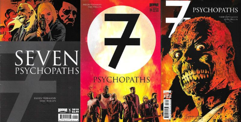
7 PSYCHOPATHS #1-3 Art by Sean Phillips Written by Fabien Vehlmann Translated by Dan Heching Coloured by Hubert Lettered by Troy Peteri BOOM! Studios, $3.99 each (2010)

 photo SPCoversB_zpsw5ewnwsc.jpg

Despite sharing a name this 3 issue comic book series published by BOOM! Studios in 2010 is nothing to do with Martin McDonagh’s 2012 ridiculously overstuffed (but still wildly enjoyable) movie. Also, despite it involving an attempt on Adolf Hitler’s life by a bunch of ne’er do wells any similarities with Quentin Tarantino’s “Inglourious Bastards” (2009) will have to come from you, because I don’t watch Quentin Tarantino movies anymore. I’d rather watch the movies he rips off, uh, repurposes. Hey, you watch what you want and I’ll watch what I want, nobody’s judging anyone here. Going on the brief text piece provide by Sean Phillips in the back of #3 this was initially published as a 1 volume hardback in that there Europe in 2007. Which explains why each issue feels weirdly paced, particularly the first one where they don’t even finish introducing the cast before you hit the back cover. Still, no one’s going to be reading it in monthly instalments in 2017 so it’s not really a concern. I’m sorry I brought it up. Alright, alright, don’t go on about it. ♫♬♩ Let it go, let it go, let it gooooooooooooooo! ♫♬♩.
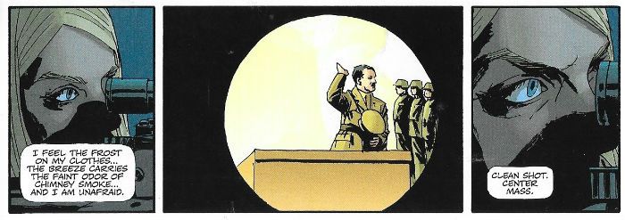
 photo SPShotB_zpsyriwrffq.jpg 7 PSYCHOPATHS by Phillips, Vehlmann, Heching, Hubert & Peteri

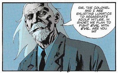
So the high concept is set a nutter to kill a nutter. Or 7 nutters, for as Joshua Goldschmidt, the plan’s instigator and principal nutter, points out, 7 in the Kabbalah (קַבָּלָה) symbolises completeness. I remember this from R.E. lessons myself; you know, all that business about 7 days to create the world, Exodus telling you how to make a 7 candle menorah, er, 7 brides for 7 brothers all that. 40 was a pretty popular number in the Bible or Torah (תּוֹרָה) (from which the Kabbalah is derived) as well, maybe Joshua Goldschmidt would have been better with 40 psychopaths. He would certainly have been better with 40 days, because he also specifies the mission has to take 7 days. It’s a bit of a tight deadline that but, hey, he’s not the full shilling is he? He’s all about the number 7 this guy. But why people with, uh, issues. Look, okay, I apologise for using the term “nutters” back there, I did so on the understanding that we’re all here to have  a bit of light hearted fun, and that when I use the term I’m kind of just indicating how exaggerated and cartoonish the mental health issues on show are. Life is hard and we’re all built differently, and it takes its toll on us all in different ways. You know, my compos isn’t exactly totally mentis either but, yeah, I hear you, words matter. Duly noted. Even Goldschmidt pitches a fit when he catches his Special Executive Operations (SEO) liaison calling the project “7 Psychopaths”, even though there are 7 of them and they are all…
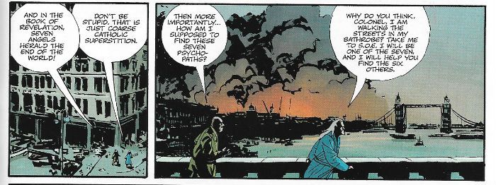
 photo SPCoarseB_zpspjzfzbf6.jpg 7 PSYCHOPATHS by Phillips, Vehlmann, Heching, Hubert & Peteri

…talented in their own ways. Willy Wright just wants to be loved and to this end can transform himself into anyone you like with a bit of bootblack and a comb, like that “Ooo will buy mah steecks!” guy off the Fast Show or (my Bronze Age DC fave) The Unknown Soldier, but without the hideous facial scarring. I guess that’s because there was no scarring left to go round because "The Warlord" is a hulking crust of scar tissues with tendencies of a decidedly pyromaniacal stripe. He’s a mute, unlike the voice in Erik Starken’s head which is that of the Berlin paperhanger himself and which stridently orates about intense visions of possible futures, with a worrying rate of accuracy. Our female member, Susan, would be worried about that but she’s too busy worrying about everything else, she’s the best shot in the forces but her tendency towards catastrophic thinking keeps shooting her concentration to shit. In the shit is where Captain Stewart finds himself after a bit of murdering but who better to turn his murder on than the architect of mass murder himself, the failed painter, Hitler. James Smith is so sane he’s insane and Joshua Goldschmidt we’ve already met. That’s 7, yeah? Phew! Goldschmidt reckons his plan will succeed because his crew’s unpredictability will make it impossible for the enemy to anticipate them. He’s not wrong. If anything he’s too right, because the unpredictability takes a terrible toll on the plan early in the game. Pretty much precisely at the series’ half way mark in fact.

 photo SPCalmB_zpsj2m6tgdp.jpg 7 PSYCHOPATHS by Phillips, Vehlmann, Heching, Hubert & Peteri

Which, unless you’ve just read a review which spoils it for you, comes pretty much out of left field. But don’t worry because that inept (and most likely aged and balding) reviewer has left plenty of other “!” moments unrevealed. See, the big thing about 7 Psychopaths is how refreshing the storytelling is. It doesn’t go where you think, and it doesn’t get to where it’s going the way you expect. It’s kind of bracing not to have the same old trex from the same old guys who’ve all read the same old books on “How To Sell Tepid Undemanding Shit To Hollywood” without realising (or caring, let’s be honest) how stultifying and homogenous most genre entertainment has become as a consequence. Three Act Structure! Meet the mentor! The Hero’s Journey! No room at his inn, pal! Yup, the best thing about 7 Psychopaths is that Joseph Campbell’s dead and withered balls haven’t been rubbed all over it so hard all the individuality’s been erased. I don’t know whether that’s because European comics have a whole different set of genre conventions, or Fabien Vehlmann is some kind of Gallic genius, but what I know is 7 Psychopaths wrong footed me throughout. It’s also pretty funny in a dark way. Just saying.
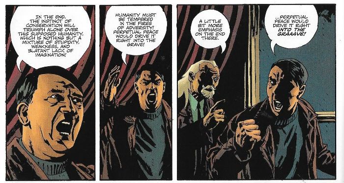
 photo SPShoutB_zpsjfclratr.jpg 7 PSYCHOPATHS by Phillips, Vehlmann, Heching, Hubert & Peteri

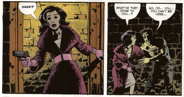
Of course this BOOM! Edition was aimed at an Engish or American audience so being healthily xenophobic we don’t care about Fabien Vehlmann with his, ugh, Frenchness, no matter how well he’s written this; no, we’re probably drawn to this because it was, uh, drawn by Sean Phillips. Mostly Sean Phillips spends his time making Ed Brubaker comics far more interesting than they have any right to be, so it’s nice to see him do something else. He does a pretty good job here; he’s Sean Phillips after all, so even on a bad day he’s still got some sweet chops. The panels are quite small, Euro-style, and he never gets a full splash, yank style, so he seizes by the scruff the few three quarter splashes he does get. Yeah, he has some fun with those showing the prophetic pantomime show going on in Starken's head. The stained glass Hitler warning us of the Cuban Missile Crisis was my favourite. Although the bit where they open the door to meet Hitler hits its hilarious mark spot on as well. Spoilt for choice, really. It’s a war book so by necessity it’s a reference heavy book and Sean Phillips does okay. I didn’t check any of it, but the German uniforms look like German uniforms and the Jerry tank is a Tiger instead of a Russki T-34, the British look British etc. The physical locations all look present and correct, largely because he seems to have drawn over photos so well they should be. There’s a bit too much “Sean’s Smile” going on (look at his work long enough and you soon recognise “Sean’s Smile”) and some problems getting the distinctive German helmet right, but all my carps are small carps. It’s Sean Phillips stretching himself so, you know, it’s solid with the odd burst of spectacular. On reflection I’m probably just being overly picky because he doesn’t find room for his signature “white shirts with creases”, which I enjoy seeing so much.

 photo SPBerlinB_zpsg8ody2uo.jpg 7 PSYCHOPATHS by Phillips, Vehlmann, Heching, Hubert & Peteri

7 Psychopaths is inventively written and nicely drawn stuff so I’m going to give it a GOOD!

OI! Where do you think you're swanning off to? No one said you could go. Sit back down. Right...Now look, it’s a sad reflection on the depths our collective psyche has plumbed that I feel the need to point out that in this series Hitler is the bad guy. Further, and it kind of pains me to have to spell this out, in real life Hitler was the bad guy. He was a “bad dude”, in the parlance of today’s POTUS. Previously that could go unspoken, but apparently some of you out there these days don’t really get the whole Nazi thing. Even I in my blithely middle-aged caveman no Facebook, no Twitter life picked up on the recent furore over whether it was right to punch Nazis. I really don’t know what’s so hard about that question. Was everyone just stuck for moral dilemmas that week? Had everyone forgotten their history? Have you all lost your furshluginner minds! The Nazis were a blight on humanity. They still are. They always will be. The evil is built in. Nazism is a giant filthy ideological cancer that will metastasize like mad given half a chance. So you don’t give it that chance. Oy! What’s hard about this, I ask you?!? Say you go to your doctor and he or she pulls a funny face and orders some X-rays, and later finds some shadows on your lungs, okay? He or she doesn’t go “Gee, we should maybe encourage that. Maybe you should take up smoking, eat a lot of burnt toast? Smoke more if you already smoke, get some Genetically modified food into your diet, put your head in the microwave if you can. Y’know, a lot of people talk cancer down, but, you know, maybe if we encourage it, give it chance to grow it’ll make you shit gold bars and bring a Heaven on earth.”  No, he or she gets zapping that crap as fast as he or she can.
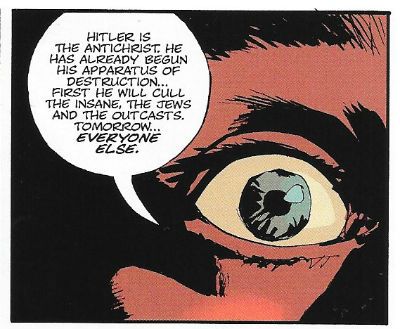
 photo SPTrueB_zpsc6fhf8mp.jpg 7 PSYCHOPATHS by Phillips, Vehlmann, Heching, Hubert & Peteri

Fucking Nazis. What’s up with you all out there? Try turning off MR fucking ROBOT and picking up a book. If you ever find yourself going, “Hmm. You know, maybe those Nazis have a point.” Something’s gone wrong in your head. There’s no “shades of grey” here. It is simply black and white. Or black with silver piping and a natty little skull to boot. Nazis! Their “philosophy” was/is childish horseshit. A load of half understood crap science and mindrot mythology, about being descended from a race of people who live in the earth’s core. That’s a 1970s Edgar Rice Burroughs movie starring Doug McClure and Caroline Munro not a workable philosophy! Some of those evil goofballs were actually, really, truly, looking for Biblical nonsense like The Ark of The Covenant and The Spear of Destiny. That was in the 1940s, Kirk Brandon didn’t even form Spear of Destiny until 1983! That’s how fucking smart Nazis are. But John, they are smart, they’ve read Nietzsche! Don’t give me that Nietzsche stuff, unlike most Nazis I’ve read Nietzsche, and as problematic as a big woolly humanist like me finds him, Nietzsche would have spat in their faces. Of course they’d have bested his more subtle ratiocinations by catching him in an alley and kicking him to death en masse, or maybe throwing a Molotov through his window while he slept, you know, in that brave way Nazis have. And they’re always the injured party! O! So badly done to! Nazis! Always the fucking underdogs, even when they’re shoving bayonets through barbed wire at your emaciated frame. It’s still your fault! Why are you making them do this! Can’t you see the tears in their eyes as they bundle you into that van with the hose leading from the exhaust into the air vent! You heartless untermensch! The poor wickle Nazi lambs.
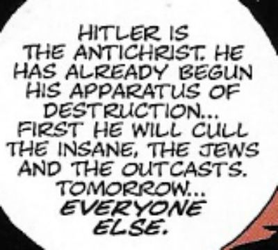
 photo SPTrueC_zps0y5bv0rv.jpg 7 PSYCHOPATHS by Phillips, Vehlmann, Heching, Hubert & Peteri

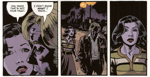
They have to do all this rank shit because, well, er, the Treaty of Versailles went too far. That’s it. That’s their rationale. Look, the Treaty of Versailles was in 1919 and had to do with Germany’s reparations for WW1. ♫♬♩ Let it go, let it go, let it gooooooooooooooo! ♫♬♩. I don’t know what earthly reason an American Nazi has to feel badly done to. Particularly as the average American Nazi would probably look at you gone out if you even mentioned the Treaty of Versailles. I imagine they aren’t too tight on the whole WW1 deal either. I guess it must just be terrible living in the richest country in the world. Is it that there’s too many black people? Too many Jews? Too Many Hispanics? Too  many cooks? Have you seen how big America is! No, if there’s too many of anything there’s too many Nazis. If there’s one Nazi there’s too many Nazis. Even if (and it’s a pretty big if) American Nazis were still sore about the Treaty of Versailles, or whatever’s hurt their sensitive Nazi feelings in America (Black people being able to drink from water fountains? ALF getting cancelled?), what are they working towards? The most successful Nazi ever was Hitler and Hitler’s Germany ended up (and these are just the highlights you understand) shooting the mentally ill and shoving people in ovens. That wasn’t a mistake; things didn’t just get a little bit out of hand; that was the plan. That. Was. The. Plan. I don’t know, call me a snowflake, but that’s not an ideal outcome to my mind. But to Nazis it is. That’s what they are working towards. That’s still the plan. Building giant autobahns with concrete mixed with your ashes. Something to aim for there. Really worthwhile stuff. Making the world a better place, yeah? Seriously, Nazis have nothing to offer humanity. Sit round the negotiating table with a Nazi and you’ll soon find they have nothing to offer. It’s never long before they start on the old “ethnic cleansing” tip. Dead giveaway really, that. I find the whole “ethnic cleansing” thing a bit of a deal breaker, speaking personally. I’m just funny like that.
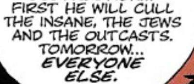
 photo SPTrueD_zpsqunhchxe.jpg 7 PSYCHOPATHS by Phillips, Vehlmann, Heching, Hubert & Peteri

Remember that bit in The Dead Zone where Johnny Smith asks Dr Sam Weizak if it would be right to go back in time and kill Hitler? He doesn’t ask if it is okay to go back and punch Hitler, does he? No, he cuts straight to the chase. And the Doc does too: “I'm a man of medicine. I'm expected to save lives and ease suffering. I love people. Therefore, I would have no choice but to kill the son of a bitch.” Christ, I got my moral instruction from Original Star Trek, 2000AD, a second hand illustrated Bible and my ol' Mum’s Stephen King novels, and even I know whether or not to punch a Nazi is the wrong question. The right question is why are there still Nazis? Sort yourselves out, you’re a disgrace. It’s 2017 not 1939; sort it.

 photo SPTrueE_zps3pttts0o.jpg 7 PSYCHOPATHS by Phillips, Vehlmann, Heching, Hubert & Peteri

NEXT TIME: Maybe something else from that there Europe because whatever the original language they are all – COMICS!!!

Wait, What? Ep. 136: Finally, Finally, Finally.

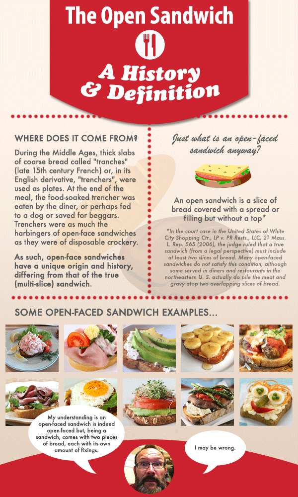
 photo OpenSandwich_zpsba347f7c.pngAnyone remember in what book Tolkien references the Battle of the Open-Faced Sandwich?  Infographic/opening salvo by the invincible Kate McMillan.

Oh, man. I hope that infographic does not hog up too much of our precious SavCrit real estate--please don't miss Abhay writing about Lazarus or that piece about how DC ran its print runs for Villains Month, or other fine entries!

Also, do join us after the jump for shownotes for our latest "Reunited-and-it-feels-so-good-except-Graeme-and-I-exchange-words-about-Game-of-Thrones-so-how-good-can-we-feel-really?" podcast!

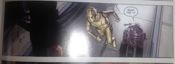
0:00-22:17: Hey, we are back and we are discussing some of the groovy NYCC announcements that the savvy Mr. McMillan knew at the time of recording.  Among the various bombshells dropped:  Priest and Bright back on Quantum & Woody; DC's announcement of the Batman weekly, Batman Eternal;  and a huge block of time wherein Graeme tells us about the Marvel announcements, including Trial of The Jean Grey; the Black Widow's new title; Al Ewing on a new Loki title; Ales Kot taking over on Secret Avengers; Avengers Undercover; All-New Ghost Rider #1 (which sounds pretty ridiculous but as I've since found out Felipe Smith of Peepo Choo fame is writing it, I'd be into it, and ditto on the Disney title written by Witch Doctor's Brandon Seifert); and much, much more. 22:17-55:14:  But there were also some pretty great comics that came out in our semi-skip weeks too and we sit down to talk about those too:  a very brief discussion of Paul Pope's Battling Boy (Graeme had read it; Jeff hadn't); Saga #14 (see?  It's been a while, hasn't it?) which leads into a talk about…TV(?) including the season debuts of Parks & Recreation, Nashville, New Girl, and others; The Star Wars #2 (with some impressive kvetching from Graeme) and which features this:

 photo 37b8a655-a521-4891-ac78-597f085d66cd_zps4b007c10.jpg (sorry about the dumb reflective lighting in the pic, we have pretty awful lighting in our place)

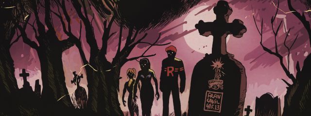
Empowered: Nine Beers with Ninjette; Fatale #17; IDW's Powerpuff Girls #1 by Troy Little; Rocket Girl #1 by Amy Reeder and Brandon Montclare; and Batman #24 by Scott Snyder and Greg Capullo. 55:14-1:07:50: Additionally, Graeme has read Superman Wonder Woman #1; Green Lantern Corps #24, Forever Evil: Arkham War #1; and the first issue of Coffin Hill by Caitlin Kittredge and Inaki Miranda, and goes on to discuss them, thank goodness, otherwise I would've really wasted some time typing those names out. 1:07:50-1:13:01: Graeme has also read Kings Watch #2 by Jeff Parker and Mark Laming, and a copy of First Second's Fairy Tales Comics in which Chris Duffy has assembled a powerhouse of comic talent--it is worth looking out for. By contrast, Jeff scratches his weary head over Walking Dead #115. 1:13:01-1:17:33:  And yet, we were both surprised and delighted by Afterlife with Archie by Roberto Aguirre-Sacasa and Francesco Francavilla (The interview with Aguirre-Sacasa that Jeff calls out is available here.  The image Jeff chooses to babble about briefly that you can't see because we are an audio podcast is this one: archie undead photo alwarchie1001f_zps12fc6f81.jpg

1:17:33-1:21:16: Compare and contrast with Shaolin Cowboy #1 by Geoff Darrow from Dark Horse Comics?  How can one? And yet, Jeff does. 1:21:16-1:39:56: Lazarus #4.  Lazarus has received a pretty good drubbing on this site, but Jeff continues to read it.  If you want to hear a new, far-more-inarticulate set of frustrations with the title, these are the few minutes for you! 1:39:56-1:45:16: Our most controversial topic yet--the open-faced sandwich!  (See above.)  Little did Jeff know when he recorded his solocast that he was inviting tremendous dissent from many…most especially the formidable Kate McMillan. (Again, see above.) 1:45:16-1:59:44: And, finally: we talk about the long-gestating secret project that's been keeping Jeff busy seemingly forever -- the electronic imprint Airport Books and its first title, the reprint of E.J. Ehlers' never-before-printed Erotic Vampire Bank Heist.  Although we aren't the type to shill heavily (for ourselves, anyway), Graeme is kind enough to help Jeff do so here, and we do hope that if this is the sort of thing you're interested in, you consider picking up a copy for your Kindle or Kindle reading app. 1:59:44-end: Closing comments! A bit of excited blurbing about the Zombo trade leads to the promise/threat of a Zombo book club for next week!  Here's the cover so you know what to look for:

zombo2 photo zombo2_zpsfd47b01e.jpg (See, I told you we don't shill for ourselves....)

And but so!

The podcast is on iTunes (probably, maybe, probably) but it is also here for your audible delectation:

Wait, What? Ep. 136: Finally, Finally, Finally.

Now, if you'll excuse me, I'm going to go celebrate the launching of my imprint in fine style and go get my teeth cleaned and drilled. (On the plus side, the nitrous will probably give me hallucinations of chatting with Amanda Urban over some choice canapes, so maybe that's the perfect launch party.)

Thank you for your kindly attention, and we'll be back with ep. 137 next week!

"Rodeo Ain't Over Yet!" COMICS! Sometimes I Don't Have A Title!

Hello! Here are some words about some comics. The sales figures analysis is just below this. Very good it is too! To clarify, the Hibbs' stuff is good, not this stuff. Anyway, this... Photobucket

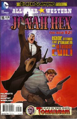
ALL STAR WESTERN#16 Jonah Hex: Art by Moritat, written by Justin Gray and Jimmy Palmiotti, coloured by Mike Atiyeh and lettered by Rob Leigh. Tomahawk!: Art and colour by Phil Winslade, written by Justin Gray and Jimmy Palmiotti and lettered by Rob Leigh. DC Comics, $3.99 (2012) Jonah Hex created by Tony DeZuniga and John Albano Tomahawk created by Edmund Good and Joe Samachson

Photobucket

I finally realised that it isn't the sticklebricking of DC Continuity and the basic desperate casting about for stunt elements that are hamstringing my enjoyment of this book. No, it's the joylessness of it. Its total and wholehearted acceptance of the current DC mode of storytelling which puts a premium on prevarication and encourages emptiness. Look, this book would be great if Bob Haney was writing it. Bob Haney isn't writing it though so it isn't great. If I'm hankering after Bob Haney in 2013 it's a fair guess your book isn't up to snuff. On the up side this issue doesn't contain the dismayingly frequent page filling device of having that Oriental lass fighting for five pages. In fact she doesn't appear once which means that any entertainment can be rightly said to be just like the cast - purely occidental. You want better jokes, make better comics.

Photobucket

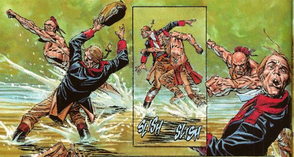
In the Tomahawk back up the most startling aspect as ever is Phil Winslade's bizarre digital watercolours job which I find enjoyable without actually knowing why. In other news, the English turn out to be the villains! I guess that's how Germans feel when they read DC war comics. A taste of my own medicine there. And it is bitter, bitter, bitter. This book, however, is only EH!

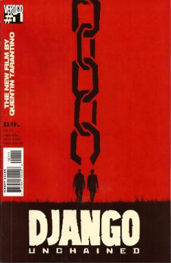
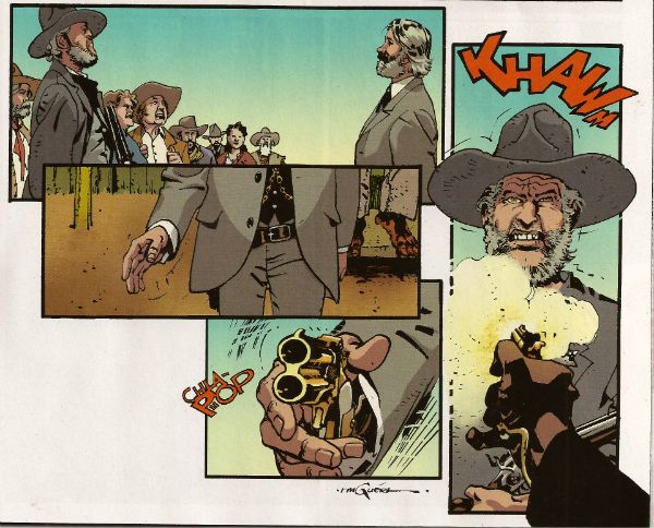
DJANGO UNCHAINED #1 Art by R M Guera with Jason Latour Adapted by Reginald Hudlin Coloured by Giulia Brusco Lettered by Sal Cipriano Adapted from the original screenplay by Quentin Tarantino Vertigo/DC Comics, $3.99

Photobucket

I can’t speak as to how good an adaptation this is because I haven’t seen the movie. I’m old and the wild and outrageous young rebel Quentin Tarantino scares me with his outrageously youthful rebelliousness and his youthfully rebellious outrageous movies. Luckily my much younger sister had seen this very movie so I asked her how she found it. She said, and I quote so the record may be deemed complete, “It was entertaining, Johnny, but it wasn’t good.” There you go then. Me, I fear I invite your youthful ire as I just don’t think Tarantino is all that. Oh, it isn't his childishly inflammatory use of the “N” word, after all I’m sure should our paths cross the edgy auteur would be equally forgiving were I to pepper him with the “C” word like it was going out of fashion. No, but some of it is the fact that he uses the word “cool” too much. The only men his age who should use “cool” that much are Grateful dead fans who live in San Franciscan dumpsters. Mostly though it’s that he reacts to proper questions like THIS. Yeah, I'll let that speak for itself I think. On the plus side the iconoclastic Quentin Tarantino does seem to have exhausted his celluloid fetish for Uma “Man Hands” Thurman.

Photobucket

The stated aim of this comic is to illustrate the original script. Every golden word. I guess it does that. It certainly seems like a Tarantino script. The dialogue is surely as self-satisfied and in need of tightening as ever and it retains all the usual rhythm and musicality (i.e. all the rhythm and musicality of a tune played on an arse flute); scenes outstay their welcome or outstay their welcome while also leading up to a totally predictable reveal and the characters haven’t any. Usually it would take hundreds of talented people and millions of dollars to make this stuff at least enjoyable if not actually good. All this comic has is R M Guera. All this comic needs is R M Guera. It’s an amazingly savvy choice since for the last 5 years and change R M Guera has been tasked with tricking everyone into thinking that a tour through Jason Aaron’s 70’s movie memories constitutes something with anything more to say than, hey, wasn't cinema in the 70’s just grand? Or SCALPED as it is known. Elevating the mundane to the magical is just what R M Guera does I guess. He does it bloody well though. Jason Latour throws down a few flashback panels and his art is excellent every time it appears but the shining star here is R M Guera. R M Guera with his ambulatory toby jugs and smooth storytelling once again showing everyone else up. Hey, the poor old writer doesn't even get a credit except here: Reginald Hudlin. I don't know why he doesn't get a credit but it's not a trend I want to encourage. Anyway, thanks largely to RM Guera this was GOOD!

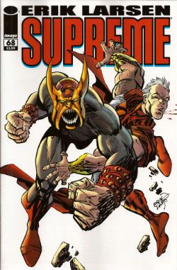
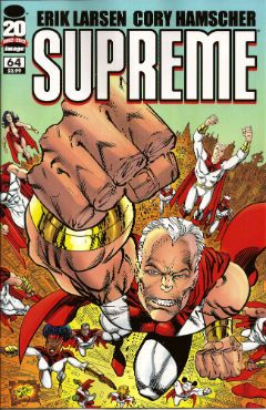
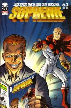
SUPREME #68 Written and Drawn by Erik Larsen Coloured by Steve Oliff Lettered by Chris Eliopoulos Supreme created by Rob Liefeld Image Comics, $3.99

Photobucket

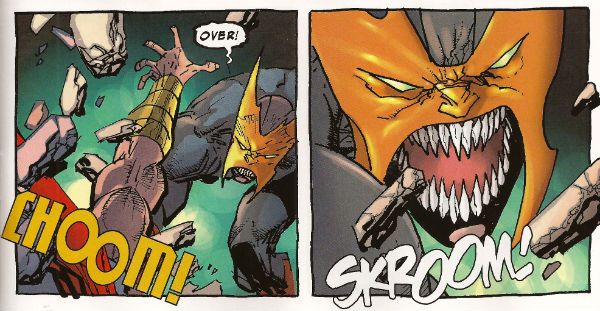
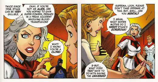
In this pulse pounding issue Erik Larsen basically says that he enjoyed illustrating Alan Moore’s script but since then he’s been noodling about and it’s been just super, thanks, but he’s off now. Apparently someone else will be taking over, no idea who but, yeah, someone at some point. Of all the moves to steal from the DC playbook that’s a pretty strange choice. At least he didn't steal DC’s signature move which is now apparently making comics nobody likes but lots of them. Larsen’s departure is a bit of a shame because I found his Kirby with a split nib art quite charming and in this issue it’s particularly so because, for no readily apparent reason, Larsen suddenly starts drawing this thing like it’s Kyle Baker’s RONIN. (Yes, I know it was Frank Miller's RONIN but this looks like Kyle Baker's RONIN).

Photobucket

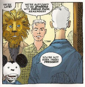
I quite enjoyed this book. It had enjoyably stupid characters like Lion headed Supreme and Darius Duck, people flew around, punching occurred and Larsen always respectfully drew Supreme in that scratchy Liefeld mode without actually ever being as shitty as Liefeld. Sure, it was pretty basic stuff but it was basically pretty stuff. Sometimes I don’t actually want all that much from a comic and this certainly delivered that. I wouldn't recommend that Erik Larsen make a habit of just dumping books as people might start referring to a failure to commit as having committed Larsen-y. Unlike that joke this was OKAY!

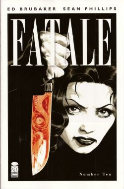
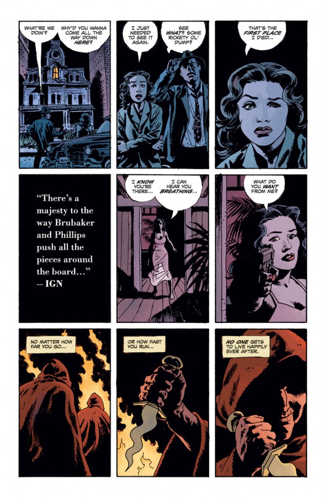
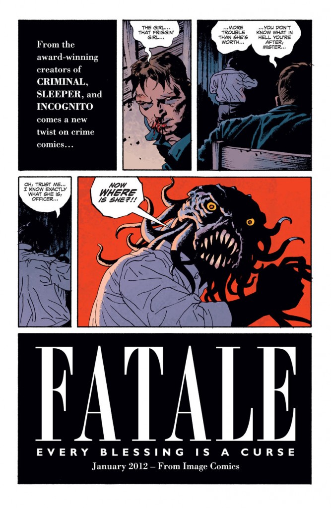
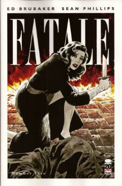
FATALE#9,10 Art by Sean Phillips Written by Ed Brubaker Coloured by Dave Stewart Fatale created by Sean Phillips and Ed Brubaker Image Comics, $3.50

Photobucket

Everyone can relax because I’m done here. I’ve had my doubts about this one all the way. For starters the horror elements have been inexplicably dusty and dull (cassocks! tentacles!). I don't need my own pet Jess Nevins to know that horror in the '70s was actually engaging with real world events and offering up savage and innovative treats which were leaving Corman's Poe adaptations for dead. Then there's the inescapable drab narration which mistakes deadpan for just plain dead on the page and is written in a fabulous new tense even more inactive than the passive; the comatose tense perhaps. The only sign of life in this one-note stuff is that it works the word “but” like it yearns to be a Salt’n’Pepa track.Then there's stuff like this:

Photobucket

That pivotal oh, go away moment occurred in issue 9 but due to the caprices of my comic dispersal system I still had issue 10 to go. Yes, one more chance! A chance which was immediately crushed when the central character (who thus far has been less like Fatale and more like Docile) just suddenly remembered she had special magic powers and plain killed everyone in a climax as rewarding as being inadvertently brought off by the motion of your train seat. Look, there’s no mystery about why men will act like complete tools for a pretty face, certainly not a supernatural mystery. Unless you think the contents of your pants are supernatural and mysterious. In which case your Pope just resigned. I didn't know Popes could do that! This series always seemed less James Ellroy and H P Lovecraft and more Quinn Martin and Donald P Bellisario. An impression strengthened by future covers which indicate the series is just going to stick a new genre on top of the usual stuff. Now she's a witch, now she's a space man, now she's a turtle, dis-integrating! Like my interest. Mr Ben with a magical woo-woo may well be a new direction but not one I’ll be pursuing. So, I’ll be missing future essays on The Scarecrow And Mrs King and, more importantly, the fine work of Sean Phillips and Dave Stewart which deserves better than to be yoked to work this EH!

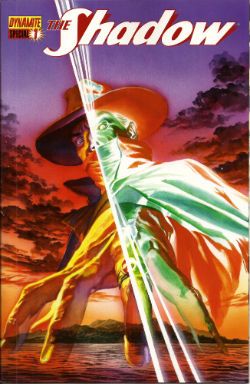
SHADOW SPECIAL #1 Art by Ronan Cliquet Written by Scott Beatty Coloured by Mat Lopes Lettered by Rob Steen The Shadow created by Walter B. Gibson Dynamite, $4.99 (HOLY MOTHER OF GOD!!!! FOUR DOLLARS AND NINETY NINE CENTS!!!! THAT'S INSANE!!!!)

Photobucket

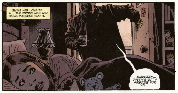
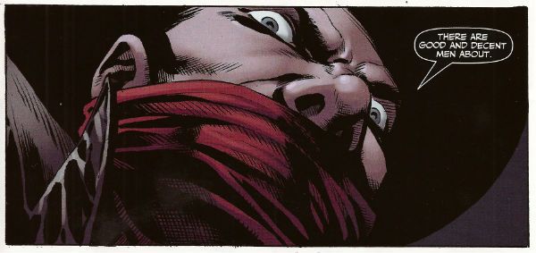
In the main title The Shadow is currently palling about with George Orwell. George Orwell is the author of a couple of books on how shit being poor is and how we will all willingly participate in a system designed to crush our common humanity. He was right about both of those things and remains right, although he missed a trick in not realising that the main way The System would ensure our complicity would be by making nice things for us to buy. But then there weren’t many nice things to buy back then so we’ll let him off. Rip The System! You don’t bring Orwell to the party unless you want that party to get political! Orwell also did a book about animals on a farm. I can’t remember what it was called but it was about animals on a farm. It was a metaphor or an analogy or some clever shit like that about some animals on a farm. Oh yeah, I remember now, the one about the animals on the farm? It was called BEFORE WATCHMEN.

Anyway, this isn’t the main series so George Orwell isn’t in it. No, this is a “special” but it isn't very, possibly even at all. Except for the price. That’s pretty fucking special right there. There’s the core of a fun and pulpy tale here but something’s gone awry on the pacing front. When there’s more pages devoted to The Shadow moaning about going shoe shopping (yes, really) than there is to his fight in a minefield with a man who has courageously chosen to sport only a bouquet of barbed wire around his nuddy bod (Oooch! Owch!) then, yes, I’d have to disagree strongly with the storytelling emphases.

Photobucket

Ronan Cliquet has a good go at being Alan Davis but he seems to have jumped ahead a bit; Alan Davis didn’t get to be Alan Davis until he’d got the basics right, son. I’m guessing he’s just some wee snip learning his trade but the best I can give him is – promising. The most special thing about this comic is the paper it’s printed on. Paper so much like catalogue pages from your youth that there’s a constant urge to riffle through them to the Hot Wheels section or the sports bra section depending on which age your development is currently arrested at. No, it wasn't special unless special is EH!

And like The Pope - I'm gone! But there's still COMICS!!!
Wait, What? Ep. 115: Less Than Greek

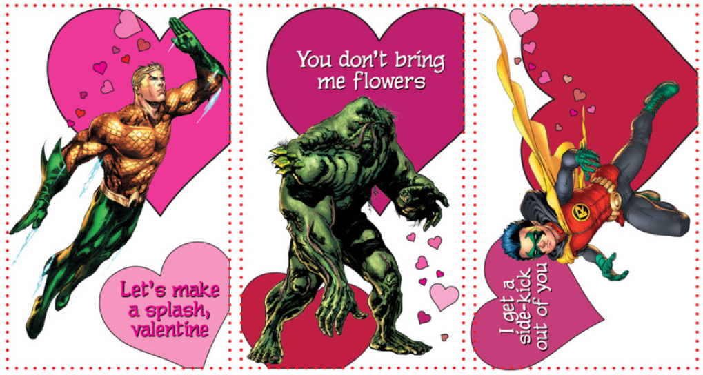
Photobucket"It's funny! It says 'I choo-choo-choose you' and then there's a picture of Aquaman."

Well, on the plus side? It is a Monday and we have a new Wait, What? for you--almost an entire day early!

On the minus side, we won't be recording this week due to Valentine's Day, so there won't be a recording next week, I am totally behind the eight ball on my other projects, and I couldn't get Graeme to draw a Don-Wan Kihotay for us.

After the jump, this week's episode and some super-speedy show notes!

0:00-3:18:  Odd greeting! Neurotic confession! Bizarre Love Triangle! Can you tell which one of these is a description of our opening, and which one is a New Order single? 3:18-12:34:  Strange Press Release!  (Another unsung New Order single.)  Graeme and Jeff  discuss the recent press release announcing the Rogue and She-Hulk novels for female readers. 12:34-20:17: From arguing about mythologies in tie-in products, we move on discussing whether Disney is getting too crazy with their Star Wars movie plans or not. 20:17-31:37: Jeff isn't sure how to he made the jump between Star Wars films and the twin legacies of Sylvester Stallone and Walter Hill. (The term "twin legacy" is used, and Luke and Leia are twins with a legacy?)  Nonetheless, if you were hoping to have a healthy dose of "Hey, you kids, stop misunderstanding the historical legacy of my lawn!"  YOU ARE IN LUCK.  (Please note: when Jeff says "Lawrence Silver" in his triade, he really means "Joel Silver." 31:37-1:07:48:  And from a topic of nostalgia and misunderstood legacies, Jeff tries to look at Marvel's Jack Kirby Captain America Omnibus and the hardcover collection of Neal Adams' Batman Odyssey. 1:07:48-1:08:24: Intermission the First! 1:08:24-1:12:54: And we're back.  Most of you probably know about my beard, but not many of us know about Graeme's secret sideburns…or about his even more secret interview with SKY NEWS. 1:12:54-1:22:28: The battle for New Comics begins!  Graeme has read Young Romance: New52 Valentine's Day Special and the first Jeff Lemire-scripted issue of Green Arrow.  Graeme didn't like them much. Jeff saw the preview trailer for Injustice: Gods Among Us. Arguably, he liked that even less.  And then came…the dreaded tech problems.  We liked those least of all. 1:22:28-1:22:52: Intermission the Second! 1:22:52-1:36:05:  We are back, to continue with a bit of grousing about DC.  Graeme has read the huge DC: 75th Anniversary book by Paul Levitz, leading to a conversation about what made DC great in the past.  We are excited about the new digital Superman book, maybe not so much (or at all) about Orson Scott Card, but we are very excited about Jeff Parker, Chris Samnee, and others.  Graeme has also got a sneak peek at Superman: The Unauthorized Biography by Glen Weldon. 1:36:05-1:45:22:  Jeff talks a little about the fourth issue of Multiple Warheads, in a "I would really rather talk about it when we've both read it, but Graeme keeps asking me questions" sort of way.  Also, Jeff doesn't wants anyone to think he's super-high but he decides to compare Multiple Warheads to Zero Dark Thirty for some reason?  Graeme gives the low-down on the Netflix remake of House of Cards. 1:45:22-2:11:25: Questions! We do manage to answer some questions (honestly, we were supposed to answer more and once again we got distracted).  Here we are speeding questions from four Whatnauts: Jesse M. on December 6th, 2012 at 7:08 pm asked: No way you’ll have time to answer all of these, choose one!  1) What’s the single issue of a comic that you love best?  2) I’ve been loving Journey Into Mystery From Gillen and Immonen. Once Immonen’s Sif run is finished, what team should tackle the Warriors Three? 3) Are there any current comics that would benefit from a JiM/BPRD style spinoff? Ben Lipman on December 6th, 2012 at 7:22 pm asked:  Should Marvel bother with covers?  They print them on the same stock as the pages, the books are ordered months in advance and sell to an audience that actively seeks them out. Why not save the price of more pages/art and just have the title sit above the first page?  Is FATALE becoming an ongoing series a good thing?  I enjoy it though it’s not their best, but was looking forward to Bru and Phillips moving on to something else.  What was the best and what was the worst comic you read for each decade you have read comics? Zomboner on December 6th, 2012 at 8:03 pm said:  What happens to Ross’ moustache when he turns into the red-hulk? mateor on December 6th, 2012 at 9:28 pm said:  How about…  A) Has anyone, ever, done more for a comic than Eddie Campbell did for From Hell?  B) Could we expect a modern reader to get anything out of the big 2 comics “masterpieces” of our youth? I am thinking of in continuity stuff here, something like Simonson’s Thor here, a book that pretty much ruled my world growing up, yet something I will ever be able to properly explain to my son, even if he had the issues in front of him. I don’t have the same doubts about Romita’s Amazing or other earlier runs, there is just something about those eighties books that seem stuck in time.  C) If you gave 100 people on the subway issues of Bill Sienkeiwicz’s New Mutants (with the lovely painted covers removed) how many would tell you it was the worst looking comic they have ever seen? and D) What would happen if Robert Kirkman decided to spend his next month’s income and buy the publishing arm of Marvel? Not the IP, just the right to publish Marvel comics the way he wanted…which characters would die each month and by which blunt instrument? How sad would the Punisher be while he used his slowly diminishing appendages to get the rest of the Marvel U killed, one 100 issue spectacular at a time?  Who would he think was calling him while he cried into a disconnected telephone and would he still have the beard? Would Aunt May be the big bad? 2:11:25-end:  Closing comments! Many apologies! Graeme tells you something that would make him laugh! Nothing but exclamation points! Or…are there?

And...there you have it...if by "it," you mean "the show notes."  If by "it," you mean "the show," then in fact, you do not have it...unless you look below, and then you will indeed have that, too:

Wait, What? Ep. 115: Less Than Greek

We hope you enjoy, thanks for listening, and we hope you have a grand Valentine's Day.

"I Tried Everything Else." COMICS! Sometimes Chaykin's Awake!!!

Hopefully you all made it through any storms okay, my American friends! If you did I've got some rubbish about comics for ya.Content! You might not want it, you might not like it but it's there!

Photobucket

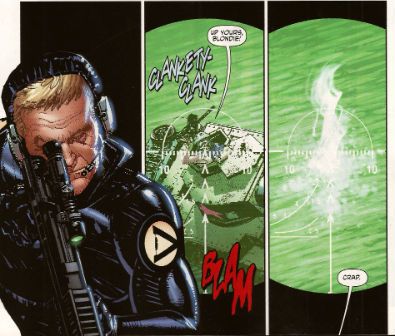
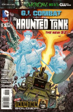
G.I. COMBAT #5 Featuring The Haunted Tank Art by Howard Victor Chaykin Story and Words by Peter J. Tomasi Coloured by Jesus Arbutov Lettered by Rob Leigh The Unknown Soldier Art by Staz Johnson Written by Jimmy Palmiotti and Justin Gray Coloured by Rob Schwager Lettered by Rob Leigh The Haunted Tank created by Russ Heath and Robert Kanigher The Unknown Soldier created byJoe Kubert and Robert Kanigher DC Comics, $3.99 (2012) Photobucket

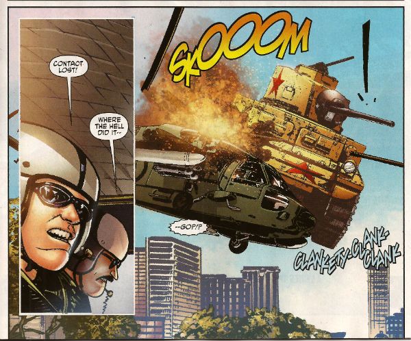
First up, I have to thank Corey (Ottawa) for bringing this comic to my attention. If it wasn't for our Canadian Contingent I'd not have known the art chores on this were by everyone's favourite filth peddler Mr. Howard Victor Chaykin! I wasn't expecting much here to be honest, I thought he'd probably be busy drawing comics too frisky for the UK to have any electrolytes left over for a book about a, well, a haunted tank.  I don't know if it's being able to clip art the shit out of this book due to its emphasis on hardware but the bits that aren't hardware have Howard Victor Chaykin pounding the pages with a barrage of highly entertaining images. Unlike, so I hear, the pounding he's giving the pages in that other (banned) book.

Photobucket

Tomasi gives him a totally stupid story to illustrate involving a nutty veteran clad in The Flag being tank-napped into a supernatural rescue mission while being pursued by Wonder Woman's high-tech ex Steve Trevor. It is nonsensical stuff but, I don't know if you've ever given it much thought but, the whole concept of The Haunted Tank isn't going to win any awards for realism. So why not go wide on the goofiness.  Chaykin seems to be enjoying himself and it all comes together a lot more successfully than some of his recent efforts. Not once did Jesus Arbutov's colour work have me reaching to ring the police and at times I was tempted to throw back my head and bellow Blessed-style "CHAYKIN'S AWAKE!!!"  Maybe he just enjoyed ringing up his russety pal Russ Heath and irritating him by going "Pop! Just drawn a tank! Pop! Just drew another! These computers are great! Now how long did it used to take you to draw these tanks, Russ? Pop! Drew another! Hey, I ever tell ya I can see the beach from my window?" I don't know, I just really enjoyed his stuff this time out. It was GOOD!

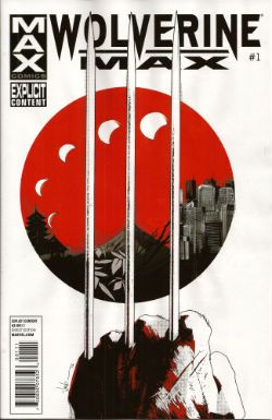
WOLVERINE MAX #1 Art by Roland Boschi & Connor Willumsen Written by Jason Starr Coloured by Dan Brown Lettered by VC's Cory Petit Wolverine created by Len Wein, John Romita Snr and Herb Trimpe Marvel, $3.99 (2012) Photobucket

While Jason Starr is a good writer of novels and I have also been known to enjoy the work of Roland Boschi the real reason I picked this up was because of Connor Willumsen. He does not disappoint! Boschi's pages seem somewhat rushed and concern the present day Wolverine fighting sharks and having no memory of why he ended up doing that. Also, his legs grow back and everyone is only slightly perturbed by this. Perturbed's too strong a word actually. I know health care professionals are rushed off their feet and are basically the busiest people in show-business and The Japanese are a modest people...but I think two legs growing back, bones and all, would cause more than a raised eyebrow and a muttered aside, suggesting such an event is more a case of exhibitionism than it is straight up miraculous. Jason Starr's handling of Wolverine's talents but in the real world is off to a choppy start is what I'm saying.

Photobucket

Willumsen, however, burns rubber from the off with his flashback scenes which portray Daniel Day Lewis from There Will Be Blood stepping into the original Claremont/Miller mini-series but in a grubbily humming Underground Comix stylee. So amazing are his inky doings that even the writing seems elevated with Victor sounding especially characterful in his disdain for the normals. I would buy this series purely for the further expansion of these elements.  I would but Marvel seem to have upset Connor Willumsen so much that he has jumped ship. His work will not be appearing in any subsequent issues of WOLVERINE MAX and so I will not be buying them as without him this comic will be less than GOOD! Well done there, Marvel! Yes, that is sarcasm.

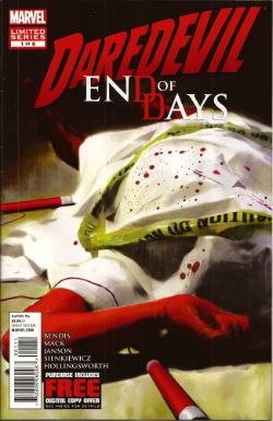
DAREDEVIL: END OF DAYS #1 Art by Klaus Janson and Bill Sienkiewicz Written by Brian Michael Bendis & David Mack Coloured by Matt Hollingsworth Lettered by VC's Joe Caramagna Daredevil created by Bill Everett and Stan Lee Marvel, $3.99 (2012) Photobucket

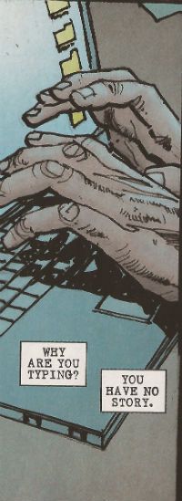
I asked my LCS why they sent this (you're darned tooting I did) and they said it was because I liked Janson and Sienkiewickz, which is true. What they failed to factor in is that ladling the  steaming hot writing of Brian Michael Bendis over the top of their efforts is, at this stage in the game, like climbing a stepladder to fart repeatedly right in my face as I admire a Vermeer. It's distractingly puerile and pretty quickly spoils the whole experience. The best bit (i.e. the very worst bit of very many bad bits) is when Ben Urich's (very long, very, very fucking awful) monologue accuses his audience (his readers, geddit!) of not appreciating words. This is super-awesome because he's being written by someone who treats the English language with all the care and attention of a hungover abattoir worker placing his bolt-gun to a steer's head.

Photobucket

This is a writer who seems to have a working vocabulary of, maybe, fifty words and whose solution to every writing conundrum (an introduction to The Incal, an introduction to a HVC art book, a recipe for quiche, instructions on how to install a Norton Commando Boyer ignition etc) is always a chatty, faux-conversational, uninformative, space devouring style which smashes grammar's head in with a brick and is in no way to be taken as an indication of a complete inability to write anything approaching a joined up sentence. Christ, this is why I ask my LCS not to send his (dismal, dismal) stuff. This comic is smug, vacuous, inane, pandering, complacent ineptitude par excellence. This comic is CRAP! I did not like it.

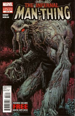
THE INFERNAL MAN-THING #3 Art by Kevin Nowlan Written by Steve Gerber Lettered by Todd Klein Also "...Man-Thing!" from Savage Tales #1 Art by Gray Morrow Written by Gerry Conway & Roy Thomas Man-Thing created by Stan Lee, Roy Thomas, Gerry Conway and Gray Morrow Marvel, $3.99 (2012) Photobucket

And so we close the comic and close the curtain on one Steve Gerber as he defies the laws of nature and reality to bow out of comics for the final time, some four years after his physical death. As we bite back the tears lets allow a manly clap on the back for Kevin Nowlan who did Gerber proud twice over with beautifully considered art to which he then applied a thoughtful and innovative colour palette.  Together with this final VERY GOOD! chapter of Gerber's playful, humane and imaginative end-song Marvel have also included Manny's first appearance.  Whether placing an ending with a beginning together in such close proximity is Marvel's way of acknowledging the Cycle of Life or just another attempt to squeeze a property until the pips squeak we'll probably never know. (Steve Gerber would have known.)

Photobucket

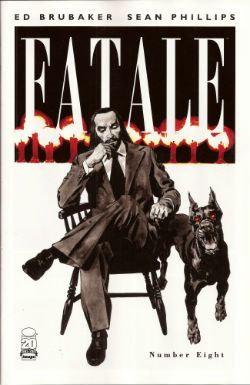
FATALE #8 By Sean Phillips and Ed Brubaker With colours by Dave Stewart Fatale created by Sean Phillips and Ed Brubaker Image, $3.50 (2012) Photobucket

I've not been impressed with this series so far but I will admit that while this issue still wasn't terribly good it was a whole lot better. Maybe it had something to with a sudden upswing in the density of incident or the fact that Phillips' art seemed more lively since he was given a couple of occasions on which to strut his stuff style-wise.  I still don't find it to be convincingly evocative of a time and place; it'll take more than some beards in a VW van to make me swoon at the authenticity of the '7os vibe, man.  At times I can almost smell the spirit glue holding all the sideburns on. Most deflating of all is the fact that the series is still hamstrung by bizarrely conservative and old-fashioned sense of horror (tentacles! men in robes with daggers! cemeteries!) which means the horror is never actually, well, horrible.

Photobucket

The humourlessness of the whole thing has also struck me recently; this was unfortunate because I then realised I couldn't recall one incidence of humour in all the work I've read by this author. That's a lot of pages in which to not crack a smile. Maybe it's me. Senses of humour are personal after all but still  the funniest thing in FATALE #8 is when the rather tasteless competition in the lettercol results in one John Cleaver out writing this whole series with just one paragraph. Mind you, if any readers do want to send me pictures of them crying while they remember horribly traumatic events from their lives they are welcome to do so(*). Get really close in there so I can see the fat bulbs of those tears bloating from your sad ducts, kids! The winner could receive a pen! So, yeah, this issue was OKAY! and you can buy it from The Savage Critics Digital Shop...here! (Although if more than 10% of the comics reading audience do so a big red light starts flashing and Brian Hibbs starts rushing everyone to the shelters as AROOOGA! AROOOGA! echoes rounds his shaggy head. It's a true fact, cats and kittens!)

(*) Don't do this. It's a joke.

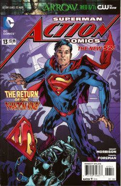
ACTION COMICS #13 Featuring... Superman in..."The Ghost In The Fortress of Solitude" Art by Travel Foreman Written by Grant Morrison Coloured by Brad Anderson Lettered by Steve Wands Superman in..."A Boy And His Dog" Art by Brad Walker (p) & Andrew Hennessy(i) Written by Sholly Fisch Coloured by Jay David Ramos Lettered by Patrick Brosseau Superman created by Jerry Siegel and Joe Shuster DC Comics, $3.99 (2012) Photobucket

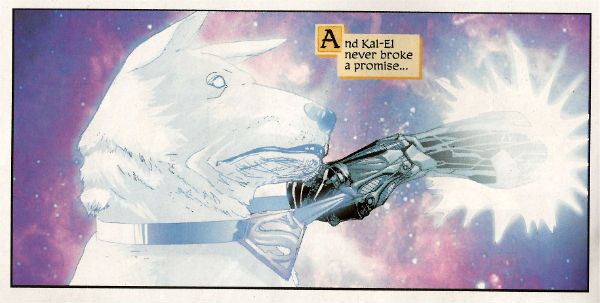
It's strange the connections your mind makes. In my head Morrison's recent callous remarks regarding the treatment of Siegel and Shuster and the portrayal of animals throughout his work suggests to me one of those lovely people who care more for the feelings of animals than those of people. Which is all really cuddly on the surface until you press them on the issue and they suddenly hiss at you that people deserve what they get! Which I find a less than generous rationale and more than a little confusing in its mix of sentiment and insensitivity. Almost as confusing as this comic which I have a strong suspicion makes no sense but as I too have a soft spot for tales of the gud dog I'll let its muddled nature pass this time and say this comic was OKAY!

Photobucket

So yeah, those were certainly some words about what I believe scientists are now calling COMICS!!!
Wait, What? Ep. 102: Age of Chance

NewPage9From the thirteenth issue of Watchmen by Alan Moore and Dave Gibbons, assembled by Miguel Corti.

The episode--she is long! (Just a bit over two hours and forty minutes, in fact.)

The show notes--they are extensive!

So join me after the jump for both, and a bit more about Watchmen issue #13!

Oh, and hey, let us know how this episode sounds to you, eh?  I gave a listen to the sound quality of the first call before throwing it into Levelator and thought it sounded...really okay?  So I'm mixing this raw.

0:00-3:38:  So, is this episode where Graeme is Goofus and Jeff is Gallant?  (Spoiler: No.)  But Jeff is much more chipper than last week, certainly.  At least until we starting discussing... 3:38-6:18: Comics!  (More specifically, Marvel Comics.) (Ultra-specifically, the twenty variant covers for Uncanny Avengers.) 6:18-28:46: Which leads us into discussion of Avengers Vs. X-Men #12 which Graeme has read and Jeff has not so it's time for some heavy-duty recapping on the part of Mr. McMillan. 28:46-43:52: Getting back to twenty variant covers situation, we ponder whether the fact Uncanny didn't outsell Walking Dead #100 is... a good thing? A bad thing?  Just a thing? [Insert "It's Clobbering Time" joke here, as appropriate.]  This ping-pongs us back to talking about (for lack of better expressions) "natural" events vs. "forced" events with Avengers Vs. X-Men, its sales, and whether or not the event was review-proof. 43:52-55:09: Sensibly, Graeme uses the recent (stunningly great) Grantland excerpt of Sean Howe's Marvel Comics: The Untold Story to compare and contrast Marvel's current marketing and operating approach with those prior.  The more things change, the more they stay the same? Well, maybe as far as killing off major characters and trying to capture female readers go.  But if you've ever enjoyed listening to us talk about Steve Englehart and Jim Starlin, you should most definitely check out the excerpt...and probably the book?  (Also, if you haven't seen Howe's amazing Tumblr, check that out too. 55:09-59:40:  Another book up Graeme's sleeve: Batman #13, the first part of the upcoming "Death of the Family" storyline. Jeff counters with Action Comics #13 by Grant Morrison and Travel Foreman. 59:40-1:06:04:  Graeme talks a bit about The Nao of Brown by Glyn Dillon, published by Self Made Hero and distributed in the U.S. by Abrams.  For you pull-quote types:  Graeme McMillan says "It is just a blinding book" and "the most beautiful comic I've seen in the longest time." 1:06:04-1:29:19:  This gives Jeff an opening to talk about Gordon Harris' self-published graphic novel, Pedestrian, Graeme mentions Josh Cotter's Skyscrapers of the Midwest which we hunt up on Comixology.  Doing so reminds Graeme he had also read the digital only sequel to Chris Roberson's Memorial... which leads us to spend a few minutes kicking around the can that is digital pricing and real vs. perceived value using such varied examples as a Digital 2000AD subscription, Saga, Valiant's digital editions, Bandette, Comixology sales, full-price books from Marvel and DC, Shonen Jump Alpha, and more. 1:29:19-2:02:32: A quick rundown by Jeff of the other books he's read this recently: Harbinger issues #1 and #2, a detailed  discussion with Graeme about Amelia Cole and the Unknown World, Black Kiss #2.3, Fatale #8, the very strange saga that is issues #7-10 of Star Wars by Roy Thomas, Don Glut, Howard Chaykin, and Tom Palmer, Axe Cop: President of the World #3, a stunning story by Michael Fleisher and Alex Nino from Showcase Presents House of Mystery (Vol. 3) (and thanks, Dylan Cassard, for that one--you should check out his podcast and podcast-related Kickstarter).  All of which reminds Graeme (somehow) that he's also read issue #0 of The Phantom Stranger. 2:02:32-2:18:48: Also, Graeme has read Thanos: The End by Jim Starlin as well as The Return of Thanos trade paperback featuring both issues of The Thanos Quest.  We talk about that, a little bit about Englehart's first issue on Silver Surfer with Marshall Rogers, The Annihilation books, DC's Cosmic Odyssey, as well as Graeme's favorite Green Lantern. This is what happens when you meet a stranger in the Alps! 2:18:48-end: And then, finally, we talk about the stunner that is the 13th issue of Watchmen, which listener Miguel Corti assembled after a discussion Graeme and I had on-air about just such an issue being via random cut-up of the first twelve.  Here's Miguel talking about the idea and how he executed it, excerpted from our correspondence:

Anyway, my original plan to show my appreciation for the effort you put into creating a show that I enjoy listening to was to make something for you based off of a throwaway idea from one of the episodes that came out in either early 2012 or late 2011. In that episode you discussed the idea of creating a 13th issue of “Watchmen” based on randomly picking panels out of the graphic novel and rearranging them until you had this ersatz issue. I was intrigued by the idea since I had just finished re-reading “Watchmen” and re-watching the movie version because I wanted to thoroughly compare the two and see why the book works and the movie doesn’t, especially since Snyder was so slavish about adapting the source material. Well, a little synchronicity was all it took to get my creative blood flowing, and I decided I would make that heretofore nonexistent 13th issue as way of further analyzing the superb work Moore and Gibbons did with that book, and maybe as something you might be interested in seeing. [...] What follows are the steps that went into making this issue. Please skip to the end if the details hold no interest for you.

First, I had to find a copy of “Watchmen” that wouldn’t object to being gutted and mutilated so heartlessly. Not as easy as I thought. The only copy I had here in Japan was the Absolute Edition, and my softcover TPB was in the states. I just wasn’t up for taking digital photos of such an unwieldy book. So, I bought another softcover (used from amazon.co.jp) and tried taking pictures with that. Again, the quality wasn’t what I wanted. For a split second I contemplated cutting up the softcover, but fortunately the rational side of brain pointed out—quickly—that I would end up only being able to use the panels from one side of a page. So then I thought: a-ha! This is the digital age! I can just download a copy from DC and then take screenshots with the iPad and then transfer them to my computer. Well, wouldn’t you know it, but for whatever reason, none of the digital comics providers were selling “Watchmen.” No one. Not even DC. (This may have changed in the intervening time, but this was the fact of the matter when I started this project earlier this year.)

So, I turned to the pirates, and found a PDF of the entire series and downloaded it. I’m not proud, but since I had already purchased the book 3 times in my life, this was as close to a victimless crime as I was going to get. (Unless, of course, you count all the people who were leaching off my seed with bittorrent while I was downloading it. There’s a chance some of them never have and never will buy the book.) If I could have found a proper digital copy (which would have made the work a lot easier) I would have gladly bought it. Unfortunately, I had to come to terms with the moral ambiguity of the situation and move on.

Next, came breaking down the work. I remember you had discussed that the book was a 9-panel affair throughout. In theory, yes, but there are a lot of double and triple panels throughout the book. Each page is built on a 9-grid layout, however. In some places, there are a whopping 18 panels on the page, but they’re still laid out with the 9 grids. I assigned each grid a number. For example, the panel in the top right of page 5 in issue 1 with Rorschach picking up the Comedian’s happy face pin would be 1-5-3 (issue 1, page 5, panel 3).  The panel after it would be 1-5-4. I made an Excel sheet with the entire book broken down like that. I needed the numbers to all fit within the margins of the paper I was going to print out, because I was going to cut them up and literally pull panel/grid numbers out of a hat. (It ended up being a plastic bag.) Unfortunately, all the issues don’t have the same page count, prohibiting me from doing a simple copy/paste over the whole file. The first issue is 26 pages, then issues 2 through 11 are 28 each, and issue 12 is 32.

After sorting that out, I printed out the file and sat down to cut it up. But, wait! On the last panel of every page, the panel is always abbreviated to allow space for a quotation in a black box. I couldn’t have my 13th issues without one of those, so I needed to separate the 9th panel/grid for each issue’s last page from the rest of the panels. I highlighted them so I could find them after cutting up the pages, and set those 12 scraps of paper aside. (The one I ended up using in my issue is from issue 5.)

Having cut up all the pages, and placed all the scraps in a plastic bag, I thought it would be easy as pulling numbers out of hat. I was wrong. Again, it’s that damn 9-panel grid that messes with you. Sometimes some panels take up more than 1 grid space, and that would alter what I was trying to do. Usually, I would pull 9 scraps out of the bag, and then record them in the order I pulled them. Then I would copy the panel from the PDF into a Word document. I ran into trouble when, for instance, I would go to get the panel matching the number on the 3rd scrap of paper, but it would turn out to be a 2- or 3-grid panel, or more on some occasions. This meant I had to discard that scrap for now, and keep pulling new one’s until I found one that match the space allotted.

What the last two paragraphs showed me is that even though I tried to make my fake issue as random as possible, that randomness was still subordinate to the original work. You can only imagine the relief I felt at work saved when the first scrap I pulled for one of the pages happened to be from the grid of one of the full-page panels in issue 12. That was the easiest day of copy-pasting-cropping during the whole project.

For the last page, I pulled a scrap from the final panels first because, well, not all of them only occupy one grid’s worth of real estate. This was the only time I went out of order.

Finally, I needed an ersatz cover for my ersatz issue 13. As you probably already know, the cover images of the original series all lead in to the first panel of the interior art. I took my cover from the panel before 10-16-2. If I was any good with Photoshop, hell if I even owned Photoshop, I would have been able to edit out that tail from the word balloon, but so be it. OK, enough of the nuts and bolts. What did I learn? First, the issue itself. It’s just as unreadable as you would imagine an endeavor like this to be. However, there are some interesting aspects that illuminate the whole.

1.     Dave Gibbons drew way more 2-or-more-grid panels than I remembered, which shows how important the size and pacing of the layout was to the story. Every time I come across a comic with half a page’s real estate devoted to something mundane like a plane flying or a car driving, it makes me want to drop the book. I don’t know if the writer or the artist is to blame, but most of the panels in modern comics don’t require that much space, especially now with the shortened book lengths. Gibbons and Moore paced “Watchmen” perfectly, and when panels are drawn bigger than average, it’s for an important reason. The opening full-page panels of issue 12 are shocking because Gibbons held that back until the very end. And despite their size, you’re not sure of what your seeing because you’re visually overwhelmed (at least the first time through), which is the disorienting feeling, I believe, they wanted to convey. Every time I read a comic now that ends with a full-page splash of just a person sitting in a darkened room with no visible background, I want to throw it across the room. And then maybe walk over, pick it up, and tear it apart. Too many modern comics writers and illustrators are just piss-poor storytellers. Whatever your opinion of the work “Watchmen” may be, I think it’s hard to argue against the fact that it is pure comics from start to finish. It’s rare to find creators who actually embrace the medium and do what books and film cannot. I spend an inordinate amount of time thinking about this because it is tangential to my field of employment (video games) where too many games are trying to be movies instead of doing what they should be doing: being and interactive medium. Games that fail to be interactive are doing a disserve to the consumers, and comics that settle for storytelling that could just have easily been done in a movie or book, or even better in those media, are doing a disservice to comics readers everywhere. 2.    As the narrations of Rorschach and Dr. Manhattan are the most prevalent  in the work, their panels in this composite issue have a weird interstitial effect of ordering the randomness of the chosen panels. It helps that in many of Dr. Manhattan’s source narrations he was already jumping around the timeline, so it doesn’t feel out of place here. Many of Dr. Manhattan’s panels tied eerily to the next panel, although the placement was random and almost always from a non-sequential section of the story. For example, on page 12, panel 3, Dr. Manhattan narrates, “They’re shaping me into something gaudy and lethal…” Then the next panel depicts Adrian in his gaudy purple suit swinging a post at his erstwhile assailant. On page 13, panel 2, Dr. Manhattan again narrates: “Laurie’s met him several times. She says his name is Dreiberg.” In the next panel Nite Owl and Silk Spectre are locked in a kiss. There are many other pieces of synchronicity, but the best are tied to Rorschach and Dr. Manhattan because of their strong narratives. In my issues 13, the story becomes Dr. Manhattan’s tale to tell, with Rorschach in a supporting role, a victim of the event surrounding him. One could argue that this isn’t too far from the original’s narrative. The fact that it continues to be so in this jumble I have assembled speaks to the focus and intent of the original. Or maybe there were just too damn many Dr. Manhattan panels to begin with. 3.    Almost all of the commentary on politics and the Cold War itself is lost in my issue. Time is the only strong theme from the original work that remains. Again, that is one of Dr. Manhattan’s themes. The lack of that political backdrop robs the story of some of its weight. I felt that when I watched the movie version too. Because although Snyder is almost slavish in adapting the source material, he does it ever so superficially. Sure it’s still set in 1985, but it doesn’t feel like the world is on the brink of a nuclear war in the movie like it did in the book. New York doesn’t really feel like the dirty, crime-drenched metropolis of the ‘70s and ‘80s. In the book, despite all the advances in technology, New York still remains a non-gentrified, citywide slum, which is exactly what the mass media wanted you to believe about New York in the ‘80s. Snyder’s New York is too aestheticized to feel like it ever needed vigilantes in the first place. This also ties into the altered ending as well. I understand that a faux alien invasion spearheaded by a giant squid would have been a tough pill to swallow for viewing audiences of Snyder’s “realistic” superhero movie; but the fact of the matter is, Snyder revealed his ignorance of current affairs when he made that film 8 years after 9/11. In the book, just like after 9/11, it’s believable that the world would stand with the United States after the tragedy that had befallen it. In the movie, however, the fake Dr. Manhattan attacks hit cities around the world, not just New York. Again, not wholly bad, because of the fact that it was Dr. Manhattan and not an outsider, a la the alien, I have a hard time believing the world would unite in global cooperation. What’s more likely is that the world would erupt in furor at the U.S. for creating Dr. Manhattan in the first place. The U.S. would be culpable in the world’s eyes. What’s worse is that in the context of the movie, there’s nothing for the people of the world to not assume that this wasn’t an attack by the U.S. aside from the fact that the U.S. was hit as well. Since the world knows Dr. Manhattan was created in an accident, how does the world know that a preemptive attack by the U.S. on the Soviets didn’t backfire on them when they tried to exploit Dr. Manhattan?

As you'll hear on the podcast, Graeme and I greatly enjoyed reading Miguel's assemblage, and we wanted to give you the opportunity to check it out and get inspired for yourself. [link is 22.8MB]  And as I mentioned to Miguel in an email to him, I found this project and his analysis to be a tremendous DIY counterpoint to Before Watchmen--it really is a way to revisit Moore and Gibbon's story while respecting the original achievement. We are incredibly pleased to have played even the most indirect part in this project.

Hmm, feel like I'm forgetting something?  Oh yes, the podcast, the podcast... As tempting as it would be to add to the artsy shenanigans and leave only these notes and the book as a type of seashell on the beach for you to find, Episode 102 is indeed out there in the world (provided you define "the world" as your RSS provider of choice) and you can listen to it here as well, should you choose:

Wait, What?, Episode 102: Age of Chance

As always, we hope you enjoy...and thanks for listening!

"Bleedhounds Kin Find Anythin'!" COMICS! Sometimes They Are Assorted!

So, you know how it should go: 1) Read comics 2) Think about comics  3) Write about comics 4) Post writing 5) Fret about having upset someone. Rinse and repeat.Well I did 1) and forgot to do 2) so that shivved 3), 4) and 5) right in the kidneys didn't it? So all you get is what I read last night. I'll try and do better next time.

Photobucket

Also: Don't forget the 100TH PODCAST BY GRAEME MCMILLAN and JEFF LESTER is due THIS WEEK! It will be MONUMENTAL! It will be ASTOUNDING! It will be the BEST THING EVER!

No pressure, guys!

SPACEMAN #9 (of 9) By Risso, Azzarello, Mulvihill, Robins, Johnson, Doyle and Dennis VERTIGO/DC Comics, $2.99 (2012) SPACEMAN created by Risso and Azzarello

Photobucket

In which all things come to the usually inconclusive and possibly clever but certainly unsatisfying end most of Azzarello’s work casually bellyflops into. Recasting a standard crime tale in sci-fi (S-F!) trappings turned out not to be enough. Possibly it turned out to more hobbling than helpful. Azzarello seems to actively avoid clarity in his storytelling at times, possibly confusing complication with complexity. Fair enough but then factor in his Footcha-Speek and the reader ends up trying to figure out the simplest of things while momentum and interest dissipate softly but noticeably out and away, like the sly fart of a dog under the Sunday dinner table.

Photobucket

The Futcha-Spik wasn’t all that good either, I’m not expecting Orwell’s Newspeak but I am at least expecting an effort on a par with Jack (Under-Rated) Womack and I’m certainly expecting it to be more than an excuse to force in more terrible puns (Real-Tee!). Also, I have a strong suspicion all this stuff just served as a distraction from the fact the end made no sense. No one went, “Actually, he didn't do it.” No one? How convenient. Luckily Risso and Mulvihill’s work remains visually sumptuous, engaging and altogether too good for the material at hand, thus raising it up to GOOD!

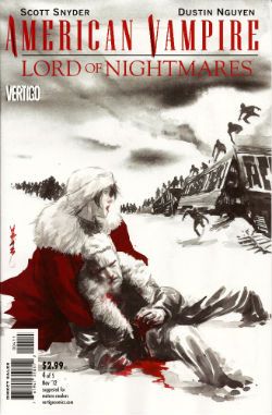
AMERICAN VAMPIRE: LORD OF NIGHTMARES #4 of 5 Drawn by Dustin Nguyen Written by Scott Snyder Colours by John Kalisz Letters by Steve Wands VERTIGO/DC Comics, $2.99 (2012) AMERICAN VAMPIRE created by Scott Snyder and Rafael Albuquerque

Photobucket

They held off quite a while didn't they? You do have to give them that, but in the end all Vampire roads lead to Vlad. Here they've plumped for the spooky baldy Murnau version; respectful but a mistake I feel. This comic could really have done with Gary Oldman’s Jack-cool-AH! livening up its sadly lifeless pages. Sometimes this thing just makes less sense than an extraordinarily senseless thing, like a clam in a coma. After doing a load of hair pulling and garment rending about how super awful a threat Dracula is the strip then seems to suggest a train crash would finish off Dracula like he was some luckless commuter on a particularly ill-fated 6.45 to Basingstoke. It also thinks having our cast trapped on a plane bickering is of interest, yet since much of the cast is made up of spooky humanoids this just ends up being like reading about the argumentative occupants of a flying supernatural pet shop.

Photobucket

What happened to Dustin Nguyen? Has he had an accident? His art is usually lovely but here it looks like he did it during a bumpy bus ride and the bus was one of those with crates of livestock on it, some of which kept getting loose and flapped right up in his face while he was engaged in his act of creation. Look, this is a series in which the Big Threat is revealed to be a chair, so yeah, it was EH!

FATALE #7 Drawn by Sean Phillips Written by Ed Brubaker Colours by Dave Stewart IMAGE, $3.50 (2012) FATALE created by Ed Brubaker and Sean Phillips

Photobucket

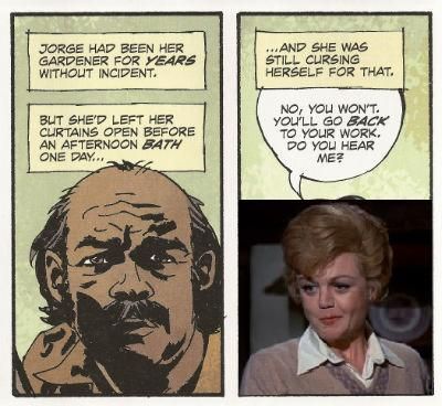
I know they don’t need any encouragement here but this would make a great TV series. Every week a special guest star could stumble over Josephine’s wall with an item of wider relevance to whichever decade the series was currently set in. So you could have Jim Belushi as Richard Nixon fall into Josephine’s bougainvilleas sweatily clutching a Watergate tape to his chest. He would find her attractive. She would wonder why she, an attractive woman, had such power over him, a clearly foolish man. It would be a real mystery. Only a supernatural solution would suffice. The gardener would get all shirty. She would help him out and find another clue to the central mystery of the story which is so ill defined I can’t even remember what it is. Richard Nixon would die and be sad. Josephine would be sad he had died. Then she would look out of her window to find Charlie Sheen as Elvis falling into her poison Ivy clutching the proof that Colonel Tom Parker was an illegal immigrant. And on and on and on. Robert DeNiro in Angel Heart has already shown up, although he’s now wearing those eggs he kept peeling as eyes.

Photobucket

As far as horror goes the most horrific thing about the book is when Sean Phillips draws people in the middle distance. They start to bloat and their proportions subtly shift from those of a human to something more akin to a Robert Aickman phantasm. Unfortunately he’s just drawing normal people but his skill with scenery and faces ensure the art is still the second best thing here. Dave Stewart’s colours being the first, check out the lovely felt-tippy green on that Green Door, Shakin' Stevens! I have no idea why the critical reception of this book is so orgasmic but then I didn't think CRIMINAL having flashbacks drawn like ARCHIE comics was exactly warming my face with the Promethean fire. I’m probably just a demanding prick so take my verdict of EH! With a pinch of salt.

Show me I'm just a big old partypooper by buying FATALE #7 from HERE. Remember - the more copies you buy the more you'll be showing me how wrong I am! Knock yourself out!

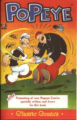
POPEYE CLASSIC COMICS #2 By Bud Sagendorf YOE Comics/IDW $3.99 (2012) POPEYE created by E.C. Segar

Photobucket

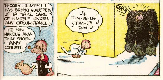
These are POPEYE comics from the ‘50s by Bud Sagendorf and if you have been paying attention to me then you know how I feel about that! If you have not been paying attention to me, why NOT? Jesus Christ, you know I only do this for the attention! Yes, only for the heat of your Love I feel through the screen do I do this thing! And the money. Anyway, these comics are mental and there are about twice as many pages as in a normal comic so that offsets the fact you’re paying 3.99, I feel. In case that was a concern. I really like the way they retain the original colouring because there’s something to be said for those halcyon days when upon reaching the age of 60 every citizen was forcibly taken to a warehouse where they were chained by the ankle to an enormous table and here, amongst ranks of equally liver spotted and doddering companions, they threw carcinogenic inks in the rough direction of where their cataract occluded eyes guessed the pictures were.

Photobucket

Nowadays it’s all done by computers and I think we've lost something there, something real, something human, something magical. As great as the contents are (and, yes, they are great) the cover is awesome as, if we take the Freudian view of firearms, it portrays Popeye punching a man so hard in the cock he ends up wearing his foreskin like a sleeve. Fuck you, Johnny Ryan, Bud Sagendorf rocks! It’s POPEYE by Bud Sagendorf and is, clearly, VERY GOOD!

POPEYE CLASSIC COMICS can be bought from HERE!. It's just like buying it from Bouncy Brian Hibbs! Except you don't get to go to San Francisco ("The World's Favourite City!"). But you do get a good comic instantly in your PC! Swings and roundabouts, people!

I hope you had a good weekend, y'all! I also hope you enjoyed some COMICS!!!
Wait, What? Ep. 93: Thrill Power Overboard

PhotobucketAbove: The Chocolate Waffle, which is a liege waffle covered in dark chocolate, from The Waffle Window, Portland, OR

Yup, Episode 93.  I would say more but I'm slightly overwhelmed with the amount of shite multitasking I'm currently doing (kinda dashing back and forth between two computers at opposite ends of the room at the moment, which neither makes me feel like a mad scientist or a keyboardist in Journey but just someone who is old, Internet, so terribly old).

On the other hand (and behind the jump):  show notes!

0:00-7:51: Greetings; getting schooled by Graeme on Tharg and the mascots of 2000AD and other British comics, with a half-hearted attempt by Jeff to pitch Mascot Wars [working title] 7:51-11:37:  By contrast, Jeff guiltily admits he's been reading the first volume of the Vampirella Archives 11:37-13:37:  Somehow this leads to a discussion of the fascinating copyright information found in Dynamite Books 13:37-15:51: Bless him, Jeff is not giving up so easily on his Mascot Wars idea 15:51-18:55: Jeff gripes about getting back into the routine after his Portland trip, Graeme gripes a bit about getting back into his routine after the 4th of July holiday 18:55-20:52:And so, finally, we start talking comic news--the announcement of Marvel NOW! and the launch of Monkeybrain comics. 20:52-24:35:  Graeme has a thing about the Uncanny Avengers cover and I really cannot blame him; 24:35-25:57: And since we are on the subject, Graeme has a few things to say about that Marvel NOW! image by Joe Quesada, too. 25:57-38:25: And so we talk about Monkeybrain instead, including Amelia Cole by friend of the podcast Adam Knave, Bandette by Colleen Coover and Paul Tobin, the other launch titles, and what we would like to see from the line in the future; 38:25-41:54:  Speaking of fantastic digital comics, the second issue of Double Barrel is out!  And neither of us have read it. But it is out!  And you should consider getting it.  Because it is also Top Shelf and also coming out in digital, we talk James Kochalka's American Elf. 41:54-49:57: Jeff talks about League of Extraordinary Gentlemen: Century: 2009. Here there be spoilers! 49:57-1:06:42:Graeme's interesting rebuttal concerns whether bad art can be forgiven if it is suitably ambitious. We have a tussle of sorts and then move on to discuss when does the creator develop that "not so fresh" feeling.  (Bonus: Graeme does a pretty great job of justifying our existence, pretty much). 1:06:42-1:15:37: Incentivizing the singles? Does it work?  Brian Wood's The Massive, Ed Brubaker's Fatale, and more discussion of the Monkeybrain publishing plan and a discussion of what works in the direct market. 1:15:37-1:29:48:  Who is stronger, Watchmen or Walking Dead?  Fight! 1:29:48-1:38:32:The possible Thief of Thieves TV show and the need to keep creating new IP for Hollywood; and when or if the Big Two will come around on that. 1:38:32-1:42:37: Uncanny Avengers.  We are a little fixated. Also, Graeme sings the ballad of Cafe Gratitude (except he doesn't sing and it's not a ballad).  And then some clever Brass Eye jokes that Graeme has to explain to Jeff.  Again. 1:42:37-1:47:36: On the other hand, Jeff did get to the comic store that week so he has that going on for him.  His quickie reviews while Graeme listens on helplessly:  Batman, Inc. #2, Fatale #6, The New Deadwardians #3 and 4; Mind MGMT #2; Prophet #26; Popeye #3 (which is awesome and must-have-ish); Tom Neely's Doppelganger; Flash #10; and Action Comics #11. 1:47:36-2:04:08: San Diego Comic Con! Graeme has two questions about it.  Crazy predictions are made and anxiety dream stories are exchanged. [brrt! brrt! David Brothers alert! brrt! brrt!]  Also, Jeff once again tries to coin the term "Nerd Vietnam" to describe SDCC. 2:04:082:09:20-: Closing comments, and a few reviews of waffles from the Waffle Window.  And then....sign off!

If you are of an iTunesian inclination, you may have already chanced upon us.  But if not, we offer you the chance to give a listen right here and now:

Wait, What?, Episode 93: Thrill Power Overboard

And as always, we hope you enjoy--and thanks for listening!

Ten Things: FATALE Issues #1 to 5

Hello.  So, I started really reading comics again, new ones.  Except for that Joost Swarte book (which is really terrific, by the way), I feel like I'd mostly focused on old ones for a sizable chunk of this year, revisiting books that made me happy.  That seemed like the healthiest way of dealing with the Comics News this year.  I was in a "none of those people get my money; my precious, precious money; me gold, give me back me gold" mood.  I call my new fashionz the Executive Leprechaun.

Anyways, that mood passed, so I've been looking for stuff to read-- wound up buying a lot of the new Image books that have been coming out, for good or for ill.  I still don't have enough time or thoughts or interest enough for the kind of writing I like to do, for my Super Deep Thoughts (TM).  But  I noticed lately when I've been talking about movies, when I have a lot I want to get out about a movie, that I've had a good time just rattling off ten things that I think, and then just getting on with my life (which is just too spectacular).

So I thought I could try to do that with some of these Image books...?  Maybe it'll work; maybe it won't; this one turned out pretty boring, but.  And maybe this'll be the only one I do-- maybe I get hit by a meteor tomorrow. So.... So, yeah.  (Sorry I haven't done this in a while-- how do you start one of these again???).  So... so...

FATALE, issue #1 to issue #5, created by Ed Brubaker, Sean Phillips and Dave Stewart, published by Image Comics, copyright the Basement Gang, Inc.
1.  The "high concept" of FATALE is taking the "doomed woman that men are helpless to resist and are ultimately destroyed by" figure from noir, and placing that character into a monster-comic where her effect on men can be made explicitly supernatural, and her doomed quality is as a result of being chased by demonic men with octopus heads.  Five issues have been published so far, comprising the first storyline entitled "Death Chases Me."   Except for framing sequences set in what I'm guessing is the modern day (?), the storyline for "Death Chases Me"  mostly takes place in late-1950's San Francisco.  But it's fuzzy what (if any) connections the comic is trying to draw between any of its themes and its choice of place or period.  After WWII, a lot of veterans stayed in San Francisco, I suppose; sure enough, the comic has suggested the titular femme fatale has some connection with that war-- some fuzzy dimestore "the Nazis liked the occult" plot lurking in the background, the kind it's hard not to feel that Mignola and his BPRD crew owns.  Fuzzy this; fuzzy that.  It's a fuzzy comic:  strong on mood but all of the details so far seem just off-panel.  Characters are referred to as "corrupt cops" but we don't see much (if anything) by way of specific corrupt behavior.  The stakes are fuzzy-- the engine for the first plotline is varous characters are hunting for ... something that presumably means ... something, possibly for reasons.  The main character met the femme fatale... sometime, in connection with his investigation of ... some such.  Can anyone explain the plotline involving the mobster?  Who the hell was "Leroy Kessler"??  What did I have for lunch yesterday?  Where are my keys?  Not knowing where my keys are is what makes me not being able to find my keys a horror story.

2.  For moods, for textures, the comic succeeds-- if how a story is told is as important as what it's about for you, there may be pleasure here in FATALE's suffocating panel grids, shadow-drenched faces, red hooded cultists lurking through rain soaked San Francisco.  The "corrupt cop" narrating that the Octopus Monster's suicide-squad henchmen wouldn't start shit in Chinatown may not make a lick of  fucking sense upon close examination, the fuck is he talking about, but if the end result is sunglass-wearing henchmen of an Octopus Man squaring off against a guy in a trenchcoat in a Chinatown opium den, then I'm not killjoy enough to complain.  The next storyline supposedly takes place in 70's Los Angeles, apparently intent on replacing the book's post-war disillusionment with post-Manson post-hippie (maybe post-Watergate depending where we are in the 70's) disillusionment; hearing about that sold me on the comic more than anything else had-- wanting to spend time in that world, that particular Los Angeles.  As a consumer of popular entertainment, I'm very much an involuntary sucker for certain images:  if a story has a con man in it, or mismatched cops teaming up, or Amy Adams trying to bake a souffle, I'm ten times more likely to enjoy it.  For my list of images, FATALE ticks enough of those boxes where I come out favorably towards it, and I have to admit I'm perpetually that simple-minded, that shallow.  So, did I enjoy FATALE?  Sure; more horror in the horror parts would be nice-- the British wave of writers would've had some more grotesque shit happen by issue 5 than gentle, classy hints that a woman died badly (which is as dark as the "horror" parts of this comic ever gets); but overall, sure.  Could I explain to you what happened?  Oh heavens, no-- heavens to murgatroyd, no, not at all.  But did I enjoy it?  Enjoyed it enough, spending time in that word; no regrets.

3.  Femme fatales, huh?  Figure those as, what, fear of sex; alienation from women; fear of a man's loss of sexual control made flesh. So, question... are those themes well served by a man being helpless to a sexually dominant woman due to supernatural reasons rather than lust, obsession, emptiness, need, desparation?   On the one hand, presenting the femme fatale as a supernatural figure seems historically to be a common enough trope in your world literature.  There's the succubus.  Sirens, who'd lead men to their doom. Angelina Jolie circa her marriage with Billy Bob Thornton when she used to carry a vial of his blood around in a necklace-- that probably counts; that was pretty goth.  Uhh, and I guess I overheard that there's a Cinemax show on right now called FEMME FATALES which is sort of about a supernatural femme fatale, and also tits, girl-tits; Highest Possible Recommendation (uh, from the person I overheard).  On the other hand.... while FATALE nods to human weakness certainly, in page after page of narration ("The way he felt about Josephine... It was out of balance with the world"), if the male characters's agency is being controlled by magical forces rather than human weakness... isn't human weakness let off the hook?  And isn't the audience thus let off the hook?  How long can a noir story or a horror story sustain itself if it lets human weakness off the hook?

4.  One thing that I don't have the math figured on with FATALE in my head: the main character of the framing sequences (set long after the action of the San Francisco storyline has gone down) has a white streak going through his hair, such that he very much resembles the character Jason Blood from Jack Kirby's THE DEMON.  (Granted-- finding ways of making boring old Normal People look comic-book interesting is a tough business; I could compare whatshisname to Rogue of the X-Men comics but all I really remember about her is that she said "sugah" a lot and I was disappointed she didn't have sexy time with Magneto in that Jim Lee Savage Land run; see also, how many people with eye patches do you meet on a day to day level?).  Still.  The rest of the comic, it's not hard to read as a duck press of EC comics:  dead women, weird cults, mobsters, monsters; that three-tier grid-- is that a thing you link in your head with EC?  So, if we hold it up and look at FATALE as a EC comic with Jason Blood in the framing sequences instead of the Crypt Keeper or whoever, that means...?  Maybe for some part of the audience, having a Kirby character learn his blood-soaked past has some frission to it.  But if FATALE is a story about comics as much as it's a story about anything (and it's still too early and all too fuzzy to say whether that's so), I don't think that's how I prefer to interface with it because... Because I know my nature, and I'm inclined to be less generous reading it that way (e.g., on account of thinking that comic creators have taken way more than their fare share from Kirby already, maybe Brubaker and/or the people he typically works for specifically).  (But I had a hard time with that Action Comics Obama issue that people got all hepped up about, too-- I'm just becoming worse at reading that kind of thing anymore; I'm a cranky guy).

5.  Apparently, the book is a great big hit though, a blockbuster hit comic, or at least the copy of the first issue I wound up with is marked "Fifth Printing."  I figure you don't get to five printings without printings One through Cuatro being received well, though no one really ever says what the numbers involved are-- it seems like there's a part of the game especially with "independent comics" where the big-wigs like the hanky-panky with how many copies get printed so they can announce "sell-outs" and what have you, for that dim part of the audience that openly conflates sales success with creative success, the Jay Leno fans (I'm not sure what I'll call them after Jay inevitably rides on the Most Classic Car There Is, but I'm open to suggestions). That third printing could have been 5 copies that were dumped into a tub of nuclear waste and will spend the rest of the eternity somewhere underneath an elementary school playground in New Mexico.  Eric Stephenson could be standing at a train station, whittling a piece of straw in his mouth, saying "We gots you, boy-- by the time you know better, we'll be in Tuscaloosa.  Hee-haw!"  100% of that could have happened-- Eric Stephenson could be a Secret Carney.  We don't know, nobody knows-- it's none of our business.  But figure it as a success, so: anything interesting about that?  Any great lessons there?  I don't see that a story about 1950's era femme fatales is especially Right Now, so I don't know that I'd chalk this one up to the good ol' zeitgeist.  So...?  It'd be nice if it meant there was a segment of the comics audience still standing that yearns for something that appears novelistic-- that those people hadn't been driven away completely like some have speculated, that the desire for comics that seem to have some scope hasn't been quashed completely.  That'd be a nice thing.  It'd be interesting if it meant that people who've heard good things about CRIMINAL over the years, when presented with a jumping-on point of a new series, perceived FATALE as a jumping-on point in a way that they didn't see the fourth or fifth CRIMINAL miniseries, regardless of how independent those are of each other, combined with some novelty that they didn't perceive in the superheroics of INCOGNITO.  That'd be interesting.  Maybe people are just really, really psyched by WINTER SOLDIER and wanted more from the guy who makes WINTER SOLDIER, though.  That'd be fine.  You kinda see the femme fatale's shadow-boobs in the first and second issues.  Maybe the shadow-boob fetishists found out about FATALE and it's the toast of Shadow-Boob forums.  That... well, that wouldn't be my #1 preference, but a sale's a sale.  (You don't see her nipples incidentally-- as crime-horror comics go, it's PG-13 conservative, but... I can't say I have a strong opinion on whether that's classy big-tent good times or sad self-censor-y oh-well-there-are-people-who-live-near-Bibles sad-y sad.  It's noticeable, but I don't care, especially).

6.  Highpoint of the series so far?  I'd say it's Stephen Blackmoore's essay on Raymond Chandler and Clifton's Cafeteria in the back matter of issue #4-- I really dig Chandler, and LA crime, so that all sent me. Of the comic itself?  I'd say again, issue #4, the two-page stretch where the "corrupt cop" talks about his life-long awareness of the supernatural horror pervading his world, and how "it wore him down, knowing how small he was... how insignificant he was to the things in the shadows..."  That seemd to me the point where the books' attempts to intersect horror and crime most succeeded-- the character of the detective who stared into the abyss too long, only transformed not by the emptiness of the abyss but by things in the abyss looking back at him.  If I had to pick a point where I felt like the book most succeeded at what it seemed like it had set out to do, that one.  Issue #4 was a good one overall-- though "Death Chases Me" suffers from maybe that same deficency as that very first CRIMINAL arc, where it seems to promise more in the penultimate issue, such that the conclusion in issue #5, the action movie of shoot-outs and octopus men and redemptive violence, disappoints.

7.  Lowpoint?  I didn't really dig on that stretch in issue #3 where the femme fatale character insists that the main character join her on an excursion to avenge her abusive past-- in this case, tawdry hints-at-rape imagery being conflated with a "cult ritual."  Rape vengeance just isn't my bag, to begin with, as exploitation fare goes-- oh, I liked REVENGE OF THE CHEERLEADERS, but from what I remember, the cheerleaders weren't avenging rape in that movie, so much as an attempted coup-de-cheerleader from a sex-hating cabal comprised of, inter alia, an evil principal, a sinister nurse and local industrialists, which isn't really the same thing.  "The femme fatale who knows the dark side of sex because she's been made separate from the rest of society by her victimization"-- there's something gross about that idea that ... that I get the math on but that I can't shake a queasiness towards.  I don't know that it'd be a tune I'd want to hear if I were a victim of anything too nasty, myself, you know?  Plus, I couldn't make heads or tails out of what motivated that sequence.  What was the femme fatale after?  Why had she waited that long to abuse her past?  Why had she insisted on bringing the main character with her?  Can you show a main character shrugging that sequence off without the audience holding his stupidity in contempt thereafter, regardless of supernatural explanations for his stupidity?  How did that... why did that...

8.  The first issue had a splash page.  FATALE for the most part clings to a rigid three-tier grid, somewhere between five to nine panels per page.  Mostly seven panels-- on a three tier grid, seven sure seems to come up a lot, maybe just by the math of it, all the different ways to add to seven (3*2*2, 3-3-1, 4-2-1, 5-1-1, and all the permutations thereof).  But the first issue has a flashback sequence (for the above-referenced dime-store Nazi plot) that it drops a splash page.  I only have a couple issues of LAST OF THE INNOCENT in arm's reach, and couldn't find a splash in either of those.  SLEEPER I remember having a very particular page layout scheme.  Did they splash a lot in CRIMINAL before?  Did they splash a lot in INCOGNITO?  I don't remember; the INCOGNITO pages online that come up on a google image search suggest they played faster, looser with the grid, as you might expect, but I don't have a photographic memory for splashes, alas.  Doesn't seem too common from them-- but is that what you want from that team?  Visual bombast...?  I guess I don't think of Brubaker or Phillips as excitement guys-- with Brubaker, what I find interesting is his career-long fascination with regret, how often he returns to that as a theme; the times he's written action spectacles have never really involved me very much. Phillips, I like for mood, more more than explosions-- he's more Toth, than Steranko. FATALE's not really an exciting comic to me-- but that's what I like about it, and when it tries to become "exciting" in the fifth issue, that's where I checked out.

9.  Colors from Dave Stewart, replacing Val Staples.  Stewart goes heavy on the purple.  I haven't spent enough time in San Francisco to say-- lot of purple going on in that city come nighttime?  I was too distracted by your beautiful city's copious drug addicts, San Francisco, to note the color palettes on display.  (Purple's historically been the color of evil in comics; so, there's that.) Compared to the Staples-era, the colors are less saturated, way cooler in temperature, less interested in making the reader overly aware of the pecularitiy of lighting.  What's interesting is how Phillips's art seems different from the LAST OF THE INNOCENT issues I have in arm's reach; a side-by-side comparison of the two comics is striking-- I suggest it if you have the issues handy, to see the difference colorists can make to the same artist.

10.  It'd be nice to be knowledgeable enough to say whether FATALE represents a culmination of any kind of techniques or thematic considerations that have been building from the first CRIMINAL or SLEEPER before it, but I don't think that I'm clever like that.  I read the CRIMINAL(s); read SLEEPER though didn't really care for it the way the entire rest of the internet seemed to; seen my share of Brubaker and/or Phillips in other contexts.  FATALE feels more ambitious, in stretching out its story over multiple decades; but what's new about it for them besides that, I couldn't answer.  But that's no small appeal-- that was the draw for me, more than the genre mish-mashing, just badly wanting a comic that reached for a bigger canvas rather just settle for immediate pulp pleasures.  I don't yet know if that's what I've got-- what we'll have if mysteries are revealed, solutions are given; whether there'll be anything left of interest if what's been left fuzzy is eventually brought into focus.


(You can find Fatale on our digital store here)

"It Is Not The FIRST TIME This Has Happened." COMICS! Sometimes They Are Hot Off The Griddle!

Hey old people, remember Sunday evening when you were a kid?: Photobucket

Urrrrrhhhh! Let's take the Sunday Blues away with some piffle about our four colour floppy friends! COMICS!!!
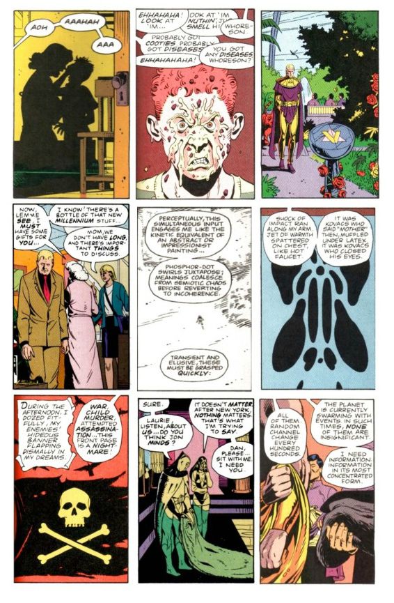
SUPREME #64 Art by Erik Larsen & Cory Hamscher Written by Erik Larsen Coloured by Steve Oliff Lettered by Chris Eliopoulos Image Comics, $2.99 (2012) Supreme created by Rob Liefeld

Photobucket

Hu-ooFF! Well, that was horrible. As a comic, I mean. Look, I don't have a problem with a change in direction and it's a little soon to tell if I have a problem with this particular change in direction, but I have a problem with a bad comic which this was. Just page after page of people dying, things falling over, plenty of, as my son would say, "'splodin'!!!". I hate to break thi sto everyone but that's not actually a story as such. Sigh. I don't have much familiarity with Erik Larsen's work (the '90s? Not really my best time for comics)  so I'm not counting him out yet. Yeah, maybe Erik Larsen can swing this one around. I'll give him a couple more issues to do so. Turns out I'm that close to generous but this issue was pretty EH!

Photobucket

Reckon them's fightin' words and wanna show me just how wrong I am? Well, you can buy this exact comic from  HERE!

FURY MAX #1 Art by Goran Parlov Written by Garth Ennis Coloured by Lee Loughridge Lettering by Rob Steen Marvel,$3.99 (2012) Nick Fury created by Jack Kirby with Stan Lee

Photobucket

I don't know what they are feeding Garth Ennis on these days but the comics he's producing would be Type 3 or 4 on The Bristol Stool Scale; this being as we all know optimal. In a worrying state of affairs Ennis has now produced two comics (see last week's THE SHADOW) which are set in  convincing historical settings, peopled by satisfyingly sketched characters and which succeed in being both informative and entertaining. Which is why I had to bring my own shit joke to the party lest his regular, heh, audience feel at at a loss. Taking the first chapter's title from TheThe softened my hardened heart but going on to deliver an intelligent, amusing and diverting comic  is what really sealed the deal here.

Photobucket

Ennis is helped no end by the astonishing art of Goran Parlov. Goran Parlov is the kind of artistic wonder who can limit himself, largely, to the most banal of page layouts without inspiring new lows of tedium in my mind. He can do this because everything he puts in those panels is just right. It doesn't hurt that his present day Fury looks  so gnarled and battered he resembles 19th Century armoire smoking a cigar while clad in plaid slippers and a fluffy robe. Yeah, this was VERY GOOD!

(Yes, I am aware Nick Fury was created by Jack Kirby with Stan Lee and that I said I wasn't going to purchase any more Marvel products which failed to acknowledge the contributions of The King.  Either my LCS forgot or decided that my professed liking for Garth Ennis' non puerile work and Goran Parlov's anything superceded this. Okay? Either way I got a good comic and I still think it could have had the words "created by Jack Kirby and Stan Lee" on it without upsetting the balance of Life itself.)

TRIO#1 Written and Drawn by John Byrne Coloured by Ronda Pattison Lettered by Robbie Robbins IDW, $3.99 (2012) Trio created by John Byrne

Photobucket

Mark the time. The super-hero funnybook is dead. I'm surprised to find John Byrne's DNA on the corpse but then it's always the ones that love hardest that end up hating enough to kill. I'm a bit sore because I lost my shirt on this one; my money was on one of the TV Breed. One of those guys who just keep parping it out until the comics cognoscenti just give in and allow quantity to supercede quality. Yeah, I figured the smoking gun would be in the clammy hands of  one of those guys with all the imagination of an empty cardboard box, one of the dialogue guys, one of the post-it notes and flow-chart guys, y'know, the sophisticated guys. But like the most surprising game of Comics Cluedo ever, in the end it was John Byrne in the LCS with The Fantastic Faux. A super team of characters called "One", "Two" and "Three" could only mean one thing; the death of imagination.

Photobucket

But look, in his defence, no one loved the super-hero funny book as much as John Byrne. He loved it so much he hid it away and protected it from reality. Up there in the big house with the pool. Pretending nothing had changed and if it had, well, it wouldn't last. See, John Byrne knows super hero comics are still big it's just the audience that got small. You just have to give 'em comics like back when they loved them. Back in the '80s. The magical hey-day of ALPHA FLIGHT! This isn't a comeback it's a return, it's the return of cape comics, the return of the way they should be done, the return of the way they were done when they were done rightIt's the return of an '80s issue of ALPHA FLIGHT. Sure, it's the best issue of '80s ALPHA FLIGHT ever published but it's still just an '80s issue of ALPHA FLIGHT. It's now 2012. Here's the corpse of super-hero comics now, caked in make-up, going on eighty trying to pass for eighteen. Nothing sadder. Sure, it may be EH! but they'll love it in Pomona.

You can prove the audience for this comic didn't leave twenty years ago by buying it from HERE!!!

FATALE #5 Art by Sean Phillips Written by Ed Brubaker Coloured by Dave Stewart Image Comics, $3.50 (2012) Fatale created by Ed Brubaker and Sean Phillips

Photobucket

Well, I gave it 5 issues and I was hoping this one would turn it around. It didn't. A spooky rinser, people in hats swearing and a demon who can come back from the dead but can't bring back his eyes. I guess you could say it was a bit like James Ellroy meets H.P. Lovecraft, y'know, if they'd both had flu at the time, or you'd only seen the covers of their books, or you had in fact never actually read them just read about them. In the end FATALE pretty much ended up being the John Byrne's TRIO of independent creator-owned comics. Familiar stuff delivered familiarly; that's not going to make me run about like my underpants are on fire no matter who is involved. Sure, I'm all for Team Independent but not if they are as bland as the alternative. Being creator owned is a magical thing but for a reader comics still have to be better than EH!

Photobucket

Possibly not the most popular opinion regarding this comic book! Why not make up your own mind by purchasing if from HERE!

MUDMAN #3 Written and Drawn by Paul Grist Coloured by Bill Crabtree Image Comics, $3.50 (2012) Mudman created by Paul Grist

Photobucket

Wait! I'm getting a pulse! turns out the cape comic isn't dead after all, it just has to keep up with the times is all. This one's about a normal kid in a timelessly sleepy English seaside town who is, through events and stuff ,suddenly not normal in a way that involves mud and being a man made thereof. It's got a breezy lightness of tone that might work against it; sometimes it seems not a lot has happened but really quite a lot has. As Owen Craig (Mud Man when he's not Mud Man) finds his powers have opened up new possibilities for him physically the environment around him seems to change in concert. Using the fixed point of Owen's discoveries as the present Grist fills in the Past and hints at the Future while parts of each encroach on Owen's life and, as is generally the way of things, threaten it.

Photobucket

Grist is really good at keeping the tone light while at the same time giving the threats real weight.  He also excels at teasing about future developments; so much so that the next issue just can't get here quick enough. But what Grist is best at is storytelling; in the words and pictures sense, natch, this being a comical periodical and all. He may be a bit too good at it because reading the comic is so effortless, practically intuitive, that it's quite likely the reader might forget to credit the incredible talents and the deft wielding of same that made it so. From soup to nuts, from top to tail, from mud to man MUD MAN is VERY GOOD!

Or is it? Find out by buying it from HERE!!!


And we're done. If you're going to hang about don't forget to lock up and put the key back through the letterbox.

Have a good weekend and always remember COMICS!!!
"Let Him Be A Child A Little Longer." COMICS! Sometimes They Are Diverse!

Hey, the postman finally turned up. Photobucket

I guess the hostiles must have been restless out there in the Badlands or something. Anyway, he may not have rung twice but he did drop off a box of comics. Here's me going on about some of them after the break: A NOTE FOR OUR AUDIENCE: According to Brian "Link-Hider General" Hibbs you can now purchase some of these comics direct from The Savage Critics!

There is a link under both Comix Experience Links and Industry Links which says "Digital Comics From The SavCrit Store!". It's that one.

I have of course followed the rigorous journalistic code of the 21st Century and given all the comics available from that link a rating of EXCELLENT! No, not really, because as a salesman I am a bit lacking.

As ever, here's some comics and what I thought! Buy 'em! Don't buy 'em! Leave them at the scenes of violent crimes to throw off the Feds! I don't know, don't look at me for help. Because I'll just look down and whisper "No."

And Now Our Feature Presentation- SOME COMICS WHAT I DID READ:

ANIMAL MAN #8 Art by Steve Pugh, Travel Foreman & Jeff Huet Written by Jeff Lemire Coloured by Lovern Kindzierski Lettered by Jared K. Fletcher DC Comics, $2.99 (2012) Animal Man created by Dave Wood and Carmine Infantino

Photobucket

Since he literally throws his daughter to the wolves I’m afraid I have to say Buddy Baker is the worst father in the DCU and he’s a pretty craptastic superhero to boot. You’re going to have to think of something better than beating an army of undead animals to death one by one, Buddy Baker! This guy is such a dumbnuts I’m getting tired of reading about him. The best thing about ANIMAL MAN is that it reminds me how wonderful Steve Pugh’s art is.

Photobucket

I love the solidity he gives everything and the way his art allows the realistic and the insane to exist frictionlessly together. If he’s too radical for the DC masses, and it doesn't take much to be that, maybe Dynamite could get him on some books? Oh, I’m getting ahead of myself; I haven’t got to THE SHADOW yet. Anyway, ANIMAL MAN was OKAY! But really his wife would have left him about 6 issues ago and in about 3 issues I expect Social Services to be having a firm word in his shell-like. Buddy Baker is a danger to himself and everyone around him, and not in a good way.

FATALE #4 Art by Sean Phillips Written by Ed Brubaker Coloured by Dave Stewart Image Comics, $3.50 (2012) Fatale created by Ed Brubaker and Sean Phillips

Photobucket

Um, I don’t want to be the party pooper but I’m not really feeling this one. Where others would see complexity I see only confusion and the horror and crime aspects don’t mix well at all; blanding each other out if anything. I’m not convinced at all that Brubaker & Phillips are as deft with horror as they are with crime. There’s one sequence in particular which is meant to suggest the soiled undersheet of reality flickering on the edges of the protagonist’s vision, but it takes up a whole page. Which is a bit like the secret supernatural underpinnings of the world putting on a straw boater and doing back flips in front of you while belting out showtunes. Subtly unsettling it’s not. Mind you this series seems to not be a lot of things. Coherent and inventive being amongst the things it isn't. So far the whole thing seems a stolid muddle which barely fends off the blunt teeth of cliché. The police scenes are about the width of a gnat’s dick from busting out the old “This is straight from The Fifth Floor, you've got 24 hours to clear this case or you’re back handing out parking tickets! Capiche, you maverick bastard!”  And then there are the narrative captions and, boy howdy, are they bad. But then I think there’s a difference between understated and lifeless. These things are like “I saw a cat. It was big.” bad. It’s like Dan Brown bad. But then Dan Brown’s very successful isn't he?

Photobucket

After all, in a shocking real-life terror twist, it turns out that FATALE is the most successful thing Brubaker & Phillips have produced. Previously this was true of INCOGNITO which I thought was pretty bad. So, it looks like success beckons the Brubaker & Phillips team, but what appears to bring them success isn't what brings me reading pleasure. Mind you, they are professional enough to produce a comic that despite my tinny whinging still comes off as OKAY! While I found the front matter lacking, Stephen Blackmoore provides a compelling backmatter piece concerning a real life gumshoe called Harry Raymond. That bit was VERY GOOD!

You can buy FATALE from HERE.

RAGEMOOR #2 Art by Richard Corben Written by Jan Strnad Lettered by Nate Piekos of Blambot® Dark Horse Comics, $3.50 (2012) Ragemoor created by Richard Corben and Jan Strnad

Photobucket

Corben’s art looks a bit odd in this issue, as though he’s got some settings wrong on his software or something. It looks a lot less crisp than last issue. It’s still great because it’s still Richard Corben but…still. Fortunately Strnad’s scripting is really strong so that helps soothe any misgivings. I didn't really know where the series could go after the first issue’s seemingly complete unto itself set-up.

Photobucket

I certainly didn't expect it to make the previously understated humour blossom so broadly; so broadly that at times it verges on farce. I certainly wouldn't have expected it to work so well either. There’s horror here but humour too and in an impressive feat of facility each complements the other leading to a comic that is a really satisfying read indeed. I don’t want to give too much away but hopefully the fact I thought it was VERY GOOD! will be enough to tempt the unwary!

THE SHADOW #1 Art by Aaron Campbell Written by Garth Ennis Coloured by Carlos Lopez Lettered by Rob Steen Dynamite, $3.99 (2012) The Shadow created by Walter B. Gibson

Photobucket

I know you've all been on tenterhooks so let me assure you that I did indeed receive a copy of this comic with the Howard Victor Chaykin cover. I thank you all for thinking of me during this period of uncertainty. It was always a bit of a gamble though wasn't it? What with Dynamite’s penchant for plural covers. Mostly they get some decent names doing some good stuff. Howard Victor Chaykin, for instance, obviously did this one well before it struck Gin O’Clock at Chaykin Towers. He’s even used a different face shape; nice job Howard Victor Chaykin!  The art on the inside of Dynamite’s books tends to be a bit more problematic. Problematic in the Early Anglo Saxon sense of “bloody awful”. Aaron Campbell manages to buck this trend by being decent for most of the book, except when The Shadow erupts into murderous action at which point Aaron Campbell impresses the Heck out of me. Really, jolly good work on those parts! I’m still not a massive fan of the old drawing over the top of photographs business so the rest of the book was just okay art wise.

Photobucket

Ennis is behaving himself too, there's none of that aggressively puerile "funny" stuff or lashing out at easy targets with a nuclear bomb strapped to a machete. He seems to actually be having a good time too. He certainly gives The Shadow a clear personality, one that's all the more entertaining for being composed primarily of arrogant bastardry. But he's not without empathy either, which is a nice trick to pull off. The whole shebang is set in one of Ennis' well researched eras of upheaval, or at least imminent upheaval. Because, and it's to his credit this, Garth Ennis is one of the few writers in comics who shows evidence of reading books other than How To Bland Out And Find Big Bucks In TV And Movies. Books that demonstrate an interest on his part in the world around him rather than a monomaniacal need to write THE MENTALIST.  If you like Ennis' war books you'll like this. If you like The Shadow you'll like this. Blimey, if you just like decent comics you'll like this. Because it's actually VERY GOOD!

SUPREME #63 Art by Erik Larsen & Cory Hamscher Written by Alan Moore Coloured by Steve Oliff Lettered by Chris Eliopoulos Image Comics, $2.99 (2012) Supreme created by Rob Liefeld

Photobucket

SUPREME is an Alan Moore genre comic. I miss Alan Moore’s genre comics. Alan Moore’s genre comics were packed with invention and humour. Alan Moore’s genre comics had more ideas on the page than most of today’s self proclaimed genii have in a lifetime. Alan Moore’s genre comics played with the form in a way that was charming and cheeky. Alan Moore’s genre comics had characters with character, but their character was never static and if it changed it would do so coherently. Alan Moore’s genre comics had craft. Alan Moore’s genre comics had joy. Alan Moore’s genre comics were VERY GOOD! Yeah, genre comics are much better off without Alan Moore. Yeah, F***k you, Alan Moore! Don't let the door hit you on the way out, Alan Moore! We don't need you, Alan Moore! We never needed you! We've got AVENGERS Vs X-MEN and BEFORE WATCHMEN now!

Photobucket

Oh God, what have we done. COME BACK, ALAN MOORE!

...please...

You can buy SUPREME from HERE.

And that's your lot!  Yes, even I have other stuff to do!

Hope you had a good weekend, everyone!

Blah blah blah COMICS!!!
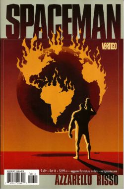
Wait, What? Ep. 82: The Problem With Problems

Photobucket Hola, chicos!
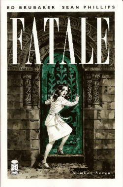
The above image is from Dave Sim's Glamourpuss #24, just one of many fine comic book hoohahs under discussion in episode 82 of the latest podcast from the brilliant (but presently ill!) Graeme McMillan and the generally slow-on-the-uptake (but mostly healthy!) yours truly.

I gotta say, we pretty much drove right in on this one, and ended up talking Action Comics #8 in the first three minutes of this two hour twenty-five minute blabapalooza, and also managed to hit topics like OMAC #8, the colorization of  Scott Pilgrim, the battles behind the TV show Community, a great blog post by Steve K. about the state of the comics Internet, Casanova #3, Supreme #20, Fatale #4, Strike Force Morituri, and that stunning issue of Glamourpuss mentioned above.

Also!  We have the first (and hopefully last) installment of Listen to Jackass, in which I respond to blog posts I haven't even read yet! It's a bit like that old Johnny Carson 'Carnac The Magnificent' sketch, except instead of cheap laughs it kinda goes more for the "feeling ashamed for Jeff and, in a way, the whole human race" kind of feeling.

iTunes?  Well, of course!  But also right here and now, ready to be cradled like a baby bird that has tumbled from its nest:

Wait, What?, Episode 82: The Problem with Problems

Oh, and I should warn you--because Graeme is feeling very under the weather, and I am feeling like I want to watch The Raid: Redemption over and over and over until they drag me kicking and screaming out of the movie theater, we won't be recording this week, so there won't be a podcast next week.  You understand, don't you?

In any event, we hope you enjoy this latest installment, and thanks for listening!

Wait, What? Ep. 78: Quotes From Pandora Three-Sixteen

Uploaded from the Photobucket iPhone App (This installment's accidental shout-out courtesy of Action Comics #7)

Normally, I try and pitch some rhetorical woo at you as a way to encourage or remind you to listen to this miniature stage play of the mind  Graeme (with his smooth, Noel Cowardesque line delivery) and I (with my stammering Method Actor incoherence) offer up each week.

However, as the soul-stealing monster known as Daylight Savings Time has arrived to demand the tribute of an hour from each of us trembling villagers, I fear I've got nothing especially fleet-footed with which to charm you, merely the verbal posturings of the maladroit and the overwrought.  The sundial? Tis broken.  The hourglass? Now hollow.

But if you wish to remember me fondly, then give Wait, What? Ep. 78 a chance:  it has Graeme and I discussing what Savage Critic rating we would give The Bible; spinoff books that can never seem to escape their progenitors; drug use and Dr. Who abuse; Action Comics, The Legion of Superheroes, Birds of Prey, and spinoff books that can never escape their progenitors; Fairest; the first issues of Saucer Country, Hell Yeah, Manhattan Projects (with spoilers for the first issue), and Superbia, Fatale #3; Fantastic Four: Season One; the amazing King City trade paperback from Brandon Graham; Detective Comics; G.I. Joe: Cobra; Wolverine #302; the DC Nation block on Cartoon Network, and much, much more.

iTunes is a wish that your heart makes (when your heart wishes for a cumbersome and inept media management program that gets totally fuxxored if you download the same update more than once, anyway) and so our latest episode should be discoverable there, but you are also invited to lasso that ethereal doggy right here, below:

Wait, What? Ep. 78.1: Quotes from Pandora Three-Sixteen

As always, we appreciate your patronage and hope you enjoy our latest offering!

"Clod. I Have WEAPONS..." Comics! Sometimes They Are Almost Fresh!

It's a post about comics! Is it early? Is it late? Time is in flux!Only if one man can face his Pull List can The Balance be restored!

One Man. One Pull List. There will be Words... (...probably the wrong ones). Photobucket

ACTION COMICS #6 “When Superman Learned To Fly” by By Andy Kubert/John Dell(a), Grant Morrison(w), Brad Anderson(c) and Patrick Brosseau(l) and “Last Day” by Chriscross(a), Sholly Fish(w), Jose Vallarubia(c) and Carlos M. Mangual(l) (DC Comics, $3.99) Superman created by Jerry Siegel and Joe Shuster.

Photobucket

 I like that stuff in my comics but I'm not unaware that in real life that kind of thinking gets you killed.

While there could be said to be many faults with the lead story in this issue such as an apparent attempt to distract from a lack of clarity (or indeed even sense) with a belligerently unslackening pace and art that once again belies Andy Kubert's alleged superstar status it remains a fact that in this story Superman's enemies conduct an auction for Kryptonite within Superman's own brain (physically, literally within Superman's own brain) and Superman uses his own Kryptonite poisoned body as a battery to save his both his own sentient ship and the day entire. Yes, Superman's enemies conduct an auction for Kryptonite within Superman's own brain (physically, literally within Superman's own brain) and Superman uses his own Kryptonite poisoned body as a battery to save his both his own sentient ship and the day entire. That's Superman comics enough for me!

The backup is the kind of sweet and tender emotional snapshot of a transitional moment in life that anyone under forty will treat as though it were sentient dog-muck hellbent on French kissing them; that's okay because I enjoyed it enough for y'all! Yup, ACTION COMICS was GOOD!

 STATUS: REMAINS ON THE LIST!


ALL-STAR WESTERN #6 “Beneath The Bat-Cave” by Moritat(a), Justin Gray & Jimmy Palmiotti(w), Gabriel Bautista(c) and Rob Leigh(l) and “The Barbary Ghost Part 3” by Phil Winslade(a), Justin Gray & Jimmy Palmiotti(w), Dominic Regan(c) and Rob Leigh(l) (DC Comics, $3.99) Jonah Hex created by John Albano and Tony Dezuniga. The Barbary Ghost created by Gray, Palmiotti and Winslade

Photobucket

Kids! How many owls can you spot!

Thank the Great Spirit! Next issue ol' bacon face is off to N'Orleans! where there will no doubt be "gumbo" galore but at least there won't be anymore shoehorning of Batman references into a book that doesn't need them. A cave beneath Wayne Manor! Filled with Bats! This cretinous continuity reached a kind of hilarious nadir with the sudden slew of references to Owls: because Batman is currently encountering stress of a strigiform stripe by all accounts in the here and now! So we get about two pages in which the characters can barely move around the mansion setting for all the owls dangling, roosting, flopping and just plain flailing around the place. It's as though Moritat has snapped and gone "You want owls? Here! Here are your owls! Got enough owls yet? I don't think so! Owls! Here! Now! In your face! All! Owls! Touch them! Touch my owls! Tell me they're pretty! Owls!" and then gone for a long lie down. Stupid owls. Anyway I'm a little bit partial to Jonah so it was still OKAY!

 STATUS: REMAINS ON THE LIST!

ANIMAL MAN #6 “Tights” by Jean Paul Leon & Travel Foreman/Jeff Huett(a), Jeff Lemire(w), Lovern Kindzierski(c) and Jared K. Fletcher(l) (DC Comics,$2.99) Animal Man created by Dave Wood and Carmine Infantino

Photobucket

Movie Cliche #23415678: Sad Dad at fridge with beer and photo of son. Collect the set!

Tricky one this. Has Jeff Lemire done a pitch-perfect satire of the vapid screenwriting cliches that have run roughshod over comics beautiful storytelling devices or does he actually believe this is a decent film script made comics? It's hard to tell isn't it. Heck, I don't know maybe you thought it was awesome? Luckily it's easy to tell that Jean Paul Leon is an awesome artist and hopefully one day he will draw comics as awesome as WINTER MEN again. This issue is a complete waste of time and is clearly a fill-in so next issue we should be back to Travel Foreman and his nightmarish body horror.

After I read the previous issue I fell into a light doze and dreamt about a man in a chair. I was holding the man in the chair via the power of some unknown threat. The man was crying and peeling his own skin off his own face with a small knife. I was then forcing him to eat it via the unspoken promise that if he did as I asked he could go free. The fact that the man was eating his own face was terrible but the worst thing was that we both knew I was lying and he wasn't leaving alive. But he had no choice but to do as I asked because that was his only hope. Yes, it's been a trying few months. They say there's nothing as boring as listening to someone else's dreams but they forgot about reading film scripts masquerading as comics which is so boring such comics are EH!

STATUS: REMAINS ON THE LIST (BUT WATCH IT)!


BATWOMAN#6 “To Drown The World - Part One” by Amy Reeder/Rob Hunter/Richard Friend(a) J.H. Williams III & W. Haden Blackman(w), Guy Major(c) and Todd Klein(l) (DC Comics,$2.99) Batwoman created by Bob Kane and Sheldon Moldoff (modern version by Greg Rucka and Alex Ross).

Photobucket

"Given the state of your medical insurance talking's about all you can afford so knock yourself out is my advice."

Wuh-hoof! That's certainly a change in artist alright. I'll stick it out for a bit because I always like people to get a fair shake of the critic stick. Initially I'm not  finding myself a fan of Reeder's thin line but I appreciate her attempts to step up her layouts. Given the writing is competent at best (actually that's a compliment in today's world o'comics) Reeder's got it all on her to raise this one up from EH!

STATUS: REMAINS ON THE LIST (FOR NOW!)

DAREDEVIL #9 By Paolo Rivera/Joe Rivera(a), Mark Waid(w), Javier Rodriguez(c) and VC’s Joe Caramagna(c) (Marvel Comics, $2.99) Daredevil created by Bill Everett and Stan Lee.

Photobucket

Storytelling in 'Not Dead' shock!

Unless Howard Victor Chaykin has been reactivated without my knowledge I guess this is the only Marvel comic I'm buying. That doesn't seem right, I'll have to check. Anyway, I'm buying this because Mark Waid understands that the bit with the boot is funnier and cleverer because it only takes up one panel. It's because Rivera Jnr and Snr make all kinds of spooky magic happen on these pages. It's because together the team on the book achieve the kind of synergy that results in the storytelling stuff from which the above image is but a sample. Yup, DAREDEVIL is a purchase because it is VERY GOOD!

(Hey, I hear Chris Samnee is coming aboard! I told you all I'd wait for him!)

STATUS: REMAINS ON THE LIST!

DEMON KNIGHTS #6 “The Balance” by Diogenes Neves & Robson Rocha with Oclair Albert(a), Paul Cornell(w), Marcelo Maiolo(c) and Jared K. Fletcher(l)(DC Comics, $2.99) The Demon created by Jack Kirby. Shining Knight originally created by Creig Flessel (modern incarnation created by Simone Bianchi and Grant Morrison). Vandal Savage created by Alfred Bester and Martin Nodell. Madame Xanadu created by Michael William Kaluta.

Photobucket

His reply is actually quite funny but I'm still baling.

Nah. I'm done. It just didn't work for me. Which is a shame as it wasn't terrible as such it just never gelled. Way too diffuse and lacking in focus both from a scripting and art standpoint. I mean, how big was this village, where was everything in relation to everything else? But like I say it wasn't terrible and I wish all involved well and hope the book works out further down the line but there are plenty of books I can read that aren't EH! And that's where my money's got to go. It's the Law of The Direct Market; savage and unrestrained!

STATUS: OFF THE LIST!

FATALE Number Two By Ed Brubaker, Sean Phillips and Dave Stewart (Image Comics, $3.50) Fatale created by Ed Brubaker and Sean Phillips.

Photobucket

 ...probably because for some odd reason she's drawn to look about 8 years old and acts as subtly as a silent movie siren?

People tend to refer to books by this team as "Brubaker" books don't they? Which is odd as I find Brubaker to be the least of the appeal they hold. I guess it's that whole Cult of The Writer thing or something. Hey now, hang on, I'm not saying Brubaker isn't good. He's got craft/technique/skill/whatever we're calling it now in spades it's just the result is, for me, mostly solid rather than inspired. Except when he gets Meta which is when the wheels start wobbling like they're about to pitch a fit (remember INCOGNITO where working in an office was "like" doing Indie comics but taking to the streets and letting your inner nature run wild was "like" working in the mainstream? Really? Um.). On the whole though I get well crafted genre staples served up with a slight twist but the real pleasure I get from this team's comics is in the form of Phillips and Stewart in conjunction with Brubaker. I'm not going to just roll around showing my belly because it hasn't got capes'n'tights in it, okay?

Here, I guess the High Concept (sigh) is Crime and Horror - together! Like Hope and Cosby! Like Morecambe and Wise! Which is fine because,hey, I like both. I'm not sure they belong smushed together though except as one of those novelty type deals. Y'know, all those Steve Niles things Steve Niles does. I guess Crime fiction tells us about the worst in ourselves and so does Horror fiction; they just use different tools. Using both sets just seems like doubling up and risking the results seeming lesser. Early days though, I mean, look at what porting Horror tropes into Crime did for James Ellroy ($$$$ is what it did, kids. Woof! Woof!). I don't think we're looking at an Ellroy here but we may be looking at an Angel Heart. And that's fine. I got a thing about chickens, Mr. Cyphre; as in I don't like to count them too soon but this one looks GOOD! so far.

STATUS: REMAINS ON THE LIST!

FRANKENSTEIN: AGENT of S.H.A.D.E. #6 “The Siege of S.H.A.D.E. City – Part One” by Alberto Ponticelli(a), Jeff Lemire(w), Jose Villarrubia(c) and Travis Lanham(l) (DC Comics, $2.99) Frankenstein: Agent of S.H.A.D.E created by Doug Mahnke and Grant Morrison (and Mary Shelley).

Photobucket

I am always happy to see the word "buffoons"!

There's a bit in this issue that is pretty much a stealth WATCHMEN (by Alan Moore, Dave Gibbons and John Higgins) reference. It's the scene in the 'Nam bar between The Comedian and Doc Manhattan but here with Franky and a red, bald dude who is, basically, Dr. Manhattan and without any pregnant woman shooting or face glassing. That is to say without any of the actual important or troubling content. I'd call that an Omen were I of a credulous nature. Otherwise it's yet another issue of Hellboy in the DCU and which is Okefenokee by me!

STATUS: REMAINS ON THE LIST!


JUSTICE LEAGUE DARK#4 and #5 “In The Dark - Part Four and Finale” by Mikel Janin(a), Peter Milligan(w), Ulises Arreola(c) and Rob Leigh(l) (DC Comics, $2.99ea) John Constantine created by Alan Moore, John Totleben, Rick Veitch and Steve Bissette. Madame Xanadu created by Michael William Kaluta. Deadman created by Arnold Drake and Carmine Infantino. Shade, The Changing Man created by Steve Ditko. Zatanna created by Gardner Fox and Murphy Anderson. Enchantress created by Bob Haney and Howard Purcell. Dove created by Steve Ditko. Mindwarp created by Peter Milligan.

Photobucket

Stealth WATCHMEN reference#2. We get it, DC! You WIN!

I haven't enjoyed this. It's all been a bit like warmed-over '90s Milligan with stuff like "In Nebraska The Pokemon come alive and the screams of the bread-cakes dance like glass-kneed OAPs." Okay, not as warmed-over '90s Milligan as that DEFENDERS#1 preview perhaps but still not terribly inspired. I mean the sheer scale of events would suggest the body count is in the hundreds of thousands not to mention the country-wide trauma involved but there's no sense of any consequences.

No, I didn't like it. I did, however, enjoy Milligan's skeevy interpretation of Deadman. I would totally read a Peter Milligan Deadman series in which Deadman acted like one of those fantastic men who pressure their missus into all kinds of sexual situations that the missus clearly isn't all that into and it's all just about the guy exerting power over her so that's she's eventually roiling around in moral squalor with only the "fact" that he loves her to keep her sane. At which point the hilarious rogue tells her she's a sl*t and leaves her to fall to pieces while he starts the whole cycle with some other vulnerable woman. I think a comic like that would bring in new readers. Sh*theads mostly, but hey, sales are down! We can't afford to be be proud anymore! Despite creepy Deadman JLA: DARK was EH!

STATUS: DROPPED!

O.M.A.C. #5 and #6 “Occasionally Monsters Accidentally Crossover” By Keith Giffen/Scott Koblish(a), Dan Didio, Jeff lemire & Keith Giffen(w), Hi-Fi(c) and Travis Lanham(l) “One More Amorous Conflict” By Scott Kolins/Scott Koblish(a), Dan Didio & Keith Giffen(w), Hi-Fi(c) and Travis Lanham(l) (DC Comics, $2.99ea) O.M.A.C. created by Jack Kirby.

Photobucket

It's the hot dog that makes it great!

In #5 O.M.A.C. and Frankenstein Agent of S.H.A.D.E have a great big slobberknocker which entertains and amuses me on a base level which I have no shame in gratifying since I am okay with comics just being goofy, colourful fun. With #6 I realise that the main reason I like O.M.A.C is because of Keith Giffen's art because with #6 the artwork is by Scott Kolins and the only memorable thing about the issue is the fact that Leilani's breasts are pancaked in the same manner that Caroline Munro's were in The Golden Voyage of Sinbad. Yes, I realise that reflects badly on me as a human being but, honestly, what reflects badly on us as a society is the fact that we have fallen so low so fast that when you read The Golden Voyage of Sinbad you automatically assumed I was talking about a p*rn film rather than a children's fantasy film from the '7os.  So, um, anyway O.M.A.C was GOOD!

STATUS: REMAINS ON THE LIST!


PUNISHERMAX#22 “War’s End” By Steve Dillon(a), Jason Aaron(w), Matt Hollingsworth(c) and VC’s Cory Pettit(l) (MAX/Marvel Comics, $3.99) The Punisher created by Gerry Conway, Ross Andru and John Romita Snr.

Photobucket

"Now that we've solved the Energy Crisis! Who's up for a brewski!"

PUNISHERMAX#22 may just be the most subversive comic I read this year. Oh, not because of the ending because...really, Jason Aaron? Really? That's your ending? We can solve all societies problems by just rising up and killing the sh*t out of other folks? Really? Heck, maybe we just need a strong leader as well? Fancy your chances do you, Jason Aaron? What a crappy ending. Mind you, I live in a country where we only arm The Police, The Army and farmers. What? No, I don't know why we arm farmers, maybe because of all the lions? Or maybe they keep being carried off by subsidies in the night. Stop getting distracted by details. So, okay, maybe that ending is a bit more reasonable over there in The Americas. If it is, I will pray for you all. Christ, that irresponsible ending.

No, PUNISHERMAX #22 may just be the most subversive comic I have read all year because of the scene involving Elektra. Elektra is at the Hand headquarters after a savage battle with Frank. Elektra has served The Hand well for many years but now Elektra needs help from The Hand. Specifically medical help. But I guess The Hand doesn't have Health Insurance for its employees and since Elektra is no longer of any use to them they have no qualms in cutting her loose in the most final of ways. Despite knowing full well the conditions of her employment Elektra is still surprised and dismayed at this turn of events. But she should have expected it, really, because that's what you get for working for Marv..I mean The Hand. Say, is something bothering you, Jason Aaron? Stuff on your mind?

Oh, PUNISHERMAX was entertaining enough and the fact that I could never reconcile the interesting parts with the witless parts of it actually made it more interesting and brought the whole thing up to GOOD!

STATUS: Cancelled or Came To A Natural End When The Author Had Told The One Frank Castle Story He Felt He Was Born To Write. (Oh, yeah!)

RASL #13 By Jeff Smith (a/w/l) (Cartoon Books, $3.50) RASL created by Jeff Smith.

Photobucket

There's a couple of reasons I really like RASL. There used to be pretty much just one reason; that although none of the individual elements actually seemed unique in and of themselves they were combined in such a way as to present a story notable for its novelty and also the freshness of its presentation. There are many scenes in RASL which you have seen in other stories but this is not a problem with RASL because it isn't really a problem at all unless it is a problem with all stories. It is a problem with some stories because they will just go for the default setting of said scene; the one that's floating closest to the surface of the popular imagination due to repetition and exposure via Hollywood blockbusters for example.

Look at the Avengers Vs. X-Men preview and ask yourself whether the life sappingly tedious familiarity of every scene is intentional and while you have your own attention ask also how many pages until The President says "And may God have Mercy on us all." It's all about familiarity, oh yes, I am aware it's all pitifully legitimised by claims of "homage" but that's cockrot, it's all about familiarity; giving people what they already know they like. Of course eventually familiarity forgets to put its rubber on and breeds something; contempt. Not in the case of RASL though. RASL keeps me on my toes, RASL demands something from me - attention. In return it rewards me with quality entertainment. That seems fair enough to me.

The other, more recent, reason for liking RASL is that unless Jeff Smith has some kind of catastrophic breakdown involving his identity he won't be suing himself anytime soon. Yup, RASL is VERY GOOD!

STATUS: REMAINS ON THE LIST!

STATIC SHOCK #5 and #6 “True Natures” and “Unrepentant” by Scott McDaniel/Andy Owens(a), Scott McDaniel(w), Travis Lanham & Dezi Sienty(l) and Guy Major(c) (DC Comics, $2.99ea) Static created by Dwayne McDuffie and Jean Paul Leon.

Photobucket

 A DC writer on The Internet: Yesterday.

Well, that was certainly a stinker of a thing. I have no problem with Scott McDaniel's art by the way. Sometimes it lacks clarity but I respond well to the boldness of his line and the chunkiness of his figures. I find it quite pleasing on the whole. His writing has, however, been less than stellar. It's hard to know what to say about this disaster really except if you employ someone to write - let them write and let the artist take care of the pictures. It isn't like there's no room for synergy; the two can be responsible for both of those separate aspects but combine them when it comes to the storytelling. It's a collaborative medium, so I've heard. A mess like this just makes me sad. I'm not very savage at all because it dismays me to say STATIC SHOCK was AWFUL!

STATUS: DROPPED!

SWAMP THING#6 “The Black Queen” by Marco Rudy(a), Scott Snyder(w), Val Staples & lee Loughridge(c) and Travis Lanham(l) (DC Comics, $2.99) Swamp Thing created by Len Wein and Berni Wrightson.

Photobucket

This is horrible in all the wrong ways. It's nice having little shout outs to Dick Durock and Len Wein and my Nana Alice and all but, hey, where's the...well, where's anything? Splash page after splash page of nigh-contextless horror does not a narrative make. Seriously, I need to know what's going on on those pages if it's going to freak me out. Marco Rudy's art works hard to evoke the scabby nastiness of the Bissette, Veitch, Totleben years but what is going on? Something to do with rot, something to do with flesh. I'm sympathetic to the notion that specificity kills horror dead on the page but y'know I need some clue or it's just...stuff. And stuff isn't specific enough to be scary. And... The Parliament of Trees? Apparently you just walk up to them with a box of matches and, hey, game over Parliament of Trees. That's...stupid. Worst of all this turns out have just been one of those crappy origins that take six issues. Sure they could wrong foot us at the last and Abby could adopt the mantle but...it still took six issues. Six not very good issues. So yeah, SWAMP THING is EH! Moley, I just checked and it's six issues and counting to the origin, that doesn't help at all.

STATUS: DROPPED!

T.H.U.N.D.E.R. AGENTS #3 “A Godawful Small Affair” by Wes Craig & Walter Simonson/Bob Wiacek(a), Nick Spencer(w), Hi Fi & Lee Loughridge(c) and Jared K. Fletcher (l) (DC Comics, $2.99) T.H.U.N.D.E.R. Agents created by Wallace (“Woody” not “Wally”) Wood and Len Brown.

Photobucket

'Nuff Said!

STATUS: STICKING IT OUT FOR THE LAST THREE ISSUES!


So yeah, hope that was okay. If you disagree with any of it that's fine just let me know and we can throw it around like a pack of terriers with a rat. If you thought it was all totally spot-on then, Hi, Mom! Whatever happens those were my comics and that's what I thought.

Have a good week and remember to read some COMICS!

Wait, What? Ep. 70: The Hour (Times 2.5)

Demolition Derby from Jon Pinnow on Vimeo.

The Pact still holds! Another week in 2012, another episode of Wait, What?

We are still experimenting with the done-in-one podcast (although many of you have used our comments thread to weigh in and say you like multiple eps. because it gave you something to look forward to...which I was worried might be the case but nobody articulated it before the change-up). I'm thinking I might get us back to two installments (or more) per ep. because something about it reminds me of the way Marvel U.K. used to chop up stories from U.S. Marvel comics and that sorta fits Graeme and I, in a way.

But, uh, it may be a while because there's something nice about only recording one intro, mixing one episode, etc., etc. So here is all two and half hours of Wait, What? Ep. 70, with the dauntless Graeme McMillan and the all-too-full-of-daunts me talking getting hacked, dreams about comics, Brubaker and Philips' Fatale, the Elseworlds 80 page giant, Chuck Dixon's G.I. Joe comic for IDW and Seal Team Six, Defenders #2, Action Comics #5, OMAC #5, Uncanny X-Men #4, New Teen Titans, Downton Abbey, Mission Impossible: Ghost Protocol, Avengers Annual, Freak Angels, Mud Man, Witch Doctor: The Resuscitation and King Cat Comics #72 by John Porcellino (the star of the short embedded above).

Sensible souls surely spotted said spirited show (on iTunes), but for hearty heroes hoping to hear happenings here (hear, hear!):

Wait, What? Ep. 70: The Hour (Times 2.5)

As always, we appreciate your patronage and thank you for listening!

Wait, What? Ep. 57.2: Playing the Dozens

Photobucket Behind the non-Clowesian eightball again, so this will have to be short and sweet.

First? Graeme and I love you all. Awwww. (See? Sweet.)

Second, the above illustration is from Uncanny X-Force #15, by the astonishingly great Jerome Opena. (I think the whole book is pretty great, because Remender is doing his best to crank things up to 11, but ooo mama that art....)

Third, this installment is approximately eighty minutes long and we talk about a dozen-plus books, including Batwoman #1, Mr. Terrific #1, Legion Lost #1, Superboy #1, Uncanny X-Force #15, PunisherMAX #17, Criminal: Last of the Innocent #4, Journey Into Mystery #627, Drifting Classroom, Bakuman, and, as you'd probably expect, Fear Itself #6.

Fourth, I think our review of Fear Itself is relatively non-skeevy or stalkery, although a bit outraged. (Not as much as perhaps it should be, maybe).

Fifth, my Wordpress interface is really slow and a bit screwy--especially when it comes to backspacing which is something sloppy typist does A LOT--and so I apologize if this entry is both too long and too short, simulatenously.

Sixth, this installment should be up on iTunes and of course it is also hear for you to listen to, comment upon, or even ignore:

Wait, What? Ep. 57.2: Playing the Dozens

Seventh, I go now to prep for our next thrilling episode by reading a metric shit-ton of comics. As always, thanks for listening and we hope you enjoy!

Backwards Lap: Capsule Reviews from Jeff

Yes, dammit.  I am currently committed to this capsule review thing, if only because it forces Hibbs and Graeme to also write reviews and my WASPy upbringing inherently enjoys guilting people into stuff. After the jump: comics from last week, last year, and a very cool fan letter.

AMAZING SPIDER-MAN #169-173:  Still pretty much a mixed bag for me, but I do love how loose story plotting becomes during this period:  issue #169, for example, teases J. Jonah Jameson showing pictures proving that Peter Parker is Spider-Man, but that's barely more than three pages of the story and the rest has Spidey beating the crap out of people he encounters essentially at random.  #172 is the debut of the Rocket Racer, but he gets only the opening four pages and then the rest of the book sets up the return of the Molten Man...and even then, interestingly enough, the cliffhanger is Spider-Man being drawn on by two armed security guards.  (The first page of #173 is Spider-Man getting shot by one of those cops and escaping, only to get jumped by bystanders, one of whom has been taking mail-order kung fu lessons.)

I know I carp on this again and again but: although none of that shit would pass muster in your basic Bob McKee workshop (or, as I recall, Dan Slott's advice sessions on Twitter), it's very fun in the right doses and it helps contribute to that "man, anything can happen" feeling...even when every issue opens and closes with a fight scene, and you have Molten Man coming back from the dead and then dying for the fifth or sixth time.

All that said, the highlight of this batch of issues for me was the following letter from issue #169:

Photobucket

Yup. It's that Frank Miller, approximately nineteen years old, saying everything it's taken me the last thirty-five years or so to try and articulate...and doing a better job of it.  I'm heartened but not surprised to find out Miller's a fan of Andru...but the mention of John Buscema is a little odd.  I wonder if that's why the two of them worked on that very odd issue of Daredevil years later?

Anyhoo, it's all pretty low-stakes stuff but I honestly think it's OK or better. The nostalgia factor bumps it up to a low GOOD for me, but I don't think I should really factor that in.

CRIMINAL: THE LAST OF THE INNOCENT #1: I really shouldn't read interviews.  If I hadn't perused Brubaker's interview with Spurgeon over at Comics Reporter, I think it'd be easier for me to see this as an excellent take on the "guy kills his cheating wife" crime tale with the metatextual stuff being a nice little bonus. But having read the interview, I walked into this expecting the metatextual to be meaty and satirical and a brilliant insight on nostalgia and it was...just kinda okay.  I'm hoping there will be a way that stuff goes a little further: it seems to me that Criminal has always been packaged in a nostalgic way -- Sean Phillips' amazing covers clearly reference those Gold Medal Books, among others -- and I think it might be uniquely suited to comment on more than the "wow, now we think of the past as somewhere safe but it was fucked up, too" element of nostalgia, but the "we even miss the fucked up stuff" element that is a little more distressing.  Is it a form of innocence to pine for something evil? Or is it a sign of corruption? I think this book is going to address this stuff (god, I really hope so), but the first issue didn't really deliver on that for me.  It's still GOOD, mind you -- well-written and lovely as hell, but I'd been primed for something great.

FLASHPOINT: BATMAN: KNIGHT OF VENGEANCE #1:  Thomas Wayne as Batman? Don't care. The Flashpoint version of The Joker? Don't care.  Art by Eduardo Risso, colored by Patricia Mulvihill?  I didn't care...until I saw it. Risso's art is just eye-wateringly good and in the sewer fight scene he has this neat trick of using the page turn to up the surprise by reversing the angle or tightening the focus (or, in some cases, both).  A fight between Batman and Killer Croc in the sewers isn't anything we haven't seen before but I don't think I've ever seen it quite like this. I wish the story had been more than your usual alt-universe blather, but danged if this didn't strike me as a GOOD stuff, anyway.

HELLBOY: THE FURY #1:  Also, in the "Holy Shit, Look At This Art!" category is this book, which somehow manages to be jaw-droppingly beautiful from the first page to the last.  Like Flashpoint: Batman, I don't really care know or care what's going on, but the art by Duncan Fegredo (and colors by the amazing Dave Stewart) and the pacing of Mignola's script miraculously negates all that.  I felt flashes of dread and wonder and, more than once, something like awe.  (I guess this'll sound obvious to you if you've read the issue, but reading it made me feel exactly the way I did when I first watched John Boorman's Excalibur, that same weird mix of the epic and the creepy.) I always feel weird giving books VERY GOOD ratings or higher based on nothing more than just the art but here we are.  Amazing stuff.

JOURNEY INTO MYSTERY #623:  The art didn't fry my burger this time around but I'm still enjoying the story and Gillen's take on Loki.  In fact, the mix of classic myth and the story's own sensibilities reminds me of the stuff I'm reading in the Simonson Thor Omnibus.  I wish the art didn't look so wispy, but I think I'm gonna give this one a VERY GOOD, nonetheless.