“Even BABIES Got Scars.” COMICS! Sometimes I Recall My Mother Saying That Resorting to Profanity Indicated a Failure of Imagination Rather Than Being a Reliable Indicator of Toughness. Then She Bopped Me One in the Eye To Drive Her Point Home. One Tough Broad.

There was a sale on Image Comics on The Comixiology to celebrate comics creators saying awful things at some convention or other. Me, I hate Rosicrucians because someone once told someone who told me that they make their kids pee standing on their hands so it goes in their mouths. I could be wrong, but why check? Oh, also I bought some stuff. For starters I got four issues of THE GODDAMNED for £0.69 each. Then I wrote this. True story, bro. “In the beginning was The Word. And The Word was poo-poo-botty-stinker.” The Book of Aaron Ch1, v.1

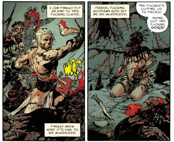
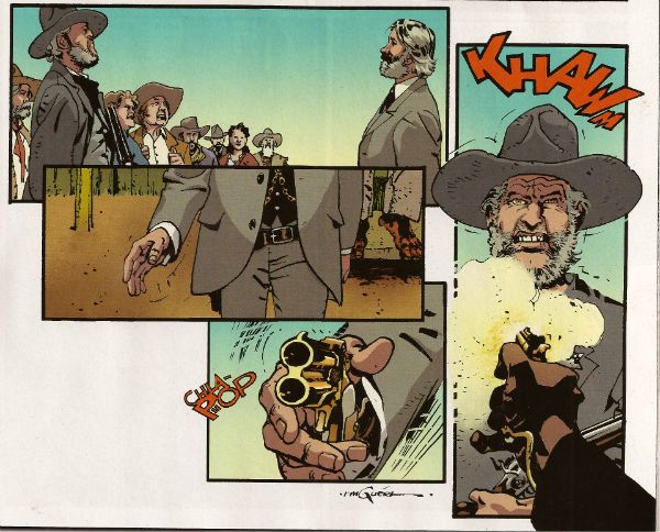
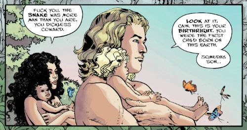
 photo Gdamn01B_zpsfxd2pruo.jpg THE GODDAMNED by Guera, Aaron, Brusco & Fletcher

Anyway, this…

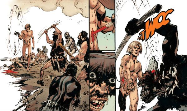
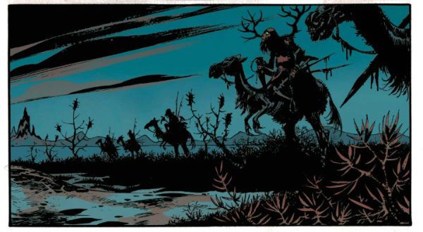
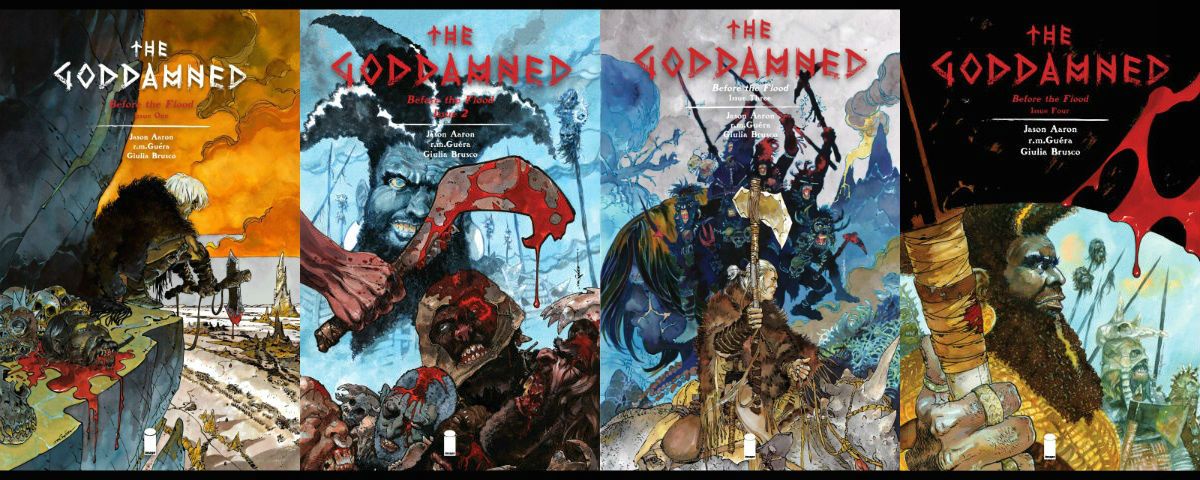
THE GODDAMNED #1-4 Art by R.M. Guera Written by Jason Aaron Coloured by Giulia Brusco Lettered by Jared K. Fletcher Image Comics, Inc, £0.69 on sale (2015-2016) THE GODDAMNED created by Guera & Aaron Based characters from The Bible by God (via 40 or so human vessels for His Word).

 photo GDCoversB_zpsrfiwttor.jpg

Man-mountain (not man-mounting, cheeky!) Jason Aaron’s new cock-flicking comic is a fiercely oh-so-adult exercise in shit-fingered maturity. Swears adorn each funky page as flies bejewel turds, if you can’t take the swears get in the kitchen, weak-o! Rattle those pots and pans! Aaron’s jizz-caked high-concept is to set THE GODDAMNED after the bastard-felching Fall but before The donkey-fellating Flood. You know, as in The bum-truffling Bible. Because that’s mother-scatting Edgy, I guess. Some library haunting self-abusers might be disappointed to learn that this Bible stuff is just a swerve, a crotchless pair of sophisticated knickers, a sop for the four-eyes out there, but proper swinging dicks will delight in the fact that THE GODDAMNED, lacy Biblical guff aside, basically resembles a booger-snuggling Heavy Metal story; from back when The Metal had robot tits on the cover, you know, not now they have a materialist magician at the helm (“Hocus Pocus! Self-Promotion!”) Make no dog-fondling mistake THE GODDAMNED is all boob-kneadingly grim stuff, with sweaty men wielding axes made of babies’ femurs and folk calling God a cunt. Golly! Ear muffs, kids!

 photo Gdamn04B_zpsfxkotnqy.jpg THE GODDAMNED by Guera, Aaron, Brusco & Fletcher

Our protagonist aside (it’s Cain. Different spelling, no relation. Or is he? Eh?), everyone, even the ladies, even the kids, are all scarred and hairy. Not unlike my savaged groin after that orchiopexy. Yeah, I know it’s primarily a kid’s procedure, but my balls were so large and laden with swimming future Winners, they had to wait until I was manly enough to take the pain of the surgically assisted descent. And, yeah, it hurt because anaesthetic is for girlymen Liberals and pussyboy intellectuals, both of which can smoke my fat porker. But not in a gay way. In a manly way. Yeah, THE GODDAMNED is a comic for all us big balled fellas who sweat when we shit; who almost pass out when we pass stool, straining faces as swollen and empurpled as our members on the vinegar stroke because our diet, see, contains only red meat. Meat we have killed our bare hands, skinned with our filed down teeth, and smoked over a fire of burning titmags. THE GODDAMNED is studly stuff, engorged with hard won beefy truths about how a man can find the drive to live within a sad child’s eyes or a woman’s shrill neediness. It’s only slightly marred by the fact that having a protagonist who can’t be killed detracts from the suspense a bit, every fight thus becomes as one-sided as an arm-wrestling contest between a long-haul trucker and a Sociology major. Imagine The Outlaw Josey Wales set on John Norman’s Gor and written by someone overcompensating for the fact that his churchy family think writing is for the ladies. “With John Vernon as Noah”. Grrr! Woof! SAY MY NAME! SAY IT!

I photo Gdamn03B_zpsybrhau2d.jpg THE GODDAMNED by Guera, Aaron, Brusco & Fletcher

Damn, this comic is so butch it’ll whip you with its dick ‘til you start to like it. Pushing past the childish desire to outrage, as through the foresty pubes of a ‘70s pornstar, it is possible to see some cute pacing, decent characterisation and robust structural integrity in the writing. But it’s hard to give credit when the whole thing consistently mistakes infantile for audacious. Luckily for the soft sods out there, like moi,  who can’t take Jason Aaron’s burnt bacon brilliance, R. M. Guera draws the hot balls off everything in such a way as to actually make the ridiculous thing seem worth reading. Reading is for mulch-cuddling professors though, so make that “worth looking at”. R.M. Guera is just a goddamn (heh) joy to watch. Even when folk are face down in pools of shit, or guts are unspooling in red splashes from twisted and gnarled bodies, there’s a vein of feral splendour running through everything. Guera’s briefly glimpsed Eden is as pure and cold and distant as perfection itself, but his broken sin-stained earth is filled with vitality and a shockingly brutal beauty. Aided only by Brusco's apocalyptically lush colours Guera’s art is eloquent enough to make an unflinching and convincing case for humanity, flaws and downright shitty behaviour and all, while the script blithely rebels uselessly, stridently and foolishly against an empty sky. Because of R.M. Guera THE GODDAMNED is VERY GOOD! But only because of R.M. Guera. Otherwise it’s EH! (N.B. I didn’t really have a late life orchiopexy. So don’t send cards. Save the money and buy yourself something nice.)

 photo Gdamn02B_zpsbrl6yqds.jpg THE GODDAMNED by Guera, Aaron, Brusco & Fletcher

NEXT TIME: Hungry Like The…COMICS!!!

"Rodeo Ain't Over Yet!" COMICS! Sometimes I Don't Have A Title!

Hello! Here are some words about some comics. The sales figures analysis is just below this. Very good it is too! To clarify, the Hibbs' stuff is good, not this stuff. Anyway, this... Photobucket

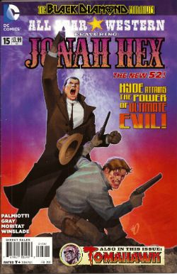
ALL STAR WESTERN#16 Jonah Hex: Art by Moritat, written by Justin Gray and Jimmy Palmiotti, coloured by Mike Atiyeh and lettered by Rob Leigh. Tomahawk!: Art and colour by Phil Winslade, written by Justin Gray and Jimmy Palmiotti and lettered by Rob Leigh. DC Comics, $3.99 (2012) Jonah Hex created by Tony DeZuniga and John Albano Tomahawk created by Edmund Good and Joe Samachson

Photobucket

I finally realised that it isn't the sticklebricking of DC Continuity and the basic desperate casting about for stunt elements that are hamstringing my enjoyment of this book. No, it's the joylessness of it. Its total and wholehearted acceptance of the current DC mode of storytelling which puts a premium on prevarication and encourages emptiness. Look, this book would be great if Bob Haney was writing it. Bob Haney isn't writing it though so it isn't great. If I'm hankering after Bob Haney in 2013 it's a fair guess your book isn't up to snuff. On the up side this issue doesn't contain the dismayingly frequent page filling device of having that Oriental lass fighting for five pages. In fact she doesn't appear once which means that any entertainment can be rightly said to be just like the cast - purely occidental. You want better jokes, make better comics.

Photobucket

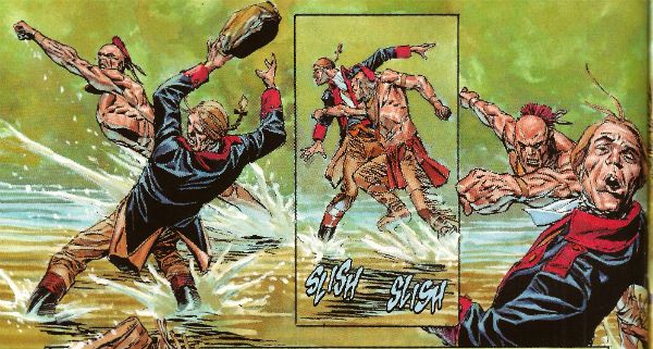
In the Tomahawk back up the most startling aspect as ever is Phil Winslade's bizarre digital watercolours job which I find enjoyable without actually knowing why. In other news, the English turn out to be the villains! I guess that's how Germans feel when they read DC war comics. A taste of my own medicine there. And it is bitter, bitter, bitter. This book, however, is only EH!

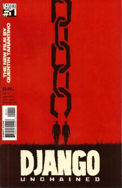
DJANGO UNCHAINED #1 Art by R M Guera with Jason Latour Adapted by Reginald Hudlin Coloured by Giulia Brusco Lettered by Sal Cipriano Adapted from the original screenplay by Quentin Tarantino Vertigo/DC Comics, $3.99

Photobucket

I can’t speak as to how good an adaptation this is because I haven’t seen the movie. I’m old and the wild and outrageous young rebel Quentin Tarantino scares me with his outrageously youthful rebelliousness and his youthfully rebellious outrageous movies. Luckily my much younger sister had seen this very movie so I asked her how she found it. She said, and I quote so the record may be deemed complete, “It was entertaining, Johnny, but it wasn’t good.” There you go then. Me, I fear I invite your youthful ire as I just don’t think Tarantino is all that. Oh, it isn't his childishly inflammatory use of the “N” word, after all I’m sure should our paths cross the edgy auteur would be equally forgiving were I to pepper him with the “C” word like it was going out of fashion. No, but some of it is the fact that he uses the word “cool” too much. The only men his age who should use “cool” that much are Grateful dead fans who live in San Franciscan dumpsters. Mostly though it’s that he reacts to proper questions like THIS. Yeah, I'll let that speak for itself I think. On the plus side the iconoclastic Quentin Tarantino does seem to have exhausted his celluloid fetish for Uma “Man Hands” Thurman.

Photobucket

The stated aim of this comic is to illustrate the original script. Every golden word. I guess it does that. It certainly seems like a Tarantino script. The dialogue is surely as self-satisfied and in need of tightening as ever and it retains all the usual rhythm and musicality (i.e. all the rhythm and musicality of a tune played on an arse flute); scenes outstay their welcome or outstay their welcome while also leading up to a totally predictable reveal and the characters haven’t any. Usually it would take hundreds of talented people and millions of dollars to make this stuff at least enjoyable if not actually good. All this comic has is R M Guera. All this comic needs is R M Guera. It’s an amazingly savvy choice since for the last 5 years and change R M Guera has been tasked with tricking everyone into thinking that a tour through Jason Aaron’s 70’s movie memories constitutes something with anything more to say than, hey, wasn't cinema in the 70’s just grand? Or SCALPED as it is known. Elevating the mundane to the magical is just what R M Guera does I guess. He does it bloody well though. Jason Latour throws down a few flashback panels and his art is excellent every time it appears but the shining star here is R M Guera. R M Guera with his ambulatory toby jugs and smooth storytelling once again showing everyone else up. Hey, the poor old writer doesn't even get a credit except here: Reginald Hudlin. I don't know why he doesn't get a credit but it's not a trend I want to encourage. Anyway, thanks largely to RM Guera this was GOOD!

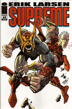
SUPREME #68 Written and Drawn by Erik Larsen Coloured by Steve Oliff Lettered by Chris Eliopoulos Supreme created by Rob Liefeld Image Comics, $3.99

Photobucket

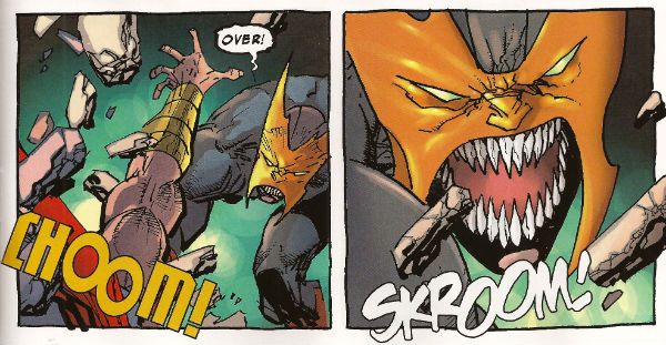
In this pulse pounding issue Erik Larsen basically says that he enjoyed illustrating Alan Moore’s script but since then he’s been noodling about and it’s been just super, thanks, but he’s off now. Apparently someone else will be taking over, no idea who but, yeah, someone at some point. Of all the moves to steal from the DC playbook that’s a pretty strange choice. At least he didn't steal DC’s signature move which is now apparently making comics nobody likes but lots of them. Larsen’s departure is a bit of a shame because I found his Kirby with a split nib art quite charming and in this issue it’s particularly so because, for no readily apparent reason, Larsen suddenly starts drawing this thing like it’s Kyle Baker’s RONIN. (Yes, I know it was Frank Miller's RONIN but this looks like Kyle Baker's RONIN).

Photobucket

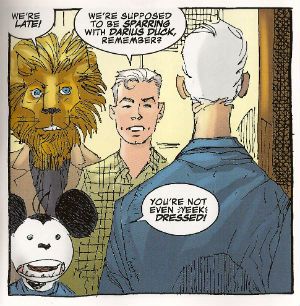
I quite enjoyed this book. It had enjoyably stupid characters like Lion headed Supreme and Darius Duck, people flew around, punching occurred and Larsen always respectfully drew Supreme in that scratchy Liefeld mode without actually ever being as shitty as Liefeld. Sure, it was pretty basic stuff but it was basically pretty stuff. Sometimes I don’t actually want all that much from a comic and this certainly delivered that. I wouldn't recommend that Erik Larsen make a habit of just dumping books as people might start referring to a failure to commit as having committed Larsen-y. Unlike that joke this was OKAY!

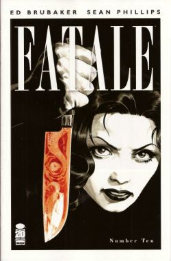
FATALE#9,10 Art by Sean Phillips Written by Ed Brubaker Coloured by Dave Stewart Fatale created by Sean Phillips and Ed Brubaker Image Comics, $3.50

Photobucket

Everyone can relax because I’m done here. I’ve had my doubts about this one all the way. For starters the horror elements have been inexplicably dusty and dull (cassocks! tentacles!). I don't need my own pet Jess Nevins to know that horror in the '70s was actually engaging with real world events and offering up savage and innovative treats which were leaving Corman's Poe adaptations for dead. Then there's the inescapable drab narration which mistakes deadpan for just plain dead on the page and is written in a fabulous new tense even more inactive than the passive; the comatose tense perhaps. The only sign of life in this one-note stuff is that it works the word “but” like it yearns to be a Salt’n’Pepa track.Then there's stuff like this:

Photobucket

That pivotal oh, go away moment occurred in issue 9 but due to the caprices of my comic dispersal system I still had issue 10 to go. Yes, one more chance! A chance which was immediately crushed when the central character (who thus far has been less like Fatale and more like Docile) just suddenly remembered she had special magic powers and plain killed everyone in a climax as rewarding as being inadvertently brought off by the motion of your train seat. Look, there’s no mystery about why men will act like complete tools for a pretty face, certainly not a supernatural mystery. Unless you think the contents of your pants are supernatural and mysterious. In which case your Pope just resigned. I didn't know Popes could do that! This series always seemed less James Ellroy and H P Lovecraft and more Quinn Martin and Donald P Bellisario. An impression strengthened by future covers which indicate the series is just going to stick a new genre on top of the usual stuff. Now she's a witch, now she's a space man, now she's a turtle, dis-integrating! Like my interest. Mr Ben with a magical woo-woo may well be a new direction but not one I’ll be pursuing. So, I’ll be missing future essays on The Scarecrow And Mrs King and, more importantly, the fine work of Sean Phillips and Dave Stewart which deserves better than to be yoked to work this EH!

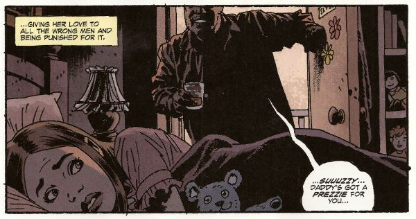
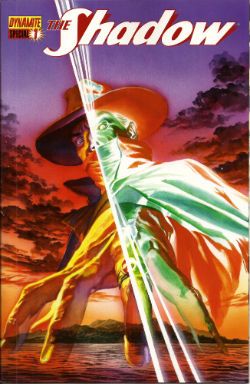
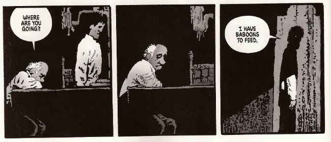
SHADOW SPECIAL #1 Art by Ronan Cliquet Written by Scott Beatty Coloured by Mat Lopes Lettered by Rob Steen The Shadow created by Walter B. Gibson Dynamite, $4.99 (HOLY MOTHER OF GOD!!!! FOUR DOLLARS AND NINETY NINE CENTS!!!! THAT'S INSANE!!!!)

Photobucket

In the main title The Shadow is currently palling about with George Orwell. George Orwell is the author of a couple of books on how shit being poor is and how we will all willingly participate in a system designed to crush our common humanity. He was right about both of those things and remains right, although he missed a trick in not realising that the main way The System would ensure our complicity would be by making nice things for us to buy. But then there weren’t many nice things to buy back then so we’ll let him off. Rip The System! You don’t bring Orwell to the party unless you want that party to get political! Orwell also did a book about animals on a farm. I can’t remember what it was called but it was about animals on a farm. It was a metaphor or an analogy or some clever shit like that about some animals on a farm. Oh yeah, I remember now, the one about the animals on the farm? It was called BEFORE WATCHMEN.

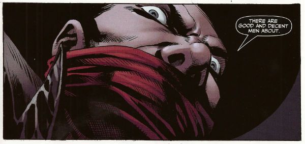
Anyway, this isn’t the main series so George Orwell isn’t in it. No, this is a “special” but it isn't very, possibly even at all. Except for the price. That’s pretty fucking special right there. There’s the core of a fun and pulpy tale here but something’s gone awry on the pacing front. When there’s more pages devoted to The Shadow moaning about going shoe shopping (yes, really) than there is to his fight in a minefield with a man who has courageously chosen to sport only a bouquet of barbed wire around his nuddy bod (Oooch! Owch!) then, yes, I’d have to disagree strongly with the storytelling emphases.

Photobucket

Ronan Cliquet has a good go at being Alan Davis but he seems to have jumped ahead a bit; Alan Davis didn’t get to be Alan Davis until he’d got the basics right, son. I’m guessing he’s just some wee snip learning his trade but the best I can give him is – promising. The most special thing about this comic is the paper it’s printed on. Paper so much like catalogue pages from your youth that there’s a constant urge to riffle through them to the Hot Wheels section or the sports bra section depending on which age your development is currently arrested at. No, it wasn't special unless special is EH!

And like The Pope - I'm gone! But there's still COMICS!!!

"No! It's ANGRY!" COMICS! Sometimes They Bow Before The King (Of R'n'R).

Good Day! Jolly Good Day! Over here we are shortly to be having a Jubilee shindig! You don't get one so I gave you this instead. It's all over the bally shop but some of it is about comics. You have been warned and so my hands are clean but look at the state of your fingernails! Photobucket

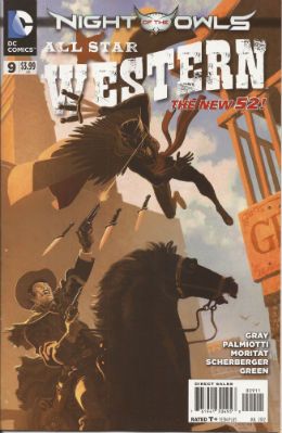
ALL STAR WESTERN #9 Art by Moritat, Patrick Sherberger and Dan Green Written by Justin Gray & Jimmy Palmiotti Coloured by Gabriel Bautista and Mike Atiyeh Lettered by Rob Leigh DC Comics, $3.99 (2012) Jonah Hex created by John Albano and Tony DeZuniga Nighthawk created by Robert Kanigher and Charles Paris Cinnamon created by Roger McKenzie and Dick Ayers

Photobucket

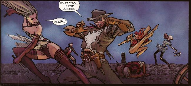
I have my concerns about this book. These concerns have nothing to do with the art what with Moritat and Bautista delivering the usually fine performance; said performance being so fine that it hardly matters that the backgrounds are a smidge perfunctory. And despite the plots being a bit woolly what with all this editorially mandated crossover bullhockey (Ooo! The lady in the cape! Some owls!) at least here they contain the always entertaining idiocy of Caucasian Americans worrying about immigrants lowering the tone of the place and generally letting the side down. It's not even that on a page turn it's "three weeks later" and we're in Gotham instead of N'Orleans, because I understand they want to get on with this interminable owl shite. And yet, part of me, the beautiful, dreaming part no doubt, misses the days when Jonah wouldn't be able to go from one town to another without ending up nailed to a cactus. And I miss El Papagayo turning up to taunt him. I miss El Papagayo he'd be all like, "Senor, Hex! Why must you always make life so hard for yourself, my friend! Come out from behind that rock and embrace me and my gang of toothless well armed vermin! Do you no longer trust your good friend, El Papagayo, Senor Hex! You hurt my heart, my friend! Why, Paco here has brought some smelly badgers! tell him, Senor Hex, tell him we don't need no steenkin' badgers!" Actually, it probably isn't the absence of El Papagayo either.

Photobucket

No, it’s more that Jonah’s becoming a guest star in his own book; it’s just too crowded and in order to stand out from the crowd I fear Jonah’s going to become more of a caricature than a character. The book's focus has shifted from the lovable asshole with the melty face to being more of an attempt to reposition DC’s mouldy old oaters in more viable iterations. I’m all about that because I have a fatal fondness for DC’s western heroes. I have no idea why but there it is. Some people are like that about The Batman; my way is cheaper, I win. I’m also quite okay with the view that there are no bad characters just bad writing. But I’m not quite convinced that the way to go is to give these characters aspects more suited to superheroes. So I’m not convinced that the missing ingredient for Nighthawk and Cinammon’s success is their possession of a pair of lucky charms which stop them dying and make them strong, super strong in fact.

Photobucket

But I just hamstrung my own qualms by saying there aren't any bad characters, so I guess the problem is the writing. In which case I'll bounce back and say it’s just too workmanlike. If you’re selling something to an audience - put your back into it, get some enthusiasm going! Well, it’s workmanlike when it isn't hat stampingly poor; as when Bruce Wayne’s bat-ancestor mentions there is poison ivy someplace. Wait, poison ivy! Do you see?!? DO you see?!? Next issue we’ll hear some joker released some penguins from Gotham Zoo but he keeps denying it because he’s two faced! This is what Jonah Hex needs! Next issue it’s Bat Lash; let’s hope he hasn't got a steam powered skidoo or some such daft shit. At the moment ALL STAR WESTERN is GOOD! but it's on thin ice, muchachos!

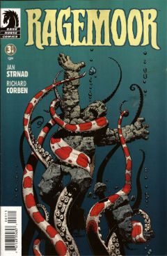
RAGEMOOR #3 Art by Richard Corben Written by Jan Strnad Lettered by Nate Piekos of Blambot® Dark Horse Comics, $3.50 (2012) Ragemoor created by Richard Corben and Jan Strnad

Photobucket

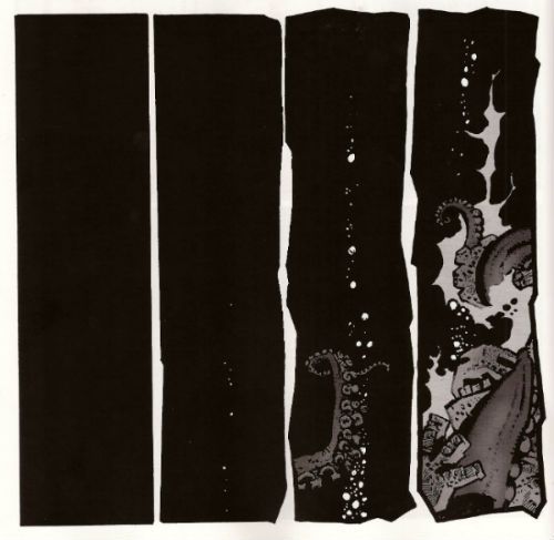
This one’s the third issue of four so you might, given modern trends, expect it to basically sit there picking its nose and inspecting the results until the next issue. After all, you’re this far in so why bother trying. But this is Corben & Strnad and they’ve been doing this a while which, I guess, means they are old or some weak and totally lame shit like that. In comics folk always underestimate the old guys don’t they? News just in: Steve Ditko’s still doing good comics. Youth will never understand that you only get old by surviving. This is largely because Youth is an abstract noun and is therefore unlikely to have cognitive functions.

Photobucket

Humourless pedantry aside, let’s face it; put Matt Fraction and Richard Corben adrift in a lifeboat and three weeks later the copters are going to be picking up one fat comic artist. Fraction’ll just turn his back to sneak a look at his reflection in the water and Corben’ll be on him like a liver spotted threshing machine. Wait, I was on about a comic, I think. So, yeah, this comic doesn't just piss complacently about, no, this comic sets back on its haunches, tenses its muscles until they thrum with the collective kinetic energy of the previous issues and prepares to, next issue, hurl itself straight at your throat. Despite the fact that the creators involved probably get twinges in their knuckles when the weather turns cold RAGEMOOR remains VERY GOOD!

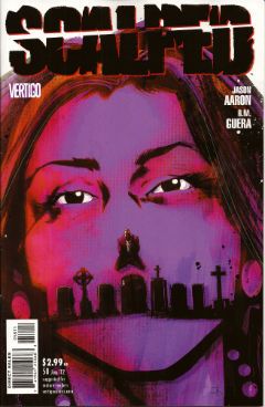
SCALPED#58 Art by R.M. Guera Written by Jason Aaron Coloured by Giulia Brusco Lettered by Sal Cipriano Vertigo/DC Comics, £2.99 (2012) Scalped created by R.M. Guera and Jason Aaron

Photobucket

In two issues this series will end. In two issues the fix will be in. In two issues people will refer to this series as Jason Aaron's SCALPED. I have but a brief window of opportunity to attempt to correct the course of the critical conversation as it puts the pedal to the metal and hurtles straight into The Cult of The Writer. Only a soulless canker of a man would deny that Jason Aaron's writing has been solid and decent throughout. It's probably more impressive the less knowledge you have of the '7os cinema he has mined so well the series. But, alas, homage is everywhere now and I know I for one require more to ensure I see out sixty issues. SCALPED gave me more in spades, and it gave it to me in the form of the art of R.M. Guera.

Photobucket

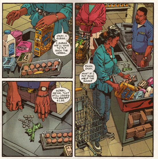
R.M Guera is the star of the show here. It's the attention to detail, I think, that is Guera's true strength. That's quite a strength considering the fantastic way his faces veer into and out of controlled caricature, his body language ranges from subtle to hysterical and his environments from the grubbily realistic to those of opulent excess and all of this, all the while, strengthening rather than destroying the suspension of disbelief; drawing the reader in rather than pushing the reader away. Christ, it's the stuff of wonder. Christ, I write about comics like old people trampoline. Look, here's R.M. Guera drawing a scene in a supermarket. It's just a scene in a supermarket but, but, look:

Photobucket

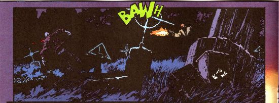
And how about those colours, ey? Brusco's colours are a special kind of magic as well throughout the book. Check out the night scene I lifted above. Be soothed by the smooth blues and then startled by the pop of the lime green FX! Giulia Brusco gets a cheek chuch for coloring cojones and no mistake. What a wonderful, wonderful book SCALPED has been on a visual level. It's a bloody shame that the aspect that lifts SCALPED up to VERY GOOD! is, I'm guessing, the aspect that'll receive least play once it ends, and the artists who worked such wonders will reap the least of any future benefits; career and reputation-wise. But before that happens, before the fix kicks, in I'm going to point out that R.M. Guera is EXCELLENT!

Those of you who read this and were not insensate from drugs or currently being attacked by a maniac will have picked up on the subtle fact that I'm a little distracted. That's because this weekend is Jubilee weekend! We get an extra Bank Holiday on Tuesday to celebrate Good Queen Bess. I'm no Royalist but I do recognise that the tourist industry is pretty much the only industry we have anymore, so she's okay on that score, and also I'm anyone's for a free day off work. Fickle? You have no idea, pal. You have no idea. So I am eager to join my fellow countrymen in the heat of the streets, swigging binge and watching as the middle aged men with their Celtic tattoos blistering in the heat bellow at their shrink wrapped wives about how Sandra in accounts understands and how he never wanted this, never wanted any of this and the discarded children weep beneath the Union Jack bunting. England, my England!

Oh please, despite all your protestations to the contrary you're all quite keen on the whole Royalty business, aren't you. my American friends. Oh, you claim otherwise, you do:

Photobucket Image from The Steve Ditko Archives Vol.2 (Ed. Blake Bell, Fantagraphics Books). Art by Harry Belafonte Jnr. No, it's Steve Ditko for Goodness Sakes! Keep up, no lollygagging at the back!

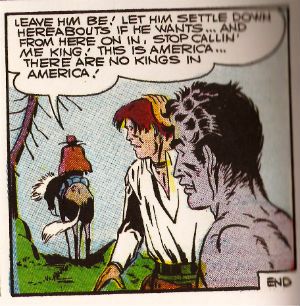
But you're just fooling yourselves. You protest too much, methinks. Look, you've had at least two Kings: The King of Comics (one Jack Kirby by  name) and this raunchy dude:

Photobucket

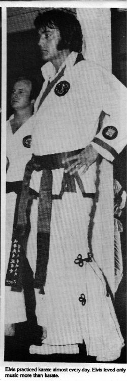
The King and American Royalty were on my mind because when I am not reading comics I am looking at enthusiastically typed and photocopied documents held together with staples produced by fans of things. Probably while they waited for The Internet. Documents such as THE ELVIS COLLECTOR #1 (edited by Major I.R. Bailye). This fragment of forgotten fandom was brought home to me courtesy of my very own Priscilla, who knows only too well that when it comes to The King there's no fool such as I.

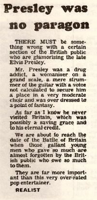
Reading the photocopied love letter to The King my eyes settled on this:

Photobucket

From The Leicester Mercury; date unknown, author pseudonymous.

Sadly "The Realist", despite his fantastic English language skills ("overdressed to a point of fantasy"!!), is incorrect as Elvis Aaron Presley touched down briefly on British soil. However, I still think his points remain valid despite this factual inaccuracy. Yet, it did make me realise that sometimes people can be blinded to the essential truth of an article if the author undermines himself with inaccuracies. A bit like an article on comics in The Wall Street Journal perhaps. The one where he's wrong about why comics aren't popular anymore (the world's just moved on and the price has risen in line with the Greed Index; that's really why) but is right about Avengers comics being less like something you'd use to attract new readers and more like something you'd scrape off your shoes before going indoors. Poo, I'm talking about poo there. Usually animal  but, given the state of Cameron's Big Society, there's a queasy possibility it could be human. Um.

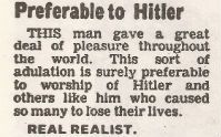
In closing let me just say that, being all crepey of skin and feeble of mind, I am only too well aware that at any moment my stinking and aged frame could just drop dead, and sometimes I wonder how I would like to be remembered. It turns out that I would like to be remembered like Elvis. No, not as a mother fixated, voyeuristic pill popper with strange ideas about chimp management. (People tend to forget the Divine Voice these days, which is their loss.) Rather:

Photobucket

From The Leicester Mercury; date unknown, author pseudonymous.

Yes, "preferable to Hitler". I think the "Real Realist" is right in that that's all any man would want in the end. So, have a smashing weekend and if you think of me, think of me, at least as being "preferable to Hitler". Like Elvis. Like The King. God Save The King! God Save The Queen!

Farewell for now, my foreign chums, and remember: if you can't have a Jubilee then have some COMICS!!!

"Do They Come In KID'S Sizes?" Comics! Sometimes I Get A Bit Grumpy.

Whoops. Lost my momentum there. Trying to get it back by looking at some comics and then blurting thoughts out in the form of words. Disaster? I have a recipe for that! Here's the ingredients:

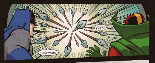
BATMAN: THE BRAVE AND THE BOLD #15 By Stewart McKenney/Dan Davis(a), Sholly Fisch(w), Guy Major(c) and Dezi Sienty(l) (DC Comics, $2.99) "No Exit" If he is to survive an unending series of death traps of unknown origin The Caped Crusader is going to need a miracle! Luckily he brought one along...MISTER MIRACLE!
Photobucket

""No...spears!" HAHAHAHAHAHA. Damn, even Kids think that joke is shit. Judgemental buggers."

This is a comic for Kids, is that alright? Is it alright if Kids have comics too? Because I know comics aren't for kids anymore. I know that the works of such mature intellects as Mark Millar, Brian Bendis and Geoff Johns have lifted the fights'n'tights funnybook up beyond the meagre intellects of children into a new and special place where they are exactly like comics for Kids but not as good; which in a very real sense is just like growing up. Everything's the same as when you were a Kid it's just a bit more shit. Comics for Kids, okay? Is that alright? Because if it isn't then there's no place for a PG version of CUBE starring Batman and Mister Miracle in which Batman solves the confounding conundrum bedevilling our two plucky chums by noticing that he doesn't need a shave and if that's true then I guess there's no place for the following exchange:

DOCTOR BEDLAM: However your MEAGER INTELLECT is no match for the brilliance of DOCTOR BEDLAM.

BATMAN: Really? How about my FIST?

There's always a place for that. Even though they do not use the correct English spelling of "meagre" and plump for the Colonial mutation. Yes, even though Mister Miracle looks creepy without a nose this is still VERY GOOD!

SCALPED #55 By R.M. Guera(a), Jason Aaron(w), Giulia Brusco(c) and Sal Cipriano(l) (Vertigo/DC Comics, $2.99) "Knuckle-Up" Conclusion
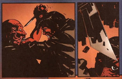
Photobucket

"Fact: I, John, actually have a thing about traumatic eye wounds. In that I fear them not that I get off on them. I know this is The Internet but be nice, now."

Now that's a fight scene! So that's GOOD!

PUNISHERMAX #21 By Steve Dillon(a), Jason Aaron(w), Matt Hollingsworth(c) and VC’s Cory Petit(l)(Marvel Comics, $3.99) "Homeless" Conclusion Frank and The Kingpin finally collide in a femur shattering confrontation from which only one will walk away! Actually they both walk away but The Kingpin has a hammer stuck in his head and scratches at the glass door of his apartment like a wet brained stray cat before Frank brings him down and then Frank falls over and so I guess it's really a femur shattering confrontation from which both walk away - but only for a bit!
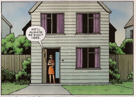
Photobucket

"The White Male Heterosexual's Worst Nightmare"

Frank Castle is homeless. And he stands there singing for money. La da dee la dee da. Ladies and gentlemen, Ms. Crystal Waters! Terrible song that but, hey, I was watching THE HURT LOCKER the other night because I like to watch films everyone has already watched and moved on from. It's important to be timely, to be relevant, I feel. It was okay, really quite a decent film until the end when they did the thing with the guy at home. I didn't really like that bit because as is usual with cool hard asses we were invited to feel sorry for him because being such a hard ass he could find no pleasure in the real treasures of life such as cleaning out the guttering and shopping for cereal (don't load the dice too much, eh, Mark Boal) and yet we were also invited to admire him as the romantic lone wolf; true to himself and his manly nature. There are a lot of these films and they seem to fulfil the same function as Chick Flicks. They kind of undermine the gender stereotype while at the same time finding shelter within it. I call the male variation Dick Flicks. PUNISHERMAX is a Dick Flick. Y'know, that weirdly pathetic male wish fulfillment where you can be free at last to be a manly man but it has come at such a cost that you get to be both pitied and feared. Like a baby the size of a tower block crying for Mama to change its nappy. You'd be scared if that turned up outside your window but you'd feel a bit sorry for it as well. Unless you were a manly man in which case you would shoot it in its big fleshy demanding face and turn away before we saw your single, solitary tear.

Someone has to say it, Frank. You are a weak man, Frank. It isn't a sign of strength to run away from responsibility, Frank. You are a weak man, Frank Castle, to rather have your family die than pick up those toys one more time, rather than sit through The Only Way is Essex one more time, rather than have to sit through those shitty Star Wars films one more time...actually, Frank, I'm starting to see your point.I am a man after all and as a man I found PUNISHERMAX was GOOD! After all, I cannot tell a lie, like most men I like a good Dick Flick.

DEMON KNIGHTS #5 By Diogenes Neves/Oclair Albert(a), Paul Cornell(w), Marcelo Maiolo(c) and Jared K. Fletcher(l) (DC Comics, $2.99) "The Traitor"
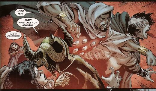
Photobucket

"Meet The Twin Fists of Tolerance!"

The best thing about this comic, because it's important to be positive about comics or so people keep bleating, is the character of Jabr. Now it seems to me that this guy is rational, educated, level-headed, tasty in a fight and quite possibly not of European extraction. He's all those things and yet not boring, he is fact the best character in this except for "Sir" Justin because us Brits love a bit of crossdressing fun. Deny it to your Mother, pal, don't waste your breath denying it to me. Astonishingly The Internet has not lost its collective mind over Jabr and it's this magical fact, this clear indication that we have at last, as a species, grown enough to, finally, recognise the transitory nature of our fragile lives and put aside our differences to become, in effect, tolerant and wise and thus strong enough to forge the collective future all our predecessors suffered and died to accomplish. Or maybe nobody is reading this as it is, after all, just OKAY!


ALL-STAR WESTERN #4,#5 By Moritat, Phil Winslade(a), Justin Gray, Jimmy Palmiotti(w)Gabriel Bautista, Dominic Regan(c) and Rob Leigh(l) (DC Comics, $2.99) Jonah Hex in "Gotham Underground" and The Barbary Ghost in, er, "The Barbary Ghost" In the caverns beneath Gotham Jonah Hex finds not only a fine example of the unfettered free market in action but also ancient evil. And some bats. Because it is Gotham. Also in this issue: The Barbary Ghost makes a spooky debut!
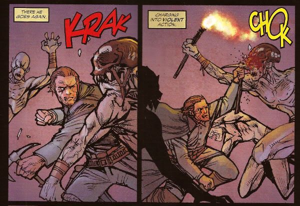
Photobucket

It was kind of okay having Arkham around for a bit but now his role seems to have quickly devolved into basically telling us when Jonah Hex is being an asshole and getting himself in a pickle Jonah has to help him out of. This erodes a large portion of the appeal of Jonah for me. I like not knowing if he is actually going to help whoever's in trouble or if he's going to just be an ornery asshole. Obviously he has to save Arkham all the time or the Asylum will never be built and Batman's continuity will be all wronged-up. Oh noes! And also I like to decide myself when Jonah has been an asshole. On occasion it has taken me several pages to realise just how big an asshole Jonah has been on that occasion several pages previous to the point at which said realisation alights upon my mind. I like that. So, yeah, shut yer fancy yapper, Arkham! And let's get out of Gotham and light out for the territories; it's too constrictive, Jonah works best out in The Big Country where he can tread in big shit in all manner of unlikely ways. I like the colours by Bautista they are kind of organic but inorganic at the same time, like laser-pastels or something. Yes, people my age still think putting "laser" in front of something suggests The Future. Aren't old people just the cutest!

Oh, the backup is The Barbary Ghost; a new creation by Gray, Palmiotti and Winslade. While Winslade's brittle lines manfully attempt to ground the story in a specific milieu at once both evocative and atmospheric this is somewhat undermined by the fact that The Barbary Ghost's knockers are kind of flopping about a lot. Now I'm no Henry History but I would have thought that a Chinese lady in the 1870's would have been personally inclined, in large part due to the mores and customs of both the particular point in history she occupied and the heritage of her own people's customs and traditions, to keep her tits shut in a bit more. Or maybe I missed the class where we were taught about The Great 1870's Chinese Tunic Button Shortage. I could have; I was a bit of a git as a kid.

Still, credit given for an original character. After all in 2012 DC's big old money fountain will be WATCHMEN: HOW I MET YOUR MOTHER. No doubt JMS is going to improve the original by, apparently, so he says,  explaining about how Jon was obsessed with time yet he still went into that time-locked room! I don't know. I guess I missed the bits in WATCHMEN where Jon was continually asking people what time it was and craning his neck to look at clocks and banging his girlfriend from behind so he could put his hand on the base of her neck in such a way that it seemed erotically stimulating due to its sensual forcefulness but at the same time afforded him an uninterrupted view of his watch. Or maybe his Dad was a watchmaker and he thus believed in Design but he was changed into a God by a complete ACCIDENT! and that was a metaphor or an analogy or even the whole meshuggener point already or, Christ, who gives a shit. Yes, okay, it was strange. Really strange. I need it explaining in a book illustrated by a cheesecake maker. I'm glad it isn't someone muttonheadly literal who's got this gig, rather someone as dependable and imaginative as JMS who is going to bless us with a mini-series in which, let's face it, quite probably Dr Manhattan reaches back trough time to give events a nudge so that he effectively creates himself! SPOILER! Christ. Mind you I know it has always troubled me, raised a question in my mind, why Rorschach wears a woman's gusset on his face. Hopefully Brian Azzarrello will be setting my mind to rest on that score. Hurm.  In 2013: CAMELOT 3010!

Do you see what I did there? I did an impression of The Internet and played right into DC's hands and I missed the point. The point about WATCHMEN: BEFORE THEY WERE FAMOUS not being a nice thing is that endorsing this is endorsing DC's treatment of Alan Moore. DC own WATCHMEN so they can do what they want with WATCHMEN and what they want to do with WATCHMEN is make money because they are a business. I can understand that, I see that, thanks. DC do not own Alan Moore and they have treated him, and continue to treat him, in a shabby fashion unbecoming of adults. That's the issue here. If they can do that to Alan Moore and it is all right because we get our nice new comics then it is all right for them to continue treating creators in such a fashion. It isn't all right. It will never be all right. That's the point here, for me, not whether the books will be any good, or any of that other diversionary horse shit. Nut up or shut up, DC. Nut up or shut up.

ALL-STAR WESTERN was GOOD! if you can remember that far back.

AMERICAN VAMPIRE #23 By Rafael Albuquerque(a), Scott Snyder(w), Dave McCaig(c) and Jared K. Fletcher(l) (Vertigo/DC Comics,$2.99) "Death Race" Part Two of Four I haven't actually read this one. I don't know if you noticed that bit up there, the boring bit, yeah? The "Part Two of Four" bit? I wouldn't have; I'd have skipped it and looked at the scan (which isn't there because I haven't read it, see) and then read the text I judged most likely to contain a cock joke or insult a noted comic creator. So I can fully understand if you missed the whole "Part Two of Four" bit. I didn't though and since I have yet to receive "Part One of Four" I am unable to read this comic. I don't mention that for any other reason than the fact that Mr. Jeff Lester and Mr. Graeme McMillan were talking about how weird their comics reading patterns can be (I mean I've got this comic bought and paid for but I'm not going to read it? Saywhanow?!) And I just wanted to mention that I share their sickness; I sup from the same trough of pain as they. Also, just thinking about them both brings me physical pleasure. Hurm.NuuuuhHHHH.


Sorry about this one, folks, hopefully it'll be better next week. Have a good weekend with COMICS!
"Now, Tanned, Rested, Ready And Fully Equipped With Brazilians..." Comics! Sometimes They Are Kind of New(ish)!

A couple of posts down from this rubbish there is a quite extraordinary thing occurring. People are discussing Digital comics and no one has been killed! It's a Christmas miracle, by Jove! Photobucket

Why not go have a looksee, this rot isn't going anywhere. I read these comics. There was no force on earth strong enough to stop me.

BATWOMAN #3 By J.H. Williams III(a), J.H. Williams III/W. Haden Blackman(w),Dave Stewart(c) and Todd Klein(l) (DC Comics, $2.99)

It’s perfectly fine story wise but I can’t lie I probably wouldn't be reading it were it not for J H Williams III’s stellar performance on every page. I guess having art like this on something so meat and taters might seem a little like a bit of a waste, like having Einstein fix your toaster, but there’s two things I bear in mind when I read BATWOMAN: Thing the first is that J H Williams III is co-writing it so it’s not as if he’s been hoodwinked into this and so if he’s happy doing this and it looks this good I’m not going to carp and pule. It’s preferable to him wasting himself illustrating some other guy’s awesome movie-pitch-cum-graphic-novel about an ex-alcoholic shark that goes back in time to try and kill Pia Zadora’s chiropodist. In space. Thing the second is that there’s just something great about seeing someone talented do that talented thing even if you aren't that enamoured of the arena in which they express themselves. Boxing? No. Muhammad Ali? Oh, yes.
Photobucket

Also it’s totally neaty keen-o that the sapphism of the lead just results in exactly the same scenes between partners we used to get when everyone, everywhere was straight.  It’s an important lesson more people should heed: what you choose to do with your genitals doesn't make you any more interesting as a human being. Really, trust me on this. Particularly if you are considering telling me about what you like to do with your genitals. You would be amazed how many people think telling me about what they get up to with their genitals is an acceptable substitute for a personality. Even though it hardly keeps me awake at night with its narrative twists and turns Batwoman certainly amuses my eyes to the extent that I would call it VERY GOOD!

WONDER WOMAN #3 By Cliff Chiang(a), Brian Azzarello(w), Matthew Wilson(c) and Jared K. Fletcher(l) (DC Comics, $2.99)

Photobucket

Well, I guess we can all agree that among all Wonder Woman’s many powers the greatest of these must be her Divine Unflappability. I know if my Mother was standing there in public talking about her needs and how Zeus answered them by breaking upon her shores in  a great salty foam of satisfaction I’d be blushing like my cheeks were slapped and making a high keening noise like a fox with its paw in a trap. Not Wondy, she just goes and belts some husky lass and burns some corpses. I am greatly enjoying Azzarello’s writing here as it’s brisk, eventful and he’s reigning in his word games to good effect. Cliff Chiang is dreamy as well. Truth to tell he makes it such a smooth read I probably don’t actually appreciate the level of skill he’s applying. Also, while I did make mock of Hera’s randy reminiscence it was more in light of the effect on Wondy than the actual scene which is handled with taste and subtlety, which I guess goes to show that mature matters can be depicted without making your brain burn with shame for the people involved, y’know, if approached maturely. Who knew a Wonder Woman comic could be VERY GOOD!?
O.M.A.C #3 By Keith Giffen & Dan Didio (a/w), Scott Koblish(i), Hi-Fi(c) and Travis Lanham(l) (DC Comics, $2.99)

Photobucket

Okay, it’s true that Kevin Cho’s only personality trait is “befuddled”, his girlfriend is as accurate a portrait of 21st Century womanhood as Dame Barbara Cartland (she spent “all morning cooking” in 2011? Really? I rather think not and I’m hardly Franky Feminist), there’s a hell of a lot more momentum than meaning and it feels almost indecent to be complementing Dan Didio on anything except turning a panicked line-wide shell game into a massive (length of term to be decided) success. But having said all that…having said all that…you get to see Keith Giffen enjoying himself in the only legal and publicly permissible manner he still has available, the microwave intensity of Hi-Fi’s colours still burns with the flare of The Future (so much so that I suspect that in 2024 there will be a sudden outbreak of people collapsing with great tumours blossoming from their eyesockets like fatal clouds. Every one of whom will be found to have read OMAC.), Max Lord not only has that Kirby Dapper Dan parting but he also smokes, there’s a character called Little Knipper and there is a man with Mind Powers who appears to have a salmon fillet draped over his head. Bearing all that in mind I think you have little option than to agree that it is game, set and match to OMAC, which by the way is still VERY GOOD!

AVENGERS 1959 #3 By Mister Howard Victor Chaykin (w/a), Jesus Arbutov(c) and Jared K. Fletcher(l) (Marvel Comics, $2.99)

Photobucket

Howard Victor Chaykin must have been told the sales figures for this series when he was halfway through the issue because he suddenly just seems to say "Aw, nertz to youse bums! Allayez!" and starts writing the story he obviously wanted to write in the first place. Since this story is basically Nick Fury in a Dr. No-era Bond Flick with a sly sideways dig at Howard Victor Chaykin's own CHALLENGERS OF THE UNKNOWN SERIES and is peppered with salty humour and ridiculously entertaining action I know I'm okay with that. Yet another issue of intriguing skullduggery set in a convincing simulacra of the '50s and containing all the man-tastic magic of the Master Of The Mai Tai his own bad self, Mister Howard Victor Chaykin. Who else could quote both Papa Hemingway and Dezi Arnaz, from I love Lucy, on the same page? Exactly! No, no one is buying it but that doesn't stop it being VERY GOOD!


MUDMAN #1 By Paul Grist(w/a) and Bill Crabtree(c) (Image Comics, $3.50)

Now this? This is some fine comics. Mister Paul Grist bringing it big style. He’s got a thing he does and he’s doing that thing here which is good because it’s a good thing Mister Paul Grist does. Alex Toth once wrote a blurb commending Paul Grist’s work. Alex Toth. Grist’s clearly influenced by Toth at the very least to the extent that his pages are very design orientated and the contents of said pages contain the minimal amount of ink in order to achieve the maximal amount of information. Grist mixes in a good dose of Kirby chunkiness into his Toth which makes the result a lot lighter and boppier than the sometimes airless Toth and of course the Toth grounds it more in reality than Kirby’s work could manage. That could all be horseshit as I have no idea what I’m on about but I am pretty sure Grist is like Toth in at least one respect: all the thinking’s been done before he puts the first line on the page. And every page here is a joy either as a pure comic experience or as an example of pure comic craft.

Photobucket

Mudman is a new series so anyone intimidated by the continuity of JACK STAFF (which included nods to continuity in old English comics even I’ve barely any acquaintance with. Lion? Victor? You could totally enjoy JACK STAFF without getting any of it BTW, it’s right gradley, tha knows. This interruption is too long to go in brackets but I’m sure no one will notice) should put their fears to one side. It’s a totally new start given the impression of some kind of back-story weight thanks to Grist’s penchant for temporal narrative zig zagging. It’s fun, funny and the execution is funnybooks in excelsis. If you aren’t reading MUDMAN you must be mad, man! (in my imagination we all clubbed together and promised Brian Hibbs that we’d get him a SavCrit cover blurb for Christmas. That’s my attempt. Cheers!) So, yeah, MUDMAN#1 is VERY GOOD!

SCALPED #54 By R.M. Guera(a), Jason Aaron(w), Giulia Brusco(c) and Sal Cipriano(l) (Vertigo/DC Comics, $2.99)

Photobucket

Although this series barely manages to avoid crumpling under the sheer weight of its genre clichés and the author’s ‘70s movie memories it remains a decently entertaining read. Some of this is due to the author who manages to pull the rug out from under you often enough that you’re never entirely complacent. Most of it is the storytelling which, yes, I guess Jason Aaron has a hand in but let’s face facts R.M. Guera’s got his whole arm in it up to his elbow. R. M. Guera is astonishing. I won’t go on about it but let’s just say that, for example, R. M. Guera knows that there’s a difference between visually basing one of your characters on Warren Oates and straight up tracing pictures of Warren Oates. The former is an act of skill and the latter lazy pish. R. M. Guera doesn't do lazy pish. When SCALPED ends with issue 60 I look forward to seeing genre comics take full advantage of Guera’s inventive and invigorating skills by assigning him to a Wolverine comic. SCALPED is VERY GOOD! but R.M. Guera is EXCELLENT! And I don’t tell him that enough so I did it here in front of y’all because I am not ashamed of my love. My love is beautiful!

THE GOON #36 By Eric Powell(w/a) and Dave Stewart(c) (Dark Horse, $3.50)

Photobucket

Hey, I laughed a couple of times, longest and hardest at the vagina joke. Oh, yes that’s the level we’re operating on with this one. And that’s okay. Like I said I laughed a couple of times at the story inside but I laughed most at the interview with Roxi DLite where the bounteous burlesque babe is at great pains to stress that burlesque isn't “just stripping in vintage lingerie”. It certainly isn’t! And those men in the front row with their hands kneading their groins like they’re digging for gold are “applauding”. Hey, whatever you want to tell yourself, people. Whatever it takes. A word of advice to the erotically adventurous: before you go to town on the centrespread of Roxi Dlite – take out the staples first. Casualty Departments are busy enough as it is, guys.

THE INFINITE VACATION #3 By Christian Ward(a/w) and Nick Spencer(w) with design stuff by Kendall Bruns and Tim Daniels (Image, $3.50)

Photobucket

I’m not Sally Scientist but reading the exposition in this I can’t help thinking that somewhere along the way someone confused science with semantics. Still, even on that basis it’s still quite fun, I mean I’m all for messing about with words, so, okay. I’m less keen on the sudden immersion in full on sordid torture of the sensationalistic stripe. I mean, really INFINITE VACATION #3, you spend all that time and skill using words, pictures and even design in a pretty entertaining use of the comics form and then just expect me to be slack jawed with awe because you've seen Hostel. Nope, you could have been something, INFINITE VACATION #3 but you let us all down with your antics, and you let down no one more than yourself. Go to your room and think about how you are just OKAY!

THE MIGHTY THOR #5 By Olivier Coipel/Khoi Pham(a), Matt Fraction(w), Laura Martin(c) and Joe Sabino(l) (Marvel Comics, $3.99)

Photobucket

This comic contains a preview of NEW AVENGERS. This is important because you may wonder why this comic which is usually EH! Is now AWFUL! despite it being exactly the same level of vacuous failure as every previous issue. It’s that NEW AVENGERS effect in full effect! I could go through this comic and tell you why it is so dispiriting an experience but no one cares least of all, for all their tiresome whining, the victimised creators so just take my word for it and save yourself $3.99 because MIGHTY THOR#5 is AWFUL!

Despite being broken and bad MIGHTY THOR did remind me of something on TV. Do you have those Adopt-A-Sad-Donkey commercials over there? Because MIGHTY THOR and NEW AVENGERS seem to be indicating that Comics are headed in that direction. So about March or so next year you can expect your episode of Chowder  to be interrupted by footage of some guy in a fluffy jumper strolling soulfully around a Mall while John Hurt’s smoky tones cough up the following:

Photobucket

“This is “Dave”. “Dave” wants nice things but tragically the world won’t just throw them at him. Times are hard for everyone and “Dave” has to earn a living. “Dave used to be able to write. You may fondly remember some of the things he wrote. “Dave” is quite happy to trade on this nostalgic fondness if you’ll just send him some money. Sadly “Dave” is old now, in his thirties, and his best days are behind him. If enough of you pledge just $3.99 a month “Dave” will receive the sales figures he so desperately needs in order to feel validated, sales figures that will result in a contract enabling him to eat brand name burgers and fart around flea markets with other needy creators looking for Female Prison films on Betamax while taking pictures of each other on Hi-tech gadgets. For just $3.99 a month “Dave” will send you a Tweet at least once a week. When he has a new comic out “Dave” will Tweet you hourly. When “Dave’s” comic gets optioned it may even require the intervention of a Law Enforcement Agency in order to stop “Dave” Tweeting you. If you pledge $5.99 a month “Dave” will reveal unfortunate intimate facts about himself and which Sham 69 b-side he was listening to when he wrote his grocery list. The comic? Oh, you don’t need to read the comic. The comic will be awful. This isn't the ‘70s, granddad, the actual comic isn't important. What is important is that “Dave” mentions all your favourite TV Shows in interviews and explains things really s-l-ow-l-y to you in the form of references to children's fantasy films from the '70s and so he must Love you and, if you send him $3.99 a month, “Dave” will ensure it will be like having the Best Friend in the World and all his successes will be your successes and all his money will be your money. So this Christmas give “Dave” the gift he needs most – money. And also unquestioning loyalty.”

And like the concept of “modesty” – I’m GONE!

Have a dandy weekend, all!


“Hell erupts and Heaven can only CRY.” Comics? Bad for your soul, but I read ‘em anyway!

I read some comics. Did a little dance. Wrote some words. So I guess this me asking, "Something for the weekend, sir?"

THE MIGHTY THOR #3 by Matt Fraction(w), Olivier Coipel/Mark Morales(a), Laura Martin(c) and VC’s Joe Sabino(l) (Marvel, $3.99)

“The Galactus Seed 3: Stranger” Galactus lolls about on the moon as Asgard engages in pointless fights and wonky dialogue and all the while the people of Broxton become ever more tedious! Also: Sif’s bongos revealed!

This month The Priest With The Least is having problems with the concept of tolerance. Boy Howdy, those Theological issues are getting a real seeing to and no mistake. Priesty and his cronies are also now drawn with a somewhat demonic aspect. Hopefully this is foreshadowing their true natures rather than just ham handed caricaturing. Hey, a boy can hope even though the lack of subtlety or nuance in this thing is pretty substantial. There’s just a total lack of attention to anything beyond the surface dazzle and bluster, both of which exist purely thanks to the efforts of Olivier Coipel. Rather than being an actual Thor comic the whole lifeless exercise comes across as a bad cover version of a Thor comic. It’s dispiriting is what it is and that makes it EH!

IRON MAN 2.0 #4 by Nick Spencer(w), Ariel Olivetti(a) and VC's Joe Caramanga(l) (Marvel, $2.99)

"Palmer Addley Is Dead Part 4" The notionally moving tale of a talented boy who fell through the cracks is eviscerated by a total disregard for the comics medium! 'Nuff said!

Oh boy, this thing right here. There are no less than 8 pages of talking heads and this follows 6 pages of a woman in a library simply gaining access to a file, reading it and being a bit upset by the contents. There are 4 double page splashes intended to be emotionally affecting but, alas, each totally fails in this due to the inept execution. Respectively these resemble: an outtake from Commodore64 version of Toy Story, an illustration to a magazine article on predatory sex pests, a scene from a fumetti entitled "When Bins Attack!" and an  advert for Lego City: Urban Shooting Playset. This is a horrible comic because it isn't a comic it's an (ineptly) illustrated TV script. One that relies for any impact on the fact that you too have seen the same generic scenes and that you will bring the emotion you felt when seeing these scenes in a, hopefully, better realised context, to bear on this pallid vacuum and give it some semblance of interest or verve. This is not a comic and so it is AWFUL!

SCALPED #49 by Jason Aaron(w), R.M. Guera(a), Giulia Brusco(c) and Sal Cipriano(l) (Vertigo/DC, $2.99)

“You Gotta Sin To Get Saved: Ain’t No God.” Paths are crossed.Secrets are revealed. Scores are settled. A decison is made.

When a character does something that’s totally out of character? That’s bad writing. But when a character does something out of character and then you realize they haven’t, instead it was you who you had the character wrong? That’s pretty good writing. If you’ve read this issue you already know what I’m talking about and if you haven’t read it you best be waiting for the trade, lovehandles, because otherwise you’re missing out on some damn fine comics. Golly, it was beautiful. I was thinking, “Of course. How convenient!”, and then I ended up with cake on my face. The cake of fools. 49 issues in and these characters are still growing and still developing in ways which, while never predictable, are entirely consistent. It’s easy to lose sight of the subtleties of SCALPED embedded as they are in the lurid and sensational aspects which surround them but they always rear up into view at precisely the right point. And the art, well, let’s just say that R. M. Guera is often close to Moebius, and that’s pretty much like being close to God. In a good way.

I may be a fool but not to the extent that I'd doubt for one second that Aaron and Guera would be totally okay with this being a TV show. Yet in the first instance they created a comic which worked as a comic. And worked very well as a comic at that. Ambitions towards other media shouldn't result in a lack of ambition in the source material. Yeah, the bit with the phone alone was EXCELLENT!

DEADPOOLMAX #9 by David Lapham(w), Shawn Crystal(a), John Rauch(c) and VC’s Clayton Cowles(l) (Marvel, $3.99)

“Bachelor Party For Bachelors” Bob’s not getting married in the morning but is that going to stop his zany scarred assassin pal from giving him a night he’ll never forget? You can bet your sweet caboose it’s not!

I’m not proud of this but I should probably tell you that the last couple of weeks I’ve been pulling a “Bobby Shaftoe” and amusing myself by substituting the word “sh*t” for the words “Fear” and “Flash” in everything I read about Marvel and DC’s annual sales spike stunt comics. See, and it’s dead clever this, you get stuff like “Sh*t Itself” and Sh*tpoint” right off the bat and then the tag lines become “Do You Sh*t…Tomorrow!” and “Everything Changes – in a Sh*t!” and there’s now a “Sh*t wave” covering the earth and, this is my favourite this one, Professor Zoom – The Reverse Sh*t!

So, y’know, I have childish aspects to my personality is what I’m getting at. So maybe the fact I don’t find DEADPOOLMAX very funny is actually a good thing? You’ll notice Kyle Baker hasn’t drawn any of this issue which is better than him not finishing drawing some of the previous issues, which has been happening quite a lot. So I make a noise like EH!

DC COMICS PRESENTS NIGHT FORCE #1 by Marv Wolfman(w), Gene Colan/Bob Smith(a), Michele Wolfman(c) and John Constanza(l)(DC Comics, $7.99)

NIGHT FORCE – they force the night to surrender its secrets! If the night needs forcing that means it’s time for NIGHT FORCE! When the NIGHT FORCE…my lonely heart calls! Oh, I wanna dance with somebody!

Ah, sweet Gene Colan.  Gene “The Dean” Colan.  Truly a unique and delightful force in mainstream genre comic art. Beyond the oft-commented upon use of shadows and light I always found his work very similar to that of Gil Kane but less rarefied and more grounded. Where Kane’s work had an operatic fluidity Colan’s was more workaday hustle. While Kane’s characters soared and thrust, Colan’s figures stumbled and lurched within a POV that was more hectic than roving. His work had life bursting out of every panel but it was the life of a bloke rather than that of a demi-god.  You could aspire to be a Kane character given enough genetic engineering and a high tolerance for pain but you probably already were a Colan character.  And although Colan seamlessly grafted his style onto all manner of genres his art possessed an intrinsic familiarity to draw the reader in no matter how fantastic the four colour shenanigans. He was The Dean. He will always be The Dean.

This package collects NIGHT FORCE #1-4 from 1982 A.D.  The issues show Baron Winters recruiting a motley group of people with sad pasts in order to prevent supernatural evil elements from ensuring the world itself has a very sad future. Baron Winters is one of those oh-so-spooky chaps that appears never to age, has a different garden every time he opens his patio doors and owns a leopard called Schnorbitz. Sorry, I meant Merlin. (Obscure reference? Check and mate.) He’s also under some kind of supernatural house arrest, hence his need for human agents who can move freely in the world abroad! So we have Jack Gold (bitter smoker with a poor employment record), Donovan Caine (a professor of parapsychology who has a wife and child who, let’s face it, shouldn’t be starting in on any DVD box sets) and Vanessa Van Helsing (a kind of psychic nuclear attack in the form of a lady). The three are manipulated into close contact via the Baron and the government’s interest in Caine’s experiments. Taking place on campus these seem to involve trying to open the Gates of Hell by stimulating Ms Van Helsing’s nascent powers via the repeated application of orgies. Which is eerily similar to my experiences of not-studying at Coventry Polytechnic. Anyway stuff goes wrong and all kind of bad hoodoo gets a-cooking!

It’s fast pulpy fun which is either enhanced or undermined, your call, by its attempts to try and inject some maturity into the whole exercise. There are references to “open marriages”, “alimony” and, while the “orgy” word isn’t ever used, it’s clear that quite a lot of people are having quite a lot of fun in a confined space via the medium of physical interaction. Sure it’s clumsy and unconvincing but kind of endearing. Of course it was all for naught as in 1984 Howard Victor Chaykin would demonstrate how to graft a more mature sensibility onto genre comics. But this was 1982 and Wolfman and Colan have a pop at it and it doesn’t really work  but, hey, they sure snuck a lot of stuff past the Comics Code.

There are many things wrong with this comic but pretty much all the worst of them are due to sloppy (re)presentation rather than the creative types involved. The last page in particular is a right horrorshow. I guess no one could find a copy of this page so they asked someone who had read it when it came out to describe it over a faulty phone line to someone with a cheap pen and the delerium tremens and then everyone just crossed their fingers. It’s bad.

And, I really don’t want to sound like Andy Anal here but, the paper stock is all wrong. Mr. Colan has gone to some effort use some exciting techniques, mostly with craft tint (is that right? That dotty stuff.), but these depend on a layering effect to succeed and they fail totally because the image just sits right on top of the glossy paper with exactly and precisely no differentiation between the layered elements. The paper also works against the inking which is too sharp for the necessary haziness of Colan’s pencils. Okay, that was probably the case in the original but the old timey soft paper would have mitigated this while the new timey , oh, look even I can’t believe I’m talking about paper stock, but that’s just how much it doesn’t work. It makes it look like Gene Colan doesn’t know what he’s doing. Gene Colan knew what he was doing but the people who assembled this didn’t. Or did but didn’t care, which is worse.

Still, it was The Dean so it was GOOD!

So, yeah, COMICS!!! Buy 'em from your LCS - I do!