Wait, What? Ep. 102: Age of Chance

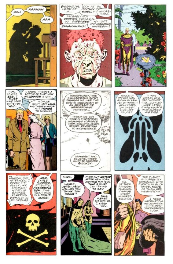
NewPage9From the thirteenth issue of Watchmen by Alan Moore and Dave Gibbons, assembled by Miguel Corti.

The episode--she is long! (Just a bit over two hours and forty minutes, in fact.)

The show notes--they are extensive!

So join me after the jump for both, and a bit more about Watchmen issue #13!

Oh, and hey, let us know how this episode sounds to you, eh?  I gave a listen to the sound quality of the first call before throwing it into Levelator and thought it sounded...really okay?  So I'm mixing this raw.

0:00-3:38:  So, is this episode where Graeme is Goofus and Jeff is Gallant?  (Spoiler: No.)  But Jeff is much more chipper than last week, certainly.  At least until we starting discussing... 3:38-6:18: Comics!  (More specifically, Marvel Comics.) (Ultra-specifically, the twenty variant covers for Uncanny Avengers.) 6:18-28:46: Which leads us into discussion of Avengers Vs. X-Men #12 which Graeme has read and Jeff has not so it's time for some heavy-duty recapping on the part of Mr. McMillan. 28:46-43:52: Getting back to twenty variant covers situation, we ponder whether the fact Uncanny didn't outsell Walking Dead #100 is... a good thing? A bad thing?  Just a thing? [Insert "It's Clobbering Time" joke here, as appropriate.]  This ping-pongs us back to talking about (for lack of better expressions) "natural" events vs. "forced" events with Avengers Vs. X-Men, its sales, and whether or not the event was review-proof. 43:52-55:09: Sensibly, Graeme uses the recent (stunningly great) Grantland excerpt of Sean Howe's Marvel Comics: The Untold Story to compare and contrast Marvel's current marketing and operating approach with those prior.  The more things change, the more they stay the same? Well, maybe as far as killing off major characters and trying to capture female readers go.  But if you've ever enjoyed listening to us talk about Steve Englehart and Jim Starlin, you should most definitely check out the excerpt...and probably the book?  (Also, if you haven't seen Howe's amazing Tumblr, check that out too. 55:09-59:40:  Another book up Graeme's sleeve: Batman #13, the first part of the upcoming "Death of the Family" storyline. Jeff counters with Action Comics #13 by Grant Morrison and Travel Foreman. 59:40-1:06:04:  Graeme talks a bit about The Nao of Brown by Glyn Dillon, published by Self Made Hero and distributed in the U.S. by Abrams.  For you pull-quote types:  Graeme McMillan says "It is just a blinding book" and "the most beautiful comic I've seen in the longest time." 1:06:04-1:29:19:  This gives Jeff an opening to talk about Gordon Harris' self-published graphic novel, Pedestrian, Graeme mentions Josh Cotter's Skyscrapers of the Midwest which we hunt up on Comixology.  Doing so reminds Graeme he had also read the digital only sequel to Chris Roberson's Memorial... which leads us to spend a few minutes kicking around the can that is digital pricing and real vs. perceived value using such varied examples as a Digital 2000AD subscription, Saga, Valiant's digital editions, Bandette, Comixology sales, full-price books from Marvel and DC, Shonen Jump Alpha, and more. 1:29:19-2:02:32: A quick rundown by Jeff of the other books he's read this recently: Harbinger issues #1 and #2, a detailed  discussion with Graeme about Amelia Cole and the Unknown World, Black Kiss #2.3, Fatale #8, the very strange saga that is issues #7-10 of Star Wars by Roy Thomas, Don Glut, Howard Chaykin, and Tom Palmer, Axe Cop: President of the World #3, a stunning story by Michael Fleisher and Alex Nino from Showcase Presents House of Mystery (Vol. 3) (and thanks, Dylan Cassard, for that one--you should check out his podcast and podcast-related Kickstarter).  All of which reminds Graeme (somehow) that he's also read issue #0 of The Phantom Stranger. 2:02:32-2:18:48: Also, Graeme has read Thanos: The End by Jim Starlin as well as The Return of Thanos trade paperback featuring both issues of The Thanos Quest.  We talk about that, a little bit about Englehart's first issue on Silver Surfer with Marshall Rogers, The Annihilation books, DC's Cosmic Odyssey, as well as Graeme's favorite Green Lantern. This is what happens when you meet a stranger in the Alps! 2:18:48-end: And then, finally, we talk about the stunner that is the 13th issue of Watchmen, which listener Miguel Corti assembled after a discussion Graeme and I had on-air about just such an issue being via random cut-up of the first twelve.  Here's Miguel talking about the idea and how he executed it, excerpted from our correspondence:

Anyway, my original plan to show my appreciation for the effort you put into creating a show that I enjoy listening to was to make something for you based off of a throwaway idea from one of the episodes that came out in either early 2012 or late 2011. In that episode you discussed the idea of creating a 13th issue of “Watchmen” based on randomly picking panels out of the graphic novel and rearranging them until you had this ersatz issue. I was intrigued by the idea since I had just finished re-reading “Watchmen” and re-watching the movie version because I wanted to thoroughly compare the two and see why the book works and the movie doesn’t, especially since Snyder was so slavish about adapting the source material. Well, a little synchronicity was all it took to get my creative blood flowing, and I decided I would make that heretofore nonexistent 13th issue as way of further analyzing the superb work Moore and Gibbons did with that book, and maybe as something you might be interested in seeing. [...] What follows are the steps that went into making this issue. Please skip to the end if the details hold no interest for you.

First, I had to find a copy of “Watchmen” that wouldn’t object to being gutted and mutilated so heartlessly. Not as easy as I thought. The only copy I had here in Japan was the Absolute Edition, and my softcover TPB was in the states. I just wasn’t up for taking digital photos of such an unwieldy book. So, I bought another softcover (used from amazon.co.jp) and tried taking pictures with that. Again, the quality wasn’t what I wanted. For a split second I contemplated cutting up the softcover, but fortunately the rational side of brain pointed out—quickly—that I would end up only being able to use the panels from one side of a page. So then I thought: a-ha! This is the digital age! I can just download a copy from DC and then take screenshots with the iPad and then transfer them to my computer. Well, wouldn’t you know it, but for whatever reason, none of the digital comics providers were selling “Watchmen.” No one. Not even DC. (This may have changed in the intervening time, but this was the fact of the matter when I started this project earlier this year.)

So, I turned to the pirates, and found a PDF of the entire series and downloaded it. I’m not proud, but since I had already purchased the book 3 times in my life, this was as close to a victimless crime as I was going to get. (Unless, of course, you count all the people who were leaching off my seed with bittorrent while I was downloading it. There’s a chance some of them never have and never will buy the book.) If I could have found a proper digital copy (which would have made the work a lot easier) I would have gladly bought it. Unfortunately, I had to come to terms with the moral ambiguity of the situation and move on.

Next, came breaking down the work. I remember you had discussed that the book was a 9-panel affair throughout. In theory, yes, but there are a lot of double and triple panels throughout the book. Each page is built on a 9-grid layout, however. In some places, there are a whopping 18 panels on the page, but they’re still laid out with the 9 grids. I assigned each grid a number. For example, the panel in the top right of page 5 in issue 1 with Rorschach picking up the Comedian’s happy face pin would be 1-5-3 (issue 1, page 5, panel 3).  The panel after it would be 1-5-4. I made an Excel sheet with the entire book broken down like that. I needed the numbers to all fit within the margins of the paper I was going to print out, because I was going to cut them up and literally pull panel/grid numbers out of a hat. (It ended up being a plastic bag.) Unfortunately, all the issues don’t have the same page count, prohibiting me from doing a simple copy/paste over the whole file. The first issue is 26 pages, then issues 2 through 11 are 28 each, and issue 12 is 32.

After sorting that out, I printed out the file and sat down to cut it up. But, wait! On the last panel of every page, the panel is always abbreviated to allow space for a quotation in a black box. I couldn’t have my 13th issues without one of those, so I needed to separate the 9th panel/grid for each issue’s last page from the rest of the panels. I highlighted them so I could find them after cutting up the pages, and set those 12 scraps of paper aside. (The one I ended up using in my issue is from issue 5.)

Having cut up all the pages, and placed all the scraps in a plastic bag, I thought it would be easy as pulling numbers out of hat. I was wrong. Again, it’s that damn 9-panel grid that messes with you. Sometimes some panels take up more than 1 grid space, and that would alter what I was trying to do. Usually, I would pull 9 scraps out of the bag, and then record them in the order I pulled them. Then I would copy the panel from the PDF into a Word document. I ran into trouble when, for instance, I would go to get the panel matching the number on the 3rd scrap of paper, but it would turn out to be a 2- or 3-grid panel, or more on some occasions. This meant I had to discard that scrap for now, and keep pulling new one’s until I found one that match the space allotted.

What the last two paragraphs showed me is that even though I tried to make my fake issue as random as possible, that randomness was still subordinate to the original work. You can only imagine the relief I felt at work saved when the first scrap I pulled for one of the pages happened to be from the grid of one of the full-page panels in issue 12. That was the easiest day of copy-pasting-cropping during the whole project.

For the last page, I pulled a scrap from the final panels first because, well, not all of them only occupy one grid’s worth of real estate. This was the only time I went out of order.

Finally, I needed an ersatz cover for my ersatz issue 13. As you probably already know, the cover images of the original series all lead in to the first panel of the interior art. I took my cover from the panel before 10-16-2. If I was any good with Photoshop, hell if I even owned Photoshop, I would have been able to edit out that tail from the word balloon, but so be it. OK, enough of the nuts and bolts. What did I learn? First, the issue itself. It’s just as unreadable as you would imagine an endeavor like this to be. However, there are some interesting aspects that illuminate the whole.

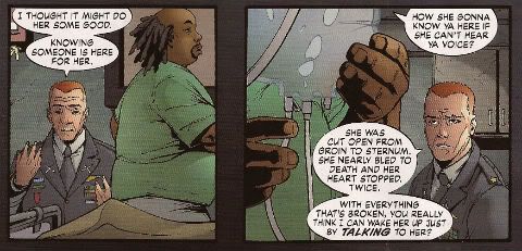
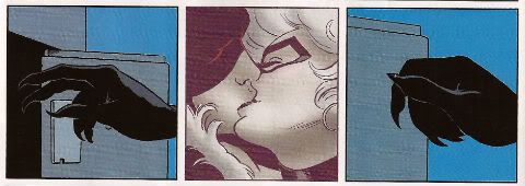
1.     Dave Gibbons drew way more 2-or-more-grid panels than I remembered, which shows how important the size and pacing of the layout was to the story. Every time I come across a comic with half a page’s real estate devoted to something mundane like a plane flying or a car driving, it makes me want to drop the book. I don’t know if the writer or the artist is to blame, but most of the panels in modern comics don’t require that much space, especially now with the shortened book lengths. Gibbons and Moore paced “Watchmen” perfectly, and when panels are drawn bigger than average, it’s for an important reason. The opening full-page panels of issue 12 are shocking because Gibbons held that back until the very end. And despite their size, you’re not sure of what your seeing because you’re visually overwhelmed (at least the first time through), which is the disorienting feeling, I believe, they wanted to convey. Every time I read a comic now that ends with a full-page splash of just a person sitting in a darkened room with no visible background, I want to throw it across the room. And then maybe walk over, pick it up, and tear it apart. Too many modern comics writers and illustrators are just piss-poor storytellers. Whatever your opinion of the work “Watchmen” may be, I think it’s hard to argue against the fact that it is pure comics from start to finish. It’s rare to find creators who actually embrace the medium and do what books and film cannot. I spend an inordinate amount of time thinking about this because it is tangential to my field of employment (video games) where too many games are trying to be movies instead of doing what they should be doing: being and interactive medium. Games that fail to be interactive are doing a disserve to the consumers, and comics that settle for storytelling that could just have easily been done in a movie or book, or even better in those media, are doing a disservice to comics readers everywhere. 2.    As the narrations of Rorschach and Dr. Manhattan are the most prevalent  in the work, their panels in this composite issue have a weird interstitial effect of ordering the randomness of the chosen panels. It helps that in many of Dr. Manhattan’s source narrations he was already jumping around the timeline, so it doesn’t feel out of place here. Many of Dr. Manhattan’s panels tied eerily to the next panel, although the placement was random and almost always from a non-sequential section of the story. For example, on page 12, panel 3, Dr. Manhattan narrates, “They’re shaping me into something gaudy and lethal…” Then the next panel depicts Adrian in his gaudy purple suit swinging a post at his erstwhile assailant. On page 13, panel 2, Dr. Manhattan again narrates: “Laurie’s met him several times. She says his name is Dreiberg.” In the next panel Nite Owl and Silk Spectre are locked in a kiss. There are many other pieces of synchronicity, but the best are tied to Rorschach and Dr. Manhattan because of their strong narratives. In my issues 13, the story becomes Dr. Manhattan’s tale to tell, with Rorschach in a supporting role, a victim of the event surrounding him. One could argue that this isn’t too far from the original’s narrative. The fact that it continues to be so in this jumble I have assembled speaks to the focus and intent of the original. Or maybe there were just too damn many Dr. Manhattan panels to begin with. 3.    Almost all of the commentary on politics and the Cold War itself is lost in my issue. Time is the only strong theme from the original work that remains. Again, that is one of Dr. Manhattan’s themes. The lack of that political backdrop robs the story of some of its weight. I felt that when I watched the movie version too. Because although Snyder is almost slavish in adapting the source material, he does it ever so superficially. Sure it’s still set in 1985, but it doesn’t feel like the world is on the brink of a nuclear war in the movie like it did in the book. New York doesn’t really feel like the dirty, crime-drenched metropolis of the ‘70s and ‘80s. In the book, despite all the advances in technology, New York still remains a non-gentrified, citywide slum, which is exactly what the mass media wanted you to believe about New York in the ‘80s. Snyder’s New York is too aestheticized to feel like it ever needed vigilantes in the first place. This also ties into the altered ending as well. I understand that a faux alien invasion spearheaded by a giant squid would have been a tough pill to swallow for viewing audiences of Snyder’s “realistic” superhero movie; but the fact of the matter is, Snyder revealed his ignorance of current affairs when he made that film 8 years after 9/11. In the book, just like after 9/11, it’s believable that the world would stand with the United States after the tragedy that had befallen it. In the movie, however, the fake Dr. Manhattan attacks hit cities around the world, not just New York. Again, not wholly bad, because of the fact that it was Dr. Manhattan and not an outsider, a la the alien, I have a hard time believing the world would unite in global cooperation. What’s more likely is that the world would erupt in furor at the U.S. for creating Dr. Manhattan in the first place. The U.S. would be culpable in the world’s eyes. What’s worse is that in the context of the movie, there’s nothing for the people of the world to not assume that this wasn’t an attack by the U.S. aside from the fact that the U.S. was hit as well. Since the world knows Dr. Manhattan was created in an accident, how does the world know that a preemptive attack by the U.S. on the Soviets didn’t backfire on them when they tried to exploit Dr. Manhattan?

As you'll hear on the podcast, Graeme and I greatly enjoyed reading Miguel's assemblage, and we wanted to give you the opportunity to check it out and get inspired for yourself. [link is 22.8MB]  And as I mentioned to Miguel in an email to him, I found this project and his analysis to be a tremendous DIY counterpoint to Before Watchmen--it really is a way to revisit Moore and Gibbon's story while respecting the original achievement. We are incredibly pleased to have played even the most indirect part in this project.

Hmm, feel like I'm forgetting something?  Oh yes, the podcast, the podcast... As tempting as it would be to add to the artsy shenanigans and leave only these notes and the book as a type of seashell on the beach for you to find, Episode 102 is indeed out there in the world (provided you define "the world" as your RSS provider of choice) and you can listen to it here as well, should you choose:

Wait, What?, Episode 102: Age of Chance

As always, we hope you enjoy...and thanks for listening!

"Let Him Be A Child A Little Longer." COMICS! Sometimes They Are Diverse!
Hey, the postman finally turned up. Photobucket

I guess the hostiles must have been restless out there in the Badlands or something. Anyway, he may not have rung twice but he did drop off a box of comics. Here's me going on about some of them after the break: A NOTE FOR OUR AUDIENCE: According to Brian "Link-Hider General" Hibbs you can now purchase some of these comics direct from The Savage Critics!

There is a link under both Comix Experience Links and Industry Links which says "Digital Comics From The SavCrit Store!". It's that one.

I have of course followed the rigorous journalistic code of the 21st Century and given all the comics available from that link a rating of EXCELLENT! No, not really, because as a salesman I am a bit lacking.

As ever, here's some comics and what I thought! Buy 'em! Don't buy 'em! Leave them at the scenes of violent crimes to throw off the Feds! I don't know, don't look at me for help. Because I'll just look down and whisper "No."

And Now Our Feature Presentation- SOME COMICS WHAT I DID READ:

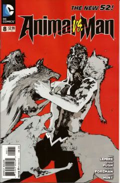
ANIMAL MAN #8 Art by Steve Pugh, Travel Foreman & Jeff Huet Written by Jeff Lemire Coloured by Lovern Kindzierski Lettered by Jared K. Fletcher DC Comics, $2.99 (2012) Animal Man created by Dave Wood and Carmine Infantino

Photobucket

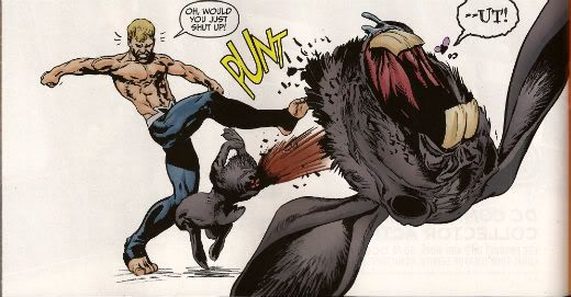
Since he literally throws his daughter to the wolves I’m afraid I have to say Buddy Baker is the worst father in the DCU and he’s a pretty craptastic superhero to boot. You’re going to have to think of something better than beating an army of undead animals to death one by one, Buddy Baker! This guy is such a dumbnuts I’m getting tired of reading about him. The best thing about ANIMAL MAN is that it reminds me how wonderful Steve Pugh’s art is.

Photobucket

I love the solidity he gives everything and the way his art allows the realistic and the insane to exist frictionlessly together. If he’s too radical for the DC masses, and it doesn't take much to be that, maybe Dynamite could get him on some books? Oh, I’m getting ahead of myself; I haven’t got to THE SHADOW yet. Anyway, ANIMAL MAN was OKAY! But really his wife would have left him about 6 issues ago and in about 3 issues I expect Social Services to be having a firm word in his shell-like. Buddy Baker is a danger to himself and everyone around him, and not in a good way.

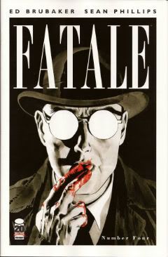
FATALE #4 Art by Sean Phillips Written by Ed Brubaker Coloured by Dave Stewart Image Comics, $3.50 (2012) Fatale created by Ed Brubaker and Sean Phillips

Photobucket

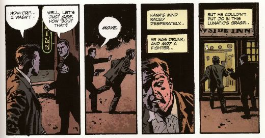
Um, I don’t want to be the party pooper but I’m not really feeling this one. Where others would see complexity I see only confusion and the horror and crime aspects don’t mix well at all; blanding each other out if anything. I’m not convinced at all that Brubaker & Phillips are as deft with horror as they are with crime. There’s one sequence in particular which is meant to suggest the soiled undersheet of reality flickering on the edges of the protagonist’s vision, but it takes up a whole page. Which is a bit like the secret supernatural underpinnings of the world putting on a straw boater and doing back flips in front of you while belting out showtunes. Subtly unsettling it’s not. Mind you this series seems to not be a lot of things. Coherent and inventive being amongst the things it isn't. So far the whole thing seems a stolid muddle which barely fends off the blunt teeth of cliché. The police scenes are about the width of a gnat’s dick from busting out the old “This is straight from The Fifth Floor, you've got 24 hours to clear this case or you’re back handing out parking tickets! Capiche, you maverick bastard!”  And then there are the narrative captions and, boy howdy, are they bad. But then I think there’s a difference between understated and lifeless. These things are like “I saw a cat. It was big.” bad. It’s like Dan Brown bad. But then Dan Brown’s very successful isn't he?

Photobucket

After all, in a shocking real-life terror twist, it turns out that FATALE is the most successful thing Brubaker & Phillips have produced. Previously this was true of INCOGNITO which I thought was pretty bad. So, it looks like success beckons the Brubaker & Phillips team, but what appears to bring them success isn't what brings me reading pleasure. Mind you, they are professional enough to produce a comic that despite my tinny whinging still comes off as OKAY! While I found the front matter lacking, Stephen Blackmoore provides a compelling backmatter piece concerning a real life gumshoe called Harry Raymond. That bit was VERY GOOD!

You can buy FATALE from HERE.

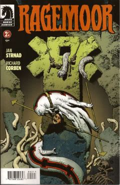
RAGEMOOR #2 Art by Richard Corben Written by Jan Strnad Lettered by Nate Piekos of Blambot® Dark Horse Comics, $3.50 (2012) Ragemoor created by Richard Corben and Jan Strnad

Photobucket

Corben’s art looks a bit odd in this issue, as though he’s got some settings wrong on his software or something. It looks a lot less crisp than last issue. It’s still great because it’s still Richard Corben but…still. Fortunately Strnad’s scripting is really strong so that helps soothe any misgivings. I didn't really know where the series could go after the first issue’s seemingly complete unto itself set-up.

Photobucket

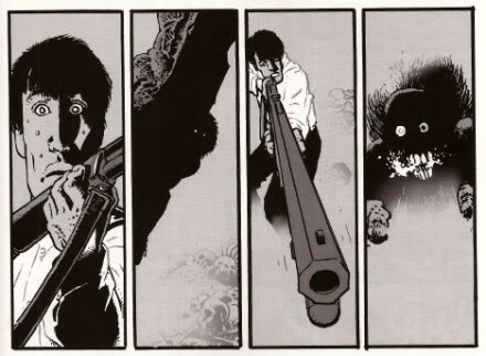
I certainly didn't expect it to make the previously understated humour blossom so broadly; so broadly that at times it verges on farce. I certainly wouldn't have expected it to work so well either. There’s horror here but humour too and in an impressive feat of facility each complements the other leading to a comic that is a really satisfying read indeed. I don’t want to give too much away but hopefully the fact I thought it was VERY GOOD! will be enough to tempt the unwary!

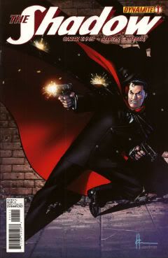
THE SHADOW #1 Art by Aaron Campbell Written by Garth Ennis Coloured by Carlos Lopez Lettered by Rob Steen Dynamite, $3.99 (2012) The Shadow created by Walter B. Gibson

Photobucket

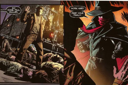
I know you've all been on tenterhooks so let me assure you that I did indeed receive a copy of this comic with the Howard Victor Chaykin cover. I thank you all for thinking of me during this period of uncertainty. It was always a bit of a gamble though wasn't it? What with Dynamite’s penchant for plural covers. Mostly they get some decent names doing some good stuff. Howard Victor Chaykin, for instance, obviously did this one well before it struck Gin O’Clock at Chaykin Towers. He’s even used a different face shape; nice job Howard Victor Chaykin!  The art on the inside of Dynamite’s books tends to be a bit more problematic. Problematic in the Early Anglo Saxon sense of “bloody awful”. Aaron Campbell manages to buck this trend by being decent for most of the book, except when The Shadow erupts into murderous action at which point Aaron Campbell impresses the Heck out of me. Really, jolly good work on those parts! I’m still not a massive fan of the old drawing over the top of photographs business so the rest of the book was just okay art wise.

Photobucket

Ennis is behaving himself too, there's none of that aggressively puerile "funny" stuff or lashing out at easy targets with a nuclear bomb strapped to a machete. He seems to actually be having a good time too. He certainly gives The Shadow a clear personality, one that's all the more entertaining for being composed primarily of arrogant bastardry. But he's not without empathy either, which is a nice trick to pull off. The whole shebang is set in one of Ennis' well researched eras of upheaval, or at least imminent upheaval. Because, and it's to his credit this, Garth Ennis is one of the few writers in comics who shows evidence of reading books other than How To Bland Out And Find Big Bucks In TV And Movies. Books that demonstrate an interest on his part in the world around him rather than a monomaniacal need to write THE MENTALIST.  If you like Ennis' war books you'll like this. If you like The Shadow you'll like this. Blimey, if you just like decent comics you'll like this. Because it's actually VERY GOOD!

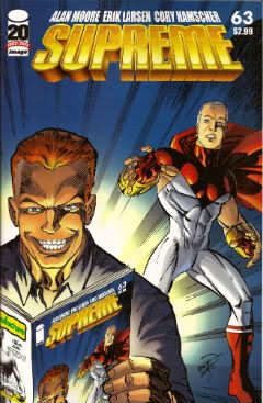
SUPREME #63 Art by Erik Larsen & Cory Hamscher Written by Alan Moore Coloured by Steve Oliff Lettered by Chris Eliopoulos Image Comics, $2.99 (2012) Supreme created by Rob Liefeld

Photobucket

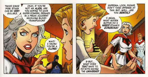
SUPREME is an Alan Moore genre comic. I miss Alan Moore’s genre comics. Alan Moore’s genre comics were packed with invention and humour. Alan Moore’s genre comics had more ideas on the page than most of today’s self proclaimed genii have in a lifetime. Alan Moore’s genre comics played with the form in a way that was charming and cheeky. Alan Moore’s genre comics had characters with character, but their character was never static and if it changed it would do so coherently. Alan Moore’s genre comics had craft. Alan Moore’s genre comics had joy. Alan Moore’s genre comics were VERY GOOD! Yeah, genre comics are much better off without Alan Moore. Yeah, F***k you, Alan Moore! Don't let the door hit you on the way out, Alan Moore! We don't need you, Alan Moore! We never needed you! We've got AVENGERS Vs X-MEN and BEFORE WATCHMEN now!

Photobucket

Oh God, what have we done. COME BACK, ALAN MOORE!

...please...

You can buy SUPREME from HERE.

And that's your lot!  Yes, even I have other stuff to do!

Hope you had a good weekend, everyone!

Blah blah blah COMICS!!!

"Clod. I Have WEAPONS..." Comics! Sometimes They Are Almost Fresh!

It's a post about comics! Is it early? Is it late? Time is in flux!Only if one man can face his Pull List can The Balance be restored!

One Man. One Pull List. There will be Words... (...probably the wrong ones). Photobucket

ACTION COMICS #6 “When Superman Learned To Fly” by By Andy Kubert/John Dell(a), Grant Morrison(w), Brad Anderson(c) and Patrick Brosseau(l) and “Last Day” by Chriscross(a), Sholly Fish(w), Jose Vallarubia(c) and Carlos M. Mangual(l) (DC Comics, $3.99) Superman created by Jerry Siegel and Joe Shuster.

Photobucket

 I like that stuff in my comics but I'm not unaware that in real life that kind of thinking gets you killed.

While there could be said to be many faults with the lead story in this issue such as an apparent attempt to distract from a lack of clarity (or indeed even sense) with a belligerently unslackening pace and art that once again belies Andy Kubert's alleged superstar status it remains a fact that in this story Superman's enemies conduct an auction for Kryptonite within Superman's own brain (physically, literally within Superman's own brain) and Superman uses his own Kryptonite poisoned body as a battery to save his both his own sentient ship and the day entire. Yes, Superman's enemies conduct an auction for Kryptonite within Superman's own brain (physically, literally within Superman's own brain) and Superman uses his own Kryptonite poisoned body as a battery to save his both his own sentient ship and the day entire. That's Superman comics enough for me!

The backup is the kind of sweet and tender emotional snapshot of a transitional moment in life that anyone under forty will treat as though it were sentient dog-muck hellbent on French kissing them; that's okay because I enjoyed it enough for y'all! Yup, ACTION COMICS was GOOD!

 STATUS: REMAINS ON THE LIST!


ALL-STAR WESTERN #6 “Beneath The Bat-Cave” by Moritat(a), Justin Gray & Jimmy Palmiotti(w), Gabriel Bautista(c) and Rob Leigh(l) and “The Barbary Ghost Part 3” by Phil Winslade(a), Justin Gray & Jimmy Palmiotti(w), Dominic Regan(c) and Rob Leigh(l) (DC Comics, $3.99) Jonah Hex created by John Albano and Tony Dezuniga. The Barbary Ghost created by Gray, Palmiotti and Winslade

Photobucket

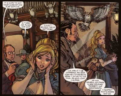
Kids! How many owls can you spot!

Thank the Great Spirit! Next issue ol' bacon face is off to N'Orleans! where there will no doubt be "gumbo" galore but at least there won't be anymore shoehorning of Batman references into a book that doesn't need them. A cave beneath Wayne Manor! Filled with Bats! This cretinous continuity reached a kind of hilarious nadir with the sudden slew of references to Owls: because Batman is currently encountering stress of a strigiform stripe by all accounts in the here and now! So we get about two pages in which the characters can barely move around the mansion setting for all the owls dangling, roosting, flopping and just plain flailing around the place. It's as though Moritat has snapped and gone "You want owls? Here! Here are your owls! Got enough owls yet? I don't think so! Owls! Here! Now! In your face! All! Owls! Touch them! Touch my owls! Tell me they're pretty! Owls!" and then gone for a long lie down. Stupid owls. Anyway I'm a little bit partial to Jonah so it was still OKAY!

 STATUS: REMAINS ON THE LIST!

ANIMAL MAN #6 “Tights” by Jean Paul Leon & Travel Foreman/Jeff Huett(a), Jeff Lemire(w), Lovern Kindzierski(c) and Jared K. Fletcher(l) (DC Comics,$2.99) Animal Man created by Dave Wood and Carmine Infantino

Photobucket

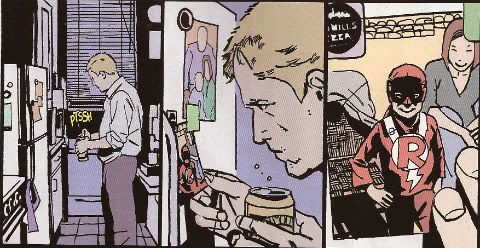
Movie Cliche #23415678: Sad Dad at fridge with beer and photo of son. Collect the set!

Tricky one this. Has Jeff Lemire done a pitch-perfect satire of the vapid screenwriting cliches that have run roughshod over comics beautiful storytelling devices or does he actually believe this is a decent film script made comics? It's hard to tell isn't it. Heck, I don't know maybe you thought it was awesome? Luckily it's easy to tell that Jean Paul Leon is an awesome artist and hopefully one day he will draw comics as awesome as WINTER MEN again. This issue is a complete waste of time and is clearly a fill-in so next issue we should be back to Travel Foreman and his nightmarish body horror.

After I read the previous issue I fell into a light doze and dreamt about a man in a chair. I was holding the man in the chair via the power of some unknown threat. The man was crying and peeling his own skin off his own face with a small knife. I was then forcing him to eat it via the unspoken promise that if he did as I asked he could go free. The fact that the man was eating his own face was terrible but the worst thing was that we both knew I was lying and he wasn't leaving alive. But he had no choice but to do as I asked because that was his only hope. Yes, it's been a trying few months. They say there's nothing as boring as listening to someone else's dreams but they forgot about reading film scripts masquerading as comics which is so boring such comics are EH!

STATUS: REMAINS ON THE LIST (BUT WATCH IT)!


BATWOMAN#6 “To Drown The World - Part One” by Amy Reeder/Rob Hunter/Richard Friend(a) J.H. Williams III & W. Haden Blackman(w), Guy Major(c) and Todd Klein(l) (DC Comics,$2.99) Batwoman created by Bob Kane and Sheldon Moldoff (modern version by Greg Rucka and Alex Ross).

Photobucket

"Given the state of your medical insurance talking's about all you can afford so knock yourself out is my advice."

Wuh-hoof! That's certainly a change in artist alright. I'll stick it out for a bit because I always like people to get a fair shake of the critic stick. Initially I'm not  finding myself a fan of Reeder's thin line but I appreciate her attempts to step up her layouts. Given the writing is competent at best (actually that's a compliment in today's world o'comics) Reeder's got it all on her to raise this one up from EH!

STATUS: REMAINS ON THE LIST (FOR NOW!)

DAREDEVIL #9 By Paolo Rivera/Joe Rivera(a), Mark Waid(w), Javier Rodriguez(c) and VC’s Joe Caramagna(c) (Marvel Comics, $2.99) Daredevil created by Bill Everett and Stan Lee.

Photobucket

Storytelling in 'Not Dead' shock!

Unless Howard Victor Chaykin has been reactivated without my knowledge I guess this is the only Marvel comic I'm buying. That doesn't seem right, I'll have to check. Anyway, I'm buying this because Mark Waid understands that the bit with the boot is funnier and cleverer because it only takes up one panel. It's because Rivera Jnr and Snr make all kinds of spooky magic happen on these pages. It's because together the team on the book achieve the kind of synergy that results in the storytelling stuff from which the above image is but a sample. Yup, DAREDEVIL is a purchase because it is VERY GOOD!

(Hey, I hear Chris Samnee is coming aboard! I told you all I'd wait for him!)

STATUS: REMAINS ON THE LIST!

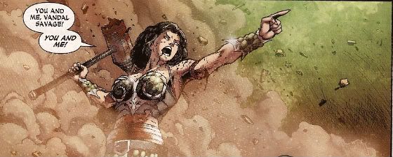
DEMON KNIGHTS #6 “The Balance” by Diogenes Neves & Robson Rocha with Oclair Albert(a), Paul Cornell(w), Marcelo Maiolo(c) and Jared K. Fletcher(l)(DC Comics, $2.99) The Demon created by Jack Kirby. Shining Knight originally created by Creig Flessel (modern incarnation created by Simone Bianchi and Grant Morrison). Vandal Savage created by Alfred Bester and Martin Nodell. Madame Xanadu created by Michael William Kaluta.

Photobucket

His reply is actually quite funny but I'm still baling.

Nah. I'm done. It just didn't work for me. Which is a shame as it wasn't terrible as such it just never gelled. Way too diffuse and lacking in focus both from a scripting and art standpoint. I mean, how big was this village, where was everything in relation to everything else? But like I say it wasn't terrible and I wish all involved well and hope the book works out further down the line but there are plenty of books I can read that aren't EH! And that's where my money's got to go. It's the Law of The Direct Market; savage and unrestrained!

STATUS: OFF THE LIST!

FATALE Number Two By Ed Brubaker, Sean Phillips and Dave Stewart (Image Comics, $3.50) Fatale created by Ed Brubaker and Sean Phillips.

Photobucket

 ...probably because for some odd reason she's drawn to look about 8 years old and acts as subtly as a silent movie siren?

People tend to refer to books by this team as "Brubaker" books don't they? Which is odd as I find Brubaker to be the least of the appeal they hold. I guess it's that whole Cult of The Writer thing or something. Hey now, hang on, I'm not saying Brubaker isn't good. He's got craft/technique/skill/whatever we're calling it now in spades it's just the result is, for me, mostly solid rather than inspired. Except when he gets Meta which is when the wheels start wobbling like they're about to pitch a fit (remember INCOGNITO where working in an office was "like" doing Indie comics but taking to the streets and letting your inner nature run wild was "like" working in the mainstream? Really? Um.). On the whole though I get well crafted genre staples served up with a slight twist but the real pleasure I get from this team's comics is in the form of Phillips and Stewart in conjunction with Brubaker. I'm not going to just roll around showing my belly because it hasn't got capes'n'tights in it, okay?

Here, I guess the High Concept (sigh) is Crime and Horror - together! Like Hope and Cosby! Like Morecambe and Wise! Which is fine because,hey, I like both. I'm not sure they belong smushed together though except as one of those novelty type deals. Y'know, all those Steve Niles things Steve Niles does. I guess Crime fiction tells us about the worst in ourselves and so does Horror fiction; they just use different tools. Using both sets just seems like doubling up and risking the results seeming lesser. Early days though, I mean, look at what porting Horror tropes into Crime did for James Ellroy ($$$$ is what it did, kids. Woof! Woof!). I don't think we're looking at an Ellroy here but we may be looking at an Angel Heart. And that's fine. I got a thing about chickens, Mr. Cyphre; as in I don't like to count them too soon but this one looks GOOD! so far.

STATUS: REMAINS ON THE LIST!

FRANKENSTEIN: AGENT of S.H.A.D.E. #6 “The Siege of S.H.A.D.E. City – Part One” by Alberto Ponticelli(a), Jeff Lemire(w), Jose Villarrubia(c) and Travis Lanham(l) (DC Comics, $2.99) Frankenstein: Agent of S.H.A.D.E created by Doug Mahnke and Grant Morrison (and Mary Shelley).

Photobucket

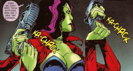
I am always happy to see the word "buffoons"!

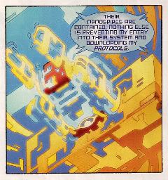
There's a bit in this issue that is pretty much a stealth WATCHMEN (by Alan Moore, Dave Gibbons and John Higgins) reference. It's the scene in the 'Nam bar between The Comedian and Doc Manhattan but here with Franky and a red, bald dude who is, basically, Dr. Manhattan and without any pregnant woman shooting or face glassing. That is to say without any of the actual important or troubling content. I'd call that an Omen were I of a credulous nature. Otherwise it's yet another issue of Hellboy in the DCU and which is Okefenokee by me!

STATUS: REMAINS ON THE LIST!


JUSTICE LEAGUE DARK#4 and #5 “In The Dark - Part Four and Finale” by Mikel Janin(a), Peter Milligan(w), Ulises Arreola(c) and Rob Leigh(l) (DC Comics, $2.99ea) John Constantine created by Alan Moore, John Totleben, Rick Veitch and Steve Bissette. Madame Xanadu created by Michael William Kaluta. Deadman created by Arnold Drake and Carmine Infantino. Shade, The Changing Man created by Steve Ditko. Zatanna created by Gardner Fox and Murphy Anderson. Enchantress created by Bob Haney and Howard Purcell. Dove created by Steve Ditko. Mindwarp created by Peter Milligan.

Photobucket

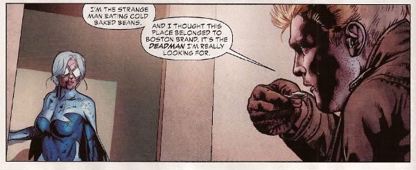
Stealth WATCHMEN reference#2. We get it, DC! You WIN!

I haven't enjoyed this. It's all been a bit like warmed-over '90s Milligan with stuff like "In Nebraska The Pokemon come alive and the screams of the bread-cakes dance like glass-kneed OAPs." Okay, not as warmed-over '90s Milligan as that DEFENDERS#1 preview perhaps but still not terribly inspired. I mean the sheer scale of events would suggest the body count is in the hundreds of thousands not to mention the country-wide trauma involved but there's no sense of any consequences.

No, I didn't like it. I did, however, enjoy Milligan's skeevy interpretation of Deadman. I would totally read a Peter Milligan Deadman series in which Deadman acted like one of those fantastic men who pressure their missus into all kinds of sexual situations that the missus clearly isn't all that into and it's all just about the guy exerting power over her so that's she's eventually roiling around in moral squalor with only the "fact" that he loves her to keep her sane. At which point the hilarious rogue tells her she's a sl*t and leaves her to fall to pieces while he starts the whole cycle with some other vulnerable woman. I think a comic like that would bring in new readers. Sh*theads mostly, but hey, sales are down! We can't afford to be be proud anymore! Despite creepy Deadman JLA: DARK was EH!

STATUS: DROPPED!

O.M.A.C. #5 and #6 “Occasionally Monsters Accidentally Crossover” By Keith Giffen/Scott Koblish(a), Dan Didio, Jeff lemire & Keith Giffen(w), Hi-Fi(c) and Travis Lanham(l) “One More Amorous Conflict” By Scott Kolins/Scott Koblish(a), Dan Didio & Keith Giffen(w), Hi-Fi(c) and Travis Lanham(l) (DC Comics, $2.99ea) O.M.A.C. created by Jack Kirby.

Photobucket

It's the hot dog that makes it great!

In #5 O.M.A.C. and Frankenstein Agent of S.H.A.D.E have a great big slobberknocker which entertains and amuses me on a base level which I have no shame in gratifying since I am okay with comics just being goofy, colourful fun. With #6 I realise that the main reason I like O.M.A.C is because of Keith Giffen's art because with #6 the artwork is by Scott Kolins and the only memorable thing about the issue is the fact that Leilani's breasts are pancaked in the same manner that Caroline Munro's were in The Golden Voyage of Sinbad. Yes, I realise that reflects badly on me as a human being but, honestly, what reflects badly on us as a society is the fact that we have fallen so low so fast that when you read The Golden Voyage of Sinbad you automatically assumed I was talking about a p*rn film rather than a children's fantasy film from the '7os.  So, um, anyway O.M.A.C was GOOD!

STATUS: REMAINS ON THE LIST!


PUNISHERMAX#22 “War’s End” By Steve Dillon(a), Jason Aaron(w), Matt Hollingsworth(c) and VC’s Cory Pettit(l) (MAX/Marvel Comics, $3.99) The Punisher created by Gerry Conway, Ross Andru and John Romita Snr.

Photobucket

"Now that we've solved the Energy Crisis! Who's up for a brewski!"

PUNISHERMAX#22 may just be the most subversive comic I read this year. Oh, not because of the ending because...really, Jason Aaron? Really? That's your ending? We can solve all societies problems by just rising up and killing the sh*t out of other folks? Really? Heck, maybe we just need a strong leader as well? Fancy your chances do you, Jason Aaron? What a crappy ending. Mind you, I live in a country where we only arm The Police, The Army and farmers. What? No, I don't know why we arm farmers, maybe because of all the lions? Or maybe they keep being carried off by subsidies in the night. Stop getting distracted by details. So, okay, maybe that ending is a bit more reasonable over there in The Americas. If it is, I will pray for you all. Christ, that irresponsible ending.

No, PUNISHERMAX #22 may just be the most subversive comic I have read all year because of the scene involving Elektra. Elektra is at the Hand headquarters after a savage battle with Frank. Elektra has served The Hand well for many years but now Elektra needs help from The Hand. Specifically medical help. But I guess The Hand doesn't have Health Insurance for its employees and since Elektra is no longer of any use to them they have no qualms in cutting her loose in the most final of ways. Despite knowing full well the conditions of her employment Elektra is still surprised and dismayed at this turn of events. But she should have expected it, really, because that's what you get for working for Marv..I mean The Hand. Say, is something bothering you, Jason Aaron? Stuff on your mind?

Oh, PUNISHERMAX was entertaining enough and the fact that I could never reconcile the interesting parts with the witless parts of it actually made it more interesting and brought the whole thing up to GOOD!

STATUS: Cancelled or Came To A Natural End When The Author Had Told The One Frank Castle Story He Felt He Was Born To Write. (Oh, yeah!)

RASL #13 By Jeff Smith (a/w/l) (Cartoon Books, $3.50) RASL created by Jeff Smith.

Photobucket

There's a couple of reasons I really like RASL. There used to be pretty much just one reason; that although none of the individual elements actually seemed unique in and of themselves they were combined in such a way as to present a story notable for its novelty and also the freshness of its presentation. There are many scenes in RASL which you have seen in other stories but this is not a problem with RASL because it isn't really a problem at all unless it is a problem with all stories. It is a problem with some stories because they will just go for the default setting of said scene; the one that's floating closest to the surface of the popular imagination due to repetition and exposure via Hollywood blockbusters for example.

Look at the Avengers Vs. X-Men preview and ask yourself whether the life sappingly tedious familiarity of every scene is intentional and while you have your own attention ask also how many pages until The President says "And may God have Mercy on us all." It's all about familiarity, oh yes, I am aware it's all pitifully legitimised by claims of "homage" but that's cockrot, it's all about familiarity; giving people what they already know they like. Of course eventually familiarity forgets to put its rubber on and breeds something; contempt. Not in the case of RASL though. RASL keeps me on my toes, RASL demands something from me - attention. In return it rewards me with quality entertainment. That seems fair enough to me.

The other, more recent, reason for liking RASL is that unless Jeff Smith has some kind of catastrophic breakdown involving his identity he won't be suing himself anytime soon. Yup, RASL is VERY GOOD!

STATUS: REMAINS ON THE LIST!

STATIC SHOCK #5 and #6 “True Natures” and “Unrepentant” by Scott McDaniel/Andy Owens(a), Scott McDaniel(w), Travis Lanham & Dezi Sienty(l) and Guy Major(c) (DC Comics, $2.99ea) Static created by Dwayne McDuffie and Jean Paul Leon.

Photobucket

 A DC writer on The Internet: Yesterday.

Well, that was certainly a stinker of a thing. I have no problem with Scott McDaniel's art by the way. Sometimes it lacks clarity but I respond well to the boldness of his line and the chunkiness of his figures. I find it quite pleasing on the whole. His writing has, however, been less than stellar. It's hard to know what to say about this disaster really except if you employ someone to write - let them write and let the artist take care of the pictures. It isn't like there's no room for synergy; the two can be responsible for both of those separate aspects but combine them when it comes to the storytelling. It's a collaborative medium, so I've heard. A mess like this just makes me sad. I'm not very savage at all because it dismays me to say STATIC SHOCK was AWFUL!

STATUS: DROPPED!

SWAMP THING#6 “The Black Queen” by Marco Rudy(a), Scott Snyder(w), Val Staples & lee Loughridge(c) and Travis Lanham(l) (DC Comics, $2.99) Swamp Thing created by Len Wein and Berni Wrightson.

Photobucket

This is horrible in all the wrong ways. It's nice having little shout outs to Dick Durock and Len Wein and my Nana Alice and all but, hey, where's the...well, where's anything? Splash page after splash page of nigh-contextless horror does not a narrative make. Seriously, I need to know what's going on on those pages if it's going to freak me out. Marco Rudy's art works hard to evoke the scabby nastiness of the Bissette, Veitch, Totleben years but what is going on? Something to do with rot, something to do with flesh. I'm sympathetic to the notion that specificity kills horror dead on the page but y'know I need some clue or it's just...stuff. And stuff isn't specific enough to be scary. And... The Parliament of Trees? Apparently you just walk up to them with a box of matches and, hey, game over Parliament of Trees. That's...stupid. Worst of all this turns out have just been one of those crappy origins that take six issues. Sure they could wrong foot us at the last and Abby could adopt the mantle but...it still took six issues. Six not very good issues. So yeah, SWAMP THING is EH! Moley, I just checked and it's six issues and counting to the origin, that doesn't help at all.

STATUS: DROPPED!

T.H.U.N.D.E.R. AGENTS #3 “A Godawful Small Affair” by Wes Craig & Walter Simonson/Bob Wiacek(a), Nick Spencer(w), Hi Fi & Lee Loughridge(c) and Jared K. Fletcher (l) (DC Comics, $2.99) T.H.U.N.D.E.R. Agents created by Wallace (“Woody” not “Wally”) Wood and Len Brown.

Photobucket

'Nuff Said!

STATUS: STICKING IT OUT FOR THE LAST THREE ISSUES!


So yeah, hope that was okay. If you disagree with any of it that's fine just let me know and we can throw it around like a pack of terriers with a rat. If you thought it was all totally spot-on then, Hi, Mom! Whatever happens those were my comics and that's what I thought.

Have a good week and remember to read some COMICS!

"But first, call your girlfriend..." Comics! Sometimes they are Nu!

Um, no show without Punch, right? Photobucket Well, how to follow all that, eh? All the Nu-DC reviewed and rated by some of the finest minds to have been damaged by comics at an early age! How about by saying exactly the same things about less comics but more leadenly, with more words and a smattering of shit jokes. Those being bad jokes as opposed to jokes about shit. Business as usual then!


WONDER WOMAN #1 By Cliff Chiang (a), Brian Azzarello (w), Matthew Wilson (c) and Jared K. Fletcher (l) (DC Comics, $2.99)

For someone as pickled in cape comics as I am I sure do have a deficiency in the area of Wonder Woman comics. In fact I think I only own those Wonder Woman issues John Byrne did. I own them but I haven’t read them. I think I was drunk on E-Bay or something. Anyway I don’t really have a clear idea of Wonder Woman but luckily neither does DC by all accounts (ho ho ho) so this blank slate beginning was perfect for me. After reading it I still have no idea about Wonder Woman because it’s not really about Wonder Woman after all or it is but it’s also about everybody else in it, kind of an ensemble piece.

Photobucket

I certainly wouldn't have gone for Azzarello’s idea of sticking Wonder Woman into GREEK STREET as my first choice but it turns out I’d be wrong because I really, really enjoyed this one. It’s creepy, eventful and surprisingly unsettling all in all and Cliff Chiang’s art is just the dreamiest. Cliff Chiang – reach out and touch him! I look forward to this characterisation of Wonder Woman being carried across to the JL where she will just straight gut Darkseid while he’s bloviating leading to a big Super-sigh from Supes and 21 pages of the JL trying not catch Wonder Woman’s eye while she stands there daring any of them to say anything. Because consistency of characterisation across the line is certainly what I expect from the Big 2! In this comic WONDER WOMAN was VERY GOOD!


MEN OF WAR #1 Tom Derenick, Phil Winslade (a),  Ivan Brandon, Jonathan Vankin (w), Matt Wilson, Thomas Ch (c) and Rob Leigh (l) (DC Comics, $3.99) I didn't ask for this one. I guess my LCS sent it because I chunter on about old war comics all the time. Watch: What’s this Men of War starring Frank Rock’s grandson business? What’s all that about? Rock stories appear in Our Army At War or Sgt Rock comics! Men of War is Gravedigger’s book! Why didn't they go with Gravedigger? He’s African-American so they could have picked up some of that sweet media heat.

This one looks like one of the rush-jobs because it isn't very interesting at all despite the revelation that apparently in the US Armed Forces on occasion you will be taken into a room where you will be told how much everyone you have ever met really likes you and then they will ask after your Mother. If you are a Captain you get a back rub and ice cream. There was a terrible moment when the issue opened with “Something warm on my face…wet…” but I checked and Judd Winick hadn't written it so I carried on. There’s some weird business with super heroes that lacks clarity, I’m guessing nu-Rock will have a chip on his shoulder about capes. I’m guessing this since the mission goes big-time number ten SNAFU as soon as the cape turns up. I’m thinking someone wants to plan their Ops a bit more thoroughly than sending in the ground boys and then just have a cape jizz about blowing stuff up and crashing into everything willy nilly. I’m no Patton but a bit of planning might help.

Photobucket  "Exciting stuff, there!"

There’s quite a lot of action in this but it isn’t terribly interestingly delivered, which is a shame because that means most of the issue isn’t terribly interesting. C’mon, Tom Derenick, I know it can’t be easy making this stuff look exciting but, I don’t know if you've heard, there ain’t nothing easy in Easy Company! There’s a back-up that is exactly like some early ‘60s Robert Kanigher/Irv Novick short about fighting men and how they are men who are fighting. Which was okay back then but I checked with a passing young person and apparently it is now 2011, so that’s not so good. There’s the usual lovely gangly scratchiness from Phil Winslade on this bit so that’s nice. But his presence suggests someone put this comic together in a rush because although Phil Winslade deserves better he appears to be DC’s first choice for pinch-hitting on non-cape comics. Overall then MEN OF WAR #1 is kind of like stumbling into a pit of confusion laced with punji sticks carved from clichés. Proving once again that War is EH!


ACTION COMICS #1 By Rags Morales/Rick Bryant (a), Grant Morrison (w), Brad Anderson (c) and Patrick Brosseau (l) (DC Comics, $3.99)

Beginning a bold new era in Superman comics! An era of Superman comics I actually want to read! That’s an exciting notion right there, DC Comics; Superman comics people might enjoy. Judging from this issue this bold experiment is working out okay. This is pretty much the kind of capey first issue Grant Morrison can probably spuff out in his sleep by now. It starts at full pelt and just keeps barrelling along with the odd handful of exposition and foreshadowing thrown at the eager reader’s face as it whistles past. Nicely done. Rags Morales was obviously a bit time constrained but for the most part his art is pretty lovely. Other parts are just jarring, like when I was enjoying Lex Luthor’s regal new nose only to turn the page to find he had somehow turned into a beatific bald child, later on his nu-nose was back, but, c’mon. let’s try and keep on-model here, guys.  I really enjoyed Lex Luthor in this, he was given some kind of reasonable motivation for his Super-hate and did that suave thing where he basically does what they paid him for without even breaking a sweat (or registering the colossal property damage and human injuries involved) and then just saunters off. Stylish!

Photobucket "Hey, anyone seen a berk? Superman needs to talk to a berk!"

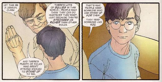
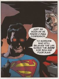
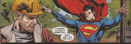
Superman intimidating that there fellow into a confession? Have to say it didn't bother me that much. The dude he drops is clearly (almost comically so) established to have done Wrong. So, it’s not even a Left/Right wing thing either. He’s a Bad, Bad Man!  Of course what Superman does isn't super-nice but then he is basically a power fantasy after all. And, yeah, big old woolly minded Liberals like me have them too. But a part of the power fantasy of Superman is: He’s Right So It’s Okay. Anyway wasn't all this sorted around 1986 with that book WHATCHAMAFLIP where it showed if capes existed then they’d be co-opted by The Man, hunted as criminals, retire quietly or be big, blue men who liked to feel it swing in the wind? As another book that year said “We have always been criminals, Clark.” It’s just one of those things you agree not to notice when you pick up a cape book, I think. C’mon, I noted at least two people had had their head pushed through a wall/table by Superman. I’m pretty sure that’s likely to be fatal. But I bet it wasn't, because, y’know, it’s…Superman! Suspension of disbelief, people, have some on you at all times! And so Superman, and thus, ACTION COMICS #1, is VERY GOOD!


DEMON KNIGHTS #1 By Diogenes Neves/Oclair Albert (a), Paul Cornell (w), Marcelo Maiolo (c) and Jared K. Fletcher (l). The Demon created by JACK KIRBY. (See Marvel, who did that hurt? Eh?!) (DC Comics. $2.99)

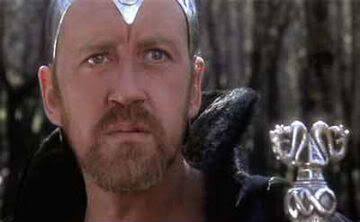
I don’t know about this one, I’d guess it was slapped together for the Nu-push at short notice. It’s got concepts and ideas but it all just seems a bit bunged out, a bit “Table Four are getting up to leave! Soup now, Chef!” While it just never really gelled for me it did have appealing elements such as the mix of characters and a working sense of humour. Sadly Cornell drops a bollock by making Merlin practically characterless. As anyone who has seen EXCALIBUR will attest Merlin must always evoke Nicol Williamson’s fantastic I-have-decided-I-am-in-a-different-film-to-everyone-else performance, otherwise your Merlin just ain't happening, pal. Ignoring that but given the very real problems I had with the comic I can’t in all conscience give it better than EH! But since I sense some potential I’m hoping it’ll at least get to GOOD! But try to remember that not everyone is as patient and lovely as me, DC!

Photobucket

"It is the DOOM of Marvel that they refuse to credit Jack Kirby. Hmmm!"

SWAMP THING #1 By Yanick Paquette (a), Scott Snyder (w), Nathan Fairbairn (c) and John J. Hill (l) (DC Comics, $2.99)

It’s lucky I’m not in a Scott Snyder comic or I’d be discomforting Superman with that time my Dad said unfortunate things about immigrants or how this whole dead birds and fish thing is a bit like my Dad saying how people park in front of your house and, yeah, you don’t own the bit outside your front window but, really now, is it too much to ask for just a little common decency here, Superman? But I’m not in it, Alec Holland is. Interestingly despite having returned magically from the dead after a period of some years Alec Holland is still way more employable than me. He’s on his second job since he just popped up a few weeks ago and he’s made the transition from botanical boffin to horny handed builder without missing a step. Versatility is the key in times of recession, jobseekers! Having been dead and then kind-of-maybe-not-sure-been Swamp Thing has left him with the super power of being able to tell which planks are spoiled by rot via touching and staring; I guess that swung the interview despite the Death Gap Years on his C.V. and total lack of experience. I liked that bit, the bit where we get a crash course on rot and also the bit about the anti-inflammatory properties of cabbage leaves. I hear they saved the bit about the effects of coriander on erectile dysfunction for another comic.

Photobucket "Oh hush now and dance with me you fool!" I also enjoyed the bit about the slow-motion savagery of The Green. Mind you, that sounded familiar; is that from He Who Cannot Be Named’s run? Speaking of  which there are cute shout outs to previous Swamp Thing comics (the logo on the diggers, Holland’s pass code, the name of the motel, etc) but the most obvious throwback is the style, which is very like The Nameless One’s early issues. Not as good, mind you, but similar. The art’s nice as well. I don’t envy Paquette having to draw all that…real stuff but he does it well displaying a commendable range. I heard that he had to redraw some of it as well to incorporate Superman’s new, um, look so kudos for the extra effort there. Hopefully it’ll get a bit smoother now the set-up is over, maybe Swamp Thing will be on more than one page and we’ll hear less Dad wisdom but, yeah, it’s a little bit talky and it’s a little bit creepy (like me, huh! Well, that's nice.) I…guess…it…was…OKAY!


FRANKENSTEIN AGENT OF S.H.A.D.E #1 By Albert Ponticelli (a), Jeff Lemire (w), Jose Villarrubia (c) and Pat Brosseau (l) (DC Comics, $2.99)

I’m okay about Jeff Lemire, I enjoyed that book he did about the sad kid and the grumpy ex hockey player and then that series he does about the sad kid with antlers and the grumpy ex-hockey player after the apocalypse. I thought I’d try this one to see if he could maybe expand his range a bit. Because apparently it’s really laudatory for creators to “go outside their comfort zones”. Which, yeah, it is but only if they avoid moving all their old baggage and furniture in so that in no time at all the place pretty much looks like their old comfort zone. (I’m not talking about Jeff Lemire here, SWEET TOOTH and ESSEX COUNTY are very different, that was a cheap gag earlier so I could cram this next bit in.) Some of these guys who get a rep for “going outside their comfort zone” remind me of a certain tendency we Brits have. This being a tendency to go somewhere exotic and then find the nearest English theme pub and sit in it for two weeks eating Yorkshire puddings and drinking binge while looking at a foreign sky out of the window. Anyway this one’s about a sad monster kid and his team of undead ex-hockey players. No, not really it was just punchline time!

Photobucket

 "Keats was a pussy, Palmer! Larkin, dude! Larkin!"

It is, as has been stated by better people, quite similar to Xombi. You remember Xombi; the fresh and fizzy breakneck ride packed with invention and incident that didn't stint on characterisation and was illustrated by someone who clearly gave a shit about what he was doing. The one that got cancelled after 6 issues. This is a bit like Xombi but, I don’t want to be mean (after all I (spoiler!) liked it just fine), but a bit more pedestrian, a bit more stale. A bit more likely to survive, I guess. Of course it’s got a bit of a hand up since it’s riding the crest of the nu-wave. Did this one sell out? Six months ago would this have sold out? Questions there - show your workings. So there’s an immediate benefit the relaunch has had. Stuff that’s a bit quirky, a bit off-beat has a far likelier chance to survive. That can’t be a bad thing can it? I guess once Lemire gets rid of the stock crazy ideas that float on top of his mind things should get more interesting and the series might actually have a chance to last that long. At the moment though it’s OKAY!


ANIMAL MAN #1 By Travel Foreman/Dan Green (a), Jeff Lemire (w), Lovern Kinzierski (c) and Jared K. Fletcher (l) (DC Comics, $2.99)

This one seems to have been pretty clearly in the can before the call to arms came. I think the tell is just how polished it is. It’s a really tidy little first issue which tells you who everyone is in relation to each other, how Animal Man’s powers work, how he is in a crisis, where he stands in the wider world and demonstrates that whoever’s inking it should really sort that out pronto, because some of it was real gloopy. In fact the execution is almost kind of a bit too efficient for me, almost a bit too TV for me.

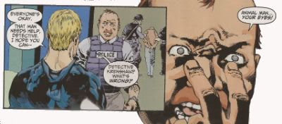
Photobucket "They're...they're in your face!"

Luckily there were some appealing rough spots such as Buddy and Ellen’s interaction (I thought it was pretty “realistic” couple chat action myself. Unless that reflects badly on me in which case it was terrible! Terrible!, I say!) and Travel Foreman’s quirky art which had quite a lot of space in it which worked to make things a bit not unpleasingly discombobulating for this reader at least. I’ll stick around for a bit anyway as it was, on the whole, GOOD! However, if Buddy’s kids start being sad and Buddy turns out to have a past playing hockey, I’m gone, bubba!


OMAC#1 By Keith Giffen/Scott Koblish (a), Dan Didio/Keith Giffen (w), Hi-Fi (c) and Travis Lanham (l) (DC Comics, $2.99)

Step back! It’s an OMAC attack! The Buddha of Budda!budda!budda! is back! OMAC! Created by JACK! Bubblegum bellicosity Kirby style! I believe it only right that there should be a corner of comics that is forever Kirby so this was VERY GOOD! If they actually credit Jack Kirby next time I might see fit to say it’s even better. Naughty, DC.!

Photobucket

And on that bombshell! Have a great weekend, everyone!

nu52: Meat & Wood

Shouldn't be any surprise we're still organizing in the store, so trying to dance amongst the raindrops to review books while I also do that (AND writing a Tilting this week, sheesh!) Here's your next two books: ANIMAL MAN and SWAMP THING

ANIMAL MAN #1: I'm of the opinion that no one other than Grant Morrison ever "got" Animal Man, and that was more of the fourth wall-breaking action than anything else. Buddy is just (sorry!) not that compelling of a character in the first place. The real value he has is of being one of the rare family men in comics, or of being the "everyman" who is probably a lot like you and me -- he isn't perfect like a Superman, he feels vaguely uncomfortable in his costume, he's not really all that very good at "stopping crime", but his heart is utterly in the right place.

Jeff Lemire seems to embrace all of that here, and also does a few things to shake up expectations (opening with a magazine-style interview piece, for example, or the hallucinatory dream sequence), and while I liked it, I didn't really love it. Travel Foreman's art is excellent in places, but also pretty awful in a few others (Ew, some of those faces, yikes!). I'd certainly give it an arc to see where it might be going, but my overall reaction was really not much more than a very very low GOOD.

ANIMAL MAN is the one and only book of the 14 released so far that I have sold out of so far -- and that's on a fairly solid number of copies.


SWAMP THING #1: If AM covers "the red", this one here is "the green", but apart from some REALLY lovely art by Yanick Paquette, I'm not really feeling this one yet.

That may be because "Swampy" really doesn't appear in the issue until the last page, or maybe that I have no (NONE!) affinity for "Alec Holland", a character who, over the last 40-ish years had maybe 10 words of dialogue? (Among them: "Oh, look... a bom-" or something to that effect) -- so, I kind of don't care if he has his sad little Doctor David Banner moments.

Throw in a ugly cameo from Superman (how is THAT guy the one in JL or Action?), where he seems to reference the Death of Superman (Again: how did that story happen... especially without a married Lois?), and something that looks a bit like a rip on the invunche, and I found myself missing Moore's prose (there's monologue, but not a single descriptive caption on display), and, I don't know -- I don't "get" this book, I think.

I'm willing to give it another issue, but I thought it was merely OK.


That's me: What did YOU think?


-B