"You Can Only Get In So Many Fights." COMICS! Sometimes They Are Sublime!

So, I got a chunk of time and I devoted it to this comic. I hope you enjoy reading this but even more I hope you enjoy the comic in question.  photo reading_zpsc9680899.jpg
Anyway, this...

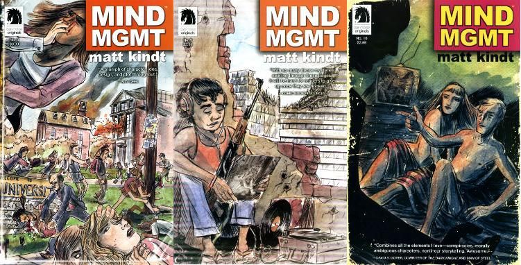
MIND MGMT Issues 8 - 12 (The Futurist parts 2 - 6) Story, Art and Cover by MATT KINDT Digital Production CLAY JANES Design MATT KINDT with ADAM GRANO Assistant editor IAN TUCKER Editor BRENDAN WRIGHT Publisher MIKE RICHARDSON MIND MGMTTM © 2013 MATT KINDT Dark Horse Comics Inc., $3.99 each

 photo covers1_zps446dc67d.jpg

MIND MGMT is a monthly periodical comic book published by Dark Horse. It is my favourite regular arrival in any care package I receive from my LCS. And yet I have been largely silent about it after an initial burst of typically irritating hyperbolic and grammatically challenged enthusiasm. This is because it literally just stopped arriving. (Literally because literally means literally; literally does not mean figuratively. Literally.) Despite all the horror stories one hears about postmen, quarries and pension cheques it seemed unlikely that my erstwhile deliverer of pizza menus, demands for money and paper based parental chiding had been losing them in transit. (Losing rather than loosing, because it seemed unlikely he had been setting them free like tagged owls) Now, because I have a pretty laissez-faire attitude to my LCS it took me a while to cotton on. Also, at some point in any interaction with my LCS we usually fall out because I say unkind things about Brian Bendis or Mark Millar both of whom are dear to the heart of my comic procuring Billy Batson look-a-like. Displaying an enormous amount of restraint I remained civil and so following an exchange between myself and my LCS the logjam has been cleared and I ended up with a big lump of MIND MGMT to pore over. (I did not pour over it because I am not a sentient liquid.)

As I said before I dazzled you with an outburst of pedantic fireworks MIND MGMT is my favourite regular comical periodical. This statement should not be confused with any claims that MIND MGMT is the best periodical comic currently being produced. Part of maturity is realising that because you like something doesn’t mean it is good. I like lots of awful things but I don’t pretend they are good; I just like them, er, because. MIND MGMT isn’t awful MIND MGMT is...but that bit's at the end. Suspense there, I'm going for suspense. It is entirely possible that I like MIND MGMT and MIND MGMT is also good. Let's see...

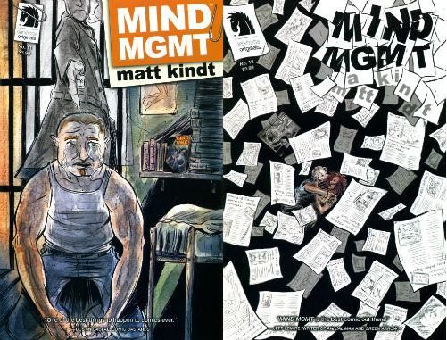
 photo covers2_zps1632cce0.jpg

I won't go on about the story MIND MGMT is telling (it is a good story; a conspiracy story) but I will go on about how MIND MGMT is telling that story. Because what MIND MGMT is really about, the real pleasure of MIND MGMT, is a man who is using the medium of comics to its fullest. Or at least the fullest that I am currently exposing myself to. Like a Millhaven butcher Matt Kindt uses every part of the animal. At the heart of every conspiracy story lurks a dependency on the revelation of the connectedness of previously thought unconnected things. The formal thematic fun starts with the very covers of each issue of MIND MGMT. Indeed each of the covers of these six (and also issue 7, the first part of The Futurist arc, which arrived so long ago it has become part of the papery lining of my garage and was thus unavailable) contain the cover of the previous issue in a a kind of Matryoshka doll effect. The cover of 7 is a poster which appears on a lamppost on 8; the cover of 8 appears as an album cover on 9; the cover of 9 appears as a TV image on 10; the cover of 10 appears on a pile of magazines on 11; the cover of 11 appears in a flurry of incriminatingly revelatory papers on 12. None of these appear forced; they all appear organic; they all make sense. Which is the key to conviction in any conspiracy story.

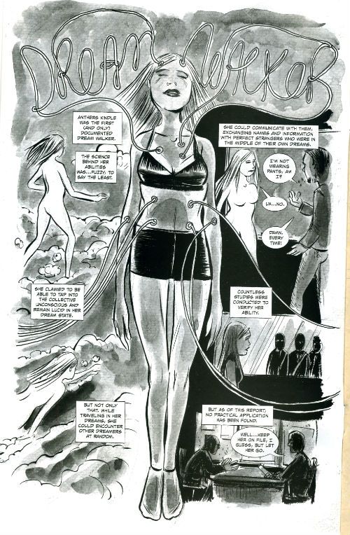
 photo Inner_zps32fe0758.jpg

The inside front cover isn’t an advert (there are no adverts for MIND MGMT except for fake adverts; later. Suspense there again.) it is a single page piece introducing an outlandish character or concept. There are many outlandish characters and concepts in MIND MGMT and the more Matt Kindt throws at the reader the more the reader’s natural resistance to outlandishness is eroded. Like the application of a pleasant pumice stone to the horny warts of the reader’s disbelief. Be forewarned, be forearmed, these may appear fun things of fluff to add to the patchwork but this may not be the case. They may also foreshadow concepts or characters which may rise to later prominence in the series. This is a distinct possibility. It has happened before, it may happen again. At the very least they are a fun bit of world building and probably more honest than that Seamonkeys advert.

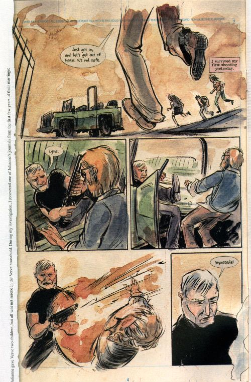
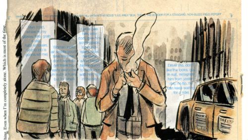
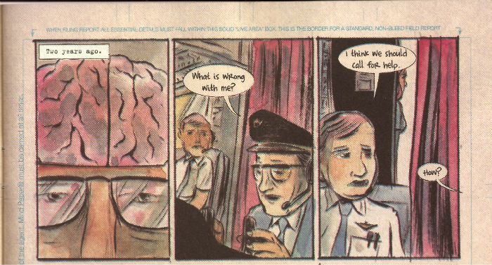
The next 22 pages form the bulk of the issue; the narrative guts if you will. The pages of MIND MGMT are not like the pages of other comics. Every page taking place in the narrative present is presented as a page of comic art. Art complete with the editorial blue lines which mandate the format of such submissions. As though the events we are witnessing are a report submitted after the fact to an organisation which requires all reports to be submitted in the form of a sequential graphic narrative; a comic. For the first part of this sequence of issues the left hand margin of these pages is torn away and replaced by a second narrative. This second narrative is Premeditated: A True Crime Novel. In the world of MIND MGMT the word true should be distrusted at all turns. It is written by one of the characters about events involving other characters. In this way it again builds the MIND MGMT world’s past even as the reader witnesses the MIND MGMT present. Although the MIND MGMT present is also the MIND MGMT past, as we witness events retroactively. Later issues return us to the form established in the initial MIND MGMT issues with the left hand side restored to the conceit of the blue line guidance in the form of MIND MGMT FIELD GUIDE extracts. Both novel extracts and guidance function in the same way: at times these literal marginalia appear to comment upon, reinforce or undermine the events on the page which they border. This may be intentional, it may also be the result of the human mind’s natural inclination to seek patterns in chaos and its remarkable facility to do so where none exist. It is not unlikely that MIND MGMT knows this. Where there is clarity there is also confusion; this also is the hallmark of successful conspiracy stories. In issue 12 the margin text becomes a warning pink transforming into DISBANDING PROTOCOL. Shit is kicking off big time story wise at this point and the comic itself seems to respond in kind. MIND MGMT is self-aware.

 photo Page_zps416e2b2d.jpg

I will not dwell on the actual contents of the story pages as they are where the bulk of your initial pleasure will be focused upon reading these issues. Suffice it to say that they are event packed, intelligent and move with a fierce propulsion. In fact so fierce is the propulsion that Kindt’s art, art so sketchy and rushed looking in comparison to the static lifelessness of much on the stands, is a totally appropriate form for this content. The water colouring effects are a bold and evocative move and like all Kindt’s artistic hallmarks allow for speed of production with no loss of communicative efficacy. It is a very heavy style and if it isn’t to the reader’s taste then that’s that. But what initially appears rough and imprecise does reveal itself to be suggestive of a great number of emotional subtleties. It’s here that I realise I’m making MIND MGMT appear a bit dry and perhaps more of a slog than a pleasure. This failure is mine. MIND MGMT has an enormous sense of fun despite the bleak and serious surface of its happenings. One of the great attractions of MIND MGMT is its very playfulness. Playfulness of form (which is what I’m mostly getting at with this piece) but also playfulness of content. Jokes, I’m talking about jokes there. Horror, pain, loss, unresponsive genitals all these things are part of the human condition but so is humour. MIND MGMT doesn’t do quips as such, but it does do jokes. God save me from quips. My favourite joke was page 9 of issue 11. Here in one panel Kindt effectively summarises and good-naturedly parodies the Oni series THE SIXTH GUN. Also of note is the mind expansion sequence on page 2 of issue 12 where what seems to be a reference to Campbell & Moore’s comics masterpiece FROM HELL appears. There may well be references and connections I missed. I don’t doubt it. That’s what re-reading is for. MIND MGMT invites re-reading like notions that Jack Kirby was just a work-for-hire stooge at 1960s Marvel invite scorn. MIND MGMT is a comic which appears to be conscious of other comics. Playful, like I said.

Initially pages 23 and 24 appear to be a more fulsome return to the inside front cover concept. Here a deeper look at a tangential character is occasioned. It is a character who has appeared before but the backups are a neat sleight of hand. They do build the character and inform previous events with greater significance but, well, the biggest development in the series thus far seemed to me to occur here. It’s in this sequence that the true nature of a main character is revealed and the fact that Kindt used the simplest visual trick in the book to misdirect me so successfully gave me a warm feeling. When someone tricks you and you ares o impressed you want to thank them it isn’t just a trick. It’s magic. MIND MGMT is comics magic.

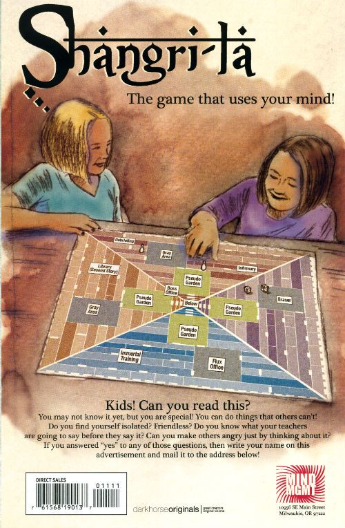
The back cover of MIND MGMT is always an advert but the back cover of MIND MGMT is never an advert. It is an advert which is not an advert. The advert will be connected to the contents of the issue you have read and functions as a final bit of playful worldbuilding. It is an advert for itself. Even at the last, right up to the last page MIND MGMT is revelling in what it is – a comic.

 photo Advert_zpsf2cb1397.jpg

I enjoy the story MIND MGMT is telling but more than that I enjoy the way MIND MGMT is telling me that story. I am not unaware that Matt Kindt’s periodical pleasure has successfully attracted attention from the televisiual media. That’s nice, I hope that works out for him but MIND MGMT started out as a comic and it’s as a comic I’m concerned with it. And, having read it and having thought about it I have to give MIND MGMT my highest accolade. MIND MGMT innovates on every page and it makes those innovations look obvious in retrospect. That’s genius. The innovations are integral to the story rather than empty tricks laid atop bland doggerel in order to create an impression of substance where none exists. I have not enjoyed a monthly periodical comic, I have not admired a mothly periodical comic, as much as MIND MGMT since AMERICAN FLAGG! I am in awe of MIND MGMT. I am in awe of Matt Kindt. MIND MGMT is EXCELLENT!

MIND MGMT is many things and it will be many more but first and foremost MIND MGMT is – COMICS!!!
Wait, What? Ep. 98: Gorilla With An Eyepatch

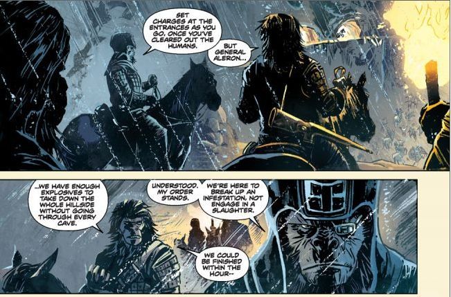
PhotobucketGorilla with an eyepatch/ I know, I know/ It's really serious... from Boom!'s Betrayal of the Planet of the Apes by Corinna Bechko and Gabriel Hardman

We are creeping ever-closer to magic number 100, as you are probably aware.  But, hey, why fixate on the future?  There's every possibility the world could be thrown into cataclysmic upheaval, giving rise to a world of intelligent rifle-wielding apes that, as here, look cooler than all hell.

So let's just pay attention to where we're at, and what's happening now, and also...show notes!

0:53-3:53:  Some tough work engagements for Graeme this week!  Let him tell you about it.
3:53-11:23:   For example, Graeme talks the Siegel-Schuster lawsuit and the recent article written about the Schuster side of the lawsuit.  For those of you who like Mr. McMillions when he's having ambivalent feelings, these seven and a half minutes are for you.
11:23-19:48:  And then in this corner... Rob Liefeld vs. DC, just weeks after aggravating Marvel's editors. Are you on Team Rob or Team Big Two? (Or is there no Team Big Two?)
19:48-22:41:  And then one of those wacky tech problems pop up and necessitate a call back.  Minor slight delay and then minor chitchat about the Internets.
22:41-38:18: Back to Rob Liefeld vs DC:  Graeme talks about why this story will blow things open wide for DC, while Jeff is not so sure.  It moves into a conversation about emotional attachments to creators, companies, and concepts.
38:18-42:28:  Challenged about what comics can be read in five minutes, Jeff talks briefly about the twelfth issues of Flash, Batwoman, and Wonder Woman, and compares them a bit with Batman, Inc. #3.
42:28-49:08:  Also, Jeff has lots of good things to say about the Betrayal of the Planet of the Apes trade paperback with gorgeous art by Gabriel Hardman (see above) and a strong script by Hardman and Corinna Bechko.  As an Apehead who's late to this book, I have to say it's pretty darn great.
49:08-56:26: And as we are on a recommending roll, Graeme recommends the first issue of Mark Waid and Chris Samnee's Rocekteer: Cargo of Doom.
56:26-1:05:04:  And then, just to keep the balance, Graeme reviews Before Watchmen: Dr. Manhattan #1.  He... is not pleased. The phrase "eye-bleedingly bad" may end up being used.  A bit of stuff about BW: Rorschach is included for your enjoyment.
1:05:04-1:14:08:  Also under Graeme's four color microscope, Amazing Spider-Man #692.  (Jeff requests you ignore most of his comments in this section as they are even more befuddled than usual. Thx.)
1:14:08-1:37:21:  Invited to talk about stuff he's read and liked this week, Jeff declines and instead chooses to complain about...movies.  More specifically, Captain America The First Avenger which is on Netflix Watch Instantly. Also discussed: The Bourne Legacy and Battleship.
1:37:21-1:42:30:  Of course, that trifecta of movie cannot help but inevitably lead to Graeme talking about...Bunheads.  Well, sure.  Of course.
1:42:30-1:54:22:  And then, because somehow we end up out of time, we mention more comics we also find noteworthy SAGA #6, Fatale #7, Batman Inc. #3, Mind MGMT #4, and Glamourpuss #26.  Also some speedy head-scratching from Jeff about the Butcher Baker blow-up.  What does it mean to be a critical darling? Is there a "tastemaker" for comics on the Internet?
1:54:22-end:  And here is where we open up the question to you, our listeners:  have you ever bought a book based on something we said?  If so, what and how'd it go?  Who are the people in the comics blogosphere you consider tastemakers?  We want to know!  So you know...sound off in the comments, please.
Maybe this auditory apparition has haunted the forlorn witch-house called iTunes, perhaps not.  But you can cross the streams, so to speak (not recommended, I know), and also listen below:
And, as always, thank you for listening!

"Let 'Em Loose, Bobo!" COMICS! Sometimes They May Arouse The Proles!

How goes the day! I guess after that Olympics Opening Ceremony I should just assure all our American friends, particularly your President, that the National Health Service doesn't actually mean that you have a socialist nation 3,000 miles off the coast of America. And, no, if you let this stand all of Europe isn't going to go next in a kind of domino effect. You guys are so ansty!

Photobucket Connor Willumson/Jason Latour (art/words)

I read some comics and then did the words thing. You can do the reading bit if you like, if there's nowt on the box.

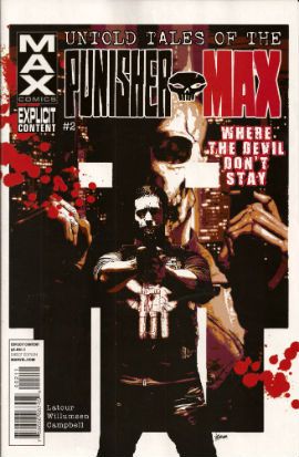
UNTOLD TALES OF THE PUNISHERMAX #2 Art by Connor Willumson Written by Jason Latour Coloured by James Campbell Lettered by VC's Cory Petit Marvel, $3.99 (2012) THE PUNISHER created by Gerry Conway, John Romita Snr and Ross Andru Photobucket Cover by Kaare Andrews

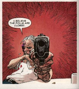
This VERY GOOD! book is about Punisher Max. Unlike the Regular Punisher he does not have a beard, and his stories have swears, gore and dead kids in ‘em! Because, yes, Regular Punisher now has a beard. That’s the only thing that caught my attention in that recent irritating crossover with Daredevil. Not wishing to impugn the, no doubt, exhaustive research by Greg Rucka into face foliage, but I don’t think it’s a good look for Frank. He should be clean shaven do you not think? Shaving’s about discipline, shaving’s very military. But a beard? A beard’s not about discipline, a beard’s about vanity. Vanity’s not really something I associate with psychotic vigilantes. I have a hard time believing Frank Castle puts his War on Crime on hold while he just trims his tidy beard. Yes, I can believe a man can fly, but apparently a vengeful killing machine that has a face care regime is a step too far for me. No offence intended there to any bearded people. Particularly any bearded people built like brick shit houses who control this site. The Punisher's beard is important, yes?

Photobucket Connor Willumson/Jason Latour (art/words)

Anyway, this book is about the other Punisher, the one who can eat soup without upsetting people at the next table. It’s called Untold Tales and yet here they are. It’s the second issue and like the first issue the real reason for paying three dollars and ninety nine cents is the art. Last issue’s art was pretty good but this issue’s art by Willumson is preposterously good. I’m not well versed in anything too freaky but even I can tell there’s a real ComiX vibe to the art. It’s got a wild-eyed and feral vibe to it which makes the contents of every deceptively traditionally shaped panel thrum with an animal heat and press against the page with an almost physical weight. The youngsters will appreciate that the sound FX are even drawn in as though they are giant inflatable physical presences, like Frank Quitely did in that Batman comic that time. Admittedly this senses shattering artistic performance is yoked to a fundamentally meat’n’taters tale; one which seems inspired by that old Jerry Lee song (“Come on over, baby, we got Castle in the barn!”) and has a big chunky gold shout-out to the King. No, not Jack Kirby. Elvis. Jack Kirby’s dead, stop going on about it. Stan Lee did everything! C’mon, Stan Lee probably stood behind Jack Kirby’s chair and moved his simple little hands for him. Why not, eh?

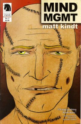
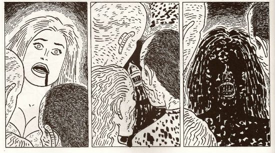
MIND MGMT #2 Story, art and cover by Matt Kindt Dark Horse, $3.99 (2012) MIND MGMT created by Matt Kindt Photobucket Cover by Matt Kindt Did you notice the stitches on the guy's face? Ahuh, Matt Kindt is still EXCELLENT!

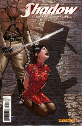
THE SHADOW #4 Art by Aaron Campbell Written by Garth Ennis Colours by Carlos Lopez Lettered by Rob Steen Cover by Howard Victor Chaykin Dynamite, $3.99, (2012) THE SHADOW created by Walter B. Gibson Photobucket Cover by Howard Victor Chaykin

It’s a shame Campbell isn't just that bit better because this issue he does a pretty good job; there's a real sense of time and place, a sense that someone has done their homework, that materials of an archival nature have been attended to but, due to certain core failings, he can't help but  fluff the big emotional bit somewhat, which has the unfortunate effect of my authorially intended species-shame at Ennis’ intentional homage to The Searchers being trumped by the fact that I find myself thinking, man, hats sure are hard to do. And they are, ask Lou Fine, so this was still GOOD!

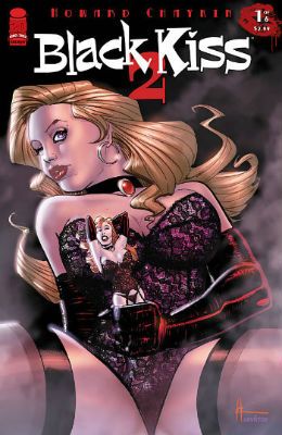
BLACK KISS 2 #1 By Howard Victor Chaykin Image Comics, $3.99 (2012) BLACK KISS created by Howard Victor Chaykin Photobucket

"That's a Pez Dispenser, right?" Cover by Howard Victor Chaykin

Ban This Sick Filth!” blared the Daily Mail headline that Wednesday morning. Of course “Ban This Sick Filth!” is the Daily Mail’s headline every morning and had nothing to do with Howard Victor Chaykin’s new exercise in saucy muck being held by The Customs. Oooer! Held by The Customs! Fnarr! Fnarr! The true extent of the upset was only revealed when the owner of my LCS commented, “No one cares, John.” Before adding, “And when are you going to pay for all these comics.” Leaving him to his quips I realised something had to be done, so I poked my head over the wall and saw Her Madge was pegging her washing out. I mentioned the whole thing to her, and she said she remembered meeting Howard Victor Chaykin when she guest starred in Viper and he had "sad eyes, like a child with a grazed knee" and agreed to get The Head Boy over to sort the whole HVC BK2 UK situation out.

Photobucket "I can see the beach from my window. That's how much I give a s***." He didn't say when he wasn't contacted.

So Cammers turns up, and he's a bit out of sorts because we’d interrupted him holding the back door of the NHS open so the Private Sector could run in and strip the place bare, wires and all, before anyone cottoned on. He’d got a copy of the moral soiling rag in question and he held it up to his face, his statesman’s face, his face with all the statesmanlike integrity of a lard sculpture of a single bum cheek, but with eyes, and commenced to read with those eyes. And he goes, he says,  “Yes, but is it a book you would wish your wife or servants to read?" And Her Madge points out it isn't 1960 and tells him to his face that the book will be available next week, or she'll be reminding everyone about that time he left his own child behind in the pub. "Did he thank you, then?" said my LCS owner when I told him of the entirely imaginary lengths I had gone to for HVC. "No", I said, "And he’ll never have to.

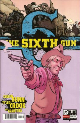
THE SIXTH GUN #23 Art by Tyler Crook Written by Cullen Bunn Coloured by Bill Crabtree Lettered by Douglas E. Sherwood Oni Press, $3.99 (2012) THE SIXTH GUN created by Cullen Bunn & Brian Hurtt Photobucket Cover by Brian Hurtt

Yeah, I miss Bat Lash too, so this was GOOD!


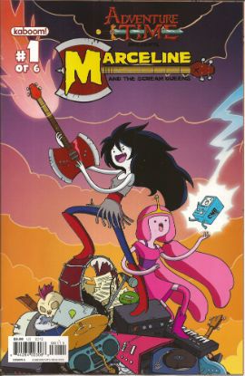
ADVENTURE TIME: MARCELINE AND THE SCREAM QUEENS #1 Written & illustrated by Meredith Gran, Jen Wang Coloured by Lisa Moore Lettered by Steve Wands KaBoom!, $3.99 (2012) ADVENTURE TIME created by Pendleton Ward Photobucket

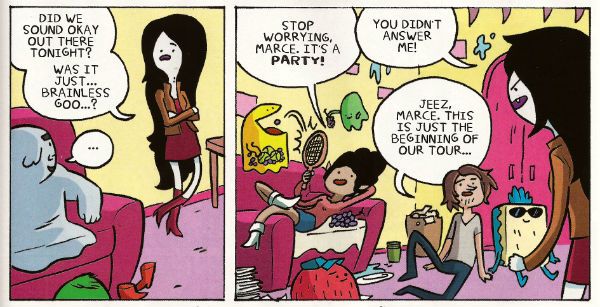
Much like Blessed Brian Hibbs I asked an 8 year old boy what he made of this comic. There must have been some kind of miscommunication because quite quickly there was a lot of shouting and after a bit of tussling a police presence was required. Anyway my court date is next month so if anyone can put me in touch with a good lawyer that’d be great. Otherwise, this comic aimed at 8-year old children contains a reference to the popular children’s entertainer Iggy Pop(!) and revolves around the fantasy of having a super-awesome musical career; that’s really more a teen and mid twenties thing, I think. Although these days I guess that dream can be dragged all the way into your forties. Mind you, it will probably weather the ravages of time about as well as the skin on the back of Cher's knees.

Photobucket

Meredith Gran (w/a)

People may mock, but you only need to do one song that plays over the end credits of the latest Jenifer Aniston flick (one where workaholic Jen learns the value of things via a series of laugh-out-loud hi-jinks stemming from her upsetting a genie and being cursed with a set of talking balls on her chin) and you’ll never have to hit up your Mom for cash again! I dunno, if you’re doing a kids comic I’d say get the stuff kids like right first, and then put all the hip stuff aimed at your mates in. Otherwise you’ll end up with something that’s really nice looking but essentially EH!


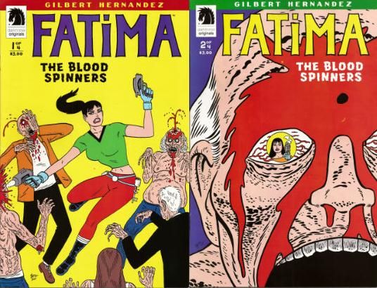
FATIMA: THE BLOOD SPINNERS #1 and #2 Story & Art by Gilbert Hernandez Dark Horse, $3.99 (2012) FATIMA: THE BLOOD SPINNERS created by Gilbert Hernandez Photobucket

Covers by Gilbert Hernandez

Now this, this, is a comic an 8 year old boy would like! In fact it’s a bit like a comic an 8 year old boy would create. An 8 year old whose pets keep disappearing. It’s a disturbingly affectless presentation of a gorily deadpan comedy parody/celebration of genre trash. Maybe it has something serious to say about the human condition. We’ll probably never know as rational thought quickly gets tickled into insensibility by the women in bikinis shooting zombies, cleverly stupid names like “bittermeat”, laughably terrible jokes and the rewarding central conceit of beautiful people with beige minds seriously making a mess of the whole saving the world thing.

Photobucket

Gilbert Hernandez (a/w)

Look, the people in this awesome comic wear devices that look like metal Y-fronts to make them invisible for the delightfully childish and arbitrary time of 3 minutes. That should clue any slowcoaches in that this is no Walking Dead. And that's just peachy by me.  I also liked the letter in the back of #2 that said Fatima had a “manly” face. It’s comics by Gilbert Hernandez! Don't be getting all prissy, John Sayles wrote Alligator. I hear Beto's (I call him Beto because we are so close we were practically separated at birth.)  now been doing this stuff for 30 years, man and boy, and he remains VERY GOOD!

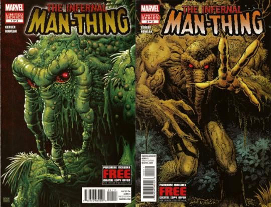
THE INFERNAL MAN-THING #1 and #2 Art by Kevin Nowlan Written by Steve Gerber Lettered by Todd Klein Marvel, $3.99 ea (2012) MAN-THING created by Stan Lee, Roy Thomas, Gerry Conway and Gray Morrow Photobucket Covers by Art Adams

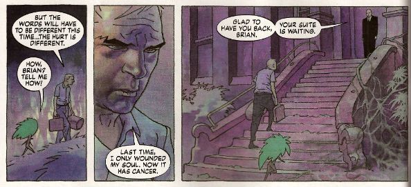
This doesn’t read too well as individual issues as (as I am sure we are all aware) it is an OGN cut up and shoved out in three easy, and pricey, pieces. It’s taken this long because Kevin Nowlan has taken this long. According to the text piece in #1 he was doing a page a week. At the Marvel page rates I have made up in my head, he would have starved to death before getting to page 10. So, rather than produce a half-assed product or die, Nowlan took his time and did other stuff. And I do have to say that the art here is very, very impressive. He’s got a ‘80s Kyle Baker thing going on, but with the additional, and considerable, oomph a foundation of fully painted colour provides. It’s a purposefully limited palette which gives everything a humid and lurid look. Like a swamp, see. Also, Nowlan’s also given Man-Thing a bit of a make-over and it’s kinda nice too, particularly the way Manny’s head seems to have slipped down to rest on his chest. Nice, that. Causes your gaze to stumble every time, good effect there. The words are very Steve Gerber, which is to say it’s very satirical in that endearingly adolescently blunt style Steve Gerber had. And when I say “adolescent” I don’t mean it as a put-down I just mean that in the sense of being energetic and all-encompassing. I always think of Steve Gerber as being an American version of Pat Mills, writing wise anyway. Although Gerber's more willing to accept his own portion of blame for the way things suck, I think. Maybe that’s why people respond more warmly to the work of Gerber than that of Mills.If you like Steve Gerber you'll like this, if you've never read Steve Gerber it's a good start as it is very Gerber-y. If you don't like Steve Gerber we won't be spending Christmas together. Because he and this are both VERY GOOD!

Photobucket

Kevin Nowlan/Steve Gerber (a/w)

According to #1 there's a lot of respect in this project. And yes, there probably is but this is Marvel. And so, as respectful as it was of your Uncle Nate to turn up to Pappy's funeral, it would have been better if he hadn't crammed his pockets with canapés, winked at the widow and blocked the bog with a boozy poo before drunkenly falling through a window. It’s a sloppy package what with the reprint of “Song-Cry of The Living Dead Man” looking kind of cheap and, in the second issue, having a double page spread printed on the front and back of the same page. This comic cost me two pounds and ninety nine pence Sterling, and yet I've had menus from the local pizza place pushed through my letterbox that had more thought, care and consideration in their design. But, I’m sure somewhere in there is a very real respect for Steve Gerber. At least Uncle Nate turned up, y'know. Ultimately, as Marvel as it is, it’s done out of respect for Steve Gerber, who is dead. And of course even Marvel respect the dead. Except for Jack Kirby. Who, it seems, can still just go f*** himself.

I hope you all had a smashing wekend and read some smashing COMICS!!!
Wait, What? Ep. 93: Thrill Power Overboard

PhotobucketAbove: The Chocolate Waffle, which is a liege waffle covered in dark chocolate, from The Waffle Window, Portland, OR

Yup, Episode 93.  I would say more but I'm slightly overwhelmed with the amount of shite multitasking I'm currently doing (kinda dashing back and forth between two computers at opposite ends of the room at the moment, which neither makes me feel like a mad scientist or a keyboardist in Journey but just someone who is old, Internet, so terribly old).

On the other hand (and behind the jump):  show notes!

0:00-7:51: Greetings; getting schooled by Graeme on Tharg and the mascots of 2000AD and other British comics, with a half-hearted attempt by Jeff to pitch Mascot Wars [working title] 7:51-11:37:  By contrast, Jeff guiltily admits he's been reading the first volume of the Vampirella Archives 11:37-13:37:  Somehow this leads to a discussion of the fascinating copyright information found in Dynamite Books 13:37-15:51: Bless him, Jeff is not giving up so easily on his Mascot Wars idea 15:51-18:55: Jeff gripes about getting back into the routine after his Portland trip, Graeme gripes a bit about getting back into his routine after the 4th of July holiday 18:55-20:52:And so, finally, we start talking comic news--the announcement of Marvel NOW! and the launch of Monkeybrain comics. 20:52-24:35:  Graeme has a thing about the Uncanny Avengers cover and I really cannot blame him; 24:35-25:57: And since we are on the subject, Graeme has a few things to say about that Marvel NOW! image by Joe Quesada, too. 25:57-38:25: And so we talk about Monkeybrain instead, including Amelia Cole by friend of the podcast Adam Knave, Bandette by Colleen Coover and Paul Tobin, the other launch titles, and what we would like to see from the line in the future; 38:25-41:54:  Speaking of fantastic digital comics, the second issue of Double Barrel is out!  And neither of us have read it. But it is out!  And you should consider getting it.  Because it is also Top Shelf and also coming out in digital, we talk James Kochalka's American Elf. 41:54-49:57: Jeff talks about League of Extraordinary Gentlemen: Century: 2009. Here there be spoilers! 49:57-1:06:42:Graeme's interesting rebuttal concerns whether bad art can be forgiven if it is suitably ambitious. We have a tussle of sorts and then move on to discuss when does the creator develop that "not so fresh" feeling.  (Bonus: Graeme does a pretty great job of justifying our existence, pretty much). 1:06:42-1:15:37: Incentivizing the singles? Does it work?  Brian Wood's The Massive, Ed Brubaker's Fatale, and more discussion of the Monkeybrain publishing plan and a discussion of what works in the direct market. 1:15:37-1:29:48:  Who is stronger, Watchmen or Walking Dead?  Fight! 1:29:48-1:38:32:The possible Thief of Thieves TV show and the need to keep creating new IP for Hollywood; and when or if the Big Two will come around on that. 1:38:32-1:42:37: Uncanny Avengers.  We are a little fixated. Also, Graeme sings the ballad of Cafe Gratitude (except he doesn't sing and it's not a ballad).  And then some clever Brass Eye jokes that Graeme has to explain to Jeff.  Again. 1:42:37-1:47:36: On the other hand, Jeff did get to the comic store that week so he has that going on for him.  His quickie reviews while Graeme listens on helplessly:  Batman, Inc. #2, Fatale #6, The New Deadwardians #3 and 4; Mind MGMT #2; Prophet #26; Popeye #3 (which is awesome and must-have-ish); Tom Neely's Doppelganger; Flash #10; and Action Comics #11. 1:47:36-2:04:08: San Diego Comic Con! Graeme has two questions about it.  Crazy predictions are made and anxiety dream stories are exchanged. [brrt! brrt! David Brothers alert! brrt! brrt!]  Also, Jeff once again tries to coin the term "Nerd Vietnam" to describe SDCC. 2:04:082:09:20-: Closing comments, and a few reviews of waffles from the Waffle Window.  And then....sign off!

If you are of an iTunesian inclination, you may have already chanced upon us.  But if not, we offer you the chance to give a listen right here and now:

Wait, What?, Episode 93: Thrill Power Overboard

And as always, we hope you enjoy--and thanks for listening!

Words With Friends: Jeff Talks About A Few Comics

I promised myself if I ever got caught up, I'd do one of these.  The last couple of podcasts, we've wrapped up with a one or two books that I'd read still left unmentioned.  Hmm, I thought to myself.  If only there was a way I could actually share my thoughts on these books without ceaselessly cutting off Graeme just as he was saying something sensible and well-reasoned.  Via some kind of...written medium, maybe... After the jump: the miracle of the written word!

MIND MGMT #1:  Did you pick this up?  It's an odd, paradoxical package: a $3.99 book without any real "hand" to it that is actually a full, satisfying read; a "by-the-numbers" plot that feels unique and idiosyncratic; art that straddles the line between off-putting and charming; a comic that all but screams "self-published labor of love" that comes with the Dark Horse stamp on it.

None of it should work.  Almost all of it works. And it works because the creator Matt Kindt is the kind of guy who has ambition to burn and mad formalist chops.  The best I can do to make my point is to point you to page 24 of the book, where the bottom six panels of the nine page grid are actually a single image just as the narrator explains the secret behind a psychic able to see the future by reading the minds of every living creature around him.  You literally see "the big picture" at the same time as the revelation, which lets you experience how the psychic's power works.

While I didn't put down the book with any especially strong desire to see what happens next in the story, I can't wait to see the next issue, to see what Kindt tries to pull off next, and to see if he can use those formalist skills to make me care about what's happening.  This is quite a GOOD book and worth your time.

MUD MAN #4Mud Man is one of those books I soooo dearly want to love.  Paul Grist is really working the Lee/Ditko vibe of Amazing Spider-Man, trying his damnedest to re-create that odd, off-kilter feeling of a teen superhero trying to get by without a rulebook to follow.  Rather than follow the beats laid down by Lee and Ditko (and copied by generations of comic book creators since), Grist is using his own rhythms and ideas and the limitations he's put on the title character.  There's a charming little essay on the inside cover about where the title should go in comic books, the last line of which is "Why Don't People Do Comics The Way I Want?" and it's pretty easy to see Mud Man as Grist doing the superhero comic he wants to read the way he wants.  I feel like he should be lifted on the shoulders of the comics industry for it.

And yet, once you strip away some of the smart and dynamic page layouts, the masterful use of white space, and the charmingly low-stakes action (this is our first supervillain, and he's a shirtless old guy),  the book doesn't really have that much different from it from what you'd see in, say, the Rogers/Giffen run of Blue Beetle: it's very much the "young hero gets a cool, enigmatic  mentor" turn with an additional four page action sequence that turns out to be a daydream.

I know, I know: that's a lot of amazing stuff to put away to one side, like I decided to complain about a cake with the opening argument of "putting aside the amazing frosting and the amazingly rich texture of the cake itself..."  But I think maybe there's some validity to not being satisfied with a chocolate cake without any chocolate in it.  In Mud Man, our hero makes a heroic choice to save the guy who bullies him in his secret identity, but he does it without any use of his superpowers.  (And the best, most exciting example of his power ends up utilized in the four page daydream sequence.)

Lee and Ditko did an amazing job of making Peter Parker an object of pathos, in both his secret and public identity.  But we also got to see Peter kick some ass in exactly the right proportion to all the superhero-deflating hijinks.  I know it makes me a bad reviewer to judge this book on what I want rather than what Grist intends, but just a dash more superheroing in this superhero book would make it so much more than the OKAY read it is to me.

PLANETOID #1:  Okay fine I admit it I am a stinking bourgeois pig who went out and got an iPhone 4S a few months ago when I came to the perfect intersection of necessity (we needed to change carriers) and culpability (as I recall, Apple had just opened Foxconn and their partner manufacturing plants to outside review) but you know what: don't tell me you couldn't give a shit about Siri because YOU ARE LYING.

I submit this sci-fi book by Ken Garing as Exhibit A, because no sooner than the protagonist crashes on a strange planet than he activates RICTER, his interactive analytical assistant.  Yeah, that's right, bitches:  our indy comic protag only makes it four pages before he decides he needs a faceless servile voice to catalog his inventory.

So don't tell me you don't dig the idea of holding up your phone and giving it some numbers to calculate a percentage of, or what time sunset is set for, or to send a message to your wife telling her you've managed to lock your keys inside the car for the third time this month and could she please come downtown with the spare set.  Because I've got HAL in 2001: A Space Odyssey, Paul Bettany in all those Iron Man movies, and mother-fucking Ricter from mother-fucking Planetoid #1 to call you out on your shit.

As for the book itself, it's a very generous 32 pages for $2.99, and although it's about as by-the-numbers as you can get, it's lovely to look at and is scratching that new, weird sci-fi comic itch recently brought about by Prophet, Saga,  the first two years of Uncanny X-Force, and being able to buy issues of Matt Howarth's Those Annoying Post Bros. and Savage Henry for ninety-nine cents a pop over on Comixology.  It's an OK book, the kind of thing that could be entirely disregarded if just one of the factors (price point, talent, individual interest, use in dumb pop-culture arguments) wasn't met.  But they were so, yes, OKAY, indeed.

POPEYE #2:  Comes sooooo very close to being the absolute slice of licensed genius I want it to be: in fact, that Sappo story in the back by Langridge and Tom Neely is in fact something breathtakingly close to perfection.  In the way it takes an goofy premise and logically makes it goofier and goofier while keeping it grounded by its characters (or character types, really), it reminds me of a lot of what I loved most about Segar's work.

The Popeye story, however, doesn't work quite as well despite having a classic premise--Popeye has to compete against the dastardly movie star Willy Wormwood for Olive's affections.  All of the pieces are in place and each character is recognizable and in character--Olive is fickle, Popeye is a sensitive roughneck, Wimpy is a smooth conniver--but for some reason nothing really quite lands.  I don't know if the licensor had problems with the script, or Langridge didn't have time to finesse things  or what, but when you've got a potentially genius set-up as Wimpy playing Cyrano and feeding lines for Popeye to say to Olive and you get rid of that idea in a quarter of a page, something has gone screwy.

I know Langridge and Co. don't have the freedom to  play a comic bit out for as long as they want the way Segar did with his strip, but, unlike with the Sappo piece, the main story felt overly full and oddly static at the same time.

Thanks to the Sappo story, I'm giving this issue an overall GOOD rating, but I' d love to see it get even better next issue.  It's got more than enough potential to do so.

"A Moi La Légion!" COMICS! Sometimes I Have Too Much Sun!

Greetings! It has been sunny in England for more than three consecutive days. This means that the entire nation is required by Law to sit outside until their skins glow like pink suns and crack like dry riverbeds in Texan heat. So I have been doing that. This means I didn't read many comics and when I wrote about them the fact that my brain had been lightly boiled in its own juices didn't seem to have a beneficial effect on my thought processes or judgement. But, hey, I made my deadline! I made it, Ma! I'm a hack! Photobucket

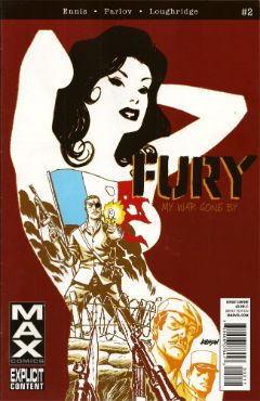
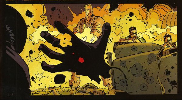
FURYMAX #2 Art by Goran Parlov Written by Garth Ennis Coloured by Lee Loughridge Lettered by Rob Steen Marvel, $3.99 (2012) Nick Fury created by Jack Kirby AND Stan Lee

Photobucket

Imagine my delight upon opening the latest issue of this fine comic to find an act of recreational physical pleasure being performed by Nick Fury and Ms. DeFabio. No, not because I have always wanted to see Kirby/Lee characters nut deep in the fun patch, no. (Well, Lockjaw maybe but that’s a personal thing.) No, it’s the fact that the act is presented so matter of factly. Almost as though it is just a part of life; one of those things adults do from time to time, these days mostly when they lose their broadband service and the TV is simultaneously on the fritz. In fact I can assure you I am not idly boasting when I say that even I , the misanthrope's misanthrope, have in fact personally heard of people in real life who have encountered a real life lady in such close quarters; which is to say even closer quarters than Nick & Co. encounter the ‘Cong in this comic. For one moment I thought mainstream genre comics had, in actual fact as opposed to the popular fiction entertained by most fans, grown up. A bit. Then I remembered it was a MAX comic and so that was okay as the regular line of comics would continue to be as ridiculous in their depiction of recreational procreation as ever.

Photobucket

Seriously, how bizarre must the depiction of something in regular life be if  its depiction in a Garth Ennis war comic is actually a healthier alternative. Focusing on that aspect, as for some inexplicable reason I have, does Ennis' work on this comic a disservice as it is so well realised by all the involved personnel that its level of focus brings to mind a close up of a sniper's eye as the unseen finger exerts the required pressure to do the necessary. It's one well honed machine is what I'm saying. This week, because this book appears to be weekly for some arbitrary reason, Goran Parlov knocks my socks off on the several occasions when he draws the Nazi bastard’s head as just a collection of lines held together by Lee Loughridge’s ever-excellent colours. Giving us a glimpse into a horrific world where Pig Pen grew up and joined The Hitler Youth. To speak plainly then, I thought FURYMAX#2 was VERY GOOD!

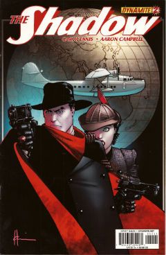
THE SHADOW #2 Art by Aaron Campbell Written by Garth Ennis Coloured by Carlos Lopez Lettered by Rob Steen Dynamite, $3.99 (2012) The Shadow created by Walter B. Gibson

Photobucket

As is customary, and contrary to my therapist’s advice, I shall now devote more time to the cover by Howard Victor Chaykin than the book it adorns. It’s a pretty swell cover, yes it is. The elegant simplicity of its design elements is foremost amongst its pleasures but only because the cheekiness of anchoring it all on The Shadow’s torso (which is little more than an oblong) is, let’s face it, the kind of thing only people who should really stop harassing aged Jewish comics creators when they go for a jog on the beach are going to give a gefilte fish about. I’d plump for Arbutov on colours rather than Delgado because it’s less an attack on visual sense and more of an attempt to attractively enhance the base image. But, this being Dynamite the colour of your cover is not a fixed thing! You can have a “Bloody Red” Retailer Incentive Cover (red and white!) or the Dynamic Forces Exclusive Howard Chaykin cover (black and white!). I hope these are all in the TPB because I would actually have an interest in seeing the image without colour, but that’s because I am a Chaykinmaniac. Otherwise I am just totally flummoxed by the need for all these covers. There are another 7 of them! The Ryan Sook one looks lovely by the way.

Photobucket

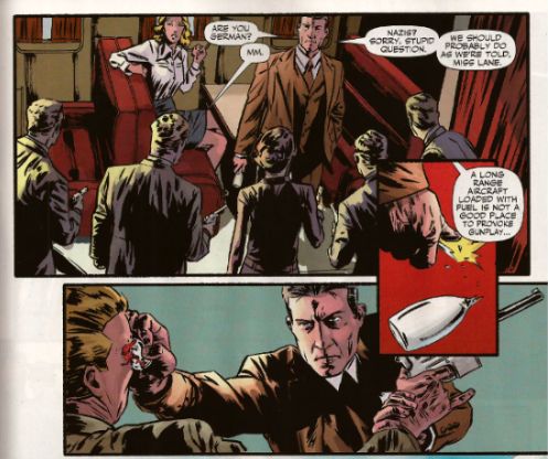
Eventually, sated, I looked at the actual comic. Ennis’ script this time out is pretty great. It’s basically an extended action sequence inventively choreographed within the confines of a Pan Am clipper intercut with exposition largely designed to demonstrate the evil of the opposition (kiddy fiddler ahoy!). I can’t fault the writer's execution of the script or the savagery of the violence (injury to eye is just the hors d’ouvres, darling!) but it impresses only despite some serious fumbling of the ball on Campbell’s part. I’ll not dwell on it too much as, after all, the art turns up and does the job; albeit with all the fiery invention of a Council employee during the week before his pension finally kicks in. Also, Megalophobics are hereby duly warned to stay away from the hilariously outsize hat which dominates the last panel. Still, Ennis’ script is so solid the comic remains GOOD!

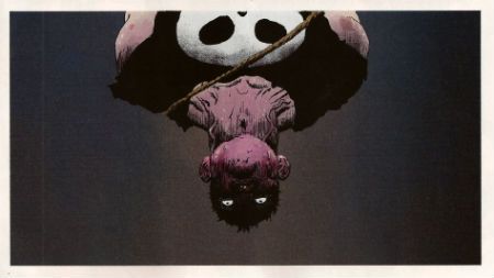
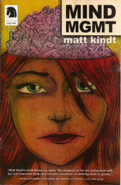
MIND MGMT #1 By Matt Kindt Dark Horse, $3.99 (2012)

Photobucket

In this comic's after-piece Matt Kindt runs the old I Want This Periodical To Work As A Periodical schtick. Y’know the one; the one about extras unique to the pamphlet (or FLOPPY!(cue Brian Hibbs rearing back like Christopher Lee before Pter Cushing's crossed candlesticks. Hsssss!)) which will enhance and entertain, yes, that one. I think he’s actually serious about it, too. That's on the evidence of the first issue of what future generations will call “that book Matt Kindt did no one bought” (but we will call MIND MGMT). I mean, only time will tell but I doubt this is going to take the form of backmatter telling us how his movie deals are progressing (Matt Kindt hasn't got any. Yet.), how hard life is for the talented and beautiful (my heart; it bleeds), a telephone book size list of all the awful comics he has in print (because Matt Kindt doesn't do awful comics. Ever. Fact.). Not that anyone else does that, but I severely doubt Matt Kindt will. The clue is in the comic itself.

Photobucket

Every page of this comic is the comic. The inside front and back covers are a short prologue to the book itself, the back cover is an advertisement that is in fact not an advertisement, text crawls up the side and across the page margins (a la ADVENTURE TIME) adding colour and background to the concept in a dryly humourous faux-bureaucratic way, there’s a short backup piece not intended for the TPB which ends with a six panel sequence so awesome that you know right then and there that MIND MGMT is the one. MIND MGMT is the one. MIND MGMT is the one where Matt Kindt arrives. This is Matt Kindt’s AMERICAN FLAGG! moment. This is where Matt Kindt turns up says, hey, this is what I do and this is the way I do it and you, well, you just deal with it! Matt Kindt just slapped his big talented balls on the table and now you either walk away or you just deal with it. MIND MGMT is odd but EXCELLENT! Deal with it!

And then I saw sense and decided my time, and yours would be better utilised if I wandered off to flick lima beans at next door's koi carp.

Hope you had a good weekend with some COMICS!!!
NEXT TIME: Something else!

Here comes Crankypants!: Hibbs' 5/23

Here I am, here I am!

(Yeah, I skipped a week, sorry)


AQUAMAN #9: Here we are at issue number NINE of this comic, and I've realized that I still really don't know who Aquaman is, or what motivates him (other than "being pissed off", I guess, generically?). I mean, I like the character just fine, but there's not any "there" there, is there? Pretty much just a collection of cool powers and a costume. And this "Aquaman's other team" storyline is just as bad at this, introducing several new characters, again, who don't seem to have clear personalities or motivations. And yet, and yet.... and yet, I kinda still like it, because Ivan Reis is a very good artist, and Johns knows how to write compelling action and dialogue, but it still feel like less than the sum of its parts to me.

I didn't like the cliffhanger either. Besides the tarnishment it implies, I'm kinda getting sick of John's Daddy Issues as being the only kind of motivation that anyone ever has.

I enjoyed this more than the rating as I was reading it, but here two days later I can't say this is anything other than OK.


BATMAN INCORPORATED #1: I liked the issue just fine as chapter #81 (or something like that? He's coming close on 100 Batman comics, isn't he?) of Grant Morrison's Batman run -- especially because Chris Burnham is one hell of an artist -- in fact, as issue #81, this was pretty crazy awesomely good, but I'm this weird old fashioned kind of a guy who thinks that a first issue of a series should contain it's premise. I thought this was largely unreadable as a FIRST ISSUE, and it's hard to see where the "incorporated" comes from here. So that's going to knock this down at least an entire grade to only a GOOD. You can tell me I am a crankypants. But it won't stick, because I'm also pushing for a Bat-Cow mini-series. So there.


FANTASTIC FOUR #606: It's nice to see Hickman doing a "traditional" FF story for once -- where they are heroically exploring. And then there's a fun little "twist" at the end that makes it even better. A nearly perfect little "done in one" issue that I thought was VERY GOOD.


FLASH #9: Pretty pretty comic, every month without fail, but can I say that I've yet to find the "new" Speed Force to be compelling, and Barry Allen personally even less so? I think tying in the "origin" of Gorilla City to Flash is incredibly wrong-headed, and I don't like the new Grodd's relationship to his fellow residents. But it is pretty, and therefore, at least OK.


IRREDEEMABLE #37: As impossibly powerful as Waid has made his title character, there was largely only way this could end, and Waid did almost exactly what I thought he was going to do. Exxxxxcept, I was thinking that "energy" would moebius-loop somehow (like the Supremium Man in Alan Moore's Supreme), and I didn't expect that Waid would then make his evil analogue responsible for the creation of the original from Siegel and Shuster. That's kind of ballsy. Or douchey, I don't know. For leaving a bad taste in my mouth, I sadly have to go with AWFUL, when it's not nearly that bad -- hell, I'm sure Mark didn't consciously realize that's how it would be taken; but there it is.


JUSTICE LEAGUE DARK #9: Jeff Lemire's first issue, and the book takes a decided turn towards "traditional super team" with a guest appearance by Steve Trevor, an explicit naming of the team, tie ins to the "black room" plot points in JL, and so on. And it strikes me that in a way this is a larger betrayal of anything the creator envisioned, or the character was built to be, or, hell, of their sister imprint for that matter, than "Before Watchmen" is going to be. It also seems like it undoes Gaiman's Sandman kind of explicitly.  Which is weird. I kind of don't understand what this book is meant to be, and the nuDCU has way too many superteams-without-a-clear-function titles already. More than anything, I'd guess this book is aimed at formal Marvel editors who sneered a lot about Vertigo when it launched -- "Sandman done right" and all that. That's not a very large audience, though; and I don't see how this book doesn't just keep freefalling from issue to issue like it has been. Extremely EH.


MIND MGMT #1: It has been a terrific year for amazing first issues from new independent ongoing series, and this one spreads the love over to Dark Horse for possibly the strongest debut issue yet this year (which is a crowded field, I think, with things like SAGA and MANHATTAN PROJECTS and PROPHET, etc. etc). There's this wonderful wonderful density to this title, which sets up a wide-ranging conspiracy theory-ish story like, say, "Lost" or "Fringe", and does so under the incredibly assured layouts of Matt Kindt. I absolutely admire Kindt's storytelling and energy on the page, though I constantly think that he'd be incredibly aided by having a solid and professional finisher to ink him -- there are pieces of this that really look like layouts more than anything else, and I think that stylistic choice is going to turn a lot of the widest potential audience off.  Try to overlook it, though, or you're missing something really special.  Kindt colors the book himself, and his color choices are really strong and striking.

Either way, this is comics by someone who "gets" comics just perfectly, and this absolutely deserves to be on your reserve list -- I've just placed a reorder at 100% of my initial, and will be hand-selling this with some large amount of joy. I thought this was a truly EXCELLENT debut.


PROPHET #25: This was the first issue where I was NOT enjoying what was happening until we got well past the halfway point and the "real" Prophet showed up. Then I totally fell back in love all at once. This is such a VERY GOOD comic, and I'm totally at awe of the world-building that gets built and tossed around each and every issue.


SUPERMAN #9: Basically, see what I said about AQUAMAN above -- I have no idea who or what the "modern" Superman is about, really, other than "it's Superman", but all of the changes to the supporting cast and mythos, so far, seem to be arbitrary to me, rather than organic. All of the stuff in this comic about how the media behaves? Beyond terrible. This is terribly EH material, and I doubt I'll read another issue until they change creative teams (again!) YOUNGBLOOD #71: Y'know what? I was digging on John McLaughlin's script here -- kind of the most AUTHORITY-like comic that we've seen in a while, but dear god, the art by Jon Malin and Rob Liefeld (Rob's inking?) is really wretched and uninspiring. I know a lot of people used to really really like Liefeld, but, honestly folks, most of those people stopped actually purchasing comics at least a decade back, leaving this a commercial trainwreck. Too bad, I really dug the script, but the final product is a muddled EH of a comic.


That's me... what did YOU think?


-B