“Droids Don't Knock.” COMICS! Sometimes The Darkest Judge of All Is Judge Critic!

Not wishing to set a precedent here but in response to a reader comment I look at a volume of IDW’s JUDGE DREDD. There’s little, if any, toilet humour in this one. I've got all that out of my system (tee hee!) But if you like icy disdain then bring your skates because we’re doing figure eights! Or maybe I liked it. Ha, Ha, just kidding.  photo AWODshowB_zpsbhdibqy7.jpg JUDGE DREDD by Daniel, Swierczynski & Lee
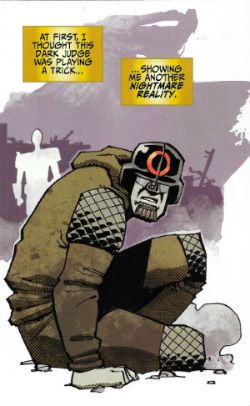
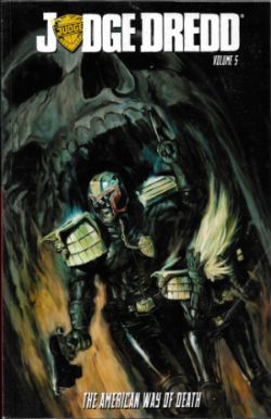
Anyway, this… JUDGE DREDD, VOLUME 5: THE AMERICAN WAY OF DEATH Art by Nelson Daniel, Steve Scott Written by Duane Swierczynski Coloured by John-Paul Bove Lettered by Shawn Lee Originally published as JUDGE DREDD #17-20 IDW, $17.99 (2014) JUDGE DREDD created by Carlos Ezquerra & John Wagner

 photo AWODcovB_zpsg2uidkm5.jpg

For a few years now IDW have had the licence to produce original Dredd comics in America, and these exist distinct from the (more familiar to me) UK Dredd canon, which is currently handled by Rebellion. Theoretically IDW are in a pretty advantageous position; they get to start from scratch without any of the early mis-steps of the original strip (Maria! Non-Judge policemen! Mick McMahon thinking Dredd was black!) and can cherry pick plots and characters from an impressively fecund near-40 years of ideas and concepts pre-tested in the fieriest crucible of the imagination  possible – British children’s minds. Alas, it gives me no pleasure whatsoever to report that on the evidence of this volume IDW have bungled it quite badly. I wanted to like this book; I want to like every book I read. Whatever kind of creature it is which knowingly seeks out things it dislikes, that is not the kind of creature I am. (Unless it’s DKIII: TMR because, seriously, **** that garbage.) JUDGE DREDD VOLUME 5: THE AMERICAN WAY OF DEATH is not a disaster, but like many a Tory given all its in-built advantages it’s a disappointment.
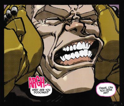
 photo AWODarghB_zps272rertf.jpg JUDGE DREDD by Daniel, Swierczynski & Lee

Thanks mainly to Nelson Daniel's lively cartooning (and frequent use of a function on his PC which replicates that dotty stuff I like so much) as I read the book I was enjoying it, but the further I read that enjoyment was progressively undermined by some pretty basic gaffes. Not least among these was the utter disregard with which the volume treated potential new readers. Like, uh, me. It’s pretty staggering; as though IDW expect everyone to have read Vol.s 1 thru 4 thirty seconds before they cracked the covers on this one. Would it have broken the bank to use a page to provide a cast list and a “What Has Gone Before…” paragraph? (No, it wouldn’t.)  I’ve read Dredd for longer than is admissible in mixed company so, yeah, I know who Judge Janus and Judge Omar are, and why they can talk to each other using unanchored thought balloons (helpfully colour coded pink for a girl and blue for a boy like this is fucking Bunty or something) but does Chet in Omaha, who has never read a Dredd before? (No, Chet doesn’t. Look at his big simple face; he hasn’t a clue.) Of course, it’s not so much the basic set-up of Judge Dredd as a series I’m talking about; just looking at the book effectively communicates the fact that it takes place in The Future, Judge Dredd is a Cop and Things Are Less Than Rosy. Dredd’s a pretty direct concept. With the exception of Mark Millar & Grant Morrison most sentient creatures can pretty much pick up “Judge Dredd” so easily it’s almost as though it’s by osmosis. No, it’s more the set-up of the story herein itself which is the problem.
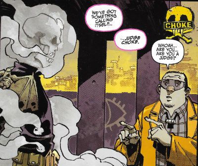
 photo AWODchokeB_zpsjtnkpemx.jpg JUDGE DREDD by Daniel, Swierczynski & Lee

Essentially this doesn’t read like a complete story but like a section in a larger story. Which is fine, very sexy, very modern, very Television and all that but Christ, people, context counts. And context here is sorely lacking. Although the book is ostensibly about Dredd vs. The Dark Judges, some fuzzily defined business about two people who have swapped bodies (in a previous volume, I guess) keeps barging its way to the fore like a drunk on a bus. This is a problem, as I picked it up for The Dark Judges, and if you want me to be more interested in some other story that’s already half over you’ll have to put your back into it. Unfortunately, Duane Swierczynski doesn’t. He is, I hasten to add, professional enough to convey the essentials of the situation (a man and a woman have swapped bodies, one of them was a Judge, and the Judge swapped bodies so that the other party would go to Titan (the space prison for Judges) instead). Sure, Swierczynski manages to smoothly integrate all that into the text and I can think of plenty of Red Hawt Comics Writers who would have skinned their knees at even at that low hurdle. But, c’mon, being better than the worst isn’t good enough. Beyond the basics there’s no deeper insight into the situation proffered e.g. the relationship between the two people, how the swap occurred or even what crime the Judge committed. Let me put it in terms a writer would understand – when you go to a meeting with some people “in” Television what’s the first thing everyone does? Introduce themselves! The smile on your face tells me I’ve been understood.
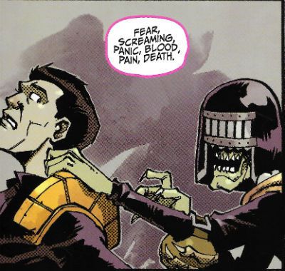
 photo AWODeathB_zpswwdjv72e.jpg JUDGE DREDD by Daniel, Swierczynski & Lee

It’s unfortunate that Swierczynski  seems to have elected to tell this other story with the The Dark Judges acting as merely a spicy backdrop, because this means he doesn’t really develop that bit either. The book starts and The Dark Judges are running amuck in Mega-City One because, uh, because…of something that happened in the previous volume? (Chet’s really flailing now, IDW. I don’t think you’ve won him over. He’s looking wistfully at the TV.)  For some inexplicable reason Swierczynski has decided to add a bunch of new Dark Judges as well. I know we’re always moaning that people don’t create stuff anymore but, you know a) there’s a time and a place and b) it still has to be good. These new Dark Judges are totally unnecessary and utterly underwhelming in comparison to their antecedents. I mean Nelson Daniel draws the balls off them, there’s nothing wrong with his designs at all; they are fresh, funny and not a little icky as befits a concept which straddles the sinister and the silly as deftly as that of The Dark Judges.
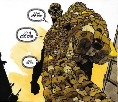
 photo AWODbigB_zpsgsojk82o.jpg JUDGE DREDD by Daniel, Swierczynski & Lee

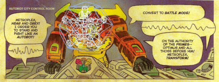
It’s a tough gig adding new Dark Judges, a bit of a poison chalice really. Especially since even the immediate additions post Death’s first appearance (Fear, Fire and Mortis) do, in retrospect, have the whiff of Brian Bolland’s having done some sweet character designs which were just thrown in to spice stuff up. Personally, Judge Death’s enough but there’s so many of the buggers now that even he’s barely in the book. Remember when you went to see BLADE: TRINITY and there were all these other people in it and Ryan Reynold’s abs vying for screen space? But you had gone hoping to see Blade not all these other people, and certainly not Ryan Reynold’s abs? It’s like that. A bit. There are so many Dark Judges, and the book is so slim that most of them only really get a scene to establish their shtick, and if they get more than that then it’s because the plot requires them to do something to propel it along. The action’s disappointing too, with Judge Dredd (points awarded for him being written as suitably curt and street-smart rather than a thick thug) strolling about dispatching his enemies with incendiaries. It's hardly Sun Tzu is it now? Mind you it’s hardly a permanent solution but then again the permanent solution is somewhat problematic. It’s problematic in the sense that it seems pulled from Duane Swierczynski’s backside. It hasn’t been of course. Obviously, this solution is a call back to events in an earlier volume but since there is no indication of this in the text it all seems bit random and dismayingly abrupt. (Chet’s started digging for gold up his nose and I don’t think he’ll be back, IDW).
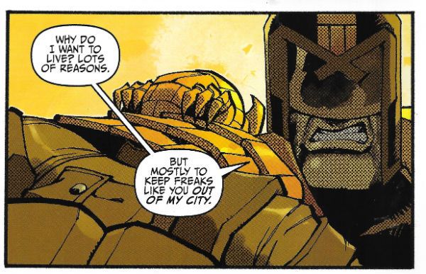
 photo AWODliveB_zpsqhdowxbt.jpg JUDGE DREDD by Daniel, Swierczynski & Lee

So even Nelson Daniel’s fizzy Charlie-Adlard-but-with-a-pulse performance can’t save what is basically a Freaky Friday re-run with cameos from The Dark Judges. In the hellish future world that is The Savage Critics Judge John is The Law, and Judge John’s verdict is that JUDGE DREDD VOLUME 5:  THE AMERICAN WAY OF DEATH is EH!

BONUS: HOW WELL DO YOU KNOW THE NEW DARK JUDGES? TAKE OUR FUN QUIZ AND FIND OUT!
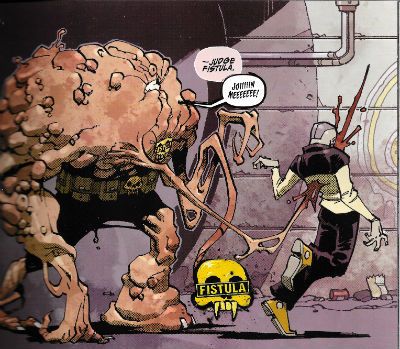
 photo AWODfistB_zpsrrgerbzf.jpg JUDGE DREDD by Daniel, Swierczynski & Lee

Judge Blank is: A) A mysterious teleporting entity which acts in opposition to the other Dark Judges.

B) A plot device used to get people from one far-flung location to another.

Answer: A)

Judge Fistula is: A) A blobby looking chap who links people together by impaling them with lengthy fleshy barbs.

B) A Scouser who issues sexual threats at passers-by (“I’m gunna fist you, la’!”)

Answer: A) (Now, I’ve not been graced with a fistula (“an abnormal or surgically made passage between a hollow or tubular organ and the body surface, or between two hollow or tubular organs”) but I do know what one is (see preceding note) and this “Judge Fistula” thing seems a bit tenuous. You may disagree. From the pages of sketches and notes in the back of the book it seems Duane Swierczynski was going for a Human Centipede effect. Since the whole Human Centipede effect depends on someone having their mouth sewn to a stranger’s arse and here we just have some people stood dazedly about connected by flesh sticks I think he missed that effect. I think “Judge Tumour” might have been better but again, that’s just me.)

Judge Skinner has: A) Had his lyrics discussed in an Oxford Professor of Poetry lecture by Sir Geoffrey Hill.

B) No skin and can remove the skin of his victims by magic.

Answer: B)

Judge Sleep is: A) A lady Judge who causes irritating gummy secretions in people’s eyes, which harden and can be really tricky to get out even if you use your little finger and get right on in there. Hot water and cotton wool are the cure.

B) A lady judge who puts people to sleep forever.

Answer: B) (Which sounds more like Judge Coma to me but there you go, I’m not a writer like Duane Swierczynski so what do I know.)

Judge Burroughs : A) Shoots wives in the head "accidentally" and fantasises about naked sailors hanging themselves in sufficient quantities that the resultant terminal ejaculate makes it look like it is snowing.

B) Burrows like a mole. (Brring! Brring! Brian Azzarello called, he wants his wordplay back.)

Answer: B) (He also looks like a mole, albeit a skinned one which, look, okay, moles do burrow, I’ll give you that,  but I’m kind of hazy on their connection to death. I’m struggling to think of any culture which has the mole as a totem of death. I’m flawed; I’ve watched a lot of bad movies where “nature fights back”, but I can’t think of even one where moles start acting up. Rabbits and worms, yes, slugs even, but moles? I’m drawing a blank here, to be honest. Maybe Duane Swierczynski’s got an allotment and moles got into his lettuce last summer and he still bears a grudge. Judge Burroughs is stupid is what I’m getting at there.)

Judge Sludge is: A) Made of Sludge and able to spray victims with a dense emission.

B) Evidence that inspiration can fail us all.

Answer: A)

Judge Metastasis is: A) an ever increasing giant composed of people subsumed into its bulk, all of whom are ruled by one mind; a searing commentary on the mindlessness of the mob.

B) the result of someone reading Clive Barker’s In The Hills, The Cities at a formative age.

Answer: A)

Judge Stigmata is: A) Able to sidle up to people and charismatically induce them to wound themselves.

B) An attention seeking hairdresser who gives priests who look like Gabriel Byrne boners.

Answer: A) (Unfortunately, and I take no pleasure in pointing this out, this is not actually stigmatism as the wounds do not appear spontaneously and nor do they conform to those said to have been endured by Jesus Christ. Those, you know, being the defining elements of stigmatism. What we have here in this book is hypnotically induced self-harming. I know it seems picky but there you go. Again, no writer I.)

Judge Choke is: A)  A somewhat hazily realised comment on the self-destructive  nature of smoking. (Okay, maybe he just straight up chokes people on smoke. Design-wise anyway, Judge Choke definitely looks like Ghost Rider after a light summer shower.)

B) An insecure actor who corners people at parties and, in an increasingly hysterical manner as the evening wears on, and the drink gets sunk, points out that although appearances in drearily unexceptional production-line Marvel©® movie fodder have made him rich he just really, really needs you to know that there’s just so much more to him than that; what with him having once directed a movie adaptation of Chuck Palahniuk’s Choke. Struggling to stay conscious victims stab themselves in the leg with those cocktail sticks you put the tiny sausages on, eventually expiring from blood loss.

Answer A)

Judge Judy is: A) a TV program my Mum watches during the day because she is retired and that’s her choice; she’s worked hard and she’s earned that right.

B) a cheap joke on my behalf to see us out.

Answer: A) and B)

NEXT TIME: I don’t know. Do you think I actually have a plan? Probably this week’s 2000AD and a couple of other – COMICS!!!

"I'm Starting To Miss My Trolley." COMICS! Sometimes I Purr Like A Kitten!

Alright, let’s try that capsule business again. Took a little bit of the wormwood out this time around and drizzled it with some milk of human kindness. Serves two. Should be plenty of leftovers then.  photo TRANSoddB_zpsmhxrvm9s.jpg By Scioli and Barber

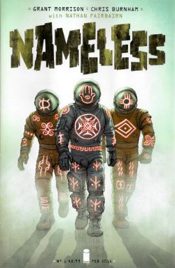
Anyway, this… NAMELESS #1 Art by Chris Burnham Written by Grant Morrison Coloured by Nathan Fairbairn Lettered by Simon Bowland Logo And Design by Rian Hughes Image, $2.99 (2015) Nameless created by Chris Burnham & Grant Morrison

 photo NLESSCovB_zpspunaatqg.jpg

Nameless stands in stark contrast to the two Multiversity comics I so hostilely (unfairly so? No.) assessed yesterday. It does this by practically vibrating with vim, vigour and vitality; sure, this is due largely to the Viagra of Chris Burnside (with Nathan Fairbairn)’s art, but the efforts of Grant Morrison certainly play a part. Fair’s fair and all that, Morrison’s performance here is farcically dark with fractured shards of gross atrocities (courtesy of Burnham), plunging towards your eyes while (courtesy of Morrison) elliptical whispers hissing of yet grosser atrocities to come caress your mind. Although it’s all delivered in a distorted and fragmentary way, a stark sense of claustrophobic threat stabs cleanly through it all; which is no mean feat as the threat turns out to be star borne and earth bound. Yes, space is big and so not terribly claustrophobic but it is also dark and it’s the darkness that wins out here. Morrison’s an old hand at this whole flinging of black glitter in the reader’s face and the practice has paid off with a fine balancing act between unsettling suggestion and the overtly gross. Sure, at root this comic has the same generic skeleton of a bullshity flatterpants plot shared by a multitude of entertainments. It’s the one about how you are secretly special and one day someone will knock on your door and beg you to save the world because only you can, and despite your huge personal sadness which you stoically bear, you will agree because you aren’t just special  - you are awesome too. (If that ever does happen, if someone does ever knock on your door and tells you you’re special my advice is to shut that door and ring the police. Real life and comics are very different beasts, me old plumduffs) But that’s okay, because the familiar “special you!” plot is just the skeleton and it’s how you flesh it out that counts. And here Morrison fleshes it out just fine. No, he isn’t doing anything new here, but he’s doing everything well here. That matters.

 photo NLESSCoinB_zpsyxsomz2o.jpg By Burnham, Fairbairn, Morrison & Bowland

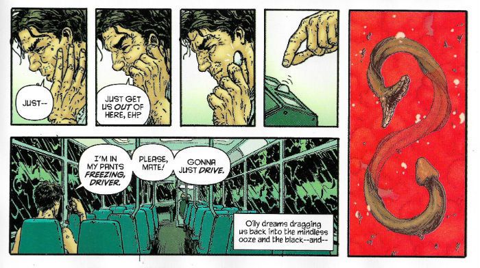
And rippling under the flesh there’s Chris Burnham’s artistic muscle and Chris Burnham’s artistic muscle is ripped. Go on, touch it, he won’t bite; see, like boulders. So good, Burnham’s stuff here; just so , so good. But dark and nasty too, as befits Nameless’s disposition. It's great reading just on its own visual merits, this art; noticing how Burnham plays with page layouts so that they are paced just so and being giddily inventive and never succumbing to empty showmanship. And then there’s the crazy level of visual interest thanks to his detail crammed panels, all of which is done, and it’s a neat trick this, without clogging the narrative flow. And it’s all just ‘off’ by enough, with its obtrusively, and troublingly, textured look. It’s like everything is coated or speckled with blackened crackling from a burnt Sunday joint. In brilliant contrast Burnham has everything coated in this roasted, pitted shell bouncing about with a cartoony exuberance. Sure, the stuff on these pages is intentionally ugly but the skill swimming beneath is beautiful. Never tripping once over Nameless’ outlandish tone Burnham’s work is simultaneously menacing and amusing. Chris Burnham, you suspect, could turn a bus timetable into an oddly comical frenzy of meat and fear. A talent as mighty as this allied with one of Morrison’s better scripts means Nameless is VERY GOOD!

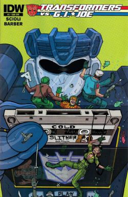
TRANSFORMERS VS G.I. JOE #5 Art by Tom Scioli Written by Tom Scioli & John Barber Coloured by Tom Scioli Lettered by Tom Scioli IDW, $3.99 (2014)

 photo TRANSCovB_zps3dcvr0cq.jpg

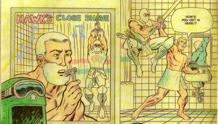
Man alive, this book; this crazy, hectic, dazzling piece of concentrated genius given paper form! The only thing low-key about this comic is the critical reception. Where’s the tickertape parade? Where are the interviews with the creators? Whither the in-depth, humorously toned, lightly ironic retrospectives on these toys - you know The G.I. Robots, The Transvestite Joes; whatever the Hell they are? Look, I won’t lie to you (there’s nothing in it for me) I don’t care about the toys (the Twinfarter G.I.s, The Rowboat Josephs?) but I care about this comic. When you get old everything’s usually just, truly, basically a fiasco, and increasingly so and then you die; but the upside is that you can read comics for what they do rather than the IP properties they contain. Scioli and Barber love these toys (the little men and lady ones, the big robot ones) enough for all mankind. But better yet they love comics enough to just make each issue a Hell for leather, go-for-broke visual symphony in zesty bombast. Every page is a delight. Stylistically, formally or just in its basic joie de vivre every page of this comic is a delight. Every. Single. Page. There isn’t a page in any one of the issues of this comic so far that has not made me laugh, applaud, or just boggle in stupefied silence.

 photo TRANSshaveB_zpsvid2lovh.jpg By Scioli & Barber

But I guess Comic News is so exciting that there’s no room to ballyhoo the most formally inventive (as in invention with the form of comics, rather than deciding to occlude your speech bubbles while sporting a top hat and tux) and volcanically joyous comic since Jack Kirby’s O.M.A.C.. No, it’s far more important that we hear how - Eric Estrada Reveals He Is Willing To Helm Marvel’s Next Blockbuster! Why Marvel’s Secret Wars Is Guaranteed To Tie A knot In Your Urethra! Hear How Scarlett Johannsen Admits She Saw A Comic Once And It Didn’t Make Her Throw Her Lovely Guts Up! How DC’s Convergence Can Feed Three For Under Twenty Dollars! Bob Hoskins Says Even Death Won’t Keep Him From Playing Turner D Century! How Starsky & Hutch by Matt Fraction and Some Artist Or Other Will Make Knitwear Sexy Again! Fifty Things Marvel Need To Do To Get Turner D Century On The Screen! Comic Creator Declares Evil is “Kinda Like Not the Best Thing, Yeah?”! Nuuuh. Nuuuuh. Tear yourself away from all that essential noise and pick up a copy of Transformers Vs. G.I. Joe and discover a reason to love comics on every page. “Nice Try at a pull quote, John, you transparent bastard,” you say,” but what’s it about, John? This “review” is awful, John, you haven’t told us the first thing about this book! This review is more awful, John, than those where you think you are being funny but you just come off as a nasty, nasty, bitter, twisted little man. John. Yes, you, John. It’s as though you’ve written this review to alleviate the soul-numb that comes from being away from home for work, John. In fact, John, we strongly suspect you are without even a copy of the actual bloody comic within sixty miles of you! You are fooling no one, John!” Lies and slurs atop lies, I say. Yet if (if!) I were to spend my few stale hours of respite from selling chicken muzzles holed up in a Travelodge writing about this comic while face first in the mini-bar wouldn’t that speak volumes about the quality of this book? The answer is , yes. Look, I was right about Shaolin Cowboy and I’m right about Transformers Vs. G.I. Joe. It’s EXCELLENT!

Actually, that was a literary conceit back there as I don’t work away from home, but I do love – COMICS!!!
"You Can't...Put A BULLET...In A NIGHTMARE!" COMICS! Sometimes Pleasures Can Be Dark Indeed!

Thanks to the snow and the UK's inability to ever cope with it I got a bit of extra time (but not your...kisss!). I'll have to make that time up mind you, but don't you worry about that, because here's a pitiful splatter of words about a collection of Tom Sutton's work on Charlton's "ghost" line of comics. I should probably tell you upfront that I liked 'em, because I know I can be a bit equivocal about this stuff.  photo TSCTTeddyB_zp sa3cbbc52.jpg

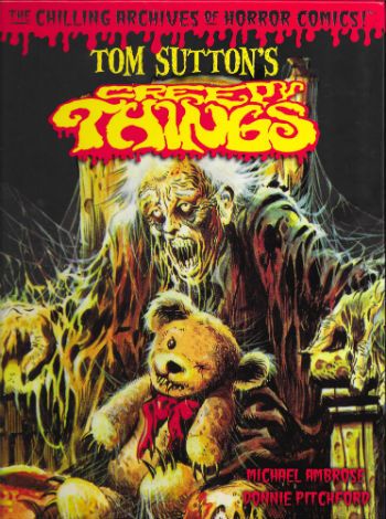
Anyway, this... TOM SUTTON'S CREEPY THINGS (The Chilling Archives of Horror Comics #9) Art by Tom Sutton Written by Tom Sutton, Nicola Cuti & Joe Gill Edited & Produced by Michael Ambrose & Donnie Pitchford Yoe Books/IDW, $24.99 (2014)

 photo TSCTCovB_zps51444402.jpg

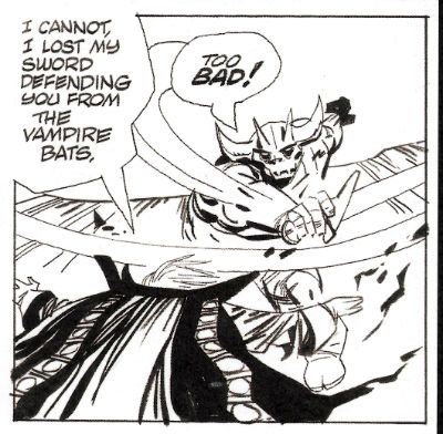
Oh, I loved this book. I loved this book so very, very much. This book is chock-a-block full of stuff I thought I’d never see, but stuff I always wanted to. And here it is and I’m seeing it! Oops, sorry. (Dignity in all things, John!) So, ahem, this splendid tome, from the hands of Michael Ambrose & Donnie Pitchford, contains reprints of a selection of strips and covers Tom Sutton drew (and many of the stories he also wrote) for the comics publisher Charlton's "ghost" line during the 1970s. I don’t think they’ve been reprinted since they first appeared, certainly not in bulk; I know they were all fresh sights to my eyes.  Which isn’t surprising as even though, like all good 1970s children, I was gluttonous in my hunger for four colour papery entertainment, Charlton rarely formed part of that eye diet.

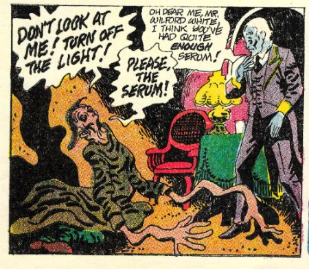
 photo TSCTSerumB_zps82b9c42d.jpg

Mostly this was down to Charlton comics being a sporadic sight in obscure North of England market towns like the one in which I festered. The other thing about Charlton comics was that when they did turn up they were so aesthetically displeasing even the least picky child was deterred. Charlton’s poor reproduction and unpleasantly tactile paper are the stuff of legend, but it’s a legend based in fact; they were poorly printed on weird material. When it comes to the company itself fact and legend get all mushed up so, although it sounds like a myth, it is a fact that the company was formed over a handshake in jail. Yet the stuff which sounds plausible, the stuff about how their comics were the result of penny pinching efficiency because the presses had to keep rolling 24/7, might be a legend (it depends whose “facts” you read). Mind you, on reflection “The presses must never stop! They hunger.” is all a tad Oliver Onions, non? Delightfully so. Then there was the flood which submerged the company under 18 feet of water in 1958 and I’ve even heard that the nightwatchman had a hook for a hand and strange lights came from the gents on Wednesdays. From this physical and temporal distance relying on other people’s accounts Charlton sounds not so much like a comics publisher than a haunted house. Or a cursed one at least. Where better for the work of an artist whose art is as sinister as that of Tom Sutton to infest?

 photo TSCTSwirlB_zpsd1f95e57.jpg

Obviously that creaky and laborious conceit all rather crumbles to dust in light of all the other comics Charlton produced but I’m trying to keep a creepy theme going and you’re making that hard with your insistence on facts. So, yes, okay, Charlton didn’t just produce horror comics they produced western comics, war comics, romance comics, super-hero comics (Blue Beetle, Captain Atom, E-Man), licenced comics; remember, the spice must flow; the presses must never stop. And Tom Sutton probably drew some of those, but they aren’t in this book. This book is all about his Charlton horror comics (For pedants: yes, there's one S-F and one "barbarian" but they all appeared in the "ghost" line of books). Sutton worked at Charlton for the same reason as Steve Ditko - they paid pennies but they left you alone. As long as pages were coming in they were happy, which meant what was on those pages was at the mercy of the artist. Artistic freedom, I believe they call it. The results can vary depending on the artist (O God, can it vary; truly, it varies) but in Tom Sutton's (and Steve Ditko's) case the results were wonderful.

 photo TSCTFiligreeB_zpsbc3a18cb.jpg

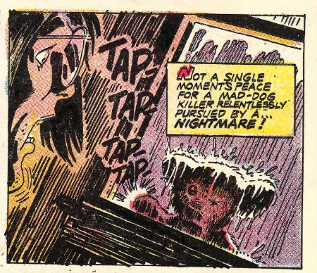
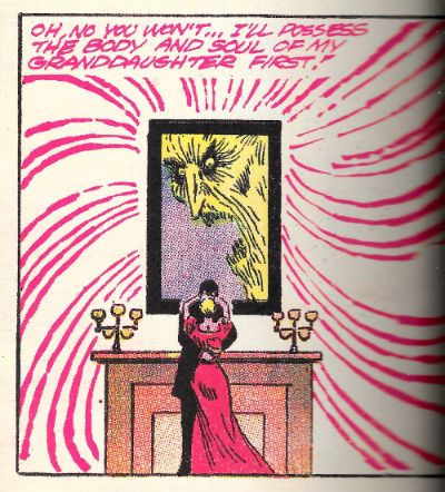
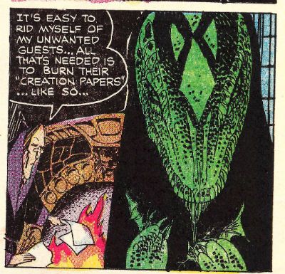
Not so much because of the plots, which sound daft when torn from their visual context. These artfully mottled pages contain a vengeful stuffed toy, a drunk and lonely ghost, an unfortunate marriage or two, a sea monster; basically a bubbling broth of all the rote , but fun, genre markers of horror of the 1970s. Yet Sutton’s art brutally lashes these mostly slender, and derivative (but sometimes original, to wit - a love story told from the POV of a grave) concepts to the end of their allotted pages and the results may leave your higher brain unruffled but your lizard brain will be skittering about like it sat on a hot rock. These strips leave hazy emotions lightly roiling in their wake as though something disturbed is moving around down there in the mud of your mind. Something angry;something hungry.

 photo TSCTwellB_zpsa5250df5.jpg

I guess it is style over content, but in that good way Comics can carry off; the style is sometimes also the content. Mostly, the content fills while the style kills. So, no, it isn’t the killer teddy bear which unnerves; it’s the world of razor sharp lines and blooms of stygian black you inhabit while reading which goes quietly about its terrible work of suspending your disbelief by its ankles. Sutton’s work can sell the silliest or most pointless stories because the seriousness is in the art. So, yeah, it's a story about a blob in love with a robot but when Sutton draws it, you can tell he's all in. They are stories but sometimes only just; sometimes it's better to see them as wells of mood into which Sutton’s art pitches you. The unfathomable depths of Sutton’s blacks in which he couches his sudden lurches into intricately filigreed detail are not only how the tale is told, sometimes they are the tale itself. "Unscheduled Stop" doesn’t even make any narrative sense but for the duration I was rapt as Sutton starts with one of the most depressing grid pages I’ve ever seen, and by the second page he’s messily riffing on Krigstein’s "Master Race", and then it’s page layout blow-out time as the ghost of Poe directs the Universal creatures in a fantasmagoric dream melt. I had no idea what I'd just read but I knew it was great COMICS!!!

 photo TSCTorigArtB_zpsb51b41c4.jpg

On an aesthetic note, the reproduction of these Comics (and covers) throughout is pretty good. They are presented as was though, so be warned that they do look like old comics. There's no re-colouring or re-mastering or re-anything except re-sizing and reprinting going on here (as far as I can see). Where there is the occasional descent into addled muddiness it’s still within acceptable parameters, I think,  for the privilege of seeing this work. For the most part, sized-up to magazine size as they are here, these pages have (probably) never looked so good. (They still essentially look like old Charlton comics though; I'm just making that crystal clear.) Better yet, there is a smattering of pages that also have never been seen (by the wider reading audience; obviously, someone saw them.) These pages take the form of the original art (from the collection of Michael Ambrose; cheers, Michael Ambrose!) and where possible these B&W reproductions have been used in place of the printed pages. Sutton’s often overlooked precision hits you immediately on these pages.

 photo TSCTFishermanB_zps5d59ac72.jpg

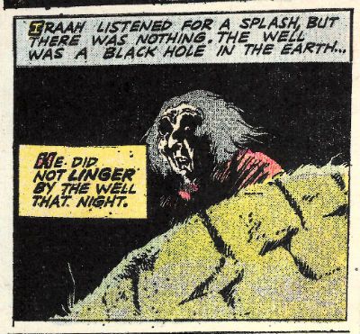
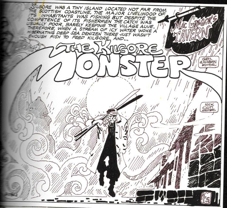
The shittines of the above image is due entirely to my scanning ineptitude. In the book this is (as are all other such B&W pages) crisp and clear. So, anyway, often Sutton's precision is lost in the blurry printing and the sheer reckless momentum of his art, but not here. Consider the half page panel of a sailorman stumping forth from a fog. It could have been drawn any one of the current carriers of Sutton's strain of dark genius; it could have slid from the brush of Michael T Gilbert, Steve Bissette or Kevin O'Neil only yesterday. But it didn't, it was drawn by Tom Sutton in 1974. In 2015 I am still impressed with the apparent ease with which Sutton makes the background elements creepily cohere into a shape of Cthulloid menace. It's just one of Tom Sutton's Creepy Things and this book's bloated with 'em. VERY GOOD!

“I Am The Storm...Returned From The Grave.” COMICS! Sometimes I See How Writing A Bit More Off The Cuff Works Out For Us All!

Ugh, January. Anway, I had a quiet hour or two so here's a couple of comics I liked in 2014 that I thought didn't get enough play. I'll just rectify that then...  photo StarPanelB_zps6202a7e4.jpg Starslammers by Simonson, Workman & Ory

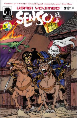
Anyway, this... USAGI YOJIMBO: SENSO Illustrated by Stan Sakai Written by Stan Sakai Cover Colours by Tom Luth Dark Horse Comics, $3.99 each (2014) Usagi Yojimbo created by Stan Sakai

 photo UsagiCovB_zpsbbd2c70b.jpg

According to the yellow circle on the cover of each issue 2014 marked 30 years of Stan Sakai's comics featuring his titular samurai (sigh, okay; ronin) character. I would dearly love to bluff my way through this piece by pretending I was there at the start and remained a constant reader through the decades separating the character's first appearance in Albedo Anthropomorphics in 1984 and this 2014 limited series. Alas, for most of its publishing history I thought Usagi Yojimbo was one of those crappy B&W “funny” animal comics that boomed and busted back then. Burnt once by a purchase of Adolescent Radioactive Black Belt Hamsters I remained shy upon every later encounter with Usagi Yojimbo. Mysteriously, about three years back, I started buying Usagi Yojimbo. I can't remember why so this anecdote isn't terribly thrilling (let's pretend the fate of the free world hung in the balance) but the fact is I did, and I haven't stopped buying it since.

 photo UsagiPanelB_zps07bdd163.jpg Usagi Yojimbo: Senso by Stan Sakai

Well, except for that brief period when Stan Sakai stopped making it to work on 47 Ronin (still samurai, but humans this time). With Usagi Yojimbo:Senso Usagi bounds back in a series set 20 years ahead of the regular series and with an atypically S-F slant. It's an odd move to be sure but it's working. In issue 4 Geoff “Shaolin Cowboy” Darrow writes in to compliment them on their paper stock. That's how well crafted this comic is – Geoff Darrow(!) is so excited about the paper its printed on he is moved to set pen to paper. It isn't just the paper Usagi Yojimbo: Senso is printed on though. Basically, Usagi Yojimbo: Senso works because Usagi Yojimbo always works. For me, anyway, and, chances are high, it works for everybody if they give it a go. The great thing about Usgai Yojimbo is it is at once for all ages (this does not just mean children) and is so beautifully crafted that every fresh episode seems as timeless as a legend. VERY GOOD!

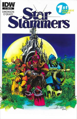
STARSLAMMERS #1-8 Illustrated by Walter Simonson Written by Walter Simonson Colours by Len O'Grady (Colours in issues 1-3 based on original colouring by Walter & Louise Simonson) Lettered by John Workman Cover colours by Romulo Fajardo and Richard Ory IDW, $3.99 each (2014) Starslammers created by Walter Simonson

 photo StarCovB_zps35fb1066.jpg

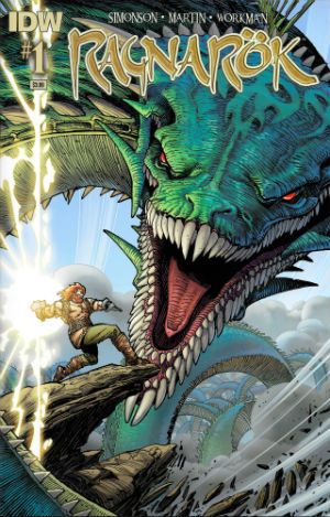
RAGNAROK #1 – 3 Illustrated by Walter Simonson Written by Walter Simonson Coloured by Laura Martin Lettered by John Workman IDW, $3.99 each (2014) Ragnarok created by Walter Simonson

 photo RagnCovB_zps1a1a3c36.jpg

In June of 2014, after giving his handlers the slip, Howard Victor Chaykin appeared at Special Edition: NYC where he said many things which were true and beautiful. The truest and most beautiful thing his louche larynx exclaimed was, “The only man of my generation that's still producing work that's not a parody of itself is Walter Simonson. Simonson's doing amazing work.” In 2014 Ragnarok proved this to be as true as a very true thing indeed. Also earlier in that same year Starslammers reminded us that Simonson had been doing amazing work for so long that that very longevity was kind of amazing in and of itself. It shouldn't have been a surprise since he never went away but, well, welcome to Comics - where Brian Bendis is taken seriously and Walter Simonson is taken for granted. (Comics – it's a visual medium. Write it down somewhere. Jesus.) For its first three issues Starslammers reformatted and reprinted the Starslammers 1984 Marvel Graphic Novel. The level of skill already present in this “old” work proved to be ridiculously ostentatious. Even back then Simonson had such a sure grip on pacing and truly cinematic presentation he ran the risk of leaving bruises behind. Also present, even back then, was John Workman's lettering; lettering so awesomely complementary that it became an inseparable and essential element of the stunning visuals on display. The remaining issues of the 2014 series re-presented the 1995 Malibu/Bravura Starslammers series.

 photo RagnPanelB_zps7837161e.jpg Ragnarok by Simonson, Workman & Martin

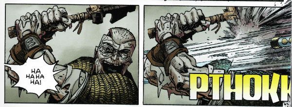
This was the first time the full series had seen print and so the rejoicing in my tiny head was loud indeed. This later material proved Simonson hadn't lost any of his magic but had learned a few new spells as well. Simonson's work now flirted so hard with abstraction his ability to refrain from tumbling into incoherence was stunning. With Starslammers it might be an exaggeration to say that there was a lesson in comic art on every page but by the time Ragnarok rolled around such a statement was probably, if anything, selling Simonson and Workman short. Sure, Simonson's stories are fun, solid and entertaining genre stuff, but, in truth, I read his comics for the storytelling. There may well come a time when the old Gods die but, ironically, Ragnarok proved that time isn't here yet. VERY GOOD!

Basically I liked 'em because if either of those series were anything they were very definitely – COMICS!!!
"This is Worser Than Washin' An Elephink!" COMICS! Sometimes It's Like I'm Shouting This At You While I Run Past!

Borag Thung, Earthlets! I have been quiet of late but I rested easy in the knowledge that the delightful Messrs Khosla, McMillan, Lester and Hibbs had been satisfying all your comicy needs to the highest of standards as ever. Not that I was resting you understand. So, practically writing this one as I move towards the door...Anyway, this...  photo DHPLaphamB_zps0a5669a1.jpg David Lapham from The Strain in DARK HORSE PRESENTS  #28

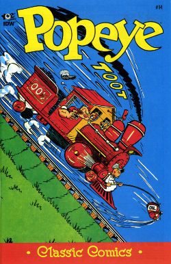
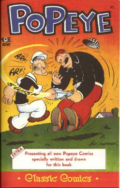
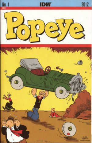
POPEYE:CLASSICS #14 Written and drawn by Bud Sagendorf IDW/Yoe Books, $3.99 (2013) Popeye created by E.C. Segar

Some issues of POPEYE: CLASSICS are available from the Savage Critics Store (which you have all quite patently forgotten about. Sniff!) HERE.

 photo PopeyeCovB_zpsc97449dd.jpg

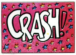
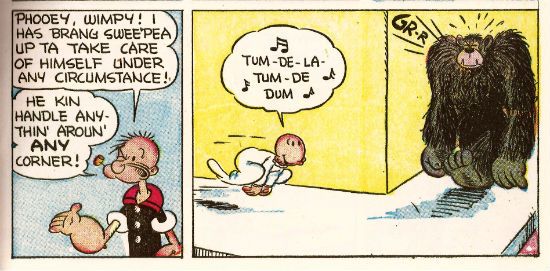
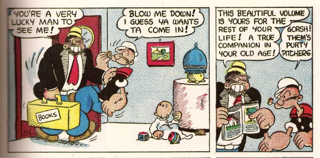
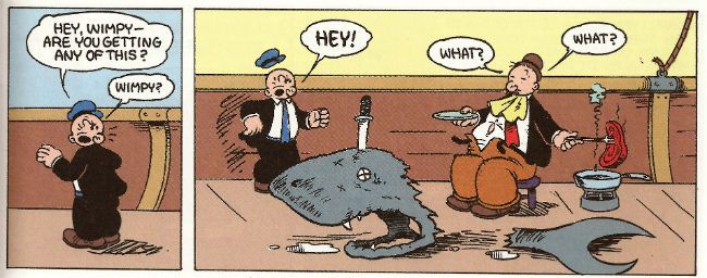
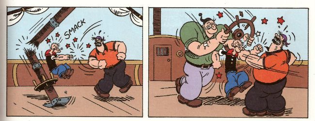
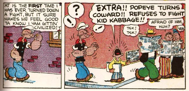
Month in month out the nautically attired freak faced grammar mangler continues to pleasantly baffle me with the weirdly logical escalation of the ludicrous incidents which comprise his preposterous adventures. Since Popeye, for all his charms, is in fact a fictional construct I’m going to place the credit for this consistently entertaining package at the door of Bud Sagendorf, a real life man (now deceased) who went done drew and writed it all. Fans of the magic old men do can marvel at Sagendorf’s use of long shot silhouettes to prevent a total nervous breakdown from having to repeatedly draw a train in what are quite small panels indeed. As a special bonus Sagendorf serves up some right nice visual gaggery, the best of which are the parts where sound FX have a physical effect on the drawn environment they inhabit. Basically they hit people on the chin is what I’m saying there.

 photo PopeyeCrashB_zps5874c470.jpg Bud Sagendorf from POPEYE CLASSICS #14

In this issue the main tale involves Popeye buying a railroad, Olive Oyl’s demanding customer, an attempted hijack and a visual stereotype of a re..native American (altho’ in the world of Popeye this might actually be a vacationing accountant in racially insensitive fancy dress). Then there’s a story where Popeye buys the world’s cheapest and laziest race horse, another story where Popeye and Olive simultaneously seek to teach Sweetpea a lesson and demonstrate their poor parenting skills by scaring the shit out of the wee tyke in an abandoned mine, and a short with Wimpy being out foxed by a cow (“a lady of the meadow”), there’s a text story as well but I skipped that. Bud Sagendorf wasn’t writing for the &*^%ing omnibus is what I’m getting at here. Popeye is printed on weirdly bloated pages, haphazardly coloured and always, always a welcome arrival in my field of vision so I’m going to say it’s VERY GOOD!

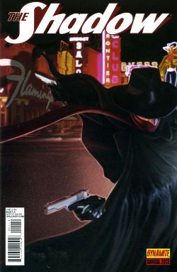
THE SHADOW ANNUAL 2013 Art by Bilquis Evely Written by Andre Parks Coloured by Daniela Miwa The Shadow created by Walter B. Gibson Dynamite, $4.99 (2013)

 photo ShadCovB_zps5952fe00.jpg

Man, I’m not exactly Sammy Stable at the best of times (“No shit, John!”) but the temporal shenanigans in this thing almost gave me a panic attack. It’s five minutes ago! Now it’s three hours later! No, hang on, it’s five years earlier. No, it’s been seven hours and fifteen days. And nothing compares. Nothing compares. To yaaaooooooooowwwww. Clearly the comparison being begged here is that this comic is like Brief Encounter but starring two psychopaths and set in Vegas before Elvis conquered it.

 photo ShadTimeB_zps5522896f.jpg

Bilquis Evely from THE SHADOW ANNUAL 2013

Even more clearly it’s not like that at all but instead is very much like having to find your train in a busy station where all the clocks show the wrong time, people keep getting stabbed and shot and you’ve found yourself in the company of some boring jabberjaw who won’t shut up about his first love. Shadow, dude, move on. This is unseemly in a man of your standing. Fucking chin up, old son. As for the art, well, it’s okay, it’s alright, but there’s a tendency for noses to look like the owner has a heavy cold. That’s Sean Murphy’s influence (influenza!) in action there. So, a nice idea, not terribly well executed at a price point I want to hit with a stick makes this EH!

DARK HORSE PRESENTS #28 Art by David Lapham, Neal Adams, Richard Corben, Steve Lieber, Patrick Alexander, Ron Randall, Menton3, Michael T. Gilbert, Aaron Conley and Geoff Darrow Written/plotted by David Lapham, Edgar Allan Poe, Richard Corben, Neal Adams, Caitlin R. Kiernan, Ron Randall, Steve Niles, Michael T. Gilbert, Janet Gilbert and Damon Gentry Coloured by Lee Loughridge, Moose Baumann, Rachelle Rosenberg, Jeremy Colwell, Michael T. Gilbert, Sloane Leong Lettered by Clem Robbins, Nate Piekos of Blambot, Ken Bruzenak, Steve Lieber and Damon Gentry

 photo DHPCovB_zps02ecf8a5.jpg

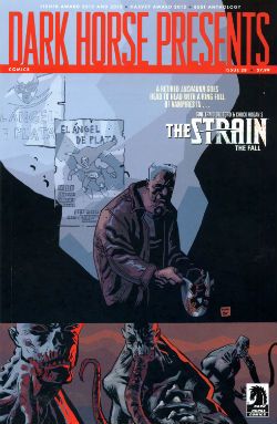
Dark Horse Presents is an anthology so, you know, it’s a bit all over the shop. Mostly though it keeps its footing on the shiny tiles and rarely sends the display of stacked tins (Pork and beans! For the poor!) spinning madly about. First up, David Lapham reminds me how good he is at comics with his The Strain chapter. Even though I have no particular interest in this property and there's a bit of cultural shorthand verging on the cliched Lapham quietly did the business on every page to ensure that the final panel came as a punch to the guts and I actually wanted to read what happened next. Later in the ish Lapham resurfaces with the conclusion to his introductory Juice Squeezers tale which, with its teen focused Cronenbergyness, proves to be the kind of nuts that comics would benefit from more of and yet truculently resists embracing.

 photo DHPMonsterB_zps01cc1c30.jpg

Michael T. Gilbert, Janet Gilbert and Ken Bruzenak from Mr. Monster Geoff Darrow’s spot illustrations continue to amaze with the visual conviction with which they deliver scenes at once grotesque, impossible and droll. In a similar fashion to the comics Darrow produces elsewhere, comics which chafe some SavCrits so (but, strangley, not this eminently chafeable one), Sabretooth Swordsman with its surprising Savage Pencil influences is an optically delirious but narratively slight piece.

 photo DHPTigerB_zpsba5c3891.jpg Aaron Conley, Damon Gentry and Sloane Leong from Sabertooth Swordsman

Richard Corben chucks out another Poe adaptation which is notable primarily for the truly scintillating colour work executed therein. I am absolutely horrible at appreciating the colour in comics but even here, even I, had to stop and marvel at more than one point. Ken “The Chameleon” Bruzenak is here in several different stories and in each case serves up lettering apposite to the pieces in question; in the very traditional Trekker his work is attractive but modest while in Mr. Monster he provides an ostentatious display of madcap fonts.

 photo DHPCorbB_zps6e657e2e.jpg

Richard Corben and Nate Piekos from Edgar Allan Poe's The Assignation

As a whole Mr Monster, additionally armed as it is with Michael T Gilbert’s invigoratingly loose art, continues to cock a scruffy snook at seriousness; which I like. Mrs. Plopsworht's Kitchen by Patrick Alexander succeeds in making physical and emotional abuse funny which is an interesting type of victory. Oh, and there’s some other stuff here; Steve Niles producing his trademark pound shop horror; Alabaster continuing to not be anything I want while not actually being terrible and Blood by Neal Adams continuing to be Blood by Neal Adams. Overall though I had a good time so DHP was GOOD!

JUDGE DREDD CLASSICS#3 Art by Carlos Ezquerra Written by John Wagner & Alan Grant (as T.B. Grover) Coloured by Tom Mullin Lettered by Steve Potter Judge Dredd created by John Wagner & Carlos Ezquerra IDW, $3.99 (2013)

 photo JDCCovB_zps5bc7dd9e.jpg

Look, before I start acting like a pissy arse let’s get this one thing straight: these are great comics. I know this because it isn’t the first time I’ve bought them and it certainly isn’t the last time I’ll read them. When I first read them they blew my school socks off (not a kink; I was at school). The Apocalypse War was where Carlos Ezquerra returned to the character he (co) created after an absence occasioned by unfortunate editorial decisions. Carlos Ezquerra was back and Carlos Ezquerra meant it. Carlos Ezquerra drew the cremola out of The Apocalypse War even as The Apocalypse War blew the world of Dredd to grud and back. Because The Apocalypse War was where Wagner & Grant (AKA T.B. Grover) took all the pages of world building that had gone before them and applied a match. After The Apocalypse War the world of Dredd would never be the same again. Really. In The Apocalypse War Dredd made a decision no man should ever have to make, a decision only a man who was not a man could make, and the following decades of the strip have shown the consequences and ramifications of that decision fashion Judge Joseph Dredd into a man at last. With The Apocalypse War Wagner & Grant’s breathlessly hi-octane narrative pace in tandem with Ezquerra’s consistently brutal style created an epic that looked like the end of everything but was instead the birth of the strip’s future. These are great comics.

 photo JDCPeepsB_zps79926a17.jpg Ezauerra, Wagner, Grant, Potter and Mullin from The Apocalypse War

Alas, when I talk about greatness I’m talking purely about the pages of comics in here. The actual physical pamphlet comic is a bit lacking. You know, these are great comics. Do I repeat myself? I repeat myself. Great comics, so how’s about a bit of care and attention; a bit of respect. That’ll have to remain purely theoretical because, oh, he’s off now…The cover’s a bit lacking for starters; look, I’m all about negative space and clear, crisp design but that looks a bit, well, I don’t think it achieved its aim. Imagine if they’d rejigged an original 2000AD cover featuring The Apocalypse War. Trust me when I say the new cover would be a poor second. Then, oh dear, the inside front cover seems to think this story is called Block Mania but it isn’t; Block Mania finished last issue. This story in this issue, (which is all reprints and cost $3.99) is called The Apocalypse War which is why I’ve called it that through all the preceding verbiage. Then between each chapter there’s a perfunctory full page graphic. Grud on a Greenie! I realise the space has to be filled due to the page counts of each episode but could you not have had a bit of fun, IDW? Got a bit creative? Maybe stuck the original covers on there instead, or blown up a portion of a panel pop art style like on those DC Kirby/Ditko/etc Omnibooks? You’ll notice, IDW, that I’m not even daring to suggest you commission some, choke, original content. I mean I realise reprinting decades old comics and charging $3.99 a pop might not allow for such largesse. Sarcasm there.

 photo JDCTotalB_zps142c6b28.jpg Ezauerra, Wagner, Grant, Potter and Mullin from The Apocalypse War

Then there’s that weird waste of space at the bottom of the page. Again, I appreciate you don’t want to mess with the size ratios but, drokk it all, that’s some token stuff there, IDW. And there's a page out of sequence. A page out of sequence in a comic of reprints selling for $3.99! However, I am okay with the colouring. Obviously, I’d rather they hadn’t bothered because the art was drawn for B&W (except for the opening spreads) but I understand Americans are fond of their colours. There they are America: enjoy your Colonial colours! Moan, moan, moan except this is all basic stuff. I'm hardly asking for Cher to sing live in my living room here just some vague pass at professionalism, if you please.

 photo JDCShapeB_zps97a70a9e.jpg Ezauerra, Wagner, Grant, Potter and Mullin from The Apocalypse War

So, a confounding miscalculation on the part of IDW here; this material is readily available in a number of other formats and has been for decades so making a new iteration stand out from the crowd would, I’d think, be imperative. Making your books expensive and ill-designed is certainly a novel approach. Luckily, these are great comics so even though the crime is Fail the sentence is GOOD!

Anyway, I'm off now. With any luck I'll bump into some COMICS!!!!

"I Did My Bit To Make It Work, With Mixed Results, Up And Down, Good And Mediocre..." PEOPLE! Sometimes Genius Is Modest To A Fault!

Sometimes I read books about the people who make comics. These two books were about one man: Alex Toth. Now, obviously Alex Toth doesn't deserve two books. No, he deserves three at least. But only two have come out yet so here’s what happened when I read them and then tried to write about them. photo COVERS_zps2c68672d.jpg

Anyway, this…

All images are sourced from The Internet and this place in particular was very useful: The Library Of American Comics.

GENIUS, ISOLATED: THE LIFE AND ART OF ALEX TOTH By Alex Toth, Dean Mullaney & Bruce Canwell IDW, £37.99 (2011) GENIUS, ILLUSTRATED: THE LIFE AND ART OF ALEX TOTH By Alex Toth, Dean Mullaney & Bruce Canwell IDW, £37.99 (2013)

 photo COVERS_zps2c68672d.jpg

These two volumes comprise the first two thirds of a project to detail and illustrate the talent and life of the monumentally gifted, butchly moustachioed and abrasively tempered comic artist Alex Toth. Genius Isolated (Vol.1) was met with much fanfare and fan love on its release in 2011 while the second volume’s reception was so muted I was surprised when it arrived from my LCS (the LCS of the elephantine memory; no pre-order is too “pre” for OKComics!) having not realised it had even been released. Being enormously perceptive I realised this trend replicated that of the reception to Charles Burns’ THE HIVE (also vol.2 of 3; also consistently stunning; also a sort of an open secret). Hopefully, in both cases when the third volumes drop and the trilogies are complete (the prophecies fulfilled; the circle squared; Stella’s groove returned) the welcomes will be somewhat more raucous. This would be entirely natural as completeness does have a tendency to spur consideration. Hopefully, as I say, since at the moment both series are being a bit short changed in the kudos department. That’s okay because I was looking for a purpose in life! So, yes, I read both Toth volumes in rapid succession and then had a bit of a think. This took longer than I expected as that’s a lot of reading to do and thinking’s not my forte. (So apologies for the delay.) Well, I say a lot of reading, but there was also a lot of looking; for while there is a lot of written information here about Toth and his life off the page there’s also a plenitude of his life on the page in the form of his art, and it’s the looking at (basking in) these pages that slows the reading experience to a gentle stroll. A stroll through some of the best comics scenery you’ll probably ever see. If you've exchanged the not inconsiderable (but far from unreasonable) sums demanded for these volumes Toth’s talent probably isn't a surprise. You’re probably already okay about how much of a knack Alex Toth had at the comic book art lark, and you've probably picked them up to find out more about the man.

 photo Alex_suit_overcoat1_zpse03bb2d5.jpg

And find out about the man you do. These first two volumes cover Toth’s birth, life, work and death. They contextualise both the man and the art and seek to illustrate, if not explain, the precipitous stalling of his output and his eternal interpersonal difficulties. The Authors have obviously done the footwork, put the hours in, manhandled the microfiche and asked the people who knew and ended up with a pretty good picture of the man who drew all those lovely, lovely pictures. While it’s hardly The Running Man it’s no mean feat for Mullaney & Canwell to make the text as interesting as it is. This is, after all, the story of Alex Toth, which is basically the story of a man who sat in a chair smoking and drawing for several decades. His biographers aren't helped in the last stretch of Toth’s life when he packs in his nasty habit and spends most of his time just sitting and smoking. (AKA Living The Dream!) Luckily they have nous enough to realise that this long stretch of very little is a bit of a Mystery and there’s quite a lot of trying to pin down exactly why someone so gifted, so feted and (unusual for comics this) still in demand despite his age found it so hard to produce anything for so long. Toth has the obligatory odd relationship with his mother, a mysteriously detail light (particularly given the obvious research) early marriage, an army stint, alimony, children…basically a Life much like many others. There’s no smoking gun to be found, there’s no childhood encounter with a man in the park, no hiding under a pile of corpses, no secret love of show tunes, just a Life. A life with ups and downs and a marked decline in productivity somewhat sooner than might be expected. Personally, I think he just burned out early. Toth was ridiculously concerned with producing the best art he could and that’s not the best way to achieve longevity in comics. Quantity first and, hopefully, then quality; it remains the same today. He would constantly give his contemporaries (Kubert, Kane, Kirby, possibly even people whose names began with another consonant) grief for their shortcuts and shorthand, apparently ignoring the fact that sometimes you just have to draw someone walking down the street and you aren’t always going to look for a unique way to do that. Except Toth would, and I think eventually he ran out of ways to draw the same things in new ways. Hence his later preference of pin ups over sequential art. Eventually Toth was a victim of his own dizzyingly high standards; finally he found even his own work unworthy. Or maybe not.

 photo P_Underoos1_zps5f7272a0.jpg

As I say, comics has always rewarded quantity and it’s hard to see how Toth could have made a living given the ever decreasing volume of his output. Luckily back then comic artists had two escape hatches – syndicated strips and animation. (Sure there were also the old standbys of insanity, alcoholism, prison, suicide, politics and the foreign legion but those options are open to all of us rather than being exclusive to comic artists.) Syndication was the Golden Ticket; syndication was the one they all wanted. As TV is to today’s comic writers so was syndicated newspaperstrippery to yesterday’s comic artists. Joe Kubert had TALES OF THE GREEN BERETS, Jack Kirby had SKY MASTERS, Gil Kane had STARHAWKS and none of those, absolutely none of them, despite all the talent involved, are why those guys are remembered in all our hearts with more love than we afford members of our own family. It was a tough gig to get, syndication was, and I emphasise it only to show how the book implicitly demonstrates how the market has changed (Newspapers? Print? Eyes?) But I have also used it as an act of cheap misdirection because it wasn’t syndication but rather animation which may have saved Toth from wrestling with rats for scraps. As cheap jack and shoddy as those productions may appear now their impact on young minds is undeniable. While SPACE GHOST means the most to most people it means nothing to me. I’m not having a pop at it I just have no memory of it. However…however finding out that Toth designed the cartoons on The Banana Splits caused an explosion of fizzy and not entirely unpleasant associations from my childhood to sparkle briefly before swiftly dying in the infinite night of my mind.  Toth’s influence and appeal went far beyond comics and the emphasis (an entirely natural emphasis) given to the sophistication of his artistry should never overshadow the simple fact that his work never disdained his audience. Popularity and appeal were at the core of Toth’s work. The complexity of his techniques was entirely in thrall to his desire to communicate with his audience in the most direct manner possible. While the comics cognoscenti and the artistically educated will always, rightly, laud the technique, Toth’s (eternal? TBC!) popularity is due to this desire to be universally understood, to be enjoyed by anyone and everyone but never at the cost of his art and certainly never, ever by pandering.

 photo Sex_zps0c1530c9.jpg

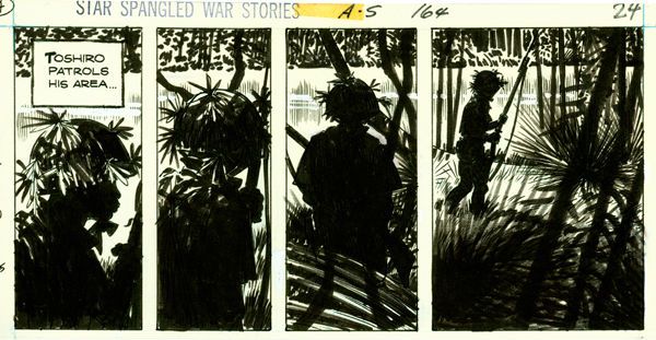
This art, intended for all but unique only to Toth, is plentifully and beautifully reproduced on the pages of both books. The one exception would be the Jon Fury pages which look like they have been reconstructed from pages on the verge of disintegration. Indeed this turns out to be the case; here posterity trumps prettiness, but everywhere else the art is reproduced to startling standards and is a representative mix of original pencils and printed product. Seeing The Crushed Gardenia pages in the original B/W shows just how much Toth was anticipating the colour used in the final version to complete his work. Drawing in B& W and drawing for B&W, Toth knew, are very different. All the art here is informative, educational and just plain enjoyable. Most of the credit is, of course, Toth’s but there’s a lot of credit due Mullaney & Canwell for sourcing it all and presenting it so attractively. 

 photo Awesome_Toth_zps21bd0b18.jpg

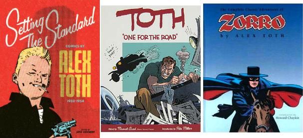
Now, while these books are perfectly enjoyable in and of themselves they can be enhanced by also dipping into ONE FOR THE ROAD (Auad, 2001), SETTING THE STANDARD (Fantagraphics, 2011) and ZORRO: The COMPLETE ALEX TOTH, Image, 2001). These are all easily available and the STANDARD art documents a period for Toth of incredible output where quality was married to quantity and the great and sympathetic inking of Mike Peppe is seen at full force. The ZORRO book is generally agreed to be Toth’s greatest sustained burst of solo art and has even had grey tones reworked by Mr. Toth, thus making it as Artist Approved as anything by Alex Toth is ever likely to have been. The ROAD book collects a fat wodge of neglected strips about cars, surfing, girls, girls and, indeed, girls etc. where the free reign given to the artist results in Toth unclenching somewhat and producing some of his most innovative and exuberant work. I would like to recommend a volume showcasing his DC work but until DC produces one I can’t.

 photo WhiteDevil4_zpse19360f2.jpg So, yes, visually, as befits books about Alex Toth, these are some handsome volumes right here. Beyond the art there are also pictures of the man. And if the number of photographs is surprising then the number of them on which Alex Toth is clearly happy is a revelation. Given Toth’s reputation as a curmudgeon non-parallel it’s important (and pleasant) to remember that sometimes his temper took time off and he was a normal person; one remembered as cheerful, funny, helpful and generous. Until he wasn't. It’s pretty obvious Toth had some problems and I’m no more going to pop psychoo-analyse him than the authors do. He was what he was and the nearest we can get to that is via the testimony of those who were there. And as I say, he seems like a nice man most of the time but, obviously, the other stuff remains more vivid and it all gets one more go round, a definitive go round given the authors’ thoroughness. There’s the Julie Schwartz Spat, the Kubert and the Art in The Car Boot Debacle, all the timeless standards and family favourites collected for all time in one place and extra bonus! -  a whole bunch of new people who Toth just cut off contact with because, well, because he could be a bit of a bear with a sore arse sometimes. But that’s a perhaps ungenerous and certainly one-sided way to remember Alex Toth and to their credit the authors make a concerted effort to show Toth finding a bit of light in his life towards the end with reconciliations and concessions raising up once more many of the bridges once thought burned beyond repair. It’s a biography not a comic so Toth still dies at the end, but the reader has a sense that he died well and with a measure of peace; a measure he would probably have never expected. I’d count that as a happy ending as far as these things go. Even happier, Alex Toth’s life and work are celebrated in his absence by a series of books which, thus far, are VERY GOOD!

The forthcoming third volume GENIUS ANIMATED: THE LIFE AND ART OF ALEX TOTH will apparently be a dedicated art book showcasing model sheets and presentations for the many animated series Toth worked on or pitched.

That’s going to be something to see even though it isn’t strictly speaking - COMICS!!!
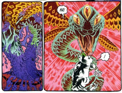
"Why Is That Puppet's Bosom EXPOSED?" COMICS! Sometimes Corben Endures!

Good morrow! It is I, the man who skipped a week without notice! I'm sure your rancour and anger have abated somewhat. If indeed they ever existed. Perhaps it was a feeling more akin to relief. As when the drowning man releases that last bubble of air and watches it rise unhurriedly to the surface through clouded but resigned and unpanicked eyes. No, my American friends, I have no idea what I'm talking about as - Christmas? Getting in the way of your free content it appears.  Anyway, this...Photobucket


I'm going to do some me stuff now. I don’t know if that’s because Christmas makes sentimental fools of us all or it's just the need to pad this crap out because Brian "Penelope Smallbone" Hibbs pays by the word (cannily he won't say which word hence - so many of the little bastards).Anyway, we (The MiracleKane Family) attended the local Victorian Fayre because, yes, I live in a country which fetishises the time we rounded up the poor into camps and the name of the game was institutionalised sadistic hypocrisy.   After perusing several stalls of overpriced tat, the consumption of heated offal and a couple of goes on Hook-A-Duck the evening ended ended with all souls present being entertained by a firework display set up in the football stadium over the road. And by stadium I mean a field with lines chalked on it surrounded by a wall.  I don’t exactly live in a cosmopolis, is what I’m saying there. Nonetheless the display was pretty impressive. It’s impressiveness was undoubtedly enhanced by the decision to play James Bond themes over the barking tannoy. Sure,  if you played James Bond themes over the sight of a man picking his nose while standing in a field of stale turds it would magically become entertaining beyond all reason. James Bond themes are like that. Well the John Barry ones anyway and that’s what these were. Brian “Holly Goodhead” Hibbs would have approved. Grudgingly as is his wont but still approval would occur within his beefy frame, I'm sure.

Photobucket I just really like this picture.

But, y’know, fair’s fair the fireworks were pretty spectacular. MiracleKid even exclaimed "Awesome!" and he's at the age when he means "awesome" when he says it and it's not just the result of a combination of affected ennui and an impoverished vocabulary. Yet, and yet, when the almost insanely enthusiastic voice riding the tannoy suggested everyone render a round of applause in appreciation...well now I know what the sound of one Dad clapping is. Christ, people are ungrateful buggers. And on that festive note...

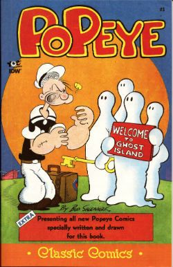
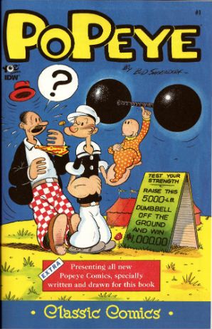
POPEYE CLASSIC COMICS #3 By Bud Sagendorf IDW/Yoe, $3.99 (2012) Popeye created by E.C. Segar

Photobucket

The adventures of everyone’s favourite arse-chinned violent maritime moron continue! But enough about Aquaman! Arf! Arf!! Yes, it’s more crumbly comics from the time when the only people who were tattooed were sailors, whores and convicts. It is truly a Golden Age of reprints when the work of Bud Sagendorf can be disinterred, dusted down and presented to an audience that never even knew it existed (well, I didn't). Because Bud Sagendorf’s Popeye comics are more golden than a dead Shirley Eaton! I don’t think I've read anything about these comics on-line which is weird given how great they are. Sagendorf’s cartooning is timeless in it’s bigfootededly bizarre brilliance as are his strangely sensical nonsensical plots which the reader is propelled through via the simple ,yet incredibly effective, method of ending each page with a “turn” (or whatever Brian “Vesper Lynd” Hibbs calls it).

Photobucket

Bud Sagendorf was not as other men.

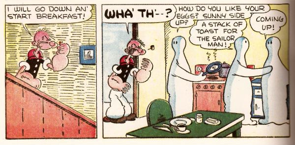
In the first (and longest) story here everyone just accepts the idea that when you die in Popeye’s world you turn into a ghost and go live on Ghost Island. This equating of death with geographical relocation is not entirely dissimilar to the premise of Will Self’s How The Dead Live except Popeye is funnier and shorter. But How The Dead Live is unarguably a lot more Jewish. Hey, these are VERY GOOD! comics; each page is beautifully crafted and built to last. But then, personally speaking, the comedy of a man looking in a window while declaiming “I is looking in this window, so I is! Arf! Arf!” is inexhaustible. I don’t know why that is and I don’t want to know. It’s enough I find things funny I don’t need to know why all the time. Sometimes it is what it is and that’s all that it is! ARF! ARF!

Help Brian “Plenty O’Toole” Hibbs blush like a rose in bloom by purchasing POPEYE CLASSIC COMICS #3 from HERE!

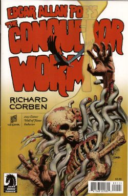
EDGAR ALLAN POE'S THE CONQUEROR WORM Adapted by Richard Corben Lettered by Nate Piekos of Blambot Dark Horse Comics, $3.99 (2012)

Photobucket

Again! Again Richard Corben paws and kneads at the raw material of Poe’s poetry shaping and reworking it to his requirements. These being the provision of a showcase for his art. To belittle this because the narrative seems somewhat undernourished would, I feel, be to miss the point. It would be to judge the artwork by the frame in which it is set. Because anyone coming to this expecting all the parts to have equal weight is going to be sorely displeased. This is Corben lifting weights in his garage, but he's left the door open so you can all crowd round and peer in. Or something.

Photobucket

After Richard Corben's first attempt offers for panto soon dried up.

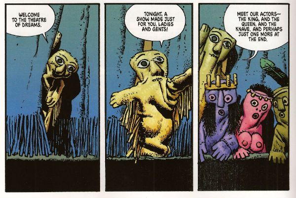
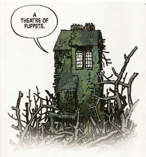
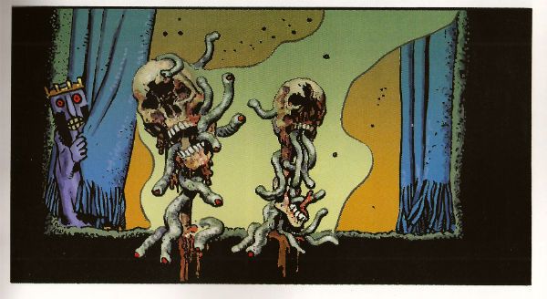
Fortuitously when you’re as great as Corben even your workouts are better than most other actual performances. Artwise, this is the real stuff. There are some brief and yet informative notes secreted in the back of the book which serve to unsettle the assuredness of my readerly assumptions. After all while I was reading this I would have said it was set in a Hammer Horror/Mad Max future limbo but in the brief but informative notes in the back I learn that Corben set it "very definitely in the 19th Century”(Much like the imagination of the British people! Not really worth all that set-up was it. Sigh.) This does serve to make the anachronistic dialogue ("Yeah, okay. I'll go for it.") funnier. Anyway this one's all about the art with Corbens's swollen and boiled looking figures capering around a world coloured mustardy rust and chalky grey through which sudden bursts of scarlet punch in horrid revelation. Also, he draws the titular worms to resemble nothing but independently mobile and toothy cocks. That's not something you see every day but neither is Richard Corben who, thrillingly, remains VERY GOOD!

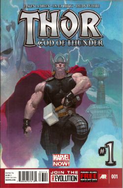
THOR GOD OF THUNDER #1 Artist Esad Ribic Writer Jason Aaron Colour Artist Dean White Letterer VC's Joe Sabino Marvel, $3.99 (2012) Thor created by Jack Kirby, Larry Lieber and Stan Lee (and the people of Norway)

Photobucket

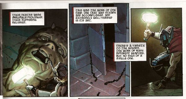
It's not a bad idea to relocate Thor as a serial killer thriller narrative. It's certainly better than the previous writer's decision to give priority to trying on trendy hats and alphabetising his coloured vinyl 7" single collection while letting his artists to do all the work. It's fine, no problems really. Aaron even seeds possible future stories with the introduction of a new pantheon of Gods here represented by The God Butcher.

Photobucket

"Mrs. Leeds changing. Do you see? Mrs Jacobi reborn. Do you see? Mrs. Leeds reborn. Do you see?"

Consequently later stories will no doubt focus on such dastardly deities as The God Baker and The God Candlestick Maker. The whole thing is a kind of watered down Heavy Metal strip the success is which is due mostly to Ribic and White's work which lends the whole derivative but enjoyable thing a grandeur and scale it probably doesn't really merit. At $3.99 it's GOOD! but not good enough for me to continue with. And there's the whole Jack Kirby thing of course; you can thank my LCS for sending me this unbidden.

So, apologies but Christmas will affect productivity but in the meantime you'll always have COMICS!!!
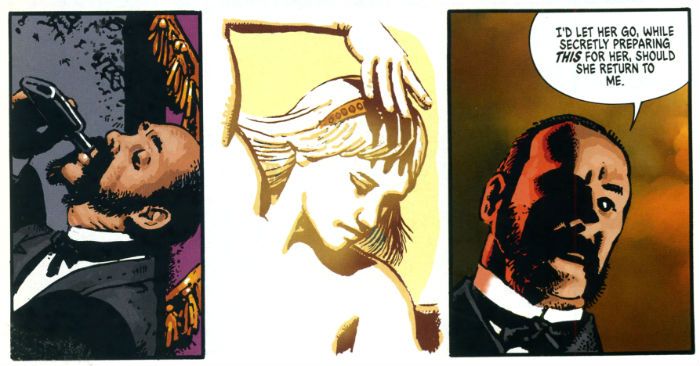
"...A Cascade Of Wasps Attacked the Furry Monster!" COMICS! Sometimes You Worry About The Men Who Made Them!

That's right I read some comics. Some of them were old and some of them were new and one of them wasn't really a comic at all. But only one of them made me think it was a miracle anyone was actually conceived in the '50s. Photobucket

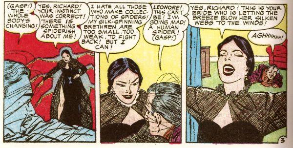
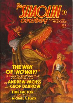
Yes, paging Dr. Subtext! Outbreak of '50s gynophobia! But then to nostalgic old fools like me '50s gynophobia is arguably the finest gynophobia of all! Anyway, this... THE SHAOLIN COWBOY ADVENTURE MAGAZINE #1 The Shaolin Cowboy in "The Way of No Way!" by Andrew Vachss and Geoff Darrow Time Factor by Michael A. Black Illustrations by Geoff Darrow and Gary Gianni Designed by Peter Doherty Cover by Scott Gustafson Dark Horse Books, $15.99 (2012) Shaolin Cowboy created by Geoff Darrow

Photobucket

This isn't a comic book, best get that straight right from the off. What it is is a loving evocation of the pulp magazines of the past. Peter Doherty has designed the book, and every page within it, to wilfully evoke those deceased progenitors of the super hero comic. He draws short at leaving the page edges untrimmed but other than that it's a splendid piece of design work. The contents are very reminiscent of the old pulps too. I haven't read a lot of those but what I have read of them they were largely shaggy dog stories told in very wordy way with the main draw being the charisma of the central character and the outlandish inventions deployed by the (often uncredited) authors to delay the ending.  Pulps were largely exercises in covering as much ground with as little material as possible (very much like certain comics from The Big Two. Ha ha! You Crazy!) but fought hard to be entertaining while doing so (unlike certain...Ha ha! Me passive aggressive!).

Photobucket

So what you get here consists of pages of words punctuated by  a plenitude of Darrow's hypnotically precise spot illustrations and a smattering of full page "Helpful Hints" where Shaolin Cowboy helpfully shows you how to switch on a toaster before e.g. tearing off someone's nutsack with it. That's the joke there and it's the same joke every time but as with certain jokes the accumulative repetition somehow keeps it funny. Because that's the thing about Shaolin Cowboy isn't it? There aren't a lot of jokes but what there are are good jokes. The best joke in the comics is appreciating the density of illustration used to enliven such meagre plots. The trick here is that Vachss and Darrow make the language serve the illustrative function but the joke remains, in essence because whole pages dense with text  are spent describing a scene only to have the scene change suddenly. More space is spent describing how the people Shaolin Cowboy is about to dispatch look than there is spent describing how they are dispatched. As with the comic the emphasis is on appearance rather than action. You will have to like words to like this one.

Darrow and Vachss have worked together before (Darrow did the covers for Vachss' 1995 CROSS series at Dark Horse and worked on the 1993 ANOTHER CHANCE TO GET THINGS RIGHT g/n along with many other artists) but it's surprising how well it works here given that change of emphasis from art to text. Vachss is a perfect choice for a pulp project like this. He's an accomplished writer of fiction whose work tends to read like nothing so much as pulp filtered through a dark adapted eye. His Burke novels are pretty much What If  Doc Savage and his crew had all had terrible childhoods and now hunted sexual predators with absolutely no intention of rehabilitating them. Vachss is an imposing figure what with his designer suits, eye-patch and general stance that seems to declare that he has just dealt with something and it will never hurt anyone else again. He isn't a dilettante either, just paddling in the waters of human atrocity for profit. This is from his bio in the back:

"Andrew Vachss has been a federal investigator in sexually transmitted diseases, a social-services caseworker, and a labour organiser, and has directed a maximum-security prison for "aggressive-violent youth". Now a lawyer in private practice, he represents children and youth exclusively."

This explains the references to the organisation PROTECT which crop up in the book and the no-nonsense message about kids and violence. Andrew Vachss makes Steve Ditko look indecisive is what I'm saying. I'm glad there is someone out there like Andrew Vachss, almost as glad as I am sorry that there is a need for people like him. But I can assure you that my rating is based entirely on the fact that I really enjoyed the book. It certainly isn't fear of having my legs broken that makes me say it was VERY GOOD! Also, the Michael A. Black time travelling/dinosaurs short that brings up the rear of the book is pretty neat and will take you back to Sundays reading Ray Bradbury on the rug in front of the fire before you even knew the world contained kids less fortunate than you who needed things like PROTECT.


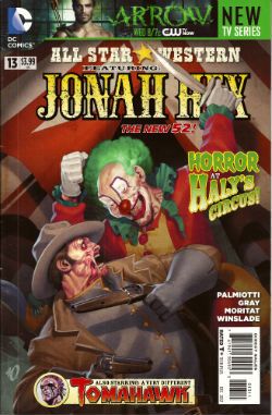
ALL STAR WESTERN#13 Jonah Hex: Art by Moritat, written by Justin Gray and Jimmy Palmiotti, coloured by Mike Atiyeh and lettered by Rob Leigh. Tomahawk!: Art and colour by Phil Winslade, written by Justin Gray and Jimmy Palmiotti and lettered by Rob Leigh. DC Comics, $3.99 (2012) Jonah Hex created by Tony DeZuniga and John Albano Tomahawk created by Edmund Good and Joe Samachson

Photobucket

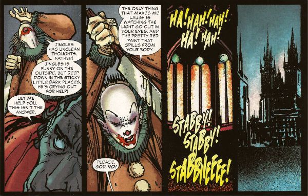
This book gets worse and worse and it still sells more than it did when it was called JONAH HEX. But then it isn't about Jonah Hex anymore is it? No,  it's more like Jonah Hex And His Amazing Friends. Except they are far from amazing and, as he's Jonah, they aren't really his friends, so it's more Jonah Hex And Some People Tolerating Each Other. Whatever I say about this book (and I'll be saying some stuff alright) all that needs be done to refute me is to chuck back its sales figures in my angry biased jealous fan boy face. The guy doing the most work here is clearly Moritat and he does a far better job than the material requires. Look, this isn't about Jonah Hex being "my" character and how I don't like what they've done to him. It's about bad comics. This one starts off with a clown killing a priest. He is killing the priest because he does not like priests because they fiddled with him when he was a kid. Jonah and his crew show up and notice the dead priest has had his face painted like a clown and someone says there's a circus in town and, oh God, oh Jesus....it's not exactly a fucking "two pipe problem" is it, Watson?

Photobucket

And I've gone Holmes on you there because what this comic is also doing is bringing in fictional literary characters from the period the book is set in (at the minute we have Edward Hyde, y'know, from Little Dorrit.) I can only guess they are doing this because the constant shout-outs to DC super hero continuity aren't stupid enough. I've got no beef with either man (I'm certainly not jealous(!)) but Palmiotti and Gray's work comes down heavily on the commercial rather than the creative end of the see-saw. It beggars my mind why on earth they would seek to go toe to toe in the shared-world arena with Kim Newman, Philip Jose Farmer and that elderly Englishman we've all decided we hate (because although less than he was he still makes everyone else look bad).  In comparison this is just pantomime and Palmiotti and Gray look like they'be both not only turned up as the horse, but they've miscalculated further and they both came as the horses' ass.  C'mon, the clock is ticking until Spring Heeled Jack shows up. After all some claim the murders ended because he sailed to The New World, how can they resist. Look forward to "It's Saucy Jack, sir! He's struck agin! Right under our very noses!" That should show FROM HELL up good and proper. Yeah, I know; but it sells more than ever - so I lose. I looOOooooOOOOOOooOOse! Look, something can be successful but still CRAP! It isn't a critic's job to tell you what's selling - it's their task to tell you whether something is any good or not and why. Sometimes elliptically. Sometimes irritatingly.


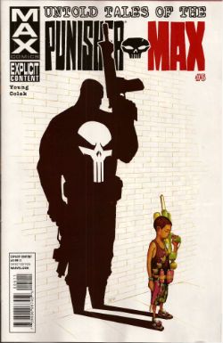
UNTOLD TALES OF THE PUNISHER MAX#5 Art by Mirko Colak (p) and Norman Lee & Rick Ketcham (i) Written by Skottie Young Coloured by Michele Rosenberg Lettered by VC's Cory Petit Marvel, $3.99 (2012) The Punisher created by John romita Snr, Ross Andru and Gerry Conway

Photobucket

There are many audacious things aout this comic written by the man who will, on this evidence, remain better known for his art on Marvel's wonderful Oz books. First up is the fact that Young attempts to position FrankMax as some kind of homicidal homilist dispensing murder and maxims. That would be okay(ish) if this were FrankNorm but in the MAX (So uncompromising! So complex! (i.e. violent and cruel)) world it seems a bit...off. Like FrankMax's taken one too many blows to the head and suddenly become simple minded or something. Don't get me wrong it's a good moral but I don't know if the guy who (spoiler!) killed your Dad is the guy you're going to listen to. No, put the phone down! Not your Dad; the Dad in the book. The Punisher didn't kill your Dad! He isn't real! No, The Punisher isn't real, your Dad is. Look, you're just doing it on purpose now.

Photobucket

The other bold move is to have the issue basically centre around a high-stakes cat and mouse game revolving entirely around the making of cheese macaroni and, specifically, whether there is some cheese in the fridge! I won't spoil it for you. No, not the cheese that's okay it's in the fridge. Or! Is! It!? I kind of liked that actually; it amused me. Young really stretches my credence to cracking point though when he suggests someone's favourite movie could be Appollo 13. Hey, it's a decent movie and it documents a thoroughly remarkable instance of insanely laudable human bravery and ingenuity no doubt, no doubt. But...favourite movie? Ever? Of all the movies you have ever seen? Okay, it might be crew members Lovell and Hise's favourite movie (Swigert died before it was made but he'd probably have been mad keen on it too.) but this comic isn't about them. I know all kids think their Dad's taste in movies suck but c'mon. Even my Dad likes Reservoir Dogs (altho', "There's no real need for all that language, John.", so spaketh he.) All this together with the unspectacular art makes the comic EH! And in the end the brassiest thing about the comic is that Marvel charged $3.99 for it. (You don't even get a Free Digital Code!)

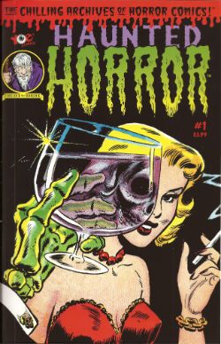
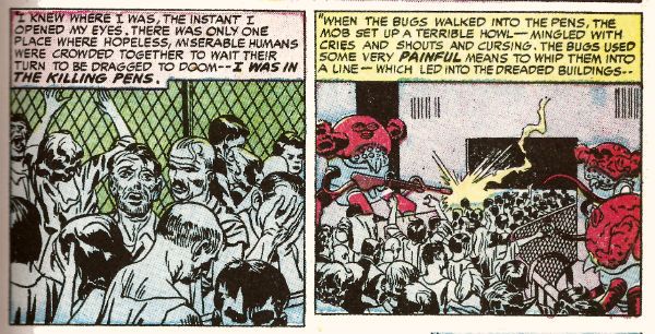
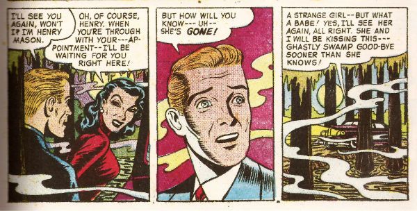
HAUNTED HORROR #1 Art by C.A. Winter, Bernard Baily, Mike Sekowsky & Bill Walton (attrib.), Jack Kirby & Joe Simon, Jack Cole and Jay Disbrow. Reprints tales from WEIRD TERROR#1 (1952), THIS MAGAZINE IS HAUNTED#4 (1952), BAFFLING MYSTERIES#6 (1952), BLACK MAGIC#31 (1954), INTRIGUE #1 (1955) and CRIME DETECTOR #5 (1954) Cover by Warren Kramer and Lee Elias IDW/YOE Comics, $3.99 (2012)

Photobucket

If you don't think that that fine as wine cover is some kind of awesome then you best look away now because that's the smoothest thing in this package. And what a package this is! A splatter of pre-Code horror comics from various sources and various artists that shores up the case for art being the decisive factor in a comic's appeal. Because these sure ain't some well written comics. Apart from the Simon & Kirby (S&K) tale none of the other contents even get a writer credit. I'm not really surprised either. These things are entertaining allright but probably not in the way the authors intended. If the authors even intended anything because back then people just wrote this stuff to eat and they had to write a lot of it and they had to write it fast. Intentions are a very modern affectation for comics writers, tha ken. The more sedate of these tales are written like the writer’s got his cock in a mangle and he’s just learned he's late for a plane.They aren't exactly coherent is what I'm saying there. But the best one is "Black Magic In A Slinky Gown" because it has an almost palpable revulsion for women and the dirty, dirty things they make men do with them. The author of this one is only saved from almost certain Sectioning by the addled and unfocused nature of the storytelling. Or maybe it makes it seem worse than it is; either way it's hilarious. The kind of story you imagine being written by the kind of man who silently props up the bar surrounded by a circle of silence and goes home and the next time you hear about him it's in the paper and it isn't for winning the lottery.

Photobucket

In a more commonly accepted sense of "best" it's "Slaughter-House" which takes the prize. This is by S&K and is a real shocker. It's f-in' brutal!  A couple of battered Joes resist after the Earth has been conquered by '50s style aliens and it's all really unsettling. It's as though limited as to what they could depict visually S&K snuck through the real horror in the text. Seriously, it's basically got humanity being herded into killing pens and "...SLAUGHTERED like beef on the hoof!" With the wire and the guards and the mechanised death and the resistance and the Quislings and...you don't need letters after your name to know what S&K are on about (World War 2, darlings. World War 2). It also contains the word "noggin" which automatically makes my day. The ending is uncharacteristically downbeat for Kirby (maybe it's more Simon) but it's weird to reflect that The King's work appears more pessimistic before Marvel fucked him over than it does after. Because while this story apparently refutes it Jack Kirby, and I may have mentioned this before, never gave up on us.

Photobucket

This is a VERY GOOD! package overall. Not just for nostalgia (because don't you have to have experienced them first time round for that?) but also out of interest in what comics used to be like. Turns out they were the kind of thing that, had it been produced yesterday by people under thirty, would tickle the 'nads of VICE readers as much as the sight of a pretty girl reading Infinite Jest opposite them on the subway. (Honestly, there's some real Charles Burns/Dan Clowes look-a-likey stuff in here.) Also, for people who like their reprints just the way they were this book is for you, Brian Hibbs! It looks like someone just scanned the comics in and adjusted the contrast and so all you need is a Police Action in Korea, a corn dog and a cop on every corner for it be just like the good old days again!

Make Brian Hibbs smile like a child again by buying HAUNTED HORROR #1 from HERE.

And like the good old days - I'm gone!

Hope y'all had a good Thanksgiving and remembered to give thanks for COMICS!!!
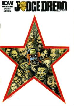
"There's A Hairy Man Running At...!" COMICS! Sometimes It Takes A Corben To Catch A Monster!

Blah-blah more days to Hallowe’en! Sil-VER Sham-ROCK! (AKA Season of The Jeff!) Here’s some stuff about a monster comic. I was going to put it up on Hallowe’en but I’ll be busy going from door to door with my son begging from strangers. That being pretty much the only growth industry there is over here, so best to prepare him early! Life skillz! Anyway, this...Photobucket

BIGFOOT #1 to #4 Art by Richard Corben Written by Steve Niles & Rob Zombie Colours by Martin Breccia & Nestor Pereyra Lettered by Robbie Robbins BIGFOOT is TM & © Steve Nile, Rob Zombie & Idea + Design Works. But not Richard Corben. IDW, $3.99ea (2005)

Photobucket

This is a comic from 2005, although as is usual with Steve Niles it’s really more of a come on to Hollywood. Yes, another pitch-comic I ‘m afraid. But this one is better than most as it is actually a pretty decent comic. This has little to do with the two writers (and copyright holders) and rather more to do with the guy they brought aboard as a hired flunky. The seasoned vet who’s brought on for his experience and ends up providing the most entertainment for the audience before being sacrificed at the end. Yes, tonight Richard Corben is Quint!

Photobucket

The main thing I know about Steve Niles is that like my Mum he believes that “If you can’t say anything nice then don’t say anything at all.” She said that thirty years ago and has remained mute as Michael Myers ever since. Hoist by her own petard there. (I’d just like to point out that creative people who wish to remove critically dissenting voices have no ulterior motive or vested interest in this happening. None at all. Perish the thought. Everything's just fucking dandy.) Now, unlike my Mother, Steve Niles has continued to be unquiet. Most of his output seems to consist of taking two things and putting them together in the hope that the result will be a third thing, a thing which will contain all the attractive qualities of the two separate things but also a new feature notable for its attraction to Hollywood. Oh, that’s unfair isn’t it, just plain rude in fact. Look, Steve Niles latest project is about vampires and robots...I'll continue then. And then there’s Rob Zombie. Who, basically, is an adult called Rob Zombie.

Photobucket

I don’t know if this indicates someone who does not take horror seriously enough or who takes horror too seriously. It isn’t that he has a daft name either it’s that it’s not a very good daft name. Lux Interior is a fine daft name for e.g.  but Rob Zombie is a bit on the nose for a Schlock Rocker, horror Director and celebrity fan-dancer, no? Like a comedian being called Clowny McSlapstick. And yet you may say; John, I feel you are still being a bit of a prick perhaps both Niles and McSlapstick felt that only comics could provide the unique storytelling tools their vision required, perhaps a movie deal would be naturally welcome but hardly the impetus for this artistic enterprise. I would then regretfully point out that BIGFOOT was published under the CREEP imprint, CREEP being a joint venture production company involving the two authors. Okay? I am probably being a bit of a prick though, you can still have that. My point though is that despite this BIGFOOT is right smart comic indeed.

Photobucket

The only real reason to rescue BIGFOOT from the back issue bins where it has holed up is the fact that on every page Corben works a series of wonders with what is quite frankly uninspiring material. From the title down there’s something altogether unpromising about the enterprise. BIGFOOT isn't exactly a name to conjure with is it? I hear BIGFOOT and I picture…well, a big foot. If I work at it I could maybe get some terror going. Maybe visualize the big foot launching itself sole first out of the foliage to rub its coarse underside all over the faces of its startled victims until they are riddled with verrucas the size of their own screaming mouths! You’re already swimming against the current by having that name up top. SASQUATCH! would have been better, it’s got the air of an authentic legend older than the white man but younger than the land whereas BIGFOOT sounds like a jackass in a bad costume.

Photobucket

Corben does in fact start with a picture of a jackass in a costume with the cover to #1 and initially teases with stolen glimpses that this is what we’re going with. But when ‘Foot crashes through the wall (and through the page into the comic, which is a nice touch) his size alone means there’s no mistaking this sucker for a dude in a suit. From then on Corben uses his mighty roster of distortions of scale, inelegant angles, impossible shadows and queasy goofiness to bring the strange. Corben can suggest the essentially remorselessly savage and animalistically other nature of ‘Foot through just a single glassy eye and a lolloping bottom lip. He manages to remove the humanity from it using its most recognizably human features. He gives it a face but it is not a face you recognize yourself in. (Unless you are way more interesting than I am giving you credit for.) Corben also has night scenes on black pages and day scenes on white pages which is a simple trick but when the action busts loose he he has jagged panels combining both (non-) colours and (ta-da!) disorientates the established schema. Then there's the action itself. This has the usually Corben flourishes of drawn SFX and motion lines which give the whole thing an inappropriately goofy aspect. And it's this very inappropriateness that gives the horror its edge. That trick runs through all Corben's work as does the treat of his sheer professionalism which is on display in every page on which he outshines the script. Which is to say, on every page.

Photobucket

It’s to the credit of the writers that they recognized Corben’s talents would elevate their work. It would be more to their credit if they had provided a script which deserved him. You see the sin here is two fold. Niles and Zombie not only treat the comic medium with little respect (inconsistent use of thought balloons is a dead giveaway), as merely a step on the journey to the true destination (the movie!) but they also short change the monster movie genre. No, the monster movie isn't the hardest template to follow but they don’t even do that, and the reason they don’t do that isn't because they are going beyond the template, forging new paths of invention and terror, hell no, it’s because they just need this to read enough like a script to catch someone’s eye. Later on all the rewrites can do the tricky stuff. Because people in Hollywood are busy they've front loaded the pitch, with the first issue being the best and most fully realized but then they just seem to give up and fall back on the basics of monster movies. And I really do mean basics. It’s like they don’t think they have to try. Some of this stuff is just a step above the “SCENE MISSING” placeholders or scribbled in notes of “emphasise parallels!” a first pass script would require. There’s a scene in a gun shop which is kinda-sort-maybe edging towards making joke or a statement about the availability of automatic weapons in a sensible society but then wanders out to the parking lot without bothering. There’s no real reason given for the increased ‘Foot activity; there’s not a sudden influx of campers for Earth Day or Secretary’s Day, no one’s building a home for disabled orphans/luxury shopping centre near the ‘Foot family’s residence. I mean I’m assuming this is increased activity because in a very short period ‘Foot has polished off quite a number of people. If it isn't increased activity folks must be pretty damned blasé about missing campers in the States. The Sheriff finally nuts up but his reasons for covering up the ‘Foot attacks are beyond stupid. There is the slightest possible effort exerted to suggest that the ‘Foot attacks are advantageous to the area because of the economic benefits of tourists but this bears the same relation to a coherent satirical argument as a fart does to a turd. It's just there because that kind of thing should be there, look, we'll work it out later when Tom Arnold's signed up for The Sheriff. Speaking of which there aren't even any good roles! Where's the Quint?! Talk about not trying!

Photobucket

I'm not an unreasonable man. No one expects a Jaws, and no one wants a humourless exercise like Orca, but there’s a happy medium where intelligence, humour and horror meet that isn't all that rare (despite what snooty cineastes may maintain) in the monster movie. Is it too much to ask for an Alligator, a Piranha or a Lake Placid? BIGFOOT thinks it’s too classy to get down and roll around in the schlock like Blood Beach but the authors aren't even willing to put enough effort in to give us Grizzly. It’s aiming for Tremors but that had a good script so they end up with Razorback which people only remember because of the visuals. And the visuals here are only so tip-top top-notch because they at least had the sense to get Corben on it. And Corben? He’s on it like vomit. I…could perhaps have put that better. In effect he’s just(!) bringing The Corben but that’s what this inert, rote, half-formed stuff needs, it needs all the flying spittle, rictus grins, creepy textures and gummy blood pools Corben can provide. If there’s any atmosphere, tension, humour or horror here it’s because of Corben. And because it’s Corben there’s plenty of all those things. So BIGFOOT is VERY GOOD! because while BIGFOOT is a movie pitch rather than a comic Corben is, and ever will be,  COMICS!!!
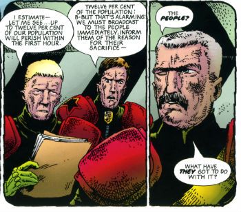
I'm off now to carve living heads into the shapes of pumpkins and if I don't see you before then do have a a Happy Hallowe'en!

Wait, What? Ep. 104: Zero Point Now

PhotobucketJohn Byrne really, uh, bringing it in Alpha Flight #6

Yeah, that's....mmm, boy!  Good ol' John Byrne, amirite?

Anyhoo... the adventure that are the shownotes for our podcast: right behind the jump!

0:00-2:48: Introductions and a bit (just a tad) of shop talk, complainy bits, and a promise from Graeme (that last phrase sounding a bit like a British pop song, eh?  For some reason, I imagine Seal singing it but that's probably just me.)
2:48-6:31: The talk turns to the early days of Morrison's Doom Patrol and even the issues just preceding.  Can you guess Graeme's secret shame before he confesses?  Hint: It'll surprise you! [Second hint: the first hint is totally worthless and can just as easily be ignored.]
6:31-30:13:  And today's surprise read from Graeme's magical library system:  John Byrne's Alpha Flight!  Graeme has fond memories of it.  Jeff has the kind of memories that should be set to the pocket watch music from For A Few Dollars More (or the harmonica music from Once Upon A Time in the West, take your pick).  Lots of discussion of Byrne from that era ensues, including Superman and Fantastic Four.  Also, Jeff attempts to recreate an Alpha Flight issue from memory. He's a clown! Come and listen and point and laugh!
30:13-30:35:  Intermission Prima!
30:35-31:46:  "And we're back."
31:46-50:21:  News and weather! (Without the weather!)  Graeme lets Jeff in on the latest development on the Siegel & Schuster heirs' court battle for the Superman copyright.  Also covered (and not really in any way that's germane to comics) the folding of Newsweek as a print media publication and what's going on with old and new media.  If you need it to tie into comics, we do mention a series of related Doonesbury strips.
50:21-1:01:42:  Back to comics! Jeff gets cranky about the blindly upbeat reception to the first issue of IDW's My Little Pony as a possibly overheated market should worthy of consideration and caution (especially from the comics press).  Jeff also has his panties in a bunch about IDW's Mars Attacks event--mistakenly, as it turns out.  Fortunately, Graeme is there to straighten Jeff out.  Unfortunately, Jeff is sufficiently without shame he has decided to leave his mistake in rather than savvily saving face via the "select and delete" option.
1:01:42-1:02:02:  Intermission Seconda!
1:02:02-1:02:56:  "Welcome back."  Man, Graeme is really on top of it this episode, isn't he?  I'm well aware of how fortunate I am to work with him but still...wow.
1:02:56-1:21:31:  Comics!  Graeme is very much liking Season Nine of Buffy and quite likes it.  We spend a few minutes talking about Archer & Armstrong #3 and how we are actually...digging this Valiant relaunch? Like a lot, I guess?  Very strange times we live in.  Other comics under discussion:  Justice League #13 by Geoff Johns and Tony Daniels (and on a related note--is Jeff Lemire having one helluva year in comics or what?)  I could tell you how this leads into our discussion of Sex Criminals by Matt Fraction and Chip Zdarsky but what would be the fun of that?  And Graeme once again is on point here, talking about the influences of Grant Morrison's Kill Your Boyfriend and this leads into a great little tangent: Graeme's personal Criterion list--movies he thinks everyone should see.
1:21:31-1:30:00:  And so Graeme talks about the experience of seeing all the very different versions of Beauty & The Beast out there: the Cocteau version, the Disney version, the TV show from 1988 and from now.  (Do we take the moment to talk about the classic Ann Nocenti scripted miniseries Beauty and The Beast featuring Dazzler?  And The Beast?  We do not.)  Also, Graeme has read Bandette: Tales of the Urchins and we have not.  However, we can check out the two page preview which is complete in and of itself here.
1:30:00-1:40:01:  Marvel Now! Point One--Graeme has read it and tells Jeff about the high points, low points and in-between points.
1:40:01-1:53:51:  Jeff's turn!  Because we are sort of running late, Jeff speeds through his impressions of Batman #13; the Shonen Jump Alpha Starter Pack, over 300 pages of digital manga you can pick up for free; the third issue of Godzilla: The Half-Century War by James Stokoe; re-reading Zaucer of Zilk by Al Ewing and Brendan McCarthy via the first issue reprint from IDW; Bakuman Vol. 15; and King Cat Comics and Stories issue #73.
1:53:51-end:  Closing comments, and plans for next ep! (Hint)
Whew!  That will keep you busy for a while, yes?  Perhaps you have already run over the podcast in your fine German car on the autobahn that is iTunes.  If not, we invite you to spend time idling here at der kleineshausdassWaffelngebaut (or, roughly translated: the little house that waffles built):
As always, we hope you enjoy and thanks for listening!

When Reporters Repeat

So, the Dave Sim / IDW press release went out wide, and several sources are specifically reporting the story as though this means that IDW is publishing a paper collection of Cerebus comics. I do not think this is correct.  In fact, I'm sure it isn't.

Read the release again, slowly -- this HAS to be for a DVD (?) collection of  the digital files, not a print book. (Edit: they've changed the title at AMOC, indicting it IS a DVD. Toldja!)

Heidi also pitches it as being "rare and expensive" from "IDW Limited", which might be one component of it -- but given that "IDW Limited" items are NOT sold in stores, and the rest of the release talks about "comic store rights", this too must be wrong.

Tom is the only one who gets it "right", but I think that's only because he doesn't commit one way or the other to what "hard copy" means as to what it might be, giving him plausible denialability.

But, here's a question: is it too much to ask that reporters not run stories without confirming the details? I don't care if you JUST run a press release, but if you comment on it, can you get it right, please?


-B

"Bleedhounds Kin Find Anythin'!" COMICS! Sometimes They Are Assorted!

So, you know how it should go: 1) Read comics 2) Think about comics  3) Write about comics 4) Post writing 5) Fret about having upset someone. Rinse and repeat.Well I did 1) and forgot to do 2) so that shivved 3), 4) and 5) right in the kidneys didn't it? So all you get is what I read last night. I'll try and do better next time.

Photobucket

Also: Don't forget the 100TH PODCAST BY GRAEME MCMILLAN and JEFF LESTER is due THIS WEEK! It will be MONUMENTAL! It will be ASTOUNDING! It will be the BEST THING EVER!

No pressure, guys!

SPACEMAN #9 (of 9) By Risso, Azzarello, Mulvihill, Robins, Johnson, Doyle and Dennis VERTIGO/DC Comics, $2.99 (2012) SPACEMAN created by Risso and Azzarello

Photobucket

In which all things come to the usually inconclusive and possibly clever but certainly unsatisfying end most of Azzarello’s work casually bellyflops into. Recasting a standard crime tale in sci-fi (S-F!) trappings turned out not to be enough. Possibly it turned out to more hobbling than helpful. Azzarello seems to actively avoid clarity in his storytelling at times, possibly confusing complication with complexity. Fair enough but then factor in his Footcha-Speek and the reader ends up trying to figure out the simplest of things while momentum and interest dissipate softly but noticeably out and away, like the sly fart of a dog under the Sunday dinner table.

Photobucket

The Futcha-Spik wasn’t all that good either, I’m not expecting Orwell’s Newspeak but I am at least expecting an effort on a par with Jack (Under-Rated) Womack and I’m certainly expecting it to be more than an excuse to force in more terrible puns (Real-Tee!). Also, I have a strong suspicion all this stuff just served as a distraction from the fact the end made no sense. No one went, “Actually, he didn't do it.” No one? How convenient. Luckily Risso and Mulvihill’s work remains visually sumptuous, engaging and altogether too good for the material at hand, thus raising it up to GOOD!

AMERICAN VAMPIRE: LORD OF NIGHTMARES #4 of 5 Drawn by Dustin Nguyen Written by Scott Snyder Colours by John Kalisz Letters by Steve Wands VERTIGO/DC Comics, $2.99 (2012) AMERICAN VAMPIRE created by Scott Snyder and Rafael Albuquerque

Photobucket

They held off quite a while didn't they? You do have to give them that, but in the end all Vampire roads lead to Vlad. Here they've plumped for the spooky baldy Murnau version; respectful but a mistake I feel. This comic could really have done with Gary Oldman’s Jack-cool-AH! livening up its sadly lifeless pages. Sometimes this thing just makes less sense than an extraordinarily senseless thing, like a clam in a coma. After doing a load of hair pulling and garment rending about how super awful a threat Dracula is the strip then seems to suggest a train crash would finish off Dracula like he was some luckless commuter on a particularly ill-fated 6.45 to Basingstoke. It also thinks having our cast trapped on a plane bickering is of interest, yet since much of the cast is made up of spooky humanoids this just ends up being like reading about the argumentative occupants of a flying supernatural pet shop.

Photobucket

What happened to Dustin Nguyen? Has he had an accident? His art is usually lovely but here it looks like he did it during a bumpy bus ride and the bus was one of those with crates of livestock on it, some of which kept getting loose and flapped right up in his face while he was engaged in his act of creation. Look, this is a series in which the Big Threat is revealed to be a chair, so yeah, it was EH!

FATALE #7 Drawn by Sean Phillips Written by Ed Brubaker Colours by Dave Stewart IMAGE, $3.50 (2012) FATALE created by Ed Brubaker and Sean Phillips

Photobucket

I know they don’t need any encouragement here but this would make a great TV series. Every week a special guest star could stumble over Josephine’s wall with an item of wider relevance to whichever decade the series was currently set in. So you could have Jim Belushi as Richard Nixon fall into Josephine’s bougainvilleas sweatily clutching a Watergate tape to his chest. He would find her attractive. She would wonder why she, an attractive woman, had such power over him, a clearly foolish man. It would be a real mystery. Only a supernatural solution would suffice. The gardener would get all shirty. She would help him out and find another clue to the central mystery of the story which is so ill defined I can’t even remember what it is. Richard Nixon would die and be sad. Josephine would be sad he had died. Then she would look out of her window to find Charlie Sheen as Elvis falling into her poison Ivy clutching the proof that Colonel Tom Parker was an illegal immigrant. And on and on and on. Robert DeNiro in Angel Heart has already shown up, although he’s now wearing those eggs he kept peeling as eyes.

Photobucket

As far as horror goes the most horrific thing about the book is when Sean Phillips draws people in the middle distance. They start to bloat and their proportions subtly shift from those of a human to something more akin to a Robert Aickman phantasm. Unfortunately he’s just drawing normal people but his skill with scenery and faces ensure the art is still the second best thing here. Dave Stewart’s colours being the first, check out the lovely felt-tippy green on that Green Door, Shakin' Stevens! I have no idea why the critical reception of this book is so orgasmic but then I didn't think CRIMINAL having flashbacks drawn like ARCHIE comics was exactly warming my face with the Promethean fire. I’m probably just a demanding prick so take my verdict of EH! With a pinch of salt.

Show me I'm just a big old partypooper by buying FATALE #7 from HERE. Remember - the more copies you buy the more you'll be showing me how wrong I am! Knock yourself out!

POPEYE CLASSIC COMICS #2 By Bud Sagendorf YOE Comics/IDW $3.99 (2012) POPEYE created by E.C. Segar

Photobucket

These are POPEYE comics from the ‘50s by Bud Sagendorf and if you have been paying attention to me then you know how I feel about that! If you have not been paying attention to me, why NOT? Jesus Christ, you know I only do this for the attention! Yes, only for the heat of your Love I feel through the screen do I do this thing! And the money. Anyway, these comics are mental and there are about twice as many pages as in a normal comic so that offsets the fact you’re paying 3.99, I feel. In case that was a concern. I really like the way they retain the original colouring because there’s something to be said for those halcyon days when upon reaching the age of 60 every citizen was forcibly taken to a warehouse where they were chained by the ankle to an enormous table and here, amongst ranks of equally liver spotted and doddering companions, they threw carcinogenic inks in the rough direction of where their cataract occluded eyes guessed the pictures were.

Photobucket

Nowadays it’s all done by computers and I think we've lost something there, something real, something human, something magical. As great as the contents are (and, yes, they are great) the cover is awesome as, if we take the Freudian view of firearms, it portrays Popeye punching a man so hard in the cock he ends up wearing his foreskin like a sleeve. Fuck you, Johnny Ryan, Bud Sagendorf rocks! It’s POPEYE by Bud Sagendorf and is, clearly, VERY GOOD!

POPEYE CLASSIC COMICS can be bought from HERE!. It's just like buying it from Bouncy Brian Hibbs! Except you don't get to go to San Francisco ("The World's Favourite City!"). But you do get a good comic instantly in your PC! Swings and roundabouts, people!

I hope you had a good weekend, y'all! I also hope you enjoyed some COMICS!!!
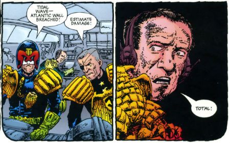
"I Got A Heart Like Nobody's Bizness!" COMICS! Sometimes They Are Timeless Magic!

Now I don't know about you but I needed a bit of a larf recently. And the most larfs I had lately were courtesy of these comics. So I thought I'd tell you about them and then you could go and buy them and have a larf too. It's called The Cycle of Larf! Arf! Arf! No, wait, these are good books, honest! Oh, be like that then. Photobucket

POPEYE #1 Art and letters by Bruce Ozella Written by Roger Langridge Coloured by Luke McDonnell IDW, $3.99 (2012) POPEYE created by E.C. Segar

Photobucket

A while back I commented that the presence of this comic was awesome for anyone who missed Thimble Theatre. Forgetting I was on The Internet I think my words were misconstrued as a dig at the fact that such an old property was being dug up and dusted off once again; despite the fact that the original audience had long ago ceased to care about comics if not before, then certainly shortly after, they had ceased breathing, which they all had some time ago. That's not actually what I meant. What I actually meant was that the presence of this comic is awesome for anyone who missed Thimble Theatre. Like me. Basically I meant "missed" as in "failed to experience" rather than "felt the loss or lack of". Words are tricky, hear me now!

I was well up for this because the only time Roger Langridge has ever disappointed me was that time when he failed to bring peace to the world entire. To be fair though that expectation may only have been in my head and comics are really more his thing. After all comics are a thing Roger Langridge does rather well. Here he just dives in with a feature length tale of Popeye and all his familiar companions, together with several unfamiliar to me anyway, creations having madcap adventures of a bizarre and confounding nature while in serach of a mate for The Jeep.  Apparently this strange creature gave the WW2 US Army vehicle its name. I previously thought it was named after the onomatopoeic effect of the initials for General Purpose (G.P.) but, no, apparently it was a Popeye character. According to the Bud Sagendorf book anyway, more on that anon. Langridge and Ozella's tale is a pell mell charge into entertainment which is dense in event with something engagingly off-kilter occurring on every page. Ozella's art has a loose and scrappy quality that retains the "punkier" quality of Segar's work as opposed to the cleaner Sagendorf stuff. By basically taking the property of Popeye and changing very little (his pipe is just for show now), the book retains the central appeal of the character which is the main reason to buy the thing.  That's not cluelessness it's common sense.

Photobucket

People want Popeye not "street level" Popeye or "Tom Clancy-lite" Popeye. If the book doesn't sell then people just don't want Popeye. The yellow lettering on the cover of my copy indicates it is a "2nd Printing", so I guess people want Popeye alright. This is something DC could bear in mind with characters like Captain "Shazam!" Marvel. If you change it too much it isn't that character anymore and if it isn't that character anymore why should anyone care? After all making Captain Marvel a dick in a hood contributes little except a clear indication that he isn't Jewish. Anyway, this comic is about Popeye not Shazam! (Boo!) and it reads like a Popeye comic and thanks to the talents of all involved it is VERY GOOD!

Please help send Brian Hibbs to Summer Camp by purchasing this comic from HERE. Issues 2,3 and 4 are also now available, just saying. Summer Camp can be pricey these days.

Photobucket

POPEYE (Classic Comics) #1 By Bud Sagendorf IDW/Yoe Comics, $3.99 (2012) POPEYE created by E.C. Segar

Photobucket

Now, when I read the 2012 comic I had very little idea about Popeye but once I'd finished it I found my curiosity had been piqued. Luckily this comic appeared. So I bought it. Causality in action there. This is apparently the first issue in a complete reprinting of the POPEYE comics which spun up and out from the newspaper strip. There are over a hundred of these. Judging by the contents of this issue the next ten years are going to be called the Happy Popeye Fan Decade. Because although I'd never heard of Bud Sagendorf before buying this it turns out that Bud Sagendorf is all kinds of awesome. He is particularly awesome at Popeye.

Photobucket

His style is cleaner and more polished than that of Segar but it loses none of its anatomical daftness and retains enough of the creepiness that always underlies Popeye's comedy. Although these strips are from 1948 they are just as mentally, er, different and rich in incident as the 2012 comic. The strips seem to have been copied straight from the old comics with warts and all remaining which gives them a lovely old timey feeling, like when you maul your grandad's face. The pages are thick and the package has a heft and solidity pleasing to the purchaser. I believe Brian Hibbs calls this quality "finger". POPEYE CLASSIC COMICS has good finger. The comics within it are, truth to tell, also VERY GOOD!

Now, I don't want to come across as though I'm rattling a tin in front of your face but this comic can also be purchased from HERE.

POPEYE The Great Comic Book Tales By Bud Sagendorf By Bud Sagendorf (Natch! Arf! Arf!) IDW/Yoe Books, $29.99 (2011) POPEYE created by E.C. Segar

Photobucket

So I read those books and then I went looking for more. Because I am a greedy man indeed. And that's how I ended up buying this. It's a sturdy volume and like all Yoe books the design and research speak so loudly of  enthusiasm that any cavils about proofreading are soon drowned out. The contents are a selection of Sagendorf's strips across a roughly 10 year period. The reproduction, and in fact the very first strip, are exactly the same as the comic above. So if you enjoyed that you're sure to enjoy this. Heck if you enjoy Popeye or just good comics you're certain to enjoy this.

Photobucket

There are probably historically verifiable reasons for each of the stunningly unsettling character designs on display here. One thing I do know is the timeless quality engendered by their wonderful weirdness enables each new generation to imprint their own meaning upon them. The Sea Hag, for example, looks like nothing so much as a stroppy Grant Morrison in a hooded cloak. That’s pretty disturbing on its own but when she asks the squint-eyed one for his malformed hand in marriage whole new vistas of repellent perversity play out in the unwilling reader’s mind. Conversely when old arse-chin smacks The Sea Hag one upside her weirdly hirsute chin you do kind of want to shout, “That’s for Siegel and Shuster, you pound shop Anarchist!” Basically though why these strangely swollen and wobbly looking folks look the way they do I haven't a clue. Maybe E.C. Segar had a squint, talked like his tongue was as big as a cat and had a chin like a bum with a pipe stuck in it. I don’t know. I know he had tattoos so that’s one mystery solved right there. I could have looked it all up but frankly I want to keep the focus on these comics and when I do finally get those E.C. Segar volumes from Fantagraphics I’ll be wanting to present their well researched facts as my own won’t I now?

Photobucket

This volume has its own well researched facts in the form of preface by Craig Yoe which is illustrated with Sagendorf rarities and one picture of the artist with snowy white hair. I am a big fan of pictures of comic book artists with snowy white hair. To me they are like pictures of kittens are to normal people. This introduction is highly enlightening in regard to Sagendorf’s craft as it includes two pages from a correspondence course he chipped in on (above) and has the man himself explaining, via quotes, some of the process involved in the creation of the strips. He and Segar would basically fish from Segar’s boat for five days hashing ideas out before belting the strips out. The introduction isn't very long but as I say it’s informative After reading it you understand why Sagendorf was able to replicate The Master’s style after his death i.e. simpatico interests (science -fiction, which explains a lot about the strip in itself) and seemingly being a creative equal for much of their association. And yet it points at the huge mystery of why it took Kings Feature Syndicate 2o years to pass the job on to Sagendorf without offering an answer. In the end though Sagendorf got the gig and made it his own. The extent to which he succeeded can now be viewed by generations previously unaware of his very existence. I think he would have liked that and I think you will like this book as it is VERY GOOD!

Before I bought POPEYE #1 by Langridge and Ozella I knew very little about Popeye, shortly thereafter I had bought POPEYE CLASSIC COMICS #1 and POPEYE THE GREAT COMIC BOOK TALES. I don't know much about publishing or retailing but I think I might count that as a success right there for all involved and the persistent magic of the the profoundly stupid or perhaps even the stupidly profound, world of POPEYE!

Have a good weekend, y'all, and read some COMICS!!! (Maybe even buy 'em from HERE!)
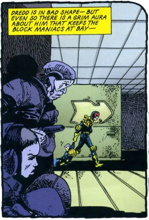
"It Is Not The FIRST TIME This Has Happened." COMICS! Sometimes They Are Hot Off The Griddle!

Hey old people, remember Sunday evening when you were a kid?: Photobucket

Urrrrrhhhh! Let's take the Sunday Blues away with some piffle about our four colour floppy friends! COMICS!!!
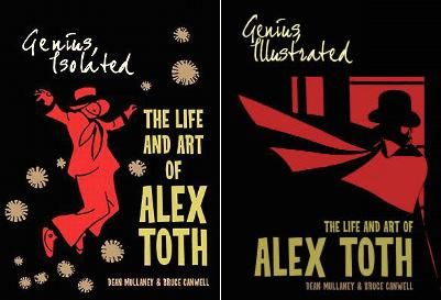
SUPREME #64 Art by Erik Larsen & Cory Hamscher Written by Erik Larsen Coloured by Steve Oliff Lettered by Chris Eliopoulos Image Comics, $2.99 (2012) Supreme created by Rob Liefeld

Photobucket

Hu-ooFF! Well, that was horrible. As a comic, I mean. Look, I don't have a problem with a change in direction and it's a little soon to tell if I have a problem with this particular change in direction, but I have a problem with a bad comic which this was. Just page after page of people dying, things falling over, plenty of, as my son would say, "'splodin'!!!". I hate to break thi sto everyone but that's not actually a story as such. Sigh. I don't have much familiarity with Erik Larsen's work (the '90s? Not really my best time for comics)  so I'm not counting him out yet. Yeah, maybe Erik Larsen can swing this one around. I'll give him a couple more issues to do so. Turns out I'm that close to generous but this issue was pretty EH!

Photobucket

Reckon them's fightin' words and wanna show me just how wrong I am? Well, you can buy this exact comic from  HERE!

FURY MAX #1 Art by Goran Parlov Written by Garth Ennis Coloured by Lee Loughridge Lettering by Rob Steen Marvel,$3.99 (2012) Nick Fury created by Jack Kirby with Stan Lee

Photobucket

I don't know what they are feeding Garth Ennis on these days but the comics he's producing would be Type 3 or 4 on The Bristol Stool Scale; this being as we all know optimal. In a worrying state of affairs Ennis has now produced two comics (see last week's THE SHADOW) which are set in  convincing historical settings, peopled by satisfyingly sketched characters and which succeed in being both informative and entertaining. Which is why I had to bring my own shit joke to the party lest his regular, heh, audience feel at at a loss. Taking the first chapter's title from TheThe softened my hardened heart but going on to deliver an intelligent, amusing and diverting comic  is what really sealed the deal here.

Photobucket

Ennis is helped no end by the astonishing art of Goran Parlov. Goran Parlov is the kind of artistic wonder who can limit himself, largely, to the most banal of page layouts without inspiring new lows of tedium in my mind. He can do this because everything he puts in those panels is just right. It doesn't hurt that his present day Fury looks  so gnarled and battered he resembles 19th Century armoire smoking a cigar while clad in plaid slippers and a fluffy robe. Yeah, this was VERY GOOD!

(Yes, I am aware Nick Fury was created by Jack Kirby with Stan Lee and that I said I wasn't going to purchase any more Marvel products which failed to acknowledge the contributions of The King.  Either my LCS forgot or decided that my professed liking for Garth Ennis' non puerile work and Goran Parlov's anything superceded this. Okay? Either way I got a good comic and I still think it could have had the words "created by Jack Kirby and Stan Lee" on it without upsetting the balance of Life itself.)

TRIO#1 Written and Drawn by John Byrne Coloured by Ronda Pattison Lettered by Robbie Robbins IDW, $3.99 (2012) Trio created by John Byrne

Photobucket

Mark the time. The super-hero funnybook is dead. I'm surprised to find John Byrne's DNA on the corpse but then it's always the ones that love hardest that end up hating enough to kill. I'm a bit sore because I lost my shirt on this one; my money was on one of the TV Breed. One of those guys who just keep parping it out until the comics cognoscenti just give in and allow quantity to supercede quality. Yeah, I figured the smoking gun would be in the clammy hands of  one of those guys with all the imagination of an empty cardboard box, one of the dialogue guys, one of the post-it notes and flow-chart guys, y'know, the sophisticated guys. But like the most surprising game of Comics Cluedo ever, in the end it was John Byrne in the LCS with The Fantastic Faux. A super team of characters called "One", "Two" and "Three" could only mean one thing; the death of imagination.

Photobucket

But look, in his defence, no one loved the super-hero funny book as much as John Byrne. He loved it so much he hid it away and protected it from reality. Up there in the big house with the pool. Pretending nothing had changed and if it had, well, it wouldn't last. See, John Byrne knows super hero comics are still big it's just the audience that got small. You just have to give 'em comics like back when they loved them. Back in the '80s. The magical hey-day of ALPHA FLIGHT! This isn't a comeback it's a return, it's the return of cape comics, the return of the way they should be done, the return of the way they were done when they were done rightIt's the return of an '80s issue of ALPHA FLIGHT. Sure, it's the best issue of '80s ALPHA FLIGHT ever published but it's still just an '80s issue of ALPHA FLIGHT. It's now 2012. Here's the corpse of super-hero comics now, caked in make-up, going on eighty trying to pass for eighteen. Nothing sadder. Sure, it may be EH! but they'll love it in Pomona.

You can prove the audience for this comic didn't leave twenty years ago by buying it from HERE!!!
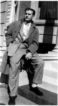
FATALE #5 Art by Sean Phillips Written by Ed Brubaker Coloured by Dave Stewart Image Comics, $3.50 (2012) Fatale created by Ed Brubaker and Sean Phillips

Photobucket

Well, I gave it 5 issues and I was hoping this one would turn it around. It didn't. A spooky rinser, people in hats swearing and a demon who can come back from the dead but can't bring back his eyes. I guess you could say it was a bit like James Ellroy meets H.P. Lovecraft, y'know, if they'd both had flu at the time, or you'd only seen the covers of their books, or you had in fact never actually read them just read about them. In the end FATALE pretty much ended up being the John Byrne's TRIO of independent creator-owned comics. Familiar stuff delivered familiarly; that's not going to make me run about like my underpants are on fire no matter who is involved. Sure, I'm all for Team Independent but not if they are as bland as the alternative. Being creator owned is a magical thing but for a reader comics still have to be better than EH!

Photobucket

Possibly not the most popular opinion regarding this comic book! Why not make up your own mind by purchasing if from HERE!

MUDMAN #3 Written and Drawn by Paul Grist Coloured by Bill Crabtree Image Comics, $3.50 (2012) Mudman created by Paul Grist

Photobucket

Wait! I'm getting a pulse! turns out the cape comic isn't dead after all, it just has to keep up with the times is all. This one's about a normal kid in a timelessly sleepy English seaside town who is, through events and stuff ,suddenly not normal in a way that involves mud and being a man made thereof. It's got a breezy lightness of tone that might work against it; sometimes it seems not a lot has happened but really quite a lot has. As Owen Craig (Mud Man when he's not Mud Man) finds his powers have opened up new possibilities for him physically the environment around him seems to change in concert. Using the fixed point of Owen's discoveries as the present Grist fills in the Past and hints at the Future while parts of each encroach on Owen's life and, as is generally the way of things, threaten it.

Photobucket

Grist is really good at keeping the tone light while at the same time giving the threats real weight.  He also excels at teasing about future developments; so much so that the next issue just can't get here quick enough. But what Grist is best at is storytelling; in the words and pictures sense, natch, this being a comical periodical and all. He may be a bit too good at it because reading the comic is so effortless, practically intuitive, that it's quite likely the reader might forget to credit the incredible talents and the deft wielding of same that made it so. From soup to nuts, from top to tail, from mud to man MUD MAN is VERY GOOD!

Or is it? Find out by buying it from HERE!!!
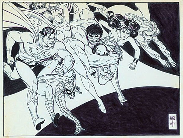
 

And we're done. If you're going to hang about don't forget to lock up and put the key back through the letterbox.

Have a good weekend and always remember COMICS!!!
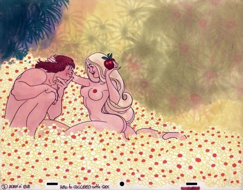
"I don't know about the cat." Comics! Sometimes they are a bit creepy!
Photobucket Hey, I read some comics and then I wrote about them in a hot new style I like to call "cack-handed". If you aren't doing anything else this weekend, sugar rush, you might want to get your hands  all cacky with me?

THE IRON AGE FEATURING...AVENGERS

Lee Weeks/Tom Palmer and Ben Oliver (a), Christos N Gage and Rob Williams (w), Matt Hollingsworth and Veronica Gandini (c) and Jared K Fletcher(l)

THE IRON AGE FEATURING...FANTASTIC FOUR

Nick Dragotta, Ron Frenz and Sal Buscema(a), Jen Van Meter and Elliott Kalan(w), Brad Simpson and John Kalisz(c) and Jared K Fletcher(l)

(MARVEL, $4.99 ea)

I recall the unrepentant Scot Mr. Graeme McMillan expressed puzzlement at this series’ very existence; not wishing to be outdone I expressed puzzlement at its presence in my shipment. You’ll note my LCS omitted the Alpha issue which just goes to prove that MARVEL did a bang-up job on marketing this thing. Anyway to recap for people who don’t listen to That American guy and That Scottish guy: this is a throwback series in which Tony Stark bounces back in time to meet an assortment of MARVEL characters with each issue really being two issues with the more sales friendly characters ballyhooed on the front.

The AVENGERS one was truly heartbreaking. I really felt for Tony Stark as he milled about his colleagues unable to warn them of the dreadful future which awaited them all. To look at each of those faces and know that they were aiding you in bringing about a witless future of incessant babbling and senseless plots must have been heartbreaking for him. Lee Weeks did the art and he’s totally awesome. Lee Weeks is to MARVEL as Jose Luis Garcia Lopez is to DC. If either company let either gentleman regularly adorn their pages both companies’ quality would be immediately improved by a scientifically calculated 65%. Which I know is a fact because I just made it up. But DC are content to have JL-GL drawing pictures for underoos and MARVEL just keep Lee Weeks in a box under the stairs or something. Amazing.

Photobucket

Well since your future comics make the scripting on The Suite Life of Zack And Cody look like Pinter, I think you'll probably envy the dead, Hank.

Illustration By Lee Weeks/Tom Palmer. Words and irony by Christos N. Gage

The Captain Britain one was okay and successfully captured the essence of '80s Britain by Veronica Gandini using a colour palette based on watery diarrhoea. I can’t remember what happened as I've slept since then but I think Cap was a bit of a fool and it was definitely set in Alan Moore’s excellent (you heard me Mr. Graeme McMillan!) Captain Britain run so that helped. Oh yeah, the British Army turned up to help save the day, so I guess this must have been one of the days when they weren't allegedly wearing unmarked police uniforms and kicking the tar out of striking miners. Not that they did that. That's how rumours start so watch that stuff. Jesus, Britain in the '80s. Airstrip One a-go-go. Nurse!

The FANTASTIC FOUR issue starts off with a Power Man and Iron Fist appearance on which Nick Dragotta does a really first rate job. Totally tip-top stuff with cracking storytelling and beezer body language. Thanks, Nick Dragotta! The Fantastic Four part is pleasantly silly with Johnny Storm fretting about growing up (Elliot Kalan means YOU!), Tonio and Stormy visiting a club where everyone dresses as superheroes (leading to a nicely icky Sue Storm joke), meeting Drunk Tony and facing off against Doctor Doom! Reliable Ron Frenz and Sturdy Sal Buscema provided the art which is both sturdy and reliable in a manner which far too few people appreciate.

Hey, I’m old so I quite enjoyed these issues largely because they possessed a plot, everyone spoke in a clear manner and they were just really entertaining all round. Maybe it had nothing to do with my failing mind and everything to do with craft/skill. There's a thought. Oh yeah, it didn't hurt that there were panels like this:

Photobucket

Who doesn't love panels like that? Tories!

(Illustration by Ron Frenz and Sal Buscema. Words by Elliot Kalan.)

Of course due to recent developments I won't see how this series ends. (I believe this is called foreshadowing. C’mon and watch me now. Huhn!) Setting that aside for the nonce (for I am nothing if not a nonce) for the price of this series I could have sated the nostalgic within by purchasing a fat b/w volume of ESSENTIAL MARVEL TEAM-UP (Or ESSENTIAL MARVEL TWO-IN-ONE, I’m more of a M T-I-O man myself. High five, Ron Wilson! High five!). So although it was satisfyingly solid old-school entertainment MARVEL’s senseless pricing shoots it in the foot and makes it EH!

JUSTICE SOCIETY OF AMERICA 80-PAGE GIANT 2011 #1

Scott Hampton,  Josh Adams/Bob McLeod, Victor Ibanez, Tim Seeley, Andy Smith/Keith Champagne, Nic Klein and Mister Howard Victor Chaykin(a), Steve Niles, B Clay Moore, Matt Kindt, Matthew Cody, Drew Ford, Ivan Brandon and Adam Beechen(w), Daniel Vozzo, Thomas Chu, Ego, Richard & Tanya Horie, Chris Beckett, Nic Klein and Jesus Arbutov(c) and  Rob Leigh lettered every story much to my typing finger's relief.

(DC Comics, $5.99)

Steve Niles continues his, to my mind, unbroken decades long run of profitably confusing unoriginality, terrible prose and nonsensical tedium for horror while Scott Hampton is just tragically wasted on this pish (but his Justice Inc. backups with Jason Starr in DOC SAVAGE were several nice slices of awesome pie. Available in back issue bins – now!) And if you think that was a twist at the end, pal-o-mine, I can only say EH!

Then there’s some creepy stuff with Sarge Steel picking a damaged young woman (I guess she’s attractive; it’s hard to tell from the art) and basically building her up and leading her on even though he knows her soft young hands can never cradle his lifeless metal honker. Seriously:

Photobucket

This world we live in, I swear. This world.

(Illustration by Tim Seely. Words by Matthew Cody.)

It all ends with a sad cookout so I guess that makes it homely not skin crawling. Like witnessing any old dude grooming some young chick it made me feel AWFUL!

The next one is weird as it involves a Yakuza who has the magic power of shooting people really good but is only a bad man because the Yakuza are holding his son hostage. I don’t know, Yakuza Man, but if you are that exceptional at death dealing shouldn't you have rescued your son earlier? Anyway Yakuza Man dies and some JSA members (Who? Sorry, I forgot to care.) have to rescue his son who has inherited his super killing powers so we can end (actually it just stops rather than ends) with this:

Photobucket

You can have mine, Fumio. Then I can go down the pub for once.

(Illustration by Josh Adams. Words by B. Clay Moore.)

Because if it involves a crying kid with a gun we can all just assume that somewhere in there we all must have learnt something very special. All I know I learned was that this was AWFUL!

There’s an Alan Scott Green Lantern story which has scenes that just end rather than have a point and seems to just be there to explain that magic is called magic because it is magic. Which is magical. Victor Ibanez' art is nice though, it’s a bit Steve Pugh-y. Alas,  not even an artist as good as Ibanez can make Alan Scott’s new uniform look like he’s wearing anything other than what appears to be an exoskeleton made of lawn furniture. Still and all, art as good as this at least lifts it to EH!

The Jesse Quick one equaled the second Green Lantern tale in that both were so bland/incoherent they slid straight off the surface of my brain and pooled into a puddle of AWFUL!

Hey, if the big hand is pointing to JSA and the little hand is pointing to Howard Victor Chaykin it must be HUAC-O’Clock! Again. The script is about how even the stupidest of men can do some good or something. It isn't very good. Howard Victor Chaykin cheekily turns in a couple of pages he’s not quite finished (the hospital bed one, the supermarket one) but retains his special place in my withered heart by gifting us this goofy looking dude:

Photobucket

"How you doin'?"

(Illustration by Mister Howard Victor Chakin.)

Remember goofiness? I do and I say goofiness is OKAY!

Unless you are me or Howard Victor Chaykin’s mum this comic was AWFUL! Heck, even if you were me or Howard Victor Chaykin’s mum this comic was still AWFUL!

CREEPY #6

Nathan Fox, Shawn Alexander, Kevin Ferrara, Garry Brown and Neal Adams(a), Joe R Lansdale, Christopher A. Taylor, Alice Henderson, Dan Braun, Craig Haffner and Archie Goodwin(w).

(DARK HORSE COMICS, $4.99)

O! America! You guys used to be so good at anthologies! You totally did, I can tell you. All those EC comics people insist on reprinting in formats too expensive for me to purchase are printed testimony to that! And then there are CREEPY and EERIE the fondly remembered not-as-good-as-EC-but-pretty-good-depending-on-which-editor-was-in-charge-‘70s anthologies currently being reprinted in formats too expensive for me to purchase. But how are you now, America? How are you at the anthology format now? Let’s take a looky-loo at the latest manifestation of CREEPY:

Joe R Lansdale and Nathan Fox have the best offering with “Mine!” a relentlessly paced piece of grisly nonsense about a cowboy being chased by a gluttonous corpse. It works really well, suggesting the tone of Looney Tunes cartoons while never stinting on the gore. Joe R Lansdale and Nathan Fox previously collaborated on PIGEONS FROM HELL which is much better but this was still VERY GOOD!

Nathan Fox does stuff like this:

Photobucket

Nathan Fox – get some!

(Illustration by Nathan Fox. Word by Joe R Lansdale)

Then we have "Commedia Dell' Morte!" which is a story that mushes up clowns, priests, children, demons and murder in the hope that all that stuff will somehow interact to produce some kind of point without any effort on the behalf of the writer, Christopher A Taylor. The twist is it doesn't! Really nice Kent Williams style art by Shawn Alexander though so it’s OKAY!

"The Wreck" is notable for being largely wordless and Kevin Ferrara's art does a pretty good job taking the strain but Alice Henderson's script could have done with some tightening. Maybe just me but the twist didn't really need spelling out to that extent, give your readers some credit, ey? But all reservations aside it was pretty GOOD!

Reprint magic is provided by Archie Goodwin and Professor Neal Adams with "Fair Exchange"! So it’s hokey and old timey and lovely. I said it’s Archie Goodwin and Neal Adams which is another way of saying it’s GOOD!

Not a bad issue of CREEPY but as with most anthologies it can be pretty (ahem!) variable so I’m just talking about this particular issue when I say it was GOOD!

ROBERT BLOCH'S THAT HELLBOUND TRAIN#2

Dave Wachter(a), Robert Bloch, Joe R Lansdale & John Lansdale(w), Alfredo Rodriguez(c) and Neil Uyetake(l)

(IDW, $3.99)

Here's some craft, pals. Bet no one's buying this, besides my own bad self, but it's got craft by the bucket. It's an adaptation of a 1958 Robert Bloch (1917-1994) Hugo Award winning (in 1959) short story so right there you've got some strong craft. It's going to be an engine designed to entertain but if you bend down and put your ever-loving ear to it it's going to tell you stuff as well. Stuff about life and the living of same. Used to be you could do that; entertain and illuminate both at once.  Not bad for a genre short but when it came to genre shorts Robert Bloch knew his onions. Joe R Lansdale is pretty well informed about hollow leaved plants containing edible bulbs too. Heard tell of him? No? Go read THE BIG BLOW and get back to me, I'll wait...

...no, no need to thank me, thank Joe R Lansdale. Joe R and his own son John do a neat job on the old adapting duties. It's sweet, clean and quiet. Fact is they are pretty unobtrusive and unobtrusive is surely conducive to immersion. A thankless task to be sure unless you appreciate craft. And this is no stale antiquated tale this one. Though the bulk is Bloch's the Lansdale's and Dave Wachter pop a couple of contemporary references in there but cleverly so as not to burst the bubble of suspension of disbelief. Someone's been watching Mad Men is what I'm saying.

And Dave Wachter? I'm telling you to keep an eye on this tyke. He ain't loud and fancy like some travelling salesman who's gone when the morning comes leaving you with just a cheap bible and a water infection, no, he's a straight up straight arrow. Comes in does his job and it's only later, on reflection, that you realise how cleverly he handled that scene transition here or subtly supported the text with a slight artistic nudge there. Brings the creepy stuff good too.

It's not perfect (there are two spelling errors in one speech balloon, the thought balloons in the bird shit on the jacket scene don't work) but it's admirably restrained and honestly admirable in its emphasis on craft. So I reckon this one walks quietly and carries a big stick. Creatively speaking. In reality Joe R Lansdale is a dab hand at karate and needs no stick. I suspect if you came at him with a stick he would probably break that stick with your face. So don't do that rather buy this because although might take a while to cotton on it's really VERY GOOD!

Photobucket

Craft in action! Subtlety in motion!

(Illustration by Dave Wachter. Words by Bloch & The Lansdales)


Looking ahead if things go according to plan the only MARVEL Comics I’ll be discussing in the future will be DAREDEVIL, PUNISHERMAX and AVENGERS 1959. I think you know why.

(choke!)I’ll miss you Chris Samnee (sob!). You stay strong for me now, Chris Samnee.

Photobucket

Enough, MARVEL! Give The King his due! Pah! Enough!

(Illustration by Ron Frenz & Sal Buscema.)

(Doctor Doom created by JACK KIRBY.)

I always thought they came from the planet Kling: Graeme on another 4/25 book.

These are the following things that I think about when someone says the word "Klingon" to me: * Funny foreheads. * Michael Dorn manages to make a career out of frowning. * Tribbles. * All of those very dull episodes of Star Trek: The Next Generation and Deep Space Nine where they talked about Klingon culture and things were very dark and they talk about "honor" a lot. * Please stop saying the word "Klingon".

This is something that I don't think about when someone says the word "Klingon" to me:

* The need for a five-issue miniseries about Klingons published by IDW, especially a miniseries that has a Klingon-language variant of the first issue.

Do you see how that works? My lack of massive Star Trek fanboyishness (I know enough to think that Deep Space Nine in the best of the series, but not enough to stay away from the Voyager reruns on Spike, which Kate is now addicted to) and my disinterest in the Klingons at the best of times leaves me pretty much outside of the target market for this series, and yet somehow it managed to disappoint me nonetheless. Part of the problem is, I think, the scattered nature of this first issue - We're given a fairly generic framing sequence where Klingons outside of any given timeframe talk about some mysterious decision that they need to make, complete with potted (and confusing) history of the entire Klingon race before we flash back to, oddly enough, a recap of the original series episode "Errand of Mercy" from the point of view of the Klingons. And throughout the whole thing, I was thinking, Who is this book actually for?

The history of the Klingon race sequence - less than a page in total - seems to be written for insiders with unexplained references to human genetic science that somehow split the Klingons into two species and a plot of genetic superiority, and the rest of the issue is a recap of a Star Trek episode that fans will be familiar with, without much spin or insight... Those scenes only really work for those who are familiar with the original series, because for those like me who had to google the details because we guessed that it was probably from the TV show, it's an obviously incomplete storytelling experience; you can tell that something's missing, and what's missing is something that probably comes from knowledge of the episode in question. Which is probably very nice for the already existant fanbase, but isn't it lazy to write so directly to the fanbase and exclusionary to everyone else?

(Artwise, the book is blocky, but in a good way - The figurework is good, but there's something offputtingly perfect about the images of spaceships that suggests use of 3D-modelling software, and breaks the feel of the story somehow...)

I don't know why I'm surprised that this is all about the fanbase; it does have a Klingon language variant, after all. Okay for what it is.