"I Tried Everything Else." COMICS! Sometimes Chaykin's Awake!!!
/Hopefully you all made it through any storms okay, my American friends! If you did I've got some rubbish about comics for ya.Content! You might not want it, you might not like it but it's there!
G.I. COMBAT #5
Featuring
The Haunted Tank
Art by Howard Victor Chaykin
Story and Words by Peter J. Tomasi
Coloured by Jesus Arbutov
Lettered by Rob Leigh
The Unknown Soldier
Art by Staz Johnson
Written by Jimmy Palmiotti and Justin Gray
Coloured by Rob Schwager
Lettered by Rob Leigh
The Haunted Tank created by Russ Heath and Robert Kanigher
The Unknown Soldier created byJoe Kubert and Robert Kanigher
DC Comics, $3.99 (2012)
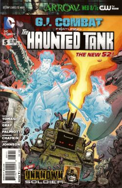
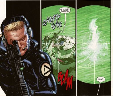
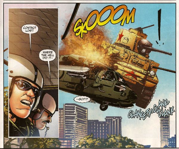
First up, I have to thank Corey (Ottawa) for bringing this comic to my attention. If it wasn't for our Canadian Contingent I'd not have known the art chores on this were by everyone's favourite filth peddler Mr. Howard Victor Chaykin! I wasn't expecting much here to be honest, I thought he'd probably be busy drawing comics too frisky for the UK to have any electrolytes left over for a book about a, well, a haunted tank. I don't know if it's being able to clip art the shit out of this book due to its emphasis on hardware but the bits that aren't hardware have Howard Victor Chaykin pounding the pages with a barrage of highly entertaining images. Unlike, so I hear, the pounding he's giving the pages in that other (banned) book.
Tomasi gives him a totally stupid story to illustrate involving a nutty veteran clad in The Flag being tank-napped into a supernatural rescue mission while being pursued by Wonder Woman's high-tech ex Steve Trevor. It is nonsensical stuff but, I don't know if you've ever given it much thought but, the whole concept of The Haunted Tank isn't going to win any awards for realism. So why not go wide on the goofiness. Chaykin seems to be enjoying himself and it all comes together a lot more successfully than some of his recent efforts. Not once did Jesus Arbutov's colour work have me reaching to ring the police and at times I was tempted to throw back my head and bellow Blessed-style "CHAYKIN'S AWAKE!!!" Maybe he just enjoyed ringing up his russety pal Russ Heath and irritating him by going "Pop! Just drawn a tank! Pop! Just drew another! These computers are great! Now how long did it used to take you to draw these tanks, Russ? Pop! Drew another! Hey, I ever tell ya I can see the beach from my window?" I don't know, I just really enjoyed his stuff this time out. It was GOOD!
WOLVERINE MAX #1
Art by Roland Boschi & Connor Willumsen
Written by Jason Starr
Coloured by Dan Brown
Lettered by VC's Cory Petit
Wolverine created by Len Wein, John Romita Snr and Herb Trimpe
Marvel, $3.99 (2012)
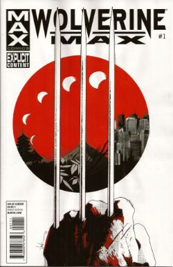
While Jason Starr is a good writer of novels and I have also been known to enjoy the work of Roland Boschi the real reason I picked this up was because of Connor Willumsen. He does not disappoint! Boschi's pages seem somewhat rushed and concern the present day Wolverine fighting sharks and having no memory of why he ended up doing that. Also, his legs grow back and everyone is only slightly perturbed by this. Perturbed's too strong a word actually. I know health care professionals are rushed off their feet and are basically the busiest people in show-business and The Japanese are a modest people...but I think two legs growing back, bones and all, would cause more than a raised eyebrow and a muttered aside, suggesting such an event is more a case of exhibitionism than it is straight up miraculous. Jason Starr's handling of Wolverine's talents but in the real world is off to a choppy start is what I'm saying.
Willumsen, however, burns rubber from the off with his flashback scenes which portray Daniel Day Lewis from There Will Be Blood stepping into the original Claremont/Miller mini-series but in a grubbily humming Underground Comix stylee. So amazing are his inky doings that even the writing seems elevated with Victor sounding especially characterful in his disdain for the normals. I would buy this series purely for the further expansion of these elements. I would but Marvel seem to have upset Connor Willumsen so much that he has jumped ship. His work will not be appearing in any subsequent issues of WOLVERINE MAX and so I will not be buying them as without him this comic will be less than GOOD! Well done there, Marvel! Yes, that is sarcasm.
DAREDEVIL: END OF DAYS #1
Art by Klaus Janson and Bill Sienkiewicz
Written by Brian Michael Bendis & David Mack
Coloured by Matt Hollingsworth
Lettered by VC's Joe Caramagna
Daredevil created by Bill Everett and Stan Lee
Marvel, $3.99 (2012)
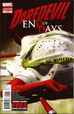
I asked my LCS why they sent this (you're darned tooting I did) and they said it was because I liked Janson and Sienkiewickz, which is true. What they failed to factor in is that ladling the steaming hot writing of Brian Michael Bendis over the top of their efforts is, at this stage in the game, like climbing a stepladder to fart repeatedly right in my face as I admire a Vermeer. It's distractingly puerile and pretty quickly spoils the whole experience. The best bit (i.e. the very worst bit of very many bad bits) is when Ben Urich's (very long, very, very fucking awful) monologue accuses his audience (his readers, geddit!) of not appreciating words. This is super-awesome because he's being written by someone who treats the English language with all the care and attention of a hungover abattoir worker placing his bolt-gun to a steer's head.
This is a writer who seems to have a working vocabulary of, maybe, fifty words and whose solution to every writing conundrum (an introduction to The Incal, an introduction to a HVC art book, a recipe for quiche, instructions on how to install a Norton Commando Boyer ignition etc) is always a chatty, faux-conversational, uninformative, space devouring style which smashes grammar's head in with a brick and is in no way to be taken as an indication of a complete inability to write anything approaching a joined up sentence. Christ, this is why I ask my LCS not to send his (dismal, dismal) stuff. This comic is smug, vacuous, inane, pandering, complacent ineptitude par excellence. This comic is CRAP! I did not like it.
THE INFERNAL MAN-THING #3
Art by Kevin Nowlan
Written by Steve Gerber
Lettered by Todd Klein
Also "...Man-Thing!" from Savage Tales #1
Art by Gray Morrow
Written by Gerry Conway & Roy Thomas
Man-Thing created by Stan Lee, Roy Thomas, Gerry Conway and Gray Morrow
Marvel, $3.99 (2012)
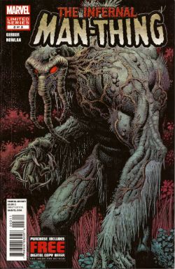
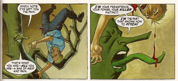
And so we close the comic and close the curtain on one Steve Gerber as he defies the laws of nature and reality to bow out of comics for the final time, some four years after his physical death. As we bite back the tears lets allow a manly clap on the back for Kevin Nowlan who did Gerber proud twice over with beautifully considered art to which he then applied a thoughtful and innovative colour palette. Together with this final VERY GOOD! chapter of Gerber's playful, humane and imaginative end-song Marvel have also included Manny's first appearance. Whether placing an ending with a beginning together in such close proximity is Marvel's way of acknowledging the Cycle of Life or just another attempt to squeeze a property until the pips squeak we'll probably never know. (Steve Gerber would have known.)
FATALE #8
By Sean Phillips and Ed Brubaker With colours by Dave Stewart
Fatale created by Sean Phillips and Ed Brubaker
Image, $3.50 (2012)
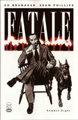
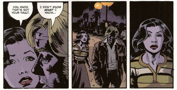
I've not been impressed with this series so far but I will admit that while this issue still wasn't terribly good it was a whole lot better. Maybe it had something to with a sudden upswing in the density of incident or the fact that Phillips' art seemed more lively since he was given a couple of occasions on which to strut his stuff style-wise. I still don't find it to be convincingly evocative of a time and place; it'll take more than some beards in a VW van to make me swoon at the authenticity of the '7os vibe, man. At times I can almost smell the spirit glue holding all the sideburns on. Most deflating of all is the fact that the series is still hamstrung by bizarrely conservative and old-fashioned sense of horror (tentacles! men in robes with daggers! cemeteries!) which means the horror is never actually, well, horrible.
The humourlessness of the whole thing has also struck me recently; this was unfortunate because I then realised I couldn't recall one incidence of humour in all the work I've read by this author. That's a lot of pages in which to not crack a smile. Maybe it's me. Senses of humour are personal after all but still the funniest thing in FATALE #8 is when the rather tasteless competition in the lettercol results in one John Cleaver out writing this whole series with just one paragraph. Mind you, if any readers do want to send me pictures of them crying while they remember horribly traumatic events from their lives they are welcome to do so(*). Get really close in there so I can see the fat bulbs of those tears bloating from your sad ducts, kids! The winner could receive a pen! So, yeah, this issue was OKAY! and you can buy it from The Savage Critics Digital Shop...here! (Although if more than 10% of the comics reading audience do so a big red light starts flashing and Brian Hibbs starts rushing everyone to the shelters as AROOOGA! AROOOGA! echoes rounds his shaggy head. It's a true fact, cats and kittens!)
(*) Don't do this. It's a joke.
ACTION COMICS #13
Featuring...
Superman in..."The Ghost In The Fortress of Solitude"
Art by Travel Foreman
Written by Grant Morrison
Coloured by Brad Anderson
Lettered by Steve Wands
Superman in..."A Boy And His Dog"
Art by Brad Walker (p) & Andrew Hennessy(i)
Written by Sholly Fisch
Coloured by Jay David Ramos
Lettered by Patrick Brosseau
Superman created by Jerry Siegel and Joe Shuster
DC Comics, $3.99 (2012)
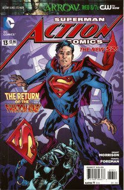
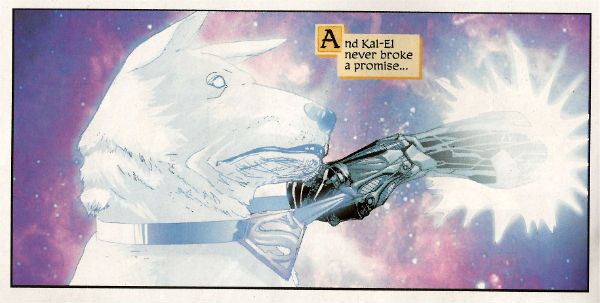
It's strange the connections your mind makes. In my head Morrison's recent callous remarks regarding the treatment of Siegel and Shuster and the portrayal of animals throughout his work suggests to me one of those lovely people who care more for the feelings of animals than those of people. Which is all really cuddly on the surface until you press them on the issue and they suddenly hiss at you that people deserve what they get! Which I find a less than generous rationale and more than a little confusing in its mix of sentiment and insensitivity. Almost as confusing as this comic which I have a strong suspicion makes no sense but as I too have a soft spot for tales of the gud dog I'll let its muddled nature pass this time and say this comic was OKAY!
So yeah, those were certainly some words about what I believe scientists are now calling COMICS!!!
