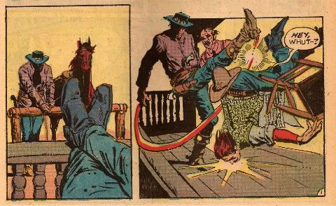
“Muh Version of Whut Happened May Not Be Spicy Enough Fer Yore Little Boy’s Tastes…” COMICS! Sometimes Even A Surly Jackass Weeps For The World!

Man, I just about read the ink right offa these pages when I was just a young ‘un. And I just read ‘em agin right now. If you’re of a mind to, sit back and whittle awhile and I’ll flap my yapper concernin’ ‘em.  photo HexShootB_zpsd44b9828.jpg Anyway, this…
What follows is a gentle amble through the contents of a comic from 1981. That’s all. It should not be taken as the latest shaky salvo in an attempt to prove old comics are better than new comics. Because they aren’t. Or rather; sometimes they are and sometimes they aren’t. A good comic is a good comic no matter when it was made. It’s what makes it a good comic that’s of interest. And that’s of interest because it’s never constant.  So, you know, don’t take this as a personal attack on modern comics from an old man having trouble adjusting to the fast moving world of today (Indoor plumbing! Ladies in trousers! Talking apes!) Oh, you can if you want. Life’s too short to be writing provisos this long. So, I read an old comic and this is what happened inside my head as I did so.

JONAH HEX #55 Art by Tony DeZuniga Written by Michael Fleisher Coloured by Bob Le Rose Lettered by Shelley Leferman DC Comics, $0.61 (1981) Jonah Hex created by Tony DeZuniga & John Albano

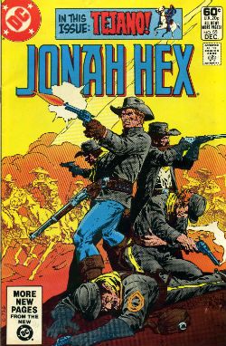
 photo HexCovB_zps470a05e2.jpg Cover by Tony DeZuniga

I’m a traditional guy, so let’s start at the beginning; let’s start with the cover. It’s worth doing because this issue of Jonah Hex is graced by one of my all-time favourite covers. I just totally groove on the daring use of perky yellow to frame a typically DeZuniga-n scene of dust, desperation and violence. The huddled group being picked off by circling riders is a scene immediately recognisable to anyone familiar with the tale of General George Custer. This being a not unlikely freight of knowledge for the audience of a comic about a violent cowboy. Whether such familiarity was formed by hagiography or revisionism (e.g They Died With Their Boots On (1941) vs. Little Big Man (1970)) the clear inference in the image is that there ain’t no one getting out of here alive. Even allowing for you being a real smart alec and knowing Jonah’s likely to be okay because, well, this wasn’t the last issue of Jonah Hex, there still remains the question of how. I saw that cover and I wanted to know what was going on behind it. That’s some powerful cover medicine right there.

 photo HexLastIssueB_zpsd2c1b0a7.jpg

Image by DeZuniga, Fleisher, Le Rose & Leferman In a move which would give modern creators conniptions this comic just jumps right on in, picking up as it does immediately from the last issue’s cliff hanger. I think it’s called in media res but I could be wrong; never was one for book learning. True, this page basically reiterates the end of the previous issue which is Bad now, but was Good then because back in days of yore you could never gauren-damn-tee that the previous issue had made it across the ocean, and the idea that single issues of Jonah Hex would be collected between two covers was still a pretty plumb loco proposition. We join the action as, apparently, Jonah Hex and a pretty senorita called Carmelita have just escaped from El Papagaya only to confront the guns of a bunch of grey coats hot for Jonah’s hide. We’re only a page in and, in a shock move, Carmelita The Senorita turns out to have been working for the Fort Charlotte Brigade (FCB). These being the grey coats in question, who are a bunch of ornery owl hoots who want Jonah to pay for his betrayal of his own troops at Fort Charlotte. Jonah is innocent of course; well, Jonah is innocent of that particular charge at least. So, Carmelita The Senorita throws Jonah to the FCB and Micah, the leader, throws her some gold. Man, this comic is moving like a freight train. Say what you like about Michael Fleisher (just run it past a lawyer first) but the dude’s Jonah Hex books have got some momentum.

People mill about for a bit and introductions are made; motives established. Your basics; your meat and potatoes. You know, solid stuff; stuff I’d like to see more of. I like that DeZuniga’s drawn one of the FCB swigging from a canteen. That’s a nice touch; people aren’t just standing about lollygagging. Hey, I wonder what’s in that canteen, maybe it pays off later? Yeah, Tony DeZuniga (1932 – 2012) drew this. I should talk about the art. Everybody on the internet has been told to talk about the art; to tell you how it makes them feel. Tony DeZuniga’s art makes me feel like a leopard in heat; it makes me feel like a motherless child; it makes me feel like a shopping trolley that won the lottery. Tony DeZuniga’s art makes me feel like I just saw some heavily photo referenced pictures the artist made cohere into a satisfactory whole via lashings of gritty spackle and high contrast lighting. And that, muchachos, that’s a good feeling because DeZuniga was a good artist even if his realism is often slightly undermined by stiff staging. Dusty is the word when it comes to DeZuniga; I unconsciously wipe my hands on my shirtfront after reading a DeZuniga book. I also do that after eating crisps and then blithely walk around with crisp crumbs down my front like a simpleton. Drives milady nuts, that does.

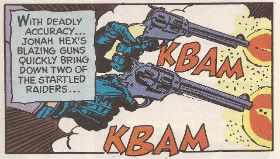
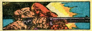
 photo HexShootB_zpsd44b9828.jpg Image by DeZuniga, Fleisher, Le Rose & Leferman

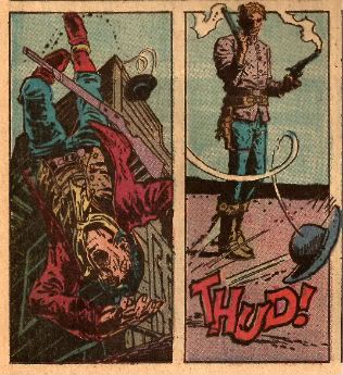
So, yeah, see how happy Carmelita is! See how she laughs! I wonder what brought her to this pass. What kind of life she must have had to make her betray trust for gold. What an interesting female character, I look forward to learning more about her in the pages ahe..oh, she just got shot off her horse. It appears Carmelita will not be joining us for the rest of the issue. I wasn’t expecting that; a brutal move but certainly an arresting one. Now here’s a thing, many people die in this issue and DeZuniga, more often than not, got to draw a big jammy splash of gore erupting out of the appropriate area. In 2014 and in comparison to, say, the idiotically violent Damian: Son of Batman these are just papercuts, but in 1981 and compared with, well, anything else in a kid’s reach this is like Sam Peckinpah level shit. This is one violent-ass comic, you just wait. I don’t know how they got away with this; I’m glad they did. This kid just ate it up, and I turned out alright. Cough.
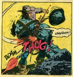
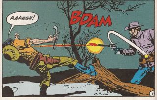
 photo HexThugB_zps0134dc1e.jpg Image by DeZuniga, Fleisher, Le Rose & Leferman

Like many of the supporting cast suspense is short lived in Jonah Hex and it is immediately revealed that El Papagaya shot Carmelita The Senorita. He also calls her a “puta” which, children were unhelpfully informed via a footnote, meant “tramp”. In 1981 in England a tramp was usually a male of advanced years who had chosen a life of vagrancy and begging. This is not the same as a homeless person who can be any age and has had the choice made for them and whose presence is a living indictment of any society in which they exist. Boom! Boom! Try the organic chicken sourced from Fair Trade vendors! Tramp also means "whore", but don't tell the Kids! This issue of Jonah Hex was surprisingly educational; by reading it you would also learn the following terms: pistolas (pistols) and compadres (companions). Enough to get anyone through a weekend break south of the border!
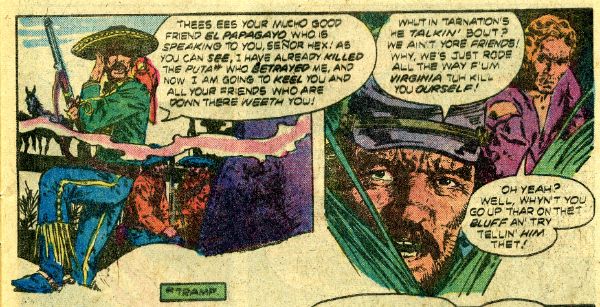
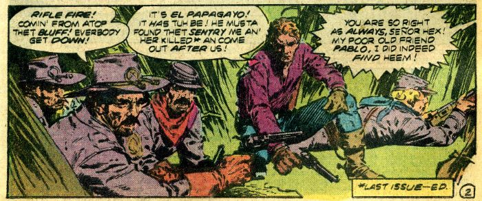
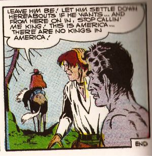
 photo HexPapagayaB_zps5b6a6bb6.jpg Image by DeZuniga, Fleisher, Le Rose & Leferman Meanwhile, back at the rocky outcrop we find El Papagaya. Now, El Papagaya is a rare thing in Jonah Hex; a recurring villain. This rarity being down to Jonah’s tendency to deal quite decisively with anyone posing a threat to him. He’s prone to go blood simple at the drop of a hat, that Jonah Hex. But El Papagaya is a wily one and always lives to taunt another day. Because that’s the big thing about El Papagaya; his taunting. Loquacious only begins to describe him. He’s called El Papagaya which means parrot because he has one but also, he never shuts the hell up. Well, I think that’s funny. I think El Papagaya is a funny guy he’s so blatantly disingenuous but at the same time totally transparent. He’s probably modelled on the kind of big hatted stereotypes that gave Humphrey Bogart a bad time in those old movies. But El Papagaya has a parrot and is dressed as flamboyantly as an ice skater so he’s better.

It’s a tight bind Jonah and his crew are in and no mistake. To escape Jonah sets light to the dry grass so that the smoke will cover their exit. I know this because it is mentioned several times in the course of two pages. Now, unless Michael Fleisher thought his audience were prone to sudden attacks of amnesia, this isn’t particularly smooth writing. I don’t really know why it’s mentioned so much but I think comic writers used to be a bit insecure and made sure there were lots of words on those pages for a couple of reasons. One is, I guess, they didn’t know who’d be drawing it or if they did they had no guarantee how it was going to turn out. They couldn’t just fire off a chummy E-Mail and get a scan back thirty seconds later. Pure supposition this; also, they were very, very clear about what was going on to avoid any possible confusion. This means this comic is overwritten to Hell and back but it also means I’m not going “Wait, What?” at any point. Anyway, El Papagaya obligingly lets the smoke build to a sufficient density to permit our band to escape.
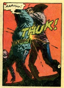
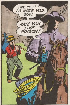
 photo HexThukB_zpscbce9c25.jpg Image by DeZuniga, Fleisher, Le Rose & Leferman

Now here’s some sexy shit; two whole pages of an old man and his slave talking in a graveyard. It’s not even very good talking but there is plenty of it. Now, the poor quality and large quantity are quite in line with current trends but, unfortunately for him, Fleisher’s made the schoolboy error of putting information in his dialogue. This makes it exposition (which today is Bad) instead of aimless drivel which is stellar character work (which today is Good). Exposition isn’t actually bad in and of itself but there is such a thing as badly executed exposition. Which this is. There’s so much of it in fact that Turnbull’s face is obscured throughout by his exposition bloated word balloons. That’s on purpose that is; so we can’t see him but I don’t really know why that is.

Why we can’t see his face that is. I mean we’re unlikely to recognise him. It’s not like eventually he’s revealed to be Harry Osborne’s dad or anything. He’s just some mad old, bald, fat white guy. Oh my God, it’s me! It was me all along! No wonder they hid his face. It all makes sense now! I’m joking; I’m not fat. Anyway, there’s all this exposition about how Jonah Hex caused Turnbull’s son to be killed and how, By God, Turnbull will see Jonah Hex in his grave for it and all that kind of spittly lipped, stick waving thing. To be fair, this stuff does do a few things, although it does none of them subtly. It corroborates the mission of the men who have captured Jonah Hex so we know they aren’t just delusional lunatics; allows Fleisher to (and it is quite smart this) put the truer spin in the mouth of Solomon so that Turnbull can bat it away out of hand showing both a) Turnbull just wants someone to pay; the truth is moot and b) Solomon’s superficial equality is purely that; superficial. Yeah, it’s clumsy as a sprinter with wooden legs and real feet but it still gets quite a lot of stuff done. It’s convenient to forget that this is the fundamental purpose of a genre comic; getting stuff done. (I know I repeat that later; that’s for reinforcement not because I didn’t re-read this for glaring shittiness. Oops! Missed a bit!) Also, after all the words the sudden silent panel where Turnbull kneels at his son’s grave actually has some impact. Surprisingly so; bonus points for that one.
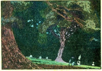
 photo HexGraveB_zps6227db71.jpg Image by DeZuniga, Fleisher, Le Rose & Leferman

Back at the camp Jonah and the FCB take a break from TCB and indulge in some more expositionary chit chat. Jonah has noticed that one of their number is a little short in the tooth to have been at Fort Charlotte but, alas, his Dad wasn’t. Jonah tries to explain what (whut) happened but the kid is having none of it and plumb hawks one up right in Hex’s bacony face. Even though there are a lot of words here DeZuniga does a good job keeping things interesting by dropping detail out entirely at some points so the central image is bracketed by blankness and varying the POV as things progress. When the script slackens the art keeps things taut; it’s a joint effort. Words and pictures, you know how that goes. This scene’s pretty important (hey, maybe it pays off later?) but its immediate significance is in the fact that in its first panel the dude with the water flask is going “hic!” Maybe he drank his water too fast and got an upset tummy? Do you think that’s going to pay off soon? Do you think this piece is ever going to end? (Maybe it’ll be like the Tristram Shandy of nostalgic old man comics writing? maybe my heart will give out first?) Remember when drunk people went “hic”? They used to do it in movies too. In real life though they just get angry and violent. Ah, good times. Hic!

We’re on page 8 (PAGE EIGHT!) now, in case anyone’s keeping score and things start moving like a heated tomahawk through someone’s face from hereonin. So far the comics been overwritten (like this piece; like that was on purpose!) and expositing like expositing is a real thing, but Fleisher’s been setting it all up. All the pieces are now in place; El Papagaya’s in pursuit, Hex has connected with the kid, there’s a boozer loose and it’s all about to pay off over the next few pages. And you best believe it’s going to pay off in death and sorrow. Hey, Kids! Comics!

 photo HexMadeitB_zpsd7f98334.jpgImage by DeZuniga, Fleisher, Le Rose & Leferman

Page eight is where the ordure becomes authentic. Despite Hex’s protestations the boozer (Shenandoah!) wobbles off and picks up a feather from the ground. Why, what harm coul…OMG! A feather! Like a parrot has! It’s El Papa..the ground immediately appears to eat Shenandoah and there is a child scarring two panel sequence of him falling onto some stakes (GHAAAAAAAAAA!). You don’t see anything really. Just the falling body suspended above the stakes below and then an inset of his screaming face, which has been charmingly hued a deep red. That shit sure shook me up when I was a kid. It was AWESOME! GHAAAAAAAAAAA! Hell, yeah! I wouldn’t get this excited again until I saw Walter Hill’s magnificent beast of a movie Southern Comfort (1981; coincidence?). In all honesty I get mixed messages from Walter Hill films. Do you think Southern Comfort knows it is skewering machismo even while it seems to be paying homage to it? It doesn’t really matter because, Powers Boothe. Anyway, I have a weak spot for fiction involving people in a hostile environment being picked off one by one. Some folk are like Hmm, chocolate or Awww, cats but me, I’m all Aw yeah, people in a hostile environment being picked off one by one! And it’s all this comic’s fault. Mind you, it hasn’t escaped my notice that people in a hostile environment being picked off one by one is basically Life, so there you go. Anyway everyone knows how that people in a hostile environment being picked off one by one stuff goes and that’s how this comic goes for the remainder of its pages.
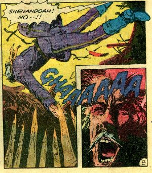
 photo HexSouthernB_zps589f5d70.jpg Image by DeZuniga, Fleisher, Le Rose & Leferman

The point, he said realising he was late to take his kid to Cubs and he had paced this badly, is that this tale of Jonah Hex is 17 pages long but, boy howdy, it covers some distance. The actual comic book is a mite longer since there is also a one pager about dead sheriffs, a letter column and a Gary Cohn and Tom Yeates strip called Tejano. Consequently Fleisher and DeZuniga don’t have space to faff about, so they don’t. By the 8th page Fleisher and Dezuniga have worked like ditch diggers to get the reader up to speed with who everyone is, what they want and how they all relate to each other while also defining a deadly scenario to shape the events following. None of it is elegantly done but it all gets done. Round these parts that’s what genre comics are all about; getting’ it done. Fleisher and DeZuniga get it done quick and dirty and it all ends with an overwrought moment of emotion which is still not entirely unmoving despite its relative lack of sophistication. Jonah Hex #55 (“Blood Trail”!) mebbe weren’t quite as good as I remembered, but it still entertained like all get out and that makes GOOD! Did it deserve all those words? No, but like the man said, “Deserve’s got nothin' to do with it.

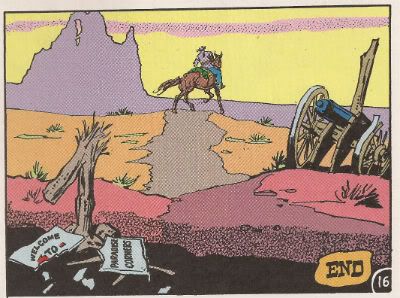
 photo HexFinB_zpsa202a393.jpg Image by DeZuniga, Fleisher, Le Rose & Leferman

As the sun sets sadly on the West Jonah Hex#55 (“Blood Trail”!) couldn’t be more – COMICS!!!

"Do They Still READ In The Future?" COMICS! Sometimes It's Great To Be Rude!

It was Half-Term last week hence the silence. Yes, the blessed silence. But now your God has failed you and I am back! It has been quietly suggested that I put on hold my tribute to Charlie Drake and maybe look at some comics this time. So, no actors who were dead before you grew your big teeth this time out. Just comics! Just lovely, lovely comics! But were they lovely? Hmmmmm? Anyway, this...  photo DHP_Pop001_B_zps333a52d6.jpg NEXUS by Steve Rude & Mike Baron

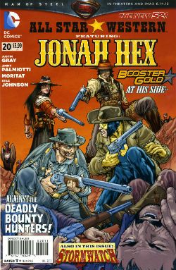
ALL STAR WESTERN #20 Art by Moritat (Jonah Hex) and Staz Johnson (Stormwatch) Written by Justin Gray & Jimmy Palmiotti Coloured by Mike Atiyeh (Jonah Hex) & Rob Schwager (Stormwatch) Lettered by Rob Leigh Jonah Hex created by Tony DeZuniga & John Albano Stormwatch created by Brandon Choi & Jim Lee DC Comics, $3.99

 photo All_SWCov001_B_zps3260d931.jpg

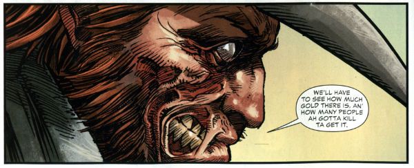
I kind of liked this issue. I don’t know whether the worms have finally reached my brain, or what but twenty issues in and this one almost clicked. I’m not exactly the most demanding Jonah fan either, I just enjoy the scar faced twat in a hat going around kicking up dust and making life brutal, difficult and short for folks. I prefer it to be a straight western but it isn't a deal breaker.

 photo All_SWPanel001_B_zps37540f12.jpg Jonah Hex by Moritat, Gray & Palmiotti

No, I don’t mind Booster Gold turning up for no reason that is ever going to be explained (hey, that’s just how comic books roll these days). I’m just pleased the book has a bit of a spring back in its step. Maybe it’s the beneficial effect of getting Jonah out of the city and into the countryside? Like when you ferry troubled youths by coach out into the boondocks to stroke goats. Moritat’s art seems a bit more lively and engaged although that might be due to the brighter and more varied colour palette in use. Watch these backgrounds though, I’m not a native of the Americas but I’m pretty sure mesas aren't mobile. Like I say I don’t expect much really and this delivered that making it OKAY!

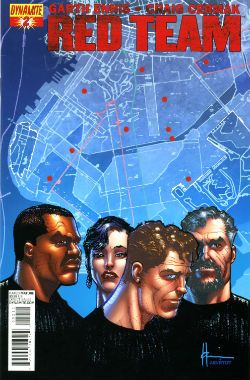
RED TEAM #2 Art by Craig Cermak Written by Garth Ennis Coloured by Adriano Lucas Lettered by Rob Steen Cover by Howard Victor Chaykin Red Team created by Craig Cermak & Garth Ennis(?) Dynamite, $3.99

 photo Red_TCov001_B_zps4bf0c366.jpg

More like RED MEAT amiright, soft lads? Here Comics’ Firmest Handshake Garth Ennis turns his surly attention to a tale of cops taking the law into their own hands. I’m sure that will work out really well for everyone involved. At the minute it isn't working out too well for me. I guess my LCS sent this as Howard Victor Chaykin is doing the covers and I like Comics’ Deepest Voice Garth Ennis’ war comics. So, okay, fair enough. I’m not turned off by the concept either. I’m always up for that old story which ends with a bunch of people dead or drenched in blood while sirens scream closer and those who aren't corpses suddenly realise why there are rules.

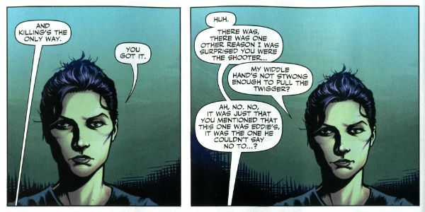
 photo Red_TPanel001_B_zps37f466f0.jpg Red Team by Cermak & Ennis

Maybe it won’t go that way, after all Comics’ Hottest Curry Garth Ennis spends enough time (i.e. too much time) explaining how his characters can smoke in a government building that it must surely (surely!) pay off later in an example of Chekov’s Fags! Maybe everything will go swimmingly but the racially and sexually mixed cast will succumb to a series of smoking related diseases. Maybe not. But hopefully the series will avoid plummeting into maudlin sentimentality like a sloppy drunk slurring on about The Old Country as the barkeep dials for a taxi. Not an uncommon occurrence in work by Comics’ Softest Hearted Big Man Garth Ennis. This thing seems written for the screen (no, the page and the screen are not interchangeable) and the art just isn't up to the job of hiding this. It gives me no pleasure to say that. In fact I’ll leave it there except to express the hope that you really like that panel I picked because you’ll be seeing a lot of it on these pages. RED TEAM is not a complete wash though and that’s due mostly to the dialogue of Comics’ Hairiest Chest Garth Ennis. It’s good dialogue and it means RED TEAM is OKAY! That probably still won’t save me from a beating though.

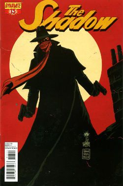
THE SHADOW #13 Art by Giovanni Timpano Written by Chris Roberson Coloured by Fabricio Guerra Lettered by Rob Steen The Shadow created by Walter B. Gibson Dynamite, $3.99

 photo Shad_Cov001_B_zps0806f9d9.jpg

Everything in this book is so familiar that the sight of your face in the shaving mirror delivers more surprises. This issue is impressive only in its devout refusal to bring anything new or interesting to bear on the join the dots plot with its transparent mystery, its space wasting reluctance to provide more than one speech bubble in a panel and…oh...look, there’s a three page sequence of a drunk man going home, going upstairs, pouring a drink and being surprised. No. That’s not comics, that’s just horseshit. I’m not even going to scan a picture of the contents as the fewer people who see this then the less damage done to those involved. Honestly, I’m doing them a solid here. Or a salad as they say in Nyawk. So, no offence to any of the people involved here as we all have bills to pay but this was AWFUL!

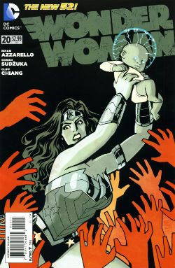
WONDER WOMAN: #20 Art by Goran Sudzuka & Cliff chiang Written by Brian Azzarello Coloured by Matthew Wilson Lettered by Jared K. Fletcher Wonder Woman created by William Moulton Marston and H. G. Peter DC Comics, $2.99

 photo WWom_Cov001_B_zps8c89c4c0.jpg

This is an atypically action packed issue but all too typically when the dust settles the forward plot motion is infinitesimal if not entirely illusory. With its large cast, stateliest of paces, squandered artistic talent and elevation of chat at the expense of incident it’s hard not to see WW as Azzarello’s attempt to bottle a bit of that drab Bendis magic. Luckily, despite his heroic efforts, Azzarello appears incapable of attaining such low levels of blandery. For starters his characters don’t sound like they are recovering from traumatic blows to the head; trading only in recursive whirlpools of bland doggerel. And every now and again something does happen. So, it’s an improvement but it’s still very far from being good. It still rarely rises above word play on a par with puzzles in the magazines old people in hospital spontaneously secrete in-between visiting times. Also, I think his cast have a problem with the booze. Although as the middle class assure us, if it’s wine it isn't alcoholism.

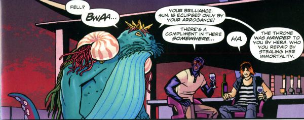
 photo WWom_Panel002_B_zps13522682.jpg

Wonder Woman by Chiang, Sudzuka & Azzarello

At some point in any given issue the chattering cast will mingle about some tasteful locale sipping drinks and hoovering up nibbles. Thankfully the medium of comics spares the reader the no doubt inevitable soundtrack of Toploader Orion snuck on to smooth things along. The whole thing is like one of those hellish networking soirees for people who do a bit of wee when they think about Powerpoint presentations. Except everybody is cosplaying Sandman and the evening ends abruptly when a big blue catfish in a crown stabs Simon from Accounts in the face. And puns! This issue’s highlight was when War asked, “Where’s my drink? You said you’d get me a Belgian White Beer!” and Wonder Woman replies “I beg your pardon, I never promised you a Hoegaarden!” Face it, Tiger; this book’s so far gone you’re not even sure if that happened. So it’s a fact that the crisp clarity of Goran Sudzuka and Cliff Chiang's art which brings this up to OKAY!

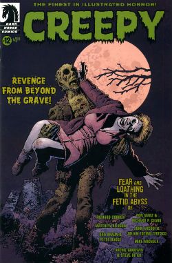
CREEPY #12 Art by Richard Corben, Richard P. Clark, Peter Bagge, Matthew Allison, Julian Totino Tedesco and Steve Ditko Written by Richard Corben, Ron Marz, Dan Braun, Peter Bagge, Matthew Allison, John Arcudi and Archie Goodwin Lettered by Nate Piekos of Blambot and Peter Bagge Dark Horse Comics, $4.99

 photo Creepy_Cov001_B_zpsed87d4c8.jpg

There's the usal raggy grab bag of one pagers and spot illos but storywise we have:

Uncle Mangus by Richard Corben

Corben’s on first and Corben’s on form with a frivolous shamble of a shaggy corpse story. Corbenites won’t be disappointed as the shadows drape at strange angles across distorted faces, the undergrowth looks like gathia sticks from Bombay Mix, the borders are jagged when nerves become ragged and the horrific punchline is drawn with slapstick mixed with the ink. Yes, Richard Corben continues to defy Time itself and belligerently refuses to budge from VERY GOOD!

 photo Creepy_Corb001_B_zpsfe235ff8.jpg

Uncle Mangus by Corben

Fishing by Ron Marz & Richard P. Clark Not entirely rote retelling of one of the usual variations on kids go fishing fear fables. Sorry, but EH!

Local Talent by Matthew Allison Allison's tale nicely conveys the grotty zest of late '70s foreign filmed schlock but would have conveyed it better in less space. Also, I know this charmingly cack cinematic genre was limited by budget but it's not a limitation shared by comic art, so c'mon let's have some backgrounds, son. Good enough for an OKAY!

 photo Creepy_Ditko001_B_zps2a622c1e.jpg

The Spirit of The Thing by Ditko & Goodwin The Spirit of The Thing by Steve Ditko & Archie Goodwin

It’s Steve Ditko! "He is Dee Aye Tee Kay OH! He is Dee Aye Tee Kay OH! He’s Dee- delightful! Aye – Innovative! Tee- Totally not open to compromise on any point of principle upon which he has formulated an Objectivist stance! Kay – Kind of kooky! OH!- oooOOOOOOOOOOOOOOooooooooo! He is Dee Aye Tee Kay OH!" In this reprint Archie Goodwin does his usual solid scripting but it’s Ditko’s groovy grey wash German Expressionism that makes this one retain its VERY GOOD! kick lo these many decades after its original printing. It’s also a nice reminder that aficionados of Sturdy Steve should be salivating after the Creepy Presents…Steve Ditko volume that will be dropping imminently. Pre order from your LCS now, they'll appreciate it!

 photo Creepy_Panel001_B_zps17d66933.jpg Pack Leader by Tedesco & Arcudi

Pack Leader by Julian Totino Tedesco & John Arcudi While Ditko and Corben get to VERY GOOD! on the merits of their art alone Arcudi and Tedesco’s tale reaches the same grade due to the success of their collaboration. This one really gels and even wrong-footed me at the last. That's nice. Arcudi and Tedesco knew what they were after and they went and got it. Nice work, fellas!

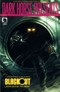
DARK HORSE PRESENTS #24 Dark Horse Comics, $7.99

 photo DHP_Cov001_B_zpsdd591b27.jpg

BLACKOUT CHAPTER 1 Story and lettering by Frank Barbiere Art by Micah Kaneshiro Blackout created by Mike Richardson (?)

This one didn't grab me I’m afraid. With its slickly appealing tech sourced graphics and plot predicated on the promise of explanations further down the line it read like the tie-in to some video game I've never heard of. It’s only a few pages though so maybe it’ll pick up and improve from EH!

ALABASTER: BOXCAR TALES CHAPTER 6 Art and lettering by Steve Lieber Story by Caitlin R. Kiernan Coloured by Rachelle Rosenberg Alabaster created by Caitlin R Kiernan

My total indifference to this one is purely a case of it not being my cup of tea rather than any failure on the part of the creative team. I did read it but I couldn't tell you anything about it except it’s in space and usually it isn't. There are some talking animals and a lady, usually with a very broad accent, having magical adventures. Oh, she’s called Dancy Flammarion. Yeah, that’s me gone. I'm no Garth Ennis but fey’s not my thing, I fear. Disregarding my witless bias this is bound to be OKAY! Because Steve Lieber can sure draw nice and Caitlin R Kiernan writes proper books (she should not be confused with Caitlin Moran who doesn't). The most interesting thing was how disproportionately irritated I was by the bit where the team tell us what they were listening to when they created the strip. It was really distracting. I mean was Kiernan really listening to the Sunshine OST? Why? Was it just because it’s the soundtrack to a movie set in space? That’s a stunningly literal approach isn't it? What did she do when it was finished? Start again? Stop writing?

Like a real asshole I find it all a bit disingenuous when creators share stuff like this with us. No one ever says they were listening to Phil Collins or Cher do they? Ever. Yeah, right. Have you seen some of the people who make comics? Seriously. I mean that guy who always does that stupid thing in photos with his face so it looks like a wet thumb sliding down a window is a Foreigner fan and no mistake. Look into your heart, you know it is true. Anyway, this stuff's just the thin end of the wedge, next thing you know they're telling you about their substance abuse problems, how many kids they have or whether they get to put the fairy on top of the Christmas tree. Being an unfeeling automaton it’s just not something I need to know about creators. I mean, does it do any of you any good to know I wrote this while listening to SWANS’ Time is Money (Bastard)? Oh, alright it was Cher. "Do you belieeeeeeeeve!?!"

 photo DHP_BHound001_B_zpsf720926a.jpg

Bloodhound by Jolley, Kirk & Riggs BLOODHOUND: PLAIN SIGHT CHAPTER 2 Art by Leonard Kirk & Robin Riggs Written by Dan Jolley Coloured by Moose Baumann Lettered by Rob Leigh Bloodhound created by Dan Jolley & Drew Johnson

This is a revival of a defunct DC property which has now been given back to the creators to do with as they will. I believe DC also returned the less than successful Monolith property to its creators recently too. This is really rather sporting of DC and we should probably acknowledge that before reminding ourselves of their treatment of Alan Moore. It appears that the lesson here is that if you create anything successful for DC they will line up and bang you like a shit house door. Meanwhile the creators of Bloodhound have decided to put it in DHP. I liked this series when it first appeared and I still like it despite the pony tail our hero sports. He’s kind of like a government sanctioned Punisher with all his marbles and a beer belly who targets super villains. This is just a short three parter so the mystery tends to be cleared up by the characters approaching each suspect, the suspect immediately breaking down and pointing to the next suspect and then the villain breaking cover to provide a thrilling cliff hanger. Brevity isn’t doing it any favours is what I’m saying. But I still find the premise promising, the characters solid and the art pleasant enough for it to be OKAY!

BRAIN BOY CHAPTER 2 Art by Freddie Williams II Written by Fred Van Lente Coloured by Ego ("The Living Colourist"?) Lettered by Nate Piekos of Blambot Brain Boy created by Gil Kane & herb Castle

Although it’s not explicitly stated I guess this is an update of Herb Castle and Gil Kane’s 1962 creation for the faster paced and more luridly violent Now. Since Dark Horse published a pricey hardback of these (old and very probably nuts) tales you’d think they might want to draw attention to this. Weird. Anyway, the update is definitely fast and bloody and it’s not without its charms. Chief amongst these are Van Lente’s witty revisionism best exemplified by the call centre riff and the ‘magic cereal' which fools no one. Artwise Williams II has obviously thought long and hard and come to some definite conclusions about how to draw our hero’s nose. I can’t speak with any surety as to the conclusions he’s reached but there’s definitely something going on with Brain Boy’s hooter. Oh, it all bounces along in a lively if not altogether logical fashion, which makes it GOOD!

 photo DHP_Nexus001_B_zpsda643d33.jpg Nexus by Rude & Baron

TREKKER: THE TRAIN TO AVALON BAY CHAPTER 1 Story and art by Ron Randall Coloured by Jeremy Colwell Lettered by Ken Bruzenak Trekker created by Ron Randall

It's super-nice that an old lag like Randall has his own creator owned property. It's less agreeable to report I found the whole future bounty hunting lady with sad past thing a tad too generic for my fussy palate. I am certain there is an audience for this but I adamant I am not amongst their number. I wish Randall well in all his travels but this, for me, was EH!

KING'S ROAD: THE LONG WAY HOME CHAPTER 2 Art by Phil Winslade Written by Peter Hogan Lettering by Steve Dutro

Oooh! It's a high concept! What if the kids from a book very similar to (but. lawyers take note, not the same as) The Lion, The Witch & The Wardrobe grew up and had kids who didn't know about their adventures and then The Evil Returned and the kids had to take up arms on behalf of their paunchy and totes dull 'dults?!? This. That's what. No doubt Hogan will be exploring the Christian symbols underlying his borrowings with the same rigour and aplomb as his source. Or at least get a movie deal. Just joking! This is a promising (if not a little cheeky) premise and it's made all the more attractive thanks to Winslade's endearingly gangly characters. Although these do inhabit a blurry world of boisterous blooms of colour, the intensity of which suggest Mr. Winslade should pop down the opticians pretty sharpish or at least dial his PC settings down a bit. Maybe I'm getting soft in my dotage but this was OKAY!

CRIME DOES NOT PAY: CITY OF ROSES CHAPTER 5 Art by Patric Reynolds Written by Phil Stanford Colours by Bill Farmer Lettering by Nate Piekos of Blambot Crime Does Not Pay: City of RosesCity Of Roses created by Patric Reynolds & Phil Stanford

This is EH! due to the perfunctory writing and the weirdly flaky looking art. It isn't terrible but it isn't terribly exciting either. Everybody thinks crime comics are easy and nearly everyone is wrong. Everyone except David Lapham. Christ, I miss STRAY BULLETS. Why can't Dark Horse Presents find room for new David Lapham genius? WHYYYYYYYYYYYYYYYYYY???? WAAAAAAAAAAAAAAAAAHHHHHH!!!!

NEXUS: INTO THE PAST CHAPTER 2 Art by Steve Rude Written by Mike Baron Lettered by Steve Rude Coloured by Glenn Whitmore Nexus created by Steve Rude & Mike Baron

Eventually every open ended continuing narrative strip gets to Jack the Ripper, it's likely that they get to Sherlock Holmes too, but only Nexus would throw in H.G. Wells without overbalancing, without even wobbling in fact. It's Nexus so it's VERY GOOD! In fact I'll tell you this: I'd never read Nexus until it appeared in DHP but once it did I ordered Vol.1 of the Omnibooks pretty darn lickety split. I would imagine there is no higher praise a comic creator can receive than a sale. We'll be coming back to Nexus at some point. Aw, yeah!

HUNTER QUAID: ARMAGEDDON OUT OF HERE Art by Melissa Curtin Written by Donny Cates & Eliot Rahal Coloured by Lauren Affe Lettered by Lauren Affe Hunter Quaid created by Donny Cates & eliot Rahal

I couldn’t get a grip on this one. It’s like something an artist would do to showcase their style but it has a writer, no, two writers? And they are the creators but it's the art that is the stand out feature? I don’t know. I don't get that. It looks nice but, hey, that’s all you need sometimes. It was OKAY! but only because of the artist.

 photo DHP_Wheeler001_B_zpsb74cb0f6.jpg Villain House by Wheeler

VILLAIN HOUSE CHAPTER 4 By Shannon "Papa" Wheeler

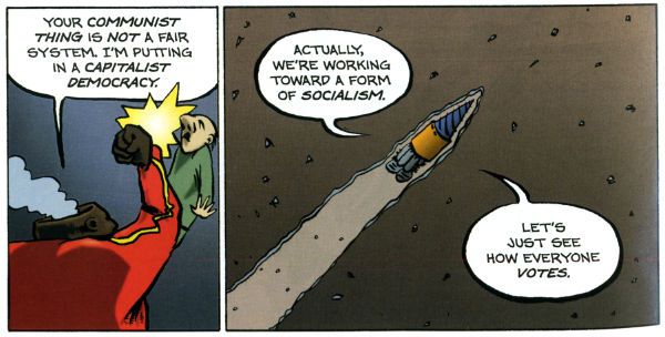
It’s a kind of testament to the durability and depth of the concepts at the heart of Jack Kirby and Stan Lee’s Fantastic Four that half a century later it still provides fertile soil for trees of mirth like this. As mirth trees go this is a sturdy beech indeed. This is some funny stuff right here from the surly insistence of 'Not The Thing' that everything bad is Communist to the laser targeted title of “Invisible Wife” and beyond. The laughs aren't empty either, there’s a sympathetic villain whose world is ruined by a bunch of powered berks getting all up in his business to hilariously disastrous, but not unmoving, effect. I’d hazard a guess this strip is somewhat more refreshing and engaging than yet another modernisation of an old Kirby & Lee classic. ( “Yo, Yo, Yo! Ben Grimm is Totes Sad, Bro! (Ch-Ch-Ch-check out Mi Tumb-LAH!!!)”) Wheelers’ treat of a tummy tickler may not beat the ultimate yukkifier of Don Simpson’ s Yarn Man and “Golly! That crazy gizmo really works!” but it comes closer than most in a very small space. And that’s VERY GOOD!

Christ, I think I sprained something back there. And now I know why people don't review anthologies. I still don't understand why they don't buy em. They're stilll - COMICS!!!
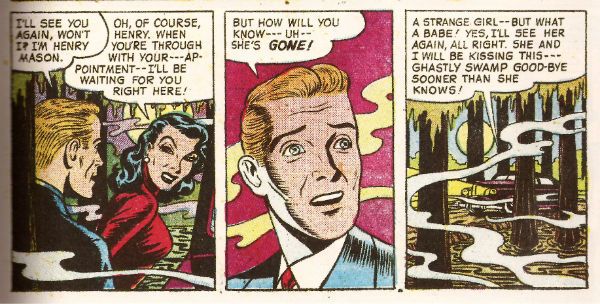
"...A Cascade Of Wasps Attacked the Furry Monster!" COMICS! Sometimes You Worry About The Men Who Made Them!

That's right I read some comics. Some of them were old and some of them were new and one of them wasn't really a comic at all. But only one of them made me think it was a miracle anyone was actually conceived in the '50s. Photobucket

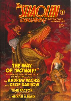
Yes, paging Dr. Subtext! Outbreak of '50s gynophobia! But then to nostalgic old fools like me '50s gynophobia is arguably the finest gynophobia of all! Anyway, this... THE SHAOLIN COWBOY ADVENTURE MAGAZINE #1 The Shaolin Cowboy in "The Way of No Way!" by Andrew Vachss and Geoff Darrow Time Factor by Michael A. Black Illustrations by Geoff Darrow and Gary Gianni Designed by Peter Doherty Cover by Scott Gustafson Dark Horse Books, $15.99 (2012) Shaolin Cowboy created by Geoff Darrow

Photobucket

This isn't a comic book, best get that straight right from the off. What it is is a loving evocation of the pulp magazines of the past. Peter Doherty has designed the book, and every page within it, to wilfully evoke those deceased progenitors of the super hero comic. He draws short at leaving the page edges untrimmed but other than that it's a splendid piece of design work. The contents are very reminiscent of the old pulps too. I haven't read a lot of those but what I have read of them they were largely shaggy dog stories told in very wordy way with the main draw being the charisma of the central character and the outlandish inventions deployed by the (often uncredited) authors to delay the ending.  Pulps were largely exercises in covering as much ground with as little material as possible (very much like certain comics from The Big Two. Ha ha! You Crazy!) but fought hard to be entertaining while doing so (unlike certain...Ha ha! Me passive aggressive!).

Photobucket

So what you get here consists of pages of words punctuated by  a plenitude of Darrow's hypnotically precise spot illustrations and a smattering of full page "Helpful Hints" where Shaolin Cowboy helpfully shows you how to switch on a toaster before e.g. tearing off someone's nutsack with it. That's the joke there and it's the same joke every time but as with certain jokes the accumulative repetition somehow keeps it funny. Because that's the thing about Shaolin Cowboy isn't it? There aren't a lot of jokes but what there are are good jokes. The best joke in the comics is appreciating the density of illustration used to enliven such meagre plots. The trick here is that Vachss and Darrow make the language serve the illustrative function but the joke remains, in essence because whole pages dense with text  are spent describing a scene only to have the scene change suddenly. More space is spent describing how the people Shaolin Cowboy is about to dispatch look than there is spent describing how they are dispatched. As with the comic the emphasis is on appearance rather than action. You will have to like words to like this one.

Darrow and Vachss have worked together before (Darrow did the covers for Vachss' 1995 CROSS series at Dark Horse and worked on the 1993 ANOTHER CHANCE TO GET THINGS RIGHT g/n along with many other artists) but it's surprising how well it works here given that change of emphasis from art to text. Vachss is a perfect choice for a pulp project like this. He's an accomplished writer of fiction whose work tends to read like nothing so much as pulp filtered through a dark adapted eye. His Burke novels are pretty much What If  Doc Savage and his crew had all had terrible childhoods and now hunted sexual predators with absolutely no intention of rehabilitating them. Vachss is an imposing figure what with his designer suits, eye-patch and general stance that seems to declare that he has just dealt with something and it will never hurt anyone else again. He isn't a dilettante either, just paddling in the waters of human atrocity for profit. This is from his bio in the back:

"Andrew Vachss has been a federal investigator in sexually transmitted diseases, a social-services caseworker, and a labour organiser, and has directed a maximum-security prison for "aggressive-violent youth". Now a lawyer in private practice, he represents children and youth exclusively."

This explains the references to the organisation PROTECT which crop up in the book and the no-nonsense message about kids and violence. Andrew Vachss makes Steve Ditko look indecisive is what I'm saying. I'm glad there is someone out there like Andrew Vachss, almost as glad as I am sorry that there is a need for people like him. But I can assure you that my rating is based entirely on the fact that I really enjoyed the book. It certainly isn't fear of having my legs broken that makes me say it was VERY GOOD! Also, the Michael A. Black time travelling/dinosaurs short that brings up the rear of the book is pretty neat and will take you back to Sundays reading Ray Bradbury on the rug in front of the fire before you even knew the world contained kids less fortunate than you who needed things like PROTECT.


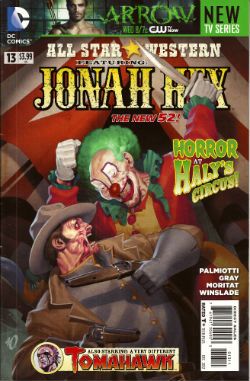
ALL STAR WESTERN#13 Jonah Hex: Art by Moritat, written by Justin Gray and Jimmy Palmiotti, coloured by Mike Atiyeh and lettered by Rob Leigh. Tomahawk!: Art and colour by Phil Winslade, written by Justin Gray and Jimmy Palmiotti and lettered by Rob Leigh. DC Comics, $3.99 (2012) Jonah Hex created by Tony DeZuniga and John Albano Tomahawk created by Edmund Good and Joe Samachson

Photobucket

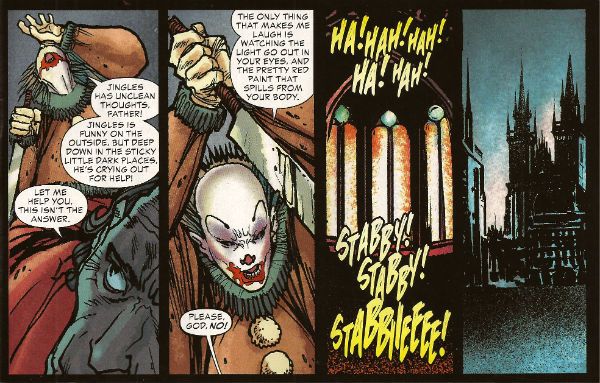
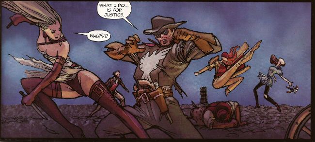
This book gets worse and worse and it still sells more than it did when it was called JONAH HEX. But then it isn't about Jonah Hex anymore is it? No,  it's more like Jonah Hex And His Amazing Friends. Except they are far from amazing and, as he's Jonah, they aren't really his friends, so it's more Jonah Hex And Some People Tolerating Each Other. Whatever I say about this book (and I'll be saying some stuff alright) all that needs be done to refute me is to chuck back its sales figures in my angry biased jealous fan boy face. The guy doing the most work here is clearly Moritat and he does a far better job than the material requires. Look, this isn't about Jonah Hex being "my" character and how I don't like what they've done to him. It's about bad comics. This one starts off with a clown killing a priest. He is killing the priest because he does not like priests because they fiddled with him when he was a kid. Jonah and his crew show up and notice the dead priest has had his face painted like a clown and someone says there's a circus in town and, oh God, oh Jesus....it's not exactly a fucking "two pipe problem" is it, Watson?

Photobucket

And I've gone Holmes on you there because what this comic is also doing is bringing in fictional literary characters from the period the book is set in (at the minute we have Edward Hyde, y'know, from Little Dorrit.) I can only guess they are doing this because the constant shout-outs to DC super hero continuity aren't stupid enough. I've got no beef with either man (I'm certainly not jealous(!)) but Palmiotti and Gray's work comes down heavily on the commercial rather than the creative end of the see-saw. It beggars my mind why on earth they would seek to go toe to toe in the shared-world arena with Kim Newman, Philip Jose Farmer and that elderly Englishman we've all decided we hate (because although less than he was he still makes everyone else look bad).  In comparison this is just pantomime and Palmiotti and Gray look like they'be both not only turned up as the horse, but they've miscalculated further and they both came as the horses' ass.  C'mon, the clock is ticking until Spring Heeled Jack shows up. After all some claim the murders ended because he sailed to The New World, how can they resist. Look forward to "It's Saucy Jack, sir! He's struck agin! Right under our very noses!" That should show FROM HELL up good and proper. Yeah, I know; but it sells more than ever - so I lose. I looOOooooOOOOOOooOOse! Look, something can be successful but still CRAP! It isn't a critic's job to tell you what's selling - it's their task to tell you whether something is any good or not and why. Sometimes elliptically. Sometimes irritatingly.


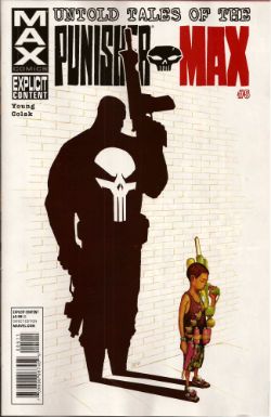
UNTOLD TALES OF THE PUNISHER MAX#5 Art by Mirko Colak (p) and Norman Lee & Rick Ketcham (i) Written by Skottie Young Coloured by Michele Rosenberg Lettered by VC's Cory Petit Marvel, $3.99 (2012) The Punisher created by John romita Snr, Ross Andru and Gerry Conway

Photobucket

There are many audacious things aout this comic written by the man who will, on this evidence, remain better known for his art on Marvel's wonderful Oz books. First up is the fact that Young attempts to position FrankMax as some kind of homicidal homilist dispensing murder and maxims. That would be okay(ish) if this were FrankNorm but in the MAX (So uncompromising! So complex! (i.e. violent and cruel)) world it seems a bit...off. Like FrankMax's taken one too many blows to the head and suddenly become simple minded or something. Don't get me wrong it's a good moral but I don't know if the guy who (spoiler!) killed your Dad is the guy you're going to listen to. No, put the phone down! Not your Dad; the Dad in the book. The Punisher didn't kill your Dad! He isn't real! No, The Punisher isn't real, your Dad is. Look, you're just doing it on purpose now.

Photobucket

The other bold move is to have the issue basically centre around a high-stakes cat and mouse game revolving entirely around the making of cheese macaroni and, specifically, whether there is some cheese in the fridge! I won't spoil it for you. No, not the cheese that's okay it's in the fridge. Or! Is! It!? I kind of liked that actually; it amused me. Young really stretches my credence to cracking point though when he suggests someone's favourite movie could be Appollo 13. Hey, it's a decent movie and it documents a thoroughly remarkable instance of insanely laudable human bravery and ingenuity no doubt, no doubt. But...favourite movie? Ever? Of all the movies you have ever seen? Okay, it might be crew members Lovell and Hise's favourite movie (Swigert died before it was made but he'd probably have been mad keen on it too.) but this comic isn't about them. I know all kids think their Dad's taste in movies suck but c'mon. Even my Dad likes Reservoir Dogs (altho', "There's no real need for all that language, John.", so spaketh he.) All this together with the unspectacular art makes the comic EH! And in the end the brassiest thing about the comic is that Marvel charged $3.99 for it. (You don't even get a Free Digital Code!)

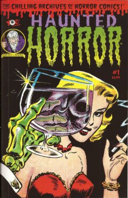
HAUNTED HORROR #1 Art by C.A. Winter, Bernard Baily, Mike Sekowsky & Bill Walton (attrib.), Jack Kirby & Joe Simon, Jack Cole and Jay Disbrow. Reprints tales from WEIRD TERROR#1 (1952), THIS MAGAZINE IS HAUNTED#4 (1952), BAFFLING MYSTERIES#6 (1952), BLACK MAGIC#31 (1954), INTRIGUE #1 (1955) and CRIME DETECTOR #5 (1954) Cover by Warren Kramer and Lee Elias IDW/YOE Comics, $3.99 (2012)

Photobucket

If you don't think that that fine as wine cover is some kind of awesome then you best look away now because that's the smoothest thing in this package. And what a package this is! A splatter of pre-Code horror comics from various sources and various artists that shores up the case for art being the decisive factor in a comic's appeal. Because these sure ain't some well written comics. Apart from the Simon & Kirby (S&K) tale none of the other contents even get a writer credit. I'm not really surprised either. These things are entertaining allright but probably not in the way the authors intended. If the authors even intended anything because back then people just wrote this stuff to eat and they had to write a lot of it and they had to write it fast. Intentions are a very modern affectation for comics writers, tha ken. The more sedate of these tales are written like the writer’s got his cock in a mangle and he’s just learned he's late for a plane.They aren't exactly coherent is what I'm saying there. But the best one is "Black Magic In A Slinky Gown" because it has an almost palpable revulsion for women and the dirty, dirty things they make men do with them. The author of this one is only saved from almost certain Sectioning by the addled and unfocused nature of the storytelling. Or maybe it makes it seem worse than it is; either way it's hilarious. The kind of story you imagine being written by the kind of man who silently props up the bar surrounded by a circle of silence and goes home and the next time you hear about him it's in the paper and it isn't for winning the lottery.

Photobucket

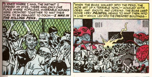
In a more commonly accepted sense of "best" it's "Slaughter-House" which takes the prize. This is by S&K and is a real shocker. It's f-in' brutal!  A couple of battered Joes resist after the Earth has been conquered by '50s style aliens and it's all really unsettling. It's as though limited as to what they could depict visually S&K snuck through the real horror in the text. Seriously, it's basically got humanity being herded into killing pens and "...SLAUGHTERED like beef on the hoof!" With the wire and the guards and the mechanised death and the resistance and the Quislings and...you don't need letters after your name to know what S&K are on about (World War 2, darlings. World War 2). It also contains the word "noggin" which automatically makes my day. The ending is uncharacteristically downbeat for Kirby (maybe it's more Simon) but it's weird to reflect that The King's work appears more pessimistic before Marvel fucked him over than it does after. Because while this story apparently refutes it Jack Kirby, and I may have mentioned this before, never gave up on us.

Photobucket

This is a VERY GOOD! package overall. Not just for nostalgia (because don't you have to have experienced them first time round for that?) but also out of interest in what comics used to be like. Turns out they were the kind of thing that, had it been produced yesterday by people under thirty, would tickle the 'nads of VICE readers as much as the sight of a pretty girl reading Infinite Jest opposite them on the subway. (Honestly, there's some real Charles Burns/Dan Clowes look-a-likey stuff in here.) Also, for people who like their reprints just the way they were this book is for you, Brian Hibbs! It looks like someone just scanned the comics in and adjusted the contrast and so all you need is a Police Action in Korea, a corn dog and a cop on every corner for it be just like the good old days again!

Make Brian Hibbs smile like a child again by buying HAUNTED HORROR #1 from HERE.

And like the good old days - I'm gone!

Hope y'all had a good Thanksgiving and remembered to give thanks for COMICS!!!
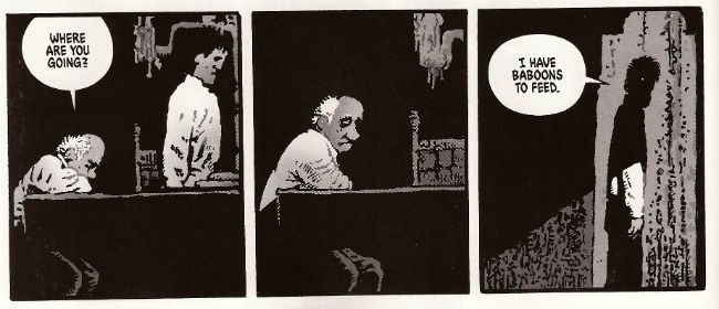
"No! It's ANGRY!" COMICS! Sometimes They Bow Before The King (Of R'n'R).

Good Day! Jolly Good Day! Over here we are shortly to be having a Jubilee shindig! You don't get one so I gave you this instead. It's all over the bally shop but some of it is about comics. You have been warned and so my hands are clean but look at the state of your fingernails! Photobucket

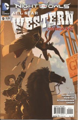
ALL STAR WESTERN #9 Art by Moritat, Patrick Sherberger and Dan Green Written by Justin Gray & Jimmy Palmiotti Coloured by Gabriel Bautista and Mike Atiyeh Lettered by Rob Leigh DC Comics, $3.99 (2012) Jonah Hex created by John Albano and Tony DeZuniga Nighthawk created by Robert Kanigher and Charles Paris Cinnamon created by Roger McKenzie and Dick Ayers

Photobucket

I have my concerns about this book. These concerns have nothing to do with the art what with Moritat and Bautista delivering the usually fine performance; said performance being so fine that it hardly matters that the backgrounds are a smidge perfunctory. And despite the plots being a bit woolly what with all this editorially mandated crossover bullhockey (Ooo! The lady in the cape! Some owls!) at least here they contain the always entertaining idiocy of Caucasian Americans worrying about immigrants lowering the tone of the place and generally letting the side down. It's not even that on a page turn it's "three weeks later" and we're in Gotham instead of N'Orleans, because I understand they want to get on with this interminable owl shite. And yet, part of me, the beautiful, dreaming part no doubt, misses the days when Jonah wouldn't be able to go from one town to another without ending up nailed to a cactus. And I miss El Papagayo turning up to taunt him. I miss El Papagayo he'd be all like, "Senor, Hex! Why must you always make life so hard for yourself, my friend! Come out from behind that rock and embrace me and my gang of toothless well armed vermin! Do you no longer trust your good friend, El Papagayo, Senor Hex! You hurt my heart, my friend! Why, Paco here has brought some smelly badgers! tell him, Senor Hex, tell him we don't need no steenkin' badgers!" Actually, it probably isn't the absence of El Papagayo either.

Photobucket

No, it’s more that Jonah’s becoming a guest star in his own book; it’s just too crowded and in order to stand out from the crowd I fear Jonah’s going to become more of a caricature than a character. The book's focus has shifted from the lovable asshole with the melty face to being more of an attempt to reposition DC’s mouldy old oaters in more viable iterations. I’m all about that because I have a fatal fondness for DC’s western heroes. I have no idea why but there it is. Some people are like that about The Batman; my way is cheaper, I win. I’m also quite okay with the view that there are no bad characters just bad writing. But I’m not quite convinced that the way to go is to give these characters aspects more suited to superheroes. So I’m not convinced that the missing ingredient for Nighthawk and Cinammon’s success is their possession of a pair of lucky charms which stop them dying and make them strong, super strong in fact.

Photobucket

But I just hamstrung my own qualms by saying there aren't any bad characters, so I guess the problem is the writing. In which case I'll bounce back and say it’s just too workmanlike. If you’re selling something to an audience - put your back into it, get some enthusiasm going! Well, it’s workmanlike when it isn't hat stampingly poor; as when Bruce Wayne’s bat-ancestor mentions there is poison ivy someplace. Wait, poison ivy! Do you see?!? DO you see?!? Next issue we’ll hear some joker released some penguins from Gotham Zoo but he keeps denying it because he’s two faced! This is what Jonah Hex needs! Next issue it’s Bat Lash; let’s hope he hasn't got a steam powered skidoo or some such daft shit. At the moment ALL STAR WESTERN is GOOD! but it's on thin ice, muchachos!

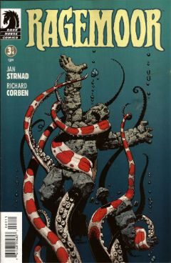
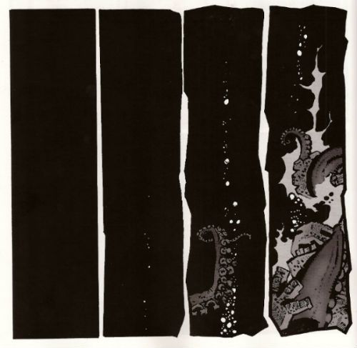
RAGEMOOR #3 Art by Richard Corben Written by Jan Strnad Lettered by Nate Piekos of Blambot® Dark Horse Comics, $3.50 (2012) Ragemoor created by Richard Corben and Jan Strnad

Photobucket

This one’s the third issue of four so you might, given modern trends, expect it to basically sit there picking its nose and inspecting the results until the next issue. After all, you’re this far in so why bother trying. But this is Corben & Strnad and they’ve been doing this a while which, I guess, means they are old or some weak and totally lame shit like that. In comics folk always underestimate the old guys don’t they? News just in: Steve Ditko’s still doing good comics. Youth will never understand that you only get old by surviving. This is largely because Youth is an abstract noun and is therefore unlikely to have cognitive functions.

Photobucket

Humourless pedantry aside, let’s face it; put Matt Fraction and Richard Corben adrift in a lifeboat and three weeks later the copters are going to be picking up one fat comic artist. Fraction’ll just turn his back to sneak a look at his reflection in the water and Corben’ll be on him like a liver spotted threshing machine. Wait, I was on about a comic, I think. So, yeah, this comic doesn't just piss complacently about, no, this comic sets back on its haunches, tenses its muscles until they thrum with the collective kinetic energy of the previous issues and prepares to, next issue, hurl itself straight at your throat. Despite the fact that the creators involved probably get twinges in their knuckles when the weather turns cold RAGEMOOR remains VERY GOOD!

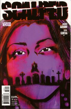
SCALPED#58 Art by R.M. Guera Written by Jason Aaron Coloured by Giulia Brusco Lettered by Sal Cipriano Vertigo/DC Comics, £2.99 (2012) Scalped created by R.M. Guera and Jason Aaron

Photobucket

In two issues this series will end. In two issues the fix will be in. In two issues people will refer to this series as Jason Aaron's SCALPED. I have but a brief window of opportunity to attempt to correct the course of the critical conversation as it puts the pedal to the metal and hurtles straight into The Cult of The Writer. Only a soulless canker of a man would deny that Jason Aaron's writing has been solid and decent throughout. It's probably more impressive the less knowledge you have of the '7os cinema he has mined so well the series. But, alas, homage is everywhere now and I know I for one require more to ensure I see out sixty issues. SCALPED gave me more in spades, and it gave it to me in the form of the art of R.M. Guera.

Photobucket

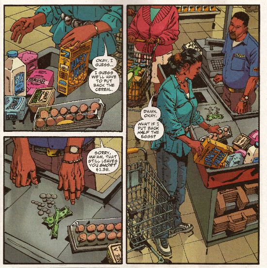
R.M Guera is the star of the show here. It's the attention to detail, I think, that is Guera's true strength. That's quite a strength considering the fantastic way his faces veer into and out of controlled caricature, his body language ranges from subtle to hysterical and his environments from the grubbily realistic to those of opulent excess and all of this, all the while, strengthening rather than destroying the suspension of disbelief; drawing the reader in rather than pushing the reader away. Christ, it's the stuff of wonder. Christ, I write about comics like old people trampoline. Look, here's R.M. Guera drawing a scene in a supermarket. It's just a scene in a supermarket but, but, look:

Photobucket

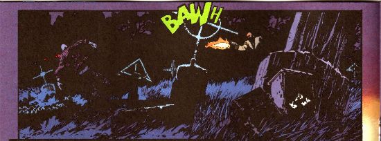
And how about those colours, ey? Brusco's colours are a special kind of magic as well throughout the book. Check out the night scene I lifted above. Be soothed by the smooth blues and then startled by the pop of the lime green FX! Giulia Brusco gets a cheek chuch for coloring cojones and no mistake. What a wonderful, wonderful book SCALPED has been on a visual level. It's a bloody shame that the aspect that lifts SCALPED up to VERY GOOD! is, I'm guessing, the aspect that'll receive least play once it ends, and the artists who worked such wonders will reap the least of any future benefits; career and reputation-wise. But before that happens, before the fix kicks, in I'm going to point out that R.M. Guera is EXCELLENT!

Those of you who read this and were not insensate from drugs or currently being attacked by a maniac will have picked up on the subtle fact that I'm a little distracted. That's because this weekend is Jubilee weekend! We get an extra Bank Holiday on Tuesday to celebrate Good Queen Bess. I'm no Royalist but I do recognise that the tourist industry is pretty much the only industry we have anymore, so she's okay on that score, and also I'm anyone's for a free day off work. Fickle? You have no idea, pal. You have no idea. So I am eager to join my fellow countrymen in the heat of the streets, swigging binge and watching as the middle aged men with their Celtic tattoos blistering in the heat bellow at their shrink wrapped wives about how Sandra in accounts understands and how he never wanted this, never wanted any of this and the discarded children weep beneath the Union Jack bunting. England, my England!

Oh please, despite all your protestations to the contrary you're all quite keen on the whole Royalty business, aren't you. my American friends. Oh, you claim otherwise, you do:

Photobucket Image from The Steve Ditko Archives Vol.2 (Ed. Blake Bell, Fantagraphics Books). Art by Harry Belafonte Jnr. No, it's Steve Ditko for Goodness Sakes! Keep up, no lollygagging at the back!

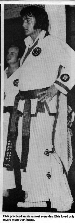
But you're just fooling yourselves. You protest too much, methinks. Look, you've had at least two Kings: The King of Comics (one Jack Kirby by  name) and this raunchy dude:

Photobucket

The King and American Royalty were on my mind because when I am not reading comics I am looking at enthusiastically typed and photocopied documents held together with staples produced by fans of things. Probably while they waited for The Internet. Documents such as THE ELVIS COLLECTOR #1 (edited by Major I.R. Bailye). This fragment of forgotten fandom was brought home to me courtesy of my very own Priscilla, who knows only too well that when it comes to The King there's no fool such as I.

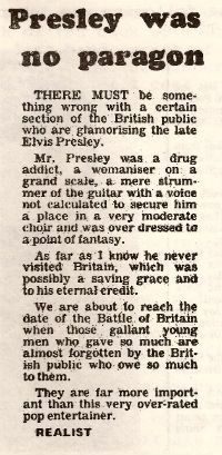
Reading the photocopied love letter to The King my eyes settled on this:

Photobucket

From The Leicester Mercury; date unknown, author pseudonymous.

Sadly "The Realist", despite his fantastic English language skills ("overdressed to a point of fantasy"!!), is incorrect as Elvis Aaron Presley touched down briefly on British soil. However, I still think his points remain valid despite this factual inaccuracy. Yet, it did make me realise that sometimes people can be blinded to the essential truth of an article if the author undermines himself with inaccuracies. A bit like an article on comics in The Wall Street Journal perhaps. The one where he's wrong about why comics aren't popular anymore (the world's just moved on and the price has risen in line with the Greed Index; that's really why) but is right about Avengers comics being less like something you'd use to attract new readers and more like something you'd scrape off your shoes before going indoors. Poo, I'm talking about poo there. Usually animal  but, given the state of Cameron's Big Society, there's a queasy possibility it could be human. Um.

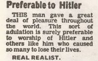
In closing let me just say that, being all crepey of skin and feeble of mind, I am only too well aware that at any moment my stinking and aged frame could just drop dead, and sometimes I wonder how I would like to be remembered. It turns out that I would like to be remembered like Elvis. No, not as a mother fixated, voyeuristic pill popper with strange ideas about chimp management. (People tend to forget the Divine Voice these days, which is their loss.) Rather:

Photobucket

From The Leicester Mercury; date unknown, author pseudonymous.

Yes, "preferable to Hitler". I think the "Real Realist" is right in that that's all any man would want in the end. So, have a smashing weekend and if you think of me, think of me, at least as being "preferable to Hitler". Like Elvis. Like The King. God Save The King! God Save The Queen!

Farewell for now, my foreign chums, and remember: if you can't have a Jubilee then have some COMICS!!!
"Wal, Ah'll Be Danged." Comics! Sometimes Creators Are Hurting!

I don’t know if you’ve heard but comic book artist Tony DeZuniga is in a really bad way. The details are here. Photobucket

So, I thought I'd jaw a little about some of his work.

And then Brian "Call Me Mr." Hibbs dropped his MASSIVE ANNOUNCEMENT that I've just stepped over with my big cow patty boots. Er, sorry, but time seemed an issue here, so REMEMBER below this post Brian "Future Town" Hibbs has a MASSIVE ANNOUNCEMENT. Below the break I just have some words.

Photobucket

Now, I don’t know about you but I’m pretty tired of reading about all these guys’n’gals who created the magical characters that made my childhood almost pleasant only when their foetally curled carcasses are chipped off the bottom of a skip every winter. (Perhaps even a skip in an alley outside a cinema showing the latest billion dollar grossing motion picture extravaganza featuring their creations. In the foyer – soda pop with ice made from Jack Kirby’s ghostly tears! Or Don Heck’s! Or…etc) So, here’s this guy, Tony DeZuniga, having a bad time medically and financially and, I don’t know, I’m not asking you to give anything except maybe a little attention; a little consideration to his work maybe. It won’t help him any but it might count for something.

Photobucket

Mr. DeZuniga was born in the Philippines and got his start in American comics working at DC around 1969/70. In 1973 he created Black Orchid with Sheldon Mayer. So I imagine the BLACK ORCHID DELUXE EDITION by Gaiman/McKean which has been released this week, according to "Pappy" Hibbs' Shipping List, will see DC Comics sending Mr. DeZuniga some money at this most unfortunate time. I’ve never read any of the original Black Orchid but I have read a lot of comics featuring the character Mr. DeZuniga created with the writer John Albano in 1971 - Jonah Woodson Hex. Yeah, me and Mr DeZuniga go way back. Not personally, I’ve never met the man, but in a comic book way. When I was a kid, man, I used to love me some of that DeZuniga Jonah Hex. And, hey now, since Jonah Hex was created by Tony DeZuniga and John Albano what could be more appropriate than to look at some of his work there.

(Okay, I also really liked Mr. DeZuniga’s work on Roy Thomas and Ernie Colon’s creation ARAK but I don’t have any ARAK since the Great Purging my parents conducted while I was off failing to be educated. So that would have been a pretty short post. (Hey, I heard that!))

Photobucket

I guess somewhere along the way I became a 'fanboy' for the character. Yeah, I've got a whole heap of mouldering paper with his image on and I'm always ready to read another issue of Jonah messing up, likkering up, riding about a bit, riding a whore a bit and just generally making everyone around him's life just that bit more unpleasant even if he  does save their lives. Which he doesn't always do. But having said that I think this 'fanboyishness' is due to the fact that the character has had strong creative teams behind him for the most part. Sure I like the character but I think I like the character due to the many talented people behind his comics. Because, while I do love me some comic characters, I never forget that the folk what made 'em up are just that wee bit more important. What with them being real live human beings and all. Creators like Tony DeZuniga, who is currently demonstrating just how human he is and without whom I would not have had the pleasure of making the acquaintance of Jonah Hex.

Photobucket

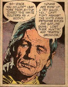
So, Jonah Hex then. Now the character design for Jonah is pretty striking, yes? There aren't a lot of ways to make a cowboy as visually striking as the comic book medium likes. It’s easy to slip over into camp given the sexual connotations of the breed in the popular imagination. John Voight wasn't in Midnight Accountant was he? No. DeZuniga (and Albano) give Jonah a striking presence on the page with his blue trousers and Confederate grey tunic before you even get to his famous face. And wearing that tunic in post Civil War times pretty much encapsulates the self hating suicidal swagger of the surly sonovagun right there. Clever stuff and then we get to the face. Striking is surely the word there for the flesh fondue frozen mid slide. It’s pretty simple but that’s why it’s so smart. There’s not a lot to get wrong. That's important in mainstream genre comics where other hands will be at the character more than likely. There are teething troubles as Mr. DeZuniga does initially demonstrate some indecision as to Jonah’s hat, soon ditching the practically ostentatious stripey hat band after a couple of issues and there he is pretty much as he remains to this day: Jonah Hex.

Photobucket

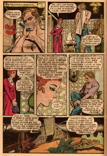
Even though the art reproduced here is from books created in the ‘7os I hope I've succeeded in making it evident that the page by page art is also rewarding and possessed of a surprising sophistication. Mr. DeZuniga’s early training in commercial art and work in advertising is evident in all kinds of pleasing ways. Admittedly this does mean his ladies seem a little too modern for the setting but otherwise all I can see are gains. Look on the bright side, his ladies certainly seem worth the courting. Here, let’s you and me look at the attention paid in this scene to the environment; the fixtures and fittings and particularly the wallpaper:

Photobucket

While the actions of the people are hardly thrilling the busy pattern keeps the eye occupied and alert as the mind digests the heavy load in the word balloons. Then at the end there’s a DeZuniga scene setting special. It’s a little overloaded with objects and a tad intrusive in the angling but this was still only 1973. He’d get smoother and subtler (but not that subtle; there’ll always be a broken wheel, a cattle skull or a twisted stump not far off.).  When he was professionally active Mr. DeZuniga worked on plenty of books besides Jonah Hex; Romance, Mystery, Barbarian and, yes, super-heroes.  The guy's work had range but it also had depth.

Photobucket

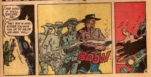
I haven't read every comic Tony DeZuniga ever drew but of the many I have read I can fairly say he always entertained. Even better there was always at least one part of the book where DeZuniga was clearly loving it. He'd crack out the Zip-a-tone or depict an action sequence in time-slices or exaggerate the physicality of violence to dull it with comedy or have Charles Bronson turn up as an Ind..Native American or... You get the drift, for someone working at the unforgiving pace of mainstream genre comics DeZuniga's work always excelled at melding his disparate influences and approaches into an attractive and  experimental package. Tony DeZuniga did good comics is what I'm saying. And in 2006 Tony DeZuniga returned to JONAH HEX and proved he still did good comics:

Photobucket

Tony DeZuniga may not be one of The Greats but he was still pretty great. Force my hand and I'll say Tony Dezuniga was VERY GOOD! because Tony DeZuniga is one of the reasons I never grew out of loving COMICS!!!

All images reproduced from WEIRD WESTERN TALES #16,18 and 20 (1973) and JONAH HEX #5 (2006) published by DC COMICS.

"Clod. I Have WEAPONS..." Comics! Sometimes They Are Almost Fresh!
It's a post about comics! Is it early? Is it late? Time is in flux!Only if one man can face his Pull List can The Balance be restored!

One Man. One Pull List. There will be Words... (...probably the wrong ones). Photobucket

ACTION COMICS #6 “When Superman Learned To Fly” by By Andy Kubert/John Dell(a), Grant Morrison(w), Brad Anderson(c) and Patrick Brosseau(l) and “Last Day” by Chriscross(a), Sholly Fish(w), Jose Vallarubia(c) and Carlos M. Mangual(l) (DC Comics, $3.99) Superman created by Jerry Siegel and Joe Shuster.

Photobucket

 I like that stuff in my comics but I'm not unaware that in real life that kind of thinking gets you killed.

While there could be said to be many faults with the lead story in this issue such as an apparent attempt to distract from a lack of clarity (or indeed even sense) with a belligerently unslackening pace and art that once again belies Andy Kubert's alleged superstar status it remains a fact that in this story Superman's enemies conduct an auction for Kryptonite within Superman's own brain (physically, literally within Superman's own brain) and Superman uses his own Kryptonite poisoned body as a battery to save his both his own sentient ship and the day entire. Yes, Superman's enemies conduct an auction for Kryptonite within Superman's own brain (physically, literally within Superman's own brain) and Superman uses his own Kryptonite poisoned body as a battery to save his both his own sentient ship and the day entire. That's Superman comics enough for me!

The backup is the kind of sweet and tender emotional snapshot of a transitional moment in life that anyone under forty will treat as though it were sentient dog-muck hellbent on French kissing them; that's okay because I enjoyed it enough for y'all! Yup, ACTION COMICS was GOOD!

 STATUS: REMAINS ON THE LIST!


ALL-STAR WESTERN #6 “Beneath The Bat-Cave” by Moritat(a), Justin Gray & Jimmy Palmiotti(w), Gabriel Bautista(c) and Rob Leigh(l) and “The Barbary Ghost Part 3” by Phil Winslade(a), Justin Gray & Jimmy Palmiotti(w), Dominic Regan(c) and Rob Leigh(l) (DC Comics, $3.99) Jonah Hex created by John Albano and Tony Dezuniga. The Barbary Ghost created by Gray, Palmiotti and Winslade

Photobucket

Kids! How many owls can you spot!

Thank the Great Spirit! Next issue ol' bacon face is off to N'Orleans! where there will no doubt be "gumbo" galore but at least there won't be anymore shoehorning of Batman references into a book that doesn't need them. A cave beneath Wayne Manor! Filled with Bats! This cretinous continuity reached a kind of hilarious nadir with the sudden slew of references to Owls: because Batman is currently encountering stress of a strigiform stripe by all accounts in the here and now! So we get about two pages in which the characters can barely move around the mansion setting for all the owls dangling, roosting, flopping and just plain flailing around the place. It's as though Moritat has snapped and gone "You want owls? Here! Here are your owls! Got enough owls yet? I don't think so! Owls! Here! Now! In your face! All! Owls! Touch them! Touch my owls! Tell me they're pretty! Owls!" and then gone for a long lie down. Stupid owls. Anyway I'm a little bit partial to Jonah so it was still OKAY!

 STATUS: REMAINS ON THE LIST!

ANIMAL MAN #6 “Tights” by Jean Paul Leon & Travel Foreman/Jeff Huett(a), Jeff Lemire(w), Lovern Kindzierski(c) and Jared K. Fletcher(l) (DC Comics,$2.99) Animal Man created by Dave Wood and Carmine Infantino

Photobucket

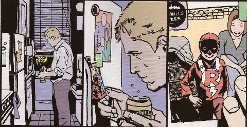
Movie Cliche #23415678: Sad Dad at fridge with beer and photo of son. Collect the set!

Tricky one this. Has Jeff Lemire done a pitch-perfect satire of the vapid screenwriting cliches that have run roughshod over comics beautiful storytelling devices or does he actually believe this is a decent film script made comics? It's hard to tell isn't it. Heck, I don't know maybe you thought it was awesome? Luckily it's easy to tell that Jean Paul Leon is an awesome artist and hopefully one day he will draw comics as awesome as WINTER MEN again. This issue is a complete waste of time and is clearly a fill-in so next issue we should be back to Travel Foreman and his nightmarish body horror.

After I read the previous issue I fell into a light doze and dreamt about a man in a chair. I was holding the man in the chair via the power of some unknown threat. The man was crying and peeling his own skin off his own face with a small knife. I was then forcing him to eat it via the unspoken promise that if he did as I asked he could go free. The fact that the man was eating his own face was terrible but the worst thing was that we both knew I was lying and he wasn't leaving alive. But he had no choice but to do as I asked because that was his only hope. Yes, it's been a trying few months. They say there's nothing as boring as listening to someone else's dreams but they forgot about reading film scripts masquerading as comics which is so boring such comics are EH!

STATUS: REMAINS ON THE LIST (BUT WATCH IT)!


BATWOMAN#6 “To Drown The World - Part One” by Amy Reeder/Rob Hunter/Richard Friend(a) J.H. Williams III & W. Haden Blackman(w), Guy Major(c) and Todd Klein(l) (DC Comics,$2.99) Batwoman created by Bob Kane and Sheldon Moldoff (modern version by Greg Rucka and Alex Ross).

Photobucket

"Given the state of your medical insurance talking's about all you can afford so knock yourself out is my advice."

Wuh-hoof! That's certainly a change in artist alright. I'll stick it out for a bit because I always like people to get a fair shake of the critic stick. Initially I'm not  finding myself a fan of Reeder's thin line but I appreciate her attempts to step up her layouts. Given the writing is competent at best (actually that's a compliment in today's world o'comics) Reeder's got it all on her to raise this one up from EH!

STATUS: REMAINS ON THE LIST (FOR NOW!)

DAREDEVIL #9 By Paolo Rivera/Joe Rivera(a), Mark Waid(w), Javier Rodriguez(c) and VC’s Joe Caramagna(c) (Marvel Comics, $2.99) Daredevil created by Bill Everett and Stan Lee.

Photobucket

Storytelling in 'Not Dead' shock!

Unless Howard Victor Chaykin has been reactivated without my knowledge I guess this is the only Marvel comic I'm buying. That doesn't seem right, I'll have to check. Anyway, I'm buying this because Mark Waid understands that the bit with the boot is funnier and cleverer because it only takes up one panel. It's because Rivera Jnr and Snr make all kinds of spooky magic happen on these pages. It's because together the team on the book achieve the kind of synergy that results in the storytelling stuff from which the above image is but a sample. Yup, DAREDEVIL is a purchase because it is VERY GOOD!

(Hey, I hear Chris Samnee is coming aboard! I told you all I'd wait for him!)

STATUS: REMAINS ON THE LIST!

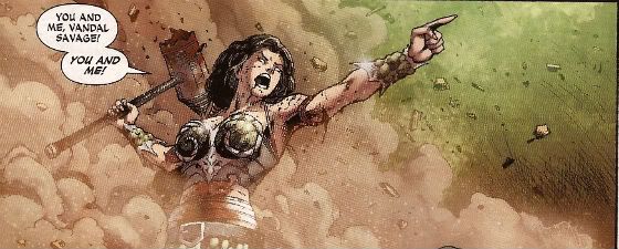
DEMON KNIGHTS #6 “The Balance” by Diogenes Neves & Robson Rocha with Oclair Albert(a), Paul Cornell(w), Marcelo Maiolo(c) and Jared K. Fletcher(l)(DC Comics, $2.99) The Demon created by Jack Kirby. Shining Knight originally created by Creig Flessel (modern incarnation created by Simone Bianchi and Grant Morrison). Vandal Savage created by Alfred Bester and Martin Nodell. Madame Xanadu created by Michael William Kaluta.

Photobucket

His reply is actually quite funny but I'm still baling.

Nah. I'm done. It just didn't work for me. Which is a shame as it wasn't terrible as such it just never gelled. Way too diffuse and lacking in focus both from a scripting and art standpoint. I mean, how big was this village, where was everything in relation to everything else? But like I say it wasn't terrible and I wish all involved well and hope the book works out further down the line but there are plenty of books I can read that aren't EH! And that's where my money's got to go. It's the Law of The Direct Market; savage and unrestrained!

STATUS: OFF THE LIST!

FATALE Number Two By Ed Brubaker, Sean Phillips and Dave Stewart (Image Comics, $3.50) Fatale created by Ed Brubaker and Sean Phillips.

Photobucket

 ...probably because for some odd reason she's drawn to look about 8 years old and acts as subtly as a silent movie siren?

People tend to refer to books by this team as "Brubaker" books don't they? Which is odd as I find Brubaker to be the least of the appeal they hold. I guess it's that whole Cult of The Writer thing or something. Hey now, hang on, I'm not saying Brubaker isn't good. He's got craft/technique/skill/whatever we're calling it now in spades it's just the result is, for me, mostly solid rather than inspired. Except when he gets Meta which is when the wheels start wobbling like they're about to pitch a fit (remember INCOGNITO where working in an office was "like" doing Indie comics but taking to the streets and letting your inner nature run wild was "like" working in the mainstream? Really? Um.). On the whole though I get well crafted genre staples served up with a slight twist but the real pleasure I get from this team's comics is in the form of Phillips and Stewart in conjunction with Brubaker. I'm not going to just roll around showing my belly because it hasn't got capes'n'tights in it, okay?

Here, I guess the High Concept (sigh) is Crime and Horror - together! Like Hope and Cosby! Like Morecambe and Wise! Which is fine because,hey, I like both. I'm not sure they belong smushed together though except as one of those novelty type deals. Y'know, all those Steve Niles things Steve Niles does. I guess Crime fiction tells us about the worst in ourselves and so does Horror fiction; they just use different tools. Using both sets just seems like doubling up and risking the results seeming lesser. Early days though, I mean, look at what porting Horror tropes into Crime did for James Ellroy ($$$$ is what it did, kids. Woof! Woof!). I don't think we're looking at an Ellroy here but we may be looking at an Angel Heart. And that's fine. I got a thing about chickens, Mr. Cyphre; as in I don't like to count them too soon but this one looks GOOD! so far.

STATUS: REMAINS ON THE LIST!

FRANKENSTEIN: AGENT of S.H.A.D.E. #6 “The Siege of S.H.A.D.E. City – Part One” by Alberto Ponticelli(a), Jeff Lemire(w), Jose Villarrubia(c) and Travis Lanham(l) (DC Comics, $2.99) Frankenstein: Agent of S.H.A.D.E created by Doug Mahnke and Grant Morrison (and Mary Shelley).

Photobucket

I am always happy to see the word "buffoons"!

There's a bit in this issue that is pretty much a stealth WATCHMEN (by Alan Moore, Dave Gibbons and John Higgins) reference. It's the scene in the 'Nam bar between The Comedian and Doc Manhattan but here with Franky and a red, bald dude who is, basically, Dr. Manhattan and without any pregnant woman shooting or face glassing. That is to say without any of the actual important or troubling content. I'd call that an Omen were I of a credulous nature. Otherwise it's yet another issue of Hellboy in the DCU and which is Okefenokee by me!

STATUS: REMAINS ON THE LIST!


JUSTICE LEAGUE DARK#4 and #5 “In The Dark - Part Four and Finale” by Mikel Janin(a), Peter Milligan(w), Ulises Arreola(c) and Rob Leigh(l) (DC Comics, $2.99ea) John Constantine created by Alan Moore, John Totleben, Rick Veitch and Steve Bissette. Madame Xanadu created by Michael William Kaluta. Deadman created by Arnold Drake and Carmine Infantino. Shade, The Changing Man created by Steve Ditko. Zatanna created by Gardner Fox and Murphy Anderson. Enchantress created by Bob Haney and Howard Purcell. Dove created by Steve Ditko. Mindwarp created by Peter Milligan.

Photobucket

Stealth WATCHMEN reference#2. We get it, DC! You WIN!

I haven't enjoyed this. It's all been a bit like warmed-over '90s Milligan with stuff like "In Nebraska The Pokemon come alive and the screams of the bread-cakes dance like glass-kneed OAPs." Okay, not as warmed-over '90s Milligan as that DEFENDERS#1 preview perhaps but still not terribly inspired. I mean the sheer scale of events would suggest the body count is in the hundreds of thousands not to mention the country-wide trauma involved but there's no sense of any consequences.

No, I didn't like it. I did, however, enjoy Milligan's skeevy interpretation of Deadman. I would totally read a Peter Milligan Deadman series in which Deadman acted like one of those fantastic men who pressure their missus into all kinds of sexual situations that the missus clearly isn't all that into and it's all just about the guy exerting power over her so that's she's eventually roiling around in moral squalor with only the "fact" that he loves her to keep her sane. At which point the hilarious rogue tells her she's a sl*t and leaves her to fall to pieces while he starts the whole cycle with some other vulnerable woman. I think a comic like that would bring in new readers. Sh*theads mostly, but hey, sales are down! We can't afford to be be proud anymore! Despite creepy Deadman JLA: DARK was EH!

STATUS: DROPPED!

O.M.A.C. #5 and #6 “Occasionally Monsters Accidentally Crossover” By Keith Giffen/Scott Koblish(a), Dan Didio, Jeff lemire & Keith Giffen(w), Hi-Fi(c) and Travis Lanham(l) “One More Amorous Conflict” By Scott Kolins/Scott Koblish(a), Dan Didio & Keith Giffen(w), Hi-Fi(c) and Travis Lanham(l) (DC Comics, $2.99ea) O.M.A.C. created by Jack Kirby.

Photobucket

It's the hot dog that makes it great!

In #5 O.M.A.C. and Frankenstein Agent of S.H.A.D.E have a great big slobberknocker which entertains and amuses me on a base level which I have no shame in gratifying since I am okay with comics just being goofy, colourful fun. With #6 I realise that the main reason I like O.M.A.C is because of Keith Giffen's art because with #6 the artwork is by Scott Kolins and the only memorable thing about the issue is the fact that Leilani's breasts are pancaked in the same manner that Caroline Munro's were in The Golden Voyage of Sinbad. Yes, I realise that reflects badly on me as a human being but, honestly, what reflects badly on us as a society is the fact that we have fallen so low so fast that when you read The Golden Voyage of Sinbad you automatically assumed I was talking about a p*rn film rather than a children's fantasy film from the '7os.  So, um, anyway O.M.A.C was GOOD!

STATUS: REMAINS ON THE LIST!


PUNISHERMAX#22 “War’s End” By Steve Dillon(a), Jason Aaron(w), Matt Hollingsworth(c) and VC’s Cory Pettit(l) (MAX/Marvel Comics, $3.99) The Punisher created by Gerry Conway, Ross Andru and John Romita Snr.

Photobucket

"Now that we've solved the Energy Crisis! Who's up for a brewski!"

PUNISHERMAX#22 may just be the most subversive comic I read this year. Oh, not because of the ending because...really, Jason Aaron? Really? That's your ending? We can solve all societies problems by just rising up and killing the sh*t out of other folks? Really? Heck, maybe we just need a strong leader as well? Fancy your chances do you, Jason Aaron? What a crappy ending. Mind you, I live in a country where we only arm The Police, The Army and farmers. What? No, I don't know why we arm farmers, maybe because of all the lions? Or maybe they keep being carried off by subsidies in the night. Stop getting distracted by details. So, okay, maybe that ending is a bit more reasonable over there in The Americas. If it is, I will pray for you all. Christ, that irresponsible ending.

No, PUNISHERMAX #22 may just be the most subversive comic I have read all year because of the scene involving Elektra. Elektra is at the Hand headquarters after a savage battle with Frank. Elektra has served The Hand well for many years but now Elektra needs help from The Hand. Specifically medical help. But I guess The Hand doesn't have Health Insurance for its employees and since Elektra is no longer of any use to them they have no qualms in cutting her loose in the most final of ways. Despite knowing full well the conditions of her employment Elektra is still surprised and dismayed at this turn of events. But she should have expected it, really, because that's what you get for working for Marv..I mean The Hand. Say, is something bothering you, Jason Aaron? Stuff on your mind?

Oh, PUNISHERMAX was entertaining enough and the fact that I could never reconcile the interesting parts with the witless parts of it actually made it more interesting and brought the whole thing up to GOOD!

STATUS: Cancelled or Came To A Natural End When The Author Had Told The One Frank Castle Story He Felt He Was Born To Write. (Oh, yeah!)

RASL #13 By Jeff Smith (a/w/l) (Cartoon Books, $3.50) RASL created by Jeff Smith.

Photobucket

There's a couple of reasons I really like RASL. There used to be pretty much just one reason; that although none of the individual elements actually seemed unique in and of themselves they were combined in such a way as to present a story notable for its novelty and also the freshness of its presentation. There are many scenes in RASL which you have seen in other stories but this is not a problem with RASL because it isn't really a problem at all unless it is a problem with all stories. It is a problem with some stories because they will just go for the default setting of said scene; the one that's floating closest to the surface of the popular imagination due to repetition and exposure via Hollywood blockbusters for example.

Look at the Avengers Vs. X-Men preview and ask yourself whether the life sappingly tedious familiarity of every scene is intentional and while you have your own attention ask also how many pages until The President says "And may God have Mercy on us all." It's all about familiarity, oh yes, I am aware it's all pitifully legitimised by claims of "homage" but that's cockrot, it's all about familiarity; giving people what they already know they like. Of course eventually familiarity forgets to put its rubber on and breeds something; contempt. Not in the case of RASL though. RASL keeps me on my toes, RASL demands something from me - attention. In return it rewards me with quality entertainment. That seems fair enough to me.

The other, more recent, reason for liking RASL is that unless Jeff Smith has some kind of catastrophic breakdown involving his identity he won't be suing himself anytime soon. Yup, RASL is VERY GOOD!

STATUS: REMAINS ON THE LIST!

STATIC SHOCK #5 and #6 “True Natures” and “Unrepentant” by Scott McDaniel/Andy Owens(a), Scott McDaniel(w), Travis Lanham & Dezi Sienty(l) and Guy Major(c) (DC Comics, $2.99ea) Static created by Dwayne McDuffie and Jean Paul Leon.

Photobucket

 A DC writer on The Internet: Yesterday.

Well, that was certainly a stinker of a thing. I have no problem with Scott McDaniel's art by the way. Sometimes it lacks clarity but I respond well to the boldness of his line and the chunkiness of his figures. I find it quite pleasing on the whole. His writing has, however, been less than stellar. It's hard to know what to say about this disaster really except if you employ someone to write - let them write and let the artist take care of the pictures. It isn't like there's no room for synergy; the two can be responsible for both of those separate aspects but combine them when it comes to the storytelling. It's a collaborative medium, so I've heard. A mess like this just makes me sad. I'm not very savage at all because it dismays me to say STATIC SHOCK was AWFUL!

STATUS: DROPPED!

SWAMP THING#6 “The Black Queen” by Marco Rudy(a), Scott Snyder(w), Val Staples & lee Loughridge(c) and Travis Lanham(l) (DC Comics, $2.99) Swamp Thing created by Len Wein and Berni Wrightson.

Photobucket

This is horrible in all the wrong ways. It's nice having little shout outs to Dick Durock and Len Wein and my Nana Alice and all but, hey, where's the...well, where's anything? Splash page after splash page of nigh-contextless horror does not a narrative make. Seriously, I need to know what's going on on those pages if it's going to freak me out. Marco Rudy's art works hard to evoke the scabby nastiness of the Bissette, Veitch, Totleben years but what is going on? Something to do with rot, something to do with flesh. I'm sympathetic to the notion that specificity kills horror dead on the page but y'know I need some clue or it's just...stuff. And stuff isn't specific enough to be scary. And... The Parliament of Trees? Apparently you just walk up to them with a box of matches and, hey, game over Parliament of Trees. That's...stupid. Worst of all this turns out have just been one of those crappy origins that take six issues. Sure they could wrong foot us at the last and Abby could adopt the mantle but...it still took six issues. Six not very good issues. So yeah, SWAMP THING is EH! Moley, I just checked and it's six issues and counting to the origin, that doesn't help at all.

STATUS: DROPPED!

T.H.U.N.D.E.R. AGENTS #3 “A Godawful Small Affair” by Wes Craig & Walter Simonson/Bob Wiacek(a), Nick Spencer(w), Hi Fi & Lee Loughridge(c) and Jared K. Fletcher (l) (DC Comics, $2.99) T.H.U.N.D.E.R. Agents created by Wallace (“Woody” not “Wally”) Wood and Len Brown.

Photobucket

'Nuff Said!

STATUS: STICKING IT OUT FOR THE LAST THREE ISSUES!


So yeah, hope that was okay. If you disagree with any of it that's fine just let me know and we can throw it around like a pack of terriers with a rat. If you thought it was all totally spot-on then, Hi, Mom! Whatever happens those were my comics and that's what I thought.

Have a good week and remember to read some COMICS!

"Do They Come In KID'S Sizes?" Comics! Sometimes I Get A Bit Grumpy.

Whoops. Lost my momentum there. Trying to get it back by looking at some comics and then blurting thoughts out in the form of words. Disaster? I have a recipe for that! Here's the ingredients:

BATMAN: THE BRAVE AND THE BOLD #15 By Stewart McKenney/Dan Davis(a), Sholly Fisch(w), Guy Major(c) and Dezi Sienty(l) (DC Comics, $2.99) "No Exit" If he is to survive an unending series of death traps of unknown origin The Caped Crusader is going to need a miracle! Luckily he brought one along...MISTER MIRACLE!

Photobucket

""No...spears!" HAHAHAHAHAHA. Damn, even Kids think that joke is shit. Judgemental buggers."

This is a comic for Kids, is that alright? Is it alright if Kids have comics too? Because I know comics aren't for kids anymore. I know that the works of such mature intellects as Mark Millar, Brian Bendis and Geoff Johns have lifted the fights'n'tights funnybook up beyond the meagre intellects of children into a new and special place where they are exactly like comics for Kids but not as good; which in a very real sense is just like growing up. Everything's the same as when you were a Kid it's just a bit more shit. Comics for Kids, okay? Is that alright? Because if it isn't then there's no place for a PG version of CUBE starring Batman and Mister Miracle in which Batman solves the confounding conundrum bedevilling our two plucky chums by noticing that he doesn't need a shave and if that's true then I guess there's no place for the following exchange:

DOCTOR BEDLAM: However your MEAGER INTELLECT is no match for the brilliance of DOCTOR BEDLAM.

BATMAN: Really? How about my FIST?

There's always a place for that. Even though they do not use the correct English spelling of "meagre" and plump for the Colonial mutation. Yes, even though Mister Miracle looks creepy without a nose this is still VERY GOOD!

SCALPED #55 By R.M. Guera(a), Jason Aaron(w), Giulia Brusco(c) and Sal Cipriano(l) (Vertigo/DC Comics, $2.99) "Knuckle-Up" Conclusion

Photobucket

"Fact: I, John, actually have a thing about traumatic eye wounds. In that I fear them not that I get off on them. I know this is The Internet but be nice, now."

Now that's a fight scene! So that's GOOD!

PUNISHERMAX #21 By Steve Dillon(a), Jason Aaron(w), Matt Hollingsworth(c) and VC’s Cory Petit(l)(Marvel Comics, $3.99) "Homeless" Conclusion Frank and The Kingpin finally collide in a femur shattering confrontation from which only one will walk away! Actually they both walk away but The Kingpin has a hammer stuck in his head and scratches at the glass door of his apartment like a wet brained stray cat before Frank brings him down and then Frank falls over and so I guess it's really a femur shattering confrontation from which both walk away - but only for a bit!

Photobucket

"The White Male Heterosexual's Worst Nightmare"

Frank Castle is homeless. And he stands there singing for money. La da dee la dee da. Ladies and gentlemen, Ms. Crystal Waters! Terrible song that but, hey, I was watching THE HURT LOCKER the other night because I like to watch films everyone has already watched and moved on from. It's important to be timely, to be relevant, I feel. It was okay, really quite a decent film until the end when they did the thing with the guy at home. I didn't really like that bit because as is usual with cool hard asses we were invited to feel sorry for him because being such a hard ass he could find no pleasure in the real treasures of life such as cleaning out the guttering and shopping for cereal (don't load the dice too much, eh, Mark Boal) and yet we were also invited to admire him as the romantic lone wolf; true to himself and his manly nature. There are a lot of these films and they seem to fulfil the same function as Chick Flicks. They kind of undermine the gender stereotype while at the same time finding shelter within it. I call the male variation Dick Flicks. PUNISHERMAX is a Dick Flick. Y'know, that weirdly pathetic male wish fulfillment where you can be free at last to be a manly man but it has come at such a cost that you get to be both pitied and feared. Like a baby the size of a tower block crying for Mama to change its nappy. You'd be scared if that turned up outside your window but you'd feel a bit sorry for it as well. Unless you were a manly man in which case you would shoot it in its big fleshy demanding face and turn away before we saw your single, solitary tear.

Someone has to say it, Frank. You are a weak man, Frank. It isn't a sign of strength to run away from responsibility, Frank. You are a weak man, Frank Castle, to rather have your family die than pick up those toys one more time, rather than sit through The Only Way is Essex one more time, rather than have to sit through those shitty Star Wars films one more time...actually, Frank, I'm starting to see your point.I am a man after all and as a man I found PUNISHERMAX was GOOD! After all, I cannot tell a lie, like most men I like a good Dick Flick.

DEMON KNIGHTS #5 By Diogenes Neves/Oclair Albert(a), Paul Cornell(w), Marcelo Maiolo(c) and Jared K. Fletcher(l) (DC Comics, $2.99) "The Traitor"

Photobucket

"Meet The Twin Fists of Tolerance!"

The best thing about this comic, because it's important to be positive about comics or so people keep bleating, is the character of Jabr. Now it seems to me that this guy is rational, educated, level-headed, tasty in a fight and quite possibly not of European extraction. He's all those things and yet not boring, he is fact the best character in this except for "Sir" Justin because us Brits love a bit of crossdressing fun. Deny it to your Mother, pal, don't waste your breath denying it to me. Astonishingly The Internet has not lost its collective mind over Jabr and it's this magical fact, this clear indication that we have at last, as a species, grown enough to, finally, recognise the transitory nature of our fragile lives and put aside our differences to become, in effect, tolerant and wise and thus strong enough to forge the collective future all our predecessors suffered and died to accomplish. Or maybe nobody is reading this as it is, after all, just OKAY!


ALL-STAR WESTERN #4,#5 By Moritat, Phil Winslade(a), Justin Gray, Jimmy Palmiotti(w)Gabriel Bautista, Dominic Regan(c) and Rob Leigh(l) (DC Comics, $2.99) Jonah Hex in "Gotham Underground" and The Barbary Ghost in, er, "The Barbary Ghost" In the caverns beneath Gotham Jonah Hex finds not only a fine example of the unfettered free market in action but also ancient evil. And some bats. Because it is Gotham. Also in this issue: The Barbary Ghost makes a spooky debut!

Photobucket

It was kind of okay having Arkham around for a bit but now his role seems to have quickly devolved into basically telling us when Jonah Hex is being an asshole and getting himself in a pickle Jonah has to help him out of. This erodes a large portion of the appeal of Jonah for me. I like not knowing if he is actually going to help whoever's in trouble or if he's going to just be an ornery asshole. Obviously he has to save Arkham all the time or the Asylum will never be built and Batman's continuity will be all wronged-up. Oh noes! And also I like to decide myself when Jonah has been an asshole. On occasion it has taken me several pages to realise just how big an asshole Jonah has been on that occasion several pages previous to the point at which said realisation alights upon my mind. I like that. So, yeah, shut yer fancy yapper, Arkham! And let's get out of Gotham and light out for the territories; it's too constrictive, Jonah works best out in The Big Country where he can tread in big shit in all manner of unlikely ways. I like the colours by Bautista they are kind of organic but inorganic at the same time, like laser-pastels or something. Yes, people my age still think putting "laser" in front of something suggests The Future. Aren't old people just the cutest!

Oh, the backup is The Barbary Ghost; a new creation by Gray, Palmiotti and Winslade. While Winslade's brittle lines manfully attempt to ground the story in a specific milieu at once both evocative and atmospheric this is somewhat undermined by the fact that The Barbary Ghost's knockers are kind of flopping about a lot. Now I'm no Henry History but I would have thought that a Chinese lady in the 1870's would have been personally inclined, in large part due to the mores and customs of both the particular point in history she occupied and the heritage of her own people's customs and traditions, to keep her tits shut in a bit more. Or maybe I missed the class where we were taught about The Great 1870's Chinese Tunic Button Shortage. I could have; I was a bit of a git as a kid.

Still, credit given for an original character. After all in 2012 DC's big old money fountain will be WATCHMEN: HOW I MET YOUR MOTHER. No doubt JMS is going to improve the original by, apparently, so he says,  explaining about how Jon was obsessed with time yet he still went into that time-locked room! I don't know. I guess I missed the bits in WATCHMEN where Jon was continually asking people what time it was and craning his neck to look at clocks and banging his girlfriend from behind so he could put his hand on the base of her neck in such a way that it seemed erotically stimulating due to its sensual forcefulness but at the same time afforded him an uninterrupted view of his watch. Or maybe his Dad was a watchmaker and he thus believed in Design but he was changed into a God by a complete ACCIDENT! and that was a metaphor or an analogy or even the whole meshuggener point already or, Christ, who gives a shit. Yes, okay, it was strange. Really strange. I need it explaining in a book illustrated by a cheesecake maker. I'm glad it isn't someone muttonheadly literal who's got this gig, rather someone as dependable and imaginative as JMS who is going to bless us with a mini-series in which, let's face it, quite probably Dr Manhattan reaches back trough time to give events a nudge so that he effectively creates himself! SPOILER! Christ. Mind you I know it has always troubled me, raised a question in my mind, why Rorschach wears a woman's gusset on his face. Hopefully Brian Azzarrello will be setting my mind to rest on that score. Hurm.  In 2013: CAMELOT 3010!

Do you see what I did there? I did an impression of The Internet and played right into DC's hands and I missed the point. The point about WATCHMEN: BEFORE THEY WERE FAMOUS not being a nice thing is that endorsing this is endorsing DC's treatment of Alan Moore. DC own WATCHMEN so they can do what they want with WATCHMEN and what they want to do with WATCHMEN is make money because they are a business. I can understand that, I see that, thanks. DC do not own Alan Moore and they have treated him, and continue to treat him, in a shabby fashion unbecoming of adults. That's the issue here. If they can do that to Alan Moore and it is all right because we get our nice new comics then it is all right for them to continue treating creators in such a fashion. It isn't all right. It will never be all right. That's the point here, for me, not whether the books will be any good, or any of that other diversionary horse shit. Nut up or shut up, DC. Nut up or shut up.

ALL-STAR WESTERN was GOOD! if you can remember that far back.

AMERICAN VAMPIRE #23 By Rafael Albuquerque(a), Scott Snyder(w), Dave McCaig(c) and Jared K. Fletcher(l) (Vertigo/DC Comics,$2.99) "Death Race" Part Two of Four I haven't actually read this one. I don't know if you noticed that bit up there, the boring bit, yeah? The "Part Two of Four" bit? I wouldn't have; I'd have skipped it and looked at the scan (which isn't there because I haven't read it, see) and then read the text I judged most likely to contain a cock joke or insult a noted comic creator. So I can fully understand if you missed the whole "Part Two of Four" bit. I didn't though and since I have yet to receive "Part One of Four" I am unable to read this comic. I don't mention that for any other reason than the fact that Mr. Jeff Lester and Mr. Graeme McMillan were talking about how weird their comics reading patterns can be (I mean I've got this comic bought and paid for but I'm not going to read it? Saywhanow?!) And I just wanted to mention that I share their sickness; I sup from the same trough of pain as they. Also, just thinking about them both brings me physical pleasure. Hurm.NuuuuhHHHH.


Sorry about this one, folks, hopefully it'll be better next week. Have a good weekend with COMICS!

"He's Not Human, Jim...I Swear!" Comics! Sometimes They Knife You In The Back!

Gonna talk about a cow puncher who punches hard. And shoots. Yeah, sure is partial to some shooting this fella. Daggnabit, someone's gonna get hurt you don't quit that! Photobucket

Came The Millennium came the reprints! DC celebrated the year 2000 by re-printing one old comic a month for a year (I think). These were, according to the intro by Paul Levitz, “the best and most vital examples of our art form”. And W.I.L.D. CATS.

I bought some of them and what with the appearance of an all new All-STAR WESTERN#1 I thought I’d cast a boggly eye back at Jonah Hex’s first appearance. And also because I’d just read it.

(Jonah Hex’s first appearance in) ALL-STAR WESTERN #10 By Tony DeZuniga (a), John Albano (w) (Reprinted in Millennium Edition: ALL-STAR WESTERN 10, $2.95, DC Comics)

When Hex was first introduced in ALL-STAR WESTERN #10 (1972) he was a quite exciting breath of fresh air. Instead of the customarily clean cut Marshal driven by a wholesome hankering for Justice John Albano and Tony DeZuniga delivered an ornery bounty hunter with a face as scarred as his psyche and driven by earthy lusts. By today’s standards I guess its tame stuff but back then I can imagine it was quite a bracing change.

Photobucket

The very clever thing about Hex’s first appearance is that Albano and DeZuniga set this atypical character in a story built from the most typical of Western elements. Cliches, if you will. Hex is hired by the usual sweaty businessmen in waist-coats and stove pipe hats to track down the usual sweaty gang of varmints; complications ensue and a young but not sweaty widder woman and her tow headed child are involved. The story around Hex tries to stick to the agreed and expected shape but Hex himself keeps resisting it, pushing the clichés into new shapes through sheer force of his sour temperament. Sure, he gets the gang but, shockingly for the time, kills Big Jim (clearly modeled by DeZuniga on Lee Marvin) by knifing him in the back and this after Jonah has sadistically chased his quarry and haplessly ensured that the widder woman is needlessly endangered. The widder’s wee moppet takes a shining to Hex and Hex clearly figures on settling down with the widder, after all he saved her life, and her boy in the town whose safety he has just ensured.

Which is what would usually happen. It's certainly what Jonah Hex expects to happen. Alas, throughout the course of the tale Jonah Hex has been so unlikeable that by the end of the tale…no one likes him. Except the kid. The widder woman runs him off and the sweaty businessmen block his plans to buy a home and so Jonah Hex hoists up his bag of woe and his sack of trouble and heads off out into the territories. Just time for one last tearful scene with the youngster then:

Photobucket

Mebbe not. Because Jonah Hex is an @sshole.

As comic writing goes it’s good stuff. The whole thing has an easy familiarity due to the use of clichés and the playful undermining of these very cliches lends it an arresting quality. It’s only 16 pages long but by the end you’re pretty clear who Jonah Hex is (an @sshole) and more likely than not wanting to see what he gets up to next. Crucially you have no idea why Hex's face looks like a bison's chewed it which is a smart move. Piques the interest, doncha know. DeZuniga does some smart art here but not as smart as the art he would go on to do. There’s some really stiff staging and his photo referencing (back when that was quite hard to do) works against him at times but it’s atmospheric stuff with a couple of really swell panels. For me the most impressive part of the whole thing is the fact that Hex’s scarred visage isn't revealed until page 7 and rarely thereafter. C'mon, that's pretty great.

Hex soiled the pages of ALL-STAR WESTERN through its name change to WEIRD WESTERN TALES (#18) and up to #38 when he starred in his own series for 92 issues. Which ain't bad for an old cowpuncher but even better is the fact that he’s still knocking about to this day. While the character may not embody that which is best and most noble in us he does embody at least one undying element which burns in each and every one of us to varying degrees. Jonah Hex is an @sshole but aren't we all. Sometimes.

Jonah Hex’s first appearance in ALL-STAR WESTERN #1 (1972) is very old but that doesn't stop it being VERY GOOD!

Photobucket

The Audition

I know that I told you that I'd be the first one to punk out 0n the every-week reviews -- and guess what? I was right! (But I was writing Tilting, and a very special DC-Relaunch ONOMATOPOEIA that you can actually download as a full color PDF until June 28, so I don't know, maybe that counts?)

Anyway, Jeff and I were talking about how much we like John K (UK)'s comments every week in "Shipping this week" threads, and we thought "Well, let's give him a shot".

(Important note to everyone who constantly asks to become a Critic -- this is actually how you do it. You write nd you write without any expectation of anything other than amusing yourself and others, and then we invite you without you asking whatsoever. There will be no more discussion of this.)

So, accordingly, here's John K (UK)'s first shot, below the cut. Make comments in the comments section, with your thoughts, though the final decision is absolutely mine and Jeff's.

(I really should have some reviews of my own up tomorrow, I am pretty sure)

Without further ado: John K (UK):

FEAR ITSELF: THE HOME FRONT #1: Wow, do you like your Dumb wrapped in Ugly? Then have Marvel got a Speedball story for you!  How about a page which is just J Jonah Jameson saying: “I hate superheroes, me, I do, it’s true.” It’s one of the nicer Chaykin pages the self-proclaimed Jew From The Future has recently secreted but it’s still definitely one he just did to be able to afford his RDA of Mai Tai mix. Peter Milligan does a bit I’ve already forgotten but I’ve never forgotten that his and Duncan Fegredo’s ENIGMA is fantastic. And the folk of Broxton are horrible. What a bunch of self obsessed platitude panting dingleberrys. Are we supposed to empathise with them? Is this how the Marvel Landscape Gardeners view us commoners not blessed by The Muse? I’m being unfair; I know that the stress and financial hardship of the current recession that I and my family were experiencing was alleviated no end by the fact that Marvel were excreting an oily link of overpriced comics about Nazi robots and magic hammers. CRAP!

iZOMBIE #13: I swear stuff happens in this comic but I can’t remember what all from issue to issue. It’s just horribly frothy and weightless, an astronaut’s milkshake affair. Everybody’s a zombie, or a vampire, or a mummy, or an old man in a chimp’s body and they’re all just dating and, like, RPG-ing and totally worrying about lattes and how to recharge their iPod in a crypt. It’s like Scooby Doo for people who are legally allowed to have sex but are emotionally incapable of doing so. Look the fault is mine, I’m 41 years old I should have got out as soon as I saw “paintballing vampires”. Golly, it’s so cutsey and coy I can’t really process it. Every month it turns up and smiles at me and demands to be loved but…I can’t. I’m just not built that way. I graze on Hate. I think I’m buying it because I like it and I think I like it because of Mike Allred but I think, actually, I just liked X-FORCE/X-STATIX. And this ain’t that. So few things are, bubba.

JONAH HEX#66: I don’t know much about Fiona Staples but I know that she knows enough to know that you don’t draw snow. (The Master of not drawing snow is of course Mr. Joe Kubert.) There’s a super (almost) wordless sequence where you know what its leading up to but you kind of hope that it isn’t (it’s called “ suspense”) and its delivered nicely by all parties. Words and pictures successfully working together towards the common purpose of entertaining actually happens a lot less than you might think but it happens in JONAH HEX quite a lot.

JONAH HEX #67: This is a typically taut and tasty tale in which Jonah Hex must save the life of the very man who framed him! Which sounds teeth grindingly predictable but I assure you it is not. It’s a decent done-in-one but really it could just be Jonah sat on his porch digging cow muck out of his spurs with a sharpened matchstick because Jordi Bernet is in the saddle this issue. Like Brynner’s boys dealt in lead Jordi Bernet deals in awesome. Bernet! Spread the word!

(Y’know, I’m not convinced that having Jonah Hex fight Hush in a stovepipe hat is going to bring in a whole new audience. But then again I am baffled by the fact that there is no real audience for a comic as consistently well written and excellently drawn as JONAH HEX is.)

JSA #50: Despite being a mobile fossil I don’t know much about the JSA as before 1986 the only way we got comics in Blighty was when they washed up on the beach after a U-Boat had scuppered some luckless cargo ship. Were the silence broken by so much as a fruity trump kids would be hurtling to the nearest beach hoping to find a sandy four colour treasure. Distribution was patchy is what I’m saying. Luckily the JSA are introduced in Part One, illustrated by George “Ladies wrestling? Yes, please.” Perez. Unluckily it totally fails as an introduction to the JSA. Predictably the big guns elbow all the others out of the way and then stamp on their feet with their heels until they have to move to the back of the room near the stinky damp patch of carpet.

Look, can I just personally ask DC to, for the Love of all that is Holy, to stop telling me about Hal Jordan and Barry Allen! Stop it! You’re making me crazy here! I mean look at Mr. Terrific , he gets about three panels (Usually when faced with a scene where a young man on a bridge is approached by some creepy looking guy in green underoos talking about “voids” and the need for their “filling“ you’d get some kind of hilarious rudery. But I’m better than that. And I need you to know I am better than that.) which leave you none the wiser really. Luckily I know all about Mr. Terrific (He’s the world’s third warmest man, his wife is deaf and he is invisible to heavy machinery) but you won’t learn any of that in here. Golly, it’s a good job no one is expecting him to support his own series or anything. This chapter was a mess but George Perez drew it so it was a pretty dynamic mess.

Part Two involved time travel and how to fill a lot of pages with very little. Beards still equal evil in parallel universes in case you were wondering.

Part Three and please put your hands together for – HUAC! Because the JSA without HUAC is like a Day without Doris! Howard Victor Chaykin does the pictures here. DIAGNOSIS: MURDER must have finished because it actually appears HVC was almost engaged with this. He gives everyone a different face, some of them don’t even look like they are composed of uncooked dough, and he does a nice job of layering his drawings over his now obligatory clip art compulsion. Delightfully he also effectively communicates the inherent visual comedy of having a bunch of Cosplaying adults in a stuffy legal setting. It’s okay this bit but there’s a slight possibility I might be biased.

Part Four is how I guess most issues of JSA are on a regular basis which explains why I don’t buy JSA on a regular basis. Give me a mystery – I’ll solve it! No charge.

JSA #50 was very much like turning up to a party no one actually wanted you to turn up to. I don’t think that was the idea. AWFUL!

MIGHTY THOR #1: Oh God, this priest. This priest is the worst priest ever. He appears to have been written by someone who has heard of priests but only actually experienced them via the distorting medium of popular culture. I’m no priest defender and I’m certainly not Ricky Religious but I’m pretty sure the accepted role of the priest isn’t one of scaring the living piss out of the congregation. Having a priest act like that at a time of crisis is like having a fireman show up during the Watts Riots only for him to proceed to hose down burning buildings with gasoline while screaming racial epithets. Faith, pal. Google it sometime. Oh yeah, Galactus drools when he sleeps. Heck, he probably scratches his cosmic nuts when he forgets other people are around as well but I don’t need to see that either do I? EH!