"Working Together In The Name Of The Common Good..." COMICS! Sometimes Creators Don't Get To Pick Their Fans! (Ever, Actually. Now I think About It.)

It’s a Skip Week! (Booo!) So let’s see what falls out of my head (Yay!). Checking the Savage Critic’s mail bag I see several of you may have contacted me expressing intense distress that I have yet to tell you how 2013 panned out for Howard Victor Chaykin.  It was definitely several or none. It’s so hard to remember these things. So, hedging my bets I’ll tell you anyway…  photo Gah001B_zps8964d526.jpg
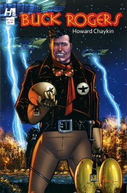
 photo BuckCovB_zpsa4f9a490.jpg

Howard Victor Chaykin ended the year of 2013 by sprawling debonairly into the first month of the new year with the final issue of Buck Rogers, which splashed down in January 2014. Judging by the sales you ‘orrible lot were blasé in the face of the charms of Howard Victor Chaykin’s Buck Rogers revival. Well, that’s your loss because I can tell you it was in fact VERY GOOD! Yes, despite the fact that a page in the final issue !OMITTED! !THE! !DIALOGUE! Howard Victor Chaykin’s Buck Rogers was the usual witty, political savvy, oddly meandering then hectically climactic appeal for everyone to stop acting like jackasses, but this time with jodhpurs and jetpacks. Kenneth Bruzenak and Jesus Arbutov all played important parts in giving the series a vibrantly pulpy sheen in keeping with the hoary yet versatile source. It was certainly very Howard Victor Chaykin and finished off what was certainly a very good year for Howard Victor Chaykin. Actually, I don’t know how Howard Victor Chaykin’s year was. It was probably a pretty decent year because throughout it he would have been Howard Victor Chaykin. Head start right there, am I right? You know I am. And what I know is it was a good year for people who enjoy Howard Victor Chaykin’s work; both of us.

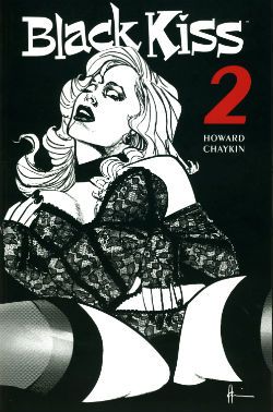
 photo Cover001B_zps08054f40.jpg

Despite being denied an overseas audience in its original periodical form (due to an aversion to spending decades in court) in 2013 Image collected and released Black Kiss 2. Which you will recall is VERY GOOD! So, it appears there are different rules for books and comics when it comes to peddling filth. And those rules are probably totally unconnected to the different amounts of money the different formats bring in. Black Kiss 2 was the one where Howard Victor Chaykin showed that even his sick smut made other people’s smart stuff look sick. Opinions were divided, with some declaring the book merely an old man whacking off in public. Such people are probably unaware just how much work goes into writing and drawing a hundred and odd pages of comics. A lot more work than whacking off, even given how much more work is involved in that the older you get. Particularly in public; you have to really plan that shit out like a caper movie unless you like having your windows broken. Or so I’ve heard. Naturally, untouched by bias as I am, in my head Black Kiss 2 was inventively vile but always engrossing and enthusiastically executed. A lot like an old man whacking off when you put it like that. It was certainly a lot less toe curling than that time Howard Victor Chaykin drew those Bendis Avengers comics. See, it’s that kind of bland doggerel kids need protecting from! Every year lowered expectations kill more people than pictures of gnawed off cocks being spat in people’s faces. Check your stats! Anyway, a mixed reaction to Black Kiss 2 like I say, but while we should always respect the opinions of others we should also remember they are worthless and only I am always right. To sum, Black Kiss 2 was probably a bit rich for most palates and we’ll move swiftly on.

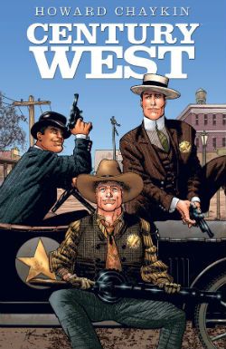
 photo centurywest_zpsfc3d63e4.jpg

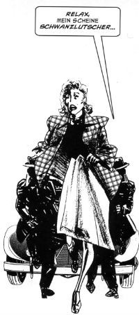
Image continued to curry my favour by finally publishing Century West; this being an OGN from about 6 years ago which originally appeared in Spanish or French or some other vulgar tongue I can’t be arsed to learn because, well, indolence is bliss. Or ignorance. Either way, I’ve got that covered! Come on now, 6 years or whatever it was; what was the hold up there? It’s not like they had to translate it or anything. I know he can be a bit excitable and his dentures might slip making his speech go all mushy but I do believe Howard Victor Chaykin usually speaks English. Anyway, like when our cat went missing that time Century West finally turned up; unlike our cat it hadn’t lost an ear and now hissed at loud noises. Despite being a bit overcrowded layoutwise and so busy with characters and events in its short span of pages it risked leaving you feeling like you’d sucked a three course meal through a straw very quickly indeed, it was VERY GOOD! It didn’t hurt that Howard Victor Chaykin’s busy script and crowded art was blessed by the titanic typography of Ken Bruzenak and Michele Madsen’s lovely colours. There was a James Garner level of cool pleasure emanating from the endeavour embodied by Howard Victor Chaykin sneaking in a sly nod to his early work decades past on the Shattuck strip. One for the keen eyed old timers there. Basically it was another fine example of Howard Victor Chaykin’s love affair with the history of America and his somewhat more ambivalent feelings about the kinematograph (it’s okay, Howard Victor Chaykin, it’ll never catch on!). It was in fact very much like Black Kiss 2 in its themes and concerns but somewhat more sunnily optimistic in its conclusions, and certainly less likely to need stashing when the Rabbi pops round to chat about donations for the next jumble sale.

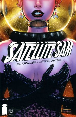
 photo SATCovB_zps826dc453.jpg

Throughout the year the odd voice was (reasonably enough) raised in opposition to the occasionally offbeat aspects of his work but it was Howard Victor Chaykin’s art that was the best reason to tolerate the tone deaf Altman impression of Matt Fraction’s Satellite Sam. Hey, another Image book. Image: we keep Howard Victor Chaykin off the streets! Despite Howard Victor Chaykin’s best efforts Fraction's incessant showboating continued to undermine the effects he was after. He's like a mirror that man,  a mirror to which access is keyed on the DNA of the entire population of the world but me; I can't see what others see in him. One day his enthusiastic mimicry might make him comics’ Michael Sheen but as the final whistle blew on 2013 he remained comics’ Mike Yarwood. And Satellite Sam remained OKAY! So, that New Year's Resolution I made to not be such a dismissive prick? Not a success. Anway, I say the art but really it was the art and the lettering which were worth showing up for. Ken Bruzenak was here again, this time busting out an innovative invisible speech approach which harked back to Alex Raymond’s Flash Gordon strip with its blunt ended bubble tails. In many ways Howard Victor Chaykin’s 2013 was also Kenneth Bruzenak’s 2013. Not only was Ken Bruzenak all over Dark Horse Presents like a beautiful rash of bruises but he was reunited with his beach dwelling pal on a seemingly permanent basis. Chaykin and The Bruise were back! Chaykin and The Bruise! Sounds like a forgotten quirky action flick from the ‘70s starring Peter Boyle and Alan Arkin or something. Maybe with a jazzily chugging score by Lalo Schifrin and a very special guest appearance by Ann Margaret. Sadly the reality is in all probability naff all like that; just a couple of salty old dudes doing the do old dudes need to do to get the dough.

 photo IM_SO_COV001_B_zps9a29b68e.jpg

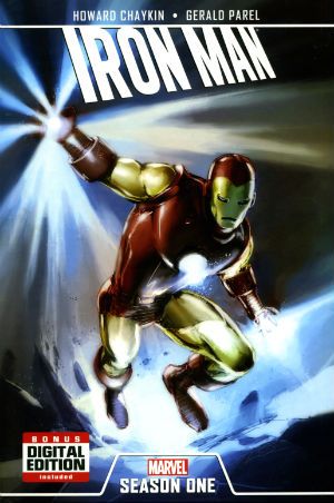
Oh, there was also Howard Victor Chaykin keeping Marvel sweet with an Iron Man OGN and that weird strip in that A+X comic (which a kind Savage Critic commenter alerted me to). This latter involved Black Widow and The White Queen flashing their breasts at a man until he puked. Because, Howard Victor Chaykin! Some even more magical pals of The Savage Critics sent me reports of Howard Victor Chaykin’s doings at conventions which were very much appreciated (SPOILER: he was a gentleman!). My thanks to all the lovely people who enable my crippling obsession! I have not named anyone because sometimes people don’t like that, but while the mental hygiene behind my thanks may be suspect those thanks are genuine. So, the year in Howard Victor Chaykin there, Actually I just blurted all this out so I probably got all the release years wrong and missed stuff and oh, dear, I have to go now. So, I might have missed something, do let me know. Oh, do!

Anyway, Howard Victor Chaykin: 2013 was another year we should have been glad he still bothered with – COMICS!!!
"spilf!" Comics! Sometimes They Are Probably Not Everybody's Cup of Tea!

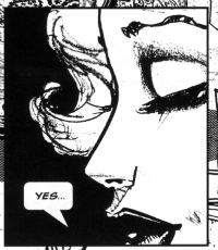
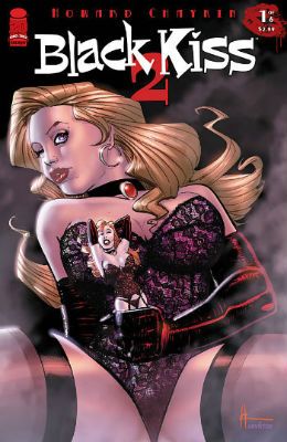
And now, as demanded by literally nobody at all, I look at BLACK KISS 2 by Howard Victor Chaykin. No, no need to thank me. Your smiles are reward enough. Of course you’ll only be clicking on MORE! if you are Over 18 years of age. I can trust you, can't I? photo Yes001B_zps1e3a2904.jpg Anyway, this...  photo Cover001B_zps08054f40.jpg

BLACK KISS 2 Story & Art Howard Victor Chaykin Lettering & Logo Ken Bruzenak Editor Thomas K (No relation) Special Effects Jed Dougherty Design Drew Gill Image Comics, Inc. $14.99USD (2013) Rated M+/Mature Plus

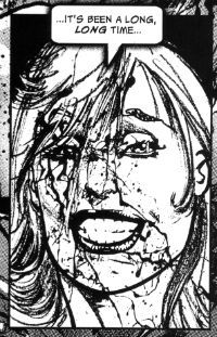
This book came in a modesty bag and, gentle reader, ten minutes after cracking the covers so did I. Hee-haw, hee-haw, heeeee-haw! No, but see how once you’ve got a distasteful image (wrinkly old me crouched and tugging like I’m trying to create fire with an empty sock) in your head it’s hard for you to focus and you are certainly inclined to view what follows as erring on the trivial. BLACK KISS 2 is far more than the sordid trappings might lead you to think, is what I’m saying there. It is true that the book came in a modesty bag because, and I don’t know if you heard about this, there was some kerfuffle over whether it would drive the populations of Canada and Great Britain doolally tap due to its mere presence on our shores. Why, to expose the simple child-like natives of Britain or Canada to this filth would be to risk priapic rampages turning our quiet high streets into open air abattoirs cum knocking shops. But I have a copy so clearly sanity prevailed. No, of course not, sanity’s having a hard time these days. No, in the end I don’t think it was actually banned. Rather than HM Customs rejecting the book, I believe, it just wasn’t submitted for their consideration after the first issue. So, the control of illicit materials is a lot like the Oscar selection process then. I could be wrong and maybe possession is actually illegal in this magical land. In which case I stood on the UK side of the US/UK border while someone in America held it up and turned the pages. Maybe I was in a boat; depends where the border is. Geography isn’t my strongpoint; that’s fan dancing. Look, whatever saves me from a lengthy period of imprisonment, prison would be hard on my piles. What I’m getting at is it took some time and it took some doing getting this book. And knock me down with a feathered sheath because it was worth it. Ayup, BLACK KISS 2 is VERY GOOD!

 photo Long001B_zps4cb94bcd.jpg

Yeah, I know, shocker! But, honestly, if Howard Victor Chaykin had laid a big brown egg I’d tell you. I don’t know much about porn comics as I don’t have many. That isn’t because I’m a buckle hatted Puritan, no, it’s the same reason I don’t have a roulette wheel in my living room, a bar next to the bed and the only crack in my sugarbowl is from when I dropped it pissed on my winnings. But I know my Howard Victor Chaykin comics and BLACK KISS 2 is VERY GOOD!

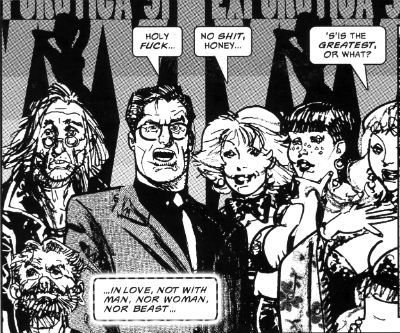
As well as being VERY GOOD! BLACK KISS 2 is, fittingly, a form of literary hermaphrodite; being both a prequel and a sequel to HVC’s 1988 black comedy BLACK KISS. The original slides neatly between chapters 9 and 10 to create comics’ first great sleaze epic. BLACK KISS 2’s a pretty explicit book. It is a book which contains scenes of violence, sexual violence, debauchery, debasement, casual racism, casual homophobia, casual saxophony, dressy sexism, profanity, jeans worn with a suit jacket and just a hint of scat for flavour. There might also be some interspecies romance but that depends on the lady having taken the horse out for a nice dinner beforehand. Otherwise it’s just plain old vanilla bestiality. All this is presented in the patented Prolific Period Howard Victor Chaykin style. Except he’s clearly had a bit more lead time on it, or maybe it’s just the fact that it’s his, either way his focused application has nipped and tucked his art nicely to produce a far tighter style than you might expect. The faces in the page anchoring insets are a particular high point, but I really don’t want to be saying Howard Victor Chaykin gives good face. When Howard Victor Chaykin straight up replicates his original BLACK KISS style for chapter 8 its position surrounded by the newer style stuff reveals that in the meantime, while barely altering his signature page routines, Howard Victor Chaykin’s managed to develop a rather good perceptual trick. Rather than the impression that each panel is like looking through a camera at a fixed set there’s an assured shift towards the impression of looking through eyes at a world. A damned and dirty world, but a world.

 photo Public001B_zps6d22eb75.jpg

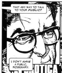
Sure, sure all the problems I have with HVC’s current work are here but far less so and sometimes they work to the book’s advantage. The biggest advantage the art has is that it’s in B&W. This means that the visual noise of all Chaykin’s textures is kept down to a muted hum. The lack of his modern toffee-apple glare colouring enhances the visual coherence of the art no end. Sometimes the application of textures is a bit skew-if but here this, together with the tendency of the pasted elements to contain too much visual information or sometimes seemingly spookily float creates a nicely off-kilter effect. Needless to say, his figure work and attention to period detail remains stirring. But I appear to have said it anyway. However, I remain unconvinced by Howard Victor Chaykin’s pasting of the same image further along successive panels to show movement. However, this is small beer indeed. This stuff doesn't need to be perfect it needs to work. And here Howard Victor Chaykin's art works like a (wet) dream. In BLACK KISS 2 Chaykin’s art is far stronger than in his work for hire stuff and Ken Bruzenak’s period specific text boxes and enduring mastery of the art of the letterer brings it up another level. As ever. Ken Bruzenak. Ken fucking Bruzenak. The Bruise!

 photo OhDear001B_zps2110ab9f.jpg

Sadly, living in the real world (which isn’t where BLACK KISS 2 is set) I have been unable to find the time to go full LitCrit on BK2 but I can certainly say it is about something. Things, some of them, yes, that’s what it’s about. This is because Howard Victor Chaykin is sometimes quite explicit about his meaning but then he gets all coy and retracts before you get the full brunt of his point. As ever, draped like lacey underthings over every page, we have the dryly delivered Howard Victor Chaykin Revisionist History of These United States (“Some people say we stole the land from the Indians, well, fuck them in the neck with a rusty spoon…” You know the drill). When he isn’t riding his hobbyhorse about how America’s insecurities have led it to neglect its own rich cultural products he’s telling us how America was built by assholes. Honey to mine ears as ever. And all this is punctuated by his usual clipped and caustic dialogue. It’s good reading is what I’m saying there. Because it’s good writing. Funny as fuck, too.

 photo Eyes001B_zpsedbeccde.jpg

Anyway, as far as I can tell it’s about fame, or the peculiarly democratized form of fame ushered in by the movie business. With the invention of movies even a Cotswolds boy could be a cowboy. It’s about fame and success and how they attract and how they devour. But in BLACK KISS 2 it’s a sick and shabby kind of success Chaykin's concerned with. An illusion, a reflection. Famous people crop up in BLACK KISS 2, but they are people whose fame is tainted by violence, from Lee Harvey Oswald to Andy Warhol; epoch defining events are brushed past (Aids,9/11) as the solipsistic cast wallow in their own base natures. Faces so deep in each other’s asses that their world (the world of BLACK KISS) becomes truncated and defined by their appetites to the exclusion of all else. Because BLACK KISS 2 doesn’t show us the world, it only shows a portion of the world. For all the glossy cars, spacious houses, natty clothes and cheeky bondage gear to exist there must be a world beyond that presented on these pages. A world where people are just getting on with their business; the regular world. BLACK KISS 2’s world ignores the mundane and is set squarely in a world of excess. A world where want is confused with need. A world populated by people who can’t control their appetites. Or rather, are unwilling to control their appetites. And it’s to these people the succubus, the vampire, the whatever the hell it is gravitates when the need to feed descends. And it seems wholly appropriate that this is so.

 photo Run001B_zps9144825e.jpg

Timely, too. There’s a modern vogue for phrasing failure/success in terms of appetite. Repellently judgmental phrases are now part of the vocab of the vainglorious, “You weren’t hungry enough”, “You didn’t want it enough”. Such generosity of spirit is always expressed by those who were and, naturally, did of course. Such depths of empathy. Yes, fame costs as someone in leg warmers once said and when Beverley shows up is where you start paying. And at the last, in the final chapters, in a voice so resigned and heavy with a history of experience (so heavy, so resigned it must, it just must, sound just like William Holden’s in Sunset Blvd.) Cass Pollack (AKA HVC) lays it all out. Like a body on a slab. Because, you know what? BLACK KISS 2’s about the same thing all HVC’s stuff is about. It's about defining your worth by your work and not by anyone else's opinion of same. It's about having some self re-cocking-spect. It’s about learning to accommodate your appetites before they destroy you. He’s just changed the focus from the usual Chaykin avatar (Cass) to the villain. A new twist on an old theme. An old theme with a new twist. No wonder Chaykin loves jazz. Jazzzzzzzzzzzz, babies. Jazzzzzzzzzzzz. This time out then, in a startlingly optimistic (that’s optimistic for BLACK KISS) climax both “Chaykin” and the bad gal/guy have experienced moments of clarity which entitle them to a happy ending. They aren’t exactly going to save each other but at least everybody else will be safe from them. And that’s about as happy an ending as there ever could be in the world of BLACK KISS 2. Which is VERY GOOD!

And like HVC’s VHS copy of Raiders Of The Lost Ass – I’m gone!

This week your safe word was – COMICS!!!
Wait, What? Ep. 113: Technically Difficult

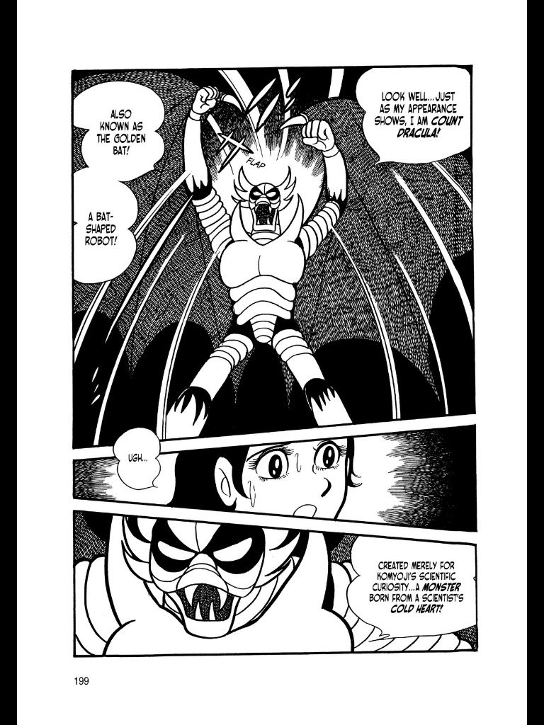
Uploaded from the Photobucket iPhone AppA page from Shotaro Ishinomori's Kikaider, which we didn't even discuss this week but which I kinda adore, nonetheless...

ATTENTION, ATTENTION, NEXT WEEK WILL BE A SKIP WEEK FOR THE PODCAST.  NEXT WAIT IS A WEEK, WHAT? SKIPCAST!

You may not care.  In fact, you may be relieved but either way, Graeme and I will not be talking one another's ear off this week so there won't be anything for you to listen to from us next week.  Maybe you can get out of the house for a bit?  Go for a walk?  Realize that although it's probably too late to do that "52 books  in 52 weeks" you promised, you can maybe still get in 48 in 48 weeks?

Either way, we are here today, gone tomorrow (by which we mean: next week).

As for that "here today" part--show notes after the jump!

Yeah, we had all kinds of technical problems again...sorry about that.  Maybe one day soon, we will try tech solution Omega...but I'm not looking forward to that too much, to be honest.  I'm hoping we can come up something a little bit better than using an atomic bomb we worship as a god to blow up the planet...

0:00-8:49: Hello! 113 is apparently an unlucky number?  Graeme reports on the bounce houses in the sky, and also a story about a prison break that seems very Beagle Boy-esque. 8:49-27:47: 'Comic news' is a great term because most people would say it's neither.  Nonetheless, we discuss the new column by Bob Harras and Bobbie Chase (which they call B&B, but I sort of wish they'd titled "Two Bobs and a Weave"), the news of writers getting pulled off their books before their first issues are even out, etc., etc. Sadly, we have a dose of  our infuriatingly intermittent tech problems plaguing us a bit during this conversation (that eventually builds to a somewhat hilarious obsession on Jeff's part about whether or not he's rocking in his chair too much, or at all).  Our apologies.  Poor DC--once we're done with that, we grouse about their really bad covers, lately.  Also, Jeff has a metaphor for the New DC that probably reveals a bit too much about his family past, maybe. 27:47-41:17:  And because Marvel doesn't get a free pass (except when they do), we also discuss the upcoming Thanos Rising miniseries and compare/contrast with DC's Birds of Prey debacle.  Also, Jeff tries to start an urban legend where if you look in a mirror and say "Mark Badger, Mark Badger, Mark Badger" three times, a Batman miniseries appears. A discussion of how much "there" needs to be there for a comics news story to be a news story... 41:17-41:38: Intermission (Jaunty)! 41:38-53:30:  Comic books!  Graeme and Jeff discuss New Avengers #2 by Jonathan Hickman and Steve Epting; and Jeff talks about how Marvel is creeping him out a little bit. 53:30-1:00:09: Captain America #3!  Graeme isn't reading it; Jeff is, but is somewhat troubled by Cap being less of a Kirbyesque Cap than a Milleresque Cap, and later, while editing the podcast, is a little horrified that this is a complaint he actually made with his face. 1:00:09-1:05:53: Graeme has read the latest issue of Daredevil and then an advance ARC of Paul Pope's The One Trick Rip-Off.  After more techie problems, we decided to jump just a bit early and come back with a different (and more reliable) mic. 1:05:53-1:06:15: Intermission (Jazzy)! 1:06:15-1:08:17:  Round Three!  Graeme has noticed something about the latest Marvel solicitations that suggests they're not reading them especially closely.  He also has good news about Avengers Assemble #14? 1:08:17-1:14:57:  Batman #16 and Batman and Robin #16!  The Death of the Family stuff is just intensely, baroquely fucked up in a way that reminds Jeff of another Batman book that may not be what Scott Snyder and the Bat-team had in mind… 1:14:57-1:23:42:  Issues #5 and #6 of Black Kiss 2!  It's the grand wrap-up of a this mighty odd sequel from Howard Chaykin. 1:23:42-1:42:13:  Questions, finally!   Al Ewing asked: Where do you stand on: 1) Vodka And Coke; 2) Christmas Crackers; 3) Dennis The Menace vs Dennis The Menace And Gnasher; 4) Big sacks with ‘SWAG’ on them vs Big sacks with ‘$’ on them; 5) The ‘aggro style’ UK comics of the late seventies; 6) Hi-style design-heaviness in US superhero work – could the design sensibility of a David Aja or a Johnathan Hickman replace the hem-hem ‘design’ sensibility of bendy spines and porn poses and upskirt angles if we all wish really really hard? 7) Bad Machinery/Girls With Slingshots/Dinosaur Comics 1:42:13-1:56:19: Mo Walker asked: 1). If you could put together an Avengers/Justice League style team comprised of Kirby characters, who would make the cut? 2). What are your thoughts on series 4 of Misfits? 1:56:19-1:59:40: JohnK (UK) asked: 1) A revival of Quality’s BIG BEN – The Man With No Time For Crime by Al Ewing and J Bone – Yes or No? QUICKLY! Yes or No? 2) Biggest Loss to Comics’ archive: ROM, ATARI FORCE or MICRONAUTS(original runs, natch!) 3) Who really owns Marvelman (in less than 10 words)? 4) a) Was “Jimmy Broxton” the artist on KNIGHT & SQUIRE a pseudonym? b)If so, who for? 1:59:40-end:  Closing comments.  Extra apologies.  A notice is made (as it was above) that next week is a skip week and so we will not be around but shall return the week after that.

If all of this sets your glands a-salivatin', then feel free to pull up a stool and being listening now!

Wait, What? Ep. 113: Technically Difficult

As always, we hope you enjoy and thanks for listening!

Wait, What? Ep. 102: Age of Chance

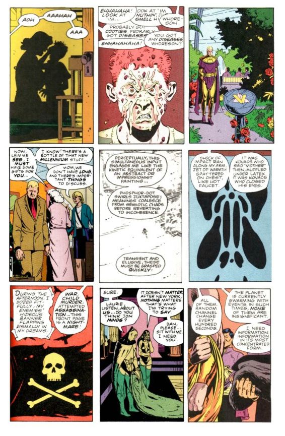
NewPage9From the thirteenth issue of Watchmen by Alan Moore and Dave Gibbons, assembled by Miguel Corti.

The episode--she is long! (Just a bit over two hours and forty minutes, in fact.)

The show notes--they are extensive!

So join me after the jump for both, and a bit more about Watchmen issue #13!

Oh, and hey, let us know how this episode sounds to you, eh?  I gave a listen to the sound quality of the first call before throwing it into Levelator and thought it sounded...really okay?  So I'm mixing this raw.

0:00-3:38:  So, is this episode where Graeme is Goofus and Jeff is Gallant?  (Spoiler: No.)  But Jeff is much more chipper than last week, certainly.  At least until we starting discussing... 3:38-6:18: Comics!  (More specifically, Marvel Comics.) (Ultra-specifically, the twenty variant covers for Uncanny Avengers.) 6:18-28:46: Which leads us into discussion of Avengers Vs. X-Men #12 which Graeme has read and Jeff has not so it's time for some heavy-duty recapping on the part of Mr. McMillan. 28:46-43:52: Getting back to twenty variant covers situation, we ponder whether the fact Uncanny didn't outsell Walking Dead #100 is... a good thing? A bad thing?  Just a thing? [Insert "It's Clobbering Time" joke here, as appropriate.]  This ping-pongs us back to talking about (for lack of better expressions) "natural" events vs. "forced" events with Avengers Vs. X-Men, its sales, and whether or not the event was review-proof. 43:52-55:09: Sensibly, Graeme uses the recent (stunningly great) Grantland excerpt of Sean Howe's Marvel Comics: The Untold Story to compare and contrast Marvel's current marketing and operating approach with those prior.  The more things change, the more they stay the same? Well, maybe as far as killing off major characters and trying to capture female readers go.  But if you've ever enjoyed listening to us talk about Steve Englehart and Jim Starlin, you should most definitely check out the excerpt...and probably the book?  (Also, if you haven't seen Howe's amazing Tumblr, check that out too. 55:09-59:40:  Another book up Graeme's sleeve: Batman #13, the first part of the upcoming "Death of the Family" storyline. Jeff counters with Action Comics #13 by Grant Morrison and Travel Foreman. 59:40-1:06:04:  Graeme talks a bit about The Nao of Brown by Glyn Dillon, published by Self Made Hero and distributed in the U.S. by Abrams.  For you pull-quote types:  Graeme McMillan says "It is just a blinding book" and "the most beautiful comic I've seen in the longest time." 1:06:04-1:29:19:  This gives Jeff an opening to talk about Gordon Harris' self-published graphic novel, Pedestrian, Graeme mentions Josh Cotter's Skyscrapers of the Midwest which we hunt up on Comixology.  Doing so reminds Graeme he had also read the digital only sequel to Chris Roberson's Memorial... which leads us to spend a few minutes kicking around the can that is digital pricing and real vs. perceived value using such varied examples as a Digital 2000AD subscription, Saga, Valiant's digital editions, Bandette, Comixology sales, full-price books from Marvel and DC, Shonen Jump Alpha, and more. 1:29:19-2:02:32: A quick rundown by Jeff of the other books he's read this recently: Harbinger issues #1 and #2, a detailed  discussion with Graeme about Amelia Cole and the Unknown World, Black Kiss #2.3, Fatale #8, the very strange saga that is issues #7-10 of Star Wars by Roy Thomas, Don Glut, Howard Chaykin, and Tom Palmer, Axe Cop: President of the World #3, a stunning story by Michael Fleisher and Alex Nino from Showcase Presents House of Mystery (Vol. 3) (and thanks, Dylan Cassard, for that one--you should check out his podcast and podcast-related Kickstarter).  All of which reminds Graeme (somehow) that he's also read issue #0 of The Phantom Stranger. 2:02:32-2:18:48: Also, Graeme has read Thanos: The End by Jim Starlin as well as The Return of Thanos trade paperback featuring both issues of The Thanos Quest.  We talk about that, a little bit about Englehart's first issue on Silver Surfer with Marshall Rogers, The Annihilation books, DC's Cosmic Odyssey, as well as Graeme's favorite Green Lantern. This is what happens when you meet a stranger in the Alps! 2:18:48-end: And then, finally, we talk about the stunner that is the 13th issue of Watchmen, which listener Miguel Corti assembled after a discussion Graeme and I had on-air about just such an issue being via random cut-up of the first twelve.  Here's Miguel talking about the idea and how he executed it, excerpted from our correspondence:

Anyway, my original plan to show my appreciation for the effort you put into creating a show that I enjoy listening to was to make something for you based off of a throwaway idea from one of the episodes that came out in either early 2012 or late 2011. In that episode you discussed the idea of creating a 13th issue of “Watchmen” based on randomly picking panels out of the graphic novel and rearranging them until you had this ersatz issue. I was intrigued by the idea since I had just finished re-reading “Watchmen” and re-watching the movie version because I wanted to thoroughly compare the two and see why the book works and the movie doesn’t, especially since Snyder was so slavish about adapting the source material. Well, a little synchronicity was all it took to get my creative blood flowing, and I decided I would make that heretofore nonexistent 13th issue as way of further analyzing the superb work Moore and Gibbons did with that book, and maybe as something you might be interested in seeing. [...] What follows are the steps that went into making this issue. Please skip to the end if the details hold no interest for you.

First, I had to find a copy of “Watchmen” that wouldn’t object to being gutted and mutilated so heartlessly. Not as easy as I thought. The only copy I had here in Japan was the Absolute Edition, and my softcover TPB was in the states. I just wasn’t up for taking digital photos of such an unwieldy book. So, I bought another softcover (used from amazon.co.jp) and tried taking pictures with that. Again, the quality wasn’t what I wanted. For a split second I contemplated cutting up the softcover, but fortunately the rational side of brain pointed out—quickly—that I would end up only being able to use the panels from one side of a page. So then I thought: a-ha! This is the digital age! I can just download a copy from DC and then take screenshots with the iPad and then transfer them to my computer. Well, wouldn’t you know it, but for whatever reason, none of the digital comics providers were selling “Watchmen.” No one. Not even DC. (This may have changed in the intervening time, but this was the fact of the matter when I started this project earlier this year.)

So, I turned to the pirates, and found a PDF of the entire series and downloaded it. I’m not proud, but since I had already purchased the book 3 times in my life, this was as close to a victimless crime as I was going to get. (Unless, of course, you count all the people who were leaching off my seed with bittorrent while I was downloading it. There’s a chance some of them never have and never will buy the book.) If I could have found a proper digital copy (which would have made the work a lot easier) I would have gladly bought it. Unfortunately, I had to come to terms with the moral ambiguity of the situation and move on.

Next, came breaking down the work. I remember you had discussed that the book was a 9-panel affair throughout. In theory, yes, but there are a lot of double and triple panels throughout the book. Each page is built on a 9-grid layout, however. In some places, there are a whopping 18 panels on the page, but they’re still laid out with the 9 grids. I assigned each grid a number. For example, the panel in the top right of page 5 in issue 1 with Rorschach picking up the Comedian’s happy face pin would be 1-5-3 (issue 1, page 5, panel 3).  The panel after it would be 1-5-4. I made an Excel sheet with the entire book broken down like that. I needed the numbers to all fit within the margins of the paper I was going to print out, because I was going to cut them up and literally pull panel/grid numbers out of a hat. (It ended up being a plastic bag.) Unfortunately, all the issues don’t have the same page count, prohibiting me from doing a simple copy/paste over the whole file. The first issue is 26 pages, then issues 2 through 11 are 28 each, and issue 12 is 32.

After sorting that out, I printed out the file and sat down to cut it up. But, wait! On the last panel of every page, the panel is always abbreviated to allow space for a quotation in a black box. I couldn’t have my 13th issues without one of those, so I needed to separate the 9th panel/grid for each issue’s last page from the rest of the panels. I highlighted them so I could find them after cutting up the pages, and set those 12 scraps of paper aside. (The one I ended up using in my issue is from issue 5.)

Having cut up all the pages, and placed all the scraps in a plastic bag, I thought it would be easy as pulling numbers out of hat. I was wrong. Again, it’s that damn 9-panel grid that messes with you. Sometimes some panels take up more than 1 grid space, and that would alter what I was trying to do. Usually, I would pull 9 scraps out of the bag, and then record them in the order I pulled them. Then I would copy the panel from the PDF into a Word document. I ran into trouble when, for instance, I would go to get the panel matching the number on the 3rd scrap of paper, but it would turn out to be a 2- or 3-grid panel, or more on some occasions. This meant I had to discard that scrap for now, and keep pulling new one’s until I found one that match the space allotted.

What the last two paragraphs showed me is that even though I tried to make my fake issue as random as possible, that randomness was still subordinate to the original work. You can only imagine the relief I felt at work saved when the first scrap I pulled for one of the pages happened to be from the grid of one of the full-page panels in issue 12. That was the easiest day of copy-pasting-cropping during the whole project.

For the last page, I pulled a scrap from the final panels first because, well, not all of them only occupy one grid’s worth of real estate. This was the only time I went out of order.

Finally, I needed an ersatz cover for my ersatz issue 13. As you probably already know, the cover images of the original series all lead in to the first panel of the interior art. I took my cover from the panel before 10-16-2. If I was any good with Photoshop, hell if I even owned Photoshop, I would have been able to edit out that tail from the word balloon, but so be it. OK, enough of the nuts and bolts. What did I learn? First, the issue itself. It’s just as unreadable as you would imagine an endeavor like this to be. However, there are some interesting aspects that illuminate the whole.

1.     Dave Gibbons drew way more 2-or-more-grid panels than I remembered, which shows how important the size and pacing of the layout was to the story. Every time I come across a comic with half a page’s real estate devoted to something mundane like a plane flying or a car driving, it makes me want to drop the book. I don’t know if the writer or the artist is to blame, but most of the panels in modern comics don’t require that much space, especially now with the shortened book lengths. Gibbons and Moore paced “Watchmen” perfectly, and when panels are drawn bigger than average, it’s for an important reason. The opening full-page panels of issue 12 are shocking because Gibbons held that back until the very end. And despite their size, you’re not sure of what your seeing because you’re visually overwhelmed (at least the first time through), which is the disorienting feeling, I believe, they wanted to convey. Every time I read a comic now that ends with a full-page splash of just a person sitting in a darkened room with no visible background, I want to throw it across the room. And then maybe walk over, pick it up, and tear it apart. Too many modern comics writers and illustrators are just piss-poor storytellers. Whatever your opinion of the work “Watchmen” may be, I think it’s hard to argue against the fact that it is pure comics from start to finish. It’s rare to find creators who actually embrace the medium and do what books and film cannot. I spend an inordinate amount of time thinking about this because it is tangential to my field of employment (video games) where too many games are trying to be movies instead of doing what they should be doing: being and interactive medium. Games that fail to be interactive are doing a disserve to the consumers, and comics that settle for storytelling that could just have easily been done in a movie or book, or even better in those media, are doing a disservice to comics readers everywhere. 2.    As the narrations of Rorschach and Dr. Manhattan are the most prevalent  in the work, their panels in this composite issue have a weird interstitial effect of ordering the randomness of the chosen panels. It helps that in many of Dr. Manhattan’s source narrations he was already jumping around the timeline, so it doesn’t feel out of place here. Many of Dr. Manhattan’s panels tied eerily to the next panel, although the placement was random and almost always from a non-sequential section of the story. For example, on page 12, panel 3, Dr. Manhattan narrates, “They’re shaping me into something gaudy and lethal…” Then the next panel depicts Adrian in his gaudy purple suit swinging a post at his erstwhile assailant. On page 13, panel 2, Dr. Manhattan again narrates: “Laurie’s met him several times. She says his name is Dreiberg.” In the next panel Nite Owl and Silk Spectre are locked in a kiss. There are many other pieces of synchronicity, but the best are tied to Rorschach and Dr. Manhattan because of their strong narratives. In my issues 13, the story becomes Dr. Manhattan’s tale to tell, with Rorschach in a supporting role, a victim of the event surrounding him. One could argue that this isn’t too far from the original’s narrative. The fact that it continues to be so in this jumble I have assembled speaks to the focus and intent of the original. Or maybe there were just too damn many Dr. Manhattan panels to begin with. 3.    Almost all of the commentary on politics and the Cold War itself is lost in my issue. Time is the only strong theme from the original work that remains. Again, that is one of Dr. Manhattan’s themes. The lack of that political backdrop robs the story of some of its weight. I felt that when I watched the movie version too. Because although Snyder is almost slavish in adapting the source material, he does it ever so superficially. Sure it’s still set in 1985, but it doesn’t feel like the world is on the brink of a nuclear war in the movie like it did in the book. New York doesn’t really feel like the dirty, crime-drenched metropolis of the ‘70s and ‘80s. In the book, despite all the advances in technology, New York still remains a non-gentrified, citywide slum, which is exactly what the mass media wanted you to believe about New York in the ‘80s. Snyder’s New York is too aestheticized to feel like it ever needed vigilantes in the first place. This also ties into the altered ending as well. I understand that a faux alien invasion spearheaded by a giant squid would have been a tough pill to swallow for viewing audiences of Snyder’s “realistic” superhero movie; but the fact of the matter is, Snyder revealed his ignorance of current affairs when he made that film 8 years after 9/11. In the book, just like after 9/11, it’s believable that the world would stand with the United States after the tragedy that had befallen it. In the movie, however, the fake Dr. Manhattan attacks hit cities around the world, not just New York. Again, not wholly bad, because of the fact that it was Dr. Manhattan and not an outsider, a la the alien, I have a hard time believing the world would unite in global cooperation. What’s more likely is that the world would erupt in furor at the U.S. for creating Dr. Manhattan in the first place. The U.S. would be culpable in the world’s eyes. What’s worse is that in the context of the movie, there’s nothing for the people of the world to not assume that this wasn’t an attack by the U.S. aside from the fact that the U.S. was hit as well. Since the world knows Dr. Manhattan was created in an accident, how does the world know that a preemptive attack by the U.S. on the Soviets didn’t backfire on them when they tried to exploit Dr. Manhattan?

As you'll hear on the podcast, Graeme and I greatly enjoyed reading Miguel's assemblage, and we wanted to give you the opportunity to check it out and get inspired for yourself. [link is 22.8MB]  And as I mentioned to Miguel in an email to him, I found this project and his analysis to be a tremendous DIY counterpoint to Before Watchmen--it really is a way to revisit Moore and Gibbon's story while respecting the original achievement. We are incredibly pleased to have played even the most indirect part in this project.

Hmm, feel like I'm forgetting something?  Oh yes, the podcast, the podcast... As tempting as it would be to add to the artsy shenanigans and leave only these notes and the book as a type of seashell on the beach for you to find, Episode 102 is indeed out there in the world (provided you define "the world" as your RSS provider of choice) and you can listen to it here as well, should you choose:

Wait, What?, Episode 102: Age of Chance

As always, we hope you enjoy...and thanks for listening!

Wait, What? Ep. 100: Year Zero

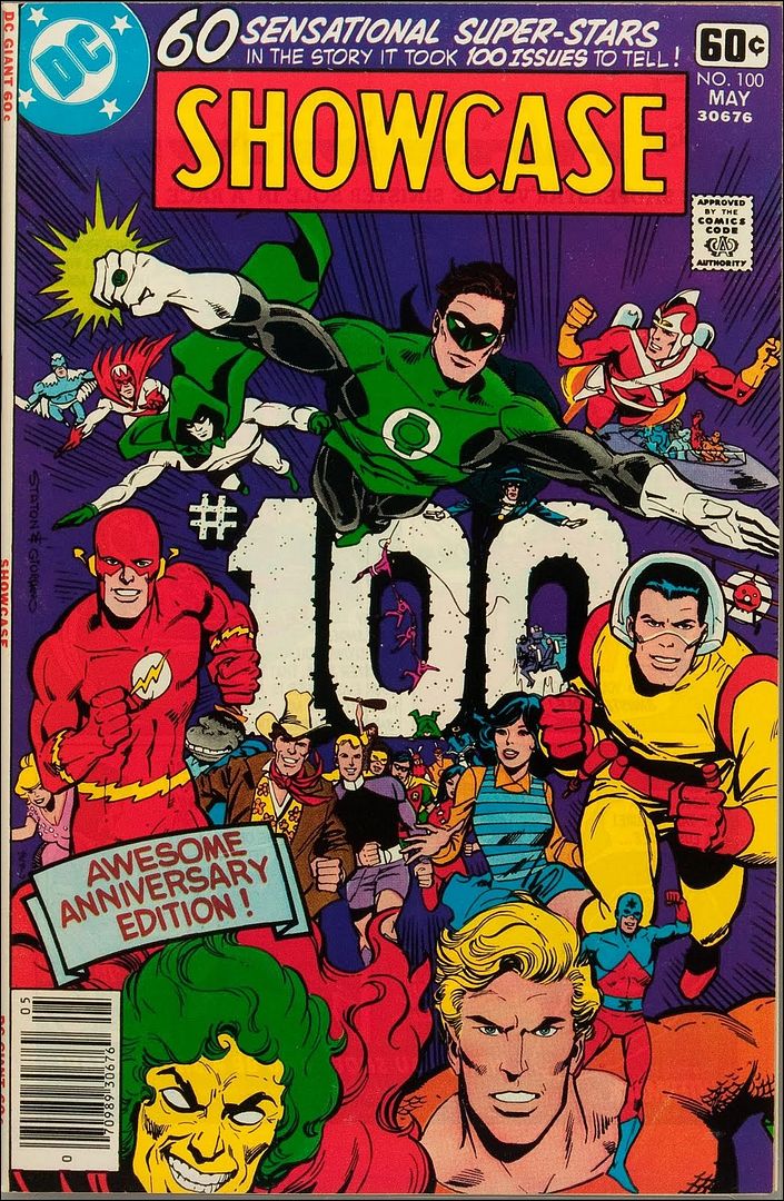
Photobucket(One of my favorite hundredth issue covers, by Joe Staton and Dick Giordano for DC Comics)

I don't know why, but for a moment there... I was very afraid this episode wouldn't end up existing?  I think because, you know, you say something is a thing, as opposed to just being business as usual, and the next thing you know there's a certain nimbus of expectation around it, even if only to yourself?  Sometimes it  seems like that kind of nimbus makes the best kind of target for capricious fate...

Anyway, enough of that "and then he tore his eyes out in the fifth act!" musing, join us behind the jump for show notes and celebratory waffles, yes?

0:00-8:24: Graeme brings a message to piss Jeff off...from the future!  What can it be? Hint: Before Watchmen is involved.  Laughs are had and the distance between qualified and unqualified is considered.
8:24-20:54: And on a related note--time for some red-hot sexy DC New 52 Issue #0 talk.  Batman, Inc. #0, Batwoman #0, Wonder Woman #0, Supergirl #0, Justice League #0, Earth 2 #0, and OMAC and DC Universe Presents #0.  Warning: Graeme has read 38 of these by now.  I mean that's...wow.
20:54-46:59: ASM is being cancelled!? Jughead is going on hiatus?! (A reference to) cats and dogs living together under the same roof?! What the hell is happening?
Also, Graeme has the chance to have some quality time with the listeners. Also also, in the coming attractions end of thing, we discuss how Bendis' X-Men is shaping up, in light of Avengers Vs. X-Men #11. Additionally, we run down Professor X's CV. If you want to guys remembering off the top of their heads the names of Hank McCoy and Bobby Drake's old girlfriends, this is where you want to be.
46:59-54:59: Mattotti and Zentner's The Crackle of the Frost.  We actually talk about it, finally!
54:59-1:13:33: And from there, Jeff and Graeme go on to discuss Jennifer Blood, as conceived by Garth Ennis and executed by Al Ewing.
1:13:33-1:22:51: And from one crime book to another, we also talk about Stumptown issue 2.1 by Greg Rucka and Matthew Southworth. With special guest appearances by John Updike and J.D. Salinger!
1:22:51-1:30:24: And from there we got to Dave Stevens' The Rocketeer?  I think it says something great about the current state of the comics marketplace that we can talk about three different type of pulp stories that are still a long ways away from superhero books.  Also, it's Graeme's turn to take a powder while Jeff gets to talk directly with the listeners.
1:30:24-2:16:04: Phone calls! From listeners!  We have them, and they are awesome.  Many thanks to Voodoo Ben, Alex, Robert G., Sean Witzke, J.L. Blair (whose call did not survive the round-the-world treatment, sadly and whom I initially misidentify, to boot) and Derek (or Garrett?).  Though most of the calls are just well-wishes, we do tackle a suggested topic--Jim Starlin at Marvel in the '70s, '80s and '90s--at some length, as per Alex's request.  Who says this isn't the Golden Age for Whatnauts?
2:16:04-2:26:31: Jeff, whose attention span is crushed, all but leaps in mid-answer from talking about Hank Pym to discussing Bloodshot.  Graeme, for his part, has been catching up on old issues of Milestone Shadow Cabinet issues. Add 'em all together and you get...Chaykin's Black Kiss 2 #2?  Not really, but we end up talking about that as well as well as the pretty brilliant (non-comix, though there's a chart or two) book by Jarett Kobek, If You Won't Read, Then Why Should I Write?
2:26:31-end: And then, because it wouldn't be a Wait, What? podcast without goofy technical difficulties, Graeme turns into the Lord of the Flies again, a clear sign to sign off. (Although we also manage to praise Bandette #2, Double Barrel, the xckd strip Click & Drag, and Dustin Harbin's Boxes before we're done).  At one point, I'm laughing while Graeme is talking, and it just sounds like there should be the sounds of a building burning down and maybe some backmasked electric guitars...which is maybe the most fitting way to celebrate our hundredth episode?  Lord only knows what we'll sound like by episode 150....
Anyway, you should be able to find it on iTunes (although there's now that whole bullshit separate app for Podcasts, can you believe it?) as well as your RSS feeder of choice.  Alternately, you can take a swing at the audio pinata below:
And then next week...Ep. 101?  (Man, I gotta go fan myself on the divan at the thought of it!) In any event, whether this is your first time listening to Wait, What? or your one hundredth, we hope you enjoy and thank you for listening!

"Guh, UH. Huh, HUH." COMICS! Sometimes They Are Unseemly!

So, Howard Victor Chaykin returned to his successful BLACK KISS creation and penned a sequel. What could possibly go wrong!?! (SPOILER: I liked it.) Photobucket

BLACK KISS 2 #1 Story & Art by Howard Victor Chaykin Lettering & Logo by Ken Bruzenak Cover Colours by Jesus Arbutov Additional design by Drew Gill Image Comics, $2.99 (2012) BLACK KISS created by Howard Victor Chaykin

Photobucket

This is actually how it arrived- in a semi black bag. I unwrapped it and was immediately compelled to begin using a cheese grater on the blameless plum of my glans. Buyer BEWARE! Indeed.

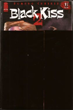
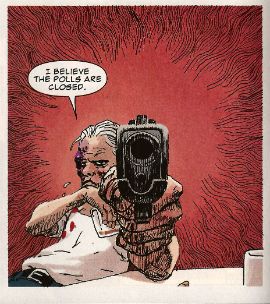
Well, it isn’t for everybody. In fact if you live in the United Kingdom or Canada it isn’t for anybody. The first issue made it past the real life heroes of HM Customs after a thorough vetting but Diamond have since declined to submit the second issue for the contemplation of HM Customs due to there being “scenes depicted which may fall foul of UK Customs’ regulations on the importing of indecent and obscene material.” Apparently if you commission HVC to create a sequel to his controversial sexually explicit and raucously funny‘80s series BLACK KISS he isn't going to turn in six issues of wrinkle faced dogs and sunsets over still lakes. Who knew?!? I mean he’s all old and shit for totes so he should just be producing comics about boiled sweets and Stannah stair lifts when he isn't weeping over faded Polaroids of all the ladies he squired to the sound of Glen Miller’s In The Mood back when the sky was still blue with futures yet to live. Turns out though that people over 50 don’t just stand still and wish for death, turns out they can still actively engage the world via the mechanisms of their mind and produce creator owned work that has a little more ambition than, say, superheroes but in the real world or a fucking TV pitch the ambition of which flies no higher than an episode of The Rockford Files from the ‘70s. You may not like BLACK KISS 2 but there’s no doubt it’s about something.

Photobucket

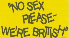
Not just the title of a shitty farce.

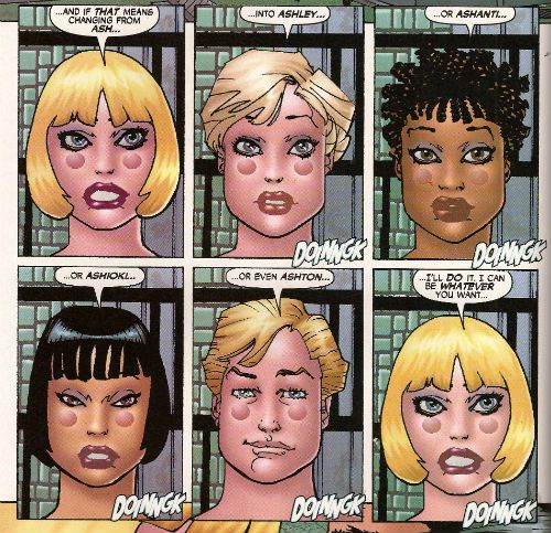
Don’t expect me to tell you what though. I was so confused by the first issue that I intended to let the series end before I belaboured your ever dwindling patience with another unbiased and restrained 1000 words on why Howard Victor Chaykin is just super, thanks! That’s not going to be an option though is it? So, from this first issue here’s what I can fillet out. For a start the most arresting aspect of BK2 is what it isn't. Because what it isn't is a typical HVC comic. HVC comics are usually about various things depending on the series but are presented in the same HVC style. This one isn't. It’s a lot less linear than the usual HVC affair. We start in 1906 with a visit to the pictures. This is framed by two pages reminiscent of nothing so much as the title sequence to the popular sit-com Cheers, which is weird an more than a little discomfiting. Now, I’m not too sure what goes on from then on because either it was usual in 1906 for men and women to attend performances of pornographic films en masse or what we are being presented with is not to be taken too literally. HVC is seemingly casting cinema as a demon which will divert and sap the strength of the lower orders while he's also trying to communicate what it must have been like, what a very sensual experience cinema must have been, to the first audiences. Or, as is often the case, a demon with a plenitude of phalli does in fact pleasure the entire audience via every orifice before the cinema itself disappears like a haunted toy shop in a Victorian ghost story. Given the less than delighted descriptions of cinema (“..two-faced God of Cinema”, “..light exploding from the very asshole of Hell itself.”) I think HVC is definitely not on its side. Which is borne out by knowledge of HVC’s oeuvre in which he is often to be found lambasting the cinema for its portrayal of fake heroism and dissemination of impossible to fulfil ideals.

Photobucket "...and they're always glad you CAME." (Sigh. Sorry about that. It just slipped out.)

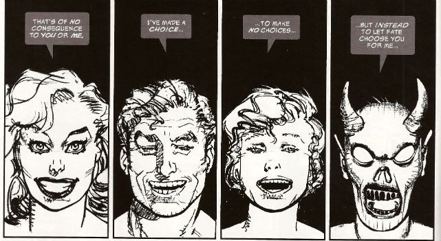
HVC’s work is also concerned at times with the polymorphous perversity of people’s appetites and how technological advances are bent towards this end. In CITY OF TOMORROW (2005), a series in which HVC’s apparent conviction that if we can invent it we will try to fuck it is at the forefront, there is this sequence:

Photobucket

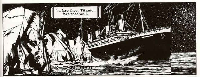
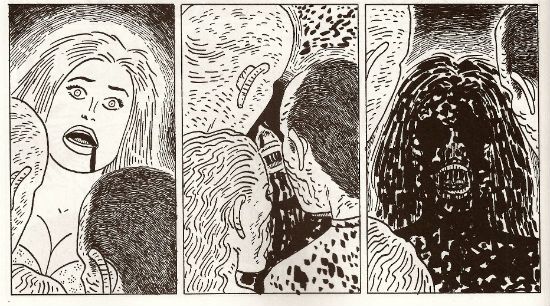
Once the scene has shifted to the Titanic in 1912 (natch, I guess) BLACK KISS 2 contains this sequence:

Photobucket

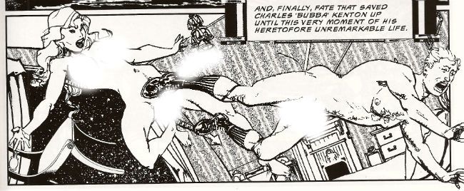
Now this one involves a demon (succubus?) rather than an automaton but, and you’re going to have to bear with me here, the intention is the same I think. HVC has already explicitly linked cinema to the demon i.e. a technological advance and the supernatural or magical. If we just shut up and agree with the thought that magic is just science that we don’t understand then the parallels are plain. In both scenes the advanced creature (science based or supernatural) controls the situation by appealing to the protagonists basest instincts. Lack of self control isn't something to be encouraged, show some gumption or you'll soon be having someone get grotty on your botty, Bubba!

The hero initially seems like it’s going to be the usual HVC stand-in, one Abie Gelbfein but the focus switches, in part two, to Bubba Kenton. This makes sense as Bubba was the force behind the mcguffin in the first series, even though he was dead when it opened. I guess the series is going to show us Bubba’s descent into Hell over the next 5 issues, which will be a useful bit of back-story for the chronological sequel to rest on. I mean, I won’t know will I, as my country would make of HV a prisoner; a prisoner of Sex, in his shackles of Love! Anyway, although HVC wrong-foots us by basically telling us the story of the villain rather than the hero this is still very HVC. After all what we’re about to see, or you are about to see anyway, is another exercise in HVC’s demonstration that power corrupts. “Power Corrupts (What The Hell Else Is It For?)” declared the cover to HOWARD CHAYKIN’S AMERICAN FLAGG #1 and Howard Victor Chaykin still hasn't stopped declaring it here in a comic which, should you pass through Customs, you would itself have to declare.

Photobucket

Chin up, Old son. You can probably get the TPB when it comes out.

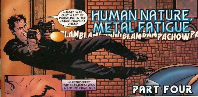
There’s also a nice joke in the art when Bubba is thrown through the air mid-forced bum fun and there’s a panel that is a hilarious inversion of the usual HVC hero swaggeringly soaring through the air while unloading his weapon. Y'know what, I found the art throughout to be pretty strong throughout, only sagging when HVC used his computer to reduce and enlarge images; turns out that sounds easier than it is. There are some nice compositions and I liked the scenes of panic on the Titanic. It was, in fact, quite refreshing to see HVC's art free from some of the busyness all those textures he applies for colour were absent. I just really like looking at his art in B&W it seems. Still, Jesus Arbutov does some really slick and candied colours on the cover and seems set to continue this excellent performance onto issue 2. Ken Bruzenak remains a force of nature but I thought the caption boxes got lost in the art too easily, but that’s just whining, any Ken Bruzenak is good Ken Bruzenak. Despite the fact that the editor missed a few bumpy bits, as a comic I thought it was VERY GOOD! I already told you I did !

Photobucket Wow. No One liked ULTIMATUM did they!?!

Photobucket

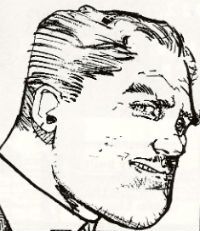
Compare and Contrast! (N.B. I have edited the latter panel to remove any indication of biological items that we all might possess and/or see on a daily basis. In case it might turn your hair white or make you fondle dogs or something.)

I still have questions. Why does the series begin in 1906 when the demon is apparently already in the USA and then switch to 1912 when the demon is apparently on its way to the USA? Are Alfie and Rose going to be the hero and heroine; if not what were they doing in the book? I guess we did get to hear the ear scarring sound of Gentle Jeff Lester reading the narration to the “horsecocked little Jew” text, so I guess that’s reason enough. Is the last page meant to remind me of a ‘70s Marvel short strip involving a lifeboat from the Titanic in which one of the survivors turned out to be a monster; a strip I cannot clearly remember beyond that, but the existence of which I am certain of? If every sex scene in the book was replaced by a scene of equally explicit violence would this book still be problematic? Really? Who knows? Not me. Because, as I said, I will be unable to read any further issues. I guess, as befits my National stereotype, I finished too early. Just think of it as a compliment, that’s what I always say in those situations. (Psst. Edit that bit out, John).

In case you needed another reason to value the continued existence of Howard Victor Chaykin the comic also has a Q&A with him which contains this:

Photobucket

'Nuff Said, True Believers! Have a good weekend and enjoy only the most decent of COMICS!!!
Wait, What? Ep. 96: Cool as Cooks

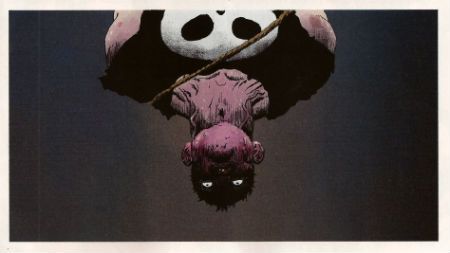
PhotobucketOur first non-food podcast pic in a month and of course it's David Aja from Marvel's Hawkeye #1.

Graeme and I are getting dangerously close to the big #100. (Almost in time for Onomatopoeia #200!)  I feel like we should do something special but...God only knows what?

Anyway, join me behind the jump, won't you, for show notes so you can discover what we did for this episode. (Hint: it rhymes with "balk a lout's tonic schnooks...")

Notes about the show:

1:00-21:09 : We jump *right* into the funny books. Seriously.  Our brains are broken by Howard Chaykin's Black Kiss 2, and we have to talk about it.  (Spoilers: obviously). Lots of discussion ensues about discussions, genitals, and (of course) Eddie Campbell.
21:09-29:40: Talking about the possible digital sales of Black Kiss 2 leads to us talking about the No. 2 top selling comic on Comixology, Earth Two, the second wave of DC's New 52--World's Finest, Dial H for Hero, and G.I. Combat--as well as the upcoming third wave.
29:40-37:50:  Hawkeye #1! (see above) Graeme can and has read it; Jeff cannot and has not.  We talk about it anyway, as is our want. Graeme has some very good things to say,
37:50-58:19: Graeme has some, uh, less good things to say about Avengers Vs. X-Men #9.  We talk about the current plot, possible swerves, the nature of Emma Frost, and more.  Will Cyclops die? Should Cyclops die? And other rhetorical questions...plus proof that Jeff is bad at math.  (Among other things.)
58:19-1:35:18:  Mark Waid vs. Newsarama!  It starts as part of our conversation about the challenges of creating today (one of which is instant feedback) and then becomes its own thing about personal ethics, obligations, how malleable the Internet actually is, and understanding comics creators and commentators on the Net.  Sadly, neither of us think to pull a "Waid, What?" pun.
1:36:18-1:53:23:  And then...comics!  We discuss Darwyn Cooke's Parker: The Score.  Graeme and I have similar reactions, but I feel like maybe we go in different directions with them.  Also, at some point, I think Graeme also coins the phrase "Princess TitsOut" while discussing European graphic albums and God do I want that phrase on a t-shirt.
1:53:23-2:07:21:   Back when I thought Black Kiss 2 would be working the crime vibe of the first series, I wanted to talk about it in relation to Cooke's adaptation of Parker: The Score and an amazingly formatted paperback graphic novel adaptation of Donald Goines' Daddy Cool by Donald F. Glut and Alfredo Alcala.  Fun fact: when I say on the podcast that Abhay interviewed him at a retrospective, it was actually during a promotional campaign for the book I mention on the 'Cast--Brother Blood, the "African vampire on the Sunset Strip during the '60s book" (That was written before Scream, Blacula, Scream).  Of course, we can't help but being slightly sentimental about the horrible way comics ended up chopped into bits to fit into a standard paperback.
2:07:21-2:16:57: Action Comics #12.  Not really much like either The Score or Daddy Cool, but we talk about it anyway.
2:16:57-The End: Closing comments!  They come so suddenly.  Graeme mentions he has a Formspring account where he's answering questions.  Oh, and remind me to ask Graeme about the Crackle and Frost which he doesn't have time to tell us about this time.
You may have come across this episode hitching North on iTunes, or you may check it out here and now and right:
And, as always, thanks for listening and we hope you enjoy!

No. More. BJs! - Hibbs on 8/1/12

Foggy, gray Sunday here at the store (yes, working this weekend as well), but comics bring light and happiness! ACTION COMICS #12: One of my quintessential problems with the New52 is here were are at month #12, and I still really don't have a strong idea of whom this Superman is. This one is certainly not the same one appearing in the rest of the DCU, but, even here in the Grant Morrison penned series, Superman's character seems allll over the map.  So I have this weird relationship with this comic -- on the one hand: all over the map, so I am sad; but on the other hand, this issue features Adam Blake, Captain Comet, who, in few senses, can be considered the first Silver Age hero, and it also features a Silver Agey plotline of a super learning feat, and Batman is in it, and oooh, the first bits of a new Mr. Mxyzptlk... so awesome!  No backup story either, which made this a lot denser read. I'm sad Grant is leaving at #16, but mostly because I can't see how they replace him, especially without a clear frickin' direction for Superman, buuuuut I don't necessarily enjoy each issue fully..... *sigh* I suppose this one was GOOD.

AVENGERS VS X-MEN #9: You know what's nice to see? A genuine moment of heroism in the Marvel universe. So, yay for that.  Too bad it is in service of general nonsense -- the idea that puny Parker could stand up to a punch from Colossus is kind of ridiculous, let alone one that is Phoenixed-up. Then there's the whole off-camera "...and then the two Rasputins defeated each other...somehow." silliness. I'd go "Very Good" for Heroism, and "Awful" for story logic, and then we're something like an OK for a final grade?

FUCK ALAN MOORE BEFORE WATCHMEN NITE OWL #2: I really didn't think it was possible that this could get worse, but it's clear that I suffer from a severe lack of imagination. I remain convinced that this is somehow intended to be a parody, because no one could fundamentally misunderstand WATCHMAN like this on purpose. CRAP.

BLACK KISS II #1: Wow, that's really dirty. And not a BJ in sight! There's no real "protagonist" on display here, so how much you'll like this is going to come down (heh) to how much you like seeing Chaykin do "dirty".  EH.

DEADPOOL KILLS MARVEL UNIVERSE #1: Deadpool, for me, is one of those characters I don't really "get. I understand some people find him funny ("Yeah, funny like a crutch!" he said, in his best Lisa Loopner), but there's none of that in THIS comic, where they ECT the funny out of the concept, and go straight for the gory. Have fun with that, I guess? AWFUL.

FIRST X-MEN #1: Once, a long long time ago, Neal Adams was the hottest thing in comics; then "ToyBoy" happened, I guess? As a retailer, it is pretty dispiriting to order what you think a modern Neal Adams X-MEN comic might sell like, then to find that you've overshot your (extremely, extremely low) guess by 100% or more. AWFUL

HAWKEYE #1:  So this is what tears me up inside: there's no real market for a "Hawkeye" comic, as something like the last 30 years of the Marvel universe has taught us over and over again. What's the over/under on sales for this, nationally? Maybe 45k, if they're lucky? Down to 30k by issue #6?  Now, what's the same for "Matt Fraction, and David Aja on anything whatsoever"? See, I think it's something like 30k, maybe down to 21-22k by #6 (I mean, not in THIS store, I would have ordered the SAME 25 copies of "Purple Marksman #1" as I did of this, but I concede we're a little different)... but my point is, since this CAN'T be a "hit" for Marvel, why on earth do it FOR Marvel? There's no advantage in the medium run, and, in the long run, what odds do you want to give that Fraction/Aja will be earning significant royalties for this in 2020? Meh.

What's interesting here is: no costume, no villains, no antagonist (at least anywhere on Hawkeye's "level"), no hook to come back for #2 (except "well, that was PRETTY!") -- I mean, I liked it, and quite a bit, but almost as a novelty... I have a harder time imagining liking this the same after I've read six of them, because "Done in one" really shouldn't mean "Kinda dull, objectively". Overall, I think I'll call this GOOD.

LOVE AND CAPES WHAT TO EXPECT #1: Thom Zhaler's cartooning chops are really terrific, and I love his light hearted and loving DC universe romance comic here, but I want to murder him for those stupid translucent word baloons which make the dialogue incredibly difficult to read. *sigh* GOOD, and not two grades higher for those balloons.

ULTIMATE COMICS SPIDER-MAN #13 DWF:  Spidey is happening in a universe that's not even close to the same one that the other two "Ultimate" comics are set. Doing a "crossover" here that only highlights how Spidey is wildly out of tone and time with the rest of the universe is so odd. I like this comic for what it is (it is GOOD), but, man, once you commit to destroying Washington DC, and having Texas secede, and so on, fucking commit to it, will you?

That's it for me, me thinketh. What did YOU think?

-B

"Let 'Em Loose, Bobo!" COMICS! Sometimes They May Arouse The Proles!

How goes the day! I guess after that Olympics Opening Ceremony I should just assure all our American friends, particularly your President, that the National Health Service doesn't actually mean that you have a socialist nation 3,000 miles off the coast of America. And, no, if you let this stand all of Europe isn't going to go next in a kind of domino effect. You guys are so ansty!

Photobucket Connor Willumson/Jason Latour (art/words)

I read some comics and then did the words thing. You can do the reading bit if you like, if there's nowt on the box.

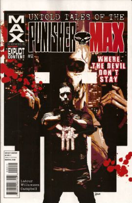
UNTOLD TALES OF THE PUNISHERMAX #2 Art by Connor Willumson Written by Jason Latour Coloured by James Campbell Lettered by VC's Cory Petit Marvel, $3.99 (2012) THE PUNISHER created by Gerry Conway, John Romita Snr and Ross Andru Photobucket Cover by Kaare Andrews

This VERY GOOD! book is about Punisher Max. Unlike the Regular Punisher he does not have a beard, and his stories have swears, gore and dead kids in ‘em! Because, yes, Regular Punisher now has a beard. That’s the only thing that caught my attention in that recent irritating crossover with Daredevil. Not wishing to impugn the, no doubt, exhaustive research by Greg Rucka into face foliage, but I don’t think it’s a good look for Frank. He should be clean shaven do you not think? Shaving’s about discipline, shaving’s very military. But a beard? A beard’s not about discipline, a beard’s about vanity. Vanity’s not really something I associate with psychotic vigilantes. I have a hard time believing Frank Castle puts his War on Crime on hold while he just trims his tidy beard. Yes, I can believe a man can fly, but apparently a vengeful killing machine that has a face care regime is a step too far for me. No offence intended there to any bearded people. Particularly any bearded people built like brick shit houses who control this site. The Punisher's beard is important, yes?

Photobucket Connor Willumson/Jason Latour (art/words)

Anyway, this book is about the other Punisher, the one who can eat soup without upsetting people at the next table. It’s called Untold Tales and yet here they are. It’s the second issue and like the first issue the real reason for paying three dollars and ninety nine cents is the art. Last issue’s art was pretty good but this issue’s art by Willumson is preposterously good. I’m not well versed in anything too freaky but even I can tell there’s a real ComiX vibe to the art. It’s got a wild-eyed and feral vibe to it which makes the contents of every deceptively traditionally shaped panel thrum with an animal heat and press against the page with an almost physical weight. The youngsters will appreciate that the sound FX are even drawn in as though they are giant inflatable physical presences, like Frank Quitely did in that Batman comic that time. Admittedly this senses shattering artistic performance is yoked to a fundamentally meat’n’taters tale; one which seems inspired by that old Jerry Lee song (“Come on over, baby, we got Castle in the barn!”) and has a big chunky gold shout-out to the King. No, not Jack Kirby. Elvis. Jack Kirby’s dead, stop going on about it. Stan Lee did everything! C’mon, Stan Lee probably stood behind Jack Kirby’s chair and moved his simple little hands for him. Why not, eh?

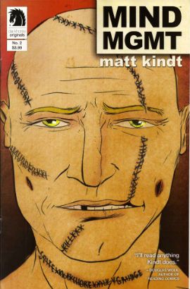
MIND MGMT #2 Story, art and cover by Matt Kindt Dark Horse, $3.99 (2012) MIND MGMT created by Matt Kindt Photobucket Cover by Matt Kindt Did you notice the stitches on the guy's face? Ahuh, Matt Kindt is still EXCELLENT!

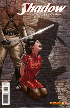
THE SHADOW #4 Art by Aaron Campbell Written by Garth Ennis Colours by Carlos Lopez Lettered by Rob Steen Cover by Howard Victor Chaykin Dynamite, $3.99, (2012) THE SHADOW created by Walter B. Gibson Photobucket Cover by Howard Victor Chaykin

It’s a shame Campbell isn't just that bit better because this issue he does a pretty good job; there's a real sense of time and place, a sense that someone has done their homework, that materials of an archival nature have been attended to but, due to certain core failings, he can't help but  fluff the big emotional bit somewhat, which has the unfortunate effect of my authorially intended species-shame at Ennis’ intentional homage to The Searchers being trumped by the fact that I find myself thinking, man, hats sure are hard to do. And they are, ask Lou Fine, so this was still GOOD!

BLACK KISS 2 #1 By Howard Victor Chaykin Image Comics, $3.99 (2012) BLACK KISS created by Howard Victor Chaykin Photobucket

"That's a Pez Dispenser, right?" Cover by Howard Victor Chaykin

Ban This Sick Filth!” blared the Daily Mail headline that Wednesday morning. Of course “Ban This Sick Filth!” is the Daily Mail’s headline every morning and had nothing to do with Howard Victor Chaykin’s new exercise in saucy muck being held by The Customs. Oooer! Held by The Customs! Fnarr! Fnarr! The true extent of the upset was only revealed when the owner of my LCS commented, “No one cares, John.” Before adding, “And when are you going to pay for all these comics.” Leaving him to his quips I realised something had to be done, so I poked my head over the wall and saw Her Madge was pegging her washing out. I mentioned the whole thing to her, and she said she remembered meeting Howard Victor Chaykin when she guest starred in Viper and he had "sad eyes, like a child with a grazed knee" and agreed to get The Head Boy over to sort the whole HVC BK2 UK situation out.

Photobucket "I can see the beach from my window. That's how much I give a s***." He didn't say when he wasn't contacted.

So Cammers turns up, and he's a bit out of sorts because we’d interrupted him holding the back door of the NHS open so the Private Sector could run in and strip the place bare, wires and all, before anyone cottoned on. He’d got a copy of the moral soiling rag in question and he held it up to his face, his statesman’s face, his face with all the statesmanlike integrity of a lard sculpture of a single bum cheek, but with eyes, and commenced to read with those eyes. And he goes, he says,  “Yes, but is it a book you would wish your wife or servants to read?" And Her Madge points out it isn't 1960 and tells him to his face that the book will be available next week, or she'll be reminding everyone about that time he left his own child behind in the pub. "Did he thank you, then?" said my LCS owner when I told him of the entirely imaginary lengths I had gone to for HVC. "No", I said, "And he’ll never have to.

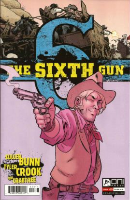
THE SIXTH GUN #23 Art by Tyler Crook Written by Cullen Bunn Coloured by Bill Crabtree Lettered by Douglas E. Sherwood Oni Press, $3.99 (2012) THE SIXTH GUN created by Cullen Bunn & Brian Hurtt Photobucket Cover by Brian Hurtt

Yeah, I miss Bat Lash too, so this was GOOD!


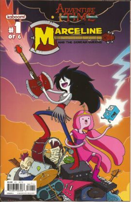
ADVENTURE TIME: MARCELINE AND THE SCREAM QUEENS #1 Written & illustrated by Meredith Gran, Jen Wang Coloured by Lisa Moore Lettered by Steve Wands KaBoom!, $3.99 (2012) ADVENTURE TIME created by Pendleton Ward Photobucket

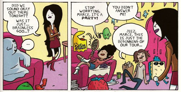
Much like Blessed Brian Hibbs I asked an 8 year old boy what he made of this comic. There must have been some kind of miscommunication because quite quickly there was a lot of shouting and after a bit of tussling a police presence was required. Anyway my court date is next month so if anyone can put me in touch with a good lawyer that’d be great. Otherwise, this comic aimed at 8-year old children contains a reference to the popular children’s entertainer Iggy Pop(!) and revolves around the fantasy of having a super-awesome musical career; that’s really more a teen and mid twenties thing, I think. Although these days I guess that dream can be dragged all the way into your forties. Mind you, it will probably weather the ravages of time about as well as the skin on the back of Cher's knees.

Photobucket

Meredith Gran (w/a)

People may mock, but you only need to do one song that plays over the end credits of the latest Jenifer Aniston flick (one where workaholic Jen learns the value of things via a series of laugh-out-loud hi-jinks stemming from her upsetting a genie and being cursed with a set of talking balls on her chin) and you’ll never have to hit up your Mom for cash again! I dunno, if you’re doing a kids comic I’d say get the stuff kids like right first, and then put all the hip stuff aimed at your mates in. Otherwise you’ll end up with something that’s really nice looking but essentially EH!


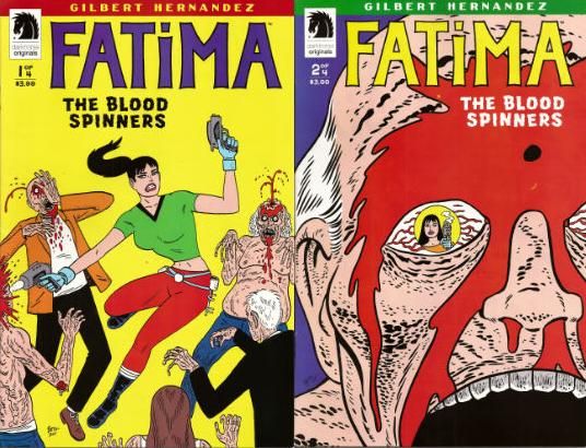
FATIMA: THE BLOOD SPINNERS #1 and #2 Story & Art by Gilbert Hernandez Dark Horse, $3.99 (2012) FATIMA: THE BLOOD SPINNERS created by Gilbert Hernandez Photobucket

Covers by Gilbert Hernandez

Now this, this, is a comic an 8 year old boy would like! In fact it’s a bit like a comic an 8 year old boy would create. An 8 year old whose pets keep disappearing. It’s a disturbingly affectless presentation of a gorily deadpan comedy parody/celebration of genre trash. Maybe it has something serious to say about the human condition. We’ll probably never know as rational thought quickly gets tickled into insensibility by the women in bikinis shooting zombies, cleverly stupid names like “bittermeat”, laughably terrible jokes and the rewarding central conceit of beautiful people with beige minds seriously making a mess of the whole saving the world thing.

Photobucket

Gilbert Hernandez (a/w)

Look, the people in this awesome comic wear devices that look like metal Y-fronts to make them invisible for the delightfully childish and arbitrary time of 3 minutes. That should clue any slowcoaches in that this is no Walking Dead. And that's just peachy by me.  I also liked the letter in the back of #2 that said Fatima had a “manly” face. It’s comics by Gilbert Hernandez! Don't be getting all prissy, John Sayles wrote Alligator. I hear Beto's (I call him Beto because we are so close we were practically separated at birth.)  now been doing this stuff for 30 years, man and boy, and he remains VERY GOOD!

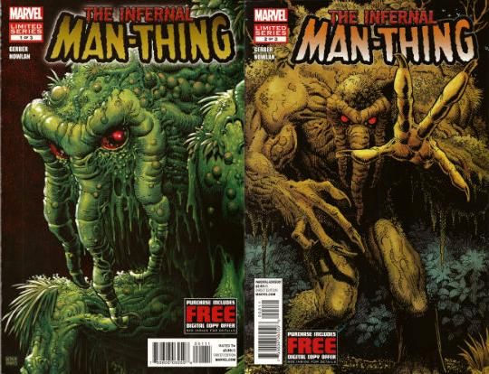
THE INFERNAL MAN-THING #1 and #2 Art by Kevin Nowlan Written by Steve Gerber Lettered by Todd Klein Marvel, $3.99 ea (2012) MAN-THING created by Stan Lee, Roy Thomas, Gerry Conway and Gray Morrow Photobucket Covers by Art Adams

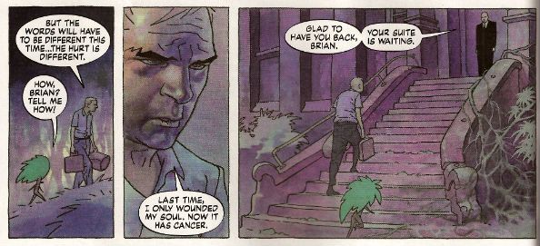
This doesn’t read too well as individual issues as (as I am sure we are all aware) it is an OGN cut up and shoved out in three easy, and pricey, pieces. It’s taken this long because Kevin Nowlan has taken this long. According to the text piece in #1 he was doing a page a week. At the Marvel page rates I have made up in my head, he would have starved to death before getting to page 10. So, rather than produce a half-assed product or die, Nowlan took his time and did other stuff. And I do have to say that the art here is very, very impressive. He’s got a ‘80s Kyle Baker thing going on, but with the additional, and considerable, oomph a foundation of fully painted colour provides. It’s a purposefully limited palette which gives everything a humid and lurid look. Like a swamp, see. Also, Nowlan’s also given Man-Thing a bit of a make-over and it’s kinda nice too, particularly the way Manny’s head seems to have slipped down to rest on his chest. Nice, that. Causes your gaze to stumble every time, good effect there. The words are very Steve Gerber, which is to say it’s very satirical in that endearingly adolescently blunt style Steve Gerber had. And when I say “adolescent” I don’t mean it as a put-down I just mean that in the sense of being energetic and all-encompassing. I always think of Steve Gerber as being an American version of Pat Mills, writing wise anyway. Although Gerber's more willing to accept his own portion of blame for the way things suck, I think. Maybe that’s why people respond more warmly to the work of Gerber than that of Mills.If you like Steve Gerber you'll like this, if you've never read Steve Gerber it's a good start as it is very Gerber-y. If you don't like Steve Gerber we won't be spending Christmas together. Because he and this are both VERY GOOD!

Photobucket

Kevin Nowlan/Steve Gerber (a/w)

According to #1 there's a lot of respect in this project. And yes, there probably is but this is Marvel. And so, as respectful as it was of your Uncle Nate to turn up to Pappy's funeral, it would have been better if he hadn't crammed his pockets with canapés, winked at the widow and blocked the bog with a boozy poo before drunkenly falling through a window. It’s a sloppy package what with the reprint of “Song-Cry of The Living Dead Man” looking kind of cheap and, in the second issue, having a double page spread printed on the front and back of the same page. This comic cost me two pounds and ninety nine pence Sterling, and yet I've had menus from the local pizza place pushed through my letterbox that had more thought, care and consideration in their design. But, I’m sure somewhere in there is a very real respect for Steve Gerber. At least Uncle Nate turned up, y'know. Ultimately, as Marvel as it is, it’s done out of respect for Steve Gerber, who is dead. And of course even Marvel respect the dead. Except for Jack Kirby. Who, it seems, can still just go f*** himself.

I hope you all had a smashing wekend and read some smashing COMICS!!!