"I'm A STUART, Grandpa." COMICS! Sometimes The Weird Porous Kid Walks It!

Here at Savage Towers the UK contingent is experiencing problems with The Haunted Scanner. So, just the covers this time out I'm afraid. Apparently my brain is no longer under warranty so I can't help the words that accompany the pictures. So here's a shoddy make-shift Sunday look at some comics. Or you could go outside and play in the snow! Photobucket
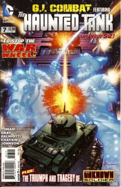
G.I. COMBAT Featuring The Haunted Tank #7 Haunted Tank by Howard Victor Chaykin (a), Peter J Tomasi (w), Jesus Arbutov (c) and Rob Leigh (l) Unknown Soldier by Staz Johnson (a), Justin Gray & Jimmy Palmiotti (w), Rob Schwager (c) and Rob Leigh (l) DC Comics $3.99 (2011) Haunted Tank created by Russ Heath & Robert Kanigher Unknown Soldier created by Joe Kubert & Robert Kanigher

Photobucket

The lead story here, a lead story about a Haunted Tank we should bear in mind, is a consumate exercise in capturing the gleeful idiocy of DC war comics of yesteryear; that is way back when to the time when Mommy would roll them up and beat me with them. Yes, the day I wrestled that rolled up copy of ALARMING BULLSHIT #235 off her was the day I became a man (i.e. 10 March 2007). Tomasi doesn't blink once as he recounts the tale of a Haunted Tank crewed by a gipper in a string vest and his endearingly credulous Grandson as they go up against a revamped War Wheel piloted by Rommel's grandson and powered by the slack corpus of The Desert Fox himself. It's barmy and all the better for it. HVC seems to have found the perfect home for his clip-art pasting mania with this hardware heavy tale although he doesn't fare as well on the flesh he hardly fails as such, giving The Fox himself a pleasingly senile cast to his confounded features.

Gray and Palmiotti manage the not inconsiderable feat of removing anything of interest from the Unknown Soldier concept, leaving us with some pages where a man falls out of a window and then goes and has sad thoughts in  someone else's garden. They even waste the nonsensical fun of having a diamond laced skeleton. As a result it's purely down to Tomasi and Chaykin's unflinching grasping of the nettle of nonsense that this book is GOOD!

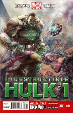
INDESTRUCTIBLE HULK #1 Art by Lenil Francis Yu Written by Mark Waid Coloured by Sunny Gho Lettered by Chris Eliopoulos Marvel, 3.99 (2011) The Hulk created by Jack Kirby and Stan Lee

Photobucket

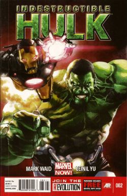
INDESTRUCTIBLE HULK #2 Art by Lenil Francis Yu & Gerry Alanguilan Written by Mark Waid Coloured by Sunny Gho Lettered by Chris Eliopoulos Marvel, 3.99 (2011) The Hulk created by Jack Kirby and Stan Lee

Photobucket

Yes, I know I shouldn't have this comic due to THE KIRBY IMPERATIVE but my Retailer forgot and so he wanted to share what he thought was a book I might like with me. Which is okay, because I don't actually expect my Retailer to remember all my mad demands and crazy caveats all the time. Most of the time will do. I'm not an animal. So, I ended up with this comic but because of Marvel's double-shipping and the lag in my deliveries I actually ended up with issues 1 & 2. Thus (thus, yet! Oh yes, thus! Smell my formal indignation!) a simple error sparked by generous intentions ended up costing me £5.98 and taking up space in my package that two comics I actually wanted might have occupied. This is the hidden damage of Marvel's double-shipping! I now want even less to do with Marvel than ever and I wasn't exactly mad-keen on them at this stage anyway.

But stupid English dude, double-shipping is just giving you more of what you like, I hear the less polite mutter. No, not really. Even if it was DAREDEVIL which I do like. For a start you aren't giving me anything. I'm paying for it. Secondly, I've seen Theatre of Blood and I do not want to be in the Robert Morley role while Marvel acts like Vincent Price and bakes my beloved (dogs/comics) in a pie and forces them down my throat with a plunger until I suffocate. Some of the classier of you might want to recast that thought in terms of Titus Andronicus, but I'm okay with Theatre of Blood.

This book was OKAY! Mark Waid is a reliable writing guy and Leinil Yu is still okay even if I think he needs to step back from the fussiness into the alcove of clarity. But it was $3.99 and even without THE KIRBY IMPERATIVE that's too much a month and with double shipping it would be $7.98 a month, maybe more. That's just nuts.

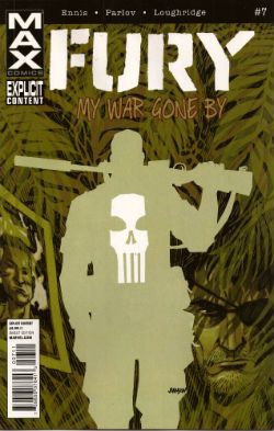
FURY MAX #7 Art by Goran Parlov Written by Garth Ennis Coloured by Lee Loughridge Lettered by Rob Steen Marvel, $3.99 (2011) Nick Fury created by Jack Kirby and Stan Lee Frank Castle (The Punisher)created by John romita Snr, Ross Andru & Gerry Conway

Photobucket

Originally I was overriding the KIRBY DIRECTIVE as this was such a VERY GOOD! comic and, more importantly, I am a weak creature always on the lookout for an out. As if to rub my smug face in my own moral doo-doo the quality of the comic seems to have taken a sudden lurch from Ellroy-lite into those issues of THE 'NAM where Frank Castle got introduced to boost sales. Quite a few people fondly recall THE 'NAM (i.e. the comic not the land war in South East Asia. Although I suppose it might have its fans too, human nature being what it is.) but I have never read anyone fondly recall the issues of THE 'NAM where Frank Castle started popping up. Also, I have decided to send the CBLDF the equivalent total monies this comic will end up costing me. Hopefully this combination of unmet expectations and financial excess will encourage me to actually be a man of my word. Then I will really get my Smug on, you betcha!

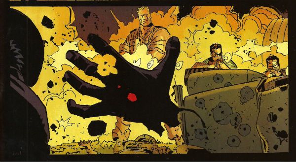
Goran Parlov's art is still staggering this time out with even the talking heads sections being just as entertaining as the slobberknockers in most other comics. There's an absolutely fantastic panel where Fury is giving Ms DeFabio a Cage-ing. It isn't fantastic for the contents but it is fantastic in that it has clearly been enlarged to make the occurrences within less, ahem, overt. This is a series that clearly, frequently and savagely depicts the effects of violence on large numbers of people, but apparently it still has trouble with a bit of bum fun. Marvel MAX comics - where there are no limits, except when there are! Despite all this it's still a VERY GOOD! comic.


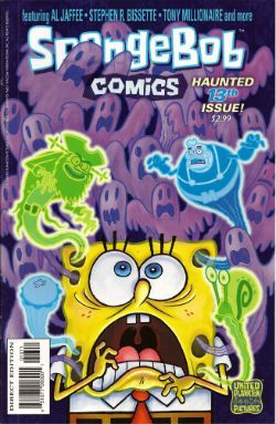
SPONGEBOB COMICS #13 Art by Rick Altergott, Vince DePorter, Nate Neal, James Kochalka, Derek Drymon, Stephen R. Bissette, Rementer, Tony Millionaire, Jacob Chabot, Al Jaffee Written by Chris Duffy, David Lewman, Maris Wicks, James Kochalka, Derek Drymon, Roman, Robert Leighton, Chris Yambar Coloured by Molly Dolben, Cat Garza, Monica Kubina, James Campbell, HiFi Lettered by Comicraft United Plankton Pictures, $2.99 (2011) Spongebob Squarepants created by Stephen Hillenburg

Photobucket

The Kid recently discovered Spongebob Squarepants on that televisual device that's sweeping the nation by storm and so I ordered this. Mostly to make up for all the parenting mistakes I make on a daily basis. Yes, he may end up hating me but he'll hate me less because I bought him a comic, I reasoned. And reasoned well. Being familiar with kid's spin off comics I braced myself for a tie-in comic which was so lacking in care or effort it would probably not even have the creators credited, it might even just consist of screen captures like that shitty Marvel digest of the ULTIMATE SPIDER-MAN show, whatever it was it would probably not be worth a second thought by anyone over the age of 7.

Once again proving how right I always am it turned out to be VERY GOOD!

I mean, look at that roster up there! I'm not listing all the names again (it's cold here and I'm a martyr to The Arthritis) but right here on these pages we've got the guys who did Doofus, Tyrant!, Sock Monkey, SuperF*ckers and all those crazy MAD fold-in things. Other people too, but I'm not familiar with them but they don't disappoint either. I guess the highlight is the Mermaid Man strip in which Steve Bissette basically draws a Nick Cardy era Aquaman strip and Derek Drymon has Spongebob draw himself into it. Like many a bored child has done in reality. It's sweet and clever and is surrounded by strips of equal or only slightly lesser worth. It's a crazy good line up producing crazy good comics and I wish The Haunted Scanner was working because then I could show you. But then again, maybe it's better if you just go and buy an issue of SPONGEBOB COMICS. You might be disappointed but with all the talent and invention on show here that's probably going to be all your own fault.

And I'm gone like Fury's eye but there remain  - COMICS!!!
"A Moi La Légion!" COMICS! Sometimes I Have Too Much Sun!

Greetings! It has been sunny in England for more than three consecutive days. This means that the entire nation is required by Law to sit outside until their skins glow like pink suns and crack like dry riverbeds in Texan heat. So I have been doing that. This means I didn't read many comics and when I wrote about them the fact that my brain had been lightly boiled in its own juices didn't seem to have a beneficial effect on my thought processes or judgement. But, hey, I made my deadline! I made it, Ma! I'm a hack! Photobucket

FURYMAX #2 Art by Goran Parlov Written by Garth Ennis Coloured by Lee Loughridge Lettered by Rob Steen Marvel, $3.99 (2012) Nick Fury created by Jack Kirby AND Stan Lee

Photobucket

Imagine my delight upon opening the latest issue of this fine comic to find an act of recreational physical pleasure being performed by Nick Fury and Ms. DeFabio. No, not because I have always wanted to see Kirby/Lee characters nut deep in the fun patch, no. (Well, Lockjaw maybe but that’s a personal thing.) No, it’s the fact that the act is presented so matter of factly. Almost as though it is just a part of life; one of those things adults do from time to time, these days mostly when they lose their broadband service and the TV is simultaneously on the fritz. In fact I can assure you I am not idly boasting when I say that even I , the misanthrope's misanthrope, have in fact personally heard of people in real life who have encountered a real life lady in such close quarters; which is to say even closer quarters than Nick & Co. encounter the ‘Cong in this comic. For one moment I thought mainstream genre comics had, in actual fact as opposed to the popular fiction entertained by most fans, grown up. A bit. Then I remembered it was a MAX comic and so that was okay as the regular line of comics would continue to be as ridiculous in their depiction of recreational procreation as ever.

Photobucket

Seriously, how bizarre must the depiction of something in regular life be if  its depiction in a Garth Ennis war comic is actually a healthier alternative. Focusing on that aspect, as for some inexplicable reason I have, does Ennis' work on this comic a disservice as it is so well realised by all the involved personnel that its level of focus brings to mind a close up of a sniper's eye as the unseen finger exerts the required pressure to do the necessary. It's one well honed machine is what I'm saying. This week, because this book appears to be weekly for some arbitrary reason, Goran Parlov knocks my socks off on the several occasions when he draws the Nazi bastard’s head as just a collection of lines held together by Lee Loughridge’s ever-excellent colours. Giving us a glimpse into a horrific world where Pig Pen grew up and joined The Hitler Youth. To speak plainly then, I thought FURYMAX#2 was VERY GOOD!

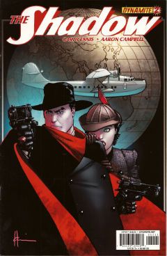
THE SHADOW #2 Art by Aaron Campbell Written by Garth Ennis Coloured by Carlos Lopez Lettered by Rob Steen Dynamite, $3.99 (2012) The Shadow created by Walter B. Gibson

Photobucket

As is customary, and contrary to my therapist’s advice, I shall now devote more time to the cover by Howard Victor Chaykin than the book it adorns. It’s a pretty swell cover, yes it is. The elegant simplicity of its design elements is foremost amongst its pleasures but only because the cheekiness of anchoring it all on The Shadow’s torso (which is little more than an oblong) is, let’s face it, the kind of thing only people who should really stop harassing aged Jewish comics creators when they go for a jog on the beach are going to give a gefilte fish about. I’d plump for Arbutov on colours rather than Delgado because it’s less an attack on visual sense and more of an attempt to attractively enhance the base image. But, this being Dynamite the colour of your cover is not a fixed thing! You can have a “Bloody Red” Retailer Incentive Cover (red and white!) or the Dynamic Forces Exclusive Howard Chaykin cover (black and white!). I hope these are all in the TPB because I would actually have an interest in seeing the image without colour, but that’s because I am a Chaykinmaniac. Otherwise I am just totally flummoxed by the need for all these covers. There are another 7 of them! The Ryan Sook one looks lovely by the way.

Photobucket

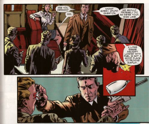
Eventually, sated, I looked at the actual comic. Ennis’ script this time out is pretty great. It’s basically an extended action sequence inventively choreographed within the confines of a Pan Am clipper intercut with exposition largely designed to demonstrate the evil of the opposition (kiddy fiddler ahoy!). I can’t fault the writer's execution of the script or the savagery of the violence (injury to eye is just the hors d’ouvres, darling!) but it impresses only despite some serious fumbling of the ball on Campbell’s part. I’ll not dwell on it too much as, after all, the art turns up and does the job; albeit with all the fiery invention of a Council employee during the week before his pension finally kicks in. Also, Megalophobics are hereby duly warned to stay away from the hilariously outsize hat which dominates the last panel. Still, Ennis’ script is so solid the comic remains GOOD!

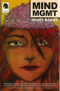
MIND MGMT #1 By Matt Kindt Dark Horse, $3.99 (2012)

Photobucket

In this comic's after-piece Matt Kindt runs the old I Want This Periodical To Work As A Periodical schtick. Y’know the one; the one about extras unique to the pamphlet (or FLOPPY!(cue Brian Hibbs rearing back like Christopher Lee before Pter Cushing's crossed candlesticks. Hsssss!)) which will enhance and entertain, yes, that one. I think he’s actually serious about it, too. That's on the evidence of the first issue of what future generations will call “that book Matt Kindt did no one bought” (but we will call MIND MGMT). I mean, only time will tell but I doubt this is going to take the form of backmatter telling us how his movie deals are progressing (Matt Kindt hasn't got any. Yet.), how hard life is for the talented and beautiful (my heart; it bleeds), a telephone book size list of all the awful comics he has in print (because Matt Kindt doesn't do awful comics. Ever. Fact.). Not that anyone else does that, but I severely doubt Matt Kindt will. The clue is in the comic itself.

Photobucket

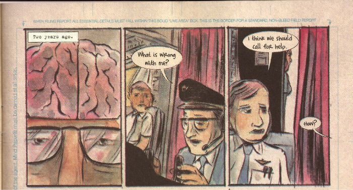
Every page of this comic is the comic. The inside front and back covers are a short prologue to the book itself, the back cover is an advertisement that is in fact not an advertisement, text crawls up the side and across the page margins (a la ADVENTURE TIME) adding colour and background to the concept in a dryly humourous faux-bureaucratic way, there’s a short backup piece not intended for the TPB which ends with a six panel sequence so awesome that you know right then and there that MIND MGMT is the one. MIND MGMT is the one. MIND MGMT is the one where Matt Kindt arrives. This is Matt Kindt’s AMERICAN FLAGG! moment. This is where Matt Kindt turns up says, hey, this is what I do and this is the way I do it and you, well, you just deal with it! Matt Kindt just slapped his big talented balls on the table and now you either walk away or you just deal with it. MIND MGMT is odd but EXCELLENT! Deal with it!

And then I saw sense and decided my time, and yours would be better utilised if I wandered off to flick lima beans at next door's koi carp.

Hope you had a good weekend with some COMICS!!!

NEXT TIME: Something else!

"It Is Not The FIRST TIME This Has Happened." COMICS! Sometimes They Are Hot Off The Griddle!

Hey old people, remember Sunday evening when you were a kid?: Photobucket

Urrrrrhhhh! Let's take the Sunday Blues away with some piffle about our four colour floppy friends! COMICS!!!
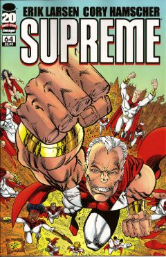
SUPREME #64 Art by Erik Larsen & Cory Hamscher Written by Erik Larsen Coloured by Steve Oliff Lettered by Chris Eliopoulos Image Comics, $2.99 (2012) Supreme created by Rob Liefeld

Photobucket

Hu-ooFF! Well, that was horrible. As a comic, I mean. Look, I don't have a problem with a change in direction and it's a little soon to tell if I have a problem with this particular change in direction, but I have a problem with a bad comic which this was. Just page after page of people dying, things falling over, plenty of, as my son would say, "'splodin'!!!". I hate to break thi sto everyone but that's not actually a story as such. Sigh. I don't have much familiarity with Erik Larsen's work (the '90s? Not really my best time for comics)  so I'm not counting him out yet. Yeah, maybe Erik Larsen can swing this one around. I'll give him a couple more issues to do so. Turns out I'm that close to generous but this issue was pretty EH!

Photobucket

Reckon them's fightin' words and wanna show me just how wrong I am? Well, you can buy this exact comic from  HERE!

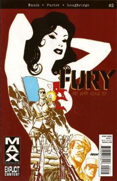
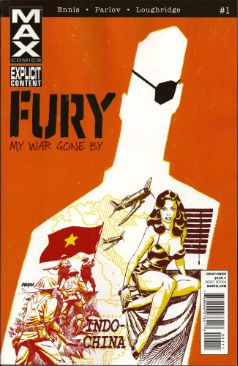
FURY MAX #1 Art by Goran Parlov Written by Garth Ennis Coloured by Lee Loughridge Lettering by Rob Steen Marvel,$3.99 (2012) Nick Fury created by Jack Kirby with Stan Lee

Photobucket

I don't know what they are feeding Garth Ennis on these days but the comics he's producing would be Type 3 or 4 on The Bristol Stool Scale; this being as we all know optimal. In a worrying state of affairs Ennis has now produced two comics (see last week's THE SHADOW) which are set in  convincing historical settings, peopled by satisfyingly sketched characters and which succeed in being both informative and entertaining. Which is why I had to bring my own shit joke to the party lest his regular, heh, audience feel at at a loss. Taking the first chapter's title from TheThe softened my hardened heart but going on to deliver an intelligent, amusing and diverting comic  is what really sealed the deal here.

Photobucket

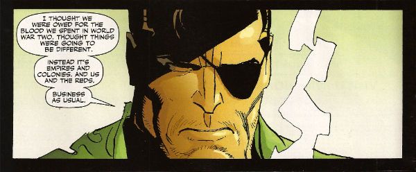
Ennis is helped no end by the astonishing art of Goran Parlov. Goran Parlov is the kind of artistic wonder who can limit himself, largely, to the most banal of page layouts without inspiring new lows of tedium in my mind. He can do this because everything he puts in those panels is just right. It doesn't hurt that his present day Fury looks  so gnarled and battered he resembles 19th Century armoire smoking a cigar while clad in plaid slippers and a fluffy robe. Yeah, this was VERY GOOD!

(Yes, I am aware Nick Fury was created by Jack Kirby with Stan Lee and that I said I wasn't going to purchase any more Marvel products which failed to acknowledge the contributions of The King.  Either my LCS forgot or decided that my professed liking for Garth Ennis' non puerile work and Goran Parlov's anything superceded this. Okay? Either way I got a good comic and I still think it could have had the words "created by Jack Kirby and Stan Lee" on it without upsetting the balance of Life itself.)

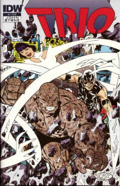
TRIO#1 Written and Drawn by John Byrne Coloured by Ronda Pattison Lettered by Robbie Robbins IDW, $3.99 (2012) Trio created by John Byrne

Photobucket

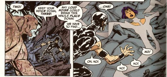
Mark the time. The super-hero funnybook is dead. I'm surprised to find John Byrne's DNA on the corpse but then it's always the ones that love hardest that end up hating enough to kill. I'm a bit sore because I lost my shirt on this one; my money was on one of the TV Breed. One of those guys who just keep parping it out until the comics cognoscenti just give in and allow quantity to supercede quality. Yeah, I figured the smoking gun would be in the clammy hands of  one of those guys with all the imagination of an empty cardboard box, one of the dialogue guys, one of the post-it notes and flow-chart guys, y'know, the sophisticated guys. But like the most surprising game of Comics Cluedo ever, in the end it was John Byrne in the LCS with The Fantastic Faux. A super team of characters called "One", "Two" and "Three" could only mean one thing; the death of imagination.

Photobucket

But look, in his defence, no one loved the super-hero funny book as much as John Byrne. He loved it so much he hid it away and protected it from reality. Up there in the big house with the pool. Pretending nothing had changed and if it had, well, it wouldn't last. See, John Byrne knows super hero comics are still big it's just the audience that got small. You just have to give 'em comics like back when they loved them. Back in the '80s. The magical hey-day of ALPHA FLIGHT! This isn't a comeback it's a return, it's the return of cape comics, the return of the way they should be done, the return of the way they were done when they were done rightIt's the return of an '80s issue of ALPHA FLIGHT. Sure, it's the best issue of '80s ALPHA FLIGHT ever published but it's still just an '80s issue of ALPHA FLIGHT. It's now 2012. Here's the corpse of super-hero comics now, caked in make-up, going on eighty trying to pass for eighteen. Nothing sadder. Sure, it may be EH! but they'll love it in Pomona.

You can prove the audience for this comic didn't leave twenty years ago by buying it from HERE!!!

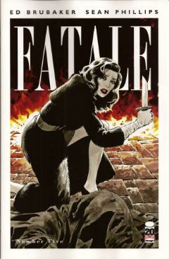
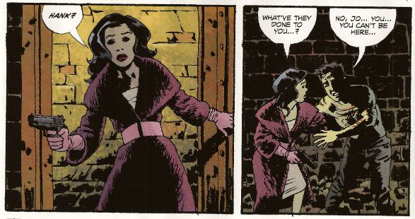
FATALE #5 Art by Sean Phillips Written by Ed Brubaker Coloured by Dave Stewart Image Comics, $3.50 (2012) Fatale created by Ed Brubaker and Sean Phillips

Photobucket

Well, I gave it 5 issues and I was hoping this one would turn it around. It didn't. A spooky rinser, people in hats swearing and a demon who can come back from the dead but can't bring back his eyes. I guess you could say it was a bit like James Ellroy meets H.P. Lovecraft, y'know, if they'd both had flu at the time, or you'd only seen the covers of their books, or you had in fact never actually read them just read about them. In the end FATALE pretty much ended up being the John Byrne's TRIO of independent creator-owned comics. Familiar stuff delivered familiarly; that's not going to make me run about like my underpants are on fire no matter who is involved. Sure, I'm all for Team Independent but not if they are as bland as the alternative. Being creator owned is a magical thing but for a reader comics still have to be better than EH!

Photobucket

Possibly not the most popular opinion regarding this comic book! Why not make up your own mind by purchasing if from HERE!

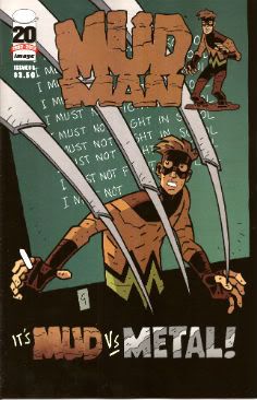
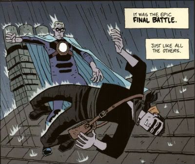
MUDMAN #3 Written and Drawn by Paul Grist Coloured by Bill Crabtree Image Comics, $3.50 (2012) Mudman created by Paul Grist

Photobucket

Wait! I'm getting a pulse! turns out the cape comic isn't dead after all, it just has to keep up with the times is all. This one's about a normal kid in a timelessly sleepy English seaside town who is, through events and stuff ,suddenly not normal in a way that involves mud and being a man made thereof. It's got a breezy lightness of tone that might work against it; sometimes it seems not a lot has happened but really quite a lot has. As Owen Craig (Mud Man when he's not Mud Man) finds his powers have opened up new possibilities for him physically the environment around him seems to change in concert. Using the fixed point of Owen's discoveries as the present Grist fills in the Past and hints at the Future while parts of each encroach on Owen's life and, as is generally the way of things, threaten it.

Photobucket

Grist is really good at keeping the tone light while at the same time giving the threats real weight.  He also excels at teasing about future developments; so much so that the next issue just can't get here quick enough. But what Grist is best at is storytelling; in the words and pictures sense, natch, this being a comical periodical and all. He may be a bit too good at it because reading the comic is so effortless, practically intuitive, that it's quite likely the reader might forget to credit the incredible talents and the deft wielding of same that made it so. From soup to nuts, from top to tail, from mud to man MUD MAN is VERY GOOD!

Or is it? Find out by buying it from HERE!!!


And we're done. If you're going to hang about don't forget to lock up and put the key back through the letterbox.

Have a good weekend and always remember COMICS!!!