"This is Worser Than Washin' An Elephink!" COMICS! Sometimes It's Like I'm Shouting This At You While I Run Past!
/Borag Thung, Earthlets! I have been quiet of late but I rested easy in the knowledge that the delightful Messrs Khosla, McMillan, Lester and Hibbs had been satisfying all your comicy needs to the highest of standards as ever. Not that I was resting you understand. So, practically writing this one as I move towards the door...Anyway, this...
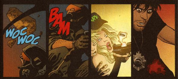
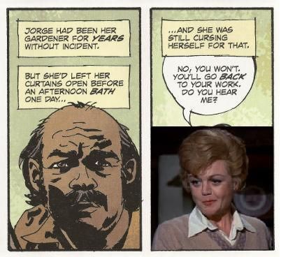
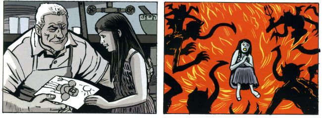 David Lapham from The Strain in DARK HORSE PRESENTS #28
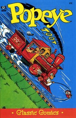
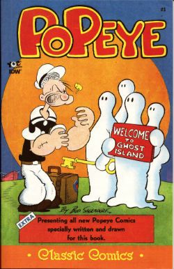
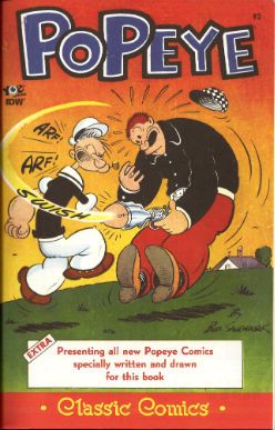
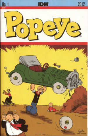
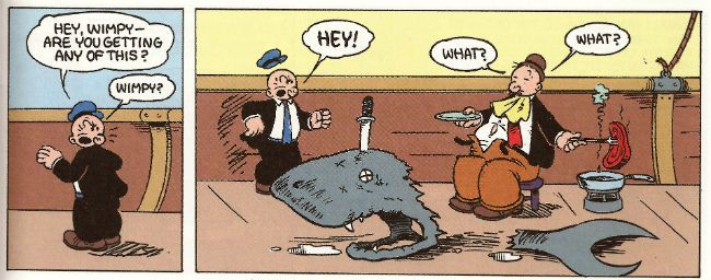
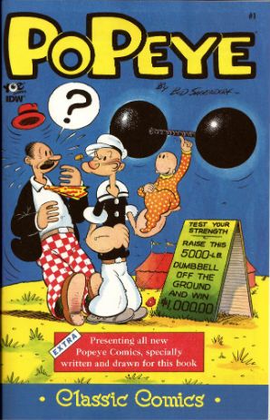
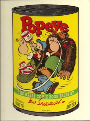
POPEYE:CLASSICS #14 Written and drawn by Bud Sagendorf IDW/Yoe Books, $3.99 (2013) Popeye created by E.C. Segar
Some issues of POPEYE: CLASSICS are available from the Savage Critics Store (which you have all quite patently forgotten about. Sniff!) HERE.
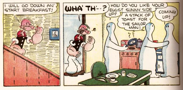
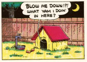
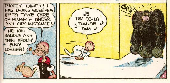
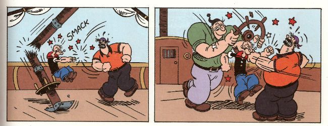
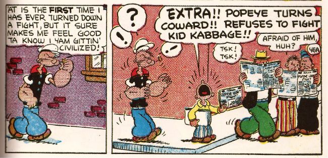
Month in month out the nautically attired freak faced grammar mangler continues to pleasantly baffle me with the weirdly logical escalation of the ludicrous incidents which comprise his preposterous adventures. Since Popeye, for all his charms, is in fact a fictional construct I’m going to place the credit for this consistently entertaining package at the door of Bud Sagendorf, a real life man (now deceased) who went done drew and writed it all. Fans of the magic old men do can marvel at Sagendorf’s use of long shot silhouettes to prevent a total nervous breakdown from having to repeatedly draw a train in what are quite small panels indeed. As a special bonus Sagendorf serves up some right nice visual gaggery, the best of which are the parts where sound FX have a physical effect on the drawn environment they inhabit. Basically they hit people on the chin is what I’m saying there.
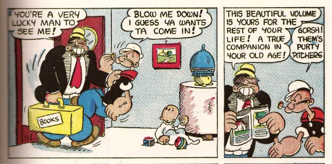
 Bud Sagendorf from POPEYE CLASSICS #14
In this issue the main tale involves Popeye buying a railroad, Olive Oyl’s demanding customer, an attempted hijack and a visual stereotype of a re..native American (altho’ in the world of Popeye this might actually be a vacationing accountant in racially insensitive fancy dress). Then there’s a story where Popeye buys the world’s cheapest and laziest race horse, another story where Popeye and Olive simultaneously seek to teach Sweetpea a lesson and demonstrate their poor parenting skills by scaring the shit out of the wee tyke in an abandoned mine, and a short with Wimpy being out foxed by a cow (“a lady of the meadow”), there’s a text story as well but I skipped that. Bud Sagendorf wasn’t writing for the &*^%ing omnibus is what I’m getting at here. Popeye is printed on weirdly bloated pages, haphazardly coloured and always, always a welcome arrival in my field of vision so I’m going to say it’s VERY GOOD!
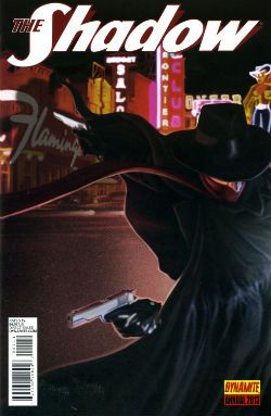
THE SHADOW ANNUAL 2013 Art by Bilquis Evely Written by Andre Parks Coloured by Daniela Miwa The Shadow created by Walter B. Gibson Dynamite, $4.99 (2013)
Man, I’m not exactly Sammy Stable at the best of times (“No shit, John!”) but the temporal shenanigans in this thing almost gave me a panic attack. It’s five minutes ago! Now it’s three hours later! No, hang on, it’s five years earlier. No, it’s been seven hours and fifteen days. And nothing compares. Nothing compares. To yaaaooooooooowwwww. Clearly the comparison being begged here is that this comic is like Brief Encounter but starring two psychopaths and set in Vegas before Elvis conquered it.
Bilquis Evely from THE SHADOW ANNUAL 2013
Even more clearly it’s not like that at all but instead is very much like having to find your train in a busy station where all the clocks show the wrong time, people keep getting stabbed and shot and you’ve found yourself in the company of some boring jabberjaw who won’t shut up about his first love. Shadow, dude, move on. This is unseemly in a man of your standing. Fucking chin up, old son. As for the art, well, it’s okay, it’s alright, but there’s a tendency for noses to look like the owner has a heavy cold. That’s Sean Murphy’s influence (influenza!) in action there. So, a nice idea, not terribly well executed at a price point I want to hit with a stick makes this EH!
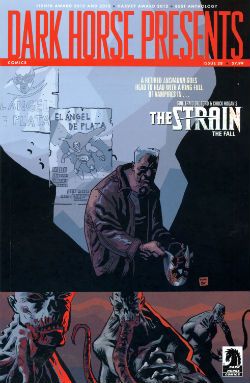
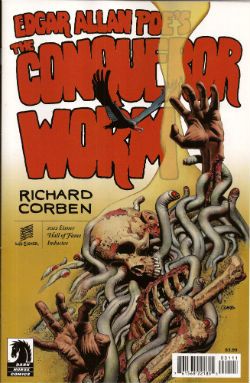
DARK HORSE PRESENTS #28 Art by David Lapham, Neal Adams, Richard Corben, Steve Lieber, Patrick Alexander, Ron Randall, Menton3, Michael T. Gilbert, Aaron Conley and Geoff Darrow Written/plotted by David Lapham, Edgar Allan Poe, Richard Corben, Neal Adams, Caitlin R. Kiernan, Ron Randall, Steve Niles, Michael T. Gilbert, Janet Gilbert and Damon Gentry Coloured by Lee Loughridge, Moose Baumann, Rachelle Rosenberg, Jeremy Colwell, Michael T. Gilbert, Sloane Leong Lettered by Clem Robbins, Nate Piekos of Blambot, Ken Bruzenak, Steve Lieber and Damon Gentry
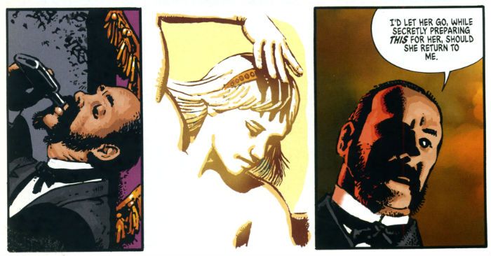
Dark Horse Presents is an anthology so, you know, it’s a bit all over the shop. Mostly though it keeps its footing on the shiny tiles and rarely sends the display of stacked tins (Pork and beans! For the poor!) spinning madly about. First up, David Lapham reminds me how good he is at comics with his The Strain chapter. Even though I have no particular interest in this property and there's a bit of cultural shorthand verging on the cliched Lapham quietly did the business on every page to ensure that the final panel came as a punch to the guts and I actually wanted to read what happened next. Later in the ish Lapham resurfaces with the conclusion to his introductory Juice Squeezers tale which, with its teen focused Cronenbergyness, proves to be the kind of nuts that comics would benefit from more of and yet truculently resists embracing.
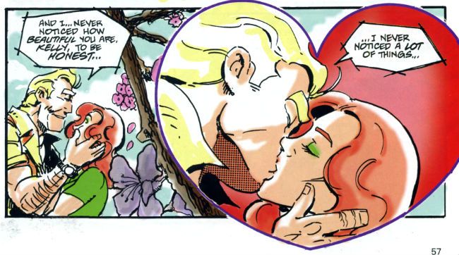
Michael T. Gilbert, Janet Gilbert and Ken Bruzenak from Mr. Monster Geoff Darrow’s spot illustrations continue to amaze with the visual conviction with which they deliver scenes at once grotesque, impossible and droll. In a similar fashion to the comics Darrow produces elsewhere, comics which chafe some SavCrits so (but, strangley, not this eminently chafeable one), Sabretooth Swordsman with its surprising Savage Pencil influences is an optically delirious but narratively slight piece.
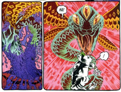 Aaron Conley, Damon Gentry and Sloane Leong from Sabertooth Swordsman
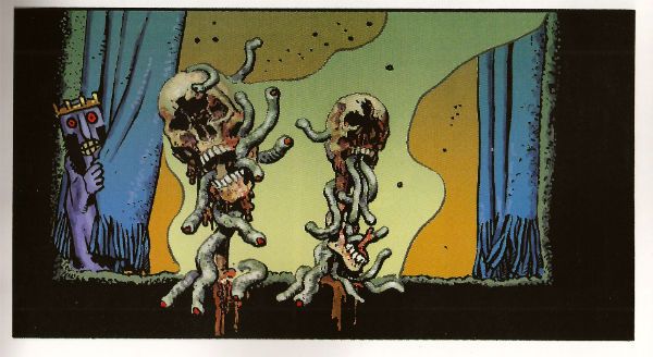
Richard Corben chucks out another Poe adaptation which is notable primarily for the truly scintillating colour work executed therein. I am absolutely horrible at appreciating the colour in comics but even here, even I, had to stop and marvel at more than one point. Ken “The Chameleon” Bruzenak is here in several different stories and in each case serves up lettering apposite to the pieces in question; in the very traditional Trekker his work is attractive but modest while in Mr. Monster he provides an ostentatious display of madcap fonts.
Richard Corben and Nate Piekos from Edgar Allan Poe's The Assignation
As a whole Mr Monster, additionally armed as it is with Michael T Gilbert’s invigoratingly loose art, continues to cock a scruffy snook at seriousness; which I like. Mrs. Plopsworht's Kitchen by Patrick Alexander succeeds in making physical and emotional abuse funny which is an interesting type of victory. Oh, and there’s some other stuff here; Steve Niles producing his trademark pound shop horror; Alabaster continuing to not be anything I want while not actually being terrible and Blood by Neal Adams continuing to be Blood by Neal Adams. Overall though I had a good time so DHP was GOOD!
JUDGE DREDD CLASSICS#3 Art by Carlos Ezquerra Written by John Wagner & Alan Grant (as T.B. Grover) Coloured by Tom Mullin Lettered by Steve Potter Judge Dredd created by John Wagner & Carlos Ezquerra IDW, $3.99 (2013)
Look, before I start acting like a pissy arse let’s get this one thing straight: these are great comics. I know this because it isn’t the first time I’ve bought them and it certainly isn’t the last time I’ll read them. When I first read them they blew my school socks off (not a kink; I was at school). The Apocalypse War was where Carlos Ezquerra returned to the character he (co) created after an absence occasioned by unfortunate editorial decisions. Carlos Ezquerra was back and Carlos Ezquerra meant it. Carlos Ezquerra drew the cremola out of The Apocalypse War even as The Apocalypse War blew the world of Dredd to grud and back. Because The Apocalypse War was where Wagner & Grant (AKA T.B. Grover) took all the pages of world building that had gone before them and applied a match. After The Apocalypse War the world of Dredd would never be the same again. Really. In The Apocalypse War Dredd made a decision no man should ever have to make, a decision only a man who was not a man could make, and the following decades of the strip have shown the consequences and ramifications of that decision fashion Judge Joseph Dredd into a man at last. With The Apocalypse War Wagner & Grant’s breathlessly hi-octane narrative pace in tandem with Ezquerra’s consistently brutal style created an epic that looked like the end of everything but was instead the birth of the strip’s future. These are great comics.
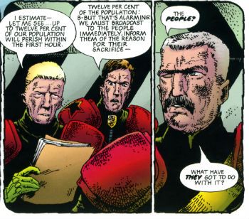 Ezauerra, Wagner, Grant, Potter and Mullin from The Apocalypse War
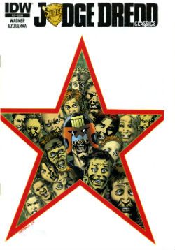
Alas, when I talk about greatness I’m talking purely about the pages of comics in here. The actual physical pamphlet comic is a bit lacking. You know, these are great comics. Do I repeat myself? I repeat myself. Great comics, so how’s about a bit of care and attention; a bit of respect. That’ll have to remain purely theoretical because, oh, he’s off now…The cover’s a bit lacking for starters; look, I’m all about negative space and clear, crisp design but that looks a bit, well, I don’t think it achieved its aim. Imagine if they’d rejigged an original 2000AD cover featuring The Apocalypse War. Trust me when I say the new cover would be a poor second. Then, oh dear, the inside front cover seems to think this story is called Block Mania but it isn’t; Block Mania finished last issue. This story in this issue, (which is all reprints and cost $3.99) is called The Apocalypse War which is why I’ve called it that through all the preceding verbiage. Then between each chapter there’s a perfunctory full page graphic. Grud on a Greenie! I realise the space has to be filled due to the page counts of each episode but could you not have had a bit of fun, IDW? Got a bit creative? Maybe stuck the original covers on there instead, or blown up a portion of a panel pop art style like on those DC Kirby/Ditko/etc Omnibooks? You’ll notice, IDW, that I’m not even daring to suggest you commission some, choke, original content. I mean I realise reprinting decades old comics and charging $3.99 a pop might not allow for such largesse. Sarcasm there.
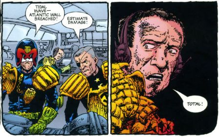 Ezauerra, Wagner, Grant, Potter and Mullin from The Apocalypse War
Then there’s that weird waste of space at the bottom of the page. Again, I appreciate you don’t want to mess with the size ratios but, drokk it all, that’s some token stuff there, IDW. And there's a page out of sequence. A page out of sequence in a comic of reprints selling for $3.99! However, I am okay with the colouring. Obviously, I’d rather they hadn’t bothered because the art was drawn for B&W (except for the opening spreads) but I understand Americans are fond of their colours. There they are America: enjoy your Colonial colours! Moan, moan, moan except this is all basic stuff. I'm hardly asking for Cher to sing live in my living room here just some vague pass at professionalism, if you please.
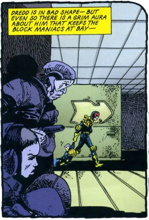 Ezauerra, Wagner, Grant, Potter and Mullin from The Apocalypse War
So, a confounding miscalculation on the part of IDW here; this material is readily available in a number of other formats and has been for decades so making a new iteration stand out from the crowd would, I’d think, be imperative. Making your books expensive and ill-designed is certainly a novel approach. Luckily, these are great comics so even though the crime is Fail the sentence is GOOD!
Anyway, I'm off now. With any luck I'll bump into some COMICS!!!!
