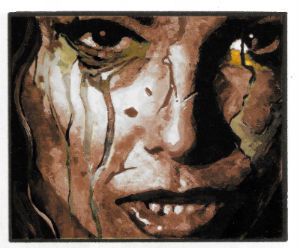
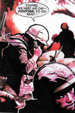
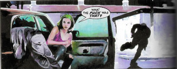
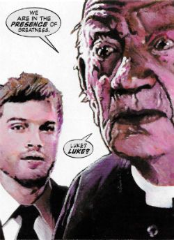
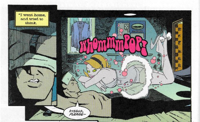
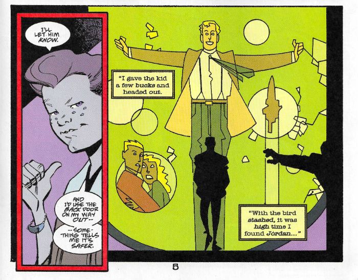
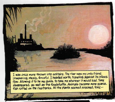
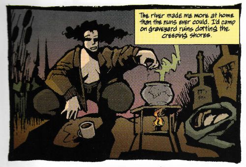
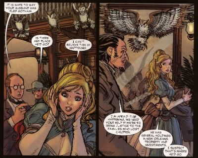
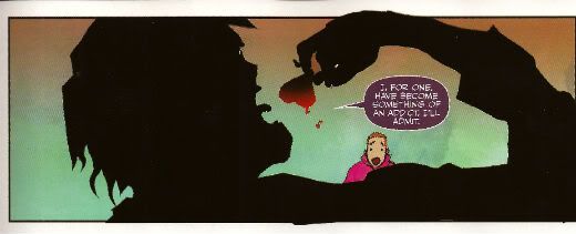
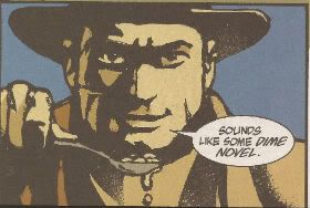
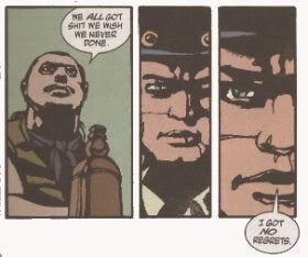
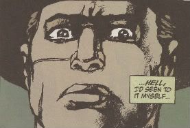
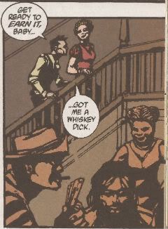
“Well, Chuck you, Farley!” COMICS! Sometimes Life is Cheap But That’s Okay Because So Are the Bananas!

Sure, right now the site is just saying: 403: FORBIDDEN. Which is less than ideal, and I think a lot of us can relate. But this isn’t the time to roll over, Savage Critics server, this is the time to stand up and keep, uh, writing self-indulgent “things” about old comics no one cares to remember. That’ll show those Ctrl-Alt-Del Nazis! So, anyway, if you can read this then the site’s no longer 403: FORBIDDEN. Hurrah! Let’s bloviate! Well, I’ll bloviate and you can run out of patience once we hit the bit about Ike.  photo ACplaneB_zpsfbeoaftp.jpg
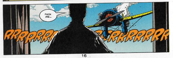
AMERICAN CENTURY by Laming, Stokes, Chaykin, Tischman, Bruzenak, Rambo and Jamison

Anyway, this…

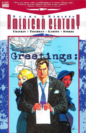
AMERICAN CENTURY:SCARS AND STRIPES Penciled by Marc "No Blaming" Laming Inked by John "Doris" Stokes Written by Howard "Victor" Chaykin & David "Tsk" Tischman Lettered by Ken "The Bruise" Bruzenak Coloured by Pam "This Time We Win" Rambo Seperations by Jamison Logo Design by Rian Hughes Original Cover Paintings and Thumbnails by Howard Victor Chaykin Originally published in single magazine form as AMERICAN CENTURY 1-4 DC Comics/Vertigo, $8.95 (2001) American Century Created by Howard Victor Chaykin

 photo ACtpbCovB_zps9rcgmk2n.jpg

Usually I ignore the quotes on books unless it’s from someone whose opinion I respect. Since for comics these are usually sourced from Neil Gaiman, mostly I ignore the quotes on books. (Hee hee!) The TPB of AMERICAN CENTURY: SCARS & STRIPES has a nice, refreshingly non-Gaiman, quote though:

"Now we know what would happen if James Ellroy and Graham Greene hooked up and wrote comics." - Editor's Choice, Entertainment Weekly

Yes, you could dismiss it as glib but it’s actually pretty smart, especially as Graham ‘Brighton Rock’ Greene isn’t the usual point of comparison for Comics’ Greatest Ballroom Dancer, Howard Victor Chaykin. James Ellroy’s name is not so surprising: unpleasant people doing unpleasant things against an unpleasant historical backdrop; the fictional creating literary friction with the factual; ayup, AMERICAN CENTURY is squarely in ‘American Tabloid’ territory. Less liberal-baiting racial slurs than the Demon Dog, though. But, Graham ‘The End of the Affair’ Greene? Yeah, it works. Just as Graham ‘The Human Factor’ Greene’s work took place in Greeneland so does Chaykin’s work take place in Chaykinland; both imaginary lands bearing some resemblance to the real world, but largely defined by the idiosyncrasies of the authors in question. Graham ‘The Power and the Glory’ Greene had Catholicism and Chaykin has Judaism; but whereas Graham ‘The Quiet American’ Greene wore his religion like itchy fetters, Chaykin sports his like a natty hat. Both Graham ‘Our Man in Havana’ Greene & Chaykin evince a healthy interest in the world around them, its history, and how this history affected people and vice versa (emphasis on the vice, alas). As approaches go the whole saying something about the world we all inhabit approach sadly proves, when it comes to comics, to be rare as hen’s teeth. So, despite the eruptions and ructions of the very recent past North American genre comics can be relied upon to continue on their merrily emptyheaded and decompressed way, telling us very little about not very much. Exceptions exist, but I put it to the Court, m’lud, that no one has so stubbornly endeavoured to elevate North American genre comics from insubstantial Pablum to something with some mental traction, than the thermodynamic miracle, Howard Victor Chaykin. (Well, no American anyway.) Of course there are very clear differences between Chaykin and Greene; Graham ‘The Third Man’ Greene definitely wrote ‘Travels With My Aunt’, but let’s face it Chaykin would be more likely to write ‘Travels With My Cock’. Comparisons only go so far, after all.

 photo AMCLedgeB_zpssfvgsfqy.jpg

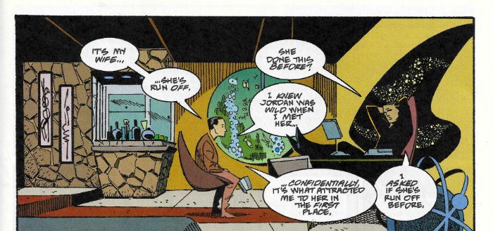
In many ways AMERICAN CENTURY (the 2001 Vertigo Comics series, of which this TPB collects the first four issues) is a succession of travels with Howard Victor Chaykin’s cock. Or his analogue’s cock at least. This time out that analogue is one Harry Block (later Harry Kraft) by name. Harry’s a Portuguese ginger midget with a wooden leg and halitosis that can stun an ox…oh, okay, Harry’s a tall, handsome, physically fit, dark haired, realistically cynical (or cynically realistic), heterosexual American Jew who might not be too smart, but is pretty wily and kind of self-righteous. That is, it’s the usual Chaykin mix of mensch and schmuck we know and love so much. Harry’s come back from the War and unsuccessfully settled into the suburbs. His wife’s a nag and his life is drab. Then he gets drafted for the Korean “Police (cough!) Action” And like any responsible adult he just ups and fucks off, leaving it all behind and sets out into the…(ta da!) American Century! Because, okay, sure, we have to give America that much; the 20th Century belonged to America. (Sorry, Yanks, the 21st Century is earmarked for Tonga. It’s Tonga’s Century, we’re all just living in it!)
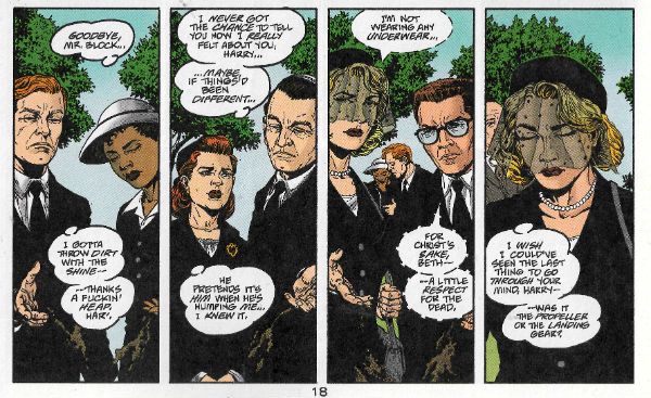
 photo ACwakeB_zpsaj4rsgio.jpg AMERICAN CENTURY by Laming, Stokes, Chaykin, Tischman, Bruzenak, Rambo and Jamison

The book is set in the ‘50s which is an interesting period in American history, one when America’s Imperialism, emboldened by the fact everywhere else was just plain tuckered out after WW2, was still a tad heavy handed. The ‘60s of course would force a slicker and quieter approach after Vietnam black America’s eyes (e.g. in 1968: 16,592 American deaths were reported in Vietnam versus, say, in 2014: the first McDonalds was opened in Vietnam. I don’t like McDonald’s, but I’d much rather dead cows than dead people. Sorry, vegetarians.) Of course Howard Victor Chaykin isn’t the only name involved here. Writing wise it’s Chaykin & Tischman, which, well, it’s a gobstopper isn’t it? I was going to go with “C&T”, “Tishkin” or maybe “Chayk-Man” for brevity’s sake. But “C&T” sounds like a cheap cocktail (or a regrettable medical procedure people who respect life but kill doctors want to ban), “Tishkin” sounds like a 19th Century Russian poet (author of ‘The Bronze Cocksman’, perchance) and Chayk-Man sounds like a really bad idea for a superhero (don’t ask). So, I’ll be sticking with Chaykin & Tischman, thanks.
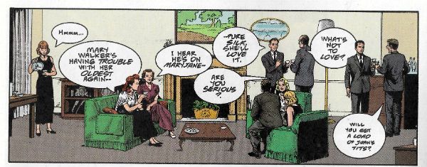
 photo ACpartyB_zpswfrooqew.jpg AMERICAN CENTURY by Laming, Stokes, Chaykin, Tischman, Bruzenak, Rambo and Jamison

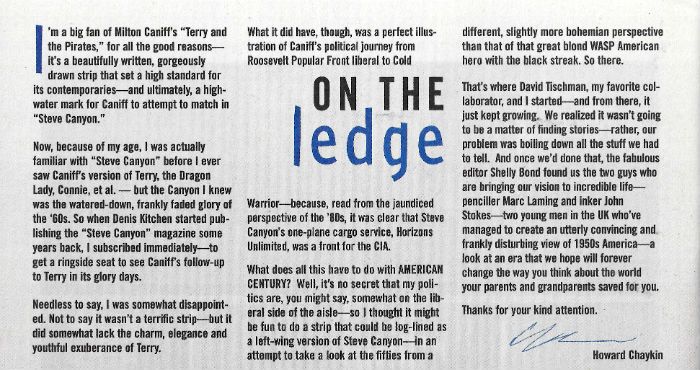
On art there’s Marc Laming, with inks by John Stokes. Laming’s cut quite the rug lately over at Dynamite with his pleasantly solid work on the Kings Features characters, but back in 2001 he was a greenhorn and, alas, it shows. Working from breakdowns by Howard Victor Chaykin, Laming’s work is never less than efficient but hardly more than that either. Problems are apparent on the first page where he fluffs the distance between a coupling couple and a pile of books. The whole point of the scene is their physical infidelity topples the books and causes a crack in a wedding photo (SYMBOLISM!) Yet, the books are either too far away for it to work and the couple appear to throw themselves across the room, or they are comically large books.  Perspective, innit. Tricky stuff. (Wittily, one of the books is Norman Mailer’s 1948 novel ‘The Naked and The Dead’, wherein Mailer was swayed into the use of “fug” rather than “fuck”, because, uh, moral decency and all that good stuff. By 2001 Chaykin & Tischman are under no such constraints and revel in it. Swear like fucking sailors they do. Disgraceful fuckers.) Laming’s faces are also less than ideal, tending toward a samey-ness which can confuse. But, hey, that never stopped Jim Lee.  And it probably didn’t take Laming 6 months to draw someone’s tear duct. John Stokes’ inks manage to elevate Laming’s art for the most part but, alas, the art is at root the kind of stiff that results from artistic stage fright. Hey, it’s a big gig for someone starting out, and while Laming never excels, he doesn’t disgrace himself either. He’s good on the hardware and environment; cars, houses, offices all have that authentic repressed ‘50s flavour. Racism and homophobia saturated the '50s but they could sure design cars and fridges. Now we stil ahve all the bad stuff but everything looks like cheap crap. Uh, anyway. Fair’s fair, the story gets told; which is more than many can manage first time out. Some established pros still struggle don’t they, Tony S Daniel? Laming and Stokes’ art is given some visual pop via Ken “The Bruise” Bruzenak’s reliably playful lettering, but he struggles to integrate it as smoothly as he can with Howard Victor Chaykin’s art. Luckily with Chaykin & Tischman’s script there’s a surfeit of bawdy energy and surly humour which helps to paper over the artistic cracks somewhat. Unusually for comics then, AMERICAN CENTURY fares better on the writing than the art, with the script retaining the urbane combination of aloof and louche which makes Howard Victor Chaykin’s solo work sparkle so. I don’t know what the actual split on scribing duties were, but if Tischman was just tasked with putting Howard Victor Chaykin into historical scenarios and ensuring the tiny dynamo was waist deep in fighting and fucking, he couldn’t have done a better job. Tischman also writes the introduction to the TPB, and it’s a nice piece of clipped prose, evoking the hard-boiled likes of Cain and Hammett which the series seeks to channel, but also with that undercurrent of self-aware humour characteristic of Chaykin’s work. Even when others are involved.
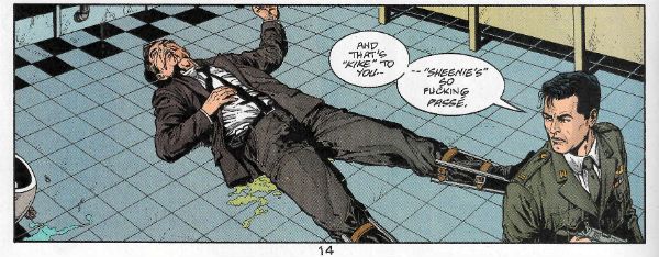
 photo ACslursB_zpsqxsmgym4.jpg AMERICAN CENTURY by Laming, Stokes, Chaykin, Tischman, Bruzenak, Rambo and Jamison

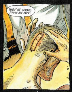
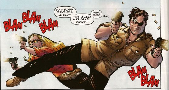
The post-WW2 period when America was still King Shit of Cock Mountain, all swagger and unreflecting self-righteousness, unsurprisingly provides plenty of grist for AMERICAN CENTURY’s revisionist mill. The book starts off with a swift precis of ‘50s suburban Hell; people living the American Dream, but finding dreams are just fantasies which reality rides roughshod over. These people don’t just play charades at dinner parties, you hear me? People being piss poor fits for perfection, AMERICAN CENTURY shows how everyone is unhappy in a different way despite the air-con, fridges, autos and rictus grins. But the book isn’t interested in everyone; it’s interested in Harry Block/Kraft. A lot of the characters get short shrift because of this, but only in comparison. (And the series swings back in later issues to see how most of them are doing.) Character-wise, considering the set-up takes place in one issue it’s an impressive piece of compression. The book’s cast is swiftly delineated as being an All-American rainbow of racists, repressed homosexuals, sexists, dipsos, adulterers, anti-Semites, moral cripples, physical cripples, and probably a few other things I forgot; all swiftly and ably done in less than one issue to boot. It’s a lot to take in in a short span of pages. But the key here is to read the book slow. Seriously, you can’t breeze your way through AMERICAN CENTURY like most comics; you have to take your time. AMERICAN CENTURY assumes you want to spend time with it and operates accordingly. If you just zip through the book like it’s a chore to be done rather than a pleasure to be savoured you’ll think it’s a jumbled mess. It ain’t. Having done all that scene setting spade work AMERICAN CENTURY then throws it all out of the window as Harry absconds in an aeroplane, and Chaykin & Tischman drop Harry into a fantastical scenario where America is sticking its oar into another country’s business. What utter nonsense! Ah, well, unfortunately it isn’t. For the rest of the book Harry has to fictionally negotiate the factual US backed Guatemalan coup of 1954 in a tale which is both lurid and educational, both fiction and fact, with not a little Howard Victor Chaykin sexual wish-fulfilment on the side. Yes, all the Ladies Love Cool Howard, from the dirt poor hooker to the Eva Perón-a-like. It’s a curse, I imagine. Hang on, John, the US backed Guatemalan Coup of 1954? The US backed What of The When?
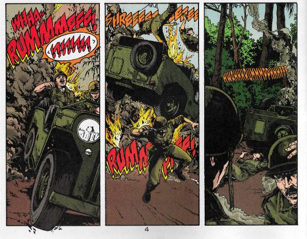
 photo ACbattleB_zpsiagjq0fb.jpg AMERICAN CENTURY by Laming, Stokes, Chaykin, Tischman, Bruzenak, Rambo and Jamison

Remember Ike, whom buttons proclaim we all like? Well, in 1952 people liked Ike enough that Eisenhower became President of America on the back of a campaign, within which was snugly nestled a promise to actively combat, rather than inertly contain, communism (N.B. America is not a big fan of communism. Just so you know. They hide it well, but they can’t fool me.) The prior Truman administration had been increasingly wary of communist influence in Guatemala but had played largely fair, using only economic and diplomatic pressures. (PBFORTUNE its one attempt at covert action was quickly shelved once it became somewhat less than covert. Oops!) Fairness was off the board post-Truman as McCarthyism (i.e. the hysterical self-aggrandising scaremongering of Senator Joseph McCarthy, not an outbreak of impressions of Edgar Bergen’s ventriloquist doll Charlie McCarthy) was rife within Eisenhower’s Government, the Cold War was escalating and Russia was a totalitarian shitshow giving socialism a bad name (link to Bon Jovi: “BAD NAME!”); all in all things were looking bleak for Guatemala on the non-intervention front. Geopolitically speaking America was cracking its knuckles in an alley waiting for someone to distract Guatemala’s attention. But why? Guatemala? Bizarrely the culprit was a fruit company with its nose bent out of shape. I didn’t even know they had noses!
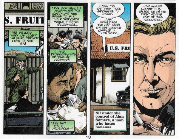
 photo ACfruitB_zpso03659x2.jpg AMERICAN CENTURY by Laming, Stokes, Chaykin, Tischman, Bruzenak, Rambo and Jamison

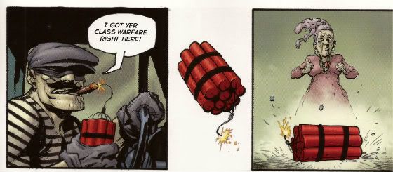
Because I am largely docile I have spent a large part of my life thinking the United Fruit Company (UFC) was just some kind of CIA front with a typically silly code name, and while the CIA and the UFC were indeed linked, it turns out the UFC was actually and primarily a fruit company, probably a united one to boot. Yeah, fruit; Bananas and that. I find it odd to this day that a fruit company (!) could have such an effect on history as this one. Well, any effect on history besides providing people with fruit. Now, because unrestrained capitalism is just great, just absolutely fantastic, this US based company had basically ended up running a private fiefdom within Guatemala; true this was via concessions from various Guatemalan rulers who liked money rather more than their people. Hold on though, fruit isn’t the only fall guy in this scenario as these bad practices had their root in the 19th Century and the concessions made to plantation owners when coffee demand blossomed. So the humble coffee bean has to shoulder some of the blame. Yes, History makes even breakfast a guilt trip! What larks.  In clear violation of anything even remotely close to human decency, land was sold from under the (poorly shod, I imagine) feet of the Guatemalan population to the plantation owners and, acting like monopoly is just a board game, the UFC ended up being the only banana game in town, with control over the communication and distribution infrastructure required by such a business. You know, little things like roads and rail tracks. Things were pretty awesome for the UFC all told, but less so for the average Guatemalan. I don’t know, but I imagine they were controlled by repression and violence, which are all okay obviously as long as they are happening out of the customers’ sight and people get their iPads, I mean, bananas. In 1929 the Great Depression happened and, boy, that was what historians call “a doozy”, there are books about it and everything. Surprisingly though, The Great Depression didn’t just affect America; everywhere was a bit down in the mouth. In Guatemala it was all getting a bit much; life was shit and now this? Finally, the Guatemalan people rose up (hurrah!)…and were pushed back down (boo!). Actually they were pushed even further back and even further down by Jorge Ubico’s (US Supported) regime, for which the word repressive is probably soft soaping it. The important thing here though is Jolly Jorge Ubico not only gave the UFC massive amounts of public land, but also exempted it from all taxes.
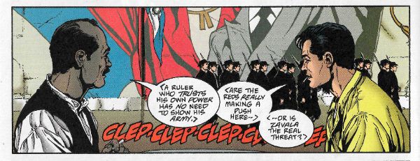
 photo ACmarchB_zpsfw5cv8rp.jpg AMERICAN CENTURY by Laming, Stokes, Chaykin, Tischman, Bruzenak, Rambo and Jamison

Taxes! People fucking hate paying taxes don’t they? I just want to make this point here because currently people seem to think paying tax is some kind of cheeky imposition, some kind of theft. Look, tax puts the money back. Not all of it; you can keep some for being successful, because there’s nothing wrong with success and the rewarding thereof. (Despite what they tell you Socialism doesn’t punish success.) Hey, I’m no economist (SPOILER!) but here’s a clue about trickle-down economics – if you divert all the money into bank accounts in Panama it isn’t going to trickle anyfuckingwhere, certainly not back into society where it is needed. It’s really cute that you can afford someone to cook your books so you avoid paying what you should, but don’t expect us peons who have to pay full whack or face going to prison to be cheering you on. If you are paying someone to get creative with your taxes I’m not sure you should do that. It’s “From each according to his ability, to each according to his needs.” It’s not “From each as little as you can fucking get away with, to each none of mine if at all possible.” Squirrelling your money away off-shore is as Left Wing as Enoch Powell’s arse. Yeah, I do know the difference between tax evasion and tax avoidance. And, yeah, I know one’s not illegal, but I also know it is still immoral. So, yeah, my names JohnK, and I think my shit don’t stink or whatever you think will shut me up, but, hey, pay your taxes. It’s not a little game between your accountant and the gubbermint; people die due to lack of adequate funding. You know - human beings. Die. And they don’t come back like in the comics. But of course you’ll never see them die and you’ve got your bananas, right? You’ve got aaaaaaaaaaaalllllll the bananas. Well done you. Hang onto those bananas. Like a big fucking chimp. Man, 2016’s really soured my mood. Sorry about that. No, no I’m not. Scratch that.
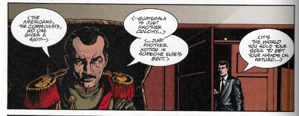
 photo ACbeltB_zpskiargxk8.jpg AMERICAN CENTURY by Laming, Stokes, Chaykin, Tischman, Bruzenak, Rambo and Jamison

So, uh, where were we? (Christ, who was that guy? “Immoral”? Dude, it ain’t the 16th Century. What a fucking “snowflake”. Hurr.) Right, so, if history has shown us anything it’s that The People will put up with far too much shit before kicking back. But eventually kick back they do, and in 1954 the Guatemalan people did so and Ubico valiantly ran off, leaving a Junta in his place which continued his charming policies. This being a less than ideal outcome, the Guatemalan people had another crack at it. Persistence paid off as The October Revolution threw the Junta out. A real kick in the Juntas there and, miracle of miracles, there was a free election. Like, uh, democracy and that. Democracy, which America loves; unless it gets in the way of its bananas. Juan José Arévalo won the election and while he was by no means a communist, he was certainly an improvement and sensibly pragmatic. He shook things up, but not enough to shake them to pieces. Education, health and the labour code all improved, and there was even a minimum wage. Civilised stuff, I trust you agree. Keeping America sweet he was openly anti-communist (America still had its doubts about him, because being anti-communist would be perfect cover for a communist wouldn’t it? Yes, America. Keep taking the pills, America.) Human nature being what it is, for improving the lot of the Guatemalan people Arévalo’s reward was around 25 attempted coups. Over here Jeremy Corbyn (who also only wants to improve people’s lot) has only had one attempted coup so far, but there’s time yet. Jacobo Árbenz was elected next and he started to step on some UFC toes. (Uh oh.) He began to roll back some of the ridiculous concessions granted under Ubico and, worse (i.e. better), his 1952 Agrarian Reform Law (sexy stuff! Batman? Pah! Agrarian Reform Law, that’s the sexy business.) confiscated 100s of 1000s of acres of uncultivated land from the UFC, with compensation based (get this, this is truly excellent, I like this bit:) on the valuation used by the company for its tax payments. I adore the chutzpah of that. Let’s see, who thinks the valuation the UFC used for its tax payments was anywhere in the region of the real worth of that land? Hmmm. Anyone? I’m not seeing any hands. Good, so we all know how the world works. So, hoo boy, that pissed the UFC off. Big mistake. I know; it’s a fruit company (bananas and that) so how come the CIA would help it stage a coup? How precisely do you get from bananas to blood in the street?
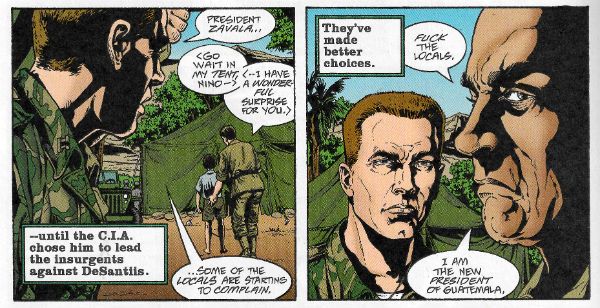
 photo ACsuperB_zpsqzpb0pfw.jpg AMERICAN CENTURY by Laming, Stokes, Chaykin, Tischman, Bruzenak, Rambo and Jamison

Unfortunately, I don’t know. I doubt anyone knows. To this day the reasons why the Eisenhower administration backed a coup in Guatemala due to the discomfort of a fruit company forced to exhibit the barest modicum of decency are shrouded in eerie wisps of mystery. While it is true that Secretary of State John Foster Dulles and CIA Director Allen Dulles had both arranged several deals for the UFC while previously working in Law, and it is true also that Undersecretary of State Bedell Smith later became a UFC Director, and it is additionally true that the wife of the UFC Public Relations Director was personal assistant to Dwight D. Eisenhower, the President of The United States of America, surely to suggest any inappropriate conflation of interests is tantamount to an act of treason, sir. I mean, good luck trying to join those dots, huh? Paging Woodward and Bernstein! Geraldo, even! It’s a two-pipe problem and no mistake, Sherlock. Golly, I guess we’ll just never know. Unless you read about the Guatemalan coup on Wikipedia, where there is also a handy cut out and keep list of all the regime changes America has had a hand in (although it misses off the Australian coup Britain also had a hand in. (Sorry, Australia; poor form on our part there.)) Coups always make for good reading, as there are always unbelievable bits like that part where a force of  60 (US supported) insurgents were arrested by a single policeman before they even crossed the border from Ecuador. Coups also make for sad reading, because they mean something’s gone wrong. In the end the US Sponsored Guatemalan coup won, not because it was well planned, efficient, or in any way professional, but because everyone knew America was behind it (America wanted everyone to know for precisely this reason), and knowing that once you’ve got rid of the "rebels" America is going to start swinging its nuclear powered fists takes the wind out of most country’s sails. Or maybe it succeeded because America is the Hand of God working upon this Earth. Yeah, if you’re a stone cold lunatic, that’s certainly another explanation you could go with. In 1999 the renowned woman botherer and then President of the United States of America Bill Clinton apologised for all the US shenanigans in Guatemala, which made everything okay, and America never messed in other countries’ affairs again, the wicked stepmother recanted, the dish ran away with the spoon and we all lived happily ever after.

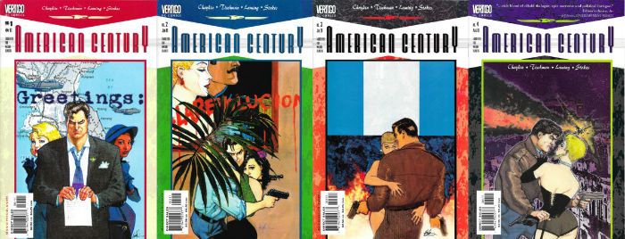
 photo AMCcoversB_zpsvojsowcn.jpg

Aren’t you all glad I didn’t go all the way back to The Monroe Doctrine? I know I am. Obviously you don’t need to know all that up there to enjoy AMERICAN CENTURY. I didn’t know all that. I had to go and look it up on Wikipedia; it’s not like I carry around ‘Ye True and Fplendide Hiftory of Guatemala’ in my head. But the point (yes there is one) is that Howard Victor Chaykin and David Erasmus Tischman had to know it, and the fact that they succeeded in spinning it into an entertainingly racy tale is even further to their credit. The value of fiction in giving us tools by which to apprehend the nature of the world we live in seems to have been forgotten by most comic creators. Stick your head in the sand too long and history will kick you in the arse. This year History’s been kicking far too many arses, and it might be beneficial if comics remembered there was a world beyond their borders, and helped push our heads out of the sand. Just a thought.

In case you were wondering, AMERICAN CENTURY was VERY GOOD!

NEXT TIME: Less strident half-witted recapping of Wikipedia and more COMICS!!!

“Passive Smoking On The Last Train Home.” COMICS! Sometimes It's All About Family, Innit?

Sunday, and I've been caught a mite short. So I'll just blast through this and see how we do. It's an old Vertigo/DC Comic you might want to look out for in the dollar bins. And I'll tell you for why after the "More..."  photo Mob01B_zpsbbwxws0l.jpg MOBFIRE by Pleece, Ushaw & Gaspar

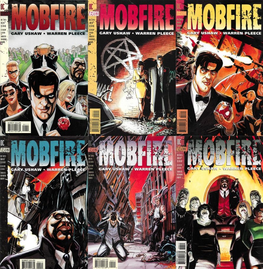
Anyway, this... MOBFIRE #1-6 Art by Warren Pleece Written by Gary Ushaw Lettered by Gaspar Logo and publication design by Rian Hughes Art & Text © Gary Ushaw & Warren Pleece All other material © DC Comicss DC Comics/Vertigo, $2.50 each (1994-1995)

 photo MFIRECovs01B_zpsenwkfcee.jpg

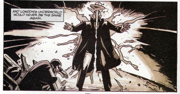
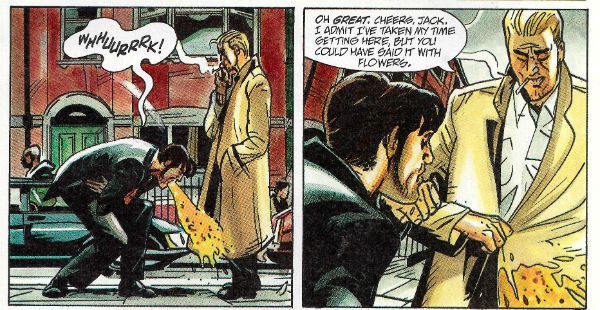
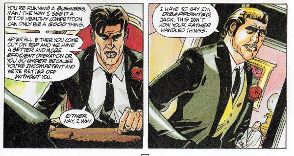
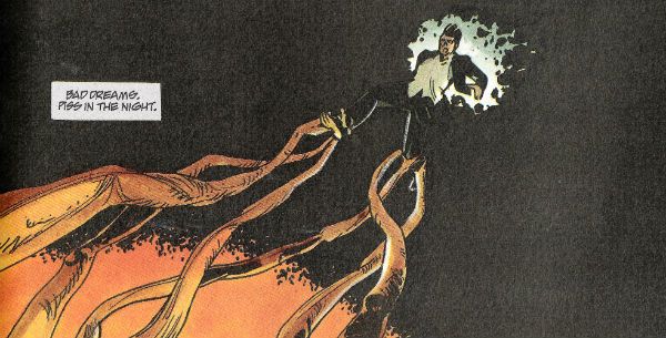
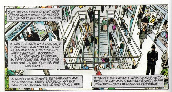
Inheriting the family firm at short notice due to the sudden demise of a parent is always a tricky business. For Jack Kellor it's trickier than usual since the Firm his dad ran was decidedly dodgy, not entirely kosher, a bit on the illegit side, you feel me. And that's putting it kindly. See, John Kellor's business was mucky business. Crime if you must. And if you really must then come tooled up, but mind it's with something a bit tastier than a shooter, because in this slightly-to-the-side-of-reality world the scallywags have got a bit of the supernaturals on their side. See, way back when you could leave your door unlocked at night (or were stupid enough to think you could) Jack Kellor ran into a black fellow in a severe state of duress and saved his bacon. Turned out he wasn't just some bloke over here to fill in the post-war labour shortage by driving a bus. Nah, only a blooming witch doctor wanne? And thereafter indebted to the man who saved his hide (because that's how magic works, and who am I to argue?) this Bocor gave John Kellor a decided edge, at least for a bit. After all, it may well have been magic and all that, but in the wrong hands it was just a new weapon, so the other gangs picked themselves some tasty talent handy with the old hocus-pocus and there you go, Bob's your uncle and Fanny's your aunt. That's the world Jack's now chucked into, bad enough to make you wish you'd stayed in bed. But Jack's a chip off the old block in that he has ambition, but where his dad's ambition was to build it up, Jack's going to burn it down. Unless the Bocor gets a whiff of it, because he owed Jack's dear old dad, not Jack; in fact he owes Jack shit, and it looks like he's going to try his level best to make him drown in it. So, no, inheriting the family business might not be all it's cracked up to be for Jack.

 photo Mob05B_zpsbumttsgh.jpg MOBFIRE by Pleece, Ushaw & Gaspar

The six issues of MOBFIRE were published in 1994-1995 and thus far remain uncollected. This can only have been due to poor sales as pretty much everything was collected back then. If MOBFIRE did sell poorly it wasn't because of any lack of quality, but probably due to the lack of familiarity with the talent involved. I mean, I have no idea who Gary Ushaw is. I hope he's healthy and life has been kind to him, because he wrote a pretty good comic here. The first few issues of MOBFIRE are the densest and tightest, with by far the best writing which serves to suck you in quite nicely. Ushaw and Pleece then keep you on your toes with a surprising development at the fourth issue point, which then results in a lengthy guest appearance by John Constanine. As nicely written as that part is it's an odd choice for a creator owned series, and won't help the chances of a TPB now the rights have probably reverted. Shame, because for all of its six issues MOBFIRE is a pretty good time ,with a varied cast, some surprises and betrayals and it all ends in a bizarre fiasco of violence which is delightfully insane and resembles a Pampers advert directed by 1980s David Cronenberg.

 photo Mob06B_zpswe6hyzfg.jpg MOBFIRE by Pleece, Ushaw & Gaspar

Whoever Ushaw is and whatever he does now, MOBFIRE shows he could write a tidy little comic. The characters are varied and nicely sketched, including but not limited to the addict sister, the mother whose bitterness is rooted in denial of the filth her life style rests on, the chipper best mate and Jack's lady friend (who is not only a woman of colour, but also clearly stronger than Jack in every way without it coming across as unctuous pandering). Ushaw's also a dab hand at that '90s Brit Talent staple the Stream Of Consciousness Babble. You know , the one Morrison and Gaiman dabbled in, Milligan excelled at, and the ridiculously neglected John Smith claimed as his own kingdom and within which he has since dwelt, seeing off all comers quite successfully. Ushaw holds his own in this tricky arena, but his effort impresses perhaps more than it should as he cleverly uses it to confound any creeping misgivings about his portrayal of the Bocor as a largely monosyllabic slab of black Evil. Dude's got depths, just pray you never see them. While the whole thing's played mainly straight Ushaw's not above a bit of playfulness. At one point the criminal enterprise is explicitly explained in terms which make you momentarily wonder whether Ushaw is in fact describing the Free Market as gangsterism. Which he is. (As they say - it's funny because it's true.) Then there’s a Scots bloke who has spooky mirror powers, and if he isn't a cheeky riff on Mirror Master then I'm Beryl Reid. (I'm not Beryl Reid). Not only that but the wee scunner ends a violently bloody encounter by recreating a visual joke made famous by Harry Worth.

 photo Mob04B_zpskadganva.jpg MOBFIRE by Pleece, Ushaw & Gaspar

Don't worry if you're coming up blank there. Harry Worth is a particularly British reference point and Ushaw is pretty sweet at including these without over-egging the colloquial pudding. The singularly British references are there, but they don't run around on fire screaming in a catastrophic and self defeating bid for attention (see James Robinson's FIREARM. Or don't). E.g. at one point a couple of thick necked guards are partaking in some manly banter, and one mentions he won't be going “up The Arsenal” because “it's the big wedding on The Street.” Sure, the football reference is pretty basic, but the latter part is interesting because he's referring there to a wedding on the popular British TV soap opera Coronation Street (AKA “The Street”) rather than an actual wedding on his street. Britain not actually being that big on street weddings, since the weather is for shit and the folk are mostly miserable social inverts. Basically, for the duration of the book if you get the reference everything's better, but if you miss it there's no harm done. Best way really.

 photo Mob02B_zpshkn6n2qa.jpg MOBFIRE by Pleece, Ushaw & Gaspar

The uniquely British atmosphere is aided no end by the art of Warren Pleece which makes the book worthy of rediscovery all on its lonesome. Warren Pleece is a talented comic book artist, by which I mean he clearly understand the nuts and bolts of putting a page together, but more than that Warren Pleece is a singular talent, because over and above that stuff he understands the importance of conveying a sense of place. The place here is Britain and it looks like Britain. It doesn’t always, not in the comics. There's a bit more to it than Big Ben and a red bus, hard as that may be to believe. Pleece doesn't get much space to play with, but he makes the space he's given work like work is going out of fashion. In crowd scenes everyone is dressed differently, and there are a range of ages on display, but everyone has that singularly worn out and worn down lack of finish which marks every Brit out in a crowd. The shop signs proclaim “MARKS & SPENCER”, “C&A” and “WOOLWORTHS”. Yeah, Woolworths has gone now, but it used to be there; it used to be everywhere in the UK, and so Pleece's art captures not just a place but also a time. And there's also the infernal golden arches in a nod to the cultural homogenisation only just getting a toe hold back then. And Pleece packs all that in one panel on a seven panel page.

 photo Mob03B_zpszkv4hfh6.jpg MOBFIRE by Pleece, Ushaw & Gaspar

On another page he slides into sight the delights of typical pub grub, discreetly colouring the drinks with a typically urinous wash. Another panel on the same page shows us there’s a man in an England shirt with a tat on his neck (in every pub in England there's a man in an England shirt with a tat on his neck. Either that or he just left, or he's due in shortly. Bide your time and he'll be by, the man in the England shirt with a tat on his neck). Ella, who Jack runs with, lives in a flat and Pleece treats us to the sight of laundry flapping on the balcony and contrasts the visually tedious edifice with a short arsed but far more characterful terrace. In one panel, that is, on an eight panel page. Get the drift? Pleece's faces are distinctive with their porcelain sheen and implacable drift chinward towards Punchinello levels of grotesquery, and it's easily these that make the most marked impression. But the fact Pleece bothers to give them a fully realised world to move through lifts his work from the quirkily accomplished and into the great. Because of course it's a fully-realised world; it's our world and capturing that is a kind of magic I can believe in. Utltimatley though the book works because Ushaw and Pleece are firmly in creative cahoots, any doubts about that are kicked to the curb with the bit of business in #5 on p. 9 & 10 involving the flowers in the cafe. It does nothing to propel the plot, but does everything to assure you Ushaw and Pleece are having fun, and doing a bang up job while they are at it. Look, what I'm getting at is Ushaw's writing and Pleece's places make MOBFIRE VERY GOOD! So if you see it, tuck in!

NEXT TIME: Go on, guess! That's right – COMICS!!!

“Oh, Betty!” COMICS! Sometimes It’s Doctor Who And The Pub Made of Haunted Wood!

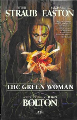
Just for a change I thought I’d look at an Original Graphic Novel rather than a British anthology comic featuring a poo eating robot that talks more sense than most public figures. Naturally, I loaded the dice by picking one by one of my favourite writers working with an artist whose work I have much fondness for. And Michael Easton. Guess how well that worked out for everyone. photo GwomFishB_zpsjlr1eo9x.jpg THE GREEN WOMAN (Bolton, Straub & Easton, Klein) Anyway, this… THE GREEN WOMAN Art by John Bolton Written by Peter Straub & Michael Easton Lettered by Todd Klein Starring Peter Capaldi Vertigo/DC Comics, £14.99 (2010)

 photo GwomCovB_zps2xknngtb.jpg

On the banks of the Milwaukee River squats a bar and in that bar there broods a man who is both more than a man and less than a man. He is old now and senses the fast enchroaching end to the long road paved with his dead. But no man murders without trace and in New York a self-hating cop begins to follow the trail which will end in either his redemption or in his destruction, but it will certainly end in a bar on the banks of the Milwaukee River where a man broods. A man once called Fielding Bandolier.

 photo GwomFaceB_zpswdold4yw.jpg THE GREEN WOMAN (Bolton, Straub & Easton, Klein)

I know who Peter Straub and John Bolton are, but who is the mysterious Michael Easton? If only there was some easily accessible source of inf...ah. A quick glance at his Wikipedia page shows me that Michael Easton is a master of the smouldering glance and favours large cuffed shirts. He is also an actor (ALLY MCBEAL, MUTANT X, ONE LIFE TO LIVE) in things I’ve never seen,  a poet whose poetry I’ve never read, an author of OGNs (the SOUL STEALER SERIES) which I’ve never heard of, in fact all I know for certain is he’s just basically six different shades of dreamy, ladies. And, I guess, gentlemen too; it’s all just friction, you prudes! Now, being a nasty piece of work I would like to blame the failure of THE GREEN WOMAN on him alone. However, that’s probably unfair. Because in the interests of fairness I should probably point out that Peter Straub’s output has somewhat diminished since 2004’s IN THE NIGHT ROOM. Diminished in frequency and scale certainly but, THE GREEN WOMAN excepted, not in quality. This book first appeared in its hardcover iteration in 2010, a year which also saw Straub produce THE JUNIPER TREE AND OTHER STORIES and A DARK MATTER. A healthily impressive output at first glance, no doubt. However, as all readers of supernatural fiction know, appearances can be deceptive; THE JUNIPER TREE was a collection of previously published stories and A DARK MATTER, his first original novel since IN THE NIGHT ROOM, was poorly received (I liked it, but there you go). It basically took Straub six years to produce a single novel, which is par for some writers but not par for Straub. What I’m trying to get at is THE GREEN WOMAN feels like a new short initially intended to freshen up the THE JUNIPER TREE, but one that didn’t make it to fruition and so the basic outline was repurposed into an OGN with help from the dreamy enigma Michael Easton and John Bolton. Alas, this is of course pure conjecture and as a consequence utterly worthless, but it killed some time for us all. And gave me an introductory paragraph. In my opinion, which is basically The Truth of The World by any other name, Peter Straub is a magnificent writer, one whose output I hold in the highest of esteem. (I heartses Peter Straub, basically.) Some of his books may not be as good as others, but they are all better than most other people’s books. This is because he is a masterful prose artist who can make distressingly horrific effects explode seemingly from nowhere following the most sublime of slow burns. His books work because Peter Straub is an unnervingly fastidious author and also because he is in complete control of his prose. This obviously isn’t the case with THE GREEN WOMAN where other hands muck in and, well, things go a bit to pot.

 photo GwomNamB_zpsgc3kd5hn.jpg THE GREEN WOMAN (Bolton, Straub & Easton, Klein)

THE GREEN WOMEN is intended to act as a capstone to all the fiction Straub has previously penned regarding one Fee Bandolier. And there has been a lot of fiction from Peter Straub regarding Fee Bandolier. I’ll resist the temptation to list them as sometimes part of the joy of Straub’s work is realising how something you are reading ties in to other works, and such a list while making me feel all superior would edge a wee bit too close to SPOILER territory in some cases; trust me, Fee’s all over Straub’s post-KOKO work like a psychotic yet weirdly endearing rash. Don’t worry though THE GREEN WOMAN recaps everything you need to know about Fee and his…tendencies. Unfortunately it does so in the bluntest possible way, lacking almost wholly Straub’s prose finesse which usually effortlessly ameliorates the clichés which underpin this material. Basically dependent on others to aid his vision this just reads like a not terribly well executed serial-killer-with-‘Nam-flashbacks-hunted-by-rogue-cop-who-is-more-like-his-prey-than-he-wishes-to-acknowledge. It’s just disheartening to see Straub stoop to a cop who is the tiresome Troubled White Guy with a Gun so familiar to us all. But then I recall that he has done that in his novels and it’s worked a treat. See, it’s not the concepts in THE GREEN WOMAN which are at fault, it’s the execution and maybe the limited page count. The core tale of Straub’s (previously brilliantly realised) tragic monster reaching the end of his rope, while being hunted by a man who’s character is swiftly unravelling due to the moral faultlines within him, would have been plenty all on its todd but, no; there’s a secondary plot revolving around a malevolent ship’s figurehead which in the long gone days caused its crew to suicide en masse, and now wants to be reunited with the timbers of the boat it was stuck on, which are currently holding up a pub in Ireland. Yes, that’s right we’re talking here about spooky wood pining (get on that one, Brian Azzarello! Geddit: “pining” wood! That’s GOLD!) Obviously most scary doodahs can be reduced to the laughable via fantastic word skillage as what I has. However was a similar excellence in prose in evidence it could make the concept of haunted wood turn your bowels to water. In a Peter Straub novel this would be the case (see IF YOU COULD SEE ME NOW) but this is not a novel it is a graphic novel, so the prose is sparse and far too much rests on the art. Which is terrible. Really bad.

 photo GwomthatB_zpsv1xhy4bh.jpg THE GREEN WOMAN (Bolton, Straub & Easton, Klein)

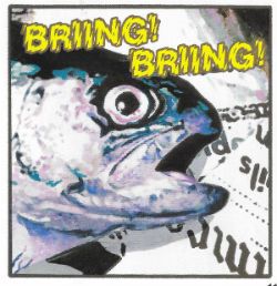
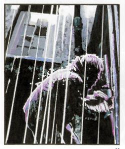
It gives me no pleasure to point out the artistic failings of THE GREEN WOMAN. I have enjoyed John Bolton’s flowing Frazetta-esque art in the past (HOUSE OF HAMMER, WARRIOR) but not here, not in THE GREEN WOMAN. Not unsurprisingly, and entirely to his credit, John Bolton has developed since then as an artist. However, the area he has chosen to take his art into centres around photo manipulation. Unfortunately for my eyes it turns out that I’m a bit picky, and I only like John Bolton’s art when he is actually, you know, drawing, which he isn’t here. He’s doing something with photographs which regular readers (hi, mom!) will recall I welcome like warts on my nethers. Even so, I am usually magnanimous enough to at least suggest the slightest possibility that that might be a matter of taste. Not here though; this is patently poor no matter what your preference.  For a start the whole thing looks so blurry I had to keep looking away to focus on other things in the room to reassure me that cataracts weren’t kicking in at a rate of knots. Then there’s the fact that someone has clearly set the resolution wrong on some of the pages, so you’re just left looking at it and wondering how many eyes this passed in front of, and how so many eyes could not care. A lot (all?) of the images are collaged together but sometimes you can clearly see the edges where the elements haven’t quite fitted together, and again those eyes, those uncaring eyes are brought to mind. There are some richly fruity images there for Bolton to play with (the women hung out like fish) but it’s all muffled and lacking in impact. THE GREEN WOMAN is just not a good reflection of John Bolton’s talent, because as sloppy as this stuff looks he’s a far from untalented artist. It’s a real shame because we’ve all had bad days at the office but few of us have those bad days printed up and bound for posterity. Mind you I don’t charge anyone money to look at my bad days at the office, either.

 photo GwomGreatB_zpsikrskes5.jpg THE GREEN WOMAN (Bolton, Straub & Easton, Klein)

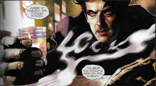
Even were it not ramshackle stuff (and, boy, is it ramshackle stuff) Bolton comes a cropper for me in his choice of model for Fee, our unhinged protagonist. See, he’s based every appearance of Fee here on the popular thespian Peter Capaldi. I mean, sure, Peter Capaldi gives good gurn so he’s a deft choice in that respect; you’re not ever in much doubt about Fee’s emotions at any given point. When the book was originally released (reminder: in 2010, in hardback) Capaldi was a recognised face in the UK thanks (largely but not solely) to his splenetic  portrayal of the sweary king of spin Malcolm Tucker in THE THICK OF IT (a political satire which now appears quaintly understated thanks to the idiocies of reality). So I’m guessing America was probably largely still oblivious to his spittle flecked charms when the book premiered, but in 2016 with Capaldi playing  the 197th Doctor in DOCTOR WHO pretty much any reader is all but guaranteed to be thrown out of the book every time he appears, which is often. (And FYI: he’s playing “The Doctor” not “Doctor Who”; woe fucking betide anyone who makes that error anywhere near some winner who has tied their sense of self-worth to a children’s TV show).

 photo GWomFeeB_zps7njhtzqb.jpg THE GREEN WOMAN (Bolton, Straub & Easton, Klein)

So often does Capaldi’s emotionally contorted face glare out at you from these pages that THE GREEN WOMAN should in all fairness appear on Peter Capaldi’s Wikipedia page, somewhere between IN THE LOOP and BISTRO. It won’t do though, because it’s not like he owns his own face is it? (This is fine by me as I currently use Capaldi’s sinewy visage on dating websites to lure young women into extra marital filth because I have no respect for my partner, but that’s okay it’s the 21st Century. It sure seemed like a good idea, but every time I try to explain away the fact that I don’t look like Peter Capaldi by saying I’m still currently playing Doctor Who but a different incarnation, they start shouting about how it’s “The Doctor! Not Doctor Fucking Who! What’s wrong with you! I don’t mind being lured into creepy sexual nastiness but what kind of pervert and general failure as a human being doesn’t know that! IT’S THE DOCTOR! You massive nonce!” And then they storm out like I’ve seen ladies in movies do, and I end the evening tearfully wanking into a hanky. Then the head waiter asks me to leave.)  Seriously, it’s a total immersion destroyer turning the page and seeing Peter Capaldi fiercely scrunching his face up like a sock ready for the laundry again. I keep expecting him to ask someone if they’d like a jelly baby. (I know that was Tom Baker; I am fucking with you. It won’t be the last time.)

 photo GwomrainB_zpsiytzcq2p.jpg THE GREEN WOMAN (Bolton, Straub & Easton, Klein)

THE GREEN WOMAN is at once overstuffed and undercooked, and everyone involved has done better work elsewhere. Better to seek that out instead, say I, because this was AWFUL!

NEXT TIME: Uh, (SPOILER!) - COMICS!!!

"If I'm Reading Those Erect Nipples Right, YOU'RE Having A Good Time." COMICS! Sometimes They Might Be A Wee Bit Too Hard-Boiled.

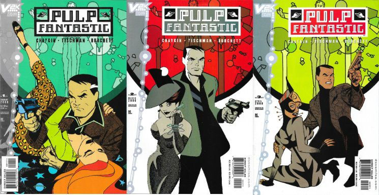
Hey, I wrote some words about a comic. They're under the break, somewhere. I think that's how it works. Mostly this one is about how people will still be awful in the future and how Rick Burchett is The Balls. Sorry, still shaking the rust off.  photo PFWorthB_zpsde7q1vob.jpg PULP FANTASTIC by Burchett, Chaykin & Tischman, Bruzenak & Loughridge Anyway, this... PULP FANTASTIC #1-3 Art by Rick Burchett Written by Howard Victor Chaykin & David Tischman Lettered by Ken Bruzenak Coloured byand Seperated by Lee Loughridge Covers by Rick Burchett & Howard Victor Chaykin Logo by 52MM DC Comics/Vertigo, $2.50 each Pulp Fantastic created by Howard Victor Chaykin

 photo PFCoversB_zpsi1xni5na.jpg

Pulp Fantastic was published in 2000 as part of DC Comics’ fifth week wave of millennially themed/inspired mini-series. Older folk will recall that everyone expected the world to die screaming on the millennial stroke of midnight as toasters exploded, shoes refused to work and milk demanded equal rights. By continuing to publish comics in the face of this certain (certain, I say!) Apocalypse DC/Vertigo showed a touching faith in the survival of the human race. A faith that was well founded since we can all agree the world is still here. (Unless you are particularly philosophically minded, in which case; who knows?) What isn’t here in 2015 is a TPB collecting Pulp Fantastic, so it’s to the back-issue bins if you want to experience a beautifully illustrated but markedly mean spirited exercise in genre repurposing. Because while the series is draped in sci-fi schmutter so it can fulfil its future themed remit, it is quite clearly an exercise in the hard-boiled PI genre.

 photo PFchairB_zpsa1ifzyq8.jpg

PULP FANTASTIC by Burchett, Chaykin & Tischman, Bruzenak & Loughridge

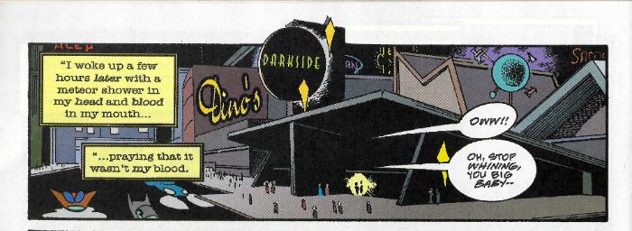
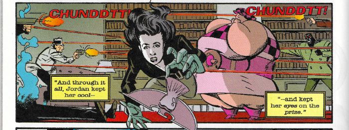
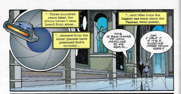
Pulp Fantastic is set on a future world far way to which the members of a (presumably very large) cult ascended on New Year’s Eve thanks to the benevolence of some passing aliens. The aliens have gone AWOL and the cultists have developed a society not entirely unlike a ‘50s noir world crossed with a Roman Catholic mall. It’s an utterly bizarre set-up that doesn’t seem to have much purpose as anything other than set dressing until the many, many, plot threads Chaykin & Tischman have been waving gaily in your face knit together to make an utterly bizarre pullover, I mean ending, in the third and final issue. Our narrator for the course of the series is one Vector Pope; a foul-mouthed cynic with the sex life of an alleycat who is drawn by the incredibly talented Rick Burchett as resembling a Peter Gunn/Howard Victor Chaykin hybrid. Pope is an ex-cop PI hired to find some shmuck’s frail but what looks like a cakewalk is complicated by the fact that the cake, it soon transpires, was baked with sinister motivations and fateful ramifications. And eggs, probably. Also, cakes don’t have legs, so I don’t know what that expression means but it sounded old-timey. And Pulp Fantastic is an old timey throwback with a vicious modern streak on top. I guess that's the cherry on the cake. (N.B. Writing is hard.)

 photo PFDinerB_zpsq5pl7kib.jpg

PULP FANTASTIC by Burchett, Chaykin & Tischman, Bruzenak & Loughridge

Just as Robert Altman and Leigh Brackett famously updated Chandlers’ Marlowe to excellently sour effect in The Long Good-bye (“…it happens everyday…” Cheers, John Williams and Jonny Mercer. ) so Chaykin & Tischman, maybe, (possibly) try a similar trick with Hammett’s Sam Spade. Altman & Brackett recast Marlowe as comfortably inert (“It’s all right with me.”) until the accumulated effects of his inertia actually affects him personally. Beautifully played by Elliot Gould, he’s an affable prick; it just takes a while for the prick to kick in. Spade was already scrappier, blunter and, well, prickier, than Marlowe in the source books so Chaykin & Tischman’s trick doesn’t work so well. Also, Pope starts off as a turbo-charged prick so his pitiless pursuit of prickishness over the three issues means that when he performs an actual act of kindness at the end it’s as unexpected and shocking as someone shooting their best friend like a dog. If (if!) it is an update of Hammett’s Spade for a more cynical age it works a bleak trick indeed. In at the kill of the fin de siècle Pulp Fantastic suggests kindness is the surprise and cruelty the norm. Maybe they aren’t even doing that, how the good fuck would I know, I’m just spitballing here.

 photo PFActionB_zpsnhivoemd.jpg

PULP FANTASTIC by Burchett, Chaykin & Tischman, Bruzenak & Loughridge

Anyway, it’s rapidly apparent that Hammett’s The Maltese Falcon is (really) being playfully, and primarily, bludgeoned throughout Pulp Fantastic but there are also nods to the usual commonplaces of crime fiction. Regular head traumas resulting in unconsciousness at narratively opportune moments for our protagonist? Check. Ladies who are like trouble: they’re easier to get into than they are to get out of? Check? Ladies who just like trouble. Check. Troubled ladies who like The Who? No, don't get smart. A client and a case neither of which are what they first appear? Check. A duplicitous dame who plays men like the spoons. Check. A maguffin. Check. A fool, a foil and a frail? Sordid secrets of the rich and powerful? Check. Check. Check. And Checkity-Check. Waiter! Check! As countless comics can bear tedious witness this kind of thing can quickly descend into lifeless homage, but whatever Pulp Fantastic’s faults (and there’s a few of ‘em) it’s certainly lively. A lot of this life comes from Chaykin & Tischman’s choice to be almost provocatively vulgar but this does have its drawbacks. The most successful spark is in the art, and the only drawback there is that there’s only three issues of it.

 photo PFshipB_zps4w7nmxv4.jpg

PULP FANTASTIC by Burchett, Chaykin & Tischman, Bruzenak & Loughridge

The cleanest thing about the book by far is Rick Burchett’s line which lends the world of Pulp Fantastic a hygienic aspect which the nasty narrative can bounce loutishly off to nauseous effect. Burchett’s future is an idealised one; a future informed primarily by ‘50s/’60s art-deco. It is in this sanitary and regular environment Chaykin & Tischman’s grubbily ‘70s inflected characters brutalise, intimidate and kill each other. And all those awful, awful characters are expertly designed by Burchett. I particularly liked the fact that Pope’s legs are clad in trousers so tight that his legs suggest those of a satyr. And Burchett’s got storytelling down pat. Guy’s got range, is what I’m saying. He can give you dynamic splash pages as with the opener of Pope hurtling through a stained glass window. Or if it’s a talky scene why not have Rick Burchett sprinkle some well-judged expressions to soften the exposition? Fancy a cat’n’mouse scene but don’t want the reader to notice it’s happening until afterwards? Call Rick Burchett on 0800 DOESITALL. Ma Burchett's boy - your one-stop shop for all your storytelling needs. Overall I get the sense Rick Burchett had a sweet time drawing these pages; I know for a fact that I had a sweet time looking at what Rick Burchett had drawn. Burchett’s often remembered for his work on the Batman animated comics but his work on Blackhawk in Action Comics Weekly and then, later, in the short lived Blackhawk series is well worth whatever pitiful sum your comic vendor will charge you. As is Pulp Fantastic.

 photo PFPopB_zpswhxjybxw.jpg

PULP FANTASTIC by Burchett, Chaykin & Tischman, Bruzenak & Loughridge

So, Pulp Fantastic has a lot going for it. It’s got Rick Burchett. It’s got Ken Bruzenak too. The extraordinary Ken Bruzenak spatters the whole thing with his typographic magic. The world of Pulp Fantastic is lent an extra level of conviction through his wonderful skill with visual onomatopoeia, which proves valuable beyond the wealth of man in world building and character definition (some characters speak in different fonts). Ken Bruzenak’s lettering forms another layer of art, but one which works with Burchett’s, avoiding clutter and achieving a dreamy seamlessness of purpose and effect. It’s got those Chaykin names that crackle with fanciful implausibility to such an extent that you suspect they might actually turn out to be filthy anagrams. It's got a plot that just won't stop. It's got Lee Loughridge's colours which are super good but I lack the knowledge to pinpoint why (I liked the greens in the church scenes, they contrasted nicely with the purples. But I don't know why purple or green, see?) According to the credits Loughridge's colours are having such a good time that had to be separated like randy dogs.

 photo PFChurchB_zpskxs0k8il.jpg

PULP FANTASTIC by Burchett, Chaykin & Tischman, Bruzenak & Loughridge

Unfortunately, there are some editorial aspects which suggest something rushed about the series. The first issue says it’s “1 of 4” but by the second issue this is truncated to 3. Misprint or something else? My money’s on something else. But then I have no money, so the joke’s on you! Chaykin usually works at his best in a three act structure; four or five and some padding slips in; six issues and he gets a bit wheel spinney, but three issues is usually pretty golden. Yet Pulp Fantastic is three issues and things are clearly a bit awry. Only the thundering pace of the thing distracts from the fact that often events and people are linked without explanation, or that characters leap to conclusions with their eyes shut, and there are some linguistic infelicities which suggest one more polish wouldn’t have gone amiss. Also, I suspect Chaykin’s usual smut is set a little too high for most palates. We’re barely into the book and we hear of a man having an affair with the 15 year old clone of his wife, there’s a scene reeking with same salt-beefy stench as ‘that’ scene in Friedkin’s Cruisin’ and, well, I checked with the most rigorous thinker I know when it comes to offensive content and, yeah, my Mum said it was all a bit much too. To be fair some of this blue pays off later down the line, but there is a definite sense that Chaykin and Tischman are trying to push somebody’s buttons. They certainly overstep the mark at the last, I think, by having Vector Pope punish the mentally ill gender bending villain with a little bit of cheeky bum rape. I can only imagine te hullabaloo if this were published today. (Burn him! Ugh!) Ultimately, it’s only the strength of the entertainment provided which prevents Pulp Fantastic from being a mess. Well, that and Rick Burchett’s magnificent performance of smooth cartooning with an underlying noir bite. Sure, I’m all about the Howard Victor Chaykin comics, but they can’t all be winners, and the fact that Pulp Fantastic does (just) win is down to Rick Burchett. I like Pulp Fantastic, and I've liked work by all involved, but I think it’s Rick Burchett mostly who raises this one to VERY GOOD!

Let's have big round of applause for Mr. Rick Burchett there - or as he's known down the boozer - Mr. COMICS!!!

"Unorthodox Practices." COMICS! Sometimes I Hope You Notice I Resisted The Temptation To Make A Terrible Play On Words Involving Her Surname!

Ted McKeever. Lydia Lunch. Fluids.  photo TGBurnB_zpsbfe04ed6.jpg Image by McKeever, Lunch & Robins

Anyway, this… TOXIC GUMBO Art by Ted McKeever Written by Lydia Lunch Lettered by Clem Robins Coloured by Ted McKeever Special thanks to Maria-Elena D'Agostino DC Comics/Vertigo, $5.95 (1998)

 photo TGCoverB_zpsa8a814c9.jpg

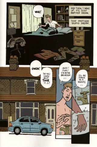
In 1998 DC Comics published a comic written by Lydia Lunch and illustrated by Ted McKeever. In 1998 DC Comics published a comic written by Lydia Lunch and illustrated by Ted McKeever. I repeated that because it bears repeating. It’s strange enough to think that DC Comics once had a place for an artist so atypical as McKeever, but they did. Indeed they did. In 1998 he was well within a run of work for DC which would last until the noughties were exhausted. He even had a regular gig in Doom Patrol, although it was after everyone had stopped reading. Mostly though he oozed a bunch of miniseries roiling with his idiosyncratic aesthetic and some Elseworlds with Superman, Batman and Wonder Woman shunted into a German Expressionism. We’ll get to those too, maybe. (No promises; promises are just time travelling lies). In 2014 DC Comics is a very different (trans: more banal) place so McKeever currently resides at Image, where his work provides a necessarily brusque corrective to all those underwritten begging letters to Hollywood propped up by fantastic artists. So, despite it looking odd that DC once had a place for someone who draws like everything is made of melting wax, it wasn’t really. Lydia Lunch is another matter. Admittedly, this wasn’t the first time Comics had felt the subtle touch of Lydia Lunch; in 1990 her work appeared in something called AS-FIX-E-8 and in 1992 there was Bloodsucker with Bob “Minimum Wage” Fingerman. Having seen neither I can’t comment, but it’s a safe bet they would have made Paul Levitz plotz. They were probably very Lydia Lunch what with Lydia Lunch having a quite distinctive artistic voice and all.

 photo TGSunB_zpsea8c05f6.jpg Image by McKeever, Lunch & Robins

Lydia motherflossing Lunch! I’m just going to barrel right on in with an explanatory paragraph or two about Lydia Lunch because I don’t know how many people are familiar with the lady and her work. Chances are I’m underestimating some of you; you might still be having therapy to recover from that 8 Eyed Spy gig back in ’80, or still tearfully fondle your crumbling poster for The Immaculate Consumptive inbetween school runs and on-line food shops. Mostly though it’s a sea of blank faces out there, I’m guessing. Well, a sea of two, if the hit-count’s reliable. Lydia Lunch (real name: Mind your own ****king business, sunbeam.) was a mainstay of the New York post-punk No Wave scene and has stood defiantly on the neck of the intervening decades to remain an active creative force. Lydia Lunch is many things to very few people, but back when I was still actively engaged with the world her work was mainly in the realm of auditory assault. In the music papers of the time it was commonly described as aural terrorism; a winning blend of atonal dirges and vituperative shrieking which left the listener feeling like they’d just been hurled down some stairs by a scatological force of nature in female form. It’s not for everyone, the work of Lydia Lunch, is what I’m getting at there. If pressed I’d guess her stuff has its roots in the Beat tradition, but mostly it’s about rancorous anger and provocative hostility; it would probably beat tradition into a bloody mush with a nail studded baseball bat. Think neon lipstick and rat turds. Think lo-fi ‘80s NYC grot chic. Think Driller Killer. Then think about something more pleasant. When I was a Badly Dressed Boy I liked Lydia Lunch, but part of what I liked most about her was she was several thousand miles away.

 photo TGCookB_zps33468ce6.jpg Image by McKeever, Lunch & Robins

Like many independently minded modern ladies Lydia Lunch likes to keep busy, she’s dipped a tiny toe into music, poetry, film, the spoken word and, according to the Internet, even a cook book. Apparently this has “sexy asides from the racy author” which just brings to mind an incensed Nigella with shit under her nails throwing knives at a cucumber while spitting sexual expletives. But that’s because I’m stuck in the past; I’m sure Lydia Lunch has mellowed and whips up a nice crumble these days. La Lunch’s work has always been marked by collaboration, so it’s neat she has great taste in confrères. Over the years she’s hitched her exquisitely bitter eccentricity to people like J G Thirwell, Sonic YouthThe Birthday Party, Rowland S. Howard, Die Haut and Gallon Drunk. It’s 2014 now and people don't hurl piss at Coldplay on sight so I realise some of you might actually struggle to place even the divine Birthday Party; if so then you’ve got no chance with the others. That’s okay; it’s not a contest. What I’m getting at is, in common with super heroes and wanton sack-artistes, Lydia Lunch does like a good team up. And comics is always up for a good collaboration, and Lydia Lunch and Ted McKeever is a good collaboration.

 photo TGBastB_zps8878f228.jpg Image by McKeever, Lunch & Robins

Toxic Gumbo, as the name suggests, is set in the Louisiana Bayou. Not the real one though. Visually this Louisiana Bayou belongs to Ted McKeever, because visually this Louisiana Bayou is all putrefaction and shadows, all tumble down shacks and tyre piles. This Bayou is populated by people who morph from panel to panel like they are made of warm tallow. If the real Louisiana Bayou is like the pestilential mess in this book then Heaven help the Tourist Board. In Toxic Gumbo McKeever certainly seems to be enjoying himself. Sometimes his pages are reminiscent of illustrated books with his queasy images silently swarming around a block of text, other times it’s more traditional comic pages but all with that unsettlingly feverish McKeever effect. In addition to his art there are also photos of some quite intricate dolls by D'Agostino which simply by contrasting with the drawn images punch up the unreality of everything around them. Most of the book is coloured flatly but on occasion the colours become deeper and more detailed before slipping back into a flat uniformity. It’s a nice touch. Basically, everything Ted McKeever draws looks like it’s just stepped out of Hell. Which is appropriate because Lunch’s script paints the Bayou as a Hell her heroine must navigate with only the briefest of lulls.

 photo TGTextB_zpsf9d5830a.jpg Image by McKeever, Lunch & Robins

Typically for Lydia these respites seemingly exist only so that the pain burns our heroine all the fiercer on its resumption. The heroine here is Onesia who is spat from the womb when her mother goes into toxic shock after being stung by a caterpillar. Wasting no time in indulging her abhorrence of authority Lunch has Onesia raised by nuns. One of them is nice; which is one more than you expected. Like a malefic MacGyver Onesia uses a child’s chemistry set and some putrefied vermin to develop a concoction of rot which she uses to poison her overseers. Free to wander about Onesia quickly develops an interest and aptitude for swamp magic (i.e. poisons). What follows is a perversion of the picaresque as Onesia makes her way through a world of threat and filth killing people. Okay, mostly killing men. But, you know, for reasons, so it’s okay. Unlike in most male revenge fantasy narratives nothing is solved by these murders and Onesia doesn’t feel bad about them. Oh, wait, she does feel a bit bad about the guy who melts crotch first when he tries to cheer her up with his penis. She bounces back quite quickly though - resourceful. Oh, I forgot to mention that all Onesia’s bodily fluids are toxic. (Hmmm.) Which is why she finds it hard to make friends. Well, that and her friends tend to die violently. Luckily that isn’t such a big problem as most of the folk in the book are deranged shits. Of the two exceptions one gets shotgunned in the face and the other is a kind of deranged swamp Tom Bombadil singing about Jesus. The narrative’s explicit and insistent inability to see anything in any terms other than those of  Heaven or Hell might be key. Maybe Toxic Gumbo is about how hard life can be if you insist on viewing it in extremes. I doubt it.

 photo TGThreatB_zps45d0c7ce.jpg Image by McKeever, Lunch & Robins

I’m going to stick with saying Toxic Gumbo acts as a satire of the lazy boner narrative, even though that’ll probably lead you to erroneously expect jokes and that isn’t really how satire has to work. I don’t know, Toxic Gumbo was definitely kind of darkly nuts and keen to stress that even when life is just endurance it’s still life. Which is very Lydia Lunch. Add in Ted McKeever and not only is it very Lydia Lunch it’s GOOD!

This one's for Teenage John And The - COMICS!!!

Wait, What? Ep. 131: Linkpocalypse

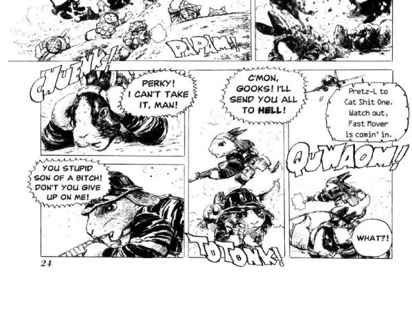
 photo 084ccc28-f6fd-4588-82c8-f035c8c2702c_zpsbfe14488.jpgMotofumi Kobayashi's Cat Shit One: Another great reason to love comics.

Yes, okay! As always, I have nothing clever to say in this space, but unlike always, I'm not going to waste your time saying it. I've got show notes with images! Links! Prizes! (There are no prizes!) Torrid confessions! (There probably will not be any torrid confessions.)

After the jump: Show Note Machine...Go!

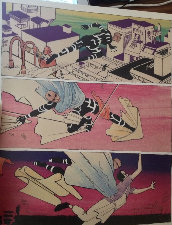
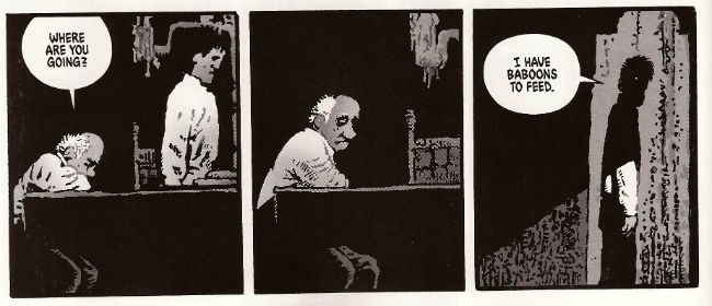
0:00-25:22: Bemoaning the fact that we're not nearly as organized as other podcasts, Graeme makes a prediction about we'll be talking about this episode as a way of introducing this episode to listeners. This allows me to retool a favorite aphorism here in the show notes:  "If you want to make God laugh, introduce a podcast." It leads right into our first order of business:  talking about the latest crazy developments in DC's 3-D cover event.  If you've already read Hibbs' post about this already, you'll be a step ahead of most of the points Jeff makes here, although he does bring his own unique tin foil hat spin to the situation.  Also covered, the recent decision in Kirby v. Marvel,  what it means to "hamburger a muffin" and the opening of a  new Salt & Straw right near Graeme. Verily, this is the Mighty Wait, What? Age of Golden Epicureanism! 25:22-34:07:  Also on a non-comics tip, Stephen Colbert and Bryan Cranston, which famous people we've been compared to, the Adult BMI guidelines, Tarder Sauce, and more. 34:07-45:37:  Todd McFarlane, Len Wein and Gerry Conway discussing sexism and comic books! which we discuss without the context provided by some later tweets made by Conway.  And who is…. the Billy Joel of comics?  Find out here, along with a torrid confession from Jeff!  (Oh, okay, so there was one of those, after all.  Huh.) 45:37-58:05: And in this week's installment of "Welcome to Jeff's Big Basket of Sour Grapes," Jeff talks about a Twitter exchange between Rob Liefeld and Erik Larsen and their consideration of comic book criticism.  Graeme, trying to bring the sense, just ends up bouncing the ball of generosity off Jeff's ungenerous blockhead for an impressively long time. 58:05-1:04:00:  Also, under discussion, Mark Millar's comments about rape.  You probably can imagine our reaction to that one but...maybe not? 1:04:00-1:21:40: And now it's time to talk about some comics we've read -- a little bit about AvX  (and the kindness and generosity of the Whatnauts), but also a lot about the genius that is Rogue Trooper and Cat Shit One. This leads to our we-might-as-well-make-it-official-and-call-it-weekly discussion about 2000 A.D., which in turn leads to discussion about comic book covers, which in turn leads to Velvet by Ed Brubaker and Steve Epting, 1:21:40-1:26:08: Jack Kirby's In The Days Of The Mob! It is available! It is…not cheap!  Not cheap at all! 1:26:08-1:27:21: Copra Compendium (which I can't say aloud without thinking of Weird Al-esque lyrics set to "Copacabana" which is probably why I probably called it Copra Companion half the time) Vol. 2!  Jeff loves this like burning, worries that Graeme may not.  But either way, there is so much lovely stuff, including  the panel shown below and discussed in this podcast:

 photo 6a69f2db-1d51-479d-88d0-f34b31bed185_zps92ffe6f8.jpg

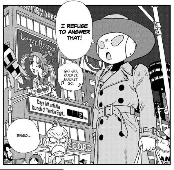
1:27:21-1:31:33:  That inspires Graeme to talk about Lynn Varley, Trevor Von Eeden, and the Kickstarter the latter is running with Don McGregor for Sabre: The Early Future Years. 1:31:33-1:34:12:  Graeme has read Cartozia Tales, the shared fantasy universe featuring some outstanding work by Jen Vaughn, Jon Lewis, Dylan Horrocks, and more. 1:34:12-1:38:34: Trilium #1 by Jeff Lemire. We've both read it.  We both discuss it. 1:38:34-1:41:55: Jeff fumbles and bumbles through some display problems to try and convey how much he digs Jaco the Galactic Patrolman by Akira Toriyama, as well as Toriyama's brilliantly dopey pre-Dragonball series, Dr. Slump.  One of the panels Jeff discusses super-briefly is this one:

 photo 6c6541ba-d040-4dfc-b343-93fd0b16a839_zps2407b166.jpg

1:41:55-1:45:04: The first collection of Talon from DC!  Did Graeme like it almost as much as Jeff likes Toriyama…or even more than Jeff likes Toriyama?  Tune in and find out. 1:45:04-1:52:08: The final volume of Bakuman is out, which is very bittersweet for Jeff.  Despite the frustrations with how Viz has handled publication of this manga (and the generally anticlimactic nature of the last volume), man of man, Jeff is going to miss that series. 1:52:08-end: Closing comments! Graeme makes it sound like we won't be back next week but we will!  (I think.)

See, look at all that. Links! Images! Torrid confessions. (Well, a torrid confession.)  Nice, eh?  So you should go hear it!  It is on iTunes -- eventually -- and it is here for your convenience:

Wait, What? Ep. 131: Linkpocalypse

As always, we thank you for listening and hope you enjoy!  (Now if you excuse me, I have a new chapter of Jaco The Galactic Patrolman to go read....)

Wait, What? Ep. 116: G-Mo K-Hole

Uploaded from the Photobucket iPhone AppBecause it is Hook Jaw, and Because it is My Heart...

Yep, we are back!  Sorry for our absence from the podcasting broadcast waves and of course the Savage Critic site itself.

After the jump--show notes!  But before we get there, I wanted to congratulate House to Astonish for their 100th Episode!  I'm listening to it now, and want to recommend it for people who like what Graeme and I do but would maybe like it if it was done much better?  Congrats to Al & Paul!

Now, then.  Where was I?  Oh, right.

Actually, as long as I'm on the linking-to-not-Wait-What? tip, I should mention I had a great time talking movies with Sean Witzke over at the Factual Opinion's movie podcast, Travis Bickle on the Riviera.  As I said on Twitter, I make a terrible Tucker Stone stand-in, but being able to talk Lincoln, The Seven-Ups, All That Jazz, and John Woo's The Killer (among others) was an opportunity I refused to pass up.  Big thanks to Sean for that, and if there are those brave, masochistic few that haven't had enough of my braying laugh yet, please do check it out.

As for this go-round, check it out:

0:00-6:59: We tried to get our technical problems out of the way at the very beginning (and pass the savings on to you, the listener).  And then it's on to a few minutes of Jeff kibitzing on Graeme's work habits, so it's the best of both worlds--you get to listen in on what Graeme McMillan (the hardest working man on the Internet)

6:59-9:44:  "But, instead, let me read three pages of Hook Jaw…" Who does that sentence turn out well for?  Not someone who has other things to do, that's for sure.  In other words, Hook Jaw is awesome, unless you're Jeff who is trying to procrastinate.

9:44-13:11: Moving on from Hook Jaw, Jeff also picked up issues #3 and #4 of Happy by Grant Morrison and Darick Robertson, and talks about that (although with a lot less evil oil rigger imitations).

13:11-20:04: As long as we're on the G-Mo Train (and let's be honest, when aren't we on the G-Mo Train?), Jeff also read Action Comics #17.  Since Graeme hasn't, the conversation is not especially weighty.  But, hey, for those of you filling out your Wait, What? bingo cards, feel free to fill that in…even if it really should be the card's free space by now.

20:04-21:59: "Where on the Morrison spectrum does Batman Inc. fall for you?"  Yeah, we are not out of the k-hole that is Grant Morrison yet. Not nearly.

21:59-43:07:  And so we're out, via discussion of Batman #17, the "Death of the Family" finale by Snyder and Capullo. Graeme references the discussion that he had over at Kotaku with his smart friends, and it's only fair I include a link to that here.  Graeme also talks about the follow-up issue of Batman & Robin which Jeff forgot to pick up at the store, dammit.

43:07-50:54: We discuss Justice League of America #1.  Has it been a while since we've really dug into DC titles, or is it just me?

50:54-58:14:  But speaking of not speaking of Marvel, Graeme read issue #6 of The Avengers by Hickman & Kubert thinking Jeff would've read but didn't and then he has to talk about it all by himself.  Haw, haw! Sucker.

58:14-1:01:43: Jeff has read Thor #5 by Aaron & Ribic, and man is that a pretty book. This isn't much of a review as much of a collection of spoilers with a bunch of fanning compliments about the art, but, eh.  That's how it happens sometimes.

1:01:43-1:04:39:  Jeff also read the first issue of Nova by Jeph Loeb and Ed McGuinness and was pretty surprised to find himself enjoying it.  (Not such a fan of Avengers/X-Sanction was ol' Jeff.)

1:04:39-1:07:13:  Graeme really liked issue #23 of Daredevil by Mark Waid and Chris Samnee, which apparently is a great jumping-on point for the book.  Jeff is pretty jealous.  The term "a perfect superhero comic" is used as well as the phrase "amazing, amazing stuff."

1:07:13-1:13:55:  Jeff asks about the Superman H'el on Earth storyline because, eh, he's honestly curious.  What can he say?  And Graeme gives all the deets. Unfortunately, at this point, Jeff's head moves one step closer to its MODOK stage and the crunching of the headphones tightening around his ears can be heard in the background. Embarrassing and awkward!

1:13:55-1:26:46:  Also, does Graeme have a take on the new Green Lantern teams?  Whatnauts wanted to know, so Jeff also asks about that bit of business. A bit of analysis about what DC is doing and where they're heading is probably inevitable.

1:26:46-1:50:54:  And of course we are going to discuss "Oscar Scott Card." Probably also inevitable.  There's also some discussion of Jeff and his ever-growing collection of bad-faith boycotts that may be kind of interesting to some.  A surprising admission is made, let's just say.

1:50:54-1:54:34: More comic reviewy stuff!  Uncanny X-Men #1 by Bendis and Bachalo has been read by Jeff so he blabs about it for a bit.

1:54:34-2:14:02:  Last issue of Hellblazer!  It's been read by Graeme so he blabs about it for a bit, as well.  (Spoiler alerts, of course.)  He's got a great prediction here for a possible announcement during con season--be on the look-out for it.

2:14:02-end:  Winding down/update for any Graeme stalkers: will Graeme be attending ECCC? Or other conventions?  Also: Graeme listened to House to Astonish Ep. 100 (see above--but, yes, I will also link it again). Also, if you are in Oslo on June 7 and 8, check out the Oslo Comics Expo!  We will be back next week with more podcastery!  (And we promise to answer our outstanding questions next time, we promise! Even I'm a little appalled we didn't answer any this time around.)

The episode is probably up on iTunes of this entry--if only because all of my attempts to launch this early Tuesday morning has gone awry the last three or four months.  But you can also grab it below, should you wish:

Wait, What? Ep. 116: G-Mo K-Hole

We hope you enjoy and thanks for listening!


On Karen and Vertigo

I'm crazy sad that Karen Berger is leaving DC Entertainment & Vertigo. As many of you know, I opened in April of 1989, so I "came up" at the same time as Vertigo, in many ways -- I still have my very first order form I ever turned in, and I ordered a whopping 15 copies of SANDMAN #6, my single highest ordered comic book for that month (BATMAN #434 came in next at 12 copies). Before the year was out, we'd be selling triple-digits of SANDMAN.

All of the comics that Karen oversaw -- ANIMAL MAN, DOOM PATROL, SANDMAN, SWAMP THING being the most prominent -- were among our biggest sellers, we were one of a new breed of comics stores, stores for who reading was more important than collecting, per se, where creators matter more than characters, where we were all about trying to find NEW readers for comics.

Vertigo comics were generally one of the best tools for new readership -- especially when Karen aggressive started pursuing graphic novel collections. It was EASY to hand someone a copy of "A Doll's House", and have them enjoy it immensely. But compared to the other "wide audience" books of the time, EIGHTBALL, HATE, LOVE & ROCKETS, that entire wing, what Karen did was put out comics for literate adults, and have them come out monthly at the same time.

THAT was the critical difference between Vertigo and virtually any other attempt at the time to do "smart" comics -- they actually came out frequently enough that one could make a living from selling them.

Quickly we became known as "a Vertigo store" (I believe we were if not THE first one identified as such, it was in the first 10), and I put an enormous amount of my success at the feet of Karen Berger, and her editorial sensibilities and skilled in navigating the market.

More recently, Vertigo became a pale shadow of itself, largely, I am understood, as a result of new contracts which Warners insisted on, which gave them more control and ability to exploit properties. "Strangely enough" people stopped wanting to take new titles to them after that, go figure.

I assume this is functionally the end of Vertigo, with Karen moving on -- I think adaptations of "mature" books and movies, like "The Girl With The Dragon Tattoo" and "Django" are much more likely to be the future of Vertigo from here out.

I've been prepared for this for a long time -- from the day that Paul Levitz left I've been thinking that Karen couldn't really stay past the end of whatever contract she had at that point, and I really hope that Karen has a Second Act in her, because I'd love to see her land somewhere, or start something new, that could teach everyone just why that first Vertigo Revolution happened in the first place -- if you put out genre comics that respect their audience, that are produced regularly, that support their creators, you're 90% of the way there.

-B

Wait, What? Ep. 106: You Are Number Six.

PhotobucketAt Graeme's Behest: the cover to Colder #1

Yeah, that's a pleasant way to get your Tuesday rolling, eh?

Anyhoo, very truncated version of things this time around, I'm afraid but after the jump...show notes!

So yeah, I've got a trip that I'll be on for a few days which means I'm trying to write this AND pack AND panic AND forget the one thing I'm not going to remember until I've been the road for two hours.  But am I letting any of that get in the way of bringing you this podcast?  I say thee: nay!  (Though, verily, I shall admit to assing it by half...)

Oh, and I got a big upgrade on the recording end of things but unfortunately it may be why there's a bit of crackle in the opening of the podcast.  Sorry about that--I hope to have that figured out by next episode...

0:00-41:19:  Greetings!  The small talk is eensy-sized this time around as we get right into the topic of the news that day--the pending cancellation of Hellblazer at Vertigo and the launch of Constantine over at the DCU. Graeme brings the facts; Jeff brings the wild conspiratorial speculation.  (Also, Jeff was a little behind the curve this week, so feel free to create a quick & easy drinking game where you take a drink every time Graeme informs him of something of which he was unaware. You will be feeling no pain in absolutely no time at all.)  Is Vertigo effed in the ay?  Maybe. Is that as bad for the marketplace as it would've been ten years ago?  Maybe not.  Somewhat tangentially related: whatever happened to the NuMarvel generation of creators? Why does Aardvark Books in San Francisco have the used graphic novel section that it does?  And other questions lead us into…

41:19-41:54: Intermission 1!

41:54-1:08:21:  For an early birthday present, Jeff picked up a digital subscription to 2000AD and Graeme has been keeping up with it lately, and so much discussion ensues over issues #1806-1808. Spoilers ahoy (especially for #1808). Want to hear us talk Judge Dredd by Al Ewing and Henry Flint; ABC Warriors by Pat Mills and Clint Langley; Brass Sun by Ian Edgington and I.N.J. Culbard; Low Life by Rob Williams and D'Israeli; and The Simping Detective by Simon Spurrier and Simon Coleby?  Then this is the thirty-seven minutes for you! ( Oh, and if you've never seen the original Prisoner--spoilers! at 1:00:36-1:01:36.)

1:08:21-1:11:19: Then, at the very tail end of things, Graeme discusses Action Comics #14 by Grant Morrison, Sholly Fisch, Rags Morales and Chris Sprouse.  Because he just couldn't bring himself to wait until after...

1:11:19-1:11:42:  Intermission 2!

1:11:42-end:  Since Graeme has been to the store (and Jeff hasn't), he leads with reviews, in alphabetical order, no less, of Colder by Paul Tobin and Juan Ferreyra; Earth 2 #6 by James Robinson and Nicola Scott; Iron Man #1 by Kieron Gillen and Greg Land (and also AvX: Consequences); Stumptown v2 #3 by Greg Rucka and Matthew Southworth; Willow Wonderland #1 by Jeff Parker and Brian Ching; and, outside of alphabetical order (and our natural laws of time, space, and arguably taste), the X-Men: Iceman hardcover collecting the miniseries by J.M. DeMatteis and Alan Kupperberg from 1984.

Jeff, by contrast, is utterly flummoxed by the digital comic Batman: Li'l Gotham by Dustin Nguyen and Derek Fridolfs and happily shares the flum with everyone.  And while we're on the flum tip, Jeff also explains his preparations for reading Marvel comics in a legit non-piratey way as well as his first current Marvel comic in a long time: Captain America #19 by Ed Brubaker and Steve Epting.  Also, the book that really knocked him off his chair: the third issue of Ethan Rilly's Pope Hats:  a stunningly strong piece of cartooning and storytelling that is completely worth your time and cash.

[Stealth bonus #1: we also talk about Sean Howe's amazing Marvel Comics: The Untold Story a bit more toward the end.]

[Stealth bonus #2:  Rather than edit out that bit about my Skype pic, here it is in it's teeny-tiny glory:]

Photobucket

[Stealth bonus #3:  You'll know it when you hear it…]

Again, apologies the show notes are so sparse this time around.  To make up for it, I put this up into the ether a little early so you may have already seen the podcast already on iTunes.  But if not,  you are certainly encouraged to have at it below:

Wait, What? Ep. 106: You Are Number Six.

As always, we hope you enjoy and thank you for listening!


Getting Hibbsy with 10/31

Ugh, I’ve missed too many weeks of reviews here, let’s get this back on track! A PLUS X #1 NOW: Finally another ”Marvel NOW!” title ships… and it is the low-to-no plot title. “AvX: VS” was a cute side project for the main AvX comic (and could be, I think, argued that it was often much better than the comic with the actual plot), but I have a hard time seeing this concept sustainable as an ongoing monthly.  As always, things that work out as a joke idea generally can’t survive being stretched out to ongoing status, and I think the low-to-no-plot content is going to not help that one tiny bit. The execution of this issue? Totally competent, but I suspect people are looking for a bit more than “competent” for a $3.99 monthly series. I thought it was EH.

ACTION COMICS ANNUAL #1: Sholly Fisch (Whose name, have I said out loud?, sounds like a golden Age DC Comics writer) takes the big chair here, and the result is perfectly respectable.  Actually, what I found interesting was just how much this comic resembled the basic plot of SUPERMAN EARTH ONE v2 – sudden powers given to someone that Superman must stop, but can’t touch physically lest his own powers be removed; end of comic, villain goes to work for military, which is trying to figure out a way how to kill Superman – also out this week. I think this annual did the story much much better, and it was highly OK.

ANGEL & FAITH #15: I mostly bring this issue up because the back half of it is illustrated by David Lapham, a general rarity these days, much to my sorrow. Isn’t it just nuts that STRAY BULLETS is not in print? Crazy crazy making. Anyway, yeah, ANGEL & FAITH is generally more readable than BUFFY and this issue is no exception, even if it reads a smidge like a fill-in with its two-story structure. Still? GOOD.

AQUAMAN #13: Fourteen issues later, and it’s still all about TELLING us that Aquaman is good, without really SHOWING it. Scowly-Anger-Man is, I guess, a form of characterization, but I’m still not really certain just WHY he’s so pissed off about everything. The only one calling Aquaman lame is the writer of this comic (and they do it again, here, fourteen issues in). Were I paying cash for comical books, this issue would mark me as “Done”, but I work in a comics store, so I quite imagine I’ll read the next issue as well, and not really enjoy it very much either. EH.

BATGIRL ANNUAL #1: I found the painted art (mostly by Admira Wijaya) to be a little too, dunno, paperback cover-like, maybe? Too stiff, too posed, and largely unable to properly render anything too “fantastic” (like Catwoman’s mask, or the perfectly proportioned bandages on SheTalon’s face, and I’m pretty sick of Court of Owls-related stuff at this point, but otherwise, this annual was perfectly OK.

BEDLAM #1: It’s kind of an Arkham Asylum / Joker pitch with the serial numbers filed off in which, at least if I’m following this correctly, the Joker becomes a “good” guy at the end – it carried me right along in its world, which is what a comic is supposed to do, so let’s add this to the rapidly growing pile of intriguing Image comics – I’ll go with VERY GOOD, I think, and, hey, you can buy it on our digital store!

CAPTAIN MARVEL #6: Among the many reasons I am not an editor of comic books is not really understanding why you would launch a book with as distinct of an artist as Dexter Soy, then drop him out before the end of the first arc for someone like Emma Rios (who is a swell artist, but nothing whatsoever like Soy in style or tone). Nor, for that matter, why you would jam out those 6 issues in three and a half months. Especially if your artist can’t keep that schedule, apparently? Also: I’d never ever have made the first arc a time travel story, especially with a (sorry) B-level character like Cap who needs to be “reintroduced” to the Marvel U – you don’t make that work by taking the character OUT of the (modern) Universe. Add it all up, and it’s not any kind of surprise we’re already down to single digit sales on this title from just under 30 sold of issue #1. But the worst part of it all, the very worst part? I really thought this wrap up chapter was quite good, and, I think, ended up making Carol’s “secret origin” a much stronger one. I thought this issue was VERY GOOD, too bad I’ll end up being subs only by issue #12 at the rate things are going.

EC KURTZMAN CORPSE O/T IMJIN AND OTHER STORIES HC EC WALLY WOOD CAME THE DAWN AND OTHER STORIES HC : Sadly, deeply, amazingly disappointed in these – purely because they’re in black & white. I was strongly hoping for something like the Carl Barks reprints, with that nice flat coloring, and I was absolutely committed to replacing out my EC library (which consists of all of the Gemstone reprints, the ones that are literally four issues of the comics, covers, ads and all, glued together into an outercover) for handsome FBI reprints… but, ugh, I don’t want them in black and white. The solicitation copy, the press releases, really bury the fact that these aren’t in color, which I kind of find borderline dishonest. This is now the second attempt at upscale packaging for the ECs in a row that gets it wrong (the last HC set had new, shiny, color, ew!), which just hurts. I think I’m going to have to cut my orders on the next set of books by like 80% -- even “Nostalgia Guy” (my name for him) turned up his nose at them when he spied them on the rack. It’s too bad, because these ARE handsome hardcovers, and those spines are going look AWESOME together on the shelf, and it is really smart to collect the ECs by artist and genre – but they’re simply not how I want these stories archived in my library. I love the EC comics, and they really do deserve to be there for a wider audience, but I’d encourage you to have your LCS to try ordering the Gemstone “Annuals” – about ¾ of them are still in print, but Diamond never really advertises the fact. I stumbled across them doing a trawl of Diamond’s inventory, in fact. But those are flat color on newsprint, which is kind of how those books SHOULD be presented. I also don’t like how this edition doesn’t note which specific comics which specific story comes from. I would have preferred a Table of Contents more like a DC Archives edition, which even gives you month/year. *sigh* For the outer packaging, and the underlying work, I wanted to give a VERY GOOD, or an EXCELLENT, but this B&W edition makes me say EH, instead.

GHOSTS #1: Here’s a happy surprise – I kind of flat-out loved this anthology, as virtually every story was stellar. The other thing I really liked is that with the exception of the Phil Jimenez story, I feel like I could hand this comic over to Ben to read at 9 years old, just like its 70s predecessor. That’s the most awesome thing of all, and I think that they should continue that into the future with Vertigo Anthologies. Get that “Suggested for mature readers” off the cover, says I! The only story I really didn’t like? The “Neil Gaiman’s Dead Boy Detectives” which they decided to bill on the cover instead of Geoff John’s first Vertigo work (which I kind of found odd) – the problem is that it isn’t a full story, at all, and “too be continued, somewhere, eventually” is a big fail in an anthology book. I’m also growing more and more convinced that Al Ewing is The Real Deal, and I really loved his kick off story. And presenting the pencils-only from the Joe Kubert story was kind of touching and cool. Yeah, so: VERY GOOD.

MASTERS OF THE UNIVERSE THE ORIGIN OF SKELETOR #1: You also want to know from surprising? LOVED this. I don’t care for/about MotU at all, and their backstories never seemed any deeper than, dunno, a marketing interns stab at creating a fantasy world (Though, really, what else can you do when you have characters named things like “Stinkor”), so when Joshua Hale Fialkov actually manages to build a backstory that is reasonably compelling, then said story is drawn by Frazier Irving (!), then, hokey smokes, you’ve got a horse race. I was loving this right up to the last page when it says something like “And, so, your name is….SKELETOR!” and then I remembered it was a MotU comic. Aw! Still, this really was surprisingly VERY GOOD.

POPE HATS #3: Ooh, and this was even better. Ethan Rilly is going from strength to strength with this comic, and, damn it, I wish I could still sell issue #1 because we should be picking up readers for this great slice of life story about two room mates with very different career paths. Straight up terrific cartooning, and I would call it “Excellent” except for that pesky $6.95 cover price. Ow. So, knocking a grade off for that: VERY GOOD.

Looks like I’m out of time for the week – time to go pay bills! (yay?)

As always, what did YOU think?

-B

"No! It's ANGRY!" COMICS! Sometimes They Bow Before The King (Of R'n'R).

Good Day! Jolly Good Day! Over here we are shortly to be having a Jubilee shindig! You don't get one so I gave you this instead. It's all over the bally shop but some of it is about comics. You have been warned and so my hands are clean but look at the state of your fingernails! Photobucket

ALL STAR WESTERN #9 Art by Moritat, Patrick Sherberger and Dan Green Written by Justin Gray & Jimmy Palmiotti Coloured by Gabriel Bautista and Mike Atiyeh Lettered by Rob Leigh DC Comics, $3.99 (2012) Jonah Hex created by John Albano and Tony DeZuniga Nighthawk created by Robert Kanigher and Charles Paris Cinnamon created by Roger McKenzie and Dick Ayers

Photobucket

I have my concerns about this book. These concerns have nothing to do with the art what with Moritat and Bautista delivering the usually fine performance; said performance being so fine that it hardly matters that the backgrounds are a smidge perfunctory. And despite the plots being a bit woolly what with all this editorially mandated crossover bullhockey (Ooo! The lady in the cape! Some owls!) at least here they contain the always entertaining idiocy of Caucasian Americans worrying about immigrants lowering the tone of the place and generally letting the side down. It's not even that on a page turn it's "three weeks later" and we're in Gotham instead of N'Orleans, because I understand they want to get on with this interminable owl shite. And yet, part of me, the beautiful, dreaming part no doubt, misses the days when Jonah wouldn't be able to go from one town to another without ending up nailed to a cactus. And I miss El Papagayo turning up to taunt him. I miss El Papagayo he'd be all like, "Senor, Hex! Why must you always make life so hard for yourself, my friend! Come out from behind that rock and embrace me and my gang of toothless well armed vermin! Do you no longer trust your good friend, El Papagayo, Senor Hex! You hurt my heart, my friend! Why, Paco here has brought some smelly badgers! tell him, Senor Hex, tell him we don't need no steenkin' badgers!" Actually, it probably isn't the absence of El Papagayo either.

Photobucket

No, it’s more that Jonah’s becoming a guest star in his own book; it’s just too crowded and in order to stand out from the crowd I fear Jonah’s going to become more of a caricature than a character. The book's focus has shifted from the lovable asshole with the melty face to being more of an attempt to reposition DC’s mouldy old oaters in more viable iterations. I’m all about that because I have a fatal fondness for DC’s western heroes. I have no idea why but there it is. Some people are like that about The Batman; my way is cheaper, I win. I’m also quite okay with the view that there are no bad characters just bad writing. But I’m not quite convinced that the way to go is to give these characters aspects more suited to superheroes. So I’m not convinced that the missing ingredient for Nighthawk and Cinammon’s success is their possession of a pair of lucky charms which stop them dying and make them strong, super strong in fact.

Photobucket

But I just hamstrung my own qualms by saying there aren't any bad characters, so I guess the problem is the writing. In which case I'll bounce back and say it’s just too workmanlike. If you’re selling something to an audience - put your back into it, get some enthusiasm going! Well, it’s workmanlike when it isn't hat stampingly poor; as when Bruce Wayne’s bat-ancestor mentions there is poison ivy someplace. Wait, poison ivy! Do you see?!? DO you see?!? Next issue we’ll hear some joker released some penguins from Gotham Zoo but he keeps denying it because he’s two faced! This is what Jonah Hex needs! Next issue it’s Bat Lash; let’s hope he hasn't got a steam powered skidoo or some such daft shit. At the moment ALL STAR WESTERN is GOOD! but it's on thin ice, muchachos!

RAGEMOOR #3 Art by Richard Corben Written by Jan Strnad Lettered by Nate Piekos of Blambot® Dark Horse Comics, $3.50 (2012) Ragemoor created by Richard Corben and Jan Strnad

Photobucket

This one’s the third issue of four so you might, given modern trends, expect it to basically sit there picking its nose and inspecting the results until the next issue. After all, you’re this far in so why bother trying. But this is Corben & Strnad and they’ve been doing this a while which, I guess, means they are old or some weak and totally lame shit like that. In comics folk always underestimate the old guys don’t they? News just in: Steve Ditko’s still doing good comics. Youth will never understand that you only get old by surviving. This is largely because Youth is an abstract noun and is therefore unlikely to have cognitive functions.

Photobucket

Humourless pedantry aside, let’s face it; put Matt Fraction and Richard Corben adrift in a lifeboat and three weeks later the copters are going to be picking up one fat comic artist. Fraction’ll just turn his back to sneak a look at his reflection in the water and Corben’ll be on him like a liver spotted threshing machine. Wait, I was on about a comic, I think. So, yeah, this comic doesn't just piss complacently about, no, this comic sets back on its haunches, tenses its muscles until they thrum with the collective kinetic energy of the previous issues and prepares to, next issue, hurl itself straight at your throat. Despite the fact that the creators involved probably get twinges in their knuckles when the weather turns cold RAGEMOOR remains VERY GOOD!

SCALPED#58 Art by R.M. Guera Written by Jason Aaron Coloured by Giulia Brusco Lettered by Sal Cipriano Vertigo/DC Comics, £2.99 (2012) Scalped created by R.M. Guera and Jason Aaron

Photobucket

In two issues this series will end. In two issues the fix will be in. In two issues people will refer to this series as Jason Aaron's SCALPED. I have but a brief window of opportunity to attempt to correct the course of the critical conversation as it puts the pedal to the metal and hurtles straight into The Cult of The Writer. Only a soulless canker of a man would deny that Jason Aaron's writing has been solid and decent throughout. It's probably more impressive the less knowledge you have of the '7os cinema he has mined so well the series. But, alas, homage is everywhere now and I know I for one require more to ensure I see out sixty issues. SCALPED gave me more in spades, and it gave it to me in the form of the art of R.M. Guera.

Photobucket

R.M Guera is the star of the show here. It's the attention to detail, I think, that is Guera's true strength. That's quite a strength considering the fantastic way his faces veer into and out of controlled caricature, his body language ranges from subtle to hysterical and his environments from the grubbily realistic to those of opulent excess and all of this, all the while, strengthening rather than destroying the suspension of disbelief; drawing the reader in rather than pushing the reader away. Christ, it's the stuff of wonder. Christ, I write about comics like old people trampoline. Look, here's R.M. Guera drawing a scene in a supermarket. It's just a scene in a supermarket but, but, look:

Photobucket

And how about those colours, ey? Brusco's colours are a special kind of magic as well throughout the book. Check out the night scene I lifted above. Be soothed by the smooth blues and then startled by the pop of the lime green FX! Giulia Brusco gets a cheek chuch for coloring cojones and no mistake. What a wonderful, wonderful book SCALPED has been on a visual level. It's a bloody shame that the aspect that lifts SCALPED up to VERY GOOD! is, I'm guessing, the aspect that'll receive least play once it ends, and the artists who worked such wonders will reap the least of any future benefits; career and reputation-wise. But before that happens, before the fix kicks, in I'm going to point out that R.M. Guera is EXCELLENT!

Those of you who read this and were not insensate from drugs or currently being attacked by a maniac will have picked up on the subtle fact that I'm a little distracted. That's because this weekend is Jubilee weekend! We get an extra Bank Holiday on Tuesday to celebrate Good Queen Bess. I'm no Royalist but I do recognise that the tourist industry is pretty much the only industry we have anymore, so she's okay on that score, and also I'm anyone's for a free day off work. Fickle? You have no idea, pal. You have no idea. So I am eager to join my fellow countrymen in the heat of the streets, swigging binge and watching as the middle aged men with their Celtic tattoos blistering in the heat bellow at their shrink wrapped wives about how Sandra in accounts understands and how he never wanted this, never wanted any of this and the discarded children weep beneath the Union Jack bunting. England, my England!

Oh please, despite all your protestations to the contrary you're all quite keen on the whole Royalty business, aren't you. my American friends. Oh, you claim otherwise, you do:

Photobucket Image from The Steve Ditko Archives Vol.2 (Ed. Blake Bell, Fantagraphics Books). Art by Harry Belafonte Jnr. No, it's Steve Ditko for Goodness Sakes! Keep up, no lollygagging at the back!

But you're just fooling yourselves. You protest too much, methinks. Look, you've had at least two Kings: The King of Comics (one Jack Kirby by  name) and this raunchy dude:

Photobucket

The King and American Royalty were on my mind because when I am not reading comics I am looking at enthusiastically typed and photocopied documents held together with staples produced by fans of things. Probably while they waited for The Internet. Documents such as THE ELVIS COLLECTOR #1 (edited by Major I.R. Bailye). This fragment of forgotten fandom was brought home to me courtesy of my very own Priscilla, who knows only too well that when it comes to The King there's no fool such as I.

Reading the photocopied love letter to The King my eyes settled on this:

Photobucket

From The Leicester Mercury; date unknown, author pseudonymous.

Sadly "The Realist", despite his fantastic English language skills ("overdressed to a point of fantasy"!!), is incorrect as Elvis Aaron Presley touched down briefly on British soil. However, I still think his points remain valid despite this factual inaccuracy. Yet, it did make me realise that sometimes people can be blinded to the essential truth of an article if the author undermines himself with inaccuracies. A bit like an article on comics in The Wall Street Journal perhaps. The one where he's wrong about why comics aren't popular anymore (the world's just moved on and the price has risen in line with the Greed Index; that's really why) but is right about Avengers comics being less like something you'd use to attract new readers and more like something you'd scrape off your shoes before going indoors. Poo, I'm talking about poo there. Usually animal  but, given the state of Cameron's Big Society, there's a queasy possibility it could be human. Um.

In closing let me just say that, being all crepey of skin and feeble of mind, I am only too well aware that at any moment my stinking and aged frame could just drop dead, and sometimes I wonder how I would like to be remembered. It turns out that I would like to be remembered like Elvis. No, not as a mother fixated, voyeuristic pill popper with strange ideas about chimp management. (People tend to forget the Divine Voice these days, which is their loss.) Rather:

Photobucket

From The Leicester Mercury; date unknown, author pseudonymous.

Yes, "preferable to Hitler". I think the "Real Realist" is right in that that's all any man would want in the end. So, have a smashing weekend and if you think of me, think of me, at least as being "preferable to Hitler". Like Elvis. Like The King. God Save The King! God Save The Queen!

Farewell for now, my foreign chums, and remember: if you can't have a Jubilee then have some COMICS!!!
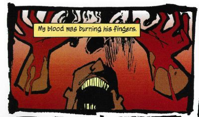
Wait, What? Ep. 84: Q and A DNA Q

Photobucket First off, our new graphic is courtesy of the incredibly talented Adam P. Knave (who on top of all the other things he does and does well, has added podcaster to the mix. Go check out The Glory, The Glory, why don't you?) and our old dashed-off scattershot introductions to the podcast, courtesy of me who has once again managed to land himself behind a scheduling eightball.

But!  That doesn't mean we didn't attend to our duties, as far as answering your questions go.  On the contrary, Episode 84 of Wait, What? is our first hour and forty five minute foray into the savage wilds of your inquiries.  Among the ground covered by Graeme McMillan and me:  our recommendations for DC Showcases and Marvel Essentials (both real and imaginary), the fall of Vertigo's Sincere Age, Alan Moore and the plight of 1963, our Free Comic Book Day picks, the damning influence of Big Question Mark, event comics, follow-ups to articles discussed without being read, work for hire vs. creative owned work, Steve Gerber and Foolkiller, Submarine, Elite Squad, our favorite comic book city,  and assorted cage matches and Hunger Games.

Also: Stuff.  Additionally: Things.

Men and Women With X-Ray Eyes (And/Or Specs) have already seen the podcast radiating in the iTunes spectrum (grappling perhaps with an Infrared Manta).  Those of us with only stereoscopic or lesser degrees of vision can certainly be satisfied with the auditory equivalent, as available below:

Wait, What?, Episode 84: Q and A DNA Q

As always, thanks for listening and we hope you enjoy!

"Like Porcelain, They Shattered." Comics! Sometimes They Contain Ageless Horror!

Photobucket An eerie sense of deja vu descends upon you now as I talk about Richard Corben, Simon Revelstroke and a very odd house indeed. Viewings by appointment only, please call first to avoid disappointment!

THE HOUSE ON THE BORDERLAND Adapted by Richard Corben and Simon Revelstroke Art by Richard Corben Words by Simon Revelstroke Coloured & separated by Lee Loughridge Lettered by Clem Robbins Introduction by Alan Moore Based on the book THE HOUSE ON THE BORDERLAND by William Hope Hodgson (Vertigo/DC Comics, H/B, Colour, $29.95 (2000))

Photobucket

Corben and Revelstroke’s 2000 adaptation of Hodgson’s 1908 novel is fronted by a lucid and informative introduction by one Alan Moore. Moore, not for the last time, reveals he has in fact not read the work (the adaptation rather than the novel, which he has read) in its entirety but assures his notional reader that it is no doubt of merit because Richard Corben is involved. No, this would not be the last time Moore would pass judgement on work he had not read but since his verdict here is positive and concerns the adaptation of a dusty old tome by an exponent of Comix it appears to have passed unnoticed and failed to ignite a conflagration of unfortunate dimensions.

Today such terms as “a conflagration of unfortunate dimensions” are applied to a bunch of people being vocal about their hurt feelings concerning what an exasperated old man whose opinion they don’t value thinks about some comics written by people who are a bit touchy and which involve characters shooting lasers from their eyes and flying about a bit. A scant few decades earlier such a description would have been applied to something like World War 1 (1914-1918). Now, the novel clearly precedes The Great War but Moore suggests it could reasonably be placed in the literary genre of ‘Invasion Literature’. Basically this is a series of novels/short stories produced independently by various and diverse authors such as H.G. Wells and John Buchan which seem to prefigure the horrendous event with their imaginative toying with the anxieties of society. I don’t recall if anyone ever actually claimed credit for predicting the apocaluptically sorry mess; it seems a little unlikely since people had some measure of self respect and would have drawn the line at enhancing their own reputations at the expense of an entire generation turned to bone meal. And Mark Millar hadn't been born then. Moore’s suggestion is novel since THOTB is initially a far less obvious candidate for inclusion in Invasion Literature than something like The War of The Worlds. Because THOTB is a far more chimerical beast indeed.

Photobucket

Moore’s claim is sound though as of the 85 pages which make up this adaptation fully 26 are concerned with the defense of the titular house from wave upon wave of animalistic invaders. It’s a relentless and exhausting read as the two humans, and Pepper the dog!, are driven further and further back; first into the house then to the very roof of the structure where the tide of mutant mis-shapes ceases finally but the horrors merely burrow deeper and attack more subtly. From hereonin the battle becomes apparently one between the narrator and the house itself characterised by sly suggestions and dark discoveries. The darkest of these is perhaps that the battle is intended not to destroy the narrator but to sway him to the house’s true purpose. For is it not called The House on the Borderland? Through the destruction of the narrator the intention seems to be to rebirth him as the master of the house, to accord him the function of guardian of The Borderlands. While defeat will entail his destruction the narrator’s victory can only ensure an eternal struggle to avoid a more encompassing and apocalyptic defeat.

Photobucket

But The Borderlands of what? The simple answer would be between sanity and insanity and, yes, that reading is here too. The narrator and his sister are initially presented as the ossified and reserved pair of any fiction which involves the wearing of top hats and frock coats on a daily basis. Soon though they are torn and dishevelled by their strenuous fight against “The Other” but once the physical forces recede the supernatural forces swell. Emotions become unseemly and desires best beaten with a stick become…apparent. Things fall apart. The narrator descends to the bowels of the house and becomes untethered from time (from reality?). Reality can no longer be trusted, surety is cast aside and as all times become one and the Black Sun (Black Hole?) with its boundless hunger can only be delayed not destroyed.

It’s pretty phantasmagorical stuff at once inviting and repelling comprehension. Aside from the inherent humour in Corben’s exaggerated stylings the adaptors play the whole thing straight. A prologue and epilogue are added to brace the main narrative with at least some form of closure without eroding any of the themes or atmosphere but the meat of the matter is as ever in the adaptation itself. While Corben is the star and the draw here Revelstroke does a nice job that shouldn't go unacknowledged. Confined largely to captions taken from the narrator’s recollections he (and Corben: synergy!) do a grand job of yoking them to images to their best effect. Sometimes the image will belie the caption, sometimes the caption will purposefully be woefully inadequate at describing the illustrated horrors and at times the horrors will be so overwhelming the caption is dropped entirely. Corben and Revelstroke understand about words and pictures and here they subdue their creative egos to the end of creating a satisfactory work. It would be easy to dismiss the writing as it never flails for your attention as though the writer were desperately elbowing the artist out of the way for the crumbs of your attention. Easy but wrong. Often the taut restraint pays off beautifully and I’ll try and demonstrate that now with my favourite bit. Here is something that would appear in the original novel upon the printed page without visual reinforcement:

The shadows lapped at her. Firelight struck glints off the droplets upon her breasts…Her grunted words were unintelligible. Her need was…apparent!

Nice stuff, particularly as you know, if you read it in context, that “she” is his sister. Such interactions between siblings, at least in England, are generally regarded as being wrong. Not even if she has an anachronistically denuded pudenda. So, nice, yes, but not as nice as:

Photobucket

Isn’t that jolly super! I thus trust Simon Revelstroke’s talent is…apparent!

And Corben? Alan Moore says in his introduction, “Mr. Richard Corben, in his finest visionary form, a genuine giant of his chosen medium.” And he ain't pissing up a rope there, kids! To adapt something as well-regarded as THOTB the comic has to bring something special. As good as Mr. Revelstroke is his words are no replacement for the Hope Hodgson's originals. But add them to the bloated beauty of Richard Corben and we've got something magical happening. While in RAGEMOOR Corben utilises a more traditional technique, one appropriate to the traditional genre trappings of his tale, in THOTB Corben embraces the swirling nuttiness of the on-page happenings to bust out some smooth moves visually. There’s plenty of variations on these pages in panel size, shape and position and they all have their part to play in the narrative structure Corben’s embedded them into. If there’s a page which consists solely of a grid then it’s a rarity and such a rarity that it doesn't spring to my mind. Corben’s varying variations keep the eye moving about and engaged.

Photobucket

There’s no extended stretch where the eye can become complacent. Even panels simply placed next to each other will be slightly larger or smaller than their neighbours. The mission here seems to be to keep the eye moving, keep the eye interested, keep that eye engaged, keep that eye on its toes. The contents of the panels are the usual Corben glories. Everything has that weirdly organic texture whether it be flesh, fauna, smoke or stone. And he does that thing with the angles. That thing where he draws a scene from an unfamiliar angle but also positions the elements in a fresh way usually with shadows employed to further occlude the meaning of the image; forcing you to halt your gaze and look at it until it reveals itself. It’s a great way to control the pace of the reader without having to use up real estate on splash pages. Embracing the lurid and fanciful shenanigans he’s asked to illustrate Corben’s pages are at times hypnotically arresting. The savage combat, the twisted landscapes, the mis-shapes and malformations and the whole bizarre and disconcerting deal play to Corben’s strengths. And yet the finest part of his work here, for me, is one of the more subdued scenes where the narrator has laid behind him a trail of candles which begin to go out one by one as the darkness, and whatever calls it home, relentlessly pursues him.

In the introduction Alan Moore also makes mention that he is pleased that the novel THOTB has escaped the attempted whitewashing of genre fiction from earlier centuries. Corben and Revelstroke’s adaptation should help entail the novel remains in the public imagination. Provided someone points out that said adaptation exists and that it is VERY GOOD! Of course it'd probably help if some other folks read it too.

Photobucket

And like all sense of sanity, decorum or restraint I am gone!

Hope you had a nice weekend and read some COMICS!!!
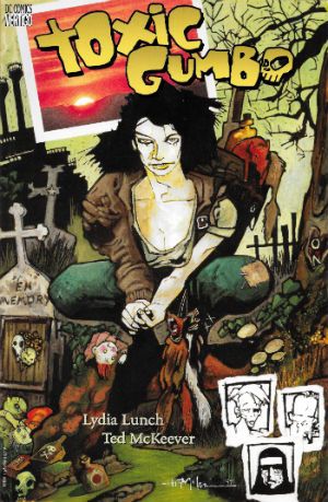
Wait, What? Ep. 79.2: Power of Ones

Uploaded from the Photobucket iPhone App Hey, guess who did it wrong?

Yeah, I had an incredibly busy Wednesday and it wasn't until my head hit the pillow that I remembered I'd forgotten to upload this podcast.

And create this entry.

So, despite my fond reveries about providing extra content and blahblahblahblah, that will probably have to wait until next week because, well, I'm tired and dumb.

But I wasn't (entirely) when Graeme and I talked now comics for our conclusion to Episode 79!  Nope, I was more or less lucid and we reviewed the latest issues of Buffy The Vampire Slayer, Angel and Faith, Frankenstein, Agent of Shade, Batwoman, and a whole mess of first first issues including Saucer Country, Crossed Badlands, Saga, Avengers Assemble, and of course Todd McFarlane's Spider-Man (which I'm sure some of you were unfortunate enough to realize from the above excerpt).
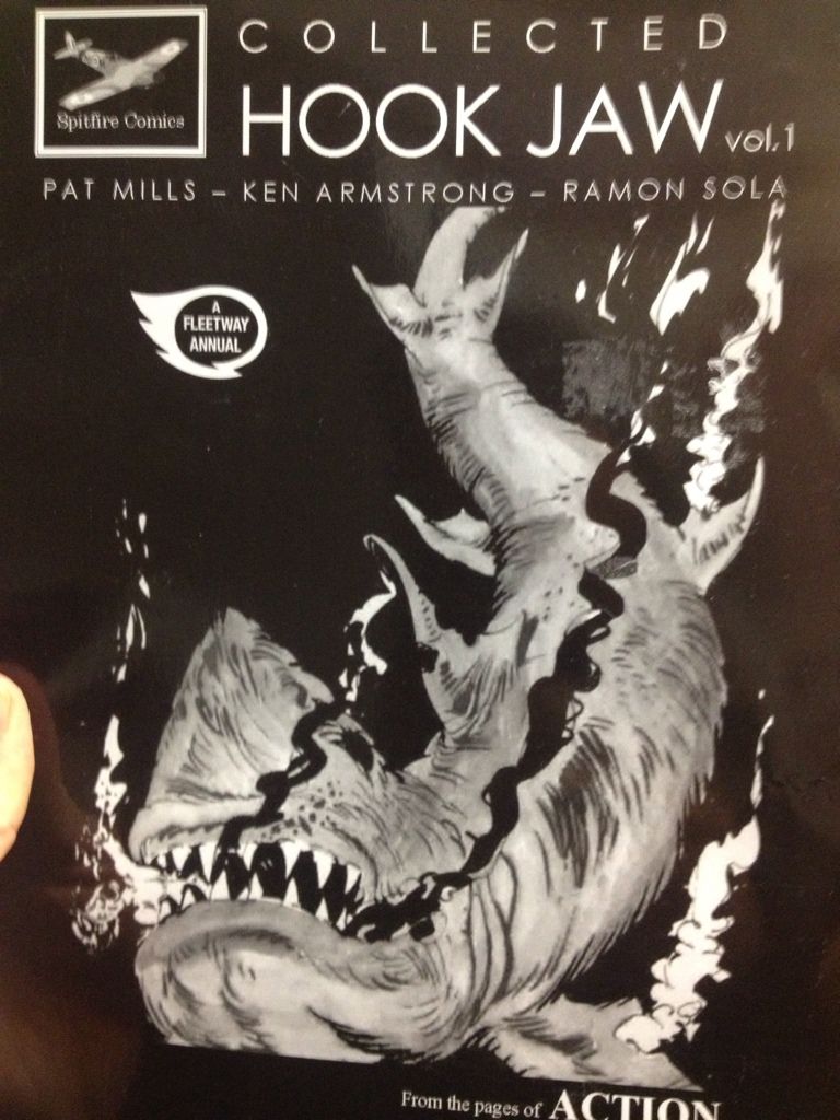
"A candy-colored clown they call iTunes tiptoes to your feed every night just to sprinkle podcasts and to whisper "Go to sleep, everything is all right."

Alternately:

Wait, What? Ep. 79.2: The Power of Ones

As always, we hope you zzzzzzzzzzzzzzzzzzzzzzzzzzzzzzzzzzzzzzzz...

"Clod. I Have WEAPONS..." Comics! Sometimes They Are Almost Fresh!
It's a post about comics! Is it early? Is it late? Time is in flux!Only if one man can face his Pull List can The Balance be restored!

One Man. One Pull List. There will be Words... (...probably the wrong ones). Photobucket

ACTION COMICS #6 “When Superman Learned To Fly” by By Andy Kubert/John Dell(a), Grant Morrison(w), Brad Anderson(c) and Patrick Brosseau(l) and “Last Day” by Chriscross(a), Sholly Fish(w), Jose Vallarubia(c) and Carlos M. Mangual(l) (DC Comics, $3.99) Superman created by Jerry Siegel and Joe Shuster.

Photobucket

 I like that stuff in my comics but I'm not unaware that in real life that kind of thinking gets you killed.

While there could be said to be many faults with the lead story in this issue such as an apparent attempt to distract from a lack of clarity (or indeed even sense) with a belligerently unslackening pace and art that once again belies Andy Kubert's alleged superstar status it remains a fact that in this story Superman's enemies conduct an auction for Kryptonite within Superman's own brain (physically, literally within Superman's own brain) and Superman uses his own Kryptonite poisoned body as a battery to save his both his own sentient ship and the day entire. Yes, Superman's enemies conduct an auction for Kryptonite within Superman's own brain (physically, literally within Superman's own brain) and Superman uses his own Kryptonite poisoned body as a battery to save his both his own sentient ship and the day entire. That's Superman comics enough for me!

The backup is the kind of sweet and tender emotional snapshot of a transitional moment in life that anyone under forty will treat as though it were sentient dog-muck hellbent on French kissing them; that's okay because I enjoyed it enough for y'all! Yup, ACTION COMICS was GOOD!

 STATUS: REMAINS ON THE LIST!


ALL-STAR WESTERN #6 “Beneath The Bat-Cave” by Moritat(a), Justin Gray & Jimmy Palmiotti(w), Gabriel Bautista(c) and Rob Leigh(l) and “The Barbary Ghost Part 3” by Phil Winslade(a), Justin Gray & Jimmy Palmiotti(w), Dominic Regan(c) and Rob Leigh(l) (DC Comics, $3.99) Jonah Hex created by John Albano and Tony Dezuniga. The Barbary Ghost created by Gray, Palmiotti and Winslade

Photobucket

Kids! How many owls can you spot!

Thank the Great Spirit! Next issue ol' bacon face is off to N'Orleans! where there will no doubt be "gumbo" galore but at least there won't be anymore shoehorning of Batman references into a book that doesn't need them. A cave beneath Wayne Manor! Filled with Bats! This cretinous continuity reached a kind of hilarious nadir with the sudden slew of references to Owls: because Batman is currently encountering stress of a strigiform stripe by all accounts in the here and now! So we get about two pages in which the characters can barely move around the mansion setting for all the owls dangling, roosting, flopping and just plain flailing around the place. It's as though Moritat has snapped and gone "You want owls? Here! Here are your owls! Got enough owls yet? I don't think so! Owls! Here! Now! In your face! All! Owls! Touch them! Touch my owls! Tell me they're pretty! Owls!" and then gone for a long lie down. Stupid owls. Anyway I'm a little bit partial to Jonah so it was still OKAY!

 STATUS: REMAINS ON THE LIST!

ANIMAL MAN #6 “Tights” by Jean Paul Leon & Travel Foreman/Jeff Huett(a), Jeff Lemire(w), Lovern Kindzierski(c) and Jared K. Fletcher(l) (DC Comics,$2.99) Animal Man created by Dave Wood and Carmine Infantino

Photobucket

Movie Cliche #23415678: Sad Dad at fridge with beer and photo of son. Collect the set!

Tricky one this. Has Jeff Lemire done a pitch-perfect satire of the vapid screenwriting cliches that have run roughshod over comics beautiful storytelling devices or does he actually believe this is a decent film script made comics? It's hard to tell isn't it. Heck, I don't know maybe you thought it was awesome? Luckily it's easy to tell that Jean Paul Leon is an awesome artist and hopefully one day he will draw comics as awesome as WINTER MEN again. This issue is a complete waste of time and is clearly a fill-in so next issue we should be back to Travel Foreman and his nightmarish body horror.

After I read the previous issue I fell into a light doze and dreamt about a man in a chair. I was holding the man in the chair via the power of some unknown threat. The man was crying and peeling his own skin off his own face with a small knife. I was then forcing him to eat it via the unspoken promise that if he did as I asked he could go free. The fact that the man was eating his own face was terrible but the worst thing was that we both knew I was lying and he wasn't leaving alive. But he had no choice but to do as I asked because that was his only hope. Yes, it's been a trying few months. They say there's nothing as boring as listening to someone else's dreams but they forgot about reading film scripts masquerading as comics which is so boring such comics are EH!

STATUS: REMAINS ON THE LIST (BUT WATCH IT)!


BATWOMAN#6 “To Drown The World - Part One” by Amy Reeder/Rob Hunter/Richard Friend(a) J.H. Williams III & W. Haden Blackman(w), Guy Major(c) and Todd Klein(l) (DC Comics,$2.99) Batwoman created by Bob Kane and Sheldon Moldoff (modern version by Greg Rucka and Alex Ross).

Photobucket

"Given the state of your medical insurance talking's about all you can afford so knock yourself out is my advice."

Wuh-hoof! That's certainly a change in artist alright. I'll stick it out for a bit because I always like people to get a fair shake of the critic stick. Initially I'm not  finding myself a fan of Reeder's thin line but I appreciate her attempts to step up her layouts. Given the writing is competent at best (actually that's a compliment in today's world o'comics) Reeder's got it all on her to raise this one up from EH!

STATUS: REMAINS ON THE LIST (FOR NOW!)

DAREDEVIL #9 By Paolo Rivera/Joe Rivera(a), Mark Waid(w), Javier Rodriguez(c) and VC’s Joe Caramagna(c) (Marvel Comics, $2.99) Daredevil created by Bill Everett and Stan Lee.

Photobucket

Storytelling in 'Not Dead' shock!

Unless Howard Victor Chaykin has been reactivated without my knowledge I guess this is the only Marvel comic I'm buying. That doesn't seem right, I'll have to check. Anyway, I'm buying this because Mark Waid understands that the bit with the boot is funnier and cleverer because it only takes up one panel. It's because Rivera Jnr and Snr make all kinds of spooky magic happen on these pages. It's because together the team on the book achieve the kind of synergy that results in the storytelling stuff from which the above image is but a sample. Yup, DAREDEVIL is a purchase because it is VERY GOOD!

(Hey, I hear Chris Samnee is coming aboard! I told you all I'd wait for him!)

STATUS: REMAINS ON THE LIST!

DEMON KNIGHTS #6 “The Balance” by Diogenes Neves & Robson Rocha with Oclair Albert(a), Paul Cornell(w), Marcelo Maiolo(c) and Jared K. Fletcher(l)(DC Comics, $2.99) The Demon created by Jack Kirby. Shining Knight originally created by Creig Flessel (modern incarnation created by Simone Bianchi and Grant Morrison). Vandal Savage created by Alfred Bester and Martin Nodell. Madame Xanadu created by Michael William Kaluta.

Photobucket

His reply is actually quite funny but I'm still baling.

Nah. I'm done. It just didn't work for me. Which is a shame as it wasn't terrible as such it just never gelled. Way too diffuse and lacking in focus both from a scripting and art standpoint. I mean, how big was this village, where was everything in relation to everything else? But like I say it wasn't terrible and I wish all involved well and hope the book works out further down the line but there are plenty of books I can read that aren't EH! And that's where my money's got to go. It's the Law of The Direct Market; savage and unrestrained!

STATUS: OFF THE LIST!

FATALE Number Two By Ed Brubaker, Sean Phillips and Dave Stewart (Image Comics, $3.50) Fatale created by Ed Brubaker and Sean Phillips.

Photobucket

 ...probably because for some odd reason she's drawn to look about 8 years old and acts as subtly as a silent movie siren?

People tend to refer to books by this team as "Brubaker" books don't they? Which is odd as I find Brubaker to be the least of the appeal they hold. I guess it's that whole Cult of The Writer thing or something. Hey now, hang on, I'm not saying Brubaker isn't good. He's got craft/technique/skill/whatever we're calling it now in spades it's just the result is, for me, mostly solid rather than inspired. Except when he gets Meta which is when the wheels start wobbling like they're about to pitch a fit (remember INCOGNITO where working in an office was "like" doing Indie comics but taking to the streets and letting your inner nature run wild was "like" working in the mainstream? Really? Um.). On the whole though I get well crafted genre staples served up with a slight twist but the real pleasure I get from this team's comics is in the form of Phillips and Stewart in conjunction with Brubaker. I'm not going to just roll around showing my belly because it hasn't got capes'n'tights in it, okay?

Here, I guess the High Concept (sigh) is Crime and Horror - together! Like Hope and Cosby! Like Morecambe and Wise! Which is fine because,hey, I like both. I'm not sure they belong smushed together though except as one of those novelty type deals. Y'know, all those Steve Niles things Steve Niles does. I guess Crime fiction tells us about the worst in ourselves and so does Horror fiction; they just use different tools. Using both sets just seems like doubling up and risking the results seeming lesser. Early days though, I mean, look at what porting Horror tropes into Crime did for James Ellroy ($$$$ is what it did, kids. Woof! Woof!). I don't think we're looking at an Ellroy here but we may be looking at an Angel Heart. And that's fine. I got a thing about chickens, Mr. Cyphre; as in I don't like to count them too soon but this one looks GOOD! so far.

STATUS: REMAINS ON THE LIST!

FRANKENSTEIN: AGENT of S.H.A.D.E. #6 “The Siege of S.H.A.D.E. City – Part One” by Alberto Ponticelli(a), Jeff Lemire(w), Jose Villarrubia(c) and Travis Lanham(l) (DC Comics, $2.99) Frankenstein: Agent of S.H.A.D.E created by Doug Mahnke and Grant Morrison (and Mary Shelley).

Photobucket

I am always happy to see the word "buffoons"!

There's a bit in this issue that is pretty much a stealth WATCHMEN (by Alan Moore, Dave Gibbons and John Higgins) reference. It's the scene in the 'Nam bar between The Comedian and Doc Manhattan but here with Franky and a red, bald dude who is, basically, Dr. Manhattan and without any pregnant woman shooting or face glassing. That is to say without any of the actual important or troubling content. I'd call that an Omen were I of a credulous nature. Otherwise it's yet another issue of Hellboy in the DCU and which is Okefenokee by me!

STATUS: REMAINS ON THE LIST!


JUSTICE LEAGUE DARK#4 and #5 “In The Dark - Part Four and Finale” by Mikel Janin(a), Peter Milligan(w), Ulises Arreola(c) and Rob Leigh(l) (DC Comics, $2.99ea) John Constantine created by Alan Moore, John Totleben, Rick Veitch and Steve Bissette. Madame Xanadu created by Michael William Kaluta. Deadman created by Arnold Drake and Carmine Infantino. Shade, The Changing Man created by Steve Ditko. Zatanna created by Gardner Fox and Murphy Anderson. Enchantress created by Bob Haney and Howard Purcell. Dove created by Steve Ditko. Mindwarp created by Peter Milligan.

Photobucket

Stealth WATCHMEN reference#2. We get it, DC! You WIN!

I haven't enjoyed this. It's all been a bit like warmed-over '90s Milligan with stuff like "In Nebraska The Pokemon come alive and the screams of the bread-cakes dance like glass-kneed OAPs." Okay, not as warmed-over '90s Milligan as that DEFENDERS#1 preview perhaps but still not terribly inspired. I mean the sheer scale of events would suggest the body count is in the hundreds of thousands not to mention the country-wide trauma involved but there's no sense of any consequences.

No, I didn't like it. I did, however, enjoy Milligan's skeevy interpretation of Deadman. I would totally read a Peter Milligan Deadman series in which Deadman acted like one of those fantastic men who pressure their missus into all kinds of sexual situations that the missus clearly isn't all that into and it's all just about the guy exerting power over her so that's she's eventually roiling around in moral squalor with only the "fact" that he loves her to keep her sane. At which point the hilarious rogue tells her she's a sl*t and leaves her to fall to pieces while he starts the whole cycle with some other vulnerable woman. I think a comic like that would bring in new readers. Sh*theads mostly, but hey, sales are down! We can't afford to be be proud anymore! Despite creepy Deadman JLA: DARK was EH!

STATUS: DROPPED!

O.M.A.C. #5 and #6 “Occasionally Monsters Accidentally Crossover” By Keith Giffen/Scott Koblish(a), Dan Didio, Jeff lemire & Keith Giffen(w), Hi-Fi(c) and Travis Lanham(l) “One More Amorous Conflict” By Scott Kolins/Scott Koblish(a), Dan Didio & Keith Giffen(w), Hi-Fi(c) and Travis Lanham(l) (DC Comics, $2.99ea) O.M.A.C. created by Jack Kirby.

Photobucket

It's the hot dog that makes it great!

In #5 O.M.A.C. and Frankenstein Agent of S.H.A.D.E have a great big slobberknocker which entertains and amuses me on a base level which I have no shame in gratifying since I am okay with comics just being goofy, colourful fun. With #6 I realise that the main reason I like O.M.A.C is because of Keith Giffen's art because with #6 the artwork is by Scott Kolins and the only memorable thing about the issue is the fact that Leilani's breasts are pancaked in the same manner that Caroline Munro's were in The Golden Voyage of Sinbad. Yes, I realise that reflects badly on me as a human being but, honestly, what reflects badly on us as a society is the fact that we have fallen so low so fast that when you read The Golden Voyage of Sinbad you automatically assumed I was talking about a p*rn film rather than a children's fantasy film from the '7os.  So, um, anyway O.M.A.C was GOOD!

STATUS: REMAINS ON THE LIST!


PUNISHERMAX#22 “War’s End” By Steve Dillon(a), Jason Aaron(w), Matt Hollingsworth(c) and VC’s Cory Pettit(l) (MAX/Marvel Comics, $3.99) The Punisher created by Gerry Conway, Ross Andru and John Romita Snr.

Photobucket

"Now that we've solved the Energy Crisis! Who's up for a brewski!"

PUNISHERMAX#22 may just be the most subversive comic I read this year. Oh, not because of the ending because...really, Jason Aaron? Really? That's your ending? We can solve all societies problems by just rising up and killing the sh*t out of other folks? Really? Heck, maybe we just need a strong leader as well? Fancy your chances do you, Jason Aaron? What a crappy ending. Mind you, I live in a country where we only arm The Police, The Army and farmers. What? No, I don't know why we arm farmers, maybe because of all the lions? Or maybe they keep being carried off by subsidies in the night. Stop getting distracted by details. So, okay, maybe that ending is a bit more reasonable over there in The Americas. If it is, I will pray for you all. Christ, that irresponsible ending.

No, PUNISHERMAX #22 may just be the most subversive comic I have read all year because of the scene involving Elektra. Elektra is at the Hand headquarters after a savage battle with Frank. Elektra has served The Hand well for many years but now Elektra needs help from The Hand. Specifically medical help. But I guess The Hand doesn't have Health Insurance for its employees and since Elektra is no longer of any use to them they have no qualms in cutting her loose in the most final of ways. Despite knowing full well the conditions of her employment Elektra is still surprised and dismayed at this turn of events. But she should have expected it, really, because that's what you get for working for Marv..I mean The Hand. Say, is something bothering you, Jason Aaron? Stuff on your mind?

Oh, PUNISHERMAX was entertaining enough and the fact that I could never reconcile the interesting parts with the witless parts of it actually made it more interesting and brought the whole thing up to GOOD!

STATUS: Cancelled or Came To A Natural End When The Author Had Told The One Frank Castle Story He Felt He Was Born To Write. (Oh, yeah!)

RASL #13 By Jeff Smith (a/w/l) (Cartoon Books, $3.50) RASL created by Jeff Smith.

Photobucket

There's a couple of reasons I really like RASL. There used to be pretty much just one reason; that although none of the individual elements actually seemed unique in and of themselves they were combined in such a way as to present a story notable for its novelty and also the freshness of its presentation. There are many scenes in RASL which you have seen in other stories but this is not a problem with RASL because it isn't really a problem at all unless it is a problem with all stories. It is a problem with some stories because they will just go for the default setting of said scene; the one that's floating closest to the surface of the popular imagination due to repetition and exposure via Hollywood blockbusters for example.

Look at the Avengers Vs. X-Men preview and ask yourself whether the life sappingly tedious familiarity of every scene is intentional and while you have your own attention ask also how many pages until The President says "And may God have Mercy on us all." It's all about familiarity, oh yes, I am aware it's all pitifully legitimised by claims of "homage" but that's cockrot, it's all about familiarity; giving people what they already know they like. Of course eventually familiarity forgets to put its rubber on and breeds something; contempt. Not in the case of RASL though. RASL keeps me on my toes, RASL demands something from me - attention. In return it rewards me with quality entertainment. That seems fair enough to me.

The other, more recent, reason for liking RASL is that unless Jeff Smith has some kind of catastrophic breakdown involving his identity he won't be suing himself anytime soon. Yup, RASL is VERY GOOD!

STATUS: REMAINS ON THE LIST!

STATIC SHOCK #5 and #6 “True Natures” and “Unrepentant” by Scott McDaniel/Andy Owens(a), Scott McDaniel(w), Travis Lanham & Dezi Sienty(l) and Guy Major(c) (DC Comics, $2.99ea) Static created by Dwayne McDuffie and Jean Paul Leon.

Photobucket

 A DC writer on The Internet: Yesterday.

Well, that was certainly a stinker of a thing. I have no problem with Scott McDaniel's art by the way. Sometimes it lacks clarity but I respond well to the boldness of his line and the chunkiness of his figures. I find it quite pleasing on the whole. His writing has, however, been less than stellar. It's hard to know what to say about this disaster really except if you employ someone to write - let them write and let the artist take care of the pictures. It isn't like there's no room for synergy; the two can be responsible for both of those separate aspects but combine them when it comes to the storytelling. It's a collaborative medium, so I've heard. A mess like this just makes me sad. I'm not very savage at all because it dismays me to say STATIC SHOCK was AWFUL!

STATUS: DROPPED!

SWAMP THING#6 “The Black Queen” by Marco Rudy(a), Scott Snyder(w), Val Staples & lee Loughridge(c) and Travis Lanham(l) (DC Comics, $2.99) Swamp Thing created by Len Wein and Berni Wrightson.

Photobucket

This is horrible in all the wrong ways. It's nice having little shout outs to Dick Durock and Len Wein and my Nana Alice and all but, hey, where's the...well, where's anything? Splash page after splash page of nigh-contextless horror does not a narrative make. Seriously, I need to know what's going on on those pages if it's going to freak me out. Marco Rudy's art works hard to evoke the scabby nastiness of the Bissette, Veitch, Totleben years but what is going on? Something to do with rot, something to do with flesh. I'm sympathetic to the notion that specificity kills horror dead on the page but y'know I need some clue or it's just...stuff. And stuff isn't specific enough to be scary. And... The Parliament of Trees? Apparently you just walk up to them with a box of matches and, hey, game over Parliament of Trees. That's...stupid. Worst of all this turns out have just been one of those crappy origins that take six issues. Sure they could wrong foot us at the last and Abby could adopt the mantle but...it still took six issues. Six not very good issues. So yeah, SWAMP THING is EH! Moley, I just checked and it's six issues and counting to the origin, that doesn't help at all.

STATUS: DROPPED!

T.H.U.N.D.E.R. AGENTS #3 “A Godawful Small Affair” by Wes Craig & Walter Simonson/Bob Wiacek(a), Nick Spencer(w), Hi Fi & Lee Loughridge(c) and Jared K. Fletcher (l) (DC Comics, $2.99) T.H.U.N.D.E.R. Agents created by Wallace (“Woody” not “Wally”) Wood and Len Brown.

Photobucket

'Nuff Said!

STATUS: STICKING IT OUT FOR THE LAST THREE ISSUES!


So yeah, hope that was okay. If you disagree with any of it that's fine just let me know and we can throw it around like a pack of terriers with a rat. If you thought it was all totally spot-on then, Hi, Mom! Whatever happens those were my comics and that's what I thought.

Have a good week and remember to read some COMICS!

"Do They Come In KID'S Sizes?" Comics! Sometimes I Get A Bit Grumpy.

Whoops. Lost my momentum there. Trying to get it back by looking at some comics and then blurting thoughts out in the form of words. Disaster? I have a recipe for that! Here's the ingredients:

BATMAN: THE BRAVE AND THE BOLD #15 By Stewart McKenney/Dan Davis(a), Sholly Fisch(w), Guy Major(c) and Dezi Sienty(l) (DC Comics, $2.99) "No Exit" If he is to survive an unending series of death traps of unknown origin The Caped Crusader is going to need a miracle! Luckily he brought one along...MISTER MIRACLE!

Photobucket

""No...spears!" HAHAHAHAHAHA. Damn, even Kids think that joke is shit. Judgemental buggers."

This is a comic for Kids, is that alright? Is it alright if Kids have comics too? Because I know comics aren't for kids anymore. I know that the works of such mature intellects as Mark Millar, Brian Bendis and Geoff Johns have lifted the fights'n'tights funnybook up beyond the meagre intellects of children into a new and special place where they are exactly like comics for Kids but not as good; which in a very real sense is just like growing up. Everything's the same as when you were a Kid it's just a bit more shit. Comics for Kids, okay? Is that alright? Because if it isn't then there's no place for a PG version of CUBE starring Batman and Mister Miracle in which Batman solves the confounding conundrum bedevilling our two plucky chums by noticing that he doesn't need a shave and if that's true then I guess there's no place for the following exchange:

DOCTOR BEDLAM: However your MEAGER INTELLECT is no match for the brilliance of DOCTOR BEDLAM.

BATMAN: Really? How about my FIST?

There's always a place for that. Even though they do not use the correct English spelling of "meagre" and plump for the Colonial mutation. Yes, even though Mister Miracle looks creepy without a nose this is still VERY GOOD!

SCALPED #55 By R.M. Guera(a), Jason Aaron(w), Giulia Brusco(c) and Sal Cipriano(l) (Vertigo/DC Comics, $2.99) "Knuckle-Up" Conclusion

Photobucket

"Fact: I, John, actually have a thing about traumatic eye wounds. In that I fear them not that I get off on them. I know this is The Internet but be nice, now."

Now that's a fight scene! So that's GOOD!

PUNISHERMAX #21 By Steve Dillon(a), Jason Aaron(w), Matt Hollingsworth(c) and VC’s Cory Petit(l)(Marvel Comics, $3.99) "Homeless" Conclusion Frank and The Kingpin finally collide in a femur shattering confrontation from which only one will walk away! Actually they both walk away but The Kingpin has a hammer stuck in his head and scratches at the glass door of his apartment like a wet brained stray cat before Frank brings him down and then Frank falls over and so I guess it's really a femur shattering confrontation from which both walk away - but only for a bit!

Photobucket

"The White Male Heterosexual's Worst Nightmare"

Frank Castle is homeless. And he stands there singing for money. La da dee la dee da. Ladies and gentlemen, Ms. Crystal Waters! Terrible song that but, hey, I was watching THE HURT LOCKER the other night because I like to watch films everyone has already watched and moved on from. It's important to be timely, to be relevant, I feel. It was okay, really quite a decent film until the end when they did the thing with the guy at home. I didn't really like that bit because as is usual with cool hard asses we were invited to feel sorry for him because being such a hard ass he could find no pleasure in the real treasures of life such as cleaning out the guttering and shopping for cereal (don't load the dice too much, eh, Mark Boal) and yet we were also invited to admire him as the romantic lone wolf; true to himself and his manly nature. There are a lot of these films and they seem to fulfil the same function as Chick Flicks. They kind of undermine the gender stereotype while at the same time finding shelter within it. I call the male variation Dick Flicks. PUNISHERMAX is a Dick Flick. Y'know, that weirdly pathetic male wish fulfillment where you can be free at last to be a manly man but it has come at such a cost that you get to be both pitied and feared. Like a baby the size of a tower block crying for Mama to change its nappy. You'd be scared if that turned up outside your window but you'd feel a bit sorry for it as well. Unless you were a manly man in which case you would shoot it in its big fleshy demanding face and turn away before we saw your single, solitary tear.

Someone has to say it, Frank. You are a weak man, Frank. It isn't a sign of strength to run away from responsibility, Frank. You are a weak man, Frank Castle, to rather have your family die than pick up those toys one more time, rather than sit through The Only Way is Essex one more time, rather than have to sit through those shitty Star Wars films one more time...actually, Frank, I'm starting to see your point.I am a man after all and as a man I found PUNISHERMAX was GOOD! After all, I cannot tell a lie, like most men I like a good Dick Flick.

DEMON KNIGHTS #5 By Diogenes Neves/Oclair Albert(a), Paul Cornell(w), Marcelo Maiolo(c) and Jared K. Fletcher(l) (DC Comics, $2.99) "The Traitor"

Photobucket

"Meet The Twin Fists of Tolerance!"

The best thing about this comic, because it's important to be positive about comics or so people keep bleating, is the character of Jabr. Now it seems to me that this guy is rational, educated, level-headed, tasty in a fight and quite possibly not of European extraction. He's all those things and yet not boring, he is fact the best character in this except for "Sir" Justin because us Brits love a bit of crossdressing fun. Deny it to your Mother, pal, don't waste your breath denying it to me. Astonishingly The Internet has not lost its collective mind over Jabr and it's this magical fact, this clear indication that we have at last, as a species, grown enough to, finally, recognise the transitory nature of our fragile lives and put aside our differences to become, in effect, tolerant and wise and thus strong enough to forge the collective future all our predecessors suffered and died to accomplish. Or maybe nobody is reading this as it is, after all, just OKAY!


ALL-STAR WESTERN #4,#5 By Moritat, Phil Winslade(a), Justin Gray, Jimmy Palmiotti(w)Gabriel Bautista, Dominic Regan(c) and Rob Leigh(l) (DC Comics, $2.99) Jonah Hex in "Gotham Underground" and The Barbary Ghost in, er, "The Barbary Ghost" In the caverns beneath Gotham Jonah Hex finds not only a fine example of the unfettered free market in action but also ancient evil. And some bats. Because it is Gotham. Also in this issue: The Barbary Ghost makes a spooky debut!

Photobucket

It was kind of okay having Arkham around for a bit but now his role seems to have quickly devolved into basically telling us when Jonah Hex is being an asshole and getting himself in a pickle Jonah has to help him out of. This erodes a large portion of the appeal of Jonah for me. I like not knowing if he is actually going to help whoever's in trouble or if he's going to just be an ornery asshole. Obviously he has to save Arkham all the time or the Asylum will never be built and Batman's continuity will be all wronged-up. Oh noes! And also I like to decide myself when Jonah has been an asshole. On occasion it has taken me several pages to realise just how big an asshole Jonah has been on that occasion several pages previous to the point at which said realisation alights upon my mind. I like that. So, yeah, shut yer fancy yapper, Arkham! And let's get out of Gotham and light out for the territories; it's too constrictive, Jonah works best out in The Big Country where he can tread in big shit in all manner of unlikely ways. I like the colours by Bautista they are kind of organic but inorganic at the same time, like laser-pastels or something. Yes, people my age still think putting "laser" in front of something suggests The Future. Aren't old people just the cutest!

Oh, the backup is The Barbary Ghost; a new creation by Gray, Palmiotti and Winslade. While Winslade's brittle lines manfully attempt to ground the story in a specific milieu at once both evocative and atmospheric this is somewhat undermined by the fact that The Barbary Ghost's knockers are kind of flopping about a lot. Now I'm no Henry History but I would have thought that a Chinese lady in the 1870's would have been personally inclined, in large part due to the mores and customs of both the particular point in history she occupied and the heritage of her own people's customs and traditions, to keep her tits shut in a bit more. Or maybe I missed the class where we were taught about The Great 1870's Chinese Tunic Button Shortage. I could have; I was a bit of a git as a kid.

Still, credit given for an original character. After all in 2012 DC's big old money fountain will be WATCHMEN: HOW I MET YOUR MOTHER. No doubt JMS is going to improve the original by, apparently, so he says,  explaining about how Jon was obsessed with time yet he still went into that time-locked room! I don't know. I guess I missed the bits in WATCHMEN where Jon was continually asking people what time it was and craning his neck to look at clocks and banging his girlfriend from behind so he could put his hand on the base of her neck in such a way that it seemed erotically stimulating due to its sensual forcefulness but at the same time afforded him an uninterrupted view of his watch. Or maybe his Dad was a watchmaker and he thus believed in Design but he was changed into a God by a complete ACCIDENT! and that was a metaphor or an analogy or even the whole meshuggener point already or, Christ, who gives a shit. Yes, okay, it was strange. Really strange. I need it explaining in a book illustrated by a cheesecake maker. I'm glad it isn't someone muttonheadly literal who's got this gig, rather someone as dependable and imaginative as JMS who is going to bless us with a mini-series in which, let's face it, quite probably Dr Manhattan reaches back trough time to give events a nudge so that he effectively creates himself! SPOILER! Christ. Mind you I know it has always troubled me, raised a question in my mind, why Rorschach wears a woman's gusset on his face. Hopefully Brian Azzarrello will be setting my mind to rest on that score. Hurm.  In 2013: CAMELOT 3010!

Do you see what I did there? I did an impression of The Internet and played right into DC's hands and I missed the point. The point about WATCHMEN: BEFORE THEY WERE FAMOUS not being a nice thing is that endorsing this is endorsing DC's treatment of Alan Moore. DC own WATCHMEN so they can do what they want with WATCHMEN and what they want to do with WATCHMEN is make money because they are a business. I can understand that, I see that, thanks. DC do not own Alan Moore and they have treated him, and continue to treat him, in a shabby fashion unbecoming of adults. That's the issue here. If they can do that to Alan Moore and it is all right because we get our nice new comics then it is all right for them to continue treating creators in such a fashion. It isn't all right. It will never be all right. That's the point here, for me, not whether the books will be any good, or any of that other diversionary horse shit. Nut up or shut up, DC. Nut up or shut up.

ALL-STAR WESTERN was GOOD! if you can remember that far back.

AMERICAN VAMPIRE #23 By Rafael Albuquerque(a), Scott Snyder(w), Dave McCaig(c) and Jared K. Fletcher(l) (Vertigo/DC Comics,$2.99) "Death Race" Part Two of Four I haven't actually read this one. I don't know if you noticed that bit up there, the boring bit, yeah? The "Part Two of Four" bit? I wouldn't have; I'd have skipped it and looked at the scan (which isn't there because I haven't read it, see) and then read the text I judged most likely to contain a cock joke or insult a noted comic creator. So I can fully understand if you missed the whole "Part Two of Four" bit. I didn't though and since I have yet to receive "Part One of Four" I am unable to read this comic. I don't mention that for any other reason than the fact that Mr. Jeff Lester and Mr. Graeme McMillan were talking about how weird their comics reading patterns can be (I mean I've got this comic bought and paid for but I'm not going to read it? Saywhanow?!) And I just wanted to mention that I share their sickness; I sup from the same trough of pain as they. Also, just thinking about them both brings me physical pleasure. Hurm.NuuuuhHHHH.


Sorry about this one, folks, hopefully it'll be better next week. Have a good weekend with COMICS!

"Now, Tanned, Rested, Ready And Fully Equipped With Brazilians..." Comics! Sometimes They Are Kind of New(ish)!

A couple of posts down from this rubbish there is a quite extraordinary thing occurring. People are discussing Digital comics and no one has been killed! It's a Christmas miracle, by Jove! Photobucket

Why not go have a looksee, this rot isn't going anywhere. I read these comics. There was no force on earth strong enough to stop me.

BATWOMAN #3 By J.H. Williams III(a), J.H. Williams III/W. Haden Blackman(w),Dave Stewart(c) and Todd Klein(l) (DC Comics, $2.99)

It’s perfectly fine story wise but I can’t lie I probably wouldn't be reading it were it not for J H Williams III’s stellar performance on every page. I guess having art like this on something so meat and taters might seem a little like a bit of a waste, like having Einstein fix your toaster, but there’s two things I bear in mind when I read BATWOMAN: Thing the first is that J H Williams III is co-writing it so it’s not as if he’s been hoodwinked into this and so if he’s happy doing this and it looks this good I’m not going to carp and pule. It’s preferable to him wasting himself illustrating some other guy’s awesome movie-pitch-cum-graphic-novel about an ex-alcoholic shark that goes back in time to try and kill Pia Zadora’s chiropodist. In space. Thing the second is that there’s just something great about seeing someone talented do that talented thing even if you aren't that enamoured of the arena in which they express themselves. Boxing? No. Muhammad Ali? Oh, yes.

Photobucket

Also it’s totally neaty keen-o that the sapphism of the lead just results in exactly the same scenes between partners we used to get when everyone, everywhere was straight.  It’s an important lesson more people should heed: what you choose to do with your genitals doesn't make you any more interesting as a human being. Really, trust me on this. Particularly if you are considering telling me about what you like to do with your genitals. You would be amazed how many people think telling me about what they get up to with their genitals is an acceptable substitute for a personality. Even though it hardly keeps me awake at night with its narrative twists and turns Batwoman certainly amuses my eyes to the extent that I would call it VERY GOOD!

WONDER WOMAN #3 By Cliff Chiang(a), Brian Azzarello(w), Matthew Wilson(c) and Jared K. Fletcher(l) (DC Comics, $2.99)

Photobucket

Well, I guess we can all agree that among all Wonder Woman’s many powers the greatest of these must be her Divine Unflappability. I know if my Mother was standing there in public talking about her needs and how Zeus answered them by breaking upon her shores in  a great salty foam of satisfaction I’d be blushing like my cheeks were slapped and making a high keening noise like a fox with its paw in a trap. Not Wondy, she just goes and belts some husky lass and burns some corpses. I am greatly enjoying Azzarello’s writing here as it’s brisk, eventful and he’s reigning in his word games to good effect. Cliff Chiang is dreamy as well. Truth to tell he makes it such a smooth read I probably don’t actually appreciate the level of skill he’s applying. Also, while I did make mock of Hera’s randy reminiscence it was more in light of the effect on Wondy than the actual scene which is handled with taste and subtlety, which I guess goes to show that mature matters can be depicted without making your brain burn with shame for the people involved, y’know, if approached maturely. Who knew a Wonder Woman comic could be VERY GOOD!?

O.M.A.C #3 By Keith Giffen & Dan Didio (a/w), Scott Koblish(i), Hi-Fi(c) and Travis Lanham(l) (DC Comics, $2.99)

Photobucket

Okay, it’s true that Kevin Cho’s only personality trait is “befuddled”, his girlfriend is as accurate a portrait of 21st Century womanhood as Dame Barbara Cartland (she spent “all morning cooking” in 2011? Really? I rather think not and I’m hardly Franky Feminist), there’s a hell of a lot more momentum than meaning and it feels almost indecent to be complementing Dan Didio on anything except turning a panicked line-wide shell game into a massive (length of term to be decided) success. But having said all that…having said all that…you get to see Keith Giffen enjoying himself in the only legal and publicly permissible manner he still has available, the microwave intensity of Hi-Fi’s colours still burns with the flare of The Future (so much so that I suspect that in 2024 there will be a sudden outbreak of people collapsing with great tumours blossoming from their eyesockets like fatal clouds. Every one of whom will be found to have read OMAC.), Max Lord not only has that Kirby Dapper Dan parting but he also smokes, there’s a character called Little Knipper and there is a man with Mind Powers who appears to have a salmon fillet draped over his head. Bearing all that in mind I think you have little option than to agree that it is game, set and match to OMAC, which by the way is still VERY GOOD!

AVENGERS 1959 #3 By Mister Howard Victor Chaykin (w/a), Jesus Arbutov(c) and Jared K. Fletcher(l) (Marvel Comics, $2.99)

Photobucket

Howard Victor Chaykin must have been told the sales figures for this series when he was halfway through the issue because he suddenly just seems to say "Aw, nertz to youse bums! Allayez!" and starts writing the story he obviously wanted to write in the first place. Since this story is basically Nick Fury in a Dr. No-era Bond Flick with a sly sideways dig at Howard Victor Chaykin's own CHALLENGERS OF THE UNKNOWN SERIES and is peppered with salty humour and ridiculously entertaining action I know I'm okay with that. Yet another issue of intriguing skullduggery set in a convincing simulacra of the '50s and containing all the man-tastic magic of the Master Of The Mai Tai his own bad self, Mister Howard Victor Chaykin. Who else could quote both Papa Hemingway and Dezi Arnaz, from I love Lucy, on the same page? Exactly! No, no one is buying it but that doesn't stop it being VERY GOOD!


MUDMAN #1 By Paul Grist(w/a) and Bill Crabtree(c) (Image Comics, $3.50)

Now this? This is some fine comics. Mister Paul Grist bringing it big style. He’s got a thing he does and he’s doing that thing here which is good because it’s a good thing Mister Paul Grist does. Alex Toth once wrote a blurb commending Paul Grist’s work. Alex Toth. Grist’s clearly influenced by Toth at the very least to the extent that his pages are very design orientated and the contents of said pages contain the minimal amount of ink in order to achieve the maximal amount of information. Grist mixes in a good dose of Kirby chunkiness into his Toth which makes the result a lot lighter and boppier than the sometimes airless Toth and of course the Toth grounds it more in reality than Kirby’s work could manage. That could all be horseshit as I have no idea what I’m on about but I am pretty sure Grist is like Toth in at least one respect: all the thinking’s been done before he puts the first line on the page. And every page here is a joy either as a pure comic experience or as an example of pure comic craft.

Photobucket

Mudman is a new series so anyone intimidated by the continuity of JACK STAFF (which included nods to continuity in old English comics even I’ve barely any acquaintance with. Lion? Victor? You could totally enjoy JACK STAFF without getting any of it BTW, it’s right gradley, tha knows. This interruption is too long to go in brackets but I’m sure no one will notice) should put their fears to one side. It’s a totally new start given the impression of some kind of back-story weight thanks to Grist’s penchant for temporal narrative zig zagging. It’s fun, funny and the execution is funnybooks in excelsis. If you aren’t reading MUDMAN you must be mad, man! (in my imagination we all clubbed together and promised Brian Hibbs that we’d get him a SavCrit cover blurb for Christmas. That’s my attempt. Cheers!) So, yeah, MUDMAN#1 is VERY GOOD!

SCALPED #54 By R.M. Guera(a), Jason Aaron(w), Giulia Brusco(c) and Sal Cipriano(l) (Vertigo/DC Comics, $2.99)

Photobucket

Although this series barely manages to avoid crumpling under the sheer weight of its genre clichés and the author’s ‘70s movie memories it remains a decently entertaining read. Some of this is due to the author who manages to pull the rug out from under you often enough that you’re never entirely complacent. Most of it is the storytelling which, yes, I guess Jason Aaron has a hand in but let’s face facts R.M. Guera’s got his whole arm in it up to his elbow. R. M. Guera is astonishing. I won’t go on about it but let’s just say that, for example, R. M. Guera knows that there’s a difference between visually basing one of your characters on Warren Oates and straight up tracing pictures of Warren Oates. The former is an act of skill and the latter lazy pish. R. M. Guera doesn't do lazy pish. When SCALPED ends with issue 60 I look forward to seeing genre comics take full advantage of Guera’s inventive and invigorating skills by assigning him to a Wolverine comic. SCALPED is VERY GOOD! but R.M. Guera is EXCELLENT! And I don’t tell him that enough so I did it here in front of y’all because I am not ashamed of my love. My love is beautiful!

THE GOON #36 By Eric Powell(w/a) and Dave Stewart(c) (Dark Horse, $3.50)

Photobucket

Hey, I laughed a couple of times, longest and hardest at the vagina joke. Oh, yes that’s the level we’re operating on with this one. And that’s okay. Like I said I laughed a couple of times at the story inside but I laughed most at the interview with Roxi DLite where the bounteous burlesque babe is at great pains to stress that burlesque isn't “just stripping in vintage lingerie”. It certainly isn’t! And those men in the front row with their hands kneading their groins like they’re digging for gold are “applauding”. Hey, whatever you want to tell yourself, people. Whatever it takes. A word of advice to the erotically adventurous: before you go to town on the centrespread of Roxi Dlite – take out the staples first. Casualty Departments are busy enough as it is, guys.

THE INFINITE VACATION #3 By Christian Ward(a/w) and Nick Spencer(w) with design stuff by Kendall Bruns and Tim Daniels (Image, $3.50)

Photobucket

I’m not Sally Scientist but reading the exposition in this I can’t help thinking that somewhere along the way someone confused science with semantics. Still, even on that basis it’s still quite fun, I mean I’m all for messing about with words, so, okay. I’m less keen on the sudden immersion in full on sordid torture of the sensationalistic stripe. I mean, really INFINITE VACATION #3, you spend all that time and skill using words, pictures and even design in a pretty entertaining use of the comics form and then just expect me to be slack jawed with awe because you've seen Hostel. Nope, you could have been something, INFINITE VACATION #3 but you let us all down with your antics, and you let down no one more than yourself. Go to your room and think about how you are just OKAY!

THE MIGHTY THOR #5 By Olivier Coipel/Khoi Pham(a), Matt Fraction(w), Laura Martin(c) and Joe Sabino(l) (Marvel Comics, $3.99)

Photobucket

This comic contains a preview of NEW AVENGERS. This is important because you may wonder why this comic which is usually EH! Is now AWFUL! despite it being exactly the same level of vacuous failure as every previous issue. It’s that NEW AVENGERS effect in full effect! I could go through this comic and tell you why it is so dispiriting an experience but no one cares least of all, for all their tiresome whining, the victimised creators so just take my word for it and save yourself $3.99 because MIGHTY THOR#5 is AWFUL!

Despite being broken and bad MIGHTY THOR did remind me of something on TV. Do you have those Adopt-A-Sad-Donkey commercials over there? Because MIGHTY THOR and NEW AVENGERS seem to be indicating that Comics are headed in that direction. So about March or so next year you can expect your episode of Chowder  to be interrupted by footage of some guy in a fluffy jumper strolling soulfully around a Mall while John Hurt’s smoky tones cough up the following:

Photobucket

“This is “Dave”. “Dave” wants nice things but tragically the world won’t just throw them at him. Times are hard for everyone and “Dave” has to earn a living. “Dave used to be able to write. You may fondly remember some of the things he wrote. “Dave” is quite happy to trade on this nostalgic fondness if you’ll just send him some money. Sadly “Dave” is old now, in his thirties, and his best days are behind him. If enough of you pledge just $3.99 a month “Dave” will receive the sales figures he so desperately needs in order to feel validated, sales figures that will result in a contract enabling him to eat brand name burgers and fart around flea markets with other needy creators looking for Female Prison films on Betamax while taking pictures of each other on Hi-tech gadgets. For just $3.99 a month “Dave” will send you a Tweet at least once a week. When he has a new comic out “Dave” will Tweet you hourly. When “Dave’s” comic gets optioned it may even require the intervention of a Law Enforcement Agency in order to stop “Dave” Tweeting you. If you pledge $5.99 a month “Dave” will reveal unfortunate intimate facts about himself and which Sham 69 b-side he was listening to when he wrote his grocery list. The comic? Oh, you don’t need to read the comic. The comic will be awful. This isn't the ‘70s, granddad, the actual comic isn't important. What is important is that “Dave” mentions all your favourite TV Shows in interviews and explains things really s-l-ow-l-y to you in the form of references to children's fantasy films from the '70s and so he must Love you and, if you send him $3.99 a month, “Dave” will ensure it will be like having the Best Friend in the World and all his successes will be your successes and all his money will be your money. So this Christmas give “Dave” the gift he needs most – money. And also unquestioning loyalty.”

And like the concept of “modesty” – I’m GONE!

Have a dandy weekend, all!


Wait, What? Ep. 62.1: The Hour That Stretches

Photobucket Ah, mishaps. They seemed to plague Graeme and I during the recording of Wait, What? Ep. 62 but somehow we were able to wrest a podcast from the vile clutches of "why isn't this recording? Dear God, how long has this not been recording?" So I have to warn you in advance, we only have one installment for you this week and it is just a dash over an hour long, answering your questions from our earlier post here on this website.

Warning Number Two: we don't discuss Josie & The Pussycats. I just liked the image and needed a bit of Dan DeCarlo-inspired sunshine in my day. But we do talk kid-friendly books in the New52, Matt Fraction and Dave Eggers, Uncanny X-Force, Spaceman #1 and the future of Vertigo, Kevin Huizenga's Ganges, Alphas and Misfits, and as much as we can work into our unfortunately-truncated time schedule.  It's only an hour but we jam a lot of stuff in there for you.

The podcast is now available on iTunes, certainly, but it is also available right here for your listening pleasure:

Wait, What? Ep. 62.1: The Hour That Stretches

We will be back next week with more (hopefully, much more).  Until then, we hope you enjoy and thank you for listening!

"...only a fool goes huntin' GHOSTS." Comics! Sometimes They Judge You!

So, yeah, I read something and then I went and wrote about it all half-assed like and if you aren't doing the chores you might want to hunker down a spell and take a look. Might not as well. Ain't no skin off mine. Photobucket

Ah, there's just nothing like a merciless black-hearted look at human nature to lift your spirits is there? EL DIABLO By Danijel Zezelj (a), Brian Azzarello (w), Kevin Sommers (c), Clem Robbins (l) and Tim Sale (covers) Vertigo/DC Comics, $12.99

 The peace in Bollas Raton is kept by Sheriff Moses Stone. Stone was a mean man once upon a poisoned water hole, a bounty hunter by trade, but now he's turned his back on the whole sorry man hunting deal. These days he's a good man, with a good wife in a good town. Enter El Diablo! The peace of the town is shattered, men die, flesh is scarred and Moses Stone leads a posse after El Diablo into the badlands towards a town called Halo; where the stage is set for a showdown between The Past and The Present, but identities and alignments shift like the dunes and reckonings for the wrongs of The Past must be paid in full. El Diablo is about to show Moses Stone that a man can have secrets even from himself.

Photobucket

To say any more would spoil the plot as it has a couple of big reveals that to do more than allude to would strip a whole chunk of pleasure out of the book. Sure, one of these reveals requires a pretty big suspension of disbelief but if you aren't willing to go the extra inch on this one while reading about a supernatural incarnation of vengeance then I don’t know. I just don’t know. It’s a fine plot, tight as a nut; one that barrels right along with a convincing cast of characters, crackling and layered dialogue, moments of hideous psychological and physical horror (and indeed both in one darling scene involving an ant hill) and leaves you feeling a bit unsettled and nauseous. Like when your boozy Auntie slipped you the tongue that time.

Photobucket

It’s pretty fitting that I can only lift up my skirts and dance around the content as Azzarello is a very literary writer one whose work can irritate and confound on occasion with its elliptical and stubbornly obtuse approach. He seems to operate on the assumption that his work will be read and re-read, that some effort will be made by the reader to pierce the layers of obfuscation in order to ascertain his true meaning. He seems not to think his comics are just mental screensavers for readers waiting for the menu on their new DVD box set to load up. Which is admirable but intermittently his very specific methodology can work against him to produce comics that are baffling and incoherent. Which is when you end up with a cancery priest fighting a big robot man name after a Peter Shaffer play on a tropical island. Forever. But that doesn't happen here because when he marries it with the right subject the results are delightfully intelligent and reward close attention. El Diablo is one such marriage and you are cordially invited to attend.

El Diablo is soaked in the supernatural and the enemy of effectively conveying the uncanny is specificity. Now, since specificity isn't exactly one of the problems Azzarello has as a writer this works to his advantage here. He manages to stop the sense of the supernatural slipping into nonsense by giving it some ground rules. But he doesn't do it where you’d expect. In the second chapter Moses Stone and his ill-fated posse sit around a camp fire jawing about El Diablo. This allows Azzarello to present the reader with several options regarding the nature of El Diablo. Noah gives the basic outline of the original character (created by Robert Kanigher and Gray Morrow in 1970), Honus sees it as a vengeful force seeking retribution on its own killers, Paw Paw tells of how the Apaches basically view it as a being allocated by The Great Spirit with enacting revenge for the restless dead (I believe that's The Spectre and I believe that's an in-joke.). This is pretty interesting as each man has heard of El Diablo and each man has a different explanation but they can only agree on one thing; you do bad and El Diablo’s gonna even the score. So, while apparently explaining El Diablo to the reader Azzarello has in fact done no such thing but the reader feels that he has.

Photobucket

It’s an even neater piece of misdirection in that the real key to El Diablo’s motivation is presented early in the book during an exchange between Paw Paw and Moses Stone. The two are watching two Indians being hung for the murder of a little girl. Stone reckons they deserve their fate due to their awful crime but Paw Paw, who tracked and caught them, thinks they are innocent of the stated crime but still deserve to swing because they killed his horse. The nature and severity of the transgression isn't important merely the fact that an offence has been committed is enough for the most severe of penalties. There’s also another layer here. Paw Paw’s horse wouldn't have been shot had he not been tracking the Indians. He has basically contributed to event that have resulted in the offenders being, in his eyes, justly rewarded. This is, in actual fact, how El Diablo works on the characters, particularly Moses Stone. Only once does El Diablo directly visit his judgement, when a poor sap foolishly makes fun of him, on all other occasions he herds his victims into situations where their own actions doom them. And since actions are indicative of intent and intent is indicative of character their doom is deserved. In the world of El Diablo good men are just bad men waiting to happen. And when they do happen El Diablo will be there. The best weapon in El Diablo’s arsenal is man’s nature. And man’s nature being what it is, in this book anyway, it’s the only weapon El Diablo really needs.

Photobucket

The atmospheric success of the whole moody enterprise is due in no small part to the magnificently dusty efforts of Danijel Zezelj whose art is, naturally, more European in approach (and origin) than the usual North American Genre Comics artists. His diverse and atypical storytelling sensibilities give the pages an unsettling feel all by themselves and when added to the oblique air Azzarello gives everything succeed in saturating the book in the uncanny so necessary for it to work. The use of overhead shots of scenes give  a creepy sense of an omnipresent viewer that works to build the impression that nothing is hidden from El Diablo. Zezelj’s frequent use of overlapping panels makes the characters seem trapped in the book and in the books events, which of course they are. There’s also a lot of blank space within the panels but rather than suggesting freedom and wide open spaces, because they are largely enclosed by strict panel borders, these spaces seem to suggest instead a void; a true and terrible emptiness that everyone in the book is just slightly ahead of. Until, of course, they aren't.

Photobucket

Kevin Somers colours are also noteworthy. Working with a pastelly palette of muted tones applied with few, if any, tonal variations, these colours not only help induce mood but are valuable storytelling tools. Oft times the colour of characters will be used to highlight and centre the reader’s attention on the focal point of a scene. It’s a simple but effective trick that I liked and if the colourist has done something I noted he must be doing a good job because, brothers and sisters, what I know about comic book colouring wouldn't fill a pint pot already half full with piss. The TPB is also really nicely designed by Amelia Grohman. Now this is only a 4 issue series so I guess there’s some padding going on here but if you’re going to pad this is the way to do it. Certain of  Zezelj’s images are cropped out of the book and dropped on full pages of colour as spot illos to striking effect and each issue is preceded by a full page consisting of a panel containing significant dialogue blown up to fill a page. Like the colouring it’s simple but effective stuff and worth a shot of old rotgut should I ever meet the individuals involved.

Photobucket

El Diablo is a weird western. A very weird western indeed. It is also Very Good!

Graeme On Daytripper: A Sunday Driver, Yeah

Taken on its own, DAYTRIPPER #10 is a weirdly underwhelming end to what's been one of my favorite series in recent times; it continues with last issue's break from format by not killing Bras at the end of the issue, and offers, instead, something of a happy ending - but it also feels... I don't know, sparer than earlier issues, for some reason, less of a story than a coda, if that makes sense. Thing is, when you read the entire series in one sitting - and I really, really recommend that you do - that calm and space seems more fitting, and has more impact. Like I said, Daytripper has been something that I've really been enjoying on a monthly basis, and up until the second last issue, that's all it'd been - I'd taken each issue on face value, another alternate Bras meeting his end at another point in his life, each issue "done in one" with poignancy and beautiful art and great because of it. But as #9's dream sequences overlapped details from each story with one another, I went back to re-read them all to date, and realized how well they worked together, how important is was that they were read together, or at least considered individual chapters of one long story - of Bras' life; set-ups from the first issue pay off in the fourth, the story from the second leads (in)directly into the opening of the third, and so on. It's left up to the reader to interpret exactly how they all fit together (Is each issue "real" and happening to a different Bras? Does each issue tell a real story with an imagined death? Is each issue one of the dreams that the Bras from the final issue - the one who's come to terms with dying - has had, and are they ways in which he's come to terms with dying? That last one is my take, but whatever way you choose to put them together, what's left is an impressive piece of work that tells the story of the important events in one man's life, from birth until... well, almost death, in the end.

Even if the writing hadn't turned out to be so impressive (And, separately, so peaceful and... I don't know, lyrical, almost? Moon and Ba tend towards sentiment and oversimplicity at times, which can make for mawkish reading if you're not inclined that way - I am, I blush as I admit - but even if you find their dialogue or plots cloying, it's hard to deny the power of their writing, even just based on how different it is from most comic writing; there's a value there, on that alone, I'd argue), it'd still be a series I'd recommend on art alone. I love Fabio Moon's art - he illustrates essentially all the series, with the exception of Gabriel Ba pitching in on some of the dream sequences in #9 - for his brushwork and the way his characters act, understated and exaggerated at the same time. It's only made better by Dave Stewart's amazing color work, which adds depth and texture in such a wonderfully subtle way that shouldn't be overlooked; I hope that Stewart's involved in whatever Moon's next work is (Casanova, maybe?).

Overall, Daytripper was something magical, and beautiful, and unexpected - It's not got the immediate hook of a lot of recent Vertigo launches, and it doesn't fit into the five-issue-opener-and-then-more format, either. But it's all the better for all of that. It's not for everyone, I know, but for me? Daytripperwas Excellent.