"And He Hasn't Yet Learned HOW to Lose!" COMICS! Sometimes You shouldn't Oughta Honk God Off!

Gil Kane. John Buscema. Superman. Mortality.  photo SBomAHeaderB_zps237de432.jpg

Image by Kane, Nowlan, Grant, Lopez, Giddings & Cone

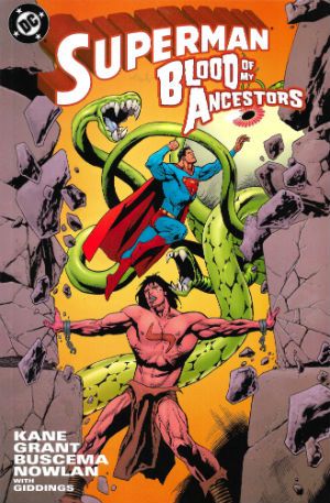
Anyway, this… SUPERMAN: BLOOD OF MY ANCESTORS Pencils by Gil Kane, John Buscema Inks by Kevin Nowlan Plot by Gil Kane & Steven Grant Dialogue by Steven Grant Lettered by Ken Lopez Coloured by Noelle Giddings Separations by Sno Cone DC Comics, $6.95 (2003) Superman created by Jerry Siegel & Joe Shuster

 photo SBomACovB_zps3a72bd91.jpg

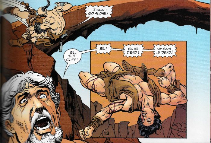
Gil Kane! John Buscema! Big John! Garrulous Gil! Together at last! On Superman! No! It isn’t as good as Gil Kane and John Buscema delineating Superman should be! Which is a shame! But then it isn’t totally terrible either! So it’s not too much of a shame! I mean, c’mon, it’s still – Kane! Buscema! Superman! If you can’t wring any pleasure out of that then I hope your high standards are a comfort to you. And while Superman: Blood of My Ancestors may not exactly have been anyone’s finest hour it was, alas, both Kane and Buscema’s final hour. Kane died on 31st January 2000 before the book was completed and Buscema finished it off before he too succumbed to the inevitable on January 10th 2002. Since they were both in their seventies when they died we’ll leave any eyewash about cursed books where it belongs – in the Middle Ages. Now I’m in my own Middle Age I’ve quite warmed to the book but when I first read it I was a demanding little shit and it just didn’t come up to scratch. Mostly that was because it doesn’t really work, but there’s still magic to be mined from it.

 photo SBomAStrengthB_zpsbd0a848f.jpg

Image by Buscema, Nowlan, Grant, Lopez, Giddings & Cone

Dollars to doughnuts the concept for this book came from the brain of Gil Kane; rejigging a Biblically evocative tale with post-apocalyptic trappings is so Gil Kane it might as well have swirl of ice creamy hair and address everyone as “M’boy!” I refer the honourable reader to such prior exercises in friable buildings and flapping loincloths as Blackmark, Talos of the Wilderness Sea and Sword of The Atom. In order to sell his concept (I groundlessly conjecture) Kane had to stick Superman in it. Regrettably this apparent sop to commercialism makes everything a little less sense-making than might be desirable.

 photo SBomABootsB_zps707058be.jpg

Image by Kane, Nowlan, Grant, Lopez, Giddings & Cone

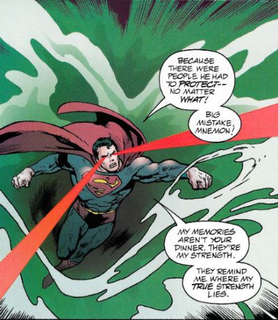
It starts off alright with “my” Superman (everybody has their own Superman but this one is mine; how can I tell? Easy, he says, "Superman doesn’t kill." Word!) swooping in to save lives against a big eye on tentacles (very Gil Kane) which is resorbing people. It’s even quite clever that bit, because the tentacle-eye is devouring their memories and when it starts tucking into Superman it finds his racial memories stored in his DNA and…cue the main story in flashback! By all known laws of North American genre comics this flashback should involve an ancestor of Superman facing just such a beast and defeating it, thus revealing its weakness to his descendent in the present. Kane (or Grant; but I’m guessing Kane) instead sidesteps into the true reason for the book's existence – a sort-of sci-fi scuffle with the Old Testament Samson story. Which is kind of really clever because if memory (Wikipedia) serves Samson is considered by academia as a derivation of the “Sun Hero” type a la Hercules; as is Superman (whom academia is probably slower to recognise). Unfortunately all the bits required to shoehorn the story into Superman’s mythos are the bits where it fails worst. Superman has his own mythology and part of that mythology isn’t that there was kryptonite on Krypton or that Superman’s strength and heroic nature are divinely inspired by Rao and also hereditary. Everyone (he said about to tempt fate) knows Kryptonite is leftovers of Krypton and that Superman is powerful because of the sun and that he is lovely because he was brought up properly by decent elderly white Middle American child stealers.

 photo SBomABeneathB_zps062d8868.jpg

Image by Buscema, Nowlan, Grant, Lopez, Giddings & Cone

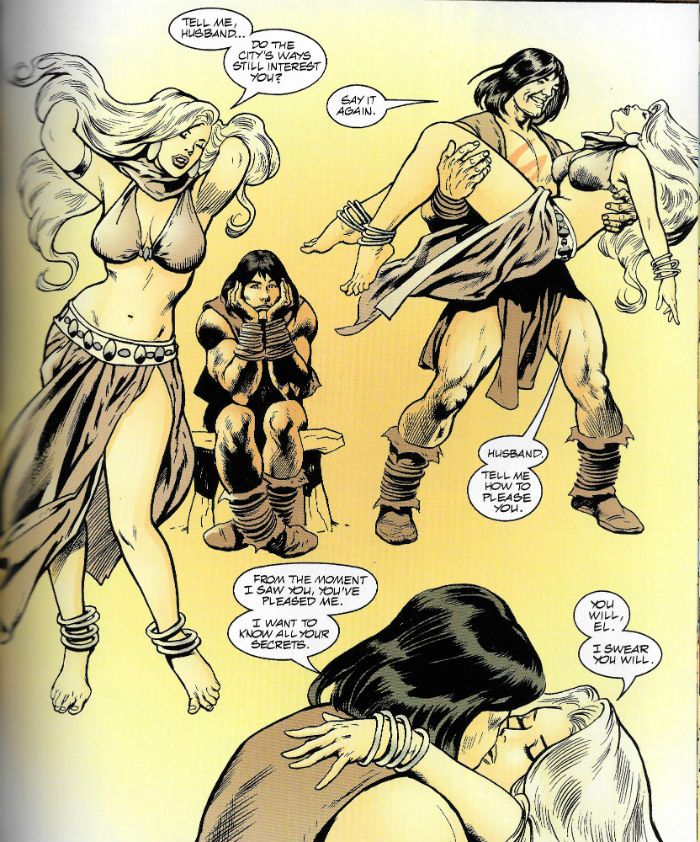
But them’s the breaks; Kane clearly just wanted to do the Space Samson stuff which fortunately is pretty sweet even though he only got to draw it for a few pages before the world was denied his presence. As exits go it might not be inspired but it’s still pretty great. In the slight space fate allotted him Kane crams in all a Gil Kane Fan’s favourites – Power Amoebas©®, Back Flip Impact©®, Angst Akimbo©®,Body Cradling©®, Floating Head of Melodrama©®, Nasal Upshot©®, Turnover Boots©®, Crumbly Buildings©® and more. All of which might as wll be ©® Gil Kane. Yes, those are all things Gil Kane does all the time, but they are also the things Gil Kane Fans turn up for because he was so darn awesome at them. They were his moves. No one ever listened to Elvis sing Moody Blue and thought, well; I have now heard that song I need not ever listen to it again. No, everyone who listens to Elvis sing Moody Blue is forever after waiting to be blessed by that aural glory again. No need for thanks; poorly thought out and decidedly jejune appreciations of comic book artists is what I do. It’s important to note that the success of the art throughout the book is indebted to the sympathetic and fluid inks of Kevin Nowlan. Not only does he professionally finish Kane’s pencils but he’s also called upon to polish Buscema up and in the process provide a discreet visual continuity between the two. Which he does, because Kevin Nowlan is awesome.

 photo SBomAHeadB_zpsc1d56696.jpg

Image by Kane, Nowlan, Grant, Lopez, Giddings & Cone Truly, it’s no mean feat Nowlan performs here either, as Buscema and Kane are hardly interchangeable. I can say that with some authority since this book shows both their essential styles side by side and even their unique interpretations of some of the same characters. Buscema’s a great fit with the book having spent a soul wilting span of years illustrating the savage shenanigans of Conan and such ill-bred sorts. Here amongst the rubble, the rabble, the swords, the sandals, the temples and the tempers Big John walks his last walk and he walks it tall. I didn’t mind the story but most of the fun was looking at Buscema and Kane’s art and then stating the obvious for you. Because looking at Superman: Blood of My Ancestors it’s clear that Kane was all fluid athleticism and Buscema was all burly sturdiness. Kane’s figures flare in their denial of gravity while Buscema’s bodies bow and bend under its burden. Weight is Buscema’s greatness while Kane’s is grace. Buscema’s work thunders with meaty drama while Kane’s shimmers with strident melodrama. Neither men are at the height of their powers here and they probably only look as good as they do because of Nowlan but, still, Christ, these guys. These goddamn guys...uh...shitshitshitdontloseitdontloseit..aw man, my mascara is running now…

 photo SBomAHominaB_zps7c5ba465.jpg

Image by Buscema, Nowlan, Grant, Lopez, Giddings & Cone

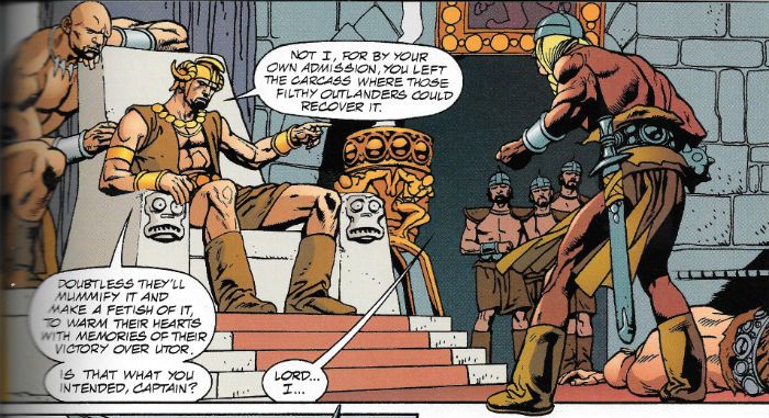
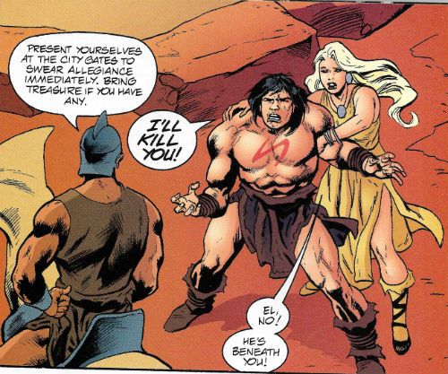
..Humph. Anyhoo, like Nowlan, Steve Grant pulls his weight and then some in a thankless role. I imagine he was called upon to ‘facilitate’ Kane’s vison hence his twin credits for script and dialogue. It’s probably due to his efforts the book reads as smoothly as it does. It’s still a bit of a bodge; the Krypton stuff never really convincingly meshes with the Earth stuff. But while he can’t quite make it work as a piece he does make enough pieces work well enough. Grant crams in plenty of characterisation too, so that while the villain, Utor(!), is still a villain he is at least a droll one and El (Samson) remains sympathetic even as his arrogance swells to God taunting proportions, but Grant’s best work is with Laras Lilit (AKA Delilah). She’s no one note femme fatale but a complicated and conflicted woman who shares in the redemption El’s ordeal offers. She even gets the best for while, in that endearingly Biblical way, El learns his lesson by dying (that’ll teach him!) she gets to live a life at peace with herself. Which is better than she gets in the original; God alone knows what happens to her in the Bible. Literally.

Superman: Blood of My Ancestors is a bit of a muddle; less satisfying as a comic than it is as a final chance to see two giants of the form in action. It isn’t a great comic but it is by some of comics’ greats so that makes it GOOD!
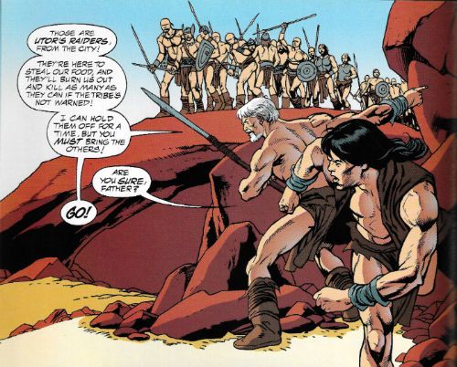
 photo SBomAGoB_zps9fb150ec.jpg Image by Kane, Nowlan, Grant, Lopez, Giddings & Cone

Out of the eater came something to eat. And out of the strong came forth – COMICS!!!

"I Tried Everything Else." COMICS! Sometimes Chaykin's Awake!!!

Hopefully you all made it through any storms okay, my American friends! If you did I've got some rubbish about comics for ya.Content! You might not want it, you might not like it but it's there!

Photobucket

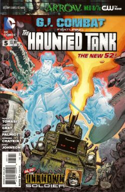
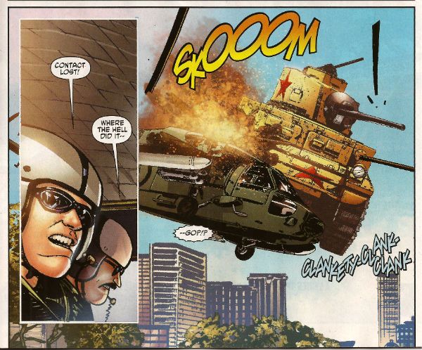
G.I. COMBAT #5 Featuring The Haunted Tank Art by Howard Victor Chaykin Story and Words by Peter J. Tomasi Coloured by Jesus Arbutov Lettered by Rob Leigh The Unknown Soldier Art by Staz Johnson Written by Jimmy Palmiotti and Justin Gray Coloured by Rob Schwager Lettered by Rob Leigh The Haunted Tank created by Russ Heath and Robert Kanigher The Unknown Soldier created byJoe Kubert and Robert Kanigher DC Comics, $3.99 (2012) Photobucket

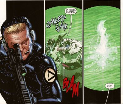
First up, I have to thank Corey (Ottawa) for bringing this comic to my attention. If it wasn't for our Canadian Contingent I'd not have known the art chores on this were by everyone's favourite filth peddler Mr. Howard Victor Chaykin! I wasn't expecting much here to be honest, I thought he'd probably be busy drawing comics too frisky for the UK to have any electrolytes left over for a book about a, well, a haunted tank.  I don't know if it's being able to clip art the shit out of this book due to its emphasis on hardware but the bits that aren't hardware have Howard Victor Chaykin pounding the pages with a barrage of highly entertaining images. Unlike, so I hear, the pounding he's giving the pages in that other (banned) book.

Photobucket

Tomasi gives him a totally stupid story to illustrate involving a nutty veteran clad in The Flag being tank-napped into a supernatural rescue mission while being pursued by Wonder Woman's high-tech ex Steve Trevor. It is nonsensical stuff but, I don't know if you've ever given it much thought but, the whole concept of The Haunted Tank isn't going to win any awards for realism. So why not go wide on the goofiness.  Chaykin seems to be enjoying himself and it all comes together a lot more successfully than some of his recent efforts. Not once did Jesus Arbutov's colour work have me reaching to ring the police and at times I was tempted to throw back my head and bellow Blessed-style "CHAYKIN'S AWAKE!!!"  Maybe he just enjoyed ringing up his russety pal Russ Heath and irritating him by going "Pop! Just drawn a tank! Pop! Just drew another! These computers are great! Now how long did it used to take you to draw these tanks, Russ? Pop! Drew another! Hey, I ever tell ya I can see the beach from my window?" I don't know, I just really enjoyed his stuff this time out. It was GOOD!

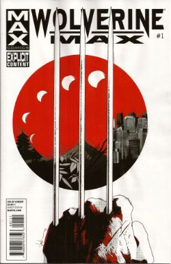
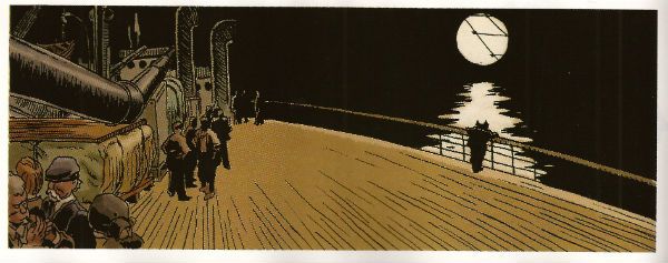
WOLVERINE MAX #1 Art by Roland Boschi & Connor Willumsen Written by Jason Starr Coloured by Dan Brown Lettered by VC's Cory Petit Wolverine created by Len Wein, John Romita Snr and Herb Trimpe Marvel, $3.99 (2012) Photobucket

While Jason Starr is a good writer of novels and I have also been known to enjoy the work of Roland Boschi the real reason I picked this up was because of Connor Willumsen. He does not disappoint! Boschi's pages seem somewhat rushed and concern the present day Wolverine fighting sharks and having no memory of why he ended up doing that. Also, his legs grow back and everyone is only slightly perturbed by this. Perturbed's too strong a word actually. I know health care professionals are rushed off their feet and are basically the busiest people in show-business and The Japanese are a modest people...but I think two legs growing back, bones and all, would cause more than a raised eyebrow and a muttered aside, suggesting such an event is more a case of exhibitionism than it is straight up miraculous. Jason Starr's handling of Wolverine's talents but in the real world is off to a choppy start is what I'm saying.

Photobucket

Willumsen, however, burns rubber from the off with his flashback scenes which portray Daniel Day Lewis from There Will Be Blood stepping into the original Claremont/Miller mini-series but in a grubbily humming Underground Comix stylee. So amazing are his inky doings that even the writing seems elevated with Victor sounding especially characterful in his disdain for the normals. I would buy this series purely for the further expansion of these elements.  I would but Marvel seem to have upset Connor Willumsen so much that he has jumped ship. His work will not be appearing in any subsequent issues of WOLVERINE MAX and so I will not be buying them as without him this comic will be less than GOOD! Well done there, Marvel! Yes, that is sarcasm.

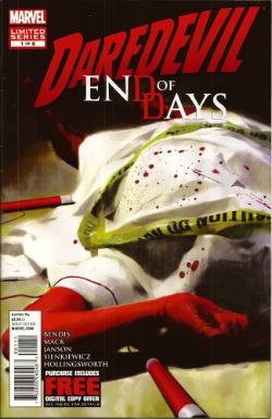
DAREDEVIL: END OF DAYS #1 Art by Klaus Janson and Bill Sienkiewicz Written by Brian Michael Bendis & David Mack Coloured by Matt Hollingsworth Lettered by VC's Joe Caramagna Daredevil created by Bill Everett and Stan Lee Marvel, $3.99 (2012) Photobucket

I asked my LCS why they sent this (you're darned tooting I did) and they said it was because I liked Janson and Sienkiewickz, which is true. What they failed to factor in is that ladling the  steaming hot writing of Brian Michael Bendis over the top of their efforts is, at this stage in the game, like climbing a stepladder to fart repeatedly right in my face as I admire a Vermeer. It's distractingly puerile and pretty quickly spoils the whole experience. The best bit (i.e. the very worst bit of very many bad bits) is when Ben Urich's (very long, very, very fucking awful) monologue accuses his audience (his readers, geddit!) of not appreciating words. This is super-awesome because he's being written by someone who treats the English language with all the care and attention of a hungover abattoir worker placing his bolt-gun to a steer's head.

Photobucket

This is a writer who seems to have a working vocabulary of, maybe, fifty words and whose solution to every writing conundrum (an introduction to The Incal, an introduction to a HVC art book, a recipe for quiche, instructions on how to install a Norton Commando Boyer ignition etc) is always a chatty, faux-conversational, uninformative, space devouring style which smashes grammar's head in with a brick and is in no way to be taken as an indication of a complete inability to write anything approaching a joined up sentence. Christ, this is why I ask my LCS not to send his (dismal, dismal) stuff. This comic is smug, vacuous, inane, pandering, complacent ineptitude par excellence. This comic is CRAP! I did not like it.

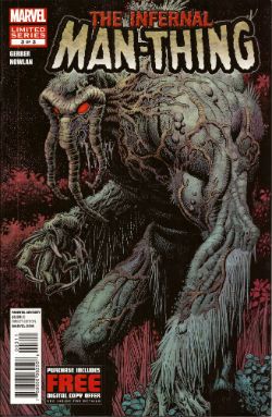
THE INFERNAL MAN-THING #3 Art by Kevin Nowlan Written by Steve Gerber Lettered by Todd Klein Also "...Man-Thing!" from Savage Tales #1 Art by Gray Morrow Written by Gerry Conway & Roy Thomas Man-Thing created by Stan Lee, Roy Thomas, Gerry Conway and Gray Morrow Marvel, $3.99 (2012) Photobucket

And so we close the comic and close the curtain on one Steve Gerber as he defies the laws of nature and reality to bow out of comics for the final time, some four years after his physical death. As we bite back the tears lets allow a manly clap on the back for Kevin Nowlan who did Gerber proud twice over with beautifully considered art to which he then applied a thoughtful and innovative colour palette.  Together with this final VERY GOOD! chapter of Gerber's playful, humane and imaginative end-song Marvel have also included Manny's first appearance.  Whether placing an ending with a beginning together in such close proximity is Marvel's way of acknowledging the Cycle of Life or just another attempt to squeeze a property until the pips squeak we'll probably never know. (Steve Gerber would have known.)

Photobucket

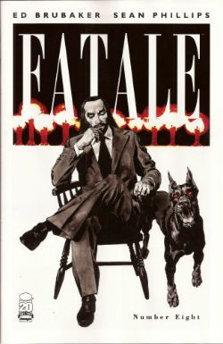
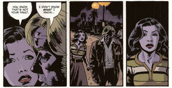
FATALE #8 By Sean Phillips and Ed Brubaker With colours by Dave Stewart Fatale created by Sean Phillips and Ed Brubaker Image, $3.50 (2012) Photobucket

I've not been impressed with this series so far but I will admit that while this issue still wasn't terribly good it was a whole lot better. Maybe it had something to with a sudden upswing in the density of incident or the fact that Phillips' art seemed more lively since he was given a couple of occasions on which to strut his stuff style-wise.  I still don't find it to be convincingly evocative of a time and place; it'll take more than some beards in a VW van to make me swoon at the authenticity of the '7os vibe, man.  At times I can almost smell the spirit glue holding all the sideburns on. Most deflating of all is the fact that the series is still hamstrung by bizarrely conservative and old-fashioned sense of horror (tentacles! men in robes with daggers! cemeteries!) which means the horror is never actually, well, horrible.

Photobucket

The humourlessness of the whole thing has also struck me recently; this was unfortunate because I then realised I couldn't recall one incidence of humour in all the work I've read by this author. That's a lot of pages in which to not crack a smile. Maybe it's me. Senses of humour are personal after all but still  the funniest thing in FATALE #8 is when the rather tasteless competition in the lettercol results in one John Cleaver out writing this whole series with just one paragraph. Mind you, if any readers do want to send me pictures of them crying while they remember horribly traumatic events from their lives they are welcome to do so(*). Get really close in there so I can see the fat bulbs of those tears bloating from your sad ducts, kids! The winner could receive a pen! So, yeah, this issue was OKAY! and you can buy it from The Savage Critics Digital Shop...here! (Although if more than 10% of the comics reading audience do so a big red light starts flashing and Brian Hibbs starts rushing everyone to the shelters as AROOOGA! AROOOGA! echoes rounds his shaggy head. It's a true fact, cats and kittens!)

(*) Don't do this. It's a joke.

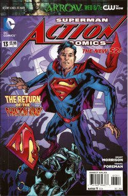
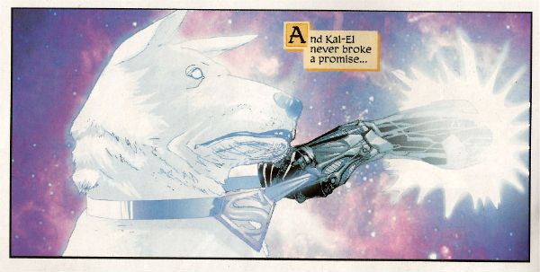
ACTION COMICS #13 Featuring... Superman in..."The Ghost In The Fortress of Solitude" Art by Travel Foreman Written by Grant Morrison Coloured by Brad Anderson Lettered by Steve Wands Superman in..."A Boy And His Dog" Art by Brad Walker (p) & Andrew Hennessy(i) Written by Sholly Fisch Coloured by Jay David Ramos Lettered by Patrick Brosseau Superman created by Jerry Siegel and Joe Shuster DC Comics, $3.99 (2012) Photobucket

It's strange the connections your mind makes. In my head Morrison's recent callous remarks regarding the treatment of Siegel and Shuster and the portrayal of animals throughout his work suggests to me one of those lovely people who care more for the feelings of animals than those of people. Which is all really cuddly on the surface until you press them on the issue and they suddenly hiss at you that people deserve what they get! Which I find a less than generous rationale and more than a little confusing in its mix of sentiment and insensitivity. Almost as confusing as this comic which I have a strong suspicion makes no sense but as I too have a soft spot for tales of the gud dog I'll let its muddled nature pass this time and say this comic was OKAY!

Photobucket

So yeah, those were certainly some words about what I believe scientists are now calling COMICS!!!
"Let 'Em Loose, Bobo!" COMICS! Sometimes They May Arouse The Proles!

How goes the day! I guess after that Olympics Opening Ceremony I should just assure all our American friends, particularly your President, that the National Health Service doesn't actually mean that you have a socialist nation 3,000 miles off the coast of America. And, no, if you let this stand all of Europe isn't going to go next in a kind of domino effect. You guys are so ansty!

Photobucket Connor Willumson/Jason Latour (art/words)

I read some comics and then did the words thing. You can do the reading bit if you like, if there's nowt on the box.

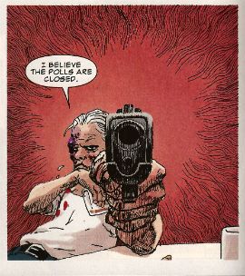
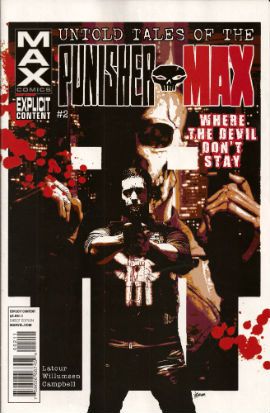
UNTOLD TALES OF THE PUNISHERMAX #2 Art by Connor Willumson Written by Jason Latour Coloured by James Campbell Lettered by VC's Cory Petit Marvel, $3.99 (2012) THE PUNISHER created by Gerry Conway, John Romita Snr and Ross Andru Photobucket Cover by Kaare Andrews

This VERY GOOD! book is about Punisher Max. Unlike the Regular Punisher he does not have a beard, and his stories have swears, gore and dead kids in ‘em! Because, yes, Regular Punisher now has a beard. That’s the only thing that caught my attention in that recent irritating crossover with Daredevil. Not wishing to impugn the, no doubt, exhaustive research by Greg Rucka into face foliage, but I don’t think it’s a good look for Frank. He should be clean shaven do you not think? Shaving’s about discipline, shaving’s very military. But a beard? A beard’s not about discipline, a beard’s about vanity. Vanity’s not really something I associate with psychotic vigilantes. I have a hard time believing Frank Castle puts his War on Crime on hold while he just trims his tidy beard. Yes, I can believe a man can fly, but apparently a vengeful killing machine that has a face care regime is a step too far for me. No offence intended there to any bearded people. Particularly any bearded people built like brick shit houses who control this site. The Punisher's beard is important, yes?

Photobucket Connor Willumson/Jason Latour (art/words)

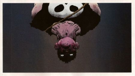
Anyway, this book is about the other Punisher, the one who can eat soup without upsetting people at the next table. It’s called Untold Tales and yet here they are. It’s the second issue and like the first issue the real reason for paying three dollars and ninety nine cents is the art. Last issue’s art was pretty good but this issue’s art by Willumson is preposterously good. I’m not well versed in anything too freaky but even I can tell there’s a real ComiX vibe to the art. It’s got a wild-eyed and feral vibe to it which makes the contents of every deceptively traditionally shaped panel thrum with an animal heat and press against the page with an almost physical weight. The youngsters will appreciate that the sound FX are even drawn in as though they are giant inflatable physical presences, like Frank Quitely did in that Batman comic that time. Admittedly this senses shattering artistic performance is yoked to a fundamentally meat’n’taters tale; one which seems inspired by that old Jerry Lee song (“Come on over, baby, we got Castle in the barn!”) and has a big chunky gold shout-out to the King. No, not Jack Kirby. Elvis. Jack Kirby’s dead, stop going on about it. Stan Lee did everything! C’mon, Stan Lee probably stood behind Jack Kirby’s chair and moved his simple little hands for him. Why not, eh?

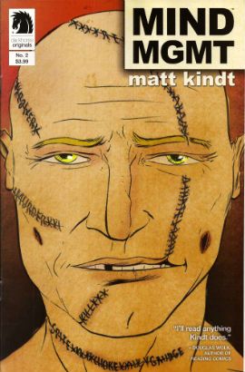
MIND MGMT #2 Story, art and cover by Matt Kindt Dark Horse, $3.99 (2012) MIND MGMT created by Matt Kindt Photobucket Cover by Matt Kindt Did you notice the stitches on the guy's face? Ahuh, Matt Kindt is still EXCELLENT!

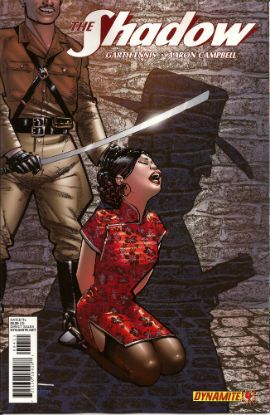
THE SHADOW #4 Art by Aaron Campbell Written by Garth Ennis Colours by Carlos Lopez Lettered by Rob Steen Cover by Howard Victor Chaykin Dynamite, $3.99, (2012) THE SHADOW created by Walter B. Gibson Photobucket Cover by Howard Victor Chaykin

It’s a shame Campbell isn't just that bit better because this issue he does a pretty good job; there's a real sense of time and place, a sense that someone has done their homework, that materials of an archival nature have been attended to but, due to certain core failings, he can't help but  fluff the big emotional bit somewhat, which has the unfortunate effect of my authorially intended species-shame at Ennis’ intentional homage to The Searchers being trumped by the fact that I find myself thinking, man, hats sure are hard to do. And they are, ask Lou Fine, so this was still GOOD!

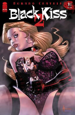
BLACK KISS 2 #1 By Howard Victor Chaykin Image Comics, $3.99 (2012) BLACK KISS created by Howard Victor Chaykin Photobucket

"That's a Pez Dispenser, right?" Cover by Howard Victor Chaykin

Ban This Sick Filth!” blared the Daily Mail headline that Wednesday morning. Of course “Ban This Sick Filth!” is the Daily Mail’s headline every morning and had nothing to do with Howard Victor Chaykin’s new exercise in saucy muck being held by The Customs. Oooer! Held by The Customs! Fnarr! Fnarr! The true extent of the upset was only revealed when the owner of my LCS commented, “No one cares, John.” Before adding, “And when are you going to pay for all these comics.” Leaving him to his quips I realised something had to be done, so I poked my head over the wall and saw Her Madge was pegging her washing out. I mentioned the whole thing to her, and she said she remembered meeting Howard Victor Chaykin when she guest starred in Viper and he had "sad eyes, like a child with a grazed knee" and agreed to get The Head Boy over to sort the whole HVC BK2 UK situation out.

Photobucket "I can see the beach from my window. That's how much I give a s***." He didn't say when he wasn't contacted.

So Cammers turns up, and he's a bit out of sorts because we’d interrupted him holding the back door of the NHS open so the Private Sector could run in and strip the place bare, wires and all, before anyone cottoned on. He’d got a copy of the moral soiling rag in question and he held it up to his face, his statesman’s face, his face with all the statesmanlike integrity of a lard sculpture of a single bum cheek, but with eyes, and commenced to read with those eyes. And he goes, he says,  “Yes, but is it a book you would wish your wife or servants to read?" And Her Madge points out it isn't 1960 and tells him to his face that the book will be available next week, or she'll be reminding everyone about that time he left his own child behind in the pub. "Did he thank you, then?" said my LCS owner when I told him of the entirely imaginary lengths I had gone to for HVC. "No", I said, "And he’ll never have to.

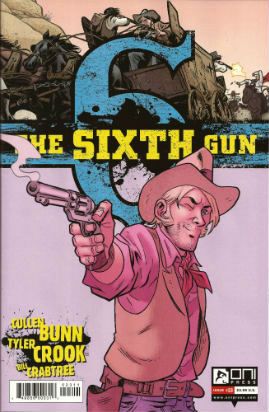
THE SIXTH GUN #23 Art by Tyler Crook Written by Cullen Bunn Coloured by Bill Crabtree Lettered by Douglas E. Sherwood Oni Press, $3.99 (2012) THE SIXTH GUN created by Cullen Bunn & Brian Hurtt Photobucket Cover by Brian Hurtt

Yeah, I miss Bat Lash too, so this was GOOD!


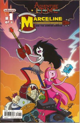
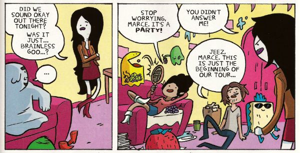
ADVENTURE TIME: MARCELINE AND THE SCREAM QUEENS #1 Written & illustrated by Meredith Gran, Jen Wang Coloured by Lisa Moore Lettered by Steve Wands KaBoom!, $3.99 (2012) ADVENTURE TIME created by Pendleton Ward Photobucket

Much like Blessed Brian Hibbs I asked an 8 year old boy what he made of this comic. There must have been some kind of miscommunication because quite quickly there was a lot of shouting and after a bit of tussling a police presence was required. Anyway my court date is next month so if anyone can put me in touch with a good lawyer that’d be great. Otherwise, this comic aimed at 8-year old children contains a reference to the popular children’s entertainer Iggy Pop(!) and revolves around the fantasy of having a super-awesome musical career; that’s really more a teen and mid twenties thing, I think. Although these days I guess that dream can be dragged all the way into your forties. Mind you, it will probably weather the ravages of time about as well as the skin on the back of Cher's knees.

Photobucket

Meredith Gran (w/a)

People may mock, but you only need to do one song that plays over the end credits of the latest Jenifer Aniston flick (one where workaholic Jen learns the value of things via a series of laugh-out-loud hi-jinks stemming from her upsetting a genie and being cursed with a set of talking balls on her chin) and you’ll never have to hit up your Mom for cash again! I dunno, if you’re doing a kids comic I’d say get the stuff kids like right first, and then put all the hip stuff aimed at your mates in. Otherwise you’ll end up with something that’s really nice looking but essentially EH!


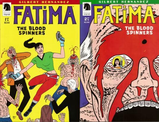
FATIMA: THE BLOOD SPINNERS #1 and #2 Story & Art by Gilbert Hernandez Dark Horse, $3.99 (2012) FATIMA: THE BLOOD SPINNERS created by Gilbert Hernandez Photobucket

Covers by Gilbert Hernandez

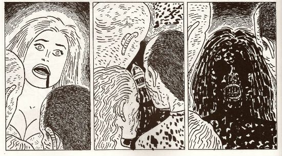
Now this, this, is a comic an 8 year old boy would like! In fact it’s a bit like a comic an 8 year old boy would create. An 8 year old whose pets keep disappearing. It’s a disturbingly affectless presentation of a gorily deadpan comedy parody/celebration of genre trash. Maybe it has something serious to say about the human condition. We’ll probably never know as rational thought quickly gets tickled into insensibility by the women in bikinis shooting zombies, cleverly stupid names like “bittermeat”, laughably terrible jokes and the rewarding central conceit of beautiful people with beige minds seriously making a mess of the whole saving the world thing.

Photobucket

Gilbert Hernandez (a/w)

Look, the people in this awesome comic wear devices that look like metal Y-fronts to make them invisible for the delightfully childish and arbitrary time of 3 minutes. That should clue any slowcoaches in that this is no Walking Dead. And that's just peachy by me.  I also liked the letter in the back of #2 that said Fatima had a “manly” face. It’s comics by Gilbert Hernandez! Don't be getting all prissy, John Sayles wrote Alligator. I hear Beto's (I call him Beto because we are so close we were practically separated at birth.)  now been doing this stuff for 30 years, man and boy, and he remains VERY GOOD!

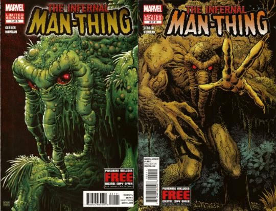
THE INFERNAL MAN-THING #1 and #2 Art by Kevin Nowlan Written by Steve Gerber Lettered by Todd Klein Marvel, $3.99 ea (2012) MAN-THING created by Stan Lee, Roy Thomas, Gerry Conway and Gray Morrow Photobucket Covers by Art Adams

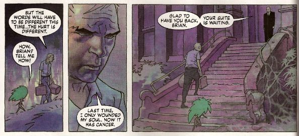
This doesn’t read too well as individual issues as (as I am sure we are all aware) it is an OGN cut up and shoved out in three easy, and pricey, pieces. It’s taken this long because Kevin Nowlan has taken this long. According to the text piece in #1 he was doing a page a week. At the Marvel page rates I have made up in my head, he would have starved to death before getting to page 10. So, rather than produce a half-assed product or die, Nowlan took his time and did other stuff. And I do have to say that the art here is very, very impressive. He’s got a ‘80s Kyle Baker thing going on, but with the additional, and considerable, oomph a foundation of fully painted colour provides. It’s a purposefully limited palette which gives everything a humid and lurid look. Like a swamp, see. Also, Nowlan’s also given Man-Thing a bit of a make-over and it’s kinda nice too, particularly the way Manny’s head seems to have slipped down to rest on his chest. Nice, that. Causes your gaze to stumble every time, good effect there. The words are very Steve Gerber, which is to say it’s very satirical in that endearingly adolescently blunt style Steve Gerber had. And when I say “adolescent” I don’t mean it as a put-down I just mean that in the sense of being energetic and all-encompassing. I always think of Steve Gerber as being an American version of Pat Mills, writing wise anyway. Although Gerber's more willing to accept his own portion of blame for the way things suck, I think. Maybe that’s why people respond more warmly to the work of Gerber than that of Mills.If you like Steve Gerber you'll like this, if you've never read Steve Gerber it's a good start as it is very Gerber-y. If you don't like Steve Gerber we won't be spending Christmas together. Because he and this are both VERY GOOD!

Photobucket

Kevin Nowlan/Steve Gerber (a/w)

According to #1 there's a lot of respect in this project. And yes, there probably is but this is Marvel. And so, as respectful as it was of your Uncle Nate to turn up to Pappy's funeral, it would have been better if he hadn't crammed his pockets with canapés, winked at the widow and blocked the bog with a boozy poo before drunkenly falling through a window. It’s a sloppy package what with the reprint of “Song-Cry of The Living Dead Man” looking kind of cheap and, in the second issue, having a double page spread printed on the front and back of the same page. This comic cost me two pounds and ninety nine pence Sterling, and yet I've had menus from the local pizza place pushed through my letterbox that had more thought, care and consideration in their design. But, I’m sure somewhere in there is a very real respect for Steve Gerber. At least Uncle Nate turned up, y'know. Ultimately, as Marvel as it is, it’s done out of respect for Steve Gerber, who is dead. And of course even Marvel respect the dead. Except for Jack Kirby. Who, it seems, can still just go f*** himself.

I hope you all had a smashing wekend and read some smashing COMICS!!!
Wait, What? Ep. 94: The Basement Japes

Uploaded from the Photobucket iPhone App Above: The Farm Fusion Waffle, which is a liege waffle topped with mushroom, spinach, roasted pepper, tomato and marinated chevre, from the Waffle Window, Portland, OR.

Yes, that is one mighty tasty waffle, let me tell you -- although let me be honest, I do not tell you in episode 95, I merely mention it to you now. But!  Trust me, it's darn good.

As for what we do discuss in this episode, join me behind the jump for... show notes!

1:20-3:24: The Basement Japes: an introduction
3:24-13:21: The front page of Time.com and how to get there; Jeff makes Graeme break down the process behind his recent Dark Knight Rises
13:21-22:03: Graeme has recently seen Transformers: Dark of the Moon on Netflix Watch Instantly  and would like to talk about it and a certain amount of contemplation transpires about the quote-unquote charms of Michael Bay.
22:03-32:02: By very sad contrast, Jeff has something to say about Melissa & Joey, which he mistakenly calls "Melissa Loves Joey" THE ENTIRE TIME.  Is Jeff really so damn old he would get the title confused with Joanie Loves Chachi?  The answer, sadly, is yes.  Fortunately, Graeme steers Jeff toward Sex House, instead.  Although that seems like a weird lead-in to mentioning Jarett Kobek's new book, If You Won't Read, Then Why Should I Write? (and yes, I also get that title wrong, too), it actually works quite well, honest.
32:02-32:22: This is the point where we acknowledge that we have not really talked about comics at all, yet.
32:22-34:18: So instead of talking about Transformer movies, we mention Transformers comics and GI Joe comics.  Woo!
34:18-40:51: Well, and so you can't really talk about GI Joe Comics without discussing Top Shelf's Double Barrel, can you? No, of course not.  Trust me when I say we speak glowingly of Double Barrel #2.
40:51-56:04: Jeff's other major comic read of the week was catching up on three weeks of Shonen Jump Alpha. Can Jeff handle jumping into Yu-Gi-Oh! Zexal on its ninth chapter?  (Spoiler: no.) The pros and cons of reading a mass of serialized information all at a go also gets a bit of the ol' poke & prod.
55:04-1:00:24: This gets us talking about how jumping on points and story density can work both for and against a story's accessibility with mentions of Morrison's JLA in trade, Mark Waid's interview at the AV Club, and whether Marvel's recap pages work.
1:00:24-1:02:59: Kieron Gillen has his own podcast, DECOMPRESSED.  We haven't listened to it, but we are very excited about it!  Check it out here!
1:02:59-1:14:09: Graeme tallks about Dark Avengers #177 by Jeff Parker and Kev Walker, and Wild Children, the recent Image book by Ales Kot and Riley Rossmo
1:14:09-1:16:28: Graeme picked up the new Eddie Campbell graphic novel, The Lovely Horrible Stuff, digitally (for only five dollars, and you can too, here at the SavCrit Digital Store) and tells us about it.  It sounds quite good.  (I admit it, I've picked it up since and can sign off on Graeme's recommendation.  It really is quite good.)
1:16:28-1:29:00: Other books Graeme discusses:  Action Comics #11,which he likes more than Jeff did, Infernal Man-Thing; and Punk-Rock Jesus.
1:29:00-1:45:38: Were you still wondering why Graeme liked the first volume of the Greg Rucka Punisher trade even though he didn't like the individual issues he tried?  He tells us here, and we get in to a bit of a tussle over the nature of The Punisher, and the differences between Rucka's approach and Ennis's approach.
1:45:36-1:58:34: Does that mean we end up talking about Rucka's run on Elektra and his career at NuMarvel as well as his current webcomic, Lady Sabre?  Why yes, it does!
1:58:34-2:03:32: The end (of the episode) is nigh! Although promising earlier to spoil the hell out of Walking Dead #100, Jeff instead tells the comic book collection bet story from Bleeding Cool.
2:03:32-2:10:24: When we recorded this, Neil Gaiman doing Before Sandman was just a rumor.  Want to know what we thought of the announcement before it was announced?  We talk about it here!
...Oh, and also closing comments, which we are still not very good at doing.
If you've got iTunes, it may have already set the nose of your faithful RSS bloodhound stirring.  Alternately, you are welcome to have a listen to it here, and sniff at it dismissively at your leisure:
Oh, and a word to the wise, we aren't recording this week, which means we won't have an episode for you next week -- I've got a trip lined up for this week, and I realized it would actually benefit my life greatly if we baked this kind of thing into my schedule, so expect us to have one skip week a month from here on out.  (Think of it as an opportunity to catch up.)
As always, we thank you for listening and hope you enjoy!

Trying to get back on track: Hibbs' 7/4 & 7/11

I posted the Batman Earth One review last week, so that covers my "quota", I guess. I'm going to mix up a little of this week and last for this week's post from me... ADVENTURE TIME MARCELINE SCREAM QUEENS #1: I've actually not read this, but I brought it home for Ben, as I've brought home every issue to date so far. Eight minutes of silence later, he handed it back to me, and said I should bring it back to the store. "What's wrong with it?" I asked, puzzled.  "Eh, I don't know," he said, "I don't think it had enough action is, and it wasn't very funny." So, that's what a comics-consuming eight year old boy thought. I'll go with that first word then and say EH.

  FUCK ALAN MOORE BEFORE WATCHMEN OZYMANDIAS #1 (OF 6): I kind of don't even want to discuss the "plot" (which, I shit you not, added a "Women in Refrigerators" moment to WATCHMEN as the grossest of its sins), but, oh my god what a crazily lovely comic book. Jae Lee just killed it here, invoking the sense of design that WATCHMEN had, and totally putting his own spin on it with a moving "round" design on every page. this may well be an execrable, money-grubbing project that is being told soullessly and clumsily by most of the writers, but fuck me if this isn't the most beautiful comic of the month by far. That's some Eisner-level art, yo. Too bad it is in service of such a horrible comic book. Two poles of rating for art and writing, landing it smack in the middle with an OK for overall rating.

BLOODSHOT (ONGOING) #1: Wow, that's a gory comic. Like really crazily keep it the fuck away from kids level of gory. Do people actually like that, actually? There's an alright set-up, I guess, in here, with "weapon for the government" and "everything you think is a lie" and all that, but there wasn't a thing in here that got me considering to actually come back and read issue #2, because I don't really see any signs of it going in anything other than a regular Frankenstein direction. Fairly EH.

BTVS SEASON 9 FREEFALL #11: Oh, I liked this issue. Actually, it might have made a better issue #1 than issue #1 was. I very much need Buffy to stop being such a whiny girl by now -- the character has been going backwards for most of the last year, and this plot line seems like it gives her a chance to move forward again. GOOD.

CROW #1: Uh, what? I know I've been saying this a lot lately, but IDW really has to get their shit together on the editorial level -- this comic's script is barely first draft where the title character appears on the last page, and the 21 before that is a ton of boring, endless repeating set-up -- the antagonist says or implies what they're going to do multiple times, AND we see it from another angle as well. This entire first issue should have been set-up in no more than eight pages, max, not padded out horribly like this.  I also think this new set-up completely upsets the straight-forward revenge of the original, AND misses the "sorrow is my fortress" vibe of O'Barr's gothy original. Almost as clear of a miss as I can possibly imagine, and I didn't even really LIKE the original very much (it remains a product of its time, very much) -- sadly AWFUL.

EARTH 2 #3: Honest to god, I wish ALL of the New 52 books were as solid and world-buildy as this one is. THEN we would have had something magic on display. This is really VERY GOOD stuff.

FANTASTIC FOUR ANNUAL #33: This year's annuals for this, DD and Wolverine are an interconnected story by Alan Davis, with connections to Clandestine. Clandestine has never quite worked for me, and I can't say why exactly, but I really love-ity love Davis' clean superhero art, and if I can't have him drawing silver age DC characters (or a variant thereon), then, yeah, have him draw what is very clearly his baby. I wonder though if he gets some kind of character participation or something for him to keep coming back to this when it keeps not clicking with the general audience? Anyway, this was solidly GOOD, and made for a nice stand-alone, star-drawn annual.

INFERNAL MAN-THING #1 (OF 3): In case you all were wondering, Jeff really IS sticking with his Marvel ban -- I could not get him to budge on what I thought would be the easiest tempt of all: new Steve Gerber, doing his #2 best known character, ooooh, with yummy art by Kevin Nowlan. It's a clear follow through on an old MT story, and I thought it showed a lot of strong maturity and growth in balancing the "Gerber wacky" with actually affecting human emotion -- that is to say: this is less of a lark than, say, NEVADA. I don't really like much of Gerber's tics, but I thought this was really solid stuff, well drawn and grounded. You can see why they let this take ten years (or whatever) to get drawn. Hm, maybe if I repitch it as "originated two editorial regimes ago"? GOOD.

PUNK ROCK JESUS #1 (OF 6): Wow, nice! It's a profane title (and probably a profane execution, if I was sensitive to such things, which I'm not), but I really really liked the setup of a morally screwed up entertainment corporation creating a reality show where they clone Jesus. Hijinx, as they say, then ensue. It's a little early to say whether Sean Murphy has the writing chops to stick the landing on this one, but this first issue was a pretty wonderful read. VERY GOOD from me, and my pick of the week!

SPACE PUNISHER #1 (OF 4): I didn't necessarily expect much from this (the name tells you most of what you need to know), but I did expect less toy-etic takes on the "normal" Marvel U (example: "Doctor Octopus" is a "Space Criminal" with octopus legs for a body) -- sadly AWFUL, and not the awesome I know you were hoping for.

ULTIMATE COMICS X-MEN #14 DWF: OK, the Ultimate universe has reached that point that it seems like all "alternate super hero universe" (CF: "The New Universe", the "Supreme Powers" Universe, etc.) finally end up at -- they don't know what to do with the CHARACTERS any longer, so they think "Well let's make big big changes to the WORLD". This issue opens with a map so you can keep track of all the fucked up things that have happened in Ultimate America -- DC nuked, the southwest an internment camp, and so on, and suddenly it is no longer "a world outside your window", it's something utterly unrecognizable and (this is more important, I think) unsympathetic. Even without the "We're officially out of ideas" stench that SPIDER-MEN brought to the line, copying the general throughline of (ugh!) THE PITT isn't going to lead to anywhere good for the Ultimate Universe. I have a hard time, other than from stubbornness, understanding why these books should still be published a year from now. AWFUL.

WALKING DEAD #100: That may be the single most fucked up thing that has happened in a series where all kinds of crazy fucked up things happen all of the time. Brutal, absolutely brutal -- but it sets the book out along what I hope will be a solid new direction that should shake all of the complacency away. I thought this was an EXCELLENT installment (And, ooh, MONSTER seller, too) -- may they have another 400 more issues after this! My ONE complaint? I was really hoping the 6 page (?) Michonne story that was in that issue of PLAYBOY would have been reprinted here after the letter col.

OK, that's me... what did YOU think?

-B