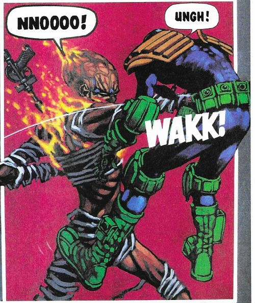
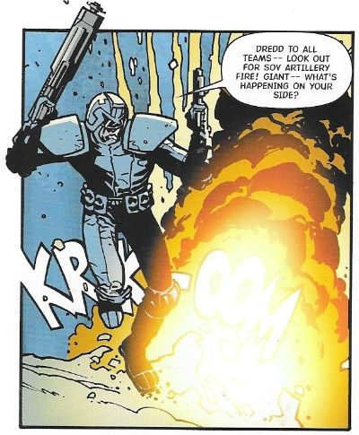
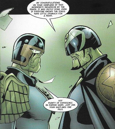
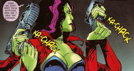
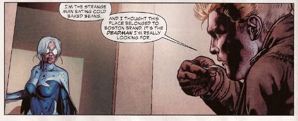
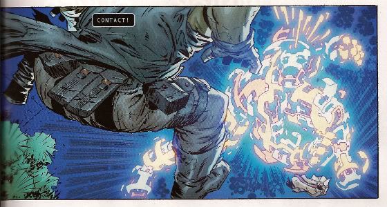
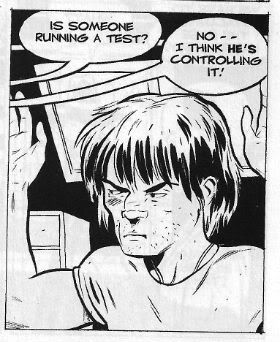
"NOBODY Calls Me CHICKEN HEAD!" COMICS! Sometimes I Hope You Brought A Clean Pair Of Pants.

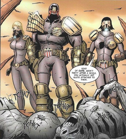
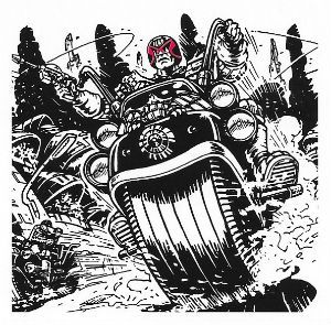
Are you ready to quiver in horripilation at the future terrors accosting Mega-City One’s premiere lawman? No, well come back when you are.  photo JDTMC77backB_zpsqzvxsfzk.jpg JUDGE DREDD: THE HAUNTING OF SECTOR HOUSE 9 by Brett Ewins
Anyway, this…

THE JUDGE DREDD MEGA COLLECTION REVIEW INDEX

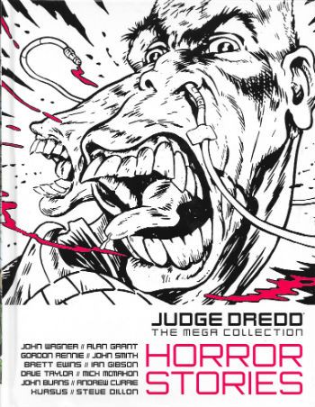
JUDGE DREDD: THE MEGA COLLECTION Vol. 77: HORROR STORIES Art by Brett Ewins, Ian Gibson, Dave Taylor, Mick McMahon, John Burns, Andrew Currie, Xuasus and Steve Dillon Written by John Wagner, Alan Grant, Gordon Rennie and John Smith Lettered by Tom Frame and Annie Parkhouse Colours by Chris Blythe Originally serialised in 2000AD Progs 359-363, 511-512, 1523-1528, 1582-1586 & 2005, JUDGE DREDD MEGAZINE 2.27-2.29, JUDGE DREDD ANNUAL 1981, JUDGE DREDD ANNUAL 1982 and 2000AD WINTER SPECIAL 1994 © 1980, 1981, 1984, 1987,1994, 2004, 2007, 2008 & 2016 Rebellion A/S Hatchette Partworks/Rebellion, £9.99 (2016) JUDGE DREDD created by Carlos Ezquerra & John Wagner

 photo JDTMC77CovB_zps2ifahwyf.jpg

JUDGE DREDD: THE HAUNTING OF SECTOR HOUSE 9 Art by Brett Ewins Written by John Wagner & Alan Grant Lettered by Tom Frame Originally published in 2000AD Progs 359-363
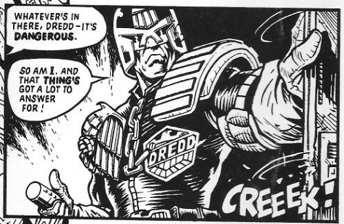
 photo JDTMC77CreeekB_zpsmntrb2po.jpg JUDGE DREDD: THE HAUNTING OF SECTOR HOUSE 9 by Ewins, Wagner & Grant and Frame

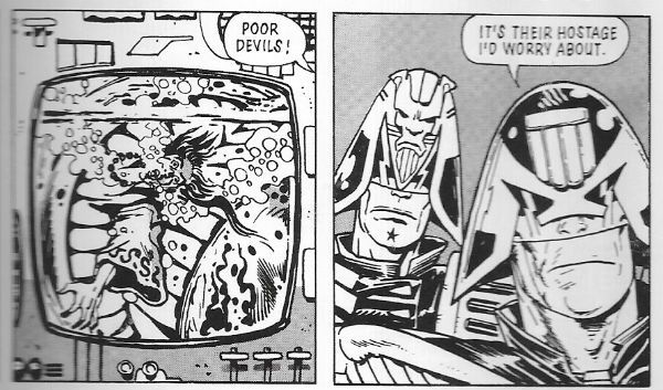
I know we've all wondered more than once what Shirley Jackson's The Haunting of Hill House would be like if it was set in Mega-City One. Well, The Haunting of Sector House 9 answers that pressing question. Apparently there would be a lot less sublimated sapphism and repressive social mores and a lot more mouths exploding from walls, zombies, disembodied hands and big men in leather shouting. On reflection it might not have that much to do with Shirley Jackson's timeless terror tome after all. It definitely has to do with Judge Dredd stolidly yelling things like "DAMNED if I'll give in to a SPOOK!" and Brett Ewins wonderful ability to draw warped flesh and matter splattered walls. I really dug this one on its first appearance way back when, there was just something unsettling about the sci-fi world of Dredd suddenly morphing into a barnstorming full-on horror flick. Wagner and Grant pace this demon baby just right with each chapter containing something icky and an incremental revelation of the solution to the mystery.  And they don't even cheat on the solution, it's not just "Well, I guess we'll never know. There are more things on heaven and earth than are dreamed of in your comportment, Judge Dredd." No, there's a proper (and very "Dredd") reason for all the poltergeisting about.
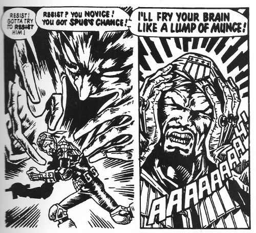
 photo JDTMC77MunceB_zpsayn5bnzn.jpg JUDGE DREDD: THE HAUNTING OF SECTOR HOUSE 9 by Ewins, Wagner & Grant and Frame

Much of the fun comes from Dredd's refusal to treat the supernatural any differently to a perp with a knife and an Umpty habit. Here he shares the stage with a couple of other Judges, most notably Judge Omar who has a turban so is, I guess, a Sikh. Although Dredd's world appears overwhelmingly secular there are still familiar religions (something Alan Grant would explore in his Judge Anderson strips; we'll get to those volumes. Patience.) Omar is also a PSI Judge. I used to think that a PSI Division was about as likely as a Healing Crystals Division (Judge Credulous, presiding) but over the years the strip has worn down my resistance, also it turns out fascists have a penchant for all that silly shit so, yeah, okay, PSI Division it is. Best used sparingly though, like nutmeg. The Haunting of Sector House 9 is good little thunder through spooky tropes with a satisfying pay off, but a lot of its success is down to the atmosphere and that's wholly down to Bret Ewins' art. Which is unfortunate, because these volumes reprint some very old strips, and I guess occasionally the original materials have gone AWOL. (Or Rebellion/Hatchette haven't bothered to source them.) In this  particular case the poor reproduction annihilates the delicacy of Ewins' line. Despite his art being all about blunt impact, a kind of brusque shove to get your eye's attention, there's always a surprising amount of detail in there.  Detail  that isn't served well by the heavy handed reproduction. You can still see all Ewins's trademarks through the murk; particularly those shiny, shiny Judge helmets. It's just a shame his crisp, clear linework is swamped by blacks for the most part. Despite this The Haunting of Sector House 9 is pulpy sprint of a thing adorned by the art of one of Dredd's more under-rated artists. GOOD!


JUDGE DREDD: JUDGEMENT Art by Ian Gibson Written by Gordon Rennie Lettered by Annie Parkhouse Originally published in 2000AD Progs 1523-1528
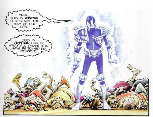
 photo JDTMC77WrongB_zpsn86warl6.jpg JUDGE DREDD: JUDGEMENT by Gibson, Rennie and Parkhouse

Here Gordon Rennie manfully struggles to give Dredd and Anderson a supernatural mystery to solve, and for the most part he is successful enough. A ghostly Judge is dispensing justice on the streets, which just isn't on, and so Dred investigates along with Anderson and SJS judge Ishmael. Judge Ishmael, er, has a beard, and contributes little to the narrative before just fading into the background. He's the kind of story flab a Wagner or a Grant would have excised completely, but not Rennie, alas. This unnecesary heaviness weighs the strip down, it all seems overly convoluted in order to get to where it's going. The pacing plods, in short. And Rennie is inconsistent in his spookiness. A ghost judge whose shell casings are material enough to be traced? Um, no. I have trouble believing in gravity so if you want me to be all-in on vengeful revenants you can't trip me up with stuff like that.
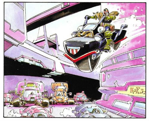
 photo JDTMC77BikeB_zpss7cf2b1q.jpg JUDGE DREDD: JUDGEMENT by Gibson, Rennie and Parkhouse

But it's not without entertainment and Rennie gets a couple of very good moments in there, such as when the gang boss realises he's just made a biiiiiiiiiiiiig mistake. And the mystery itself is pretty good, there's just the odd leadfooted moment which makes you pause just long enough to irritate. A bit of red pencil would have helped. It's close to good, but what hurls it across the line is Ian Gibson's phenomenal art. Or to be more precise Gibson's phenomenal colouring. Seriously, there's some crackerjack colouring going on here. Done in something resembling ink wash, the colours are a work of art in themselves. The indigo Ghost Judge really pops out from the world it is haunting. For that world Gibson chooses a really chirpy and upbeat palette with warm pinks, deep blues and jolly greens which, draped over his lithely curvaceous lines, create images so ebulliently cartoony they are a joy. In Judgement Rennie does okay, but Gibson raises things up to GOOD!


JUDGE DREDD: ROAD STOP Art by Dave Taylor Written by Gordon Rennie Lettered by Annie Parkhouse Originally published in 2000AD Progs 1582-1586
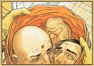
 photo JDTMC77HeadsB_zps2mbk3qna.jpg JUDGE DREDD: ROAD STOP by Taylor, Rennie and Parkhouse

Gordon Rennie again! This time Rennie picks up a bunch of genre cliches, each of which would be insufficient for a story this length and mushes them all together to create a kind of creepy comicbook rumbledethumps. And, I have to say, it's not half bad. Hmmmmm! For a bunch of reasons which can all shelter under the umbrella of Plot Convenience (which is much better than hunching under the bus shelter of Plot Contrivance) Judge Dred is stranded until a storm passes at a decrepit Road Stop with a serial killer, an assassin, a coach trip and several other cits. That's pretty good. But the Road Stop comes under attack from a mutant gang and, yes, and, the owners of the Road Stop have something hungry in the basement. It should be overstuffed but, credit to Rennie, it moves along with quite a bit of zip and not without a few surprises. There's never a dull moment, but then with that lot going on there shouldn't be. (Again, though, Mr. Editor should have pointed out that you don't tell someone who has just revealed themselves as an assassin that you would love to help them but you have to pack all this stolen money..oops, you're dead!) Fun for the most part, writing-wise.
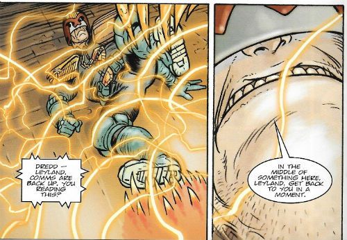
 photo JDTMC77CommsB_zps8inzbrap.jpg JUDGE DREDD: ROAD STOP by Taylor, Rennie and Parkhouse

But the art? Grud on a Greenie! Who is this Dave Taylor! He's the Tip-Top Top Cat and no mistake! His art has a wonderfully European inflection and a super robust sense of physical dimension. He doesn't stint one jot on the characters or the locations either. The road house is wonderfully designed, with a real sense of novelty to every room, rather than a jaded sense of yes-I've-seen-Blade-Runner-too-it-was-forty-years-ago-can-we-move-on-now-please. And there's no stinginess with the character designs either. Most folk would have saved the robot with a monkey’s head or the electric-circuit person for their own projects. But here they are just part of a bunch of wild designs which get less page time than Judge Dredd's bike. Dave Taylor goes all-in is what I'm saying. I looked him up on Wikipedia and it turns out he's English so that explains everything. Apparently he also had a double hernia. I doubt that's the secret of his ridiculously good art though. Road Stop is solid stuff so GOOD!


JUDGE DREDD: THE FEAR THAT MADE MILWAUKEE FAMOUS! Art by Mick McMahon Written by John Wagner Lettered by Tom Frame Originally published in JUDGE DREDD ANNUAL 1981
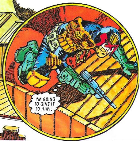
 photo JDTMC77GiveB_zpsgxsw64rd.jpg JUDGE DREDD: THE FEAR THAT MADE MILWAUKEE FAMOUS! by McMahon, Wagner and Frame

In 1981 Judge Dredd got his own Annual! (Well, I guess in 1980 strictly speaking). This was pretty momentous if you were 11 years old, because that meant that Christmas would bring not only the 2000AD Annual but also a Judge Dredd one! (Family finances permitting; the ‘80s was a hard time for us, we had to let one of the planes go). North American genre comics have annuals too, but these are published too randomly to suggest anyone producing them actually knows what the word means, and are basically just fat comics. A fat comic chucked out intermittently is not an “annual”, North American genre comics! In Britain where we understand the value of routine and the meaning of words, Annuals come out just before Christmas, are magazine sized with hard covers and cater to a range of interests; sports, puzzles, etc and, yes, comics. The 2000AD Annual would bulk itself out with old reprints (one year I’m sure Rick Random Space Detective was in there. Rick Random! I’m sure Rick Random has his charms, but it was a bit like interrupting a kid’s party with a lecture on the Joys of Accounting. Rick Random isn’t exactly FLESH!) but IIRC Judge Dredd’s Annual was all new stuff. Even if it wasn’t, even if I’m wrong, it had an awesome Mike McMahon drawn strip (yes, this strip!) which took advantage of the big pages and extra length to really go Total McMahon.
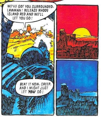
 photo JDTMC77TimeB_zps1wqobnqa.jpg JUDGE DREDD: THE FEAR THAT MADE MILWAUKEE FAMOUS! by McMahon, Wagner and Frame

The story isn’t much; Dredd is chasing down a bad mutant hombre but comes unstuck when the Milwaukee dead rise up to exact revenge for their nuclear annihilation. It’s a bit of zippy fluff which gets by on the visual joke of the bad guy and Dredd’s refusal to give an inch in the face of a city of restless spirits. Mostly it's McMahon's show. McMahon’s art here is a summation of his “scabby” style, which he would immediately start moving away from, like the restless genius that he is. You can really see here his technique for making the most of his page count by creating pages within pages; that is, a group of three or four panels which are read together within the larger page on which they nestle. He really covers some ground like that, and it leaves him free to have a big image dominating the layout to boot. He also colours it like a gifted child armed with felt tip pens; if Lynne Varley had done it we'd all be shaking a tail feather over it. His pages here were so scrumdiddlyumptious that even an 11 year old could tell. I spent a lot of 1981 copying Mike McMahon’s art from the Judge Dredd Annual 1981 in biro on some wallpaper offcuts we had lying about (remember wallpaper?). Yes, I should have got out more. The Fear That Made Milwaukee Famous! is not only a pun on an ancient Schlitz beer advertising slogan but, drawn by Mike McMahon, it is thus VERY GOOD!


JUDGE DREDD: THE VAMPIRE EFFECT Art by Mick McMahon Written by John Wagner Lettered by Tom Frame Originally published in JUDGE DREDD ANNUAL 1982
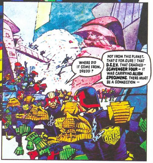
 photo JDTMC77AlienB_zpsmec1cqul.jpg JUDGE DREDD: THE VAMPIRE EFFECT by McMahon, Wagner and Frame A space ship carrying alien life form samples crashes into Mega City one and an energy vampire is on the loose! The more it eats the bigger it gets and by the time it has eaten a few under-city dwellers it is pretty hefty and ready to chow down on Mega City One. Can Judge Dredd and his fascist pals stop it before it's too late? Yes, obviously. But how? Yeah, smart guy, how? There's not much to this solidly scripted effort other than a steady ratcheting up of the stakes and a pervasive sense of hopelessness, which is quite a lot really; and most of that is probably down to the art by Mike McMahon.
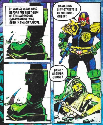
 photo JDTMC77DangB_zps7zripuxi.jpg JUDGE DREDD: THE VAMPIRE EFFECT by McMahon, Wagner and Frame

One year later and we can see just how much hunger McMahon's talent has for fresh artistic conquests. The man gobbles up challenges like the in-story vampire chows down on energy. Ravenously. His art still retains a grubby patina but is far more visually controlled now. There's a discipline in the straightness of lines strong enough for him to perch his more expressionistic tendencies atop them. The flare of Dredd's helmet is starting to reach the point where he'll be forced to enter rooms sideways, but the exaggeration is consistent with the larger landscape of visual hyperbole it inhabits; which makes it Art rather than a goof. Fret not, though, McMahon's art has lost none of its playfulness despite his apparent turn towards the stern. His colours are more subdued here with the odd pop of a green knee pad leavening the dourness, but there's still wit; see the negative colouring on people “bitten” by the vampire, and his refusal to make the vampire anything other than a blob speckled by colour. The reproduction here is a crying shame, tending as it does to the blurry. But The Vampire Effect is still drawn by Mike McMahon and so it is VERY GOOD!


JUDGE DREDD: HORROR HOUSE Art by John Burns Written by John Wagner Lettered by Tom Frame Originally published in 2000AD WINTER SPECIAL 1994
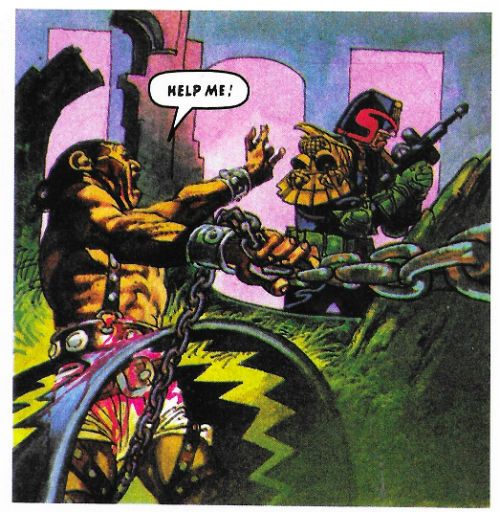
 photo JDTMC77HelpB_zps6lfd3mel.jpg JUDGE DREDD: HORROR HOUSE by Burns, Wagner and Frame

A one episode punchline strip in which Dredd has to rescue a kidnapped kid from an animatronic house of horrors. This is from a Winter Specuial which, unlike an Annual, is a fat comic released at seasonal intervals. Used to be we just had Summer Specials which were an awesome part of being a kid. Looks like we now have Winter Specials because profits in the third quarter are down, or whatever. I don't know, but I for one am not sitting on a Blackpool beach in my trunks reading Shiver'n'Shake in November, thanks. Must be getting old. So, yeah, the old lag John Burns (b.1938) has scads of fun with the different dioramas in the Mega-Tussauds’ of Terror, and my eyes enjoyed his lovely tides of colour breaking over the page. Burns’ style is very European, characterised by pin-sharp linework so awesome that he took over Modesty Blaise from Enrique Romano in the ‘70s. Burns was beloved by kids of the ‘70s for his art on the smutty newspaper strip George & Lynne, by the ‘80s he was blazing trails of awesome on the page for 2000AD, where his work embraced colour with a vigour that would make a vicar blush. I like John Burns’ art.  Unfortunately while the script’s punchline isn’t bad as such, it landed leadenly as I hadn’t realised there was anything amiss with Dredd’s behaviour. He’s not exactly chatty Cathy at the best of times is he now? Anyway, John Burns drawing Judge Dredd fighting things is always GOOD!

JUDGE DREDD: CHRISTMAS WITH THE BLINTS Art by Andrew Currie Written by John Wagner Coloured by Chris Blythe Lettered by Tom Frame Originally published in 2000AD Prog 2005
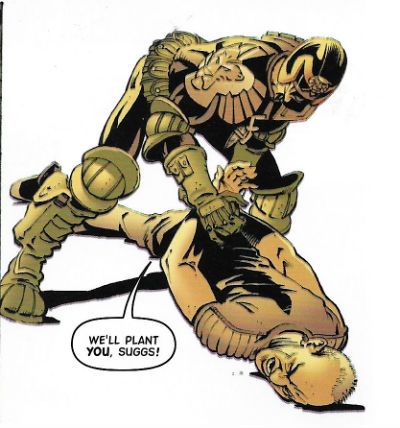
 photo JDTMC77SuggsB_zps6vg3lcrn.jpg JUDGE DREDD: CHRISTMAS WITH THE BLINTS by Currie, Wagner, Blythe and Frame

This is the finale of a long running storyline about Dredd failing to catch Ooola Blint, who is addicted to euthanasia-ing unwilling people, and her useful idiot of a husband, Homer. The problem with this series of mega-books is here we just get the end of the chase. Maybe the other bits are in other books, I don't know. Anyway, although robbed of much of its cumulative impact, the script is the usual drly comic Wagner effort wherein romance and murder become so intertwined it gets hard to distinguish between the two. At heart this is pretty sick stuff but thanks to Wagner's deadpan delivery this very sickness becomes part of the humour.
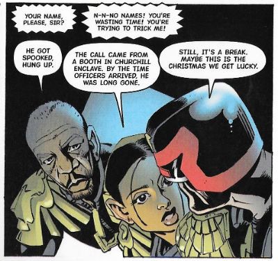
 photo JDTMC77MorganB_zpsmf6yanhi.jpg JUDGE DREDD: CHRISTMAS WITH THE BLINTS by Currie, Wagner, Blythe and Frame

Christmas With The Blints is more of a characer piece than an action piece so Currie has his work cut out for him. Fortunatley Currie seems to have a yen for caricature, so fun with faces is right up his street, and his “acting” is well up to snuff(heh!) for the duration. He does a particularly sweet Morgan Freeman whose sloping contours suggest the influence of the Master Caricaturist Mort Drucker, which is nice to see in a Dredd strip. It's a wordy episode but Currie keeps it interesting and his crisp, clean style is attractive if never eye boggling. Christmas With The Blints is GOOD!


JUDGE DREDD: THE JIGSAW MURDERS Art by Xuasas Written by John Smith Lettered by Tom Frame Originally published in JUDGE DREDD MEGAZINE 2.27-2.29

I really like John Smith as a writer, and I really, really like Judge Dredd as a character but I don't think John Smith writes a good Judge Dredd. The Jigsaw Murders doesn't change that opinion. Smith has his very own range of obsessions he rarely deviates from: body horror, fractured stream-of-consciousness inner monologues, creepy malefic beings whose reality can be a bit dubious and a rigid dislike of authority. This latter quality overshadows his more intriguing aspects on Dredd, because he gives the impression he's holding his nose whenever he has to write Dredd himself. I don't know how he gives that impression but he does. So what I do is, I just read it as a John Smith story and that usually works out okay. Here then I ended up reading about a serial killer who dismembers his victims to disguise his less than sane search for a replacement arm. This being a John Smith joint he rides about in an ice cream truck and is haunted by The Giggler, a creepy kid's toy, and is pursued by Judge Dredd, who looks like our Judge Dredd but is an inflexible asshole prone to bad one-liners. He's not as bad as Millar and Morrison's tone-deaf interpretation of Judge Dredd, but then at least here he's in a decent story which is something that pair never managed to conjure up. As John Smith stories go it's pretty good, there's a hilarious bit where the Jigsaw Killer finally gets his arm and it's all kind of icky and nasty like a good John Smith tale should be.
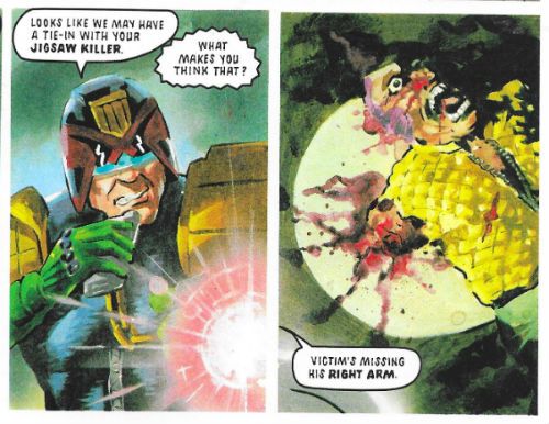
 photo JDTMC77ArmB_zps0zcrid7n.jpg JUDGE DREDD: THE JIGSAW MURDERS by Xuasas, Smith and Frame

It's illustrated by Juan Jesus Garcia, who likes to be called “Xuasus”, in a fully painted style which I like to call “mostly successful”. It's got some real heft to it thanks to Xuasus' penchant for lumpiness and there's a winning ugliness to everything, not least the characters. However, stiffness is an issue when he paints people in motion, and while it didn't entirely convince there was always the odd stand-out like the panel below. Interesting, I guess I'd go for. The Jigsaw Murders is pleasantly odd thanks to Smith's script and Xuasus', uh, heavy approach. So, GOOD!
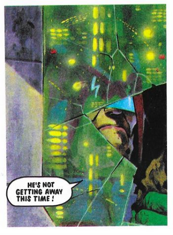
 photo JDTMC77PeekB_zpstnrhq9fw.jpg JUDGE DREDD: THE JIGSAW MURDERS by Xuasas, Smith and Frame


JUDGE DREDD: THE BEATING HEART Art by Steve Dillon Written by John Wagner & Alan Grant Lettered by Tom Frame Originally published in 2000AD Progs 511-512
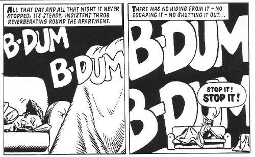
 photo JDTMC77BDumB_zpsdq88bw6d.jpg JUDGE DREDD: THE BEATING HEART by Dillon, Wagner & Grant and Frame

This is a little two parter, a playful update of Poe's “Tell-Tale Heart” which is amusing enough in its way, but is of note largely because of Steve Dillon's art. In 2015 comics lost Brett Ewins (see above) and in 2016 Steve Dillon died, which makes this volume a bittersweet read. It does provide a reminder that Dillon's sparky art could lift a trifle like this out of the filler category and up into GOOD! without breaking a sweat. Dillon may only ever have drawn one female face but he put atop it a cascade of Bizarre '80s hairstyles that would give a Studio Style executive a chubby, and while his décor could be minimal his pacing was precise. Best of all Dillon would always remember that it was Judge Dredd's strip and really nail his Dredd bits down hard. Ciao, Steve Dillon! Ciao, Brett Ewins! And thanks for all the Thrill-Power!

And as all the best horror stories end with a hand coming out of the ground…
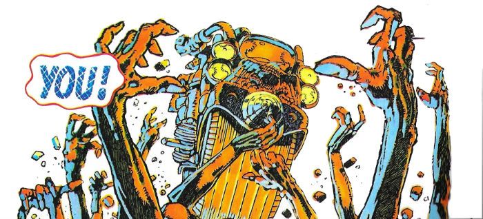
 photo JDTMC77YouB_zpsxqt5nkxv.jpg JUDGE DREDD: THE FEAR THAT MADE MILWAUKEE FAMOUS! by McMahon, Wagner and Frame

NEXT TIME:  I'm not sure but probably Judge Dredd in some - COMICS!!!

“Not Unless He Had Three Legs.” COMICS! Sometimes It's Nice To Have A Change Of Scenery!

In which Judge Dredd is a right gadabout and doesn’t even have the decency to send a postcard.!!BONUS MAP OF THE MEGA-TERRITORIES!!  photo JDTMC56RedB_zps2c6ktymy.jpg JUDGE DREDD: GULAG by Charlie Adlard

Anyway, this…

THE JUDGE DREDD MEGA COLLECTION REVIEW INDEX

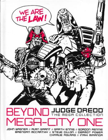
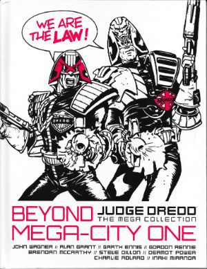
JUDGE DREDD: THE MEGA COLLECTION Vol. 56: BEYOND MEGA-CITY ONE Art by Brendan McCarthy, Steve Dillon, Dermot Power, Charlie Adlard and Inaki Miranda Written by John Wagner, Alan Grant, Garth Ennis, Mark Millar & Grant Morrison and Gordon Rennie Lettered by Tom Frame, Mark King, John Aldrich, Annie Parkhouse and Simon Bowland Colours by Wendy Simpson, Chris Blythe Eu de la Cruz Originally serialised in 2000AD Progs 485-488, 727-732, 859-866, 1382-1386 & JUDGE DREDD MEGAZINE 246-249 © 1986, 1991, 1993, 2004, 2006 & 2016 Rebellion A/S Hatchette Partworks/Rebellion, £9.99 (2016) JUDGE DREDD created by Carlos Ezquerra & John Wagner

 photo JDTMC56CovB_zps0etjedgi.jpg

ATLANTIS Art by Brendan McCarthy Written by John Wagner & Alan Grant Lettered by Tom Frame & Mark King

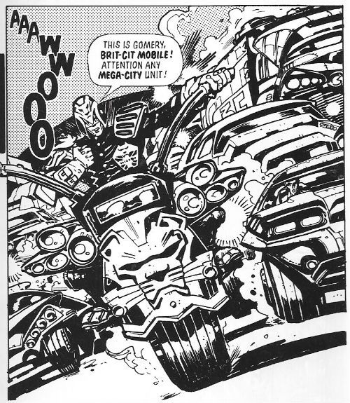
 photo JDTMC56BritB_zps1xz9evh1.jpg JUDGE DREDD: ATLANTIS by McCarthy, Wagner & Grant and Frame

Have you ever seen a British Bobby’s helmet? Ooooh, don’t! Get you! Stop it! OoooOOOOooooOOOOOOh! No, really, back when they walked the beat tipping the wink to the ladies, dispensing directions  and gruffly moving on the ruffians and all that, before they became  swaddled in bullet proof jackets and started cradling matt black engines of death while licking their chapped lips, back before that, did you ever seen a British bobby’s helmet? We used to call them “tit heads”, because kids have no respect and, also, they were a pretty ridiculous bit of gear. And yet thoroughly British in their ridiculousness, due to their air of wonky pomp.  Brendan McCarthy’s design for the Brit Judge embraces this tradition and carries it into the future like a sheikh carrying a blonde lady on the cover of a Mills & Boon romance. Smoothly, that is. It also suggests he is the only person in existence who ever looked at Calos Ezquerra’s original Judge design and thought, “Hmmm, pretty impractical, but not impractical enough!” Pity the poor sap who has to patrol the mean streets of Future Little Tidworth in this get-up.

 photo JDTMC56PoorB_zpsw2ns6alv.jpg JUDGE DREDD: ATLANTIS by McCarthy, Wagner & Grant and Frame

It works on the page though because Brendan McCarthy is  a design genius, and part of that genius must be due to his total refutation of physical practicalities.  Not only is the Brit Judge get-up visually delightful  it is also very British, what with its lion(s) rampant and multiple Union Jacks (The Royal Union Flag, to any Canucks out there).  All the kind of garish tat in fact which symbolises the overcompensation this nation makes for its reduced circumstances and present global irrelevance. I wouldn’t be surprised if the kneepads alternated playing the national anthem and Churchill’s speeches, and the belt pouches contained the fixings for a nice cup o’ char. Preposterously impractical and ostentatiously nationalistic, like fascism filtered through buffoonery Brendan McCarthy’s design captures the British character to a tee. I like it. Other than that though we learn little as Brit-Judges just act like Judges and the strip isn’t set in Brit-Cit but instead in Atlantis, which is not a mythical sunken city but a way station on the sea bed. The strip is a shaggy mutie story that earns its length by introducing Atlantis and Brit-Cit judges, and by being drawn by Brendan McCarthy; it’s worth reading just to see McCarthy’s giant manta rays alone. Throw in the bumptious bobby design to boot and it’s GOOD! Stuff.

EMERALD ISLE Art by Steve Dillon Written by Garth Ennis Coloured by Wendy Simpson Lettered by Tom Frame

 photo JDTMC56EireB_zpsy07v92cp.jpg JUDGE DREDD: EMERALD ISLE by Dillon, Ennis, Simpson and Frame

Bejabbers! If and it isn’t the quare man hissownself now, Garth Ennis! To be sure, and there’s been many a pot o’ gold at the end o’ his rainbow o’writing! To be sure, to be sure! Oho, oho, oho! But this’ll no be one of ‘em! See and if he’s not brought his sense of humour with him!  Ah now, ‘tis a turrible, turrible ting his sense o’ humour is.  Aye now, ‘tis a sorry tale indeed. In the immortal words of Alan Partridge, “Der’s more to Oirland dan DIS!” What? Oh, it’s racist when I do it is it? I see. I better stop then. When Garth Ennis does it it’s satire. Except it isn’t. Unless you are a lot less demanding than me. You know that particularly poor satire that’s so bad it is actually indistinguishable from what it purports to satirise? Well, after reading Emerald Isle you will. I guess it’s a satire of people’s ideas about Ireland but it’s kind of painful. Mind you, me and Garth Ennis’ sense of humour will always at odds. Mostly because I have an outdated belief that humour should be funny. A little bird tells me though that  different people find different things funny, so if you think having a Guinness harp© on a Judge’s helmet and potato guns that you can set to “chips” are funny, then you tuck in!

 photo JDTMC56BlamB_zpskqjqjxx7.jpg JUDGE DREDD: EMERALD ISLE by Dillon, Ennis, Simpson and Frame

Unconvincingly mixed into this hilarious stuff is a more grounded tale of a M-C1 hitman who hides out with a bunch of terrorists. Terrorism is apparently just a bit of a jape until the proper crook turns up, then things get heavy. The insouciant  Emerald Isle Judges are unprepared for the sudden explosion of pitilessly thuggish activity. Luckily Judge Dredd lends a hand. Personally I’m a bit unconvinced that terrorism in Ireland and organised crime were not inextricably linked but I’m not going to argue that point with anyone from Ireland. Say, has anyone else seen that crackin’ John Boorman movie THE GENERAL (1998)? Brendan Gleeson’s in it and it’s well good. Based on Dublin Crime Lord, Martin Cahill, it probably soft soaps the harsher reality but still, Brendan Gleeson. Lovely, lovely Brendan Gleeson. ORDINARY DECENT CRIMINAL (2000) stars Kevin Spacey and apparently covers the same ground. I’ve not watched that one so I’d not know. Meanwhile, back at the point, the late, great Steve Dillon draws “Emerald Isle” in his usual sturdy fashion whereby he avoids drawing anything too demanding but his stylistic charisma prevents it all getting too bland. He’s also wise enough to know that Dredd’s the star, so he’ll ensure at least one really great image of Dredd being Zarjaz! He’s a right good choice for such a whipsaw mix of comedy larks and brutal violence given his style can accommodate both at the expense of neither. It may not be the craic it thinks it is but “Emerald Isle” is GOOD!


BOOK OF THE DEAD Art by Dermot Power Written by Mark Millar & Grant Morrison Lettered by Tom Frame & John Aldrich

 photo JDTMC56LuxorB_zpsmk7l9tqq.jpg JUDGE DREDD: BOOK OF THE DEAD by Power, Millar & Morrison and Frame

I’m stretching charity to its limits when I say that Mark Millar and Grant Morrison’s Judge Dredd work is the high point of neither of their careers. Considering how little I rate anything by Mark Millar this should be warning enough. At this stage of their careers (the crazysexyfuntime ‘90s!) Millar & Morrison had teamed up and were giving interviews like they were pop stars in the vein of Pepsi and Shirley or something; they seemed pretty committed to the novel artistic approach of just telling people they were awesome without actually making any decent comics to back that up. A right self-promoting pair of capering  mountebanks  they were. Preening narcissists, some might say, because people can be very cruel. Morrison and Millar were all mouth and no trousers, as we say over here. Morrison would eventually snap out of it and lower himself to write some decent comics, which very clever people would read a great deal more into than was actually present. I don’t know what happened to him after, because the last thing I read by him was something odious about Siegel and Shuster’s treatment by DC which, while I can’t remember the specifics, certainly sounded like “Goodbye, John” to me. Apparently, because I ceased paying attention long ago, Millar would just defiantly plod on regardless, cultivating his lucrative furrow of thundering chicanery and creative impoverishment to spectacularly rewarding effect. Financially, not creatively rewarding, obviously. Before that though, the team were steadfast in their belief that if they reduced Judge Dredd to the level of a shit ‘80s straight to video action twat, this would be a good thing. At no point in their complacently leaden tenure on the strip would their approach bear any fruit other than arse grapes.

 photo JDTMC56FightB_zpsprazvd8a.jpg JUDGE DREDD: BOOK OF THE DEAD by Power, Millar & Morrison and Frame

“Book of the Dead” is a pretty representative bunch of those very arse grapes. Here the legends in their own minds send Dredd to the city of Luxor in Egypt, where they can’t be bothered to invent a future society, because they are busy modelling Speedos© for Deadline, or taking about being punk while actually being about as punk as Barry Manilow, or whatever and who cares, so they just make it a really superficial idea of how Ancient Egypt was, you know, pyramids, pharaohs, mummies, etc. but with hover cars, energy staffs and Resyk. Given the amount of thought involved we’re lucky the Judges don’t ride about on robot camels and Dredd doesn’t come home with a rug from a mega-bazaar. Whenever Dredd’s abroad some folk’s antennae start twitching in case any casual racism slips in, but I think the mental sloth on show here is damning enough. It’s just a multi-part punch-up and a piss poor use of Dermot Power’s not inconsiderable talents. Power fully paints the strip with a level of skill and artistry better suited to a script where someone was, you know, actually trying.  There’s some lovely muscle work on show reminiscent of the master of muscle magic, Mr Glenn Fabry, and at no point does Power succumb to the twin pitfalls of fully painted 2000AD art: drab colours and visual inertia. His work here is so lovely for seconds at a time I forgot how insultingly contemptuous the writing was of its audience. It’s only because of Dermot Power that this gets OKAY! rather than CRAP!

GULAG Art by Charlie Adlard Written by Gordon Rennie Coloured by Chris Blythe Lettered by Tom Frame

 photo JDTMC56BoomB_zpsjxrecenm.jpg JUDGE DREDD: GULAG by Adlard, Rennie, Blythe & Frame

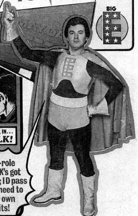
Charlie Adlard draws this one. Charlie Adlard is famous for drawing The Walking Dead, which is itself famous for being successful and unerringly mediocre. You knew that, but did you know that Charlie Adlard is now the UK Comics Laureate. Disappointingly, unlike the Poet Laureate, this does not mean that he has to produce comics on the Queen’s birthday or royal births and marriages, and public occasions, such as coronations and military victories. Her Madge’s Royal God-appointed face as she opened up her birthday card to find a picture of a rotting corpse tottering around a valiantly nondescript America would be quite the thing! No, it seems it’s more of a charitable position whereby the noble art of The Comic is promoted with the hope that one day it will be as popular as poetry. (<--- joke!) If you didn’t know that, then it probably evaded your attention that Dave Gibbons was the last UK Comics Laureate. As part of his promotional efforts I like to think The Gibbons used to squeeze himself into his Big E leotard from his Tornado days and leap into libraries scattering comics like startled gulls into the receptive faces of the next generation of comics’ readers. And old people sheltering from the cold. That probably didn’t happen but I think we all feel a bit better having imagined Dave Gibbons dressed as Big E. Take your pleasure where you find it doesn’t just apply to Wilson Pickett fans.

 photo bigeB_zpsrknllnbh.jpg DAVE GIBBONS: BIG E stolen from thefifthbranch.com

The story? Oh, “Gulag” is about Judge Dredd getting a bunch of stubbornly unmemorable Judges together to rescue some POWS from a Siberian Gulag. Yeah, by the way, in case it hasn’t become obvious these reviews aren’t the kind which tell you significant character appearances (e.g. here: Psi Judge Karyn), who created them (Dean Ormston and Alan Grant), which story they first appeared in (Raptaur), where that story first appeared (Judge Dredd Megazine #1.11-1.17) and when (1991). No, these are just what an old man of questionable lucidity manages to crank out in the time allotted by circumstance. Reviews, but not as we know them. There’s little rigour or design to them. It’s less Douglas Wolk and more a shaky old gent muttering to himself in a library (Dredd…zarjaz!...Rico…BAD! Pat Mills…lovely teeth! Space Spinner…Big news for readers inside! Etc etc), before Dave Gibbons unwisely clad in the rags of yesteryear, bursts in and causes me to vapor lock in shock. Prone to divergence at no notice, yeah? Particularly when dealing with Gordon Rennie, who here writes about Judge Dredd and chums in Siberia. In “Gulag” Sibera is less than rewarding as a locale as it is just full of snow and bits of barbed wire, and the differences in the Sov Judges’ uniforms is minimal. It’s not worth the trip really. Rennie huffs and puffs about the stakes at, er, stake but I could never rid myself of the impression that it was all just a big fight over an empty shed in a snowy field. Charlie Adlard fails to ignite events, but everything he draws looks like what it’s supposed to be. I mean, it certainly wasn’t worth a butt of sack but it was OKAY!  

REGIME CHANGE Art by Inaki Miranda Written by Gordon Rennie Coloured by Eua de la Cruz Lettered by Tom Frame, Annie Parkhouse & Simon Bowland

 photo JDTMC56BarranB_zpsm4juxvb3.jpg JUDGE DREDD: REGIME CHANGE by Miranda, Rennie, del la Cruz, Frame, Parkhouse & Bowland

“Regime Change” is the second Rennie penned tale and had an equal impact on my memory as that one in the snow, what’s it called? The one with, uh, the snow and, uh...Anyway, Dredd goes to Ciudad Barranquilla (AKA Banana City) which spawls over most of Central America like a gaily coloured, city shaped metaphorical sombrero. Pretending to give a shit about missing cits Dredd and a multi-national  “peace keeping force” show up and nose about. Turns out though, in a twist that could only surprise a Daily Mail reader, that they are actually just there to depose the Judge Supremo and install someone more to M-C1’s liking. When the corpses of fourteen M-C1 citizens are found in a mass grave they have all the excuse they need. What shocking cynicism! The sheer gall of Gordon Rennie to even suggest to imply such a thing! It’s fine. It’s drawn by Inaki Miranda whose art I don’t like because everyone is drawn with a tiny wee head like Thrud The Barbarian, and it’s all just a bit too busy for me. One of the problems with comics is that you can come up against a style you just don’t like. It doesn’t mean it’s “bad”, it’s just not to your taste. Guess what? That’s right. So, “Regime Change” is OKAY!

 photo JDTMC56CuteB_zpsanh36kbo.jpg JUDGE DREDD: REGIME CHANGE by Miranda, Rennie, del la Cruz, Frame, Parkhouse & Bowland

It was a bit dull that wasn’t it, a bit normal. Sometimes I’ll do that, sometimes I’ll just start on a craven apology for not having done these sooner. Because, yeah, I started writing up these Dredd partworks in 2015 and then…I stopped. A lot of that was down to apparently I like to make promises I can’t keep. That way I think I get to keep the guilt up. I’m still feeding off the guilt of not carrying on with the Planet of the Apes Weekly, but that was a lot of work to be fair, I kind of aimed to high on that one. Not doing the Dredds as well was too much guilt though. It was getting oppressive. Mind you, about two write-ups in, when I first started, it was pointed out to me that Douglas Wolk had written up every Judge Dredd strip ever so…I felt a bit like a spare prick at a wedding. If Gus van Sant had been halfway through making PSYCHO when someone told him this guy Fred Hitchcock had already had a go, I like to think he would have had the sense to stop. It’s about knowing your place, innit. Alas, that didn’t stop me feeling bad; yes, I felt bad, and I still feel bad because “Drac” in the comments was all gung-ho about following along from his Australian location. And I just pisseded off and left him or her hanging. That’s shabby behaviour. So, too late to make up for it, I’ve started again. I’m banging them out now but that won’t always be possible (because, life), but as slow as the flow may become I’ll carry on. Sometimes I’ll try and do a proper job and sometimes I’ll just amuse myself, depends. Personally I find it difficult to say much about Gordon Rennie, so it’s unfortunate that we have two of his storylines in this book. Bit of a mixed bag this book, to be fair the Rennie ones are part of a longer uberplot involving the machinations of an embittered Sov, so they lose out by being isolated here. BEYOND MEGA CITY ONE is a GOOD! Read overall, I guess.

NEXT TIME: I haven’t thought that far ahead. So surprises in store for us all!

BONUS: A NO DOUBT OUTDATED MAP OF THE WORLD OF JUDGE DREDD!

 photo JDTMC56MapB_zpsor9naqso.jpg

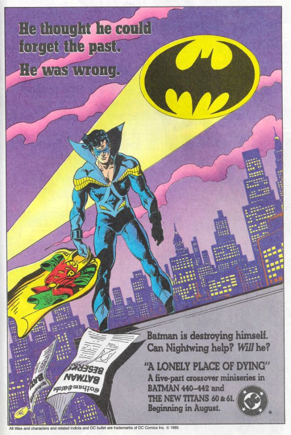
“He Thought He Could Forget The Past. He was Wrong.” COMICS! Sometimes I Find A whole New Way To Bore You!

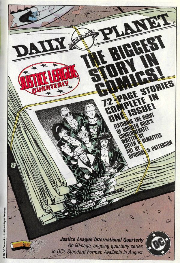
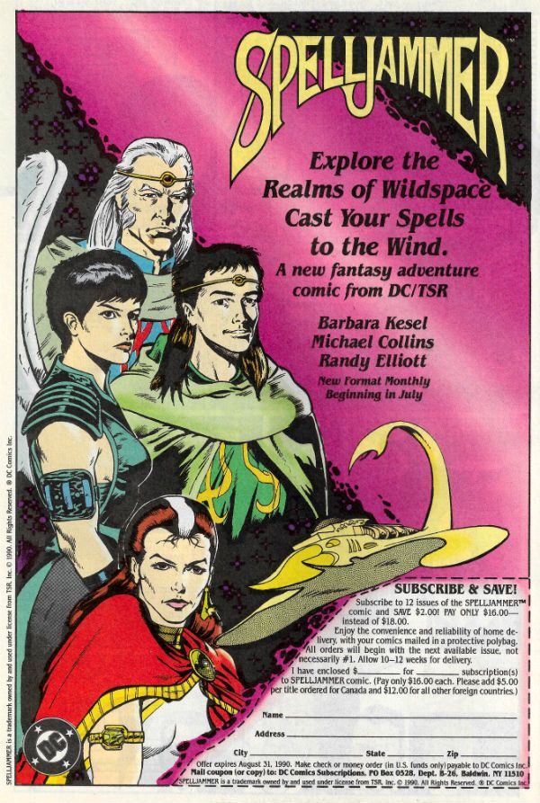
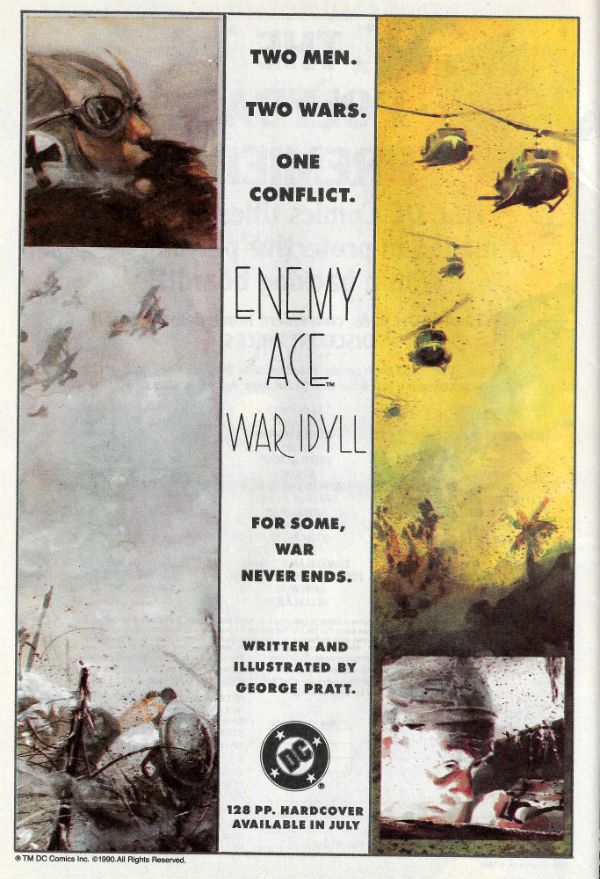
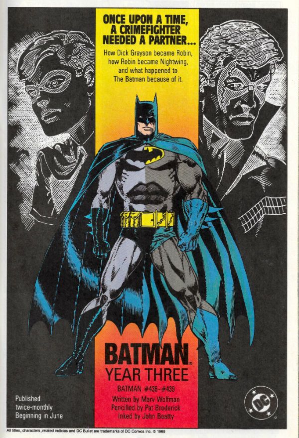
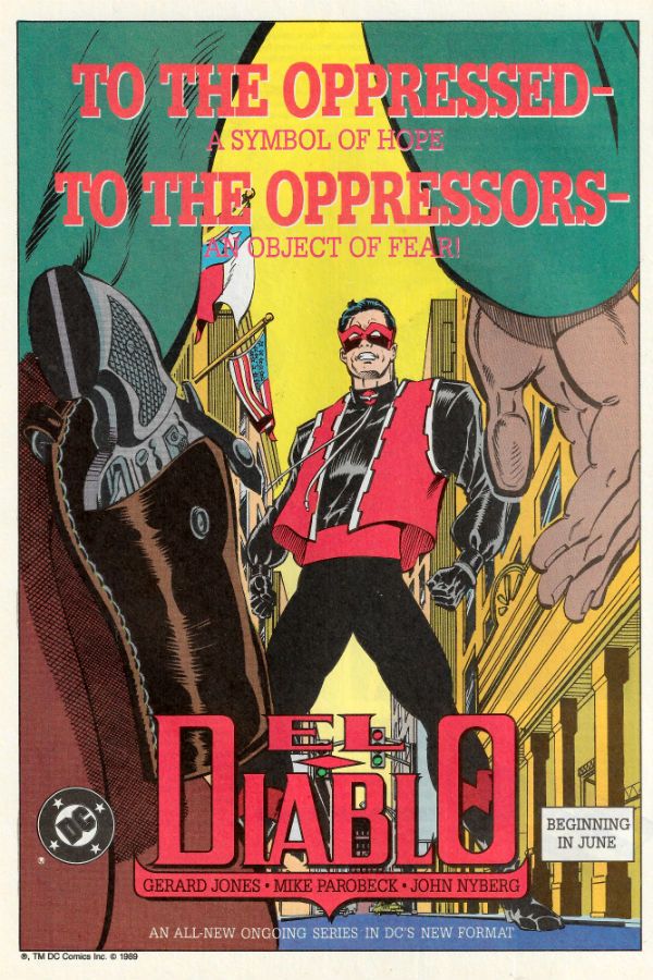
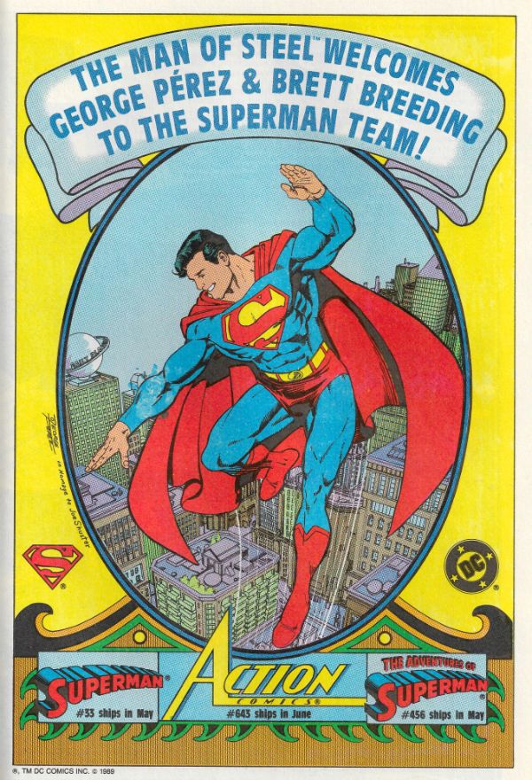
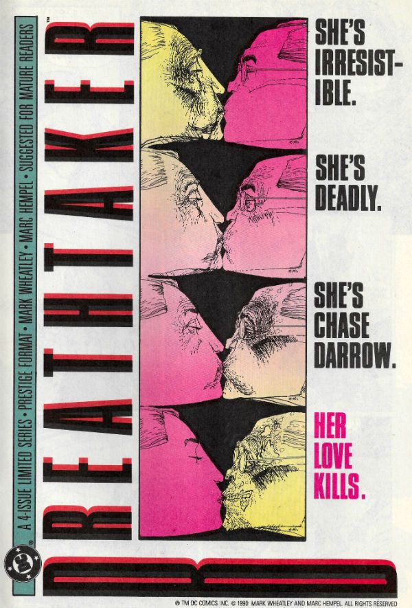
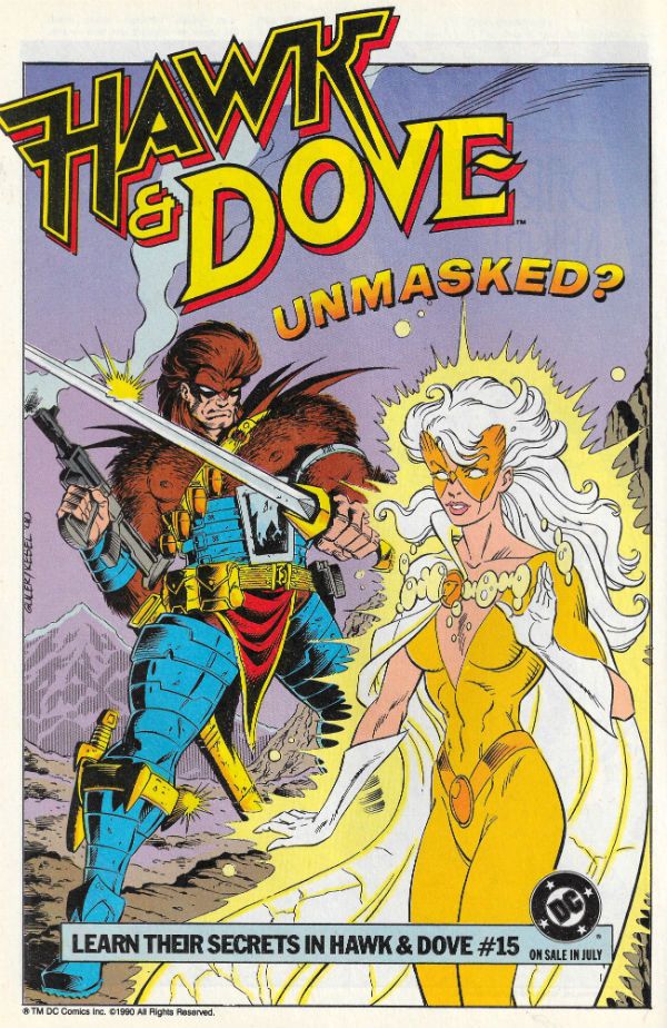
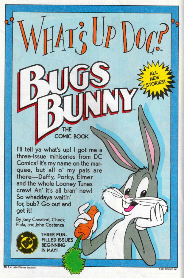
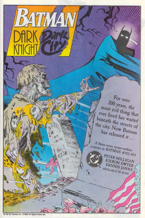
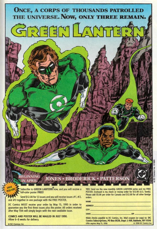
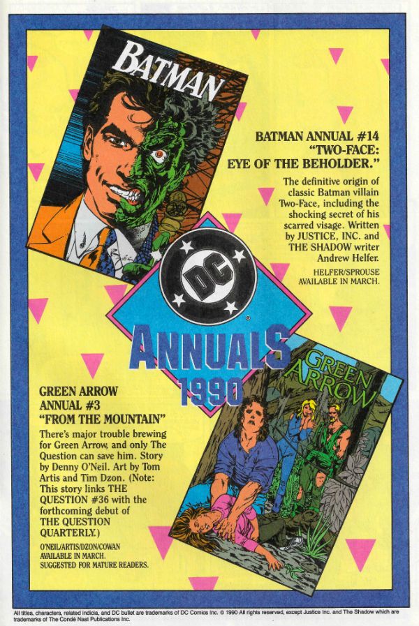
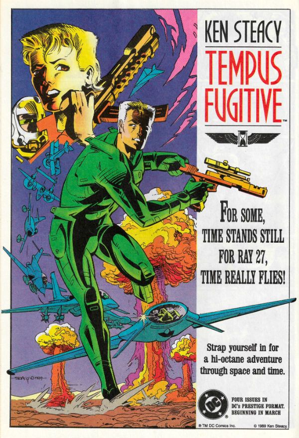
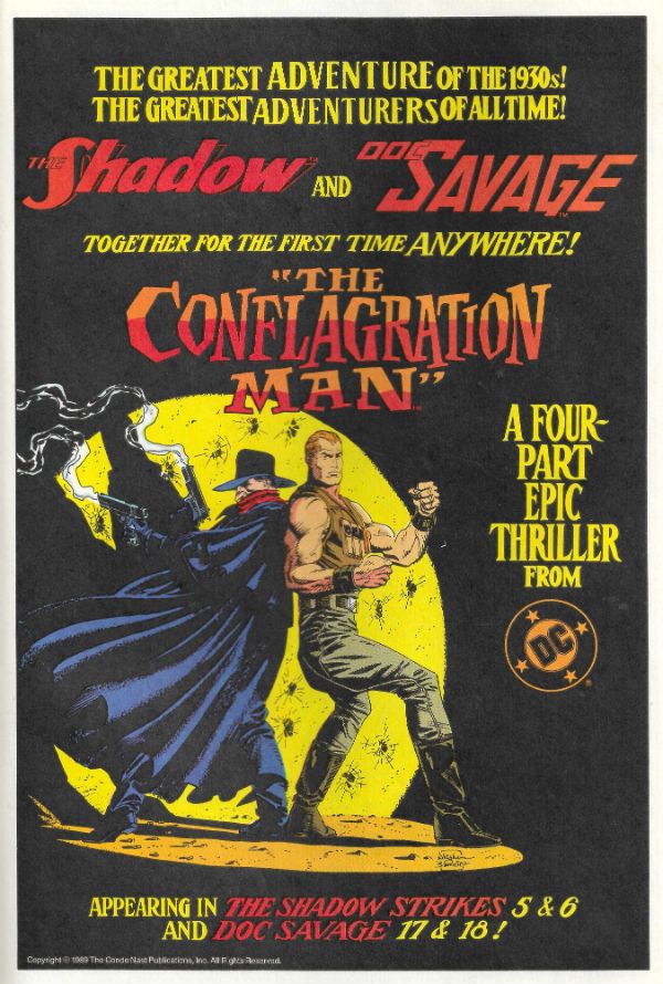
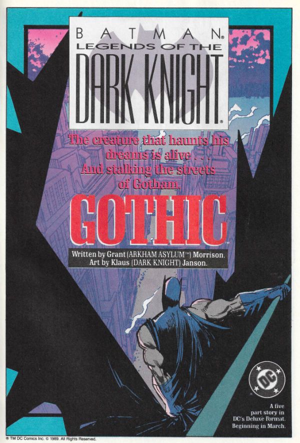
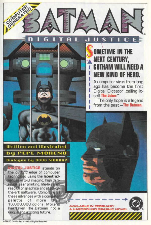
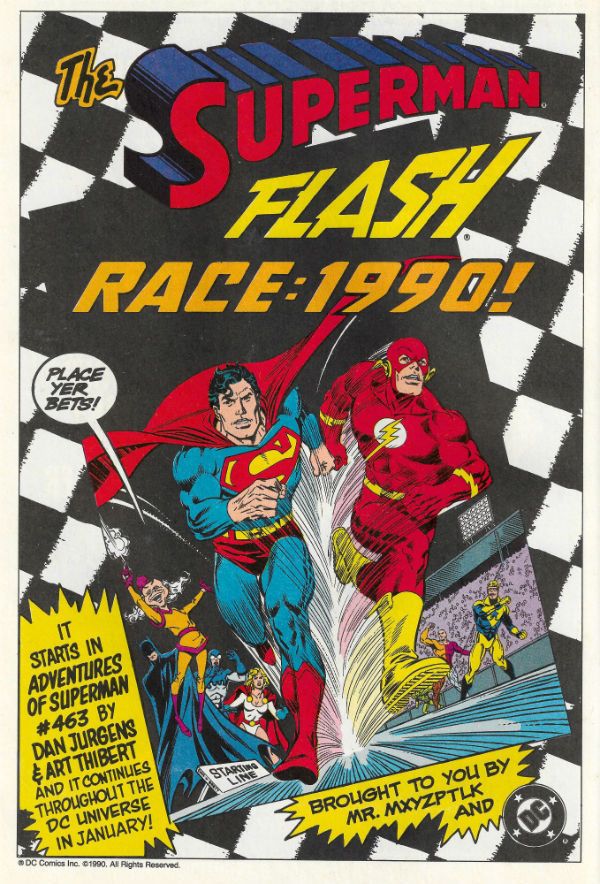
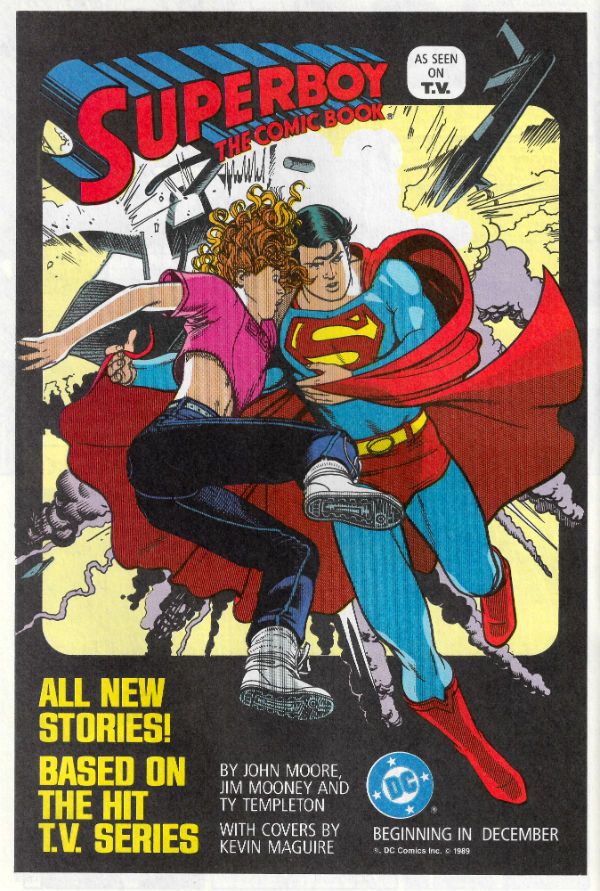
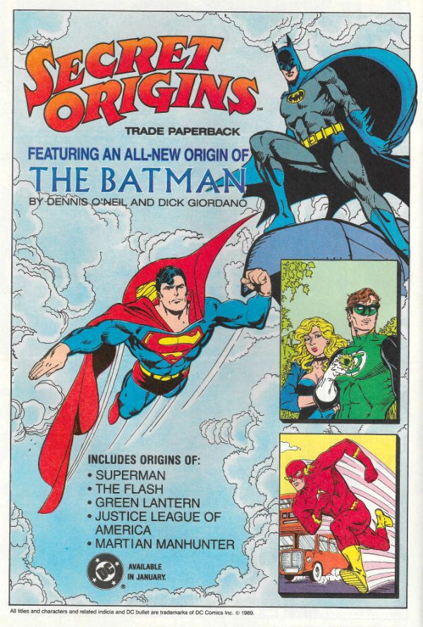
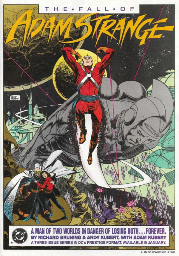
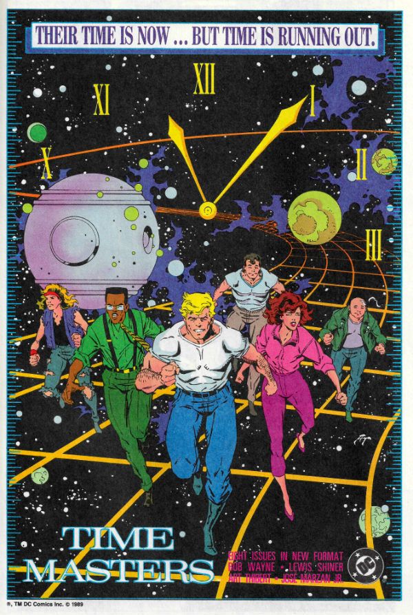
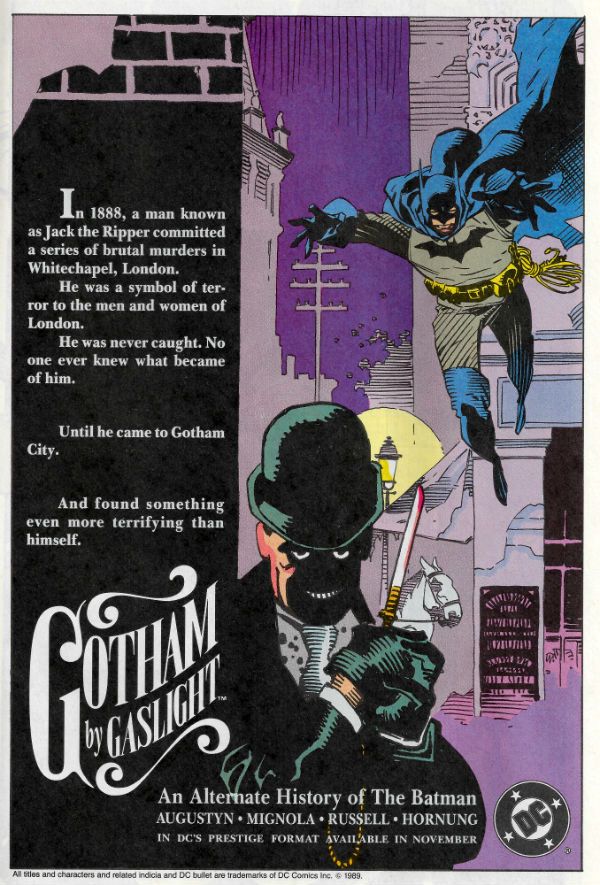
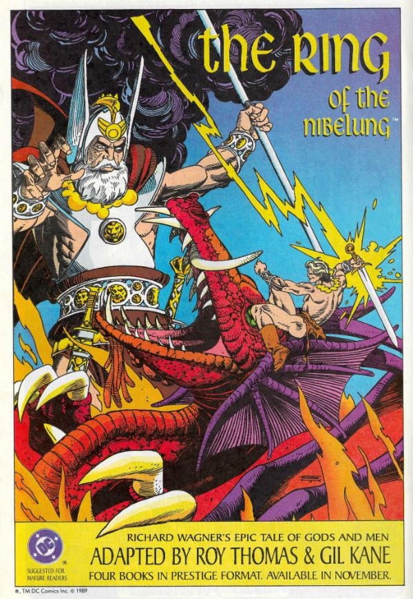
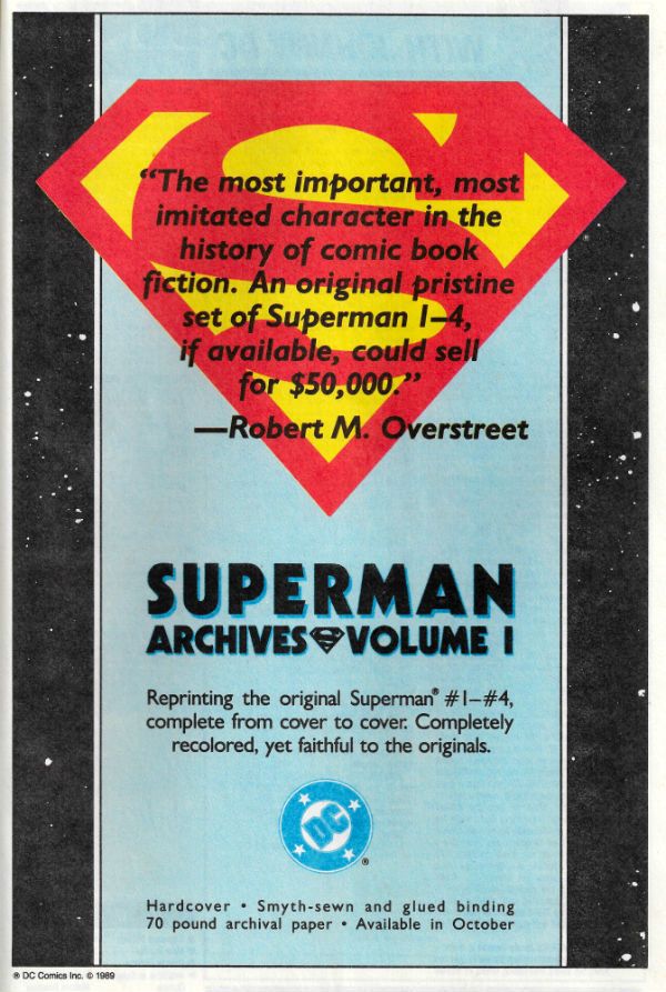
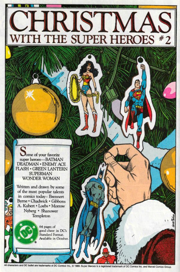
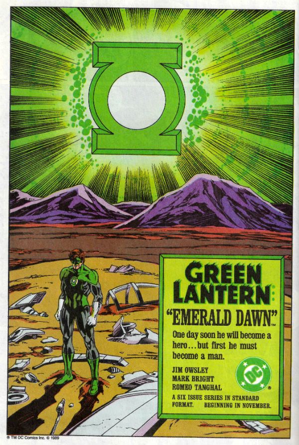
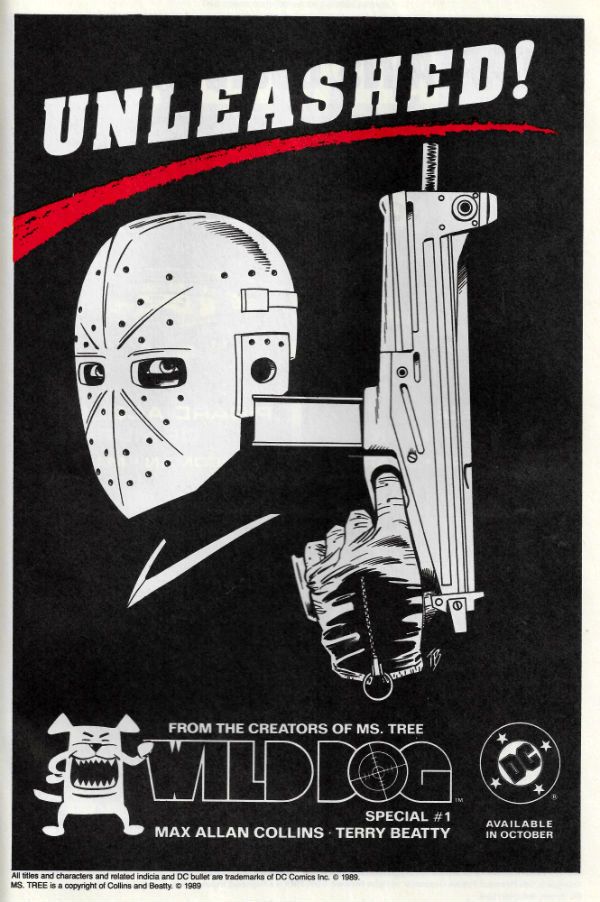
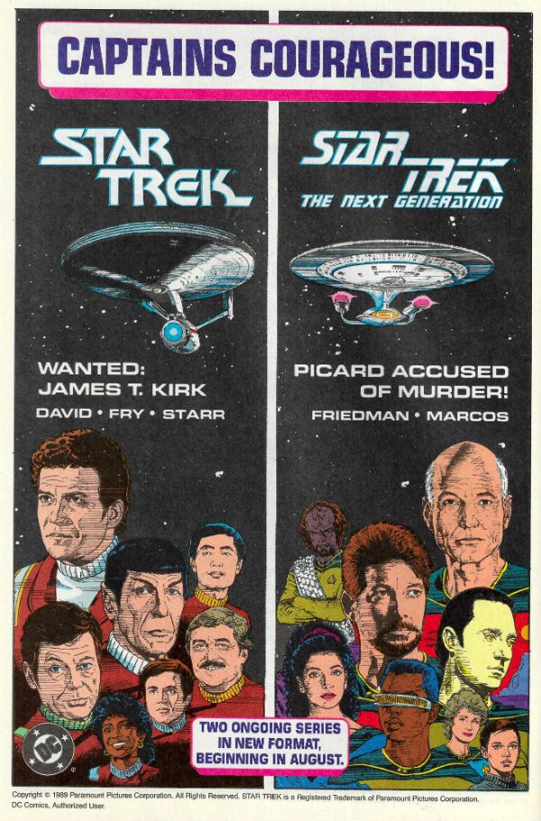
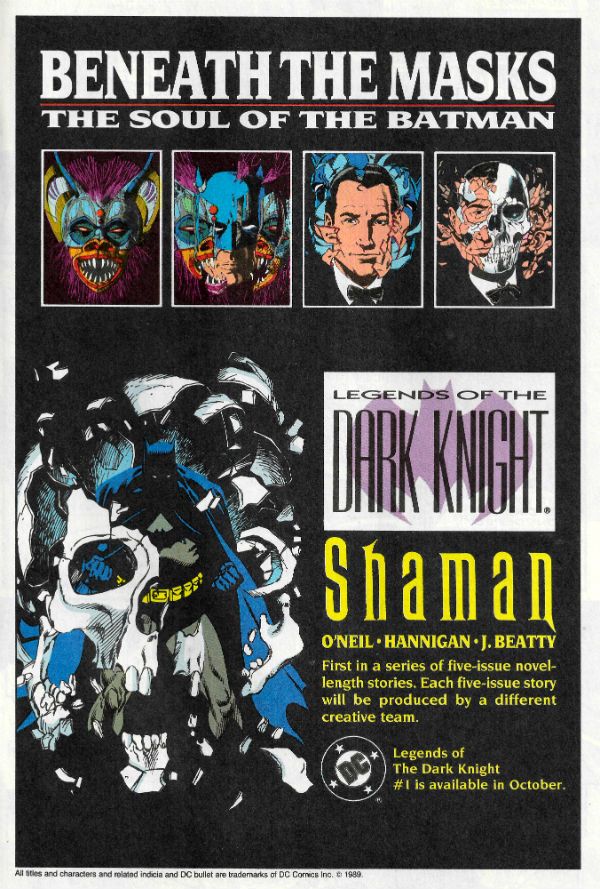
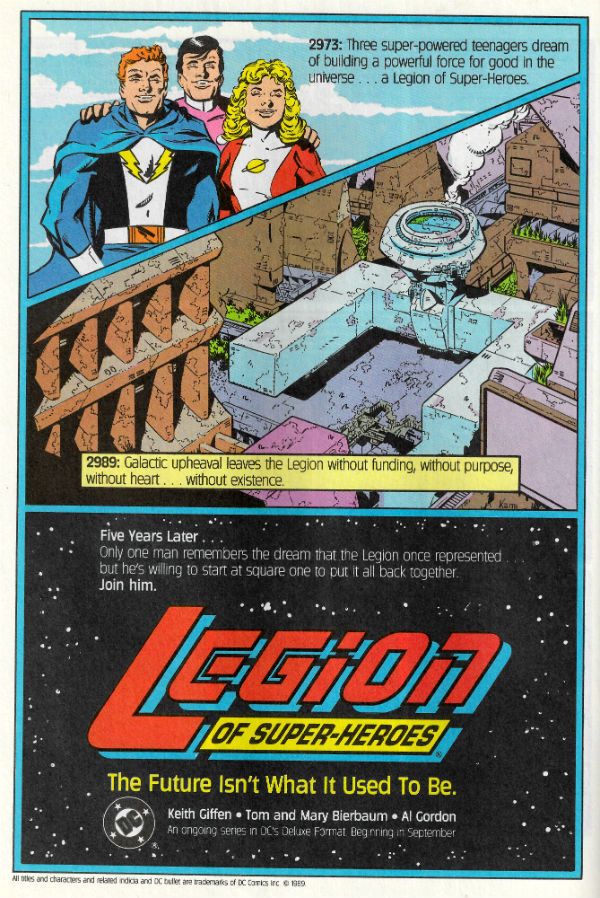
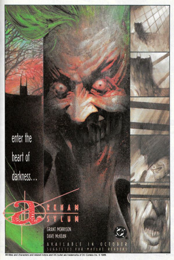
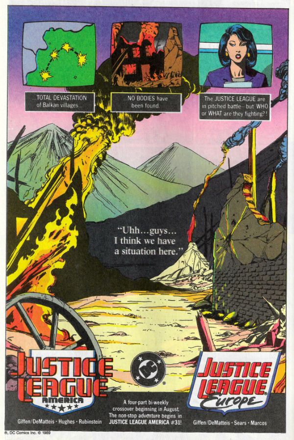
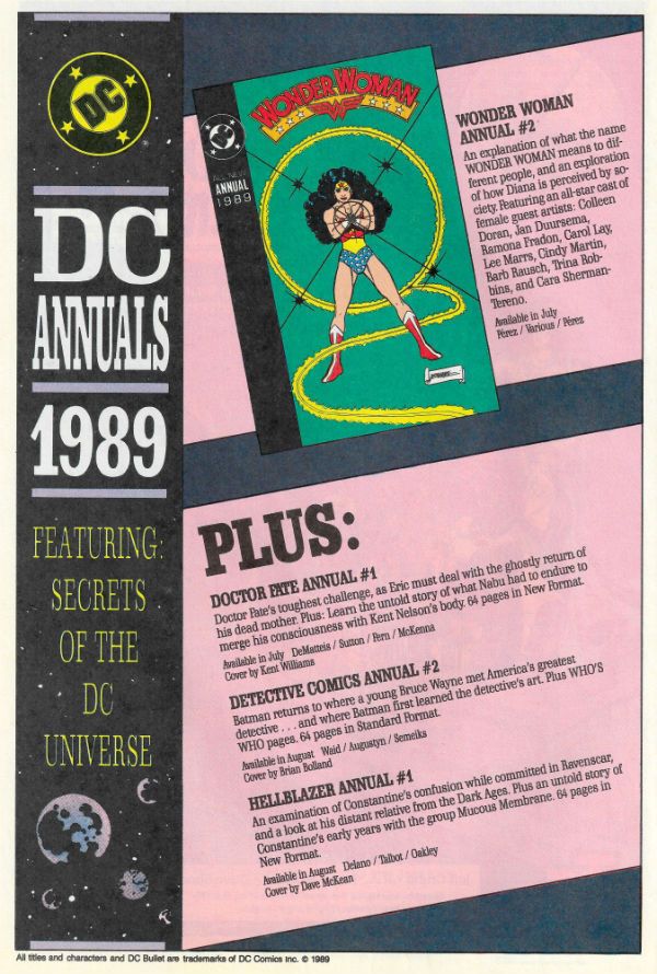
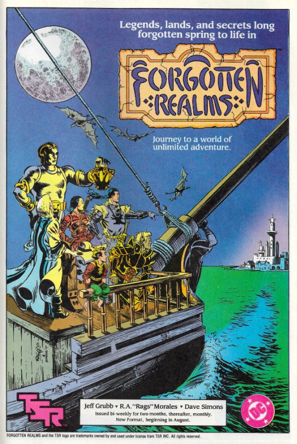
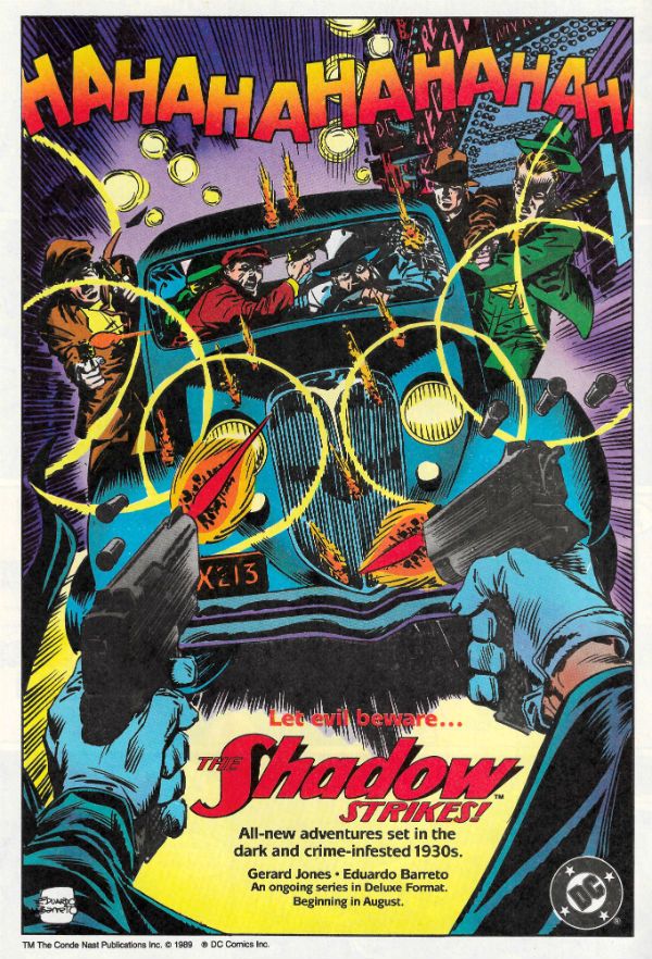
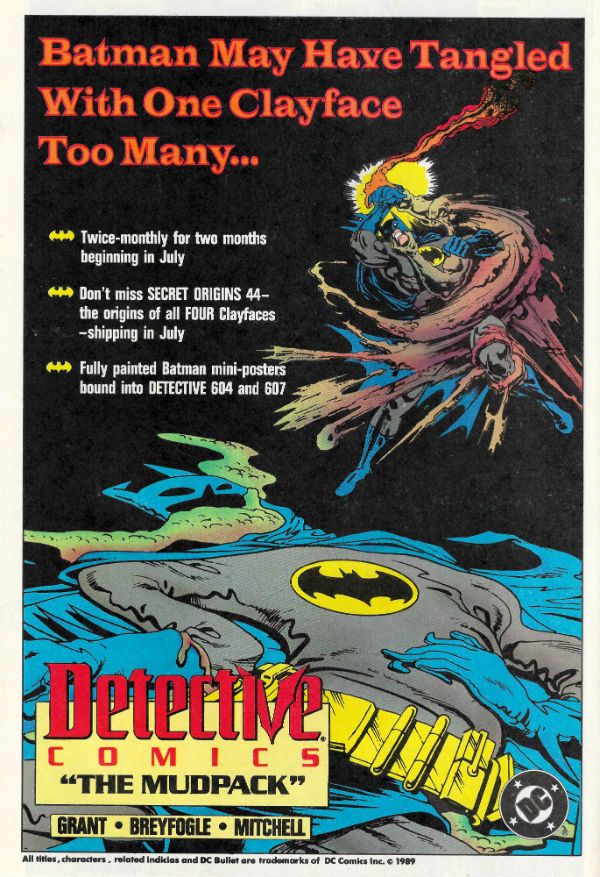
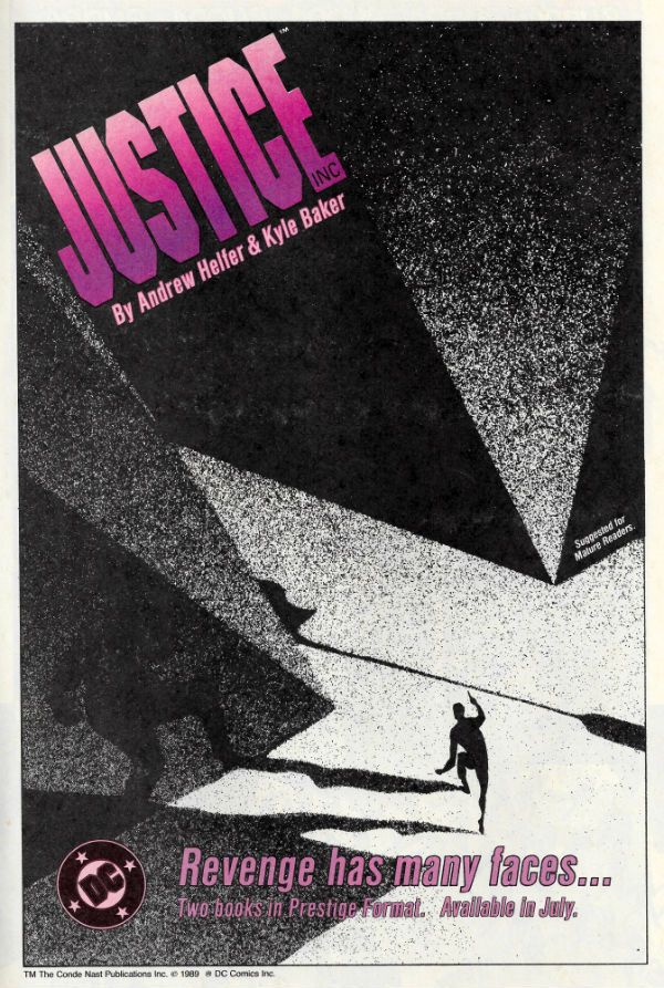
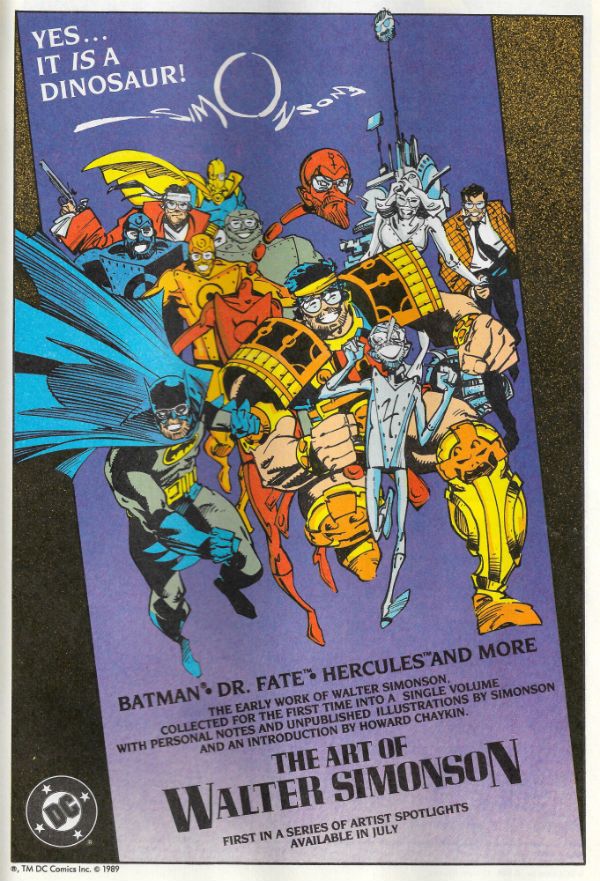
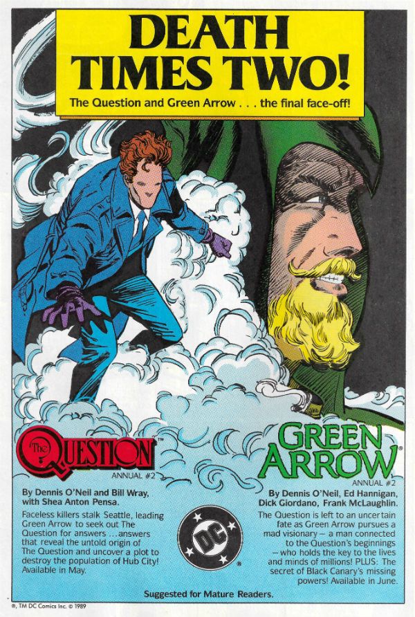
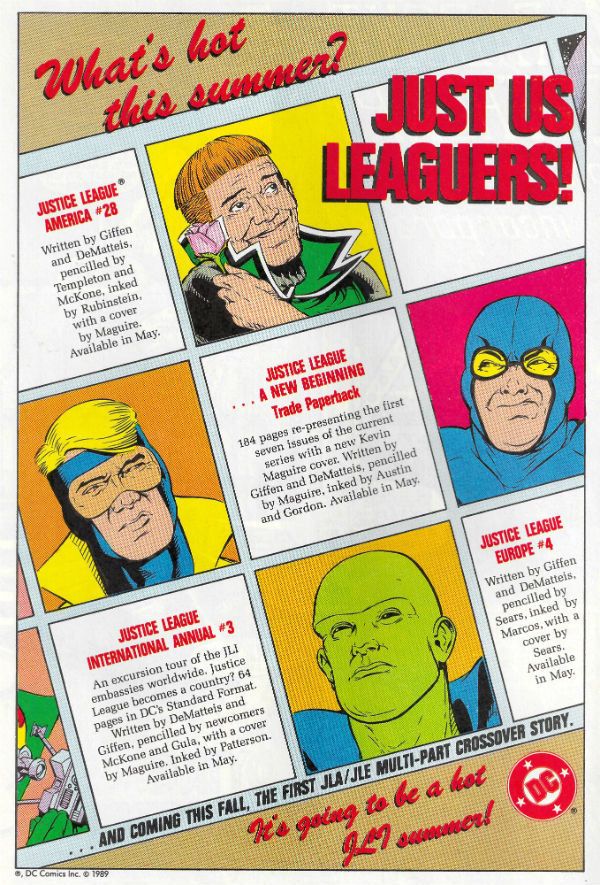
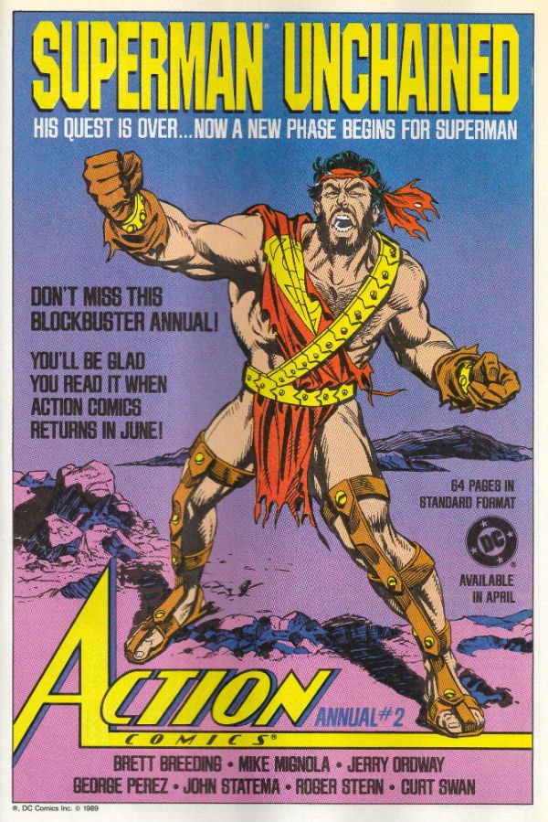
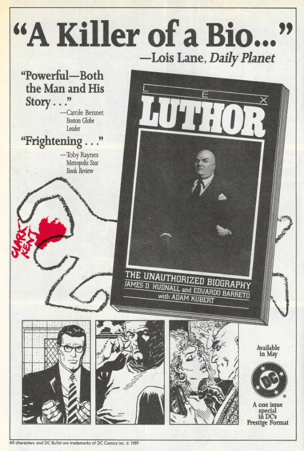
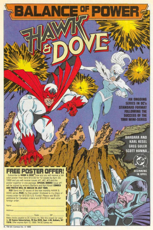
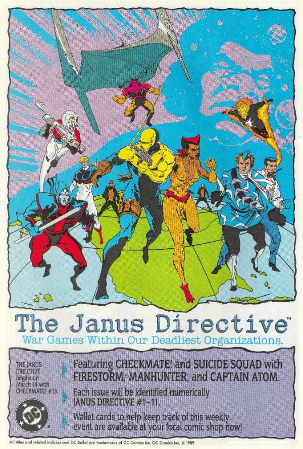
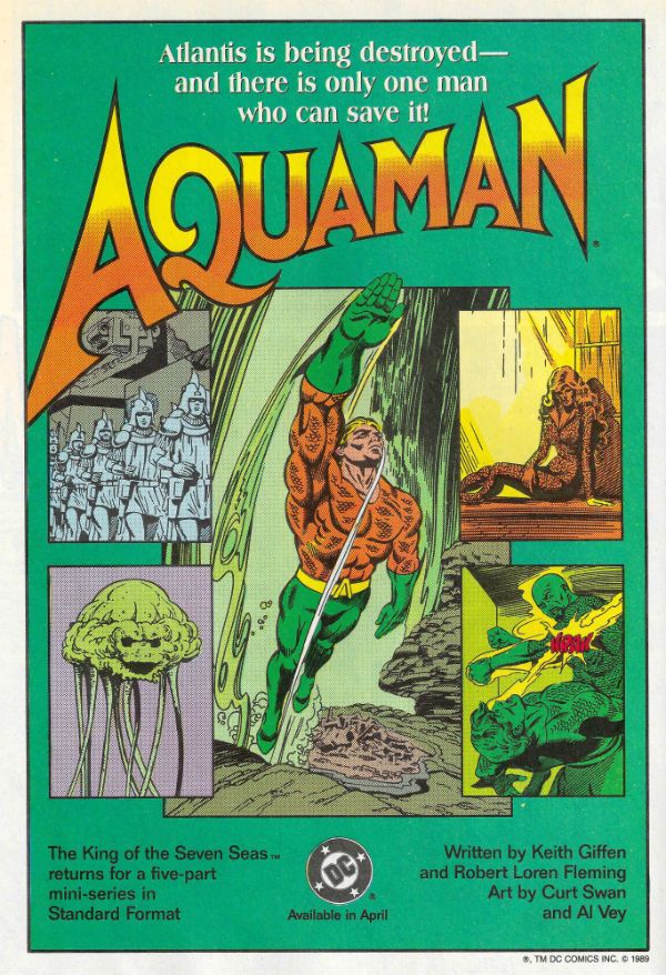
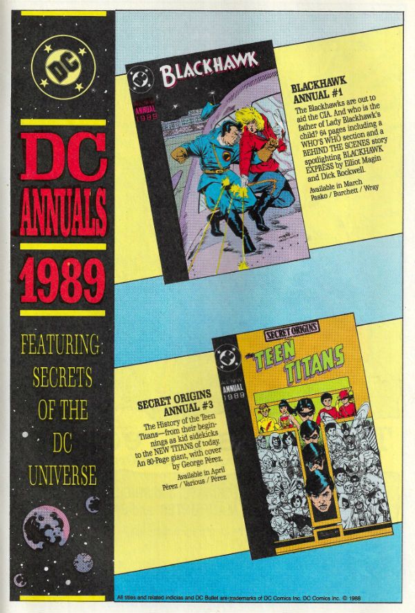
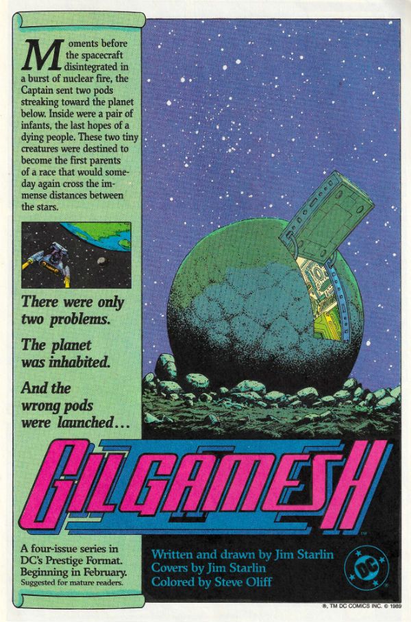
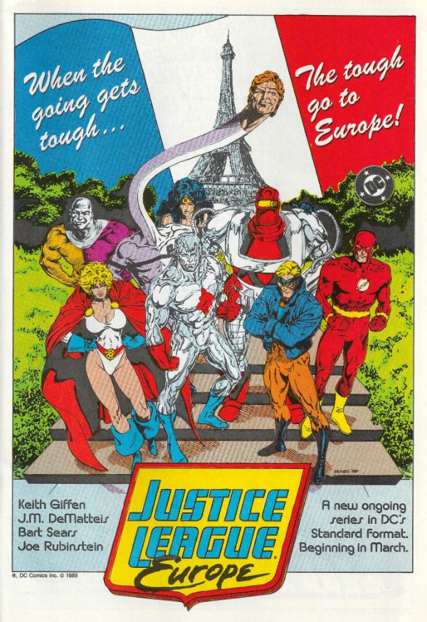
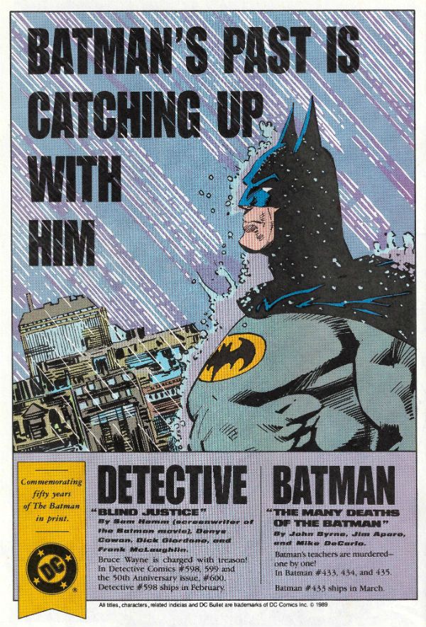
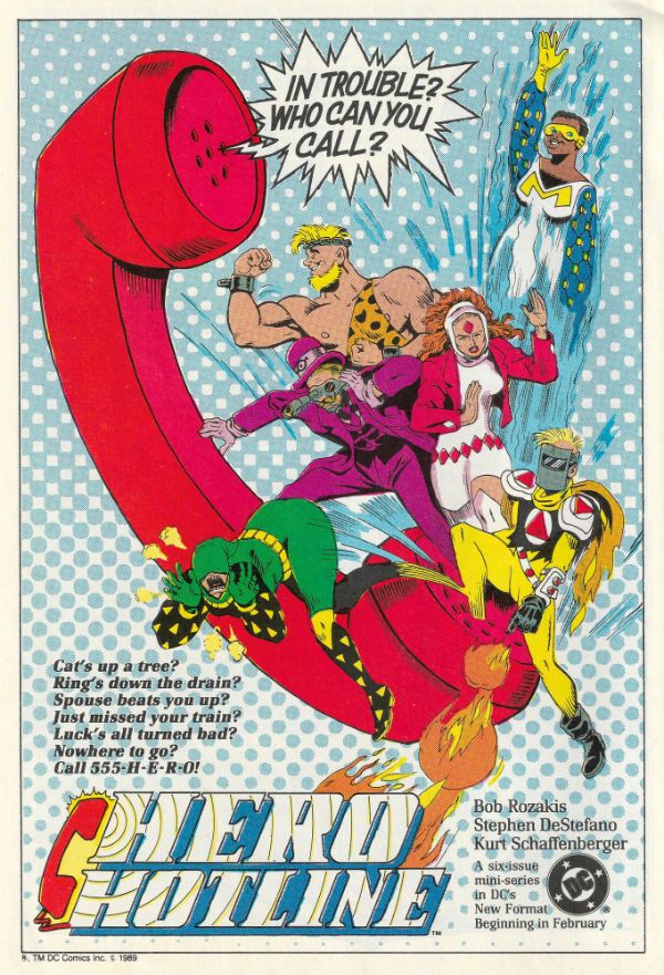
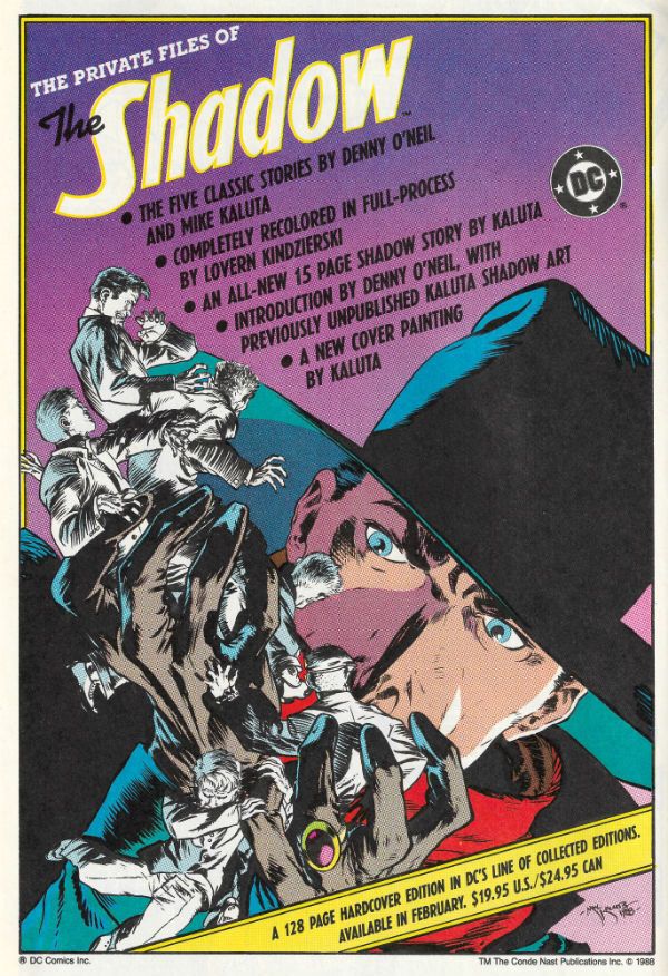
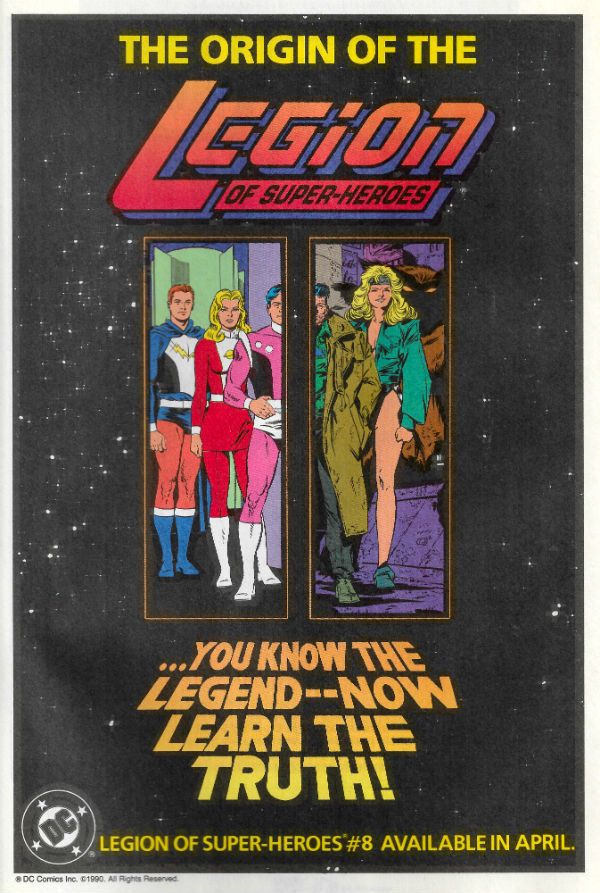
Of late I've been a regular Chatty Cathy and no mistake, so as a change of pace I've scanned in some House Ads which ran in DC Comics from (and it's totally arbitrary this) March 1989 to August 1990. I always enjoy looking at these things when I dig out my back issues; they remind me of stuff I have tucked away (and even sometimes forgotten), or nudge me about stuff I mean to pick up at some point before...I come to my senses and start acting my age. Sometimes they just make me shake my head and wonder how that turned out for everyone. Heck, it's just fun looking at them, basically, and I hope you share my fascination...  photo DCHADSstart_zps8zsk4fy9.jpg

Anyway, this...

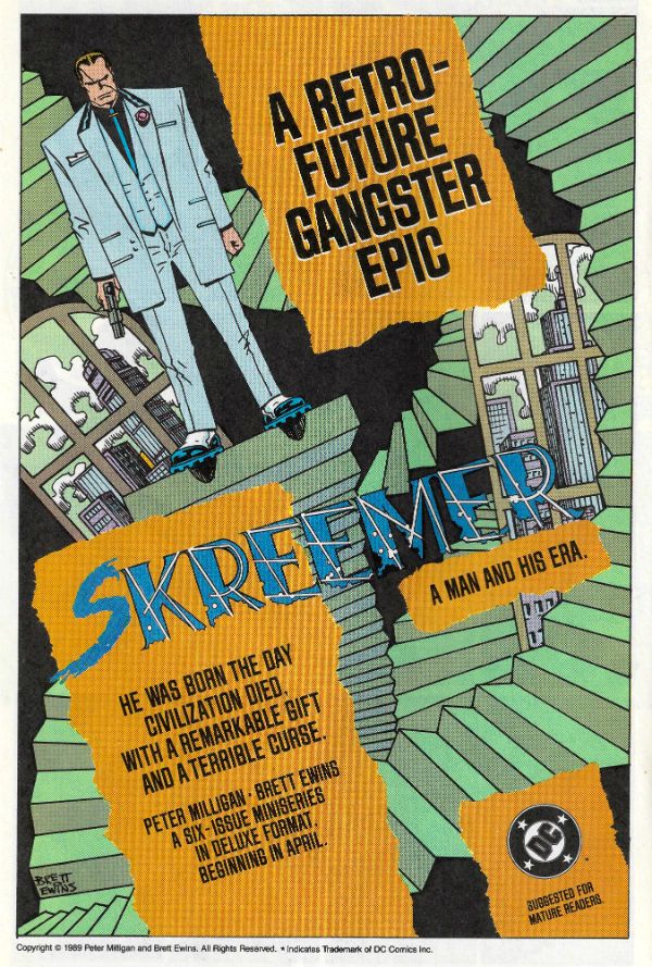
While this is an image heavy post, and so you do get off lightly, you don't get off Scott-free as I have some words as well. Looking at the ad for SKREEMER I am reminded of one of several reasons why I will always be happy to give Peter Milligan a hug i.e. the ferocious passion with which, early in his career, he sought to make James Joyce an influence on comics. Now with most (mainstream North American) comic writers rarely straying to any level higher than that of Glen A. Larson or The Disney Channel his example is missed more than ever. Also, SKREEMER is not only violence and intelligence beautifully and cheekily intertwined via Milligan's script and Dillon/Ewins' art, but it is also still in print today. So go and buy a copy before I do a more in depth write-up on it, is what I'm getting at there.

JUSTICE INC. by Helfer & Baker isn't in print and (AFAIK) has never been reprinted. This is bad. However, you can pick up both prestige format issues for pennies. Which is good. Particularly if you want a comic which wades into the same troubled waters of America's History as Ellroy's UNDERWORLD USA trilogy and Don Winslow's POWER OF THE DOG. Not only that, but it does so by avoiding Ellroy's grating (if historically accurate) racism and Winslow's risky dalliance with cliché. JUSTICE INC. is also funnier. Not only that but Helfer's scripts show that if your dialogue is going to make the art play second fiddle, then it better be pretty immaculate dialogue. Which his is. Of course, it doesn't hurt to have a stylistic chameleon like Kyle Baker on board either, and he makes every artistic inch begrudgingly allotted him work like a pastel shaded dream.

Additionally, from this aged vantage, I well recall Alan Grant and Norm Breyfogle's Batman run(s). As well I should, as it's the only comic I allowed myself while, ahem, studying due to the fact that Guinness doesn't buy itself. (Sometimes I weakened and bought SHADE THE CHANGING MAN as well. Shhhh.) Those were some rock solid Batman comics and I'm pretty sure I can't be alone in being keen on a comprehensive collection of them appearing one day.

I note also that there's an advert for THE ART OF WALTER SIMONSON down there, and that volume is packed full of Simonson's early DC work, and is a humongous joy for any Simonson fan (which should really be any fan of Comics). It's also cheap to pick up today; so you just ran out of reasons for not owning it, chum. The magnificent Gil Kane's there as well; still alive back then, and fulfilling his personal dream of adapting (with Roy Thomas) Richard (not John) Wagner's The Ring Cycle. That's easy to find too in 2016, and if you like Gil Kane (as well you should) then that's you sorted. I never read Pepe Moreno's BATMAN: DIGITAL JUSTICE, which was probably for the best as I believe it's now considered to be to DC Comics as E.T. THE VIDEO GAME was to Atari.

There's lots of other stuff there, and feel free to share your recollections and misgivings regarding them. But before I go, it has always struck me as a bit of a dick move on the part of The Flash to challenge Superman to a race. Do you not think? And on that note, stick your face right into The Past and enjoy...COMICS!!!

 photo DCHADS56B_zpscuq10xie.jpg

 photo DCHADS57B_zpsxifflipr.jpg

 photo DCHADS58B_zpsqhnduhw0.jpg

 photo DCHADS53B_zpsucx4i4uh.jpg

 photo DCHADS54B_zpsdwkcwhcn.jpg

 photo DCHADS55B_zpstfum4gmd.jpg

 photo DCHADS52B_zpssuthctyk.jpg

 photo DCHADS51B_zpsniabsfi0.jpg

 photo DCHADS48B_zpsdlxexhcd.jpg

 photo DCHADS49B_zpsqyx1s1yj.jpg

 photo DCHADS50B_zpsojsoodtz.jpg

 photo DCHADS47B_zpspuxi2kmp.jpg

 photo DCHADS46B_zpsyh2f9g9r.jpg

 photo DCHADS45B_zpsiv7ybaaf.jpg

 photo DCHADS43B_zpsmku7pdqa.jpg

 photo DCHADS39B_zpswrtk6bcy.jpg

 photo DCHADS42B_zpsuoulf31b.jpg

 photo DCHADS41B_zpslggvylcy.jpg

 photo DCHADS40B_zpsbg6nb9p7.jpg

 photo DCHADS35B_zpstid85d54.jpg

 photo DCHADS38B_zpsdmb9ktl0.jpg

 photo DCHADS37B_zps3ltlegzt.jpg

 photo DCHADS36B_zpsfothudmc.jpg

 photo DCHADS34B_zpswy4g4c4m.jpg

 photo DCHADS32B_zpskxhoatxp.jpg

 photo DCHADS33B_zpszry8u52h.jpg

 photo DCHADS31B_zpsksfiubwb.jpg

 photo DCHADS30B_zps42j2aslw.jpg

 photo DCHADS29B_zpstisn4eka.jpg

 photo DCHADS28B_zpslskzcfyx.jpg

 photo DCHADS24B_zpsyevxfbkf.jpg

 photo DCHADS25B_zpsi4sx7ngh.jpg

 photo DCHADS27B_zpstzbaxiaw.jpg

 photo DCHADS26B_zpsxee0v3dm.jpg

 photo DCHADS22B_zpsy9qzryrp.jpg

 photo DCHADS23B_zpsulcuxsmf.jpg

 photo DCHADS21B_zpscfw77q60.jpg

 photo DCHADS19B_zps0h2vzcmp.jpg

 photo DCHADS17B_zpsfp4flza4.jpg

 photo DCHADS20B_zpsc4qwqkjx.jpg

 photo DCHADS18B_zpsesenyt9p.jpg

 photo DCHADS16B_zpsuf5jkk4j.jpg

 photo DCHADS15B_zpsaajf31z8.jpg

 photo DCHADS14B_zpselv3chc6.jpg

 photo DCHADS13B_zpsuswve8o4.jpg

 photo DCHADS11B_zpskgnrtven.jpg

 photo DCHADS09B_zpsq26fehhp.jpg

 photo DCHADS12B_zpsnnv7ctfa.jpg

 photo DCHADS08B_zps9ainuijo.jpg

 photo DCHADS10B_zpsqpb9ouep.jpg

 photo DCHADS07B_zpsdpv9wew0.jpg

 photo DCHADS02B_zpso7qjh6xg.jpg

 photo DCHADS03B_zpsknpmz1qg.jpg

 photo DCHADS06B_zpsnzgyusws.jpg

 photo DCHADS04B_zpsdm6xu2yo.jpg

 photo DCHADS01B_zpsbwl944e6.jpg

 photo DCHADS05B_zpsq535azms.jpg

NEXT TIME: Take a wild guess, that's right - COMICS!!!

"Justice Has A Price. The Price Is Freedom." COMICS! Sometimes I Hesitate To Correct An Officer Of The Law But I Think You'll Find That In This Case The Price is £9.99 Fortnightly. OW!

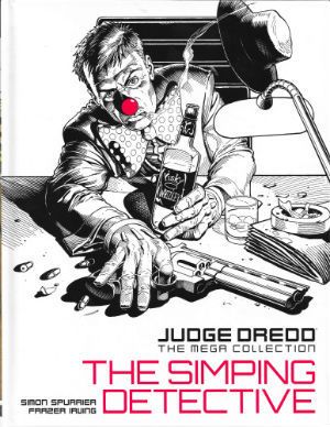
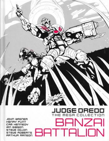
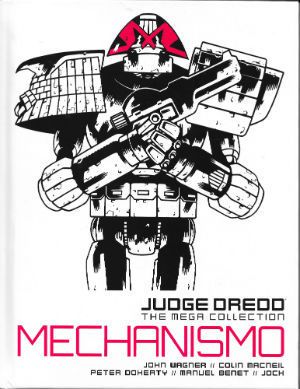
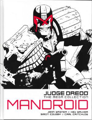
Borag Thungg, Earthlets! Clearly I have nothing useful to do with my time because I have bodged up a master list of the JUDGE DREDD MEGA COLLECTION. As each volume is released I will update the list and the accompanying image gallery. Should I “review” a volume I will link to that volume in the list. So, interested in the JUDGE DREDD MEGA COLLECTION as “reviewed” by yours truly, then this is the list for that. Pretty clear stuff. No questions? Anyone? Good. If anyone wants me to look at a particular volume, just drop me a comment. The volumes aren't released in order so it's not like I have a sensible plan of attack. If anyone wants me to stick them where the sun don't shine I suggest you keep that sentiment to yourself, cheers. Right, that laundry won't wash itself. Pip! Pip!

 photo JDMCMickMB_zpsizu2lmf4.jpg JUDGE DREDD by Mick McMahon & Pat Mills

Anyway, this... JUDGE DREDD THE MEGA COLLECTION Published by Hatchette/Rebellion UK, 2014 onwards.

Judge Dredd Created by Carlos Ezquerra, John Wagner & Pat Mills

Volumes:

01 – JUDGE DREDD: AMERICA  photo JDMC01CovB_zpszwn41pta.jpg Cover by Colin MacNeil

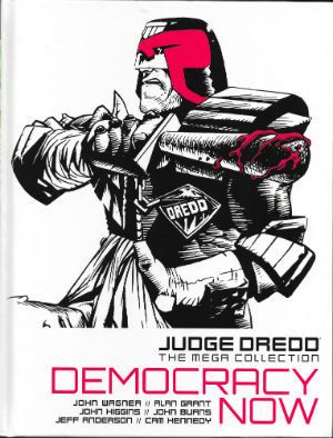
02 – JUDGE DREDD: DEMOCRACY NOW  photo JDMC02CovB_zpsq911wtwo.jpg Cover by John Higgins

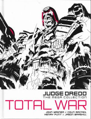
03 – JUDGE DREDD: TOTAL WAR  photo JDMC03CovB_zpsivydbs9u.jpg Cover by Simon Coleby

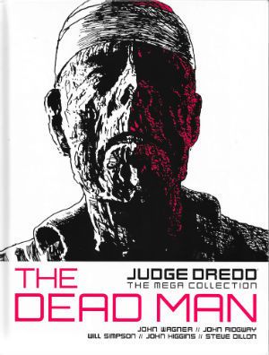
04 - JUDGE DREDD: THE DEAD MAN  photo JDMC04CovB_zpsmn7ydfuh.jpg Cover by John Ridgway

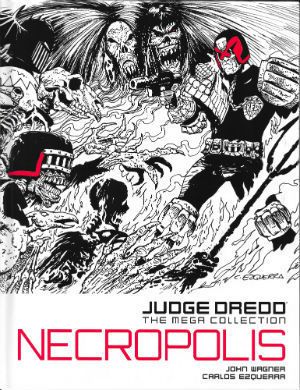
05 - JUDGE DREDD: NECROPOLIS  photo JDMC05CovB_zpsnuqsvxj5.jpg Cover by Carlos Ezquerra

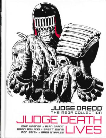
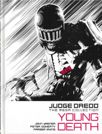
06 - JUDGE DREDD: JUDGE DEATH LIVES  photo JDTMC06CovB_zpsaq3ditzq.jpg Cover By Brian Bolland 07 - JUDGE DREDD: YOUNG DEATH  photo JDTMC07CovB_zpsob9kouak.jpg Cover by Frazer Irving

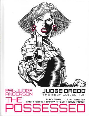
08 – JUDGE ANDERSON: THE POSSESSED  photo JDMC08CovB_zpsuvcgvenl.jpg Cover by Brett Ewins

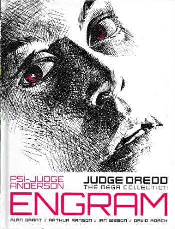
09 - JUDGE ANDERSON: ENGRAM  photo JDTMC09CovB_zpsdkyt2b50.jpg Cover by David Roach

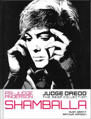
10 – JUDGE ANDERSON: SHAMBALLA  photo JDMC10CovB_zps4dorgz0v.jpg Cover by Arthur Ranson

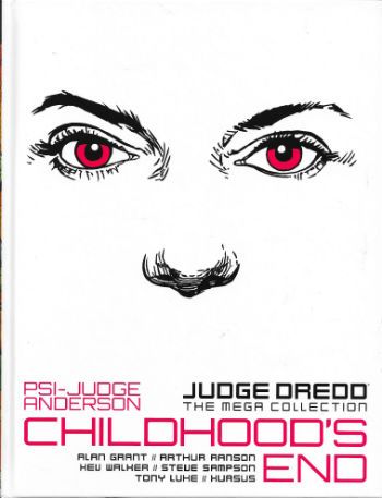
11 - JUDGE ANDERSON: CHILDHOOD'S END  photo JDTMC11CovB_zpslu5tzgiw.jpg Cover by Kev Walker

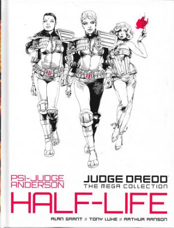
12 - JUDGE ANDERSON: HALF-LIFE  photo JDTMC12CovB_zps5utk9y9a.jpg Cover by Arthur Ranson

13 -

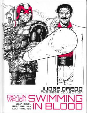
14 – DEVLIN WAUGH: SWIMMING IN BLOOD  photo JDMC14CovB_zpsvyswy0fh.jpg Cover by Cliff Robinson

15 - DEVLIN WAUGH: CHASING HEROD  photo JDMC15CovB_zpsnimjxsr9.jpg Cover by Colin Wilson

16 - DEVLIN WAUGH: FETISH  photo JDTMC16CovB_zpscuk0v1s1.jpg Cover by Cliff Robinson 17 -

18 -

19 - LOW LIFE:PARANOIA  photo JDMC19CovB_zpsgg7guzae.jpg Cover by Henry Flint

20 - LOW LIFE: HOSTILE TAKEOVER  photo JDTMC20CovB_zpsyngdx9uy.jpg Cover by D'Israeli

21 - THE SIMPING DETECTIVE  photo JDMC21CovB_zpsitffoknj.jpg Cover by Cliff Robinson

22 -

23 - JUDGE DREDD: BANZAI BATALLION  photo JDTMC23CovB_zpsvjxnlmkj.jpg Cover by Jock

24 - JUDGE DREDD: MECHANISMO  photo JDMC24CovB_zpsbk8cffzz.jpg Cover by Colin MacNeil

25 - JUDGE DREDD: MANDROID  photo JDMC25CovB_zpstmax9ipf.jpg Cover by Kev Walker

26 - 27 -

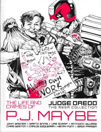
28 - JUDGE DREDD: THE LIFE AND CRIMES OF P. J. MAYBE  photo JDTMC28CovB_zpst5nqiyjj.jpg Cover by Cliff Robinson

29 -

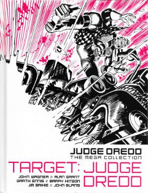
30 - TARGET: JUDGE DREDD  photo JDMC30CovB_zpsehozji3q.jpg Cover by Jim Baikie

31 – JUDGE DREDD: OZ  photo JDMC31CovB_zpscwshqbub.jpg Cover by Steve Dillon

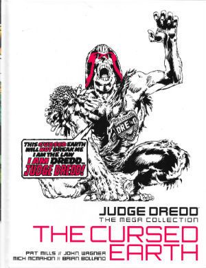
32 – JUDGE DREDD: THE CURSED EARTH  photo JDMC32CovB_zpsdpn4ydg9.jpg Cover by Mick McMahon

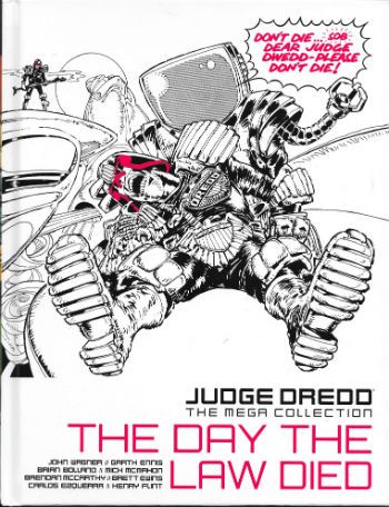
33 - JUDGE DREDD: THE DAY THE LAW DIED  photo JDTMC33CovB_zps0gz5vjru.jpg Cover by Mick McMahon

34 - 35 -

36 – JUDGE DREDD: THE APOCALYPSE WAR  photo JDMC36CovB_zpsfenowryi.jpg Cover by Carlos Ezquerra

37 - JUDGE DREDD: JUDGEMENT DAY  photo JDMC37CovB_zpsd05ohipp.jpg Cover by Carlos Ezquerra

38 - JUDGE DREDD: INFERNO  photo JDTMC38CovB_zpslw7fxonu.jpg Cover by Carlos Ezquerra

39 - JUDGE DREDD: WILDERLANDS  photo JDTMC39CovB_zpsiyoxkwq0.jpg Cover by Trevor Hairsine

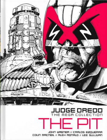
40 - JUDGE DREDD: THE PIT  photo JDTMC40CovB_zpspzoxpfzh.jpg Cover by Cliff Robinson

41 -

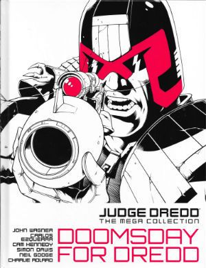
42 – JUDGE DREDD: DOOMSDAY FOR DREDD  photo JDMC42CovB_zpsrrjlb1lh.jpg Cover by Dylan Teague

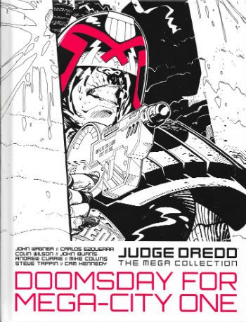
43 - JUDGE DREDD: DOOMSDAY FOR MEGA-CITY ONE  photo JDTMC43CovB_zps87xsz7tg.jpg Cover by Colin Wilson

44 -

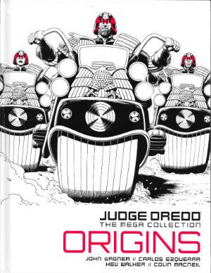
45 - JUDGE DREDD: ORIGINS  photo JDMC45CovB_zpsl9cheet9.jpg Cover by Brian Bolland

46 -

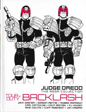
47 - JUDGE DREDD: TOUR OF DUTY: BACKLASH  photo JDTMC47CovB_zpsxajbvcgy.jpg Cover by Carlos Ezquerra

48 -

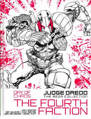
49 - JUDGE DREDD: DAY OF CHAOS: THE FOURTH FACTION  photo JDMC49CovB_zpsptwjvupp.jpg Cover by Henry Flint

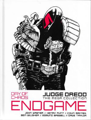
50 – JUDGE DREDD: DAY OF CHAOS: ENDGAME  photo JDMC50CovB_zpscvwjhrmc.jpg Cover by Henry Flint

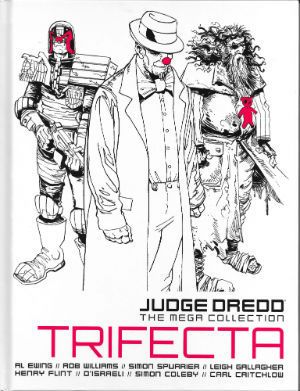
51 - TRIFECTA  photo JDMC51CovB_zpshowsktmz.jpg Cover by Carl Critchlow

52 - 53 - 54 -

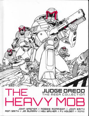
55 – JUDGE DREDD: THE HEAVY MOB  photo JDMC55CovB_zpsktwwziwe.jpg Cover by Dylan Teague

56 -JUDGE DREDD: BEYOND MEGA-CITY ONE  photo JDMC56CovB_zpspufoidxp.jpg Cover by Brendan McCarthy

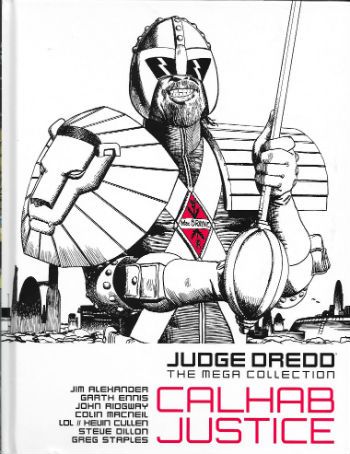
57 - CALHAB JUSTICE  photo JDTMC57CovB_zpsufxttikn.jpg Cover by John Ridgway

58 - 59 -

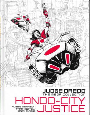
60 – HONDO-CITY JUSTICE  photo JDMC60CovB_zps1nwcymd4.jpg Cover by Cliff Robinson

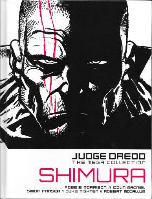
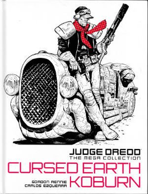
61 - SHIMURA  photo JDMC61CovB_zpsw3yr3wo4.jpg Cover by Colin MacNeil 62 - 63 - 64 - 65 - 66 - 67 - CURSED EARTH KOBURN  photo JDMC67CovB_zps8x2mgubm.jpg

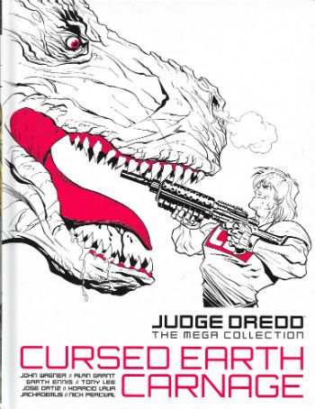
68 - CURSED EARTH CARNAGE  photo JDTMC68CovB_zps8b1ebsky.jpg Cover by Anthony Williams

69 - 70 - 71 -

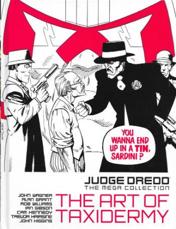
72 - JUDGE DREDD: THE ART OF TAXIDERMY  photo JDTMC72CovB_zpskjb2hko5.jpg Cover by Steve Dillon

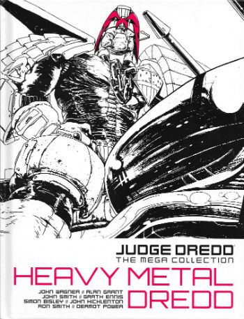
73 - JUDGE DREDD: HEAVY METAL DREDD  photo JDTMC73CovB_zpsg60x71tu.jpg Cover by John Hicklenton

74

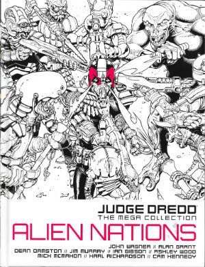
75 – JUDGE DREDD: ALIEN NATIONS  photo JDMC75CovB_zpsoejo0w3t.jpg Cover by Cliff Robinson

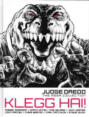
76 - JUDGE DREDD: KLEGG HAI  photo JDMC76CovB_zpsfloyfmee.jpg Cover by Chris Weston

77 - JUDGE DREDD: HORROR STORIES  photo JDTMC77CovB_zpspgu4ny8w.jpg Cover by Brett Ewins

78 -

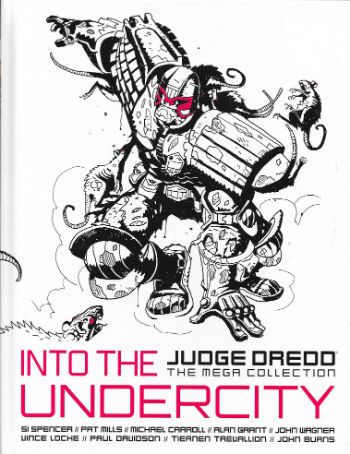
79 - JUDGE DREDD: INTO THE UNDERCITY  photo JDTMC79CovB_zpsypnh5ic8.jpg Cover by Tiernen Trevallion

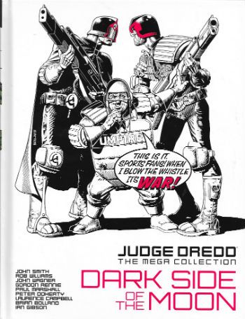
80 - JUDGE DREDD: DARK SIDE OF THE MOON  photo JDTMC80CovB_zpsxgtpkvlb.jpg Cover by Brian Bolland

Judge Dredd! He is the – COMICS!!!

"You Dropped The Coffee, Stephanie." COMICS! Sometimes They Shaped Us In A Million Invisible Ways!

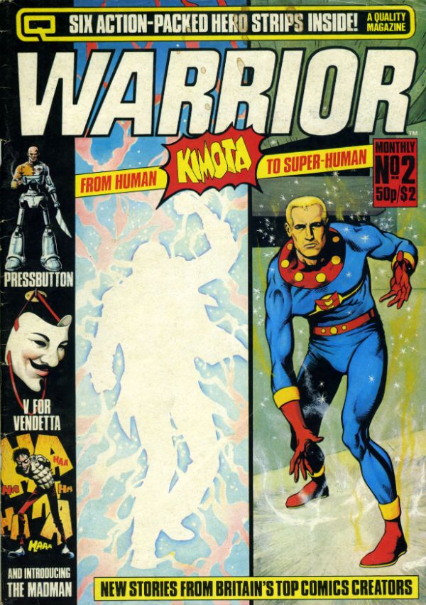
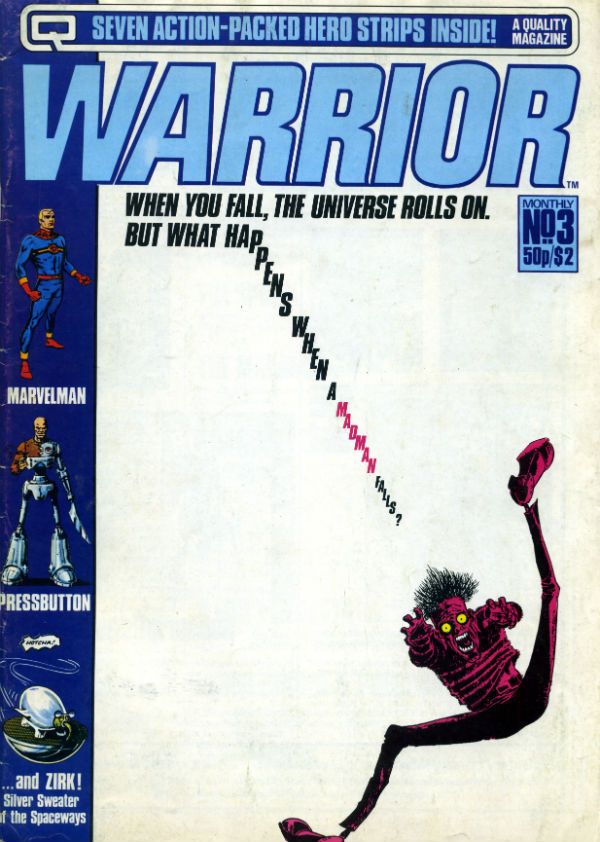
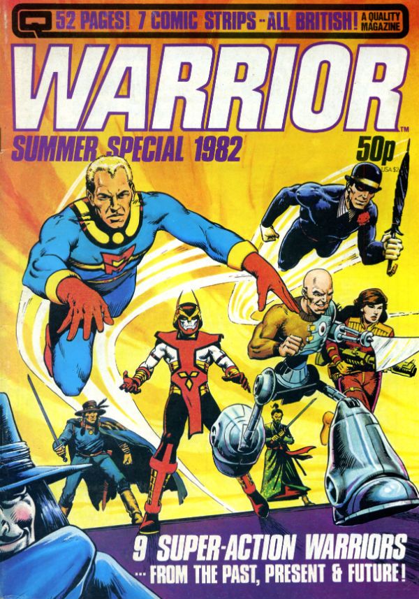
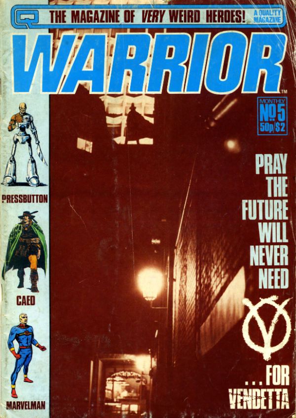
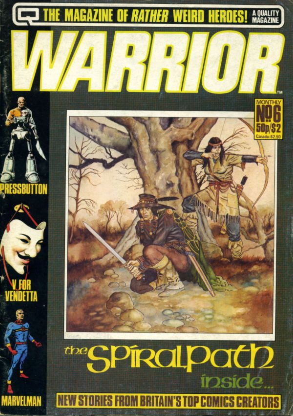
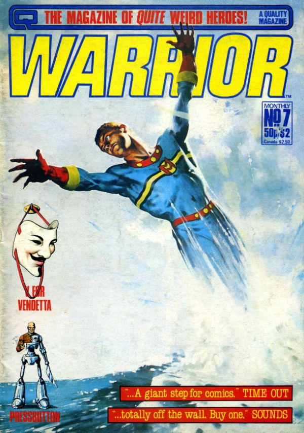
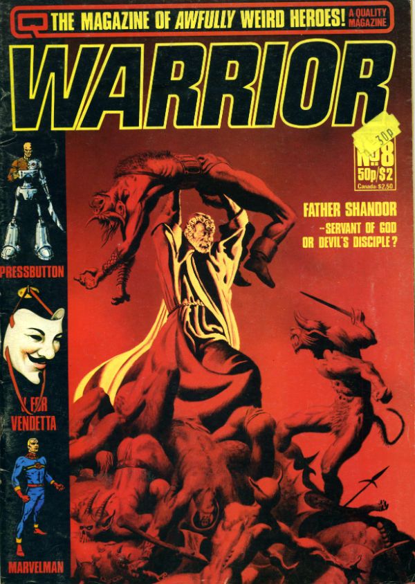
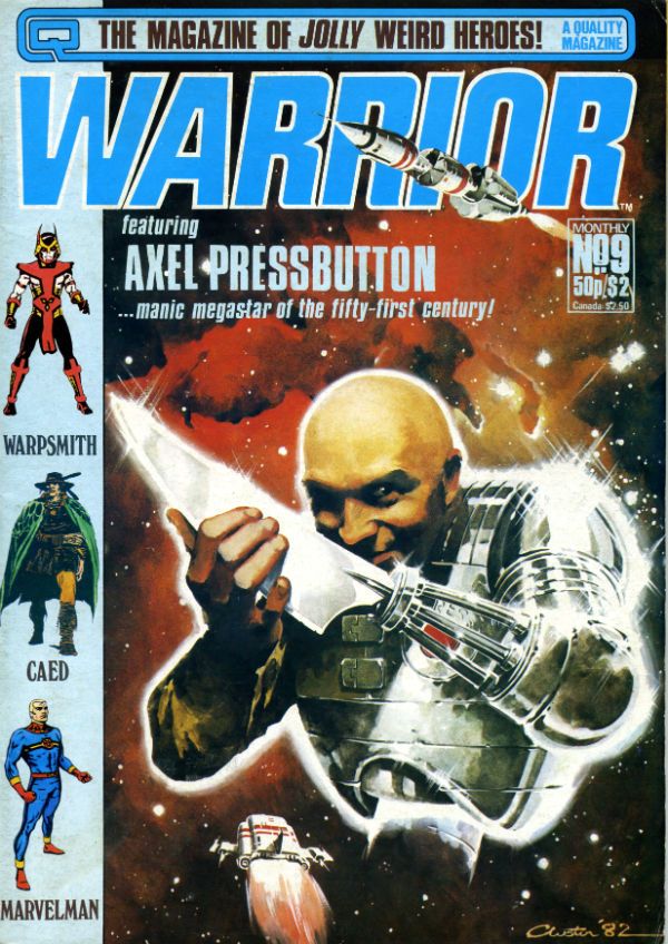
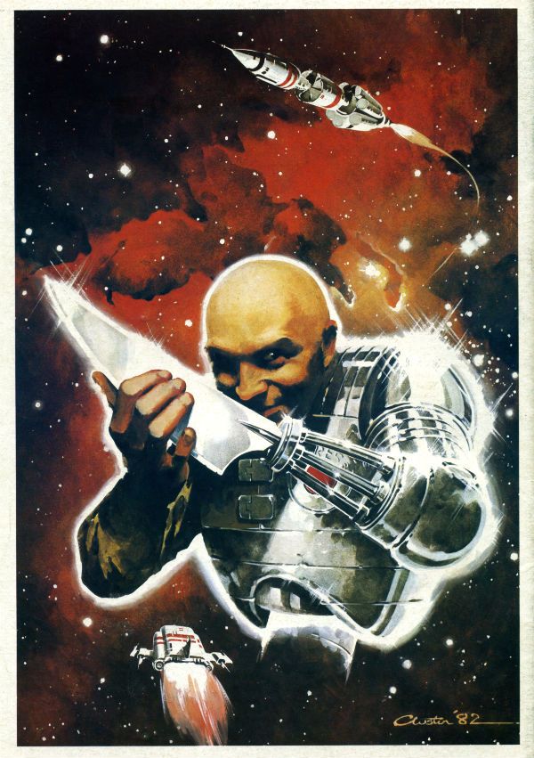
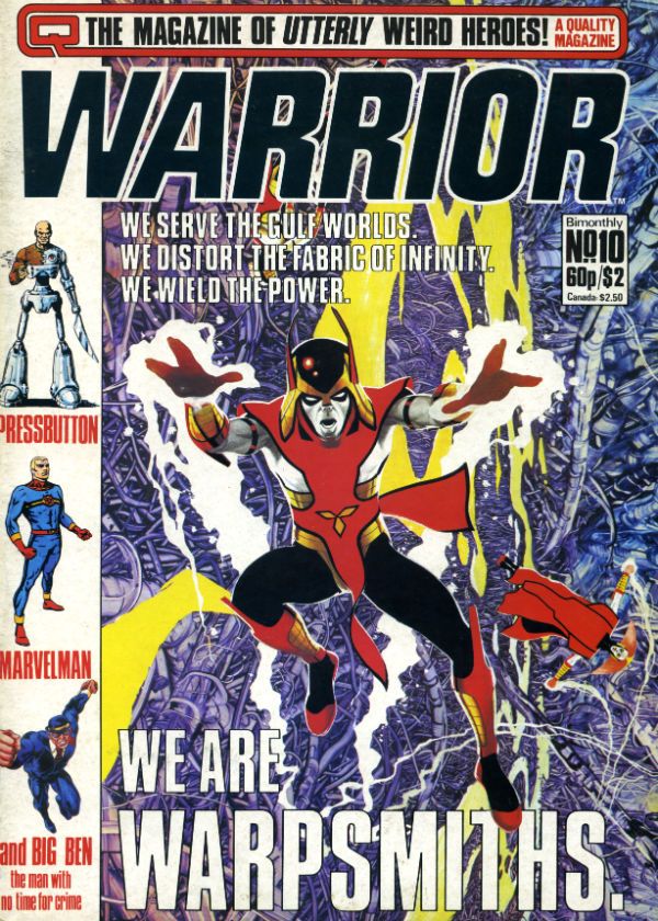
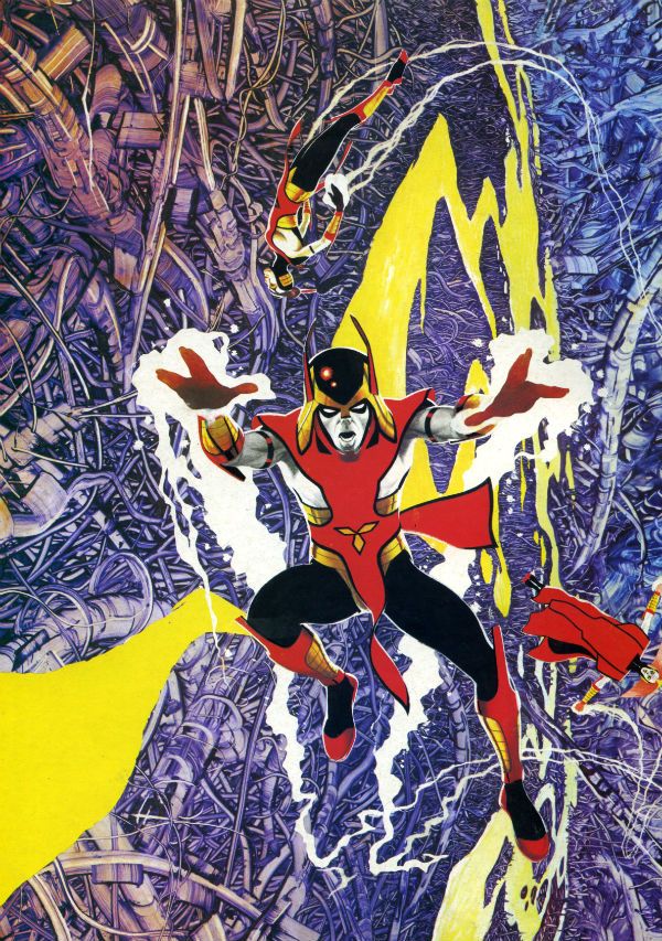
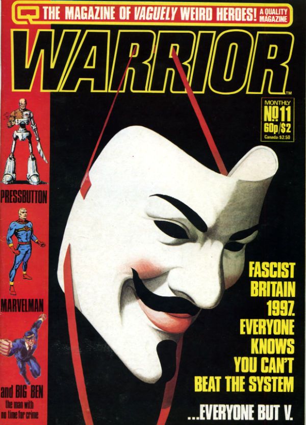
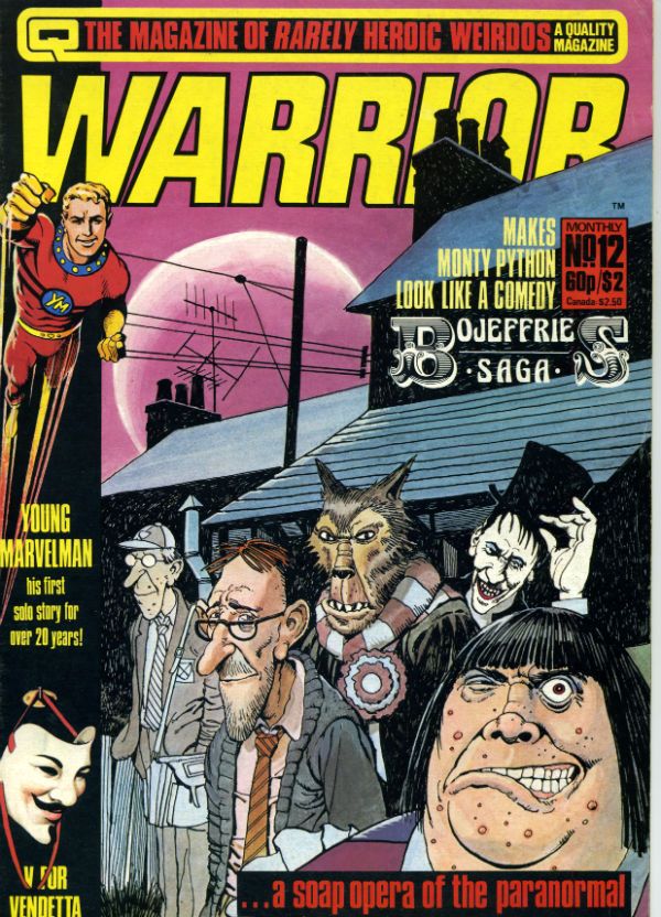
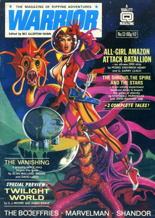
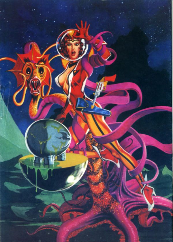
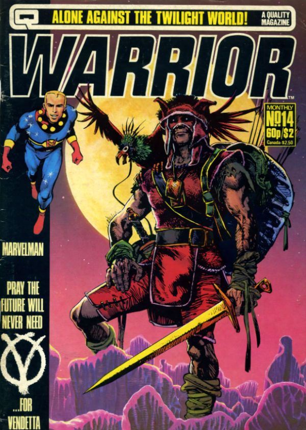
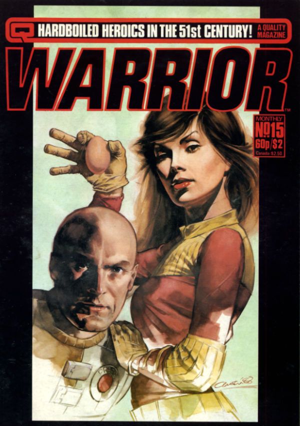
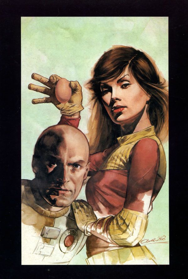
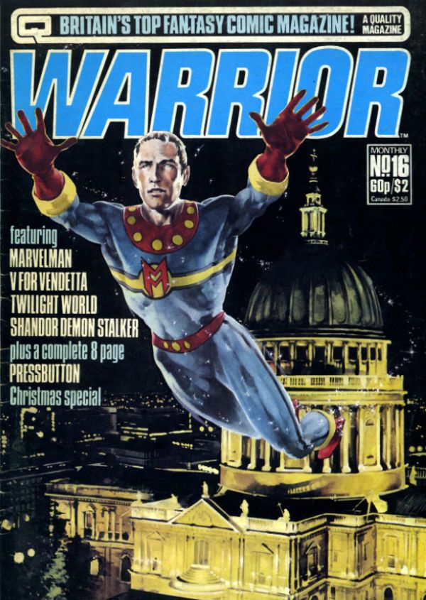
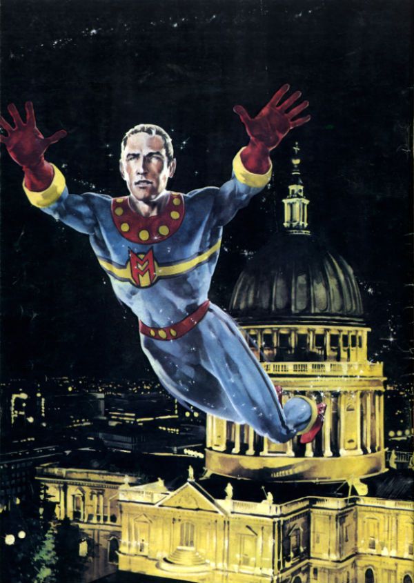
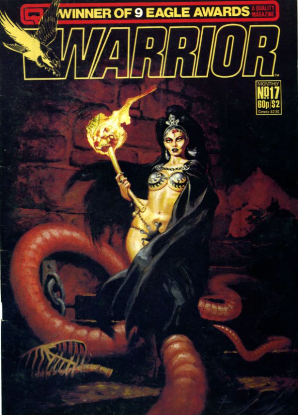
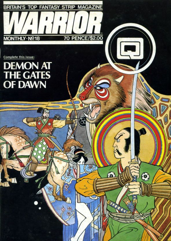
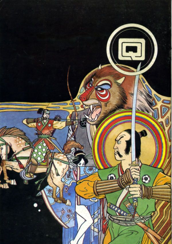
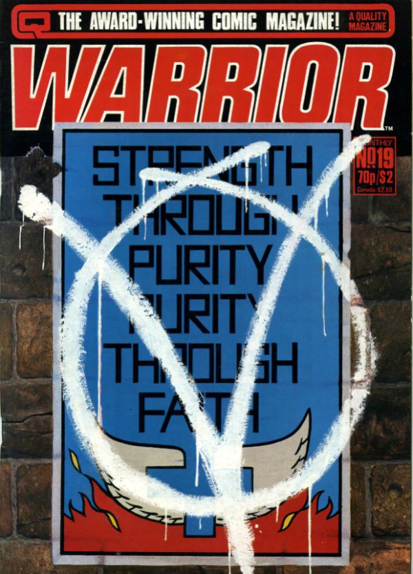
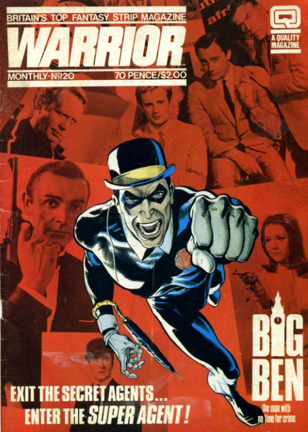
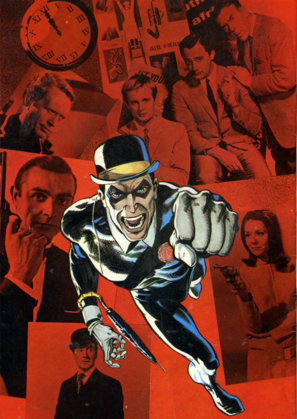
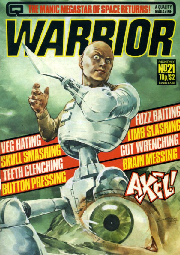
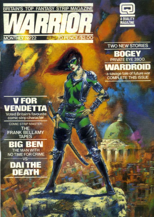
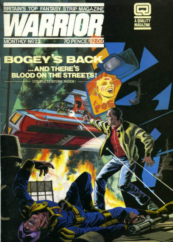
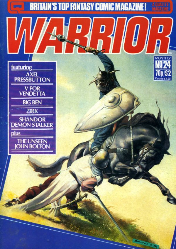
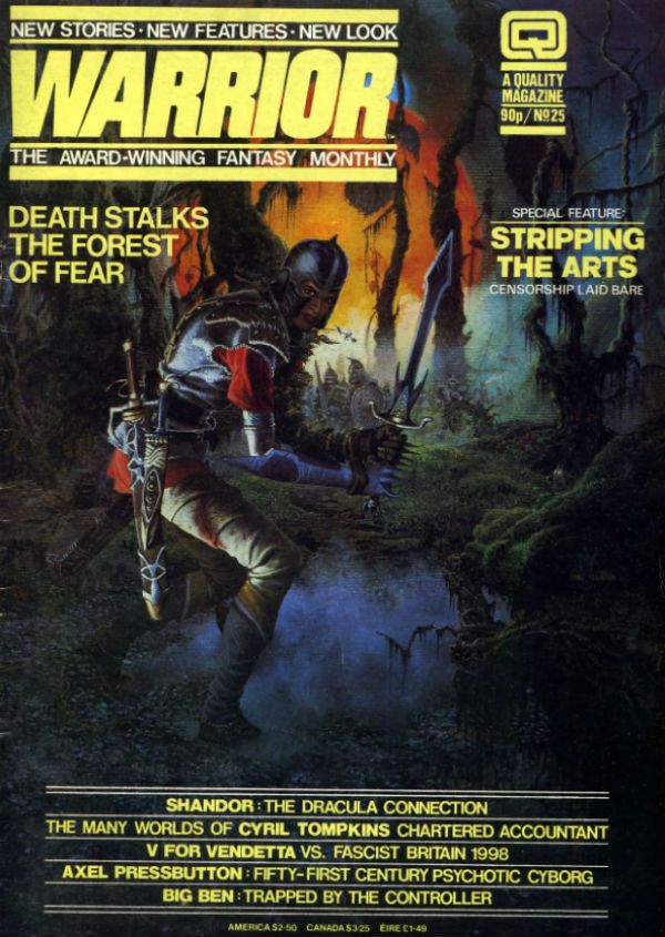
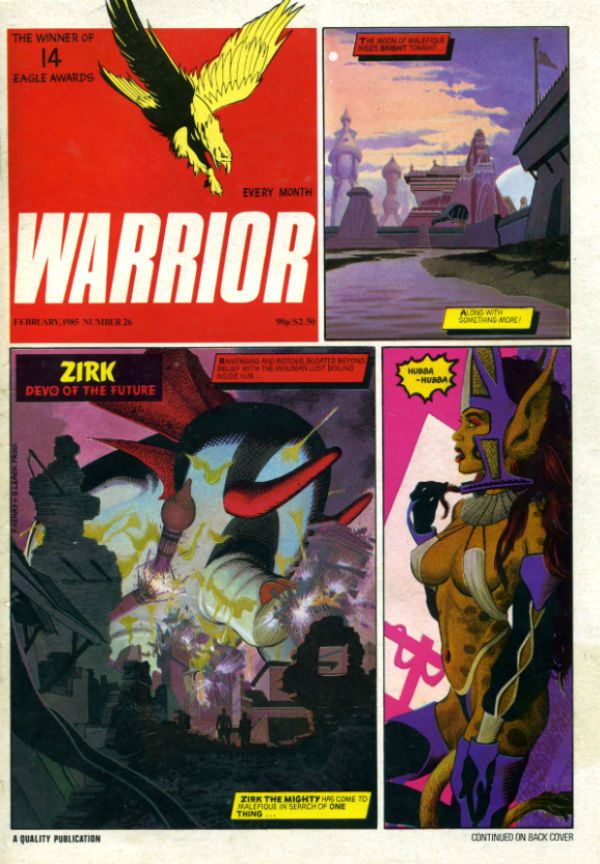
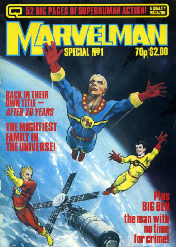
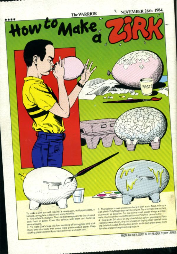
I was a bit rushed this week so I thought I'd save some time by doing a gallery instead of a bunch of words arranged in upsetting orders. Hilariously, I saved no time whatsoever but I can now present to you a cover gallery of all the issues of WARRIOR Magazine I own (i.e. no issue 1). They are old, stained, dog-eared and read to within an inch of their lives but they still look nice and give a savoury taste of the groundbreaking early '80s anthology that thrilled me from the age of twelve and up, up and away. Anyhoo, have a look if you want. (Also: How To Make a Zirk! Really!)  photo IntroB_zpse02fb8fe.jpg Alan Moore and Alan Davis correctly predict the reaction of the Internet to those Miracleman reprints coming in January 2014. Who sez he ain't magic!?!

Anyway, this...

Oh, WARRIOR was VERY GOOD! there, now I can categorise it as a review. Tricks of the trade, my loves. Tricks of the trade.

 photo Warrior02B_zpsf0dcc82a.jpg

WARRIOR ISSUE 2 COVER ART by Garry Leach

 photo Warrior03B_zps5d034ab7.jpg

WARRIOR ISSUE 3 COVER ART by Paul Neary

 photo Warrior04B_zps64332e03.jpg

WARRIOR ISSUE 4 COVER ART by Steve Dillon

 photo Warrior05B_zps10f3176d.jpg

WARRIOR ISSUE 5 COVER ART by Dez Skinn

 photo Warrior06B_zps723094ce.jpg

WARRIOR ISSUE 6 COVER ART by Steve Parkhouse

 photo Warrior07B_zps8990bfc2.jpg

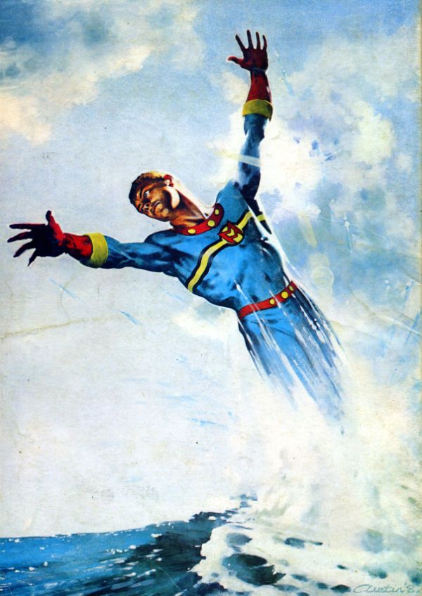
WARRIOR ISSUE 7 COVER ART by Mick Austin

 photo Warrior07bB_zps29da3f31.jpg

Mick Austin's cover unadorned except by age and stains.

 photo Warrior08B_zpse6358dbf.jpg

WARRIOR ISSUE 8 COVER ART by David Jackson

 photo Warrior09B_zps2563fc45.jpg

WARRIOR ISSUE 9 COVER ART by Mick Austin

 photo Warrior09bB_zpsaec03555.jpg

Mick Austin's cover unadorned except by age and stains.

 photo Warrior10B_zpsbefc5426.jpg

WARRIOR ISSUE 10 COVER ART by Garry Leach

 photo Warrior10bB_zpsde876a4e.jpg

Garry Leach's cover unadorned except by age and stains.

 photo Warrior11B_zpsbf309a50.jpg

WARRIOR ISSUE 11 COVER ART by David Lloyd

 photo Warrior12B_zps76183303.jpg

WARRIOR ISSUE 12 COVER ART by Steve Parkhouse

 photo Warrior13bB_zps9204a412.jpg

WARRIOR ISSUE 13 COVER ART by Garry Leach

 photo Warrior13B_zps3d16a63c.jpg

 photo Warrior14B_zpsd0ac56f1.jpg

WARRIOR ISSUE 14 COVER ART by Jim Baikie

 photo Warrior15B_zps913a00af.jpg

WARRIOR ISSUE 15 COVER ART by Mick Austin

 photo Warrior15bB_zpscef0bbbb.jpg

 photo Warrior16B_zpse55e2952.jpg

WARRIOR ISSUE 16 COVER ART by Steve Parkhouse

 photo Warrior16bB_zps34c7d61e.jpg

 photo Warrior17B_zps47329e7b.jpg

WARRIOR ISSUE 17 COVER ART by David Jackson

 photo Warrior18B_zpsccb7bbe4.jpg

WARRIOR ISSUE 18 COVER ART by Steve Parkhouse

 photo Warrior18BB_zps2663513f.jpg

 photo Warrior19B_zpsf52be5f0.jpg

WARRIOR ISSUE 19 COVER ART by Dez Skinn?Garry Leach?David Lloyd? I know not.

 photo Warrior20B_zps9a6a3189.jpg

WARRIOR ISSUE 20 COVER ART by Garry Leach

 photo Warrior20bB_zps8bb74e63.jpg

 photo Warrior21B_zps9b85fdd9.jpg

WARRIOR ISSUE 21 COVER ART by Mick Austin

 photo Warrior22B_zps249d36c1.jpg

WARRIOR ISSUE 22 COVER ART by Geoff Senior

 photo Warrior23B_zps3ec71d17.jpg

WARRIOR ISSUE 23 COVER ART by Jim Baikie & Garry Leach

 photo Warrior24B_zps750d6b70.jpg

WARRIOR ISSUE 24 COVER ART by John "Joz" Bolton

 photo Warrior25B_zps24dd2f22.jpg

WARRIOR ISSUE 25 COVER ART by Garry Leach

 photo Warrior26B_zps33736a6a.jpg

WARRIOR ISSUE 26 COVER ART by Garry Leach

 photo MManSpec01B_zps5af23b23.jpg

MARVELMAN SPECIAL #1 COVER ART by Mick Austin

BONUS****BONUS****BONUS****BONUS***

How to Make a Zirk Art by Garry Leach!!!

 photo ZIRKB_zps43994b1d.jpg

As you've probably gathered by now, those were - COMICS!!!
"Clod. I Have WEAPONS..." Comics! Sometimes They Are Almost Fresh!

It's a post about comics! Is it early? Is it late? Time is in flux!Only if one man can face his Pull List can The Balance be restored!

One Man. One Pull List. There will be Words... (...probably the wrong ones). Photobucket

ACTION COMICS #6 “When Superman Learned To Fly” by By Andy Kubert/John Dell(a), Grant Morrison(w), Brad Anderson(c) and Patrick Brosseau(l) and “Last Day” by Chriscross(a), Sholly Fish(w), Jose Vallarubia(c) and Carlos M. Mangual(l) (DC Comics, $3.99) Superman created by Jerry Siegel and Joe Shuster.

Photobucket

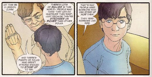
 I like that stuff in my comics but I'm not unaware that in real life that kind of thinking gets you killed.

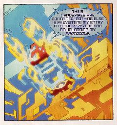
While there could be said to be many faults with the lead story in this issue such as an apparent attempt to distract from a lack of clarity (or indeed even sense) with a belligerently unslackening pace and art that once again belies Andy Kubert's alleged superstar status it remains a fact that in this story Superman's enemies conduct an auction for Kryptonite within Superman's own brain (physically, literally within Superman's own brain) and Superman uses his own Kryptonite poisoned body as a battery to save his both his own sentient ship and the day entire. Yes, Superman's enemies conduct an auction for Kryptonite within Superman's own brain (physically, literally within Superman's own brain) and Superman uses his own Kryptonite poisoned body as a battery to save his both his own sentient ship and the day entire. That's Superman comics enough for me!

The backup is the kind of sweet and tender emotional snapshot of a transitional moment in life that anyone under forty will treat as though it were sentient dog-muck hellbent on French kissing them; that's okay because I enjoyed it enough for y'all! Yup, ACTION COMICS was GOOD!

 STATUS: REMAINS ON THE LIST!


ALL-STAR WESTERN #6 “Beneath The Bat-Cave” by Moritat(a), Justin Gray & Jimmy Palmiotti(w), Gabriel Bautista(c) and Rob Leigh(l) and “The Barbary Ghost Part 3” by Phil Winslade(a), Justin Gray & Jimmy Palmiotti(w), Dominic Regan(c) and Rob Leigh(l) (DC Comics, $3.99) Jonah Hex created by John Albano and Tony Dezuniga. The Barbary Ghost created by Gray, Palmiotti and Winslade

Photobucket

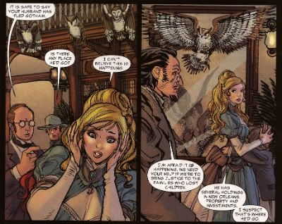
Kids! How many owls can you spot!

Thank the Great Spirit! Next issue ol' bacon face is off to N'Orleans! where there will no doubt be "gumbo" galore but at least there won't be anymore shoehorning of Batman references into a book that doesn't need them. A cave beneath Wayne Manor! Filled with Bats! This cretinous continuity reached a kind of hilarious nadir with the sudden slew of references to Owls: because Batman is currently encountering stress of a strigiform stripe by all accounts in the here and now! So we get about two pages in which the characters can barely move around the mansion setting for all the owls dangling, roosting, flopping and just plain flailing around the place. It's as though Moritat has snapped and gone "You want owls? Here! Here are your owls! Got enough owls yet? I don't think so! Owls! Here! Now! In your face! All! Owls! Touch them! Touch my owls! Tell me they're pretty! Owls!" and then gone for a long lie down. Stupid owls. Anyway I'm a little bit partial to Jonah so it was still OKAY!

 STATUS: REMAINS ON THE LIST!

ANIMAL MAN #6 “Tights” by Jean Paul Leon & Travel Foreman/Jeff Huett(a), Jeff Lemire(w), Lovern Kindzierski(c) and Jared K. Fletcher(l) (DC Comics,$2.99) Animal Man created by Dave Wood and Carmine Infantino

Photobucket

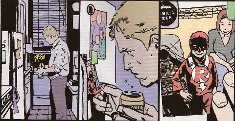
Movie Cliche #23415678: Sad Dad at fridge with beer and photo of son. Collect the set!

Tricky one this. Has Jeff Lemire done a pitch-perfect satire of the vapid screenwriting cliches that have run roughshod over comics beautiful storytelling devices or does he actually believe this is a decent film script made comics? It's hard to tell isn't it. Heck, I don't know maybe you thought it was awesome? Luckily it's easy to tell that Jean Paul Leon is an awesome artist and hopefully one day he will draw comics as awesome as WINTER MEN again. This issue is a complete waste of time and is clearly a fill-in so next issue we should be back to Travel Foreman and his nightmarish body horror.

After I read the previous issue I fell into a light doze and dreamt about a man in a chair. I was holding the man in the chair via the power of some unknown threat. The man was crying and peeling his own skin off his own face with a small knife. I was then forcing him to eat it via the unspoken promise that if he did as I asked he could go free. The fact that the man was eating his own face was terrible but the worst thing was that we both knew I was lying and he wasn't leaving alive. But he had no choice but to do as I asked because that was his only hope. Yes, it's been a trying few months. They say there's nothing as boring as listening to someone else's dreams but they forgot about reading film scripts masquerading as comics which is so boring such comics are EH!

STATUS: REMAINS ON THE LIST (BUT WATCH IT)!


BATWOMAN#6 “To Drown The World - Part One” by Amy Reeder/Rob Hunter/Richard Friend(a) J.H. Williams III & W. Haden Blackman(w), Guy Major(c) and Todd Klein(l) (DC Comics,$2.99) Batwoman created by Bob Kane and Sheldon Moldoff (modern version by Greg Rucka and Alex Ross).

Photobucket

"Given the state of your medical insurance talking's about all you can afford so knock yourself out is my advice."

Wuh-hoof! That's certainly a change in artist alright. I'll stick it out for a bit because I always like people to get a fair shake of the critic stick. Initially I'm not  finding myself a fan of Reeder's thin line but I appreciate her attempts to step up her layouts. Given the writing is competent at best (actually that's a compliment in today's world o'comics) Reeder's got it all on her to raise this one up from EH!

STATUS: REMAINS ON THE LIST (FOR NOW!)

DAREDEVIL #9 By Paolo Rivera/Joe Rivera(a), Mark Waid(w), Javier Rodriguez(c) and VC’s Joe Caramagna(c) (Marvel Comics, $2.99) Daredevil created by Bill Everett and Stan Lee.

Photobucket

Storytelling in 'Not Dead' shock!

Unless Howard Victor Chaykin has been reactivated without my knowledge I guess this is the only Marvel comic I'm buying. That doesn't seem right, I'll have to check. Anyway, I'm buying this because Mark Waid understands that the bit with the boot is funnier and cleverer because it only takes up one panel. It's because Rivera Jnr and Snr make all kinds of spooky magic happen on these pages. It's because together the team on the book achieve the kind of synergy that results in the storytelling stuff from which the above image is but a sample. Yup, DAREDEVIL is a purchase because it is VERY GOOD!

(Hey, I hear Chris Samnee is coming aboard! I told you all I'd wait for him!)

STATUS: REMAINS ON THE LIST!

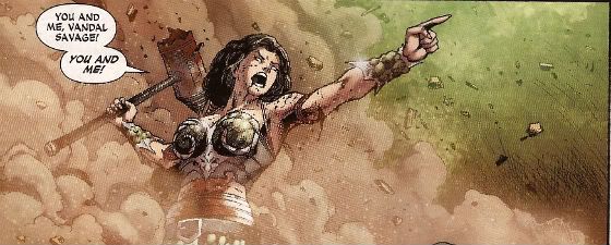
DEMON KNIGHTS #6 “The Balance” by Diogenes Neves & Robson Rocha with Oclair Albert(a), Paul Cornell(w), Marcelo Maiolo(c) and Jared K. Fletcher(l)(DC Comics, $2.99) The Demon created by Jack Kirby. Shining Knight originally created by Creig Flessel (modern incarnation created by Simone Bianchi and Grant Morrison). Vandal Savage created by Alfred Bester and Martin Nodell. Madame Xanadu created by Michael William Kaluta.

Photobucket

His reply is actually quite funny but I'm still baling.

Nah. I'm done. It just didn't work for me. Which is a shame as it wasn't terrible as such it just never gelled. Way too diffuse and lacking in focus both from a scripting and art standpoint. I mean, how big was this village, where was everything in relation to everything else? But like I say it wasn't terrible and I wish all involved well and hope the book works out further down the line but there are plenty of books I can read that aren't EH! And that's where my money's got to go. It's the Law of The Direct Market; savage and unrestrained!

STATUS: OFF THE LIST!

FATALE Number Two By Ed Brubaker, Sean Phillips and Dave Stewart (Image Comics, $3.50) Fatale created by Ed Brubaker and Sean Phillips.

Photobucket

 ...probably because for some odd reason she's drawn to look about 8 years old and acts as subtly as a silent movie siren?

People tend to refer to books by this team as "Brubaker" books don't they? Which is odd as I find Brubaker to be the least of the appeal they hold. I guess it's that whole Cult of The Writer thing or something. Hey now, hang on, I'm not saying Brubaker isn't good. He's got craft/technique/skill/whatever we're calling it now in spades it's just the result is, for me, mostly solid rather than inspired. Except when he gets Meta which is when the wheels start wobbling like they're about to pitch a fit (remember INCOGNITO where working in an office was "like" doing Indie comics but taking to the streets and letting your inner nature run wild was "like" working in the mainstream? Really? Um.). On the whole though I get well crafted genre staples served up with a slight twist but the real pleasure I get from this team's comics is in the form of Phillips and Stewart in conjunction with Brubaker. I'm not going to just roll around showing my belly because it hasn't got capes'n'tights in it, okay?

Here, I guess the High Concept (sigh) is Crime and Horror - together! Like Hope and Cosby! Like Morecambe and Wise! Which is fine because,hey, I like both. I'm not sure they belong smushed together though except as one of those novelty type deals. Y'know, all those Steve Niles things Steve Niles does. I guess Crime fiction tells us about the worst in ourselves and so does Horror fiction; they just use different tools. Using both sets just seems like doubling up and risking the results seeming lesser. Early days though, I mean, look at what porting Horror tropes into Crime did for James Ellroy ($$$$ is what it did, kids. Woof! Woof!). I don't think we're looking at an Ellroy here but we may be looking at an Angel Heart. And that's fine. I got a thing about chickens, Mr. Cyphre; as in I don't like to count them too soon but this one looks GOOD! so far.

STATUS: REMAINS ON THE LIST!

FRANKENSTEIN: AGENT of S.H.A.D.E. #6 “The Siege of S.H.A.D.E. City – Part One” by Alberto Ponticelli(a), Jeff Lemire(w), Jose Villarrubia(c) and Travis Lanham(l) (DC Comics, $2.99) Frankenstein: Agent of S.H.A.D.E created by Doug Mahnke and Grant Morrison (and Mary Shelley).

Photobucket

I am always happy to see the word "buffoons"!

There's a bit in this issue that is pretty much a stealth WATCHMEN (by Alan Moore, Dave Gibbons and John Higgins) reference. It's the scene in the 'Nam bar between The Comedian and Doc Manhattan but here with Franky and a red, bald dude who is, basically, Dr. Manhattan and without any pregnant woman shooting or face glassing. That is to say without any of the actual important or troubling content. I'd call that an Omen were I of a credulous nature. Otherwise it's yet another issue of Hellboy in the DCU and which is Okefenokee by me!

STATUS: REMAINS ON THE LIST!


JUSTICE LEAGUE DARK#4 and #5 “In The Dark - Part Four and Finale” by Mikel Janin(a), Peter Milligan(w), Ulises Arreola(c) and Rob Leigh(l) (DC Comics, $2.99ea) John Constantine created by Alan Moore, John Totleben, Rick Veitch and Steve Bissette. Madame Xanadu created by Michael William Kaluta. Deadman created by Arnold Drake and Carmine Infantino. Shade, The Changing Man created by Steve Ditko. Zatanna created by Gardner Fox and Murphy Anderson. Enchantress created by Bob Haney and Howard Purcell. Dove created by Steve Ditko. Mindwarp created by Peter Milligan.

Photobucket

Stealth WATCHMEN reference#2. We get it, DC! You WIN!

I haven't enjoyed this. It's all been a bit like warmed-over '90s Milligan with stuff like "In Nebraska The Pokemon come alive and the screams of the bread-cakes dance like glass-kneed OAPs." Okay, not as warmed-over '90s Milligan as that DEFENDERS#1 preview perhaps but still not terribly inspired. I mean the sheer scale of events would suggest the body count is in the hundreds of thousands not to mention the country-wide trauma involved but there's no sense of any consequences.

No, I didn't like it. I did, however, enjoy Milligan's skeevy interpretation of Deadman. I would totally read a Peter Milligan Deadman series in which Deadman acted like one of those fantastic men who pressure their missus into all kinds of sexual situations that the missus clearly isn't all that into and it's all just about the guy exerting power over her so that's she's eventually roiling around in moral squalor with only the "fact" that he loves her to keep her sane. At which point the hilarious rogue tells her she's a sl*t and leaves her to fall to pieces while he starts the whole cycle with some other vulnerable woman. I think a comic like that would bring in new readers. Sh*theads mostly, but hey, sales are down! We can't afford to be be proud anymore! Despite creepy Deadman JLA: DARK was EH!

STATUS: DROPPED!

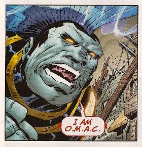
O.M.A.C. #5 and #6 “Occasionally Monsters Accidentally Crossover” By Keith Giffen/Scott Koblish(a), Dan Didio, Jeff lemire & Keith Giffen(w), Hi-Fi(c) and Travis Lanham(l) “One More Amorous Conflict” By Scott Kolins/Scott Koblish(a), Dan Didio & Keith Giffen(w), Hi-Fi(c) and Travis Lanham(l) (DC Comics, $2.99ea) O.M.A.C. created by Jack Kirby.

Photobucket

It's the hot dog that makes it great!

In #5 O.M.A.C. and Frankenstein Agent of S.H.A.D.E have a great big slobberknocker which entertains and amuses me on a base level which I have no shame in gratifying since I am okay with comics just being goofy, colourful fun. With #6 I realise that the main reason I like O.M.A.C is because of Keith Giffen's art because with #6 the artwork is by Scott Kolins and the only memorable thing about the issue is the fact that Leilani's breasts are pancaked in the same manner that Caroline Munro's were in The Golden Voyage of Sinbad. Yes, I realise that reflects badly on me as a human being but, honestly, what reflects badly on us as a society is the fact that we have fallen so low so fast that when you read The Golden Voyage of Sinbad you automatically assumed I was talking about a p*rn film rather than a children's fantasy film from the '7os.  So, um, anyway O.M.A.C was GOOD!

STATUS: REMAINS ON THE LIST!


PUNISHERMAX#22 “War’s End” By Steve Dillon(a), Jason Aaron(w), Matt Hollingsworth(c) and VC’s Cory Pettit(l) (MAX/Marvel Comics, $3.99) The Punisher created by Gerry Conway, Ross Andru and John Romita Snr.

Photobucket

"Now that we've solved the Energy Crisis! Who's up for a brewski!"

PUNISHERMAX#22 may just be the most subversive comic I read this year. Oh, not because of the ending because...really, Jason Aaron? Really? That's your ending? We can solve all societies problems by just rising up and killing the sh*t out of other folks? Really? Heck, maybe we just need a strong leader as well? Fancy your chances do you, Jason Aaron? What a crappy ending. Mind you, I live in a country where we only arm The Police, The Army and farmers. What? No, I don't know why we arm farmers, maybe because of all the lions? Or maybe they keep being carried off by subsidies in the night. Stop getting distracted by details. So, okay, maybe that ending is a bit more reasonable over there in The Americas. If it is, I will pray for you all. Christ, that irresponsible ending.

No, PUNISHERMAX #22 may just be the most subversive comic I have read all year because of the scene involving Elektra. Elektra is at the Hand headquarters after a savage battle with Frank. Elektra has served The Hand well for many years but now Elektra needs help from The Hand. Specifically medical help. But I guess The Hand doesn't have Health Insurance for its employees and since Elektra is no longer of any use to them they have no qualms in cutting her loose in the most final of ways. Despite knowing full well the conditions of her employment Elektra is still surprised and dismayed at this turn of events. But she should have expected it, really, because that's what you get for working for Marv..I mean The Hand. Say, is something bothering you, Jason Aaron? Stuff on your mind?

Oh, PUNISHERMAX was entertaining enough and the fact that I could never reconcile the interesting parts with the witless parts of it actually made it more interesting and brought the whole thing up to GOOD!

STATUS: Cancelled or Came To A Natural End When The Author Had Told The One Frank Castle Story He Felt He Was Born To Write. (Oh, yeah!)

RASL #13 By Jeff Smith (a/w/l) (Cartoon Books, $3.50) RASL created by Jeff Smith.

Photobucket

There's a couple of reasons I really like RASL. There used to be pretty much just one reason; that although none of the individual elements actually seemed unique in and of themselves they were combined in such a way as to present a story notable for its novelty and also the freshness of its presentation. There are many scenes in RASL which you have seen in other stories but this is not a problem with RASL because it isn't really a problem at all unless it is a problem with all stories. It is a problem with some stories because they will just go for the default setting of said scene; the one that's floating closest to the surface of the popular imagination due to repetition and exposure via Hollywood blockbusters for example.

Look at the Avengers Vs. X-Men preview and ask yourself whether the life sappingly tedious familiarity of every scene is intentional and while you have your own attention ask also how many pages until The President says "And may God have Mercy on us all." It's all about familiarity, oh yes, I am aware it's all pitifully legitimised by claims of "homage" but that's cockrot, it's all about familiarity; giving people what they already know they like. Of course eventually familiarity forgets to put its rubber on and breeds something; contempt. Not in the case of RASL though. RASL keeps me on my toes, RASL demands something from me - attention. In return it rewards me with quality entertainment. That seems fair enough to me.

The other, more recent, reason for liking RASL is that unless Jeff Smith has some kind of catastrophic breakdown involving his identity he won't be suing himself anytime soon. Yup, RASL is VERY GOOD!

STATUS: REMAINS ON THE LIST!

STATIC SHOCK #5 and #6 “True Natures” and “Unrepentant” by Scott McDaniel/Andy Owens(a), Scott McDaniel(w), Travis Lanham & Dezi Sienty(l) and Guy Major(c) (DC Comics, $2.99ea) Static created by Dwayne McDuffie and Jean Paul Leon.

Photobucket

 A DC writer on The Internet: Yesterday.

Well, that was certainly a stinker of a thing. I have no problem with Scott McDaniel's art by the way. Sometimes it lacks clarity but I respond well to the boldness of his line and the chunkiness of his figures. I find it quite pleasing on the whole. His writing has, however, been less than stellar. It's hard to know what to say about this disaster really except if you employ someone to write - let them write and let the artist take care of the pictures. It isn't like there's no room for synergy; the two can be responsible for both of those separate aspects but combine them when it comes to the storytelling. It's a collaborative medium, so I've heard. A mess like this just makes me sad. I'm not very savage at all because it dismays me to say STATIC SHOCK was AWFUL!

STATUS: DROPPED!

SWAMP THING#6 “The Black Queen” by Marco Rudy(a), Scott Snyder(w), Val Staples & lee Loughridge(c) and Travis Lanham(l) (DC Comics, $2.99) Swamp Thing created by Len Wein and Berni Wrightson.

Photobucket

This is horrible in all the wrong ways. It's nice having little shout outs to Dick Durock and Len Wein and my Nana Alice and all but, hey, where's the...well, where's anything? Splash page after splash page of nigh-contextless horror does not a narrative make. Seriously, I need to know what's going on on those pages if it's going to freak me out. Marco Rudy's art works hard to evoke the scabby nastiness of the Bissette, Veitch, Totleben years but what is going on? Something to do with rot, something to do with flesh. I'm sympathetic to the notion that specificity kills horror dead on the page but y'know I need some clue or it's just...stuff. And stuff isn't specific enough to be scary. And... The Parliament of Trees? Apparently you just walk up to them with a box of matches and, hey, game over Parliament of Trees. That's...stupid. Worst of all this turns out have just been one of those crappy origins that take six issues. Sure they could wrong foot us at the last and Abby could adopt the mantle but...it still took six issues. Six not very good issues. So yeah, SWAMP THING is EH! Moley, I just checked and it's six issues and counting to the origin, that doesn't help at all.

STATUS: DROPPED!

T.H.U.N.D.E.R. AGENTS #3 “A Godawful Small Affair” by Wes Craig & Walter Simonson/Bob Wiacek(a), Nick Spencer(w), Hi Fi & Lee Loughridge(c) and Jared K. Fletcher (l) (DC Comics, $2.99) T.H.U.N.D.E.R. Agents created by Wallace (“Woody” not “Wally”) Wood and Len Brown.

Photobucket

'Nuff Said!

STATUS: STICKING IT OUT FOR THE LAST THREE ISSUES!


So yeah, hope that was okay. If you disagree with any of it that's fine just let me know and we can throw it around like a pack of terriers with a rat. If you thought it was all totally spot-on then, Hi, Mom! Whatever happens those were my comics and that's what I thought.

Have a good week and remember to read some COMICS!

"Do They Come In KID'S Sizes?" Comics! Sometimes I Get A Bit Grumpy.

Whoops. Lost my momentum there. Trying to get it back by looking at some comics and then blurting thoughts out in the form of words. Disaster? I have a recipe for that! Here's the ingredients:

BATMAN: THE BRAVE AND THE BOLD #15 By Stewart McKenney/Dan Davis(a), Sholly Fisch(w), Guy Major(c) and Dezi Sienty(l) (DC Comics, $2.99) "No Exit" If he is to survive an unending series of death traps of unknown origin The Caped Crusader is going to need a miracle! Luckily he brought one along...MISTER MIRACLE!

Photobucket

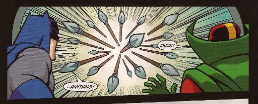
""No...spears!" HAHAHAHAHAHA. Damn, even Kids think that joke is shit. Judgemental buggers."

This is a comic for Kids, is that alright? Is it alright if Kids have comics too? Because I know comics aren't for kids anymore. I know that the works of such mature intellects as Mark Millar, Brian Bendis and Geoff Johns have lifted the fights'n'tights funnybook up beyond the meagre intellects of children into a new and special place where they are exactly like comics for Kids but not as good; which in a very real sense is just like growing up. Everything's the same as when you were a Kid it's just a bit more shit. Comics for Kids, okay? Is that alright? Because if it isn't then there's no place for a PG version of CUBE starring Batman and Mister Miracle in which Batman solves the confounding conundrum bedevilling our two plucky chums by noticing that he doesn't need a shave and if that's true then I guess there's no place for the following exchange:

DOCTOR BEDLAM: However your MEAGER INTELLECT is no match for the brilliance of DOCTOR BEDLAM.

BATMAN: Really? How about my FIST?

There's always a place for that. Even though they do not use the correct English spelling of "meagre" and plump for the Colonial mutation. Yes, even though Mister Miracle looks creepy without a nose this is still VERY GOOD!

SCALPED #55 By R.M. Guera(a), Jason Aaron(w), Giulia Brusco(c) and Sal Cipriano(l) (Vertigo/DC Comics, $2.99) "Knuckle-Up" Conclusion

Photobucket

"Fact: I, John, actually have a thing about traumatic eye wounds. In that I fear them not that I get off on them. I know this is The Internet but be nice, now."

Now that's a fight scene! So that's GOOD!

PUNISHERMAX #21 By Steve Dillon(a), Jason Aaron(w), Matt Hollingsworth(c) and VC’s Cory Petit(l)(Marvel Comics, $3.99) "Homeless" Conclusion Frank and The Kingpin finally collide in a femur shattering confrontation from which only one will walk away! Actually they both walk away but The Kingpin has a hammer stuck in his head and scratches at the glass door of his apartment like a wet brained stray cat before Frank brings him down and then Frank falls over and so I guess it's really a femur shattering confrontation from which both walk away - but only for a bit!

Photobucket

"The White Male Heterosexual's Worst Nightmare"

Frank Castle is homeless. And he stands there singing for money. La da dee la dee da. Ladies and gentlemen, Ms. Crystal Waters! Terrible song that but, hey, I was watching THE HURT LOCKER the other night because I like to watch films everyone has already watched and moved on from. It's important to be timely, to be relevant, I feel. It was okay, really quite a decent film until the end when they did the thing with the guy at home. I didn't really like that bit because as is usual with cool hard asses we were invited to feel sorry for him because being such a hard ass he could find no pleasure in the real treasures of life such as cleaning out the guttering and shopping for cereal (don't load the dice too much, eh, Mark Boal) and yet we were also invited to admire him as the romantic lone wolf; true to himself and his manly nature. There are a lot of these films and they seem to fulfil the same function as Chick Flicks. They kind of undermine the gender stereotype while at the same time finding shelter within it. I call the male variation Dick Flicks. PUNISHERMAX is a Dick Flick. Y'know, that weirdly pathetic male wish fulfillment where you can be free at last to be a manly man but it has come at such a cost that you get to be both pitied and feared. Like a baby the size of a tower block crying for Mama to change its nappy. You'd be scared if that turned up outside your window but you'd feel a bit sorry for it as well. Unless you were a manly man in which case you would shoot it in its big fleshy demanding face and turn away before we saw your single, solitary tear.

Someone has to say it, Frank. You are a weak man, Frank. It isn't a sign of strength to run away from responsibility, Frank. You are a weak man, Frank Castle, to rather have your family die than pick up those toys one more time, rather than sit through The Only Way is Essex one more time, rather than have to sit through those shitty Star Wars films one more time...actually, Frank, I'm starting to see your point.I am a man after all and as a man I found PUNISHERMAX was GOOD! After all, I cannot tell a lie, like most men I like a good Dick Flick.

DEMON KNIGHTS #5 By Diogenes Neves/Oclair Albert(a), Paul Cornell(w), Marcelo Maiolo(c) and Jared K. Fletcher(l) (DC Comics, $2.99) "The Traitor"

Photobucket

"Meet The Twin Fists of Tolerance!"

The best thing about this comic, because it's important to be positive about comics or so people keep bleating, is the character of Jabr. Now it seems to me that this guy is rational, educated, level-headed, tasty in a fight and quite possibly not of European extraction. He's all those things and yet not boring, he is fact the best character in this except for "Sir" Justin because us Brits love a bit of crossdressing fun. Deny it to your Mother, pal, don't waste your breath denying it to me. Astonishingly The Internet has not lost its collective mind over Jabr and it's this magical fact, this clear indication that we have at last, as a species, grown enough to, finally, recognise the transitory nature of our fragile lives and put aside our differences to become, in effect, tolerant and wise and thus strong enough to forge the collective future all our predecessors suffered and died to accomplish. Or maybe nobody is reading this as it is, after all, just OKAY!


ALL-STAR WESTERN #4,#5 By Moritat, Phil Winslade(a), Justin Gray, Jimmy Palmiotti(w)Gabriel Bautista, Dominic Regan(c) and Rob Leigh(l) (DC Comics, $2.99) Jonah Hex in "Gotham Underground" and The Barbary Ghost in, er, "The Barbary Ghost" In the caverns beneath Gotham Jonah Hex finds not only a fine example of the unfettered free market in action but also ancient evil. And some bats. Because it is Gotham. Also in this issue: The Barbary Ghost makes a spooky debut!

Photobucket

It was kind of okay having Arkham around for a bit but now his role seems to have quickly devolved into basically telling us when Jonah Hex is being an asshole and getting himself in a pickle Jonah has to help him out of. This erodes a large portion of the appeal of Jonah for me. I like not knowing if he is actually going to help whoever's in trouble or if he's going to just be an ornery asshole. Obviously he has to save Arkham all the time or the Asylum will never be built and Batman's continuity will be all wronged-up. Oh noes! And also I like to decide myself when Jonah has been an asshole. On occasion it has taken me several pages to realise just how big an asshole Jonah has been on that occasion several pages previous to the point at which said realisation alights upon my mind. I like that. So, yeah, shut yer fancy yapper, Arkham! And let's get out of Gotham and light out for the territories; it's too constrictive, Jonah works best out in The Big Country where he can tread in big shit in all manner of unlikely ways. I like the colours by Bautista they are kind of organic but inorganic at the same time, like laser-pastels or something. Yes, people my age still think putting "laser" in front of something suggests The Future. Aren't old people just the cutest!

Oh, the backup is The Barbary Ghost; a new creation by Gray, Palmiotti and Winslade. While Winslade's brittle lines manfully attempt to ground the story in a specific milieu at once both evocative and atmospheric this is somewhat undermined by the fact that The Barbary Ghost's knockers are kind of flopping about a lot. Now I'm no Henry History but I would have thought that a Chinese lady in the 1870's would have been personally inclined, in large part due to the mores and customs of both the particular point in history she occupied and the heritage of her own people's customs and traditions, to keep her tits shut in a bit more. Or maybe I missed the class where we were taught about The Great 1870's Chinese Tunic Button Shortage. I could have; I was a bit of a git as a kid.

Still, credit given for an original character. After all in 2012 DC's big old money fountain will be WATCHMEN: HOW I MET YOUR MOTHER. No doubt JMS is going to improve the original by, apparently, so he says,  explaining about how Jon was obsessed with time yet he still went into that time-locked room! I don't know. I guess I missed the bits in WATCHMEN where Jon was continually asking people what time it was and craning his neck to look at clocks and banging his girlfriend from behind so he could put his hand on the base of her neck in such a way that it seemed erotically stimulating due to its sensual forcefulness but at the same time afforded him an uninterrupted view of his watch. Or maybe his Dad was a watchmaker and he thus believed in Design but he was changed into a God by a complete ACCIDENT! and that was a metaphor or an analogy or even the whole meshuggener point already or, Christ, who gives a shit. Yes, okay, it was strange. Really strange. I need it explaining in a book illustrated by a cheesecake maker. I'm glad it isn't someone muttonheadly literal who's got this gig, rather someone as dependable and imaginative as JMS who is going to bless us with a mini-series in which, let's face it, quite probably Dr Manhattan reaches back trough time to give events a nudge so that he effectively creates himself! SPOILER! Christ. Mind you I know it has always troubled me, raised a question in my mind, why Rorschach wears a woman's gusset on his face. Hopefully Brian Azzarrello will be setting my mind to rest on that score. Hurm.  In 2013: CAMELOT 3010!

Do you see what I did there? I did an impression of The Internet and played right into DC's hands and I missed the point. The point about WATCHMEN: BEFORE THEY WERE FAMOUS not being a nice thing is that endorsing this is endorsing DC's treatment of Alan Moore. DC own WATCHMEN so they can do what they want with WATCHMEN and what they want to do with WATCHMEN is make money because they are a business. I can understand that, I see that, thanks. DC do not own Alan Moore and they have treated him, and continue to treat him, in a shabby fashion unbecoming of adults. That's the issue here. If they can do that to Alan Moore and it is all right because we get our nice new comics then it is all right for them to continue treating creators in such a fashion. It isn't all right. It will never be all right. That's the point here, for me, not whether the books will be any good, or any of that other diversionary horse shit. Nut up or shut up, DC. Nut up or shut up.

ALL-STAR WESTERN was GOOD! if you can remember that far back.

AMERICAN VAMPIRE #23 By Rafael Albuquerque(a), Scott Snyder(w), Dave McCaig(c) and Jared K. Fletcher(l) (Vertigo/DC Comics,$2.99) "Death Race" Part Two of Four I haven't actually read this one. I don't know if you noticed that bit up there, the boring bit, yeah? The "Part Two of Four" bit? I wouldn't have; I'd have skipped it and looked at the scan (which isn't there because I haven't read it, see) and then read the text I judged most likely to contain a cock joke or insult a noted comic creator. So I can fully understand if you missed the whole "Part Two of Four" bit. I didn't though and since I have yet to receive "Part One of Four" I am unable to read this comic. I don't mention that for any other reason than the fact that Mr. Jeff Lester and Mr. Graeme McMillan were talking about how weird their comics reading patterns can be (I mean I've got this comic bought and paid for but I'm not going to read it? Saywhanow?!) And I just wanted to mention that I share their sickness; I sup from the same trough of pain as they. Also, just thinking about them both brings me physical pleasure. Hurm.NuuuuhHHHH.


Sorry about this one, folks, hopefully it'll be better next week. Have a good weekend with COMICS!

Wait, What? Ep. 71: Funk, Soul, Brother

Photobucket Yep, a bit of a delay but here we are, more or less as promised: Wait, What? Ep. 71, featuring our new theme song courtesy of the hyper-talented Graeme McMillan. This done-in-one episode is not quite two hours and forty-five minutes and covers, um, lots of stuff.

Stuff like OMAC and the other cancelled new52 titles; the current state of George Perez's career and what Marvel's marketing team could do with it; Mark Millar's Trouble and Spider-Man; comments by Charles Vess and Ariel Olivetti about Marvel; Mark Waid's Amazing Spider-Man/Daredevil crossover, Jason Aaron's Wolverine and the X-Men as well as Wolverine #300.

Plus, a lot of babbling from Jeff about PunisherMAX #21; a debate how many "good" issues a creator might have in them; Secret Avengers, Astonishing X-Men, Warren Ellis, and in-canon behavior; James Robinson and Shade; the preview issue of Shonen Jump Alpha; and Marvel Two-in-One vol. 4.

See? Worth the wait. (Probably.)

We would like to think it is on iTunes, but we are all but certain you can listen to it here, thanks to the handy link below:

Wait, What? Ep. 71: Funk, Soul, Brother

As always, we thank you for listening and hope you enjoy!

"...I'm Taking The Case." Comics! Sometimes They Aren't Older Than Your Grandad!

Here's an image from DAREDEVIL #4; a comic that isn't talked about within. But I just really, really wanted it up there so I indulged myself. I do go on about #5 of DAREDEVIL though. Is that alright? Are you sure? Because it matters to me! Photobucket

Well, I can't promise to help but I did write some words about some comics that were actually published this Century. Yay me!

Oh yeah, one of the images may be NSFW, depends where you work, I guess?

DAREDEVIL #5 By Mighty Marcos Martin(a), Marvellous Mark Waid (w), Jaunty Javier Rodriguez(c) and Venerable VC's Joe Caramagna(l) (Marvel Comics, $2.99 (YES! TWO DOLLARS AND NINETY NINE CENTS NOT THREE DOLLARS AND NINETY NINE CENTS!)

Photobucket

"...but it's bee-yoo-ti-ful!"

If I said that this was probably the best book Marvel are belching out that probably wouldn't mean much since I don’t subject myself to much of their gassy blather. But the fact that everyone else who has ever picked the book up has said roughly the same might be an indication that it’s worth a look if you aren't already looking. Because it’s sure as sure can be that it’s worth looking at. Sockamagee, the art, oh the art, art as this there should be in comics all the time! Every page has something delightful on it and those are the lesser pages. It’s just excellent stuff that revels in all the possibilities that words and pictures reveal when used in concert. Rivera plainly loves comics and consequently his art rolls around in the medium like a dog in a cow pat. But there’s no shortage of people piling on the praise for the pictures so I thought I might at least extol the work of Mark Waid on writing. Because this is good stuff and, I feel, it gets overshadowed by the glories of the art.

Photobucket

"A hero acting heroically? Get outta town!"

It’s just super-solid all round and there’s a real danger of underrating that. Strong enough stuff to just shrug off that lame drivel about DD’s identity and turn it into a running gag. Better yet, for me at least, Mark Waid remembers the inherent awesome of fights’n’tights comics. There’s a bit in #5 where Waid solves the conundrum of how Daredevil would know he was being targeted by snipers so smartly, so gracefully, so obviously that I did, I admit, smile in admiration. By the time Waid topped it with the light switch gag I was full out snorting like a frisky pig. Corporate North American Mainstream Superhero comics don’t get any better than Daredevil by Mark Waid, Paolo Rivera and Marcos Martin because it is EXCELLENT!


CAPTAIN AMERICA AND BUCKY #620 By Cracking Chris Samnee (a), Everpresent Ed Brubaker and Middling Mark Andreyko(w), Bouncing Bettie Breitweiser (c), Victorious VC's Joe Caramagna(l) (Marvel Comics, $2.99)

Y’know I bet sometimes Bucky feels like a motherless child. Oh. He is. And Dad pegs it as well. Then his sister gets taken into care and he gets brutalised by the military until he is a killing machine That’s quite a lot of misfortune for one kid, personally I’m just glad he didn't have a dog. By which I mean I’m glad for the dog. Now I’m going to spoil the rest of this series for you because I reckon I can see where it’s going based on how things have gone so far.

Photobucket

"The laughs never start."

Crucially we never actually see Ma Bucky and Pa Bucky die and Little Sister Bucky’s fate is uncertain. This is comics, better yet this is Marvel Comics, so the clock is ticking until they return from “the dead”! Not only that but they too will have been turned into killing machines with bionic bits and bobs. Will the Winter Soldier survive against the most dangerous enemy of all – his own family?!? Yes. But they will all be reset to being nice (i.e. American not Russian, obviously) and together they will go “off the grid” and cross America finding warehouses in which they can talk in front of bits of machinery before narrating sad thoughts over some Steranko influenced action. Hey, Captain America can turn up every now and again and whine about how much paperwork he has to do while looking out of a window with his back to everyone. Even better each one will have their own series: Winter Soldier, Spring Soldier, Summer Soldier and Fall Soldier as well as the “core” book: The Four Deadly Seasons! Call me, Marvel! I can LOSE you money too! Oh, this comic has got technique but no life and is a total waste of Chris Samnee's excellence because it is EH!

(This book was pre-ordered before my delusional and smug decision not to give Marvel money for books featuring Jack Kirby characters until such time as they just acted decently towards The King's memory. This also applies to THE MIGHTY THOR. The point was not to spend less at my LCS and thus drive the elfin owner into the nightmarish world of working for someone else but to fulfill my obligations viz a viz pre-ordered comics and then spend the same amount on different stuff. No, I don't know why I'm explaining this to you. And now back to our regular programme...)

OMAC #2 By Kracking Keith Giffen and Dandy Dan Didio (w&a), Saucy Scott Koblish (a), Hunky Hi-Fi (c) and Tasty Travis Lanham (l) (DC Comics, $2.99)

I enjoyed the first issue of OMAC a great deal. In fact I enjoyed it so much that had I my druthers each successive issue would consist of OMAC appearing in the Cadmus complex and then running through it smashing stuff up until he got to the end and then disappearing. Yes, every issue would open with him reappearing and then running through the Cadmus complex smashing stuff up until he got to the end before disappearing. Every issue. Same page layouts, same panels, same characters in the panels. But! With every issue and every re-appearance the scenery would be more battered and the people more bruised. Over the course of the series the dialogue would degenerate from shocked exclamations to weary acceptance and right down to futile grunts. This would continue for about, say, 12 issues until OMAC was just running through an ever deepening trench littered with bones and metal. (Hey DC, Call me! I can lose YOU money!)

Photobucket "Really? You look more like a "Larry" to me."

With issue 2 they don’t do that so what do they do? Well, it isn't Kirby let’s get that right “out there”!!! By the time Kirby birthed OMAC he had evolved beyond the merely mortal, having ascended to a plane whereby he could produce comics suffused with complexity and subtext that the man himself would have had trouble articulating. Reportedly not the most articulate of men Kirby was at his most articulate when he communicated via the medium of pencil and paper. With OMAC he was telling us of The Future. And the news from The Future wasn't good. The news from The Future is never good because in The Future you will be dead. Sorry about that. Worse than that Kirby’s OMAC told us that in The Future people would still be sh*theads and technology would simply give them exciting new ways to be such. But as long as there was someone willing to stand up and punch stuff until it stopped moving we’d be okay. The new OMAC isn't about The Future it’s about Now. Since stuff that’s about The Future is about Now anyway I guess that makes the new OMAC about The Past. And that’s clearest in the storytelling.

Photobucket

"Kids! How many storytelling techniques can you spot in this one panel!"

What we have here is pretty much any Hulk comic from the Bronze Age. By which I really mean how you remember any Hulk comic from the Bronze Age being. There’s a big old slobberknocker of a fight in which outlandish property damage is inflicted and much expositionary dialogue is spouted. Now, you may say there’s no place for such old-timey stuff in the brave new world of comics and I’d kind of see your point but I cannot deny the simple pleasure that this issue delivered. I don’t want to sound like some luddite berk living in the desert with locusts stuck in his beard but the fact remains that this style works. It delivers. And it isn't all Old School; the technicolour japescape of a colour job by Hi Fi looks like it was sourced from the still wet skins of alien jellyfish. It’s pretty good stuff, amiable entertainment that leaves you feeling entertained and amiable. I think the whole “I” for an “Eye” thing is bit too cute but I really liked “Omactivate!” so, you know, each to their own. There is some odd English in it too. Which is a bit rich coming from me but then I don’t have an Editor do I? But then, in a very real sense, does anyone in comics these days. Minor hiccups then and maybe not even that just a touch of reflux maybe? OMAC #2 is VERY GOOD! in any case.


PUNISHERMAX#18 By Swanky Steve Dillon(a), Jumpy Jason Aaron(w)and Matt Hollingsworth(c) (Marvel Comics, $3.99)

What a frustrating book this is. There have been some great moments as Frank’s monstrous nature is revealed in all its dark blankness but there’s some serious flaws. Just having Frank pop in or out of places like a magic fairy of death is jarring. It seems he can just waltz into the correctional facility hospital and pop his nut in Bullseye’s face. (Or a cap, I’m not strong on youth slang.) It undermines the good stuff when there’s such little attention paid to the plot. “And then I escaped…” isn't really a satisfactory way to end a prison arc, y’know. It’s all a bit odd because Aaron’s had plenty of room to tell his story (oh, look another three panels of someone leaving a room!) but it’s all a bit nebulous aside from the bits where Frank does something psychologically foul. These may be the more interesting parts to read simply because Aaron finds these the most interesting parts to write, all the other stuff gets a bit out of focus and vague. Unmemorable people in unmemorable rooms filling pages until Frank does something unforgivable isn't really convincing me that’s there’s much going on here. I mean there’s The Kingpin but he seems to be currently re-enacting some scenario from the letters pages of a psychopathic Razzle simply because he’s a bit bored. Oh, I know it’s the old thing about selling your soul to get what you want but then finding out it’s not; but it just looks like the Kingpin hasn't the wit to think of anything to do but drug and shag in his free time. Try cracking a book, man.

Photobucket

"Dammit, Kingpin baby, I (nnnhh!) almost (unnnh!) got there that time but you keep (uhhhh!) throwing me off (uhhh!) by callin me "Alan"!)

I don’t think matters are helped by Steve Dillon. Look, I like Steve Dillon, he’s a good artist but his action is too static, his backgrounds too vacant and his faces too caricatured to convince when applied to a serious story. Well, as serious a story as a story with The Punisher in can be. We’re not talking Ingmar Bergman here, folks, probably more Larry Cohen at best. At its worst it just seems like crude fan fiction involving the supporting cast of Frank Miller’s Daredevil run. I’m sure seeing Kingpin’s tubby bum as he slaps it to Elektra made someone’s day but it wasn't me and it wasn't today. At its best though it does seem to be saying something about fathers and men and stuff (oh, don’t worry, it’s nothing good. It’s never anything good.). Like I say it’s frustrating because if there was a bit more substance and a lot less sensationalism this would be better than OKAY!


SWAMP THING #2 By Yomping Yanick Paquette (a), Salty Scott Snyder(w), Naughty Nathan Fairburn(c) and Jesty John J. Hill(l) (DC Comics, $2.99)

Scott Snyder isn't the first person to tell us everything we know about Swamp Thing is wrong, but I doubt if anyone has ever done it as hamfistedley as this. The Parliament of Trees straight up send some mossy messenger to Alec Holland and he just plain tells Alec that everything he knows about Swamp Thing is wrong! Considering that the swampsters no longer talk in slow motion this takes him an incredibly long time. He uses a lot of words. So many words that he basically just wears Alec Holland down into believing him rather than actually says anything convincing. Holland clearly decides to believe Swamp Thing because life’s too short to listen any longer. Oh, and there’s also the biggest threat ever, ever, ever that has been around for ever, ever, ever but no one’s ever mentioned it before because. Just because. The woody courier then drops dead which is the price of his mission. I’m thinking the Parliament of trees want to maybe look into more effective means of communication. Then mad badness involving backwards headed people wakes the reader up, gainfully employs Paquette and dares to entertain for the latter part of the issue. This is slightly undercut when Abby turns up - but now she’s a bad-ass girl on a motorcycle! I hope the series isn't just going to end up with characters turning up but different! It’s Anton Arcane! But he’s a shoe salesman from Hoboken with a penchant for playing Toploader songs on the paper comb! It’s Chester but he has big ears! Nice art and some effective last-act nastiness but, really, the second issue seems a bit soon to fall into EH!


MIGHTY THOR#4 By Oval Olivier Coipel/Messianic Mark Morales(a), Melancholoy Matt Fraction(a), Lively Laura Martin(c) and Vitamin-enriched VC's Joe Sabino(l) (Marvel Comics, $3.99)

Ah, oh, it’s the usual bad cover version of a Thor comic. A hint of tit, a couple of “bastards” and some blood (when apparently some wolves get into Odin’s freezer. It isn't very clear what’s going on really.) seek to convince that this is  in some way more mature than those old Thor comics children (Haw! Children!) liked. Basically Thor hits The Silver Surfer in space. There’s some other stuff but it all seems mechanical and unconnected. Yes, predictably enough it’s another addition to the dismaying number of comics that probably sounded aces in interviews but, in reality, are staggeringly inadequate reading experiences. This seems to be working out okay for everyone though. (After all it’s only healthy to ignore reality and just stay positive about everything all the time.) I guess in the future there won’t actually be any comics, just interviews.

Photobucket

Interviews describing the most awesome comics ever; comics so awesome that to make them a reality would be just plain vulgar. There’ll be some personal stuff in there as well so that you feel connected to the interviewee with the uncomfortably shrill emotional content distracting from the cynical calculation underlying it all. After all what’s your USP? You, baby! You beautiful snowflake, you! They’ll have to be careful though, these writers of the future, it’s a fine line between being compared to Dave Eggers and being compared to Dave Pelzer. I don’t mind as they are the writers and being writers they are The Shining Ones and those that dare to raise a voice in criticism (burn them!) are nothing but Haters fuelled by resentment and jealousy. And it’s true. Christ, sometimes I wake up with my face wet with tears because I didn’t end up writing Thor comics. I wasn't hungry enough.  I failed the world. I am the filth of the earth. And all that’s fine, I mean it isn't like this pallid thing cost $3.99 is it? It did? Oh, those writers can get stuffed then. I’m sure everyone involved in this was a truly special human being but that doesn't stop it being EH!


AVENGERS 1959 #2 By Hirsute Howard Chaykin (w/a), Jolly Jesus Arbutov(c) and Jingoistic Jared K. Fletcher(l) (Marvel Comics, $2.99)

(Yes, I am aware Nick Fury was created by Jack Kirby but Howard Victor Chaykin needs his Mai Tai mix and who am I to deny him?)

Kind of typed myself into a corner haven’t I? In trying to course correct the critical conversation concerning Howard Victor Chaykin I may have erred a little on the enthusiastic side. (“Ya think, you limey asshat, huh, ya think?”) Now I imagine no one will believe me when I say that this second issue is even better than the first issue and the first issue was nice stuff to start with. Any rational human being would be forgiven for dismissing me as the kind of guy who had Howard Victor Chaykin pooped in a brown paper bag I’d pay for the privilege of a peek. I wouldn't though and I think that kind of nasty talk tells us more than enough about where your mind goes when no-one’s watching. For most of the issue the art is really, really sweet. The colouring is greatly improved and makes everything more visually coherent and there are some strong holding lines going on which I like. I was particularly enamoured of The Blonde Phantom’s hair.

Photobucket

"Oh, Howard Victor Chaykin! Don't you ever change!"

The last few pages get a bit choppy but by this point the events are getting pleasingly goofy so it’s not a dealbreaker. Baron Blood and Brain Drain? From Rascally Roy and Frisky Frank Robbins’ sweat drenched INVADERS run? By Howard Victor Chaykin? Man, that’s some daft stuff I’m liking. And on the last page when Howard Victor Chaykin basically introduces John Steed into the Marvel Universe I’m kind of starting to warm to the idea of looking in that bag. I guess you could say it’s Howard Victor Chaykin by numbers but I've run the numbers and Howard Victor Chaykin’s numbers look pretty good. AVENGERS 1959 #2 is witty, smart, saucy, fast-moving entertainment and it’s my fault but your loss that you won’t believe me when I say it’s VERY GOOD!

Remember, Kids, if you only buy one of these - buy DAREDEVIL because it is pure COMICS!!!
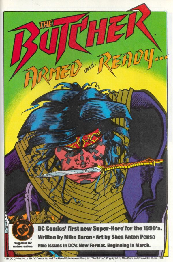
EXTRA BONUS DAREDEVIL PICTURE FROM ISSUE 4:

Photobucket

Criminy, just buy it already! Now go have a nice weekend!
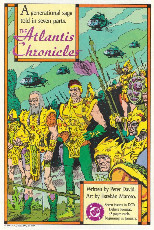
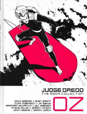
“More Water, Ma’am?”…Comics? They still make 'em and I still read ‘em!

Enter my personal four colour nightmare! Gonna make your eyes boil like eggs! Or bore you senseless. Hard to tell really. Anyway, I read some comics wrote some words - it's a story as old as Love itself! Like my face. (You look lost, stranger - The Shipping List is the next post down)

You know, without your glasses and your hair down like that you look like you'd enjoy hearing about:

PUNISHERMAX#14 by Jason Aaron(w), Steve Dillon(a), Matt Hollingswoth(c) and VC’s Cory Petit(l) (Marvel/Disney, $3.99)

“FRANK Part Three”: Then: Back from The ‘Nam Frank continues to brighten up the lives of all around him while exploring new career opportunities. Now: A wholly expected riot erupts. Will Frank learn to hate again. Will he learn to kill again? Time may just be running out for everyone’s favourite sad mass murderer…

Yes, every story element in this comic is so totally unoriginal that every scene is as familiar to me as my sainted mother’s “disappointed” face, but it cannot be denied that it still retains narrative power and wrongful fascination enough to stick a shank right into any misgivings and jerk that sucker about until the toothbrush handle snaps in half. Nick Fury is a bit of a cranky man though; I think Frank would make a great dishwasher. Keep him away from the cutlery perhaps.  Also, I hope Big Jesus’ surname is Trashcan. Oh, I see, I see how it is. It’s just David Bowie references that are Da Kewl. Fine.

Meanwhile Steve Dillon’s backgrounds continue their audition for a revamp of the Simon MacCorkindale detective/body horror series but they appear to have misheard the title as “Minimal”. It’s too late. I made that joke thirty-five minutes ago! Somewhat predictably this was VERY GOOD!


FLASHPOINT BATMAN: KNIGHT OF VENGEANCE #1 by Brian Azzarello(w), Eduardo Risso(a), Patricia Mulvihill(c) and Clem Robbins(l) (DC Comics, $2.99)

Thomas Wayne is The Batman! The Joker has kidnapped Harvey (not Two-Face!) Dent’s twins(!). How nasty will it get before someone tranq darts Brian Azzarello? Very, I'm guessing.

I really like Brian Azzarello’s Batman and the reason I really like Brian Azzarello’s Batman is because he is so very, very unlikeable. There’s no way this is accidental. Of course in regular DCU continuity Mr. Azzarello’s apparent experiment in aversion therapy is hampered by the fact that Batman can’t just machete open Killer Croc’s head like a coconut. Luckily the very special, very Geoff Johns-ian, magic of Flashpoint is that Batman can in fact do just that. So he does. So here’s Batmaniac, kids; everything everyone who ever got upset that Batman didn’t just kill The Joker has ever wanted. Now eat it. Eat it all up. Eat. It.

Mr. Eduardo Risso brings his usual experimental theatre production approach full of weird lighting sources, minimal stage design, excellent blocking and fine character acting and it is a dreamy thing indeed. This comic also has the dubious honour of having a last page so nasty the thoughts it provoked made me ashamed of my own brain. Relentlessly foul and repellent and, since that seems to be wholly the point, - EXCELLENT!


DOOM PATROL #22 by Keith Giffen(w), Ron Randall(a), Pat Brosseau(l) and Guy Major (c). (DC Comics, $2.99)

“Doomsday (No, Not Him)”: Mother of God, is this the end of The Doom Patrol? Like any of you lot care, right? Waaaahhhhhh!

I say, I say, I say, why do trade waiters read with gloves on? Because their hands are wet with the blood of cancelled comics! Bwa ha, and indeed, ha! Despite art that barely lurched above serviceable Keith “Take Me For Granted, Please!” Giffen served up a series that was loopy, clever, dense and oddly moving. Like a crab with a wooden leg. One that’s really good at telling stories, mind you.

The climax to the issue/series was a hilarious piece of rug pullery; the sort of thing that might upset some, but probably only because they forgot that in THE DOOM PATROL anything can happen and probably already did while you were separating your socks. It’s the sort of “4th Wall Breaking” that’s been going on since the ‘40s but that’s still inexplicably taken as modern and has folks breaking out “meta” (your flexible friend!) and in all likelihood blaming the series’ demise (but only if the series is sexy!) on the incredibly difficult demands it made on the poor audience (The Ben 10 Defence).

Not here, though, none of that will be happening here because Keith Giffen just thinks making smart comics is part of his job and that’s just not going to give anyone a pup tent in their pants now is it? Well, y’know what, every time I read an issue I was entertained and call me unfashionable (that’s your cue…) but that made this series VERY GOOD!


T.H.U.N.D.E.R. AGENTS#7 by Nick Spencer(w), Cafu/Bit(a), Mike Grell(a), Nick Dragotta(a), Santiago Arcas(c),Val Staples(c), Lee Loughridge(c), Patrick Brosseau(l)

“On Victoria”: What if the original Dynamo and The Iron Maiden had shacked up in suburbia? Would a panel consisting of her hand holding a cucumber make you turgid?

Oh dear, no. I rather think not. Here it is, my nightmare made paper – a whole page consisting of four panels the sum total of which is that a woman on a plane is asked if she wants a glass of water. She accepts. The only useful narrative information transferred is that she is preoccupied and reading a file about The Iron Maiden.

Enough, already! That’s a whole page up the Swanee right there. You only have 20 of these things now, y’know. Either writers today cannot see the very real differences between ALIEN: THE ILLUSTRATED STORY by Archie Goodwin and Walter Simonson and ALIEN: THE PHOTONOVEL or they think their readers can’t. You want to do cinematic comics see the aforementioned Goodwin/Simonson masterpiece or read AMERICAN FLAGG! Howard Victor Chaykin didn’t nearly kill his fragrant self breaking new ground just so you could all drive away readers with lazy tat! Nothing personal to all the talented individuals involved but this approach is helping no one because it is AWFUL!

BONUS! Courtesy of the preview of CAPTAIN AMERICA #1 here’s Steve “Did I mention the shield is quite important to me?” Rogers with Comic Book Scripting Secrets #2398:

“If I narrate something quite ordinary/but spread it out/over enough panels/by Sterile Steve McNiven/ or maybe Banal Bryan Hitch/by the time/I have finished/saying it/you will assume/you have read/something of substance.” Repeat. For ten years. EH!

Yeah, I'll probably read some more comics and, yeah, I'll probably tell you about 'em too later, see?  'Cos you can't stop me copper, see? See?

(PS Working on the scans thing but don't hold your breath is my advice.)

Thanks for letting me into your eyes!

Bewilderment Inc: Featuring The Malingerer!

After the break I’ll be not knowing what the Hell I’m doing with some comics you probably didn’t read. Remember, kids, if you want me to stop before someone gets hurt contact Mr. Hibbs.

First though, a vain attempt at professionalism (always worth a chuckle):

Key to abbreviations:

(w) Words

(a) Art

(c) Colours (NOT colors, coloUrs)

(l) Lettering

Now let’s me and you do The Do!

CASANOVA II: GULA #4 by Matt Fraction(w), Fabio Moon(a), Gabriel Ba(a), Criss Peter(c) and Dustin K Harbin(l) (Icon/Marvel/Disney, $3.99)

The guy who writes this usually gets all the tickertape and thrown knickers but, for me, it’s the art that makes this one essential. And by “art” I’m referring to the combination of pictures, colours and letters that coalesce to create a unified whole most pleasing to mine eye in that way that, surely, only comics can do so sleekly and satisfyingly. The writing’s good, don’t get me wrong. Heck, I’m all for Kirby/Steranko S.H.I.E.L.D, Morrison  etc. being mashed up and garnished with a fat old heap of Daddy Issues (Killing Daddy makes that gumbo sp-sp-spicy!) but it’s the art that sets this one apart. Also in this issue you get both the riper linework of Ba and the complementary gaunt contours of Moon;bargain!

I was excessively pleased when the backmatter was dropped as that stuff brought to mind some guy trying to get a girl’s attention by posting her parts of himself (It was a bad time for me, okay?). But I liked the one where he interviewed Mr. Howard Victor Chaykin. So, yeah, shocker! I guess you can ignore all my whining though as according to the sub(!ha!) text of the last story he isn’t writing it for “me”! (Maaaaaaaan!). All perceived authorial preciousness aside this was EXCELLENT!

FIRST WAVE SPECIAL #1 by Jason Starr(w), Phil Winslade,(a), Lovern Kindzierski(c) and Rob Leigh (l) (DC Comics, $3.99)

Starring my personal favourite character in the recent chart-topping record-setting FIRST WAVE fiesta of success: The Avenger! His wife’s dead and so is his face! He is totally old-school pulp madness. The kind of guy who if he existed I’d want gassing like a badger but when confined to fiction really lights up my life. Look, he just wants to help criminals, really. Help them to…(shouts:)DIE! Wow! That bit was just like a film wasn’t it!?!

Oh, the story? It’s basically a graphical dramatisation of that old “To kill, or not to kill. That is the (dodged) question!” routine. The Avenger wants to kill the Big Boss. The Bat Man and Doc Savage realise that there are “complications” and “grey areas”, y’know, all that moral relativism cockcobblers that’s served us all so well recently. The Avenger hears them out but things don’t go too well and hi-jinks ensue. “The guy’s completely demented.” The Bat Man says this of The Avenger. The Bat-Man! That’s how crackers for maracas The Avenger is. Mr. Jason Starr does a great job delivering the neurosis-ago-go and Mr. Phil Winslade’s brittle jitteriness gives good pulp; the stand out panel being the one of The Avenger lurching off into the city of night undeterred in his dementia despite the failure of his (admittedly really quite poor) plan. Despite a last page that seemed unsure what it was trying to do this was VERY GOOD!

PUNISHERMAX#14 by Jason Aaron(w), Steve Dillon(a), Matt Hollingswoth(c) and VC’s Cory Petit(l) (Marvel/Disney, $3.99)

While (“They Call Him…”) Mr. Hibb’s rightly ballyhooed the great work Mr. Jason Aaron is doing on this title I’d like to shine my love light on the work of Mr. Steve Dillon. It’s not often an artist pays such lavish attention to world building but we certainly have an instance here. See, the MAX universe isn’t like the Marvel Universe; a harsher harder place is this. In the MAX Universe death, maiming or harsh language could put a crimp in your day without warning. Men, women and children are all as likely to be minced by the frightful despair fuelled grinder that is the MAX Universe. In the MAX Universe the only “mercy” comes from the mouths of polite French people. Little wonder then that the residents of said place neglect interior decoration almost totally. In the MAX Universe the only difference between your home and an abattoir is that the abattoir has more cracks in the wall. Steve Dillon knows this. Steve Dillon shows you this. And despite this it is still VERY GOOD!

(Pause for a cuppa tea.)

Due to Austerity Measures I have been rooting around in my Archive (i.e. the garage) where I found these (i.e. they fell on my head when I was moving the dead guinea pig’s cage) issues which together form a story not yet collected between two covers:

WARLOCK#1-4 (2004/5) by Greg Pak(w), Charlie Adlard(a), Sotocolor’s P. Serrano(c) and VC’s Cory Petit(l) (Marvel,$2.99ea)

It’s about realising that if God is Dead (He is. I sent flowers.) then that effectively makes you God and how you might want to think about what kind of God you want to be if you don’t want to end up with a ball of dirt studded with piles of smoking offal instead of a world. Metaphorically speaking. It’s about growing up and working out how to live in a clearly insane world without going insane. Not so metaphorically speaking. Hey, I’m not claiming it’s Teilhard De Chardin (because I don’t know who he is, mostly) or anything but it does raise interesting questions and if the answers it gives are a little pat it’s important to remember it is a comic churned out by Marvel; the very fact it even raises questions (beyond the usual, “Why are these characters talking like morons?”) is pretty applause worthy in itself.

Mr. Pak does a fine job giving the story youthful protagonists which are neither cloying nor hateful (not an easy thing), an eventful plot and some good Warlocking all round. Alas, Mr. Adlard fares less well as his natural inclination artistically seems to be towards the mundane but Serrano’s colours link their fingers together and boost him up so his art does at least graze the necessary level of awesome Warlock demands! Okay, WARLOCK (2004) isn’t even close to Roy and Gil Kane’s (sexy sweaty space Jesus) or Jim Starlin’s (Evil = Purple Afro!) but it’s still VERY GOOD!


Ha! I can see your thoughts! But, no, unless my mother has led a far more eventful life than I have been led to believe, I am not related to Gil Kane.

Next time: More flailing in the abyss!

Burble Burble Burble, Hibbs fufills a promise to review

I said I was going to review, so here's a few quick hits. I've been spending a lot of time this week on the back end of the site, you'll notice some of the real estate has changed. That "uncategorized" number will shrink over the year as I go through the older, blogger-era posts (sheesh, we have nearly 2000 posts here at this point!), but the tag cloud will really only be utilized properly going forward from here.  

If you have any mechanical/aesthetic suggestions for the site, now is the time to do so.


Putting that aside, what stuck with me in the last two weeks?


PUNISHERMAX #14: I wrote up #13, but #14 compels me to speak again. Jason Aaron has found this astonishing sweet spot to tell the origin of the Punisher that neither directly involves 'nam nor that fateful day in Central Park. I had thought that all veins of the Punisher were as mined out as could be, but Aaron has found a genuinely new place to get us into Frank's head that feels resoundingly realistic to this reader. What's great is just how well Aaron has mastered the language of comics here (ably aided and abetted by Steve Dillon) -- at least I'm assuming that all of the awesome scene transitions and juxtapositions are in Aaron's script. The story is centered around what must be Stock Punisher Cliche Story #1: Frank's in Jail! and yet at no point am I thinking "Damn, been here before". This is possibly the weirdest recommendation coming from MY lips, but I think that this book is one of the five best appearing on the stands "monthly" these days, and, certainly and BY FAR the single best title that Marvel is publishing today from a perspective of craft. This is seriously bravura work on this storyline -- Eisner level work, in spite of the character -- and should be selling 4 or 5 times what it is currently. Flat out EXCELLENT.


FEAR ITSELF: FEARSOME FOUR #1: Is really everything that Graeme said in his review, but, damn it, he didn't bring up the fact that half (or so) of the issue is drawn by two wicked awesome illustrators: Michael Kaluta, and Simon Bisley. And each of those sections are gorgeous looking (for wholly different reasons). I mean, talk about two tastes that don't even remotely go together -- soaring, delicate fine linesmanship of Kaluta bouncing against the explosive putrid grunge (and, hm, I mean that in a good way) of Bisley. There's a third artist involved (Ryan Bodenheim) who looks like the same artist that drew the last Howard mini (or was it a one shot? It blurs) in that strange small-bill version, but Kaluta and Bisley are drawing the "real" Howard (mostly). I wonder if it is now more important or less important at Disney HQ that HTD properly looks like Donald? Serously, there could not be a more jarring looking book that makes no visual sense of any kind, but you have to admire the king size stones of an editor that's commissioning pages from such disparate sources and thinking for a second that it might work. It's really and truly an AWFUL comic to try and read, but as a curious-ass artifact of how comics are made? I'll say GOOD. This is something ten years from now you'll kick yourself for not having this issue.


GHOST RIDER #0.1: For a "and this is how Ghosty becomes a chick!" comic, I thought this was remarkably entertaining (even though the chick-ing comes in #1, I think, and this is just a way to get Johnny Blaze to not be Ghosty any longer) (is it just me, or is this a really short second run for JB?) -- even though I wouldn't want to hazard a guess if the series to follow this might be any good or not, since it won't be about these characters. I had low-to-no expectations here, and, yeah, I thought it was a low GOOD.


KIRBY GENESIS #1: As you will recall I was so-so on #0, but I thought this one was a tremendous comic. Part of it is that the Kurt Busiek that is writing it is the "Astro City Kurt", and the choice is made to squarely focus on the human character. I know that Jack Kirby's worst ideas are probably more compelling that many guy's best ideas, but I'd generally suggest there's a reason that most of these concepts on display didn't go anywhere. I mean, the market has had a few chances to decide it didn't want Silver Star, right? I really didn't care much about the JK characters running around, and yet I still thought that KIRBY GENESIS #1 was the best comic I read the week of 6/15 because of the human heart centering it. So, yeah, a strong GOOD.


AVENGERS #14: plot-wise, I dunno, it's really just a bunch of punching, but I thought that Bendis was really smart here by counter-pointing the big stuff with the little-insets-of-oral-history-interview technique that I've previously thought was kind of cloying. This time it worked pretty well, as Romita JR really does excel at the two-big-guys-punching stuff -- it is just wonderfully kinetic -- while the insets let the pacing to work out so that it isn't a 30-second read. I don't find a Worthy-fied Thing nor a Red Hulk at all compelling, and I kinda moaned when the new Avengers Tower came crashing down (plus, like, how does it have force fields that can protect the people inside, but not protect the building itself? Buh?) since that just seemed so cliche, but this was a rare issue of AVENGERS that I thought was (if on the lower end of) GOOD.


OK, I have to get back to editing old posts, and getting ready to go into work... what did YOU think?


-B