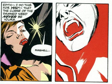
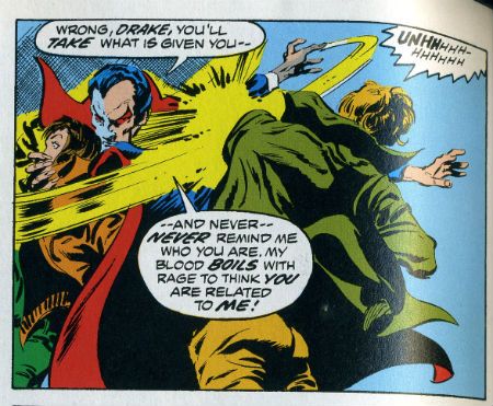
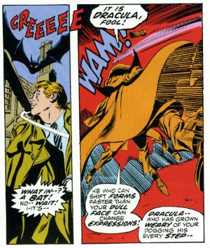
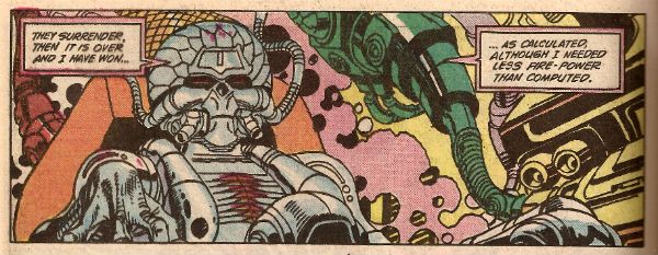
"Dig It, Fangs--" COMICS! Sometimes It's The Unsteady Dead!

It's a Skip Week! Oh, oh, the horror! So let's take your mind off it and hurriedly look at some comics which originally appeared some forty one years back. Way back, back when a lady entering a pub unaccompanied would be burned as a witch. And rightly so! Look, it was either this or I did a Best Comics of 2013 like everyone and their mother, but you know what The Best Comics of 2013 are? Whatever you think they are! Merry Christmas! Don’t worry, I try and get serious later. That’s usually quite funny isn't it; like a chimp baking or something? So, Tomb of Dracula!  photo ToDwordsB_zps757a4689.jpg
Anyway, this...

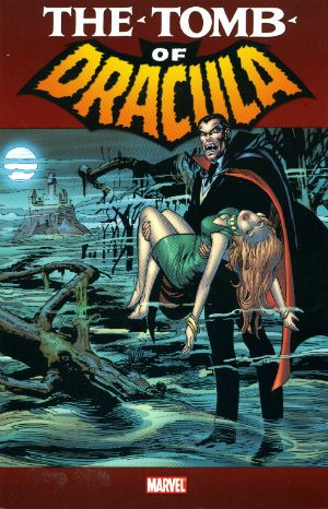
THE TOMB OF DRACULA Vol. 1 Penciler: Gene Colan Inkers: Gene Colan, Tom Palmer, Vince Colletta, Ernie Chan & Jack Abel Writers: Marv Wolfman, Gerry Conway, Archie Goodwin & Gardner Fox Colourists: Tom Palmer, Glynis Wein & Petra Goldberg Letterers: John Constanza, Artie Simek, Charlotte Jetter & Tom Orzechowski Front Cover: Neal Adams Contains material originally published in magazine form as Tomb of Dracula #1-12 (1972-3) Blade created by Gene Colan & Marv Wolfman Marvel, $24.99 (2010)

 photo ToDCoverB_zpsd9a029e5.jpg

The biggest surprise on reading this book was how long it takes for Marv Wolfman to show up (issue 7, p.137 ff). I’d got it into my head he and Gene Colan were there from the off but apparently not. Gene Colan’s here from the start but for most of this book he’s bolstering up a bugger's muddle of writers; each stopping only to catch their breath before being yanked out and replaced by the next passing writer. Stability only really even starts to settle in when Marv Wolfman starts bringing his own mug in, symbolically speaking. He's the one who, mostly in later volumes than this, defines the cast and events which would cause Tomb of Dracula to be so fondly remembered all these years later. Because it is a lot of years since these appeared. 1972! Or Nineteen Seventy Two as David Peace would have it.

 photo ToDEeeeB_zps723594c4.jpg

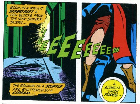
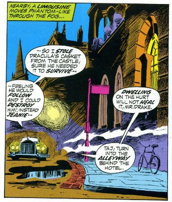
Tomb of Dracula is a bit of a bumpy ride writing wise; it’s a bit cacophonic in terms of authorial voices but that does mean it's never predictible. Gerry Conway starts us off and I have to say, credit where credit’s due and all that, I do have to say Gerry Conway starts proceedings off with a surprisingly strong first chapter. There’s a very adult air about the whole thing driven as it is by debts, resentful friendships and sour love. Really quite enjoyable and effective at hooking the reader in. Sadly his next chapter is pretty bad, largely being a rehash of the first issue and featuring some big bald dude who seems significant but is never seen again. Come issue 3 and Archie Goodwin tries to reign it all in to some shape, succumbing to his omnipresent Editor Within to explain continuity glitches away and home in on a coherent  narrative direction. This direction being, as it was throughout the series, finding a way to repurpose the Gothic trappings of Dracula within the heady, crazy days of the fast changing fondue-tastic, tie-dyed seventies. The book takes a while to settle into this and there are moments of inadvertent humour as Dracula is nearly bested by the use of car headlights, enlists children as feral weapons, encounters a projecter that can make an army of vampires (Don't ask. Really.), goes on a cruise, mixes it up with biker gangs and voodoo and dispenses advice to a couple of troubled teens hemmed in by small town life.  It's all very silly but quite charming.

 photo ToDSceneryB_zpsd9bb1dda.jpg

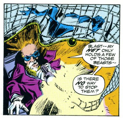
You can particularly feel Marv Wolfman settling in and becoming more comfortable and far more effective as the pages pass. And as the pages pass Wolfman's cast amasses. Largely a drab bunch to begin with things liven up with the arrival of Blade, the blaxploitation inspired vampire hunter who would go on to earn Marvel millions in other media. (Oh don’t worry, I’m not going to go into it. I mean, Christ forbid someone should express any concern for another human being. Particularly one they've never met. How absurd! I will say, to no one's surprise, I do think Marv Wolfman was badly treated in this instance.) Which is lucky because besides Harker with his seemingly magical wheelchair (which can access any location unaided no matter how remote) and his array of endearingly rubbish gadgets ("I call it...a net!")Dracula is the only real personality on show.

 photo ToDNetB_zps86cbd1c8.jpg

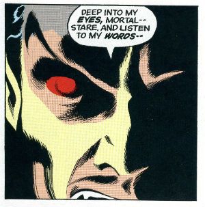
Good job it's his book. And it is his book. Despite being portrayed as a slap-happy chap who never changes his clothes and monologues like monologuing is in danger of going out of fashion Dracula really comes, er, alive by the end of the book. He's no frilly cuffed fop puling and whining like Andrew Bennet in I...Vampire. No, this dude is a proacative predator with schemes galore up his grave dirt soaked sleeves. Also, don't fuck with him because this Drac fucks back.  As our outclassed band of hunters discover to their chagrin in issue 12. In fact by that moment in the final issue reprinted here everything is meshing so smoothly that the art, writing, colouring all combine into this magnificent sequence atypical of '70s corporate comics in its artistic innovation and emotional impact:

 photo ToDgreatB_zps7ad4517b.jpg

Now fair warning; these comics are from an earlier day, a day in which comic book dialogue was distinct from dialogue in other media. Here people spout great gouts of unexpectedly near lyrical verbiage within a single panel portraying as swift an action as, say, Dracula slapping someone to the floor. (He does that a lot.)But then no one literally took the words being spoken to actually be occurring within the time frame of the action being portrayed. We were children, yes, but we weren’t idiots. Because back then comics were comics and cheerfully so. And one of the conventions of comics back then was that the dialogue would, yes, be the words spoken but these would be presented in a manner in which such words were supplemented by information informing the emotional affect, the emotional stakes of the scene and the emotional states of the players in question. Either via narrative text boxes or within the dialogue itself. Hence the overstuffed armchair of exposition effect modern readers often balk at. Inelegant as it may have been at its best the result was a very comics specific variation of, I guess, prosody.

 photo ToDProsodyB_zps870ae7ae.jpg

There’s an assumption that this method was unsophisticated; in fact it was very sophisticated. However, it was implicit, instinctive and had evolved naturally along with the comics form. It wasn’t pretty but it was one of the unique beauties of the comic form. It is of course dead now. And it died because it was very hard to reduce to a simple formula, thus it was hard to replicate and, not insignificantly, requires not a little knowledge and love of the English language. For a reader the dissimilarity between the old school and the new school is, I think, the difference between passively watching a story unfold and actively inhabiting a story as it develops. Both are valid, but I have always liked to live within my comics as I read them. It’s more difficult to do that now. But time passes, trends change and the moving finger writes; and having writ moves on…to television (it hopes). Of course the ascendant trend is borne not of artistic need but of expediency, the very expediency Gene Colan turned to his very great advantage.

 photo ToDFoolB_zps3d168259.jpg

Because if there’s one reason I bought this then that reason is Gene “The Dean” Colan. This time out the big thing I noticed about Gene Colan’s art (the inkers here varying from Palmer's sympathetic magic  to Colletta's reliably shitty hackwork) is how his signature style is shaped by the demands of his job. Every page and every panel on these pages is an illustration not only of whatever the script calls for but also of the requisite rapidity a Bronze Age comics warrior's position entailed. Gene Colan’s work here is a series of exercises in expediency. The genius is that he manages to turn this from a stylistic restraint into an instrument of stylistic release. Using shadows, bizarre POVs and about three battered postcards of London Gene Colan provides an England that never was, but an England absolutely fitting to the pulpy melodrama at play. And he populates this eerie environment with figures whose startlingly realistic faces contrast starkly with the impossibility of their bodies; these bodies apparently composed of clothes filled with living winds in fluctuating states of agitation. As a result Colan’s pictures are pickled in atmosphere and thrumming with potential threat. So, when the kick off comes (and come it always does) Colan’s flailing and comprehensively wind whipped figures whirl around a world filled with fearful shadows. More than anyone else involved Gene Colan makes Tomb of Dracula the success it is. When I was young I thought Gene Colan’s art was awesome simply because it looked awesome now I am less young I think Gene Colan’s art is more awesome still because I now have the merest inkling of the skill involved. That’s why Gene’s The Bursar! I mean, that’s why Gene’s The Dean! And ultimatley that's why Tomb of Dracula Vol. 1 is VERY GOOD!

It's also, it almost goes without saying, COMICS!!!

"You See That? He's STILL The Greatest!" COMICS! Sometimes It's GilWolf Unbound!

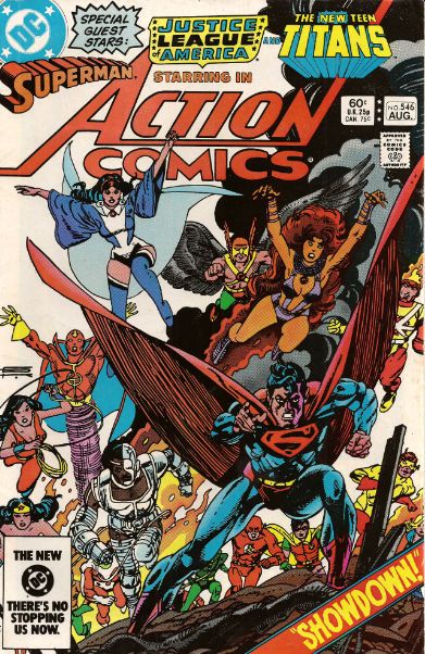
A-huh! HUH! It’s another instalment of Gil Happy! Unsightly blemishes are a thing of the past as Gil Kane and his plucky sidekick, Marv Wolfman, team up with friends galore to document the exciting, amazing and thoroughly ridiculous adventures of 1980s Superman. Bonus! Feel the years just fall away as we revisit that time a comics creator flicked DC’s tie back in its face! Documentary evidence provided! Anyway this…

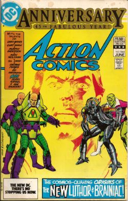
 photo Anniv08B_zps923d1c52.jpg DC's Legal Department in a self congratulatory mood...oh, sorry, it's actually Brainiac!

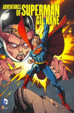
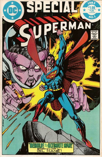
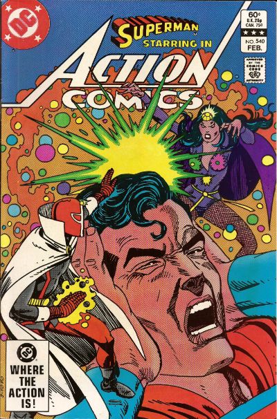
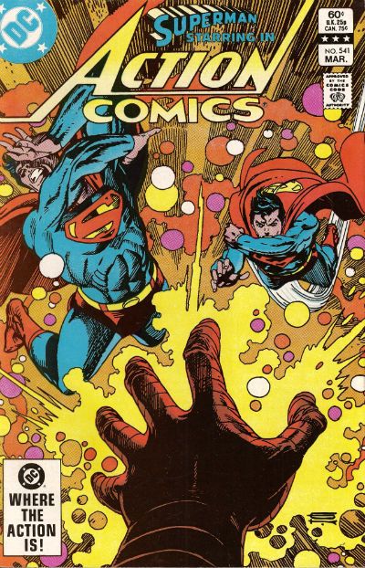
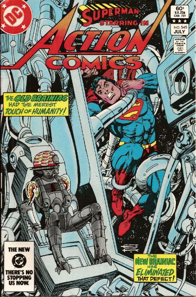
ADVENTURES OF SUPERMAN: GIL KANE Art by Gil Kane Written by Marv Wolfman, Martin Pasko, Bob Rozakis, Gil Kane, Cary Bates, Roy Thomas and Joey Cavalieri Coloured by Tom Ziuko, Gene D'Angelo, Anthony Tollin, Jerry serpe and Carl Gafford Lettered by Shirley Leferman, Ben Oda, Gaspar Saladino, Andy Kubert, Milt Snapinn and Todd Klein Originally published in Action Comics #539-541, 544-546, DC Comics Presents Annual #3, Superman #367, 372, 375 and Superman Special #1 and 2 DC Comics, $39.99 (2012)

Superman created by Jerry Siegel and Joe Shuster

 photo Cover_B_zpsb1bec174.jpg

AN APOLOGY: John's scanner is still acting up. While this sounds like John's housemate is Darryl Revok and he isn't doing his share of the washing up, what it really means is that all images are not taken from this book. All images in the body of the review are in the book but in a much cleaner, nicer form. I apologise for this.

I've mentioned some of the comics contained herein on previous occasions. Usually I've emphasised the art as the stories seemed a bit, er, slapdash. Since my age tanned run was incomplete I thought this was the result of absent chapters. Having experienced the visually splendid whole I find that, in fact, the stories are just straight-up nonsensical and preposterous in the extreme. That’s not intended as a slur on Marv Wolfman, who is a pretty decent comic book writer. Indeed, shortly after these issues he would have a far more coherent run on Adventures of Superman with Jerry Ordway following the Byrne re-boot. This does suggest that Gil Kane had the storytelling/plotting lead here and while he has given himself plenty of ostentatious incidents to illustrate the burden on explaining these, seemingly after the fact, falls to Wolfman. Most of whose intellectual energies are engaged with coming up with various different scientific, cough, results for Superman spinning around very fast indeed. I may exaggerate upon occasion but I feel safe in saying that if you are a fan of pictures of Superman spinning around very fast indeed you will want to marry this book. There are a lot of pictures of Superman spinning around very fast indeed, is what I’m getting at there.

 photo Anniv07B_zps7232b157.jpg No, he isn't spinning around but it is all quite exciting!

As a writer Wolfman gets some craft scraps in the form of Lana And Lois continually trying to c*** block one another over Clark and a slightly less ludicrous approach to inter-personal dynamics than comics may previously have shown. I said, slightly. Yes, Jimmy Olsen does put on a magic show for orphans because - you don’t fuck with the classics. Wolfman does refer to Joanie Loves Chacchi and for this he should never, ever be forgiven. Ideally there’d be an introduction in which Wolfman explained how the book came to be but DC splashed out on glossy paper instead, I guess. Tightwads. As it is I have made a great deal of assumptions so maybe I am wrong. Maybe Marv Wolfman forced Gil Kane to illustrate his scripts exactly as written so convinced was he of their literary worth. Maybe. I doubt it. Anyway, none of it makes any sense at all but Marv Wolfman does make it hold together enough for rational human beings to enjoy the book’s goofy charms without getting nosebleeds. Just about. C’mon, it’s a comic about a flying man with a good heart drawn by Gil Kane and that’s enough for me.

 photo Anniv06B_zps1b6b2b47.jpg

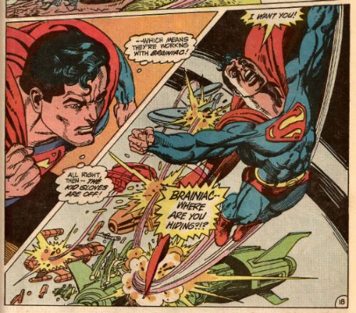
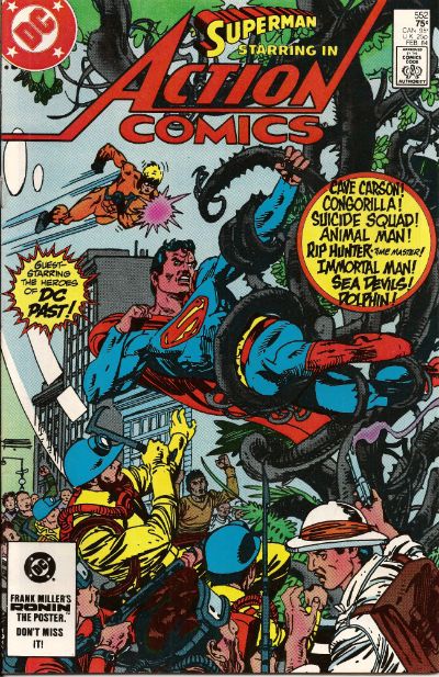
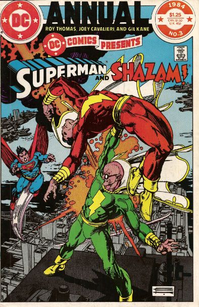
Gil Kane just straight up drew the Hell out of this panel, didn't he? The collection eases you into the insanity with a couple of shorts one of which is about how if you ignore a hosepipe ban Superman will pay you a personal visit and tell you a story about Krypton expressly designed to make you feel like a proper shitheel. Where I live a man from the Council with cheap shoes and a bad haircut would come round and threaten to fine you which, frankly, lacks razzamatazz in comparison. GilWolf©’s run proper starts with a tale concerning two sorcerers who seek a divorce via time travelling magical violence. Relax, they are a lady and a man so bigots can enjoy this tale too. This magical marital disharmony results in Superman’s doppelganger creating the universe at the dawn of time, where he is spotted by Brainiac whose disembodied consciousness has travelled back to the dawn of creation because mumble mumble. Brainiac, now a fussily re-designed robot, entirely reasonably comes away with the impression that Superman is the Angel of Death or something and pressgangs several planets’ populations into an army. After failing to kill Superman because his plans repeatedly fail to take into account the power of spinning around very fast indeed, Brainiac attacks earth whereupon Gil Kane draws a whole issue where the JLA and Teen Titans fight, fight, fight those coerced alien rascals. This is a mid-way high point as Gil Kane demonstrates you don’t need six fucking months to draw some robots and rubble as well as proving it is possible to draw Starfire without making me ashamed of my entire gender. As I implied, there’s more to come and that more involves a parade of DC’s Lamest Heroes© (who are actually fantastic in their lameness and this world is all the poorer without them), Vandal Savage, some pyramids, aliens, stuff, nonsense, bit, bobs, maybe even a kitchen sink and it all culminates chaotically in that fantastic single issue where Jerry Siegel and Joe Shuster create Superman and save the world through their pluck, belief and imagination. I may have mentioned that one before. Fair play though; it’s impressive how each storyline in the main run flows into the next, with elements being carried across and the whole thing building to the magnificently shameless optimism of the final chapter. Sure, it’s crackers but it’s quality crackers. The book ends with a DC COMICS PRESENTS ANNUAL where Superman, Superman of Earth -2 and Captain “Shazam” Marvel fight Silvana which is beautiful in its combination of single minded narrative simplicity and the raw joy communicated by Gil Kane’s art.

 photo SwoopInB_zpsf4eaf735.jpg Swooping in...

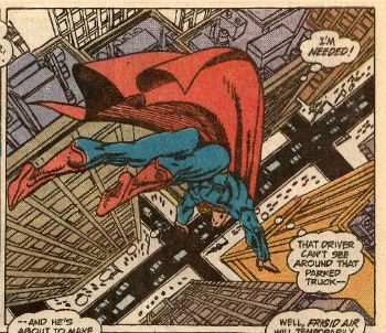
And it’s that art you’ll mostly be revelling in. Because, Gil Kane. Keep up, son. Art-wise the big thing I noticed reading these comics in a fat batch wasn't just all Gil Kane’s usual tricks but a couple of new ones. Well, new to me, I’m hardly Oliver Observant you know. I’ll just focus on one because you look a bit restless; apparently having forgotten that you can stop reading this at any time you like. Now, we all know that people being punched so hard they back flip out of the panel is a ©Gil Kane move. It’s not exactly subtle is it? It’s only due to the limits of reality that the back flipping dude isn't literally in your face. But a slyer move Gil Kane sneaks in is a number of panels where a character will be flying, leaping, bounding etc (as Kane’s athletic characters were wont to do) and some extremity or other crosses beyond the panel border. This basically flips the effect of the “punch out” panels to give the impression of the figure entering the panel/page from without. Sometimes the character’s extremity just fails to cross the border but due to the position and tendency of the figure with the other contents of the panel it’s unmistakably the artist’s intention to communicate the impression of entrance. Over the long haul the combination of these “punch out” and “plunge in” panels create, I think, a particular and magical effect. Rather than the panels on the page being read as images projected onto the flat page and the “screen” of each panel, Kane’s pages are like windows onto another world. Another couple of scotches and I’d be trying to push my face into the panels imagining it looming hugely out of a cloud on the other side of the dimensional barrier that Kane’s art creates the illusion of having broken. Due to Kane’s distinctively friable style it’s obviously not our reality but it could be easily be a world where everything looks like Gil Kane drew it. That’s just the one thing I noticed, there’s plenty of others. As the art goes there’s something to ponder, admire or puzzle over on every one of these pages. Even if that thing is just that someone with talents so awesome and honed by practice could still have such trouble drawing feet.

 photo Act_CAWMON_B-1_zps5523acec.jpg Gil Kane was quite a humorous artist too. That guy in the foreground is not only doing a "Hey, youse guys, check out alla da commotion!" pose but the fact that the same pose crops up again and again in more modern milieu implicitly makes this chump the ancestor of many of Kane's foreground folk.

Oh, wait, before you all go could DC Comics just stay behind for a minute…thank you.

Now, I take no pleasure at all in pointing this out but if we don’t address this issue it may have ramifications for your future. So, this book cost £39.99, which is no small sum, and on the back of the jacket there is this blurb:

"Kane's work of Superman shined on such titles as..."

Look, DC Comics, I’m not unsympathetic; I realise these are tight times for us all and I guess, allegedly, crushing the dreams of elderly people in courts of Law is a pricey business. But the apparent outsourcing of your proof reading to the linguistically challenged Brian Bendis is just a false economy. No good can come of it. It hardly speaks to a commitment to quality commensurate with your position in the industry does it now? Treating your audience with the same disdain as you now treat creators post Levitz/Kahn might not actually be the soundest policy with regards to the future. Just a thought there. Don’t let me have to detain you again. Now go outside and play in the sun.

Despite DC Comics’ best efforts at self-sabotage ADVENTURES OF SUPERMAN: GIL KANE is VERY GOOD!

However, purchasers will miss out on the non-Gil Kane contents of ACTION #544. But it’s okay because I have that issue and I can fill you in on what you missed. The issue in question is an Anniversary issue and so to celebrate DC Comics got the creators of Superman to contribute.

 photo Anniv01B_zps9c42bd68.jpg Art by Gil Kane and Dick Giordano

That’s Mr Jerome Siegel and Mr Joseph Shuster I’m talking about there. You may remember them fondly from decades of legal hassle with DC Comics. I guess there was a bit of a truce on at the time. DC was paying them something at least, I imagine. Everybody on their best behaviour and all that. So, being the writer, Jerry Siegel gives us several thousand words reminiscing about the creation of Superman; thanking all the people who helped it become a success; how it defined his life and such. It’s all very temperate and polite. Neal Adams et al are all thanked but he doesn’t explicitly say that’s he’s thanking them for securing Joe and he the payments from DC then currently ensuring the truce and the good behaviour.

The whole thing is sweet and kind of heartbreaky. Mind you, the fact that it’s actually addressed to Superman throughout in the manner of one of those letters dead parents leave for their children to find, the ones which emphasise how the child enriched the parent’s truncated life, kind of gets the ducts filling early anyway. Of course, hearts are harder these days, with most of fandom more concerned with how the Siegel & Shuster legal battles would affect the possibility of a Justice League movie or whether Superman’s trunks could come back. Because, priorities.

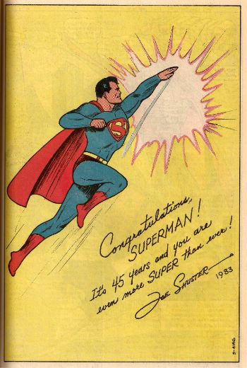
Being the artist Joe Shuster submits this charming piece:

 photo Anniv04B_zps04ca07dd.jpg

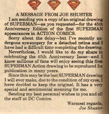
Now, as nice as that is the words he sent it with knock it into a cocked hat. This is what Joe Shuster wrote:

 photo Anniv05B_zps500b1f57.jpg

"...I have decided to keep the original."

All those years, all those lawyers and they didn’t break him.

HA! Now that’s not comics but it is very - COMICS!!!

Have a good Easter now, y'all!

"...Primitive Lyricism..." PEOPLE! Sometimes Gil's Gone!

Gil Kane died on 31 January in the year 2000 A.D. Photobucket

Time enough has now passed that although I still feel the loss of his gargantuan talents I am past the garment rending and hair pulling stage. I will never be beyond the celebrating his work stage though. So what follows is a brief visual burst of Gil Kane's genius from the '80s. After all ACTIONs speak louder than words and Gil was a man of great experience...

"So I know the one quality that I'm always trying to push through in my work is grace and power. Sort of primitive lyricism that I've been capable of. I thought that that's the one quality that sort of saved me and permeated my work and gave me any kind of legitimate status...the thing that I had going for me was that the only thing I wanted to express essentially was the sentimental fall with grace and power, and I try to do that with every drawing I ever did." Gil Kane Gil Kane: Art And Interviews by Daniel Herman (Hermes Press, 2002)

Superman was created by Jerry Siegel & Joe Shuster


Photobucket

Photobucket

Photobucket

Photobucket

Photobucket

Photobucket

Photobucket

Photobucket

Photobucket

Photobucket

Photobucket

Photobucket

Photobucket

Photobucket

Photobucket

Photobucket

Photobucket

Photobucket

Photobucket

KANE: I liked those stories. Gil Kane on the GilWolf™’ Superman comics Gil Kane: Art And Interviews by Daniel Herman (Hermes Press, 2002)

Gil Kane (1926 - 2000)

_________________________________________________________________________

Photobucket

Hopefully, this being the anniversary of Gil Kane's passing, The Internet is alive with chat about this man with élan. After all last time on I Will Make You Care About Gil Kane Before Death Claims Me I was more than likely getting all teary-eyed about the fact no one seemed to talk about Gentleman Gil much these days.  Serendipitously I had read Charles Nicholl's Guardian review of  Andrew Hadfield's Edmund Spenser: A Life. Said review began:

"There is a rather deadly kind of literary fame which TS Eliot neatly defined as a "conspiracy of approval". It condemns a writer" to be universally accepted; to be damned by the praise that quenches all desire to read the book; to be afflicted by the imputation of virtues which excite the least pleasure; and to be read only by historians and antiquaries". (Fairy Singer, Colonial Apparatchik by Charles Nicholl, The Guardian, 21/07/2012)

Although I can feel my face fair sodden by your salivations at the prospect of me going on about TS Eliot or Edmund Spenser I am, in fact, going to stop there because I think the point has been made. It's a good point;  one all the better for not being mine. Is that's what has happened to Gentleman Gil? Is he a victim of the "conspiracy of approval"? I don't want that to happen here; in my series of wholly unbiased and never (never!) hyperbolic pieces on Gil Kane the idea will be be to arouse you to such a state that you might go and try some of his stuff. If you go, "Well, Gil Kane sure sounds good. Now, how about I dip my eyes in  some sweet, sweet Tony Daniel magic!" then I have failed.

Or as Johnny Cash put it somewhat more succinctly:

"Did you forget the folk singer so soon? And did you forget my song?"

We are in fact a couple of posts into "Gil Happy!" already so we have avoided the whole here's what I'll be doing oh no I won't rigmarole this time out.

There'll be other stuff too but there will definitely be more Gil Kane and always, always more COMICS!!!

"Believe!..BELIEVE!!" COMICS! Sometimes Imagination Changes EVERYTHING!

I hear your pain, people! January is a real nutcracker ain't it. What we need, as  Bonnie Tyler advised, is a hero. And, yes, Virginia, there are still heroes. It's just sometimes you have to root about in the back issue bins to find 'em. I found one. I found a Hero. Photobucket

What's the best Superman story ever, ever, ever? It's a question that has occupied many minds for many decades; a real bone of contention with the self explanatory importance of the issue justifying every brutally curtailed friendship, divided family, and more than one instance of burning dog poo being forced through someone's letterbox. Sorry about that, Mom, but it's an inflammatory subject and fiery faeces spoke more eloquently than I ever could. Look, tempers can run high. Luckily, I'm here to solve the conundrum for all time for I, as ever, am totally right once again. It's a gift and yet, at times, a curse. Don't envy me too quickly. Anyway, the best Superman story ever, ever, ever is: Photobucket

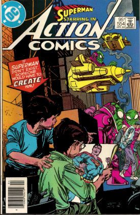
ACTION COMICS #554 "If Superman Didn't Exist..." Art by Gentleman Gil Kane Written by Mighty Marv Wolfman Coloured by Bountiful Ben Oda Coloured by Tiny Tony Tollin DC Comics, $0.95 (Apr 1984) Superman created by Jerry Siegel & Joe Shuster

The title is such an obvious construction that you've probably already completed the missing words signified by the ellipsis. "...then it would be necessary to invent him." And you would be 100% correct. Take a bow! But this is ACTION COMICS where Superman already exists so what, by the ruby rays of Rao, the dingdangdong is going on here? Specifically here being ACTION COMICS #554 and unbeknownst to most ACTION COMICS #554 is the glorious summit of  Gil Kane and Marv Wolfman's run on the title.  A run which I believe has just been collected in a hardback from DC Comics. A book which Babylonian Brian Hibbs will gladly sell you in return for cold hard cash. That's how he works, it's too late to change him.

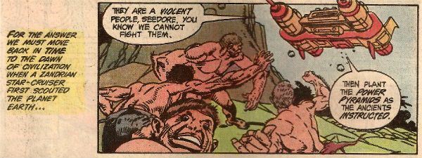
When I first read this comic a while ago though I didn't know it had been preceded by a long build up, it was just this weird story where there was a world without a Superman but which sorely needed a Superman. It had, in fact, been a world with a Superman but due to a series of quite magnificently preposterous events throughout GilWolf™'s run (I later learned, because it's never too late to learn!) Superman had been erased from the fabric of this (his) world as  thoroughly as your mother erased those adolescent stains from the fabric of your underoos. Although in this case via the use of  "power pyramids" rather than a boil wash and some sturdy tongs.

Photobucket

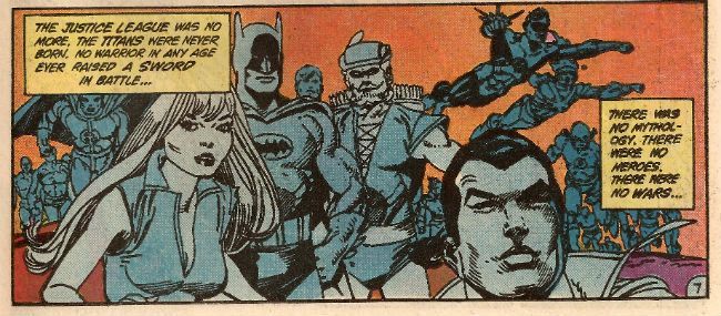
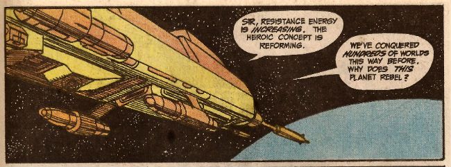
The details don't matter, all that matters is that the course of world history has been changed retroactively. Not only is there no Superman there is no "heroic concept"! This is because there is no War and never has been. Rather depressingly this has led to an agrarian plough level civilisation of scattered settlements. People wear baggy clothes and sport bowl haircuts like some horrific world-wide Madchester revival and while technology is rudimentary they have, astonishingly, developed corrective eye wear. On balance the drab content of life in 20th Century Earth in exchange for millions of years of suffering and violence is probably a fair trade but, crucially, it has sadly left Earth open to a full on conquering by an alien race. Which was said alien race's plan all along. All resistance has been removed, yea unto the very fish that crawled onto the shores and walked. Cunning, perhaps but  thorough, most definitely.

Photobucket

The source of earth's salvation comes from two wee tow-headed scamps renowned about the township for their useless dreaming and pointless imaginings. Two tow-headed scamps by the name of Jerry and Joe.

Jerry and Joe.

Oh, you worked it out. (Someone give that guy at the back a hand. 'Sokay we can wait.)

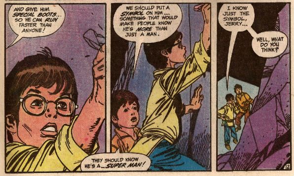
Jerry and Joe realise that to resist the invaders the Earth needs a hero so they hide in a cave and chalk upon the walls the design of this man who "...comes from the stars...", this man who's "GOOD instead of being BAD..." this man with "...a Cape...to CATCH THE WIND!" This man ends up being Liberace, who while very entertaining isn't much use against an alien invasion, so they try again and come up with "...a...SUPER MAN!".  This seems more like what they were after and in short order this creature birthed from the human imagination and powered by human belief sets all things aright as Superman is restored to the world and all is well again. Of course, that mean's War is back but so are aspirin and microwaves but, hey, comme ci, comme ça, amiright? That's rhetorical, we already established I am always right back at the top.

Now, this isn't exactly what you might call a realistic premise. It's not terribly likely is it? I mean I love this comic but even I don't think you can imagine Superman up, believe in him and he will exist and sort it all out. I've been trying long enough and hard enough I've given myself a hernia and - no dice so far. I will keep you posted though. No, it's not supposed to be realistic. It's supposed be inspiring and entertaining. Heroic even. And I like that. I like that a lot.

Photobucket

Most (but not all) of the success here can of course be laid at the feet of Gentleman Gil Kane whose art is present in all it's '80s prime. The '80s was, for me, Gil Kane's Shining Time. The time when he had the inking nous to finally do his own pencils justice and the editorial clout to ensure he got to ink himself. While in previous decades Kane was often a hostage to unsympathetic inking the '80s saw Kane unleashed as never before. Yes, I quite like Kane's '8os art. I see '80s Gil Kane in much the same way as '70s Kirby (KOIBY!!!) - a thing unique and entire unto itself. Both styles are so complete that no further development is desirable or, I strongly suspect, possible.  Even Kane's shortcomings work to his advantage here. His perfunctory space ships and goofy aliens play into the childish naivete of the narrative. For it is an intentionally childish narrative I think. It's often thought that people like Kane and Wolfman were unsophisticated storytellers since, um, craft apparently only got invented ten years ago or some such horseshit which flatters the current generation. But there are many levels of sophistication and one of these levels is surely being able to pitch a tale to appeal to children while at the same time winking at adults.

Photobucket

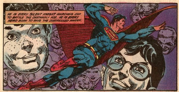
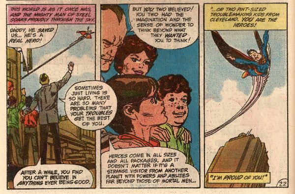
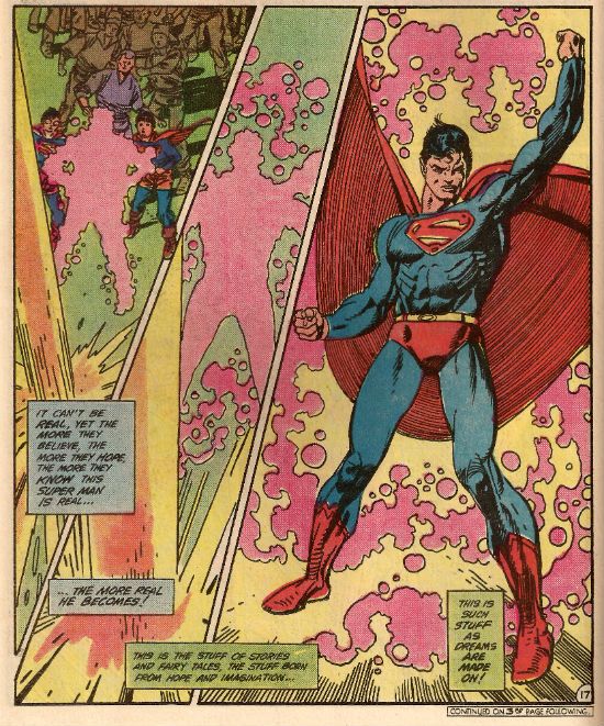
Here kids can thrill to the scrappy youngsters showing the adults what's what despite the initial disbelief, get a little fearful frisson when the parents die, be reassured when it turns out the aliens were kidnapping not killing the adults and, finally, soar with Superman as the impossible becomes possible because two children dreamed a dream which became real.  Adults of course can get a kick out of the goofy antics as well as enjoy the cheeky moments of humour such as when Joe enquires after his parents and an adult just blandly states, "They're probably DEAD. Buried under the RUBBLE." or when the plucky pair outline their insane plan only for a kid to say "But that makes no semnffmfm" his latter words muffled because an adult has just shut him up with a stern hand. GilWolf™ are not unaware of the daffiness they are dealing in and handle it with a balance and surety easily missed. But you can't miss, no one could miss, the glory of Kane's Superman. Initially appearing as a chalk drawing (an amazingly detailed and preternaturally accomplished chalk drawing - a lot like a Gil Kane drawing (another wink)) Kane's Superman is revealed in an amazing sequence that thrums with power, so much so that Wolfman has little recourse but to resort to the Greatest Wordsmith of all  - The Shakespeare. The insane and impossible magic achieved by combining words and pictures and imagination reaches its magnificent apogee here. After this things necessarily fall off a bit (or the risk would be that the reader's head would melt) but Kane's Superman is still like unto a God or at least a Roman Hellenistic statue of a God. A stutue that moves, because, boy, does Gil Kane's Superman move. When he's in motion, and he is mostly in motion, Kane's Superman is fluidity and power in perfect union. Kane's Superman looks delighted to be alive. Kane's Superman is so transported by the act of living even his cape blooms like a physical flare of joy.

Photobucket

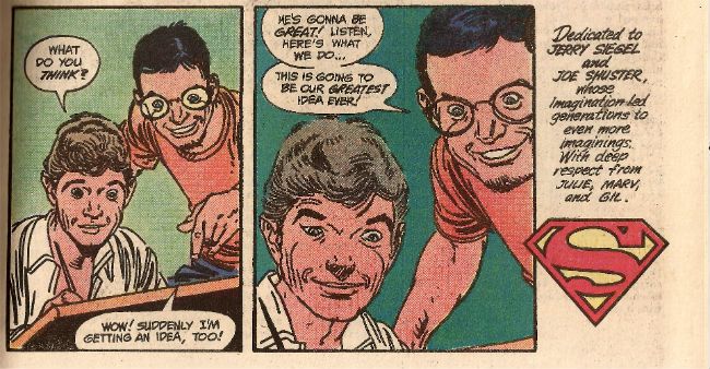
And as Superman flies off to heal the world on a monthly basis once more the story shifts scene a final time to another pair of kids. An older pair but a pair engaged in a similar exercise of imagination. The exercise of imagination known as creation. Two kids called Joseph and Jack.

Joseph and Jack.

Joseph and Jack.

'Nuff Said, right?

And maybe that, in the end, is why ACTION COMICS #554 is the greatest Superman story ever told. Because although it could only whisper it tried to tell us the truth. About creation. About imagination and the people who have it and where the real original value in all these creations, all these billion dollar making creations, resides. It resides in the act of creation and it resides in those who have imagination enough to create.

Photobucket

For Joe and Jerry.

For Joseph and Jack.

For the creators.

For COMICS!!!


Wait, What? Ep. 111: Things That Go Wrong...

PhotobucketIt's....not easy to explain. Trust me.

Oh, man.  Remember all the questions you guys asked us and we didn't get to?  Well, don't say we didn't start 2013 right!

After the jump:  Show notes,  no more terrifying photos, still kissing with saliva, etc., etc.

0:00-12:00:  Greetings!  Before the comics talk, Graeme and Jeff catch up with what they did during the holidays.  Unsurprisingly, Jeff got sick and moped.  Even less surprisingly, Graeme worked. And worked.  And worked.  Other exciting topics covered:  inadvertent tech problems, deliberate tech problems, Cocoa Pebbles, Cocoa Puffs, and Cocoa Krispies and Honey Monster, the Sugar Puffs mascot. 12:00-29:03: Jeff talks about the first season of American Horror Story, which is another "what we did during the holidays" topic, and that leads into a discussion about things that go wrong, TV, and includes mention of The West Wing and Agatha Christie's Tommy and Tuppence.  And, just as we almost start talking about comics, we swerve and talk about Misfits about which, in a weird reversal of the status quo, Jeff is caught up on and Graeme is not.  Also, you will never know how much coughing I had to edit out to make this sound at all listenable, but it was kind of a lot.  Some of them I had to keep in so we could (sort of) hear Graeme.  Sorry about that. 29:03-36:16:  Graeme lists the comics he's read! Hey everybody, we're talking about comics!  Well, starting to talk about comics! Well, almost…starting to…talk… 36:16-36:52: Intermission Uno! 36:52-38:52:  Hey, who has two thumbs and has been interviewed again by Canadian Television? This guy….Graeme McMillan, whom we all know.  Yes, CL Cool Graeme (Canada Loves Cool Graeme) is burning up the airwaves. 38:52-56:58:  Comics!  We were supposed to talk about all those books Graeme listed so of course…we don't talk about them.  Instead, we talk about Amazing Spider-Man #700. 56:58-1:05:35: And from there, we talk a spot of news--the promotions of Bob Harras and Hank Kanalz over at DC. Also, those great lists of CE's top-selling books for 2012. 1:05:35-1:05:50: And so…we finally get around to talking about the list of comics Graeme bought!  Or….do we? (Hint: we don't). 1:05:50-1:06:38: Intermission Two! 1:06:38-1:07:23: And we're back…and the sound is a bit hinky for some reason? Have we thanked you for continuing to listen to us recently?  We really should! 1:07:23-1:23:23:  Remember that list of comics Graeme mentioned way back when?  Here it is! A delightful batch of old issues Graeme picked up at his local comic book shop's sale: Batman and the Outsiders Annual #1 (1984); DC Comics Presents #60 (Superman and Guardians of the Universe);    Machine Man #10 by Marv Wolfman and Steve Ditko; Micronauts Annual #1 (1979); Mr. Miracle Special by Mark Evanier and Steve Rude (1987); and the DC Comics Mystery In Space DC Presents One-Shot (2004) featuring Elliot S! Maggin & J.H. Williams III, and Grant Morrison & Jerry Ordway. 1:23:23-1:39:12: Also, something comics-related(!):  Graeme and I talk Final Crisis since both of us (weirdly enough) had re-read it in the last month or so:  ccontinuity, the New 52, reverse time, and issues of race, are among the subjects of our conversational hand-wringing. Then…techpocalypse forces us to cut things short in mid-convo and try again. 1:39:12-1:39:32: Intermission 3! 1:39:32-1:42:35: And we are back! (After a few failed attempts, which were a bit on the crazy-making side of things?)  So it's back to more Final Crisis talk--where are those Batman issues?  What about the Legion of 3 Worlds? 1:42:35-end: And now on to some quick chat about new comics--Flash #15 and its amazing second half by Francis Manapul; New Avengers #1 by Jonathan Hickman and Steve Epting (including a shout-out to Abhay's fantastic commentary on Hickman's Secret); Sachie-Chan Good!! by Akira Toriyama and Masakazu Katsura (which inspires Graeme to recount the "Miss Universe" pitch from the Downey Files podcast); Batman Inc. #6; Saga #8; Wonder Woman #15; Fatale #11 by Brubaker and Phillips; Prophet #32; Godzilla: The Half-Century War #4; Witch-Doctor: Mal Practice #2; and (digitally) the first volume of Kikaider by Shotaro Ishinomori (sooooo good!)  And then a little after the two hour mark--we are finished!  For now. [Cue ominous music...]

As I'm a bit out of practice, a bit sick, and staring down the barrel of an early wake-up call, let me just cut through the niceties and say: it's good to be back!  (Hold up, brain: isn't that a nicety right there?)  And blah blah blah blah iTunes, but also right here, and so on:

Wait, What? Ep. 111: Things That Go Wrong

Ah, but no worries we will be back next week--here is to a Happy New Year to all and, as you may have guessed, we thank you for listening!

"Choke! Gasp!" Not A Podcast! A Sort Of Smörgåsbord! Look, It's Free. Okay?!?

Hey now, hey now, hey now, now! I hear there's no podcast this week because Gentle Jeff is blowing up balloons and Glamorous Graeme is helping out by asking him how that there balloon blowing up stuff is going!  It's a skip week is what I'm saying. Dry your eyes, o child of woe, for I have written about some stuff I bought with my own money and read with my own eyes. Yes, Superman's in it. A bit. Oh, I will make you miss Jeff and Graeme, I will make you hunger for them..!

Photobucket (Panel by Steve Ditko & Len Wein from THE DEMON in The Fatal Finale, Detective Comics #485, 1979, DC Comics)

BANG! And we're off!

54 By Wu Ming Translated from the Italian by Shaun Whiteside William Heinemann Ltd, 640pp. (2005)

Photobucket

Being the first words you'll read: "'Postwar means nothing. What fools called 'peace' simply meant moving away from the front. Fools defended peace by supporting the armed wings of money. Beyond the next dune the clashes continued..."

This is the slightly disappointing second novel by Wu Ming who are an Italian collective of writers with a, to my eyes, somewhat Socialist bent. I guess they like to kneecap any possible success as they write under the name Wu Ming nowadays rather than the name Luther Blisset; which name adorned the cover of their first, very successful, novel Q. If you wanted to read a sort of James Ellroy American Confidential take on The Reformation then Q's your (very good) book. If you want to read a book about that time America got all in a snit about tea or something and turned their backs on the truly magical and sublime people of Britain then Manituana's your book. I haven't finished that one yet but it is quite fascinating, particularly as, so far, it is treating the British as the good guys which is a novel tack to take. I mean, not even we think we were the good guys in that one. (Don't tell the Yanks though, they'll just go on about it. Lovely people, though.) 54 attempts to illustrate the neglected landscape of European Socialism following Stalin's death together with the spread of organised crime and the cancerous spread of the then nascent technology of TV. Sadly as impressively ambitious as it was 54 never really gelled for me, although it was always at least entertaining, and never more so than in the excellent chapters in which Cary Grant goes on a covert mission to scope out Tito's intentions. They are really, really good at capturing Cary Grant's Cary Grantiness so that brings it up to GOOD!

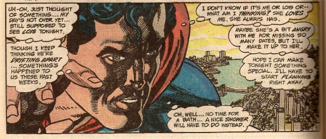
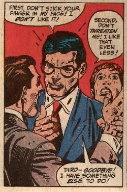
Speaking of Cary Grant, does anyone else remember that time in the '80s when Gil Kane drew ACTION COMICS and Marv Wolfman wrote Clark Kent just like Cary Grant?

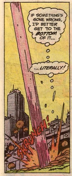
Photobucket (Panel by Gil Kane & Marv Wolfman from ACTION COMICS #546, 1983, DC Comics)

Totally Cary Grant! Kudos Marv Wolfman!

THE SENSE OF AN ENDING By Julian Barnes Jonathan Cape, 150 pp. (2011)

Photobucket

Being the first words you'll read: "I remember, in no particular order:  - a shiny inner wrist;  - steam rising from a wet sink as a hot frying pan is laughingly tossed into it;  - gouts of sperm circling a plughole, before being sluiced down the full length of a tall house;"

A stately paced shaggy dog story where the plot creaks under the weight of Barnes’ beautifully observed evocation of a time and, perhaps, a kind of person now lost in history. So effective is Barne's precise and poised prose in evoking the humdrum human of the recently deceased past that the whole thing runs the risk of, to anyone who isn't British,  seeming like some alternate world. The book beautifully undermines the idiocy that The Past was Better by gently and only allusively revealing ways we self servingly corrupt, and in our turn are corrupted, by memory. The polite manners and sedate delicacy often latched upon as defining post-war Britain  are revealed as merely a thin coating of anaglypta over the usual seedy world and all the lovely ways we find to hurt each other. This is how people lived, but. more tellingly, it's how people remember themselves as having lived. All the restraint concerning matters of courting will no doubt be particularly opaque to a generation which, The Internet shows me, believes a romantic encounter should end with the man naked and apparently so enraged that he appears to be attempting to tear off his own cock and fling it in the upturned face of a kneeling woman who looks like she recently lost a fight with a teacup full of wallpaper paste. Kids today! Unlike modern mating rituals this book was VERY GOOD!

LIONEL ASBO: STATE OF ENGLAND By Martin Amis Jonathan Cape, 288 pp. (2012)

Photobucket

Being the first words you will read (errors intentional): "Dear Jennavieve, I'm having an affair with an older woman. Shes' a lady of some sophistication, and makes a refreshing change from the teen agers I know (like Alektra for example, or Chanel.) The sex is fantastic and I think I'm in love. But ther'es one very serious complication and i'ts this; shes' my Gran!"

I was going to do a whole thing about how editors don’t even edit books properly never mind comics anymore, because this book has the occasional jarring slip that suggests Martin Amis isn't entirely au-fait with the world outside his window. Things like the prominence given to studying for O-Levels when O-Levels no longer exist. And then The Tories only announce they are bringing them back! Coming soon because you demanded it: poor houses, indentured servitude, cholera, drought de seignior, rickets and powdered wigs. Martin Amis has been at pains to point out that the publication of his latest book isn't a fond fuck you very much to the country he’s just left in order to live in someplace called America. This one, as in most Late Amis (Late because he's in his sixth decade, so enfant terrible, my arse), is a bit wobbly; the hideously repellent balanced with the cloyingly sentimental to not entirely satisfactory effect but then, not entirely unsatisfactory effect either. As in Any Amis the prose is just blinding, pal. That's the real reason for cracking an Amis and he doesn't disappoint here. He's mainly concerned with putting the case forward for education as a more viable form of self improvement than, y'know, becoming famous for fucking nothing in point of fact. Safe and well trod ground that may be but it does allow him to dust off his spats and tip his boater for a series of comedic showstoppers involving a Jordan manqué. For non-British visitors; a Jordan is like a Kardashian but without the classiness or self respect. Excitingly a Jordan sells more books than a Martin Amis, despite the fact Jordan doesn't even write them. It’s not a secret either. She’s a brand see so that’s okay. That’s where all your branding gets you. Branding’s what they used to do to cattle. And even cattle had the sense to struggle. Cows, there, I’m mainly talking about cows, horses too but mainly cows. When people who say "brand" without an inadvertent bit of sick slipping out and down their lost and hopeless face dream do they dream of beige formica? I’m not talking about ants there, either. Lost you now, haven’t I? Branding. Christ, I’m going to have a little sit down now and collect myself. Branding. Christ. What? Oh, the book's GOOD!

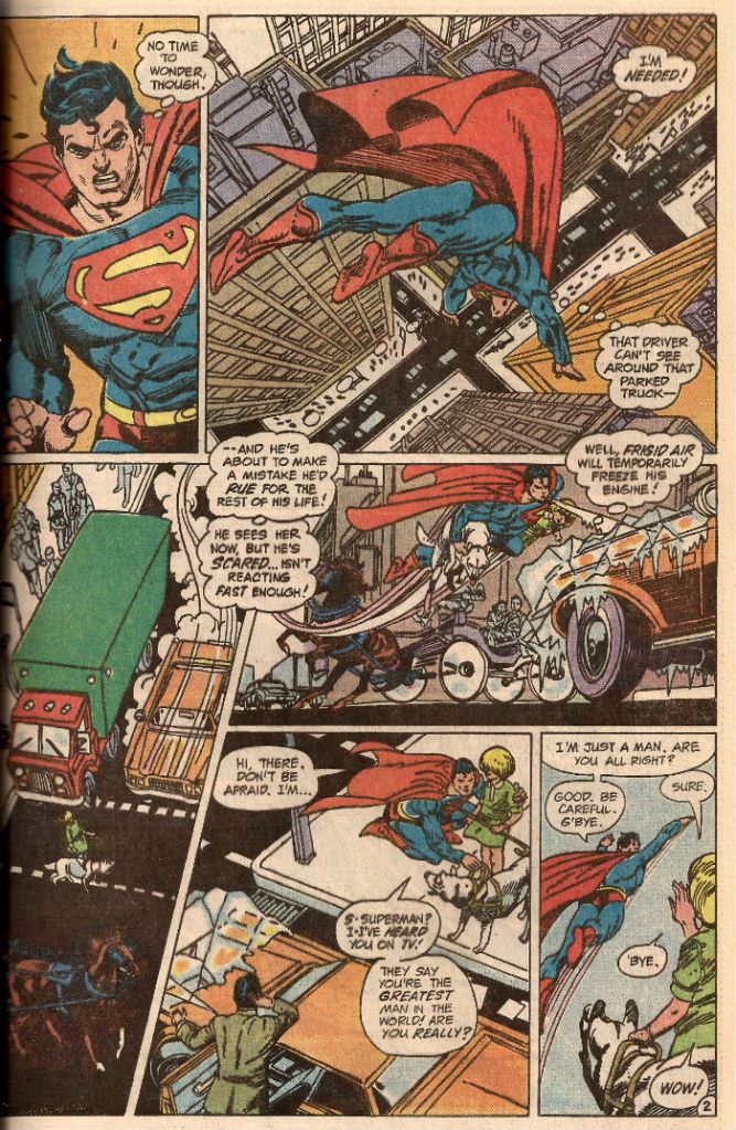
Blimey, sounds like that silly sod wants to get a grip! While we're waiting for the lithium to kick in what we need is a page of Superman from ACTION COMICS. This is written by Marv Wolfman and drawn (ILLUMINATED!) by Gil Kane. It's a lovely page, a real sweet piece of storytelling and extraordinarily educational about how to slap down images on paper and give them power and purpose. I like to pretend this is a complete story called "Just A Man."

So, without any further ado, Ladies and Gentlemen, Mr. Marv Wolfman and Mr. Gil Kane will now present..."Just A Man." Please remain seated until the performance has ended.

Photobucket

(Page by Gil Kane & Marv Wolfman from ACTION COMICS #544, 1983, DC Comics) You didn't like that? Geddouda heah, ya bum! Y'heah me! G'wan!

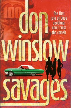
SAVAGES By Don Winslow Arrow, 320 pp. (2011)

Photobucket

Being the first words you'll read: "Fuck you."

Yes, that takes up a whole page and is indicative of the fact that Winslow does a whole heck of a lot of fiffing and faffing around with the prose as usual. Sometimes he seems keen to find the sparest prose of all; where words have to be hefted and weighed in the mind to glean their true cargo of meaning; a slow and meditative process counter to the break neck reading speed their staccato brevity encourages. James Ellroy would usually get thrown in round about  here thanks to the magnificently uncompromising White Jazz but that’s only because he’s (nominally) crime too. Really it's Richard Christian Matheson who's the guy who already perfected this method (see Dystopia). Of course having made such an arrogant declaration I am suddenly clammy with the almost certain knowledge that there's probably someone else who did it even earlier.  Someone I haven't even read! Winslow's eruptions of inventiveness allow Savages to drop straight into screen play mode at times. As sophisticated as this no doubt is, were I to understand why it occurs, it is certainly awfully convenient. Because, oh, it seems this is soon to be a motion picture presentation. This explains the  chummy high-five to Oliver “The Hand” Stone.

Photobucket "Oh my bleddy hand! My bleddy, bleddy hand! BLEDDY! BLEDDY! HELL!" (Image stolen from pulpinformer.blogspot.co.uk.)

Have you seen The Hand (1980)? It’s that one where shout-fuelled syndicated newspaper cartoonist Michael Caine is angry at his wife and puts his hand out of the car and a truck lops off his hand and he gets a prosthetic hand and his missing hand starts to kill people he doesn't like, or maybe his hand doesn't maybe it’s him because he has anger problems and this is called suspense, boo! That one. Most people like it because it is trashy fun,  but I always watch it because I can never remember who did the drawings used as Caine’s artwork. It’s Barry Windsor Smith.  I have written it here where I can come and look at it anytime so I need never have to watch The Hand again. The best thing of all in The Hand is when the hand attacks someone and we see it from the POV of the hand. The POV of the hand. Hand’s don’t have eyes, that’s all I’m saying. Mind you, detached hands don’t crawl around and strangle people either, I guess you win this round, Oliver Stone. I have now written hand so many times it no longer looks right. The Hand is OKAY!, I give it one thumbs up. (This is what you wanted! This is the stuff!)

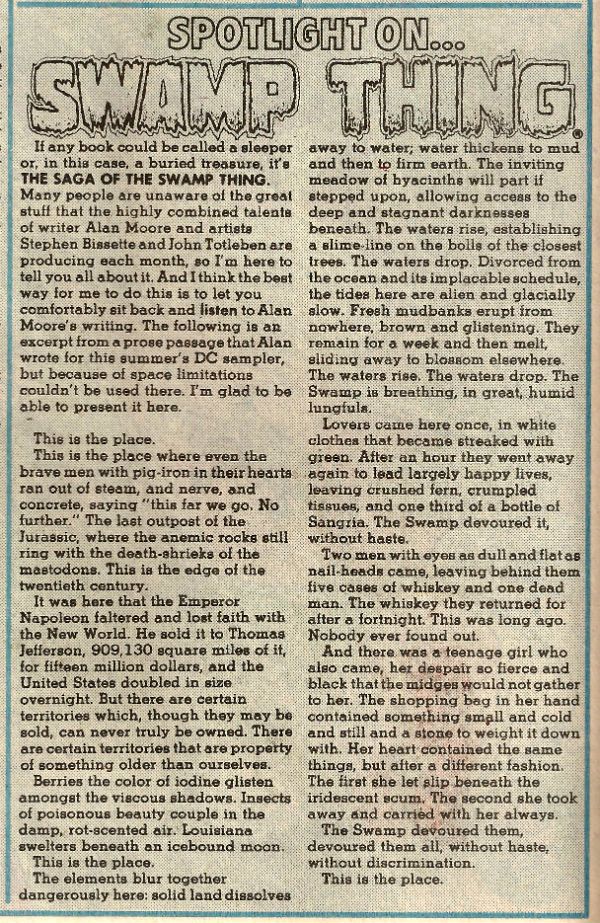
Nonsensical asides about enjoyable bad horror films aside, I enjoyed Winslow's language based larks sufficiently to graciously bestow the benefit of the doubt. Yes, he'll be no doubt pleased to hear that, on the whole, I'll give him credit for playing with form rather than debit him for lazy assedness. Because what with all the violent sauciness and saucy violence this is some pretty entertaining salad dressing. I mean, book.  This book is about a threesome of young people who are talented, intelligent, violent and just generally youthfully awesome. However, they are undone by their belief that you can run a drugs business like a Ben and Jerry’s eco-hashish outlet. Because it turns out that people involved in the drug business are just not very nice at all. They will put you right in touch with the ecology though, yup, once they’re through with you you’ll definitely be a part of the old ecosystem and no mistake. So, no, Savages isn't Power of The Dog but it is GOOD! Apropos of absolutely nothing here's a rare Alan Moore SWAMP THING piece to finish on:

Photobucket

(Taken from DC COMICS PRESENTS ANNUAL #3, 1984, DC Comics. SWAMP THING was created by Len Wein and Berni Wrightson. N.B. Len Wein was editor of SWAMP THING when Alan Moore took over so I can only imagine he was okay with Alan Moore writing his creation.  Y'know, in case anyone was wanting to fling that particular pie at Alan Moore.)

And that's your lot, Buster.  Didn't we have fun, kids? Did we have a time?. Didn't we almost have it all?

Hey, no one forced you to read it! Unless they did, in which case I can only apologise for my callous thoughtlessness.

Next time: COMICS!!!

"I'm A MAN, And I'll LOVE You As A Man Loves A ..." Comics! Sometimes There's A Film Out As Well! (John Carter!)

So, yeah, there's a John Carter film out on Friday. Not that I ever get to the pictures anymore but, hey, you might! In the meantime you could read this about some comics featuring the same character. It's a thought isn't it. Probably one more than went into the writing of this. Hey, can CGI do this?: Photobucket

No, no it can not. You lose CGI!

I guess I should start with a disclaimer: I'm not really an Edgar Rice Burroughs fan; indeed I don't even know if I have read the source novels for these comics. So if you're looking for an informed Burroughsian monograph you might want to jump off right here. What follows is just some old gimp prattling about some comics, because what he really likes is comics. And prattling.


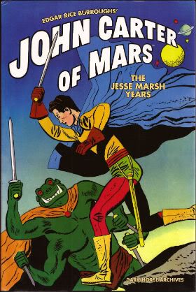
EDGAR RICE BURROUGHS’ JOHN CARTER OF MARS: THE JESSE MARSH YEARS Drawn by Jesse Marsh. Scripted by Paul S. Newman. Foreword by Mario Henandez. Collects Four Color Comics #375, #437 and #488, originally published in 1952 and 1953 by Dell Publishing Co., inc. (Dark Horse Books, 2010, $29.99)

Photobucket

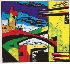
I bought this book because once I'd seen the cover it refused to entirely leave my mind and was constantly hovering there urgently pressing me to purchase it at some point. I think it was the really solid no-nonsense blacks that fixed the image to the page and into my mind. At the time I had been admiring Don Heck's solid blacks and this seemed to play off and feed into that brief flare of interest. Also, there was something very Gilbert Hernandez about it what with the intentionally(?) stilted poses , the harsh crease lines and the occasional smattering of dots for texture. So I bought the book with some Christmas money and prepared to be disappointed. Obviously the cover was just a lucky image that Dark Horse were using to lure credulous punters like myself into buying reprints of justly forgotten chaff as the Hollywood version of the material slowly hove into view.

I was wrong.

Photobucket

Mars circa 1952.

This book was fantastic. Jesse Marsh is fantastic. This isn't actually news to anyone except me it seems. He's actually on the list of possible inductees into the 2012 Eisner's Hall of Fame. Casting my mind back I recall interviews with Alex Toth and Howard Victor Chaykin (who is also on the 2012 Hall of Fame list. What a dilemma!) in which both mention Jesse Marsh. Still, it's one thing hearing about a comic artist's work and seeing it.

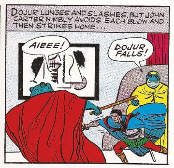
Actually looking at it Marsh's work looks totally ahead of its time. Wait, let's back up. I'm not saying anyone could mistake these comics for modern comics. The very nature of the material works against Marsh in this regard. For a start each of the three reprinted comics are tasked with adapting an entire Edgar Rice Burroughs' novel in 32 pages. There's no time for shilly-shallying, no room for indulgences like splash pages, very little chance for a panel's art to be unadorned by narration or dialogue. No, Marsh has to fit it all in to a series of pages consisting of (roughly) 6x6 grids where his greatest indulgence is to let two such panels bleed together either vertically or horizontally. And he doesn't get to do that all that often. Cramped and constricted as he is by the format Marsh has the technique to deliver the equivalent of putting on a musical in an elevator. That's where the 'ahead of its time' bit comes in; in the actual art.

Photobucket

The Incomporable Dejah Thoris - Circa 1952.

There's a colossally impressive understanding of design on show. Because Marsh is working in the highly strictured world of '50s comics (and Gold Key were particularly inflexible in format) Marsh is unable to do anything about the actual page design but the design of the panels themselves are beautifully chosen to balance the elements within them. And (get this) the actual elements within the panels are further forays into design by an artist who was clearly just so incredibly good at what he did he could do the incredible just to keep himself amused. What other reason can there be for the pictures/sculptures/scenery with which Marsh surrounds his characters? His sculptures and pictures are so good I have the suspicion that they are actual object d'art that only my lack of breeding and education prevent me from identifying. The fact they change from panel to panel (even when the scene has not changed!) suggest Marsh was just larking about. But, what larks!

Photobucket

Martian Action! Circa 1952.

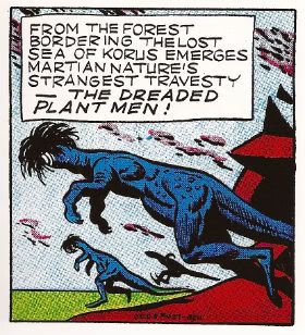
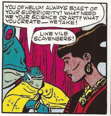
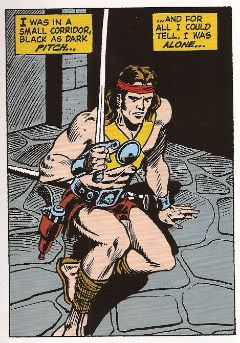
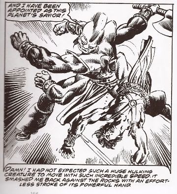
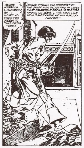
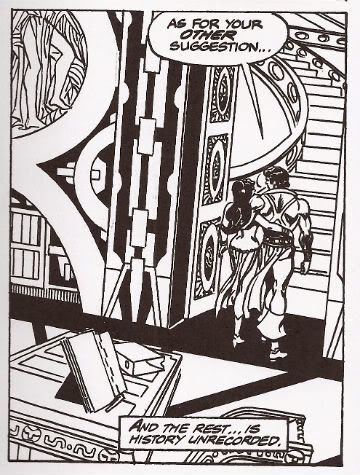
But, no, you aren't going to mistake these comics for the cutting edge of Now. Marsh's work does have its failings but although the characters may be stiff  it must be said they are distinctive. The "incomparable" Dejah Thoris seems to have been modelled on the actor Emily Watson which can't be right? John Carter isn't terribly expressive but he does look like himself in every scene and doesn't look like anyone else and you can't always say that about even modern comics. Although the big thing everyone gets sweaty about with Burrough's Mars novels is that everyone is nudey rude except for weapons and jewelry everyone here is fully dressed.  So, I guess purist might balk but all the incident, adventure and momentum of good pulp entertainment remain intact. Given the task of illustrating the functional script of Paul S. Newman Marsh manages to not only provide work which does so but at the same time carves out room to indulge his own idiosyncrasies and interests in a way which actually serves to enhance the work rather than distract or undermine its primary purpose: to entertain.

Photobucket

John Carter circa 1952.

One for the folks interested in form rather than content, or the talent rather than the character if you like.  VERY GOOD!


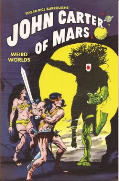
EDGAR RICE BURROUGHS’ JOHN CARTER OF MARS: WEIRD WORLDS Art by Sal Amendola, Murphy Anderson, Gray Morrow and Joe Orlando. Written by Marv Wolfman. Introduction by Marv Wolfman. Collects stories from Tarzan #207-209 and Weird Worlds #1-#7, originally published in 1972 and 1973 by DC Comics. (Dark Horse Books, 2011, $14.99)

Photobucket

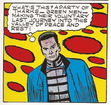
In 1971 as a hedge against the possibility that super-heroes had outstayed their welcome DC comics cast about for properties to replace them. Tarzan and the other ERB properties, including John Carter, caught DC's fancy since they were still adventure themed but more sober in appearance than super-heroes. This tells us that people are always predicting the end of super-hero comics and sobriety is pretty subjective. Good news for drunks, then! Great news for The Incomparable Joe Kubert who took the lead on the project. While his creative talents were focused on Tarzan he took on editorial duties for the other ERB character, such as John Carter. According to Bill Schelly's Man of Rock: A Biography of Joe Kubert (which I am filleting facts from in an attempt to look knowledgeable) Murphy Anderson and Marv Wolfman got the John Carter assignment because they were big John Carter fans. Apparently Michael William Kaluta wanted the gig but Murphy Anderson got it, mostly because he shared an office with Pappy Joe Kubert and was asked first. Not exactly high drama but that's what happened.  (You could have guessed Granite Joe Kubert had edited these stories because he can't help sticking his inky fingers in the Gray Morrow chapter on on pg17-22.) Anyway, the comics that resulted are collected in this book.

Photobucket

Mars circa 1972.

Given the fact that fully two decades separate the work in this volume and that contained in the Marsh volume discussed earlier it's interesting to see how the comic art approach has changed. There's a lot more variety in page design in 1971 with panels inset into double page splashes, flashback panels with wobbly edges, decorative chapter headings a la old timey newspaper strips and on and on. What's clear is that the artist has far more freedom to control the visual presentation of the material. In between Marsh and Anderson's work something new has appeared: pacing. There is no pacing in the Marsh book; there's no opportunity for it. But in this volume it's evident that the writer/artist are able to actually pace their material. The material may have set limits as to length but these limits are far more generous than those Marsh was labouring under.

Photobucket The Incomparable Dejah Thoris circa 1972.

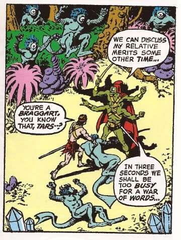
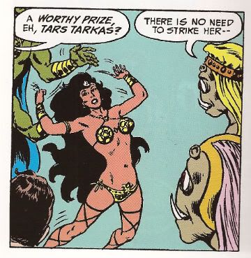
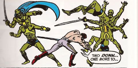
There's also a lot more freedom with regards to sex'n'violence. In the '50s material the incomparable Dejah Thoris was wrapped up like a shoolmarm but by the '70s she's certainly giving herself a good airing. Don't worry though because in the '50s John Carter was decked out like a Hussar but by the '70s he's all raggedy loincloth and musky muscles so noone's playing favourites here. Poor old Jesse Marsh had at best a couple of panels to depict savage action on worlds unknown but Anderson et al fare better with plenty of room to swing a Thark.

Photobucket

Martian Action! Circa 1972.

The ERB books didn't really sell very well and after a while moves were made to bring in cheaper foreign artists which probably explains why Murphy Anderson's contributions stop on pg. 68 and Sal Amendola finishes off the rest of the book. I'm not saying Sal Amendola was foreign (to American shores) but I am betting he was cheaper.  After the somewhat traditional art preceding it the book suddenly explodes into a Barbarellatastic mindmelt of groovy layouts and gear designs, man. Well, it tries to. Alas, Sal Amedola is hampered by a lack of talent but the surfeit of ambition he possesses almost overcomes this. I said "almost". It isn't very pretty but I admire the energy; that's about as good as it gets with the Sal Amendola stuff. He does, however, chuck in some nudey rudery for the hardcore Burroughs' fans which is amusingly cheeky of him.

Photobucket

John Carter circa 1972.

As a complete TPB this one disappoints in that it starts off with some strong and solid work by industry vets but is compromised halfway through by market considerations to ultimatley produce a collection that I can only call OKAY!


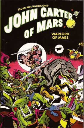
EDGAR RICE BURROUGHS’ JOHN CARTER OF MARS: WARLORD OF MARS Art by Ross Andru, Bob Budiansky, Sal Buscema, Ernie Chan, Dave Cockrum, Ernie Colon, Frank Giacoia, Larry Hama, Carmine Infantino, Gil Kane, Bob McLeod, Frank Miller, George Perez, Walt Simonson, Mike Vosburg and Alan Weiss. Words by Chris Claremont, Peter Gillis, Bill Mantlo, Alan Weiss and Marv Wolfman Foreword by Michael Chabon Collects John Carter, Warlord of Mars #1-#28 and Annuals #1-#3 originally published in 1977-79 by Marvel Comics. (Dark Horse Books, 2011, $29.99)

Photobucket

Pulp got Gil Kane early and pulp got Gil Kane but good. Although he was often opining that Comics needed to mature itself in terms of subject matter, he, himself, was never able to escape the grip pulp held on his imagination. Gil Kane was a great, great man but his tastes could tend to the unsophisticated. Luckily since that was the very problem he berated comics for he may have been held back creatively but it didn't hurt him commercially. Particularly in the '70s when pulp's stock was strong in the comics market and he had plenty of juice himself.

Photobucket

Mars circa 1977.

In the '70s Kane spent a lot of time working up books he'd be interested in doing, starting them, realising he couldn't produce pages fast enough to pay him enough, leave the book, work up a book he's be interested in doing...and rinse, repeat. He was like the goddamn Littlest Hobo of comics or something ("There’s a voice that keeps on calling me. Down the road is where I’ll always be").  I'm being 'exasperated' because that behaviour makes it really hard to get good long runs of his stuff in collections. Obviously I know that's really not any concern of Gil Kane but  equally obviously it does mean I'm glad to have this volume.

Photobucket

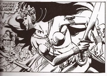
The Incomparable Dejah Thoris circa 1977.

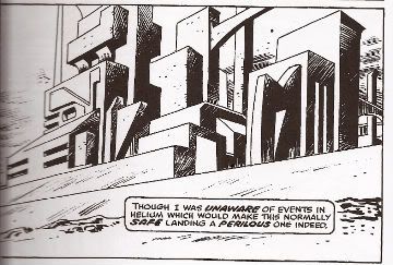
So, yeah, my primary interest in this volume is the Gil Kane stuff. That's a good 190 pages. After that my attention started to wander a bit but I can assure you that the Gil Kane on these pages is some good Gil. As usual his natural glory is clothed by inks by someone else which isn't ideal but hardly a deal breaker. Most of the time the inks are by Rudy Nebres or other Filipino artists of the period. Which is fine as this  lends everything an ornate quality appropriate to the pulp material. It helps make up for Kane's shortcomings. Oh, I love old Gil I do, I do but he did suffer from visual generalisation quite a bit. C'mon, we speak freely here; his future buildings and his ancient buildings are only distinguishable because the latter have some cracks in and a tree growing out of a window while the former doesn't. So, while it's usual to bemoan the fact it isn't Kane on Kane action for this volume it works out okay; the ripe inking lends everything a distinctive character Kane would probably have omitted if left to his own devices.

Photobucket

Martian Action! Circa 1977.

Where Kane doesn't need any help is in portraying the supple violence of well honed bodies in motion, communicating the lusty allure of his sexy ladies and his even more alluring men and basically creating such an atmosphere of raw physicality that it practically removes the readers glasses and tells them they are beautiful. Or something. I like Gil Kane's art, it sends me. Of course like any good bad boy he's gone when he's had his fill and Kane's departure makes the book stumble a little but the continued use of Rudy Nebres gives it enough visual continuity to keep it upright and interesting. For a while anyway. Storywise it's just the usual pulp stuff. In that it's more important that things happen than that the things that happen actually make sense. In fact the more outlandish and sense defying the better. The Headmen of Mars by Bill Mantlo and Ernie Chan is a particularly proud erection to the joys of sheer momentum and excess over intellect. It's pulp and it's written as such so the words don't treally bear close examination. Ah, but that's what they want you to think. If, however, you do pay attention to the words you find that EDGAR RICE BURROUGHS’ JOHN CARTER OF MARS: WARLORD OF MARS is in fact lubricated with sly innuendo and at times this reaches such steamy excess that it wouldn't be too great a surprise if the pages dilated at the touch of your enquiring fingers or let loose a soft sigh at the insistent pressure of your questing gaze.

I'm not joking. Not only are John Carter and the Incomparable Dejah Thoris continually on their way to/from the boudoir but you get the impression that if it weren't for all these Master Assassins of Mars, zombie hordes, air-pirates of Mars etc. they would be quite happy just letting John Carter make good on all his multiple breathy promises to "love her as only a husband can love a wife", "kiss her as she has never been kissed before" and "get right in there and root around like a monkey looking for nuts".  This reaches delirious heights on p. 306 when the text reads:

"With a SKILL that still occasionally SURPRISES me--I MATCHED course and speed with Dejah's flier and DOCKED the two craft together. A moment later I was at her ENTRY HATCH--With a cry torn from her SOUL, she sprang into my arms --I will not DWELL on what happened next."

Oh, do dwell, Chris Claremont, dwell!

Photobucket

John Carter circa 1977.

And you know what? That's great! The John Carter and The Incomparable Dejah Thoris actually resemble a couple with a working sexual attraction. Okay, it might be somewhat exaggerated in a pulp stylee but maybe if my muscles were three times as powerful as any other males I imagine I'd be a lot more popular too.

I really liked this book but I think I've made it clear that that that's primarily because of the presence of Gil Kane, a tendency for my own interests to run to the unsophisticated and an appreciation for healthy smut. If you do not share these pleasures you probably won't find this to be GOOD!

(Apparently Marvel have released the same comics in a colour over-sized Omnibus. They are probably even better in colour. Sighhhhhhh.)

Photobucket

Mars. The Incomparable Dejah Thoris. John Carter. ('Mars Action' about to occur) circa 1977.

Have a good weekend and remember to read some COMICS!!!

Wait, What? Ep. 70: The Hour (Times 2.5)

Demolition Derby from Jon Pinnow on Vimeo.

The Pact still holds! Another week in 2012, another episode of Wait, What?

We are still experimenting with the done-in-one podcast (although many of you have used our comments thread to weigh in and say you like multiple eps. because it gave you something to look forward to...which I was worried might be the case but nobody articulated it before the change-up). I'm thinking I might get us back to two installments (or more) per ep. because something about it reminds me of the way Marvel U.K. used to chop up stories from U.S. Marvel comics and that sorta fits Graeme and I, in a way.

But, uh, it may be a while because there's something nice about only recording one intro, mixing one episode, etc., etc. So here is all two and half hours of Wait, What? Ep. 70, with the dauntless Graeme McMillan and the all-too-full-of-daunts me talking getting hacked, dreams about comics, Brubaker and Philips' Fatale, the Elseworlds 80 page giant, Chuck Dixon's G.I. Joe comic for IDW and Seal Team Six, Defenders #2, Action Comics #5, OMAC #5, Uncanny X-Men #4, New Teen Titans, Downton Abbey, Mission Impossible: Ghost Protocol, Avengers Annual, Freak Angels, Mud Man, Witch Doctor: The Resuscitation and King Cat Comics #72 by John Porcellino (the star of the short embedded above).

Sensible souls surely spotted said spirited show (on iTunes), but for hearty heroes hoping to hear happenings here (hear, hear!):

Wait, What? Ep. 70: The Hour (Times 2.5)

As always, we appreciate your patronage and thank you for listening!

“Hell erupts and Heaven can only CRY.” Comics? Bad for your soul, but I read ‘em anyway!

I read some comics. Did a little dance. Wrote some words. So I guess this me asking, "Something for the weekend, sir?"

THE MIGHTY THOR #3 by Matt Fraction(w), Olivier Coipel/Mark Morales(a), Laura Martin(c) and VC’s Joe Sabino(l) (Marvel, $3.99)

“The Galactus Seed 3: Stranger” Galactus lolls about on the moon as Asgard engages in pointless fights and wonky dialogue and all the while the people of Broxton become ever more tedious! Also: Sif’s bongos revealed!

This month The Priest With The Least is having problems with the concept of tolerance. Boy Howdy, those Theological issues are getting a real seeing to and no mistake. Priesty and his cronies are also now drawn with a somewhat demonic aspect. Hopefully this is foreshadowing their true natures rather than just ham handed caricaturing. Hey, a boy can hope even though the lack of subtlety or nuance in this thing is pretty substantial. There’s just a total lack of attention to anything beyond the surface dazzle and bluster, both of which exist purely thanks to the efforts of Olivier Coipel. Rather than being an actual Thor comic the whole lifeless exercise comes across as a bad cover version of a Thor comic. It’s dispiriting is what it is and that makes it EH!

IRON MAN 2.0 #4 by Nick Spencer(w), Ariel Olivetti(a) and VC's Joe Caramanga(l) (Marvel, $2.99)

"Palmer Addley Is Dead Part 4" The notionally moving tale of a talented boy who fell through the cracks is eviscerated by a total disregard for the comics medium! 'Nuff said!

Oh boy, this thing right here. There are no less than 8 pages of talking heads and this follows 6 pages of a woman in a library simply gaining access to a file, reading it and being a bit upset by the contents. There are 4 double page splashes intended to be emotionally affecting but, alas, each totally fails in this due to the inept execution. Respectively these resemble: an outtake from Commodore64 version of Toy Story, an illustration to a magazine article on predatory sex pests, a scene from a fumetti entitled "When Bins Attack!" and an  advert for Lego City: Urban Shooting Playset. This is a horrible comic because it isn't a comic it's an (ineptly) illustrated TV script. One that relies for any impact on the fact that you too have seen the same generic scenes and that you will bring the emotion you felt when seeing these scenes in a, hopefully, better realised context, to bear on this pallid vacuum and give it some semblance of interest or verve. This is not a comic and so it is AWFUL!

SCALPED #49 by Jason Aaron(w), R.M. Guera(a), Giulia Brusco(c) and Sal Cipriano(l) (Vertigo/DC, $2.99)

“You Gotta Sin To Get Saved: Ain’t No God.” Paths are crossed.Secrets are revealed. Scores are settled. A decison is made.

When a character does something that’s totally out of character? That’s bad writing. But when a character does something out of character and then you realize they haven’t, instead it was you who you had the character wrong? That’s pretty good writing. If you’ve read this issue you already know what I’m talking about and if you haven’t read it you best be waiting for the trade, lovehandles, because otherwise you’re missing out on some damn fine comics. Golly, it was beautiful. I was thinking, “Of course. How convenient!”, and then I ended up with cake on my face. The cake of fools. 49 issues in and these characters are still growing and still developing in ways which, while never predictable, are entirely consistent. It’s easy to lose sight of the subtleties of SCALPED embedded as they are in the lurid and sensational aspects which surround them but they always rear up into view at precisely the right point. And the art, well, let’s just say that R. M. Guera is often close to Moebius, and that’s pretty much like being close to God. In a good way.

I may be a fool but not to the extent that I'd doubt for one second that Aaron and Guera would be totally okay with this being a TV show. Yet in the first instance they created a comic which worked as a comic. And worked very well as a comic at that. Ambitions towards other media shouldn't result in a lack of ambition in the source material. Yeah, the bit with the phone alone was EXCELLENT!

DEADPOOLMAX #9 by David Lapham(w), Shawn Crystal(a), John Rauch(c) and VC’s Clayton Cowles(l) (Marvel, $3.99)

“Bachelor Party For Bachelors” Bob’s not getting married in the morning but is that going to stop his zany scarred assassin pal from giving him a night he’ll never forget? You can bet your sweet caboose it’s not!

I’m not proud of this but I should probably tell you that the last couple of weeks I’ve been pulling a “Bobby Shaftoe” and amusing myself by substituting the word “sh*t” for the words “Fear” and “Flash” in everything I read about Marvel and DC’s annual sales spike stunt comics. See, and it’s dead clever this, you get stuff like “Sh*t Itself” and Sh*tpoint” right off the bat and then the tag lines become “Do You Sh*t…Tomorrow!” and “Everything Changes – in a Sh*t!” and there’s now a “Sh*t wave” covering the earth and, this is my favourite this one, Professor Zoom – The Reverse Sh*t!

So, y’know, I have childish aspects to my personality is what I’m getting at. So maybe the fact I don’t find DEADPOOLMAX very funny is actually a good thing? You’ll notice Kyle Baker hasn’t drawn any of this issue which is better than him not finishing drawing some of the previous issues, which has been happening quite a lot. So I make a noise like EH!

DC COMICS PRESENTS NIGHT FORCE #1 by Marv Wolfman(w), Gene Colan/Bob Smith(a), Michele Wolfman(c) and John Constanza(l)(DC Comics, $7.99)

NIGHT FORCE – they force the night to surrender its secrets! If the night needs forcing that means it’s time for NIGHT FORCE! When the NIGHT FORCE…my lonely heart calls! Oh, I wanna dance with somebody!

Ah, sweet Gene Colan.  Gene “The Dean” Colan.  Truly a unique and delightful force in mainstream genre comic art. Beyond the oft-commented upon use of shadows and light I always found his work very similar to that of Gil Kane but less rarefied and more grounded. Where Kane’s work had an operatic fluidity Colan’s was more workaday hustle. While Kane’s characters soared and thrust, Colan’s figures stumbled and lurched within a POV that was more hectic than roving. His work had life bursting out of every panel but it was the life of a bloke rather than that of a demi-god.  You could aspire to be a Kane character given enough genetic engineering and a high tolerance for pain but you probably already were a Colan character.  And although Colan seamlessly grafted his style onto all manner of genres his art possessed an intrinsic familiarity to draw the reader in no matter how fantastic the four colour shenanigans. He was The Dean. He will always be The Dean.

This package collects NIGHT FORCE #1-4 from 1982 A.D.  The issues show Baron Winters recruiting a motley group of people with sad pasts in order to prevent supernatural evil elements from ensuring the world itself has a very sad future. Baron Winters is one of those oh-so-spooky chaps that appears never to age, has a different garden every time he opens his patio doors and owns a leopard called Schnorbitz. Sorry, I meant Merlin. (Obscure reference? Check and mate.) He’s also under some kind of supernatural house arrest, hence his need for human agents who can move freely in the world abroad! So we have Jack Gold (bitter smoker with a poor employment record), Donovan Caine (a professor of parapsychology who has a wife and child who, let’s face it, shouldn’t be starting in on any DVD box sets) and Vanessa Van Helsing (a kind of psychic nuclear attack in the form of a lady). The three are manipulated into close contact via the Baron and the government’s interest in Caine’s experiments. Taking place on campus these seem to involve trying to open the Gates of Hell by stimulating Ms Van Helsing’s nascent powers via the repeated application of orgies. Which is eerily similar to my experiences of not-studying at Coventry Polytechnic. Anyway stuff goes wrong and all kind of bad hoodoo gets a-cooking!

It’s fast pulpy fun which is either enhanced or undermined, your call, by its attempts to try and inject some maturity into the whole exercise. There are references to “open marriages”, “alimony” and, while the “orgy” word isn’t ever used, it’s clear that quite a lot of people are having quite a lot of fun in a confined space via the medium of physical interaction. Sure it’s clumsy and unconvincing but kind of endearing. Of course it was all for naught as in 1984 Howard Victor Chaykin would demonstrate how to graft a more mature sensibility onto genre comics. But this was 1982 and Wolfman and Colan have a pop at it and it doesn’t really work  but, hey, they sure snuck a lot of stuff past the Comics Code.

There are many things wrong with this comic but pretty much all the worst of them are due to sloppy (re)presentation rather than the creative types involved. The last page in particular is a right horrorshow. I guess no one could find a copy of this page so they asked someone who had read it when it came out to describe it over a faulty phone line to someone with a cheap pen and the delerium tremens and then everyone just crossed their fingers. It’s bad.

And, I really don’t want to sound like Andy Anal here but, the paper stock is all wrong. Mr. Colan has gone to some effort use some exciting techniques, mostly with craft tint (is that right? That dotty stuff.), but these depend on a layering effect to succeed and they fail totally because the image just sits right on top of the glossy paper with exactly and precisely no differentiation between the layered elements. The paper also works against the inking which is too sharp for the necessary haziness of Colan’s pencils. Okay, that was probably the case in the original but the old timey soft paper would have mitigated this while the new timey , oh, look even I can’t believe I’m talking about paper stock, but that’s just how much it doesn’t work. It makes it look like Gene Colan doesn’t know what he’s doing. Gene Colan knew what he was doing but the people who assembled this didn’t. Or did but didn’t care, which is worse.

Still, it was The Dean so it was GOOD!

So, yeah, COMICS!!! Buy 'em from your LCS - I do!