“FEEL THE FLESH.” COMICS! Sometimes I Wanna Know What Love Is!

“FEEL THE FLESH.” COMICS! Sometimes I Wanna Know What Love Is!

A very special throwback this time out! As requested some time ago by someone whose name I've mislaid I finally look at a series from way back in the mists of 1990-91. This one is for everyone who has a very special place in their heart for John Boorman's ZARDOZ. This one's for all the dreamers! WORLD WITHOUT ENDby Higgins, Delano and Starkings

Read More

“Azzarello: But there’s always room for a 10th issue. [Laughs]” COMICS! Sometimes The Laughter is Hollow.

“Azzarello: But there’s always room for a 10th issue. [Laughs]” COMICS! Sometimes The Laughter is Hollow.

Some say it’s not the journey but the destination. In this case it’s very much about the destination, which is the final issue of the artistically impoverished big ticket cash-grab from DC Comics, Dark Knight III: The Master Race. After this we’ll all just pretend it never happened and get on with our lives. We shall never speak of this again. EVER. DKIII:TMR by Kubert, Janson, Azzarello, Anderson, Robins & Miller

Read More

"Ma! Ma! Ma! Ki! Ki! Ki!" MOVIES! VIDEO GAMES! PARENTING! Sometimes there’s Something For Everyone (Except Comics Fans)!

"Ma! Ma! Ma! Ki! Ki! Ki!" MOVIES! VIDEO GAMES! PARENTING! Sometimes there’s Something For Everyone (Except Comics Fans)!

As I probably said, I’m quite busy at the minute. But I like to write to relieve the stress. So I wrote this. It’s about the Friday The 13th movies, being a dad, the implacable march of time and the Friday The 13th game on PS4. It’s of limited interest, except to students of the pointlessly self-indulgent. But that's never stopped me before!

Read More

"And What He IS is GONE." COMICS! Sometimes Persistence Doesn't Pay Off.

"And What He IS is GONE." COMICS! Sometimes Persistence Doesn't Pay Off.

Nearly there. Good soldier. Nearly there. DKIII:TMR by Kubert, Janson, Azzarello, Anderson, Robins & Miller

Anyway, this...

DARK KNIGHT III: THE MASTER RACE #8 Pencils by Andy Kubert and Frank Miller Inks by Klaus Janson Story by Frank Miller (Yeah, right) & Brian Azzarello Colours by Brad Anderson and Alex Sinclair Letters by Clem Robins Cover by Andy Kubert & Brad Anderson Variant Covers by Frank Miller & Alex Sinclair, Jim Lee, Scott Williams & Alex Sinclair, Klaus Janson & Brad Anderson, Bill Sienkiewicz and Riley Rossmo Based on THE DARK KNIGHT RETURNS by Frank Miller (WITH Lynn Varley, Klaus Janson & John Constanza. Remember them, DC Comics? You should, you really should. You've got one more issue to remember 'em. Then it's spankin' time!) Batman created by Bill Finger and Bob Kane DC Comics, $5.99 or $12.99 (deluxe) (2017)

Read More

“Lew's Gettin' Me BUPKIS." COMICS! Sometimes I Wonder Who Will Think Of The Children!

“Lew's Gettin' Me BUPKIS." COMICS! Sometimes I Wonder Who Will Think Of The Children!

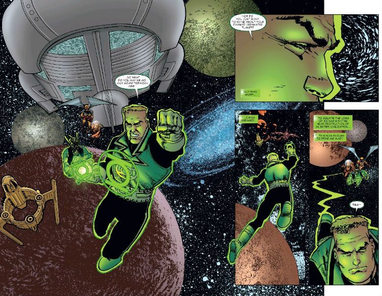
In which I talk about a kid’s comic featuring Space Ghost and Green Lantern. That’s right, I’m 47 years old. It’s called living the dream, baby. Living the dream! RUFF'N'REDDYby Chaykin, Quintana and Brosseau

GREEN LANTERN/SPACE GHOST SPECIAL #1 Art by Ariel Olivetti and Howard Victor Chaykin Written by James Tynion IV: The Voyage Home & Christopher Sebela, and Howard Victor Chaykin Lettered by A Larger Word Studios and Pat Brosseau Coloured by Ariel Olivetti and Wil Quintana Cover by Ariel Olivetti DC Comics, £2.99 (2017) Green Lantern created by John Broome, Gil Kane, Bill Finger, Martin Nodell & Gardner Fox Space Ghost created by Alex Toth, William Hanna & Joseph Barbera Ruff And Reddy created by William Hanna & Joseph Barbera

Read More

“I'll TILT-A-WHIRL You…!” Sometimes The Louder You Scream The Faster It Goes!

Just one comic, and not too many words. Oh, happy 4th of July, I guess. This one’s for all of my American buddies. (It’s got nothing whatsoever to do with the 4th of July, if I’m being quite honest.)  photo SOTGRunB_zpskl3qhd3d.jpg SHADOWS ON THE GRAVE: "The Clown" by Corben

Anyway, this...

SHADOWS ON THE GRAVE #4 Art by Richard Corben Written by Richard Corben, Jan Strnad Dark Horse Comics, $3.99 (2017)

 photo SOTGCOvB_zpspxybsfwg.jpg

Shadows on the Grave (SotG) is a monthly B/W anthology comic featuring a spatter of short terror tales and a thoroughly muscular episode of a comedic barbarian serial. It could have just consisted of short stories revolving around the life cycle of  the Scarabaeus sacer and pin-ups of Brian Bendis in a variety of revealing swim suits, as long as Richard Corben was on the job. Because SotG is very much all about Richard Corben. Or his art at least. The thing is, look, the thing about the traditional draw of a comic, the stories, the thing about them in SotG is…well, they often aren’t really stories as such. I mean, they are technically stories, I guess, but they can kind of peter out a bit sometimes. In that sense they are a lot like the old DC “Mystery” books in that all the signifiers of horror are there but the narrative thread comes a poor second. Atmosphere is paramount where shadows drape the grave. Which is okay for me, but maybe not you? I mean, I bought this because it’s Richard Corben doing whatever he wants. And I am all about the Colossi of Comics doing whatever they want. Which is why Carla Speed McNeil’s Finder is an auto-buy wherever it appears; why Walter Simonson’s Ragnarök is the only $4.99 comic I buy without grinding my teeth; why Howard Victor Chaykin’s Divided States of Hysteria is…oops, moving swiftly on…  In essence, in much the same way that a Daily Mail reader comes for the sideboob and stays for the archaic right wing frothing which paints every monied white person over 50 as a besieged minority in their own country, I come to SotG for the stories but I stay for the craft.

 photo SOTGFairB_zpsvgyakmyc.jpg SHADOWS ON THE GRAVE: "The Clown" by Corben

Stories which are, as I say, mostly exercises in style; attempts at inducing an atmosphere of creeping unease. The opener in this particular pamphlet of pulsating dread, “The Clown”, involves a bloke who does a bad thing at the circus and is gotten by a creepy clown doll. There’s no overt connection between his act of murderous larceny and his fate via macabre marionette. It’s just your stringently judgmental mind at work, Gidget. He could as well been singled out for smoking, or  calling the dancing lady a rude word, or just for wearing a roll neck jumper with a jacket. All of which he does, because he’s a proper bad apple. But it’s not really important. What’s really important is seeing how Corben does it. How Corben draws the lady dancer’s boobs floppaloppaling about, managing in just one static panel to suggest  more about the interconnectedness of mass and motion via the slightly down-market device of her go-go mammaries than the entire career of, say, Jim Lee ever has. How Corben draws a circus so tattily alive you can practically smell the cheap pot pourri of fried onions, exhaust fumes and cotton candy, almost hear the sharp cry of a freshly slapped child. How Corben captures the shabby glamour of the travelling fair, in short. All that’s the real pleasure.

 photo SOTGBeefB_zpsb5idfm3h.jpg SHADOWS ON THE GRAVE: “Flex!” by Corben and Strnad

Next up is “Flex!” which has far more structural integrity story-wise. Which it should well have, since Corben calls on his frequent partner in grime, Jan Strnad. Now Jan Strnad’s name may not be up in lights on the Broadway of your mind but he is an extraordinarily capable writer. Which may sound like faint praise but it’s more praise that I’d give most fan-favourite hawt hold-the-phone-! writers. More comic writers should deserve praise so faint, in short. I enjoyed Strnad’s horror novel Risen (written as J. Knight, Warner Books, 2001, ISBN 978-0759550384, GOOD!) quite a bit. It’s one of those small-town-steamrollered-by-evil things, so comparisons with Gravity’s Rainbow might not be entirely fair. More of a beach read, really; but that’s no great slur. Risen’s prose is efficient and it’s speedily paced but, you know, several times I admit the thought crossed my largely empty mind that it would work really well as a comic drawn by…Richard Corben!. Choke! And, Corben’s art is the star on “Flex”, but Strnad’s script lends the hokey wish-that-is-obviously-going-to-backfire premise enough of a casually raised eyebrow to bring everyone in on the fun. Most of that fun is seeing the outrageous contortions Corben puts human physiology through in the toe curling pay off to this cautionary tale of body builders. Ouch, fair made my eyes water so it did. OOF!

 photo SOTGFightB_zpsrwxszkpc.jpg SHADOWS ON THE GRAVE: “Denaeus: The Black Quest” by Corben

Appropriately enough the hyperbolic muscularity, one of Corben’s key visual motifs, of “Flex” also saturates the episode of “Denaeus” which ends the issue. It’s appropriate because Denaeus is one of Corben’s hyper-muscular barbarian characters a la Den (the two are related in some fashion I’ve forgotten; it’s not important). It’s familiar territory for Corben, as familiar as his horror stuff but, because he is Corben (i.e. because he is awesome), it’s all as fresh as the meat on a newly felled steer. It’s the usual stuff about prophecies, heroes, mysterious mages, maidens and violence, but all enlivened and undercut by Corben’s typically modern approach to the dialogue. That and the fact Corben can’t even make a sand dune look dull. So you can imagine the artistic delights he throws like so much visual tinsel all over the pages during the violent slapstick of the Denaeus vs cyclops centrepiece. There aren’t many comic artists who can bring to the page a giddy blend of creatine, egg whites, Ray Harryhausen movies, Michael Bentine’s Pottytime, Johnson’s baby oil and John Milius’ Conan The Barbarian. In fact there’s only one, Richard Corben. Further, there’s only one Richard Corben. And Shadows on the Grave is what he’s doing right now, and that’s VERY GOOD!

NEXT TIME: Queersploitation, Canadian superheroics, Howard Victor Chaykin’s bizarre foray into Hanna Barbera territory, a crappy slasher movie franchise goes paper, Judge Dredd or, uh, something completely different? Whatever it is, it’s bound to be – COMICS!!! (If you have a preference let me know below the line. I’ll probably ignore it, but you could get lucky!)

“Why the Hell Why?” COMICS! Sometimes It’s Sobering To Think That This Comic Is Someone’s Idea of Fun.

In which I continue to try and make up lost ground by looking at issue 7 (of 8 of 9) of DC Comic’s big-ticket Bat event. By popular demand! Well, two people, anyway.  photo DKTMRtreesB_zpsxk4z3iyu.jpg DKIII:TMR by Kubert, Janson, Azzarello, Anderson, Robins & Miller

Anyway, this…

DARK KNIGHT III: THE MASTER RACE #7 Pencils by Andy Kubert Inks by Klaus Janson Story by Frank Miller (Yeah, right) & Brian Azzarello Colours by Brad Anderson Letters by Clem Robins Cover by Andy Kubert, Frank Miller & Brad Anderson Variant Covers by Frank Miler & Alex Sinclair, Jim Lee, Scott Williams & Alex Sinclair, Klaus Janson & Dave McCaig, Howard Victor Chaykin & Jesus Arbuto and Chris Burnham & Nathan Fairbairn Based on THE DARK KNIGHT RETURNS by Frank Miller (WITH Lynn Varley, Klaus Janson & John Constanza. Remember them, DC Comics? You should, you really should.) Batman created by Bill Finger and Bob Kane DC Comics, $5.99 or $12.99 (deluxe) (2017)

 photo DKTMRcovsBB_zpsa1ieboeq.jpg

Make no mistake with issue 7 DKIII:TMR remains a very special comic; special in a wholly awful way. DKIII: TMR is the kind of comic that is so awful it actually makes you genuinely miserable for having sat through it. Maybe it’s the waste of talent that makes the misery sting so hard, for there are talented people here; people who have produced some pretty decent comics but this…thing, is just so awful, so pitiful in fact that to treat it with the disdain it deserves seems unfair, if not cruel. Then you remember how much money this bunch probably got ($$lot$$) for producing this vacuous piffle.  It’s hard to decide which bits are worse, the bits with the words or the bits with the pictures. Only joking, it’s definitely the words. As vague and perfunctory as Kubert’s paltry efforts may be, his art’s inadequacies pale before the titanic idiocy of the writing.  Azzarello firmly plants his flag in the peak of Mount Awful from the very first page with a tour de farce of faux cleverness. For the author of a comic that has spent far too long buggering about Azzarello certainly doesn’t bugger about in buggering things up. He’s straight in there. In the last characteristically pathetic issue, you will recall (because how could you not), Batman fell in battle.  Actually, you might not recall that, because it was delivered with all the narrative vitality of a rural bus timetable. I didn’t see anything on The Internet about it anyway, and that’s where there’s usually some kind of moronic  rumpus if a fictional character even coughs persistently enough, never mind finds a rusty red warning in their supertrunks.

 photo DKTMRsandB_zpsip1lh0l0.jpg DKIII:TMR by Kubert, Janson, Azzarello, Anderson, Robins & Miller

So Superman picks ailing Batman up and flies off with him, which is where this issue opens. And Azzarello, for once wasting no time (but unfortunately wasting no time in being awful), in a move you just know made him fire finger guns at his screen, rejigs the old Superman “Faster than a speeding bullet..” spiel from the Siegel and Schuster days, but with a typically modern maudlin slant. “Am I, in fact, all that?” is the undercurrent to this un-Super internal monologue. Azzarello is probably under the misapprehension that this is as cute as that page in All-Star Superman which reduces Superman’s origin to its fundamentals (“Doomed Planet.” ,“Last Son.”,  etc). Tragically for tobacco-beard-sporting-finger-gunning writers everywhere it isn’t cute; it’s plain dumb. For starters why would Superman know that speech? Does he make up little ditties about himself, maybe while he’s sat covered in ice (for reasons no one has seen fit to divulge over the seven issues of this blocked toilet of a comic)? Or are there Superman comics in the world of TDKIII:TMR? And were they made by Siegel and Shuster? And did they get royally fucked over like they did in this world? And if I want to read a comic where Superman and Siegel and Shuster occupy the same world why aren’t I reading Rick Veitch’s Maximortal, which is a far, far better comic? Flawed as it is from the off, Azzarello does his self-satisfied conceit no favours at all with his typically tortured syntax. Azzarello’s inept rejig comes off like the empty posturing it is in comparison to Siegel and Shuster’s breezy and effortlessly iconic brilliance. And it just doesn’t work anyway. Superman’s basically bemoaning the fact that even being Superman may not be enough to save Batman (like what’s the alternative, a fucking ambulance? Would a fucking ambulance be better? A flying fucking ambulance even? No, Superman, it wouldn’t.) “I’m only Superman” he sighs, telling us nothing about Superman or indeed anything at all except the utter failure of the writer to “get” the character. Someone should have made Azzarello rewrite this smug baloney until it worked, or until he binned it. It’s not big and it’s not clever; it’s nincompoopery of the highest order. Supernincompoopery!

 photo DKTMRpoolB_zps6kvce1gi.jpg DKIII:TMR by Kubert, Janson, Azzarello, Anderson, Robins & Miller

But where’s Superman going with Batman?  To the Lazarus pit! Who didn’t see that coming? Even Karl Marlden in Dario Argento’s Cat O’Nine Tails saw that coming! (Note: Karl Marlden plays a blind man in Dario Argento’s Cat O’Nine Tails. That’s the joke there.) But because Superman is a thoughtless dick we have several pages of Carrie being all sadznshitz because she thinks Batman is dead. You would have thought Superman would have had the wit to let her know there was…a chance! But although that would be entirely in character for Superman, and not too difficult to work into the story, he instead leaves her to wet Batman’s helmet with her lady tears (not a euphemism). These, typically for Kubert, sparsely arted pages are a complete fucking waste of space unless you like seeing young women feeling all sadznshitz for no reason. That doesn’t speak highly of you, I’m afraid. It does speak to the utterly desperate attempts of this comic to inject some drama into the thoroughly beige goings-on. Carrie’s already been sadznshitz over a not-dead Batman in issues #1 and #2 and here she is again all sadznshitz. Azzarello is so frantic to fill his pages he’s reduced to recycling things that already failed to work. So, Superman drops Batman in the Lazarus Pit. I don’t believe (I could be wrong; I don’t really care at this point) the words “Lazarus Pit” are used in this issue, so anyone unfortunate enough to be reading this without decades of useless Bat-ephemera clogging up their higher functions, would be left wondering why Superman has taken the corpse of his pal to what appears to be a particularly sternly ornamented San Franciscan bath house. Is it because they spent some good times there flicking towels at each other’s taut arses between badmouthing Lois and exchanging smoky glances?

 photo DKTMRhillB_zpsk9wizc6m.jpg DKIII:TMR by Kubert, Janson, Azzarello, Anderson, Robins & Miller

No, it’s because it’s a Lazarus Pit! And, as the advert says - it does what it says on the tin. There’s about 4 pages wasted on Batman going into the healing waters, Superman waiting, and then Batman leaping out like a nude billionaire shaped salmon. Fully two pages of that are just Superman waiting. Just…waiting. Lad de dah…waiting. Just…waiting. Got any mints? Waiting…waiting. Thrilling stuff. If you’re an accountant. So, yeah, Batman’s young again! And we might as well shut up shop right here, because all protestations to the contrary this has been the whole point of the series – to make Batman young again. Now they can have TDKR comics forever and a day! Regular Batman can find Carrie’s soiled knickers in his washbin; we could have a lenticular cover, and when you move it Batman holds the lacy aromatic rag up to his nose! Part 1 of a 50 part event: “The Knickers”. Or Dark Knight Batman could team up with Huckleberry fucking Hound! Or Strawberry Fucking Shortcake! The possibilities are quite literally dreary beyond belief! As ever though, in their sweaty fumble after more money DC miss the point. The USP of The Dark Knight universe was that Batman was old, that Batman could die. Without that it’s all just more Batman. And still just more Bruce Wayne Batman to boot. A writer with any stones would have had Bats die, Carrie take the mantle and that black kid from issue one (the kid we all thought was indicative of some thoughtfulness, some relevance; the kid who died in one of the lumpen fight scenes) should have become Robin (but you know, in more urban attire. More “street”. Not just a Nehru collar and some piping, Jim Lee.) Instead we get the same old, same old. Seven overpriced, ineptly executed issues thus far; all so DC can just switch The Dark Knight Returns off and switch it back on again; restore the whole thing back to factory settings. What was once original and thrilling is now neutered and subsumed into the grey paste of insipid corporate product. See also: Watchmen. There’s going to be a Watchmen TV series! How fucking mundane must you be to be excited about a Watchmen TV series! How arid must your inner life that be to think The Dark Knight Returns was a bit too exciting and could really do with being more like the other umptyfuckingbillion Batman comics. The Dark Knight Returns and Watchmen - now just as lifeless and drab as everything else! Huzzah! DC clearly need to brush up on their Aesop’s fables. Particularly the one about the goose and the golden eggs. BIFF! BANG! POW! Short stories, typically with animals as characters, conveying a moral aren’t just for kids!

 photo DKTMRmiteB_zpsc8n42vkr.jpg DKIII:TMR by Miller, Janson, Sinclair, Robins, Azzarello

A wiser man, a better man, would stop there; the series having essentially declared itself a bleak exercise in corporate box ticking devoid of any and all artistic intentions. Why bother with it anymore? Because it is truly, fascinatingly awful. And it is important that voices are raised against precisely this kind of incompetent high-profile crap. So, I’ll go on. There is a jaw droppingly shit bit where Azzarello tries to inject some depth into the junk tumbling from his characters’ mouths.  Carrie and Commissioner Yindel have a rooftop confab which is so full of horseshit I half expected Kubert to have sketched a shire horse next to the smashed Bat-signal. But that would have required some humour, and also horses are hard, and if the art on DKIII:TMR tells me anything it tells me Kubert’s not all that into graft. If there’s a shortcut, Kubert will take it. I’d rather Kubert drove me on holiday than drew my comics is what I’m saying there. Back at the Brian Azzarello Insight Corner: Was it worth it?, asks Yindel who is clearly a moron. All what, asks Carrie because she too is none too bright herself. All this, says Yindel because circuitous drivel takes up space and that’s what writing for comics in the 21st century is all about – taking up space. That and choking the imagination and beauty out of everything. The gist, I think, of all this deep, deep thought is that Yindel is asking Robin if fighting the bad guys was worth it; worth all the death and property damage. This is such a boneheaded question I worry for the state of Brian Azzarello’s mental health.  Then, even better (i.e. even worse)  there is some mush mouthed mental gruel about how everyone always thinks they are on the right side, so how can they know what they did was right? Deep. Oh, and (buckle UP, Wittgenstein) how masks don’t just conceal – they REVEAL! (Christ. Just…Christ.) The ideas beneath all this overcooked rumbledethumps of inane prattle barely even qualify as thoughts. But important questions are being asked, we are assured. The only important question is how anyone could write this shit and not spend their life puce with shame. This is what happens when people whose talent has really short arms reach for profundity.

 photo DKTMRhatB_zpsohcelt7o.jpg DKIII:TMR by Kubert, Janson, Azzarello, Anderson, Robins & Miller

Other things happen in the issue and the best I can say about those is they aren’t as hair curlingly terrible as the stuff I’ve highlighted. The Kandorians continue to hang about like a cloud of midges over a stagnant pond, before deciding to go to Paradise Island (“De plane, boss! De plane! De invisible plane!” RIP, Herve Villechaize) for some childnapping. Superman and Wonder Woman’s daughter continues to hang about with the poorly motivated Kandorians, like a posh kid slumming it with the scruffs to piss off mom and dad. The guy with the big melted face complains about having a big melted face. And to be honest I think this whole guy-with-a-big-melted-face business isn’t really worth all the space it’s getting. There’s only so much mileage in a guy-with-a-big-melted-face. But then everything (what little there is of it) gets far too much space in this comic, the whole thing is a whole load of nothing spread far too thin. Oh, the Atom’s back! It’s been several weeks now, or something, since he shrunk so he should, by rights, be covered in his own mess, winnowed by starvation and not a little boggle eyed with fear. But Nah, He’s perfectly fine, sat on a molecule working on his techno-bits. I guess he’s sat on a molecule in a piece of ham which us why he hasn’t starved to death. Why, precisely, it’s taking him so long to fix his magic machine (which will no doubt be adroitly deployed at the climax of the book) is anyone’s guess. There’s also a mini-comic, the bulk of the fun of which is in Frank Miller’s enthusiastic pencils, alas much of the fun of these is crushed by Janson’s rigid inks. The best bit (of the whole series so far in fact) is the appearance of Bat-Mite, largely because there is no mention of him on the page; so it’s entirely possible Frank Miller just drew him in there (twice) for shits and giggles. Just that small sight of goofy (possibly improvisatory) fun throws the rest of the joyless crap surrounding it into stark and unflattering relief.  Bat-Mite! Yay! Unfortunately, like the main book, it’s all written in Azzarello’s dourly congested style, in which everyone thinks they are being highly insightful while merely being full of shite. Fans of stereotypically sweaty and sinister Egyptians will have a field day, but that’s probably a minority of the Direct Market audience in 2017.

 photo DKTMReyeB_zps4hwdsppx.jpg DKIII:TMR by Kubert, Janson, Azzarello, Anderson, Robins & Miller

If DKIII:TMR had been a Broadway Musical it would have closed so fast Spider-Man: Turn Out The Dark’s run would have resembled that of The Mousetrap. But it’s a comic, so its audience are even less discerning than a pensioners’ coach trip at a heavily discounted, matinee performance. Also, because its sales figures are inflated by the comics equivalent of sub-prime mortgages (i.e. variants) it gets to preen about pretending people like it, until every last cent has been squeezed out and you can practically hear its pips squeak. DC even added an extra issue! That was about as welcome as an extra in-law. Obviously this decision was to allow the peerless artistry of the series room to excel, and certainly not because DC wished to increase their market share for another month with one of their few regularly well performing titles. I despise this new tendency on the part of Marvel and DC to gift its audience with an extra issue of whatever over-hyped and undercooked craptacular they have induced us all into buying despite the weight of experience. There’s nothing like flagrantly taking advantage of your audience to engender good will.  Here’s where that ends up: I’m not buying anymore mini-series. I’ll just get the TPB when they are done. Add as many issues as you like, you short termist donkey haunches; I’ll not be buying them. Craven and underhanded shenanigans in the extreme, as ever from Corporate Comics.  There’s no artistic reason for sticking another ish in since the series has no genuine artistry, and from a creative viewpoint could have done with being seven issues less. That might have, you know, focused the minds of everyone involved. The last thing an ill-disciplined, sprawling, and fundamentally empty thing like DKIII:TMR needs is more room. When your kid starts projectile vomiting due to an allergic reaction to a Chinese meal, you don’t wander through every room in the house with him; maybe knock on next door’s as a surprise and merrily spread the trail of vomitus yet further. No, you stick him in the bath and keep him there. Damage limitation, innit.  You all know the words by now, so sing along: DKIII:TMR is CRAP!

NEXT TIME: Something a bit less blatantly soulless and worthier of the name – COMICS!!!

"See God's Truth In Loving Action!" COMICS! Sometimes Salmonella Should Be On A Certain Someone's Mind!

I don’t know what happened! I wrote about three whole comics in less than fifty billion words! It won’t happen again. My apologies. I don't know what I was thinking. I certainly wasn't thinking about this intro, which is why it's so weak. Rush politely past it and read on...  photo BLUBClubB_zpshx8bjzkj.jpg BLUBBER by Gilbert Hernandez

Anyway, this…

SLASHER #1 By Charles Sanford Forsman Floating World Comics, Digital: £1.49 (2017)

 photo SLASHcovB_zpsezckcmdh.jpg

Like many men in their middle years (“middle”, yeah, like I’m going to see 94. Pretty loose definition of “middle” there, society) I court danger like its dad owns a yacht. To relight that sputtering youthful fire some middle-aged men take up shark wrestling or sex pesting young women, but me? I like to take it to the edge. I try and go into comics with as little knowledge as possible. (Of the comic; as little knowledge of the comic, you wiseacre.) I saw SLASHER on the ‘Ology and thought “okay”; largely because it looked like it might be a slasher comic. How, I wondered, would a slasher comic work in the comics medium? On a static page how would an artist pull off the necessary control of pacing and deliver the required kills with the requisite impact? I’m still wondering. Because as it turns out SLASHER is as much about a slasher as JAWS is about a shark. Even less so, in fact, because JAWS has a lot of shark in it now I think about it. There is a bit of slashing in SLASHER but it is self-inflicted, as befits a warts to the fore portrayal of our oddly damaged modern psyches. At least I think that’s what’s going on here.

 photo SLASHmeatB_zps4rz8yinm.jpg SLASHER by Charles Sanford Forsman

Despite sounding like a one man firm of lawyers, Charles Sanford Forsman earns every one of his three names with SLASHER. Mostly, for me anyway, by giving a lightly disquieting imprecision to his art. One which echoes his ably unsettling script’s unerring ability to pick at the scab of any normal everyday occurrence (shopping, workplace assessment, txting a friend, etc, etc…) until the wound oozes the tacit creepiness of us all. (Well, mostly you. Me, I’m perfectly healthy. But I see you, Sancho. I. See. You.) Mind you, I dig stylish imperfections in  art since they imply the actual passing of a human hand across the page, which is as close to seeing the face of God moving over the face of  the waters as an non-spiritual and inartistic putz like me will ever get. For a comic in which the milk of human kindness is so thoroughly curdled SLASHER is a surprising amount of fun. Most of that fun came from not expecting what I got, so I sure wouldn’t want to spoil it all for you. Take it from me that if you’re the kind of bitter freak who pines for movies like HAPPINESS (1998) and IN THE COMPANY OF MEN (1997) then get stuck into SLASHER. (ßPull Quote Alert!) Also, let’s go do movies and a brew sometime, you’re my kind of people! VERY GOOD!

GRASS KINGS #3 Art by Tyler Jenkins Written by Matt Kindt Lettered by Jim Campbell BOOM! Studios, $3.99 (2017)

 photo GRASSCovB_zpsekp1goew.jpg

I like this comic, but it doesn’t do itself any favours. Fatally so, I fear; in an overcrowded market it just sort of slouches there, instead of selling itself. For starters look at the cover, it hardly leaps out from across the room demanding your attention does it? The logo is all high-end understated artiness, the kind more suited to a designer range of name brand geegaws and tchotkes aimed at people who retro-fit wood burning stoves into their 21st century sci-fi kitchens. Can you even read that title across the comic store? Does it stand out in the slightest from the visual roar of Marvel’s latest waste of Al Ewing’s time and DC’s unrelenting variations on a Bat-theme? Did you even know this comic existed? I genuinely ask because I don’t go to a physical LCS, so I actually don’t know the answers. Except for that last one; I certainly didn’t know it existed, my LCS just sent it me because…they think I’m the kind of guy who retro-fits a wood burning stove into his 21st Century sci-fi kitchen? Tsk!

 photo GRASScarB_zpszds4cr46.jpg GRASS KINGS by Kindt, Jenkins and Campbell

Beyond the cover GRASS KINGS remains a defiantly low energy affair. Jenkins’ art is a really watery water-colour affair that kind of seeps into your eyes, and Kindt’s script is a low summer drawl of a thing. It all kind of pootles past at its own sweet pace like an elderly gent on his weekly walk into town, pausing periodically to get his breath back, or simply staring into the air where the old dance hall and the night he met his deceased wife swims into being before his cloudy eyes. GRASS KINGS is about some kind of off the grid enclave where the gubbermint has no traction (i.e. the libertarian’s nocturnal emission of the American Dream), everyone’s a bit flaky and there’s murders and missing persons, and not a few flashbacks which are typically unhurried  in declaring their relevance. Unlike most comics GRASS KINGS doesn’t scream for your attention, it doesn’t even whisper, it just sings to itself under its breath. (ßPull Quote Alert!) If you lean in to listen, I think you’ll be glad you did. VERY GOOD!


BLUBBER #3 By Gilbert Hernandez Fantagraphics, $3.99 (2016)

 photo BLUBCovB_zpsbomujunw.jpg

What’s black and white and covered in an old man’s dead jizz? My copy of BLUBBER! Only joking…it’s not all in black and white. (But it is covered in my dead jizz! (“Old man John! Spoiling everything!” ß Joke For The Kidz!)) Yup, BLUBBER’s covers are colour, and what lovely covers they are. The back of each issue has also been graced by a Gilbert “Bert” Hernandez pin-up of some kind of phantasmagorical fauna fresh from his bubbling brain pan. So invitingly comical and eye-catchingly vivid are these covers that “Gil” sometimes picks them up and asks if he can read them. HOO! Not wishing to spend the next several months and many, many, thousands of pounds fighting for visitation rights I have as yet denied him. He can stick with SPONGEBOB COMICS (also great, but in a really quite different way) for now. From the outside BLUBBER looks all fantastically harmless, but inside it remains a maelstrom of scatological insanity. Calm down though, my little pearl clutchers, as it is so offensive that it transcends offence and just becomes comical in its absurd mania for the grossly vulgar. Less Spongebob Squarepants and more Spongebob Shitpants. But don’t mistake my loutish rattlepanning and manic emphasis on the outré as licence to belittle the artistry on display. Hernandez’ big old floppy chops are evident on every page.

 photo BLUBFightB_zps6lt9z9rs.jpg BLUBBER by Gilbert Hernandez

BLUBBER may well be an explosion of transgressions but it’s a highly controlled one. As the late Dennis Hopper, star of TEXAS CHAINSAW MASSACRE 2 (1986), could attest were he not, well, dead, you can lie in a ring of dynamite sticks and set them off without harm; the trick is in having them face the right way. (Otherwise you’re fucked, bubeleh.)  In every panel of BLUBBER Hernandez plays with dynamite but his spectacular artistic panache ensures he doesn’t take his talented face off in the blast. Not even Tony Salvador Daniel could lead up to XXX Papusi climaxing in a final panel as heart crushingly poignant as a JoJo Moyles book in the rain. (Be warned though if you are rubbing one out while reading and wipe a tear from your eye, you do run the risk of pink eye.) And could anyone but Gilbert “He Was Always A Quiet Man” Hernandez answer the oft asked question of “What if Arthur Machen’s ‘Great God Pan’ was crossed with Elvis Presley?” No, because the answer involves lots of furry-haunched cock frothing and cryptic wisdom.  Cock-a-hula, baby, indeed! Gilbert ”Looking Back We Should Have Known” Hernandez is also versatile enough to reimagine the hauntingly poignant Mickey Rourke mumbling-sadly-in-sweaty-trunks movie THE WRESTLER (1990), but he gives it his own uniquely tender spin by smearing it with sudden bowel movements, satanic orgies and forlorn longings on the part of a phenomenally endowed man for our barely sentient albino lunk. Yo, mama, Hernandez really brings the stains to life in this tour de force of turds and turgidity. There’s just something truly affecting about the sight of our barely sentient protagonist’s trunks distended by a crop of fresh poops. (PRO TIP: If you scratch your bum and sniff your finger new levels of immersion can be achieved.) And that’s just some of the fun inside BLUBBER! In a world of flamboyantly vacuous TV pitches masquerading as comics BLUBBER is a refreshing toot from the artistic arse flute of Gilbert Hernandez. A real room clearer of a comic. (ßPull Quote Alert!) The only TV BLUBBER is likely to appear on is the one that explodes in a shower of guts in VIDEODROME (1983). And that’s because BLUBBER is EXCELLENT!


NEXT TIME: The world’s least informative reviews continue as I look at more – COMICS!!!

“****ing WHITE People, Know'm Sayin'?” COMICS! Sometimes People Are...Complicated!

That surly rogue Howard Victor Chaykin had a new comic out, so I took a look. Buckle up, Sunshine...  photo DSoHboomB_zpsidiy88g7.jpg THE DIVIDED STATES OF HYSTERIA by Chaykin, Bruzenak & Arbutov

Anyway, this…

THE DIVIDED STATES OF HYSTERIA© #1 Art by Howard Victor Chaykin Written by Howard Victor Chaykin Lettered by Ken Bruzenak Coloured by  Jesus Arbutov Cover Colourist Wil Quintana With thanks to Ramon Torres and Calvin Nye A tip of the Chaykin chapeau to Sabrina Pandora Image Comics, £2.49 (digital), (2017) © HOWARD CHAYKIN INC

 photo DSoHCoverB_zpss8nxdor0.jpg

1. An Actual Honest To Gosh Synopsis To Start Us Off, Like I hear The  Professionals Do…

THE DIVIDED STATES OF HYSTERIA (TDSoH) is the latest paper swagger from cerebral beefcake, Howard Victor Chaykin (Tony Curtis), and his unruly crew, Ken “The Bruise” Bruzenak (Russ Tamblyn) and Jesus “No Relation” Arbutov (Channing Tatum). It’s set in a kind of alternate reality that doesn’t seem altogether all that more awful than, uh, actual reality; it’s just slightly more awful in different ways. A Presidential coup has been averted but America is getting low on Presidents, and paranoia is the new normal as the skies are spattered with drones and besmirched with the babble of conspiratorial chat rooms. Besmirched visually, because interestingly this latter internet chatter is given concrete form by “King” Ken Bruzenak, giving the pages a chaotic ugliness I’d guess is entirely intentional. It’s an ugly world under Arbutov’s crisp kitchen-catalogue sheen. Basically The War on Terror isn’t going well in this one, particularly for CIA spook-meister Frank Villa whose career just turned to wet shit and in order to save his rep and the world itself he’s going to need the help of polite society’s worst nightmares.

 photo DSoHCrowdB_zpslcsqzri6.jpg THE DIVIDED STATES OF HYSTERIA by Chaykin, Bruzenak & Arbutov


2. The Bad Ham Sandwich of History Always Repeats Itself

Judging by this first issue it looks like Howard Victor Chaykin is tweaking his 2004 CHALLENGERS OF THE UNKNOWN series for the 2010s. That is, a ragbag of ragamuffins are introduced and clearly set up to combat the instigators of a terrorist attack on American soil. Close reading Chaykinmaniacs will note the recurrence of the terror-attack-on-American-soil motif from both CHALLENGERS and CITY OF TOMORROW (2005), even closer reading Chaykinmaniacs will smugly recall this goes back through BLACKHAWK: BLOOD AND IRON (1988) and, yea, even unto AMERICAN FLAGG!(1983). That’s because, unlike 99.9% of North American Comic Creators Howard Victor Chaykin didn’t just start thinking about terrorism post 11th September 2001. And that’s because Howard Victor Chaykin knows that there are fundamental forces which move through history, thanks to the delightful intransigence of human nature.

Alas, terrorism itself is far more persistent than it is modern, staining history’s robes from the 1st Century AD  Sicarii Zealots’ opposition to the Roman occupation of Judea, to, well, that Islamophobe in a van just the other day in dear old London town. (Yes, it’s still terrorism if the perpetrator is a white dude.) That’s two thousand and seventeen magical years of terrorism, not that anybody’s counting. There are other tangy chunks of familiarity in Howard Victor Chaykin’s latest jam, such as the fractious domestic doonybrook (see also MARKED MAN (2012)), because although somewhere in-between 1590 and 1597 William Shakespeare wrote that “the course of true love never did run smooth” (A Midsummer Night’s Dream), it was true before that and it’s still true today. Chuck in kids, as Chaykin does, and make the bloke a philandering schmuck and it’s truer than ever. Truth persists after all. But so do shitty interpersonal relationships and terrorism. But there are other forces equally tenacious.

 photo DSoHstreetB_zpsfb40tniv.jpg THE DIVIDED STATES OF HYSTERIA by Chaykin, Bruzenak & Arbutov


3. Exit Hubris, Pursued by Nemesis

“Theresa May is more popular with voters than any leader since the late 1970s, a new poll shows…” The Daily Telegraph, 26 April 2017.


What with a clutch of terrorist attacks, a general election, the resulting hung parliament, the possibility of the Tories propping themselves up with a party that doesn’t believe in either dinosaurs or homosexuals, a horrific fire so horrific it resists acceptance and sundry other whatnots and wellnows, the world of comics has been far from my senescent mind. Seriously, with all the real world upheaval I can’t even pretend to care about Nick Spencer’s Captain America comics, Marvel’s shrinking share of the market, or even DC’s latest attempt to use some dust they found trapped in an Alan Moore script to wrap Geoff Johns’ latest bovine Event comic maunderings around. As to that last, it seems that there is just too much honour and decency in comics (sarcasm), so DC have had to outsource the latest corporate fracking of Watchmen to some ex-CIA dude. Hey, I’m not saying the CIA are hazy on morals, but it wouldn’t surprise me if they thought ethics is a county in England immediately north-east of London.

All of which is a typically round the houses way of saying that like DC’s latest wunderkind homunculus TDSoH’s main protagonist, Frank Villa, is CIA, although Villa’s still employed by The Agency and currently riding a crack-head high on results and reputation. Nope, old Villa won’t have to write comics about Batman finding buttons (UK: badges) in his Batcave anytime soon.  Crucially Villa also displays all the humility of a Marvel editor on Twitter. Pride goeth before a fall, as my old Mum used to say (she had a lisp). But it’s a pattern even older than my old Mum (bless ‘er oxen heart). Aye, truth be told  thousands of years before Geoff Johns bought his first baseball cap the ancient  Greeks noted that Hubris (the god of arrogance) was oft followed by Nemesis (the goddess of fate and revenge).

 photo DSoHwolfB_zps0mdboqe3.jpg THE DIVIDED STATES OF HYSTERIA by Chaykin, Bruzenak & Arbutov

But since Howard Victor Chaykin isn’t Greek lets stick to the Hebrews, who stuck it in a book for posterity: Proverbs 16:18 to be precise in a little tome called The Bible. Said spiritual foundation would of course be familiar to our Prime Minister, Theresa May, who is keen to remind everyone at every opportunity that she is a vicar’s daughter; as though this were the 1930’s and somehow that accident of birth meant anything at all with regard to morals or the lack thereof. For as Saint Francis of Assisi (and indeed Otis Redding in 'Hard To Handle'), would have it, “actions speak louder than words”, and her actions contain as much Christian charity as Turkish Delight contains vitamins. In essence, my mum was a Nursing Auxiliary but I think there’d be some raised eyebrows if I started bed bathing strangers. Anyway, that’s got nothing to do with anything, I’m just sick of Theresa May. In a minute I’ll go on about her again, but it will actually be relevant. Which will make a nice change for us all.

So, yeah, what I’m getting at is the pursuit of Hubris by Nemesis is not some cobwebby redundancy to be disdained in this age of wifi, streaming content and fidget spinners. It was true back when men wore togas and were lot looser about where folks’ gristly bits went, and it’s no less true now. What’s that? “Can you give me an example, John? Perhaps involving Theresa May?” I’m glad you asked, imaginary reader! Flex your brain and imagine being so secure of your political position that you called a General Election three years early with the stated intention of gaining a massive majority and driving the opposition back into the sea for a generation or more. (That’s Hubris.) Now, keep that brain flexing and imagine if the election results came back and you not only had lost any previous advantage you had, but were now dependent on alliances with other parties in order to have a functional government, and even better, the opposition you sought to scour from the face of the earth had risen up and pushed back hard, in the process rediscovering its fire and grit. (All that bit would be Nemesis.) There’s a lot of it about, basically, and there’s been a lot of it about for a long, long time; so it’s exceedingly apt that Chaykin chooses this as his starting point. Hubris is all over the pages featuring Frank Villa, but on the last page, in the very last panel, Nemesis roars.

 photo DSoHsniperB_zpswkq6afng.jpg THE DIVIDED STATES OF HYSTERIA by Chaykin, Bruzenak & Arbutov

4. All The Action Is Always At The Shit End of The Stick

“The scum of the earth... but what fine soldiers we have made them.” The Duke of Wellington on the British soldier.


Knowing he’ll set Nemesis loose at the close of the issue Chaykin fills the preceding pages with introductions for his motley cast of embryonic leads. He makes some, er, interesting choices here; choices so extreme in their awfulness I suspect some dark joke is being played. I think part of the set up for that joke is recognition of who exactly ends up being the boots on the ground when a geopolitical fart unfortunately follows through. Because, c’mon, it is always, always, down to the ordinary Joes and Josephines to come to the rescue.  Christ, these days even the spooks themselves don’t even have to get their hands wet; they sip their root beer in a shed a thousand miles from the zone, drawling instructions to some Iowa farmboy weighed down with a cam set into his breastplate, like it’s Call of Duty 15: It’s Not My Balls On The Wire. Yeah, should things turn to shit in a hot second it won’t be the sugar rushed Yalie whose mum gets folded flag and  a telegram. And all for the benefit of the Status Quo (not the Dad-Rock band) and those who benefit most from the Status Quo (still not the Dad-Rock band); all of whom it would be pushing things to say gave even the slightest wisp of a shit for the human lives spent keeping them fat and happy.

More realistically, and more pertinently to us all on a day to day basis, take the low regard with which Emergency service workers are held by the political class. Their disdain for these mere cogs is clearer than a Cornwall summer dawn. Over here the emergency services have  suffered more cuts than a sadist’s Sunday roast under the last 7 years of Tory austerity. But when the bombs go off, when the knives come out, when the cars slam into crowds and when the buildings burn, who is there saving lives, containing chaos, stacking the dead and stockpiling nightmare scenes for the rest of their nights? It’s not the politicians. It’s the mortgage slaves and the supermarket shoppers; the people who always have to do more with less. Ordinary people in extraordinary circumstances. It’s not the people who start the shit who finish it, it’s the people who get stuck in the shit. In a bleaker than bleak gag Howard Victor Chaykin overeggs this propensity  to the extent that his whole sick crew are plucked from the ranks of the razor taloned boogeymen under the bed of western civilisation: the real bottom rungers. These being Henry John Noone, a black racist fresh off a shooting spree; Paul Evan Berg, a confidence trickster with a yen for mass murder; John Cesare Nacamulli, a serial killing shithead; and Christopher Michael Silver, a chick with a dick kicking violently against the pricks.  And Howard Victor Chaykin, a comic book prince, sets these utter sweethearts the task of saving the world. Or he will do, next issue. Unless his pacing is totally fucked.

 photo DSoHdroneB_zpsak4gcd42.jpg THE DIVIDED STATES OF HYSTERIA by Chaykin, Bruzenak & Arbutov


5. Offence Is In The Eye of The Beholder

Even in my privileged cis cocoon of blithe obliviousness I heard some people were offended by this comic, now I’m no fan of Arbutov’s colouring myself but really, people, chill! Ah, a little cornball humour there. The thing is if people were offended then people were offended, I’m not about to argue against that. But if Comics as a whole is to be offended it’s probably best to nail down the nature of the offence. In the pages of DIVIDED STATES OF HYSTERIA is Howard Victor Chaykin transphobic, homophobic or (God forbid) neither? After all, the point of contention appears to be the portrayal of the character Christopher Michael Silver, and the book’s not entirely crystal on Silver's status. As I understand it a “chick with a dick” can be either a passive male homosexual or transvestite, or a trans woman (i.e. male to female) with male genitalia. Silver's one of them. Unfortunatley Silver is also beaten savagely while turning a trick and kills in self-defence. This, it has been argued, is a less than wholesome representation of an already besieged section of society. Well, yeah, it is. And?

Look, Chaykin has long been active in at least promoting the existence of the, uh, sexually lavish. I don’t know how many Trial By Internet points that’s worth, but it must have some traction. But just because he has a preoccupation with this aspect of human diversity I don’t think an automatic blanket condemnation is due. That would be as moronic as pointing out there’s a lot of rape in Alan Moore’s work and thinking that you had thus proved Alan Moore himself is a bit rapey. You’ve got to take it on a case by case basis. If the approach is consistently derogatory or repellent then, fine, fuck off, Sunshine; but if it isn’t… And just in case you think I am contorting myself unnecessarily to support an inherent bias, you’ll be pleased to note that, on a case by case basis the results are not entirely wonderful.

 photo DSoHvictimsB_zpsan653xfx.jpg THE DIVIDED STATES OF HYSTERIA by Chaykin, Bruzenak & Arbutov


6. An Incomplete Look At The Many Chicks With Dicks of Howard Victor Chaykin

In AMERICAN FLAGG! comedy occurs when Reuben kicks a chick and his foot finds a dick. Comic relief is one of the earliest stages of societal acceptance when it comes to types considered outside the norm (see all the homosexuals in the sit-coms of the homophobic ‘70s), so…not great, but okay. Ah, but there’s also a whole plot in FLAGG! revolving around a kind of transvestite twist on Vertigo, which is pointedly humane in its portrayal of the (then) improper. Big points go in the pot for that one.  The camp comedy stylings continue with a urinal encounter between the plucky fireplug Maxim and a hefty transvestite in POWER AND GLORY (1994). Significantly Chaykin’s bold as brass about it all, and the real punchline arrives with the superhero’s full pelt flight from the glam man, powered not by the atom or nanotech, but by his super-homophobia. So, still in the realms of humour, but since the brunt of it falls fully on the homophobe, some strong points awarded there. Unfortunately, in PULP FANTASTIC (2000) Chaykin’s portrayal of the sexually versatile reaches a sour nadir, so we’ll just say that the series itself has a thoroughly distempered air that does none of the contents any favours. Oof, some genuine demerits there. It’s okay though, because the spectacularly unpleasant BLACK KISS/BLACK KISS 2 is Chaykin’s ace in the hole. BLACK KISS (1988) prominently features a chick with a dick and while this prominence is slightly undermined by the fact s/he is used as none too flattering metaphor, by BLACK KISS 2 (2012) Chaykin, in a quite phenomenal feat of artistic sleight of hand, delivers a romantic horror comedy in which the demonic chick with a dick finds true love and peace (of a kind) with Chaykin’s doppelgänger, Cass Pollack. There are probably some I missed but I think that gives the gist.

 photo DSoHmurderB_zps5el7dea3.jpg THE DIVIDED STATES OF HYSTERIA by Chaykin, Bruzenak & Arbutov

Pillory Chaykin if you wish, it’s your dime and I’m sure he couldn’t give less of a shit; but I can’t think of another white male whose work extends to chicks with dicks the ultimate compliment of treating them just like everyone else. No, I don’t know why I  am even bothering; it’s not going to change your mind. Howard Victor Chaykin’s a transphobe, a homophobe a Francophobe and a chifforobe. Think what you like. Sure, The Anti-Chaykin Grant Morrison had a  chick with a dick in the waywardly great THE INVISIBLES, but s/he was an avatar of bullshit magicky wagicky woo-wooooooh! Maybe that’s better, more helpful to the cause, but I don’t think so. In his grumpy back matter Chaykin chunters on about identity politics, and I think this point gets lost in his anger at Trump winning the election. (There are many reasons Trump won, but mostly it’s because The Democrats didn’t campaign on policies, and seemed to believe they should win just because Trump is a dick. SPOILER!) Because I think his point is...that you shouldn’t define people by their labels, but instead by their behaviour. Define them by who they are, not what they are. There are white shitheads and there are black shitheads; there are hetero shitheads and there are queer shitheads; there are cis shitheads and there are chicks with dicks shitheads. Real equality is not achieved by singling a group out, but by treating that group as individuals, and treating all individuals equally. So, to take an example from TDSoH, it might rankle that Chaykin’s black character, Noone, is a racist murderer, but it’s not his skin that defines him, it’s his racism.

I was a bit naughty there. I overplayed how equally Howard Victor Chaykin treats, Silver. Mostly because the Witchfinder Internet also ignored this (how odd!). Howard Victor Chaykin does in fact apportion a greater measure of narrative sympathy to Silver than any of the other misfits. Significantly the only one of the characters whose situation is adulterated by backstory is the trans/queer character. It’s fairly clear from the punchy and unself-pitying internal monologue that the situation in which Silver finds him/herself is down to society’s failure to adapt or include. So, yes, there is transphobia and homophobia on the pages of TDSoH, but it belongs to the characters not to the author of those characters. The only two protagonists who don’t come across as monsters are Villa and Silver. Hey you know, this could turn out to be a love story after all. Let the chick with a dick get the guy. It’s 2017 after all, so why the fuck not?

 photo DSoHBronxB_zpsyunhf5qn.jpg THE DIVIDED STATES OF HYSTERIA by Chaykin, Bruzenak & Arbutov


7. Poor Old Ken Bruzenak

The real loser after all that noise is Ken Bruzenak. I intended to spend the bulk of this thing digging into the colossal contribution of Ken Bruzenak to the look of TDSoH, but now I have neither time nor room. Also, he goes over it himself in the backmatter. That's right! The backmatter in TDSoH is actually of interest! Sure, there's Howard Victor Chaykin's provocative screed about the election and how it messed up his intentions for the series, which is nice. But, better yet, Ken Bruzenak takes us through the creation of one single panel, from a black and white bitmap devoid of letters to the lushly layered final product. In the process he cements his right to be considered as much the artist as the colourist, Jesus Arbutov or the penciller, Howard Victor Chaykin. He puts a ridiculous amount of work into every panel and I'd like to single out his contribution for applause and pony rides but I've run out of room. Maybe next time, Ken Bruzenak. Because there will be a next time since THE DIVIDED STATES OF HYSTERIA was VERY GOOD!

 photo DSoHpainB_zpsiii06fcc.jpg THE DIVIDED STATES OF HYSTERIA by Chaykin, Bruzenak & Arbutov


NEXT TIME: Hopefully something a bit sooner, lighter and altogether shorter than this, and involving the plural of comic, which is – COMICS!!!

“I Love It When Men Talk About Pork.” COMICS! Sometimes You Just Got To Keep On Killin' 'Em All 'Til All The Killin' Is Done!

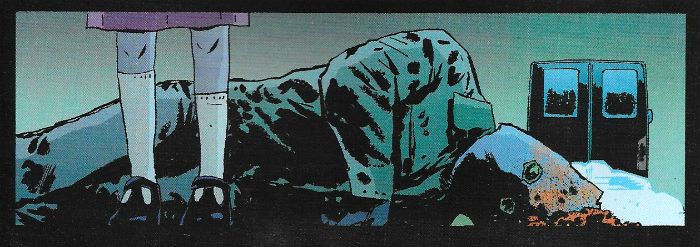
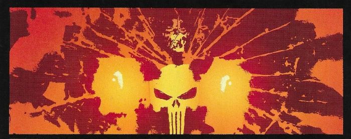
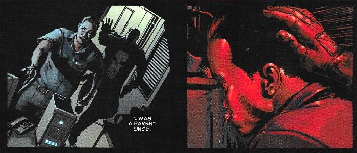
In which I look at some PunisherMAX comics. But not the PunisherMAX comics everyone likes. That would be too easy. No, these are the other PunisherMAX comics. The PunisherMAX comics no one ever mentions. The PunisherMAXes Garth Ennis didn’t write. Those PunisherMax comics.  photo Pmwttbstartb_zpsnnh5rv7v.jpg PUNISHER: FRANK CASTLE MAX by Parlov, Gischler, Loughridge & Petit

Anyway, this...

1) Half-Hearted Apologia:

So, yeah, I took a break which was fun. Except I have been following the news. We’ve got a General Election on, doncha know. Apparently The Tories are going to win despite the fact they make Norsefire look cuddly and their leader displays all the charm and humanity of Lady Darkseid; while their manifesto is centred around foxhunting and taking old people’s homes off them to sell to Lady Darkseid’s husband’s mates. Look I’m not saying the political class in this country are a shitshow but I’ve heard they are such a shitshow a bunch of shitshows are starting a Kickstarter to sue them for defamation of shitshows everywhere. They make shitshows look bad is what I’m saying. What I’m also saying is I’m a bit out of sorts and so for solace I turned to a big man with a gun shooting his problems in the face.  Because I am civilized.

2) PunisherMAX: What Has Gone Before.

 photo Pmwttbshowb_zpsedqohozx.jpg PUNISHER: FRANK CASTLE MAX by Parlov, Gischler, Loughridge & Petit

Despite sounding like an unwise purchase from a dispenser in a night club toilet PunisherMAX was a pretty good little run of comics. (The title of the comic varies for reasons known only to the minds at Marvel©™®, I've just left it as PunisherMAX because that joke wouldn't have worked.) Garth Ennis reined in his playground bully humour and delivered, via the art of many partners,  a masterpiece of incrementally increasing horror. Starting off unpromisingly with brayingly unfunny crap like testicles in a paper cup, the series quickly transcended the oafish drollery of Marvel Knights Punisher by presenting essentially the same story but, and it really worked this, each time everything was that bit more appalling, until it all ended in a future so post apocalyptically awful that only the magnificent Richard Corben could do it justice. His story having being told Ennis jumped ship. Which is uncharacteristically wise behaviour from a comics writer, it must be said. But Marvel©™® weren’t giving up a critically lauded cash-cow that easily. So the book limped on under a number of writers. That’s ungenerous of me. While these issues pale in comparison to Ennis & pals’ nightmarish epic, well, so do most comics. Taken as their own thing these issues of PunisherMAX are pretty entertaining Thug With A Gun stuff.

3) It’s Not Sordid, Ma! It’s Purgative!

 photo PMwttbfeetb_zpshai5t3gc.jpg PUNISHER: FRANK CASTLE MAX by Parlov, Gischler, Loughridge & Petit

There’s not really much point gussying it up, The Punisher isn’t literature, was never meant to be literature and is highly unlikely to ever be literature. The whole ethos embodied by The Punisher comes from a bad place. And I don’t mean Brooklyn. Wacka wacka wacka! The Punisher comes from that subterranean pit of the male psyche that wants violence to solve everything, and to be the biggest dick in a world of big dicks. The Punisher is the poster boy for the inadequate revenge fantasy in all of us. Even those who aren’t white or male. We’ve all been hurt and felt the lesser for it, and we’ve all wanted to fuck that fuck’s shit right the fuck up. But most of us don’t. Because we can’t. But Frank can. In these issues Frank faces off drug traffickers, monied sociopaths and inbred hicks. And he fucks aaaaaaall their shit up. Of course two seconds later the vacuum left by these corpses is filled by other drug traffickers, monied sociopaths and inbred hicks. Frank forever crops the Weed of Evil but he never pulls out the roots. Because that’s complex stuff, the kind of stuff that requires social funding, education, rehabilitation programmes, investment in social infrastructure and a genuine push to eradicate the inherent inequality of a social system which rewards the few at the cost of the many. That’s not really Frank’s bag. He does do as much good as a nutter with a gun can, though. Fair’s fair.

4) The Men Who Aren’t Garth Ennis.

 photo Pmshtkrunb_zpslrizzt63.jpg PUNISHER: FRANK CASTLE MAX by Lacombe, Swierczynski, Staples & Petit

It’s an interesting roster of writers too; all taken from the Crime section of the library. No strangers to chewy macho action these guys. Obviously I’ve not read them, because that would require some degree of professionalism, but I did look at the titles they have penned. Greg Hurwitz has The Kill Clause, Troubleshooter, Bullet Fucker, etc; Victor Gischler has Shotgun Opera, Gun Monkeys, Kalashnikov Suppository, etc; and Duane Swierczynski has Revolver, The Wheelman, Vegan Cooking For Busy Moms, etc etc.  All burly, well-ripped titles which suggest that though they may sit behind desks these guys could crack concrete blocks with their cocks. It looks like these guys are the guys (and they are guys) who write the sweaty meats in the carvery of literature. The kind of thing where some dude (and it is usually a dude) with a harrowing past still somehow manages to be superhumanly capable in the violence stakes when push comes to shove. And push is forever coming to shove. The kind of stuff mechanics would have had rolled up in their oil stained back pockets in gas stations all across the American Past. In the American Present they are read by men who know what a latte is, and think a harrowing past is that time the wifi acted up and they couldn’t smoothly stream that episode of Veronica Mars involving the cupcake and the chimp. Times change but men don’t, is what I’m getting at there. Men will always want to be able to punch through someone’s skull so hard they wear the luckless chump’s face like a glove. And to be right in doing so.  All men. Rabbis and Social Workers too. Particularly Rabbis and social workers. Especially Rabbis and Social Workers. I don’t mean to be a misogynist prick but I imagine women are different to men in this respect. Maybe not, I’m not willing to speculate. But men? I know whereof I speak. And being a man I am not immune to the sweaty charms of these comics .

5) At Long Goddamned Last The Actual Comics (Cue Fanfare!): 

GIRLS IN WHITE DRESSES PUNISHER (AKA PUNISHERMAX) #61-65 Art by Laurence Campbell Written by Greg Hurwitz Coloured by Lee Loughridge Lettered by VC's Cory Pettit Covers by Dave Johnson The Punisher created by John Romita Snr, Ross Andru & Gerry Conway Marvel©™®, $ 2.99 (2008)

 photo dressescovs_zpsfukxgwoh.jpg

First up we have ‘Girls in White Dresses’ which is one of those festivals of testosterone where a poor Mexican town has to get some violent gringos in to sort out their problems. This kill riff goes back at least to The Magnificent Seven (1960), maybe further. (I don’t really have time to look into the tenacity of the “America as Saviour of Mexico” genre. But I do know it was done best in The Three Amigos (1986)) In this case of course the Mexican town in question requires the help of a singular gringo, Frank Castle. Frank doesn’t need six companions, because friends are for the weak. More like the Feeble Seven, eh Frank? Frank Castle just needs to know two things: where the bad guys are and what’s the name for that depression between your nose and top lip. Keeps him awake at nights that does. That and the memory of his dead wife and kids. (It’s the philtrum, Frank. Sleep that bit easier now, old warrior.)

 photo Pmgwwdvanb_zpsutc7gpz5.jpg PUNISHER: FRANK CASTLE MAX by Campbell, Hurwitz, Loughridge & Petit

It’s full of the usual butch silliness right from the start, like the way Frank spots his tail because he is wearing a big cowboy hat. (So if you ever do tail a psychotic ex-‘Nam mass murderer, a big cowboy hat might not be the best headgear to go with. Every day is a school day.) Also nice was the way Frank reins himself in from killing the tail because under the hat is an old man. Old men are of course completely harmless. I guess Hurwitz has never seen The Wild Bunch (1969), Bubba Ho-Tep (2002) or ever been in the vicinity of Pappy Kane when he’s that way out. It’s good that Frank stays his hand because then el anciano is able to petition him for aid and thus the comic doesn’t end suddenly. For as is traditional in the America-Helps-the-Mexicans genre the village has scraped together less than you spent on an iPad to sweeten the pot; those poor backward fools never realise that Americans will help Mexico because Americans are Awesome, rather than for the paltry financial reward on offer. After all America is Mexico’s friend; well, except for that time it just up and stole Texas, and that whole Wall business and the way it is constantly interfering with “observers”, and the way it never actually helps in any constructive way whatsoever…other than that though, America wuvs Mexico so very, very much. Unmoved by the financial lure Frank says no, because it’d spoil the suspense for when he appears later to help them despite having said no. Because I know I for one was honestly expecting the next three issue to show the drug traffickers riding roughshod over the community with the odd cutaway to Frank shining his shoes or searching NETflix for something to watch (Housebound (2014) is fun, Frank) or rollerblading in denim cut-offs. Whatever took his fancy really.

So Frank turns up and kills everyone who is bad. THE END.

 photo Pmgwwdgunsb_zpsl29t9qn3.jpg PUNISHER: FRANK CASTLE MAX by Campbell, Hurwitz, Loughridge & Petit

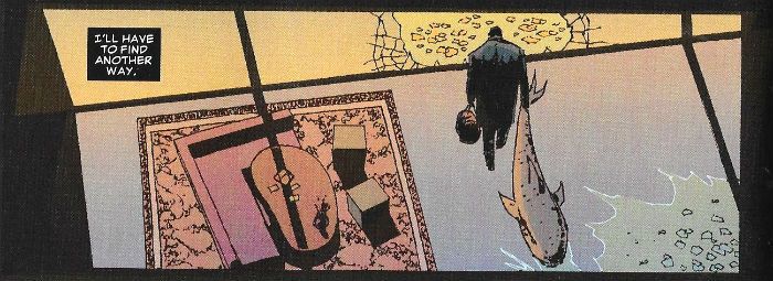
Okay there’s a bit more to it than that. Hurwitz takes a thoroughly well-worn set up and chucks in some grisly bits to give it some oomph. Among the gruesome touches on show are the fact that  the women kidnaped by the drug traffickers are being returned stitched up like knock off teddies, Frank has to dig up a kid’s corpse and then dig a bullet out of said dead kid (which was particularly nice) and there’s a simply darling bit of business involving a pet shark. (Yes, a pet shark.) Unfortunately all that good work is slightly undermined by a few tricks nicked from substandard action flicks. It’s possible that on screen Frank’s charge through multiple sheets of drug glazing would work, but on the page it’s a bit listless. (But Campbell nearly makes it work visually, to be fair) And you’d have to be fourteen and merry on cheap cider to take the old throw-a-roll-of-coins-at-the-crane’s-controls-to-drop-a-heavy-thing-on-the-bad-guys bit seriously. It’s a bit too sub-Seagal to play is that part. However, there’s been some research done; or at least I think there has, I’m not going to check but apparently cat litter is used in the production of narcotics (and also for cats to do their cat business in, if the bad guys have an actual cat) and manufacturing narcotics is bad on your eyes and lungs. (Seriously the working conditions are appalling, someone should make it illegal.)

 photo Pmsharkb_zpsvdiz9kbv.jpg PUNISHER: FRANK CASTLE MAX by Campbell, Hurwitz, Loughridge & Petit

Oh, and in a weird sop to normal Punisher continuity it turns out that the Big Bad is Jigsaw. Jigsaw is Frank’s only(?) recurring villain because Frank is tough on his villains. I find Jigsaw a bit dull, personally. Jigsaw’s big thing is Frank fucked his face up.  Other than that he’s just a bad man. Bit of a nutter to boot (i.e. his Jigsaw has some pieces missing!) This being MAX Jigster’s also a bit rapey, but mainly he’s just a “bad hombre” as your PoTUS might have it. There’s a lot of build up as to who the Big Bad will be and the payoff is dependent on visual punch, which is unfortunate as Campbell’s splash page reveal is of a man leaning over a desk with what looks like a sooty face. I thought it was maybe a new villain, “Sooty Face”, but no they were scars and it was just Jigsaw.  Which is a problem with Campbell’s approach to art. Drawing over photo reference is all special and modern and that, but scars deform the surface of the skin around them; they aren’t just straight lines laid over a face. You can get away with drawing straight lines on a face if you are drawing everything from the ground up, because everything is obeying the same inherent visual laws, but just scribbling on someone’s face makes it look like someone has a face that’s been scribbled on, like they fell asleep during a frat party or something.  But Campbell does do pretty well overall, even though his approach is not my favourite technique. He certainly knows how to balance his panels, which is super-important if you’re going to rely on the landscape format (see also: Goran Parlov). There’s some nice stuff going on, and the page where Frank is hidden in the patterns of a bush like a malevolent optical illusion is pretty great. And even a colour dunce like myself can tell that Loughridge knows when and how to make things pop. Both here and in Welcome To The Bayou Loughridge artfully displays the blunt impact of the solid red backround beautifully. Girls In White Dresses is GOOD! But really, for the price of the TPB you could probably pick up Don Winslow’s Power of The Dog and The Cartel, which together do the whole America/Mexico drug thing but with the sweep of Ellroy’s American Tabloid while also managing to mix in some historical veracity along with the pantomime machismo.

SIX HOURS TO KILL PUNISHER: FRANK CASTLE MAX (AKA PUNISHER AKA PUNISHERMAX) #66-70 Art by Michel Lacombe Written by Duane Swierczynski Coloured by Val Staples Lettered by VC's Cory Pettit Covers by Dave Johnson The Punisher created by John Romita Snr, Ross Andru & Gerry Conway Marvel©™®, $3.99 (2009)

 photo sixhourscovs_zpsfbdbpktl.jpg

Here we have Frank plugged into the Race Against Time trope. Children will be familiar with this from the timeless Crank sequence of movies (Crank (2006), Crank 2: Crankier (2009) and Crank 3: Crankiest (in production)), adults will know it from Speed (1994) and Speed 2: Cruise Liners Aren’t Very Fast (1997) and the elderly will, after much prompting, recall DOA (1950; remade 1988). I  Imagine it was meant to be a very cinematic outing this one, but as is usual with such comics it just made me want to go on an outing to the cinema.  I guess Swierczynski panicked a bit because it’s far too overstuffed for the simple premise. And such premises thrive on simplicity. Consequently what should zip swiftly along kind of lumbers stolidly towards a not entirely convincing denouement. (I have always wanted to use the word “denouement”; I can die happy now.)

 photo PMshtdfaceb_zps8hlrrnzm.jpg PUNISHER: FRANK CASTLE MAX by Lacombe, Swierczynski, Staples & Petit

A quick peek behind The Wizard’s Curtain: I don’t tend to write these things with the actual comics to hand; I have to snatch time where and when I can and smoosh it all together later, hoping I pick up on repetitions and inaccuracies. And to be quite frank (hohoho) I’m struggling to remember the intricacies of this particular plot.  Start the clock and let's go: There’s a mayor whose future is threatened because his cousin in law has been running a kids home as a paedo pick’n’mix (and this shows how long ago this comic was written; today politicians can set kids on fire in full public view and then mount the still twitching corpse and people will just shrug and say, yeah, but, immigrants, yeah but, dole scroungers, yeah but, my house isn’t on fire, yeah, but Gogglebox is on, yeah? Remember when politicians used to resign? When was the last time a politician resigned?  About an hour ago should be the right answer, but it isn’t.  Whatever happened to accountability? Oh, John! You’re such an old-fashioned chap! Get on your penny farthing, granddad, and fuck off back to the past!) Er, so some rich dude who is in the mayor’s pocket (or who has the mayor in his pocket) decides to off the mayor to avoid being torpedoed with him, and he chooses to use Frank Castle, so that no one else gets covered in shit when the mayor goes down.

 photo PMshtkpubb_zpsphhpm0bx.jpg PUNISHER: FRANK CASTLE MAX by Lacombe, Swierczynski, Staples & Petit

So there’s this rich dude, his sex addled sister, a brain wrecked ‘Nam vet cum-politico and a techy geek who injects Frank with a drug which will kill him in six hours - unless he offs the mayor there’s no antidote for Frank. Then, amusingly, Frank immediately goes off message and tries to maximise his kills given his time limit and the amount of ground he can cover in that time.  That was genuinely pretty funny and really caught the monomania of the character. Almost funny enough in fact to distract from the fact that if they’d just let Frank know the mayor was up to his nuts in kiddie fiddling then Frank would have given them a freebie, you know, without all the magic drug farting about. Anyway, then there are these ex-cops who pretend to be real cops so they can off Frank (because Frank doesn’t kill cops) but Frank senses they are not real cops, but, wait, there are also real cops after Frank, and so Frank has to stop these cops dying when they get caught in the crossfire with the fake cops or it might be some angry gangbangers. I can’t really remember, but there were...shriners? And maybe some put-out girl scouts, and maybe some Japanese soldiers who had been hiding in a hot dog stand in Times Square unaware the war had ended? It’s all gets a bit silly. Yeah, I know it's The Punisher, but there's silly and then there's just silly. And this ends up just silly. Just that bit too goofy for me, I guess. Lacombe does well though, given the overly large cast there's a total lack of confusion, and he handles the set pieces well; they have a real sense of space and an admirable clarity of staging. The only real clanger is when people have multiple facial contusions it looks more like they are sporting a tasty crop of boils. It's a pretty good art job though, not unreminiscent of Cannon and Ha's work on Alan Moore's Top Ten. But, you know, with a shit ton more violence and implied fellatio. Aw, it was OKAY!

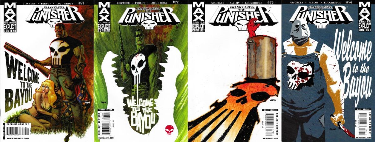
WELCOME TO THE BAYOU PUNISHER: FRANK CASTLE MAX (AKA PUNISHER AKA PUNISHERMAX) #71-74 Art by Goran Parlov Written by Victor Gischler Coloured by Lee Loughridge Lettered by VC's Cory Pettit Covers by Dave Johnson The Punisher created by John Romita Snr, Ross Andru & Gerry Conway Marvel©™®, $3.99 each (2009)

 photo bayoucovs_zpszn1yzqxb.jpg

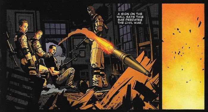
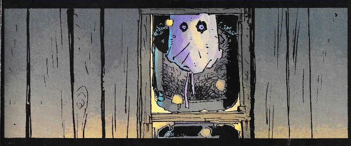
This one is just junk. Unapologetic trash.  Just...trash. It’s great. Basically, and I do mean basically, it involves Frank wandering into a ridiculous Frankensteinian patchwork of grindhouse horror movies. There’s a bunch of spring breakers who make a fateful pit stop , a cannibalistic family , a giant gator, a deformed nutter in bib overalls with a sack on his head, bbq cannibalism and probably a whole bunch more of such sophisticated cinematic concoctions I failed to pick up on. It’s not exactly spiritually enriching stuff. In short it’s trash as I said above. Crucially, though, it’s well done trash. Sure there’s much flagrant mugging of other people’s ideas, but it’s so blatant it’s kind of disarming, and they reconfigure everything into at least a semblance of freshness: things take a neat early twist with Frank outclassing his congenitally evil enemies to the extent that expectations become upended, and he seems the monster and they the prey. But sure as eggs is eggs genre will out, and it quickly reverts back to factory settings. It’s brutal, tasteless stuff with a light comedy glazing, all given the appropriate tone of flip goonery by Parlov’s sure handed blend of ludicrousness and realism. Frank himself looks more like a raybanned update of Carl Critchlow’s Thrud The Barbarian than anything that ever drew breath in reality. And the way Parlov controls the pacing and flawlessly connects with the jump scares is evidence of genius at play on the page.  Sure, the outcome of the story might never be in doubt, but Parlov & Gischler consistently give your expectations a good hard Glasgae kiss. Ayup, Frank sure has to jump through some (Tobe) hoop(er)s in this one. Welcome To The Bayou knows what it is and runs headlong with it into a secluded thicket of VERY GOOD!

 photo Pmwttbfaceb_zpsyjb9dpkj.jpg PUNISHER: FRANK CASTLE MAX by Parlov, Gischler, Loughridge & Petit

Weirdly, despite its obvious borrowings the only movie anyone mentions in the story is Deliverance, which is aiming a bit high since that was written by the poet James Dickey and not, say, Ray Garton. Mind you, despite Deliverance being written by the 18th United States poet Laureate, most people do tend to remember it as just a classy survivalist flick. That’s folk for ya. What a lot of people who’ve seen Deliverance don’t know is that Dickey saw active service in both WW2 and the Korean “Police Action”. Maybe the nascent poet, awaiting his next nightfighter mission, propped his ass on a crate and uncurled a battered paperback of  Punisher-esque he-man nonsense. I like to think so, and I'm sure the current purveyors of he-man nonsense considered above would echo that sentiment.

6) Concluding Remarks:

In the future no matter how advanced we as a species become somewhere there will be a man scratching his ass and smelling his fingers. And there's probably some value in that.

NEXT TIME: Will it be a message from a freshly birthed Socialist Utopia or the same quasi-fascist and morally diseased Selfish State? Either way it'll involve - COMICS!!!

“They Could Be A Crosstown Bus, A Croissant Or A Crossdresser By Now…” COMICS! Sometimes You Should Have Put  A Ring On It!

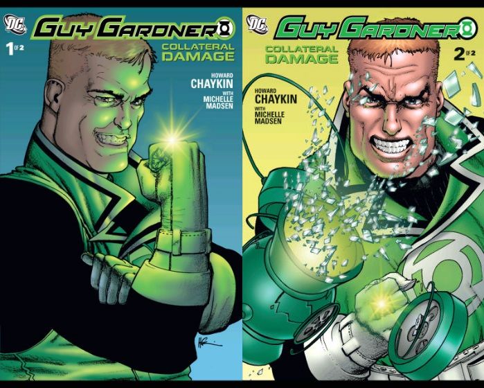
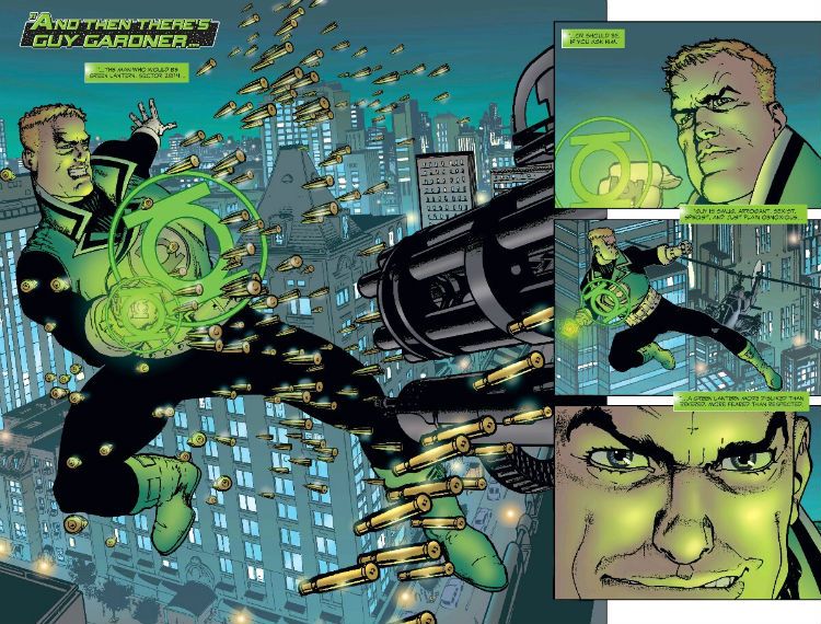
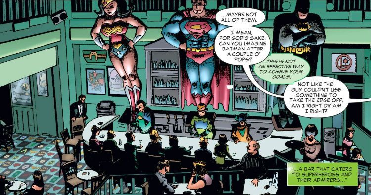
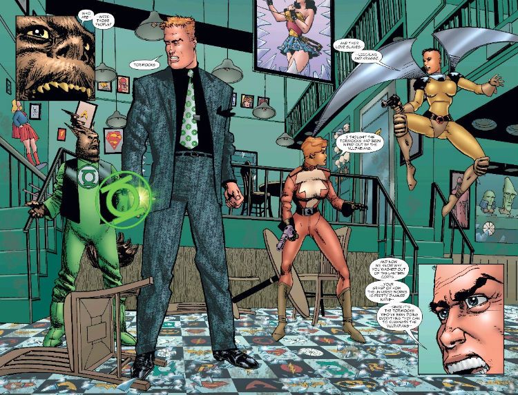
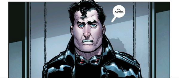
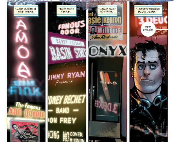
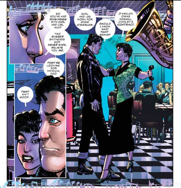
So I took a break and now I’m back! Like rickets! So here’s far more words than anyone sane would ever need to read about a two-issue comic Howard Victor Chaykin did in 2006. Because, that’s why. Just because. Also: because. Because.  photo GGCD_logoB_zpsmu81xngi.jpg GUY GARDNER: COLLATERAL DAMAGE by Chaykin, Madsen & Balsman

GUY GARDNER: COLLATERAL DAMAGE #1-2 Art by Howard Victor Chaykin Written by Howard Victor Chaykin Coloured by Michelle Madsen Lettered by Phil Balsman DC Comics (2006) Green Lantern created by Gil Kane, John Broome, Bill Finger, Martin Nodell and Gardner Fox Guy Gardner created by Gil Kane, John Broome G’Nort created by Keith Giffen & J. M. deMatteis

 photo GGCC_CoversB_zpsoiauznan.jpg

“Guy Gardner: Collateral Damage” is part of the second of Mount (as in “Mountain”; it’s not an instruction) Chaykin’s twin creative peaks. The first peak, as any fule kno, was in the ‘80s when Howard Victor Chaykin stopped putzing about and found his suave groove. In this period, covering “American Flagg!” thru to “Black Kiss”, Chaykin was amazing. The second, less trumpeted, peak occurred in the ‘00s and marked Howard Victor Chaykin’s full-time return to comics after toiling in the soulless arena of Television for much of the ‘90s. What he did in Television was make money, any more detail and you’ll need someone who gives a shit about Television. A comic writer with an Image book, say. Me, I think a talking car was involved and some Marvel show about mutants; I’m already falling asleep, zzzzzzz. Anyway, everyone needs money so whatever and well done to him. Howard Victor Chaykin burst back onto the comics scene with “Mighty Love”, and followed it with a fiesta of fun concepts, nut-tight art, smart scripting and…no one gave much of a shit, to be honest. Which is a stain on Comics’ collective Report Card. (Also, Comics must try harder in gym and stop being so easily distracted, there are no jobs out there for class clowns.) Luckily I am here to heroically, singlehandedly and, above all, modestly rescue Howard Victor Chaykin’s ‘00s output from the ignominy of thoughtless neglect. I picked “Guy Gardner: Collateral Damage” because as we’ll see it is an unlikely place (a continuity burdened Event tie-in) for his characteristic strengths to find purchase. But, like Nature, Howard Victor Chaykin finds a way. Also I’d just bought it on The ‘Ology.

 photo GGCD_gunsB_zps8tykyj3z.jpg GUY GARDNER: COLLATERAL DAMAGE by Chaykin, Madsen & Balsman

Yes! This aptly named series originally appeared in 2006 as two “prestige” format comics and is now available in 2017 digitally (and, crucially, cheaper) on the ‘Ology.  This means I can write about it without breaking the spines of my originals while scanning them. (Such are the trials which mar my life!) The book lived up to its title (“Collateral Damage”, see) by being barely noticed on publication due to most eyes being filled to the brim by the rest of the “Infinite Crisis” lardfest, of which this was but one small part. In the same way that “House of M” (2005) sounded the death knell for my interest in Marvel’s output, “Infinite Crisis” would place the pillow over the face of my interest in DC and begin to apply pressure. Lest we forget, because after all it was 11 years ago now,  “Infinite Crisis” was the core series in which Geoff Johns wrote a load of typically mawkish continuity-chuff drizzled in saucy gore, and peppered with his childish resentment at internet commentators; all in an attempt to hornswoggle the audience into believing something of merit and depth had occurred. (It hadn’t.) Worse, there were ancillary mini-series like “The Rann-Thanagar War”, which, while decently written, was a waste of the unique talents of Dave Gibbons. Getting Dave Gibbons to write corporately mandated tie-ins to short-term sales bloating events is a bit like getting Isambard Kingdom Brunel in to unblock your sink because the boss is coming round for dinner.  It’s unseemly, and speaks to a total lack of appreciation of his gift. Which is the ability to draw real well, DC Comics. I thought I should spell that out for you; although I guess for DC the real gift of Dave Gibbons is his ability to maintain a dignified silence while they fart once more into the face of  “Watchmen”’s corpse. Although there is a certain grim irony in the fact that DC’s latest attempt to reduce one of the (very few) decent cape comics into something they can eventually team-up with Scooby fucking Doo starts with Batman finding a “Watchmen” promotional button in his cave. After all DC’s underhand antics with promotional badges are what started the whole sorry “Let’s All Hunt And Kill Alan Moore” shitshow off aren’t they? (Yes.)

 photo GGCD_punchB_zpszkvihayg.jpg GUY GARDNER: COLLATERAL DAMAGE by Chaykin, Madsen & Balsman

But this isn’t about that, this is about a Howard Victor Chaykin comic which was secreted somewhere within  muddled parpstorm of a terrible Event. An Event so larded in extraneous chaff that I’ve hardly even begun to scratch the surface. I can’t even be arsed to look it up, so demoralising is the memory of all that Trex, so I may have a few facts wrong when I say there was also “The OMAC Project” which involved Greg Rucka, so it was probably a bit like drowsing while watching a TV show about a strong! independent! female! written with all the élan and excitement of a spreadsheet macro; “Villains United” which tried to make Catman a sexy badass, so enough said there, and a series about the return of Donna Troy (imaginatively and thrillingly entitled “The Return of Donna Troy”) which I imagine no one read, since no one shares DC’s insane belief in the character of Donna Troy. Although it is sobering to note that they have treated Donna Troy, a fictional character, with more love and respect than they have treated Alan Moore, a real human being. Maybe Alan Moore should start wearing a tight cat suit with little stars on it; it wouldn’t change anything but I think the world would be fundamentally a far sexier place. He could maybe jump around a bit and giggle for Peak Sexy. Uh, anyway, Donna Troy, I don’t know; that probably went about as well as expected, I think they found her weeing in a grate outside IKEA while singing showtunes. I could be wrong. Oh, and then all the regular DC series had a tie-in of some description, that description probably involving the terms “irritating”, “disruptive” and “unwelcome”. Best of all (i.e. worst of all) every title then zipped forward 12 months and the series created specifically to fill in this blank, “52”, didn’t. But everyone writing it had fun and readers did get to see small child torn to pieces by a talking crocodile, which is worth more than rubies to Geoff Johns. In essence the “Infinite Crisis” Event turned out as well as any Event could which starts off with the chirpy schmuck Blue Beetle’s brains being blown out. Fucking grown up stuff, that. If I have made any errors in that brief rundown I want to assure you now that I don’t care. Not a jot. What is undeniable is that the only worthwhile reason to brave this blizzard of inconsequential pablum was Howard Victor Chaykin; who, working diligently away in a neglected corner of the DC Universe, produced another Howard Victor Chaykin comic.

 photo GGCD_barB_zpskqh8e7mj.jpg GUY GARDNER: COLLATERAL DAMAGE by Chaykin, Madsen & Balsman

Given the nature of the Event beast Howard Victor Chaykin must here sup from the cup of continuity somewhat deeper than is his wont, yet Chaykin still ably finagles his way into writing what he’d rather be writing about: a horny jackass accidentally doing the right thing for all the wrong reasons. First though he has to pay lip service to the corporate tie-in friendly setup, which is that G’Nort (AKA G'nort Esplanade G'neesmacher the canine looking alien Green Lantern) is looking for an independent entity to broker peace between Rann (the planet of boffins Adam Strange knocks about with) and Thanagar (the planet of winged fascists like that Hawkman). Caught between these two cheeks of the same warmongering arse G’Nort’s home planet has fared poorly. What with his family having being offed the usually played for laffs character is thus portrayed as a bitter champion of peace. An upright talking dog with a magic wishing ring rancorously lamenting its slaughtered family is a pretty good joke about “gritty” superheroes, I think. So, back at the point: G’Nort chooses Guy Gardner, who is the “edgy Green Lantern”. Since the only Green Lantern I have any familiarity with is Hal Jordan, in comparison to whom even I appear “edgy”, I don’t really know how “edgy” Guy Gardner is usually. I’m not really interested either. Here Howard Victor Chaykin writes Guy Gardner as “Howard Victor Chaykin” (Legal Note i.e. not really Howard Victor Chaykin but the cartoonish exaggeration he uses as his default protagonist. Hence the rabbit’s ears round his name.) Or “Howard Victor Chaykin” if he owned his own bar (namely Warriors: “…the finest meat rack the world’s ever seen”) and had a magic wishing ring. It goes without saying that this is the single best set up for a series ever, ever, ever and the very real tragedy is we only have two issues. To recap for Green Lantern newbs: If you stick your finger in Guy Gardner’s ring and make a wish, that wish briefly becomes a physical, but green, reality. But should you stick your finger in Howard Victor Chaykin’s ring and make a wish you end up with a few less teeth and a restraining order. A little lesson in the difference between fantasy and reality there, kids. So, yeah, since there’s a six-issue mini-series occurring somewhere beyond these pages about the Rann-Thanagar War the whole peace process business is a bit of a McGuffin. Okay, a lot of a McGuffin. Everyone gathers in Guy’s bar and then the Tormocks burst in and wreck it and the comic forgets what it was supposed to be about while Guy goes and finishes off the Tormocks. The Tormocks having just finished off the Vuldarian race. I just looked on Wikipedia and, oh wow, it turns out Guy Gardner is the first successful example of the merging of Vuldarian (the Tormock’s hated enemies)  and human DNA. Guy was also born in Baltimore, Maryland. There are people out there who know all that but don’t know who their MP is. Think about that for a minute. This comic is a lot of fun but not quite as much fun as imagining Howard Victor Chaykin’s face as he read Guy Gardner’s backstory.  Bojemoi!

 photo GGCD_stanceB_zpsszd2o8ur.jpg GUY GARDNER: COLLATERAL DAMAGE by Chaykin, Madsen & Balsman

Given his oft expressed preference for comics’ form over comics’ content I was amazed that Chaykin had immersed himself in Guy Gardner’s typically ridiculous (not a criticism) continuity to the extent he had, but it’s all part of Chaykin’s sleight of hand as he refocuses the tie-in not too subtly onto his pet concerns. Basically the Tormocks allow him to provide his arrogant schmuck of a protagonist with the usual “moral cripple” opposition. Since Guy Gardner is the “hero” it’s important he come into conflict with someone demonstrably worse. Which is kind of tough because Gardner is a leering oaf, a blunt concoction of braggadocio, poor impulse control and genitally driven self-interest.  And he also has the worst haircut in comics. The guy’s a walking pile of soiled jock straps with all the self-awareness of a stump. Much of the comedy comes from Chaykin nakedly embracing Guy’s faults, with only Guy’s wishing ring’s sardonic commentary, acting as a kind of unheeded conscience, as a balm to the buffoonish sexism on display. I kid you not when I say there are no less than three panels in which Gardner is clearly ogling a boob while talking to its owner, and his interest in heroism is a poor second to his interest in troilism. Even back when it was just called dickheadedness Chaykin showed a  concern with toxic masculinity, a concern which persists in his work. Because he doesn’t actively undermine it to the extent people expect someone to I think he gets a raw deal, and people interpret his depiction as an endorsement. (Also it’s easier to dismiss him that way.) Chaykin’s mature (i.e. Flagg! onwards) work is festooned with protagonists hampered by their toxic masculinity. Usually violent, sexually aggressive and emotionally restricted many of Chaykin’s male leads are walking (but charming) embodiments of toxic masculinity. But the stories they inhabit are often misinterpreted as celebrating this, because Chaykin doesn’t tut and shake his head enough to sate political correctness. Yet Chaykin’s usually kneecapping male bravado as thoroughly as a bolt gun. in “American Flagg!” our cocky protagonist  is brought firmly down to earth, only prevailing through fear driven violence and ending a weeping wreck in the arms of a woman despite all the swagger of preceding issues. “Midnight Men” is as much about a man breaking out of the emotional inertia of maleness so he can finally mourn his father, as it is about the joys of punching assholes in the face. Blackhawk doesn’t win by fighting, he wins by thinking. Cass Pollack in “Black Kiss” is thoroughly punished, emasculated even, for his moral feebleness. And Guy Gardner, well, Guy Gardner is just an unrepentant prick. And remains so. Which is fine, but it makes it hard to root for him. Hence the Tormocks. This bunch of charmers are basically engaged in ethnic cleansing on a universal scale, and not only kill people but turn them into a kind of paste and then get schwifty while rolling about in it. So, yeah, as unrepentant as he may be Guy Gardner doesn’t look too bad in comparison. I’ll take toxic males over space Nazis anyoldday.

 photo GGCD_spaceB_zpsqzvwly9g.jpg GUY GARDNER: COLLATERAL DAMAGE by Chaykin, Madsen & Balsman

Visually, Chaykin returned from Television with a new lucidity and boldness which the pages of  “Guy Gardner: Collateral Damage” testify loudly to. His figures are big and his layouts regimented. It’s easy to rip the piss out of the predictability of his layouts, with their strict regime of vertical or horizontal panels interrupted by insets, but it works because his aim is clarity, not pizzazz. Sometimes his aim’s off though. No, it’s not all unrestrained gushing from my end (ooer!), Chaykin’s pages definitely work best on the horizontal pattern; the vertical doesn’t give him enough space to stage action, which he forgets sometimes. Confusion ensues. (A dependency on vertical panels would somewhat tarnish, and for some fatally undermine, the many other pleasures of the later “Century West” OGN) Mostly though it’s good lookin’ stuff! There’s a real bounce to it all, a real sense Chaykin’s having a good time. This pleasure is particularly evident in the glee with which he yanks back the clock on the sci-fi stuff. Chaykin’s space jalopies are fantastically old school, each a knowing throwback to the thrilling days of yesteryear. Specifically 1938-40,  when Olympic swimmer Larry “Buster” Crabbe (1908-1983) was so virile he portrayed not just Flash Gordon but Buck Rogers to boot. With their rococo ornamentation and redundant aerodynamic tapering Chaykin’s ships just need a fire cracker stuck up the jacksie and to be hoisted aloft by wires moving in a circular but persistently vertical motion. (Also, I’m pretty sure one of the characters is using a hairdryer as a gun at one point.) This obvious affection for the outmoded, impractical but beautiful would find later and fuller expression in Chaykin’s “Buck Rogers” revamp. Here though it’s super heroes a-go-go and Chaykin goes appropriately brash and big with the figurework. Surely no heart can remain unmoved by the five (count them: five!) double page splashes which open the book in a suitably dynamic and sweeping style. Oh yeah, there’s also some debonair styling going on as Chaykin continues his wholly understandable love affair with the visual of a man in a nice suit. And woven in among it all are some sweet little touches of humour, such as the repeating GL symbol on Guy’s tie. It helps that the book’s coloured by Michelle Madsen, whose contribution to this ‘00s second peak period of Chaykin is considerable. Embracing lurid and fruity colours as befits such a lurid and fruity book, Madsen’s colouring here is delightfully essential rather than dutifully unobtrusive. The lettering is fine, but it’s not Ken Bruzenak. It’s fine though. But not Ken. Okay I’ve run out of time so “Guy Gardner: Collateral Damage” is undoubtedly a minor work by a major talent, but it’s still VERY GOOD! Let those who worship evil’s might, beware my power – COMICS!!!

“F*** you, Tarzan.” COMICS! Sometimes ‘Tis Pity She’s A Whore!

In which I aimlessly amble around Howard Victor Chaykin’s recent series ‘Midnight of the Soul’ and see what strikes my fancy. No, really, even more than usual, I just sort of prattle on rather aimlessly and hope some kind of coherent point emerges. It probably won’t, but as I haven’t written it yet we’ll have to find out together. Take my hand, fellow stranger in paradise! Take my hand...  photo MotStabuB_zpsngnrr5c3.jpg MIDNIGHT OF THE SOUL by Chaykin, Arbutov and Bruzenak Anyway, this...

MIDNIGHT OF THE SOUL #1-5 Written by Howard Victor Chaykin Art by Howard Victor Chaykin Coloured by Jesus Aburtov Lettered by Ken Bruzenak Image Comics, $3.50 each (2016)

 photo MotSCoversB_zps4ay4i1ei.jpg

On one level ‘Midnight of the Soul’ is exactly the kind of comic everyone thinks Howard Victor Chaykin makes, but on another level it isn’t, and the abrasion between what you expect to read and what you actually read creates some smart sparks. I think. The success of Chaykin’s smuggling run in 'Midnight of the Soul' is aided no end by the fact he draws it and so, inevitably, it looks just like a Howard Victor Chaykin comic. This is the bit that misleads because the surface is flawlessly “Chaykin”. Obviously. What did you want, Dave McKean? The guy’s in his sixties, he’s not likely to be suddenly incorporating mixed media and sculpture into his work. Not when “Diagnosis: Murder” is on and there’s kosher Franks in the pan! Thus, the art is as Late Chaykin as Late Chaykin gets. And, yes, it breaks my heart too, but it is getting late in the Seasons of The Chaykin. But dry your eyes, o feral child, because he’s still with us, and he’s still delivering his pugnaciously suave art. Sure, some eyes will still be perturbed by the clip art that doesn’t quite gel and flinch at the odd lapse in positioning. I’m a Chaykin maniac but I’m not blind to his transgressions; there’s one panel of Patricia in a doorway that doesn’t work – at all, and he’s stuck himself with a motorbike image that doesn’t always suit the angle of his composition, and that precise image of a woman was in Satellite Sam, and that cop’s all out of whack with that barrier and, and, and, you know, we could carp all day, but what matters is that for the most part, most of it works. As your eye sweeps over it, as you read it, it works. If you sit and look at each panel, eh, not so much. But who’d do that? Whaddya think comics are? Art? Comics are for reading first and looking at second. 'Midnight of the Soul' is a VERY GOOD! read.

 photo MotSsailorB_zpszow0ttqs.jpg MIDNIGHT OF THE SOUL by Chaykin, Arbutov and Bruzenak

The occasional glaring visual infelicity aside, Chaykin definitely gets in a major artistic victory by resurrecting a sense of of New York as 'twas. While Arbutov’s colours remain a little too garishly lacquer-ish for my sedate tastes, they contribute enormously to this effect as well. The interiors of the dance halls and gin-joints are particularly noteworthy and Arbutov lays down some seriously hot pinks and cool greens. So, y’know, yay. The ‘50s being the Golden Age of The Billboard, omitting to mention the phantasmagoria of styles and fonts Bruzenak scatters as gloriously and as evocatively as the notes Gershwin throws over the opening of ‘Manhattan’(1979) would be a serious dereliction of duty. Bruzenak also subtly colour codes his speech bubbles so you know who is speaking even when they are “offscreen”. The big thing about Big Ken Bruzenak is that he never stands still (artistically, that is), and his stylistic evolution continues here with a pretty darn exciting and innovative mock 3-D lettering effect, used sparingly and effectively. Conjuring a particular time and  a particular place from the past into the present via paper and ink is a very Chaykin preoccupation. The man’s rightly proud that locations in the original ‘Black Kiss’ are so redolent of ‘80s Los Angeles that readers’ noses start convulsing for coke in sympathy. In ‘Midnight of The Soul’ Chaykin (and Arbutov and Bruzenak) work a similar feat for ‘50s New York, though here it’s your stomach that rumbles for coffee and a doughnut, rather than your nose for Class ‘A’s.

 photo MotSHornB_zpstexcff1j.jpg MIDNIGHT OF THE SOUL by Chaykin, Arbutov and Bruzenak

Not that the New York of ‘Midnight of the Soul’ is drug free. Au contraire, mon frère! On past evidence Chaykin’s not one of those selective amnesiacs who thinks the past was a magical Eden, to which the present is a disgraceful relative. If anything he’s prone to wallowing in the seamier side of things, and we’re not just talking about stockings there. And so it goes that Joel Breakstone’s search for his errant wife brings him up against a rash of rascals, a pair of gun slinging gunsels (in the correct sense of "catamites"), a saucy whip-smart dancer, a corrupt cop, and a boss man with a ginger flattop. This is after all, the ‘Midnight of The Soul’, so a certain sense of threat and moral conflict come with the territory. I mean, I could be wrong, but I believe the title alludes to ‘The Dark Night of the Soul’ (AKA ‘Noche obscura del alma’). That’s not because I am an expert on the poetry of St. John of the Cross (1542-1591), but because ‘Midnight of the Soul’ has a familiar structure, one which accords with the ‘time of testing’ the poem assures us we must all go through before reaching a state of Grace. Something to look forward to there, kids. That’s some high falutin’ stuff, poncho! Don’t worry, it just means ‘Midnight of the Soul’ is a lot like, oh, ‘After Hours’ (1985). Basically in these things you get some dude (or maybe a lady these days) out of his depth flailing about a thoroughly threatening city, encountering threats embodying his inner failings, while his intended goal remains persistently out of reach until his ordeal has suitably shriven him for the final confrontation. After which he’s a lot more at peace than he was when he started. And so it is for our slightly schmucky and typically Chaykin-esque looking lead, Joel Breakstone.

 photo MotSRedB_zpsbeyr6ifw.jpg MIDNIGHT OF THE SOUL by Chaykin, Arbutov and Bruzenak

Joel’s a failed writer but a successful drunk who slouches despondently in the garage of a house he sold to his Brother-in-Law to clear debts accrued, pecking out unwanted alt-History tales of a World where Germany won WW2. If Joel punched himself every time he ate a bagel he couldn't be more obviously a self-hating Jew. He doesn’t hate himself because he's a Jew though, he hates himself for some unpleasantness which occurred during the liberation of a Concentration Camp in WW2. Something, as Joseph Heller famously had it, happened. Coming to terms with that memory is Joel's key to Grace, but to do it he'll have to navigate his 'Midnight of the Soul'. Meanwhile, just to underline his emasculation, his wife is out bringing home the bread working as a night-court stenographer. Except she isn't, as Joel finds out while pathetically creeping the house for booze. Turns out she's turning tricks. The lit match of his self-righteous indignation plops straight into the accumulated reservoir of self-hatred, and the resulting explosion of dumb machismo is sufficient to propel the cuckolded schmuck out into the city in search of vengeance. New York, however, has other ideas. 'Midnight of the Soul' is a picaresque adventure comic in which a man finds out a lot of the things he thought he knew about himself aren't true, and that the truth might hurt but not as much as living a lie does. Also: violence, jazz, profanity, blow jobs, snappy patter, racism, jokes and a man dressed as a baby in an Irish bar. 'Midnight of the Soul' has something for everyone! Except humourless drips.

 photo MotSBlamB_zps7jnc9rwm.jpg MIDNIGHT OF THE SOUL by Chaykin, Arbutov and Bruzenak

Joel's a luckless boob for the most part, but he is ultimately lucky because he gets to inhabit one of Chaykin's more vital narratives. From the first loaded word (“Parallels”) there’s a sense of Howard Victor Chaykin pushing through the pages of the narrative at the reader. The explicit fictional narrative of the book seems shaken every now and then by subsurface ructions, barely repelled authorial outbursts, which threaten to make it lose its footing.  Which it never quite does, but it comes close. There’s a lack of commitment to the pulp fiction on show, as though Howard Victor Chaykin is intermittently is gripped by the urge to be doing something else. And I think he probably is. In a sense 'Midnight of the Soul' works as a big kiss-off to a bunch of tropes you suspect Chaykin feels he’s outgrown. Joel enters a midnight world of Chaykin standards, but always at an odd angle, always a few beats behind thee action, always playing catch-up, as though trying to find his way into the story proper. A story which seems to be occurring in parallel(!) to his search. This story, the story Joel circles for the bulk of the book, is the “usual” Chaykin, the Chaykin we expect; all bad behaviour, colourful characters, sassy patter and blunt force violence. For much of the book Joel never quite connects with this pulp strand, instead he keeps bouncing off it into a more sedate but no less colourful screwball romantic comedy. Both strands hinge on a portrait of New York anchored by visual verisimilitude and the odd nod to reality (is that Joe Gould reciting 'The Face on The Bar-room Floor'? In #3?) but both run parallel(!) to each other; until the final pages, anyway. And it's on these final pages that Chaykin seemingly states his current genre preference. But is it “Goodbye” or just “Au Revoir” to the genre staples that made his name and brought him fame? Alas, despite what I tell ladies in bars, I don't know Howard Victor Chaykin personally, so we'll all just have to wait and see together...

NEXT TIME: Take a guess, punchy. That's right - COMICS!!!

"...Gimme A Circus Like This Anyday." COMICS! Sometimes We're In Like Flint!

There's a little bit of Dredd in this one, a smidgeon mayhap. However there is a whole lot of Carlos Ezquerra and he's really making his computer colouring work in this one. Some real freaky skyscapes going on in the background of these panels. If you're a Carlos Ezquerra fan you'll probably want to pick this one up. Oh, looks like I started the review early, better put the rest under the jump. See ya, wouldn't want to be ya!  photo JDMC67backB_zpswcpjviup.jpg CURSED EARTH KOBURN by Carlos Ezquerra

Anyway, this…

THE JUDGE DREDD MEGA COLLECTION REVIEW INDEX

JUDGE DREDD: THE MEGA COLLECTION Vol. 67: CURSED EARTH KOBURN Art by Carlos Ezquerra Written by Gordon Rennie Lettered by Ellie DeVille and Annie Parkhouse Originally serialised in JUDGE DREDD MEGAZINE 211-212, 221-223, 228, 239, 241-244, 314-318 & 361-364 © 2003, 2004, 2005, 2006, 2011, 2015 & 2016 Rebellion A/S Hatchette Partworks/Rebellion, £9.99 (2016) JUDGE DREDD created by Carlos Ezquerra & John Wagner

 photo JDMCCov67B_zpstvolape4.jpg

‘Cursed Earth Koburn’ mostly features the exploits of circuit-Judge Koburn, rounded out by a Dredd adventure featuring the vengeful El Maldito. Both Koburn and Maldito hark back down the ages to Battle Picture Weekly and the strips 'Major Eazy' and 'El Mestizo', both of which were created by Carlos Ezquerra and Alan Hebden. I’ve written some slapdash slop about 'Major Eazy' before HERE, but just to recap for those too busy to click on a link: Major Eazy was a laid-back one man attack, as anti-authoritarian as he was effective in taking the fight to the Nazis. And since he was very effective indeed he was very anti-authoritarian indeed, as many a weak chinned officer type found out to his stuttering chagrin. Like most of Battle’s characters he was a direct reaction against the bright eyed and bushy tailed Tommy pushing back the baddies for God, Queen and Country, always with that distinct sense of good sportsmanship which defines the British in their own minds but in no one else’s. In comparison Major Eazy would fuck you up, and fuck you up good and he’d do it quick and nasty too. Because in war you get the job done, you don’t stop and have tea and scones while you do it. Visually Eazy was modelled on David Niven, as any fool knows. No, it was the American actor James Coburn (1928-2002), an actor with an easy-going and thoroughly amiable but subtly malevolent, screen presence., Despite apparently being born with the teeth of  a much larger man the ‘70s were good to James Coburn, indeed as they were to British comics, and so the latter plucked the former’s iconic image from Peckinpah’s Cross of Iron and plunked it in a strip for kids, probably about 50 seconds after Hebden and Ezquerra left the movie theatre, since both film and character appeared in 1976. Which is why Eazy wears a German cap, usually pulled down over his narrow, calculating slits for eyes. He also usually has a cheroot drooping from his slim lip because Coburn was a keen smoker both on screen and off.

 photo JDMC67coolB_zpsq97lc1ho.jpg CURSED EARTH KOBURN: KUSS HARD by Ezquerra, Rennie and Parkhouse

If you buy the Arrow blu-ray of 'Bring Me The Head of Alfredo Garcia' not only will you have bought the greatest movie about Warren Oates and a head in a bag ever made, but you also get the documentary about Peckinpah, 'Man of Iron', in which Coburn probably appears, smoking. It’s highly likely because if you do buy that blu-ray (which I think you should. NOW!) you also get a disk with 10 hours (1!0! H!O!U!R!S!) of interviews, from which the contents of the doc are culled. I’m far too busy being a supercilious prick to have watched this yet, but I did treat myself to the first 30 mins or so, in which James Coburn appears, smoking. He is also, obviously, awesome.  He is so awesome in fact that after a few seconds it’s like you’re sat opposite him while he suavely drawls about the past, smoking. So convivial is his company that at one point I almost tapped him for a smoke, then I remembered it was a recording, he’d been dead for 15 years and I no longer smoke. He’s a funny one because you always think he just showed up and did his stuff, but the interview reveals him as a proper artist with thoughts about his art and a real interest in the art of moviemaking. I mean, I never realised this, but James Coburn was second unit director on 'Convoy'. The last thing I ever envisaged James Coburn doing was sitting on a water tower waiting for instructions via walkie-talkie (like a mobile phone, kids) so he could film footage for one of Sam Peckinpah’s shittiest films. Man, the dude really dug Peckinpah. Oh, he also reveals what the ending to 'Cross of Iron' means, which is something I’ve been puzzling over for about four decades. (SPOILER: It’s hilarious, after all these years it turns out that the ending to 'Cross of Iron' means that Peckinpah set Coburn and Maximilian Schell loose on a set of exploding scrap until something happened. What happened was that Schell’s prop gun fell to bits in his hand and Coburn laughed his ass off in response. That’s it. Brilliant.) Basically James Coburn was awesome, and this was duly recognised by the Academy in 1998 with an Oscar® for his role in 'Affliction'. (Which is a great movie; one that should be on Blu-Ray, people!)

 photo JDMC67hellB_zpsgg72zeyh.jpg CURSED EARTH KOBURN: KUSS HARD by Ezquerra, Rennie and Parkhouse

I don’t really know where I am now, uh, Major Eazy was based visually on James Coburn? Which is why Koburn is called Koburn. According to the interview with Rennie in the back of the book they tried lots of variations along the lines of “Eazy” but went with Koburn, which works. Turns out a fan suggested Ezquerra bring Eazy back, and that was Rennie’s impetus for introducing the basic character to the world of Dredd. The first strip “Sturm Und Dang” sets out the characters’ stall. Dredd is on a hotdog run with some cadets and picks up Koburn along the way. Koburn knows the territory because he’s a cursed Earth circuit-judge, a kind of itinerant sheriff with a given area to patrol. This set-up  allows Rennie to play Koburn’s slackness off against Dredd’s rigidity, to effectively define how the character works. It’s a smart move. Key is the fact that both Dredd and Koburn get the job done. It’s no good being a laidback dude if you can’t snipe a guy’s eye out from two klicks at the drop of a hat. Koburn’s all pose but underneath his cool poise you just know he’s like a cat in a room full of rocking chairs (© Traditional). All Dredd can see is infractions of Dress code and lack of respect.  But who ends up in a bath chair with a broken leg fighting a Panzer and who sashays his way through storms of bullets while barely breaking a sweat? That’s right. Oh, the panzer? Oh, yeah they are up against Comedy Nazis which isn’t ideal for me, because I’m not that into Comedy Nazis since that logically leads to Comical Concentration Camps and I have a hard time squaring that particular circle. And yet, I guess, yeah, it does acknowledge the roots of the character in a cheeky winkeyty-wink kind of a way, and no one gets hurt. Except the comical Nazis who get comically dead. Ezquerra is obviously having a whale of a time and gives The Cursed Earth his unique sheen of grubbiness while revisiting his war comic past, but with a quirky twist of Dredd. GOOD!

 photo JDMC67turnB_zpsvhr31hru.jpg CURSED EARTH KOBURN: STURM UND DANG by Ezquerra, Rennie and Parkhouse

Next up is “Kuss Hard” in which Koburn gets a partner. Typically this is a female Judge, Judge Bonaventura, who is a bit more rules orientated than her shabby new partner, and so she’ll be getting a lesson in how things work in The Cursed Earth, dang straight! We get a bit of low-comedy where she walks in on Koburn being ridden by a Rubenesque whore and she’s all “Oh, my!”  She’s a straight arrow, see. Did you get that? The mis-matched (sigh) pair set off on the trail of The Kuss Brothers who are suspected of Organ-Legging and are regulars on Koburn’s patch. To be honest Rennie seems to get distracted early on in this one and it all just sort of happens without any weight to anything.  There’s a weird bit where Koburn visits the Brothers’ mom at the unsavoury jail she runs. When she’s less than forthcoming Koburn releases all the inmates and it’s like Rennie forgot Koburn was a Judge or something. He’s not some wandering vagabond laying down the law in his own special way; he’s a Judge! Even better (i.e. worse) their mom’s totally superfluous to proceedings, and it all ends, as it should have done a lot earlier, in a fight in a meat packing factory. It’s all a bit uninspired and flabby, which is unfortunate so early in the character’s run. But it does introduce Bonaventura for Koburn to play off, and old fogies will realise belatedly that she’s just a sex-swapped update of Sgt Daly, Major Eazy’s long-suffering subordinate.  (Later I think Eazy acquired an Arab chap who liked cutting Nazi throats, but there are probably some things we should leave to the ‘70s. Despite what UKIP think.) OKAY!

 photo JDMC67deadB_zpsr6nf2lgs.jpg CURSED EARTH KOBURN: BURIAL PARTY by Ezquerra, Rennie and Parkhouse

“Burial Party” is up next, where Rennie widens the cast of the series to include Koburn’s fellow circuit-Judges, all of whom are either scarred or a bit nuts as befits the harshness of their lives. It’s a nice piece with drunken silliness giving way to sober reflection on occasion, as everyone drinks around the corpse of a fallen Judge, a blatant reminder of how they’ll all end up.  Despite being mostly set in one room with a fixed cast all wearing very similar clothes, Ezquerra’s art is so good at making even the mundane visually interesting with his bold feathering and attention to grimy detail, it never feels visually constrained in the least. GOOD! Having established, koburn, Bonaventura, and their fellow circuit-Judges Rennie goes on to show us one of their regular duties in  “The Assizes”. Titled after a now defunct British legal term describing courts held periodically around the country, The Assizes shows us Koburn doing precisely that small-scale  King Solomon shtick in some Cursed Earth armpit of a town. The complaints of the scabby citizenry are of the "humorous" kind and are probably really funny if you think people fucking animals is hilarious. It’s the kind of stuff that would make Garth Ennis shoot Guinness out of his (broken) nose. Still, Ezquerra has fun, and it’s always nice to see his never entirely-absent skills as a caricaturist slide to the fore. Hit and miss stuff, basically. So little is there to “The Assizes” that a substantial part of it is the prologue to the next story.  OKAY! “Malachi” is that next story and it’s where Rennie starts trying to inject some seriousness into his so far largely light-hearted strip.

 photo JDMC67plngB_zps1jeitetc.jpg CURSED EARTH KOBURN: MALACHI by Ezquerra, Rennie and Parkhouse

Malachi is some dude who encountered Judge Death and, well, unlived to tell the tale. Now he roams about killing everything he meets while saying spooky things in those spooky word balloons that make spooky words everso much more spooky!  I think he’s the physical manifestation of the hate The Cursed Earth dead hold for the living.  Or something. It’s not entirely clear, but what is clear is nothing can kill him and he’s headed straight for Koburn and Bonaventura. Which is unfortunate as Koburn and Bonaventura are currently looking in on Spring Seeds, a Juve Offenders facility. This means there’s a lot of kids for Malachi to mangle unless someone can stop him, which is going to be tough as Malachi, as is demonstrated by his run-ins with the circuit-Judges introduced in “Burial Party”, is unstoppable. Just so we care, Rennie gives us a tough Juve who may be salvageable and his pregnant girlfriend to root for. Pregnant? Yes, even in a Juve Offenders facility nature finds a way. Which is not too big a surprise as later when Malachi bursts into the girls dorm they are squealing in negligees like someone got 'Porky’s' and 'Friday The 13th' mixed up. Negligees in a Cursed Earth Juve Offenders facility! Oh, Carlos Ezquerra, you cheeky Spanish rogue! There’s a real feel of impending doom, some characters to care for, a sense of jeopardy and a genuine question about how Koburn can stop such an unstoppable force. In the interview Rennie says the more serious strips don’t work as well, but I’d have to disagree here. GOOD! Blimey, this is a proper slog isn’t it? Last push, everyone!

 photo JDMC67signB_zpsrmsmesp4.jpg CURSED EARTH KOBURN: GOING AFTER BILLY ZANE by Ezquerra, Rennie and DeVille

In the final Koburn tale, “Going After Billy Zane” Rennie cranks up the seriousness and sets up a creepy tale in which the past which haunts the present bares its teeth. Koburn teams up with Judge Rico (who is basically another clone of Fargo; a younger Dredd) to track a Citi-Def squad lost on manoeuvres in The Cursed Earth. Unfortunately the Billy Zane Block Citi-Def squad are not lost but are tracking a distress signal, a distress signal sent by a man who died twelve years ago. Obviously they don’t know that, but we do. The squad are led by a female leader who lost her kids twelve years ago, the man who died twelve years ago was the Judge who broke Koburn in and, uh, about twelve years ago Rico had doubts about his lineage. (The original Rico being Dredd’s bent Judge brother. Judge Dredd's favourite joke: "My bent Judge brother has no nose! How does he smell?...") Which kind of reflects the strip in essence. That is, it struggles to link everything so that there’s a true sense of things coming full circle, a sense of inevitability but it..just…can’t…quite…make it happen. Which is a shame, because there’s some strong stuff on these pages. Strong enough certainly to entertain but not any stronger than that, alas. Ezquerra’s pours the creepiness on this one with a great inky ladle, making rocks and crevasses look far more menacing than you want them to . There’s a surface sense of unease and an undercurrent of violence running through all Ezquerra’s art here. The big noses and whiskery  comedy chins stay at home and he breaks out the shadows and silhouettes to unsettling effect. The strip peters out on a cliff hanger which is as yet unresolved, but even that seems appropriate to the sense of amorphous menace it seeks to convey. Koburn’s last outing is GOOD!

 photo JDMC67payB_zpsnunfke2w.jpg JUDGE DREDD: EL MALDITO by Ezquerra, Rennie and Parkhouse

Yes, that was Koburn’s last hurrah but there’s still one story to go: “El Maldito”. This strip is interesting for a couple of reasons, the most obvious of which I’ll save ‘til last. In this one a spooky figure is wading in on the side of the workers at a food processing facility in The Cursed Earth. What’s interesting here is that it’s not often that you see something so “up the workers!” in comics these days, which I find both odd and troubling. Mostly because this silence seems to reflect the increasing belief that somehow unions are bad things. Over here the papers (who are all to a greater or lesser extent in hock to tax dodging billionaires with their own freedom stifling agendas) endlessly roar at any and every episode of industrial action. And the vox pop is less than ideal, “how dare they inconvenience me!”, “I wish I could have the day off work!” and all that cretinous rot. Hey, poncho, I’ve been on strike. I’ve been on strike more than once, and I’ll let all you vox pop nincompoops out there into a little secret: you don’t get paid for strike days. And if I could afford not to get paid, pal, I wouldn't go to work. Those people striking? They are making a personal sacrifice to protest some form of injustice or proposed measure which will erode the safety of all involved. So, think on next time. Anyway, here we have a bunch of “peons” striking and acting up and generally getting in the way of business. Obviously that can’t stand, so the company send in the men with the batons. Apparently these workers want conditions improving or fair pay or somesuch socialist snowflake nonsense. Probably want treating like human beings or some other pie in the sky shit. So the plan is as ever, a few heads get cracked, names are named and the ringleaders get rounded up and hey ho we can all get back to work. Or you can. I’ll just spend all this lovely money while you put your back into it.

 photo JDMC67fightB_zpsvimdmzye.jpg JUDGE DREDD: EL MALDITO by Ezquerra, Rennie and Parkhouse

Unfortunately a lot of companies mistake salaried employment for indentured servitude, and even more unfortunately a lot of governments are happy to let them. Oh, don’t worry, my right wing chums, I’m fighting a losing battle. It’s okay, don’t ruffle your share portfolios over it; you’re winning while I’m whining. Today Theresa May sent her letter triggering Article 50 which will see us begin to leave the EU. Yes, we’ll be leaving all that “red tape”, all those pesky regulations that gave us holidays, safe working conditions and kept our food safe are all up for grabs now. And the Tories have the whip hand. So, yeah, good times ahead for people who want more human faeces in their drinking water and horse meat in their Bolognese. Regulation! Pah! Who needs it! Personally I think we should just go the whole hog and bring back hanging, National Service and 'The Black and White Minstrel Show'. Say, did you see that shit about “Empire 2.0”? And that’s the grown-ups in charge that is. I despair, I honestly and utterly despair. I also lose my track but always find my way back. The strikers are helped by this spooky figure who comes in times of need, this El Maldito. The company has Judge Dredd. Sparks fly and symapthies may not lie entirely where you expect. It’s a decent strip with good points to make about industrial relations, but Judge Dredd survives a massive explosion, uh, because, and the subplot about the guy and his kid doesn’t gel but, y’know, fun is had and salient points are made, so GOOD! Oh, the other interesting thing (besides how irritated you got when I went on about strike action) is that El Maldito is a tip of the hat to 'El Mestizo', which like 'Major Eazy' ran in Battle Picture Weekly. Unlike Eazy this was set in the American Civil War and involved a black slave turned mercenary having weekly and very violent adventures. Yeah, a black slave , and if you started any of that moaning about pandering to Social Justice Warrior Snowflakes shit he'd have stuck a stick of dynamite up your arse and kicked you off a cliff. And quite right too. Unfortunately while I do remember the strip, all I can remember is he looked like Jimi Hendrix as dressed by Sergio Leone and was balls cool. Although it was the ‘70s so we probably would have said he was “jolly spiffing” and then laughed at some homosexuals on TV. Since there were only 16 episodes someone should collect the 'El Mestizo' strips so I can buy them, you know, with money I earned while not striking. HAH!

 photo JDMC67nameB_zps4rdfugjs.jpg CURSED EARTH KOBURN: GOING AFTER BILLY ZANE by Ezquerra, Rennie and DeVille

NEXT TIME: If I don’t end up in jail for sedition, it’ll be more Judge Dredd and thus more COMICS!!!

"Death Among The Hors D'oeuvres." COMICS! Sometimes It's Tough, Tough Toys For Tough, Tough Boys!

What would Thunderbirds be like in the world of Judge Dredd? My dog has no nose; why isn’t Robbie Morrison funny? What if the messiah was susceptible to weed killer?  What would be the absolute best name for a character in a very cold place? Can a gun be too big? And if war is so terrible why is it so good for John Wagner? All questions I’ll probably forget to answer in the latest jolly riverdance through the JUDGE DREDD MEGA COLLECTION.  photo JDMC55backB_zpsp0h97kfi.jpg JUDGE DREDD: THE HEAVY MOB by P J Holden

Anyway, this…

THE JUDGE DREDD MEGA COLLECTION REVIEW INDEX

JUDGE DREDD: THE MEGA COLLECTION Vol. 55: THE HEAVY MOB Art by Jim Murray, Clint Langley, Malcolm Davis, Nick Percival, Xuasus, David Millgate, Kevin Walker, Brian Bolland, Ron Smith and P J Holden Written by John Smith, Chris Standley, Robbie Morrison, John Wagner and Michael Carroll Coloured by Chris Blythe and Len O'Grady Lettered by Gordon Robson, Ellie DeVille, Steve Potter, Tom Frame and Annie Parkhouse Originally serialised in 2000AD Progs 122-125 & 1792-1796 & JUDGE DREDD MEGAZINE 2.31-2.33, 2.60-2.62, 2.70, 3.20-3.23, 3.29-3.33 & 240-243 © 1979, 1993, 1994, 1995, 2006, 2012 & 2015 Rebellion A/S Hatchette Partworks/Rebellion, £9.99 (2015) JUDGE DREDD created by Carlos Ezquerra & John Wagner

 photo JDMCCov55B_zpsfiuarnsw.jpg

HOLOCAUST 12: SKYFALL Art by Jim Murray Written by John Smith & Chris Standley Lettered by Gordon Robson Originally published in JUDGE DREDD MEGAZINE 3.20-3.23 HOLOCAUST 12: STORM WARNING Art by Clint Langley & Malcolm Davis Written by John Smith & Chris Standley Lettered by Gordon Robson & Ellie DeVille Originally published in JUDGE DREDD MEGAZINE 3.29-3.33

 photo JDMChs01B_zpsxmuojqci.jpg HOLOCAUST 12: SKYFALL by Murray, Smith & Standley and Robson

In the 1990s the JUDGE DREDD MEGAZINE was so starved of content there was actually a strip based on a concept (The Holocaust Squad) which had appeared for less than a page in Judge Dredd a couple of decades earlier (see Father Earth below). Spotting that idea had legs was a pretty good spot, particularly as the 1990s were characterised by a bizarre fetish for trying to replicate the high-octane and content-light high-concept action movie style into comics. It didn’t work. Movies aren’t comics and comics aren’t movies. What zips past on the screen trundles across the page, and so this first outing for what is basically a fire brigade on steroids staffed by psychopaths  seems to involve the world’s slowest space ship crash. It would have been even slower on its first appearance with the weeks separating each instalment. On screen there are also actors, so even the slimmest of characters can be fattened with unspoken character. On the page Cyrus “The Virus” is probably a bit flat but stick his words in the mouth of John Malkovich and we’re off to the races. Smith’s strip has no such advantage so his characters are just violent ciphers. Visually they are distinct because comics have art and Murray and Langley are certainly distinctive artists, but that’s about it. One of the Squad carks it in this first instalment and I couldn’t remember which one , and our POV character gets side-lined shortly after he’s walked through a room and had everyone described to him. There’s a lot of “This is Cockthrottler Magoo. He can fart through cement and is just such a badass, well, it’s just plain scary is what it is!” A lot of telling not showing basically, and we all know how much we enjoy that.  Smith is a good writer but some writers are good only in certain areas. The vagaries of comic writing mean the humble dreamweavers are often called upon to write something they aren’t really suited to. Disaster-action movie seems a particularly poor fit for John Smith’s body horror obsession and trademark bursts of stream of consciousness narration. It’s too constricting; Smith works best on horror because horror is a tad more elastic than the action movie. The action movie is all about the cliché, moving within that cliché, and stretching it maybe, but always solidly retaining that core cliché. Smith’s not one to work well within restrictions. He’s too cerebral for this shit basically; you practically can feel him switching of areas of his brain, limiting himself.

 photo JDMChs02B_zpsnzzqpado.jpg HOLOCAUST 12: STORM WARNING by Langley & Davis, Smith & Standley and Robson & DeVille

It’s not a complete loss, he certainly has some fun sneaking his gore in there. Lots of people die horrible deaths in both instalments and it sometimes seems like concocting vile ends for his bodies is all that’s keeping Smith awake. It’s pretty much all that kept me awake too, well,  besides his always fun narrative captions, evidence that at least one comic creator enjoys modernist linguistic trickery. There’s a disaster, people die, the Holocaust Squad stop being naughty and set off, the clock is ticking, more people die, rescue is achieved. It’s all pretty much like that. In the first a spaceship fizzing with chemical death is crashing into the city, in the second the tallest building in the world (Chump Tower; ho ho!) is hit by a freak weather storm and a space ship, oh, and the zoo gets loose, because there's no such thing as overkill! In this second one Smith doesn’t make it easy to root for the victims as they are all rich arseholes (rissoles?) except for a manservant (maybe a nod to The Admirable Crichton (1957) there?) Ultimately Holocaust 13 just feels too restrictive a concept to have much room for Smith to manoeuvre within. Artistically the strip provides plenty of freedom for Murray and Langley (hmm, that sounds like a posh brand of paint) particularly in the realm of the grotesque.  Although given a largely tech-based scenario Murray gets some nice gore in there, and has fun with his POVs. He takes the time to paint the reflected lights in a pool of blood and his SFX have a Vaughn Bode/Comix wobble to them. The reproduction dulls his fully painted but cartoony art, but Murray goes the extra mile indicative of someone enjoying themselves. Clint Langley goes several miles too far and may be enjoying himself far too much. Sometimes it’s hard to tell what you’re looking at on Langley’s metallically garish yet brutally dark pages. It’s like squinting at a metal zoo losing its collective mind  in a catacomb. Langley’s obviously pushing the then available technology of photo manipulation to its extreme, and while it may be a struggle to read, it is just a step on the way to his current bizarre peak. For a couple of strips struggling so hard to be unpleasant, surprisingly there are pleasures in these Holocaust 13 strips but you have to hunt and peck for them. GOOD!

BRIT-CIT BRUTE Art by Nick Percival Written by Robbie Morrison Lettered by Ellie DeVille Originally published in JUDGE DREDD MEGAZINE 2.31-2.33 BRIT-CIT BRUTE: TRILOGY Art by Nick Percival, Xuasus and David Millgate Written by Robbie Morrison Lettered by Steve Potter Originally published in JUDGE DREDD MEGAZINE 2.60-2.62

 photo JDMCbcb01B_zps98dnc5sk.jpg BRIT-CIT BRUTE by Percival, Morrison and DeVille

I’m not spending long on this one as it’s clearly for people who found DC’s Lobo a bit highbrow. It’s supposed to be funny so you get our strapping lad of a lead being named Newt (because they are small!) and his boss who looks like John Major (British Tory Prime Minister 1990-97) is called Judge Major (because satire!) and some Elvis references (because he’s a lazy comedy staple!) and some underwear stealing (because the British!) and if you find your ribs being tickled by any of that you’ll soil yourself if you ever read any Mark Millar (ugh!). Brit-Cit Brute is bad is what I’m saying. And don’t be expecting any insight into Brit-Cit unless you are a massive fan of being disappointed. It’s hard to even tell what Brit-Cit looks like because Percival’s art is so unfocused. It’s the work of someone who likes drawing but hasn’t realised there’s more to comics than just drawing; there’s as much panel to panel continuity here as there is on Celebrity Squares. It’s a good job Robbie Morrison’s script is so tedious that it informs us of things we should be able to see , because thanks to Percival’s murky and stilted art we can’t actually see them anyway.  There’s a two page interview with Percival at the back where he sounds very enthusiastic and likeable, which is nice, but doesn’t alter any of the artistic deficiencies here. However we do also learn he was very young and Brit-Cit Brute was very early in his career, so maybe enshrining it between hardcovers wasn’t such a hot idea, Rebellion?  Xuasis and David Millgate fare better artistically, but none of it’s in any danger of hanging in the Louvre any time soon. Hopefully everyone involved had a great time because I didn’t.  Brit-Cit Brute has only a handful of episodes but manages to outstay it’s welcome before even the first of them is over. CRAP!

WYNTER Art by Kevin Walker Written by Robbie Morrison Lettered by Ellie DeVille Originally published in JUDGE DREDD MEGAZINE 2.70

 photo JDMCwy01B_zpsrjpw0vik.jpg WYNTER by Walker, Morrison and DeVille

He’s called Wynter ‘cause he’s up in the snow, and it’s proper snowy in winter, see. Clever wordplay, Robbie Morrison. Well, in the old days it snowed in winter, nowadays not so much. Definitely nothing to that global warming malarkey, mind. All made up by them Koreans to make America look bad, bribed all the scientists haven’t they? My lad’s all glum because every year they promise it’s going to be a “Bad Winter”, and it isn’t; so no sledging for the yowwun. We had a bit of a flurry but nothing special. I remember when it’d be knee high, and all the buses would stop and you’d have to walk to school.  Mind you I also remember the Yorkshire Ripper, Margaret Thatcher and the IRA pub bombings so, you know, it wasn’t all roses. You can oversell nostalgia, kids. But it wasn’t that far back either; in the ‘90s I once got stuck halfway between home and Leeds because the snow was too much for the buses. Had to spend the night in a Fox’s biscuit factory. No lie. Got waved over to it by a plod who spotted me walking aimlessly about looking worried and trying to keep warm. Curled up on a leatherette sofa eating free biscuits and reading Helen Zahavi’s Dirty Weekend while the night shift kept those biscuits flowing, snow or no snow. I’ve had worse nights. Rang in and told work to **** off the morning after. Barely had any sleep had I? Got to get my beauty sleep or I’m no use to man nor beast. So, yeah, Wynter, clever word play. Except it drives me nuts that “cool misspellings” thing. I have to keep checking “Gil” knows you don’t spell “attacks” “attax” as in “Match Attax” and all the other everyday spelling atrocities which slip my mind right now. So, back at the comic, Wynter is a Judge in the snow, the Antartic Territories to be precise. All Robbie Morrison has to tell us about this exciting addition to the world of Judge Dredd is it’s cold, snowy, sparsely populated and it’s snowy, did I mention the snow? Luckily he remembers Michael Moorcock’s The Ice Schooner and has a boat zipping over the ice proper sharpish like. It’s crewed by ice pirates who have made off with some medical supplies and some chemical weapons. Wynter (recap: because it’s cold) has to get the chemical weapons and never mind the mega-Lemsips. But kids are dying so he’s not happy about that. There’s a bit of a ruckus and he makes the right choice. There’s not much too it but then I imagine no one imagined it’d ever be enshrined between hard covers, probably a last minute bit of filler unfairly maligned here by my rancorous self. The art’s okay though. Probably more of interest as a look at Kev Walker before he dropped all the extraneous detail and went a bit Mignola; a style which suits him greatly and is adequately represented elsewhere in this series. Here though he’s still drawing like someone who really liked Citadel miniature’s Warhammer 40K and thinks John Blanche is an artistic demigod (which he is). His action’s all over the shop as well, but he’d get (a lot) better and so he shouldn’t be too upset. I did like the way Robbie Morrison tried to give it some weight by starting off with Wynter (recap: brrr!) portentously informing us that he’d “buried a child today”. In the same way that chucking Johnny Cash’s version of Hurt over anything, even a video of a your cat cleaning its bum, makes it seem as important and moving as The Crucifixion, dead kids give stuff a bit of heft.  Wynter (recap: because it’s a bit nippy!) is a bit of a waste of a dead kid really because it’ still EH!

JUDGE DREDD: FATHER EARTH Art by Brian Bolland and Ron Smith Written by John Wagner Lettered by Tom Frame Originally published in 2000AD Progs 122-125

 photo JDMCfe01B_zpsy9jzymjo.jpg JUDGE DREDD: FATHER EARTH by Bolland,Wagner and Frame

This is the best tale in the book by a hefty margin and it’s nobody’s fault except everyone surrounding it that it’s also the most elderly. This does mean a few of you will be suspecting that I have difficulty accommodating the present and like many withered old fusspots prefer to live in the past.  Which is obviously  true; after all I sit here in the sallow light of flickering candles inscribing these words upon parchment via quill and ink. There is a certain bit of the power of early imprinting at work because I can quite clearly remember several moments in this one and the attendant original thrill they induced quite clearly. But would it have imprinted so hard had it not been so good? I don’t know, and I don’t think it’s worth applying for a grant to find out. It is good; really, really good. It starts off small with a (rare for 2000AD) black couple encountering a Cursed Earth messiah, who looks like Alan Moore if he’d been designed to sell corn on tins for a living, at their trading outpost. Before the story ends Mega City 1 will have become besieged by mutants wearing dog heads like hats, a power tower will have gone a bit Pompeii, thousands will have lost their lives and a singing, killing plant will have meted out blackly ironic justice. It is a master class in serialised entertainment. Because not only is there all that stuff but there is also a tense bomb disposal scene (a la David Hemmings in JUGGERNAUT (1974)), comedy robots, Dredd failing to save a lady, and a major plot point hinges on the power surges in the 1970s whenever the whole country watched something on TV (e.g. there used to be power surges immediately after CORONATION STREET as everyone leapt up to put the kettle on) and of course…the Holocaust Squad!

 photo JDMCfe02B_zpszys2liqa.jpg JUDGE DREDD: FATHER EARTH by Smith,Wagner and Frame

These dudes appear for a half page, dropping out of the sky in sci-fi diving suits and into the maw of the power station turned volcano. After that we only hear their voices for a handful of panels as they go out one by one like candles in a draught. Which reminds me…hang on (lights candle and bends back over the parchment). The brevity of their appearance belies its power to shock the mind of a child. For the last few decades I thought they were the focus of a whole episode, but they barely get a page in reality. It really shook little me up reading their voices bravely passing the baton as they burnt up like tissues in a furnace. Wagner has many strengths as a writer and here we see two of them smashing boredom like twin hammers going at a pile of crackers. First is how much he can get out of so little; the robots get enough personality to make them humorous, but also enough for you to go “Oh!” when the bomb disposal goes to cock, and the Holocaust Squad have more impact over their petite sprinkle of panels than they do over two full stories by John Smith (see above). Secondly he is fearless in his use of imagination. A lot of comic writers write like they are scared they will never have another idea, Wagner writes like he’s convinced their flow will never cease. It takes some nuts to write like that, but it’s definitely the best approach. The art here is by Bolland and Ron Smith and it’s great too, although the reproduction is so awful you may have to take that on trust. Bolland fares worst with big areas of solid black swamping his detail but Smith uses a lighter touch and his art comes off better, if a little ghostly. Shame, but it doesn’t stop Father Earth being VERY GOOD!

JUDGE DREDD: DEBRIS Art by P J Holden Written by Michael Carroll Coloured by Chris Blythe Lettered by Annie Parkhouse Originally published in 2000AD Progs 1792-1796

 photo JDMCdb01B_zpsjw9an9et.jpg JUDGE DREDD: DEBRIS by Holden, Carroll, Blythe and Parkhouse

Michael Carroll is one of the new breed of Dredd writers currently tasked with chronicling Old Stoney Face regularly whenever John Wagner isn’t. Because I don’t follow The Tooth regular like anymore I’ve not read a lot of his stuff yet, but it seems competent enough, just lacking that essential Umpty factor.  This Debris one is fine, I guess, but not exactly a stunner. It’s about a block seceding from the Meg and how it has a big gun on top to defend itself. There’s an interesting kernel there about how the block feels it’s better at protecting its inhabitants than the Judges, and it’s hard not to see their point as the story is set after another of the seemingly endless city filleting events.  The gun on the top is the least interesting aspect but this proves to be the focus of the strip, which is unfortunate. Carroll seems unduly impressed by the fact that the gun hoovers® up debris (that’s right!) to fire. Sure, it’s an idea but it’s not a big enough or good enough idea to hang the story on. I mean, it’s a big gun so all you have to do is get under it so it can’t fix a bead on you and Bob’s your uncle and Fanny’s your Judge. This doesn’t seem to occur to any of the characters, who are bulked up by some Space Marines who themselves are bulked up by their armour (hence their inclusion in this volume). The Marines are there because the Judges are so depleted by the regular occurrence of extinction  level events their numbers are running low, they might also be there to highlight the different approaches to situations between the military and judicial mind-set, they might not; it’s hard to tell because developing that would distract from the big gun, which Carroll is convinced we are more interested in. Unfortunately we’re not; or I wasn’t, you might be all over that big gun like a rash. Since it devolves quickly into action and shouting Debris takes up too much page space. After The Pit it’s pretty much established that the Dredd audience can manage the more talky stories, so Carroll’s swerve into the least interesting  and more action packed approach is even more puzzling. Holden’s art is okay though; a little rushed and he fluffs some of the staging, but it’s chunky and funky in a Brett Ewins/Rufus Dayglo markers and rulers way. It’s no great shakes but Dredd seems like Dredd and entertainment is had. OKAY!

JUDGE DREDD: WARZONE Art by P J Holden Written by John Wagner Coloured by Len O'Grady Lettered by Tom Frame Originally published in JUDGE DREDD MEGAZINE 240-243

 photo JDMCwz01B_zpsvqihnzra.jpg JUDGE DREDD: WARZONE by Holden, Wagner, O'Grady and Frame

Not only is this one also illustrated by P J Holden but its events are also spurred into being by a recent Mega-City trashing event. One of the many (many) cool beans things about The World of Dredd is how Events happen and then there is a period of fallout from that Event which has to be navigated before the next corpse-piling Event occurs. Because, yes, astonishingly, it turns out that it is possible to segue from one Event into another while also providing satisfactory stories with beginnings, middles and (crucial this:) endings, characterisation and even internal logic; despite what writers of North American genre comics demonstrate on a monthly basis. (I mean seriously now, are you people even trying?) Anyway, Dredd’s after some bloke who was instrumental in terror attacks on the Big Meg. Wisely hiding out in a warzone the guy probably thinks he’s safe, unfortunately he doesn’t realise he’s the bad guy in a Judge Dredd strip so his days are numbered, like on a really morbid calendar. You can take the war comics off the child but he’ll only buy them again later in more expensive hardback formats. No wait, I mean you can take the writer out of the war comics but you can’t take the war comics out of the writer. Wagner might have started out writing girls’ (eeew!) comics but he got great during his stint on war comics, and Warzone is like a quick reminder to the world that where war comics are concerned John Wagner’s still got it going on. He hasn’t lost a step; he might even have gained a couple of new ones.

 photo JDMCwz02B_zpsx2ixn5p2.jpg JUDGE DREDD: WARZONE by Holden, Wagner, O'Grady and Frame

In less time than it takes a North American genre comic writer to have his characters discuss their favourite cereals Wagner has sketched in the personalities of each member of the group assigned to Dredd. Not only that but he’s also established the needlessness and futility of the conflict they are waging (it’s space-Vietnam). Sure the soldiers are types, but they are also alive; the noble sergeant who is more metal than man, the shell-shock case who can only utter profanities, the hov-grafted guy who lost his girl along with his legs, the ear-collecting Rogue Trooper-a-like, etc etc. Not an original one among them, but you’ll still give a shit when they get shot to bits. How does that happen? SPOILER: Good writing. There’s a tellingly protracted sequence after the big battle when time is spent just showing the bodies, all torn and mangled and host to a variety of carrion eaters, in which the reader is silently invited to ruminate upon exactly what their deaths have achieved. They died bravely and they died well but they are dead. Wagner being Wagner there’s also some humour because where there’s life there’s laughter. I particularly enjoyed Dredd’s abrupt curtailment of the campfire bonding. In the end as implacable as ever Dredd, bloody but never beaten, pushes his way past the war and manages to extract some small measure of Justice for the fallen. Warzone is John Wagner doing war comics and that’s still VERY GOOD!


NEXT TIME: Old British war comics make another unlikely appearance in the world of Dredd as a couple of familiar faces get a new coat of future-paint! Hoo ha -COMICS!!!

“#i!” COMICS! Sometimes Tenderness Is A Weakness.

There now follows a change to our scheduled programme. Settle back as our Argentinian chums Eduardo Risso and the late Carlos Trillo take us on a trip to the near future where everything is awful; simply awful. Just dreadful, darlings. Ugh. (Oh, And I realise Argentina isn't in Europe but the book was originally published in Italy(?), which is in Europe so check and mate!)  photo BgunC_zpsyncjb0oc.jpg BORDERLINE by Risso & Trillo and Brandon

BORDERLINE Vol. 1 Art by Eduardo Risso Written by Carlos Trillo Translated by Ivan Brandon Dynamite, $19.99 (1995/2007)

 photo BCovB_zpsgf2njdux.jpg

BORDERLINE is set in a future dystopia and involves a sexy lady assassin and a troubled gruff male loner facing off in a world lit by the klieg lights of glaring subtext…oh no. OHO! Fret not, Euro-fan, it’s not as bad as it sounds. In fact it’s pretty neat. Usually that would be wholly down to the art, but the writing’s not half bad either; although it took me a bit to twig to that. But we’re getting ahead of ourselves.  I mean, “sexy lady assassin”! Not my favourite genre; the bulk of it being composed of any number of trite shite titles in the North American Mainstream. The whole “Men damaged her but now she’s damaging back! But not at the expense of her femininity! You can still be strong in a thong!” gets creepy pretty quick, particularly when it’s written by some dude you just know is rubbing himself against the underside of the desk as he writes, because, damn, this is some progressive shit. Whoooo, man writes Strong! Female! Protagonist! damn, gonna be statues of him in the streets! With every scissor kick and poisoned kiss sexism dies another death! But people obviously buy lots of “sexy lady kill” books; because if they didn’t they wouldn’t make them. So as genres go someone likes it.

 photo BgymB_zpsorzvsi5h.jpg BORDERLINE by Risso & Trillo and Brandon

Which is fine. I mean, I’m not a big fan of the whole “nurse passive aggressively hounds doctor in a borderline psychotic manner until he marries her” genre, but I hear Mills & Boon are still going.  Spoiler: I’m not a woman so you know maybe I don’t have the right to react to this stuff. Or maybe I’m not reacting in the right way? I don’t know. I mean, I get that these sexy killin’ ladies have to be toned and limber; you can’t be lugging a load of excess weight about if you’re a top assassin. I like the occasional pie, and the odds of me rolling across any car bonnets with twin pistols flaring without there being a lot of ungainly sprawling and sliding, and not a few hefty grunts, are kind of on the poor side. And I’m not being sizeist there; I’m just trying to save you some grief on Careers Day.  These are tricky times; lots of toes to be trodden on. Should I just say it’s the creepy way the whole “sisters with pistols!” thing slyly panders to men under the femme friendly surface? Because it is. But that’s okay, because BORDERLINE knows that too.

 photo BcarB_zps6qtajp2x.jpg BORDERLINE by Risso & Trillo and Brandon

BORDERLINE shows that Risso and Trilllo know the genre and, better, they know how to toy with it. Games are very definitely being played here. First, and most obviously, you need a sexy lady assassin. Accordingly Risso’s heroine, Lisa, is a combination of sinew and pulchritude, topped by a black flare of Goth hair. The Sisters of Mercy, despite this sister having little of said quality, spring to mind and !bang! the viscous tang of “snakebite and black” springs to the throat as a Proustian moment flings you back to Bradford and a billion gigs of collapsed hair and sweat streaked eyeshadow. (Ask your parents.) Anyway, think an inhumanly aerobicized ‘80s era Beatrice Dalle draped in a leather rhino-shouldered jacket and sporting sprayed on jeans and you’d be in the right (erogenous) zone. Risso’s art has always been able to sell sex like the First Prize is a Cadillac El Dorado, Second Prize is a set of steak knives and Third Prize is you’re fired! But he never sells it cheap. Lisa is supposed to look ridiculously stimulating, so that she contrasts sharply with everything around her, because BORDERLINE is all about sharp contrasts. (It’s not an accident the book is in B&W.)

 photo BstrutB_zps0vhgb8g2.jpg BORDERLINE by Risso & Trillo and Brandon

In keeping with the whole contrasts thing there is what Lisa looks like and what Lisa is. What she is is a piece of lethal meat exploited by everyone around her. Usually deadly ladies are all about their agency (for everyone born prior to 1990: this is their capacity to make choices, not who handles their bookings and headshots) and how they still have it goin’ on. Not Lisa. The only choice she has is not to pull the trigger, and that choice is fraught with the dangers of repercussion. Tradition dictates Lisa be damaged and tradition is fulfilled to a parodic degree here. Amongst other things (see below) Lisa is deaf. Since a deaf assassin would last about as long as a Raspberry Mivvi on a log fire I think we can safely identify some satirical intent here. She has so little agency that BORDERLINE makes the usual subtext text. Not only are her skills exploited, but so is her hawt body. During her down-time she is either being peeped on or pawed by Jack (or Mike) one of a pair of identical men (or women) whose race is as unfixed as their gender.

 photo BhopeB_zps0lyhvooa.jpg BORDERLINE by Risso & Trillo and Brandon

Usually this sexually predatory role would be filled by a fat sweaty, Caucasian male but BORDERLINE opens it up and recasts that character as both racially and sexually ambiguous; one who is also in a  loving relationship, just to really mix it up . Now the defining aspect of the abuse has shifted; it is authority. Which is correct. Abuse is a consequence of the possession of power over another, not the possession of a penis. This is usually muddied by the fact most of the powerful people have penises (usually just one each) and false conclusions are then drawn. But it’s power that corrupts not the penis. (Except in ZARDOZ (1974) where “the penis is”, indeed, “evil.”) There’s a reason that no one says, “Penis corrupts and absolute penis corrupts absolutely.”  Well, except for the occasional tipsy feminist in any Polytechnic Biko Bar circa 1990.

 photo BbodyB_zpsvcej4goo.jpg BORDERLINE by Risso & Trillo and Brandon

Speaking of penises, Lisa’s opposite number, the stubbled, moody male loner, Blue(!), is slightly less interesting because stubbled, moody male loners are mostly uninteresting; with the exception of me, because I am intrinsically fascinating. Also, it’s an overdone trope. Luckily for your reading pleasure Trillo and Risso kick the legs out from under this tedious trope pretty swiftly. It’s okay him mooning about (i.e. being “blue”; geddit!) after Lisa and spray-painting her face on walls (not a euphemism) and being all sad inside because, sure,  all that’s super dreamy and romantic, but he’s still six feet of shit stuffed in distressed denim. (SPOILER: Turns out he turned out his chick for a hit. Pretty hard to walk back from that one, no matter how sexy you find troubled loners. Before we rush to judgement, ladies and gents, let’s not forget troubled loners like raunchy Richard Speck and dreamy David Berkowitz. Whoo! Is it hot in here, or is it just me?)

 photo BGraffB_zpsyvavzt1e.jpg BORDERLINE by Risso & Trillo and Brandon

Look, the dude Blue didn’t just miss her birthday or have someone else’s knickers in his pocket, he traded her for a fix and, even better (i.e. even worse), Lisa was then harvested for organs before being rescued and having her organs replaced so she could be trained as an attractive assassin. So she’s traumatised beyond comprehension and deaf to boot. This pair of lovelorn killers dance the dance of death around each other, while their orbits threaten to collide with all the dramatic inevitability of any decent pulp fiction. Whereupon he looks at her with puppy eyes and then she forgives him and they get married and live in Mytholmroyd, where she looks after the house while he has a succession of joyless affairs at the Estate Agents where he works. No, not really because this isn’t real - it’s fiction! So you’ll just have to see what happens. On the understanding that a lot of it will happen in later volumes, since this is volume 1 of 6.

 photo BBlueB_zpsmqiugz6a.jpg BORDERLINE by Risso & Trillo and Brandon

It being the first volume there’s a lot of world building but it’s a very simple world; there are two sides: one side controls its people by telling them there’s a reward after death, the other side is more materialistic. Both sides are ruled by bumbling chucklefucks boiling with psychological buboes, but society persists in functioning after a fashion, nevertheless. There are cities and subways and a civilisation of sorts. (Visually all this involves a lot of Besson’ing about; the tuxedoed thugs in the subway seem like a doff of the cap to SUBWAY (1985) and the refuse laden outlands strongly suggest  LE DERNIER COMBAT (1983). Thankfully, there are no underage girls dancing to Madonna in their scanties.) People with money live in the cities and the people without money don’t. If you don’t live in the city you have to scavenge in the ruins of a world crumpled by an (as yet) undefined Event. The poor are twisted, crippled things with a tendency to throw themselves off high things such is the horror of life without Wi-Fi. Practically enough the poor are kept around so the monied can live off them; literally - by harvesting their organs, because fuck the poor, right? Damn straight. And everyone is controlled by drugs, particularly a drug called Hope which instils in the user a belief that everything will turn out okay. That’s right, there’s the key; it’s not really a world but a joke. The punchline being us.

 photo BcrashB_zpsq8hscklf.jpg BORDERLINE by Risso & Trillo and Brandon

It’s a good joke; a smart joke and Trillo’s writing here is a lot cleverer than I first thought. Narration and dialogue is sparse and this being comics Risso takes the brunt of the weight. But then why waste Eduardo Risso? What’s important is the writing you do is good not that you do a lot of it. And here Trillo pulls off an exceptionally nice trick. His narration addresses the reader directly, giving proceedings a nicely informal, chatty, air, and occasionally it shrugs past things or draws your attention to things. It’s the kind of device North American comic creators get all giggly about doing ,and think Grant Morrison invented. This is because they have no sense of history and mistake it for modern. But then if your highest ambition in writing is to end up as a fucking TV show then you are unlikely to use a mode customary in the 19th Century novel (e.g. Victor Hugo’s Les Misérables (1862)) and if you did, you’d probably think it was first used on BJ AND THE BEAR (1979-81). Yeah, shit musical adaptations be damned, class lasts. Not content with being a classy bastard, Trillo occasionally, and whimsically, allows his “voice” to interact with the characters. It took me two reads to notice, because he doesn’t start waving his hands about and going “OOO! Look at me!” and thus critically kneecapping the suspension of disbelief along the way. No, he just smoothly  slides it past you. And lest we forget, the fact that any of this good stuff strikes home is in part due to the translation skills of Ivan Brandon, who retains a tone at once formal and chatty in equal measure. Which can’t have been an easy gig. Via Brandon, Trillo’s done his job and done it well, the rest is up to you; if you notice, you notice…

 photo BtubeB_zpseauxtnyq.jpg BORDERLINE by Risso & Trillo and Brandon

What you can’t help but notice is the phenomenal art of Eduardo Risso, unless some rich sod has made off with your eyes. Risso builds a world of desolation punctured by clusters of degradation. In keeping with the almost comical overtness of its themes the book is, I remind you, drawn in black and white; stunningly so, natch. Robbed of the crutch of colour Risso’s art soars rather than falls. Which comes as no shock to keen Risso readers, since both his (originally coloured) work on LOGAN for Marvel©™® and Batman for DC Comics©™® were made available in B&W editions. Colour might enhance Risso’s work but it isn’t essential. That’s a sure sign of art soaked with structural integrity. The key of course is Risso’s high contrast approach, which here leaves great swathes of pages untouched; colour can be accommodated but so can its absence. Outside everything seems lit by a merciless sun, while inside it’s the unflinching glare of neon, and everywhere shadows as black as a banker’s heart anchor it all. It’s not without precedent of course; the cowboy boots embellished with swastikas are as much a giveaway as the detail bleaching; someone’s been studying their Frank Miller circa Sin City. Actually, lots of people have been studying their Frank Miller circa Sin City, but no one has managed to subsume it into their style as flawlessly as Risso. As dumbly fun as the stories were, the real story in Sin City was Frank Miller’s courageous shearing of detail right up to the brink of sense. The lessons Miller’s pages contained were not lost on Eduardo Risso. He isn’t copying, he’s picking up the baton and haring off in his own direction; which is no way to win a race, but I’m not very good with sports metaphors; I’m sure you know what I meant. There is so much absent from the pages of BORDERLINE another, lesser artist would have some serious explaining to do. But Risso is a better, greater artist and so his art explains everything. Less may well be more but only because Risso works the balls off what little there is.

BORDERLINE is VERY GOOD!

NEXT TIME: Maybe get back on schedule with a bit of Dredd, or maybe something random again. I don’t know about you but I’m getting that Chaykin feeling. Anyway, something, sometime from the wacky world of – COMICS!!!

SUNDAY BARBECUE: Abhay x Civil War II - The Conclusion

The final part in a short series of write-em-ups written in a panicked rush, for no discernible reason.

By the end, the air really goes out of this balloon.  Look at the colors on this page-- this is a scene taking place outdoors.  The beautiful solid gray outdoors.

I kinda get why they didn't repeat the "curvy line with a gradient fill underneath" move from panels 1 and 3 in panel 2.  Maybe it'd look off if they all had the same color background (?).  But why pick that bland gray?  If you're not going to have any effort on the backgrounds, why not go hot pink or a bright yellow or ... a color that's just purely an emotional color, or that pops more? Would that not have worked? Or is that solid gray an emotional gray for you....?

You know: not every panel needs to have a background. But I really have to think they might want to have turned into the skid a little more than they did here...

The story fades away with a fart, too.  After the Big Status Quo change, a character that was on Carol Danvers's side all along told her that she was right all along ... okay... and then, Carol Danvers says "thanks-- here are some ads for upcoming Marvel comics"; then goes and tells Obama that she wants to talk to him about the future, for some reason.

We live in the future -- Obama ain't around-- American life is A+.  So whatever they talked about -- I guess it wasn't anything all that helpful...

I should probably try some kind of plot synopsis in case you haven't read this thing:

The inhumans find Scott Stapp, a magical douchebag who can kinda tell the future except shitty.  Iron Man keeps going "hey, his future-telling is shitty" but Carol Danvers says no it isn't-- even though she's never proven right anywhere within this series, we're meant to believe she is as equally good as Tony Stark, whose opinions are based on science and experience with alternate futures.  Okay. A bunch of plotlines start but go exactly nowhere-- e.g., She Hulk is angry about something and yells the word "And?" a lot but And Nothing, end of storyline.  The superheros fight because Carol Danvers is depriving a woman of her civil rights (another abandoned storyline).  During the fight, the superheros see a vision of the future where Black Spiderman has killed Captain America.  Black Spiderman and Captain America go to the place where they'll murder each other, but instead of murdering each other, Carol Danvers beats Tony Stark into a coma.  Hawkeye comes to her and tells her that very important things are about to happen, in other comics, sold separately, at some future date, presumably.  Obama tells her he's proud of her.  She says thanks.  The end.  

So.  I guess that's a story you could tell...?

I mean, is it worse than other crossovers?  Not really. But maybe people are harder to satisfy now.  I mean, if you don't like the big Marvel crossover, you can go get your superhero fix from EVERY OTHER PART OF OUR CULTURE now.  So.  What Marvel sells is worth less and costs more.

I wonder what that feels like.

I always get this "We did it-- we won" vibe from comics, but... what does anyone need a Marvel comic book for anymore???  I don't watch Supergirl but I read the young people on that tumblr, Harold, which means I basically end up watching the sexy parts of Supergirl in gif format every week, and... Seems like that means something to people that the comics aren't built to provide.  But maybe it's all translating to fans and new audiences and all that stuff in some way I'm too narrow-minded to appreciate.  I don't know.  It's none of my business, I guess, at the end of the day.

If I walked into Civil War 2 with that as one of my questions-- "What does anyone need a Marvel comic book for anymore?"-- well, I know that question I don't have an answer for after this experience.  But that's a tough one...

Too tough for me!

Cue My Adolescent Sniggering Theme Music.

[embed]https://www.youtube.com/watch?v=auUPqxI1vqg[/embed]

...I mean, is there a better choice?

There probably isn't.

There's only so many songs.

Best part of Civil War 2:  when the superheros stop and realize that maybe they can have a superhero fuck-fest on the steps of the Capitol.  Maybe they can have a superhero fuck-fest all day, every day.  What's the downside of the superhero fuck-fest?  The dry-cleaning bill...?

Civil War 3: Superhero Fuck-Fest.  Coming to a BBS near you in 2018.

Annnnnd that was the Adolescent Sniggering part of our evening.

I found it kind of interesting that the Obama era political comic ended with a "we have to worry because of the guy after you" speech.  Thanks, Glenn Greenwald, wherever you are, I guess.

We had to worry about all of them, though.  The idea that there are these Responsible People in the world who are Very Serious and deserve our deference... Well, that just seems like its own fantasy, one that lets people keep sleeping through some Same Old Shit, and tell themselves that crap was okay because Their Guy was doing it.  But eh-- it's at least some kind of  tolerable message there, at the end, at least.

Though the comic then ends with a triumphant hug to the Deep State and a celebration of public apathy towards war crimes, et cetera.

So.  I mean, I have three minutes so the contradictions of modern liberalism are probably beyond the scope of discussion here, but there is a sort of weird fog of dysfunction over the ending.  At least for me, just since when I look back over recent history, the "what did people believe" of it all gets a little perplexing.

Not a terribly fun comic. Poor storytelling.  Some occasional cute dialogue bits, but just as many that were just... very strange.  (At one point, Tony Stark yells that young people don't know that hair salons used to be called barbershops, which... how old is Bendis??  He wasn't that old the last I checked.  Did he drink from the wrong Grail cup?  What's going on over there???).

And it's 6.  So, that was me trying to do this Sunday Barbecue thing.  I don't know how it all turned out-- I'll do an edit to fix the images now, but.  Thanks for tuning in if you did.  Hope you have a good rest of the weekend.


SUNDAY BARBECUE: Abhay x Civil War II - Issues Five and Six

There's a lot here to point at and snicker about.  Let me try to have at least one of these be a little more coherent... Let's see how that goes!

Issues 5 and 6 definitely don't work.

The basic storytelling is not involving or exciting.

Check out this bit-- the guy in the top left corner getting hit into the sky (Luke Cage) is being snatched up at the bottom right panel by a giant random Sasquatch...?  It took me a long time to figure that out because the camera is as far from the character in peril as possible for both panels-- you have no sense of Cage ever being at risk, especially because in between are characters rocketing off to outer damn space, making Cage's earth-bound difficulties seem pretty inconsequential by comparison.

The comic wants to utilize Michael Bay/MTV style edits to make the action scenes chaotic (I suppose a person could argue that the Bourne films are a likely point of reference, but this reminds me more of Bay).  Now, I happen to like Michael Bay-- I know, I know--  but his kind of editing (Bayhem, or what have you) works because a pummeling visual assault just bullies you as a viewer into a peculiar kind of submission-- and you might like that, or I know a lot of people don't.  But comics doing that... Comics is never anything but an active experience.  So I don't know that type of technique could possibly work, even under ideal circumstances.

That said, there've been action scenes that have been chaotic in comics.  Certainly manga; some Paul Pope comics come to mind.

But I think a critical difference is the lack of subjectivity to the camera, maybe.  Who is the camera in this fight scene?  The "camera" (for lack of a better term; the reader's POV, point of view) is just ... wherever.  Are we supposed to be worried for Luke Cage?  Which character's experience are we rooted in?  The comic is so committed to this "Which side will you choose" marketing idea, that it can't commit to anything or else half the audience will be alienated; choices haven't been made.

If I think of a fight manga, I usually think there's a clarity in who the reader's identification character is, that doesn't get lost even if the artist might use speed lines, or weird blur smudges to convey speed or confusion...

The bigger problem may be my lack of imagination that... I just seriously can't imagine there were people saying "I'm rooting for Carol Danvers in this comic." Even among people who might support profiling because.. she's just not being presented as a legitimate point of view.

If there were pro-Danvers people, I'd think it was because of work done outside the comic, on Danvers's own series by other creators -- a pre-existing affection that this book relied on to its detriment.  Because the scenes of her arguing her point are so unpersuasive-- it's just her rolling her eyes while other characters make their point.

When given a moment to engender audience sympathy, Danvers is presented as experiencing PTSD-like flashback symptoms, suggesting that even Danvers's ideology is not caused by legitimate beliefs but trauma.  How can you root for trauma symptoms?

There are people who believe that profiling immigrants or others is warranted in order to deter crime and terrorism.  Those people are in charge now, shit-- plenty of people support that ideology. I'm just not sure this comic is ever really making their case, is the thing.  But it'd be hard to present that case without being like, "yeah, the future kid is right-- that black superhero's up to no good."  That'd be a tricky place to go!

There could have been scenes early on where Carol won some arguments -- by actually preventing horrible things.  But I feel like all the early scenes were Carol preventing Maybe Things while Tony Stark stood next to her yelling about how his liberal ideologies were going to be proven right by later events in this comic series.

Taking a step back... in the 4 minutes I have remaining, I think the interesting thing to ask is what were their choices?

They want to feature Carol Danvers as an interesting character.  Does that to some extent require them to break the character?  You know: to put her in a dramatically alive position?

It may not make her "likable" -- having not read any of the Kelly Sue work or whatever, the appeal of this character is totally lost on me right now.  (She just seems like a cop-- who roots for cops??) But you know, they want to make her dramatically interesting enough that she can shoulder her half of a Civil War.  How do you do that without sacrificing likability?

You know, I thought they had a hard time with Tony Stark after Civil War, but at the same time... That character got way more popular after that series, too.

They have this desire to be an exciting company for this new audience of women or whoever they're targeting -- how do you satisfy that while still putting your characters in new places, treating them like characters and not just super-fucking-boring "exemplars of goodness", not treating them like DC characters?  Tricky spot to be in...

* * * 

And it's 5.  One last one and we wrap this up.


SUNDAY BARBECUE: Abhay x Civil War II - Issues Three and Four

Whoever finishes a revolution only halfway, digs his own grave.

-- Georg Buchner

So when we last left off, the Civil War characters were going to go talk to Hulk because Scott Stapp had a vision of Hulk being real mean-like.  So then: it cuts ahead to a Trial of the Century for Hawkeye -- because Hawkeye decided to murder Hulk from a nearby tree, rather than let Hulk get mean-like.  Trials Of the Century usually take (a) months to start and (b) months to finish, but this all took about 24 hours in Marvel time.

(Daredevil is either prosecuting the case or the defense attorney on the case-- it's hard to tell because he's aggressively examining everyone, without any of that fuddy duddy "advocacy" business getting in the way.)

Anyways, the jury lets Hawkeye go because they're like "oh Hawkeye killing the Hulk-- well, that was more like assisted suicide than murder."  Uhm: but assisted suicide last I checked was still illegal.  So.

Anyways: then there's a lenghty part where everyone in the comic turns to Carol Danvers and is like "Carol Danvers, you are a horrible woman who no decent person could ever feel any affection towards."  (But it's okay because Marvel is feminist now).  And then Carol Danvers rolls her eyes, flies through somebody's ceiling, and threatens to rob a woman of her civil rights until finally-- FINALLY-- a bunch of superheros show up to start the Civil War.

Four months seem like a long time to wait for a Civil War to start in a comic book called Civil War 2.  But it's not like I'm in a hurry.  Where do I have to be today?  Well, I have some laundry to do.  My shirts don't smell right.  People are starting to notice.  I can feel their stares.

Let's shift over and do a lame joke... 

Cue my Lame Joke Theme Music!

[embed]https://www.youtube.com/watch?v=auUPqxI1vqg[/embed]

...

Goddamn, I need better lame joke theme music.

I'm out of practice!

I DON'T HAVE WHAT IT TAKES ANYMORE.

I remember when I got caught experimenting on myself.  There's no shame to it!

AND THAT'S BEEN OUR LAME JOKE DEPARTMENT.    

On the "why wasn't this a big crowdpleaser" level... I don't know that the story's especially un-engaging.  It's moving from big moment to big moment. Well, unless you like the Captain Marvel character-- if you like that character, I'd have to think  this would be dismaying because that character's not been presented as a valid character in this, very much.

You can say the same is true of Iron Man in the first Civil War except... Iron Man was kind of in a shambles after Civil War.  Didn't they have to reboot Iron Man's brain a year after Civil War, erase his memories, etc.?  It would seem the "let's make one character a total villain" thing would be something you'd want to course-correct about that first Civil War, but if anything, this seems more extreme because all of the good characters like Tony Stark and none like Danvers.

But besides that... I don't think the art's that exciting.  The rendering is nice but look at this page-- it's a page where Tony's talking about all these exciting things that got prevented thanks to Scott Stapp, but ... It's a drawing of Modok, a drawing of some guys rappelling towards a building (presumably a building where something exciting happened?), and a pinup of some superheros posing.

There's no storytelling going on here, really.

How exciting would that be for fans?

The art has to tell a story-- otherwise, it's not comics.  It's just pin-ups.

Do you think that contributed to fans not getting excited?  Or are modern comic fans so divorced from the art-appreciation part that it doesn't even make a difference anymore?  I couldn't even guess.

Like, what emotions am I supposed to be looking at here?

I don't really quite know...

Determination?  Anger?  Curiosity?

I'm kind of at a loss.

Oh wait, Sasquatch and five characters I can't name are siding with Carol Danvers -- nevermind.

Anyways, politically, this comic continues to be deeply weird, though I can see from the clock I'm running out of time.

But the comic seems to be engaged in an argument that racial profiling is bad even though it's right a lot of the time...?  Which.  That's a weird way of phrasing that argument.  It's sort of reminds me of Zootopia, where that movie was like "we all should want more harmony with minorities, who are fundamentally predators but maybe have the ability to control their predatorial natures."  Uh, that would be a lot cooler without that second half of that sentence!

Isn't the better argument that racial profiling is bad because an evaluation of something's morality sometimes goes beyond statistics and numerical results?  I don't know.  We'll see where this goes.

Favorite dialogue in this stretch:  "And?"  "And?"  "And?"  "And?"  

...He's getting paid by the "And?"  Baby needs that "And?" money.

And it's 4pm.

SUNDAY BARBECUE: Abhay x Civil War II - Issues One and Two

The mental fog after reading this is not clearing up as quickly as I'd like.  Was the premise of this that I'd have interesting things to say?  Oh god.  Oh god no.  Oh god what have I done.

The thing that struck me was how quickly and without hesitation the series announced what it was about.  "Here is the moral dilemma that will be the premise of this series, kids."  I imagine that's sweet relief for people who buy the comics religious-like on a Wednesday, your True Believers, not having to wait for the story to reach the same point as the marketing materials.

But:  it's weird reading all at once after the fact because within 30 seconds of finding out that there's an Inhuman who can see the future, Tony Stark and Captain Marvel are like "well, I guess we have no choice but to have an all-out superhero civil war because of this moral dilemma that each of us is able to carefully articulate."  I can't tie my shoelaces in the morning if I don't have a cup of coffee.  And I can't tie my shoelaces after I have a cup of coffee either.  My point is I never learned how to tie my shoelaces-- all I do is fall down.

I think I also immediately figured out why people hate this crossover though:

It's about the Marvel superheros fighting over which of them loves Scott Stapp from the band Creed more.

Was that what happened?  Did people buy these comics and just go, "Wait, is that Scott Stapp from Creed?  Creed sucks!"  For a multi-zillion dollar publishing outfit, they sure gambled a lot on Marvel Comics fans loving With Arms Wide Open.

Why am I reading about this douchebag??

There's some other music person he looks like more but I can't put my finger on it.  But he looks like he should be singing about how Jesus is going to high-five him for not having sex before he's married, not mixing it up with Spidermen.  That is not really an endearing character design, but maybe I'm just not in touch with the youth of today, their Christian rock, their Dude Perfect youtube videos, etc.

If there's some tremendous political message here, yet, I'm not picking up on it.  So far it's just "what if Minority Report had blackrifice in it?"  I don't ... I don't know what the answer to that is but I'm going to spend four hours today to find out!  Whee!

Well, actually, there is...

I mostly missed the whole Woke Era of Comics at Marvel-- I skipped Thor being a girl, or Captain America being a minority Nazi, or all that stuff.  Judging from these two issues, that stuff is really awkwardly done.

Not just in the dialogue which has some ... odd dialogue choices.  The dialogue I had to stop and scribble down in my notes: "Carol. Just in time for parcheesi." "That line was parcheesi." "True. But I'm in mourning."  ... I don't know what parcheesi is because I'm only a middle-aged man, not Methuselah.  What the hell is being said here???

But there's a scene where Tony Stark is torturing Scott Stapp from Creed-- you know, the sort of "the power to inflict violence = awesome" kinda thing that I'd associate with Marvel comics, but then mid-way through this torture scene, Iron Man (Marvel's #1 hero celebrating the military industrial complex) starts lecturing Scott Stapp about implicit bias...?  And how implicit bias means we all have received racist ideas whether or not we want to cop to them???

It's fucking weird.

Is the Marvel version of being woke just, like, "there are people out there that don't realize gender is a fluid spectrum -- so we're going to shoot rayguns out of our eyes at them until their skin melts off their flesh"?  Like, I don't know how progressive you can be when your entire genre is rooted in a fetishizing an ability to inflict mass violence.

It's nice these people are trying.  The results seem very awkward though.

What else do I have in my notes... "Stan Lee's biggest sin was that everybody after him wants to write wisecracks."  And that's it for my notes.

Let's go to the mailbag!

Well, I haven't read it but I'd hope March...?

Oh wait, that's not a superhero comic.

But isn't it though?

ISN'T IT?

I'd love to edit this but it's 3pm so I have to hit post and get back to ...

Chills!

Spills!

Something about the Hulk...

SUNDAY BARBECUE: Abhay x Civil War II -- Prelims

"Sometimes I won. Mostly I lost. But you put the show on speed... I chew all they asses up. All them Grand Masters and them Europeans... with they government subsidies and whatnot to sit on they asses and play all day... they ain't livin'in the world. Put the clock on 'em, put the heat on they backs, they break down. Put 'em in the park fishin' for dollars, and they break. That's Bobby Fisher-- some say he's the greatest player to ever play the game. I never played him. All them patzers sittin' around the park... waitin' for him to go back there, like Jesus. Me, I don't give a shit. Put the clock on that motherfucker... I'll chew his ass up just like the rest of'em. Chew it right up."

-- Samuel L. Jackson in FRESH, written by Boaz Yakin

* * *

CIVIL WAR II, by Brian Michael Bendis, David Marquez, Justin Ponsor, Virtual Calligraphy, Clayton Cowles, Axel Alonso, Tom Brevoort, the great Wil Moss, Alanna Smith, and Marko Djurdjevic.

Hi. This is a thing I wanted to try this year:

I'm going to read Civil War II, and after every two issues write something, with the plan being I post up some kind of something every hour. Half hour to read two issues; half hour to write something-- more or less.

I didn't read Civil War II while it was being published-- I am reading the collected edition courtesy of Comixology. I had read issues #0 and #00 -- I thought either #0 or #00 (or FCBD #1) was actually the first issue of the series, but that turned out to be an elaborate ruse. And at the time, I just figured "I can't figure out how to buy the first issue of your comic book" was as good an omen as a person could ask for to avoid a thing.

But I wanted to put the clock on and see how I'd do. I haven't done this in a while-- I feel super-rusty-- and I wanted to see if I'd bite the dust if I tried to think up anything interesting to say in a short window of time. I've felt a little drained of good humor lately-- a little low on the vim and vigor.

Thus and therefore: let's put the clock on. Let's get the heat on the back. Let's fish for some dollars.

(Plus, who hasn't seen that website Twitch and thought, "Hey, what would Twitch look like except for writing angry, inappropriate nonsense overreacting to comic books?"  I know I'm not alone.  The future is mine).

I'll be drinking some white wine that I got as a Christmas gift. I'll also at some point be ordering some fried chicken from Postmates for lunch.  It's Sunday, I got the day from work, and I got a big hit comic book to relax with.

What could go wrong?

* * *

What's interesting about Civil War II besides the fact that it's the Cadillac of comic books?

Well, one, I thought it'd be an easy thing to try this whole idea out on. I'm old and extremely tired of hearing about these characters, but having opinions about Marvel comics is a pretty easy thing for a person to pull off, as tasks go.  The audience "having opinions" is something that has sustained these comics for many years, I would think.

And there were a few other questions that struck me as being ones a person who read Civil War II would want to be asking themselves while they read it (besides "What went wrong with my life?" or "Is this why no one will ever love me?") ... I can't say I'll be answering any of these, on account of time-- this might just be a total car crash-- I'm feeling pretty rusty-- but here's a bunch of questions I thought a person might want to try to ask themselves, while reading Civil War II:

1) What's going on with the characters? What do they want, what are they afraid of, and what is the reader learning about them from the story?

So, for starters: basic meat & potato questions that a person wants to ask themselves when experiencing any kind of story.

Especially for a Brian Michael Bendis (hereinafter referred to as "Bendis") comic-- his orientation is usually more on character than on plot. He doesn't really write "mysteries" a person can solve at home, at least not that I've ever been around for.  Based on every other Bendis comic I've read, I don't think it'll be fun trying to guess the ending of this comic, say.

Todd Alcott (who has shown up at the Beat in the past) has a saying, something like what a character wants is the reason the movie is happening. (When he talks about Jaws, he phrases it as "the path of the protagonist is the meaning of the movie"). I don't know if that's true or not-- but it sounds like a workable enough theory that maybe these are good questions to keep in mind.

I don't really care if someone's being written "in character" though.  At this point, I don't really know who the characters are anymore, probably. They stopped being written any way I understood them a long time ago, I would guess, and status quos have changed enough, that maybe that's nothing a reasonable person can expect.

In the 00 and 0 issues that I read, I remember being confused that Thanos robs banks now. That's what I remember happening in the two issues that I read:  there's an Inhuman who can tell the future named Ulysses or Samson or something like that; Marvel's trying to make the Inhumans happen (which will *never* happen) for business reasons; Thanos showed up to rob a bank or something, carrying machine guns, which is not how I remember that character ever acting, I thought he was more a Space Dictator, but I guess...???; there was a fight; and then a couple weeks later, I was talking with a friend, and they said "oh, James Rhodes got black-rificed in that fight because one of the squiggles in the 00 issue was the minority dying so that the white characters could experience emotions" and I went "I didn't even realize that had happened when I read it-- are you being for serious?", and apparently he was.  So, that's all I remember about those two issues, but I think it's enough where I don't have to revisit them for this re-read.

Also worth noting: for that first Civil War series, the Marvel superheros being written out of character turned out to be a feature, not a bug.

2) Is this fun?  Are the fights cool?  Am I seeing cool shit go down?

It's a superhero civil war-- somebody's probably going to get punched, I'd figure.

Though, once your eyes get old, and you get weary of this world...

For me, most mainstream fight scenes just started to look like ... drawings of characters in "classic fight poses", but with the poses placed close enough to other characters in "Classic fight poses" so as to resemble characters fighting. As opposed to drawings of two characters actually engaged in a struggle, where the artist seems cognizant of both characters having their own weight, gravity, momentum, impact, etc.

Set aside manga.

The fights I remember in mainstream comics, the fun part was watching how characters would use their superpowers against one another -- Riptide spins his body and flings out shurikens, but Colossus uses his metal skin to withstand that long enough to break his neck.

Or if not that, then there'd be a scale to the proceedings-- Wonder Man and Hyperion punching each other into the sun, while an army of dead superheros fights the living to keep the galaxy from exploding.

But cut to modern comics, cut to me being gross and old, without vim or vigor, and I felt like I was just seeing characters drawn with their arms out in punching gestures near other characters drawn in slightly different punching gestures.  

That had become "enough", if there were just enough of those characters drawn onto a page.

But look, is this the only criteria to judge fun?  Of course not.  Other things can make a series like this fun: cliffhangers; character turns; "Everything is different now" status quo changes.

So, let's see what we got!  Shoe money tonight!

3) Is this purely an editorial product or are Bendis's themes discernible in the mix?

At this point, the question of whether or not Bendis has written a "good comic" is especially meaningless. They made a Netflix show of one of his comics that won a fucking Peabody, and he got to go to the Peabody's (!). This life's a game, and that dude's played the game well, man. (And I think he's deserved his success-- he worked very hard for it, anyways.)

So now that he's had this whole career, whether one comic is good or not doesn't seem all that Life-or-Death.  But what strikes me as interesting is you can now see this entire career of him exploring and reexploring particular themes and go "oh how does this fit into that"...

More specifically, Bendis's career-long obsession is characters negotiating situations where the Old Systems don't work anymore-- characters either choosing to redefine themselves because of their exhaustion with the old status quo, or having new status quos thrust upon them.

And from the beginning of his career (Kingpin getting stabbed by his underlings; Ultimate Spiderman confessing his identity to Mary Jane, etc.), that's been his focus, moreso than on plots or fight scenes or anything traditionally "of comics".  He has always made dominant the experience of watching character try to think their way through shifting status quos, usually out loud.

He has a total interest in the chaos and creative possibility of a certain kind of instability (though significantly less interest in the moments after that initial liminal moment, in resolving his changed status quos, which can create a certain frustration with his work).

So, yeah: how does Civil War II fit in that?

Civil War II would seem ideally suited to be in keeping with that theme. "Here's a new status quo, some characters like it, some don't." But we know he has to answer in this same comic to editors, marketing, line-wide publishing plans, machinations perhaps greater and more ridiculous than we are meant to know.

So: who won? Who won the Civilest War of them all?

4) What went wrong? Why is this the "Bad Crossover?"

Spoiler warning:  "Here at ICV2, we've certainly been hearing about significant pull box abandonment by comic store customers over the past few months[.]"

I haven't been following the "Comics News" too closely but the impression I've gotten is this crossover was particularly badly received. This was the "Bad crossover" -- so bad that people started wringing their hands about the future again.

Why?

What made this worse than Siege? Fear Itself? The Lanterns of Arbitrary Character Death (I forget what that one was called)? Those were all fucking terrible. All crossovers to an extent stink because of how often the story gets smeared out across multiple books, rather than a team creating a strong dominant title that creates a possibility space for spin-offs (which I thought was the obvious strength of that first Civil War).

I think crossovers and the "creative environment" they result in is noxious and tends towards ripping off fans, plus more troublingly, stunting the growth of other creators. But I've thought that for years and years, and that didn't stop dumb-sounding shit like Avengers vs Xmen from selling.

So, what happened here?? What changed? Why is the bad one?

I'm pretty excited about finding out!

5) What's going on with this comic politically? Intentional messages? Unintentional messages?

The history of these crossovers is pretty fucking gnarly.

Well, the first Civil War at least ended with fascism triumphant because progressivism decided that opening up a meaningful dialogue with Nazis was better than punching them the fuck out. Liberal readers got to enjoy the fantasy of having an unearned smug sense of superiority while avoiding engaging with the world with anything more than empty talk; right wing readers got the fantasy of wielding unchecked power to control their world, even though the brazen stupidity of their ideas should've given them at least some pause; everybody got what they wanted...? Oh, this was all horribly cynical, but "Mark Millar Comic Discovered to be Cynical" -- that's too edgy an insight for a lowly comic critic like me; I haven't earned those stripes yet, not yet.

My memories of Secret Invasion are a little more tinged with anger, one that hasn't gone away. Not so much because of how that comic was about how righteous it'd be to violently suppress an evil religious minority who've infiltrated your society, or how the only downside of doing something as completely warranted as that would be that it could lead to a fascist demagogue seizing control at the end of that conflict. That's not ... not really great stuff, but I get what happened there --  they assumed who their reader was, what the Default Human Experience was, and proceeded accordingly.  I was a brown person reading comics before comics started pretending it wanted brown people to read comics; so, that's just not some surprising thing to me.

No, the part that's never stopped bugging me, all these years later, is there was a one or two page scene of the comic lecturing protesters for being naive, for naively supporting the civil rights of religious minorities. I think protesters are fucking heroic, and responsible for great social achievements (the end of child labor, women having the right to vote, the 40 hour work week, civil rights, etc.), so found it very unsettling for a fiction purportedly about heroism to attack actual heroism.  And that whole scene has really magnified in my mind given the way the world has gone in the last year. Now that the chips are down, superheros ain't coming to save anyone-- Hillary Clinton's too busy cough-fainting in the woods. All you see saving people is each other, massive groups of people responding to calls for help, coming out of their homes, standing with one another because they know nothing changes for the better without them.

So I'm especially uncharitable to the memory of that comic, at the moment, as it has only become more goddamn contrary to the thing keeping me sane anymore, as the years have gone by.

But look, years have certainly gone by: those two crossovers were a while ago-- nearly 10 years ago on Secret Invasion (!). Those were long before Marvel decided to sell itself as a company that panders to woke youths instead of pandering to charisma-free loners. Sales strategies evolve. Maybe people's philosophies evolve, too, maybe-- it'd be awfully nice to think so.

Civil War II should be interesting because it was created on the cusp of a whole mess of shit, changes that I don't think anybody can really lay claim to having their head wrapped all the way around; created by people who at the time were at least selling themselves as liberals since it was advantageous for them to do so -- but at a time when I think a certain kind of liberal was plainly telling themselves fairy tales.

So: I'm curious what all seeps in. If anything!

6) Is there anything-- anything!-- interesting at all about the presentation?

I'm just going to tell you my pet peeve, before we read this thing. It's a thing I noticed and once you notice, you can't stop noticing it. But when comic-drawing dudes and dudettes don't really have chops in laying out pages, they all pull the same move to avoid having their comics be extra-fuck-boring to look at.

They do widesceen panels-- which are the most boring fucking things on earth; how someone with zero imagination whatsoever draws comics-- but then in order to spice up the proceedings, they just have one character vertically take up two widescreen panels.

Here, I'll do a little drawing to show the kind of layout I mean:

I. Hate. This. Kind. of. Layout.

Because once you start noticing people doing it, you can't stop noticing it. Because some people, this is their ONLY MOVE.

I mean, it's a cute move-- I get that it "works." I don't know if Wally Wood put it in 22 Panels that Always Work, but sure, fine, it works, fine. I just hate it anyways. I hate it. I hate it so much. Irrationally? Very well-- irrationally.

But it's become the thing I look for now when I look at comics from this sector of the business-- "do they draw pretty but then hide their lack of storytelling chops behind this one whole move?" I say that out loud. In a comic shop. Scaring children.

I hate it so much.  Have more than one move!

So, I want to see a fun layout.

BARBECUE!

But we'll see. We'll get what we get!  I got a clock on me, so what gets said is what gets said.  If you got two cents about the issues we're going to be reading, you can toss 'em out.  And let's circle back at 3pm, for ...

Excitement!

Thrills!

Issues 1 and 2 of Civil War 2!

Sunday Barbecue!