"Let 'Em Loose, Bobo!" COMICS! Sometimes They May Arouse The Proles!

How goes the day! I guess after that Olympics Opening Ceremony I should just assure all our American friends, particularly your President, that the National Health Service doesn't actually mean that you have a socialist nation 3,000 miles off the coast of America. And, no, if you let this stand all of Europe isn't going to go next in a kind of domino effect. You guys are so ansty!
Photobucket Connor Willumson/Jason Latour (art/words)

I read some comics and then did the words thing. You can do the reading bit if you like, if there's nowt on the box.

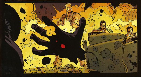
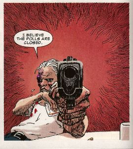
UNTOLD TALES OF THE PUNISHERMAX #2 Art by Connor Willumson Written by Jason Latour Coloured by James Campbell Lettered by VC's Cory Petit Marvel, $3.99 (2012) THE PUNISHER created by Gerry Conway, John Romita Snr and Ross Andru Photobucket Cover by Kaare Andrews
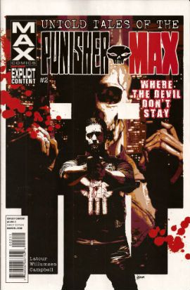
This VERY GOOD! book is about Punisher Max. Unlike the Regular Punisher he does not have a beard, and his stories have swears, gore and dead kids in ‘em! Because, yes, Regular Punisher now has a beard. That’s the only thing that caught my attention in that recent irritating crossover with Daredevil. Not wishing to impugn the, no doubt, exhaustive research by Greg Rucka into face foliage, but I don’t think it’s a good look for Frank. He should be clean shaven do you not think? Shaving’s about discipline, shaving’s very military. But a beard? A beard’s not about discipline, a beard’s about vanity. Vanity’s not really something I associate with psychotic vigilantes. I have a hard time believing Frank Castle puts his War on Crime on hold while he just trims his tidy beard. Yes, I can believe a man can fly, but apparently a vengeful killing machine that has a face care regime is a step too far for me. No offence intended there to any bearded people. Particularly any bearded people built like brick shit houses who control this site. The Punisher's beard is important, yes?
Photobucket Connor Willumson/Jason Latour (art/words)

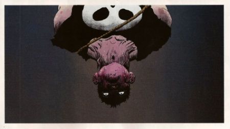
Anyway, this book is about the other Punisher, the one who can eat soup without upsetting people at the next table. It’s called Untold Tales and yet here they are. It’s the second issue and like the first issue the real reason for paying three dollars and ninety nine cents is the art. Last issue’s art was pretty good but this issue’s art by Willumson is preposterously good. I’m not well versed in anything too freaky but even I can tell there’s a real ComiX vibe to the art. It’s got a wild-eyed and feral vibe to it which makes the contents of every deceptively traditionally shaped panel thrum with an animal heat and press against the page with an almost physical weight. The youngsters will appreciate that the sound FX are even drawn in as though they are giant inflatable physical presences, like Frank Quitely did in that Batman comic that time. Admittedly this senses shattering artistic performance is yoked to a fundamentally meat’n’taters tale; one which seems inspired by that old Jerry Lee song (“Come on over, baby, we got Castle in the barn!”) and has a big chunky gold shout-out to the King. No, not Jack Kirby. Elvis. Jack Kirby’s dead, stop going on about it. Stan Lee did everything! C’mon, Stan Lee probably stood behind Jack Kirby’s chair and moved his simple little hands for him. Why not, eh?

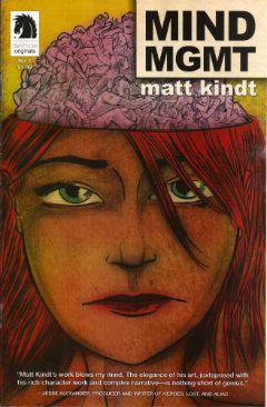
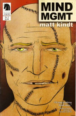
MIND MGMT #2 Story, art and cover by Matt Kindt Dark Horse, $3.99 (2012) MIND MGMT created by Matt Kindt Photobucket Cover by Matt Kindt Did you notice the stitches on the guy's face? Ahuh, Matt Kindt is still EXCELLENT!
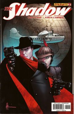
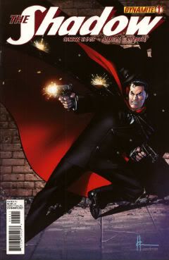
THE SHADOW #4 Art by Aaron Campbell Written by Garth Ennis Colours by Carlos Lopez Lettered by Rob Steen Cover by Howard Victor Chaykin Dynamite, $3.99, (2012) THE SHADOW created by Walter B. Gibson Photobucket Cover by Howard Victor Chaykin
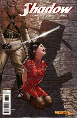
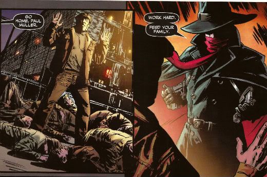
It’s a shame Campbell isn't just that bit better because this issue he does a pretty good job; there's a real sense of time and place, a sense that someone has done their homework, that materials of an archival nature have been attended to but, due to certain core failings, he can't help but  fluff the big emotional bit somewhat, which has the unfortunate effect of my authorially intended species-shame at Ennis’ intentional homage to The Searchers being trumped by the fact that I find myself thinking, man, hats sure are hard to do. And they are, ask Lou Fine, so this was still GOOD!

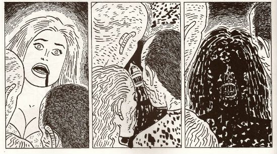
BLACK KISS 2 #1 By Howard Victor Chaykin Image Comics, $3.99 (2012) BLACK KISS created by Howard Victor Chaykin Photobucket
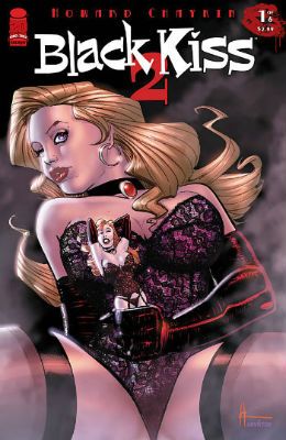
"That's a Pez Dispenser, right?" Cover by Howard Victor Chaykin

Ban This Sick Filth!” blared the Daily Mail headline that Wednesday morning. Of course “Ban This Sick Filth!” is the Daily Mail’s headline every morning and had nothing to do with Howard Victor Chaykin’s new exercise in saucy muck being held by The Customs. Oooer! Held by The Customs! Fnarr! Fnarr! The true extent of the upset was only revealed when the owner of my LCS commented, “No one cares, John.” Before adding, “And when are you going to pay for all these comics.” Leaving him to his quips I realised something had to be done, so I poked my head over the wall and saw Her Madge was pegging her washing out. I mentioned the whole thing to her, and she said she remembered meeting Howard Victor Chaykin when she guest starred in Viper and he had "sad eyes, like a child with a grazed knee" and agreed to get The Head Boy over to sort the whole HVC BK2 UK situation out.

Photobucket "I can see the beach from my window. That's how much I give a s***." He didn't say when he wasn't contacted.

So Cammers turns up, and he's a bit out of sorts because we’d interrupted him holding the back door of the NHS open so the Private Sector could run in and strip the place bare, wires and all, before anyone cottoned on. He’d got a copy of the moral soiling rag in question and he held it up to his face, his statesman’s face, his face with all the statesmanlike integrity of a lard sculpture of a single bum cheek, but with eyes, and commenced to read with those eyes. And he goes, he says,  “Yes, but is it a book you would wish your wife or servants to read?" And Her Madge points out it isn't 1960 and tells him to his face that the book will be available next week, or she'll be reminding everyone about that time he left his own child behind in the pub. "Did he thank you, then?" said my LCS owner when I told him of the entirely imaginary lengths I had gone to for HVC. "No", I said, "And he’ll never have to.

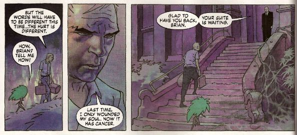
THE SIXTH GUN #23 Art by Tyler Crook Written by Cullen Bunn Coloured by Bill Crabtree Lettered by Douglas E. Sherwood Oni Press, $3.99 (2012) THE SIXTH GUN created by Cullen Bunn & Brian Hurtt Photobucket Cover by Brian Hurtt
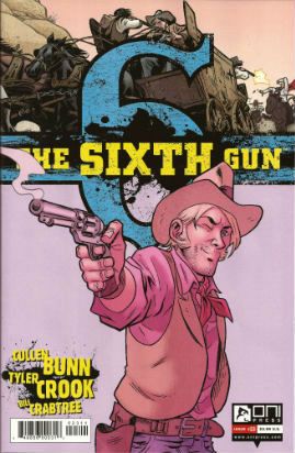
Yeah, I miss Bat Lash too, so this was GOOD!


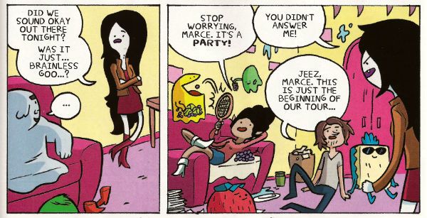
ADVENTURE TIME: MARCELINE AND THE SCREAM QUEENS #1 Written & illustrated by Meredith Gran, Jen Wang Coloured by Lisa Moore Lettered by Steve Wands KaBoom!, $3.99 (2012) ADVENTURE TIME created by Pendleton Ward Photobucket
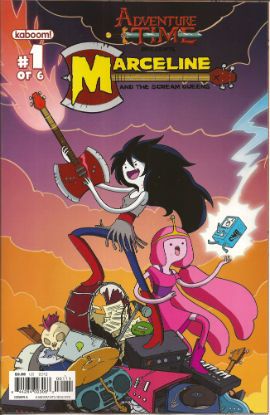
Much like Blessed Brian Hibbs I asked an 8 year old boy what he made of this comic. There must have been some kind of miscommunication because quite quickly there was a lot of shouting and after a bit of tussling a police presence was required. Anyway my court date is next month so if anyone can put me in touch with a good lawyer that’d be great. Otherwise, this comic aimed at 8-year old children contains a reference to the popular children’s entertainer Iggy Pop(!) and revolves around the fantasy of having a super-awesome musical career; that’s really more a teen and mid twenties thing, I think. Although these days I guess that dream can be dragged all the way into your forties. Mind you, it will probably weather the ravages of time about as well as the skin on the back of Cher's knees.

Photobucket

Meredith Gran (w/a)

People may mock, but you only need to do one song that plays over the end credits of the latest Jenifer Aniston flick (one where workaholic Jen learns the value of things via a series of laugh-out-loud hi-jinks stemming from her upsetting a genie and being cursed with a set of talking balls on her chin) and you’ll never have to hit up your Mom for cash again! I dunno, if you’re doing a kids comic I’d say get the stuff kids like right first, and then put all the hip stuff aimed at your mates in. Otherwise you’ll end up with something that’s really nice looking but essentially EH!


FATIMA: THE BLOOD SPINNERS #1 and #2 Story & Art by Gilbert Hernandez Dark Horse, $3.99 (2012) FATIMA: THE BLOOD SPINNERS created by Gilbert Hernandez Photobucket
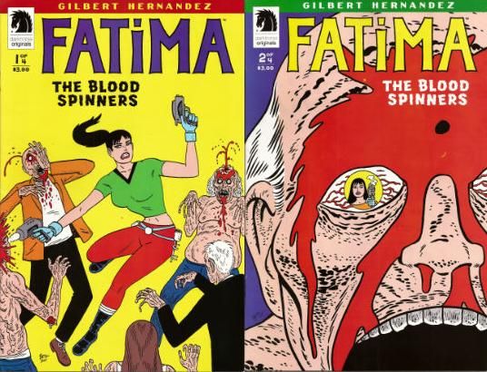
Covers by Gilbert Hernandez

Now this, this, is a comic an 8 year old boy would like! In fact it’s a bit like a comic an 8 year old boy would create. An 8 year old whose pets keep disappearing. It’s a disturbingly affectless presentation of a gorily deadpan comedy parody/celebration of genre trash. Maybe it has something serious to say about the human condition. We’ll probably never know as rational thought quickly gets tickled into insensibility by the women in bikinis shooting zombies, cleverly stupid names like “bittermeat”, laughably terrible jokes and the rewarding central conceit of beautiful people with beige minds seriously making a mess of the whole saving the world thing.

Photobucket

Gilbert Hernandez (a/w)

Look, the people in this awesome comic wear devices that look like metal Y-fronts to make them invisible for the delightfully childish and arbitrary time of 3 minutes. That should clue any slowcoaches in that this is no Walking Dead. And that's just peachy by me.  I also liked the letter in the back of #2 that said Fatima had a “manly” face. It’s comics by Gilbert Hernandez! Don't be getting all prissy, John Sayles wrote Alligator. I hear Beto's (I call him Beto because we are so close we were practically separated at birth.)  now been doing this stuff for 30 years, man and boy, and he remains VERY GOOD!

THE INFERNAL MAN-THING #1 and #2 Art by Kevin Nowlan Written by Steve Gerber Lettered by Todd Klein Marvel, $3.99 ea (2012) MAN-THING created by Stan Lee, Roy Thomas, Gerry Conway and Gray Morrow Photobucket Covers by Art Adams
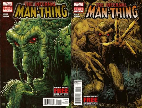
This doesn’t read too well as individual issues as (as I am sure we are all aware) it is an OGN cut up and shoved out in three easy, and pricey, pieces. It’s taken this long because Kevin Nowlan has taken this long. According to the text piece in #1 he was doing a page a week. At the Marvel page rates I have made up in my head, he would have starved to death before getting to page 10. So, rather than produce a half-assed product or die, Nowlan took his time and did other stuff. And I do have to say that the art here is very, very impressive. He’s got a ‘80s Kyle Baker thing going on, but with the additional, and considerable, oomph a foundation of fully painted colour provides. It’s a purposefully limited palette which gives everything a humid and lurid look. Like a swamp, see. Also, Nowlan’s also given Man-Thing a bit of a make-over and it’s kinda nice too, particularly the way Manny’s head seems to have slipped down to rest on his chest. Nice, that. Causes your gaze to stumble every time, good effect there. The words are very Steve Gerber, which is to say it’s very satirical in that endearingly adolescently blunt style Steve Gerber had. And when I say “adolescent” I don’t mean it as a put-down I just mean that in the sense of being energetic and all-encompassing. I always think of Steve Gerber as being an American version of Pat Mills, writing wise anyway. Although Gerber's more willing to accept his own portion of blame for the way things suck, I think. Maybe that’s why people respond more warmly to the work of Gerber than that of Mills.If you like Steve Gerber you'll like this, if you've never read Steve Gerber it's a good start as it is very Gerber-y. If you don't like Steve Gerber we won't be spending Christmas together. Because he and this are both VERY GOOD!

Photobucket

Kevin Nowlan/Steve Gerber (a/w)

According to #1 there's a lot of respect in this project. And yes, there probably is but this is Marvel. And so, as respectful as it was of your Uncle Nate to turn up to Pappy's funeral, it would have been better if he hadn't crammed his pockets with canapés, winked at the widow and blocked the bog with a boozy poo before drunkenly falling through a window. It’s a sloppy package what with the reprint of “Song-Cry of The Living Dead Man” looking kind of cheap and, in the second issue, having a double page spread printed on the front and back of the same page. This comic cost me two pounds and ninety nine pence Sterling, and yet I've had menus from the local pizza place pushed through my letterbox that had more thought, care and consideration in their design. But, I’m sure somewhere in there is a very real respect for Steve Gerber. At least Uncle Nate turned up, y'know. Ultimately, as Marvel as it is, it’s done out of respect for Steve Gerber, who is dead. And of course even Marvel respect the dead. Except for Jack Kirby. Who, it seems, can still just go f*** himself.

I hope you all had a smashing wekend and read some smashing COMICS!!!
"A Moi La Légion!" COMICS! Sometimes I Have Too Much Sun!

Greetings! It has been sunny in England for more than three consecutive days. This means that the entire nation is required by Law to sit outside until their skins glow like pink suns and crack like dry riverbeds in Texan heat. So I have been doing that. This means I didn't read many comics and when I wrote about them the fact that my brain had been lightly boiled in its own juices didn't seem to have a beneficial effect on my thought processes or judgement. But, hey, I made my deadline! I made it, Ma! I'm a hack! Photobucket

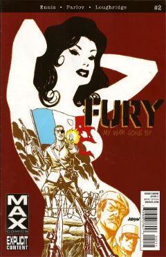
FURYMAX #2 Art by Goran Parlov Written by Garth Ennis Coloured by Lee Loughridge Lettered by Rob Steen Marvel, $3.99 (2012) Nick Fury created by Jack Kirby AND Stan Lee

Photobucket

Imagine my delight upon opening the latest issue of this fine comic to find an act of recreational physical pleasure being performed by Nick Fury and Ms. DeFabio. No, not because I have always wanted to see Kirby/Lee characters nut deep in the fun patch, no. (Well, Lockjaw maybe but that’s a personal thing.) No, it’s the fact that the act is presented so matter of factly. Almost as though it is just a part of life; one of those things adults do from time to time, these days mostly when they lose their broadband service and the TV is simultaneously on the fritz. In fact I can assure you I am not idly boasting when I say that even I , the misanthrope's misanthrope, have in fact personally heard of people in real life who have encountered a real life lady in such close quarters; which is to say even closer quarters than Nick & Co. encounter the ‘Cong in this comic. For one moment I thought mainstream genre comics had, in actual fact as opposed to the popular fiction entertained by most fans, grown up. A bit. Then I remembered it was a MAX comic and so that was okay as the regular line of comics would continue to be as ridiculous in their depiction of recreational procreation as ever.

Photobucket

Seriously, how bizarre must the depiction of something in regular life be if  its depiction in a Garth Ennis war comic is actually a healthier alternative. Focusing on that aspect, as for some inexplicable reason I have, does Ennis' work on this comic a disservice as it is so well realised by all the involved personnel that its level of focus brings to mind a close up of a sniper's eye as the unseen finger exerts the required pressure to do the necessary. It's one well honed machine is what I'm saying. This week, because this book appears to be weekly for some arbitrary reason, Goran Parlov knocks my socks off on the several occasions when he draws the Nazi bastard’s head as just a collection of lines held together by Lee Loughridge’s ever-excellent colours. Giving us a glimpse into a horrific world where Pig Pen grew up and joined The Hitler Youth. To speak plainly then, I thought FURYMAX#2 was VERY GOOD!

THE SHADOW #2 Art by Aaron Campbell Written by Garth Ennis Coloured by Carlos Lopez Lettered by Rob Steen Dynamite, $3.99 (2012) The Shadow created by Walter B. Gibson

Photobucket

As is customary, and contrary to my therapist’s advice, I shall now devote more time to the cover by Howard Victor Chaykin than the book it adorns. It’s a pretty swell cover, yes it is. The elegant simplicity of its design elements is foremost amongst its pleasures but only because the cheekiness of anchoring it all on The Shadow’s torso (which is little more than an oblong) is, let’s face it, the kind of thing only people who should really stop harassing aged Jewish comics creators when they go for a jog on the beach are going to give a gefilte fish about. I’d plump for Arbutov on colours rather than Delgado because it’s less an attack on visual sense and more of an attempt to attractively enhance the base image. But, this being Dynamite the colour of your cover is not a fixed thing! You can have a “Bloody Red” Retailer Incentive Cover (red and white!) or the Dynamic Forces Exclusive Howard Chaykin cover (black and white!). I hope these are all in the TPB because I would actually have an interest in seeing the image without colour, but that’s because I am a Chaykinmaniac. Otherwise I am just totally flummoxed by the need for all these covers. There are another 7 of them! The Ryan Sook one looks lovely by the way.

Photobucket

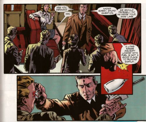
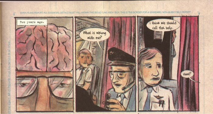
Eventually, sated, I looked at the actual comic. Ennis’ script this time out is pretty great. It’s basically an extended action sequence inventively choreographed within the confines of a Pan Am clipper intercut with exposition largely designed to demonstrate the evil of the opposition (kiddy fiddler ahoy!). I can’t fault the writer's execution of the script or the savagery of the violence (injury to eye is just the hors d’ouvres, darling!) but it impresses only despite some serious fumbling of the ball on Campbell’s part. I’ll not dwell on it too much as, after all, the art turns up and does the job; albeit with all the fiery invention of a Council employee during the week before his pension finally kicks in. Also, Megalophobics are hereby duly warned to stay away from the hilariously outsize hat which dominates the last panel. Still, Ennis’ script is so solid the comic remains GOOD!

MIND MGMT #1 By Matt Kindt Dark Horse, $3.99 (2012)

Photobucket

In this comic's after-piece Matt Kindt runs the old I Want This Periodical To Work As A Periodical schtick. Y’know the one; the one about extras unique to the pamphlet (or FLOPPY!(cue Brian Hibbs rearing back like Christopher Lee before Pter Cushing's crossed candlesticks. Hsssss!)) which will enhance and entertain, yes, that one. I think he’s actually serious about it, too. That's on the evidence of the first issue of what future generations will call “that book Matt Kindt did no one bought” (but we will call MIND MGMT). I mean, only time will tell but I doubt this is going to take the form of backmatter telling us how his movie deals are progressing (Matt Kindt hasn't got any. Yet.), how hard life is for the talented and beautiful (my heart; it bleeds), a telephone book size list of all the awful comics he has in print (because Matt Kindt doesn't do awful comics. Ever. Fact.). Not that anyone else does that, but I severely doubt Matt Kindt will. The clue is in the comic itself.

Photobucket

Every page of this comic is the comic. The inside front and back covers are a short prologue to the book itself, the back cover is an advertisement that is in fact not an advertisement, text crawls up the side and across the page margins (a la ADVENTURE TIME) adding colour and background to the concept in a dryly humourous faux-bureaucratic way, there’s a short backup piece not intended for the TPB which ends with a six panel sequence so awesome that you know right then and there that MIND MGMT is the one. MIND MGMT is the one. MIND MGMT is the one where Matt Kindt arrives. This is Matt Kindt’s AMERICAN FLAGG! moment. This is where Matt Kindt turns up says, hey, this is what I do and this is the way I do it and you, well, you just deal with it! Matt Kindt just slapped his big talented balls on the table and now you either walk away or you just deal with it. MIND MGMT is odd but EXCELLENT! Deal with it!

And then I saw sense and decided my time, and yours would be better utilised if I wandered off to flick lima beans at next door's koi carp.

Hope you had a good weekend with some COMICS!!!

NEXT TIME: Something else!

"Let Him Be A Child A Little Longer." COMICS! Sometimes They Are Diverse!

Hey, the postman finally turned up. Photobucket

I guess the hostiles must have been restless out there in the Badlands or something. Anyway, he may not have rung twice but he did drop off a box of comics. Here's me going on about some of them after the break: A NOTE FOR OUR AUDIENCE: According to Brian "Link-Hider General" Hibbs you can now purchase some of these comics direct from The Savage Critics!

There is a link under both Comix Experience Links and Industry Links which says "Digital Comics From The SavCrit Store!". It's that one.

I have of course followed the rigorous journalistic code of the 21st Century and given all the comics available from that link a rating of EXCELLENT! No, not really, because as a salesman I am a bit lacking.

As ever, here's some comics and what I thought! Buy 'em! Don't buy 'em! Leave them at the scenes of violent crimes to throw off the Feds! I don't know, don't look at me for help. Because I'll just look down and whisper "No."

And Now Our Feature Presentation- SOME COMICS WHAT I DID READ:

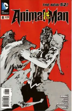
ANIMAL MAN #8 Art by Steve Pugh, Travel Foreman & Jeff Huet Written by Jeff Lemire Coloured by Lovern Kindzierski Lettered by Jared K. Fletcher DC Comics, $2.99 (2012) Animal Man created by Dave Wood and Carmine Infantino

Photobucket

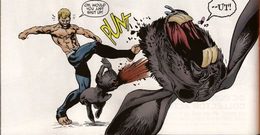
Since he literally throws his daughter to the wolves I’m afraid I have to say Buddy Baker is the worst father in the DCU and he’s a pretty craptastic superhero to boot. You’re going to have to think of something better than beating an army of undead animals to death one by one, Buddy Baker! This guy is such a dumbnuts I’m getting tired of reading about him. The best thing about ANIMAL MAN is that it reminds me how wonderful Steve Pugh’s art is.

Photobucket

I love the solidity he gives everything and the way his art allows the realistic and the insane to exist frictionlessly together. If he’s too radical for the DC masses, and it doesn't take much to be that, maybe Dynamite could get him on some books? Oh, I’m getting ahead of myself; I haven’t got to THE SHADOW yet. Anyway, ANIMAL MAN was OKAY! But really his wife would have left him about 6 issues ago and in about 3 issues I expect Social Services to be having a firm word in his shell-like. Buddy Baker is a danger to himself and everyone around him, and not in a good way.

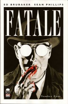
FATALE #4 Art by Sean Phillips Written by Ed Brubaker Coloured by Dave Stewart Image Comics, $3.50 (2012) Fatale created by Ed Brubaker and Sean Phillips

Photobucket

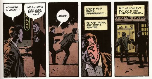
Um, I don’t want to be the party pooper but I’m not really feeling this one. Where others would see complexity I see only confusion and the horror and crime aspects don’t mix well at all; blanding each other out if anything. I’m not convinced at all that Brubaker & Phillips are as deft with horror as they are with crime. There’s one sequence in particular which is meant to suggest the soiled undersheet of reality flickering on the edges of the protagonist’s vision, but it takes up a whole page. Which is a bit like the secret supernatural underpinnings of the world putting on a straw boater and doing back flips in front of you while belting out showtunes. Subtly unsettling it’s not. Mind you this series seems to not be a lot of things. Coherent and inventive being amongst the things it isn't. So far the whole thing seems a stolid muddle which barely fends off the blunt teeth of cliché. The police scenes are about the width of a gnat’s dick from busting out the old “This is straight from The Fifth Floor, you've got 24 hours to clear this case or you’re back handing out parking tickets! Capiche, you maverick bastard!”  And then there are the narrative captions and, boy howdy, are they bad. But then I think there’s a difference between understated and lifeless. These things are like “I saw a cat. It was big.” bad. It’s like Dan Brown bad. But then Dan Brown’s very successful isn't he?

Photobucket

After all, in a shocking real-life terror twist, it turns out that FATALE is the most successful thing Brubaker & Phillips have produced. Previously this was true of INCOGNITO which I thought was pretty bad. So, it looks like success beckons the Brubaker & Phillips team, but what appears to bring them success isn't what brings me reading pleasure. Mind you, they are professional enough to produce a comic that despite my tinny whinging still comes off as OKAY! While I found the front matter lacking, Stephen Blackmoore provides a compelling backmatter piece concerning a real life gumshoe called Harry Raymond. That bit was VERY GOOD!

You can buy FATALE from HERE.

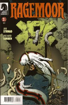
RAGEMOOR #2 Art by Richard Corben Written by Jan Strnad Lettered by Nate Piekos of Blambot® Dark Horse Comics, $3.50 (2012) Ragemoor created by Richard Corben and Jan Strnad

Photobucket

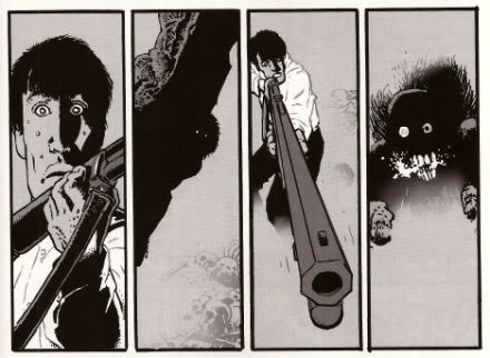
Corben’s art looks a bit odd in this issue, as though he’s got some settings wrong on his software or something. It looks a lot less crisp than last issue. It’s still great because it’s still Richard Corben but…still. Fortunately Strnad’s scripting is really strong so that helps soothe any misgivings. I didn't really know where the series could go after the first issue’s seemingly complete unto itself set-up.

Photobucket

I certainly didn't expect it to make the previously understated humour blossom so broadly; so broadly that at times it verges on farce. I certainly wouldn't have expected it to work so well either. There’s horror here but humour too and in an impressive feat of facility each complements the other leading to a comic that is a really satisfying read indeed. I don’t want to give too much away but hopefully the fact I thought it was VERY GOOD! will be enough to tempt the unwary!

THE SHADOW #1 Art by Aaron Campbell Written by Garth Ennis Coloured by Carlos Lopez Lettered by Rob Steen Dynamite, $3.99 (2012) The Shadow created by Walter B. Gibson

Photobucket

I know you've all been on tenterhooks so let me assure you that I did indeed receive a copy of this comic with the Howard Victor Chaykin cover. I thank you all for thinking of me during this period of uncertainty. It was always a bit of a gamble though wasn't it? What with Dynamite’s penchant for plural covers. Mostly they get some decent names doing some good stuff. Howard Victor Chaykin, for instance, obviously did this one well before it struck Gin O’Clock at Chaykin Towers. He’s even used a different face shape; nice job Howard Victor Chaykin!  The art on the inside of Dynamite’s books tends to be a bit more problematic. Problematic in the Early Anglo Saxon sense of “bloody awful”. Aaron Campbell manages to buck this trend by being decent for most of the book, except when The Shadow erupts into murderous action at which point Aaron Campbell impresses the Heck out of me. Really, jolly good work on those parts! I’m still not a massive fan of the old drawing over the top of photographs business so the rest of the book was just okay art wise.

Photobucket

Ennis is behaving himself too, there's none of that aggressively puerile "funny" stuff or lashing out at easy targets with a nuclear bomb strapped to a machete. He seems to actually be having a good time too. He certainly gives The Shadow a clear personality, one that's all the more entertaining for being composed primarily of arrogant bastardry. But he's not without empathy either, which is a nice trick to pull off. The whole shebang is set in one of Ennis' well researched eras of upheaval, or at least imminent upheaval. Because, and it's to his credit this, Garth Ennis is one of the few writers in comics who shows evidence of reading books other than How To Bland Out And Find Big Bucks In TV And Movies. Books that demonstrate an interest on his part in the world around him rather than a monomaniacal need to write THE MENTALIST.  If you like Ennis' war books you'll like this. If you like The Shadow you'll like this. Blimey, if you just like decent comics you'll like this. Because it's actually VERY GOOD!

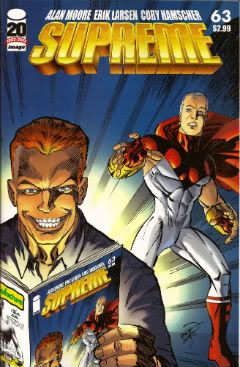
SUPREME #63 Art by Erik Larsen & Cory Hamscher Written by Alan Moore Coloured by Steve Oliff Lettered by Chris Eliopoulos Image Comics, $2.99 (2012) Supreme created by Rob Liefeld

Photobucket

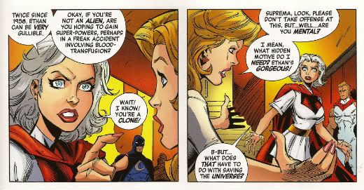
SUPREME is an Alan Moore genre comic. I miss Alan Moore’s genre comics. Alan Moore’s genre comics were packed with invention and humour. Alan Moore’s genre comics had more ideas on the page than most of today’s self proclaimed genii have in a lifetime. Alan Moore’s genre comics played with the form in a way that was charming and cheeky. Alan Moore’s genre comics had characters with character, but their character was never static and if it changed it would do so coherently. Alan Moore’s genre comics had craft. Alan Moore’s genre comics had joy. Alan Moore’s genre comics were VERY GOOD! Yeah, genre comics are much better off without Alan Moore. Yeah, F***k you, Alan Moore! Don't let the door hit you on the way out, Alan Moore! We don't need you, Alan Moore! We never needed you! We've got AVENGERS Vs X-MEN and BEFORE WATCHMEN now!

Photobucket

Oh God, what have we done. COME BACK, ALAN MOORE!

...please...

You can buy SUPREME from HERE.

And that's your lot!  Yes, even I have other stuff to do!

Hope you had a good weekend, everyone!

Blah blah blah COMICS!!!

Hibbs catches up, sort of -- 4/18's books

Happy 4/20! OK, getting much closer to being "on time", right there under the jump!

AVENGERS VS X-MEN #2: A jarring tonal shift comes this issue as Jason Aaron handles the scripting. It's sort of on par with the change of George Perez to Ron Lim on Infinity Gauntlet, because the voices couldn't be more different. I *liked* what Aaron's got on the page here, but man that's three issues in a row now with no consistency whatsoever between them, and the round robin of writers continues through the series (and art changes with #5, as well) I'm finding this jarring.

I'm also not following a specific plot point, and that's how is Phoenix "coming" in outer space, but also already possessing Hope?

Again, this book isn't for me, really, but I thought this issue was at least OK

BATMAN #8: This here is the first $3.99 issue, and I was a little concerned it would cause a jump off, but people seem to be enjoying the Owls storyline enough to keep supporting it. Again, we'll see what happens when the first Bat-line crossover happens next month -- it seems to me that most of the tie-ins are going to read very similarly, though: owls attack, fight owls. This arc has had a bunch of bizarre "power fluctuation", though -- you'll remember how it opened with Bats kicking the ass of dozens of traditional bat villains, at once. THEN, a single Owl curbstomped Bats about as hard as he's ever been hit. And NOW, Bruce is fighting off dozens of Owls at once, showing again how butch he is. I'd finding this awkward, at best.

The backup story was largely the epitome of "unneeded back up", as it just showed and elongated a moment that we'd seen just minutes before. Boo!

I'm liking the book, overall, but there's something a little off about this whole thing that I'm not figuring out yet. I still thought it was a very low GOOD.

PROPHET #24: Ugh, now THIS is comics! Man, I don't even know what this bit has to do with anything in the first three issues (same character, wholly different scenario), but I also don't care, because it's such fun science fiction, AND we get some wonderful artwork from Farel Dalrymple. I think I've said this before, but this reminds me of nothing less than HEAVY METAL from the 1970s, amazingly inventive and lavishly illustrated science fiction that may or may not make a ton of sense, but who cares because the passion just drips off it. I think this is truly EXCELLENT work.

RESET #1: Peter Bagge returns with something new, and while his cartooning is as good as ever, I had two kind of overwhelming problems with this. First is that the setup is just too thin -- we understand the protagonist is someone who is at least somewhat famous, who did some unspecified awful thing, but there are no details about any of that given here, and so it makes relating to the underlying science fiction premise (that there's a machine that can allow you to relive your life, and make different decisions, but it has to always start from one specific point) just too difficult. We neither know where the protagonist came from, nor where he is trying to go, so taking any kind of suspense or anticipation is rendered virtually impossible.

My second problem is that I think that Bagge has grown into an increasingly "safe" cartoonist as the years have gone by -- not from his underlying style, but from the range and direction of his work. There's nothing "edgy" about his work any longer, it feels predictable and almost staid. Safe.

This work is OK, at best.

SHADOW #1: I was a little surprised how much I liked this. Well, maybe not, because it's Garth -- but there's almost no Ennis-isms here (other than whatever is naturally baked into the character and supporting cast), just a great straight-forward, historically-appropriate period-piece version of the best of the character. If I had one "problem" its that Dynamite really could do itself a favor and instead of spending the coin to get four different unique comics stylists doing covers, they should spend at least that much attention on the interior art. Aaron Campbell is in no way a poor artist, but it's hard to not suffer in comparison to Alex Ross, Chaykin, Jae Lee and John Cassaday. Despite that, I thought this was swell comics, indeed, and thought it was VERY GOOD.

SUPERGIRL #8: I'm only pointing this out because George Perez is suddenly drawing a pair of issues of this book, and I thought this was a very solid little comic that your eye might have wandered away from. Here's a place to wander back for an issue or two -- I thought this was GOOD.

WONDER WOMAN #8: I've said before, ad infinitum, I so don't care for mythological supporting casts, and, so, overall while I've been liking this arc OK, it's really not for me. I still largely feel that way about this issue, but I'd be a big ol' meanie if I didn't observe just how much I liked Cliff Chiang's "redesign" of Hades and the afterlife -- that's some genuinely creepy and affecting stuff. GOOD.

That's it for me for today, as always: what did YOU think?

-B