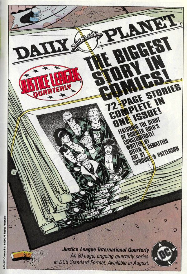
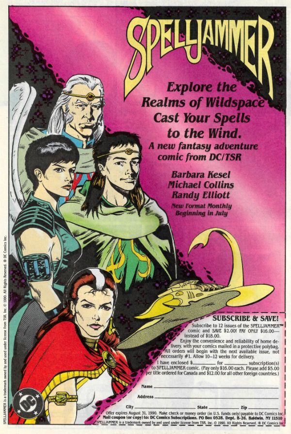
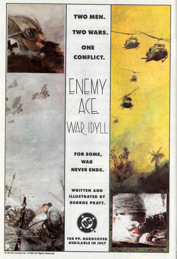
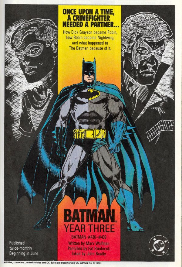
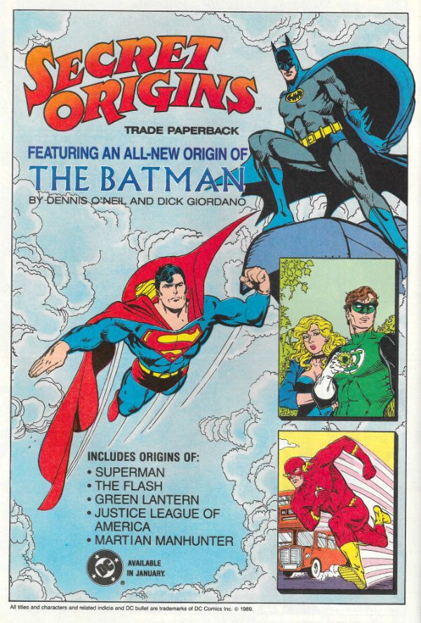
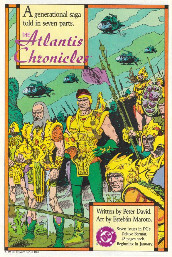
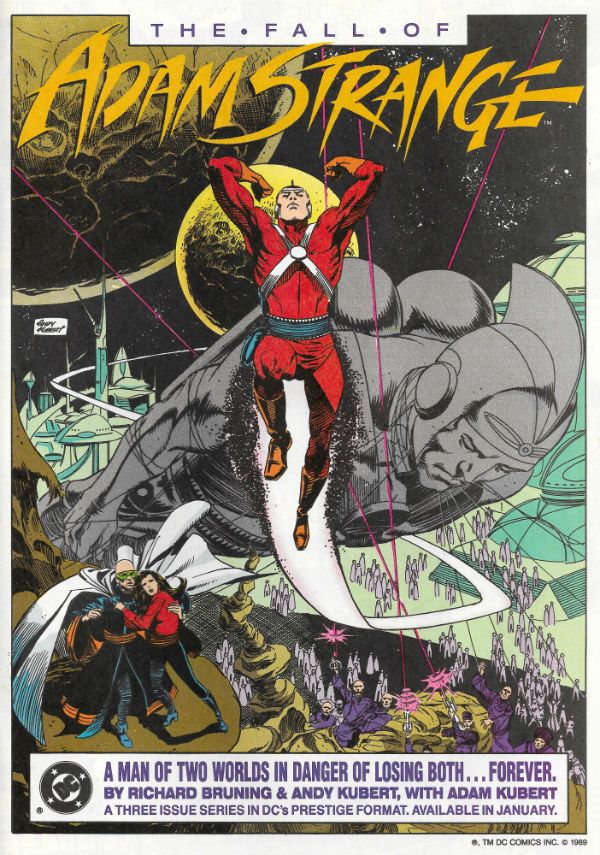
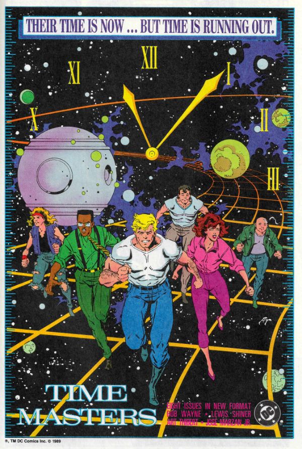
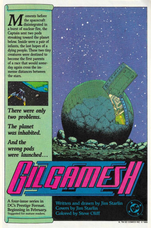
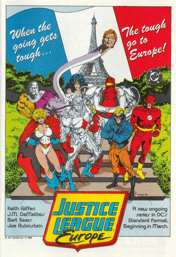
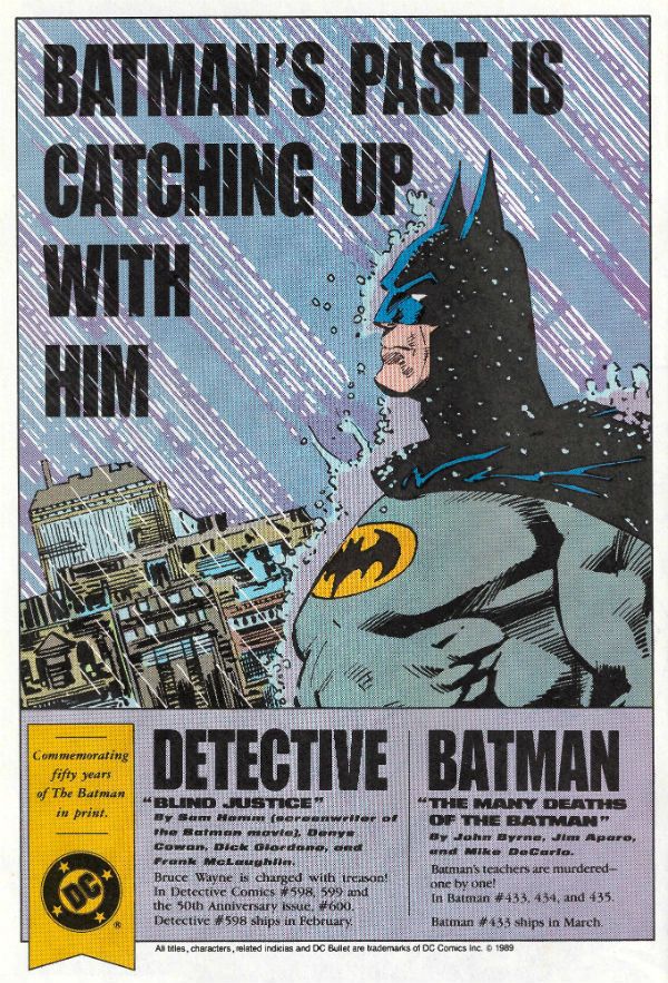
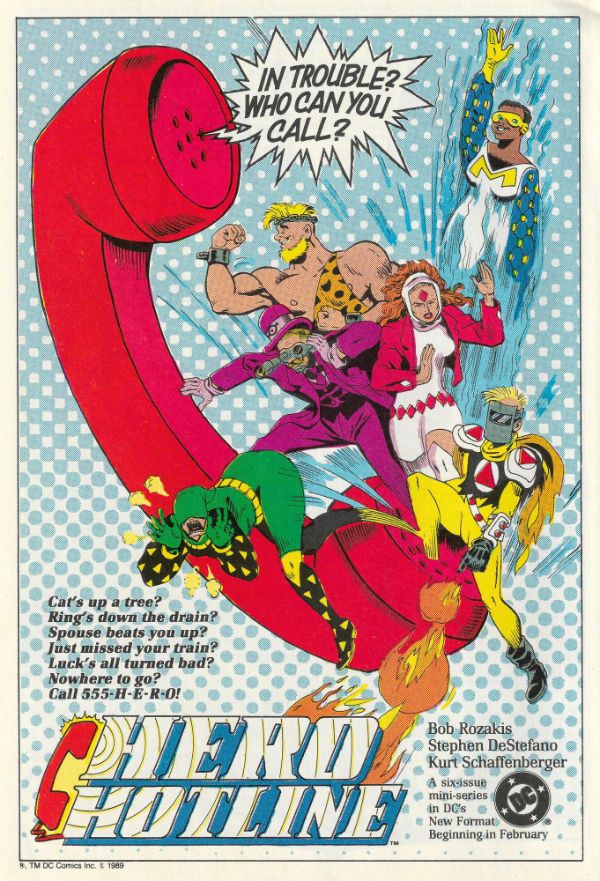
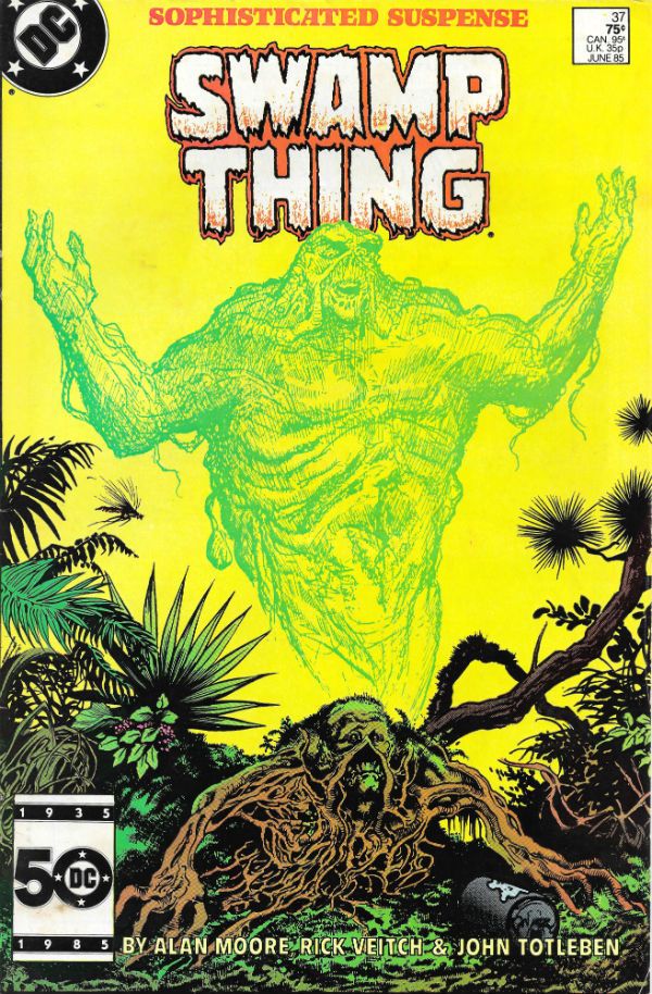
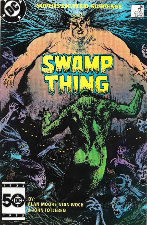
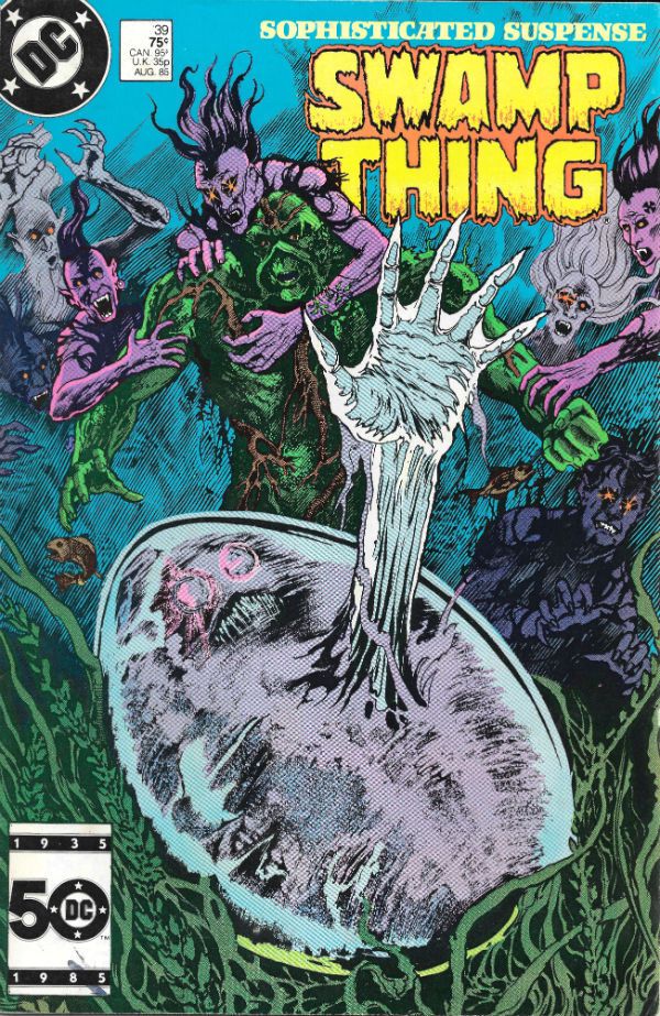
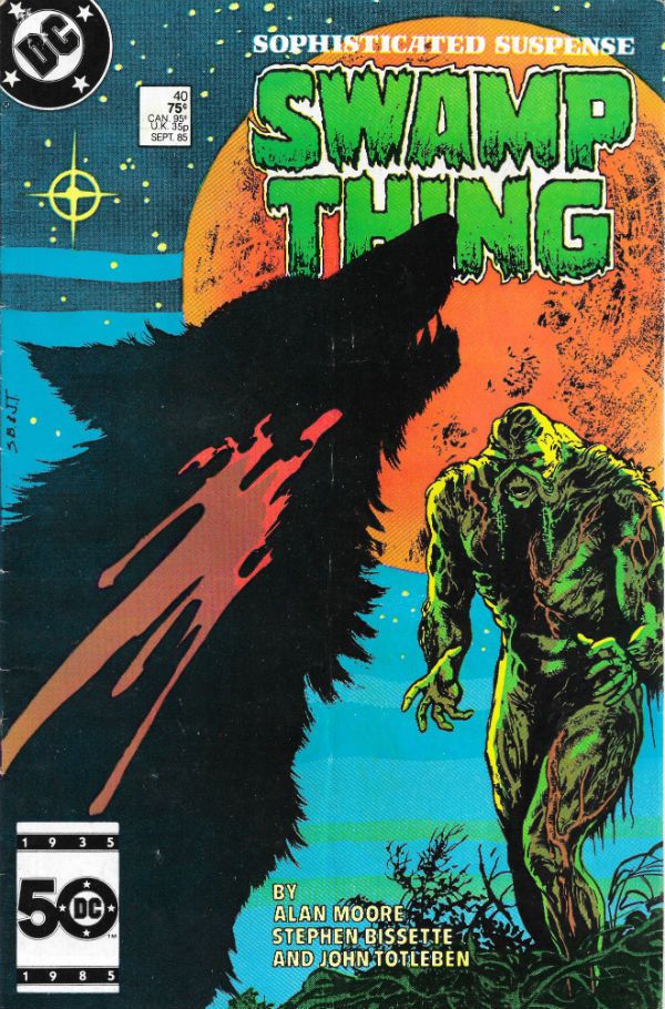
“He Thought He Could Forget The Past. He was Wrong.” COMICS! Sometimes I Find A whole New Way To Bore You!

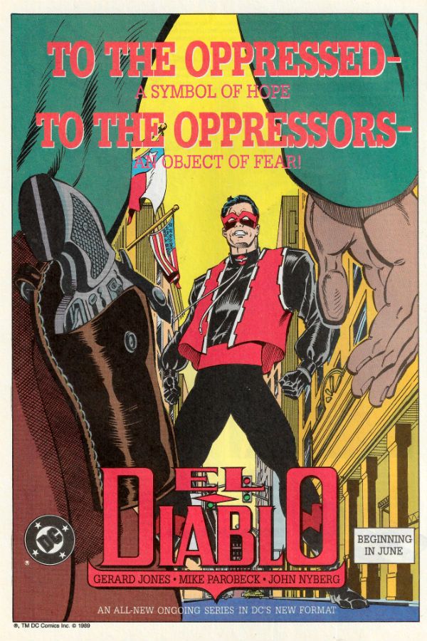
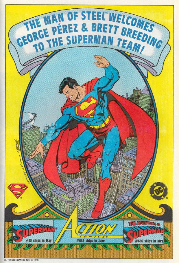
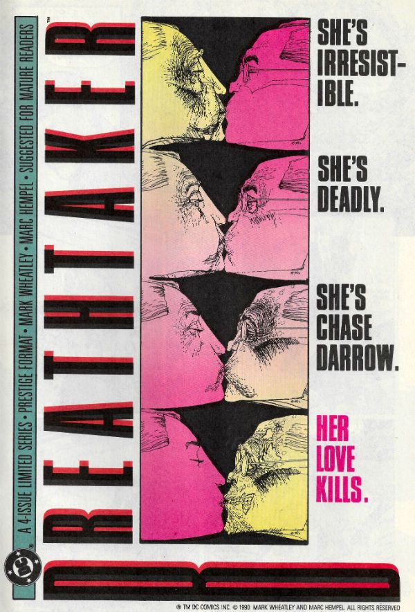
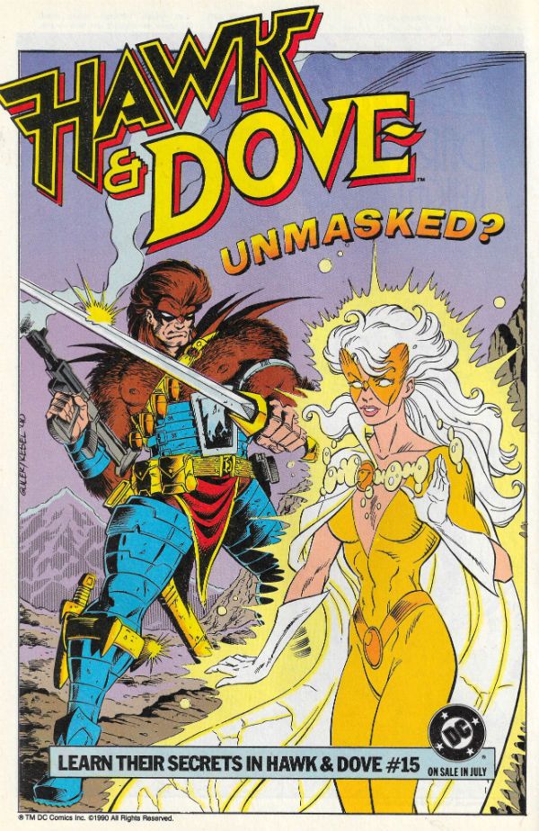
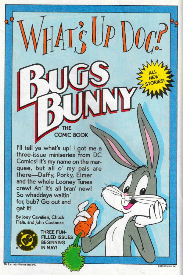
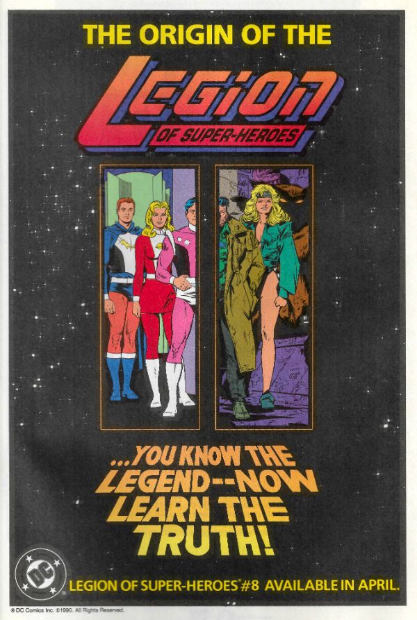
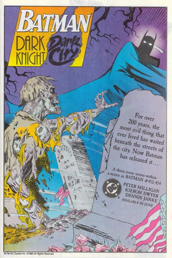
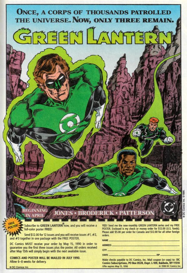
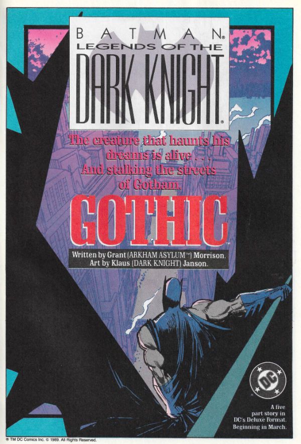
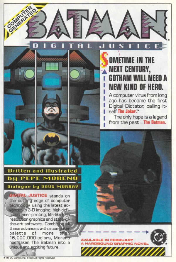
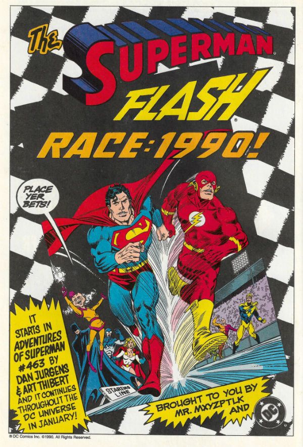
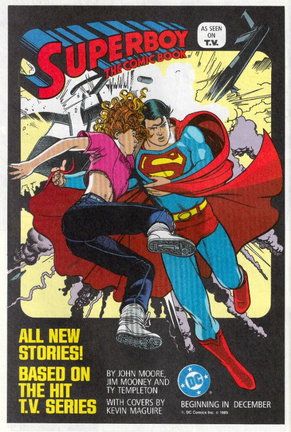
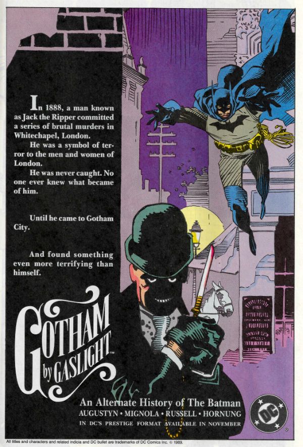
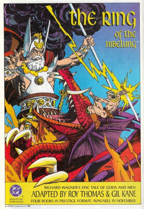
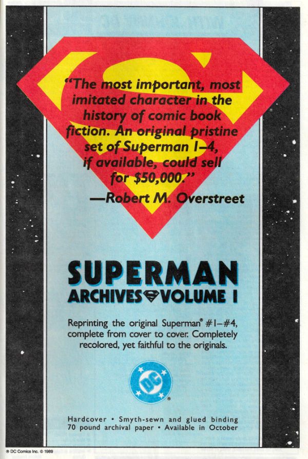
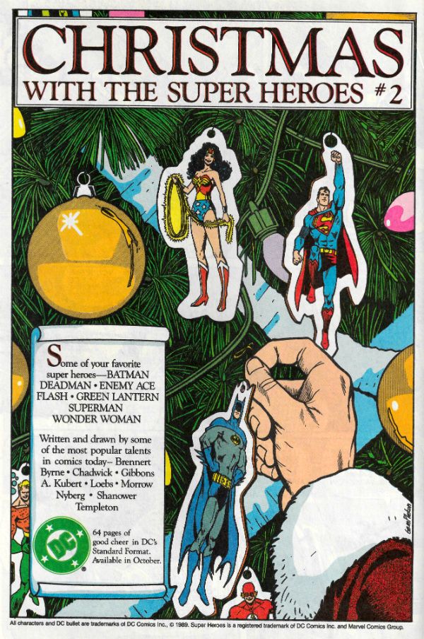
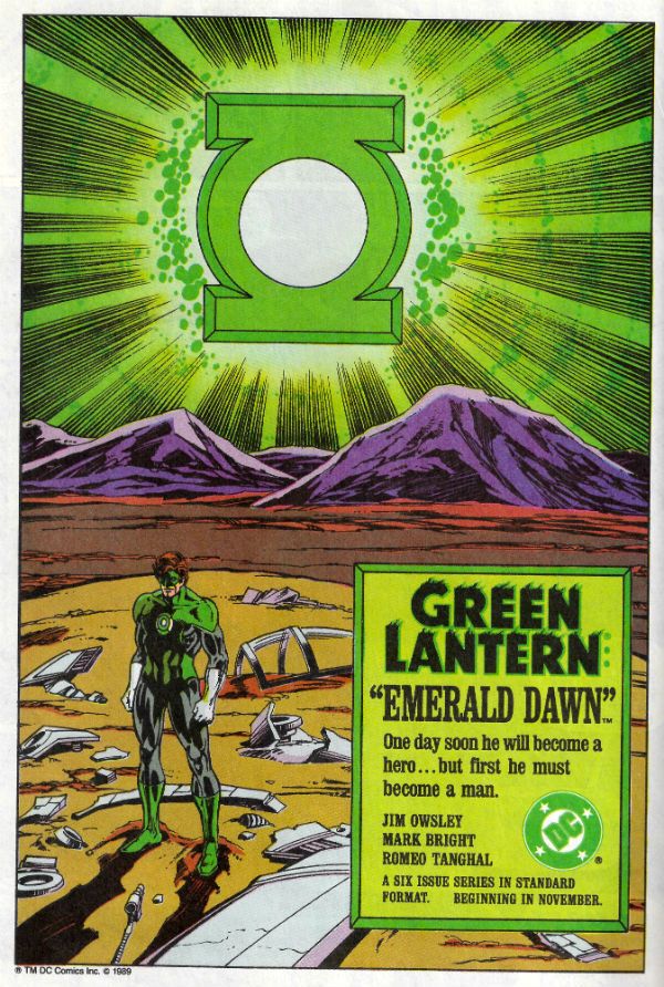
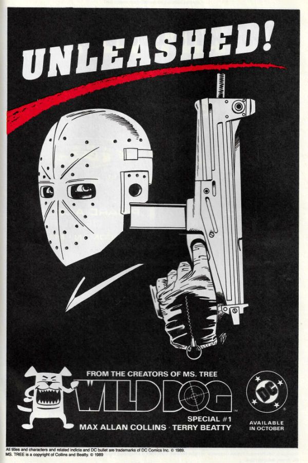
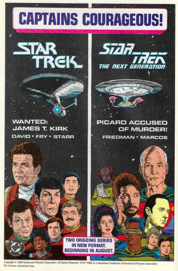
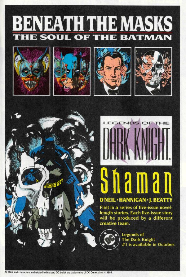
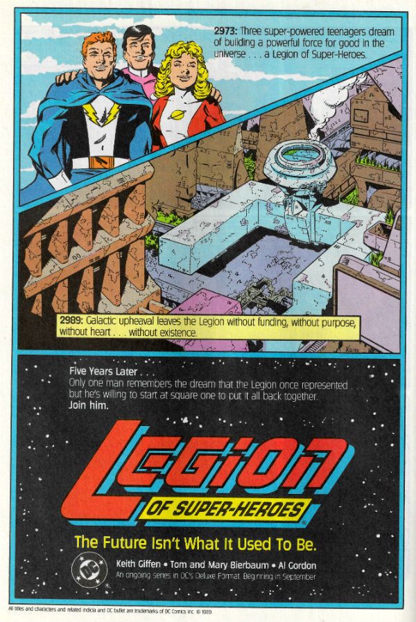
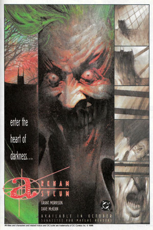
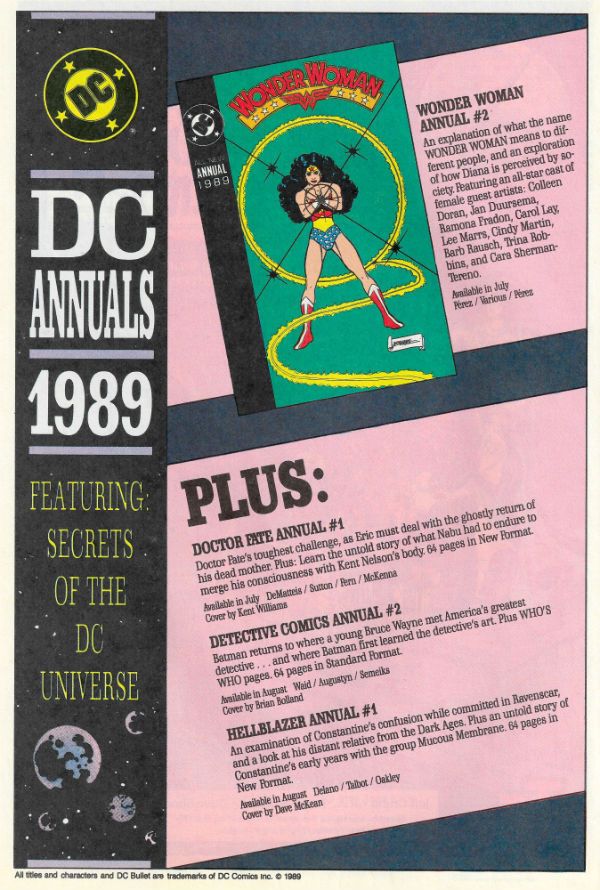
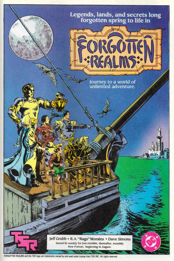
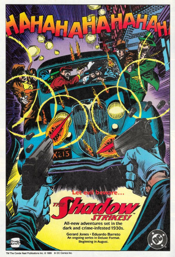
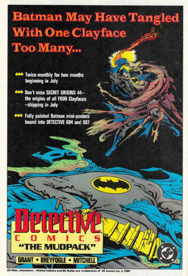
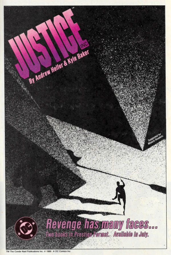
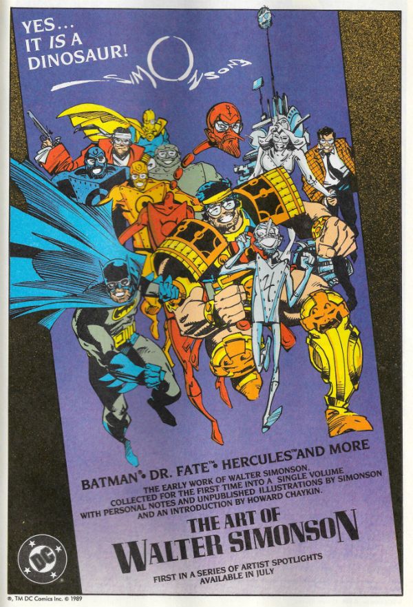
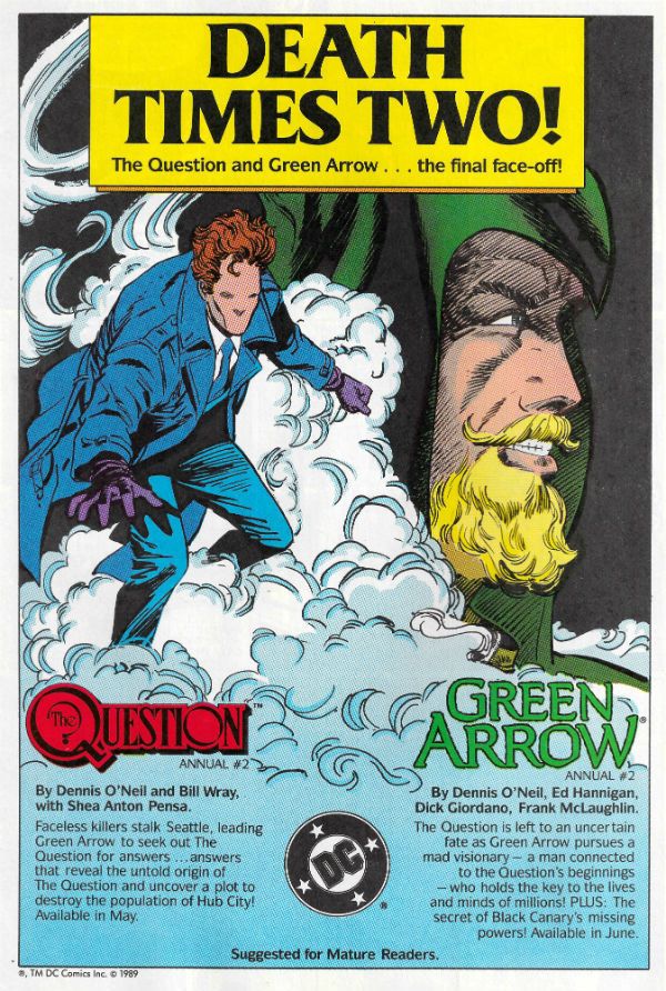
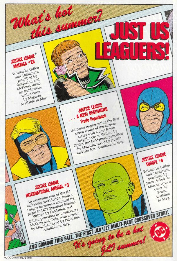
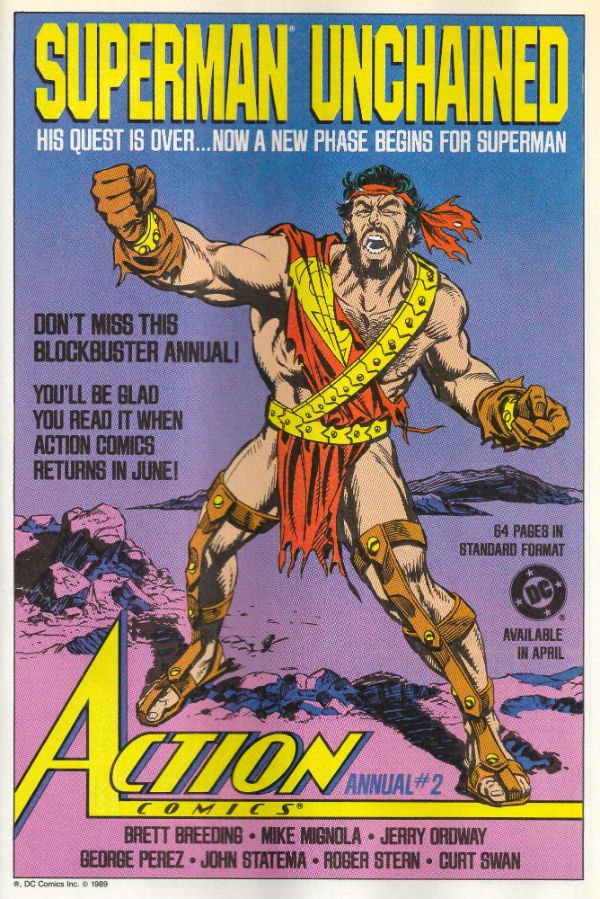
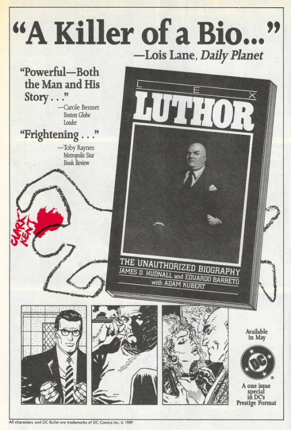
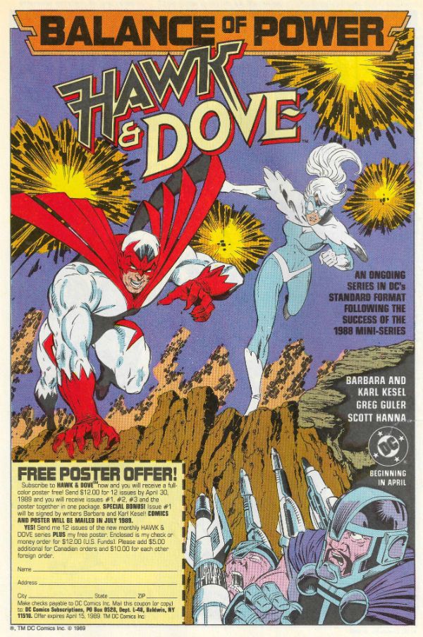
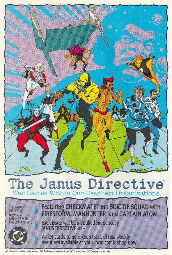
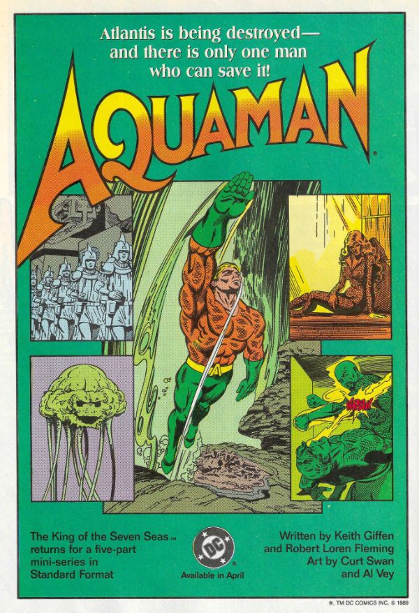
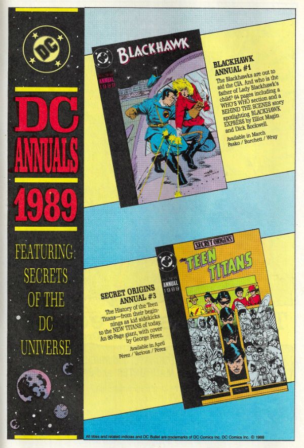
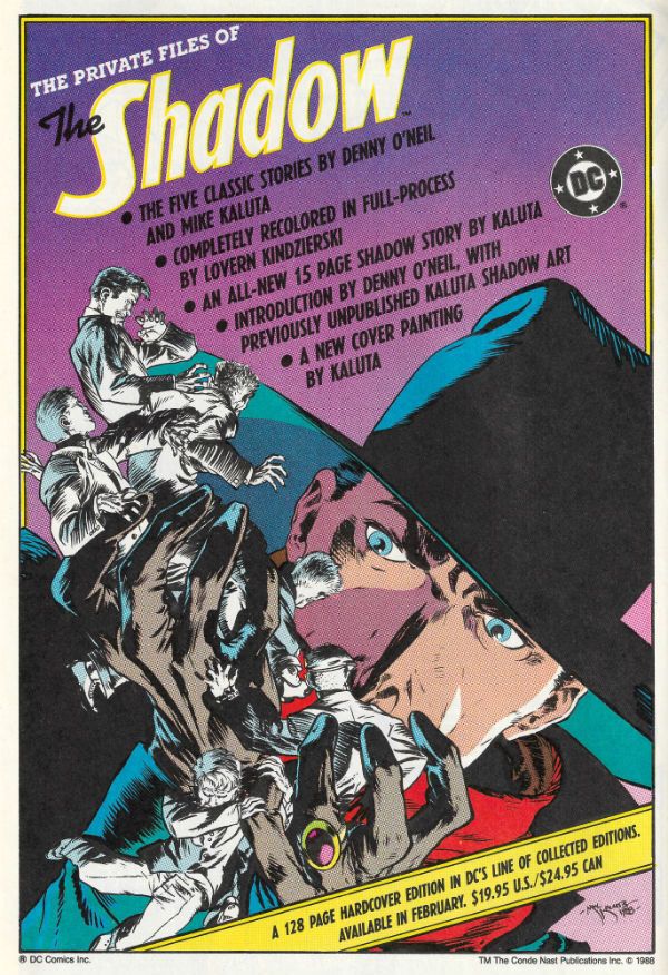
Of late I've been a regular Chatty Cathy and no mistake, so as a change of pace I've scanned in some House Ads which ran in DC Comics from (and it's totally arbitrary this) March 1989 to August 1990. I always enjoy looking at these things when I dig out my back issues; they remind me of stuff I have tucked away (and even sometimes forgotten), or nudge me about stuff I mean to pick up at some point before...I come to my senses and start acting my age. Sometimes they just make me shake my head and wonder how that turned out for everyone. Heck, it's just fun looking at them, basically, and I hope you share my fascination...  photo DCHADSstart_zps8zsk4fy9.jpg

Anyway, this...

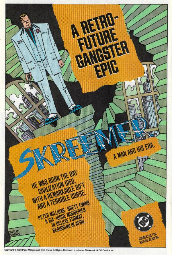
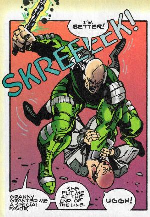
While this is an image heavy post, and so you do get off lightly, you don't get off Scott-free as I have some words as well. Looking at the ad for SKREEMER I am reminded of one of several reasons why I will always be happy to give Peter Milligan a hug i.e. the ferocious passion with which, early in his career, he sought to make James Joyce an influence on comics. Now with most (mainstream North American) comic writers rarely straying to any level higher than that of Glen A. Larson or The Disney Channel his example is missed more than ever. Also, SKREEMER is not only violence and intelligence beautifully and cheekily intertwined via Milligan's script and Dillon/Ewins' art, but it is also still in print today. So go and buy a copy before I do a more in depth write-up on it, is what I'm getting at there.

JUSTICE INC. by Helfer & Baker isn't in print and (AFAIK) has never been reprinted. This is bad. However, you can pick up both prestige format issues for pennies. Which is good. Particularly if you want a comic which wades into the same troubled waters of America's History as Ellroy's UNDERWORLD USA trilogy and Don Winslow's POWER OF THE DOG. Not only that, but it does so by avoiding Ellroy's grating (if historically accurate) racism and Winslow's risky dalliance with cliché. JUSTICE INC. is also funnier. Not only that but Helfer's scripts show that if your dialogue is going to make the art play second fiddle, then it better be pretty immaculate dialogue. Which his is. Of course, it doesn't hurt to have a stylistic chameleon like Kyle Baker on board either, and he makes every artistic inch begrudgingly allotted him work like a pastel shaded dream.

Additionally, from this aged vantage, I well recall Alan Grant and Norm Breyfogle's Batman run(s). As well I should, as it's the only comic I allowed myself while, ahem, studying due to the fact that Guinness doesn't buy itself. (Sometimes I weakened and bought SHADE THE CHANGING MAN as well. Shhhh.) Those were some rock solid Batman comics and I'm pretty sure I can't be alone in being keen on a comprehensive collection of them appearing one day.

I note also that there's an advert for THE ART OF WALTER SIMONSON down there, and that volume is packed full of Simonson's early DC work, and is a humongous joy for any Simonson fan (which should really be any fan of Comics). It's also cheap to pick up today; so you just ran out of reasons for not owning it, chum. The magnificent Gil Kane's there as well; still alive back then, and fulfilling his personal dream of adapting (with Roy Thomas) Richard (not John) Wagner's The Ring Cycle. That's easy to find too in 2016, and if you like Gil Kane (as well you should) then that's you sorted. I never read Pepe Moreno's BATMAN: DIGITAL JUSTICE, which was probably for the best as I believe it's now considered to be to DC Comics as E.T. THE VIDEO GAME was to Atari.

There's lots of other stuff there, and feel free to share your recollections and misgivings regarding them. But before I go, it has always struck me as a bit of a dick move on the part of The Flash to challenge Superman to a race. Do you not think? And on that note, stick your face right into The Past and enjoy...COMICS!!!

 photo DCHADS56B_zpscuq10xie.jpg

 photo DCHADS57B_zpsxifflipr.jpg

 photo DCHADS58B_zpsqhnduhw0.jpg

 photo DCHADS53B_zpsucx4i4uh.jpg

 photo DCHADS54B_zpsdwkcwhcn.jpg

 photo DCHADS55B_zpstfum4gmd.jpg

 photo DCHADS52B_zpssuthctyk.jpg

 photo DCHADS51B_zpsniabsfi0.jpg

 photo DCHADS48B_zpsdlxexhcd.jpg

 photo DCHADS49B_zpsqyx1s1yj.jpg

 photo DCHADS50B_zpsojsoodtz.jpg

 photo DCHADS47B_zpspuxi2kmp.jpg

 photo DCHADS46B_zpsyh2f9g9r.jpg

 photo DCHADS45B_zpsiv7ybaaf.jpg

 photo DCHADS43B_zpsmku7pdqa.jpg

 photo DCHADS39B_zpswrtk6bcy.jpg

 photo DCHADS42B_zpsuoulf31b.jpg

 photo DCHADS41B_zpslggvylcy.jpg

 photo DCHADS40B_zpsbg6nb9p7.jpg

 photo DCHADS35B_zpstid85d54.jpg

 photo DCHADS38B_zpsdmb9ktl0.jpg

 photo DCHADS37B_zps3ltlegzt.jpg

 photo DCHADS36B_zpsfothudmc.jpg

 photo DCHADS34B_zpswy4g4c4m.jpg

 photo DCHADS32B_zpskxhoatxp.jpg

 photo DCHADS33B_zpszry8u52h.jpg

 photo DCHADS31B_zpsksfiubwb.jpg

 photo DCHADS30B_zps42j2aslw.jpg

 photo DCHADS29B_zpstisn4eka.jpg

 photo DCHADS28B_zpslskzcfyx.jpg

 photo DCHADS24B_zpsyevxfbkf.jpg

 photo DCHADS25B_zpsi4sx7ngh.jpg

 photo DCHADS27B_zpstzbaxiaw.jpg

 photo DCHADS26B_zpsxee0v3dm.jpg

 photo DCHADS22B_zpsy9qzryrp.jpg

 photo DCHADS23B_zpsulcuxsmf.jpg

 photo DCHADS21B_zpscfw77q60.jpg

 photo DCHADS19B_zps0h2vzcmp.jpg

 photo DCHADS17B_zpsfp4flza4.jpg

 photo DCHADS20B_zpsc4qwqkjx.jpg

 photo DCHADS18B_zpsesenyt9p.jpg

 photo DCHADS16B_zpsuf5jkk4j.jpg

 photo DCHADS15B_zpsaajf31z8.jpg

 photo DCHADS14B_zpselv3chc6.jpg

 photo DCHADS13B_zpsuswve8o4.jpg

 photo DCHADS11B_zpskgnrtven.jpg

 photo DCHADS09B_zpsq26fehhp.jpg

 photo DCHADS12B_zpsnnv7ctfa.jpg

 photo DCHADS08B_zps9ainuijo.jpg

 photo DCHADS10B_zpsqpb9ouep.jpg

 photo DCHADS07B_zpsdpv9wew0.jpg

 photo DCHADS02B_zpso7qjh6xg.jpg

 photo DCHADS03B_zpsknpmz1qg.jpg

 photo DCHADS06B_zpsnzgyusws.jpg

 photo DCHADS04B_zpsdm6xu2yo.jpg

 photo DCHADS01B_zpsbwl944e6.jpg

 photo DCHADS05B_zpsq535azms.jpg

NEXT TIME: Take a wild guess, that's right - COMICS!!!

“Selena Has Already Decided Not To Buy The Lawn Furniture.” COMICS! Sometimes I Look at Saga - The Saga Of The Swamp Thing!

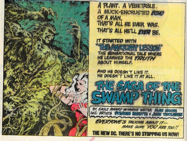
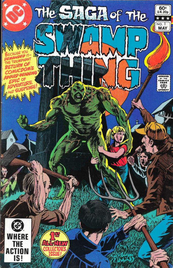
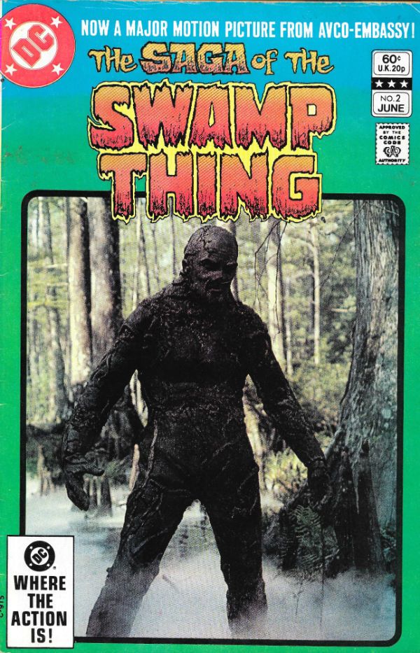
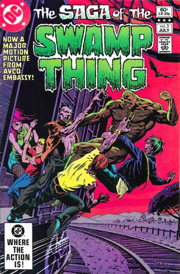
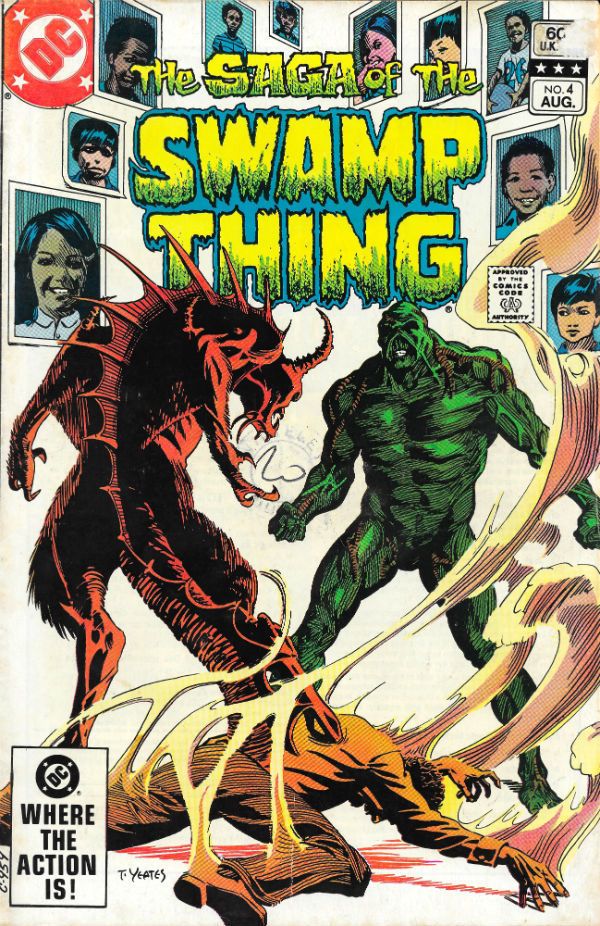
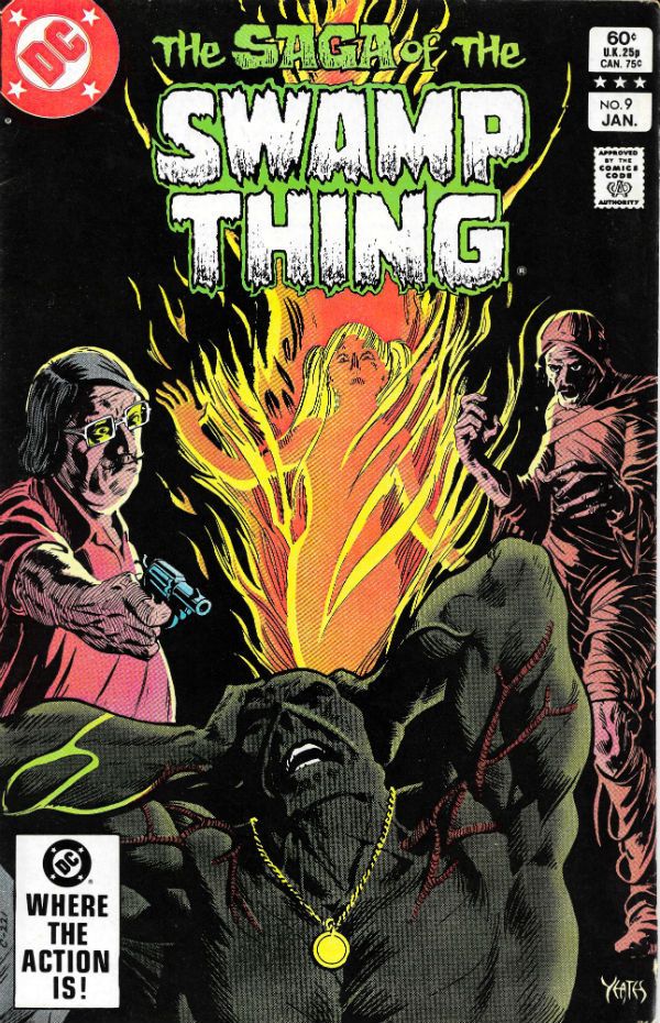
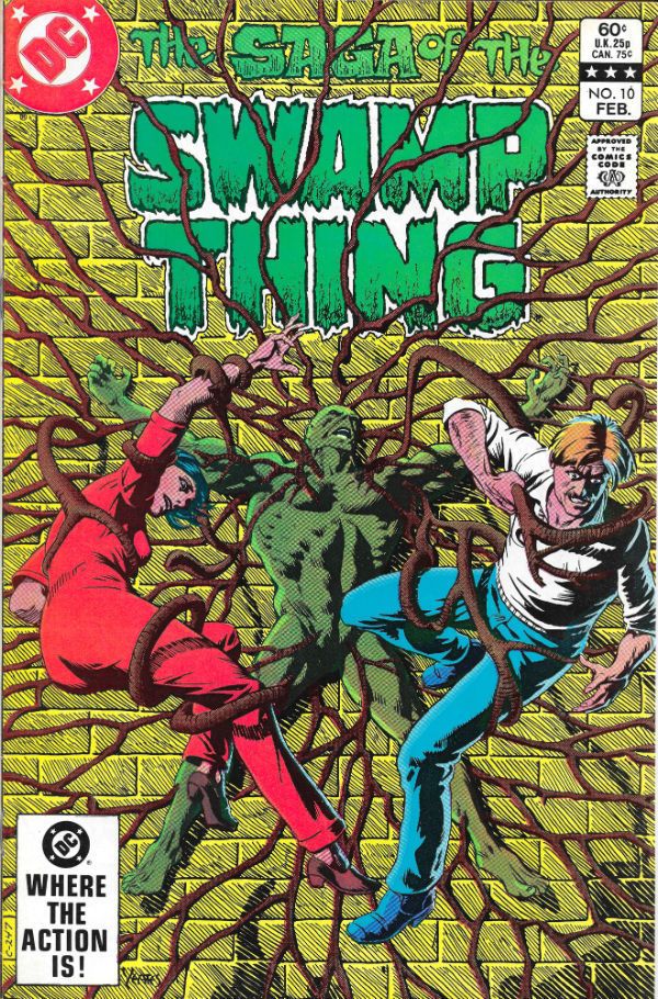
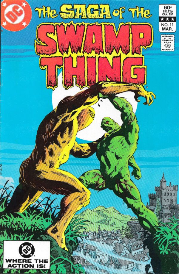
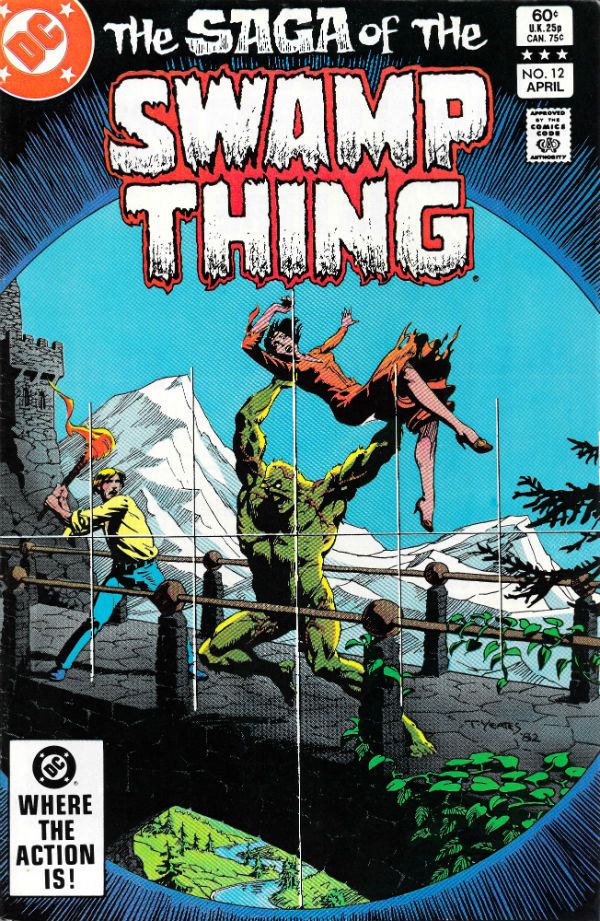
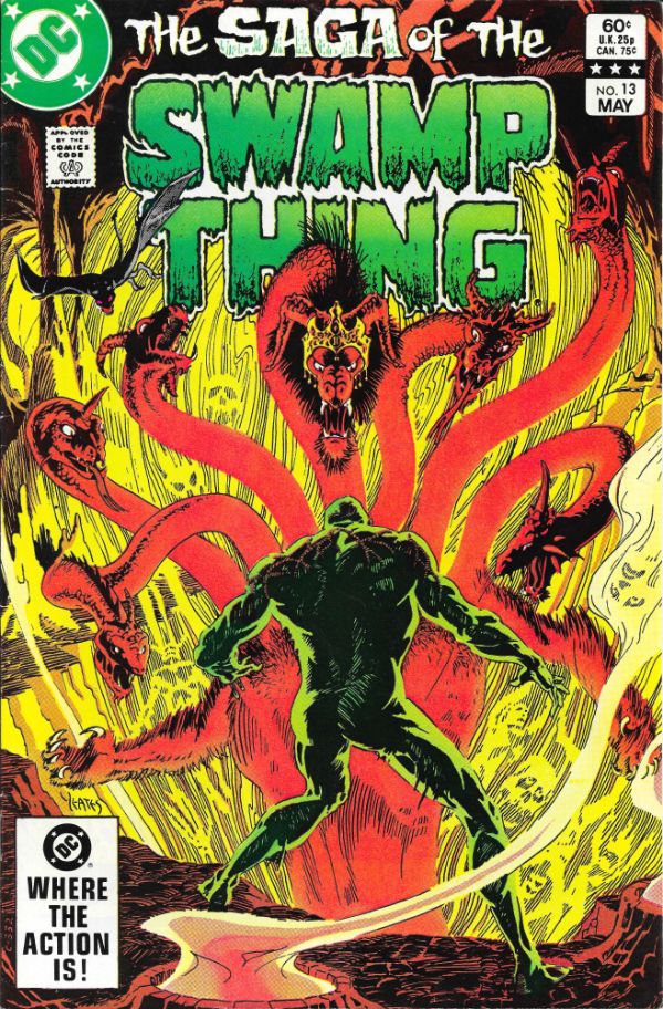
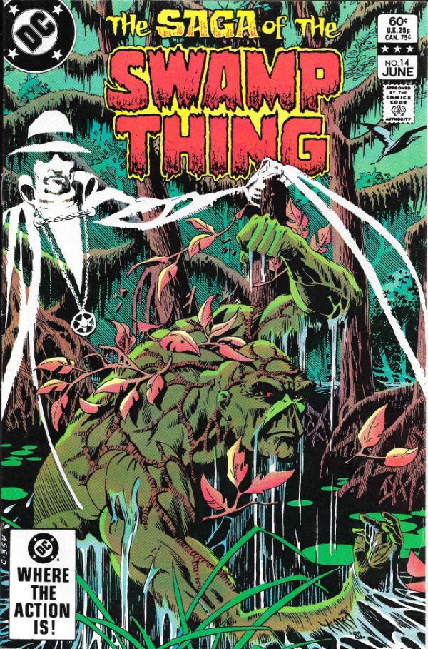
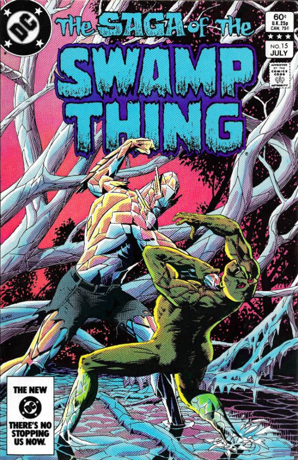
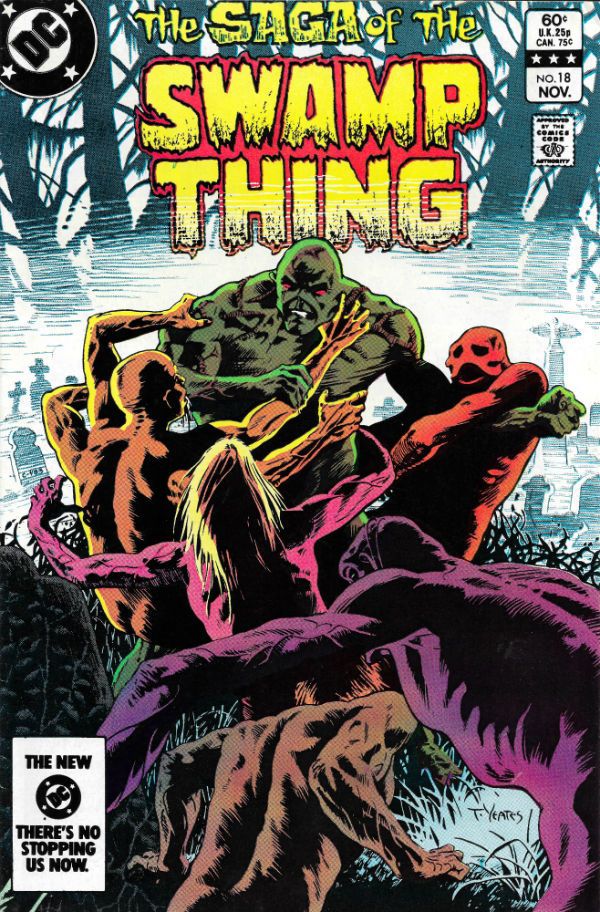
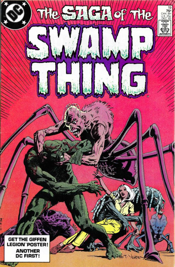
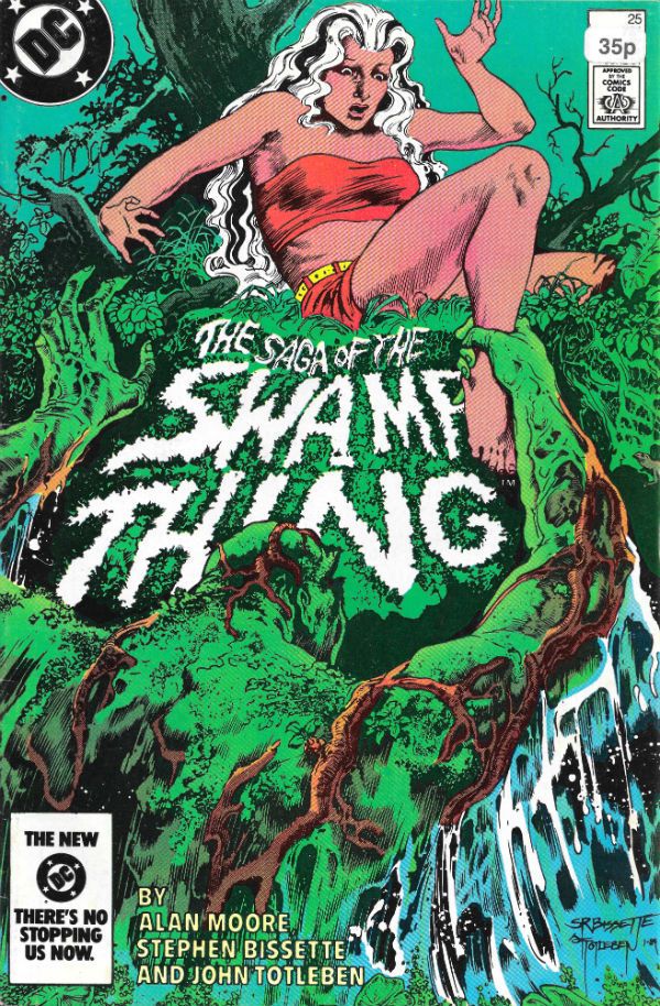
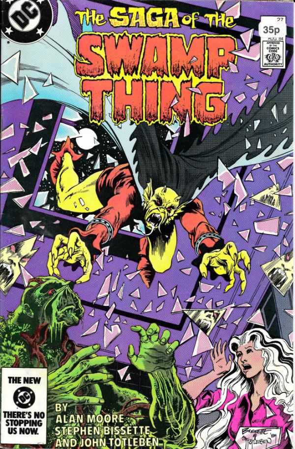
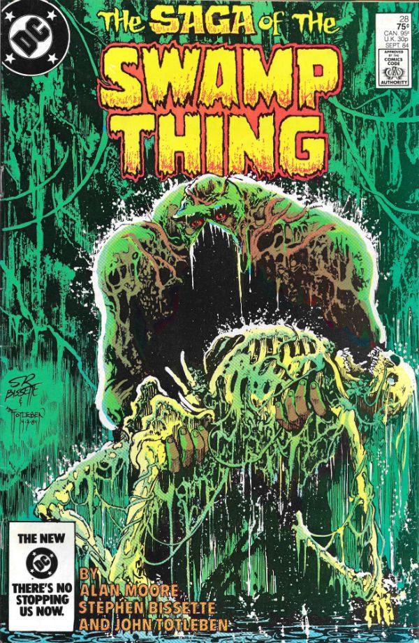
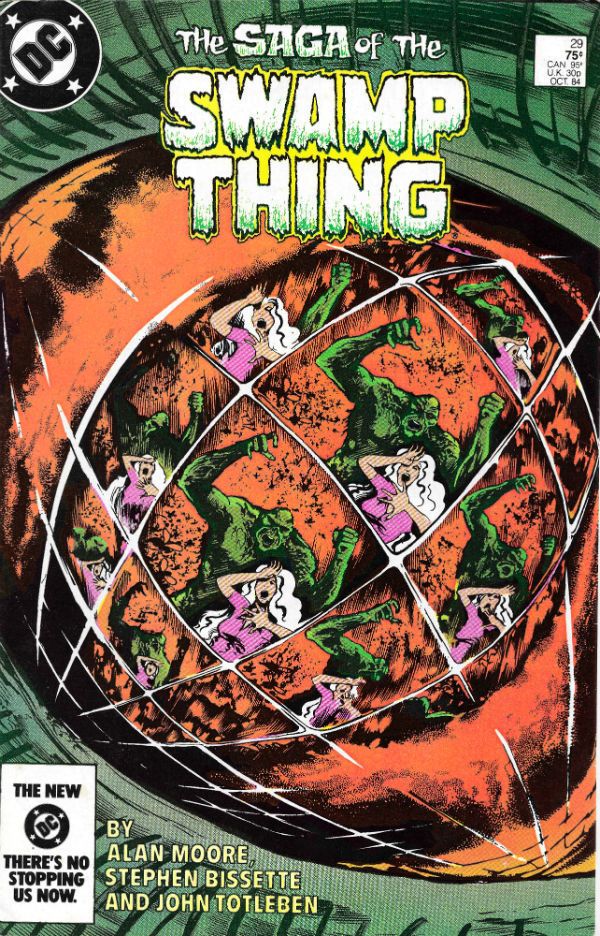
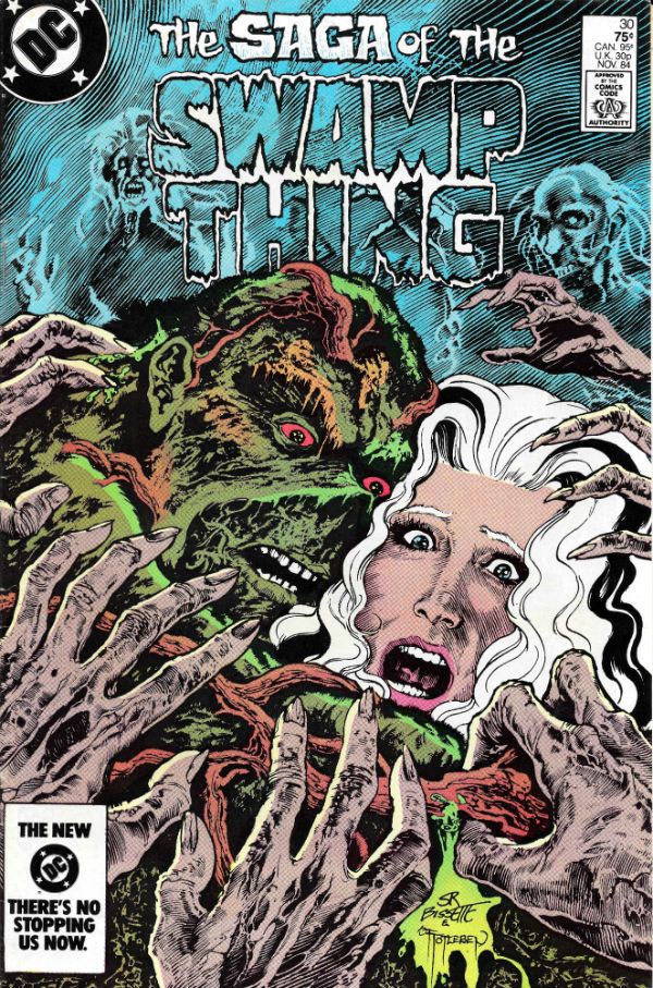
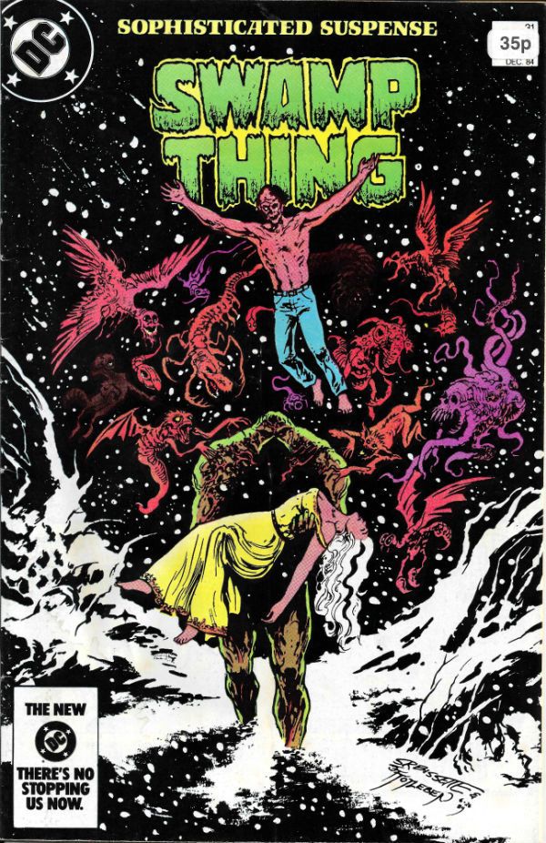
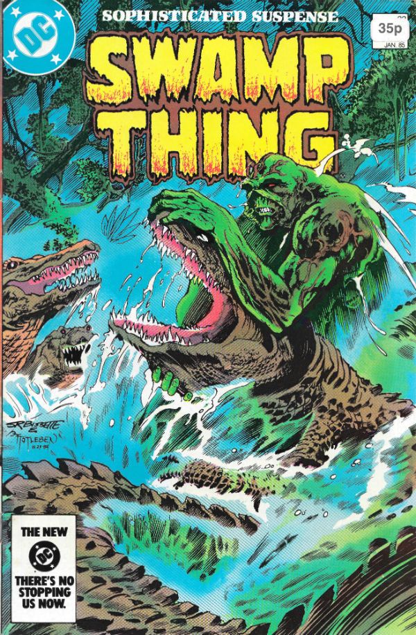
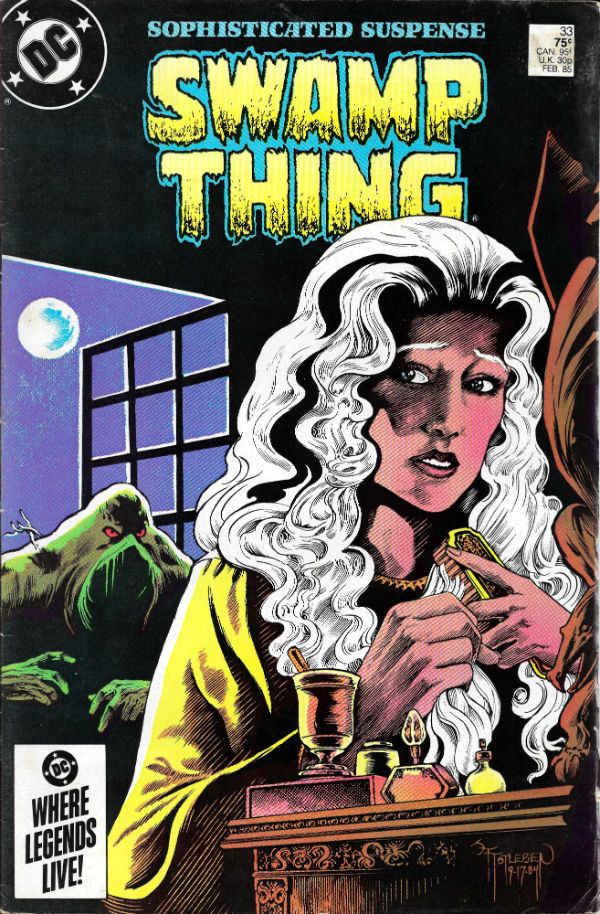
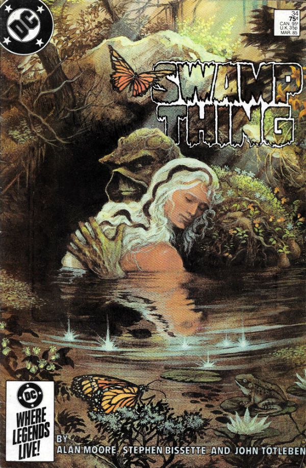
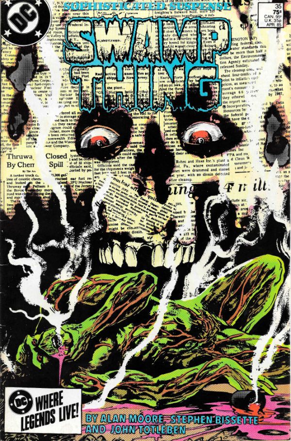
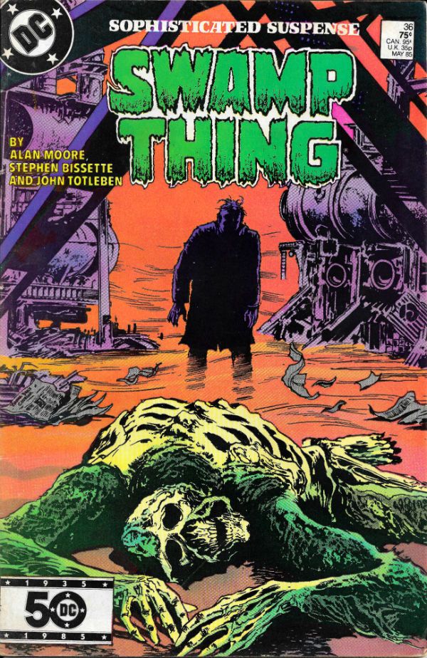
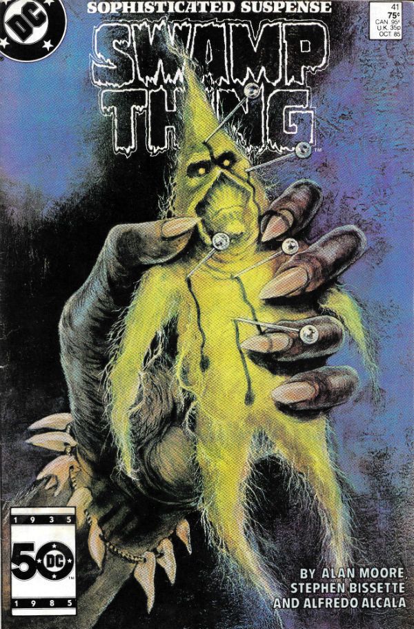
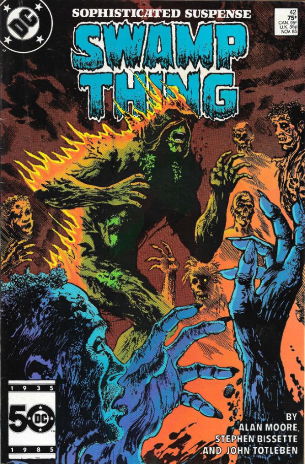
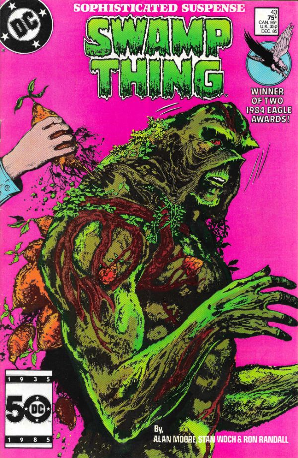
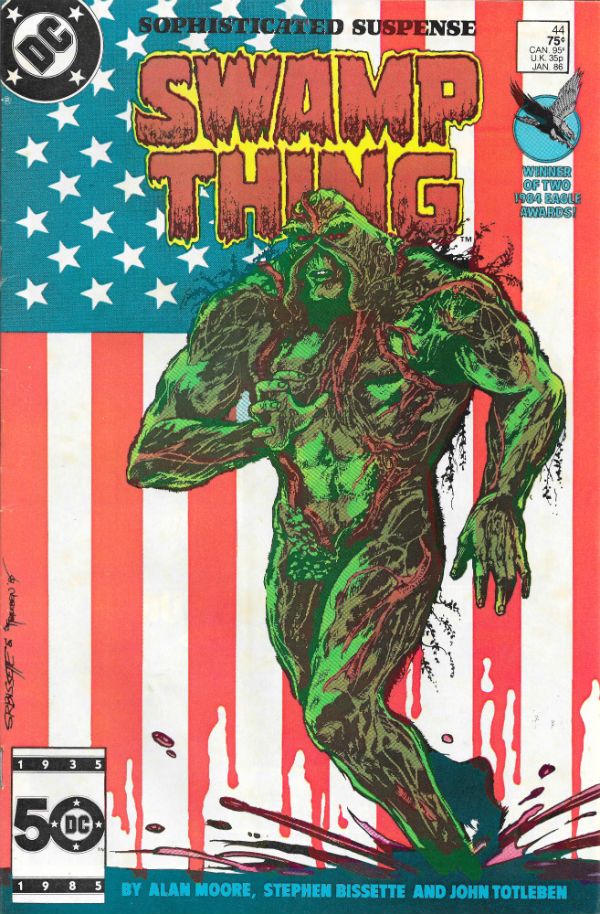
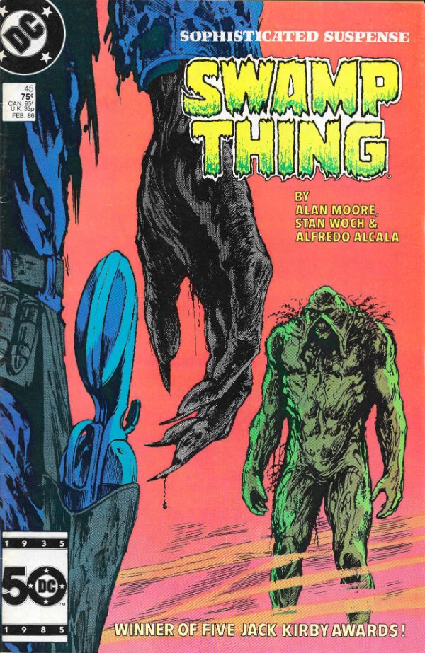
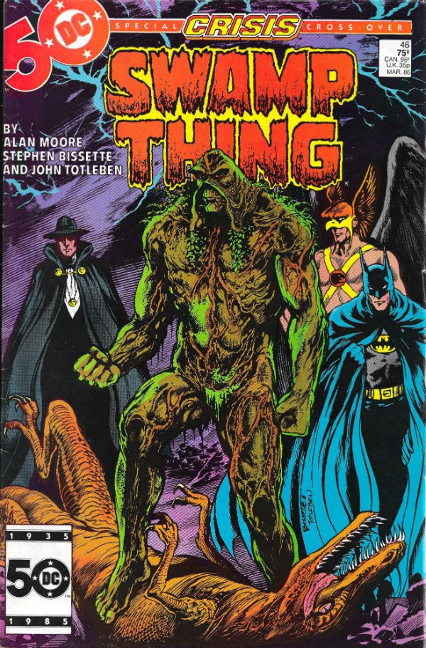
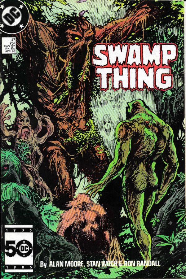
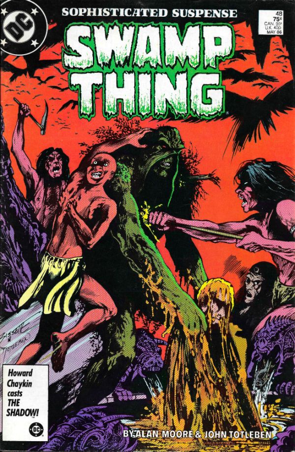
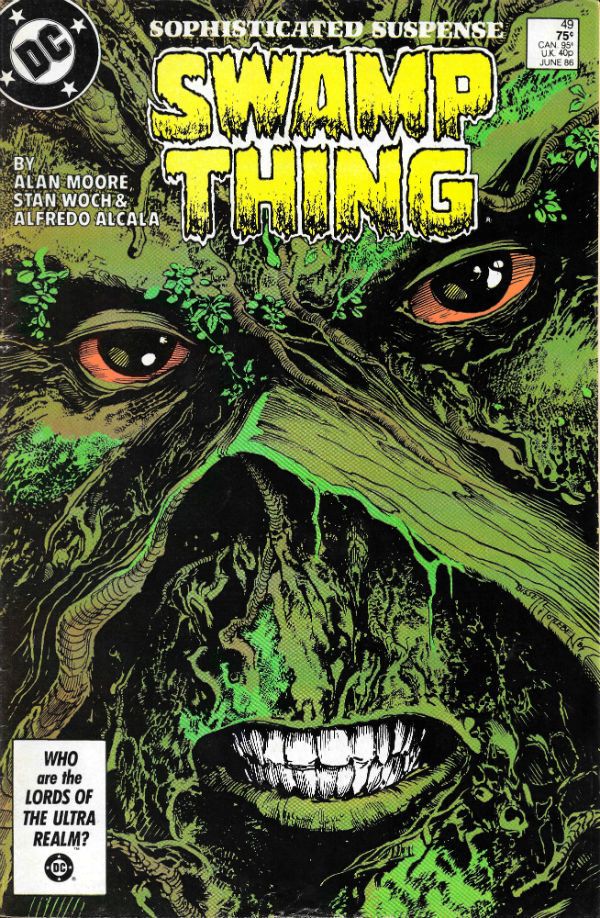
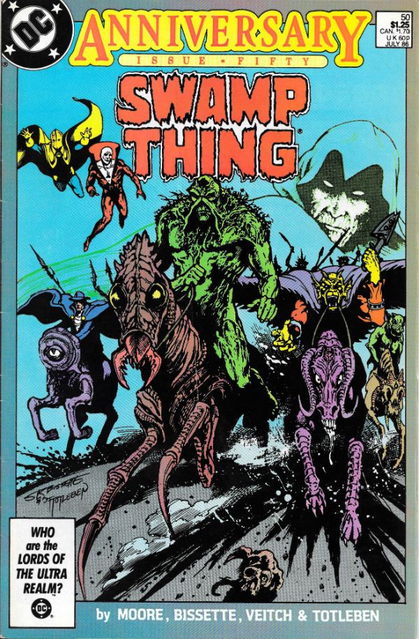
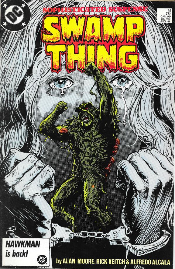
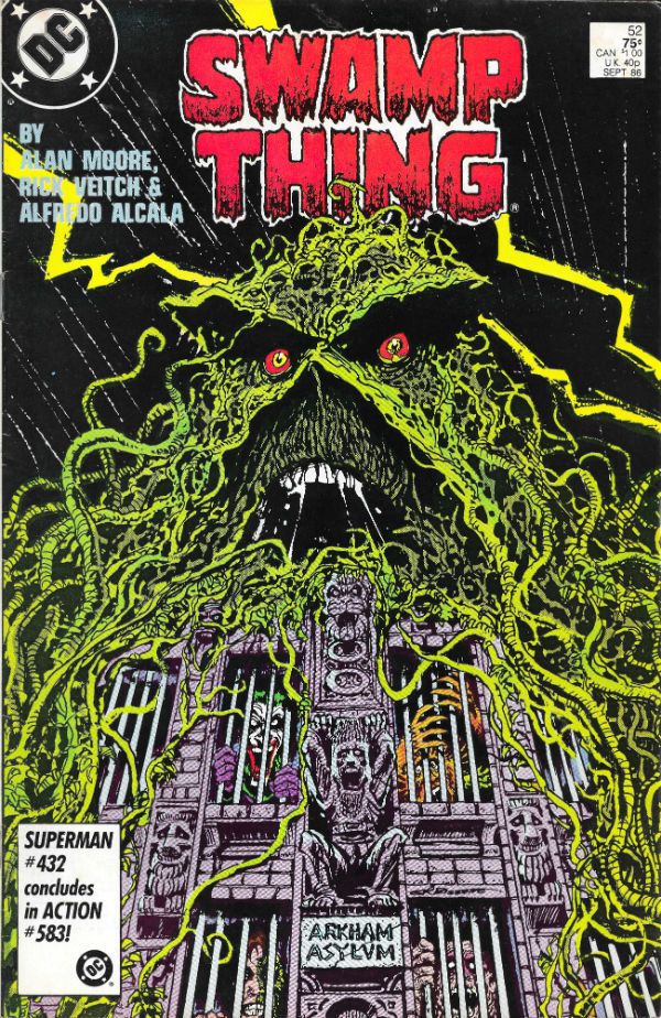
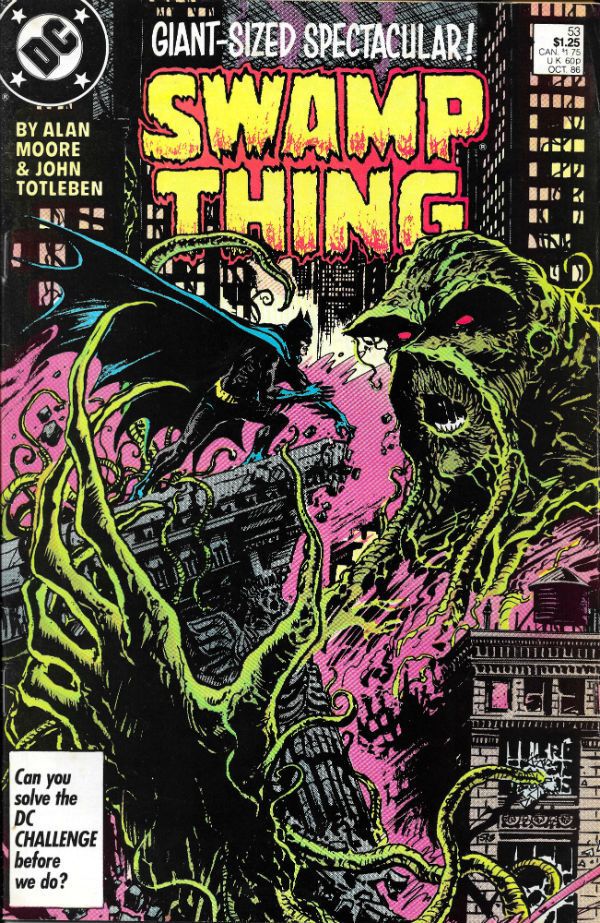
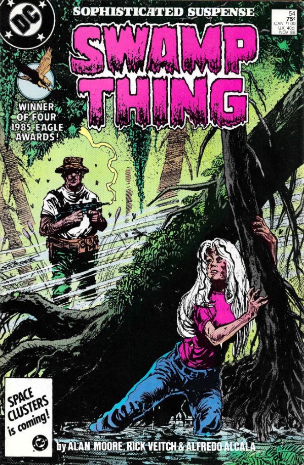
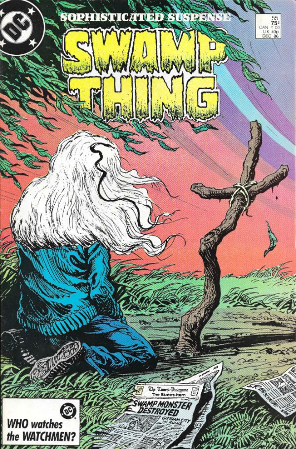
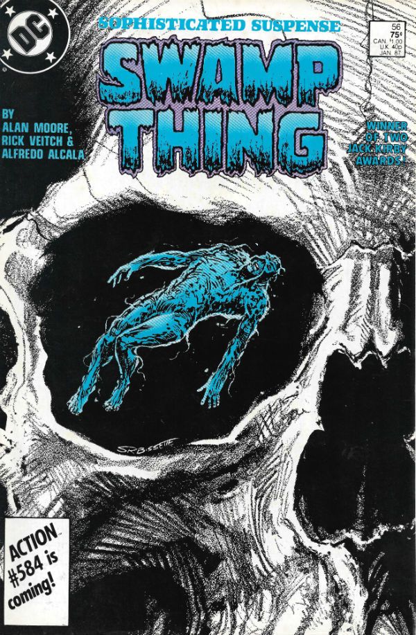
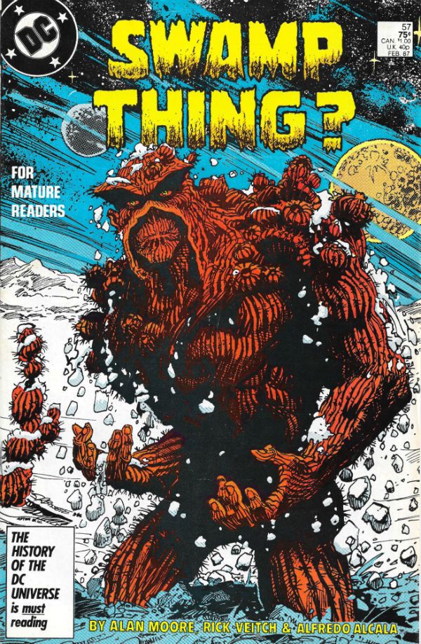
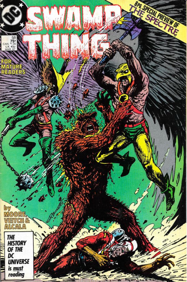
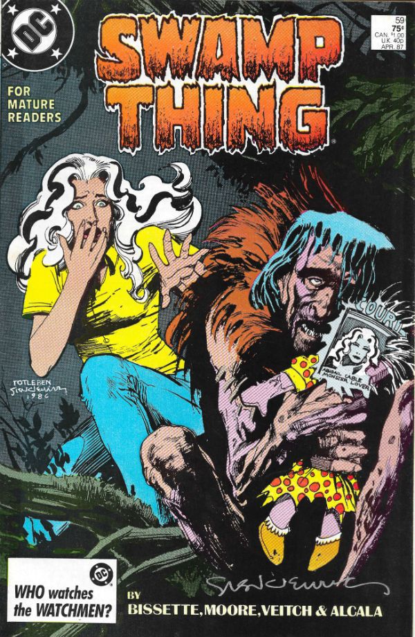
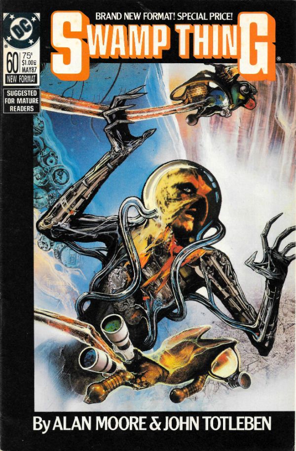
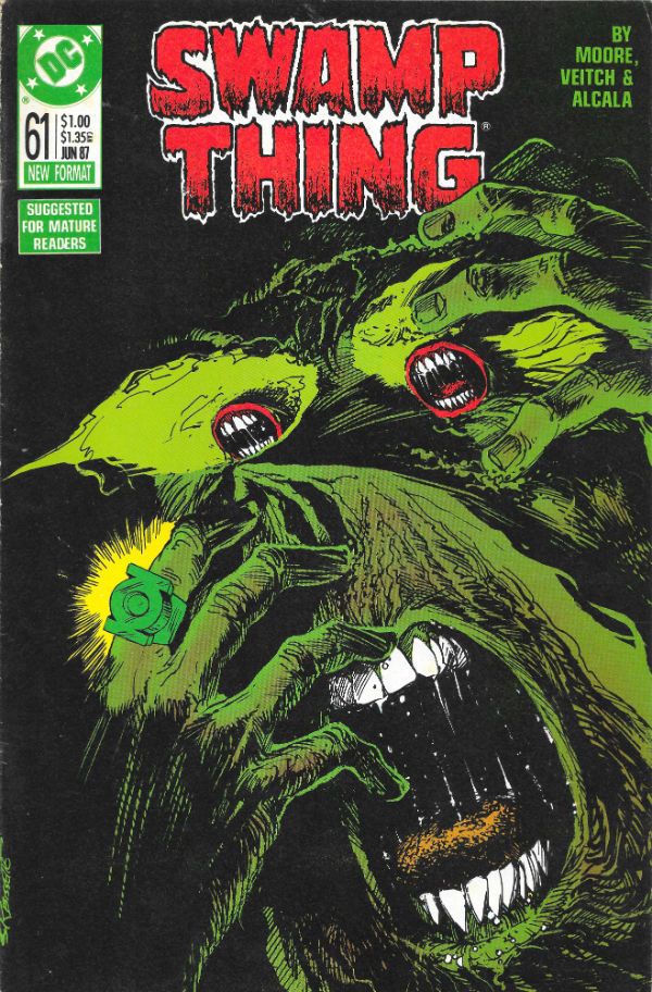
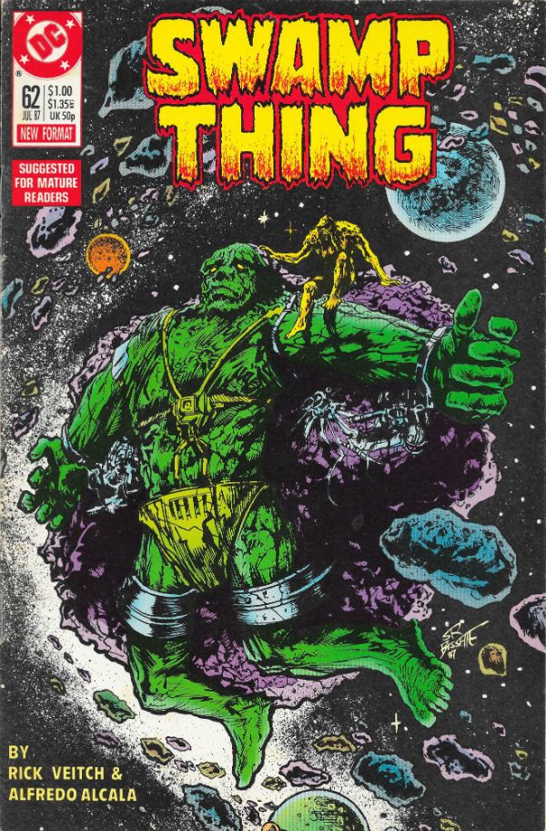
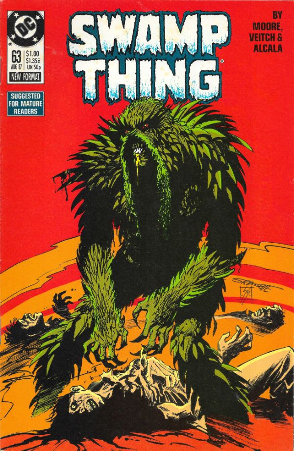
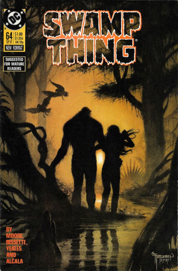
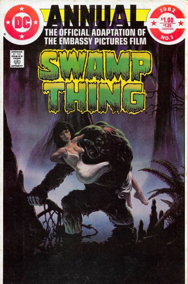
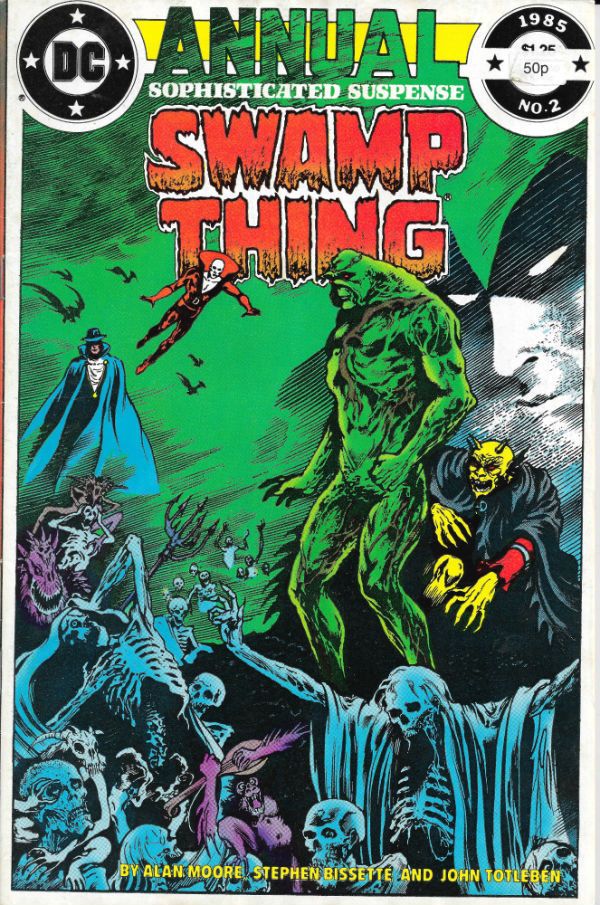
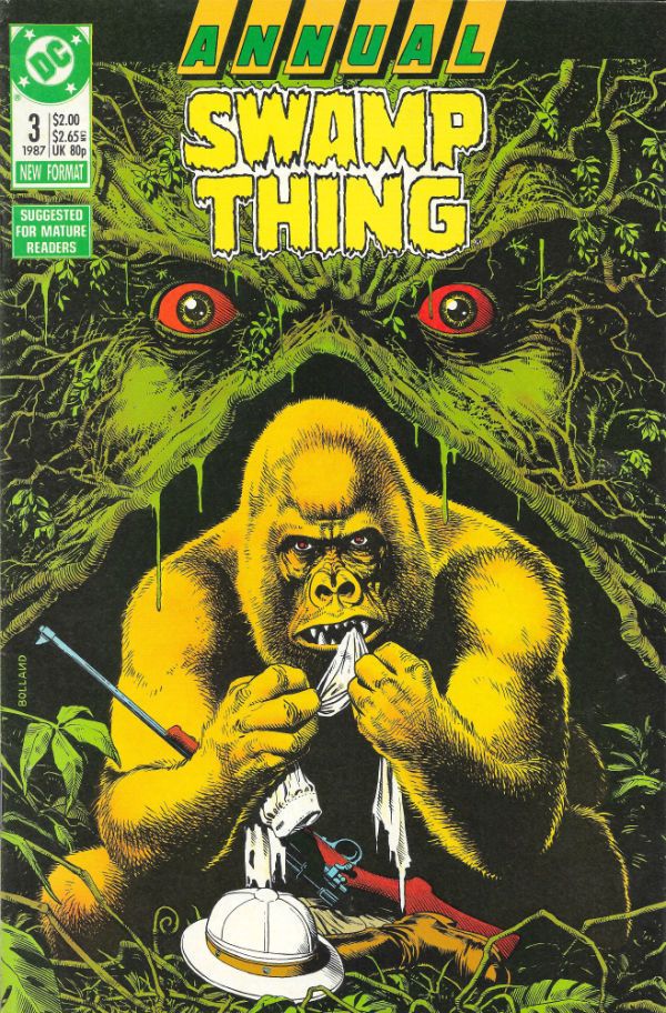
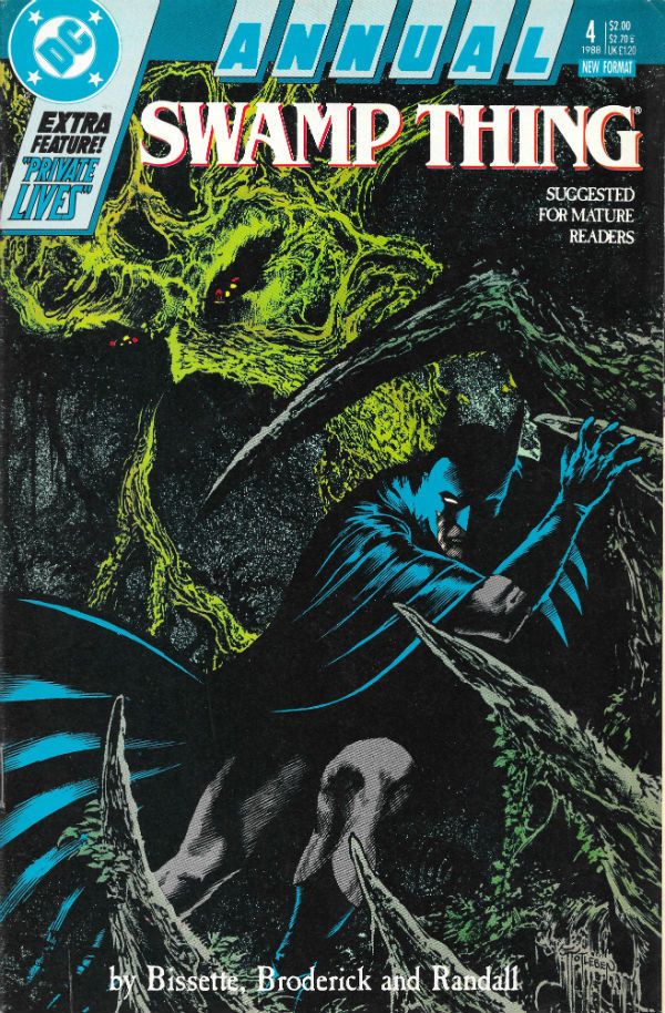
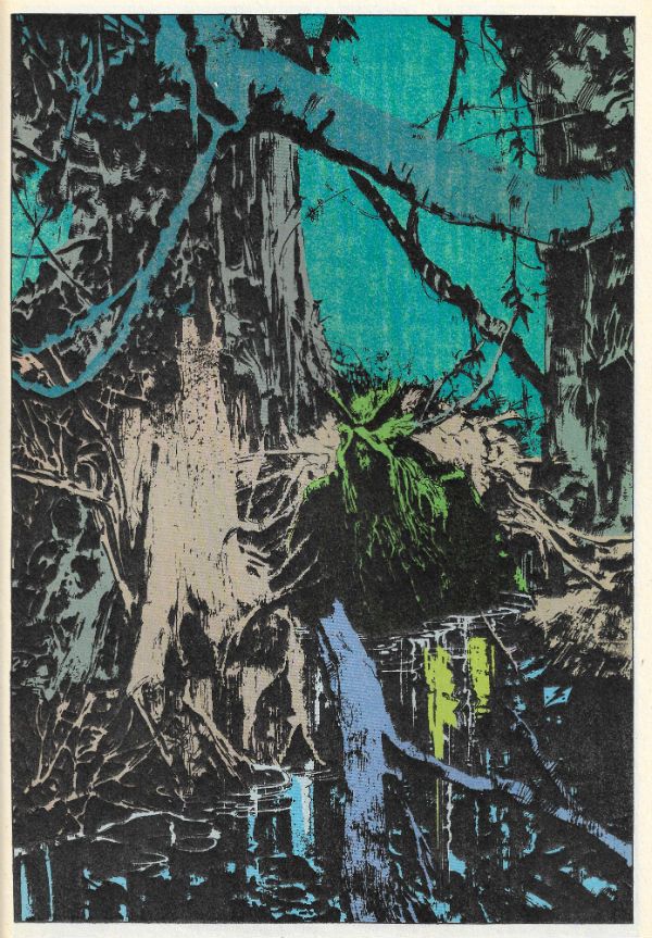
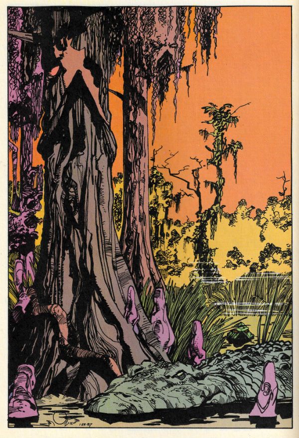
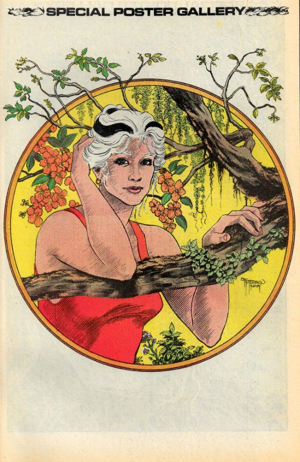
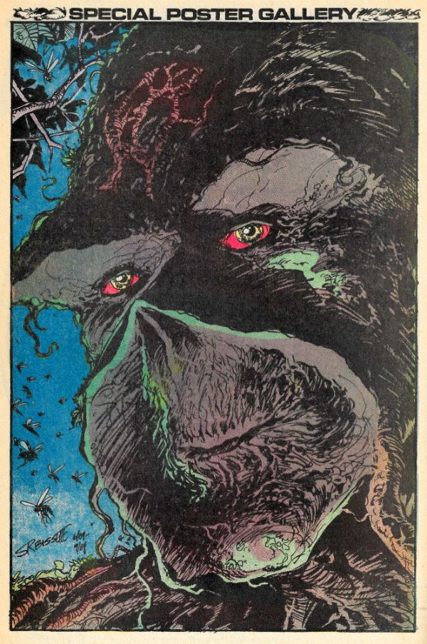
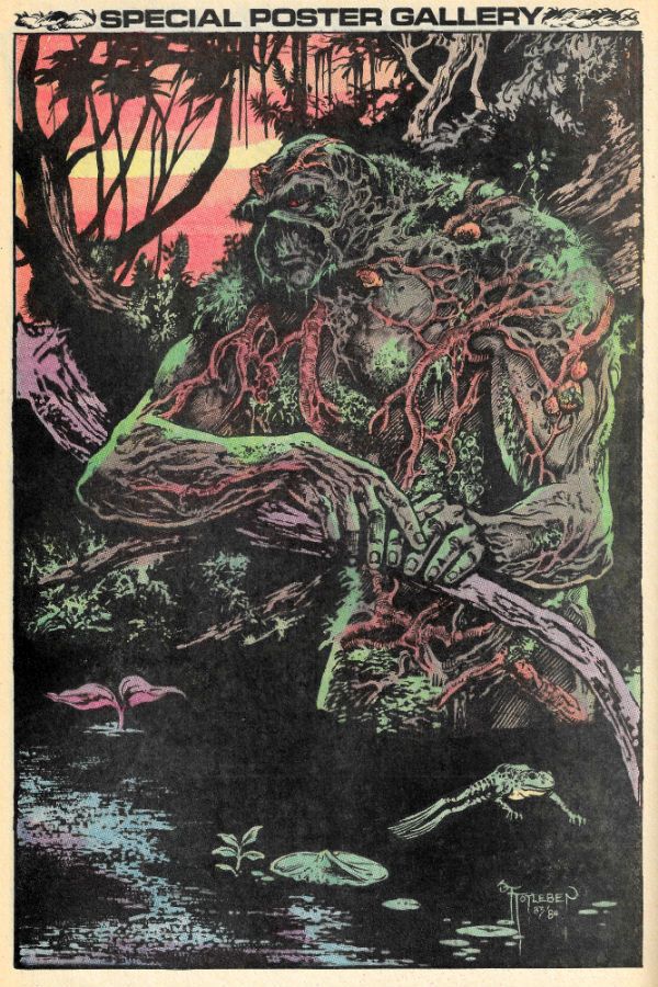
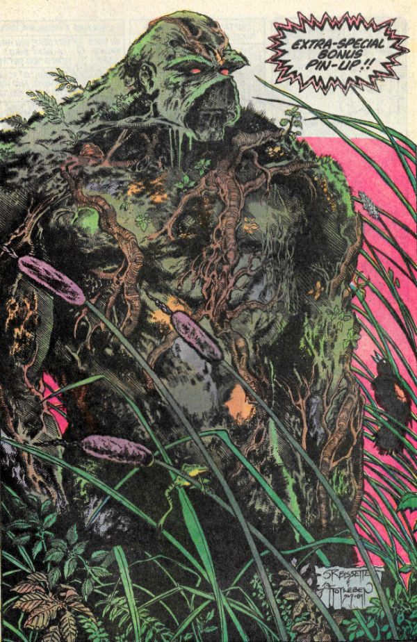
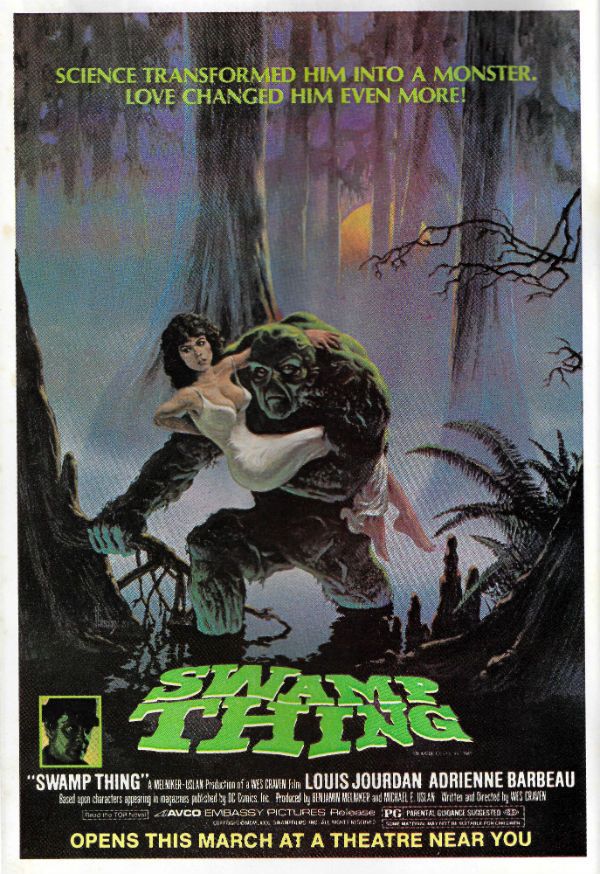
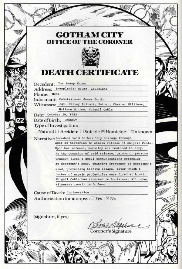
It's Halloween! Gather round, gather round! O, you lucky children! Feast your tiny dead fly sized eyes on a ghoulish gallery fit to chill even the hardiest of souls! Halloween! Sil-VER SHAMROCK! Oh alright, I just scanned in my incomplete Saga of the Swamp Thing comics run. No tricks here, m'dears; only treats! It's mostly covers but also some pin-ups and even Swamp Thing's death certificate. Morbidly apropos eh, what? I hope you enjoy looking at them while I creep up behind you. HOO-HA! Gonna wear your face like knickers!  photo S0tST27bB_zpsiwfempwk.jpg SWAMP THING by Stephen Bissette, John Totleben, Alan Moore, Tatjana Wood & John Constanza

SWAMP THING Created by Berni Wrightson & Len Wein

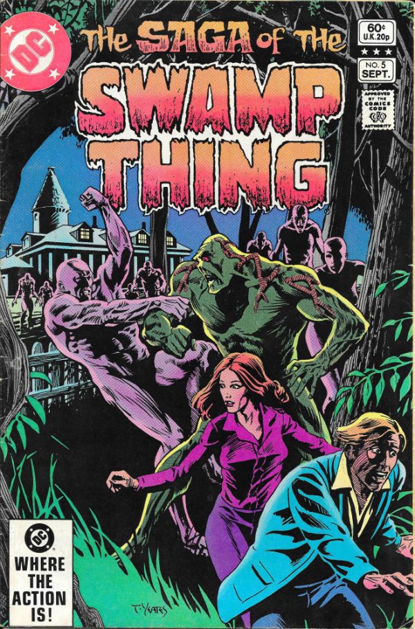
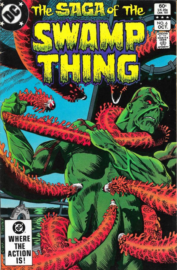
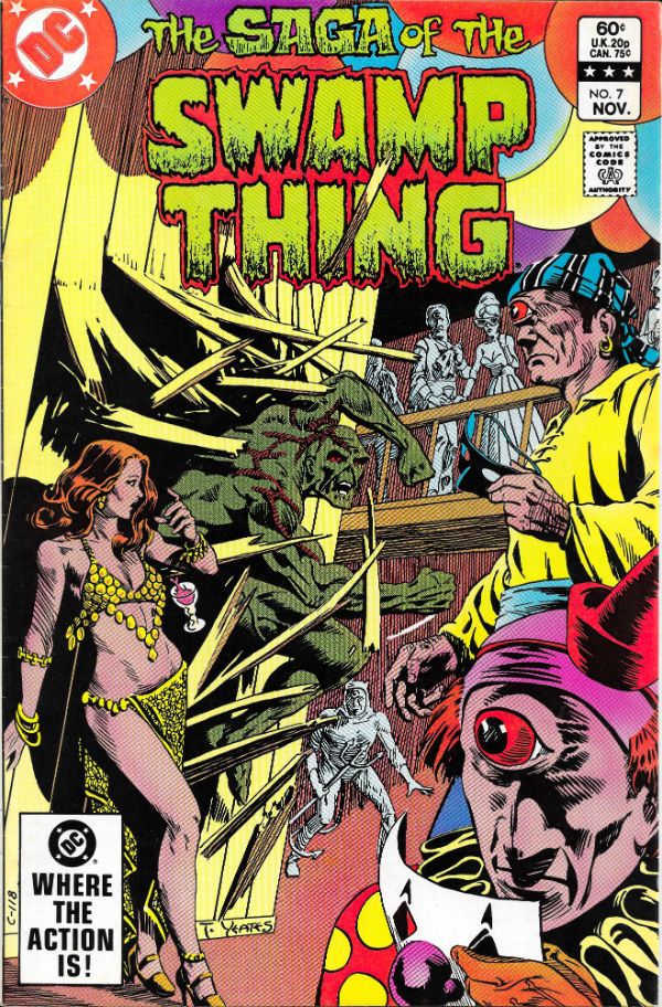
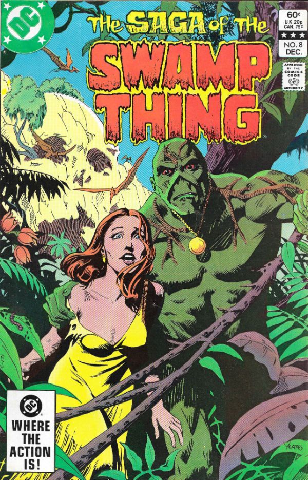
I started reading Saga of the Swamp Thing (SotST) with # 2 because I was 12 and a morbid little thing. Oh yes, Horror was my jam. I spread it liberally on my toast of terror. I was there, so let me tell you that the 1980s were a pretty awesome time all around for horror in movies, prose and comics. Probably even jam; horror was everywhere. Probably because the 1980s was a pretty awesome time for horror in real life: Thatcher, AIDS, Clause28, The Cold War, Reaganomics, The Miners Strike, Phil Collins; sometimes you just wanted to pull the covers over your head. But then you ran the risk of missing some fab Horror jam. Like SotSW. I stopped reading SotSW with #6. Not because it was rubbish, but because it stopped appearing at my local market cum newstand. Those early issues by Tom Yeates and Martin Pasko aren't the ones people remember but they were pretty decent. Issue 3 with the vampires was nice (nice enough for Moore to call back later in #38 & #39) and #4 had a children's entertainer who entertained himself with children in a bad way. It was far from rote and just about worthy of note. I restarted reading SotSW with #35 when it suddenly reappeared back on my stands. That fella from Warrior and 2000AD whose stuff I liked only turned out to be writing it, didn't he! (It would turn out he'd been writing it for a while.) My surprise and delight at the chillingly efficient tales this Moore fellow was producing was rather upended when Swamp Thing promptly died at the end of #36. Well, fuck a duck, I thought (I was a potty mouthed child).

 photo S0tST25bB_zpsfk00uihl.jpg

But then he brought him back. Later on he'd kill Swampy again, but I'd got the knack by then and just hung on til he was back. With #64 Moore moved on and even brought back Tom Yeates for a fitting finale. But Moore didn't push off before he'd written a pile of the most entertaining comics it's ever been my pleasure to read. (And re-read. And re-re-read. Etc.) So much so that I went back and filled as many gaps as I could, before TPBs were a thing at which point I, as they say, completed the set. It took time and it took money but it was worth it. From the early issues which recast old horror tropes in fresh robes of relevance, through the inevitable team up with Batman (one which actually had weight and consequences for once) through the tail end whistle stop tour of the DCU, Alan Moore brought the words. And plenty of them. But that's okay because they were good words. I have a weakness for writers who love language; I'm odd like that. And as ever with any long comics run you could tell he stayed too long, but rather than phone it in he simply concentrated on keeping himself entertained, and in so doing kept me entertained.

But there are more than words in a comic; otherwise it would be prose. There are pictures. And the pictures in SotST are the equal of Moore's words, mostly. From the titanic trio of Bissette, Totleben & Veitch whose jagged, fractured pages seemed to stab the horrors displayed right into your mind, to the stalwarts called in at short notice: Alfredo Alcala, Stan Woch, Ron Randall et al. And of course, Shawn McManus. Shawn McManus who gave Moore's script for POG (#32) a heartwrecking cartoony beauty. Everyone on the book seemed to be having a blast and so I had a blast. John Totleben certainly had fun, fun which culminated in, with #60, his flamboyantly futuristic issue-long recasting of Kirby Collage technique. John Totleben's eyes are tired, so they say, but he can hear well enough, so let's all say that, you, John Totleben rocked, and you rocked never harder than on #60 of The Saga of the Swamp Thing (unless it was that issue of Miracleman (yeah, that one). SotST is often spoken of as being Alan Moore's but that's just convenient shorthand. SotST and its many, many successes belong to everyone on its pages. Most notably those already spoken of, and particularly Steve Bissette's dark swathes of ink. SotSW is a remarkable run of comics; remarkable in its consistency, intelligence and heart. Yes, heart. Because for a horror book it was surprisingly keen to remind us of what it meant to be human; how that can be the worst thing in the world, but also how it can be the best thing in the world. That's not bad for a comic book about a plant that dreamt it was a man.Sage of the Swamp Thing was EXCELLENT!

You've all been very patient so here's the gallery:

 photo S0tST01aB_zps7h5hwgue.jpg

 photo S0tST02B_zpszdyqnst2.jpg

 photo S0tST03B_zpslf6q2xbc.jpg

 photo S0tST04B_zpscy2qs815.jpg

 photo S0tST05B_zpskrjm0ere.jpg

 photo S0tST06B_zpswdwuunik.jpg

 photo S0tST07B_zpsqte67v9r.jpg

 photo S0tST08B_zpshvofaavx.jpg

 photo S0tST09B_zpsjxa1lezp.jpg

 photo S0tST10B_zpse1uoltfq.jpg

 photo S0tST11B_zpswqlv7wtw.jpg

 photo S0tST12B_zpssfjcaq0d.jpg

 photo S0tST13B_zps8bo3fv9p.jpg

 photo S0tST14B_zpsvivzjzif.jpg

 photo S0tST15B_zps1xedww1b.jpg

 photo S0tST18B_zpsnuiygvpv.jpg

 photo S0tST19B_zpsuwutnp5z.jpg

 photo S0tST25aB_zps3tysl1sc.jpg

 photo S0tST27aB_zps0loq4qxu.jpg

 photo S0tST28B_zpsmiw1obak.jpg

 photo S0tST29aB_zpsskphvrjv.jpg

 photo S0tST30B_zpsx0la6u2u.jpg

 photo S0tST31B_zpsgot7zuvm.jpg

 photo S0tST32B_zpsm9qy66hq.jpg

 photo S0tST33aB_zpsx7wua3vy.jpg

 photo S0tST34B_zpsownvcs1j.jpg

 photo S0tST35B_zpsznnknjca.jpg

 photo S0tST36B_zpso2qu0eif.jpg

 photo S0tST37B_zpsxeynkefc.jpg

 photo S0tST38B_zpsopoygf1k.jpg

 photo S0tST39B_zpslth7i3mr.jpg

 photo S0tST40B_zpsd26tl5tm.jpg

 photo S0tST41B_zpsdrvixr4q.jpg

 photo S0tST42B_zpsljwtrkr1.jpg

 photo S0tST43B_zpsoxrfstyp.jpg

 photo S0tST44B_zps3gfhl8ay.jpg

 photo S0tST45B_zpshvdm3nft.jpg

 photo S0tST46B_zpsd8obz8fi.jpg

 photo S0tST47B_zpsifwgyksx.jpg

 photo S0tST48B_zpseqezckgg.jpg

 photo S0tST49B_zpsbneswwwa.jpg

 photo S0tST50B_zpsyvf3mam3.jpg

 photo S0tST51B_zpsyn0w08ri.jpg

 photo S0tST52B_zpsmwnmvi12.jpg

 photo S0tST53B_zps9frna7qi.jpg

 photo S0tST54B_zps0xhxnwkt.jpg

 photo S0tST55B_zpslesguhzq.jpg

 photo S0tST56aB_zpsohaunsiz.jpg

 photo S0tST57B_zpsiaqpadgq.jpg

 photo S0tST58B_zpsmgd1rlzp.jpg

 photo S0tST59B_zpsjwh2z4gt.jpg

 photo S0tST60B_zpsdmfcyt1r.jpg

 photo S0tST61aB_zpslhdmkxta.jpg

 photo S0tST62B_zpsdnn3rhx3.jpg

 photo S0tST63B_zpshyv41wqh.jpg

 photo S0tST64B_zpsw5xfgw3o.jpg

 photo S0tSTan01B_zpslomwyqhd.jpg

 photo S0tSTan02B_zpsrwbdlrgt.jpg

 photo S0tSTan03B_zpsuxr6xmxd.jpg

 photo S0tSTan04B_zpsti69jov9.jpg

 photo S0tST61bB_zpsrydsqhs8.jpg

 photo S0tST61cB_zpsg9bys5c0.jpg

 photo S0tST33cB_zpsgb1fcy2r.jpg

 photo S0tST33dB_zpsd62wuaoc.jpg

 photo S0tST33bB_zpsvt2qopaw.jpg

 photo S0tST29bB_zps6xqtt53s.jpg

 photo S0tST01bB_zpsllbs3gih.jpg

 photo S0tST56bB_zps77ya6esz.jpg

Sometimes...I am almost...frightened...by my own – COMICS!!!

"ARRRRRRRRUUUUGGGH!" COMICS! Sometimes I Should Have Probably Just Watched Valley of the Gwangi Instead!

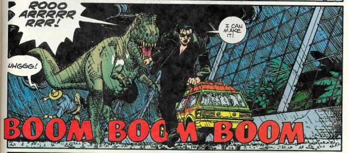
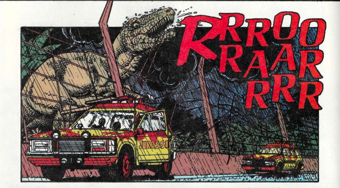
There’s a new JURASSIC PARK movie out! I’m not particularly bothered! I won’t be going to see it! But I did read a comic adaptation of the first movie! So why waste happenstance! And that’s about as zeity as my geisty gets.  photo JParkEyeB_zps0x7mlhwq.jpg

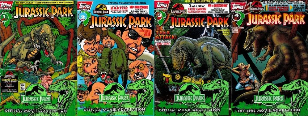
JURASSIC PARK by Kane & Perez, Simonson, Workman & Smith Anyway, this… JURASSIC PARK#1 -4 Art by Gil Kane & George Perez Written by Walter Simonson Lettered by John Workman Coloured by Tom Smith Based on the screenplay by David Koepp Based on the novel by Michael Crichton and on adaptations by Michael Crichton & Malia Scotch Marmo TOPPS COMICS, $2.95ea (1993)

 photo JParkCoversB_zps6uyuo6yl.jpg

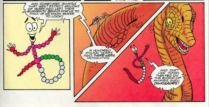
In 1978 Michael Crichton wrote and directed the entertaining slice of speculative hooey WESTWORLD. This had robots run amuck in a theme park. Because genius cannot be hurried it would take Crichton a further 12 years to come up with the idea of replacing the robots with dinosaurs, which he did in his 1990 novel JURASSIC PARK. It would take a further 3 years before Steven “ALWAYS” Spielberg would deliver the technically innovative but peculiarly unsatisfying movie of the same name. As a tie-in the short lived TOPPS Comics threw this four issue adaptation out into the world. Several years later I bought them off E-Bay because I saw Gil Kane’s name on the listing. Last week I found them in the garage and finally read them. Which brings up to date, I think. I haven’t read the book so I’m not getting into that. I am as scientific as a chimp so I’m not getting into that either. But I do know I don’t really like JURASSIC PARK the movie and I know that because I’ve never owned it. And this is from a man who owned FALL TIME, TRACES OF RED and FTW on VHS. Yet never JURASSIC PARK. This is less because while JURASSIC PARK has many leathery denizens Mickey Rourke isn’t one of them, and more down to the fact I found JURASSIC PARK a bit underwhelming. I mean, it’s okay when you’re sat in front of it but as soon as you go and do something else there’s a nagging sense that you’ve just done something for the last 127 minutes but a maddening lack of specifics about what exactly that thing was. Usually when that happens I’m wearing a dress with blood in my hair and there’s a uniformed man outside with a bullhorn and some well-armed friends. All you know is it definitely involved Jeff Goldblum and a cup of water. For something that cost $63 million that seems like a remarkably poor return. Usually you can point at something about a movie and say That! That! is why it failed to entertain! But JURASSIC PARK is well directed, well scripted, ably cast, brimming with special FX which are special and, y’know, dinosaurs and…none of that ever actually comes together to make a good movie; it’s just stubbornly bland. As much of an achievement as the FX were at the time surely the eternal achievement of JURASSIC PARK is making a movie about resurrected dinosaurs running amok in an island paradise less engaging than sneaking a fart out.

 photo JParkDNAB_zpsyuwrgw7f.jpg JURASSIC PARK by Kane & Perez, Simonson, Workman & Smith

Of course, I had already been somewhat spoiled on the old dinosaurs running amuck front by Pat Mills and Various European Gentlemen’s FLESH in 2000AD (1977-1978). Despite “Pat Mills and Various European Gentlemen’s FLESH” sounding like something that would be seized at Customs, it was in fact a luridly violent strip aimed at children which involved time travelling Future Cowboys harvesting dinosaurs, in the course of which the tables quickly, predictably, and violently turn. It was fast, nasty and punched its point home like it was trying to grab your spine. In comparison JURASSIC PARK is like a dinosaurs’ tea party where the worst that happens is T-Rex spills milk on a doily and the Velociraptors say something unfortunate about someone’s sister. I don’t want to be crass (but we aren’t always all we want to be) but how many deaths are there in JURASSIC PARK? Four or five? Six tops. That’s pitiful. There are six deaths on every page of FLESH. And if there aren’t (because someone will take me literally) it feels like there are. The deaths in JURASSIC PARK are frictionless punchlines to efficient action set-ups. The deaths in FLESH, however, are nasty and brutal with much screaming and precision about exactly what is happening and how unpleasant it all is. Look, In FLESH you get dialogue like “Gotta STAB this she-hag right in the BRAIN!” and that’s always going to trump “Have some ice cream. Twenty two flavours and I tested every one!” Sure, no one talks like people do in FLESH but then no one is going back in time dressed as cowboys and farming dinosaurs for future supermarkets. YET! If you’re calling foul on dialogue on that creative battlefield you’re getting hung up on the wrong barbed wire, pal. Maybe that’s it - JURASSIC PARK tries to marry spectacle to respectability. Come on, anyone trying to make a respectable dinosaurs run amuck movie has failed at the first hurdle. Basically then, I remain ashamed that I enjoyed CARNOSAUR more.

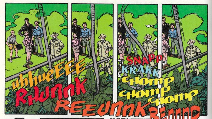
 photo JParkWordsB_zpsnb9uj7mp.jpg JURASSIC PARK by Kane & Perez, Simonson, Workman & Smith

I can’t actually speak to how well the adaptation and the movie line up because I was unwilling to give up some of my valuable time spent staring into the middle distance and being disappointed in myself to rewatch it. And if you think that makes all this pointless exercise in self-amusement then have a banana! Take two; knock yourself out! Flash Fact: this is my free time. Anyway, parts of the comics adaptation are ridiculously faithful and I’m kind of thinking Walter Simonson simply and efficiently adapted the script (or at least a near to shooting script). I mean that’s basically all he does. I’m not making any huge perceptive leaps here. That’s no foul. Obviously expectations may be raised because of all that pushing-of-comics-into-weird-new-shapes-in-order-to-evoke-the-experience-of-the-movie he (and Archie Goodwin) did with ALIEN: THE ILLUSTRATED STORY. (I may have mentioned it previously. At length.) But Simonson doesn’t do that here so don’t be expecting what he hasn’t done. What he has done is deliver a meat’n’taters movie on the page. In fact, the most interesting thing visual invention wise is how John Workman positions his (as ever) wonderful lettering FX; they really help shunt the eye through the pages. Also interesting are the slight deviations from the movie I could identify. Unless I’m wrong there’s an extra scene with the lawyer at an amber mine (more lawyers talking to capable men in short sleeved shirts outdoors; that’s what JURASSIC PARK needed!) and I know I’m not wrong when Simonson has Kane & Perez illustrate Sam Neill’s “no one in the audience has ever heard of Raptors but you need to be aware of how awesome they are or all this build up simply won’t work…”speech to that random kid as a kind of dream sequence.

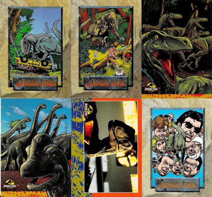
 photo JParkCardsB_zpsmmfl0jni.jpg

I also thought Bob Peck was in charge of the luckless wage slave bit at the start, but here it looks like it’s Howard Victor Chaykin sporting some shades. (And another thing, I mean, seriously, the whole fiasco is down to employers thinking they don’t have to adhere to basic Health & Safety because, what, it impacts on the “bottom line” and affects “targets” (trans: “money”). There’s a lot of huffing and puffing trying to make the lawyer the villain (because tradition) but all that dude wants is everyone to do what the law says. Fuck that dude, with his safety concerns; I hope he dies humiliatingly hiding in a portable loo. Look, I don’t care how cuddly Richard Attenborough is, he still values human life less than a theme park ride. That misty eyed reminiscence thing about the flea circus? Get real, people, Life is the Circus to Richard Attenborough and we, the people, are THE FLEAS! Dude’s a cock of the first order. Does he get eaten? No, he does not. That’s bloody Rule #1 in dinosaurs run amok movies- payback! Payback for the shitters of the world! Ultimately JURASSIC PARK is toothless (Oh God, that’s some great wordplay. Professional level shit there, John; keep that up! Publishers will be “interested” (trans: “money”) so it’s no wonder I can’t be doing with this movie.) Mind you maybe Gil Kane did that as a joke (recap: the Howard Chaykin in shades thing) because Gil Kane seems to be playing pretty loose character design wise.

 photo JParkRunB_zpsxywpyofg.jpg JURASSIC PARK by Kane & Perez, Simonson, Workman & Smith

Oh, yeah, that’s why I have these comics – Gil Kane. No, not because I ever believed the lie of easy riches implicit in the “Special Collector’s Edition” status of these books with their protective sheaths (which you have to re-insert the comics back into; if you close your eyes you can imagine putting a French tickler on Gumby) and the trading cards included therein. Man, never has a generation been so betrayed as the Comics Fans of the ‘90s. Life wasn’t supposed to be like this. We were all going to be rich. None of us learned life skills because we were going to cash on our mint holofoil BALLJUGGLER#1s and live a life resembling a blizzard of jizz and glitter but with added cats in speedboats. None of us can actually even talk to people never mind hold down a job! Shit like this is why I’m in favour of regulation. Well, that and the whole global financial collapse which threw my country rightwards and into the arms of the Tories. Other than that though, it’s definitely the whole trading cards thing. So, Gil Kane. We were talking about Gil Kane; well, Gil’s here but so is George Perez. Look, I have no beef with George Perez’ work usually; it’s fine. A bit busy and stolid for me personally, but if you want a lot of superheroes all in one place George Perez can do that pretty well. But, man, here in the place where there are no superheroes his heavy lines and consequent dearth of suggestive space where the reader’s mind can play really flattens Kane’s work into inertia. I guess it’s decent enough stuff; he keeps Kane’s basics intact, nothing is omitted. In fairness there are a couple of “imaginary” scenes where the detail gets pared back and in those bits Perez and Kane are a team to reckon with. But Perez’ signature insistence on specificity really hurts Kane’s inherent grace and flow. It’s just a less than ideal combination; both men on their own – smashing, but together, meh, not so much. Hey, that’s how it goes sometimes.

 photo JParkFaceB_zpscpzaqccr.jpg JURASSIC PARK by Kane & Perez, Simonson, Workman & Smith

The salt’n’marshmallow art combo sure makes some of Kane’s faces look weird as well. There certainly seems to have been some kind of power struggle over Laura Dern’s face (artistically speaking). There’s no doubt in my fat and generous heart that Gil Kane was a phenomenal artist but he could only draw two ladies faces- either a goddess or a crone. Laura Dern is neither; she just looks like a normal human being. I’m saying it looks like George Perez redrew her face. Actually I don’t really know what’s going on with the faces here. Kane nails Wayne Knight (artistically speaking) but his Samuel L Jackson looks like he’s never heard of Samuel L Jackson, his Richard Attenborough looks like he’s got a mossy skin disease instead of a beard and (the late, great) Bob peck who looks like Gil Kane drew him in reality doesn’t look like Gil Kane drew him here. I find the face work in these comics fascinating but I can tell from the depth and regularity of your breathing that you want to move on. Why am I even talking about faces! It’s a comic about dinosaurs run amuck and I’m talking about faces! There’s the crux of the matter right there. I never got within about 2000 miles of Gil Kane but you don’t have to be Thought Jacker to guess he probably turned up here to draw dinosaurs, not a bunch of mostly normal looking people in drab clothes ambling about impressively unmemorable set designs. Eventually Kane does get to draw dinosaurs but Walter Simonson, tumbling into the trap of hyper-fidelity to the source, has knacked the pacing. So the bits where Gil can go dino-crazy are well worth showing up for but they are also kind of cramped and hurried. Meanwhile there are all these pages of weird faces saying words, none of which are why anyone turned up, least of all the audience.

 photo JParkRexB_zpscjcdzbt1.jpg JURASSIC PARK by Kane & Perez, Simonson, Workman & Smith

I love Walter Simonson and I love Gil Kane, John Workman is a little cracker and George Perez ain’t never done me no harm so these comics weren’t a total wash. But Honesty, like Christ, compels me to admit they’ve both done better work elsewhere and there are even better dinosaur run amuck comics. So, sure, given the talent involved JURASSIC PARK may be EH! but then that goes for the movie too. So, as adaptations go it’s spot on.

What I want to know is, if dinosaurs were around for so long how come they never invented – COMICS!!!

"Seems Like Even The GODS Have Their ACCIDENTS!" COMICS! Sometimes The King Is Still Dead!

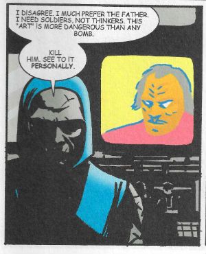
“Tarru!” to you, too!! Just look at the creators on this thing! It’s like the comic book equivalent of one of those Irwin Allen films where Steve McQueen and Paul Newman jockey for top billing, Fred Astaire tumbles burning out of a lift, Michael Caine shouts about bloody, bloody bees and Gene Hackman tells God off with his steam blistered fists raised. It isn't a movie, but is it a disaster?  photo JPLeonB_zpsb5f63aca.jpg TALES OF THE NEW GODS by John Paul Leon, Kevin McCarthy, John Workman & Tatjana Wood

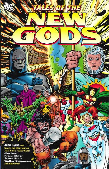
Anyway this… TALES OF THE NEW GODS Pencilled by Steve Rude, John Byrne, Walter Simonson, Ron Wagner, Frank Miller, Dave Gibbons, Erik Larsen, Howard Victor Chaykin, Rob Liefeld, Art Adams, Jim Lee, John Paul Leon, Allen Milgrom, Eddie Campbell & Steve Ditko Inked by Mike Royer, John Byrne, Walter Simonson, Ray Kryssing, Frnk Miller, Dave Gibbons, Al Gordon, Howard Chaykin, Norm Rapmund, Art Adams, Scott Williams, John Paul Leon, Klaus Janson, Eddie Campbell & Mick Gray Written by Mark Evanier, John Byrne, Walter Simonson, Eric Stephenson, Walter Simonson with Howard Victor Chaykin, Jeph Loeb, Kevin McCarthy & Mark Millar Lettered by Todd Klein, John Byrne, John Workman, Clem Robins, Ken Bruzenak & Richard Starkings Coloured by Anthony Tollin, Lee Loughridge, Noelle Giddings, Sherilyn Van Valkenburgh, Tatjana Wood, Buzz Setzer & Drew Moore Collecting stories from Mister Miracle Special, Jack Kirby's Fourth World #2-11,13-20, and Orion #3-4, #6-8, #10, #12, #15, #18-19. Plus, a never-before-published short story by The Socialist Mark Millar with art by Steve Ditko and Mick Gray DC COMICS, $19.99 (2008) The Fourth World created by Jack Kirby Superman created by Jerry Siegel & Joe Shuster

 photo TotNGCovB_zps24dc3ac7.jpg

In 1970 Jack Kirby, finally tiring of Marvel’s inability accord him decent treatment, chose to go to DC Comics. It was there that he began the greatest phase of his many great phases of work, a phase I have taken the liberty of dubbing with fierce precision “1970s Jack Kirby”. While at DC this phase encompassed his majestically epic work on The Demon, Omac, The Sandman, Kamandi, First Issue Special, The Losers and of course, and most pertinently, Jack Kirby’s Fourth World books. Jack Kirby’s Fourth World concept took the form of an interlocking suite of books (Jimmy Olsen, New Gods, Mister Miracle and Forever People) which were intended to be collected in a series of bound volumes for bookstores and, thus, a wider audience. In 2015 this is common practice for any old trex but in 1970 this kind of thing never happened. And it didn’t happen with Jack Kirby’s Fourth World either.

 photo MillerB_zpsd119c243.jpg TALES OF THE NEW GODS by Frank Miller, John Workman & Sherilyn Van Valkenburgh

Controversy still smoulders regarding whether these books were successful or not but it’s all a bit moot as the last of them was cancelled in 1973. Short lived but much loved, Jack Kirby’s original Fourth World work is currently available in a series of four TPs from DC Comics. Sometimes they are even seen in bookshops as Jack Kirby originally envisaged. Post-Kirby DC has attempted periodically to revive the various Fourth World IPs with, to be kind, varying levels of success. Remember that time Jim Starlin inflated the New Gods’ thighs and killed them all? No, me neither. But, you know, that’s what comics companies do; no harm, no foul. And if they make good comics while doing so, then everyone wins. Tales of The New Gods reprints, somewhat haphazardly, some of the best illustrated attempts at being Jack Kirby. The results are variable, but as awful as a couple of them are they are all better than my attempt at being Jack Kirby, an attempt which starts and ends with not being able to drive.

 photo ChaykinB_zpsd1857224.jpg TALES OF THE NEW GODS by Howard Victor Chaykin, Walter Simonson, Ken Bruzenak & Sherilyn Van Valkenburgh

MISTER MIRACLE SPECIAL (Pages 3 -42)

 photo RudeB_zps6ced5e7b.jpg Mister Miracle Special by Steve Rude, Mike Royer, Mark Evanier, Todd Klein & Anthony Tollin

Given it’s written by Mark Evanier this volume opener is, as you might, expect, an exercise in respect. It doesn’t do anything new but then it doesn’t want to. It’s kind of a primer on Mister Miracle, as though the whole run were truncated to one book. It could work as a self-contained summation of that whole Mister Miracle deal or as a scene setter for a new series. Either way it’s a hectic romp filled with knowingly cornball humour, tinges of darkness, flamboyantly ridiculous death traps and inexplicable escapes from certain death. Mostly though, it’s all about Steve Rude’s art which here is as much of a politely inflamed (sometimes even a tentatively frenetic) collision of Kirby and Toth as it ever has been. It’s wild and wacky stuff adroitly sold. But Rude’s art, like Evanier’s script, as madcap as it all gets remains too tethered to reality to ever risk lifting both feet clear of solid ground and floating “out there!!!” like the King. It’s still wonderful stuff, just different. It lacks the irreverent insanity Kirby would suddenly plunge into without warning. Basically there’s nothing like that bad guy called “Merkin” but then to be honest I’m entirely comfortable with the idea that Jack Kirby knew what a pubic wig was. Rude & Evanier’s strip is happy enough to be a tribute and homage to Mister Miracle and I’m happy enough to have it be such. GOOD!

JACK KIRBY’s FOURTH WORLD #2-20 (pages 43 - 147)

 photo ByrneSeidB_zps7bf81b8c.jpg TALES OF THE NEW GODS by John Byrne & lee Loughridge

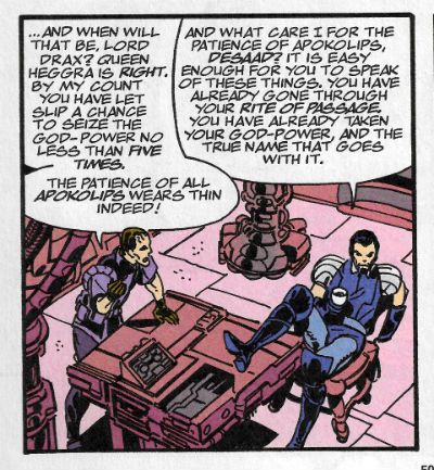
In 1997 John Byrne started vigorously emitting issues of a series entitled Jack Kirby’s Fourth World. This was a dream come true; for John Byrne anyway. I’m not saying John Byrne seems to have an unhealthy fixation with bettering Jack Kirby but it wouldn’t surprise me if he was often mistaken in the street for a 1975 John Huston movie adapted from the works of Rudyard Kipling and starring Sean Connery, Michael Caine and Christopher Plummer. Phew! While John Byrne’s no Jack Kirby (who is? No one.) he’s very definitely John Byrne, and John Byrne is a talented man in his own right. So there’s a certain level of fascination in watching him get stuck into Kirby’s mythology. And then fascination turns to dismay as you realise he is actually stuck in Kirby’s mythos. While (I assume) the main stories in his series progressed Kirby’s mythos what we have here are the back-ups and these are more concerned with regressing and filling in the background to The Fourth World. John Byrne, sadly, suffers from Roy Thomas Disease and so that goes someway to explaining why he backfills the backstory of Scott Free, Metron and The Forever People for example, but only a truly unnerving level of hubris can explain the fact that John Byrne gave Darkseid an origin.

 photo ByrneTalkB_zps15dbc2bd.jpg TALES OF THE NEW GODS by John Byrne & Noelle Giddings

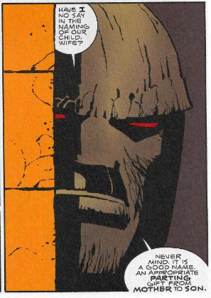
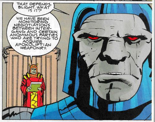
As origins for Darkseid go it’s not bad; there’s even a surprise - it turns out to be someone else’s origin too. Unfortunately, and fundamentally, I don’t think Darkseid needed an origin. I think Darkseid works better as a granite faced mini-skirted embodiment of the fascistic darkness ready to pounce when civilisation becomes complacent. Which, to be fair, none of which Byrne has changed, but after reading his origin the looming brute is forever after diminished by the thought of the henpecked sneak he came from. What’s important is (simply) that Darkseid IS not (convolutedly) who Darkseid was. Whether by design, sheer forward momentum, or a fortuitous combination of the two, Kirby left loads of spaces both within and around the Fourth World; spaces for the imagination of his readers to fill. Kirby’s creations invited reader participation because Kirby believed indiscriminately in imagination. John Byrne also believes in imagination, but only in his. Again and again, with a fixity of purpose that stifles any imaginative flex Byrne returns to the spaces within Kirby’s stories and starts filling them in, like graves.

 photo CollageB_zps49764de1.jpg TALES OF THE NEW GODS by John Byrne & Noelle Giddings

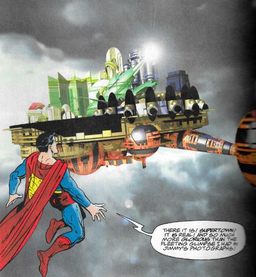
Of course Kirby would also go back, when able, to show what was past. But when he did it we got The Pact; when he did it they were revelations not explanations. Kirby’s additions opened up his narrative, Byrne’s additions all feel like a door has been slammed shut somewhere. As Byrne’s pages pass there’s a sense of narrative claustrophobia as the characters, characters who more than most characters should have access to the infinite, run out of room, they risk becoming entombed in their own narrative. Visually this impression is also, unfortunately, true; great wodges of stilted and circumlocutious dialogue hem his figures into his badly planned panels with dismaying frequency. Which is a shame because I like John Byrne’s art here, when I can see it. It has an appealingly loose and impromptu aspect which invests it with more energy than can be entirely stifled by the narrative slog it inhabits. Sometimes Byrne will surprise, with the early Apokolips scenes being visually lively, or by drawing more birds in the sky during the old timey scenes, which feels right (I don’t know, I wasn’t there). Then he’ll dismay with a character called Francine Goodbody, and the sudden threat of John Byrne penning some period sauce about dirty earls and bosomy maids turns your ears scarlet with dismay. Byrne's fatal miscalculation is to let Walter Simonson provide one of the backups, whereupon Simonson shows how it should be done. Thanks to a lightness of touch and his usual impeccable storytelling wizardry Simonson explains how Kanto came to dress like a Borgia in tale which is both hilariously obvious and melodramatically arresting. It’s a bit of a shame really as Byrne’s clearly into this stuff. He even goes so far as to update the Kirby collage technique with a couple of images combining his drawn figures with CGI of the time. By the end of this section though we have found a talent capable of invigorating Kirby’s mythos anew. Unfortunately it wasn’t John Byrne. OKAY!

 photo SimonsonB_zps8dc11d13.jpg TALES OF THE NEW GODS by Walter Simonson, John Workman & Noelle Giddings

Orion #3-4, #6-8, #10, #12, #15, #18-19. (Pages 148 - 207)

No, in a bitter twist worthy of The Source itself , it was Walter Simonson! In 2000 Walter Simonson began his Orion series. This focused on the angry pup of Darkseid while also flopping happily about in the wider Fourth World concepts. As is usual in Comics quality had nothing to do with sales and it ended in 2002. Taking his cue from Byrne’s series there was a main strip and then a backup. I guess Walter Simonson is a lot more amenable than John Byrne because a cavalcade of comics creators muck in to help him out on them. I know because I typed all their names in up there. That’s my free time that is; you’re very welcome. Rather than the main strips then it is these backups which are presented here. Unfortunately while Simonson made the more sensible decision to have his backups inform and augment events in the main strip rather than compete directly with the King, that does mean that reading them here, divorced from their original context can be less than satisfying.

 photo CampbellB_zps7740a955.jpg TALES OF THE NEW GODS by Eddie Campbell, Walter Simonson, Pete Mullins, John Workman & Tatjana Wood

Some stand alone and read well such as Frank Miller’s typically, and appropriately, brutally drawn birth of Orion which, again opens up rather than closes off story possibilities. The John Paul Leon strip is his usual wonderful balancing act between extremities of light and dark with a script by Kevin McCarthy which is a nice bit of business about fathers, sons, and the place of art under Darkseid (beneath his boot). Mostly though they are just a bit of fun where you enjoy the performance as much as the story. Howard Victor Chaykin characteristically provides pages involving a blue skinned sexy lady which involve domination, badinage and a messy ending. Of most interest there is the crucial part Ken Bruzenak’s letters play in deciphering the climax and the way the printing serves Chaykin so poorly that the climax has to be deciphered. Otherwise Eddie Campbell draws Darkseid, Arthur Adams channels Jean Giraud and, well, it’s just nice seeing most of these folk having fun. There’s a whole two duffers which isn’t bad by any stretch. Liefeld & Loeb remain inept and as much love as I have for the work of Steve Ditko either he isn’t really trying here or the thick inks by Mick Gray destroy any of his signature fluidity. In fact the best bit of this final (previously unpublished!) strip is that Ditko is teamed up with Mark Millar. Pairing someone as ideologically resolute as Steve Ditko with, well, Mark Millar is a black joke worthy of Darkseid his bad self.  Overall this section Is VERY GOOD! which by my calculations makes the whole book - GOOD!

(NOTE: But the whole Simonson Orion run is shortly to be released by DC as an Omnibus. Knowhumsayin’? Because that thing will be fat with - COMICS!!!)

“I Am The Storm...Returned From The Grave.” COMICS! Sometimes I See How Writing A Bit More Off The Cuff Works Out For Us All!

Ugh, January. Anway, I had a quiet hour or two so here's a couple of comics I liked in 2014 that I thought didn't get enough play. I'll just rectify that then...  photo StarPanelB_zps6202a7e4.jpg Starslammers by Simonson, Workman & Ory

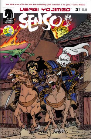
Anyway, this... USAGI YOJIMBO: SENSO Illustrated by Stan Sakai Written by Stan Sakai Cover Colours by Tom Luth Dark Horse Comics, $3.99 each (2014) Usagi Yojimbo created by Stan Sakai

 photo UsagiCovB_zpsbbd2c70b.jpg

According to the yellow circle on the cover of each issue 2014 marked 30 years of Stan Sakai's comics featuring his titular samurai (sigh, okay; ronin) character. I would dearly love to bluff my way through this piece by pretending I was there at the start and remained a constant reader through the decades separating the character's first appearance in Albedo Anthropomorphics in 1984 and this 2014 limited series. Alas, for most of its publishing history I thought Usagi Yojimbo was one of those crappy B&W “funny” animal comics that boomed and busted back then. Burnt once by a purchase of Adolescent Radioactive Black Belt Hamsters I remained shy upon every later encounter with Usagi Yojimbo. Mysteriously, about three years back, I started buying Usagi Yojimbo. I can't remember why so this anecdote isn't terribly thrilling (let's pretend the fate of the free world hung in the balance) but the fact is I did, and I haven't stopped buying it since.

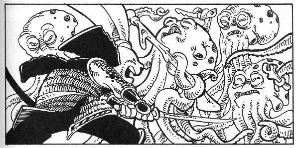
 photo UsagiPanelB_zps07bdd163.jpg Usagi Yojimbo: Senso by Stan Sakai

Well, except for that brief period when Stan Sakai stopped making it to work on 47 Ronin (still samurai, but humans this time). With Usagi Yojimbo:Senso Usagi bounds back in a series set 20 years ahead of the regular series and with an atypically S-F slant. It's an odd move to be sure but it's working. In issue 4 Geoff “Shaolin Cowboy” Darrow writes in to compliment them on their paper stock. That's how well crafted this comic is – Geoff Darrow(!) is so excited about the paper its printed on he is moved to set pen to paper. It isn't just the paper Usagi Yojimbo: Senso is printed on though. Basically, Usagi Yojimbo: Senso works because Usagi Yojimbo always works. For me, anyway, and, chances are high, it works for everybody if they give it a go. The great thing about Usgai Yojimbo is it is at once for all ages (this does not just mean children) and is so beautifully crafted that every fresh episode seems as timeless as a legend. VERY GOOD!

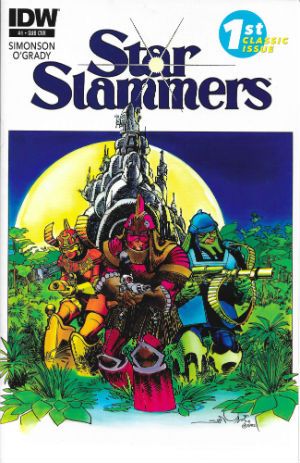
STARSLAMMERS #1-8 Illustrated by Walter Simonson Written by Walter Simonson Colours by Len O'Grady (Colours in issues 1-3 based on original colouring by Walter & Louise Simonson) Lettered by John Workman Cover colours by Romulo Fajardo and Richard Ory IDW, $3.99 each (2014) Starslammers created by Walter Simonson

 photo StarCovB_zps35fb1066.jpg

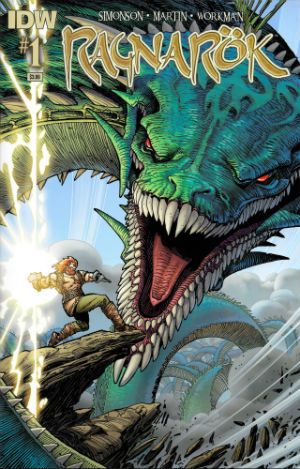
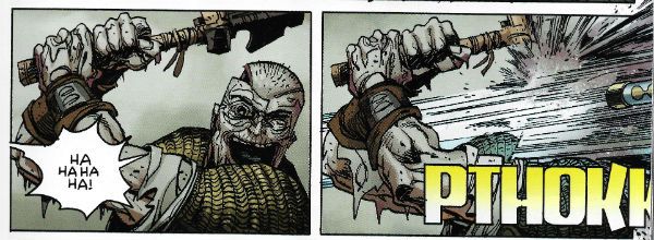
RAGNAROK #1 – 3 Illustrated by Walter Simonson Written by Walter Simonson Coloured by Laura Martin Lettered by John Workman IDW, $3.99 each (2014) Ragnarok created by Walter Simonson

 photo RagnCovB_zps1a1a3c36.jpg

In June of 2014, after giving his handlers the slip, Howard Victor Chaykin appeared at Special Edition: NYC where he said many things which were true and beautiful. The truest and most beautiful thing his louche larynx exclaimed was, “The only man of my generation that's still producing work that's not a parody of itself is Walter Simonson. Simonson's doing amazing work.” In 2014 Ragnarok proved this to be as true as a very true thing indeed. Also earlier in that same year Starslammers reminded us that Simonson had been doing amazing work for so long that that very longevity was kind of amazing in and of itself. It shouldn't have been a surprise since he never went away but, well, welcome to Comics - where Brian Bendis is taken seriously and Walter Simonson is taken for granted. (Comics – it's a visual medium. Write it down somewhere. Jesus.) For its first three issues Starslammers reformatted and reprinted the Starslammers 1984 Marvel Graphic Novel. The level of skill already present in this “old” work proved to be ridiculously ostentatious. Even back then Simonson had such a sure grip on pacing and truly cinematic presentation he ran the risk of leaving bruises behind. Also present, even back then, was John Workman's lettering; lettering so awesomely complementary that it became an inseparable and essential element of the stunning visuals on display. The remaining issues of the 2014 series re-presented the 1995 Malibu/Bravura Starslammers series.

 photo RagnPanelB_zps7837161e.jpg Ragnarok by Simonson, Workman & Martin

This was the first time the full series had seen print and so the rejoicing in my tiny head was loud indeed. This later material proved Simonson hadn't lost any of his magic but had learned a few new spells as well. Simonson's work now flirted so hard with abstraction his ability to refrain from tumbling into incoherence was stunning. With Starslammers it might be an exaggeration to say that there was a lesson in comic art on every page but by the time Ragnarok rolled around such a statement was probably, if anything, selling Simonson and Workman short. Sure, Simonson's stories are fun, solid and entertaining genre stuff, but, in truth, I read his comics for the storytelling. There may well come a time when the old Gods die but, ironically, Ragnarok proved that time isn't here yet. VERY GOOD!

Basically I liked 'em because if either of those series were anything they were very definitely – COMICS!!!

"BIG..! I'm Telling You...The Sonuvabitch is HUGE!" COMICS! Sometimes They Are Extravagant!

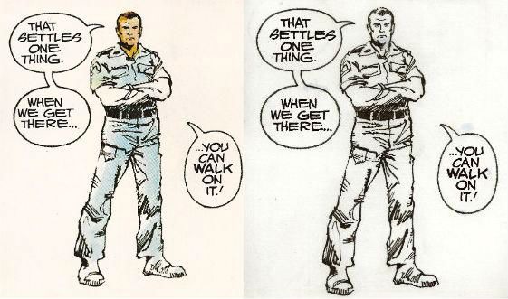
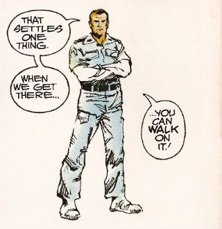
Like Ripley going back for that damn cat I go back to ALIEN THE ILLUSTRATED STORY. This time it's so big Ash could very well be right and, yes, you could probably walk on it! Photobucket

No it isn't PLANET OF THE APES WEEKLY. Well spotted. This week I learned two things: 1) Never say what you are going to look at next because Life will unleash a horde of flying monkeys right at your face and turn you into a big fat liar. 2) In the words of Beat-Cop Brian Hibbs "Always have a throw-down piece." That would be this. But hey, I didn't actually say POTA would start this week...so I also learned 3) Just in, I have also learned I will wheedle.

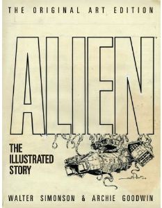
ALIEN THE ILLUSTRATED STORY (THE ORIGINAL ART EDITION)

Photobucket

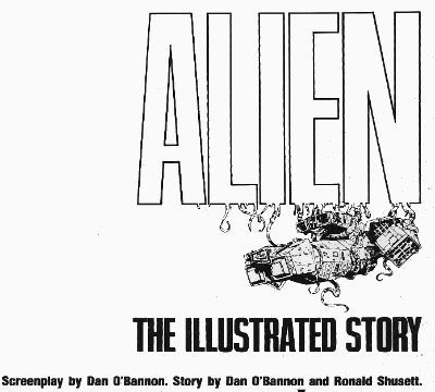
Art by Walter Simonson Scripted by Archie Goodwin Lettered by John Workman Based on the original screenplay ALIEN by Dan O'Bannon & Ronald Shusett And the motion picture directed by Ridley Scott Titan Books, 35.1 x 2.5 x 50.5 cm, 96 pp (2012) $75.00 US $85.00 Can £54.99 UK

"We did not try to replicate the film, an impossible task. Instead, we tried to create a graphic novel that would stand on its own merits." Walter Simonson (2012)

Walter Simonson there reminiscing about his and Archie Goodwin & John Workman's 1979 Heavy Metal adaptation of the motion picture presentation ALIEN. When we were all that bit younger and fleet of foot I went on about it a bit HERE. (Spoiler: It was VERY GOOD!) If you want to buy a nice shiny version of thatbook Titan just republished it a couple of weeks ago. (Bodacious Ben Lipman popped up in the comments to say: "I bought the cheaper Titan edition a few weeks back, and I don’t believe it has the interviews or behind-the-scenes bits and bobs mentioned in your review – it’s all comic!" So I have altered the following bit.) Here as well as the original (still innovative) adaptation you'll get Goodwin's script with Simonson's annotations, two pages of try-outs (once in B&W and once in colour) and a comprehensive and good natured interview with both Simonson and Workman conducted by J P Rutter. Of even more importance though, in this version, the version I splashed the cash on, you get all those and you get the art reproduced from the original artboards.

Turns out art boards are big.

Turns out art board books are big and pricey.

Yeah, about that. I bought this book because it is a great book but I bought this version because it is probably the only chance I'll get to grab one of these Original Artboards books. The IDW (to which this bears great, ahem, similarities) books are things of great joy and Satanic temptation but ultimately it's not the best idea to  spend what you haven't got (as Western economies found out recently). That's not to say that the IDW books are unreasonably priced for what you get (by all accounts you get wonders) but they are out of my reach. Thanks to a deep pre-order discount and a deal with Satanzon I could just get my needy fingers on this one. Just in case anyone thought I was Richie fucking Rich or got comps.  I'm not, I don't, and yet I still bought this ostentatious thing. It didn't disappoint.

While most of your time will be spent staring at the wonderful (i.e. full of wonders) art, art which is still instructive about how to make comics some thirty three years later, the value of the accompanying interview must be stressed. No empty glad handing back slapping celebration of how simply marvellous all involved were is this. No, although all involved probably deserve it in this case. It is in fact highly educational about how the book was put together.

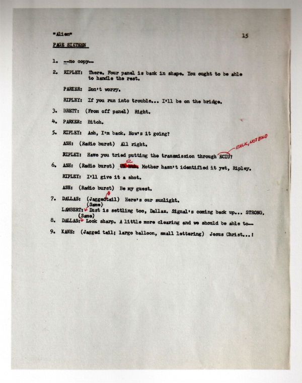
Look, here's a page of the script:

Photobucket

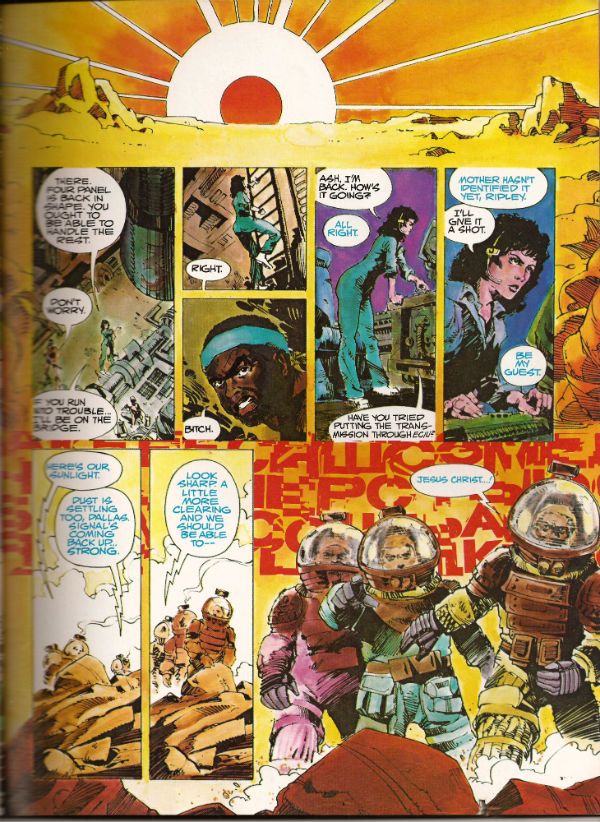
Now, here's the scripted page in its drawn and published form:

Photobucket

Alone these could be taken as yet another example of how the writer gets the artist to do all the work. In the interview it becomes clear how closely Goodwin, Simonson and Workman involved. It was the kind of mental cross pollination that isn't ever going to be adequately documented except in the form of an interview. Where the more abstract and elusive contributions of the creators, contributions that leave no physical evidence, can at least be acknowledged in the approximate, but permanent, form of words. Rutter's done a fantastic job on the interview is what I'm saying. It helps that he has two subjects as cuddly as Walter Simonson and John Workman (Archie Goodwin died in 1998 and so was unable to attend). Both men are self effacing but aware of the work's value and so able to discuss its fascinating creation in a way which is both informative and engaging.

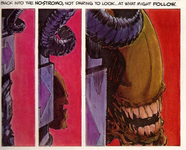
It's through the interview that the names of the people who actually coloured the book are revealed.  So, a belated big happy shout out to Louise Jones (later Louise Simonson), Polly Law and Deb Pedlar for the bulk of the colour work herein. Except it isn't herein as this one is the uncoloured art from the original art boards. Irony in action there. Most people who buy the book will have a copy of the coloured version so they can have some fun comparing and contrasting and fully appreciating the impact the colour brought to the work. I've had to use a scanner to provide examples but with two copies of the book, steady hands and your own eyes this effect can be replicated at will:

Photobucket

Photobucket

Sometimes they do the comparison for you:

Photobucket

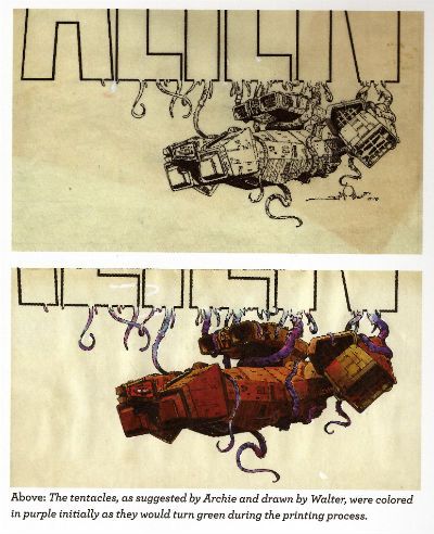
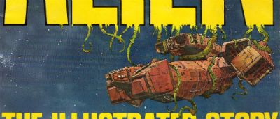
But you still need to get another copy to look at the original cover, then you've got the final piece of the puzzle. (Hey, purple becomes green - I did not know that!):

Photobucket

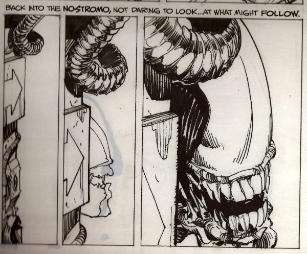
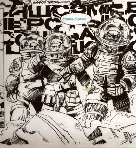
When I was doing the script/final page comparison I tried to scan in the original art page just to get that middle step in but that was seriously not a thing that was going to happen. Look, I'm just a sour old man sat in his kitchen with a scanner that can just fit a normal comic without technical hilarity ensuing. I'm not a 21st Century publishing house. So, in lieu of that please accept, as a token indication of the original art involved, a reproduction of the final panel of that page:

Photobucket

There are two things I really like about having that panel:

1) I can now tell that Simonson drew distorted shapes in the helmets behind the characters' heads to represent the letters of the SFX behind them. He has visually indicated the distortion the (already bizarre) noise is subject to by passing through the medium of the helmets. I don't think that extra attention to detail is apparent in the published piece. SIMONSON!

2) The stains!

Were I to spend £54.99 on a book only for someone to spill coffee on it I can assure you there would be raised voices and the very real possibility of awkward man-dancing resulting in at least a torn cardigan and at worst a grazed knuckle or two. Shouty violence of a singularly inept and middle-aged stripe would be on the cards. I'd react badly is what I'm saying. And yet...and yet...I have just spent £54.99 (well, not really £54.99...) on a book and I am pleased as punch to find a reproduction of the 33 year old spillage from one of Simonson's cawwfee cups defacing it. I mean, it isn't even the real stain. But, in my defence, it is a stain reproduced from the original artboards!

It was a massive amount of fun looking at this massive book and comparing it with the original, reading the interview, matching the script to the original art and then to the published work etc. But I am not unaware that it was also massivley expensive fun. If you've got the cash to hand it is an eye opening, beautifully produced experience. Particularly so for non comics makers, for such as them (i.e. such as me) who'll probably get no closer to the process than this I'm going to say this was EXCELLENT!

If you just want to read a really good comic adaptation of the movie ALIEN stick to the normal tpb (£10.99 UK). This one is for the professionals, the would-be professionals and the untalented nutters like me who just really, really like COMICS!!!

NEXT TIME: Who the Hell knows (lesson learned.)

"I Admire Its PURITY." Comics! Sometimes They Are A Bit Like Films (ALIEN)!

Photobucket (Or: Never Put an Englishman called Kane in charge.)

Photobucket ALIEN: THE ILLUSTRATED STORY Art by Walter Simonson (b.1946) Words by Archie Goodwin (1937 - 1998) Lettered by John Workman (b.1950) Based on 20th Century Fox's science fiction hit, ALIEN (Heavy Metal Futura Publications, £2.50, 1979)

1. "It's Not Our Sysyem..." or I Start Talking.

It's only a slim volume this, a hair over 6o pages so the team have it all on to pack in the 117 movie minutes. In fact it's a ridiculously small amount of space but the bizarre thing is that they have any space at all. Why a comic adaptation of a film in 1979 of all years?  STAR WARS is why. Just as STAR WARS' mind damaging box-office success is the reason ALIEN was green-lit so was STAR WARS the reason for the existence of a comics adaptation. The comics adaptation of STAR WARS was very, very, very successful (alas, this had nothing to do with the fact that the world had woken up to the magic of Howard Victor Chaykin). Also the people working on ALIEN were pretty comics savvy and were familiar with HEAVY METAL (Ridley Scott has described his storyboards as being very "Moebius"). So that's why a comic and that's why a comic by HEAVY METAL.

Photobucket

ALIEN:THE ILLUSTRATED STORY(A:TIS) was intendended to spearhead a series of movie adaptations that would be serialised in HEAVY METAL and then collected. I don't know how many others were produced but I know there was the Veitch/Bissette 1941 adaptation (way better than the inert film) and Steranko's OUTLAND (like getting Picasso to adapt BEN10). This latter has never been collected in English so I guess the run of adaptations fizzled out pretty quickly. The then Art Director at HEAVY METAL John Workman was tasked with bringing the ALIEN adaptation to term and rang Carmine Infantino with the intention of having Infantino do pencils and Simonson do the inks.  Infantino's phone was busy so Workman rang Simonson and by the end of the call Simonson had smooth talked his way into doing the whole job. Simonson had the very bright idea of roping in editor par excellence Archie Goodwin for the non-pictorial tasks. It was one sweet team thus assembled and the results were the first comic to squat on the New York Times bestseller list and, even better, remain there for 7 weeks.

Photobucket

It's important to remember that A:TIS  is an adaptation not a replication. Some dialogue you may be familiar with is missing some you might not recognise is present. It's a little hard at this date to actually remember what dialogue is actually in the film what with Scott's incessant tinkering. As regards the 1979 original version there are, I assure you, textual differences. This is because Simonson & Goodwin (S&G) had access to 3 drafts of the script and used these to piece together a narrative they found most satisfying to the comics presentation. From the ground up the piece was built with its format in mind. They had also seen a cut of the film and had access to an abundance of stills so the book's visuals are clearly sourced on the cinematic offering. Not being composed of pure tedium S&G don't do a lumpen shot for shot representation so the familiarity with the settings/costumes etc. allow them to vamp some stuff and use unusual POVs without losing the visual consistency afforded by the production's tip-top designs. S&G don't have to design anything because it's all been done for them by Ron Cobb (ship interiors), Cris Foss (ship exteriors), Moebius (spacesuits) and H.R. Giger (alien stuff). They can just concentrate on designing the comic. And design it they do. Rather than go through the whole thing page by page which would break even the strongest reader's spirit I will now briefly alight on a few instances I find pleasing to mine eye.

2. "Oh, I Feel Dead." or (Slow) Motion.

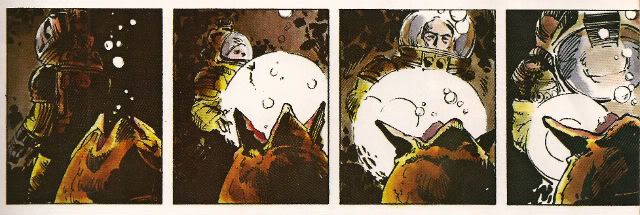
ALIEN the movie opens with a languorously paced sequence in which a strange transmission is received and the Nostromo's crew are awakened from hyper-sleep. This takes quite a bit of screen time but the comic doesn't have the same luxury in terms of space (using a shorthand of time=pages). What S&G do is pretty neat. They go to the opposite extreme and slow the scene down further. You could call it decompression even but it's a strange kind of decompression. They counterintuitively concentrate on the opening of a single eye to both illustrate the process of waking and set the tempo for the scene they are illustrating. Witness the four panels given over to Kane's eye opening:

Photobucket

This effectively sets the sluggish pace for the happenings depicted on the page and cues us in that the others will be waking equally slowly, because this is a slow process. It's a bold move to use so much of the sparse space available on so few seconds of screen time. Bold but effective as the sequence is emblematic of the waking process as a whole. The visual decompression acts a form of compression with regard to the content.

There then follows a depiction of Kane brewing up for his colleagues. I like this sequence because it shows the intelligence behind S&G's choices, because as in any adaptation choices have to be made. This takes up quite a lot of space, relatively speaking anyway. It is after all just a man brewing up which is precisely the kind of mundane task that you might think could be jettisoned

Photobucket

from the narrative without any loss being felt. But S&G recognise it is important in its very mundanity. When you wake up, you have a coffee. Even in space. It's a recognition of the crucial interplay of the familiar and the unfamiliar which anchor the film and allow for the later excesses to be accommodated without a break in the suspension of disbelief. Also, a lot more is happening in those panels than those of the preceding waking sequence. Note the single panel of the steaming cups indicating the repetition of the task without the need to actually repeat the other panels. The density of the panels indicate the pace is picking up compared to the sleepy start. With Kane's salutation the reader effectively receives a signal that the plot is now in motion.

3. "It Doesn't Look Like An S.O.S." or Sounds Without Sound.

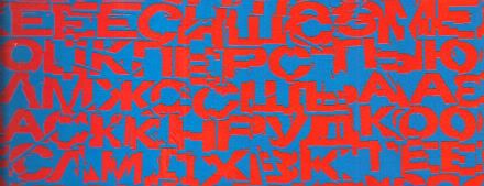
The movie uses sound design beautifully to evoke the otherness of certain occurrences such as the meaty phlop of the egg flaps opening or the screech of the skedadilling chest burster. Naturally the mute medium of  comics can do little but suggest these; usually through distortions in the lettering. With A:TIS S&G demonstrate that the power of suggestion can be surprisingly powerful. They attempt to replicate the scouring howl of the howling distress/warning transmission by choosing the most godawful combination of text and background colours known to reading beings. That's no accident. It's supposed to be perturbing. It'd be hard to make text anymore unsettling than engineering it to actually move around in a queasy manner at the slightest variation in your gaze. The fracturing of the letter shapes and the vibrating effect of the colour combination rattle the reader's gaze in a really quite clever manner.

Photobucket

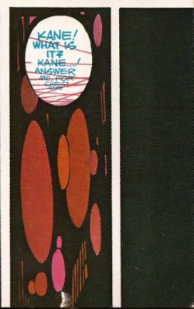
Unable to replicate the staticky crackle and insistent hiss of communication over comm-channels the decision was made to colour such speech blue. This doesn't actually communicate the texture of the noise but it does at least imply a difference in the sound emitted by the characters and the  sounds emitted by the technology around them. It would be hard for a non comics-savvy reader to parse the panel below without the visual cue of the colours. But because the rules of the text/colour device have been set up clearly in the earlier pages any reader would know that Brett and Parker were not hallucinating but hearing a comm transmission from someone not pictured in the scene.

Photobucket

4. "Open The Door!" or It's Constraining Men (and Two Women).

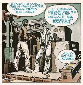
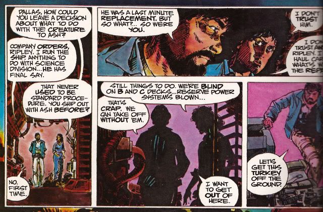
A key element in the tension that underscores the movie is the pervasive sense of claustrophobia.  The physical environment aids the film makers here with the sets being fixed and the ceilings having been lowered by some four feet to create a physically oppressive reality in which the action unfolds. Archie Goodwin was responsible for the placement of the balloons on the page while Workman lettered within them. Goodwin was an excellent editor and his positioning of the balloons suggests the presence of some considered intention. Now while it's possible to argue that the density of the speech is a result of the space limitations it's also possible to argue that the placement of the balloons is used to hem in the figures to create an additional level of constriction.

Photobucket

The words on the page are read as equally physical and present as the drawn environment in which the action occurs.The characters are doubly restricted by the ship drawn around around them with all its clutter and shadows and the very words they are speaking.

5. "All Other Priorities Rescinded." or Toeing The Company Line.

There are very few instances where this atmosphere of restriction are alleviated but there is a particularly jarring one which is used in the service of both characterisation and foreshadowing. There are some things a film can do which it is impossible to reproduce on the page. Crucially these include the incredibly convincing performances of all the actors involved. These are some good performances right there. There's no way via words and pictures to fully convey the shrill flakiness of Lambert (Veronica Cartwright), the passive-aggressive sniping of Brett and Parker (Harry Dean Stanton & Yaphet Kotto), the chafing enthusiasm of Kane (John Hurt), the fake-matiness of Ash (Ian Holm), the eroding confidence of Dallas (Tom Skerritt) and the uncertain certainty of Ripley (Sigourney Weaver). I can't believe even the best comic writer and the best comic artist could do more than approximate the fusion of emotional flavours in Weaver's reading of the simple line, "Micro changes in air density, my ass." I only point out this 'failure' so I can concentrate on the work's successes because Simonson & Goodwin do achieve some fantastic successes here. One of them is this:

Photobucket

During the film Ian Holm is able to subtly suggest Ash's oddness with a series of brief bizaritties that verge on the subliminal; his little standing jog, the intermittent twitchy moues and his inflexibly diagnostic gaze during the 'birth' sequence for example. It's a subtle string of hints and tics that build towards his character's revelatory scene. S&G don't have room for that but they get one good shot in with the above panel. From the stance to the complete nullity of the background they manage to communicate that as far as Ash is concerned only he exists and has any real import. Nothing around him matters, particularly not his crew-mates. He's the perfect Company Man. And like all Company Men he isn't really a man at all. Um, spoiler?

6. "It's Got A Wonderful Defense Mechanism. You Don't Dare Kill It." or (Quick) Motion.

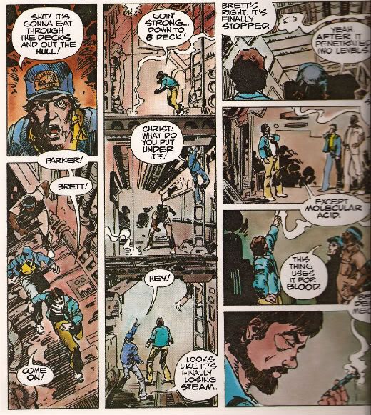
Punctuating the unhurried pacing of the film like a steel toothed phallus piercing a Brit thesp's chest are scenes of abruptly frantic action. One of the earliest of these occurs when the crew discover that the xenomorph sat on Kane's face has a charming defense mechanism in the form of acid for blood. S&G don't have a physical set they can hurtle through with a soundtrack and editing enhancing the action but they have a good go nevertheless.

Photobucket

The page itself is pressed into service as the film set with the panel breaks and gutters providing the editing. The eye has to travel from the top of the first column to the base then in the gutter it moves swiftly to the top of the second vertical which is interrupted by the in-panel floor levels suggesting "soft" breaks in the page which the eye lingers on but less so than "hard" white breaks. The speed of the gaze downwards is thus increased but not actually interrupted before zipping back up via the gutter again to the top of the third vertical where the division into four panels by "hard" breaks cause the gaze to slow before halting on the final panel. Reading the sequence the eye really covers some ground and together with the diminishing pace this adroitly captures the essence of the scene.

7. "Now, This Air-Shaft May Work To Our Advantage." or The Suspense of Uncertainty.

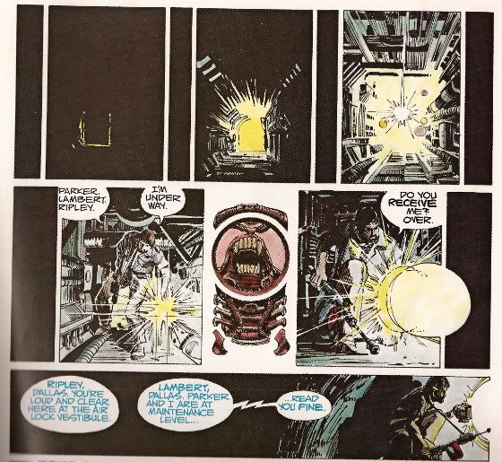
The sequence where Dallas scurries around in the guts of the ship in pursuit of the Alien is also rendered effectively despite the static nature of the form although here the techniques are a little more ambiguous. Purposefully so, I'd say. In the top layer we are adopting the POV of something other than Dallas, its uncertain whether we are seeing things from the Alien viewpoint or just a non specific POV. Then there are the thin vertical panels breaking up the larger images. Are these the Alien's POV? The increasingly illuminated panels interrupting these flat blacks indicate Dallas' imminent arrival.  When Dallas reaches our POV the interruption changes from black to a blare of white dominated by a bizarre image. It's clearly related to the Alien but is it the Alien reflected in Dallas' lamp lens? Is it the Alien sheltering in some comfy duct now the light has invaded its previously dark nest? Dallas forges on to the outer edge of the last horizontal panel but behind him there is darkness.

Photobucket

In fact there's an uncomfortable amount of darkness behind him, more than there is light in front; is that to indicate how far he's come or to indicate that now there is something behind him? The whole sequence depicts Dallas nearing our POV on the top layer, arriving at that POV in the middle layer and then moving away again in the final lower panel. There's a definite sense that what he was heading towards is now behind him. Something happened in there, the exact nature of which is imprecise but the implication is it isn't going to be good. There's just something really creepy and suspenseful about the whole thing which is perfectly appropriate and the uncertainty of it all exacerbates this.

8. "I Wanna Go Home And Party" or Hurray, I Shut up!

Yeah, sure, despite all this craft, talent and enthusiasm A:TIS never once manages to replace the audio-visual thrill of the film itself. But this would be an expectation held only by someone possessing an excess of optimism or a shortage of sense. It does however provided a surprisingly innovative comics experience. One that's still fresh and surprising on a technique level some three decades later. As I say I've just highlighted some of my favourite parts. There's plenty of other stuff on the pages such as Simonson's occasional use of organic bio-form borders, the use of splash pages at moments when they are most useful and even one page that is composed entirely of colour elements with no line work. This all sounds positivley innovative and challenging particularly as the modern tendency would surely be to to slap verbatim dialogue on unvaryingly widescreen panels. And, yes, if you break down the techniques on show they are quite complex but this complexity is  used entirely in the service of transparency of meaning. While Simonson has claimed that the book was accompanying a hit movie accounts for its unprecedented success it wouldn't be too outlandish to think that the high quality and accessibility of the end product itself might not have helped as well. ALIEN: THE ILLUSTRATED STORY is, after all, VERY GOOD!

Note: ALIEN: THE ILLUSTRATED STORY is due to be reprinted in May 2012.

Acknowledgements: If any facts have made it into this waffle that is due purely to the following sources: MODERN MASTERS: WALTER SIMONSON (TwoMorrows, 2006) THE ALIEN ANTHOLOGY (20th Century Fox, 2010 (Blu-Ray))

Photobucket Have a good weekend, all, and remember to read some COMICS!!!

"Clod. I Have WEAPONS..." Comics! Sometimes They Are Almost Fresh!

It's a post about comics! Is it early? Is it late? Time is in flux!Only if one man can face his Pull List can The Balance be restored!

One Man. One Pull List. There will be Words... (...probably the wrong ones). Photobucket
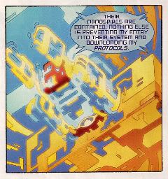
ACTION COMICS #6 “When Superman Learned To Fly” by By Andy Kubert/John Dell(a), Grant Morrison(w), Brad Anderson(c) and Patrick Brosseau(l) and “Last Day” by Chriscross(a), Sholly Fish(w), Jose Vallarubia(c) and Carlos M. Mangual(l) (DC Comics, $3.99) Superman created by Jerry Siegel and Joe Shuster.
Photobucket

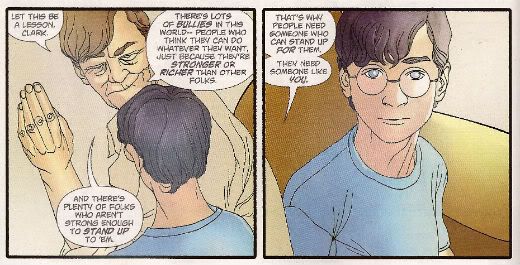
 I like that stuff in my comics but I'm not unaware that in real life that kind of thinking gets you killed.

While there could be said to be many faults with the lead story in this issue such as an apparent attempt to distract from a lack of clarity (or indeed even sense) with a belligerently unslackening pace and art that once again belies Andy Kubert's alleged superstar status it remains a fact that in this story Superman's enemies conduct an auction for Kryptonite within Superman's own brain (physically, literally within Superman's own brain) and Superman uses his own Kryptonite poisoned body as a battery to save his both his own sentient ship and the day entire. Yes, Superman's enemies conduct an auction for Kryptonite within Superman's own brain (physically, literally within Superman's own brain) and Superman uses his own Kryptonite poisoned body as a battery to save his both his own sentient ship and the day entire. That's Superman comics enough for me!

The backup is the kind of sweet and tender emotional snapshot of a transitional moment in life that anyone under forty will treat as though it were sentient dog-muck hellbent on French kissing them; that's okay because I enjoyed it enough for y'all! Yup, ACTION COMICS was GOOD!

 STATUS: REMAINS ON THE LIST!


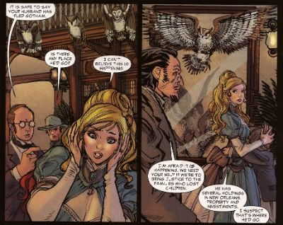
ALL-STAR WESTERN #6 “Beneath The Bat-Cave” by Moritat(a), Justin Gray & Jimmy Palmiotti(w), Gabriel Bautista(c) and Rob Leigh(l) and “The Barbary Ghost Part 3” by Phil Winslade(a), Justin Gray & Jimmy Palmiotti(w), Dominic Regan(c) and Rob Leigh(l) (DC Comics, $3.99) Jonah Hex created by John Albano and Tony Dezuniga. The Barbary Ghost created by Gray, Palmiotti and Winslade
Photobucket

Kids! How many owls can you spot!

Thank the Great Spirit! Next issue ol' bacon face is off to N'Orleans! where there will no doubt be "gumbo" galore but at least there won't be anymore shoehorning of Batman references into a book that doesn't need them. A cave beneath Wayne Manor! Filled with Bats! This cretinous continuity reached a kind of hilarious nadir with the sudden slew of references to Owls: because Batman is currently encountering stress of a strigiform stripe by all accounts in the here and now! So we get about two pages in which the characters can barely move around the mansion setting for all the owls dangling, roosting, flopping and just plain flailing around the place. It's as though Moritat has snapped and gone "You want owls? Here! Here are your owls! Got enough owls yet? I don't think so! Owls! Here! Now! In your face! All! Owls! Touch them! Touch my owls! Tell me they're pretty! Owls!" and then gone for a long lie down. Stupid owls. Anyway I'm a little bit partial to Jonah so it was still OKAY!

 STATUS: REMAINS ON THE LIST!

ANIMAL MAN #6 “Tights” by Jean Paul Leon & Travel Foreman/Jeff Huett(a), Jeff Lemire(w), Lovern Kindzierski(c) and Jared K. Fletcher(l) (DC Comics,$2.99) Animal Man created by Dave Wood and Carmine Infantino
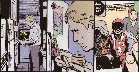
Photobucket

Movie Cliche #23415678: Sad Dad at fridge with beer and photo of son. Collect the set!

Tricky one this. Has Jeff Lemire done a pitch-perfect satire of the vapid screenwriting cliches that have run roughshod over comics beautiful storytelling devices or does he actually believe this is a decent film script made comics? It's hard to tell isn't it. Heck, I don't know maybe you thought it was awesome? Luckily it's easy to tell that Jean Paul Leon is an awesome artist and hopefully one day he will draw comics as awesome as WINTER MEN again. This issue is a complete waste of time and is clearly a fill-in so next issue we should be back to Travel Foreman and his nightmarish body horror.

After I read the previous issue I fell into a light doze and dreamt about a man in a chair. I was holding the man in the chair via the power of some unknown threat. The man was crying and peeling his own skin off his own face with a small knife. I was then forcing him to eat it via the unspoken promise that if he did as I asked he could go free. The fact that the man was eating his own face was terrible but the worst thing was that we both knew I was lying and he wasn't leaving alive. But he had no choice but to do as I asked because that was his only hope. Yes, it's been a trying few months. They say there's nothing as boring as listening to someone else's dreams but they forgot about reading film scripts masquerading as comics which is so boring such comics are EH!

STATUS: REMAINS ON THE LIST (BUT WATCH IT)!


BATWOMAN#6 “To Drown The World - Part One” by Amy Reeder/Rob Hunter/Richard Friend(a) J.H. Williams III & W. Haden Blackman(w), Guy Major(c) and Todd Klein(l) (DC Comics,$2.99) Batwoman created by Bob Kane and Sheldon Moldoff (modern version by Greg Rucka and Alex Ross).
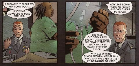
Photobucket

"Given the state of your medical insurance talking's about all you can afford so knock yourself out is my advice."

Wuh-hoof! That's certainly a change in artist alright. I'll stick it out for a bit because I always like people to get a fair shake of the critic stick. Initially I'm not  finding myself a fan of Reeder's thin line but I appreciate her attempts to step up her layouts. Given the writing is competent at best (actually that's a compliment in today's world o'comics) Reeder's got it all on her to raise this one up from EH!

STATUS: REMAINS ON THE LIST (FOR NOW!)

DAREDEVIL #9 By Paolo Rivera/Joe Rivera(a), Mark Waid(w), Javier Rodriguez(c) and VC’s Joe Caramagna(c) (Marvel Comics, $2.99) Daredevil created by Bill Everett and Stan Lee.
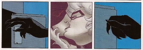
Photobucket

Storytelling in 'Not Dead' shock!

Unless Howard Victor Chaykin has been reactivated without my knowledge I guess this is the only Marvel comic I'm buying. That doesn't seem right, I'll have to check. Anyway, I'm buying this because Mark Waid understands that the bit with the boot is funnier and cleverer because it only takes up one panel. It's because Rivera Jnr and Snr make all kinds of spooky magic happen on these pages. It's because together the team on the book achieve the kind of synergy that results in the storytelling stuff from which the above image is but a sample. Yup, DAREDEVIL is a purchase because it is VERY GOOD!

(Hey, I hear Chris Samnee is coming aboard! I told you all I'd wait for him!)

STATUS: REMAINS ON THE LIST!

DEMON KNIGHTS #6 “The Balance” by Diogenes Neves & Robson Rocha with Oclair Albert(a), Paul Cornell(w), Marcelo Maiolo(c) and Jared K. Fletcher(l)(DC Comics, $2.99) The Demon created by Jack Kirby. Shining Knight originally created by Creig Flessel (modern incarnation created by Simone Bianchi and Grant Morrison). Vandal Savage created by Alfred Bester and Martin Nodell. Madame Xanadu created by Michael William Kaluta.
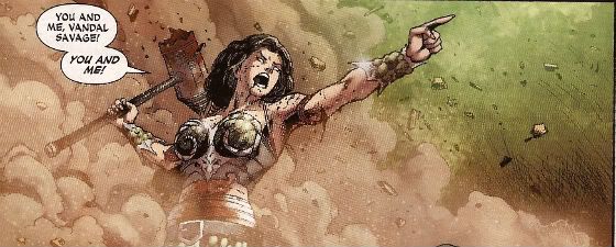
Photobucket

His reply is actually quite funny but I'm still baling.

Nah. I'm done. It just didn't work for me. Which is a shame as it wasn't terrible as such it just never gelled. Way too diffuse and lacking in focus both from a scripting and art standpoint. I mean, how big was this village, where was everything in relation to everything else? But like I say it wasn't terrible and I wish all involved well and hope the book works out further down the line but there are plenty of books I can read that aren't EH! And that's where my money's got to go. It's the Law of The Direct Market; savage and unrestrained!

STATUS: OFF THE LIST!

FATALE Number Two By Ed Brubaker, Sean Phillips and Dave Stewart (Image Comics, $3.50) Fatale created by Ed Brubaker and Sean Phillips.
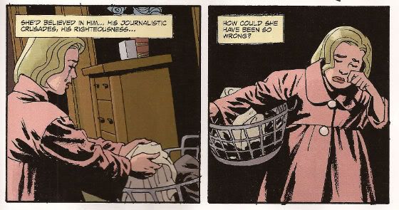
Photobucket

 ...probably because for some odd reason she's drawn to look about 8 years old and acts as subtly as a silent movie siren?

People tend to refer to books by this team as "Brubaker" books don't they? Which is odd as I find Brubaker to be the least of the appeal they hold. I guess it's that whole Cult of The Writer thing or something. Hey now, hang on, I'm not saying Brubaker isn't good. He's got craft/technique/skill/whatever we're calling it now in spades it's just the result is, for me, mostly solid rather than inspired. Except when he gets Meta which is when the wheels start wobbling like they're about to pitch a fit (remember INCOGNITO where working in an office was "like" doing Indie comics but taking to the streets and letting your inner nature run wild was "like" working in the mainstream? Really? Um.). On the whole though I get well crafted genre staples served up with a slight twist but the real pleasure I get from this team's comics is in the form of Phillips and Stewart in conjunction with Brubaker. I'm not going to just roll around showing my belly because it hasn't got capes'n'tights in it, okay?

Here, I guess the High Concept (sigh) is Crime and Horror - together! Like Hope and Cosby! Like Morecambe and Wise! Which is fine because,hey, I like both. I'm not sure they belong smushed together though except as one of those novelty type deals. Y'know, all those Steve Niles things Steve Niles does. I guess Crime fiction tells us about the worst in ourselves and so does Horror fiction; they just use different tools. Using both sets just seems like doubling up and risking the results seeming lesser. Early days though, I mean, look at what porting Horror tropes into Crime did for James Ellroy ($$$$ is what it did, kids. Woof! Woof!). I don't think we're looking at an Ellroy here but we may be looking at an Angel Heart. And that's fine. I got a thing about chickens, Mr. Cyphre; as in I don't like to count them too soon but this one looks GOOD! so far.

STATUS: REMAINS ON THE LIST!

FRANKENSTEIN: AGENT of S.H.A.D.E. #6 “The Siege of S.H.A.D.E. City – Part One” by Alberto Ponticelli(a), Jeff Lemire(w), Jose Villarrubia(c) and Travis Lanham(l) (DC Comics, $2.99) Frankenstein: Agent of S.H.A.D.E created by Doug Mahnke and Grant Morrison (and Mary Shelley).
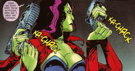
Photobucket

I am always happy to see the word "buffoons"!

There's a bit in this issue that is pretty much a stealth WATCHMEN (by Alan Moore, Dave Gibbons and John Higgins) reference. It's the scene in the 'Nam bar between The Comedian and Doc Manhattan but here with Franky and a red, bald dude who is, basically, Dr. Manhattan and without any pregnant woman shooting or face glassing. That is to say without any of the actual important or troubling content. I'd call that an Omen were I of a credulous nature. Otherwise it's yet another issue of Hellboy in the DCU and which is Okefenokee by me!

STATUS: REMAINS ON THE LIST!


JUSTICE LEAGUE DARK#4 and #5 “In The Dark - Part Four and Finale” by Mikel Janin(a), Peter Milligan(w), Ulises Arreola(c) and Rob Leigh(l) (DC Comics, $2.99ea) John Constantine created by Alan Moore, John Totleben, Rick Veitch and Steve Bissette. Madame Xanadu created by Michael William Kaluta. Deadman created by Arnold Drake and Carmine Infantino. Shade, The Changing Man created by Steve Ditko. Zatanna created by Gardner Fox and Murphy Anderson. Enchantress created by Bob Haney and Howard Purcell. Dove created by Steve Ditko. Mindwarp created by Peter Milligan.
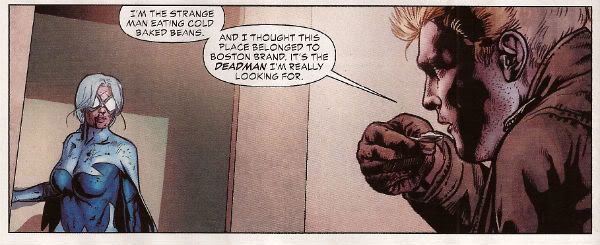
Photobucket

Stealth WATCHMEN reference#2. We get it, DC! You WIN!

I haven't enjoyed this. It's all been a bit like warmed-over '90s Milligan with stuff like "In Nebraska The Pokemon come alive and the screams of the bread-cakes dance like glass-kneed OAPs." Okay, not as warmed-over '90s Milligan as that DEFENDERS#1 preview perhaps but still not terribly inspired. I mean the sheer scale of events would suggest the body count is in the hundreds of thousands not to mention the country-wide trauma involved but there's no sense of any consequences.

No, I didn't like it. I did, however, enjoy Milligan's skeevy interpretation of Deadman. I would totally read a Peter Milligan Deadman series in which Deadman acted like one of those fantastic men who pressure their missus into all kinds of sexual situations that the missus clearly isn't all that into and it's all just about the guy exerting power over her so that's she's eventually roiling around in moral squalor with only the "fact" that he loves her to keep her sane. At which point the hilarious rogue tells her she's a sl*t and leaves her to fall to pieces while he starts the whole cycle with some other vulnerable woman. I think a comic like that would bring in new readers. Sh*theads mostly, but hey, sales are down! We can't afford to be be proud anymore! Despite creepy Deadman JLA: DARK was EH!

STATUS: DROPPED!

O.M.A.C. #5 and #6 “Occasionally Monsters Accidentally Crossover” By Keith Giffen/Scott Koblish(a), Dan Didio, Jeff lemire & Keith Giffen(w), Hi-Fi(c) and Travis Lanham(l) “One More Amorous Conflict” By Scott Kolins/Scott Koblish(a), Dan Didio & Keith Giffen(w), Hi-Fi(c) and Travis Lanham(l) (DC Comics, $2.99ea) O.M.A.C. created by Jack Kirby.
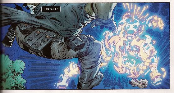
Photobucket

It's the hot dog that makes it great!

In #5 O.M.A.C. and Frankenstein Agent of S.H.A.D.E have a great big slobberknocker which entertains and amuses me on a base level which I have no shame in gratifying since I am okay with comics just being goofy, colourful fun. With #6 I realise that the main reason I like O.M.A.C is because of Keith Giffen's art because with #6 the artwork is by Scott Kolins and the only memorable thing about the issue is the fact that Leilani's breasts are pancaked in the same manner that Caroline Munro's were in The Golden Voyage of Sinbad. Yes, I realise that reflects badly on me as a human being but, honestly, what reflects badly on us as a society is the fact that we have fallen so low so fast that when you read The Golden Voyage of Sinbad you automatically assumed I was talking about a p*rn film rather than a children's fantasy film from the '7os.  So, um, anyway O.M.A.C was GOOD!

STATUS: REMAINS ON THE LIST!


PUNISHERMAX#22 “War’s End” By Steve Dillon(a), Jason Aaron(w), Matt Hollingsworth(c) and VC’s Cory Pettit(l) (MAX/Marvel Comics, $3.99) The Punisher created by Gerry Conway, Ross Andru and John Romita Snr.

Photobucket

"Now that we've solved the Energy Crisis! Who's up for a brewski!"

PUNISHERMAX#22 may just be the most subversive comic I read this year. Oh, not because of the ending because...really, Jason Aaron? Really? That's your ending? We can solve all societies problems by just rising up and killing the sh*t out of other folks? Really? Heck, maybe we just need a strong leader as well? Fancy your chances do you, Jason Aaron? What a crappy ending. Mind you, I live in a country where we only arm The Police, The Army and farmers. What? No, I don't know why we arm farmers, maybe because of all the lions? Or maybe they keep being carried off by subsidies in the night. Stop getting distracted by details. So, okay, maybe that ending is a bit more reasonable over there in The Americas. If it is, I will pray for you all. Christ, that irresponsible ending.

No, PUNISHERMAX #22 may just be the most subversive comic I have read all year because of the scene involving Elektra. Elektra is at the Hand headquarters after a savage battle with Frank. Elektra has served The Hand well for many years but now Elektra needs help from The Hand. Specifically medical help. But I guess The Hand doesn't have Health Insurance for its employees and since Elektra is no longer of any use to them they have no qualms in cutting her loose in the most final of ways. Despite knowing full well the conditions of her employment Elektra is still surprised and dismayed at this turn of events. But she should have expected it, really, because that's what you get for working for Marv..I mean The Hand. Say, is something bothering you, Jason Aaron? Stuff on your mind?

Oh, PUNISHERMAX was entertaining enough and the fact that I could never reconcile the interesting parts with the witless parts of it actually made it more interesting and brought the whole thing up to GOOD!

STATUS: Cancelled or Came To A Natural End When The Author Had Told The One Frank Castle Story He Felt He Was Born To Write. (Oh, yeah!)

RASL #13 By Jeff Smith (a/w/l) (Cartoon Books, $3.50) RASL created by Jeff Smith.
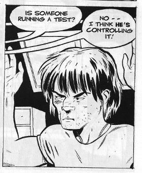
Photobucket

There's a couple of reasons I really like RASL. There used to be pretty much just one reason; that although none of the individual elements actually seemed unique in and of themselves they were combined in such a way as to present a story notable for its novelty and also the freshness of its presentation. There are many scenes in RASL which you have seen in other stories but this is not a problem with RASL because it isn't really a problem at all unless it is a problem with all stories. It is a problem with some stories because they will just go for the default setting of said scene; the one that's floating closest to the surface of the popular imagination due to repetition and exposure via Hollywood blockbusters for example.

Look at the Avengers Vs. X-Men preview and ask yourself whether the life sappingly tedious familiarity of every scene is intentional and while you have your own attention ask also how many pages until The President says "And may God have Mercy on us all." It's all about familiarity, oh yes, I am aware it's all pitifully legitimised by claims of "homage" but that's cockrot, it's all about familiarity; giving people what they already know they like. Of course eventually familiarity forgets to put its rubber on and breeds something; contempt. Not in the case of RASL though. RASL keeps me on my toes, RASL demands something from me - attention. In return it rewards me with quality entertainment. That seems fair enough to me.

The other, more recent, reason for liking RASL is that unless Jeff Smith has some kind of catastrophic breakdown involving his identity he won't be suing himself anytime soon. Yup, RASL is VERY GOOD!

STATUS: REMAINS ON THE LIST!

STATIC SHOCK #5 and #6 “True Natures” and “Unrepentant” by Scott McDaniel/Andy Owens(a), Scott McDaniel(w), Travis Lanham & Dezi Sienty(l) and Guy Major(c) (DC Comics, $2.99ea) Static created by Dwayne McDuffie and Jean Paul Leon.

Photobucket

 A DC writer on The Internet: Yesterday.

Well, that was certainly a stinker of a thing. I have no problem with Scott McDaniel's art by the way. Sometimes it lacks clarity but I respond well to the boldness of his line and the chunkiness of his figures. I find it quite pleasing on the whole. His writing has, however, been less than stellar. It's hard to know what to say about this disaster really except if you employ someone to write - let them write and let the artist take care of the pictures. It isn't like there's no room for synergy; the two can be responsible for both of those separate aspects but combine them when it comes to the storytelling. It's a collaborative medium, so I've heard. A mess like this just makes me sad. I'm not very savage at all because it dismays me to say STATIC SHOCK was AWFUL!

STATUS: DROPPED!

SWAMP THING#6 “The Black Queen” by Marco Rudy(a), Scott Snyder(w), Val Staples & lee Loughridge(c) and Travis Lanham(l) (DC Comics, $2.99) Swamp Thing created by Len Wein and Berni Wrightson.
Photobucket

This is horrible in all the wrong ways. It's nice having little shout outs to Dick Durock and Len Wein and my Nana Alice and all but, hey, where's the...well, where's anything? Splash page after splash page of nigh-contextless horror does not a narrative make. Seriously, I need to know what's going on on those pages if it's going to freak me out. Marco Rudy's art works hard to evoke the scabby nastiness of the Bissette, Veitch, Totleben years but what is going on? Something to do with rot, something to do with flesh. I'm sympathetic to the notion that specificity kills horror dead on the page but y'know I need some clue or it's just...stuff. And stuff isn't specific enough to be scary. And... The Parliament of Trees? Apparently you just walk up to them with a box of matches and, hey, game over Parliament of Trees. That's...stupid. Worst of all this turns out have just been one of those crappy origins that take six issues. Sure they could wrong foot us at the last and Abby could adopt the mantle but...it still took six issues. Six not very good issues. So yeah, SWAMP THING is EH! Moley, I just checked and it's six issues and counting to the origin, that doesn't help at all.

STATUS: DROPPED!

T.H.U.N.D.E.R. AGENTS #3 “A Godawful Small Affair” by Wes Craig & Walter Simonson/Bob Wiacek(a), Nick Spencer(w), Hi Fi & Lee Loughridge(c) and Jared K. Fletcher (l) (DC Comics, $2.99) T.H.U.N.D.E.R. Agents created by Wallace (“Woody” not “Wally”) Wood and Len Brown.
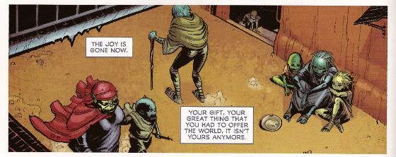
Photobucket

'Nuff Said!

STATUS: STICKING IT OUT FOR THE LAST THREE ISSUES!
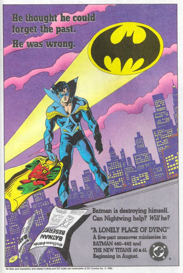
 

So yeah, hope that was okay. If you disagree with any of it that's fine just let me know and we can throw it around like a pack of terriers with a rat. If you thought it was all totally spot-on then, Hi, Mom! Whatever happens those were my comics and that's what I thought.
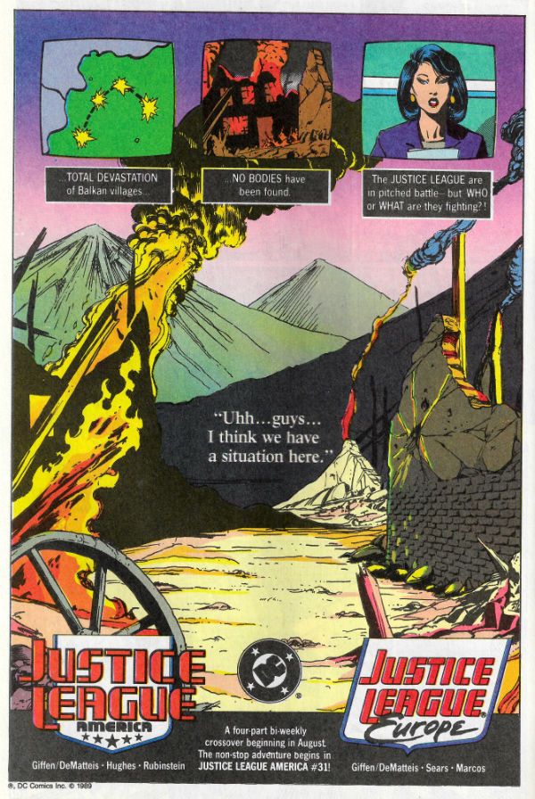
Have a good week and remember to read some COMICS!