Wait, What? Ep. 131: Linkpocalypse

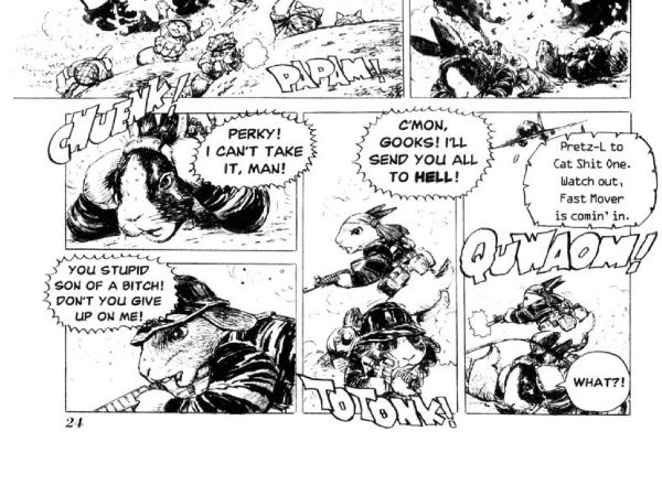
 photo 084ccc28-f6fd-4588-82c8-f035c8c2702c_zpsbfe14488.jpgMotofumi Kobayashi's Cat Shit One: Another great reason to love comics.

Yes, okay! As always, I have nothing clever to say in this space, but unlike always, I'm not going to waste your time saying it. I've got show notes with images! Links! Prizes! (There are no prizes!) Torrid confessions! (There probably will not be any torrid confessions.)

After the jump: Show Note Machine...Go!

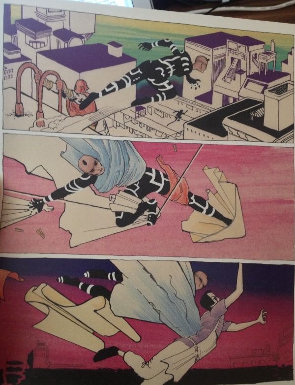
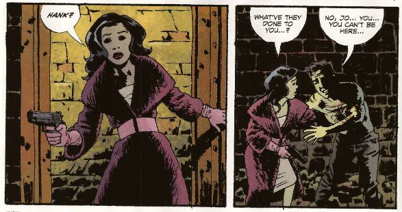
0:00-25:22: Bemoaning the fact that we're not nearly as organized as other podcasts, Graeme makes a prediction about we'll be talking about this episode as a way of introducing this episode to listeners. This allows me to retool a favorite aphorism here in the show notes:  "If you want to make God laugh, introduce a podcast." It leads right into our first order of business:  talking about the latest crazy developments in DC's 3-D cover event.  If you've already read Hibbs' post about this already, you'll be a step ahead of most of the points Jeff makes here, although he does bring his own unique tin foil hat spin to the situation.  Also covered, the recent decision in Kirby v. Marvel,  what it means to "hamburger a muffin" and the opening of a  new Salt & Straw right near Graeme. Verily, this is the Mighty Wait, What? Age of Golden Epicureanism! 25:22-34:07:  Also on a non-comics tip, Stephen Colbert and Bryan Cranston, which famous people we've been compared to, the Adult BMI guidelines, Tarder Sauce, and more. 34:07-45:37:  Todd McFarlane, Len Wein and Gerry Conway discussing sexism and comic books! which we discuss without the context provided by some later tweets made by Conway.  And who is…. the Billy Joel of comics?  Find out here, along with a torrid confession from Jeff!  (Oh, okay, so there was one of those, after all.  Huh.) 45:37-58:05: And in this week's installment of "Welcome to Jeff's Big Basket of Sour Grapes," Jeff talks about a Twitter exchange between Rob Liefeld and Erik Larsen and their consideration of comic book criticism.  Graeme, trying to bring the sense, just ends up bouncing the ball of generosity off Jeff's ungenerous blockhead for an impressively long time. 58:05-1:04:00:  Also, under discussion, Mark Millar's comments about rape.  You probably can imagine our reaction to that one but...maybe not? 1:04:00-1:21:40: And now it's time to talk about some comics we've read -- a little bit about AvX  (and the kindness and generosity of the Whatnauts), but also a lot about the genius that is Rogue Trooper and Cat Shit One. This leads to our we-might-as-well-make-it-official-and-call-it-weekly discussion about 2000 A.D., which in turn leads to discussion about comic book covers, which in turn leads to Velvet by Ed Brubaker and Steve Epting, 1:21:40-1:26:08: Jack Kirby's In The Days Of The Mob! It is available! It is…not cheap!  Not cheap at all! 1:26:08-1:27:21: Copra Compendium (which I can't say aloud without thinking of Weird Al-esque lyrics set to "Copacabana" which is probably why I probably called it Copra Companion half the time) Vol. 2!  Jeff loves this like burning, worries that Graeme may not.  But either way, there is so much lovely stuff, including  the panel shown below and discussed in this podcast:

 photo 6a69f2db-1d51-479d-88d0-f34b31bed185_zps92ffe6f8.jpg

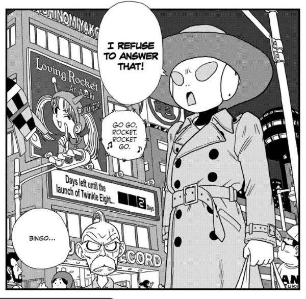
1:27:21-1:31:33:  That inspires Graeme to talk about Lynn Varley, Trevor Von Eeden, and the Kickstarter the latter is running with Don McGregor for Sabre: The Early Future Years. 1:31:33-1:34:12:  Graeme has read Cartozia Tales, the shared fantasy universe featuring some outstanding work by Jen Vaughn, Jon Lewis, Dylan Horrocks, and more. 1:34:12-1:38:34: Trilium #1 by Jeff Lemire. We've both read it.  We both discuss it. 1:38:34-1:41:55: Jeff fumbles and bumbles through some display problems to try and convey how much he digs Jaco the Galactic Patrolman by Akira Toriyama, as well as Toriyama's brilliantly dopey pre-Dragonball series, Dr. Slump.  One of the panels Jeff discusses super-briefly is this one:

 photo 6c6541ba-d040-4dfc-b343-93fd0b16a839_zps2407b166.jpg

1:41:55-1:45:04: The first collection of Talon from DC!  Did Graeme like it almost as much as Jeff likes Toriyama…or even more than Jeff likes Toriyama?  Tune in and find out. 1:45:04-1:52:08: The final volume of Bakuman is out, which is very bittersweet for Jeff.  Despite the frustrations with how Viz has handled publication of this manga (and the generally anticlimactic nature of the last volume), man of man, Jeff is going to miss that series. 1:52:08-end: Closing comments! Graeme makes it sound like we won't be back next week but we will!  (I think.)

See, look at all that. Links! Images! Torrid confessions. (Well, a torrid confession.)  Nice, eh?  So you should go hear it!  It is on iTunes -- eventually -- and it is here for your convenience:

Wait, What? Ep. 131: Linkpocalypse

As always, we thank you for listening and hope you enjoy!  (Now if you excuse me, I have a new chapter of Jaco The Galactic Patrolman to go read....)
"Rodeo Ain't Over Yet!" COMICS! Sometimes I Don't Have A Title!

Hello! Here are some words about some comics. The sales figures analysis is just below this. Very good it is too! To clarify, the Hibbs' stuff is good, not this stuff. Anyway, this... Photobucket

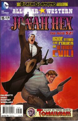
ALL STAR WESTERN#16 Jonah Hex: Art by Moritat, written by Justin Gray and Jimmy Palmiotti, coloured by Mike Atiyeh and lettered by Rob Leigh. Tomahawk!: Art and colour by Phil Winslade, written by Justin Gray and Jimmy Palmiotti and lettered by Rob Leigh. DC Comics, $3.99 (2012) Jonah Hex created by Tony DeZuniga and John Albano Tomahawk created by Edmund Good and Joe Samachson

Photobucket

I finally realised that it isn't the sticklebricking of DC Continuity and the basic desperate casting about for stunt elements that are hamstringing my enjoyment of this book. No, it's the joylessness of it. Its total and wholehearted acceptance of the current DC mode of storytelling which puts a premium on prevarication and encourages emptiness. Look, this book would be great if Bob Haney was writing it. Bob Haney isn't writing it though so it isn't great. If I'm hankering after Bob Haney in 2013 it's a fair guess your book isn't up to snuff. On the up side this issue doesn't contain the dismayingly frequent page filling device of having that Oriental lass fighting for five pages. In fact she doesn't appear once which means that any entertainment can be rightly said to be just like the cast - purely occidental. You want better jokes, make better comics.

Photobucket

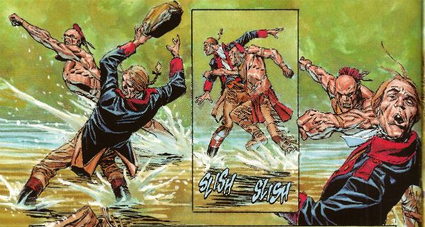
In the Tomahawk back up the most startling aspect as ever is Phil Winslade's bizarre digital watercolours job which I find enjoyable without actually knowing why. In other news, the English turn out to be the villains! I guess that's how Germans feel when they read DC war comics. A taste of my own medicine there. And it is bitter, bitter, bitter. This book, however, is only EH!

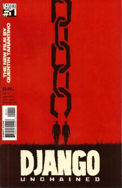
DJANGO UNCHAINED #1 Art by R M Guera with Jason Latour Adapted by Reginald Hudlin Coloured by Giulia Brusco Lettered by Sal Cipriano Adapted from the original screenplay by Quentin Tarantino Vertigo/DC Comics, $3.99

Photobucket

I can’t speak as to how good an adaptation this is because I haven’t seen the movie. I’m old and the wild and outrageous young rebel Quentin Tarantino scares me with his outrageously youthful rebelliousness and his youthfully rebellious outrageous movies. Luckily my much younger sister had seen this very movie so I asked her how she found it. She said, and I quote so the record may be deemed complete, “It was entertaining, Johnny, but it wasn’t good.” There you go then. Me, I fear I invite your youthful ire as I just don’t think Tarantino is all that. Oh, it isn't his childishly inflammatory use of the “N” word, after all I’m sure should our paths cross the edgy auteur would be equally forgiving were I to pepper him with the “C” word like it was going out of fashion. No, but some of it is the fact that he uses the word “cool” too much. The only men his age who should use “cool” that much are Grateful dead fans who live in San Franciscan dumpsters. Mostly though it’s that he reacts to proper questions like THIS. Yeah, I'll let that speak for itself I think. On the plus side the iconoclastic Quentin Tarantino does seem to have exhausted his celluloid fetish for Uma “Man Hands” Thurman.

Photobucket

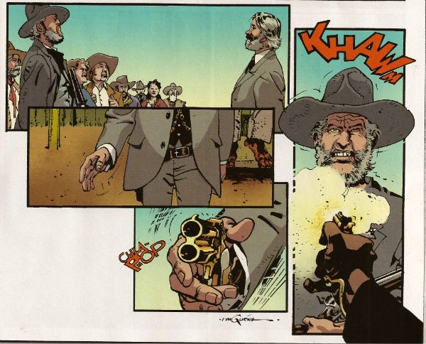
The stated aim of this comic is to illustrate the original script. Every golden word. I guess it does that. It certainly seems like a Tarantino script. The dialogue is surely as self-satisfied and in need of tightening as ever and it retains all the usual rhythm and musicality (i.e. all the rhythm and musicality of a tune played on an arse flute); scenes outstay their welcome or outstay their welcome while also leading up to a totally predictable reveal and the characters haven’t any. Usually it would take hundreds of talented people and millions of dollars to make this stuff at least enjoyable if not actually good. All this comic has is R M Guera. All this comic needs is R M Guera. It’s an amazingly savvy choice since for the last 5 years and change R M Guera has been tasked with tricking everyone into thinking that a tour through Jason Aaron’s 70’s movie memories constitutes something with anything more to say than, hey, wasn't cinema in the 70’s just grand? Or SCALPED as it is known. Elevating the mundane to the magical is just what R M Guera does I guess. He does it bloody well though. Jason Latour throws down a few flashback panels and his art is excellent every time it appears but the shining star here is R M Guera. R M Guera with his ambulatory toby jugs and smooth storytelling once again showing everyone else up. Hey, the poor old writer doesn't even get a credit except here: Reginald Hudlin. I don't know why he doesn't get a credit but it's not a trend I want to encourage. Anyway, thanks largely to RM Guera this was GOOD!

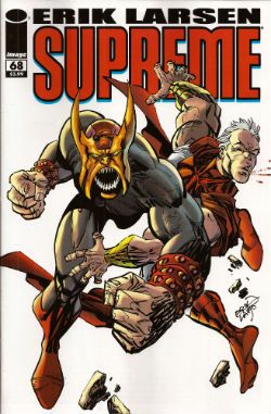
SUPREME #68 Written and Drawn by Erik Larsen Coloured by Steve Oliff Lettered by Chris Eliopoulos Supreme created by Rob Liefeld Image Comics, $3.99

Photobucket

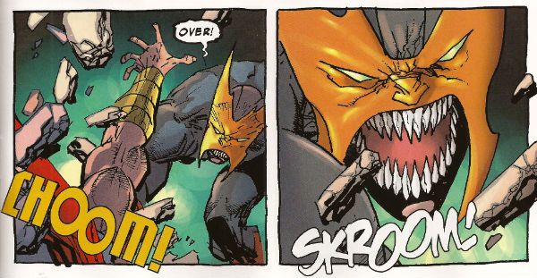
In this pulse pounding issue Erik Larsen basically says that he enjoyed illustrating Alan Moore’s script but since then he’s been noodling about and it’s been just super, thanks, but he’s off now. Apparently someone else will be taking over, no idea who but, yeah, someone at some point. Of all the moves to steal from the DC playbook that’s a pretty strange choice. At least he didn't steal DC’s signature move which is now apparently making comics nobody likes but lots of them. Larsen’s departure is a bit of a shame because I found his Kirby with a split nib art quite charming and in this issue it’s particularly so because, for no readily apparent reason, Larsen suddenly starts drawing this thing like it’s Kyle Baker’s RONIN. (Yes, I know it was Frank Miller's RONIN but this looks like Kyle Baker's RONIN).

Photobucket

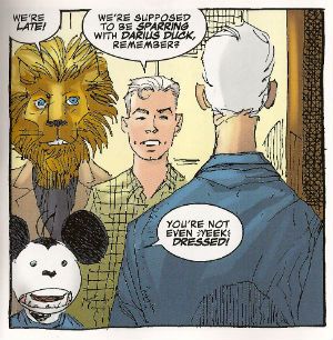
I quite enjoyed this book. It had enjoyably stupid characters like Lion headed Supreme and Darius Duck, people flew around, punching occurred and Larsen always respectfully drew Supreme in that scratchy Liefeld mode without actually ever being as shitty as Liefeld. Sure, it was pretty basic stuff but it was basically pretty stuff. Sometimes I don’t actually want all that much from a comic and this certainly delivered that. I wouldn't recommend that Erik Larsen make a habit of just dumping books as people might start referring to a failure to commit as having committed Larsen-y. Unlike that joke this was OKAY!

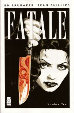
FATALE#9,10 Art by Sean Phillips Written by Ed Brubaker Coloured by Dave Stewart Fatale created by Sean Phillips and Ed Brubaker Image Comics, $3.50

Photobucket

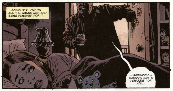
Everyone can relax because I’m done here. I’ve had my doubts about this one all the way. For starters the horror elements have been inexplicably dusty and dull (cassocks! tentacles!). I don't need my own pet Jess Nevins to know that horror in the '70s was actually engaging with real world events and offering up savage and innovative treats which were leaving Corman's Poe adaptations for dead. Then there's the inescapable drab narration which mistakes deadpan for just plain dead on the page and is written in a fabulous new tense even more inactive than the passive; the comatose tense perhaps. The only sign of life in this one-note stuff is that it works the word “but” like it yearns to be a Salt’n’Pepa track.Then there's stuff like this:

Photobucket

That pivotal oh, go away moment occurred in issue 9 but due to the caprices of my comic dispersal system I still had issue 10 to go. Yes, one more chance! A chance which was immediately crushed when the central character (who thus far has been less like Fatale and more like Docile) just suddenly remembered she had special magic powers and plain killed everyone in a climax as rewarding as being inadvertently brought off by the motion of your train seat. Look, there’s no mystery about why men will act like complete tools for a pretty face, certainly not a supernatural mystery. Unless you think the contents of your pants are supernatural and mysterious. In which case your Pope just resigned. I didn't know Popes could do that! This series always seemed less James Ellroy and H P Lovecraft and more Quinn Martin and Donald P Bellisario. An impression strengthened by future covers which indicate the series is just going to stick a new genre on top of the usual stuff. Now she's a witch, now she's a space man, now she's a turtle, dis-integrating! Like my interest. Mr Ben with a magical woo-woo may well be a new direction but not one I’ll be pursuing. So, I’ll be missing future essays on The Scarecrow And Mrs King and, more importantly, the fine work of Sean Phillips and Dave Stewart which deserves better than to be yoked to work this EH!

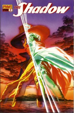
SHADOW SPECIAL #1 Art by Ronan Cliquet Written by Scott Beatty Coloured by Mat Lopes Lettered by Rob Steen The Shadow created by Walter B. Gibson Dynamite, $4.99 (HOLY MOTHER OF GOD!!!! FOUR DOLLARS AND NINETY NINE CENTS!!!! THAT'S INSANE!!!!)

Photobucket

In the main title The Shadow is currently palling about with George Orwell. George Orwell is the author of a couple of books on how shit being poor is and how we will all willingly participate in a system designed to crush our common humanity. He was right about both of those things and remains right, although he missed a trick in not realising that the main way The System would ensure our complicity would be by making nice things for us to buy. But then there weren’t many nice things to buy back then so we’ll let him off. Rip The System! You don’t bring Orwell to the party unless you want that party to get political! Orwell also did a book about animals on a farm. I can’t remember what it was called but it was about animals on a farm. It was a metaphor or an analogy or some clever shit like that about some animals on a farm. Oh yeah, I remember now, the one about the animals on the farm? It was called BEFORE WATCHMEN.

Anyway, this isn’t the main series so George Orwell isn’t in it. No, this is a “special” but it isn't very, possibly even at all. Except for the price. That’s pretty fucking special right there. There’s the core of a fun and pulpy tale here but something’s gone awry on the pacing front. When there’s more pages devoted to The Shadow moaning about going shoe shopping (yes, really) than there is to his fight in a minefield with a man who has courageously chosen to sport only a bouquet of barbed wire around his nuddy bod (Oooch! Owch!) then, yes, I’d have to disagree strongly with the storytelling emphases.

Photobucket

Ronan Cliquet has a good go at being Alan Davis but he seems to have jumped ahead a bit; Alan Davis didn’t get to be Alan Davis until he’d got the basics right, son. I’m guessing he’s just some wee snip learning his trade but the best I can give him is – promising. The most special thing about this comic is the paper it’s printed on. Paper so much like catalogue pages from your youth that there’s a constant urge to riffle through them to the Hot Wheels section or the sports bra section depending on which age your development is currently arrested at. No, it wasn't special unless special is EH!

And like The Pope - I'm gone! But there's still COMICS!!!

Wait, What? Ep. 88: Starry-Eyed Cynics

Uploaded from the Photobucket iPhone App Yup, we continue to make headway on Operation: Q&A, with perhaps as many as *ten* full questions answered in this, Episode 88 of your friendly, neighborhood Wait, What? podcast.

The wolf is at my door (figuratively speaking) so allow me to fill you in on what to expect and then I'll have to run (literally speaking--I don't know, it gets complicated but you can figure it out):

For a hearty two hours and five minutes (with the first ten devoted strictly to music talk), Graeme McMillan and I gab about which Alan Moore's universe we'd like to see continued; the recent first issues of Batman Inc., The Ravagers, and Superman Family Adventures; Erik Larsen and The Savage Dragon; digital content and comics as a niche market; who gets a bigger free pass--Marvel or DC; Greg Rucka and Brian Bendis' discussion over at the Mulholland Books website; the degrees of freelancer success; Scott Kurtz and cynicism; Jim Lee and the role of creators in corporate comics; and really just so much oh my god you guys I cant even begin to tell you

Those with an Internet connection and our patented SynethesiaGoggles may have already watched the warp and woof of our mellifluous mouthtones on iTunes, but you can also have a grainier, more auditory, and some would even say more fulfilling (but that may be because they didn't want to fork over the extra fiver for the goggles) experience below:

Wait, What? Ep. 88: Starry-Eyed Cynics

As ever, please secure your bags either below your seat or in the overhead bins before departure, and thank you for listening!

"It Is Not The FIRST TIME This Has Happened." COMICS! Sometimes They Are Hot Off The Griddle!

Hey old people, remember Sunday evening when you were a kid?: Photobucket

Urrrrrhhhh! Let's take the Sunday Blues away with some piffle about our four colour floppy friends! COMICS!!!

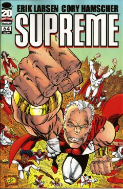
SUPREME #64 Art by Erik Larsen & Cory Hamscher Written by Erik Larsen Coloured by Steve Oliff Lettered by Chris Eliopoulos Image Comics, $2.99 (2012) Supreme created by Rob Liefeld

Photobucket

Hu-ooFF! Well, that was horrible. As a comic, I mean. Look, I don't have a problem with a change in direction and it's a little soon to tell if I have a problem with this particular change in direction, but I have a problem with a bad comic which this was. Just page after page of people dying, things falling over, plenty of, as my son would say, "'splodin'!!!". I hate to break thi sto everyone but that's not actually a story as such. Sigh. I don't have much familiarity with Erik Larsen's work (the '90s? Not really my best time for comics)  so I'm not counting him out yet. Yeah, maybe Erik Larsen can swing this one around. I'll give him a couple more issues to do so. Turns out I'm that close to generous but this issue was pretty EH!

Photobucket

Reckon them's fightin' words and wanna show me just how wrong I am? Well, you can buy this exact comic from  HERE!

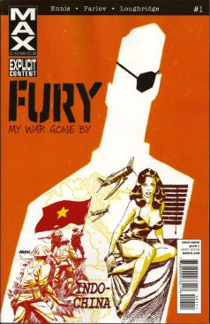
FURY MAX #1 Art by Goran Parlov Written by Garth Ennis Coloured by Lee Loughridge Lettering by Rob Steen Marvel,$3.99 (2012) Nick Fury created by Jack Kirby with Stan Lee

Photobucket

I don't know what they are feeding Garth Ennis on these days but the comics he's producing would be Type 3 or 4 on The Bristol Stool Scale; this being as we all know optimal. In a worrying state of affairs Ennis has now produced two comics (see last week's THE SHADOW) which are set in  convincing historical settings, peopled by satisfyingly sketched characters and which succeed in being both informative and entertaining. Which is why I had to bring my own shit joke to the party lest his regular, heh, audience feel at at a loss. Taking the first chapter's title from TheThe softened my hardened heart but going on to deliver an intelligent, amusing and diverting comic  is what really sealed the deal here.

Photobucket

Ennis is helped no end by the astonishing art of Goran Parlov. Goran Parlov is the kind of artistic wonder who can limit himself, largely, to the most banal of page layouts without inspiring new lows of tedium in my mind. He can do this because everything he puts in those panels is just right. It doesn't hurt that his present day Fury looks  so gnarled and battered he resembles 19th Century armoire smoking a cigar while clad in plaid slippers and a fluffy robe. Yeah, this was VERY GOOD!

(Yes, I am aware Nick Fury was created by Jack Kirby with Stan Lee and that I said I wasn't going to purchase any more Marvel products which failed to acknowledge the contributions of The King.  Either my LCS forgot or decided that my professed liking for Garth Ennis' non puerile work and Goran Parlov's anything superceded this. Okay? Either way I got a good comic and I still think it could have had the words "created by Jack Kirby and Stan Lee" on it without upsetting the balance of Life itself.)
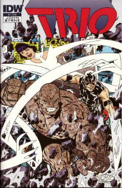
TRIO#1 Written and Drawn by John Byrne Coloured by Ronda Pattison Lettered by Robbie Robbins IDW, $3.99 (2012) Trio created by John Byrne
Photobucket

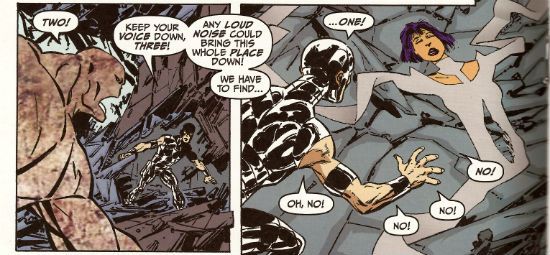
Mark the time. The super-hero funnybook is dead. I'm surprised to find John Byrne's DNA on the corpse but then it's always the ones that love hardest that end up hating enough to kill. I'm a bit sore because I lost my shirt on this one; my money was on one of the TV Breed. One of those guys who just keep parping it out until the comics cognoscenti just give in and allow quantity to supercede quality. Yeah, I figured the smoking gun would be in the clammy hands of  one of those guys with all the imagination of an empty cardboard box, one of the dialogue guys, one of the post-it notes and flow-chart guys, y'know, the sophisticated guys. But like the most surprising game of Comics Cluedo ever, in the end it was John Byrne in the LCS with The Fantastic Faux. A super team of characters called "One", "Two" and "Three" could only mean one thing; the death of imagination.

Photobucket

But look, in his defence, no one loved the super-hero funny book as much as John Byrne. He loved it so much he hid it away and protected it from reality. Up there in the big house with the pool. Pretending nothing had changed and if it had, well, it wouldn't last. See, John Byrne knows super hero comics are still big it's just the audience that got small. You just have to give 'em comics like back when they loved them. Back in the '80s. The magical hey-day of ALPHA FLIGHT! This isn't a comeback it's a return, it's the return of cape comics, the return of the way they should be done, the return of the way they were done when they were done rightIt's the return of an '80s issue of ALPHA FLIGHT. Sure, it's the best issue of '80s ALPHA FLIGHT ever published but it's still just an '80s issue of ALPHA FLIGHT. It's now 2012. Here's the corpse of super-hero comics now, caked in make-up, going on eighty trying to pass for eighteen. Nothing sadder. Sure, it may be EH! but they'll love it in Pomona.

You can prove the audience for this comic didn't leave twenty years ago by buying it from HERE!!!

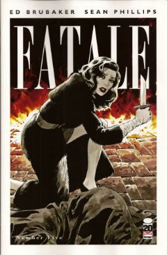
FATALE #5 Art by Sean Phillips Written by Ed Brubaker Coloured by Dave Stewart Image Comics, $3.50 (2012) Fatale created by Ed Brubaker and Sean Phillips

Photobucket

Well, I gave it 5 issues and I was hoping this one would turn it around. It didn't. A spooky rinser, people in hats swearing and a demon who can come back from the dead but can't bring back his eyes. I guess you could say it was a bit like James Ellroy meets H.P. Lovecraft, y'know, if they'd both had flu at the time, or you'd only seen the covers of their books, or you had in fact never actually read them just read about them. In the end FATALE pretty much ended up being the John Byrne's TRIO of independent creator-owned comics. Familiar stuff delivered familiarly; that's not going to make me run about like my underpants are on fire no matter who is involved. Sure, I'm all for Team Independent but not if they are as bland as the alternative. Being creator owned is a magical thing but for a reader comics still have to be better than EH!

Photobucket

Possibly not the most popular opinion regarding this comic book! Why not make up your own mind by purchasing if from HERE!

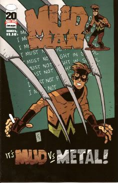
MUDMAN #3 Written and Drawn by Paul Grist Coloured by Bill Crabtree Image Comics, $3.50 (2012) Mudman created by Paul Grist

Photobucket

Wait! I'm getting a pulse! turns out the cape comic isn't dead after all, it just has to keep up with the times is all. This one's about a normal kid in a timelessly sleepy English seaside town who is, through events and stuff ,suddenly not normal in a way that involves mud and being a man made thereof. It's got a breezy lightness of tone that might work against it; sometimes it seems not a lot has happened but really quite a lot has. As Owen Craig (Mud Man when he's not Mud Man) finds his powers have opened up new possibilities for him physically the environment around him seems to change in concert. Using the fixed point of Owen's discoveries as the present Grist fills in the Past and hints at the Future while parts of each encroach on Owen's life and, as is generally the way of things, threaten it.

Photobucket

Grist is really good at keeping the tone light while at the same time giving the threats real weight.  He also excels at teasing about future developments; so much so that the next issue just can't get here quick enough. But what Grist is best at is storytelling; in the words and pictures sense, natch, this being a comical periodical and all. He may be a bit too good at it because reading the comic is so effortless, practically intuitive, that it's quite likely the reader might forget to credit the incredible talents and the deft wielding of same that made it so. From soup to nuts, from top to tail, from mud to man MUD MAN is VERY GOOD!

Or is it? Find out by buying it from HERE!!!


And we're done. If you're going to hang about don't forget to lock up and put the key back through the letterbox.

Have a good weekend and always remember COMICS!!!

"Let Him Be A Child A Little Longer." COMICS! Sometimes They Are Diverse!

Hey, the postman finally turned up. Photobucket

I guess the hostiles must have been restless out there in the Badlands or something. Anyway, he may not have rung twice but he did drop off a box of comics. Here's me going on about some of them after the break: A NOTE FOR OUR AUDIENCE: According to Brian "Link-Hider General" Hibbs you can now purchase some of these comics direct from The Savage Critics!

There is a link under both Comix Experience Links and Industry Links which says "Digital Comics From The SavCrit Store!". It's that one.

I have of course followed the rigorous journalistic code of the 21st Century and given all the comics available from that link a rating of EXCELLENT! No, not really, because as a salesman I am a bit lacking.

As ever, here's some comics and what I thought! Buy 'em! Don't buy 'em! Leave them at the scenes of violent crimes to throw off the Feds! I don't know, don't look at me for help. Because I'll just look down and whisper "No."

And Now Our Feature Presentation- SOME COMICS WHAT I DID READ:

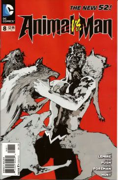
ANIMAL MAN #8 Art by Steve Pugh, Travel Foreman & Jeff Huet Written by Jeff Lemire Coloured by Lovern Kindzierski Lettered by Jared K. Fletcher DC Comics, $2.99 (2012) Animal Man created by Dave Wood and Carmine Infantino

Photobucket

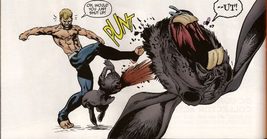
Since he literally throws his daughter to the wolves I’m afraid I have to say Buddy Baker is the worst father in the DCU and he’s a pretty craptastic superhero to boot. You’re going to have to think of something better than beating an army of undead animals to death one by one, Buddy Baker! This guy is such a dumbnuts I’m getting tired of reading about him. The best thing about ANIMAL MAN is that it reminds me how wonderful Steve Pugh’s art is.

Photobucket

I love the solidity he gives everything and the way his art allows the realistic and the insane to exist frictionlessly together. If he’s too radical for the DC masses, and it doesn't take much to be that, maybe Dynamite could get him on some books? Oh, I’m getting ahead of myself; I haven’t got to THE SHADOW yet. Anyway, ANIMAL MAN was OKAY! But really his wife would have left him about 6 issues ago and in about 3 issues I expect Social Services to be having a firm word in his shell-like. Buddy Baker is a danger to himself and everyone around him, and not in a good way.

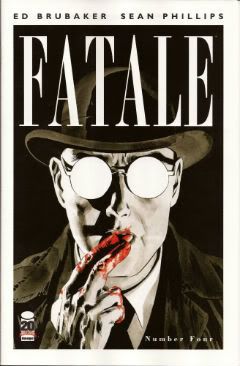
FATALE #4 Art by Sean Phillips Written by Ed Brubaker Coloured by Dave Stewart Image Comics, $3.50 (2012) Fatale created by Ed Brubaker and Sean Phillips

Photobucket

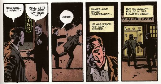
Um, I don’t want to be the party pooper but I’m not really feeling this one. Where others would see complexity I see only confusion and the horror and crime aspects don’t mix well at all; blanding each other out if anything. I’m not convinced at all that Brubaker & Phillips are as deft with horror as they are with crime. There’s one sequence in particular which is meant to suggest the soiled undersheet of reality flickering on the edges of the protagonist’s vision, but it takes up a whole page. Which is a bit like the secret supernatural underpinnings of the world putting on a straw boater and doing back flips in front of you while belting out showtunes. Subtly unsettling it’s not. Mind you this series seems to not be a lot of things. Coherent and inventive being amongst the things it isn't. So far the whole thing seems a stolid muddle which barely fends off the blunt teeth of cliché. The police scenes are about the width of a gnat’s dick from busting out the old “This is straight from The Fifth Floor, you've got 24 hours to clear this case or you’re back handing out parking tickets! Capiche, you maverick bastard!”  And then there are the narrative captions and, boy howdy, are they bad. But then I think there’s a difference between understated and lifeless. These things are like “I saw a cat. It was big.” bad. It’s like Dan Brown bad. But then Dan Brown’s very successful isn't he?

Photobucket

After all, in a shocking real-life terror twist, it turns out that FATALE is the most successful thing Brubaker & Phillips have produced. Previously this was true of INCOGNITO which I thought was pretty bad. So, it looks like success beckons the Brubaker & Phillips team, but what appears to bring them success isn't what brings me reading pleasure. Mind you, they are professional enough to produce a comic that despite my tinny whinging still comes off as OKAY! While I found the front matter lacking, Stephen Blackmoore provides a compelling backmatter piece concerning a real life gumshoe called Harry Raymond. That bit was VERY GOOD!

You can buy FATALE from HERE.

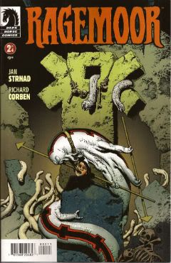
RAGEMOOR #2 Art by Richard Corben Written by Jan Strnad Lettered by Nate Piekos of Blambot® Dark Horse Comics, $3.50 (2012) Ragemoor created by Richard Corben and Jan Strnad

Photobucket

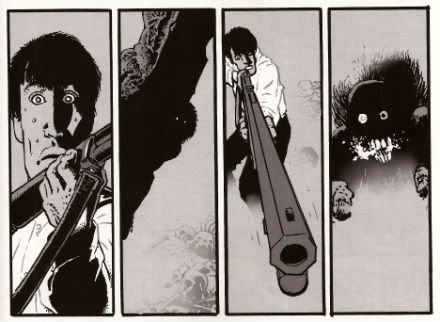
Corben’s art looks a bit odd in this issue, as though he’s got some settings wrong on his software or something. It looks a lot less crisp than last issue. It’s still great because it’s still Richard Corben but…still. Fortunately Strnad’s scripting is really strong so that helps soothe any misgivings. I didn't really know where the series could go after the first issue’s seemingly complete unto itself set-up.

Photobucket

I certainly didn't expect it to make the previously understated humour blossom so broadly; so broadly that at times it verges on farce. I certainly wouldn't have expected it to work so well either. There’s horror here but humour too and in an impressive feat of facility each complements the other leading to a comic that is a really satisfying read indeed. I don’t want to give too much away but hopefully the fact I thought it was VERY GOOD! will be enough to tempt the unwary!

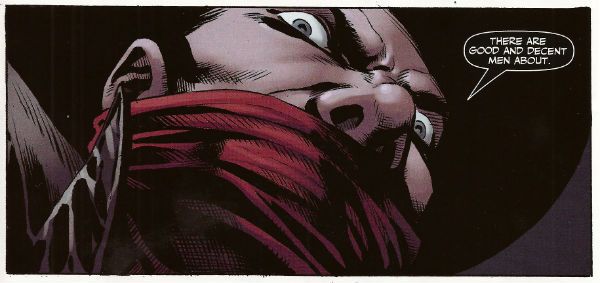
THE SHADOW #1 Art by Aaron Campbell Written by Garth Ennis Coloured by Carlos Lopez Lettered by Rob Steen Dynamite, $3.99 (2012) The Shadow created by Walter B. Gibson

Photobucket

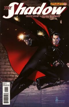
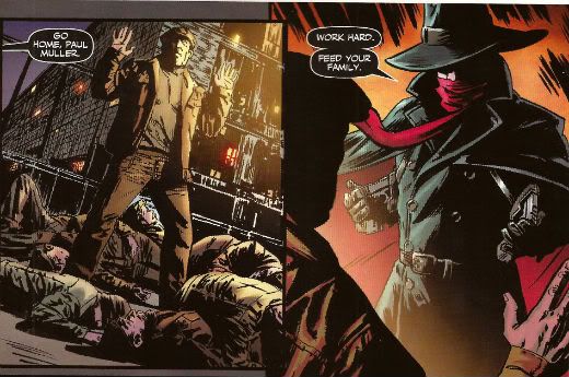
I know you've all been on tenterhooks so let me assure you that I did indeed receive a copy of this comic with the Howard Victor Chaykin cover. I thank you all for thinking of me during this period of uncertainty. It was always a bit of a gamble though wasn't it? What with Dynamite’s penchant for plural covers. Mostly they get some decent names doing some good stuff. Howard Victor Chaykin, for instance, obviously did this one well before it struck Gin O’Clock at Chaykin Towers. He’s even used a different face shape; nice job Howard Victor Chaykin!  The art on the inside of Dynamite’s books tends to be a bit more problematic. Problematic in the Early Anglo Saxon sense of “bloody awful”. Aaron Campbell manages to buck this trend by being decent for most of the book, except when The Shadow erupts into murderous action at which point Aaron Campbell impresses the Heck out of me. Really, jolly good work on those parts! I’m still not a massive fan of the old drawing over the top of photographs business so the rest of the book was just okay art wise.

Photobucket

Ennis is behaving himself too, there's none of that aggressively puerile "funny" stuff or lashing out at easy targets with a nuclear bomb strapped to a machete. He seems to actually be having a good time too. He certainly gives The Shadow a clear personality, one that's all the more entertaining for being composed primarily of arrogant bastardry. But he's not without empathy either, which is a nice trick to pull off. The whole shebang is set in one of Ennis' well researched eras of upheaval, or at least imminent upheaval. Because, and it's to his credit this, Garth Ennis is one of the few writers in comics who shows evidence of reading books other than How To Bland Out And Find Big Bucks In TV And Movies. Books that demonstrate an interest on his part in the world around him rather than a monomaniacal need to write THE MENTALIST.  If you like Ennis' war books you'll like this. If you like The Shadow you'll like this. Blimey, if you just like decent comics you'll like this. Because it's actually VERY GOOD!

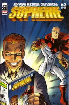
SUPREME #63 Art by Erik Larsen & Cory Hamscher Written by Alan Moore Coloured by Steve Oliff Lettered by Chris Eliopoulos Image Comics, $2.99 (2012) Supreme created by Rob Liefeld

Photobucket

SUPREME is an Alan Moore genre comic. I miss Alan Moore’s genre comics. Alan Moore’s genre comics were packed with invention and humour. Alan Moore’s genre comics had more ideas on the page than most of today’s self proclaimed genii have in a lifetime. Alan Moore’s genre comics played with the form in a way that was charming and cheeky. Alan Moore’s genre comics had characters with character, but their character was never static and if it changed it would do so coherently. Alan Moore’s genre comics had craft. Alan Moore’s genre comics had joy. Alan Moore’s genre comics were VERY GOOD! Yeah, genre comics are much better off without Alan Moore. Yeah, F***k you, Alan Moore! Don't let the door hit you on the way out, Alan Moore! We don't need you, Alan Moore! We never needed you! We've got AVENGERS Vs X-MEN and BEFORE WATCHMEN now!

Photobucket

Oh God, what have we done. COME BACK, ALAN MOORE!

...please...

You can buy SUPREME from HERE.

And that's your lot!  Yes, even I have other stuff to do!

Hope you had a good weekend, everyone!

Blah blah blah COMICS!!!

All this and Earth, too? Hibbs starts on 5/2

Everybody loves comics!

ACTION COMICS #9: This is a lot more like what I was hoping for from Grant Morrison on a regular ongoing Superman comic -- focusing on President Superman from Earth-23. last seen in FINAL CRISIS -- but I was a bit surprised to not find the "real" Superman anywhere in the story. Still, Silver Age-y without feeling dated, and lots of fun things happen. Gene Ha's art was as awesome as always. I thought this was VERY GOOD. AVENGERS VS X-MEN #3 (OF 12) AVX: Brubaker's got the writing spot this week, so maybe that's why I felt this issue had a bunch more plot? I can't even imagine how this is going to read in trade, with it's crazy tonal shifts every issue? I thought this one was strongly OK.


DIAL H #1: China Mieville's comic debut, and it's pretty decent. There are a few mechanical problems with the set up (most namely: how do you dial four digits 0n a *rotary dial* phone by accident when trying to call for help in the middle of witnessing a horrible beating?), and I have to admit that I'm not sure that I at all like the notion that the H-dial is in a static location, but putting that aside, I very much liked this issue. (On the other hand, I always liked the Robbie Reed version as well) (Sockamagee!)

I liked the schlubbiness of the protagonist, I very much liked the dialed up heroes (Captain Lachrymose needs an ongoing series, stat!), and I just liked the general weird vibe on display here -- this comic could be perfectly at home at pre-Vertigo Vertigo, and whatcha know, it's Karen Berger editing her first superhero comic in 20-something years.

The art by Mateus Santolouco sort of veers back and forth between some Ted McKeever-looking wonderfulness to "Ugh, you need more fundamentals", but it certainly works with the book just fine. Overall: VERY GOOD


EARTH 2 #1: Having read this, I really really can't even begin to understand all of the faffing about in the pre-print interviews of "well, we really can't describe this to you", because, unless there's a dramatic change from what's on display in this first issue (which would then, arguably be a not-so-good FIRST issue), this seems easy to shorthand: it's the formation of a NEW e2-based Justice Society (though maybe they'll never be called that, who knows), where the set-up is in contemporary times, rather than ww2.

I'm a pretty big ("real") JSA fan, and I didn't really like any of the new costumes we've seen so far, so I was suspicious of this at first, but yeah, I very much liked the setup and world building, and slow roll-out of characters.

James Robinson's script was solid -- I felt a real emotional tingle in that scene between Bruce & Helena -- and Nicola Scott's art is as strong as always. I don't know if I will like the new JSA, really (there's really only 7-8 pages of those characters, the rest of the oversized space is dedicated to setting up the world), but as a "Yes, I would like to see more, please" first issue, I thought this was VERY GOOD.


EPIC KILL #1:  If you want to see teenage hotties do acrobatics like River Tam in Firefly, with lots of slaughter, then this is surely the comic for you. Largely reading like a pitch for a movie, it at least has fairly pretty art by Raffaele Ienco that kind of reminds me of John Ridgeway, I think -- detailed, but with straight lines not noodly curvy ones, yet just ever so slightly stiff because of that. Anyway, since the base idea feels so "Seen that a dozen times", the joy of this kind of work is all in the *execution* of the idea, and there's just enough "hey, cool" scenes to have me say that this is GOOD.


GI COMBAT #1: Half the book is about soldiers fighting dinosaurs, so there's that, and as a plus the art is by Ariel Olivetti, and it really fits here; the other half is yet another new take on "Unknown Soldier", who is getting close to becoming DC's equivalent in the if-we-keep-relaunching-him-someone-will-like-it-eventually-right? sweepstakes to Moon Knight. I think they need to try again, as I was really entirely uninterested in this version, sorry. I think this may be a concept that just can't work in the 21st century, maybe because of the "unknown" part, and that doesn't work in our database-driven world (esp with regards to soldiers, I'd have to say). Anyway, like the first half, disliked the second, which means I can't say better then EH.


MIND THE GAP #1 :Another book that reads a little more like a pitch then a comic, but I thought this pitch was fairly terrific. The set-up is for a whodunnit kind of mystery, with the victim's spirit interacting on the, dunno, astral plane, maybe is what to call it, with what looks like a little touch of Deadman-meets-Quantum Leap, maybe?  Jim McCann's script is very strong, and the characters vivid, while the art by Rodin Esquejo and Sonia Oback is realistic, without being creepy and off-putting, like some in that style become. As a bonus, this first issue is oversized @ 48 pages, and just a mere $2.99, making it a helluva deal. No doubt this was a VERY GOOD comic!


STAR TREK ONGOING #8: Given that the premise of the first six issues of this series was adapting/converting classic Trek episodes with the movie characters, you might have missed that they followed that with a two-parter (starting in issue #7), that followed up on the film, with the Romulans and the last drop of "Red Matter" -- I know I sure did until I grabbed this issue to read, and went, "Wait... that's not TOS!" (from the "next issue" pic, it looks like they're going back to that and "The Return of the Archons"). I don't know that I exactly care about the tattooed Romulan faction, or Red Matter, but it was nice to see something wholly new set in this universe (and, in theory, "official"). I thought it was highly OK, and if you miss the TOS characters, recast or not, this was a fun little follow-up.


SUPREME #64: Wow. this should be taught as a masterclass in how to utter destroy a previous set-up in 22 pages, and replace it with the exact opposite. I really loved the clever way that Moore set up his "all versions are true" love letter to Superman, and it's own set up gave all of the ability to complete rewrite the rules as new creators came onboard, but instead Erik Larsen rips it all to shreds and chucks it out the window for the ugliest possible of all iterations of Supreme. That takes mad skills, yo. The craziest part to me is actually the letter's page to the issue (which I suspect won't be in a digital version, sorry) where Larsen defends his actions by comparing this to following Todd on Spider-Man, or whoever followed Miller & Mazuchelli after "Born Again" in Daredevil. the difference, of course, being that there's a 15-or-so year gap here between issues, and while the argument is at least understandable when related to regular ongoing production of corporately owned icons (the trains, in fact, have to keep running), it's utterly bizarre in this case, especially after they went out of their way to try and show "respect" to Alan Moore by illustrating his final "lost" script.

Obviously, the difference between, say, WATCHMEN and this situation is that the creator of the property is the owner and can do whatever they want on work-for-hire material, but there's a dissonance here that my brain is ringing from.

Erik is a talented creator, and this work has a lot of energy, but I really liked the Moore version of Supreme (and pretty much hated the grim'n'gritty take that preceded it), so I thought this comic was pretty AWFUL


WORLDS FINEST #1: I have to say that if I were DC marketing, I wouldn't have scheduled the two Earth-2 related comics in the same week, but I just sell the things, what do I know? But, I also have to say that I really really liked this one, as well. Paul Levitz turns in the first script in months that I genuinely liked from start to finish, and the twin artist (George Perez in the modern sequences, Kevin Maguire on the flashbacks) really worked much better than I thought it would. Yeah, I really thought this was strong, VERY GOOD stuff.

The one problem? That logo. Jesus, that's a horrible horrible disaster -- it looks cluttered and terrible using the "across the room" test (if you can't pick a logo/design element/whatever from across the room, it fails), and it's not at all clear what the name of the comic IS, with "Huntress" being over "World's Finest". Yow.


X-O MANOWAR (ONGOING) #1: If you read the original in the 90s, you've pretty much read this first issue, as it really alters very little of the original setup, just with a little more depth, maybe. It reads well, it's pretty enough, but I didn't feel like "OMG! I need to read the next one right now!" Maybe I'll check back in a few issues to see if they're doing new stories and not just retelling things I already know. Or, maybe I won't. OK.


Right, that's me -- what did YOU think?


-B

Big and Bad: Hibbs 4/4's

I know you'd never know it from my Industry-driven posting (seriously? It's what I DO), but I've actually been sick as a dog the last week, and have barely read any comics at all. But I said "I'm back on the horse", and, barring the two weeks where I couldn't log on TO post here, I am , I am! So, here's 3 (or maybe 4) books, below the cut.

AVENGERS VS X-MEN #1: Rich Johnston was right, I think, when he said this book is review proof. No one is going to buy or not buy this comic based upon anything I (or anyone else) says about it, and, because it's purely an exercise in smashing the action figures together, I doubt anyone is really looking at this for an exceptional example of sequential storytelling, or anything.

Which is terrific, because it kind of sucked.

Sort of even to the point that I'm not even really sure where exactly to begin.

Well, let's start with the talent. I like JR JR, I really do... but I like him on things that are gritty and "street" and dark -- KICK ASS he's suited for, shiny-Avengers-heroes? Not so much. Scott Hanna's inks help a little, but overall, the effect here is of the absolutely wrong artist for the book.

Then you have the "Story" credit going to FIVE different people. Really? Reallly? I mean, I have to assume that something really change-up different is going to happen at some point here, because "The Avengers and the X-Men fight" hardly needs FIVE plotters. Damn, it don't need one -- even my eight year old can plot this. In fact, I asked him to tell me why they might fight, and he said, and I shall quote: "they're superheroes, they just do"

Smart kid.

And, oh, oh, oh, the scripting. I don't know if it's that Bendis is just getting too frayed from working on too many comics, or that I've just "learned" his ear too well from reading too many of them, but his dialogue has descended into self-parody at this point. "What's going on? Never Mind. Don't care. Are we having an Avengers meeting or--?" "Guys -- we got a thing here."  Damn, they all have the same frickin' voice. Even the single normal human being in the entire comic, who has a line after flying through the sky with the rubble of the Chrysler building, then is webbed safely by Spider-Man (wait, what? How?!?! 3/4 of those people should be corpses!) says "Wow. That's It. I'm moving. I'm done."

Gawd.

(Plus, like, destroying the Chrysler building? This is your signifier of "yeah, the stakes are real!"? Ugh)

(See, even *I* am doing the bendis voice! Man!)

I also really like that "scorecard" thing at the top of the issue that has like 20+ Avengers, including a bunch not even cameoing in the issue (War Machine?), while the X-Men side is all of 6 people.

I don't, AT ALL, get Cyclops' motivations here. I could maybe possibly understand him if it was "We don't have enough power, we need more, we can't let the humans have this", but all of that bullshit he was spouting about rebirth and shit? Are you nuts? Scott should hate the Phoenix force more than almost any other human in the universe, given that it destroyed his first love, his child, his school, and now it is going after his grand daughter, who is "the future of the mutant race". Given what happened to Jean, how could he POSSIBLY be ok with Hope getting anywhere near the force?

Also: Where the fuck is Rachel, anyway? Why would the thing WANT Hope in the first place? We've always always seen the Phoenix force go after TELEKINETIC TELEPATHS -- what does it want with a girl whose powerset is *copying* other powers, and who, afaik, is utterly powerless without other mutants around?

Hell, maybe that's what we need five plotters to explain?

So, nope, didn't like it, not a bit... but it's going to make a big pile of money regardless. I thought it was pretty AWFUL.


INFINITE COMICS #1: Free with the digital download of AvX #1 was the first of Marvel's "Infinite Comics", by Mark Waid and Stuart Immonen. I read this as well.

I have to say that I thought it was... adequate. Waid's script is filled with some fun things about moving faster than the speed of light, but there's not a single thing about the PERSON behind the suit (other than his liking hot dogs or whatever it was, but that was so generic, it literally could have been interchangeable between Spider-Man, the Human Torch, Speedball, or fifty other characters).

The art was fairly pretty (duh), but when it came to major, important things like, dunno, SMASHING THROUGH THE CHRYSLER BUILDING, it's staged in such a way you can barely tell what's going on.

As a "What happened between panels 5 & 6 on page 4" (or whatever), it was perfectly adequate... maybe even fairly decent.

But as a technical achievement? Wow wow what a dog!

Maybe, I don't know, but maybe possibly this is because I read it on an iPad 1 -- but this, rather than the "Luther" proof-of-concept where elements fairly seamlessly "floated" into place, here each new element was on a seperate page of it's own that I could LITERALLY *see* being served to me.

What this meant was that.

(tap)

What this meant was that as each page would come up on the screen.

(tap)

What this meant was that as each page would come up on the screen my eye automatically started to read.

(tap)

What this meant was that as each page would come up on the screen my eye automatically started to read from the left again.

(tap)

What this meant was that as each page would come up on the screen my eye automatically started to read from the left again until eventually the.

(LENS FLARE!)

What this meant was that as each page would come up on the screen my eye automatically started to read from the left again until eventually the whole page was finally rendered.

Oh. My. God! COMPLETELY unreadable.

I thought "Well, maybe it's just the first iPad?" so I went to try and read it in-browser on my computer, which Marvel SAYS you can do. I followed the link PROVIDED ON THE "redeem" page. No. That takes you to a page full of press releases about previous free digital downloads. Then I spent at least 20 minutes reading through help pages on Marvel.com, and finally found a different link that the help pages insisted was direct to "all of your free-with-print digital downloads", but THAT page redirected me instead to a four page preview of AVENGING SPIDER-MAN #1 that the only way it would let me escape was if I signed in to Marvel Digital Unlimited... which is not even close to the same thing, so I closed my browser in disgust and said "fuck it".

I probably wouldn't be so disgustipated if it wasn't for the THREE (!!) pages that IC #1 had to serve me to proclaim that this was the "FUTURE OF COMICSSSSSSSSS!!!!!"

Seriously?

If that's the "future" of comics, comics can go fuck themselves. As much as I didn't like the "hey we're showing off by taking control of your reading experience for you!" that "Luther" did, it was a BILLION times worse in the one-page-at-a-time slideshow on the iPad. It made me want to choke to death on someone else's vomit.

The CONTENT of INFINITE COMICS #1? EH. The EXECUTION?: Pure, stinking ASS.


THE BOYS #65:  While there are 3 (4? 5?) more issues left of the series, this is really the big moment everything has been pointing to since that first issue, and there's a clear Ennis-ian Nelson-style "Haw haw!" in here as everything everyone thinks is going on is flipped on it's side before the gory gory gory gory climax of it all. I liked the twist, I thought it was "fair", but this issue really REALLY suffered, I thought by being drawn by two artists, neither of whom is Darick Robertson. Russ Brown and John McCrea are just fine, but neither is the co-creator of the series, and I kept recasting every page if DR had drawn it. The version in my head is better. Still? Solidly GOOD.


SUPREME #63:  It's been like ten years since the last chapter, has it? I guess that explains why I sold less than a third of what I thought I might of this unseen Alan Moore Script? What's weird is that, as a silver age pastiche, it really kind of read as if I had just read the previous issue last month. I miss the hell out of this book. I can't believe this really was to be Moore's LAST script, though, because there's clearly 1 or 2 more issues to go along this whole thought.

I quite liked Erik Larsen's art here, though -- made me think he was channeling Kev O'Neill, especially on those Suprema pages. The blurbs seem to indicate that the next issue is abandoning the silver age stuff and going back to 90s-style Rob Liefeld Supreme, and while they're earned one more issue from me for that, my instincts say I'd rather be forced to read INFINITE COMICS again.

Anyway, does this mean we can hope for a proper reprint book of Moore's runs that isn't scanned at the wrong resolution or whatever the hell the problem was with those Checker editions?


Right, that's it for me this week, see you in a day or two with the next batch of reviews!!


As always: what did YOU think?


-B

Wait, What? Ep. 82: The Problem With Problems

Photobucket Hola, chicos!

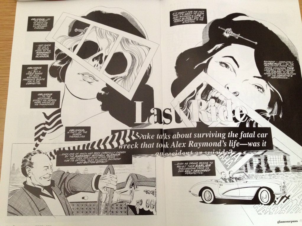
The above image is from Dave Sim's Glamourpuss #24, just one of many fine comic book hoohahs under discussion in episode 82 of the latest podcast from the brilliant (but presently ill!) Graeme McMillan and the generally slow-on-the-uptake (but mostly healthy!) yours truly.

I gotta say, we pretty much drove right in on this one, and ended up talking Action Comics #8 in the first three minutes of this two hour twenty-five minute blabapalooza, and also managed to hit topics like OMAC #8, the colorization of  Scott Pilgrim, the battles behind the TV show Community, a great blog post by Steve K. about the state of the comics Internet, Casanova #3, Supreme #20, Fatale #4, Strike Force Morituri, and that stunning issue of Glamourpuss mentioned above.

Also!  We have the first (and hopefully last) installment of Listen to Jackass, in which I respond to blog posts I haven't even read yet! It's a bit like that old Johnny Carson 'Carnac The Magnificent' sketch, except instead of cheap laughs it kinda goes more for the "feeling ashamed for Jeff and, in a way, the whole human race" kind of feeling.

iTunes?  Well, of course!  But also right here and now, ready to be cradled like a baby bird that has tumbled from its nest:

Wait, What?, Episode 82: The Problem with Problems

Oh, and I should warn you--because Graeme is feeling very under the weather, and I am feeling like I want to watch The Raid: Redemption over and over and over until they drag me kicking and screaming out of the movie theater, we won't be recording this week, so there won't be a podcast next week.  You understand, don't you?

In any event, we hope you enjoy this latest installment, and thanks for listening!