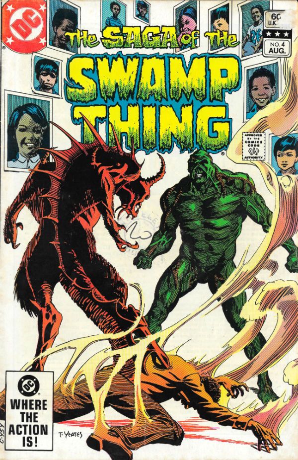
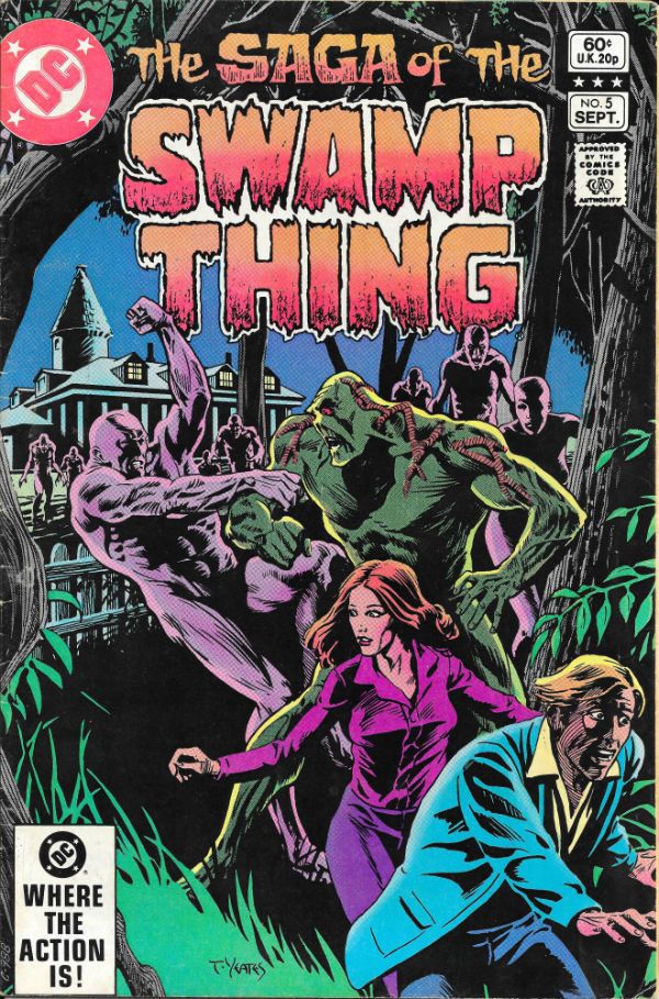
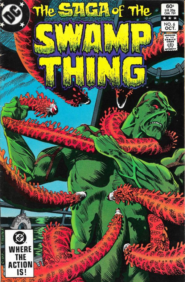
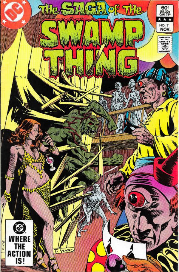
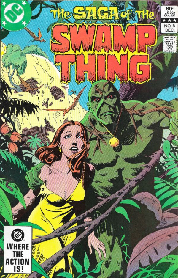
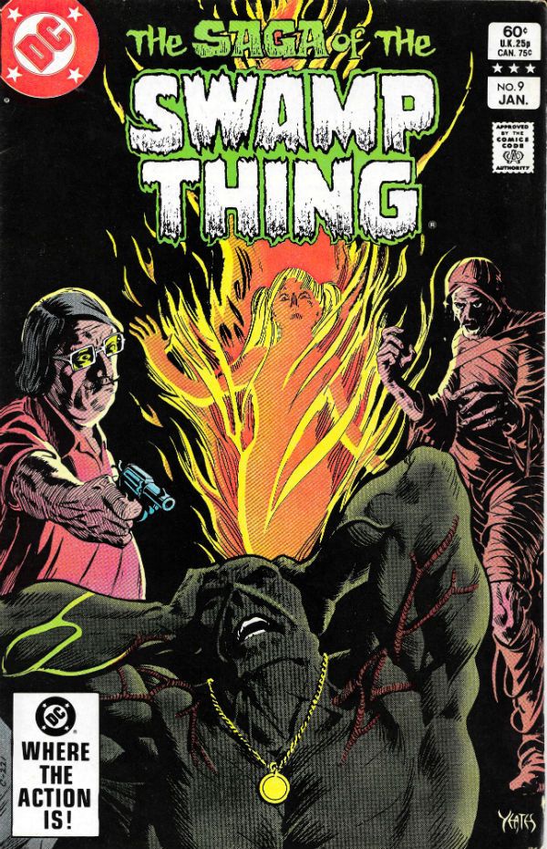
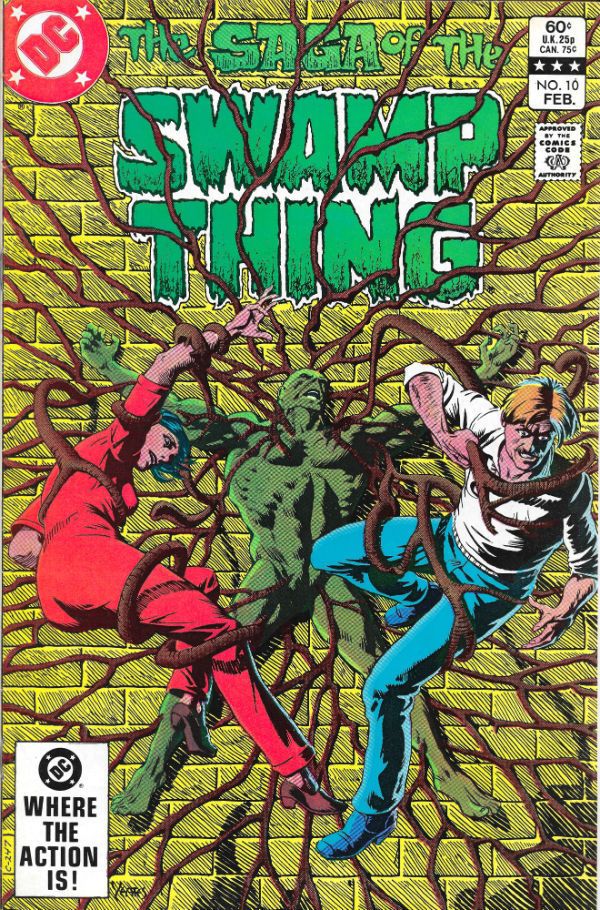
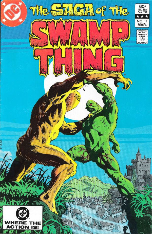
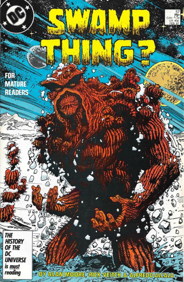
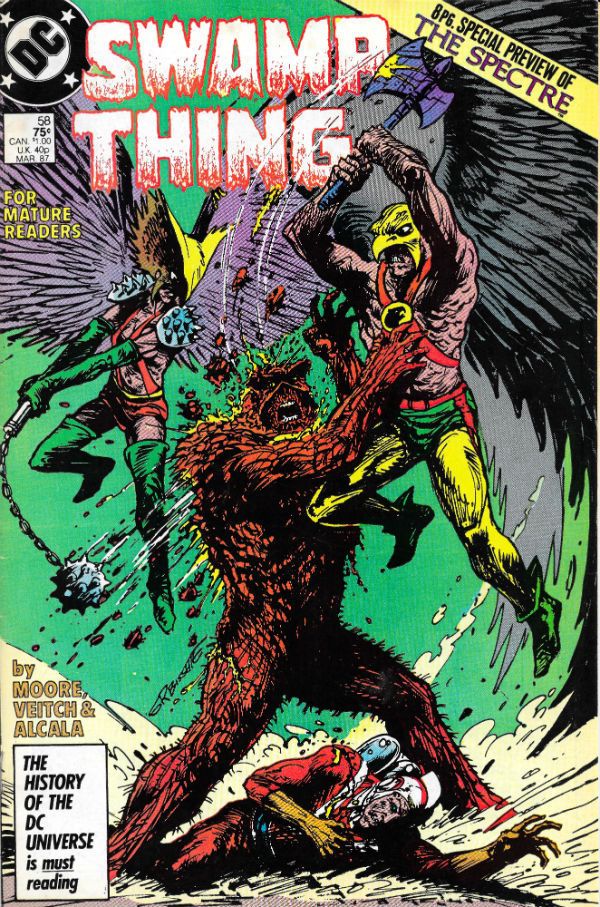
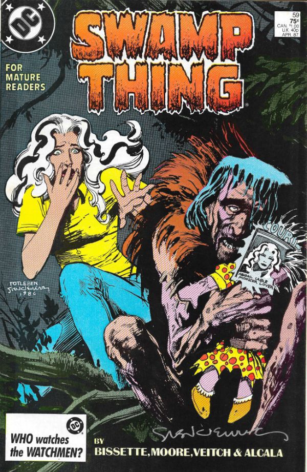
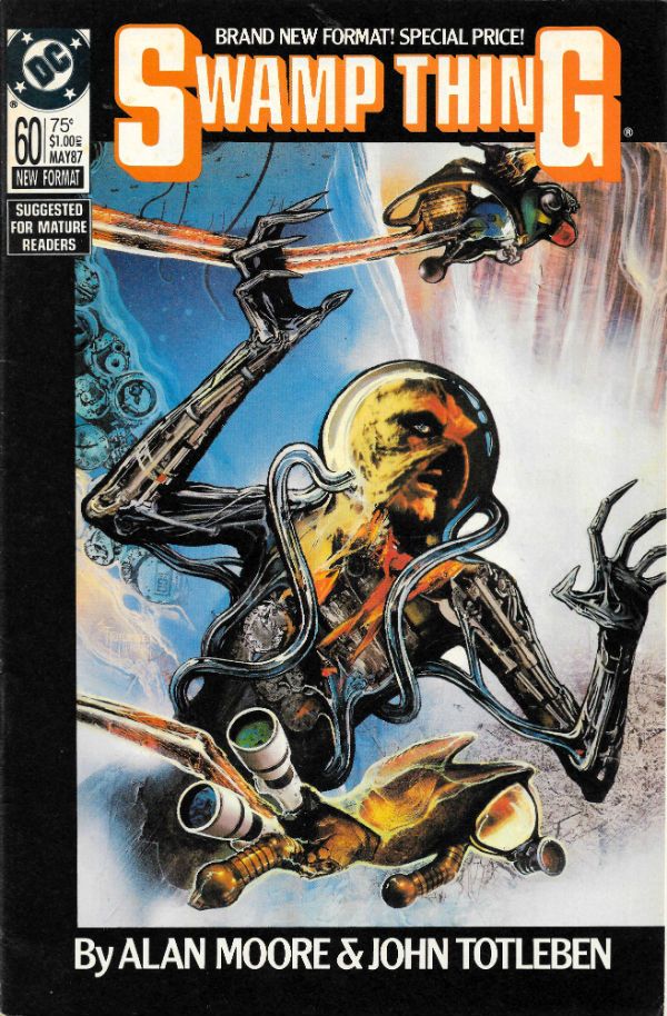
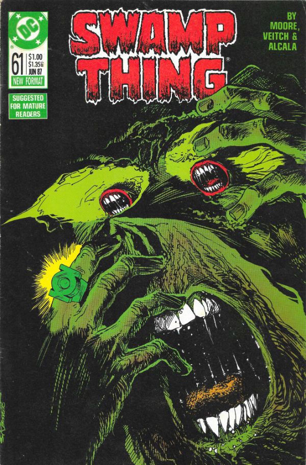
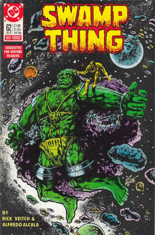
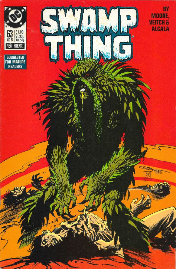
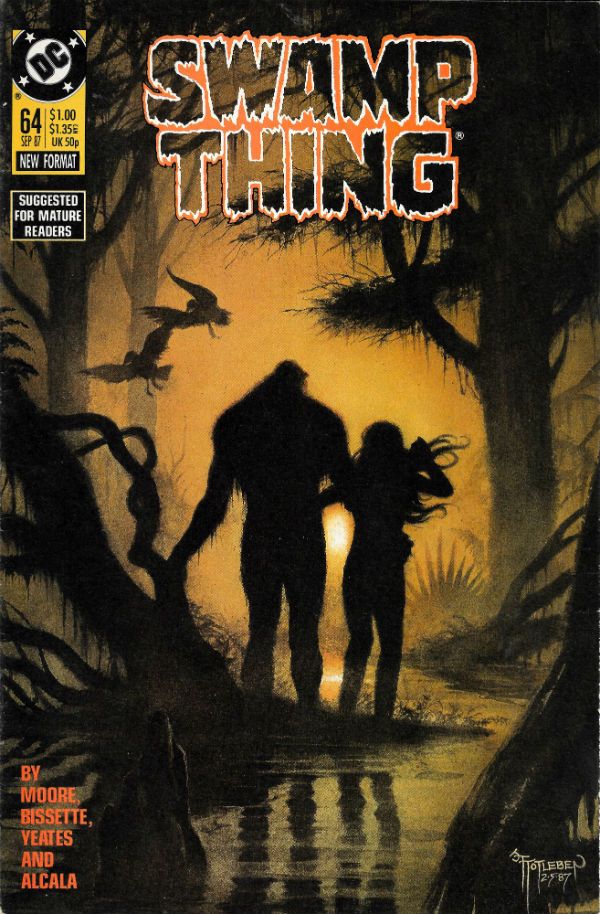
“Selena Has Already Decided Not To Buy The Lawn Furniture.” COMICS! Sometimes I Look at Saga - The Saga Of The Swamp Thing!

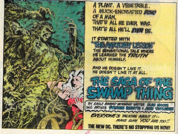
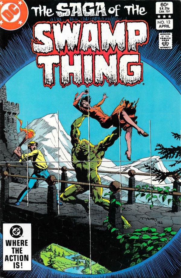
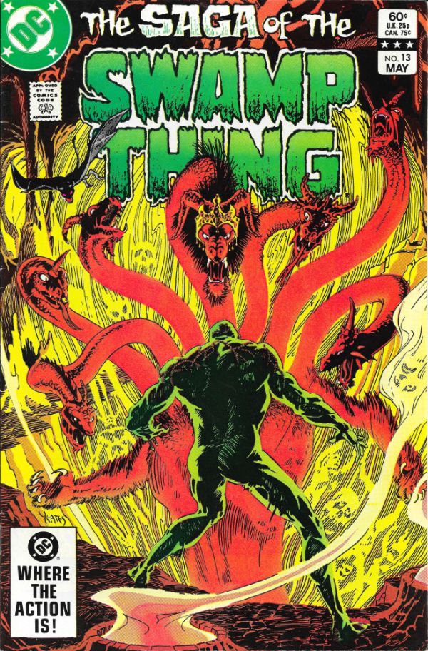
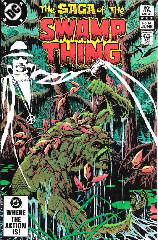
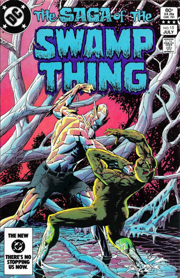
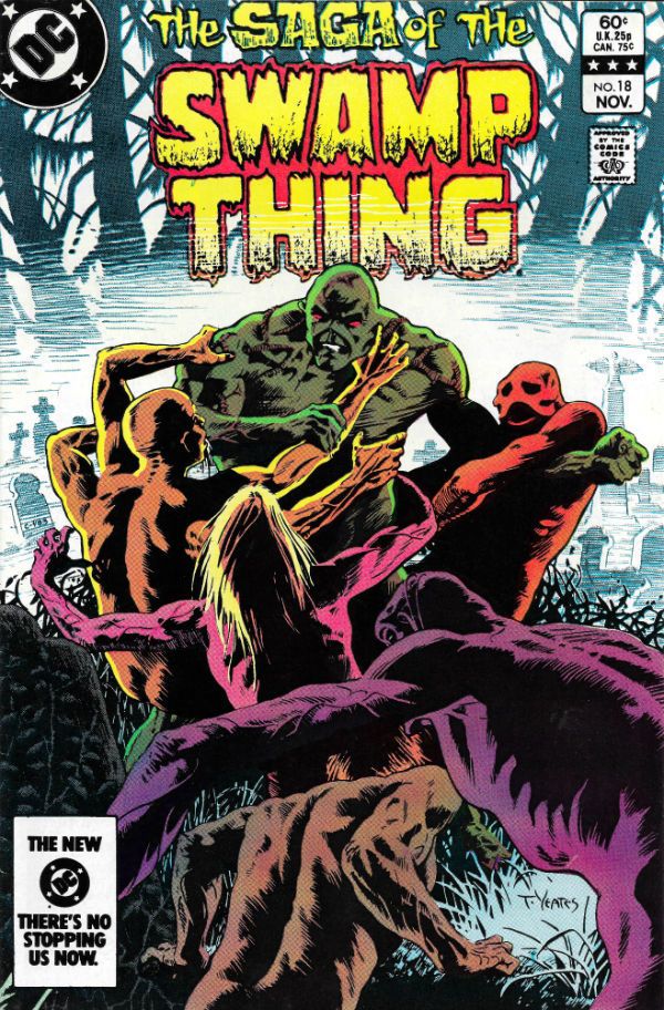
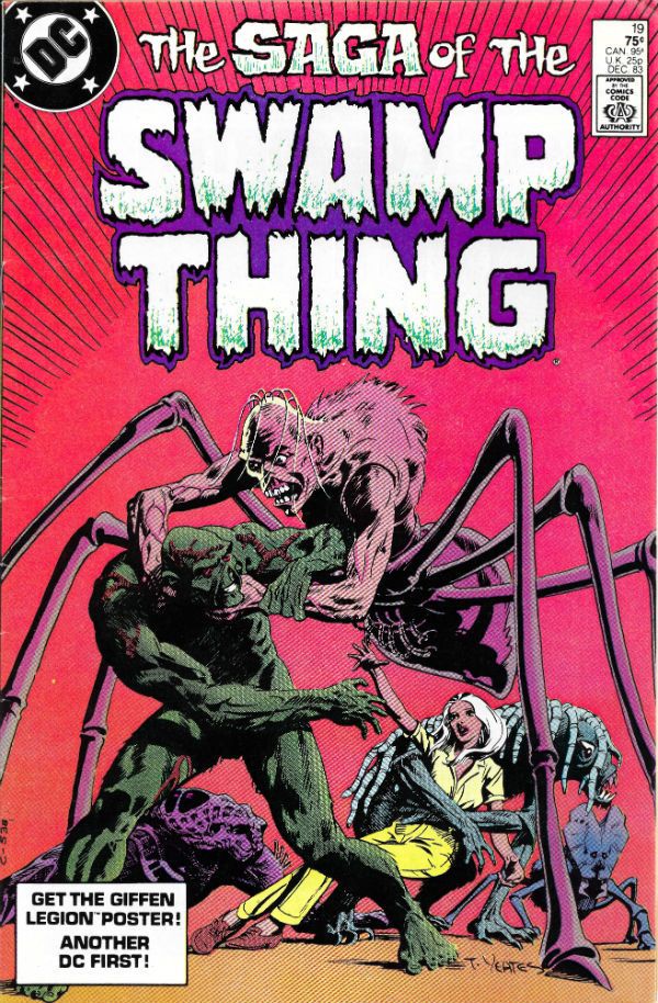
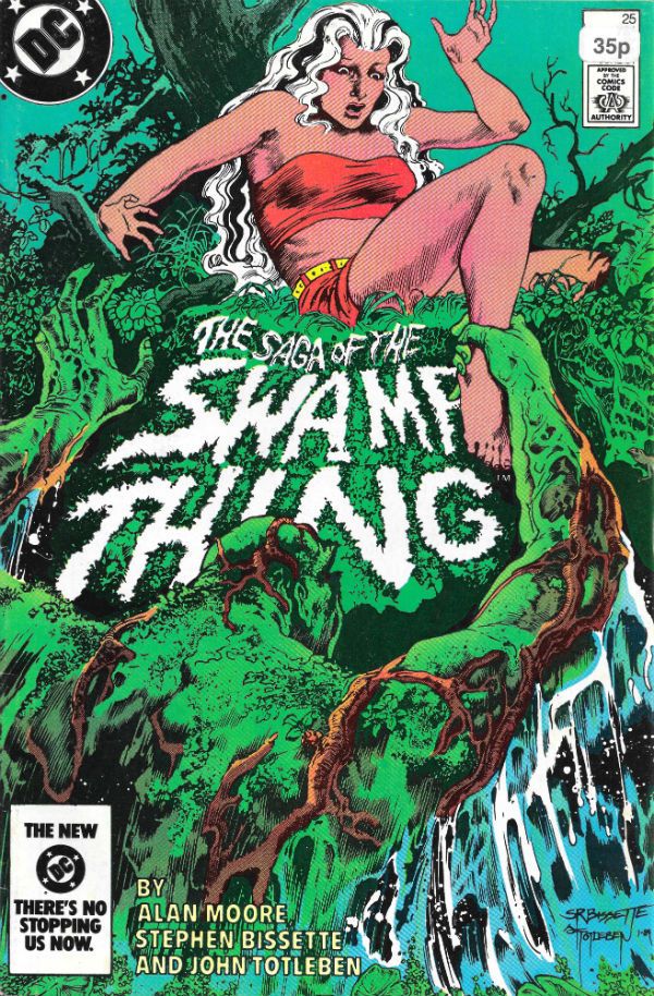
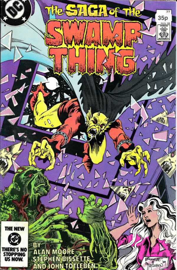
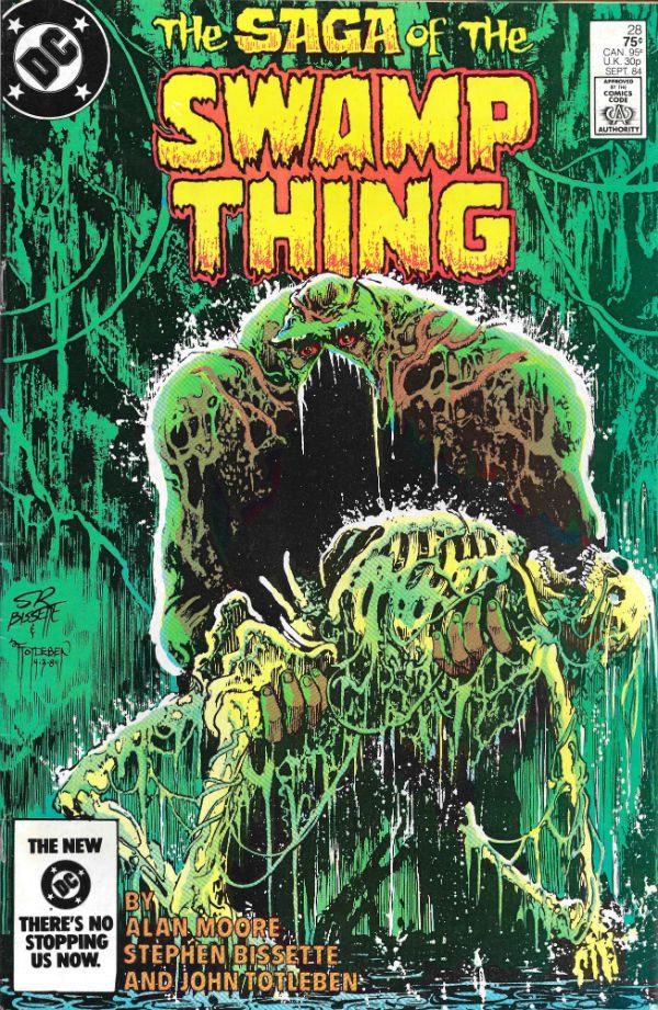
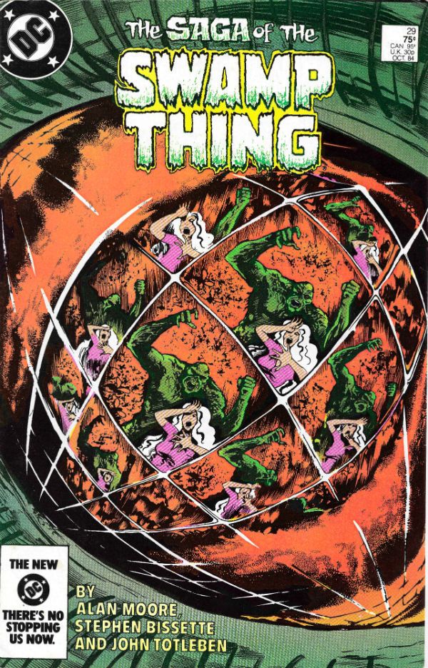
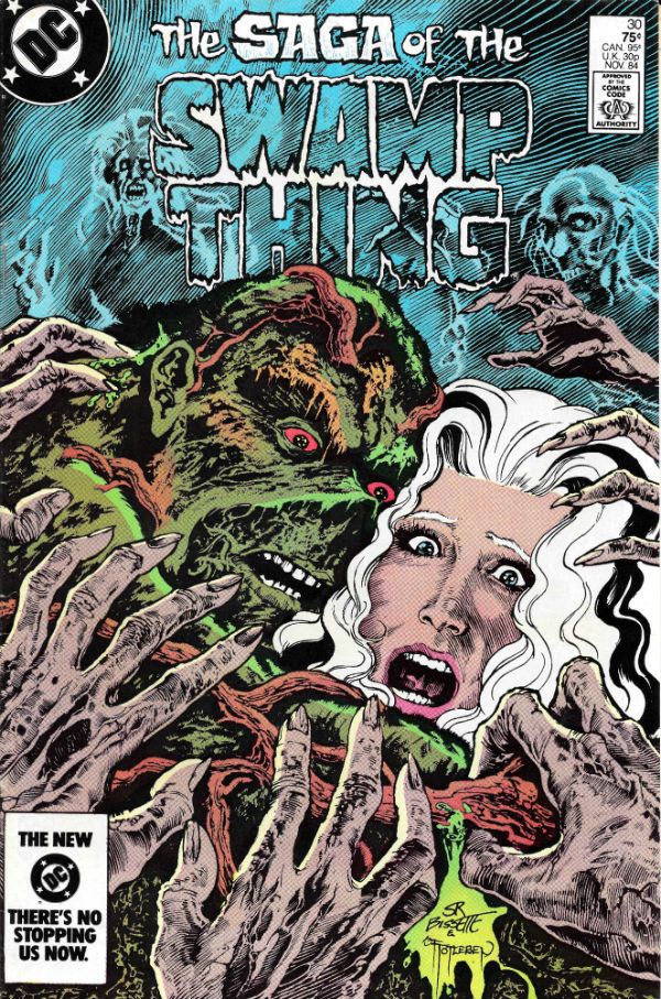
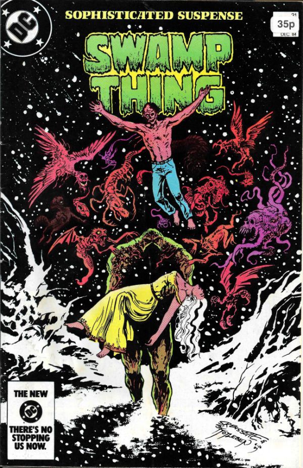
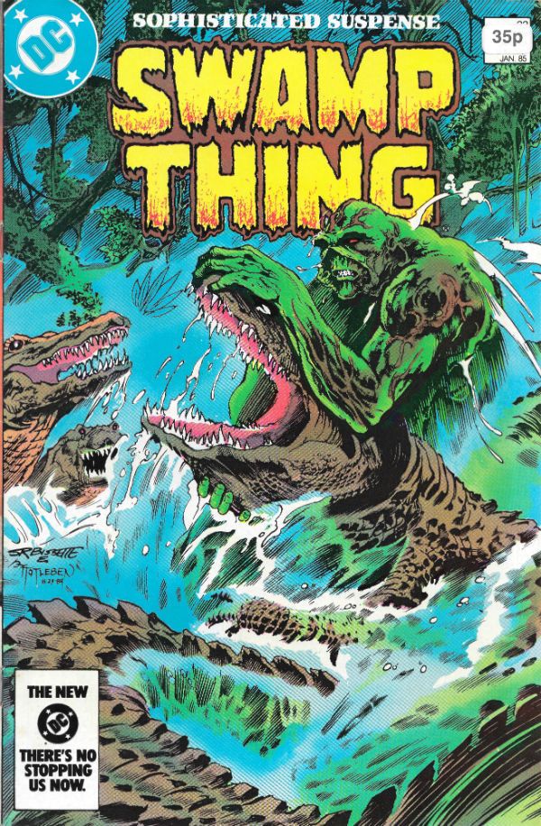
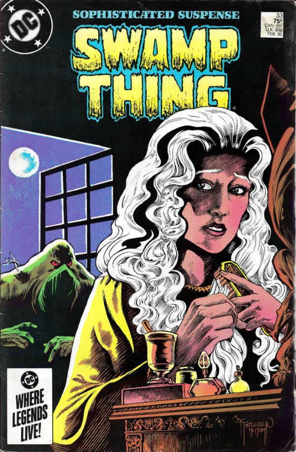
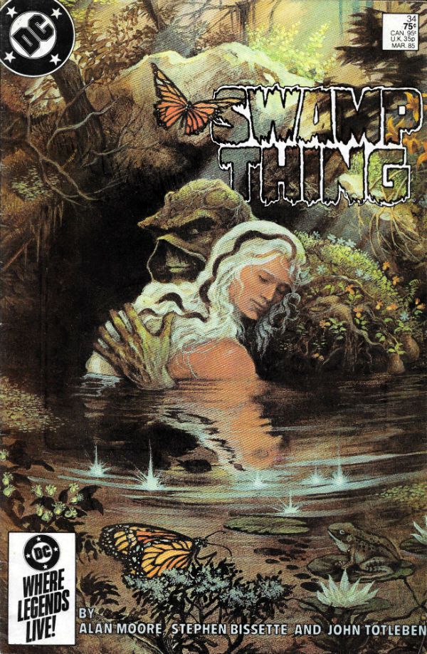
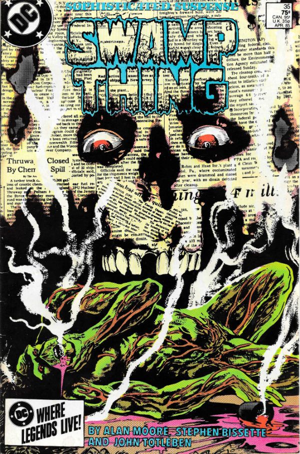
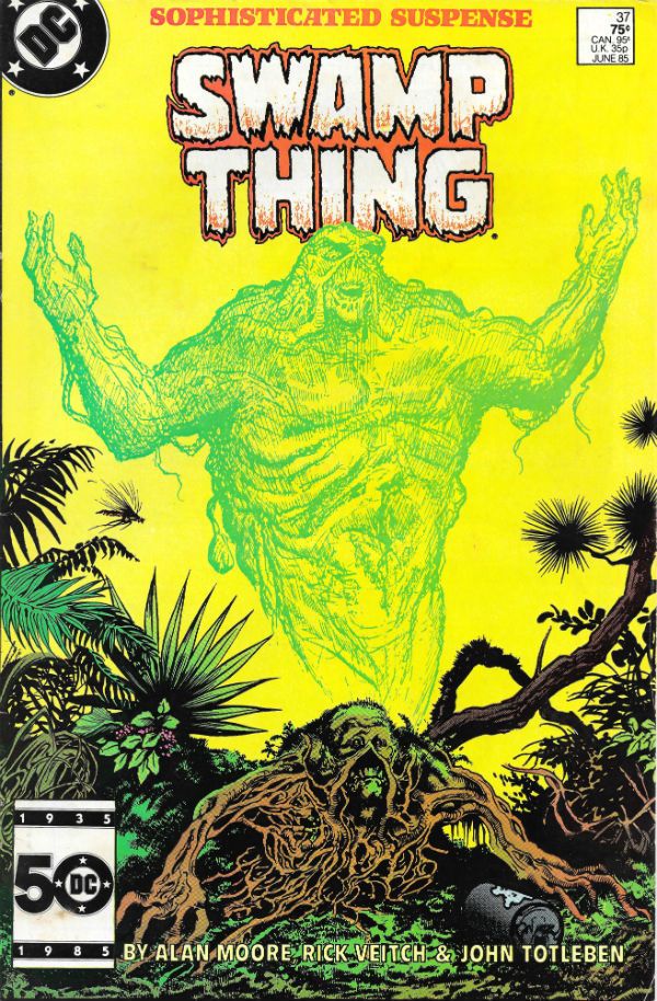
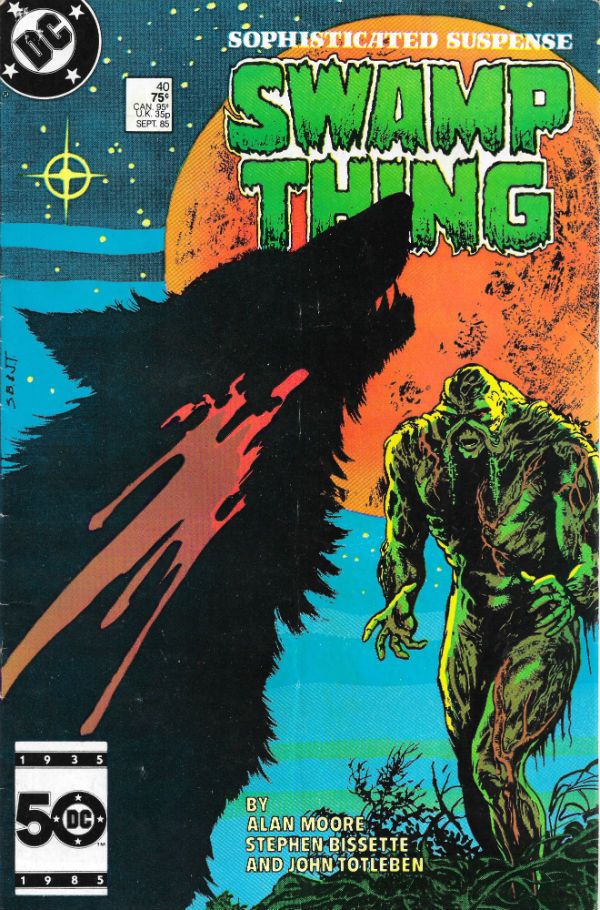
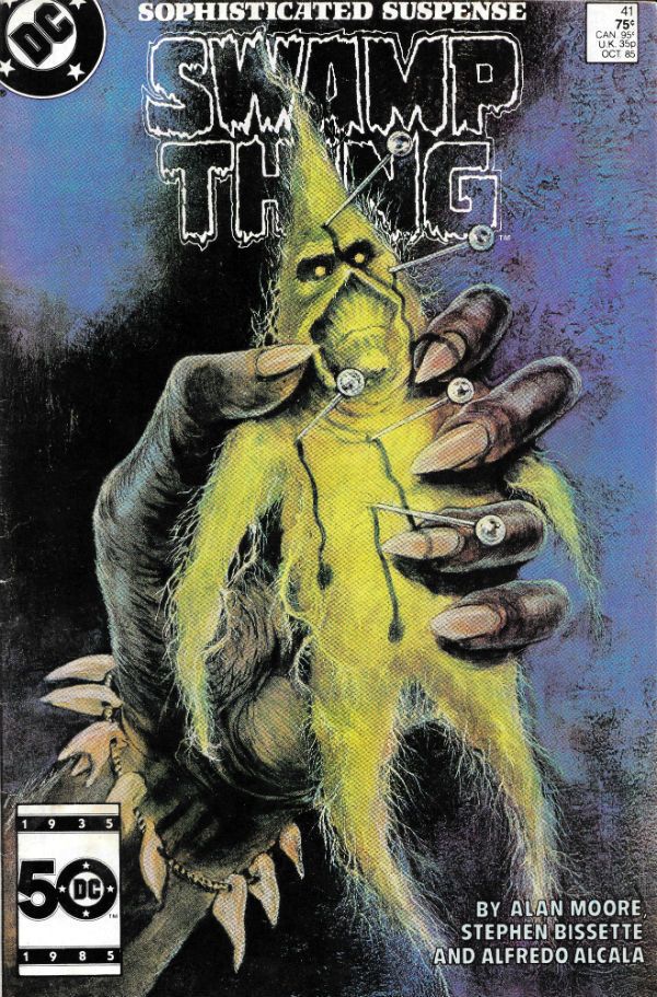
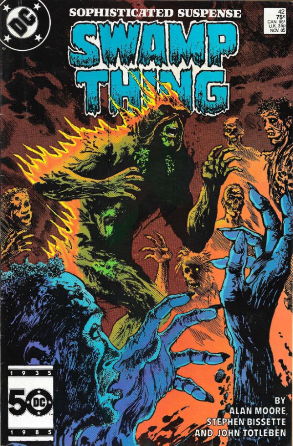
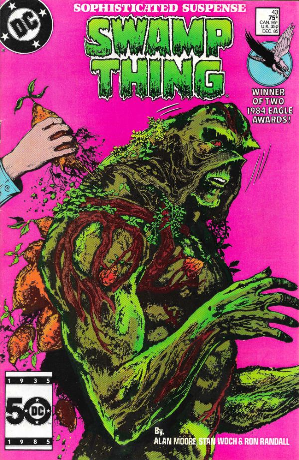
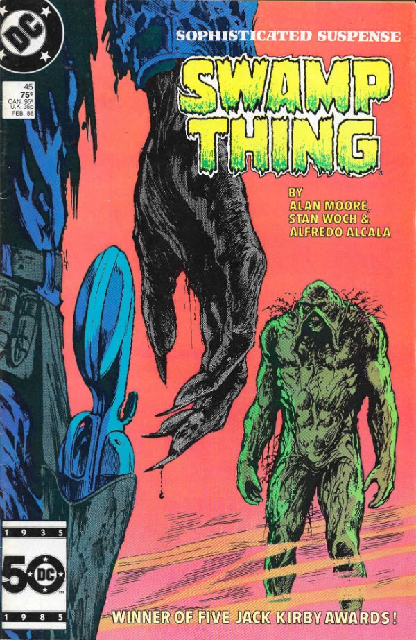
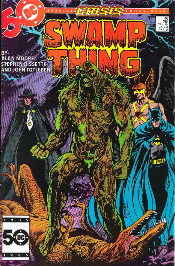
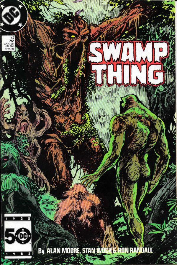
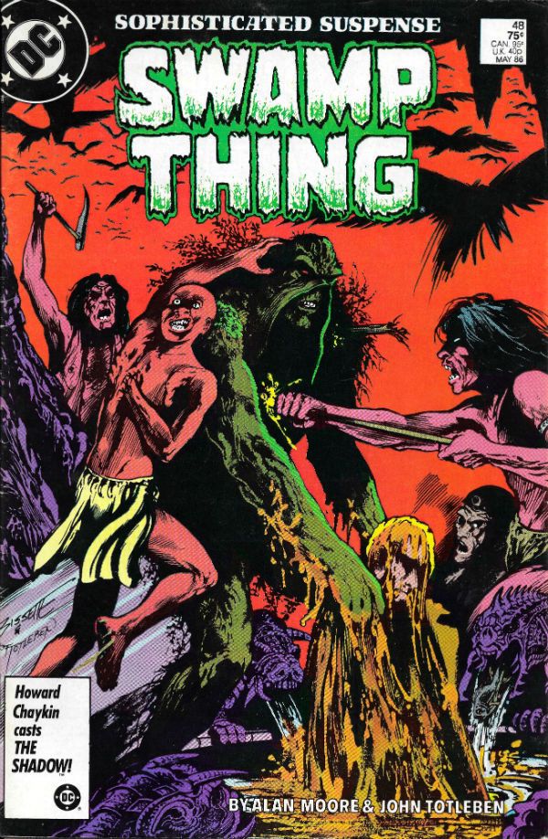
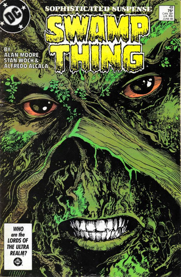
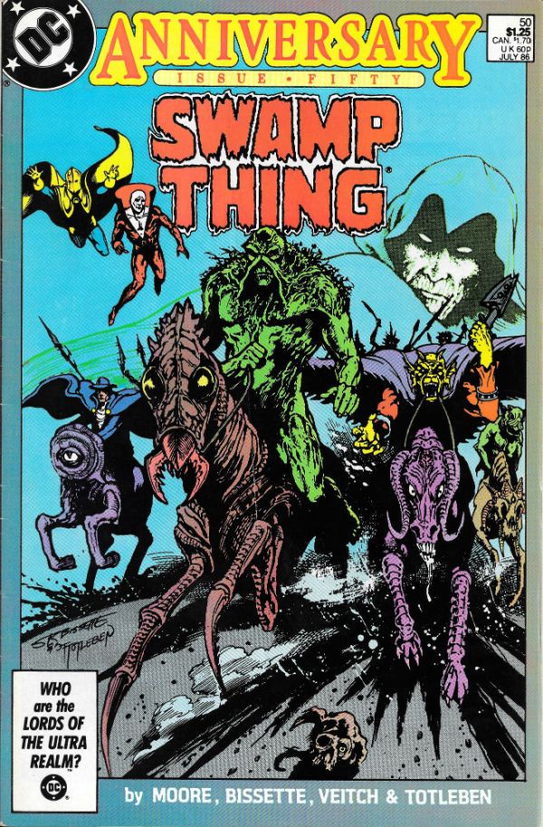
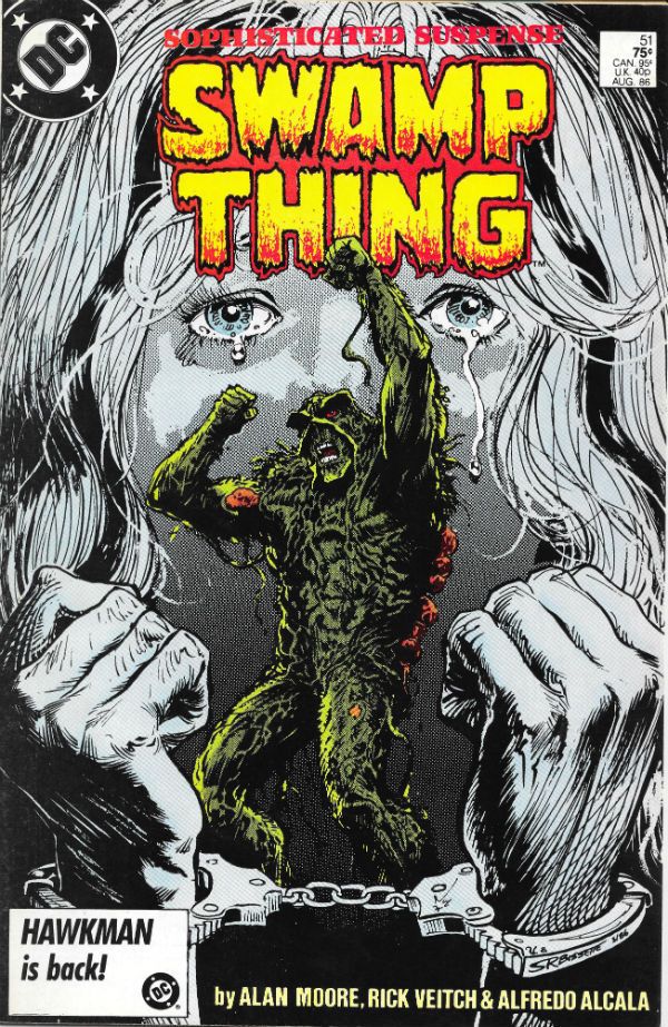
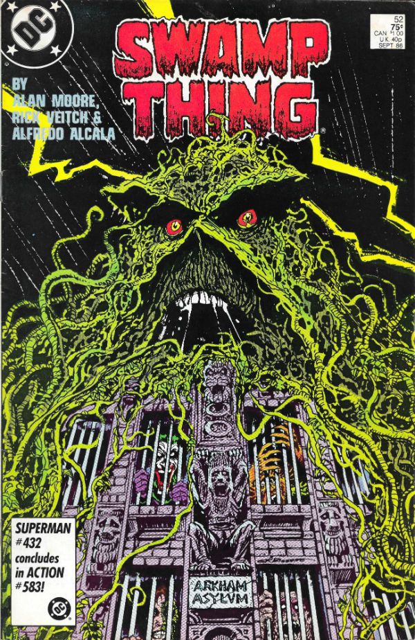
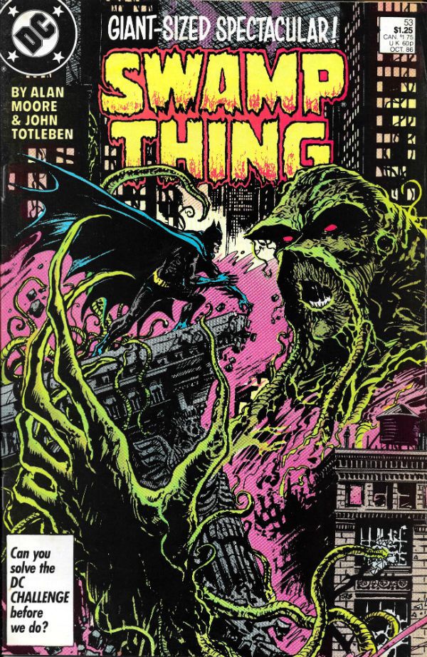
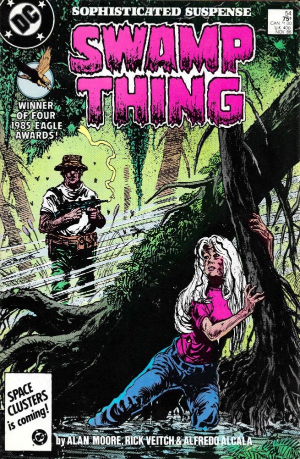
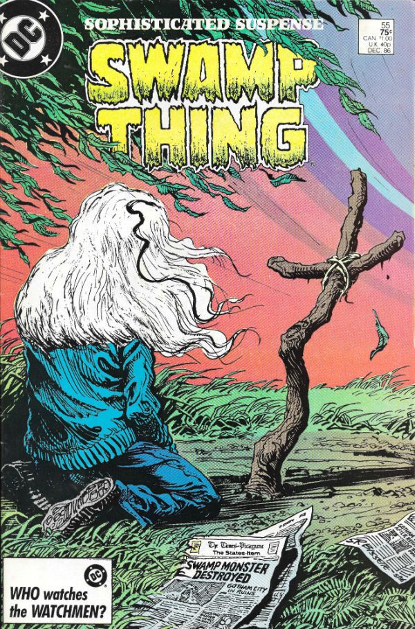
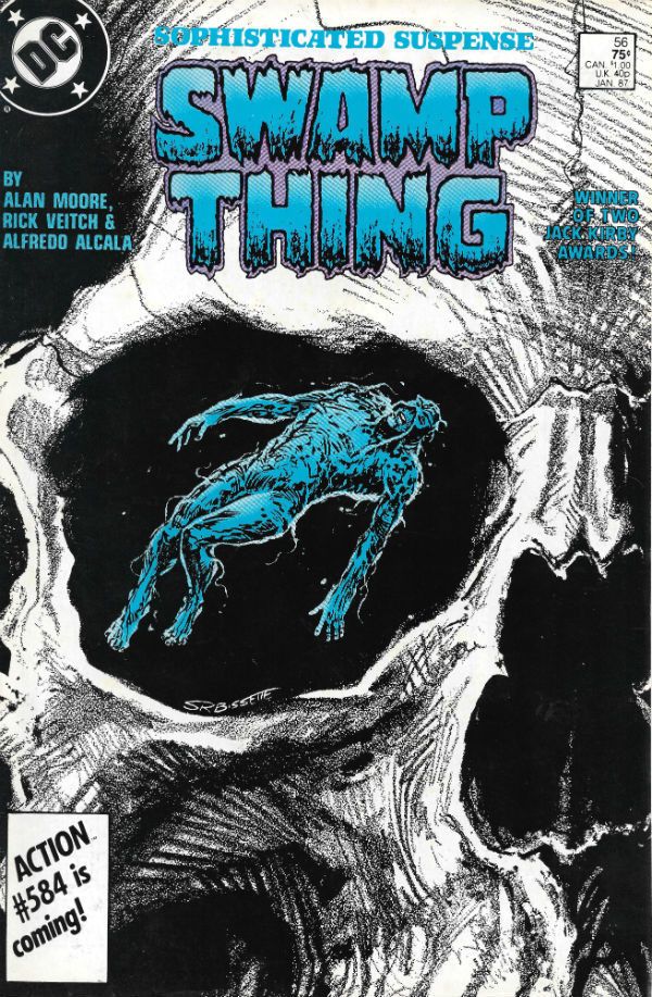
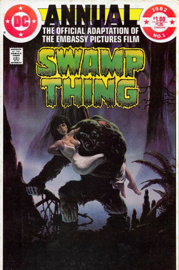
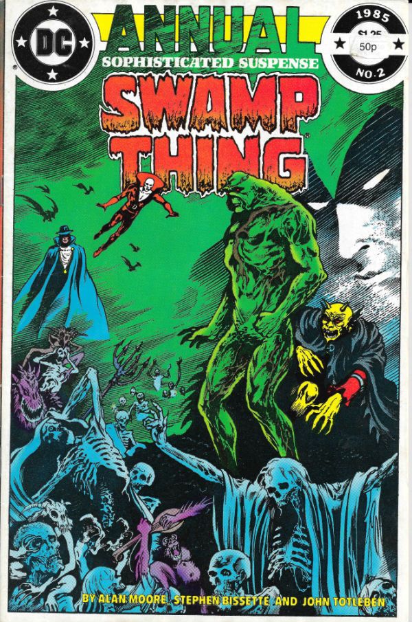
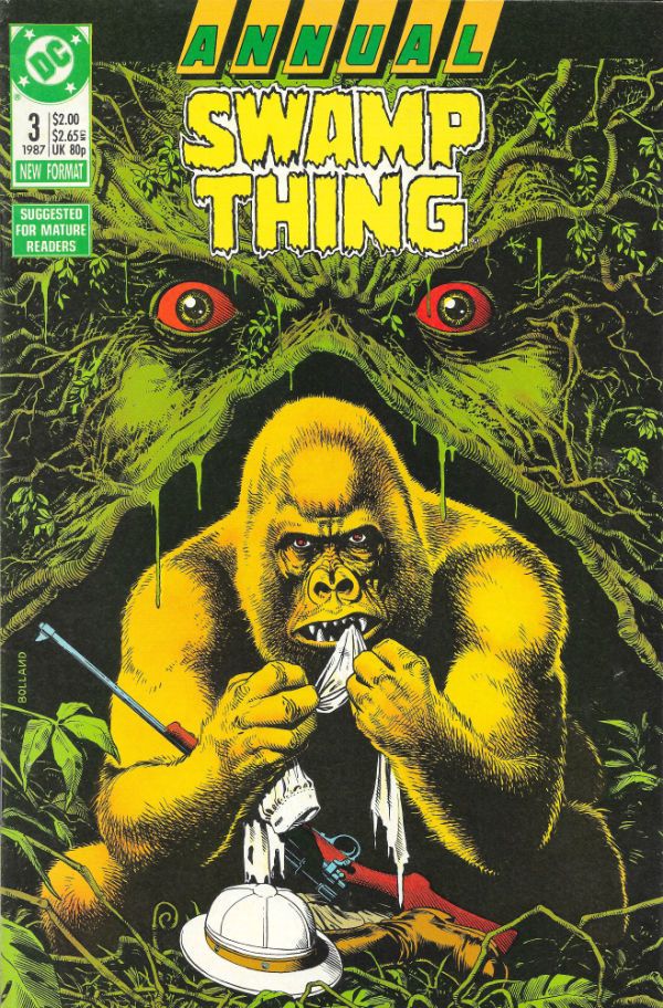
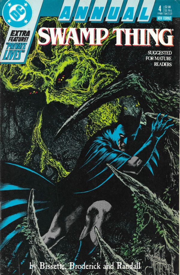
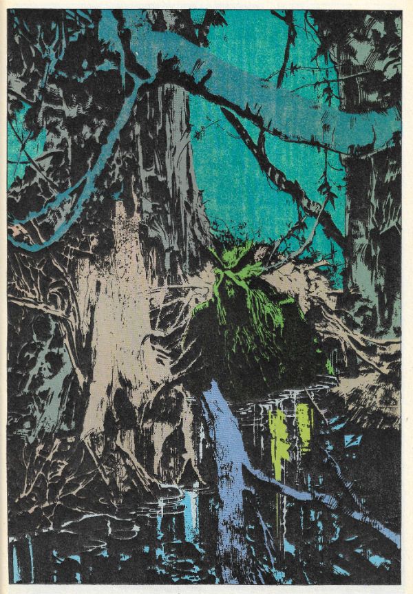
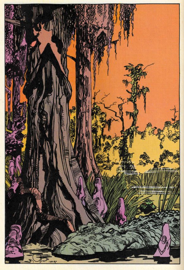
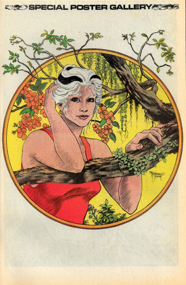
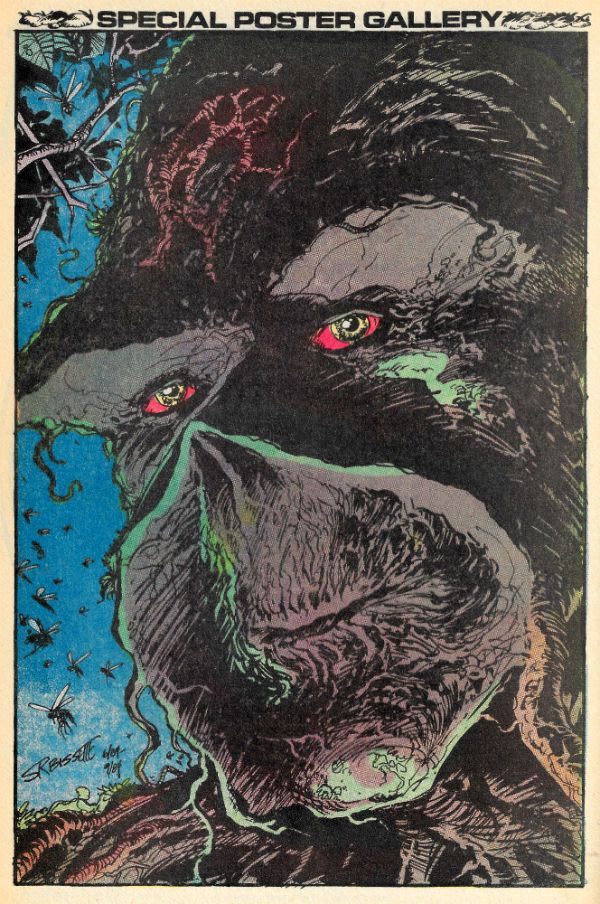
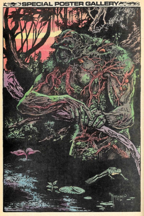
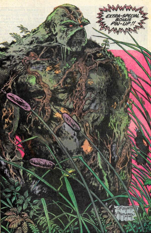
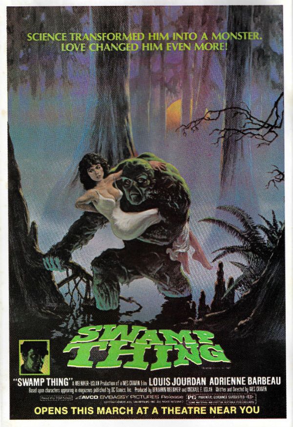
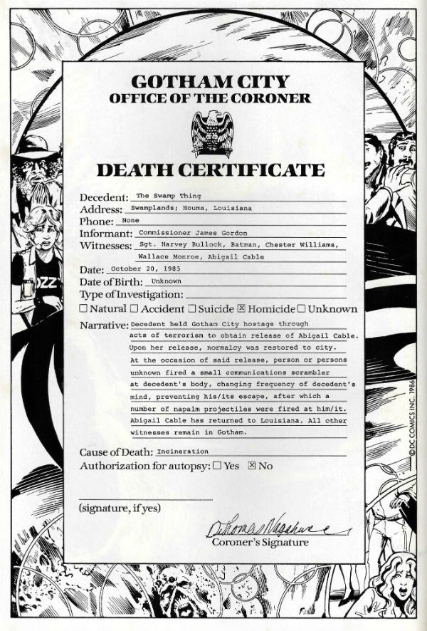
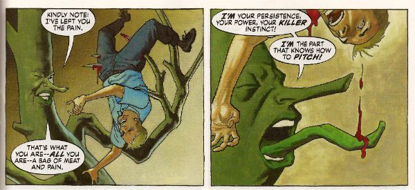
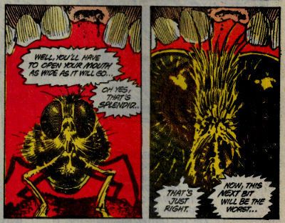
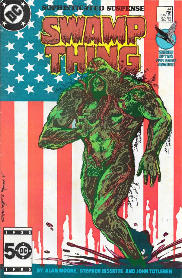
It's Halloween! Gather round, gather round! O, you lucky children! Feast your tiny dead fly sized eyes on a ghoulish gallery fit to chill even the hardiest of souls! Halloween! Sil-VER SHAMROCK! Oh alright, I just scanned in my incomplete Saga of the Swamp Thing comics run. No tricks here, m'dears; only treats! It's mostly covers but also some pin-ups and even Swamp Thing's death certificate. Morbidly apropos eh, what? I hope you enjoy looking at them while I creep up behind you. HOO-HA! Gonna wear your face like knickers!  photo S0tST27bB_zpsiwfempwk.jpg SWAMP THING by Stephen Bissette, John Totleben, Alan Moore, Tatjana Wood & John Constanza

SWAMP THING Created by Berni Wrightson & Len Wein

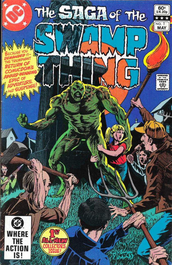
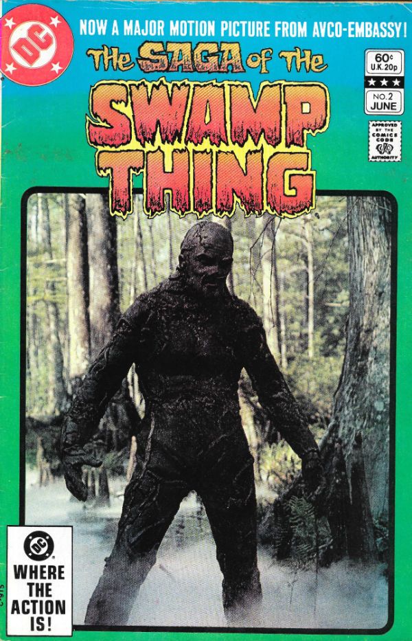
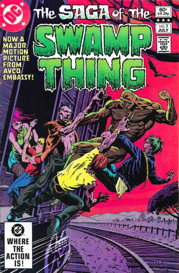
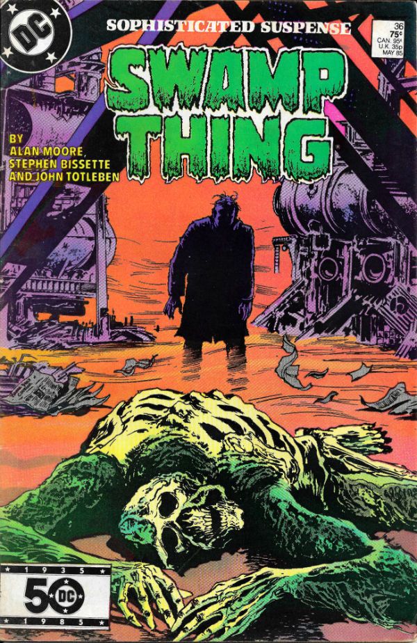
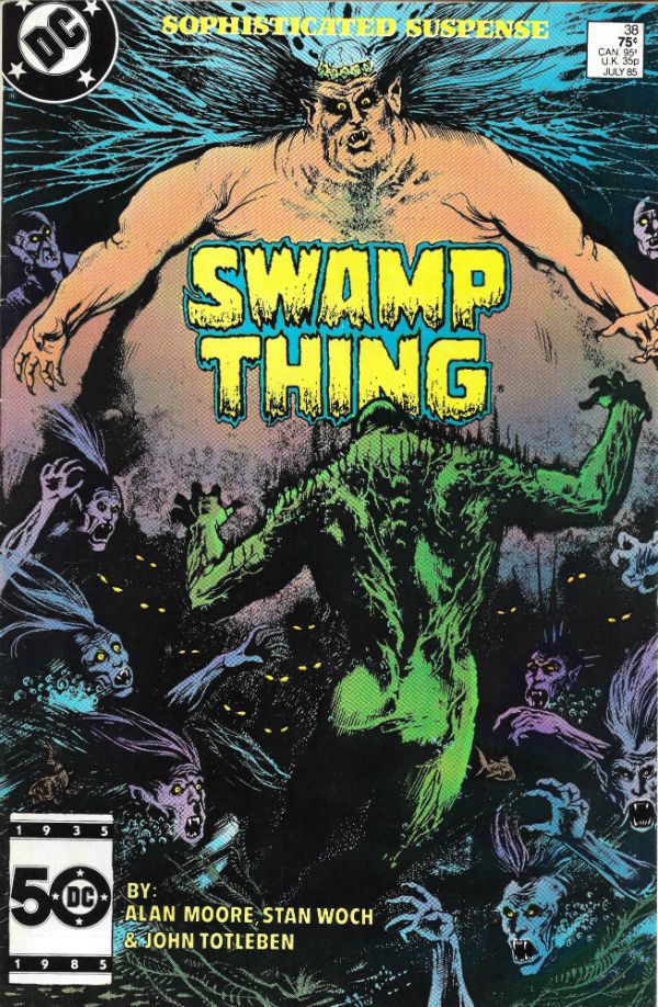
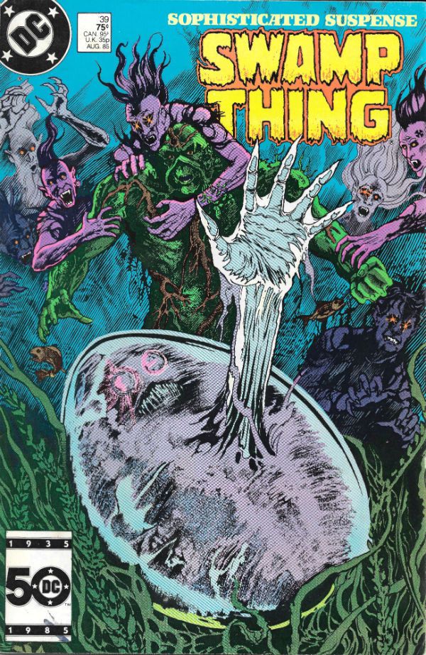
I started reading Saga of the Swamp Thing (SotST) with # 2 because I was 12 and a morbid little thing. Oh yes, Horror was my jam. I spread it liberally on my toast of terror. I was there, so let me tell you that the 1980s were a pretty awesome time all around for horror in movies, prose and comics. Probably even jam; horror was everywhere. Probably because the 1980s was a pretty awesome time for horror in real life: Thatcher, AIDS, Clause28, The Cold War, Reaganomics, The Miners Strike, Phil Collins; sometimes you just wanted to pull the covers over your head. But then you ran the risk of missing some fab Horror jam. Like SotSW. I stopped reading SotSW with #6. Not because it was rubbish, but because it stopped appearing at my local market cum newstand. Those early issues by Tom Yeates and Martin Pasko aren't the ones people remember but they were pretty decent. Issue 3 with the vampires was nice (nice enough for Moore to call back later in #38 & #39) and #4 had a children's entertainer who entertained himself with children in a bad way. It was far from rote and just about worthy of note. I restarted reading SotSW with #35 when it suddenly reappeared back on my stands. That fella from Warrior and 2000AD whose stuff I liked only turned out to be writing it, didn't he! (It would turn out he'd been writing it for a while.) My surprise and delight at the chillingly efficient tales this Moore fellow was producing was rather upended when Swamp Thing promptly died at the end of #36. Well, fuck a duck, I thought (I was a potty mouthed child).

 photo S0tST25bB_zpsfk00uihl.jpg

But then he brought him back. Later on he'd kill Swampy again, but I'd got the knack by then and just hung on til he was back. With #64 Moore moved on and even brought back Tom Yeates for a fitting finale. But Moore didn't push off before he'd written a pile of the most entertaining comics it's ever been my pleasure to read. (And re-read. And re-re-read. Etc.) So much so that I went back and filled as many gaps as I could, before TPBs were a thing at which point I, as they say, completed the set. It took time and it took money but it was worth it. From the early issues which recast old horror tropes in fresh robes of relevance, through the inevitable team up with Batman (one which actually had weight and consequences for once) through the tail end whistle stop tour of the DCU, Alan Moore brought the words. And plenty of them. But that's okay because they were good words. I have a weakness for writers who love language; I'm odd like that. And as ever with any long comics run you could tell he stayed too long, but rather than phone it in he simply concentrated on keeping himself entertained, and in so doing kept me entertained.

But there are more than words in a comic; otherwise it would be prose. There are pictures. And the pictures in SotST are the equal of Moore's words, mostly. From the titanic trio of Bissette, Totleben & Veitch whose jagged, fractured pages seemed to stab the horrors displayed right into your mind, to the stalwarts called in at short notice: Alfredo Alcala, Stan Woch, Ron Randall et al. And of course, Shawn McManus. Shawn McManus who gave Moore's script for POG (#32) a heartwrecking cartoony beauty. Everyone on the book seemed to be having a blast and so I had a blast. John Totleben certainly had fun, fun which culminated in, with #60, his flamboyantly futuristic issue-long recasting of Kirby Collage technique. John Totleben's eyes are tired, so they say, but he can hear well enough, so let's all say that, you, John Totleben rocked, and you rocked never harder than on #60 of The Saga of the Swamp Thing (unless it was that issue of Miracleman (yeah, that one). SotST is often spoken of as being Alan Moore's but that's just convenient shorthand. SotST and its many, many successes belong to everyone on its pages. Most notably those already spoken of, and particularly Steve Bissette's dark swathes of ink. SotSW is a remarkable run of comics; remarkable in its consistency, intelligence and heart. Yes, heart. Because for a horror book it was surprisingly keen to remind us of what it meant to be human; how that can be the worst thing in the world, but also how it can be the best thing in the world. That's not bad for a comic book about a plant that dreamt it was a man.Sage of the Swamp Thing was EXCELLENT!

You've all been very patient so here's the gallery:

 photo S0tST01aB_zps7h5hwgue.jpg

 photo S0tST02B_zpszdyqnst2.jpg

 photo S0tST03B_zpslf6q2xbc.jpg

 photo S0tST04B_zpscy2qs815.jpg

 photo S0tST05B_zpskrjm0ere.jpg

 photo S0tST06B_zpswdwuunik.jpg

 photo S0tST07B_zpsqte67v9r.jpg

 photo S0tST08B_zpshvofaavx.jpg

 photo S0tST09B_zpsjxa1lezp.jpg

 photo S0tST10B_zpse1uoltfq.jpg

 photo S0tST11B_zpswqlv7wtw.jpg

 photo S0tST12B_zpssfjcaq0d.jpg

 photo S0tST13B_zps8bo3fv9p.jpg

 photo S0tST14B_zpsvivzjzif.jpg

 photo S0tST15B_zps1xedww1b.jpg

 photo S0tST18B_zpsnuiygvpv.jpg

 photo S0tST19B_zpsuwutnp5z.jpg

 photo S0tST25aB_zps3tysl1sc.jpg

 photo S0tST27aB_zps0loq4qxu.jpg

 photo S0tST28B_zpsmiw1obak.jpg

 photo S0tST29aB_zpsskphvrjv.jpg

 photo S0tST30B_zpsx0la6u2u.jpg

 photo S0tST31B_zpsgot7zuvm.jpg

 photo S0tST32B_zpsm9qy66hq.jpg

 photo S0tST33aB_zpsx7wua3vy.jpg

 photo S0tST34B_zpsownvcs1j.jpg

 photo S0tST35B_zpsznnknjca.jpg

 photo S0tST36B_zpso2qu0eif.jpg

 photo S0tST37B_zpsxeynkefc.jpg

 photo S0tST38B_zpsopoygf1k.jpg

 photo S0tST39B_zpslth7i3mr.jpg

 photo S0tST40B_zpsd26tl5tm.jpg

 photo S0tST41B_zpsdrvixr4q.jpg

 photo S0tST42B_zpsljwtrkr1.jpg

 photo S0tST43B_zpsoxrfstyp.jpg

 photo S0tST44B_zps3gfhl8ay.jpg

 photo S0tST45B_zpshvdm3nft.jpg

 photo S0tST46B_zpsd8obz8fi.jpg

 photo S0tST47B_zpsifwgyksx.jpg

 photo S0tST48B_zpseqezckgg.jpg

 photo S0tST49B_zpsbneswwwa.jpg

 photo S0tST50B_zpsyvf3mam3.jpg

 photo S0tST51B_zpsyn0w08ri.jpg

 photo S0tST52B_zpsmwnmvi12.jpg

 photo S0tST53B_zps9frna7qi.jpg

 photo S0tST54B_zps0xhxnwkt.jpg

 photo S0tST55B_zpslesguhzq.jpg

 photo S0tST56aB_zpsohaunsiz.jpg

 photo S0tST57B_zpsiaqpadgq.jpg

 photo S0tST58B_zpsmgd1rlzp.jpg

 photo S0tST59B_zpsjwh2z4gt.jpg

 photo S0tST60B_zpsdmfcyt1r.jpg

 photo S0tST61aB_zpslhdmkxta.jpg

 photo S0tST62B_zpsdnn3rhx3.jpg

 photo S0tST63B_zpshyv41wqh.jpg

 photo S0tST64B_zpsw5xfgw3o.jpg

 photo S0tSTan01B_zpslomwyqhd.jpg

 photo S0tSTan02B_zpsrwbdlrgt.jpg

 photo S0tSTan03B_zpsuxr6xmxd.jpg

 photo S0tSTan04B_zpsti69jov9.jpg

 photo S0tST61bB_zpsrydsqhs8.jpg

 photo S0tST61cB_zpsg9bys5c0.jpg

 photo S0tST33cB_zpsgb1fcy2r.jpg

 photo S0tST33dB_zpsd62wuaoc.jpg

 photo S0tST33bB_zpsvt2qopaw.jpg

 photo S0tST29bB_zps6xqtt53s.jpg

 photo S0tST01bB_zpsllbs3gih.jpg

 photo S0tST56bB_zps77ya6esz.jpg

Sometimes...I am almost...frightened...by my own – COMICS!!!

"I Have Got To Be Sure, You Old Poop!" COMICS! Sometimes Democracy Comes Second!

Yes! Beat out that rhythm on a drum! Here's the only comic reviews worth reading on The Internet. No, Not really. No, not really in the mood either but if I don't put something up They come round and stand outside my windows in silent judgement. Hoopla! Also, don't forget to Save The Hibbs - HERE!  photo JaimePanelB_zpsui3bzwcz.jpg LOVE AND ROCKETS NEW STORIES by Jaime Hernandez
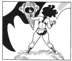
Anyway, this... GILBERT AND JAIME HERNANDEZ' LOVE AND ROCKETS NEW STORIES ISSUE 7 IS “FRISKILY AGAINST THE PRIVATISATION OF THE PENAL SERVICE” IN AN ISSUE WHICH IS “BOUNCY.”

LOVE AND ROCKETS NEW STORIES #7 Everything by Gilbert & Jaime Hernandez Fantagraphics, $14.99 (2014) Love And Rockets created by Jaime & Gilbert Hernandez  photo LRockCovB_zpsiqwifvto.jpg

My LCS always forgets to send me this because, I guess, they are young and they think my aged mind is rotted like the teeth of a candy addicted child, and probably also being like super old and intellectually vulgar I can't appreciate The Good Stuff. That John, they think, he just likes 1970s war comics and Howard Victor Chaykin. He's just not been the same, that John, since his cock left him for the circus, they say opening themselves to a libel suit. Or slander. I'm not the lawyer, that’s the other chap. Either way, you know what I mean. Eventually though I remember to ask for it and they send it and it arrives and I read it. Write what you know, right? Have you seen this stuff? Look, someone in Comics needs to talk to someone in a position of authority pretty damn sharpish before things get out of hand. I'd say send Tom Spurgeon because he is disturbingly level headed about everything but they'd bang him up before he got a word out, what with his not exactly being dissimilar to that rangy dude out of Manhunter.
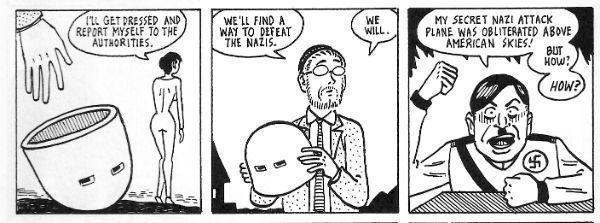
 photo GilbPanelB_zpspcyd6kux.jpg LOVE AND ROCKETS NEW STORIES by Gilbert Hernandez

So, no, don't send him, but someone needs to be sent. Because on the evidence of the last few LOVE AND ROCKETS NEW STORIES it's just a matter of time before Gilbert Hernandez flies a dirigible painted to resemble a giant, solitary boob at the Superbowl while spraying jellybeans and blue urine from an intricate system of nozzles and feeder tubes while playing MMMBop! at a volume sufficient to shatter skulls like plates chucked at a fireplace. Gilbert Hernandez' contributions here look like he just got a felt pen and proceeded to set down a bunch of pages so ridiculously bizarre that they threaten at any moment to explode into a nightmarishly profound revelation about the very nature of reality itself. I mean, after the dirigible thing, people are going to ask why no one saw the warning signs, and we're all going to have to hide our copies of LOVE AND ROCKETS NEW STORIES and act sheepish until the hullabaloo dies down. Then the other one, that Jaime, he's doing his thing about relationships and the past and learning to live, learning to die and all that, and I realise he is excellent at it but all that? it's just not me but BOOMSHAMALAMABINGBANG! he then only goes and equals the derangement which fists its way through every page of his siblings efforts, and what we have here is a comic so insanely aflame with creative fire that we have to break the Emergency Glass and throw the word ART! at it. No doubt, no doubt at all, The Bros Hernandez are still simply the best; better than all the rest; NA NA NA NA STEAMY WINDOWS! BONUS: KIDS! Can you spot the two Thomas Harris references in the preceding? Bully for you; you'll still get old and hate everything you once held dear! EXCELLENT!

REVIEW: FRACTION, CHAYKIN & BRUZENAK’S SATELLITE SAM #12 WISHES IT “HAD MORE THAN ONE LIFE TO GIVE FOR ITS COUNTRY” WHILE ALSO REGRETTING “TAPING “EVERYBODY LOVES RAYMOND”.”

SATELLITE SAM #12 Art by Howard Victor Chaykin Written by Matt Fraction Lettered by Ken Bruzenak Image Comics, $3.50 (2015) Satellite Sam created by Matt Fraction & HowardVictor Chaykin
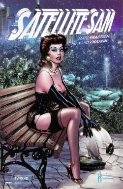
 photo SSamCovB_zpslngtotgz.jpg

Show me the man who has greater love for Howard Victor Chaykin and Ken Bruzenak. (Show me! Show me!) No, that guy doesn’t count he’s just some bum you bribed with a cot and two squares to say that. Me, I’m the real deal; I‘m the original walking bias when it comes to Howard Victor Chaykin and Ken Bruzenak so it pains me to say that this (the twelfth; what will be the first in the third trade paperback; what is already $42.00 in real money) issue of Satellite Sam is the only one so far to actually have worked. A bit. That’s just me though. Matt Fraction described this comic as “the ultimate Howard Chaykin(sic) comic” apparently blind to the arrogant condescension within his glib shilling. (What about all the Howard Victor Chaykin comics Howard Victor Chaykin wrote and drew? What about The Shadow: Blood And Judgement, Blackhawk: Blood and Iron, American Flagg!, Time2, Midnight Men, Black Kiss, Black Kiss2, and all the ones that aren’t as good as those (but are still better than Satellite Sam)? Sweet Mother of Pearl, the unmitigated gall of the man.) Anyway, in this issue characters suddenly realise the series is almost over and stop aimlessly noodling about and start blurting lines more suited to those movies Sally Field and Brian Dennehy are in that only children and people old enough to have varicose veins in their eyes watch, because only they are at home during the day. “I'm just another hole your Daddy left behind that you can't fill!” shrills one character and we all pretend that this isn't just a Empty Bullshit Moment unattached to anything in the preceding issues. It's the pact we make with today's writers. A pact signed in lattes.
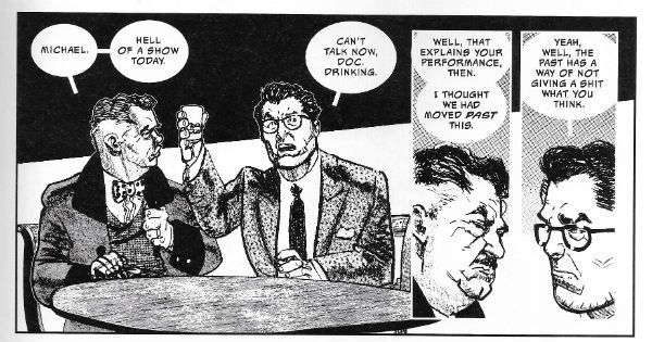
 photo SatPanelB_zpsovokltb1.jpg SATELLITE SAM by Howard Victor Chaykin, Matt Fraction & Ken Bruzenak

As full of blazingly manipulative yet calorifically negligent emotional bombast as this issue is it's still better than any of the preceding issues. Mainly, it's better because every scene isn't at least a third too long, hanging about like a hammy actor reluctant to leave the stage and Howard Victor Chaykin seems to no longer, apparently, be drawing in a state of arousal so heated he can barely see. Ken Bruzenak remains flawless as ever. When people tell you this comic was mature, provocative and insightful always remember it was dumb enough to have a character blackmail a writer and for that not actually be a joke. As it enters the home stretch it looks like SATELLITE SAM will wind up being a gauche muddle of half-digested research that expects everyone to share its naive shock that in the past there was racism, homophobia and sexual intercourse other than the missionary position. Anyway, this thing is over soon and then we can all concentrate on an actual Ultimate Howard Victor Chaykin Comic. One that will hopefully be better than OKAY!


REVIEW: MAHNKE, ALAMY, IRWIN, CHAMPAGNE, MENDOZA AND MORRISON'S THE MULTIVERSITY: ULTRA COMICS #1 "RESTS ITS BALLS FOURSQUARE ON THE CHIN OF FANDOM."

THE MULTIVERSITY: ULTRA COMICS #1 Art by Doug Mahnke & Christian Alamy, Nark Irwin, Keith Champagne, Jaime Mendoza Written by Grant Morrison Coloured by Gabe Eltaeb, David Baron Lettered by Steve Wands DC Comics, $4.99 (2015) Superman created by Jerry Siegel & Joe Shuster
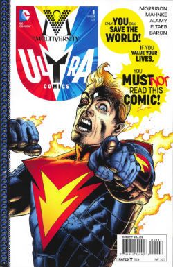
 photo MultCovB_zpsa20ixglv.jpg

It was VERY GOOD! Because it was smart and entertaining but mostly because Mahnke & a crowded taxicab of inkers' art just plain fit like flesh on a skull. Those dudes are the dreamiest team. I hear inkers are on the outs what with there being no real need to divide the work that way for the hyper streamlined assembly line of 21st comic book production. I hope some teams stay together: this Sunday 5-a-side Team obviously, and Alan Davis & Mark Farmer, John Romita Jnr & Klaus Janson, Jack Kirby & Mike Royer, oh wait...Anyway back at Grant Morrison, we can't talk about the artists more than Grant Morrison now, can we? He'll get in a right snit. So, yeah, really now, can we have a moratorium on whining about Internet criticism within the books themselves. This childishly one sided last-wordism is even more distasteful as it always comes from the writers  criticism can’t touch.  Like Elvis sang, why are writers always first to feel the hurt and always hurt the worst. Or was it children? Is there even a difference? Questions. Anyway, thanks, Elvis; see yourself out. Loves his Mum, you know. Also, for someone so keen to be understood Morrison is remarkably opaque about the nature of his eggy Evil here. It’s the critics; no, wait, it’s the comics companies; no wait, it’s the fans; hang on, it's Terry Blesdoe from next door but one to me Mum; no, wait, it’s poor people; no, wait, it’s rich people; no wait, it’s Alan Moore! (It’s always Alan Moore! That utter, utter shit! Look at him over there apparently minding his own business, but we know he’s really biding his time. Oh, we’ve got your (big) number, Alan Moore!)
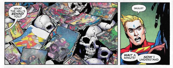
 photo MultPanelB_zpsqc3rza9j.jpg THE MULTIVERSITY: ULTRA COMICS by Mahnke, Alamy, Irwin, Champagne, Mendoza, Morrison, Eltaeb, Baron & Wands

I think (and I didn’t think too hard) it ended up being just that nasty old Negativity; it’s Bad Thoughts that are Dragging Us All Down, Maaaaan! If You Can’t Saying Anything Nice…Then You’re Evil. Seems fair enough. That’s the world’s problems sorted out then; who’s for a cuppa! Maybe I’m wrong. No doubt a small Commonwealth of vastly more gifted bloggers will shortly refract their own intelligence through the prism of this comic to reveal its hidden intricacies which, naturally, were there all along! It’s a smart book but it's a canny sort of smart; it’s all surface and any depth is dependent on the willingness of the reader to muck in and add it. I mean, seriously, there’s a bit about what’s the difference really between soldiers and murderers (Maaaaan)? #BIKOBAR! So, yeah, everyone just be nice; the Corporations are coming to save us!  Which is about the level of connection with the real world I’d expect from someone who lives in a castle with a medal from the Queen. MULTIVERSITY thus far is a mixed bag; MULTIVERSITY is pastiche, capiche? And Morrison can do pastiche well (Thunderworld) and he can do pastiche badly (Mastermen) so it all tends to even out. Here Grant Morrison's pastiche is of Grant Morrison so, of course , it works really well. When you can no longer impersonate yourself it's time to turn off the lights. It's not that time yet. Despite the niggling sense that behind the wonderful, intentionally slightly off-kilter art someone was throwing their toys out of their pram, this was smart and entertaining; it was VERY GOOD!


REVIEW: BURNHAM & MORRISON'S NAMELESS #3 “PREFERS ‘(NOT ENOUGH) LOVE AND UNDERSTANDING’ TO ‘GYPSIES, TRAMPS AND THIEVES’” LARGELY DUE TO “MISGIVINGS ABOUT FEDORAS FOR PIGS.”

NAMELESS #3 Art by Chris Burnham Written by Grant Morrison Coloured by Nathan Fairbairn Lettered by Simon Bowland Logo and Design by Rian Hughes Image Comics, $2.99 (2015) Nameless created by Chris Burnham & Grant Morrison
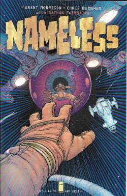
 photo NameCovB_zpst4tqjlpi.jpg

There are two reasons why this book works as well as it does (and it works very well indeed): Chris and Burnham. If it wasn't for Chris Burnham's Sunday joint textured art I'd have noticed that the first issue was a dense blizzard of folderol designed more to excite than deliver. Were Chris Burnham not so wonderful at imbuing every panel with sneakily discombobulating detail and at setting said panels in slyly unbalanced page designs I'd have maybe thought that the only real development in issue two was the jolly obvious “flu” reveal. And had it not been for Chris Burnham's deftly unsettling scale games in this, the most recent issue, better folk than I would have perhaps suspected that the pace was somewhat, ahem, leisurely and that narratively this should have all happened within the first two issues at most.

 photo NamePanelB_zpsacxr88xf.jpg NAMELESS by Burnham, Morrison, Fairbairn & Bowland

Luckily though I was aware of none of that so dazzled was I by Chris Burnham's muscularly disturbing performance here. I didn't even notice that for someone so magically special and all that our hero is pretty crap. Even though NAMELESS remains basically Event Horizon - But Not Shit NAMELESS is VERY GOOD! because last time I looked NAMELESS still had Chris Burnham.

NEAL, SCHIGEL, KOCHALKA, WICKS, SIENKIEWICZ, DESTEFNO, DEPORTER, BRUBAKER, WEISER, HI-FI, JIHANIAN, KUBINA AND LEIGH'S SPONGEBOB COMICS #43 BELIEVES IN “FROM EACH ACCORDING TO THEIR ABILITY, TO EACH ACCORDING TO HIS NEED” AND SO DOES EVERYONE ELSE WITH EVEN A SHRED OF GODDAMN HUMAN DECENCY.

SPONGEBOB COMICS #43 Art by Nate Neal, Gregg Schigel, James Kochalka, Maris Wicks, Bill Sienkiewicz, Stephen DeStefano, Vince DePorter, Charles Brubaker Written by Nate Neal, James Kochalka, Maris Wicks, Joey Weiser, Vince DePorter, Charles Brubaker Coloured by Hi-Fi, Levan Jihanian, Monica Kubina Lettered by Rob Leigh

 photo SBobCovB_zpsksqdbhes.jpg

This isn't a particularly spectacular issue of SPONGEBOB COMICS; it does remain, however, beautifully illustrated and amusing enough to be a papery riposte to the idea that this kind of thing must needs be crapped out hackery. I mention it not because Bill Sienkiewicz has provided a cover with the titular spongiform loon in his best Wolversponge pose, but because Bill Sienkiewicz also provided a pull out two-page poster of Spongebob as a kind of symbiotic melange of kitchen utensils and undersea cretin. What this means, in effect, for people of a certain age is that Bill Sienkiewicz has provided a poster in a children's comic which readily brings to mind his creator owned '90s epic of child-murder, mental breakdowns, talking birds and general nutjobbery, STRAY TOASTERS. Now, tell me that ain't GOOD!
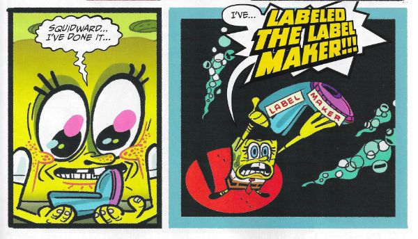
 photo SpongePanelB_zpspipgnxok.jpg

SPONGEBOB COMICS by DeStefano, Weiser, Jihanian & Leigh

We're having an Election over here but when the dust settles and it's all over no matter who is in charge we'll still have – COMICS!!!
Wait, What? Ep. 120: Beat Up

 photo f8dabd57-4b13-4eff-b84a-507a8760a3bd_zpsb112cfea.jpgStunner stuff from D'Israeli in Stickleback, currently appearing in 2000 A.D.

Welcome back my friends to the show that never ends! (If I was Stan Lee, I'd offer a No-Prize to those of you who really get that reference...but thank goodness there is only one Stan and I'm not him.)
Join me after the jump for show notes for Wait, What? Ep. 120, won't you?  (Yes, there is one this week.  I assure you, I'm not pulling an April Fool's Joke on you a week late...OR AM I????

Nope, I'm not.

By the way, we offer on-air apologies but let me apologize here for not giving you all an on-site update about last week's unexpected skip week.   In the future, I'll try to throw something together to let website-oriented Whatnauts aware that we won't be around.  At the end of this 'cast, however, we mention our skip weeks for the next six weeks or so, so feel free to get out your calendar if it will ease your anxiety.

What was I...?  Oh, right.  Show notes!

0:00-16:44:  Well, nothing says upbeat like talking about dead people!  Graeme and Jeff briefly contemplate the passing of Roger Ebert and -- in a bit more detail -- the passing of Carmine Infantino.  Also included in the discussion (but still alive as far as we know): Terry Austin; Bill Sienkiewicz; John Peele; advocacy v. shrill pedanticism; our own critical failings; etc. 16:44-37:01:  And as we skate merrily onto thinner ice:  Age of Ultron; the Guardians of the Galaxy Infinite Comics; and a new thesis (All-New Avenging Thesis!) from Jeff about the work of Brian Michael Bendis.  And more discussion about the concept of naive cynicism.  It could well be very frustrating for those who have to participate in this conversation via comment threads (or brought it up in the hopes we would stop talking about this kind of thing) but there are some surprising turns in here, I think. 37:01-50:10:  The first of three things Graeme really wants to talk about this week: (1) Zombo by Al Ewing and Henry Flint (currently appearing in 2000 A.D.), which also includes praise for Stickleback by Ian Edginton and the amazing art by D'Israeli, and Dandridge by Alec Worley and Warren Pleece. 50:10-54:41:  By contrast, Jeff thought he would love Agent Gates, the super powered quasi-steampunk graphic novel parody of Downton Abbey by Camaren Subhiyah and Kyle Hilton. 54:41-1:14:14: The second of three things Graeme wants to talk about:  (2) Stormwatch #19 by Jim Starlin.  Graeme is perhaps not so pleased.  We also end up talking a bit about The Inhumans over at Marvel and openly pray for the return of HEX (which probably isn't usually referred to in all-caps like that but it gives you an idea of our fervor.) 1:14:14-1:14:49:  Intermission One!  (And what is probably my current favorite of Graeme's stinger tunes for us.) 1:14:49-1:24:04: Graeme has been on NPR! Jeff has left a glass of water in the next room! And Graeme's third thing he really wants to talk about this week:  (3) Marta Acosta's She-Hulk Diaries. 1:24:04-1:37:52:  But Jeff, all he wants to do is talk about Giant-Man.  Giant-Man, Giant-Man, Giant-Man! 1:37:52-1:46:53: And Graeme reminds Jeff that Avengers A.I. which is coming soon. And then we spoil Age of Ultron #3.  (You're welcome.)  Also included in the conversation (and filed under "Stuff Jeff doesn't know until Graeme tells him"): Marvel's next event and the death of Formspring.  (I actually had just a comma there originally since I thought there might be more to the list, and was tempted to leave it just so it would look like the title of Marvel's next event was "The Death of Formspring.") 1:46:53-1:56:41:  "Jeff, tell me about a comic you liked!"  Jeff's answer?  Season Five of Mad Men.  Includes the phrase, "the Thor vs. Hulk of my heart."  Bonus topic:  What do we read comics for?  (And for extra credit, guess which one of us really hates that question.) 1:56:41-2:14:07:  Graeme read DC Showcase Presents: The Flash, Vol. 4, so we get to talk more about Carmine Infantino, as well as Ross Andru and Mike Esposito, our favorite things about Infantino's art, whether Neal Adams destroyed comic book art, Dave Cockrum, and more. [Note: Jeff mistakenly says Dan Day at least once here when he means Gene Day. Oy.] 2:14:07-end:  Closing comments! Apologies, promises, blood oaths, and so the cycle is complete.  And lo, the cycle shall start again!

It's possible (yes, really.  Highly possible, even) that this podcast is already on iTunes.  But, as always, we make it available here for your delectation.  Are you not delectated?

Wait, What? Ep. 120: Beat Up

Oh, and don't forget to check out Abhay's thoughts about Scarlet #6, or John K (UK)'s thoughts on Robert Aickman, or any of the other material by people who don't have to read the coattails of a talented and charismatic Scotsman.   And, as always, we thank you for listening and hope you enjoy!

"I Tried Everything Else." COMICS! Sometimes Chaykin's Awake!!!

Hopefully you all made it through any storms okay, my American friends! If you did I've got some rubbish about comics for ya.Content! You might not want it, you might not like it but it's there!

Photobucket

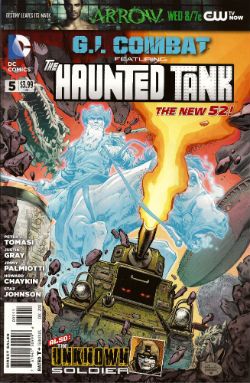
G.I. COMBAT #5 Featuring The Haunted Tank Art by Howard Victor Chaykin Story and Words by Peter J. Tomasi Coloured by Jesus Arbutov Lettered by Rob Leigh The Unknown Soldier Art by Staz Johnson Written by Jimmy Palmiotti and Justin Gray Coloured by Rob Schwager Lettered by Rob Leigh The Haunted Tank created by Russ Heath and Robert Kanigher The Unknown Soldier created byJoe Kubert and Robert Kanigher DC Comics, $3.99 (2012) Photobucket

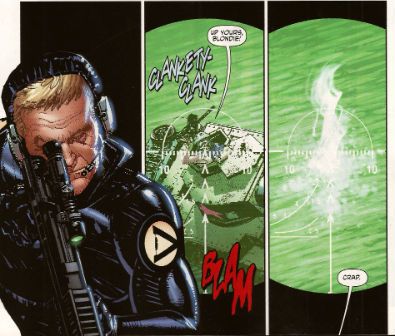
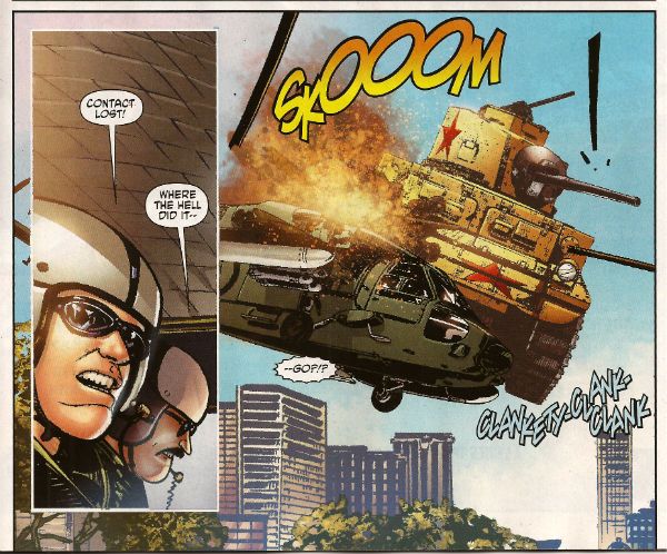
First up, I have to thank Corey (Ottawa) for bringing this comic to my attention. If it wasn't for our Canadian Contingent I'd not have known the art chores on this were by everyone's favourite filth peddler Mr. Howard Victor Chaykin! I wasn't expecting much here to be honest, I thought he'd probably be busy drawing comics too frisky for the UK to have any electrolytes left over for a book about a, well, a haunted tank.  I don't know if it's being able to clip art the shit out of this book due to its emphasis on hardware but the bits that aren't hardware have Howard Victor Chaykin pounding the pages with a barrage of highly entertaining images. Unlike, so I hear, the pounding he's giving the pages in that other (banned) book.

Photobucket

Tomasi gives him a totally stupid story to illustrate involving a nutty veteran clad in The Flag being tank-napped into a supernatural rescue mission while being pursued by Wonder Woman's high-tech ex Steve Trevor. It is nonsensical stuff but, I don't know if you've ever given it much thought but, the whole concept of The Haunted Tank isn't going to win any awards for realism. So why not go wide on the goofiness.  Chaykin seems to be enjoying himself and it all comes together a lot more successfully than some of his recent efforts. Not once did Jesus Arbutov's colour work have me reaching to ring the police and at times I was tempted to throw back my head and bellow Blessed-style "CHAYKIN'S AWAKE!!!"  Maybe he just enjoyed ringing up his russety pal Russ Heath and irritating him by going "Pop! Just drawn a tank! Pop! Just drew another! These computers are great! Now how long did it used to take you to draw these tanks, Russ? Pop! Drew another! Hey, I ever tell ya I can see the beach from my window?" I don't know, I just really enjoyed his stuff this time out. It was GOOD!

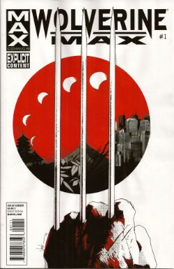
WOLVERINE MAX #1 Art by Roland Boschi & Connor Willumsen Written by Jason Starr Coloured by Dan Brown Lettered by VC's Cory Petit Wolverine created by Len Wein, John Romita Snr and Herb Trimpe Marvel, $3.99 (2012) Photobucket

While Jason Starr is a good writer of novels and I have also been known to enjoy the work of Roland Boschi the real reason I picked this up was because of Connor Willumsen. He does not disappoint! Boschi's pages seem somewhat rushed and concern the present day Wolverine fighting sharks and having no memory of why he ended up doing that. Also, his legs grow back and everyone is only slightly perturbed by this. Perturbed's too strong a word actually. I know health care professionals are rushed off their feet and are basically the busiest people in show-business and The Japanese are a modest people...but I think two legs growing back, bones and all, would cause more than a raised eyebrow and a muttered aside, suggesting such an event is more a case of exhibitionism than it is straight up miraculous. Jason Starr's handling of Wolverine's talents but in the real world is off to a choppy start is what I'm saying.

Photobucket

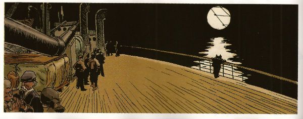
Willumsen, however, burns rubber from the off with his flashback scenes which portray Daniel Day Lewis from There Will Be Blood stepping into the original Claremont/Miller mini-series but in a grubbily humming Underground Comix stylee. So amazing are his inky doings that even the writing seems elevated with Victor sounding especially characterful in his disdain for the normals. I would buy this series purely for the further expansion of these elements.  I would but Marvel seem to have upset Connor Willumsen so much that he has jumped ship. His work will not be appearing in any subsequent issues of WOLVERINE MAX and so I will not be buying them as without him this comic will be less than GOOD! Well done there, Marvel! Yes, that is sarcasm.

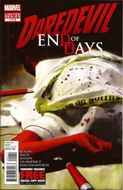
DAREDEVIL: END OF DAYS #1 Art by Klaus Janson and Bill Sienkiewicz Written by Brian Michael Bendis & David Mack Coloured by Matt Hollingsworth Lettered by VC's Joe Caramagna Daredevil created by Bill Everett and Stan Lee Marvel, $3.99 (2012) Photobucket

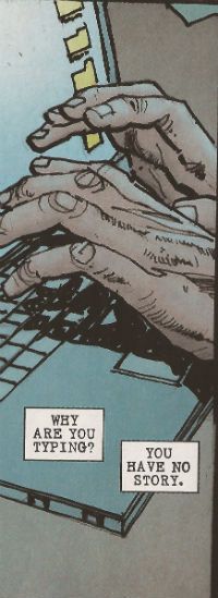
I asked my LCS why they sent this (you're darned tooting I did) and they said it was because I liked Janson and Sienkiewickz, which is true. What they failed to factor in is that ladling the  steaming hot writing of Brian Michael Bendis over the top of their efforts is, at this stage in the game, like climbing a stepladder to fart repeatedly right in my face as I admire a Vermeer. It's distractingly puerile and pretty quickly spoils the whole experience. The best bit (i.e. the very worst bit of very many bad bits) is when Ben Urich's (very long, very, very fucking awful) monologue accuses his audience (his readers, geddit!) of not appreciating words. This is super-awesome because he's being written by someone who treats the English language with all the care and attention of a hungover abattoir worker placing his bolt-gun to a steer's head.

Photobucket

This is a writer who seems to have a working vocabulary of, maybe, fifty words and whose solution to every writing conundrum (an introduction to The Incal, an introduction to a HVC art book, a recipe for quiche, instructions on how to install a Norton Commando Boyer ignition etc) is always a chatty, faux-conversational, uninformative, space devouring style which smashes grammar's head in with a brick and is in no way to be taken as an indication of a complete inability to write anything approaching a joined up sentence. Christ, this is why I ask my LCS not to send his (dismal, dismal) stuff. This comic is smug, vacuous, inane, pandering, complacent ineptitude par excellence. This comic is CRAP! I did not like it.

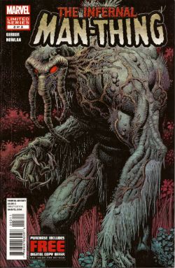
THE INFERNAL MAN-THING #3 Art by Kevin Nowlan Written by Steve Gerber Lettered by Todd Klein Also "...Man-Thing!" from Savage Tales #1 Art by Gray Morrow Written by Gerry Conway & Roy Thomas Man-Thing created by Stan Lee, Roy Thomas, Gerry Conway and Gray Morrow Marvel, $3.99 (2012) Photobucket

And so we close the comic and close the curtain on one Steve Gerber as he defies the laws of nature and reality to bow out of comics for the final time, some four years after his physical death. As we bite back the tears lets allow a manly clap on the back for Kevin Nowlan who did Gerber proud twice over with beautifully considered art to which he then applied a thoughtful and innovative colour palette.  Together with this final VERY GOOD! chapter of Gerber's playful, humane and imaginative end-song Marvel have also included Manny's first appearance.  Whether placing an ending with a beginning together in such close proximity is Marvel's way of acknowledging the Cycle of Life or just another attempt to squeeze a property until the pips squeak we'll probably never know. (Steve Gerber would have known.)

Photobucket

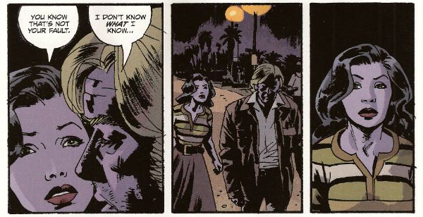
FATALE #8 By Sean Phillips and Ed Brubaker With colours by Dave Stewart Fatale created by Sean Phillips and Ed Brubaker Image, $3.50 (2012) Photobucket

I've not been impressed with this series so far but I will admit that while this issue still wasn't terribly good it was a whole lot better. Maybe it had something to with a sudden upswing in the density of incident or the fact that Phillips' art seemed more lively since he was given a couple of occasions on which to strut his stuff style-wise.  I still don't find it to be convincingly evocative of a time and place; it'll take more than some beards in a VW van to make me swoon at the authenticity of the '7os vibe, man.  At times I can almost smell the spirit glue holding all the sideburns on. Most deflating of all is the fact that the series is still hamstrung by bizarrely conservative and old-fashioned sense of horror (tentacles! men in robes with daggers! cemeteries!) which means the horror is never actually, well, horrible.

Photobucket

The humourlessness of the whole thing has also struck me recently; this was unfortunate because I then realised I couldn't recall one incidence of humour in all the work I've read by this author. That's a lot of pages in which to not crack a smile. Maybe it's me. Senses of humour are personal after all but still  the funniest thing in FATALE #8 is when the rather tasteless competition in the lettercol results in one John Cleaver out writing this whole series with just one paragraph. Mind you, if any readers do want to send me pictures of them crying while they remember horribly traumatic events from their lives they are welcome to do so(*). Get really close in there so I can see the fat bulbs of those tears bloating from your sad ducts, kids! The winner could receive a pen! So, yeah, this issue was OKAY! and you can buy it from The Savage Critics Digital Shop...here! (Although if more than 10% of the comics reading audience do so a big red light starts flashing and Brian Hibbs starts rushing everyone to the shelters as AROOOGA! AROOOGA! echoes rounds his shaggy head. It's a true fact, cats and kittens!)

(*) Don't do this. It's a joke.

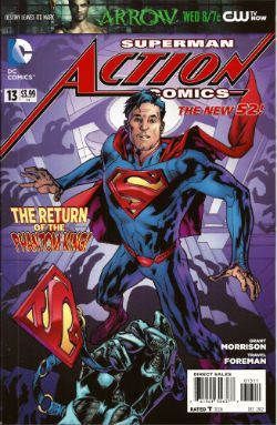
ACTION COMICS #13 Featuring... Superman in..."The Ghost In The Fortress of Solitude" Art by Travel Foreman Written by Grant Morrison Coloured by Brad Anderson Lettered by Steve Wands Superman in..."A Boy And His Dog" Art by Brad Walker (p) & Andrew Hennessy(i) Written by Sholly Fisch Coloured by Jay David Ramos Lettered by Patrick Brosseau Superman created by Jerry Siegel and Joe Shuster DC Comics, $3.99 (2012) Photobucket

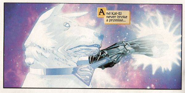
It's strange the connections your mind makes. In my head Morrison's recent callous remarks regarding the treatment of Siegel and Shuster and the portrayal of animals throughout his work suggests to me one of those lovely people who care more for the feelings of animals than those of people. Which is all really cuddly on the surface until you press them on the issue and they suddenly hiss at you that people deserve what they get! Which I find a less than generous rationale and more than a little confusing in its mix of sentiment and insensitivity. Almost as confusing as this comic which I have a strong suspicion makes no sense but as I too have a soft spot for tales of the gud dog I'll let its muddled nature pass this time and say this comic was OKAY!

Photobucket

So yeah, those were certainly some words about what I believe scientists are now calling COMICS!!!

Everyone Loses: Hibbs on 9/3's cape comics

Four superhero books below that cut!


AVENGERS VS X-MEN #12:  Man, it would be nice to have a Marvel crossover once that ended right. I don't know what frustrates me more: Captain America's extraordinary hypocrisy in the face of the breaking point he engendered, or why no one is asking about what happens with all of the *good* stuff that the Phoenix Five engineered (food, energy, water, worldwide). but, these are superhero comics, and superhero comics don't like dealing with ramifications, do they? Like I said back at the review of #1, this comic clearly is reviewer-proof; nothing I could say or do would impact it's entire success as a commercial juggernaut -- I'm certainly selling twice or more copies of AvX than I do of either of the component characters any longer.

The thing is, I'm afraid that this series fundamentally broke the X-Men -- what are they any longer?

With Xavier dead, the mutants no longer an "extinct race", Cyclops considered a super-villain, what's presumably the world's stock of Sentinels melted down (along with all of the battleships and nuclear weapons in #6) "Uncanny Avengers", and so on -- well, what's next? Where can you go from here? The core metaphor might still have need today -- but can the X-Men still be the spirit of alienation in any clear way when mutants are now responsible for bringing peace and food and water to Africa, y'know? I have my doubts, especially because the first new x-book off the blocks this week is actually an Avengers title, and the "flagship" X-comic is going to be a time-travel story, which doesn't even sound remotely sustainable to me as an ongoing monthly.

At the end of the day, I thought AVENGERS VS X-MEN #12 was pretty AWFUL. Though I doubt that's any real surprise to anyone out there. I also thought that the X-Men "won", in that Cyclops was right, and his species is now viable again... even though they're left at the end as being a largely irrelevent concept in the Marvel Universe. Funny how those things work out.


AVX #6: As a modern piece of comedy, I thought this was generally pretty darn GOOD. "Captain America is level 15 in Guilt Trips," indeed! Though the Hawkeye sexploitation dream was pretty dang grody, and prevented the book from scoring higher.


DAREDEVIL END OF DAYS #1:  I was originally looking forward to this, because on paper, at least, it sounds good: Bendis, Mack, Janson, Sienkiewicz all back on Daredevil for one final story. Too bad the result is a gory mess, with multiple scenes of people beating each other to death. Yay, comics? Overall the art, mostly Jansen being inked by Sienkiewicz, has the worst of each artist's tics, though there are a few nice and painted panels that entirely work. Seeing those lovely panels make the rest of the book look that much worse, sadly.  Pretty AWFUL.


LEGENDS OF THE DARK KNIGHT #1: So, this is a collection of  Batman stories that, as far as I know, ran as digital content before being collected here.  This is the fourth (fifth?) "re-purposed" digital comic, and, at my store at least, sales have all been uniformly awful on these books, but I can't tell if it is the chicken, or if it is the egg. Batman, in serialization, is going through a pretty nice period right now -- BATMAN itself is my top selling DC comic. and all five of his monthly books are selling at least 25 copies a month for me. This one? I sold 2 copies in week 1, and I'm not expecting that to grow in any manner I'm willing to carry the risk on. So, is LDK flopping out because it is digital first, and people don't want leftovers? Or is it flopping because it's Batman-led comic #6? Or is it flopping because it is shitty?

There are three stories here, one by Damon Lindelof & Jeff Lemire which is close to the worst Batman story I've ever read being, I think, a "what if?" of "What If Batman was an arrogant drunk?" Hrf?!? The second two stories are kind of  NEW TALENT SHOWCASE teaming newer writers with solid artists (JG Jones, Nicola Scott) -- but the stories aren't any great shakes, neither rising above what you might hope for in a new talent anthology series: not shitty, exactly, but not so great either. At least not for $4.

The bigger problem, for me, is that these comics are kind of the "proof of concept" for the problem of what you do for natively-digital work when the iPad landscape/computer monitor being different proportions from the printed page.  Mark Waid was the first person I ever heard who said, "Duh, just plop the two screens on top of each other, and your back to normal proportions", and I thought he was genius when he said that.

Except... now I've seen what it looks like in practice. It is... not very good.

So, first, if you're even slightly aware of it, you can "see" the weld made on each page as writers are aiming the "beat" for the bottom-rightmost panel of each "page", except each page now has two of THOSE, and it TOTALLY blows the "rhythm" of the comics page.

Second, because you have to present the page smaller than it displays on monitor/iPad, it feels oddly cramped, with too-small lettering.

Third, it really shows just how limited the landscape format is for density-of-content -- It is hard to cleanly fit more than 4 "panels" on any "page", then, which gives you an extremely limited number of choices of page layout and panel arrangement. then you see that twice on each printed page, and it is kind of a mess.

So, I guess now I really don't think that digital comics can be reformatted to print in this way without kind of crashing out the beauty and strength of the real unit of comic books: the page. I thought the Lindlehof story was AWFUL, but the rest was decent enough it could drag the entire book closer to an EH.


That's me, what did YOU think?


-B