“My HEAD is on FIRE!” COMICS! Sometimes It Makes A weird Clanky Noise When You Go Over 60mph!

In which I look at a comic featuring a man whose head is on fire. It’s by Clayton Crain and Garth Ennis; so no soft lads past this point. BRAAAAAAAAAAAS!  photo GRlightB_zpsdlibpo3o.jpg GHOST RIDER: ROAD TO DAMNATION by Crain, Ennis & Eliopoulos

Anyway, this…

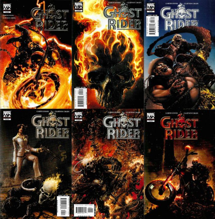
GHOST RIDER: ROAD TO DAMNATION #1-6 Art by Clayton Crain Written by Garth Ennis Lettered by Chris Eliopoulos Marvel Comics, $2.99 each (2005-2006) GHOST RIDER created by Mike Ploog, Gary Friedrich & Roy Thomas

 photo GRCoversB_zpsibgufamj.jpg

I’m probably not the audience for this one, as the only exposure I’ve had to motor-biking is when my dad used to go arse over tit every Friday after the pub, sending our fish suppers skidding across the drive’s tarmacadam. Being a small child at the time, the experience didn’t really endear the manly art of riding about very fast indeed to me. But, being a large child at this time, I do quite like the idea of a man whose head is perpetually aflame, which is very much what this comic is about. In fact the book itself mentions the ceaseless flickering of our undead chum’s combustible noggin on more than one occasion. Either because he profoundly underestimates his audience’s ability to retain information or because he profoundly overestimates the humour of doing so, Ennis repeatedly goes out of his way to remind us, in case we had forgotten, that the man with the head on fire we are looking at, is in fact a man with his head on fire. He also has a good beery laugh at the expense of names like Johnny Blaze and Richard Rider because they sound a bit, well, unmanly.  Dick Rider! Hurrr! It’s okay having a pop at the camp names from old comics, but if you wrote one of the most hilariously repressed comics ever (Preacher, obviously) you might want to think about motes, beams, eyes and the removal of such. See Matthew 7:3 -7:5, as Garth could no doubt tell you, him being such a keen Biblical scholar.
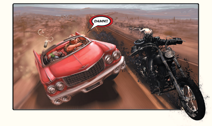
 photo GRBikeB_zpsikkfqrxa.png GHOST RIDER: ROAD TO DAMNATION by Crain, Ennis & Eliopoulos

Or maybe not a scholar as such. There’s his usual guff about angels and devils and Heaven and Hell, which suggests wee Garth Ennis wasn’t listening too hard when old Sister Clodagh was giving it the old Scripture business. The angels are as bad as the devils, seems to be the thing he’s going for here (#EDGEYSTUFF) but it’s all undone by the fact he’s clearly having more fun with the Hellish emissary, Hoss. Hoss is a big fat cowboy type, who is all down homey and grits, and all that big belt buckle stuff; he’s probably a real hoot if you are, uh, well, Garth Ennis. Or Jason Aaron. (Ironically, Jason Aaron AKA "the house-trained Garth Ennis", would later have a really quite decent run on GHOST RIDER.)   And get this (it’s awesome) he has a biker (get ready for awesome town) stick his own head up (buckle up! Awesome City limits up ahead) his own anus (HOO! HOO!) and that’s how the guy remains for the rest of these series. Classic, Garth. Just classic. Better yet he’s called “Buttview.” Because he has his head stuck up his butt. Oh, my aching ribs. Yeah, Buttview’s up there with Garth Ennis’ other nuanced creations Arseface and, uh, Shithead. Excuse me while I crush this beercan on my forehead. BOO-YA!

 photo GRDoneB_zpsfmtogsaw.jpg GHOST RIDER: ROAD TO DAMNATION by Crain, Ennis & Eliopoulos

All of which is just Garth Ennis’ usual cheeky playground humour schtick. But his schtick comes unstuck this time out. While it is really super edgey to declaim there is no difference between Heaven and Hell, it is a bit confusing. I’m not sure which creed Ennis is addressing here; which is kind of important if you’re wanting to believe he’s making any points at all; besides how bloody proper bloody hard he bloody is.  It doesn’t work, basically. The angels in the book are a couple of effete berks who cause a woman to miscarry because she can see them, and Ruth, a lady angel in a white pantsuit, who makes a kid stick a pencil in his own eye because he can see her wings. Which is the big problem of wearing white pants suits. HA! See I did a joke about pantie pads just for all the manly fellas out there! Hurr! Who’s up for an Indian? Now, as the sages say, the world don’t move to the beat of just one drum so it is possible that miscarriages and self-blinding children might be real thighslappers somewhere, but it’s doubtful. It just doesn’t work and the book knows it. The giveaway is that the kid’s traumatic eye injury occurs off panel but we get to see the biker put his head up his butt on panel. The shift from the harmlessly crass humour beloved of booger-eaters the world over, to the sadistically nasty is too sharp. They don’t sit right together. Sure they are both violence but the mix is off.  You don’t put pepper in your Angel Delight do ya? Call me picky but I’m not sure miscarriages and blinded children sit so well with, say, Miss Catmint, the mousey downtrodden assistant with the 1970s comedy name. “Oooh, can I just look in your drawers, Miss Catmint!”, no one says but you bet Garth though hard before deleting it. That's right he even thinks hard! What? Yes, I get it: they're all the same, they're all bastards. Great. That's useful. As observations go, it's fit only for funnybooks. And while I have some sympathy for what some inclined towards academia might view as a pointed erosion of the traditional hero (Johnny is basically a clueless f-wit all too eager to think the best of people, even demons), let's not forget it's a book about a man who's head is on fire.
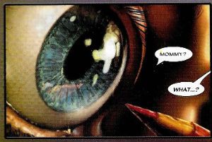
 photo GReyeB_zpsby0qv5nr.jpg GHOST RIDER: ROAD TO DAMNATION by Crain, Ennis & Eliopoulos

The plot doesn’t make a lot of sense, but is basically a kind of cut down Wacky Races with Hell, Ghosty and Heaven all competing to stop Squiddlybipbopbop the Demon from bringing Hell to earth. Ennis makes such a hash of explaining things that I’m a little unclear really about why anyone is doing anything. Particularly as it all seems to revolve around keeping schtum about some kind of spiritual insider trading so that God doesn’t catch on. Now it’s been a few decades since Sunday School but I’m pretty sure one of the big things about God is that whole omniscient thing so, uh, I guess omniscience isn’t all it’s cracked up to be or someone’s been overselling The Big Yin for the last few thousand years. Or, uh, muhwuhmuhmu, look his head’s on fire! Did we mention his head's on fire! Basically, when it comes to specifics this plot has a strong air of oh, is that the time, must dash! Which is fair enough since this is a comic featuring (and it’s important to bear this is mind) a man whose head is permanently aflame, so no one’s expecting intellectual rigour.  Worse though is the brevity of the race. There’s all of one fight scene involving a bus full of hapless chumps being wielded like a mallet, and then the various racers are where they need to get to. Why they couldn’t appear right where they needed to get to in the first place, what with them all being supernatural and that, is a question only someone who doesn’t know how hard it is to fill six issues would ask.
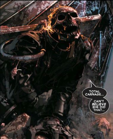
 photo GRTotalB_zps1d3eu8za.jpg GHOST RIDER: ROAD TO DAMNATION by Crain, Ennis & Eliopoulos

On the upside Clayton Crain’s art is…difficult to judge, honestly. Mainly because it’s really dark for the most part, not in a “Ooh! Kind dark! Kinda edgey! That won’t play in Peoria!” way, but in a “Hey, Who forgot to pay the light bill!” way.  Squinting through the gloom though, he seems to have an ambitious array of grotesquerie on display. His Hell is a kind of smouldering meatscape, with Ghost-ado being pursued over what looks like barbecue holocaust by escapees from a demon butchers.  He has a lot of fun visualising the demons, especially Shabbadoowaaa who is all spinal cord and wheels, like some kind of roaring, sentient, apocalyptic car accident; definitely Hellish looking. The normal scenes obviously interest Crain less, but they are okay; he has a lot of fun with the bloated paraplegic businessman, but the more normal folk get short shrift. But no one is reading a Ghost Rider comic to see thrilling evocations of the mundanity of day to day life. No, they are here to see nauseating physical monstrosities and a man with his head on fire. And there is where Clayton Crain delivers. In spades. The ace of spades!  I loved the liquid quality of the flames crowning Ghostarino's dome in particular.  In fact Crain’s art is probably better than it looked to me, because he’s obviously using them there computers, and back in 2006 that was a pretty avant garde.  Also, In the interests of not being a total jerkwad I went and looked at the preview pages on Comixology and I have to say that his art pops a lot more in digital. A lot of the FX such as the butane-blue flames  are so blurry in print as to not be worth the bother. So I binned all my dark unto uselessness scans and skanked all the panels off Comixology. It seemed like the only way to give Crain a fair shake. No, it's okay, I'm made of time. There's nothing I'd rather be doing with my swiftly disappearing lifespan. Anyway, Digital did the art some favours, but it didn’t improve the script. Funny that. It's a good book to look at, but not so hot to read.
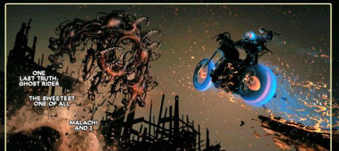
 photo GRTruthB_zpskw1gtvmb.jpg GHOST RIDER: ROAD TO DAMNATION by Crain, Ennis & Eliopoulos

Fair’s fair though, the art makes GHOST RIDER: ROAD TO DAMNATION a step up from autopilot Ennis (oh, throw a stick you’ll hit one), sure and it’s not a big step. The book struggles to be more than a six issue round of Garth Ennis Bingo (1st Prize: a big auld steak and a six pack o’stout. 2nd Prize: A dog-eared Sven Hassel novel. 3rd Prize: That ‘70s poster of the tennis player scratching her bare arse). And don't worry he manages to get in the old maudlin whinny of  "Noo Yawk! As pretty as a fair Collen passed out in her own sick with her drawers round her ankles! Oh, New Yawk! Let me paw your arse!" Christ, show some decorum, man. What is it with the Irish and New York? Whatever it is, give it a rest. Mainstream North American genre comics being what they are It’s not uncommon for Ennis (or anyone) to do work-for-hire about a central character he clearly has little interest in, but unfortunately here he seemingly struggles to find anything he does have an interest in. But, you know, it’s w-f-h so maybe he had an editorial remit to fulfil rather than this being a personal work of searing truth; The Ghost Rider Story He Had To Tell.  You know, all that waffle falafel they come out with. (“After I handed in the final draft of SPIDER-MAN: BOOMBOX BOONDOGGLE I wept, for there were no more worlds to conquer.”) It reads like someone rang him and said, “That Preacher you did? The kids like that, Garth, so do six issues of that stuff. Just remember to stick a bloke whose head is on fire in there. ” And he saw the cheque and went, “Konichi wa! Fair dinkum, boyo!” and got stuck in. And why not? We’ve all got bills to pay. This was EH!


NEXT TIME: More GHOST RIDER by Garth Ennis? JUDGE DREDD mayhap? Or a Euro-Comic? I don’t know, I’m trapped in a Hell of – COMICS!!!

“Not Unless He Had Three Legs.” COMICS! Sometimes It's Nice To Have A Change Of Scenery!

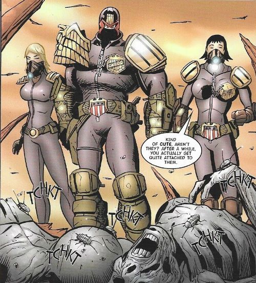
In which Judge Dredd is a right gadabout and doesn’t even have the decency to send a postcard.!!BONUS MAP OF THE MEGA-TERRITORIES!!  photo JDTMC56RedB_zps2c6ktymy.jpg JUDGE DREDD: GULAG by Charlie Adlard

Anyway, this…

THE JUDGE DREDD MEGA COLLECTION REVIEW INDEX

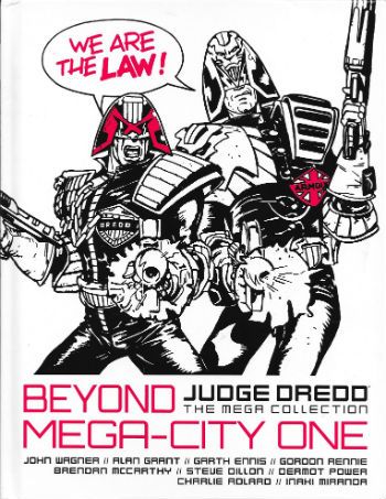
JUDGE DREDD: THE MEGA COLLECTION Vol. 56: BEYOND MEGA-CITY ONE Art by Brendan McCarthy, Steve Dillon, Dermot Power, Charlie Adlard and Inaki Miranda Written by John Wagner, Alan Grant, Garth Ennis, Mark Millar & Grant Morrison and Gordon Rennie Lettered by Tom Frame, Mark King, John Aldrich, Annie Parkhouse and Simon Bowland Colours by Wendy Simpson, Chris Blythe Eu de la Cruz Originally serialised in 2000AD Progs 485-488, 727-732, 859-866, 1382-1386 & JUDGE DREDD MEGAZINE 246-249 © 1986, 1991, 1993, 2004, 2006 & 2016 Rebellion A/S Hatchette Partworks/Rebellion, £9.99 (2016) JUDGE DREDD created by Carlos Ezquerra & John Wagner

 photo JDTMC56CovB_zps0etjedgi.jpg

ATLANTIS Art by Brendan McCarthy Written by John Wagner & Alan Grant Lettered by Tom Frame & Mark King

 photo JDTMC56BritB_zps1xz9evh1.jpg JUDGE DREDD: ATLANTIS by McCarthy, Wagner & Grant and Frame

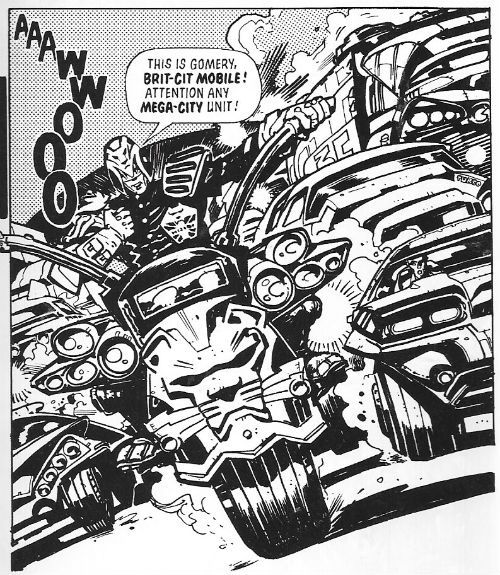
Have you ever seen a British Bobby’s helmet? Ooooh, don’t! Get you! Stop it! OoooOOOOooooOOOOOOh! No, really, back when they walked the beat tipping the wink to the ladies, dispensing directions  and gruffly moving on the ruffians and all that, before they became  swaddled in bullet proof jackets and started cradling matt black engines of death while licking their chapped lips, back before that, did you ever seen a British bobby’s helmet? We used to call them “tit heads”, because kids have no respect and, also, they were a pretty ridiculous bit of gear. And yet thoroughly British in their ridiculousness, due to their air of wonky pomp.  Brendan McCarthy’s design for the Brit Judge embraces this tradition and carries it into the future like a sheikh carrying a blonde lady on the cover of a Mills & Boon romance. Smoothly, that is. It also suggests he is the only person in existence who ever looked at Calos Ezquerra’s original Judge design and thought, “Hmmm, pretty impractical, but not impractical enough!” Pity the poor sap who has to patrol the mean streets of Future Little Tidworth in this get-up.

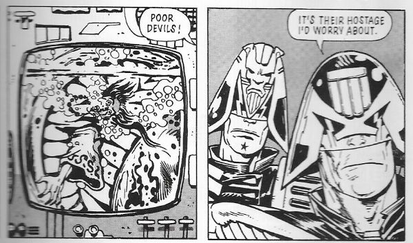
 photo JDTMC56PoorB_zpsw2ns6alv.jpg JUDGE DREDD: ATLANTIS by McCarthy, Wagner & Grant and Frame

It works on the page though because Brendan McCarthy is  a design genius, and part of that genius must be due to his total refutation of physical practicalities.  Not only is the Brit Judge get-up visually delightful  it is also very British, what with its lion(s) rampant and multiple Union Jacks (The Royal Union Flag, to any Canucks out there).  All the kind of garish tat in fact which symbolises the overcompensation this nation makes for its reduced circumstances and present global irrelevance. I wouldn’t be surprised if the kneepads alternated playing the national anthem and Churchill’s speeches, and the belt pouches contained the fixings for a nice cup o’ char. Preposterously impractical and ostentatiously nationalistic, like fascism filtered through buffoonery Brendan McCarthy’s design captures the British character to a tee. I like it. Other than that though we learn little as Brit-Judges just act like Judges and the strip isn’t set in Brit-Cit but instead in Atlantis, which is not a mythical sunken city but a way station on the sea bed. The strip is a shaggy mutie story that earns its length by introducing Atlantis and Brit-Cit judges, and by being drawn by Brendan McCarthy; it’s worth reading just to see McCarthy’s giant manta rays alone. Throw in the bumptious bobby design to boot and it’s GOOD! Stuff.

EMERALD ISLE Art by Steve Dillon Written by Garth Ennis Coloured by Wendy Simpson Lettered by Tom Frame

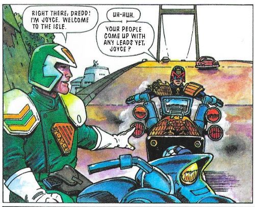
 photo JDTMC56EireB_zpsy07v92cp.jpg JUDGE DREDD: EMERALD ISLE by Dillon, Ennis, Simpson and Frame

Bejabbers! If and it isn’t the quare man hissownself now, Garth Ennis! To be sure, and there’s been many a pot o’ gold at the end o’ his rainbow o’writing! To be sure, to be sure! Oho, oho, oho! But this’ll no be one of ‘em! See and if he’s not brought his sense of humour with him!  Ah now, ‘tis a turrible, turrible ting his sense o’ humour is.  Aye now, ‘tis a sorry tale indeed. In the immortal words of Alan Partridge, “Der’s more to Oirland dan DIS!” What? Oh, it’s racist when I do it is it? I see. I better stop then. When Garth Ennis does it it’s satire. Except it isn’t. Unless you are a lot less demanding than me. You know that particularly poor satire that’s so bad it is actually indistinguishable from what it purports to satirise? Well, after reading Emerald Isle you will. I guess it’s a satire of people’s ideas about Ireland but it’s kind of painful. Mind you, me and Garth Ennis’ sense of humour will always at odds. Mostly because I have an outdated belief that humour should be funny. A little bird tells me though that  different people find different things funny, so if you think having a Guinness harp© on a Judge’s helmet and potato guns that you can set to “chips” are funny, then you tuck in!

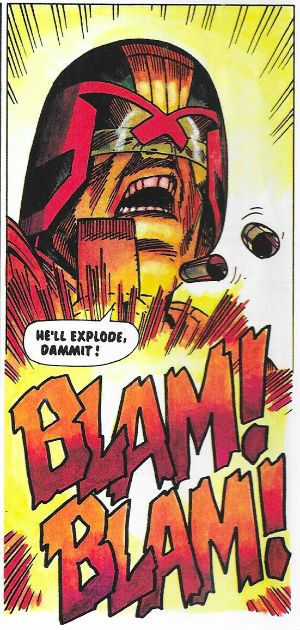
 photo JDTMC56BlamB_zpskqjqjxx7.jpg JUDGE DREDD: EMERALD ISLE by Dillon, Ennis, Simpson and Frame

Unconvincingly mixed into this hilarious stuff is a more grounded tale of a M-C1 hitman who hides out with a bunch of terrorists. Terrorism is apparently just a bit of a jape until the proper crook turns up, then things get heavy. The insouciant  Emerald Isle Judges are unprepared for the sudden explosion of pitilessly thuggish activity. Luckily Judge Dredd lends a hand. Personally I’m a bit unconvinced that terrorism in Ireland and organised crime were not inextricably linked but I’m not going to argue that point with anyone from Ireland. Say, has anyone else seen that crackin’ John Boorman movie THE GENERAL (1998)? Brendan Gleeson’s in it and it’s well good. Based on Dublin Crime Lord, Martin Cahill, it probably soft soaps the harsher reality but still, Brendan Gleeson. Lovely, lovely Brendan Gleeson. ORDINARY DECENT CRIMINAL (2000) stars Kevin Spacey and apparently covers the same ground. I’ve not watched that one so I’d not know. Meanwhile, back at the point, the late, great Steve Dillon draws “Emerald Isle” in his usual sturdy fashion whereby he avoids drawing anything too demanding but his stylistic charisma prevents it all getting too bland. He’s also wise enough to know that Dredd’s the star, so he’ll ensure at least one really great image of Dredd being Zarjaz! He’s a right good choice for such a whipsaw mix of comedy larks and brutal violence given his style can accommodate both at the expense of neither. It may not be the craic it thinks it is but “Emerald Isle” is GOOD!


BOOK OF THE DEAD Art by Dermot Power Written by Mark Millar & Grant Morrison Lettered by Tom Frame & John Aldrich

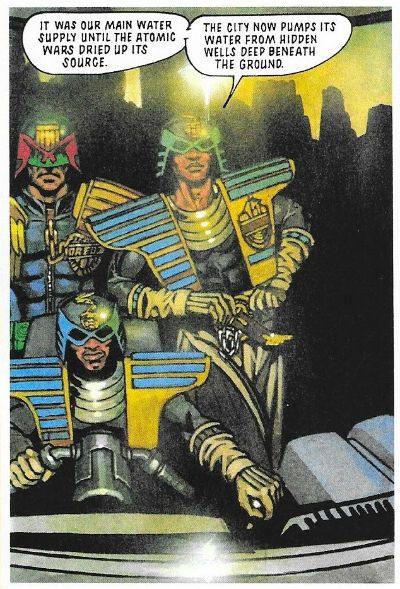
 photo JDTMC56LuxorB_zpsmk7l9tqq.jpg JUDGE DREDD: BOOK OF THE DEAD by Power, Millar & Morrison and Frame

I’m stretching charity to its limits when I say that Mark Millar and Grant Morrison’s Judge Dredd work is the high point of neither of their careers. Considering how little I rate anything by Mark Millar this should be warning enough. At this stage of their careers (the crazysexyfuntime ‘90s!) Millar & Morrison had teamed up and were giving interviews like they were pop stars in the vein of Pepsi and Shirley or something; they seemed pretty committed to the novel artistic approach of just telling people they were awesome without actually making any decent comics to back that up. A right self-promoting pair of capering  mountebanks  they were. Preening narcissists, some might say, because people can be very cruel. Morrison and Millar were all mouth and no trousers, as we say over here. Morrison would eventually snap out of it and lower himself to write some decent comics, which very clever people would read a great deal more into than was actually present. I don’t know what happened to him after, because the last thing I read by him was something odious about Siegel and Shuster’s treatment by DC which, while I can’t remember the specifics, certainly sounded like “Goodbye, John” to me. Apparently, because I ceased paying attention long ago, Millar would just defiantly plod on regardless, cultivating his lucrative furrow of thundering chicanery and creative impoverishment to spectacularly rewarding effect. Financially, not creatively rewarding, obviously. Before that though, the team were steadfast in their belief that if they reduced Judge Dredd to the level of a shit ‘80s straight to video action twat, this would be a good thing. At no point in their complacently leaden tenure on the strip would their approach bear any fruit other than arse grapes.

 photo JDTMC56FightB_zpsprazvd8a.jpg JUDGE DREDD: BOOK OF THE DEAD by Power, Millar & Morrison and Frame

“Book of the Dead” is a pretty representative bunch of those very arse grapes. Here the legends in their own minds send Dredd to the city of Luxor in Egypt, where they can’t be bothered to invent a future society, because they are busy modelling Speedos© for Deadline, or taking about being punk while actually being about as punk as Barry Manilow, or whatever and who cares, so they just make it a really superficial idea of how Ancient Egypt was, you know, pyramids, pharaohs, mummies, etc. but with hover cars, energy staffs and Resyk. Given the amount of thought involved we’re lucky the Judges don’t ride about on robot camels and Dredd doesn’t come home with a rug from a mega-bazaar. Whenever Dredd’s abroad some folk’s antennae start twitching in case any casual racism slips in, but I think the mental sloth on show here is damning enough. It’s just a multi-part punch-up and a piss poor use of Dermot Power’s not inconsiderable talents. Power fully paints the strip with a level of skill and artistry better suited to a script where someone was, you know, actually trying.  There’s some lovely muscle work on show reminiscent of the master of muscle magic, Mr Glenn Fabry, and at no point does Power succumb to the twin pitfalls of fully painted 2000AD art: drab colours and visual inertia. His work here is so lovely for seconds at a time I forgot how insultingly contemptuous the writing was of its audience. It’s only because of Dermot Power that this gets OKAY! rather than CRAP!

GULAG Art by Charlie Adlard Written by Gordon Rennie Coloured by Chris Blythe Lettered by Tom Frame

 photo JDTMC56BoomB_zpsjxrecenm.jpg JUDGE DREDD: GULAG by Adlard, Rennie, Blythe & Frame

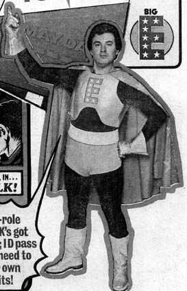
Charlie Adlard draws this one. Charlie Adlard is famous for drawing The Walking Dead, which is itself famous for being successful and unerringly mediocre. You knew that, but did you know that Charlie Adlard is now the UK Comics Laureate. Disappointingly, unlike the Poet Laureate, this does not mean that he has to produce comics on the Queen’s birthday or royal births and marriages, and public occasions, such as coronations and military victories. Her Madge’s Royal God-appointed face as she opened up her birthday card to find a picture of a rotting corpse tottering around a valiantly nondescript America would be quite the thing! No, it seems it’s more of a charitable position whereby the noble art of The Comic is promoted with the hope that one day it will be as popular as poetry. (<--- joke!) If you didn’t know that, then it probably evaded your attention that Dave Gibbons was the last UK Comics Laureate. As part of his promotional efforts I like to think The Gibbons used to squeeze himself into his Big E leotard from his Tornado days and leap into libraries scattering comics like startled gulls into the receptive faces of the next generation of comics’ readers. And old people sheltering from the cold. That probably didn’t happen but I think we all feel a bit better having imagined Dave Gibbons dressed as Big E. Take your pleasure where you find it doesn’t just apply to Wilson Pickett fans.

 photo bigeB_zpsrknllnbh.jpg DAVE GIBBONS: BIG E stolen from thefifthbranch.com

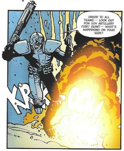
The story? Oh, “Gulag” is about Judge Dredd getting a bunch of stubbornly unmemorable Judges together to rescue some POWS from a Siberian Gulag. Yeah, by the way, in case it hasn’t become obvious these reviews aren’t the kind which tell you significant character appearances (e.g. here: Psi Judge Karyn), who created them (Dean Ormston and Alan Grant), which story they first appeared in (Raptaur), where that story first appeared (Judge Dredd Megazine #1.11-1.17) and when (1991). No, these are just what an old man of questionable lucidity manages to crank out in the time allotted by circumstance. Reviews, but not as we know them. There’s little rigour or design to them. It’s less Douglas Wolk and more a shaky old gent muttering to himself in a library (Dredd…zarjaz!...Rico…BAD! Pat Mills…lovely teeth! Space Spinner…Big news for readers inside! Etc etc), before Dave Gibbons unwisely clad in the rags of yesteryear, bursts in and causes me to vapor lock in shock. Prone to divergence at no notice, yeah? Particularly when dealing with Gordon Rennie, who here writes about Judge Dredd and chums in Siberia. In “Gulag” Sibera is less than rewarding as a locale as it is just full of snow and bits of barbed wire, and the differences in the Sov Judges’ uniforms is minimal. It’s not worth the trip really. Rennie huffs and puffs about the stakes at, er, stake but I could never rid myself of the impression that it was all just a big fight over an empty shed in a snowy field. Charlie Adlard fails to ignite events, but everything he draws looks like what it’s supposed to be. I mean, it certainly wasn’t worth a butt of sack but it was OKAY!  

REGIME CHANGE Art by Inaki Miranda Written by Gordon Rennie Coloured by Eua de la Cruz Lettered by Tom Frame, Annie Parkhouse & Simon Bowland

 photo JDTMC56BarranB_zpsm4juxvb3.jpg JUDGE DREDD: REGIME CHANGE by Miranda, Rennie, del la Cruz, Frame, Parkhouse & Bowland

“Regime Change” is the second Rennie penned tale and had an equal impact on my memory as that one in the snow, what’s it called? The one with, uh, the snow and, uh...Anyway, Dredd goes to Ciudad Barranquilla (AKA Banana City) which spawls over most of Central America like a gaily coloured, city shaped metaphorical sombrero. Pretending to give a shit about missing cits Dredd and a multi-national  “peace keeping force” show up and nose about. Turns out though, in a twist that could only surprise a Daily Mail reader, that they are actually just there to depose the Judge Supremo and install someone more to M-C1’s liking. When the corpses of fourteen M-C1 citizens are found in a mass grave they have all the excuse they need. What shocking cynicism! The sheer gall of Gordon Rennie to even suggest to imply such a thing! It’s fine. It’s drawn by Inaki Miranda whose art I don’t like because everyone is drawn with a tiny wee head like Thrud The Barbarian, and it’s all just a bit too busy for me. One of the problems with comics is that you can come up against a style you just don’t like. It doesn’t mean it’s “bad”, it’s just not to your taste. Guess what? That’s right. So, “Regime Change” is OKAY!

 photo JDTMC56CuteB_zpsanh36kbo.jpg JUDGE DREDD: REGIME CHANGE by Miranda, Rennie, del la Cruz, Frame, Parkhouse & Bowland

It was a bit dull that wasn’t it, a bit normal. Sometimes I’ll do that, sometimes I’ll just start on a craven apology for not having done these sooner. Because, yeah, I started writing up these Dredd partworks in 2015 and then…I stopped. A lot of that was down to apparently I like to make promises I can’t keep. That way I think I get to keep the guilt up. I’m still feeding off the guilt of not carrying on with the Planet of the Apes Weekly, but that was a lot of work to be fair, I kind of aimed to high on that one. Not doing the Dredds as well was too much guilt though. It was getting oppressive. Mind you, about two write-ups in, when I first started, it was pointed out to me that Douglas Wolk had written up every Judge Dredd strip ever so…I felt a bit like a spare prick at a wedding. If Gus van Sant had been halfway through making PSYCHO when someone told him this guy Fred Hitchcock had already had a go, I like to think he would have had the sense to stop. It’s about knowing your place, innit. Alas, that didn’t stop me feeling bad; yes, I felt bad, and I still feel bad because “Drac” in the comments was all gung-ho about following along from his Australian location. And I just pisseded off and left him or her hanging. That’s shabby behaviour. So, too late to make up for it, I’ve started again. I’m banging them out now but that won’t always be possible (because, life), but as slow as the flow may become I’ll carry on. Sometimes I’ll try and do a proper job and sometimes I’ll just amuse myself, depends. Personally I find it difficult to say much about Gordon Rennie, so it’s unfortunate that we have two of his storylines in this book. Bit of a mixed bag this book, to be fair the Rennie ones are part of a longer uberplot involving the machinations of an embittered Sov, so they lose out by being isolated here. BEYOND MEGA CITY ONE is a GOOD! Read overall, I guess.

NEXT TIME: I haven’t thought that far ahead. So surprises in store for us all!

BONUS: A NO DOUBT OUTDATED MAP OF THE WORLD OF JUDGE DREDD!

 photo JDTMC56MapB_zpsor9naqso.jpg

“EASY THE FERG!” COMICS! Sometimes It's Not The Fall That Kills You!

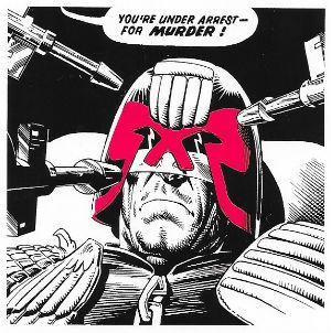
It's Valentine's Day! This Valentine's Day Judge Dredd's first and only love, The Law, sends a Valentine...straight...to...his...HEART!  photo JDTMmurderB_zpsuj5zcjb8.jpg JUDGE DREDD: THE DAY THE LAW DIED by Bolland, Wagner & Frame

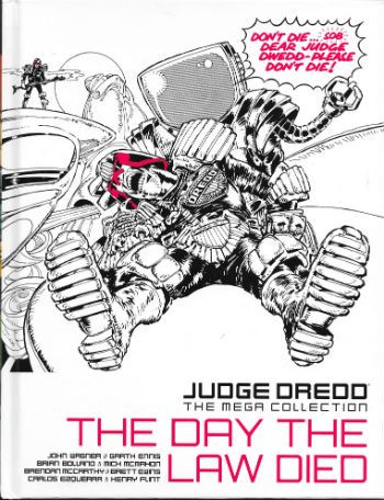
Anyway, this… JUDGE DREDD: THE MEGA COLLECTION Vol. 33: THE DAY THE LAW DIED Art by Mick McMahon, Brian Bolland (Dave Gibbons inks one episode), Brett Ewins, Brendan McCarthy, Garry Leach, Ron Smith, Carlos Ezquerra and Henry Flint Written by John Wagner and Garth Ennis Lettered by Tom Frame, Dave Gibbons, Tom Knight and Jack Potter Colours by Chris Blythe Originally serialised in 2000AD Progs86-108 & 1250-1261 © 1978, 1979, 2001 & 2016 Rebellion A/S Hatchette Partworks/Rebellion, £9.99 (2016) JUDGE DREDD created by Carlos Ezquerra & John Wagner

 photo JDTMC33CovB_zps0gz5vjru.jpg

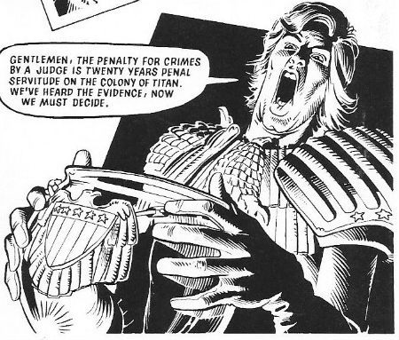
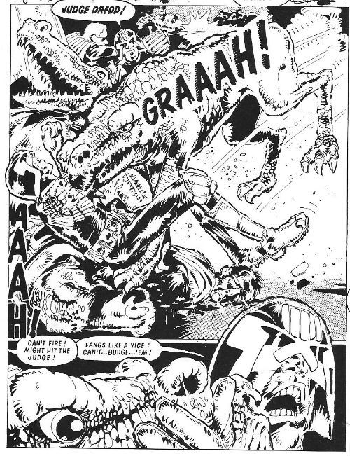
It’s now established tradition that Dredd mega-epics are usually separated by the best part of a year so as to allow everyone to get their breath back, including the readers; but back in 1978 John Wagner must have been full of beans and youthful pep because Old Stoney Face would barely have time to wash his smalls after “The Cursed Earth” before being unwittingly embroiled in “The Day The Law Died”. This one would be purely John Wagner’s creature and as such it trades heavily in his trademark satire via absurdism, rather than the more in-yer-FACE!!! style favoured by Pat Mills. While “The Cursed Earth” had been an energetic and eye popping exercise in world building “The Day The Law Died” turned its gaze inward and set about consolidating the world of Mega-City One, with particular emphasis on The Judge system. Back in Mega City One Dredd is immediately framed for murder, dispatched to Titan, shot in the head and left in no doubt that the new Chief Judge, the flagrantly insane Cal, is up to no good. Heading a rag-tag resistance Dredd has to free his city from the autocratic maniac, his own Judges and Cal’s Praetorian guard of Klegg alien mercenaries. Slicey-dicey! Oncey-twicey! Personally, my money’s on Dredd.

 photo JDTMBowlB_zpsxeyzt3fr.jpg JUDGE DREDD: THE DAY THE LAW DIED by Bolland, Wagner & Frame

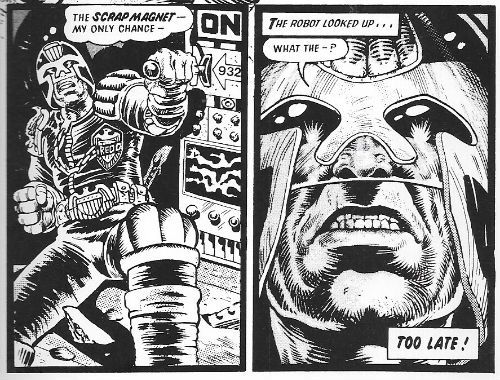
Previously Judges had been shown as an elite police force with traffic cops and more routine police being glimpsed around and about the strips. The very name, “Judge” suggested they were high up some nebulous law enforcement hierarchy. It was now made explicit that the Judges were the police, the whole police and nothing but the police. They were The Law. Hmmm. That’s catchy. However, there was still an elite police force, the Special Judicial Squad (SJS). These being an armed version of Internal Affairs, or the gimlet eyed automata known within most organisations as “Audit”. Tellingly these salty looking SJS dudes sport a uniform even more fascistic than that of Dredd, and since Dredd’s helmet has the twin lightning bolt emblem of the Schutzstaffel instead of eyes, that’s pretty darn fascistic. Keeping these little charmers under control comes under the purview of the Deputy Chief Judge, second in command to The Chief Judge, the prime panjandrum of the Justice System. Both these sit on the Council of Five, with three other seasoned vets.

 photo JDTMScrapB_zpssgwujxs4.jpg JUDGE DREDD: THE DAY THE LAW DIED by Ewins/McCarthy, Wagner & Frame

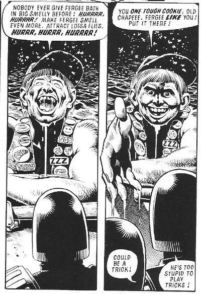
More seasoned vets are on show when the Judge Tutors appear to help Dredd. Back in the ‘70s the old saying was “Those that can’t, teach. (And those that can’t teach, teach P.E.)” Accordingly Judges who are no longer street fit end up teaching in The Academy of Law. Dredd has a bunch of these dudes with missing bits on his side. They are pretty funny; one guy calculates their chances of survival while they are falling to their probable doom, another is called Judge Schmaltz so…you can fill in the blanks there, I guess. Oh, Judge Giant turns up again reminding me that his presence links Judge Dredd to HARLEM HEROES. Alas, JUDGE DREDD was slow to incorporate black characters and Giant only appears intermittently hereafter. Since he uses the word “baby” and refers to his “pappy” this might have been for the best. He is, however, resourceful and instrumental in saving Dredd’s bacon, so there’s that. Apparently Mike McMahon started drawing Judge Dredd under the impression the character was black (mostly because his name was a garbled leftover from Pat Mills’ pitch for JUDGE DREAD, a voodoo horror strip which didn’t happen.) Imagine if they’d stuck with that!  You’ll have to imagine it, because they didn’t; Judge Dredd is white, baby. White like Pappy’s bedclothes! Baby! Things look bleak for Dredd and Mega City One until he and his team of maimed trainers smash through to the undercity and land in the Big Smelly. Oh, yeah, turns out the undercity is the polluted husk of the American Eastern seaboard. Seems it was easier just to concrete over it and build Mega-City One (some landmarks were relocated above ground for the tourists e.g. Empire State building), the Big Smelly is the Ohio River. On impact, most of them die as a result, but they do meet Fergee who is a big lovable doofus with a penchant for ultra-violence.  Fergee’s lack of smarts, specifically his failure to realise he is dead, will be instrumental in foiling Cal’s plan to nerve gas the whole city.

 photo JDTMFishB_zpswxexsxfo.jpg JUDGE DREDD: THE DAY THE LAW DIED by McMahon and Wagner

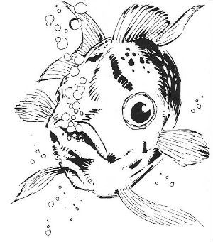
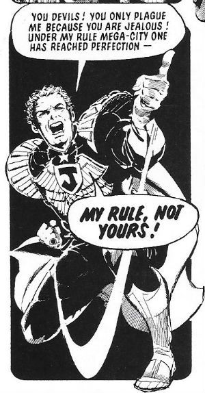
Don’t be deceived by those leaden paragraphs from my stilted hamd because Wagner is a talented writer, so he knows how to leaven the strip with exposition without sapping any of the demented drive of his tale. A tale which is an answer to an interesting question. What if someone with only the most tenuous grasp on sanity achieved the most powerful office in the land? Apparently he would build a big wall, institute a whole slew of authoritarian and often preposterous laws, throw a hissy fit when the public failed to display the requisite adoration, surround himself with pusillanimous yes-men and, basically, just abuse the office he holds and stain the system he represents like a crack addled Little Lord Fauntleroy. But enough about the 45th President of the United States! (Cue: sad trombone.) Weirdly enough that’s also what Judge Cal does after he has connived his way into The Chief Judge’s chair. “It is the doom of Man that he forgets!” squawks Nicol Williamson’s skull capped Merlin in EXCALIBUR (1981) and he’s not wrong. See, Wagner doesn’t base Cal on the Roman Emperor Gaius Julius Caesar Augustus Germanicus (AKA Caligula) merely because he’d recently watched  the 1976 BBC production of “I, Claudius”. I don’t doubt that it helped, particularly as the late John Hurt’s performance of “the little boot” was probably reliably arresting. (Wagner almost certainly hadn’t seen Tinto Brass’s porno-chic “cult” movie CALIGULA (1979), for which we can only be thankful.) No, he probably picked Caligula mostly because, well, “It happened before, it will happen again, it's just a question of when.” as Charlton Heston narrates in ARMAGEDDON (1998). It’s called learning from history, and when we don’t this is where we end up. Also with Wagner picking the much maligned Roman Emperor the opportunities for absurdism knocked harder than a drunk whose forgotten his keys. Suetonius says Caligula made his horse (Incitatus) a Senator? Wagner can have his Cal appoint a fish Deputy Chief Judge. Yes, Judge Fish is the spectacular character find of 1978! Who can ever forget his sage advice, “Bloop!” or his heartbreaking “Bloop! Bloop!” Gets me every time. Wagner has a ton of fun with Cal’s credulity straining antics so we’ll not spoil it for anyone. But, y’know, Judge Fish!

 photo JDTMFergB_zpsruj5iqwp.jpg JUDGE DREDD: THE DAY THE LAW DIED by Bolland, Wagner & Frame

Artistically “The Cursed Earth” was a two-hander between McMahon and Bolland, with McMahon’s hand being comically large like that of a cartoon mouse and Bolland’s being more refined and smaller like that of a lady of means. “The Day The Law Died” is more of a scrum; there’s a real pout pourri of art styles on display for the length of the epic. In a North American mainstream genre comic this would lead to a right buggers’ muddle and generally not work terribly well. Here it works out surprisingly well. Regular 2000AD readers (and Brit comic readers in general) were conditioned to understand that a strip’s artist could change at the drop of a hat. Being too young to be anything other than positive it was viewed as more of an opportunity to see a different style, rather than an indication that Terry Blesdoe had had to step in because Barry Teagarden had started shouting at buses due to the punishing demands of drawing 8 pages of Space Urchins every week for wages that would shame Sports Direct. It helps also that there’s a definite visual through line. Say Mike McMahon ends his strip with Dredd’s gun arm stuck deep in a Klegghound’s gullet, next Prog Brian Bolland will start his strip with…Judge Dredd’s gun arm stuck deep in a Klegghound’s gullet. And although every artist tends to draw MC-1 and the Judges with their own slightly quirky way, you are still clearly reading a strip about a future cop in a future city.

 photo JDTMHoundB_zpstzn6clgl.jpg JUDGE DREDD: THE DAY THE LAW DIED by McMahon, Wagner & Frame

Big Brian Bolland leads us in with his reliable clarity of line and subtle undermining of his hyper realism via restrained caricature. As ever his episodes are few and far between but always a tight delight. Mike McMahon gets stuck in, his work here being a bit airier than on “The Cursed Earth” but no less manic or delightfully inventive. By now Mike McMahon is able to bend reality to his scrappy whim and can populate his strip with what look like maltreated Muppets lolloping about a claustrophobic jumble of a city without once endangering the reader’s suspension of disbelief. There are also strong hints of McMahon’s next evolution in style peeking through, but right here  right now Mike McMahon’s work is sweet indeed! Gary/Garry Leach looks like he’s got too much ink on his brush and that spoils his usual majestic delicacy of line this time out. Brett Ewins and Brendan McCarthy team up and their combination of rigidity and fluidity creates an interesting effect each couldn’t achieve alone. Picking up the baton for the last stretch is Ron Smith. I understand Ron Smith is a divisive artist for a lot of Dredd fans, due primarily to his cavalier attitude to continuity of the series’ designs. Despite being in the top ten in terms of Dredd output (probably, I can’t be arsed to check) there’s not likely to be a “Dredd by Ron Smith” volume any time soon. Which is a shame, because I think Ron rocks. Like McMahon he can lard a page with a so much detail and information it’s staggering. His page layouts are always striking, with at least one dominant image to grab the eye, and sometimes more, so the eye bounces about the page, but always in the right direction. He shows a remarkable agility with regards to shifting scale between panels without jarring the eye, and the amount of detail he crams in is ridiculous. I’m a particular fan of his hyperbolic body language, shown off here to best effect by Cal’s contortions as his mania grips him. Look, Ron Smith is the man who drew “Sob Story”, “The Man Who Drank The Blood of Satanus”, “The Black Plague”, “The Hot Dog Run”, “Shanty Town”, “Tight Boots” and co-created not only Chopper but also Dave, the orang-utan mayor. John says Ron’s The One!

 photo JDTMCalB_zpslnigqwtl.jpg JUDGE DREDD: THE DAY THE LAW DIED by Smith, Wagner & Frame

“The Day The Law Died is an artistic mish mash held together by the strength of the various styles on show and John Wagner’s elegant and understated blend of absurdity, drama and action. It’s VERY GOOD!

 photo JDTMFiendsB_zpsglvxduad.jpg JUDGE DREDD: HELTER SKELTER by Ezquerra, Ennis, Blythe & Frame

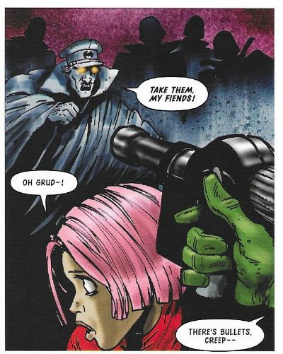
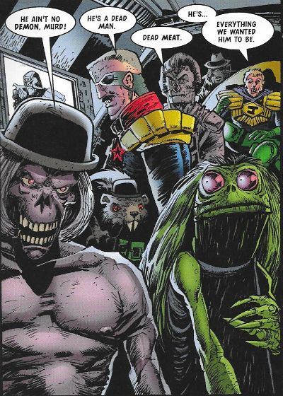
This volume of JUDGE DREDD: THE MEGA COLLECTION also includes “Helter Skelter” a 12-parter from the year 2001 which marked Garth Ennis’ return to the character of Dredd. In comparison to the “Day The Law Died” it’s a slight effort indeed, but not without its charms. An experiment in dimension mapping comes unstuck when a probe returns with what looks remarkably like the Geeks from the old 2000AD strip THE V.C.S. Further incursions of the familiar occur, and it all turns out to be a plot by Judge Cal from another dimension to kill Dredd, since he can’t stand the idea that there’s a dimension where Dredd won. Cal is accompanied by an army of Judges, a bunch of Dredd’s old enemies (dead in this dimension: Fink, Rico, Murd The Oppressor, Cap’n Skank, etc) equally upset at the thought of a live Dredd and a bunch of dimensional flotsam and jetsam  familiar to elderly Squaxx Dec Thargo, or keen readers of reprints.

 photo JDTMFlintB_zpspjtmoyuh.jpg JUDGE DREDD: HELTER SKELTER by Flint, Ennis, Blythe & Frame

It’s all done with a sense of fun (there are roughly “two thousand” dimensions already mapped. Ho ho!)  and while it trades unashamedly in nostalgia there’s enough of a plot and some decent jokes to leave you with a smile (and maybe a little tear as you recall Ace Garp’s sign off floating through the air). Carlos Ezquerra draws the bulk of it and is as reliably Carlos Ezquerra as ever. Most notable are his computer manipulated backgrounds which are interesting reminders that he was a swift adopter of new tech. Henry Flint does a bit of it and he’s as inkily delightful as ever, managing to evoke early McMahon while also being clearly his own man. “Helter Skelter” has some good scenes and makes a valid point about the Judges (they don’t do it for their benefit but for the citizens’ benefit) but is never really more than a bit of a nicely illustrated lark. GOOD!

NEXT TIME: Uh, maybe look at some other bits of Dredd’s world? People seem interested in that judging from the, uh, two comments. So pack your swimsuit and your sun oil! Factor 2000!

INDEX TO JUDGE DREDD: THE MEGA COLLECTION REVIEWS

"...A Fish Pedicure, Whatever That Was..." COMICS! Sometimes I Skull The Future Is Going To Brown In All Our Mouths, Hurrrm!

Okay, hurrmmm, I spent a lot of time writing a lot of words about some recent comics, but something happened there that means they won't be appearing. Bit unexpected that was, and it left me on the back foot. I've cobbled together a piece on Crossed Plus 100 which will, I hope, achieve several aims: 1) stop the site looking cobwebby over Easter, 2) bring attention to one of the many good books everyone doesn't talk enough about and 3) burn up any goodwill I've earned with you. I'm sure there's something wrong with that list but I can't quite put my finger on it. Anyway, I'm going to post this – what could go wrong?  photo CrossMovieC_zpsmrcmtr0p.jpg

CROSSED PLUS ONE HUNDRED by Andrade, Moore, Reed & Digikore

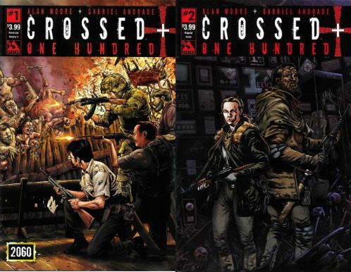
Anyway, this... CROSSED PLUS ONE HUNDRED #1 & #2 Art by Gabriel Andrade Story by Alan Moore Coloured by Digikore Studios Lettered by Jaymes Reed Avatar, $3.99 each (2014) Crossed created by Garth Ennis & Jacen Burrows

 photo CrossCovsB_zpsgtftsccj.jpg

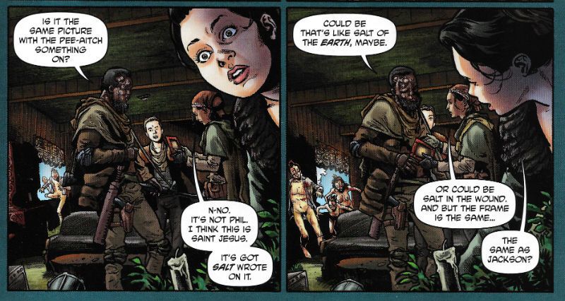
In which the fascinating human being and talented author Alan Moore takes the reins of the less fascinating, but still very talented, Garth Ennis’ Crossed franchise and spurs it so hard it leaps one hundred years into the future. The book follow a group of scavengers as they attempt to avoid the titular scarred sadists in a bid to harvest knowledge and resources from the disaster site that was once civilisation. A sense of dread begins to creep in as The Crossed turn out to be not quite as nearly extinct as previously believed and a mystery involving pictures of serial killers, Jesus Christ, and offerings of salt begins to take shape. The clock is ticking until unutterable terror explodes all over our hapless protag...what? Can I help you? I'm trying to..yes, Alan Moore wrote this comic and I’d like to tell you about what a swell job he did , but I see it doesn’t work like that with Alan Moore. First I have to declare a bias – I once said (out loud) to my LCS owner that I felt “privileged to be alive and reading comics at a time when Alan Moore was producing them.” He just looked at me like I had said my bum was haunted, because for a long time now Comics has been treating Alan Moore like he was their own 'Trotsky in Mexico' or something. Folk have all kinds of reasons for this, the reasons vary depending on how seriously they want to be taken, but, really, let’s face it, it’s because Alan Moore upset a lot of comics fans a while back by saying he thought their entertainment choices erred on the juvenile. I don’t really know why there was an ocean of outrage in response to that. Alan Moore isn’t me and he isn’t you so, you know, sometimes all of our opinions on things are going to be a bit out of synch.

 photo CrossEdenB_zpscnbmqq6k.jpg

CROSSED PLUS ONE HUNDRED by Andrade, Moore, Reed & Digikore

Fundamentally, Alan Moore’s big sin was to forget that comic creators are required to pretend that they are just like us and share our hopes, wants, dreams and (crucial this one) entertainment choices, but with an understanding by all that parties that when it comes to the crunch they are better than us because writing corporate Trex and high concept TV auditions is a lot tougher and more worthwhile than whatever paltry shit you occupy your life with, you uncreative drone; and all done in that strange way that is both patronising and demeaning to all parties simultaneously. Seriously, I like Alan Moore a bunch but I could give one rich shit if Alan Moore enjoyed The Lego Movie as much as I did. Mind you, I can’t help thinking that if Alan Moore wore a t-shirt and jeans and pretended the children’s entertainment Star Wars was a fit use of a grown man’s mind he’d get a lot less stick.

 photo CrossOopsB_zpsxuz5gqpt.jpg

CROSSED PLUS ONE HUNDRED by Andrade, Moore, Reed & Digikore

Meanwhile, back at the comics - Crossed +100 is work-for-hire which means rather than tell you how enjoyably unshowy and just plain solid it felt as a reading experience we have to go through the whole Alan Moore Work-For-Hire rigmarole. Alan Moore doesn’t mind Work-For-Hire as long as everyone understands that everyone is doing Work-For-Hire. He bangs on about Watchmen because he clearly believes there was some bad faith in there. He doesn’t bang on about John Constantine or the ABC Comics characters because they were all Work-For-Hire (LoEG excepted, natch) and everybody was super-clear about that. E.g. Apres Alan Moore the Tom Strong series has intermittently continued under Peter Hogan - with Moore’s blessing (so I understand). Nor did the The Top 10 stuff after he left elicit nary a peep from the disgruntled Magus. Look, just because he worships a sock doesn’t make him unreasonable.

 photo CrossSceneryB_zpsiuhkohfo.jpg

CROSSED PLUS ONE HUNDRED by Andrade, Moore, Reed & Digikore

I am in fact quite chuffed Alan Moore is doing W-F-H in this case as Crossed is Garth Ennis' crazy baby and Garth Ennis is, rumour has it, a Comics Creator. The past couple of years have seen comics creators en-mass treat Moore with all the dignity and respect a crowd of teenage afternoon drinkers accord a Big Issue seller. (“Lookarrisbeerd! Pooshimovah! Oldcantoldcantcrazyoldstinkycantyman!”) Lest we forget Comics creators are perfectly content to turn a blind eye to all kinds of shenanigans on the part of their dreamweaving sect including, but I imagine by no means limited to, sexual predation. Ironically though they fail to bring this very united front to face towards bettering conditions for their vocation as a whole. But then why would you when you can take the Before Watchmen money and run? So, yeah, Crossed Plus 100...Despite being continually painted as a humourless curmudgeon Alan Moore possesses enough of a sense of humour to slip some pretty good jokes into what is in essence a comic about humanity staring down the deepest darkest anus of hopelessness yet imagined. His characters spend their time foraging for knowledge in libraries; the joke here being that the libraries are remarkably (but not totally) unscathed due to their having little appeal to the either the Crossed or other survivors (or even people before The Crossing). As we all know Alan Moore has publicly and vociferously campaigned on the behalf of libraries in real life. Actually, you might not know that because it’s possible that this and his other attempts to effect material change for the better in the real world (food hampers for the needy, benefit appearances, de-icing the walkways at old people’s flats, burning money on Dodgem Logic so that there was (briefly) an intelligent magazine out there) didn’t receive as much play in the comic press as someone getting a TV contract or piggybacking on the social concerns of the moment to raise their profile. But, yeah, Crossed Plus 100 is a pretty funny comic. Moore also has his band of survivors harvest old tech for video clips of The Oldy Times and we find that in the middle of an explosion of barbaric obscenity people will still pause to film someone having their cock torn off and fed to a snarling barista.

 photo CrossPastB_zpsppswbeii.jpg

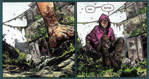
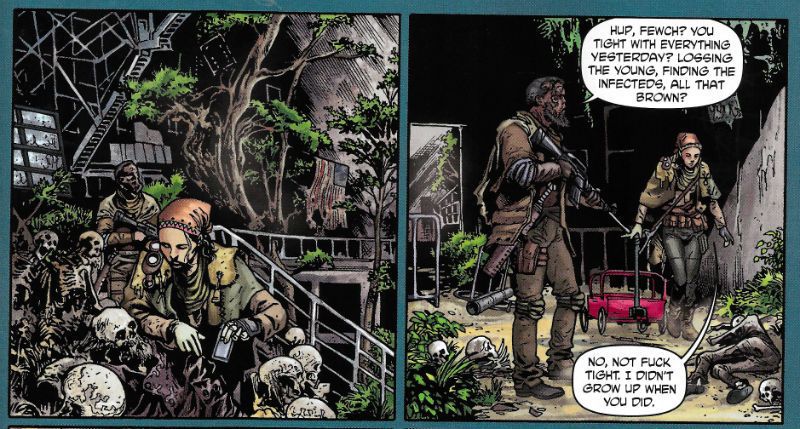
CROSSED PLUS ONE HUNDRED by Andrade, Moore, Reed & Digikore There are other jokes (Elvis' paean to tat, Gracelands, is admiringly described as “fuck class for definite.”) As you can see by that bit in brackets, Moore has even come up with a new Futcha-spikky, Which was a nice touch because language does evolve and Moore gets to build in some good jokes there too. Something of visual interest in real life is called “movie” and there’s a tiny sense of satisfaction which sparks when some of the more obtuse meanings click home. Although, none of it is too obtuse (that would be counter-productive) but I read my comics when I'm tired and it took me a full issue to figure out AFAWK was not a parrot like exclamation ,but the popular acronym. It's smart, inventive stuff and for a comic so soaked in a sense of impending doom I spent quite a lot of time laughing. This will surprise no one who has met me.

 photo CrossUselessB_zpsnshmj2a4.jpg

CROSSED PLUS ONE HUNDRED by Andrade, Moore, Reed & Digikore

But Moore's best joke (his towering edifice of hilarity) is an invisible one; it takes the form of an absence. The joke is that for a comic spent in such a degraded universe there's precious little sexual violence. There's some; there's a bit, but you have to really peer hard to find it. Which just isn't on. Where's my sexual violence? I demand some sexual violence? You know, the sexual violence about which we never speak, as there is a Conspiracy of Silence about this sexual violence. Except, obviously when we do speak of the sexual violence in Alan Moore’s work, which is every time there is sexual violence in Alan Moore’s work, which is quite a lot of the time, hence the discussion. On reflection as Conspiracies of Silence go, I have to say, it needs work. On the Silence bit anyway. This time out the silence surrounding sexual violence is the result of there being no sexual violence here, which beggars belief really. He can't not be taking the piss. Also, I'm afraid anyone holding out for a juicy bit of racism to get stuck into is going hungry tonight. I do share your trepidation, because thanks to Alan Moore’s relentless and, frankly, inexplicable attempts to reposition the racist marmalade totem of my youth I read this one with my face tensed as if for a slap. However, everybody braced for racism can stand down because this group of doomed fuckers contains only one clearly Caucasian male so, I think we can put our rocks back down on that one.

 photo CrossTrainB_zpszbanhghf.jpg

CROSSED PLUS ONE HUNDRED by Andrade, Moore, Reed & Digikore

An apology is due here. And I apologise unreservedly and wholeheartedly; I apologise sincerely and repeatedly. And I apologise to Gabriel Andrade. Because Gabriel Andrade draws Crossed Plus 100 and he hasn't had a sniff yet. Which is a shame because his work on Crossed Plus 100 is extraordinarily decent. His world is convincingly overgrown and decayed in equal measure; the rampant foliage spattered with the flaky remains of our white goods and furnishings. The Eden we built is replaced on these pages by The Eden of Nature, and it's clear who's getting the last laugh. Sometimes the overly lush colours swamp the art and confuse the perspective, but that's just a carp to show I was awake. Art wise Andrade takes Moore's script and puts it on the page with enough skill to ensure his own style is not swamped by that of The Moore. I particularly enjoyed the way the train our crew pootle about in looked like something from a fanciful children’s book but, ew, stuck in a world entirely the fault of adults.

Then, in issue #1, there's some backmatter. In this backmatter (“backmatter” being a comics term which I am beginning to think means it’s in the back and it doesn’t matter) Comics Softest Hearted Big Man Garth Ennis (who should never be described as Comics Biggest Hearted Soft Man) puts his metaphorical cap on the floor and starts playing the verbal spoons to drum up interest in either his Crossed webisodes (which is a word which should be stricken from the human record), a new Crossed series by Alan Moore (which is this comic) and one by Kieron Gillen (about how Bogshed fare in the Crossed world: Crossed C86), or an attempt to get Crossed on television because as any fule kno Television is the apex of human achievement. Oh, okay, I couldn’t really tell what he was trying to get me to invest in because the interview is conducted by Hannah Means Shannon (which apparently is a name and not the key to a particularly humdrum code) and contains sentences which actively repelled my interest. Speckling the thickets of time-share speak are the odd blooms of interest where burly Garth Ennis tells us what Crossed is about thematically (“how do you take charge of pure chaos..” Badly, I'm guessing, Garth.) Ultimately the world of Crossed is all a bit much for this tired old man who needs his illusions of decency and sanity just to make it through to his next biscuit, but when I was young I'd have snarfed this stuff down. So, yeah, I came for Alan Moore and that's what I got. Don't get me wrong, he's not perfect; he's just human but he does extend you the rare courtesy of not hiding that. He's Alan Moore, he writes comics and this one was VERY GOOD! But then again, like I said, I'm biaised.

Alan Moore is many things to many people but to me he's mostly - COMICS!!!
"Thor Has His Doubts About This One.." COMICS! Sometimes It's Gruff In The Age of Mjolinir!

Here's some words about a comic with Thor in. Do with them what thou wilt.  photo TVikWhatB_zps0c53cbd6.jpg

Anyway, this... THOR: VIKINGS #1 - 4 Art by Glen Fabry Written by Garth Ennis Coloured by Paul Mounts Lettered by Dave Sharpe MARVEL, $3.50ea (2003) Thor created by Jack Kirby, Larry Lieber,  Stan Lee and the people of Norway Dr. Strange created by Steve Ditko and Stan Lee

 photo TVikcoversB_zps7e8433ed.jpg

This 2003 limited series features the popular and girlishly tonsured hero Thor versus zombie Vikings. It is set in the Marvel MAX universe and is written by Comics’ toughest shave, Mr. Garth Ennis. Surprisingly Garth Ennis isn’t the star here and nor is Thor; the real star of this series is the genially grotesque art of Glenn Fabry. For a MAX series about Thor versus zombie Vikings in New York City the whole affair is relatively restrained. Particularly on the part of Garth Ennis. Quite possibly in deference to the real-life events of 11th September 2001; an event towards which eyes are obliquely lowered towards at a couple of points on these pages. While there’s some playful undercutting of the usual conventions of super hero comics (The Avengers get a royal battering; Thor is swiftly shunted to the sidelines) Ennis never really lays into the superhero concept as is his wont. He certainly doesn’t do that bullying overkill thing where it becomes less like reading a comic and more like watching a drunk squaddie man-dance on a student’s neck in a pub car park come closing time. The reason, I think, being Ennis just isn’t that interested in Thor;Thor's not worth it. To the extent that it doesn’t really read like a Garth Ennis Thor story at all. It reads like a Garth Ennis story that happens to have Thor in it.

 photo TVikyukB_zpsb808c8d9.jpg

The generic set up’s the give-away; all that’s required is a titular hero you can blindside the reader by immediately side-lining, a chippy wizard who does all the work and a city of Enormous Symbolic Importance. So here we have Thor, Dr. Strange and New York City but it would have worked as well with Judge Dredd, Devlin Waugh and Mega City One or Superman, John Constantine and Metropolis. Sure, you’d need to shorten the hem and let out the waist a bit in each case but the set up would basically be a snug fit. Because this is a Thor comic here we have Thor and (seriously) Ennis isn’t really interested in Thor so Goldilocks gets a good hiding in short order from the zombie Vikings. Dr Strange (who Ennis isn’t interested in either even though he gets all the best lines) kisses the be-banged one’s boo boos better and gets the plot moving and hustles us into the bit Ennis is interested in. See, to battle the zombie Vikings (a very English sounding) Dr. Strange plucks three people from the time stream (amusingly visualised as a stream of Time) and it’s these which allow Ennis to play with his favourite toys. Selected for the First Team are a lady Viking (woman are as good as men at the worst men can do. Violence, I’m talking about violence there); a Python-esquely single minded Crusader (Religion; not the top of Garth’s Pops so rumour has it) and a Good German (if Garth Ennis has a dog I bet it’s called "Erwin").

 photo TVikStrangeB_zpsb51e4bb4.jpg

This bunch fight the Vikings while Ennis backs Thor into a ridiculously confined corner and then just shrugs and, metaphorically, has Thor turn round and open the door which was behind him all the time. It isn’t exactly tightly plotted is what I’m getting at there. It is, however, fast-paced, absurd and wryly inventive in its scenes of horror and violence; but best of all it is gifted with an artist who can do Ennis’ ridiculous flights of fancy justice;Glen Fabry.

 photo TVikChristB_zps726aee0b.jpg

Of course Fabry and Ennis have previous form; Fabry provided painted covers to Ennis and Steve Dillon’s popular series about the undeclared homosexual love between a vampire and a virile idiot. Preacher, I’m talking about Preacher there. They’ve worked together since then (e.g. The Authority: Kev); enough so to suggest that Ennis has geared this script to the tastes of his artist. Glen Fabry’s wonderful art first lunged off the page at me in 1985 when he started illuminating Pat Mills’ Slaine series in 2000AD. Unlike his Preacher covers his art there was B&W linework and the subject matter of Celtic barbarians soon made him a dab hand at drawing the underdressed enthusiastically hacking away at each other. This comes in very handy here as his zombie Vikings have a physical solidity and air of authenticity which make the ridiculous concept peculiarly plausible. The early scenes where the Vikings are behaving badly in their own time are highly convincing but it’s when the magically animated anachronistic dead start acting up in NYC that the art becomes most captivating, and the appeal of Fabry’s skills become most apparent.

 photo TVikCarB_zps7329c247.jpg

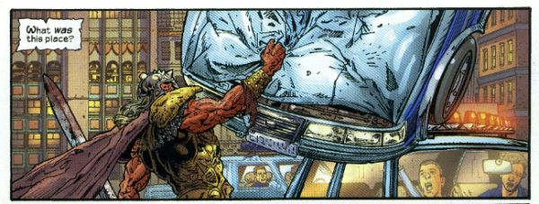
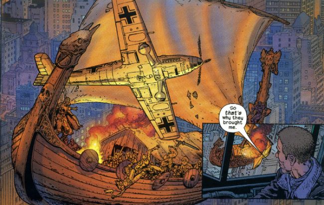
The credibility Fabry’s detailed art has given the time shifted terrors in the earlier pages is carried straight-facedly into the more modern milieu in which they massacre like massacre’s are going out of fashion. The hard won visual integrity of these impossible figures allows Fabry to pull off the frankly preposterous demands of Ennis’ imaginative, but cursorily plotted, script. Severed heads piled so high they block a street; Fabry’s the man with his rubbery mugs which flinch just short of caricature. A dogfight between a levitating longboat and the last of the Luftwaffe in the sky alleys of the Big Apple; Fabry’s the fella with his melding of research and chutzpah.

 photo TVikBroughtB_zps84e2cde8.jpg

While Fabry’s art is grounded in realism there’s an amiability about it which lends it a degree of flexibility. It’s more cordial than the chill of po-faced photorealism and this openness allows his art to embrace unreality just enough to make the impossible, well, probable at least. In its attention to detail Fabry’s art is very similar to the art of another talented 2000AD alumnus, Chris Weston. If Weston’s clench jawed and detail dense art were on muscle relaxants. Of the Old School Fabry’s art harks back to Hogarth (Burne not William; the 1700s is a bit too Old School, cheeky) both of them sharing a preoccupation with anatomy but Fabry’s figures are more placidly posed than Hogarth’s often frenetic excess in this area. It is of course excessive indeed to place skills of Fabry’s calibre in the service of, um, Thor versus zombie Vikings in the MAX universe. But then there’s little point to Thor versus zombie Vikings in the MAX universe other than the excess, which I guess is why Fabry’s art elevates a sloppy but fun wisp of a thing to GOOD!

Thor versus zombie vikings in modern day New York is very much - COMICS!!!

Wait, What? Ep. 129: Idol Speculation

Wait What Punk photo waitwhatpunk_zps1cb5bdd6.pngA nifty piece of fan art from the crazily talented Adam P. Knave. Thank you, Adam!

We are back!  To do that thing to your ears that you insist you like!  (Really, you like it? Really?)

After the jump -- show notes!  That thing I do to your eyes that...maybe is helpful?  Even the way I do it, maybe?  Join us!

(Ugh, I'm so old: looking at photoshopped me with those shoes, I'm all, "Man, I look like Bob Fosse!"  Sad, sad, sad.)

0:00-18:54: Greetings! Apologies! Alternate theme songs! Prepping from SDCC!  Graeme tells us what kind of stuff he's looking forward to -- and, equally as important, dreading -- at this year's Con.  Also covered: the upcoming geek lifestyle program brought to you from a somewhat unlikely source; Blair Butler and more. 18:54-29:34: Is Marvelman coming back at this Con?  Will anyone care? Will Jeff be able to get halfway decent prices for his copies, or has he entered the greedy speculator phase of his comic reading career far, far too late?  Also, Jeff unburdens himself about his shady contribution to Internet discourse.  And that leads, in its odd way, to discussion of the latest Marvel event and the new Inhumans series. 29:34-41:34:  And that leads to us talking about Gaiman's changing credits on Guardians of the Galaxy, DC being less bitchy in public than Marvel, but still doing stuff like cutting Ales Kot loose from Suicide Squad. Is DC trying to bring back its Silver Age in the worst way possible?  Or do they just not know how to grow creators? 41:34-50:14:  Compare and contrast:  Graeme has read the two collections of Nick Spencer's Ultimate X-Men and has some things to report back on that experience.  He also read the Superior Foes of Spider-Man, also written by Nick Spencer.  Since Jeff hasn't read Morning Glories and Graeme has, Jeff grills Graeme about the A-B-Cs of N-I-C(k). 50:14-57:49:  Whoever had 49:10 in the holiday pool for when Jeff would want to start talking about 2000AD, pick up your winnings at Window No. 2!  We talk about Laura Sneddon's excellent article about Zenith, Hillary Robinson and Chronos Carnival, and giving Jeff a chance to vent about his obsession with the Leonard Zelig of the comics industry, Michael Fleisher.  And just as we talk about one of the best pieces to happen to comics in the last two weeks, things go a bit pear-shaped, leading us into… 57:49-58:10:   Intermission One! 58:10-1:04:54: Where we were?  Oh, right.  One of the best things to happen to comics in the last two weeks?  That would be Jim Steranko joining Twitter.  Are you following @IamSteranko?  You really, really should. 1:04:54-1:11:01:  Neither Graeme nor Jeff attended the Image Expo. Did that keep Jeff and Graeme from talking about it? Oh my, no. 1:11:01-1:17:53: What do Game of Thrones, Dead Snow, and The Fantastic Four have in common?  And what does all of that have to do with The Boys?  Jeff has a hurried, stammery story that will connect the dots for you! 1:17:53-1:30:14:  And to continue from that last talking point, Jeff (a.k.a., Mr. Up-To-Date) finally finished reading all of The Boys by Garth Ennis, Darick Robertson, John McCrea, and Russ Braun (who Jeff, because he is daft, refers to as Dan Braun at least once, much to his shame now). Spoilers ahoy! 1:30:14-1:52:01Batman, Inc. #12!  What'd we think? JLA: Tower of Babel! Which one of us has only now just read it? The second Prophet collection!  Which other one finally read that and what'd they think?  Bandette and Batman '66! Did one of us read them and love them, or did both of us read them and love them? The Private Eye!  Who's going to sound like a douchebag talking about the new they discovered to read the latest issue by Brian K. Vaughn and Marcos Martin?  Pick up your pencils and begin.  You will have slightly less than twenty-two minutes to complete this part of the exam. 1:52:01-end:  Closing comments! Promises to return that hopefully will not sound hollow to thy ears! And, of course, Exclamation points! Exclamation points for everyone!!

Um, what else?  I just saw Pacific Rim today.   I wasn't the only one  weirded out by how much that Australian dude looked like Geoff Johns when he put his baseball cap on, was I? No?  Just me?

Anyway, it was far from a great movie (like I don't even think there's bus service between where Pacific Rim ended up and a great movie) but it worked for me.  I had an okay time with a few minutes of genuine nerd joy.  Weirdly, it reminded me of Battleship, another so-very-far-from-great movie, that also spent most of its running time trying to justify its own premise and really was entertaining when it wasn't being terrible...the difference being that Peter Berg is just a tourist in nerd town and Guillermo Del Toro owns, like, a third of the shops there.

I mean there weren't enough fights in the city for my tastes, and I don't know how you can put Charlie Day in a movie and make him yell all the time and have it still be dull (because I think Charlie Day yelling is like one of the funniest things in the world). But, you know. As a bargain matinee on the big screen? Enjoyable.

Oh, right!  The podcast!!  I knew I almost forgot something!  It'll be on iTunes soon, it's in our RSS feed, and it's right below.  We hope you listen and enjoy!

Wait, What? Ep. 129: Idol Speculation

"Do They Still READ In The Future?" COMICS! Sometimes It's Great To Be Rude!

It was Half-Term last week hence the silence. Yes, the blessed silence. But now your God has failed you and I am back! It has been quietly suggested that I put on hold my tribute to Charlie Drake and maybe look at some comics this time. So, no actors who were dead before you grew your big teeth this time out. Just comics! Just lovely, lovely comics! But were they lovely? Hmmmmm? Anyway, this...  photo DHP_Pop001_B_zps333a52d6.jpg NEXUS by Steve Rude & Mike Baron

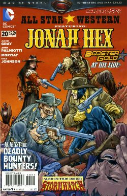
ALL STAR WESTERN #20 Art by Moritat (Jonah Hex) and Staz Johnson (Stormwatch) Written by Justin Gray & Jimmy Palmiotti Coloured by Mike Atiyeh (Jonah Hex) & Rob Schwager (Stormwatch) Lettered by Rob Leigh Jonah Hex created by Tony DeZuniga & John Albano Stormwatch created by Brandon Choi & Jim Lee DC Comics, $3.99

 photo All_SWCov001_B_zps3260d931.jpg

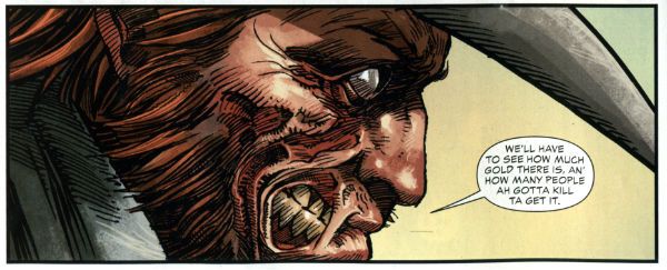
I kind of liked this issue. I don’t know whether the worms have finally reached my brain, or what but twenty issues in and this one almost clicked. I’m not exactly the most demanding Jonah fan either, I just enjoy the scar faced twat in a hat going around kicking up dust and making life brutal, difficult and short for folks. I prefer it to be a straight western but it isn't a deal breaker.

 photo All_SWPanel001_B_zps37540f12.jpg Jonah Hex by Moritat, Gray & Palmiotti

No, I don’t mind Booster Gold turning up for no reason that is ever going to be explained (hey, that’s just how comic books roll these days). I’m just pleased the book has a bit of a spring back in its step. Maybe it’s the beneficial effect of getting Jonah out of the city and into the countryside? Like when you ferry troubled youths by coach out into the boondocks to stroke goats. Moritat’s art seems a bit more lively and engaged although that might be due to the brighter and more varied colour palette in use. Watch these backgrounds though, I’m not a native of the Americas but I’m pretty sure mesas aren't mobile. Like I say I don’t expect much really and this delivered that making it OKAY!

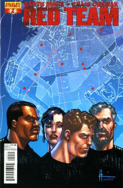
RED TEAM #2 Art by Craig Cermak Written by Garth Ennis Coloured by Adriano Lucas Lettered by Rob Steen Cover by Howard Victor Chaykin Red Team created by Craig Cermak & Garth Ennis(?) Dynamite, $3.99

 photo Red_TCov001_B_zps4bf0c366.jpg

More like RED MEAT amiright, soft lads? Here Comics’ Firmest Handshake Garth Ennis turns his surly attention to a tale of cops taking the law into their own hands. I’m sure that will work out really well for everyone involved. At the minute it isn't working out too well for me. I guess my LCS sent this as Howard Victor Chaykin is doing the covers and I like Comics’ Deepest Voice Garth Ennis’ war comics. So, okay, fair enough. I’m not turned off by the concept either. I’m always up for that old story which ends with a bunch of people dead or drenched in blood while sirens scream closer and those who aren't corpses suddenly realise why there are rules.

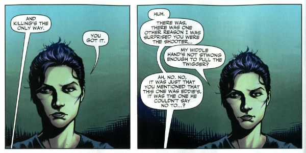
 photo Red_TPanel001_B_zps37f466f0.jpg Red Team by Cermak & Ennis

Maybe it won’t go that way, after all Comics’ Hottest Curry Garth Ennis spends enough time (i.e. too much time) explaining how his characters can smoke in a government building that it must surely (surely!) pay off later in an example of Chekov’s Fags! Maybe everything will go swimmingly but the racially and sexually mixed cast will succumb to a series of smoking related diseases. Maybe not. But hopefully the series will avoid plummeting into maudlin sentimentality like a sloppy drunk slurring on about The Old Country as the barkeep dials for a taxi. Not an uncommon occurrence in work by Comics’ Softest Hearted Big Man Garth Ennis. This thing seems written for the screen (no, the page and the screen are not interchangeable) and the art just isn't up to the job of hiding this. It gives me no pleasure to say that. In fact I’ll leave it there except to express the hope that you really like that panel I picked because you’ll be seeing a lot of it on these pages. RED TEAM is not a complete wash though and that’s due mostly to the dialogue of Comics’ Hairiest Chest Garth Ennis. It’s good dialogue and it means RED TEAM is OKAY! That probably still won’t save me from a beating though.

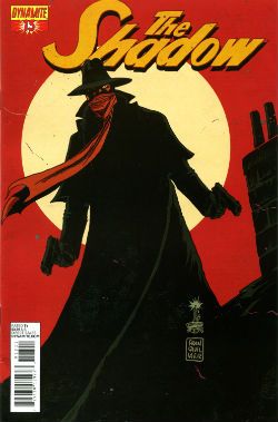
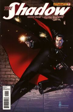
THE SHADOW #13 Art by Giovanni Timpano Written by Chris Roberson Coloured by Fabricio Guerra Lettered by Rob Steen The Shadow created by Walter B. Gibson Dynamite, $3.99

 photo Shad_Cov001_B_zps0806f9d9.jpg

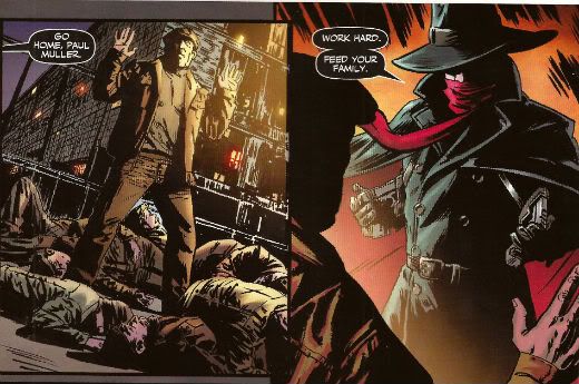
Everything in this book is so familiar that the sight of your face in the shaving mirror delivers more surprises. This issue is impressive only in its devout refusal to bring anything new or interesting to bear on the join the dots plot with its transparent mystery, its space wasting reluctance to provide more than one speech bubble in a panel and…oh...look, there’s a three page sequence of a drunk man going home, going upstairs, pouring a drink and being surprised. No. That’s not comics, that’s just horseshit. I’m not even going to scan a picture of the contents as the fewer people who see this then the less damage done to those involved. Honestly, I’m doing them a solid here. Or a salad as they say in Nyawk. So, no offence to any of the people involved here as we all have bills to pay but this was AWFUL!

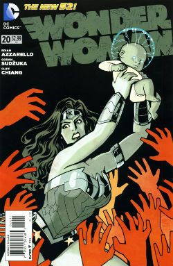
WONDER WOMAN: #20 Art by Goran Sudzuka & Cliff chiang Written by Brian Azzarello Coloured by Matthew Wilson Lettered by Jared K. Fletcher Wonder Woman created by William Moulton Marston and H. G. Peter DC Comics, $2.99

 photo WWom_Cov001_B_zps8c89c4c0.jpg

This is an atypically action packed issue but all too typically when the dust settles the forward plot motion is infinitesimal if not entirely illusory. With its large cast, stateliest of paces, squandered artistic talent and elevation of chat at the expense of incident it’s hard not to see WW as Azzarello’s attempt to bottle a bit of that drab Bendis magic. Luckily, despite his heroic efforts, Azzarello appears incapable of attaining such low levels of blandery. For starters his characters don’t sound like they are recovering from traumatic blows to the head; trading only in recursive whirlpools of bland doggerel. And every now and again something does happen. So, it’s an improvement but it’s still very far from being good. It still rarely rises above word play on a par with puzzles in the magazines old people in hospital spontaneously secrete in-between visiting times. Also, I think his cast have a problem with the booze. Although as the middle class assure us, if it’s wine it isn't alcoholism.

 photo WWom_Panel002_B_zps13522682.jpg

Wonder Woman by Chiang, Sudzuka & Azzarello

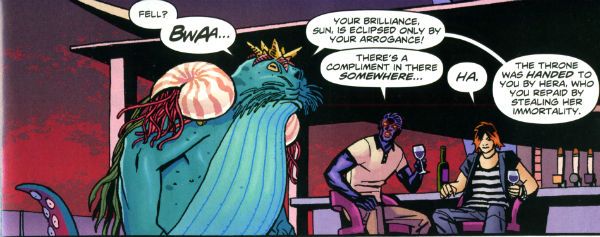
At some point in any given issue the chattering cast will mingle about some tasteful locale sipping drinks and hoovering up nibbles. Thankfully the medium of comics spares the reader the no doubt inevitable soundtrack of Toploader Orion snuck on to smooth things along. The whole thing is like one of those hellish networking soirees for people who do a bit of wee when they think about Powerpoint presentations. Except everybody is cosplaying Sandman and the evening ends abruptly when a big blue catfish in a crown stabs Simon from Accounts in the face. And puns! This issue’s highlight was when War asked, “Where’s my drink? You said you’d get me a Belgian White Beer!” and Wonder Woman replies “I beg your pardon, I never promised you a Hoegaarden!” Face it, Tiger; this book’s so far gone you’re not even sure if that happened. So it’s a fact that the crisp clarity of Goran Sudzuka and Cliff Chiang's art which brings this up to OKAY!

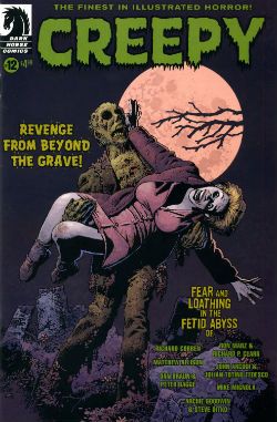
CREEPY #12 Art by Richard Corben, Richard P. Clark, Peter Bagge, Matthew Allison, Julian Totino Tedesco and Steve Ditko Written by Richard Corben, Ron Marz, Dan Braun, Peter Bagge, Matthew Allison, John Arcudi and Archie Goodwin Lettered by Nate Piekos of Blambot and Peter Bagge Dark Horse Comics, $4.99

 photo Creepy_Cov001_B_zpsed87d4c8.jpg

There's the usal raggy grab bag of one pagers and spot illos but storywise we have:

Uncle Mangus by Richard Corben

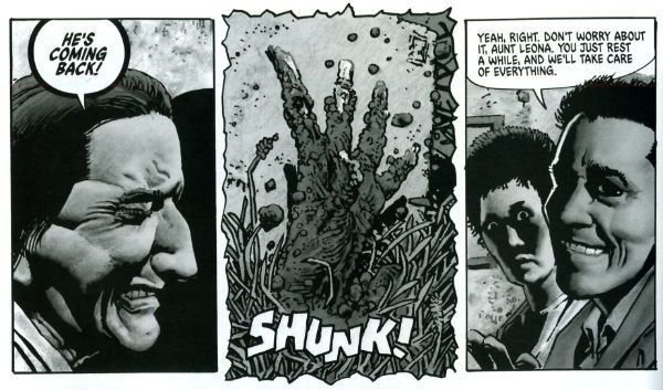
Corben’s on first and Corben’s on form with a frivolous shamble of a shaggy corpse story. Corbenites won’t be disappointed as the shadows drape at strange angles across distorted faces, the undergrowth looks like gathia sticks from Bombay Mix, the borders are jagged when nerves become ragged and the horrific punchline is drawn with slapstick mixed with the ink. Yes, Richard Corben continues to defy Time itself and belligerently refuses to budge from VERY GOOD!

 photo Creepy_Corb001_B_zpsfe235ff8.jpg

Uncle Mangus by Corben

Fishing by Ron Marz & Richard P. Clark Not entirely rote retelling of one of the usual variations on kids go fishing fear fables. Sorry, but EH!

Local Talent by Matthew Allison Allison's tale nicely conveys the grotty zest of late '70s foreign filmed schlock but would have conveyed it better in less space. Also, I know this charmingly cack cinematic genre was limited by budget but it's not a limitation shared by comic art, so c'mon let's have some backgrounds, son. Good enough for an OKAY!

 photo Creepy_Ditko001_B_zps2a622c1e.jpg

The Spirit of The Thing by Ditko & Goodwin The Spirit of The Thing by Steve Ditko & Archie Goodwin

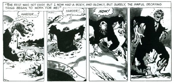
It’s Steve Ditko! "He is Dee Aye Tee Kay OH! He is Dee Aye Tee Kay OH! He’s Dee- delightful! Aye – Innovative! Tee- Totally not open to compromise on any point of principle upon which he has formulated an Objectivist stance! Kay – Kind of kooky! OH!- oooOOOOOOOOOOOOOOooooooooo! He is Dee Aye Tee Kay OH!" In this reprint Archie Goodwin does his usual solid scripting but it’s Ditko’s groovy grey wash German Expressionism that makes this one retain its VERY GOOD! kick lo these many decades after its original printing. It’s also a nice reminder that aficionados of Sturdy Steve should be salivating after the Creepy Presents…Steve Ditko volume that will be dropping imminently. Pre order from your LCS now, they'll appreciate it!

 photo Creepy_Panel001_B_zps17d66933.jpg Pack Leader by Tedesco & Arcudi

Pack Leader by Julian Totino Tedesco & John Arcudi While Ditko and Corben get to VERY GOOD! on the merits of their art alone Arcudi and Tedesco’s tale reaches the same grade due to the success of their collaboration. This one really gels and even wrong-footed me at the last. That's nice. Arcudi and Tedesco knew what they were after and they went and got it. Nice work, fellas!

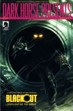
DARK HORSE PRESENTS #24 Dark Horse Comics, $7.99

 photo DHP_Cov001_B_zpsdd591b27.jpg

BLACKOUT CHAPTER 1 Story and lettering by Frank Barbiere Art by Micah Kaneshiro Blackout created by Mike Richardson (?)

This one didn't grab me I’m afraid. With its slickly appealing tech sourced graphics and plot predicated on the promise of explanations further down the line it read like the tie-in to some video game I've never heard of. It’s only a few pages though so maybe it’ll pick up and improve from EH!

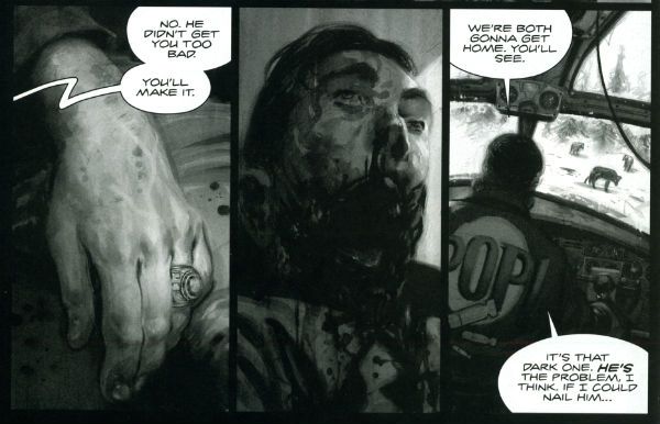
ALABASTER: BOXCAR TALES CHAPTER 6 Art and lettering by Steve Lieber Story by Caitlin R. Kiernan Coloured by Rachelle Rosenberg Alabaster created by Caitlin R Kiernan

My total indifference to this one is purely a case of it not being my cup of tea rather than any failure on the part of the creative team. I did read it but I couldn't tell you anything about it except it’s in space and usually it isn't. There are some talking animals and a lady, usually with a very broad accent, having magical adventures. Oh, she’s called Dancy Flammarion. Yeah, that’s me gone. I'm no Garth Ennis but fey’s not my thing, I fear. Disregarding my witless bias this is bound to be OKAY! Because Steve Lieber can sure draw nice and Caitlin R Kiernan writes proper books (she should not be confused with Caitlin Moran who doesn't). The most interesting thing was how disproportionately irritated I was by the bit where the team tell us what they were listening to when they created the strip. It was really distracting. I mean was Kiernan really listening to the Sunshine OST? Why? Was it just because it’s the soundtrack to a movie set in space? That’s a stunningly literal approach isn't it? What did she do when it was finished? Start again? Stop writing?

Like a real asshole I find it all a bit disingenuous when creators share stuff like this with us. No one ever says they were listening to Phil Collins or Cher do they? Ever. Yeah, right. Have you seen some of the people who make comics? Seriously. I mean that guy who always does that stupid thing in photos with his face so it looks like a wet thumb sliding down a window is a Foreigner fan and no mistake. Look into your heart, you know it is true. Anyway, this stuff's just the thin end of the wedge, next thing you know they're telling you about their substance abuse problems, how many kids they have or whether they get to put the fairy on top of the Christmas tree. Being an unfeeling automaton it’s just not something I need to know about creators. I mean, does it do any of you any good to know I wrote this while listening to SWANS’ Time is Money (Bastard)? Oh, alright it was Cher. "Do you belieeeeeeeeve!?!"

 photo DHP_BHound001_B_zpsf720926a.jpg

Bloodhound by Jolley, Kirk & Riggs BLOODHOUND: PLAIN SIGHT CHAPTER 2 Art by Leonard Kirk & Robin Riggs Written by Dan Jolley Coloured by Moose Baumann Lettered by Rob Leigh Bloodhound created by Dan Jolley & Drew Johnson

This is a revival of a defunct DC property which has now been given back to the creators to do with as they will. I believe DC also returned the less than successful Monolith property to its creators recently too. This is really rather sporting of DC and we should probably acknowledge that before reminding ourselves of their treatment of Alan Moore. It appears that the lesson here is that if you create anything successful for DC they will line up and bang you like a shit house door. Meanwhile the creators of Bloodhound have decided to put it in DHP. I liked this series when it first appeared and I still like it despite the pony tail our hero sports. He’s kind of like a government sanctioned Punisher with all his marbles and a beer belly who targets super villains. This is just a short three parter so the mystery tends to be cleared up by the characters approaching each suspect, the suspect immediately breaking down and pointing to the next suspect and then the villain breaking cover to provide a thrilling cliff hanger. Brevity isn’t doing it any favours is what I’m saying. But I still find the premise promising, the characters solid and the art pleasant enough for it to be OKAY!

BRAIN BOY CHAPTER 2 Art by Freddie Williams II Written by Fred Van Lente Coloured by Ego ("The Living Colourist"?) Lettered by Nate Piekos of Blambot Brain Boy created by Gil Kane & herb Castle

Although it’s not explicitly stated I guess this is an update of Herb Castle and Gil Kane’s 1962 creation for the faster paced and more luridly violent Now. Since Dark Horse published a pricey hardback of these (old and very probably nuts) tales you’d think they might want to draw attention to this. Weird. Anyway, the update is definitely fast and bloody and it’s not without its charms. Chief amongst these are Van Lente’s witty revisionism best exemplified by the call centre riff and the ‘magic cereal' which fools no one. Artwise Williams II has obviously thought long and hard and come to some definite conclusions about how to draw our hero’s nose. I can’t speak with any surety as to the conclusions he’s reached but there’s definitely something going on with Brain Boy’s hooter. Oh, it all bounces along in a lively if not altogether logical fashion, which makes it GOOD!

 photo DHP_Nexus001_B_zpsda643d33.jpg Nexus by Rude & Baron

TREKKER: THE TRAIN TO AVALON BAY CHAPTER 1 Story and art by Ron Randall Coloured by Jeremy Colwell Lettered by Ken Bruzenak Trekker created by Ron Randall

It's super-nice that an old lag like Randall has his own creator owned property. It's less agreeable to report I found the whole future bounty hunting lady with sad past thing a tad too generic for my fussy palate. I am certain there is an audience for this but I adamant I am not amongst their number. I wish Randall well in all his travels but this, for me, was EH!

KING'S ROAD: THE LONG WAY HOME CHAPTER 2 Art by Phil Winslade Written by Peter Hogan Lettering by Steve Dutro

Oooh! It's a high concept! What if the kids from a book very similar to (but. lawyers take note, not the same as) The Lion, The Witch & The Wardrobe grew up and had kids who didn't know about their adventures and then The Evil Returned and the kids had to take up arms on behalf of their paunchy and totes dull 'dults?!? This. That's what. No doubt Hogan will be exploring the Christian symbols underlying his borrowings with the same rigour and aplomb as his source. Or at least get a movie deal. Just joking! This is a promising (if not a little cheeky) premise and it's made all the more attractive thanks to Winslade's endearingly gangly characters. Although these do inhabit a blurry world of boisterous blooms of colour, the intensity of which suggest Mr. Winslade should pop down the opticians pretty sharpish or at least dial his PC settings down a bit. Maybe I'm getting soft in my dotage but this was OKAY!

CRIME DOES NOT PAY: CITY OF ROSES CHAPTER 5 Art by Patric Reynolds Written by Phil Stanford Colours by Bill Farmer Lettering by Nate Piekos of Blambot Crime Does Not Pay: City of RosesCity Of Roses created by Patric Reynolds & Phil Stanford

This is EH! due to the perfunctory writing and the weirdly flaky looking art. It isn't terrible but it isn't terribly exciting either. Everybody thinks crime comics are easy and nearly everyone is wrong. Everyone except David Lapham. Christ, I miss STRAY BULLETS. Why can't Dark Horse Presents find room for new David Lapham genius? WHYYYYYYYYYYYYYYYYYY???? WAAAAAAAAAAAAAAAAAHHHHHH!!!!

NEXUS: INTO THE PAST CHAPTER 2 Art by Steve Rude Written by Mike Baron Lettered by Steve Rude Coloured by Glenn Whitmore Nexus created by Steve Rude & Mike Baron

Eventually every open ended continuing narrative strip gets to Jack the Ripper, it's likely that they get to Sherlock Holmes too, but only Nexus would throw in H.G. Wells without overbalancing, without even wobbling in fact. It's Nexus so it's VERY GOOD! In fact I'll tell you this: I'd never read Nexus until it appeared in DHP but once it did I ordered Vol.1 of the Omnibooks pretty darn lickety split. I would imagine there is no higher praise a comic creator can receive than a sale. We'll be coming back to Nexus at some point. Aw, yeah!

HUNTER QUAID: ARMAGEDDON OUT OF HERE Art by Melissa Curtin Written by Donny Cates & Eliot Rahal Coloured by Lauren Affe Lettered by Lauren Affe Hunter Quaid created by Donny Cates & eliot Rahal

I couldn’t get a grip on this one. It’s like something an artist would do to showcase their style but it has a writer, no, two writers? And they are the creators but it's the art that is the stand out feature? I don’t know. I don't get that. It looks nice but, hey, that’s all you need sometimes. It was OKAY! but only because of the artist.

 photo DHP_Wheeler001_B_zpsb74cb0f6.jpg Villain House by Wheeler

VILLAIN HOUSE CHAPTER 4 By Shannon "Papa" Wheeler

It’s a kind of testament to the durability and depth of the concepts at the heart of Jack Kirby and Stan Lee’s Fantastic Four that half a century later it still provides fertile soil for trees of mirth like this. As mirth trees go this is a sturdy beech indeed. This is some funny stuff right here from the surly insistence of 'Not The Thing' that everything bad is Communist to the laser targeted title of “Invisible Wife” and beyond. The laughs aren't empty either, there’s a sympathetic villain whose world is ruined by a bunch of powered berks getting all up in his business to hilariously disastrous, but not unmoving, effect. I’d hazard a guess this strip is somewhat more refreshing and engaging than yet another modernisation of an old Kirby & Lee classic. ( “Yo, Yo, Yo! Ben Grimm is Totes Sad, Bro! (Ch-Ch-Ch-check out Mi Tumb-LAH!!!)”) Wheelers’ treat of a tummy tickler may not beat the ultimate yukkifier of Don Simpson’ s Yarn Man and “Golly! That crazy gizmo really works!” but it comes closer than most in a very small space. And that’s VERY GOOD!

Christ, I think I sprained something back there. And now I know why people don't review anthologies. I still don't understand why they don't buy em. They're stilll - COMICS!!!
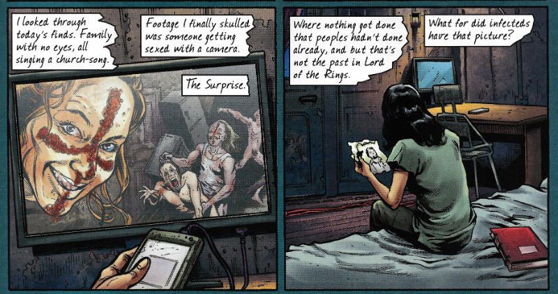
Hibbs? Why is HE stinkin' up the joint?!?!

Hi, it is me, the y'know, original founder of this blog.  You might have noticed I've been just a little slack in posting since around Christmas time. The Season soaked up my time, then I started my new consulting business, but mostly, I needed a break from writing reviews.  It happens! I was going to start posting a few weeks ago, but that was the week where Abhay descended out of the blue for a solid week of posts, and I didn't want to step on his toes.

This week, we welcome our newest SavCrit -- the artist formerly known as J_Smitty (Yes, eventually every regular commenter will be given a seat in the big chair*), now unveiled as Jordan Smith, whose first post is directly below this one, but I felt like I couldn't put off my return for much longer (it is MAY!), so join me below the cut, would you?

Hi!

Now, I am hella hella rusty, so forgive me as I get back up to speed... and I also picked a maybe not so great week to do this, since it be a little thin on the new comics beat, but let's see where we get how we get when, shall we?

AVENGERS ASSEMBLE #15AU: I haven't especially been a fan of this title since it launched -- I really don't feel like it has had a point or direction of any particular value (Except, maybe, "Let's try to capitalize on the Avengers movie 15 months ago"), and THIS issue is a tie-in to one of the most drama-free Big Crossover Events. I mean, let's face it, "Age of Ultron" isn't really going to have any real impact, even if they DO take away Logan's healing (though, looking at the new Wolverine movie trailer, one assumes that that is REALLY being done to tie in with the film...), or bring Angela into the Marvel universe.

(which, by the way, is a real "WTF?!!?" moment and, honestly, feels more like a vindictive swipe at McFarlane ["Hah! I'll give it to MARVEL!"] than anything resembling a cohesive creative plan.... or, for that matter, something that any fan, anywhere was looking for)

So, one generally assumes that tie-ins to such a beast would also be inconsequential and uninteresting -- and I think they mostly have been so far to date.

Not so this one, however.

Well, I guess it is "inconsequential" because nothing that happened in this comic will matter in 6 weeks or 6 months, or, probably, even be referred to in the parent book, even -- but so far this was certainly the most interesting bit of  AoA to date, being a look at how AoA is impacting Britain, introduces at least one interesting new character, and had a really tremendous "What If...?" status change for another major character.

AA#15au is written by Al Ewing, who is very rapidly becoming  my favorite new writer, and whom I'm very much suspecting really is The Real Deal, y'know? I want to see Ewing on an original US series of his own creation because based on his doing other people's ideas I would guess he's got his own SANDMAN, TRANSMETROPOLITAN or PREACHER in him (if, y'know, you're about my age, those are big big touchstones....)  I thought this comic was the best Avengers thing I've read in a really long time, and was absolutely VERY GOOD.


BATMAN AND ROBIN RED HOOD #20: Snyder's run on the main title, and Morrison's various perambulations through the Bat-mythos have largely overshadowed Peter Tomasi and Patrick Gleason's title, which some months really is the best of the bat-books. I like what they're doing here post-Damien, using the other bat-family sidekicks as stand-ins for the Stage of Grief. On the other hand, I'm decidedly uncomfortable with "Carrie Kelley" (The "Dark Knight Returns Robin"), one because she doesn't seem even remotely like Carrie Kelley in DKR to me, two because it some how seems disrespectful to DKR, and three because bringing in a new Robin this close to the dispatch of the last one, seems like a really lousy idea. We'll see, we'll see, maybe they're just fucking with us, I sure hope so.  I thought (with the exception of the pages she appeared on) that this was pretty GOOD.


CHIN MUSIC #1: You'd think that 30s Gangsters and The Occult would go together like buttah, especially when you've got Horror-Guy Steve Niles teaming with Tough Guy Tony Harris on a new creator-owned series, but I got to tell you: I could hardly follow the who and the what and the why do I care here. Interest almost always comes from character, not situation, and there aren't any realized characters on display here.  EH.


GARTH ENNIS BATTLEFIELDS #6 (OF 6): Even though you really needed to read an entirely different series of "Battlefields" comics to appreciate the end of this issue, and even though Russ Braun's art is a little too... flat for my tastes (though, good on Garth for loyalty and keeping Braun working), I thought this was a pretty wonderful, poignant, and moral and human ending to the story -- Ennis' specialty, really. This kind of work will never find a wide audience, but I'm so appreciative that Ennis makes sure it keeps coming out. VERY GOOD.


JUSTICE LEAGUE OF AMERICA #3:  Three issues now, and I've yet to feel a moment of interest in this set-up or collection of characters -- the story is so Plothammer-y that it ain't funny, and David Finch looks like he had about an hour to draw the issue. Plus, that whole "WTF" thing didn't really work, did it? Most of the "shocks" weren't, or, worse, were merely rhetorical questions. Plus that they're still shipping into May... ugh. this book may represent everything twhat's wrong with the New52 as a whole: plothammered and ugly. But maybe I'm just cranky. Either way, I thought it was fairly AWFUL.


UBER #1:  I don't get this comic. I mean who is it for and all that. I can see (somewhat) the intellectual appeal of a story about nazi superman, but when the rubber meets the road, these are the antagonist, and, for this to work as a story, we're required to have protagonists for whom to root. I don't see any in the first issue (or in the #0, for that matter), and the art by Caanan White is "Avatar House Style" enough (and ugly) that that won't be bringing me back. Avatar, trying to harness the Power of Bleeding Cool tried to convince people that the book is "hot" somehow, but it's pretty icy cold on the real world racks (besides the coupla speculator-types that bought #0). I generally like Kieron Gillen's writing, but I think he's pretty much entirely missed the needle here, not just the eye. AWFUL.


UNCANNY AVENGERS #8: I truly don't get the point of this comic either, if it's not a showcase for John Cassaday. I like Daniel Acuna's art fine, I guess, but he's pretty far in style from Cassaday, and the story has felt to me like the worst excesses of Rick Remender, trying to do Big Story with characters that aren't strong enough to support it, using obscure and uninteresting bits of Marvel history to do so. This is pretty EH for a "flagship" book.


WOLVERINE #3: If you had told me that there would be a Wolverine comic where I'd only be ordering 1 single rack copy by issue #3, and that, by Friday, it would still just be sitting there on the shelf, despite being by Paul Cornell and Alan Davis, I'd laugh at you. But here we are. Honestly, it's not that bad -- really, it is OK, so why are people just not buying this?


Right, that's enough to start, I thinketh. Like I said: rusty. But, as always, I want to know what YOU thought....


-B


* = Note: This will NOT be happening; don't get your hopes up, you!

"A Tiger Doesn't Give A Buffalo Warning." COMICS! Sometimes They aaaAAAIEEEE!!! DAAKEESE MOB!!

In the Burmese jungle of 1942 only one thing was more deadly than the Japanese...In the war comics of 1976 only one strip ruled the playground...That thing, that strip was DARKIE’S MOB by Mike Western and John Wagner.  photo Dark_Jimmy_B_zpse9c4f003.jpg COME ON!!! GET SOME!! CAHMMM AHHHNNNNN!!!! DARKIE’S MOB: The Secret War of Joe Darkie Art by Mike Western Written by John Wagner Introduction by Garth Ennis Titan Books, £16.99 (2011) Darkie’s Mob created by Mike Western and John Wagner (N.B. Darkie’s character defining shiny pate was the masterstroke of then editor Dave Hunter.)

 photo Cover_B_zpsaf06bbd9.jpg Cover art by Carlos Ezquerra and Mike Western.

May 30th 1942: “We’re just sitting. Waiting to die…” Taken from the blood stained pages of the battle log of private Richard Shortland comes the story of Darkie’s Mob. This is the story of Joe Darkie and of the men who followed him into Hell. This is the story of Joe Darkie who wore a dragon against his flesh and hid a demon in his heart. And this is the story, also, of the lost and hopeless men Joe Darkie forged with War into a jungle hard fighting force. And when he was done, when Joe Darkie was finally done, Joe Darkie had taught them that war was Hell but he also taught them that Hell could also be a home. And the Hell of War was the only home there could ever be for DARKIE’S MOB.

 photo Dark_Head_B_zps3e02db5f.jpg ...and then he'll have to kill you.

This book contains all the episode of the picto-serial DARKIE’S MOB which originally appeared in issues of BATTLE PICTURE WEEKLY from August 1976 to June 1977. BATTLE was a weekly British war comic aimed primarily at children and it was thus a violent, dark, complex and brutal assault on the pre-teen mind. Which is just how kids like it, social services be damned. So, you've probably guessed Pat “Moderation” Mills was involved but only in that he, together with John Wagner, had set up BATTLE for Fleetway in direct response to the tamer and more typical fare of D C Thompson’s WARLORD.  To be fair, when I was a kid WARLORD had its moments but BATTLE still has its moments now I’m an adult, so BATTLE wins. Some might be confused by the fact that during the 1970s there was such an emphasis on the war in British comics. Such people’s confusion would be bolstered by the knowledge that, in addition to BATTLE and WARLORD, there were also the several monthly self-contained digest size titles of BATTLE PICTURE LIBRARY, WAR PICTURE LIBRARY and COMMANDO COMICS.

 photo Covers_Trip_B_zps07a40715.jpg"British people In Hot Weather-AH!" The simplistic and sweeping answer (you were expecting maybe a reasoned thesis?) is that the War still wasn't all that far behind us back then. In fact a notable feature of early BATTLE was that readers were encouraged to send in the war stories of their fathers and grandfathers. (Of course due to natural attrition this feature became less popular as the years wore on). Basically Britain was still trying to process the massive trauma of the conflict and was having a hard time doing so. We’d helped win the thing but it had pretty much broken us and so, yes, it may well have been the 1970s but, sad to admit, the 1940s were taking some shaking.  In Renegade the autobiography of (i.e. a fascinating interpretation of his own reality) The Fall’s Mark E. Smith recalls how he used to play Japanese Prisoner of War Camp with the kids he was babysitting. This would involve them having to sit under a table and asking permission of the future Marquis Cha-Cha for any water or food. The kids of Britain in general were not unaffected by the tone of the times, is what I’m getting at there, and BATTLE would reflect this. BATTLE would reflect it in a relatively timely fashion as by 1976 attitudes to the war had changed somewhat and this was, as ever, reflected in the entertainments proffered. The slightly harsh but never too far from cosy early post-WW2 war films embodied by the words “John Mills” had started to give way to bleaker, grimier fare such as Robert Aldrich’s Too Late The Hero. Comics has ever magpied from pop culture after the fact but BATTLE was nimbler than WARLORD on picking up on the changes. WARLORD lagged behind in that it was still Millsian in the sense of Little Johnny but BATTLE was about to forge ahead by virtue of being Millsian in the sense of Pat. DARKIE’S MOB would be one of a number of strips Mills, Wagner, Gerry Finley Day et al would develop and script which would be part of a nation’s acceptance of its own past. Proof that true acceptance had been reached came when war comics fell by the way side. And so the healthy British mindset was to be embodied by a giant killer shark eating surfers like plankton and a fascistic future cop with a chin like a knee but, then, that’s why comics are the best of all things ever. Fact.

 photo Darkie_dont_B_zps9850d482.jpg It's okay, he's just joshing...isn't he?

DARKIE’S MOB is a product of the 1970s and so, as this is 2013 when everybody behaves impeccably at all times, Garth Ennis spends most of his informative, knowledgeable and very enthusiastic introduction pointing out that although racist terms are used, they fall within acceptable parameters for the portrayal of a bunch of desperate men at the end of their tethers fighting an enemy it is in their interests to dehumanise. Let’s face it soldiers swear, and sometimes use less than pleasant terms for the people they are trying to kill. There’s no effin’ and jeffin’ here but there are some terms that might make us uncomfortable. And so they should, after all we’re not currently jungle fighting the Japanese are we? Anyway, you have been warned. Ennis also points out that the Japanese army weren't fucking about either. They meant business. In fact, the extent to which they were not fucking about quite surprised the breath out of the British hence they were somewhat on the back-foot when the tale opens. Although, cleverly, the tale is over when it begins and we witness everything via flashbacks spurred by entries in a diary found after the Japanese defeat. Right there on the first page is the clue to how it all ends, and it won’t be ending with kissing nurses in ticker tape parades. Not for Joe Darkie's Mob.

 photo Darkie_Grave_B_zpsea874322.jpg "Hey Kids, COMICS!!!"

As was usual for strips in British weekly anthologies of the time John Wagner and Mike Western get a whopping three (sometimes four!) pages an episode. Consequently brevity, concision, density and clarity are the order of the day and Western and Wagner obey those orders above and beyond the call of duty. While the initial impact of DARKIE’S MOB will always result from surprise at the savagery of the proceedings its persistence in the reader’s memory is wholly due to the characterisation. No, it’s not exactly Jonathan Franzen, but Wagner nails down the various characters with an enviable certainty and economy. He does this while, in each episode, also delivering at least one explosively violent set piece, hinting at Darkie’s past and keeping a character centric sub plot or two simmering. Wagner is of course known and loved by all comics fans primarily for co-creating Judge Dredd and Strontium Dog but is an excellent comic writer; one whose excellence is often taken for granted due to his comics working so well you often don’t realise how superbly executed they are. To the detriment of his own reputation Wagner always steps back and lets the story take precedence over his personality. Here then is DARKIE’S MOB which is fantastic episodic comic book writing by John Wagner. Oh, the usual warning applies with Brit reprints - it isn't, truthfully, best served by gorging, so maybe put the book aside now and then for the best effect. Self-restraint, I’m talking about self-restraint there. Although that might be difficult given the breakneck velocity built into the strip.

 photo Dark_Truck_B_zps8008bfc0.jpg "AIEEEE!", Indeed!

In concert with Wagner’s scripting DARKIE’S MOB benefits enormously from its excellent envisaging by Mike Western. Mike Western is one of a whole host of 70s artists who worked on British comics and whom deserve wider recognition. Thanks to reprints some of them are getting a deserved second wind. This should afford them at least a place in comics history even if it isn’t fully the place they deserve. Carlos Ezquerra’s okay he’s got Judge Dredd (and then all the rest) to keep him in view and Joe Colquhoun isn't going anywhere thanks to Charley’s War and his Johnny Red should give John Cooper a deserved leg up as he shared the strip, but Mike Western’s shot is probably going to be DARKIE’S MOB, so forgive me if I try and make it count.  Because it deserves to count because Mike Western is a kind of old school awesome worth celebrating. Western was a stalwart mainstay of the British comics scene with his realistic rather than cartoony work gracing adventure strips and TV tie-ins in titles such as Knockout, Buster, Valiant and, of course BATTLE. Following DARKIE’S MOB Western would continue working in British comics until he officially retired in the ‘90s. He died in 2008. Throughout his career his work was informed by an admiration of artists from over the pond such as Alex Raymond and Milton Caniff. Studying their work would enable him to maximise the limited page space available in British comics but it was his own remarkable talents which make his work in DARKIE’S MOB so successful.

 photo Dark_COME_ON_B_zps31116020.jpg He's Got A Ticket To DIE!!!!

Western served his country in WW2 and while I do not know if any of his experiences are reflected in his art for Darkie’s Mob I kind of hope not for his own sake, what with the claustrophobic sense of sweaty doom he gives the strip. Reportedly Western enjoyed drawing faces and while this is never a bad thing in a comic artist it’s a sure strength when drawing war comics. As the Army isn't noted for encouraging individuality the Mob are largely differentiated by their faces, somewhat in the manner of real human beings. Western’s solid and lifelike fizzogs ground the melodramatic emotions being experienced and enable the retention of a veneer of realism over events that sometimes might stretch belief. Western’s characters are also placed firmly in environments which in a few lines and slabs of black ensure that the reader comes away from DARKIE’S MOB with a sure sense that the book has occurred within the dank folds of a murky jungle Hell. At first glance Western’s art might appear staid and static but when read with Wagner’s words it comes alive, drawing the reader in and pushing the real world out. Proper Comics there, that is. In DARKIE’S MOB with fewer pages than fingers on a wounded hand Western manages to pack in all the desperate and dingy psychodrama Wagner’s script requires in order to sting. He also works those individual panels. Really works them. Mike Western could cram an indecent amount of action, event, character, information and motion into a single panel and if you gave him a whole page to play with? Glad you asked:

 photo Darkie_ATTACK_B_zps470e22a7.jpg

DARKIE’S MOB is a raw blast of ‘70s Brit comics Burmese battle action delivered by the masterful team of Mike Western and John Wagner. War is truly terrible but DARKIE’S MOB is VERY GOOD!

 photo Dark_Run_B_zps3da1f7d2.jpg “AAAIIIIEEEEE!!!” – COMICS!!!!

"Decency." COMICS! Sometimes They Do Not Bring Me Out In Hives!

Look, we all know that last time John read some comics released this century it all got a bit hairy. John would like to point out that this was not out of malice, low blood sugar, jealousy, his piles flaring up or sunspot activity. No, difficult as it may be to believe, John maintains it was the result of those comics not actually being all that good. Think of it as being a bit like John was showing you that sometimes he and Comics would argue but it didn't mean they didn't love each other any less and it certainly wasn't your fault. John can see why Doctor Doom talks like this – it’s fun. Anyway, this…Photobucket

Due to the lack of a scanner all pictures are stolen from other people. That's what I'm reduced to. I hope you are all proud.

(Note: Doctor Doom was created by Jack Kirby and Stan Lee. Or Stan Lee and Jack Kirby, whichever floats your boat. The important thing is to get both names in there. It’s free and respectful, Marvel.)

CREEPY#11 Art by Gilbert Hernandez, Amy Reeder, Peter Bagge, Chrissie Zullo, Johnny Craig and Joelle Jones Written by Gilbert Hernandez, J. Torres, Dan Braun, Peter Bagge, Alisa Whitney, Archie Goodwin and Jamie S. Rich Lettered by Gilbert Hernandez, Amy Reeder, Peter Bagge and Nate Piekos of Blambot® Dark Horse Comics, $4.99 (2013)

Photobucket

CREEPY is a horror anthology comic so it’s a given that it'll be a mixed bag but this issue kicks itself in the head from the off by kicking off with The Gilbert Hernandez Show and so everything after that is done no favours whatsoever. Oh editors, you never put Elvis on first. Hernandez’ tale is haunted by the phantom sounds of a thousand readers’ eyes revolving as his statistically gifted heroine grits her teeth through her lower back pain and bounces through a story as trashy and daft as all get out. By the final full page reveal said fun parched eyes will be revolving so fast that dogs from miles around will be howling at the resulting sound. The only way this nonsensical and nasty strip could have been improved would have been to slather it with hot pinks and crystalline greens a la Stuart Gordon's From Beyond. Ayup, fear fans, that’s the toxic territory we’re in here and while there does not actually exist a monograph called Basket Crepes: The Nearly Edible Imagery of Frank Henenlotter if you wish one did you’ll enjoy this magnificently shameless embracing of schlocky horror by a man so gifted he just doesn't have to care anymore.

Photobucket

"...like a gingerbread man!"

After that, Amy Reeder illustrates a story about a pining husband and his inadvertent contribution to the locally sourced fishing industry. This one is mainly notable for Amy Reeder’s art being far better than it was on her BATWOMAN stint. Then there’s one about how a lady’s monthly cramps might be hunger cramps because women are unknowable monsters who prey on men. I've made it sound really misogynistic there because I wanted to see who reached for their buckled hat and flaming torch. And now I know, don’t I? Now we all know. Alas my New Puritans it’s far more mundane than all that; the tale isn't terrible but is too derivative and tamely delivered to work as a terror tale. Filling in the cheap content reprint slot there’s Johnny Craig joint from an old CREEPY. It may be from the '70s CREEPY, but could just as well have come from a '50s EC Comic which is fine and dandy by me but might not be by you. I feel quite tremulous merely mentioning EC Comics on The Internet as currently any conversation involving them seems to devolve rapidly into a fucking chimps tea party where the winner is whoever gets the most shit in Eddie Campbell’s hair. The final story reads like someone excorcising the baggage of a bad relationship through the medium of words and pictures; with the pictures not quite sleazy enough to do the job justice. Throughout the book there’s a drizzle of Peter Bagge strips which, if you are a Peter Bagge fan, I guess you’ll like. Like I said, it’s a horror anthology so if you like horror anthologies what with their customary blemishes and surgical scars and all then this one was GOOD!

GLORY#31 Art by Ross Campbell & Ulises Farinas Written by Joe Keatinge Coloured by Owen Gieni Lettered by Douglas E. Sherwood Glory created by Rob Liefeld Image, $3.99 (2013)

Photobucket

Ah, Glory. What a fine comic this is. Sales aren't so hot so I hear. That’s most likely because Glory is a female character who hasn't been designed with the aim of appealing to the lowest portions of the lowest portions of fandom. She’s a bit butch, this lass and no mistake. Glory doesn't so much look like she’s built like a brick shit house as she looks built out of brick shit houses. A sturdy pile of at least five on top of which sits a creepy wee Barbie head but with Action Man’s scarring. Flesh may be on display but the flesh on display has the bluish-marbled sheen of freezer burned meat. Fancy your chances, chaps, and Glory will snap it off and feed it to you. Which is refreshing. What’s also refreshing is the jumble of outrageously gory issue(s) long fight scenes and convincing character interactions the series has managed to deliver thus far . The splatterhouse fight scenes are by Ross Campbell, who gives the offally antics a Darrow/Quitely/Burnham/Burrows burnish of detail; a level of detail which explicitly testifies to the relish with which the task is attacked. With GLORY Keatinge and Campbell (et al.)  have built a sweet story of friendship, a brutal story of family and a comic that’s basically just all round engaging entertainment. Although I greatly enjoyed Keatinge's effective deployment of undercutting (pancakes, anyone?) his savage and serious buildup I think I most enjoyed the issue which flash forwarded to a point in the narrative where everything looks to have gone tits up. Now we've jumped back and the suspense is doubled; nice one. I enjoyed this stratagem when I first encountered it in the WARRIOR SUMMER SPECIAL in 1982(ish) where Alan Moore did it in Marvelman. I don’t know if Alan Moore did it first and nor do I care because what’s important is that Keatinge deploys it at least as well as The Magnificent One; meaning GLORY is GOOD!

Photobucket

1982 - That was certainly a special Summer!

Of course a lot of you won’t be familiar with Marvelman due to the reasons outlined so smashingly in Padraig O'Mealoid’s fascinating, informative and wholly necessary investigation into the history of Marvelman. An investigation which promises to reveal who actually owns Marvelman. This, of course, is a bit of a cheeky maguffin as the ownership of Marvelman is beyond doubt. Why, as any fule kno, Marvelman is owned wholly and totally by Marvel©™, man! Oh sure, sceptics call this into doubt and wave at the fact that Marvel©™ has released nothing Marvelman related except for a bunch of insanely overpriced reprints of the Mick Anglo strips and a bad Joe Quesada poster. Now while these Anglo reprints are certainly of nostalgic interest (which is of more interest than the Joe Quesada poster) they are not the Alan Moore or Neil Gaiman material; i.e. the only material anyone cares about. Hataz fixate on this as though it proves something and yet these Hataz fail to take into account Marvel©™’s publicly stated position that they are taking their time so that when the MM stuff appears it will be done right. I mean, let’s face it perfectionism is a major, if not the defining trait, of Marvel©™. After all they do a perfectly good job of (and seem perfectly happy doing so) of denying Jack Kirby any credit or compensation for his co-creator role in the creation of the IPs without which no one at Marvel©™ would have a job. Oh, you thought I was going to do that thing where someone looks at Marvelman and has the shit shocked right out of them like brown toothpaste from a tightly squeezed tube by the bloody remarkable fact that in the last 30 odd years Marvelman has dated somewhat. But I didn't. Probably will do at some point though!

BATTLEFIELDS#4 Art by Russ Braun Written by Garth Ennis Coloured by Tony Avina Lettered by Simon Bowland Dynamite, $3.99 (2013)

Photobucket

Garth Ennis once popped up in one of the Dynamite back pages to bemoan the fact that no one read this here comic and that writing the series was pretty much a thankless and financially fruitless task. Since the contents of Dynamite back pages don't exactly inspire credence I thought Garth Ennis was just being a drama queen because he seems that sort doesn't he? A bit flaky; no good in a firefight; dress as a lady as soon as the lifeboats are struck; you know the sort. Seriously though, who believes anything comic creators say anymore? No, no, no, their wives just say they do; it’s part if the matrimonial pact. Anyway, I had a look at the sales figures and this comic is the #300 best-selling comic. That means people find that there are 299 comics better than this one. At first I thought this meant that readers would much rather read a bad super hero comic than a good war comic. Then I realised these were sales to Retailers. So really Retailers were happier ordering bad super hero comics rather than good war comics. Then I realised the “super hero” and “war” were red herrings and basically retailers were okay ordering bad comics rather than good comics. And at those deep discounts and attractive retailer incentives who can blame them! I guess everyone’s okay with comics being a giant Ponzi scheme? Do they generally work out well those things? Ha ha ha, only joking. I know nothing about retailing and I'm sure it's all fine! Say, while I was enjoying myself reading comics (or, if it was a Tuesday, enjoying myself staring into space silently weeping) my long suffering partner pointed out that there had been a programme on TV about the Hindenburg. Apparently the Hindenburg worked really well. Until suddenly it didn't.

Photobucket

Everything was going so well!

So, this comic no one is reading? Turns out it’s pretty great. BATTLEFIELDS is basically a banner under which Ennis and his various (and variable but very good at the least) artists deliver three part story arcs. Sometimes these arcs are stand alone and sometimes they involve recurring characters. There’s usually a good reason if the characters don’t recur. Death, I’m talking about death there; happens a lot in war, so I hear. Obviously raised on British war comics of the '70s Ennis synthesises the chippily anti-authoritarian swagger and honest violence of these with modern sophisticated storytelling to create (along with his artists) some of the best comics (apparently) barely anyone is reading. They also usually have covers by the divine Garry Leach (and maybe one fine and shining day he could do some interiors?), Leach is of course the man who first drew Alan Moore’s reinvention of Marvelman and is one of the few people who give cross hatching a good name. I’m getting off the subject now, but let’s be clear here – Marvel own Marvelman, Padraig O’Mealoid! MARVEL! Also (SPOILER!) Marvelman may have dated a bit in the last three or so decades. OMG! KIMOTA! Anyhoo, this issue of BATTLEFIELDS kicks off a new three parter involving Anna Kharkova; she being a female Russian pilot previously featured in an arc you need not have read to enjoy this comic. All you need to enjoy this comic is to read it.

Photobucket

"AIIEEEEEE!!!!"

Because, yes, despite the fact that comics is a primarily visual medium this comic, one which consists for the most part of two people in a room talking, is pretty great. It’s pretty great because the words coming out of the characters’ mouths are not bland pap; you know, the kind of page filling sub-TV blather dependant on some weird mutual non-aggression pact between the reader and the writer. These words here have content, these words here have substance and within these words a world unfolds. Admittedly it’s a world consisting primarily of a Quonset hut populated by two people but, still, it’s a world. Unfortunately for all involved it’s a world within a world and all that divides the two is wood, tin and glass which is little use against the irrevocable intrusion of the larger, madder and infinitely more savage world which is the world at war. It’s fine work in the words department is what I’m saying. The staging’s good too with both Ennis and Braun working with very little to convey the passing of time in an unobtrusive but effective fashion. It’s mostly Ennis’ show given the confined cast and setting which means Braun isn't given much to work with. Then again Braun is given the human face to work with and that is everything a decent artist needs; he proves to be a more than decent artist by the way. So, this issue was engaging, effective and intelligent and I’m going to go all the way up to VERY GOOD! Should you have the temerity to doubt my words then you’ll have to read it won’t you now? Check. And mate.

Oh, and because there is no podcast this week here's some thoughts on the latest Big Ticket Thinks in Recentville:

1) There is no question to which the right answer is arming Brian Hibbs. We "don't want any more trouble like you had last year in the Fillmore District", Brian Hibbs! 2) I won't be buying anything by people who actively seek to deny other people equal rights. You do what you want. That's how that Freedom stuff works. 3) Jerry Ordway is a good artist and yet he's still basically turning up at the WalMart parking lot at 6 in the morning hoping someone will pick him to go in the back of the truck. Nope, nothing wrong with this industry. 4) Howard Victor Chaykin is starting a new series about General George Custer in the next issue of DARK HORSE PRESENTS - aw, yeah! You'll miss him when he's gone you know!

Now go and fight like the mad dogs you are! But only fight about what's worthwhile - COMICS!!!
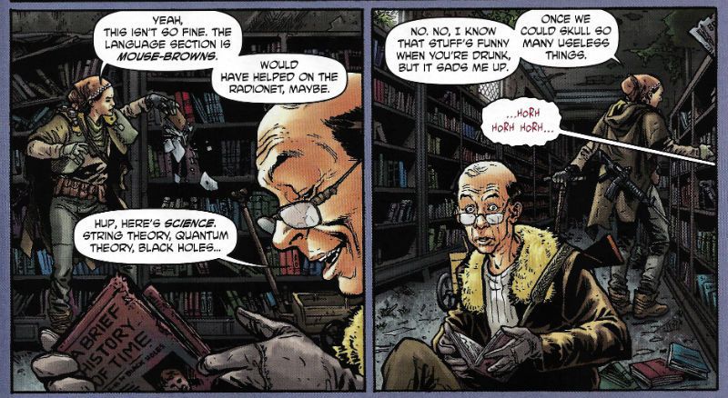
"I'm A STUART, Grandpa." COMICS! Sometimes The Weird Porous Kid Walks It!

Here at Savage Towers the UK contingent is experiencing problems with The Haunted Scanner. So, just the covers this time out I'm afraid. Apparently my brain is no longer under warranty so I can't help the words that accompany the pictures. So here's a shoddy make-shift Sunday look at some comics. Or you could go outside and play in the snow! Photobucket

G.I. COMBAT Featuring The Haunted Tank #7 Haunted Tank by Howard Victor Chaykin (a), Peter J Tomasi (w), Jesus Arbutov (c) and Rob Leigh (l) Unknown Soldier by Staz Johnson (a), Justin Gray & Jimmy Palmiotti (w), Rob Schwager (c) and Rob Leigh (l) DC Comics $3.99 (2011) Haunted Tank created by Russ Heath & Robert Kanigher Unknown Soldier created by Joe Kubert & Robert Kanigher

Photobucket

The lead story here, a lead story about a Haunted Tank we should bear in mind, is a consumate exercise in capturing the gleeful idiocy of DC war comics of yesteryear; that is way back when to the time when Mommy would roll them up and beat me with them. Yes, the day I wrestled that rolled up copy of ALARMING BULLSHIT #235 off her was the day I became a man (i.e. 10 March 2007). Tomasi doesn't blink once as he recounts the tale of a Haunted Tank crewed by a gipper in a string vest and his endearingly credulous Grandson as they go up against a revamped War Wheel piloted by Rommel's grandson and powered by the slack corpus of The Desert Fox himself. It's barmy and all the better for it. HVC seems to have found the perfect home for his clip-art pasting mania with this hardware heavy tale although he doesn't fare as well on the flesh he hardly fails as such, giving The Fox himself a pleasingly senile cast to his confounded features.

Gray and Palmiotti manage the not inconsiderable feat of removing anything of interest from the Unknown Soldier concept, leaving us with some pages where a man falls out of a window and then goes and has sad thoughts in  someone else's garden. They even waste the nonsensical fun of having a diamond laced skeleton. As a result it's purely down to Tomasi and Chaykin's unflinching grasping of the nettle of nonsense that this book is GOOD!

INDESTRUCTIBLE HULK #1 Art by Lenil Francis Yu Written by Mark Waid Coloured by Sunny Gho Lettered by Chris Eliopoulos Marvel, 3.99 (2011) The Hulk created by Jack Kirby and Stan Lee

Photobucket

INDESTRUCTIBLE HULK #2 Art by Lenil Francis Yu & Gerry Alanguilan Written by Mark Waid Coloured by Sunny Gho Lettered by Chris Eliopoulos Marvel, 3.99 (2011) The Hulk created by Jack Kirby and Stan Lee

Photobucket

Yes, I know I shouldn't have this comic due to THE KIRBY IMPERATIVE but my Retailer forgot and so he wanted to share what he thought was a book I might like with me. Which is okay, because I don't actually expect my Retailer to remember all my mad demands and crazy caveats all the time. Most of the time will do. I'm not an animal. So, I ended up with this comic but because of Marvel's double-shipping and the lag in my deliveries I actually ended up with issues 1 & 2. Thus (thus, yet! Oh yes, thus! Smell my formal indignation!) a simple error sparked by generous intentions ended up costing me £5.98 and taking up space in my package that two comics I actually wanted might have occupied. This is the hidden damage of Marvel's double-shipping! I now want even less to do with Marvel than ever and I wasn't exactly mad-keen on them at this stage anyway.

But stupid English dude, double-shipping is just giving you more of what you like, I hear the less polite mutter. No, not really. Even if it was DAREDEVIL which I do like. For a start you aren't giving me anything. I'm paying for it. Secondly, I've seen Theatre of Blood and I do not want to be in the Robert Morley role while Marvel acts like Vincent Price and bakes my beloved (dogs/comics) in a pie and forces them down my throat with a plunger until I suffocate. Some of the classier of you might want to recast that thought in terms of Titus Andronicus, but I'm okay with Theatre of Blood.

This book was OKAY! Mark Waid is a reliable writing guy and Leinil Yu is still okay even if I think he needs to step back from the fussiness into the alcove of clarity. But it was $3.99 and even without THE KIRBY IMPERATIVE that's too much a month and with double shipping it would be $7.98 a month, maybe more. That's just nuts.

FURY MAX #7 Art by Goran Parlov Written by Garth Ennis Coloured by Lee Loughridge Lettered by Rob Steen Marvel, $3.99 (2011) Nick Fury created by Jack Kirby and Stan Lee Frank Castle (The Punisher)created by John romita Snr, Ross Andru & Gerry Conway

Photobucket

Originally I was overriding the KIRBY DIRECTIVE as this was such a VERY GOOD! comic and, more importantly, I am a weak creature always on the lookout for an out. As if to rub my smug face in my own moral doo-doo the quality of the comic seems to have taken a sudden lurch from Ellroy-lite into those issues of THE 'NAM where Frank Castle got introduced to boost sales. Quite a few people fondly recall THE 'NAM (i.e. the comic not the land war in South East Asia. Although I suppose it might have its fans too, human nature being what it is.) but I have never read anyone fondly recall the issues of THE 'NAM where Frank Castle started popping up. Also, I have decided to send the CBLDF the equivalent total monies this comic will end up costing me. Hopefully this combination of unmet expectations and financial excess will encourage me to actually be a man of my word. Then I will really get my Smug on, you betcha!

Goran Parlov's art is still staggering this time out with even the talking heads sections being just as entertaining as the slobberknockers in most other comics. There's an absolutely fantastic panel where Fury is giving Ms DeFabio a Cage-ing. It isn't fantastic for the contents but it is fantastic in that it has clearly been enlarged to make the occurrences within less, ahem, overt. This is a series that clearly, frequently and savagely depicts the effects of violence on large numbers of people, but apparently it still has trouble with a bit of bum fun. Marvel MAX comics - where there are no limits, except when there are! Despite all this it's still a VERY GOOD! comic.


SPONGEBOB COMICS #13 Art by Rick Altergott, Vince DePorter, Nate Neal, James Kochalka, Derek Drymon, Stephen R. Bissette, Rementer, Tony Millionaire, Jacob Chabot, Al Jaffee Written by Chris Duffy, David Lewman, Maris Wicks, James Kochalka, Derek Drymon, Roman, Robert Leighton, Chris Yambar Coloured by Molly Dolben, Cat Garza, Monica Kubina, James Campbell, HiFi Lettered by Comicraft United Plankton Pictures, $2.99 (2011) Spongebob Squarepants created by Stephen Hillenburg

Photobucket

The Kid recently discovered Spongebob Squarepants on that televisual device that's sweeping the nation by storm and so I ordered this. Mostly to make up for all the parenting mistakes I make on a daily basis. Yes, he may end up hating me but he'll hate me less because I bought him a comic, I reasoned. And reasoned well. Being familiar with kid's spin off comics I braced myself for a tie-in comic which was so lacking in care or effort it would probably not even have the creators credited, it might even just consist of screen captures like that shitty Marvel digest of the ULTIMATE SPIDER-MAN show, whatever it was it would probably not be worth a second thought by anyone over the age of 7.

Once again proving how right I always am it turned out to be VERY GOOD!

I mean, look at that roster up there! I'm not listing all the names again (it's cold here and I'm a martyr to The Arthritis) but right here on these pages we've got the guys who did Doofus, Tyrant!, Sock Monkey, SuperF*ckers and all those crazy MAD fold-in things. Other people too, but I'm not familiar with them but they don't disappoint either. I guess the highlight is the Mermaid Man strip in which Steve Bissette basically draws a Nick Cardy era Aquaman strip and Derek Drymon has Spongebob draw himself into it. Like many a bored child has done in reality. It's sweet and clever and is surrounded by strips of equal or only slightly lesser worth. It's a crazy good line up producing crazy good comics and I wish The Haunted Scanner was working because then I could show you. But then again, maybe it's better if you just go and buy an issue of SPONGEBOB COMICS. You might be disappointed but with all the talent and invention on show here that's probably going to be all your own fault.

And I'm gone like Fury's eye but there remain  - COMICS!!!
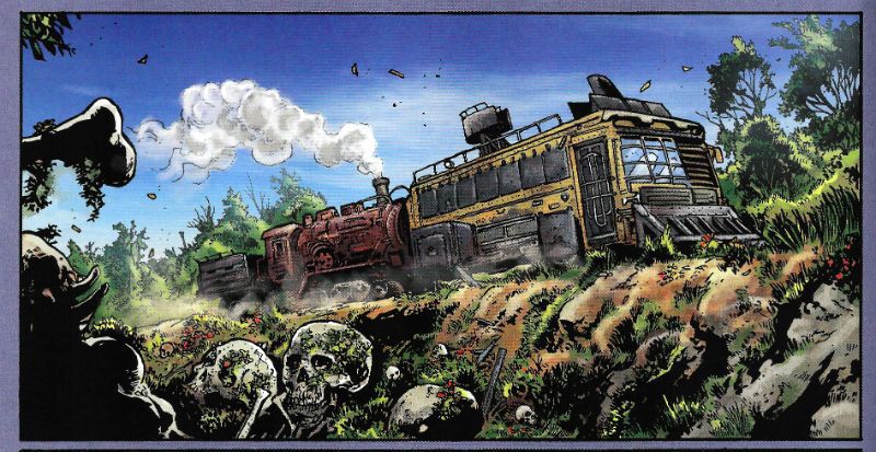
Wait, What? Ep. 100: Year Zero

Photobucket(One of my favorite hundredth issue covers, by Joe Staton and Dick Giordano for DC Comics)

I don't know why, but for a moment there... I was very afraid this episode wouldn't end up existing?  I think because, you know, you say something is a thing, as opposed to just being business as usual, and the next thing you know there's a certain nimbus of expectation around it, even if only to yourself?  Sometimes it  seems like that kind of nimbus makes the best kind of target for capricious fate...

Anyway, enough of that "and then he tore his eyes out in the fifth act!" musing, join us behind the jump for show notes and celebratory waffles, yes?

0:00-8:24: Graeme brings a message to piss Jeff off...from the future!  What can it be? Hint: Before Watchmen is involved.  Laughs are had and the distance between qualified and unqualified is considered.
8:24-20:54: And on a related note--time for some red-hot sexy DC New 52 Issue #0 talk.  Batman, Inc. #0, Batwoman #0, Wonder Woman #0, Supergirl #0, Justice League #0, Earth 2 #0, and OMAC and DC Universe Presents #0.  Warning: Graeme has read 38 of these by now.  I mean that's...wow.
20:54-46:59: ASM is being cancelled!? Jughead is going on hiatus?! (A reference to) cats and dogs living together under the same roof?! What the hell is happening?
Also, Graeme has the chance to have some quality time with the listeners. Also also, in the coming attractions end of thing, we discuss how Bendis' X-Men is shaping up, in light of Avengers Vs. X-Men #11. Additionally, we run down Professor X's CV. If you want to guys remembering off the top of their heads the names of Hank McCoy and Bobby Drake's old girlfriends, this is where you want to be.
46:59-54:59: Mattotti and Zentner's The Crackle of the Frost.  We actually talk about it, finally!
54:59-1:13:33: And from there, Jeff and Graeme go on to discuss Jennifer Blood, as conceived by Garth Ennis and executed by Al Ewing.
1:13:33-1:22:51: And from one crime book to another, we also talk about Stumptown issue 2.1 by Greg Rucka and Matthew Southworth. With special guest appearances by John Updike and J.D. Salinger!
1:22:51-1:30:24: And from there we got to Dave Stevens' The Rocketeer?  I think it says something great about the current state of the comics marketplace that we can talk about three different type of pulp stories that are still a long ways away from superhero books.  Also, it's Graeme's turn to take a powder while Jeff gets to talk directly with the listeners.
1:30:24-2:16:04: Phone calls! From listeners!  We have them, and they are awesome.  Many thanks to Voodoo Ben, Alex, Robert G., Sean Witzke, J.L. Blair (whose call did not survive the round-the-world treatment, sadly and whom I initially misidentify, to boot) and Derek (or Garrett?).  Though most of the calls are just well-wishes, we do tackle a suggested topic--Jim Starlin at Marvel in the '70s, '80s and '90s--at some length, as per Alex's request.  Who says this isn't the Golden Age for Whatnauts?
2:16:04-2:26:31: Jeff, whose attention span is crushed, all but leaps in mid-answer from talking about Hank Pym to discussing Bloodshot.  Graeme, for his part, has been catching up on old issues of Milestone Shadow Cabinet issues. Add 'em all together and you get...Chaykin's Black Kiss 2 #2?  Not really, but we end up talking about that as well as well as the pretty brilliant (non-comix, though there's a chart or two) book by Jarett Kobek, If You Won't Read, Then Why Should I Write?
2:26:31-end: And then, because it wouldn't be a Wait, What? podcast without goofy technical difficulties, Graeme turns into the Lord of the Flies again, a clear sign to sign off. (Although we also manage to praise Bandette #2, Double Barrel, the xckd strip Click & Drag, and Dustin Harbin's Boxes before we're done).  At one point, I'm laughing while Graeme is talking, and it just sounds like there should be the sounds of a building burning down and maybe some backmasked electric guitars...which is maybe the most fitting way to celebrate our hundredth episode?  Lord only knows what we'll sound like by episode 150....
Anyway, you should be able to find it on iTunes (although there's now that whole bullshit separate app for Podcasts, can you believe it?) as well as your RSS feeder of choice.  Alternately, you can take a swing at the audio pinata below:
And then next week...Ep. 101?  (Man, I gotta go fan myself on the divan at the thought of it!) In any event, whether this is your first time listening to Wait, What? or your one hundredth, we hope you enjoy and thank you for listening!

"Let 'Em Loose, Bobo!" COMICS! Sometimes They May Arouse The Proles!

How goes the day! I guess after that Olympics Opening Ceremony I should just assure all our American friends, particularly your President, that the National Health Service doesn't actually mean that you have a socialist nation 3,000 miles off the coast of America. And, no, if you let this stand all of Europe isn't going to go next in a kind of domino effect. You guys are so ansty!

Photobucket Connor Willumson/Jason Latour (art/words)

I read some comics and then did the words thing. You can do the reading bit if you like, if there's nowt on the box.

UNTOLD TALES OF THE PUNISHERMAX #2 Art by Connor Willumson Written by Jason Latour Coloured by James Campbell Lettered by VC's Cory Petit Marvel, $3.99 (2012) THE PUNISHER created by Gerry Conway, John Romita Snr and Ross Andru Photobucket Cover by Kaare Andrews

This VERY GOOD! book is about Punisher Max. Unlike the Regular Punisher he does not have a beard, and his stories have swears, gore and dead kids in ‘em! Because, yes, Regular Punisher now has a beard. That’s the only thing that caught my attention in that recent irritating crossover with Daredevil. Not wishing to impugn the, no doubt, exhaustive research by Greg Rucka into face foliage, but I don’t think it’s a good look for Frank. He should be clean shaven do you not think? Shaving’s about discipline, shaving’s very military. But a beard? A beard’s not about discipline, a beard’s about vanity. Vanity’s not really something I associate with psychotic vigilantes. I have a hard time believing Frank Castle puts his War on Crime on hold while he just trims his tidy beard. Yes, I can believe a man can fly, but apparently a vengeful killing machine that has a face care regime is a step too far for me. No offence intended there to any bearded people. Particularly any bearded people built like brick shit houses who control this site. The Punisher's beard is important, yes?

Photobucket Connor Willumson/Jason Latour (art/words)

Anyway, this book is about the other Punisher, the one who can eat soup without upsetting people at the next table. It’s called Untold Tales and yet here they are. It’s the second issue and like the first issue the real reason for paying three dollars and ninety nine cents is the art. Last issue’s art was pretty good but this issue’s art by Willumson is preposterously good. I’m not well versed in anything too freaky but even I can tell there’s a real ComiX vibe to the art. It’s got a wild-eyed and feral vibe to it which makes the contents of every deceptively traditionally shaped panel thrum with an animal heat and press against the page with an almost physical weight. The youngsters will appreciate that the sound FX are even drawn in as though they are giant inflatable physical presences, like Frank Quitely did in that Batman comic that time. Admittedly this senses shattering artistic performance is yoked to a fundamentally meat’n’taters tale; one which seems inspired by that old Jerry Lee song (“Come on over, baby, we got Castle in the barn!”) and has a big chunky gold shout-out to the King. No, not Jack Kirby. Elvis. Jack Kirby’s dead, stop going on about it. Stan Lee did everything! C’mon, Stan Lee probably stood behind Jack Kirby’s chair and moved his simple little hands for him. Why not, eh?

MIND MGMT #2 Story, art and cover by Matt Kindt Dark Horse, $3.99 (2012) MIND MGMT created by Matt Kindt Photobucket Cover by Matt Kindt Did you notice the stitches on the guy's face? Ahuh, Matt Kindt is still EXCELLENT!

THE SHADOW #4 Art by Aaron Campbell Written by Garth Ennis Colours by Carlos Lopez Lettered by Rob Steen Cover by Howard Victor Chaykin Dynamite, $3.99, (2012) THE SHADOW created by Walter B. Gibson Photobucket Cover by Howard Victor Chaykin

It’s a shame Campbell isn't just that bit better because this issue he does a pretty good job; there's a real sense of time and place, a sense that someone has done their homework, that materials of an archival nature have been attended to but, due to certain core failings, he can't help but  fluff the big emotional bit somewhat, which has the unfortunate effect of my authorially intended species-shame at Ennis’ intentional homage to The Searchers being trumped by the fact that I find myself thinking, man, hats sure are hard to do. And they are, ask Lou Fine, so this was still GOOD!

BLACK KISS 2 #1 By Howard Victor Chaykin Image Comics, $3.99 (2012) BLACK KISS created by Howard Victor Chaykin Photobucket

"That's a Pez Dispenser, right?" Cover by Howard Victor Chaykin

Ban This Sick Filth!” blared the Daily Mail headline that Wednesday morning. Of course “Ban This Sick Filth!” is the Daily Mail’s headline every morning and had nothing to do with Howard Victor Chaykin’s new exercise in saucy muck being held by The Customs. Oooer! Held by The Customs! Fnarr! Fnarr! The true extent of the upset was only revealed when the owner of my LCS commented, “No one cares, John.” Before adding, “And when are you going to pay for all these comics.” Leaving him to his quips I realised something had to be done, so I poked my head over the wall and saw Her Madge was pegging her washing out. I mentioned the whole thing to her, and she said she remembered meeting Howard Victor Chaykin when she guest starred in Viper and he had "sad eyes, like a child with a grazed knee" and agreed to get The Head Boy over to sort the whole HVC BK2 UK situation out.

Photobucket "I can see the beach from my window. That's how much I give a s***." He didn't say when he wasn't contacted.

So Cammers turns up, and he's a bit out of sorts because we’d interrupted him holding the back door of the NHS open so the Private Sector could run in and strip the place bare, wires and all, before anyone cottoned on. He’d got a copy of the moral soiling rag in question and he held it up to his face, his statesman’s face, his face with all the statesmanlike integrity of a lard sculpture of a single bum cheek, but with eyes, and commenced to read with those eyes. And he goes, he says,  “Yes, but is it a book you would wish your wife or servants to read?" And Her Madge points out it isn't 1960 and tells him to his face that the book will be available next week, or she'll be reminding everyone about that time he left his own child behind in the pub. "Did he thank you, then?" said my LCS owner when I told him of the entirely imaginary lengths I had gone to for HVC. "No", I said, "And he’ll never have to.

THE SIXTH GUN #23 Art by Tyler Crook Written by Cullen Bunn Coloured by Bill Crabtree Lettered by Douglas E. Sherwood Oni Press, $3.99 (2012) THE SIXTH GUN created by Cullen Bunn & Brian Hurtt Photobucket Cover by Brian Hurtt

Yeah, I miss Bat Lash too, so this was GOOD!


ADVENTURE TIME: MARCELINE AND THE SCREAM QUEENS #1 Written & illustrated by Meredith Gran, Jen Wang Coloured by Lisa Moore Lettered by Steve Wands KaBoom!, $3.99 (2012) ADVENTURE TIME created by Pendleton Ward Photobucket

Much like Blessed Brian Hibbs I asked an 8 year old boy what he made of this comic. There must have been some kind of miscommunication because quite quickly there was a lot of shouting and after a bit of tussling a police presence was required. Anyway my court date is next month so if anyone can put me in touch with a good lawyer that’d be great. Otherwise, this comic aimed at 8-year old children contains a reference to the popular children’s entertainer Iggy Pop(!) and revolves around the fantasy of having a super-awesome musical career; that’s really more a teen and mid twenties thing, I think. Although these days I guess that dream can be dragged all the way into your forties. Mind you, it will probably weather the ravages of time about as well as the skin on the back of Cher's knees.

Photobucket

Meredith Gran (w/a)

People may mock, but you only need to do one song that plays over the end credits of the latest Jenifer Aniston flick (one where workaholic Jen learns the value of things via a series of laugh-out-loud hi-jinks stemming from her upsetting a genie and being cursed with a set of talking balls on her chin) and you’ll never have to hit up your Mom for cash again! I dunno, if you’re doing a kids comic I’d say get the stuff kids like right first, and then put all the hip stuff aimed at your mates in. Otherwise you’ll end up with something that’s really nice looking but essentially EH!


FATIMA: THE BLOOD SPINNERS #1 and #2 Story & Art by Gilbert Hernandez Dark Horse, $3.99 (2012) FATIMA: THE BLOOD SPINNERS created by Gilbert Hernandez Photobucket

Covers by Gilbert Hernandez

Now this, this, is a comic an 8 year old boy would like! In fact it’s a bit like a comic an 8 year old boy would create. An 8 year old whose pets keep disappearing. It’s a disturbingly affectless presentation of a gorily deadpan comedy parody/celebration of genre trash. Maybe it has something serious to say about the human condition. We’ll probably never know as rational thought quickly gets tickled into insensibility by the women in bikinis shooting zombies, cleverly stupid names like “bittermeat”, laughably terrible jokes and the rewarding central conceit of beautiful people with beige minds seriously making a mess of the whole saving the world thing.

Photobucket

Gilbert Hernandez (a/w)

Look, the people in this awesome comic wear devices that look like metal Y-fronts to make them invisible for the delightfully childish and arbitrary time of 3 minutes. That should clue any slowcoaches in that this is no Walking Dead. And that's just peachy by me.  I also liked the letter in the back of #2 that said Fatima had a “manly” face. It’s comics by Gilbert Hernandez! Don't be getting all prissy, John Sayles wrote Alligator. I hear Beto's (I call him Beto because we are so close we were practically separated at birth.)  now been doing this stuff for 30 years, man and boy, and he remains VERY GOOD!

THE INFERNAL MAN-THING #1 and #2 Art by Kevin Nowlan Written by Steve Gerber Lettered by Todd Klein Marvel, $3.99 ea (2012) MAN-THING created by Stan Lee, Roy Thomas, Gerry Conway and Gray Morrow Photobucket Covers by Art Adams

This doesn’t read too well as individual issues as (as I am sure we are all aware) it is an OGN cut up and shoved out in three easy, and pricey, pieces. It’s taken this long because Kevin Nowlan has taken this long. According to the text piece in #1 he was doing a page a week. At the Marvel page rates I have made up in my head, he would have starved to death before getting to page 10. So, rather than produce a half-assed product or die, Nowlan took his time and did other stuff. And I do have to say that the art here is very, very impressive. He’s got a ‘80s Kyle Baker thing going on, but with the additional, and considerable, oomph a foundation of fully painted colour provides. It’s a purposefully limited palette which gives everything a humid and lurid look. Like a swamp, see. Also, Nowlan’s also given Man-Thing a bit of a make-over and it’s kinda nice too, particularly the way Manny’s head seems to have slipped down to rest on his chest. Nice, that. Causes your gaze to stumble every time, good effect there. The words are very Steve Gerber, which is to say it’s very satirical in that endearingly adolescently blunt style Steve Gerber had. And when I say “adolescent” I don’t mean it as a put-down I just mean that in the sense of being energetic and all-encompassing. I always think of Steve Gerber as being an American version of Pat Mills, writing wise anyway. Although Gerber's more willing to accept his own portion of blame for the way things suck, I think. Maybe that’s why people respond more warmly to the work of Gerber than that of Mills.If you like Steve Gerber you'll like this, if you've never read Steve Gerber it's a good start as it is very Gerber-y. If you don't like Steve Gerber we won't be spending Christmas together. Because he and this are both VERY GOOD!

Photobucket

Kevin Nowlan/Steve Gerber (a/w)

According to #1 there's a lot of respect in this project. And yes, there probably is but this is Marvel. And so, as respectful as it was of your Uncle Nate to turn up to Pappy's funeral, it would have been better if he hadn't crammed his pockets with canapés, winked at the widow and blocked the bog with a boozy poo before drunkenly falling through a window. It’s a sloppy package what with the reprint of “Song-Cry of The Living Dead Man” looking kind of cheap and, in the second issue, having a double page spread printed on the front and back of the same page. This comic cost me two pounds and ninety nine pence Sterling, and yet I've had menus from the local pizza place pushed through my letterbox that had more thought, care and consideration in their design. But, I’m sure somewhere in there is a very real respect for Steve Gerber. At least Uncle Nate turned up, y'know. Ultimately, as Marvel as it is, it’s done out of respect for Steve Gerber, who is dead. And of course even Marvel respect the dead. Except for Jack Kirby. Who, it seems, can still just go f*** himself.

I hope you all had a smashing wekend and read some smashing COMICS!!!
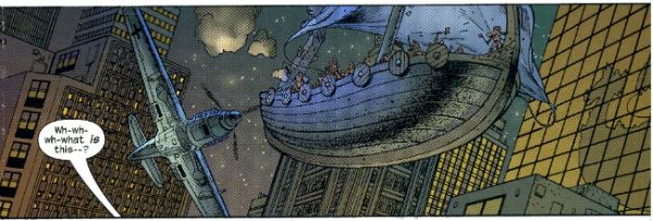
"A Moi La Légion!" COMICS! Sometimes I Have Too Much Sun!

Greetings! It has been sunny in England for more than three consecutive days. This means that the entire nation is required by Law to sit outside until their skins glow like pink suns and crack like dry riverbeds in Texan heat. So I have been doing that. This means I didn't read many comics and when I wrote about them the fact that my brain had been lightly boiled in its own juices didn't seem to have a beneficial effect on my thought processes or judgement. But, hey, I made my deadline! I made it, Ma! I'm a hack! Photobucket

FURYMAX #2 Art by Goran Parlov Written by Garth Ennis Coloured by Lee Loughridge Lettered by Rob Steen Marvel, $3.99 (2012) Nick Fury created by Jack Kirby AND Stan Lee

Photobucket

Imagine my delight upon opening the latest issue of this fine comic to find an act of recreational physical pleasure being performed by Nick Fury and Ms. DeFabio. No, not because I have always wanted to see Kirby/Lee characters nut deep in the fun patch, no. (Well, Lockjaw maybe but that’s a personal thing.) No, it’s the fact that the act is presented so matter of factly. Almost as though it is just a part of life; one of those things adults do from time to time, these days mostly when they lose their broadband service and the TV is simultaneously on the fritz. In fact I can assure you I am not idly boasting when I say that even I , the misanthrope's misanthrope, have in fact personally heard of people in real life who have encountered a real life lady in such close quarters; which is to say even closer quarters than Nick & Co. encounter the ‘Cong in this comic. For one moment I thought mainstream genre comics had, in actual fact as opposed to the popular fiction entertained by most fans, grown up. A bit. Then I remembered it was a MAX comic and so that was okay as the regular line of comics would continue to be as ridiculous in their depiction of recreational procreation as ever.

Photobucket

Seriously, how bizarre must the depiction of something in regular life be if  its depiction in a Garth Ennis war comic is actually a healthier alternative. Focusing on that aspect, as for some inexplicable reason I have, does Ennis' work on this comic a disservice as it is so well realised by all the involved personnel that its level of focus brings to mind a close up of a sniper's eye as the unseen finger exerts the required pressure to do the necessary. It's one well honed machine is what I'm saying. This week, because this book appears to be weekly for some arbitrary reason, Goran Parlov knocks my socks off on the several occasions when he draws the Nazi bastard’s head as just a collection of lines held together by Lee Loughridge’s ever-excellent colours. Giving us a glimpse into a horrific world where Pig Pen grew up and joined The Hitler Youth. To speak plainly then, I thought FURYMAX#2 was VERY GOOD!

THE SHADOW #2 Art by Aaron Campbell Written by Garth Ennis Coloured by Carlos Lopez Lettered by Rob Steen Dynamite, $3.99 (2012) The Shadow created by Walter B. Gibson

Photobucket

As is customary, and contrary to my therapist’s advice, I shall now devote more time to the cover by Howard Victor Chaykin than the book it adorns. It’s a pretty swell cover, yes it is. The elegant simplicity of its design elements is foremost amongst its pleasures but only because the cheekiness of anchoring it all on The Shadow’s torso (which is little more than an oblong) is, let’s face it, the kind of thing only people who should really stop harassing aged Jewish comics creators when they go for a jog on the beach are going to give a gefilte fish about. I’d plump for Arbutov on colours rather than Delgado because it’s less an attack on visual sense and more of an attempt to attractively enhance the base image. But, this being Dynamite the colour of your cover is not a fixed thing! You can have a “Bloody Red” Retailer Incentive Cover (red and white!) or the Dynamic Forces Exclusive Howard Chaykin cover (black and white!). I hope these are all in the TPB because I would actually have an interest in seeing the image without colour, but that’s because I am a Chaykinmaniac. Otherwise I am just totally flummoxed by the need for all these covers. There are another 7 of them! The Ryan Sook one looks lovely by the way.

Photobucket

Eventually, sated, I looked at the actual comic. Ennis’ script this time out is pretty great. It’s basically an extended action sequence inventively choreographed within the confines of a Pan Am clipper intercut with exposition largely designed to demonstrate the evil of the opposition (kiddy fiddler ahoy!). I can’t fault the writer's execution of the script or the savagery of the violence (injury to eye is just the hors d’ouvres, darling!) but it impresses only despite some serious fumbling of the ball on Campbell’s part. I’ll not dwell on it too much as, after all, the art turns up and does the job; albeit with all the fiery invention of a Council employee during the week before his pension finally kicks in. Also, Megalophobics are hereby duly warned to stay away from the hilariously outsize hat which dominates the last panel. Still, Ennis’ script is so solid the comic remains GOOD!

MIND MGMT #1 By Matt Kindt Dark Horse, $3.99 (2012)

Photobucket

In this comic's after-piece Matt Kindt runs the old I Want This Periodical To Work As A Periodical schtick. Y’know the one; the one about extras unique to the pamphlet (or FLOPPY!(cue Brian Hibbs rearing back like Christopher Lee before Pter Cushing's crossed candlesticks. Hsssss!)) which will enhance and entertain, yes, that one. I think he’s actually serious about it, too. That's on the evidence of the first issue of what future generations will call “that book Matt Kindt did no one bought” (but we will call MIND MGMT). I mean, only time will tell but I doubt this is going to take the form of backmatter telling us how his movie deals are progressing (Matt Kindt hasn't got any. Yet.), how hard life is for the talented and beautiful (my heart; it bleeds), a telephone book size list of all the awful comics he has in print (because Matt Kindt doesn't do awful comics. Ever. Fact.). Not that anyone else does that, but I severely doubt Matt Kindt will. The clue is in the comic itself.

Photobucket

Every page of this comic is the comic. The inside front and back covers are a short prologue to the book itself, the back cover is an advertisement that is in fact not an advertisement, text crawls up the side and across the page margins (a la ADVENTURE TIME) adding colour and background to the concept in a dryly humourous faux-bureaucratic way, there’s a short backup piece not intended for the TPB which ends with a six panel sequence so awesome that you know right then and there that MIND MGMT is the one. MIND MGMT is the one. MIND MGMT is the one where Matt Kindt arrives. This is Matt Kindt’s AMERICAN FLAGG! moment. This is where Matt Kindt turns up says, hey, this is what I do and this is the way I do it and you, well, you just deal with it! Matt Kindt just slapped his big talented balls on the table and now you either walk away or you just deal with it. MIND MGMT is odd but EXCELLENT! Deal with it!

And then I saw sense and decided my time, and yours would be better utilised if I wandered off to flick lima beans at next door's koi carp.

Hope you had a good weekend with some COMICS!!!

NEXT TIME: Something else!

"Let Him Be A Child A Little Longer." COMICS! Sometimes They Are Diverse!

Hey, the postman finally turned up. Photobucket

I guess the hostiles must have been restless out there in the Badlands or something. Anyway, he may not have rung twice but he did drop off a box of comics. Here's me going on about some of them after the break: A NOTE FOR OUR AUDIENCE: According to Brian "Link-Hider General" Hibbs you can now purchase some of these comics direct from The Savage Critics!

There is a link under both Comix Experience Links and Industry Links which says "Digital Comics From The SavCrit Store!". It's that one.

I have of course followed the rigorous journalistic code of the 21st Century and given all the comics available from that link a rating of EXCELLENT! No, not really, because as a salesman I am a bit lacking.

As ever, here's some comics and what I thought! Buy 'em! Don't buy 'em! Leave them at the scenes of violent crimes to throw off the Feds! I don't know, don't look at me for help. Because I'll just look down and whisper "No."

And Now Our Feature Presentation- SOME COMICS WHAT I DID READ:

ANIMAL MAN #8 Art by Steve Pugh, Travel Foreman & Jeff Huet Written by Jeff Lemire Coloured by Lovern Kindzierski Lettered by Jared K. Fletcher DC Comics, $2.99 (2012) Animal Man created by Dave Wood and Carmine Infantino

Photobucket

Since he literally throws his daughter to the wolves I’m afraid I have to say Buddy Baker is the worst father in the DCU and he’s a pretty craptastic superhero to boot. You’re going to have to think of something better than beating an army of undead animals to death one by one, Buddy Baker! This guy is such a dumbnuts I’m getting tired of reading about him. The best thing about ANIMAL MAN is that it reminds me how wonderful Steve Pugh’s art is.

Photobucket

I love the solidity he gives everything and the way his art allows the realistic and the insane to exist frictionlessly together. If he’s too radical for the DC masses, and it doesn't take much to be that, maybe Dynamite could get him on some books? Oh, I’m getting ahead of myself; I haven’t got to THE SHADOW yet. Anyway, ANIMAL MAN was OKAY! But really his wife would have left him about 6 issues ago and in about 3 issues I expect Social Services to be having a firm word in his shell-like. Buddy Baker is a danger to himself and everyone around him, and not in a good way.

FATALE #4 Art by Sean Phillips Written by Ed Brubaker Coloured by Dave Stewart Image Comics, $3.50 (2012) Fatale created by Ed Brubaker and Sean Phillips

Photobucket

Um, I don’t want to be the party pooper but I’m not really feeling this one. Where others would see complexity I see only confusion and the horror and crime aspects don’t mix well at all; blanding each other out if anything. I’m not convinced at all that Brubaker & Phillips are as deft with horror as they are with crime. There’s one sequence in particular which is meant to suggest the soiled undersheet of reality flickering on the edges of the protagonist’s vision, but it takes up a whole page. Which is a bit like the secret supernatural underpinnings of the world putting on a straw boater and doing back flips in front of you while belting out showtunes. Subtly unsettling it’s not. Mind you this series seems to not be a lot of things. Coherent and inventive being amongst the things it isn't. So far the whole thing seems a stolid muddle which barely fends off the blunt teeth of cliché. The police scenes are about the width of a gnat’s dick from busting out the old “This is straight from The Fifth Floor, you've got 24 hours to clear this case or you’re back handing out parking tickets! Capiche, you maverick bastard!”  And then there are the narrative captions and, boy howdy, are they bad. But then I think there’s a difference between understated and lifeless. These things are like “I saw a cat. It was big.” bad. It’s like Dan Brown bad. But then Dan Brown’s very successful isn't he?

Photobucket

After all, in a shocking real-life terror twist, it turns out that FATALE is the most successful thing Brubaker & Phillips have produced. Previously this was true of INCOGNITO which I thought was pretty bad. So, it looks like success beckons the Brubaker & Phillips team, but what appears to bring them success isn't what brings me reading pleasure. Mind you, they are professional enough to produce a comic that despite my tinny whinging still comes off as OKAY! While I found the front matter lacking, Stephen Blackmoore provides a compelling backmatter piece concerning a real life gumshoe called Harry Raymond. That bit was VERY GOOD!

You can buy FATALE from HERE.

RAGEMOOR #2 Art by Richard Corben Written by Jan Strnad Lettered by Nate Piekos of Blambot® Dark Horse Comics, $3.50 (2012) Ragemoor created by Richard Corben and Jan Strnad

Photobucket

Corben’s art looks a bit odd in this issue, as though he’s got some settings wrong on his software or something. It looks a lot less crisp than last issue. It’s still great because it’s still Richard Corben but…still. Fortunately Strnad’s scripting is really strong so that helps soothe any misgivings. I didn't really know where the series could go after the first issue’s seemingly complete unto itself set-up.

Photobucket

I certainly didn't expect it to make the previously understated humour blossom so broadly; so broadly that at times it verges on farce. I certainly wouldn't have expected it to work so well either. There’s horror here but humour too and in an impressive feat of facility each complements the other leading to a comic that is a really satisfying read indeed. I don’t want to give too much away but hopefully the fact I thought it was VERY GOOD! will be enough to tempt the unwary!

THE SHADOW #1 Art by Aaron Campbell Written by Garth Ennis Coloured by Carlos Lopez Lettered by Rob Steen Dynamite, $3.99 (2012) The Shadow created by Walter B. Gibson

Photobucket

I know you've all been on tenterhooks so let me assure you that I did indeed receive a copy of this comic with the Howard Victor Chaykin cover. I thank you all for thinking of me during this period of uncertainty. It was always a bit of a gamble though wasn't it? What with Dynamite’s penchant for plural covers. Mostly they get some decent names doing some good stuff. Howard Victor Chaykin, for instance, obviously did this one well before it struck Gin O’Clock at Chaykin Towers. He’s even used a different face shape; nice job Howard Victor Chaykin!  The art on the inside of Dynamite’s books tends to be a bit more problematic. Problematic in the Early Anglo Saxon sense of “bloody awful”. Aaron Campbell manages to buck this trend by being decent for most of the book, except when The Shadow erupts into murderous action at which point Aaron Campbell impresses the Heck out of me. Really, jolly good work on those parts! I’m still not a massive fan of the old drawing over the top of photographs business so the rest of the book was just okay art wise.

Photobucket

Ennis is behaving himself too, there's none of that aggressively puerile "funny" stuff or lashing out at easy targets with a nuclear bomb strapped to a machete. He seems to actually be having a good time too. He certainly gives The Shadow a clear personality, one that's all the more entertaining for being composed primarily of arrogant bastardry. But he's not without empathy either, which is a nice trick to pull off. The whole shebang is set in one of Ennis' well researched eras of upheaval, or at least imminent upheaval. Because, and it's to his credit this, Garth Ennis is one of the few writers in comics who shows evidence of reading books other than How To Bland Out And Find Big Bucks In TV And Movies. Books that demonstrate an interest on his part in the world around him rather than a monomaniacal need to write THE MENTALIST.  If you like Ennis' war books you'll like this. If you like The Shadow you'll like this. Blimey, if you just like decent comics you'll like this. Because it's actually VERY GOOD!

SUPREME #63 Art by Erik Larsen & Cory Hamscher Written by Alan Moore Coloured by Steve Oliff Lettered by Chris Eliopoulos Image Comics, $2.99 (2012) Supreme created by Rob Liefeld

Photobucket

SUPREME is an Alan Moore genre comic. I miss Alan Moore’s genre comics. Alan Moore’s genre comics were packed with invention and humour. Alan Moore’s genre comics had more ideas on the page than most of today’s self proclaimed genii have in a lifetime. Alan Moore’s genre comics played with the form in a way that was charming and cheeky. Alan Moore’s genre comics had characters with character, but their character was never static and if it changed it would do so coherently. Alan Moore’s genre comics had craft. Alan Moore’s genre comics had joy. Alan Moore’s genre comics were VERY GOOD! Yeah, genre comics are much better off without Alan Moore. Yeah, F***k you, Alan Moore! Don't let the door hit you on the way out, Alan Moore! We don't need you, Alan Moore! We never needed you! We've got AVENGERS Vs X-MEN and BEFORE WATCHMEN now!

Photobucket

Oh God, what have we done. COME BACK, ALAN MOORE!

...please...

You can buy SUPREME from HERE.

And that's your lot!  Yes, even I have other stuff to do!

Hope you had a good weekend, everyone!

Blah blah blah COMICS!!!
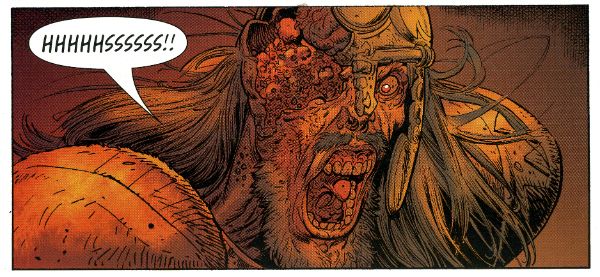
Wait, What? Ep. 83: As Good As A Feast

Lovely Hoo boy.  Did not think I was going to make this particular deadline.  I won't bore you with the blah-blah-blahs, but let's just say: papa needs a new microphone and he needs one bad.  I apologize in advance for all the not-especially-discreet cracking and popping going on at various points in the background of this.  We are maybe two weeks away from a solution to both it and the mild echo chamber effect that's afflicted us ever since Graeme managed to transcend this corporeal realm.

Buttttttttt, anywayyyyyyy... Gotta keep this short and snappy so lemme just say this:  Wait, What? Ep. 83 is two hours and twenty-seven minutes long, and Graeme and I do not spend all that time trying to remember if the boss at the end of Crazy Climber was a gorilla or not!

No.  Instead, we do our best to cover a lot of lost ground by jawing about Iron Muslim and Zombies vs. Fanboys from Boom Comics, Kirby: Genesis, the current state of comics and the comics internet including Chris Roberson quitting DC and David Brothers' amazing article over at Comics Alliance, Before Watchmen, Grant Morrison, Brian Bendis and Avengers Assemble #2, as well as the Oral History of the Avengers.

Also?  The eighth issues of Wonder Woman Justice League, OMAC, and Batman, Casanova #3, The Shadow #1, The Boys by Garth Ennis and Darick Robertson, Alabaster Wolves, Saga #2, Archie Meets KISS, Prophet #24, more issues of Glamourpuss, and much, much more.

This show was pretty late making its way to iTunes, but if it's not there yet, it will be there soon.  But even so!  You can also listen to it here and now if you would prefer.  Behold:

Wait, What? Ep. 83: As Good As A Feast

As always, thanks for your patience.  I gotta go jump through hoops for the next ten hours or so, but we'll have more for you next week--and, of course, thank you for listening!

Hibbs catches up, sort of -- 4/18's books

Happy 4/20! OK, getting much closer to being "on time", right there under the jump!

AVENGERS VS X-MEN #2: A jarring tonal shift comes this issue as Jason Aaron handles the scripting. It's sort of on par with the change of George Perez to Ron Lim on Infinity Gauntlet, because the voices couldn't be more different. I *liked* what Aaron's got on the page here, but man that's three issues in a row now with no consistency whatsoever between them, and the round robin of writers continues through the series (and art changes with #5, as well) I'm finding this jarring.

I'm also not following a specific plot point, and that's how is Phoenix "coming" in outer space, but also already possessing Hope?

Again, this book isn't for me, really, but I thought this issue was at least OK

BATMAN #8: This here is the first $3.99 issue, and I was a little concerned it would cause a jump off, but people seem to be enjoying the Owls storyline enough to keep supporting it. Again, we'll see what happens when the first Bat-line crossover happens next month -- it seems to me that most of the tie-ins are going to read very similarly, though: owls attack, fight owls. This arc has had a bunch of bizarre "power fluctuation", though -- you'll remember how it opened with Bats kicking the ass of dozens of traditional bat villains, at once. THEN, a single Owl curbstomped Bats about as hard as he's ever been hit. And NOW, Bruce is fighting off dozens of Owls at once, showing again how butch he is. I'd finding this awkward, at best.

The backup story was largely the epitome of "unneeded back up", as it just showed and elongated a moment that we'd seen just minutes before. Boo!

I'm liking the book, overall, but there's something a little off about this whole thing that I'm not figuring out yet. I still thought it was a very low GOOD.

PROPHET #24: Ugh, now THIS is comics! Man, I don't even know what this bit has to do with anything in the first three issues (same character, wholly different scenario), but I also don't care, because it's such fun science fiction, AND we get some wonderful artwork from Farel Dalrymple. I think I've said this before, but this reminds me of nothing less than HEAVY METAL from the 1970s, amazingly inventive and lavishly illustrated science fiction that may or may not make a ton of sense, but who cares because the passion just drips off it. I think this is truly EXCELLENT work.

RESET #1: Peter Bagge returns with something new, and while his cartooning is as good as ever, I had two kind of overwhelming problems with this. First is that the setup is just too thin -- we understand the protagonist is someone who is at least somewhat famous, who did some unspecified awful thing, but there are no details about any of that given here, and so it makes relating to the underlying science fiction premise (that there's a machine that can allow you to relive your life, and make different decisions, but it has to always start from one specific point) just too difficult. We neither know where the protagonist came from, nor where he is trying to go, so taking any kind of suspense or anticipation is rendered virtually impossible.

My second problem is that I think that Bagge has grown into an increasingly "safe" cartoonist as the years have gone by -- not from his underlying style, but from the range and direction of his work. There's nothing "edgy" about his work any longer, it feels predictable and almost staid. Safe.

This work is OK, at best.

SHADOW #1: I was a little surprised how much I liked this. Well, maybe not, because it's Garth -- but there's almost no Ennis-isms here (other than whatever is naturally baked into the character and supporting cast), just a great straight-forward, historically-appropriate period-piece version of the best of the character. If I had one "problem" its that Dynamite really could do itself a favor and instead of spending the coin to get four different unique comics stylists doing covers, they should spend at least that much attention on the interior art. Aaron Campbell is in no way a poor artist, but it's hard to not suffer in comparison to Alex Ross, Chaykin, Jae Lee and John Cassaday. Despite that, I thought this was swell comics, indeed, and thought it was VERY GOOD.

SUPERGIRL #8: I'm only pointing this out because George Perez is suddenly drawing a pair of issues of this book, and I thought this was a very solid little comic that your eye might have wandered away from. Here's a place to wander back for an issue or two -- I thought this was GOOD.

WONDER WOMAN #8: I've said before, ad infinitum, I so don't care for mythological supporting casts, and, so, overall while I've been liking this arc OK, it's really not for me. I still largely feel that way about this issue, but I'd be a big ol' meanie if I didn't observe just how much I liked Cliff Chiang's "redesign" of Hades and the afterlife -- that's some genuinely creepy and affecting stuff. GOOD.

That's it for me for today, as always: what did YOU think?

-B

Big and Bad: Hibbs 4/4's

I know you'd never know it from my Industry-driven posting (seriously? It's what I DO), but I've actually been sick as a dog the last week, and have barely read any comics at all. But I said "I'm back on the horse", and, barring the two weeks where I couldn't log on TO post here, I am , I am! So, here's 3 (or maybe 4) books, below the cut.

AVENGERS VS X-MEN #1: Rich Johnston was right, I think, when he said this book is review proof. No one is going to buy or not buy this comic based upon anything I (or anyone else) says about it, and, because it's purely an exercise in smashing the action figures together, I doubt anyone is really looking at this for an exceptional example of sequential storytelling, or anything.

Which is terrific, because it kind of sucked.

Sort of even to the point that I'm not even really sure where exactly to begin.

Well, let's start with the talent. I like JR JR, I really do... but I like him on things that are gritty and "street" and dark -- KICK ASS he's suited for, shiny-Avengers-heroes? Not so much. Scott Hanna's inks help a little, but overall, the effect here is of the absolutely wrong artist for the book.

Then you have the "Story" credit going to FIVE different people. Really? Reallly? I mean, I have to assume that something really change-up different is going to happen at some point here, because "The Avengers and the X-Men fight" hardly needs FIVE plotters. Damn, it don't need one -- even my eight year old can plot this. In fact, I asked him to tell me why they might fight, and he said, and I shall quote: "they're superheroes, they just do"

Smart kid.

And, oh, oh, oh, the scripting. I don't know if it's that Bendis is just getting too frayed from working on too many comics, or that I've just "learned" his ear too well from reading too many of them, but his dialogue has descended into self-parody at this point. "What's going on? Never Mind. Don't care. Are we having an Avengers meeting or--?" "Guys -- we got a thing here."  Damn, they all have the same frickin' voice. Even the single normal human being in the entire comic, who has a line after flying through the sky with the rubble of the Chrysler building, then is webbed safely by Spider-Man (wait, what? How?!?! 3/4 of those people should be corpses!) says "Wow. That's It. I'm moving. I'm done."

Gawd.

(Plus, like, destroying the Chrysler building? This is your signifier of "yeah, the stakes are real!"? Ugh)

(See, even *I* am doing the bendis voice! Man!)

I also really like that "scorecard" thing at the top of the issue that has like 20+ Avengers, including a bunch not even cameoing in the issue (War Machine?), while the X-Men side is all of 6 people.

I don't, AT ALL, get Cyclops' motivations here. I could maybe possibly understand him if it was "We don't have enough power, we need more, we can't let the humans have this", but all of that bullshit he was spouting about rebirth and shit? Are you nuts? Scott should hate the Phoenix force more than almost any other human in the universe, given that it destroyed his first love, his child, his school, and now it is going after his grand daughter, who is "the future of the mutant race". Given what happened to Jean, how could he POSSIBLY be ok with Hope getting anywhere near the force?

Also: Where the fuck is Rachel, anyway? Why would the thing WANT Hope in the first place? We've always always seen the Phoenix force go after TELEKINETIC TELEPATHS -- what does it want with a girl whose powerset is *copying* other powers, and who, afaik, is utterly powerless without other mutants around?

Hell, maybe that's what we need five plotters to explain?

So, nope, didn't like it, not a bit... but it's going to make a big pile of money regardless. I thought it was pretty AWFUL.


INFINITE COMICS #1: Free with the digital download of AvX #1 was the first of Marvel's "Infinite Comics", by Mark Waid and Stuart Immonen. I read this as well.

I have to say that I thought it was... adequate. Waid's script is filled with some fun things about moving faster than the speed of light, but there's not a single thing about the PERSON behind the suit (other than his liking hot dogs or whatever it was, but that was so generic, it literally could have been interchangeable between Spider-Man, the Human Torch, Speedball, or fifty other characters).

The art was fairly pretty (duh), but when it came to major, important things like, dunno, SMASHING THROUGH THE CHRYSLER BUILDING, it's staged in such a way you can barely tell what's going on.

As a "What happened between panels 5 & 6 on page 4" (or whatever), it was perfectly adequate... maybe even fairly decent.

But as a technical achievement? Wow wow what a dog!

Maybe, I don't know, but maybe possibly this is because I read it on an iPad 1 -- but this, rather than the "Luther" proof-of-concept where elements fairly seamlessly "floated" into place, here each new element was on a seperate page of it's own that I could LITERALLY *see* being served to me.

What this meant was that.

(tap)

What this meant was that as each page would come up on the screen.

(tap)

What this meant was that as each page would come up on the screen my eye automatically started to read.

(tap)

What this meant was that as each page would come up on the screen my eye automatically started to read from the left again.

(tap)

What this meant was that as each page would come up on the screen my eye automatically started to read from the left again until eventually the.

(LENS FLARE!)

What this meant was that as each page would come up on the screen my eye automatically started to read from the left again until eventually the whole page was finally rendered.

Oh. My. God! COMPLETELY unreadable.

I thought "Well, maybe it's just the first iPad?" so I went to try and read it in-browser on my computer, which Marvel SAYS you can do. I followed the link PROVIDED ON THE "redeem" page. No. That takes you to a page full of press releases about previous free digital downloads. Then I spent at least 20 minutes reading through help pages on Marvel.com, and finally found a different link that the help pages insisted was direct to "all of your free-with-print digital downloads", but THAT page redirected me instead to a four page preview of AVENGING SPIDER-MAN #1 that the only way it would let me escape was if I signed in to Marvel Digital Unlimited... which is not even close to the same thing, so I closed my browser in disgust and said "fuck it".

I probably wouldn't be so disgustipated if it wasn't for the THREE (!!) pages that IC #1 had to serve me to proclaim that this was the "FUTURE OF COMICSSSSSSSSS!!!!!"

Seriously?

If that's the "future" of comics, comics can go fuck themselves. As much as I didn't like the "hey we're showing off by taking control of your reading experience for you!" that "Luther" did, it was a BILLION times worse in the one-page-at-a-time slideshow on the iPad. It made me want to choke to death on someone else's vomit.

The CONTENT of INFINITE COMICS #1? EH. The EXECUTION?: Pure, stinking ASS.


THE BOYS #65:  While there are 3 (4? 5?) more issues left of the series, this is really the big moment everything has been pointing to since that first issue, and there's a clear Ennis-ian Nelson-style "Haw haw!" in here as everything everyone thinks is going on is flipped on it's side before the gory gory gory gory climax of it all. I liked the twist, I thought it was "fair", but this issue really REALLY suffered, I thought by being drawn by two artists, neither of whom is Darick Robertson. Russ Brown and John McCrea are just fine, but neither is the co-creator of the series, and I kept recasting every page if DR had drawn it. The version in my head is better. Still? Solidly GOOD.


SUPREME #63:  It's been like ten years since the last chapter, has it? I guess that explains why I sold less than a third of what I thought I might of this unseen Alan Moore Script? What's weird is that, as a silver age pastiche, it really kind of read as if I had just read the previous issue last month. I miss the hell out of this book. I can't believe this really was to be Moore's LAST script, though, because there's clearly 1 or 2 more issues to go along this whole thought.

I quite liked Erik Larsen's art here, though -- made me think he was channeling Kev O'Neill, especially on those Suprema pages. The blurbs seem to indicate that the next issue is abandoning the silver age stuff and going back to 90s-style Rob Liefeld Supreme, and while they're earned one more issue from me for that, my instincts say I'd rather be forced to read INFINITE COMICS again.

Anyway, does this mean we can hope for a proper reprint book of Moore's runs that isn't scanned at the wrong resolution or whatever the hell the problem was with those Checker editions?


Right, that's it for me this week, see you in a day or two with the next batch of reviews!!
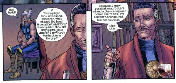
 

As always: what did YOU think?


-B

Wait, What? Ep. 79.2: Power of Ones

Uploaded from the Photobucket iPhone App Hey, guess who did it wrong?

Yeah, I had an incredibly busy Wednesday and it wasn't until my head hit the pillow that I remembered I'd forgotten to upload this podcast.

And create this entry.

So, despite my fond reveries about providing extra content and blahblahblahblah, that will probably have to wait until next week because, well, I'm tired and dumb.

But I wasn't (entirely) when Graeme and I talked now comics for our conclusion to Episode 79!  Nope, I was more or less lucid and we reviewed the latest issues of Buffy The Vampire Slayer, Angel and Faith, Frankenstein, Agent of Shade, Batwoman, and a whole mess of first first issues including Saucer Country, Crossed Badlands, Saga, Avengers Assemble, and of course Todd McFarlane's Spider-Man (which I'm sure some of you were unfortunate enough to realize from the above excerpt).
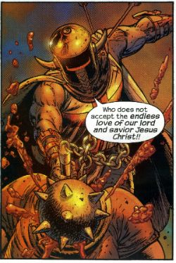
"A candy-colored clown they call iTunes tiptoes to your feed every night just to sprinkle podcasts and to whisper "Go to sleep, everything is all right."

Alternately:

Wait, What? Ep. 79.2: The Power of Ones

As always, we hope you zzzzzzzzzzzzzzzzzzzzzzzzzzzzzzzzzzzzzzzz...

Hibbs says "Heeellllo 3/14's comics!"

Two weeks in a row, yeah, baybee. AVENGERS ASSEMBLE #1: Yeowch, that was rather poor. Part of it is just how inconsequential the story felt (and part of that is having the stupid "Zodiac" characters as the antagonists... ugh, have they EVER been interesting?), part of it was the need for "Marvel Continuity" to now reflect "movie continuity" (despite the fact that this kind of material DOESN'T BRING IN A MEASURABLE NUMBER OF NEW READERS from the films to comics), so we've got "Dumb Hulk" running around here (And I think Bendis totally doesn't "get" his voice, sorry), despite that not being the Status Quo in the Marvel universe, or in any currently published "Hulk" comic, oops. I guess this entire comic is a spoiler? Weightless, flabby, and, of course, $4 for the privilege. Ew, this is absolutely EH work.

CROSSED BADLANDS #1: Gahd, what a horrible title. Well, at least Garth's back on the book he created, but I seriously think that this comic isn't sustainable 24 times a year, and that by June we'll be selling under half of what we might sell of this first issue. Anyway, it's Crossed, and it's Ennis, and so it's filled with all kind of depraved stuff you can just hear that naughty little boy giggling over, and while I like it, I don't really love it, and it's effectively an anthology series now, so we'll see what happens going forward, but for now: I like it, but don't love it. OK

FANTASTIC FOUR #604: I strongly liked this issue, even with it's fairly heavy Deux Ex Machina (even if that's an established plot point) -- I like it's message of Hope and family, even if I'm not exactly sure why the plan worked, or even how it got came up with or anything like that. Still: GOOD.

LUTHER: Hey, not at all a print comic, but Mark Waid's free "proof of concept" for his vision of Digital comics, where you advance through it with the arrow keys.  I liked the story quite a bit, but there's something that's not quite "comics" to me about the whole process.

Sometimes it is overt, like the panel where the shovel suddenly appears in frame, where I think "well, that's just animation, just only two frames, isn't it?"; sometimes it's more covert like all of the times where Waid is actually controlling the reading experience by forcing when balloons or panels actually appear.

I think that comics are, in some ways, as much about time and space as anything else, but all of those elements really should remain in the hand of the reader -- it's my choice if I want to read all of the captions on the page first, or which elements of the illustration I choose to believe are the most significant and deserve my focus.

One last consideration is that this story is all of 33 panels long. Just over 3 pages, if it was a Watchmen-style 3x3 grid. (This is, of course, a stupid thing to say -- if this same story was told on a print page, even if it was 3x3, the rhythm of it would be ENTIRELY different; this same story would, of necessity, be a different size and shape) And while it was a well told and reasonably engaging story, I can't really see spending (let's say) 99 cents for 33 panels of comics.

Having said that, I did very much like the story, and judging it entirely on the basis of the content, I'd call it GOOD. Sadly, it also has the tech issues, and those distracted me, rather than drawing me in, and that reduces my grade, ultimately, to an OK. Still, can't beat the price, go give it a read.

SAGA #1: Now this, on the other hand, I loved.  So much so that we've put a copy is (almost) every subscribers box and are offering it 100% money-back guarantee. "Star Wars meets Game of Thrones" is the easy log-line, but the more important thing is the characters are rich, the world intriguing, the dialogue crisp, and the art really swell. There's kind of this weird "MOONSHADOW" vibe going on with the narration, but, thankfully, without the hippies. Either way, this is a wholly wonderful start to a series by Brian K. Vaughan and Fiona Staples, and I thoroughly recommend this book as one to read. EXCELLENT.

SAUCER COUNTRY #1: Hrm. On the one hand, I find a lot compelling in here (especially the ghosts [?] of Pioneer 10), on the other hand I'm not sure that the lead thrust of the book is adequately established. It's weird when the supporting characters make more of an impression than the protagonist. I'll most certainly give this another issue (or two) to grab me, but this first one didn't GRAB me all by itself. I want to give it a low GOOD, but I'm having a really hard time actually doing so... it's more like an extremely high OK.

SECRET HISTORY OF DB COOPER #1: Here's the thing: the charm of the title rally depends on you know WHO "DB Cooper" is, and based on a bunch of informal polling virtually none of my customers do (Or, perhaps, some do once you explicitly say it to them -- "oh, yeah, I've heard of him"), which means that a huge chunk of the high concept is immediately swept away. The second problem is that this issue kind of just stops, and I could not, if you put a gun to my head and forced me to jump out of an airplane with $200k, tell you whatsoever what the premise of this book ACTUALLY is, other than the vague notion from the title. There just isn't anything here to get me to come back for issue #2, I'm sorry, which is the only real goal of a first issue. So: I liked what I read, and I liked the surreal concepts I saw, but I don't know why I would spend $4 for it exactly, or why I would want to come back for #2, unlike SAUCER COUNTRY which intrigued me JUST enough to say "Sure, give me another dose". So, yeah, this is merely OK, despite my enjoying the ride as I sat on it. I'd just never stand in line for a second go, y'know?

SHADE #6: I hate this comic because the art from Javier Pulido is SO good, and yet I don't give a single wet fart about any of the not-Shade characters, or what the superhero situation in Barcelona is, at all. It's "The Atlantis Problem" for me (I care about Aquaman and Namor; I DON'T care about "Atlantis". I care about Black Bolt and Medusa; I don't give a fuck about "The Inhumans". I very much love Wonder Woman; I'd rather like the street clean than read about Amazonian culture or what the Greco-Roman gods are doing in modern America. And so on). Y'know, I think that STARMAN worked because Jack was a fine "everyman" of a protagonist; and Shade was a TREMENDOUS foil/friend for him... but I think I only care about Shade in the context of Jack's world, because every issue I sit down, eager to read, and I walk away feeling "Man, that was just OK"

WOLVERINE AND X-MEN #7: Have I said this already? If every Marvel comic was at least as good and dense and humorous as this, then maybe people would be happy to pay $4 for it. But because so many Marvel books just aren't worth the four bones, nowhere enough people are buying this book in my store, and there's this (wrong, so far, in this case) feeling like you can't just read "one" X-book. Well, you can, and it should very much be this one -- it's action packed, it's hilarious, it's incredibly energetic. Jason Aaron is one of the very few writers in comics that I can think of that seems to be able to equally handle "dense, gritty narrative" and "light-hearted romp". I love Nick Bradshaw's art, too -- it's got this nice Art Adams-y thing going on without being derivative. This is probably my favorite superhero comic being published today, and I thought this issue was VERY GOOD.

That's me, this week -- what did YOU think?

-B