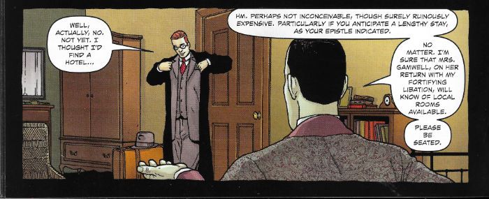
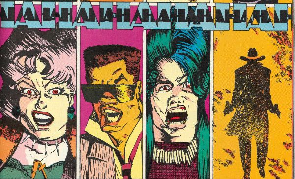
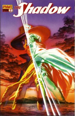
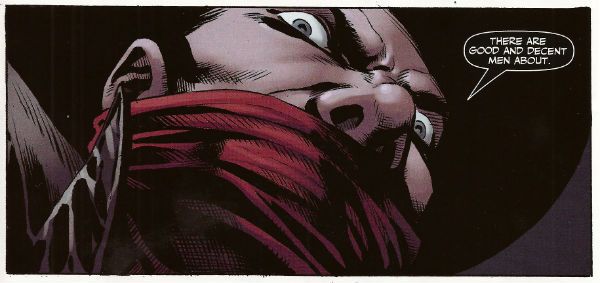
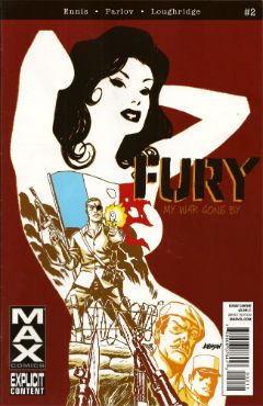
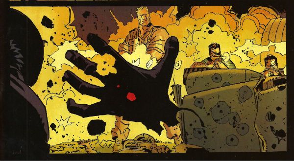
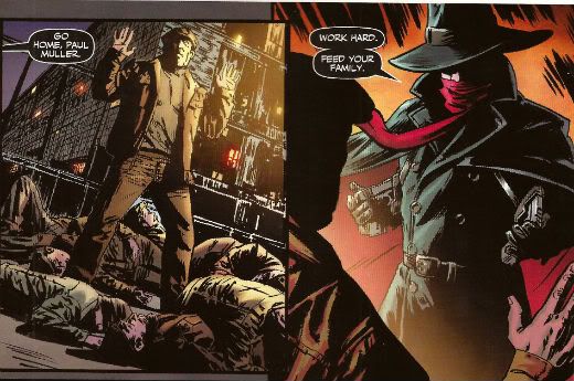
“COURAGE! He Is But A MOLLUSCOID MOUNTEBANK!” COMICS! Sometimes We're Making Whoopee!

A samurai, a shadow and a sponge. It's either a further trudge through my pull list or the best pop band ever. Let's see!  photo TopPicB_zpsbt8qnwjr.jpg The Shadow: The Death of Margo Lane by Wagner, Wagner & A Larger World Studios Anyway, this...

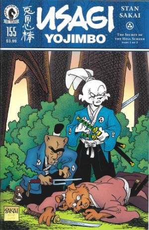
USAGI YOJIMBO #155 Art by Stan Sakai Written by Stan Sakai Lettered by Stan Sakai Cover by Stan Sakai Cover coloured by Tom Luth Dark Horse Comics, Inc., $3.99 (2016) Usagi Yojimbo created by Stan Sakai

 photo UYCovB_zpskz6plmtk.jpg

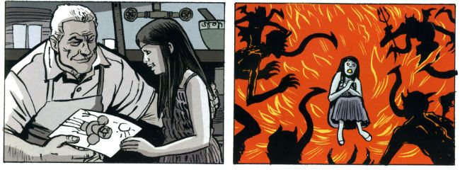
In which our roving ronin happens upon a murder most mysterious and is reunited with his old friend, Inspector Ishida, he of the emotively animated mono-brow. With more than enough suspects, both likely and unlikely, our anthropomorphic investigators could probably do without the uncanny and bloody additions to the notorious “Hell Screen”. Hurry Usagi, the game is a-paw! I mean, a foot! (Ouch!) So, yeah, another super-solid exercise in entertainment by the man who is quite possibly Comics' Most Undervalued Talent, Mr Stan Sakai. There is nothing that is not very good about Usagi Yojimbo, so much so that it remains somewhat galling that each issue receives little to no acknowledgment of its existence by the comics' press. This then is the reward for consistent brilliance: silence.

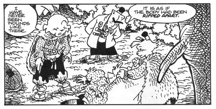
 photo UYpicB_zps4a5hnsv7.jpg Usagi Yojimbo by Stan Sakai

Meanwhile, The Hulk got shot by an arrow made of Dumb and someone got all school marmy because Wonder Woman doesn't go commando, and, quite rightly, that's all anyone goes on about. Alas, Usagi Yojimbo has to get by on clever plotting, consistent characterisation, barbarous action and a general air of amiable excellence. And then, when you've read it you can go back and marvel at how simply Sakai depicts his rain, how he creates the illusion of depth via varying the heaviness of his line, and how he expertly employs cross hatching to evoke texture. Every panel of every page proves Stan Sakai remains implacable in his delivery of high levels of artistry and entertainment. But never mind that, someone drew The Hulk with his cock out! Or The Hulk got shot by a cock! Or something. Oh yeah, more often than not the estimable Mr. Sakai finds time (as he does here) to pen a wee pin-up on the back cover, which is nice. Also, the letter column is one of the healthiest I've read, with people just genuinely reacting with unfashionable (ugh!) affection for the book and its author both. There's none of that creepy and needy validate me! Validate my tastes! stuff you usually get in independent lettercols; just pure heart. The cosplayer highlighted this issue is impressive alright roo, but, and I have no idea why this is, she just made me imagine David Keith replaced by a large rabbit for the final scenes of WHITE OF THE EYE. Why is daddy wearing hot dogs, indeed. That's a reflection on me rather than the talented lady in question. Man, I don't know what's wrong with me but I sure know what's right – Stan Sakai and Usagi Yojimbo. VERY GOOD!


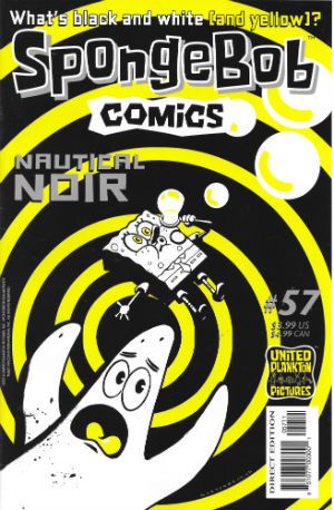
SPONGEBOB COMICS #57 Art by Nate Neal, Vince DePorter, Derek Drymon, James Kochalka, Marc Hempel, Andrea Tsurumi, Maris Wicks, Hilary Barta, Jacob Chabot Written by Nate Neal, Vince DePorter, Derek Drymon, James Kochalka, Jay Lender, Robert Leighton, Maris Wicks, Chuck Dixon, Hilary Barta Lettered by Rob Leigh Coloured by Monica Kubina, Scott Roberts, Jason Millet Cover by Shawn Martinbrough (with thanks to Jacob Chabot) United Plankton Pictures Inc., $3.99 (2016) Spongebob Squarepants created by Stephen Hillenburg

 photo SBCcovB_zps63ttkhnw.jpg

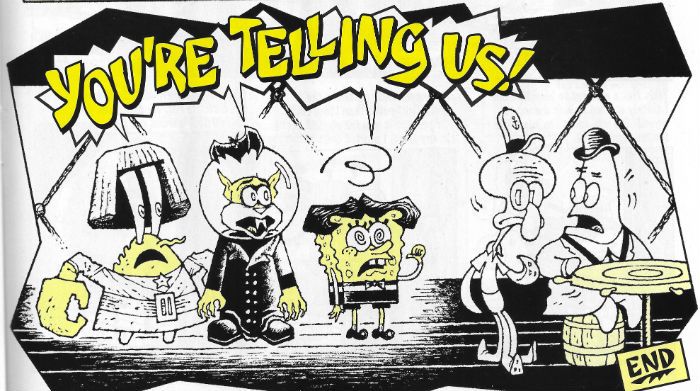
As you can see by the text on Martinbrough's Hitchcock indebted cover this issue's theme is “noir”! But only in the loosest possible sense of “crime stuff”; you know, before a bunch of tedious old men start flapping their gums about what noir is or isn't. Look, it's a comic for kids about a talking sponge, so get back worrying about whether noirs can be in colour or not. Yeah, you take care of the important stuff, while the world goes to Hell in a handbasket. Anyway, as is mostly (but not always) the case there's a bunch of smile raising shorts. Sometimes there's only a couple, or just one, but they are always smile raising. It isn't the smile raising that’s in doubt, it's the number of stories within. I trust that's clear: SPONGEBOB COMICS is funny stuff.

 photo SBCpicB_zpsl5aob5e4.jpg Spongebob Comics by Hempel, Lender, Roberts & Leigh

And those titter inducing tales herein? Our porous pal's life is complicated when he crosses paths with a larcenous double, the new fish in prison reflects back on how his life was ruined by a yellow terror as implacable as a guilty conscience, a hilariously learnedly loquacious Patrick eruditely narrates the terrible tale of “Doctor Calamari” in a suitably German Expressionistic stylee (which, no, isn't noir but it is the root from which noir sprang. So go back to sleep, tedious old men.), there's a trenchcoat and hat PI pastiche, and Mermaid Man reveals the terrible secret of his stylish cape. And! Maris Wicks gives a one page shoal of facts about hermit crabs while James Kochalka remains James Kochalka. VERY GOOD!


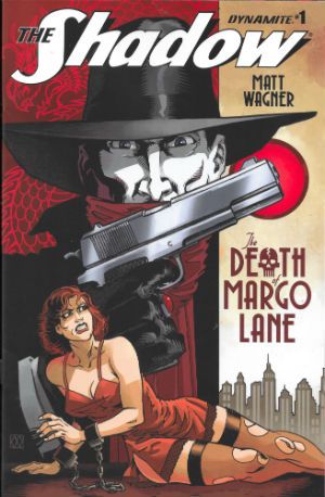
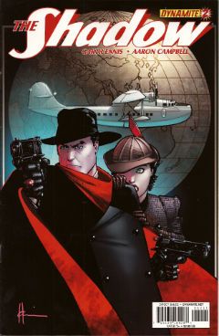
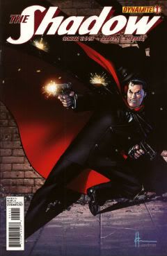
THE SHADOW: THE DEATH OF MARGO LANE #1 Art by Matt Wagner Written by Matt Wagner Coloured by Brennan Wagner Lettered by A Larger World Studios Cover by Matt Wagner & Brennan Wagner Dynamite Entertainment, $3.99 (2016) The Shadow created by Walter B. Gibson

 photo DMLCovB_zpsscs3a6io.jpg

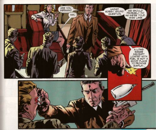
See! I told you about my LCS! They only went and sent me another Shadow comic! Again with The Shadow comics! I'm not old enough to remember The Pulps, people! I am old enough to remember Pulp though. In fact I'm old enough to have attended their final gig at the Magna Science Adventure Centre. Well, their first “final” gig. I'm also old enough to remember when words meant things, words like “final”. Grumble. Grumble. Mutter, mutter. So, The Shadow! Dynamite's Shadow stuff has been a bit variable, to be honest. There was that series which had a weird obsession with sinister Chinese laundries and had George Orwell fighting with El Shadder; it was okay and while the bit where George Orwell ended his adventure by going “Hmmm, ANIMAL FARM is catchy, but so is NINETEEN EIGHTYFOUR; which to write first?!?” was pretty hilarious, it was still nice to have a comic writer who knew about George Orwell. Then there was that one set in the present which was, well, terrible. After that it was all a bit patchy with Houdini cropping up and a Nazi car factory or something, but of late things seem to have settled down with Matt Wagner taking the reigns. And Matt Wagner? He can draw. Anyone who claims he cain't is all wet. And how!

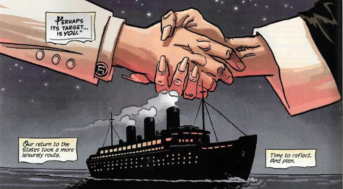
 photo DMLpicB_zpsmj49bxfy.jpg The Shadow: The Death of Margo Lane by Wagner, Wagner & A Larger World Studios

Now I ain't ladling out no applesauce saying that this guy's blotto on graphic design and knows his onions when it comes to page layouts. I must have been all turned around for the last forty odd years because Matt Wagner's excellence has somehow passed me by. Sure and I wasn't giving his stuff the high-hat, I just never crossed its path is all. From the first page of this Shadow joint I was crushing on this stuff so bad I had to check my cheaters were clean. Storytelling-wise this ruckus is the cat's pajamas , and I ain't laying down a line. Boffo stuff all round. It's swanky stuff, on the up and up, I tells ya. Maybe it is just meat'n'taters, just horsefeathers story-wise what with alla them shenanigans with hats, flivvers, gats, cocktails, luxury liners and death traps. But, hey it's a Shadow comic and alla that guff is why we came in the first place. A ragamuffin it may be, but it's a ragamuffin swanked up like Valentino. That's gotta be worth the scratch. So I'm a few decades late for this party but I'm tellin' youse, this Matt Wagner kid's got the goods. Heck, he's got the VERY GOOD!s

Lips That Touch Liquor Shall Not Touch – COMICS!!!

“I Myself Played A Zobo Kazoo.” COMICS! Sometimes Comedy Lurks In The Unlikeliest of Places!

Yeah, uh,  sorry. Didn't mean to be gone quite so long. Got distracted by the real world. Big Mistake. What an awful place the real world is. Simply dreadful. So, yeah, not a good year thus far for any of us, huh? Hey, I know what we need, some sweet, sweet COMICS!!! (DISCLAIMER: Contains words of praise for Alan Moore.)  photo MotTOP_zps8wymixgp.png Midnight of the Soul by Chaykin, Arbutov & Bruzenak

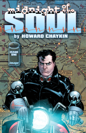
Anyway, this... MIDNIGHT OF THE SOUL #1 Art by Howard Victor Chaykin Written by Howard Victor Chaykin Coloured by Jesus Arbutov Lettered by Ken Bruzenak Image Comics, Inc., $3.50 (2016) Midnight of the Soul created by Howard Victor Chaykin

 photo MotSCovB_zpsgxts8vht.png

So, yeah, at long damn last Howard Victor Chaykin's MIDNIGHT OF THE SOUL strikes at your eyes like a comic book cobra! My son (“Gil”) wasn't even born when the coiner of the phrase “moral cripples” started talking this one up. You can't rush awesome though, so here we are. Fifteen hairline depleting years later, here we are. This time out Howard Victor Chaykin's dreamy doppelganger is one Joel Breakstone who as ever looks good, looks fine, maybe a little too good, a tad too fine for someone in Joel Breakstone's position. That being one of a man wallowing in a self medicated haze of booze following an as yet unrevealed incident while liberating the WW2 Death Camps.

We'll obviously be coming back to the Death Camps of WW2. Largely because Joel Breakstone keeps going back to the Death Camps of WW2. Because, as Joseph Heller might have it “something happened” in the Death Camps of WW2. Not just the stuff we all know went on in the Death Camps of WW2 but something particular to Joel Breakstone. Because Joel Breakstone helped liberate one and what occurred in The Death Camps of WW2 is the gift that keeps giving. But then don't judge the book too quickly, because there is such a thing as an unreliable narrator and a pretty good candidate for such a post would be a man whose spent five years coping with PTSD by self medicating himself with alcohol and refusing to leave his house. That's Joel Breakstone, not me. On the very first page turn Chaykin seamlessly entwines the past and the present via the images of chimneys and he keeps this high standard of storytelling up for the duration. He seems more than present, he seems engaged, and because Howard Victor Chaykin is engaged the words on the page matter and no word matters more than the first word here “Parallels.”

 photo MotS003B_zpsi7gbqzio.png Midnight of the Soul by Chaykin, Arbutov & Bruzenak

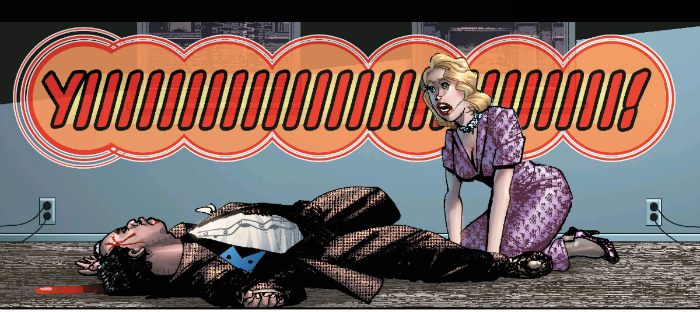
Art-wise it's looking good, it' s looking cleaner and smarter than a Howard Victor Chaykin joint has for a while. The big test of Chaykin art in 2016 is how is going with the cheeks'n'chins? I checked with my eyes and the cheeks and chins in MotS seem altogether more controlled than they have for awhile. Chaykin's reigning in his prognathous tendencies and no one is stylin' Jō Shishido cheeks,so that's good. His figure work's sweet, with a killer panel of Breakstone kicking his TV in. And that TV, like everything around it, seems period authentic so I guess he's as reliable as ever in that respect. There's still a little ghost-float where the images don't quite cohere ideally, but Jesus Arbutov's shadows attempt a corrective tethering. And Ken Bruzenak, lovely, lovely Ken Bruzenak continues his ridiculously innovative attempts to visually represent the purely audible; by now his constructions of visual onomatopoeia are as integral to the art as a whole as any pictures Chaykin lays down. It's a finely honed machine, is what I'm saying.

MIDNIGHT OF THE SOUL is as ridiculously virile, as cheekily provocative, as visually intelligent and as resolutely “Chaykin” as anyone could wish. VERY GOOD!

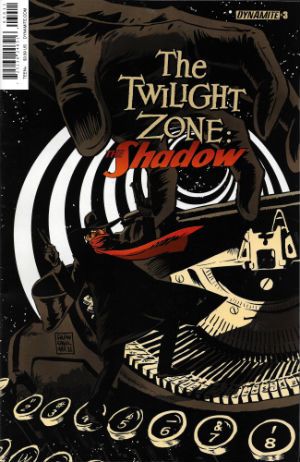
THE TWILIGHT ZONE: THE SHADOW #3 Art by Dave Acosta Written by David Avallone Coloured by Omi Remalante Lettered by Taylor Esposito Cover by Francesco Francavilla Dynamite Entertainment, $3.99 (2016) The Twilight Zone created by Rod Serling The Shadow created by Walter B Gibson

 photo TZSCovB_zpsxud4eqf5.jpg

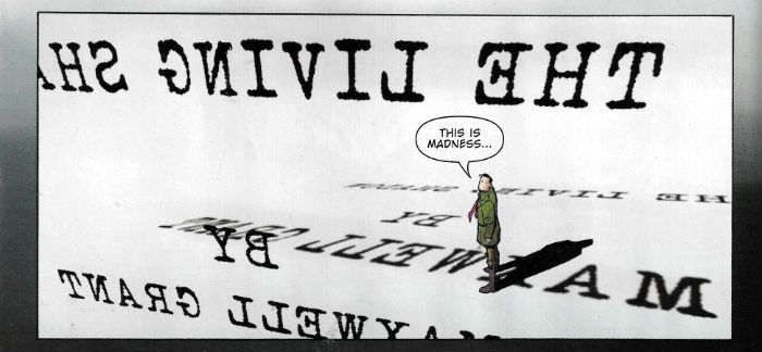
Here's a thing, my LCS just automatically sends me every comic about The Shadow. I'm not entirely sure why that is, but it is. Maybe they think I am so old I remember the pulps or something. Anyway, this isn't what I was expecting at all. I was hoping The Shadow would be maybe fixing Burgess Meredith's glasses, or leaning past William Shatner and firing his twin .45s through the plane window and blowing that thing to fuck and back, or maybe saving the world by saying, “For the Love of God, it's a cookbook, you blithering fools.” Nope, it's some kind of meta affair whereby Shads has entered The Twilight Zone and every issue he is plonked into some situation where The Shadow is a fictional construct (i.e. kind of our reality; last issue he was an Orson Welles doppler, this issue he's “Maxwell Grant”, and thus deucedely confused) and learns a lesson which brings him that bit closer back to the humanity he had been in the process of losing.

 photo TZSpicB_zpsycbpmhrg.jpg The Twilight Zone: The Shadow by Acosta, Avallone, Remalante & Esposito

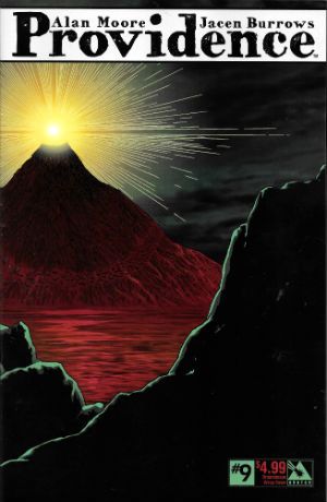
It's a clever little set up and while David Avallone might have bitten off a little more than he can chew and the spindly art by Dave Acosta is more game than it is successful, it's neat enough stuff. The kind of thing Neil Gaiman makes such bloody heavy weather out of , but Avallone & Acosta keep it all light with just the right amount of humour and some inventive set pieces. What could be more Twilight Zone-y than The Shadow being attacked by giant typewriter keys spelling J-U-S-T-I-C-E? Not much, I trust you'll agree. GOOD! PROVIDENCE #9 Art by Jacen Burrows Written by Alan Moore Coloured by Juan Rodriguez Lettered by Kurt Hathaway Cover by Jacen Burrows Avatar Press Inc, $4.99 (2016) Providence created by Alan Moore & Jacen Burrows Inspired by and indebted to the works of Howard Philips Lovecraft

 photo ProvCovB_zpsumncfz0i.jpg

In which everyone's favourite ginger haired Jewish homosexual nebbish glides blithely nearer a Stygian fate swarming with noisome and gibbering cyclopean terrors whose preternatural forms possess angles in defiance of all mortal conceptions of GEOMETRY!!! It took a bit of getting into to be honest, this one. Burrows' art was a bit of an impediment to immersion until I figured it out. It's purposefully bland. Being, I think, the visual equivalent of Lovecraft's dense and willfully archaic texts, which softly lull you into a kind of waking stupor, allowing the horrors to encroach subtly but decisively even as your eyes glaze over. Thus leaving you ripe for the final unveiling of...no, no, it cannot be named! At first I thought the series could be improved by having, say, Cam Kennedy or Richard Corben draw over the, uh, unutterable aspects. But then they'd really stand out, which isn't what they're after, I think. Even the, uh, eldritch elements have to be visually contiguous so that our protagonist’s rationalising of the thoroughly irrational has some credence.

 photo ProvPicB_zpspf590exx.jpg Providence by Burrows, Moore, Rodriguez & Hathaway

Sure PROVIDENCE took some effort to read, but it repaid that work. Heck, I even started rereading Lovecraft hissownself, and I haven't touched the stuff since I was 15. Lovecraft that is, not the glue. Yes, I'm still merrily huffing into my forties. No, but, anyway re-reading Lovecraft? Hoo boy is he racist! It's right on the page as well. I missed that when I was fifteen, so either I was a bit thick or I was very racist myself, because seriously HP Lovecraft? Big racist. Just lays it right out there. Turns out he was the kind of racist who was anti-Semitic too. Lovely. Funny thing is though he was the kind of anti-Semite who marries a Jewish woman, because racists never make sense. (That's because racism doesn't make sense.) Anyway that marriage was less than successful (I know! SURPRISE!), but it does lend HP Lovecraft's jolly time with our Jewish friend herein a undercurrent of humour. Because there's a lot of humour in PROVIDENCE, some of it quite dark but some of it just plain funny. I mean, HP Lovecraft on these pages is a hilarious creation, seemingly inhabiting the century just prior to the one everyone else is living in. His erudite vocabulary set to task on the most mundane of conversational niceties is a proper hoot. He was actually a bit like that as well, so they say. Odd cove all round that HP Lovecraft. Say, did I mention the racism?

With PROVIDENCE Alan Moore brings a depth, intelligence and care to his writing which makes most everything surrounding it in the mainstream comics world seem as unto hurried mush, and Jacen Burrows acquits himself well r.e. his apparent brief to keep it real. The book repays the work you put in, basically. That dumpy looking washer woman staring balefully from the tower in this issue? It's not the first time she's appeared in the series. But to what end. To what...END!!! VERY GOOD!


That is not dead which still reads – COMICS!!!

"If Only I Could Convince BEVERLY That He's As IMPORTANT As I Know He Is." COMICS FOLK! Sometimes It's 65 Pictures For 65 Years!

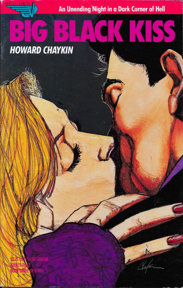
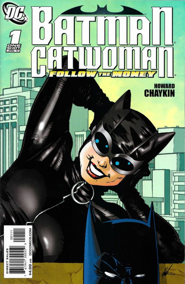
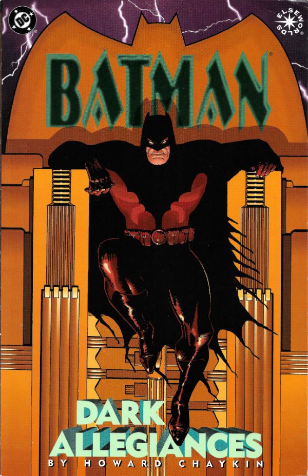
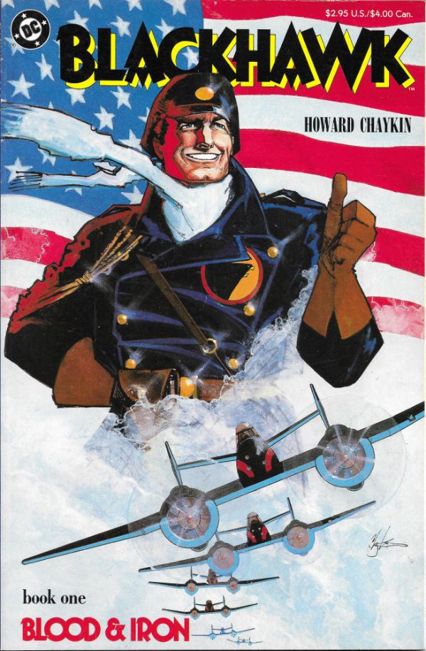
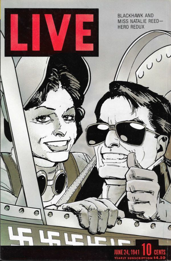
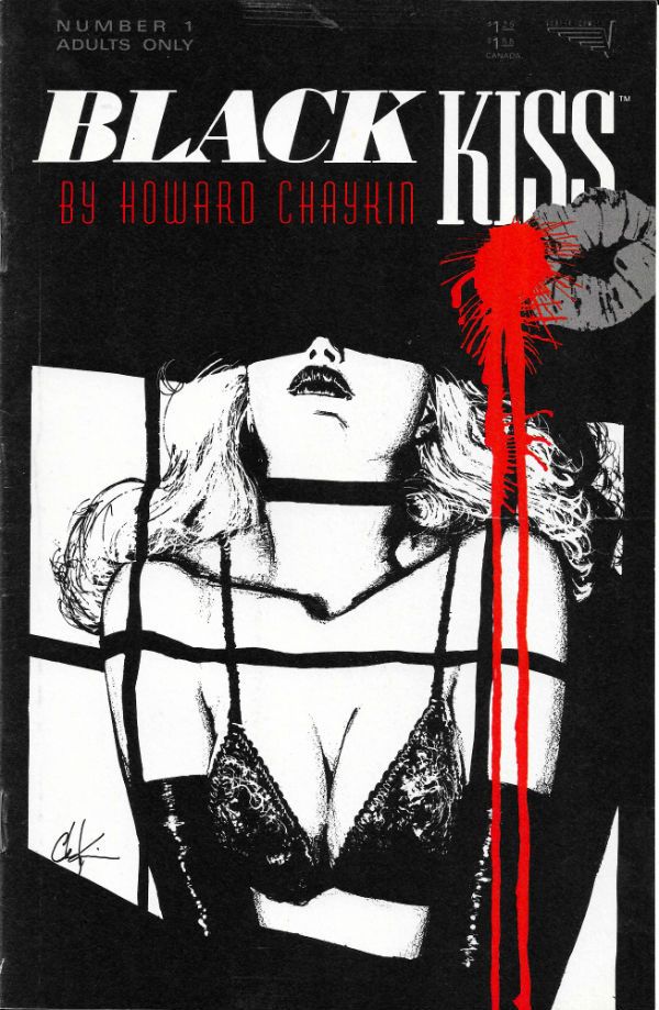
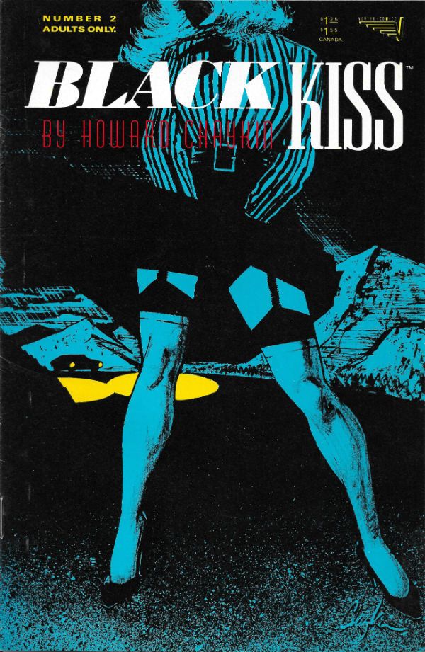
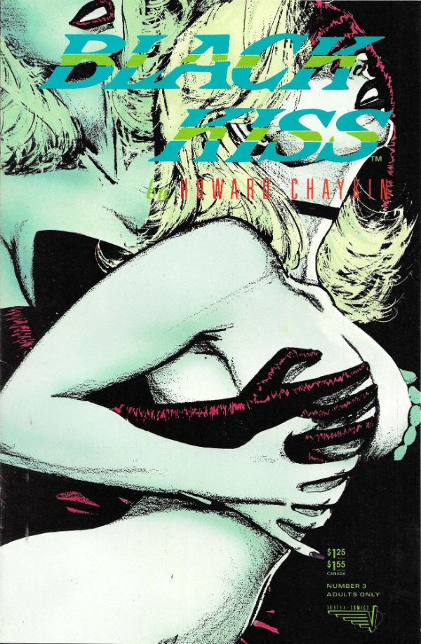
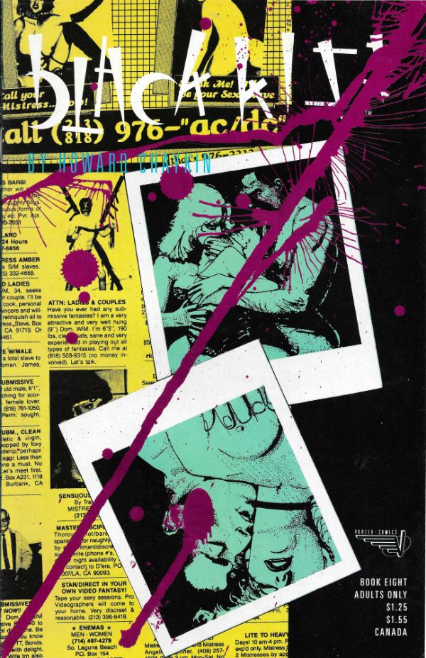
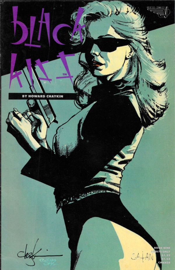
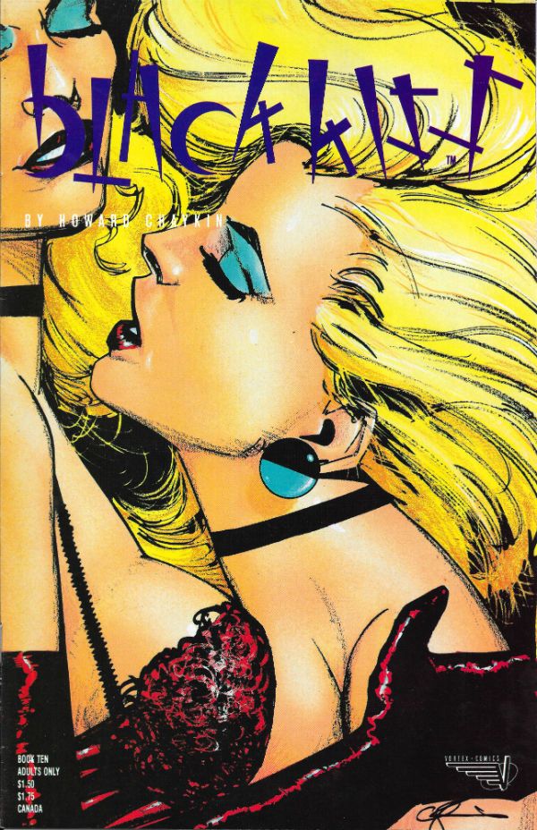
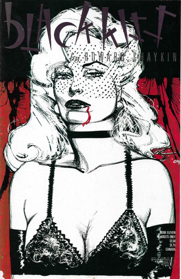
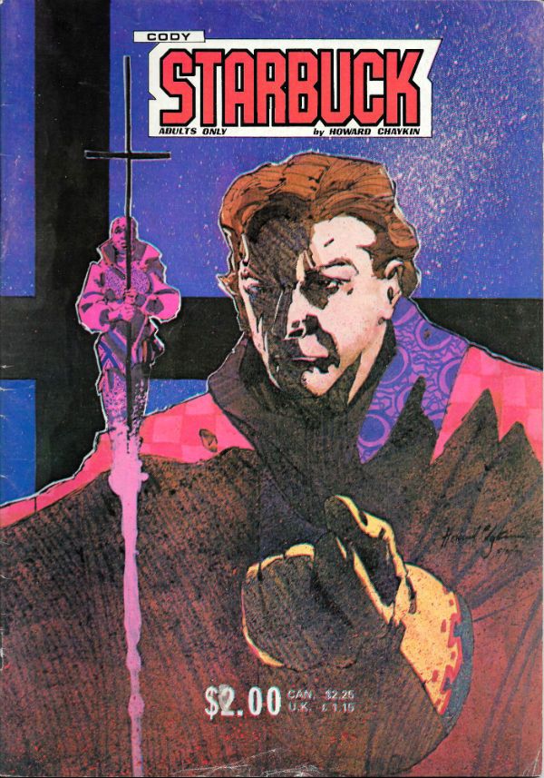
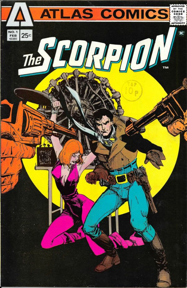
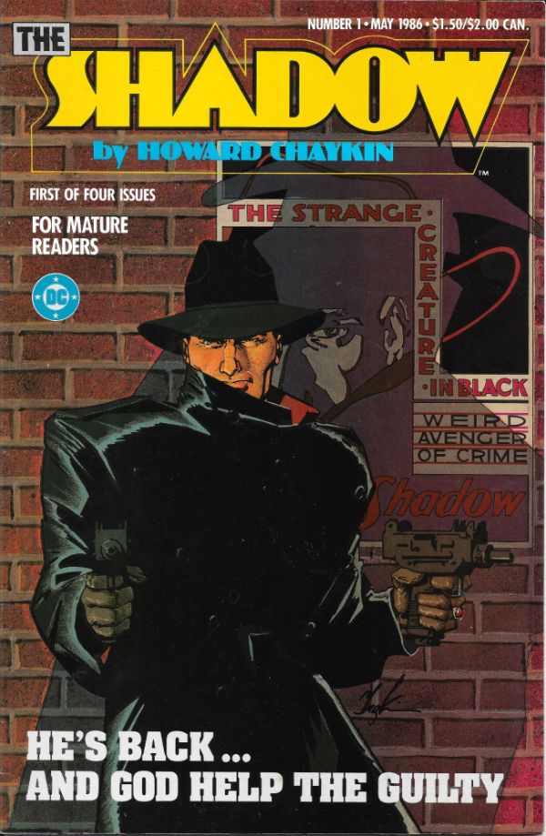
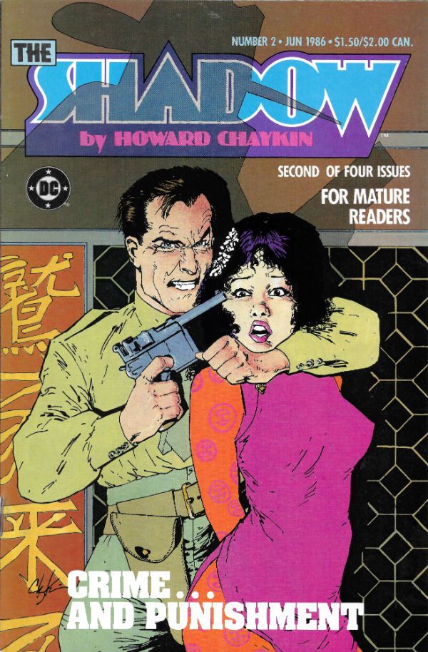
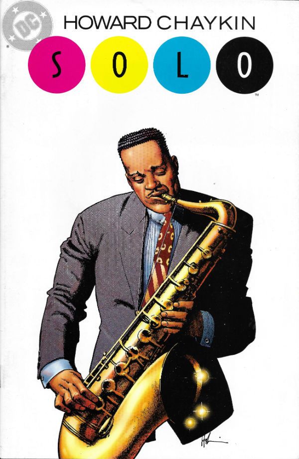
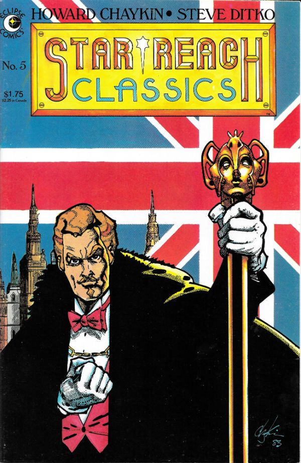
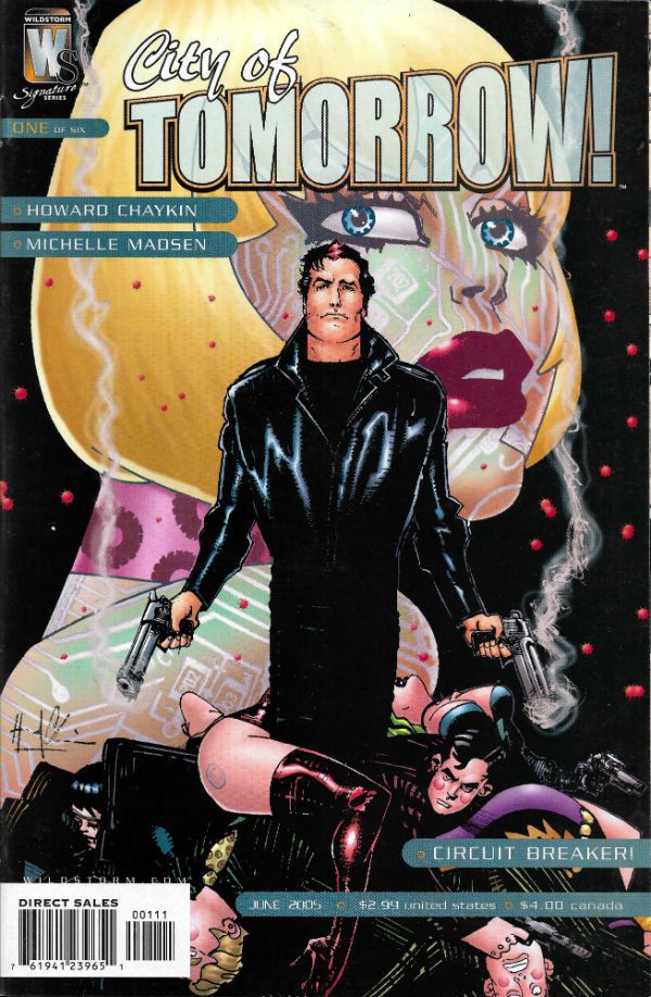
It's the 7th October 2015 and that means it's been 65 years of the chunky wee thermodynamic miracle Howard Victor Chaykin! Today is his day, so I'm going to shut my yapper and below the break you can feast your eyes on 65 images culled from The Chaykin Section in The Kane Garage Archives. Raise your root beers high and let's all drink to another 65 years of the amazing Mr. Chaykin!  photo HeaderB_zpswlcrwrik.jpg

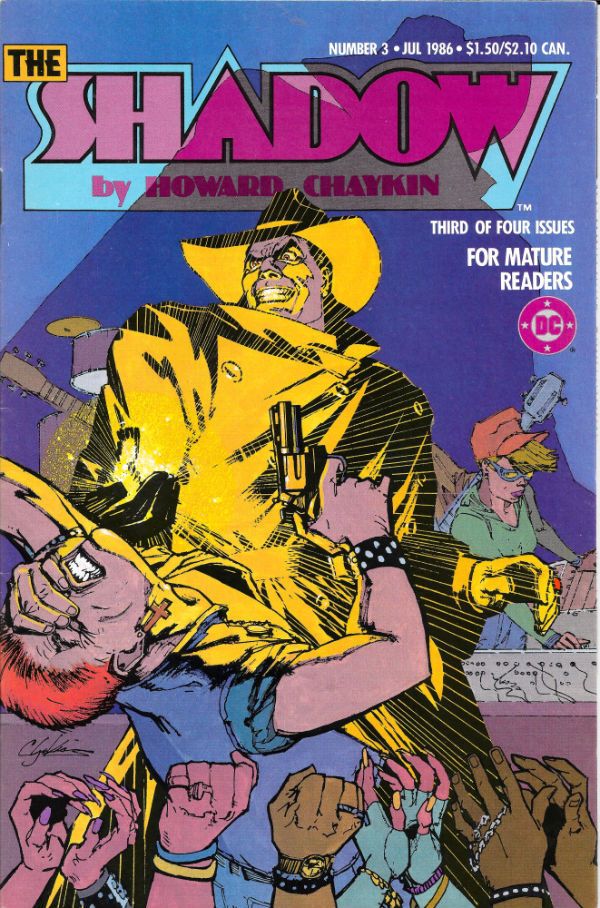
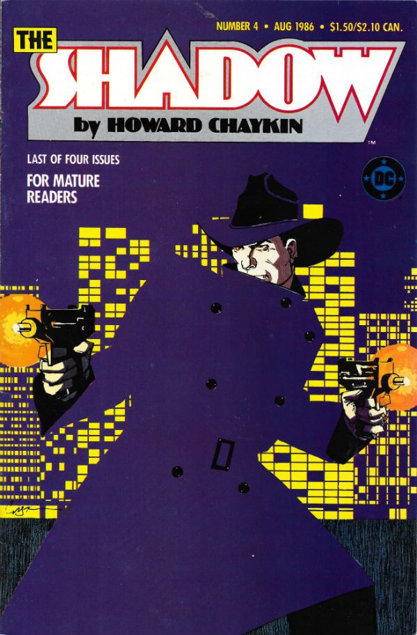
THE SHADOW by Chaykin, Bruzenak & Wald

Anyway, this...

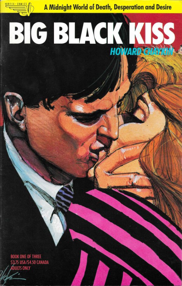
 photo BBKISS1B_zpscqcybakq.jpg

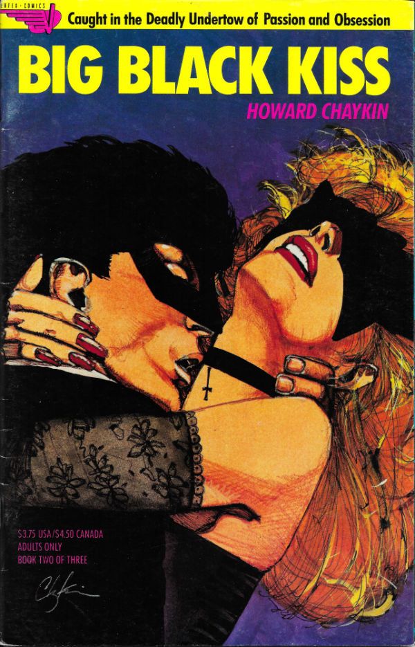
 photo BBKISS2B_zpsbx6hbkyd.jpg

 photo BBKISS3B_zpsrpsevtxg.jpg

 photo BCAT1B_zpshj3ybymm.jpg

 photo BDA1B_zpsjg697xkn.jpg

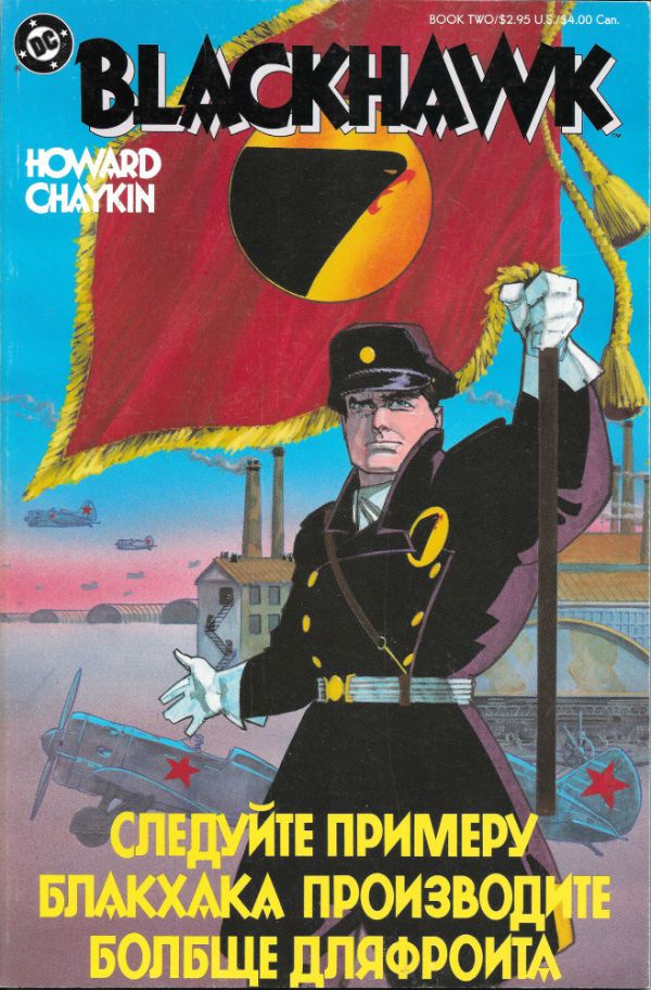
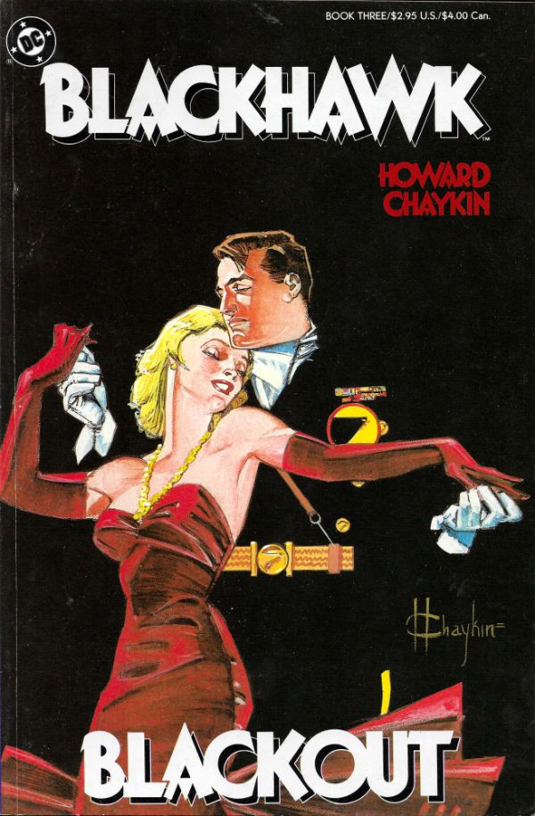
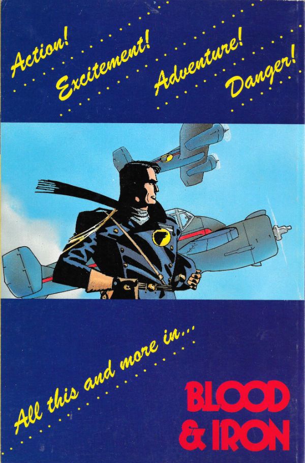
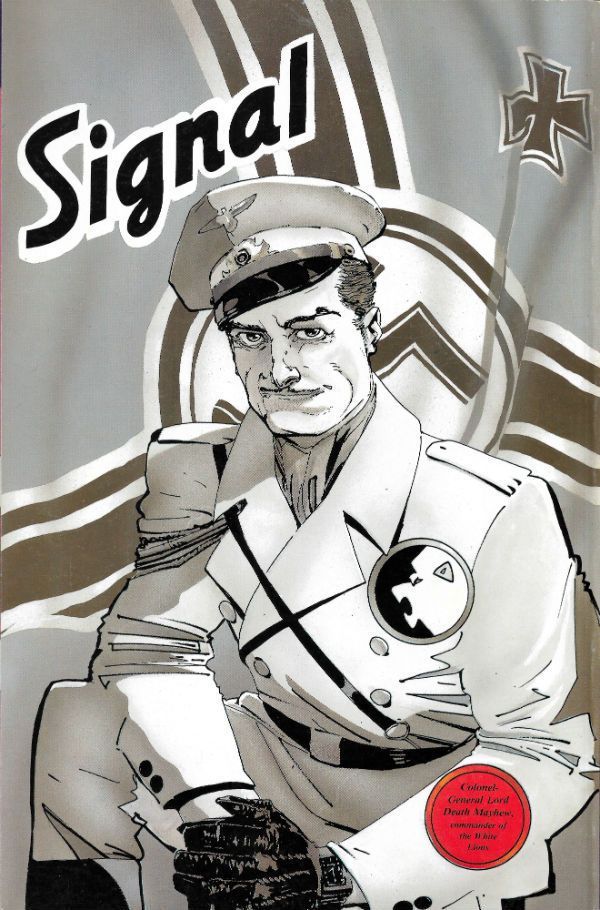
 photo BHAWK1B_zpsr4487rn3.jpg

 photo BHAWK2B_zps2ntwbeuc.jpg

 photo BHAWK3B_zpslvaerurz.jpg

 photo BHAWK4B_zpsk9qjgymk.jpg

 photo BHAWK5B_zps9a2zkarw.jpg

 photo BHAWK6B_zpsbwixzqwy.jpg

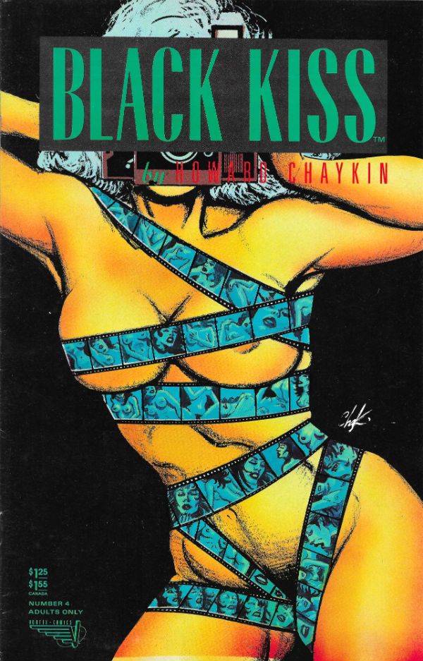
 photo BKISS1B_zpsbg26cktv.jpg

 photo BKISS2B_zpsixbybehi.jpg

 photo BKISS3B_zpswd42yorp.jpg

 photo BKISS4B_zpswyfe0lnr.jpg

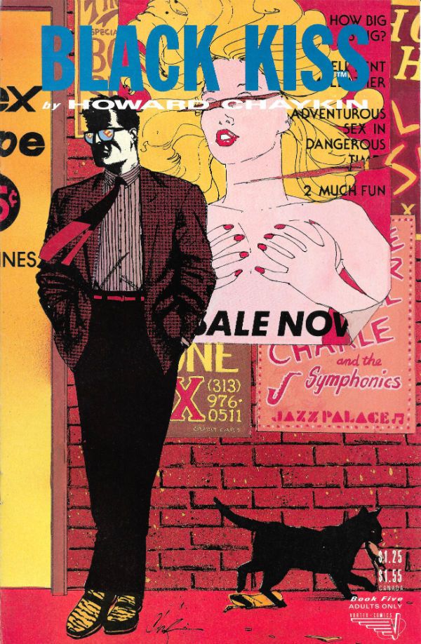
 photo BKISS5B_zpsgawdprvh.jpg

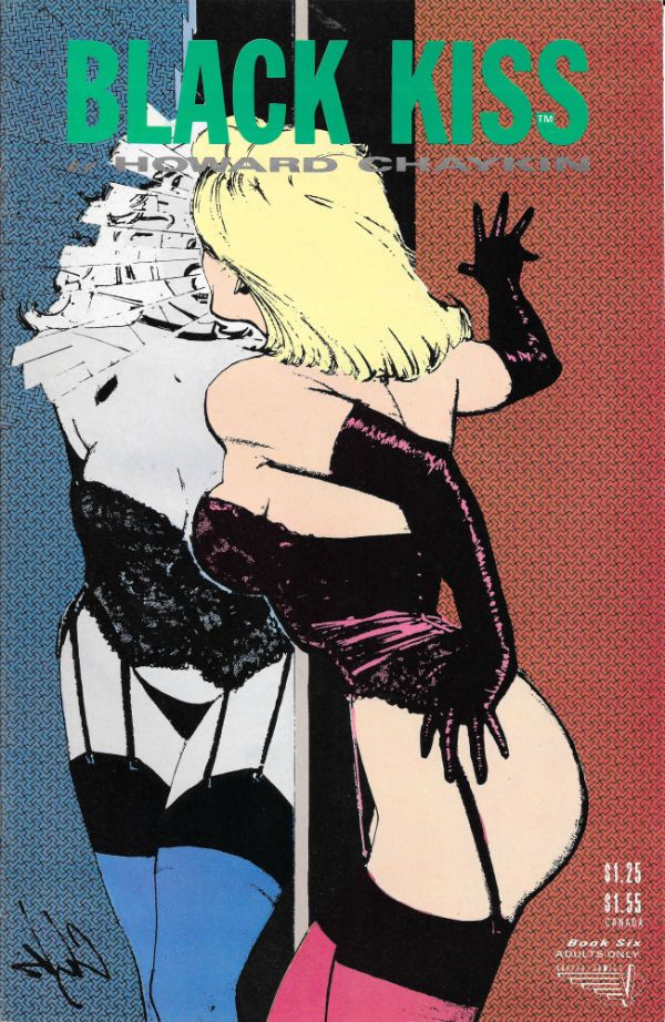
 photo BKISS6B_zpsb7omu6u0.jpg

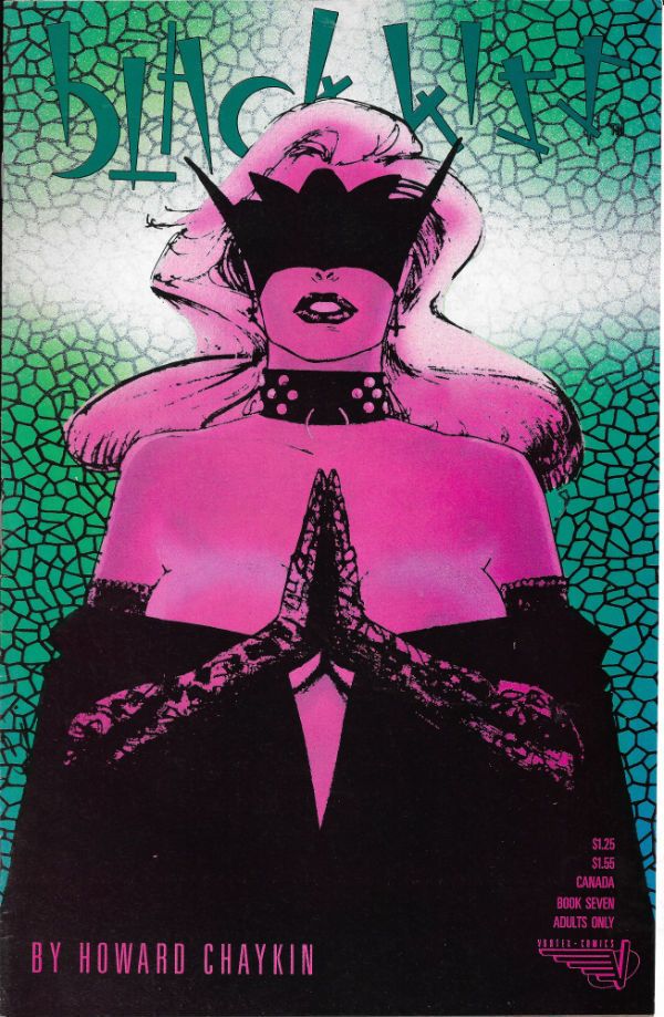
 photo BKISS7B_zps47re8s8w.jpg

 photo BKISS8B_zpsn2qnfe7e.jpg

 photo BKISS9B_zpsfdao5lzz.jpg

 photo BKISS10B_zpsjfu5iebi.jpg

 photo BKISS11B_zpsks0dj48k.jpg

 photo BKISS12B_zpsqd0wnip4.jpg

 photo BKISSH1B_zpsq46doo9k.jpg

 photo BKISSX1B_zpsowjphyl1.jpg

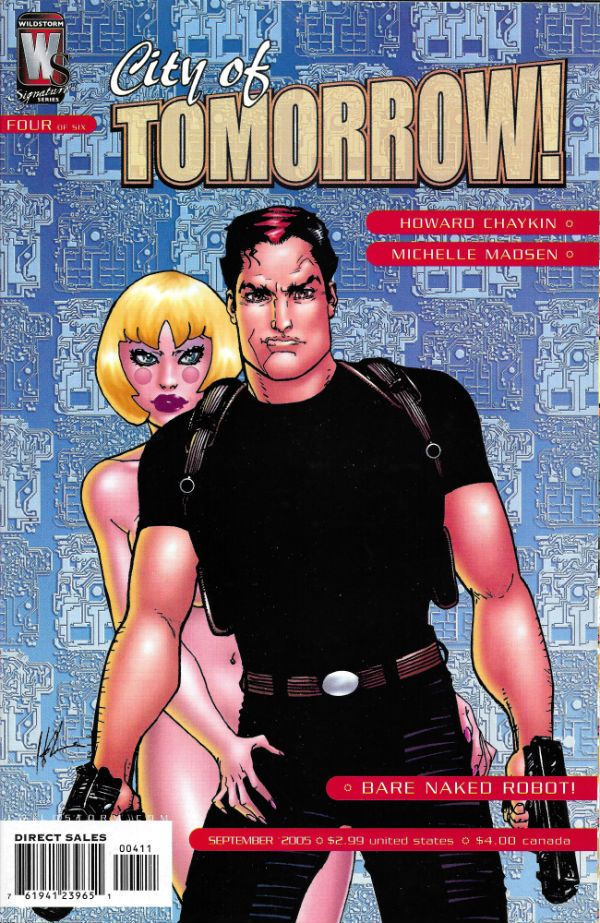
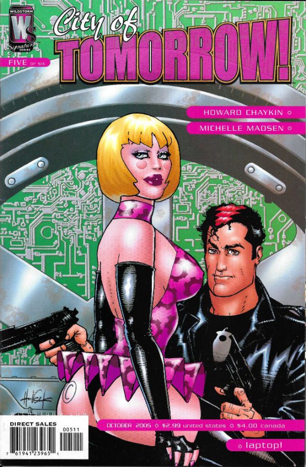
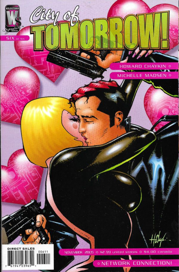
 photo CITY1B_zpsmkfccd2o.jpg

 photo CITY2B_zpsm7tiu6ot.jpg

 photo CITY3B_zps9surjwfn.jpg

 photo CITY4B_zpsvv8qmrom.jpg

 photo CITY5B_zpsmkdz07ai.jpg

 photo CITY6B_zpspo9ywqk4.jpg

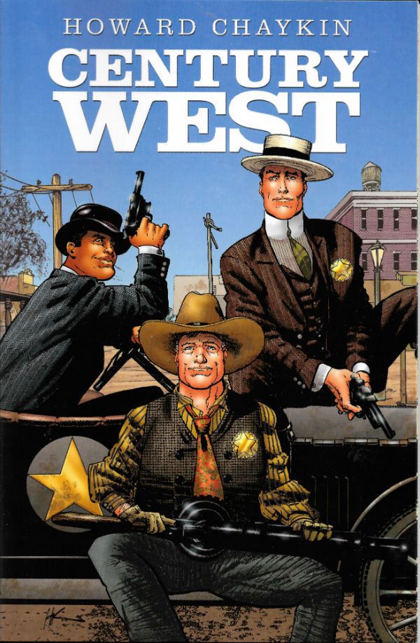
 photo CWEST1B_zpsrtl5ojfr.jpg

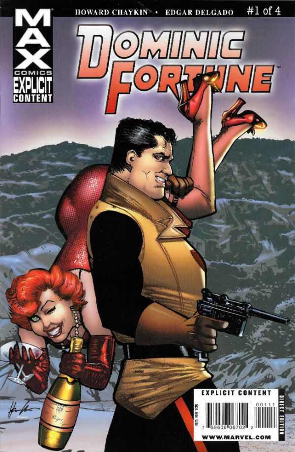
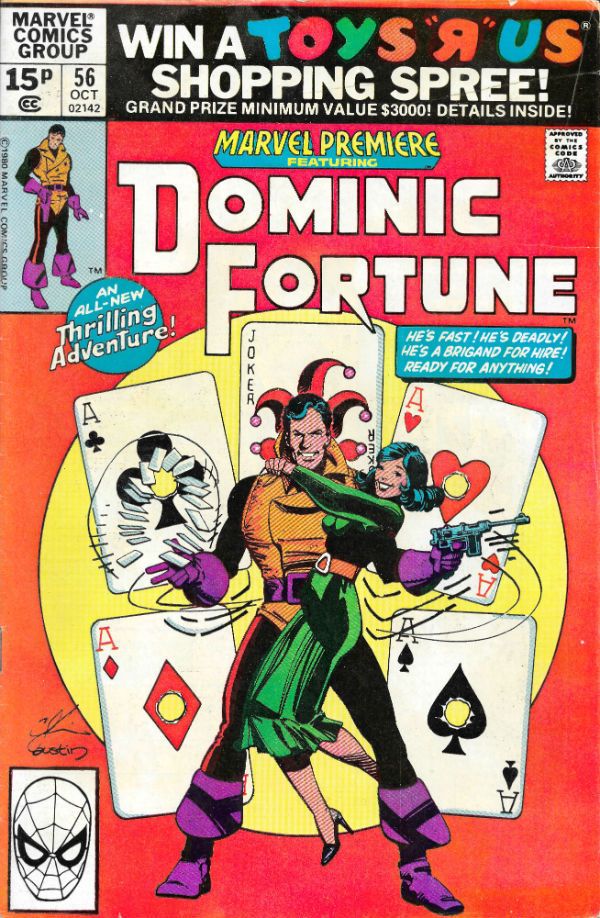
 photo DFORT1B_zpsjajk764h.jpg

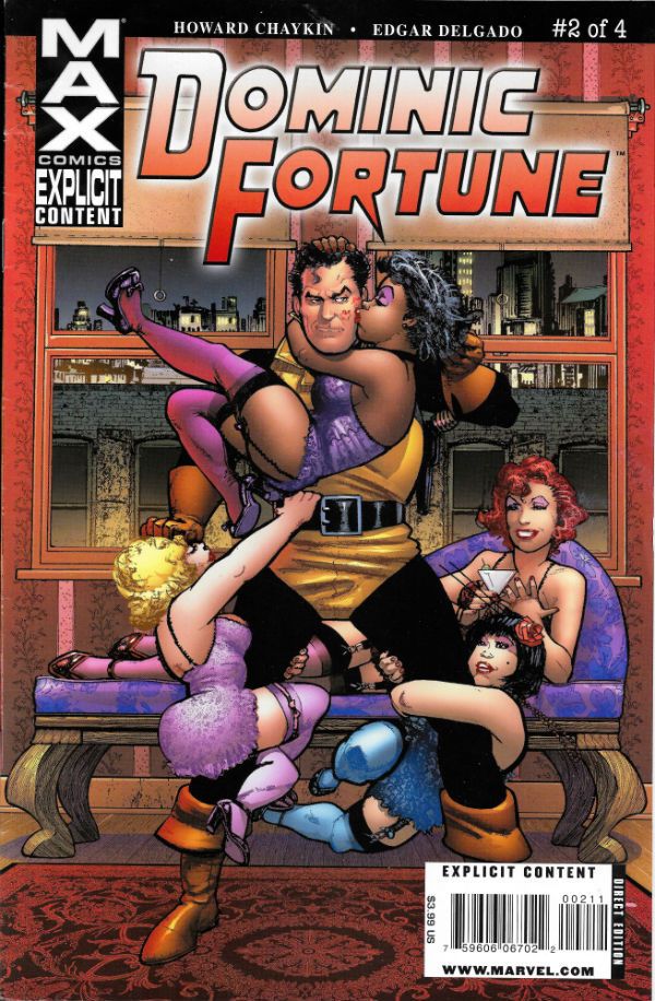
 photo DFORT2B_zps94izj2pn.jpg

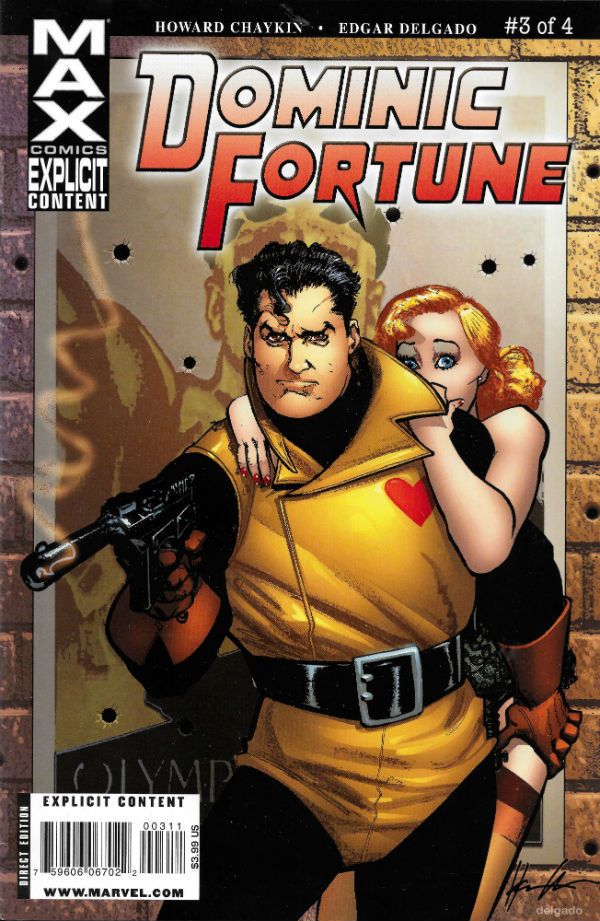
 photo DFORT3B_zpsefbkrdjp.jpg

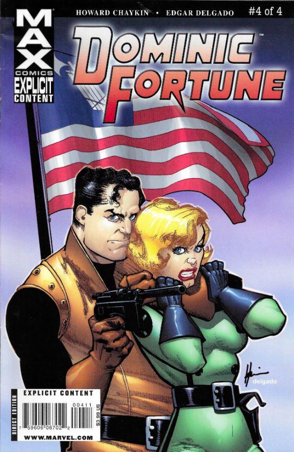
 photo DFORT4B_zps7hefoksy.jpg

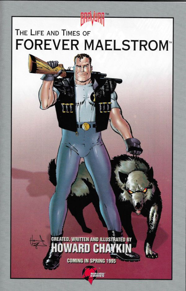
 photo FMAELS1B_zpsgmzh6rzo.jpg

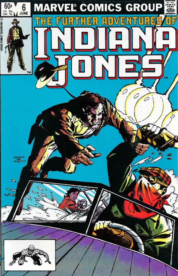
 photo INDY1B_zpsrpe6idky.jpg

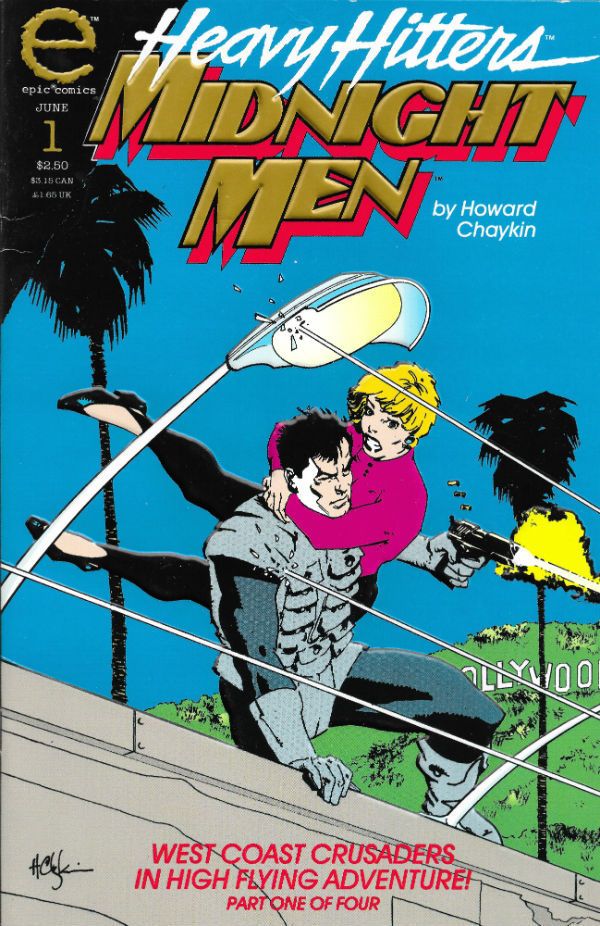
 photo MIDM1B_zpsobgnd7pt.jpg

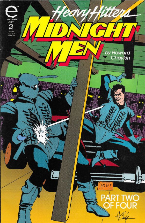
 photo MIDM2B_zpsh3pxjf2d.jpg

 photo MIDM3B_zpsyrcirgpt.jpg

 photo MIDM4B_zpsvhdgfj65.jpg

 photo MOSC1B_zpsuoxb7nua.jpg

 photo MOSC2B_zpskpwftthy.jpg

 photo MOSC3B_zps1nhfas1u.jpg

 photo MOSC4B_zpskwu3ln8f.jpg

 photo MOSC5B_zpsa4lkjeg0.jpg

 photo MOSC6B_zpsbphlehsa.jpg

 photo MPREM1B_zpsh10ank2y.jpg

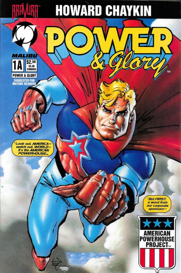
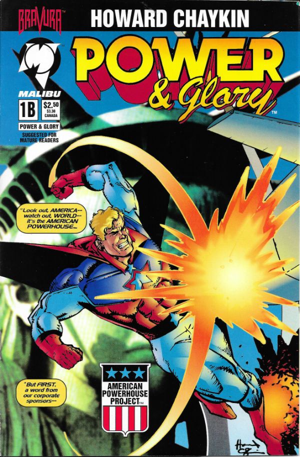
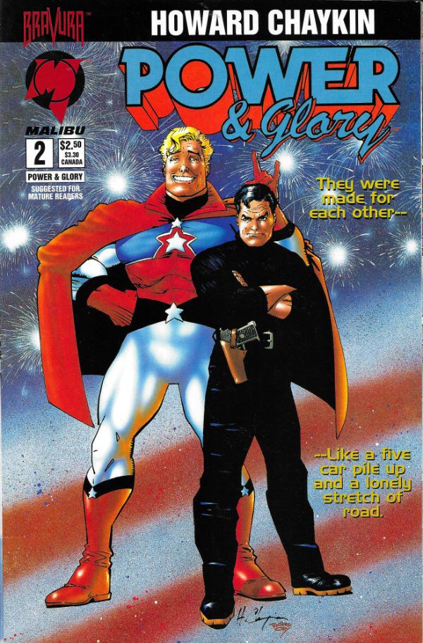
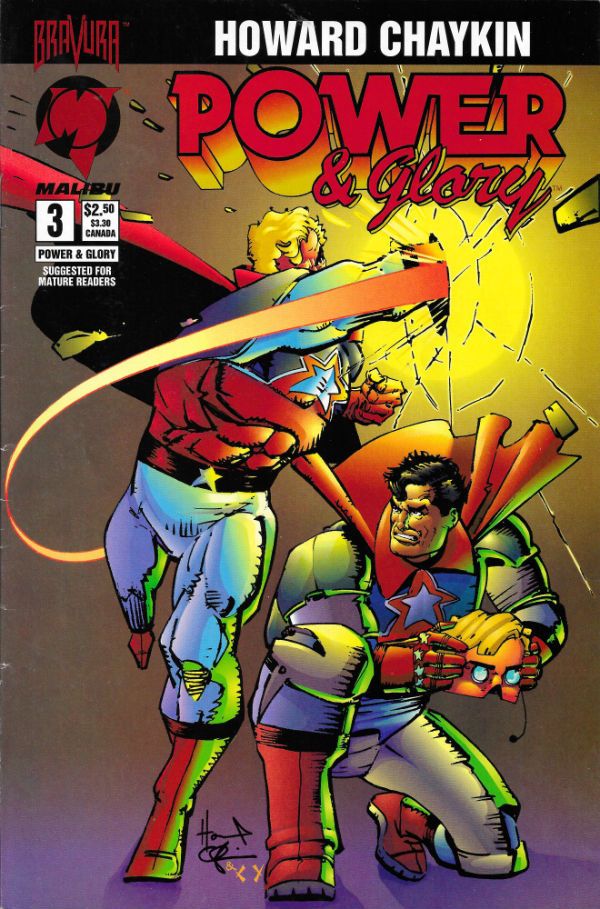
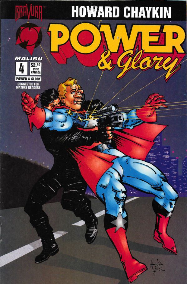
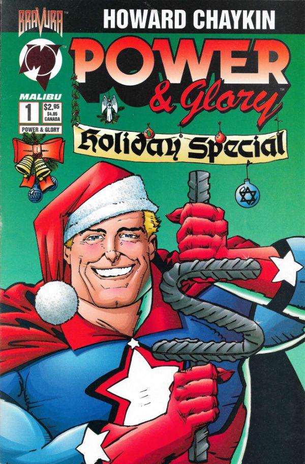
 photo PGLORYA1B_zpsle3tw7lt.jpg

 photo PGLORYB1B_zpskjlqzisx.jpg

 photo PGLORYS1B_zps27ytwlkh.jpg

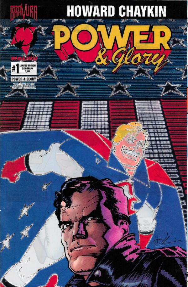
 photo PGLORY2B_zps6ra5rpby.jpg

 photo PGLORY3B_zpsre61dvlm.jpg

 photo PGLORY4B_zpsswgs4usu.jpg

 photo PGLORYX1B_zpszijwnjbw.jpg

 photo SBUCK1B_zpswi0wsvgc.jpg

 photo SCORP1B_zpsmsk1cxee.jpg

 photo SHAD1B_zpstshhzvyx.jpg

 photo SHAD2B_zpszrzln0nc.jpg

 photo SHAD3B_zpskkszmlj7.jpg

 photo SHAD4B_zpscbmpxflh.jpg

 photo SOL1B_zpsarx20xkk.jpg

 photo SREACH1B_zpsvukxd4xw.jpg

 photo SSTALK1B_zpszp9ajyca.jpg

  Happy Birthday, Mr. Chaykin and thanks for all the - COMICS!!!

"HER AG-GRES-SIVE-NESS DOES NOT/COM-PRO-MISE HER FEM-I-NIN-ITY" COMICS! Sometimes Everyone Was Robot Fighting (Those Kicks Were Fast As Lightning)!

America! How's that 4th of July Weekend thing going for you? Man, Canada just touches itself for one day but you lot take a whole weekend! Always fireworks on the4th of July as Max Cady said. Hope you all had a truly lovely time even though you are basically breaking our balls over here. No hard feelings! Here's some words about comics. Hey, Magnus, can you guess which I liked best?  photo MagGuess_zps4f47797b.jpg

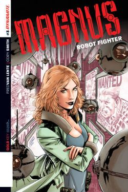
Nope. Anyway, this... MAGNUS ROBOT FIGHTER #1 thru 3 Art by Cory Smith Written by Fed Van Lente Coloured by Mauricio Wallace Lettered by Marshall Dillon Magnus Robot Fighter created by Russ Manning Dynamite, $3.99 (2014) (After a couple of weeks it's $1.99 on the Dark Horse Digital App)

 photo MagCov_zpsaa69a296.jpg

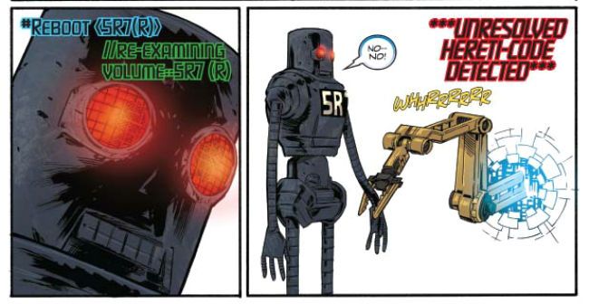
It’s the man in the skirt who lays down the hurt! It’s Magnus: Robot Fighter! Apparently this is one of a number of old Gold Key properties Dynamite are slapping on the table, applying the creative juice to and then stepping back and yelling “CLEAR!” to see if enough folk give a chuff in the 21st Century; which is where we live now, apparently. Boy, you just blink and there go two decades. Anyway, as you have guessed I only bought this because I am old and cannot cope with modern comics and ceaselessly seek succour via nostalgia.  Yeah, guess again, Pop Tarts; I don’t know anything about Gold Key properties because we never saw them in my neck of the woods. Back then depending on where you were in England you got different American comics. The seaside had the best stuff, or different stuff (and when you’re a kid the stuff you can’t normally get is the best stuff). I don’t know where the Gold Key stuff went, Sidcup perhaps. I’ve never been to Sidcup. Or me. So, yes, comics, John; in your own time now. I just bought this, um,  because at my age buying a comic sight unseen is the height of profligate recklessness. I didn’t know what I was going to get so I wasn’t expecting much, just some dude called Magnus and some robot fighting and, yea verily, I got that but I got a chunk more besides. And that’s why I went back for the next issue. And the next.

 photo MagTalk_zps795149c4.jpg

Sure, the first issue was just(!) solid; sure the first issue went exactly where you instinctively knew it would as soon as you saw the snow globe on the first page; sure younger readers would have been thinking of The Matrix and older readers would have been thinking of Philip K Dick and some would even have thought of Plato’s Cave, but they would have been dead for centuries so I don’t know what they’d be doing buying comics in the 21st Century. With the initial issue it was easy to take the writing for granted and just be bewitched by the  lovely art and colours. Yes, I actually appreciated Mauricio Wallace's colours, although they were so clearly appealing you’d have to actually exert energy to avoid appreciating them. Lovely, lovely colours all soft and alluring where needed and harsh when required but never, never settling for that uniformly gloss glare so common now.  And the art by Corey Smith is just aces (technical term). Absolutely gorgeous work which like the colours never sticks to a one note approach but varies the register of its approach as the mutable contents it depicts require. Corey Smith is playing a blinder here, and it's a shame because I bet a lot of eyes aren't pointing in this direction. Well, your eyes lose then!

 photo MagArm_zps47d7a122.jpg

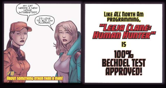
Like I rambled already there’s not a lot that leaps out and throttles you in the first issue; it sets out the premise smoothly and succinctly with a twist or two for spice, and you think the series' tone has largely been set. And you're...wrong, in an entirely pleasing way. Because bewilderingly, but not unpleasantly so, the second issue decides to be a buddy comedy with a particularly pointed kick at the slightly ethnic sidekick trope to boot. Magnus picks up a robo-sidekick who's personality is an explicitly terrible example of the movie comedic sidekick who is also a Gentleman of Colour, as my late Grandma said. (This is different to a Colourful Gentleman who would be a man who likes other men in a romantic way.) In the third issue the team up the ante so hard your uncle slaps her right there at the family dinner table and  you can hear a pin drop. This was my favourite of the three issues since it just draws a big old clown face on all those pandertastic comics featuring damaged ladies who become strong and which believe women are only of interest if they are kick boxing lumps of scar tissue with nice hair who have sexytimes on their own terms. Yes, some ladies like that and that’s great but, c’mon, the real appeal is to the boys. When I show my own Prisoner of Misogyny these Ladyspy and Sad Killer comics the first thing she asks even before her eyes stop rolling is, “Is she damaged? Oh please, let her be damaged!”  And the answer is yes, the answer is always: yes she’s damaged.  With all the change-ups and change-overs in just three issues if I were a high-faluting type I'd maybe say the comic was a bit meta, a bit post modern, but I don't think anyone uses those words with enough rigour for them to mean much these days, so let's say Magnus: Robot Fighter is playful and leave it at that. Sure, there is a downside to all this creative flexibility and that comes in the form of a lack of focus and a kind of failure to define Magnus himself. I don’t really know what Magnus is after, he just sort of wanders about fighting robots and looking pensive. But there's time yet and I'd rather applaud the display of creative facility than prate about a lack of character depth in a man who fights robots.

 photo MagTest_zps519125f3.jpg

I liked this, I liked every issue and with each issue I liked it more. For a few pennies I found a satisfyingly weird and beautifully illustrated comic which, yes, seems to be less about robot fighting than Lazy Comic Trope Fighting. And, perhaps, clichés are more dangerous to Comics than robots. Perhaps Magnus has a point after all. C'mon! Magnus: Cliché Fighter! How can that not be GOOD!

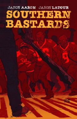
SOUTHERN BASTARDS #1 and 2 Art by Jason Latour Written by Jason Aaron Colour by Jason Latour Lettered by Jared K Fletcher Southern Bastards created Aaron & Latour Image $3.50 (2014)

 photo SouthBCov_zps15fdcf1b.jpg

I thought this book was beautiful, let's get that out there before things go South. Latour's subdued sepia palette of largely orange and khaki with the odd pop of a more violent hue is just a real deep fried delight. And then that's laid softly over some truly solid gnarliness giving everything a real sense of weight and wear and tear, and the whole thing hovers a gnat's pube from caricature. But the thing itself? I mean, shit, I guess what we have her is...a failure to communicate. Because I didn't cotton none to this at all. I mean, Jesus, really? That’s what we’ve got now? East Bound And Down played straight. Hell, look at you out there; chances are you think you’re special but no matter how special you reckon you are you ain’t Southern Special because that’s a whole ‘nother level of Special right there,  “boy”. Golly, The South sure is special! I’ve never been anywhere near close to The South and all the moth eaten tropes on these pages are as familiar to me as the back of my Dad’s hand (ow! Yes, there are Daddy Issues in this comic). This comic is The South as Theme Park. The South as Postcard Punk. If that's the The Southern Truth then that's plain Southern Sad.

 photo SouthBDog_zps57d4f525.jpg

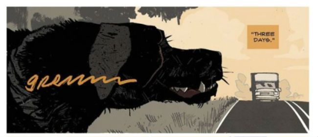
Slightly after the ostentatiously provocative title (Oooh! A doity woid!) the book opens with a double page splash of a dog slipping a turd out which I guess is supposed to shock or something. The South! A place so hard that dogs poop in public! Look, The South, I don’t want to deflate your ballsy balloon but If you look out my front window ten minutes after Eastenders finishes you’ll see a middle aged man with grey hair walk his dog out onto the bit of land out front of my window. And regular as clockwork a big old turd slides out of that beast’s ass and, no, standing with your back to your dog while it does its business doesn’t convince me you don’t know what’s going on, Mr. Man From Round The Corner. So, illegal dog drops ain’t just a Southern thang, I assure you. Interestingly there’s also a tree on that patch of regularly befouled grass but I don’t think it’s growing out of anyone’s ass like the one in this book. (His Daddy's ass! Yes, there are Daddy issues by the pound here) A crueller man than I might say there’s a case to be made that his book is growing out of somebody’s ass.

 photo SouthBGame_zps00c282fd.jpg

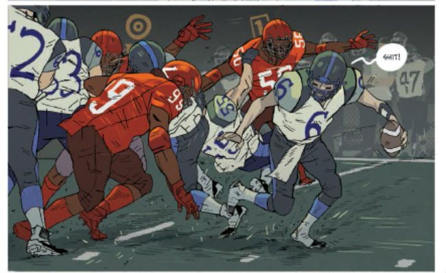
Oh, technically it’s fine, I guess, if fine means very much a screenplay first and a comic script second which these days is very much what fine means. It’s very televisual. It just sort of lollops about like an ex-pro with a bum knee trying to get to the likker store before it shuts. And you know that while on the screen none of these scenes would outstay their welcome (not so much because of the scintillating script but because Southern actors are always entertaining in the flesh) but on the page they can verge on the interminable. The centrepiece of issue two is a Football game, sorry, an American Football game (why is it called American Football when they barely ever touch the ball with their feet? American Carryball more like it) and it just flounders about like everyone should just naturally give a shit rather than actually making anyone give a shit. Sure, there's Craft here in the writing but there's Art in the colours and, uh, art. It's an uneven mix.

It’s a pretty sorry state of affairs all round if you're reaching for the Mythic and finding a battered VHS of Walking Tall in your mitt. This book is just a clueless monument to swaggering self pity of a particularly male stripe. And I've seen it before and I've read it before and the only reason I'm reading it this time is because of Jason Latour. If it wasn't for Jason Latour this would just be that Trace Adkins Luke McBain comic all over again and no would give one rich shit. Sorry and all, but I don't buy for one hot second that The South is stuck in 1974 like a dino in a tar pit. No, I don't know The South from a hole in the ground but I do credit it with more than that. More than just another comic about men behaving badly but feeling bad about it so boo hoo them. Beat me with a hosepipe if I'm wrong but I think, maybe, to show The South Today I reckon this book need a bit less Walking Tall and a bit more Looking Harder. Basically, if it wasn't for Jason Latour this comic would be two levels down from GOOD! Harsh words maybe, but they can take it; they're Southern Tough!

And remember: Any man playing grab ass or fightin' in the building spends the night reading - COMICS!!!

“Sometimes I Ride A Horse Too.” COMICS! Sometimes I’m not Bored, I’m Actually Quite Entertained. But Thanks for Asking, Klytus!

Oh hey, I wrote about some comics. Wonders never cease do they?  photo MingB_zpscf08c7e6.jpgBy Laming, Parker, Boyd & Bowland

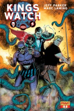
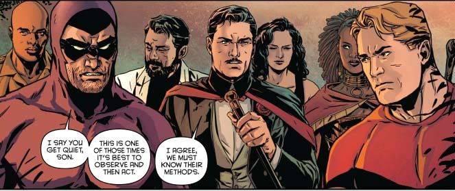
Anyway, this… KINGS WATCH #1 to #5 Art by Marc Laming Written by Jeff Parker Coloured by Jordan Boyd Lettered by Simon Bowland Dynamite Comics (2014) $1.99 each on Dark Horse Digital, $3.99 each on Paper Flash Gordon created by Alex Raymond The Phantom created by Lee Falk Mandrake The Magician created by Lee Falk

 photo KWCoverB_zps8f0e8f44.jpg By Laming, Boyd, Bowland

Kings Watch (or King’s Watch as it inside the comic) is a five issue attempt by Dynamite to blow the dust off several Kings (no apostrophe) Features characters for the largely bemused perusal of a 21st Century audience. I say largely bemused because while thanks to the joyously tatty energy of the 1980 movie everyone still remembers Flash Gordon his fellow Features have fared less well in the public imagination. Once again neglecting to check with everyone everywhere I feel fairly safe in saying that The Phantom movie of 1996 is not as fondly regarded as Flash’s outing despite the dolorous presence of Patrick McGoohan and the haunting sight of Billy Zane running around the jungle like a muscular grape. As for Mandrake the Magician and the movies I’m afraid even I haven’t a clue, darlings. Comics wise it appears The Phantom has been less dormant than I thought having recently appeared in series published by both Moonstone and Dynamite, and Flash has had a recent series with Alex Ross covers and a readership confined to one nice man in Ottawa. The only movement on the Mandrake front seems to be a newspaper strip collection due to appear before our very eyes shortly. It’s all a bit messy really isn’t it? So, I guess Kings Watch is intended to both streamline and refine these properties with an eye to maximising their potential across a range of multimedia platforms going forward. Or, you know, whatever people in ironic glasses say in rooms with white boards while sipping overpriced coffee bought in from a quaint little bodega down the street. The rest of us should just be concerned with whether these old characters are in are good comics.

 photo KWMercilessB_zps9a0080ab.jpgBy Laming, Parker, Boyd & Bowland

And they are good comics and what helps is that (some of) the characters have had a bit of a remodel for The Now they are intended to inhabit. Flash Gordon and chums require very little refurb with Parker simply, but effectively, updating Flash as a thrill seeking but focus deprived athlete par excellence; Dale remains female and the strange choice is made not to make her a regretful super assassin (“She Could Kill Any Man Alive! But She Could Never Kill The Sadness Inside!”) but rather a level headed, resourceful and strikingly unflappable human being (FFS! Who can relate to that? At least give her guns in her eyes or something!), and Zarkov as the comedy nutter gets most of the laughs via the drunken arrogance which colours his genius so vividly. Having read none of his recent outings I don’t really know how much tinkering Parker had to do but here The Phantom is a mass of scar tissue and arthritic inflammation poured into a bright purple body suit topped off by a domino mask and a zebra patterned truss. He could be a tiresome violent old man type but Parker gives him a nice line in dead pan humour which lightens him up a bit. The character Parker seems to do least to is the one who would seem to require the most tinkering to avoid obsolescence; Mandrake The Magician. Parker doesn’t reinvent him as an “edgy” young street magician or a clapped out old Vegas showman with a tragic past but instead, and remarkably, seems to leave him pretty much untouched. Yes, in King’s Watch Mandrake the Magician remains a magician from back when magicians dressed like the Kaiser was coming to dinner and it wasn’t just serial killers who sawed ladies in half. All this tickling’n’tinkering was just dandy by me because the appealing goofiness of the characters remained; it just wasn’t front and centre like it used to be, that’s all.

 photo KWObserveB_zps47a6fc1b.jpgBy Laming, Parker, Boyd & Bowland

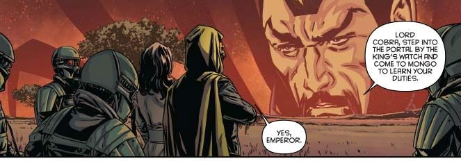
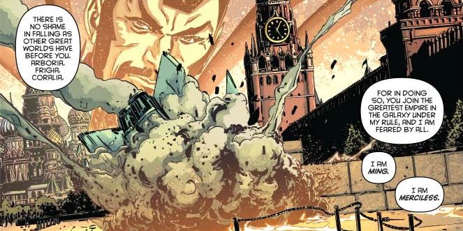
The actual series these characters inhabit may be somewhat stately paced but each issue does contain, in varying but satisfying proportions, an action set piece or two, some engaging character work, a sure sense of progression and, just past the mid-way point, some rather unfortunate developments surprising in both their sweep and suddenness. Let’s just say London’s in it and if London’s in your American genre comic you know that things have probably gone shit side up. The good guys are on the back foot because, unusually for a bad guy, Ming actually has a pretty good plan. He’s quiet droll as well, Ming is, which I liked. Not as much as I liked the fact he wasn’t coloured bright yellow because these properties? Probably a bit of racist baggage, yeah. But Kings Watch deals well with this throughout and the ending subtly recasts things in the direction of greater inclusivity so anyone worrying about all those racist bits from the past of these strips can relax. Unless those were the bits you like, I mean UKIP supporters read comics too; besides The Daily Mail, I mean. Me, I was particularly taken with the bit near the end when everyone realises what they have to do to stop things getting worse and the attendant cost it will inflict on them. I liked this bit not because I love to wallow in other people’s misery (although I do) but because refreshingly there’s no weeping and wailing, there’s no pages of E*M*O*T*I*O*N*S like it’s the backmatter of an Image book, no, they just go and do it because, heroes. Remember those? Well this comic does. Damn straight. With the modern tendency for comics to actually avoid an ending it’s worth noting when one as good as the one here appears.

 photo KWMercilessB_zps9a0080ab.jpgBy Laming, Parker, Boyd & Bowland

Those still awake will note I’ve treated the series as a big lump rather than individually teasing out the art, the writing, the colouring and the lettering. That’s just because I didn’t have time (like Graeme & Jeff I am involved in a Secret Project; mine is Not Getting Sacked, it’s an on-going thing) and also because the fact that the end product was so enjoyable should be testament to the work of all involved. Kings Watch is solid stuff with everyone pulling their weight but no one single contributor showboating and overshadowing the others. Thankfully then there’s no real reason for me to drone on for several hundred grammatically suspect words about Parker’s steady pacing, entertaining characters, or even to single out his unobtrusive humour which seems to occur naturally from the premise, strengthening rather than undermining the drama; nor need I flail desperately about trying to explain why although I still find Laming’s art a little on the stiff side he has come on great guns since I last saw his work on American Century, and that while his art may be more efficient than astounding efficiency is nothing to cock a snook at. Apparently though I do have time to say I thought there could have been a bit more of a stylistic differentiation between the discrete elements of Mongo and Earth to ensure their interaction carried a bit more visual fizz. Hey, I even noticed the colours because some of the FX and palettes really popped on a screen and I say screen because, yes, I continue to force my face into The Future. And because I read Kings Watch in Digital the choice to present most of this series in largely widescreen panels punctuated by the odd splash page for impact worked a treat. Guided View worked fine for most of it and then a bit of manual intervention on the splashes. (Make your own jokes up on that one, knock yourself out. My treat.) Remarkably, old as I am I managed to navigate the thing without soiling myself and crying. Of course I could really do with some advice about how to get images off my tablet and into Photobucket. (I was kind of getting a bit desperate for googled images by the end of this but I think I got away with it.)That would be almost as GOOD! as Kings Watch was.

 photo KWgoogle_zps82303c53.jpg

Now dispatch War Rocket Ajax and bring me some – COMICS!!!

"This is Worser Than Washin' An Elephink!" COMICS! Sometimes It's Like I'm Shouting This At You While I Run Past!

Borag Thung, Earthlets! I have been quiet of late but I rested easy in the knowledge that the delightful Messrs Khosla, McMillan, Lester and Hibbs had been satisfying all your comicy needs to the highest of standards as ever. Not that I was resting you understand. So, practically writing this one as I move towards the door...Anyway, this...  photo DHPLaphamB_zps0a5669a1.jpg David Lapham from The Strain in DARK HORSE PRESENTS  #28

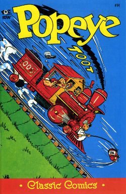
POPEYE:CLASSICS #14 Written and drawn by Bud Sagendorf IDW/Yoe Books, $3.99 (2013) Popeye created by E.C. Segar

Some issues of POPEYE: CLASSICS are available from the Savage Critics Store (which you have all quite patently forgotten about. Sniff!) HERE.

 photo PopeyeCovB_zpsc97449dd.jpg

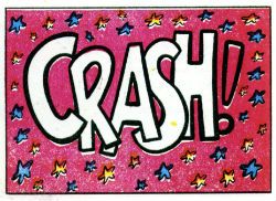
Month in month out the nautically attired freak faced grammar mangler continues to pleasantly baffle me with the weirdly logical escalation of the ludicrous incidents which comprise his preposterous adventures. Since Popeye, for all his charms, is in fact a fictional construct I’m going to place the credit for this consistently entertaining package at the door of Bud Sagendorf, a real life man (now deceased) who went done drew and writed it all. Fans of the magic old men do can marvel at Sagendorf’s use of long shot silhouettes to prevent a total nervous breakdown from having to repeatedly draw a train in what are quite small panels indeed. As a special bonus Sagendorf serves up some right nice visual gaggery, the best of which are the parts where sound FX have a physical effect on the drawn environment they inhabit. Basically they hit people on the chin is what I’m saying there.

 photo PopeyeCrashB_zps5874c470.jpg Bud Sagendorf from POPEYE CLASSICS #14

In this issue the main tale involves Popeye buying a railroad, Olive Oyl’s demanding customer, an attempted hijack and a visual stereotype of a re..native American (altho’ in the world of Popeye this might actually be a vacationing accountant in racially insensitive fancy dress). Then there’s a story where Popeye buys the world’s cheapest and laziest race horse, another story where Popeye and Olive simultaneously seek to teach Sweetpea a lesson and demonstrate their poor parenting skills by scaring the shit out of the wee tyke in an abandoned mine, and a short with Wimpy being out foxed by a cow (“a lady of the meadow”), there’s a text story as well but I skipped that. Bud Sagendorf wasn’t writing for the &*^%ing omnibus is what I’m getting at here. Popeye is printed on weirdly bloated pages, haphazardly coloured and always, always a welcome arrival in my field of vision so I’m going to say it’s VERY GOOD!

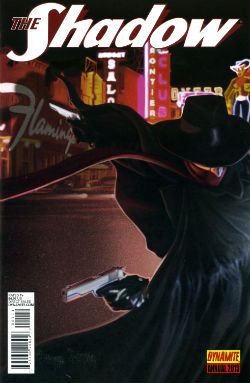
THE SHADOW ANNUAL 2013 Art by Bilquis Evely Written by Andre Parks Coloured by Daniela Miwa The Shadow created by Walter B. Gibson Dynamite, $4.99 (2013)

 photo ShadCovB_zps5952fe00.jpg

Man, I’m not exactly Sammy Stable at the best of times (“No shit, John!”) but the temporal shenanigans in this thing almost gave me a panic attack. It’s five minutes ago! Now it’s three hours later! No, hang on, it’s five years earlier. No, it’s been seven hours and fifteen days. And nothing compares. Nothing compares. To yaaaooooooooowwwww. Clearly the comparison being begged here is that this comic is like Brief Encounter but starring two psychopaths and set in Vegas before Elvis conquered it.

 photo ShadTimeB_zps5522896f.jpg

Bilquis Evely from THE SHADOW ANNUAL 2013

Even more clearly it’s not like that at all but instead is very much like having to find your train in a busy station where all the clocks show the wrong time, people keep getting stabbed and shot and you’ve found yourself in the company of some boring jabberjaw who won’t shut up about his first love. Shadow, dude, move on. This is unseemly in a man of your standing. Fucking chin up, old son. As for the art, well, it’s okay, it’s alright, but there’s a tendency for noses to look like the owner has a heavy cold. That’s Sean Murphy’s influence (influenza!) in action there. So, a nice idea, not terribly well executed at a price point I want to hit with a stick makes this EH!

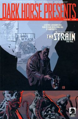
DARK HORSE PRESENTS #28 Art by David Lapham, Neal Adams, Richard Corben, Steve Lieber, Patrick Alexander, Ron Randall, Menton3, Michael T. Gilbert, Aaron Conley and Geoff Darrow Written/plotted by David Lapham, Edgar Allan Poe, Richard Corben, Neal Adams, Caitlin R. Kiernan, Ron Randall, Steve Niles, Michael T. Gilbert, Janet Gilbert and Damon Gentry Coloured by Lee Loughridge, Moose Baumann, Rachelle Rosenberg, Jeremy Colwell, Michael T. Gilbert, Sloane Leong Lettered by Clem Robbins, Nate Piekos of Blambot, Ken Bruzenak, Steve Lieber and Damon Gentry

 photo DHPCovB_zps02ecf8a5.jpg

Dark Horse Presents is an anthology so, you know, it’s a bit all over the shop. Mostly though it keeps its footing on the shiny tiles and rarely sends the display of stacked tins (Pork and beans! For the poor!) spinning madly about. First up, David Lapham reminds me how good he is at comics with his The Strain chapter. Even though I have no particular interest in this property and there's a bit of cultural shorthand verging on the cliched Lapham quietly did the business on every page to ensure that the final panel came as a punch to the guts and I actually wanted to read what happened next. Later in the ish Lapham resurfaces with the conclusion to his introductory Juice Squeezers tale which, with its teen focused Cronenbergyness, proves to be the kind of nuts that comics would benefit from more of and yet truculently resists embracing.

 photo DHPMonsterB_zps01cc1c30.jpg

Michael T. Gilbert, Janet Gilbert and Ken Bruzenak from Mr. Monster Geoff Darrow’s spot illustrations continue to amaze with the visual conviction with which they deliver scenes at once grotesque, impossible and droll. In a similar fashion to the comics Darrow produces elsewhere, comics which chafe some SavCrits so (but, strangley, not this eminently chafeable one), Sabretooth Swordsman with its surprising Savage Pencil influences is an optically delirious but narratively slight piece.

 photo DHPTigerB_zpsba5c3891.jpg Aaron Conley, Damon Gentry and Sloane Leong from Sabertooth Swordsman

Richard Corben chucks out another Poe adaptation which is notable primarily for the truly scintillating colour work executed therein. I am absolutely horrible at appreciating the colour in comics but even here, even I, had to stop and marvel at more than one point. Ken “The Chameleon” Bruzenak is here in several different stories and in each case serves up lettering apposite to the pieces in question; in the very traditional Trekker his work is attractive but modest while in Mr. Monster he provides an ostentatious display of madcap fonts.

 photo DHPCorbB_zps6e657e2e.jpg

Richard Corben and Nate Piekos from Edgar Allan Poe's The Assignation

As a whole Mr Monster, additionally armed as it is with Michael T Gilbert’s invigoratingly loose art, continues to cock a scruffy snook at seriousness; which I like. Mrs. Plopsworht's Kitchen by Patrick Alexander succeeds in making physical and emotional abuse funny which is an interesting type of victory. Oh, and there’s some other stuff here; Steve Niles producing his trademark pound shop horror; Alabaster continuing to not be anything I want while not actually being terrible and Blood by Neal Adams continuing to be Blood by Neal Adams. Overall though I had a good time so DHP was GOOD!

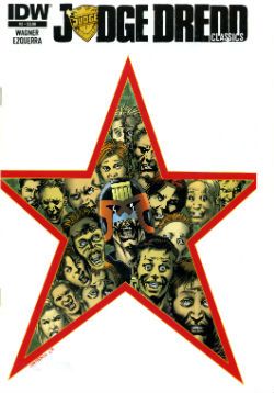
JUDGE DREDD CLASSICS#3 Art by Carlos Ezquerra Written by John Wagner & Alan Grant (as T.B. Grover) Coloured by Tom Mullin Lettered by Steve Potter Judge Dredd created by John Wagner & Carlos Ezquerra IDW, $3.99 (2013)

 photo JDCCovB_zps5bc7dd9e.jpg

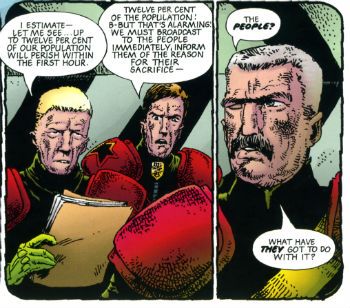
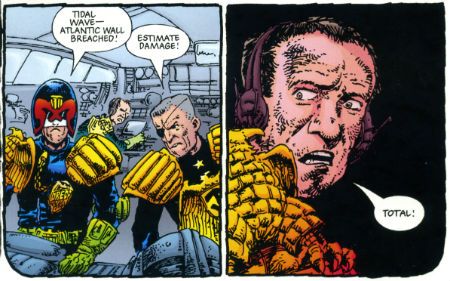
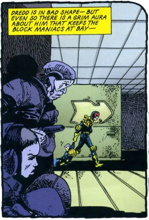
Look, before I start acting like a pissy arse let’s get this one thing straight: these are great comics. I know this because it isn’t the first time I’ve bought them and it certainly isn’t the last time I’ll read them. When I first read them they blew my school socks off (not a kink; I was at school). The Apocalypse War was where Carlos Ezquerra returned to the character he (co) created after an absence occasioned by unfortunate editorial decisions. Carlos Ezquerra was back and Carlos Ezquerra meant it. Carlos Ezquerra drew the cremola out of The Apocalypse War even as The Apocalypse War blew the world of Dredd to grud and back. Because The Apocalypse War was where Wagner & Grant (AKA T.B. Grover) took all the pages of world building that had gone before them and applied a match. After The Apocalypse War the world of Dredd would never be the same again. Really. In The Apocalypse War Dredd made a decision no man should ever have to make, a decision only a man who was not a man could make, and the following decades of the strip have shown the consequences and ramifications of that decision fashion Judge Joseph Dredd into a man at last. With The Apocalypse War Wagner & Grant’s breathlessly hi-octane narrative pace in tandem with Ezquerra’s consistently brutal style created an epic that looked like the end of everything but was instead the birth of the strip’s future. These are great comics.

 photo JDCPeepsB_zps79926a17.jpg Ezauerra, Wagner, Grant, Potter and Mullin from The Apocalypse War

Alas, when I talk about greatness I’m talking purely about the pages of comics in here. The actual physical pamphlet comic is a bit lacking. You know, these are great comics. Do I repeat myself? I repeat myself. Great comics, so how’s about a bit of care and attention; a bit of respect. That’ll have to remain purely theoretical because, oh, he’s off now…The cover’s a bit lacking for starters; look, I’m all about negative space and clear, crisp design but that looks a bit, well, I don’t think it achieved its aim. Imagine if they’d rejigged an original 2000AD cover featuring The Apocalypse War. Trust me when I say the new cover would be a poor second. Then, oh dear, the inside front cover seems to think this story is called Block Mania but it isn’t; Block Mania finished last issue. This story in this issue, (which is all reprints and cost $3.99) is called The Apocalypse War which is why I’ve called it that through all the preceding verbiage. Then between each chapter there’s a perfunctory full page graphic. Grud on a Greenie! I realise the space has to be filled due to the page counts of each episode but could you not have had a bit of fun, IDW? Got a bit creative? Maybe stuck the original covers on there instead, or blown up a portion of a panel pop art style like on those DC Kirby/Ditko/etc Omnibooks? You’ll notice, IDW, that I’m not even daring to suggest you commission some, choke, original content. I mean I realise reprinting decades old comics and charging $3.99 a pop might not allow for such largesse. Sarcasm there.

 photo JDCTotalB_zps142c6b28.jpg Ezauerra, Wagner, Grant, Potter and Mullin from The Apocalypse War

Then there’s that weird waste of space at the bottom of the page. Again, I appreciate you don’t want to mess with the size ratios but, drokk it all, that’s some token stuff there, IDW. And there's a page out of sequence. A page out of sequence in a comic of reprints selling for $3.99! However, I am okay with the colouring. Obviously, I’d rather they hadn’t bothered because the art was drawn for B&W (except for the opening spreads) but I understand Americans are fond of their colours. There they are America: enjoy your Colonial colours! Moan, moan, moan except this is all basic stuff. I'm hardly asking for Cher to sing live in my living room here just some vague pass at professionalism, if you please.

 photo JDCShapeB_zps97a70a9e.jpg Ezauerra, Wagner, Grant, Potter and Mullin from The Apocalypse War

So, a confounding miscalculation on the part of IDW here; this material is readily available in a number of other formats and has been for decades so making a new iteration stand out from the crowd would, I’d think, be imperative. Making your books expensive and ill-designed is certainly a novel approach. Luckily, these are great comics so even though the crime is Fail the sentence is GOOD!

Anyway, I'm off now. With any luck I'll bump into some COMICS!!!!

"Do They Still READ In The Future?" COMICS! Sometimes It's Great To Be Rude!

It was Half-Term last week hence the silence. Yes, the blessed silence. But now your God has failed you and I am back! It has been quietly suggested that I put on hold my tribute to Charlie Drake and maybe look at some comics this time. So, no actors who were dead before you grew your big teeth this time out. Just comics! Just lovely, lovely comics! But were they lovely? Hmmmmm? Anyway, this...  photo DHP_Pop001_B_zps333a52d6.jpg NEXUS by Steve Rude & Mike Baron
ALL STAR WESTERN #20 Art by Moritat (Jonah Hex) and Staz Johnson (Stormwatch) Written by Justin Gray & Jimmy Palmiotti Coloured by Mike Atiyeh (Jonah Hex) & Rob Schwager (Stormwatch) Lettered by Rob Leigh Jonah Hex created by Tony DeZuniga & John Albano Stormwatch created by Brandon Choi & Jim Lee DC Comics, $3.99
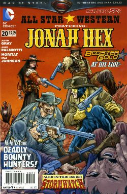
 photo All_SWCov001_B_zps3260d931.jpg

I kind of liked this issue. I don’t know whether the worms have finally reached my brain, or what but twenty issues in and this one almost clicked. I’m not exactly the most demanding Jonah fan either, I just enjoy the scar faced twat in a hat going around kicking up dust and making life brutal, difficult and short for folks. I prefer it to be a straight western but it isn't a deal breaker.
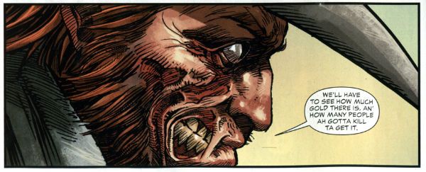
 photo All_SWPanel001_B_zps37540f12.jpg Jonah Hex by Moritat, Gray & Palmiotti

No, I don’t mind Booster Gold turning up for no reason that is ever going to be explained (hey, that’s just how comic books roll these days). I’m just pleased the book has a bit of a spring back in its step. Maybe it’s the beneficial effect of getting Jonah out of the city and into the countryside? Like when you ferry troubled youths by coach out into the boondocks to stroke goats. Moritat’s art seems a bit more lively and engaged although that might be due to the brighter and more varied colour palette in use. Watch these backgrounds though, I’m not a native of the Americas but I’m pretty sure mesas aren't mobile. Like I say I don’t expect much really and this delivered that making it OKAY!

RED TEAM #2 Art by Craig Cermak Written by Garth Ennis Coloured by Adriano Lucas Lettered by Rob Steen Cover by Howard Victor Chaykin Red Team created by Craig Cermak & Garth Ennis(?) Dynamite, $3.99
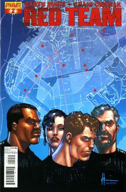
 photo Red_TCov001_B_zps4bf0c366.jpg

More like RED MEAT amiright, soft lads? Here Comics’ Firmest Handshake Garth Ennis turns his surly attention to a tale of cops taking the law into their own hands. I’m sure that will work out really well for everyone involved. At the minute it isn't working out too well for me. I guess my LCS sent this as Howard Victor Chaykin is doing the covers and I like Comics’ Deepest Voice Garth Ennis’ war comics. So, okay, fair enough. I’m not turned off by the concept either. I’m always up for that old story which ends with a bunch of people dead or drenched in blood while sirens scream closer and those who aren't corpses suddenly realise why there are rules.
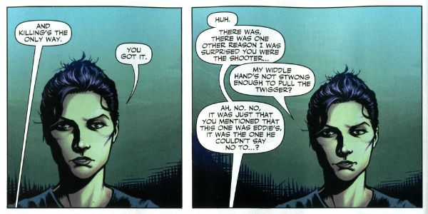
 photo Red_TPanel001_B_zps37f466f0.jpg Red Team by Cermak & Ennis

Maybe it won’t go that way, after all Comics’ Hottest Curry Garth Ennis spends enough time (i.e. too much time) explaining how his characters can smoke in a government building that it must surely (surely!) pay off later in an example of Chekov’s Fags! Maybe everything will go swimmingly but the racially and sexually mixed cast will succumb to a series of smoking related diseases. Maybe not. But hopefully the series will avoid plummeting into maudlin sentimentality like a sloppy drunk slurring on about The Old Country as the barkeep dials for a taxi. Not an uncommon occurrence in work by Comics’ Softest Hearted Big Man Garth Ennis. This thing seems written for the screen (no, the page and the screen are not interchangeable) and the art just isn't up to the job of hiding this. It gives me no pleasure to say that. In fact I’ll leave it there except to express the hope that you really like that panel I picked because you’ll be seeing a lot of it on these pages. RED TEAM is not a complete wash though and that’s due mostly to the dialogue of Comics’ Hairiest Chest Garth Ennis. It’s good dialogue and it means RED TEAM is OKAY! That probably still won’t save me from a beating though.

THE SHADOW #13 Art by Giovanni Timpano Written by Chris Roberson Coloured by Fabricio Guerra Lettered by Rob Steen The Shadow created by Walter B. Gibson Dynamite, $3.99
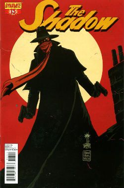
 photo Shad_Cov001_B_zps0806f9d9.jpg

Everything in this book is so familiar that the sight of your face in the shaving mirror delivers more surprises. This issue is impressive only in its devout refusal to bring anything new or interesting to bear on the join the dots plot with its transparent mystery, its space wasting reluctance to provide more than one speech bubble in a panel and…oh...look, there’s a three page sequence of a drunk man going home, going upstairs, pouring a drink and being surprised. No. That’s not comics, that’s just horseshit. I’m not even going to scan a picture of the contents as the fewer people who see this then the less damage done to those involved. Honestly, I’m doing them a solid here. Or a salad as they say in Nyawk. So, no offence to any of the people involved here as we all have bills to pay but this was AWFUL!

WONDER WOMAN: #20 Art by Goran Sudzuka & Cliff chiang Written by Brian Azzarello Coloured by Matthew Wilson Lettered by Jared K. Fletcher Wonder Woman created by William Moulton Marston and H. G. Peter DC Comics, $2.99
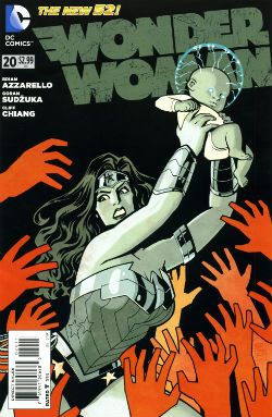
 photo WWom_Cov001_B_zps8c89c4c0.jpg

This is an atypically action packed issue but all too typically when the dust settles the forward plot motion is infinitesimal if not entirely illusory. With its large cast, stateliest of paces, squandered artistic talent and elevation of chat at the expense of incident it’s hard not to see WW as Azzarello’s attempt to bottle a bit of that drab Bendis magic. Luckily, despite his heroic efforts, Azzarello appears incapable of attaining such low levels of blandery. For starters his characters don’t sound like they are recovering from traumatic blows to the head; trading only in recursive whirlpools of bland doggerel. And every now and again something does happen. So, it’s an improvement but it’s still very far from being good. It still rarely rises above word play on a par with puzzles in the magazines old people in hospital spontaneously secrete in-between visiting times. Also, I think his cast have a problem with the booze. Although as the middle class assure us, if it’s wine it isn't alcoholism.
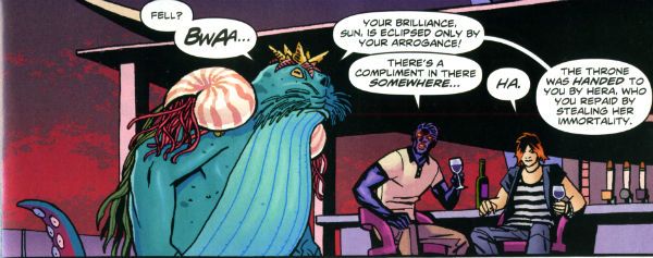
 photo WWom_Panel002_B_zps13522682.jpg

Wonder Woman by Chiang, Sudzuka & Azzarello

At some point in any given issue the chattering cast will mingle about some tasteful locale sipping drinks and hoovering up nibbles. Thankfully the medium of comics spares the reader the no doubt inevitable soundtrack of Toploader Orion snuck on to smooth things along. The whole thing is like one of those hellish networking soirees for people who do a bit of wee when they think about Powerpoint presentations. Except everybody is cosplaying Sandman and the evening ends abruptly when a big blue catfish in a crown stabs Simon from Accounts in the face. And puns! This issue’s highlight was when War asked, “Where’s my drink? You said you’d get me a Belgian White Beer!” and Wonder Woman replies “I beg your pardon, I never promised you a Hoegaarden!” Face it, Tiger; this book’s so far gone you’re not even sure if that happened. So it’s a fact that the crisp clarity of Goran Sudzuka and Cliff Chiang's art which brings this up to OKAY!

CREEPY #12 Art by Richard Corben, Richard P. Clark, Peter Bagge, Matthew Allison, Julian Totino Tedesco and Steve Ditko Written by Richard Corben, Ron Marz, Dan Braun, Peter Bagge, Matthew Allison, John Arcudi and Archie Goodwin Lettered by Nate Piekos of Blambot and Peter Bagge Dark Horse Comics, $4.99
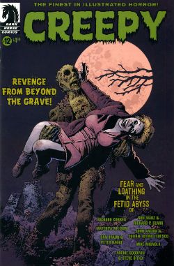
 photo Creepy_Cov001_B_zpsed87d4c8.jpg

There's the usal raggy grab bag of one pagers and spot illos but storywise we have:

Uncle Mangus by Richard Corben

Corben’s on first and Corben’s on form with a frivolous shamble of a shaggy corpse story. Corbenites won’t be disappointed as the shadows drape at strange angles across distorted faces, the undergrowth looks like gathia sticks from Bombay Mix, the borders are jagged when nerves become ragged and the horrific punchline is drawn with slapstick mixed with the ink. Yes, Richard Corben continues to defy Time itself and belligerently refuses to budge from VERY GOOD!
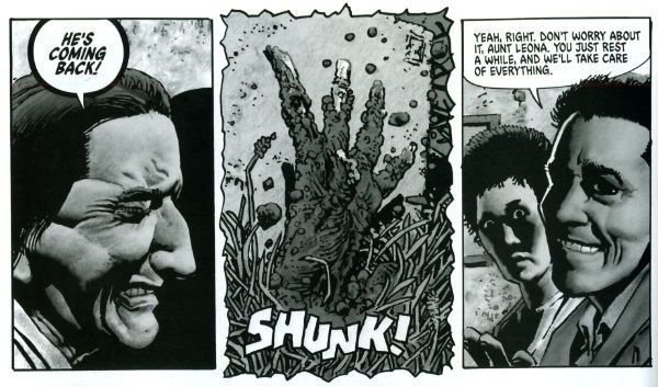
 photo Creepy_Corb001_B_zpsfe235ff8.jpg

Uncle Mangus by Corben

Fishing by Ron Marz & Richard P. Clark Not entirely rote retelling of one of the usual variations on kids go fishing fear fables. Sorry, but EH!

Local Talent by Matthew Allison Allison's tale nicely conveys the grotty zest of late '70s foreign filmed schlock but would have conveyed it better in less space. Also, I know this charmingly cack cinematic genre was limited by budget but it's not a limitation shared by comic art, so c'mon let's have some backgrounds, son. Good enough for an OKAY!
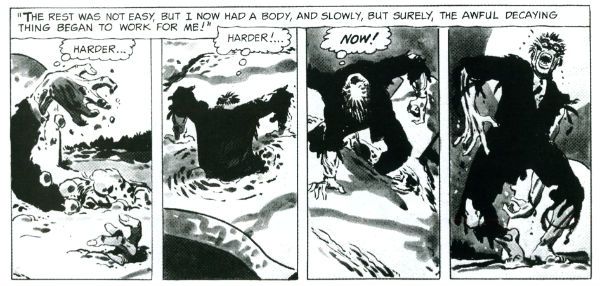
 photo Creepy_Ditko001_B_zps2a622c1e.jpg

The Spirit of The Thing by Ditko & Goodwin The Spirit of The Thing by Steve Ditko & Archie Goodwin

It’s Steve Ditko! "He is Dee Aye Tee Kay OH! He is Dee Aye Tee Kay OH! He’s Dee- delightful! Aye – Innovative! Tee- Totally not open to compromise on any point of principle upon which he has formulated an Objectivist stance! Kay – Kind of kooky! OH!- oooOOOOOOOOOOOOOOooooooooo! He is Dee Aye Tee Kay OH!" In this reprint Archie Goodwin does his usual solid scripting but it’s Ditko’s groovy grey wash German Expressionism that makes this one retain its VERY GOOD! kick lo these many decades after its original printing. It’s also a nice reminder that aficionados of Sturdy Steve should be salivating after the Creepy Presents…Steve Ditko volume that will be dropping imminently. Pre order from your LCS now, they'll appreciate it!
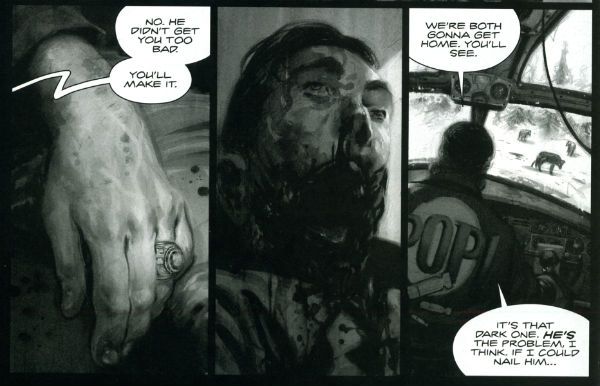
 photo Creepy_Panel001_B_zps17d66933.jpg Pack Leader by Tedesco & Arcudi

Pack Leader by Julian Totino Tedesco & John Arcudi While Ditko and Corben get to VERY GOOD! on the merits of their art alone Arcudi and Tedesco’s tale reaches the same grade due to the success of their collaboration. This one really gels and even wrong-footed me at the last. That's nice. Arcudi and Tedesco knew what they were after and they went and got it. Nice work, fellas!

DARK HORSE PRESENTS #24 Dark Horse Comics, $7.99
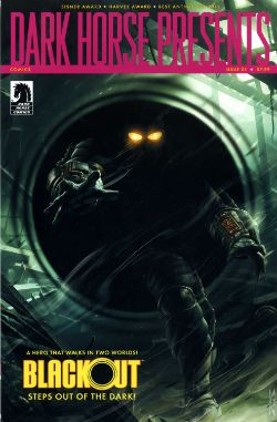
 photo DHP_Cov001_B_zpsdd591b27.jpg

BLACKOUT CHAPTER 1 Story and lettering by Frank Barbiere Art by Micah Kaneshiro Blackout created by Mike Richardson (?)

This one didn't grab me I’m afraid. With its slickly appealing tech sourced graphics and plot predicated on the promise of explanations further down the line it read like the tie-in to some video game I've never heard of. It’s only a few pages though so maybe it’ll pick up and improve from EH!

ALABASTER: BOXCAR TALES CHAPTER 6 Art and lettering by Steve Lieber Story by Caitlin R. Kiernan Coloured by Rachelle Rosenberg Alabaster created by Caitlin R Kiernan

My total indifference to this one is purely a case of it not being my cup of tea rather than any failure on the part of the creative team. I did read it but I couldn't tell you anything about it except it’s in space and usually it isn't. There are some talking animals and a lady, usually with a very broad accent, having magical adventures. Oh, she’s called Dancy Flammarion. Yeah, that’s me gone. I'm no Garth Ennis but fey’s not my thing, I fear. Disregarding my witless bias this is bound to be OKAY! Because Steve Lieber can sure draw nice and Caitlin R Kiernan writes proper books (she should not be confused with Caitlin Moran who doesn't). The most interesting thing was how disproportionately irritated I was by the bit where the team tell us what they were listening to when they created the strip. It was really distracting. I mean was Kiernan really listening to the Sunshine OST? Why? Was it just because it’s the soundtrack to a movie set in space? That’s a stunningly literal approach isn't it? What did she do when it was finished? Start again? Stop writing?

Like a real asshole I find it all a bit disingenuous when creators share stuff like this with us. No one ever says they were listening to Phil Collins or Cher do they? Ever. Yeah, right. Have you seen some of the people who make comics? Seriously. I mean that guy who always does that stupid thing in photos with his face so it looks like a wet thumb sliding down a window is a Foreigner fan and no mistake. Look into your heart, you know it is true. Anyway, this stuff's just the thin end of the wedge, next thing you know they're telling you about their substance abuse problems, how many kids they have or whether they get to put the fairy on top of the Christmas tree. Being an unfeeling automaton it’s just not something I need to know about creators. I mean, does it do any of you any good to know I wrote this while listening to SWANS’ Time is Money (Bastard)? Oh, alright it was Cher. "Do you belieeeeeeeeve!?!"
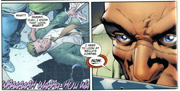
 photo DHP_BHound001_B_zpsf720926a.jpg

Bloodhound by Jolley, Kirk & Riggs BLOODHOUND: PLAIN SIGHT CHAPTER 2 Art by Leonard Kirk & Robin Riggs Written by Dan Jolley Coloured by Moose Baumann Lettered by Rob Leigh Bloodhound created by Dan Jolley & Drew Johnson

This is a revival of a defunct DC property which has now been given back to the creators to do with as they will. I believe DC also returned the less than successful Monolith property to its creators recently too. This is really rather sporting of DC and we should probably acknowledge that before reminding ourselves of their treatment of Alan Moore. It appears that the lesson here is that if you create anything successful for DC they will line up and bang you like a shit house door. Meanwhile the creators of Bloodhound have decided to put it in DHP. I liked this series when it first appeared and I still like it despite the pony tail our hero sports. He’s kind of like a government sanctioned Punisher with all his marbles and a beer belly who targets super villains. This is just a short three parter so the mystery tends to be cleared up by the characters approaching each suspect, the suspect immediately breaking down and pointing to the next suspect and then the villain breaking cover to provide a thrilling cliff hanger. Brevity isn’t doing it any favours is what I’m saying. But I still find the premise promising, the characters solid and the art pleasant enough for it to be OKAY!

BRAIN BOY CHAPTER 2 Art by Freddie Williams II Written by Fred Van Lente Coloured by Ego ("The Living Colourist"?) Lettered by Nate Piekos of Blambot Brain Boy created by Gil Kane & herb Castle

Although it’s not explicitly stated I guess this is an update of Herb Castle and Gil Kane’s 1962 creation for the faster paced and more luridly violent Now. Since Dark Horse published a pricey hardback of these (old and very probably nuts) tales you’d think they might want to draw attention to this. Weird. Anyway, the update is definitely fast and bloody and it’s not without its charms. Chief amongst these are Van Lente’s witty revisionism best exemplified by the call centre riff and the ‘magic cereal' which fools no one. Artwise Williams II has obviously thought long and hard and come to some definite conclusions about how to draw our hero’s nose. I can’t speak with any surety as to the conclusions he’s reached but there’s definitely something going on with Brain Boy’s hooter. Oh, it all bounces along in a lively if not altogether logical fashion, which makes it GOOD!
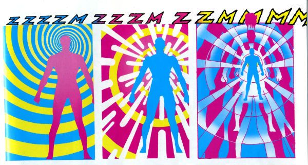
 photo DHP_Nexus001_B_zpsda643d33.jpg Nexus by Rude & Baron

TREKKER: THE TRAIN TO AVALON BAY CHAPTER 1 Story and art by Ron Randall Coloured by Jeremy Colwell Lettered by Ken Bruzenak Trekker created by Ron Randall

It's super-nice that an old lag like Randall has his own creator owned property. It's less agreeable to report I found the whole future bounty hunting lady with sad past thing a tad too generic for my fussy palate. I am certain there is an audience for this but I adamant I am not amongst their number. I wish Randall well in all his travels but this, for me, was EH!

KING'S ROAD: THE LONG WAY HOME CHAPTER 2 Art by Phil Winslade Written by Peter Hogan Lettering by Steve Dutro

Oooh! It's a high concept! What if the kids from a book very similar to (but. lawyers take note, not the same as) The Lion, The Witch & The Wardrobe grew up and had kids who didn't know about their adventures and then The Evil Returned and the kids had to take up arms on behalf of their paunchy and totes dull 'dults?!? This. That's what. No doubt Hogan will be exploring the Christian symbols underlying his borrowings with the same rigour and aplomb as his source. Or at least get a movie deal. Just joking! This is a promising (if not a little cheeky) premise and it's made all the more attractive thanks to Winslade's endearingly gangly characters. Although these do inhabit a blurry world of boisterous blooms of colour, the intensity of which suggest Mr. Winslade should pop down the opticians pretty sharpish or at least dial his PC settings down a bit. Maybe I'm getting soft in my dotage but this was OKAY!

CRIME DOES NOT PAY: CITY OF ROSES CHAPTER 5 Art by Patric Reynolds Written by Phil Stanford Colours by Bill Farmer Lettering by Nate Piekos of Blambot Crime Does Not Pay: City of RosesCity Of Roses created by Patric Reynolds & Phil Stanford

This is EH! due to the perfunctory writing and the weirdly flaky looking art. It isn't terrible but it isn't terribly exciting either. Everybody thinks crime comics are easy and nearly everyone is wrong. Everyone except David Lapham. Christ, I miss STRAY BULLETS. Why can't Dark Horse Presents find room for new David Lapham genius? WHYYYYYYYYYYYYYYYYYY???? WAAAAAAAAAAAAAAAAAHHHHHH!!!!

NEXUS: INTO THE PAST CHAPTER 2 Art by Steve Rude Written by Mike Baron Lettered by Steve Rude Coloured by Glenn Whitmore Nexus created by Steve Rude & Mike Baron

Eventually every open ended continuing narrative strip gets to Jack the Ripper, it's likely that they get to Sherlock Holmes too, but only Nexus would throw in H.G. Wells without overbalancing, without even wobbling in fact. It's Nexus so it's VERY GOOD! In fact I'll tell you this: I'd never read Nexus until it appeared in DHP but once it did I ordered Vol.1 of the Omnibooks pretty darn lickety split. I would imagine there is no higher praise a comic creator can receive than a sale. We'll be coming back to Nexus at some point. Aw, yeah!

HUNTER QUAID: ARMAGEDDON OUT OF HERE Art by Melissa Curtin Written by Donny Cates & Eliot Rahal Coloured by Lauren Affe Lettered by Lauren Affe Hunter Quaid created by Donny Cates & eliot Rahal

I couldn’t get a grip on this one. It’s like something an artist would do to showcase their style but it has a writer, no, two writers? And they are the creators but it's the art that is the stand out feature? I don’t know. I don't get that. It looks nice but, hey, that’s all you need sometimes. It was OKAY! but only because of the artist.
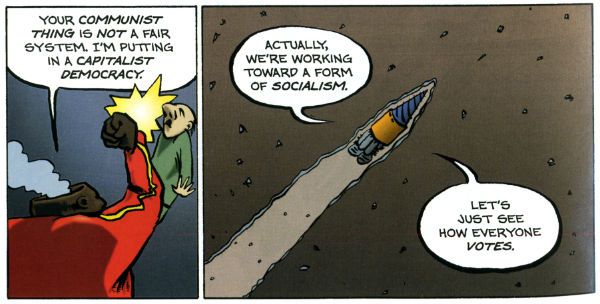
 photo DHP_Wheeler001_B_zpsb74cb0f6.jpg Villain House by Wheeler

VILLAIN HOUSE CHAPTER 4 By Shannon "Papa" Wheeler

It’s a kind of testament to the durability and depth of the concepts at the heart of Jack Kirby and Stan Lee’s Fantastic Four that half a century later it still provides fertile soil for trees of mirth like this. As mirth trees go this is a sturdy beech indeed. This is some funny stuff right here from the surly insistence of 'Not The Thing' that everything bad is Communist to the laser targeted title of “Invisible Wife” and beyond. The laughs aren't empty either, there’s a sympathetic villain whose world is ruined by a bunch of powered berks getting all up in his business to hilariously disastrous, but not unmoving, effect. I’d hazard a guess this strip is somewhat more refreshing and engaging than yet another modernisation of an old Kirby & Lee classic. ( “Yo, Yo, Yo! Ben Grimm is Totes Sad, Bro! (Ch-Ch-Ch-check out Mi Tumb-LAH!!!)”) Wheelers’ treat of a tummy tickler may not beat the ultimate yukkifier of Don Simpson’ s Yarn Man and “Golly! That crazy gizmo really works!” but it comes closer than most in a very small space. And that’s VERY GOOD!

Christ, I think I sprained something back there. And now I know why people don't review anthologies. I still don't understand why they don't buy em. They're stilll - COMICS!!!
"Rodeo Ain't Over Yet!" COMICS! Sometimes I Don't Have A Title!

Hello! Here are some words about some comics. The sales figures analysis is just below this. Very good it is too! To clarify, the Hibbs' stuff is good, not this stuff. Anyway, this... Photobucket

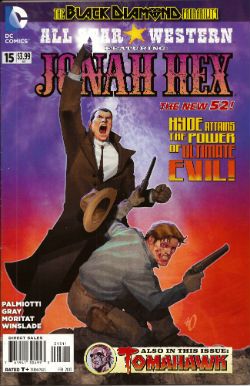
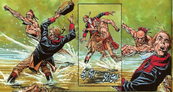
ALL STAR WESTERN#16 Jonah Hex: Art by Moritat, written by Justin Gray and Jimmy Palmiotti, coloured by Mike Atiyeh and lettered by Rob Leigh. Tomahawk!: Art and colour by Phil Winslade, written by Justin Gray and Jimmy Palmiotti and lettered by Rob Leigh. DC Comics, $3.99 (2012) Jonah Hex created by Tony DeZuniga and John Albano Tomahawk created by Edmund Good and Joe Samachson

Photobucket

I finally realised that it isn't the sticklebricking of DC Continuity and the basic desperate casting about for stunt elements that are hamstringing my enjoyment of this book. No, it's the joylessness of it. Its total and wholehearted acceptance of the current DC mode of storytelling which puts a premium on prevarication and encourages emptiness. Look, this book would be great if Bob Haney was writing it. Bob Haney isn't writing it though so it isn't great. If I'm hankering after Bob Haney in 2013 it's a fair guess your book isn't up to snuff. On the up side this issue doesn't contain the dismayingly frequent page filling device of having that Oriental lass fighting for five pages. In fact she doesn't appear once which means that any entertainment can be rightly said to be just like the cast - purely occidental. You want better jokes, make better comics.

Photobucket

In the Tomahawk back up the most startling aspect as ever is Phil Winslade's bizarre digital watercolours job which I find enjoyable without actually knowing why. In other news, the English turn out to be the villains! I guess that's how Germans feel when they read DC war comics. A taste of my own medicine there. And it is bitter, bitter, bitter. This book, however, is only EH!

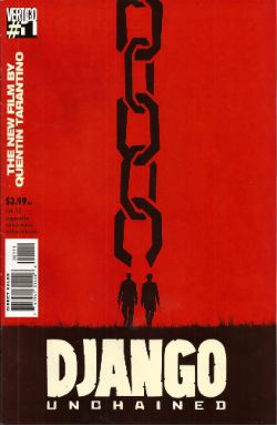
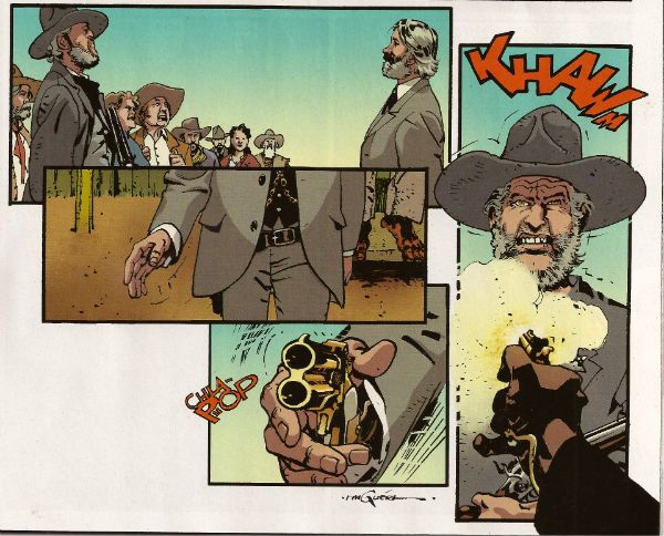
DJANGO UNCHAINED #1 Art by R M Guera with Jason Latour Adapted by Reginald Hudlin Coloured by Giulia Brusco Lettered by Sal Cipriano Adapted from the original screenplay by Quentin Tarantino Vertigo/DC Comics, $3.99

Photobucket

I can’t speak as to how good an adaptation this is because I haven’t seen the movie. I’m old and the wild and outrageous young rebel Quentin Tarantino scares me with his outrageously youthful rebelliousness and his youthfully rebellious outrageous movies. Luckily my much younger sister had seen this very movie so I asked her how she found it. She said, and I quote so the record may be deemed complete, “It was entertaining, Johnny, but it wasn’t good.” There you go then. Me, I fear I invite your youthful ire as I just don’t think Tarantino is all that. Oh, it isn't his childishly inflammatory use of the “N” word, after all I’m sure should our paths cross the edgy auteur would be equally forgiving were I to pepper him with the “C” word like it was going out of fashion. No, but some of it is the fact that he uses the word “cool” too much. The only men his age who should use “cool” that much are Grateful dead fans who live in San Franciscan dumpsters. Mostly though it’s that he reacts to proper questions like THIS. Yeah, I'll let that speak for itself I think. On the plus side the iconoclastic Quentin Tarantino does seem to have exhausted his celluloid fetish for Uma “Man Hands” Thurman.

Photobucket

The stated aim of this comic is to illustrate the original script. Every golden word. I guess it does that. It certainly seems like a Tarantino script. The dialogue is surely as self-satisfied and in need of tightening as ever and it retains all the usual rhythm and musicality (i.e. all the rhythm and musicality of a tune played on an arse flute); scenes outstay their welcome or outstay their welcome while also leading up to a totally predictable reveal and the characters haven’t any. Usually it would take hundreds of talented people and millions of dollars to make this stuff at least enjoyable if not actually good. All this comic has is R M Guera. All this comic needs is R M Guera. It’s an amazingly savvy choice since for the last 5 years and change R M Guera has been tasked with tricking everyone into thinking that a tour through Jason Aaron’s 70’s movie memories constitutes something with anything more to say than, hey, wasn't cinema in the 70’s just grand? Or SCALPED as it is known. Elevating the mundane to the magical is just what R M Guera does I guess. He does it bloody well though. Jason Latour throws down a few flashback panels and his art is excellent every time it appears but the shining star here is R M Guera. R M Guera with his ambulatory toby jugs and smooth storytelling once again showing everyone else up. Hey, the poor old writer doesn't even get a credit except here: Reginald Hudlin. I don't know why he doesn't get a credit but it's not a trend I want to encourage. Anyway, thanks largely to RM Guera this was GOOD!

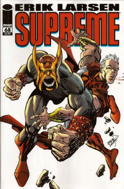
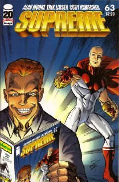
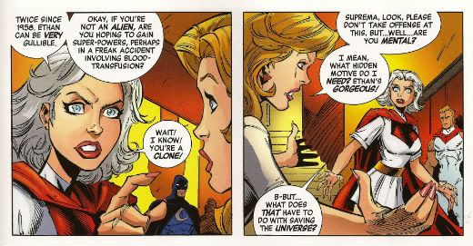
SUPREME #68 Written and Drawn by Erik Larsen Coloured by Steve Oliff Lettered by Chris Eliopoulos Supreme created by Rob Liefeld Image Comics, $3.99
Photobucket

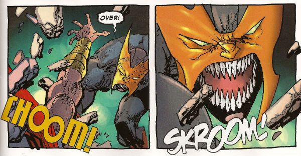
In this pulse pounding issue Erik Larsen basically says that he enjoyed illustrating Alan Moore’s script but since then he’s been noodling about and it’s been just super, thanks, but he’s off now. Apparently someone else will be taking over, no idea who but, yeah, someone at some point. Of all the moves to steal from the DC playbook that’s a pretty strange choice. At least he didn't steal DC’s signature move which is now apparently making comics nobody likes but lots of them. Larsen’s departure is a bit of a shame because I found his Kirby with a split nib art quite charming and in this issue it’s particularly so because, for no readily apparent reason, Larsen suddenly starts drawing this thing like it’s Kyle Baker’s RONIN. (Yes, I know it was Frank Miller's RONIN but this looks like Kyle Baker's RONIN).
Photobucket

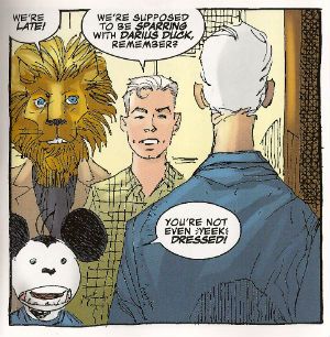
I quite enjoyed this book. It had enjoyably stupid characters like Lion headed Supreme and Darius Duck, people flew around, punching occurred and Larsen always respectfully drew Supreme in that scratchy Liefeld mode without actually ever being as shitty as Liefeld. Sure, it was pretty basic stuff but it was basically pretty stuff. Sometimes I don’t actually want all that much from a comic and this certainly delivered that. I wouldn't recommend that Erik Larsen make a habit of just dumping books as people might start referring to a failure to commit as having committed Larsen-y. Unlike that joke this was OKAY!

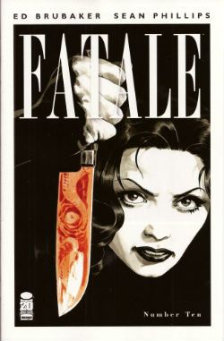
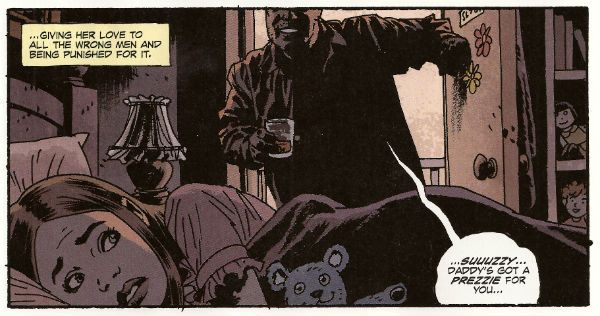
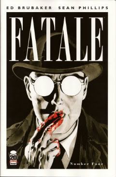
FATALE#9,10 Art by Sean Phillips Written by Ed Brubaker Coloured by Dave Stewart Fatale created by Sean Phillips and Ed Brubaker Image Comics, $3.50

Photobucket

Everyone can relax because I’m done here. I’ve had my doubts about this one all the way. For starters the horror elements have been inexplicably dusty and dull (cassocks! tentacles!). I don't need my own pet Jess Nevins to know that horror in the '70s was actually engaging with real world events and offering up savage and innovative treats which were leaving Corman's Poe adaptations for dead. Then there's the inescapable drab narration which mistakes deadpan for just plain dead on the page and is written in a fabulous new tense even more inactive than the passive; the comatose tense perhaps. The only sign of life in this one-note stuff is that it works the word “but” like it yearns to be a Salt’n’Pepa track.Then there's stuff like this:

Photobucket

That pivotal oh, go away moment occurred in issue 9 but due to the caprices of my comic dispersal system I still had issue 10 to go. Yes, one more chance! A chance which was immediately crushed when the central character (who thus far has been less like Fatale and more like Docile) just suddenly remembered she had special magic powers and plain killed everyone in a climax as rewarding as being inadvertently brought off by the motion of your train seat. Look, there’s no mystery about why men will act like complete tools for a pretty face, certainly not a supernatural mystery. Unless you think the contents of your pants are supernatural and mysterious. In which case your Pope just resigned. I didn't know Popes could do that! This series always seemed less James Ellroy and H P Lovecraft and more Quinn Martin and Donald P Bellisario. An impression strengthened by future covers which indicate the series is just going to stick a new genre on top of the usual stuff. Now she's a witch, now she's a space man, now she's a turtle, dis-integrating! Like my interest. Mr Ben with a magical woo-woo may well be a new direction but not one I’ll be pursuing. So, I’ll be missing future essays on The Scarecrow And Mrs King and, more importantly, the fine work of Sean Phillips and Dave Stewart which deserves better than to be yoked to work this EH!

SHADOW SPECIAL #1 Art by Ronan Cliquet Written by Scott Beatty Coloured by Mat Lopes Lettered by Rob Steen The Shadow created by Walter B. Gibson Dynamite, $4.99 (HOLY MOTHER OF GOD!!!! FOUR DOLLARS AND NINETY NINE CENTS!!!! THAT'S INSANE!!!!)

Photobucket

In the main title The Shadow is currently palling about with George Orwell. George Orwell is the author of a couple of books on how shit being poor is and how we will all willingly participate in a system designed to crush our common humanity. He was right about both of those things and remains right, although he missed a trick in not realising that the main way The System would ensure our complicity would be by making nice things for us to buy. But then there weren’t many nice things to buy back then so we’ll let him off. Rip The System! You don’t bring Orwell to the party unless you want that party to get political! Orwell also did a book about animals on a farm. I can’t remember what it was called but it was about animals on a farm. It was a metaphor or an analogy or some clever shit like that about some animals on a farm. Oh yeah, I remember now, the one about the animals on the farm? It was called BEFORE WATCHMEN.

Anyway, this isn’t the main series so George Orwell isn’t in it. No, this is a “special” but it isn't very, possibly even at all. Except for the price. That’s pretty fucking special right there. There’s the core of a fun and pulpy tale here but something’s gone awry on the pacing front. When there’s more pages devoted to The Shadow moaning about going shoe shopping (yes, really) than there is to his fight in a minefield with a man who has courageously chosen to sport only a bouquet of barbed wire around his nuddy bod (Oooch! Owch!) then, yes, I’d have to disagree strongly with the storytelling emphases.

Photobucket

Ronan Cliquet has a good go at being Alan Davis but he seems to have jumped ahead a bit; Alan Davis didn’t get to be Alan Davis until he’d got the basics right, son. I’m guessing he’s just some wee snip learning his trade but the best I can give him is – promising. The most special thing about this comic is the paper it’s printed on. Paper so much like catalogue pages from your youth that there’s a constant urge to riffle through them to the Hot Wheels section or the sports bra section depending on which age your development is currently arrested at. No, it wasn't special unless special is EH!

And like The Pope - I'm gone! But there's still COMICS!!!

"A Moi La Légion!" COMICS! Sometimes I Have Too Much Sun!

Greetings! It has been sunny in England for more than three consecutive days. This means that the entire nation is required by Law to sit outside until their skins glow like pink suns and crack like dry riverbeds in Texan heat. So I have been doing that. This means I didn't read many comics and when I wrote about them the fact that my brain had been lightly boiled in its own juices didn't seem to have a beneficial effect on my thought processes or judgement. But, hey, I made my deadline! I made it, Ma! I'm a hack! Photobucket

FURYMAX #2 Art by Goran Parlov Written by Garth Ennis Coloured by Lee Loughridge Lettered by Rob Steen Marvel, $3.99 (2012) Nick Fury created by Jack Kirby AND Stan Lee

Photobucket

Imagine my delight upon opening the latest issue of this fine comic to find an act of recreational physical pleasure being performed by Nick Fury and Ms. DeFabio. No, not because I have always wanted to see Kirby/Lee characters nut deep in the fun patch, no. (Well, Lockjaw maybe but that’s a personal thing.) No, it’s the fact that the act is presented so matter of factly. Almost as though it is just a part of life; one of those things adults do from time to time, these days mostly when they lose their broadband service and the TV is simultaneously on the fritz. In fact I can assure you I am not idly boasting when I say that even I , the misanthrope's misanthrope, have in fact personally heard of people in real life who have encountered a real life lady in such close quarters; which is to say even closer quarters than Nick & Co. encounter the ‘Cong in this comic. For one moment I thought mainstream genre comics had, in actual fact as opposed to the popular fiction entertained by most fans, grown up. A bit. Then I remembered it was a MAX comic and so that was okay as the regular line of comics would continue to be as ridiculous in their depiction of recreational procreation as ever.

Photobucket

Seriously, how bizarre must the depiction of something in regular life be if  its depiction in a Garth Ennis war comic is actually a healthier alternative. Focusing on that aspect, as for some inexplicable reason I have, does Ennis' work on this comic a disservice as it is so well realised by all the involved personnel that its level of focus brings to mind a close up of a sniper's eye as the unseen finger exerts the required pressure to do the necessary. It's one well honed machine is what I'm saying. This week, because this book appears to be weekly for some arbitrary reason, Goran Parlov knocks my socks off on the several occasions when he draws the Nazi bastard’s head as just a collection of lines held together by Lee Loughridge’s ever-excellent colours. Giving us a glimpse into a horrific world where Pig Pen grew up and joined The Hitler Youth. To speak plainly then, I thought FURYMAX#2 was VERY GOOD!

THE SHADOW #2 Art by Aaron Campbell Written by Garth Ennis Coloured by Carlos Lopez Lettered by Rob Steen Dynamite, $3.99 (2012) The Shadow created by Walter B. Gibson
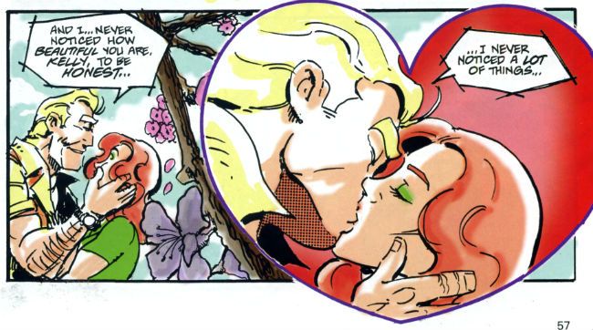
Photobucket

As is customary, and contrary to my therapist’s advice, I shall now devote more time to the cover by Howard Victor Chaykin than the book it adorns. It’s a pretty swell cover, yes it is. The elegant simplicity of its design elements is foremost amongst its pleasures but only because the cheekiness of anchoring it all on The Shadow’s torso (which is little more than an oblong) is, let’s face it, the kind of thing only people who should really stop harassing aged Jewish comics creators when they go for a jog on the beach are going to give a gefilte fish about. I’d plump for Arbutov on colours rather than Delgado because it’s less an attack on visual sense and more of an attempt to attractively enhance the base image. But, this being Dynamite the colour of your cover is not a fixed thing! You can have a “Bloody Red” Retailer Incentive Cover (red and white!) or the Dynamic Forces Exclusive Howard Chaykin cover (black and white!). I hope these are all in the TPB because I would actually have an interest in seeing the image without colour, but that’s because I am a Chaykinmaniac. Otherwise I am just totally flummoxed by the need for all these covers. There are another 7 of them! The Ryan Sook one looks lovely by the way.
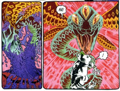
Photobucket

Eventually, sated, I looked at the actual comic. Ennis’ script this time out is pretty great. It’s basically an extended action sequence inventively choreographed within the confines of a Pan Am clipper intercut with exposition largely designed to demonstrate the evil of the opposition (kiddy fiddler ahoy!). I can’t fault the writer's execution of the script or the savagery of the violence (injury to eye is just the hors d’ouvres, darling!) but it impresses only despite some serious fumbling of the ball on Campbell’s part. I’ll not dwell on it too much as, after all, the art turns up and does the job; albeit with all the fiery invention of a Council employee during the week before his pension finally kicks in. Also, Megalophobics are hereby duly warned to stay away from the hilariously outsize hat which dominates the last panel. Still, Ennis’ script is so solid the comic remains GOOD!

MIND MGMT #1 By Matt Kindt Dark Horse, $3.99 (2012)

Photobucket

In this comic's after-piece Matt Kindt runs the old I Want This Periodical To Work As A Periodical schtick. Y’know the one; the one about extras unique to the pamphlet (or FLOPPY!(cue Brian Hibbs rearing back like Christopher Lee before Pter Cushing's crossed candlesticks. Hsssss!)) which will enhance and entertain, yes, that one. I think he’s actually serious about it, too. That's on the evidence of the first issue of what future generations will call “that book Matt Kindt did no one bought” (but we will call MIND MGMT). I mean, only time will tell but I doubt this is going to take the form of backmatter telling us how his movie deals are progressing (Matt Kindt hasn't got any. Yet.), how hard life is for the talented and beautiful (my heart; it bleeds), a telephone book size list of all the awful comics he has in print (because Matt Kindt doesn't do awful comics. Ever. Fact.). Not that anyone else does that, but I severely doubt Matt Kindt will. The clue is in the comic itself.

Photobucket

Every page of this comic is the comic. The inside front and back covers are a short prologue to the book itself, the back cover is an advertisement that is in fact not an advertisement, text crawls up the side and across the page margins (a la ADVENTURE TIME) adding colour and background to the concept in a dryly humourous faux-bureaucratic way, there’s a short backup piece not intended for the TPB which ends with a six panel sequence so awesome that you know right then and there that MIND MGMT is the one. MIND MGMT is the one. MIND MGMT is the one where Matt Kindt arrives. This is Matt Kindt’s AMERICAN FLAGG! moment. This is where Matt Kindt turns up says, hey, this is what I do and this is the way I do it and you, well, you just deal with it! Matt Kindt just slapped his big talented balls on the table and now you either walk away or you just deal with it. MIND MGMT is odd but EXCELLENT! Deal with it!

And then I saw sense and decided my time, and yours would be better utilised if I wandered off to flick lima beans at next door's koi carp.

Hope you had a good weekend with some COMICS!!!

NEXT TIME: Something else!

"Let Him Be A Child A Little Longer." COMICS! Sometimes They Are Diverse!

Hey, the postman finally turned up. Photobucket

I guess the hostiles must have been restless out there in the Badlands or something. Anyway, he may not have rung twice but he did drop off a box of comics. Here's me going on about some of them after the break: A NOTE FOR OUR AUDIENCE: According to Brian "Link-Hider General" Hibbs you can now purchase some of these comics direct from The Savage Critics!

There is a link under both Comix Experience Links and Industry Links which says "Digital Comics From The SavCrit Store!". It's that one.

I have of course followed the rigorous journalistic code of the 21st Century and given all the comics available from that link a rating of EXCELLENT! No, not really, because as a salesman I am a bit lacking.

As ever, here's some comics and what I thought! Buy 'em! Don't buy 'em! Leave them at the scenes of violent crimes to throw off the Feds! I don't know, don't look at me for help. Because I'll just look down and whisper "No."

And Now Our Feature Presentation- SOME COMICS WHAT I DID READ:

ANIMAL MAN #8 Art by Steve Pugh, Travel Foreman & Jeff Huet Written by Jeff Lemire Coloured by Lovern Kindzierski Lettered by Jared K. Fletcher DC Comics, $2.99 (2012) Animal Man created by Dave Wood and Carmine Infantino

Photobucket

Since he literally throws his daughter to the wolves I’m afraid I have to say Buddy Baker is the worst father in the DCU and he’s a pretty craptastic superhero to boot. You’re going to have to think of something better than beating an army of undead animals to death one by one, Buddy Baker! This guy is such a dumbnuts I’m getting tired of reading about him. The best thing about ANIMAL MAN is that it reminds me how wonderful Steve Pugh’s art is.

Photobucket

I love the solidity he gives everything and the way his art allows the realistic and the insane to exist frictionlessly together. If he’s too radical for the DC masses, and it doesn't take much to be that, maybe Dynamite could get him on some books? Oh, I’m getting ahead of myself; I haven’t got to THE SHADOW yet. Anyway, ANIMAL MAN was OKAY! But really his wife would have left him about 6 issues ago and in about 3 issues I expect Social Services to be having a firm word in his shell-like. Buddy Baker is a danger to himself and everyone around him, and not in a good way.

FATALE #4 Art by Sean Phillips Written by Ed Brubaker Coloured by Dave Stewart Image Comics, $3.50 (2012) Fatale created by Ed Brubaker and Sean Phillips

Photobucket

Um, I don’t want to be the party pooper but I’m not really feeling this one. Where others would see complexity I see only confusion and the horror and crime aspects don’t mix well at all; blanding each other out if anything. I’m not convinced at all that Brubaker & Phillips are as deft with horror as they are with crime. There’s one sequence in particular which is meant to suggest the soiled undersheet of reality flickering on the edges of the protagonist’s vision, but it takes up a whole page. Which is a bit like the secret supernatural underpinnings of the world putting on a straw boater and doing back flips in front of you while belting out showtunes. Subtly unsettling it’s not. Mind you this series seems to not be a lot of things. Coherent and inventive being amongst the things it isn't. So far the whole thing seems a stolid muddle which barely fends off the blunt teeth of cliché. The police scenes are about the width of a gnat’s dick from busting out the old “This is straight from The Fifth Floor, you've got 24 hours to clear this case or you’re back handing out parking tickets! Capiche, you maverick bastard!”  And then there are the narrative captions and, boy howdy, are they bad. But then I think there’s a difference between understated and lifeless. These things are like “I saw a cat. It was big.” bad. It’s like Dan Brown bad. But then Dan Brown’s very successful isn't he?

Photobucket

After all, in a shocking real-life terror twist, it turns out that FATALE is the most successful thing Brubaker & Phillips have produced. Previously this was true of INCOGNITO which I thought was pretty bad. So, it looks like success beckons the Brubaker & Phillips team, but what appears to bring them success isn't what brings me reading pleasure. Mind you, they are professional enough to produce a comic that despite my tinny whinging still comes off as OKAY! While I found the front matter lacking, Stephen Blackmoore provides a compelling backmatter piece concerning a real life gumshoe called Harry Raymond. That bit was VERY GOOD!

You can buy FATALE from HERE.

RAGEMOOR #2 Art by Richard Corben Written by Jan Strnad Lettered by Nate Piekos of Blambot® Dark Horse Comics, $3.50 (2012) Ragemoor created by Richard Corben and Jan Strnad

Photobucket

Corben’s art looks a bit odd in this issue, as though he’s got some settings wrong on his software or something. It looks a lot less crisp than last issue. It’s still great because it’s still Richard Corben but…still. Fortunately Strnad’s scripting is really strong so that helps soothe any misgivings. I didn't really know where the series could go after the first issue’s seemingly complete unto itself set-up.

Photobucket

I certainly didn't expect it to make the previously understated humour blossom so broadly; so broadly that at times it verges on farce. I certainly wouldn't have expected it to work so well either. There’s horror here but humour too and in an impressive feat of facility each complements the other leading to a comic that is a really satisfying read indeed. I don’t want to give too much away but hopefully the fact I thought it was VERY GOOD! will be enough to tempt the unwary!

THE SHADOW #1 Art by Aaron Campbell Written by Garth Ennis Coloured by Carlos Lopez Lettered by Rob Steen Dynamite, $3.99 (2012) The Shadow created by Walter B. Gibson

Photobucket

I know you've all been on tenterhooks so let me assure you that I did indeed receive a copy of this comic with the Howard Victor Chaykin cover. I thank you all for thinking of me during this period of uncertainty. It was always a bit of a gamble though wasn't it? What with Dynamite’s penchant for plural covers. Mostly they get some decent names doing some good stuff. Howard Victor Chaykin, for instance, obviously did this one well before it struck Gin O’Clock at Chaykin Towers. He’s even used a different face shape; nice job Howard Victor Chaykin!  The art on the inside of Dynamite’s books tends to be a bit more problematic. Problematic in the Early Anglo Saxon sense of “bloody awful”. Aaron Campbell manages to buck this trend by being decent for most of the book, except when The Shadow erupts into murderous action at which point Aaron Campbell impresses the Heck out of me. Really, jolly good work on those parts! I’m still not a massive fan of the old drawing over the top of photographs business so the rest of the book was just okay art wise.

Photobucket

Ennis is behaving himself too, there's none of that aggressively puerile "funny" stuff or lashing out at easy targets with a nuclear bomb strapped to a machete. He seems to actually be having a good time too. He certainly gives The Shadow a clear personality, one that's all the more entertaining for being composed primarily of arrogant bastardry. But he's not without empathy either, which is a nice trick to pull off. The whole shebang is set in one of Ennis' well researched eras of upheaval, or at least imminent upheaval. Because, and it's to his credit this, Garth Ennis is one of the few writers in comics who shows evidence of reading books other than How To Bland Out And Find Big Bucks In TV And Movies. Books that demonstrate an interest on his part in the world around him rather than a monomaniacal need to write THE MENTALIST.  If you like Ennis' war books you'll like this. If you like The Shadow you'll like this. Blimey, if you just like decent comics you'll like this. Because it's actually VERY GOOD!

SUPREME #63 Art by Erik Larsen & Cory Hamscher Written by Alan Moore Coloured by Steve Oliff Lettered by Chris Eliopoulos Image Comics, $2.99 (2012) Supreme created by Rob Liefeld

Photobucket

SUPREME is an Alan Moore genre comic. I miss Alan Moore’s genre comics. Alan Moore’s genre comics were packed with invention and humour. Alan Moore’s genre comics had more ideas on the page than most of today’s self proclaimed genii have in a lifetime. Alan Moore’s genre comics played with the form in a way that was charming and cheeky. Alan Moore’s genre comics had characters with character, but their character was never static and if it changed it would do so coherently. Alan Moore’s genre comics had craft. Alan Moore’s genre comics had joy. Alan Moore’s genre comics were VERY GOOD! Yeah, genre comics are much better off without Alan Moore. Yeah, F***k you, Alan Moore! Don't let the door hit you on the way out, Alan Moore! We don't need you, Alan Moore! We never needed you! We've got AVENGERS Vs X-MEN and BEFORE WATCHMEN now!

Photobucket

Oh God, what have we done. COME BACK, ALAN MOORE!

...please...

You can buy SUPREME from HERE.

And that's your lot!  Yes, even I have other stuff to do!

Hope you had a good weekend, everyone!

Blah blah blah COMICS!!!

"And Kindly Remove Your Pelvis..." Comics! Sometimes They Are A Lot Like Last Time But Newer (John Carter pt.2)!

Photobucket  My name is John Kane and if my instructions have been honoured then what now assails your minds will be a continuation of the unfeasible events that occurred when I persisted in following the course of John Carter comics into the current Century. It is not for such as I to grant such an endeavour any merit for such a task can only fall to those who suffer the results. My chore has ended and yours has only begun...

WARLORD OF MARS #1 - #14 (of an ongoing series) Art by Stephen Sadowski, Lui Antonio, Edgar Salazar Written by Arvid Nelson Coloured by Adriano Lucas, Shane Rooks, Maxflan Araujo, Marcello Pinto Lettered by Troy Peteri, Marshall Dillon Based on the stories by Edgar Rice Burroughs (Dynamite Entertainment, $3.99ea (except #1 which was $1.00))

Photobucket

Previously on 'An Old Man Talks Uninformed Shite About Comics No one Cares About' I discussed comics from 1952-3 and 1972-79 and went on about changes in comic storytelling between the '50s and the '70s. But only in a general way; not in a way that's going to suggest the presence of any original thought or anything. I was pretty happy to report that comics had come on a bit in terms of technique but what about by 2010 when this Dynamite series began? That'd be roughly 60 years since the Jesse Marsh Stuff and, say, around 30 years since the DC/Marvel stuff ended. Those numbers making up in roundness what they lack in precision, somewhat akin to a large boned gentleman's reflection in a fun-house mirror.

Photobucket Mars circa 2010.

It takes this series 9 issues to adapt A Princess of Mars. That's a fact. Another fact is the same ERB book was adapted by Dell and Marvel in one issue. Okay those adaptations are hardly the most elegant of things but they are certainly entertaining and have momentum. So, no, they probably aren't as rich an experience as reading the novel but they are quite a good experience as far as reading a comic goes. To pack all that stuff into one issue some pretty brutal choices have to be made about what to include and where the narrative emphasis should lie. Even though the Dynamite series has room to sprawl about the place like a boneless teenager choices have also been made. I haven't read the original ERB novels but thanks to this pointless task I have set myself I have now read no less than 5 (FIVE!!!) comic book adaptations of A Princess of Mars. None of these are exactly the same in either events or tone. In every case decisions have been made.

Photobucket The Incomparable Dejah Thoris circa 2010

Tellingly the Dynamite series is touted as an "expansion of the sci-fi classic". So the fact it takes a whole heck of a lot longer to cover the same ground as previous adaptations is unsurprising. What is surprising is the time taken to get John Carter onto Mars. In the Dell series JC is on Mars by p.2, in the DC series he's there on p.5 while the Marvel series starts with him already there up to his cute tuchus in trouble! In 2010 (now sit down and have someone nearby ready to call the emergency services before you read this next bit) John Carter manifests on Mars on the 1st page of the...THIRD issue.

The only real reason to stick with a series clearly sold as being about a man having robust frolics on Mars for three issues in which his frolics are neither robust nor Mars-based is if you are a fan of ERB (or pulp) already. So, yeah, pretty much two of my least favourite modern tendencies (as in suicidal) in comics: no attempt to appeal to new readers and decompression. Stylistically this latter would be the biggest difference to have occurred in the 60 some years separating the Dell and Dynamite material. The boon of having plenty of room to spread any artistic wings is pissed away due to a lack of inclination to do so in a way which is constructive and a maddening tendency to prevaricate. But it's okay for modern comics to do that because the audience isn't going anywhere is it? Well, I guess I'm looking at different sales figures because that audience certainly seems to be going somewhere.

Photobucket Mars Action circa 2010.

(About decompression. Now, I'm aware that decompression can be a valid literary device but I am also aware that the term is often invoked in order to lend legitimacy to what is clearly better described as taking the piss. Language is quite a powerful thing and I think it is time we reclaimed "decompression" from those who abuse it to the furtherance of fluffing up both their own and their audience's egos. Next time you see the word 'decompression' try mentally replacing it with 'taking the piss'. I think the results will delight you! (Note: unless you are a diver in which  case I suggest you stick to 'decompression'.))

Photobucket John Carter circa 2010.

Now those are harmful inclinations but they are hardly unique to this comic (which is why they are so especially infuriating) and to judge this series on those grounds alone would be unfair. It's not a bad little series. There's evidence that some thought has gone into the presentation of the material. The narration is presented in a typeface akin to that in a words-alone book, there's some attempt at supplementary material intended to evoke the "true story" aspect of the original novels and the choice to up the ante on the tits'n'gizzards has clearly been made at an early stage. And, like a Calot returning to its own vomit, it's this I'd like to look at again.

You could be forgiven for believing that I am some kind of sweaty one-handed reader who won't be satisfied until all comics resemble nothing so much as a fiesta of fur and quivering meat but this isn't the case. I just think you should show commitment to things. Commitment is a big thing in my household. I know my Incomparable partner is always trying to get me committed. Particularly after reading one of these things.  But although there is more gore and more nekkidery than in any previous iteration of this here ERB IP, it's all a bit half-assed. People like the nudey-roo aspect to this stuff so: John Carter does at least have the (in)decency to be swinging in the wind initially, the incomparable Dejah Thoris is unlikely to suffer from rashes due to her detergent,  and then there are those "risque" covers. But... John Carter has to contort himself comically to avoid a glimpse of his carrot and taters, the incomparable one is too often shown quailing or threatened and those covers are censored.  There just doesn't seem to be much point to it really. If you're going to get down there then get down and roll around,  I say. After all, it isn't as if Dynamite are in thrall to the demands of the ERB estate is it? Which reminds me:

Photobucket Martian irony circa 2010.

There are three different artists throughout the course of the book so far. Initially it's Stephen Sadowski and I'll just say that if you're having cowboys in your book it's probably best get people who can draw hats on people's heads. I know it's not the easiest thing in the world and even Lovely Lou Fine wasn't very good at it, but still. Sadowski crops up later on and hilariously depicts the incomparable Dejah Thoris wearing more to bed than at any other point in the series. Sadowski's photo derived work bookends the contributions of Lui Antonio who has a nicely blocky approach that's kind of sub-Art Adams. It's clean, nice art but, unlike Art Adams, a little light on the details and Antonio has a tendency to give JC a big vein on each arm suggesting nothing so much as sword wielding phalli. Which could be entirely intentional but is surely unnerving. Salazar crops up in the later issues and I really don't like his brittle line, lacking as it does any confidence in itself and lending the book a hesitant and scratchy look. (Pulp should never be hesitant.) On words Nelson does a decent job. It all bustles along, things happen and it's entertaining enough with even a glimpse of humour here and there ("Kiss me, you Calot!"). He really earns his money with the second arc which is a kind of murder mystery without JC but starring his son and is, thus, about as satisfying as tuning into Scooby-Doo only to find it's an episode all about Scrappy. Still Nelson manfully manages to keep it rolling along and through into the latest issues where unfortunately, for this reader, his solid work is unable to distract from the eye-prickling art. Overall, since most of my quibbles and carps were aimed at modern comics generally rather than this one in particular, the series is OKAY!


WARLORD OF MARS: DEJAH THORIS #1 - #9 (of an ongoing series) Art by Carlos Rafael Written By Arvid Nelson Coloured by Carlos Lopez Lettered by Marshall Dillon Based on the stories by Edgar Rice Burroughs (Dynamite Entertainment, $3.99ea)

Photobucket

Ah. Yes. Another tendency in the modern genre comic scene is to milk that IP teat until it is sore. So here we have a solo title for The Incomparable One. These tales are set before John Carter turns up so The incomparable one is only a mere slip of a girl at this stage, probably barely in her 5th Century. Oh yes, from reading all these books I have learned that Martians are born from eggs, mature quickly and age slowly, live to be about 1,000 years old (unless someone stabs them or they are eaten by some of the more agile fauna) at which point they go off and commit unassisted suicide by the River Iss (a kind of more brutal Dignitas). Unsettlingly this means John Carter has shacked up with some old crone who lays eggs. This makes John Carter possibly the only fictional character who engages in procreation with a geriatric, suicidal monotreme.

Photobucket "...(s)he's an egg-laying mammal of action!.."

Unfortunately the reality of this series is entirely more conventional than the preceding would have you believe. (Pulp should never be conventional). Illustrated in a sub-Frank Cho style the art is clean and cartoony. Although both male and female Martians are both dressed quite minimally it's clear that The Incomparable Dejah Thoris is dressed more minimally than most. Since these stories are solid little genre adventures in which the main novelty is the fact that the lead character is a capable and independent lady equally comfortable politicking or shellacking they sound quite progressive. Progressive for mainstream genre comics anyway. Sadly this is somewhat undermined by the fact that The Incomparable Dejah Thoris is continually contorting herself to display her assets to their best advantage. This can be overlooked in action scenes due to their physical nature but the  talking scenes are somewhat undermined by her tendency to present herself like a horny ape to some invisible suitor.  The series is, however, in no way the kind of sordid disgrace that mainstream genre comics featuring partially robed ladies are inclined towards and is entertaining in a lurid and daft way. And in Pulp that is OKAY!

WARLORD OF MARS: FALL OF BARSOOM #1 - #2 ( of Four) Art by Roberto Castro Written by Robert Place Napton Coloured by Alex Guimaraes Lettered by Simon Bowland Inspired by the stories of Edgar Rice Burroughs (Dynamite Entertainment, $3.99ea)

Photobucket

Or Palping The Teat Part Two. This comic is is set "100,000 years before John Carter arrived on Mars." That's ludicrous. Which is a shame as the thrice-named Napton delivers a decent three stranded pulp narrative that is only slightly undermined by decompression and generic dialogue.  Roberto Castro is a bit too cross-hatchy for my tastes even going so far as to edge into Liefeldian which, since I am not one of those youngsters with their elder-baiting Liefeld-revisionism, is not a good thing for me. It's EH! which is not something that a spin-off title needs to be. What with WoM:DT and this we can see the third fatal tendency of the modern marketplace in full effect: dilution of the IP, over-saturation of the market, cutting off your nose to spite your face, call it what you will it's not good. Now Dynamite are publishing Not-Tarzan comics I am waiting with bated breath for Cheetah: Year One! filled with all the shit slinging, nit picking, teeth baring and frenzied humping fans of chimps all over the world have come to know and love. Seriously, "100,000 years before John Carter arrived on Mars." Christ.

JOHN CARTER OF MARS: A PRINCESS OF MARS #1 - #5 (of Five) Art by Filipe Andrade Written by Roger Langridge Coloured by Sonny Gho Lettered by VC's Cory Petit Based on the works of Edgar Rice Burroughs (Marvel Comics, $2.99ea)

Photobucket

This was by far the best of the JC comics I read during this expensive and time consuming exercise in senseless self-flagellation. Roger Langridge's script is fast paced (JC's already on Mars when it starts), packed with well paced incident, brief suspensions of action to allow for the smaller, quieter scenes to occur and it's also a little bit tongue-in-cheek. It's good stuff but the humour doesn't quite sit right. In the merit column it does allow John Carter to actually appear to possess some form of personality. Such a thing hasn't really been in evidence in the comics prior to this. Pulp heroes not being noted for their rich (or indeed any) characterisation I can't say I'd really noticed until Langridge offered up an alternative. Usually John Carter is in love with Dejah Thoris, good at killing stuff and, er, generally upbeat. Here John Carter has a sense of humour as well. However, he appears to have Roger Langridge's sense of humour; which is okay as Roger Langridge is a funny man but isn't okay because, unless I missed something, Roger Langridge isn't a Virginian gentleman of the 1860's. So when John Carter makes jokes about mints on pillows, giving only his name rank and serial number or uses a particularly legendarily bad chat-up line it does tend to ruffle the reader's immersion in the doings.

Photobucket Mars circa 2011.

Mind you, the flashback sequence is brief and none too clear. It could very well be that the intention was to leave Carter's earthly origins vague to allow just such humour to be possible. It may be that I brought an ungodly amount of prior John Carter comics to bear on this series and got the wrong end of the stick. If I did, I apologise and I do at least concede that Langridge's humour is actually funny, which is probably the most important thing really.

Photobucket The Incomparable Dejah Thoris circa 2011

The series also dodges the problems with gore'n'genitals by opting to go the clean-cut route. This turns out to be a wise decision. The incomparable Dejah Thoris is well covered and so it is easier to believe John Carter is in actual fact in love with her as a person rather just in love with having her fine caboose ride his cock horse. That's nice. I can do romantic too. I can. Stop laughing.

Photobucket Mars Action circa 2011.

The violence is good and violent but not overdone. Thanks to Filipe Andrade's fine work the fight scenes are more suggestive than ham-handedly bloody. In fact Filipe Andrade's work on this is pretty great. It's like the designs on an Ancient Greek vase have come to life and started running around and having smashing adventures. It is visually stylish and arresting work that nicely embodies the archaic nature of both the setting and the source material itself while being visually inventive enough to appear startlingly fresh, particularly in comparison with the somewhat familiar styles of art present in the other modern day John Carter books. Filipe Andrade - I like him!

Photobucket John Carter circa 2011.

I was expecting the least from this one given it's origins but it just goes to show that you should always go on the talent rather than the publisher. (I have no idea why people have a loyalty to particular comics publishers. It baffles me.) Langridge rarely disappoints and continues not to here and Andrade is a lovely discovery for me. It isn't my ideal JC comic (That would be: cover by Corben, words by Lansdale, art by Veitch. Thanks for asking. Took you long enough.) but it ain't half bad. In fact I'll go up to VERY GOOD!

JOHN CARTER: THE WORLD OF MARS #1 - #4 (of Four) Art by Luke Ross Written By Peter David Coloured by Ulises Arreola Lettered by VC's Cory Petit Based on characters created by Edgar Rice Burroughs and the screenplay JOHN CARTER by Andrew Stanton, Mark Andrews and Michael Chabon. (Marvel Comics, $3.99ea)

Photobucket

This one I regret to inform all is a blatant cash-grab that takes up four issues with what can generously be described as one issues worth of content. That's not to insult the creative team who I am sure enhance the lives of everyone they come into contact with. They've clearly been given the thankless task of providing a prequel to a film which by the very nature of the premise it is prequelling cannot actually feature the main character of said film or even allow the supporting characters to meet even though their adventures must have some connection. The real interest thus becomes seeing how Peter David will negotiate this thankless task. He has a good stab but the unavoidably inessential nature of the material is never in doubt, which really spoils the reading experience. Luke Ross' art is odd because he's really good at the bits that don't involve humans. He's got a nice thick line with a lovely crayon like effect that lends life and vigour to creatures that are clearly only of the imagination. Alas, his humans are stiff and overact and his landscapes are just photographs with minimal effects. Look, I'm tired of John Carter now so let's just say it was AWFUL!


So, 60 some years of John Carter comics there. I guess I should draw some conclusions? Up to 1979 there's one defining characteristic of the JC comics. The people involved seem to be having fun. Whether it's Jesse Marsh amusing himself by drawing works of art on the walls of his backgrounds, Sal Amendola outstripping his talent with his ambition or just the prurient purple prose of the Marvel stuff fun is clearly being had. It's an inclusive kind of fun, too.

There's less of this in the 21st Century stuff. Less enjoyment in both the form and the content. A lot of the time it just reads like it was work, a job. Which it was, of course. But equally so was the earlier stuff. That's why the Langridge/Felipe series seems so much brighter than all those series surrounding it. Heck, I'm sure everyone involved in all these comics had fun. There are probably interviews where they stress how much fun it was, how it engendered an almost obscene thrill to be involved in the expansion of his venerable ERB IP. There are always interviews alike that, about everything. What there aren't a lot of are comics that actually feel like they are interested in reaching out and including the audience in that fun. Look, I don't really know what pulp should be but I think it should be fun. Thankfully Roger Langridge and Felipe Andrade at least seem to agree.

Photobucket

Now that I have fulfilled the instructions of my delusional relative and allowed the clearly addled fruit of his stunted tree of a mind to fall before your eyes but one task remains to me. For I shall tell you now that he directed that I remove his body to Yorkshire without embalming and that he be laid in a Mylar bag of unfeasible dimensions upon an acid free board of card of similar size, therein to be sealed with tape. Clearly the man was a fool of the first order but I did as bade and can testify with a true tongue that, to this day, although his body has yellowed around the edges somewhat he remains, these many years hence, still Mint to Near Mint. Remarkable indeed.

Yours very sincerely

ERB

Have a good weekend, all, and remember to read some COMICS!!!