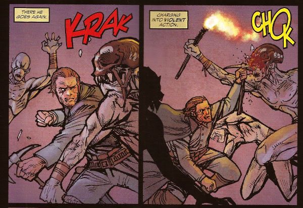
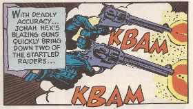
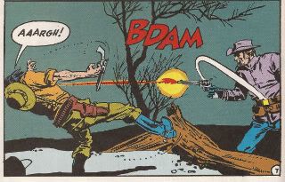
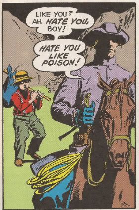
"NNGGGGAAAANNGAAAABBUUUBBBUUUZZZZZZZ..." COMICS! Sometimes They Are Good, Sometimes Not So Much!

I hope all our American friends had a smashing Thanksgiving! Managed to sneak another holiday in there before Christmas again, I see. Couldn't wait a few weeks for some Turkey. America, we are going to have to work on your delayed gratification! Maybe in the New Year, eh? Along with that membership to the gym. No, I have no idea what I'm on about.  Here are some words about comics I managed to dash off before being swallowed by the pre-Christmas maelstrom. Sorry about the lack of images but, y'know, time and all that hot jazz. Anyway, this...

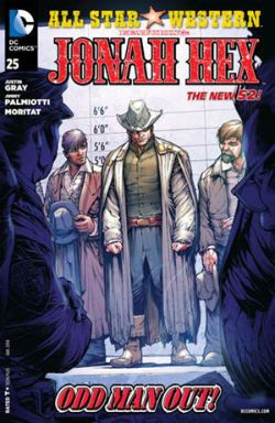
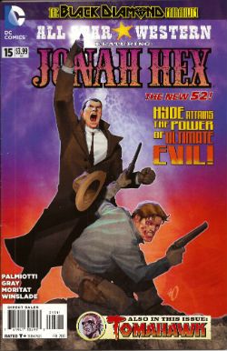
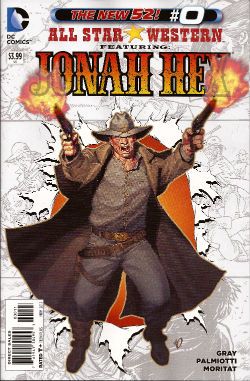
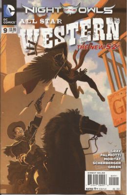
All Star Western #25 Artist Moritat Writers Jimmy Palmiotti & Justin Gray Colour Mike Atiyeh Letters Rob Leigh Cover by Howard Porter Jonah Hex created by Tony DeZuniga and John Albano DC Comic, $3.99 (2013)

 photo ASWCovB_zpsf3838270.jpg

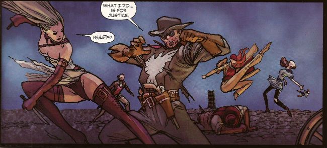
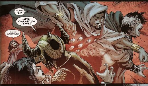
I’m not saying the driving conceit of this series is low hanging fruit but its rind is a gnat’s fart from brushing the tips of the grass. It’s Jonah Hex in the DC Now! While it was a fair joke to have Jonah show up and be more inclusive of difference than the modern populace stewing around him it wasn’t a joke that had much legs. A better joke would have been having Jonah show up and be distastefully offensive to everyone. (But that would require having some nuts left in your sack). Every month Jonah could have wandered around displaying levels of racism, homophobia and misogyny toxic to normal people. Hell, he could even have worked in comics. (Oh, too soon?) Anyway, now it’s just Jonah mamboing about and bumping into DC Universe characters. Like a Bob Haney comic but with none of the energy, inventiveness or flair. So, not much like a Bob Haney comic then. More of a Gerry Conway comic. It isn’t well written; something happens; something else happens; then it ends. Despite the fact Jonah is in the 21st Century, meets John Constantine, fights (well that’s gilding the lily, they move about a bit in an aggressive fashion) a demon and then Swamp Thing shows up it is all curiously unengaging. If it were any more pedestrianly written it would come with a free pair of shoes. Which means, as is more often than commonly acknowledged, the art has to carry most of the load. Luckily, Moritat has many strengths, mostly in figure work, architecture, faces and textures. Not so much panel to panel flow or action. There was a bit an issue or two ago where some guy in a car looked to be spoiling a fun run but in fact he was killing people by the shed load.  The impact was somewhat diluted. And the same is true here with Moritat tasked with a battle in the desert which, well, he muffs. Even so Moritat just about carries this comic, but it isn’t really a Jonah Hex comic anymore than Hex was a Jonah Hex comic. All Star Western is EH!

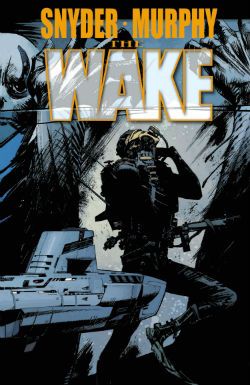
THE WAKE #5 (of 10) Artist Sean Murphy Writer Scott Snyder Colour Matt Hollingsworth Letters Jared K. Fletcher The Wake created by Scott Snyder & Sean Murphy DC Comics, $3.99 (2013)

 photo WakeCovB_zps41562b66.jpg

Fair warning: turn away now because I don't think this comic is very good. The urgency of any notionally exciting action is continually being spuffed away by the creaky and derivative narrative joltingly halting while someone delivers a big old furball of exposition. Said text dump consisting of a lightly tweaked wikipedia entry in a laughably unconvincing attempt to lend the ridiculous events occurring some kind of gravitas. In old legends floods are mentioned sometimes so, uh, yeah. And the people hawking this stuff up are just, well, it’s a good job they are all so memorably portrayed by Sean Murphy because otherwise they might as well just have stickers on their heads (Spunky Lady, Sciency Man, Troubled Mom). Murphy gives them all engaging visual presences (it doesn’t hurt that one of them looks like Harlan Ellison and another Ditko and Lee’s elderly Vulture). In fact it’s wholly to Sean Murphy’s credit that I’ve stuck this badly written dross out thus far. With his incredible ability to convey mind swamping discrepancies of scale; to lend the quieter moments as much weight as the flashier bits together with his endearing tendency to draw people with beards as though their face is a mass of scar tissue, Sean Murphy is the only real reason to turn up.

Anyway, at this point the series takes a break and I’ll not be rejoining it. Apparently when it resumes all the good stuff starts. Which seems a bit late really. Since the good stuff seems to consist of the umptyumpteenth iteration of a Drowned! World!, and one where there’s enough technological infrastructure to produce cutting edge swimwear at that, I think I’ll be popping off, thanks. Oh, and let there be no doubt all the failures here are the writer’s (“Oh we’re all doomed! Luckily I have a secret submarine armed with ridiculous weapons I failed to mention before.” Oh, do fuck off. Do! ) This is exemplified by a piss poor text piece at the back which is so repetitive and badly written it’s just depressing. So, I’ll see you on something else Sean Murphy. As for Scott Snyder, well, everyone meet the new Steve Niles, same as the old Steve Niles. The Wake is EH!

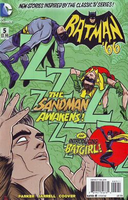
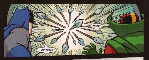
Batman ’66 #5 Art by Ruben Procopio, Colleen Coover Written by Jeff Parker Colours by Matthew Wilson, Colleen Coover Lettered by Wes Abbott Cover by Michael & Laura Allred Batman created by Bob Kane DC Comics, $3.99 (2013)

 photo batman66B_zps511681b0.jpg

While DC’s bold new creative direction of frantic barrel scraping is largely of little interest to me…everyone has a chink in their armour and my chink is shaped like the ‘60s Batman TV series. Personally, I believe the only reason God has still not scoured his finest creation of the plague of humanity is His/Her/It’s remembrance that the ‘60s Batman TV show existed. I like it is what I’m saying there. And I have always liked it. Even during those tedious decades when acknowledgement of the frivolous magic that was the ‘60s Batman TV Show provoked spittle flecked aneurysms in fandom. Finally I have been vindicated by DC’s creative bankruptcy! Batman is Bat-back! It’s like that time your family realised Uncle Larry was a lot wealthier than everyone thought and suddenly became oh-so-accepting of the fact he was a man who preferred the company of men and started inviting him to Thanksgiving again. While the art on every story here is wonderful and captures the ungainly physicality of the cast in action beautifully what most impressed was the writing. Writing wise it’s all about catching the voices; the lovely honey roasted burnish of those hammy, oh so hammy, voices. Although mine ears may be festooned with the hairs of age it sounds to me, well, it sounds to me like Jeff Parker couldn’t have done a better job if the voices were running around in straightjackets and he was armed with a butterfly net. Jeff Parker’s come along way from selling chickens by the roadside. Good on you, Jeff Parker. But this is a joint success with every hand working towards the creation of ridiculous, hilarious, entertaining and wonderful comics. Batman ’66 is VERY GOOD! Sure now and so it is, Boy Wonder!

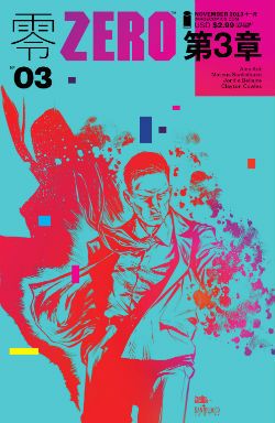
Zero #3 Illustrated by Matteus Santolouco Written by Ales Kot Coloured by Jordi Bellaire lettered by Clayton Cowles Designed by Tom Muller Zero created by Ales Kot Image Comics, $2.99 (2013)

 photo ZEROCovB_zpsefbca0a6.jpg

It didn’t look good. The comic starts off with that terrible style of dialogue that seeks to be arch, smart, worldy and profane but just comes off like how kids think grown-ups might talk if grown-ups were, like, not totes super-lame all the time but, you know, somehow got it together sometimes to be all, whoa, cool and shit, maybe, uh, nice tats, my man, ha, no, your mom, ha ha ha ha, no, really, your mom. As a reluctant eldster I can assure you that never, not once, on the very many occasions on which it has occurred have I failed to punch someone who greeted me with “Hey, cock-stippler, see ya still got a face like a racist’s taint!”, or, you know, whatever. I mean. It’s not really conducive to productive communication, is what I’m saying there. So, the dialogue here’s great if you like that Ellis-y “I know you are, but what am I?” playground mode of chat. Hell, don’t get me wrong, it’s still okay even if you don’t. After all, this is comics where a guy (not this guy, another guy) whose dialogue is nothing more than the literary equivalent of water-injected meat can be compared to a Pulitzer winning playwright. No, my point is it set my teeth on edge and the likelihood of enjoying the following comic was low.

And yet enjoy it I did. And very much so.

(Which is supposed to indicate how good the comic was, how it won me over after my knee-jerk initial negative reaction. A reaction which was wholly on me and not on anyone involved on the comic. Just making that clear.)

Because after the writer has had his c-word and eaten it the dialogue calms down. Then we’re off to the races as the creative team throw a fizzy confection of ideas and helter skelter paced events into your face like, er, a glass of innovation laced with a soupcon of emotional impact. Or birds, a handful of garish birds singing a swetly sad song thrown in your face. Or something else, pick something. Everybody on these pages pulls their weight and the success of the resultant package is a group success. A success resting on Bellaire’s palette shifts from warm party colours which threaten to push into the red spectrum of violence to the icy blues which foreshadow the chill of the denouement; Santolouco’s clarity of staging, elegance of scene setting and crisply sudden violence; even Cowle’s letters which get to hold centre stage unadorned for a whole page and leave the reader feeling not in the slightest shortchanged. All these are brought together to serve the writer’s fun, fast and slightly experimental ideas. I stress this; Zero is not one of those Shit’n’Glitter comics that seek to distract you with pointlessly ostentatious storytelling devices from the hollowness within them. No, Zero is a collaborative success. Zero is good comics. Zero is VERY GOOD!

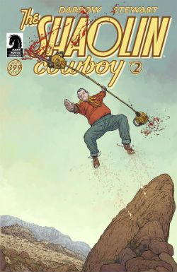
Shaolin Cowboy #2 Story and Art Geoff Darrow Colours Dave Stewart Letters, back cover, design Pete Doherty Shaolin Cowboy created by Geoff Darrow Dark Horse Comics, $3.99 (2013)

 photo ShaolinCovB_zps1ce09658.jpg

COMICS!!!! And unrepentantly so. EXCELLENT!


"Do They Still READ In The Future?" COMICS! Sometimes It's Great To Be Rude!

It was Half-Term last week hence the silence. Yes, the blessed silence. But now your God has failed you and I am back! It has been quietly suggested that I put on hold my tribute to Charlie Drake and maybe look at some comics this time. So, no actors who were dead before you grew your big teeth this time out. Just comics! Just lovely, lovely comics! But were they lovely? Hmmmmm? Anyway, this...  photo DHP_Pop001_B_zps333a52d6.jpg NEXUS by Steve Rude & Mike Baron

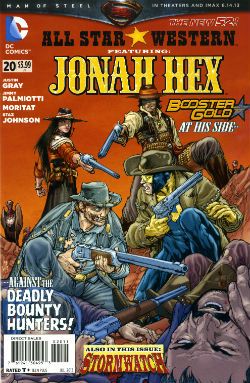
ALL STAR WESTERN #20 Art by Moritat (Jonah Hex) and Staz Johnson (Stormwatch) Written by Justin Gray & Jimmy Palmiotti Coloured by Mike Atiyeh (Jonah Hex) & Rob Schwager (Stormwatch) Lettered by Rob Leigh Jonah Hex created by Tony DeZuniga & John Albano Stormwatch created by Brandon Choi & Jim Lee DC Comics, $3.99

 photo All_SWCov001_B_zps3260d931.jpg

I kind of liked this issue. I don’t know whether the worms have finally reached my brain, or what but twenty issues in and this one almost clicked. I’m not exactly the most demanding Jonah fan either, I just enjoy the scar faced twat in a hat going around kicking up dust and making life brutal, difficult and short for folks. I prefer it to be a straight western but it isn't a deal breaker.

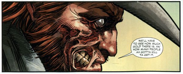
 photo All_SWPanel001_B_zps37540f12.jpg Jonah Hex by Moritat, Gray & Palmiotti

No, I don’t mind Booster Gold turning up for no reason that is ever going to be explained (hey, that’s just how comic books roll these days). I’m just pleased the book has a bit of a spring back in its step. Maybe it’s the beneficial effect of getting Jonah out of the city and into the countryside? Like when you ferry troubled youths by coach out into the boondocks to stroke goats. Moritat’s art seems a bit more lively and engaged although that might be due to the brighter and more varied colour palette in use. Watch these backgrounds though, I’m not a native of the Americas but I’m pretty sure mesas aren't mobile. Like I say I don’t expect much really and this delivered that making it OKAY!

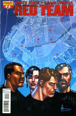
RED TEAM #2 Art by Craig Cermak Written by Garth Ennis Coloured by Adriano Lucas Lettered by Rob Steen Cover by Howard Victor Chaykin Red Team created by Craig Cermak & Garth Ennis(?) Dynamite, $3.99

 photo Red_TCov001_B_zps4bf0c366.jpg

More like RED MEAT amiright, soft lads? Here Comics’ Firmest Handshake Garth Ennis turns his surly attention to a tale of cops taking the law into their own hands. I’m sure that will work out really well for everyone involved. At the minute it isn't working out too well for me. I guess my LCS sent this as Howard Victor Chaykin is doing the covers and I like Comics’ Deepest Voice Garth Ennis’ war comics. So, okay, fair enough. I’m not turned off by the concept either. I’m always up for that old story which ends with a bunch of people dead or drenched in blood while sirens scream closer and those who aren't corpses suddenly realise why there are rules.

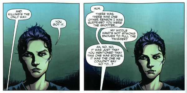
 photo Red_TPanel001_B_zps37f466f0.jpg Red Team by Cermak & Ennis

Maybe it won’t go that way, after all Comics’ Hottest Curry Garth Ennis spends enough time (i.e. too much time) explaining how his characters can smoke in a government building that it must surely (surely!) pay off later in an example of Chekov’s Fags! Maybe everything will go swimmingly but the racially and sexually mixed cast will succumb to a series of smoking related diseases. Maybe not. But hopefully the series will avoid plummeting into maudlin sentimentality like a sloppy drunk slurring on about The Old Country as the barkeep dials for a taxi. Not an uncommon occurrence in work by Comics’ Softest Hearted Big Man Garth Ennis. This thing seems written for the screen (no, the page and the screen are not interchangeable) and the art just isn't up to the job of hiding this. It gives me no pleasure to say that. In fact I’ll leave it there except to express the hope that you really like that panel I picked because you’ll be seeing a lot of it on these pages. RED TEAM is not a complete wash though and that’s due mostly to the dialogue of Comics’ Hairiest Chest Garth Ennis. It’s good dialogue and it means RED TEAM is OKAY! That probably still won’t save me from a beating though.

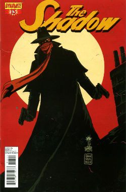
THE SHADOW #13 Art by Giovanni Timpano Written by Chris Roberson Coloured by Fabricio Guerra Lettered by Rob Steen The Shadow created by Walter B. Gibson Dynamite, $3.99

 photo Shad_Cov001_B_zps0806f9d9.jpg

Everything in this book is so familiar that the sight of your face in the shaving mirror delivers more surprises. This issue is impressive only in its devout refusal to bring anything new or interesting to bear on the join the dots plot with its transparent mystery, its space wasting reluctance to provide more than one speech bubble in a panel and…oh...look, there’s a three page sequence of a drunk man going home, going upstairs, pouring a drink and being surprised. No. That’s not comics, that’s just horseshit. I’m not even going to scan a picture of the contents as the fewer people who see this then the less damage done to those involved. Honestly, I’m doing them a solid here. Or a salad as they say in Nyawk. So, no offence to any of the people involved here as we all have bills to pay but this was AWFUL!

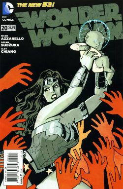
WONDER WOMAN: #20 Art by Goran Sudzuka & Cliff chiang Written by Brian Azzarello Coloured by Matthew Wilson Lettered by Jared K. Fletcher Wonder Woman created by William Moulton Marston and H. G. Peter DC Comics, $2.99

 photo WWom_Cov001_B_zps8c89c4c0.jpg

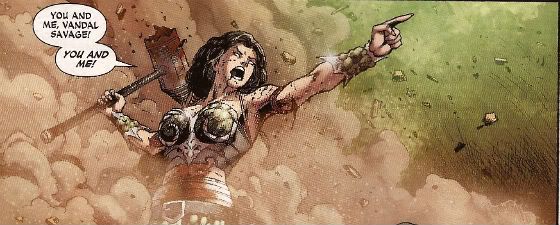
This is an atypically action packed issue but all too typically when the dust settles the forward plot motion is infinitesimal if not entirely illusory. With its large cast, stateliest of paces, squandered artistic talent and elevation of chat at the expense of incident it’s hard not to see WW as Azzarello’s attempt to bottle a bit of that drab Bendis magic. Luckily, despite his heroic efforts, Azzarello appears incapable of attaining such low levels of blandery. For starters his characters don’t sound like they are recovering from traumatic blows to the head; trading only in recursive whirlpools of bland doggerel. And every now and again something does happen. So, it’s an improvement but it’s still very far from being good. It still rarely rises above word play on a par with puzzles in the magazines old people in hospital spontaneously secrete in-between visiting times. Also, I think his cast have a problem with the booze. Although as the middle class assure us, if it’s wine it isn't alcoholism.

 photo WWom_Panel002_B_zps13522682.jpg

Wonder Woman by Chiang, Sudzuka & Azzarello

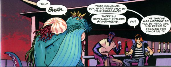
At some point in any given issue the chattering cast will mingle about some tasteful locale sipping drinks and hoovering up nibbles. Thankfully the medium of comics spares the reader the no doubt inevitable soundtrack of Toploader Orion snuck on to smooth things along. The whole thing is like one of those hellish networking soirees for people who do a bit of wee when they think about Powerpoint presentations. Except everybody is cosplaying Sandman and the evening ends abruptly when a big blue catfish in a crown stabs Simon from Accounts in the face. And puns! This issue’s highlight was when War asked, “Where’s my drink? You said you’d get me a Belgian White Beer!” and Wonder Woman replies “I beg your pardon, I never promised you a Hoegaarden!” Face it, Tiger; this book’s so far gone you’re not even sure if that happened. So it’s a fact that the crisp clarity of Goran Sudzuka and Cliff Chiang's art which brings this up to OKAY!

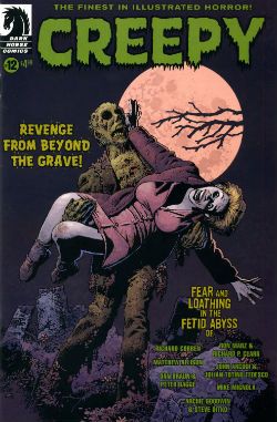
CREEPY #12 Art by Richard Corben, Richard P. Clark, Peter Bagge, Matthew Allison, Julian Totino Tedesco and Steve Ditko Written by Richard Corben, Ron Marz, Dan Braun, Peter Bagge, Matthew Allison, John Arcudi and Archie Goodwin Lettered by Nate Piekos of Blambot and Peter Bagge Dark Horse Comics, $4.99

 photo Creepy_Cov001_B_zpsed87d4c8.jpg

There's the usal raggy grab bag of one pagers and spot illos but storywise we have:

Uncle Mangus by Richard Corben

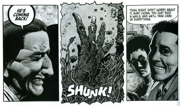
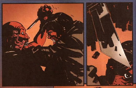
Corben’s on first and Corben’s on form with a frivolous shamble of a shaggy corpse story. Corbenites won’t be disappointed as the shadows drape at strange angles across distorted faces, the undergrowth looks like gathia sticks from Bombay Mix, the borders are jagged when nerves become ragged and the horrific punchline is drawn with slapstick mixed with the ink. Yes, Richard Corben continues to defy Time itself and belligerently refuses to budge from VERY GOOD!

 photo Creepy_Corb001_B_zpsfe235ff8.jpg

Uncle Mangus by Corben

Fishing by Ron Marz & Richard P. Clark Not entirely rote retelling of one of the usual variations on kids go fishing fear fables. Sorry, but EH!

Local Talent by Matthew Allison Allison's tale nicely conveys the grotty zest of late '70s foreign filmed schlock but would have conveyed it better in less space. Also, I know this charmingly cack cinematic genre was limited by budget but it's not a limitation shared by comic art, so c'mon let's have some backgrounds, son. Good enough for an OKAY!

 photo Creepy_Ditko001_B_zps2a622c1e.jpg

The Spirit of The Thing by Ditko & Goodwin The Spirit of The Thing by Steve Ditko & Archie Goodwin

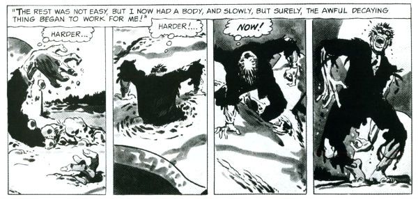
It’s Steve Ditko! "He is Dee Aye Tee Kay OH! He is Dee Aye Tee Kay OH! He’s Dee- delightful! Aye – Innovative! Tee- Totally not open to compromise on any point of principle upon which he has formulated an Objectivist stance! Kay – Kind of kooky! OH!- oooOOOOOOOOOOOOOOooooooooo! He is Dee Aye Tee Kay OH!" In this reprint Archie Goodwin does his usual solid scripting but it’s Ditko’s groovy grey wash German Expressionism that makes this one retain its VERY GOOD! kick lo these many decades after its original printing. It’s also a nice reminder that aficionados of Sturdy Steve should be salivating after the Creepy Presents…Steve Ditko volume that will be dropping imminently. Pre order from your LCS now, they'll appreciate it!

 photo Creepy_Panel001_B_zps17d66933.jpg Pack Leader by Tedesco & Arcudi

Pack Leader by Julian Totino Tedesco & John Arcudi While Ditko and Corben get to VERY GOOD! on the merits of their art alone Arcudi and Tedesco’s tale reaches the same grade due to the success of their collaboration. This one really gels and even wrong-footed me at the last. That's nice. Arcudi and Tedesco knew what they were after and they went and got it. Nice work, fellas!

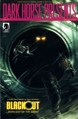
DARK HORSE PRESENTS #24 Dark Horse Comics, $7.99

 photo DHP_Cov001_B_zpsdd591b27.jpg

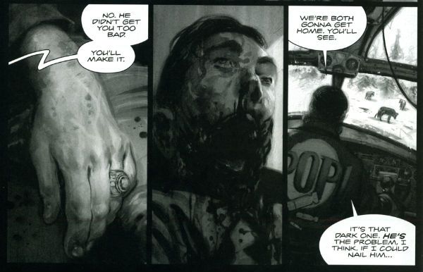
BLACKOUT CHAPTER 1 Story and lettering by Frank Barbiere Art by Micah Kaneshiro Blackout created by Mike Richardson (?)

This one didn't grab me I’m afraid. With its slickly appealing tech sourced graphics and plot predicated on the promise of explanations further down the line it read like the tie-in to some video game I've never heard of. It’s only a few pages though so maybe it’ll pick up and improve from EH!

ALABASTER: BOXCAR TALES CHAPTER 6 Art and lettering by Steve Lieber Story by Caitlin R. Kiernan Coloured by Rachelle Rosenberg Alabaster created by Caitlin R Kiernan

My total indifference to this one is purely a case of it not being my cup of tea rather than any failure on the part of the creative team. I did read it but I couldn't tell you anything about it except it’s in space and usually it isn't. There are some talking animals and a lady, usually with a very broad accent, having magical adventures. Oh, she’s called Dancy Flammarion. Yeah, that’s me gone. I'm no Garth Ennis but fey’s not my thing, I fear. Disregarding my witless bias this is bound to be OKAY! Because Steve Lieber can sure draw nice and Caitlin R Kiernan writes proper books (she should not be confused with Caitlin Moran who doesn't). The most interesting thing was how disproportionately irritated I was by the bit where the team tell us what they were listening to when they created the strip. It was really distracting. I mean was Kiernan really listening to the Sunshine OST? Why? Was it just because it’s the soundtrack to a movie set in space? That’s a stunningly literal approach isn't it? What did she do when it was finished? Start again? Stop writing?

Like a real asshole I find it all a bit disingenuous when creators share stuff like this with us. No one ever says they were listening to Phil Collins or Cher do they? Ever. Yeah, right. Have you seen some of the people who make comics? Seriously. I mean that guy who always does that stupid thing in photos with his face so it looks like a wet thumb sliding down a window is a Foreigner fan and no mistake. Look into your heart, you know it is true. Anyway, this stuff's just the thin end of the wedge, next thing you know they're telling you about their substance abuse problems, how many kids they have or whether they get to put the fairy on top of the Christmas tree. Being an unfeeling automaton it’s just not something I need to know about creators. I mean, does it do any of you any good to know I wrote this while listening to SWANS’ Time is Money (Bastard)? Oh, alright it was Cher. "Do you belieeeeeeeeve!?!"

 photo DHP_BHound001_B_zpsf720926a.jpg

Bloodhound by Jolley, Kirk & Riggs BLOODHOUND: PLAIN SIGHT CHAPTER 2 Art by Leonard Kirk & Robin Riggs Written by Dan Jolley Coloured by Moose Baumann Lettered by Rob Leigh Bloodhound created by Dan Jolley & Drew Johnson

This is a revival of a defunct DC property which has now been given back to the creators to do with as they will. I believe DC also returned the less than successful Monolith property to its creators recently too. This is really rather sporting of DC and we should probably acknowledge that before reminding ourselves of their treatment of Alan Moore. It appears that the lesson here is that if you create anything successful for DC they will line up and bang you like a shit house door. Meanwhile the creators of Bloodhound have decided to put it in DHP. I liked this series when it first appeared and I still like it despite the pony tail our hero sports. He’s kind of like a government sanctioned Punisher with all his marbles and a beer belly who targets super villains. This is just a short three parter so the mystery tends to be cleared up by the characters approaching each suspect, the suspect immediately breaking down and pointing to the next suspect and then the villain breaking cover to provide a thrilling cliff hanger. Brevity isn’t doing it any favours is what I’m saying. But I still find the premise promising, the characters solid and the art pleasant enough for it to be OKAY!

BRAIN BOY CHAPTER 2 Art by Freddie Williams II Written by Fred Van Lente Coloured by Ego ("The Living Colourist"?) Lettered by Nate Piekos of Blambot Brain Boy created by Gil Kane & herb Castle

Although it’s not explicitly stated I guess this is an update of Herb Castle and Gil Kane’s 1962 creation for the faster paced and more luridly violent Now. Since Dark Horse published a pricey hardback of these (old and very probably nuts) tales you’d think they might want to draw attention to this. Weird. Anyway, the update is definitely fast and bloody and it’s not without its charms. Chief amongst these are Van Lente’s witty revisionism best exemplified by the call centre riff and the ‘magic cereal' which fools no one. Artwise Williams II has obviously thought long and hard and come to some definite conclusions about how to draw our hero’s nose. I can’t speak with any surety as to the conclusions he’s reached but there’s definitely something going on with Brain Boy’s hooter. Oh, it all bounces along in a lively if not altogether logical fashion, which makes it GOOD!

 photo DHP_Nexus001_B_zpsda643d33.jpg Nexus by Rude & Baron

TREKKER: THE TRAIN TO AVALON BAY CHAPTER 1 Story and art by Ron Randall Coloured by Jeremy Colwell Lettered by Ken Bruzenak Trekker created by Ron Randall

It's super-nice that an old lag like Randall has his own creator owned property. It's less agreeable to report I found the whole future bounty hunting lady with sad past thing a tad too generic for my fussy palate. I am certain there is an audience for this but I adamant I am not amongst their number. I wish Randall well in all his travels but this, for me, was EH!

KING'S ROAD: THE LONG WAY HOME CHAPTER 2 Art by Phil Winslade Written by Peter Hogan Lettering by Steve Dutro

Oooh! It's a high concept! What if the kids from a book very similar to (but. lawyers take note, not the same as) The Lion, The Witch & The Wardrobe grew up and had kids who didn't know about their adventures and then The Evil Returned and the kids had to take up arms on behalf of their paunchy and totes dull 'dults?!? This. That's what. No doubt Hogan will be exploring the Christian symbols underlying his borrowings with the same rigour and aplomb as his source. Or at least get a movie deal. Just joking! This is a promising (if not a little cheeky) premise and it's made all the more attractive thanks to Winslade's endearingly gangly characters. Although these do inhabit a blurry world of boisterous blooms of colour, the intensity of which suggest Mr. Winslade should pop down the opticians pretty sharpish or at least dial his PC settings down a bit. Maybe I'm getting soft in my dotage but this was OKAY!

CRIME DOES NOT PAY: CITY OF ROSES CHAPTER 5 Art by Patric Reynolds Written by Phil Stanford Colours by Bill Farmer Lettering by Nate Piekos of Blambot Crime Does Not Pay: City of RosesCity Of Roses created by Patric Reynolds & Phil Stanford

This is EH! due to the perfunctory writing and the weirdly flaky looking art. It isn't terrible but it isn't terribly exciting either. Everybody thinks crime comics are easy and nearly everyone is wrong. Everyone except David Lapham. Christ, I miss STRAY BULLETS. Why can't Dark Horse Presents find room for new David Lapham genius? WHYYYYYYYYYYYYYYYYYY???? WAAAAAAAAAAAAAAAAAHHHHHH!!!!

NEXUS: INTO THE PAST CHAPTER 2 Art by Steve Rude Written by Mike Baron Lettered by Steve Rude Coloured by Glenn Whitmore Nexus created by Steve Rude & Mike Baron

Eventually every open ended continuing narrative strip gets to Jack the Ripper, it's likely that they get to Sherlock Holmes too, but only Nexus would throw in H.G. Wells without overbalancing, without even wobbling in fact. It's Nexus so it's VERY GOOD! In fact I'll tell you this: I'd never read Nexus until it appeared in DHP but once it did I ordered Vol.1 of the Omnibooks pretty darn lickety split. I would imagine there is no higher praise a comic creator can receive than a sale. We'll be coming back to Nexus at some point. Aw, yeah!

HUNTER QUAID: ARMAGEDDON OUT OF HERE Art by Melissa Curtin Written by Donny Cates & Eliot Rahal Coloured by Lauren Affe Lettered by Lauren Affe Hunter Quaid created by Donny Cates & eliot Rahal

I couldn’t get a grip on this one. It’s like something an artist would do to showcase their style but it has a writer, no, two writers? And they are the creators but it's the art that is the stand out feature? I don’t know. I don't get that. It looks nice but, hey, that’s all you need sometimes. It was OKAY! but only because of the artist.

 photo DHP_Wheeler001_B_zpsb74cb0f6.jpg Villain House by Wheeler

VILLAIN HOUSE CHAPTER 4 By Shannon "Papa" Wheeler

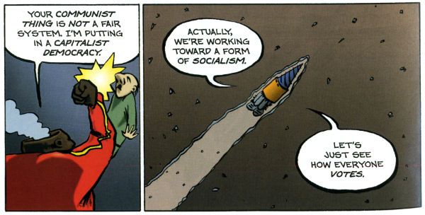
It’s a kind of testament to the durability and depth of the concepts at the heart of Jack Kirby and Stan Lee’s Fantastic Four that half a century later it still provides fertile soil for trees of mirth like this. As mirth trees go this is a sturdy beech indeed. This is some funny stuff right here from the surly insistence of 'Not The Thing' that everything bad is Communist to the laser targeted title of “Invisible Wife” and beyond. The laughs aren't empty either, there’s a sympathetic villain whose world is ruined by a bunch of powered berks getting all up in his business to hilariously disastrous, but not unmoving, effect. I’d hazard a guess this strip is somewhat more refreshing and engaging than yet another modernisation of an old Kirby & Lee classic. ( “Yo, Yo, Yo! Ben Grimm is Totes Sad, Bro! (Ch-Ch-Ch-check out Mi Tumb-LAH!!!)”) Wheelers’ treat of a tummy tickler may not beat the ultimate yukkifier of Don Simpson’ s Yarn Man and “Golly! That crazy gizmo really works!” but it comes closer than most in a very small space. And that’s VERY GOOD!

Christ, I think I sprained something back there. And now I know why people don't review anthologies. I still don't understand why they don't buy em. They're stilll - COMICS!!!

"Rodeo Ain't Over Yet!" COMICS! Sometimes I Don't Have A Title!

Hello! Here are some words about some comics. The sales figures analysis is just below this. Very good it is too! To clarify, the Hibbs' stuff is good, not this stuff. Anyway, this... Photobucket

ALL STAR WESTERN#16 Jonah Hex: Art by Moritat, written by Justin Gray and Jimmy Palmiotti, coloured by Mike Atiyeh and lettered by Rob Leigh. Tomahawk!: Art and colour by Phil Winslade, written by Justin Gray and Jimmy Palmiotti and lettered by Rob Leigh. DC Comics, $3.99 (2012) Jonah Hex created by Tony DeZuniga and John Albano Tomahawk created by Edmund Good and Joe Samachson

Photobucket

I finally realised that it isn't the sticklebricking of DC Continuity and the basic desperate casting about for stunt elements that are hamstringing my enjoyment of this book. No, it's the joylessness of it. Its total and wholehearted acceptance of the current DC mode of storytelling which puts a premium on prevarication and encourages emptiness. Look, this book would be great if Bob Haney was writing it. Bob Haney isn't writing it though so it isn't great. If I'm hankering after Bob Haney in 2013 it's a fair guess your book isn't up to snuff. On the up side this issue doesn't contain the dismayingly frequent page filling device of having that Oriental lass fighting for five pages. In fact she doesn't appear once which means that any entertainment can be rightly said to be just like the cast - purely occidental. You want better jokes, make better comics.

Photobucket

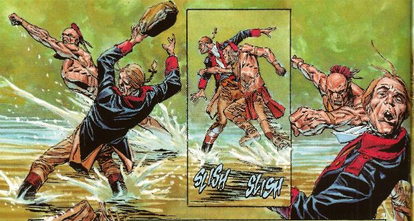
In the Tomahawk back up the most startling aspect as ever is Phil Winslade's bizarre digital watercolours job which I find enjoyable without actually knowing why. In other news, the English turn out to be the villains! I guess that's how Germans feel when they read DC war comics. A taste of my own medicine there. And it is bitter, bitter, bitter. This book, however, is only EH!

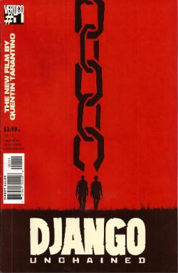
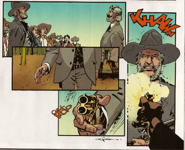
DJANGO UNCHAINED #1 Art by R M Guera with Jason Latour Adapted by Reginald Hudlin Coloured by Giulia Brusco Lettered by Sal Cipriano Adapted from the original screenplay by Quentin Tarantino Vertigo/DC Comics, $3.99

Photobucket

I can’t speak as to how good an adaptation this is because I haven’t seen the movie. I’m old and the wild and outrageous young rebel Quentin Tarantino scares me with his outrageously youthful rebelliousness and his youthfully rebellious outrageous movies. Luckily my much younger sister had seen this very movie so I asked her how she found it. She said, and I quote so the record may be deemed complete, “It was entertaining, Johnny, but it wasn’t good.” There you go then. Me, I fear I invite your youthful ire as I just don’t think Tarantino is all that. Oh, it isn't his childishly inflammatory use of the “N” word, after all I’m sure should our paths cross the edgy auteur would be equally forgiving were I to pepper him with the “C” word like it was going out of fashion. No, but some of it is the fact that he uses the word “cool” too much. The only men his age who should use “cool” that much are Grateful dead fans who live in San Franciscan dumpsters. Mostly though it’s that he reacts to proper questions like THIS. Yeah, I'll let that speak for itself I think. On the plus side the iconoclastic Quentin Tarantino does seem to have exhausted his celluloid fetish for Uma “Man Hands” Thurman.

Photobucket

The stated aim of this comic is to illustrate the original script. Every golden word. I guess it does that. It certainly seems like a Tarantino script. The dialogue is surely as self-satisfied and in need of tightening as ever and it retains all the usual rhythm and musicality (i.e. all the rhythm and musicality of a tune played on an arse flute); scenes outstay their welcome or outstay their welcome while also leading up to a totally predictable reveal and the characters haven’t any. Usually it would take hundreds of talented people and millions of dollars to make this stuff at least enjoyable if not actually good. All this comic has is R M Guera. All this comic needs is R M Guera. It’s an amazingly savvy choice since for the last 5 years and change R M Guera has been tasked with tricking everyone into thinking that a tour through Jason Aaron’s 70’s movie memories constitutes something with anything more to say than, hey, wasn't cinema in the 70’s just grand? Or SCALPED as it is known. Elevating the mundane to the magical is just what R M Guera does I guess. He does it bloody well though. Jason Latour throws down a few flashback panels and his art is excellent every time it appears but the shining star here is R M Guera. R M Guera with his ambulatory toby jugs and smooth storytelling once again showing everyone else up. Hey, the poor old writer doesn't even get a credit except here: Reginald Hudlin. I don't know why he doesn't get a credit but it's not a trend I want to encourage. Anyway, thanks largely to RM Guera this was GOOD!

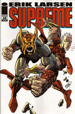
SUPREME #68 Written and Drawn by Erik Larsen Coloured by Steve Oliff Lettered by Chris Eliopoulos Supreme created by Rob Liefeld Image Comics, $3.99

Photobucket

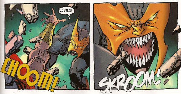
In this pulse pounding issue Erik Larsen basically says that he enjoyed illustrating Alan Moore’s script but since then he’s been noodling about and it’s been just super, thanks, but he’s off now. Apparently someone else will be taking over, no idea who but, yeah, someone at some point. Of all the moves to steal from the DC playbook that’s a pretty strange choice. At least he didn't steal DC’s signature move which is now apparently making comics nobody likes but lots of them. Larsen’s departure is a bit of a shame because I found his Kirby with a split nib art quite charming and in this issue it’s particularly so because, for no readily apparent reason, Larsen suddenly starts drawing this thing like it’s Kyle Baker’s RONIN. (Yes, I know it was Frank Miller's RONIN but this looks like Kyle Baker's RONIN).

Photobucket

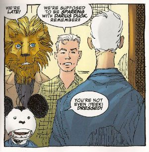
I quite enjoyed this book. It had enjoyably stupid characters like Lion headed Supreme and Darius Duck, people flew around, punching occurred and Larsen always respectfully drew Supreme in that scratchy Liefeld mode without actually ever being as shitty as Liefeld. Sure, it was pretty basic stuff but it was basically pretty stuff. Sometimes I don’t actually want all that much from a comic and this certainly delivered that. I wouldn't recommend that Erik Larsen make a habit of just dumping books as people might start referring to a failure to commit as having committed Larsen-y. Unlike that joke this was OKAY!

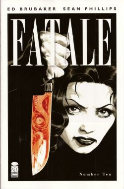
FATALE#9,10 Art by Sean Phillips Written by Ed Brubaker Coloured by Dave Stewart Fatale created by Sean Phillips and Ed Brubaker Image Comics, $3.50

Photobucket

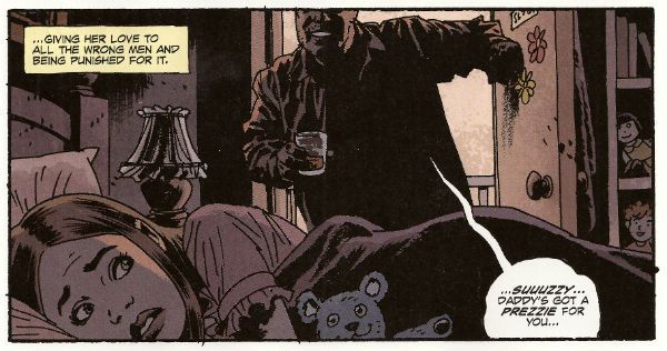
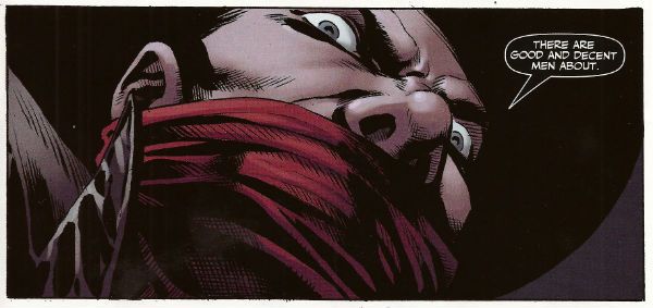
Everyone can relax because I’m done here. I’ve had my doubts about this one all the way. For starters the horror elements have been inexplicably dusty and dull (cassocks! tentacles!). I don't need my own pet Jess Nevins to know that horror in the '70s was actually engaging with real world events and offering up savage and innovative treats which were leaving Corman's Poe adaptations for dead. Then there's the inescapable drab narration which mistakes deadpan for just plain dead on the page and is written in a fabulous new tense even more inactive than the passive; the comatose tense perhaps. The only sign of life in this one-note stuff is that it works the word “but” like it yearns to be a Salt’n’Pepa track.Then there's stuff like this:

Photobucket

That pivotal oh, go away moment occurred in issue 9 but due to the caprices of my comic dispersal system I still had issue 10 to go. Yes, one more chance! A chance which was immediately crushed when the central character (who thus far has been less like Fatale and more like Docile) just suddenly remembered she had special magic powers and plain killed everyone in a climax as rewarding as being inadvertently brought off by the motion of your train seat. Look, there’s no mystery about why men will act like complete tools for a pretty face, certainly not a supernatural mystery. Unless you think the contents of your pants are supernatural and mysterious. In which case your Pope just resigned. I didn't know Popes could do that! This series always seemed less James Ellroy and H P Lovecraft and more Quinn Martin and Donald P Bellisario. An impression strengthened by future covers which indicate the series is just going to stick a new genre on top of the usual stuff. Now she's a witch, now she's a space man, now she's a turtle, dis-integrating! Like my interest. Mr Ben with a magical woo-woo may well be a new direction but not one I’ll be pursuing. So, I’ll be missing future essays on The Scarecrow And Mrs King and, more importantly, the fine work of Sean Phillips and Dave Stewart which deserves better than to be yoked to work this EH!

SHADOW SPECIAL #1 Art by Ronan Cliquet Written by Scott Beatty Coloured by Mat Lopes Lettered by Rob Steen The Shadow created by Walter B. Gibson Dynamite, $4.99 (HOLY MOTHER OF GOD!!!! FOUR DOLLARS AND NINETY NINE CENTS!!!! THAT'S INSANE!!!!)

Photobucket

In the main title The Shadow is currently palling about with George Orwell. George Orwell is the author of a couple of books on how shit being poor is and how we will all willingly participate in a system designed to crush our common humanity. He was right about both of those things and remains right, although he missed a trick in not realising that the main way The System would ensure our complicity would be by making nice things for us to buy. But then there weren’t many nice things to buy back then so we’ll let him off. Rip The System! You don’t bring Orwell to the party unless you want that party to get political! Orwell also did a book about animals on a farm. I can’t remember what it was called but it was about animals on a farm. It was a metaphor or an analogy or some clever shit like that about some animals on a farm. Oh yeah, I remember now, the one about the animals on the farm? It was called BEFORE WATCHMEN.

Anyway, this isn’t the main series so George Orwell isn’t in it. No, this is a “special” but it isn't very, possibly even at all. Except for the price. That’s pretty fucking special right there. There’s the core of a fun and pulpy tale here but something’s gone awry on the pacing front. When there’s more pages devoted to The Shadow moaning about going shoe shopping (yes, really) than there is to his fight in a minefield with a man who has courageously chosen to sport only a bouquet of barbed wire around his nuddy bod (Oooch! Owch!) then, yes, I’d have to disagree strongly with the storytelling emphases.

Photobucket

Ronan Cliquet has a good go at being Alan Davis but he seems to have jumped ahead a bit; Alan Davis didn’t get to be Alan Davis until he’d got the basics right, son. I’m guessing he’s just some wee snip learning his trade but the best I can give him is – promising. The most special thing about this comic is the paper it’s printed on. Paper so much like catalogue pages from your youth that there’s a constant urge to riffle through them to the Hot Wheels section or the sports bra section depending on which age your development is currently arrested at. No, it wasn't special unless special is EH!

And like The Pope - I'm gone! But there's still COMICS!!!

"...A Cascade Of Wasps Attacked the Furry Monster!" COMICS! Sometimes You Worry About The Men Who Made Them!

That's right I read some comics. Some of them were old and some of them were new and one of them wasn't really a comic at all. But only one of them made me think it was a miracle anyone was actually conceived in the '50s. Photobucket

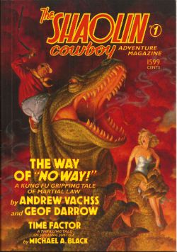
Yes, paging Dr. Subtext! Outbreak of '50s gynophobia! But then to nostalgic old fools like me '50s gynophobia is arguably the finest gynophobia of all! Anyway, this... THE SHAOLIN COWBOY ADVENTURE MAGAZINE #1 The Shaolin Cowboy in "The Way of No Way!" by Andrew Vachss and Geoff Darrow Time Factor by Michael A. Black Illustrations by Geoff Darrow and Gary Gianni Designed by Peter Doherty Cover by Scott Gustafson Dark Horse Books, $15.99 (2012) Shaolin Cowboy created by Geoff Darrow

Photobucket

This isn't a comic book, best get that straight right from the off. What it is is a loving evocation of the pulp magazines of the past. Peter Doherty has designed the book, and every page within it, to wilfully evoke those deceased progenitors of the super hero comic. He draws short at leaving the page edges untrimmed but other than that it's a splendid piece of design work. The contents are very reminiscent of the old pulps too. I haven't read a lot of those but what I have read of them they were largely shaggy dog stories told in very wordy way with the main draw being the charisma of the central character and the outlandish inventions deployed by the (often uncredited) authors to delay the ending.  Pulps were largely exercises in covering as much ground with as little material as possible (very much like certain comics from The Big Two. Ha ha! You Crazy!) but fought hard to be entertaining while doing so (unlike certain...Ha ha! Me passive aggressive!).

Photobucket

So what you get here consists of pages of words punctuated by  a plenitude of Darrow's hypnotically precise spot illustrations and a smattering of full page "Helpful Hints" where Shaolin Cowboy helpfully shows you how to switch on a toaster before e.g. tearing off someone's nutsack with it. That's the joke there and it's the same joke every time but as with certain jokes the accumulative repetition somehow keeps it funny. Because that's the thing about Shaolin Cowboy isn't it? There aren't a lot of jokes but what there are are good jokes. The best joke in the comics is appreciating the density of illustration used to enliven such meagre plots. The trick here is that Vachss and Darrow make the language serve the illustrative function but the joke remains, in essence because whole pages dense with text  are spent describing a scene only to have the scene change suddenly. More space is spent describing how the people Shaolin Cowboy is about to dispatch look than there is spent describing how they are dispatched. As with the comic the emphasis is on appearance rather than action. You will have to like words to like this one.

Darrow and Vachss have worked together before (Darrow did the covers for Vachss' 1995 CROSS series at Dark Horse and worked on the 1993 ANOTHER CHANCE TO GET THINGS RIGHT g/n along with many other artists) but it's surprising how well it works here given that change of emphasis from art to text. Vachss is a perfect choice for a pulp project like this. He's an accomplished writer of fiction whose work tends to read like nothing so much as pulp filtered through a dark adapted eye. His Burke novels are pretty much What If  Doc Savage and his crew had all had terrible childhoods and now hunted sexual predators with absolutely no intention of rehabilitating them. Vachss is an imposing figure what with his designer suits, eye-patch and general stance that seems to declare that he has just dealt with something and it will never hurt anyone else again. He isn't a dilettante either, just paddling in the waters of human atrocity for profit. This is from his bio in the back:

"Andrew Vachss has been a federal investigator in sexually transmitted diseases, a social-services caseworker, and a labour organiser, and has directed a maximum-security prison for "aggressive-violent youth". Now a lawyer in private practice, he represents children and youth exclusively."

This explains the references to the organisation PROTECT which crop up in the book and the no-nonsense message about kids and violence. Andrew Vachss makes Steve Ditko look indecisive is what I'm saying. I'm glad there is someone out there like Andrew Vachss, almost as glad as I am sorry that there is a need for people like him. But I can assure you that my rating is based entirely on the fact that I really enjoyed the book. It certainly isn't fear of having my legs broken that makes me say it was VERY GOOD! Also, the Michael A. Black time travelling/dinosaurs short that brings up the rear of the book is pretty neat and will take you back to Sundays reading Ray Bradbury on the rug in front of the fire before you even knew the world contained kids less fortunate than you who needed things like PROTECT.


ALL STAR WESTERN#13 Jonah Hex: Art by Moritat, written by Justin Gray and Jimmy Palmiotti, coloured by Mike Atiyeh and lettered by Rob Leigh. Tomahawk!: Art and colour by Phil Winslade, written by Justin Gray and Jimmy Palmiotti and lettered by Rob Leigh. DC Comics, $3.99 (2012) Jonah Hex created by Tony DeZuniga and John Albano Tomahawk created by Edmund Good and Joe Samachson

Photobucket

This book gets worse and worse and it still sells more than it did when it was called JONAH HEX. But then it isn't about Jonah Hex anymore is it? No,  it's more like Jonah Hex And His Amazing Friends. Except they are far from amazing and, as he's Jonah, they aren't really his friends, so it's more Jonah Hex And Some People Tolerating Each Other. Whatever I say about this book (and I'll be saying some stuff alright) all that needs be done to refute me is to chuck back its sales figures in my angry biased jealous fan boy face. The guy doing the most work here is clearly Moritat and he does a far better job than the material requires. Look, this isn't about Jonah Hex being "my" character and how I don't like what they've done to him. It's about bad comics. This one starts off with a clown killing a priest. He is killing the priest because he does not like priests because they fiddled with him when he was a kid. Jonah and his crew show up and notice the dead priest has had his face painted like a clown and someone says there's a circus in town and, oh God, oh Jesus....it's not exactly a fucking "two pipe problem" is it, Watson?

Photobucket

And I've gone Holmes on you there because what this comic is also doing is bringing in fictional literary characters from the period the book is set in (at the minute we have Edward Hyde, y'know, from Little Dorrit.) I can only guess they are doing this because the constant shout-outs to DC super hero continuity aren't stupid enough. I've got no beef with either man (I'm certainly not jealous(!)) but Palmiotti and Gray's work comes down heavily on the commercial rather than the creative end of the see-saw. It beggars my mind why on earth they would seek to go toe to toe in the shared-world arena with Kim Newman, Philip Jose Farmer and that elderly Englishman we've all decided we hate (because although less than he was he still makes everyone else look bad).  In comparison this is just pantomime and Palmiotti and Gray look like they'be both not only turned up as the horse, but they've miscalculated further and they both came as the horses' ass.  C'mon, the clock is ticking until Spring Heeled Jack shows up. After all some claim the murders ended because he sailed to The New World, how can they resist. Look forward to "It's Saucy Jack, sir! He's struck agin! Right under our very noses!" That should show FROM HELL up good and proper. Yeah, I know; but it sells more than ever - so I lose. I looOOooooOOOOOOooOOse! Look, something can be successful but still CRAP! It isn't a critic's job to tell you what's selling - it's their task to tell you whether something is any good or not and why. Sometimes elliptically. Sometimes irritatingly.


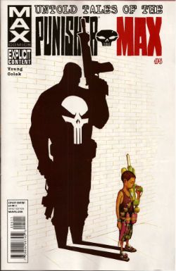
UNTOLD TALES OF THE PUNISHER MAX#5 Art by Mirko Colak (p) and Norman Lee & Rick Ketcham (i) Written by Skottie Young Coloured by Michele Rosenberg Lettered by VC's Cory Petit Marvel, $3.99 (2012) The Punisher created by John romita Snr, Ross Andru and Gerry Conway

Photobucket

There are many audacious things aout this comic written by the man who will, on this evidence, remain better known for his art on Marvel's wonderful Oz books. First up is the fact that Young attempts to position FrankMax as some kind of homicidal homilist dispensing murder and maxims. That would be okay(ish) if this were FrankNorm but in the MAX (So uncompromising! So complex! (i.e. violent and cruel)) world it seems a bit...off. Like FrankMax's taken one too many blows to the head and suddenly become simple minded or something. Don't get me wrong it's a good moral but I don't know if the guy who (spoiler!) killed your Dad is the guy you're going to listen to. No, put the phone down! Not your Dad; the Dad in the book. The Punisher didn't kill your Dad! He isn't real! No, The Punisher isn't real, your Dad is. Look, you're just doing it on purpose now.

Photobucket

The other bold move is to have the issue basically centre around a high-stakes cat and mouse game revolving entirely around the making of cheese macaroni and, specifically, whether there is some cheese in the fridge! I won't spoil it for you. No, not the cheese that's okay it's in the fridge. Or! Is! It!? I kind of liked that actually; it amused me. Young really stretches my credence to cracking point though when he suggests someone's favourite movie could be Appollo 13. Hey, it's a decent movie and it documents a thoroughly remarkable instance of insanely laudable human bravery and ingenuity no doubt, no doubt. But...favourite movie? Ever? Of all the movies you have ever seen? Okay, it might be crew members Lovell and Hise's favourite movie (Swigert died before it was made but he'd probably have been mad keen on it too.) but this comic isn't about them. I know all kids think their Dad's taste in movies suck but c'mon. Even my Dad likes Reservoir Dogs (altho', "There's no real need for all that language, John.", so spaketh he.) All this together with the unspectacular art makes the comic EH! And in the end the brassiest thing about the comic is that Marvel charged $3.99 for it. (You don't even get a Free Digital Code!)

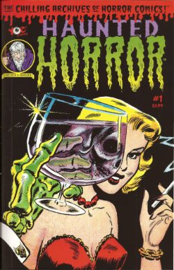
HAUNTED HORROR #1 Art by C.A. Winter, Bernard Baily, Mike Sekowsky & Bill Walton (attrib.), Jack Kirby & Joe Simon, Jack Cole and Jay Disbrow. Reprints tales from WEIRD TERROR#1 (1952), THIS MAGAZINE IS HAUNTED#4 (1952), BAFFLING MYSTERIES#6 (1952), BLACK MAGIC#31 (1954), INTRIGUE #1 (1955) and CRIME DETECTOR #5 (1954) Cover by Warren Kramer and Lee Elias IDW/YOE Comics, $3.99 (2012)

Photobucket

If you don't think that that fine as wine cover is some kind of awesome then you best look away now because that's the smoothest thing in this package. And what a package this is! A splatter of pre-Code horror comics from various sources and various artists that shores up the case for art being the decisive factor in a comic's appeal. Because these sure ain't some well written comics. Apart from the Simon & Kirby (S&K) tale none of the other contents even get a writer credit. I'm not really surprised either. These things are entertaining allright but probably not in the way the authors intended. If the authors even intended anything because back then people just wrote this stuff to eat and they had to write a lot of it and they had to write it fast. Intentions are a very modern affectation for comics writers, tha ken. The more sedate of these tales are written like the writer’s got his cock in a mangle and he’s just learned he's late for a plane.They aren't exactly coherent is what I'm saying there. But the best one is "Black Magic In A Slinky Gown" because it has an almost palpable revulsion for women and the dirty, dirty things they make men do with them. The author of this one is only saved from almost certain Sectioning by the addled and unfocused nature of the storytelling. Or maybe it makes it seem worse than it is; either way it's hilarious. The kind of story you imagine being written by the kind of man who silently props up the bar surrounded by a circle of silence and goes home and the next time you hear about him it's in the paper and it isn't for winning the lottery.

Photobucket

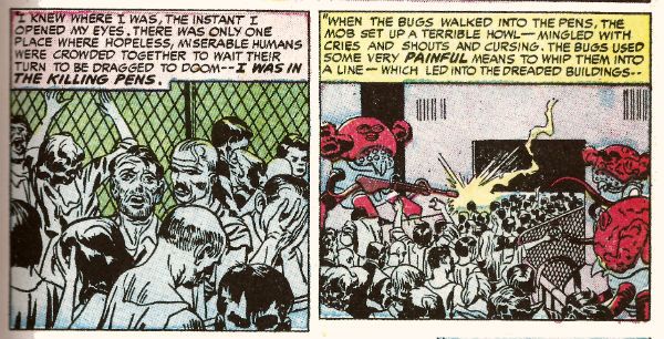
In a more commonly accepted sense of "best" it's "Slaughter-House" which takes the prize. This is by S&K and is a real shocker. It's f-in' brutal!  A couple of battered Joes resist after the Earth has been conquered by '50s style aliens and it's all really unsettling. It's as though limited as to what they could depict visually S&K snuck through the real horror in the text. Seriously, it's basically got humanity being herded into killing pens and "...SLAUGHTERED like beef on the hoof!" With the wire and the guards and the mechanised death and the resistance and the Quislings and...you don't need letters after your name to know what S&K are on about (World War 2, darlings. World War 2). It also contains the word "noggin" which automatically makes my day. The ending is uncharacteristically downbeat for Kirby (maybe it's more Simon) but it's weird to reflect that The King's work appears more pessimistic before Marvel fucked him over than it does after. Because while this story apparently refutes it Jack Kirby, and I may have mentioned this before, never gave up on us.

Photobucket

This is a VERY GOOD! package overall. Not just for nostalgia (because don't you have to have experienced them first time round for that?) but also out of interest in what comics used to be like. Turns out they were the kind of thing that, had it been produced yesterday by people under thirty, would tickle the 'nads of VICE readers as much as the sight of a pretty girl reading Infinite Jest opposite them on the subway. (Honestly, there's some real Charles Burns/Dan Clowes look-a-likey stuff in here.) Also, for people who like their reprints just the way they were this book is for you, Brian Hibbs! It looks like someone just scanned the comics in and adjusted the contrast and so all you need is a Police Action in Korea, a corn dog and a cop on every corner for it be just like the good old days again!

Make Brian Hibbs smile like a child again by buying HAUNTED HORROR #1 from HERE.

And like the good old days - I'm gone!

Hope y'all had a good Thanksgiving and remembered to give thanks for COMICS!!!

"Mr. Dazzleby Has Promised To Be Kind And True." COMICS! Sometimes It's Four Divided By Zero Plus One!

I've heard some people only read Marvel comics! Also, some people only read DC Comics! That's okay, 99% of all psychiatrists agree - compartmentalisation is really healthy! It's also okay because I only wrote about some DC Comics! Marvel people will have to wait a bit. I know, I know but I'm sure you'll find the wherewithal to cope. Next: words... Photobucket

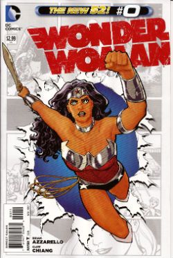
WONDER WOMAN #0 Art By Cliff Chiang Written by Brian Azzarello Colours by Matt Wilson Lettering by Jared Fletcher DC Comics, £2.99 (2012) Wonder Woman created by William Moulton Marston Photobucket

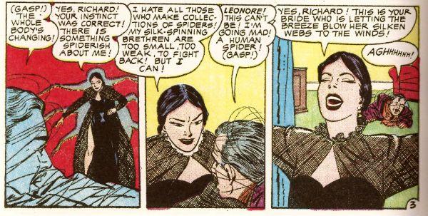
Throughout this comic Cliff Chiang provides outrageously gorgeous artwork, I just want to make that clear. Because as lovely as his work is it can in no way distract from the petty failures of Azzarello's script. This reads like an attempt to channel the scripts of old complete with their overwrought narration and abundance of redundant information.  In the hands of a respectful and talented writer this would be a cute homage, a neat tip of the hat, a cheeky wink, a clever and enjoyable comic. But not here. Azzarello's bitterness and contempt for the work of all those who came before him is evident on every chippy little page. The first narrative caption contains not only this creepily layered insult to both readers and women, "the monthly monster strikes again!"  but goes on tell us the tale originally appeared in "All-Girl Adventure Tales For Men".

Photobucket

I imagine the intention was to be humorous but I don't have to imagine that the reality is so soured with loathing for the audience, the self and even the genre that  it's a relief when the curdled homage ends a few pages later. Yes, because as primitive and rubbish as we are implicitly assured the writing was in comics of yore, it's actually beyond Brian Azzarello's sophisticated and modern talents to replicate at even a satirically joshing level for a full issue. As base as they were he can't do it. Which is the best joke of all. It's thanks only to Chiang, Wilson and Fletcher that the book hovers around GOOD!

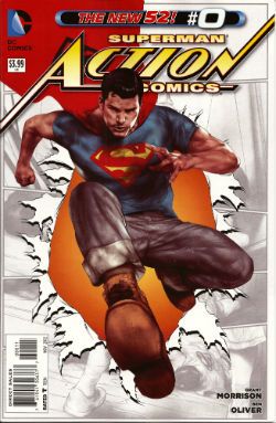
ACTION COMICS #0 Art by Ben Oliver, Cafu Written by Grant Morrison, Sholly Fisch Colours by Brian Reber, Jay David Ramos Lettered by Steve Wands, Dezi Sienty DC Comics, £3.99 (2012) Superman created by Jerry Siegel & Joe Shuster Photobucket

Unlike the assured work in his BATMAN books (work so assured that it it kind of glosses over how bad some of it is) I've not found Grant Morrison's run on ACTION COMICS to be terribly convincing. It's had the air of him having been asked if it's still his dream job to write a regular Superman comic, to which he's replied, "Hoots! Aye tha ken right, maboab! When am ah starting?" And then he's been told "Er, we need twenty two pages in the next five minutes." "Crivvens!" indeed! The results have been a bit patchy to say the least. Although maybe it's just that he was writing in a burning temple. That would put anyone off.

(I guess I should apologise for that outrageous descent into Jockface but I'm sure you understand that I am an artist and, even though I’m very far removed from Scots culture, I really love it. I don’t even eat a lot of shortbread, I eat a lot of fish and chips but the fascination with the Scots remains part of our everyday British culture. It would be wrong of me not to rip the piss. Also, Grant Morrison is really acting like a bowffing staigie these days.)

Photobucket

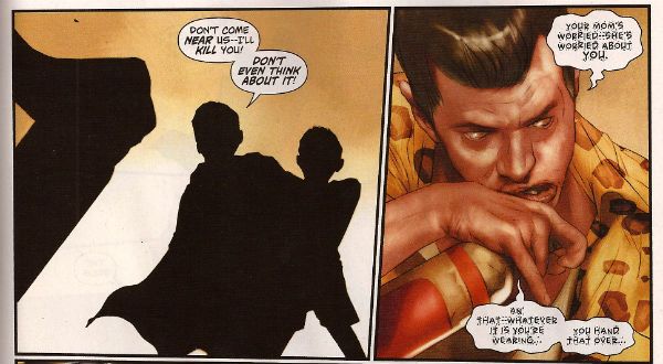
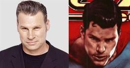
It's just a bad comic all over but you can see how it could have been a good comic had some time been spent whipping it into proper shape. Children being saved from awfulness by the sheer Goodness of Superman should be a slam dunker but this thing is under-worked at both words and art level. Underworked to the extent that the art isn't even art at times, it just flat out descends into silhouettes like a cack handed Han Dynasty Chinese shadow play rather than a Twenty First Century American comic-book. As it is the whole thing is a lost cause anyway; totally scuppered by its failure to decide where it stands on quiffs. Initially the quiff is seen as a force for good, embodied in the choice of basing Superman on Film Critic and All Round Good Egg Mark Kermode.  Yet later a drunk child abuser (boo!) is introduced sporting the self same pompadour. Mixed messages are one thing but if a comic can't even decide where it stands on the morality of a haircut it's pretty much bound to be EH!

Photobucket

ALL STAR WESTERN#0 Art by Moritat (and Pia Guerra) Written by Jimmy Palmiotti and Justin Gray Coloured by Mike Atiyeh Lettered by Rob Leigh DC Comics, £3.99 (2012) Jonah Hex created by John Albano and Tony DeZuniga Photobucket

Fortuitously for the writers Jonah Hex has had an eventful life because then they can just fill the pages offhandedly routinely recounting his doings in a manner that would make the personification of Perfunctory raise her fan to her face and blush. This happened, then this happened and later this happened? that's not actually a story. It's things happening. There's no attempt to add anything to Jonah's story it's just: Jonah's Dad was violent but not a drunk, now Jonah's Dad is violent and a drunk, etc. It's just there. Moritat is clearly overworked here but he does manage the odd panel that it's worth lingering over amongst all those that you'd rather rush past in embarrassment. Despite the rote plodding of the writing thanks to Moritat's occasionally interesting art and a travelling salesman called "Mr. Dazzleby" the comic manages to be OKAY!

Photobucket

Sometimes people point out that they don't like that rasher of skin connecting Jonah's upper and lower jaw. Somehow this weakens the whole character for them. Luckily I ignore my family and think about things like that, important things. Yes I'm here to help. Place your forefinger at the point at which your lips meet, now place your thumb at the point where your teeth stop and your jawbone begins (you will have to press against the flesh until you feel the difference), now move your forefinger in a rough circle between its starting point and where your thumb has paused. Imagine that that flesh has been cut away. Hi ho! There you go! The mystery of Jonah's strange face solved. Next!

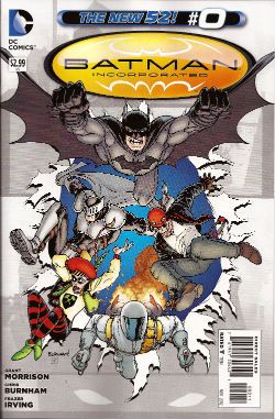
BATMAN INCORPORATED#0 Art by Frazer Irving Written by Grant Morrison (story by Grant Morrison & Chris Burnham) Coloured by Frazer irving Lettered by Pat Brosseau DC Comics, £2.99 (2012) Batman created by Bob Kane Photobucket

Even though Frazer Irving's art is obviously rushed, veering wildly from the astonishing to the embarrassing, and he badly fluffs the final "beat" with the boomerang his work here is still fascinating in a really pleasing way. I like the way the colours are presented as just shapes and your eye has to skitter about the image, like a spider seeking shelter when you suddenly switch the light on, until it gleans enough information to figure out what the Holy Mother of Pearl it's looking at. Your eye that is, not the spider.

Photobucket

Maybe that's why the story here works so well. Because it isn't really a story it's more a of a sleight of hand in which a jumble of moments manages to create enough mental connections in the mind of the reader to make it seem as though a coherent narrative has occurred. It's a neat trick. A good enough trick in fact for the comic to be GOOD!

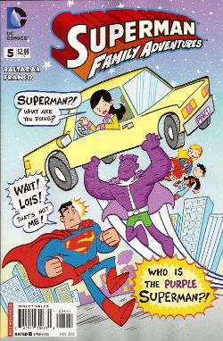
SUPERMAN FAMILY ADVENTURES #5 Art by Art Baltazar Written by Art Baltazar and Franco DC Comics, £2.99 (2012) Superman created by Jerry Siegel & Joe Shuster Photobucket

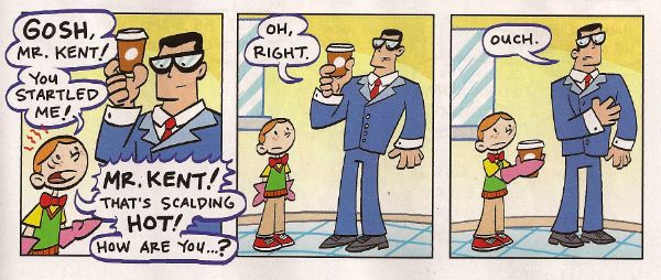
I buy this comic for Johnk(UK) V.2.0 in the hope that he will also wish to waste large amounts of his life on blathering on witlessly about the artform known as comics. Yes, he enjoys this but then so do I. I enjoy it for lots of reasons beyond the fact that I am a child-like simpleton. I enjoy the fact it is quite sophisticated in its treatment of the Olsen-Lane-Kent dynamic. Lois knows Clark's secret she just pretends she doesn't and Clark knows she knows and that she is pretending she doesn't while Jimmy is just comically plain vanilla oblivious.

Photobucket

Also, I like the Super-pets and this comic is the only place you can see them unless the main DCU finally matured enough to stop being embarassed of its heritage in exactly the same way that a teenager is embarassed by their parents. Look, the book's neat stuff. A lot of the time I have no idea what is going on, but that's okay. Even when it is just brightly coloured gibberish the kids seem to understand. And since that's who it's for this is VERY GOOD!

I hope you all had a nice weekend and enjoyed some COMICS!!!

"No! It's ANGRY!" COMICS! Sometimes They Bow Before The King (Of R'n'R).

Good Day! Jolly Good Day! Over here we are shortly to be having a Jubilee shindig! You don't get one so I gave you this instead. It's all over the bally shop but some of it is about comics. You have been warned and so my hands are clean but look at the state of your fingernails! Photobucket

ALL STAR WESTERN #9 Art by Moritat, Patrick Sherberger and Dan Green Written by Justin Gray & Jimmy Palmiotti Coloured by Gabriel Bautista and Mike Atiyeh Lettered by Rob Leigh DC Comics, $3.99 (2012) Jonah Hex created by John Albano and Tony DeZuniga Nighthawk created by Robert Kanigher and Charles Paris Cinnamon created by Roger McKenzie and Dick Ayers

Photobucket

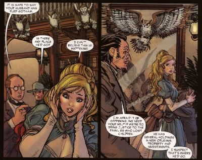
I have my concerns about this book. These concerns have nothing to do with the art what with Moritat and Bautista delivering the usually fine performance; said performance being so fine that it hardly matters that the backgrounds are a smidge perfunctory. And despite the plots being a bit woolly what with all this editorially mandated crossover bullhockey (Ooo! The lady in the cape! Some owls!) at least here they contain the always entertaining idiocy of Caucasian Americans worrying about immigrants lowering the tone of the place and generally letting the side down. It's not even that on a page turn it's "three weeks later" and we're in Gotham instead of N'Orleans, because I understand they want to get on with this interminable owl shite. And yet, part of me, the beautiful, dreaming part no doubt, misses the days when Jonah wouldn't be able to go from one town to another without ending up nailed to a cactus. And I miss El Papagayo turning up to taunt him. I miss El Papagayo he'd be all like, "Senor, Hex! Why must you always make life so hard for yourself, my friend! Come out from behind that rock and embrace me and my gang of toothless well armed vermin! Do you no longer trust your good friend, El Papagayo, Senor Hex! You hurt my heart, my friend! Why, Paco here has brought some smelly badgers! tell him, Senor Hex, tell him we don't need no steenkin' badgers!" Actually, it probably isn't the absence of El Papagayo either.

Photobucket

No, it’s more that Jonah’s becoming a guest star in his own book; it’s just too crowded and in order to stand out from the crowd I fear Jonah’s going to become more of a caricature than a character. The book's focus has shifted from the lovable asshole with the melty face to being more of an attempt to reposition DC’s mouldy old oaters in more viable iterations. I’m all about that because I have a fatal fondness for DC’s western heroes. I have no idea why but there it is. Some people are like that about The Batman; my way is cheaper, I win. I’m also quite okay with the view that there are no bad characters just bad writing. But I’m not quite convinced that the way to go is to give these characters aspects more suited to superheroes. So I’m not convinced that the missing ingredient for Nighthawk and Cinammon’s success is their possession of a pair of lucky charms which stop them dying and make them strong, super strong in fact.

Photobucket

But I just hamstrung my own qualms by saying there aren't any bad characters, so I guess the problem is the writing. In which case I'll bounce back and say it’s just too workmanlike. If you’re selling something to an audience - put your back into it, get some enthusiasm going! Well, it’s workmanlike when it isn't hat stampingly poor; as when Bruce Wayne’s bat-ancestor mentions there is poison ivy someplace. Wait, poison ivy! Do you see?!? DO you see?!? Next issue we’ll hear some joker released some penguins from Gotham Zoo but he keeps denying it because he’s two faced! This is what Jonah Hex needs! Next issue it’s Bat Lash; let’s hope he hasn't got a steam powered skidoo or some such daft shit. At the moment ALL STAR WESTERN is GOOD! but it's on thin ice, muchachos!

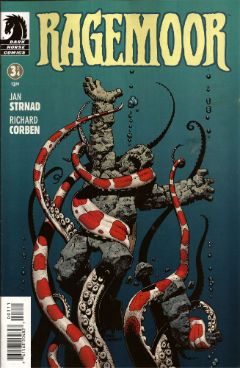
RAGEMOOR #3 Art by Richard Corben Written by Jan Strnad Lettered by Nate Piekos of Blambot® Dark Horse Comics, $3.50 (2012) Ragemoor created by Richard Corben and Jan Strnad

Photobucket

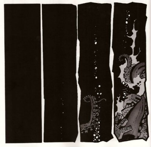
This one’s the third issue of four so you might, given modern trends, expect it to basically sit there picking its nose and inspecting the results until the next issue. After all, you’re this far in so why bother trying. But this is Corben & Strnad and they’ve been doing this a while which, I guess, means they are old or some weak and totally lame shit like that. In comics folk always underestimate the old guys don’t they? News just in: Steve Ditko’s still doing good comics. Youth will never understand that you only get old by surviving. This is largely because Youth is an abstract noun and is therefore unlikely to have cognitive functions.

Photobucket

Humourless pedantry aside, let’s face it; put Matt Fraction and Richard Corben adrift in a lifeboat and three weeks later the copters are going to be picking up one fat comic artist. Fraction’ll just turn his back to sneak a look at his reflection in the water and Corben’ll be on him like a liver spotted threshing machine. Wait, I was on about a comic, I think. So, yeah, this comic doesn't just piss complacently about, no, this comic sets back on its haunches, tenses its muscles until they thrum with the collective kinetic energy of the previous issues and prepares to, next issue, hurl itself straight at your throat. Despite the fact that the creators involved probably get twinges in their knuckles when the weather turns cold RAGEMOOR remains VERY GOOD!

SCALPED#58 Art by R.M. Guera Written by Jason Aaron Coloured by Giulia Brusco Lettered by Sal Cipriano Vertigo/DC Comics, £2.99 (2012) Scalped created by R.M. Guera and Jason Aaron

Photobucket

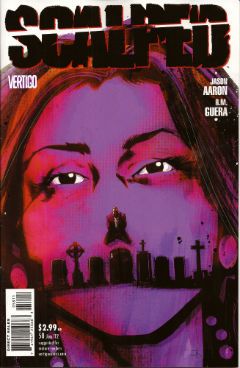
In two issues this series will end. In two issues the fix will be in. In two issues people will refer to this series as Jason Aaron's SCALPED. I have but a brief window of opportunity to attempt to correct the course of the critical conversation as it puts the pedal to the metal and hurtles straight into The Cult of The Writer. Only a soulless canker of a man would deny that Jason Aaron's writing has been solid and decent throughout. It's probably more impressive the less knowledge you have of the '7os cinema he has mined so well the series. But, alas, homage is everywhere now and I know I for one require more to ensure I see out sixty issues. SCALPED gave me more in spades, and it gave it to me in the form of the art of R.M. Guera.

Photobucket

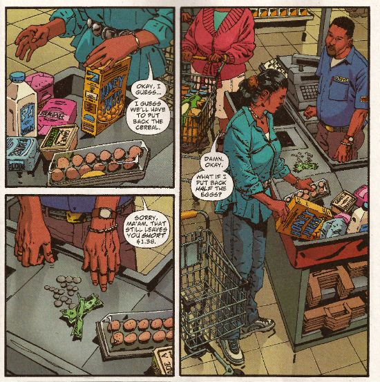
R.M Guera is the star of the show here. It's the attention to detail, I think, that is Guera's true strength. That's quite a strength considering the fantastic way his faces veer into and out of controlled caricature, his body language ranges from subtle to hysterical and his environments from the grubbily realistic to those of opulent excess and all of this, all the while, strengthening rather than destroying the suspension of disbelief; drawing the reader in rather than pushing the reader away. Christ, it's the stuff of wonder. Christ, I write about comics like old people trampoline. Look, here's R.M. Guera drawing a scene in a supermarket. It's just a scene in a supermarket but, but, look:

Photobucket

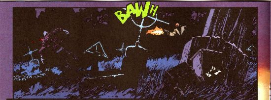
And how about those colours, ey? Brusco's colours are a special kind of magic as well throughout the book. Check out the night scene I lifted above. Be soothed by the smooth blues and then startled by the pop of the lime green FX! Giulia Brusco gets a cheek chuch for coloring cojones and no mistake. What a wonderful, wonderful book SCALPED has been on a visual level. It's a bloody shame that the aspect that lifts SCALPED up to VERY GOOD! is, I'm guessing, the aspect that'll receive least play once it ends, and the artists who worked such wonders will reap the least of any future benefits; career and reputation-wise. But before that happens, before the fix kicks, in I'm going to point out that R.M. Guera is EXCELLENT!

Those of you who read this and were not insensate from drugs or currently being attacked by a maniac will have picked up on the subtle fact that I'm a little distracted. That's because this weekend is Jubilee weekend! We get an extra Bank Holiday on Tuesday to celebrate Good Queen Bess. I'm no Royalist but I do recognise that the tourist industry is pretty much the only industry we have anymore, so she's okay on that score, and also I'm anyone's for a free day off work. Fickle? You have no idea, pal. You have no idea. So I am eager to join my fellow countrymen in the heat of the streets, swigging binge and watching as the middle aged men with their Celtic tattoos blistering in the heat bellow at their shrink wrapped wives about how Sandra in accounts understands and how he never wanted this, never wanted any of this and the discarded children weep beneath the Union Jack bunting. England, my England!

Oh please, despite all your protestations to the contrary you're all quite keen on the whole Royalty business, aren't you. my American friends. Oh, you claim otherwise, you do:

Photobucket Image from The Steve Ditko Archives Vol.2 (Ed. Blake Bell, Fantagraphics Books). Art by Harry Belafonte Jnr. No, it's Steve Ditko for Goodness Sakes! Keep up, no lollygagging at the back!

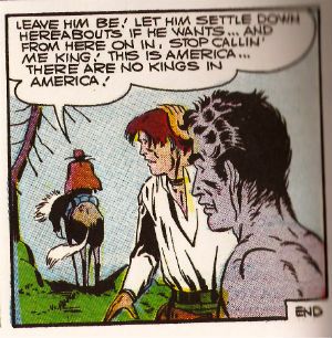
But you're just fooling yourselves. You protest too much, methinks. Look, you've had at least two Kings: The King of Comics (one Jack Kirby by  name) and this raunchy dude:

Photobucket

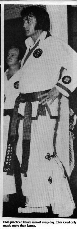
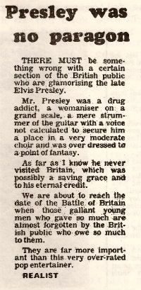
The King and American Royalty were on my mind because when I am not reading comics I am looking at enthusiastically typed and photocopied documents held together with staples produced by fans of things. Probably while they waited for The Internet. Documents such as THE ELVIS COLLECTOR #1 (edited by Major I.R. Bailye). This fragment of forgotten fandom was brought home to me courtesy of my very own Priscilla, who knows only too well that when it comes to The King there's no fool such as I.

Reading the photocopied love letter to The King my eyes settled on this:

Photobucket

From The Leicester Mercury; date unknown, author pseudonymous.

Sadly "The Realist", despite his fantastic English language skills ("overdressed to a point of fantasy"!!), is incorrect as Elvis Aaron Presley touched down briefly on British soil. However, I still think his points remain valid despite this factual inaccuracy. Yet, it did make me realise that sometimes people can be blinded to the essential truth of an article if the author undermines himself with inaccuracies. A bit like an article on comics in The Wall Street Journal perhaps. The one where he's wrong about why comics aren't popular anymore (the world's just moved on and the price has risen in line with the Greed Index; that's really why) but is right about Avengers comics being less like something you'd use to attract new readers and more like something you'd scrape off your shoes before going indoors. Poo, I'm talking about poo there. Usually animal  but, given the state of Cameron's Big Society, there's a queasy possibility it could be human. Um.

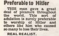
In closing let me just say that, being all crepey of skin and feeble of mind, I am only too well aware that at any moment my stinking and aged frame could just drop dead, and sometimes I wonder how I would like to be remembered. It turns out that I would like to be remembered like Elvis. No, not as a mother fixated, voyeuristic pill popper with strange ideas about chimp management. (People tend to forget the Divine Voice these days, which is their loss.) Rather:

Photobucket

From The Leicester Mercury; date unknown, author pseudonymous.

Yes, "preferable to Hitler". I think the "Real Realist" is right in that that's all any man would want in the end. So, have a smashing weekend and if you think of me, think of me, at least as being "preferable to Hitler". Like Elvis. Like The King. God Save The King! God Save The Queen!

Farewell for now, my foreign chums, and remember: if you can't have a Jubilee then have some COMICS!!!

"Clod. I Have WEAPONS..." Comics! Sometimes They Are Almost Fresh!

It's a post about comics! Is it early? Is it late? Time is in flux!Only if one man can face his Pull List can The Balance be restored!

One Man. One Pull List. There will be Words... (...probably the wrong ones). Photobucket

ACTION COMICS #6 “When Superman Learned To Fly” by By Andy Kubert/John Dell(a), Grant Morrison(w), Brad Anderson(c) and Patrick Brosseau(l) and “Last Day” by Chriscross(a), Sholly Fish(w), Jose Vallarubia(c) and Carlos M. Mangual(l) (DC Comics, $3.99) Superman created by Jerry Siegel and Joe Shuster.

Photobucket

 I like that stuff in my comics but I'm not unaware that in real life that kind of thinking gets you killed.

While there could be said to be many faults with the lead story in this issue such as an apparent attempt to distract from a lack of clarity (or indeed even sense) with a belligerently unslackening pace and art that once again belies Andy Kubert's alleged superstar status it remains a fact that in this story Superman's enemies conduct an auction for Kryptonite within Superman's own brain (physically, literally within Superman's own brain) and Superman uses his own Kryptonite poisoned body as a battery to save his both his own sentient ship and the day entire. Yes, Superman's enemies conduct an auction for Kryptonite within Superman's own brain (physically, literally within Superman's own brain) and Superman uses his own Kryptonite poisoned body as a battery to save his both his own sentient ship and the day entire. That's Superman comics enough for me!

The backup is the kind of sweet and tender emotional snapshot of a transitional moment in life that anyone under forty will treat as though it were sentient dog-muck hellbent on French kissing them; that's okay because I enjoyed it enough for y'all! Yup, ACTION COMICS was GOOD!

 STATUS: REMAINS ON THE LIST!


ALL-STAR WESTERN #6 “Beneath The Bat-Cave” by Moritat(a), Justin Gray & Jimmy Palmiotti(w), Gabriel Bautista(c) and Rob Leigh(l) and “The Barbary Ghost Part 3” by Phil Winslade(a), Justin Gray & Jimmy Palmiotti(w), Dominic Regan(c) and Rob Leigh(l) (DC Comics, $3.99) Jonah Hex created by John Albano and Tony Dezuniga. The Barbary Ghost created by Gray, Palmiotti and Winslade

Photobucket

Kids! How many owls can you spot!

Thank the Great Spirit! Next issue ol' bacon face is off to N'Orleans! where there will no doubt be "gumbo" galore but at least there won't be anymore shoehorning of Batman references into a book that doesn't need them. A cave beneath Wayne Manor! Filled with Bats! This cretinous continuity reached a kind of hilarious nadir with the sudden slew of references to Owls: because Batman is currently encountering stress of a strigiform stripe by all accounts in the here and now! So we get about two pages in which the characters can barely move around the mansion setting for all the owls dangling, roosting, flopping and just plain flailing around the place. It's as though Moritat has snapped and gone "You want owls? Here! Here are your owls! Got enough owls yet? I don't think so! Owls! Here! Now! In your face! All! Owls! Touch them! Touch my owls! Tell me they're pretty! Owls!" and then gone for a long lie down. Stupid owls. Anyway I'm a little bit partial to Jonah so it was still OKAY!

 STATUS: REMAINS ON THE LIST!

ANIMAL MAN #6 “Tights” by Jean Paul Leon & Travel Foreman/Jeff Huett(a), Jeff Lemire(w), Lovern Kindzierski(c) and Jared K. Fletcher(l) (DC Comics,$2.99) Animal Man created by Dave Wood and Carmine Infantino

Photobucket

Movie Cliche #23415678: Sad Dad at fridge with beer and photo of son. Collect the set!

Tricky one this. Has Jeff Lemire done a pitch-perfect satire of the vapid screenwriting cliches that have run roughshod over comics beautiful storytelling devices or does he actually believe this is a decent film script made comics? It's hard to tell isn't it. Heck, I don't know maybe you thought it was awesome? Luckily it's easy to tell that Jean Paul Leon is an awesome artist and hopefully one day he will draw comics as awesome as WINTER MEN again. This issue is a complete waste of time and is clearly a fill-in so next issue we should be back to Travel Foreman and his nightmarish body horror.

After I read the previous issue I fell into a light doze and dreamt about a man in a chair. I was holding the man in the chair via the power of some unknown threat. The man was crying and peeling his own skin off his own face with a small knife. I was then forcing him to eat it via the unspoken promise that if he did as I asked he could go free. The fact that the man was eating his own face was terrible but the worst thing was that we both knew I was lying and he wasn't leaving alive. But he had no choice but to do as I asked because that was his only hope. Yes, it's been a trying few months. They say there's nothing as boring as listening to someone else's dreams but they forgot about reading film scripts masquerading as comics which is so boring such comics are EH!

STATUS: REMAINS ON THE LIST (BUT WATCH IT)!


BATWOMAN#6 “To Drown The World - Part One” by Amy Reeder/Rob Hunter/Richard Friend(a) J.H. Williams III & W. Haden Blackman(w), Guy Major(c) and Todd Klein(l) (DC Comics,$2.99) Batwoman created by Bob Kane and Sheldon Moldoff (modern version by Greg Rucka and Alex Ross).

Photobucket

"Given the state of your medical insurance talking's about all you can afford so knock yourself out is my advice."

Wuh-hoof! That's certainly a change in artist alright. I'll stick it out for a bit because I always like people to get a fair shake of the critic stick. Initially I'm not  finding myself a fan of Reeder's thin line but I appreciate her attempts to step up her layouts. Given the writing is competent at best (actually that's a compliment in today's world o'comics) Reeder's got it all on her to raise this one up from EH!

STATUS: REMAINS ON THE LIST (FOR NOW!)

DAREDEVIL #9 By Paolo Rivera/Joe Rivera(a), Mark Waid(w), Javier Rodriguez(c) and VC’s Joe Caramagna(c) (Marvel Comics, $2.99) Daredevil created by Bill Everett and Stan Lee.

Photobucket

Storytelling in 'Not Dead' shock!

Unless Howard Victor Chaykin has been reactivated without my knowledge I guess this is the only Marvel comic I'm buying. That doesn't seem right, I'll have to check. Anyway, I'm buying this because Mark Waid understands that the bit with the boot is funnier and cleverer because it only takes up one panel. It's because Rivera Jnr and Snr make all kinds of spooky magic happen on these pages. It's because together the team on the book achieve the kind of synergy that results in the storytelling stuff from which the above image is but a sample. Yup, DAREDEVIL is a purchase because it is VERY GOOD!

(Hey, I hear Chris Samnee is coming aboard! I told you all I'd wait for him!)

STATUS: REMAINS ON THE LIST!

DEMON KNIGHTS #6 “The Balance” by Diogenes Neves & Robson Rocha with Oclair Albert(a), Paul Cornell(w), Marcelo Maiolo(c) and Jared K. Fletcher(l)(DC Comics, $2.99) The Demon created by Jack Kirby. Shining Knight originally created by Creig Flessel (modern incarnation created by Simone Bianchi and Grant Morrison). Vandal Savage created by Alfred Bester and Martin Nodell. Madame Xanadu created by Michael William Kaluta.

Photobucket

His reply is actually quite funny but I'm still baling.

Nah. I'm done. It just didn't work for me. Which is a shame as it wasn't terrible as such it just never gelled. Way too diffuse and lacking in focus both from a scripting and art standpoint. I mean, how big was this village, where was everything in relation to everything else? But like I say it wasn't terrible and I wish all involved well and hope the book works out further down the line but there are plenty of books I can read that aren't EH! And that's where my money's got to go. It's the Law of The Direct Market; savage and unrestrained!

STATUS: OFF THE LIST!

FATALE Number Two By Ed Brubaker, Sean Phillips and Dave Stewart (Image Comics, $3.50) Fatale created by Ed Brubaker and Sean Phillips.

Photobucket

 ...probably because for some odd reason she's drawn to look about 8 years old and acts as subtly as a silent movie siren?

People tend to refer to books by this team as "Brubaker" books don't they? Which is odd as I find Brubaker to be the least of the appeal they hold. I guess it's that whole Cult of The Writer thing or something. Hey now, hang on, I'm not saying Brubaker isn't good. He's got craft/technique/skill/whatever we're calling it now in spades it's just the result is, for me, mostly solid rather than inspired. Except when he gets Meta which is when the wheels start wobbling like they're about to pitch a fit (remember INCOGNITO where working in an office was "like" doing Indie comics but taking to the streets and letting your inner nature run wild was "like" working in the mainstream? Really? Um.). On the whole though I get well crafted genre staples served up with a slight twist but the real pleasure I get from this team's comics is in the form of Phillips and Stewart in conjunction with Brubaker. I'm not going to just roll around showing my belly because it hasn't got capes'n'tights in it, okay?

Here, I guess the High Concept (sigh) is Crime and Horror - together! Like Hope and Cosby! Like Morecambe and Wise! Which is fine because,hey, I like both. I'm not sure they belong smushed together though except as one of those novelty type deals. Y'know, all those Steve Niles things Steve Niles does. I guess Crime fiction tells us about the worst in ourselves and so does Horror fiction; they just use different tools. Using both sets just seems like doubling up and risking the results seeming lesser. Early days though, I mean, look at what porting Horror tropes into Crime did for James Ellroy ($$$$ is what it did, kids. Woof! Woof!). I don't think we're looking at an Ellroy here but we may be looking at an Angel Heart. And that's fine. I got a thing about chickens, Mr. Cyphre; as in I don't like to count them too soon but this one looks GOOD! so far.

STATUS: REMAINS ON THE LIST!

FRANKENSTEIN: AGENT of S.H.A.D.E. #6 “The Siege of S.H.A.D.E. City – Part One” by Alberto Ponticelli(a), Jeff Lemire(w), Jose Villarrubia(c) and Travis Lanham(l) (DC Comics, $2.99) Frankenstein: Agent of S.H.A.D.E created by Doug Mahnke and Grant Morrison (and Mary Shelley).

Photobucket

I am always happy to see the word "buffoons"!

There's a bit in this issue that is pretty much a stealth WATCHMEN (by Alan Moore, Dave Gibbons and John Higgins) reference. It's the scene in the 'Nam bar between The Comedian and Doc Manhattan but here with Franky and a red, bald dude who is, basically, Dr. Manhattan and without any pregnant woman shooting or face glassing. That is to say without any of the actual important or troubling content. I'd call that an Omen were I of a credulous nature. Otherwise it's yet another issue of Hellboy in the DCU and which is Okefenokee by me!

STATUS: REMAINS ON THE LIST!


JUSTICE LEAGUE DARK#4 and #5 “In The Dark - Part Four and Finale” by Mikel Janin(a), Peter Milligan(w), Ulises Arreola(c) and Rob Leigh(l) (DC Comics, $2.99ea) John Constantine created by Alan Moore, John Totleben, Rick Veitch and Steve Bissette. Madame Xanadu created by Michael William Kaluta. Deadman created by Arnold Drake and Carmine Infantino. Shade, The Changing Man created by Steve Ditko. Zatanna created by Gardner Fox and Murphy Anderson. Enchantress created by Bob Haney and Howard Purcell. Dove created by Steve Ditko. Mindwarp created by Peter Milligan.

Photobucket

Stealth WATCHMEN reference#2. We get it, DC! You WIN!

I haven't enjoyed this. It's all been a bit like warmed-over '90s Milligan with stuff like "In Nebraska The Pokemon come alive and the screams of the bread-cakes dance like glass-kneed OAPs." Okay, not as warmed-over '90s Milligan as that DEFENDERS#1 preview perhaps but still not terribly inspired. I mean the sheer scale of events would suggest the body count is in the hundreds of thousands not to mention the country-wide trauma involved but there's no sense of any consequences.

No, I didn't like it. I did, however, enjoy Milligan's skeevy interpretation of Deadman. I would totally read a Peter Milligan Deadman series in which Deadman acted like one of those fantastic men who pressure their missus into all kinds of sexual situations that the missus clearly isn't all that into and it's all just about the guy exerting power over her so that's she's eventually roiling around in moral squalor with only the "fact" that he loves her to keep her sane. At which point the hilarious rogue tells her she's a sl*t and leaves her to fall to pieces while he starts the whole cycle with some other vulnerable woman. I think a comic like that would bring in new readers. Sh*theads mostly, but hey, sales are down! We can't afford to be be proud anymore! Despite creepy Deadman JLA: DARK was EH!

STATUS: DROPPED!

O.M.A.C. #5 and #6 “Occasionally Monsters Accidentally Crossover” By Keith Giffen/Scott Koblish(a), Dan Didio, Jeff lemire & Keith Giffen(w), Hi-Fi(c) and Travis Lanham(l) “One More Amorous Conflict” By Scott Kolins/Scott Koblish(a), Dan Didio & Keith Giffen(w), Hi-Fi(c) and Travis Lanham(l) (DC Comics, $2.99ea) O.M.A.C. created by Jack Kirby.

Photobucket

It's the hot dog that makes it great!

In #5 O.M.A.C. and Frankenstein Agent of S.H.A.D.E have a great big slobberknocker which entertains and amuses me on a base level which I have no shame in gratifying since I am okay with comics just being goofy, colourful fun. With #6 I realise that the main reason I like O.M.A.C is because of Keith Giffen's art because with #6 the artwork is by Scott Kolins and the only memorable thing about the issue is the fact that Leilani's breasts are pancaked in the same manner that Caroline Munro's were in The Golden Voyage of Sinbad. Yes, I realise that reflects badly on me as a human being but, honestly, what reflects badly on us as a society is the fact that we have fallen so low so fast that when you read The Golden Voyage of Sinbad you automatically assumed I was talking about a p*rn film rather than a children's fantasy film from the '7os.  So, um, anyway O.M.A.C was GOOD!

STATUS: REMAINS ON THE LIST!


PUNISHERMAX#22 “War’s End” By Steve Dillon(a), Jason Aaron(w), Matt Hollingsworth(c) and VC’s Cory Pettit(l) (MAX/Marvel Comics, $3.99) The Punisher created by Gerry Conway, Ross Andru and John Romita Snr.

Photobucket

"Now that we've solved the Energy Crisis! Who's up for a brewski!"

PUNISHERMAX#22 may just be the most subversive comic I read this year. Oh, not because of the ending because...really, Jason Aaron? Really? That's your ending? We can solve all societies problems by just rising up and killing the sh*t out of other folks? Really? Heck, maybe we just need a strong leader as well? Fancy your chances do you, Jason Aaron? What a crappy ending. Mind you, I live in a country where we only arm The Police, The Army and farmers. What? No, I don't know why we arm farmers, maybe because of all the lions? Or maybe they keep being carried off by subsidies in the night. Stop getting distracted by details. So, okay, maybe that ending is a bit more reasonable over there in The Americas. If it is, I will pray for you all. Christ, that irresponsible ending.

No, PUNISHERMAX #22 may just be the most subversive comic I have read all year because of the scene involving Elektra. Elektra is at the Hand headquarters after a savage battle with Frank. Elektra has served The Hand well for many years but now Elektra needs help from The Hand. Specifically medical help. But I guess The Hand doesn't have Health Insurance for its employees and since Elektra is no longer of any use to them they have no qualms in cutting her loose in the most final of ways. Despite knowing full well the conditions of her employment Elektra is still surprised and dismayed at this turn of events. But she should have expected it, really, because that's what you get for working for Marv..I mean The Hand. Say, is something bothering you, Jason Aaron? Stuff on your mind?

Oh, PUNISHERMAX was entertaining enough and the fact that I could never reconcile the interesting parts with the witless parts of it actually made it more interesting and brought the whole thing up to GOOD!

STATUS: Cancelled or Came To A Natural End When The Author Had Told The One Frank Castle Story He Felt He Was Born To Write. (Oh, yeah!)

RASL #13 By Jeff Smith (a/w/l) (Cartoon Books, $3.50) RASL created by Jeff Smith.

Photobucket

There's a couple of reasons I really like RASL. There used to be pretty much just one reason; that although none of the individual elements actually seemed unique in and of themselves they were combined in such a way as to present a story notable for its novelty and also the freshness of its presentation. There are many scenes in RASL which you have seen in other stories but this is not a problem with RASL because it isn't really a problem at all unless it is a problem with all stories. It is a problem with some stories because they will just go for the default setting of said scene; the one that's floating closest to the surface of the popular imagination due to repetition and exposure via Hollywood blockbusters for example.

Look at the Avengers Vs. X-Men preview and ask yourself whether the life sappingly tedious familiarity of every scene is intentional and while you have your own attention ask also how many pages until The President says "And may God have Mercy on us all." It's all about familiarity, oh yes, I am aware it's all pitifully legitimised by claims of "homage" but that's cockrot, it's all about familiarity; giving people what they already know they like. Of course eventually familiarity forgets to put its rubber on and breeds something; contempt. Not in the case of RASL though. RASL keeps me on my toes, RASL demands something from me - attention. In return it rewards me with quality entertainment. That seems fair enough to me.

The other, more recent, reason for liking RASL is that unless Jeff Smith has some kind of catastrophic breakdown involving his identity he won't be suing himself anytime soon. Yup, RASL is VERY GOOD!

STATUS: REMAINS ON THE LIST!

STATIC SHOCK #5 and #6 “True Natures” and “Unrepentant” by Scott McDaniel/Andy Owens(a), Scott McDaniel(w), Travis Lanham & Dezi Sienty(l) and Guy Major(c) (DC Comics, $2.99ea) Static created by Dwayne McDuffie and Jean Paul Leon.

Photobucket

 A DC writer on The Internet: Yesterday.

Well, that was certainly a stinker of a thing. I have no problem with Scott McDaniel's art by the way. Sometimes it lacks clarity but I respond well to the boldness of his line and the chunkiness of his figures. I find it quite pleasing on the whole. His writing has, however, been less than stellar. It's hard to know what to say about this disaster really except if you employ someone to write - let them write and let the artist take care of the pictures. It isn't like there's no room for synergy; the two can be responsible for both of those separate aspects but combine them when it comes to the storytelling. It's a collaborative medium, so I've heard. A mess like this just makes me sad. I'm not very savage at all because it dismays me to say STATIC SHOCK was AWFUL!

STATUS: DROPPED!

SWAMP THING#6 “The Black Queen” by Marco Rudy(a), Scott Snyder(w), Val Staples & lee Loughridge(c) and Travis Lanham(l) (DC Comics, $2.99) Swamp Thing created by Len Wein and Berni Wrightson.

Photobucket

This is horrible in all the wrong ways. It's nice having little shout outs to Dick Durock and Len Wein and my Nana Alice and all but, hey, where's the...well, where's anything? Splash page after splash page of nigh-contextless horror does not a narrative make. Seriously, I need to know what's going on on those pages if it's going to freak me out. Marco Rudy's art works hard to evoke the scabby nastiness of the Bissette, Veitch, Totleben years but what is going on? Something to do with rot, something to do with flesh. I'm sympathetic to the notion that specificity kills horror dead on the page but y'know I need some clue or it's just...stuff. And stuff isn't specific enough to be scary. And... The Parliament of Trees? Apparently you just walk up to them with a box of matches and, hey, game over Parliament of Trees. That's...stupid. Worst of all this turns out have just been one of those crappy origins that take six issues. Sure they could wrong foot us at the last and Abby could adopt the mantle but...it still took six issues. Six not very good issues. So yeah, SWAMP THING is EH! Moley, I just checked and it's six issues and counting to the origin, that doesn't help at all.

STATUS: DROPPED!

T.H.U.N.D.E.R. AGENTS #3 “A Godawful Small Affair” by Wes Craig & Walter Simonson/Bob Wiacek(a), Nick Spencer(w), Hi Fi & Lee Loughridge(c) and Jared K. Fletcher (l) (DC Comics, $2.99) T.H.U.N.D.E.R. Agents created by Wallace (“Woody” not “Wally”) Wood and Len Brown.

Photobucket

'Nuff Said!

STATUS: STICKING IT OUT FOR THE LAST THREE ISSUES!


So yeah, hope that was okay. If you disagree with any of it that's fine just let me know and we can throw it around like a pack of terriers with a rat. If you thought it was all totally spot-on then, Hi, Mom! Whatever happens those were my comics and that's what I thought.

Have a good week and remember to read some COMICS!

"Do They Come In KID'S Sizes?" Comics! Sometimes I Get A Bit Grumpy.

Whoops. Lost my momentum there. Trying to get it back by looking at some comics and then blurting thoughts out in the form of words. Disaster? I have a recipe for that! Here's the ingredients:

BATMAN: THE BRAVE AND THE BOLD #15 By Stewart McKenney/Dan Davis(a), Sholly Fisch(w), Guy Major(c) and Dezi Sienty(l) (DC Comics, $2.99) "No Exit" If he is to survive an unending series of death traps of unknown origin The Caped Crusader is going to need a miracle! Luckily he brought one along...MISTER MIRACLE!

Photobucket

""No...spears!" HAHAHAHAHAHA. Damn, even Kids think that joke is shit. Judgemental buggers."

This is a comic for Kids, is that alright? Is it alright if Kids have comics too? Because I know comics aren't for kids anymore. I know that the works of such mature intellects as Mark Millar, Brian Bendis and Geoff Johns have lifted the fights'n'tights funnybook up beyond the meagre intellects of children into a new and special place where they are exactly like comics for Kids but not as good; which in a very real sense is just like growing up. Everything's the same as when you were a Kid it's just a bit more shit. Comics for Kids, okay? Is that alright? Because if it isn't then there's no place for a PG version of CUBE starring Batman and Mister Miracle in which Batman solves the confounding conundrum bedevilling our two plucky chums by noticing that he doesn't need a shave and if that's true then I guess there's no place for the following exchange:

DOCTOR BEDLAM: However your MEAGER INTELLECT is no match for the brilliance of DOCTOR BEDLAM.

BATMAN: Really? How about my FIST?

There's always a place for that. Even though they do not use the correct English spelling of "meagre" and plump for the Colonial mutation. Yes, even though Mister Miracle looks creepy without a nose this is still VERY GOOD!

SCALPED #55 By R.M. Guera(a), Jason Aaron(w), Giulia Brusco(c) and Sal Cipriano(l) (Vertigo/DC Comics, $2.99) "Knuckle-Up" Conclusion

Photobucket

"Fact: I, John, actually have a thing about traumatic eye wounds. In that I fear them not that I get off on them. I know this is The Internet but be nice, now."

Now that's a fight scene! So that's GOOD!

PUNISHERMAX #21 By Steve Dillon(a), Jason Aaron(w), Matt Hollingsworth(c) and VC’s Cory Petit(l)(Marvel Comics, $3.99) "Homeless" Conclusion Frank and The Kingpin finally collide in a femur shattering confrontation from which only one will walk away! Actually they both walk away but The Kingpin has a hammer stuck in his head and scratches at the glass door of his apartment like a wet brained stray cat before Frank brings him down and then Frank falls over and so I guess it's really a femur shattering confrontation from which both walk away - but only for a bit!

Photobucket

"The White Male Heterosexual's Worst Nightmare"

Frank Castle is homeless. And he stands there singing for money. La da dee la dee da. Ladies and gentlemen, Ms. Crystal Waters! Terrible song that but, hey, I was watching THE HURT LOCKER the other night because I like to watch films everyone has already watched and moved on from. It's important to be timely, to be relevant, I feel. It was okay, really quite a decent film until the end when they did the thing with the guy at home. I didn't really like that bit because as is usual with cool hard asses we were invited to feel sorry for him because being such a hard ass he could find no pleasure in the real treasures of life such as cleaning out the guttering and shopping for cereal (don't load the dice too much, eh, Mark Boal) and yet we were also invited to admire him as the romantic lone wolf; true to himself and his manly nature. There are a lot of these films and they seem to fulfil the same function as Chick Flicks. They kind of undermine the gender stereotype while at the same time finding shelter within it. I call the male variation Dick Flicks. PUNISHERMAX is a Dick Flick. Y'know, that weirdly pathetic male wish fulfillment where you can be free at last to be a manly man but it has come at such a cost that you get to be both pitied and feared. Like a baby the size of a tower block crying for Mama to change its nappy. You'd be scared if that turned up outside your window but you'd feel a bit sorry for it as well. Unless you were a manly man in which case you would shoot it in its big fleshy demanding face and turn away before we saw your single, solitary tear.

Someone has to say it, Frank. You are a weak man, Frank. It isn't a sign of strength to run away from responsibility, Frank. You are a weak man, Frank Castle, to rather have your family die than pick up those toys one more time, rather than sit through The Only Way is Essex one more time, rather than have to sit through those shitty Star Wars films one more time...actually, Frank, I'm starting to see your point.I am a man after all and as a man I found PUNISHERMAX was GOOD! After all, I cannot tell a lie, like most men I like a good Dick Flick.

DEMON KNIGHTS #5 By Diogenes Neves/Oclair Albert(a), Paul Cornell(w), Marcelo Maiolo(c) and Jared K. Fletcher(l) (DC Comics, $2.99) "The Traitor"

Photobucket

"Meet The Twin Fists of Tolerance!"

The best thing about this comic, because it's important to be positive about comics or so people keep bleating, is the character of Jabr. Now it seems to me that this guy is rational, educated, level-headed, tasty in a fight and quite possibly not of European extraction. He's all those things and yet not boring, he is fact the best character in this except for "Sir" Justin because us Brits love a bit of crossdressing fun. Deny it to your Mother, pal, don't waste your breath denying it to me. Astonishingly The Internet has not lost its collective mind over Jabr and it's this magical fact, this clear indication that we have at last, as a species, grown enough to, finally, recognise the transitory nature of our fragile lives and put aside our differences to become, in effect, tolerant and wise and thus strong enough to forge the collective future all our predecessors suffered and died to accomplish. Or maybe nobody is reading this as it is, after all, just OKAY!


ALL-STAR WESTERN #4,#5 By Moritat, Phil Winslade(a), Justin Gray, Jimmy Palmiotti(w)Gabriel Bautista, Dominic Regan(c) and Rob Leigh(l) (DC Comics, $2.99) Jonah Hex in "Gotham Underground" and The Barbary Ghost in, er, "The Barbary Ghost" In the caverns beneath Gotham Jonah Hex finds not only a fine example of the unfettered free market in action but also ancient evil. And some bats. Because it is Gotham. Also in this issue: The Barbary Ghost makes a spooky debut!

Photobucket

It was kind of okay having Arkham around for a bit but now his role seems to have quickly devolved into basically telling us when Jonah Hex is being an asshole and getting himself in a pickle Jonah has to help him out of. This erodes a large portion of the appeal of Jonah for me. I like not knowing if he is actually going to help whoever's in trouble or if he's going to just be an ornery asshole. Obviously he has to save Arkham all the time or the Asylum will never be built and Batman's continuity will be all wronged-up. Oh noes! And also I like to decide myself when Jonah has been an asshole. On occasion it has taken me several pages to realise just how big an asshole Jonah has been on that occasion several pages previous to the point at which said realisation alights upon my mind. I like that. So, yeah, shut yer fancy yapper, Arkham! And let's get out of Gotham and light out for the territories; it's too constrictive, Jonah works best out in The Big Country where he can tread in big shit in all manner of unlikely ways. I like the colours by Bautista they are kind of organic but inorganic at the same time, like laser-pastels or something. Yes, people my age still think putting "laser" in front of something suggests The Future. Aren't old people just the cutest!

Oh, the backup is The Barbary Ghost; a new creation by Gray, Palmiotti and Winslade. While Winslade's brittle lines manfully attempt to ground the story in a specific milieu at once both evocative and atmospheric this is somewhat undermined by the fact that The Barbary Ghost's knockers are kind of flopping about a lot. Now I'm no Henry History but I would have thought that a Chinese lady in the 1870's would have been personally inclined, in large part due to the mores and customs of both the particular point in history she occupied and the heritage of her own people's customs and traditions, to keep her tits shut in a bit more. Or maybe I missed the class where we were taught about The Great 1870's Chinese Tunic Button Shortage. I could have; I was a bit of a git as a kid.

Still, credit given for an original character. After all in 2012 DC's big old money fountain will be WATCHMEN: HOW I MET YOUR MOTHER. No doubt JMS is going to improve the original by, apparently, so he says,  explaining about how Jon was obsessed with time yet he still went into that time-locked room! I don't know. I guess I missed the bits in WATCHMEN where Jon was continually asking people what time it was and craning his neck to look at clocks and banging his girlfriend from behind so he could put his hand on the base of her neck in such a way that it seemed erotically stimulating due to its sensual forcefulness but at the same time afforded him an uninterrupted view of his watch. Or maybe his Dad was a watchmaker and he thus believed in Design but he was changed into a God by a complete ACCIDENT! and that was a metaphor or an analogy or even the whole meshuggener point already or, Christ, who gives a shit. Yes, okay, it was strange. Really strange. I need it explaining in a book illustrated by a cheesecake maker. I'm glad it isn't someone muttonheadly literal who's got this gig, rather someone as dependable and imaginative as JMS who is going to bless us with a mini-series in which, let's face it, quite probably Dr Manhattan reaches back trough time to give events a nudge so that he effectively creates himself! SPOILER! Christ. Mind you I know it has always troubled me, raised a question in my mind, why Rorschach wears a woman's gusset on his face. Hopefully Brian Azzarrello will be setting my mind to rest on that score. Hurm.  In 2013: CAMELOT 3010!

Do you see what I did there? I did an impression of The Internet and played right into DC's hands and I missed the point. The point about WATCHMEN: BEFORE THEY WERE FAMOUS not being a nice thing is that endorsing this is endorsing DC's treatment of Alan Moore. DC own WATCHMEN so they can do what they want with WATCHMEN and what they want to do with WATCHMEN is make money because they are a business. I can understand that, I see that, thanks. DC do not own Alan Moore and they have treated him, and continue to treat him, in a shabby fashion unbecoming of adults. That's the issue here. If they can do that to Alan Moore and it is all right because we get our nice new comics then it is all right for them to continue treating creators in such a fashion. It isn't all right. It will never be all right. That's the point here, for me, not whether the books will be any good, or any of that other diversionary horse shit. Nut up or shut up, DC. Nut up or shut up.

ALL-STAR WESTERN was GOOD! if you can remember that far back.

AMERICAN VAMPIRE #23 By Rafael Albuquerque(a), Scott Snyder(w), Dave McCaig(c) and Jared K. Fletcher(l) (Vertigo/DC Comics,$2.99) "Death Race" Part Two of Four I haven't actually read this one. I don't know if you noticed that bit up there, the boring bit, yeah? The "Part Two of Four" bit? I wouldn't have; I'd have skipped it and looked at the scan (which isn't there because I haven't read it, see) and then read the text I judged most likely to contain a cock joke or insult a noted comic creator. So I can fully understand if you missed the whole "Part Two of Four" bit. I didn't though and since I have yet to receive "Part One of Four" I am unable to read this comic. I don't mention that for any other reason than the fact that Mr. Jeff Lester and Mr. Graeme McMillan were talking about how weird their comics reading patterns can be (I mean I've got this comic bought and paid for but I'm not going to read it? Saywhanow?!) And I just wanted to mention that I share their sickness; I sup from the same trough of pain as they. Also, just thinking about them both brings me physical pleasure. Hurm.NuuuuhHHHH.


Sorry about this one, folks, hopefully it'll be better next week. Have a good weekend with COMICS!

"He's Not Human, Jim...I Swear!" Comics! Sometimes They Knife You In The Back!

Gonna talk about a cow puncher who punches hard. And shoots. Yeah, sure is partial to some shooting this fella. Daggnabit, someone's gonna get hurt you don't quit that! Photobucket

Came The Millennium came the reprints! DC celebrated the year 2000 by re-printing one old comic a month for a year (I think). These were, according to the intro by Paul Levitz, “the best and most vital examples of our art form”. And W.I.L.D. CATS.

I bought some of them and what with the appearance of an all new All-STAR WESTERN#1 I thought I’d cast a boggly eye back at Jonah Hex’s first appearance. And also because I’d just read it.

(Jonah Hex’s first appearance in) ALL-STAR WESTERN #10 By Tony DeZuniga (a), John Albano (w) (Reprinted in Millennium Edition: ALL-STAR WESTERN 10, $2.95, DC Comics)

When Hex was first introduced in ALL-STAR WESTERN #10 (1972) he was a quite exciting breath of fresh air. Instead of the customarily clean cut Marshal driven by a wholesome hankering for Justice John Albano and Tony DeZuniga delivered an ornery bounty hunter with a face as scarred as his psyche and driven by earthy lusts. By today’s standards I guess its tame stuff but back then I can imagine it was quite a bracing change.

Photobucket

The very clever thing about Hex’s first appearance is that Albano and DeZuniga set this atypical character in a story built from the most typical of Western elements. Cliches, if you will. Hex is hired by the usual sweaty businessmen in waist-coats and stove pipe hats to track down the usual sweaty gang of varmints; complications ensue and a young but not sweaty widder woman and her tow headed child are involved. The story around Hex tries to stick to the agreed and expected shape but Hex himself keeps resisting it, pushing the clichés into new shapes through sheer force of his sour temperament. Sure, he gets the gang but, shockingly for the time, kills Big Jim (clearly modeled by DeZuniga on Lee Marvin) by knifing him in the back and this after Jonah has sadistically chased his quarry and haplessly ensured that the widder woman is needlessly endangered. The widder’s wee moppet takes a shining to Hex and Hex clearly figures on settling down with the widder, after all he saved her life, and her boy in the town whose safety he has just ensured.

Which is what would usually happen. It's certainly what Jonah Hex expects to happen. Alas, throughout the course of the tale Jonah Hex has been so unlikeable that by the end of the tale…no one likes him. Except the kid. The widder woman runs him off and the sweaty businessmen block his plans to buy a home and so Jonah Hex hoists up his bag of woe and his sack of trouble and heads off out into the territories. Just time for one last tearful scene with the youngster then:

Photobucket

Mebbe not. Because Jonah Hex is an @sshole.

As comic writing goes it’s good stuff. The whole thing has an easy familiarity due to the use of clichés and the playful undermining of these very cliches lends it an arresting quality. It’s only 16 pages long but by the end you’re pretty clear who Jonah Hex is (an @sshole) and more likely than not wanting to see what he gets up to next. Crucially you have no idea why Hex's face looks like a bison's chewed it which is a smart move. Piques the interest, doncha know. DeZuniga does some smart art here but not as smart as the art he would go on to do. There’s some really stiff staging and his photo referencing (back when that was quite hard to do) works against him at times but it’s atmospheric stuff with a couple of really swell panels. For me the most impressive part of the whole thing is the fact that Hex’s scarred visage isn't revealed until page 7 and rarely thereafter. C'mon, that's pretty great.

Hex soiled the pages of ALL-STAR WESTERN through its name change to WEIRD WESTERN TALES (#18) and up to #38 when he starred in his own series for 92 issues. Which ain't bad for an old cowpuncher but even better is the fact that he’s still knocking about to this day. While the character may not embody that which is best and most noble in us he does embody at least one undying element which burns in each and every one of us to varying degrees. Jonah Hex is an @sshole but aren't we all. Sometimes.

Jonah Hex’s first appearance in ALL-STAR WESTERN #1 (1972) is very old but that doesn't stop it being VERY GOOD!

Photobucket

nu52: wk 4: The Finaleing!

Running low on time, and I didn't have "clever" subcategories to go with it this week, so, here's the final 13 books in a single post.


ALL-STAR WESTERN #1: What a terrific comic! I thought there was a lot of thought and density in this book, and the art was scrumptious. VERY GOOD.


AQUAMAN #1: A solid debut, though it's really hard to judge what the series will actually be like -- this was mostly a bunch of "Aquaman is lame" jokes, and, clearly THAT's not a sustainable direction, month-after-month. I'll go, for the moment, with a solid GOOD, because the monsters seemed interesting.


BATMAN: THE DARK KNIGHT #1: Hey, look, ANOTHER breakout from Arkham! Hey, look, we end with a wrongly named character! This just seems like "the unnecessary Batman comic" to me. It wasn't terrible, or anything, but I don't see the reason for this to exist other than "showcase for Finch"... and does anyone expect him to be monthly on this book for 2-3 years? I don't. So: OK.


BLACKHAWKS #1: I mean, for what it is, it is absolutely competently done, but I don't really like GI Joe in the first place, and a DCU version doesn't fill my black heart with joy. I think, after reading all 52 now, this is probably the first one that will be cancelled because there's just nothing to draw me in (though, honestly, it might work fine as a TV show) when compared to "proper" superhero comics in the same universe. EH.


THE FURY OF FIRESTORM #1: Oh, god, ow. Wow, that was miserable. First, Jason and Ronnie as contemporaries kind of sucks. Second, having "Firestorm" without a disembodied co-pilot kind of misses the entire point of the premise. Third, the "Fury" idea is kinda sorta amusing, but way way too much of being Firestorm in the first place was just skipped over to get to that last page beat. Fourth, scientists in the DCU are now just handing out "superpower bombs" to high school students now? Fifth, really? THAT'S the origin? "he presses a button" Really? Sixth, um what's with the other girl who was there, why didn't she get powers too? I thought this was pretty lousy overall -- AWFUL.


By the way, I guess this means that the whole "Firestorm is, like, a bomb that's going to explode" or whatever that plotline was... that will never been resolved, eh? I'm super curious to what the intended resolution of that one was. If you knew it, drop me a line, eh? I KNOW someone from DC is reading these....


THE FLASH #1: Nice art, nice page layout, solid enough story -- more enjoyable than the Flash has been in a long while -- GOOD.


GREEN LANTERNS: NEW GUARDIANS #1: Interesting choice to start with the origin of Kyle, which made this easy enough to follow, but then it leads into the Rainbow Corps stuff, and I'm all meh about that -- no real plot here yet, or notion of what the book is ABOUT. So... OK?


I, VAMPIRE #1: Beautiful moody expressive art... but I had a really hard time following the who and the what and the when of it all. That's probably because I read thirteen comics in one sitting!  OK


JUSTICE LEAGUE DARK #1: Going in with extremely low expectations helps, yes it does -- I thought this was solid, if unspectacular. A low GOOD?


SAVAGE HAWKMAN #1: Textbook of how NOT to do a reboot -- it's predicated on (at least I think) wanting to break the curse of Hawkman (which I take to mean the through-the-years romance dealie?), but you have to KNOW that to understand the who and what at all. And then when he tries to burn the suit, it somehow bonds to him or something equally incomprehensible. The art was vaguely nice, but there's nothing sympathetic on display, and I felt like I walked into the middle of someone else's D&D campaign where they has a bunch of poorly explained house rules. Pretty AWFUL.


SUPERMAN #1: It MIGHT be in relationship to ACTION, but I sort of think this was a bad comic all on its own. You know what it felt like to me? A comics by and for old people, but who were really really trying to be "hip" or modern, but not at all seeing what and why and how they were entirely missing was IS modern. Also, a special double-ugh to Clark's new hairstyle, which almost sorta worked in ACTION, but looks beyond shitty here. This book smells covered with group-think, and I thought it was sadly AWFUL. (Yet, it was ironically the best-seller this week of the 13)


TEEN TITANS #1: Not enough happened for me to judge the tone or direction of this series, but it sorta worked for me anyway... at least as long as I tell myself "this is the only Titans, ever" OK, I thought.


VOODOO #1: Late night cable in comics form. It started off like some sort of cheesy Skinamax soft-core, then, boom! rubber monster at the end of it. I don't think you can do a book that's nothing but antagonists, and find an audience, but I guess we'll see? At least it was pretty, but oh so very EH.


Sheesh, finished! I never want to do that ever again!!


I have a notion for a "what did I learn?" piece, but it might be better suited after we've got most (or all) of a month of #2s behind us.


Still, as always, what did YOU think?
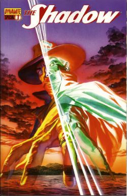


-B

Graeme Takes On The New 52. All At Once.

You know, before DC Comics so politely sent me the entire run of the New 52 launch issues, I don't think that I'd ever read an entire month's worth of a superhero universe before. I have to say, it's kind of exhausting. But that doesn't mean that I'm not going to try and run down very quick capsule reviews of all 52 right here, right now, as Fatboy Slim once said many many years ago oh God I am so old. ACTION COMICS #1: In retrospect, maybe my favorite of all 52 books, this one feels like it actually understands how to reboot a concept without overwhelming the reader with information or assuming that they already know everything; Grant Morrison's script has some of his shorthand dialogue, but it's dense and filled with "action" throughout, and this feels like a satisfying chunk of comics that also lays the groundwork for future stories. Very Good.

ALL STAR WESTERN #1: It's heresy amongst the comicsinternet to admit that I'm not a massive fan of Justin Gray and Jimmy Palmiotti's Jonah Hex, but it's never really done a lot for me. That said, this felt solidly Good, setting up the new status quo for the character - and offering enough introduction to the character for new readers - with some really nice art by Moritat. I'm amused by yet another "Gotham is built upon conspiracy and evil" storyline so soon after last month's finale of Batman: Gates of Gotham, though.

ANIMAL MAN #1: Oh, this was so almost good. Jeff Lemire's writing is... good, I think, although I feel like he stumbles on the more domestic side of things here, and I like the subtle repositioning of this series as a horror book. But the art is just not serving the writing well at all; Travel Foreman can be an interesting stylist, but he ruins scenes here, most importantly - and, I think, damningly - the final page, which is robbed of its full impact by some weird staging that basically wastes the top half of the page. Also not helping, the inks by Dan Green (which veer between too heavy and almost weightlessly light) and some very dull, flat colors by Lovern Kindzierski. Eh, then, because of the art.

AQUAMAN #1: Yes, Geoff, I get it: Aquaman isn't a comedy punchline anymore. I would've preferred it if we'd had a chance to decide that for ourselves instead of suffering through the "blogger interview" midway through the book, but overall, this is a pretty Good first issue, setting out its pitch, introducing its characters and having a decent enough hook for the next few issues. That said, if you were reading Brightest Day, you pretty much know what's in here already; this is very much a continuation of what was happening with the character in that book.

BATGIRL #1: I don't know if this was flop sweat or something else, but this just didn't work as well as I'd been expecting it to. Maybe because it's so joyless, something that writer Gail Simone didn't seem to have a problem expressing with the character in Birds of Prey, but there really is something very... rushed and filled and self-important about this issue that made it feel like you were being hurriedly brought up to speed by someone who wanted you to know how serious everything was. World's dumbest cliffhanger, too. Eh.

BATMAN #1: Greg Capullo's art is surprisingly nice - Yes, a little too MacFarlane for my tastes, still, but what can you do? - and Scott Snyder's story is... I don't know. Nice, but somewhat slight, perhaps? I'll be coming back for a second issue, but I think that's more down to goodwill for the creative team than anything having particularly wowed me with this debut. Okay, I guess.

BATMAN AND ROBIN #1: Now this was much more my speed, perhaps because I enjoyed this version of Batman more - One who seems to be dealing with his trauma after X number of years processing survivor guilt as Batman, instead of just burying it - than the one in Batman or Detective (And, really, I can't believe that a linewide reboot didn't result in a slightly more consistent portrayal of Batman. He feels like a different character everytime he appears, like Superman. That doesn't seem like a good thing to me), or perhaps because there was more of an urgency on display here than in Snyder's title. Either way, Good, and a much better "first issue" than the last time Peter Tomasi and Pat Gleason took over the book.

BATMAN: THE DARK KNIGHT #1: Talking of wildly varying characterizations, this book... uh... exists. I don't know what to say about it. If you want a generic Image-style take on Batman, complete with pouty mouths from David Finch and overdone dialogue by Paul Jenkins, this is for you, I guess. I was completely underwhelmed, and laughed out loud as the kids say at the reveal of "One-Face" at the end of the book, especially because he still has half of his face scarred. Awful, but I'm sure it'll have its audience. Oh, and Jaina Hudson is the new Jezebel Jet.

BATWING #1: The first of the "This was much better than I expected" books of the 52, I found myself drawn into this more than I'd thought I would. Maybe it was Judd Winick's take on the character and his secret identity (A cop working outside of the system, because the system is so corrupt), or perhaps it was Ben Oliver's lovely, weirdly hazily dream-like artwork, but this convinced me to try the second issue, which I really wouldn't have thought would've been the case. A low Good, perhaps, but I have to say: This feels much more like a mini-series than an ongoing, already.

BATWOMAN #1: This, however, was a letdown. Not because it wasn't Good, because it was. But I'd been expecting more, spoiled by Greg Rucka's run on Detective. The writing here - by artist JH Williams and co-writer Hayden Blackman - was fine, and hit all the right notes, but didn't surprise me or have the emotional depth that Rucka's had, and the art, while beautiful, also lacked the impact or purpose of the original run. Even though I'll be back for future issues, and even though I enjoyed this, I found myself disappointed nonetheless. That's what I get for having high expectations.

BIRDS OF PREY #1: I'm not sure why, but this felt like it had too much space in it, if that makes any sense. What's here is fine, it's a perfectly Okay comic book, but it feels too empty for some reason, like something is missing. I can't quite put my finger on it, but something isn't quite right, like it's only half of the intended story or something.

BLACKHAWKS #1: I love Mike Costa's Cobra series for IDW, which is why it depressed me so much to realize how much I didn't like this first issue (The art by Graham Nolan and Ken Lashley didn't help; it's overly busy and not quirky enough to make me want to keep paying attention). You can't fault him for throwing the reader in as everything's already happening, but I didn't find any character particularly interesting, mysterious or even distinctive enough to care about, and as a result, the whole thing left me cold. Awful, sadly.

BLUE BEETLE #1: On the podcast, I said this was like the Blue Beetle we had before, but less so. Tony Bedard and Ig Guara make all the right moves, but it lacks the heart or originality to make me want to come back for issue 2. Eh.

CAPTAIN ATOM #1: Hey, everyone who's always wished that there was a Doctor Manhattan solo title spinning out from Watchmen, now you have your dream book. Sadly, it's written by JT Krul - who ruins the goodwill he'd built up from an Okay first issue by ending with a stupid "Is Captain Atom about to die?" cliffhanger (It's his first issue, so I think that question answers itself) - but, on the plus side, the art by Freddie Williams II is very nice indeed. If it gets smarter in future issues, it could end up being worth checking back in with in future, I suspect.

CATWOMAN #1: Oh, man, haven't I said enough about this already? Cheesecakey pandering with a depressingly unsexy tone and annoyingly passive lead character. Awful.

DC UNIVERSE PRESENTS: DEADMAN #1: I swear to God, this is like a black hole in my brain. I have read this book multiple times, and it really refuses to stay in there. Pretty much the definition of Eh for me, although I'll say that Bernard Chang never really gets the credit for his work that he deserves. I'd love to see him paired with less garish colorists sometime.

DEATHSTROKE #1: Fun last-minute twist aside, there's little in this book that appeals: I don't care about the character or the machismo on display, and Joe Bennett has always been hit-or-miss (with an emphasis on the latter) for me. Eh.

DEMON KNIGHTS #1: Punny title aside, Paul Cornell pretty much won me over with the sense of humor on display in this one, much like Jon Rogers did the same in IDW's Dungeons and Dragons book (which this is oddly reminiscent of, it has to be said). Weirdly parochial, but all the better for it. Very Good.

DETECTIVE COMICS #1: Tony "Salvador" Daniel - Has he ever used his middle name before? - aims high and doesn't quite make it, but oh man, can you see him try. There's nothing particularly wrong with this, but there's nothing particularly right, either; it all feels familiar, and more workmanlike than previous attempts. Having Daniel be writer/artist on a Batbook when you also have David Finch doing the same elsewhere in the same franchise feels a bit weird to me, for some reason; I feel like Daniel comes off worse, even though he's better at deadlines and arguably better as a writer, too. Eh, and that's only because I wasn't as appalled by the final page as many were.

THE FLASH #1: After the disappointment of the last Flash run, color me shocked to have enjoyed this as much as I did. Francis Manapul's art is just great - that opening double page splash! The page of Barry in his apartment! - and it turns out that his writing (along with Brian Buccellato) is much faster-paced and more fun than Geoff Johns' on this book. I like the new Barry Allen, and love his relationship to Iris in this new continuity. More of this, please. Very Good.

FRANKENSTEIN, AGENT OF S.H.A.D.E. #1: Another frustratingly "almost" effort from Jeff Lemire - I know where he's going! I just wish he'd made it there! - with equally frustrating art from Alberto Ponticelli, which is just a little too scratchy for its own good (and, like Travel Foreman in Animal Man, a little off in the framing when it really counts). There's a lot to like here, so I'm tempted to put this down to first issue nerves and hope that this book ends up sorting itself out down the line. That said, this is Okay, and I think that the just-finished Xombi played in the same sandbox in a much more entertaining and original way...

THE FURY OF FIRESTORM THE NUCLEAR MEN #1: Of the two Gail Simone books this month, this is the more enjoyable, but it has almost as much crammed into it as Batgirl, leading to a weirdly claustrophobic feeling. That said, I like the new spin on the concept (and the title), and wonder where, exactly, we're going from the end of this issue. Is this going to be DC's second attempt at doing a Hulk book? Yildiray Cinar's art is weirdly reminiscent of Francis Manipul's as far as the inks go, but I'm not sure if it fits here just yet... All in all, an Okay start, but with the potential for either greatness or creative dead-ending within the year.
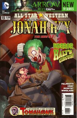
GREEN ARROW #1: It's as if JT Krul, Dan Jurgens and George Perez set out to create the most generic, boring superhero book imaginable... and succeeded. Crap.

GREEN LANTERN #1: Considering how self-important (and self-conscious) this title had become before the relaunch, it's surprising that Geoff Johns and Doug Mahnke manage to essentially play this first issue for laughs and get away with it. Good, although I found myself wishing that the last page had been held back for a few months, if only because I really enjoyed seeing dick Hal Jordan so much.

GREEN LANTERN CORPS #1: I was always going to be a sucker for this book; John Stewart and Guy Gardner are my favorite Green Lanterns, Peter Tomasi's previous run on the title was something I really enjoyed, and there's no Hal Jordan or Kyle Rayner to harsh my buzz. Sure enough, I really dug this; uberviolent opening aside, I appreciated the "this is where our leads are" intros before the mystery was revealed, and the final page felt weighty and dramatic enough to bring me back next issue. Sure, Fernando Pasarin's art feels like a little bit of a letdown after that Doug Mahnke cover, but it's still pretty great in a "Bryan Hitch but more approachable" way. Very Good, for me.

GREEN LANTERN: NEW GUARDIANS #1: And then there's this. This is just a bit of mess, whether it's the loss of the "some time ago" caption at the opener explaining that the book opens with a flashback, or the failure to really explain who all the different Lantern characters are, it seems sloppy and at odds with the other Lantern books, and Tyler Kirkham's art doesn't necessarily help, either. Awful.

GRIFTER #1: Finally answering that eternal fanboy question "What do you get if you cross Sawyer from Lost with ROM, Space Knight," this is Okay for those of you who enjoy this kind of thing; Nathan Edmonson's script is a bit light on explaining things, but I suspect that's intentional, and CAFU's art seems too polite for the story being told for my tastes. I don't know; there's nothing wrong with it, but there's also nothing that feels especially compelling about it, either, if that makes sense. I think Fringe probably does this kind of thing better, really.

HAWK & DOVE #1: I wanted to like this book so much, and then Rob Liefeld couldn't stop himself reminding me that he's a terrible, terrible artist. Everything happens at crazy angles! People's mouths change size without explanation! Everyone looks permanently in pain because of all the scratches on their bodies! It's a shame, because you get the feeling that Sterling Gates is really trying to work with Liefeld's energy, but he's overwhelmed by it on this issue. Truly, unhappily Awful.

I, VAMPIRE #1: On the plus side, Andrea Sorrentino could pass as fake Jae Lee if the position ever opens up. On the minus side, this is worryingly murky in terms of story (and storytelling; it's not just Joshua Hale Fialkov's script here, the art really does it no favors), and reads like someone's idea of doomed romance a la Twilight, but even more melodramatic. I'm sure there is a massive audience for this, but I found it pretty Eh at best.

JUSTICE LEAGUE #1: Hey, remember when everyone was talking about this book? Well, not much has changed since then. I like it, for what it is; I like dick Hal Jordan, I think there's a reasonably strong mystery introduced and I don't care that the entire team isn't in there despite the cover. But I'd be lying if I said I thought it was more than just Good; there were other books that the relaunch could have led with that seem better suited for all-new readers and a heavy media blitz.
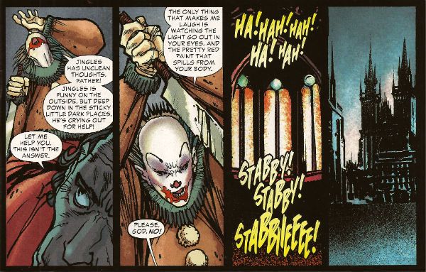
JUSTICE LEAGUE DARK #1: It's not quite Shade Peter Milligan - or, for that matter, Secret Seven Milligan - but there's the potential for getting there with this opener (I really liked the perversity of the Kathy reveal), and Mikel Janin's art is lovely. Slightly underwhelming, I've got a lot of faith that this Good first issue will turn out to be a very good series.

JUSTICE LEAGUE INTERNATIONAL #1: Potentially Green Arrow's main competitor in the "most generic superhero comic" race - And Dan Jurgens is involved with this one, as well! Clearly, this is karma for killing Superman twenty years ago - this just feels like a subpar fill-in to a comic from some point in the 1980s, complete with inexplicable Margaret Thatcher cameo appearance. Considering the potential for a JLI series spinning out of the surprisingly strong Generation Lost mini, this is a tiny bit heartbreaking. Awful.

LEGION LOST #1: The good: Pete Woods' art is just amazing here, really, really great stuff. The bad: Unless you're a Legion fan already, this is likely entirely impenetrable stuff. I love the Legion, and this almost made no sense to me whatsoever. It doesn't help that important things happen off-panel (So, Timber Wolf just picked up the bad guy and no-one tried to stop him?), the characters have no real introduction and just way too much happens to let the reader have any time to make sense of it on first, second or even third reading, because there's not enough space in the book for everything. What it ends up as, then, is a good-looking mess. That's what we call Awful round these here parts.

LEGION OF SUPER-HEROES #1: I've really, really tried to convince myself that New Levitz Legion is just like Old Levitz Legion, but I think this is the issue when I realized I couldn't keep it up. I'm unsure whether it's Levitz or his circumstance, but everything feels so jumpy and fractured that there's no chance - or, it seems, space - to build up the long running soap operatics that I loved the first time around, with everything ending up sacrificed for whatever big storyline that I find myself uninterested in. Eh as much as I wish it were otherwise.

MEN OF WAR #1: Someone, somewhere, found this to be more than some generic "Are you really a man?" cliches wrapped around a superhero mystery, but it wasn't me. Awful, and the back-up strip was even worse.

MISTER TERRIFIC #1: Another book that I really, really wanted to like - Although that's almost entirely down to the original release info containing the hilariously melodramatic line about him fighting "science gone bad!" - and the actual book... kind of lived up to my expectations, perhaps? There's a lot to like here (The new origin, with a time travel mystery replacing the Spectre's telling him "Hey, that white guy? You should rip him off," for example), but it doesn't come together properly, and ends with a cliffhanger that just makes no sense in a first issue ("Is this character acting weird? How would you know! You've just met him. Tune in next month to find out if he is or not!"). But... Again, maybe it's goodwill, but even though this was just Okay, I'm holding out hope for better soon.
NIGHTWING #1: I came to really like Dick Grayson when he was Batman, so why do I find almost everything in his new title feeling like it's a step backwards? Whether it's Dick visiting the circus again, or telling us how good it is to feel like himself, all of it feels more forced and less genuine than it should. Eh, and most of my fondness for the character disappears entirely as he disappears behind a pile of dialogue and sentiment we've heard before.

OMAC #1: If it wasn't for Superboy, this might have been the best surprise of all 52 books. Somehow, Keith Giffen and Dan Didio manage to channel Kirby's sense of fun, if not his sense of originality - This is a reboot of an existing concept, after all - by smooshing together Office Space, the Hulk and the original OMAC to come up with something that feels like it owes as much to Giffen's own Ambush Bug as it does Kirby, and it... weirdly... works. It's very much not for everyone, but I think that's true of the original OMAC as well. It's an odd feeling to think that Dan Didio came up with one of the most individual and arguably the most fun of all of the New 52 books, but there you go. Very Good, and long may it stick around.

RED HOOD AND THE OUTLAWS #1: I think we can also file under "Things I've said too much about," but short version: Not for me even before we hit the "Starfire is an amnesiac bimbo nymphomanic" thing. Crap.

RED LANTERNS #1: If Ed Benes wasn't drawing this book, I have the strangest feeling I would have actually liked it, because Peter Milligan's script - or, more properly, his narration - is weirdly compelling here, and feels oddly subversive to all the Geoff Johnserisms in the scenes surrounding it. If he ends up carrying that further in future issues, I could see this becoming a sleeper hit for the the cool kids who are perfectly okay with women who can twist their bodies to simultaneously show off their butts and their breasts at the same time. Eh, with chances for better later.

RESURRECTION MAN #1: Clearly, it's books dealing with life after death that I have a problem with. Like the Deadman book, this one also barely registers after multiple re-reads. Eh, then.

THE SAVAGE HAWKMAN #1: For everyone who ever thought "What would make Hawkman awesome would be if his armor and wings came out through his pores like Warren Ellis' Iron Man!" then this is apparently the book for you. For the rest of us, this is a book where Hawkman tries to burn his costume for some unknown reason, then gets attacked by it, and then it turns out it's living inside him or something. It really is as bad as it sounds, although Philip Tan's watercolor art is rather nice in places. Awful, though.

STATIC SHOCK #1: It's modern Spider-Man, with the rest of the Milestone universe seemingly playing the supporting cast. It's surprising just how ready I was for that book, without ever realizing it. Good, although I'm already worried about it, now that we know that John Rozum is off the book by #4.

STORMWATCH #1: Like Batgirl, it's possible that this book fails because the writer was far too aware of what they had to do; there's too much empty exposition in this issue, and it's an issue that needed useful exposition. Paul Cornell doesn't quite catch the tone of Warren Ellis' characters, and the disconnect is obvious in a way that isn't obvious; no-one sounds quite right, and everything feels off-kilter as a result. It's a book that simultaneously feels dense and sparse, and Miguel Sepulveda's art, static and heavy, doesn't help with that feeling. A low Eh, and it should be much better.

SUICIDE SQUAD #1: Forget skinny Amanda Waller; this book has way bigger problems. You know, things like an awkward structure (Not helped by multiple artists working on the same issue), a ridiculous set-up and thoroughly flat characterization throughout. Disappointingly Awful.

SUPERBOY #1: I was genuinely surprised by how much this book feels like science-fiction instead of a superhero book, at least in this first issue, and how there's an interesting lack of moral certainty at show just yet (I'm sure that'll change in time). With RB Silva's clean art and Scott Lobdell's strongest script for the relaunch by far, this is Good stuff.

SUPERGIRL #1: This is also surprisingly Good. A complete reboot for the character, and a chance to start from a personality closer to Sterling Gates' work with the character - Probably the character's most recent high point - instead of the wishy-washiness of the origins of the previous version, this issue isn't showy in the slightest, but gets the job done nonetheless.

SUPERMAN #1: Oh, oh, oh. Oh, Superman. I guess, if nothing else, this issue does provide an alternative to Action Comics, mainly in that Action was really good, and this isn't. Where to start? The confusing opening (Is the new Daily Planet built? It would appear so on page 2, but I'm still not sure if that was meant to be a glimpse into the future or not. If it had been rebuilt, would the previous site still have the remains of the old one?), the hilarious scenes of Lois et al discussing journalism ("Print is dying!"), Clark being bitter and mean to Lois, the genuinely horrible examples of Clark's journalism... There is so much wrong with this issue, but primarily I think the underlying structure is the biggest problem: Too much is, again, forced into too small a space, and this time, it's combined with a super brawl that is neither exciting or even interesting, leaving the impression that Superman's life is dull, full of sniping arguments and a ham-fisted idea of how journalism works. It's a mess, and one not saved by Jesus Merino's sterling attempts on art. Awful, and maybe the biggest disappontment of the bunch.

SWAMP THING #1: Talking of wordy, this is another overly-verbose book that could've easily dialed back the exposition to sensible levels and become infinitely better as a result (The whole Superman scene in particular felt unnecessary). That said, like Animal Man, the horror tone works and there's definite potential here. Okay, but greedily, I wanted more.

TEEN TITANS #1: It's a slow start, true, but I'll admit to being sucked in to Scott Lobdell's plan of essentially running one story between this and Superboy - although that final scene in both books has different dialogue and staging in some parts, which seems a completely avoidable mistake to me - and enjoyed this much more than I was expecting from early previews. A high Okay - I still have my issues with Brett Booth's art, I'm sorry - and I might even keep going on this, at least until the entire team is together.

VOODOO #1: You know, deep within this book, there's an interesting idea about an alien invasion happening in plain sight, with the alien as the central character. But getting there in this case means working through a lot of gender politics that's trying to have its cake and eat it at the same time ("Yeah, this is cheesecake, but look, the strippers are real women with class and babysitter problems and shit! But here's some more T&A anyway!"), and... I'm just not interested, ultimately. Awful.

WONDER WOMAN #1: Holy crap, it's the last book. I was beginning to think this would never end. And it's ending on a high note, too; sure, Brian Azzarello's script is sharp and fast-paced (if a little short on explanations, but there's time for those later), but this is entirely Cliff Chiang's show, and he doesn't even vaguely fail to deliver. This is a wonderful looking book - Matt Wilson's colors help considerably - and all the moreso because there's nothing else like it on the DC stands right now. The mythical quality of the story seems on a different scale to all the other New 52 books as well, and the strong individuality of the book makes it feel more like an event... and that's a nice feeling for a Wonder Woman book to have. Very Good, and one of the best books of the line so far.

Now, as the saying goes: What did you think?