Its my bar of chocolate, give it to me NOW!

OK, MarvelNOW! has pretty much gotten going, where did we leave off...?  


ALL-NEW X-MEN #1 & 2: If one single thing is going to harm this Marvel relaunch, it is going to be these bi-weekly shipping comics. And, heck, scratch "bi-weekly" as #3 is inexplicably shipping NEXT week (wait, what, why?), and that's a bit of a shame because I (unlike Mr. Lester or Mr. McMillan) kind of like ANX.

Now, part of that is that I am really glad we're back to the "old" X-paradigm -- they're operating out the school, mutants are no longer tied to "the 198" or Utopia island, or any of that. And part of that is that Brian Michael Bendis had long since run out his string on the Avengers titles, so seeing him get something fresher is nice. I also think he's very much toned done much of the "Bendisms" that marked too much of Avengers.

Another is that Stuart Immonen is an awesome artist, so it's a real treat to look at.

There's a buncha handwaving that one has to do with the time travel stuff, but I'm willing to give it to him because this is comics, and the story should be more important than the mechanics of it.

Ultimately, I'm willing to give Bendis a bit of rope here -- I think this is a very high OK so far, and as a general direction to make the x-books relevent again, I'm fine with it.


CAPTAIN AMERICA #1: I liked this OK as well -- Romita & Janson are always a good art team, and Rick Remender's script is zippy and actiony. I worry a little about the setup -- the text page would seem to indicate that this "Dimension Z" is the home of the book for a while, and I sort of worry about a Captain America comics not set in, y'know, America, but the bigger problem is the $4 cover price, I think.


FANTASTIC FOUR #1: Lots of setup, and a reasonable enough pitch for the next 12-18 issues of the comic. Fraction does dependable work here, and Bagley's art just screams "Marvel!" as it always does.  Because it only has a $3 cover price it also gets more goodwill from me, which means I thought it was GOOD, though execution over the months will count for more here than some of the other NOW! books.


FF #1: The flipside to Fan4 above, this one is Fraction and Allred, and, hot damn, did I like this first issue. I especially liked the narrative structure that suggests you read the book a second time now that you understand on the last page the reasoning/setup for some of the interstitial pages. My absolute favorite of the NOW! books so far, I thought this was pretty EXCELLENT.


INDESTRUCTIBLE HULK #1: Solid set-up for a series, which one should probably expect from Mark Waid. I'm not so sure that the art from Leinil Yu (at least on the Banner pages) really worked in harmony, but the Hulk bits were nice, so it works out. Solidly GOOD, that $4 cover keeps it from the next grade up.


JOURNEY INTO MYSTERY #646:  Kathryn Immonen and Valerio Schiti move the book from Young Loki, to Sif instead.  I kind of don't care about Sif, but Schiti's art is a joy to behold. Hard to see this lasting for long, really, but as a first issue, I thought it was also solidly GOOD.


THOR: GOD OF THUNDER #1 & 2: Yay, it's fun Jason Aaron, writing a loutish Thor. Art by Esad Ribic is super spiffy. I also quite like the parallel structures of past and future Thors and crazy godshit in space and whatever, and yeah, digging it... except for that damn $4 cover price, which caps my grade at GOOD.


X-MEN LEGACY #1 & 2: It's a damn shame that this came alphabetically last, because I have to go out on a down note, then. Cuz' this just wasn't compelling. It's nothing wrong with Si Spurrier's script, per se, or even Tan Eng Huat's art, though I get he's an acquired taste. I think the bigger problem really is the focus on Legion, who just isn't a very interesting character, and there's less than no reason to call this comic "X-Men" anything. #2 had a printing error, and they put it on paper more suited to a free giveaway comic -- this is likely to be the first NOW! book cancelled.  EH.


What did YOU think?


-B

"...A Cascade Of Wasps Attacked the Furry Monster!" COMICS! Sometimes You Worry About The Men Who Made Them!

That's right I read some comics. Some of them were old and some of them were new and one of them wasn't really a comic at all. But only one of them made me think it was a miracle anyone was actually conceived in the '50s. Photobucket

Yes, paging Dr. Subtext! Outbreak of '50s gynophobia! But then to nostalgic old fools like me '50s gynophobia is arguably the finest gynophobia of all! Anyway, this... THE SHAOLIN COWBOY ADVENTURE MAGAZINE #1 The Shaolin Cowboy in "The Way of No Way!" by Andrew Vachss and Geoff Darrow Time Factor by Michael A. Black Illustrations by Geoff Darrow and Gary Gianni Designed by Peter Doherty Cover by Scott Gustafson Dark Horse Books, $15.99 (2012) Shaolin Cowboy created by Geoff Darrow

Photobucket

This isn't a comic book, best get that straight right from the off. What it is is a loving evocation of the pulp magazines of the past. Peter Doherty has designed the book, and every page within it, to wilfully evoke those deceased progenitors of the super hero comic. He draws short at leaving the page edges untrimmed but other than that it's a splendid piece of design work. The contents are very reminiscent of the old pulps too. I haven't read a lot of those but what I have read of them they were largely shaggy dog stories told in very wordy way with the main draw being the charisma of the central character and the outlandish inventions deployed by the (often uncredited) authors to delay the ending.  Pulps were largely exercises in covering as much ground with as little material as possible (very much like certain comics from The Big Two. Ha ha! You Crazy!) but fought hard to be entertaining while doing so (unlike certain...Ha ha! Me passive aggressive!).

Photobucket

So what you get here consists of pages of words punctuated by  a plenitude of Darrow's hypnotically precise spot illustrations and a smattering of full page "Helpful Hints" where Shaolin Cowboy helpfully shows you how to switch on a toaster before e.g. tearing off someone's nutsack with it. That's the joke there and it's the same joke every time but as with certain jokes the accumulative repetition somehow keeps it funny. Because that's the thing about Shaolin Cowboy isn't it? There aren't a lot of jokes but what there are are good jokes. The best joke in the comics is appreciating the density of illustration used to enliven such meagre plots. The trick here is that Vachss and Darrow make the language serve the illustrative function but the joke remains, in essence because whole pages dense with text  are spent describing a scene only to have the scene change suddenly. More space is spent describing how the people Shaolin Cowboy is about to dispatch look than there is spent describing how they are dispatched. As with the comic the emphasis is on appearance rather than action. You will have to like words to like this one.

Darrow and Vachss have worked together before (Darrow did the covers for Vachss' 1995 CROSS series at Dark Horse and worked on the 1993 ANOTHER CHANCE TO GET THINGS RIGHT g/n along with many other artists) but it's surprising how well it works here given that change of emphasis from art to text. Vachss is a perfect choice for a pulp project like this. He's an accomplished writer of fiction whose work tends to read like nothing so much as pulp filtered through a dark adapted eye. His Burke novels are pretty much What If  Doc Savage and his crew had all had terrible childhoods and now hunted sexual predators with absolutely no intention of rehabilitating them. Vachss is an imposing figure what with his designer suits, eye-patch and general stance that seems to declare that he has just dealt with something and it will never hurt anyone else again. He isn't a dilettante either, just paddling in the waters of human atrocity for profit. This is from his bio in the back:

"Andrew Vachss has been a federal investigator in sexually transmitted diseases, a social-services caseworker, and a labour organiser, and has directed a maximum-security prison for "aggressive-violent youth". Now a lawyer in private practice, he represents children and youth exclusively."

This explains the references to the organisation PROTECT which crop up in the book and the no-nonsense message about kids and violence. Andrew Vachss makes Steve Ditko look indecisive is what I'm saying. I'm glad there is someone out there like Andrew Vachss, almost as glad as I am sorry that there is a need for people like him. But I can assure you that my rating is based entirely on the fact that I really enjoyed the book. It certainly isn't fear of having my legs broken that makes me say it was VERY GOOD! Also, the Michael A. Black time travelling/dinosaurs short that brings up the rear of the book is pretty neat and will take you back to Sundays reading Ray Bradbury on the rug in front of the fire before you even knew the world contained kids less fortunate than you who needed things like PROTECT.


ALL STAR WESTERN#13 Jonah Hex: Art by Moritat, written by Justin Gray and Jimmy Palmiotti, coloured by Mike Atiyeh and lettered by Rob Leigh. Tomahawk!: Art and colour by Phil Winslade, written by Justin Gray and Jimmy Palmiotti and lettered by Rob Leigh. DC Comics, $3.99 (2012) Jonah Hex created by Tony DeZuniga and John Albano Tomahawk created by Edmund Good and Joe Samachson

Photobucket

This book gets worse and worse and it still sells more than it did when it was called JONAH HEX. But then it isn't about Jonah Hex anymore is it? No,  it's more like Jonah Hex And His Amazing Friends. Except they are far from amazing and, as he's Jonah, they aren't really his friends, so it's more Jonah Hex And Some People Tolerating Each Other. Whatever I say about this book (and I'll be saying some stuff alright) all that needs be done to refute me is to chuck back its sales figures in my angry biased jealous fan boy face. The guy doing the most work here is clearly Moritat and he does a far better job than the material requires. Look, this isn't about Jonah Hex being "my" character and how I don't like what they've done to him. It's about bad comics. This one starts off with a clown killing a priest. He is killing the priest because he does not like priests because they fiddled with him when he was a kid. Jonah and his crew show up and notice the dead priest has had his face painted like a clown and someone says there's a circus in town and, oh God, oh Jesus....it's not exactly a fucking "two pipe problem" is it, Watson?

Photobucket

And I've gone Holmes on you there because what this comic is also doing is bringing in fictional literary characters from the period the book is set in (at the minute we have Edward Hyde, y'know, from Little Dorrit.) I can only guess they are doing this because the constant shout-outs to DC super hero continuity aren't stupid enough. I've got no beef with either man (I'm certainly not jealous(!)) but Palmiotti and Gray's work comes down heavily on the commercial rather than the creative end of the see-saw. It beggars my mind why on earth they would seek to go toe to toe in the shared-world arena with Kim Newman, Philip Jose Farmer and that elderly Englishman we've all decided we hate (because although less than he was he still makes everyone else look bad).  In comparison this is just pantomime and Palmiotti and Gray look like they'be both not only turned up as the horse, but they've miscalculated further and they both came as the horses' ass.  C'mon, the clock is ticking until Spring Heeled Jack shows up. After all some claim the murders ended because he sailed to The New World, how can they resist. Look forward to "It's Saucy Jack, sir! He's struck agin! Right under our very noses!" That should show FROM HELL up good and proper. Yeah, I know; but it sells more than ever - so I lose. I looOOooooOOOOOOooOOse! Look, something can be successful but still CRAP! It isn't a critic's job to tell you what's selling - it's their task to tell you whether something is any good or not and why. Sometimes elliptically. Sometimes irritatingly.


UNTOLD TALES OF THE PUNISHER MAX#5 Art by Mirko Colak (p) and Norman Lee & Rick Ketcham (i) Written by Skottie Young Coloured by Michele Rosenberg Lettered by VC's Cory Petit Marvel, $3.99 (2012) The Punisher created by John romita Snr, Ross Andru and Gerry Conway

Photobucket

There are many audacious things aout this comic written by the man who will, on this evidence, remain better known for his art on Marvel's wonderful Oz books. First up is the fact that Young attempts to position FrankMax as some kind of homicidal homilist dispensing murder and maxims. That would be okay(ish) if this were FrankNorm but in the MAX (So uncompromising! So complex! (i.e. violent and cruel)) world it seems a bit...off. Like FrankMax's taken one too many blows to the head and suddenly become simple minded or something. Don't get me wrong it's a good moral but I don't know if the guy who (spoiler!) killed your Dad is the guy you're going to listen to. No, put the phone down! Not your Dad; the Dad in the book. The Punisher didn't kill your Dad! He isn't real! No, The Punisher isn't real, your Dad is. Look, you're just doing it on purpose now.

Photobucket

The other bold move is to have the issue basically centre around a high-stakes cat and mouse game revolving entirely around the making of cheese macaroni and, specifically, whether there is some cheese in the fridge! I won't spoil it for you. No, not the cheese that's okay it's in the fridge. Or! Is! It!? I kind of liked that actually; it amused me. Young really stretches my credence to cracking point though when he suggests someone's favourite movie could be Appollo 13. Hey, it's a decent movie and it documents a thoroughly remarkable instance of insanely laudable human bravery and ingenuity no doubt, no doubt. But...favourite movie? Ever? Of all the movies you have ever seen? Okay, it might be crew members Lovell and Hise's favourite movie (Swigert died before it was made but he'd probably have been mad keen on it too.) but this comic isn't about them. I know all kids think their Dad's taste in movies suck but c'mon. Even my Dad likes Reservoir Dogs (altho', "There's no real need for all that language, John.", so spaketh he.) All this together with the unspectacular art makes the comic EH! And in the end the brassiest thing about the comic is that Marvel charged $3.99 for it. (You don't even get a Free Digital Code!)

HAUNTED HORROR #1 Art by C.A. Winter, Bernard Baily, Mike Sekowsky & Bill Walton (attrib.), Jack Kirby & Joe Simon, Jack Cole and Jay Disbrow. Reprints tales from WEIRD TERROR#1 (1952), THIS MAGAZINE IS HAUNTED#4 (1952), BAFFLING MYSTERIES#6 (1952), BLACK MAGIC#31 (1954), INTRIGUE #1 (1955) and CRIME DETECTOR #5 (1954) Cover by Warren Kramer and Lee Elias IDW/YOE Comics, $3.99 (2012)

Photobucket

If you don't think that that fine as wine cover is some kind of awesome then you best look away now because that's the smoothest thing in this package. And what a package this is! A splatter of pre-Code horror comics from various sources and various artists that shores up the case for art being the decisive factor in a comic's appeal. Because these sure ain't some well written comics. Apart from the Simon & Kirby (S&K) tale none of the other contents even get a writer credit. I'm not really surprised either. These things are entertaining allright but probably not in the way the authors intended. If the authors even intended anything because back then people just wrote this stuff to eat and they had to write a lot of it and they had to write it fast. Intentions are a very modern affectation for comics writers, tha ken. The more sedate of these tales are written like the writer’s got his cock in a mangle and he’s just learned he's late for a plane.They aren't exactly coherent is what I'm saying there. But the best one is "Black Magic In A Slinky Gown" because it has an almost palpable revulsion for women and the dirty, dirty things they make men do with them. The author of this one is only saved from almost certain Sectioning by the addled and unfocused nature of the storytelling. Or maybe it makes it seem worse than it is; either way it's hilarious. The kind of story you imagine being written by the kind of man who silently props up the bar surrounded by a circle of silence and goes home and the next time you hear about him it's in the paper and it isn't for winning the lottery.

Photobucket

In a more commonly accepted sense of "best" it's "Slaughter-House" which takes the prize. This is by S&K and is a real shocker. It's f-in' brutal!  A couple of battered Joes resist after the Earth has been conquered by '50s style aliens and it's all really unsettling. It's as though limited as to what they could depict visually S&K snuck through the real horror in the text. Seriously, it's basically got humanity being herded into killing pens and "...SLAUGHTERED like beef on the hoof!" With the wire and the guards and the mechanised death and the resistance and the Quislings and...you don't need letters after your name to know what S&K are on about (World War 2, darlings. World War 2). It also contains the word "noggin" which automatically makes my day. The ending is uncharacteristically downbeat for Kirby (maybe it's more Simon) but it's weird to reflect that The King's work appears more pessimistic before Marvel fucked him over than it does after. Because while this story apparently refutes it Jack Kirby, and I may have mentioned this before, never gave up on us.

Photobucket

This is a VERY GOOD! package overall. Not just for nostalgia (because don't you have to have experienced them first time round for that?) but also out of interest in what comics used to be like. Turns out they were the kind of thing that, had it been produced yesterday by people under thirty, would tickle the 'nads of VICE readers as much as the sight of a pretty girl reading Infinite Jest opposite them on the subway. (Honestly, there's some real Charles Burns/Dan Clowes look-a-likey stuff in here.) Also, for people who like their reprints just the way they were this book is for you, Brian Hibbs! It looks like someone just scanned the comics in and adjusted the contrast and so all you need is a Police Action in Korea, a corn dog and a cop on every corner for it be just like the good old days again!

Make Brian Hibbs smile like a child again by buying HAUNTED HORROR #1 from HERE.

And like the good old days - I'm gone!

Hope y'all had a good Thanksgiving and remembered to give thanks for COMICS!!!

All over the map: Hibbs' 11/7

Comics, TV, and a movie, after the jump.

Comics, first? OK with me!


FUCK ALAN MOORE BEFORE WATCHMEN: MOLOCH #1: Much like MINUTEMEN, this would be one of the FAMBW books that I was at least curious about -- we don't really know a lot about Moloch, and he's arguably a principal... well, "catalyst", at least, if not "character". And I was hopeful because, hell, Eduardo Risso is drawing it, and that cat can fuckin' draw, y'know? Sadly, though, it has all the subtlety of any other comic that J. Michael Straczynski has written recently, that is: slim-to-none, and the result is just a cliched horrible mess -- Moloch's bad because he's ugly (no explanation for the bat ears is given), and because all women are horrible predatory whores. Yay!

Even Better is how this was hastily solicited to fill in a massive scheduling hole, where, suddenly, they seem to have lost an entire month's worth of FAMBW titles -- going from weekly to skipping five week's worth of issues is a kick in the gut on momentum on this series which was pretty strongly selling to a specific group of customers who are buying the entire project (not specific minis, like I thought in advance) -- well, damn, it makes DC suddenly look like Marvel in terms of schedule.

Either way, I know this isn't aimed at me, but we continue with "Exceptionally pretty, but emotionally bankrupt", which the closest on the Critic scale is, I think, EH.


DEADPOOL #1:  Brian Posehn (!), Gerry Duggan, and Tony Moore do the Marvel NOW! relaunch of  "the Merc with the mouth", and he's pretty much a character that I've never really cared one teensy bit about ever -- to the point where I don't believe (from the tags) that we've ever once reviewed a straight Deadpool comic on the site ever! -- and, hey, guess what, I thought it was reasonably entertaining! I can't say I'd personally add it to my monthly reading stack, but there was some charm and wisecracking, and an imaginatively funny series of antagonists, and it's almost certainly modestly GOOD.

What's funny for me, as a retailer guy, is just how much better this is selling right now then the next book (about 250% of that figure), as well as outselling it's previous incarnation, handily (for now at least) -- I went long on this #1, chasing that fat 70% discount, and I'm confident they'll eventually go (week 15, or 16, I'm guessing), while the next book I can already tell I'll never ever sell them all. *sigh*


IRON MAN #1: is that next book, and, in many significant ways for this retailer, my real litmus test for the commercial viability of MarvelNOW! as a branding exercise for Marvel.

I'm sure that in a month or two I'll write a post-mortum on the launches for TILTING AT WINDMILLS, but going into this my feeling was that Marvel comics are a significantly more popular "brand" than DC, and have a MUCH larger number of "lapsed" readers. The "New 52" launch succeeded by any dream of avarice I might have had, where even books where it was clear that they WOULD be cancelled within a year (HAWK & DOVE, anyone?) still sold 70-80% more copies than I ever thought they possibly could have, and the "big books" totally dominated fourth quarter sales charts.

Now, to me, IRON MAN is the modern quintessential Marvel comic -- two hit movies, lead role in the AVENGERS film, can't HELP but benefit from a big wide "push". DC reboots sold like 500%+ their previous issues, I didn't feel at all shaky going 300% of "current" IM sales, scored the extra discount on the first issue, at least (as I did with most, but not all, NOW! books)

So far? I've sold precisely one FEWER copy of #1 than I have of #522 in the same time period (day #6). Uh? What? The? Fuck? Again: I'm sure that will pick up eventually, but, damn, that's the exact opposite of what was supposed to happen.

The big problem is that I can't actually push the comic very hard on the strength of its contents -- I'm no real fan of Greg Land's stiff-and-lightboxed art, and Kieron Gillan's script, despite being one of the "Yeah, that makes sense!" names attached to NOW!, gives us a story whose premise is essentially that of "Armor Wars". I've read "Armor Wars". God help me, I've even read "Armor Wars II", this isn't what I want to read as the Big Relaunch.

I mean, it isn't terrible, or anything, but it's also not much better than OK, and for a $4 asking price, am I really going to suggest people buy this over, say, STUMPTOWN or even the next book, this week? Yeah, didn't think so.

This week is going to be the real test of it, I think (with 6 NOW! books), but I'm starting to feel like MarvelNOW! is going to be as big of a miss as New52 was a hit, and that's truly terrifying if that's playing out in the rest of the world the same way.


DIAL H #6: A beautiful, beautiful done-in-one story essentially ruminating on the stupidity and banality of some characters, and just how hard it is to "fight crime", and the real selling point for me was that the issue was drawn by David Lapham, who, of course, isn't even cover billed. Yeah, this was a truly great issue of this series -- I thought it was VERY GOOD.


How about some TV? Sure, can do!


ARROW: much to my disconcertion and surprise, I thought this was kind of non-shitty.  I was expecting more "Smallville" (ew), but instead it's kind of about as close to "Green Arrow: The Longbow Hunters" (well, or more properly, the monthly book by Grell & Hannigan just AFTER that mini-series) as you're likely to find -- there's a structured mystery, and plan, and it seems like it is playing out alright, and while it's a version of Green Arrow from Earth-TV (Speedy is his sister, Deathstroke is some sort of army torturer, or something, the probably-some-day Black Canary is named "Laurel", rather than "Dinah", so on, so forth) it has an interesting continuing flashback structure -- yeah, I don't love it (I'd never have watched it if I didn't own a comic book store), but I like it very fine. Marc Guggenheim has managed to make a very solid little weekly vigilante TV show.

Two notes: first: man, the budget on this thing seems loooooow, to me -- they're constantly setting scenes in "night clubs" which are fairly clearly a soundstage, with a curtain hanging in the background with colored lights playing against it, and like two silhouettes dancing behind it -- yet they sell it pretty damn well.

Second: this Arrow (oddly called "hood" by most characters IN the show) is a STRAIGHT-UP killer. Some episodes the body counts top a score. And it's all very kind of sub-rosa -- I mean, yes, the cops are after him, but one gets the sense it's more from being a vigilante, rather than being a KILLER vigilante. You'd think that "Laurel", as written, would be appalled by Arrow's actions, but, yeah, kind of not.  It is odd.

Anyway, I think this show is watchable, and surprisingly OK.


THE WALKING DEAD: So far, season 3 has been going swimmingly (I'm a week behind, I think?) -- this has been going breakneck speed, and shock follows shock pretty much every week. What I'm liking the best is that all of the same pieces are in play from the comic, but things come in different order, at different times that you can't really second guess it much. I mean, clearly, we have the prison, we have the Governor, but other than that, "anything can happen". I'm finding this a real thrill this season, and some of the acting this go round is getting downright good -- especially a recent reaction to something that happened involving Rick -- that was some raw-ass human emotion there. This really has been VERY GOOD, with only memories of the first "half" of Season 2 keeping me from wholly embracing it.


What, and a film, too? Sure! (though this has to go faster than I thought, since I just got the call that the truck with this week's comics will be here in a few minutes!)


SKYFALL: The latest James bond film was, I thought, one of the better ones -- it's actually ABOUT something, and when viewed with CASINO ROYALE (skip out on QUANTUM OF SOLACE, I think), it really projects a lot of new possibilities for the character -- but the last act of the film, while emotionally connective, was almost terrifyingly "small" in scope and range for a Bond movie, where you expect it to get bigger and bigger and ludicrous.  There's a crazy villain, however, and bi-sexual flirting (!), and a surprising denouement there at the end, and it even had what I thought were the best credit sequence of the entire series (seriously, it was almost entirely nude woman free, AND relevant to the actual movie, for once). You have to go far to beat MAN WITH THE GOLDEN GUN in my heart (and SPY WHO LOVED ME / MOONRAKER in my memory, though, watching those again with Ben, I didn't care for either much), and this didn't beat those heights, but, yeah, I thought it was terrific and thoughtful in most ways. It's a very strong GOOD.


Whew! Gotta bounce! How about you? What did YOU think?


-B

"Choke! Gasp!" Not A Podcast! It's The Menopausal Male Media Massacre!

Are you an adventurer? Are you lonely? Are you a lonely adventurer? Click "more" to meet lonely adventurers in your area... Photobucket

Art by Jack Kirby from THE JACK KIRBY OMNIBUS Vol.1 (DC Comics, 2011) Oh, okay, it's not really a dating thing for lonely adventurers. After all, Love should be the least lonely adventure of all!

No, what it is is Mr Jeff Lester and Mr Graeme McMillan are denying us all the pleasure of their patter as this is A Skip Week. So here's some stuff I threw together about some other stuff so you don't feel all aggrieved and put out or something. It's either this or me telling you about filling in my tax return or why men should take off their hats when indoors. (Because we aren't animals is why.) Anyway, this...

THE WOMAN WHO MARRIED A CLOUD The Collected Stories of Jonathan Carroll By Jonathan Carroll 600pp. Subterranean Press (2012)

Photobucket

Jonathan Carroll is a funny one alright. He's the kind of writer I blithely assume is at the top of some chart somewhere and beloved of thousands of eager and appreciative fans. The fact that I never hear about his new books and have to actively go look up if he's done anything since the last time I checked, together with the fact that this, his most recent book, is published by Subterranean Press, indicate that he probably isn't as popular as I presume. Which is a shame. It's a shame because he is a really good writer. He does a kind of magical-realist-fantasy-horror thing which is firmly and insistently set within the mundane frame of day to day reality. He does this so that when the Bad Things happen it is all the more effective. In a fairly short number of pages, and in a terse and limited vocabulary of fierce neutrality he'll map out the setting and then, well, pretty much anything can happen.

Basically he's like Neil Gaiman if Gaiman hadn't been neutered for public consumption. While Neil Gaiman is gabbing away at you he's always too busy refilling your cup of tea and making sure you have enough cushions; while Carroll would chat with you until your guard dropped at which point he'd throw the steaming hot tea in your face and force the cushion down your shrieking mouth while a talking dog appeared from nowhere and pissed in your stinging eyes. He's been robbed is what I'm saying. If you've never read Carroll then this book is a good place to start as it collects all Carroll's short fiction from 1990-2012 and amply demonstrates the effectiveness of his sharp contrast approach. The work of Jonathan Carroll is as arresting as a sparkling work surface smeared with human shit. One for the book jacket there. He's not a one-note writer though as well as the horror there's humour, eroticism, intelligence and a very playful sense of invention. I liked this book (I like all his books) it was VERY GOOD!

 SWEET TOOTH By Ian McEwan 336pp. Jonathan Cape (2012)

Photobucket

Difficult not to spoil this one but some might say the author does that for you. It starts off at a right canter and you'll be whisked along with your pearly teeth exposed in delight as your long clean hair flies behind you like a streamer of joy. Because it looks like  you're getting a nut-tight spy thriller graced with all the literate loveliness only a prose perfectionist like McEwan can deliver. It looks like you're getting a fascinating view of the paradigm shift within the Secret Services as the Cold War politely steps back and the Irish mainland bombing campaign thuggishly elbows its way to the forefront of State concerns. It looks like you're getting a fascinating portrait of the silent sexism that soured the '70s, it looks like you're getting a love story, and then...

Photobucket

You just couldn't help yourself could you, McEwan? Look, pal, no one likes a smart arse. Lucky for lad-di-da Ian McEwan that we all like good writing and the writing in SWEET TOOTH is fantastic but since it is put to such ultimately shallow ends the book wound up just being GOOD!

HHhH By Laurent Binet Translated by Sam Taylor 336 pp. Harvill Secker (2012)

Photobucket

It was the fictional light entertainment dunderhead Alan Partridge who said, “The more I learn about Hitler the more I dislike him”; a statement that it is hard to argue with and one which is also equally applicable to Reinhard Heydrich who is the titular subject of this book. Yes, reader, the more I learned about Heydrich the more I disliked him. Although, to be fair, he had an uphill struggle from the off as he was one of the architects of The Final Solution. You know the one, that's right, that one. Revealingly the impetus for The Final Solution was to ease the burden on the sensitive souls of the SS who found slaughtering men, women and children round the clock was a tad wearing on their ickle nerves. That such tremendous horror should have been born of such tender concern is almost funny. If it isn’t funny it is at least instructive, as is much of the book since its subject is not just Heydrich but also the kind of Mind-State occupied by a people willing to implement the unthinkable in the same way as a change to bus routes; the attempt on Heydrich's life by a small group of Czech and Slovak resistance fighters; the appalling consequences of this (See! A village disappear!) and how it all lead to the world finally facing the fact that the only way to deal with  Hitler was to burn him down and salt the earth afterwards. The book is written in a chatty, discursive style in which Binet reflects on his doubts regarding his work, the impossibility of being objective, the ladies he has liked and the other works of fact and fiction dealing with the same areas. I guess some would find this post-modern and innovative, and it probably is, but I just found it absorbing and appealing. Which, of course, can be due in no small part to the translator Sam Taylor. Don't worry the style doesn't reduce the subject matter to vapid emo-tainment (You know: "Enough about The Holocaust! What about my problems!?!") but it does just take the edges off so that you can finish the book without collapsing in despair at the whole shoddy mess of Evil involved and all the unthinkable implications about our species that all that sad Nazi shit contains. It wasn't exactly a feel-good romp but it was VERY GOOD! Remember: Always leave 'em laughing!

Next time maybe I'll avoid a disciplinary from Bwana Brian and observe the remit and talk about COMICS!!!

Getting Hibbsy with 10/31

Ugh, I’ve missed too many weeks of reviews here, let’s get this back on track! A PLUS X #1 NOW: Finally another ”Marvel NOW!” title ships… and it is the low-to-no plot title. “AvX: VS” was a cute side project for the main AvX comic (and could be, I think, argued that it was often much better than the comic with the actual plot), but I have a hard time seeing this concept sustainable as an ongoing monthly.  As always, things that work out as a joke idea generally can’t survive being stretched out to ongoing status, and I think the low-to-no-plot content is going to not help that one tiny bit. The execution of this issue? Totally competent, but I suspect people are looking for a bit more than “competent” for a $3.99 monthly series. I thought it was EH.

ACTION COMICS ANNUAL #1: Sholly Fisch (Whose name, have I said out loud?, sounds like a golden Age DC Comics writer) takes the big chair here, and the result is perfectly respectable.  Actually, what I found interesting was just how much this comic resembled the basic plot of SUPERMAN EARTH ONE v2 – sudden powers given to someone that Superman must stop, but can’t touch physically lest his own powers be removed; end of comic, villain goes to work for military, which is trying to figure out a way how to kill Superman – also out this week. I think this annual did the story much much better, and it was highly OK.

ANGEL & FAITH #15: I mostly bring this issue up because the back half of it is illustrated by David Lapham, a general rarity these days, much to my sorrow. Isn’t it just nuts that STRAY BULLETS is not in print? Crazy crazy making. Anyway, yeah, ANGEL & FAITH is generally more readable than BUFFY and this issue is no exception, even if it reads a smidge like a fill-in with its two-story structure. Still? GOOD.

AQUAMAN #13: Fourteen issues later, and it’s still all about TELLING us that Aquaman is good, without really SHOWING it. Scowly-Anger-Man is, I guess, a form of characterization, but I’m still not really certain just WHY he’s so pissed off about everything. The only one calling Aquaman lame is the writer of this comic (and they do it again, here, fourteen issues in). Were I paying cash for comical books, this issue would mark me as “Done”, but I work in a comics store, so I quite imagine I’ll read the next issue as well, and not really enjoy it very much either. EH.

BATGIRL ANNUAL #1: I found the painted art (mostly by Admira Wijaya) to be a little too, dunno, paperback cover-like, maybe? Too stiff, too posed, and largely unable to properly render anything too “fantastic” (like Catwoman’s mask, or the perfectly proportioned bandages on SheTalon’s face, and I’m pretty sick of Court of Owls-related stuff at this point, but otherwise, this annual was perfectly OK.

BEDLAM #1: It’s kind of an Arkham Asylum / Joker pitch with the serial numbers filed off in which, at least if I’m following this correctly, the Joker becomes a “good” guy at the end – it carried me right along in its world, which is what a comic is supposed to do, so let’s add this to the rapidly growing pile of intriguing Image comics – I’ll go with VERY GOOD, I think, and, hey, you can buy it on our digital store!

CAPTAIN MARVEL #6: Among the many reasons I am not an editor of comic books is not really understanding why you would launch a book with as distinct of an artist as Dexter Soy, then drop him out before the end of the first arc for someone like Emma Rios (who is a swell artist, but nothing whatsoever like Soy in style or tone). Nor, for that matter, why you would jam out those 6 issues in three and a half months. Especially if your artist can’t keep that schedule, apparently? Also: I’d never ever have made the first arc a time travel story, especially with a (sorry) B-level character like Cap who needs to be “reintroduced” to the Marvel U – you don’t make that work by taking the character OUT of the (modern) Universe. Add it all up, and it’s not any kind of surprise we’re already down to single digit sales on this title from just under 30 sold of issue #1. But the worst part of it all, the very worst part? I really thought this wrap up chapter was quite good, and, I think, ended up making Carol’s “secret origin” a much stronger one. I thought this issue was VERY GOOD, too bad I’ll end up being subs only by issue #12 at the rate things are going.

EC KURTZMAN CORPSE O/T IMJIN AND OTHER STORIES HC EC WALLY WOOD CAME THE DAWN AND OTHER STORIES HC : Sadly, deeply, amazingly disappointed in these – purely because they’re in black & white. I was strongly hoping for something like the Carl Barks reprints, with that nice flat coloring, and I was absolutely committed to replacing out my EC library (which consists of all of the Gemstone reprints, the ones that are literally four issues of the comics, covers, ads and all, glued together into an outercover) for handsome FBI reprints… but, ugh, I don’t want them in black and white. The solicitation copy, the press releases, really bury the fact that these aren’t in color, which I kind of find borderline dishonest. This is now the second attempt at upscale packaging for the ECs in a row that gets it wrong (the last HC set had new, shiny, color, ew!), which just hurts. I think I’m going to have to cut my orders on the next set of books by like 80% -- even “Nostalgia Guy” (my name for him) turned up his nose at them when he spied them on the rack. It’s too bad, because these ARE handsome hardcovers, and those spines are going look AWESOME together on the shelf, and it is really smart to collect the ECs by artist and genre – but they’re simply not how I want these stories archived in my library. I love the EC comics, and they really do deserve to be there for a wider audience, but I’d encourage you to have your LCS to try ordering the Gemstone “Annuals” – about ¾ of them are still in print, but Diamond never really advertises the fact. I stumbled across them doing a trawl of Diamond’s inventory, in fact. But those are flat color on newsprint, which is kind of how those books SHOULD be presented. I also don’t like how this edition doesn’t note which specific comics which specific story comes from. I would have preferred a Table of Contents more like a DC Archives edition, which even gives you month/year. *sigh* For the outer packaging, and the underlying work, I wanted to give a VERY GOOD, or an EXCELLENT, but this B&W edition makes me say EH, instead.

GHOSTS #1: Here’s a happy surprise – I kind of flat-out loved this anthology, as virtually every story was stellar. The other thing I really liked is that with the exception of the Phil Jimenez story, I feel like I could hand this comic over to Ben to read at 9 years old, just like its 70s predecessor. That’s the most awesome thing of all, and I think that they should continue that into the future with Vertigo Anthologies. Get that “Suggested for mature readers” off the cover, says I! The only story I really didn’t like? The “Neil Gaiman’s Dead Boy Detectives” which they decided to bill on the cover instead of Geoff John’s first Vertigo work (which I kind of found odd) – the problem is that it isn’t a full story, at all, and “too be continued, somewhere, eventually” is a big fail in an anthology book. I’m also growing more and more convinced that Al Ewing is The Real Deal, and I really loved his kick off story. And presenting the pencils-only from the Joe Kubert story was kind of touching and cool. Yeah, so: VERY GOOD.

MASTERS OF THE UNIVERSE THE ORIGIN OF SKELETOR #1: You also want to know from surprising? LOVED this. I don’t care for/about MotU at all, and their backstories never seemed any deeper than, dunno, a marketing interns stab at creating a fantasy world (Though, really, what else can you do when you have characters named things like “Stinkor”), so when Joshua Hale Fialkov actually manages to build a backstory that is reasonably compelling, then said story is drawn by Frazier Irving (!), then, hokey smokes, you’ve got a horse race. I was loving this right up to the last page when it says something like “And, so, your name is….SKELETOR!” and then I remembered it was a MotU comic. Aw! Still, this really was surprisingly VERY GOOD.

POPE HATS #3: Ooh, and this was even better. Ethan Rilly is going from strength to strength with this comic, and, damn it, I wish I could still sell issue #1 because we should be picking up readers for this great slice of life story about two room mates with very different career paths. Straight up terrific cartooning, and I would call it “Excellent” except for that pesky $6.95 cover price. Ow. So, knocking a grade off for that: VERY GOOD.

Looks like I’m out of time for the week – time to go pay bills! (yay?)

As always, what did YOU think?

-B

"I Tried Everything Else." COMICS! Sometimes Chaykin's Awake!!!

Hopefully you all made it through any storms okay, my American friends! If you did I've got some rubbish about comics for ya.Content! You might not want it, you might not like it but it's there!

Photobucket

G.I. COMBAT #5 Featuring The Haunted Tank Art by Howard Victor Chaykin Story and Words by Peter J. Tomasi Coloured by Jesus Arbutov Lettered by Rob Leigh The Unknown Soldier Art by Staz Johnson Written by Jimmy Palmiotti and Justin Gray Coloured by Rob Schwager Lettered by Rob Leigh The Haunted Tank created by Russ Heath and Robert Kanigher The Unknown Soldier created byJoe Kubert and Robert Kanigher DC Comics, $3.99 (2012) Photobucket

First up, I have to thank Corey (Ottawa) for bringing this comic to my attention. If it wasn't for our Canadian Contingent I'd not have known the art chores on this were by everyone's favourite filth peddler Mr. Howard Victor Chaykin! I wasn't expecting much here to be honest, I thought he'd probably be busy drawing comics too frisky for the UK to have any electrolytes left over for a book about a, well, a haunted tank.  I don't know if it's being able to clip art the shit out of this book due to its emphasis on hardware but the bits that aren't hardware have Howard Victor Chaykin pounding the pages with a barrage of highly entertaining images. Unlike, so I hear, the pounding he's giving the pages in that other (banned) book.

Photobucket

Tomasi gives him a totally stupid story to illustrate involving a nutty veteran clad in The Flag being tank-napped into a supernatural rescue mission while being pursued by Wonder Woman's high-tech ex Steve Trevor. It is nonsensical stuff but, I don't know if you've ever given it much thought but, the whole concept of The Haunted Tank isn't going to win any awards for realism. So why not go wide on the goofiness.  Chaykin seems to be enjoying himself and it all comes together a lot more successfully than some of his recent efforts. Not once did Jesus Arbutov's colour work have me reaching to ring the police and at times I was tempted to throw back my head and bellow Blessed-style "CHAYKIN'S AWAKE!!!"  Maybe he just enjoyed ringing up his russety pal Russ Heath and irritating him by going "Pop! Just drawn a tank! Pop! Just drew another! These computers are great! Now how long did it used to take you to draw these tanks, Russ? Pop! Drew another! Hey, I ever tell ya I can see the beach from my window?" I don't know, I just really enjoyed his stuff this time out. It was GOOD!

WOLVERINE MAX #1 Art by Roland Boschi & Connor Willumsen Written by Jason Starr Coloured by Dan Brown Lettered by VC's Cory Petit Wolverine created by Len Wein, John Romita Snr and Herb Trimpe Marvel, $3.99 (2012) Photobucket

While Jason Starr is a good writer of novels and I have also been known to enjoy the work of Roland Boschi the real reason I picked this up was because of Connor Willumsen. He does not disappoint! Boschi's pages seem somewhat rushed and concern the present day Wolverine fighting sharks and having no memory of why he ended up doing that. Also, his legs grow back and everyone is only slightly perturbed by this. Perturbed's too strong a word actually. I know health care professionals are rushed off their feet and are basically the busiest people in show-business and The Japanese are a modest people...but I think two legs growing back, bones and all, would cause more than a raised eyebrow and a muttered aside, suggesting such an event is more a case of exhibitionism than it is straight up miraculous. Jason Starr's handling of Wolverine's talents but in the real world is off to a choppy start is what I'm saying.

Photobucket

Willumsen, however, burns rubber from the off with his flashback scenes which portray Daniel Day Lewis from There Will Be Blood stepping into the original Claremont/Miller mini-series but in a grubbily humming Underground Comix stylee. So amazing are his inky doings that even the writing seems elevated with Victor sounding especially characterful in his disdain for the normals. I would buy this series purely for the further expansion of these elements.  I would but Marvel seem to have upset Connor Willumsen so much that he has jumped ship. His work will not be appearing in any subsequent issues of WOLVERINE MAX and so I will not be buying them as without him this comic will be less than GOOD! Well done there, Marvel! Yes, that is sarcasm.

DAREDEVIL: END OF DAYS #1 Art by Klaus Janson and Bill Sienkiewicz Written by Brian Michael Bendis & David Mack Coloured by Matt Hollingsworth Lettered by VC's Joe Caramagna Daredevil created by Bill Everett and Stan Lee Marvel, $3.99 (2012) Photobucket

I asked my LCS why they sent this (you're darned tooting I did) and they said it was because I liked Janson and Sienkiewickz, which is true. What they failed to factor in is that ladling the  steaming hot writing of Brian Michael Bendis over the top of their efforts is, at this stage in the game, like climbing a stepladder to fart repeatedly right in my face as I admire a Vermeer. It's distractingly puerile and pretty quickly spoils the whole experience. The best bit (i.e. the very worst bit of very many bad bits) is when Ben Urich's (very long, very, very fucking awful) monologue accuses his audience (his readers, geddit!) of not appreciating words. This is super-awesome because he's being written by someone who treats the English language with all the care and attention of a hungover abattoir worker placing his bolt-gun to a steer's head.

Photobucket

This is a writer who seems to have a working vocabulary of, maybe, fifty words and whose solution to every writing conundrum (an introduction to The Incal, an introduction to a HVC art book, a recipe for quiche, instructions on how to install a Norton Commando Boyer ignition etc) is always a chatty, faux-conversational, uninformative, space devouring style which smashes grammar's head in with a brick and is in no way to be taken as an indication of a complete inability to write anything approaching a joined up sentence. Christ, this is why I ask my LCS not to send his (dismal, dismal) stuff. This comic is smug, vacuous, inane, pandering, complacent ineptitude par excellence. This comic is CRAP! I did not like it.

THE INFERNAL MAN-THING #3 Art by Kevin Nowlan Written by Steve Gerber Lettered by Todd Klein Also "...Man-Thing!" from Savage Tales #1 Art by Gray Morrow Written by Gerry Conway & Roy Thomas Man-Thing created by Stan Lee, Roy Thomas, Gerry Conway and Gray Morrow Marvel, $3.99 (2012) Photobucket

And so we close the comic and close the curtain on one Steve Gerber as he defies the laws of nature and reality to bow out of comics for the final time, some four years after his physical death. As we bite back the tears lets allow a manly clap on the back for Kevin Nowlan who did Gerber proud twice over with beautifully considered art to which he then applied a thoughtful and innovative colour palette.  Together with this final VERY GOOD! chapter of Gerber's playful, humane and imaginative end-song Marvel have also included Manny's first appearance.  Whether placing an ending with a beginning together in such close proximity is Marvel's way of acknowledging the Cycle of Life or just another attempt to squeeze a property until the pips squeak we'll probably never know. (Steve Gerber would have known.)

Photobucket

FATALE #8 By Sean Phillips and Ed Brubaker With colours by Dave Stewart Fatale created by Sean Phillips and Ed Brubaker Image, $3.50 (2012) Photobucket

I've not been impressed with this series so far but I will admit that while this issue still wasn't terribly good it was a whole lot better. Maybe it had something to with a sudden upswing in the density of incident or the fact that Phillips' art seemed more lively since he was given a couple of occasions on which to strut his stuff style-wise.  I still don't find it to be convincingly evocative of a time and place; it'll take more than some beards in a VW van to make me swoon at the authenticity of the '7os vibe, man.  At times I can almost smell the spirit glue holding all the sideburns on. Most deflating of all is the fact that the series is still hamstrung by bizarrely conservative and old-fashioned sense of horror (tentacles! men in robes with daggers! cemeteries!) which means the horror is never actually, well, horrible.

Photobucket

The humourlessness of the whole thing has also struck me recently; this was unfortunate because I then realised I couldn't recall one incidence of humour in all the work I've read by this author. That's a lot of pages in which to not crack a smile. Maybe it's me. Senses of humour are personal after all but still  the funniest thing in FATALE #8 is when the rather tasteless competition in the lettercol results in one John Cleaver out writing this whole series with just one paragraph. Mind you, if any readers do want to send me pictures of them crying while they remember horribly traumatic events from their lives they are welcome to do so(*). Get really close in there so I can see the fat bulbs of those tears bloating from your sad ducts, kids! The winner could receive a pen! So, yeah, this issue was OKAY! and you can buy it from The Savage Critics Digital Shop...here! (Although if more than 10% of the comics reading audience do so a big red light starts flashing and Brian Hibbs starts rushing everyone to the shelters as AROOOGA! AROOOGA! echoes rounds his shaggy head. It's a true fact, cats and kittens!)

(*) Don't do this. It's a joke.

ACTION COMICS #13 Featuring... Superman in..."The Ghost In The Fortress of Solitude" Art by Travel Foreman Written by Grant Morrison Coloured by Brad Anderson Lettered by Steve Wands Superman in..."A Boy And His Dog" Art by Brad Walker (p) & Andrew Hennessy(i) Written by Sholly Fisch Coloured by Jay David Ramos Lettered by Patrick Brosseau Superman created by Jerry Siegel and Joe Shuster DC Comics, $3.99 (2012) Photobucket

It's strange the connections your mind makes. In my head Morrison's recent callous remarks regarding the treatment of Siegel and Shuster and the portrayal of animals throughout his work suggests to me one of those lovely people who care more for the feelings of animals than those of people. Which is all really cuddly on the surface until you press them on the issue and they suddenly hiss at you that people deserve what they get! Which I find a less than generous rationale and more than a little confusing in its mix of sentiment and insensitivity. Almost as confusing as this comic which I have a strong suspicion makes no sense but as I too have a soft spot for tales of the gud dog I'll let its muddled nature pass this time and say this comic was OKAY!

Photobucket

So yeah, those were certainly some words about what I believe scientists are now calling COMICS!!!

"There's A Hairy Man Running At...!" COMICS! Sometimes It Takes A Corben To Catch A Monster!

Blah-blah more days to Hallowe’en! Sil-VER Sham-ROCK! (AKA Season of The Jeff!) Here’s some stuff about a monster comic. I was going to put it up on Hallowe’en but I’ll be busy going from door to door with my son begging from strangers. That being pretty much the only growth industry there is over here, so best to prepare him early! Life skillz! Anyway, this...Photobucket

BIGFOOT #1 to #4 Art by Richard Corben Written by Steve Niles & Rob Zombie Colours by Martin Breccia & Nestor Pereyra Lettered by Robbie Robbins BIGFOOT is TM & © Steve Nile, Rob Zombie & Idea + Design Works. But not Richard Corben. IDW, $3.99ea (2005)

Photobucket

This is a comic from 2005, although as is usual with Steve Niles it’s really more of a come on to Hollywood. Yes, another pitch-comic I ‘m afraid. But this one is better than most as it is actually a pretty decent comic. This has little to do with the two writers (and copyright holders) and rather more to do with the guy they brought aboard as a hired flunky. The seasoned vet who’s brought on for his experience and ends up providing the most entertainment for the audience before being sacrificed at the end. Yes, tonight Richard Corben is Quint!

Photobucket

The main thing I know about Steve Niles is that like my Mum he believes that “If you can’t say anything nice then don’t say anything at all.” She said that thirty years ago and has remained mute as Michael Myers ever since. Hoist by her own petard there. (I’d just like to point out that creative people who wish to remove critically dissenting voices have no ulterior motive or vested interest in this happening. None at all. Perish the thought. Everything's just fucking dandy.) Now, unlike my Mother, Steve Niles has continued to be unquiet. Most of his output seems to consist of taking two things and putting them together in the hope that the result will be a third thing, a thing which will contain all the attractive qualities of the two separate things but also a new feature notable for its attraction to Hollywood. Oh, that’s unfair isn’t it, just plain rude in fact. Look, Steve Niles latest project is about vampires and robots...I'll continue then. And then there’s Rob Zombie. Who, basically, is an adult called Rob Zombie.

Photobucket

I don’t know if this indicates someone who does not take horror seriously enough or who takes horror too seriously. It isn’t that he has a daft name either it’s that it’s not a very good daft name. Lux Interior is a fine daft name for e.g.  but Rob Zombie is a bit on the nose for a Schlock Rocker, horror Director and celebrity fan-dancer, no? Like a comedian being called Clowny McSlapstick. And yet you may say; John, I feel you are still being a bit of a prick perhaps both Niles and McSlapstick felt that only comics could provide the unique storytelling tools their vision required, perhaps a movie deal would be naturally welcome but hardly the impetus for this artistic enterprise. I would then regretfully point out that BIGFOOT was published under the CREEP imprint, CREEP being a joint venture production company involving the two authors. Okay? I am probably being a bit of a prick though, you can still have that. My point though is that despite this BIGFOOT is right smart comic indeed.

Photobucket

The only real reason to rescue BIGFOOT from the back issue bins where it has holed up is the fact that on every page Corben works a series of wonders with what is quite frankly uninspiring material. From the title down there’s something altogether unpromising about the enterprise. BIGFOOT isn't exactly a name to conjure with is it? I hear BIGFOOT and I picture…well, a big foot. If I work at it I could maybe get some terror going. Maybe visualize the big foot launching itself sole first out of the foliage to rub its coarse underside all over the faces of its startled victims until they are riddled with verrucas the size of their own screaming mouths! You’re already swimming against the current by having that name up top. SASQUATCH! would have been better, it’s got the air of an authentic legend older than the white man but younger than the land whereas BIGFOOT sounds like a jackass in a bad costume.

Photobucket

Corben does in fact start with a picture of a jackass in a costume with the cover to #1 and initially teases with stolen glimpses that this is what we’re going with. But when ‘Foot crashes through the wall (and through the page into the comic, which is a nice touch) his size alone means there’s no mistaking this sucker for a dude in a suit. From then on Corben uses his mighty roster of distortions of scale, inelegant angles, impossible shadows and queasy goofiness to bring the strange. Corben can suggest the essentially remorselessly savage and animalistically other nature of ‘Foot through just a single glassy eye and a lolloping bottom lip. He manages to remove the humanity from it using its most recognizably human features. He gives it a face but it is not a face you recognize yourself in. (Unless you are way more interesting than I am giving you credit for.) Corben also has night scenes on black pages and day scenes on white pages which is a simple trick but when the action busts loose he he has jagged panels combining both (non-) colours and (ta-da!) disorientates the established schema. Then there's the action itself. This has the usually Corben flourishes of drawn SFX and motion lines which give the whole thing an inappropriately goofy aspect. And it's this very inappropriateness that gives the horror its edge. That trick runs through all Corben's work as does the treat of his sheer professionalism which is on display in every page on which he outshines the script. Which is to say, on every page.

Photobucket

It’s to the credit of the writers that they recognized Corben’s talents would elevate their work. It would be more to their credit if they had provided a script which deserved him. You see the sin here is two fold. Niles and Zombie not only treat the comic medium with little respect (inconsistent use of thought balloons is a dead giveaway), as merely a step on the journey to the true destination (the movie!) but they also short change the monster movie genre. No, the monster movie isn't the hardest template to follow but they don’t even do that, and the reason they don’t do that isn't because they are going beyond the template, forging new paths of invention and terror, hell no, it’s because they just need this to read enough like a script to catch someone’s eye. Later on all the rewrites can do the tricky stuff. Because people in Hollywood are busy they've front loaded the pitch, with the first issue being the best and most fully realized but then they just seem to give up and fall back on the basics of monster movies. And I really do mean basics. It’s like they don’t think they have to try. Some of this stuff is just a step above the “SCENE MISSING” placeholders or scribbled in notes of “emphasise parallels!” a first pass script would require. There’s a scene in a gun shop which is kinda-sort-maybe edging towards making joke or a statement about the availability of automatic weapons in a sensible society but then wanders out to the parking lot without bothering. There’s no real reason given for the increased ‘Foot activity; there’s not a sudden influx of campers for Earth Day or Secretary’s Day, no one’s building a home for disabled orphans/luxury shopping centre near the ‘Foot family’s residence. I mean I’m assuming this is increased activity because in a very short period ‘Foot has polished off quite a number of people. If it isn't increased activity folks must be pretty damned blasé about missing campers in the States. The Sheriff finally nuts up but his reasons for covering up the ‘Foot attacks are beyond stupid. There is the slightest possible effort exerted to suggest that the ‘Foot attacks are advantageous to the area because of the economic benefits of tourists but this bears the same relation to a coherent satirical argument as a fart does to a turd. It's just there because that kind of thing should be there, look, we'll work it out later when Tom Arnold's signed up for The Sheriff. Speaking of which there aren't even any good roles! Where's the Quint?! Talk about not trying!

Photobucket

I'm not an unreasonable man. No one expects a Jaws, and no one wants a humourless exercise like Orca, but there’s a happy medium where intelligence, humour and horror meet that isn't all that rare (despite what snooty cineastes may maintain) in the monster movie. Is it too much to ask for an Alligator, a Piranha or a Lake Placid? BIGFOOT thinks it’s too classy to get down and roll around in the schlock like Blood Beach but the authors aren't even willing to put enough effort in to give us Grizzly. It’s aiming for Tremors but that had a good script so they end up with Razorback which people only remember because of the visuals. And the visuals here are only so tip-top top-notch because they at least had the sense to get Corben on it. And Corben? He’s on it like vomit. I…could perhaps have put that better. In effect he’s just(!) bringing The Corben but that’s what this inert, rote, half-formed stuff needs, it needs all the flying spittle, rictus grins, creepy textures and gummy blood pools Corben can provide. If there’s any atmosphere, tension, humour or horror here it’s because of Corben. And because it’s Corben there’s plenty of all those things. So BIGFOOT is VERY GOOD! because while BIGFOOT is a movie pitch rather than a comic Corben is, and ever will be,  COMICS!!!

I'm off now to carve living heads into the shapes of pumpkins and if I don't see you before then do have a a Happy Hallowe'en!

"BIG..! I'm Telling You...The Sonuvabitch is HUGE!" COMICS! Sometimes They Are Extravagant!

Like Ripley going back for that damn cat I go back to ALIEN THE ILLUSTRATED STORY. This time it's so big Ash could very well be right and, yes, you could probably walk on it! Photobucket

No it isn't PLANET OF THE APES WEEKLY. Well spotted. This week I learned two things: 1) Never say what you are going to look at next because Life will unleash a horde of flying monkeys right at your face and turn you into a big fat liar. 2) In the words of Beat-Cop Brian Hibbs "Always have a throw-down piece." That would be this. But hey, I didn't actually say POTA would start this week...so I also learned 3) Just in, I have also learned I will wheedle.

ALIEN THE ILLUSTRATED STORY (THE ORIGINAL ART EDITION)

Photobucket

Art by Walter Simonson Scripted by Archie Goodwin Lettered by John Workman Based on the original screenplay ALIEN by Dan O'Bannon & Ronald Shusett And the motion picture directed by Ridley Scott Titan Books, 35.1 x 2.5 x 50.5 cm, 96 pp (2012) $75.00 US $85.00 Can £54.99 UK

"We did not try to replicate the film, an impossible task. Instead, we tried to create a graphic novel that would stand on its own merits." Walter Simonson (2012)

Walter Simonson there reminiscing about his and Archie Goodwin & John Workman's 1979 Heavy Metal adaptation of the motion picture presentation ALIEN. When we were all that bit younger and fleet of foot I went on about it a bit HERE. (Spoiler: It was VERY GOOD!) If you want to buy a nice shiny version of thatbook Titan just republished it a couple of weeks ago. (Bodacious Ben Lipman popped up in the comments to say: "I bought the cheaper Titan edition a few weeks back, and I don’t believe it has the interviews or behind-the-scenes bits and bobs mentioned in your review – it’s all comic!" So I have altered the following bit.) Here as well as the original (still innovative) adaptation you'll get Goodwin's script with Simonson's annotations, two pages of try-outs (once in B&W and once in colour) and a comprehensive and good natured interview with both Simonson and Workman conducted by J P Rutter. Of even more importance though, in this version, the version I splashed the cash on, you get all those and you get the art reproduced from the original artboards.

Turns out art boards are big.

Turns out art board books are big and pricey.

Yeah, about that. I bought this book because it is a great book but I bought this version because it is probably the only chance I'll get to grab one of these Original Artboards books. The IDW (to which this bears great, ahem, similarities) books are things of great joy and Satanic temptation but ultimately it's not the best idea to  spend what you haven't got (as Western economies found out recently). That's not to say that the IDW books are unreasonably priced for what you get (by all accounts you get wonders) but they are out of my reach. Thanks to a deep pre-order discount and a deal with Satanzon I could just get my needy fingers on this one. Just in case anyone thought I was Richie fucking Rich or got comps.  I'm not, I don't, and yet I still bought this ostentatious thing. It didn't disappoint.

While most of your time will be spent staring at the wonderful (i.e. full of wonders) art, art which is still instructive about how to make comics some thirty three years later, the value of the accompanying interview must be stressed. No empty glad handing back slapping celebration of how simply marvellous all involved were is this. No, although all involved probably deserve it in this case. It is in fact highly educational about how the book was put together.

Look, here's a page of the script:

Photobucket

Now, here's the scripted page in its drawn and published form:

Photobucket

Alone these could be taken as yet another example of how the writer gets the artist to do all the work. In the interview it becomes clear how closely Goodwin, Simonson and Workman involved. It was the kind of mental cross pollination that isn't ever going to be adequately documented except in the form of an interview. Where the more abstract and elusive contributions of the creators, contributions that leave no physical evidence, can at least be acknowledged in the approximate, but permanent, form of words. Rutter's done a fantastic job on the interview is what I'm saying. It helps that he has two subjects as cuddly as Walter Simonson and John Workman (Archie Goodwin died in 1998 and so was unable to attend). Both men are self effacing but aware of the work's value and so able to discuss its fascinating creation in a way which is both informative and engaging.

It's through the interview that the names of the people who actually coloured the book are revealed.  So, a belated big happy shout out to Louise Jones (later Louise Simonson), Polly Law and Deb Pedlar for the bulk of the colour work herein. Except it isn't herein as this one is the uncoloured art from the original art boards. Irony in action there. Most people who buy the book will have a copy of the coloured version so they can have some fun comparing and contrasting and fully appreciating the impact the colour brought to the work. I've had to use a scanner to provide examples but with two copies of the book, steady hands and your own eyes this effect can be replicated at will:

Photobucket

Photobucket

Sometimes they do the comparison for you:

Photobucket

But you still need to get another copy to look at the original cover, then you've got the final piece of the puzzle. (Hey, purple becomes green - I did not know that!):

Photobucket

When I was doing the script/final page comparison I tried to scan in the original art page just to get that middle step in but that was seriously not a thing that was going to happen. Look, I'm just a sour old man sat in his kitchen with a scanner that can just fit a normal comic without technical hilarity ensuing. I'm not a 21st Century publishing house. So, in lieu of that please accept, as a token indication of the original art involved, a reproduction of the final panel of that page:

Photobucket

There are two things I really like about having that panel:

1) I can now tell that Simonson drew distorted shapes in the helmets behind the characters' heads to represent the letters of the SFX behind them. He has visually indicated the distortion the (already bizarre) noise is subject to by passing through the medium of the helmets. I don't think that extra attention to detail is apparent in the published piece. SIMONSON!

2) The stains!

Were I to spend £54.99 on a book only for someone to spill coffee on it I can assure you there would be raised voices and the very real possibility of awkward man-dancing resulting in at least a torn cardigan and at worst a grazed knuckle or two. Shouty violence of a singularly inept and middle-aged stripe would be on the cards. I'd react badly is what I'm saying. And yet...and yet...I have just spent £54.99 (well, not really £54.99...) on a book and I am pleased as punch to find a reproduction of the 33 year old spillage from one of Simonson's cawwfee cups defacing it. I mean, it isn't even the real stain. But, in my defence, it is a stain reproduced from the original artboards!

It was a massive amount of fun looking at this massive book and comparing it with the original, reading the interview, matching the script to the original art and then to the published work etc. But I am not unaware that it was also massivley expensive fun. If you've got the cash to hand it is an eye opening, beautifully produced experience. Particularly so for non comics makers, for such as them (i.e. such as me) who'll probably get no closer to the process than this I'm going to say this was EXCELLENT!

If you just want to read a really good comic adaptation of the movie ALIEN stick to the normal tpb (£10.99 UK). This one is for the professionals, the would-be professionals and the untalented nutters like me who just really, really like COMICS!!!

NEXT TIME: Who the Hell knows (lesson learned.)

“…There Must be A Creature Superior To Man.” COMICS! Sometimes Hasslein Was RIGHT!

This isn't actually a post about comics it’s a post about the posts about comics which are to follow. See, I had an idea…oh dear. Click “More” to enter…The Planet of the Nostalgics! Photobucket (Art by George Tuska)

For a while now I've wanted to write about the experience of comics reading during the ‘70s. I thought this might be of interest as it is now 2012 and some of your parents weren't even born then. I thought it might be of even more interest as, and the keener minds among you will have already noted this, I live in Great Britain. Which isn't that Great but it is certainly called Britain. Alack, alas, I had a great deal of difficulty figuring out where to start, I’ll spare you all the hemming and hawing and just say that I think I've found a solution…

Photobucket Yeah, stick a flag in it, pal. That'll solve everything! (Art by George Tuska)

What I’m intending (intentions!) to do is look at the entire run of PLANET OF THE APES WEEKLY published by Marvel Comics International Limited. Well, issues #1 (Oct 1974) to #123 (Feb 1977). (Following this it was folded into THE MIGHTY WORLD OF MARVEL.) By having a focal point I am hoping that I will be able to touch on a multitude of areas of historical comical periodical interest. Not only will I be moaning about George Tuska’s inert art but I’ll hopefully go wider and give some idea of the ‘70s via many words on the content, availability, price and format of comics. Most of the words will concern content, I imagine. Largely though I will be hammering home the important sociological point that using comics as surrogate parents ends up with your kid turning out like me. This is certainly what I would call a warning from History.

Photobucket

A really quite significant moment for Tiny me was when Taylor (AKA "Tay-LAH!") just said, "Aw f*** it and f*** you all too!" in the most final of manners. (Art by Alfredo Alcala)

I suppose I could claim some measure of relevance as POTA is back on the radar in the form of the current licensed comic from Boom!, so there’s that and also the UK comic had, aside from the early issues, back ups that maybe(?) represent some of the more varied and perhaps under loved strips Marvel published. I was going to say overlooked but since the advent of the Internet I guess there’s no such thing as an overlooked strip anymore. (Personally I think Atlas’ POLICE ACTION FEATURING LOMAX should get more attention. Get right on that, Internet!). Should worse comes to worse (i.e. I remain true to form) and I never actually say anything of interest or relevance about the ‘70s I can promise you that we will at least have covered a great many creators and bizarre series. Some of which you may never have heard of! (Gullivar Jones, anyone?) I think you’ll like it! And if you don’t I imagine you’ll tell me about it! Possibly using inventive invective. The kind that back in the ‘70s you would have had to deliver in person and probably got a pop on the nose for your troubles. Because things were different back then. They were better. (Of course they weren’t, they were Godawful but for a second you thought I was serious and I, personally, found that second hilarious. Oh, your face!).

Photobucket

Taylor (AKA "Bright-Eyes") was my first hero what with his smoking in a pressurised oxygen environment, heroin addiction and misanthropic attitude. The ideal role model for four year olds everywhere! (Art by George Tuska)

(Oh, who am I kidding, my actual reasons for this are selfish as a bloke at work lent me these comics about two years ago and I imagine he’ll be wanting them back soon. So if I have to tell you lot about them I guess I’ll have to read ‘em!)

I’ll still be posting about other stuff but this should be a nice regular thing I can try and build some consistency around. It's a little bit ambitious but I'll see how I go with it. Trust me, no one will lose out because If all else fails I can just post stuff like this:

Photobucket

EXCELSIOR!

So why not join us next time on Planet of the Nostalgics (aside from the fact it will be sh**) when we hear: "APES! Apes On Horseback!" or PLANET OF THE APES WEEKLY #1 (w/e Oct. 26th 1974) In which I say, “Look, I’m sure George Tuska was a boon to the lives of all who knew him BUT…

Photobucket

Steamroller of content: Hibbs' 10/10

Yes, yes, let's keep this week's Steamroller of Content rolling along, with me doing This Week's Comics actually, y'know, THIS week...!

BATMAN #13: I thought this was very very effective, full of mood and tension and anxiety and evil clowns and, yeah, just everything you might want in a modern comic. To a certain extent, I think the vigor as a commercial product that BATMAN has shown since its relaunch might possibly single-handedly make "the new 52" have been worth it. Clearly America's #1 superhero comic book of the moment, I thought this was frankly EXCELLENT.


BATGIRL #13: this one, on the other hand? Not so much. I mean, the main story was perfectly adequate attempt at making  grrrrr/gritty nemesis for Babs (who, let's remember, until now has primarily be associated with Killer Moth) -- but it feels to me like... dunno, trying to hard or something? I was pretty insulted by the "tie-in" to the Batman storyline, with its wraparound cover and instant sell-out, but only being, yuck, 2 pages  of anything, and that thing was pretty much no-thing, anyway. So, yeah, I thought it was pretty EH.


AvX: CONSEQUENCES #1: I think that personally, my favorite "consequence" of this issue is that Cap apparently went squirrelly, and decided that the best time to go shopping for new clothes was in the narrow space between AvX #12 and this... and that no one is willing to say anything to his face about it. "Cap, seriously, you look like a penis now." or "Nice look, did NFL Superpro have a sale?". Anyway, the plot of this is mostly "Cyke's in jail, doesn't care"... I don't know, where can he possibly go as a character from here? He was always the most boring of the X-Men original or giant-sized or uncanny or new, and this isn't doing him any favors. He's just as dull watching mope around a prison cell. Hope is also told she can go be a normal kid first, but someone is going to have to take her hand and take her clothing shopping first, because she looks distinctly unnormal standing around in that combat suit talking like that. Just, god, please don't let it be Cap taking her to the store -- his fashion sense sucks! That comic was extremely EH.


UNCANNY AVENGERS #1: I really wanted to like this, but man I have such a hard time with the things they're trying to get us to believe about how the world perceives the mutants, etc. I sure don't believe when Captain America comes along and says that *Alex Summers* is the last, best hope to lead mutantkind to their new Avengery-destiny. Dude, Alex Summers is a damp squib of a character. Just about the only thing he's got going for him is that cool costume. But past that? Name one actual human-personality trait he's ever shown in some 40 years of existence? No, you can't, because he's never exhibited one either.

I mean, honestly! You want the even duller brother of the world's most tedious mutant to lead an Avengers team, really?

The main thing UNCANNY AVENGERS has going for it is John Cassaday, who is, of course, a very fine artist. My problem is that this isn't a gathering of characters that I want to see him draw, and the situation he is drawing is fairly uninteresting to me. This was OK.


HALLOWEEN EVE: This is one big Amy Reeder showcase, and, yeah, she's an artist to watch, with a wicked sense of style and verve in her drawing. I'm less enthused about her lettering and coloring -- the former looking entirely computer done with too large baloons, the latter being too bright in too many places, and without a good balance between background and foreground. But who cares, the art itself is so pretty! The story, on the other hand -- pretty much just "A Christmas Carol", except set during Halloween -- I've read worse, I'm sure, but it was pretty average stuff. So what to rate it what to rate it... Oh, hell, I'll go with a low GOOD.


POINT OF IMPACT #1:  Jay Faerber's new ongoing black & white crime book, and while part of me thinks that maybe it veers towards the wannabe TV Pilot that Abhay was discussing earlier (at least partially pushed along by the ode to Boomtown in the text page), I thought it was a zippy enough first issue to say something about it. Artist Koray Kuranel is new (or at least "new to me"), and he's still got some awkward drawings to get out of his (?) system -- look at that hand in the next to last panel of the last page and tell me that doesn't look like that weird SNL character with the tiny hands? But I was more struck through a lot of the issue that the art kind of looked like Ian Gibson. Haven't seen his art is years -- still working in the UK?

Anyway, this is a noble effort that looks like it has a certain amount of potential. I'll also call it a low GOOD.


RED SHE-HULK #58: Or, what would, in any other universe, be called #1. I'm very much not the audience for this, I don't think, because in my brain, making Betty Ross a hulk (let alone the very idea of multiple, colored hulks!) seems about as wise as having, say, Jean Loring become Eclipso after killing Sue Dibney.  But, even if I didn't think that, I'd want to see some characterization or personality or motivation, all of which seem to be 100% absent in this comic book. Is it too much to want the titular hero of a book to be a protagonist... well, or at least a motivating factor in things that happen? Yeah, this ain't for me. AWFUL.


PHANTOM STRANGER #1: I can't believe that I'm going to say this, but maybe this was even worse than #0.  If only because it didn't have the deeply wrong Judas backstory, yet was, in effect, exactly the same story as issue #1 -- someone wants PS to help them (in this case, it is Raven, once [but no longer] of the Teen Titans), PS betrays them because God tells him to, PS levels up (he's down to 28 pieces of Silver now, woo!) -- exactly and precisely the story of #0, where it was the Spectre then. Douchebag Monthly! This is going to sell and sell and sell!

I lie, there is ONE more thing that's slightly different, something which pushes this issue truly into howler territory -- at the end of this it sure looks as though the Phantom Stranger goes home to his wife and loving children. Yep, not only have the entirely missed the point of being a "stranger", they now seem to be saying that Judas has changed his name to "Phil", and is living The American Dream in what looks to be a suburb.

I'll just let that idea sink in for a moment.

I kind of now need to give this comic just one more issue to determine if it is merely criminally insane, or Bob Haney-style brilliant. I know which way I'm leaning, but I have to leave the possibility of brilliance open, don't I?  So, while I want to say "CRAP", I'm barely, and perversely going to call it as "INCOMPLETE".


AME-COMI GIRLS #1: Well, even shrunk and reformatted, I'll stare at Amanda Conner art all day long. And, boo, that she only does about 2/3rds of the comic, but it still looks nice in those bits. Plotwise the comics is a bit sex-n-gore-y, but if you're looking for an anime-style version of Wonder Woman, with nice cheescake art, there are certainly worse directions this comic could have gone.  So, that's, what? OK, I guess?


OK, enough from me... what did YOU think?


-B

"You're Wrong. I'm Not STRONG." COMICS! Sometimes Legends Are Involved!

Merciful Minerva! It's a content-pocalypse here at The Savage Critics! Below this there's Amazing Abhay taking a comic by the throat in his talented teeth and shaking it until its neck snaps. Beneath that there's Gentle Jeff Lester using duct tape, tact and sheer pluck to bring you, via technology, not only the cheapest comics...but the best comics! Beneath that there's Bewildered Brian Hibbs vs. online journalism! Bang-on Brian Hibbs cracking the heads of several  cape comics together was also a thing that occurred! As ever, earlier in the week the best Commenters in any seven dimensions you care to mention took on the Shipping List and, of course, Gentle Jeff and Garrulous Graeme's audio bliss in Podcast form remains in geosynchronous orbit with all our ears! Photobucket

And then there's me talking about a comic Howard Victor Chaykin and Russ Heath did in 2005 that no one read. The Savage Critics: For people who ain't lookin' for nothin' but a good time because it don't get better than this! (Everybody loves Poison! Except people with taste!)

LEGEND #1 to 4 Written By Howard Victor Chaykin Illustrated by Russ Heath Inked by Russ Heath & Al Vey Lettered by Rob Leigh Coloured by Darlene Royer & David Rodriguez for Wildstorm FX Wildstorm, $5.99 each (2005) Inspired by Philip Wylie’s novel GLADIATOR

Photobucket

One of the totally bizarre things about comics in the 21st Century is the continued expectation broad based multi media content providers and dispersal merchants (formerly known as: writers) have that they will shock the living shit out of us all with the concept of superheroes but in the real world. It’s utterly nutty because none of them seem (seem) aware that that’s how this whole crazy capes mess started up in the first place. It had to really. You start with the real world and you put your superhero in it. All the rest, all the goofiness, all the magic all the “silliness” that is popularly taken to define the Cape genre comes after and from that initial starting point. Not being in the real world isn't inherent in the capes genre. Well, no more than any other genre. Opening myself up to a cascade of corrections, but in the interests of getting somewhere before you start catching flies, I’m taking Superman as the first superhero. Stay with me here, because LEGEND is “inspired by Philip Wylie’s Novel GLADIATOR”.

Photobucket

And so too is Superman inspired by Philip Wylie’s novel GLADIATOR(1930), certainly to the extent that Wylie threatened to sue Jerry Siegel in 1940. There are a remarkable number of similarities between the two works but there are also a number of significant differences, that’s how “inspiration” works, I guess. If memory serves, the only really totally outlandishly fanciful element in the first published Superman story is...Superman; he is a superhero but in the real world. Similarly GLADIATOR, Superman’s inspiration, involves a super-powered individual but in the real world. You see what I’m saying here though? The very genesis of the capes genre is in actual fact superheroes but in the real world. You might think this is just a tiresomely roundabout way of telling modern comics creators to knock it the fuck off but it isn't just that. No, it’s also a tiresomely roundabout way of introducing LEGEND by Howard Victor Chaykin (HVC) and Russ Heath.

Photobucket

LEGEND is a comics adaptation of Wylie’s book and was published by Wildstorm Comics in 2005. It isn’t the first adaptation as the novel was made into a feature film in 1938. Since this flick starred Joe E. Hill Brown the flexibly faced funnyman familiar to fans of Billy Wilder’s Some Like It Hot (1959) and apparently revolves around wrestling it’s probably less than faithful in its adaptive duties. Probably more faithful was the abortive adaptation by Rascally Roy Thomas and Tony DeZuniga titled Man-God in MARVEL PREVIEW #9 (1976). I have used 'probably' there because I've seen neither of them. Nor have I read the original novel. I have, however, read LEGEND by HVC and Russ Heath. A lot of people haven’t read LEGEND as it was published in 2005 by Wildstorm Comics which, at that point in history, was the publishing equivalent of being buried alive.

Photobucket

By all accounts this one’s a pretty accurate adaptation, with just a few necessary changes to update it to the 50’s thru the ‘70s. Vietnam is swapped in for WWI for example. Chaykin and Heath's’ book consequently is light on the heroics and high on the super. After all, Siegel and Shuster brought the cape but Wylie brought the super-man. Wylie’s creation at no time battles for Truth, Justice or any Way be it American or not. His book takes the case of an extremely gifted individual called Hugo Danner and examines how someone so special could ever fit into the moribund world of us normal dreary folks.

Photobucket

It’s the kind of book people who feel they are themselves gifted tend to write. By all accounts (i.e. Wikipedia) Wylie was quite gifted, or at least a very thoughtful individual who used his writing as a device for disseminating his thoughts rather than primarily for producing entertainments. He probably felt a greater sense of achievement in having popularized the raising of orchids than being midwife to genre informed by wonder and imagination. A genre into which his book was adapted by HVC and Gil Kane, except,that's right, it wasn't. I'm glad you are still awake. But it almost was...

Photobucket

Like many comics LEGEND isn’t perfect because Gil Kane didn’t draw it. But at least LEGEND had a fighting chance of being drawn by Kane. HVC developed LEGEND with Kane in mind. His hope seems to have been to nudge Kane more towards work in the hard-boiled pulp vein of Kane’s self-published HIS NAME IS…SAVAGE (1968). Kane seemed to naturally gravitate towards fantasy, a direction HVC felt worked against Kane’s desire to tell more socially relevant tales. When Kane, with Rascally Roy Thomas, took on the monumental task of adapting Wagner’s Ring Trilogy into comics HVC’s reaction was a big fat,“So?”. Unfortunately the fantasy genre was entirely simpatico to Kane’s desire to avoid research. LEGEND with its broad backdrop of several decades and visual dependence on verisimilitude would require, oh yeah, research and so Gil Kane declined. This is of course a colossal loss to comics and me personally but I try not to be too bitter. After all the project would eventually be drawn by Russ Heath. I like Russ Heath but what did HVC make of his work? If only there were a pricey collection of interviews with him I could plunder. Oh, Wait…

Costello: Was there anything you changed in the text of your adaptation to account for the difference in Kane’s and Heath’s styles?

Chaykin: No. It is what it is, and Russ just took it and ran with it. At the time Russ and I were neighbours…He would come over to the house and show me pages. I was delighted, particularly because I’d assumed for a number of years that Russ had lost it because the work he’d been doing for most of that era was shit, and it turns out he was phoning it in because he was lazy. He was capable of doing great stuff and just wasn’t bothering. Russ is really old. He dated Fred Flintstone’s sister. He’s still a very vital and incredibly talented guy, one of my heroes. And he’s got carrot coloured hair. He looks like he was molested by a carrot.

(Extract from an interview with Brannon Costello on pp.270-271 of HOWARD CHAYKIN: CONVERSATIONS Edited by Brannon Costello (University Press of Mississippi, 2011))

Photobucket

While I’m not as enamoured of Heath’s work here as HVC is, it is pretty good stuff that serves the material well. His grounded and reality-sourced work gives the whole thing a necessary level of detachment. A warmer, more intuitive style would risk the reader being swamped by viscera. Heath’s style may be the equivalent of a man in a lab-coat pointing at genitals while declaiming their Latin nomenclature but this is entirely necessary. The earthily robust script by HVC is so ripe with a raunchy lust for life that even Heath’s distanced work ends up crossing its legs and dabbing sweat from its top lip. If Gil “Sugar Lips” Kane had drawn this the thing would have had to be printed on asbestos and available only to blinded castrati. Yes, Chaykin’s script obviously brings to the fore things better left to the aft in Wylie’s day.

Photobucket

Despite the almost absurdly heated erotic activity, profane humour and offhandedly extreme violence the book seems to embody all the things Wylie initially intended. It remains the tale one gifted man’s progress through the various layers of his society in search of a place in which to fit. A fruitless search as it turns out. Chaykin remains true to the spirit of the thing even if the execution is totally Chaykin-esque. By Chaykin-esque we are of course talking the Chaykin of popular perception (the urbanely disillusioned priapic satyr with the gift for page design and filthy wit) rather than the Chaykin of reality (the respected professional, loving partner and twinkly grandfather noted for not suing people who write about him on the Internet. Cough.)

Photobucket

Initially, I admit, I wasted quite some time by typing several thousand words in a jocular journey through each of the four issues highlighting particularly preposterous points but then I went and binned that.  Sacrifice. In order for the books to still retain plenty of surprises  I have instead written around the work while (hopefully) letting the work speak for itself through the selection of images scattered about this dreary chuff. I think they say far more, far better than anything I could ever conjure about the very particular, very (very) melodramatic pleasures of Howard Victor Chaykin and Russ Heath’s LEGEND. It’s highly unlikely that you've ever read a comic like LEGEND but it’s highly recommended that you do. Seriously, this comic should be available on the NHS as treatment for depression. For all its sincerity and intelligence LEGEND is some pretty funny stuff and it’s never funnier than on the last page. You can probably find these comics for cheap and that’s probably worth doing because LEGEND is VERY GOOD! C'mon, when was the last time you read a comic about a man with a cock as big as a cat...but in the real world! Exactly. Have a jolly splendid weekend and remember to read some COMICS!!!

Ten Things: MIND THE GAP

I took requests a couple reviews back, and that may not have been my best idea-- BUT THAT MEANS 10 THINGS about MIND THE GAP, issues number  one and two, by Jim McCann, Rodin Esquejo, Sonia Oback, Dave Lanphear, Damien Lucchese, Heidi Ryder, Michael Lapinski, with variant covers by Adrian Alphona, Christina Strain, and Francesco Francavilla. However, both issues feature a credit saying "MIND THE GAP created by Jim McCann", so Messrs. Esquejo, Oback, Lanphear, Lucchese, Ryder, Lapinski, Alphona, Strain and Francavilla can fuck the fuck off, I guess.  (McCann is similarly listed as the sole copyright owner.)

There are details below for MIND THE GAP.  You are therefore now receiving a CAVEAT about the HIGH POTENTIAL of having your ENJOYMENT DIMINISHED by knowing events in a story further along the point of the story you have to date experienced!  (Spoiler Warning: I figure out a a shorter way of saying all of that!).

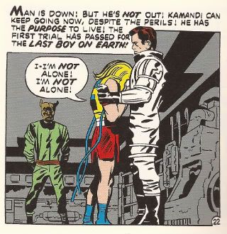
MIND THE GAP is a mystery comic about a drawing of a woman, who gets beaten into a coma on a subway platform, then ends up trying to solve the Mystery of the Subway-Beating while out of her own body, from the astral plane.  (HIGH CONCEPT!)  While occupying the astral plane, the main character has amnesia, so she doesn't remember what happened to her.  Also, she forgets to have a personality, apparently-- the Mystery of Who Cares?? looks like it's going to go unsolved.  We also watch the other dull people in her life, and come to learn that there's a nefarious conspiracy afoot, the kind of conspiracy featured in television shows, the dull, 10pm-on-a-Saturday washed-up-actress television show this comic is pitching.

Should this comic be adapted for the USA Network, TNT, or a television station for Bored Dads to be named later???  Let's all find out together!  P.S. you can tell it's a nefarious conspiracy because one of its members is wearing a hoodie.  Congratulations, semiotics majors.

From an interview with USA Today: "The concept for Mind the Gap originally came from a TV pilot idea McCann had been kicking around, since he loved long-form mysteries and had wanted to do a Twin Peaks or X-Files kind of show.  However, it struck him that this was a story he could tell first as a comic and release it quickly. 'And if a TV show or movie comes calling, I won't say no!' he says with a laugh."

Hahaha, oh we are laughing!

I would say I'm definitely, definitely, definitely not the audience for this comic.  I believe that the artist and poet Kreayshawn has already best described the audience for this comic as "basic bitches."  I suppose someone very new to comics or reading in general might find some pleasure here, in that the comic is extremely unchallenging.  In style, character, dialogue, it most closely resembles a daytime soap opera (though not a good one like PASSIONS)(What?).  The Rich Mom is a bit of a frigid dragon-lady!  The female detective is a lesbian!  The "sophisticated" British character is a guy wearing a vest who calls the main character "luv."  Characters walk around with names like "Ellis 'Elle' Peterssen" and "Bobby Plangman."

All-pipe, no-pleasure dialogue?  You decide:  "Shit, meet fan."  "Life goes on and it is of importance that we move with it."  "Have you met me?"  "She's probably inside like any sane person would be on a wet-ass President's Day!"  "You haven't begun to see over-stepping, Hammond."  "That's one word for it."  "Yeah, he deserves it, but come on, man!  You're better than that."  "Life's a bitch and so is this place.  Great."

This is all combined with a "don't use any of the tools of comics because then the stupidest member of the audience might not be able to understand what you've created, and that should always be your target audience" approach to the page that McCann doesn't deserve undue criticism for-- it's become the dominant style of writing comics at the mainstream comic companies. This is just our world now.

Wikipedia confirms McCann is a former soap writer; former PR person for Marvel.  (McCann is also listed as a multi-Eisner nominee for an Archaia book called RETURN OF THE DAPPER MEN-- though nominated the same year Archaia's book-trade consultant was a jury member). (Oh and he wrote a Hawkeye comic I said some negative things about, but under stunt-y and unfair and somewhat-douchebag-y circumstances).

According to the credits, Rodin Esquejo and Sonia Oback didn't create this comic, so it's unfair to speak too ill of their work.  Comicbookdb confirms Esquejo is a relatively young creator, and so the mistakes I'm about to go through aren't really those of cynical veterans, but young creators making classic young creator mistakes.  For artists, comics are a physical performance that lasts years, so I don't really enjoy talking smack re: the art much.

That having been said:

Compositions are consistently undramatic-- if they know the Rule of Thirds, they ain't following it.  Foreground-midground-background compositions?  Problematic.  An overreliance on "widescreen panels"?  Yep. No variation in line weight.  Character designs that don't particularly distinguish the main characters.  Some 180-degree rule issues (smart people disagree how much that matters with comics, though, to be fair).  Trying to hide undramatic drawings with Photoshop blur filters (really?  REALLY?).

Repeated attempts to put the camera in complicated angle-y places that they don't have the skills to pull off-- why do young artists always want these crane shots?  If you're just getting the hang of human anatomy at ground level, why are you throwing you putting the camera up three stories and looking down?  How often is a storytelling purpose ever served by shoving your camera way over everybody?  What story value does that point of view possibly add?  Every other panel can't be the staircase scene from Psycho...

To their credit, Esquejo-Oback try to draw backgrounds-- the results do not inspire but they're trying.  They will get better.  The only way for artists to get better is by making pages-- they're making pages; so, they'll get better. Heck, McCann will get better, too.  I will someday learn to fellate my own genitalia, and this whole charade of "comic criticism" I've been playing at will come to its inevitable end;  I am a complete fraud!  We will all evolve past this transient and ephemeral moment in time.

A number of characters have melodramatic conversations, while some random scenes happen to characters we don't care very much about, and then there's a full-page splash cliffhanger, but there's no real structure to the issues qua issues-- it's just a bunch of disconnected scenes that...

...

.... I just described... let's see... ALL of the comics.

Fuck, I am bored.  I am bored, man.

If I'm going to write more about "creator owned" comics, even as infrequently as once-in-a-whatever, this won't be the last comic I end up reading that's a weaksauce TV/movie pitch.  Image publishes a small mountain of those every year.  "Ooooh, maybe one of these movie pitch writers will be called up to Marvel or DC and be the next muckey-mucks to write the next series of RUNAWAYS or some shit.  Lah-di-dah!"  You want to be the Susan Sarandon for this shit???

What is the point?  How many times have we done this??

The comic's first panel is...

The comic's first panel is a drawing of a dreamcatcher with the text of Lionel Richie lyrics superimposed on them.  In panels 2 and 3, we find out that someone's cell phone is going off and it's playing Lionel Richie. Page 2 continues this cell phone song motif with the one Cee-Lo song.

A few pages later, the text of a Blind Melon song from about ... 1994(?) is placed onto pages, and the main character is introduced wearing a bee costume. Referring to the music video from a song that people liked nearly 20 years ago.

Near the end of the comic...

Near the end of the comic, two of the characters quote Pink Floyd lyrics at each other, prompting one of them to spend 4 panels discussing the song Money, describing it as ....

Near the end of the comic, two of the characters quote Pink Floyd lyrics at each other, prompting one of them to spend 4 panels discussing the song Money, describing it as "A song that no one has been able to recreate in its beautiful complexity."

I've read other comics that have been Hollywood pitches, without the level of disdain I have for MIND THE GAP.  But MIND THE GAP... It's a book that wants to be television, but who would watch a show with this premise?  It's blathering on about music, but in the context of fucking cell phone ringtones.  It might as well be a comic for/about/dedicated-to muzak.

Reading MIND THE GAP isn't just being reminded of pop culture but pop culture at its dreariest, at its most mercenary, at its most base.  Bad network pulp TV, radio Top 40 Clear Channel station music, Carson Daly Total Request Live music videos.  Pop Culture as slop.

I don't take that stuff well -- but I don't like that I don't.

What was your reaction when you heard they made a movie from that board game BATTLESHIP?  Or when they announced a movie version of CANDYLAND?  The remake of TOTAL RECALL?  That bullshit new costume that the fake ROBOCOP is going to wear?  When comic companies announce mega-crossovers?  The comic book that is a TV pitch?

Can you just accept those things in a Tony Robbins  "Let's be grateful that people are spending their time and/or oodles of money just trying to entertain me" spirit?  Or do you just go UGH?

The Tony Robbins answer seems more likely to lead to, you know, a spiritual tranquility-- it seems fairly obvious I'd be spiritually better off aiming that-a-ways. "I'm okay, and you're okay, and that bullshit costume the fake Robocop is wearing is ... is... o-o-o-okay."  (It hurt just to type that).  I mean, Tony Robbins seems like a happy guy, give or take some people getting their feet burnt every so often.

But that's not where I'm at.  I do the latter.  I go "UGH."  Which seems to me entirely normally usually, in my daily life, but typing this out, doesn't seem like something I should like about myself very much, no.

What do I care?  I didn't read AVENGERS VS XMEN-- fuck all those comics and fuck the horse they rode in on, fuck that horse into glue, fuck 'em into glue using dicks, using Bea Arthur's dick.  I didn't go see BATTLESHIP, the TOTAL RECALL remake, and I probably ain't seeing the ROBOCOP remake. So: what do I care?  To say UGH connotes caring-- isn't that itself a defeat?

So-- then, what?  Is it a class thing?  Am I'm reacting along class lines, with poor MIND THE GAP earning my disdain for being of the entertainment for the lower-class?  "Soap Operas?  How gauche?  We never watch those at the country club, while eating cucumber sandwiches.  We're too busy watching shows about rich people in the 60's being exquisitely sad about their infidelities and enormous wealth."

That doesn't sound right just for no other reason than if I had that sort of class motivation, would I really be able to read any comics at all, ever?  I'd only be allowed to read Chris Ware comics.  And that's not really what's going on in my apartment-- my apartment isn't exactly the Hôtel de Rambouillet.  I think I'm free and clear there.

So: what?  My reaction to MIND THE GAP-- a certain amount of my negativity is entirely appropriate because it's a poorly made comic that is unable to execute upon its meager ambitions; but a certain amount of my negativity is basically absurd.

Part of me thinks... Part of me thinks these things hold us in contempt to begin with.  Creative product aimed at the "lowest-common denominator."  Do you wake up wanting to feel like you're a proud member of the "lowest-common denominator?"  Do you want to wear that "I'm with Stupid" t-shirt?  And so, part of me thinks having that reaction of "Well, fuck you right back" to the TV pitch comic, to the remake, to when you hear about Professor X getting murdered or whatever the fuck, that reaction seems entirely sane and reasonable, if not honorable and essentially Fuck-Yeah-Let's-All-Feel-That-Way.

This is probably-maybe an incorrect way to think about these things. It reads an awful lot into motives, incorrect things.   The sad truth is a lot of the people making sad art are trying, just along sad vectors.  Why wouldn't you want your comic to be a TV Show?  Can't make real money off independent comics-- TV money could help make more comics, so where's the harm?  Why wouldn't you want to share your idea with as many people as possible, even your most humdrum ideas?  Raymond Chandler  once wrote "Ideas are poison. The more you reason, the less you create."  (I guess whatever negative things one might say of MIND THE GAP, at least you can't accuse its creators of being especially poisoned by ideas.)

So, no, the Comic-That-Is-Actually-and-Obviously-a-Pitch isn't an indefensible thing.  But gosh, it's a sad thing.  Remakes, mega-crossovers, board-game movies, pitch comics-- if you go UGH, I think it's not just the mercantile quality of it all, but the waste.  The waste of money.  The waste of time.  The waste of people's creative lives.  The waste of our opportunity to feel something genuine.  This moment is fleeting and yet here is how meagerly it is being spent.  Soon, everything we have known or loved will be gone and yet here is this thing squandering that time, when it should be it should be it should be-- TIME IS RUNNING OUT AAAAAAAAAAAAAAAAAAAH.  What is the point?  How many times have we done this??

Soon, sooner than you'll believe, it'll be too late even for me to learn how to fellate myself.

Let the immense tragedy of that envelop you for a second.

In conclusion, here is a panel of a fireplace from MIND THE GAP #2:

Everyone Loses: Hibbs on 9/3's cape comics

Four superhero books below that cut!


AVENGERS VS X-MEN #12:  Man, it would be nice to have a Marvel crossover once that ended right. I don't know what frustrates me more: Captain America's extraordinary hypocrisy in the face of the breaking point he engendered, or why no one is asking about what happens with all of the *good* stuff that the Phoenix Five engineered (food, energy, water, worldwide). but, these are superhero comics, and superhero comics don't like dealing with ramifications, do they? Like I said back at the review of #1, this comic clearly is reviewer-proof; nothing I could say or do would impact it's entire success as a commercial juggernaut -- I'm certainly selling twice or more copies of AvX than I do of either of the component characters any longer.

The thing is, I'm afraid that this series fundamentally broke the X-Men -- what are they any longer?

With Xavier dead, the mutants no longer an "extinct race", Cyclops considered a super-villain, what's presumably the world's stock of Sentinels melted down (along with all of the battleships and nuclear weapons in #6) "Uncanny Avengers", and so on -- well, what's next? Where can you go from here? The core metaphor might still have need today -- but can the X-Men still be the spirit of alienation in any clear way when mutants are now responsible for bringing peace and food and water to Africa, y'know? I have my doubts, especially because the first new x-book off the blocks this week is actually an Avengers title, and the "flagship" X-comic is going to be a time-travel story, which doesn't even sound remotely sustainable to me as an ongoing monthly.

At the end of the day, I thought AVENGERS VS X-MEN #12 was pretty AWFUL. Though I doubt that's any real surprise to anyone out there. I also thought that the X-Men "won", in that Cyclops was right, and his species is now viable again... even though they're left at the end as being a largely irrelevent concept in the Marvel Universe. Funny how those things work out.


AVX #6: As a modern piece of comedy, I thought this was generally pretty darn GOOD. "Captain America is level 15 in Guilt Trips," indeed! Though the Hawkeye sexploitation dream was pretty dang grody, and prevented the book from scoring higher.


DAREDEVIL END OF DAYS #1:  I was originally looking forward to this, because on paper, at least, it sounds good: Bendis, Mack, Janson, Sienkiewicz all back on Daredevil for one final story. Too bad the result is a gory mess, with multiple scenes of people beating each other to death. Yay, comics? Overall the art, mostly Jansen being inked by Sienkiewicz, has the worst of each artist's tics, though there are a few nice and painted panels that entirely work. Seeing those lovely panels make the rest of the book look that much worse, sadly.  Pretty AWFUL.


LEGENDS OF THE DARK KNIGHT #1: So, this is a collection of  Batman stories that, as far as I know, ran as digital content before being collected here.  This is the fourth (fifth?) "re-purposed" digital comic, and, at my store at least, sales have all been uniformly awful on these books, but I can't tell if it is the chicken, or if it is the egg. Batman, in serialization, is going through a pretty nice period right now -- BATMAN itself is my top selling DC comic. and all five of his monthly books are selling at least 25 copies a month for me. This one? I sold 2 copies in week 1, and I'm not expecting that to grow in any manner I'm willing to carry the risk on. So, is LDK flopping out because it is digital first, and people don't want leftovers? Or is it flopping because it's Batman-led comic #6? Or is it flopping because it is shitty?

There are three stories here, one by Damon Lindelof & Jeff Lemire which is close to the worst Batman story I've ever read being, I think, a "what if?" of "What If Batman was an arrogant drunk?" Hrf?!? The second two stories are kind of  NEW TALENT SHOWCASE teaming newer writers with solid artists (JG Jones, Nicola Scott) -- but the stories aren't any great shakes, neither rising above what you might hope for in a new talent anthology series: not shitty, exactly, but not so great either. At least not for $4.

The bigger problem, for me, is that these comics are kind of the "proof of concept" for the problem of what you do for natively-digital work when the iPad landscape/computer monitor being different proportions from the printed page.  Mark Waid was the first person I ever heard who said, "Duh, just plop the two screens on top of each other, and your back to normal proportions", and I thought he was genius when he said that.

Except... now I've seen what it looks like in practice. It is... not very good.

So, first, if you're even slightly aware of it, you can "see" the weld made on each page as writers are aiming the "beat" for the bottom-rightmost panel of each "page", except each page now has two of THOSE, and it TOTALLY blows the "rhythm" of the comics page.

Second, because you have to present the page smaller than it displays on monitor/iPad, it feels oddly cramped, with too-small lettering.

Third, it really shows just how limited the landscape format is for density-of-content -- It is hard to cleanly fit more than 4 "panels" on any "page", then, which gives you an extremely limited number of choices of page layout and panel arrangement. then you see that twice on each printed page, and it is kind of a mess.

So, I guess now I really don't think that digital comics can be reformatted to print in this way without kind of crashing out the beauty and strength of the real unit of comic books: the page. I thought the Lindlehof story was AWFUL, but the rest was decent enough it could drag the entire book closer to an EH.


That's me, what did YOU think?


-B

"Walter-bout An Audition?" COMICS! Sometimes It's That Company That Doesn't Respect Jack Kirby!

Then I read some Marvel comics! I wouldn't want anyone to accuse me of being in DC's pocket now would I? I should bloody cocoa, chum! So yeah, the same one-note entitled whining will now follow but with different pictures posted in between the words! Photobucket Bountiful Brian Hibbs' Shipping List is under this linguistic lard!

MUPPETS #3 (of 4) Written and Drawn by Roger Langridge Colours by Kawaii Creative Studio Lettered by Litomilano S.r.l Marvel Comics, $2.99 (2012) The Muppets created by Jim Henson

Photobucket

This is an all-ages comic written and drawn by Roger Langridge. For those who balk at the very mention of “all-ages” let me just clarify that Roger Langridge is a consummate cartoonist and a craftsman of no little sophistication. He’s been banging about for a while but quite a lot of people still seem surprised he exists. No, THOR THE MIGHTY AVENGER with Chris Samnee wasn't his first work. This probably won’t be the last time I mention Roger Langridge is what I’m saying. This Muppets comic was his last work for Marvel before he went off and embarked on the Eisner award winning SNARKED.

Photobucket

Anyway, here he creates a comic which not only recreates the madcap bustle of the original Muppets Show without losing any of the distinctive personalities in the joyfully rambunctious chaos, but also chucks in a plot and jokes which all revolve around the slightly melancholy themes Autumn suggests without descending into mawkish sentimentality. He’s helped in no small part by his wonderfully expressive art, with its bounciness of line and emphasis on clarity and characterisation. I originally bought this for JKUKv.2.0 but it turns out the violent pig woman scares him so I guess I’ll just have to read it myself. Or stop doing the voices, maybe. That’s okay because being a parent is all about sacrifice and just like Roger Langridge, this comic is VERY GOOD!

In the back of THE MUPPETS is a preview of the way Marvel will produce comics in the future. This excremental extra bills itself as ULTIMATE SPIDER-MAN: GREAT POWER Digest but it is in fact Satan's balls rubbed right up in your face. Creatively speaking. It is apparently a whole wee book of screen grabs taken from the TV show arranged on the page with all the finesse and care you would expect of a dead robot. It is a thing. A thing of Evil.

Photobucket

Buying this for your child is exactly like stamping on the neck of Comics. It is the artistic equivalent of wearing your own bum as a hat. I am so livid I have stopped making sense. It is CRAP! Shun it as you would shun The Devil himself! Or, you know, have a look and make your own mind up.

UNTOLD TALES OF THE PUNISHERMAX#4 Art by Fernando Blanco Written by Nathan Edmondson Coloured by James Campbell Lettered by VC's Cory Petit Marvel Comics, $3.99 (2012) The Punisher created by Gerry Conway, John Romita Snr and Ross Andru

Photobucket

In this awe inspiring exercise in unoriginality if you have a problem and no one else can help you can simply roll on up to Frank’s local Chinese where he’ll be tucking into some dim sum, flash a few photos of your dead daughter and he’s off. His first stop is a boat where a Bad man is touching two ladies. In crime stories Bad men always have more than one lady in bed at a time and Bad men also have a penchant for flash boats. This is because Bad men enjoy a good hard fishing and are too cheap to buy hot water bottles. Frank then tortures the bad man by hanging him over the water and cutting him until a shark obligingly shows up. This doesn't take long because, just as in London you are never more than 5 feet away from a rat, if you are a Bad man hung upside down being tortured on your own boat you are never more than 30 seconds from a shark. There is a quip! No, not “sharks to be you!” or “tooth bad!” or “you look a bit down in the mouth!” no they went with “over your head!” Clever word play there. Frank says this more than once in the issue and, like the dialogue of Michael Bendis, it doesn't work any better with repetition. Then there’s some violence which is unpredictable only to the extent that it is so predictable. Frank finds Mr. Big but to be frank(!) finding Mr. Big doesn't turn out to be that difficult. I've had more trouble finding someone who can lay flagstones that don’t wobble after the first hard frost than Frank has following the breadcrumbs of crime here. Obviously in my case there was less standing on car roofs and shooting unerringly down into the tops of people’s heads, but overall tracking a competent builder to his lair was a lot more work than finding the head of a white slavery ring is in this comic. Then: more violence. Holy shit! Frank just got shot!

Photobucket

Jesus fucking Christ, Frank’s dead! Holy Coconut Balls! Hold onto your hats here - the guy who shot Frank was the guy who hired him! TWISTAMATAZZ! He was using Frank to get rid of the competition! This is some Byzantine labyrinthine shit going on here! Hold on while I pull out the whiteboard and diagram this one so I can follow it properly! TWISTGASM! Frank’s alive! To the surprise of precisely no one except the chowderhead who shot him it turns out Frank was wearing a vest! Not a string one either because they are a bit creepy, no, nor a thermal one despite the fact it’s so chilly even rich criminals are having to sleep three-in-a-bed to keep the chill off, no, a bulletproof one! Frank kills everyone and that makes everything okay. The end. Previous issues of this series have avoided the charge of being an unnecessary cash-grab by at least having artwork which justified the price of purchase alone. The art in this issue does not do that, I’m leaving it at that. (Also, issue 3 was dire on a words and pictures level too, but it dodges a bullet because I’m trying to appear timely so I've gone straight to kicking this one around.) If this thing reached publication without anyone involved once noticing it was CRAP! then your system is broken, Marvel. The only original thought here is to put so much unoriginality in one place and charge three monkey-humping dollars and ninety nine cents for it. Christ.

DAREDEVIL#18 Art by Chris Samnee Written by Mark Waid Coloured by Javier Rodriguez Lettered by VC's Joe Caramagna Marvel, $2.99 (2012) Daredevil created by Stan Lee and Bill Everett

Photobucket

Ah, Milla’s back. I was hoping this run was going to shun the inexplicably popular Marvel Knights run. Said run being primarily just a reminder of the bad old days when I didn't trust my own judgement. That was then but now, for me, none of that bullshit happened. Wait! I don’t think I've alienated enough of you so let’s just briefly run the MK years down: Kevin Smith! I know it’s hard for some of the youngsters out there to countenance but there was actually a time when people took Kevin Smith’s writing seriously. Maybe because with so many words on each page it was statistically likely that some of them would be worthwhile? So much for statistics! Michael Bendis and Alex Maleev provided a run that managed to eke out the premise of a Harmony Hairspray advert for five horribly chatty photo-sourced years (“What happened to you?” “I got shot.” “You got shot?” “I got shot.” “Wait, you got shot? With a bullet?” “I got shot with a bullet, yes.” “Oh. This is just verbal chaff isn't it?” “Shhh! How’s that nervous breakdown?” “Fine. I had a bit of a lie down and it’s gone away.” “DEMON BABY!) then Ed Brubaker wrote Murdock increasingly as a Man Without Sense (“I gamble everything on the fact that my mentally ill ex-foe who is being mind controlled won’t throw my wife off the ro…oh, snap!” ). And now Milla’s back. Great.

Photobucket

It wouldn't usually be too bad because there’s often lots of other stuff going on but this issue seems a bit…lighter in the density department. It doesn't seem to cover as much ground as it used to does it? I mean, these are some big ass panels we've got going on here. Luckily they are big asses saturated with the fat of Chris Samnee’s fantastic art, art which is currently exploring a beautiful obsession with Alex Toth via his animation storyboards. Lovely to look at but a bit light on content is how the “in” in indispensable starts slipping off. I’m holding my breath but this is going to have to get back to being better than just GOOD!

Did you know that "monkey humping is in Word Press' spell check? I don't know what that means but it scares me.

NEXT TIME: Some other companies who make COMICS!!!

"Mr. Dazzleby Has Promised To Be Kind And True." COMICS! Sometimes It's Four Divided By Zero Plus One!

I've heard some people only read Marvel comics! Also, some people only read DC Comics! That's okay, 99% of all psychiatrists agree - compartmentalisation is really healthy! It's also okay because I only wrote about some DC Comics! Marvel people will have to wait a bit. I know, I know but I'm sure you'll find the wherewithal to cope. Next: words... Photobucket

WONDER WOMAN #0 Art By Cliff Chiang Written by Brian Azzarello Colours by Matt Wilson Lettering by Jared Fletcher DC Comics, £2.99 (2012) Wonder Woman created by William Moulton Marston Photobucket

Throughout this comic Cliff Chiang provides outrageously gorgeous artwork, I just want to make that clear. Because as lovely as his work is it can in no way distract from the petty failures of Azzarello's script. This reads like an attempt to channel the scripts of old complete with their overwrought narration and abundance of redundant information.  In the hands of a respectful and talented writer this would be a cute homage, a neat tip of the hat, a cheeky wink, a clever and enjoyable comic. But not here. Azzarello's bitterness and contempt for the work of all those who came before him is evident on every chippy little page. The first narrative caption contains not only this creepily layered insult to both readers and women, "the monthly monster strikes again!"  but goes on tell us the tale originally appeared in "All-Girl Adventure Tales For Men".

Photobucket

I imagine the intention was to be humorous but I don't have to imagine that the reality is so soured with loathing for the audience, the self and even the genre that  it's a relief when the curdled homage ends a few pages later. Yes, because as primitive and rubbish as we are implicitly assured the writing was in comics of yore, it's actually beyond Brian Azzarello's sophisticated and modern talents to replicate at even a satirically joshing level for a full issue. As base as they were he can't do it. Which is the best joke of all. It's thanks only to Chiang, Wilson and Fletcher that the book hovers around GOOD!

ACTION COMICS #0 Art by Ben Oliver, Cafu Written by Grant Morrison, Sholly Fisch Colours by Brian Reber, Jay David Ramos Lettered by Steve Wands, Dezi Sienty DC Comics, £3.99 (2012) Superman created by Jerry Siegel & Joe Shuster Photobucket

Unlike the assured work in his BATMAN books (work so assured that it it kind of glosses over how bad some of it is) I've not found Grant Morrison's run on ACTION COMICS to be terribly convincing. It's had the air of him having been asked if it's still his dream job to write a regular Superman comic, to which he's replied, "Hoots! Aye tha ken right, maboab! When am ah starting?" And then he's been told "Er, we need twenty two pages in the next five minutes." "Crivvens!" indeed! The results have been a bit patchy to say the least. Although maybe it's just that he was writing in a burning temple. That would put anyone off.

(I guess I should apologise for that outrageous descent into Jockface but I'm sure you understand that I am an artist and, even though I’m very far removed from Scots culture, I really love it. I don’t even eat a lot of shortbread, I eat a lot of fish and chips but the fascination with the Scots remains part of our everyday British culture. It would be wrong of me not to rip the piss. Also, Grant Morrison is really acting like a bowffing staigie these days.)

Photobucket

It's just a bad comic all over but you can see how it could have been a good comic had some time been spent whipping it into proper shape. Children being saved from awfulness by the sheer Goodness of Superman should be a slam dunker but this thing is under-worked at both words and art level. Underworked to the extent that the art isn't even art at times, it just flat out descends into silhouettes like a cack handed Han Dynasty Chinese shadow play rather than a Twenty First Century American comic-book. As it is the whole thing is a lost cause anyway; totally scuppered by its failure to decide where it stands on quiffs. Initially the quiff is seen as a force for good, embodied in the choice of basing Superman on Film Critic and All Round Good Egg Mark Kermode.  Yet later a drunk child abuser (boo!) is introduced sporting the self same pompadour. Mixed messages are one thing but if a comic can't even decide where it stands on the morality of a haircut it's pretty much bound to be EH!

Photobucket

ALL STAR WESTERN#0 Art by Moritat (and Pia Guerra) Written by Jimmy Palmiotti and Justin Gray Coloured by Mike Atiyeh Lettered by Rob Leigh DC Comics, £3.99 (2012) Jonah Hex created by John Albano and Tony DeZuniga Photobucket

Fortuitously for the writers Jonah Hex has had an eventful life because then they can just fill the pages offhandedly routinely recounting his doings in a manner that would make the personification of Perfunctory raise her fan to her face and blush. This happened, then this happened and later this happened? that's not actually a story. It's things happening. There's no attempt to add anything to Jonah's story it's just: Jonah's Dad was violent but not a drunk, now Jonah's Dad is violent and a drunk, etc. It's just there. Moritat is clearly overworked here but he does manage the odd panel that it's worth lingering over amongst all those that you'd rather rush past in embarrassment. Despite the rote plodding of the writing thanks to Moritat's occasionally interesting art and a travelling salesman called "Mr. Dazzleby" the comic manages to be OKAY!

Photobucket

Sometimes people point out that they don't like that rasher of skin connecting Jonah's upper and lower jaw. Somehow this weakens the whole character for them. Luckily I ignore my family and think about things like that, important things. Yes I'm here to help. Place your forefinger at the point at which your lips meet, now place your thumb at the point where your teeth stop and your jawbone begins (you will have to press against the flesh until you feel the difference), now move your forefinger in a rough circle between its starting point and where your thumb has paused. Imagine that that flesh has been cut away. Hi ho! There you go! The mystery of Jonah's strange face solved. Next!

BATMAN INCORPORATED#0 Art by Frazer Irving Written by Grant Morrison (story by Grant Morrison & Chris Burnham) Coloured by Frazer irving Lettered by Pat Brosseau DC Comics, £2.99 (2012) Batman created by Bob Kane Photobucket

Even though Frazer Irving's art is obviously rushed, veering wildly from the astonishing to the embarrassing, and he badly fluffs the final "beat" with the boomerang his work here is still fascinating in a really pleasing way. I like the way the colours are presented as just shapes and your eye has to skitter about the image, like a spider seeking shelter when you suddenly switch the light on, until it gleans enough information to figure out what the Holy Mother of Pearl it's looking at. Your eye that is, not the spider.

Photobucket

Maybe that's why the story here works so well. Because it isn't really a story it's more a of a sleight of hand in which a jumble of moments manages to create enough mental connections in the mind of the reader to make it seem as though a coherent narrative has occurred. It's a neat trick. A good enough trick in fact for the comic to be GOOD!

SUPERMAN FAMILY ADVENTURES #5 Art by Art Baltazar Written by Art Baltazar and Franco DC Comics, £2.99 (2012) Superman created by Jerry Siegel & Joe Shuster Photobucket

I buy this comic for Johnk(UK) V.2.0 in the hope that he will also wish to waste large amounts of his life on blathering on witlessly about the artform known as comics. Yes, he enjoys this but then so do I. I enjoy it for lots of reasons beyond the fact that I am a child-like simpleton. I enjoy the fact it is quite sophisticated in its treatment of the Olsen-Lane-Kent dynamic. Lois knows Clark's secret she just pretends she doesn't and Clark knows she knows and that she is pretending she doesn't while Jimmy is just comically plain vanilla oblivious.

Photobucket

Also, I like the Super-pets and this comic is the only place you can see them unless the main DCU finally matured enough to stop being embarassed of its heritage in exactly the same way that a teenager is embarassed by their parents. Look, the book's neat stuff. A lot of the time I have no idea what is going on, but that's okay. Even when it is just brightly coloured gibberish the kids seem to understand. And since that's who it's for this is VERY GOOD!

I hope you all had a nice weekend and enjoyed some COMICS!!!

Post, Damn You, Post! -- Hibbs muddles about 9/26

Have some funnybook roulette!


THE INFINITE WAIT GN: This is Julia Werz's newest book, from Koyama Press, and it hasn't (yet?) been solicited through Diamond as of yet, and it doesn't look like it's for sale on Amazon, etc., so you're going to need to find a store who buys direct, or buy it from Julia or Koyama yourselves if you're not shopping at one of the, let's guess, 100 or so stores that might have it.

I'm a tremendous fan of Julia's work, but she's traditionally done short-form work -- her three previous collections (FART PARTY v1 & 2, and DRINKING AT THE MOVIES) are pretty just much repackaging of single page stream-of-consciousness gags. DRINKING has maybe a couple of 5-8 page stories? And this new book goes for the full-on "graphic novel" treatment, as there are two distinct stories here, one a 90 page (!) meditation on all of the jobs Julia has ever held in her life, and the other ostensibly about finding out that she has Lupus.

Julia has some serious comedic chops, and is a very skilled observationist, but there is a pretty large difference between an 8 page story, and a 90 page one, and I'm really kind of hard-pressed to say that she has the skills to pull it off. Well, no, that's not it exactly... but I think she'd be very well suited to having an editor to sharpen and focus her work against. 90 pages of employment history is a bit much, really! Especially when at least parts of it have been discussed before in FP.

But the problem is kind of dramatically magnified in the title story "The Infinite Wait" about her struggle with Lupus. Part of it is from following up after a novella about shitty jobs while at the same time taking place DURING the first novella -- that was kind of exhausting, actually, and I felt like the work would have been significantly better if it had been a single story, of about half the total length. The second problem with "TIW" is that Julia kind of abandons any conversation by, about, or related to Lupus at about the halfway point of the story, and it starts being more about her social relationships. I mean, sure, that helps in struggling with a disease, but as a focused story, it totally crashed out at that point.

Julia's from the "school" where the telling of the story is more important than the exact craft, but she has one cartooning tic that absolutely drives nuts in this book, almost precisely because of the "serious, full length" nature of this book -- when drawing a seated person, or really most times when you can't see the full body, she almost always draws both segments of the arm as being about the length of the torso. Ape people!

There's a lot of work and sweat, and raw human honesty (and fart jokes) in this book, and it's a very dense read, but it suffers from a lack of focus, and any kind of editorial pass (typos, grammar, repeating words, etc.), that I'm finding it hard to give it over a high OK.


HAPPY #1: Grant Morrison and Darick Robertson unbound! Or something. Half of me thinks this is Grant's mind's revenge for writing Batman and Superman for so long that saying "fuck" a lot is sort of the metal equivalent of taking a crap, the other part says he's trying to channel Garth Ennis. There's a properly Morrisonian twist there to all the Ennis-ing going on that suggests that the next three issues might be very amusing. This issue, however, was merely OK.


TOWER CHRONICLES 1: Hurf. This feels just so created by committee to fill a market need (or something like that) -- I pretty much hate the physical look of the character as far too "comic booky" or maybe "video gamey" with those straps and pouches, and the rope around him, and the non-purposeful hood, and all of that. On the other hand, the script by Matt Wagner is at the least competent, and while this is not the Simon Bisely-of-old, there's multiple awesome monster/gory moments in the book that are cool enough (I especially liked the owl-monster thingy climbing out of that person) to give it a pass. The problem might be that this book is maybe above it's station, with it's $8 price tag and battleship-steel-thick paper -- this prestige format needs to have prestige ideas; and while these may be prestige creators, this isn't a prestige idea. The problem is, if you've watched nearly any amount of sci-fi/fantasy TV/movie/whatever since the turn of the century, then you've pretty much read this. Incredibly competent, with a few nice images/beats/moments, but not original enough OR over-the-top enough to get it any better than OK.


(That's three very different kinds of OK, eh?)

(Man... I want to unreservedly like something here! Wait, here's one...)


PROPHET #29: The last few issues of Prophet have been pretty rough for me because I'm not super-excited by Giannis Milonogiannis as an artist, but this issue is from the lush-ass pen of Farel Dalrymple. Now, that's some nice looking  science fiction! Crazy, fun, thoughtful, exciting, this is the kind of stuff that, really, only comics can possibly do right. I thought this issue was downright EXCELLENT.


Right, all I have time for today.... what did YOU think?


-B


"Bleedhounds Kin Find Anythin'!" COMICS! Sometimes They Are Assorted!

So, you know how it should go: 1) Read comics 2) Think about comics  3) Write about comics 4) Post writing 5) Fret about having upset someone. Rinse and repeat.Well I did 1) and forgot to do 2) so that shivved 3), 4) and 5) right in the kidneys didn't it? So all you get is what I read last night. I'll try and do better next time.

Photobucket

Also: Don't forget the 100TH PODCAST BY GRAEME MCMILLAN and JEFF LESTER is due THIS WEEK! It will be MONUMENTAL! It will be ASTOUNDING! It will be the BEST THING EVER!

No pressure, guys!

SPACEMAN #9 (of 9) By Risso, Azzarello, Mulvihill, Robins, Johnson, Doyle and Dennis VERTIGO/DC Comics, $2.99 (2012) SPACEMAN created by Risso and Azzarello

Photobucket

In which all things come to the usually inconclusive and possibly clever but certainly unsatisfying end most of Azzarello’s work casually bellyflops into. Recasting a standard crime tale in sci-fi (S-F!) trappings turned out not to be enough. Possibly it turned out to more hobbling than helpful. Azzarello seems to actively avoid clarity in his storytelling at times, possibly confusing complication with complexity. Fair enough but then factor in his Footcha-Speek and the reader ends up trying to figure out the simplest of things while momentum and interest dissipate softly but noticeably out and away, like the sly fart of a dog under the Sunday dinner table.

Photobucket

The Futcha-Spik wasn’t all that good either, I’m not expecting Orwell’s Newspeak but I am at least expecting an effort on a par with Jack (Under-Rated) Womack and I’m certainly expecting it to be more than an excuse to force in more terrible puns (Real-Tee!). Also, I have a strong suspicion all this stuff just served as a distraction from the fact the end made no sense. No one went, “Actually, he didn't do it.” No one? How convenient. Luckily Risso and Mulvihill’s work remains visually sumptuous, engaging and altogether too good for the material at hand, thus raising it up to GOOD!

AMERICAN VAMPIRE: LORD OF NIGHTMARES #4 of 5 Drawn by Dustin Nguyen Written by Scott Snyder Colours by John Kalisz Letters by Steve Wands VERTIGO/DC Comics, $2.99 (2012) AMERICAN VAMPIRE created by Scott Snyder and Rafael Albuquerque

Photobucket

They held off quite a while didn't they? You do have to give them that, but in the end all Vampire roads lead to Vlad. Here they've plumped for the spooky baldy Murnau version; respectful but a mistake I feel. This comic could really have done with Gary Oldman’s Jack-cool-AH! livening up its sadly lifeless pages. Sometimes this thing just makes less sense than an extraordinarily senseless thing, like a clam in a coma. After doing a load of hair pulling and garment rending about how super awful a threat Dracula is the strip then seems to suggest a train crash would finish off Dracula like he was some luckless commuter on a particularly ill-fated 6.45 to Basingstoke. It also thinks having our cast trapped on a plane bickering is of interest, yet since much of the cast is made up of spooky humanoids this just ends up being like reading about the argumentative occupants of a flying supernatural pet shop.

Photobucket

What happened to Dustin Nguyen? Has he had an accident? His art is usually lovely but here it looks like he did it during a bumpy bus ride and the bus was one of those with crates of livestock on it, some of which kept getting loose and flapped right up in his face while he was engaged in his act of creation. Look, this is a series in which the Big Threat is revealed to be a chair, so yeah, it was EH!

FATALE #7 Drawn by Sean Phillips Written by Ed Brubaker Colours by Dave Stewart IMAGE, $3.50 (2012) FATALE created by Ed Brubaker and Sean Phillips

Photobucket

I know they don’t need any encouragement here but this would make a great TV series. Every week a special guest star could stumble over Josephine’s wall with an item of wider relevance to whichever decade the series was currently set in. So you could have Jim Belushi as Richard Nixon fall into Josephine’s bougainvilleas sweatily clutching a Watergate tape to his chest. He would find her attractive. She would wonder why she, an attractive woman, had such power over him, a clearly foolish man. It would be a real mystery. Only a supernatural solution would suffice. The gardener would get all shirty. She would help him out and find another clue to the central mystery of the story which is so ill defined I can’t even remember what it is. Richard Nixon would die and be sad. Josephine would be sad he had died. Then she would look out of her window to find Charlie Sheen as Elvis falling into her poison Ivy clutching the proof that Colonel Tom Parker was an illegal immigrant. And on and on and on. Robert DeNiro in Angel Heart has already shown up, although he’s now wearing those eggs he kept peeling as eyes.

Photobucket

As far as horror goes the most horrific thing about the book is when Sean Phillips draws people in the middle distance. They start to bloat and their proportions subtly shift from those of a human to something more akin to a Robert Aickman phantasm. Unfortunately he’s just drawing normal people but his skill with scenery and faces ensure the art is still the second best thing here. Dave Stewart’s colours being the first, check out the lovely felt-tippy green on that Green Door, Shakin' Stevens! I have no idea why the critical reception of this book is so orgasmic but then I didn't think CRIMINAL having flashbacks drawn like ARCHIE comics was exactly warming my face with the Promethean fire. I’m probably just a demanding prick so take my verdict of EH! With a pinch of salt.

Show me I'm just a big old partypooper by buying FATALE #7 from HERE. Remember - the more copies you buy the more you'll be showing me how wrong I am! Knock yourself out!

POPEYE CLASSIC COMICS #2 By Bud Sagendorf YOE Comics/IDW $3.99 (2012) POPEYE created by E.C. Segar

Photobucket

These are POPEYE comics from the ‘50s by Bud Sagendorf and if you have been paying attention to me then you know how I feel about that! If you have not been paying attention to me, why NOT? Jesus Christ, you know I only do this for the attention! Yes, only for the heat of your Love I feel through the screen do I do this thing! And the money. Anyway, these comics are mental and there are about twice as many pages as in a normal comic so that offsets the fact you’re paying 3.99, I feel. In case that was a concern. I really like the way they retain the original colouring because there’s something to be said for those halcyon days when upon reaching the age of 60 every citizen was forcibly taken to a warehouse where they were chained by the ankle to an enormous table and here, amongst ranks of equally liver spotted and doddering companions, they threw carcinogenic inks in the rough direction of where their cataract occluded eyes guessed the pictures were.

Photobucket

Nowadays it’s all done by computers and I think we've lost something there, something real, something human, something magical. As great as the contents are (and, yes, they are great) the cover is awesome as, if we take the Freudian view of firearms, it portrays Popeye punching a man so hard in the cock he ends up wearing his foreskin like a sleeve. Fuck you, Johnny Ryan, Bud Sagendorf rocks! It’s POPEYE by Bud Sagendorf and is, clearly, VERY GOOD!

POPEYE CLASSIC COMICS can be bought from HERE!. It's just like buying it from Bouncy Brian Hibbs! Except you don't get to go to San Francisco ("The World's Favourite City!"). But you do get a good comic instantly in your PC! Swings and roundabouts, people!

I hope you had a good weekend, y'all! I also hope you enjoyed some COMICS!!!

A buncha zeroes

Yeah, so the DC "Zero month", hows that working out?

(I know this is lazy bloggery, finding an easy theme and going from there, but in my defense it took me longer to write the Tilting than I thought it was going to take, and I gave Kimbrough the weekend, so I've been working a crazy lot recently. I'm sleepy!)


One thing I'm not going to do is be all dumb and try to review each and every one of these comics -- my head still aches from doing that with the #1s. So, just overviewy time, I think. Let's start with some new books?


PHANTOM STRANGER #0: There are some characters -- like, say, Wolverine -- who stay much more interesting when there're bits of them shrouded in mystery. Knowing that ol' Logan used to be a foppish little child who wore a night dress... well it kind of diminishes him, I think. Much the same with the Phantom Stranger, whose very appeal IS IN HIS NAME. "I...am a stranger."

So, turning him (actually) into Judas Iscariot (with his trademark '70s love-disk necklace becoming the literal 30 pieces of silver) is... well, ill-considered, at best, right?

What you need to remember is that when there was an issue of "Secret Origins" about The Phantom Stranger in the 80s, DC was clever enough to give him four different possible origins. That's smart, and really kind of amusing really. But, no, today we need to be all literal. Ugh.

It's a bad idea though to really underline that both the God of the Old Testament and the "Council of Wizards" on display here who are handing out apparently handing out god-like powers and conditions and, like, the Greco-Roman pantheons all exist in the same world. You CAN make it work, but mostly by God being indirect, but in this first issue we're already well off the rails, as Dan Didio conflates The Phantom Strangers origin with that of The Spectre. Oh boy.

So, follow along: PS *is* Judas, condemned to "walk this land until the debt for your sins is paid". And, when PS levels up, one of the thirty pieces of silver drops from his chain. (!)

So, let's think about the storytelling problems with this set-up.

First and foremost, "Redeeming Judas" is a fairly distasteful Plot -- 30 level-ups and PS is forgiven for killing the Son of God, really? We're going to make Adolph Hitler the next Green Lantern, next? Yikes!

The second problem is that PS' first level-up comes from encouraging Jimmy Corrigan along a path that makes him The Spectre. In other words, he earns his first level-up from essentially *betraying* Corrigan, not helping him. This version of God is a supremely large asshole, doncha think? Didio tries to kind of be coy about the involvement of God by being all "I'm not sure whose Voice it really is", but this is all put to a lie at the end when the Voice clearly has the power to not only create, but to control The Spectre.

Theologically, cosmologically, this thing is just a horrid mess -- it feels like the kind of idea come up with at 3 in the morning, the night before your solicitation copy is due, when someone panics and points out that someone counted wrong, and you only have 51 books in the third wave. It's just possible that maybe, the setup could be messaged to make work, but it would take a much more skilled writer than Didio to rise above the errors of the plot.

Brent Anderson's art is nice, of course, but otherwise this comic is a fairly insane mess. Flatly AWFUL.


TEAM 7 #0: Here's a book whose premise I really don't understand: is it meant to be permanently set in the past? It's a "flashback" series? That won't work, not with these characters, at least... ugh, and my first week sales really show that (3 copies only? ruh roh). Wow, I'll be selling zero copies by issue #6 for certain.

The problem is, kinda, that this is retarded: they won't tell us the backstories of, say, the JLA in the "five year gap", but they want people to buy a team that includes Grifter and Deathstroke... characters in the bottom 20% of DC sales? And that it is a mixed hybrid of WS and DCU at that? Ew. It's all guns and ammo pouches and belts and shoulder pads... and really nothing that almost anyone in the modern audience is really interested in at all.

The other problem is there are at least 9 team members introduced in this first issue (but only seven on the cover, so guessing a few of those are introduced-to-die), plus "control" from Lynch -- and introducing all of THAT doesn't leave any room for, y'know, actual plot.

I'm giving this a Thumbs Down, but from pure craft, it's not any worse than OK.


EARTH 2 #0: I was really wondering how the LAST wave of books was going to work, considering they had just started and all that, and here's one answer: it feels like James Robinson had no idea what to do with this interruption to his world building -- most of this issue is really just a minor redo of issue #1, now with more Terry Sloan. Pity, I was groovin' on this until now. OK.


GREEN LANTERN CORPS #0: Some of these books are playing "fast and loose" with continuity, and this one might be a good example: Guy Gardner has a TOTALLY different origin here than in the original comics -- here, he's the fully trained sector partner of Hal Jordan, plus he's a failed cop from a family of cops. In the original, Guy was a gym teacher who missed being a GL by a few feet, geographically, then was rescued from a coma by a rogue Guardian during the first Crisis. So... I guess none of those Englehart/Staton issues actually happened, then? But... if none of that happened, then... how did Hal ultimately go nuts, and become Parallax, which lead to the Rebirth, which lead to the Blackest Night? Add that to the other characters that couldn't have participated in that story, then how was GL #1 a follow-up to Brightest Day? Oh god, oh god, my head hurts! THIS is why the "five year gap" simply doesn't work -- you tug on one thread and all of a sudden all of the rest of it falls apart.

If you want a laugh (or maybe I'm the only one who is laughing), go look up the Wiki page for Guy Gardner and watch how BOTH his pre- and post-DCnU are expressed on the page, jumping back and forth between them paragraph by paragraph. Silly.

This new origin is pretty EH -- it makes Guy Just Another Corpsman, rather than the complex contradiction he used to be. Oh Well.


GREEN LANTERN #0: It's actually kind of nice to read a #0 that's contemporary, AND an origin, AND will be followed up directly next month. The new GL is Muslim-American -- how timely. And, of course, his "origin" involves 9/11 and being mistaken for a terrorist. OF COURSE.

And, sure, 9/11. 2001. Which is made explicit in GL #0, since it's more than 10 years ago, by captions. But, of course, BATMAN #0 takes place "six years ago"... making Bruce and Kal and everything else explicitly post-"War on Terror" and, Jesus, doesn't THAT change the characters dramatically? And that, folks, is why you NEVER tie superhero comics to explicit dates or historical events -- my son was 3 years old when the JLA started? *headsplode*

Anyway, back to GL -- I'm pretty cool with this new setup, except for the cover, I think -- why does the muslim GL have to wear a gimp mask and carry a gun (!) when he's got a MAGIC WISHING RING on the end of his fist? Why wear a mask like that when your EXTREMELY DISTINCTIVE tattoo is all lit up in green light?

But, even with all of that, this COULD work... if only GL didn't launch into a four-month, four-book crossover next month. *sigh*

Even with all that, I kind of thought it was a low GOOD.


BATMAN #0: As I noted before, this goes the furthest back in the "near past", set SIX years ago. But, I think this might have been one of the most effective #0s I've read so far as it really did try to add to the legend of Batman, showing us something we've never seen before, with pre-costume batman-ing. And, I frankly loved the backup story (mostly from the art by Andy Clarke), even with the whole Jason's-an-accessory-to-murder bit (which is reasonably fine with his character) -- so, yeah, I'm going to say this one is VERY GOOD, even if the timeline makes zero sense.


OK, books almost arriving today, I'm out of time... as always, what did YOU think?

-B

"Choke! Gasp!" Not A Podcast! A Sort Of Smörgåsbord! Look, It's Free. Okay?!?

Hey now, hey now, hey now, now! I hear there's no podcast this week because Gentle Jeff is blowing up balloons and Glamorous Graeme is helping out by asking him how that there balloon blowing up stuff is going!  It's a skip week is what I'm saying. Dry your eyes, o child of woe, for I have written about some stuff I bought with my own money and read with my own eyes. Yes, Superman's in it. A bit. Oh, I will make you miss Jeff and Graeme, I will make you hunger for them..!

Photobucket (Panel by Steve Ditko & Len Wein from THE DEMON in The Fatal Finale, Detective Comics #485, 1979, DC Comics)

BANG! And we're off!

54 By Wu Ming Translated from the Italian by Shaun Whiteside William Heinemann Ltd, 640pp. (2005)

Photobucket

Being the first words you'll read: "'Postwar means nothing. What fools called 'peace' simply meant moving away from the front. Fools defended peace by supporting the armed wings of money. Beyond the next dune the clashes continued..."

This is the slightly disappointing second novel by Wu Ming who are an Italian collective of writers with a, to my eyes, somewhat Socialist bent. I guess they like to kneecap any possible success as they write under the name Wu Ming nowadays rather than the name Luther Blisset; which name adorned the cover of their first, very successful, novel Q. If you wanted to read a sort of James Ellroy American Confidential take on The Reformation then Q's your (very good) book. If you want to read a book about that time America got all in a snit about tea or something and turned their backs on the truly magical and sublime people of Britain then Manituana's your book. I haven't finished that one yet but it is quite fascinating, particularly as, so far, it is treating the British as the good guys which is a novel tack to take. I mean, not even we think we were the good guys in that one. (Don't tell the Yanks though, they'll just go on about it. Lovely people, though.) 54 attempts to illustrate the neglected landscape of European Socialism following Stalin's death together with the spread of organised crime and the cancerous spread of the then nascent technology of TV. Sadly as impressively ambitious as it was 54 never really gelled for me, although it was always at least entertaining, and never more so than in the excellent chapters in which Cary Grant goes on a covert mission to scope out Tito's intentions. They are really, really good at capturing Cary Grant's Cary Grantiness so that brings it up to GOOD!

Speaking of Cary Grant, does anyone else remember that time in the '80s when Gil Kane drew ACTION COMICS and Marv Wolfman wrote Clark Kent just like Cary Grant?

Photobucket (Panel by Gil Kane & Marv Wolfman from ACTION COMICS #546, 1983, DC Comics)

Totally Cary Grant! Kudos Marv Wolfman!

THE SENSE OF AN ENDING By Julian Barnes Jonathan Cape, 150 pp. (2011)

Photobucket

Being the first words you'll read: "I remember, in no particular order:  - a shiny inner wrist;  - steam rising from a wet sink as a hot frying pan is laughingly tossed into it;  - gouts of sperm circling a plughole, before being sluiced down the full length of a tall house;"

A stately paced shaggy dog story where the plot creaks under the weight of Barnes’ beautifully observed evocation of a time and, perhaps, a kind of person now lost in history. So effective is Barne's precise and poised prose in evoking the humdrum human of the recently deceased past that the whole thing runs the risk of, to anyone who isn't British,  seeming like some alternate world. The book beautifully undermines the idiocy that The Past was Better by gently and only allusively revealing ways we self servingly corrupt, and in our turn are corrupted, by memory. The polite manners and sedate delicacy often latched upon as defining post-war Britain  are revealed as merely a thin coating of anaglypta over the usual seedy world and all the lovely ways we find to hurt each other. This is how people lived, but. more tellingly, it's how people remember themselves as having lived. All the restraint concerning matters of courting will no doubt be particularly opaque to a generation which, The Internet shows me, believes a romantic encounter should end with the man naked and apparently so enraged that he appears to be attempting to tear off his own cock and fling it in the upturned face of a kneeling woman who looks like she recently lost a fight with a teacup full of wallpaper paste. Kids today! Unlike modern mating rituals this book was VERY GOOD!

LIONEL ASBO: STATE OF ENGLAND By Martin Amis Jonathan Cape, 288 pp. (2012)

Photobucket

Being the first words you will read (errors intentional): "Dear Jennavieve, I'm having an affair with an older woman. Shes' a lady of some sophistication, and makes a refreshing change from the teen agers I know (like Alektra for example, or Chanel.) The sex is fantastic and I think I'm in love. But ther'es one very serious complication and i'ts this; shes' my Gran!"

I was going to do a whole thing about how editors don’t even edit books properly never mind comics anymore, because this book has the occasional jarring slip that suggests Martin Amis isn't entirely au-fait with the world outside his window. Things like the prominence given to studying for O-Levels when O-Levels no longer exist. And then The Tories only announce they are bringing them back! Coming soon because you demanded it: poor houses, indentured servitude, cholera, drought de seignior, rickets and powdered wigs. Martin Amis has been at pains to point out that the publication of his latest book isn't a fond fuck you very much to the country he’s just left in order to live in someplace called America. This one, as in most Late Amis (Late because he's in his sixth decade, so enfant terrible, my arse), is a bit wobbly; the hideously repellent balanced with the cloyingly sentimental to not entirely satisfactory effect but then, not entirely unsatisfactory effect either. As in Any Amis the prose is just blinding, pal. That's the real reason for cracking an Amis and he doesn't disappoint here. He's mainly concerned with putting the case forward for education as a more viable form of self improvement than, y'know, becoming famous for fucking nothing in point of fact. Safe and well trod ground that may be but it does allow him to dust off his spats and tip his boater for a series of comedic showstoppers involving a Jordan manqué. For non-British visitors; a Jordan is like a Kardashian but without the classiness or self respect. Excitingly a Jordan sells more books than a Martin Amis, despite the fact Jordan doesn't even write them. It’s not a secret either. She’s a brand see so that’s okay. That’s where all your branding gets you. Branding’s what they used to do to cattle. And even cattle had the sense to struggle. Cows, there, I’m mainly talking about cows, horses too but mainly cows. When people who say "brand" without an inadvertent bit of sick slipping out and down their lost and hopeless face dream do they dream of beige formica? I’m not talking about ants there, either. Lost you now, haven’t I? Branding. Christ, I’m going to have a little sit down now and collect myself. Branding. Christ. What? Oh, the book's GOOD!

Blimey, sounds like that silly sod wants to get a grip! While we're waiting for the lithium to kick in what we need is a page of Superman from ACTION COMICS. This is written by Marv Wolfman and drawn (ILLUMINATED!) by Gil Kane. It's a lovely page, a real sweet piece of storytelling and extraordinarily educational about how to slap down images on paper and give them power and purpose. I like to pretend this is a complete story called "Just A Man."

So, without any further ado, Ladies and Gentlemen, Mr. Marv Wolfman and Mr. Gil Kane will now present..."Just A Man." Please remain seated until the performance has ended.

Photobucket

(Page by Gil Kane & Marv Wolfman from ACTION COMICS #544, 1983, DC Comics) You didn't like that? Geddouda heah, ya bum! Y'heah me! G'wan!

SAVAGES By Don Winslow Arrow, 320 pp. (2011)

Photobucket

Being the first words you'll read: "Fuck you."

Yes, that takes up a whole page and is indicative of the fact that Winslow does a whole heck of a lot of fiffing and faffing around with the prose as usual. Sometimes he seems keen to find the sparest prose of all; where words have to be hefted and weighed in the mind to glean their true cargo of meaning; a slow and meditative process counter to the break neck reading speed their staccato brevity encourages. James Ellroy would usually get thrown in round about  here thanks to the magnificently uncompromising White Jazz but that’s only because he’s (nominally) crime too. Really it's Richard Christian Matheson who's the guy who already perfected this method (see Dystopia). Of course having made such an arrogant declaration I am suddenly clammy with the almost certain knowledge that there's probably someone else who did it even earlier.  Someone I haven't even read! Winslow's eruptions of inventiveness allow Savages to drop straight into screen play mode at times. As sophisticated as this no doubt is, were I to understand why it occurs, it is certainly awfully convenient. Because, oh, it seems this is soon to be a motion picture presentation. This explains the  chummy high-five to Oliver “The Hand” Stone.

Photobucket "Oh my bleddy hand! My bleddy, bleddy hand! BLEDDY! BLEDDY! HELL!" (Image stolen from pulpinformer.blogspot.co.uk.)

Have you seen The Hand (1980)? It’s that one where shout-fuelled syndicated newspaper cartoonist Michael Caine is angry at his wife and puts his hand out of the car and a truck lops off his hand and he gets a prosthetic hand and his missing hand starts to kill people he doesn't like, or maybe his hand doesn't maybe it’s him because he has anger problems and this is called suspense, boo! That one. Most people like it because it is trashy fun,  but I always watch it because I can never remember who did the drawings used as Caine’s artwork. It’s Barry Windsor Smith.  I have written it here where I can come and look at it anytime so I need never have to watch The Hand again. The best thing of all in The Hand is when the hand attacks someone and we see it from the POV of the hand. The POV of the hand. Hand’s don’t have eyes, that’s all I’m saying. Mind you, detached hands don’t crawl around and strangle people either, I guess you win this round, Oliver Stone. I have now written hand so many times it no longer looks right. The Hand is OKAY!, I give it one thumbs up. (This is what you wanted! This is the stuff!)

Nonsensical asides about enjoyable bad horror films aside, I enjoyed Winslow's language based larks sufficiently to graciously bestow the benefit of the doubt. Yes, he'll be no doubt pleased to hear that, on the whole, I'll give him credit for playing with form rather than debit him for lazy assedness. Because what with all the violent sauciness and saucy violence this is some pretty entertaining salad dressing. I mean, book.  This book is about a threesome of young people who are talented, intelligent, violent and just generally youthfully awesome. However, they are undone by their belief that you can run a drugs business like a Ben and Jerry’s eco-hashish outlet. Because it turns out that people involved in the drug business are just not very nice at all. They will put you right in touch with the ecology though, yup, once they’re through with you you’ll definitely be a part of the old ecosystem and no mistake. So, no, Savages isn't Power of The Dog but it is GOOD! Apropos of absolutely nothing here's a rare Alan Moore SWAMP THING piece to finish on:

Photobucket

(Taken from DC COMICS PRESENTS ANNUAL #3, 1984, DC Comics. SWAMP THING was created by Len Wein and Berni Wrightson. N.B. Len Wein was editor of SWAMP THING when Alan Moore took over so I can only imagine he was okay with Alan Moore writing his creation.  Y'know, in case anyone was wanting to fling that particular pie at Alan Moore.)

And that's your lot, Buster.  Didn't we have fun, kids? Did we have a time?. Didn't we almost have it all?

Hey, no one forced you to read it! Unless they did, in which case I can only apologise for my callous thoughtlessness.

Next time: COMICS!!!

"Guh, UH. Huh, HUH." COMICS! Sometimes They Are Unseemly!

So, Howard Victor Chaykin returned to his successful BLACK KISS creation and penned a sequel. What could possibly go wrong!?! (SPOILER: I liked it.) Photobucket

BLACK KISS 2 #1 Story & Art by Howard Victor Chaykin Lettering & Logo by Ken Bruzenak Cover Colours by Jesus Arbutov Additional design by Drew Gill Image Comics, $2.99 (2012) BLACK KISS created by Howard Victor Chaykin

Photobucket

This is actually how it arrived- in a semi black bag. I unwrapped it and was immediately compelled to begin using a cheese grater on the blameless plum of my glans. Buyer BEWARE! Indeed.

Well, it isn’t for everybody. In fact if you live in the United Kingdom or Canada it isn’t for anybody. The first issue made it past the real life heroes of HM Customs after a thorough vetting but Diamond have since declined to submit the second issue for the contemplation of HM Customs due to there being “scenes depicted which may fall foul of UK Customs’ regulations on the importing of indecent and obscene material.” Apparently if you commission HVC to create a sequel to his controversial sexually explicit and raucously funny‘80s series BLACK KISS he isn't going to turn in six issues of wrinkle faced dogs and sunsets over still lakes. Who knew?!? I mean he’s all old and shit for totes so he should just be producing comics about boiled sweets and Stannah stair lifts when he isn't weeping over faded Polaroids of all the ladies he squired to the sound of Glen Miller’s In The Mood back when the sky was still blue with futures yet to live. Turns out though that people over 50 don’t just stand still and wish for death, turns out they can still actively engage the world via the mechanisms of their mind and produce creator owned work that has a little more ambition than, say, superheroes but in the real world or a fucking TV pitch the ambition of which flies no higher than an episode of The Rockford Files from the ‘70s. You may not like BLACK KISS 2 but there’s no doubt it’s about something.

Photobucket

Not just the title of a shitty farce.

Don’t expect me to tell you what though. I was so confused by the first issue that I intended to let the series end before I belaboured your ever dwindling patience with another unbiased and restrained 1000 words on why Howard Victor Chaykin is just super, thanks! That’s not going to be an option though is it? So, from this first issue here’s what I can fillet out. For a start the most arresting aspect of BK2 is what it isn't. Because what it isn't is a typical HVC comic. HVC comics are usually about various things depending on the series but are presented in the same HVC style. This one isn't. It’s a lot less linear than the usual HVC affair. We start in 1906 with a visit to the pictures. This is framed by two pages reminiscent of nothing so much as the title sequence to the popular sit-com Cheers, which is weird an more than a little discomfiting. Now, I’m not too sure what goes on from then on because either it was usual in 1906 for men and women to attend performances of pornographic films en masse or what we are being presented with is not to be taken too literally. HVC is seemingly casting cinema as a demon which will divert and sap the strength of the lower orders while he's also trying to communicate what it must have been like, what a very sensual experience cinema must have been, to the first audiences. Or, as is often the case, a demon with a plenitude of phalli does in fact pleasure the entire audience via every orifice before the cinema itself disappears like a haunted toy shop in a Victorian ghost story. Given the less than delighted descriptions of cinema (“..two-faced God of Cinema”, “..light exploding from the very asshole of Hell itself.”) I think HVC is definitely not on its side. Which is borne out by knowledge of HVC’s oeuvre in which he is often to be found lambasting the cinema for its portrayal of fake heroism and dissemination of impossible to fulfil ideals.

Photobucket "...and they're always glad you CAME." (Sigh. Sorry about that. It just slipped out.)

HVC’s work is also concerned at times with the polymorphous perversity of people’s appetites and how technological advances are bent towards this end. In CITY OF TOMORROW (2005), a series in which HVC’s apparent conviction that if we can invent it we will try to fuck it is at the forefront, there is this sequence:

Photobucket

Once the scene has shifted to the Titanic in 1912 (natch, I guess) BLACK KISS 2 contains this sequence:

Photobucket

Now this one involves a demon (succubus?) rather than an automaton but, and you’re going to have to bear with me here, the intention is the same I think. HVC has already explicitly linked cinema to the demon i.e. a technological advance and the supernatural or magical. If we just shut up and agree with the thought that magic is just science that we don’t understand then the parallels are plain. In both scenes the advanced creature (science based or supernatural) controls the situation by appealing to the protagonists basest instincts. Lack of self control isn't something to be encouraged, show some gumption or you'll soon be having someone get grotty on your botty, Bubba!

The hero initially seems like it’s going to be the usual HVC stand-in, one Abie Gelbfein but the focus switches, in part two, to Bubba Kenton. This makes sense as Bubba was the force behind the mcguffin in the first series, even though he was dead when it opened. I guess the series is going to show us Bubba’s descent into Hell over the next 5 issues, which will be a useful bit of back-story for the chronological sequel to rest on. I mean, I won’t know will I, as my country would make of HV a prisoner; a prisoner of Sex, in his shackles of Love! Anyway, although HVC wrong-foots us by basically telling us the story of the villain rather than the hero this is still very HVC. After all what we’re about to see, or you are about to see anyway, is another exercise in HVC’s demonstration that power corrupts. “Power Corrupts (What The Hell Else Is It For?)” declared the cover to HOWARD CHAYKIN’S AMERICAN FLAGG #1 and Howard Victor Chaykin still hasn't stopped declaring it here in a comic which, should you pass through Customs, you would itself have to declare.

Photobucket

Chin up, Old son. You can probably get the TPB when it comes out.

There’s also a nice joke in the art when Bubba is thrown through the air mid-forced bum fun and there’s a panel that is a hilarious inversion of the usual HVC hero swaggeringly soaring through the air while unloading his weapon. Y'know what, I found the art throughout to be pretty strong throughout, only sagging when HVC used his computer to reduce and enlarge images; turns out that sounds easier than it is. There are some nice compositions and I liked the scenes of panic on the Titanic. It was, in fact, quite refreshing to see HVC's art free from some of the busyness all those textures he applies for colour were absent. I just really like looking at his art in B&W it seems. Still, Jesus Arbutov does some really slick and candied colours on the cover and seems set to continue this excellent performance onto issue 2. Ken Bruzenak remains a force of nature but I thought the caption boxes got lost in the art too easily, but that’s just whining, any Ken Bruzenak is good Ken Bruzenak. Despite the fact that the editor missed a few bumpy bits, as a comic I thought it was VERY GOOD! I already told you I did !

Photobucket Wow. No One liked ULTIMATUM did they!?!

Photobucket

Compare and Contrast! (N.B. I have edited the latter panel to remove any indication of biological items that we all might possess and/or see on a daily basis. In case it might turn your hair white or make you fondle dogs or something.)

I still have questions. Why does the series begin in 1906 when the demon is apparently already in the USA and then switch to 1912 when the demon is apparently on its way to the USA? Are Alfie and Rose going to be the hero and heroine; if not what were they doing in the book? I guess we did get to hear the ear scarring sound of Gentle Jeff Lester reading the narration to the “horsecocked little Jew” text, so I guess that’s reason enough. Is the last page meant to remind me of a ‘70s Marvel short strip involving a lifeboat from the Titanic in which one of the survivors turned out to be a monster; a strip I cannot clearly remember beyond that, but the existence of which I am certain of? If every sex scene in the book was replaced by a scene of equally explicit violence would this book still be problematic? Really? Who knows? Not me. Because, as I said, I will be unable to read any further issues. I guess, as befits my National stereotype, I finished too early. Just think of it as a compliment, that’s what I always say in those situations. (Psst. Edit that bit out, John).

In case you needed another reason to value the continued existence of Howard Victor Chaykin the comic also has a Q&A with him which contains this:

Photobucket

'Nuff Said, True Believers! Have a good weekend and enjoy only the most decent of COMICS!!!