"DIMINISHING Your Enemy DOESN'T defeat Him." COMICS! Sometimes Ken's Hair is Brushed And Parted!

So, the nights are drawing in and we've had a full dance card over here what with begging sweets from strangers, burning effigies and firing explosives into the sky. Inbetween all that I read some comics and wrote about them. I did it as and when, so I've just put this together now from scraps and I can't even remember writing most of it. Hopefully you won't remember reading it. Anyway, this...  photo PDTownB_zpsbea8a7ce.jpg
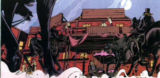
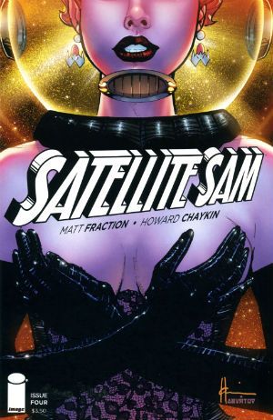
SATELLITE SAM #4 Art by Howard Victor Chaykin Written by Matt Fraction Lettering & Logo by Ken Bruzenak Digital Production by Jed Dougherty Cover Colour by Jesus Arbutov Designed by Drew Gill Edited by Thomas K (still no relation) Satellite Sam created by Howard Victor Chaykin and Matt Fraction Image Comics, $3.50 (2013)

 photo SATCovB_zps826dc453.jpg

While on a rare physical manifestation to my LCS recently (I’ve been travelling; not for work just to throw the FBI off my trail) I asked what the response to this series was and my LCS owner said, “Weeeeeeeeell, people don’t hate this as much as his other stuff.” Hilariously, he meant Howard Victor Chaykin rather than Matt Fraction. Matt Fraction! The man who does more Tumbling than The Flying Graysons after the shots rang out! Try the veal! Apparently SATELLITE SAM is an on-going not, as I thought, a limited series; explains much this does. Mostly it explains the total lack of focus and failure of any of the narrative threads to engage my attention on anything other than a, “Oooooh, research!”, level. I guess there’s some free-form vamping jazz-scatting shabbeey-doo-waaa going on writing wise. That would explain much but it wouldn’t excuse any of it.

 photo SATtvB_zps73659af4.jpg

There’s a lot of, sigh, craft here but it’s not paying off for me. Maybe too much craft? Or maybe too much showing off. Showboating should come after you nail the basics, I’m thinking. But I’m not a writer so. Y’know…Basically Fraction’s comics remind me of a puppy that can walk on its back legs or do that creepy shake hands thing but still has a tendency to leave a surprise behind the sofa when no one’s looking. He’s a mixed bag is what I’m saying.

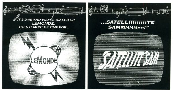
Take the gusset sequence last issue...please! That took up some major page real estate and you could almost hear his neck pop as he inclined his head (modestly, always modestly) for applause. But, c’mon, I need an Editor, stat! That sequence could have been halved (just keep the pages of the people at the table; give your readers some credit!) to double the comic effect (strictly speaking doubling zero is still zero but...). Hmmm, and yet, and yet then the world would have been denied HVC’s gusset panel. Who would deny HVC his gussets? I pity the man who gets between HVC and his gussets. I’m referring there to the last issue because I can’t remember what happened in this issue. Well, I can, but it seems like everything that happened in this issue had already happened at least once in the previous issues. Sure, sure, I hear the cries, this comic may be as exciting as watching cardboard swell in the rain but look at that craft! Craft, yeah, great. Craft’s a foundation you build on it’s not the finished product. Mind you, I’m not a writer so, y’know…Anyhow, with SATELLITE SAM Fraction attempts a faux Chaykin, which is cheeky because that’s Mrs Chaykin’s job. A bit of blue there to extend my demographic appeal. Kids like filth, right? It’s kind of a Howard Victor Chaykin comic; if Howard Victor Chaykin had never left his house. It’s not exactly riveting is what I’m saying there. Still, Fraction obviously butters Chaykin’s parsnips well because the art here is quite, quite lovely. Oh, and The Bruise is slumming it here as plain Ken Bruzenak but he’s still inventive as all get out. I really like his ‘invisible’ balloons and his subtle doubling on the loudspeaker chat from last issue. Or was it this issue? Wait, is every issue of SATELLITE SAM the same but with the pages in a different order? Yes, there’s still a tendency for HVC’s art to include character-float and counter-intuitive levels of detail in crowd scenes but he seems pretty engaged with this stuff. Far more than I am in fact; so SATELLITE SAM just gets GOOD!


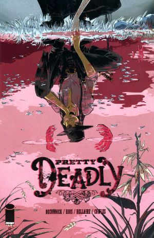
PRETTY DEADLY #1 Art & Cover by Emma Rios Script by Kelly Sue deConnick Colours by Jordie Bellaire Letters by Clayton Cowles Edits by Sigrid Ellis Image Comics, $3.50 (2013) Pretty Deadly created by Emma Rios & kelly Sue DeConnick

 photo PDCovB_zps50a7ca21.jpg

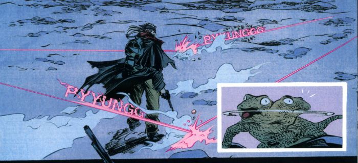
And it is. Pretty, that is. Probably not deadly though. Unless you roll it up and jam it down your throat, or maybe set fire to it and jump in a vat of gasoline, or maybe…you’d have to try hard is what I’m getting at there. I liked this and I mostly liked it for the visual aspect. Here I’m including the whole art/colours/letters synery thang, because it all worked together real sweetly. Ayup, a really quite visually impressively thing this comic was. I enjoyed many things about the visuals but the following floated to the top of my air filled head: the visual distinction with which Emma Rios defined the characters; the clear differentiation of textures, again by Rios but also Jordie Bellaire; the fact that there was not a little Colin Wilson about it all (altho’ the main debt is to that Paul Pope/Nathan Fox shabby energy thang) ; the hot pink of bullet trails in the desert dark which would be Bellaire alone; the fact that the Rios' whores looked like normal women with bodies subject to gravity; the tricksy but comprehensible page layouts, probably DeConnick and Rios; the variations within the lettering from Clayton Cowles and the attention and care with which the purposefully varied and distinct colour palettes were applied throughout by Bellaire. It was good stuff.

 photo PDShotsB_zpse2f142c4.jpg

That good in fact that I barely noticed it was called upon to illustrate what were basically standard genre scenes bolted together with the kind of mysterious supernatural vagueness that arises when you go out of your way to avoid clearly explaining anything. It’s the kind of comic which has the title character appear on the last page and I'm guessing it's also the kind that won’t actually have got around to setting the premise in place until the fifth issue. Note to comic book writers: people don’t live forever, so get a fucking move on. The writing’s not bad but it is very (very) concerned that you notice it. That whole kid at the back of the stage trying to attract its parent’s attention thing. Oh, fret not, I certainly noticed the writing but mostly because it teetered precariously on the precipice of preciousness. Luckily the fantastically evocative and atmospheric art managed to prevent the whimsy from becoming too cloying. Had I not warmed to the visuals quite so readily reading this this would have been akin to choking on Turkish Delight. At points it made Caitlin R Kiernan read like Helen Zahavi. It’s just not a style I warm to, is what I’m saying there. That doesn’t make it an invalid style or the writing itself bad in and of itself (that’s important; I should maybe mention that). There’s some back matter but since I’m not really one for all that simultaneously self-abnegating/self mythologising (you have to fail to succeed! You have to fall to fly! You have to die to live! You have to poo to eat! Marvel at the sparkle on the diamond of my life! I mean share in my enjoyment of the sparkle on the diamond of my life! Share! Well, after you’ve paid £3.99, soul sister, soul brother!!) stuff today’s comic scribes peddle we’ll move swiftly on. I give this VERY GOOD! If you get through life pretending it's a movie and you're the star you can probably go up a grade. Hey, whatever gets you through this vale of shite.

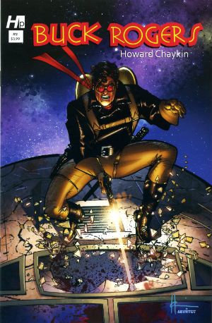
BUCK ROGERS#2 Art and Script by Howard Victor Chaykin Colours by Jesus Arbuto Lettering by Kenneth Bruzenak Pin-up (p.22) by Jed Dougherty Buck Rogers created by Philip Francis Nowlan Hermes Press, $3.99 (2013)

 photo BRCovB_zpsea67ee60.jpg

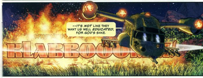
In which amends are made for the first issue omission and  Ken Bruzenak not only gets credited as letterer but is credited as Kenneth Bruzenak! Ooh-la-la! Kenneth, yet! I do so hope Kenneth lettered with his pinky stuck out and all gussied up in his tux and spats; this being a formal shindig donchew know! Kenneth’s lettering here is still bubbly and fun because no matter how shiny his shoes – he’s still The Bruise! Oh, and Jesus Arbuto steadfastly continues to colour this like he’s got peyote on a drip; which works just great in this madhouse of a future setting. You will recall that the last issue of BUCK ROGERS was pretty good but this issue is actually even better. There’s always humour in a Howard Victor Chaykin comic but he’s rarely embraced the comedic so blatantly as he does here. Successfully too I might add; I know I laughed several times. When Buck displayed his pragmatism by avoiding detection with a brutal act of unkindness I laughed like I had a flip top head.

 photo BRsfxB_zps91b76998.jpg

So there’s verbal sparring, comedic bickering, and some dark, dark laffs too as HVC confronts the racism of this world he has built, and basically tells everyone to knock that shit off. Humour not for humour’s sake but humour with a purpose. Visually it’s still Alimony Age Chaykin, so you know if you like that. And I know you don’t. Luckily I like it enough for all of us! The real standout is his breackneck don’t-sweat-the-details pacing and bracing wit. There’s even a slight “kids, today!” subtext that pays off with a man weeping to music anybody reading this would have to Google. BUCK ROGERS is funny, serious and, hey, got the sun in my eye here, cough, whisper it: moving. That’s not a bad range to cover in a book about a man in jodhpurs with a jet pack. Boy, I don’t know who this young turk Howard Victor Chaykin is but I sure like the cut of his jib! Kenneth too! Hell, Jesus is pretty good on this comic as well. There's a sentence my Sunday School teachers never thought I'd write! This issue takes BUCK ROGERS up to VERY GOOD! But you knew that because you’re already buying it, right! Whoa, that cleared the room.

And remember: we can tear each other apart but God help the fool who tears up - COMICS!!!

Wait, What? Ep. 138: Gone Galoshing

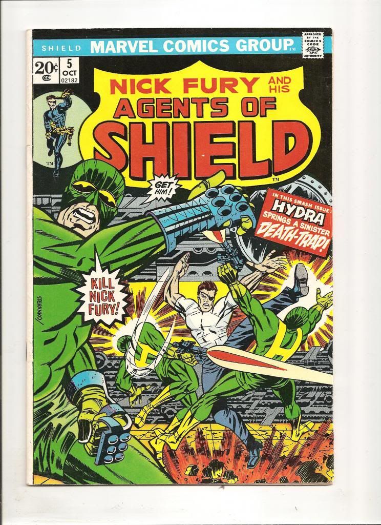
 photo nickfury5001_zpsb92b1d1e.jpgAhh, nostalgia. I used to love that cover....and I know I should crop out that border.  But.

Hey, Internet! My apologies in advance--things are rushed, except maybe a little more so! My Monday schedule changed around a bit so it's gonna be a rush on my part to make sure they still happen before Tuesday morning.

All of which is to say: join me after the jump for some very hasty show notes, yes?

00:00-4:07:  Opening comments!  Greetings, statements, insinuations. But before the paint has even started to dry on our work-related complaints…comics! 4:07-13:54:  First off, Pretty Deadly.  Recorded just a few hours before "Rip-Up-A-Copy-of-Pretty-DeadlyGate," we talk about our mixed feelings about this new Image title by Kelly Sue DeConnick and Emma Rios. We talk westerns, manga, prologues, emotional investment, narrative baiting and switching, and other keen topics. 13:54-27:58: It’s a blurry line, since we’re still unpacking reactions to Pretty Deadly, but around here is where we also work in discussion  of the second book in the week’s trifecta from Image’s Portland Mafia, Velvet #1 by Ed Brubaker and Steve Epting. Included in the discussion: LeCarre, Bond, Val from Nick Fury, Paul Gulacy, Sandbaggers, Story X becoming Story Y, etc. 27:58-46:57: And finally, we work in the third book, Sex Criminals #2 by Fraction and Zdarsky.  In the mix: amazing colors, fantastic jokes, problematic jokes, sales figures, sex skittishness, and what have you. 46:57-56:39:  The first Justice League of America hardcover—Graeme has seen it, read it, and has some very good questions about it.  Also discussed: the Fortress of Solitude trade, the Death of the Family trade, the draw of missing issues, things of that nature. 56:39-1:14:30:  And Jeff has things to say about the Cross Manage one-shot that just ran in Shonen Jump Weekly digital.  What did a huge fan of KAITO’s high-school lacrosse fantasy think of the strip’s return?  Also mentioned: romance (of course), New Girl, Castle, Bones, and Deadwood. 1:14:30-1:27:33:  And this kind of crazy talk leads around to an overdue discussion about the DC policy that their heroes can’t have happy romantic relationships. Included in the discussion:  the many stages of Spider-Man; Earth One and the New 52; someone jumping up and down on Superman’s brain and causing him to get divorced; and the possible marital status of Iron Man. 1:27:33-1:35:05: The Secret Origin of Tony Stark over in Iron Man!  We spoil the ending, and talk about the story’s big swerve, narrative v. marketing, the Superman and Wonder Woman relationship (uh, somehow?) and a few additional things thrown in there I don't quite remember at the moment. 1:35:05-1:43:15: Graeme has a rant about the Agents of SHIELD TV show.  Jeff wants to hear it!  Here’s the segment where we figure out how to make that happen.  There’s a slight tech glitch, but it doesn’t stop us from talking about the Military-Industrial Complex and Hollywood…and Marvel Entertainment, in particular.  This was recorded right around the time of the Captain America: Winter Soldier trailer which was an interesting compare/contrast. 1:43:15-end: “Speaking of Mighty Marvel Self-Critique…” Graeme also walks us through Marvel: Now What? Jeff tries to make up for his sour mood by talking about how much he’s still enjoying Yakitate!! Japan and the most excellent poop joke in Volume 8.  We also end up complaining about Agents of SHIELD some more.  Fortunately, Jeff thinks to ask Graeme about Halloween and this leads to a lively anecdote about “Galoshin’,” a list of costumes Graeme has worn, and we each pick comic book costumes for the other to wear.  IN THE COMMENTS: give us your picks for our Halloween costumes.  Best choices will be shamefacedly and resolutely ignored.

Itunes has been alerted, but the podcast should be below.  The stupid file came out stupidly big so I tried to compress it.  Hopefully, it's still audible (it's probably still stupidly big, I fear.)

Wait, What? Ep. 138: Gone Galoshing

Next week:  is a skip week!   We will be back in two weeks!

Getting Hibbsy with 10/31

Ugh, I’ve missed too many weeks of reviews here, let’s get this back on track! A PLUS X #1 NOW: Finally another ”Marvel NOW!” title ships… and it is the low-to-no plot title. “AvX: VS” was a cute side project for the main AvX comic (and could be, I think, argued that it was often much better than the comic with the actual plot), but I have a hard time seeing this concept sustainable as an ongoing monthly.  As always, things that work out as a joke idea generally can’t survive being stretched out to ongoing status, and I think the low-to-no-plot content is going to not help that one tiny bit. The execution of this issue? Totally competent, but I suspect people are looking for a bit more than “competent” for a $3.99 monthly series. I thought it was EH.

ACTION COMICS ANNUAL #1: Sholly Fisch (Whose name, have I said out loud?, sounds like a golden Age DC Comics writer) takes the big chair here, and the result is perfectly respectable.  Actually, what I found interesting was just how much this comic resembled the basic plot of SUPERMAN EARTH ONE v2 – sudden powers given to someone that Superman must stop, but can’t touch physically lest his own powers be removed; end of comic, villain goes to work for military, which is trying to figure out a way how to kill Superman – also out this week. I think this annual did the story much much better, and it was highly OK.

ANGEL & FAITH #15: I mostly bring this issue up because the back half of it is illustrated by David Lapham, a general rarity these days, much to my sorrow. Isn’t it just nuts that STRAY BULLETS is not in print? Crazy crazy making. Anyway, yeah, ANGEL & FAITH is generally more readable than BUFFY and this issue is no exception, even if it reads a smidge like a fill-in with its two-story structure. Still? GOOD.

AQUAMAN #13: Fourteen issues later, and it’s still all about TELLING us that Aquaman is good, without really SHOWING it. Scowly-Anger-Man is, I guess, a form of characterization, but I’m still not really certain just WHY he’s so pissed off about everything. The only one calling Aquaman lame is the writer of this comic (and they do it again, here, fourteen issues in). Were I paying cash for comical books, this issue would mark me as “Done”, but I work in a comics store, so I quite imagine I’ll read the next issue as well, and not really enjoy it very much either. EH.

BATGIRL ANNUAL #1: I found the painted art (mostly by Admira Wijaya) to be a little too, dunno, paperback cover-like, maybe? Too stiff, too posed, and largely unable to properly render anything too “fantastic” (like Catwoman’s mask, or the perfectly proportioned bandages on SheTalon’s face, and I’m pretty sick of Court of Owls-related stuff at this point, but otherwise, this annual was perfectly OK.

BEDLAM #1: It’s kind of an Arkham Asylum / Joker pitch with the serial numbers filed off in which, at least if I’m following this correctly, the Joker becomes a “good” guy at the end – it carried me right along in its world, which is what a comic is supposed to do, so let’s add this to the rapidly growing pile of intriguing Image comics – I’ll go with VERY GOOD, I think, and, hey, you can buy it on our digital store!

CAPTAIN MARVEL #6: Among the many reasons I am not an editor of comic books is not really understanding why you would launch a book with as distinct of an artist as Dexter Soy, then drop him out before the end of the first arc for someone like Emma Rios (who is a swell artist, but nothing whatsoever like Soy in style or tone). Nor, for that matter, why you would jam out those 6 issues in three and a half months. Especially if your artist can’t keep that schedule, apparently? Also: I’d never ever have made the first arc a time travel story, especially with a (sorry) B-level character like Cap who needs to be “reintroduced” to the Marvel U – you don’t make that work by taking the character OUT of the (modern) Universe. Add it all up, and it’s not any kind of surprise we’re already down to single digit sales on this title from just under 30 sold of issue #1. But the worst part of it all, the very worst part? I really thought this wrap up chapter was quite good, and, I think, ended up making Carol’s “secret origin” a much stronger one. I thought this issue was VERY GOOD, too bad I’ll end up being subs only by issue #12 at the rate things are going.

EC KURTZMAN CORPSE O/T IMJIN AND OTHER STORIES HC EC WALLY WOOD CAME THE DAWN AND OTHER STORIES HC : Sadly, deeply, amazingly disappointed in these – purely because they’re in black & white. I was strongly hoping for something like the Carl Barks reprints, with that nice flat coloring, and I was absolutely committed to replacing out my EC library (which consists of all of the Gemstone reprints, the ones that are literally four issues of the comics, covers, ads and all, glued together into an outercover) for handsome FBI reprints… but, ugh, I don’t want them in black and white. The solicitation copy, the press releases, really bury the fact that these aren’t in color, which I kind of find borderline dishonest. This is now the second attempt at upscale packaging for the ECs in a row that gets it wrong (the last HC set had new, shiny, color, ew!), which just hurts. I think I’m going to have to cut my orders on the next set of books by like 80% -- even “Nostalgia Guy” (my name for him) turned up his nose at them when he spied them on the rack. It’s too bad, because these ARE handsome hardcovers, and those spines are going look AWESOME together on the shelf, and it is really smart to collect the ECs by artist and genre – but they’re simply not how I want these stories archived in my library. I love the EC comics, and they really do deserve to be there for a wider audience, but I’d encourage you to have your LCS to try ordering the Gemstone “Annuals” – about ¾ of them are still in print, but Diamond never really advertises the fact. I stumbled across them doing a trawl of Diamond’s inventory, in fact. But those are flat color on newsprint, which is kind of how those books SHOULD be presented. I also don’t like how this edition doesn’t note which specific comics which specific story comes from. I would have preferred a Table of Contents more like a DC Archives edition, which even gives you month/year. *sigh* For the outer packaging, and the underlying work, I wanted to give a VERY GOOD, or an EXCELLENT, but this B&W edition makes me say EH, instead.

GHOSTS #1: Here’s a happy surprise – I kind of flat-out loved this anthology, as virtually every story was stellar. The other thing I really liked is that with the exception of the Phil Jimenez story, I feel like I could hand this comic over to Ben to read at 9 years old, just like its 70s predecessor. That’s the most awesome thing of all, and I think that they should continue that into the future with Vertigo Anthologies. Get that “Suggested for mature readers” off the cover, says I! The only story I really didn’t like? The “Neil Gaiman’s Dead Boy Detectives” which they decided to bill on the cover instead of Geoff John’s first Vertigo work (which I kind of found odd) – the problem is that it isn’t a full story, at all, and “too be continued, somewhere, eventually” is a big fail in an anthology book. I’m also growing more and more convinced that Al Ewing is The Real Deal, and I really loved his kick off story. And presenting the pencils-only from the Joe Kubert story was kind of touching and cool. Yeah, so: VERY GOOD.

MASTERS OF THE UNIVERSE THE ORIGIN OF SKELETOR #1: You also want to know from surprising? LOVED this. I don’t care for/about MotU at all, and their backstories never seemed any deeper than, dunno, a marketing interns stab at creating a fantasy world (Though, really, what else can you do when you have characters named things like “Stinkor”), so when Joshua Hale Fialkov actually manages to build a backstory that is reasonably compelling, then said story is drawn by Frazier Irving (!), then, hokey smokes, you’ve got a horse race. I was loving this right up to the last page when it says something like “And, so, your name is….SKELETOR!” and then I remembered it was a MotU comic. Aw! Still, this really was surprisingly VERY GOOD.

POPE HATS #3: Ooh, and this was even better. Ethan Rilly is going from strength to strength with this comic, and, damn it, I wish I could still sell issue #1 because we should be picking up readers for this great slice of life story about two room mates with very different career paths. Straight up terrific cartooning, and I would call it “Excellent” except for that pesky $6.95 cover price. Ow. So, knocking a grade off for that: VERY GOOD.

Looks like I’m out of time for the week – time to go pay bills! (yay?)

As always, what did YOU think?

-B