“Run Scared And You End Up Running From Yourself." COMICS! Sometimes A Sunday Morning Is The Last Thing You’d Think To Compare Him to!

Carlos Ezquerra. Alan Hebden. Major Eazy.  photo EazyTankB_zps07156304.jpg Major Eazy by Carlos Ezquerra
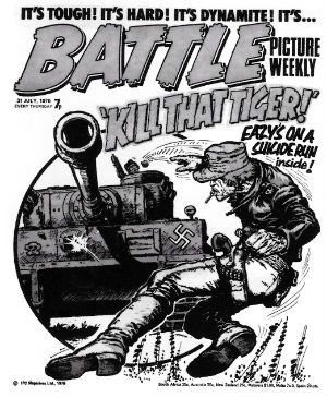
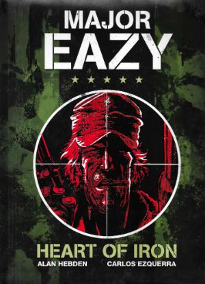
Anyway, this… MAJOR EAZY: HEART OF IRON Art by Carlos Ezquerra Written by Alan Hebden Major Eazy created by Carlos Ezquerra & Alan Hebden Titan, 128 pages, B&W, £14.99 (2012)

 photo EazyCovB_zpsfd31c6ac.jpg

This is a collection of comic strips from Battle Picture Weekly featuring the fondly recalled (by me and probably many other emotionally stunted middle-aged men) fictional character Major Eazy. The strips within detail his adventures in North Africa during the very real 2nd World War. Launched in 1976 Major Eazy, the creation of Alan Hebden & Carlos Ezquerra, quickly became a popular strip in an already popular comic. It featured a character who was visually James Coburn in Cross of Iron from the neck up and behaviourally beholden to Clint Eastwood’s character in Sergio Leone’s Man With No Name oaters. Eazy was a maverick (hence his suicidally inappropriate headgear and his Bentley) whose apparent lackadaisical style belied his killing efficiency. As a foil for expressions of awe at his antics Eazy was provided with Sergeant Daly; clearly, and amusingly, modelled on the 1970s sit-com mainstay Arthur Mullard. Since starting to sully this site I have thought about British comics harder and longer than ever before, and I am coming to the conclusion that Carlos Ezquerra, a Spaniard no less, was the single most important artist in 1970s British comics. He isn’t important because of Major Eazy, but Major Eazy is a part of that importance. Ezquerra’s fast and nasty style was a perfect fit with the fast and nasty Brit comics of the 1970s and he was in the best of all of them (Action, Battle, 2000AD) and, ultimately, he co-created the most enduring strip of all of them (Judge Dredd). And because the Comics crowd is now so huge so many get lost in the crush no one will be a rush to pin any Comics medals on Alan Hebden, his work here is certainly sturdy enough to remain entertaining decades later. No mean feat, that.

 photo EazyHollywoodB_zpsac817dd6.jpg

Major Eazy by Carlos Ezquerra & Alan Hebden

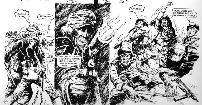
It’s mostly Hebden’s show as, despite his undoubted genius, Ezquerra’s visuals aren’t able to carry this book unaided due to, entirely reasonable given the material’s age, I guess, deficiencies in reproduction. While the book does present the strips at the right size (i.e. magazine size), unfortunately it necessarily reprints them at a remove of some decades. And, much like the UK public transport infrastructure since the 1970s, there’s been some degeneration. The worst affected are the once-colour pages which are now mushy looking and blurred, but even the regular originally B&W pages vary in quality. Some pages display Ezquerra’s evolving method of contrast (panels which almost glare via delicate hatching then hemmed in by grubbily dense panels) to fine effect, while other pages present an exciting challenge to the reader’s perceptual abilities. It's a mixed bag with the earlier pages faring worst, the majority of it reads just fine. But if you are used to the almost hallucinatory precision of modern comics reproduction this might not be the book for you.

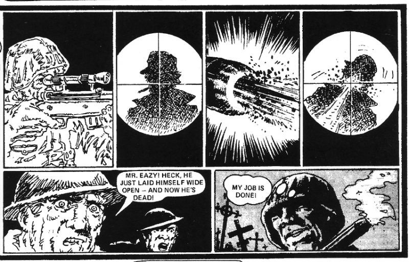
 photo EazySniperB_zps6597423e.jpg

Major Eazy by Carlos Ezquerra & Alan Hebden

But then these were comics intended for the moment, not comics intended for the ages; it’s testament to the strength of Hebden’s writing that these strips still entertain despite the frequently difficult to decipher visuals. These were also comics aimed straight at the brains of children and it’s totally to Hebden’s credit again that he not only introduces adult themes but that he handles them so nimbly. Kids’ comics they may well be, but they don’t shy too far away from war’s inhumanity. This is a children’s comic where the light and larky Kelly’s Heroes vibe (Eazy happily plays cards with the Germans between bombardments – until they cheat!) is regularly pierced by dark moments that flirt strongly with honest depictions of the depths war contains - a priest previously seen rescuing smiling children is found strung up from a tree, British troops are mistakenly shot down by an American plane, Eazy shoots a young woman in the back, a steam scalded German is allowed to suicide under Eazy’s eye, wounded troops die due to black market profiteering of essential medical supplies, and on, and on, and more besides.

 photo EazyLinesB_zps82860d0c.jpg

Major Eazy by Carlos Ezquerra & Alan Hebden

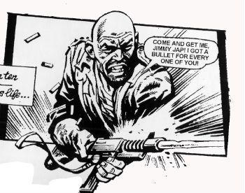
Hebden doesn’t get away with everything though and there’s some fun to be had spotting the occasional comical editorial intervention. In the friendly fire episode the yank flier is clearly machine gunned to death by Eazy, yet the next panel finds Sgt Daly pointing with a hastily drawn arm to a yet more hastily drawn figure parachuting to safety in the distance. And then you get a story so harsh it’s staggering that editorial waved it past. There’s one particular cavalcade of chuckles featuring a Polish officer who, unhinged by the treatment of himself and his country at the hands of the German Army, embarks on a series of retaliatory atrocities. In one unpleasantly memorable scene Eazy surprises him in a barn going at a trussed up German with a straight razor and shortly thereafter everything ends admirably badly for everyone. Sure, these strips may be a bit rickety but there’s still power in their pages. And that power is all the more impressive for the brevity of each episode (3-pagers, done in ones; mostly). Intermittent visual shortcomings aside I enjoyed revisiting these strips; they are a lot darker and harder than I thought they were. (That probably goes for the 1970s too.) GOOD!
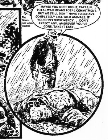
 photo EazyAnimalsB_zpsa299c42b.jpg Major Eazy by Carlos Ezquerra & Alan Hebden

Of course the real horror is that during wartime they ration paper and that means no - COMICS!!!
"A Tiger Doesn't Give A Buffalo Warning." COMICS! Sometimes They aaaAAAIEEEE!!! DAAKEESE MOB!!

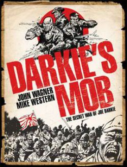
In the Burmese jungle of 1942 only one thing was more deadly than the Japanese...In the war comics of 1976 only one strip ruled the playground...That thing, that strip was DARKIE’S MOB by Mike Western and John Wagner.  photo Dark_Jimmy_B_zpse9c4f003.jpg COME ON!!! GET SOME!! CAHMMM AHHHNNNNN!!!! DARKIE’S MOB: The Secret War of Joe Darkie Art by Mike Western Written by John Wagner Introduction by Garth Ennis Titan Books, £16.99 (2011) Darkie’s Mob created by Mike Western and John Wagner (N.B. Darkie’s character defining shiny pate was the masterstroke of then editor Dave Hunter.)

 photo Cover_B_zpsaf06bbd9.jpg Cover art by Carlos Ezquerra and Mike Western.

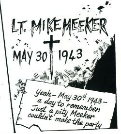
May 30th 1942: “We’re just sitting. Waiting to die…” Taken from the blood stained pages of the battle log of private Richard Shortland comes the story of Darkie’s Mob. This is the story of Joe Darkie and of the men who followed him into Hell. This is the story of Joe Darkie who wore a dragon against his flesh and hid a demon in his heart. And this is the story, also, of the lost and hopeless men Joe Darkie forged with War into a jungle hard fighting force. And when he was done, when Joe Darkie was finally done, Joe Darkie had taught them that war was Hell but he also taught them that Hell could also be a home. And the Hell of War was the only home there could ever be for DARKIE’S MOB.

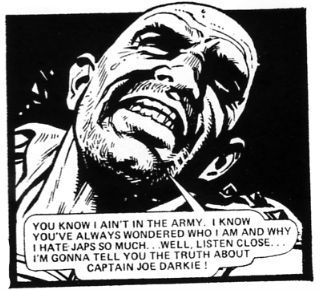
 photo Dark_Head_B_zps3e02db5f.jpg ...and then he'll have to kill you.

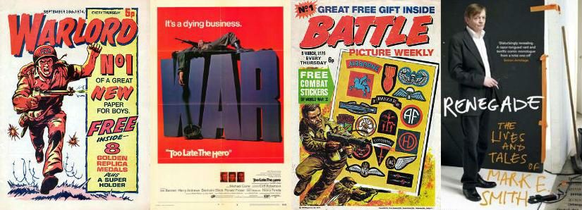
This book contains all the episode of the picto-serial DARKIE’S MOB which originally appeared in issues of BATTLE PICTURE WEEKLY from August 1976 to June 1977. BATTLE was a weekly British war comic aimed primarily at children and it was thus a violent, dark, complex and brutal assault on the pre-teen mind. Which is just how kids like it, social services be damned. So, you've probably guessed Pat “Moderation” Mills was involved but only in that he, together with John Wagner, had set up BATTLE for Fleetway in direct response to the tamer and more typical fare of D C Thompson’s WARLORD.  To be fair, when I was a kid WARLORD had its moments but BATTLE still has its moments now I’m an adult, so BATTLE wins. Some might be confused by the fact that during the 1970s there was such an emphasis on the war in British comics. Such people’s confusion would be bolstered by the knowledge that, in addition to BATTLE and WARLORD, there were also the several monthly self-contained digest size titles of BATTLE PICTURE LIBRARY, WAR PICTURE LIBRARY and COMMANDO COMICS.

 photo Covers_Trip_B_zps07a40715.jpg"British people In Hot Weather-AH!" The simplistic and sweeping answer (you were expecting maybe a reasoned thesis?) is that the War still wasn't all that far behind us back then. In fact a notable feature of early BATTLE was that readers were encouraged to send in the war stories of their fathers and grandfathers. (Of course due to natural attrition this feature became less popular as the years wore on). Basically Britain was still trying to process the massive trauma of the conflict and was having a hard time doing so. We’d helped win the thing but it had pretty much broken us and so, yes, it may well have been the 1970s but, sad to admit, the 1940s were taking some shaking.  In Renegade the autobiography of (i.e. a fascinating interpretation of his own reality) The Fall’s Mark E. Smith recalls how he used to play Japanese Prisoner of War Camp with the kids he was babysitting. This would involve them having to sit under a table and asking permission of the future Marquis Cha-Cha for any water or food. The kids of Britain in general were not unaffected by the tone of the times, is what I’m getting at there, and BATTLE would reflect this. BATTLE would reflect it in a relatively timely fashion as by 1976 attitudes to the war had changed somewhat and this was, as ever, reflected in the entertainments proffered. The slightly harsh but never too far from cosy early post-WW2 war films embodied by the words “John Mills” had started to give way to bleaker, grimier fare such as Robert Aldrich’s Too Late The Hero. Comics has ever magpied from pop culture after the fact but BATTLE was nimbler than WARLORD on picking up on the changes. WARLORD lagged behind in that it was still Millsian in the sense of Little Johnny but BATTLE was about to forge ahead by virtue of being Millsian in the sense of Pat. DARKIE’S MOB would be one of a number of strips Mills, Wagner, Gerry Finley Day et al would develop and script which would be part of a nation’s acceptance of its own past. Proof that true acceptance had been reached came when war comics fell by the way side. And so the healthy British mindset was to be embodied by a giant killer shark eating surfers like plankton and a fascistic future cop with a chin like a knee but, then, that’s why comics are the best of all things ever. Fact.

 photo Darkie_dont_B_zps9850d482.jpg It's okay, he's just joshing...isn't he?

DARKIE’S MOB is a product of the 1970s and so, as this is 2013 when everybody behaves impeccably at all times, Garth Ennis spends most of his informative, knowledgeable and very enthusiastic introduction pointing out that although racist terms are used, they fall within acceptable parameters for the portrayal of a bunch of desperate men at the end of their tethers fighting an enemy it is in their interests to dehumanise. Let’s face it soldiers swear, and sometimes use less than pleasant terms for the people they are trying to kill. There’s no effin’ and jeffin’ here but there are some terms that might make us uncomfortable. And so they should, after all we’re not currently jungle fighting the Japanese are we? Anyway, you have been warned. Ennis also points out that the Japanese army weren't fucking about either. They meant business. In fact, the extent to which they were not fucking about quite surprised the breath out of the British hence they were somewhat on the back-foot when the tale opens. Although, cleverly, the tale is over when it begins and we witness everything via flashbacks spurred by entries in a diary found after the Japanese defeat. Right there on the first page is the clue to how it all ends, and it won’t be ending with kissing nurses in ticker tape parades. Not for Joe Darkie's Mob.

 photo Darkie_Grave_B_zpsea874322.jpg "Hey Kids, COMICS!!!"

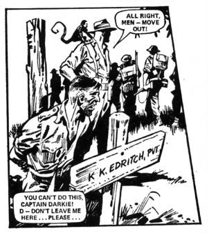
As was usual for strips in British weekly anthologies of the time John Wagner and Mike Western get a whopping three (sometimes four!) pages an episode. Consequently brevity, concision, density and clarity are the order of the day and Western and Wagner obey those orders above and beyond the call of duty. While the initial impact of DARKIE’S MOB will always result from surprise at the savagery of the proceedings its persistence in the reader’s memory is wholly due to the characterisation. No, it’s not exactly Jonathan Franzen, but Wagner nails down the various characters with an enviable certainty and economy. He does this while, in each episode, also delivering at least one explosively violent set piece, hinting at Darkie’s past and keeping a character centric sub plot or two simmering. Wagner is of course known and loved by all comics fans primarily for co-creating Judge Dredd and Strontium Dog but is an excellent comic writer; one whose excellence is often taken for granted due to his comics working so well you often don’t realise how superbly executed they are. To the detriment of his own reputation Wagner always steps back and lets the story take precedence over his personality. Here then is DARKIE’S MOB which is fantastic episodic comic book writing by John Wagner. Oh, the usual warning applies with Brit reprints - it isn't, truthfully, best served by gorging, so maybe put the book aside now and then for the best effect. Self-restraint, I’m talking about self-restraint there. Although that might be difficult given the breakneck velocity built into the strip.

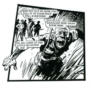
 photo Dark_Truck_B_zps8008bfc0.jpg "AIEEEE!", Indeed!

In concert with Wagner’s scripting DARKIE’S MOB benefits enormously from its excellent envisaging by Mike Western. Mike Western is one of a whole host of 70s artists who worked on British comics and whom deserve wider recognition. Thanks to reprints some of them are getting a deserved second wind. This should afford them at least a place in comics history even if it isn’t fully the place they deserve. Carlos Ezquerra’s okay he’s got Judge Dredd (and then all the rest) to keep him in view and Joe Colquhoun isn't going anywhere thanks to Charley’s War and his Johnny Red should give John Cooper a deserved leg up as he shared the strip, but Mike Western’s shot is probably going to be DARKIE’S MOB, so forgive me if I try and make it count.  Because it deserves to count because Mike Western is a kind of old school awesome worth celebrating. Western was a stalwart mainstay of the British comics scene with his realistic rather than cartoony work gracing adventure strips and TV tie-ins in titles such as Knockout, Buster, Valiant and, of course BATTLE. Following DARKIE’S MOB Western would continue working in British comics until he officially retired in the ‘90s. He died in 2008. Throughout his career his work was informed by an admiration of artists from over the pond such as Alex Raymond and Milton Caniff. Studying their work would enable him to maximise the limited page space available in British comics but it was his own remarkable talents which make his work in DARKIE’S MOB so successful.

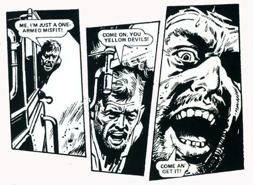
 photo Dark_COME_ON_B_zps31116020.jpg He's Got A Ticket To DIE!!!!

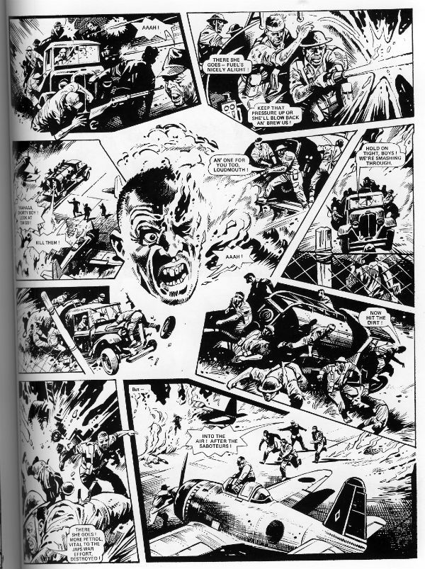
Western served his country in WW2 and while I do not know if any of his experiences are reflected in his art for Darkie’s Mob I kind of hope not for his own sake, what with the claustrophobic sense of sweaty doom he gives the strip. Reportedly Western enjoyed drawing faces and while this is never a bad thing in a comic artist it’s a sure strength when drawing war comics. As the Army isn't noted for encouraging individuality the Mob are largely differentiated by their faces, somewhat in the manner of real human beings. Western’s solid and lifelike fizzogs ground the melodramatic emotions being experienced and enable the retention of a veneer of realism over events that sometimes might stretch belief. Western’s characters are also placed firmly in environments which in a few lines and slabs of black ensure that the reader comes away from DARKIE’S MOB with a sure sense that the book has occurred within the dank folds of a murky jungle Hell. At first glance Western’s art might appear staid and static but when read with Wagner’s words it comes alive, drawing the reader in and pushing the real world out. Proper Comics there, that is. In DARKIE’S MOB with fewer pages than fingers on a wounded hand Western manages to pack in all the desperate and dingy psychodrama Wagner’s script requires in order to sting. He also works those individual panels. Really works them. Mike Western could cram an indecent amount of action, event, character, information and motion into a single panel and if you gave him a whole page to play with? Glad you asked:

 photo Darkie_ATTACK_B_zps470e22a7.jpg

DARKIE’S MOB is a raw blast of ‘70s Brit comics Burmese battle action delivered by the masterful team of Mike Western and John Wagner. War is truly terrible but DARKIE’S MOB is VERY GOOD!

 photo Dark_Run_B_zps3da1f7d2.jpg “AAAIIIIEEEEE!!!” – COMICS!!!!

"BIG..! I'm Telling You...The Sonuvabitch is HUGE!" COMICS! Sometimes They Are Extravagant!

Like Ripley going back for that damn cat I go back to ALIEN THE ILLUSTRATED STORY. This time it's so big Ash could very well be right and, yes, you could probably walk on it! Photobucket

No it isn't PLANET OF THE APES WEEKLY. Well spotted. This week I learned two things: 1) Never say what you are going to look at next because Life will unleash a horde of flying monkeys right at your face and turn you into a big fat liar. 2) In the words of Beat-Cop Brian Hibbs "Always have a throw-down piece." That would be this. But hey, I didn't actually say POTA would start this week...so I also learned 3) Just in, I have also learned I will wheedle.

ALIEN THE ILLUSTRATED STORY (THE ORIGINAL ART EDITION)

Photobucket

Art by Walter Simonson Scripted by Archie Goodwin Lettered by John Workman Based on the original screenplay ALIEN by Dan O'Bannon & Ronald Shusett And the motion picture directed by Ridley Scott Titan Books, 35.1 x 2.5 x 50.5 cm, 96 pp (2012) $75.00 US $85.00 Can £54.99 UK

"We did not try to replicate the film, an impossible task. Instead, we tried to create a graphic novel that would stand on its own merits." Walter Simonson (2012)

Walter Simonson there reminiscing about his and Archie Goodwin & John Workman's 1979 Heavy Metal adaptation of the motion picture presentation ALIEN. When we were all that bit younger and fleet of foot I went on about it a bit HERE. (Spoiler: It was VERY GOOD!) If you want to buy a nice shiny version of thatbook Titan just republished it a couple of weeks ago. (Bodacious Ben Lipman popped up in the comments to say: "I bought the cheaper Titan edition a few weeks back, and I don’t believe it has the interviews or behind-the-scenes bits and bobs mentioned in your review – it’s all comic!" So I have altered the following bit.) Here as well as the original (still innovative) adaptation you'll get Goodwin's script with Simonson's annotations, two pages of try-outs (once in B&W and once in colour) and a comprehensive and good natured interview with both Simonson and Workman conducted by J P Rutter. Of even more importance though, in this version, the version I splashed the cash on, you get all those and you get the art reproduced from the original artboards.

Turns out art boards are big.

Turns out art board books are big and pricey.

Yeah, about that. I bought this book because it is a great book but I bought this version because it is probably the only chance I'll get to grab one of these Original Artboards books. The IDW (to which this bears great, ahem, similarities) books are things of great joy and Satanic temptation but ultimately it's not the best idea to  spend what you haven't got (as Western economies found out recently). That's not to say that the IDW books are unreasonably priced for what you get (by all accounts you get wonders) but they are out of my reach. Thanks to a deep pre-order discount and a deal with Satanzon I could just get my needy fingers on this one. Just in case anyone thought I was Richie fucking Rich or got comps.  I'm not, I don't, and yet I still bought this ostentatious thing. It didn't disappoint.

While most of your time will be spent staring at the wonderful (i.e. full of wonders) art, art which is still instructive about how to make comics some thirty three years later, the value of the accompanying interview must be stressed. No empty glad handing back slapping celebration of how simply marvellous all involved were is this. No, although all involved probably deserve it in this case. It is in fact highly educational about how the book was put together.

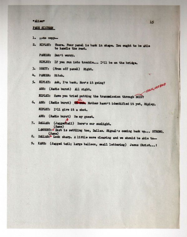
Look, here's a page of the script:

Photobucket

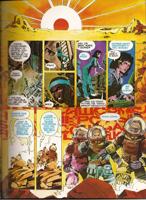
Now, here's the scripted page in its drawn and published form:

Photobucket

Alone these could be taken as yet another example of how the writer gets the artist to do all the work. In the interview it becomes clear how closely Goodwin, Simonson and Workman involved. It was the kind of mental cross pollination that isn't ever going to be adequately documented except in the form of an interview. Where the more abstract and elusive contributions of the creators, contributions that leave no physical evidence, can at least be acknowledged in the approximate, but permanent, form of words. Rutter's done a fantastic job on the interview is what I'm saying. It helps that he has two subjects as cuddly as Walter Simonson and John Workman (Archie Goodwin died in 1998 and so was unable to attend). Both men are self effacing but aware of the work's value and so able to discuss its fascinating creation in a way which is both informative and engaging.

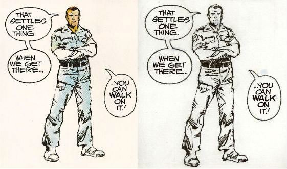
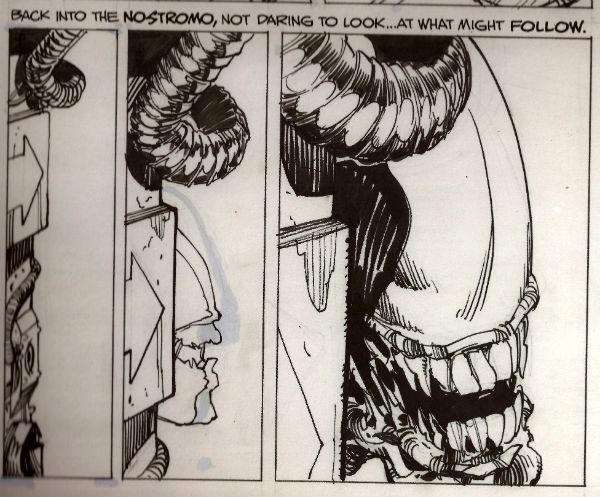
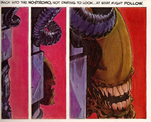
It's through the interview that the names of the people who actually coloured the book are revealed.  So, a belated big happy shout out to Louise Jones (later Louise Simonson), Polly Law and Deb Pedlar for the bulk of the colour work herein. Except it isn't herein as this one is the uncoloured art from the original art boards. Irony in action there. Most people who buy the book will have a copy of the coloured version so they can have some fun comparing and contrasting and fully appreciating the impact the colour brought to the work. I've had to use a scanner to provide examples but with two copies of the book, steady hands and your own eyes this effect can be replicated at will:

Photobucket

Photobucket

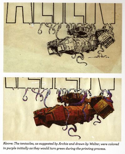
Sometimes they do the comparison for you:

Photobucket

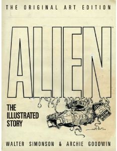
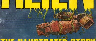
But you still need to get another copy to look at the original cover, then you've got the final piece of the puzzle. (Hey, purple becomes green - I did not know that!):

Photobucket

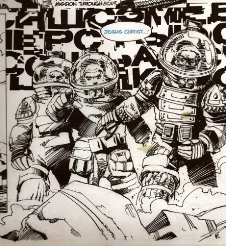
When I was doing the script/final page comparison I tried to scan in the original art page just to get that middle step in but that was seriously not a thing that was going to happen. Look, I'm just a sour old man sat in his kitchen with a scanner that can just fit a normal comic without technical hilarity ensuing. I'm not a 21st Century publishing house. So, in lieu of that please accept, as a token indication of the original art involved, a reproduction of the final panel of that page:

Photobucket

There are two things I really like about having that panel:

1) I can now tell that Simonson drew distorted shapes in the helmets behind the characters' heads to represent the letters of the SFX behind them. He has visually indicated the distortion the (already bizarre) noise is subject to by passing through the medium of the helmets. I don't think that extra attention to detail is apparent in the published piece. SIMONSON!

2) The stains!

Were I to spend £54.99 on a book only for someone to spill coffee on it I can assure you there would be raised voices and the very real possibility of awkward man-dancing resulting in at least a torn cardigan and at worst a grazed knuckle or two. Shouty violence of a singularly inept and middle-aged stripe would be on the cards. I'd react badly is what I'm saying. And yet...and yet...I have just spent £54.99 (well, not really £54.99...) on a book and I am pleased as punch to find a reproduction of the 33 year old spillage from one of Simonson's cawwfee cups defacing it. I mean, it isn't even the real stain. But, in my defence, it is a stain reproduced from the original artboards!

It was a massive amount of fun looking at this massive book and comparing it with the original, reading the interview, matching the script to the original art and then to the published work etc. But I am not unaware that it was also massivley expensive fun. If you've got the cash to hand it is an eye opening, beautifully produced experience. Particularly so for non comics makers, for such as them (i.e. such as me) who'll probably get no closer to the process than this I'm going to say this was EXCELLENT!

If you just want to read a really good comic adaptation of the movie ALIEN stick to the normal tpb (£10.99 UK). This one is for the professionals, the would-be professionals and the untalented nutters like me who just really, really like COMICS!!!
NEXT TIME: Who the Hell knows (lesson learned.)