Hibbs? Why is HE stinkin' up the joint?!?!

Hi, it is me, the y'know, original founder of this blog.  You might have noticed I've been just a little slack in posting since around Christmas time. The Season soaked up my time, then I started my new consulting business, but mostly, I needed a break from writing reviews.  It happens! I was going to start posting a few weeks ago, but that was the week where Abhay descended out of the blue for a solid week of posts, and I didn't want to step on his toes.

This week, we welcome our newest SavCrit -- the artist formerly known as J_Smitty (Yes, eventually every regular commenter will be given a seat in the big chair*), now unveiled as Jordan Smith, whose first post is directly below this one, but I felt like I couldn't put off my return for much longer (it is MAY!), so join me below the cut, would you?

Hi!

Now, I am hella hella rusty, so forgive me as I get back up to speed... and I also picked a maybe not so great week to do this, since it be a little thin on the new comics beat, but let's see where we get how we get when, shall we?

AVENGERS ASSEMBLE #15AU: I haven't especially been a fan of this title since it launched -- I really don't feel like it has had a point or direction of any particular value (Except, maybe, "Let's try to capitalize on the Avengers movie 15 months ago"), and THIS issue is a tie-in to one of the most drama-free Big Crossover Events. I mean, let's face it, "Age of Ultron" isn't really going to have any real impact, even if they DO take away Logan's healing (though, looking at the new Wolverine movie trailer, one assumes that that is REALLY being done to tie in with the film...), or bring Angela into the Marvel universe.

(which, by the way, is a real "WTF?!!?" moment and, honestly, feels more like a vindictive swipe at McFarlane ["Hah! I'll give it to MARVEL!"] than anything resembling a cohesive creative plan.... or, for that matter, something that any fan, anywhere was looking for)

So, one generally assumes that tie-ins to such a beast would also be inconsequential and uninteresting -- and I think they mostly have been so far to date.

Not so this one, however.

Well, I guess it is "inconsequential" because nothing that happened in this comic will matter in 6 weeks or 6 months, or, probably, even be referred to in the parent book, even -- but so far this was certainly the most interesting bit of  AoA to date, being a look at how AoA is impacting Britain, introduces at least one interesting new character, and had a really tremendous "What If...?" status change for another major character.

AA#15au is written by Al Ewing, who is very rapidly becoming  my favorite new writer, and whom I'm very much suspecting really is The Real Deal, y'know? I want to see Ewing on an original US series of his own creation because based on his doing other people's ideas I would guess he's got his own SANDMAN, TRANSMETROPOLITAN or PREACHER in him (if, y'know, you're about my age, those are big big touchstones....)  I thought this comic was the best Avengers thing I've read in a really long time, and was absolutely VERY GOOD.


BATMAN AND ROBIN RED HOOD #20: Snyder's run on the main title, and Morrison's various perambulations through the Bat-mythos have largely overshadowed Peter Tomasi and Patrick Gleason's title, which some months really is the best of the bat-books. I like what they're doing here post-Damien, using the other bat-family sidekicks as stand-ins for the Stage of Grief. On the other hand, I'm decidedly uncomfortable with "Carrie Kelley" (The "Dark Knight Returns Robin"), one because she doesn't seem even remotely like Carrie Kelley in DKR to me, two because it some how seems disrespectful to DKR, and three because bringing in a new Robin this close to the dispatch of the last one, seems like a really lousy idea. We'll see, we'll see, maybe they're just fucking with us, I sure hope so.  I thought (with the exception of the pages she appeared on) that this was pretty GOOD.


CHIN MUSIC #1: You'd think that 30s Gangsters and The Occult would go together like buttah, especially when you've got Horror-Guy Steve Niles teaming with Tough Guy Tony Harris on a new creator-owned series, but I got to tell you: I could hardly follow the who and the what and the why do I care here. Interest almost always comes from character, not situation, and there aren't any realized characters on display here.  EH.


GARTH ENNIS BATTLEFIELDS #6 (OF 6): Even though you really needed to read an entirely different series of "Battlefields" comics to appreciate the end of this issue, and even though Russ Braun's art is a little too... flat for my tastes (though, good on Garth for loyalty and keeping Braun working), I thought this was a pretty wonderful, poignant, and moral and human ending to the story -- Ennis' specialty, really. This kind of work will never find a wide audience, but I'm so appreciative that Ennis makes sure it keeps coming out. VERY GOOD.


JUSTICE LEAGUE OF AMERICA #3:  Three issues now, and I've yet to feel a moment of interest in this set-up or collection of characters -- the story is so Plothammer-y that it ain't funny, and David Finch looks like he had about an hour to draw the issue. Plus, that whole "WTF" thing didn't really work, did it? Most of the "shocks" weren't, or, worse, were merely rhetorical questions. Plus that they're still shipping into May... ugh. this book may represent everything twhat's wrong with the New52 as a whole: plothammered and ugly. But maybe I'm just cranky. Either way, I thought it was fairly AWFUL.


UBER #1:  I don't get this comic. I mean who is it for and all that. I can see (somewhat) the intellectual appeal of a story about nazi superman, but when the rubber meets the road, these are the antagonist, and, for this to work as a story, we're required to have protagonists for whom to root. I don't see any in the first issue (or in the #0, for that matter), and the art by Caanan White is "Avatar House Style" enough (and ugly) that that won't be bringing me back. Avatar, trying to harness the Power of Bleeding Cool tried to convince people that the book is "hot" somehow, but it's pretty icy cold on the real world racks (besides the coupla speculator-types that bought #0). I generally like Kieron Gillen's writing, but I think he's pretty much entirely missed the needle here, not just the eye. AWFUL.


UNCANNY AVENGERS #8: I truly don't get the point of this comic either, if it's not a showcase for John Cassaday. I like Daniel Acuna's art fine, I guess, but he's pretty far in style from Cassaday, and the story has felt to me like the worst excesses of Rick Remender, trying to do Big Story with characters that aren't strong enough to support it, using obscure and uninteresting bits of Marvel history to do so. This is pretty EH for a "flagship" book.


WOLVERINE #3: If you had told me that there would be a Wolverine comic where I'd only be ordering 1 single rack copy by issue #3, and that, by Friday, it would still just be sitting there on the shelf, despite being by Paul Cornell and Alan Davis, I'd laugh at you. But here we are. Honestly, it's not that bad -- really, it is OK, so why are people just not buying this?


Right, that's enough to start, I thinketh. Like I said: rusty. But, as always, I want to know what YOU thought....


-B


* = Note: This will NOT be happening; don't get your hopes up, you!

"There's A Hairy Man Running At...!" COMICS! Sometimes It Takes A Corben To Catch A Monster!

Blah-blah more days to Hallowe’en! Sil-VER Sham-ROCK! (AKA Season of The Jeff!) Here’s some stuff about a monster comic. I was going to put it up on Hallowe’en but I’ll be busy going from door to door with my son begging from strangers. That being pretty much the only growth industry there is over here, so best to prepare him early! Life skillz! Anyway, this...Photobucket

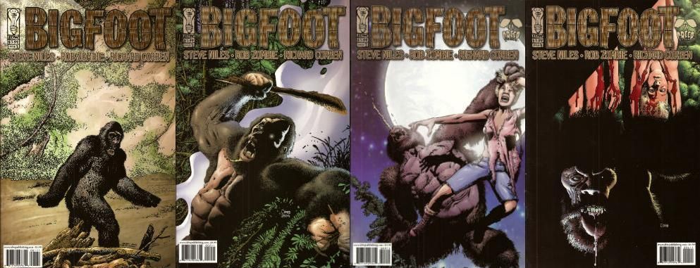
BIGFOOT #1 to #4 Art by Richard Corben Written by Steve Niles & Rob Zombie Colours by Martin Breccia & Nestor Pereyra Lettered by Robbie Robbins BIGFOOT is TM & © Steve Nile, Rob Zombie & Idea + Design Works. But not Richard Corben. IDW, $3.99ea (2005)

Photobucket

This is a comic from 2005, although as is usual with Steve Niles it’s really more of a come on to Hollywood. Yes, another pitch-comic I ‘m afraid. But this one is better than most as it is actually a pretty decent comic. This has little to do with the two writers (and copyright holders) and rather more to do with the guy they brought aboard as a hired flunky. The seasoned vet who’s brought on for his experience and ends up providing the most entertainment for the audience before being sacrificed at the end. Yes, tonight Richard Corben is Quint!

Photobucket

The main thing I know about Steve Niles is that like my Mum he believes that “If you can’t say anything nice then don’t say anything at all.” She said that thirty years ago and has remained mute as Michael Myers ever since. Hoist by her own petard there. (I’d just like to point out that creative people who wish to remove critically dissenting voices have no ulterior motive or vested interest in this happening. None at all. Perish the thought. Everything's just fucking dandy.) Now, unlike my Mother, Steve Niles has continued to be unquiet. Most of his output seems to consist of taking two things and putting them together in the hope that the result will be a third thing, a thing which will contain all the attractive qualities of the two separate things but also a new feature notable for its attraction to Hollywood. Oh, that’s unfair isn’t it, just plain rude in fact. Look, Steve Niles latest project is about vampires and robots...I'll continue then. And then there’s Rob Zombie. Who, basically, is an adult called Rob Zombie.

Photobucket

I don’t know if this indicates someone who does not take horror seriously enough or who takes horror too seriously. It isn’t that he has a daft name either it’s that it’s not a very good daft name. Lux Interior is a fine daft name for e.g.  but Rob Zombie is a bit on the nose for a Schlock Rocker, horror Director and celebrity fan-dancer, no? Like a comedian being called Clowny McSlapstick. And yet you may say; John, I feel you are still being a bit of a prick perhaps both Niles and McSlapstick felt that only comics could provide the unique storytelling tools their vision required, perhaps a movie deal would be naturally welcome but hardly the impetus for this artistic enterprise. I would then regretfully point out that BIGFOOT was published under the CREEP imprint, CREEP being a joint venture production company involving the two authors. Okay? I am probably being a bit of a prick though, you can still have that. My point though is that despite this BIGFOOT is right smart comic indeed.

Photobucket

The only real reason to rescue BIGFOOT from the back issue bins where it has holed up is the fact that on every page Corben works a series of wonders with what is quite frankly uninspiring material. From the title down there’s something altogether unpromising about the enterprise. BIGFOOT isn't exactly a name to conjure with is it? I hear BIGFOOT and I picture…well, a big foot. If I work at it I could maybe get some terror going. Maybe visualize the big foot launching itself sole first out of the foliage to rub its coarse underside all over the faces of its startled victims until they are riddled with verrucas the size of their own screaming mouths! You’re already swimming against the current by having that name up top. SASQUATCH! would have been better, it’s got the air of an authentic legend older than the white man but younger than the land whereas BIGFOOT sounds like a jackass in a bad costume.

Photobucket

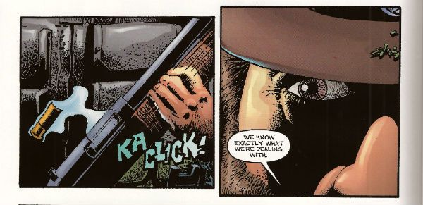
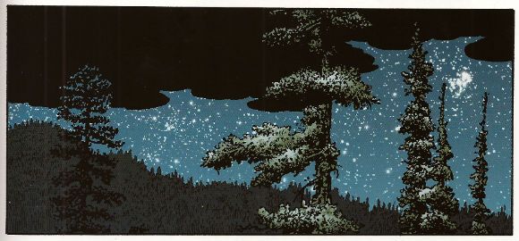
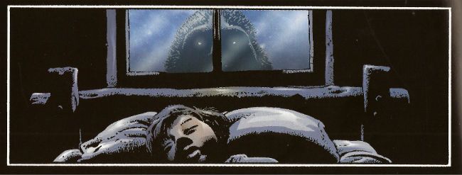
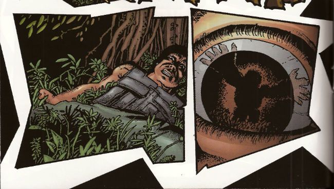
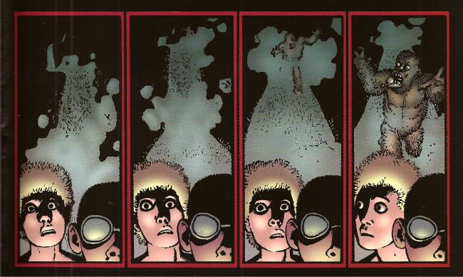
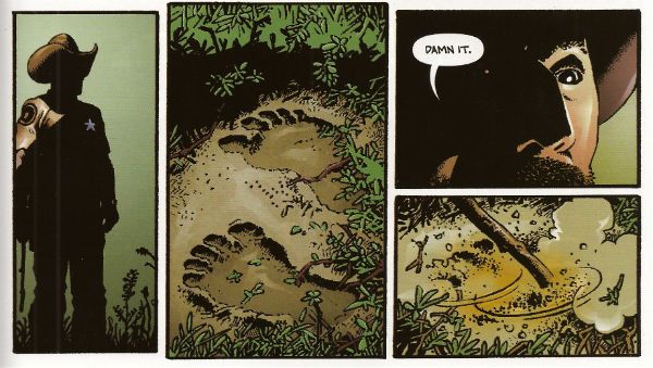
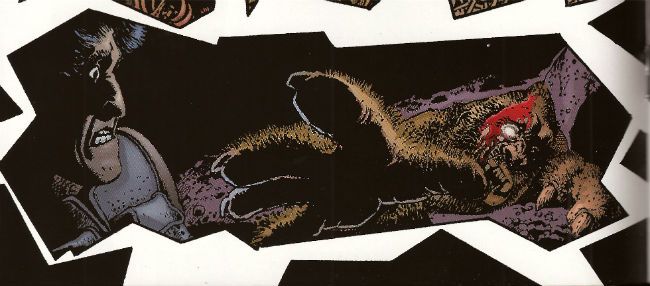
Corben does in fact start with a picture of a jackass in a costume with the cover to #1 and initially teases with stolen glimpses that this is what we’re going with. But when ‘Foot crashes through the wall (and through the page into the comic, which is a nice touch) his size alone means there’s no mistaking this sucker for a dude in a suit. From then on Corben uses his mighty roster of distortions of scale, inelegant angles, impossible shadows and queasy goofiness to bring the strange. Corben can suggest the essentially remorselessly savage and animalistically other nature of ‘Foot through just a single glassy eye and a lolloping bottom lip. He manages to remove the humanity from it using its most recognizably human features. He gives it a face but it is not a face you recognize yourself in. (Unless you are way more interesting than I am giving you credit for.) Corben also has night scenes on black pages and day scenes on white pages which is a simple trick but when the action busts loose he he has jagged panels combining both (non-) colours and (ta-da!) disorientates the established schema. Then there's the action itself. This has the usually Corben flourishes of drawn SFX and motion lines which give the whole thing an inappropriately goofy aspect. And it's this very inappropriateness that gives the horror its edge. That trick runs through all Corben's work as does the treat of his sheer professionalism which is on display in every page on which he outshines the script. Which is to say, on every page.

Photobucket

It’s to the credit of the writers that they recognized Corben’s talents would elevate their work. It would be more to their credit if they had provided a script which deserved him. You see the sin here is two fold. Niles and Zombie not only treat the comic medium with little respect (inconsistent use of thought balloons is a dead giveaway), as merely a step on the journey to the true destination (the movie!) but they also short change the monster movie genre. No, the monster movie isn't the hardest template to follow but they don’t even do that, and the reason they don’t do that isn't because they are going beyond the template, forging new paths of invention and terror, hell no, it’s because they just need this to read enough like a script to catch someone’s eye. Later on all the rewrites can do the tricky stuff. Because people in Hollywood are busy they've front loaded the pitch, with the first issue being the best and most fully realized but then they just seem to give up and fall back on the basics of monster movies. And I really do mean basics. It’s like they don’t think they have to try. Some of this stuff is just a step above the “SCENE MISSING” placeholders or scribbled in notes of “emphasise parallels!” a first pass script would require. There’s a scene in a gun shop which is kinda-sort-maybe edging towards making joke or a statement about the availability of automatic weapons in a sensible society but then wanders out to the parking lot without bothering. There’s no real reason given for the increased ‘Foot activity; there’s not a sudden influx of campers for Earth Day or Secretary’s Day, no one’s building a home for disabled orphans/luxury shopping centre near the ‘Foot family’s residence. I mean I’m assuming this is increased activity because in a very short period ‘Foot has polished off quite a number of people. If it isn't increased activity folks must be pretty damned blasé about missing campers in the States. The Sheriff finally nuts up but his reasons for covering up the ‘Foot attacks are beyond stupid. There is the slightest possible effort exerted to suggest that the ‘Foot attacks are advantageous to the area because of the economic benefits of tourists but this bears the same relation to a coherent satirical argument as a fart does to a turd. It's just there because that kind of thing should be there, look, we'll work it out later when Tom Arnold's signed up for The Sheriff. Speaking of which there aren't even any good roles! Where's the Quint?! Talk about not trying!

Photobucket

I'm not an unreasonable man. No one expects a Jaws, and no one wants a humourless exercise like Orca, but there’s a happy medium where intelligence, humour and horror meet that isn't all that rare (despite what snooty cineastes may maintain) in the monster movie. Is it too much to ask for an Alligator, a Piranha or a Lake Placid? BIGFOOT thinks it’s too classy to get down and roll around in the schlock like Blood Beach but the authors aren't even willing to put enough effort in to give us Grizzly. It’s aiming for Tremors but that had a good script so they end up with Razorback which people only remember because of the visuals. And the visuals here are only so tip-top top-notch because they at least had the sense to get Corben on it. And Corben? He’s on it like vomit. I…could perhaps have put that better. In effect he’s just(!) bringing The Corben but that’s what this inert, rote, half-formed stuff needs, it needs all the flying spittle, rictus grins, creepy textures and gummy blood pools Corben can provide. If there’s any atmosphere, tension, humour or horror here it’s because of Corben. And because it’s Corben there’s plenty of all those things. So BIGFOOT is VERY GOOD! because while BIGFOOT is a movie pitch rather than a comic Corben is, and ever will be,  COMICS!!!

I'm off now to carve living heads into the shapes of pumpkins and if I don't see you before then do have a a Happy Hallowe'en!

"I am one of those losers that doesn't have a car." Comics! Read 'em with your eyes!

While I was waiting for The Boy With The Roast Beef Face to come back off holiday and restore order before the whole country turned into an indoor firework I read some comics. It's a Not Big Two Bonanza this week! Let's see what  creators unbound can give us, eh?

THE INFINITE VACATION #2 By Christian Ward(a), Nick Spencer(w) (Image, $3.50) Ever wanted to holiday in the life of an alternate you in an alternate reality? Well, now you can because there’s an App for that! But what if there was a murderer rapidly reducing the alternate yous between him and you? Got an App for that have you, pal? Thought not.

As high concepts go it’s pretty vertigo inducing I think you’ll agree. The real genius is tapping into that sexy tech gland in the brains of the young and yoking it together with the weird sense of inferiority these things evoke in the meat machines that consume them. Today’s tech is sexy tech but it’s also, maybe, dangerous tech and it’s this formless, and very human, anxiety that the core concept feeds upon. I think. Of course familiar elements are needed to ground the narrative sufficiently for readers to connect, so there’s a murder mystery providing propulsion and a romance with a mystery hot girl, paedo jokes etc.

Photobucket

Christian Ward’s art is inventive not only in layouts, which often hover on the border of confusion while admirably never crossing it, but also in his choice of colours. It’s well worth looking at is Christian Ward’s art. Refreshing would be the word there. Nick Spencer’s story rattles along at such a pace that while the series is clearly pleased with itself it never tips over into smugness and, crucially, the reader is never given chance to question any of it too deeply. Which is just as well. I had a few questions about stuff but that’s what happens when you show old people the future they want to know where the toilets are and where they can buy some crisps.

As inventively illustrated high concept entertainment goes this was VERY GOOD!

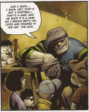
THE GOON #34 By Eric Powell (Dark Horse, $3.50) The Goon watches some sport, gets likkered up and has a fight. It's really, really pretty.

The Goon is Eric Powell’s comic. This means he can do whatever he dingdanged likes with it. If Eric Powell wants to waste several pages ineffectually taking the piss out of an transient media blip like Twilight then that’s what Eric Powell’s a-gonna do. If Eric Powell wants one of his characters to actually comment on what a waste of time said pages are then that’s what’s a-gonna happen. If Eric Powell wants the rest of the comic to be an extended fight scene punctuated by moments intended to be humorous and some cool images, guess what? That’s right.

Photobucket

Sounds pretty negligible and indeed it is but that’s not taking into account the art. Eric Powell’s art is gorgeous. Finished off in lovely washes it has a chunky cartoon quality rooted in realism that is a sweet treat for the eye. I’m a fair man, my heart still beats, so I’ll mitigate my opinion of this issue by saying that I have read Eric Powell’s BUZZARD and CHIMICHINGA! and both of those were better because both of those had an actual honest-to-goodness story. When you get art this good illustrating something of at least a little substance you get one ripe peach of a comic experience. The GOON #34 wasn’t such an experience but if Eric Powell wants to meticulously illustrate what is basically behind the bike sheds humour he’s certainly free to do so. Just like I’m free to say it’s OKAY!


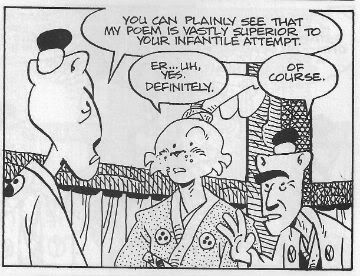
USAGI YOJIMBO #139 By Stan Sakai (Dark Horse, $3.50) “Murder At The Inn” Part One.

Along with a disparate group of strangers the rabbit Ronin seeks shelter from a storm. When a murder is committed Usagi discovers that a nowhere is safe when strangers with strange motives are involved. The game is afoot! Or is it a-paw! Heh.

The peerless Stan Sakai has been working on Usagi Yojimbo since 1987. Despite its longevity it is a series rarely mentioned but when it is mentioned it is always with a large measure of respect. This is entirely fitting as through these many decades Mr Stan Sakai has pursued his peculiarly anthropomorphic vision with unfaltering commitment to his craft resulting in one of the most consistently entertaining and satisfying pamphlets to grace the racks. When he began Stan Sakai was already pretty great but as the years have passed he has quietly become a master. His art and storytelling have never taken any great leaps forward but rather have evolved slowly and surely towards his present level of subdued excellence.

Photobucket

I enjoy every issue of USAGI YOJIMBO for many reasons (I am particularly prone to staring at his cross hatching and I revel in the research he shares with us in the lettercol) but the principal reason is that Stan Sakai is content to bring good tales well told to the table. And there are still seats at the table for anyone who favours staunch excellence over empty bombast.

USAGI YOJIMBO#139 is pretty much like every issue of USAGI YOJIMBO in that it is EXCELLENT!


TRAILBLAZER (ONE-SHOT) By James Daily/Jimmy Palmiotti/Peter Palmiotti & Ken Branch (a), Justin Gray & Jimmy Palmiotti, Paul Mounts(c) and Bill Tortolini(l)(Image, $5.99)

The most awesome assassin in the world turns against his paymasters and is sent back to the Old West as part of a government witness relocation scheme. When the sins of the present follow him back he’ll have to accept his past if he’s to have any future!

 This thing has a hero who is a bad assed killing machine who hires his bad assed killing skills out to organised crime. It’s okay though because he is an orphan, gives most of his money to the orphanage, was raised by nuns, only kills members of organised crime cartels and probably sorts out his glass from his cardboard when he recycles. So, he’s an okay guy! No, no he’s not, he’s a self centred piece of moral detritus that can only be considered a hero by people who think morality is as quaint and outmoded as taking your hat off indoors. Hilariously this soil bucket whines on about how all the people he has ever cared about die when all the people he has ever cared about who we see die have quite clearly died because they associate with a narcissistic killer.

Anyone with any inner ethical life will surely be left wondering about how they can get the time wasted reading this thing back. I guess you’d have to build a time machine. Did I mention the time machine? Oh, tiny dancer, get this: the US Govt develops time travel and uses it to relocate witnesses in the Old West. If the U.S. Govt had developed time travel technology I think using it to relocate witnesses would be pretty far down the list of things they would use it for. This may be because I am a twisted misanthrope and thus inherently distrustful of governments and the uses to which they put technological advances but I think it is definitely due to the fact that this idea is mind bogglingly stupid. I spent more time deciding which socks to wear this morning than the creators of this thing spent considering the ramifications of this concept. (I went for the clean ones in the end.) The US Govt develops time travel and uses it to relocate witnesses in the Old West. I just wanted to write that down again so I could marvel at its almost total resistance to sense. I would have to be carved entirely from lard to countenance such a wilfully witless premise. Still, if you can buy that I guess you might buy this. I don’t and I wish I hadn’t.

Photobucket

But I’m not the intended audience. I am a comic book reader and this is not a comic although it presents itself as such. The intended audience for this is composed of deal makers in the TV and Movie industries. This is a sales pitch not a comic. From the “Papermovies” branding to the creator bios which read more like C.V.s all the way through to the perfunctory presentation of the thoroughly unoriginal (or original but cretinous) concepts. This is what you get when creators pander to the market. You get the equivalent to those leaflets window cleaners push through your letter box in times of recession. Those aren’t comics either.

I disliked this because I am British and fun is alien to me, true, but mostly because it wasn’t really a comic which made it AWFUL!

CRIMINAL MACABRE/THE GOON: WHEN FREAKS COLLIDE ONE-SHOT By Christopher Mitten(a), Steve Niles/Eric Powell(w), Michelle Madsen(c), Nate Piekos of Blambot(l) (Dark Horse, $3.99)

Maybe you like Eric Powell’s IP The Goon? In which case have you seen Steve Niles’ IP Criminal Macabre (Cal McDonald)? What if they had a fight before realising they had been tricked by the real enemy and then teamed up to boot the bad guy’s jacksie? Wouldn’t that be totally different to all the tights’n’fights comics that follow this strict formula?  It would be totally different! Well, the art is better at least. Would you like to buy more? Press here!

Kind of a “Here they are, hope ya like ‘em! Particularly hope ya like ‘em enough to buy more!” deal. Given all that The Goon comes off best here as he has slightly more presence thanks to having some blatant shtick than can be easily riffed on (outdated references, comical swearing and hitting things with a big wrench) whereas Cal McDonald is…there? Despite having plenty of room to do so, as it’s hardly heaving with plot and incident, the comic fails to impart much of an idea of either character.  That’s okay with The Goon who’s basically a lively cartoon and even if you don’t do much with him you’d have to do nothing at all with him for him to be totally unmemorable. To their credit the creators of this don’t do absolutely nothing with The Goon. It’s close, though but close only counts in horse shoes and hand grenades, as The Goon might say.

Photobucket

This here Cal McDonald IP is…there? He does a little magic, does a little drugs (Ooooh, dangerous!) and has black hair. A bit like John Constantine in the same way that Panda Cola is like Coca Cola. On the basis of these pages Cal McDonald isn’t so much of a character as an IP waiting for SYFI to notice him. Regrettably studios only tend to shop for knock-offs if the original is successful. Cal McDonald curses you, Keanu Reeves! He damns your very eyes! Oh, on the last page Mike Mignola’s IP Hellboy turns up which seems an oddly cheap and desperate note on which to end but, hey, turns out this “one-shot” is “…to be continued!” so the only thing that’s actually ended is my interest. Probably not the outcome they were shooting for there.

So, yeah, this was just like a corporate comic and bored me quite a bit, that boredom beget irritation and then I just ran my mouth like a jackass so, y’know, on the whole I expected better but I got EH!

TIMEBELCH! By Hank Jeno (w/a) (Burning Streets, $4.99) What if you could change the course of History with kindness! What if History had other plans!

Barry Tupper is the best at what he does and what Barry Tupper does is Social Work. Despite this he is a pariah at Chistlewick Council due to his unorthodox and sexily rogue nature, which largely manifests in a tendency to deride managers as “paper fondlers” and tell clients that the IT system is a “shit counter”. On being given his third and final written warning (for using the work photocopier to print flyers for his local charity car boot sale) Barry Tupper is given a choice: Get a job in the private sector or go on a secret government mission from which he will never return.

Barry goes for the lesser of two evils and finds himself thrown through time back, back to Leonding, Austria in 1898 with one mission: make Hitler a nice man! Adept at gaining the confidence of fearful pensioners Barry has few problems in befriending the potential world immolating nutbag and commences to throw his weight behind Nuture in its eternal struggle with Nature. For the two men the next couple of decades pass in a montage of walks through russet leaves, heads thrown back with full throated laughter and beach volleyball. All seems well as Barry concentrates on distracting Hitler from the iconography of his local church, giving him painting tips, nudging him towards macramé rather than politics and encouraging the use of “How you doin’!” rather than “Heil!”.

Then one fateful day upon entering the café at which he and Hitler meet each morning Barry hears Hitler making an anti-Semitic remark to the waiter. Consumed by self-hatred at the extent of his failure Barry seizes the nearest butter knife. At the exact moment that Barry swings the butter knife in a fatal arc at Hitlers’ neck he realises Hitler was expressing his dislike of the breakfast juice provided. A beach volleyball rolls across some sand and just as it seems about to stop… SMASH CUT TO BLACK. Sad piano music.

Although TIMEBELCH is  written with all the subtlety and tact of a Marvel Event and is drawn by someone who has had every bone in his hands broken only to have them set all wrong I feel it is ripe for optioning by a major studio and thus EXCELLENT! Have your people call my people!

One of those comics wasn't real! Did you guess which?

Now I must go and stand at my window and look out at blasted England with old eyes fat with tears. Only joking, have a great weekend, everyone!