In which I continue to drag you along on my cheerless trudge through all the 1970s Marvel UK issues of Planet of the Apes Weekly a man at work lent me that time. Doesn’t it just make everything in your life seem radiant with an inner light by comparison? Suit yourself.
Planet of the Apes by George Tuska, Mike Esposito & Doug Moench
Anyway, this...
PLANET OF THE APES WEEKLY #3
(Week Ending November 9th 1974)
Edited by Matt Softley
Planet of The Apes Chapter Three: In The Compound!
Art by George Tuska & Mike Esposito
Written by Doug Moench
Based on the 20th Century Fox Motion Picture Planet of The Apes (1968)
Based on the novel by Pierre Boulle
Gullivar Jones, Warrior of Mars: River of the Dead!
Art by Gil Kane & Bill Everett
Written by Roy Thomas
Lettered by John Costa
Freely adapted from the novel Lt. Gullivar Jones by Edwin L. Arnold
Ka-Zar: Frenzy on the Fortieth Floor!
Art by Jack Kirby & Stan Grainger
Written by Roy Thomas
Lettered by Sam Rosen
Ka-Zar created by Jack Kirby & Stan Lee
Marvel UK, £0.08 (1974)
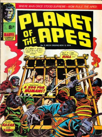
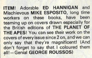
A quick note about the covers: Since Planet of the Apes Weekly appeared more frequently than its monthly US parent mag it required more covers. In this issue there's a note about who did what. So fair play to Marvel in this instance. And so let the record show:
Planet of The Apes Chapter Three: In The Compound!
Art by George Tuska & Mike Esposito
Written by Doug Moench
Based on the 20th Century Fox Motion Picture Planet of The Apes (1968)
Based on the novel by Pierre Boulle
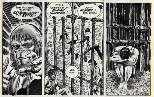
Being the third chunk of Doug Moench & George Tuska’s faithful replication of the 20th Century Fox motion picture presentation Planet of the Apes. Just to recap for those joining us late (yeah, right) or anyone who enjoyed their twenties a tad too much – it’s a very respectful adaptation which, in a sense, is nice. But then again it’s a bit too respectful. You’d think Planet of The Apes stormed the beaches of Normandy, invented the iPad or died for our sins. Heck (not Don; just the expletive), I like Planet of the Apes but, c’mon. Mind you, as we’ve also covered (and it will be on the Mid-Terms) there were probably reasons for that (you couldn’t watch the movie in the comfort of your own home, never mind on a tiny phone screen propped up on your dashboard while you drove, like some dangerous jackass.) But, forty years on I get a bit restless reading even these small chunks and my mind wanders and I find myself wasting time and energy making very poor jokes like this:
Planet of the Apes by George Tuska, Mike Esposito & Doug Moench
I think Zira’s Little Rascals’ face seals that particular deal. But, no, it’s weak comedic tea indeed and I’m not proud of having done that, but it’s pretty clearly Doug Moench and George Tuska’s fault. So, um, Moench is mostly just aping the script and it’s up to Tuska to impress. And he does, really, in bits. In one smashing panel Tuska catches the body language of Doctor Zaius ("Doctor Zaius! Doctor Zaius!") just so. That’s no mean feat as the apes in the old movies walk in a kind of ambling shuffle which encompasses a kind of see-saw effect in the shoulders. Obviously Tuska is denied movement but the figure he draws is clearly frozen at a point in that process.
Planet of the Apes by George Tuska, Mike Esposito & Doug Moench
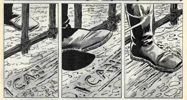
Also, and crucially, Moench senses when to shut up and Tuska knows how to sell the pivotal moment when Dr Zaius’ stitched slippers sweeps Taylors words away. It’s not exactly a visual gift that scene, but it works on the page and it’s important that it works. As an entertainment Planet of the Apes keeps its momentum up by serving up a succession of uppercuts to expectations and this one is one of my favourites; when Dr Zaius reveals himself as a big furry shit.
Planet of the Apes by George Tuska, Mike Esposito & Doug Moench
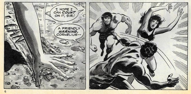
But it also, also, it puts a little bit of spin on the events. It’s a bit of a shocker isn’t it, really? So Zaius knows? What exactly does he know? How does he know it? Eh? And why doesn’t he have those funny big cheeks like the orangutan in that modern Apes movie? Not the new new one with Commissioner Gordon, no, the old new one. The old new one where Jess Franco, the world’s stupidest genius, ignores every single health and safety protocol (put there for your own safety, people) to save his Dad, who can’t remember how to play the piano anymore (not everyone else; just his Dad because his Dad’s special; fuck everyone else whose Dad can’t remember how to play the piano, or the tuba or whatever. And if your Dad wasn’t musically inclined in the first place, well, he’s just wasted everybody’s time and should lie down in a ditch and scrape the earth over his (rightly) weeping face.) but instead ruins National Parks for ever. Or something. I don’t know, I had to stop watching when the ape went to stay at Brian (the stocky actor not the baby-faced physicist) Cox’s and it was all David Pelzer Time but, y'know, for motion capture fake animals. I can’t watch animals being sad anymore. Not even pretend ones. I don’t know what happened. I just can’t do that anymore. This is what age does to you; you can't even take pleasure in the suffering of fake animals. Enjoy your youth. But, yeah, the bit on the bridge was good (I came sashaying back in for that bit) and old floppy cheeks was in that bit. So, yeah, Dr Zaius - did he evolve out of his floppy cheeks? Maybe there’s more than one kind of orangutan? There was “Right turn, Clyde!” Y'know, Clint and that. American Orangutan. Like An Orangutan Lining Up Its Shot. Oscars, yeah. America, I feel you. Sweet. So , yeah, January - not the month to ask a lot of me, I'm guessing.
Planet of the Apes by George Tuska, Mike Esposito & Doug Moench
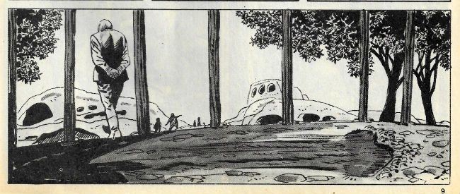
It’s kind of freaky that Tuska handles such a quiet (but momentous) moment so well because when action erupts Tuska’s super-heroic Marvel House Style reflexes kick in to ill effect. Muscles become swollen like boulders and a generic air descends on the combat. Super-hero comics (back then anyway) dealt in action rather than violence. (Yes, I’m archaic enough to think there’s a difference between a bit o’ colourful wrasslin’ and some guy in a domino mask dismembering some other dude and feeding him, piece by piece, into his own arse. Call me old fashioned. Call me Pappy!) But PotA isn’t about super heroes; it’s about animals and man and how the two are (SPOILER!) quite similar if you think about it (I hate that presumptuous phrase so much). Yeah, so, action is how humanity domesticates its violence and Tuska undercuts this point by portraying action when he should, I think, be upping the ante to violence. He does good monkey faces though. Sorry, ape faces. See fig. 1 above; that there’s as close to a jowl wobblin’ Elvis Double-Take (see Gigolo Rigmarole! or Clamgasm! for more face shakin’ Presley action!) as comics can come, I believe. In fact the expressions on Tuska’s apes are much better than those on his people. Yeah, Tuska’s Taylor (some might spy) is well served at the emotional extremes but in-between he looks like someone’s switched him off. Don’t get me wrong, with all this talk of lack of effect and lifelessness George Tuska’s art is still a far more amenable sight than , say, that of Greg Land. Tuska’s Nature may well be beige in tooth and claw but at least it isn’t shit. OKAY!
Gullivar Jones, Warrior of Mars: River of the Dead!
Art by Gil Kane & Bill Everett
Written by Roy Thomas
Lettered by John Costa
Freely adapted from the novel Lt. Gullivar Jones by Edwin L. Arnold
In this second episode of the adaptation of the original (cough) inspiration for John Carter our old mucker Gullivar Jones gets a bad case of worms. More pertinently the writing bloats with all the bad habits of Bronze Age writing. Which is a massive shame because it makes me look bad. After all, last time out, I made great play about how Roy Thomas’ writing was as verbose and purple as a Peter Ustinov made of plums. And yet, and yet, I maintained mulishly, that approach suited the material perfectly. Obviously, I’m not saying I was wrong (what a terrible thing to say; wash your mouth out) I’m just saying I can’t say that this time out. What I was saying a lot while reading it was sub-vocal and largely consisted of instructions for Roy Thomas to get out of Gil Kane’s way. Quite forceful instructions, if you know what I mean.
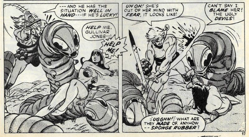
Gullivar Jones, Warrior of Mars by Gil Kane, Sam Grainger & Roy Thomas
Because, be still my beatin’ heart, Gil’s away again. He’s off at a proper canter all right with Gullivar hacking at big worms, then slicing up ape headed spiders (or spider bodied apes) before being crucified and fed to a giant Gil(a) monster. It’s all cavorting and chopping, nasal flare and sweeping hair. It’s Gil Kane with his ridiculously anatomical antics on great form. The mere brow muscles of Gil Kane’s Gullivar Jones could crack walnuts. The stuff here’s a hair closer to violence than action with the odd gout of blood (ichor?) splashing up from a wounded worm. I remember that being a bit of a shock when I was little; the rarity of such signifiers of the effects of violence lending them weight and, yes, horror. But startling spurts aside, throughout the strip Gil Kane’s spectacular gymnastics have their energy stifled by the physical presence of Thomas’ clotted prose. Because that’s the thing about comics, the writing is there; like a fedora, it’s part of the image.
Gullivar Jones, Warrior of Mars by Gil Kane, Sam Grainger & Roy Thomas
Now, I like writing. A good turn of phrase or a mot which is bon turns me on; I like words. But this is Comics so when they bog down the art I’m all rearing back like a horse at a cliff face and Unh-UH! Words that do that better be some special words indeed. Unfortunately the words here aren’t terribly special. I’ve not read the original Arnold novel so maybe Thomas is just adhering to the source, and the source isn’t very good. Or it’s just not working this time out; it can happen to the best of us. In 1970’s Roy Thomas’ defence there are still, in 2015, plenty of writers who can’t find that golden balance twixt art’n’words. And there’s always the art, which is Gil Kane. Word. GOOD!
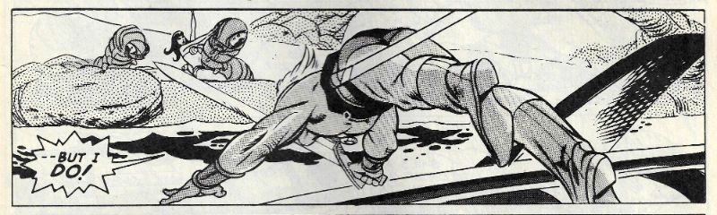
Ka-Zar: Frenzy on the Fortieth Floor!
Art by Jack Kirby & Stan Grainger
Written by Roy Thomas
Lettered by Sam Rosen
Ka-Zar created by Jack Kirby & Stan Lee
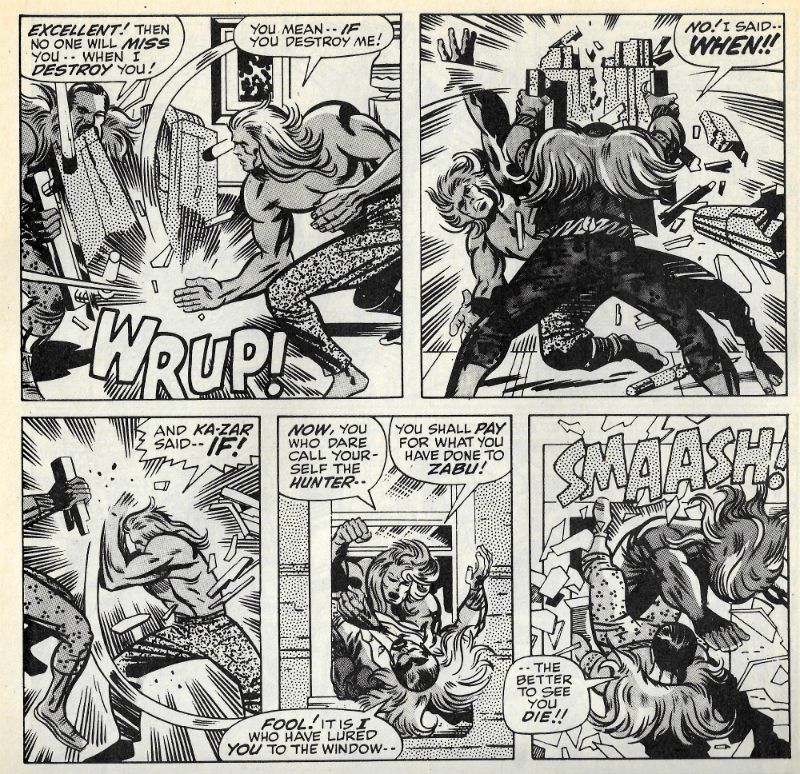
Ka-Zar tracks Kraven The Hunter to his swanky NYC hotel lair and battle commences for the freedom of Zabu. I know what you’re thinking (ugh!) but, no, Ka-Zar doesn’t just barge in like some savage. Instead, like a latter day loin cloth clad Sun Tzu Ka-Zar stands in the lobby of the hotel and bellows…and then barges in like some savage. Kirby’s prime concern here is A!C!T!I!O!N! and he’s set his slobberknocker in the environs of the urban “jungle” to see how that shakes out visually. And visually it works a treat with swinging from balconies instead of branches and commuters hurriedly dispersing like startled rodents. Like an old timey wrasslin' match in the first episode Ka-Zar and Kraven wrassled on Ka-Zar’s home turf and Ka-Zar lost (because Kraven cheated, natch. Boo!) Here we get the rematch where, despite Kraven’s habitual cheating (boo!) and the unfamiliar environs, Ka-Zar is victorious.
Ka-Zar by Jack Kirby, Sam Grainger, Roy Thomas & Sam Rosen
All Rascally Roy's Stan-tastic dialogue can do is cling on and hope to convince via its relentless presence that it’s an integral part of the whole thing. Which it isn’t, so you get some dandy Faux-Stan Lee moments of Stan Lee’s patented (not really, legal eagles) “I knew you were going to do that, so I let you, so I can do THIS!” Manoeuvre. Which is a smarter move on his (Stan or Roy's) part than he’s generally given credit for. Such impromptu one-upmanship is, after all, a staple of the schoolyard play of the 1970s target audience. Children, I’m talking about children there. Remember, children? They used to read comics. Or maybe they still do. Someone bought those 250 giga-billion copies of the first issue of that comic based on the children’s entertainment Star Wars. Children, obviously. Oh, or Retailers.
Ka-Zar by Jack Kirby, Sam Grainger, Roy Thomas & Sam Rosen
This Ka-Zar strip here is a mess, but it’s fun, it’s daft too; it’s basically men in tights, but these are the kind of tights stretched out of shape by the girth of such 70s giants of the ring as Big Daddy, Kendo Nagasaki and Giant Haystacks rather than those that snugly cosset the somewhat more svelte Superman. Next time they want to make a Wallace Beery "B" they should nix that Barton Fink fella and go for that “Jack Kirby feeling”. It is preposterous stuff that retains the attention thanks to its rowdy visual energy. Mind you, these visuals are strangely marred by touch-ups. It’s not even subtly done so I know it’s a fact that there’s definitely the hand of a Severin (Marie?) in the mix here, which makes you wonder what strange set of circumstances must have arisen to occasion Jack Kirby’s art being footled with. I’m not saying Jack Kirby’s mind was on other things but I will say that this strip originally appeared in Astonishing Tales #2 circa 1970, which is when Kirby disappeared from Marvel and took a chance on DC. I’m just sayin’ is all! OKAY!
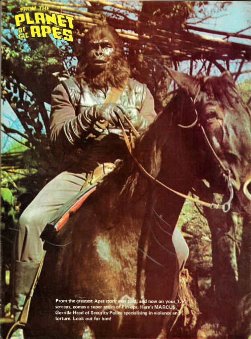
This issue of PotA-W is rounded out by a pulse-pounding pin-up. So, I leave you, gentle reader, with this thought: some under-tens didn't put aspirational pictures of sportsmen and women on their wood-chipped walls, but plumped instead for “MARCUS, Gorilla Head of Security Police specialising in violence and torture. Look out for him!” Look for that kid, I say!
NEXT TIME: Hopefully the snow will have melted enough to let the Royal Mail drop off my first comics parcel of the new Year. Then I can stop entertaining myself at your expense and get stuck into some modern – COMICS!!!


 MICRONAUTS#39 by Steve Ditko, Danny Bulandi, Bill Mantlo, Jim Novak & Bob Sharen


