“COURAGE! He Is But A MOLLUSCOID MOUNTEBANK!” COMICS! Sometimes We're Making Whoopee!

A samurai, a shadow and a sponge. It's either a further trudge through my pull list or the best pop band ever. Let's see!  photo TopPicB_zpsbt8qnwjr.jpg The Shadow: The Death of Margo Lane by Wagner, Wagner & A Larger World Studios Anyway, this...
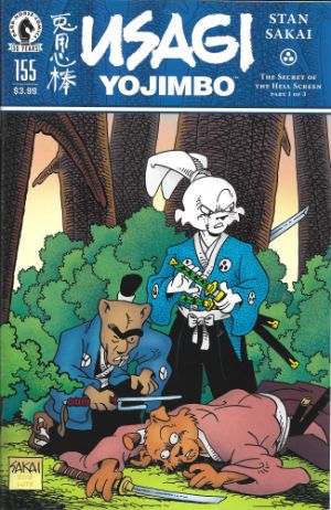
USAGI YOJIMBO #155 Art by Stan Sakai Written by Stan Sakai Lettered by Stan Sakai Cover by Stan Sakai Cover coloured by Tom Luth Dark Horse Comics, Inc., $3.99 (2016) Usagi Yojimbo created by Stan Sakai

 photo UYCovB_zpskz6plmtk.jpg

In which our roving ronin happens upon a murder most mysterious and is reunited with his old friend, Inspector Ishida, he of the emotively animated mono-brow. With more than enough suspects, both likely and unlikely, our anthropomorphic investigators could probably do without the uncanny and bloody additions to the notorious “Hell Screen”. Hurry Usagi, the game is a-paw! I mean, a foot! (Ouch!) So, yeah, another super-solid exercise in entertainment by the man who is quite possibly Comics' Most Undervalued Talent, Mr Stan Sakai. There is nothing that is not very good about Usagi Yojimbo, so much so that it remains somewhat galling that each issue receives little to no acknowledgment of its existence by the comics' press. This then is the reward for consistent brilliance: silence.

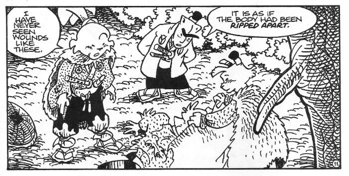
 photo UYpicB_zps4a5hnsv7.jpg Usagi Yojimbo by Stan Sakai

Meanwhile, The Hulk got shot by an arrow made of Dumb and someone got all school marmy because Wonder Woman doesn't go commando, and, quite rightly, that's all anyone goes on about. Alas, Usagi Yojimbo has to get by on clever plotting, consistent characterisation, barbarous action and a general air of amiable excellence. And then, when you've read it you can go back and marvel at how simply Sakai depicts his rain, how he creates the illusion of depth via varying the heaviness of his line, and how he expertly employs cross hatching to evoke texture. Every panel of every page proves Stan Sakai remains implacable in his delivery of high levels of artistry and entertainment. But never mind that, someone drew The Hulk with his cock out! Or The Hulk got shot by a cock! Or something. Oh yeah, more often than not the estimable Mr. Sakai finds time (as he does here) to pen a wee pin-up on the back cover, which is nice. Also, the letter column is one of the healthiest I've read, with people just genuinely reacting with unfashionable (ugh!) affection for the book and its author both. There's none of that creepy and needy validate me! Validate my tastes! stuff you usually get in independent lettercols; just pure heart. The cosplayer highlighted this issue is impressive alright roo, but, and I have no idea why this is, she just made me imagine David Keith replaced by a large rabbit for the final scenes of WHITE OF THE EYE. Why is daddy wearing hot dogs, indeed. That's a reflection on me rather than the talented lady in question. Man, I don't know what's wrong with me but I sure know what's right – Stan Sakai and Usagi Yojimbo. VERY GOOD!


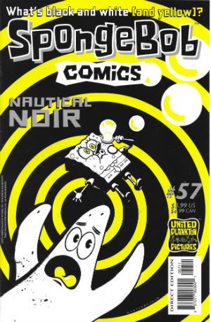
SPONGEBOB COMICS #57 Art by Nate Neal, Vince DePorter, Derek Drymon, James Kochalka, Marc Hempel, Andrea Tsurumi, Maris Wicks, Hilary Barta, Jacob Chabot Written by Nate Neal, Vince DePorter, Derek Drymon, James Kochalka, Jay Lender, Robert Leighton, Maris Wicks, Chuck Dixon, Hilary Barta Lettered by Rob Leigh Coloured by Monica Kubina, Scott Roberts, Jason Millet Cover by Shawn Martinbrough (with thanks to Jacob Chabot) United Plankton Pictures Inc., $3.99 (2016) Spongebob Squarepants created by Stephen Hillenburg

 photo SBCcovB_zps63ttkhnw.jpg

As you can see by the text on Martinbrough's Hitchcock indebted cover this issue's theme is “noir”! But only in the loosest possible sense of “crime stuff”; you know, before a bunch of tedious old men start flapping their gums about what noir is or isn't. Look, it's a comic for kids about a talking sponge, so get back worrying about whether noirs can be in colour or not. Yeah, you take care of the important stuff, while the world goes to Hell in a handbasket. Anyway, as is mostly (but not always) the case there's a bunch of smile raising shorts. Sometimes there's only a couple, or just one, but they are always smile raising. It isn't the smile raising that’s in doubt, it's the number of stories within. I trust that's clear: SPONGEBOB COMICS is funny stuff.
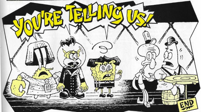
 photo SBCpicB_zpsl5aob5e4.jpg Spongebob Comics by Hempel, Lender, Roberts & Leigh

And those titter inducing tales herein? Our porous pal's life is complicated when he crosses paths with a larcenous double, the new fish in prison reflects back on how his life was ruined by a yellow terror as implacable as a guilty conscience, a hilariously learnedly loquacious Patrick eruditely narrates the terrible tale of “Doctor Calamari” in a suitably German Expressionistic stylee (which, no, isn't noir but it is the root from which noir sprang. So go back to sleep, tedious old men.), there's a trenchcoat and hat PI pastiche, and Mermaid Man reveals the terrible secret of his stylish cape. And! Maris Wicks gives a one page shoal of facts about hermit crabs while James Kochalka remains James Kochalka. VERY GOOD!


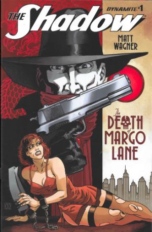
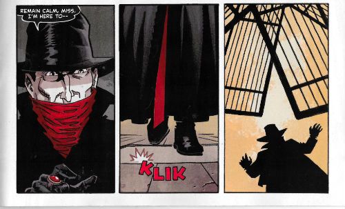
THE SHADOW: THE DEATH OF MARGO LANE #1 Art by Matt Wagner Written by Matt Wagner Coloured by Brennan Wagner Lettered by A Larger World Studios Cover by Matt Wagner & Brennan Wagner Dynamite Entertainment, $3.99 (2016) The Shadow created by Walter B. Gibson

 photo DMLCovB_zpsscs3a6io.jpg

See! I told you about my LCS! They only went and sent me another Shadow comic! Again with The Shadow comics! I'm not old enough to remember The Pulps, people! I am old enough to remember Pulp though. In fact I'm old enough to have attended their final gig at the Magna Science Adventure Centre. Well, their first “final” gig. I'm also old enough to remember when words meant things, words like “final”. Grumble. Grumble. Mutter, mutter. So, The Shadow! Dynamite's Shadow stuff has been a bit variable, to be honest. There was that series which had a weird obsession with sinister Chinese laundries and had George Orwell fighting with El Shadder; it was okay and while the bit where George Orwell ended his adventure by going “Hmmm, ANIMAL FARM is catchy, but so is NINETEEN EIGHTYFOUR; which to write first?!?” was pretty hilarious, it was still nice to have a comic writer who knew about George Orwell. Then there was that one set in the present which was, well, terrible. After that it was all a bit patchy with Houdini cropping up and a Nazi car factory or something, but of late things seem to have settled down with Matt Wagner taking the reigns. And Matt Wagner? He can draw. Anyone who claims he cain't is all wet. And how!
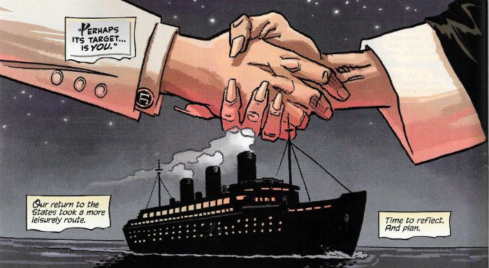
 photo DMLpicB_zpsmj49bxfy.jpg The Shadow: The Death of Margo Lane by Wagner, Wagner & A Larger World Studios

Now I ain't ladling out no applesauce saying that this guy's blotto on graphic design and knows his onions when it comes to page layouts. I must have been all turned around for the last forty odd years because Matt Wagner's excellence has somehow passed me by. Sure and I wasn't giving his stuff the high-hat, I just never crossed its path is all. From the first page of this Shadow joint I was crushing on this stuff so bad I had to check my cheaters were clean. Storytelling-wise this ruckus is the cat's pajamas , and I ain't laying down a line. Boffo stuff all round. It's swanky stuff, on the up and up, I tells ya. Maybe it is just meat'n'taters, just horsefeathers story-wise what with alla them shenanigans with hats, flivvers, gats, cocktails, luxury liners and death traps. But, hey it's a Shadow comic and alla that guff is why we came in the first place. A ragamuffin it may be, but it's a ragamuffin swanked up like Valentino. That's gotta be worth the scratch. So I'm a few decades late for this party but I'm tellin' youse, this Matt Wagner kid's got the goods. Heck, he's got the VERY GOOD!s

Lips That Touch Liquor Shall Not Touch – COMICS!!!

Post, Damn You, Post! -- Hibbs muddles about 9/26

Have some funnybook roulette!


THE INFINITE WAIT GN: This is Julia Werz's newest book, from Koyama Press, and it hasn't (yet?) been solicited through Diamond as of yet, and it doesn't look like it's for sale on Amazon, etc., so you're going to need to find a store who buys direct, or buy it from Julia or Koyama yourselves if you're not shopping at one of the, let's guess, 100 or so stores that might have it.

I'm a tremendous fan of Julia's work, but she's traditionally done short-form work -- her three previous collections (FART PARTY v1 & 2, and DRINKING AT THE MOVIES) are pretty just much repackaging of single page stream-of-consciousness gags. DRINKING has maybe a couple of 5-8 page stories? And this new book goes for the full-on "graphic novel" treatment, as there are two distinct stories here, one a 90 page (!) meditation on all of the jobs Julia has ever held in her life, and the other ostensibly about finding out that she has Lupus.

Julia has some serious comedic chops, and is a very skilled observationist, but there is a pretty large difference between an 8 page story, and a 90 page one, and I'm really kind of hard-pressed to say that she has the skills to pull it off. Well, no, that's not it exactly... but I think she'd be very well suited to having an editor to sharpen and focus her work against. 90 pages of employment history is a bit much, really! Especially when at least parts of it have been discussed before in FP.

But the problem is kind of dramatically magnified in the title story "The Infinite Wait" about her struggle with Lupus. Part of it is from following up after a novella about shitty jobs while at the same time taking place DURING the first novella -- that was kind of exhausting, actually, and I felt like the work would have been significantly better if it had been a single story, of about half the total length. The second problem with "TIW" is that Julia kind of abandons any conversation by, about, or related to Lupus at about the halfway point of the story, and it starts being more about her social relationships. I mean, sure, that helps in struggling with a disease, but as a focused story, it totally crashed out at that point.

Julia's from the "school" where the telling of the story is more important than the exact craft, but she has one cartooning tic that absolutely drives nuts in this book, almost precisely because of the "serious, full length" nature of this book -- when drawing a seated person, or really most times when you can't see the full body, she almost always draws both segments of the arm as being about the length of the torso. Ape people!

There's a lot of work and sweat, and raw human honesty (and fart jokes) in this book, and it's a very dense read, but it suffers from a lack of focus, and any kind of editorial pass (typos, grammar, repeating words, etc.), that I'm finding it hard to give it over a high OK.


HAPPY #1: Grant Morrison and Darick Robertson unbound! Or something. Half of me thinks this is Grant's mind's revenge for writing Batman and Superman for so long that saying "fuck" a lot is sort of the metal equivalent of taking a crap, the other part says he's trying to channel Garth Ennis. There's a properly Morrisonian twist there to all the Ennis-ing going on that suggests that the next three issues might be very amusing. This issue, however, was merely OK.


TOWER CHRONICLES 1: Hurf. This feels just so created by committee to fill a market need (or something like that) -- I pretty much hate the physical look of the character as far too "comic booky" or maybe "video gamey" with those straps and pouches, and the rope around him, and the non-purposeful hood, and all of that. On the other hand, the script by Matt Wagner is at the least competent, and while this is not the Simon Bisely-of-old, there's multiple awesome monster/gory moments in the book that are cool enough (I especially liked the owl-monster thingy climbing out of that person) to give it a pass. The problem might be that this book is maybe above it's station, with it's $8 price tag and battleship-steel-thick paper -- this prestige format needs to have prestige ideas; and while these may be prestige creators, this isn't a prestige idea. The problem is, if you've watched nearly any amount of sci-fi/fantasy TV/movie/whatever since the turn of the century, then you've pretty much read this. Incredibly competent, with a few nice images/beats/moments, but not original enough OR over-the-top enough to get it any better than OK.


(That's three very different kinds of OK, eh?)

(Man... I want to unreservedly like something here! Wait, here's one...)


PROPHET #29: The last few issues of Prophet have been pretty rough for me because I'm not super-excited by Giannis Milonogiannis as an artist, but this issue is from the lush-ass pen of Farel Dalrymple. Now, that's some nice looking  science fiction! Crazy, fun, thoughtful, exciting, this is the kind of stuff that, really, only comics can possibly do right. I thought this issue was downright EXCELLENT.


Right, all I have time for today.... what did YOU think?


-B


Around the Store in 31 Days: Day Twelve

OK, so I've clearly lost the daily pattern we had at the start -- my apologies, it's been a rough and busy week. I SHOULD be able to do daily through Wednesday this week, but then I have to disappear again (ComicsPRO's annual in Vegas)

Matt Wagner is one of my favorite creators in the whole wide world. (Come by the store some day and I'll tell you the story of why I'm in comics, and why Matt is really the one to blame) You can tell if you look at the store, because I've got more than 20 pieces of original Matt Wagner art (most commissions) hanging around the store -- including an on-going series of JSA portraits (in fact, I even have two that I still haven't even gotten framed yet)

In most circumstances this would probably lead to a discussion of MAGE: THE HERO DISCOVERED, except that, well, it is OP from Image at the moment, and who knows when it is coming back into print? If it does, grab it.

But, since it is OP, let me relate another story here...

(This is where I would have put the jump, if it wasn't for the small fact that more than half of you HATE the jump. We're trying to figure out what to do in the long run, but I heard ya', at least)

This was early in the store's life -- probably about '93 or '94. A gentleman came into the store, and he was pretty obviously on his last legs with AIDS. He was weak and emaciated, had palsy and could barely walk. He had a few sores on his face as well.

He asks me if I have any comics about suicide.

...

Now, I'm seriously torn here. The guy's sick, and my assumption is that the reason he's asking is because he's contemplating killing himself. This is the first time (and the only time since) that I felt like I had to make a moral decision about selling someone a comic book, y'know?

In the end, I walked over to the rack and pulled off a copy of GRENDEL: THE DEVIL INSIDE, the story of the Brian Li Sung version of Grendel by Matt and Bernie Mireault.

This story aside, the is a great comic, told in fragment, by a fragmented mind teetering on the brink of extinction. Wagner hasn't, I don't think, really gotten his due as a writer, and the experimental efforts he had through the 90s. Sure, some of them failed pretty massively, but overall he's changed the way I approach a peiece of comics writing by his playing with technique and format. And Mireault's art is astonishing here, bubbling with madness and grief.

I never saw the sick man again, so I don't know if DEVIL INSIDE helped him or hurt him. I dearly hope it is the former.

-B

The post I don't want to make!

While I won't go so far as to claim that I'm the biggest Matt Wagner fan of all time (that would probably go to someone who has inked their body, is my guess), I strongly suspect I am in the top 2% -- I've got something like 20 Wagner originals hanging in the store, our bathroom door is a Grendel Mask, writ large... hell, the store's "Back in 5 minutes" sign is a Matt Wagner original.

So I'm quite sad to say that I was horribly disappointed with GRENDEL: BEHOLD THE DEVIL #1.

The worst of it, really, is it isn't really the work itself -- Matt remains, as always, a consummate storyteller, creative visionary, and experimenter with the form of comics -- but rather with the packaging and presentation and pricing, and the sense that maybe I *am* on the wrong side of history these days and this whole "periodical comic" thing is just a lousy idea.

(Well, no, I'll repudiate that immediately, just by thinking, with a smile on my face of BRAVE&BOLD, my last review, but it looks good in print as a point, so there you are...)

Let me back up about a half-step and remind you that I own a comic book store. This means I pay WHOLESALE for my comics. Hell, I suspect (though I've never tried it) that I could probably even write THAT off my taxes, if I wanted to. So for me, of all people, to be frustrated by cost/content ratios means they've got to be pretty bad.

G:BtD is 20 pages long. For $3.50. That, in and of itself, maybe wouldn't be so bad, except that 2 of those pages are "Journal" pages, with just spot illos, the next six of them are double-page spreads (with 4 of those pretty much just being blood spatters), and there's a page of character-looking-through-newspaper-archives where all of the newspaper clippings are simply Lorem Ipsums. Add in that final pin-up page, and half of the book isn't exactly "comics", really. Plus, it is B&W, with some minor single spot-color red thrown in.

And then, sort of insult-to-injury, the letters page, such that it is (I remember when "Grendel's Lair" used to be one of the densest letters pages in the business) mentions that the "MySpace" preview of the issue has two pages that don't appear in the printed version -- you can't win for losing, can ya'?

(And, aside to Di: next time use TinyURL, instead of that three lines of typing, sheesh!)

Look, I dig Matt, and I dig Grendel, and I love Matt's storytelling and panache and design, but there's absolutely no way I'm going to purchase this serialization. I can't even consider it. Eight issues @ $3.50 a throw (plus the 50 cent "#0") is $28.50. Even when this comes in HC, I can't see it being priced at over $24.95. Even if it was $29.95, hell the extra buck and a half will be worth it for what will likely be a new cover, and title page and some nice designy stuff. And the permanent format.

Craft-wise, G:BtD is, at the very least, GOOD work; it's probably even VERY GOOD -- but as a commercial package, as a unit of entertainment, whoo boy, is this AWFUL.

What did YOU think?

-B

Hibbs on 2/28 (part 3!!)

Just back from WonderCon -- Fridays are generally slow there, so its definitely the right day to go. I expect Saturday to be Madness. MADNESS, I say! WC moved yet again -- this time to Moscone South, or "The Big Moscone", which made it seem even more slow, but, if I had to guess, attendance was probably up a little bit, just spread out over a bigger area.

Pro attendance seemed kind of low to me, but this may be a function of Convention Season Death March, with Florida 2 weeks ago, NY last week, and LA in 2 weeks from now -- how can people do THAT MANY shows in a row?

Ben came with me for a couple hours in the morning -- he's so adorable out in public; and the purchase I allowed him, after doing the whole show floor to make sure what he got what was he REALLY wanted, was a mummy pen and a sarcophagus pencil case. He loved showing that off to every adult we spoke to, and virtually every adult was pretty stunned to see such a little man know that it was called a "sarcophagus", and what Hieroglyphics were. Kid has himself an amazing vocabulary.

Got 2 new JSA pieces for the gallery from Matt Wagner -- Hourman and Mr. Terrific. They are awesome, and I will punch you if you don't think so. With the speed that I move to get things framed, it will probably be 3-4 months before they make it on CE's walls, so if you're at the store, ask and I shall show. We're just down to 4 pieces left... Atom, Spectre, and (Golden age) Superman and Batman. Maybe we'll even be finished by 2010!

Um, didn't read a lot of comics yesterday (as you'll see below) -- decided to get caught up on TV, and the week's worth of DAILY SHOWs backed up, etc. I desperately want to stop watching LOST because it keeps on spinning and spinning and spinning its wheels (LAST week, I *literally* screamed at the TV to HAVE SOMETHING [ANYTHING!!] HAPPEN!!!! and STOP INTRODUCING NEW FUCKING 'OTHERS', WE DON'T CARE YOU FUCKS!). The only reason I keep watching is because I feel like I invested some sixty hours of my life at this point, and I'd like that to fucking pay off, thankyouverymuch. THis is almost certainly a fool's errand at this point.

Didn't much care for THE BLACK DONNELEYS, but I'll give it one more episode to see if it's going anywhere.

Dude, have you seen the "Back To The Future" commercial for DirecTV with Christopher Lloyd as Doc Brown? It bothers me. Deeply. Not just because I'd rather if every beloved movie wasn't whored out to shill for something. And not just because I kinda assumed Christopher Lloyd was the kind of savvy actor who had such a string of visible memorable roles that I kind of figured he was set for life at this point, and didn't need to do commercials. But really because it violates the very logic of the thing that it's trying to use to shill. Marty, after the rescue at the clock tower in the 1950s, zooms, well, back to the future, and Doc Brown comes running up and say "Great Scott! I forgot to tell Marty about DirecTV!". Yeah, except this is 1950s Doc Brown, who hasn't time travelled, and won't for another 30 years, and HE DOESN'T KNOW ABOUT ANY SUCH THING. Further, even if he DID tell Marty, what the fuck could Marty DO with that info? Marty is going back to the 1980s -- he's at least 10 years from even the possibility of ubiquitous wide-spread satellite TV. Fuck, sell out if you HAVE to, but at least have the shit make sense, wouldja?

Whaaaaaat? You want comics? Well, between last night and now I've only read three:

CITY OF OTHERS #1: I'm torn. It's really fucking pretty. Like "man, that's god-damn amazingly wonderful looking!"; and it has one of the strongest voices Steve Niles has ever delivered yet with a cold, disassociated killer. But, it's all in the service of what is pretty sub-NIGHT GALLERY story. First off, the killer is stupendously, no... RIDICulously! competent. TORE me out of the story. Second, what the fuck was up with that train? Third, isn't that pretty directly ripped off from "Midnight Meat Train" in Clive Barker's BOOKS OF BLOOD? Fourth, didn't Niles either directly adapt, or at least edit the adaptation to comics of "Midnight Meat Train"? (I may be wrong on that score, but am too lazy to google it) Fifth, (paraphrasing) that last line of "And that's how I knew it was zombies.... and vampires!" was truly truly cringe-inducing. Sixth, the fawning editorial page where she declares this, in effect, the second coming of horror comics, and how awesomely amazingly awesome it was, was just salt in the wounds. I dig she has a she-woody for Wrightson -- and hell, his art is really really damn fine handled this way -- but keep it in your pants. An editor should never come on the page and tell you how great something you just read was. (JOe and Dan could learn that lesson, too) It's... well, it is simply unseemly. How do you balance an AWFUL (the story) with a GOOD (the lovely lovely art, and the specific scripting)? I'll go with EH.

WOLVERINE #51: Oh cripes. Second verse, same as above. BEAUTIFUL looking little thing. HORRIFIC thing to read, filled with jibber jabber and blah blah blah and nonsensical nonsense about pretty much nothing. Marvel is offering a color-free version of the book (still $3, though! HAHAHAHAH!)... what about offering a words-free version? If it was just Bianchi drawing 22 pages of whatever-the-fuck... well, I wouldn't have "enjoyed it", but I'd be a lot closer to "Cool!", but this is dragged down by the script. Sorry, we average out to AWFUL in this case (though, again, I FULLY SUPPORT those of you buying it for the art)

X-FACTOR #16: Art was much less likeable this go round (and likely drops it a full "grade"), but this was a really strong episode of Madrox Finds Himself. Didn't really care about the Monet/Siryn thread too much, though. Monet is too one-note to continue to be entertaining. With the possible (and not always) exception of ASTONISHING, THIS is the best X-book being published each month. GOOD.

I'm sort of undecided about this "daily" experiment. I'm probably writing more than I would, and it's not "Oh, God, block out 3 hours..." chore that writing a big one entails, but more manageable 30-60 chunks, but I also know I really can't maintain this over the longer haul. Let me know if you like it like this, or if you prefer the longer single-entry-for-a-week entries...

I'll be back tomorrow with more (assuming I get to read any more)

As always.... what did YOU think?

-B

Awesome!

So, Ben showed me his first real signs of higher intelligence yesterday. We got him some blocks a month or so ago, and he did a lot of the "raking claw" and mostly just knocked them around the room. Which is cool, and all -- he's still a baby.

But for the last week or so, everytime I've played with him I've tried patiently to show him how to stack the blocks. Didn't really work, he mostly showed interest in knocking down the stack, flinging the blocks all over the room. This might have been because he was so excited he couldn't control his fine movements, but I was starting to despair that he wasn't figuring it out.

Anyway, I'm reading last night, and Ben is playing in the living room, and I popped my head out every few minutes to check on him, and what do I see? He's sitting quietly, in the middle of the room, all alone, happily stacking and unstacking his blocks, gently grasping them and carefully placing them on top of one another.

W00t!

Here's some comics from this week:

JLA #103: "Everyone Cries" continues. This time, John Stewert cries. Apparantly everyone up at DC has forgotten that JS already cried a bunch considering he was responsible for the death of an alien planet, but, hey, that's OK, I guess, isn't it? ISN'T IT? Eh.

LEGENDS OF THE DARK KNIGHT #182: "War Games" part 2. There's some running, and some shouting, and lots of gunfire, and I can't really keep all of the characters straight, but that's OK, I guess, because it's just act one, and half of them will be dead before this is all over. But on the bright side, this is polybagged with a CD, and the extra pound of shipping costs per 3-4 copies doesn't have a credit issued to retailers, and our sales will be cut because the stupid things are bagged, and you probably can't find a mint copy... wait, that's not good, is it? Eh.

NIGHTWING #96: "War Games" part 3. Probably should be called "The Adventures of Tarantula, guest starring Nightwing", but who am I to complain? I like the info dump scene where Dick finds out stuff we already know, but, structurally, it should probably have happened before the halfway point, y'know? I'm not a big fan of these kinds of crossovers, can you tell? Eh.

GREEN ARROW #41: "War Games" part... wait! This isn't a "War Games" crossover... which is funny, because the plot looks almost exactly the same. Planning! At least this one is easier to follow... OK.

PUNISHER #10: "War Games" part... nah, that jokes not funny a second time. Hell, it wasn't funny the first time. Loathsome people being loathsome, and lots and lots of cursing! I liked this better when it was a comedy... Eh.

LEGION #37: I'm still not at all sure what anyone's motivation or reasoning here is, but Karate Kid and Timber Wolf came off pretty cool. Eh.

ACTION #818: Hitting! Shouting! Exploding! It's all action, all of the time! Supes acts like a big jerk, and no one thinks twice about it, and I keep flashing back to Kingdom Come and thinking "We've forgotten the cautionary tale, already?" It's hard to picture a universe where this is worth two-dollars-and-fifty-cents, isn't it? It took me, maybe 120 seconds to read this. 2 cents a second? Now that's a deal! Awful.

BMW's THE HIRE #1: This also took almost no time to read, but the difference is, it was at least a complete thought, had several vividly drawn characters, as well as a contemporary plot. This Matt Wagner kid can really draw, he might be going somewhere! On the other hand, it's sorta a commercial (even if the car doesn't actually exist), so I can't be as enthused as I might otherwise be. OK.

DC COMICS PRESENTS: THE FLASH #1: Two cute uses of the cover image, but there's nothing woodmaking here. OK.

ALPHA FLIGHT #6: Comedy super-heroes don't really work -- at least not as a team book, because everyone needs to be in on the joke. The worst part is how badly Marvel missed the bet -- there really is an actual audience for a good AF book. We sold like 40 copies of #1 in 3 days, and by issue #5 we're down to like 11. I can't imagine this is going to make it past the first year, can you? Hell, Marvel's even tried to disassociate it from the X-Men line (It's now a "Marvel Heroes" book), which is smart, because this is Awful.

X-FORCE #1: No, Liefeld still can;t draw, but it looks K3wl, and it has lots and lots of scratchy little lines, the kind boys like! Having said that, actually, this wasn't as horrible as I thought it might have been -- the plot lurched forward adequately, and it probably is what people want. Have fun, people! Eh.

AUTHORITY #14: The "last issue"... except that it's going to be rebooted by Brubaker is like 2 months. Have we learned nothing from Star Trek, people? If a concept if dying/dead, you should take a WHILE off to recharge the DESIRE of the audience for it. Six months, a year maybe -- Authority V3 #1 isn't going to sell any better than V2 #14 when it's coming out in October, fercryinoutloud! Anyway, this was slop -- revenge revenge revenge with a slight (and cynical!) attempt to be uplifting there on the last few pages. Too bad the Coup D'etat concept when nowhere... Awful.

TEEN TITANS #14: Solid, if non-exceptional, superhero stuff -- as an attempt to give Gar an "Arch Villian" it seems to work fine. Let's call it a low Good.

HULK #75: Except for all of the "The Helicopter will just fly itself!" stuff, I kinda liked this -- certainly better than the first 3 years of Jones' run. Darick Robertson's Hulk is kinda fun looking, too. Call it a high OK.

BLOODHOUND #2: I really quite enjoyed this. Good solid police story set in the DCU, with strong characterizations, a "gritty" hero who actually seems complex, and nice art. It won't make it past issue #12, though. because I think we sold all of 7 copies of #1, and that's not a big enough base to decline from. Gotta give this a chance though, folks -- I thought it was a very solid Good.

CAPTAIN AMERICA #30: "At the (thanks) of Batroc"? Even Kirkman can't make Batroc seem like an even slightly credible threat. Sheesh. Still, while it's the Chinese menu syndrome ("I'll have the Red SKull from Column A, and the Serpent Society from column B"), I enjoyed this enough to give it a low Good.

CHOSEN #3: Hahahahahaha! I know Lester will bag on this, but I liked the "twist" at the end (though I figured it out around page 5) -- I sorta want to put up a "spolier warning", but now that you know there IS a twist, you know what it is, right? Anyway, this isn't great comics, no, but at least we can't make Ultimate Jebus jokes any longer. Good.

And that's it for today. More later, as I read them.....

-B