"No WANDERING OFF." COMICS (and MOVIES)! Sometimes All Other Priorities Are Rescinded!

Hello! You can blame this one on a conversation I had at a party. I say party but at my age that's four men in a suburban living room with some nibbles and tinnies with the conversation always one slurred word away from movies. At that point it's all about ALIEN from my end of the couch. And so is this huge block of stale drivel. It's a bit wayward but if you stick with it I do mention comics eventually. Dedicated to the enduring magic of the wrestler, teacher and actor Mr. Brian Glover (1934-1997). photo PredPage1B_zps07c09ff5.png
Anyway, this... In The Interest of Clarity & Fairness John Tells You What He’s Up To This Time Out

Bodged together with duct tape as they may be my sensors indicate a sudden flurry of micro changes in air density in the Dark Horse licencing department lately. Either this is to soften the sting of Weyland-Yutani Disney-Marvel nabbing back the licence to the children’s entertainment STAR WARS or because there’s a new ALIEN videogame out. Not actually being employed by Dark Horse I don’t really know. But it turns out that there’s a fat batch of interconnected limited series capped off by a finale issue. If I’ve got it right you’ve got four issues each of PROMETHEUS: RON & NANCY, ALIENS: PORK AND BEANS, ALIENS VERSUS PREDATOR: GREEN EGGS AND HAM, PREDATOR: FLARES & BEADS (or maybe they are all subtitled FIRE AND STONE, but where’s the fun in that, eh?) To top it all off there’s some bow tying by Kelly Sue DeConnick in a finale issue. No, I don’t know who’s drawing the finale but, yes, I know who’s writing it because that’s how comics (a primarily visual medium) works these days. So, you know, it’s been a while since I tried your patience so I thought I’d do something special for you. I ran the numbers and apparently in dollars the cost of all these comics comes to, let’s see, carry the one, and…a fuck-ton of money. It’s certainly a bit rich for my palate. So I’ll tell you what: I’ll look at the first issue of each. Financially it’s still a bit racy but that’s how much I love you. Hopefully the prospect of all this will grab you a bit more pleasantly than a big hand-crab trying to face rape you. Having actually read some of my writing I can’t guarantee that though.

It All Starts Promisingly enough But Then John is Immediately Side-tracked Into Talking About Movies he Hasn’t Watched For So Long He’s Really Just Talking About Memories And We All Know How Reliable That Jackass’s Memory Is

The idea was if nothing else I’d have a good time because, well, I’m enormously selfish and also because I really like ALIEN movies. Except after a moment’s thought I realised I didn’t. You can skip to the comics if you want at this point. It’s like a Choose Your Own Adventure Review!

Do you want to listen to an old man moan about movies turn to page 2.

Turn to page 243 and hear him complain about comics.

If you roll a 6 go and spend time with someone you love.

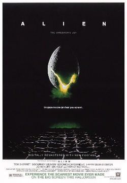
Take A Picture To Capture That Magic Moment Where He Shows Enthusiasm Rather Than Belittling Disdain or ALIEN (1979)

 photo alienB_zpsc3a6a8b6.jpg

I do like ALIEN; ALIEN is great. No complaints on that score. ALIEN is the movie that comes for you in the night. ALIEN is one of those movies which you watch for the first time and you feel something click firmly home and you know you will be watching this movie for as long as you are watching movies. I have been watching ALIEN for about thirty years with the odd break here and there to live this life thing and I still never get bored of ALIEN. ALIEN is. ALIEN. ALIEN. ALIEN. Jeff “Altered States” Lester wrote about ALIEN here because Jeff Lester is a man of great taste. (Although in his characteristically dazzling piece he forgets that the big difference between ALIEN and STAR WARS is STAR WARS is for children.) Some of you might remember Jeff Lester and his partner in wonder Graeme McMillion$ from before. Before they set out for the new life which awaited them in the off-world colonies. I wonder how their new Patreon funded life of steak and fine wines is working out for them. Watch out for that gout, guys! Anyway, ALIEN; the pinnacle of people trapped in a hostile environment being picked off one by one movies. ALIEN; crew expendable: story of my life; story of all our lives. The massive (I’m talking creative not financial; sheesh) success of ALIEN is all very odd because ALIEN should just be a piece of enjoyably trashy genre hokum, but it is in fact far better than that. Decades after it burst into cinemas it still leaves me feeling soiled and twitchy after every viewing. And that’s hardly because I don’t know what’s coming; it’s because ALIEN has real power. ALIEN has the power of nightmares; the power of the poorly suppressed thought; the power of the suspicion that the Universe never got the memo about you actually mattering. In ALIEN as soon as they answer the distress call everything doesn’t just start going wrong, everything starts becoming wrong. I’m not even getting into all the stuff about the leathery egg sacs, organic openings and mobile, fanged phalluses (Phallusi? Phalluseseses?). ALIEN is. And it remains so to this day.

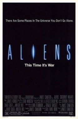
A Superficial Look At The Last James Cameron Movie He Enjoyed Ends Up With Us All In An Arcade In Cornwall or ALIENS (1986)

 photo AliensB_zps3b944961.jpg

After that it’s ALIENS which is still good stuff. It’s James Cameron and the big thing about James Cameron is that the more money and freedom he has then the less interesting he gets. Luckily, with ALIENS he’s just about at the outer limits of my interest so I still have a good time. And that’s not bad for a movie that old; it still thrills and I still jump but it doesn’t wound like its progenitor does. There’s something redundantly comforting about ALIENS’ desire to explain (there are eggs; there is a Queen; they are like insects; I have killed the magic!) ALIEN doesn’t want you to understand what’s going on; some mystery stubbornly remains because, well, that’s unsettling. ALIENS explains things too much and becomes an action movie rather than a horror movie. It’s a very good action movie but it’s only a pretty good ALIEN movie. Experience tells me things get contentious quick with ALIENS but let me be clear here: I don’t mind ALIENS. The woman whose life I soil daily with my very presence thinks it has dated horribly. I don’t know, I think ALIENS still rocks. James Horner's urgent bin lids clatterthon of a score helps more than people admit. Could do without the kid though; Isn’t she plucky, now bugger off. Mind you, whenever the family unit goes on holiday we check out the arcades and have a pop on that ALIENS arcade game; the one with the mounted guns. That game is always somewhere in every arcade. I saw a new game where you shoot animals like an American but I don’t think that’ll catch on in Cornwall. Animals, no. Xenomorphs, yes. Stands to reason. Since I am a wholly regrettable human being I can only guess that the secret of a long lasting relationship is hunting down the ALIENS arcade game and playing it together. So, yes, I don’t mind ALIENS but it isn’t ALIEN. And, yes, someone out there will prefer ALIENS to ALIEN because the world will always need people who are mistaken.

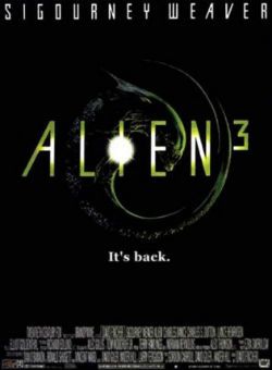
“Thus arse RHEUM-ARE CuNDRoll!” or ALIEN3 (1992)

 photo Alien3B_zps2483fe78.jpg

I’ll be uncharacteristically direct: ALIEN CUBED isn’t exactly a good movie. People let it off a lot because of its ‘troubled production’ and because David Fincher went on to do FIGHT CLUB. Me, I like it better than I probably should because it is filled with British accents. If ALIEN is HP Lovecraft’s BLUE COLLAR in space then ALIEN CUBED is HP Lovecraft’s PORRIDGE in space. It’s both comforting and amusing to think that in the far flung future no matter how far you go from Earth your lugs will still rattle to a Yorkshire bark. ALIEN CUBED is even more special to me because one of the accents is bellowed by Brian (KES) Glover, who not only looks like my Uncle Kenneth but, better yet, once pulled his car in on North Bridge to ask me and a mate directions to the digs he was due to stay in while treading the boards at the Civic Theatre. Yes, later in the ‘rub-a-dub-dub’ over some ‘laugh and titter’ we did both wish we’d told him to “stick to the road and stay off the moor”. I guess that’s not really my anecdote as such because I hung back in my usual fear of life but I nicked it anyway. Sorry, Justin. If you ever look up the unused scripts for ALIEN CUBED by William “Neuromancer” Gibson and David “PITCH BLACK” Twohy you’ll appreciate the filmed ALIEN CUBED even more as neither of the rejected scripts seem too concerned with the Alien. In fact they seem to begrudge the Alien’s contractually obliged interruptions of, respectively, the cold war analogy and the space prison hijinks which form the bulk of them. Both scripts continue the shift started by Cameron in ALIENS from movies about the Alien to movies about other things which happen to have the Alien in them. While ALIEN CUBED fails to be the former it at least struggles like a good ‘un not be the latter. Sure, like Twohy’s script, there’s a prison setting but, endearingly, Fincher & Co are clearly trying to make the Alien central again. The movie works hard not to have the Alien secondary to a larger analogy but to be integral to any analogies which might be occurring in the movie’s vicinity. I mean, it is a bit of a mess so I don’t quite know what it’s on about but I can tell it’s trying to be on about something; that always gets points in my book. I just looked and there’s a rejigged version on my Blu_Ray (I know; swanky!). It’s supposed to be well different with the Alien coming out of an ox rather than a dog and Brian Glover telling a protracted joke about remembering the Alamo (not really). I was surprised that, apparently, none of the dropped footage included Steven Berkoff as the movie largely consists of sweaty bald Englishmen shouting in thick accents so he seems an odd omission. Anyway, I should give that a decco. I’ll come back and edit this bit if I’ve had time to watch it. (I guess I didn’t get time.)

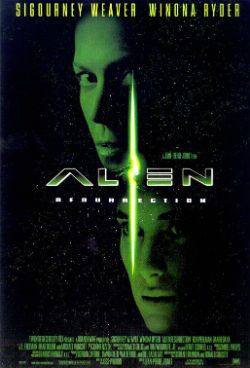
For The Entertainment of Children And The Easily Amused Faecal Matter is Referenced To Excess or ALIEN RESURRECTION (1997)

 photo alienResB_zps53328ce1.jpg

Similarly ALIEN RESURRECTION had a ‘troubled production’ but no one lets it off because it’s shit. It’s very pretty but it’s still shit. Here all ALIEN CUBED’s spirited resistance to the insistent trend of the Alien movies away from the Alien was steamrollered into the dirt. The result is a glossy action movie with a great cast (Brad Dourif!) and spectacular set design saddled with a script so shitty it smears everything about it. Worse, it might as well have had irradiated shih tzus in it as the Alien. My favourite reaction to this movie was that of the late and very great H R Giger in a documentary where, commenting on the Nu-Alien, he said something roughly on the lines of: “It was a piece of shit. Quite literally a piece of shit.” This terrible, terrible waste of everybody’s time, money and effort was written by Joss Whedon, but apparently it’s not his fault. He also did CABIN IN THE WOODS which I watched last week and that was also a piece of shit; this time because it was too busy being impressed with itself to actually be a movie. It was a lot like someone who thinks they’re above horror movies telling you about a horror movie they’d seen rather than, you know, watching an actual horror movie. It would have made a decent five minute skit, basically. Of course that’s because I’m old and certainly not because 90 odd minutes and several million dollars is a bit excessive for what is basically a smug joke about Scooby fucking Doo. Anyway, I’m sure that isn’t Joss Whedon’s fault either. So, yeah, where we? Oh, while ALIEN started it all off by beggaring expectations ALIEN RESURRECTION ends things by beggaring belief.

“I Ain’t Got Time To Bleed.” Or All The Other Stuff He’s Not Really Going To Bother Pretending He’s All That Interested In or PREDATOR/PREDATOR2/PREDATORS/ALIEN vs PREDATOR and PROMETHEUS

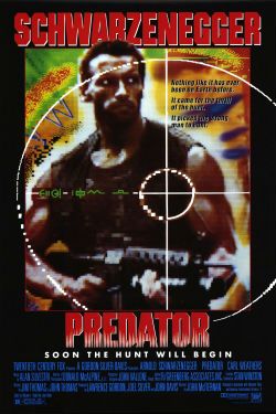
 photo predatorB_zpsabdfedf8.jpg

You shouldn’t really look so surprised when I tell you I really like PREDATOR, after all it is another people in a hostile environment being picked off one by one movie. It also has a script that’s as tight as a nut and just rolls like the goddamn thunder. Everything about it is great except the guy starring in it, but everything about PREDATOR is so great I can put up with him. Ugh, that guy; not even ironically, you feel me? PREDATOR 2 is okay; if it came on I wouldn’t leave the room but I wouldn’t seek it out either. People who know about science (“science-tists”) have told me that PREDATORS is a bit dodgy on the old science front. I’ll take their word for it but I thought it was a great-stupid pulp premise which, sadly, stubbornly refused to ignite the expected flares of delight in my hind brain. Maybe it’s because Adrien Brody is as convincing an action hero as Rod Hull. Also, Laurence Fishburne looked like he was in more danger from gout than predators. Maybe he was Patreon funded too. Now, you all know me and how I live in fear of being called an elitist but, holy fuck, really, I mean, those ALIEN VS PREDATOR moves sure suck. I’ll admit I’ve only seen the first one as that was enough; it was like an uncharismatic jumble of cut scenes from a video game. Perhaps the second one is the SWEET SMELL OF SUCCESS of people in a hostile environment being picked off one by one movies. After all, at our works’ Christmas do (pies in a pub; the glamour of it all!) last year a gentleman in his twenties revealed these AvP things were his favourite movies. EVER. Yes, even better than COLOR OF NIGHT. I know! Basically though it’s hard to feel I was at fault in my dislike since by this point it had not escaped my notice that the Alien franchise was reduced to the level of ABBOTT AND COSTELLO MEET FRANKENSTEIN. Oh, and I haven’t watched PROMETHEUS. Can I go out and play now?

Meanwhile Back At The Point or THE COMICS!!!!

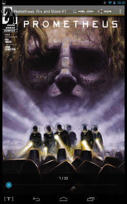
PROMETHEUS: FIRE AND STONE #1 Art by Juan Ferrya Written by Paul Tobin Lettered by Nate Piekos of Blambot® Cover art by David Palumbo Dark Horse Comics, 22 pages, $£3.99 print/digital or $1.99 digital after a period of time (2014)

 photo PromCovB_zpsccef8a6c.png

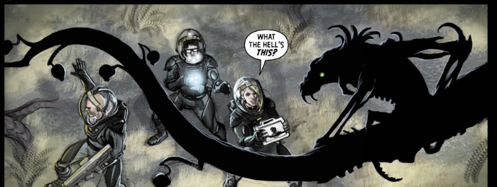
This begins oddly with a prologue featuring a probe which is mobile enough to travel billions of miles through space and smart enough to analyse an entire environment but is neither smart nor mobile enough to avoid somebody’s foot. This foot is either a shout out to the movie (which I haven’t seen) or a secret to be revealed at its own sweet pace; it’s hard to tell because the story then jumps forward around 129 years whereupon Tobin proceeds to treat us to, well, a rerun of ALIEN basically. Sure, Juan Ferrya busts his talented nuts trying to disguise this by draping everything in the high-end hotel bathroom aesthetic of PROMETHEUS as opposed to the bedsit squalor of ALIEN, but it’s basically ALIEN all over again. That’s not a bad idea but unfortunately everything’s kind of pumped up to the extent that it starts to undermine things. There are a lot more characters here than in ALIEN but they are a lot more unlikeable and a lot more stupid, particularly as most of them are scientists and particularly as the ALIEN crew were verging on the suicidally daft in the first place. These Prometheans just sort of wander around blithe at the sight of all these “phenomena” (bit of science jargon there, cheers) which at best should necessitate a reconsideration of some of the more fundamental assumptions humanity has made about the nature of existence, and at worst strongly hint that the whole place is more dangerous than a jumper made of those bloody lethal Japanese kitchen knives.

 photo PromPageB_zpsab74c29a.png

These great minds of science find weird goop displaying the qualities of everything ever in chaotic flux and then casually slip a bit in their pocket for later; requests like “Can I take these alien ants which have displayed unprecedented ferocity back on the ship?” are met with “Oh, go on then.” These geniuses would play Twister in a room full of bear traps. The comic ends when they discover just such a room and decide to open the door without, I don’t know, “scanning” it or whatever science can do by 2219. I’m pretty sure by 2219 science will be able to tell us what’s on the other side of a door. Something to look forward to there. Anyway, some dude who is dying of an unspecified illness, maybe space-gout, is going to do something really stupid, a lot of people are going to die screaming and, er, Juan Ferrya sure draws pretty. He’s got this colouring thing going on where it looks like he’s done it all with really hard coloured pencils (yes, I know but with a computer; thanks) and I found that interesting. His attractive and sedate visuals are quite appropriate to what is basically a set up cum travelogue issue. It may have taken a whole lot of stupid to get things moving but PROMETHEUS: FIRE AND STONE is professional enough stuff: OKAY!

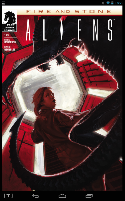
ALIENS: FIRE AND STONE #1 Art by Patric Reynolds Written by Chris Roberson Coloured by Dave Stewart Lettered by Nate Piekos of Blambot® Cover art by David Paulmbo Dark Horse Comics, 25 pages, $3.99 print/digital or $1.99 digital after a period of time (2014) This series takes place before the events of PROMETHEUS: FIRE AND STONE #1

 photo AliensCovB_zps4bda4c0a.png

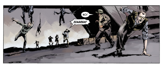
If you’re anything like me (and for your sake I hope not) you’ll often wake up in the night wondering what happened to that bunch of colonists we didn’t see in ALIENS. Well, rest easy, pilgrims, because this comic is all about what happened to those colonists we didn’t see in ALIENS. Basically they got attacked by Aliens flew to the moon where that PROMETHEUS: FIRE AND STONE comic took place and got attacked again. If this bunch had any luck it would be shitty. This series starts off with a bang and rarely lets up; consequently it’s all largely running and screaming like a someone’s thrown a load of Aliens into a January Sale. So it’s to Chris Roberson’s credit that he still manages to introduce his cast and demonstrate the characteristics which will define them for the duration of the mini-series. However, it’s to his demerit that this is all largely just running and screaming because that relies on the art being strong enough to stop it all feeling a bit breezy; a bit lightweight. Before I get stuck in I would like to say that the artist, as with all modern artists working from other people’s scripts, has my sympathies. I imagine the script probably read a lot like this: (Obviously I have no idea what the script looked like. Maybe Chris Roberson described everything to the last detail and even provided breakdowns and sketches. I’m just assuming here which is always a really excellent idea; I’m having second thoughts about this bit now. Hope no one notices.)

ALIENS: FIRE AND STONE

PAGE 1 (3 Panels)

We are on that planet from ALIENS or something.

PANEL 1: The colonists are running and screaming.

COLONISTS: EEEEEE!

ALIENS: HISSSSSS!

PANEL 2: An Alien gets a colonist. (Have fun with it!)

COLONIST: AGHHH!

ALIEN: HISSSSSS!

PANEL 3: There are now less colonists but they are still running and screaming.

COLONISTS: EEEEEE!

ALIENS: HISSSSSS!

 photo ALiensPage2B_zpsdab5c2b6.png

That type of thing is good for an artist because they can do what they want but it’s bad because the multiplicity of options is just as likely to paralyse. It takes quite a bit of work and talent to make something like the above visually impress on the printed page. Here the art is by Patric Reynolds, the guy who did CITY OF ROSES in DARK HORSE PRESENTS. I didn’t like his art there but it works a bit better here. A bit. His line is still unsettlingly flakey suggesting everything in the world he’s depicting is inordinately friable (I’ve probably said that before; it’s still true). I don’t have some beef with the guy, he can clearly draw but he’s not really the best choice to illustrate a lot of running and screaming. Mostly because conveying motion would be handy but his panels resemble movie stills. And while everyone looks human and has a definite look it’s another case of the Amazing Photo Faced People. There’s a very real difference between someone pulling a “oh noes!” face and someone actually scared shitless; ask your dentist. He’s gamely attempted to adapt his photo referenced style to Aliens but it looks a lot like he’s got some photos of apes lunging about and scratched out an Alien shape over the top. However, since the script calls for the Aliens to be out in the open a lot Reynolds does have a tough remit. A lot of the threat, the unsettling otherness, of the Aliens just dissipates when you can see them (which is why you don’t see it properly until the end of ALIEN; basics, people!) In a further bid at appeasement I will say his space scenes are pretty nice, but they are few and far between; mostly it’s just running and screaming which he’s not really suited to. Again though, his art isn’t terrible; most of the issues I’ve sadistically outlined as problematic are ones shared by a lot of comics artist. Doesn’t mean I have to let ‘em past! As harsh as all that sounds none of the book was woeful so ALIENS: FIRE AND STONE #1 gets OKAY!

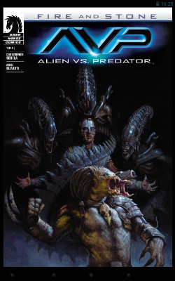
ALIEN VS PREDATOR: FIRE AND STONE #1 Art by Ariel Olivetti Written by Christopher Sebela Lettered by Nate Piekos of Blambot® Cover art by E.M Gist Dark Horse Comics, 25 pages, $3.99 print/digital or $1.99 digital after a period of time (2014) This story takes place between the events of PROMETHEUS: FIRE AND STONE #4 and PREDATOR: FIRE AND STONE #1

 photo AVPCovB_zps1fee49bc.png

This one picks up after most all the cretins in PROMETHEUS: FIRE AND STONE are dead. Most of them probably forgot to breathe, or maybe set fire to themselves because they were cold or tried to eat some live tigers. To avoid spoilers as to exactly how stupidly they died the book keep things vague, but it looks like the sickly dude did in fact do something fantastically ill-advised. Understandably then the unlikeable security guy has locked him up while they and all the other survivors fly off in the unattractively designed ship. It quickly becomes apparent that whatever the stupid thing the sickly dude did was it involved a Synthetic, Kevin Eldon. The effect on Kevin Eldon is a bit of a mixed bag; he now appears to be caked in a thick coating of icing but, balancing this, he can control it to make deadly fondant limbs. And while he’s now mentally inclined towards the more batshit end of the scale he can also control Aliens like they were hunt dogs. God giveth and God taketh away, is my take away there.

 photo AVPPageB_zps9c9d2959.png

Most of the issue is Icing Covered Kevin Eldon casually strolling through the ship while talking and setting his Aliens loose on all the survivors. As if that weren’t a big enough pile of trouble some Predators take a break from killing wildlife on a garishly hued nearby world and decide to join in. Ariel Olivetti illustrates it in his usual style; the one which lurches unpredictably from genius to godawful. Sometimes even doing so between elements within the same panel. I think I was a bit tired at this point because both the art and story seemed a bit confusing really, but I did like how they solved the problem of getting Predators into the mix; they just show up! I know that might seem a bit simplistic but I don’t know how much sophistication you should realistically expect at this point. It’s ALIEN VERSUS PREDATOR after all not ALIEN VERSUS MACBETH. (Give it time though.) OKAY!

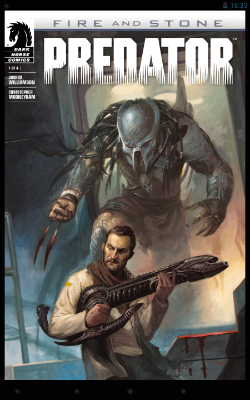
PREDATOR: FIRE AND STONE #1 Art by Christopher Mooneyham Written by Joshua Williamson Coloured by Dan Brown Lettered by Nate Piekos of Blambot® Cover art by Lucas Graciano Dark Horse Comics, 25 pages, $3.99 print/digital or $1.99 digital after a period of time (2014) This series takes place after the events of PROMETHEUS: FIRE AND STONE #1-4 and ALIEN VS PREDATOR: FIRE AND STONE #1

 photo PredCovB_zps8b578fbc.png

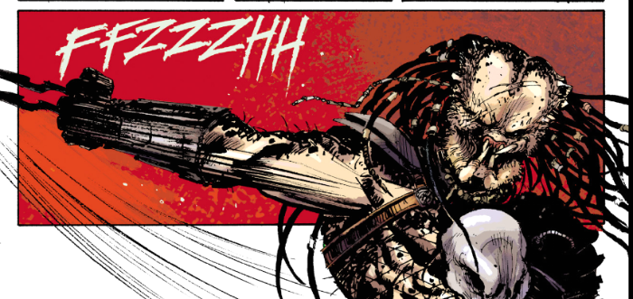
This gets off to a strong start with a cover showing a Predator sneaking up on young Frank Miller who is apparently clutching what appears to be a severed Alien penis. Nothing inside lives up to that promise but I’d still argue this is the best of these comics. And I’d argue that despite the fact that this one has the slenderest wisp of a premise of any of the books I bought. Here, the unpleasant security dude has escaped from the confused mess of AVP:F&S#1 into this comic where he and his two chums are hunted by a Predator. That’s it. Three dudes on a spaceship get hunted for 25 pages. Then there’s a bit of a twist because there’s another three issues to go. As basic as the setup is (it’s Predator and people being hunted is what Predator fans pay for) I’d still argue that it’s the best comic here. And not just because I’m an argumentative **** but because it’s the best at being a comic. And I’m betting that’s all down to Christopher Mooneyham. I imagine the script he received wasn’t much in excess of:

PREDATOR: FIRE AND STONE #1

PAGE 13 (3 Panels)

We are on-board THE SPACESHIP PERSES. It’s dark because of course it is, but we can still make out space ship stuff like corridors, ladders and stuff and things. It’s dark but not that dark.

PANEL 1: Unpleasant Security Man, Cocky Cannon Fodder Boy and Bald Lee Van Cleef Walk along the corridor.

UNPLEASANT SECURITY MAN: It’s hunting us.

COCKY CANNON FODDER BOY: Dude, your Mom is hunting us. BURRRN!

PANEL 2:

Unpleasant Security Man, Cocky Cannon Fodder Boy and Bald Lee Van Cleef Walk along the corridor.

BALD LEE VAN CLEEF: How jolly.

COCKY CANNON FODDER BOY: We’re on an express elevator to Kitchenware! Going Down!

PANEL 3:

They stop walking suddenly because Cocky Cannon Fodder Boy explodes in a shower of guts. (Have fun with it!)

COCKY CANNON FODDER BOY: Ack!

BALD LEE VAN CLEEF: Tsk!

UNPLEASANT SECURITY MAN: Ooh! We’re in a tight spot now!

PREDATOR: BOO!

 photo PredPage2B_zps118c4885.png

But, unlike the unfairly maligned (by me) Patric Reynolds, Mooneyham makes every page pulse with pulp energy and an almost loutish swagger entirely appropriate to the subject at hand. Dude sure likes his Klaus Janson but there’s plenty that’s purely himself here. I enjoyed looking at Mooneyham’s Predator so much that that alone was worth the admission price. His Predator is just perfect, like a scarred spider carved from the pith of an orange. There's real impact on the page turn reveal when that dude shows up. BOO! This is genre comic book art from a time when comics didn’t bow and scrape before television. A time when comics didn’t tug their forelock in the presence of movies but instead revelled in their very nature. It’s genre comic art from a time when comics were proud to be comics. There is a feast of storytelling devices within this comic that put the polite “cinematic” devices of the rest of this bunch to shame. The comics above all largely work in long shot, medium shot and close up; they work largely in landscape panels with a daring inset to pop the monotony. And if its coincidence that all those terms are interchangeable with movie making then, well, it isn’t is it? And I get why it’s legitimate, to an extent, that the comics above treat the pages as screens (because after al I read them on a screen) I should stress that Mooneyham’s pages treated as pages worked just as well. If not better. By embracing the native skills of his medium Mooneyham provides a comic far more akin to movies than any of the placid and pretty offerings preceding it. Basically compared to any of the other Dark Horse comics above PREDATOR: FIRE AND STONE #1 is like a box of fireworks going off in your face. It is very much not that the comics above are bad as such ,and they certainly aren’t wrong with how they go about things, it’s just genre comics are such weird things now, they come from such a weird place that I am just so grateful to find a comic that’s happy being a comic. Hell, one which exults in being a comic. It’s hardly Human Diastrophism but it’s bloody well done so: GOOD!

Phew. Believe you me no one is more glad that's done than me. Cheers and all that.

You still don't understand what you're dealing with, do you? COMICS!!!!

Wait, What? Ep. 145: Doublespeak.

 photo be52a2a8-2cda-462d-8263-5ac6f7464e2e_zps78ecd876.jpgIt's funny because it's true.

Hey there, everyone!  You miss us?  Well, good news, we're back--all three of us (Graeme, me, and my terrifying vocal echo that haunts much of this podcast).  After the jump:  show notes and promises to do better!

So, yeah.  there's a bit of an echo and we're damn sorry about it.  Steps are even now being taken to make sure it doesn't happen again.  I was pretty sure in this case it was caused by generous application of our good friend Levelator, but in fact I think it may be the volume in my headset.  Or Graeme's headset.  Or Graeme's head.  It's a thing we're working on, honest.

And because I want to get this to you as early as possible (which is, you know, an entire day early), let me get on those show notes...although before I do, let me remind you to jump over and check out Hibbs' analysis of the annual Bookscan numbers:  I'm always a bit stunned by the amount of sheer statistical elbow grease Hibbs put into the piece.  Although publishers and some bloggers are generally quick to poo-poo the accuracy of the results, I feel like there are very few places where people not on the publishing end of the industry get any chance to look at how the comics industry interacts with "the real world."  It's a helluva service (and even if Hibbs were getting paid big money to write it--which I doubt--that would still be mitigated by the amount of time it takes to do it).

Anyway, off the soapbox, let's get on with the vaudeville:

00:00-10:12: Greetings! We have simultaneous hellos, which may well be a first for us. Graeme checks to make sure Jeff is recording and then fills you in on what you missed with our lost episode:  super-quick coverage of Ms. Marvel #1, Loki #1, Empowered Vol. 8, The perils of being “neggo” (I think we passed on the “Leggo of my neggo” joke for reasons probably related to good sense).  There’s also beard talk!  Beard talk!  We actually compare notes about growing beards, voluptuous or otherwise. Thank god this thing we call the Internet was developed to allow two men in different states (in both the geographic and beard-growing senses of the term) to discuss their beards and allow people from all over the world to listen in.  Then we talk weather, Jeff’s snowaphobia, Dr. Who time travel sounds, all the usual stuff you’d expect.  You do expect it, don’t you?  You should.) 10:12-36:24:  Graeme was re-reading The Best of Milligan & McCarthy and has a question for us:  are we somehow past the point of non-ironic fun comics?  Under discussion: Archer &Armstrong, Quantum & Woody (more ampersands in this paragraph than I've typed in a month), and a significant chat about four books by Kyle Baker (Cowboy Wally, Why I Hate Saturn, You Are Here, and Undercover Genie) which leads us down a pretty deep Nostalgia-Hole where we discuss books like Beautiful Stories for Ugly Children and Wasteland.  As John Kane would say: Comics! Sometimes they are obscure and old (like the people who talk about them)! [Edit:  Someone brought to my attention an interview with John Ostrander about Wasteland conducted by Copra genius Michel Fiffe over at The Factual Opinion.  You should check it out!  I am doing so right this very minute.] 36:24-50:28: Since Graeme has already written somewhere in the neighborhood of thirty thousand words on the Guardians of the Galaxy trailer (this one being my personal favorite), Jeff decides to take advantage of that and get the man's impressions about it. 50:28-1:14:44: From new movies to old! Prometheus made its way to HBO so Jeff got a chance to see it and…hoo boy.  Fascinating enough that we are compelled to pick it apart, but don’t let this fool you into seeing it.  Oh no, please.  We don’t want that on our heads.  Mentioned: Buck Rogers, Tom Hardy, A Reverse Man Who To Fell To Earth, prequels, The House on Haunted Hill, a secret challenge to Sean Witzke, Smallville, Marc Bernardin’s take on Gotham, The Savage Hawkman by Tony Daniel and more. 1:14:44-1:21:32: Batman #28!  As the podcast’s current bat-nerd, Jeff has thoughts.  He also has thoughts on the last few issues of Batman & Two-Face.  Oh, yes.  Yes, he does. 1:21:32-1:36:48:  And we both have thoughts about “Titan,” the excellent Judge Dredd storyline by Rob Williams and Henry Flint that just wrapped up in 2000 A.D.  Graeme calls it “Trifecta-level quality” so that is very high praise. Jeff also loves it but actually feels the last few issues of the mag have been perfectly balanced and thoroughly enjoyable.  We talk more about the storyline, the mag, what’s happening in the Megazine, conflicting feelings re: singles v. trades, DRM v. non-DRM, and more. 1:36:48-2:05:35: Yes, we did keep up with our reading on Avengers…somehow!  So we talk about issues #26-50 by Stan Lee, Roy Thomas, Don Heck, John Buscema, George Tuska, a bunch of really good inkers, and others.  Also discussed:  the mysteries of Hawkeye,  story twists, terrible continuity, why Inside Llewyn Davis should have Hercules in it, and more. 2:05:35-end: Closing comments!  Hilariously, we talk about doing a closing section with added reverb, utterly unaware that for some reason Jeff’s voice has been doubled during the podcast to a truly terrifying degree.  This is a thing we vow to resolve! (Well, not in the podcast, we don't. I’m vowing it right now, here in the show notes. See? Watch me vow!)

Okay, so this is a thing that is up on iTunes and our RSS feed, but is also the sort of thing we'd be more than happy for you to listen to below, if you want:

Wait, What? Ep. 145: Doublespeak

Again, our apologies for the delay and we will see you in another fortnight!  We thank you for listening and hope you enjoy.

"BIG..! I'm Telling You...The Sonuvabitch is HUGE!" COMICS! Sometimes They Are Extravagant!

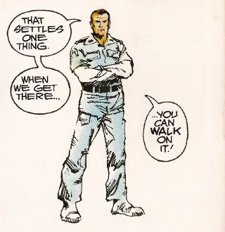
Like Ripley going back for that damn cat I go back to ALIEN THE ILLUSTRATED STORY. This time it's so big Ash could very well be right and, yes, you could probably walk on it! Photobucket

No it isn't PLANET OF THE APES WEEKLY. Well spotted. This week I learned two things: 1) Never say what you are going to look at next because Life will unleash a horde of flying monkeys right at your face and turn you into a big fat liar. 2) In the words of Beat-Cop Brian Hibbs "Always have a throw-down piece." That would be this. But hey, I didn't actually say POTA would start this week...so I also learned 3) Just in, I have also learned I will wheedle.

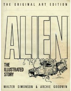
ALIEN THE ILLUSTRATED STORY (THE ORIGINAL ART EDITION)

Photobucket

Art by Walter Simonson Scripted by Archie Goodwin Lettered by John Workman Based on the original screenplay ALIEN by Dan O'Bannon & Ronald Shusett And the motion picture directed by Ridley Scott Titan Books, 35.1 x 2.5 x 50.5 cm, 96 pp (2012) $75.00 US $85.00 Can £54.99 UK

"We did not try to replicate the film, an impossible task. Instead, we tried to create a graphic novel that would stand on its own merits." Walter Simonson (2012)

Walter Simonson there reminiscing about his and Archie Goodwin & John Workman's 1979 Heavy Metal adaptation of the motion picture presentation ALIEN. When we were all that bit younger and fleet of foot I went on about it a bit HERE. (Spoiler: It was VERY GOOD!) If you want to buy a nice shiny version of thatbook Titan just republished it a couple of weeks ago. (Bodacious Ben Lipman popped up in the comments to say: "I bought the cheaper Titan edition a few weeks back, and I don’t believe it has the interviews or behind-the-scenes bits and bobs mentioned in your review – it’s all comic!" So I have altered the following bit.) Here as well as the original (still innovative) adaptation you'll get Goodwin's script with Simonson's annotations, two pages of try-outs (once in B&W and once in colour) and a comprehensive and good natured interview with both Simonson and Workman conducted by J P Rutter. Of even more importance though, in this version, the version I splashed the cash on, you get all those and you get the art reproduced from the original artboards.

Turns out art boards are big.

Turns out art board books are big and pricey.

Yeah, about that. I bought this book because it is a great book but I bought this version because it is probably the only chance I'll get to grab one of these Original Artboards books. The IDW (to which this bears great, ahem, similarities) books are things of great joy and Satanic temptation but ultimately it's not the best idea to  spend what you haven't got (as Western economies found out recently). That's not to say that the IDW books are unreasonably priced for what you get (by all accounts you get wonders) but they are out of my reach. Thanks to a deep pre-order discount and a deal with Satanzon I could just get my needy fingers on this one. Just in case anyone thought I was Richie fucking Rich or got comps.  I'm not, I don't, and yet I still bought this ostentatious thing. It didn't disappoint.

While most of your time will be spent staring at the wonderful (i.e. full of wonders) art, art which is still instructive about how to make comics some thirty three years later, the value of the accompanying interview must be stressed. No empty glad handing back slapping celebration of how simply marvellous all involved were is this. No, although all involved probably deserve it in this case. It is in fact highly educational about how the book was put together.

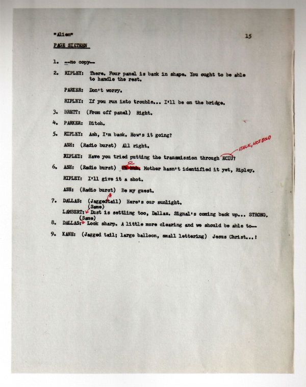
Look, here's a page of the script:

Photobucket

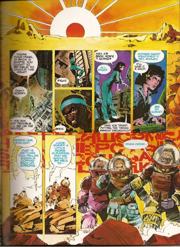
Now, here's the scripted page in its drawn and published form:

Photobucket

Alone these could be taken as yet another example of how the writer gets the artist to do all the work. In the interview it becomes clear how closely Goodwin, Simonson and Workman involved. It was the kind of mental cross pollination that isn't ever going to be adequately documented except in the form of an interview. Where the more abstract and elusive contributions of the creators, contributions that leave no physical evidence, can at least be acknowledged in the approximate, but permanent, form of words. Rutter's done a fantastic job on the interview is what I'm saying. It helps that he has two subjects as cuddly as Walter Simonson and John Workman (Archie Goodwin died in 1998 and so was unable to attend). Both men are self effacing but aware of the work's value and so able to discuss its fascinating creation in a way which is both informative and engaging.

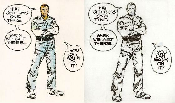
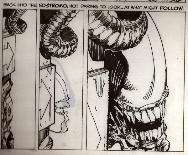
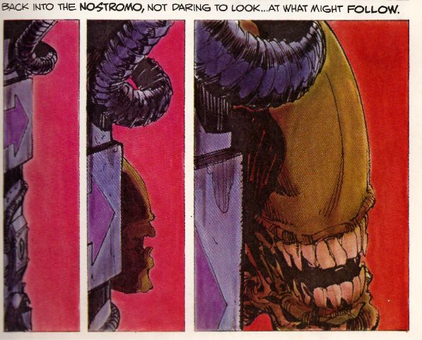
It's through the interview that the names of the people who actually coloured the book are revealed.  So, a belated big happy shout out to Louise Jones (later Louise Simonson), Polly Law and Deb Pedlar for the bulk of the colour work herein. Except it isn't herein as this one is the uncoloured art from the original art boards. Irony in action there. Most people who buy the book will have a copy of the coloured version so they can have some fun comparing and contrasting and fully appreciating the impact the colour brought to the work. I've had to use a scanner to provide examples but with two copies of the book, steady hands and your own eyes this effect can be replicated at will:

Photobucket

Photobucket

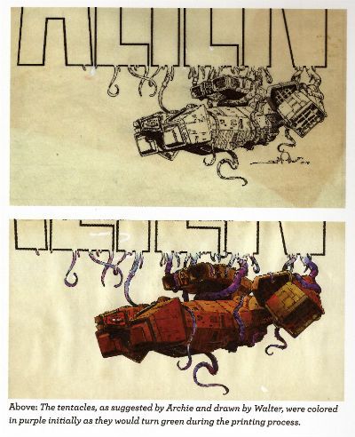
Sometimes they do the comparison for you:

Photobucket

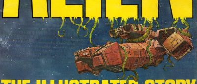
But you still need to get another copy to look at the original cover, then you've got the final piece of the puzzle. (Hey, purple becomes green - I did not know that!):

Photobucket

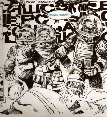
When I was doing the script/final page comparison I tried to scan in the original art page just to get that middle step in but that was seriously not a thing that was going to happen. Look, I'm just a sour old man sat in his kitchen with a scanner that can just fit a normal comic without technical hilarity ensuing. I'm not a 21st Century publishing house. So, in lieu of that please accept, as a token indication of the original art involved, a reproduction of the final panel of that page:

Photobucket

There are two things I really like about having that panel:

1) I can now tell that Simonson drew distorted shapes in the helmets behind the characters' heads to represent the letters of the SFX behind them. He has visually indicated the distortion the (already bizarre) noise is subject to by passing through the medium of the helmets. I don't think that extra attention to detail is apparent in the published piece. SIMONSON!

2) The stains!

Were I to spend £54.99 on a book only for someone to spill coffee on it I can assure you there would be raised voices and the very real possibility of awkward man-dancing resulting in at least a torn cardigan and at worst a grazed knuckle or two. Shouty violence of a singularly inept and middle-aged stripe would be on the cards. I'd react badly is what I'm saying. And yet...and yet...I have just spent £54.99 (well, not really £54.99...) on a book and I am pleased as punch to find a reproduction of the 33 year old spillage from one of Simonson's cawwfee cups defacing it. I mean, it isn't even the real stain. But, in my defence, it is a stain reproduced from the original artboards!

It was a massive amount of fun looking at this massive book and comparing it with the original, reading the interview, matching the script to the original art and then to the published work etc. But I am not unaware that it was also massivley expensive fun. If you've got the cash to hand it is an eye opening, beautifully produced experience. Particularly so for non comics makers, for such as them (i.e. such as me) who'll probably get no closer to the process than this I'm going to say this was EXCELLENT!

If you just want to read a really good comic adaptation of the movie ALIEN stick to the normal tpb (£10.99 UK). This one is for the professionals, the would-be professionals and the untalented nutters like me who just really, really like COMICS!!!
NEXT TIME: Who the Hell knows (lesson learned.)

"I Admire Its PURITY." Comics! Sometimes They Are A Bit Like Films (ALIEN)!

Photobucket (Or: Never Put an Englishman called Kane in charge.)

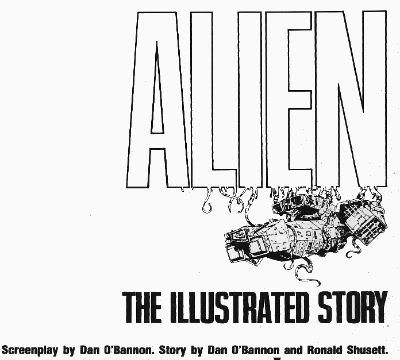
Photobucket ALIEN: THE ILLUSTRATED STORY Art by Walter Simonson (b.1946) Words by Archie Goodwin (1937 - 1998) Lettered by John Workman (b.1950) Based on 20th Century Fox's science fiction hit, ALIEN (Heavy Metal Futura Publications, £2.50, 1979)

1. "It's Not Our Sysyem..." or I Start Talking.

It's only a slim volume this, a hair over 6o pages so the team have it all on to pack in the 117 movie minutes. In fact it's a ridiculously small amount of space but the bizarre thing is that they have any space at all. Why a comic adaptation of a film in 1979 of all years?  STAR WARS is why. Just as STAR WARS' mind damaging box-office success is the reason ALIEN was green-lit so was STAR WARS the reason for the existence of a comics adaptation. The comics adaptation of STAR WARS was very, very, very successful (alas, this had nothing to do with the fact that the world had woken up to the magic of Howard Victor Chaykin). Also the people working on ALIEN were pretty comics savvy and were familiar with HEAVY METAL (Ridley Scott has described his storyboards as being very "Moebius"). So that's why a comic and that's why a comic by HEAVY METAL.

Photobucket

ALIEN:THE ILLUSTRATED STORY(A:TIS) was intendended to spearhead a series of movie adaptations that would be serialised in HEAVY METAL and then collected. I don't know how many others were produced but I know there was the Veitch/Bissette 1941 adaptation (way better than the inert film) and Steranko's OUTLAND (like getting Picasso to adapt BEN10). This latter has never been collected in English so I guess the run of adaptations fizzled out pretty quickly. The then Art Director at HEAVY METAL John Workman was tasked with bringing the ALIEN adaptation to term and rang Carmine Infantino with the intention of having Infantino do pencils and Simonson do the inks.  Infantino's phone was busy so Workman rang Simonson and by the end of the call Simonson had smooth talked his way into doing the whole job. Simonson had the very bright idea of roping in editor par excellence Archie Goodwin for the non-pictorial tasks. It was one sweet team thus assembled and the results were the first comic to squat on the New York Times bestseller list and, even better, remain there for 7 weeks.

Photobucket

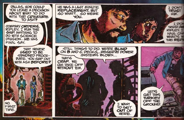
It's important to remember that A:TIS  is an adaptation not a replication. Some dialogue you may be familiar with is missing some you might not recognise is present. It's a little hard at this date to actually remember what dialogue is actually in the film what with Scott's incessant tinkering. As regards the 1979 original version there are, I assure you, textual differences. This is because Simonson & Goodwin (S&G) had access to 3 drafts of the script and used these to piece together a narrative they found most satisfying to the comics presentation. From the ground up the piece was built with its format in mind. They had also seen a cut of the film and had access to an abundance of stills so the book's visuals are clearly sourced on the cinematic offering. Not being composed of pure tedium S&G don't do a lumpen shot for shot representation so the familiarity with the settings/costumes etc. allow them to vamp some stuff and use unusual POVs without losing the visual consistency afforded by the production's tip-top designs. S&G don't have to design anything because it's all been done for them by Ron Cobb (ship interiors), Cris Foss (ship exteriors), Moebius (spacesuits) and H.R. Giger (alien stuff). They can just concentrate on designing the comic. And design it they do. Rather than go through the whole thing page by page which would break even the strongest reader's spirit I will now briefly alight on a few instances I find pleasing to mine eye.

2. "Oh, I Feel Dead." or (Slow) Motion.

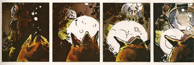
ALIEN the movie opens with a languorously paced sequence in which a strange transmission is received and the Nostromo's crew are awakened from hyper-sleep. This takes quite a bit of screen time but the comic doesn't have the same luxury in terms of space (using a shorthand of time=pages). What S&G do is pretty neat. They go to the opposite extreme and slow the scene down further. You could call it decompression even but it's a strange kind of decompression. They counterintuitively concentrate on the opening of a single eye to both illustrate the process of waking and set the tempo for the scene they are illustrating. Witness the four panels given over to Kane's eye opening:

Photobucket

This effectively sets the sluggish pace for the happenings depicted on the page and cues us in that the others will be waking equally slowly, because this is a slow process. It's a bold move to use so much of the sparse space available on so few seconds of screen time. Bold but effective as the sequence is emblematic of the waking process as a whole. The visual decompression acts a form of compression with regard to the content.

There then follows a depiction of Kane brewing up for his colleagues. I like this sequence because it shows the intelligence behind S&G's choices, because as in any adaptation choices have to be made. This takes up quite a lot of space, relatively speaking anyway. It is after all just a man brewing up which is precisely the kind of mundane task that you might think could be jettisoned

Photobucket

from the narrative without any loss being felt. But S&G recognise it is important in its very mundanity. When you wake up, you have a coffee. Even in space. It's a recognition of the crucial interplay of the familiar and the unfamiliar which anchor the film and allow for the later excesses to be accommodated without a break in the suspension of disbelief. Also, a lot more is happening in those panels than those of the preceding waking sequence. Note the single panel of the steaming cups indicating the repetition of the task without the need to actually repeat the other panels. The density of the panels indicate the pace is picking up compared to the sleepy start. With Kane's salutation the reader effectively receives a signal that the plot is now in motion.

3. "It Doesn't Look Like An S.O.S." or Sounds Without Sound.

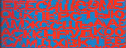
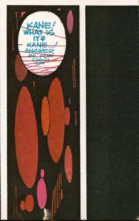
The movie uses sound design beautifully to evoke the otherness of certain occurrences such as the meaty phlop of the egg flaps opening or the screech of the skedadilling chest burster. Naturally the mute medium of  comics can do little but suggest these; usually through distortions in the lettering. With A:TIS S&G demonstrate that the power of suggestion can be surprisingly powerful. They attempt to replicate the scouring howl of the howling distress/warning transmission by choosing the most godawful combination of text and background colours known to reading beings. That's no accident. It's supposed to be perturbing. It'd be hard to make text anymore unsettling than engineering it to actually move around in a queasy manner at the slightest variation in your gaze. The fracturing of the letter shapes and the vibrating effect of the colour combination rattle the reader's gaze in a really quite clever manner.

Photobucket

Unable to replicate the staticky crackle and insistent hiss of communication over comm-channels the decision was made to colour such speech blue. This doesn't actually communicate the texture of the noise but it does at least imply a difference in the sound emitted by the characters and the  sounds emitted by the technology around them. It would be hard for a non comics-savvy reader to parse the panel below without the visual cue of the colours. But because the rules of the text/colour device have been set up clearly in the earlier pages any reader would know that Brett and Parker were not hallucinating but hearing a comm transmission from someone not pictured in the scene.

Photobucket

4. "Open The Door!" or It's Constraining Men (and Two Women).

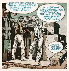
A key element in the tension that underscores the movie is the pervasive sense of claustrophobia.  The physical environment aids the film makers here with the sets being fixed and the ceilings having been lowered by some four feet to create a physically oppressive reality in which the action unfolds. Archie Goodwin was responsible for the placement of the balloons on the page while Workman lettered within them. Goodwin was an excellent editor and his positioning of the balloons suggests the presence of some considered intention. Now while it's possible to argue that the density of the speech is a result of the space limitations it's also possible to argue that the placement of the balloons is used to hem in the figures to create an additional level of constriction.

Photobucket

The words on the page are read as equally physical and present as the drawn environment in which the action occurs.The characters are doubly restricted by the ship drawn around around them with all its clutter and shadows and the very words they are speaking.

5. "All Other Priorities Rescinded." or Toeing The Company Line.

There are very few instances where this atmosphere of restriction are alleviated but there is a particularly jarring one which is used in the service of both characterisation and foreshadowing. There are some things a film can do which it is impossible to reproduce on the page. Crucially these include the incredibly convincing performances of all the actors involved. These are some good performances right there. There's no way via words and pictures to fully convey the shrill flakiness of Lambert (Veronica Cartwright), the passive-aggressive sniping of Brett and Parker (Harry Dean Stanton & Yaphet Kotto), the chafing enthusiasm of Kane (John Hurt), the fake-matiness of Ash (Ian Holm), the eroding confidence of Dallas (Tom Skerritt) and the uncertain certainty of Ripley (Sigourney Weaver). I can't believe even the best comic writer and the best comic artist could do more than approximate the fusion of emotional flavours in Weaver's reading of the simple line, "Micro changes in air density, my ass." I only point out this 'failure' so I can concentrate on the work's successes because Simonson & Goodwin do achieve some fantastic successes here. One of them is this:

Photobucket

During the film Ian Holm is able to subtly suggest Ash's oddness with a series of brief bizaritties that verge on the subliminal; his little standing jog, the intermittent twitchy moues and his inflexibly diagnostic gaze during the 'birth' sequence for example. It's a subtle string of hints and tics that build towards his character's revelatory scene. S&G don't have room for that but they get one good shot in with the above panel. From the stance to the complete nullity of the background they manage to communicate that as far as Ash is concerned only he exists and has any real import. Nothing around him matters, particularly not his crew-mates. He's the perfect Company Man. And like all Company Men he isn't really a man at all. Um, spoiler?

6. "It's Got A Wonderful Defense Mechanism. You Don't Dare Kill It." or (Quick) Motion.

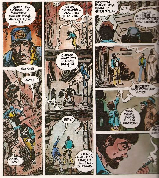
Punctuating the unhurried pacing of the film like a steel toothed phallus piercing a Brit thesp's chest are scenes of abruptly frantic action. One of the earliest of these occurs when the crew discover that the xenomorph sat on Kane's face has a charming defense mechanism in the form of acid for blood. S&G don't have a physical set they can hurtle through with a soundtrack and editing enhancing the action but they have a good go nevertheless.

Photobucket

The page itself is pressed into service as the film set with the panel breaks and gutters providing the editing. The eye has to travel from the top of the first column to the base then in the gutter it moves swiftly to the top of the second vertical which is interrupted by the in-panel floor levels suggesting "soft" breaks in the page which the eye lingers on but less so than "hard" white breaks. The speed of the gaze downwards is thus increased but not actually interrupted before zipping back up via the gutter again to the top of the third vertical where the division into four panels by "hard" breaks cause the gaze to slow before halting on the final panel. Reading the sequence the eye really covers some ground and together with the diminishing pace this adroitly captures the essence of the scene.

7. "Now, This Air-Shaft May Work To Our Advantage." or The Suspense of Uncertainty.

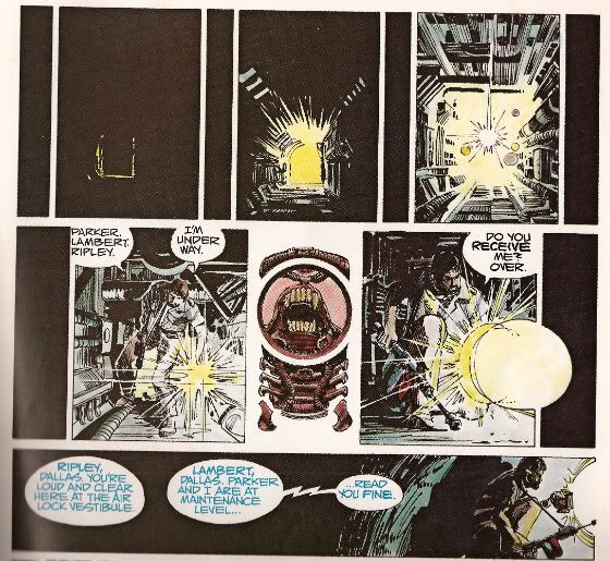
The sequence where Dallas scurries around in the guts of the ship in pursuit of the Alien is also rendered effectively despite the static nature of the form although here the techniques are a little more ambiguous. Purposefully so, I'd say. In the top layer we are adopting the POV of something other than Dallas, its uncertain whether we are seeing things from the Alien viewpoint or just a non specific POV. Then there are the thin vertical panels breaking up the larger images. Are these the Alien's POV? The increasingly illuminated panels interrupting these flat blacks indicate Dallas' imminent arrival.  When Dallas reaches our POV the interruption changes from black to a blare of white dominated by a bizarre image. It's clearly related to the Alien but is it the Alien reflected in Dallas' lamp lens? Is it the Alien sheltering in some comfy duct now the light has invaded its previously dark nest? Dallas forges on to the outer edge of the last horizontal panel but behind him there is darkness.

Photobucket

In fact there's an uncomfortable amount of darkness behind him, more than there is light in front; is that to indicate how far he's come or to indicate that now there is something behind him? The whole sequence depicts Dallas nearing our POV on the top layer, arriving at that POV in the middle layer and then moving away again in the final lower panel. There's a definite sense that what he was heading towards is now behind him. Something happened in there, the exact nature of which is imprecise but the implication is it isn't going to be good. There's just something really creepy and suspenseful about the whole thing which is perfectly appropriate and the uncertainty of it all exacerbates this.

8. "I Wanna Go Home And Party" or Hurray, I Shut up!

Yeah, sure, despite all this craft, talent and enthusiasm A:TIS never once manages to replace the audio-visual thrill of the film itself. But this would be an expectation held only by someone possessing an excess of optimism or a shortage of sense. It does however provided a surprisingly innovative comics experience. One that's still fresh and surprising on a technique level some three decades later. As I say I've just highlighted some of my favourite parts. There's plenty of other stuff on the pages such as Simonson's occasional use of organic bio-form borders, the use of splash pages at moments when they are most useful and even one page that is composed entirely of colour elements with no line work. This all sounds positivley innovative and challenging particularly as the modern tendency would surely be to to slap verbatim dialogue on unvaryingly widescreen panels. And, yes, if you break down the techniques on show they are quite complex but this complexity is  used entirely in the service of transparency of meaning. While Simonson has claimed that the book was accompanying a hit movie accounts for its unprecedented success it wouldn't be too outlandish to think that the high quality and accessibility of the end product itself might not have helped as well. ALIEN: THE ILLUSTRATED STORY is, after all, VERY GOOD!

Note: ALIEN: THE ILLUSTRATED STORY is due to be reprinted in May 2012.

Acknowledgements: If any facts have made it into this waffle that is due purely to the following sources: MODERN MASTERS: WALTER SIMONSON (TwoMorrows, 2006) THE ALIEN ANTHOLOGY (20th Century Fox, 2010 (Blu-Ray))

Photobucket Have a good weekend, all, and remember to read some COMICS!!!