I have no title, and I must scream! Hibbs' 5/22/13

Thoughts on Twelve Angry Comics from this week, below that jump


AVENGERS #12: I've tried, really I have, but I find Hickman's AVENGERS titles so bloodless and over-plotted that I just can't get into them whatsoever.  Here we are at what would be the "one year mark" for a "normal" comic, at the five months-old mark (and people wonder why Marvel is driving sales now?), and I'm so very very cold to this one and it's sibling title. Only "Spider-Ock teaching those kids how to be selfish" showed any real spark. I find this so very EH.

BOUNCE #1: I don't understand what Joe Kelley is trying to do here? "Speedball, except with swearing and explicit drug use?" That's not so very appealing, and then the first issue ends with an "alternate reality", and I'm trying to figure out what I'm rooting for? Some of the wilder ideas (A superhuman who IS a drug, shadowy conspiracies run by lizard-eaters, etc.) probably work a lot better with the mainstream-like art by David Messina that some of Casey's other co-creators.  I liked it fine, but I'm having a hard time deciphering the actual premise. Call it a very strong OK?

DAREDEVIL #26: this book is moving from strength to strength, and I think that the new enemy is one of the strongest ones that DD has ever faced... but, damn, I can't for the life of my recall his name. Akemi? Ashema? Somewhere in that range. Too bad it wasn't something like "Devildare" or something else easily remembered (Like, dunno, "Bullseye", maybe?), as that would mark a perfect nemesis. Either way, this book is VERY GOOD.

FANTASTIC FOUR #8: There's been something just a few degrees off from this renumbering, that I wish I could put my finger on -- but it's just dying in sales on our racks. Plummmmmet. Which is a damn shame, because this was as near as perfect of a single issue of a superhero comic book that I read this year. Ben Grimm on his one "day of being human", visiting the past of Yancy Street even before his sainted Aunt Petunia, and its just a great great little Done-In-One. VERY GOOD.

FLASH #20: Excited, oddly, about a new "Reverse Flash", but, like much of the Manapul/Buccellato era, it's just not delivering it's potential in my eyes. I really really want to believe, but the fairy is dying right in front of my very eyes. It tries so very very hard, and I desperately want to like it but like a poor marksman, it. keeps, missing. its. target. (KHAAAAAAAAAAANNNN!)

(Christ, I'm a nerd)

I honestly can't generate more than an OK, though I *want* it to be a VG, y'know?


GREEN LANTERN #20: And so ends an era. Really, this deserves an essay of its own, but Geoff deserves some amazing props for turning what was a (lets face it) second string character into a genuine franchise. Some people deride the "rainbow corps" (and, yeah, it probably went a step too far), but at least there are really legitimate differences and motivations and backstories between the various Corps.

I am personally of the mind that Geoff's run ran 3-4 years too long -- I'm not convinced that anything after "Blackest Night" was really particularly good -- but you GOT to give it up to Geoff for what he's accomplished in the run, overall.  I think even moreso because MY expectation is that the franchise of GL is going to crater out without Geoff at the helm... largely I think that the audience was essentially tolerating much of the excess in the line due to perceiving it as a creative vision. We'll see.

This last issue, sadly, wasn't much special -- the villain of this story has been uninteresting, and the final crossover dragged on way too long, with way too much handwaving and gnashing of teeth -- so I'm not inclined to go over an OK, but I do want to make special mention of the "text pieces" scattered throughout the issue which (and this is really straight from Jeff Lester, I am sorry for stealing!) read like nothing more than signatures collected in a high school yearbook, with all of the empty insincere praise that entails -- I'm shocked there's not a "Have A Great Summer!" in there somewhere, honestly -- the nadir probably being Diane Nelson's. I'd be shocked if she could recite the rest of that.

Yeah: "Have A Great Summer!"


GREEN TEAM #1: Here's the good news: We're guaranteed to get more issues of this than from the first series (which had just two issues, after it's debut in "1st Issue Special", both cancelled before they shipped), as this will last AT LEAST until issue #8. It's hard to think that it will get much more beyond that, however, since there wasn't a ton of ACTUAL premise on display in this first one. I get that on paper it's "rich kids buy superpowers", but that only happens for ONE of the "team", and that only on the last page. Has no one heard of "in media res"? Plus? I liked them better as, y'know, little kids. Well, copyright resecured, I guess.

I *love* this description of the cancelled first series: "In the first of the two unpublished adventures, the boys were pitted against giant lobsters and the Russian Navy. In what would have been the third issue, the Green Team face a villain called the Paperhanger who had special wallpaper that grew plants and trees, and who was a dead ringer for Adolf Hitler. They dispatch all menaces, then disappear into history in their private jet." Oh oh, the wacky wacky 70s...

This was highly OK, but needed to be so so much better to escape the event horizon of the current DCU


HALF PAST DANGER #1: Nice try, but another example of "burying the lede" and starting the story long long before the story should actually be started -- "WW2 adventurers FIGHT nazi dinosaurs!" is a great idea, but so much of this comic was walking through woods and sitting in bars and things that were not actually fighting nazis OR dinosaurs. Plus Stephen Mooney's art is just too anatomically awkward in places.  There's virtually no genre serialization that couldn't learn a lot by studying the structure of, say, an episode of Star Trek, and applying that to EACH INDIVIDUAL issue of the comic. Yet another OK on display in this one.


OCCUPY COMICS #1: I think this might be a year too late to do any good, but I liked virtually every page of this polemic of a comic. You could also call this "time capsule comics", because that's likely how this will seem in a decade (sort of like how the 9/11 comics are today), but that doesn't stop this from being a solid little anthology, and (I thought) VERY GOOD. POWERS BUREAU #4: there are times that I think that Bendis has single-handedly done more harm to the very idea of creator-owned comics than another other guy in comics. As a working retailer, I am constrained to point out that this issue is nearly a full month late, and that's after they utterly wasted having a few issues "banked" by shipping the first two bi-weekly and bragging how they were absolutely "guaranteed" to ship on time. And now we're already selling fewer copies than we did of the prior series, *sad trombone noise*

And the shame of it is that the book is very readable again, after a pretty dire patch of thinking it was better than it was -- I thought this issue was solidly GOOD.


UNCANNY X-MEN #6: Speaking of Bendis, he's just killing it here. KILLING.

I don't know why -- maybe because the Claremont DNA makes "chatty" a good move for x-books? I don't know, but this (and "All New") are absolutely "good" Bendis, and I thought this issue, with art by the incomparable Frazer Irving, was VERY GOOD.


YOUNG AVENGERS #5: Really GOOD ending to the first arc, and they're all given a plausible reason to be a team. It's just too bad that "Avengers" comics are as common as STDs on a hooker these days, because the clutter on the shelf (there are FOUR "Avengers" comics just this WEEK) is leaving this one the poor-selling stepchild.


Right, then, that's me -- what did YOU think?


-B
"Mr. Dazzleby Has Promised To Be Kind And True." COMICS! Sometimes It's Four Divided By Zero Plus One!

I've heard some people only read Marvel comics! Also, some people only read DC Comics! That's okay, 99% of all psychiatrists agree - compartmentalisation is really healthy! It's also okay because I only wrote about some DC Comics! Marvel people will have to wait a bit. I know, I know but I'm sure you'll find the wherewithal to cope. Next: words... Photobucket

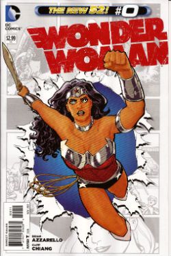
WONDER WOMAN #0 Art By Cliff Chiang Written by Brian Azzarello Colours by Matt Wilson Lettering by Jared Fletcher DC Comics, £2.99 (2012) Wonder Woman created by William Moulton Marston Photobucket

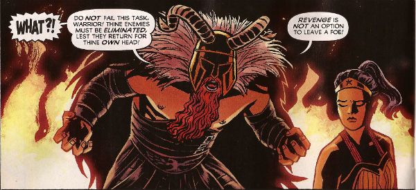
Throughout this comic Cliff Chiang provides outrageously gorgeous artwork, I just want to make that clear. Because as lovely as his work is it can in no way distract from the petty failures of Azzarello's script. This reads like an attempt to channel the scripts of old complete with their overwrought narration and abundance of redundant information.  In the hands of a respectful and talented writer this would be a cute homage, a neat tip of the hat, a cheeky wink, a clever and enjoyable comic. But not here. Azzarello's bitterness and contempt for the work of all those who came before him is evident on every chippy little page. The first narrative caption contains not only this creepily layered insult to both readers and women, "the monthly monster strikes again!"  but goes on tell us the tale originally appeared in "All-Girl Adventure Tales For Men".

Photobucket

I imagine the intention was to be humorous but I don't have to imagine that the reality is so soured with loathing for the audience, the self and even the genre that  it's a relief when the curdled homage ends a few pages later. Yes, because as primitive and rubbish as we are implicitly assured the writing was in comics of yore, it's actually beyond Brian Azzarello's sophisticated and modern talents to replicate at even a satirically joshing level for a full issue. As base as they were he can't do it. Which is the best joke of all. It's thanks only to Chiang, Wilson and Fletcher that the book hovers around GOOD!

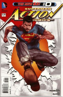
ACTION COMICS #0 Art by Ben Oliver, Cafu Written by Grant Morrison, Sholly Fisch Colours by Brian Reber, Jay David Ramos Lettered by Steve Wands, Dezi Sienty DC Comics, £3.99 (2012) Superman created by Jerry Siegel & Joe Shuster Photobucket

Unlike the assured work in his BATMAN books (work so assured that it it kind of glosses over how bad some of it is) I've not found Grant Morrison's run on ACTION COMICS to be terribly convincing. It's had the air of him having been asked if it's still his dream job to write a regular Superman comic, to which he's replied, "Hoots! Aye tha ken right, maboab! When am ah starting?" And then he's been told "Er, we need twenty two pages in the next five minutes." "Crivvens!" indeed! The results have been a bit patchy to say the least. Although maybe it's just that he was writing in a burning temple. That would put anyone off.

(I guess I should apologise for that outrageous descent into Jockface but I'm sure you understand that I am an artist and, even though I’m very far removed from Scots culture, I really love it. I don’t even eat a lot of shortbread, I eat a lot of fish and chips but the fascination with the Scots remains part of our everyday British culture. It would be wrong of me not to rip the piss. Also, Grant Morrison is really acting like a bowffing staigie these days.)

Photobucket

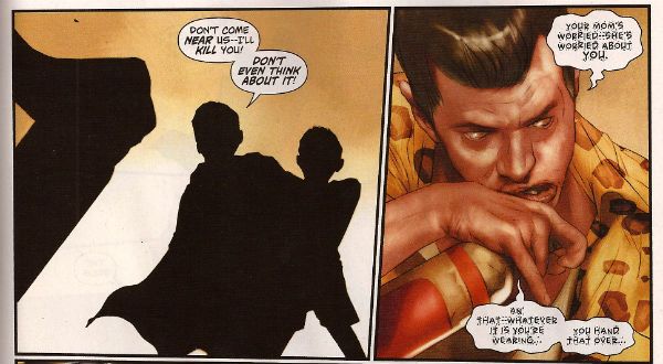
It's just a bad comic all over but you can see how it could have been a good comic had some time been spent whipping it into proper shape. Children being saved from awfulness by the sheer Goodness of Superman should be a slam dunker but this thing is under-worked at both words and art level. Underworked to the extent that the art isn't even art at times, it just flat out descends into silhouettes like a cack handed Han Dynasty Chinese shadow play rather than a Twenty First Century American comic-book. As it is the whole thing is a lost cause anyway; totally scuppered by its failure to decide where it stands on quiffs. Initially the quiff is seen as a force for good, embodied in the choice of basing Superman on Film Critic and All Round Good Egg Mark Kermode.  Yet later a drunk child abuser (boo!) is introduced sporting the self same pompadour. Mixed messages are one thing but if a comic can't even decide where it stands on the morality of a haircut it's pretty much bound to be EH!

Photobucket

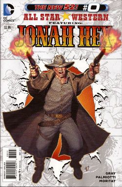
ALL STAR WESTERN#0 Art by Moritat (and Pia Guerra) Written by Jimmy Palmiotti and Justin Gray Coloured by Mike Atiyeh Lettered by Rob Leigh DC Comics, £3.99 (2012) Jonah Hex created by John Albano and Tony DeZuniga Photobucket

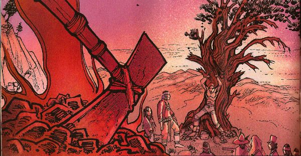
Fortuitously for the writers Jonah Hex has had an eventful life because then they can just fill the pages offhandedly routinely recounting his doings in a manner that would make the personification of Perfunctory raise her fan to her face and blush. This happened, then this happened and later this happened? that's not actually a story. It's things happening. There's no attempt to add anything to Jonah's story it's just: Jonah's Dad was violent but not a drunk, now Jonah's Dad is violent and a drunk, etc. It's just there. Moritat is clearly overworked here but he does manage the odd panel that it's worth lingering over amongst all those that you'd rather rush past in embarrassment. Despite the rote plodding of the writing thanks to Moritat's occasionally interesting art and a travelling salesman called "Mr. Dazzleby" the comic manages to be OKAY!

Photobucket

Sometimes people point out that they don't like that rasher of skin connecting Jonah's upper and lower jaw. Somehow this weakens the whole character for them. Luckily I ignore my family and think about things like that, important things. Yes I'm here to help. Place your forefinger at the point at which your lips meet, now place your thumb at the point where your teeth stop and your jawbone begins (you will have to press against the flesh until you feel the difference), now move your forefinger in a rough circle between its starting point and where your thumb has paused. Imagine that that flesh has been cut away. Hi ho! There you go! The mystery of Jonah's strange face solved. Next!

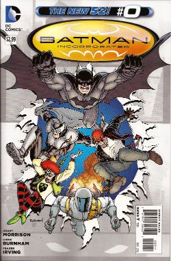
BATMAN INCORPORATED#0 Art by Frazer Irving Written by Grant Morrison (story by Grant Morrison & Chris Burnham) Coloured by Frazer irving Lettered by Pat Brosseau DC Comics, £2.99 (2012) Batman created by Bob Kane Photobucket

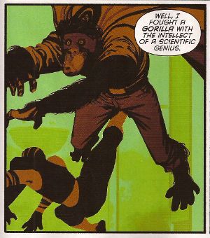
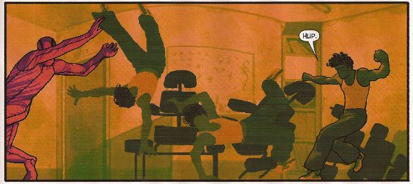
Even though Frazer Irving's art is obviously rushed, veering wildly from the astonishing to the embarrassing, and he badly fluffs the final "beat" with the boomerang his work here is still fascinating in a really pleasing way. I like the way the colours are presented as just shapes and your eye has to skitter about the image, like a spider seeking shelter when you suddenly switch the light on, until it gleans enough information to figure out what the Holy Mother of Pearl it's looking at. Your eye that is, not the spider.

Photobucket

Maybe that's why the story here works so well. Because it isn't really a story it's more a of a sleight of hand in which a jumble of moments manages to create enough mental connections in the mind of the reader to make it seem as though a coherent narrative has occurred. It's a neat trick. A good enough trick in fact for the comic to be GOOD!

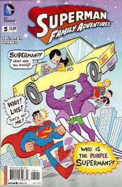
SUPERMAN FAMILY ADVENTURES #5 Art by Art Baltazar Written by Art Baltazar and Franco DC Comics, £2.99 (2012) Superman created by Jerry Siegel & Joe Shuster Photobucket

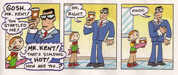
I buy this comic for Johnk(UK) V.2.0 in the hope that he will also wish to waste large amounts of his life on blathering on witlessly about the artform known as comics. Yes, he enjoys this but then so do I. I enjoy it for lots of reasons beyond the fact that I am a child-like simpleton. I enjoy the fact it is quite sophisticated in its treatment of the Olsen-Lane-Kent dynamic. Lois knows Clark's secret she just pretends she doesn't and Clark knows she knows and that she is pretending she doesn't while Jimmy is just comically plain vanilla oblivious.

Photobucket

Also, I like the Super-pets and this comic is the only place you can see them unless the main DCU finally matured enough to stop being embarassed of its heritage in exactly the same way that a teenager is embarassed by their parents. Look, the book's neat stuff. A lot of the time I have no idea what is going on, but that's okay. Even when it is just brightly coloured gibberish the kids seem to understand. And since that's who it's for this is VERY GOOD!

I hope you all had a nice weekend and enjoyed some COMICS!!!

In Which Hibbs Actually Recommends Something

As many of you know, I've really become quite a cynical bitch about comics lately. There's just a resounding sameness to so many of them, and too many writers are "writing for the trade" (rather than trying to make each single issue a compelling read in an of itself). In far too many weeks, I think the alright stuff is really just all right in comparison to other, lousier, comics.

Well, I read a comic that I genuinely liked in and of itself this week, and I want you to read it as well, That comic is XOMBI #1.

XOMBI gave me a thrill, because it's full of crazy ideas just tossed out there, like a good Grant Morrison comic -- seriously, it features a team of Catholic superheroes, one of whom is named "Nun The Less", whose superpower is shrinking -- and, in this incarnation, it has some REALLY GOOD art, by way of Frazer Irving.

XOMBI was a Milestone book -- part of the third wave, if I recall correctly, released after the market had decided, actually no it didn't want the Milestone books, though, looking at comics.org, I'm a little shocked that it lasted 22 issues back in the mid-90s.

It was an idea machine back then, too, but it kinda suffered from art in v1 by JJ Birch -- well, Joe Brozowski under a pen-name, and he's one of those artists who actually has a lot of wonderful fundamentals, but whose actual rendering style isn't too exciting, really. Everyone looked a bit stiff and angular.

This isn't a problem now with Frazer Irving doing the art -- man, this stuff just sings.

This series clearly follows from the first, but I understood every word that I read (and it's been like 14 years between issues, so I'm telling you this as a plus), and it felt very much like a proper first issue.

If I had ONE criticism of the book, it would be that it's a full 22 pages for the $2.99, instead of the now-usual 20-pages-for-a-DC-book, which means that issue #1 doesn't have a letter's page, and, thus, doesn't have any kind of "introduction and here's what we're thinking!" kind of text pieces that all of the best first issues have.

Here's how much I liked it -- so far today, I have not LET a single customer out the door without a copy of the book in their hands. I don't think I've done THAT since the SANDMAN days, actually. The downside of THAT is that, as I write this, I have exactly one copy left for sale, and I'll be sold out in the next 10-15 minutes. (reorders, sadly, take 2 weeks to turn around in the current system, unless you're willing to pay usurious shipping rates)

Which leads me to the next "here's how much I liked it" -- I've just placed a reorder equivalent to nearly 200% my initial order.... and I'm not sure I've ever quite gambled that big (well, proportionately) in a long-ass time.

So, yeah, when you go into your LCS, tell them you really would like a copy of XOMBI #1 -- it's a pretty exciting comic -- and if they're out (which they might be, I bet most stores ordered just barely above pre-orders), tell them it's Diamond order code is JAN11 0259, and that you want them to reorder it for you.

I thought XOMBI #1 was absolutely EXCELLENT.

-B