"There's A Hairy Man Running At...!" COMICS! Sometimes It Takes A Corben To Catch A Monster!
/Blah-blah more days to Hallowe’en! Sil-VER Sham-ROCK! (AKA Season of The Jeff!) Here’s some stuff about a monster comic. I was going to put it up on Hallowe’en but I’ll be busy going from door to door with my son begging from strangers. That being pretty much the only growth industry there is over here, so best to prepare him early! Life skillz! Anyway, this...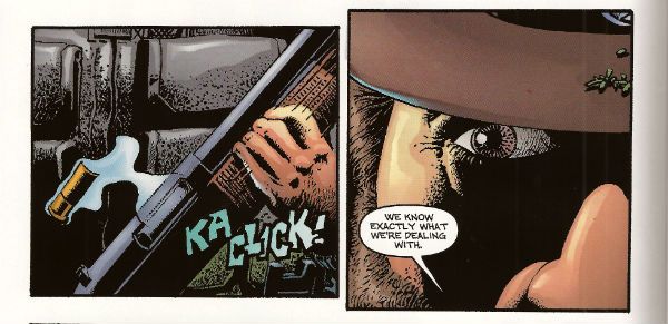
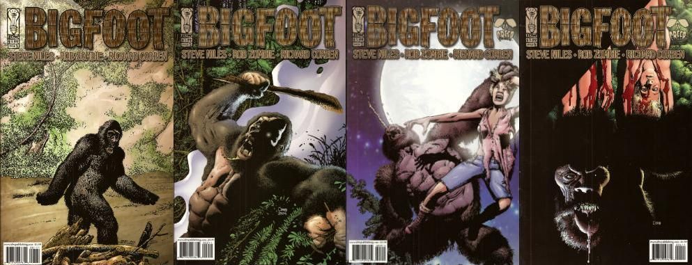
BIGFOOT #1 to #4 Art by Richard Corben Written by Steve Niles & Rob Zombie Colours by Martin Breccia & Nestor Pereyra Lettered by Robbie Robbins BIGFOOT is TM & © Steve Nile, Rob Zombie & Idea + Design Works. But not Richard Corben. IDW, $3.99ea (2005)
This is a comic from 2005, although as is usual with Steve Niles it’s really more of a come on to Hollywood. Yes, another pitch-comic I ‘m afraid. But this one is better than most as it is actually a pretty decent comic. This has little to do with the two writers (and copyright holders) and rather more to do with the guy they brought aboard as a hired flunky. The seasoned vet who’s brought on for his experience and ends up providing the most entertainment for the audience before being sacrificed at the end. Yes, tonight Richard Corben is Quint!
The main thing I know about Steve Niles is that like my Mum he believes that “If you can’t say anything nice then don’t say anything at all.” She said that thirty years ago and has remained mute as Michael Myers ever since. Hoist by her own petard there. (I’d just like to point out that creative people who wish to remove critically dissenting voices have no ulterior motive or vested interest in this happening. None at all. Perish the thought. Everything's just fucking dandy.) Now, unlike my Mother, Steve Niles has continued to be unquiet. Most of his output seems to consist of taking two things and putting them together in the hope that the result will be a third thing, a thing which will contain all the attractive qualities of the two separate things but also a new feature notable for its attraction to Hollywood. Oh, that’s unfair isn’t it, just plain rude in fact. Look, Steve Niles latest project is about vampires and robots...I'll continue then. And then there’s Rob Zombie. Who, basically, is an adult called Rob Zombie.
I don’t know if this indicates someone who does not take horror seriously enough or who takes horror too seriously. It isn’t that he has a daft name either it’s that it’s not a very good daft name. Lux Interior is a fine daft name for e.g. but Rob Zombie is a bit on the nose for a Schlock Rocker, horror Director and celebrity fan-dancer, no? Like a comedian being called Clowny McSlapstick. And yet you may say; John, I feel you are still being a bit of a prick perhaps both Niles and McSlapstick felt that only comics could provide the unique storytelling tools their vision required, perhaps a movie deal would be naturally welcome but hardly the impetus for this artistic enterprise. I would then regretfully point out that BIGFOOT was published under the CREEP imprint, CREEP being a joint venture production company involving the two authors. Okay? I am probably being a bit of a prick though, you can still have that. My point though is that despite this BIGFOOT is right smart comic indeed.
The only real reason to rescue BIGFOOT from the back issue bins where it has holed up is the fact that on every page Corben works a series of wonders with what is quite frankly uninspiring material. From the title down there’s something altogether unpromising about the enterprise. BIGFOOT isn't exactly a name to conjure with is it? I hear BIGFOOT and I picture…well, a big foot. If I work at it I could maybe get some terror going. Maybe visualize the big foot launching itself sole first out of the foliage to rub its coarse underside all over the faces of its startled victims until they are riddled with verrucas the size of their own screaming mouths! You’re already swimming against the current by having that name up top. SASQUATCH! would have been better, it’s got the air of an authentic legend older than the white man but younger than the land whereas BIGFOOT sounds like a jackass in a bad costume.
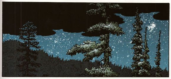
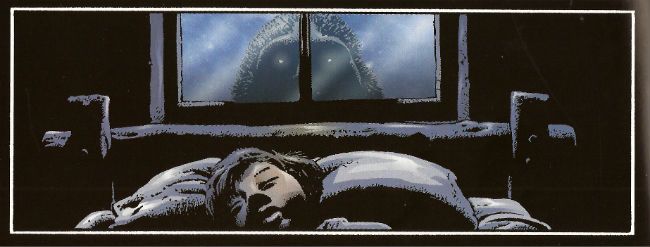
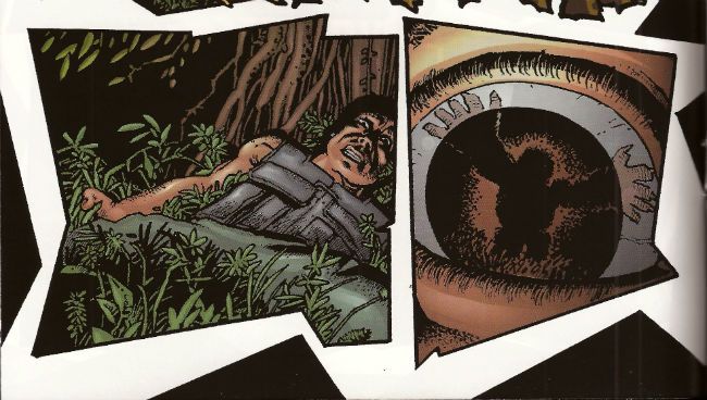
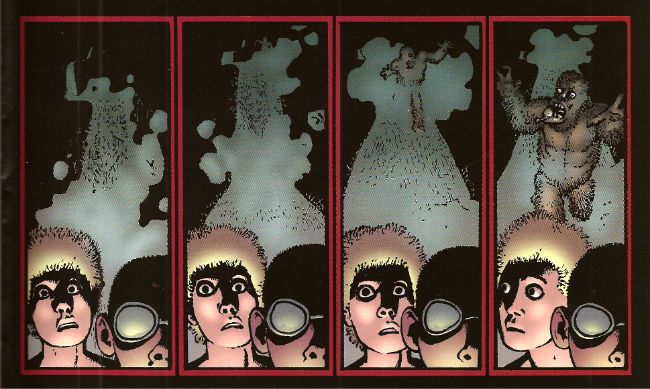
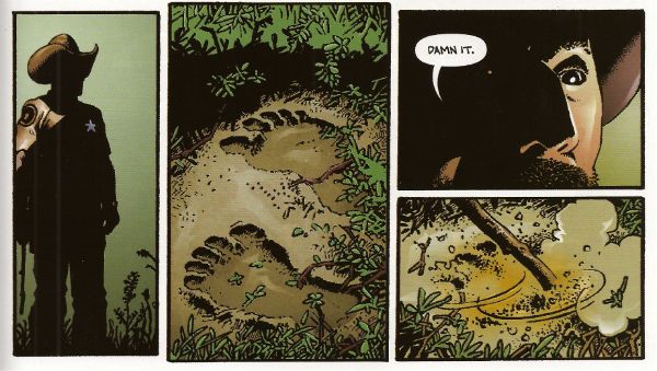
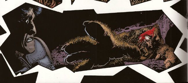
Corben does in fact start with a picture of a jackass in a costume with the cover to #1 and initially teases with stolen glimpses that this is what we’re going with. But when ‘Foot crashes through the wall (and through the page into the comic, which is a nice touch) his size alone means there’s no mistaking this sucker for a dude in a suit. From then on Corben uses his mighty roster of distortions of scale, inelegant angles, impossible shadows and queasy goofiness to bring the strange. Corben can suggest the essentially remorselessly savage and animalistically other nature of ‘Foot through just a single glassy eye and a lolloping bottom lip. He manages to remove the humanity from it using its most recognizably human features. He gives it a face but it is not a face you recognize yourself in. (Unless you are way more interesting than I am giving you credit for.) Corben also has night scenes on black pages and day scenes on white pages which is a simple trick but when the action busts loose he he has jagged panels combining both (non-) colours and (ta-da!) disorientates the established schema. Then there's the action itself. This has the usually Corben flourishes of drawn SFX and motion lines which give the whole thing an inappropriately goofy aspect. And it's this very inappropriateness that gives the horror its edge. That trick runs through all Corben's work as does the treat of his sheer professionalism which is on display in every page on which he outshines the script. Which is to say, on every page.
It’s to the credit of the writers that they recognized Corben’s talents would elevate their work. It would be more to their credit if they had provided a script which deserved him. You see the sin here is two fold. Niles and Zombie not only treat the comic medium with little respect (inconsistent use of thought balloons is a dead giveaway), as merely a step on the journey to the true destination (the movie!) but they also short change the monster movie genre. No, the monster movie isn't the hardest template to follow but they don’t even do that, and the reason they don’t do that isn't because they are going beyond the template, forging new paths of invention and terror, hell no, it’s because they just need this to read enough like a script to catch someone’s eye. Later on all the rewrites can do the tricky stuff. Because people in Hollywood are busy they've front loaded the pitch, with the first issue being the best and most fully realized but then they just seem to give up and fall back on the basics of monster movies. And I really do mean basics. It’s like they don’t think they have to try. Some of this stuff is just a step above the “SCENE MISSING” placeholders or scribbled in notes of “emphasise parallels!” a first pass script would require. There’s a scene in a gun shop which is kinda-sort-maybe edging towards making joke or a statement about the availability of automatic weapons in a sensible society but then wanders out to the parking lot without bothering. There’s no real reason given for the increased ‘Foot activity; there’s not a sudden influx of campers for Earth Day or Secretary’s Day, no one’s building a home for disabled orphans/luxury shopping centre near the ‘Foot family’s residence. I mean I’m assuming this is increased activity because in a very short period ‘Foot has polished off quite a number of people. If it isn't increased activity folks must be pretty damned blasé about missing campers in the States. The Sheriff finally nuts up but his reasons for covering up the ‘Foot attacks are beyond stupid. There is the slightest possible effort exerted to suggest that the ‘Foot attacks are advantageous to the area because of the economic benefits of tourists but this bears the same relation to a coherent satirical argument as a fart does to a turd. It's just there because that kind of thing should be there, look, we'll work it out later when Tom Arnold's signed up for The Sheriff. Speaking of which there aren't even any good roles! Where's the Quint?! Talk about not trying!
I'm not an unreasonable man. No one expects a Jaws, and no one wants a humourless exercise like Orca, but there’s a happy medium where intelligence, humour and horror meet that isn't all that rare (despite what snooty cineastes may maintain) in the monster movie. Is it too much to ask for an Alligator, a Piranha or a Lake Placid? BIGFOOT thinks it’s too classy to get down and roll around in the schlock like Blood Beach but the authors aren't even willing to put enough effort in to give us Grizzly. It’s aiming for Tremors but that had a good script so they end up with Razorback which people only remember because of the visuals. And the visuals here are only so tip-top top-notch because they at least had the sense to get Corben on it. And Corben? He’s on it like vomit. I…could perhaps have put that better. In effect he’s just(!) bringing The Corben but that’s what this inert, rote, half-formed stuff needs, it needs all the flying spittle, rictus grins, creepy textures and gummy blood pools Corben can provide. If there’s any atmosphere, tension, humour or horror here it’s because of Corben. And because it’s Corben there’s plenty of all those things. So BIGFOOT is VERY GOOD! because while BIGFOOT is a movie pitch rather than a comic Corben is, and ever will be, COMICS!!!
I'm off now to carve living heads into the shapes of pumpkins and if I don't see you before then do have a a Happy Hallowe'en!
