"ARRRRRRRRUUUUGGGH!" COMICS! Sometimes I Should Have Probably Just Watched Valley of the Gwangi Instead!

There’s a new JURASSIC PARK movie out! I’m not particularly bothered! I won’t be going to see it! But I did read a comic adaptation of the first movie! So why waste happenstance! And that’s about as zeity as my geisty gets.  photo JParkEyeB_zps0x7mlhwq.jpg

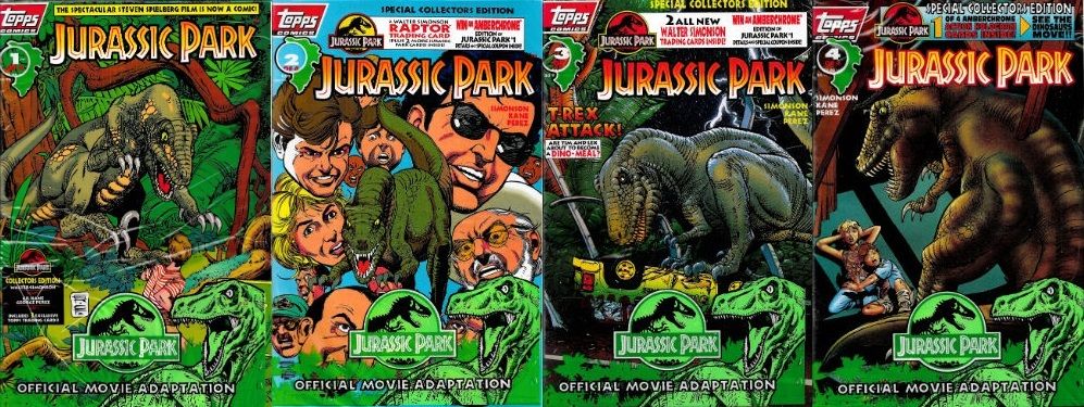
JURASSIC PARK by Kane & Perez, Simonson, Workman & Smith Anyway, this… JURASSIC PARK#1 -4 Art by Gil Kane & George Perez Written by Walter Simonson Lettered by John Workman Coloured by Tom Smith Based on the screenplay by David Koepp Based on the novel by Michael Crichton and on adaptations by Michael Crichton & Malia Scotch Marmo TOPPS COMICS, $2.95ea (1993)

 photo JParkCoversB_zps6uyuo6yl.jpg

In 1978 Michael Crichton wrote and directed the entertaining slice of speculative hooey WESTWORLD. This had robots run amuck in a theme park. Because genius cannot be hurried it would take Crichton a further 12 years to come up with the idea of replacing the robots with dinosaurs, which he did in his 1990 novel JURASSIC PARK. It would take a further 3 years before Steven “ALWAYS” Spielberg would deliver the technically innovative but peculiarly unsatisfying movie of the same name. As a tie-in the short lived TOPPS Comics threw this four issue adaptation out into the world. Several years later I bought them off E-Bay because I saw Gil Kane’s name on the listing. Last week I found them in the garage and finally read them. Which brings up to date, I think. I haven’t read the book so I’m not getting into that. I am as scientific as a chimp so I’m not getting into that either. But I do know I don’t really like JURASSIC PARK the movie and I know that because I’ve never owned it. And this is from a man who owned FALL TIME, TRACES OF RED and FTW on VHS. Yet never JURASSIC PARK. This is less because while JURASSIC PARK has many leathery denizens Mickey Rourke isn’t one of them, and more down to the fact I found JURASSIC PARK a bit underwhelming. I mean, it’s okay when you’re sat in front of it but as soon as you go and do something else there’s a nagging sense that you’ve just done something for the last 127 minutes but a maddening lack of specifics about what exactly that thing was. Usually when that happens I’m wearing a dress with blood in my hair and there’s a uniformed man outside with a bullhorn and some well-armed friends. All you know is it definitely involved Jeff Goldblum and a cup of water. For something that cost $63 million that seems like a remarkably poor return. Usually you can point at something about a movie and say That! That! is why it failed to entertain! But JURASSIC PARK is well directed, well scripted, ably cast, brimming with special FX which are special and, y’know, dinosaurs and…none of that ever actually comes together to make a good movie; it’s just stubbornly bland. As much of an achievement as the FX were at the time surely the eternal achievement of JURASSIC PARK is making a movie about resurrected dinosaurs running amok in an island paradise less engaging than sneaking a fart out.
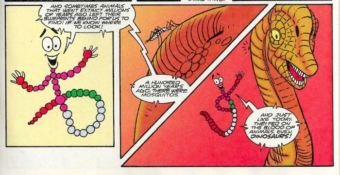
 photo JParkDNAB_zpsyuwrgw7f.jpg JURASSIC PARK by Kane & Perez, Simonson, Workman & Smith

Of course, I had already been somewhat spoiled on the old dinosaurs running amuck front by Pat Mills and Various European Gentlemen’s FLESH in 2000AD (1977-1978). Despite “Pat Mills and Various European Gentlemen’s FLESH” sounding like something that would be seized at Customs, it was in fact a luridly violent strip aimed at children which involved time travelling Future Cowboys harvesting dinosaurs, in the course of which the tables quickly, predictably, and violently turn. It was fast, nasty and punched its point home like it was trying to grab your spine. In comparison JURASSIC PARK is like a dinosaurs’ tea party where the worst that happens is T-Rex spills milk on a doily and the Velociraptors say something unfortunate about someone’s sister. I don’t want to be crass (but we aren’t always all we want to be) but how many deaths are there in JURASSIC PARK? Four or five? Six tops. That’s pitiful. There are six deaths on every page of FLESH. And if there aren’t (because someone will take me literally) it feels like there are. The deaths in JURASSIC PARK are frictionless punchlines to efficient action set-ups. The deaths in FLESH, however, are nasty and brutal with much screaming and precision about exactly what is happening and how unpleasant it all is. Look, In FLESH you get dialogue like “Gotta STAB this she-hag right in the BRAIN!” and that’s always going to trump “Have some ice cream. Twenty two flavours and I tested every one!” Sure, no one talks like people do in FLESH but then no one is going back in time dressed as cowboys and farming dinosaurs for future supermarkets. YET! If you’re calling foul on dialogue on that creative battlefield you’re getting hung up on the wrong barbed wire, pal. Maybe that’s it - JURASSIC PARK tries to marry spectacle to respectability. Come on, anyone trying to make a respectable dinosaurs run amuck movie has failed at the first hurdle. Basically then, I remain ashamed that I enjoyed CARNOSAUR more.
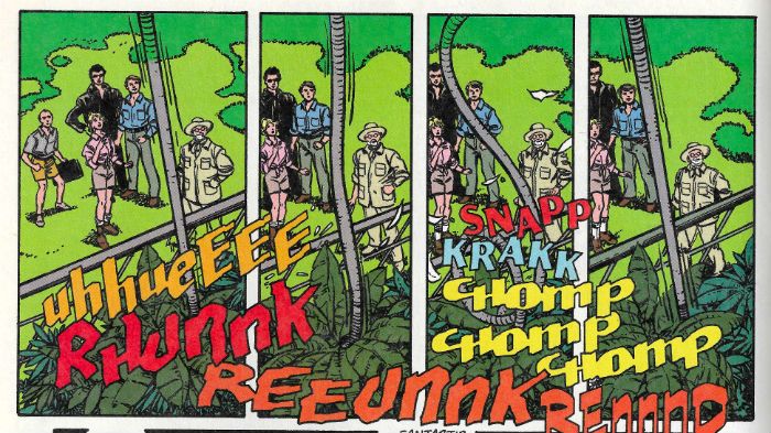
 photo JParkWordsB_zpsnb9uj7mp.jpg JURASSIC PARK by Kane & Perez, Simonson, Workman & Smith

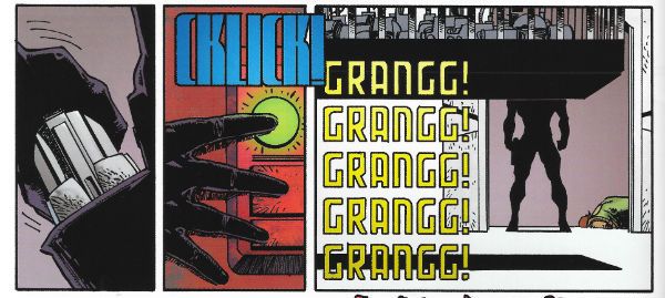
I can’t actually speak to how well the adaptation and the movie line up because I was unwilling to give up some of my valuable time spent staring into the middle distance and being disappointed in myself to rewatch it. And if you think that makes all this pointless exercise in self-amusement then have a banana! Take two; knock yourself out! Flash Fact: this is my free time. Anyway, parts of the comics adaptation are ridiculously faithful and I’m kind of thinking Walter Simonson simply and efficiently adapted the script (or at least a near to shooting script). I mean that’s basically all he does. I’m not making any huge perceptive leaps here. That’s no foul. Obviously expectations may be raised because of all that pushing-of-comics-into-weird-new-shapes-in-order-to-evoke-the-experience-of-the-movie he (and Archie Goodwin) did with ALIEN: THE ILLUSTRATED STORY. (I may have mentioned it previously. At length.) But Simonson doesn’t do that here so don’t be expecting what he hasn’t done. What he has done is deliver a meat’n’taters movie on the page. In fact, the most interesting thing visual invention wise is how John Workman positions his (as ever) wonderful lettering FX; they really help shunt the eye through the pages. Also interesting are the slight deviations from the movie I could identify. Unless I’m wrong there’s an extra scene with the lawyer at an amber mine (more lawyers talking to capable men in short sleeved shirts outdoors; that’s what JURASSIC PARK needed!) and I know I’m not wrong when Simonson has Kane & Perez illustrate Sam Neill’s “no one in the audience has ever heard of Raptors but you need to be aware of how awesome they are or all this build up simply won’t work…”speech to that random kid as a kind of dream sequence.

 photo JParkCardsB_zpsmmfl0jni.jpg

I also thought Bob Peck was in charge of the luckless wage slave bit at the start, but here it looks like it’s Howard Victor Chaykin sporting some shades. (And another thing, I mean, seriously, the whole fiasco is down to employers thinking they don’t have to adhere to basic Health & Safety because, what, it impacts on the “bottom line” and affects “targets” (trans: “money”). There’s a lot of huffing and puffing trying to make the lawyer the villain (because tradition) but all that dude wants is everyone to do what the law says. Fuck that dude, with his safety concerns; I hope he dies humiliatingly hiding in a portable loo. Look, I don’t care how cuddly Richard Attenborough is, he still values human life less than a theme park ride. That misty eyed reminiscence thing about the flea circus? Get real, people, Life is the Circus to Richard Attenborough and we, the people, are THE FLEAS! Dude’s a cock of the first order. Does he get eaten? No, he does not. That’s bloody Rule #1 in dinosaurs run amok movies- payback! Payback for the shitters of the world! Ultimately JURASSIC PARK is toothless (Oh God, that’s some great wordplay. Professional level shit there, John; keep that up! Publishers will be “interested” (trans: “money”) so it’s no wonder I can’t be doing with this movie.) Mind you maybe Gil Kane did that as a joke (recap: the Howard Chaykin in shades thing) because Gil Kane seems to be playing pretty loose character design wise.
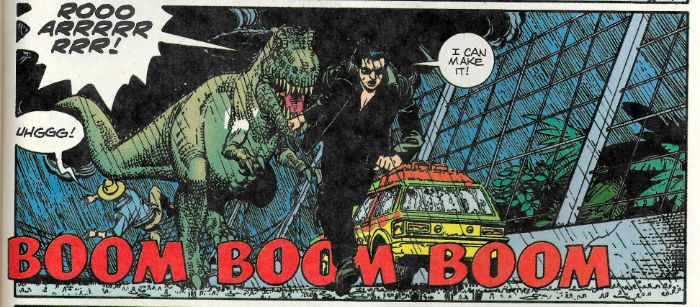
 photo JParkRunB_zpsxywpyofg.jpg JURASSIC PARK by Kane & Perez, Simonson, Workman & Smith

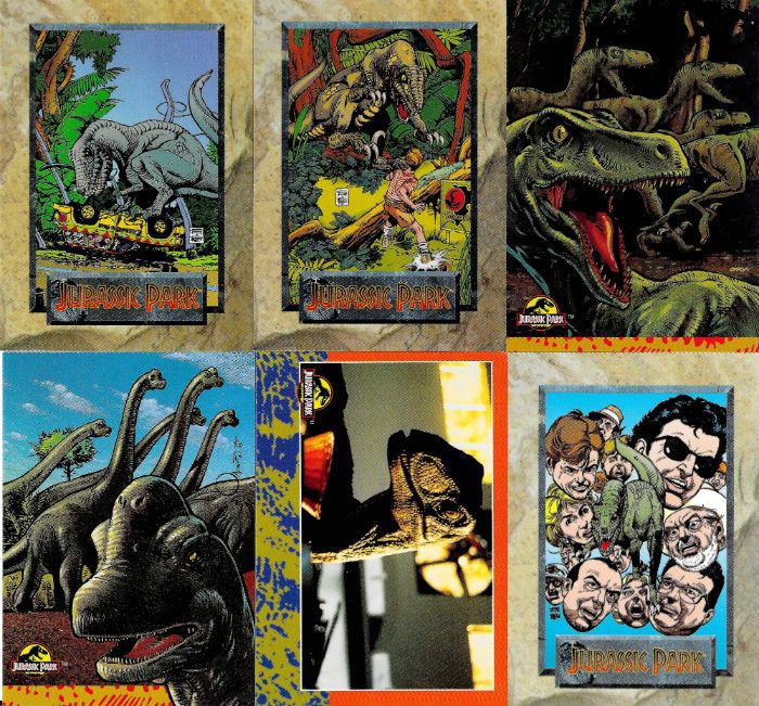
Oh, yeah, that’s why I have these comics – Gil Kane. No, not because I ever believed the lie of easy riches implicit in the “Special Collector’s Edition” status of these books with their protective sheaths (which you have to re-insert the comics back into; if you close your eyes you can imagine putting a French tickler on Gumby) and the trading cards included therein. Man, never has a generation been so betrayed as the Comics Fans of the ‘90s. Life wasn’t supposed to be like this. We were all going to be rich. None of us learned life skills because we were going to cash on our mint holofoil BALLJUGGLER#1s and live a life resembling a blizzard of jizz and glitter but with added cats in speedboats. None of us can actually even talk to people never mind hold down a job! Shit like this is why I’m in favour of regulation. Well, that and the whole global financial collapse which threw my country rightwards and into the arms of the Tories. Other than that though, it’s definitely the whole trading cards thing. So, Gil Kane. We were talking about Gil Kane; well, Gil’s here but so is George Perez. Look, I have no beef with George Perez’ work usually; it’s fine. A bit busy and stolid for me personally, but if you want a lot of superheroes all in one place George Perez can do that pretty well. But, man, here in the place where there are no superheroes his heavy lines and consequent dearth of suggestive space where the reader’s mind can play really flattens Kane’s work into inertia. I guess it’s decent enough stuff; he keeps Kane’s basics intact, nothing is omitted. In fairness there are a couple of “imaginary” scenes where the detail gets pared back and in those bits Perez and Kane are a team to reckon with. But Perez’ signature insistence on specificity really hurts Kane’s inherent grace and flow. It’s just a less than ideal combination; both men on their own – smashing, but together, meh, not so much. Hey, that’s how it goes sometimes.

 photo JParkFaceB_zpscpzaqccr.jpg JURASSIC PARK by Kane & Perez, Simonson, Workman & Smith

The salt’n’marshmallow art combo sure makes some of Kane’s faces look weird as well. There certainly seems to have been some kind of power struggle over Laura Dern’s face (artistically speaking). There’s no doubt in my fat and generous heart that Gil Kane was a phenomenal artist but he could only draw two ladies faces- either a goddess or a crone. Laura Dern is neither; she just looks like a normal human being. I’m saying it looks like George Perez redrew her face. Actually I don’t really know what’s going on with the faces here. Kane nails Wayne Knight (artistically speaking) but his Samuel L Jackson looks like he’s never heard of Samuel L Jackson, his Richard Attenborough looks like he’s got a mossy skin disease instead of a beard and (the late, great) Bob peck who looks like Gil Kane drew him in reality doesn’t look like Gil Kane drew him here. I find the face work in these comics fascinating but I can tell from the depth and regularity of your breathing that you want to move on. Why am I even talking about faces! It’s a comic about dinosaurs run amuck and I’m talking about faces! There’s the crux of the matter right there. I never got within about 2000 miles of Gil Kane but you don’t have to be Thought Jacker to guess he probably turned up here to draw dinosaurs, not a bunch of mostly normal looking people in drab clothes ambling about impressively unmemorable set designs. Eventually Kane does get to draw dinosaurs but Walter Simonson, tumbling into the trap of hyper-fidelity to the source, has knacked the pacing. So the bits where Gil can go dino-crazy are well worth showing up for but they are also kind of cramped and hurried. Meanwhile there are all these pages of weird faces saying words, none of which are why anyone turned up, least of all the audience.
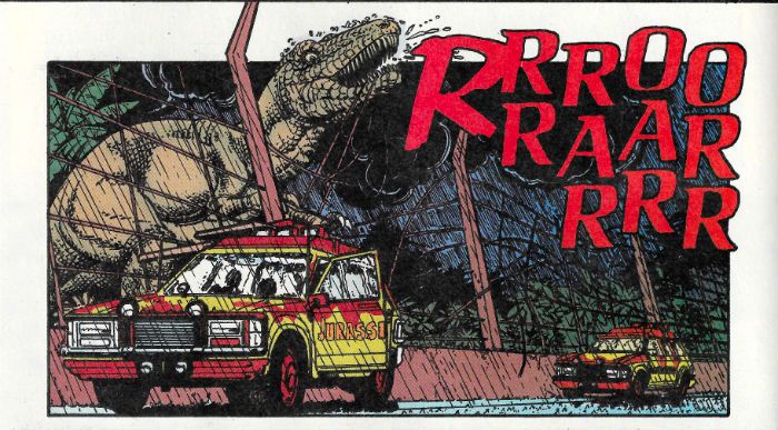
 photo JParkRexB_zpscjcdzbt1.jpg JURASSIC PARK by Kane & Perez, Simonson, Workman & Smith

I love Walter Simonson and I love Gil Kane, John Workman is a little cracker and George Perez ain’t never done me no harm so these comics weren’t a total wash. But Honesty, like Christ, compels me to admit they’ve both done better work elsewhere and there are even better dinosaur run amuck comics. So, sure, given the talent involved JURASSIC PARK may be EH! but then that goes for the movie too. So, as adaptations go it’s spot on.

What I want to know is, if dinosaurs were around for so long how come they never invented – COMICS!!!

“I Am The Storm...Returned From The Grave.” COMICS! Sometimes I See How Writing A Bit More Off The Cuff Works Out For Us All!

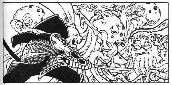
Ugh, January. Anway, I had a quiet hour or two so here's a couple of comics I liked in 2014 that I thought didn't get enough play. I'll just rectify that then...  photo StarPanelB_zps6202a7e4.jpg Starslammers by Simonson, Workman & Ory

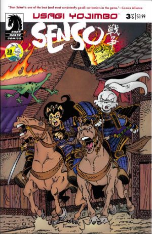
Anyway, this... USAGI YOJIMBO: SENSO Illustrated by Stan Sakai Written by Stan Sakai Cover Colours by Tom Luth Dark Horse Comics, $3.99 each (2014) Usagi Yojimbo created by Stan Sakai

 photo UsagiCovB_zpsbbd2c70b.jpg

According to the yellow circle on the cover of each issue 2014 marked 30 years of Stan Sakai's comics featuring his titular samurai (sigh, okay; ronin) character. I would dearly love to bluff my way through this piece by pretending I was there at the start and remained a constant reader through the decades separating the character's first appearance in Albedo Anthropomorphics in 1984 and this 2014 limited series. Alas, for most of its publishing history I thought Usagi Yojimbo was one of those crappy B&W “funny” animal comics that boomed and busted back then. Burnt once by a purchase of Adolescent Radioactive Black Belt Hamsters I remained shy upon every later encounter with Usagi Yojimbo. Mysteriously, about three years back, I started buying Usagi Yojimbo. I can't remember why so this anecdote isn't terribly thrilling (let's pretend the fate of the free world hung in the balance) but the fact is I did, and I haven't stopped buying it since.

 photo UsagiPanelB_zps07bdd163.jpg Usagi Yojimbo: Senso by Stan Sakai

Well, except for that brief period when Stan Sakai stopped making it to work on 47 Ronin (still samurai, but humans this time). With Usagi Yojimbo:Senso Usagi bounds back in a series set 20 years ahead of the regular series and with an atypically S-F slant. It's an odd move to be sure but it's working. In issue 4 Geoff “Shaolin Cowboy” Darrow writes in to compliment them on their paper stock. That's how well crafted this comic is – Geoff Darrow(!) is so excited about the paper its printed on he is moved to set pen to paper. It isn't just the paper Usagi Yojimbo: Senso is printed on though. Basically, Usagi Yojimbo: Senso works because Usagi Yojimbo always works. For me, anyway, and, chances are high, it works for everybody if they give it a go. The great thing about Usgai Yojimbo is it is at once for all ages (this does not just mean children) and is so beautifully crafted that every fresh episode seems as timeless as a legend. VERY GOOD!

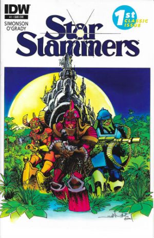
STARSLAMMERS #1-8 Illustrated by Walter Simonson Written by Walter Simonson Colours by Len O'Grady (Colours in issues 1-3 based on original colouring by Walter & Louise Simonson) Lettered by John Workman Cover colours by Romulo Fajardo and Richard Ory IDW, $3.99 each (2014) Starslammers created by Walter Simonson

 photo StarCovB_zps35fb1066.jpg

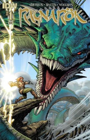
RAGNAROK #1 – 3 Illustrated by Walter Simonson Written by Walter Simonson Coloured by Laura Martin Lettered by John Workman IDW, $3.99 each (2014) Ragnarok created by Walter Simonson

 photo RagnCovB_zps1a1a3c36.jpg

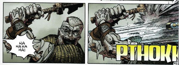
In June of 2014, after giving his handlers the slip, Howard Victor Chaykin appeared at Special Edition: NYC where he said many things which were true and beautiful. The truest and most beautiful thing his louche larynx exclaimed was, “The only man of my generation that's still producing work that's not a parody of itself is Walter Simonson. Simonson's doing amazing work.” In 2014 Ragnarok proved this to be as true as a very true thing indeed. Also earlier in that same year Starslammers reminded us that Simonson had been doing amazing work for so long that that very longevity was kind of amazing in and of itself. It shouldn't have been a surprise since he never went away but, well, welcome to Comics - where Brian Bendis is taken seriously and Walter Simonson is taken for granted. (Comics – it's a visual medium. Write it down somewhere. Jesus.) For its first three issues Starslammers reformatted and reprinted the Starslammers 1984 Marvel Graphic Novel. The level of skill already present in this “old” work proved to be ridiculously ostentatious. Even back then Simonson had such a sure grip on pacing and truly cinematic presentation he ran the risk of leaving bruises behind. Also present, even back then, was John Workman's lettering; lettering so awesomely complementary that it became an inseparable and essential element of the stunning visuals on display. The remaining issues of the 2014 series re-presented the 1995 Malibu/Bravura Starslammers series.

 photo RagnPanelB_zps7837161e.jpg Ragnarok by Simonson, Workman & Martin

This was the first time the full series had seen print and so the rejoicing in my tiny head was loud indeed. This later material proved Simonson hadn't lost any of his magic but had learned a few new spells as well. Simonson's work now flirted so hard with abstraction his ability to refrain from tumbling into incoherence was stunning. With Starslammers it might be an exaggeration to say that there was a lesson in comic art on every page but by the time Ragnarok rolled around such a statement was probably, if anything, selling Simonson and Workman short. Sure, Simonson's stories are fun, solid and entertaining genre stuff, but, in truth, I read his comics for the storytelling. There may well come a time when the old Gods die but, ironically, Ragnarok proved that time isn't here yet. VERY GOOD!

Basically I liked 'em because if either of those series were anything they were very definitely – COMICS!!!
"BIG..! I'm Telling You...The Sonuvabitch is HUGE!" COMICS! Sometimes They Are Extravagant!

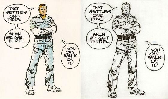
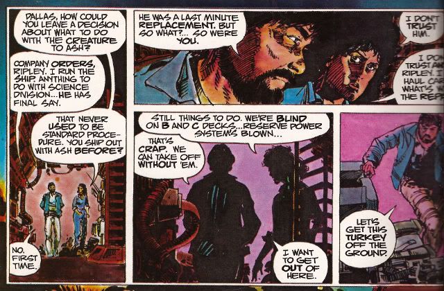
Like Ripley going back for that damn cat I go back to ALIEN THE ILLUSTRATED STORY. This time it's so big Ash could very well be right and, yes, you could probably walk on it! Photobucket

No it isn't PLANET OF THE APES WEEKLY. Well spotted. This week I learned two things: 1) Never say what you are going to look at next because Life will unleash a horde of flying monkeys right at your face and turn you into a big fat liar. 2) In the words of Beat-Cop Brian Hibbs "Always have a throw-down piece." That would be this. But hey, I didn't actually say POTA would start this week...so I also learned 3) Just in, I have also learned I will wheedle.

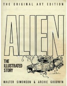
ALIEN THE ILLUSTRATED STORY (THE ORIGINAL ART EDITION)

Photobucket

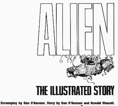
Art by Walter Simonson Scripted by Archie Goodwin Lettered by John Workman Based on the original screenplay ALIEN by Dan O'Bannon & Ronald Shusett And the motion picture directed by Ridley Scott Titan Books, 35.1 x 2.5 x 50.5 cm, 96 pp (2012) $75.00 US $85.00 Can £54.99 UK

"We did not try to replicate the film, an impossible task. Instead, we tried to create a graphic novel that would stand on its own merits." Walter Simonson (2012)

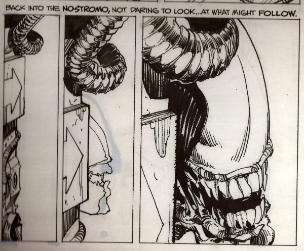
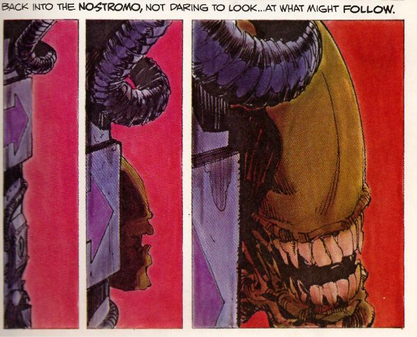
Walter Simonson there reminiscing about his and Archie Goodwin & John Workman's 1979 Heavy Metal adaptation of the motion picture presentation ALIEN. When we were all that bit younger and fleet of foot I went on about it a bit HERE. (Spoiler: It was VERY GOOD!) If you want to buy a nice shiny version of thatbook Titan just republished it a couple of weeks ago. (Bodacious Ben Lipman popped up in the comments to say: "I bought the cheaper Titan edition a few weeks back, and I don’t believe it has the interviews or behind-the-scenes bits and bobs mentioned in your review – it’s all comic!" So I have altered the following bit.) Here as well as the original (still innovative) adaptation you'll get Goodwin's script with Simonson's annotations, two pages of try-outs (once in B&W and once in colour) and a comprehensive and good natured interview with both Simonson and Workman conducted by J P Rutter. Of even more importance though, in this version, the version I splashed the cash on, you get all those and you get the art reproduced from the original artboards.

Turns out art boards are big.

Turns out art board books are big and pricey.

Yeah, about that. I bought this book because it is a great book but I bought this version because it is probably the only chance I'll get to grab one of these Original Artboards books. The IDW (to which this bears great, ahem, similarities) books are things of great joy and Satanic temptation but ultimately it's not the best idea to  spend what you haven't got (as Western economies found out recently). That's not to say that the IDW books are unreasonably priced for what you get (by all accounts you get wonders) but they are out of my reach. Thanks to a deep pre-order discount and a deal with Satanzon I could just get my needy fingers on this one. Just in case anyone thought I was Richie fucking Rich or got comps.  I'm not, I don't, and yet I still bought this ostentatious thing. It didn't disappoint.

While most of your time will be spent staring at the wonderful (i.e. full of wonders) art, art which is still instructive about how to make comics some thirty three years later, the value of the accompanying interview must be stressed. No empty glad handing back slapping celebration of how simply marvellous all involved were is this. No, although all involved probably deserve it in this case. It is in fact highly educational about how the book was put together.

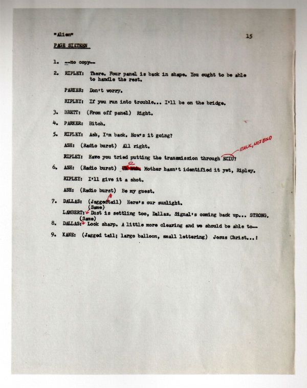
Look, here's a page of the script:

Photobucket

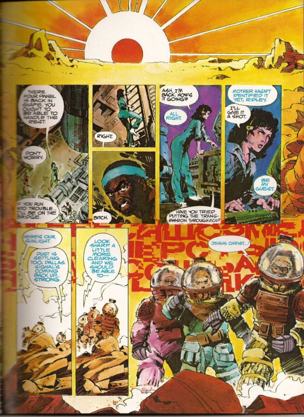
Now, here's the scripted page in its drawn and published form:

Photobucket

Alone these could be taken as yet another example of how the writer gets the artist to do all the work. In the interview it becomes clear how closely Goodwin, Simonson and Workman involved. It was the kind of mental cross pollination that isn't ever going to be adequately documented except in the form of an interview. Where the more abstract and elusive contributions of the creators, contributions that leave no physical evidence, can at least be acknowledged in the approximate, but permanent, form of words. Rutter's done a fantastic job on the interview is what I'm saying. It helps that he has two subjects as cuddly as Walter Simonson and John Workman (Archie Goodwin died in 1998 and so was unable to attend). Both men are self effacing but aware of the work's value and so able to discuss its fascinating creation in a way which is both informative and engaging.

It's through the interview that the names of the people who actually coloured the book are revealed.  So, a belated big happy shout out to Louise Jones (later Louise Simonson), Polly Law and Deb Pedlar for the bulk of the colour work herein. Except it isn't herein as this one is the uncoloured art from the original art boards. Irony in action there. Most people who buy the book will have a copy of the coloured version so they can have some fun comparing and contrasting and fully appreciating the impact the colour brought to the work. I've had to use a scanner to provide examples but with two copies of the book, steady hands and your own eyes this effect can be replicated at will:

Photobucket

Photobucket

Sometimes they do the comparison for you:

Photobucket

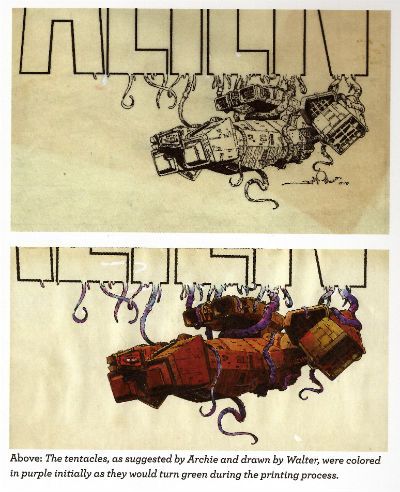
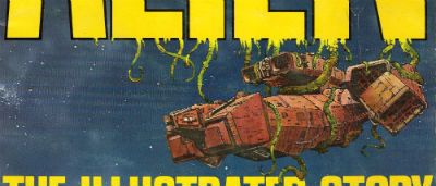
But you still need to get another copy to look at the original cover, then you've got the final piece of the puzzle. (Hey, purple becomes green - I did not know that!):

Photobucket

When I was doing the script/final page comparison I tried to scan in the original art page just to get that middle step in but that was seriously not a thing that was going to happen. Look, I'm just a sour old man sat in his kitchen with a scanner that can just fit a normal comic without technical hilarity ensuing. I'm not a 21st Century publishing house. So, in lieu of that please accept, as a token indication of the original art involved, a reproduction of the final panel of that page:

Photobucket

There are two things I really like about having that panel:

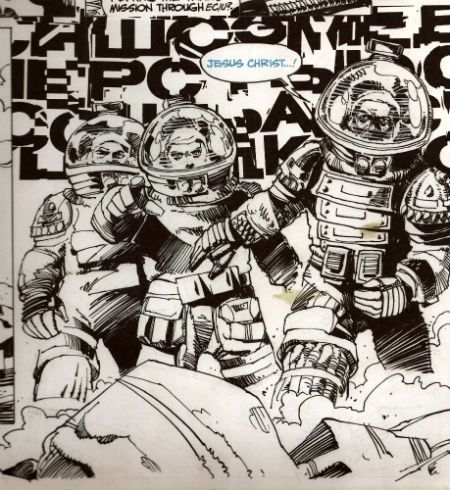
1) I can now tell that Simonson drew distorted shapes in the helmets behind the characters' heads to represent the letters of the SFX behind them. He has visually indicated the distortion the (already bizarre) noise is subject to by passing through the medium of the helmets. I don't think that extra attention to detail is apparent in the published piece. SIMONSON!

2) The stains!

Were I to spend £54.99 on a book only for someone to spill coffee on it I can assure you there would be raised voices and the very real possibility of awkward man-dancing resulting in at least a torn cardigan and at worst a grazed knuckle or two. Shouty violence of a singularly inept and middle-aged stripe would be on the cards. I'd react badly is what I'm saying. And yet...and yet...I have just spent £54.99 (well, not really £54.99...) on a book and I am pleased as punch to find a reproduction of the 33 year old spillage from one of Simonson's cawwfee cups defacing it. I mean, it isn't even the real stain. But, in my defence, it is a stain reproduced from the original artboards!

It was a massive amount of fun looking at this massive book and comparing it with the original, reading the interview, matching the script to the original art and then to the published work etc. But I am not unaware that it was also massivley expensive fun. If you've got the cash to hand it is an eye opening, beautifully produced experience. Particularly so for non comics makers, for such as them (i.e. such as me) who'll probably get no closer to the process than this I'm going to say this was EXCELLENT!

If you just want to read a really good comic adaptation of the movie ALIEN stick to the normal tpb (£10.99 UK). This one is for the professionals, the would-be professionals and the untalented nutters like me who just really, really like COMICS!!!
NEXT TIME: Who the Hell knows (lesson learned.)

"I Admire Its PURITY." Comics! Sometimes They Are A Bit Like Films (ALIEN)!

Photobucket (Or: Never Put an Englishman called Kane in charge.)

Photobucket ALIEN: THE ILLUSTRATED STORY Art by Walter Simonson (b.1946) Words by Archie Goodwin (1937 - 1998) Lettered by John Workman (b.1950) Based on 20th Century Fox's science fiction hit, ALIEN (Heavy Metal Futura Publications, £2.50, 1979)

1. "It's Not Our Sysyem..." or I Start Talking.

It's only a slim volume this, a hair over 6o pages so the team have it all on to pack in the 117 movie minutes. In fact it's a ridiculously small amount of space but the bizarre thing is that they have any space at all. Why a comic adaptation of a film in 1979 of all years?  STAR WARS is why. Just as STAR WARS' mind damaging box-office success is the reason ALIEN was green-lit so was STAR WARS the reason for the existence of a comics adaptation. The comics adaptation of STAR WARS was very, very, very successful (alas, this had nothing to do with the fact that the world had woken up to the magic of Howard Victor Chaykin). Also the people working on ALIEN were pretty comics savvy and were familiar with HEAVY METAL (Ridley Scott has described his storyboards as being very "Moebius"). So that's why a comic and that's why a comic by HEAVY METAL.

Photobucket

ALIEN:THE ILLUSTRATED STORY(A:TIS) was intendended to spearhead a series of movie adaptations that would be serialised in HEAVY METAL and then collected. I don't know how many others were produced but I know there was the Veitch/Bissette 1941 adaptation (way better than the inert film) and Steranko's OUTLAND (like getting Picasso to adapt BEN10). This latter has never been collected in English so I guess the run of adaptations fizzled out pretty quickly. The then Art Director at HEAVY METAL John Workman was tasked with bringing the ALIEN adaptation to term and rang Carmine Infantino with the intention of having Infantino do pencils and Simonson do the inks.  Infantino's phone was busy so Workman rang Simonson and by the end of the call Simonson had smooth talked his way into doing the whole job. Simonson had the very bright idea of roping in editor par excellence Archie Goodwin for the non-pictorial tasks. It was one sweet team thus assembled and the results were the first comic to squat on the New York Times bestseller list and, even better, remain there for 7 weeks.

Photobucket

It's important to remember that A:TIS  is an adaptation not a replication. Some dialogue you may be familiar with is missing some you might not recognise is present. It's a little hard at this date to actually remember what dialogue is actually in the film what with Scott's incessant tinkering. As regards the 1979 original version there are, I assure you, textual differences. This is because Simonson & Goodwin (S&G) had access to 3 drafts of the script and used these to piece together a narrative they found most satisfying to the comics presentation. From the ground up the piece was built with its format in mind. They had also seen a cut of the film and had access to an abundance of stills so the book's visuals are clearly sourced on the cinematic offering. Not being composed of pure tedium S&G don't do a lumpen shot for shot representation so the familiarity with the settings/costumes etc. allow them to vamp some stuff and use unusual POVs without losing the visual consistency afforded by the production's tip-top designs. S&G don't have to design anything because it's all been done for them by Ron Cobb (ship interiors), Cris Foss (ship exteriors), Moebius (spacesuits) and H.R. Giger (alien stuff). They can just concentrate on designing the comic. And design it they do. Rather than go through the whole thing page by page which would break even the strongest reader's spirit I will now briefly alight on a few instances I find pleasing to mine eye.

2. "Oh, I Feel Dead." or (Slow) Motion.

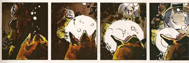
ALIEN the movie opens with a languorously paced sequence in which a strange transmission is received and the Nostromo's crew are awakened from hyper-sleep. This takes quite a bit of screen time but the comic doesn't have the same luxury in terms of space (using a shorthand of time=pages). What S&G do is pretty neat. They go to the opposite extreme and slow the scene down further. You could call it decompression even but it's a strange kind of decompression. They counterintuitively concentrate on the opening of a single eye to both illustrate the process of waking and set the tempo for the scene they are illustrating. Witness the four panels given over to Kane's eye opening:

Photobucket

This effectively sets the sluggish pace for the happenings depicted on the page and cues us in that the others will be waking equally slowly, because this is a slow process. It's a bold move to use so much of the sparse space available on so few seconds of screen time. Bold but effective as the sequence is emblematic of the waking process as a whole. The visual decompression acts a form of compression with regard to the content.

There then follows a depiction of Kane brewing up for his colleagues. I like this sequence because it shows the intelligence behind S&G's choices, because as in any adaptation choices have to be made. This takes up quite a lot of space, relatively speaking anyway. It is after all just a man brewing up which is precisely the kind of mundane task that you might think could be jettisoned

Photobucket

from the narrative without any loss being felt. But S&G recognise it is important in its very mundanity. When you wake up, you have a coffee. Even in space. It's a recognition of the crucial interplay of the familiar and the unfamiliar which anchor the film and allow for the later excesses to be accommodated without a break in the suspension of disbelief. Also, a lot more is happening in those panels than those of the preceding waking sequence. Note the single panel of the steaming cups indicating the repetition of the task without the need to actually repeat the other panels. The density of the panels indicate the pace is picking up compared to the sleepy start. With Kane's salutation the reader effectively receives a signal that the plot is now in motion.

3. "It Doesn't Look Like An S.O.S." or Sounds Without Sound.

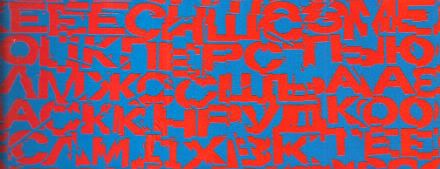
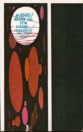
The movie uses sound design beautifully to evoke the otherness of certain occurrences such as the meaty phlop of the egg flaps opening or the screech of the skedadilling chest burster. Naturally the mute medium of  comics can do little but suggest these; usually through distortions in the lettering. With A:TIS S&G demonstrate that the power of suggestion can be surprisingly powerful. They attempt to replicate the scouring howl of the howling distress/warning transmission by choosing the most godawful combination of text and background colours known to reading beings. That's no accident. It's supposed to be perturbing. It'd be hard to make text anymore unsettling than engineering it to actually move around in a queasy manner at the slightest variation in your gaze. The fracturing of the letter shapes and the vibrating effect of the colour combination rattle the reader's gaze in a really quite clever manner.

Photobucket

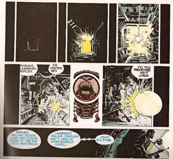
Unable to replicate the staticky crackle and insistent hiss of communication over comm-channels the decision was made to colour such speech blue. This doesn't actually communicate the texture of the noise but it does at least imply a difference in the sound emitted by the characters and the  sounds emitted by the technology around them. It would be hard for a non comics-savvy reader to parse the panel below without the visual cue of the colours. But because the rules of the text/colour device have been set up clearly in the earlier pages any reader would know that Brett and Parker were not hallucinating but hearing a comm transmission from someone not pictured in the scene.

Photobucket

4. "Open The Door!" or It's Constraining Men (and Two Women).

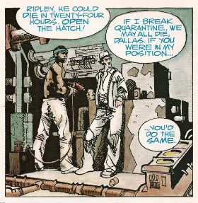
A key element in the tension that underscores the movie is the pervasive sense of claustrophobia.  The physical environment aids the film makers here with the sets being fixed and the ceilings having been lowered by some four feet to create a physically oppressive reality in which the action unfolds. Archie Goodwin was responsible for the placement of the balloons on the page while Workman lettered within them. Goodwin was an excellent editor and his positioning of the balloons suggests the presence of some considered intention. Now while it's possible to argue that the density of the speech is a result of the space limitations it's also possible to argue that the placement of the balloons is used to hem in the figures to create an additional level of constriction.

Photobucket

The words on the page are read as equally physical and present as the drawn environment in which the action occurs.The characters are doubly restricted by the ship drawn around around them with all its clutter and shadows and the very words they are speaking.

5. "All Other Priorities Rescinded." or Toeing The Company Line.

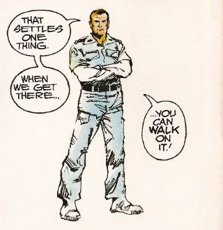
There are very few instances where this atmosphere of restriction are alleviated but there is a particularly jarring one which is used in the service of both characterisation and foreshadowing. There are some things a film can do which it is impossible to reproduce on the page. Crucially these include the incredibly convincing performances of all the actors involved. These are some good performances right there. There's no way via words and pictures to fully convey the shrill flakiness of Lambert (Veronica Cartwright), the passive-aggressive sniping of Brett and Parker (Harry Dean Stanton & Yaphet Kotto), the chafing enthusiasm of Kane (John Hurt), the fake-matiness of Ash (Ian Holm), the eroding confidence of Dallas (Tom Skerritt) and the uncertain certainty of Ripley (Sigourney Weaver). I can't believe even the best comic writer and the best comic artist could do more than approximate the fusion of emotional flavours in Weaver's reading of the simple line, "Micro changes in air density, my ass." I only point out this 'failure' so I can concentrate on the work's successes because Simonson & Goodwin do achieve some fantastic successes here. One of them is this:

Photobucket

During the film Ian Holm is able to subtly suggest Ash's oddness with a series of brief bizaritties that verge on the subliminal; his little standing jog, the intermittent twitchy moues and his inflexibly diagnostic gaze during the 'birth' sequence for example. It's a subtle string of hints and tics that build towards his character's revelatory scene. S&G don't have room for that but they get one good shot in with the above panel. From the stance to the complete nullity of the background they manage to communicate that as far as Ash is concerned only he exists and has any real import. Nothing around him matters, particularly not his crew-mates. He's the perfect Company Man. And like all Company Men he isn't really a man at all. Um, spoiler?

6. "It's Got A Wonderful Defense Mechanism. You Don't Dare Kill It." or (Quick) Motion.

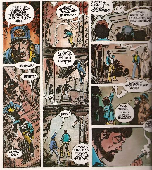
Punctuating the unhurried pacing of the film like a steel toothed phallus piercing a Brit thesp's chest are scenes of abruptly frantic action. One of the earliest of these occurs when the crew discover that the xenomorph sat on Kane's face has a charming defense mechanism in the form of acid for blood. S&G don't have a physical set they can hurtle through with a soundtrack and editing enhancing the action but they have a good go nevertheless.

Photobucket

The page itself is pressed into service as the film set with the panel breaks and gutters providing the editing. The eye has to travel from the top of the first column to the base then in the gutter it moves swiftly to the top of the second vertical which is interrupted by the in-panel floor levels suggesting "soft" breaks in the page which the eye lingers on but less so than "hard" white breaks. The speed of the gaze downwards is thus increased but not actually interrupted before zipping back up via the gutter again to the top of the third vertical where the division into four panels by "hard" breaks cause the gaze to slow before halting on the final panel. Reading the sequence the eye really covers some ground and together with the diminishing pace this adroitly captures the essence of the scene.

7. "Now, This Air-Shaft May Work To Our Advantage." or The Suspense of Uncertainty.

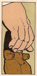
The sequence where Dallas scurries around in the guts of the ship in pursuit of the Alien is also rendered effectively despite the static nature of the form although here the techniques are a little more ambiguous. Purposefully so, I'd say. In the top layer we are adopting the POV of something other than Dallas, its uncertain whether we are seeing things from the Alien viewpoint or just a non specific POV. Then there are the thin vertical panels breaking up the larger images. Are these the Alien's POV? The increasingly illuminated panels interrupting these flat blacks indicate Dallas' imminent arrival.  When Dallas reaches our POV the interruption changes from black to a blare of white dominated by a bizarre image. It's clearly related to the Alien but is it the Alien reflected in Dallas' lamp lens? Is it the Alien sheltering in some comfy duct now the light has invaded its previously dark nest? Dallas forges on to the outer edge of the last horizontal panel but behind him there is darkness.

Photobucket

In fact there's an uncomfortable amount of darkness behind him, more than there is light in front; is that to indicate how far he's come or to indicate that now there is something behind him? The whole sequence depicts Dallas nearing our POV on the top layer, arriving at that POV in the middle layer and then moving away again in the final lower panel. There's a definite sense that what he was heading towards is now behind him. Something happened in there, the exact nature of which is imprecise but the implication is it isn't going to be good. There's just something really creepy and suspenseful about the whole thing which is perfectly appropriate and the uncertainty of it all exacerbates this.

8. "I Wanna Go Home And Party" or Hurray, I Shut up!

Yeah, sure, despite all this craft, talent and enthusiasm A:TIS never once manages to replace the audio-visual thrill of the film itself. But this would be an expectation held only by someone possessing an excess of optimism or a shortage of sense. It does however provided a surprisingly innovative comics experience. One that's still fresh and surprising on a technique level some three decades later. As I say I've just highlighted some of my favourite parts. There's plenty of other stuff on the pages such as Simonson's occasional use of organic bio-form borders, the use of splash pages at moments when they are most useful and even one page that is composed entirely of colour elements with no line work. This all sounds positivley innovative and challenging particularly as the modern tendency would surely be to to slap verbatim dialogue on unvaryingly widescreen panels. And, yes, if you break down the techniques on show they are quite complex but this complexity is  used entirely in the service of transparency of meaning. While Simonson has claimed that the book was accompanying a hit movie accounts for its unprecedented success it wouldn't be too outlandish to think that the high quality and accessibility of the end product itself might not have helped as well. ALIEN: THE ILLUSTRATED STORY is, after all, VERY GOOD!

Note: ALIEN: THE ILLUSTRATED STORY is due to be reprinted in May 2012.

Acknowledgements: If any facts have made it into this waffle that is due purely to the following sources: MODERN MASTERS: WALTER SIMONSON (TwoMorrows, 2006) THE ALIEN ANTHOLOGY (20th Century Fox, 2010 (Blu-Ray))

Photobucket Have a good weekend, all, and remember to read some COMICS!!!
"It Feels So GOOD To Be A Hero..." COMICS! Sometimes They Are Too Good!
The Church of Howard Victor Chaykin (as named by Corey of The Ottowan Empire) is now in session. Now bend your knees and bow your heads…oh, you have such filthy minds. Shame on you. Photobucket

As is customary many ill-judged words will now follow…

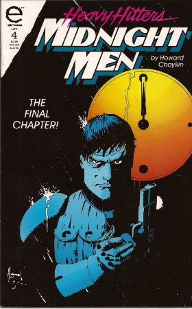
MIDNIGHT MEN Story and art by Howard Victor Chaykin Colouring by Tom Vincent Lettering by John Workman, Jim Novak (Epic Comics/Heavy Hitters/Marvel, $1.95ea, 1993)

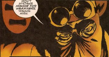
Handsome Jewish schmuck Barnett Pasternak returns to L.A. to attend the funeral of his father. But Barnett’s father died no ordinary death – his thyroid was removed! And L.A. is no ordinary city - protected as it is by a seemingly ageless protector who to the wider world remains an urban legend. In short order Barnett finds himself reunited with an old flame, an accessory to murder, on the outs with ex-KGB in cahoots with a Hollywood Player who just might hold the key to his father’s death and all the while Barnett Pasternak is unknowingly on a collision course with his Destiny. Barnett Pasternak is about to discover that you should never mistake honour for weakness and that you can’t kill…THE MIDNIGHT MEN!

Photobucket

For the sake of everyone’s sanity Howard Victor Chaykin shall, mostly, be referred to throughout as HVC. Although it strikes me now that that sounds like some kind of Home Shopping Channel. One that specialises in marital aids and Mai-Tai mix, maybe. Oh, well too late now. HVC it is.

Here’s a couple of facts before we even crack the covers of these beauties:

Fact One: MIDNIGHT MEN is © Howard Chaykin, so it ain't work for hire. I believe all the original titles released under the Heavy Hitters banner from Epic (Marvel) were creator owned. Imagine that. And it wasn't some kind of sop to creators already working at Marvel where they could pursue more personal and ambitious works (i.e. TV pitches). No, MIDNIGHT MEN was published by Marvel but is owned by Howard Chaykin. That’s because HVC is many things but one thing he isn’t is daft enough to end his days rooting through bins like some kind of rakish urban fox.

Fact Two: This may not actually be a fact but the way I understand it is that MIDNIGHT MEN is a retooling of HVC’s original pitch to DC when they decided they were going to mess up Batman big time. HVC didn't get the gig as it seems DC probably weren't really receptive to the idea of Batman dying as a result of an alcohol enabled intersection with a broken flag pole. So they went with the whole spinal injury/crack addict wrestler thing. The success of that would lead to a string of such bloat as BRUCE WAYNE: COCKKNOCKER! and GOTHAM: POOR ROAD SURFACE MAINTENANCE! Events have continued to emit from The Big Two with such decreasing returns that by this stage such events enhance the North American genre comics scene in the same way that injecting chicken meat with water enhances that particular product. Tasty!

It’s a mark of how far Events have lost the plot (and the pacing, characterisation, etc.) that I look back on KNIGHTFALL with a certain level of fondness. As indeed in all probability do DC. This year their Big Thing (i.e. short term sales spike!) looks like being, maybe, WATCHMEN 2. Crack those bones, there’s marrow inside! It’s okay though, comics are saved because Marvel have got AVENGERS Vs. X-MEN. This is a series which will take a bus load of men to produce a story of two groups of people with magic powers hitting each other for REASONS! So special, sophisticated, insightful and nuanced will this prove to be that all the fight scenes are actually going to be in another series. Yes, DC and Marvel are going to save comics by pretty much acting like they are trying to help someone whose hair is on fire by stamping on their head. I guess these series could be great, I guess that could happen. I guess the audience might not react exactly as they have every time one of these things has ended i.e. like James Spader on the grass verge at the end of Cronenberg’s CRASH: “Maybe the next time, Darling. Maybe the next time.” Sweet Mercy, I am now actually more jaded than James Spader in CRASH. A big round of applause for mainstream North American genre comics, people! Time to put those pennies on your eyes, Big Two! Going on a boat trip! In fact the best result of KNIGHTFALL is that MIDNIGHT MEN exists. I suppose I should stop mouthing off like a jackass and talk about that now.

Photobucket

The biggest problem with MIDNIGHT MEN is that it is a HVC comic. This means that people who don’t like HVC comics won’t like it (it is very HVC) but that’s their loss. For people who like HVC comics the fact that it is very much a HVC comic is also a problem. Because this means it is incredibly slick with every one of the elements under the author’s control working to the sweet end of entertaining the audience. It is so good at doing this that it is easy to overlook how clever it is. It’s ultimately too good for its own good.

Photobucket

By 1993 HVC had pretty much nailed down all the techniques that worked in order for him to produce a quality piece of work. Following his development through the stumbles and mis-steps of the ‘70s through to his glorious moment(s) of clarity in the ‘80s and ‘90s with AMERICAN FLAGG!, BLACKHAWK, TIME2, BLACK KISS and MIDNIGHT MEN it's clear that with AMERICAN FLAGG! he finally consolidated all his (hard) work and learning to create a new comics grammar and that everything after represented honing. By MIDNIGHT MEN his comics “voice” is so fluent and captivating it’s easy to miss what he’s saying and how well he's saying it.

Photobucket

A lot of what HVC is saying in MIDNIGHT MEN is what HVC is often saying in his comics. Foremost is the fact that in a HVC comic it would be totally dreamy to be HVC. (I imagine it ain't too shabby being HVC in real life either.) All HVC’s heroes are HVC to some extent or other. If you had all his characters team-up in one book not only would I soil my pants with glee but it would also resemble THE SAILOR ON THE SEAS OF FATE but with louche chiseled jawed Jews being witty and quick with their fists and good with the ladies. So, yes, Barnett Pasternak is a HVC hero. And like all HVC’s latter day heroes he follows the usual HVC character path.

Photobucket

This recurring character development lurking in HVC’s work can clearly be identified as originating in the phrase “overcame a youthful attitude problem”. Now this phrase occurs often in HVC’s blurbs and interviews. It really does, you can take my word as I’m sure you've got better things to do than check. That porn don’t watch itself, kids! Clearly HVC reached a point in his life when (Jewish literary reference ahoy!) something happened. I don’t know what all but whatever it was HVC clearly thinks that at one point he was a schmuck and then he was a mensch and ever since he’s felt glad all over. Which is precisely what happens to Barnett Pasternak. Although I imagine the real biographical details don’t involve HVC donning the mantle of an urban legend vigilante who lost his life saving him. But then who knows what HVC does at the weekend? (Ladies do!) MIDNIGHT MEN is the story of Barnett Pasternak (HVC?) learning to man up and develop some moral balls. If I were a blunt man I’d say that HVC feels that it’s a crucial part in becoming an adult to stop wanking and start fucking. Ethically speaking, of course. Aren’t you glad I’m not a blunt man.

Photobucket

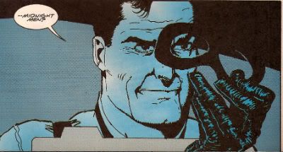
Usually this Hero’s Journey is contrasted with a Villain who has failed to make this course correction. Here we have Noble Youngblood and he is what is known in the Chaykinverse as a Moral Cripple. It’s a pretty self explanatory term, I feel. Now all the hoo-ha in MIDNIGHT MEN is caused by Youngblood’s desire to get his hands on an anti-aging formula. The only problem is that for it to work it requires thyroid glands and the natural habitat of the thyroid gland is the human being. Luckily Youngblood can get round this by having his ex-KGB chums harvest them from the worthless. To people like Youngblood anyone who isn’t as rich or powerful as him is worthless (because they didn't try hard enough, they weren't hungry enough probably.) For, as we all know, being poor and fucked up is obviously a conscious choice. The fact that Youngblood is an ex-movie star is another Chaykin favourite, for HVC never tires of pointing out the differences between the heroes on the silver screen and the failings of the individuals portraying them (even today; see the John Wayne comments by Nick Fury in AVENGERS 1959). Humour is always present in a HVC book and the stuff outlined in the previous sentences make the fact that Youngblood is killing people who won’t contribute as much as he will to the world a real yucker. C’mon you might take a bullet for the guy working on a cancer cure but Robert Pattinson can invest in his own damned bullet proof jacket. I get the impression the fact that such importance is placed on an anti-aging formula is also amusing to HVC. Finally in possession of the formula Pasternak solves the humongous moral quandary it presents by just eating it. I like to believe HVC believes that it isn't how long you live but how big you live that matters. Mind you, I also like to believe you are still reading this far in despite the paltry return on the investment of your attention.

Photobucket

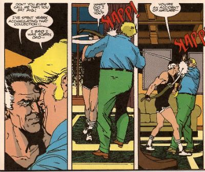
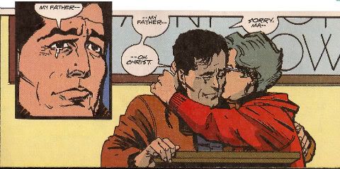
HVC does add a new wrinkle with his emphasis on sons and fathers. It isn't often a HVC hero weeps so I think the fact that this one does is notable. And who does he weep for? His father. Pasternak is initially involved via the death of his father, a career criminal who we are led to believe was a better criminal than he was a father. Youngblood has an illegitimate son who is a tubby fucknut. HVC’s not too interested in the fathering part of the equation though it’s probable that the scenes in which Youngblood verbally and physically abuses his nutty son shouldn't be taken as examples of How To Bring Up A Kid. Unless you are a shithead. I’d say it seems like these fathers have failed as men but that doesn't mean their kids have to. And in the end one of them doesn't. I guess HVC is saying, if you’re an asshole it might not be your Dad’s fault you’re an asshole? Maybe. I guess MIDNIGHT MEN is the old Nature vs Nurture debate but with better dressed people doing more exciting things than anyone in my Sociology classes ever did. Although I was pretty dapper truth be told. It’s a shame for my endless need to put meaning where there is none that it was some years after this series that HVC discovered he was in fact adopted (your ChaykinFact for the day! No charge!). That’s right, Abhay fans, EVERYTHING HOWARD VICTOR CHAYKIN KNEW ABOUT HIS DAD WAS WRONG!

Photobucket

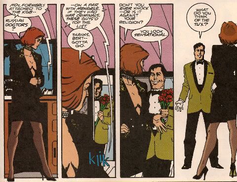
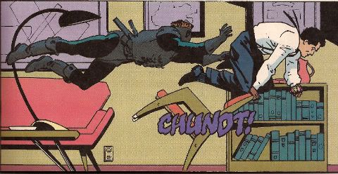
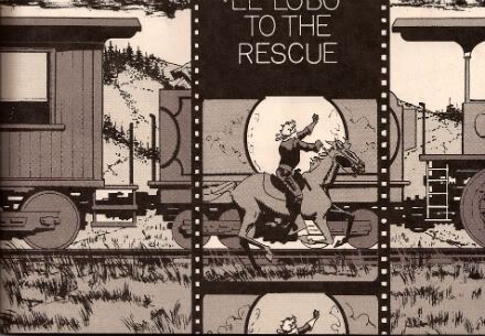
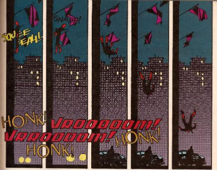
Visually MIDNIGHT MEN looks like a HVC comic but the familiarity of the elements does tend to obscure the fact that it isn't repetition it’s refinement. In the first issue HVC kicks off with a first page that incorporates photographs and silent movies.  Static pictures and moving pictures presented on the immobile page. But you still know which part is the moving picture. It’s easy to miss that it's very clever. The same issue sees HVC splash out on two pages of 4x3 grids to illustrate a safecracking which reveals much about the three characters present, is convincing in its safe crackery details and has time to include a fat man’s hand inadvertently touching a statue’s penis. Throughout the series there’s also a recurring vertical panel layout tracking the motion of a body through the panels. This striking and effective visual also foreshadows the final act in which Pasternak’s ethical nuts swell and provides contrast with the scene in which Pasternak meets and kind-of kills the man whose role he will ultimately fill. It’s great stuff and it’s HVC all the way. It’s never a one man show though and John Workman and Jim Novak’s sound FX are great throughout ( particularly when suggesting the aural smog of traffic) despite the multiple fonts and creative placing they never jar the attention and only serve to accentuate the reading experience. When I read MIDNIGHT MEN I just enjoyed it but when I flicked through it and looked at the pages in isolation I realized what a great service HVC had done the reader. Visually it is an eminently subtle work and rewards close examination on a technical level but is so good at its job that it stops the reader realising how good at its job it is. Which is a mistake people often make with HVC himself I feel.

Photobucket

So, MIDNIGHT MEN is every bit as good as all the good HVC comics but not quite as good as the best. Which makes MIDNIGHT MEN, for me, GOOD!

CHAYKINMANIAC NOTE: This series remains uncollected despite DYNAMITE threatening to do so.


I thank you for your attentions.

Have a smashing weekend with some COMICS!


NEXT TIME: Not Howard Victor Chaykin! Not War Comics! (Unless I have to fall back on those, otherwise my word is my bond!)