“I Myself Played A Zobo Kazoo.” COMICS! Sometimes Comedy Lurks In The Unlikeliest of Places!
/Yeah, uh, sorry. Didn't mean to be gone quite so long. Got distracted by the real world. Big Mistake. What an awful place the real world is. Simply dreadful. So, yeah, not a good year thus far for any of us, huh? Hey, I know what we need, some sweet, sweet COMICS!!! (DISCLAIMER: Contains words of praise for Alan Moore.)
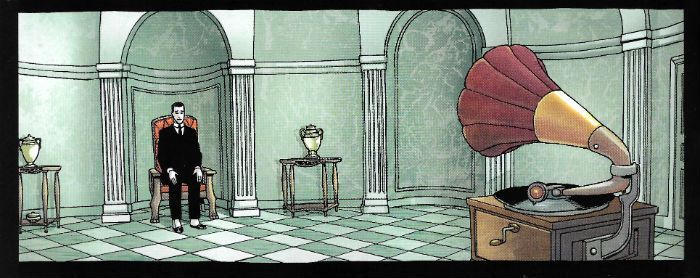
 Midnight of the Soul by Chaykin, Arbutov & Bruzenak
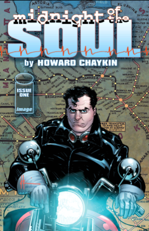
Anyway, this... MIDNIGHT OF THE SOUL #1 Art by Howard Victor Chaykin Written by Howard Victor Chaykin Coloured by Jesus Arbutov Lettered by Ken Bruzenak Image Comics, Inc., $3.50 (2016) Midnight of the Soul created by Howard Victor Chaykin
So, yeah, at long damn last Howard Victor Chaykin's MIDNIGHT OF THE SOUL strikes at your eyes like a comic book cobra! My son (“Gil”) wasn't even born when the coiner of the phrase “moral cripples” started talking this one up. You can't rush awesome though, so here we are. Fifteen hairline depleting years later, here we are. This time out Howard Victor Chaykin's dreamy doppelganger is one Joel Breakstone who as ever looks good, looks fine, maybe a little too good, a tad too fine for someone in Joel Breakstone's position. That being one of a man wallowing in a self medicated haze of booze following an as yet unrevealed incident while liberating the WW2 Death Camps.
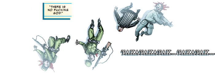
We'll obviously be coming back to the Death Camps of WW2. Largely because Joel Breakstone keeps going back to the Death Camps of WW2. Because, as Joseph Heller might have it “something happened” in the Death Camps of WW2. Not just the stuff we all know went on in the Death Camps of WW2 but something particular to Joel Breakstone. Because Joel Breakstone helped liberate one and what occurred in The Death Camps of WW2 is the gift that keeps giving. But then don't judge the book too quickly, because there is such a thing as an unreliable narrator and a pretty good candidate for such a post would be a man whose spent five years coping with PTSD by self medicating himself with alcohol and refusing to leave his house. That's Joel Breakstone, not me. On the very first page turn Chaykin seamlessly entwines the past and the present via the images of chimneys and he keeps this high standard of storytelling up for the duration. He seems more than present, he seems engaged, and because Howard Victor Chaykin is engaged the words on the page matter and no word matters more than the first word here “Parallels.”
 Midnight of the Soul by Chaykin, Arbutov & Bruzenak
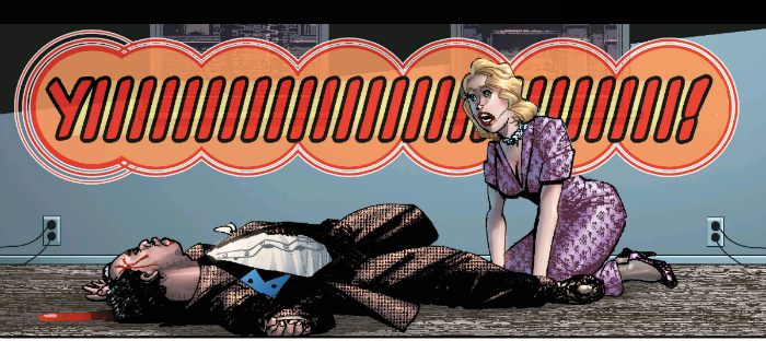
Art-wise it's looking good, it' s looking cleaner and smarter than a Howard Victor Chaykin joint has for a while. The big test of Chaykin art in 2016 is how is going with the cheeks'n'chins? I checked with my eyes and the cheeks and chins in MotS seem altogether more controlled than they have for awhile. Chaykin's reigning in his prognathous tendencies and no one is stylin' Jō Shishido cheeks,so that's good. His figure work's sweet, with a killer panel of Breakstone kicking his TV in. And that TV, like everything around it, seems period authentic so I guess he's as reliable as ever in that respect. There's still a little ghost-float where the images don't quite cohere ideally, but Jesus Arbutov's shadows attempt a corrective tethering. And Ken Bruzenak, lovely, lovely Ken Bruzenak continues his ridiculously innovative attempts to visually represent the purely audible; by now his constructions of visual onomatopoeia are as integral to the art as a whole as any pictures Chaykin lays down. It's a finely honed machine, is what I'm saying.
MIDNIGHT OF THE SOUL is as ridiculously virile, as cheekily provocative, as visually intelligent and as resolutely “Chaykin” as anyone could wish. VERY GOOD!
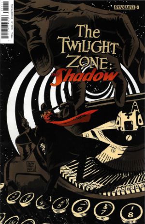
THE TWILIGHT ZONE: THE SHADOW #3 Art by Dave Acosta Written by David Avallone Coloured by Omi Remalante Lettered by Taylor Esposito Cover by Francesco Francavilla Dynamite Entertainment, $3.99 (2016) The Twilight Zone created by Rod Serling The Shadow created by Walter B Gibson
Here's a thing, my LCS just automatically sends me every comic about The Shadow. I'm not entirely sure why that is, but it is. Maybe they think I am so old I remember the pulps or something. Anyway, this isn't what I was expecting at all. I was hoping The Shadow would be maybe fixing Burgess Meredith's glasses, or leaning past William Shatner and firing his twin .45s through the plane window and blowing that thing to fuck and back, or maybe saving the world by saying, “For the Love of God, it's a cookbook, you blithering fools.” Nope, it's some kind of meta affair whereby Shads has entered The Twilight Zone and every issue he is plonked into some situation where The Shadow is a fictional construct (i.e. kind of our reality; last issue he was an Orson Welles doppler, this issue he's “Maxwell Grant”, and thus deucedely confused) and learns a lesson which brings him that bit closer back to the humanity he had been in the process of losing.
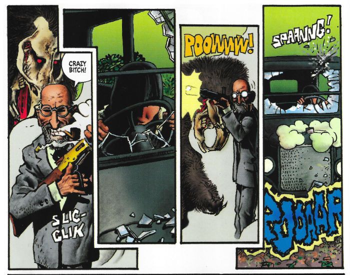
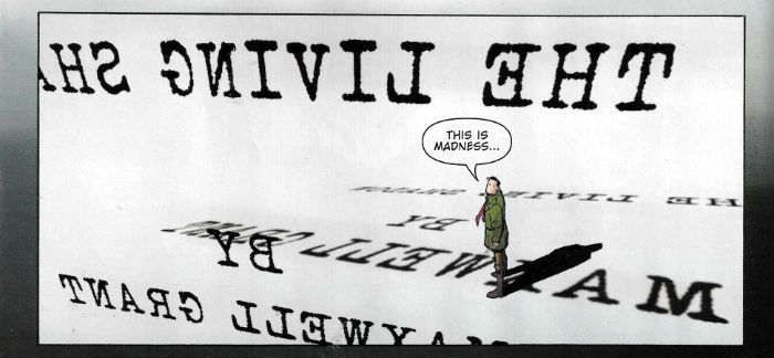 The Twilight Zone: The Shadow by Acosta, Avallone, Remalante & Esposito
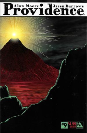
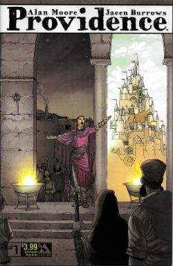
It's a clever little set up and while David Avallone might have bitten off a little more than he can chew and the spindly art by Dave Acosta is more game than it is successful, it's neat enough stuff. The kind of thing Neil Gaiman makes such bloody heavy weather out of , but Avallone & Acosta keep it all light with just the right amount of humour and some inventive set pieces. What could be more Twilight Zone-y than The Shadow being attacked by giant typewriter keys spelling J-U-S-T-I-C-E? Not much, I trust you'll agree. GOOD! PROVIDENCE #9 Art by Jacen Burrows Written by Alan Moore Coloured by Juan Rodriguez Lettered by Kurt Hathaway Cover by Jacen Burrows Avatar Press Inc, $4.99 (2016) Providence created by Alan Moore & Jacen Burrows Inspired by and indebted to the works of Howard Philips Lovecraft
In which everyone's favourite ginger haired Jewish homosexual nebbish glides blithely nearer a Stygian fate swarming with noisome and gibbering cyclopean terrors whose preternatural forms possess angles in defiance of all mortal conceptions of GEOMETRY!!! It took a bit of getting into to be honest, this one. Burrows' art was a bit of an impediment to immersion until I figured it out. It's purposefully bland. Being, I think, the visual equivalent of Lovecraft's dense and willfully archaic texts, which softly lull you into a kind of waking stupor, allowing the horrors to encroach subtly but decisively even as your eyes glaze over. Thus leaving you ripe for the final unveiling of...no, no, it cannot be named! At first I thought the series could be improved by having, say, Cam Kennedy or Richard Corben draw over the, uh, unutterable aspects. But then they'd really stand out, which isn't what they're after, I think. Even the, uh, eldritch elements have to be visually contiguous so that our protagonist’s rationalising of the thoroughly irrational has some credence.
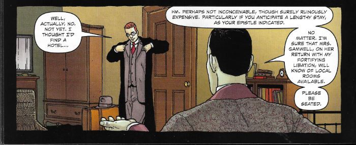 Providence by Burrows, Moore, Rodriguez & Hathaway
Sure PROVIDENCE took some effort to read, but it repaid that work. Heck, I even started rereading Lovecraft hissownself, and I haven't touched the stuff since I was 15. Lovecraft that is, not the glue. Yes, I'm still merrily huffing into my forties. No, but, anyway re-reading Lovecraft? Hoo boy is he racist! It's right on the page as well. I missed that when I was fifteen, so either I was a bit thick or I was very racist myself, because seriously HP Lovecraft? Big racist. Just lays it right out there. Turns out he was the kind of racist who was anti-Semitic too. Lovely. Funny thing is though he was the kind of anti-Semite who marries a Jewish woman, because racists never make sense. (That's because racism doesn't make sense.) Anyway that marriage was less than successful (I know! SURPRISE!), but it does lend HP Lovecraft's jolly time with our Jewish friend herein a undercurrent of humour. Because there's a lot of humour in PROVIDENCE, some of it quite dark but some of it just plain funny. I mean, HP Lovecraft on these pages is a hilarious creation, seemingly inhabiting the century just prior to the one everyone else is living in. His erudite vocabulary set to task on the most mundane of conversational niceties is a proper hoot. He was actually a bit like that as well, so they say. Odd cove all round that HP Lovecraft. Say, did I mention the racism?
With PROVIDENCE Alan Moore brings a depth, intelligence and care to his writing which makes most everything surrounding it in the mainstream comics world seem as unto hurried mush, and Jacen Burrows acquits himself well r.e. his apparent brief to keep it real. The book repays the work you put in, basically. That dumpy looking washer woman staring balefully from the tower in this issue? It's not the first time she's appeared in the series. But to what end. To what...END!!! VERY GOOD!
That is not dead which still reads – COMICS!!!
