“Let’s All Send Him Our Love.” COMICS! Sometimes I Suspect My Chakras Are Stunted.

Anthologies don’t sell! Yet people keep publishing them and I keep buying them. Here are some words about three anthologies I read this week.  photo ABCtopB_zpshtgnon6i.jpg ABC WARRIORS (Langley, Mills & Parkhouse)
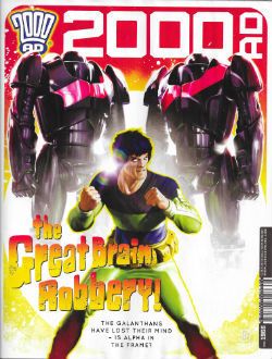
Anyway, this... 2000AD Prog 1966 Art by Mark Sexton, Richard Elson, Clint Langley, John Burns, Carlos Ezquerra Written by Michael Carroll, Dan Abnett, Pat Mills, Kek-W, John Wagner Coloured by Len O’Grady Lettered by Annie Parkhouse, Ellie De Ville, Simon Bowland Cover by Neil Roberts JUDGE DREDD created by Carlos Ezquerra & John Wagner KINGDOM created by Richard Elson & Dan Abnett ABC WARRIORS created by Kevin O’Neill, Brendan McCarthy, Mick McMahon & Pat Mills THE ORDER created by John Burns & Kek-W STRONTIUM DOG created by Carlos Ezquerra Rebellion, £2.55, weekly (2016) All contents © 2016 Rebellion A/S, unless specifically stated otherwise.

 photo Cov1966B_zpszprnldcy.jpg

Hey, here’s a thing I just noticed about 2000AD: in the little box of publishing information which tells you who owns what and what they’ll do to you if you nick it (rub distressed foxes in your face), some wag has only gone and put something humorous in it. I don’t have a fetish for legal bumph but concealing larks in that part of a comic is not entirely unknown, so occasionally I check, and this time that nanosecond glance into the small print paid off. I don’t know if it’s a regular thing, but this time out, camouflaged by legalese, someone has used the space to update people on his/her opinion of that TV series with the bikers in. The one with Ron Perlman in. The one Jason Aaron fans probably call “searing” and “incisive” when they aren’t eating raw bacon and crying about their dad not hugging them enough. Whoever penned the micro-crit wasn’t too impressed with the surly biker show but we were already into some pretty entertaining stuff and the comic hadn’t even started. See, it’s always worth having a poke about, you never know what you might find. Unless of course you work with highly confidential information, in which case you’re probably as well just minding your own business. No one wants to end up in a field choked on a porn mag with a suspiciously curt suicide note pinned to their head now, do they? As usual Tharg says some stuff but I didn’t read it. So if he said owt about me mum, let me know and I’ll go round and give ‘im a thick ear. At the bottom of the page we are promised the return of Bill Savage – COME ON, TWINKLETOES! GET SOME! So, yes, looking forward to that. GET IN THERE! Stoked, one might say.
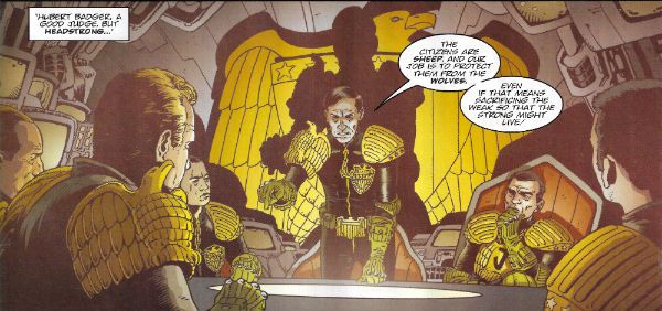
 photo DreddB_zps0omcuaan.jpg JUDGE DREDD (Sexton, Carroll, O'Grady & Parkhouse)

Oh, this one’s getting shakier as it goes on. Okay, we can go with a secret city-within-a-city of faux Judges, but stressing how hard-line they are (Hershey says they make normal Judges look like liberals – Whoof!) and then having them risk everything to rescue someone’s sister rings more than a little false. Additionally names are important in genre fiction and unfortunately naming the big bad “Badger” just makes me think of Brian May and I don’t really ever want to think about Brian May. Unless he’s being attacked by badgers. On the upside, however, Carroll does a really good job selling the idea that Dredd’s outclassed by his opponents on the cunning front, only to give him a sweet “You’re so sly, but so am I!” move to end the episode on. Sexton’s art remains detailed without becoming cluttered and is a definite asset to Carroll’s slightly listing script.  GOOD!
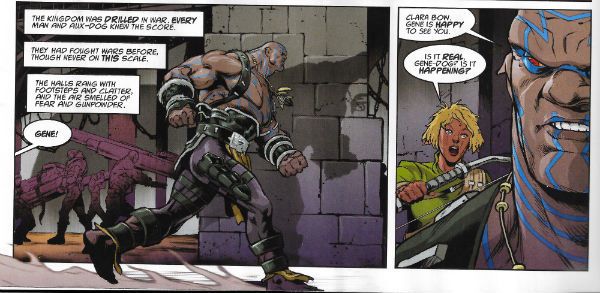
 photo KingdB_zpsfb3pppim.jpg KINGDOM (Abnett, Elson & De Ville)

There’s not a lot to say about this because it isn’t really a story, Gene (our genetically modified hero) goes and tells everyone the bugs are coming, everyone listens, goes away and prepares and then the bugs come. That’s yer lot. There isn’t even a dude with anchors on his jacket telling Gene that it’s the Fourth of July so it’s probably best for everyone if the beaches stay open. No, they just go “okay”, and knuckle down for the big slobberknocker promised by the closing two page spread of the sea of insects about to break upon the walls of the compound. You can tell that’s a big moment because pages are precious in each and every Prog, so to splurge on a double page spread means you best sit up and listen. It’s not like your American comics with their splash page fetish and its ever diminishing returns (except for writers who get paid by the page). Oh, KINGDOM’s all right, but like I say it doesn’t feel like a story just a sequence of events. Which is fine, Abnett and Elson efficiently purvey low-attention, high-octane entertainment, but I don’t think I’ll ever feel the need to read a collected edition. For six or so pages it’s pleasant enough company. A bit like a short bus ride sat next to someone who neither stinks of ammonia nor yammers into a mobile like a deaf cretin. OKAY!
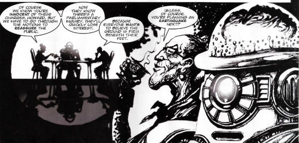
 photo ABCWarrB_zpsdspsdtnh.jpg ABC WARRIORS (Langley, Mills & Parkhouse)

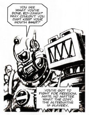
Pat Mills and Clint Langley once again, via the medium of violent robots, point at real world events and make Little Rascals Faces. Remember all those enquiries we had over here, particularly that phone hacking one which saw all those morally scrofulous people sent down and disgraced despite their connections to Rupert “Doomlord” Murdoch and David “The Ham Botherer” Cameron because The System works? No, neither does Pat Mills, but he remembers all those enquiries we had over here, particularly that phone hacking one which saw all those morally scrofulous people look a bit sheepish and embarrassed for a bit before basically taking up where they left off once everyone’s attention wandered back to The f****** Great British Bake-Off (“Terry’s sponge fingers tickle everyone’s fancy!”). Because: power protects power. Admittedly as messages go it’s all a bit rainy-day but Mills & Langley do part the clouds a bit to throw in a robot nurse with steel breasts (because men would, wouldn’t they?) and a psychotic robot yelling about “Big Jobs!” Langleys’ art might, alas, look like someone forgot to set up the printer properly but the fact ABC WARRIORS still bothers to pretend anyone cares about anything goes a long way towards healing that particular visual wound. Also, “Big Jobs!” will always make me laugh; simple pleasures for simple folk. And I am nothing if not simple. VERY GOOD! 
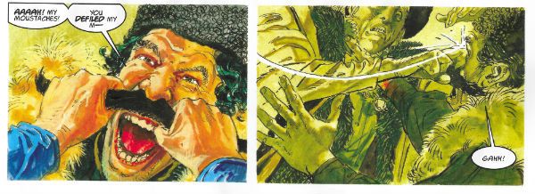
 photo OrderB_zpsmslut0le.jpg THE ORDER (Burns, Kek-W & De Ville)

Finally, The Order plays to its strengths which, John Burns’ lovely art aside, is the odd bloke tracking our dreary heroes.  The strip would be a lot better if this guy was the protagonist; he’s a bit like the autistic savant type so beloved of current televisual melodramas but less tiresomely winsome. The lesson here is that steam driven motorbikes and people anachronistically babbling in Code are okay, but character wins the day. OKAY!
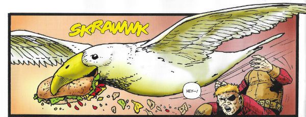
 photo StrontDB_zpsns4q6pvi.jpg STRONTIUM DOG (Wagner, Ezquerra & Bowland)

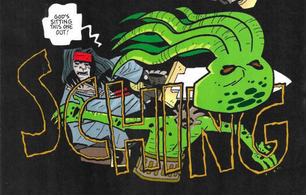
It’s easy to take Strontium Dog for granted given the apparent ease with which Ezquerra and Wagner pump it out. But then you see a panel where an alien seagull is snatching some snap from a dude with his face in his knee and the amiable weirdness of what is going on becomes glaringly apparent. I also like the fact that while Johnny is a presented as a Good Guy (which he mostly is) he’s also well dodgy and has no qualms taking advantage of the fact that the Galanthans can’t understand the concept of deceit. He’s not hurting anyone is he? Also, The Brain of Hoomonos looks like the end of term scrapings from the underside of a thousand ten year olds’ desks palm-rolled into a ball. Light comedy, endearing characters and nimbly imaginative shenanigans all add up to something that’s VERY GOOD!

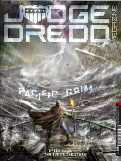
JUDGE DREDD MEGAZINE #368 Art by Nick Percival, Paul Grist, Steve Yeowell, Ben Willsher Written by Michael Carroll, Paul Grist, Arthur Wyatt Coloured by Nick Percival, Phil Elliott, Chris Blythe Lettered by Annie Parkhouse, Paul Grist, Ellie De Ville, Simon Bowland Text features by Karl Stock, Matthew Badham Rebellion, £5.80, mothly (2016) All contents © 2016 Rebellion A/S, unless otherwise stated. Demon Nic © 2016 Paul Grist JUDGE DREDD created by Carlos Ezquerra & John Wagner DEMON NIC created by Paul Grist GALEN DEMARCO created by Carlos Ezquerra & John Wagner

 photo JDMegCovB_zpsiqrrfaww.jpg

JUDGE DREDD MEGAZINE began in 1990 and is thus 2000AD’s much younger relative.  It comes out monthly rather than weekly, and has always seemed a bit extraneous to be honest; an impression not softened by the knowledge that it has often struggled to survive. At one dire point half the comic was taken up by PREACHER reprints, which was okay if you hadn’t already read PREACHER (or didn’t think PREACHER was an undisciplined mess). In 2016 those mend and make do days are long gone and it’s all original strips; well, except for quite a sizeable chunk of text stuff. I didn’t read the text stuff because I barely had time to read the comic, but it takes the form of interviews with the artists Mark Sexton and Darren Douglas, and the writer Si Spurrier. Although this is basically cheap content I am tentatively approving of it since I am old school, and I well recall having to actually make the effort to hunt down interviews with comic creators, and also the infrequency of such interviews. So if you have an interest in the work of Sexton (currently drawing Judge Dredd  - see above) or Douglas then there you go. Si Spurrier is more about shilling his new series from Image about werewolf lesbian soldiers or something. I’m sure it’s fine; he’s a decent writer from what I’ve seen. I do remain confused as to why he’s given space in the megazine to basically advertise another company’s product, but I’ll put that down to the British largesse of generosity (yes that famous largesse of ours) rather than the result of some weird quid pro quo. Mind you, if anyone is after some purely prose werewolf entertainment I’ll grant myself this opportunity to shill Toby Barlow’s SHARP TEETH (VERY GOOD!) and RED MOON (GOOD!) by Benjamin Percy. Two can play at that game, son.
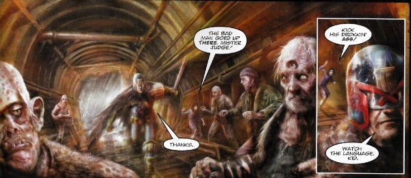
 photo GyreB_zpsuhhbm8to.jpg JUDGE DREDD (Percival, Carroll & Parkhouse)

Aw, nertz. This is just EH! And me and Michael Carroll were doing so well, we were going to meet each other’s parents and maybe start looking for a small house together! But he’s put the kibosh on all that with this duffer. In this first disappointing instalment of a new Dredd thrill, Judge Dredd and Judge Joyce go to a floating shanty town populated by the crew from Bill Nighy’s ship in that movie based on a theme park ride.  The thing is though, right, because of science no technology can work in this place, The Gyre.  Ah, where to begin. Right, yeah, it’s okay making a point of mentioning that Judge Dredd’s bionic eyes will still work because they are “shielded” since a) I’m impressed anyone remembers he had his eyes poked out during City of The Damned and b) the guy has to see unless we’re in for a kind of ultra-violent fascistic riff on Norman Wisdom. So, ahuh, okay, the tech don’t work except for Dredd’s eyes  (which are “shielded”) but how come, how come right, even though their guns don’t work, and they knew going in that only Dredd’s “shielded” eyes would work, how come they didn’t just take some of those projectile weapons humanity has had such a boner for for, ooh, only a few thousand years? How come that?   There’s no microchips in a Desert Eagle, Judge Dredd! Or a bow and arrow, for that matter. And why, pray tell, isn’t Judge Joyce in proper uniform? He’s an Irish Judge so he should be in green and white with the Guinness harp on his helmet, and be perpetually concerned that they’re all after his luck charms, Bejaysus! (Hey, don’t look at me; Garth Ennis’ frequently regrettable sense of humour’s the culprit there.) Or whatever. But no, he’s depicted as just another Judge here, which seems odd. (I suppose he could have got a transfer I forgot about during my 8 years in the wilderness) Mind you Nick Percival’s art is also pretty odd from soup to nuts. He’s gone for that all painted approach which is usually used by weaker artists to plaster over any artistic deficiencies, a function it never achieved too convincingly. And so it is with Nick Percival. But, I can’t fault his colours; everything’s got an appropriately fish-gutty look, and it all certainly looks like it would stink like death would be a mercy if you were actually there. But everything under the colours is awkward with stilted poses, and such a lack of flow that the water based scenario just becomes cruelly ironic. Like the host of a shit party Percival saves the worst until last, with a full page splash of something apparently so daunting our Judges can only goggle. Unfortunately the page turn reveals Percival has drawn what appears to be a bunch of empty barges kind of milling about lethargically, which no matter how highly strung you are isn’t even interesting, never mind threatening.  It’s like he forgot to draw something very important (like a horde of angry fish men, or a rain of enraged monkfish; I don’t know what he forgot,  after all it’s pretty hard to guess what someone hasn’t drawn). Nothing about this strip is interesting except the fact that Carroll decides to lift the “mind your language” bit from DARK KNIGHT RETURNS, and by interesting I mean baffling. I mean, why? (Because that’s what being baffled sounds like.) It’s not a homage - Dredd isn’t mortally wounded and he isn’t chasing his “Joker” through a Tunnel of Love, he’s just running after some thug and gets a bit short on wind on board a crappy ship. I don’t know why the callback’s there really. This first episode is so poorly thought out, slackly paced and badly visualised it’s more DARK KNIGHT III: THE MASTER RACE than DARK KNIGHT RETURNS. I’m not a fan is what I’m getting at here. Step it up, guys.

 photo NicB_zpsd7rfb3yh.jpg DEMON NIC (Grist & Elliott)

DEMON NIC (someone explain that title to Brian Azzarello, his little face is all creased up!) is a creator owned series by Paul Grist, and this episode is the final episode in the current run. Now, I don’t really know how I find myself in the weird position of just chancing upon work by Paul Grist right as it ends because , seriously, I would certainly appreciate it if someone out there could keep me informed of Paul Grist’s doings from now on. Clearly, The Internet isn’t cutting it. It is forever telling me what people I have no interest in are doing (things I have no interest in reading, weirdly enough).  I’m not bothered if he’s doing DOCTOR WHO because Doctor Who is, er, well, look, I’m not fussed, okay. I’m allowed to not be bothered about DOCTOR WHO you know! Everything else Paul Grist gets up to? Would you mind awfully letting me know? Thanks, you are a dear. So, yeah, nothing worse than coming in on a series’ vinegar stroke but this seems to be a spooky actioner a la Hellboy but considerably more dense, amusing and generally playful in that droll way I like. Oh, and the art is spectacular. Usually I get a bit twitchy when the page is black rather than white (Avatar do that a lot) and I’ll be shaking like a shitting dog if the panel borders also go AWOL because you need to be pretty sweet at that whole art deal to be getting away with that. Here Grist just plops his chunkily robust cast onto pure black pages and guides the eye around via the miracle of being very bloody good at what he does. Just brilliant stuff. EXCELLENT!
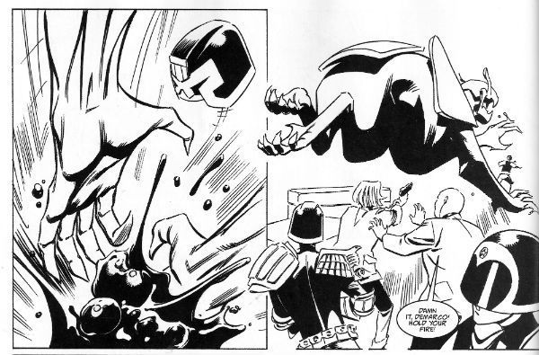
 photo MarcoB_zpsacvdiq3i.jpg DEMARCO, P.I. (Yeowell, Carroll & De Ville)

Ah, I’m beginning to see the problem; Michael Carroll is overstretched. Personally I avoid the work of any writer who regularly produces three or more US comics a month. I mean at that frequency we’re just talking mental effluvium at best; it’s not writing at that point it’s just words. Now, I don’t think Michael Carroll’s at that point yet, but then nor do I wish him to reach that point. This strip centres on Galen DeMarco a character introduced in the main Dredd strip who graduated to her own series. As a character I can’t say she she’s been terribly consistently written but then again last time I saw her she had a talking ape as a companion.  Said ape is notable by his absence so he probably died and we had a sad ape death scene which I missed, which is a shame as I am a sucker for sad ape death scenes. But enough about me! Here DeMarco is helping a bunch of Judges with some weird beast-robot things which might be connected to that TRIFECTA storyline? It’s not terribly clear. Anyway something breaks out and the size of the panels taken together with the  fact that the best last words two successive Judges can come up with at the point of death is a bare bones “No!” suggest Michael Carroll wasn’t going for the Nobel with this one. A harsher judge than I would declare it a bit of a page waster, but then I guess they wouldn’t find sufficient pleasure in Steve Yeowell’s lanky B&W stylings to raise it to OKAY!
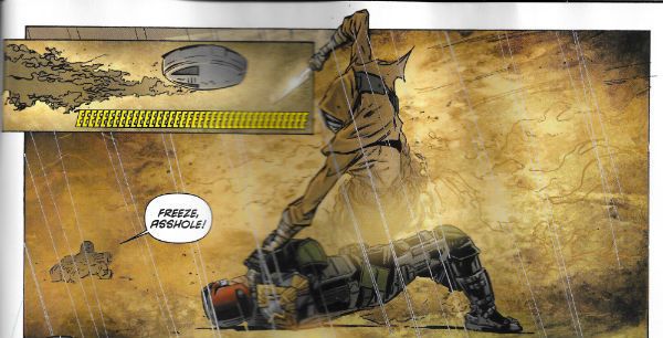
 photo MDreddB_zpsm8pzuexo.jpg DREDD (Willsher, Wyatt, Blythe & Bowland)

This is a Judge Dredd strip set in the cinematic universe of Judge Dredd. I don’t understand why that is because the cinematic universe of Judge Dredd is precisely one movie which wasn’t popular enough for a sequel. It was also a normalised version of Judge Dredd. It was okay and all; I enjoyed it. Thankfully it fed that Stallone fiasco into the woodchipper but it didn’t dethrone the original strip in my mind. It was a good movie, probably suffered from being released in such close proximity to the (similar but superior) THE RAID but, yeah, I enjoyed it. This strip seemed okay too, like if you wanted to read Judge Dredd but didn’t want to actually read proper Judge Dredd because, gee, it’s all a bit far-fetched. So in this one all the kit is more functional and the swears are normal and, me, I don’t find that as much fun. There’s a suspicion in my head that it might be repackaged at some point by IDW as it seems oriented to the American market in terms of pacing and storytelling. OKAY!

WUXTRY! Shrink-wrapped with this issue is a free magazine type Graphic Novel. This time out it’s Synnamon: Mecha Rising. I didn’t have time to read it but I do remember reading it back in the day, and for a strip about a leather jump suit lady burglar in the future it was OKAY! Undemanding entertainment slickly delivered. I think the important thing here is that you get a free magazine of reprints, and given 2000AD’s storied history chances are good that this will pay off more often than not.

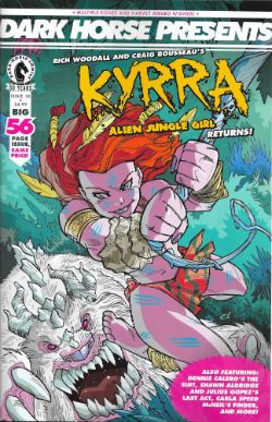
DARK HORSE PRESENTS #18 Art by Craig Rousseau, Dennis Calero, Julius Gopez, Carla Speed McNeil, Marc Olivent, David Chelsea, Tim Hamilton Written by Rich Woodall, Dennis Calero, Shawn Aldridge, Carla Speed McNeil, Barbara Randall Kesel, David Chelsea, Paul Levitz Coloured by Lawrence Bassa, Jeremy Colwell, Jenn Manley Lee, David Chelsea Lettered by Rich Woodall, John J. Hill, Carla Speed McNeil, Adam O. Pruett, David Chelsea Spot Illustrations by Geoff Darrow Cover by Craig Rousseau & Lawrence Basso Kyyra: Alien Jungle Girl TM © 2016 Craig Rousseau and Rich Woodall The Suit TM©2016 Dennis Calero Last Act TM © 2016 Shawn Alridge Finder TM © 2016 Lightspeed Press Sundown Crossroads TM© 2016 Barbara Kesel Sandy and Mandy TM © 2016 David Chelsea Brooklyn Blood TM © Paul Levitz and Tim Hamilton Shaolin Cowboy and related characters TM © Geoff Darrow Dark Horse Comics, Inc., $4.99 (2016)
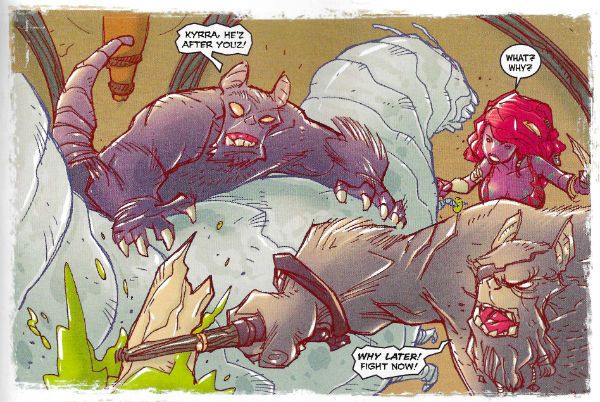
 photo DHPCovB_zpsuqhkkvoh.jpg

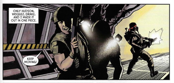
 photo DHPKyrraB_zps2omfxjtf.jpg KYRRA: ALIEN JUNGLE GIRL (Rousseau, Woodall & Basso)

This is an absolutely gorgeous strip, done in a robustly fun style saturated in E-number colours, seemingly aimed at Young Adults which repositions Tarzan as a young girl and the setting as an alien planet. I’ve already read Tarzan and I’m neither Young nor an Adult so it left me pretty cold. The art by Rousseau is thoroughly charming though. It’s OKAY! but like a lot of comics today it’s pretty thin stuff once past the delightful art. Still, it’s nice that there’s a strip about a Cave Girl that’s not drawn by Frank Cho just so that men can fap over it and show those SJWs what’s what. Progress of a sort there. Baby steps, people. Baby steps.
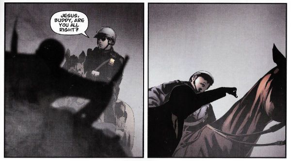
 photo DHPSuitB_zpsew0rbf8p.jpg THE SUIT: CONTRACT NEGOTIATION (Calero & Hill)

This is CRAP! This is the second run of this consistently poor series in DHP. I don’t know who asked for it back but when I find out they’ll get the sharp end of my tongue.  Every time this thing appears I just have no idea what I’m looking at on most of its pages, and when I do know what I’m looking at it’s some kind of unholy show involving photos of the two old blokes from TRADING PLACES and Don Draper. Not entirely sure if they are making love or fighting or what. Oh wait, there’s a ‘Nam flashback. Thank Christ for that. C'mon, Was everybody in America over in The ‘Nam or what? Did it not get crowded? I’m not saying ‘Nam flashbacks are overused but, yes, yes I am saying exactly that. Even my son talks about being in “The Shit” and getting back to “The World” and he’s 10 and has never been further than St Ives. And far be it from me to say that Calero is into photo referencing too heavily, but if it was cocaine we’d be calling for an intervention. Oh, mercy, mercy me (the ecology), this is just visual noise; a cacophony of blurry clip art. The passage of every poorly executed page makes Alex Maleev look more and more like Frank Robbins. I don’t want to be a big shitter here, but this should never have seen print. I just. I don’t. What. It’s. No. Just no.
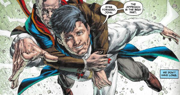
 photo DHPFlyB_zpsm3mnp5zb.jpg LAST ACT (Gopez, Aldridge & Colwell)

It would be easy to take the Mick out of this overly earnest and somewhat overwrought attempt to graft some meaning onto the superhero trope, but since it was pretty refreshing to find anyone doing anything remotely interesting with the superhero trope I’ll let it off with an OKAY! Although it did not escape my irony detectors that this was basically a strip in which a superhero makes a man called John feel better by misrepresenting reality to him. Which is basically my childhood reading habits: redux.
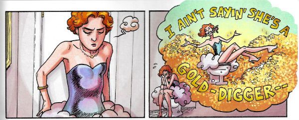
 photo DHPFinderB_zpsbvbf9wch.jpg FINDER: CHASE THE LADY (Speed McNeil & Lee)

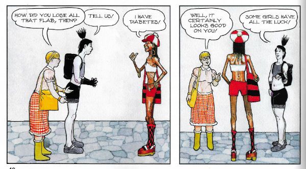
Carla Speed McNeil is EXCELLENT! Everything Carla Speed McNeil does is EXCELLENT! Her horse radish soup is EXCELLENT! I know because I go through her bins at night, but respectfully and not in a creepy way. And guess what? Her bins are EXCELLENT! The fact that she enjoyed that movie with Keanu Reeves on a bus so much that she legally adopted its title into her name is EXCELLENT! It’s possible Carla Speed McNeil has done some things which weren’t EXCELLENT! but I’m not privy to them so they don’t exist. FINDER is EXCELLENT! Even though in chunks this small and separated by whole months, my aged brain is struggling to stitch them all together into a coherent narrative, I have every faith such a thing will come to pass, and so the very strength of faith I have in Carla Speed McNeil’s being EXCELLENT! is EXCELLENT! in and of itself. Even Carla Speed McNeil’s colours, a softly vibrant balm for the eyes, are EXCELLENT! And that’s from someone so thuggishly impervious to colour he still doesn’t understand why Sam Neill is so upset on that bus in IN THE MOUTH OF MADNESS. And, no, Sam and Carla Speed are not related because Sam has an extra “l” in his surname, but had they been related I think we can all agree that that would have been EXCELLENT! Anyway, this was OKAY! Just joking, it was EXCELLENT! Oh my, what an EXCELLENT! joke.
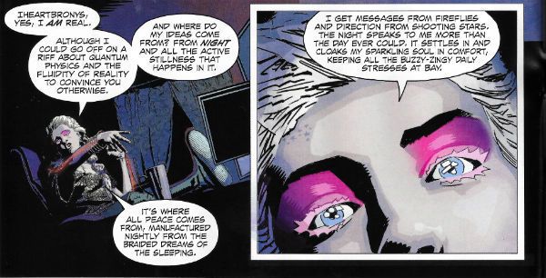
 photo DHParseB_zpsy3vb9iik.jpg SUNDOWN CROSSROADS (Olivent, Kesel & Pruett)

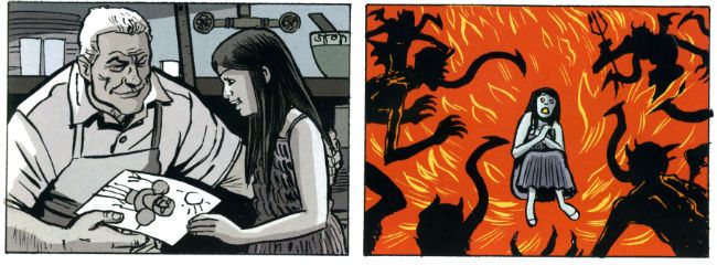
The best thing about this strip is that, well, I don’t know about you but sometimes I wake up in the night drenched in sweat worrying about whether we’re going to make it, you know, as a species. After reading SUNSET CROSSROADS I’ll probably sleep a little easier as it introduces the entirely new thought into the equation that maybe it’d be better for all concerned if we don’t. Ugh. This is some heroically twee balderdash right here.  I can make up the cover blurbs for the collection of this thing now: “With SUNSET CROSSROADS Barbara Kesel has vajazzled the soul of a generation!” - Kelly Sue DeConnick! “Something about dreams. Something about stories. SUNSET CROSSROADS is something something something.” - Neil Gaiman! The strip itself privileges us with a peek into the life of some kind of self-satisfied meringue brain wafting about her apartment, talking smug bunkum via a live podcast to people whose minds can only be little miracles of inanity. Now, my viscerally negative reaction could be due to envy as this conceited poltroon obviously makes a lot of money talking star-spangled claptrap and peddling her tat online since her apartment is bigger than my house. She doesn’t leave it either, that apartment; for the duration of the strip we are trapped inside with her and her incessant prattle; it’s like some terrible punishment. She only pauses when she spies outside what looks hilariously like Sean Philips on the street below. Sean’s minding his own business (probably getting some fresh air to clear his head before returning to the latest listless yet craft-fat script from Ed Brubaker) but our ethereal dream queen drags poor Sean into her nauseatingly precious monologue and he returns the favour by dragging her into her PC. Spooky stuff! I can tell the strip failed because my first thought as she disappeared into her monitor was “good”, not “ooh, I wonder what happens next.” I can probably live the rest of my life quite contentedly without knowing what happened to that frivolous void of a creature. Ugh. The best thing about the strip is the art, but even then in one panel the self-obsessed buffoon’s head is about four sizes too large for the body it bobbles above; which I can only hope is the artist having a cheeky laugh at the expense of the swell headed heroine. Basically, and I’m not sure if I made this clear, I’m probably not the audience for this one as I couldn’t give less of a shit about Steve Jobs and Subway makes me angry because if I wanted to make my own ****ing sandwich I’d have made my own ****ing sandwich! Basically, I am a bit of a throwback; you’d have to have your head further up the arse of the 21st Century than I’ll ever manage in order to appreciate this. That does, however, mean it is possible someone might not think SUNDOWN CROSSROADS is AWFUL!

 photo DHPChelseaB_zpsthwiiimc.jpg SANDY AND MANDY (Chelsea)

If David Chelsea wants to put his elegantly precise Winsor McCay-isms to use in immaculately illustrating a sedately paced cascade of jokes which veer giddily from the hilarious to eye-rolling howlers then who shall say him nay? Not I, sir. Not I. VERY GOOD!
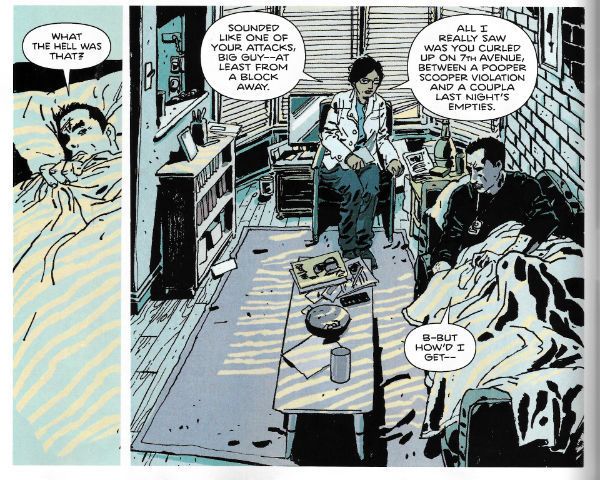
 photo DHPLevitzB_zpskg5oww0h.jpg BROOKLYN BLOOD (Hamilton, Levitz & Pruett)

Brawklynn! BRAWK-LYNNN! People are super-proud of living in Brooklyn aren’t they? Well, people who live in BREWK-LARYNN! Seem to be. Doesn’t Jimmy “Spats” Palmiotti cahm frawm BRAHK-LAHYNNNA? I don’t know, but he should. I do know that BROKE-LIE-IN! is supposed to be one of those places that has mystique (not the naked blue lady) but all I can think of is the smell of fried onions, small boys in old men's caps selling papers on street corners and pigeon coops on rooftops. Is that BRAWK-LYNNN!? (I don’t care really. I’m just humouring them.) So, yes, BREWK-LYNNE is special, and so are you if you live there, but moving on…a lot of people criticise the American police and, you know, sometimes they have a point but, personally, I think the brunt of the blame should be borne by their Human Resources Department. I realise it’s not the sexiest of Police Departments but, still, there’s no excuse for such laxity. Who keeps signing off as fit for duty all these blackout drunks, PTSD sufferers, psychics, aliens and blind tap dancers who festoon their fictional ranks?  Yes, here we are again in the aisle marked “Damaged White Men With Guns” (next to the corn, above the beets), what’s not to love! This is the second (maybe; I don’t care enough to look) episode of this exciting new series which is exactly like every other cop series about a traumatised cop, but with “‘Nam” scratched out and “Iraqistaniraq” written above it. Despite there having been two murders most of the page time has been spent watching the mentally disordered white guy roll around in the street being distressed by phantom firefights. Which is okay, because murder’s pretty shabby but the real crime is how war fucks up white guys. Mind you, I am quite impressed with how clean American streets are; if you roll around in the ones near me you’d end up covered in dog poop and cig butts. Possibly the odd unlucky hedgehog. But then I don’t live in BRAWK-LYNNN! This strip is some bizarre stuff; the damaged white guy basically can’t walk down the street without hallucinating he’s in Call of Duty (but 4Realz!!) and his partner just dusts him off and puts him to bed. Go to sleep, tiny nutcase. The main draw here is the art by Tim Hamilton which has that generosity of ink I like and there’s also something fun happening with the colours; they get all luridly rhubarb purple and custardy yellow when there’s a catastrophic flashback, but I also like the subtlety in the bed scene where he dials it right back.  Maybe this strip is some kind of post-modern piss take of clichéd cop crap and every episode they’ll discover a body and the white cop will roll about and his not-white (obviously) partner will be all sensible, and it’ll just keep going like that with the bodies turning up in ever more ludicrous places and his mania taking on more and more extreme forms. By episode six they’ll be attending a murder in a clown school and he’ll be throwing poop at the local Shriners. In reality it’s probably just going to be more EH! but in BREWK-LYNN!

What am I giving up for Lent? I don’t know but it won’t be – COMICS!!!

"The Day Terry Vanished." COMICS! Sometimes You Should Take Off And Nuke The Idea From Orbit. It's The Only Way To Be Sure!

That’s right, it has been a while! No flies on you, me old mucker. Cringing apologies duly tendered and all that. Just so you don’t think The Savage Critics don’t love you anymore here's some words about a comic.  photo DreamHeaderB_zpsd2836165.jpg

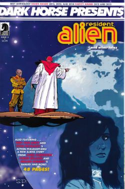
Anyway, this… DARK HORSE PRESENTS #2 Dark Horse Comics, $4.99 (2014)

 photo DHPCovB_zpsdd45db75.jpg

Resident Alien: The Sam Hain Mystery Chapter 2 Art and lettering by Steve Parkhouse Written by Peter Hogan

 photo ResAlB_zps153c5d20.jpg by Parkhouse & Hogan

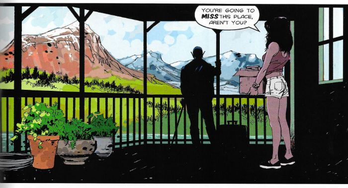
This one is called Resident Alien and is about an alien who is a resident in a Small Town®©. (Small Town is ® and © The United States of America.) Sometimes there are crimes and he kind of ambles around them in DHP but actually solves the crimes in other series outside of DHP. I’m guessing he solves them because I haven’t been sufficiently moved to follow his placid antics elsewhere. Could be maybe he doesn’t solve them; maybe he just kicks back and whittles, makes a scale model of the Mary Rose in a bottle, then someone walks past at the end and mentions they caught the Canned Peaches Killer, ayup, so they did, you betcha. Like I say though, I don’t know; maybe he hunts the killer down and exacts brutal and uncompromising revenge but then feels a bit sad about it so it’s okay that he did that. There’s a lot of that crap about these days so I’m quite receptive to a series where the main action involves some nail-biting box unpacking because Res Al is moving house. (Always label your boxes and ensure you pack the kettle last, so you unpack it first; top moving tips there, no charge). Ramping the thrills right up there are also some scenes of the Feds methodically failing to pick up his trail. I guess this isn’t exactly heart stopping stuff unless having crumpets instead of toast gives you palpitations (the razor’s very edge!) It’s an inoffensive and gentle mosey around familiar tropes in a kind of early Sunday evening TV fashion. No disrespect is meant when I say I can easily imagine it being on TV in the ‘80s with an elderly Bill Bixby in a latex mask helping out the character actor residents of a Small Town®© while The Authorities (Tony Danza) unhurriedly fail to track him down. Of course on TV you wouldn’t have Steve Parkhouse’s wonderfully precise yet sketchy art. Art which is unusually attentive to everyday details to such an extent that you are struck by the odd revelation that most comics just vamp this stuff. I’m so used to seeing characters wear Clothes (Shirt, Trousers, Shoes) and live in a House on a Street that Parkhouse’s unforced work here makes the hum drum as visually interesting as any alien world. It also enables Hogan’s amiable script become a decent comic regardless of any televisual ambitions. After all, I always figured my Mum secretly hoped Bill Bixby would run off with her so I prefer comics to Television. Resident Alien is GOOD! comics.

Dream Gang Chapter 2 Story & Art by Brendan McCarthy Lettering by Nate Piekos of Blambot

 photo DreamGangB_zps135bb304.jpg by Brendan McCarthy & Nate Piekios of Blambot

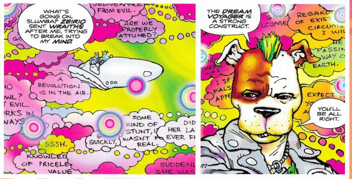
This one is called Dream Gang and is about a gang of people in dreams. Or something, dreams figure in it though. I don’t think it’s about anything really, I reckon McCarthy’s just larking about which is okay by me. Because Brendan McCarthy can really draw; breaking news there. McCarthy’s lines are just brimful of confidence and so assuredly loose that his art has all the appearances of random doodles miraculously converging just shy of sense. He also knows how to colour stuff in and while I am dreadful at appreciating colours I do know the colours here are bright and inviting since the sight of them from a room length away caused my son (“Gil”) to express an interest. Maybe he can explain it all to me; maybe it is just crazy deep (man). I mean, I like it but McCarthy’s bull-headed insistence on evading clarity can get a bit wearing. It’s also kind of weird to me how Dreams are always this short hand for the imagination frolicking in delighted play and that they are just obviously Technicolor gear and fabgasmtastic but in contrast real life is all grey drabbery. In dreams I have never ridden a marsupial boat on a tangerine river under a liquorice sky. And nor in dreams have I walked with you. More often than not I wake up feeling like someone’s been at my soul with a bone saw; gone at my very essence with a craft knife or something. Not so much Yellow Submarine as Das Boot when everything creaks just before the ocean bursts in. I guess me and Brendan McCarthy will just have to beg to differ when it comes to dreams. GOOD!

Wrestling With Demons Chapter 2 Art by Andy Kuhn Written by Jimmy Palmiotti & Justin Gray Colours by John Rauch Letters by John J. Hill

 photo WrestleB_zps25b56395.jpg by Kuhn, Palmiotti, Gray, Rauch & Hill

This one is called Wrestling With Demons and is about a man who has to wrestle with demons. Literally. Not metaphorical demons like eating too much chocolate or boozing until he shits himself or a penchant for bouncing his wife’s head off the worktop. No, proper demons. Which he wrestles. Literally. I’d hesitate to suggest either Palmiotti or Grey is coasting but I will just point out that Steve Niles manages to do this kind of workmanlike sticklebricking of stale ideas all by himself. Last issue was the introductory chapter with decent dad and sassy kid bonding on a road trip before it turned into Fight Club for Demons (and Dads who want their sassy daughter back). I just made it sound really interesting didn’t I, like Joe R Lansdale or something. While Lansdale would routinely turn something this slight into a fast and nasty blur of invention and profanity here the set up just sits around going from predictable beat to predictable beat. Oh, these comic writers and their beats. You need a bit more than beats, folks. But then I remember when beats were nice boys touching each other in pretty cars in between smoking menthol cigarettes and typing be-bop prose & poems. Beats. Anyway this is astonishingly dull stuff considering I used the phrase “Fight Club for demons”. I was watching this movie Shooter the other day, because it was on while I was sitting still for a bit and after a while I was watching the background because I don’t live in America and I like to see what it’s like. Also, the movie was predictable shit so in a defensive move my brain was focusing on the setting. I think it was set in San Francisco because there was a bit where he drove down a hill really fast and the only hill anyone ever drives down really fast in movies set in America is in San Francisco. I didn’t see Brian Hibbs so maybe it wasn’t set in San Francisco; it’s not an exact science. Yeah, I know, it was probably filmed in Canada for tax reasons and they tilted the camera to make it look like Mark Wahlberg was going down a hill. Movie magic in action. Anyway, the big thing I took away from Shooter was that America isn’t really fussed about architecture is it? No, not your old stuff, you’ve got some nice old buildings; we probably built them so, y’know, you’re welcome. Mostly though you have these big things which yell “FUTURE” and then everything else is all boxes. Big boxes and little boxes, yes, but basically boxes. (And then there’s the odd nice old bit here and there like someone spread Barnsley over 3,794,100 square miles) So, boxes with a big shiny thing or two stuck in the middle, that's you that is America. Now, it’s possible, maybe, perhaps, that I could be misjudging the architecture of what is essentially 50 discrete cultures there. But then basing an impression of an entire nation’s architecture on five minutes of an unnecessary Mark Wahlberg movie will do that. My real point is that the actual movie was dross but I found something to keep my synapses firing. So, I was reading this Wrestling With demons and I tell you I appreciated Andy Kuhn’s artwork a lot because everything else was just rote time wasting. Basically compared to the writing in Wrestling with Demons, which was as tepid as an unnecessary Mark Wahlberg movie, Andy Kuhn was America. And it was still just OKAY!

Banjo Art by Declan Shalvey Story & Colours by Jordie Bellaire Lettering by Ed Brisson

 photo BanjoB_zps6a57aeaa.jpg by Shalvey, Bellaire & Brisson

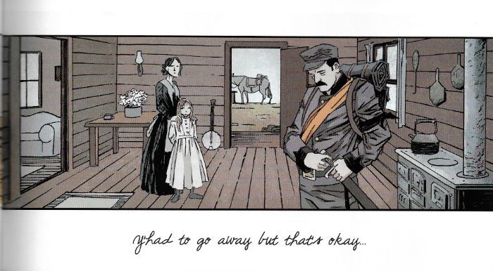
Sometimes I wonder whether or not reading comics from such a young age has somewhat degraded my finer sensibilities. Never have I wondered this more than when I finished reading a prettily illustrated and lightly written short revolving around the power of music and memory, in which a young girl wishes only for her father to return from the savage bastardry that is war, and my first thought is disappointment that there wasn’t a final panel of a skull telling me that “..the only victor in the WEIRD War is DEATH! HA! HA! HA!” Sometimes, I appal even myself. GOOD!


Action Philosophers: Action Philosophy! Art & Lettering by Ryan Dunlavey Written by Fred Van Lente

 photo ActionPB_zpsf65b41b7.jpg by Dunlavey & Van Lente

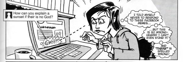
My favourite Philosopher Fact is that Nietzsche claimed to have caught syphilis by sitting on a piano stool. But back to the comic and I’d have thought this was the kind of quirky attention getter that would be kicked straight to the curb as soon as the either of these classy dudes got a regular seat at The Big Table. But no, here they are soiling the joint with wit and intelligence like they actually care about this stuff. Alas, they are playing to an empty house because everyone's pissed off to watch Shooter. GOOD!


Aliens: Field Report Art and Colours by Paul Lee Written by Chris Roberson Lettering by Nate Piekos of Blambot

 photo AliensB_zps68ccb1ec.jpg by Lee, Roberson & Piekos

Here Lee and Roberson commit a few scenes from the movie Aliens straight to the comics page. Almost. It’s an attempt to graft the new Aliens series (ALIENS: TURNER & HOOCH) into the canon. You know, so that it counts. God forbid it just be good. So Hicks notices the spaceship from the new Aliens series (ALIENS: CHEESE & PICKLES) on a monitor. Limited to a single page (and it could easily have been limited to a single page) this would have been a cute little come on. Maybe with a jokey nod at those Hostess Twinkies ads. Okay, maybe not. It doesn’t matter because this is 2014 so it isn’t a page long, no, it goes on for pages more than it should and then tells you to go buy ALIENS: SONNY & CHER; wherein you won’t find anyone from Aliens (well, except the aliens obviously) but you will find the ship Hicks saw on a screen in that one panel. Lee’s art is lifeless and flat while faithful to the source but he dismays everyone when he chooses not to draw Paul Reiser and instead hides him with a shadow. While I know I’m supposed to be all out of touch and stuff even I have a sneaky suspicion that all this Alien activity is due to the release of that new Alien videogame, ALIEN:ISOLATIONISM. Apparently it’s about Alien in America during the period just before it entered WW2. What? Yes, I suppose isolationism is a misnomer for American foreign policy at that point but since the game isn’t called ALIEN: NON INTERVENTIONISM I worked with what I had. (Our Motto: there’s a reason this stuff’s free.) Back in reality, the game looks proper good and all. I’ve heard it’s hard as time served in San Quentin but well authentic. There’s even some DLC (yes, I do know what that means, cheeky.) where you can play as members of the original Nostromo crew. Who doesn’t want to play as Yaphet Kotto!? Who doesn’t want to wander about effing and jeffing about bonuses in space. If it tells me to “Find Cat” it can **** off; it’s the escape pod for me, baby! Ma Parker raised no fools. EH!


Peppered throughout this issue are various spot illustrations by Geoff Darrow: Scrumdiddilybloodyumptious and no mistake, me old plumduffs! VERY GOOD!

Right then, this issue of DHP was a bit lacking to be honest. But that’s the thing with anthologies; there’s always an element of pot luck involved. I appreciate reading a bunch of stuff I probably wouldn’t have sought out and that’s probably the true value of a book like this; reminding me how good Andy Kuhn is or that some comic writers still think about the world. The big mistake in this latest iteration of Dark Horse Presents is the lack, two issues in, of any Howard Victor Chaykin. I don’t want to influence anyone or anything but DHP would be a little bit richer in content if it had more stuff like that one where General George Armstrong Custer survives Little Big Horn, becomes President and invades Canada. All in about 8 pages too. Just saying. In conclusion, I had a decent enough time so I’ll go with OKAY!

Hope that'll do ya, because you know what don't read themselves - COMICS!!!
"This is Worser Than Washin' An Elephink!" COMICS! Sometimes It's Like I'm Shouting This At You While I Run Past!

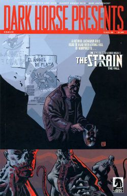
Borag Thung, Earthlets! I have been quiet of late but I rested easy in the knowledge that the delightful Messrs Khosla, McMillan, Lester and Hibbs had been satisfying all your comicy needs to the highest of standards as ever. Not that I was resting you understand. So, practically writing this one as I move towards the door...Anyway, this...  photo DHPLaphamB_zps0a5669a1.jpg David Lapham from The Strain in DARK HORSE PRESENTS  #28

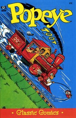
POPEYE:CLASSICS #14 Written and drawn by Bud Sagendorf IDW/Yoe Books, $3.99 (2013) Popeye created by E.C. Segar

Some issues of POPEYE: CLASSICS are available from the Savage Critics Store (which you have all quite patently forgotten about. Sniff!) HERE.

 photo PopeyeCovB_zpsc97449dd.jpg

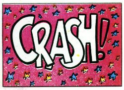
Month in month out the nautically attired freak faced grammar mangler continues to pleasantly baffle me with the weirdly logical escalation of the ludicrous incidents which comprise his preposterous adventures. Since Popeye, for all his charms, is in fact a fictional construct I’m going to place the credit for this consistently entertaining package at the door of Bud Sagendorf, a real life man (now deceased) who went done drew and writed it all. Fans of the magic old men do can marvel at Sagendorf’s use of long shot silhouettes to prevent a total nervous breakdown from having to repeatedly draw a train in what are quite small panels indeed. As a special bonus Sagendorf serves up some right nice visual gaggery, the best of which are the parts where sound FX have a physical effect on the drawn environment they inhabit. Basically they hit people on the chin is what I’m saying there.

 photo PopeyeCrashB_zps5874c470.jpg Bud Sagendorf from POPEYE CLASSICS #14

In this issue the main tale involves Popeye buying a railroad, Olive Oyl’s demanding customer, an attempted hijack and a visual stereotype of a re..native American (altho’ in the world of Popeye this might actually be a vacationing accountant in racially insensitive fancy dress). Then there’s a story where Popeye buys the world’s cheapest and laziest race horse, another story where Popeye and Olive simultaneously seek to teach Sweetpea a lesson and demonstrate their poor parenting skills by scaring the shit out of the wee tyke in an abandoned mine, and a short with Wimpy being out foxed by a cow (“a lady of the meadow”), there’s a text story as well but I skipped that. Bud Sagendorf wasn’t writing for the &*^%ing omnibus is what I’m getting at here. Popeye is printed on weirdly bloated pages, haphazardly coloured and always, always a welcome arrival in my field of vision so I’m going to say it’s VERY GOOD!

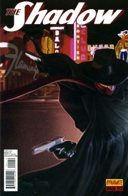
THE SHADOW ANNUAL 2013 Art by Bilquis Evely Written by Andre Parks Coloured by Daniela Miwa The Shadow created by Walter B. Gibson Dynamite, $4.99 (2013)

 photo ShadCovB_zps5952fe00.jpg

Man, I’m not exactly Sammy Stable at the best of times (“No shit, John!”) but the temporal shenanigans in this thing almost gave me a panic attack. It’s five minutes ago! Now it’s three hours later! No, hang on, it’s five years earlier. No, it’s been seven hours and fifteen days. And nothing compares. Nothing compares. To yaaaooooooooowwwww. Clearly the comparison being begged here is that this comic is like Brief Encounter but starring two psychopaths and set in Vegas before Elvis conquered it.

 photo ShadTimeB_zps5522896f.jpg

Bilquis Evely from THE SHADOW ANNUAL 2013

Even more clearly it’s not like that at all but instead is very much like having to find your train in a busy station where all the clocks show the wrong time, people keep getting stabbed and shot and you’ve found yourself in the company of some boring jabberjaw who won’t shut up about his first love. Shadow, dude, move on. This is unseemly in a man of your standing. Fucking chin up, old son. As for the art, well, it’s okay, it’s alright, but there’s a tendency for noses to look like the owner has a heavy cold. That’s Sean Murphy’s influence (influenza!) in action there. So, a nice idea, not terribly well executed at a price point I want to hit with a stick makes this EH!

DARK HORSE PRESENTS #28 Art by David Lapham, Neal Adams, Richard Corben, Steve Lieber, Patrick Alexander, Ron Randall, Menton3, Michael T. Gilbert, Aaron Conley and Geoff Darrow Written/plotted by David Lapham, Edgar Allan Poe, Richard Corben, Neal Adams, Caitlin R. Kiernan, Ron Randall, Steve Niles, Michael T. Gilbert, Janet Gilbert and Damon Gentry Coloured by Lee Loughridge, Moose Baumann, Rachelle Rosenberg, Jeremy Colwell, Michael T. Gilbert, Sloane Leong Lettered by Clem Robbins, Nate Piekos of Blambot, Ken Bruzenak, Steve Lieber and Damon Gentry

 photo DHPCovB_zps02ecf8a5.jpg

Dark Horse Presents is an anthology so, you know, it’s a bit all over the shop. Mostly though it keeps its footing on the shiny tiles and rarely sends the display of stacked tins (Pork and beans! For the poor!) spinning madly about. First up, David Lapham reminds me how good he is at comics with his The Strain chapter. Even though I have no particular interest in this property and there's a bit of cultural shorthand verging on the cliched Lapham quietly did the business on every page to ensure that the final panel came as a punch to the guts and I actually wanted to read what happened next. Later in the ish Lapham resurfaces with the conclusion to his introductory Juice Squeezers tale which, with its teen focused Cronenbergyness, proves to be the kind of nuts that comics would benefit from more of and yet truculently resists embracing.

 photo DHPMonsterB_zps01cc1c30.jpg

Michael T. Gilbert, Janet Gilbert and Ken Bruzenak from Mr. Monster Geoff Darrow’s spot illustrations continue to amaze with the visual conviction with which they deliver scenes at once grotesque, impossible and droll. In a similar fashion to the comics Darrow produces elsewhere, comics which chafe some SavCrits so (but, strangley, not this eminently chafeable one), Sabretooth Swordsman with its surprising Savage Pencil influences is an optically delirious but narratively slight piece.

 photo DHPTigerB_zpsba5c3891.jpg Aaron Conley, Damon Gentry and Sloane Leong from Sabertooth Swordsman

Richard Corben chucks out another Poe adaptation which is notable primarily for the truly scintillating colour work executed therein. I am absolutely horrible at appreciating the colour in comics but even here, even I, had to stop and marvel at more than one point. Ken “The Chameleon” Bruzenak is here in several different stories and in each case serves up lettering apposite to the pieces in question; in the very traditional Trekker his work is attractive but modest while in Mr. Monster he provides an ostentatious display of madcap fonts.

 photo DHPCorbB_zps6e657e2e.jpg

Richard Corben and Nate Piekos from Edgar Allan Poe's The Assignation

As a whole Mr Monster, additionally armed as it is with Michael T Gilbert’s invigoratingly loose art, continues to cock a scruffy snook at seriousness; which I like. Mrs. Plopsworht's Kitchen by Patrick Alexander succeeds in making physical and emotional abuse funny which is an interesting type of victory. Oh, and there’s some other stuff here; Steve Niles producing his trademark pound shop horror; Alabaster continuing to not be anything I want while not actually being terrible and Blood by Neal Adams continuing to be Blood by Neal Adams. Overall though I had a good time so DHP was GOOD!

JUDGE DREDD CLASSICS#3 Art by Carlos Ezquerra Written by John Wagner & Alan Grant (as T.B. Grover) Coloured by Tom Mullin Lettered by Steve Potter Judge Dredd created by John Wagner & Carlos Ezquerra IDW, $3.99 (2013)

 photo JDCCovB_zps5bc7dd9e.jpg

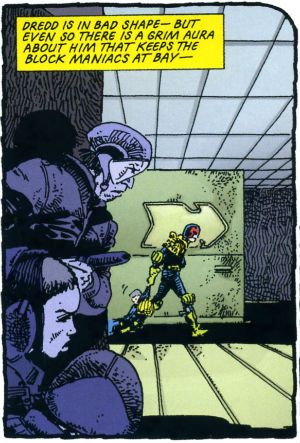
Look, before I start acting like a pissy arse let’s get this one thing straight: these are great comics. I know this because it isn’t the first time I’ve bought them and it certainly isn’t the last time I’ll read them. When I first read them they blew my school socks off (not a kink; I was at school). The Apocalypse War was where Carlos Ezquerra returned to the character he (co) created after an absence occasioned by unfortunate editorial decisions. Carlos Ezquerra was back and Carlos Ezquerra meant it. Carlos Ezquerra drew the cremola out of The Apocalypse War even as The Apocalypse War blew the world of Dredd to grud and back. Because The Apocalypse War was where Wagner & Grant (AKA T.B. Grover) took all the pages of world building that had gone before them and applied a match. After The Apocalypse War the world of Dredd would never be the same again. Really. In The Apocalypse War Dredd made a decision no man should ever have to make, a decision only a man who was not a man could make, and the following decades of the strip have shown the consequences and ramifications of that decision fashion Judge Joseph Dredd into a man at last. With The Apocalypse War Wagner & Grant’s breathlessly hi-octane narrative pace in tandem with Ezquerra’s consistently brutal style created an epic that looked like the end of everything but was instead the birth of the strip’s future. These are great comics.

 photo JDCPeepsB_zps79926a17.jpg Ezauerra, Wagner, Grant, Potter and Mullin from The Apocalypse War

Alas, when I talk about greatness I’m talking purely about the pages of comics in here. The actual physical pamphlet comic is a bit lacking. You know, these are great comics. Do I repeat myself? I repeat myself. Great comics, so how’s about a bit of care and attention; a bit of respect. That’ll have to remain purely theoretical because, oh, he’s off now…The cover’s a bit lacking for starters; look, I’m all about negative space and clear, crisp design but that looks a bit, well, I don’t think it achieved its aim. Imagine if they’d rejigged an original 2000AD cover featuring The Apocalypse War. Trust me when I say the new cover would be a poor second. Then, oh dear, the inside front cover seems to think this story is called Block Mania but it isn’t; Block Mania finished last issue. This story in this issue, (which is all reprints and cost $3.99) is called The Apocalypse War which is why I’ve called it that through all the preceding verbiage. Then between each chapter there’s a perfunctory full page graphic. Grud on a Greenie! I realise the space has to be filled due to the page counts of each episode but could you not have had a bit of fun, IDW? Got a bit creative? Maybe stuck the original covers on there instead, or blown up a portion of a panel pop art style like on those DC Kirby/Ditko/etc Omnibooks? You’ll notice, IDW, that I’m not even daring to suggest you commission some, choke, original content. I mean I realise reprinting decades old comics and charging $3.99 a pop might not allow for such largesse. Sarcasm there.

 photo JDCTotalB_zps142c6b28.jpg Ezauerra, Wagner, Grant, Potter and Mullin from The Apocalypse War

Then there’s that weird waste of space at the bottom of the page. Again, I appreciate you don’t want to mess with the size ratios but, drokk it all, that’s some token stuff there, IDW. And there's a page out of sequence. A page out of sequence in a comic of reprints selling for $3.99! However, I am okay with the colouring. Obviously, I’d rather they hadn’t bothered because the art was drawn for B&W (except for the opening spreads) but I understand Americans are fond of their colours. There they are America: enjoy your Colonial colours! Moan, moan, moan except this is all basic stuff. I'm hardly asking for Cher to sing live in my living room here just some vague pass at professionalism, if you please.

 photo JDCShapeB_zps97a70a9e.jpg Ezauerra, Wagner, Grant, Potter and Mullin from The Apocalypse War

So, a confounding miscalculation on the part of IDW here; this material is readily available in a number of other formats and has been for decades so making a new iteration stand out from the crowd would, I’d think, be imperative. Making your books expensive and ill-designed is certainly a novel approach. Luckily, these are great comics so even though the crime is Fail the sentence is GOOD!

Anyway, I'm off now. With any luck I'll bump into some COMICS!!!!
"Do They Still READ In The Future?" COMICS! Sometimes It's Great To Be Rude!

It was Half-Term last week hence the silence. Yes, the blessed silence. But now your God has failed you and I am back! It has been quietly suggested that I put on hold my tribute to Charlie Drake and maybe look at some comics this time. So, no actors who were dead before you grew your big teeth this time out. Just comics! Just lovely, lovely comics! But were they lovely? Hmmmmm? Anyway, this...  photo DHP_Pop001_B_zps333a52d6.jpg NEXUS by Steve Rude & Mike Baron

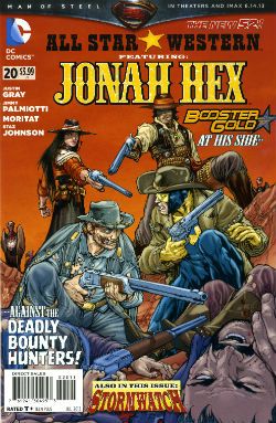
ALL STAR WESTERN #20 Art by Moritat (Jonah Hex) and Staz Johnson (Stormwatch) Written by Justin Gray & Jimmy Palmiotti Coloured by Mike Atiyeh (Jonah Hex) & Rob Schwager (Stormwatch) Lettered by Rob Leigh Jonah Hex created by Tony DeZuniga & John Albano Stormwatch created by Brandon Choi & Jim Lee DC Comics, $3.99

 photo All_SWCov001_B_zps3260d931.jpg

I kind of liked this issue. I don’t know whether the worms have finally reached my brain, or what but twenty issues in and this one almost clicked. I’m not exactly the most demanding Jonah fan either, I just enjoy the scar faced twat in a hat going around kicking up dust and making life brutal, difficult and short for folks. I prefer it to be a straight western but it isn't a deal breaker.

 photo All_SWPanel001_B_zps37540f12.jpg Jonah Hex by Moritat, Gray & Palmiotti

No, I don’t mind Booster Gold turning up for no reason that is ever going to be explained (hey, that’s just how comic books roll these days). I’m just pleased the book has a bit of a spring back in its step. Maybe it’s the beneficial effect of getting Jonah out of the city and into the countryside? Like when you ferry troubled youths by coach out into the boondocks to stroke goats. Moritat’s art seems a bit more lively and engaged although that might be due to the brighter and more varied colour palette in use. Watch these backgrounds though, I’m not a native of the Americas but I’m pretty sure mesas aren't mobile. Like I say I don’t expect much really and this delivered that making it OKAY!

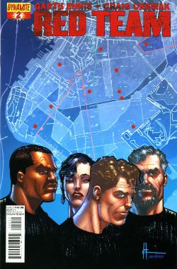
RED TEAM #2 Art by Craig Cermak Written by Garth Ennis Coloured by Adriano Lucas Lettered by Rob Steen Cover by Howard Victor Chaykin Red Team created by Craig Cermak & Garth Ennis(?) Dynamite, $3.99

 photo Red_TCov001_B_zps4bf0c366.jpg

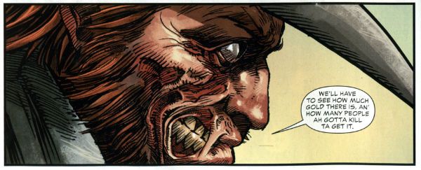
More like RED MEAT amiright, soft lads? Here Comics’ Firmest Handshake Garth Ennis turns his surly attention to a tale of cops taking the law into their own hands. I’m sure that will work out really well for everyone involved. At the minute it isn't working out too well for me. I guess my LCS sent this as Howard Victor Chaykin is doing the covers and I like Comics’ Deepest Voice Garth Ennis’ war comics. So, okay, fair enough. I’m not turned off by the concept either. I’m always up for that old story which ends with a bunch of people dead or drenched in blood while sirens scream closer and those who aren't corpses suddenly realise why there are rules.

 photo Red_TPanel001_B_zps37f466f0.jpg Red Team by Cermak & Ennis

Maybe it won’t go that way, after all Comics’ Hottest Curry Garth Ennis spends enough time (i.e. too much time) explaining how his characters can smoke in a government building that it must surely (surely!) pay off later in an example of Chekov’s Fags! Maybe everything will go swimmingly but the racially and sexually mixed cast will succumb to a series of smoking related diseases. Maybe not. But hopefully the series will avoid plummeting into maudlin sentimentality like a sloppy drunk slurring on about The Old Country as the barkeep dials for a taxi. Not an uncommon occurrence in work by Comics’ Softest Hearted Big Man Garth Ennis. This thing seems written for the screen (no, the page and the screen are not interchangeable) and the art just isn't up to the job of hiding this. It gives me no pleasure to say that. In fact I’ll leave it there except to express the hope that you really like that panel I picked because you’ll be seeing a lot of it on these pages. RED TEAM is not a complete wash though and that’s due mostly to the dialogue of Comics’ Hairiest Chest Garth Ennis. It’s good dialogue and it means RED TEAM is OKAY! That probably still won’t save me from a beating though.

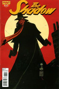
THE SHADOW #13 Art by Giovanni Timpano Written by Chris Roberson Coloured by Fabricio Guerra Lettered by Rob Steen The Shadow created by Walter B. Gibson Dynamite, $3.99

 photo Shad_Cov001_B_zps0806f9d9.jpg

Everything in this book is so familiar that the sight of your face in the shaving mirror delivers more surprises. This issue is impressive only in its devout refusal to bring anything new or interesting to bear on the join the dots plot with its transparent mystery, its space wasting reluctance to provide more than one speech bubble in a panel and…oh...look, there’s a three page sequence of a drunk man going home, going upstairs, pouring a drink and being surprised. No. That’s not comics, that’s just horseshit. I’m not even going to scan a picture of the contents as the fewer people who see this then the less damage done to those involved. Honestly, I’m doing them a solid here. Or a salad as they say in Nyawk. So, no offence to any of the people involved here as we all have bills to pay but this was AWFUL!

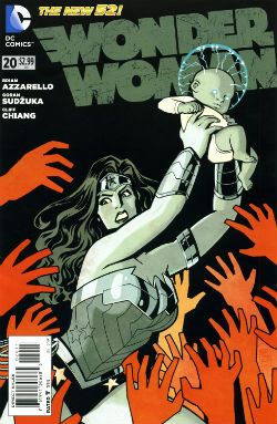
WONDER WOMAN: #20 Art by Goran Sudzuka & Cliff chiang Written by Brian Azzarello Coloured by Matthew Wilson Lettered by Jared K. Fletcher Wonder Woman created by William Moulton Marston and H. G. Peter DC Comics, $2.99

 photo WWom_Cov001_B_zps8c89c4c0.jpg

This is an atypically action packed issue but all too typically when the dust settles the forward plot motion is infinitesimal if not entirely illusory. With its large cast, stateliest of paces, squandered artistic talent and elevation of chat at the expense of incident it’s hard not to see WW as Azzarello’s attempt to bottle a bit of that drab Bendis magic. Luckily, despite his heroic efforts, Azzarello appears incapable of attaining such low levels of blandery. For starters his characters don’t sound like they are recovering from traumatic blows to the head; trading only in recursive whirlpools of bland doggerel. And every now and again something does happen. So, it’s an improvement but it’s still very far from being good. It still rarely rises above word play on a par with puzzles in the magazines old people in hospital spontaneously secrete in-between visiting times. Also, I think his cast have a problem with the booze. Although as the middle class assure us, if it’s wine it isn't alcoholism.

 photo WWom_Panel002_B_zps13522682.jpg

Wonder Woman by Chiang, Sudzuka & Azzarello

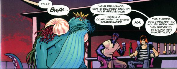
At some point in any given issue the chattering cast will mingle about some tasteful locale sipping drinks and hoovering up nibbles. Thankfully the medium of comics spares the reader the no doubt inevitable soundtrack of Toploader Orion snuck on to smooth things along. The whole thing is like one of those hellish networking soirees for people who do a bit of wee when they think about Powerpoint presentations. Except everybody is cosplaying Sandman and the evening ends abruptly when a big blue catfish in a crown stabs Simon from Accounts in the face. And puns! This issue’s highlight was when War asked, “Where’s my drink? You said you’d get me a Belgian White Beer!” and Wonder Woman replies “I beg your pardon, I never promised you a Hoegaarden!” Face it, Tiger; this book’s so far gone you’re not even sure if that happened. So it’s a fact that the crisp clarity of Goran Sudzuka and Cliff Chiang's art which brings this up to OKAY!

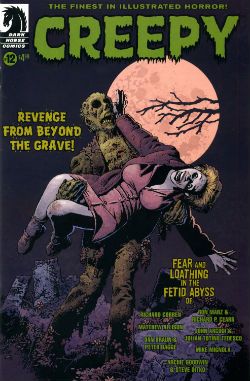
CREEPY #12 Art by Richard Corben, Richard P. Clark, Peter Bagge, Matthew Allison, Julian Totino Tedesco and Steve Ditko Written by Richard Corben, Ron Marz, Dan Braun, Peter Bagge, Matthew Allison, John Arcudi and Archie Goodwin Lettered by Nate Piekos of Blambot and Peter Bagge Dark Horse Comics, $4.99

 photo Creepy_Cov001_B_zpsed87d4c8.jpg

There's the usal raggy grab bag of one pagers and spot illos but storywise we have:

Uncle Mangus by Richard Corben

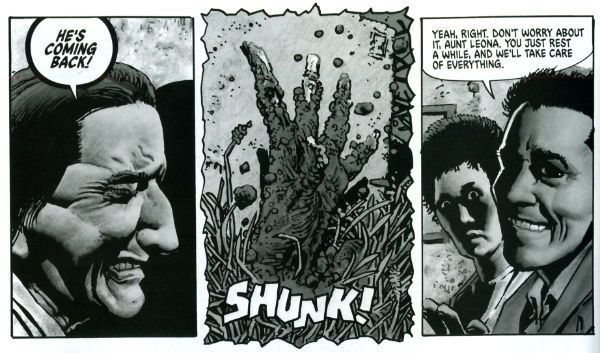
Corben’s on first and Corben’s on form with a frivolous shamble of a shaggy corpse story. Corbenites won’t be disappointed as the shadows drape at strange angles across distorted faces, the undergrowth looks like gathia sticks from Bombay Mix, the borders are jagged when nerves become ragged and the horrific punchline is drawn with slapstick mixed with the ink. Yes, Richard Corben continues to defy Time itself and belligerently refuses to budge from VERY GOOD!

 photo Creepy_Corb001_B_zpsfe235ff8.jpg

Uncle Mangus by Corben

Fishing by Ron Marz & Richard P. Clark Not entirely rote retelling of one of the usual variations on kids go fishing fear fables. Sorry, but EH!

Local Talent by Matthew Allison Allison's tale nicely conveys the grotty zest of late '70s foreign filmed schlock but would have conveyed it better in less space. Also, I know this charmingly cack cinematic genre was limited by budget but it's not a limitation shared by comic art, so c'mon let's have some backgrounds, son. Good enough for an OKAY!

 photo Creepy_Ditko001_B_zps2a622c1e.jpg

The Spirit of The Thing by Ditko & Goodwin The Spirit of The Thing by Steve Ditko & Archie Goodwin

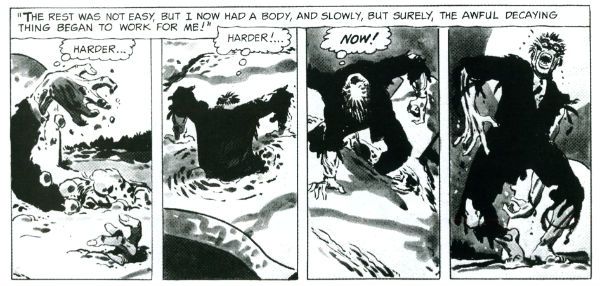
It’s Steve Ditko! "He is Dee Aye Tee Kay OH! He is Dee Aye Tee Kay OH! He’s Dee- delightful! Aye – Innovative! Tee- Totally not open to compromise on any point of principle upon which he has formulated an Objectivist stance! Kay – Kind of kooky! OH!- oooOOOOOOOOOOOOOOooooooooo! He is Dee Aye Tee Kay OH!" In this reprint Archie Goodwin does his usual solid scripting but it’s Ditko’s groovy grey wash German Expressionism that makes this one retain its VERY GOOD! kick lo these many decades after its original printing. It’s also a nice reminder that aficionados of Sturdy Steve should be salivating after the Creepy Presents…Steve Ditko volume that will be dropping imminently. Pre order from your LCS now, they'll appreciate it!

 photo Creepy_Panel001_B_zps17d66933.jpg Pack Leader by Tedesco & Arcudi

Pack Leader by Julian Totino Tedesco & John Arcudi While Ditko and Corben get to VERY GOOD! on the merits of their art alone Arcudi and Tedesco’s tale reaches the same grade due to the success of their collaboration. This one really gels and even wrong-footed me at the last. That's nice. Arcudi and Tedesco knew what they were after and they went and got it. Nice work, fellas!

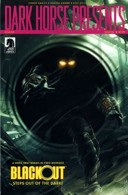
DARK HORSE PRESENTS #24 Dark Horse Comics, $7.99

 photo DHP_Cov001_B_zpsdd591b27.jpg

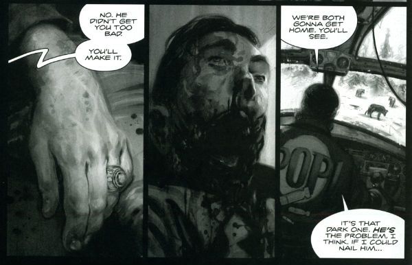
BLACKOUT CHAPTER 1 Story and lettering by Frank Barbiere Art by Micah Kaneshiro Blackout created by Mike Richardson (?)

This one didn't grab me I’m afraid. With its slickly appealing tech sourced graphics and plot predicated on the promise of explanations further down the line it read like the tie-in to some video game I've never heard of. It’s only a few pages though so maybe it’ll pick up and improve from EH!

ALABASTER: BOXCAR TALES CHAPTER 6 Art and lettering by Steve Lieber Story by Caitlin R. Kiernan Coloured by Rachelle Rosenberg Alabaster created by Caitlin R Kiernan

My total indifference to this one is purely a case of it not being my cup of tea rather than any failure on the part of the creative team. I did read it but I couldn't tell you anything about it except it’s in space and usually it isn't. There are some talking animals and a lady, usually with a very broad accent, having magical adventures. Oh, she’s called Dancy Flammarion. Yeah, that’s me gone. I'm no Garth Ennis but fey’s not my thing, I fear. Disregarding my witless bias this is bound to be OKAY! Because Steve Lieber can sure draw nice and Caitlin R Kiernan writes proper books (she should not be confused with Caitlin Moran who doesn't). The most interesting thing was how disproportionately irritated I was by the bit where the team tell us what they were listening to when they created the strip. It was really distracting. I mean was Kiernan really listening to the Sunshine OST? Why? Was it just because it’s the soundtrack to a movie set in space? That’s a stunningly literal approach isn't it? What did she do when it was finished? Start again? Stop writing?

Like a real asshole I find it all a bit disingenuous when creators share stuff like this with us. No one ever says they were listening to Phil Collins or Cher do they? Ever. Yeah, right. Have you seen some of the people who make comics? Seriously. I mean that guy who always does that stupid thing in photos with his face so it looks like a wet thumb sliding down a window is a Foreigner fan and no mistake. Look into your heart, you know it is true. Anyway, this stuff's just the thin end of the wedge, next thing you know they're telling you about their substance abuse problems, how many kids they have or whether they get to put the fairy on top of the Christmas tree. Being an unfeeling automaton it’s just not something I need to know about creators. I mean, does it do any of you any good to know I wrote this while listening to SWANS’ Time is Money (Bastard)? Oh, alright it was Cher. "Do you belieeeeeeeeve!?!"

 photo DHP_BHound001_B_zpsf720926a.jpg

Bloodhound by Jolley, Kirk & Riggs BLOODHOUND: PLAIN SIGHT CHAPTER 2 Art by Leonard Kirk & Robin Riggs Written by Dan Jolley Coloured by Moose Baumann Lettered by Rob Leigh Bloodhound created by Dan Jolley & Drew Johnson

This is a revival of a defunct DC property which has now been given back to the creators to do with as they will. I believe DC also returned the less than successful Monolith property to its creators recently too. This is really rather sporting of DC and we should probably acknowledge that before reminding ourselves of their treatment of Alan Moore. It appears that the lesson here is that if you create anything successful for DC they will line up and bang you like a shit house door. Meanwhile the creators of Bloodhound have decided to put it in DHP. I liked this series when it first appeared and I still like it despite the pony tail our hero sports. He’s kind of like a government sanctioned Punisher with all his marbles and a beer belly who targets super villains. This is just a short three parter so the mystery tends to be cleared up by the characters approaching each suspect, the suspect immediately breaking down and pointing to the next suspect and then the villain breaking cover to provide a thrilling cliff hanger. Brevity isn’t doing it any favours is what I’m saying. But I still find the premise promising, the characters solid and the art pleasant enough for it to be OKAY!

BRAIN BOY CHAPTER 2 Art by Freddie Williams II Written by Fred Van Lente Coloured by Ego ("The Living Colourist"?) Lettered by Nate Piekos of Blambot Brain Boy created by Gil Kane & herb Castle

Although it’s not explicitly stated I guess this is an update of Herb Castle and Gil Kane’s 1962 creation for the faster paced and more luridly violent Now. Since Dark Horse published a pricey hardback of these (old and very probably nuts) tales you’d think they might want to draw attention to this. Weird. Anyway, the update is definitely fast and bloody and it’s not without its charms. Chief amongst these are Van Lente’s witty revisionism best exemplified by the call centre riff and the ‘magic cereal' which fools no one. Artwise Williams II has obviously thought long and hard and come to some definite conclusions about how to draw our hero’s nose. I can’t speak with any surety as to the conclusions he’s reached but there’s definitely something going on with Brain Boy’s hooter. Oh, it all bounces along in a lively if not altogether logical fashion, which makes it GOOD!

 photo DHP_Nexus001_B_zpsda643d33.jpg Nexus by Rude & Baron

TREKKER: THE TRAIN TO AVALON BAY CHAPTER 1 Story and art by Ron Randall Coloured by Jeremy Colwell Lettered by Ken Bruzenak Trekker created by Ron Randall

It's super-nice that an old lag like Randall has his own creator owned property. It's less agreeable to report I found the whole future bounty hunting lady with sad past thing a tad too generic for my fussy palate. I am certain there is an audience for this but I adamant I am not amongst their number. I wish Randall well in all his travels but this, for me, was EH!

KING'S ROAD: THE LONG WAY HOME CHAPTER 2 Art by Phil Winslade Written by Peter Hogan Lettering by Steve Dutro

Oooh! It's a high concept! What if the kids from a book very similar to (but. lawyers take note, not the same as) The Lion, The Witch & The Wardrobe grew up and had kids who didn't know about their adventures and then The Evil Returned and the kids had to take up arms on behalf of their paunchy and totes dull 'dults?!? This. That's what. No doubt Hogan will be exploring the Christian symbols underlying his borrowings with the same rigour and aplomb as his source. Or at least get a movie deal. Just joking! This is a promising (if not a little cheeky) premise and it's made all the more attractive thanks to Winslade's endearingly gangly characters. Although these do inhabit a blurry world of boisterous blooms of colour, the intensity of which suggest Mr. Winslade should pop down the opticians pretty sharpish or at least dial his PC settings down a bit. Maybe I'm getting soft in my dotage but this was OKAY!

CRIME DOES NOT PAY: CITY OF ROSES CHAPTER 5 Art by Patric Reynolds Written by Phil Stanford Colours by Bill Farmer Lettering by Nate Piekos of Blambot Crime Does Not Pay: City of RosesCity Of Roses created by Patric Reynolds & Phil Stanford

This is EH! due to the perfunctory writing and the weirdly flaky looking art. It isn't terrible but it isn't terribly exciting either. Everybody thinks crime comics are easy and nearly everyone is wrong. Everyone except David Lapham. Christ, I miss STRAY BULLETS. Why can't Dark Horse Presents find room for new David Lapham genius? WHYYYYYYYYYYYYYYYYYY???? WAAAAAAAAAAAAAAAAAHHHHHH!!!!
NEXUS: INTO THE PAST CHAPTER 2 Art by Steve Rude Written by Mike Baron Lettered by Steve Rude Coloured by Glenn Whitmore Nexus created by Steve Rude & Mike Baron

Eventually every open ended continuing narrative strip gets to Jack the Ripper, it's likely that they get to Sherlock Holmes too, but only Nexus would throw in H.G. Wells without overbalancing, without even wobbling in fact. It's Nexus so it's VERY GOOD! In fact I'll tell you this: I'd never read Nexus until it appeared in DHP but once it did I ordered Vol.1 of the Omnibooks pretty darn lickety split. I would imagine there is no higher praise a comic creator can receive than a sale. We'll be coming back to Nexus at some point. Aw, yeah!
HUNTER QUAID: ARMAGEDDON OUT OF HERE Art by Melissa Curtin Written by Donny Cates & Eliot Rahal Coloured by Lauren Affe Lettered by Lauren Affe Hunter Quaid created by Donny Cates & eliot Rahal

I couldn’t get a grip on this one. It’s like something an artist would do to showcase their style but it has a writer, no, two writers? And they are the creators but it's the art that is the stand out feature? I don’t know. I don't get that. It looks nice but, hey, that’s all you need sometimes. It was OKAY! but only because of the artist.

 photo DHP_Wheeler001_B_zpsb74cb0f6.jpg Villain House by Wheeler

VILLAIN HOUSE CHAPTER 4 By Shannon "Papa" Wheeler

It’s a kind of testament to the durability and depth of the concepts at the heart of Jack Kirby and Stan Lee’s Fantastic Four that half a century later it still provides fertile soil for trees of mirth like this. As mirth trees go this is a sturdy beech indeed. This is some funny stuff right here from the surly insistence of 'Not The Thing' that everything bad is Communist to the laser targeted title of “Invisible Wife” and beyond. The laughs aren't empty either, there’s a sympathetic villain whose world is ruined by a bunch of powered berks getting all up in his business to hilariously disastrous, but not unmoving, effect. I’d hazard a guess this strip is somewhat more refreshing and engaging than yet another modernisation of an old Kirby & Lee classic. ( “Yo, Yo, Yo! Ben Grimm is Totes Sad, Bro! (Ch-Ch-Ch-check out Mi Tumb-LAH!!!)”) Wheelers’ treat of a tummy tickler may not beat the ultimate yukkifier of Don Simpson’ s Yarn Man and “Golly! That crazy gizmo really works!” but it comes closer than most in a very small space. And that’s VERY GOOD!

Christ, I think I sprained something back there. And now I know why people don't review anthologies. I still don't understand why they don't buy em. They're stilll - COMICS!!!