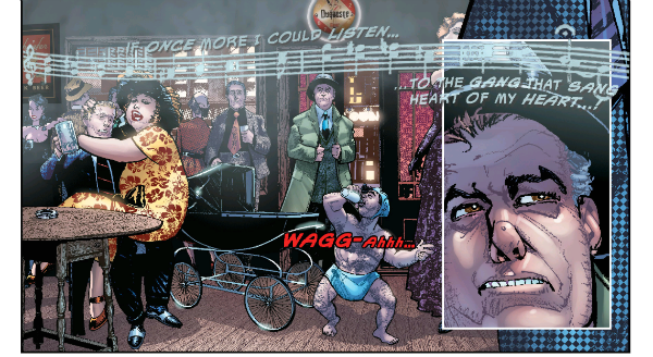
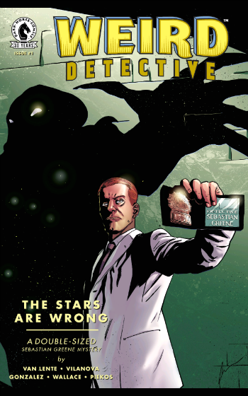
“Back Up, Old Man!” COMICS! Sometimes The Business of North American Genre Comics is Wolves.

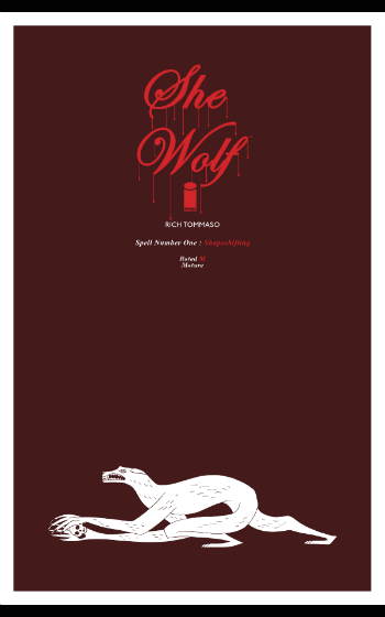
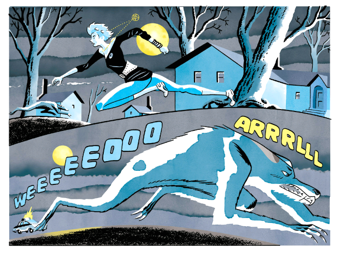
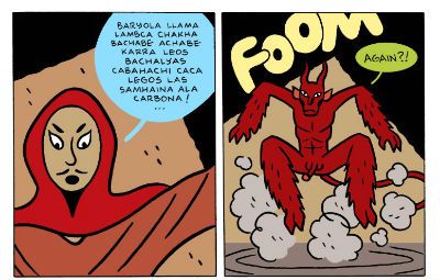
This time out it’s a He-Wolf and a She-Wolf! Don’t worry, there’s nothing remotely connected to the real world in this one. PHEW!  photo swolf2B_zpsxllbmafg.jpg SHE WOLF by Rich Tommaso
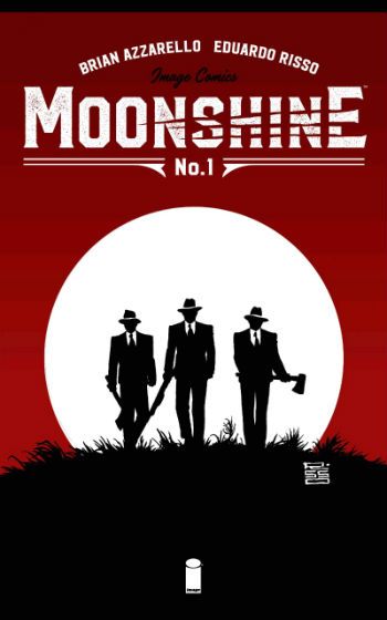
Anyway, this… MOONSHINE #1 Art by Eduardo Risso Coloured by Eduardo Risso Written by Brian Azzarello Lettered by Jared K. Fletcher Variant cover by Frank Miller (I haven't seen it, I'm sure it's awesome.) IMAGE COMICS, INC., $2.99 COMIXOLOGY (2016) MOONSHINE created by Eduardo Risso & Brian Azzarello MOONSHINE © Eduardo Risso & Brian Azzarello

 photo MshineCovB_zpssoe0mzom.jpg

So there’s manly Brian Azzarello watching LAWLESS (2012) with a manly drink of bourbons and ryes in his manly hand when his uncle Barry, who works in unmanly IT, pops in to say hello. Raising his manly eyes from the screen, where Guy Pierce is acting and Tom Hardy is standing about looking dazed, Azzarello notes manfully that Barry is sporting a lovely 100% cotton jumper with a big wolf’s face on the front. Barry notes his manly nephew’s manly gaze and starts telling him that he has one with a hood on as well, and is thinking of getting a matching one for his wife, Brian’s Auntie Babs, but that’ll be for Christmas because she’s had the conservatory roof changed to a solid one, and that didn’t come cheap. But Brian Azzarello is manfully preoccupied because a light bulb has gone off over Brian Azzarello’s manly head. Hooch. Wolves. Hooch and wolves! And thus HOOCH WOLF was born! Oh, okay MOONSHINE (geddit!) A tad on the snout it may be, but the title is a pretty good sign of what’s on offer here; what with it being within acceptable parameters for wordplay because, y’know, it actually works, it’s kind of droll and, basically isn’t godawful. (Remember “Hello”, “Hell low”? Oh, boy. Oof! Who died in here?)  There’s nothing special about it as a title and similarly there’s little special about Azzarello’s script, but the simple lack of anything bad enough to step in is cause for rejoicing. Particularly as Azzarello is once again monopolising the talents of the amazing Eduardo Risso.
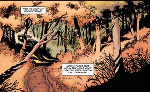
 photo Mshine01B_zpspoeqprpj.jpg MOONSHINE by Risso, Azzarello and Fletcher

Hey! This is the best writing Brian Azzarello has done for a long while. There you go. Oho! Don’t reach for the ticker-tape just yet, you little eager beaver you, because that’s pretty faint praise at this point. But yes, I’m happy to report that MOONSHINE’s more coherent than the witless farrago of DKIII:TMR (O boy! That’s like burn-it-and-salt-the-earth bad) and it’s far less of a waste of Eduardo Risso’s time and talent than LONO: BROTHER LONO (The main man wasn’t even in space and no sign of any dolphins.) Mind you, MOONSHINE’s far from spectacular, but it’s okay. As is so often the case in comics that’s mostly down to the artist, here one Eduardo Risso by name. I’m partial to a bit of Risso, so that means I get to read a lot of Brian Azzarello comics, as Azzarello has a habit of hogging Risso. Sometimes people float the idea that some writer and artist teams elevate each other to new heights. Unsurprisingly, I don’t see a lot of evidence for that. I see a lot of evidence to suggest writers get away with feeble work by having talented artists illustrate it. It’s for RM Guera’s art I suffer Jason Aaron insecurely rubbing his sweaty balls in my face, not because I enjoy the sharp tang of insecure ball sweat, you dig? But Risso has had to elevate weaker work than this (Did I mention LONO: BROTHER LONO, bastiches?) and he seems invested in MOONSHINE, even to the extent that he’s colouring his art for the first time. And that works out quite nicely. Enjoyable as his colours are, his art is too tough for his colouring to make much impact. Risso’s work has appeared in coloured and uncoloured versions (WOLVERINE: LOGAN, BATMAN NOIR: EDUARDO RISSO); neither approach significantly more appealing than the other. I’m a firm believer that the colourists’ motto should be primum non nocere, so Risso’s work is thus a great playground for a neophyte colourist, it being pretty much invulnerable. And so it goes that Risso’s colours are pleasant enough; inky blues for the night scenes, autumnal oranges in the dusk scenes etc. It’s all very good but it’s the art that’s the true strength of the pages. I enjoy just looking at how Risso has drawn his trees, that’s how good he is. What colour they are comes second. And in MOONSHINE Risso draws some mighty fine trees. He draws a whole lot of other things too; jalopies, candlestick telephones, men in hats, all that good time old-timey stuff. Yes sir, that’s my baby/No sir, don’t mean maybe! Ayup, Risso works his talented Argentine arse off bringing the ‘20s back.  Why it was just the Cat’s Meow; I didn’t know whether to Shimmy or Charleston, darling!
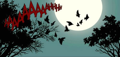
 photo Mshine02B_zpsyfvlacyq.jpg MOONSHINE by Risso, Azzarello and Fletcher

While I wouldn’t say the writing was strong as such, it is solid enough to bounce back from an opening which, while it doesn’t employ Clichéd Opening Device #1 (woman running down street at night pursued by something (insert name of male comic creator)), it does employ Clichéd Opening Device #2 (Bunch of characters offed by mysterious thing). The funny thing about clichés is how writers just employ ‘em without thought, like a muscle spasm, and that makes ‘em just about as creative. When my arm shoots out and knocks a hot cup of tea over I don’t expect applause for my Craft©™, you know? I mean, just how much suspense is there in a bunch of Feds rooting about a still at night suddenly being torn to pieces by something never clearly shown, but shown enough to register as a big furry animal with sharp teeth. Sure some people might have their money on a rabid capybara but most folk will have read the title, which kind of gives it away. Some people are killed by…exactly what you think….SUSPENSE! The only suspense is why the Feds think J Edgar Hoover wants to fuck them, I know he liked a bit of tranny action but did he also sexually harass all his agents? A flashback to J Edgar Hoover all gussied up in his scanties chasing a bunch of young be-suited WASPS around to the Benny Hill music would have maybe been ridiculous, but it would have been a bit of fresh air amongst the mustiness on show. Everyone sing along as I tickle the ivories: It’s prohibition times and a typical ne’er do well with his typical handsomeness and his typical comic book drink problem, is dispatched by his typically small, bald and sweaty shifty slug of a boss to a typically Appalachian backwoods den of torn gingham, dirt streets, cross eyed kids  and generally dirt poor hicks, to barter with a typically shifty but crafty paterfamilias in order to sell his typically special recipe hooch in the typically big city. There’s a typical sassy lady, and a sexy black lady dancing round a fire (SYMBOLISM!) Now I don’t know if that dancing black lady is typical or not, but I’m pretty sure our typical anti-hero will be typically sniffing round both sets of typical knickers with typically disastrous results. There’s not a lot of suspense here, as soon as you see that Pa Dingleberry has a scar and a milky eye you KNOW we’ll be seeing a wolf with a tuxedo and spats, no, don’t be silly, with a scar and a milky eye. It’s just a question of when. Still, inevitability can be quiet entertaining. Particularly if Eduardo Risso is drawing it. MOONSHINE is all very comfortable, it’s all very TV. There’s worse things, I guess.
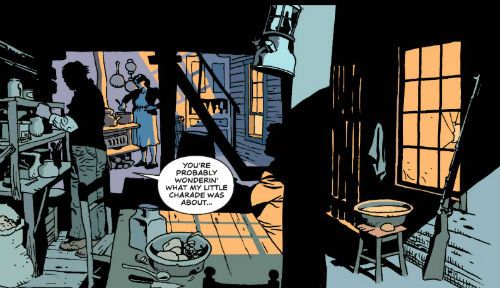
 photo Mshine03B_zpst7d2i0fe.jpg MOONSHINE by Risso, Azzarello and Fletcher

So yeah, it’s looking like Brian Azzarello’s usual go-to formula: to take something familiar and populate it with people who are irredeemable shitbags. (LONO: BROTHER LONO is basically just Two Mules For Sister Sarah crossed with one of those ‘80s movies where Chet Brisket gets pushed about for the first 60 minutes, and then spends the next 30 burning through the bad ‘uns like he was an arc welder and they were cheese. But, y’know, updated, set in Mexico and populated with walking faeces. And not as good.) Obviously this whole “everybody’s a shitbag” approach is edgy and revelatory and not all as childishly one-side as believing everyone is a magical laughter machine. No, I’m not sure why that is either. Anyway, MOONSHINE is GOOD! Risso is his usual superlative self and even Azzarello is manfully reining in his worst tendencies. (Applause!) However, I do reserve the right to throw the book across the room if he uses “hair of the dog that bit me”. A man has to have some standards, after all. Even me.

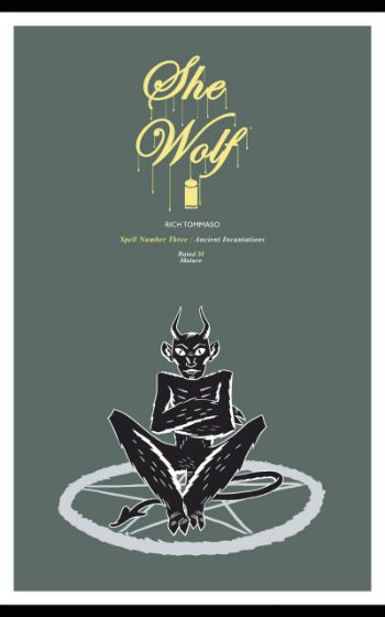
SHE WOLF #3 by Rich Tommaso Pin-ups by Patrick Dean, Chuck Forsman, Brandon Graham, Brian Level, Tom Neely, Eraklis Petmezas and Jim Rugg IMAGE COMICS, INC., $1.99 COMIXOLOGY (2016) SHE WOLF created by Rich Tommaso SHE WOLF© 2016 Rich Tommaso

 photo swolfcovB_zpsiyirav3c.jpg

I say, I say, I say, who are Macbeth’s three favourite comic creators? “To-mmaso, and To-mmaso, and To-mmaso!” Ba-da BING! Ba-da-BOOM! Aw nertz, youse bums ain’t got no class, ya hear! Ya gots no class! A-hem. Unlike many comics which shall remain nameless (cough-MOONSHINE-cough) SHE WOLF#3 is cliché free! Unless there are a lot of stories where the heroine is invited into a stained glass window wherein she witnesses, in a stained glass art style, the origin of lycanthropy, which involves, Jesus (Christ), a luckless sorceror, a demon and a right silly bastard. With its flat colours and basic shapes this blasphemous and ultimately very nasty sequence pops hard against the lush colours and magnificently evocative cartooning surrounding it.

 photo swolf1B_zpsmyjlczrz.jpg SHE WOLF by Rich Tommasso

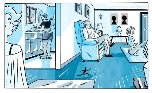
While Risso’s colours on MOONSHINE seem a handsome afterthought Tommaso’s colours are entwined inseparably with the art. The colours are the art and the art is the colour. And the genius in that combination is all Tommaso’s. There’s a single panel of our heroine waking in bed, her room a cool blue splashed with a buttery light. That panel alone is worth the paltry pennies this comic cost. But like a papery excess of largesse this comic is filled with other things besides! The exceptional panel itself leads into a dream sequence of familial violence; one made exponentially creepier by the silence within which it unfolds and the ferine shapes usurping domesticity on the periphery. Be that not enough, o seeker of thrills, then there’s a captive menagerie of monstrosities being read to by a priest with a colossal cross, reality turns out not to be, the passage of time is represented by a row of variously phased moons, a rescue occurs and, finally,  an ill-starred decision is made. Summoning demons always works out really well as we’ve seen, but to be fair sometimes the only choice is the least bad choice. Choosing not to buy SHE WOLF would be a very poor choice indeed. Rich Tommaso's SHE WOLF is  EXCELLENT!

“A secret society exists, and is living among all of us. They are neither people nor animals, but something in-between.” They are COMICS!!!

“I’m Not Taking a Dump!” COMICS! Sometimes The Female of the Species is Not Only Deadlier Than The Male But Has an Extendable Pseudoprick. Which is Nice.

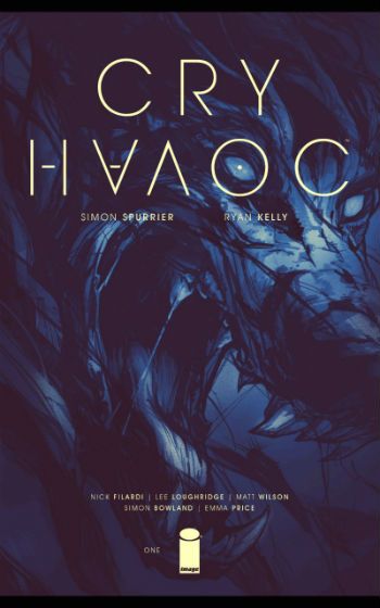
…wolf! It was “hungry like the..wolf! Did you get it? Oh, forget it; I’ll not bother in future. Here’s a couple of comics I liked. Lady werewolves and that, innit. GRRR!  photo SWolf01B_zpsciuofbwb.jpg SHE WOLF by Rich Tommaso Anyway, this… CRY HAVOC #1 Art by Ryan Kelly Written by Simon Spurrier Coloured by Nick Filardi, Lee Loughridge and Matt Wilson Lettered by Simon Bowland Design by Emma Price Main Cover by Ryan Kelly & Emma Price Variant Cover by Cameron Stewart IMAGE COMICS, INC. £0.69 on sale on Comixology (2016) CRY HAVOC created by Ryan Kelly & Simon Spurrier CRY HAVOC © 2016 Simon Spurrier & Ryan Kelly

 photo CHavocCovB_zpshgwuv2kq.jpg

Oho! Looks like we got ourselves a Writer here. For starters the title’s a truncated nub of Shakespeare (from Star Trek VI: The Undiscovered Country). It’s one which is so culturally ubiquitous it irresistibly evokes the phantom residue of the quote r.e. dogs of war and the letting loose thereof. Thus it is not entirely inappropriate for a lesbian werewolf war comic. Ah but lest you think you are in for Stirba, She-Wolf of the SS, Si(mon) Spurrier slaps your crude face up with a quote from Joseph Conrad’s Heart of Darkness (as opposed to, say, The Chuckle Brothers’ Heart of Darkness), and it isn’t “The horror! The horror!” or “Mistah Kurtz, he dead.” Good start there; if a little high falutin’ for a lesbian werewolf war comic. But, hey, maybe if Joseph Conrad (Józef Teodor Konrad Korzeniowski) were alive today he’d be writing lesbian werewolf war comics for Image. But Mistah Conrad, he dead, so it’s up to Si(mon) Spurrier.  Say, do you remember when comics used to have quotes at the front from, like, Great Literature? I always liked that as a nipper. There was a real sense back then that folks really respected literature. Now it’s taken as some kind of snooty elitist one-upmanship and only quotes from 1980s movies count. Back then though, Bill Mantlo or whoever would lead off an issue of THE INADVISABLE SHIT FLINGING TEEN MONKEY with a snippet of Virginia Woolfe. I remember one time excitedly holding court and declaiming that HULK issue #261 (1981) (wherein behind a Frank Miller cover The Absorbing Man tried to, uh, absorb Easter Island but failed) was nothing less than a four-colour, two-fisted evocation of John Donne’s immortal ‘Meditation XVII, Devotions upon Emergent Occasions’. To wit: “No man is an iland, intire of it selfe; every man is a peece of the Continent, a part of the maine...” And even though the bastards decided not to renew my tenure that year, I still stand by that.

 photo CHavoc01B_zpstx80xhib.jpg CRY HAVOC by Kelly, Spurrier, Wilson and Bowland

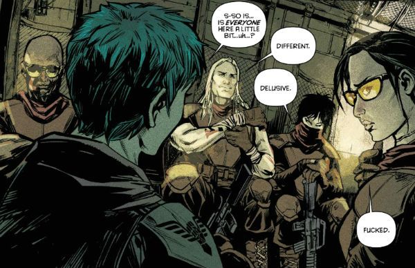
But back at CRY HAVOC, and Si(mon) Spurrier is flirting with a hernia he’s writing that hard. Most obviously there’s a tripartite structure (London, The Red Place, Bangor, Afghanistan) with each section being coloured by a different colourist (Filardi, Loughridge and Wilson, respectively). Which is a little bit special structurally, if a bit disruptive on the old suspense front. Lou clearly survives because she’s in each distinctly hued part, so at the minute the greatest question is how did a lesbian werewolf get with child. (No, not the specific biological mechanics, thanks.)  Si(mon) Spurrier also chucks a varied cast in the reader’s face, and while Inappropriate Sexual Comment Thor is funniest, everyone is interesting. Although everyone may not be as interesting as Si(mon) Spurrier thinks. It’s possible other people warm to chirpy street fiddlers with blue hair who say “sammiches” instead of “sandwiches” more than I do, but that’s our protagonist so that’s that. (Also Si(mon) Spurrier probably isn’t going for the menopausal balding male who’s made catastrophic life choices market.) CRY HAVOC’s not just about werewolves though, there are all kinds of odd mythical misfits aiding our chipper lass in her search for a rogue agent in an area torn apart by Western shenanigans (Oh, oh, like Mr. Kurtz! I get it now!) There’s even a bit at the back where Si(mon) Spurrier annotates the whole issue with his writerly wisdom. I didn’t read that because I wanted to know if the comic worked without someone explaining it over my shoulder, but its presence was appreciated. Ryan Kelly, though, hmm; I wasn’t super-sold on the art which was a bit unspectacular and a tad muddy at times. The initial alley attack was a bit meh; I’d have thought that would have been your set piece. Mostly though in that bit I was just distracted by the uncertainty that cheeky street urchin chomping would go unnoticed in an alley next to The Old Bailey. Justice may be blind but she isn’t deaf. Ho Ho! So not exactly hanging out the bunting for the art just yet. However, there’s a clear sense of an individual style trying to form, and it’s far from an incoherent mess. So watch and see, I guess.  Hopefully CRY HAVOC will avoid stumbling into some twee-shite Young Adult territory where all the Fairies and Little People are real if only you have the sight to see! Because if it does do that then what’s Neil Gaiman going to do? CRY HAVOC is currently up to its sixth issue and, yeah, I’ll catch up on those because it is GOOD!

SHE WOLF#2 By Rich Tommaso IMAGE COMICS, INC., £1.99 on COMIXOLOGY (2016) SHE WOLF created by Rich Tommaso SHE WOLF © 2016 by Rich Tommaso

 photo SwolfCovB_zpssnhppmlr.jpg

Damn, look at that cover! BOOM! That’s classy stuff right there. Oh, just get it bought. I’ve said it before and I’ll say it again, and I’ll keep saying it until Rich Tommaso can buy his own private island: SHE WOLF is many things but best of all SHE WOLF is total COMICS!!! I don’t know anything about Rich Tommaso, so going in so deep on the old recommendation front may backfire in my oh-so-trusting face. He’s a male comic creator after all, and there’s not a week goes by when we don’t discover some dude who can draw Batman or can write about Batman has, uh, bad habits. Listen, guys, I’m not unsympathetic; drawing Batman or writing about Batman are vital tasks and in many ways you are the Real Heroes, and I also know it can be confusing these days what with women being allowed to vote, drive and even enter pubs unattended but, seriously, hiding under a lady’s bed, then creeping out when she’s asleep to stand astride her head pantsless? Then slowly bending your knees, thus bringing your balls nearer to the sleeping lady’s face until her slumberous breath stirs the wispy hairs upon your fleshy danglers? Not normal, fellas. Frankly, aside from the phenomenal muscle control required there’s little to approve of in that behaviour. Oh, am I perfect? No, but there’s imperfection and then there’s behaviour which would mean Joe Spinell would play you in a movie. Basically, it shouldn’t be so hard to know when you are being creepy, guys. So, yeah, just in case my praise comes back to haunt me I’m building in my escape hatch early. Obviously, I’m not even really talking about Rich Tommasso there, okay? Got that. Until I hear otherwise I operate on the principal of ‘Innocent until proven Guilty’ and so I’ll continue my “Make Rich Tommaso Rich!” campaign. All I have to say currently about Rich Tommaso are good things, nay, great things, because SHE WOLF is great. But Rich Tommaso made it, so maybe he’s even greater?  photo SWolf02B_zpszululpcg.jpg SHE WOLF by Rich Tommaso
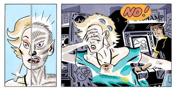
Sure, Rich Tommaso’s name may sound like someone six pints into the evening unadvisedly trying to talk about wealthy red fruits often mistaken for vegetables and frequently used in salads, but you mustn’t hold that against him, because he is an artistic behemoth! For realz, chirren of the comics! SHE WOLF has a muscular narrative propulsion not entirely dissimilar to that of our titular loping lycanthrope. All kinds of stuff kicks loose in SHE WOLF#2’s short span: a freaky friend is found, vampires and sunblock are discussed, an arm is torn off, a mother is displeased, an arm grows back, a small boy is hilariously traumatised for life in the play area, dimensions and dreams are discussed, a certain goat should have stayed in bed, secrets are revealed, further secrets are hinted at and next issue even has a demon penis on the front. All that and much, much more for one pound and ninety nine pence! SHE WOLF is as perplexing and alarming as adolescence, but a lot more beautiful to look at (and with a lot less surreptitious wanking). More wolves too. SHE WOLF wears its allegorical trappings lightly so it can be read as a coming-of-age tale, or a coming-out tale, or both, or just as a maniacally inventive and breathlessly paced horror romp, or all three and probably a fourth thing I missed. Maybe five, possibly six things. Seven might be pushing it though. The level of visual invention on display in SHE WOLF is kind of frightening in itself. Tommaso manages to blend ‘80s mall culture, toilet humour, freakazoidal Ditko-scapes, body-morphing horror, lucid dreaming, dreamy reality, counter-intuitively sunny colours and then, just because he can, he smothers the entire canis lupus caper in a Rich Tommaso sauce. SHE WOLF is EXCELLENT! 

Next Time: Decisions, decisions. Howard Victor Chaykin’s revolting bananas OR a xenophobic Little Englander’s view of Euro-COMICS!!!
“Even BABIES Got Scars.” COMICS! Sometimes I Recall My Mother Saying That Resorting to Profanity Indicated a Failure of Imagination Rather Than Being a Reliable Indicator of Toughness. Then She Bopped Me One in the Eye To Drive Her Point Home. One Tough Broad.

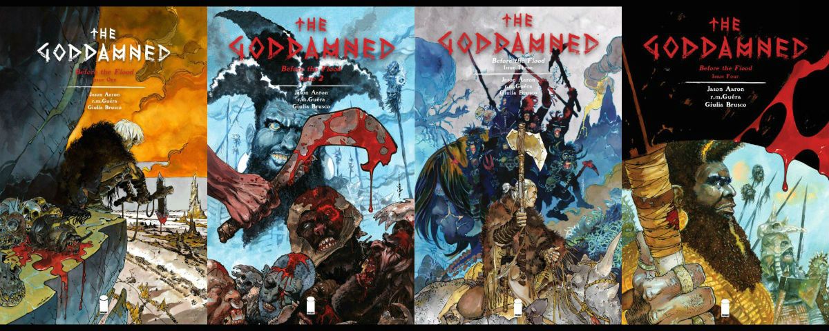
There was a sale on Image Comics on The Comixiology to celebrate comics creators saying awful things at some convention or other. Me, I hate Rosicrucians because someone once told someone who told me that they make their kids pee standing on their hands so it goes in their mouths. I could be wrong, but why check? Oh, also I bought some stuff. For starters I got four issues of THE GODDAMNED for £0.69 each. Then I wrote this. True story, bro. “In the beginning was The Word. And The Word was poo-poo-botty-stinker.” The Book of Aaron Ch1, v.1

 photo Gdamn01B_zpsfxd2pruo.jpg THE GODDAMNED by Guera, Aaron, Brusco & Fletcher

Anyway, this…

THE GODDAMNED #1-4 Art by R.M. Guera Written by Jason Aaron Coloured by Giulia Brusco Lettered by Jared K. Fletcher Image Comics, Inc, £0.69 on sale (2015-2016) THE GODDAMNED created by Guera & Aaron Based characters from The Bible by God (via 40 or so human vessels for His Word).

 photo GDCoversB_zpsrfiwttor.jpg

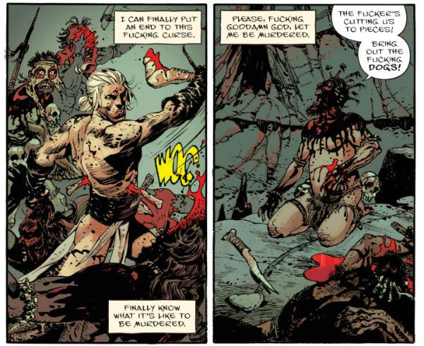
Man-mountain (not man-mounting, cheeky!) Jason Aaron’s new cock-flicking comic is a fiercely oh-so-adult exercise in shit-fingered maturity. Swears adorn each funky page as flies bejewel turds, if you can’t take the swears get in the kitchen, weak-o! Rattle those pots and pans! Aaron’s jizz-caked high-concept is to set THE GODDAMNED after the bastard-felching Fall but before The donkey-fellating Flood. You know, as in The bum-truffling Bible. Because that’s mother-scatting Edgy, I guess. Some library haunting self-abusers might be disappointed to learn that this Bible stuff is just a swerve, a crotchless pair of sophisticated knickers, a sop for the four-eyes out there, but proper swinging dicks will delight in the fact that THE GODDAMNED, lacy Biblical guff aside, basically resembles a booger-snuggling Heavy Metal story; from back when The Metal had robot tits on the cover, you know, not now they have a materialist magician at the helm (“Hocus Pocus! Self-Promotion!”) Make no dog-fondling mistake THE GODDAMNED is all boob-kneadingly grim stuff, with sweaty men wielding axes made of babies’ femurs and folk calling God a cunt. Golly! Ear muffs, kids!

 photo Gdamn04B_zpsfxkotnqy.jpg THE GODDAMNED by Guera, Aaron, Brusco & Fletcher

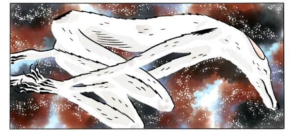
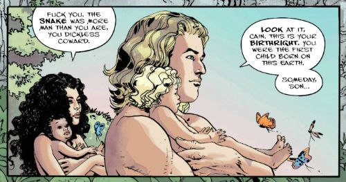
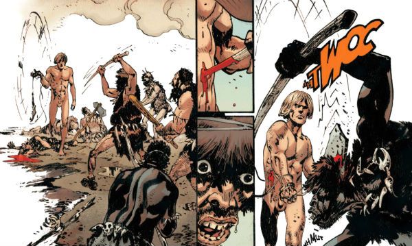
Our protagonist aside (it’s Cain. Different spelling, no relation. Or is he? Eh?), everyone, even the ladies, even the kids, are all scarred and hairy. Not unlike my savaged groin after that orchiopexy. Yeah, I know it’s primarily a kid’s procedure, but my balls were so large and laden with swimming future Winners, they had to wait until I was manly enough to take the pain of the surgically assisted descent. And, yeah, it hurt because anaesthetic is for girlymen Liberals and pussyboy intellectuals, both of which can smoke my fat porker. But not in a gay way. In a manly way. Yeah, THE GODDAMNED is a comic for all us big balled fellas who sweat when we shit; who almost pass out when we pass stool, straining faces as swollen and empurpled as our members on the vinegar stroke because our diet, see, contains only red meat. Meat we have killed our bare hands, skinned with our filed down teeth, and smoked over a fire of burning titmags. THE GODDAMNED is studly stuff, engorged with hard won beefy truths about how a man can find the drive to live within a sad child’s eyes or a woman’s shrill neediness. It’s only slightly marred by the fact that having a protagonist who can’t be killed detracts from the suspense a bit, every fight thus becomes as one-sided as an arm-wrestling contest between a long-haul trucker and a Sociology major. Imagine The Outlaw Josey Wales set on John Norman’s Gor and written by someone overcompensating for the fact that his churchy family think writing is for the ladies. “With John Vernon as Noah”. Grrr! Woof! SAY MY NAME! SAY IT!

I photo Gdamn03B_zpsybrhau2d.jpg THE GODDAMNED by Guera, Aaron, Brusco & Fletcher

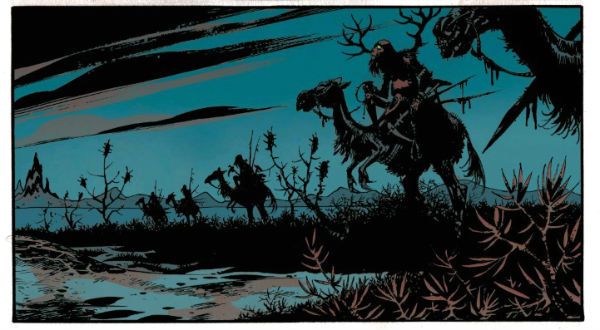
Damn, this comic is so butch it’ll whip you with its dick ‘til you start to like it. Pushing past the childish desire to outrage, as through the foresty pubes of a ‘70s pornstar, it is possible to see some cute pacing, decent characterisation and robust structural integrity in the writing. But it’s hard to give credit when the whole thing consistently mistakes infantile for audacious. Luckily for the soft sods out there, like moi,  who can’t take Jason Aaron’s burnt bacon brilliance, R. M. Guera draws the hot balls off everything in such a way as to actually make the ridiculous thing seem worth reading. Reading is for mulch-cuddling professors though, so make that “worth looking at”. R.M. Guera is just a goddamn (heh) joy to watch. Even when folk are face down in pools of shit, or guts are unspooling in red splashes from twisted and gnarled bodies, there’s a vein of feral splendour running through everything. Guera’s briefly glimpsed Eden is as pure and cold and distant as perfection itself, but his broken sin-stained earth is filled with vitality and a shockingly brutal beauty. Aided only by Brusco's apocalyptically lush colours Guera’s art is eloquent enough to make an unflinching and convincing case for humanity, flaws and downright shitty behaviour and all, while the script blithely rebels uselessly, stridently and foolishly against an empty sky. Because of R.M. Guera THE GODDAMNED is VERY GOOD! But only because of R.M. Guera. Otherwise it’s EH! (N.B. I didn’t really have a late life orchiopexy. So don’t send cards. Save the money and buy yourself something nice.)

 photo Gdamn02B_zpsbrl6yqds.jpg THE GODDAMNED by Guera, Aaron, Brusco & Fletcher

NEXT TIME: Hungry Like The…COMICS!!!
“...Even LIMP, That Bat's Too Much For ME.” COMICS! Sometimes It's The Cat Which is The Unnameable.

This time out: a lady werewolf, the slightly lighter side of Lovecraft and a drunk cuckold finds the vengeance trail's gone cold.  photo MotSTopB_zpspubovcvt.png Midnight of the Soul by Chaykin, Arbutov & Bruzenak

What's not to love about that, am I right or am I right?

Anyway, this... SHE WOLF #1 All by Rich Tommaso Image Comics, Inc., $3.99 (2016) She Wolf created by Rich Tommaso She Wolf © 2016 Rich Tommaso

 photo SWCovB_zpspae8lmxo.png

The slightly creepy theme (from my more than slightly creepy self) this week kicks off with Rich Tommaso's teenage werewolf comic. Pretty straightforward stuff you'd think, teenage werewolf comics; but you'd be wrong. Maybe. I mean she might be a werewolf, she might not, and if she is, well, she might have been bitten by one, or maybe a shape changing spell went wrong. Or she just doesn't like dogs and, uh, wait her boyfriend was a ...no, wait now she's fighting her priest but...maybe not. This hallucinatory narrative uncertainty is intentional, I would guess given that Tomasso's comic is a visually resplendent wonder indeed. You don't get the skill to draw something as phenomenally vital as this unless you know what you're doing. Of course, whether you want to let the reader in on what you are doing is another thing altogether.

 photo SWPicB_zps8clcxffl.png She Wolf by Rich Tommaso

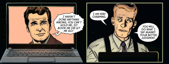
Now as we have all noted on numerous occasions, I am terrible when it comes to colour in comics but even I can see that colours here are some kind of spectacular you'd do well not to miss. At first I thought the colour coding of scenes was the key (red for dreams, blue for night, various for daytime reality) but everything starts to get blurry, and reality and fantasy are all mucked about, and you soon don't know which end is up. Which, you might hazard should you be able to rememebr that far back, is what being a teenager is like. (The way I remember it is this: being a teenager is A!W!F!U!L!). Tomasso certainly draws his heroine as a true to teenhood gawky flail of elbows and knees, like a young Laura Dern; in gangly contrast to the smooth swoosh of movement personifying the animal identity. Then there's the great scene where the Principal is reassuring our heroine, but she can also see a black and red doppleganger Principal whose every word drips mistrust and belligerence. Yeah, adults say they want to help you but they LIE because they HATE you! Man, it's a great scene. But then there are a few of those here. More great scenes in one comic than most series manage in toto. Tomasso's cartoony style may bely the horror, particularly in a viscerally unsettling dream sequence, but this lends everything a kind of comedic undercurrent. Or maybe it's a comedy with a horrific undercurrent. I don't know, but what I do know is I'm sticking with this one because Rich Tomasso's SHE WOLF is VERY GOOD! AAAAARrrrrrrrrrrrroooOOOOOOOOOAAAAOOoooooHHHH! WEIRD DETECTIVE #1 (of 5) Art by Guiu Vilanova Written by Fred Van Lente Coloured by Mauricio Wallace & Josan Gonzalez Lettered by Nate Piekos of Blambot ® Dark Horse Comics Inc., $3.99 (2016) Weird Detective ™ created by Fred Van Lente & Guiu Vilanova Weird Detective ™ indebted to the work of H P Lovecraft Text and illustrations of Weird Detective ™ © 2016 Fred Van Lente & Guiu Vilanova

 photo WDCovB_zps6556lw3x.png

Standing in stark contrast to Alan Moore & Jacen Burrows reverent and stately paced dark hymn to the majesty of HP Lovecraft, here we have Van Lente & Vilanova's somewhat more modern take. Mash-ups are still modern right? Because what WEIRD DETECTIVE ™ is is HP Lovecraft smushed up with the detective genre, hence the title. It's a lot of fun, whether it's more fun than PROVIDENCE I don't know, because anyone who measures fun is someone who isn't having any. Personally I had fun with both, just different kinds. WEIRD DETECTIVE is plump with cliches, but that's because the detective genre is filled with cliches rather than due to any lack on Van Lente's part. Van Lente in fact proves pretty smart at playing with the conventions and part of this smartness is displayed in his clever sense of humour. The scene where Greene watches TV detectives to get tips on behaviour almost buckles under all the referencing (Lovecraft, Rockford Files, Martian Manhunter, etc) but is instead impressive in both its levels of humour and intelligence. This undercurrent of drollery prevents things becoming too rote or too unpleasant. Because some of the book is pretty gross, there's the standout death by toilet but there are quieter horrors at play too. And all the horrors are derived from the Lovecraftian mythos and blatantly so. You won't be scratching your spade-like chin with this one trying to figure out the links, because the links come fast and blatant as Owen Smith's strings.

 photo WDRFPicB_zpsrhupicvf.png Weird Detective by Vilanova, Van Lente, Wallace & Gonzales, Piekos

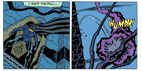
I liked Vilanova's art, although it takes a dip near the middle of the book but swiftly recovers. His real world is realistic and his creatures are unpleasantly convincing. Let's face it, it takes no little talent to make unsettling some of Lovecraft's creations, which essentially resemble an overcooked carrot, some ping pong balls and a brace of drinking straws. The action is nicely done with a particularly good fall from a high place but Vilanova also keeps the quieter scenes interesting, such as the parts where our weird detective communicates with his cat through slight twitches of his facial muscles. Although any conversation with a surly cat is by definition interesting, I guess. WEIRD DETECTIVE is clever, funny, gross and GOOD!


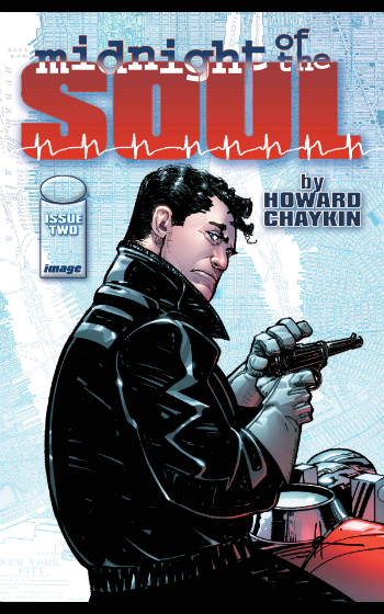
MIDNIGHT OF THE SOUL #2 (of 4) Art by Howard Victor Chaykin Written by Howard Victor Chaykin Coloured by Jesus Arbutov Lettered by Ken Bruzenak Image Comics, Inc., $3.50 (2016) Midnight of the Soul created by Howard Victor Chaykin Midnight of the Soul © Howard Victor Chaykin

 photo MotSCovB_zps5io07zfc.png

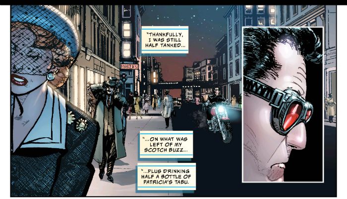
Lycanthropy and Lovecraft are creepy but the creepiest of all must be my fawning over the work of Howard Victor Chaykin. Occasionally some luckless naif will have the temerity to question why I like the work of Howard Victor Chaykin quite as much as I do. He, they often persist, always makes the same comic. This, and here is where their lucklessness comes in, spurs me to anecdotal reminiscence thusly: It was the 1990s and far too many people were taking Paul Weller seriously. One day I had a visitor who upon entering traversed the floor with the healthy, male clutter of batch (crispy tissues, ragged jazz mags, suffocated ashtrays, the glutinous residue of alcoholic frolics, etc etc) to the bookshelves.

 photo MotSPicB_zps0zebqrnq.png Midnight of the Soul by Chaykin, Arbutov & Bruzenak

Despite the variety and fine taste on show said visitor was evidently puzzled, breaking their silence with, “You have an awful lot of Elmore Leonard here.” I conceded the truth in this observation, yet couched within my tone was my evident uncertainty as to why precisely that might be so remarkable. “But doesn't he just write the same book all the time?” came the withering parry. “Yes”, I said “but it's a good one.” Then I started searching for a vein. (Not really.) VERY GOOD!

Remember: Stay on the road. Keep clear of the – COMICS!!!
"I'm Starting To Miss My Trolley." COMICS! Sometimes I Purr Like A Kitten!

Alright, let’s try that capsule business again. Took a little bit of the wormwood out this time around and drizzled it with some milk of human kindness. Serves two. Should be plenty of leftovers then.  photo TRANSoddB_zpsmhxrvm9s.jpg By Scioli and Barber

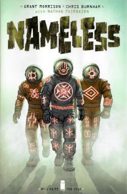
Anyway, this… NAMELESS #1 Art by Chris Burnham Written by Grant Morrison Coloured by Nathan Fairbairn Lettered by Simon Bowland Logo And Design by Rian Hughes Image, $2.99 (2015) Nameless created by Chris Burnham & Grant Morrison

 photo NLESSCovB_zpspunaatqg.jpg

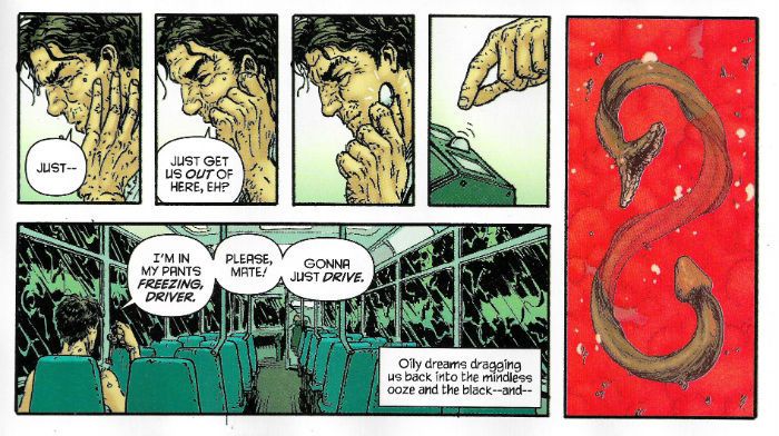
Nameless stands in stark contrast to the two Multiversity comics I so hostilely (unfairly so? No.) assessed yesterday. It does this by practically vibrating with vim, vigour and vitality; sure, this is due largely to the Viagra of Chris Burnside (with Nathan Fairbairn)’s art, but the efforts of Grant Morrison certainly play a part. Fair’s fair and all that, Morrison’s performance here is farcically dark with fractured shards of gross atrocities (courtesy of Burnham), plunging towards your eyes while (courtesy of Morrison) elliptical whispers hissing of yet grosser atrocities to come caress your mind. Although it’s all delivered in a distorted and fragmentary way, a stark sense of claustrophobic threat stabs cleanly through it all; which is no mean feat as the threat turns out to be star borne and earth bound. Yes, space is big and so not terribly claustrophobic but it is also dark and it’s the darkness that wins out here. Morrison’s an old hand at this whole flinging of black glitter in the reader’s face and the practice has paid off with a fine balancing act between unsettling suggestion and the overtly gross. Sure, at root this comic has the same generic skeleton of a bullshity flatterpants plot shared by a multitude of entertainments. It’s the one about how you are secretly special and one day someone will knock on your door and beg you to save the world because only you can, and despite your huge personal sadness which you stoically bear, you will agree because you aren’t just special  - you are awesome too. (If that ever does happen, if someone does ever knock on your door and tells you you’re special my advice is to shut that door and ring the police. Real life and comics are very different beasts, me old plumduffs) But that’s okay, because the familiar “special you!” plot is just the skeleton and it’s how you flesh it out that counts. And here Morrison fleshes it out just fine. No, he isn’t doing anything new here, but he’s doing everything well here. That matters.

 photo NLESSCoinB_zpsyxsomz2o.jpg By Burnham, Fairbairn, Morrison & Bowland

And rippling under the flesh there’s Chris Burnham’s artistic muscle and Chris Burnham’s artistic muscle is ripped. Go on, touch it, he won’t bite; see, like boulders. So good, Burnham’s stuff here; just so , so good. But dark and nasty too, as befits Nameless’s disposition. It's great reading just on its own visual merits, this art; noticing how Burnham plays with page layouts so that they are paced just so and being giddily inventive and never succumbing to empty showmanship. And then there’s the crazy level of visual interest thanks to his detail crammed panels, all of which is done, and it’s a neat trick this, without clogging the narrative flow. And it’s all just ‘off’ by enough, with its obtrusively, and troublingly, textured look. It’s like everything is coated or speckled with blackened crackling from a burnt Sunday joint. In brilliant contrast Burnham has everything coated in this roasted, pitted shell bouncing about with a cartoony exuberance. Sure, the stuff on these pages is intentionally ugly but the skill swimming beneath is beautiful. Never tripping once over Nameless’ outlandish tone Burnham’s work is simultaneously menacing and amusing. Chris Burnham, you suspect, could turn a bus timetable into an oddly comical frenzy of meat and fear. A talent as mighty as this allied with one of Morrison’s better scripts means Nameless is VERY GOOD!

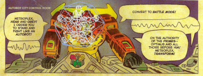
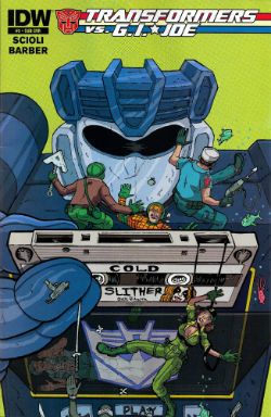
TRANSFORMERS VS G.I. JOE #5 Art by Tom Scioli Written by Tom Scioli & John Barber Coloured by Tom Scioli Lettered by Tom Scioli IDW, $3.99 (2014)

 photo TRANSCovB_zps3dcvr0cq.jpg

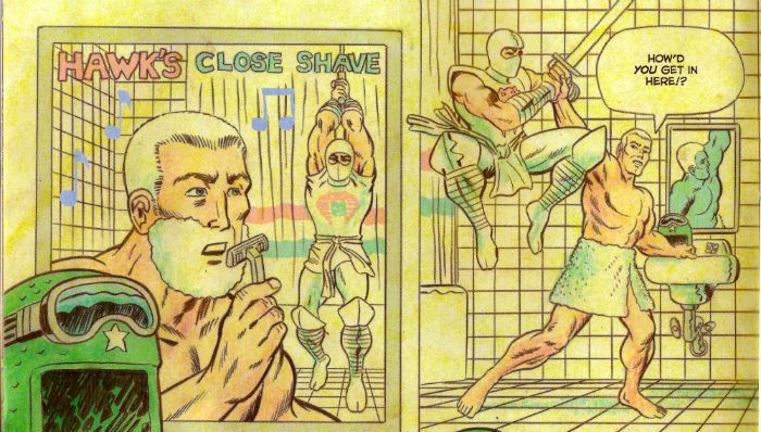
Man alive, this book; this crazy, hectic, dazzling piece of concentrated genius given paper form! The only thing low-key about this comic is the critical reception. Where’s the tickertape parade? Where are the interviews with the creators? Whither the in-depth, humorously toned, lightly ironic retrospectives on these toys - you know The G.I. Robots, The Transvestite Joes; whatever the Hell they are? Look, I won’t lie to you (there’s nothing in it for me) I don’t care about the toys (the Twinfarter G.I.s, The Rowboat Josephs?) but I care about this comic. When you get old everything’s usually just, truly, basically a fiasco, and increasingly so and then you die; but the upside is that you can read comics for what they do rather than the IP properties they contain. Scioli and Barber love these toys (the little men and lady ones, the big robot ones) enough for all mankind. But better yet they love comics enough to just make each issue a Hell for leather, go-for-broke visual symphony in zesty bombast. Every page is a delight. Stylistically, formally or just in its basic joie de vivre every page of this comic is a delight. Every. Single. Page. There isn’t a page in any one of the issues of this comic so far that has not made me laugh, applaud, or just boggle in stupefied silence.

 photo TRANSshaveB_zpsvid2lovh.jpg By Scioli & Barber

But I guess Comic News is so exciting that there’s no room to ballyhoo the most formally inventive (as in invention with the form of comics, rather than deciding to occlude your speech bubbles while sporting a top hat and tux) and volcanically joyous comic since Jack Kirby’s O.M.A.C.. No, it’s far more important that we hear how - Eric Estrada Reveals He Is Willing To Helm Marvel’s Next Blockbuster! Why Marvel’s Secret Wars Is Guaranteed To Tie A knot In Your Urethra! Hear How Scarlett Johannsen Admits She Saw A Comic Once And It Didn’t Make Her Throw Her Lovely Guts Up! How DC’s Convergence Can Feed Three For Under Twenty Dollars! Bob Hoskins Says Even Death Won’t Keep Him From Playing Turner D Century! How Starsky & Hutch by Matt Fraction and Some Artist Or Other Will Make Knitwear Sexy Again! Fifty Things Marvel Need To Do To Get Turner D Century On The Screen! Comic Creator Declares Evil is “Kinda Like Not the Best Thing, Yeah?”! Nuuuh. Nuuuuh. Tear yourself away from all that essential noise and pick up a copy of Transformers Vs. G.I. Joe and discover a reason to love comics on every page. “Nice Try at a pull quote, John, you transparent bastard,” you say,” but what’s it about, John? This “review” is awful, John, you haven’t told us the first thing about this book! This review is more awful, John, than those where you think you are being funny but you just come off as a nasty, nasty, bitter, twisted little man. John. Yes, you, John. It’s as though you’ve written this review to alleviate the soul-numb that comes from being away from home for work, John. In fact, John, we strongly suspect you are without even a copy of the actual bloody comic within sixty miles of you! You are fooling no one, John!” Lies and slurs atop lies, I say. Yet if (if!) I were to spend my few stale hours of respite from selling chicken muzzles holed up in a Travelodge writing about this comic while face first in the mini-bar wouldn’t that speak volumes about the quality of this book? The answer is , yes. Look, I was right about Shaolin Cowboy and I’m right about Transformers Vs. G.I. Joe. It’s EXCELLENT!

Actually, that was a literary conceit back there as I don’t work away from home, but I do love – COMICS!!!
"DO NOT Get In The Car." COMICS! Sometimes I Just Want To Hug Scotland.

Yeah, thanks Scotland. We're stronger together and all that. But no time to shilly shally lets get on with kicking the Tories out. In the meantine I read some comics and then wrote some words about them. I wouldn't grace them with the term reviews but, you know, it's content.  photo NWHeader_zpsceb13cc1.jpg NIGHTWORLD by Leandri & McGovern

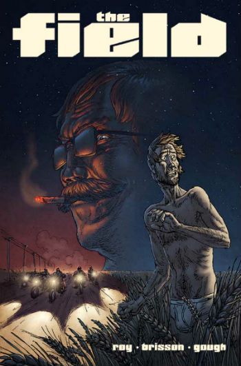
Anyway, this... THE FIELD #1 Art by Simon Roy Written and Lettered by Ed Brisson Coloured by Simon Gough Image, $3.50 (2014) THE FIELD created by Simon Roy & Ed Brisson

 photo FieldCov_zpsa7007fd9.jpg

What with THE FIELD, TREES and THE WOODS it’s like orange is just so over, darlings, and vegetation is the new black. Maybe there’s something other than autumn in the air, knowing my luck it’s probably paraquat. Or is this the dawn of a new age of agri-comics embodying mankind’s unconscious mass rejection of the cities and profound yearning for a return to Mother Nature’s embrace? As this would involve no Wi-Fi and a significantly truncated lifespan probably not. More likely it’s a complete coincidence not worth the bother of mentioning; so I won’t. Simon Roy sold this book to me as surely as if he’d knocked on my door selling sponges and dish clothes (it’s shocking how little of the proceeds goes back to those people; I believe the returns can be quite bad for door to door salesmen too. BOOM! BOOM!) I’d previously encountered Simon Roy’s talents within the pages of Prophet where the strength of his style (a little grubbiness; a lot of ungainliness) stood out even amongst the insectile swarm of other talents embroiled in visualising Brandon Graham’s entertaining body-horror-meets-Roger-Dean-album-covers-space-fest. In THE FIELD Ed Brisson’s script brings Roy’s art out of the heavens and solidly down to earth. Which is what fields are largely composed of; earth. Clever word play there, cheers. As though regretting giving the comic a title so plain it verges on the unmemorable (Pop Quiz, Hotshot, is it called TREES, THE FIELD or THE WOODS?) the first issue of Roy & Brisson’s four part mini goes hell for leather to leave an impression in your mind; like a boot in freshly tilled dirt.

 photo FieldCar_zps9050f9a2.jpg THE FIELD by Roy & Brisson

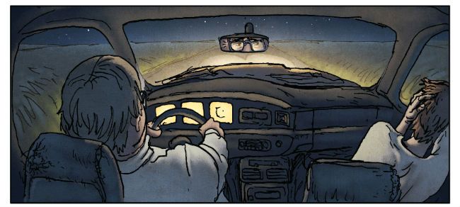
Unlike most fields this one really moves, which is good because it’s also pretty slight, I guess, in that it’s all set up, momentum and promises. But then that’s what comics like this are all about; comics where amnesiac men wake up in fields and are suddenly swamped by threats and enigmas such as a phone which TXTs warnings, an unhappy biker gang, flashbacks to science, and a bible salesman whose decorum desert him utterly in a diner. I liked the weird dynamic to the scenes in the car which suggested familiarity with long road trips in the company of an angry parent, and the fact that there’s a Christian guy whose Christian name is Christian. Hopefully other cast members will be similarly named; Muslim O’Rourke, Seventh-day Adventist Jones, Scientologist Gaiman etc etc. Mostly though I enjoyed the energy of it and the fun of the thing was augmented by the residual pleasure of rolling the ideas and potential developments around like some kind of boiled sweets of the mind. If it’s a pitch for a movie it’s a good one, because it’s a good comic first. I could see this being one of those calling card movies new directors make where energy and invention rooted by a flamboyant central performance distract from budgetary restraints. You know, Fall Time and Mickey Rourke, like that. And like that THE FIELD is GOOD!


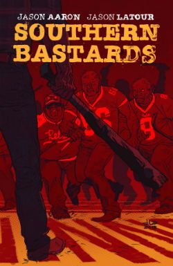
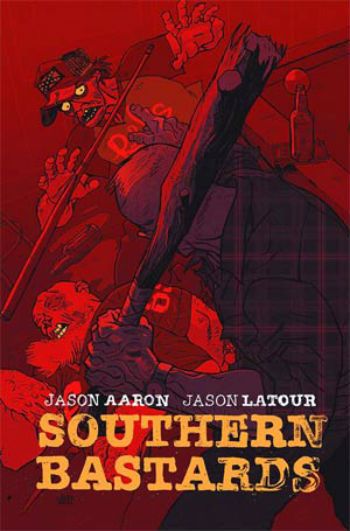
SOUTHERN BASTARDS #3 Art & Colour by Jason Latour Written by Jason Aaron Lettered by Jared K. Fletcher Image Comics, $3.50 (2014) SOUTHERN BASTARDS created by Jason Aaron & Jason Latour

 photo SBCoverB_zpsf3b10496.jpg

Jason Latour deserves better than this. It's EH!


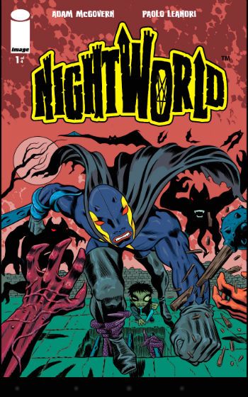
NIGHTWORLD #1 Art by Paolo Leandri Written by Adam McGovern Coloured by Dominic Regan Lettered by Paolo Leandri Image Comics, $3.50 (2014) NIGHTWORLD created by Paolo Leandri

 photo NWCover_zps19761c20.jpg

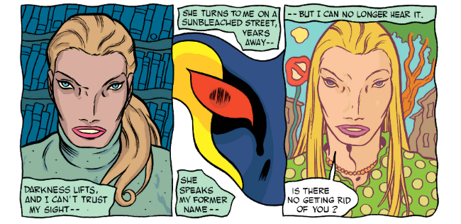
Boy, these guys really dig Steve Ditko, am I right? That isn't funny but if it was it would be because this book is an unapologetic homage to the work of Jack "King" Kirby. It's not much more than that, mind, but maybe that's enough anyway. Leandri's got the page layouts down pat but his line lacks the chunk of prime-time King Kirby. He's plumped for a Dithering D Bruce Berry line rather than a Mighty Mike Royer line. This leaches some of the impact off but there's still power enough on every page to sense the pleasure of the phantom presence of The King. It's still good stuff; if he'd chosen Colletta we wouldn't even be having this conversation. Leandri respects his source enough to add some of himself to the mix. There's a lovely four panel zoom in on our hero sipping a cup of tea all unaware as demonic dangers mass progressively behind him. Leandri's ladies are more svelte than Kirby's solid sirens and their faces are far more his than the King's. Unfortunately these faces tend towards looking like plastic surgery disasters at worst and Phoebe from Friends at best.

 photo NWFace_zps5044fa60.png NIGHTWORLD by Leandri & McGovern

Adam McGovern does a nice job of writing a comic that reads like people think Jack Kirby comics read rather than the way Jack Kirby comics actually read. He's got the "out there" ideas, the comical explanations which serve only to confuse, the intrusion of a slightly dated view of modernity (cable reception? "Bwoy"?) in the form of the villain and a, cough, unique approach to language. But there's a fundamental loss of energy which can't but occur when someone is doing an impression of someone being excited rather than actually being excited. NIGHTWORLD is all very nice and all very KOIBY! and I hope the creators had a lot of fun making it, but homage only gets you GOOD!

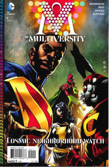
THE MULTIVERSITY #1 Pencilled by Ivan Reis Inked by Joe Prado Written by Grant Morrison Coloured by Nei Ruffino Lettered by Todd Klein Superman created by Jerry Siegel & Joe Shuster DC Comics, $4.99 (2014)

 photo MultCovB_zps43ad4c7e.jpg

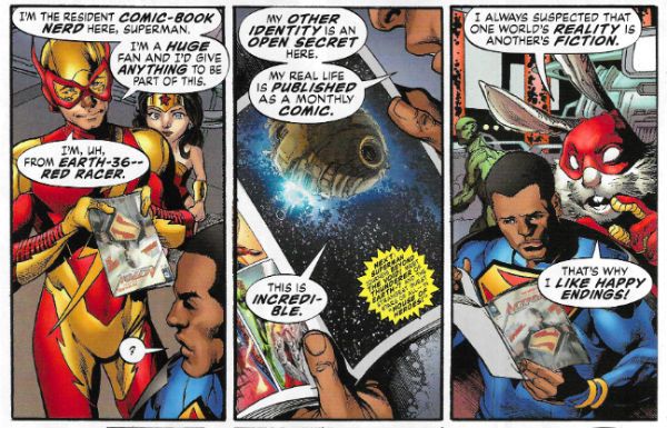
Slip on your Fiction Knickers once more as the Shaman of Solipsistic Sorcery conjures up (yet) another post meta scrying into the nature of the folk who are super with this, the first issue of the series no one is calling LIVER TITS YUM. It works okay too and that’s not be sneezed at but, honestly, it was all a bit frictionless and underwhelming. I preferred the hot mess of the very similar Final Crisis (to which VIRILE SMUTTY is a sort of sequel) because, I guess, failure is more interesting (except mine; although I never fail so that’s purely theoretical, obviously). Weirdly it’s to LIME IVY STRUT’s detriment that it works so well because I’m free to consider the end result and I remain convinced that LEVITY TRUISM is (like much of the output of the sigil slinging Scotsman since Zenith) basically the end of The Kree-Skrull War with some modernism slapped on top. Only an assassin of fun would not find Precocious 6th Former Roy Thomas a pretty entertaining approach for a cape comic but I fear I still never mistook RIVET MUSTILY for having my mind turned inside out.

 photo MultComicB_zps9dd46381.jpg

THE MULTIVERSITY by Reis, Prado & Morrison

Most of the enjoyment inhibiting came via the teeth on tin foil effect of all that shaky shit throughout TRITELY VIM US about how the Real Enemies of Cape Comics are Bad Readers and Critics. (But only when Critics are pointing out the shaky shit; when they are mindlessly cheerleading they’re also part of The Elect, I guess.) Clearly, I’m biased but I have a slight suspicion that in reality the Real Enemies of Cape Comics are Bad Writers. When that bleating quieted VEIL ITS MY RUT was pretty good; being as entertaining, fast paced and inventive as a good cape comic should be. There were still weird dead areas though. On Earth-Marbles Locum Loom has plenty of time to shellac Rood Ripples because all the other heroes are stood a hundred yards away arguing with the new arrivals instead of helping; there are panels where people say stuff about how bad it’s all getting and we just have to take their word for it (luckily, we do because, comics) and there's the almost ultrasonic whining I mentioned earlier. But we can see these are part and parcel of Morrison’s work now since they never bloody go away. So none of the failings can really, as is frequently the case, be laid at the foot of the artist (this being one Ivan Reis whose tendency towards visual literalism grounds everything nicely. Hopefully he’s aware that since VILE MIST YURT is a Grant Morrison comic (and he isn’t Frank Quitely) his contribution will only ever be considered parenthetically). VERILY IT MUST works well enough and cleverly enough but it doesn’t work well enough or cleverly enough to be better than GOOD! (There’s nothing wrong with GOOD!)

And now a change to our regular programming as I realise Christmas is coming and things are a bit tight (we had to let the nanny go;only four holidays this year) and decide to use this place to try and drum up some funds:

Dear Image


Alright, Image Comics, yeah? Good day, good day, my rosy red arse. I’m a busy man and I’m sure we’ve both got places to be, so let’s pretend all that how y’all doing soft soap shit is up here at the top, okay. We both like comics but we both like money too, so let’s make some comics and some money together. Yeah, it’s your lucky day ‘cos I’m thinking of doing a comic. Fingers on buzzers and knees up Mother Brown!

I’ll be calling it COCKNEY WANKERS. That’s not negotiable. It’ll be about some geezer called Terry Chiswick coming back to Cheapside after forty years or so Oop The Soft North. Old fella but fit like a butcher’s dog. He’ll have come back to clear out his dead Dad’s digs. His dead Dad’ll have been a bent copper, a local legend; a bit quick with his fists and slow to hug his son. Dickhead of Dock Green, you feeling me. His signature move will have been smacking folk about with some pool balls in a sock. Yeah, a la “The Daddy” Ray Winstone. If we go TV (which has only just occurred to me, honest guv) Winnie might be well up for, you know, essaying, Tel’s Dad and that. And Tel’s Dad’ll have had a nickname like C***y Chiswick , or Chiswick The C***, or maybe, if we go blunt, just The C***. Don’t worry about the swears we’ll rip off the asterisks in print, it’ll give us playground cachet, you know look all grown up and that. Oh, got a blinder on the slow burn, see, Tel’s Dad’ll have had problems with Terry being all (redacted) like, but we’ll hold that back a bit to surprise the punters. In flagrant contravention of Health & Safety as it may be, not to mention common fucking sense, The C***’ll have been buried in his old house’s garden. See, then we can have Tel blubbing his guts up on dear old Dad’s grave. Oh, don’t worry I’ve been watching them out there and they do so love that Daddy didn’t love me stuff. Every Dad’s a Bad Dad, yeah, no worries, whatever. Look out, almost got some personal responsibility on you! Calm down, winding you up, son. Smile, you won’t break anything.

 photo CockBorisB_zps90ef9779.jpg A Cockney with a Wanker

This next bit is just blinding because, see, Tel’s old Dad’s old pool cue’ll be stuck in Tel’s old Dad’s old grave and one day, while old Tel’s knelt there with the old waterworks on, we’ll have the wind pick up a bit, startle a cat, knock some bins over and, bish bosh, the pool cue takes a tumble too. This’ll bounce off Tel’s noggin. Tel’s going to be a bit thick so the daft sod’ll see this as a sign and set out to clean his Dad’s old manor up. He’ll do this mostly by hitting people with the very same stick. Cards on the table, I can’t see this doing much to solve any of his problems but we need some violence or they get bored out there. Yeah, you know it, and so I’m lining up some good kickings in a KFC. I’m thinking we can spin this as a statement about violence. Stop ‘em dwelling on how thick you’d have to be to think you can eliminate organised crime by hitting each individual member of it with a stick.

 photo PearlyFancyB_zps28bc2fd6.jpg

Tell you straight, folk over here are crackers about the football so we’ll tap into that too, see Terry will have been a dab hand at the football when he was a nipper but not no more he won’t be. Strikes me now we might have to call it the soccer, you know, for you yanks. Bless ‘em, innit. But, still on the football, right, we stick that in with the crime and it’s twofer time. I’m not wrong. Yeah, Tel’ll return to his roots and find the local crime boss is also the P.E. Teacher at the local school, All Saints Primary & Infants (Ofsted Rating 4 (inadequate)). He’ll be Barry Bass by birth, but, I know, nickname, right? Simpatico, son. We are totes simpatico, see. Same page and everything. So, nickname it is and it’s Bad Baz, I’m thinking. Or, better, The Bitter. Yeah, you’ve got it. Like the beer, the ale, like we have in this neck of the woods. Yeah, yeah, we drink it warm. This country’s fucking cold enough, pal. When The Bitter’s not doing Parents’ Evenings, marking homework, filling in a shit-ton of paperwork, having his tea or making the team run laps before Eastenders then he’ll be up to all kinds of shady shit and maybe a robbery, yeah, probably a robbery. So, yeah, Tel and The Bitter it is; the immoveable object and the unstoppable force; a berk with a stick and a sports teacher with too much time on his hands; legends come out of less. When they met it was murder, Lionel Stander in the house there and all that malarkey. So yeah, anyway it kicks off. Right fucking palaver. Proper chimps tea party all round. We’ll round it out with recipes (eels and mash, pie and mash, gin and mash; the pukka stuff) have football chants, readers’ fantasies about the Queen, rose tinted horse and trap about The Sarf (how the Krays were okay because they loved their Mum; at least you knew where you were in them days; you could leave your back door open; dream on, eh), maybe get a quote from that tirelessly entertaining buffoon Morrissey; he don’t ‘alf love The Sarf he don’t. Yeah, COCKNEY WANKERS will be the full English all right.

 photo MorrisseyBondB_zpsc49b678c.jpg “No one’s keener/Than a Window cleaner…!”

COCKNEY WANKERS will be all about its setting and the people in it, a real place filled with real people; a raw and real portrait of a truly unique place and state of mind. The very last thing COCKNEY WANKERS will be is generic. And that’s what they call a punchline.

Get back to me sharpish, alright or I’m going to Avatar with it.

Don’t be a stranger now!

John K(UK)

Yeah, I know. Don't give up the day job, John. Stick to just reading – COMICS!!!!

“Extremely Unlikely, And Definitely Improbably, But Not IMPOSSIBLE” COMICS! Sometimes It's A Whole New World. We Just Need Some Magic Carpets And We're Set To Go!

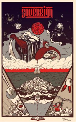
Hello. I read a comic, did a little dance. Felt it needed more work as a critical medium and fell back on words. Sometimes the Old Ways are best.  photo SovHeaderB_zps82794e99.jpg Anyway, this... SOVEREIGN #1 Art by Paul Maybury Written by Chris Roberson Coloured by Paul Maybury with Jordan Gibson Lettered by John . Hill Image, Paper $2.99 Digital £1.99 (2014) Sovereign created by Maybury & Roberson

 photo SovCovB_zps543670be.jpg

At the risk of unsettling my regular readers I thought I’d cut right to the nub of the matter this time out; Sovereign is Fantasy. It’s the kind of Fantasy with swords and monsters and cloaks and a classy upper case F. Sovereign is not that tawdry lower case f type of fantasy involving you, a Nixon mask, Kinder eggs and Miss Ga-Ga (Yes, Miss Ga-Ga; because that filly’s no Lady, I’ll be bound). More simply Sovereign is Fantasy a la Game of Thrones. I picked that because everyone knows Game of Thrones and this is very much like that, and that’s no bad thing. If you like Game of Thrones you’ll probably like Sovereign is what I’m getting at there. That’s all I need to say really so there you go. What? No, I don’t watch (or read) Game of Thrones; I did watch the first episode and it was okay (the highlight, naturally, being 1970s Martin Amis as Tyrion Lannister) but I didn’t feel any burning need to carve out a small niche in my life for it. But I think I will for this book because it caught my fancy with its off kilter visuals and intelligent approach.

 photo SovPOV_zpsde0e724d.jpg

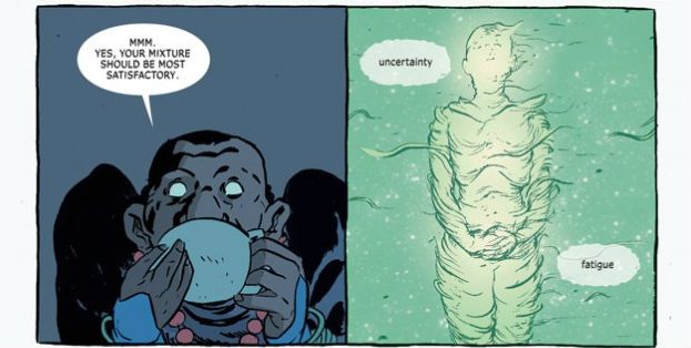
Also, quite a lot happens. So much happens in fact that Roberson has to carve his book into three chunks. Each chunk introduces a set of cast members intended to represent the mind-set of their particular societies. Since two of the chunks involve groups in transit the contrasts being offered are very much cultural rather than geographical. While we are treated to several of Maybury’s lovely locales none of them really come into too clear a focus (plus one bunch of folk are on a boat and the sea is pretty much the sea even in Scrabble Name Land) so it’s obvious the book is more bothered about the characters. The first trio of whom we meet being three members of the Luminari, which is a sect of spiritual ghost fighters who also flense corpses like master butchers under conditions of extreme duress. They are off see the Tamurid, the current rulers of Khend. It’s in this section that your eye has to acclimatise to Maybury’s off kilter approach to POVs and his art’s general air of swollen decay. I was thinking a lot about tainted sausages during this section. The spur to our spiritual pals’ pilgrimage is some rum business which we will soon see is getting the plot rolling in at least two other areas of Countdown Conundrum Land. No sooner have you noticed that our trio are in fact a cheekily recast Batman (Paladin), Robin (Raven) and Alfred Pennyworth (The Practician) than they are up their nuts in guts and it’s a cliffhanger cut to the next section.

 photo SovTeaB_zpscf2d1ece.jpg

Wherein we meet the Tamurid. The Tamurid are a kind of Steppes warrior bunch and among their number they count the book's Conan analogue. Because his Dad is Khan (no, not Ricardo Montalban) Janramir gets to generally fart about like any rich kid but with the milieu specific emphasis on killing things, laughing around campfires with other lusty men and voicing the eternal Barbarian’s Lament about perfumed men who fight only with words. In this part Maybury has a good time drawing horses so big and thick they are scarier than the big and thick men who ride them. Back at the writing Roberson does some time lapse stuff where the chat flows as if in real time but the images jump from night to day and incident to incident; I like this because people generally do just talk about shit that’s bothering them like maybe going over it one more goddamn time will make it go away. Luckily Roberson realises there’s no need to actually subject the reader to all that repetition. Better to suggest it and to do so cleverly. Take note, jabber jockeys. Alas, all wasteful things must come to an end and Janramir is told his Dad’s dead. Downer. The inference is that he’s going to have to go back and wade through the kind of internecine rivalry and callous backstabbing familiar to anyone with siblings who’s Mum has died and not said who can have her jewellery.

 photo SovRen_zps43fb2cff.jpg

The third and final part of the comic introduces us to a boat borne band whose fictional culture is clearly that of renaissance(?) Britain but, you know, a bit different; more credulity in magic and that stuff. There’s Pol Ravenstone; a bloke whose head is always in a book and prefers others to do the physical stuff, so he’s the only normal person in the comic (cough!); Lady Joselyn Evrendon, a lady it’s heavily hinted at is a bit cold and let’s hope her character arc isn’t as obvious as “sworn virgin” would lead us to infer; and then there’s Argus Mag Donnac, a violent and ill-bred man in tartan i.e. a Scot. The big set piece cracks off in this bit so I won’t spoil it; it’s good. 'S exciting if slightly hampered by a lack of clarity on the part of the restlessly inventive Maybury. I couldn’t really get a fix on the size of the ship or exactly what was happening but it was a quite hectic series of remarkably uncommon events so that may have been intentional.

 photo SovHand_zpsf36e9797.jpg

For the page count of a single comic in 2014 a lot of ground gets covered; I don’t know how much ground because Sovereign omits to give us a map. Which is odd because if Sovereign were a book it would have a map in the front, but it’s not it’s a comic so it has prose in the back. The first time through I didn’t read that bit because I shouldn’t need to. And I didn’t need to. The words at the back worked the way they should, as an appendix which enhanced and deepened what went before. But what had gone before stood solidly enough by itself. I also liked Roberson’s use of quotes from sources in his fake world to preface (and on occasion end) his chapters. This gave everything a bit of extra import and because he’s made them up they could fulfil their narrative purpose more precisely and, more importantly, we didn’t have to suffer that same fucking Nietzsche quote about the abyss everyone trots out. Hey, comic book writers? Read a book every now and again; they don’t fucking bite. Chris Roberson obviously reads books and it seems to be working out okay for his writing, I'd say.

I’m old and move slow so there are a number of issues (Sigh. Yes, I could have checked but my nails are drying, dear. This is strictly amateur hour, you know.) of this series now available but I just read the first. I’ll be picking up the others and I hope Maybury’s art continues to provide a quirky compliment to Roberson’s nifty scripting. However, he might just want to keep an eye on the levels of quirk involved. Looking at issue two’s cover it appears the cast is to be joined by the cuckolded homophobe Ray Purchase from Toast of London. While this would make it the best comic ever, as that probably isn’t going to happen Sovereign will have to settle for just being GOOD!

And remember that there may not be elves, Sam, but there are always - COMICS!!!
"HER AG-GRES-SIVE-NESS DOES NOT/COM-PRO-MISE HER FEM-I-NIN-ITY" COMICS! Sometimes Everyone Was Robot Fighting (Those Kicks Were Fast As Lightning)!

America! How's that 4th of July Weekend thing going for you? Man, Canada just touches itself for one day but you lot take a whole weekend! Always fireworks on the4th of July as Max Cady said. Hope you all had a truly lovely time even though you are basically breaking our balls over here. No hard feelings! Here's some words about comics. Hey, Magnus, can you guess which I liked best?  photo MagGuess_zps4f47797b.jpg

Nope. Anyway, this... MAGNUS ROBOT FIGHTER #1 thru 3 Art by Cory Smith Written by Fed Van Lente Coloured by Mauricio Wallace Lettered by Marshall Dillon Magnus Robot Fighter created by Russ Manning Dynamite, $3.99 (2014) (After a couple of weeks it's $1.99 on the Dark Horse Digital App)

 photo MagCov_zpsaa69a296.jpg

It’s the man in the skirt who lays down the hurt! It’s Magnus: Robot Fighter! Apparently this is one of a number of old Gold Key properties Dynamite are slapping on the table, applying the creative juice to and then stepping back and yelling “CLEAR!” to see if enough folk give a chuff in the 21st Century; which is where we live now, apparently. Boy, you just blink and there go two decades. Anyway, as you have guessed I only bought this because I am old and cannot cope with modern comics and ceaselessly seek succour via nostalgia.  Yeah, guess again, Pop Tarts; I don’t know anything about Gold Key properties because we never saw them in my neck of the woods. Back then depending on where you were in England you got different American comics. The seaside had the best stuff, or different stuff (and when you’re a kid the stuff you can’t normally get is the best stuff). I don’t know where the Gold Key stuff went, Sidcup perhaps. I’ve never been to Sidcup. Or me. So, yes, comics, John; in your own time now. I just bought this, um,  because at my age buying a comic sight unseen is the height of profligate recklessness. I didn’t know what I was going to get so I wasn’t expecting much, just some dude called Magnus and some robot fighting and, yea verily, I got that but I got a chunk more besides. And that’s why I went back for the next issue. And the next.

 photo MagTalk_zps795149c4.jpg

Sure, the first issue was just(!) solid; sure the first issue went exactly where you instinctively knew it would as soon as you saw the snow globe on the first page; sure younger readers would have been thinking of The Matrix and older readers would have been thinking of Philip K Dick and some would even have thought of Plato’s Cave, but they would have been dead for centuries so I don’t know what they’d be doing buying comics in the 21st Century. With the initial issue it was easy to take the writing for granted and just be bewitched by the  lovely art and colours. Yes, I actually appreciated Mauricio Wallace's colours, although they were so clearly appealing you’d have to actually exert energy to avoid appreciating them. Lovely, lovely colours all soft and alluring where needed and harsh when required but never, never settling for that uniformly gloss glare so common now.  And the art by Corey Smith is just aces (technical term). Absolutely gorgeous work which like the colours never sticks to a one note approach but varies the register of its approach as the mutable contents it depicts require. Corey Smith is playing a blinder here, and it's a shame because I bet a lot of eyes aren't pointing in this direction. Well, your eyes lose then!

 photo MagArm_zps47d7a122.jpg

Like I rambled already there’s not a lot that leaps out and throttles you in the first issue; it sets out the premise smoothly and succinctly with a twist or two for spice, and you think the series' tone has largely been set. And you're...wrong, in an entirely pleasing way. Because bewilderingly, but not unpleasantly so, the second issue decides to be a buddy comedy with a particularly pointed kick at the slightly ethnic sidekick trope to boot. Magnus picks up a robo-sidekick who's personality is an explicitly terrible example of the movie comedic sidekick who is also a Gentleman of Colour, as my late Grandma said. (This is different to a Colourful Gentleman who would be a man who likes other men in a romantic way.) In the third issue the team up the ante so hard your uncle slaps her right there at the family dinner table and  you can hear a pin drop. This was my favourite of the three issues since it just draws a big old clown face on all those pandertastic comics featuring damaged ladies who become strong and which believe women are only of interest if they are kick boxing lumps of scar tissue with nice hair who have sexytimes on their own terms. Yes, some ladies like that and that’s great but, c’mon, the real appeal is to the boys. When I show my own Prisoner of Misogyny these Ladyspy and Sad Killer comics the first thing she asks even before her eyes stop rolling is, “Is she damaged? Oh please, let her be damaged!”  And the answer is yes, the answer is always: yes she’s damaged.  With all the change-ups and change-overs in just three issues if I were a high-faluting type I'd maybe say the comic was a bit meta, a bit post modern, but I don't think anyone uses those words with enough rigour for them to mean much these days, so let's say Magnus: Robot Fighter is playful and leave it at that. Sure, there is a downside to all this creative flexibility and that comes in the form of a lack of focus and a kind of failure to define Magnus himself. I don’t really know what Magnus is after, he just sort of wanders about fighting robots and looking pensive. But there's time yet and I'd rather applaud the display of creative facility than prate about a lack of character depth in a man who fights robots.

 photo MagTest_zps519125f3.jpg

I liked this, I liked every issue and with each issue I liked it more. For a few pennies I found a satisfyingly weird and beautifully illustrated comic which, yes, seems to be less about robot fighting than Lazy Comic Trope Fighting. And, perhaps, clichés are more dangerous to Comics than robots. Perhaps Magnus has a point after all. C'mon! Magnus: Cliché Fighter! How can that not be GOOD!

SOUTHERN BASTARDS #1 and 2 Art by Jason Latour Written by Jason Aaron Colour by Jason Latour Lettered by Jared K Fletcher Southern Bastards created Aaron & Latour Image $3.50 (2014)

 photo SouthBCov_zps15fdcf1b.jpg

I thought this book was beautiful, let's get that out there before things go South. Latour's subdued sepia palette of largely orange and khaki with the odd pop of a more violent hue is just a real deep fried delight. And then that's laid softly over some truly solid gnarliness giving everything a real sense of weight and wear and tear, and the whole thing hovers a gnat's pube from caricature. But the thing itself? I mean, shit, I guess what we have her is...a failure to communicate. Because I didn't cotton none to this at all. I mean, Jesus, really? That’s what we’ve got now? East Bound And Down played straight. Hell, look at you out there; chances are you think you’re special but no matter how special you reckon you are you ain’t Southern Special because that’s a whole ‘nother level of Special right there,  “boy”. Golly, The South sure is special! I’ve never been anywhere near close to The South and all the moth eaten tropes on these pages are as familiar to me as the back of my Dad’s hand (ow! Yes, there are Daddy Issues in this comic). This comic is The South as Theme Park. The South as Postcard Punk. If that's the The Southern Truth then that's plain Southern Sad.

 photo SouthBDog_zps57d4f525.jpg

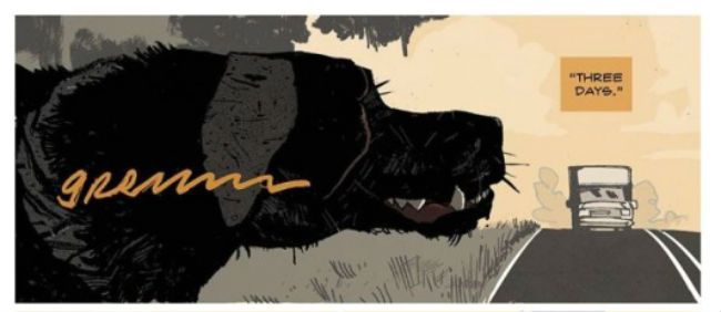
Slightly after the ostentatiously provocative title (Oooh! A doity woid!) the book opens with a double page splash of a dog slipping a turd out which I guess is supposed to shock or something. The South! A place so hard that dogs poop in public! Look, The South, I don’t want to deflate your ballsy balloon but If you look out my front window ten minutes after Eastenders finishes you’ll see a middle aged man with grey hair walk his dog out onto the bit of land out front of my window. And regular as clockwork a big old turd slides out of that beast’s ass and, no, standing with your back to your dog while it does its business doesn’t convince me you don’t know what’s going on, Mr. Man From Round The Corner. So, illegal dog drops ain’t just a Southern thang, I assure you. Interestingly there’s also a tree on that patch of regularly befouled grass but I don’t think it’s growing out of anyone’s ass like the one in this book. (His Daddy's ass! Yes, there are Daddy issues by the pound here) A crueller man than I might say there’s a case to be made that his book is growing out of somebody’s ass.

 photo SouthBGame_zps00c282fd.jpg

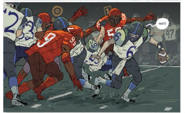
Oh, technically it’s fine, I guess, if fine means very much a screenplay first and a comic script second which these days is very much what fine means. It’s very televisual. It just sort of lollops about like an ex-pro with a bum knee trying to get to the likker store before it shuts. And you know that while on the screen none of these scenes would outstay their welcome (not so much because of the scintillating script but because Southern actors are always entertaining in the flesh) but on the page they can verge on the interminable. The centrepiece of issue two is a Football game, sorry, an American Football game (why is it called American Football when they barely ever touch the ball with their feet? American Carryball more like it) and it just flounders about like everyone should just naturally give a shit rather than actually making anyone give a shit. Sure, there's Craft here in the writing but there's Art in the colours and, uh, art. It's an uneven mix.

It’s a pretty sorry state of affairs all round if you're reaching for the Mythic and finding a battered VHS of Walking Tall in your mitt. This book is just a clueless monument to swaggering self pity of a particularly male stripe. And I've seen it before and I've read it before and the only reason I'm reading it this time is because of Jason Latour. If it wasn't for Jason Latour this would just be that Trace Adkins Luke McBain comic all over again and no would give one rich shit. Sorry and all, but I don't buy for one hot second that The South is stuck in 1974 like a dino in a tar pit. No, I don't know The South from a hole in the ground but I do credit it with more than that. More than just another comic about men behaving badly but feeling bad about it so boo hoo them. Beat me with a hosepipe if I'm wrong but I think, maybe, to show The South Today I reckon this book need a bit less Walking Tall and a bit more Looking Harder. Basically, if it wasn't for Jason Latour this comic would be two levels down from GOOD! Harsh words maybe, but they can take it; they're Southern Tough!

And remember: Any man playing grab ass or fightin' in the building spends the night reading - COMICS!!!

"Working Together In The Name Of The Common Good..." COMICS! Sometimes Creators Don't Get To Pick Their Fans! (Ever, Actually. Now I think About It.)

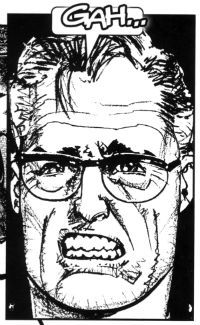
It’s a Skip Week! (Booo!) So let’s see what falls out of my head (Yay!). Checking the Savage Critic’s mail bag I see several of you may have contacted me expressing intense distress that I have yet to tell you how 2013 panned out for Howard Victor Chaykin.  It was definitely several or none. It’s so hard to remember these things. So, hedging my bets I’ll tell you anyway…  photo Gah001B_zps8964d526.jpg

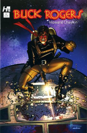
 photo BuckCovB_zpsa4f9a490.jpg

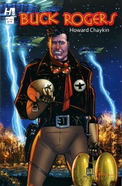
Howard Victor Chaykin ended the year of 2013 by sprawling debonairly into the first month of the new year with the final issue of Buck Rogers, which splashed down in January 2014. Judging by the sales you ‘orrible lot were blasé in the face of the charms of Howard Victor Chaykin’s Buck Rogers revival. Well, that’s your loss because I can tell you it was in fact VERY GOOD! Yes, despite the fact that a page in the final issue !OMITTED! !THE! !DIALOGUE! Howard Victor Chaykin’s Buck Rogers was the usual witty, political savvy, oddly meandering then hectically climactic appeal for everyone to stop acting like jackasses, but this time with jodhpurs and jetpacks. Kenneth Bruzenak and Jesus Arbutov all played important parts in giving the series a vibrantly pulpy sheen in keeping with the hoary yet versatile source. It was certainly very Howard Victor Chaykin and finished off what was certainly a very good year for Howard Victor Chaykin. Actually, I don’t know how Howard Victor Chaykin’s year was. It was probably a pretty decent year because throughout it he would have been Howard Victor Chaykin. Head start right there, am I right? You know I am. And what I know is it was a good year for people who enjoy Howard Victor Chaykin’s work; both of us.

 photo Cover001B_zps08054f40.jpg

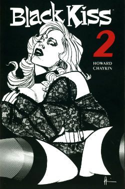
Despite being denied an overseas audience in its original periodical form (due to an aversion to spending decades in court) in 2013 Image collected and released Black Kiss 2. Which you will recall is VERY GOOD! So, it appears there are different rules for books and comics when it comes to peddling filth. And those rules are probably totally unconnected to the different amounts of money the different formats bring in. Black Kiss 2 was the one where Howard Victor Chaykin showed that even his sick smut made other people’s smart stuff look sick. Opinions were divided, with some declaring the book merely an old man whacking off in public. Such people are probably unaware just how much work goes into writing and drawing a hundred and odd pages of comics. A lot more work than whacking off, even given how much more work is involved in that the older you get. Particularly in public; you have to really plan that shit out like a caper movie unless you like having your windows broken. Or so I’ve heard. Naturally, untouched by bias as I am, in my head Black Kiss 2 was inventively vile but always engrossing and enthusiastically executed. A lot like an old man whacking off when you put it like that. It was certainly a lot less toe curling than that time Howard Victor Chaykin drew those Bendis Avengers comics. See, it’s that kind of bland doggerel kids need protecting from! Every year lowered expectations kill more people than pictures of gnawed off cocks being spat in people’s faces. Check your stats! Anyway, a mixed reaction to Black Kiss 2 like I say, but while we should always respect the opinions of others we should also remember they are worthless and only I am always right. To sum, Black Kiss 2 was probably a bit rich for most palates and we’ll move swiftly on.

 photo centurywest_zpsfc3d63e4.jpg

Image continued to curry my favour by finally publishing Century West; this being an OGN from about 6 years ago which originally appeared in Spanish or French or some other vulgar tongue I can’t be arsed to learn because, well, indolence is bliss. Or ignorance. Either way, I’ve got that covered! Come on now, 6 years or whatever it was; what was the hold up there? It’s not like they had to translate it or anything. I know he can be a bit excitable and his dentures might slip making his speech go all mushy but I do believe Howard Victor Chaykin usually speaks English. Anyway, like when our cat went missing that time Century West finally turned up; unlike our cat it hadn’t lost an ear and now hissed at loud noises. Despite being a bit overcrowded layoutwise and so busy with characters and events in its short span of pages it risked leaving you feeling like you’d sucked a three course meal through a straw very quickly indeed, it was VERY GOOD! It didn’t hurt that Howard Victor Chaykin’s busy script and crowded art was blessed by the titanic typography of Ken Bruzenak and Michele Madsen’s lovely colours. There was a James Garner level of cool pleasure emanating from the endeavour embodied by Howard Victor Chaykin sneaking in a sly nod to his early work decades past on the Shattuck strip. One for the keen eyed old timers there. Basically it was another fine example of Howard Victor Chaykin’s love affair with the history of America and his somewhat more ambivalent feelings about the kinematograph (it’s okay, Howard Victor Chaykin, it’ll never catch on!). It was in fact very much like Black Kiss 2 in its themes and concerns but somewhat more sunnily optimistic in its conclusions, and certainly less likely to need stashing when the Rabbi pops round to chat about donations for the next jumble sale.

 photo SATCovB_zps826dc453.jpg

Throughout the year the odd voice was (reasonably enough) raised in opposition to the occasionally offbeat aspects of his work but it was Howard Victor Chaykin’s art that was the best reason to tolerate the tone deaf Altman impression of Matt Fraction’s Satellite Sam. Hey, another Image book. Image: we keep Howard Victor Chaykin off the streets! Despite Howard Victor Chaykin’s best efforts Fraction's incessant showboating continued to undermine the effects he was after. He's like a mirror that man,  a mirror to which access is keyed on the DNA of the entire population of the world but me; I can't see what others see in him. One day his enthusiastic mimicry might make him comics’ Michael Sheen but as the final whistle blew on 2013 he remained comics’ Mike Yarwood. And Satellite Sam remained OKAY! So, that New Year's Resolution I made to not be such a dismissive prick? Not a success. Anway, I say the art but really it was the art and the lettering which were worth showing up for. Ken Bruzenak was here again, this time busting out an innovative invisible speech approach which harked back to Alex Raymond’s Flash Gordon strip with its blunt ended bubble tails. In many ways Howard Victor Chaykin’s 2013 was also Kenneth Bruzenak’s 2013. Not only was Ken Bruzenak all over Dark Horse Presents like a beautiful rash of bruises but he was reunited with his beach dwelling pal on a seemingly permanent basis. Chaykin and The Bruise were back! Chaykin and The Bruise! Sounds like a forgotten quirky action flick from the ‘70s starring Peter Boyle and Alan Arkin or something. Maybe with a jazzily chugging score by Lalo Schifrin and a very special guest appearance by Ann Margaret. Sadly the reality is in all probability naff all like that; just a couple of salty old dudes doing the do old dudes need to do to get the dough.

 photo IM_SO_COV001_B_zps9a29b68e.jpg

Oh, there was also Howard Victor Chaykin keeping Marvel sweet with an Iron Man OGN and that weird strip in that A+X comic (which a kind Savage Critic commenter alerted me to). This latter involved Black Widow and The White Queen flashing their breasts at a man until he puked. Because, Howard Victor Chaykin! Some even more magical pals of The Savage Critics sent me reports of Howard Victor Chaykin’s doings at conventions which were very much appreciated (SPOILER: he was a gentleman!). My thanks to all the lovely people who enable my crippling obsession! I have not named anyone because sometimes people don’t like that, but while the mental hygiene behind my thanks may be suspect those thanks are genuine. So, the year in Howard Victor Chaykin there, Actually I just blurted all this out so I probably got all the release years wrong and missed stuff and oh, dear, I have to go now. So, I might have missed something, do let me know. Oh, do!

Anyway, Howard Victor Chaykin: 2013 was another year we should have been glad he still bothered with – COMICS!!!
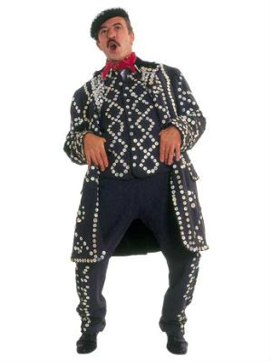
"DIMINISHING Your Enemy DOESN'T defeat Him." COMICS! Sometimes Ken's Hair is Brushed And Parted!

So, the nights are drawing in and we've had a full dance card over here what with begging sweets from strangers, burning effigies and firing explosives into the sky. Inbetween all that I read some comics and wrote about them. I did it as and when, so I've just put this together now from scraps and I can't even remember writing most of it. Hopefully you won't remember reading it. Anyway, this...  photo PDTownB_zpsbea8a7ce.jpg

SATELLITE SAM #4 Art by Howard Victor Chaykin Written by Matt Fraction Lettering & Logo by Ken Bruzenak Digital Production by Jed Dougherty Cover Colour by Jesus Arbutov Designed by Drew Gill Edited by Thomas K (still no relation) Satellite Sam created by Howard Victor Chaykin and Matt Fraction Image Comics, $3.50 (2013)

 photo SATCovB_zps826dc453.jpg

While on a rare physical manifestation to my LCS recently (I’ve been travelling; not for work just to throw the FBI off my trail) I asked what the response to this series was and my LCS owner said, “Weeeeeeeeell, people don’t hate this as much as his other stuff.” Hilariously, he meant Howard Victor Chaykin rather than Matt Fraction. Matt Fraction! The man who does more Tumbling than The Flying Graysons after the shots rang out! Try the veal! Apparently SATELLITE SAM is an on-going not, as I thought, a limited series; explains much this does. Mostly it explains the total lack of focus and failure of any of the narrative threads to engage my attention on anything other than a, “Oooooh, research!”, level. I guess there’s some free-form vamping jazz-scatting shabbeey-doo-waaa going on writing wise. That would explain much but it wouldn’t excuse any of it.

 photo SATtvB_zps73659af4.jpg

There’s a lot of, sigh, craft here but it’s not paying off for me. Maybe too much craft? Or maybe too much showing off. Showboating should come after you nail the basics, I’m thinking. But I’m not a writer so. Y’know…Basically Fraction’s comics remind me of a puppy that can walk on its back legs or do that creepy shake hands thing but still has a tendency to leave a surprise behind the sofa when no one’s looking. He’s a mixed bag is what I’m saying.

Take the gusset sequence last issue...please! That took up some major page real estate and you could almost hear his neck pop as he inclined his head (modestly, always modestly) for applause. But, c’mon, I need an Editor, stat! That sequence could have been halved (just keep the pages of the people at the table; give your readers some credit!) to double the comic effect (strictly speaking doubling zero is still zero but...). Hmmm, and yet, and yet then the world would have been denied HVC’s gusset panel. Who would deny HVC his gussets? I pity the man who gets between HVC and his gussets. I’m referring there to the last issue because I can’t remember what happened in this issue. Well, I can, but it seems like everything that happened in this issue had already happened at least once in the previous issues. Sure, sure, I hear the cries, this comic may be as exciting as watching cardboard swell in the rain but look at that craft! Craft, yeah, great. Craft’s a foundation you build on it’s not the finished product. Mind you, I’m not a writer so, y’know…Anyhow, with SATELLITE SAM Fraction attempts a faux Chaykin, which is cheeky because that’s Mrs Chaykin’s job. A bit of blue there to extend my demographic appeal. Kids like filth, right? It’s kind of a Howard Victor Chaykin comic; if Howard Victor Chaykin had never left his house. It’s not exactly riveting is what I’m saying there. Still, Fraction obviously butters Chaykin’s parsnips well because the art here is quite, quite lovely. Oh, and The Bruise is slumming it here as plain Ken Bruzenak but he’s still inventive as all get out. I really like his ‘invisible’ balloons and his subtle doubling on the loudspeaker chat from last issue. Or was it this issue? Wait, is every issue of SATELLITE SAM the same but with the pages in a different order? Yes, there’s still a tendency for HVC’s art to include character-float and counter-intuitive levels of detail in crowd scenes but he seems pretty engaged with this stuff. Far more than I am in fact; so SATELLITE SAM just gets GOOD!


PRETTY DEADLY #1 Art & Cover by Emma Rios Script by Kelly Sue deConnick Colours by Jordie Bellaire Letters by Clayton Cowles Edits by Sigrid Ellis Image Comics, $3.50 (2013) Pretty Deadly created by Emma Rios & kelly Sue DeConnick

 photo PDCovB_zps50a7ca21.jpg

And it is. Pretty, that is. Probably not deadly though. Unless you roll it up and jam it down your throat, or maybe set fire to it and jump in a vat of gasoline, or maybe…you’d have to try hard is what I’m getting at there. I liked this and I mostly liked it for the visual aspect. Here I’m including the whole art/colours/letters synery thang, because it all worked together real sweetly. Ayup, a really quite visually impressively thing this comic was. I enjoyed many things about the visuals but the following floated to the top of my air filled head: the visual distinction with which Emma Rios defined the characters; the clear differentiation of textures, again by Rios but also Jordie Bellaire; the fact that there was not a little Colin Wilson about it all (altho’ the main debt is to that Paul Pope/Nathan Fox shabby energy thang) ; the hot pink of bullet trails in the desert dark which would be Bellaire alone; the fact that the Rios' whores looked like normal women with bodies subject to gravity; the tricksy but comprehensible page layouts, probably DeConnick and Rios; the variations within the lettering from Clayton Cowles and the attention and care with which the purposefully varied and distinct colour palettes were applied throughout by Bellaire. It was good stuff.

 photo PDShotsB_zpse2f142c4.jpg

That good in fact that I barely noticed it was called upon to illustrate what were basically standard genre scenes bolted together with the kind of mysterious supernatural vagueness that arises when you go out of your way to avoid clearly explaining anything. It’s the kind of comic which has the title character appear on the last page and I'm guessing it's also the kind that won’t actually have got around to setting the premise in place until the fifth issue. Note to comic book writers: people don’t live forever, so get a fucking move on. The writing’s not bad but it is very (very) concerned that you notice it. That whole kid at the back of the stage trying to attract its parent’s attention thing. Oh, fret not, I certainly noticed the writing but mostly because it teetered precariously on the precipice of preciousness. Luckily the fantastically evocative and atmospheric art managed to prevent the whimsy from becoming too cloying. Had I not warmed to the visuals quite so readily reading this this would have been akin to choking on Turkish Delight. At points it made Caitlin R Kiernan read like Helen Zahavi. It’s just not a style I warm to, is what I’m saying there. That doesn’t make it an invalid style or the writing itself bad in and of itself (that’s important; I should maybe mention that). There’s some back matter but since I’m not really one for all that simultaneously self-abnegating/self mythologising (you have to fail to succeed! You have to fall to fly! You have to die to live! You have to poo to eat! Marvel at the sparkle on the diamond of my life! I mean share in my enjoyment of the sparkle on the diamond of my life! Share! Well, after you’ve paid £3.99, soul sister, soul brother!!) stuff today’s comic scribes peddle we’ll move swiftly on. I give this VERY GOOD! If you get through life pretending it's a movie and you're the star you can probably go up a grade. Hey, whatever gets you through this vale of shite.

BUCK ROGERS#2 Art and Script by Howard Victor Chaykin Colours by Jesus Arbuto Lettering by Kenneth Bruzenak Pin-up (p.22) by Jed Dougherty Buck Rogers created by Philip Francis Nowlan Hermes Press, $3.99 (2013)

 photo BRCovB_zpsea67ee60.jpg

In which amends are made for the first issue omission and  Ken Bruzenak not only gets credited as letterer but is credited as Kenneth Bruzenak! Ooh-la-la! Kenneth, yet! I do so hope Kenneth lettered with his pinky stuck out and all gussied up in his tux and spats; this being a formal shindig donchew know! Kenneth’s lettering here is still bubbly and fun because no matter how shiny his shoes – he’s still The Bruise! Oh, and Jesus Arbuto steadfastly continues to colour this like he’s got peyote on a drip; which works just great in this madhouse of a future setting. You will recall that the last issue of BUCK ROGERS was pretty good but this issue is actually even better. There’s always humour in a Howard Victor Chaykin comic but he’s rarely embraced the comedic so blatantly as he does here. Successfully too I might add; I know I laughed several times. When Buck displayed his pragmatism by avoiding detection with a brutal act of unkindness I laughed like I had a flip top head.

 photo BRsfxB_zps91b76998.jpg

So there’s verbal sparring, comedic bickering, and some dark, dark laffs too as HVC confronts the racism of this world he has built, and basically tells everyone to knock that shit off. Humour not for humour’s sake but humour with a purpose. Visually it’s still Alimony Age Chaykin, so you know if you like that. And I know you don’t. Luckily I like it enough for all of us! The real standout is his breackneck don’t-sweat-the-details pacing and bracing wit. There’s even a slight “kids, today!” subtext that pays off with a man weeping to music anybody reading this would have to Google. BUCK ROGERS is funny, serious and, hey, got the sun in my eye here, cough, whisper it: moving. That’s not a bad range to cover in a book about a man in jodhpurs with a jet pack. Boy, I don’t know who this young turk Howard Victor Chaykin is but I sure like the cut of his jib! Kenneth too! Hell, Jesus is pretty good on this comic as well. There's a sentence my Sunday School teachers never thought I'd write! This issue takes BUCK ROGERS up to VERY GOOD! But you knew that because you’re already buying it, right! Whoa, that cleared the room.

And remember: we can tear each other apart but God help the fool who tears up - COMICS!!!
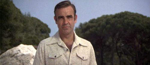
Wait, What? Ep. 84: Q and A DNA Q

Photobucket First off, our new graphic is courtesy of the incredibly talented Adam P. Knave (who on top of all the other things he does and does well, has added podcaster to the mix. Go check out The Glory, The Glory, why don't you?) and our old dashed-off scattershot introductions to the podcast, courtesy of me who has once again managed to land himself behind a scheduling eightball.

But!  That doesn't mean we didn't attend to our duties, as far as answering your questions go.  On the contrary, Episode 84 of Wait, What? is our first hour and forty five minute foray into the savage wilds of your inquiries.  Among the ground covered by Graeme McMillan and me:  our recommendations for DC Showcases and Marvel Essentials (both real and imaginary), the fall of Vertigo's Sincere Age, Alan Moore and the plight of 1963, our Free Comic Book Day picks, the damning influence of Big Question Mark, event comics, follow-ups to articles discussed without being read, work for hire vs. creative owned work, Steve Gerber and Foolkiller, Submarine, Elite Squad, our favorite comic book city,  and assorted cage matches and Hunger Games.
Also: Stuff.  Additionally: Things.

Men and Women With X-Ray Eyes (And/Or Specs) have already seen the podcast radiating in the iTunes spectrum (grappling perhaps with an Infrared Manta).  Those of us with only stereoscopic or lesser degrees of vision can certainly be satisfied with the auditory equivalent, as available below:

Wait, What?, Episode 84: Q and A DNA Q

As always, thanks for listening and we hope you enjoy!

Wait, What? Ep. 79.2: Power of Ones

Uploaded from the Photobucket iPhone App Hey, guess who did it wrong?

Yeah, I had an incredibly busy Wednesday and it wasn't until my head hit the pillow that I remembered I'd forgotten to upload this podcast.

And create this entry.

So, despite my fond reveries about providing extra content and blahblahblahblah, that will probably have to wait until next week because, well, I'm tired and dumb.

But I wasn't (entirely) when Graeme and I talked now comics for our conclusion to Episode 79!  Nope, I was more or less lucid and we reviewed the latest issues of Buffy The Vampire Slayer, Angel and Faith, Frankenstein, Agent of Shade, Batwoman, and a whole mess of first first issues including Saucer Country, Crossed Badlands, Saga, Avengers Assemble, and of course Todd McFarlane's Spider-Man (which I'm sure some of you were unfortunate enough to realize from the above excerpt).

"A candy-colored clown they call iTunes tiptoes to your feed every night just to sprinkle podcasts and to whisper "Go to sleep, everything is all right."

Alternately:

Wait, What? Ep. 79.2: The Power of Ones

As always, we hope you zzzzzzzzzzzzzzzzzzzzzzzzzzzzzzzzzzzzzzzz...

"I am one of those losers that doesn't have a car." Comics! Read 'em with your eyes!

While I was waiting for The Boy With The Roast Beef Face to come back off holiday and restore order before the whole country turned into an indoor firework I read some comics. It's a Not Big Two Bonanza this week! Let's see what  creators unbound can give us, eh?

THE INFINITE VACATION #2 By Christian Ward(a), Nick Spencer(w) (Image, $3.50) Ever wanted to holiday in the life of an alternate you in an alternate reality? Well, now you can because there’s an App for that! But what if there was a murderer rapidly reducing the alternate yous between him and you? Got an App for that have you, pal? Thought not.

As high concepts go it’s pretty vertigo inducing I think you’ll agree. The real genius is tapping into that sexy tech gland in the brains of the young and yoking it together with the weird sense of inferiority these things evoke in the meat machines that consume them. Today’s tech is sexy tech but it’s also, maybe, dangerous tech and it’s this formless, and very human, anxiety that the core concept feeds upon. I think. Of course familiar elements are needed to ground the narrative sufficiently for readers to connect, so there’s a murder mystery providing propulsion and a romance with a mystery hot girl, paedo jokes etc.

Photobucket

Christian Ward’s art is inventive not only in layouts, which often hover on the border of confusion while admirably never crossing it, but also in his choice of colours. It’s well worth looking at is Christian Ward’s art. Refreshing would be the word there. Nick Spencer’s story rattles along at such a pace that while the series is clearly pleased with itself it never tips over into smugness and, crucially, the reader is never given chance to question any of it too deeply. Which is just as well. I had a few questions about stuff but that’s what happens when you show old people the future they want to know where the toilets are and where they can buy some crisps.

As inventively illustrated high concept entertainment goes this was VERY GOOD!

THE GOON #34 By Eric Powell (Dark Horse, $3.50) The Goon watches some sport, gets likkered up and has a fight. It's really, really pretty.

The Goon is Eric Powell’s comic. This means he can do whatever he dingdanged likes with it. If Eric Powell wants to waste several pages ineffectually taking the piss out of an transient media blip like Twilight then that’s what Eric Powell’s a-gonna do. If Eric Powell wants one of his characters to actually comment on what a waste of time said pages are then that’s what’s a-gonna happen. If Eric Powell wants the rest of the comic to be an extended fight scene punctuated by moments intended to be humorous and some cool images, guess what? That’s right.

Photobucket

Sounds pretty negligible and indeed it is but that’s not taking into account the art. Eric Powell’s art is gorgeous. Finished off in lovely washes it has a chunky cartoon quality rooted in realism that is a sweet treat for the eye. I’m a fair man, my heart still beats, so I’ll mitigate my opinion of this issue by saying that I have read Eric Powell’s BUZZARD and CHIMICHINGA! and both of those were better because both of those had an actual honest-to-goodness story. When you get art this good illustrating something of at least a little substance you get one ripe peach of a comic experience. The GOON #34 wasn’t such an experience but if Eric Powell wants to meticulously illustrate what is basically behind the bike sheds humour he’s certainly free to do so. Just like I’m free to say it’s OKAY!


USAGI YOJIMBO #139 By Stan Sakai (Dark Horse, $3.50) “Murder At The Inn” Part One.

Along with a disparate group of strangers the rabbit Ronin seeks shelter from a storm. When a murder is committed Usagi discovers that a nowhere is safe when strangers with strange motives are involved. The game is afoot! Or is it a-paw! Heh.

The peerless Stan Sakai has been working on Usagi Yojimbo since 1987. Despite its longevity it is a series rarely mentioned but when it is mentioned it is always with a large measure of respect. This is entirely fitting as through these many decades Mr Stan Sakai has pursued his peculiarly anthropomorphic vision with unfaltering commitment to his craft resulting in one of the most consistently entertaining and satisfying pamphlets to grace the racks. When he began Stan Sakai was already pretty great but as the years have passed he has quietly become a master. His art and storytelling have never taken any great leaps forward but rather have evolved slowly and surely towards his present level of subdued excellence.

Photobucket

I enjoy every issue of USAGI YOJIMBO for many reasons (I am particularly prone to staring at his cross hatching and I revel in the research he shares with us in the lettercol) but the principal reason is that Stan Sakai is content to bring good tales well told to the table. And there are still seats at the table for anyone who favours staunch excellence over empty bombast.

USAGI YOJIMBO#139 is pretty much like every issue of USAGI YOJIMBO in that it is EXCELLENT!


TRAILBLAZER (ONE-SHOT) By James Daily/Jimmy Palmiotti/Peter Palmiotti & Ken Branch (a), Justin Gray & Jimmy Palmiotti, Paul Mounts(c) and Bill Tortolini(l)(Image, $5.99)

The most awesome assassin in the world turns against his paymasters and is sent back to the Old West as part of a government witness relocation scheme. When the sins of the present follow him back he’ll have to accept his past if he’s to have any future!

 This thing has a hero who is a bad assed killing machine who hires his bad assed killing skills out to organised crime. It’s okay though because he is an orphan, gives most of his money to the orphanage, was raised by nuns, only kills members of organised crime cartels and probably sorts out his glass from his cardboard when he recycles. So, he’s an okay guy! No, no he’s not, he’s a self centred piece of moral detritus that can only be considered a hero by people who think morality is as quaint and outmoded as taking your hat off indoors. Hilariously this soil bucket whines on about how all the people he has ever cared about die when all the people he has ever cared about who we see die have quite clearly died because they associate with a narcissistic killer.

Anyone with any inner ethical life will surely be left wondering about how they can get the time wasted reading this thing back. I guess you’d have to build a time machine. Did I mention the time machine? Oh, tiny dancer, get this: the US Govt develops time travel and uses it to relocate witnesses in the Old West. If the U.S. Govt had developed time travel technology I think using it to relocate witnesses would be pretty far down the list of things they would use it for. This may be because I am a twisted misanthrope and thus inherently distrustful of governments and the uses to which they put technological advances but I think it is definitely due to the fact that this idea is mind bogglingly stupid. I spent more time deciding which socks to wear this morning than the creators of this thing spent considering the ramifications of this concept. (I went for the clean ones in the end.) The US Govt develops time travel and uses it to relocate witnesses in the Old West. I just wanted to write that down again so I could marvel at its almost total resistance to sense. I would have to be carved entirely from lard to countenance such a wilfully witless premise. Still, if you can buy that I guess you might buy this. I don’t and I wish I hadn’t.

Photobucket

But I’m not the intended audience. I am a comic book reader and this is not a comic although it presents itself as such. The intended audience for this is composed of deal makers in the TV and Movie industries. This is a sales pitch not a comic. From the “Papermovies” branding to the creator bios which read more like C.V.s all the way through to the perfunctory presentation of the thoroughly unoriginal (or original but cretinous) concepts. This is what you get when creators pander to the market. You get the equivalent to those leaflets window cleaners push through your letter box in times of recession. Those aren’t comics either.

I disliked this because I am British and fun is alien to me, true, but mostly because it wasn’t really a comic which made it AWFUL!

CRIMINAL MACABRE/THE GOON: WHEN FREAKS COLLIDE ONE-SHOT By Christopher Mitten(a), Steve Niles/Eric Powell(w), Michelle Madsen(c), Nate Piekos of Blambot(l) (Dark Horse, $3.99)

Maybe you like Eric Powell’s IP The Goon? In which case have you seen Steve Niles’ IP Criminal Macabre (Cal McDonald)? What if they had a fight before realising they had been tricked by the real enemy and then teamed up to boot the bad guy’s jacksie? Wouldn’t that be totally different to all the tights’n’fights comics that follow this strict formula?  It would be totally different! Well, the art is better at least. Would you like to buy more? Press here!

Kind of a “Here they are, hope ya like ‘em! Particularly hope ya like ‘em enough to buy more!” deal. Given all that The Goon comes off best here as he has slightly more presence thanks to having some blatant shtick than can be easily riffed on (outdated references, comical swearing and hitting things with a big wrench) whereas Cal McDonald is…there? Despite having plenty of room to do so, as it’s hardly heaving with plot and incident, the comic fails to impart much of an idea of either character.  That’s okay with The Goon who’s basically a lively cartoon and even if you don’t do much with him you’d have to do nothing at all with him for him to be totally unmemorable. To their credit the creators of this don’t do absolutely nothing with The Goon. It’s close, though but close only counts in horse shoes and hand grenades, as The Goon might say.

Photobucket

This here Cal McDonald IP is…there? He does a little magic, does a little drugs (Ooooh, dangerous!) and has black hair. A bit like John Constantine in the same way that Panda Cola is like Coca Cola. On the basis of these pages Cal McDonald isn’t so much of a character as an IP waiting for SYFI to notice him. Regrettably studios only tend to shop for knock-offs if the original is successful. Cal McDonald curses you, Keanu Reeves! He damns your very eyes! Oh, on the last page Mike Mignola’s IP Hellboy turns up which seems an oddly cheap and desperate note on which to end but, hey, turns out this “one-shot” is “…to be continued!” so the only thing that’s actually ended is my interest. Probably not the outcome they were shooting for there.

So, yeah, this was just like a corporate comic and bored me quite a bit, that boredom beget irritation and then I just ran my mouth like a jackass so, y’know, on the whole I expected better but I got EH!

TIMEBELCH! By Hank Jeno (w/a) (Burning Streets, $4.99) What if you could change the course of History with kindness! What if History had other plans!

Barry Tupper is the best at what he does and what Barry Tupper does is Social Work. Despite this he is a pariah at Chistlewick Council due to his unorthodox and sexily rogue nature, which largely manifests in a tendency to deride managers as “paper fondlers” and tell clients that the IT system is a “shit counter”. On being given his third and final written warning (for using the work photocopier to print flyers for his local charity car boot sale) Barry Tupper is given a choice: Get a job in the private sector or go on a secret government mission from which he will never return.

Barry goes for the lesser of two evils and finds himself thrown through time back, back to Leonding, Austria in 1898 with one mission: make Hitler a nice man! Adept at gaining the confidence of fearful pensioners Barry has few problems in befriending the potential world immolating nutbag and commences to throw his weight behind Nuture in its eternal struggle with Nature. For the two men the next couple of decades pass in a montage of walks through russet leaves, heads thrown back with full throated laughter and beach volleyball. All seems well as Barry concentrates on distracting Hitler from the iconography of his local church, giving him painting tips, nudging him towards macramé rather than politics and encouraging the use of “How you doin’!” rather than “Heil!”.

Then one fateful day upon entering the café at which he and Hitler meet each morning Barry hears Hitler making an anti-Semitic remark to the waiter. Consumed by self-hatred at the extent of his failure Barry seizes the nearest butter knife. At the exact moment that Barry swings the butter knife in a fatal arc at Hitlers’ neck he realises Hitler was expressing his dislike of the breakfast juice provided. A beach volleyball rolls across some sand and just as it seems about to stop… SMASH CUT TO BLACK. Sad piano music.

Although TIMEBELCH is  written with all the subtlety and tact of a Marvel Event and is drawn by someone who has had every bone in his hands broken only to have them set all wrong I feel it is ripe for optioning by a major studio and thus EXCELLENT! Have your people call my people!

One of those comics wasn't real! Did you guess which?

Now I must go and stand at my window and look out at blasted England with old eyes fat with tears. Only joking, have a great weekend, everyone!