“Not Unless He Had Three Legs.” COMICS! Sometimes It's Nice To Have A Change Of Scenery!

In which Judge Dredd is a right gadabout and doesn’t even have the decency to send a postcard.!!BONUS MAP OF THE MEGA-TERRITORIES!!  photo JDTMC56RedB_zps2c6ktymy.jpg JUDGE DREDD: GULAG by Charlie Adlard
Anyway, this…

THE JUDGE DREDD MEGA COLLECTION REVIEW INDEX

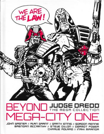
JUDGE DREDD: THE MEGA COLLECTION Vol. 56: BEYOND MEGA-CITY ONE Art by Brendan McCarthy, Steve Dillon, Dermot Power, Charlie Adlard and Inaki Miranda Written by John Wagner, Alan Grant, Garth Ennis, Mark Millar & Grant Morrison and Gordon Rennie Lettered by Tom Frame, Mark King, John Aldrich, Annie Parkhouse and Simon Bowland Colours by Wendy Simpson, Chris Blythe Eu de la Cruz Originally serialised in 2000AD Progs 485-488, 727-732, 859-866, 1382-1386 & JUDGE DREDD MEGAZINE 246-249 © 1986, 1991, 1993, 2004, 2006 & 2016 Rebellion A/S Hatchette Partworks/Rebellion, £9.99 (2016) JUDGE DREDD created by Carlos Ezquerra & John Wagner

 photo JDTMC56CovB_zps0etjedgi.jpg

ATLANTIS Art by Brendan McCarthy Written by John Wagner & Alan Grant Lettered by Tom Frame & Mark King
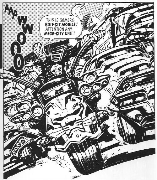
 photo JDTMC56BritB_zps1xz9evh1.jpg JUDGE DREDD: ATLANTIS by McCarthy, Wagner & Grant and Frame

Have you ever seen a British Bobby’s helmet? Ooooh, don’t! Get you! Stop it! OoooOOOOooooOOOOOOh! No, really, back when they walked the beat tipping the wink to the ladies, dispensing directions  and gruffly moving on the ruffians and all that, before they became  swaddled in bullet proof jackets and started cradling matt black engines of death while licking their chapped lips, back before that, did you ever seen a British bobby’s helmet? We used to call them “tit heads”, because kids have no respect and, also, they were a pretty ridiculous bit of gear. And yet thoroughly British in their ridiculousness, due to their air of wonky pomp.  Brendan McCarthy’s design for the Brit Judge embraces this tradition and carries it into the future like a sheikh carrying a blonde lady on the cover of a Mills & Boon romance. Smoothly, that is. It also suggests he is the only person in existence who ever looked at Calos Ezquerra’s original Judge design and thought, “Hmmm, pretty impractical, but not impractical enough!” Pity the poor sap who has to patrol the mean streets of Future Little Tidworth in this get-up.
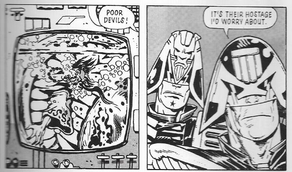
 photo JDTMC56PoorB_zpsw2ns6alv.jpg JUDGE DREDD: ATLANTIS by McCarthy, Wagner & Grant and Frame

It works on the page though because Brendan McCarthy is  a design genius, and part of that genius must be due to his total refutation of physical practicalities.  Not only is the Brit Judge get-up visually delightful  it is also very British, what with its lion(s) rampant and multiple Union Jacks (The Royal Union Flag, to any Canucks out there).  All the kind of garish tat in fact which symbolises the overcompensation this nation makes for its reduced circumstances and present global irrelevance. I wouldn’t be surprised if the kneepads alternated playing the national anthem and Churchill’s speeches, and the belt pouches contained the fixings for a nice cup o’ char. Preposterously impractical and ostentatiously nationalistic, like fascism filtered through buffoonery Brendan McCarthy’s design captures the British character to a tee. I like it. Other than that though we learn little as Brit-Judges just act like Judges and the strip isn’t set in Brit-Cit but instead in Atlantis, which is not a mythical sunken city but a way station on the sea bed. The strip is a shaggy mutie story that earns its length by introducing Atlantis and Brit-Cit judges, and by being drawn by Brendan McCarthy; it’s worth reading just to see McCarthy’s giant manta rays alone. Throw in the bumptious bobby design to boot and it’s GOOD! Stuff.

EMERALD ISLE Art by Steve Dillon Written by Garth Ennis Coloured by Wendy Simpson Lettered by Tom Frame
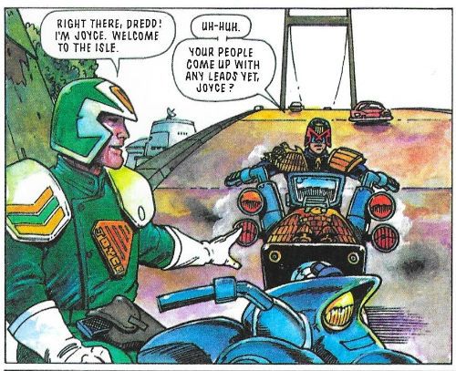
 photo JDTMC56EireB_zpsy07v92cp.jpg JUDGE DREDD: EMERALD ISLE by Dillon, Ennis, Simpson and Frame

Bejabbers! If and it isn’t the quare man hissownself now, Garth Ennis! To be sure, and there’s been many a pot o’ gold at the end o’ his rainbow o’writing! To be sure, to be sure! Oho, oho, oho! But this’ll no be one of ‘em! See and if he’s not brought his sense of humour with him!  Ah now, ‘tis a turrible, turrible ting his sense o’ humour is.  Aye now, ‘tis a sorry tale indeed. In the immortal words of Alan Partridge, “Der’s more to Oirland dan DIS!” What? Oh, it’s racist when I do it is it? I see. I better stop then. When Garth Ennis does it it’s satire. Except it isn’t. Unless you are a lot less demanding than me. You know that particularly poor satire that’s so bad it is actually indistinguishable from what it purports to satirise? Well, after reading Emerald Isle you will. I guess it’s a satire of people’s ideas about Ireland but it’s kind of painful. Mind you, me and Garth Ennis’ sense of humour will always at odds. Mostly because I have an outdated belief that humour should be funny. A little bird tells me though that  different people find different things funny, so if you think having a Guinness harp© on a Judge’s helmet and potato guns that you can set to “chips” are funny, then you tuck in!
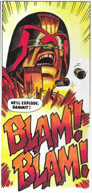
 photo JDTMC56BlamB_zpskqjqjxx7.jpg JUDGE DREDD: EMERALD ISLE by Dillon, Ennis, Simpson and Frame

Unconvincingly mixed into this hilarious stuff is a more grounded tale of a M-C1 hitman who hides out with a bunch of terrorists. Terrorism is apparently just a bit of a jape until the proper crook turns up, then things get heavy. The insouciant  Emerald Isle Judges are unprepared for the sudden explosion of pitilessly thuggish activity. Luckily Judge Dredd lends a hand. Personally I’m a bit unconvinced that terrorism in Ireland and organised crime were not inextricably linked but I’m not going to argue that point with anyone from Ireland. Say, has anyone else seen that crackin’ John Boorman movie THE GENERAL (1998)? Brendan Gleeson’s in it and it’s well good. Based on Dublin Crime Lord, Martin Cahill, it probably soft soaps the harsher reality but still, Brendan Gleeson. Lovely, lovely Brendan Gleeson. ORDINARY DECENT CRIMINAL (2000) stars Kevin Spacey and apparently covers the same ground. I’ve not watched that one so I’d not know. Meanwhile, back at the point, the late, great Steve Dillon draws “Emerald Isle” in his usual sturdy fashion whereby he avoids drawing anything too demanding but his stylistic charisma prevents it all getting too bland. He’s also wise enough to know that Dredd’s the star, so he’ll ensure at least one really great image of Dredd being Zarjaz! He’s a right good choice for such a whipsaw mix of comedy larks and brutal violence given his style can accommodate both at the expense of neither. It may not be the craic it thinks it is but “Emerald Isle” is GOOD!


BOOK OF THE DEAD Art by Dermot Power Written by Mark Millar & Grant Morrison Lettered by Tom Frame & John Aldrich
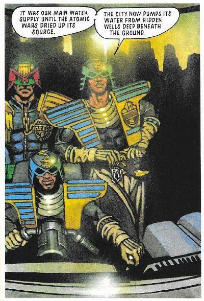
 photo JDTMC56LuxorB_zpsmk7l9tqq.jpg JUDGE DREDD: BOOK OF THE DEAD by Power, Millar & Morrison and Frame

I’m stretching charity to its limits when I say that Mark Millar and Grant Morrison’s Judge Dredd work is the high point of neither of their careers. Considering how little I rate anything by Mark Millar this should be warning enough. At this stage of their careers (the crazysexyfuntime ‘90s!) Millar & Morrison had teamed up and were giving interviews like they were pop stars in the vein of Pepsi and Shirley or something; they seemed pretty committed to the novel artistic approach of just telling people they were awesome without actually making any decent comics to back that up. A right self-promoting pair of capering  mountebanks  they were. Preening narcissists, some might say, because people can be very cruel. Morrison and Millar were all mouth and no trousers, as we say over here. Morrison would eventually snap out of it and lower himself to write some decent comics, which very clever people would read a great deal more into than was actually present. I don’t know what happened to him after, because the last thing I read by him was something odious about Siegel and Shuster’s treatment by DC which, while I can’t remember the specifics, certainly sounded like “Goodbye, John” to me. Apparently, because I ceased paying attention long ago, Millar would just defiantly plod on regardless, cultivating his lucrative furrow of thundering chicanery and creative impoverishment to spectacularly rewarding effect. Financially, not creatively rewarding, obviously. Before that though, the team were steadfast in their belief that if they reduced Judge Dredd to the level of a shit ‘80s straight to video action twat, this would be a good thing. At no point in their complacently leaden tenure on the strip would their approach bear any fruit other than arse grapes.
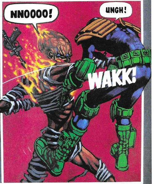
 photo JDTMC56FightB_zpsprazvd8a.jpg JUDGE DREDD: BOOK OF THE DEAD by Power, Millar & Morrison and Frame

“Book of the Dead” is a pretty representative bunch of those very arse grapes. Here the legends in their own minds send Dredd to the city of Luxor in Egypt, where they can’t be bothered to invent a future society, because they are busy modelling Speedos© for Deadline, or taking about being punk while actually being about as punk as Barry Manilow, or whatever and who cares, so they just make it a really superficial idea of how Ancient Egypt was, you know, pyramids, pharaohs, mummies, etc. but with hover cars, energy staffs and Resyk. Given the amount of thought involved we’re lucky the Judges don’t ride about on robot camels and Dredd doesn’t come home with a rug from a mega-bazaar. Whenever Dredd’s abroad some folk’s antennae start twitching in case any casual racism slips in, but I think the mental sloth on show here is damning enough. It’s just a multi-part punch-up and a piss poor use of Dermot Power’s not inconsiderable talents. Power fully paints the strip with a level of skill and artistry better suited to a script where someone was, you know, actually trying.  There’s some lovely muscle work on show reminiscent of the master of muscle magic, Mr Glenn Fabry, and at no point does Power succumb to the twin pitfalls of fully painted 2000AD art: drab colours and visual inertia. His work here is so lovely for seconds at a time I forgot how insultingly contemptuous the writing was of its audience. It’s only because of Dermot Power that this gets OKAY! rather than CRAP!

GULAG Art by Charlie Adlard Written by Gordon Rennie Coloured by Chris Blythe Lettered by Tom Frame
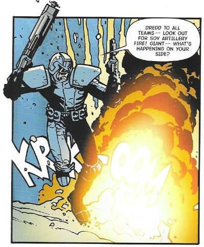
 photo JDTMC56BoomB_zpsjxrecenm.jpg JUDGE DREDD: GULAG by Adlard, Rennie, Blythe & Frame

Charlie Adlard draws this one. Charlie Adlard is famous for drawing The Walking Dead, which is itself famous for being successful and unerringly mediocre. You knew that, but did you know that Charlie Adlard is now the UK Comics Laureate. Disappointingly, unlike the Poet Laureate, this does not mean that he has to produce comics on the Queen’s birthday or royal births and marriages, and public occasions, such as coronations and military victories. Her Madge’s Royal God-appointed face as she opened up her birthday card to find a picture of a rotting corpse tottering around a valiantly nondescript America would be quite the thing! No, it seems it’s more of a charitable position whereby the noble art of The Comic is promoted with the hope that one day it will be as popular as poetry. (<--- joke!) If you didn’t know that, then it probably evaded your attention that Dave Gibbons was the last UK Comics Laureate. As part of his promotional efforts I like to think The Gibbons used to squeeze himself into his Big E leotard from his Tornado days and leap into libraries scattering comics like startled gulls into the receptive faces of the next generation of comics’ readers. And old people sheltering from the cold. That probably didn’t happen but I think we all feel a bit better having imagined Dave Gibbons dressed as Big E. Take your pleasure where you find it doesn’t just apply to Wilson Pickett fans.
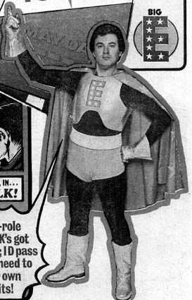
 photo bigeB_zpsrknllnbh.jpg DAVE GIBBONS: BIG E stolen from thefifthbranch.com

The story? Oh, “Gulag” is about Judge Dredd getting a bunch of stubbornly unmemorable Judges together to rescue some POWS from a Siberian Gulag. Yeah, by the way, in case it hasn’t become obvious these reviews aren’t the kind which tell you significant character appearances (e.g. here: Psi Judge Karyn), who created them (Dean Ormston and Alan Grant), which story they first appeared in (Raptaur), where that story first appeared (Judge Dredd Megazine #1.11-1.17) and when (1991). No, these are just what an old man of questionable lucidity manages to crank out in the time allotted by circumstance. Reviews, but not as we know them. There’s little rigour or design to them. It’s less Douglas Wolk and more a shaky old gent muttering to himself in a library (Dredd…zarjaz!...Rico…BAD! Pat Mills…lovely teeth! Space Spinner…Big news for readers inside! Etc etc), before Dave Gibbons unwisely clad in the rags of yesteryear, bursts in and causes me to vapor lock in shock. Prone to divergence at no notice, yeah? Particularly when dealing with Gordon Rennie, who here writes about Judge Dredd and chums in Siberia. In “Gulag” Sibera is less than rewarding as a locale as it is just full of snow and bits of barbed wire, and the differences in the Sov Judges’ uniforms is minimal. It’s not worth the trip really. Rennie huffs and puffs about the stakes at, er, stake but I could never rid myself of the impression that it was all just a big fight over an empty shed in a snowy field. Charlie Adlard fails to ignite events, but everything he draws looks like what it’s supposed to be. I mean, it certainly wasn’t worth a butt of sack but it was OKAY!  

REGIME CHANGE Art by Inaki Miranda Written by Gordon Rennie Coloured by Eua de la Cruz Lettered by Tom Frame, Annie Parkhouse & Simon Bowland
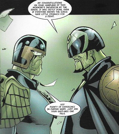
 photo JDTMC56BarranB_zpsm4juxvb3.jpg JUDGE DREDD: REGIME CHANGE by Miranda, Rennie, del la Cruz, Frame, Parkhouse & Bowland

“Regime Change” is the second Rennie penned tale and had an equal impact on my memory as that one in the snow, what’s it called? The one with, uh, the snow and, uh...Anyway, Dredd goes to Ciudad Barranquilla (AKA Banana City) which spawls over most of Central America like a gaily coloured, city shaped metaphorical sombrero. Pretending to give a shit about missing cits Dredd and a multi-national  “peace keeping force” show up and nose about. Turns out though, in a twist that could only surprise a Daily Mail reader, that they are actually just there to depose the Judge Supremo and install someone more to M-C1’s liking. When the corpses of fourteen M-C1 citizens are found in a mass grave they have all the excuse they need. What shocking cynicism! The sheer gall of Gordon Rennie to even suggest to imply such a thing! It’s fine. It’s drawn by Inaki Miranda whose art I don’t like because everyone is drawn with a tiny wee head like Thrud The Barbarian, and it’s all just a bit too busy for me. One of the problems with comics is that you can come up against a style you just don’t like. It doesn’t mean it’s “bad”, it’s just not to your taste. Guess what? That’s right. So, “Regime Change” is OKAY!
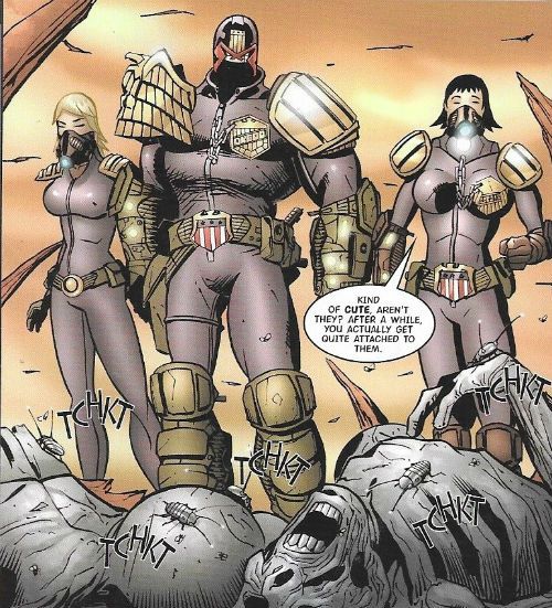
 photo JDTMC56CuteB_zpsanh36kbo.jpg JUDGE DREDD: REGIME CHANGE by Miranda, Rennie, del la Cruz, Frame, Parkhouse & Bowland

It was a bit dull that wasn’t it, a bit normal. Sometimes I’ll do that, sometimes I’ll just start on a craven apology for not having done these sooner. Because, yeah, I started writing up these Dredd partworks in 2015 and then…I stopped. A lot of that was down to apparently I like to make promises I can’t keep. That way I think I get to keep the guilt up. I’m still feeding off the guilt of not carrying on with the Planet of the Apes Weekly, but that was a lot of work to be fair, I kind of aimed to high on that one. Not doing the Dredds as well was too much guilt though. It was getting oppressive. Mind you, about two write-ups in, when I first started, it was pointed out to me that Douglas Wolk had written up every Judge Dredd strip ever so…I felt a bit like a spare prick at a wedding. If Gus van Sant had been halfway through making PSYCHO when someone told him this guy Fred Hitchcock had already had a go, I like to think he would have had the sense to stop. It’s about knowing your place, innit. Alas, that didn’t stop me feeling bad; yes, I felt bad, and I still feel bad because “Drac” in the comments was all gung-ho about following along from his Australian location. And I just pisseded off and left him or her hanging. That’s shabby behaviour. So, too late to make up for it, I’ve started again. I’m banging them out now but that won’t always be possible (because, life), but as slow as the flow may become I’ll carry on. Sometimes I’ll try and do a proper job and sometimes I’ll just amuse myself, depends. Personally I find it difficult to say much about Gordon Rennie, so it’s unfortunate that we have two of his storylines in this book. Bit of a mixed bag this book, to be fair the Rennie ones are part of a longer uberplot involving the machinations of an embittered Sov, so they lose out by being isolated here. BEYOND MEGA CITY ONE is a GOOD! Read overall, I guess.

NEXT TIME: I haven’t thought that far ahead. So surprises in store for us all!

BONUS: A NO DOUBT OUTDATED MAP OF THE WORLD OF JUDGE DREDD!

 photo JDTMC56MapB_zpsor9naqso.jpg

Wait, What? Ep. 75: Joshua Judges OMAC

Uploaded from the Photobucket iPhone App [Above:  Not a deliberate shout-out, I'm sure, but we'll take what we can get, of course.]

Thanks for your patience during our mild vacation! In return, we offer you Wait, What? Ep. 75, which features more than two and twenty minutes of Graeme McMillan and me "stealing the air" or "pump[ing] up the volume" or whatever it is you "kids" call it. [Thanks to Joolian for pointing out that should really read "two hours and twenty minutes," damn my eyes!]

Do we talk Robert Kirkman, Tony Moore, and The Walking Dead? Do we, ever! Dare we discuss Gary Friedrich, Ghost Rider and Marvel? Dare, we do! Tire I of answering rhetorical questions? Frankly, yes, but I won't let that get in the way of telling you we also chat about L.J. Smith and The Vampire Diaries; John Rozum, Scott McDaniel, and Static Shock; and James Doohan and William Shatner and Star Trek.

Also, there's Brian Bendis' ideas for the New 52; sales expectations for the Marvel and DC; Marvel's possible reboot and their strategies for Avengers Vs. X-Men; the myth of the Marvel Architects;  Joss Whedon and Buffy The Vampire Slayer; and et cetera, and what have you, and like that.

If you were the type to indulge in auditorial gambols, you may have encountered our gift in the wild autumnal splendor that is iTunes (where nearly-extinct creatures like Ping and DRM still play).  But if not, please take it as it is offered here, with utmost generosity and verbal pomposity:

Wait, What? Ep. 75: Joshua Judges OMAC?

As always, we thank you for listening and hope you enjoy!

Bewilderment Inc: Featuring The Malingerer!

After the break I’ll be not knowing what the Hell I’m doing with some comics you probably didn’t read. Remember, kids, if you want me to stop before someone gets hurt contact Mr. Hibbs.

First though, a vain attempt at professionalism (always worth a chuckle):

Key to abbreviations:

(w) Words

(a) Art

(c) Colours (NOT colors, coloUrs)

(l) Lettering

Now let’s me and you do The Do!

CASANOVA II: GULA #4 by Matt Fraction(w), Fabio Moon(a), Gabriel Ba(a), Criss Peter(c) and Dustin K Harbin(l) (Icon/Marvel/Disney, $3.99)

The guy who writes this usually gets all the tickertape and thrown knickers but, for me, it’s the art that makes this one essential. And by “art” I’m referring to the combination of pictures, colours and letters that coalesce to create a unified whole most pleasing to mine eye in that way that, surely, only comics can do so sleekly and satisfyingly. The writing’s good, don’t get me wrong. Heck, I’m all for Kirby/Steranko S.H.I.E.L.D, Morrison  etc. being mashed up and garnished with a fat old heap of Daddy Issues (Killing Daddy makes that gumbo sp-sp-spicy!) but it’s the art that sets this one apart. Also in this issue you get both the riper linework of Ba and the complementary gaunt contours of Moon;bargain!

I was excessively pleased when the backmatter was dropped as that stuff brought to mind some guy trying to get a girl’s attention by posting her parts of himself (It was a bad time for me, okay?). But I liked the one where he interviewed Mr. Howard Victor Chaykin. So, yeah, shocker! I guess you can ignore all my whining though as according to the sub(!ha!) text of the last story he isn’t writing it for “me”! (Maaaaaaaan!). All perceived authorial preciousness aside this was EXCELLENT!

FIRST WAVE SPECIAL #1 by Jason Starr(w), Phil Winslade,(a), Lovern Kindzierski(c) and Rob Leigh (l) (DC Comics, $3.99)

Starring my personal favourite character in the recent chart-topping record-setting FIRST WAVE fiesta of success: The Avenger! His wife’s dead and so is his face! He is totally old-school pulp madness. The kind of guy who if he existed I’d want gassing like a badger but when confined to fiction really lights up my life. Look, he just wants to help criminals, really. Help them to…(shouts:)DIE! Wow! That bit was just like a film wasn’t it!?!

Oh, the story? It’s basically a graphical dramatisation of that old “To kill, or not to kill. That is the (dodged) question!” routine. The Avenger wants to kill the Big Boss. The Bat Man and Doc Savage realise that there are “complications” and “grey areas”, y’know, all that moral relativism cockcobblers that’s served us all so well recently. The Avenger hears them out but things don’t go too well and hi-jinks ensue. “The guy’s completely demented.” The Bat Man says this of The Avenger. The Bat-Man! That’s how crackers for maracas The Avenger is. Mr. Jason Starr does a great job delivering the neurosis-ago-go and Mr. Phil Winslade’s brittle jitteriness gives good pulp; the stand out panel being the one of The Avenger lurching off into the city of night undeterred in his dementia despite the failure of his (admittedly really quite poor) plan. Despite a last page that seemed unsure what it was trying to do this was VERY GOOD!

PUNISHERMAX#14 by Jason Aaron(w), Steve Dillon(a), Matt Hollingswoth(c) and VC’s Cory Petit(l) (Marvel/Disney, $3.99)

While (“They Call Him…”) Mr. Hibb’s rightly ballyhooed the great work Mr. Jason Aaron is doing on this title I’d like to shine my love light on the work of Mr. Steve Dillon. It’s not often an artist pays such lavish attention to world building but we certainly have an instance here. See, the MAX universe isn’t like the Marvel Universe; a harsher harder place is this. In the MAX Universe death, maiming or harsh language could put a crimp in your day without warning. Men, women and children are all as likely to be minced by the frightful despair fuelled grinder that is the MAX Universe. In the MAX Universe the only “mercy” comes from the mouths of polite French people. Little wonder then that the residents of said place neglect interior decoration almost totally. In the MAX Universe the only difference between your home and an abattoir is that the abattoir has more cracks in the wall. Steve Dillon knows this. Steve Dillon shows you this. And despite this it is still VERY GOOD!

(Pause for a cuppa tea.)

Due to Austerity Measures I have been rooting around in my Archive (i.e. the garage) where I found these (i.e. they fell on my head when I was moving the dead guinea pig’s cage) issues which together form a story not yet collected between two covers:

WARLOCK#1-4 (2004/5) by Greg Pak(w), Charlie Adlard(a), Sotocolor’s P. Serrano(c) and VC’s Cory Petit(l) (Marvel,$2.99ea)

It’s about realising that if God is Dead (He is. I sent flowers.) then that effectively makes you God and how you might want to think about what kind of God you want to be if you don’t want to end up with a ball of dirt studded with piles of smoking offal instead of a world. Metaphorically speaking. It’s about growing up and working out how to live in a clearly insane world without going insane. Not so metaphorically speaking. Hey, I’m not claiming it’s Teilhard De Chardin (because I don’t know who he is, mostly) or anything but it does raise interesting questions and if the answers it gives are a little pat it’s important to remember it is a comic churned out by Marvel; the very fact it even raises questions (beyond the usual, “Why are these characters talking like morons?”) is pretty applause worthy in itself.

Mr. Pak does a fine job giving the story youthful protagonists which are neither cloying nor hateful (not an easy thing), an eventful plot and some good Warlocking all round. Alas, Mr. Adlard fares less well as his natural inclination artistically seems to be towards the mundane but Serrano’s colours link their fingers together and boost him up so his art does at least graze the necessary level of awesome Warlock demands! Okay, WARLOCK (2004) isn’t even close to Roy and Gil Kane’s (sexy sweaty space Jesus) or Jim Starlin’s (Evil = Purple Afro!) but it’s still VERY GOOD!


Ha! I can see your thoughts! But, no, unless my mother has led a far more eventful life than I have been led to believe, I am not related to Gil Kane.

Next time: More flailing in the abyss!

Verse Chorus Verse: Jeff's Capsule Reviews from 6/8

Does it bode ill for my reviews when I can't think of a clever thing to say while convincing you to follow me behind the jump for capsule reviews?  It probably is, isn't it?  Ah, well.  I just finished watching the screen adaptation of The Black Dahlia.  I mean, I'd heard that movie would be bad, but there were wrong casting decisions, terrible direction, and some bad mistakes in adapting Ellroy's skeezy epic to the screen. As a quasi-fan of Brian DePalma, it's a painful, painful movie to watch.  And I blame it for my inability to bring you a witty intro: the movie is a like a form of slow-acting toxin to the higher brain functions. Anyway, after the jump:  lower brain function reviews of Empowered: Ten Questions for the Maidman, Invincible Iron Man #504, Witch Doctor #0, and more.

EMPOWERED: TEN QUESTIONS FOR THE MAIDMAN:  Maidman -- the cross-dressing vigilante of Adam Warren's Empowered universe -- gets his own one-shot with alternating black and white sections by Adam Warren and color sections by Emily Warren. It was a book I wanted to deeply like, but really only admired. You can read this one-shot as a deconstruction of Batman (Maidman is one of the few non-powered superheroes in the Emp universe and easily the most feared), a deconstruction of Batman analogs (in some ways, this is the funniest issue of Midnighter never published), or maybe even a spoof of the cape industry's current trend in Mary-Sueisms.  Alternately, you could also take it as a face value, with Warren using the same gimmicks to get the reader to like Maidman that Johns or Bendis or a host of others use these days -- (a) introduce character; (b) have everyone talk admiringly of character; (c) show character doing something impossibly awesome; (d) profit.  Empowered: Ten Questions... shows Warren as being as skilled a practitioner of the current bag of comics writing magic tricks as anyone currently working.  I'm glad he at least has his own little universe to toy about with, but I wish I could get more worked up about a more-or-less OK one-shot...in no small part because I worry about him getting it yanked out from under him if the sales aren't there.  Vexingly OK.

INVINCIBLE IRON MAN #504:  Really interesting to read a book where the regular writer is caught off-balance by the obligatory line-wide event when the same guy is writing that event, too.  I mean, that two page scene with Tony and Pepper is really quite good for what it is.  But the meat of the issue, where Tony goes to Paris because one of the hammers of the Worthy has landed there, is underwhelming. Fraction clearly built the issue to that last page climax but it feels like that's the only thing he's trying to  accomplish.  So when you get to that last page, it definitely has some punch to it but it also eaves you feeling super-empty and annoyed immediately after.

Also, that last page what feels like part of an ongoing tug-of-war between Fraction and Larrocca. Instead of focusing on rendering that kinda-important pile of stones Tony is on top of, Larroca focuses on the building beside it.  It doesn't feel quite like a "fuck you" from one collaborator to another, but it does suggest painfully opposing goals\.  $3.99 price-tag + ineffective storytelling + forced event crossover=AWFULness.

POWER-MAN & IRON FIST #5: Similarly, last issue of this miniseries turned out very meh in the end despite my modest expectations.  Wellinton Alves' work ended up rushed and ugly, and Van Lente's script tried to do wayyyy too much in too short a time.  Not only do both heroes have romantic relationships resolved in this issue, but a mystery is solved, fight scenes are had, and the creepy Comedia Del'Morte are...well, frankly, I have no idea what happened to them.  It's a shame because I was won over by so much less with that back-up story from Amazing Spider-Man. (On the plus side,with very little rejiggering, Van Lente and Alves could re-tool this as an arc of the post-Morrison Batman & Robin and it'd fit right in.)  I'm tempted to get all Rex Reedy on you and say this puts the EH back in "meh," but I won't...in part because it was AWFUL.

SECRET AVENGERS #13: Ha ha ha ha ha ha ha ha ha! No. CRAP.

WALKING DEAD #85/WITCH DOCTOR #0:  Although I like the swerve Kirkman made with this storyline a few issues back, I don't know if there's really much more going on than that.  I suspect as we come 'round issue #100, Kirkman's biggest flaw --his ability to dramatize character development is rudimentary at best, and so he has to have scenes where his characters explain their motivations to one another for us to get it --  is getting more and more apparent. While I'm at it, Charlie Adlard's biggest strength -- drawing a large cast of characters to keep them easily identifiable without resorting to any flashy tricks -- may also be hindering this book:  the dramatic scenes either run to the inert or the occasionally overheated.  Energy, ambition and craft have gotten these guys farther and higher than anyone would've suspected and I in no way mean to diminish their achievement.  But I think if this book is going to make another 85 issues, they're going to need to shake up their skillsets for a change, not their storyline. OK stuff.

As for WITCH DOCTOR #0, despite having very little interest based on the material I'd seen online, I ended up enjoying the hell out of it.  Everyone [by which I mean at least me] has always wanted to write a biologic explanation for vampires, a la Matheson's treatment in I am Legend, but writer Brandon Seifert really goes to town here. Lines like "his saliva's got the usual bloodfeeder chemistry set-- vasodilator, anticoagulant and an anesthetic--plus some interesting mystical secretions.  I think one's a anterograde amnesiac--" make my heart go pitter-pat, and Seifert has a lot of them.  I can easily see how it might feel dry to some, but to me it showed a commitment to research and world-building I think you really need to make a series about a doctor (even a mystical one) work.  As for Lukas Ketner's art, it's enjoyably quirky, especially when it chooses to go detailed and when it decides to loosen up: panels of this remind me of Wrightson, others of William Stout, and still others of Jack Davis, and I could never figure out when the next swerve was going to happen.  VERY GOOD stuff and I'm definitely on-board for the first few issues of the regular title now.

WOLVERINE #9:  Not the most recent issue I know, but so much more satisfying than issue #10, I figured you'd forgive me for writing about it instead.  I mean, to begin with:  God damn, this is some gorgeous looking work.  Daniel Acuna (who I guess is doing both the art and the colors) really sold me on this story about a mysterious assassin (Lord Deathstrike) and Wolverine both trying to hunt down Mystique on the streets of San Francisco. But I should point out that there's three full pages of wordless action that feel perfectly placed in the script and I think writer Jason Aaron should really be commended for having the confidence to let the art do its stuff.  And there's also a hilariously over-the-top assassination scene at the beginning that I loved.  I suspect this book is going to have diminishing sales in no small part because Aaron just can't keep away from writing Wolverine's adventures with a strong dash of the absurdly extreme, and a larger audience for this character really want this stuff served straight-up.  I can understand that desire (especially when you get issues like #10 where it's Logan vs. the Man with the Jai-Alai Feet) but when you get such an artist who can sell you on both the sweet & sour sauce of Aaron's mix of awesome and absurd? It's really pretty satisfying.  This was one hell of a  VERY GOOD issue.

UNCANNY X-FORCE #11:  I guess this is what you can do with okay art and good characterization--you can make me care somewhat about stuff I wouldn't ordinarily care about. I missed out on the original Age of Apocalypse stuff powering the plot here and yet, thanks to a forty-issue Exiles habit, I'm pretty familiar with what's going on.  In fact, arguably I'm too familiar as I felt like I was at least a beat or two ahead of the plot at all times.  But at least some of the time I was surprised by what the characters said or how they said it.   I still quietly pine for the awesomeness of the first five issues, but this was on the high end of OK for me.

SECRET AVENGERS #13: Seriously, though.  Do you need to know why I thought this was terrible?  Well, let's just say when your plot about a Washington invasion hinges on the fierce determination of a congressman who also happens to be a magical negro mutant, and that leads to Lincoln from the Lincoln Monument and all the dinosaurs from the Smithsonian Museum of Natural History rising up to hold the line, then I think it's safe to say things have gone wrong.  Weirdly, I could've bought it in a DC book -- for whatever reason, I expect the surreal and the schmaltzy to intermingle more freely there -- but here it seems like a big ol' misfire.  Again, to sum up:  Ha ha ha ha ha ha ha ha ha! No. CRAP.

And that's my week in pamphlets.  As for my TRADE PICK....

BAKUMAN, VOL. 5:  Oh man, how I love this series.  It's not an easy sell, I know, and I'll be the first to admit that first volume is more than a little forced.  And in fact, here in volume 5, there is still a surprising number of misfires:  for example, there's a chapter here about an artist who is so committed to proving his worth to his writer that he draws pages outside her window in the middle of a blizzard and it's really treacly and ineffective. And there are more than a few hilariously cynical moves by the writer and artist to pander to their publishers:  in more than a few places, the editors and publishers of Shonen Jump are treated with a degree of reverence that borders on the fanatical.

On the other hand, Bakuman has changed my understanding of how manga is created so much I've since read other titles with new eyes --I doubt I would've enjoyed my thirteen volume romp through One-Piece nearly as much without it. And even more than that, I'm totally a sucker for the way Ohba and Obata have introduced so many different young manga creators and then blurred the lines between enemies and allies so much you realize none really exist.  As a book about the comics industry properly should, Bakuman is very much about who you have to decide to trust and the possible long-term implications of those choices.  But it's also a book where competition doesn't preclude comradeship and that totally hits a sweet spot of insecurities and needs I didn't really know I had.  Really, the series is so very far from perfect it's kinda painful...and yet the last four volumes now have been some of my favorite reading of the last year.  VERY, VERY GOOD for me, but you really not might feel at all the same.

The Reason We Read Periodical Comics

There are two kinds of special thrills that periodical comics can bring. The first is tied to world-building, in which you get a piece of a story here, and another piece there, and eventually it adds up, building into something much larger than it's parts -- this is much of the thrill of the Marvel or DC universes, and one of the reasons that every other attempt to make a "universe" usually comes crashing down: it is nearly impossible to coordinate in that particular way, and it takes a multi-year dedication to build, with titles come out in a specific way. When you try to "erect" that kind of thing, the scaffolding is usually pretty apparent, and like a magic trick, you don't want to see how it is done.

(Because, of course, DC and Marvel both stumbled into their "universes" nearly by accident -- and they grew organically from there)

Even Marvel and DC have become pretty bad a really mining this special thrill. Look at the way sales figures have flattened as they've tried to geometrically expand the search for that thrill!

But this is something that really only main-veins as a periodical experience -- because that kind of manic soap opera thrill depends AT LEAST as much on sequence and spatial-relationship-in-time as it does about content. That is to say, to create a really lousy example that doesn't actually exist, anyone can team up Spider-Man and Daredevil to fight, but only comics can have Spidey start a swing-punch in SPIDER-MAN #123, and have him finish that arc in DAREDEVIL #213. When the inter-relationships-of-titles get reprinted in book form, you're generally only getting one strand of it, so you miss out on this whole kind of meta-thingy.

I could totally explain this better, I think, but THAT thrill isn't the one I actually want to really talk about today, it's the OTHER one: the cliffhanger.

I remember vividly the first cliffhanger that REALLY stuck with me -- at the end of the first issue of the O'Neill/Cowan QUESTION #1, Vic Sage gets shot in the head at point blank range, and falls into the river, apparently dead.

Whoa!

That was a very long month, I tell you.

In #2 it turned out that because of the caliber of bullet, the angle of the shot and the shockingly cold temperature of the river, the bullet just bounced off Vic's skull, and he was able to survive. O'Neill even told a story in the letter's page of a similar real-life incident that he took as inspiration.

But when you read this in the paperback collection, where one page he plunges down, and the next he is rescued most of the cliffhanger's power is completely abrogated. It's actually a pretty flat sequence.

It's a bit like, say, watching LOST on DVD box set, and just CHEWING through the episodes -- that can be satisfying in it's own way, but losing out on the week-between-airings and the time-to-think that stems from that is missing most of the cultural weight that LOST had on the Broadcast audience.

In fact, in really terrific network-style TV, you can get some awesome impacts of this kind of thing just from commercial breaks, which, again, get often minimized on DVD. The thing TV-on-DVD has going for it (as it were) are the musical cues which can help build suspense or otherwise manipulate your emotional reaction.

Comics don't have THAT particular trick (though they have a few native ones), so it is my firm belief that the cadence of periodical versus book-format is very very different.

Once one has been doing comics enough, it's very possible to make the periodical seams vanish when something gets collceted -- what we usually refer to as "decompressed storytelling", but unless you're very careful or very very good, it's pretty easy to short change the periodical.

I'd say that, consistently, really the only cartoonist who master the comic/book split right has been Dave Sim. Especially from, say, CHURCH & STATE through to MELMOTH or so, there are little jolty cliffhangers every 20 pages in CEREBUS, so that reading the monthly was generally satisfying (and often thrilling), but when you join those together in a book, almost every one of those cliffhangers is nearly invisible within the book as a whole. Things rise and fall differently in a book.

The other guys who have started to really figure out the trick are Robert Kirkman and Charlie Adlard in WALKING DEAD.

Which brings us to this week's issue of WALKING DEAD #86.

There's a potenitally massive massive game changer here, just one of those moments where your jaw drops and you're all "please god say you didn't!" and "I wantwantwantwant the next issue NOW!!!!", and now you've got to live what what you saw for the next entire month.

I'm not going to spoil it, but I KNOW it is going to read differently in the paperback than it does here. Why? Because similar things in previous issues have as well -- it read one way in serialization, and in a more subdued way in the collection.

And if you're one of the (many!) "I read it in trade" people, well you're missing out on one of the best thrills of WALKING DEAD -- the wait between events, and the suspense that engenders.

(Plus, the Big Thing isn't the ONLY thing that happens this issue -- there's at least one more Pretty Big Thing [and maybe 2] that gets undersold because of the Big Thing)

Anyway, this is really WHY I read comics -- for the suspense BETWEEN issues, and this was a truly EXCELLENT example of that.

What did YOU think? (though, if you comment, any spoilery ones will be deleted by me)

-B

Crazy baby

I'm watching Ben today while Tzipora is off shopping -- the kid is a little dynamo, trying to get into little nooks and crannies where he shouldn't be. There's only so much baby proofing you can do, and there's always some place he shouldn't be. His latest thing is to rip apart the CD collection... which is on a shelf under the TV, abotu 4 feet off the ground. Yet the little terror manages to crawl up there with no real problem. Quickly, a few more books while I've distracted him with some shiny keys!

WALKING DEAD #9: Like I said, I need to cleanse my palate every few shitty comics. Glad I picked this one. Gripping, human story by Kirkman, and fabulous art by Adlard. The book took a quantum leap forward (and it was already really good) when Charlie came on board. That little reaction sequence on the bottom of page 10 is good, chilling comics. Excellent.

Damn, he's bored with the keys already and is hauling ass into my office trying to rip up this week's funny books.....

Let's try this one-handed with the baby in my lap.

EXCALIBUR #3: We keep selling out of this, which surprises me -- this is the worst of Claremont's excesses, with few of the charms. The supporting cast makes "Nudge" from Doom Patrol look like a fully formed character. 3 issues in, and there's still no real explanation of how (and why!) Mags is back. Poop. Awful.

Ok, Ben is squirming too much, this isn't working... back later

-B