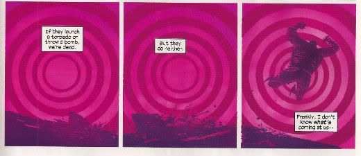
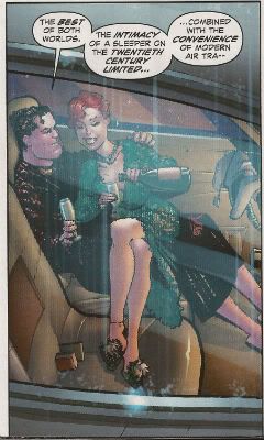
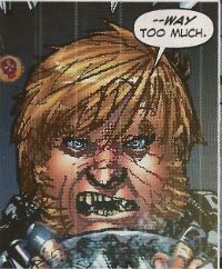
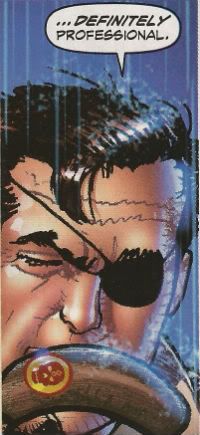
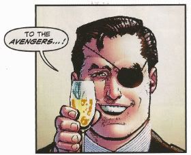
"Now, Tanned, Rested, Ready And Fully Equipped With Brazilians..." Comics! Sometimes They Are Kind of New(ish)!

A couple of posts down from this rubbish there is a quite extraordinary thing occurring. People are discussing Digital comics and no one has been killed! It's a Christmas miracle, by Jove! Photobucket
Why not go have a looksee, this rot isn't going anywhere. I read these comics. There was no force on earth strong enough to stop me.

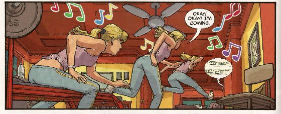
BATWOMAN #3 By J.H. Williams III(a), J.H. Williams III/W. Haden Blackman(w),Dave Stewart(c) and Todd Klein(l) (DC Comics, $2.99)

It’s perfectly fine story wise but I can’t lie I probably wouldn't be reading it were it not for J H Williams III’s stellar performance on every page. I guess having art like this on something so meat and taters might seem a little like a bit of a waste, like having Einstein fix your toaster, but there’s two things I bear in mind when I read BATWOMAN: Thing the first is that J H Williams III is co-writing it so it’s not as if he’s been hoodwinked into this and so if he’s happy doing this and it looks this good I’m not going to carp and pule. It’s preferable to him wasting himself illustrating some other guy’s awesome movie-pitch-cum-graphic-novel about an ex-alcoholic shark that goes back in time to try and kill Pia Zadora’s chiropodist. In space. Thing the second is that there’s just something great about seeing someone talented do that talented thing even if you aren't that enamoured of the arena in which they express themselves. Boxing? No. Muhammad Ali? Oh, yes.

Photobucket

Also it’s totally neaty keen-o that the sapphism of the lead just results in exactly the same scenes between partners we used to get when everyone, everywhere was straight.  It’s an important lesson more people should heed: what you choose to do with your genitals doesn't make you any more interesting as a human being. Really, trust me on this. Particularly if you are considering telling me about what you like to do with your genitals. You would be amazed how many people think telling me about what they get up to with their genitals is an acceptable substitute for a personality. Even though it hardly keeps me awake at night with its narrative twists and turns Batwoman certainly amuses my eyes to the extent that I would call it VERY GOOD!

WONDER WOMAN #3 By Cliff Chiang(a), Brian Azzarello(w), Matthew Wilson(c) and Jared K. Fletcher(l) (DC Comics, $2.99)

Photobucket

Well, I guess we can all agree that among all Wonder Woman’s many powers the greatest of these must be her Divine Unflappability. I know if my Mother was standing there in public talking about her needs and how Zeus answered them by breaking upon her shores in  a great salty foam of satisfaction I’d be blushing like my cheeks were slapped and making a high keening noise like a fox with its paw in a trap. Not Wondy, she just goes and belts some husky lass and burns some corpses. I am greatly enjoying Azzarello’s writing here as it’s brisk, eventful and he’s reigning in his word games to good effect. Cliff Chiang is dreamy as well. Truth to tell he makes it such a smooth read I probably don’t actually appreciate the level of skill he’s applying. Also, while I did make mock of Hera’s randy reminiscence it was more in light of the effect on Wondy than the actual scene which is handled with taste and subtlety, which I guess goes to show that mature matters can be depicted without making your brain burn with shame for the people involved, y’know, if approached maturely. Who knew a Wonder Woman comic could be VERY GOOD!?

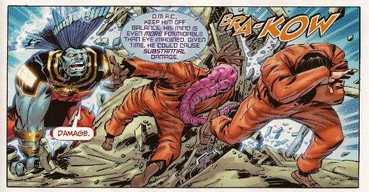
O.M.A.C #3 By Keith Giffen & Dan Didio (a/w), Scott Koblish(i), Hi-Fi(c) and Travis Lanham(l) (DC Comics, $2.99)

Photobucket

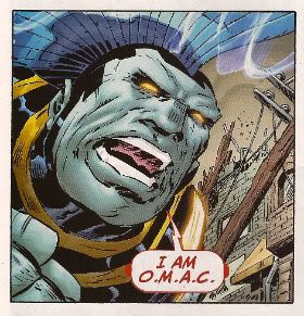
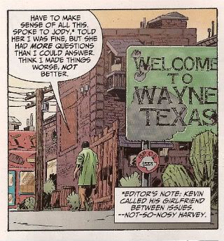
Okay, it’s true that Kevin Cho’s only personality trait is “befuddled”, his girlfriend is as accurate a portrait of 21st Century womanhood as Dame Barbara Cartland (she spent “all morning cooking” in 2011? Really? I rather think not and I’m hardly Franky Feminist), there’s a hell of a lot more momentum than meaning and it feels almost indecent to be complementing Dan Didio on anything except turning a panicked line-wide shell game into a massive (length of term to be decided) success. But having said all that…having said all that…you get to see Keith Giffen enjoying himself in the only legal and publicly permissible manner he still has available, the microwave intensity of Hi-Fi’s colours still burns with the flare of The Future (so much so that I suspect that in 2024 there will be a sudden outbreak of people collapsing with great tumours blossoming from their eyesockets like fatal clouds. Every one of whom will be found to have read OMAC.), Max Lord not only has that Kirby Dapper Dan parting but he also smokes, there’s a character called Little Knipper and there is a man with Mind Powers who appears to have a salmon fillet draped over his head. Bearing all that in mind I think you have little option than to agree that it is game, set and match to OMAC, which by the way is still VERY GOOD!

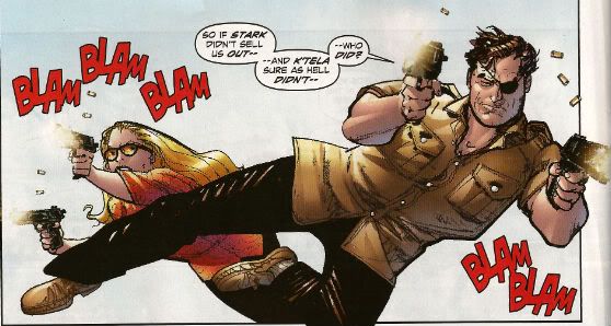
AVENGERS 1959 #3 By Mister Howard Victor Chaykin (w/a), Jesus Arbutov(c) and Jared K. Fletcher(l) (Marvel Comics, $2.99)

Photobucket

Howard Victor Chaykin must have been told the sales figures for this series when he was halfway through the issue because he suddenly just seems to say "Aw, nertz to youse bums! Allayez!" and starts writing the story he obviously wanted to write in the first place. Since this story is basically Nick Fury in a Dr. No-era Bond Flick with a sly sideways dig at Howard Victor Chaykin's own CHALLENGERS OF THE UNKNOWN SERIES and is peppered with salty humour and ridiculously entertaining action I know I'm okay with that. Yet another issue of intriguing skullduggery set in a convincing simulacra of the '50s and containing all the man-tastic magic of the Master Of The Mai Tai his own bad self, Mister Howard Victor Chaykin. Who else could quote both Papa Hemingway and Dezi Arnaz, from I love Lucy, on the same page? Exactly! No, no one is buying it but that doesn't stop it being VERY GOOD!


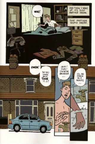
MUDMAN #1 By Paul Grist(w/a) and Bill Crabtree(c) (Image Comics, $3.50)

Now this? This is some fine comics. Mister Paul Grist bringing it big style. He’s got a thing he does and he’s doing that thing here which is good because it’s a good thing Mister Paul Grist does. Alex Toth once wrote a blurb commending Paul Grist’s work. Alex Toth. Grist’s clearly influenced by Toth at the very least to the extent that his pages are very design orientated and the contents of said pages contain the minimal amount of ink in order to achieve the maximal amount of information. Grist mixes in a good dose of Kirby chunkiness into his Toth which makes the result a lot lighter and boppier than the sometimes airless Toth and of course the Toth grounds it more in reality than Kirby’s work could manage. That could all be horseshit as I have no idea what I’m on about but I am pretty sure Grist is like Toth in at least one respect: all the thinking’s been done before he puts the first line on the page. And every page here is a joy either as a pure comic experience or as an example of pure comic craft.

Photobucket

Mudman is a new series so anyone intimidated by the continuity of JACK STAFF (which included nods to continuity in old English comics even I’ve barely any acquaintance with. Lion? Victor? You could totally enjoy JACK STAFF without getting any of it BTW, it’s right gradley, tha knows. This interruption is too long to go in brackets but I’m sure no one will notice) should put their fears to one side. It’s a totally new start given the impression of some kind of back-story weight thanks to Grist’s penchant for temporal narrative zig zagging. It’s fun, funny and the execution is funnybooks in excelsis. If you aren’t reading MUDMAN you must be mad, man! (in my imagination we all clubbed together and promised Brian Hibbs that we’d get him a SavCrit cover blurb for Christmas. That’s my attempt. Cheers!) So, yeah, MUDMAN#1 is VERY GOOD!

SCALPED #54 By R.M. Guera(a), Jason Aaron(w), Giulia Brusco(c) and Sal Cipriano(l) (Vertigo/DC Comics, $2.99)

Photobucket

Although this series barely manages to avoid crumpling under the sheer weight of its genre clichés and the author’s ‘70s movie memories it remains a decently entertaining read. Some of this is due to the author who manages to pull the rug out from under you often enough that you’re never entirely complacent. Most of it is the storytelling which, yes, I guess Jason Aaron has a hand in but let’s face facts R.M. Guera’s got his whole arm in it up to his elbow. R. M. Guera is astonishing. I won’t go on about it but let’s just say that, for example, R. M. Guera knows that there’s a difference between visually basing one of your characters on Warren Oates and straight up tracing pictures of Warren Oates. The former is an act of skill and the latter lazy pish. R. M. Guera doesn't do lazy pish. When SCALPED ends with issue 60 I look forward to seeing genre comics take full advantage of Guera’s inventive and invigorating skills by assigning him to a Wolverine comic. SCALPED is VERY GOOD! but R.M. Guera is EXCELLENT! And I don’t tell him that enough so I did it here in front of y’all because I am not ashamed of my love. My love is beautiful!

THE GOON #36 By Eric Powell(w/a) and Dave Stewart(c) (Dark Horse, $3.50)

Photobucket

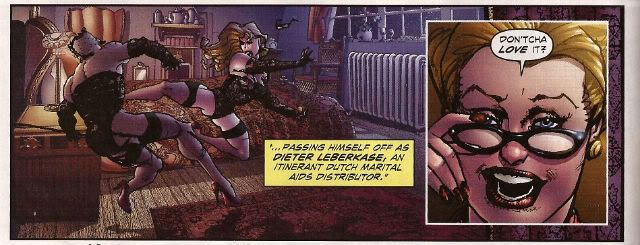
Hey, I laughed a couple of times, longest and hardest at the vagina joke. Oh, yes that’s the level we’re operating on with this one. And that’s okay. Like I said I laughed a couple of times at the story inside but I laughed most at the interview with Roxi DLite where the bounteous burlesque babe is at great pains to stress that burlesque isn't “just stripping in vintage lingerie”. It certainly isn’t! And those men in the front row with their hands kneading their groins like they’re digging for gold are “applauding”. Hey, whatever you want to tell yourself, people. Whatever it takes. A word of advice to the erotically adventurous: before you go to town on the centrespread of Roxi Dlite – take out the staples first. Casualty Departments are busy enough as it is, guys.

THE INFINITE VACATION #3 By Christian Ward(a/w) and Nick Spencer(w) with design stuff by Kendall Bruns and Tim Daniels (Image, $3.50)

Photobucket

I’m not Sally Scientist but reading the exposition in this I can’t help thinking that somewhere along the way someone confused science with semantics. Still, even on that basis it’s still quite fun, I mean I’m all for messing about with words, so, okay. I’m less keen on the sudden immersion in full on sordid torture of the sensationalistic stripe. I mean, really INFINITE VACATION #3, you spend all that time and skill using words, pictures and even design in a pretty entertaining use of the comics form and then just expect me to be slack jawed with awe because you've seen Hostel. Nope, you could have been something, INFINITE VACATION #3 but you let us all down with your antics, and you let down no one more than yourself. Go to your room and think about how you are just OKAY!

THE MIGHTY THOR #5 By Olivier Coipel/Khoi Pham(a), Matt Fraction(w), Laura Martin(c) and Joe Sabino(l) (Marvel Comics, $3.99)

Photobucket

This comic contains a preview of NEW AVENGERS. This is important because you may wonder why this comic which is usually EH! Is now AWFUL! despite it being exactly the same level of vacuous failure as every previous issue. It’s that NEW AVENGERS effect in full effect! I could go through this comic and tell you why it is so dispiriting an experience but no one cares least of all, for all their tiresome whining, the victimised creators so just take my word for it and save yourself $3.99 because MIGHTY THOR#5 is AWFUL!

Despite being broken and bad MIGHTY THOR did remind me of something on TV. Do you have those Adopt-A-Sad-Donkey commercials over there? Because MIGHTY THOR and NEW AVENGERS seem to be indicating that Comics are headed in that direction. So about March or so next year you can expect your episode of Chowder  to be interrupted by footage of some guy in a fluffy jumper strolling soulfully around a Mall while John Hurt’s smoky tones cough up the following:

Photobucket

“This is “Dave”. “Dave” wants nice things but tragically the world won’t just throw them at him. Times are hard for everyone and “Dave” has to earn a living. “Dave used to be able to write. You may fondly remember some of the things he wrote. “Dave” is quite happy to trade on this nostalgic fondness if you’ll just send him some money. Sadly “Dave” is old now, in his thirties, and his best days are behind him. If enough of you pledge just $3.99 a month “Dave” will receive the sales figures he so desperately needs in order to feel validated, sales figures that will result in a contract enabling him to eat brand name burgers and fart around flea markets with other needy creators looking for Female Prison films on Betamax while taking pictures of each other on Hi-tech gadgets. For just $3.99 a month “Dave” will send you a Tweet at least once a week. When he has a new comic out “Dave” will Tweet you hourly. When “Dave’s” comic gets optioned it may even require the intervention of a Law Enforcement Agency in order to stop “Dave” Tweeting you. If you pledge $5.99 a month “Dave” will reveal unfortunate intimate facts about himself and which Sham 69 b-side he was listening to when he wrote his grocery list. The comic? Oh, you don’t need to read the comic. The comic will be awful. This isn't the ‘70s, granddad, the actual comic isn't important. What is important is that “Dave” mentions all your favourite TV Shows in interviews and explains things really s-l-ow-l-y to you in the form of references to children's fantasy films from the '70s and so he must Love you and, if you send him $3.99 a month, “Dave” will ensure it will be like having the Best Friend in the World and all his successes will be your successes and all his money will be your money. So this Christmas give “Dave” the gift he needs most – money. And also unquestioning loyalty.”

And like the concept of “modesty” – I’m GONE!

Have a dandy weekend, all!
 

"...I'm Taking The Case." Comics! Sometimes They Aren't Older Than Your Grandad!

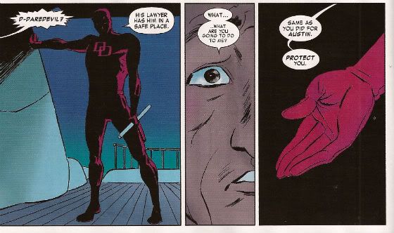
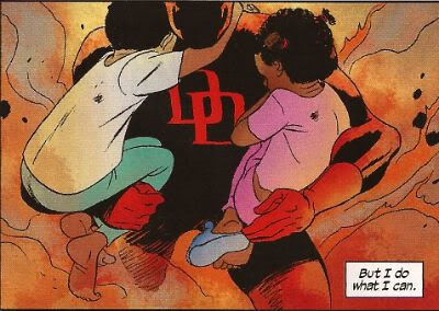
Here's an image from DAREDEVIL #4; a comic that isn't talked about within. But I just really, really wanted it up there so I indulged myself. I do go on about #5 of DAREDEVIL though. Is that alright? Are you sure? Because it matters to me! Photobucket

Well, I can't promise to help but I did write some words about some comics that were actually published this Century. Yay me!

Oh yeah, one of the images may be NSFW, depends where you work, I guess?

DAREDEVIL #5 By Mighty Marcos Martin(a), Marvellous Mark Waid (w), Jaunty Javier Rodriguez(c) and Venerable VC's Joe Caramagna(l) (Marvel Comics, $2.99 (YES! TWO DOLLARS AND NINETY NINE CENTS NOT THREE DOLLARS AND NINETY NINE CENTS!)

Photobucket

"...but it's bee-yoo-ti-ful!"

If I said that this was probably the best book Marvel are belching out that probably wouldn't mean much since I don’t subject myself to much of their gassy blather. But the fact that everyone else who has ever picked the book up has said roughly the same might be an indication that it’s worth a look if you aren't already looking. Because it’s sure as sure can be that it’s worth looking at. Sockamagee, the art, oh the art, art as this there should be in comics all the time! Every page has something delightful on it and those are the lesser pages. It’s just excellent stuff that revels in all the possibilities that words and pictures reveal when used in concert. Rivera plainly loves comics and consequently his art rolls around in the medium like a dog in a cow pat. But there’s no shortage of people piling on the praise for the pictures so I thought I might at least extol the work of Mark Waid on writing. Because this is good stuff and, I feel, it gets overshadowed by the glories of the art.

Photobucket

"A hero acting heroically? Get outta town!"

It’s just super-solid all round and there’s a real danger of underrating that. Strong enough stuff to just shrug off that lame drivel about DD’s identity and turn it into a running gag. Better yet, for me at least, Mark Waid remembers the inherent awesome of fights’n’tights comics. There’s a bit in #5 where Waid solves the conundrum of how Daredevil would know he was being targeted by snipers so smartly, so gracefully, so obviously that I did, I admit, smile in admiration. By the time Waid topped it with the light switch gag I was full out snorting like a frisky pig. Corporate North American Mainstream Superhero comics don’t get any better than Daredevil by Mark Waid, Paolo Rivera and Marcos Martin because it is EXCELLENT!


CAPTAIN AMERICA AND BUCKY #620 By Cracking Chris Samnee (a), Everpresent Ed Brubaker and Middling Mark Andreyko(w), Bouncing Bettie Breitweiser (c), Victorious VC's Joe Caramagna(l) (Marvel Comics, $2.99)

Y’know I bet sometimes Bucky feels like a motherless child. Oh. He is. And Dad pegs it as well. Then his sister gets taken into care and he gets brutalised by the military until he is a killing machine That’s quite a lot of misfortune for one kid, personally I’m just glad he didn't have a dog. By which I mean I’m glad for the dog. Now I’m going to spoil the rest of this series for you because I reckon I can see where it’s going based on how things have gone so far.

Photobucket

"The laughs never start."

Crucially we never actually see Ma Bucky and Pa Bucky die and Little Sister Bucky’s fate is uncertain. This is comics, better yet this is Marvel Comics, so the clock is ticking until they return from “the dead”! Not only that but they too will have been turned into killing machines with bionic bits and bobs. Will the Winter Soldier survive against the most dangerous enemy of all – his own family?!? Yes. But they will all be reset to being nice (i.e. American not Russian, obviously) and together they will go “off the grid” and cross America finding warehouses in which they can talk in front of bits of machinery before narrating sad thoughts over some Steranko influenced action. Hey, Captain America can turn up every now and again and whine about how much paperwork he has to do while looking out of a window with his back to everyone. Even better each one will have their own series: Winter Soldier, Spring Soldier, Summer Soldier and Fall Soldier as well as the “core” book: The Four Deadly Seasons! Call me, Marvel! I can LOSE you money too! Oh, this comic has got technique but no life and is a total waste of Chris Samnee's excellence because it is EH!
(This book was pre-ordered before my delusional and smug decision not to give Marvel money for books featuring Jack Kirby characters until such time as they just acted decently towards The King's memory. This also applies to THE MIGHTY THOR. The point was not to spend less at my LCS and thus drive the elfin owner into the nightmarish world of working for someone else but to fulfill my obligations viz a viz pre-ordered comics and then spend the same amount on different stuff. No, I don't know why I'm explaining this to you. And now back to our regular programme...)

OMAC #2 By Kracking Keith Giffen and Dandy Dan Didio (w&a), Saucy Scott Koblish (a), Hunky Hi-Fi (c) and Tasty Travis Lanham (l) (DC Comics, $2.99)

I enjoyed the first issue of OMAC a great deal. In fact I enjoyed it so much that had I my druthers each successive issue would consist of OMAC appearing in the Cadmus complex and then running through it smashing stuff up until he got to the end and then disappearing. Yes, every issue would open with him reappearing and then running through the Cadmus complex smashing stuff up until he got to the end before disappearing. Every issue. Same page layouts, same panels, same characters in the panels. But! With every issue and every re-appearance the scenery would be more battered and the people more bruised. Over the course of the series the dialogue would degenerate from shocked exclamations to weary acceptance and right down to futile grunts. This would continue for about, say, 12 issues until OMAC was just running through an ever deepening trench littered with bones and metal. (Hey DC, Call me! I can lose YOU money!)

Photobucket "Really? You look more like a "Larry" to me."

With issue 2 they don’t do that so what do they do? Well, it isn't Kirby let’s get that right “out there”!!! By the time Kirby birthed OMAC he had evolved beyond the merely mortal, having ascended to a plane whereby he could produce comics suffused with complexity and subtext that the man himself would have had trouble articulating. Reportedly not the most articulate of men Kirby was at his most articulate when he communicated via the medium of pencil and paper. With OMAC he was telling us of The Future. And the news from The Future wasn't good. The news from The Future is never good because in The Future you will be dead. Sorry about that. Worse than that Kirby’s OMAC told us that in The Future people would still be sh*theads and technology would simply give them exciting new ways to be such. But as long as there was someone willing to stand up and punch stuff until it stopped moving we’d be okay. The new OMAC isn't about The Future it’s about Now. Since stuff that’s about The Future is about Now anyway I guess that makes the new OMAC about The Past. And that’s clearest in the storytelling.

Photobucket

"Kids! How many storytelling techniques can you spot in this one panel!"

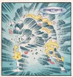
What we have here is pretty much any Hulk comic from the Bronze Age. By which I really mean how you remember any Hulk comic from the Bronze Age being. There’s a big old slobberknocker of a fight in which outlandish property damage is inflicted and much expositionary dialogue is spouted. Now, you may say there’s no place for such old-timey stuff in the brave new world of comics and I’d kind of see your point but I cannot deny the simple pleasure that this issue delivered. I don’t want to sound like some luddite berk living in the desert with locusts stuck in his beard but the fact remains that this style works. It delivers. And it isn't all Old School; the technicolour japescape of a colour job by Hi Fi looks like it was sourced from the still wet skins of alien jellyfish. It’s pretty good stuff, amiable entertainment that leaves you feeling entertained and amiable. I think the whole “I” for an “Eye” thing is bit too cute but I really liked “Omactivate!” so, you know, each to their own. There is some odd English in it too. Which is a bit rich coming from me but then I don’t have an Editor do I? But then, in a very real sense, does anyone in comics these days. Minor hiccups then and maybe not even that just a touch of reflux maybe? OMAC #2 is VERY GOOD! in any case.


PUNISHERMAX#18 By Swanky Steve Dillon(a), Jumpy Jason Aaron(w)and Matt Hollingsworth(c) (Marvel Comics, $3.99)

What a frustrating book this is. There have been some great moments as Frank’s monstrous nature is revealed in all its dark blankness but there’s some serious flaws. Just having Frank pop in or out of places like a magic fairy of death is jarring. It seems he can just waltz into the correctional facility hospital and pop his nut in Bullseye’s face. (Or a cap, I’m not strong on youth slang.) It undermines the good stuff when there’s such little attention paid to the plot. “And then I escaped…” isn't really a satisfactory way to end a prison arc, y’know. It’s all a bit odd because Aaron’s had plenty of room to tell his story (oh, look another three panels of someone leaving a room!) but it’s all a bit nebulous aside from the bits where Frank does something psychologically foul. These may be the more interesting parts to read simply because Aaron finds these the most interesting parts to write, all the other stuff gets a bit out of focus and vague. Unmemorable people in unmemorable rooms filling pages until Frank does something unforgivable isn't really convincing me that’s there’s much going on here. I mean there’s The Kingpin but he seems to be currently re-enacting some scenario from the letters pages of a psychopathic Razzle simply because he’s a bit bored. Oh, I know it’s the old thing about selling your soul to get what you want but then finding out it’s not; but it just looks like the Kingpin hasn't the wit to think of anything to do but drug and shag in his free time. Try cracking a book, man.

Photobucket

"Dammit, Kingpin baby, I (nnnhh!) almost (unnnh!) got there that time but you keep (uhhhh!) throwing me off (uhhh!) by callin me "Alan"!)

I don’t think matters are helped by Steve Dillon. Look, I like Steve Dillon, he’s a good artist but his action is too static, his backgrounds too vacant and his faces too caricatured to convince when applied to a serious story. Well, as serious a story as a story with The Punisher in can be. We’re not talking Ingmar Bergman here, folks, probably more Larry Cohen at best. At its worst it just seems like crude fan fiction involving the supporting cast of Frank Miller’s Daredevil run. I’m sure seeing Kingpin’s tubby bum as he slaps it to Elektra made someone’s day but it wasn't me and it wasn't today. At its best though it does seem to be saying something about fathers and men and stuff (oh, don’t worry, it’s nothing good. It’s never anything good.). Like I say it’s frustrating because if there was a bit more substance and a lot less sensationalism this would be better than OKAY!


SWAMP THING #2 By Yomping Yanick Paquette (a), Salty Scott Snyder(w), Naughty Nathan Fairburn(c) and Jesty John J. Hill(l) (DC Comics, $2.99)

Scott Snyder isn't the first person to tell us everything we know about Swamp Thing is wrong, but I doubt if anyone has ever done it as hamfistedley as this. The Parliament of Trees straight up send some mossy messenger to Alec Holland and he just plain tells Alec that everything he knows about Swamp Thing is wrong! Considering that the swampsters no longer talk in slow motion this takes him an incredibly long time. He uses a lot of words. So many words that he basically just wears Alec Holland down into believing him rather than actually says anything convincing. Holland clearly decides to believe Swamp Thing because life’s too short to listen any longer. Oh, and there’s also the biggest threat ever, ever, ever that has been around for ever, ever, ever but no one’s ever mentioned it before because. Just because. The woody courier then drops dead which is the price of his mission. I’m thinking the Parliament of trees want to maybe look into more effective means of communication. Then mad badness involving backwards headed people wakes the reader up, gainfully employs Paquette and dares to entertain for the latter part of the issue. This is slightly undercut when Abby turns up - but now she’s a bad-ass girl on a motorcycle! I hope the series isn't just going to end up with characters turning up but different! It’s Anton Arcane! But he’s a shoe salesman from Hoboken with a penchant for playing Toploader songs on the paper comb! It’s Chester but he has big ears! Nice art and some effective last-act nastiness but, really, the second issue seems a bit soon to fall into EH!


MIGHTY THOR#4 By Oval Olivier Coipel/Messianic Mark Morales(a), Melancholoy Matt Fraction(a), Lively Laura Martin(c) and Vitamin-enriched VC's Joe Sabino(l) (Marvel Comics, $3.99)

Ah, oh, it’s the usual bad cover version of a Thor comic. A hint of tit, a couple of “bastards” and some blood (when apparently some wolves get into Odin’s freezer. It isn't very clear what’s going on really.) seek to convince that this is  in some way more mature than those old Thor comics children (Haw! Children!) liked. Basically Thor hits The Silver Surfer in space. There’s some other stuff but it all seems mechanical and unconnected. Yes, predictably enough it’s another addition to the dismaying number of comics that probably sounded aces in interviews but, in reality, are staggeringly inadequate reading experiences. This seems to be working out okay for everyone though. (After all it’s only healthy to ignore reality and just stay positive about everything all the time.) I guess in the future there won’t actually be any comics, just interviews.

Photobucket

Interviews describing the most awesome comics ever; comics so awesome that to make them a reality would be just plain vulgar. There’ll be some personal stuff in there as well so that you feel connected to the interviewee with the uncomfortably shrill emotional content distracting from the cynical calculation underlying it all. After all what’s your USP? You, baby! You beautiful snowflake, you! They’ll have to be careful though, these writers of the future, it’s a fine line between being compared to Dave Eggers and being compared to Dave Pelzer. I don’t mind as they are the writers and being writers they are The Shining Ones and those that dare to raise a voice in criticism (burn them!) are nothing but Haters fuelled by resentment and jealousy. And it’s true. Christ, sometimes I wake up with my face wet with tears because I didn’t end up writing Thor comics. I wasn't hungry enough.  I failed the world. I am the filth of the earth. And all that’s fine, I mean it isn't like this pallid thing cost $3.99 is it? It did? Oh, those writers can get stuffed then. I’m sure everyone involved in this was a truly special human being but that doesn't stop it being EH!


AVENGERS 1959 #2 By Hirsute Howard Chaykin (w/a), Jolly Jesus Arbutov(c) and Jingoistic Jared K. Fletcher(l) (Marvel Comics, $2.99)

(Yes, I am aware Nick Fury was created by Jack Kirby but Howard Victor Chaykin needs his Mai Tai mix and who am I to deny him?)

Kind of typed myself into a corner haven’t I? In trying to course correct the critical conversation concerning Howard Victor Chaykin I may have erred a little on the enthusiastic side. (“Ya think, you limey asshat, huh, ya think?”) Now I imagine no one will believe me when I say that this second issue is even better than the first issue and the first issue was nice stuff to start with. Any rational human being would be forgiven for dismissing me as the kind of guy who had Howard Victor Chaykin pooped in a brown paper bag I’d pay for the privilege of a peek. I wouldn't though and I think that kind of nasty talk tells us more than enough about where your mind goes when no-one’s watching. For most of the issue the art is really, really sweet. The colouring is greatly improved and makes everything more visually coherent and there are some strong holding lines going on which I like. I was particularly enamoured of The Blonde Phantom’s hair.

Photobucket

"Oh, Howard Victor Chaykin! Don't you ever change!"

The last few pages get a bit choppy but by this point the events are getting pleasingly goofy so it’s not a dealbreaker. Baron Blood and Brain Drain? From Rascally Roy and Frisky Frank Robbins’ sweat drenched INVADERS run? By Howard Victor Chaykin? Man, that’s some daft stuff I’m liking. And on the last page when Howard Victor Chaykin basically introduces John Steed into the Marvel Universe I’m kind of starting to warm to the idea of looking in that bag. I guess you could say it’s Howard Victor Chaykin by numbers but I've run the numbers and Howard Victor Chaykin’s numbers look pretty good. AVENGERS 1959 #2 is witty, smart, saucy, fast-moving entertainment and it’s my fault but your loss that you won’t believe me when I say it’s VERY GOOD!

Remember, Kids, if you only buy one of these - buy DAREDEVIL because it is pure COMICS!!!

EXTRA BONUS DAREDEVIL PICTURE FROM ISSUE 4:

Photobucket

Criminy, just buy it already! Now go have a nice weekend!

"Oh, Come ON." Comics! Sometimes They Are Set in 1959!

Yeah, sorry about this. What can I say?  I will take your patience and shatter it like the dry bones of your childhood dreams! Photobucket

Next Time: A Howard Victor Chaykin free zone. Promise! My Other Half said, "There's no pony like a one-trick pony." That certainly set my mind at ease. Ah, well...

AVENGERS 1959 #1 By Howard Victor Chaykin (w/a), Jesus Arbutov (c) and Jared K. Fletcher (l) (Marvel Comics, $2.99)

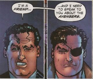
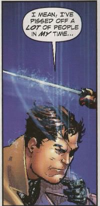
Spinning off and out of that NEW AVENGERS arc where in the present the Avengers took 6 issues to ring an ambulance while in the past Howard Victor Chaykin earned that month’s alimony payments comes this 5 issue series! Nick Fury and his rag tag ensemble of D-Listers (Bloodstone, Kraven, Namora, Sabre Tooth, Silver Sable and Dominic Fortune) celebrate the successful end of their mission with a swanky meal before disbanding. Immediately a new threat targets our heroic band, well, those members Howard Victor Chaykin is interested in writing about (Silver Sable and Bloodstone are dispatched from the narrative as soon as possible) and The Blonde Phantom is introduced in order to fulfil Howard Victor Chaykin’s stringent lingerie quota.

Consequently the issue has a rock solid structure consisting of an introduction of the team and then a succession of scenes in which each member evades an attempt upon their life by the mysterious new foe. A mysterious new foe that could well be an embryonic Hydra. It’s efficiently delivered tongue-in-cheek stuff that entertains and retains momentum despite the fundamentally episodic composition. Howard Victor Chaykin isn't breaking any new ground here but what he is doing is bringing his considerable talents to bear with the aim of providing a nice slice of pulp pie. And in that he succeeds.

Photobucket

"Ooooh! Meta!"

AVENGERS 1959 #1 is probably a pretty good point to examine The State of The Chaykin in the year of 2011. The current mode of Chaykin criticism is to bemoan the downward trajectory of his work while also bleating about how he draws “fat faces”. This latter criticism first appeared with his work illustrating Marc Guggenheim’s 2006 BLADE series. This prompted me to make the hilarious joke that Guggenheim had told Chaykin that Blade was “phat”. Since I am a repellent human being no one else was in the room and the joke fell to the floor and expired for want of appreciation. But I have held it in reserve for 5 years knowing that its time would come. Like a quality butcher I waste not; I use everything but the scream. So Howard Victor Chaykin? Degenerate degenerating or innovator innovating? Let’s warm up the thermometer, get AVENGERS 1959 #1 to drop its strides and see what Doctor John can diagnose.

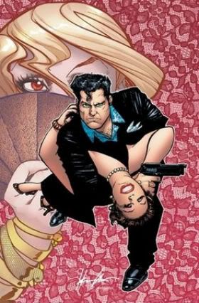
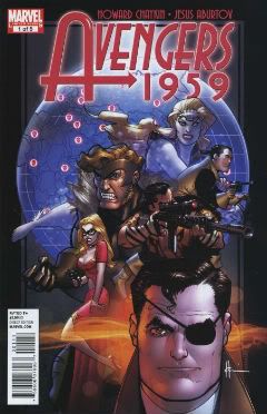
The cover to AVENGERS 1959 #1 is great. Real swell stuff but that’s no big shocker. If there’s one thing Howard Victor Chaykin excels at its, allegedly, lady baiting if there are two then we’d have to admit to page design; cover design in particular. Now as rabid and immune to sense a fan as I am I have never had the financial wherewithal merely to buy a comic because it had a Howard Victor Chaykin cover. Actually on one occasion I did. The 2009 Vertigo series BANG TANGO. Look at this:

Photobucket

Howard Victor Chaykin’s covers were some hip shit, pals o’mine. Alas, the series itself was like wading through hip deep shit. (No offense to all the talented individuals involved.) So I learned my lesson. And the lesson I learned was that Howard Victor Chaykin does covers like a cover artist should. Google image AMERICAN FLAGG! And tell me that those covers aren't like comic cover Heaven. Working in the field of advertising and paperback cover design sure didn't do him no harm. Just ask the Louisiana State University. So yeah, Howard Victor Chaykin knows how to do covers and with AVENGERS 1959 #1 he belts out another winner:

Photobucket

There’s nothing amiss with the storytelling on these pages either. The Howard Victor Chaykin Method is here in full effect. I guess you could call it a formula but then we’d have to argue out the negative connotations before I’d smile at you again. Life’s too short to sweat the small stuff so let’s call it The Howard Victor Chaykin Method and say it can be summarised thusly: long panels for scene setting and context, vertical panels for action within said scene and inset panels for reaction shots and moments of notable action. It varies a bit but that’s pretty much what we have here and it works just fine. It’s not experimental or visionary just solid and effective borne of decades of being experimental and visionary. It’s unobtrusive but it works and that’s pretty much what AVENGERS 1959 #1 demands.

And the stuff in the panels, well, I guess we’ll call that draughtsmanship and that’s pretty…variable. This is kind of where the shakiness starts to set in. Now, as you all remember from previous soliloquies Howard Victor Chaykin doesn't give his draughtsmanship much props. Together with his frequent claim that it’s the design aspects that make his brow feverish rather than the finishing I think we can start to see where the problem may lie. Now, Howard Victor Chaykin’s work is, I understand, the result of his own mighty self and assistant(s). This is super peachy in terms of fulfilling his page quotas as the primary benefit is one of speed. In fact it’s a peachy arrangement all round depending on, well, the assistants. If long before the finished article Howard Victor Chaykin’s sloped off down the bingo to charm a blue rinse then a lot of weight rests on the poor assistant. I don’t know who Howard Victor Chaykin’s assistants currently are but they aren't of the calibre of, say, Don Cameron or Rick Burchett. They aren't terrible and in fact the book does seem to get better as it goes on. There’s a lot less wonkiness by the final page and more precision. Things are looking good on the old assistants front!

Photobucket

"Howard Victor Chaykin: yesterday."

Maybe it isn't the assistants after all maybe it’s the technical methodology involved. When I potter about The Internet sometimes I look at original Howard Victor Chaykin art (and pictures of those wrinkly dogs) and I can say that as recently as the 2009 DOMINIC FORTUNE series the original art looks a whole heap better than the printed version. Come to that his art as whole seemed a far tighter and attractive affair right up until the bulk of his output started flooding out of Marvel. His work on CITY OF TOMORROW, CHALLENGERS OF THE UNKNOWN and, yes, even the much vilified HAWKGIRL had a level of precision and sureness that seems lacking in much of his Marvel stuff.

Judging from my on-line scourings Howard Victor Chaykin has also taken to drawing figures in isolation and then placing them on backgrounds via 21st Century technology. He’s not alone in this but to me, being old, it brings to mind those Letrasets from by gone days. You’d get a background sheet and a sheet of characters and objects. The latter would be applied to the former by firm application of pencil rubbing. I liked the KOJAK one best. Who knew the future of comic book art would take its direction from things given away in ‘7os packets of cereal! It’s a perfectly fine method but the results do tend to suggest that maybe all these artists should watch that scene where Father Ted explains to Father Dougal the difference between “far away” and “small”. Maybe it’s the increased output, maybe it’s the assistants or maybe, maybe it’s the colouring.

Now I tend not to notice the colouring on comics too much but, by Tatjana Wood’s eyes!, I notice the colouring in recent Howard Victor Chaykin’s comics. Regrettably this is largely not because of its excellence. There were times when reading RAWHIDE KID: SENSATIONAL SEVEN when I didn't even know what I was looking at. It was like being a character at the end of a H.P. Lovecraft story. My mind could simply not process that which it perceived.  Now it’s a Howard Victor Chaykin Fact that he’s colour blind but that’s no reason to take advantage! There seems to have been a real effort in the Marvel stuff, particularly on the part of Edgar Delgado, to colour Howard Victor Chaykin’s work in the manner of animation cels. That’s okay, that’s an approach but it’s an approach that only works, I think, when the art is built to accommodate that. I don’t think Howard Victor Chaykin’s art is built that way. Thankfully for my ocular orbs Jesus Arbutov, the colourist here, seems to agree and I’d have to say the colouring in AVENGERS 1959 #1 is, yeah, its okay. It’s obviously done with computers and science so it has that weird unnatural vibrancy that makes each page look like it’s been lacquered like lacquers’ going out of fashion. Crucially though it doesn't make me re-enact Rod Steiger’s stand out scene of restrained (cough!) horror in THE AMITYVILLE HORROR (1979). Small mercies, eh.

Photobucket

"Testify!"

Of course Howard Victor Chaykin wrote as well as drew AVENGERS 1959 #1 and it's pretty much boiler plate Howard Victor Chaykin writing. The patter has fizz and spark, the exposition is delivered economically and painlessly and the whole thing has a patina of self deprecating humour that makes it a jolly appealing read. When the comics scene was blessed by the return of Howard Victor Chaykin following his adventures in the financially lucrative field of Television it turned out he'd added writing tool to his arsenal; the omniscient narrator. I like this innovation in his work as it lends extra value to each enterprise and also because I like words. Ideally I like to "hear" the narration in my head as the voice of a 61 year old mensch whose tonsils have been gargling musk. The kind of guy who declares loudly "I'm a sexagenarian, but, hey, who was in doubt? Am I right ladies!" before firing his finger like a pistol at every female in the room. I also like this narrative technique because it displays a confidence in language and provides evidence of research that is sorely lacking in other writer's work. It also allows for neat touches like the realisation that the opening narration isn't about the characters we see on the page but rather about the situation that is developing independently of them as they sit toasting and bantering; a situation that will soon enfold each of them and so propel the plot. Words are useful tools for writers, even in a primarily visual medium, and it's laudable that Howard Victor Chaykin remains not only aware of this fact but fully able to press it to his advantage.

Photobucket

"That's the word!"

So, wait what was the question again? Degenerate degenerating or innovator innovating? On the whole, taking everything into account, with all the facts in hand, after due consideration I'd have to say; degenerate innovating! (Legal note: Howard Victor Chaykin is not a degenerate. It's a joke.)  It's not as smooth as previous Howard Victor Chaykin stuff, no. But the bumps seem to tend from attempts to embrace new methods and technologies and the fact that these experiments rest upon a solid foundation of tried and true achievements means that AVENGERS 1959 #1 is an example of a comics master embracing modern technology with variable results. On the whole the results are VERY GOOD!

Photobucket

"Well, Avengers 1959, yes. Now, that other AVENGERS stuff..."