"NNGGGGAAAANNGAAAABBUUUBBBUUUZZZZZZZ..." COMICS! Sometimes They Are Good, Sometimes Not So Much!
/I hope all our American friends had a smashing Thanksgiving! Managed to sneak another holiday in there before Christmas again, I see. Couldn't wait a few weeks for some Turkey. America, we are going to have to work on your delayed gratification! Maybe in the New Year, eh? Along with that membership to the gym. No, I have no idea what I'm on about. Here are some words about comics I managed to dash off before being swallowed by the pre-Christmas maelstrom. Sorry about the lack of images but, y'know, time and all that hot jazz. Anyway, this...
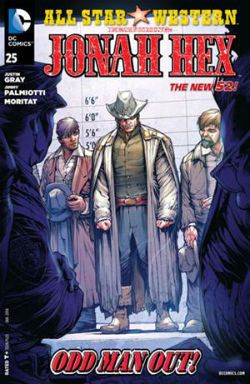
All Star Western #25 Artist Moritat Writers Jimmy Palmiotti & Justin Gray Colour Mike Atiyeh Letters Rob Leigh Cover by Howard Porter Jonah Hex created by Tony DeZuniga and John Albano DC Comic, $3.99 (2013)
I’m not saying the driving conceit of this series is low hanging fruit but its rind is a gnat’s fart from brushing the tips of the grass. It’s Jonah Hex in the DC Now! While it was a fair joke to have Jonah show up and be more inclusive of difference than the modern populace stewing around him it wasn’t a joke that had much legs. A better joke would have been having Jonah show up and be distastefully offensive to everyone. (But that would require having some nuts left in your sack). Every month Jonah could have wandered around displaying levels of racism, homophobia and misogyny toxic to normal people. Hell, he could even have worked in comics. (Oh, too soon?) Anyway, now it’s just Jonah mamboing about and bumping into DC Universe characters. Like a Bob Haney comic but with none of the energy, inventiveness or flair. So, not much like a Bob Haney comic then. More of a Gerry Conway comic. It isn’t well written; something happens; something else happens; then it ends. Despite the fact Jonah is in the 21st Century, meets John Constantine, fights (well that’s gilding the lily, they move about a bit in an aggressive fashion) a demon and then Swamp Thing shows up it is all curiously unengaging. If it were any more pedestrianly written it would come with a free pair of shoes. Which means, as is more often than commonly acknowledged, the art has to carry most of the load. Luckily, Moritat has many strengths, mostly in figure work, architecture, faces and textures. Not so much panel to panel flow or action. There was a bit an issue or two ago where some guy in a car looked to be spoiling a fun run but in fact he was killing people by the shed load. The impact was somewhat diluted. And the same is true here with Moritat tasked with a battle in the desert which, well, he muffs. Even so Moritat just about carries this comic, but it isn’t really a Jonah Hex comic anymore than Hex was a Jonah Hex comic. All Star Western is EH!
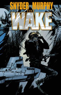
THE WAKE #5 (of 10) Artist Sean Murphy Writer Scott Snyder Colour Matt Hollingsworth Letters Jared K. Fletcher The Wake created by Scott Snyder & Sean Murphy DC Comics, $3.99 (2013)
Fair warning: turn away now because I don't think this comic is very good. The urgency of any notionally exciting action is continually being spuffed away by the creaky and derivative narrative joltingly halting while someone delivers a big old furball of exposition. Said text dump consisting of a lightly tweaked wikipedia entry in a laughably unconvincing attempt to lend the ridiculous events occurring some kind of gravitas. In old legends floods are mentioned sometimes so, uh, yeah. And the people hawking this stuff up are just, well, it’s a good job they are all so memorably portrayed by Sean Murphy because otherwise they might as well just have stickers on their heads (Spunky Lady, Sciency Man, Troubled Mom). Murphy gives them all engaging visual presences (it doesn’t hurt that one of them looks like Harlan Ellison and another Ditko and Lee’s elderly Vulture). In fact it’s wholly to Sean Murphy’s credit that I’ve stuck this badly written dross out thus far. With his incredible ability to convey mind swamping discrepancies of scale; to lend the quieter moments as much weight as the flashier bits together with his endearing tendency to draw people with beards as though their face is a mass of scar tissue, Sean Murphy is the only real reason to turn up.
Anyway, at this point the series takes a break and I’ll not be rejoining it. Apparently when it resumes all the good stuff starts. Which seems a bit late really. Since the good stuff seems to consist of the umptyumpteenth iteration of a Drowned! World!, and one where there’s enough technological infrastructure to produce cutting edge swimwear at that, I think I’ll be popping off, thanks. Oh, and let there be no doubt all the failures here are the writer’s (“Oh we’re all doomed! Luckily I have a secret submarine armed with ridiculous weapons I failed to mention before.” Oh, do fuck off. Do! ) This is exemplified by a piss poor text piece at the back which is so repetitive and badly written it’s just depressing. So, I’ll see you on something else Sean Murphy. As for Scott Snyder, well, everyone meet the new Steve Niles, same as the old Steve Niles. The Wake is EH!
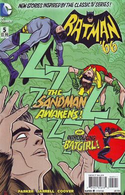
Batman ’66 #5 Art by Ruben Procopio, Colleen Coover Written by Jeff Parker Colours by Matthew Wilson, Colleen Coover Lettered by Wes Abbott Cover by Michael & Laura Allred Batman created by Bob Kane DC Comics, $3.99 (2013)
While DC’s bold new creative direction of frantic barrel scraping is largely of little interest to me…everyone has a chink in their armour and my chink is shaped like the ‘60s Batman TV series. Personally, I believe the only reason God has still not scoured his finest creation of the plague of humanity is His/Her/It’s remembrance that the ‘60s Batman TV show existed. I like it is what I’m saying there. And I have always liked it. Even during those tedious decades when acknowledgement of the frivolous magic that was the ‘60s Batman TV Show provoked spittle flecked aneurysms in fandom. Finally I have been vindicated by DC’s creative bankruptcy! Batman is Bat-back! It’s like that time your family realised Uncle Larry was a lot wealthier than everyone thought and suddenly became oh-so-accepting of the fact he was a man who preferred the company of men and started inviting him to Thanksgiving again. While the art on every story here is wonderful and captures the ungainly physicality of the cast in action beautifully what most impressed was the writing. Writing wise it’s all about catching the voices; the lovely honey roasted burnish of those hammy, oh so hammy, voices. Although mine ears may be festooned with the hairs of age it sounds to me, well, it sounds to me like Jeff Parker couldn’t have done a better job if the voices were running around in straightjackets and he was armed with a butterfly net. Jeff Parker’s come along way from selling chickens by the roadside. Good on you, Jeff Parker. But this is a joint success with every hand working towards the creation of ridiculous, hilarious, entertaining and wonderful comics. Batman ’66 is VERY GOOD! Sure now and so it is, Boy Wonder!
Zero #3 Illustrated by Matteus Santolouco Written by Ales Kot Coloured by Jordi Bellaire lettered by Clayton Cowles Designed by Tom Muller Zero created by Ales Kot Image Comics, $2.99 (2013)
It didn’t look good. The comic starts off with that terrible style of dialogue that seeks to be arch, smart, worldy and profane but just comes off like how kids think grown-ups might talk if grown-ups were, like, not totes super-lame all the time but, you know, somehow got it together sometimes to be all, whoa, cool and shit, maybe, uh, nice tats, my man, ha, no, your mom, ha ha ha ha, no, really, your mom. As a reluctant eldster I can assure you that never, not once, on the very many occasions on which it has occurred have I failed to punch someone who greeted me with “Hey, cock-stippler, see ya still got a face like a racist’s taint!”, or, you know, whatever. I mean. It’s not really conducive to productive communication, is what I’m saying there. So, the dialogue here’s great if you like that Ellis-y “I know you are, but what am I?” playground mode of chat. Hell, don’t get me wrong, it’s still okay even if you don’t. After all, this is comics where a guy (not this guy, another guy) whose dialogue is nothing more than the literary equivalent of water-injected meat can be compared to a Pulitzer winning playwright. No, my point is it set my teeth on edge and the likelihood of enjoying the following comic was low.
And yet enjoy it I did. And very much so.
(Which is supposed to indicate how good the comic was, how it won me over after my knee-jerk initial negative reaction. A reaction which was wholly on me and not on anyone involved on the comic. Just making that clear.)
Because after the writer has had his c-word and eaten it the dialogue calms down. Then we’re off to the races as the creative team throw a fizzy confection of ideas and helter skelter paced events into your face like, er, a glass of innovation laced with a soupcon of emotional impact. Or birds, a handful of garish birds singing a swetly sad song thrown in your face. Or something else, pick something. Everybody on these pages pulls their weight and the success of the resultant package is a group success. A success resting on Bellaire’s palette shifts from warm party colours which threaten to push into the red spectrum of violence to the icy blues which foreshadow the chill of the denouement; Santolouco’s clarity of staging, elegance of scene setting and crisply sudden violence; even Cowle’s letters which get to hold centre stage unadorned for a whole page and leave the reader feeling not in the slightest shortchanged. All these are brought together to serve the writer’s fun, fast and slightly experimental ideas. I stress this; Zero is not one of those Shit’n’Glitter comics that seek to distract you with pointlessly ostentatious storytelling devices from the hollowness within them. No, Zero is a collaborative success. Zero is good comics. Zero is VERY GOOD!
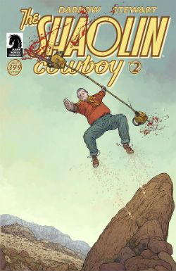
Shaolin Cowboy #2 Story and Art Geoff Darrow Colours Dave Stewart Letters, back cover, design Pete Doherty Shaolin Cowboy created by Geoff Darrow Dark Horse Comics, $3.99 (2013)
COMICS!!!! And unrepentantly so. EXCELLENT!
