"But first, call your girlfriend..." Comics! Sometimes they are Nu!

Um, no show without Punch, right? Photobucket Well, how to follow all that, eh? All the Nu-DC reviewed and rated by some of the finest minds to have been damaged by comics at an early age! How about by saying exactly the same things about less comics but more leadenly, with more words and a smattering of shit jokes. Those being bad jokes as opposed to jokes about shit. Business as usual then!


WONDER WOMAN #1 By Cliff Chiang (a), Brian Azzarello (w), Matthew Wilson (c) and Jared K. Fletcher (l) (DC Comics, $2.99)

For someone as pickled in cape comics as I am I sure do have a deficiency in the area of Wonder Woman comics. In fact I think I only own those Wonder Woman issues John Byrne did. I own them but I haven’t read them. I think I was drunk on E-Bay or something. Anyway I don’t really have a clear idea of Wonder Woman but luckily neither does DC by all accounts (ho ho ho) so this blank slate beginning was perfect for me. After reading it I still have no idea about Wonder Woman because it’s not really about Wonder Woman after all or it is but it’s also about everybody else in it, kind of an ensemble piece.

Photobucket

I certainly wouldn't have gone for Azzarello’s idea of sticking Wonder Woman into GREEK STREET as my first choice but it turns out I’d be wrong because I really, really enjoyed this one. It’s creepy, eventful and surprisingly unsettling all in all and Cliff Chiang’s art is just the dreamiest. Cliff Chiang – reach out and touch him! I look forward to this characterisation of Wonder Woman being carried across to the JL where she will just straight gut Darkseid while he’s bloviating leading to a big Super-sigh from Supes and 21 pages of the JL trying not catch Wonder Woman’s eye while she stands there daring any of them to say anything. Because consistency of characterisation across the line is certainly what I expect from the Big 2! In this comic WONDER WOMAN was VERY GOOD!


MEN OF WAR #1 Tom Derenick, Phil Winslade (a),  Ivan Brandon, Jonathan Vankin (w), Matt Wilson, Thomas Ch (c) and Rob Leigh (l) (DC Comics, $3.99) I didn't ask for this one. I guess my LCS sent it because I chunter on about old war comics all the time. Watch: What’s this Men of War starring Frank Rock’s grandson business? What’s all that about? Rock stories appear in Our Army At War or Sgt Rock comics! Men of War is Gravedigger’s book! Why didn't they go with Gravedigger? He’s African-American so they could have picked up some of that sweet media heat.

This one looks like one of the rush-jobs because it isn't very interesting at all despite the revelation that apparently in the US Armed Forces on occasion you will be taken into a room where you will be told how much everyone you have ever met really likes you and then they will ask after your Mother. If you are a Captain you get a back rub and ice cream. There was a terrible moment when the issue opened with “Something warm on my face…wet…” but I checked and Judd Winick hadn't written it so I carried on. There’s some weird business with super heroes that lacks clarity, I’m guessing nu-Rock will have a chip on his shoulder about capes. I’m guessing this since the mission goes big-time number ten SNAFU as soon as the cape turns up. I’m thinking someone wants to plan their Ops a bit more thoroughly than sending in the ground boys and then just have a cape jizz about blowing stuff up and crashing into everything willy nilly. I’m no Patton but a bit of planning might help.

Photobucket  "Exciting stuff, there!"

There’s quite a lot of action in this but it isn’t terribly interestingly delivered, which is a shame because that means most of the issue isn’t terribly interesting. C’mon, Tom Derenick, I know it can’t be easy making this stuff look exciting but, I don’t know if you've heard, there ain’t nothing easy in Easy Company! There’s a back-up that is exactly like some early ‘60s Robert Kanigher/Irv Novick short about fighting men and how they are men who are fighting. Which was okay back then but I checked with a passing young person and apparently it is now 2011, so that’s not so good. There’s the usual lovely gangly scratchiness from Phil Winslade on this bit so that’s nice. But his presence suggests someone put this comic together in a rush because although Phil Winslade deserves better he appears to be DC’s first choice for pinch-hitting on non-cape comics. Overall then MEN OF WAR #1 is kind of like stumbling into a pit of confusion laced with punji sticks carved from clichés. Proving once again that War is EH!


ACTION COMICS #1 By Rags Morales/Rick Bryant (a), Grant Morrison (w), Brad Anderson (c) and Patrick Brosseau (l) (DC Comics, $3.99)

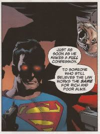
Beginning a bold new era in Superman comics! An era of Superman comics I actually want to read! That’s an exciting notion right there, DC Comics; Superman comics people might enjoy. Judging from this issue this bold experiment is working out okay. This is pretty much the kind of capey first issue Grant Morrison can probably spuff out in his sleep by now. It starts at full pelt and just keeps barrelling along with the odd handful of exposition and foreshadowing thrown at the eager reader’s face as it whistles past. Nicely done. Rags Morales was obviously a bit time constrained but for the most part his art is pretty lovely. Other parts are just jarring, like when I was enjoying Lex Luthor’s regal new nose only to turn the page to find he had somehow turned into a beatific bald child, later on his nu-nose was back, but, c’mon. let’s try and keep on-model here, guys.  I really enjoyed Lex Luthor in this, he was given some kind of reasonable motivation for his Super-hate and did that suave thing where he basically does what they paid him for without even breaking a sweat (or registering the colossal property damage and human injuries involved) and then just saunters off. Stylish!
Photobucket "Hey, anyone seen a berk? Superman needs to talk to a berk!"

Superman intimidating that there fellow into a confession? Have to say it didn't bother me that much. The dude he drops is clearly (almost comically so) established to have done Wrong. So, it’s not even a Left/Right wing thing either. He’s a Bad, Bad Man!  Of course what Superman does isn't super-nice but then he is basically a power fantasy after all. And, yeah, big old woolly minded Liberals like me have them too. But a part of the power fantasy of Superman is: He’s Right So It’s Okay. Anyway wasn't all this sorted around 1986 with that book WHATCHAMAFLIP where it showed if capes existed then they’d be co-opted by The Man, hunted as criminals, retire quietly or be big, blue men who liked to feel it swing in the wind? As another book that year said “We have always been criminals, Clark.” It’s just one of those things you agree not to notice when you pick up a cape book, I think. C’mon, I noted at least two people had had their head pushed through a wall/table by Superman. I’m pretty sure that’s likely to be fatal. But I bet it wasn't, because, y’know, it’s…Superman! Suspension of disbelief, people, have some on you at all times! And so Superman, and thus, ACTION COMICS #1, is VERY GOOD!


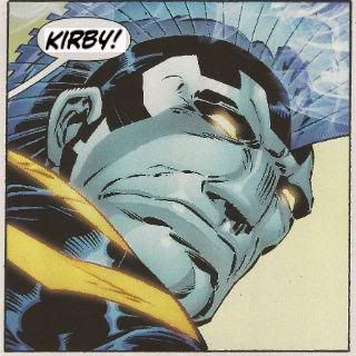
DEMON KNIGHTS #1 By Diogenes Neves/Oclair Albert (a), Paul Cornell (w), Marcelo Maiolo (c) and Jared K. Fletcher (l). The Demon created by JACK KIRBY. (See Marvel, who did that hurt? Eh?!) (DC Comics. $2.99)

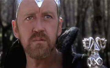
I don’t know about this one, I’d guess it was slapped together for the Nu-push at short notice. It’s got concepts and ideas but it all just seems a bit bunged out, a bit “Table Four are getting up to leave! Soup now, Chef!” While it just never really gelled for me it did have appealing elements such as the mix of characters and a working sense of humour. Sadly Cornell drops a bollock by making Merlin practically characterless. As anyone who has seen EXCALIBUR will attest Merlin must always evoke Nicol Williamson’s fantastic I-have-decided-I-am-in-a-different-film-to-everyone-else performance, otherwise your Merlin just ain't happening, pal. Ignoring that but given the very real problems I had with the comic I can’t in all conscience give it better than EH! But since I sense some potential I’m hoping it’ll at least get to GOOD! But try to remember that not everyone is as patient and lovely as me, DC!

Photobucket

"It is the DOOM of Marvel that they refuse to credit Jack Kirby. Hmmm!"

SWAMP THING #1 By Yanick Paquette (a), Scott Snyder (w), Nathan Fairbairn (c) and John J. Hill (l) (DC Comics, $2.99)

It’s lucky I’m not in a Scott Snyder comic or I’d be discomforting Superman with that time my Dad said unfortunate things about immigrants or how this whole dead birds and fish thing is a bit like my Dad saying how people park in front of your house and, yeah, you don’t own the bit outside your front window but, really now, is it too much to ask for just a little common decency here, Superman? But I’m not in it, Alec Holland is. Interestingly despite having returned magically from the dead after a period of some years Alec Holland is still way more employable than me. He’s on his second job since he just popped up a few weeks ago and he’s made the transition from botanical boffin to horny handed builder without missing a step. Versatility is the key in times of recession, jobseekers! Having been dead and then kind-of-maybe-not-sure-been Swamp Thing has left him with the super power of being able to tell which planks are spoiled by rot via touching and staring; I guess that swung the interview despite the Death Gap Years on his C.V. and total lack of experience. I liked that bit, the bit where we get a crash course on rot and also the bit about the anti-inflammatory properties of cabbage leaves. I hear they saved the bit about the effects of coriander on erectile dysfunction for another comic.
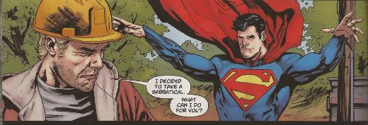
Photobucket "Oh hush now and dance with me you fool!" I also enjoyed the bit about the slow-motion savagery of The Green. Mind you, that sounded familiar; is that from He Who Cannot Be Named’s run? Speaking of  which there are cute shout outs to previous Swamp Thing comics (the logo on the diggers, Holland’s pass code, the name of the motel, etc) but the most obvious throwback is the style, which is very like The Nameless One’s early issues. Not as good, mind you, but similar. The art’s nice as well. I don’t envy Paquette having to draw all that…real stuff but he does it well displaying a commendable range. I heard that he had to redraw some of it as well to incorporate Superman’s new, um, look so kudos for the extra effort there. Hopefully it’ll get a bit smoother now the set-up is over, maybe Swamp Thing will be on more than one page and we’ll hear less Dad wisdom but, yeah, it’s a little bit talky and it’s a little bit creepy (like me, huh! Well, that's nice.) I…guess…it…was…OKAY!


FRANKENSTEIN AGENT OF S.H.A.D.E #1 By Albert Ponticelli (a), Jeff Lemire (w), Jose Villarrubia (c) and Pat Brosseau (l) (DC Comics, $2.99)

I’m okay about Jeff Lemire, I enjoyed that book he did about the sad kid and the grumpy ex hockey player and then that series he does about the sad kid with antlers and the grumpy ex-hockey player after the apocalypse. I thought I’d try this one to see if he could maybe expand his range a bit. Because apparently it’s really laudatory for creators to “go outside their comfort zones”. Which, yeah, it is but only if they avoid moving all their old baggage and furniture in so that in no time at all the place pretty much looks like their old comfort zone. (I’m not talking about Jeff Lemire here, SWEET TOOTH and ESSEX COUNTY are very different, that was a cheap gag earlier so I could cram this next bit in.) Some of these guys who get a rep for “going outside their comfort zone” remind me of a certain tendency we Brits have. This being a tendency to go somewhere exotic and then find the nearest English theme pub and sit in it for two weeks eating Yorkshire puddings and drinking binge while looking at a foreign sky out of the window. Anyway this one’s about a sad monster kid and his team of undead ex-hockey players. No, not really it was just punchline time!

Photobucket

 "Keats was a pussy, Palmer! Larkin, dude! Larkin!"

It is, as has been stated by better people, quite similar to Xombi. You remember Xombi; the fresh and fizzy breakneck ride packed with invention and incident that didn't stint on characterisation and was illustrated by someone who clearly gave a shit about what he was doing. The one that got cancelled after 6 issues. This is a bit like Xombi but, I don’t want to be mean (after all I (spoiler!) liked it just fine), but a bit more pedestrian, a bit more stale. A bit more likely to survive, I guess. Of course it’s got a bit of a hand up since it’s riding the crest of the nu-wave. Did this one sell out? Six months ago would this have sold out? Questions there - show your workings. So there’s an immediate benefit the relaunch has had. Stuff that’s a bit quirky, a bit off-beat has a far likelier chance to survive. That can’t be a bad thing can it? I guess once Lemire gets rid of the stock crazy ideas that float on top of his mind things should get more interesting and the series might actually have a chance to last that long. At the moment though it’s OKAY!


ANIMAL MAN #1 By Travel Foreman/Dan Green (a), Jeff Lemire (w), Lovern Kinzierski (c) and Jared K. Fletcher (l) (DC Comics, $2.99)

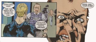
This one seems to have been pretty clearly in the can before the call to arms came. I think the tell is just how polished it is. It’s a really tidy little first issue which tells you who everyone is in relation to each other, how Animal Man’s powers work, how he is in a crisis, where he stands in the wider world and demonstrates that whoever’s inking it should really sort that out pronto, because some of it was real gloopy. In fact the execution is almost kind of a bit too efficient for me, almost a bit too TV for me.
Photobucket "They're...they're in your face!"

Luckily there were some appealing rough spots such as Buddy and Ellen’s interaction (I thought it was pretty “realistic” couple chat action myself. Unless that reflects badly on me in which case it was terrible! Terrible!, I say!) and Travel Foreman’s quirky art which had quite a lot of space in it which worked to make things a bit not unpleasingly discombobulating for this reader at least. I’ll stick around for a bit anyway as it was, on the whole, GOOD! However, if Buddy’s kids start being sad and Buddy turns out to have a past playing hockey, I’m gone, bubba!


OMAC#1 By Keith Giffen/Scott Koblish (a), Dan Didio/Keith Giffen (w), Hi-Fi (c) and Travis Lanham (l) (DC Comics, $2.99)

Step back! It’s an OMAC attack! The Buddha of Budda!budda!budda! is back! OMAC! Created by JACK! Bubblegum bellicosity Kirby style! I believe it only right that there should be a corner of comics that is forever Kirby so this was VERY GOOD! If they actually credit Jack Kirby next time I might see fit to say it’s even better. Naughty, DC.!

Photobucket

And on that bombshell! Have a great weekend, everyone!
Graeme Takes On The New 52. All At Once.

You know, before DC Comics so politely sent me the entire run of the New 52 launch issues, I don't think that I'd ever read an entire month's worth of a superhero universe before. I have to say, it's kind of exhausting. But that doesn't mean that I'm not going to try and run down very quick capsule reviews of all 52 right here, right now, as Fatboy Slim once said many many years ago oh God I am so old. ACTION COMICS #1: In retrospect, maybe my favorite of all 52 books, this one feels like it actually understands how to reboot a concept without overwhelming the reader with information or assuming that they already know everything; Grant Morrison's script has some of his shorthand dialogue, but it's dense and filled with "action" throughout, and this feels like a satisfying chunk of comics that also lays the groundwork for future stories. Very Good.

ALL STAR WESTERN #1: It's heresy amongst the comicsinternet to admit that I'm not a massive fan of Justin Gray and Jimmy Palmiotti's Jonah Hex, but it's never really done a lot for me. That said, this felt solidly Good, setting up the new status quo for the character - and offering enough introduction to the character for new readers - with some really nice art by Moritat. I'm amused by yet another "Gotham is built upon conspiracy and evil" storyline so soon after last month's finale of Batman: Gates of Gotham, though.

ANIMAL MAN #1: Oh, this was so almost good. Jeff Lemire's writing is... good, I think, although I feel like he stumbles on the more domestic side of things here, and I like the subtle repositioning of this series as a horror book. But the art is just not serving the writing well at all; Travel Foreman can be an interesting stylist, but he ruins scenes here, most importantly - and, I think, damningly - the final page, which is robbed of its full impact by some weird staging that basically wastes the top half of the page. Also not helping, the inks by Dan Green (which veer between too heavy and almost weightlessly light) and some very dull, flat colors by Lovern Kindzierski. Eh, then, because of the art.

AQUAMAN #1: Yes, Geoff, I get it: Aquaman isn't a comedy punchline anymore. I would've preferred it if we'd had a chance to decide that for ourselves instead of suffering through the "blogger interview" midway through the book, but overall, this is a pretty Good first issue, setting out its pitch, introducing its characters and having a decent enough hook for the next few issues. That said, if you were reading Brightest Day, you pretty much know what's in here already; this is very much a continuation of what was happening with the character in that book.

BATGIRL #1: I don't know if this was flop sweat or something else, but this just didn't work as well as I'd been expecting it to. Maybe because it's so joyless, something that writer Gail Simone didn't seem to have a problem expressing with the character in Birds of Prey, but there really is something very... rushed and filled and self-important about this issue that made it feel like you were being hurriedly brought up to speed by someone who wanted you to know how serious everything was. World's dumbest cliffhanger, too. Eh.

BATMAN #1: Greg Capullo's art is surprisingly nice - Yes, a little too MacFarlane for my tastes, still, but what can you do? - and Scott Snyder's story is... I don't know. Nice, but somewhat slight, perhaps? I'll be coming back for a second issue, but I think that's more down to goodwill for the creative team than anything having particularly wowed me with this debut. Okay, I guess.

BATMAN AND ROBIN #1: Now this was much more my speed, perhaps because I enjoyed this version of Batman more - One who seems to be dealing with his trauma after X number of years processing survivor guilt as Batman, instead of just burying it - than the one in Batman or Detective (And, really, I can't believe that a linewide reboot didn't result in a slightly more consistent portrayal of Batman. He feels like a different character everytime he appears, like Superman. That doesn't seem like a good thing to me), or perhaps because there was more of an urgency on display here than in Snyder's title. Either way, Good, and a much better "first issue" than the last time Peter Tomasi and Pat Gleason took over the book.

BATMAN: THE DARK KNIGHT #1: Talking of wildly varying characterizations, this book... uh... exists. I don't know what to say about it. If you want a generic Image-style take on Batman, complete with pouty mouths from David Finch and overdone dialogue by Paul Jenkins, this is for you, I guess. I was completely underwhelmed, and laughed out loud as the kids say at the reveal of "One-Face" at the end of the book, especially because he still has half of his face scarred. Awful, but I'm sure it'll have its audience. Oh, and Jaina Hudson is the new Jezebel Jet.

BATWING #1: The first of the "This was much better than I expected" books of the 52, I found myself drawn into this more than I'd thought I would. Maybe it was Judd Winick's take on the character and his secret identity (A cop working outside of the system, because the system is so corrupt), or perhaps it was Ben Oliver's lovely, weirdly hazily dream-like artwork, but this convinced me to try the second issue, which I really wouldn't have thought would've been the case. A low Good, perhaps, but I have to say: This feels much more like a mini-series than an ongoing, already.

BATWOMAN #1: This, however, was a letdown. Not because it wasn't Good, because it was. But I'd been expecting more, spoiled by Greg Rucka's run on Detective. The writing here - by artist JH Williams and co-writer Hayden Blackman - was fine, and hit all the right notes, but didn't surprise me or have the emotional depth that Rucka's had, and the art, while beautiful, also lacked the impact or purpose of the original run. Even though I'll be back for future issues, and even though I enjoyed this, I found myself disappointed nonetheless. That's what I get for having high expectations.

BIRDS OF PREY #1: I'm not sure why, but this felt like it had too much space in it, if that makes any sense. What's here is fine, it's a perfectly Okay comic book, but it feels too empty for some reason, like something is missing. I can't quite put my finger on it, but something isn't quite right, like it's only half of the intended story or something.

BLACKHAWKS #1: I love Mike Costa's Cobra series for IDW, which is why it depressed me so much to realize how much I didn't like this first issue (The art by Graham Nolan and Ken Lashley didn't help; it's overly busy and not quirky enough to make me want to keep paying attention). You can't fault him for throwing the reader in as everything's already happening, but I didn't find any character particularly interesting, mysterious or even distinctive enough to care about, and as a result, the whole thing left me cold. Awful, sadly.

BLUE BEETLE #1: On the podcast, I said this was like the Blue Beetle we had before, but less so. Tony Bedard and Ig Guara make all the right moves, but it lacks the heart or originality to make me want to come back for issue 2. Eh.

CAPTAIN ATOM #1: Hey, everyone who's always wished that there was a Doctor Manhattan solo title spinning out from Watchmen, now you have your dream book. Sadly, it's written by JT Krul - who ruins the goodwill he'd built up from an Okay first issue by ending with a stupid "Is Captain Atom about to die?" cliffhanger (It's his first issue, so I think that question answers itself) - but, on the plus side, the art by Freddie Williams II is very nice indeed. If it gets smarter in future issues, it could end up being worth checking back in with in future, I suspect.

CATWOMAN #1: Oh, man, haven't I said enough about this already? Cheesecakey pandering with a depressingly unsexy tone and annoyingly passive lead character. Awful.

DC UNIVERSE PRESENTS: DEADMAN #1: I swear to God, this is like a black hole in my brain. I have read this book multiple times, and it really refuses to stay in there. Pretty much the definition of Eh for me, although I'll say that Bernard Chang never really gets the credit for his work that he deserves. I'd love to see him paired with less garish colorists sometime.

DEATHSTROKE #1: Fun last-minute twist aside, there's little in this book that appeals: I don't care about the character or the machismo on display, and Joe Bennett has always been hit-or-miss (with an emphasis on the latter) for me. Eh.

DEMON KNIGHTS #1: Punny title aside, Paul Cornell pretty much won me over with the sense of humor on display in this one, much like Jon Rogers did the same in IDW's Dungeons and Dragons book (which this is oddly reminiscent of, it has to be said). Weirdly parochial, but all the better for it. Very Good.

DETECTIVE COMICS #1: Tony "Salvador" Daniel - Has he ever used his middle name before? - aims high and doesn't quite make it, but oh man, can you see him try. There's nothing particularly wrong with this, but there's nothing particularly right, either; it all feels familiar, and more workmanlike than previous attempts. Having Daniel be writer/artist on a Batbook when you also have David Finch doing the same elsewhere in the same franchise feels a bit weird to me, for some reason; I feel like Daniel comes off worse, even though he's better at deadlines and arguably better as a writer, too. Eh, and that's only because I wasn't as appalled by the final page as many were.

THE FLASH #1: After the disappointment of the last Flash run, color me shocked to have enjoyed this as much as I did. Francis Manapul's art is just great - that opening double page splash! The page of Barry in his apartment! - and it turns out that his writing (along with Brian Buccellato) is much faster-paced and more fun than Geoff Johns' on this book. I like the new Barry Allen, and love his relationship to Iris in this new continuity. More of this, please. Very Good.

FRANKENSTEIN, AGENT OF S.H.A.D.E. #1: Another frustratingly "almost" effort from Jeff Lemire - I know where he's going! I just wish he'd made it there! - with equally frustrating art from Alberto Ponticelli, which is just a little too scratchy for its own good (and, like Travel Foreman in Animal Man, a little off in the framing when it really counts). There's a lot to like here, so I'm tempted to put this down to first issue nerves and hope that this book ends up sorting itself out down the line. That said, this is Okay, and I think that the just-finished Xombi played in the same sandbox in a much more entertaining and original way...

THE FURY OF FIRESTORM THE NUCLEAR MEN #1: Of the two Gail Simone books this month, this is the more enjoyable, but it has almost as much crammed into it as Batgirl, leading to a weirdly claustrophobic feeling. That said, I like the new spin on the concept (and the title), and wonder where, exactly, we're going from the end of this issue. Is this going to be DC's second attempt at doing a Hulk book? Yildiray Cinar's art is weirdly reminiscent of Francis Manipul's as far as the inks go, but I'm not sure if it fits here just yet... All in all, an Okay start, but with the potential for either greatness or creative dead-ending within the year.

GREEN ARROW #1: It's as if JT Krul, Dan Jurgens and George Perez set out to create the most generic, boring superhero book imaginable... and succeeded. Crap.

GREEN LANTERN #1: Considering how self-important (and self-conscious) this title had become before the relaunch, it's surprising that Geoff Johns and Doug Mahnke manage to essentially play this first issue for laughs and get away with it. Good, although I found myself wishing that the last page had been held back for a few months, if only because I really enjoyed seeing dick Hal Jordan so much.

GREEN LANTERN CORPS #1: I was always going to be a sucker for this book; John Stewart and Guy Gardner are my favorite Green Lanterns, Peter Tomasi's previous run on the title was something I really enjoyed, and there's no Hal Jordan or Kyle Rayner to harsh my buzz. Sure enough, I really dug this; uberviolent opening aside, I appreciated the "this is where our leads are" intros before the mystery was revealed, and the final page felt weighty and dramatic enough to bring me back next issue. Sure, Fernando Pasarin's art feels like a little bit of a letdown after that Doug Mahnke cover, but it's still pretty great in a "Bryan Hitch but more approachable" way. Very Good, for me.

GREEN LANTERN: NEW GUARDIANS #1: And then there's this. This is just a bit of mess, whether it's the loss of the "some time ago" caption at the opener explaining that the book opens with a flashback, or the failure to really explain who all the different Lantern characters are, it seems sloppy and at odds with the other Lantern books, and Tyler Kirkham's art doesn't necessarily help, either. Awful.

GRIFTER #1: Finally answering that eternal fanboy question "What do you get if you cross Sawyer from Lost with ROM, Space Knight," this is Okay for those of you who enjoy this kind of thing; Nathan Edmonson's script is a bit light on explaining things, but I suspect that's intentional, and CAFU's art seems too polite for the story being told for my tastes. I don't know; there's nothing wrong with it, but there's also nothing that feels especially compelling about it, either, if that makes sense. I think Fringe probably does this kind of thing better, really.

HAWK & DOVE #1: I wanted to like this book so much, and then Rob Liefeld couldn't stop himself reminding me that he's a terrible, terrible artist. Everything happens at crazy angles! People's mouths change size without explanation! Everyone looks permanently in pain because of all the scratches on their bodies! It's a shame, because you get the feeling that Sterling Gates is really trying to work with Liefeld's energy, but he's overwhelmed by it on this issue. Truly, unhappily Awful.

I, VAMPIRE #1: On the plus side, Andrea Sorrentino could pass as fake Jae Lee if the position ever opens up. On the minus side, this is worryingly murky in terms of story (and storytelling; it's not just Joshua Hale Fialkov's script here, the art really does it no favors), and reads like someone's idea of doomed romance a la Twilight, but even more melodramatic. I'm sure there is a massive audience for this, but I found it pretty Eh at best.

JUSTICE LEAGUE #1: Hey, remember when everyone was talking about this book? Well, not much has changed since then. I like it, for what it is; I like dick Hal Jordan, I think there's a reasonably strong mystery introduced and I don't care that the entire team isn't in there despite the cover. But I'd be lying if I said I thought it was more than just Good; there were other books that the relaunch could have led with that seem better suited for all-new readers and a heavy media blitz.

JUSTICE LEAGUE DARK #1: It's not quite Shade Peter Milligan - or, for that matter, Secret Seven Milligan - but there's the potential for getting there with this opener (I really liked the perversity of the Kathy reveal), and Mikel Janin's art is lovely. Slightly underwhelming, I've got a lot of faith that this Good first issue will turn out to be a very good series.

JUSTICE LEAGUE INTERNATIONAL #1: Potentially Green Arrow's main competitor in the "most generic superhero comic" race - And Dan Jurgens is involved with this one, as well! Clearly, this is karma for killing Superman twenty years ago - this just feels like a subpar fill-in to a comic from some point in the 1980s, complete with inexplicable Margaret Thatcher cameo appearance. Considering the potential for a JLI series spinning out of the surprisingly strong Generation Lost mini, this is a tiny bit heartbreaking. Awful.

LEGION LOST #1: The good: Pete Woods' art is just amazing here, really, really great stuff. The bad: Unless you're a Legion fan already, this is likely entirely impenetrable stuff. I love the Legion, and this almost made no sense to me whatsoever. It doesn't help that important things happen off-panel (So, Timber Wolf just picked up the bad guy and no-one tried to stop him?), the characters have no real introduction and just way too much happens to let the reader have any time to make sense of it on first, second or even third reading, because there's not enough space in the book for everything. What it ends up as, then, is a good-looking mess. That's what we call Awful round these here parts.

LEGION OF SUPER-HEROES #1: I've really, really tried to convince myself that New Levitz Legion is just like Old Levitz Legion, but I think this is the issue when I realized I couldn't keep it up. I'm unsure whether it's Levitz or his circumstance, but everything feels so jumpy and fractured that there's no chance - or, it seems, space - to build up the long running soap operatics that I loved the first time around, with everything ending up sacrificed for whatever big storyline that I find myself uninterested in. Eh as much as I wish it were otherwise.

MEN OF WAR #1: Someone, somewhere, found this to be more than some generic "Are you really a man?" cliches wrapped around a superhero mystery, but it wasn't me. Awful, and the back-up strip was even worse.

MISTER TERRIFIC #1: Another book that I really, really wanted to like - Although that's almost entirely down to the original release info containing the hilariously melodramatic line about him fighting "science gone bad!" - and the actual book... kind of lived up to my expectations, perhaps? There's a lot to like here (The new origin, with a time travel mystery replacing the Spectre's telling him "Hey, that white guy? You should rip him off," for example), but it doesn't come together properly, and ends with a cliffhanger that just makes no sense in a first issue ("Is this character acting weird? How would you know! You've just met him. Tune in next month to find out if he is or not!"). But... Again, maybe it's goodwill, but even though this was just Okay, I'm holding out hope for better soon.

NIGHTWING #1: I came to really like Dick Grayson when he was Batman, so why do I find almost everything in his new title feeling like it's a step backwards? Whether it's Dick visiting the circus again, or telling us how good it is to feel like himself, all of it feels more forced and less genuine than it should. Eh, and most of my fondness for the character disappears entirely as he disappears behind a pile of dialogue and sentiment we've heard before.

OMAC #1: If it wasn't for Superboy, this might have been the best surprise of all 52 books. Somehow, Keith Giffen and Dan Didio manage to channel Kirby's sense of fun, if not his sense of originality - This is a reboot of an existing concept, after all - by smooshing together Office Space, the Hulk and the original OMAC to come up with something that feels like it owes as much to Giffen's own Ambush Bug as it does Kirby, and it... weirdly... works. It's very much not for everyone, but I think that's true of the original OMAC as well. It's an odd feeling to think that Dan Didio came up with one of the most individual and arguably the most fun of all of the New 52 books, but there you go. Very Good, and long may it stick around.

RED HOOD AND THE OUTLAWS #1: I think we can also file under "Things I've said too much about," but short version: Not for me even before we hit the "Starfire is an amnesiac bimbo nymphomanic" thing. Crap.

RED LANTERNS #1: If Ed Benes wasn't drawing this book, I have the strangest feeling I would have actually liked it, because Peter Milligan's script - or, more properly, his narration - is weirdly compelling here, and feels oddly subversive to all the Geoff Johnserisms in the scenes surrounding it. If he ends up carrying that further in future issues, I could see this becoming a sleeper hit for the the cool kids who are perfectly okay with women who can twist their bodies to simultaneously show off their butts and their breasts at the same time. Eh, with chances for better later.

RESURRECTION MAN #1: Clearly, it's books dealing with life after death that I have a problem with. Like the Deadman book, this one also barely registers after multiple re-reads. Eh, then.

THE SAVAGE HAWKMAN #1: For everyone who ever thought "What would make Hawkman awesome would be if his armor and wings came out through his pores like Warren Ellis' Iron Man!" then this is apparently the book for you. For the rest of us, this is a book where Hawkman tries to burn his costume for some unknown reason, then gets attacked by it, and then it turns out it's living inside him or something. It really is as bad as it sounds, although Philip Tan's watercolor art is rather nice in places. Awful, though.

STATIC SHOCK #1: It's modern Spider-Man, with the rest of the Milestone universe seemingly playing the supporting cast. It's surprising just how ready I was for that book, without ever realizing it. Good, although I'm already worried about it, now that we know that John Rozum is off the book by #4.

STORMWATCH #1: Like Batgirl, it's possible that this book fails because the writer was far too aware of what they had to do; there's too much empty exposition in this issue, and it's an issue that needed useful exposition. Paul Cornell doesn't quite catch the tone of Warren Ellis' characters, and the disconnect is obvious in a way that isn't obvious; no-one sounds quite right, and everything feels off-kilter as a result. It's a book that simultaneously feels dense and sparse, and Miguel Sepulveda's art, static and heavy, doesn't help with that feeling. A low Eh, and it should be much better.

SUICIDE SQUAD #1: Forget skinny Amanda Waller; this book has way bigger problems. You know, things like an awkward structure (Not helped by multiple artists working on the same issue), a ridiculous set-up and thoroughly flat characterization throughout. Disappointingly Awful.

SUPERBOY #1: I was genuinely surprised by how much this book feels like science-fiction instead of a superhero book, at least in this first issue, and how there's an interesting lack of moral certainty at show just yet (I'm sure that'll change in time). With RB Silva's clean art and Scott Lobdell's strongest script for the relaunch by far, this is Good stuff.

SUPERGIRL #1: This is also surprisingly Good. A complete reboot for the character, and a chance to start from a personality closer to Sterling Gates' work with the character - Probably the character's most recent high point - instead of the wishy-washiness of the origins of the previous version, this issue isn't showy in the slightest, but gets the job done nonetheless.

SUPERMAN #1: Oh, oh, oh. Oh, Superman. I guess, if nothing else, this issue does provide an alternative to Action Comics, mainly in that Action was really good, and this isn't. Where to start? The confusing opening (Is the new Daily Planet built? It would appear so on page 2, but I'm still not sure if that was meant to be a glimpse into the future or not. If it had been rebuilt, would the previous site still have the remains of the old one?), the hilarious scenes of Lois et al discussing journalism ("Print is dying!"), Clark being bitter and mean to Lois, the genuinely horrible examples of Clark's journalism... There is so much wrong with this issue, but primarily I think the underlying structure is the biggest problem: Too much is, again, forced into too small a space, and this time, it's combined with a super brawl that is neither exciting or even interesting, leaving the impression that Superman's life is dull, full of sniping arguments and a ham-fisted idea of how journalism works. It's a mess, and one not saved by Jesus Merino's sterling attempts on art. Awful, and maybe the biggest disappontment of the bunch.

SWAMP THING #1: Talking of wordy, this is another overly-verbose book that could've easily dialed back the exposition to sensible levels and become infinitely better as a result (The whole Superman scene in particular felt unnecessary). That said, like Animal Man, the horror tone works and there's definite potential here. Okay, but greedily, I wanted more.

TEEN TITANS #1: It's a slow start, true, but I'll admit to being sucked in to Scott Lobdell's plan of essentially running one story between this and Superboy - although that final scene in both books has different dialogue and staging in some parts, which seems a completely avoidable mistake to me - and enjoyed this much more than I was expecting from early previews. A high Okay - I still have my issues with Brett Booth's art, I'm sorry - and I might even keep going on this, at least until the entire team is together.

VOODOO #1: You know, deep within this book, there's an interesting idea about an alien invasion happening in plain sight, with the alien as the central character. But getting there in this case means working through a lot of gender politics that's trying to have its cake and eat it at the same time ("Yeah, this is cheesecake, but look, the strippers are real women with class and babysitter problems and shit! But here's some more T&A anyway!"), and... I'm just not interested, ultimately. Awful.

WONDER WOMAN #1: Holy crap, it's the last book. I was beginning to think this would never end. And it's ending on a high note, too; sure, Brian Azzarello's script is sharp and fast-paced (if a little short on explanations, but there's time for those later), but this is entirely Cliff Chiang's show, and he doesn't even vaguely fail to deliver. This is a wonderful looking book - Matt Wilson's colors help considerably - and all the moreso because there's nothing else like it on the DC stands right now. The mythical quality of the story seems on a different scale to all the other New 52 books as well, and the strong individuality of the book makes it feel more like an event... and that's a nice feeling for a Wonder Woman book to have. Very Good, and one of the best books of the line so far.

Now, as the saying goes: What did you think?

nu52: Above and Below (and side to side)

Watching over the rest is STORMWATCH, down in the streets is STATIC, with OMAC and MEN OF WAR lurking around the sides... STORMWATCH #1: I probably had the highest hopes of all the DCnu books for this one -- oh, I was anticipating ACTION more, but this was the one that I was hoping might be the best: wide-screen action like THE AUTHORITY, but firmly in the DCU. It also makes it, perhaps, the most problematic of the books, because that kind of world-changing action really doesn't work with a shared universe in a lot of ways (witness how no WS book every dealt with the notion that a corporate controlled version of The Authority took over the world for a period. as one of many examples) -- you really can't do "The Moon is a Hatching Egg!" and not have it impact a jillion other books.

There's also the notion that as appealing I find The Engineer, and Jack and Jenny and Midnighter and Apollo... well, they can't be The Authority is a world with a JL, because the JL is better... they have to be.

I'm not sure if I'm reading too much into it, or not, but STORMWATCH also appeared to be adding in Milestone concepts in the mix, with the mention of a "Shadow Cabinet" that runs it all? And which "Big Bang" are they referencing at the end of the issue? (Nah, that one is probably reaching)

I had a problem with STORMWATCH #1's dialogue -- yikes, pretty overly "comic-booky" with everyone reciting their names and powers and off-screen plot points left and right. I'm not sure there was a "normal" line of dialogue in the entire book -- I'm hoping this is purely an artifact of being a character/location/conflict-rich first issue, and this will settle down tout-suite.

Overall, I liked the character concepts and the setups and what appeared to be the remit, but I thought the dialogue was far too "old school" to enjoy it. I'd stick through the first arc, but it's pretty iffy if I'd want to go past that. A mild OK.


STATIC SHOCK #1: This may be the one book that would have most benefited from a "traditional first issue" -- that is an origin story. Starting in the middle for a character that much of the audience doesn't really know that well seemed a little weak to me. I didn't know how to root for the character! Like: is Hardware the old Hardware from Dakota, or is he like a hologram butler or something? Either way, what's he doing working with Static (or is his name now Static SHOCK like the cover says)?

The art was nice, and there was a density to the book that I liked, but I'm not feeling that crucial sympathy I need. I'd probably not bother to pick up the next issue (though the final page cliffhanger was slightly intriguing) -- overall, I thought it was pretty EH.


MEN OF WAR #1: The one book I had no expectations of of any kind going in, and it's a solid little war book (albeit one with superhumans involved). Well-written, fairly gripping, and well-illustrated. But, also one that I really didn't care too much for. I'm not very interested in war stories, and while the superhuman involvement could bring me back to flip through #2, this isn't something I would like to spend my personal money on. Ditto for the backup tale. Very solidly OK, just not my cuppa at all.


OMAC #1: Big, frenetic, dumb, fun destruction.  It's probably the speediest read of week 1, but I liked it a lot! In fact, I only have one criticism about it whatsoever, and that is that there is not "Omac created by Jack Kirby" credit. Even STATIC SHOCK had *that*. Anyway, I'd call OMAC #1 a solid (if lower) GOOD.


What did YOU think?


-B