"Our Mission Is To Destroy Crime...ALL Crime!" COMICS! Sometimes Justice Has A Big Dead Face!
/Yes, it's Sunday Afternoon Kirby Deification Theatre!More after these messages from our sponsors!
Nah, not really. I know you're all expecting me to link The Avenger, Jack Kirby and Justice and do some frothing rant about how Marvel Comics should just give The King his due so we can all just get on with our lives. But I didn't. I just wrote about an odd little '70s comic The King did on his way out of the door at DC Comics. I don't even go on about The King that much. Okay? I like to keep you guessing!
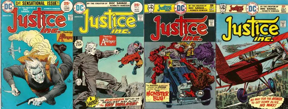
JUSTICE INC #1 - 4 Art by Al "Mysterious" McWilliams and Jack "KING!!!" Kirby Inks and letters by Mike "Royalty" Royer Words by Denny "No Heel!" O'Neil (Assisted by Paul "I Am Legion!" Levitz) Characters created by Walter Gibson and Lester Dent Issues 1,2 based on the "novels" by Paul Ernst ("Kenneth Robeson" was a pen name covering the work of the above three men.) (DC Comics, 1975, $0.25ea)
The Avenger first appeared in his self-titled magazine in 1939 and by 1942 he was gone. So, it's probably fair to say that "Lester Dent"'s attempt to replicate the success and appeal of Doc Savage failed. It's also probably fair to say that The Avenger's failure was due to the public just not wanting another pulp hero rather than the character being bad or anything. There must be something to him because he keeps popping up in The River of Time like a badly weighted corpse. After all, The Avenger was part of DC Comics' 2009 FIRST WAVE pulp sales disaster and had an (uncollected) 2 part prestige series in 1989 by Helfer/Baker. And in 1974 he butchly brooded on the pages of this series. So, yeah, who is The Avenger and how did his face gets so dead? Glad you asked.
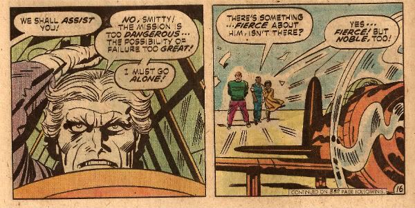
Since this series lasts only four issues there isn't much room to expand on the basics of the character much, but luckily Editor Allan Asherman provides a comprehensive run down on the character in the back of #1. So, I can just steal all that and look right clever and if Jess Nevins wants to question any of it he can just go get all up in Allan Asherman's face instead. Anyway, Dick Benson is a family man, ah, but he is a family man of the '30s! Hence it is quite believable that he was previously an adventurer and treasure hunter because, apparently, career choices in the '30s were a lot more fun. (What Allan Asherman omits but Wikipedia (hey, I'm not proud!) does not is the fact that Dick Benson also lead "native armies in Java". Which I guess makes him a mercenary. Yeah, they've dropped that by the '70s.) It doesn't really matter what unlikely employment Benson's had all that matters is that he's really wealthy and astonishingly well trained at violence. Because if an average Joe gets has his family killed by sinister criminals he tends to just have a breakdown, never find who did it and end his life living with a woman who really likes cats and is too deaf to hear him weeping in the night. That's not really very pulp though whereas a man who is master of Karate, Kung-Fu and Savate (which is not apparently a male fragrance), possesses a photographic memory, has knowledge of the sciences, and has spent an entire YEAR (Asherman's emphasis) learning to use a gun and a knife is very Pulp. He's also probably someone with very poor hand-eye coordination (a YEAR!!! (my emphasis)). Fortunately his family die and he gets to put all these mad skillz to good use attempting to destroy ALL crime!
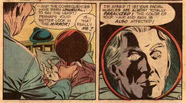
Unfortunately the shock of Benson's family's death results in total facial paralysis and his face, hair and eyes all turning as white as Jesus' conscience. Really quite white, that is. The best bit is that although Benson's facial muscles are paralysed the face itself is infinitely malleable. With a few deft cheek chuches and finger digs he can replicate the features of anyone! Sure, medical professionals may be tutting and shaking their heads at this but I'm sure the rest of us find this scenario only too plausible. Oh, and he's right handy at makeup which he keeps in a "small" make-up kit, which comprises make-up, every colour of contact lens, shoes with lifts of different heights, padded shirts and wigs in every style and colour. That's an interesting use of the word "small" there I'm sure you'll agree. Come on now, if you are expecting the adventures of a man with a malleable face who has trained as a one man army in a fight to destroy all crime to be sensible, well, you've probably misread the signals even worse than tha time that chick just upped and glassed you in the face. It's absurd is what it is. And I like absurd things and these comics are pretty absurd.
As you've probably noticed Al McWilliams draws the first issue not Jack Kirby. I don't know anything about Al McWilliams and for all I know he could be a pseudonym for Al Williamson or something. There were a lot of artists working for more than one company under different names (e.g. cheeky Gil Kane) around this time so it's possible. More likely Al McWilliams just never took to being exploited like an unloved drayhorse as is comics' wont and is a real human being who I've just insulted by positing his imaginary nature. He draws in a heavily realistic and illustrative style which is pretty good. There's not a lot of sense of motion but that's par for the illustrative approach, however, the realism does help the absurdity on display go down smoothly. That's one way to go but it's not the way Jack Kirby chooses.
(In the comments below J. Kevin Carrier points out that "Al McWilliams drew a bunch of comics from the ’40s to the ’80s, mostly for Dell, Gold Key, and Whitman. He also drew the newspaper strip “Twin Earths”." so there you go. Apologies to Al McWilliams and thanks to J. Kevin Carrier!)
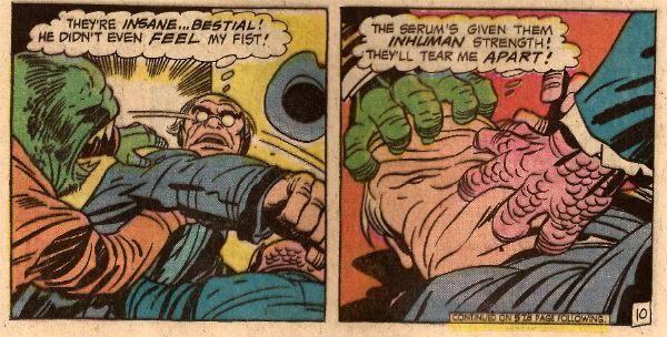
He chooses to pump up the preposterousness to such a level that absurdity looks tame indeed. Actually that's not a choice he's made, as by 1974 that was Kirby's style. And it's a great fit for something as lovably daft as this. The book is set in the '30s and Kirby's '30s look like Kirby's '70s or Kirby's '80s rather than the real world '30s. The buildings look like a gifted child's been at the building blocks again, everything is ornately chunky even the people. By 1974 as far as his art was concerned every town was Kirbytown! It's not his best work but it is his work and so it has pleasures and rewards on every page. I guess it wouldn't have been his best work because Kirby's work here is probably among the last pages he worked on at DC Comics before Marvel got to kick him around one more time.
By the end of his time at DC Comics Kirby was just being given up work to make up his agreed page rate as all his own books were cancelled. It must have been quite a shock for him working off someone else's scripts. Sure, he'd worked with Joe Simon but that seems to have been a properly collaborative relationship with both of them mucking in on different aspects as and when. Prior to Kirby's '7os DC work he would have been used to the Marvel Method. Allegedly this could be seen as involving Jack Kirby coming up with ideas and drawings which some other guy would reword the dialogue for with snake oil slickery before claiming complete credit. Some people might say that anyway. So, Kirby was probably befuddled by the fact that Denny O'Neil had provided him with a full script with a structure and dialogue and everything with only the expectation that Kirby draw it. So he does because he was The King and that's what The King did.
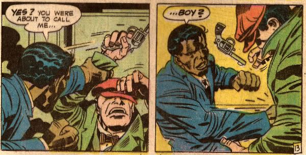
There's a repetitive aspect to O'Neill's scripts that's worth addressing. In every issue several things will always occur. There will always be a scene where the two black characters (Josh and Rosabel) act in a Minstrelly way. The first time you see this your heart just sinks and you immediately imagine that bit of text they have to put in certain reprints now about how "Bits of this comic are a tad racist but look, it was a long time ago, and people didn't hide it as well as they do now. So don't be writing us angry letters about Billy Batson using burnt cork on his face as a disguise, please." It's okay though because immediately afterwards the two characters will have been revealed to have been acting dumb and are in fact "extremely intelligent college graduates." The book is set in the '30s after all so I think O'Neill does as good a job as can be expected of acknowledging and undercutting the racism of the time in a book produced in the '70s and aimed primarily at children.
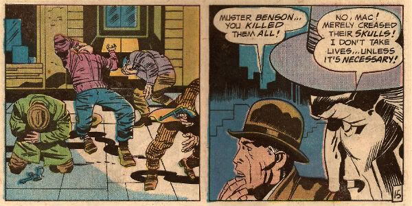
There will always be a scene where The Avenger shoots someone only to have to explain that he never takes life and the shot has just "grazed" their scalp. This is interesting because although Benson is intimate enough with his weapons to have named them Ike (the knife) and Mike (the gun) all his training has been towards the end of being so proficient in their use that he can use them and not take life. Today a character would train in order to be able to take the most life as possible in any situation. So, yes, Benson may be creepy enough to give his weapons names but he's still better than that sad twat The Punisher. Also, Benson doesn't fight alone he has a bunch of chums who accompany him in the relentless quest to kill ALL Crime! The weird thing is all of them are spectacularly intelligent but talk in a way which belies this intelligence. Except for Smitty who talks daft in the books but doesn't in the comics. That's Algernon Heathcote Smith not regular commentator J_Smitty, because as intelligent as the former is at no point does the comic book Smitty mention donuts. Or Kickstarter.
Now all this repetition, together with the customary every issue regular recap of Benson's origin and skills, isn't the result of O'Neill's lack of writerly skills. No, it's a product of the time. The emphasis in the '70s was on single issue stories as there was no expectation that readers would be able to find the next issue and so in two separate letter columns Asherman has to defend his book's choices along these lines:
"We wouldn't have minded devoting two issues to the origin either. But we also like to give our reader's their money's worth, and personally, would YOU like to buy a first issue and find "to be continued" at the end of the story?" (from issue3)
Interesting, n'est pas?
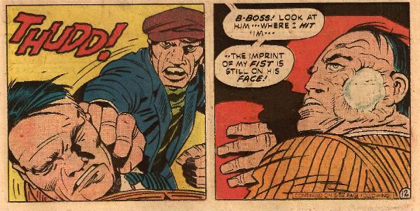
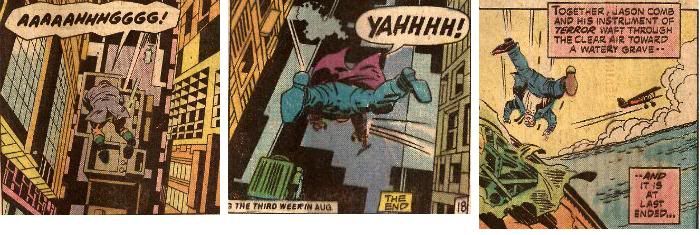
Some of the other repetition is a little harder to explain. With the exception of the first issue the three other issues end with the villain falling to his death. Seriously. Look, I faffed about in Photoshop and everything to prove it:
I don't know what that's about! Although it should be noted that it is partially explained in that issue 2 and issue 4 have exactly the same plot with only details and names changed. I guess this is because they knew they had one more issue but that was it so, hey, here's issue 2 again, who wants to go out and hold doors open for ladies!?! It's still a lot of death plunges, I feel.
So, JUSTICE INC then? Not the world's greatest comic coming across as it does as being cancelled before finding its flow and thus making its flaws all the more obvious. But in its favour it does have '70s Jack Kirby art which, for me, is the best kind of art. And maybe even more than that JUSTICE INC has plots like the one in #4 which involve the villain releasing seagulls loaded with explosives from his zeppelin and guiding the fatal flock by radio at his own airplanes in order to collect on the insurance. I mean, what could go wrong? Any comic drawn by Jack Kirby with a plot that absurd could never be less than GOOD! Me, I'm neither fierce nor noble but, like The Avenger, I am gone!
Hope you had a nice weekend and read some COMICS!!!
