"The Cane Does The Rest." Comics! Sometimes They Are Butch!

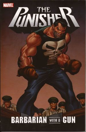
So I managed to get an hour and I wrote this.  So, you know, it's hardly incisive or anything and certainly not structured but I hope it entertains. People like seeing other people fail, right? Tuck in! Photobucket PUNISHER: BARBARIAN WITH A GUN By John Buscema (Artist), Chuck Dixon (Writer), Tom Palmer, Klaus Janson & Art Nichols (Inkers), Kevin Tinsley (Colourist and Jim Novak (Letterer) Collects PUNISHER: WAR ZONE #26-30 (Marvel Comics, $15.99, 2008)
Photobucket

This comic features the character of The Punisher created by Gerry Conway, John Romita Snr and Ross Andru here presented in an adventure I was drawn to purchase by the title and the presence of John Buscema. Also - it was on sale at my LCS for a fiver. In fact I was initially misled by the presence of John Buscema and the title to expect Frank to be swept up by a Time-Space vortex and dumped into Hyboria where he would initially act like Conan but with a gun but upon exhausting his ammo would then turn his 'Nam sharpened reflexes upon the populace of the stinky primitive land before being hailed King. This does not happen. However, if there is a comic where this does happen (and how could there not be?) then I am all ears.


What the comic delivers is, I guess, the next best thing. On the trail of a drug dealing brother-sister combo Frank is soon removed from the civilised and hygienic milieu of lovely America to the stinky and primitive land of The Caribbean jungle. No offense to my Caribbean chums but that’s how it’s presented here. This is a tale from the time before The Punisher was taken seriously (if anyone can in fact take PUNISHERMAX seriously; which it appears they can) but after the time when he wore white disco boots. The boots have been ditched by this stage which is a shame because I always believed they were his dead wife’s and he wore them as tribute to her memory. Luckily he still retains several of the goofier elements that I always enjoy about The Punisher. In several scenes Frank is pictured in a nice Hawaiian cut shirt emblazoned with his TM skull motif. This suggests that either Frank, like myself, holidays in Whitby and is partial to frequenting the make-your-own design T-Shirt shop just back from the sea front or that he spends his free time sewing and indulging his passion for crafts. Also, early on in the story Frank adopts a disguise. Now, Punisher disguises are one of my favourite things being as they are so terrible as to inspire hooting. My favourite was in the Punisher/Ghost Rider/Wolverine one-shot HEARTS OF DARKNESS written by Howard MacKie and illustrated by John Romita Jnr. In that one Frank grew a pencil tache and slicked his hair back. Luckily Wolverine’s acute smell sense pierced this quickly. I think he used his smell-sense but in all honesty he could have just used his eye-sense. In BARBARIAN WITH A GUN Frank wears a brown wig of no fixed style and another mustache. This works out pretty well until he meets a woman who had earlier seen him shoot the guy he’s disguised as and was also physically pleasured by said guy. Oh, Frank undone by sentiment!

Photobucket

So. Yes, it’s one of those old timey adventures where Frank has all the moral complexity of a brick and just batters himself against the obstacles in his way until everybody who should be dead is dead and then he gets on with a nice bit of sewing. It’s pretty well done, too. Chuck Dixon is certainly a professional at this stuff. He’s certainly professional enough not to let his personality infect the work and thus Frank never spends anytime whatsoever worrying about what consenting adults of the same gender choose to do with their genitals. Dixon is also professional enough to deliver a satisfyingly violent action-adventure romp that takes itself seriously enough but never too seriously. He does a really smart job on Frank’s clipped narration which includes gems like, “Carbine goes Winchester on me.” and “He’s asking for mercy. Sorry. Fresh out.” I dig that stuff, that He-Man steak and taters stuff and it’s all over this one.


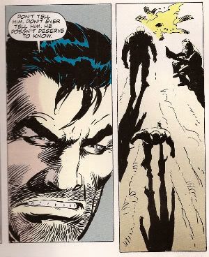
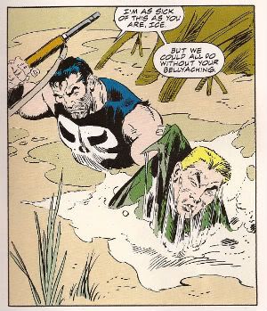
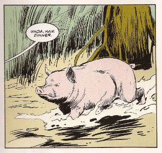
There’s no politics either despite the fact that the island of Porta Dulce is bursting into revolution more often than a teen’s face bursts into zits. The ruling class are corrupt and violent, the peasants are corrupt and violent, the Americans there to make a buck are corrupt and violent even the crocs are violent (but not corrupt). The nicest character is a pig that just ambles through and rescues our bunch of heroes with its unerring sense of direction. And it is a bunch by this point because Frank has called in Micro and Ice Phillips. This latter character is a new one on me but he’s obviously got some “juice” because the back of the TPB declares “Guest starring Ice Phillips from Marvel’s controversial series The ‘Nam!” (The ‘Nam was indeed controversial since (at least for a while when it was written by Doug Murray and illustrated by Michael Golden)  Marvel published it and it wasn't awful and was in fact quite good). So one for Ice Phillips fans here! There’s a great scene between the trio where Micro almost spills the beans on why Frank does what he does to Ice (who apparently thinks Frank is just doing it for chuckles or something) and Frank says, “Don’t tell him. Don’t ever tell him. He doesn't deserve to know.” Which is super-pissy of Frank. Then he just flounces off! Ooooh, get her!

Photobucket

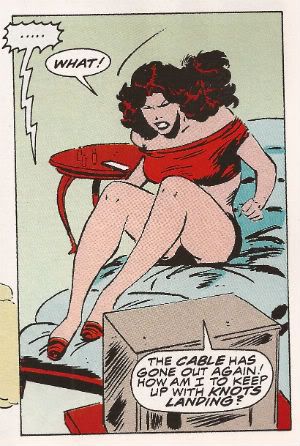
Of course all this is illustrated by John Buscema. Or John “The Don” Buscema. Now John Buscema wasn’t really the paterfamilias of a crime family in much the same way as Gene Colan wasn’t the head of a faculty in a school or college but Gene was still “The Dean” and John will always be “The Don”. He was also referred to as The Rembrandt of Comics which means he was frickin aces. It’s important to remember that John Buscema was frickin’ aces because the production of monthly comics didn't do him any favours really. He was mostly relegated to pencils so they could get more of him out there but, man, he loved inking his own stuff. And if you see any you’ll love it too. BARBARIAN WITH A GUN is typically Marvel Buscema as here he provides pencils and as bare as they may seem they still display his talent for framing and generally getting the stuff that matters into the panel in a way that’s unfussy and pleasing. Oh, and he still got emough ink on his brush to draw smoking hot ladies that embody the word "fleshy". Mind you he’s not helped by the buggers muddle of inkers, sometimes there’s more than one of them having a pop at his pencils in one issue.


These comics were originally published in 1994, I think, and John Buscema died in 2002 so we're definitely looking at a Lion in Winter here or at least one that’s feeling the chill a bit. It’s all still there though, all the Buscematic bustle and muscular pop just a bit sticky with the ink of others. It’s a bit odd really because we’re talking about John Buscema here and you’d think he’d have been treated a bit better. It isn't as though Marvel were unaware of the importance of Buscema’s work in identifying Marvel as being quite good. In fact as far back as 1978 Buscema was chosen to illustrate the book HOW TO DRAW COMICS THE MARVEL WAY. His art was chosen as the template for the sausage factory. Not Gil Kane or Jack Kirby,no, John Buscema. Mind you Jack Kirby and Gil Kane would probably have told Marvel to take a flying f*** at a rolling doughnut by that point. Or at least have pointed out that How To Draw Comics The Marvel Way was to have sound legal representation at all times, never depend on verbal promises and remember that you might need money in the future. So, John Buscema’s value was clearly acknowledged by Marvel but at the end they have him pump out some books that have to have the heavy hands of others all over them in order for them to come out on time. Kirby forbid John Buscema be given time to do some stuff the way he wanted at the end of career. Nah, just get those books out, Buscema? Never heard of him, never did anything for us. Where’s my Punisher comics?!?

Photobucket

This lack of respect extends to the physical artifact itself. While the creative contents are fine, even managing to entertain despite the mish-mash of inking, the physical contents lack even cursory care and attention. The cover is a graduate of the school of Intern With Photoshop, the colouring in general is imprecise and wishy-washy and when blood is shown to fly from punctured bodies it is coloured yellow. Yellow. Maybe The Punisher fires harmless custard bullets? Maybe the people he kills are aliens? Maybe Kevin Tinsley needs biology lessons? Maybe Marvel don’t give a chuff? Which, y’know, is their prerogative and all but this costs $15.99 and I don’t think it’s whiny for someone handing over that amount of cash to expect a decent product in return. I hear your TPBs don’t sell so well, Marvel? Maybe that’s why.


Despite all that it is still a sound piece of hugely testicular entertainment which does its job well due to the professionalism of Dixon, Buscema et al. but the fact that it’s such a cheapjack package makes it only EH! If, however, you like John Buscema, daft violence and got it for a fiver it’s really GOOD!


And that’s it from me and now...back to the COMICS!
Honestly, I have no idea for a title -- Hibbs on 7/3

BOYS #57: I really have nothing to say about this issue (other than "I've become generally bored with this title, and the only thing that keeps me reading is Hughie and Annie's relationship"), but how.... bizarrely  ironic, maybe, that this cover came out the same week as ULTIMATE FALLOUT #4? Still, an EH comic. FLASHPOINT #4: Again, not a ton to say -- this is competently executed, but it really isn't buttering my bread, if you know what I mean? --  but on the meta-level, there's something, again, ironic about the notion that the universe is about to have its reality rewritten by the only true Saint of the Silver Age, who effectively has a form of Alzheimers?  Also? I found something kind of genuinely creepy about the editorial at the back of this week's DC books explaining "why" people should buy DC comics in August. *shudder*. A perfectly OK single issue.

FLASHPOINT BATMAN KNIGHT OF VENGEANCE #3: This, on the other hand, was 32 flavors of fucked up and wrong, and darkity-dark-dark, and I kind of really really liked it. It's funny, you could really say this is at least as dark and wrong as, say LEGION OF DOOM, but that nebulous ol' "craft" makes a difference, doesn't it? I thought this was VERY GOOD.

INFINITE #1: I think a story so dependent on Time Travel requires an artist of a certain subtlety to capture the difference between a "young version" and an "old version" of a character. Rob Liefeld is not that artist. Did I mention that HAWK & DOVE is the only one of the DC 52 that I have no series-based subs on, whatsoever? I thought the set-up of the comic is clever enough, and there's a sold premise here, but for me, Liefeld's art is a game-breaker. EH.

MYSTIC #1: I have no particular affection for or nostalgia about the CrossGen books, so I was very pleasantly surprised at how much I enjoyed this debut issue -- the art suffers a bit from "everyone has an open mouth expression all the time", maybe -- but I thought the writing was crisp, and the premise somewhat interesting (though there's something about the stratified society, and just how these girls are really able to know as much as they do, that didn't add up to me), and I certainly would like to read more. Solidly GOOD.

PUNISHER #1: I don't know. There are so many wonderful things being done on the "Max" side of Punisher, that a book starring the character square in the Marvel U needs something incredibly outstanding to interest me. I love Greg Rucka's writing normally, and this seems like it might be more "p0lice procedural" than anything else, but after putting it down, I found that nothing stuck with me here at all. I'd rather have another issue of Jason Aaron's run, I guess. EH.

RACHEL RISING #1: You got to admire Terry Moore for launching ANOTHER new series less than two months after his last one (ECHO) ended -- not just that, but to be doing it in a completely different genre (Horror) this time through. Though, from the first page it looks like it is taking place in the SiP universe anyway. I thought this was a GOOD first issue, largely marred by the last page, where I kept thinking that two pages must have stuck together or something, because that last beat wasn't a "come back for more next time!" one.

ULTIMATE COMICS FALLOUT #4: This has been such an uneven, purposeless series, with nothing in this issue having much of anything to do with the first three issues at all. The Spidey segment was fine, but nothing that would lead me back to the ongoing, in and of itself. My largest problem is that this spidey doesn't seem sufficiently different (insecure, nervous wise-cracking) from Peter Parker, though let's be fair, there's not a ton one can do in 8 pages. Well, no, that's a lie, there IS a ton you can do in 8 pages, but that's not within Bendis' skill set, that I can see. Oh, speaking of Bendis! Man, I get the shuddering creeps everytime I see that photo of him in the Architects double-spread -- he looks like a drag queen whose wig has fallen off! Anyway, yeah, this reader will RAPIDLY need to see something that differentiates this Spidey from Peter Parker.

The Reed Richards story was somewhat amusing from the POV of having an anti-Future Foundation from the writer of FF, but it took me a few pages to realize that this was Reed, as he really looks very little like even Ultimate Reed.

I thought the last story was adequate, but I'm really starting to think that Nick Spencer might be completely over-rated. The art was nice, though.

Overall, an OK issue, I guess.


That's my thoughts, what did YOU think?

-B

Burble Burble Burble, Hibbs fufills a promise to review

I said I was going to review, so here's a few quick hits. I've been spending a lot of time this week on the back end of the site, you'll notice some of the real estate has changed. That "uncategorized" number will shrink over the year as I go through the older, blogger-era posts (sheesh, we have nearly 2000 posts here at this point!), but the tag cloud will really only be utilized properly going forward from here.  

If you have any mechanical/aesthetic suggestions for the site, now is the time to do so.


Putting that aside, what stuck with me in the last two weeks?


PUNISHERMAX #14: I wrote up #13, but #14 compels me to speak again. Jason Aaron has found this astonishing sweet spot to tell the origin of the Punisher that neither directly involves 'nam nor that fateful day in Central Park. I had thought that all veins of the Punisher were as mined out as could be, but Aaron has found a genuinely new place to get us into Frank's head that feels resoundingly realistic to this reader. What's great is just how well Aaron has mastered the language of comics here (ably aided and abetted by Steve Dillon) -- at least I'm assuming that all of the awesome scene transitions and juxtapositions are in Aaron's script. The story is centered around what must be Stock Punisher Cliche Story #1: Frank's in Jail! and yet at no point am I thinking "Damn, been here before". This is possibly the weirdest recommendation coming from MY lips, but I think that this book is one of the five best appearing on the stands "monthly" these days, and, certainly and BY FAR the single best title that Marvel is publishing today from a perspective of craft. This is seriously bravura work on this storyline -- Eisner level work, in spite of the character -- and should be selling 4 or 5 times what it is currently. Flat out EXCELLENT.


FEAR ITSELF: FEARSOME FOUR #1: Is really everything that Graeme said in his review, but, damn it, he didn't bring up the fact that half (or so) of the issue is drawn by two wicked awesome illustrators: Michael Kaluta, and Simon Bisley. And each of those sections are gorgeous looking (for wholly different reasons). I mean, talk about two tastes that don't even remotely go together -- soaring, delicate fine linesmanship of Kaluta bouncing against the explosive putrid grunge (and, hm, I mean that in a good way) of Bisley. There's a third artist involved (Ryan Bodenheim) who looks like the same artist that drew the last Howard mini (or was it a one shot? It blurs) in that strange small-bill version, but Kaluta and Bisley are drawing the "real" Howard (mostly). I wonder if it is now more important or less important at Disney HQ that HTD properly looks like Donald? Serously, there could not be a more jarring looking book that makes no visual sense of any kind, but you have to admire the king size stones of an editor that's commissioning pages from such disparate sources and thinking for a second that it might work. It's really and truly an AWFUL comic to try and read, but as a curious-ass artifact of how comics are made? I'll say GOOD. This is something ten years from now you'll kick yourself for not having this issue.


GHOST RIDER #0.1: For a "and this is how Ghosty becomes a chick!" comic, I thought this was remarkably entertaining (even though the chick-ing comes in #1, I think, and this is just a way to get Johnny Blaze to not be Ghosty any longer) (is it just me, or is this a really short second run for JB?) -- even though I wouldn't want to hazard a guess if the series to follow this might be any good or not, since it won't be about these characters. I had low-to-no expectations here, and, yeah, I thought it was a low GOOD.


KIRBY GENESIS #1: As you will recall I was so-so on #0, but I thought this one was a tremendous comic. Part of it is that the Kurt Busiek that is writing it is the "Astro City Kurt", and the choice is made to squarely focus on the human character. I know that Jack Kirby's worst ideas are probably more compelling that many guy's best ideas, but I'd generally suggest there's a reason that most of these concepts on display didn't go anywhere. I mean, the market has had a few chances to decide it didn't want Silver Star, right? I really didn't care much about the JK characters running around, and yet I still thought that KIRBY GENESIS #1 was the best comic I read the week of 6/15 because of the human heart centering it. So, yeah, a strong GOOD.


AVENGERS #14: plot-wise, I dunno, it's really just a bunch of punching, but I thought that Bendis was really smart here by counter-pointing the big stuff with the little-insets-of-oral-history-interview technique that I've previously thought was kind of cloying. This time it worked pretty well, as Romita JR really does excel at the two-big-guys-punching stuff -- it is just wonderfully kinetic -- while the insets let the pacing to work out so that it isn't a 30-second read. I don't find a Worthy-fied Thing nor a Red Hulk at all compelling, and I kinda moaned when the new Avengers Tower came crashing down (plus, like, how does it have force fields that can protect the people inside, but not protect the building itself? Buh?) since that just seemed so cliche, but this was a rare issue of AVENGERS that I thought was (if on the lower end of) GOOD.


OK, I have to get back to editing old posts, and getting ready to go into work... what did YOU think?


-B


(Inset witty title here)

Why is it that that the weeks with lots and lots of things to discuss are weeks where I have some other deadline driven project (order form, ONOMATOPOEIA, whatever), but the week's I have time to write there's not a lot I actually want to say?  

Still, I've been horrible the last few weeks, and while I did a lot of writing for the next Savage Symposium, I don't think you'll see that for another week or three? So let's me dive into what I have to say here...


PUNISHERMAX #13: This book seriously lost its momentum when it went on that hiatus (seriously, we lost like 1/3 of our sales here at Comix Experience), but I have to say that this current "Frank in jail" story is pretty terrific. Ultimately I care little about Frank in jail, because I've seen it so many times, but I thought the rapid intercutting between in-jail, and returned-from-vietnam was pretty astonishing well done. VERY GOOD.


One editorial note, however: Story page 11, panel 2, speech balloon. the word you want there is "grisly", not "grizzly". How that slipped past AT LEAST three sets of creative eyes (writer, letterer, editor) I couldn't possibly tell you. "Editors" don't really edit, do they?


FLASH #12:  If you want to know what happened in FLASHPOINT #1, you sort of need to read this... though by the same token you really sort of don't NEED to, because it kind of doesn't matter, and it's all kind of chatty nonsense anyway. (Though I sorta liked what happened with "Hot Pursuit")


This is also the final issue of this version of FLASH -- the solicited #13 is apparently NOT coming out, and I gotta say, looking back over this "volume", man this series has been a creative failure. I know Graeme liked the art, but I still really don't even know why Barry was back, etc. FLASH: THE FASTEST MAN ALIVE (the Bart allen series just before this) was as strong creatively.. and everyone hated that book.


Also, F:FMA #13 (the last issue of that series) sold in 76,860 copies back in 6/07. FLASH #9 (the most recent one that we have numbers posted for) sold... 55,980 copies. Hrm.


FLASHPOINT #1: Now having said that.... I really really liked this. It might be like the thing about the THOR film -- my expectations were so low, that it couldn't help but exceed them... but I don't think it's quite that either.  In fact, after I read the FCBD bit, I opined to Matt, "Wow, that didn't whet my taste, and, it actually made me not want to see what happens next", so when I picked this up and found out the FCBD stuff was just the FIRST SIX PAGES OF #1 I got extremely leery.


Thankfully, the rest of the issue picked right up, maybe as soon as the next page when we find out the Flash isn't even in this comic book series, which makes that cover pretty weird, really.


Anyway, I was pretty happily amused with all of the world-building here -- probably not amused enough to actually want to read any of the individual mini-series, but that whole rooftop sequence was extremely crisp and strong. The last page twist was also amusing, but not as jaw dropping or game changing as some people have said. It was also deeply undercut by the three pages of badly placed ads.


I have a lot more to say... but well I think this is part of the next Savage Symposium, so I'll keep it to myself right now. What I will say, however, is that given the end of the book, most of that initial narration doesn't actually make any sense whatsoever, it being stuff the narrator *can't* know.


I might be premature here, but I did like this, and I think I'm going to give it a VERY GOOD. I sure hope they can pull of the ending though -- if it turns into another BRIGHTEST DAY fiasco, I'll be extremely sad.


Right, so who wants to place early bets on who/what will Nate Gray this?


NEW MUTANTS #25: Speaking of Nate, NM gets a "new direction" which made me laugh -- "cleaning up old X-Men business". Man, there's a premis that could last you another 20 years or more! Abnett & Lanning take over the scripting, and it works as well as you'd expect it to, though the art bored me to tears. I also really liked the Ilyana scenes, and hope that she has a chance to stay in this new remit. Solidly OK.


X-MEN LEGACY #246: The other bit of the post "Age of X" storyline, and this one seems a little more ragged to me -- while NM gets a clear new path, these sort of seems like more of the same to me, except people's memories are jumbled. It isn't just that the AOA stuff adds something  new to the characters (though you certainly can argue that), but the problem is that it does so in such a way that you need a thousand word preface to explain it before you can actually begin to deal with it. Many impacted characters will have it "mindwiped" away according to this issue, but those that don't... I really don't see anyone other than Carey making any hay from this? Especially with a major character like Cyclops? I don't think I can do better than EH here.


BATMAN INC #6:  I just loved this issue. Have I said that I hope Chris Burnham stays on this book for a good long while? I don't know, that cover just made me giddy with joy, and the notion that Bruce indulges in internet sock-puppetry made me howl with glee. But the best parts are how many times Bruce smiles. VERY GOOD.


And that's it for me this week -- what looks good to YOU?


-B

Awesome!

So, Ben showed me his first real signs of higher intelligence yesterday. We got him some blocks a month or so ago, and he did a lot of the "raking claw" and mostly just knocked them around the room. Which is cool, and all -- he's still a baby.

But for the last week or so, everytime I've played with him I've tried patiently to show him how to stack the blocks. Didn't really work, he mostly showed interest in knocking down the stack, flinging the blocks all over the room. This might have been because he was so excited he couldn't control his fine movements, but I was starting to despair that he wasn't figuring it out.

Anyway, I'm reading last night, and Ben is playing in the living room, and I popped my head out every few minutes to check on him, and what do I see? He's sitting quietly, in the middle of the room, all alone, happily stacking and unstacking his blocks, gently grasping them and carefully placing them on top of one another.

W00t!

Here's some comics from this week:

JLA #103: "Everyone Cries" continues. This time, John Stewert cries. Apparantly everyone up at DC has forgotten that JS already cried a bunch considering he was responsible for the death of an alien planet, but, hey, that's OK, I guess, isn't it? ISN'T IT? Eh.

LEGENDS OF THE DARK KNIGHT #182: "War Games" part 2. There's some running, and some shouting, and lots of gunfire, and I can't really keep all of the characters straight, but that's OK, I guess, because it's just act one, and half of them will be dead before this is all over. But on the bright side, this is polybagged with a CD, and the extra pound of shipping costs per 3-4 copies doesn't have a credit issued to retailers, and our sales will be cut because the stupid things are bagged, and you probably can't find a mint copy... wait, that's not good, is it? Eh.

NIGHTWING #96: "War Games" part 3. Probably should be called "The Adventures of Tarantula, guest starring Nightwing", but who am I to complain? I like the info dump scene where Dick finds out stuff we already know, but, structurally, it should probably have happened before the halfway point, y'know? I'm not a big fan of these kinds of crossovers, can you tell? Eh.

GREEN ARROW #41: "War Games" part... wait! This isn't a "War Games" crossover... which is funny, because the plot looks almost exactly the same. Planning! At least this one is easier to follow... OK.

PUNISHER #10: "War Games" part... nah, that jokes not funny a second time. Hell, it wasn't funny the first time. Loathsome people being loathsome, and lots and lots of cursing! I liked this better when it was a comedy... Eh.

LEGION #37: I'm still not at all sure what anyone's motivation or reasoning here is, but Karate Kid and Timber Wolf came off pretty cool. Eh.

ACTION #818: Hitting! Shouting! Exploding! It's all action, all of the time! Supes acts like a big jerk, and no one thinks twice about it, and I keep flashing back to Kingdom Come and thinking "We've forgotten the cautionary tale, already?" It's hard to picture a universe where this is worth two-dollars-and-fifty-cents, isn't it? It took me, maybe 120 seconds to read this. 2 cents a second? Now that's a deal! Awful.

BMW's THE HIRE #1: This also took almost no time to read, but the difference is, it was at least a complete thought, had several vividly drawn characters, as well as a contemporary plot. This Matt Wagner kid can really draw, he might be going somewhere! On the other hand, it's sorta a commercial (even if the car doesn't actually exist), so I can't be as enthused as I might otherwise be. OK.

DC COMICS PRESENTS: THE FLASH #1: Two cute uses of the cover image, but there's nothing woodmaking here. OK.

ALPHA FLIGHT #6: Comedy super-heroes don't really work -- at least not as a team book, because everyone needs to be in on the joke. The worst part is how badly Marvel missed the bet -- there really is an actual audience for a good AF book. We sold like 40 copies of #1 in 3 days, and by issue #5 we're down to like 11. I can't imagine this is going to make it past the first year, can you? Hell, Marvel's even tried to disassociate it from the X-Men line (It's now a "Marvel Heroes" book), which is smart, because this is Awful.

X-FORCE #1: No, Liefeld still can;t draw, but it looks K3wl, and it has lots and lots of scratchy little lines, the kind boys like! Having said that, actually, this wasn't as horrible as I thought it might have been -- the plot lurched forward adequately, and it probably is what people want. Have fun, people! Eh.

AUTHORITY #14: The "last issue"... except that it's going to be rebooted by Brubaker is like 2 months. Have we learned nothing from Star Trek, people? If a concept if dying/dead, you should take a WHILE off to recharge the DESIRE of the audience for it. Six months, a year maybe -- Authority V3 #1 isn't going to sell any better than V2 #14 when it's coming out in October, fercryinoutloud! Anyway, this was slop -- revenge revenge revenge with a slight (and cynical!) attempt to be uplifting there on the last few pages. Too bad the Coup D'etat concept when nowhere... Awful.

TEEN TITANS #14: Solid, if non-exceptional, superhero stuff -- as an attempt to give Gar an "Arch Villian" it seems to work fine. Let's call it a low Good.

HULK #75: Except for all of the "The Helicopter will just fly itself!" stuff, I kinda liked this -- certainly better than the first 3 years of Jones' run. Darick Robertson's Hulk is kinda fun looking, too. Call it a high OK.

BLOODHOUND #2: I really quite enjoyed this. Good solid police story set in the DCU, with strong characterizations, a "gritty" hero who actually seems complex, and nice art. It won't make it past issue #12, though. because I think we sold all of 7 copies of #1, and that's not a big enough base to decline from. Gotta give this a chance though, folks -- I thought it was a very solid Good.

CAPTAIN AMERICA #30: "At the (thanks) of Batroc"? Even Kirkman can't make Batroc seem like an even slightly credible threat. Sheesh. Still, while it's the Chinese menu syndrome ("I'll have the Red SKull from Column A, and the Serpent Society from column B"), I enjoyed this enough to give it a low Good.

CHOSEN #3: Hahahahahaha! I know Lester will bag on this, but I liked the "twist" at the end (though I figured it out around page 5) -- I sorta want to put up a "spolier warning", but now that you know there IS a twist, you know what it is, right? Anyway, this isn't great comics, no, but at least we can't make Ultimate Jebus jokes any longer. Good.

And that's it for today. More later, as I read them.....

-B

Polishing off the 8/4 comics

Just a few things to go, then I'll do the books post... LOVE AND ROCKETS v2 #11: Like I said, I don't "get" L&R, but are Jaime and Gilbert just excellent cartoonists? There are panels throughout each story that I like to just stare at. I especially liked bits from "Life Through Whispers". I just don't get the stories at all. Still, aesthetically, hard to say less than Good.

GUARDIANS #2: This is probably moving a lot slower than it should (page 2 and the plot is just starting?) but the art is nice and the characterizations are strong. I don't really care what happens, really (especially for $3 a throw), so let's call it OK.

WOLVERINE / PUNISHER #5: Hard to imagine a more phoned-in script, but, Christ, it's Wolverine & Punisher, I suppose I shouldn't expect Dostoevsky. Still, the story doesn' t end as much as stop, and practically promises a sequel. Big waste of my 5 minutes reading time. Crap.

X-MEN UNLIMITED: The juggernaut story was cute I guess (Except, um, what's up with the hearts in the last panel? Scott and Juggy have made a love connection? Ew!), but the Emma/Logan story didn't hang together than well. Overall, call it Eh.

ENGINE HEAD #4: I tried to read this twice, and I'm still not sure I understood what is going on. I usually like McKeever's art, but it seems unfocused here. Sorry: Awful.

BATMAN / CATWOMAN: TRAIL OF THE GUN: Generally, I have to say, if you gave me a choice, I'd ask to read stories, not one-sided screeds. I favor gun control, and could barely stagger through the polemics of this. Those 5 pages of super-extreme violence upfront were nasty, rather than affecting. Plus, let's be serious, the central idea of the story is inane -- a gun that "never misses"? What, it's telepathic? That sequence where they guy fires a burst IN THE AIR and the bullets circle around to hit 3 different people? Even with comic book physics that's preposterous. Why wouldn't the bullets circle around and hit the firer? Why wouldn't they all go after one target? Sheesh. Plus the whole concept that trying to find the prototype would mean anything? Hello, if such a thing exists, they have the plans to make more. Sheesh. The only saving grace here is Ethan Van Scriver's art, which in a few places is a breathtaking joy to behold. The horror in Selina's posture in what I'll call the mascara pages is really powerful. Too bad, it was in service to such a shitty shitty polemic. Crap.

There you go. Give me an hour or so to come back and do the books....

-B