"I don't know about the cat." Comics! Sometimes they are a bit creepy!
/ Hey, I read some comics and then I wrote about them in a hot new style I like to call "cack-handed". If you aren't doing anything else this weekend, sugar rush, you might want to get your hands all cacky with me?
THE IRON AGE FEATURING...AVENGERS
Lee Weeks/Tom Palmer and Ben Oliver (a), Christos N Gage and Rob Williams (w), Matt Hollingsworth and Veronica Gandini (c) and Jared K Fletcher(l)
THE IRON AGE FEATURING...FANTASTIC FOUR
Nick Dragotta, Ron Frenz and Sal Buscema(a), Jen Van Meter and Elliott Kalan(w), Brad Simpson and John Kalisz(c) and Jared K Fletcher(l)
(MARVEL, $4.99 ea)
I recall the unrepentant Scot Mr. Graeme McMillan expressed puzzlement at this series’ very existence; not wishing to be outdone I expressed puzzlement at its presence in my shipment. You’ll note my LCS omitted the Alpha issue which just goes to prove that MARVEL did a bang-up job on marketing this thing. Anyway to recap for people who don’t listen to That American guy and That Scottish guy: this is a throwback series in which Tony Stark bounces back in time to meet an assortment of MARVEL characters with each issue really being two issues with the more sales friendly characters ballyhooed on the front.
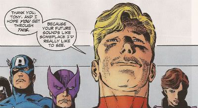
The AVENGERS one was truly heartbreaking. I really felt for Tony Stark as he milled about his colleagues unable to warn them of the dreadful future which awaited them all. To look at each of those faces and know that they were aiding you in bringing about a witless future of incessant babbling and senseless plots must have been heartbreaking for him. Lee Weeks did the art and he’s totally awesome. Lee Weeks is to MARVEL as Jose Luis Garcia Lopez is to DC. If either company let either gentleman regularly adorn their pages both companies’ quality would be immediately improved by a scientifically calculated 65%. Which I know is a fact because I just made it up. But DC are content to have JL-GL drawing pictures for underoos and MARVEL just keep Lee Weeks in a box under the stairs or something. Amazing.
Well since your future comics make the scripting on The Suite Life of Zack And Cody look like Pinter, I think you'll probably envy the dead, Hank.
Illustration By Lee Weeks/Tom Palmer. Words and irony by Christos N. Gage
The Captain Britain one was okay and successfully captured the essence of '80s Britain by Veronica Gandini using a colour palette based on watery diarrhoea. I can’t remember what happened as I've slept since then but I think Cap was a bit of a fool and it was definitely set in Alan Moore’s excellent (you heard me Mr. Graeme McMillan!) Captain Britain run so that helped. Oh yeah, the British Army turned up to help save the day, so I guess this must have been one of the days when they weren't allegedly wearing unmarked police uniforms and kicking the tar out of striking miners. Not that they did that. That's how rumours start so watch that stuff. Jesus, Britain in the '80s. Airstrip One a-go-go. Nurse!
The FANTASTIC FOUR issue starts off with a Power Man and Iron Fist appearance on which Nick Dragotta does a really first rate job. Totally tip-top stuff with cracking storytelling and beezer body language. Thanks, Nick Dragotta! The Fantastic Four part is pleasantly silly with Johnny Storm fretting about growing up (Elliot Kalan means YOU!), Tonio and Stormy visiting a club where everyone dresses as superheroes (leading to a nicely icky Sue Storm joke), meeting Drunk Tony and facing off against Doctor Doom! Reliable Ron Frenz and Sturdy Sal Buscema provided the art which is both sturdy and reliable in a manner which far too few people appreciate.
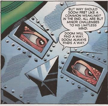
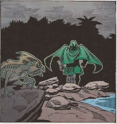
Hey, I’m old so I quite enjoyed these issues largely because they possessed a plot, everyone spoke in a clear manner and they were just really entertaining all round. Maybe it had nothing to do with my failing mind and everything to do with craft/skill. There's a thought. Oh yeah, it didn't hurt that there were panels like this:
Who doesn't love panels like that? Tories!
(Illustration by Ron Frenz and Sal Buscema. Words by Elliot Kalan.)
Of course due to recent developments I won't see how this series ends. (I believe this is called foreshadowing. C’mon and watch me now. Huhn!) Setting that aside for the nonce (for I am nothing if not a nonce) for the price of this series I could have sated the nostalgic within by purchasing a fat b/w volume of ESSENTIAL MARVEL TEAM-UP (Or ESSENTIAL MARVEL TWO-IN-ONE, I’m more of a M T-I-O man myself. High five, Ron Wilson! High five!). So although it was satisfyingly solid old-school entertainment MARVEL’s senseless pricing shoots it in the foot and makes it EH!
JUSTICE SOCIETY OF AMERICA 80-PAGE GIANT 2011 #1
Scott Hampton, Josh Adams/Bob McLeod, Victor Ibanez, Tim Seeley, Andy Smith/Keith Champagne, Nic Klein and Mister Howard Victor Chaykin(a), Steve Niles, B Clay Moore, Matt Kindt, Matthew Cody, Drew Ford, Ivan Brandon and Adam Beechen(w), Daniel Vozzo, Thomas Chu, Ego, Richard & Tanya Horie, Chris Beckett, Nic Klein and Jesus Arbutov(c) and Rob Leigh lettered every story much to my typing finger's relief.
(DC Comics, $5.99)
Steve Niles continues his, to my mind, unbroken decades long run of profitably confusing unoriginality, terrible prose and nonsensical tedium for horror while Scott Hampton is just tragically wasted on this pish (but his Justice Inc. backups with Jason Starr in DOC SAVAGE were several nice slices of awesome pie. Available in back issue bins – now!) And if you think that was a twist at the end, pal-o-mine, I can only say EH!
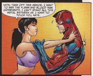
Then there’s some creepy stuff with Sarge Steel picking a damaged young woman (I guess she’s attractive; it’s hard to tell from the art) and basically building her up and leading her on even though he knows her soft young hands can never cradle his lifeless metal honker. Seriously:
This world we live in, I swear. This world.
(Illustration by Tim Seely. Words by Matthew Cody.)
It all ends with a sad cookout so I guess that makes it homely not skin crawling. Like witnessing any old dude grooming some young chick it made me feel AWFUL!
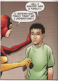
The next one is weird as it involves a Yakuza who has the magic power of shooting people really good but is only a bad man because the Yakuza are holding his son hostage. I don’t know, Yakuza Man, but if you are that exceptional at death dealing shouldn't you have rescued your son earlier? Anyway Yakuza Man dies and some JSA members (Who? Sorry, I forgot to care.) have to rescue his son who has inherited his super killing powers so we can end (actually it just stops rather than ends) with this:
You can have mine, Fumio. Then I can go down the pub for once.
(Illustration by Josh Adams. Words by B. Clay Moore.)
Because if it involves a crying kid with a gun we can all just assume that somewhere in there we all must have learnt something very special. All I know I learned was that this was AWFUL!
There’s an Alan Scott Green Lantern story which has scenes that just end rather than have a point and seems to just be there to explain that magic is called magic because it is magic. Which is magical. Victor Ibanez' art is nice though, it’s a bit Steve Pugh-y. Alas, not even an artist as good as Ibanez can make Alan Scott’s new uniform look like he’s wearing anything other than what appears to be an exoskeleton made of lawn furniture. Still and all, art as good as this at least lifts it to EH!
The Jesse Quick one equaled the second Green Lantern tale in that both were so bland/incoherent they slid straight off the surface of my brain and pooled into a puddle of AWFUL!
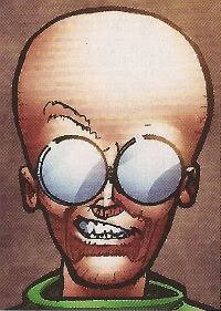
Hey, if the big hand is pointing to JSA and the little hand is pointing to Howard Victor Chaykin it must be HUAC-O’Clock! Again. The script is about how even the stupidest of men can do some good or something. It isn't very good. Howard Victor Chaykin cheekily turns in a couple of pages he’s not quite finished (the hospital bed one, the supermarket one) but retains his special place in my withered heart by gifting us this goofy looking dude:
"How you doin'?"
(Illustration by Mister Howard Victor Chakin.)
Remember goofiness? I do and I say goofiness is OKAY!
Unless you are me or Howard Victor Chaykin’s mum this comic was AWFUL! Heck, even if you were me or Howard Victor Chaykin’s mum this comic was still AWFUL!
CREEPY #6
Nathan Fox, Shawn Alexander, Kevin Ferrara, Garry Brown and Neal Adams(a), Joe R Lansdale, Christopher A. Taylor, Alice Henderson, Dan Braun, Craig Haffner and Archie Goodwin(w).
(DARK HORSE COMICS, $4.99)
O! America! You guys used to be so good at anthologies! You totally did, I can tell you. All those EC comics people insist on reprinting in formats too expensive for me to purchase are printed testimony to that! And then there are CREEPY and EERIE the fondly remembered not-as-good-as-EC-but-pretty-good-depending-on-which-editor-was-in-charge-‘70s anthologies currently being reprinted in formats too expensive for me to purchase. But how are you now, America? How are you at the anthology format now? Let’s take a looky-loo at the latest manifestation of CREEPY:
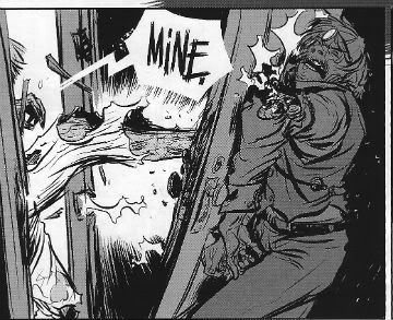
Joe R Lansdale and Nathan Fox have the best offering with “Mine!” a relentlessly paced piece of grisly nonsense about a cowboy being chased by a gluttonous corpse. It works really well, suggesting the tone of Looney Tunes cartoons while never stinting on the gore. Joe R Lansdale and Nathan Fox previously collaborated on PIGEONS FROM HELL which is much better but this was still VERY GOOD!
Nathan Fox does stuff like this:
Nathan Fox – get some!
(Illustration by Nathan Fox. Word by Joe R Lansdale)
Then we have "Commedia Dell' Morte!" which is a story that mushes up clowns, priests, children, demons and murder in the hope that all that stuff will somehow interact to produce some kind of point without any effort on the behalf of the writer, Christopher A Taylor. The twist is it doesn't! Really nice Kent Williams style art by Shawn Alexander though so it’s OKAY!
"The Wreck" is notable for being largely wordless and Kevin Ferrara's art does a pretty good job taking the strain but Alice Henderson's script could have done with some tightening. Maybe just me but the twist didn't really need spelling out to that extent, give your readers some credit, ey? But all reservations aside it was pretty GOOD!
Reprint magic is provided by Archie Goodwin and Professor Neal Adams with "Fair Exchange"! So it’s hokey and old timey and lovely. I said it’s Archie Goodwin and Neal Adams which is another way of saying it’s GOOD!
Not a bad issue of CREEPY but as with most anthologies it can be pretty (ahem!) variable so I’m just talking about this particular issue when I say it was GOOD!
ROBERT BLOCH'S THAT HELLBOUND TRAIN#2
Dave Wachter(a), Robert Bloch, Joe R Lansdale & John Lansdale(w), Alfredo Rodriguez(c) and Neil Uyetake(l)
(IDW, $3.99)
Here's some craft, pals. Bet no one's buying this, besides my own bad self, but it's got craft by the bucket. It's an adaptation of a 1958 Robert Bloch (1917-1994) Hugo Award winning (in 1959) short story so right there you've got some strong craft. It's going to be an engine designed to entertain but if you bend down and put your ever-loving ear to it it's going to tell you stuff as well. Stuff about life and the living of same. Used to be you could do that; entertain and illuminate both at once. Not bad for a genre short but when it came to genre shorts Robert Bloch knew his onions. Joe R Lansdale is pretty well informed about hollow leaved plants containing edible bulbs too. Heard tell of him? No? Go read THE BIG BLOW and get back to me, I'll wait...
...no, no need to thank me, thank Joe R Lansdale. Joe R and his own son John do a neat job on the old adapting duties. It's sweet, clean and quiet. Fact is they are pretty unobtrusive and unobtrusive is surely conducive to immersion. A thankless task to be sure unless you appreciate craft. And this is no stale antiquated tale this one. Though the bulk is Bloch's the Lansdale's and Dave Wachter pop a couple of contemporary references in there but cleverly so as not to burst the bubble of suspension of disbelief. Someone's been watching Mad Men is what I'm saying.
And Dave Wachter? I'm telling you to keep an eye on this tyke. He ain't loud and fancy like some travelling salesman who's gone when the morning comes leaving you with just a cheap bible and a water infection, no, he's a straight up straight arrow. Comes in does his job and it's only later, on reflection, that you realise how cleverly he handled that scene transition here or subtly supported the text with a slight artistic nudge there. Brings the creepy stuff good too.
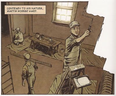
It's not perfect (there are two spelling errors in one speech balloon, the thought balloons in the bird shit on the jacket scene don't work) but it's admirably restrained and honestly admirable in its emphasis on craft. So I reckon this one walks quietly and carries a big stick. Creatively speaking. In reality Joe R Lansdale is a dab hand at karate and needs no stick. I suspect if you came at him with a stick he would probably break that stick with your face. So don't do that rather buy this because although might take a while to cotton on it's really VERY GOOD!
Craft in action! Subtlety in motion!
(Illustration by Dave Wachter. Words by Bloch & The Lansdales)
Looking ahead if things go according to plan the only MARVEL Comics I’ll be discussing in the future will be DAREDEVIL, PUNISHERMAX and AVENGERS 1959. I think you know why.
(choke!)I’ll miss you Chris Samnee (sob!). You stay strong for me now, Chris Samnee.
Enough, MARVEL! Give The King his due! Pah! Enough!
(Illustration by Ron Frenz & Sal Buscema.)
(Doctor Doom created by JACK KIRBY.)
