"You Can't...Put A BULLET...In A NIGHTMARE!" COMICS! Sometimes Pleasures Can Be Dark Indeed!

Thanks to the snow and the UK's inability to ever cope with it I got a bit of extra time (but not your...kisss!). I'll have to make that time up mind you, but don't you worry about that, because here's a pitiful splatter of words about a collection of Tom Sutton's work on Charlton's "ghost" line of comics. I should probably tell you upfront that I liked 'em, because I know I can be a bit equivocal about this stuff.  photo TSCTTeddyB_zp sa3cbbc52.jpg
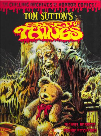
Anyway, this... TOM SUTTON'S CREEPY THINGS (The Chilling Archives of Horror Comics #9) Art by Tom Sutton Written by Tom Sutton, Nicola Cuti & Joe Gill Edited & Produced by Michael Ambrose & Donnie Pitchford Yoe Books/IDW, $24.99 (2014)

 photo TSCTCovB_zps51444402.jpg

Oh, I loved this book. I loved this book so very, very much. This book is chock-a-block full of stuff I thought I’d never see, but stuff I always wanted to. And here it is and I’m seeing it! Oops, sorry. (Dignity in all things, John!) So, ahem, this splendid tome, from the hands of Michael Ambrose & Donnie Pitchford, contains reprints of a selection of strips and covers Tom Sutton drew (and many of the stories he also wrote) for the comics publisher Charlton's "ghost" line during the 1970s. I don’t think they’ve been reprinted since they first appeared, certainly not in bulk; I know they were all fresh sights to my eyes.  Which isn’t surprising as even though, like all good 1970s children, I was gluttonous in my hunger for four colour papery entertainment, Charlton rarely formed part of that eye diet.

 photo TSCTSerumB_zps82b9c42d.jpg

Mostly this was down to Charlton comics being a sporadic sight in obscure North of England market towns like the one in which I festered. The other thing about Charlton comics was that when they did turn up they were so aesthetically displeasing even the least picky child was deterred. Charlton’s poor reproduction and unpleasantly tactile paper are the stuff of legend, but it’s a legend based in fact; they were poorly printed on weird material. When it comes to the company itself fact and legend get all mushed up so, although it sounds like a myth, it is a fact that the company was formed over a handshake in jail. Yet the stuff which sounds plausible, the stuff about how their comics were the result of penny pinching efficiency because the presses had to keep rolling 24/7, might be a legend (it depends whose “facts” you read). Mind you, on reflection “The presses must never stop! They hunger.” is all a tad Oliver Onions, non? Delightfully so. Then there was the flood which submerged the company under 18 feet of water in 1958 and I’ve even heard that the nightwatchman had a hook for a hand and strange lights came from the gents on Wednesdays. From this physical and temporal distance relying on other people’s accounts Charlton sounds not so much like a comics publisher than a haunted house. Or a cursed one at least. Where better for the work of an artist whose art is as sinister as that of Tom Sutton to infest?

 photo TSCTSwirlB_zpsd1f95e57.jpg

Obviously that creaky and laborious conceit all rather crumbles to dust in light of all the other comics Charlton produced but I’m trying to keep a creepy theme going and you’re making that hard with your insistence on facts. So, yes, okay, Charlton didn’t just produce horror comics they produced western comics, war comics, romance comics, super-hero comics (Blue Beetle, Captain Atom, E-Man), licenced comics; remember, the spice must flow; the presses must never stop. And Tom Sutton probably drew some of those, but they aren’t in this book. This book is all about his Charlton horror comics (For pedants: yes, there's one S-F and one "barbarian" but they all appeared in the "ghost" line of books). Sutton worked at Charlton for the same reason as Steve Ditko - they paid pennies but they left you alone. As long as pages were coming in they were happy, which meant what was on those pages was at the mercy of the artist. Artistic freedom, I believe they call it. The results can vary depending on the artist (O God, can it vary; truly, it varies) but in Tom Sutton's (and Steve Ditko's) case the results were wonderful.

 photo TSCTFiligreeB_zpsbc3a18cb.jpg

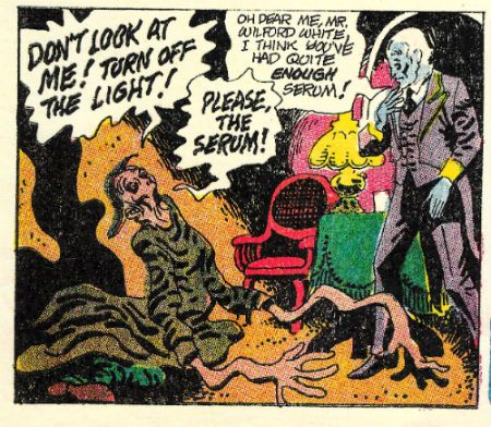
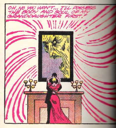
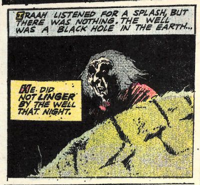
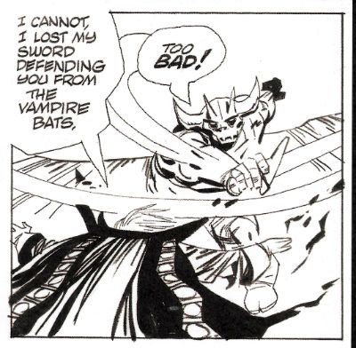
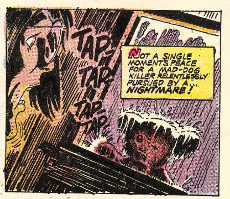
Not so much because of the plots, which sound daft when torn from their visual context. These artfully mottled pages contain a vengeful stuffed toy, a drunk and lonely ghost, an unfortunate marriage or two, a sea monster; basically a bubbling broth of all the rote , but fun, genre markers of horror of the 1970s. Yet Sutton’s art brutally lashes these mostly slender, and derivative (but sometimes original, to wit - a love story told from the POV of a grave) concepts to the end of their allotted pages and the results may leave your higher brain unruffled but your lizard brain will be skittering about like it sat on a hot rock. These strips leave hazy emotions lightly roiling in their wake as though something disturbed is moving around down there in the mud of your mind. Something angry;something hungry.

 photo TSCTwellB_zpsa5250df5.jpg

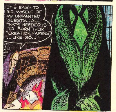
I guess it is style over content, but in that good way Comics can carry off; the style is sometimes also the content. Mostly, the content fills while the style kills. So, no, it isn’t the killer teddy bear which unnerves; it’s the world of razor sharp lines and blooms of stygian black you inhabit while reading which goes quietly about its terrible work of suspending your disbelief by its ankles. Sutton’s work can sell the silliest or most pointless stories because the seriousness is in the art. So, yeah, it's a story about a blob in love with a robot but when Sutton draws it, you can tell he's all in. They are stories but sometimes only just; sometimes it's better to see them as wells of mood into which Sutton’s art pitches you. The unfathomable depths of Sutton’s blacks in which he couches his sudden lurches into intricately filigreed detail are not only how the tale is told, sometimes they are the tale itself. "Unscheduled Stop" doesn’t even make any narrative sense but for the duration I was rapt as Sutton starts with one of the most depressing grid pages I’ve ever seen, and by the second page he’s messily riffing on Krigstein’s "Master Race", and then it’s page layout blow-out time as the ghost of Poe directs the Universal creatures in a fantasmagoric dream melt. I had no idea what I'd just read but I knew it was great COMICS!!!

 photo TSCTorigArtB_zpsb51b41c4.jpg

On an aesthetic note, the reproduction of these Comics (and covers) throughout is pretty good. They are presented as was though, so be warned that they do look like old comics. There's no re-colouring or re-mastering or re-anything except re-sizing and reprinting going on here (as far as I can see). Where there is the occasional descent into addled muddiness it’s still within acceptable parameters, I think,  for the privilege of seeing this work. For the most part, sized-up to magazine size as they are here, these pages have (probably) never looked so good. (They still essentially look like old Charlton comics though; I'm just making that crystal clear.) Better yet, there is a smattering of pages that also have never been seen (by the wider reading audience; obviously, someone saw them.) These pages take the form of the original art (from the collection of Michael Ambrose; cheers, Michael Ambrose!) and where possible these B&W reproductions have been used in place of the printed pages. Sutton’s often overlooked precision hits you immediately on these pages.

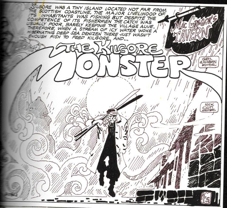
 photo TSCTFishermanB_zps5d59ac72.jpg

The shittines of the above image is due entirely to my scanning ineptitude. In the book this is (as are all other such B&W pages) crisp and clear. So, anyway, often Sutton's precision is lost in the blurry printing and the sheer reckless momentum of his art, but not here. Consider the half page panel of a sailorman stumping forth from a fog. It could have been drawn any one of the current carriers of Sutton's strain of dark genius; it could have slid from the brush of Michael T Gilbert, Steve Bissette or Kevin O'Neil only yesterday. But it didn't, it was drawn by Tom Sutton in 1974. In 2015 I am still impressed with the apparent ease with which Sutton makes the background elements creepily cohere into a shape of Cthulloid menace. It's just one of Tom Sutton's Creepy Things and this book's bloated with 'em. VERY GOOD!

"...Sweet Innocence Defiled By The Breath Of Foulness..." COMICS! Sometimes The Undead Are Impeccably Dressed!

"Four hundred years ago my vampiric kiss transformed the woman I loved into a soulless thing called Mary, Queen of Blood! Today an unholy order follows her evil designs, and the blood they spill is on my hands!..." But enough about me. What about Andrew Bennett? What about "I...Vampire!"

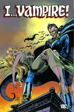
Anyway, this...  photo IVamp_BlimeyB_zpsa521d809.jpg I…VAMPIRE! Art by Tom Sutton, Ernie Colon, Adrian Gonzales, Paris Cullins, Dan Day and Jim Aparo Written by J M De Matteis, Bruce jones, Dan Mishkin, Gary Cohn and Mike W Barr Lettered by John Constanza, Gaspar, A Kawecki, Andrews, Ben Oda, Todd Klein, Jun Roy Talactac Coloured by Adrienne Roy I...Vampire! created by Tom Sutton & J M De Matteis (Contents Originally appeared in House of Mystery #290, 291, 292, 293, 295, 297, 299, 302, 304-319 & The Brave And The Bold #195 (1981-1983)) DC Comics, $29.99 (2011)

 photo IVamp_CovB_zpse830746c.jpg

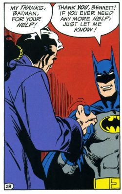
The younger, far more agreeable, me used to buy House of Mystery off the spinner rack in the UK so I didn’t always get to see every issue. The issues I did see I usually bought because they had such damn fine covers. It’s a truism that the covers of DC’s “mystery” line of anthologies were usually the best bit, mostly because it’s true. Oh, they had nice art inside but the stories were mostly pointless things that stopped rather than ended and banked on the fact that some supernatural trappings would distract you from all the other failings. They looked like Twist-In-The-Tale tales but the Twist was usually that there was barely a Tale. I still bought ‘em because they looked good and had werewolves and skeletons in. Look, here’s the big thing about kids and entertainment; they aren’t that picky. Anyway, things picked up content wise for HoM when, in 1981, it started running "I…Vampire!” This was a, rare for these books, continuing series which lasted until 1983.  Of course the downside to continuing episodic serial fiction for filthy foreigners  such as my self was, as I said, that the younger, far more agreeable, me used to buy House of Mystery off the spinner rack in the UK so I didn’t always get to see every issue. But that’s okay because here, in this volume, there is every one of the 24 original chapters of "I…Vampire!” And also, an issue of Brave And The Bold in which "I…Vampire!" teams up with Smilin' Batman! Remember when Batman smiled? Good times.

 photo IVamp_BatmanB_zps2ceaf234.jpg

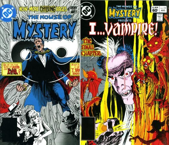
Upholding the “mystery” line tradition the covers are the best bit here, but in a welcome break from tradition the actual comics are pretty neat too. It’s just that the covers are by Joe Kubert and Michael William Kaluta. I mean, come on now. Mind the carpet; I believe your cup just did runneth over! Both artists provide fantastically atmospheric and alluring covers despite their conspicuously different styles. Kubert’s usual superficially wild lashings of ink retain their timeless impulsive energy and his signature imprecision creates a sense of instability, of flux; one wholly apt for the gaudy transformative horror of the strip. Kaluta, naturally, is far more precise with a far lighter line producing a far more ethereal and desiccated effect which, unlike Kubert, serves to underscore the melodramatic pathos at the heart of the lead character. Because "I…Vampire!" one Andrew Bennett by name, is a right whining  mimsy and no mistake.

 photo IVamp_CoversB_zpsc0746c9d.jpg

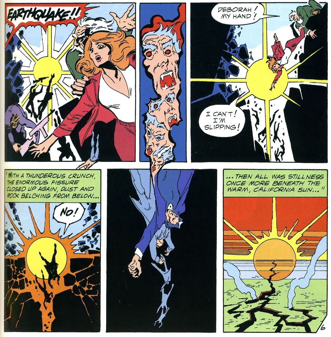
Mind you, he’s every reason to be moody what with his wedding preparations being interrupted by his sudden initiation into vampirism via a passing manky monk. Even in 1591 I imagine weddings were fraught enough affairs, as the mobile disco had yet to be invented, without being turned into an undead leech on humanity. A vampire I’m talking about there, not a lobbyist. Somewhat rashly Bennett shares his curse with his betrothed, Mary, only to find that she takes to it with somewhat more alacrity. Rebranding herself as Mary, Queen of Blood she organises her fellow nosferatu into The Blood Red Moon and embarks on a crusade to enslave humanity. When we first join him in 1981 Bennett is busy trying to kill the woman he loves and foil her evil schemes. Hobbies are important to men, after all. Luckily he isn’t alone. There’s Dmitri Mishkin who throughout the series will provide creepy oedipal fun aplenty as he tries to kill his vampiric mother. Sadly Dmitri probably isn’t related to Dan Mishkin one of the series’ later writers as that would be really weird and suggest a serious reappraisal of all our realities. Now as alluring as matricidal elderly Russian men are DeMatteis chooses to provide Bennett with a more traditional love interest in the form of Deborah Dancer. Yes, her name was Deborah. Deborah. But whether she had woodchip on the wall or, indeed, her house was very small remains unrecorded. That’s the basic set up then for the series with a bit of an alcoholism subtext as Andrew struggles to survive without taking a human life. This setup takes a whole ten pages, and stands De Matteis in good stead freeing him up to dash off in a number of unfeasible but entertaining directions. After five issues he runs out of puff and passes the baton to Bruce Jones.

 photo IVamp_QuakeB_zpsc01ac6e1.jpg

Jones barges right on in and starts marking his territory in no uncertain times. Initially he resets the series to the TV Hulk template. Now Bennett will be meandering down the lonely road to intersect episodically with different people with terrible consequences. Mostly for them. There’s an absolute cracker of an episode where Bennett takes up with the wife and child of a man whose death he has caused. Now, obviously lessons will be learned, closure achieved and there’ll be a sad departure leaving everyone wiser and richer. I don’t want to spoil anything but let’s just say that Bruce Jones sets about your expectations with a ball peen hammer and doesn’t let up until they are unrecognisable. Bruce Jones’ is really good at undercutting expectations is what I’m saying there.  This is aided and abetted by this disdain for logic, but I’m guessing entertainment is  a greater consideration for Bruce Jones than sense. I say that with some confidence because quicker than Threshold got cancelled he remembers he likes time travel and things get entertainingly insane fast as the series becomes a chronally unstable race between Bennett and Mary to save/kill the ancestors of the inventor of the cancer cure which is, in the 1980s, killing all the vampires. You hardly need the gift of Second Sight to know that Jack The Ripper turns up, Gaw Blimey! He’s near sawed ‘er head clean orf!

 photo IVamp_UBoatB_zps9ab74304.jpg

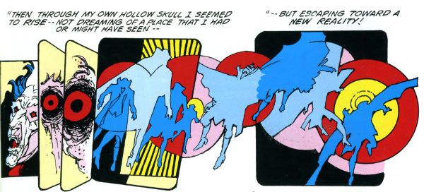
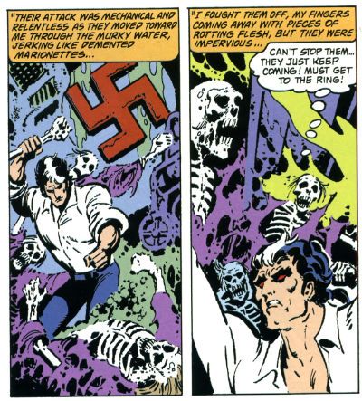
In comparison to Jones' satisfyingly eventful irrationality Mishkin and Cohn serve up altogether more sedate fare which favours the adventure elements largely to the detriment of the horror and occasionally steps straight into the puddle of preachiness. Don't mistake me, they aren't terrible, but it just takes them time to fling off their inhibitions and skinny dip in the straight faced silliness the strip requires.  Also, in "By The Time We Got To Woodstock..." a vampiric threat is destroyed by a combination of Jimi Hendrix playing live and the combined Love emanating from a field full of self obsessed drug addled Hippies. Which is terrible on an almost cellular level. But it is still amazing; I’ll give them that much. By the time the strip climaxes they have, fair’s fair, rallied their talents enough to provide Andrew Bennett with a finale as fittingly inventive, daft, moving, horrific and optimistic as he deserves. And then there's Tom Sutton. Tom Sutton who provides the bulk of the art on these pages and proves himself a showstopper and no mistake.  photo IVamp_DreamB_zpse422ffd9.jpg

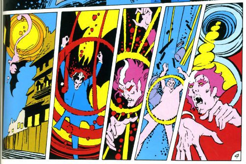
TOM SUTTON (d.2002)! If this book is worth a place on anyone's shelf (and it is. Mine!) it is because of Tom Sutton. Tom Sutton makes this series work. It’s difficult to believe that Sutton's art ever found a more suitable vehicle than "I...Vampire!" Maybe it did, let me know. I assure you, I'm all ears. Look, Tom Sutton is a maniac on these pages. Forever throwing in one nifty bit of business after another; if it's not innovatively having the contents of a panel bleed across the gutters into another, it's a series of panels showing motion or physical transformation in a manner reminiscent of psychedelic wig out movies. Tom Sutton is clearly enjoying himself here and his enthusiasm is as infectious as the vampirism he’s called upon to illustrate.

 photo IVamp_BoozeB_zpsb4394d3d.jpg

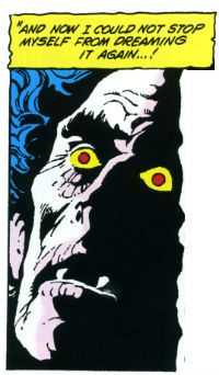
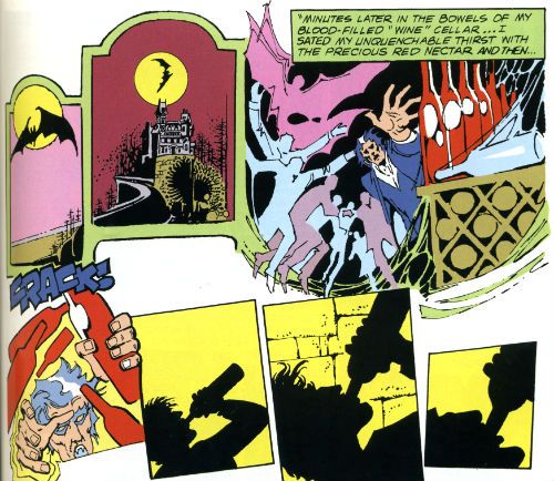
Sutton's stuff isn't pretty, elegant or, in panel to panel continuity terms, particularly consistent but it doesn't need to be. In fact I'd say it spits on such stuff. Because while energy isn't unusual (although it could do with being more usual) in comic art, Sutton's energy has a definite edge of anger to it. Fitting the strip to a tee there's a sense of dissolution permeating every one of Sutton's panels. An unsettlingly organic feel, as of fruit past its best and sliding into sweet rot. Sutton's work lifts the series out of melodrama into debauched melodrama, spectacularly flamboyantly debauched melodrama at that. Sutton's art looks like it actually has an odour. And it looks like you should thank your luck stars you can't smell it, as it would be a rank and vinegary one I'm guessing. It’s not all bug eyed hell for leather ostentation though.  Sutton’s smart enough to vary the intensity of his art so that although the whole thing looks like you're viewing it through eyes hot and misted with fever, at times it goes beyond even that; Sutton’s images become deliriously inflamed and pass seamlessly into the realm of the rawly hallucinatory.

 photo IVamp_AwesomeB_zpse0d33cea.jpg

I single Tom Sutton out because while everyone else here does good work they all did better work elsewhere, but I'm not Sure Tom Sutton did. His garish, visually mushy sensibility lines up with "I...Vampire!" so well he effectively makes it what it is. And thanks, primarily, to Tom Sutton "I...Vampire!" is like Liberace wrote Interview With A Vampire but in COMICS!!!!

Now, how can that not be GOOD!