As tradition dictates I read some comics and then wrote about them. However, I feel it incumbent upon me to direct your gaze further down the page where two other people have done some real writing. Don't worry there's none of that below this cut; consistency is key!
 By Scioli & Barber
Anyway, this...
ALL-NEW DOOP #4
Art by Frederico Santagati & David LaFuente
Written by Peter Milligan
Coloured by Laura Allred
Lettered by VC's Clayton Cowles
Cover by Michael & Laura Allred
Doop created by Michael Allred & Peter Milligan
Marvel Entertainment,$3.99 (2014)
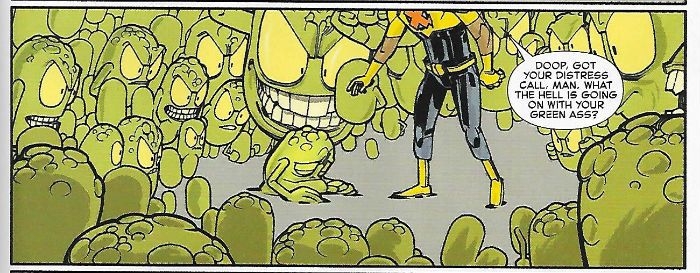
In which Ingmar Bergman is invoked, the man whose name is an anagram of Racial Kite returns, points are avoided, developments delayed and a Free Digital code still isn’t any compensation for charging three dollars and ninety nine cents for a slim pamphlet. I could buy a house for that. A house that looked and acted very much like a coffee anyway.
 By LaFuente, Milligan, Cowle and Allred
If I just ripped right into this as it so richly deserves (it’s a mess, and not one of blues, nor of eggs) you’d probably think I had some kind of beef with Peter Milligan. I don’t. Just because I dislike this ungodly and resolutely lifeless muddle doesn’t alter one iota the joy and wonder of all the stuff Peter Milligan, together with various talented artists, has done which I do like. It’s not to be sniffed at either that stuff: Bad Company, Skreemer, Enigma, The Eaters, Shade The Changing Man, Skin, Rogan Josh, Paradax, The Extremist, Vertigo Pop: London, Egypt, X-Force, X-Statix, Animal Man, Face, Girl, The Minx, Human Target, Hellblazer and probably some other bits and bobs here and there. The art is good but it’s by two different people and this together with the fact that last issue a character appeared in a scene they shouldn’t have been in suggests some backstage shenanigans. Pure conjecture there but what remains beyond doubt is this book is refusing to work. If you’re a big hearted soul you could read this as some impish piss take of how vacuous busywork is now the hallmark of the current X-books but for those with normal sized hearts the best way to read this remains not to read it at all. EH!
BATMAN '66 #13
Art by Dean Haspiel
Written by Gabe Soria
Coloured by Allen Passalaqua
Lettered by Wes Abbott
Cover by Michael & Laura Allred
Batman created by Bob Kane with Bill Finger
DC Comics, $2.99 (2014)
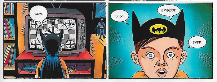
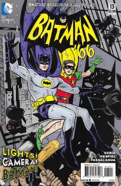 All of Gotham sits agog before the cathode ray counterparts of the caped crusaders! But what’s this? Is video villainy afoot? Don’t touch that dial, chums!
 By Haspiel, Soria, Passalaqua & Abbott
Hey, Dean Haspiel! I like Dean Haspiel! He draws his figures all chunky and loaded with momentum dspite an oddly flat aspect. I like it and I liked seeing it unfold in service of Gabe Soria's comedic conceit about how in the frothy primary coloured world of Batman ’66 a Batman TV show would be all grim and B&W but still as fundamentally ridiculous as the world in which it was transmitted. Possibly even more ridiculous even. The highlight is obviously the whole “bat-business” schtick which is even better if you use the voice of that “Ya filthy animal” guy from Home Alone for TV Batman. I mean, you are doing The Voices in your head anyway aren’t you? Do people do that? I know I’m reading a good comic when I stop “reading” and realise I’ve started acting it out in my head. Some people might think it’s strange but I certainly have no problem admitting I do that as long as it’s a common enough to pass for normal. If it’s grounds for having my kid taken off me then I don’t know what the hell you’re talking about; get the fuck away from me you bloody lunatic! GOOD!
BATMAN '66 MEETS THE GREEN HORNET #2
Art by Ty Templeton
Written by Kevin Smith and Ralph Garman
Coloured by Tony Avina
Lettered by Wes Abbott
Cover by Alex Ross
Batman created by Bob Kane with Bill Finger
Green Hornet created by George W. Trendle & Fran Striker
DC Comics,$2.99 (2014)
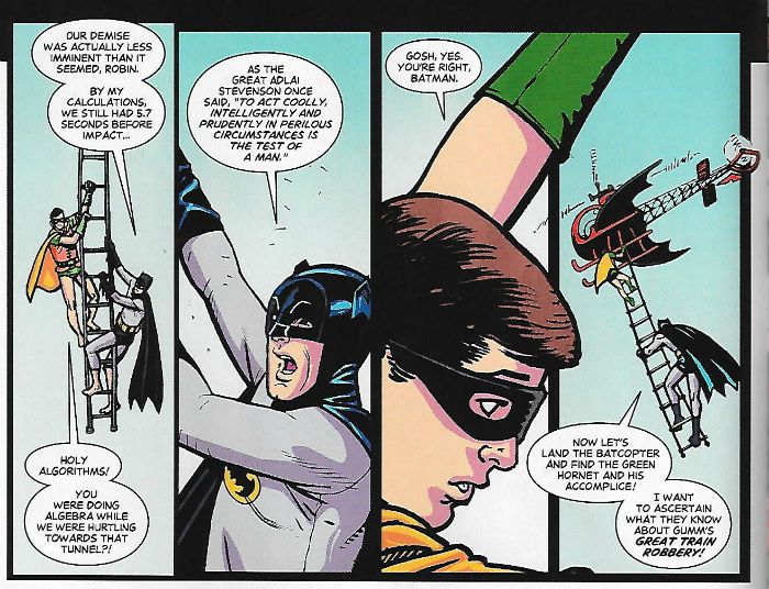
In which Batman ’66 meets The Green Hornet and a malevolently mirthful villain is revealed! Actually, technically, Batman ‘66 meets The Green Hornet again since the pair actually met in the first issue but then they get split up and so meet again. If that happens every issue there will certainly be no complaints lodged with the Trading and Standards people as far as this comic is concerned.
This comic showed up because I get and like Batman ’66. However I have little to no interest in Kevin Smith and in fact have actively avoided his doings ever since, over a decade ago now, I realised with the kind of diamond hard clarity I wish I could experience about things of real importance, that I didn’t actually like his movies; I just liked watching Jason Lee being sarcastic. Turns out you can watch Jason Lee be sarcastic in things which have nothing to do with Kevin Smith. The Free Market in action there. I think we can all agree that being able to watch Jason Lee be sarcastic and know Kevin Smith was not involved is worth every bit of inequality such a system fosters. Anyway, the good news is that this comic isn’t as dreadful as I feared. Now I don’t know who Ralph Garman is but he seems to be exerting a steadying influence on Kevin Smith; there’s no scene in which Robin ends up sat in his own shit or any ridiculously long-winded fulminating the humour of which is in inverse proportion to its length. So, Kevin Smith fans beware!
 By Templeton, Smith, Garman, Avina & Abbott
I mean it still isn’t much cop but it isn’t much cop in such a low key way it’s hard to say precisely why it isn’t much cop. We just don’t seem to have got very far after two issues and we certainly haven’t laughed very much, or indeed at all, but then we’ve not really resented the experience either. And by “we” I mean me and the unquiet ghost of Dandy Nichols, obviously. This qualified success can’t just be down to Ralph Garman as there are also the calmative effects of Ty Templeton’s art to be reckoned with. And this is despite said art being a bit raggedy, a tad approximate even, in places and generally looking as though he’s loaded up his brush with too much ink. Little matter, because underneath all that there’s still the appealing solidity of his figures, the slight quirk of his line and a definite talent for the delineation of Caesar Romero. And yes, Children of The Now, I realise this brush very likely never existed nor was ever dunked in ink as this is one of those digital books they chuck into print to maximise revenue streams or whatever the expense account big boys chunter over by the white boards. Alex Ross’ covers are fun too. Don’t want Alex Ross sulking in the corner; nice covers, Alex Ross. So, yeah, you can probably tell from the preceding that I wasn’t really engaged by this comic but in tribute to Kevin Smith I did give it an overly verbose, self-indulgent and resolutely charmless review. OKAY!
THE GREEN HORNET (2011)
Directed by Michel Gondry
Screenplay by Seth Rogen & Evan Goldberg
Starring Seth Rogen, Jay Chou, Christoph Waltz, Cameron Diaz and Tom Wilkinson
Green Hornet created by George W. Trendle & Fran Striker
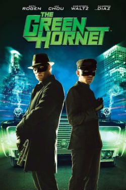
My spawn wanted to watch this so we watched it. I swear he has powers beyond mortal ken (also I didn’t mind if I did either). Naturally I had been assured by the world outside my window that it was a big old stinker but since that’s the same world that liked the Nolan Batman films I didn’t listen. Also, The Lone Ranger had been denigrated by all and sundry and my spawn enjoyed that so, yeah, ignoring all warnings we gave The Green Hornet a shot. First of all there was too much f*cking effing and jeffing; if they’d f*cking cut that shit out a lower rating might have resulted and what should have been a f*cking kid’s film may have actually been seen by some f*cking kids. You know, kids other than those whose parents are terrible gatekeepers. Because, yes, I know it was a 12 certificate but, oh alright, I’m just a sh*tty parent and while we can talk all day about the sh*ttiness of my parenting (it’s pretty sh*tty by all accounts) I think we should all just move on to the movie. I could be biased there. So, The Green Hornet; I liked it. More importantly Wallace Kirby Chaykin Ditko Kane (or “Gil” for short) liked it. Although a lot of his fun was looking at me with a “HOO! HOO!” face every time someone swore. Which was pretty f*cking often. He had a good time though; Kato was his favourite because Kato kicked butt like butt kicking should be done. I liked the colours and general design sense of the thing and I thought Gondry was surprisingly good at action; it’s not really his usual stamping ground is it? And yet I always knew what was going on and there was quite a lot going on at times. Seth Rogen plays that “Seth Rogen” character he always plays and I find that amusing but I don’t need to see any more of it for a bit; Jay Chou was funny and charming and got all the best physical stuff; Christoph Waltz was just a joy and, yeah, um, Cameron Diaz unwisely hogs a role that should have gone to some up and coming actress and is just plain embarrassing every time she appears. It's more of a Seth Rogen film than a Green Hornet film but that's OKAY!
THE SHADOW: MIDNIGHT IN MOSCOW #2
Art by Howard Victor Chaykin
Written by Howard Victor Chaykin
Coloured by Jesus Arbuto
Lettered by Ken Bruzenak
Cover by Howard Victor Chaykin & Jesus Arbuto
The Shadow created by Walter B. Gibson
Dynamite,$3.99 (2014)
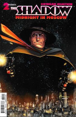 In which The Shadow continues to prepare for his departure; turning off the gas, cancelling the milk, slaughtering criminals and uttering bleak aphorisms along the way.
 By Chaykin, Arbuto & Bruzenak
I think the only person who enjoyed the first issue of this series more than me was Howard Victor CHaykin because here it is again. OKAY!
WONDER WOMAN #33
Art by Cliff Chiang
Written by Brian Azzarello
Coloured by Matthew Wilson
Lettered by Jared K. Fletcher
Cover by Cliff Chiang
Wonder Woman created by William Moulton Marston
DC Comics, $2.99 (2014)
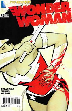 In which all things move towards their end and Diana, the newly anointed God of War, rejects an offer of Love from that guy seemingly made of compacted corned beef while her allies savour the sour taste of loss. (OR: Wonder Woman’s search of the jungles of Paradise Island for a headache remedy proves fruitless as the paracetamol.)
If you scrape past the crap (and we’ll get to that; the crap) that’s accreted around it this run of Wonder Woman has been a pretty interesting if slow moving in the mighty modern manner. It’s been a bit of a go at a Sandman for the iPod generation or maybe a nice try at a Percy Jackson, but for children (insert smiley emoticon to indicate a joke nearly happened). Definitely more of an ensemble piece than usual and thus Wonder Woman has sometimes been lost in her own book. But on the plus side there’s been some clever reinventions of ancient idols without falling into that “Denzel - God of 8-Bit Cartridges” trap most mythic modernisers run right into (see: Neil ”Have You Now Or Have You Ever Been A Scientologist” Gaiman). Unfortunately there’s a lot of nose holding going on even as I enjoy the parts of the book which are actually enjoyable. And let’s be clear here absolutely none of the faults of this book lie in the art (except for a bizarre colouring blip this issue where it’s like someone accidentally pressed the “Edgar Delgado” button or something). The art here and throughout this run has been pretty fantastic. I mean there’s a reason I’m still sticking this book out and it sure as cupcakes ain’t the words. Chiang’s back for this final trot towards the end and most of the art for the book’s run has been from either his hands or Goran Sudzuka’s. It hasn’t been as consistent as one pair of hands but it’s been pretty consistent and while Sudzuka’s been no Chiang he’s been no slouch either. There’s been a Toth-ian emphasis on clarity throughout and the detail light results have hovered near the cartoony end of the illustrative spectrum, but that’s been all to the good; some of the stuff they’ve been called on to draw would have been pretty repellent if it hadn’t been presented with such a lightness of touch. Sadly lightness has been entirely lacking from the touch of the giant ham hands of Brian Azzarello’s writing.
 By Chiang, Azzarello, Wilson & Fletcher
I try not to be a complete idiot so I realise the staginess of Azzarello’s work is intentional. That’s okay, I don’t mind that; Jack Kirby’s comics read in much the same “stagy” way (but in a way that actually "works"; for me anyway, and I'm all that matters). But Azzarello takes it to excess. There’s this thing he does where there’s very little dialogue in a panel and it creates a kind of beat of silence as you move onto the next panel; this is a very stagy effect. It’s an intentional pause for the reader to digest what they’ve just read. It’s thus implicit that what you have just read is worth the extra seconds of contemplation your sluggishly bovine mind is humbly being afforded. And that’s okay in moderation (like heroin) and while it would be wrong to say Azzarello does it all the time, it feels like he does it all the time because he does it far too much. Chuck in the mannered phrasing and nearly every utterance becomes a self-consciously theatrical stentorian oration; as though every part were played by the worst melodramatists to ever tread the boards. It’s fine in moderation (like murder) but so much of it is just fucking wearying. And most of this pause for effect business is purely an invitation to bask luxuriantly in Azzarello’s majestic word play. Unfortunately the level of Azzarello’s word play is such that this is like being invited to bask luxuriantly in cow flops. And it’s everywhere, from the terrible titles (Throne To The Wolves, Icy France; the pain, the pain) to the dialogue (or direlogue; clever, eh? No.) There is nothing remarkable in noticing that two different words sound the same and then using one in place of the other. it’s wordplay all right but it’s just play; there’s no serious import there, no further depth, no…it’s just farting about. It’s stagy stuff but it’s stagy to excess and…I don’t know but this isn’t an isolated case is it? Isn’t this what happens with comic writers now? They mistake their quirks and ticks for the reasons for their success and their work becomes just quirks and ticks. It just seems odd that in The Age of The Writer quite a lot of the time the writing is the crap you have to scrape past. I told you we’d get to that; the crap you have to scrape past. Thanks to the art then Wonder Woman was GOOD!
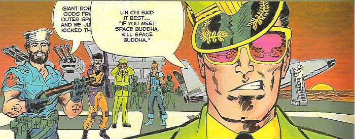
THE TRANSFORMERS VS. G.I. JOE #1
Art by Tom Scioli
Written by Tom Scioli & John Barber
Coloured by Tom Scioli
Lettered by Tom Scioli
Cover by Tom Scioli
Transformers & G.I. Joe created by Hasbro
IDW Publishing,$3.99 (2014)
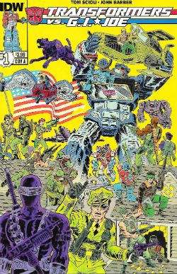
In which two popular children's toy properties I have no clear knowledge of nor any fondness for combine, with the almost certain result that I will express hostility of an almost hateful stripe. Only Tom Scioli and John Barber have the power to avert this disaster; the rest of us can only watch...and pray.
It took an invasion by robots that can turn into cars and stuff but there’s no longer any hiding the fact that Scioli’s work was a sneak attack all along. Flying under The Flag of Jack it’s now revealed for all to see that all that Kirby inflected (KOIBY! infected) alt art attitudinising was all a feint; the real crown he sought to knock askew was that of Wallace Wood. For was there ever another artist who tamed the thrill of toy soldiers and delivered it on the comics page as wonderfully as Wallace Wood? No, Cochise, there was not for it was a hypothetical. From the isolated panels of tanks and trucks and swarming hordes which punctuated such exuberant fare as T.H.U.N.D.E.R. Agents to his greatest evocation of the child at play, M.A.R.S. Patrol, Wallace Wood ruled supreme in the toy box of every child's mind.
 By Sciol & Barber
True to his era Wood’s soldiers were all kin to the one piece moulded plastic cast bought by the box in militaristic multiples but Scioli inhabits times Science Fictional by comparison. His roster of rip snortin’ gun toters are the larger, more articulated figures bought by the single in bubble pack mounted on board. Scioli with Barber channel the magic of play so well you can imagine the tips of their tongues protruding from their mouths as they did so while every panel is pregnant with the possibility that a humongous dog will run through it scattering all and sundry hither nd yon before slipping behind the sofa to slobberingly chew General Flagg's head off. And it all takes place on pages artificially aged so well that the only omission from the illusion are those flecks of dark matter which grace most old comics; those which one always suspects are fly shit. These are pages rich in play also with the very format of comics from the hand lettered SFX to the occlusion of speech by the Krackle and flare of gun fire. Not only have Scioli and Barber done Wallace Wood proud they have done it by producing 21st Century comics' first great work of art. Blowing no smoke up your ass here either; it's EXCELLENT!
It is a truth universally acknowledged that people who start a sentence with those words have probably not actually read any Jane Austen but will very probably have read some - COMICS!


 By Scioli and Barber
 By Burnham, Fairbairn, Morrison & Bowland
 By Scioli & Barber


