"...I Won't Insult You By Quoting Neitzsche." COMICS! Sometimes Chaykin Is Your Higher Power!

Hey, it's another version of Iron Man's origin but with a more realistic approach to booze abusing! So it's over to the Master of The Mai-Tai hissownself Mr. Howard Victor Chaykin, with an assist from Mr. Gerald Parel, to bring all the short term memory loss, vomiting, visuo-spatial impairments, erectile dysfunction and renal failure fans of The Inebriated Iron Man demand! Anyway, this...  photo IM_SO_HEADER001_B_zps1b229974.jpg

IRON MAN: SEASON ONE Art by Gerald Parel Written by Howard Victor Chaykin Lettered by VC's Clayton Cowles Cover art by Julian Totino Tedesco Marvel, $24.99 (2013) Iron Man created by Don Heck, Larry Lieber, Jack Kirby and Stan Lee

 photo IM_SO_COV001_B_zps9a29b68e.jpg

Here we have what I like to call Iron Man: Season of Pissed. I guess an editorially assigned OGN about Iron Man is to a Creative like HVC as a grey day at the office is for an Uncreative like me. Rather than just leadenly type out another lump of chump bait Chaykin's enough of a professional to want to do a decent job. Faced with the umpty umpth (already superceded) origin of the drunk in the metal trunks Chaykin manfully tries to find enough nooks and crannies in between the editorial requirements to make it interesting; interesting for both himself and the reader. He succeeds to the extent that my mind never quite glazed over, as sudden flares of Chaykin burst through frequently enough to keep me on my toes. Heartbreakingly , for me, he can’t go Full Chaykin as this is intended for all those New Readers who want to read Iron Man’s origin after watching those movies. One of which was Iron Man’s origin. Of course HVC’s Iron Man origin is quite similar but also quite different from the movie origin because confusing your audience makes sense. And it does make sense, the only sense that matters; financial sense. Because this “OGN” was originally a 6 six issue mini-series, but you probably missed this when it first came out in pamphlet form, because it never came out in pamphlet form. These contents preceded even the 2008 Iron Man movie and have only now been released, because, hey, it’s been paid for! I hear a cleaner recently found some sketches Jack Kirby did on the back of the cubicle door in the Gent’s which Brian Bendis will dialogue for Christmas release. Early indications are that it seems to involve Stan Lee being attacked by a donkey with five legs or something. Anyway, there’s been no attempt to reconfigure this work for release as an OGN and since Marvel don’t even spring for chapter breaks the narrative doubles back on itself at least once; unjustly making Chaykin appear possessed of short term memory loss much like the loveable liquid fuelled lothario, Tony Stark.

 photo IM_SO_Intervention001_B_zps1e70b5cc.jpg "Every party has a pooper, that's why we invited you!"

Of course dynamic tights and fights action isn't really HVC’s main area of interest so he provides himself metaphorical matchsticks under his eyes by breaking out his classic Hero’s Journey narrative. It works pretty well too, since Tony Stark is a self-involved pisshead. Nowadays of course Tony starts off as a cheeky tippler rather than the owner of a dodgy ticker. Heart problems were okay for the ‘60s, but clutching your chest and grimacing is what old people do and lacks the sexy glamour of staring into a mirror with a big sad stubbly face. By the end of course Tony’s still a dipsomaniacal dickhead but a teeny bit less self-involved since he has had a Moment of Clarity. A couple of such Moments actually because drink really does a number on those brain cells so it can take a bit for stuff to sink in. HVC gets to do a slightly more realistic drunk than that of old ‘80s comics with Tony doing a little bit of sick on some fit girl’s feet and blacking out but, alas, Tony never wets himself so badly his suit shorts out leading to a thrilling incontinence inspired brush with death. Nor does his Moment of Clarity involve waking up pantsless on a strange couch bleeding from a scalp wound with his thighs caked with his own shit. Hey, we’ve all been there.

 photo IM_SO_Maniac001_B_zpsf53e8791.jpg In reality Tony is being rolled for his wallet in an alleyway redolent of dog piss.

It’s a book about Iron Man’s origin updated to the deserts of today’s Terrorist Bad Guys, with a twin set of foes to provide contrast to our hiccuping hero. First up there's HVC's reliable doppleganger who made the wrong choices in the form of The Fundamentalist Ex-Friend. He, in his jerry-rigged suit and certainty of purpose, provides the stark (!) contrast with our more equivocal but better equipped bottle suckler. Because he had 6 theoretical issues HVC doubles down and throws in his usual White Collar Wankers as well. This is a pretty generous allotment of threats to throw at someone who has trouble finishing a sentence so there's certainly some suspense. Luckily Pepper Potts is around in strong ,but definitely, supporting role. Mind you, the white collar bunch’s plan basically amounts to little more than skimming off the top of a budget. The fact that HVC sees this as a cunning plan suggests HVC has never dealt with builders. I bet he has people to do that for him. It all builds nicely with the various threads and threats converging into one big climactic confrontation. It's professional stuff by a professional man. Mind you, HVC does fluff the action finale (if something very (very!) big falls on the villain while he is astride Iron Man then doesn't Iron Man get crushed also?) Actually, that could be a failure of staging on the part of the artist, Gerald Parel. This was his first work for Marvel but clearly isn't his first work ever as he's quite accomplished. Yeah, I like Parel’s work here; work which has a painted look but a soft and flowing aspect as opposed to, say Alex Ross’ doggedly defined offerings. In contrast, Parel’s approach provides rich textures which suggest detail and thus avoid slowing the eye down. Also, Parel is very keen on placing a young lady’s bottom in the panel foreground. Maybe he is just a frisky young man bursting with the sap of Spring or maybe he’s trying to stay awake as he draws another warehouse; one of the many through which our white collar villains persistently stroll practically rubbing their hands together as they explain their complex embezzlement plot very vaguely. It’s attractive stuff and cinematically framed throughout but except for the odd burst it’s hardly dynamic, and sometimes there's a kind of flaky effect like the image has degraded. Ironically much as the titanic talent set of Iron Man’s original artist Dashing Don Heck was ill served by flights and tights these pages suggest Parel might shine brighter in a different genre.

 photo IM_SO_Oooh001_B_zpsf410d9a6.jpg "What you gon' do with all that junk?"

Oh, it’s an Iron Man OGN detailing a more up to date origin written with facility and not a little flair, illustrated pleasingly if slightly passively. Overall it suffers because I judge everything Iron Man by the Gold standard of that time he went back in time to Camelot and punched Doctor Doom in his metal tits. Compared to that this is, like much else in life, just GOOD!

Of course Marvel have endearingly neglected to credit the creators of Iron Man without whom this book, those films and all those billions of Hollywood dollars wouldn't exist. That’s okay because I’ve nothing but time. So yet again; decency costs nothing.

Iron Man was created by Don Heck, Larry Lieber, Jack Kirby and Stan Lee.

Those being the men without whose efforts Robert Downey Jnr would be charismatically portraying nothing. I understand they even get mentioned at the end of an acre of credit crawl on the Iron Man movies or something, but this isn't a movie it’s  - COMICS!!!


"...Not As A Mystery--But As A MAN!" COMICS! Sometimes The King Knew The Score!

Celebrate your Dad, come on! (Let's Celebrate!). Smooth segues be damned on this, The Day of The Father; didjya know that Jack Kirby was also a Father? Like all Fathers Jack Kirby knew of "The Task" but only Jack Kirby dared speak of it. The final, greatest "task" of any Father; when he must remove the bomb from his child's head while waving him or her off into "The Future", remaining behind to be blown up in their stead. Wait, maybe it was a metaphor! Or maybe I just wanted to post some Jack Kirby covers because, hey, today I get celebrated (COME ON!!!) so bit busy, yeah?  Maybe more substantial content later? J_Smitty did some reviews one post down and they're good eating! Yammer, yammer; look, here's some 1970s Jack Kirby magic...  photo 2001_Dad_02001_B_zps2ecad685.jpg

Sure, every Dad'll tell you how he  dreams of the day his spawn will leave home so he can actually watch, oh, that three and a half hour David Lynch film with the rabbit sitcom in it all in one go, or just get so drunk he pukes so hard he turns inside out in his own home. But it's all a bluff facade; they all know deep inside that when it happens it'll be like being kicked in the heart by a Shire horse. Jack Kirby knew that and Jack Kirby drew that. Empty Nest Syndrome but with robots and shouting and stuff. Because Jack Kirby was complex. Jack Kirby was The King:

 photo BYE_B_zpsb4af4cf7.jpg

Of course we all know he won't ring unless he needs money.

And now in a futile attempt to satiate your cavernous need for content here be the covers and splash pages to the short-lived, but EXCELLENT!, 2001: A SPACE ODYSSEY series published by Marvel Comics. A company for whom Jack Kirby famously did some "work for hire"!!! The series was written and drawn by the ceaselessly astounding Mr. Jack Kirby and inked by his finest facilitator Mr. Mike Royer. If you find these issues in a back-issue box pick 'em up because, due to some Rights business, it's unlikely to be reprinted anytime soon. Advice that is, you know, like your Dad gives you. But more fun. Anyway, this...

 photo 2001_Cov_01001_B_zpsbba95ee3.jpg

 photo 2001_Spl_01001_B_zpsc4907d52.jpg

 photo 2001_Cov_02001_B_zps1bad6a48.jpg

 photo 2001_Spl_02001_B_zpsbd0f52fd.jpg

 photo 2001_Cov_03001_B_zps46b6e2d6.jpg

 photo 2001_Spl_03001_B_zps192e00ed.jpg

 photo 2001_Cov_04001_B_zps608b9667.jpg

 photo 2001_Spl_04001_B_zps67c818b2.jpg

 photo 2001_Cov_05001_B_zpse5da108b.jpg

 photo 2001_Spl_05001_B_zps38741082.jpg

 photo 2001_Cov_06001_B_zps2889705d.jpg

 photo 2001_Spl_06001_B_zps6074323f.jpg

 photo 2001_Cov_07001_B_zps644d0433.jpg

 photo 2001_Spl_07001_B_zps9943cc5d.jpg

 photo 2001_Cov_08001_B_zpsfbc91e52.jpg

 photo 2001_Spl_08001_B_zpsf62e7857.jpg

 photo 2001_Cov_09001_B_zps2bb1622f.jpg

 photo 2001_Spl_09001_B_zps47c6c2f2.jpg

 photo 2001_Cov_10001_B_zps272fdb08.jpg

 photo 2001_Spl_10001_B_zps887159e3.jpg


 photo 2001_End_01001_B_zps06839b43.jpg Sup your micro-brews while you can, Fathers of The World.

Well, okay, there may not actually be a party goin' on right here but at least there's always - COMICS!!! Happy "Father's" Day!!!

Smitty Gets in with Four Comics from 6/12

(Knock, Knock) Hello friend.  I represent the universal church of Cyber Terrorist Group, Ascension.  Perhaps you've heard of us?  Though rumours abound regarding our lack of resources - I assure you - we will play a role in the new Superman Unchained comic pamphlet!

SUPERMAN UNCHAINED #1

Snyder / Lee

DC COMICS $4.99


First!

QUICK, TO THE JUMP FOR ---------


Second!


ascension2


EASY there Mr. "heir to the throne."  Lord and master of DC Comics for the forseeable future...we get it.  Sheesh.

LOW OK, mostly for the handling of the supporting cast. Although, personally, I’ve had it up to my neck with their choice for puppet master villain / hate monger. Since when did this guy enter the pantheon of “worthy adversaries?”


SUPERBOY #21

Jordan / Silva

DC COMICS $2.99

Justin Jordan is in and I’m curious to see him moving forward. Here he’s using the secret organization that spawned Superboy to deliver a little one-off. Hopefully, that puts the character on the path to tying up that nagging entity. Hell, it’s only been 21 issues, right?

Maybe Lobdell was writing for the Omnibus?

Anyhow, Jordan’s pretty good right out of the gate with the quippy quippy but I wish they had worked harder to play up the lost and unfocused Stranger in a Strange Land aspect of Superboy as he was constituted in the Nu52. Now he seems poised to be yet another teen loudmouth – JOY!

I was and sketchily remain a big proponent of RB Silva’s work. However, either his pencils are becoming erratically loose or the Rob Lean inks are going over the top in a lot of unnecessary ways. If you look back on the work this pair did for the Jimmy Olsen special with Nick Spencer you find a much cleaner, balanced, and altogether more pleasing look. Now it’s going for a basement version of a Joe Mad and Chris Bachalo aesthetic and I am not enamored. More Maguire faces, please. Less squished figures and overwrought inks. My overall read is of a thoroughly EH comic but it’s had pleasures throughout.


WORLD’S FINEST #13

Levitz / Rocha

DC COMICS $2.99

Robson Rocha’s opening splash is classically exploitative in its contortions of Power Girl but his depictions of Huntress are really quite nice. Come to think of it, I think Power Girl’s costume just changed back to old DC between issues with no explanation? I'll have to look it up… Oh, yeah, editorial mandate to be sure. Occurred in the last 1/3rd of #12 with little reason. Anywho, the juxtaposition of the two leads– one with powers beyond belief and the other merely human have been played throughout the series to good effect by “old reliable” Paul Levitz. That aspect continues here as Karen and Helena are haunted by what looks like an amped up version of a member of the Apokolips Dog Cavalry. Levitz, and I mean this as a compliment, is workmanlike in his development and execution. We get a chase, a fight, a little info dump, and a partial resolution. All appreciated. Still, I was fairly disappointed we didn’t get at least half of the Maguire / Perez art squad.  OK


BATMAN #21

YEAR ZERO

Snyder / Capullo

DC COMICS $3.99

Great. We’ve run through his “definitive” Joker story so now we get his definitive “Origin” story. Father, I shall become a Bat…MAN ON A BAT DIRTBIKE WITH A CROSSBOW AND SLEEVELESS BATSUIT COWL COMBO?!?!


BATMANDI!


Alright, sign me up. Batman running around in a post trauma flooded out Gotham fighting weird street gangs? Batman as KAMANDI?!?! Jesus, just take all my mo…AHHH, CRAP. Of course that only lasted for 3 pages…

Wait, 5 months prior to six years ago? Now we’re back before Batman as Kamandi, which was technically before the Batman we see in Justice League #1?

Excuse me, but what the shit?  A TIMELINE SO STREAMLINED AND EFFICIENT IT MAKES NO SENSE.  We are on the bleeding edge, people.

Anyway, Capullo’s stuff looks great and Bruce Wayne is written as having some real brass balls here as he goes up against the human size and shaped lipstick that is called Red Hood. Seriously, the dude looks more like a walking cherry push-pop than anything else. I dunno. It fits with the “Batman fights weirdos” motif but the look is really pushing it. Still, the introduction of a few key faces, some people I’m totally unfamiliar with and an inciting incident that bares no resemblance to the origin myth I know is definitely going to keep me around. All I ask is that we get to eventually spend some quality time with Batmandi and I am ON BOARD….(BWWWWWAAAHHHM)

GOOD!


So, all in all, a deeply troubling haul from DC Entertainment this week. Here’s hoping Man of Steel is a smart enough movie to swipe liberally from Mark Waid’s Superman work without giving him any kind of credit!


Bustin' on the ones -- Hibbs duz 6/12/2013

ON New Comics Day? What? Well, don't get used to it, but I felt bad about skipping last week, that I thought I'd get way ahead on this one.  Below the jump, and all.

A1 #1 (of 6): I'm certain I have mentioned this before, but anthologies are a wicked hard sell for American audiences -- despite being essentially the "default" option for other comics markets internationally (UK and Japan in particular) -- and I suspect someone much cleverer than I could figure out something about the Essential National Character of each culture based upon their comic markets. But that isn't me.

I will note that I think we don't like anthologies in the US because I believe we judge the entire package by the WEAKEST contribution, and that we want comics to Get To The Point a little more than others. a1 is a British production -- and, in fact, is the second go 'round at least for the name, as there was a pretty nice set of thick squarebound black & white comics also from packager Dave Elliot.

THAT set was a solid mix of "big names" with people I'd never heard of (back then), and, if you can find those original six, you might be surprised how much formative work there was on display there.

In this batch, however, I don't think we're going to look back at in two decades later with a "Wow!", because, if anything, this is kind of merely a comics-formatted 2000 AD, without the "boy's action!" angle. Plus? 2 of the three serials are written by Elliot.

The problem with those two is that (and this is often a problem with both anthologies AND, I would argue, UK creators specifically) that their premises are not explicit in the first chapter. "The Weirding Willows" seems like some sort of semi-LOEG literary mash-up, but there's no real reason to be interested in the protagonist, Alice,  other than "cute blonde" -- she walks through a bunch of supporting characters, but engages with virtually none of them and there's no narrative thrust on display. You can't spend your page count "world building" in 8 page installments until AFTER you've earned your audience's interest.

Elliot's  second serial, "Odyssey", doesn't even bother trying to provide a protagonist, just showing us a bunch of scientists and dire results in its WW2 milieu. Ugh, not THAT hoary chestnut again. Maybe maybe maybe I could deal with it if there was a single sympathetic character on display, but, literally, every character in this opening is loathsome.

In the hammock is "carpediem" by W.H. Rauf and Rhoald Marcellius which is much more palatable, introducing 7+ new characters AND giving them a complete adventure at the same time, while really having some very nice cartoony art attached to it, but too much of the heavy lifting is done by punning and British humor. Still, it's the one serial in the book I'd actually be willing to read more of.

So, overall, that's a pretty textbook EH.


SIX-GUN GORILLA #1 (of 6): See, you have a comic book called "Six-gun Gorilla" that stars a pistol-wielding gorilla, I am of the mind that you start and finish every damn page with the ape, and you don't wait until the last page or three to have the critter show up. It's that UK  world-building thing again (the world in question is, hm, a reality show of an eternal war, and it's rich enough) -- any 'murican should be able to tell ya you start with the explosion, and only ramp it up from there. In media res, byee-otch!

The shame of it is, I really did like this adequately, but who wants to wait for the second issue until the title character is a real presence? that makes this just OK.


SUPERMAN UNCHAINED #1: I wanted to like this, but I think that the reason I'm merely ambivalent is the Jim Lee art. He's simply not a Superman artist. That's not to say he can't draw Superman -- he does just fine -- but his line-style just really doesn't work on an ongoing Superman comic.  Oh, and the coloring? Too too too dark for the character (that cover, especially, doesn't scream "buy me!")

This also also features a fold out poster (though that's not cover-blurbed, go figure), which raises the price to a massive $4.99, but it's so awkward and stops the story cold (on page 5, to boot!) and it's not something that I see anyone hanging on their wall (Wow, Superman is fighting some wires!), so I really don't get the point (other than, y'know, market share games)

I liked Scott Snyder's story just fine (and that's the majority of the basis of my final grade), but, I just feel like the art is working against the story in every place. I sort of hope, kind of, that Jim stays on for just the first arc, and then they hand it off to someone with a REALLY clean style.

Anyway, I liked the writing enough to give a very low GOOD.


(Joe Hill's) THUMBPRINT #1 (of  3): Liked this.  Based on a novella by Hill (which I've never read), and it does a good job presenting a sympathetic protagonist, who could be an antagonist as well. The art by Vic Malhotra has a nice Aja / Samnee thing going on and was much of the drawing point for me (because at just three issues, this seems like it will read better in collection).  I really don't have much more to say, but I was trying to hit all of the #1s this week, so.... GOOD.


THE TRUE LIVES OF THE FABULOUS KILLJOYS #1 (of 6): Gerard Way's new comic (co-written with Shaun Simon) is pretty pants-shittingly terrific. This is a rich sci-fi world -- and one that I'm not entirely sure that I followed with each and every jump. But it didn't really matter, because I look forward to finding out the details.  It has backstory text pages and everything. I liked the characters, I liked the setup, and I especially liked some of the poetry of the writing ("One day... our bodies will only belong to each other, and the streets will be for shopping, not working" says one sex android to the other).

There is a crazy density to the world, which is so supremely helped by the fabulous artwork of Beck Cloonan. This is awesome comic which probably couldn't have been done in any other media, and my only regret about it is that it is only 6 issues. EXCELLENT.


A USERS GUIDE TO NEGLECTFUL PARENTING GN: I think Guy Delisle is a splendid cartoonist -- he's got a strong line, and his timing is perfect and impeccable. The stories in this book are hysterical and universal and absolutely heart-felt and True. And yet, for all of that, I'm ultimately going to pan this book. Why?

Format.

This is presented as a paperback sized package with two panels per page. 192 pages, with a $12.95 cover price (which is much much better than the original solicited $16.95 cover price -- it has a sticker over the original price, yikes, so I don't know whether it was an exchange rate thing, or that someone got it in their hand, and realized they couldn't possibly charge that much). And I, no shit, TORE through this on a single bus ride home. Under 13 minutes from cover to cover, even stopping and going back a few times to admire his pacing on the jokes. Ow.  That makes the $5 SUPERMAN UNCHAINED look like a friggin' bargain.  It is simply 2-3 times what this should cost for the actual density of the content.

Again: that content is GREAT, and would rate a VERY GOOD, at least, on its own (I only wish that the [few] "Shit" and "Fuck"s had been dropped, otherwise this would be a GREAT all-ages title.. my 9 year old woulda loved reading these, and laughing at old dad commonalities), but the package is so criminally egregious that I have to drag it all the way down to EH. *sad panda*


Right, that's me for today at least.... what did YOU think?


-B


"Do They Still READ In The Future?" COMICS! Sometimes It's Great To Be Rude!

It was Half-Term last week hence the silence. Yes, the blessed silence. But now your God has failed you and I am back! It has been quietly suggested that I put on hold my tribute to Charlie Drake and maybe look at some comics this time. So, no actors who were dead before you grew your big teeth this time out. Just comics! Just lovely, lovely comics! But were they lovely? Hmmmmm? Anyway, this...  photo DHP_Pop001_B_zps333a52d6.jpg NEXUS by Steve Rude & Mike Baron

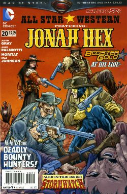
ALL STAR WESTERN #20 Art by Moritat (Jonah Hex) and Staz Johnson (Stormwatch) Written by Justin Gray & Jimmy Palmiotti Coloured by Mike Atiyeh (Jonah Hex) & Rob Schwager (Stormwatch) Lettered by Rob Leigh Jonah Hex created by Tony DeZuniga & John Albano Stormwatch created by Brandon Choi & Jim Lee DC Comics, $3.99

 photo All_SWCov001_B_zps3260d931.jpg

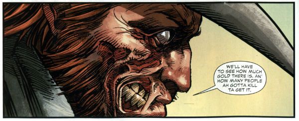
I kind of liked this issue. I don’t know whether the worms have finally reached my brain, or what but twenty issues in and this one almost clicked. I’m not exactly the most demanding Jonah fan either, I just enjoy the scar faced twat in a hat going around kicking up dust and making life brutal, difficult and short for folks. I prefer it to be a straight western but it isn't a deal breaker.

 photo All_SWPanel001_B_zps37540f12.jpg Jonah Hex by Moritat, Gray & Palmiotti

No, I don’t mind Booster Gold turning up for no reason that is ever going to be explained (hey, that’s just how comic books roll these days). I’m just pleased the book has a bit of a spring back in its step. Maybe it’s the beneficial effect of getting Jonah out of the city and into the countryside? Like when you ferry troubled youths by coach out into the boondocks to stroke goats. Moritat’s art seems a bit more lively and engaged although that might be due to the brighter and more varied colour palette in use. Watch these backgrounds though, I’m not a native of the Americas but I’m pretty sure mesas aren't mobile. Like I say I don’t expect much really and this delivered that making it OKAY!

RED TEAM #2 Art by Craig Cermak Written by Garth Ennis Coloured by Adriano Lucas Lettered by Rob Steen Cover by Howard Victor Chaykin Red Team created by Craig Cermak & Garth Ennis(?) Dynamite, $3.99

 photo Red_TCov001_B_zps4bf0c366.jpg

More like RED MEAT amiright, soft lads? Here Comics’ Firmest Handshake Garth Ennis turns his surly attention to a tale of cops taking the law into their own hands. I’m sure that will work out really well for everyone involved. At the minute it isn't working out too well for me. I guess my LCS sent this as Howard Victor Chaykin is doing the covers and I like Comics’ Deepest Voice Garth Ennis’ war comics. So, okay, fair enough. I’m not turned off by the concept either. I’m always up for that old story which ends with a bunch of people dead or drenched in blood while sirens scream closer and those who aren't corpses suddenly realise why there are rules.

 photo Red_TPanel001_B_zps37f466f0.jpg Red Team by Cermak & Ennis

Maybe it won’t go that way, after all Comics’ Hottest Curry Garth Ennis spends enough time (i.e. too much time) explaining how his characters can smoke in a government building that it must surely (surely!) pay off later in an example of Chekov’s Fags! Maybe everything will go swimmingly but the racially and sexually mixed cast will succumb to a series of smoking related diseases. Maybe not. But hopefully the series will avoid plummeting into maudlin sentimentality like a sloppy drunk slurring on about The Old Country as the barkeep dials for a taxi. Not an uncommon occurrence in work by Comics’ Softest Hearted Big Man Garth Ennis. This thing seems written for the screen (no, the page and the screen are not interchangeable) and the art just isn't up to the job of hiding this. It gives me no pleasure to say that. In fact I’ll leave it there except to express the hope that you really like that panel I picked because you’ll be seeing a lot of it on these pages. RED TEAM is not a complete wash though and that’s due mostly to the dialogue of Comics’ Hairiest Chest Garth Ennis. It’s good dialogue and it means RED TEAM is OKAY! That probably still won’t save me from a beating though.
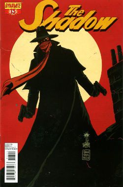
THE SHADOW #13 Art by Giovanni Timpano Written by Chris Roberson Coloured by Fabricio Guerra Lettered by Rob Steen The Shadow created by Walter B. Gibson Dynamite, $3.99

 photo Shad_Cov001_B_zps0806f9d9.jpg

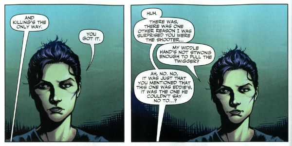
Everything in this book is so familiar that the sight of your face in the shaving mirror delivers more surprises. This issue is impressive only in its devout refusal to bring anything new or interesting to bear on the join the dots plot with its transparent mystery, its space wasting reluctance to provide more than one speech bubble in a panel and…oh...look, there’s a three page sequence of a drunk man going home, going upstairs, pouring a drink and being surprised. No. That’s not comics, that’s just horseshit. I’m not even going to scan a picture of the contents as the fewer people who see this then the less damage done to those involved. Honestly, I’m doing them a solid here. Or a salad as they say in Nyawk. So, no offence to any of the people involved here as we all have bills to pay but this was AWFUL!
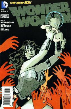
WONDER WOMAN: #20 Art by Goran Sudzuka & Cliff chiang Written by Brian Azzarello Coloured by Matthew Wilson Lettered by Jared K. Fletcher Wonder Woman created by William Moulton Marston and H. G. Peter DC Comics, $2.99

 photo WWom_Cov001_B_zps8c89c4c0.jpg

This is an atypically action packed issue but all too typically when the dust settles the forward plot motion is infinitesimal if not entirely illusory. With its large cast, stateliest of paces, squandered artistic talent and elevation of chat at the expense of incident it’s hard not to see WW as Azzarello’s attempt to bottle a bit of that drab Bendis magic. Luckily, despite his heroic efforts, Azzarello appears incapable of attaining such low levels of blandery. For starters his characters don’t sound like they are recovering from traumatic blows to the head; trading only in recursive whirlpools of bland doggerel. And every now and again something does happen. So, it’s an improvement but it’s still very far from being good. It still rarely rises above word play on a par with puzzles in the magazines old people in hospital spontaneously secrete in-between visiting times. Also, I think his cast have a problem with the booze. Although as the middle class assure us, if it’s wine it isn't alcoholism.

 photo WWom_Panel002_B_zps13522682.jpg

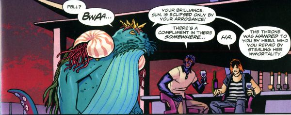
Wonder Woman by Chiang, Sudzuka & Azzarello

At some point in any given issue the chattering cast will mingle about some tasteful locale sipping drinks and hoovering up nibbles. Thankfully the medium of comics spares the reader the no doubt inevitable soundtrack of Toploader Orion snuck on to smooth things along. The whole thing is like one of those hellish networking soirees for people who do a bit of wee when they think about Powerpoint presentations. Except everybody is cosplaying Sandman and the evening ends abruptly when a big blue catfish in a crown stabs Simon from Accounts in the face. And puns! This issue’s highlight was when War asked, “Where’s my drink? You said you’d get me a Belgian White Beer!” and Wonder Woman replies “I beg your pardon, I never promised you a Hoegaarden!” Face it, Tiger; this book’s so far gone you’re not even sure if that happened. So it’s a fact that the crisp clarity of Goran Sudzuka and Cliff Chiang's art which brings this up to OKAY!
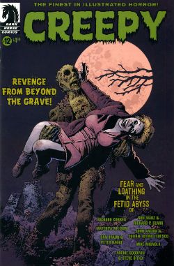
CREEPY #12 Art by Richard Corben, Richard P. Clark, Peter Bagge, Matthew Allison, Julian Totino Tedesco and Steve Ditko Written by Richard Corben, Ron Marz, Dan Braun, Peter Bagge, Matthew Allison, John Arcudi and Archie Goodwin Lettered by Nate Piekos of Blambot and Peter Bagge Dark Horse Comics, $4.99

 photo Creepy_Cov001_B_zpsed87d4c8.jpg

There's the usal raggy grab bag of one pagers and spot illos but storywise we have:

Uncle Mangus by Richard Corben

Corben’s on first and Corben’s on form with a frivolous shamble of a shaggy corpse story. Corbenites won’t be disappointed as the shadows drape at strange angles across distorted faces, the undergrowth looks like gathia sticks from Bombay Mix, the borders are jagged when nerves become ragged and the horrific punchline is drawn with slapstick mixed with the ink. Yes, Richard Corben continues to defy Time itself and belligerently refuses to budge from VERY GOOD!

 photo Creepy_Corb001_B_zpsfe235ff8.jpg

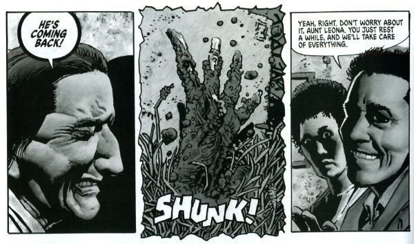
Uncle Mangus by Corben

Fishing by Ron Marz & Richard P. Clark Not entirely rote retelling of one of the usual variations on kids go fishing fear fables. Sorry, but EH!

Local Talent by Matthew Allison Allison's tale nicely conveys the grotty zest of late '70s foreign filmed schlock but would have conveyed it better in less space. Also, I know this charmingly cack cinematic genre was limited by budget but it's not a limitation shared by comic art, so c'mon let's have some backgrounds, son. Good enough for an OKAY!

 photo Creepy_Ditko001_B_zps2a622c1e.jpg

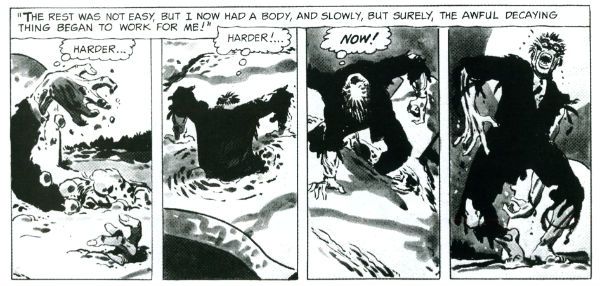
The Spirit of The Thing by Ditko & Goodwin The Spirit of The Thing by Steve Ditko & Archie Goodwin

It’s Steve Ditko! "He is Dee Aye Tee Kay OH! He is Dee Aye Tee Kay OH! He’s Dee- delightful! Aye – Innovative! Tee- Totally not open to compromise on any point of principle upon which he has formulated an Objectivist stance! Kay – Kind of kooky! OH!- oooOOOOOOOOOOOOOOooooooooo! He is Dee Aye Tee Kay OH!" In this reprint Archie Goodwin does his usual solid scripting but it’s Ditko’s groovy grey wash German Expressionism that makes this one retain its VERY GOOD! kick lo these many decades after its original printing. It’s also a nice reminder that aficionados of Sturdy Steve should be salivating after the Creepy Presents…Steve Ditko volume that will be dropping imminently. Pre order from your LCS now, they'll appreciate it!

 photo Creepy_Panel001_B_zps17d66933.jpg 
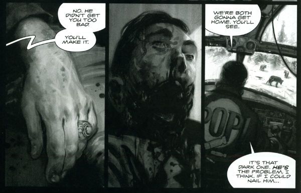
Pack Leader by Tedesco & Arcudi

Pack Leader by Julian Totino Tedesco & John Arcudi While Ditko and Corben get to VERY GOOD! on the merits of their art alone Arcudi and Tedesco’s tale reaches the same grade due to the success of their collaboration. This one really gels and even wrong-footed me at the last. That's nice. Arcudi and Tedesco knew what they were after and they went and got it. Nice work, fellas!

DARK HORSE PRESENTS #24 Dark Horse Comics, $7.99
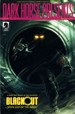
 photo DHP_Cov001_B_zpsdd591b27.jpg

BLACKOUT CHAPTER 1 Story and lettering by Frank Barbiere Art by Micah Kaneshiro Blackout created by Mike Richardson (?)

This one didn't grab me I’m afraid. With its slickly appealing tech sourced graphics and plot predicated on the promise of explanations further down the line it read like the tie-in to some video game I've never heard of. It’s only a few pages though so maybe it’ll pick up and improve from EH!

ALABASTER: BOXCAR TALES CHAPTER 6 Art and lettering by Steve Lieber Story by Caitlin R. Kiernan Coloured by Rachelle Rosenberg Alabaster created by Caitlin R Kiernan

My total indifference to this one is purely a case of it not being my cup of tea rather than any failure on the part of the creative team. I did read it but I couldn't tell you anything about it except it’s in space and usually it isn't. There are some talking animals and a lady, usually with a very broad accent, having magical adventures. Oh, she’s called Dancy Flammarion. Yeah, that’s me gone. I'm no Garth Ennis but fey’s not my thing, I fear. Disregarding my witless bias this is bound to be OKAY! Because Steve Lieber can sure draw nice and Caitlin R Kiernan writes proper books (she should not be confused with Caitlin Moran who doesn't). The most interesting thing was how disproportionately irritated I was by the bit where the team tell us what they were listening to when they created the strip. It was really distracting. I mean was Kiernan really listening to the Sunshine OST? Why? Was it just because it’s the soundtrack to a movie set in space? That’s a stunningly literal approach isn't it? What did she do when it was finished? Start again? Stop writing?

Like a real asshole I find it all a bit disingenuous when creators share stuff like this with us. No one ever says they were listening to Phil Collins or Cher do they? Ever. Yeah, right. Have you seen some of the people who make comics? Seriously. I mean that guy who always does that stupid thing in photos with his face so it looks like a wet thumb sliding down a window is a Foreigner fan and no mistake. Look into your heart, you know it is true. Anyway, this stuff's just the thin end of the wedge, next thing you know they're telling you about their substance abuse problems, how many kids they have or whether they get to put the fairy on top of the Christmas tree. Being an unfeeling automaton it’s just not something I need to know about creators. I mean, does it do any of you any good to know I wrote this while listening to SWANS’ Time is Money (Bastard)? Oh, alright it was Cher. "Do you belieeeeeeeeve!?!"

 photo DHP_BHound001_B_zpsf720926a.jpg

Bloodhound by Jolley, Kirk & Riggs BLOODHOUND: PLAIN SIGHT CHAPTER 2 Art by Leonard Kirk & Robin Riggs Written by Dan Jolley Coloured by Moose Baumann Lettered by Rob Leigh Bloodhound created by Dan Jolley & Drew Johnson

This is a revival of a defunct DC property which has now been given back to the creators to do with as they will. I believe DC also returned the less than successful Monolith property to its creators recently too. This is really rather sporting of DC and we should probably acknowledge that before reminding ourselves of their treatment of Alan Moore. It appears that the lesson here is that if you create anything successful for DC they will line up and bang you like a shit house door. Meanwhile the creators of Bloodhound have decided to put it in DHP. I liked this series when it first appeared and I still like it despite the pony tail our hero sports. He’s kind of like a government sanctioned Punisher with all his marbles and a beer belly who targets super villains. This is just a short three parter so the mystery tends to be cleared up by the characters approaching each suspect, the suspect immediately breaking down and pointing to the next suspect and then the villain breaking cover to provide a thrilling cliff hanger. Brevity isn’t doing it any favours is what I’m saying. But I still find the premise promising, the characters solid and the art pleasant enough for it to be OKAY!

BRAIN BOY CHAPTER 2 Art by Freddie Williams II Written by Fred Van Lente Coloured by Ego ("The Living Colourist"?) Lettered by Nate Piekos of Blambot Brain Boy created by Gil Kane & herb Castle

Although it’s not explicitly stated I guess this is an update of Herb Castle and Gil Kane’s 1962 creation for the faster paced and more luridly violent Now. Since Dark Horse published a pricey hardback of these (old and very probably nuts) tales you’d think they might want to draw attention to this. Weird. Anyway, the update is definitely fast and bloody and it’s not without its charms. Chief amongst these are Van Lente’s witty revisionism best exemplified by the call centre riff and the ‘magic cereal' which fools no one. Artwise Williams II has obviously thought long and hard and come to some definite conclusions about how to draw our hero’s nose. I can’t speak with any surety as to the conclusions he’s reached but there’s definitely something going on with Brain Boy’s hooter. Oh, it all bounces along in a lively if not altogether logical fashion, which makes it GOOD!

 photo DHP_Nexus001_B_zpsda643d33.jpg Nexus by Rude & Baron

TREKKER: THE TRAIN TO AVALON BAY CHAPTER 1 Story and art by Ron Randall Coloured by Jeremy Colwell Lettered by Ken Bruzenak Trekker created by Ron Randall

It's super-nice that an old lag like Randall has his own creator owned property. It's less agreeable to report I found the whole future bounty hunting lady with sad past thing a tad too generic for my fussy palate. I am certain there is an audience for this but I adamant I am not amongst their number. I wish Randall well in all his travels but this, for me, was EH!

KING'S ROAD: THE LONG WAY HOME CHAPTER 2 Art by Phil Winslade Written by Peter Hogan Lettering by Steve Dutro

Oooh! It's a high concept! What if the kids from a book very similar to (but. lawyers take note, not the same as) The Lion, The Witch & The Wardrobe grew up and had kids who didn't know about their adventures and then The Evil Returned and the kids had to take up arms on behalf of their paunchy and totes dull 'dults?!? This. That's what. No doubt Hogan will be exploring the Christian symbols underlying his borrowings with the same rigour and aplomb as his source. Or at least get a movie deal. Just joking! This is a promising (if not a little cheeky) premise and it's made all the more attractive thanks to Winslade's endearingly gangly characters. Although these do inhabit a blurry world of boisterous blooms of colour, the intensity of which suggest Mr. Winslade should pop down the opticians pretty sharpish or at least dial his PC settings down a bit. Maybe I'm getting soft in my dotage but this was OKAY!

CRIME DOES NOT PAY: CITY OF ROSES CHAPTER 5 Art by Patric Reynolds Written by Phil Stanford Colours by Bill Farmer Lettering by Nate Piekos of Blambot Crime Does Not Pay: City of RosesCity Of Roses created by Patric Reynolds & Phil Stanford

This is EH! due to the perfunctory writing and the weirdly flaky looking art. It isn't terrible but it isn't terribly exciting either. Everybody thinks crime comics are easy and nearly everyone is wrong. Everyone except David Lapham. Christ, I miss STRAY BULLETS. Why can't Dark Horse Presents find room for new David Lapham genius? WHYYYYYYYYYYYYYYYYYY???? WAAAAAAAAAAAAAAAAAHHHHHH!!!!

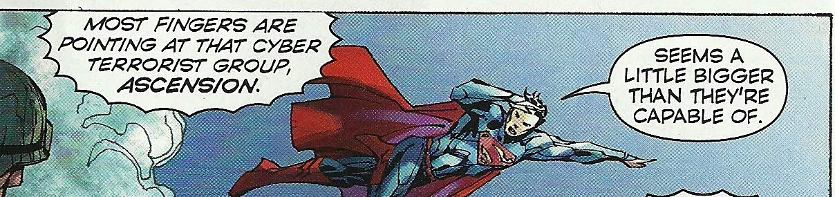
NEXUS: INTO THE PAST CHAPTER 2 Art by Steve Rude Written by Mike Baron Lettered by Steve Rude Coloured by Glenn Whitmore Nexus created by Steve Rude & Mike Baron

Eventually every open ended continuing narrative strip gets to Jack the Ripper, it's likely that they get to Sherlock Holmes too, but only Nexus would throw in H.G. Wells without overbalancing, without even wobbling in fact. It's Nexus so it's VERY GOOD! In fact I'll tell you this: I'd never read Nexus until it appeared in DHP but once it did I ordered Vol.1 of the Omnibooks pretty darn lickety split. I would imagine there is no higher praise a comic creator can receive than a sale. We'll be coming back to Nexus at some point. Aw, yeah!

HUNTER QUAID: ARMAGEDDON OUT OF HERE Art by Melissa Curtin Written by Donny Cates & Eliot Rahal Coloured by Lauren Affe Lettered by Lauren Affe Hunter Quaid created by Donny Cates & eliot Rahal

I couldn’t get a grip on this one. It’s like something an artist would do to showcase their style but it has a writer, no, two writers? And they are the creators but it's the art that is the stand out feature? I don’t know. I don't get that. It looks nice but, hey, that’s all you need sometimes. It was OKAY! but only because of the artist.

 photo DHP_Wheeler001_B_zpsb74cb0f6.jpg Villain House by Wheeler

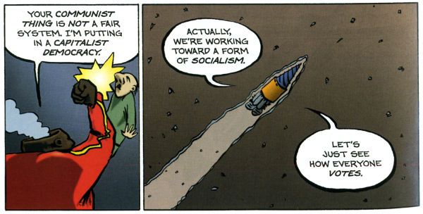
VILLAIN HOUSE CHAPTER 4 By Shannon "Papa" Wheeler

It’s a kind of testament to the durability and depth of the concepts at the heart of Jack Kirby and Stan Lee’s Fantastic Four that half a century later it still provides fertile soil for trees of mirth like this. As mirth trees go this is a sturdy beech indeed. This is some funny stuff right here from the surly insistence of 'Not The Thing' that everything bad is Communist to the laser targeted title of “Invisible Wife” and beyond. The laughs aren't empty either, there’s a sympathetic villain whose world is ruined by a bunch of powered berks getting all up in his business to hilariously disastrous, but not unmoving, effect. I’d hazard a guess this strip is somewhat more refreshing and engaging than yet another modernisation of an old Kirby & Lee classic. ( “Yo, Yo, Yo! Ben Grimm is Totes Sad, Bro! (Ch-Ch-Ch-check out Mi Tumb-LAH!!!)”) Wheelers’ treat of a tummy tickler may not beat the ultimate yukkifier of Don Simpson’ s Yarn Man and “Golly! That crazy gizmo really works!” but it comes closer than most in a very small space. And that’s VERY GOOD!

Christ, I think I sprained something back there. And now I know why people don't review anthologies. I still don't understand why they don't buy em. They're stilll - COMICS!!!
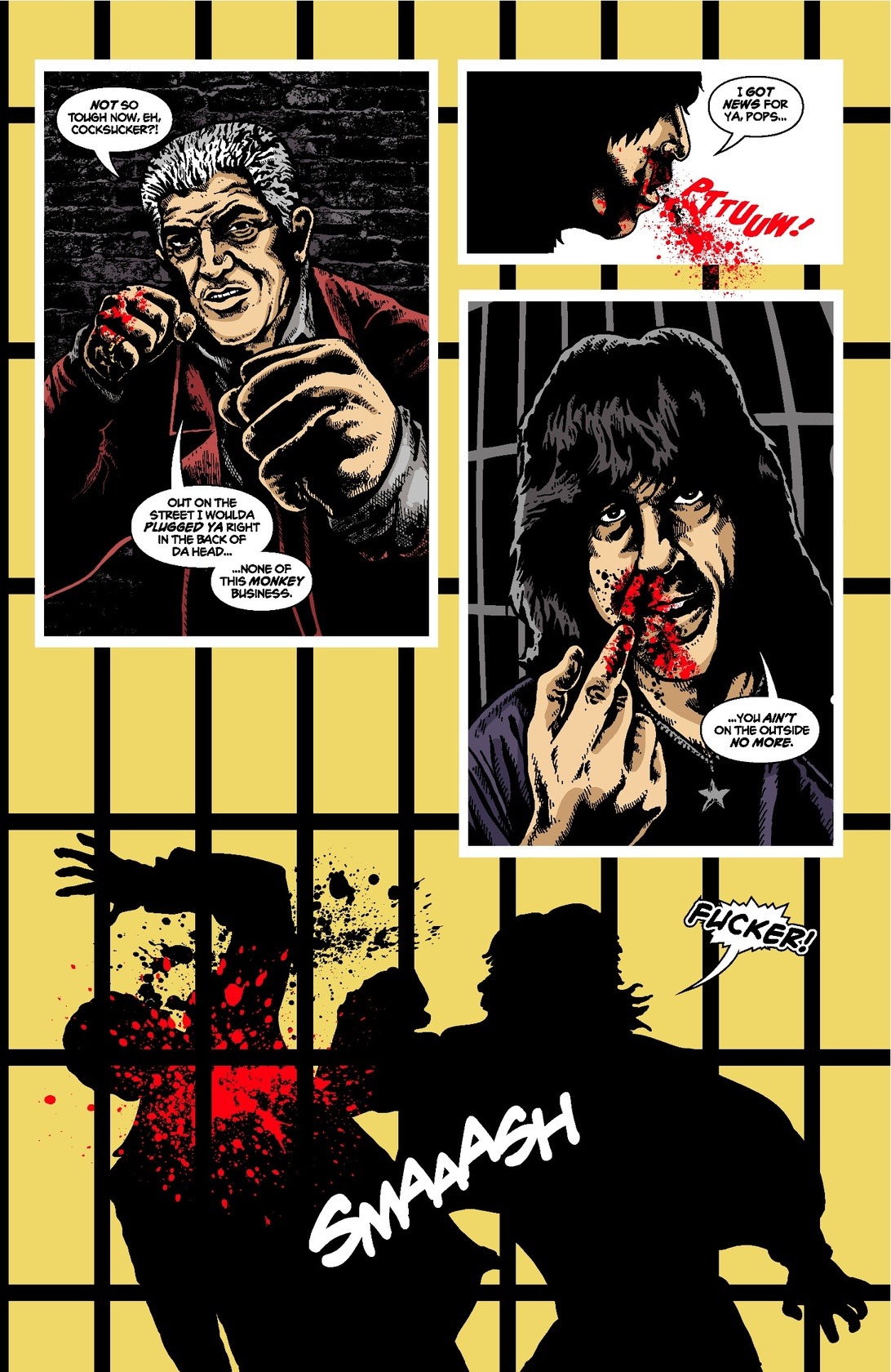
“Seems I've spent the better part of my life amongst the dead.” PEOPLE! Sometimes They Are Uxorious! (Peter Cushing!)

Sunday 26th May 2013 marks a very special occasion. Yes, 100 years ago on that day Peter Wilton Cushing OBE (26 May 1913 - 11 August 1994) was born.Look, he’s even on a bloody stamp! Happy Centenary, Peter Cushing!

 photo beast_B_zpsf01d570f.jpg The Beast Must Die (Amicus,1974)

Anyway, this… Peter Cushing is/was/will always be  EXCELLENT! And here's how we get to there from here...

Peter Cushing made 90 or so movies (and The Bitch ain't one). That's a lot of movies and sometimes the only reason to watch them is Peter Cushing. Even in the worst of his movies Cushing remains the steely calm at the eye of a storm of camp; the one man taking it all seriously enough to pin your attention to the screen; enhancing rather than undermining what is, in all probability, a load of seedily eerie nonsense. That doesn't mean he couldn't erupt into a frenetic flurry of startling physicality when required, because he could. Even better, not only was he a fine screen actor but he was agreed by all to be a genuinely decent and gentle man. So profound is the consensus on this that you could be forgiven for being permanently tensed to receive some terrible reputation soiling revelation.  As of this writing no news has reached me that Cushing’s home was built from the bones of missing hitchhikers or that he liked to set fire to tramps and laugh, so we’ll adhere to the accepted text of his life.

 photo Creeping_B_zps5cfc1881.jpg

Peter Cushing was raised in a comfortably middle class Surrey home where he appears to have wanted for little. His childish exuberance in play seems to have held fast throughout his life and found the perfect home in the adult equivalent of make believe; acting. He did, however, want for support in his desire to act. His father wasn't keen and, sadly, Cushing remained estranged from his elder brother, David, due to Cushing’s career choice until David’s death. When Cushing was 40 his father declared him a failure which was both appalling parenting and a trifle premature as at the age of 44 this failure would headline two of the most successful films in British cinema history;The Curse of Frankenstein (1958) and The Horror of Dracula(1959). (Anyone rolling their cynical eyes at my assertion earlier that Cushing could act, and act well, could do worse than to watch these performances back to back. Sure it's the same man but they are very, very clearly different characters.) 44 is hardly the bloom of youth and so it looks like success came late to Peter Cushing, but he had been quite successful for a while. In 1940 he had even been in the Americas and also in Laurel & Hardy's A Chump at Oxford (1940) amongst other well received movies. Following his return to Blighty (due to a small thing called WW2; he did not serve, he was not fit) he trod the boards and the sound-stages with Laurence Olivier (Hamlet, 1948), starred opposite a bewigged Richard Burton in Alexander The Great (1958)  and appeared in the 1954 BBC adaptation of George Orwell's 1984 ; now widely regarded as Television's first masterpiece. Indeed, the small screen was where Cushing found his biggest success as his cinematic career stubbornly failed to gain traction. Such a common and popular sight was Cushing in the  domestically screened plays of the day that to deny he was successful prior to Hammer would be to have a very narrow definition of success. But there's a kind of success that doesn't put money in the meter and that was the kind Cushing had. Well, until Hammer hit the anvil of success big style with The Curse of Frankenstein.

 photo mummy_B_zpse373a5f1.jpg

After that it was all gravy (vein gravy!!! Sorry.) but it had been a tough road. Luckily Cushing hadn't had to walk it alone. In 1942 Cushing had found emotional support in the form of Helen Beck whom he married on April 10th 1943.  The tenacity and sincerity of Cushing’s love for Helen was such that swans look like slackers in comparison. Together they helped each other through periods of depression and physical illness, eventually enjoying the silliness of cinematic success as they deserved. In 1971 Helen Cushing died. After her death Peter Cushing was different. Oh, he was still Peter Cushing. He was still lovely. Still polite and gracious to all on set. Still able to keep visitors in stitches all afternoon. But he couldn't stand to have anyone interrupt his sight-line when filming now. And now he would be sighted less when not required on set. And, at least once, he would request his wife’s portrait be used when such props were required for his character to react to. And for a while the tears he wept on screen were real. He never got over it but he didn't forget he still had a life to live. So he got on with it. Peter Cushing was a charming English eccentric who always treated every film as though it mattered; he embodied strange notions such as courtesy and civility but was nobody's fool. He died in 1994.

 photo Tales_B_zps6e7e6c32.jpg

I like to think I first encountered Peter Cushing’s filmed presence when lax parenting ensured I was, while still a child, allowed to stay up and watch horror movies on Friday nights. But then I like to think all sorts of things. No, it’s far more likely that Cushing’s relaxed command of the screen imprinted on me earlier via his several forays into child oriented fantasy movies. I would certainly have thrilled to his performance as The Doctor in Dr. Who And The Daleks (1965) and Daleks' Invasion Earth: 2150 A.D. (1966) Why, I can only imagine the good natured esteem they are held in by today’s easy going Who fans (AKA “Whosers”). You may be a bit thrown by the dates on those movies after all according to my passport I’m not quite that old. But back then, when we killed our own food, the only other outlet for visual entertainments was the time limited and channel light medium of Television. So, to maximise receipts movies remained in circulation a lot longer; even boomeranging back to more bums on seats some years after their initial release, as in the case of these entertainments. Sometimes, though, I’d catch a movie fresh as tomorrow.

 photo ATEC_B_zps5fc79f48.jpg Peter “This Nation’s Saving Grace” Cushing, Caroline Munro (who could make masonry blush) and Doug “You May Know Me From…” McClure in the Amicus motion picture presentation At The Earth’s Core (1976)

In fact one of the greatest cinematic experiences of my young life was going to “The Picture House” to see At The Earth’s Core (1976). Yes, it was a sheltered life, cheers. In this one Cushing played a primly bumbling professor who reached the earth’s core in a Very Big Drill accompanied by Doug McClure, a man who resembled an affably sybaritic cousin of George Peppard. There they found not only a subterranean race ruled by men in wholly unconvincing monster suits but also a sweaty Caroline Munro; yes, I have heard the sound of a hundred Dads crossing their legs simultaneously.

 photo BBT_B_zpsc04f5f7a.jpg

I would also have seen Cushing sporting a tinselly wig on TV in Gerry Anderson’s weekly live action exercise in failing to predict the future Space: 1999 circa 1976. From 1969 onwards Cushing had been making sporadic appearances on The Morecambe & Wise show, all of which were part of a long running joke about his seeking payment for his first appearance. This joke ended in 1980, I told you it was long running. And believe you me back then everybody watched Morecambe and Wise, or they got shipped off to Australia. Yes, there is a point beyond the ubiquity of Peter Cushing in The Dream Life of Albion, although I am moving steadily away from it. See,  1976 ,the year of At The Earth's Core's release, would also see the release of another fantastical entertainment for children featuring Peter Cushing. Yes, Peter Cushing witnessed the passing of the baton of escapist children's entertainment from Edgar Rice Burroughs to George Lucas.

 photo LilPeter_B_zpsdf3ab2e8.jpg

"Far too many men are hobby-less...Without the escapism which comes only from dabbling with adult toys, their minds are prey to all the frustrations and fears of the working day. So many, it seems to me, lose happiness as they grow up. Their entire absorption in their careers and adult responsibilities bring lines of worry and premature old age. It is not silly or childish to have an interest in hobbies..." Peter Cushing in TV Mirror, July 1956 (taken from Peter Cushing; A Life in Film by David Miller, p.74)

He’s talking up the case for hobbies there; toy soldiers in particular. But he could have been talking about comics. He was known to have liked those too. Other than that bit where his mother dressed him like a girl, Peter Cushing was a healthy young British lad, and like all such stout hearted chaps had a healthy interest in comics. Little Peter Cushing is documented as favouring the periodicals Gem and Magnet. I looked them up and they seem a bit fusty and musty in comparison to the comics of even my far gone youth never mind today’s stuff. Cushing’s favourite was the Greyfriars feature written by Charles Hamilton (AKA Frank Richards). Greyfriars was, as you all know, the school in which the famous character Billy Bunter was boarded up. These strips no doubt involved high spirited tuck shop centred larks enabling readers to delight in the gentle rebellion of the characters and their thrillingly close shaves with having their backsides beaten with a stick.  Yes, comics were somewhat more sedate and establishment friendly back then. Basically, these are the kinds of comics Pat Mills has spent his life ensuring never happen again. Given the demands on his finite time by his other hobbies of painting, model soldiers, model building together with his full time jobs of actor, loving husband and being the most decent man in the world, Cushing seem to have let the comics slip away. He did, however, have sufficiently fond memories to later reminisce in print and on Television about these early paper pals. Bless his cotton socks. Had he kept up the habit he would have no doubt have been thrilled to bits to find himself on the comics pages himself. Although it was hardly the Magnet his image graced.

 photo Comics_BrianLewis_Chaykin_B_zps420ec04d.jpg

Today Dez Skinn is chiefly renowned for his role in the whole Miracleman fiasco currently keeping Padraig O’Mealoid out of mischief, but before inadvertently embroiling some of comics finest talents (and Todd McFarlane) in Comics own Bleak House saga Mr. Skinn livened up 1976-84 by publishing House of Hammer/Halls of Horror. This was a B&W magazine focusing primarily on Hammer but also, and increasingly as Hammer slipped from relevance, on the wider area of the Horror genre. Now, given its title and somewhat lurid cover imagery even my comics illiterate parents could tell it wasn’t exactly Buster or Whizzer and Chips so I had to bide my tiny time. Luckily, and this really was terribly fortunate, there was a newsagents in the market who had a near full run HoH that, judging by the static size of the pile until I got stuck in, no one was interested in except little old Cresta drinker me. When I finally read HoH I liked it just fine, but what I liked most were the comic strips. A lot of these (naturally) were Hammer films which was nice; what was nicer was the level of talent was pretty impressive. Brian Lewis always stood out with his highly European layouts although I don’t know what happened to him, but I know what happened to Brian Bolland (Vampire Circus (1972)) and John Bolton (the further adventures of Father Shandor from Dracula: Prince of Darkness (1966)).

 photo TOE_B_zpsd0b2f794.jpg

Neither of those movies have Peter Cushing in by the way, but HoH did adapt The Gorgon (1964), Horror of Dracula and Twins of Evil (1971) etc etc so obviously there are plenty of pages of comics in these magazines graced by the cadaverous visage of Peter Cushing.  I can’t provide any scans or, indeed, any particularly original information as, sadly ,I have no physical evidence of my having purchased this magazine due to a hilarious misunderstanding where my parents thought that because I had grown older I had grown up; burning all my comics in my absence. Memories! It doesn't matter though because Dez Skinn his very self  has a whole load of images and words about this very magazine at HERE.  If that doesn't keep you busy I don’t know what will. Oh yeah, and that 1977 children's entertainment? That film. ..sigh, okay Star Wars, STAR WARS okay? Star Wars was adapted into the comics form for Marvel Comics and was drawn, at George Lucas' suggestion, by one Howard Victor Chaykin. I am still cruising on the fumes of the happiness my seven year old mind distilled on opening a Star Wars comic and finding Peter Cushing drawn by Howard Victor Chaykin. And in a risky narrative manouver there's where I'll choose to leave it - with a small child experiencing a magical confluence of all he thought was wonderful in the world; a lot of which he still finds wonder in. I've never really been one for goodbyes; best to go out on a high note. How smashing! How Cushing!

Thanks, Peter Cushing!

Happy Centenary!

Bibliography

 photo BOOKS_B_zps856ee1f3.jpg

No man, no matter how awesome he be, is born replete with Peter Cushing lore. Consequently, I am indebted to the books below for allowing me to beef up the preceding with something other than whimsical nostalgia. There's some of that, yes, but that's not the fault of these books. And nor are any (inevitable) errors; they’re all mine.

Peter Cushing: A Life In Film By David Miller, Titan Books, h/b £18.99 (2013) This is the one-stop 24 hour all night garage for all your Peter Cushing information needs. Need to know how many guineas Cushing was paid for a role? What kind of fry ups the builders who worked on his house made? ("Wonderful!", seriously). A mammoth effort of research rendered down into a breezyily paced and detail studded chronological chronicle of the man known as Peter Cushing. EXCELLENT! Unless you have no interest in Peter Cushing in which case I’m not really sure why you have read this far. Or if your taste can be trusted.

A History of Horrors: The Rise and Fall of Hammer By Denis Meikle Scarecrow Press, h/b £44.95 (2009) This one is thoroughgoing history of Hammer Studios and so covers all their films with Peter Cushing in as well as the many which lacked his presence. I found this particularly informative about the less familiar, to me, pre-success Hammer period and the studio’s final flailing at various, perhaps thankfully, unrealised projects (Nessie! Vampirella!). Although the price and paper suggest it is some tedious reference affair Meikle makes his subject interesting and even slips in some very good jokes now and again.   Comes with an introduction by Peter Cushing in which he says nice things about, well, everybody, dear hearts. Simply everybody! Simply VERY GOOD!

A Thing of Unspeakable Horror: the History of Hammer Films By Sinclar McKay Aurum Press Ltd, h/b £16.99 (2007) This is another history of Hammer but written with the emphasis firmly on the entertaining. McKay’s frothy approach does mean that it is still enjoyable even if you have already read a history of Hammer, but slack editing lets through a few errors even I could spot. (Yes, Hilary Mantel, I know I have no room to talk.) To McKay’s credit unlike other, cleverer, books he doesn't shy away from the nightmarish horror of the execrable On the Buses movie series. As a casual and light hearted introduction to Hammer it’s GOOD!

Peter Cushing: The Complete Memoirs by Peter Cushing Signum Books, h/b £19.99 (2013) A centennially stimulated repackaging of the  two previous Cushing autobios (An Autobiography, Past Forgetting) with the 1955 memoir The Peter Cushing Story as a single volume. This didn't arrive in time for me to read it but I'm sticking it on the list because it is a primary source for all the other books. I have read the two autobios though, back when I had more hair on my head than up my nose, and recall them being charmingly wobbily canters through the life of the great man himself related in his own endearingly effusive style(!). His memoirs may be surprisingly light on Hammer but are startlingly frank regarding some of the more distressing events in his life. This new edition also has some quite lovely informal photos of Cushing rocking his perennial cravat and slacks look down the ages. It’s the man himself in his own words so it could never be less than EXCELLENT! However, the reader does have to supply their own slippers, biscuits and hot tea.

A Selective Peter Cushing Filmography

 photo CushCarlson_B_zps914395b2.jpg Peter Cushing Suffering For His Art with Veronica Carlson. On the set of Frankenstein Must Be Destroyed (1969)

The Baron Frankenstein Series The Curse of Frankenstein (1956) The Revenge of Frankenstein (1958) The Evil of Frankenstein (1963) Frankenstein Created Woman (1967) Frankenstein Must be Destroyed (1969) Frankenstein and the Monster from Hell (1972)

The Van Helsing Series Horror of Dracula (1957) The Brides of Dracula (1960) Dracula A.D. 1972 (1971) The Satanic Rites of Dracula (1972) Legend of the Seven Golden Vampires (1973)

Portmanteau/Anthology (Basically, Like EC Horror Comics) Films Dr. Terror’s House of Horrors (1964) Torture Garden (1967) The House that Dripped Blood (1970) Tales from the Crypt (1971) Asylum (1972) From Beyond the Grave (1973) The Uncanny (1976)

Miscellaneous The Hound of the Baskervilles (1958) The Mummy (Hammer, 1959) The Gorgon (1964) The Skull (1965) Blood Beast Terror (1967) The Vampire Lovers (1970) Twins of Evil (1971) Horror Express (1971) The Creeping Flesh (1972) Madhouse (1973) The Beast Must Die (1973) The Ghoul (1974) Legend of the Werewolf (1974) House of the Long Shadows (1982)

Children’s Entertainments Night Creatures (1962) She (1964) Dr. Who and the Daleks (1965) Daleks Invasion Earth 2150 A.D. (1966) At the Earth’s Core (1976) Star Wars (1976) Arabian Adventure (1978)

I have no title, and I must scream! Hibbs' 5/22/13

Thoughts on Twelve Angry Comics from this week, below that jump


AVENGERS #12: I've tried, really I have, but I find Hickman's AVENGERS titles so bloodless and over-plotted that I just can't get into them whatsoever.  Here we are at what would be the "one year mark" for a "normal" comic, at the five months-old mark (and people wonder why Marvel is driving sales now?), and I'm so very very cold to this one and it's sibling title. Only "Spider-Ock teaching those kids how to be selfish" showed any real spark. I find this so very EH.

BOUNCE #1: I don't understand what Joe Kelley is trying to do here? "Speedball, except with swearing and explicit drug use?" That's not so very appealing, and then the first issue ends with an "alternate reality", and I'm trying to figure out what I'm rooting for? Some of the wilder ideas (A superhuman who IS a drug, shadowy conspiracies run by lizard-eaters, etc.) probably work a lot better with the mainstream-like art by David Messina that some of Casey's other co-creators.  I liked it fine, but I'm having a hard time deciphering the actual premise. Call it a very strong OK?

DAREDEVIL #26: this book is moving from strength to strength, and I think that the new enemy is one of the strongest ones that DD has ever faced... but, damn, I can't for the life of my recall his name. Akemi? Ashema? Somewhere in that range. Too bad it wasn't something like "Devildare" or something else easily remembered (Like, dunno, "Bullseye", maybe?), as that would mark a perfect nemesis. Either way, this book is VERY GOOD.

FANTASTIC FOUR #8: There's been something just a few degrees off from this renumbering, that I wish I could put my finger on -- but it's just dying in sales on our racks. Plummmmmet. Which is a damn shame, because this was as near as perfect of a single issue of a superhero comic book that I read this year. Ben Grimm on his one "day of being human", visiting the past of Yancy Street even before his sainted Aunt Petunia, and its just a great great little Done-In-One. VERY GOOD.

FLASH #20: Excited, oddly, about a new "Reverse Flash", but, like much of the Manapul/Buccellato era, it's just not delivering it's potential in my eyes. I really really want to believe, but the fairy is dying right in front of my very eyes. It tries so very very hard, and I desperately want to like it but like a poor marksman, it. keeps, missing. its. target. (KHAAAAAAAAAAANNNN!)

(Christ, I'm a nerd)

I honestly can't generate more than an OK, though I *want* it to be a VG, y'know?


GREEN LANTERN #20: And so ends an era. Really, this deserves an essay of its own, but Geoff deserves some amazing props for turning what was a (lets face it) second string character into a genuine franchise. Some people deride the "rainbow corps" (and, yeah, it probably went a step too far), but at least there are really legitimate differences and motivations and backstories between the various Corps.

I am personally of the mind that Geoff's run ran 3-4 years too long -- I'm not convinced that anything after "Blackest Night" was really particularly good -- but you GOT to give it up to Geoff for what he's accomplished in the run, overall.  I think even moreso because MY expectation is that the franchise of GL is going to crater out without Geoff at the helm... largely I think that the audience was essentially tolerating much of the excess in the line due to perceiving it as a creative vision. We'll see.

This last issue, sadly, wasn't much special -- the villain of this story has been uninteresting, and the final crossover dragged on way too long, with way too much handwaving and gnashing of teeth -- so I'm not inclined to go over an OK, but I do want to make special mention of the "text pieces" scattered throughout the issue which (and this is really straight from Jeff Lester, I am sorry for stealing!) read like nothing more than signatures collected in a high school yearbook, with all of the empty insincere praise that entails -- I'm shocked there's not a "Have A Great Summer!" in there somewhere, honestly -- the nadir probably being Diane Nelson's. I'd be shocked if she could recite the rest of that.

Yeah: "Have A Great Summer!"


GREEN TEAM #1: Here's the good news: We're guaranteed to get more issues of this than from the first series (which had just two issues, after it's debut in "1st Issue Special", both cancelled before they shipped), as this will last AT LEAST until issue #8. It's hard to think that it will get much more beyond that, however, since there wasn't a ton of ACTUAL premise on display in this first one. I get that on paper it's "rich kids buy superpowers", but that only happens for ONE of the "team", and that only on the last page. Has no one heard of "in media res"? Plus? I liked them better as, y'know, little kids. Well, copyright resecured, I guess.

I *love* this description of the cancelled first series: "In the first of the two unpublished adventures, the boys were pitted against giant lobsters and the Russian Navy. In what would have been the third issue, the Green Team face a villain called the Paperhanger who had special wallpaper that grew plants and trees, and who was a dead ringer for Adolf Hitler. They dispatch all menaces, then disappear into history in their private jet." Oh oh, the wacky wacky 70s...

This was highly OK, but needed to be so so much better to escape the event horizon of the current DCU


HALF PAST DANGER #1: Nice try, but another example of "burying the lede" and starting the story long long before the story should actually be started -- "WW2 adventurers FIGHT nazi dinosaurs!" is a great idea, but so much of this comic was walking through woods and sitting in bars and things that were not actually fighting nazis OR dinosaurs. Plus Stephen Mooney's art is just too anatomically awkward in places.  There's virtually no genre serialization that couldn't learn a lot by studying the structure of, say, an episode of Star Trek, and applying that to EACH INDIVIDUAL issue of the comic. Yet another OK on display in this one.


OCCUPY COMICS #1: I think this might be a year too late to do any good, but I liked virtually every page of this polemic of a comic. You could also call this "time capsule comics", because that's likely how this will seem in a decade (sort of like how the 9/11 comics are today), but that doesn't stop this from being a solid little anthology, and (I thought) VERY GOOD. POWERS BUREAU #4: there are times that I think that Bendis has single-handedly done more harm to the very idea of creator-owned comics than another other guy in comics. As a working retailer, I am constrained to point out that this issue is nearly a full month late, and that's after they utterly wasted having a few issues "banked" by shipping the first two bi-weekly and bragging how they were absolutely "guaranteed" to ship on time. And now we're already selling fewer copies than we did of the prior series, *sad trombone noise*

And the shame of it is that the book is very readable again, after a pretty dire patch of thinking it was better than it was -- I thought this issue was solidly GOOD.


UNCANNY X-MEN #6: Speaking of Bendis, he's just killing it here. KILLING.

I don't know why -- maybe because the Claremont DNA makes "chatty" a good move for x-books? I don't know, but this (and "All New") are absolutely "good" Bendis, and I thought this issue, with art by the incomparable Frazer Irving, was VERY GOOD.


YOUNG AVENGERS #5: Really GOOD ending to the first arc, and they're all given a plausible reason to be a team. It's just too bad that "Avengers" comics are as common as STDs on a hooker these days, because the clutter on the shelf (there are FOUR "Avengers" comics just this WEEK) is leaving this one the poor-selling stepchild.


Right, then, that's me -- what did YOU think?


-B

The Week That Was...

Well, between selling a boatload of donuts and running myself practically ragged I managed to give away a BUNCH of comics.  Probably somewhere in the neighborhood of 50-70 but I didn't think to count them beforehand so we'll never know for sure.  Let's take a look at some highlights and lowlights, yes? Looking good for the weekend!


Fantastic Four 243 and 245

A running theme in these posts is most definitely going to be the very transgressive and transformative nature of the comics themselves.  The bulk of my collection (suitable for giving away to relatively all ages) is from a time before "This Business" had identified status quo as a desirable state and condition for merchandising purposes.  Costumes, names, characters, all seemed up for grabs.  Case in point - John Byrne's barn burning pace on Fantastic Four.  Invisible Girl No More - Galactus Falls.  Byrne did a really, really nice job showcasing the talents of Sue Storm.  Her invisble force projection power (vague and uninspiringly defined by recent art teams) was given a huge "level-up" under his able draftsmanship.  Similarly, watching a group of Marvel's finest and also-rans take Galactus down a peg over the course of 3 issues blazed with a kind of manic pace that's not very common today.  As our beloved mainstream titles get lost in wandering stories spanning actual years of the fleeting readership's lives it's important to remember what made this stuff "Can't miss" as opposed to "Days of our Lives" never-ending soap opera horseshit.

Star Trek 10 - 11 - 12

The Mirror Universe concept gets dusted off here and by the end of it everything is blown up and Kirk is literally strangling himself.  Awesome.  Sidenote, for the LONGEST time I only had issue 11 of this arc.  Can you imagine the fever dreams I had?

Don't Panic - Most of that is reprints!

THOR 247

Thor and Firelord find themselves in the bewitching thrall of a gypsy's magical diadem.  No worries, here comes JAne Foster to challenge her to (and win cleanly, I might add) a girl knife fight.  APPROVED BY THE COMICS CODE AUTHORITY!  Thor gets the patented "I say thee, NAY!" moment but not until AFTER Jane wins the fight on her own.  Take that, Bechdel Test!

Superboy starring the Legion of Super Heroes 200

Wow, great Cockrum costumes.  Duo Damsel's wedding dress is gorgeous.  Starfinger, on the other hand...jesus.  Just...no.

Amazing Spider-Man 258 and 270

In 1985 Ron Frenz and Tom DeFalco took over from my boy Roger Stern (He of ASM 251 ENDINGS fame) and went on quite the little tear themselves.  in 258 Spidey discovers his swanky black threads are an alien symbiote and he battles it with the FF.  That resulted in the classic Spidey wears a bag on his head bit.  "Kick Me" sign and all.  Then, in 270 he somehow gets pulled into a fistfight with a former herald of Galactus and after a really well done cat and mouse game finds himself lured into the open.  It's at this point Peter goes full "Ralphie beats up the bully" from A Christmas Story on Firelord and beating him into unconsciousness   He only snaps out of it when Captain America taps him on the shoulder and is like, "Whoa, son."  The man who killed more Nazis than anyone else in history just told you to take a chill pill, Spidey.  Time to switch to decaf.

milkdonutcomic

Adventures of Superman 463

This comic broke my "Superman and the Flash are forced to race under a dubious premise" cherry and it was soooooo good.  Really dynamic stuff from Art Thibert of all people sees Superman breaking through to the developing core of the Wally West character.  Wally being all insecure but trying hard to earn it.  It's a comic about people who are learning, growing, and destroying a Mxyzptlk altered Mt. Rushmore...oops.

Unicorns do exist

Wonder Woman #0

Thanks Azzarello.  20+ issues of pushy gods, bad puns, and about 12 issues of wasted Cliff Chiang and I'm practically willing to forgive it all because of this #0.  It's a great "Young Diana" story about learning the virtue of Mercy and the importance of staying true to your heart.

But no, I don't see an audience for this kind of book, do you?  

Welp, that was the week that was.  Looking forward to next week when we discuss our favorite Hostess Pie interludes!

"...Eerie Friend Of The Needy..." COMICS! Sometimes Gil Did 'em With Roy!

What? Oh, yes. I was on about Gil Kane wasn't I? Thought I'd forgotten didn't you? Or hoped. Probably the latter. Springs eternal, so I hear, much like my chuntering. Where were we...ah, 1980s Gil Kane...  photo Midnight003_B_zpsf7a2c60d.jpg

...and no, nobody does answer that question. But then who cares - it's 1980's Gil Kane! Anyway, this...

SECRET ORIGINS #28 Starring: Midnight Art by Gil Kane Written by Roy Thomas Lettered by Jean Simek Coloured by Tom Ziuko (Also Nightshade by Rob Liefeld, Robert Greenberger et al.) DC Comics, $1.50 (1988) Midnight created by Jack Cole

Photobucket

I found this a few years ago, it was wedged in the back of a bargain box and only eyes trained in Shamballa to spot the word "Kane" on a comic book flickering past in a four colour blur allowed  me to halt my fingers long enough to pull it towards me; like a tiny child rescued from a rushing river. A rushing river whose waters were Time! A child who was not a child but a comic! It's not a comic people talk about a lot but, by Mishima's slippers, it is an astonishing piece of work by Mr. Gil Kane. It starts like this...

 photo Midnight001_B_zps283d5e1c.jpg

In order to impose some sense of order and consistency on the post CRISIS DC Universe SECRET ORIGINS delivered 50 issues during the years 1986-1990, with each issue being dedicated to presenting the newly established origin of one or more DC characters. That's right, in 1986 -1990 DC Comics actually gave enough of a chuff about continuity to have given it a bit of thought so it all worked out nicely. I think we can all agree that the Nu52 has had none of that. Although DC's total banjaxing of their own continuity does still give us the joy of seeing Baleful Brian Hibbs going all puce every single time he realises that Batman now hasn't been Batman long enough to have had all those Robins. Yes, there was a time when DC Comics didn't just pretend everything made sense they actually made it make sense. Obviously Rascally Roy Thomas was all over this series like a rash. So much so that he wrote this comic. And Gil Kane's only gone and drawn it!

 photo Midnight005_B_zps5fb2076e.jpg

GilRoy worked together on many magnificent series/characters all of which are better remembered today than this. Which is a shame. Mind you, I'm not even sure this character has ever appeared again.  Feel free to correct me, as ever. Midnight first appeared in the Quality published Smash Comics #18 (Jan 1941). The strip was certainly drawn, and probably written by, Jack "Plastic Man" Cole hence the little credit box in the splash above. Just as The Death Patrol were a copy of The Blackhawks so was Midnight essentially The Spirit. Yes, there is a text feature by the Rascally one I have cribbed from. Midnight then is a man in suit and a domino mask who decides, inspired by the character whose adventures he narrates on old timey radio, to right wrongs and smack bad guys about. His name comes from the fact that he confronts his enemies at...midnight! This is clearly a very poor gimmick that the bad guys would soon twig to ending in a dead man in a suit with a domino mask. Inspired, I have submitted to Dan Didio a treatment for a Nu52 treatment of the character which is basically the same except he attacks his foes when they are mid shite. Take my word, people have a really hard time defending themselves when they are on the pot. Anyway, I think it has the requisite level of class modern DC Comics requires and I breathlessly await their response.

 photo Midnight002_B_zpsb434061f.jpg

As much as I treasure Roy Thomas, and his work here is entertaining and sprightly as befits the pulpy period set material, I am actually here to talk about Gil Kane. Because 1980s Gil Kane is what I'm all about. Sadly I wasn't invited to personally watch Kane create the art on these pages but to me it looks like he's using markers. That's the sign of a confident man right there. Of course, so I hear, he would have broken down each page into rough layouts down to the panel level. Usually then some tightening up would transform the layouts to pencils and then, naturally, the final inking. But Kane, so I've read, would skip the pencils and just bang! ink over his layouts. With markers. That's...confidence. That's Gil Kane. Worship at your convenience.

Of course the markers may be a mundane reason for the obvious lightness of detail in Kane's work. Certainly in "The Secret Origin Of Midnight" Kane continually veers away from heavy detail.  So much so that his hatching is very rarely even crossed. Cross hatching and heavy detail were the mark of illustrators and, for Kane, there was a clear delineation between artists who favoured continuity and those who had an illustrative bias. Kane was a continuity first guy. To clarify this Kane would often cast it in terms of his work versus that of the Filipino school. Hence his documented dissatisfaction with Rudy Nebres inking of his pencils on the Marvel John Carter series. The reader's eye was meant to flow through Kane's pages obeying the visual rhythm set by the artist himself. When detail occurs it occurs in controlled quantities and its purpose is specific. Here city scenes seem detail rich but on closer inspection the illusion of detail is the result of an accumulation of what turn out to be visual generalisations. Kane saves the more honest detail for when he shows a face in close up. On these occasions he uses his hatching to cue in the mood of the subject regardless of light sources as with the noir movies of his youth. Basically for Kane illustration is used to convey intensity. Here it's usually the intensity of the villainy of a bald fat man but my point remains.

 photo Midnight004_B_zpseab1c12e.jpg

Also present on these pages is Kane's constant attempts to differentiate between the flesh and the forms of the world it inhabits. It might be argued that there is a concerted and clear divide between the living and the inert in Kane's art. This is a city based tale packed with artfully implied period detail, including suits that make natty look tatty. At no point is there any confusion on the part of the reader between the person and their clothing. This is due to Kane's skill at drapery but also to the fact that he varies the level of detail and line-weight between the clothes and the flesh that they drape. Noticeably so.  A striving for seperation, and yet also some balance, between the natural and the manufactured line was an important part of Kane's artistic ambition. He would always be quick to praise Lou Fine, an artist who Kane felt had achieved excellence in both the geometric and organic line. However, in all fairness I should note that Gil Kane could draw men in hats better than Lou Fine.

 photo MidHat1B-1_zps897695b5.jpg

Oh, don't worry this comic contains all the explosive movement, bombastic gymnastics, panel breaking, in-panel montages, punched people back flipping and chisel chinned cavorting that the most frenetically entertaining and irresistibly enjoyable work of Gil Kane always contains. I just thought I'd highlight a couple of things I wouldn't usually mention. If I came off sounding like someone having a dry drunk please don't let it put you off this comic should you see it. After all, it's 1980s Gil Kane and that's VERY GOOD!

After all, if 1980s Gil Kane is anything he's certainly - COMICS!!!


Five for Friday, but not the Spurgeon kind: Hibbs on 5/15/13

Sorry, this is so late, but lots of stuff going on this week. Under the jump for four new #1s, and something that shouldn't even have been printed!

(Really, that was a pretty shitty week for comics -- I kept most of what shipped LAST week up on the shelf too, just to fill in room....)

AGE OF ULTRON #8 (OF 10): So, I'm reading this and I'm literally thinking, "Why am I reading this? This doesn't count, this story didn't happen being the inner-level alternate reality of an alternate-reality-driven comic. The last page when, dunno, something huge drops on New York, and the city goes up in hellfire and destruction? I'm thinking "Yeah, and...?" I mean, it didn't happen, and it's all just time-travel, alternate-reality nonsense, and there's eight and one half minutes of my life that I desperately wish I had back. Wake me when the Angel-girl shows up to unthread this.... AWFUL.

AVENGERS ENEMY WITHIN #1: This is the first part of the CAPTAIN MARVEL / AVENGERS ASSEMBLE crossover, conveniently not attached to either series. I don't know, this is pretty drama-free to me, because, just like AGE OF ULTRON above, I'm fairly confident that Kelly Sue DeConnick isn't going to murder Carol, so "the enemy within" of her comic-book illness isn't really much of anything at all, now is it? This also wasn't really written with a new reader in mind -- I felt like it thought that I knew what was going on when I opened page 1, and I really don't, especially. And, more importantly, nothing on display here warmed me to Carol or Captain Marvel, or made me want to read or learn more about any of it. Foo! Also? The art was really bad, I thought -- Scott Hepburn doesn't seem to have basic control of anatomy or human proportions. I also have to give this one an AWFUL, though that's more a limitation of the SavCrit scale... "Very EH" might be slightly more accurate...

DOOMSDAY.1 #1 (OF 4): John Byrne has been killing it with these sci-fi books now -- I thought this was very much a airport best-seller from the 70s or something, and that's not even slightly a complaint: there is an easy level of craft and professionalism on display here, with many dramatically distinct characters. This isn't saying a LOT, since, like I said "shitty week of comics", but I thought that this was easily the best thing that I read this week. VERY GOOD (and available on our digital store, he said fruitlessly)

DREAM MERCHANT #1 (OF 6) : One of two named "Dream" books, and the one I couldn't really follow very well. The art by Konstantin Novosadov has some nice ethreal qualities, but it gets colored far too dark in too many places, and he kind of bobbles the faces again and again. The writing I thought was too self-indulgent, and should have covered twice the ground in half the space. WHAT IS THE ACTUAL PREMISE OF THIS COMIC? It's really not in issue #1. A very very low OK. (You could also get this at our digital store... and the coloring might be tuned to a screen, for all I know)

DREAM THIEF #1 (OF 5): Our other "Dream" comic is much easier to follow as Jai Nitz gives you a reason to care for the protagonist, and set out a controlling mystery very effectively. And I thought the art by Greg Smallwood was extremely effective in the flashback-to-dreams sections. The story is kind of Little Nemo in Slumberland meets The Spectre, and while I found the mystery compelling, I'm not sure that the body count produced makes the book really my cup of tea. Still, this is a very very solid GOOD, maybe even a bit higher.

That's what I thought at least, what did YOU think?

-B

Busiek Red - Busiek Blue

I gave away a big, big bunch of Superman books this week.  It took no small amount of reading back and I was actually conflicted about what to put out due to some suggestive content issues with the Superman line.  I get the feeling this is going to be an ongoing concern.  Read on to get my extended take. In 2005 I was established as a young idiot with a local comic store, disposable income, and THE INTERNET.  So, it’s not really surprising that I found myself extremely excited at the prospect of one Kurt Busiek signing a DC exclusive contract and taking over Superman.  In hindsight, we can throw all the shade one cares to at the “exclusive” and DC’s perceived lack of success with it, but at the time it really struck a tone of excitement and anticipation.  I, of course, loved the nostalgia and overall vibe of Marvels.  Throughout his career, before and after, I don't think you could ever make the accusation that Busiek lacked “the feel” for his characters and material.  Today we lament stories where characters all read as one person speaking through different avatars.  I can honestly say that I've never had that sensation with a Busiek comic.  Another nice component is that his stories also “moved” and didn't take long getting there. Marvels, as a complete work, was in and out in four issues.  Can you imagine what path that series would take today?

Anyway, back to the DC exclusive. Coming out of Infinite Crisis the mandate was to update and reinvigorate the core line.  “One Year Later” had been, to outside eyes, a total crapshoot with results all over the board.  DC needed to lock things down and get a vision going forward.  While they'd tapped Geoff Johns and Richard Donner to kick start the greatest of them all it was the Busiek work – for me – that really gave the standout performance.  However, he would walk down two separate paths to get there.

Two Busieks?


On the illustrative side, Kurt was truly blessed.  For his initial “Up, Up and Away” arc Pete Woods completely smashed it. Fluid, confident, and willing to give Superman a “bend” that he had been lacking for some time.  His Superman was rarely posed or locked but rather relaxed and comfortable – an easy grin always at the ready.  When you pair that style with his mercurial eye for background depth you’ve got a versatile artist with skill for days.  When Johns / Donner (and Kubert?) fell behind by three months almost immediately - Busiek stepped into the gap, brought Woods along, and delivered a pocket masterpiece in 3 issues of Action Comics.

No Worries

Over in the Superman title Carlos Pacheco was delivering fine work as well but in a different vein.  Lots of arched backs and physiques a poppin’ over here.  Heavier line, solidly built.  Pacheco works so hard here to develop a firmness in the world.  Unfortunately, the first issue I have of the run is #654.  That issue is book ended by a couple pages of Lois in various stages of undress.  I’m no prude but it kinda puts me in a spot setting it out on the give away stand, right?

Oh my...


Continuing in this vein #655 starts with a depiction of the newly re-surfaced Arion post three way (or ménage a trois if you’re feeling faux classy).  Nice strategic sheet placement, Carlos!  All kidding aside, as I was giving this block of Superman and Action issues the flip test for potential kiddy consumption, I noticed how Busiek’s writing took on a certain character for each series.  You can tell that the Superman arc was to have more consequence and be more “important” in terms of long-term development.  This was going to be "his" book and his long-term plot.  The narrative asks a supposedly big question of Superman, introduces new villains, re-introduces elements of his past, and fleshes out his returning abilities.  There’s a great deal more blunt violence as well.  However, Busiek also manages to seed in really adorable Silver Age stuff.  One fine example is when Superman pretends to read some mainstream bestseller but in the periods of that text he’s hidden microdots loaded with science, mathematics, and all manner of “super knowledge.”

We sense Busiek working very hard to make us believe the threat of villains Khyber and Arion is real.  Arion says some variation of "damn" at least five times in one word balloon.  HE'S PLAYING FOR KEEPS!  It’s gotta be over a dozen issues of this thing perking away.  Is Superman a threat? Savior? Both? Questioning, questioning, from this angle and that angle.  Throw in a Prankster appearance?  Sure, why not?  The problem here is that it’s just too obvious an answer.  Put Superman in any situation and he’s going to fight and think his way out of it.  We know that as sure as we know he wears an S on his chest.  It felt manufactured that Superman would need so much self-analysis and be so, frankly, indecisive.  It's a mistake we'd see Straczynski (half-assedly) make years later.   Still, it was a nice chance to see Zatanna’s / Lana’s / Callie’s / Lois’ chest almost fall out of her corset / dress / jumpsuit / lingerie like seven times.  Yes, those all correspond.  Yes, it’s also safe to say Carlos likes to draw well-endowed and scantily clad women.

By contrast, Action Comics #841, #842, and #843 delivers an ultra compact and completely BOSS version of this very similar – practically identical – narrative arc.  It’s a stock Superman idea: People are wondering whether they should trust Superman and he’s got to overcome all the doubters.  Now, you give ACTION COMICS Superman three issues to do the aforementioned and he is going to leave no doubt you’re dealing with the real issue.

Let’s start with the Dave Gibbons newspaper covers.  How casually amazing is this stuff?

action 841 action 842 action 843

On the interiors you’ve got Kurt’s usual grace and note perfect writing for the supporting cast.  Young Firestorm sounds that perfect balance of bewilderment and put on nonchalance.  Nightwing trusts his gut about Supes right from the word go and is played to his strengths throughout the three issues.  One of the villains and fellow abducted, Livewire, has never been more interesting as a character.  He delivers not one but two great cliffhangers and a satisfying conclusion! It’s economical comics and it is BEAUTIFUL to behold.  I guess what I’m getting at is any and all of these issues are a note perfect introduction to a great character and one I’m proud to get into someone’s hands.

In both Superman and Action Comics Kurt Busiek (Red and Blue) went looking for answers close to the core of Superman. In one case he took a circuitous and seemingly forced route to an obvious truth. In Action Comics he let the truth speak for itself.

failureisnotanoption


"...Achieving Liberal Ends By Fascist Means." COMICS! Sometimes They Fight To Make Men Free!

...and it stank like it something had crawled up it and died! What? I'm on? That's a bit ahead of schedule. Caught me on the hop a bit there, let's see what we can do. Hold on...let me check my pockets...right! Harumph! This'll have to do. Here goes. Welcome, International Comrades! In this exciting post I will be treating the eyes of all to the sight of many comic covers. Yes! These coruscating covers adorned the 1982-4 run of BLACKHAWK; a run written by Mark Evanier and drawn by Dan Spiegle with back ups from a heavenly host of talents. Pleasure for all viewers ensured as I have mastered the scanner! Technology is yet servant to the flesh! Yes! So, unlike the measly Luis Dominguez scans so unworthy of your mighty gaze these scans provide plenty of artistic acreage for your eyes to graze upon! Also, get ready to meet your new favourite artist Mr. Dan Spiegle! Anyway, this...  photo Blackhawk_Top_zps29308ce7.jpg

"It (BLACKHAWK) was about achieving liberal ends by fascist means." Howard Victor Chaykin amusingly summing up the concept in Comic Book Artist #5 (2005)

You don't know this (because you aren't psychic) but even when you can't see me I'm working. Sometimes I'm even working at the job I'm paid to do or, on rarer occasions ,working to be a decent father and partner but mostly, let's face it, I'm working on something to do with comics for you and you only! At the minute I'm invisibly having a pop at something on BLACKHAWK. A bit like I did for John Carter, you know - how it's changed over the decades. Anyway, I've got loads of stuff and it's all a bit overwhelming but work continues a(snail's)pace. Don't, you know, hold your breath or anything is my advice.

So, a I'm ploughing my way through this particular run of comics; a run I was previously unfamiliar with. And what gets me right from the off is the quality of the covers so I thought I'd share 'em. Now, I don't want to spoil anything I may later write but this series is solidly written by Mark Evanier in a slightly updated romantic adventure strip style. I like that, that's pretty good but Dan Spiegle? Dan Spiegle is a revelation. I will come back to this run even if I don't do the glutton's portion of BLACKHAWK, and I will do so for Dan Spiegle. No offence to Mark Evanier whose work is sturdy and entertaining but Dan Spiegle is...well, words you know, failure of.

Basically, in case I never finish the writing part I didn't want these covers to go to waste as some are sizzlers!  and there was a gap in the content. What does nature abhor? A lack of free content! So,  while you probably came for the Chaykin, Kane or Cockrum, I think you may find you stay for the Spiegle.

Anyway, some BLACKHAWK covers for your pleasure.  I hope you enjoy them.

And now, our Feature Presentation:

BLACKHAWK was created by Chuck Cuidera, Bob Powell and Will Eisner.

 photo Blackhawk251_B_zpsdfac7243.jpg Art by Dave Cockrum

 photo Blackhawk252_B_zps719f25eb.jpg Art by Dave Cockrum

 photo Blackhawk253_B_zps08dd02ac.jpg Art by Dave Cockrum

 photo Blackhawk254_B_zps0be58621.jpg Art by Dave Cockrum

 photo Blackhawk255_B_zps873879d5.jpg Art by Ed Hannigan & Dave Cockrum

 photo Blackhawk256_B_zpsb791247b.jpg Art by Ernie  Colon

 photo Blackhawk257_B_zps607e577c.jpg Art by Howard Victor Chaykin

 photo Blackhawk258_B_zps2c7e006e.jpg Art by Howard Victor Chaykin

 photo Blackhawk259_B_zpsda4a2902.jpg Art by Howard Victor Chaykin

 photo Blackhawk260_B_zps066c260e.jpg Art by Howard Victor Chaykin

 photo Blackhawk261_B_zps8626a92a.jpg Art by Dave Cockrum

 photo Blackhawk262_B_zps69c429a5.jpg Art by Howard Victor Chaykin

 photo Blackhawk263_B_zps1a23964a.jpg Art by Gil Kane

 photo Blackhawk264_B_zps5b33e8b2.jpg Art by Gil Kane

 photo Blackhawk265_B_zps36f86ee0.jpg Art by Dan Spiegle

 photo Blackhawk266_B_zps77167e4f.jpg Art by Dan Spiegle

 photo Blackhawk267_B_zpsbc487fda.jpg Art by Dan Spiegle

 photo Blackhawk268_B_zps97fb0f4a.jpg Art by Dan Spiegle

 photo Blackhawk270_B_zps0da69b16.jpg Art by Dan Spiegle

 photo Blackhawk271_B_zpsf95536b3.jpg Art by Dan Spiegle

 photo Blackhawk272_B_zps5cb280bc.jpg Art by Dan Spiegle

 photo Blackhawk273_B_zpsaf6403f8.jpg Art by Gil Kane

Blimey O'Reilly! I think we can safely say those were - COMICS!!!

"Choke! Gasp!" Not A Podcast! Not Comics! BOOKS! You Know, Like In Days of Yore!

It's a SKIP WEEK so the dulcet toned duo of Gentle Jeff Lester and Glamorous Graeme McMillion$ are off...um...doing, er, stuff and things. Probably. But we here at The Savage Critics love and value each and every one of you (especially you, sir! (or madam!)) and thus I have provided some hacky trash about some books you, let's face it, have no interest in. I know, you can hardly wait! Anyway, Jeff (who lives at home) and Graeme (who works from home) will be back next week. (Please, God.) Grin and bear it is my advice.  Say, anyone remember that time Howard Victor Chaykin got trapped in SWORD OF THE ATOM#3 (DC Comics, 1983) by Gil Kane & Jan Strnad?  photo Atom_B_zps07e47e43.jpgNo, because (as our Savage Legal Dept were fast to point out) that didn't happen. Anyway, this...

TRAPPED IN THE SATURDAY MATINEE by Joe R Lansdale PS Publishing, £19.99 (2012)

 photo Trapped_Lansdale_zps25ae6979.jpg

This one’s another career spanning grab bag of bits’n’bobs from the Mojo storyteller hissownself. It’s mostly short stories but there’s also a couple of non-fiction pieces about how imaginative fiction and hard work (also, although modestly whispered, talent) saved the sturdy sensei from a life spent building aluminium lawn furniture. I’m sure we can all agree that aluminium lawn furniture’s loss is weird fiction’s gain. Back there I said another because Lansdale’s career’s so lengthy and his output so vast that there are now several of these retrospective things studding his bibliography. They are all pretty much of a muchness. Each effectively represents the progression of Lansdale’s relaxed and down home style and how he has used it with increasing success to corral his wild flights of fancy into work as entertaining it is deceptively sophisticated. To misquote the American poet and visionary Jon Bon Jovi; He gives pulp a good name (good name). The actual contents of these samplers vary some but they are consistent in demonstrating Lansdale’s vulgar vigour, his inexhaustibly inventive imagination, a nice line in potty mouthery and also the sure sense of place his work delivers. Well, if it’s set in Texas anyway. Which, no fool he, most of his stuff is. Since that’s where he was born and formed Lansdale’s work is deep fried in his Texas surroundings and the colourful vernacular thereof. This is extraordinarily appealing to someone who lives in a country as grey, damp and intrinsically self-hating as England. Hey, I guess if you live in Nacogdoches, Texas then Joe R. Lansdale would be gritty kitchen sink realism. That’s a wild and woolly thought right there. Fair warning for Lansdale fans: this volume includes Lansdale’s Hellboy novelette Jiving With Shadows And Dragons And Long Dark Trains. This being a tale which Lansdale doesn't own and so this will probably be the only book with his name on the spine in which it appears. Hey now, it’s one of them there books by that there Joe R Lansdale and that’s GOOD!

THE QUIDDITY OF WILL SELF by Sam Mills Corsair, £12.99 (2012)

 photo Quiddity_Mills_zps1dbd7ab5.jpg

Thanks to the benevolence of the titular man with the face like a despairing hound Sam Mills uses the name and work of Will Self to lure readers into what would otherwise be a daunting work of bewildering convolution and disorienting stylistic facility. Yes! This is what you want! It’s several hundred pages embodying what Kingsley Amis found so unattractive about his own son’s work and graced with the phrased “titting the reader about”. Or as we mere plebs know it: post-modernism. Apparently this is Sam Mills’ first novel intended for an adult audience (adult as in grown up not adult as in brown paper bags, wandering hands and heavy breathing) and it took her nine years to complete it. Given all that and the fact that Will Self’s work haunts every page (if not every word; if not every letter; you get the drift) then I’d have to say Sam Mills is quite the fan of Will Self. Fans of Will Self or lovers of the use of the word "sesquipedalian" will get the most out of this, I guess. But that doesn't mean folk unfamiliar with Will Self will get nothing out of it. Mills is canny enough to have a character unfamiliar with Self’s work act as the reader surrogate and the various Self-ish sections are based in familiar genres (murder mystery, future dystopia etc) to aid immersion if not actual outright comprehension. It’s fun stuff but most of the fun comes from the bizarre turns and confounding twists this wonkily weird beast takes, so I'll not spoil any of them. I will note that that the underlying theme of how creativity in one person is insanity in another and is thus, by necessity, unique to each of us (if we have any) is vividly and entertainingly plumbed throughout this odd duck's duration. In sum, as Terence Blacker’s Kill Your Darlings is to Martin Amis so is The Quiddity of Will Self  to, well, Will Self, obviously. Keep up now. Or to put it another way The Quiddity of Will Self is VERY GOOD!

UMBRELLA by Will Self Bloomsbury, £18.99 (2012)

 photo Umbrella_Self_zpsd9a37745.jpg

From what I can gather the writing of this book was pretty challenging for the lugubrious human lexicon known as Will Self. His previous book, Walking To Hollywood, was decidedly not a success (an unsuccess?) and he appeared somewhat shaken by its poor sales. I stress that he appeared so in interviews etc not in close personal encounters as I don’t know the man or anything. So, I certainly don’t have access to his sales figures but I can’t imagine Will Self has 7 Shades of Shit level sales in the first place so those must have been some pretty sobering sales. Which is a shame because it was a good book; a mix of psycho-geography, insane asides and a moving consideration of the debilitating encroachment of Alzheimer’s. It didn’t sell despite a scene where the Hulk bums a car and also an extended bloodily ferocious fight between the morose flaneur himself and James Bond (Daniel Craig flava). People just ain’t got no taste, I tells ya! Stung Self retreated, regrouped and reconsidered. The result was a book written in very short sentences about a vampire boy wizard’s adventures in sex and shopping set in space. My little elitist joke designed to raise your hackles there. No, the book Will Self wrote, Umbrella was a decades spanning examination of the effects of technology on the human psyche presented via the experiences of several characters ranging from a coma patient, her ambitious but flawed psychiatrist, her WWI trenches bound class agitating soldier brother and her icy, almost robotic arms manufacturer other brother. And to really reel in the punters, to really bother the upper levels of the sales chart, to ensure those units shifted, Self chose to do it all in a stream of consciousness stylee. In effect it’s a 400-some pages long single paragraph in which the text is so molten that there can be a shift in character and a jump of decades in a single sentence. Paying attention is required I’m very much afraid, but you will be more than amply rewarded for your payment.

The big sexy hook on which all this majestic Modernism (yes, Modernism not Post-Modernism) hangs is the Sleepy Sickness (or encephalitis lethargica for any Romans stil kicking out there) of 1915-1926 and the use of L-Dopa in the ‘70s to briefly awaken the surviving sufferers. Yes, that’s right, this is similar ground to Oliver Sacks’ Awakenings or, for the cinematically inclined, the Penny Marshall directed 2007 motion picture adaptation of same. But Sack’s was fact(ish) and this is fiction and if it were (and it won’t ever be) filmed it should come off like Terry Gilliam directing a mash up of Awakenings, Charley’s War and Britannia Hospital scripted by a maniacally focused Dennis Potter. Umbrella is a beautiful thing is what I’m getting at there. Self's been quite open that his choice to apply the Modernist style was a direct reaction to what he perceived to be a lack of invention in the fiction nominated for such literary lottos as the Man Booker Prize. In a move that could leave only a stone unmoved Umbrella went on to adorn the Man Booker Prize short list for 2012. That’s irony in action there. But! Hilary Mantel took the prize with Bring Up The Bodies the second in her more traditionally honed Richard III Thomas Cromwell trilogy. That’s the literary establishment putting someone in their place in action there. And when you hit the crossed out words you'll see reality taking me down a peg or two too. As the splendidly well read and  factually accurate Jacob pointed out in his comment - I was talking out of my (smart) arse with this next bit. I wrote this stuff on paper, typed it up and forgot to do a basic fact check.  N.B. It is particularly important to fact check books you haven't read.  I've left it in because who doesn't like to see someone humbled? Gandhi? Are you Gandhi? No you are not, sir; so enjoy the schadenfreude it's free!... Still, there’s no shame in Self’s loss as the cosmic fix was clearly in anyway as, shortly after her win, the actual corpse of Mantel’s main character was found buried in a car park. Richard III just pops up for fuck’s sake, what are the chances?!? When reality is pulling publicity stunts on your behalf then winning the Booker’s a walk in the park. I’m sure Hilary Mantel’s book deserved its award but Umbrella was my book of 2012 because it was EXCELLENT!

 photo Booker_B_zps71983688.jpg

Well? What did you want? COMICS!!!

"That Soldier--He's A Woman?!" COMICS! Sometimes We Sing A Song For The Unsung!

So, I managed to wrestle a broken down wreck of a scanner out of the garage. To give it a proper work out I scanned in a bunch of covers by the artist Luis Dominguez; who I totally rate. I chucked in a bit of context but don't worry there aren't many words in this one. Mostly it's a bunch of '70s Western covers by a neglected Argentinian artist. I say mostly covers but also the famous scene where Scalphunter arm wrestled Abe Lincoln. Top that, Spielberg! Anyway, this... photo Luis_Lincoln001_B_TOP_zpsda4c4a74.jpg

Luis Dominguez is an Argentinian comic artist who, I believe, is still extant despite having been born in 1926. So it's pleasing that I can bring notice to his work while he's still with us. Dominguez worked for numerous US publishers such as Gold Key and Charlton in the '60s but it's his work for DC in the '70s which is most fondly remembered.  A lot of this work was for DC's "Mystery" (the big mystery with these wonderfully nonsensical books was what the writers had been sniffing) titles, but I first noticed Luis Dominguez' work in Weird Western Tales where he was then illustrating the violent antics of the surly sore arse Jonah Hex.

Now, the recently deceased Tony DeZuniga may well be the artist most associated with that scrunch faced character but Dominguez was no slouch. There was, however, one slight problem; he just really never seemed to get what was going on with Jonah's face. Everything else was great though, pages and panels filled with dusty and period specific locales populated by a variety of convincing characters; really very good stuff indeed, I tell you true. Then with issue #39 Jonah jumped ship into his own title and the previous backup strip became the  headliner.

This strip featured the character Scalphunter, created by Sergio Aragones and Joe Orlando. Scalphunter was one Brian Savage, a Caucasian who had been raised by Native Americans. Brian doesn't seem to have been a popular child as his new family bestowed upon him the name Ke-Woh-No-Tay ("He Who Is Less Than Human"). Storywise Brian's deal was that the native Americans didn't like him and nor did the Caucasians due to, well, basically racism. Lot of friction there. So, tension, violence and sullen stoicism were Brian's eternal lot.  Luckily, Brian was really violent and being really violent got you a long way in '70s DC Western comics. Anyway, this isn't about Brian it's about Luis Dominguez. While Dominguez did some interiors mostly this was limited to inking (saving) Dick Ayers' pencils; his full Luis Dominguez magic graced the covers of WWT until, in 1980, it fell down an abandoned mineshaft with issue #70.

So, what follows is an incomplete (I don't have 'em all) visual tribute to Luis Dominguez' work on Scalphunter. His covers mostly, but also that bit where Scalphunter "Indian wrestles" Abe Lincoln because that always brightens up the darkest day. It just seemed like a good idea, that's all. These are fine covers that deserve better than their neglected lot. As does Luis Dominguez. But really it's just me saying, "Thanks, Luis Dominguez!"

Ladies and gentlemen, Mr. Luis Dominguez...

 photo Luis049_B_zps8c2744a8.jpg

 photo Luis051_B_zpsd63abb7e.jpg

 photo Luis052_B_zpse8c6674c.jpg

 photo Luis053_B_zps2067b3ab.jpg

 photo Luis_Lincoln001_B_zpsca568458.jpg

 photo Luis_Lincoln002_B_zps3a0713ea.jpg Art by Luis Dominguez & Dick Ayers. Words by Gerry Conway. Sinew by Brian Savage. Decency by Lincoln.

 photo Luis054_B_zpscd85bafb.jpg

 photo Luis055_B_zps648d952d.jpg

 photo Luis056_B_zps37a665c4.jpg

 photo Luis058_B_zpsa85e1be3.jpg

 photo Luis059_B_zps66699239.jpg

 photo Luis060_B_zps9f03c25e.jpg

 photo Luis061_B_zpsbe27cc1f.jpg

 photo Luis062_B_zpsc2550781.jpg

 photo Luis063_B_zps4369a376.jpg

 photo Luis064_B_zps8f05ed36.jpg

 photo Luis065_B_zpsd389eab8.jpg

 photo Luis066_B_zps8f3e129a.jpg

 photo Luis067_B_zps30d0e8b6.jpg

 photo Luis069_B_zps96c340f4.jpg

 photo Luis070_B_zps4e6cae85.jpg

So, no, I don't actually know much about Luis Dominguez but I know that he is - COMICS!!!

"I Did My Bit To Make It Work, With Mixed Results, Up And Down, Good And Mediocre..." PEOPLE! Sometimes Genius Is Modest To A Fault!

Sometimes I read books about the people who make comics. These two books were about one man: Alex Toth. Now, obviously Alex Toth doesn't deserve two books. No, he deserves three at least. But only two have come out yet so here’s what happened when I read them and then tried to write about them. photo COVERS_zps2c68672d.jpg

Anyway, this…

All images are sourced from The Internet and this place in particular was very useful: The Library Of American Comics.

GENIUS, ISOLATED: THE LIFE AND ART OF ALEX TOTH By Alex Toth, Dean Mullaney & Bruce Canwell IDW, £37.99 (2011) GENIUS, ILLUSTRATED: THE LIFE AND ART OF ALEX TOTH By Alex Toth, Dean Mullaney & Bruce Canwell IDW, £37.99 (2013)

 photo COVERS_zps2c68672d.jpg

These two volumes comprise the first two thirds of a project to detail and illustrate the talent and life of the monumentally gifted, butchly moustachioed and abrasively tempered comic artist Alex Toth. Genius Isolated (Vol.1) was met with much fanfare and fan love on its release in 2011 while the second volume’s reception was so muted I was surprised when it arrived from my LCS (the LCS of the elephantine memory; no pre-order is too “pre” for OKComics!) having not realised it had even been released. Being enormously perceptive I realised this trend replicated that of the reception to Charles Burns’ THE HIVE (also vol.2 of 3; also consistently stunning; also a sort of an open secret). Hopefully, in both cases when the third volumes drop and the trilogies are complete (the prophecies fulfilled; the circle squared; Stella’s groove returned) the welcomes will be somewhat more raucous. This would be entirely natural as completeness does have a tendency to spur consideration. Hopefully, as I say, since at the moment both series are being a bit short changed in the kudos department. That’s okay because I was looking for a purpose in life! So, yes, I read both Toth volumes in rapid succession and then had a bit of a think. This took longer than I expected as that’s a lot of reading to do and thinking’s not my forte. (So apologies for the delay.) Well, I say a lot of reading, but there was also a lot of looking; for while there is a lot of written information here about Toth and his life off the page there’s also a plenitude of his life on the page in the form of his art, and it’s the looking at (basking in) these pages that slows the reading experience to a gentle stroll. A stroll through some of the best comics scenery you’ll probably ever see. If you've exchanged the not inconsiderable (but far from unreasonable) sums demanded for these volumes Toth’s talent probably isn't a surprise. You’re probably already okay about how much of a knack Alex Toth had at the comic book art lark, and you've probably picked them up to find out more about the man.

 photo Alex_suit_overcoat1_zpse03bb2d5.jpg

And find out about the man you do. These first two volumes cover Toth’s birth, life, work and death. They contextualise both the man and the art and seek to illustrate, if not explain, the precipitous stalling of his output and his eternal interpersonal difficulties. The Authors have obviously done the footwork, put the hours in, manhandled the microfiche and asked the people who knew and ended up with a pretty good picture of the man who drew all those lovely, lovely pictures. While it’s hardly The Running Man it’s no mean feat for Mullaney & Canwell to make the text as interesting as it is. This is, after all, the story of Alex Toth, which is basically the story of a man who sat in a chair smoking and drawing for several decades. His biographers aren't helped in the last stretch of Toth’s life when he packs in his nasty habit and spends most of his time just sitting and smoking. (AKA Living The Dream!) Luckily they have nous enough to realise that this long stretch of very little is a bit of a Mystery and there’s quite a lot of trying to pin down exactly why someone so gifted, so feted and (unusual for comics this) still in demand despite his age found it so hard to produce anything for so long. Toth has the obligatory odd relationship with his mother, a mysteriously detail light (particularly given the obvious research) early marriage, an army stint, alimony, children…basically a Life much like many others. There’s no smoking gun to be found, there’s no childhood encounter with a man in the park, no hiding under a pile of corpses, no secret love of show tunes, just a Life. A life with ups and downs and a marked decline in productivity somewhat sooner than might be expected. Personally, I think he just burned out early. Toth was ridiculously concerned with producing the best art he could and that’s not the best way to achieve longevity in comics. Quantity first and, hopefully, then quality; it remains the same today. He would constantly give his contemporaries (Kubert, Kane, Kirby, possibly even people whose names began with another consonant) grief for their shortcuts and shorthand, apparently ignoring the fact that sometimes you just have to draw someone walking down the street and you aren’t always going to look for a unique way to do that. Except Toth would, and I think eventually he ran out of ways to draw the same things in new ways. Hence his later preference of pin ups over sequential art. Eventually Toth was a victim of his own dizzyingly high standards; finally he found even his own work unworthy. Or maybe not.

 photo P_Underoos1_zps5f7272a0.jpg

As I say, comics has always rewarded quantity and it’s hard to see how Toth could have made a living given the ever decreasing volume of his output. Luckily back then comic artists had two escape hatches – syndicated strips and animation. (Sure there were also the old standbys of insanity, alcoholism, prison, suicide, politics and the foreign legion but those options are open to all of us rather than being exclusive to comic artists.) Syndication was the Golden Ticket; syndication was the one they all wanted. As TV is to today’s comic writers so was syndicated newspaperstrippery to yesterday’s comic artists. Joe Kubert had TALES OF THE GREEN BERETS, Jack Kirby had SKY MASTERS, Gil Kane had STARHAWKS and none of those, absolutely none of them, despite all the talent involved, are why those guys are remembered in all our hearts with more love than we afford members of our own family. It was a tough gig to get, syndication was, and I emphasise it only to show how the book implicitly demonstrates how the market has changed (Newspapers? Print? Eyes?) But I have also used it as an act of cheap misdirection because it wasn’t syndication but rather animation which may have saved Toth from wrestling with rats for scraps. As cheap jack and shoddy as those productions may appear now their impact on young minds is undeniable. While SPACE GHOST means the most to most people it means nothing to me. I’m not having a pop at it I just have no memory of it. However…however finding out that Toth designed the cartoons on The Banana Splits caused an explosion of fizzy and not entirely unpleasant associations from my childhood to sparkle briefly before swiftly dying in the infinite night of my mind.  Toth’s influence and appeal went far beyond comics and the emphasis (an entirely natural emphasis) given to the sophistication of his artistry should never overshadow the simple fact that his work never disdained his audience. Popularity and appeal were at the core of Toth’s work. The complexity of his techniques was entirely in thrall to his desire to communicate with his audience in the most direct manner possible. While the comics cognoscenti and the artistically educated will always, rightly, laud the technique, Toth’s (eternal? TBC!) popularity is due to this desire to be universally understood, to be enjoyed by anyone and everyone but never at the cost of his art and certainly never, ever by pandering.

 photo Sex_zps0c1530c9.jpg

This art, intended for all but unique only to Toth, is plentifully and beautifully reproduced on the pages of both books. The one exception would be the Jon Fury pages which look like they have been reconstructed from pages on the verge of disintegration. Indeed this turns out to be the case; here posterity trumps prettiness, but everywhere else the art is reproduced to startling standards and is a representative mix of original pencils and printed product. Seeing The Crushed Gardenia pages in the original B/W shows just how much Toth was anticipating the colour used in the final version to complete his work. Drawing in B& W and drawing for B&W, Toth knew, are very different. All the art here is informative, educational and just plain enjoyable. Most of the credit is, of course, Toth’s but there’s a lot of credit due Mullaney & Canwell for sourcing it all and presenting it so attractively. 

 photo Awesome_Toth_zps21bd0b18.jpg

Now, while these books are perfectly enjoyable in and of themselves they can be enhanced by also dipping into ONE FOR THE ROAD (Auad, 2001), SETTING THE STANDARD (Fantagraphics, 2011) and ZORRO: The COMPLETE ALEX TOTH, Image, 2001). These are all easily available and the STANDARD art documents a period for Toth of incredible output where quality was married to quantity and the great and sympathetic inking of Mike Peppe is seen at full force. The ZORRO book is generally agreed to be Toth’s greatest sustained burst of solo art and has even had grey tones reworked by Mr. Toth, thus making it as Artist Approved as anything by Alex Toth is ever likely to have been. The ROAD book collects a fat wodge of neglected strips about cars, surfing, girls, girls and, indeed, girls etc. where the free reign given to the artist results in Toth unclenching somewhat and producing some of his most innovative and exuberant work. I would like to recommend a volume showcasing his DC work but until DC produces one I can’t.

 photo WhiteDevil4_zpse19360f2.jpg So, yes, visually, as befits books about Alex Toth, these are some handsome volumes right here. Beyond the art there are also pictures of the man. And if the number of photographs is surprising then the number of them on which Alex Toth is clearly happy is a revelation. Given Toth’s reputation as a curmudgeon non-parallel it’s important (and pleasant) to remember that sometimes his temper took time off and he was a normal person; one remembered as cheerful, funny, helpful and generous. Until he wasn't. It’s pretty obvious Toth had some problems and I’m no more going to pop psychoo-analyse him than the authors do. He was what he was and the nearest we can get to that is via the testimony of those who were there. And as I say, he seems like a nice man most of the time but, obviously, the other stuff remains more vivid and it all gets one more go round, a definitive go round given the authors’ thoroughness. There’s the Julie Schwartz Spat, the Kubert and the Art in The Car Boot Debacle, all the timeless standards and family favourites collected for all time in one place and extra bonus! -  a whole bunch of new people who Toth just cut off contact with because, well, because he could be a bit of a bear with a sore arse sometimes. But that’s a perhaps ungenerous and certainly one-sided way to remember Alex Toth and to their credit the authors make a concerted effort to show Toth finding a bit of light in his life towards the end with reconciliations and concessions raising up once more many of the bridges once thought burned beyond repair. It’s a biography not a comic so Toth still dies at the end, but the reader has a sense that he died well and with a measure of peace; a measure he would probably have never expected. I’d count that as a happy ending as far as these things go. Even happier, Alex Toth’s life and work are celebrated in his absence by a series of books which, thus far, are VERY GOOD!

The forthcoming third volume GENIUS ANIMATED: THE LIFE AND ART OF ALEX TOTH will apparently be a dedicated art book showcasing model sheets and presentations for the many animated series Toth worked on or pitched.

That’s going to be something to see even though it isn’t strictly speaking - COMICS!!!

KILLOGY #1 -- Clipping Jamooks

ALAN ROBERT'S KILLOGY: GUILTY PARTIES #1 Cover C (possibly KILL-SKULL-SYMBOL-GY) by Alan Roberts and Denton J. Tipton, based on the likenesses of Frank Vincent, Brea Grant, and Marky Ramone, published by IDW Publishing in October 2012: I would just like to describe this comic to you.  That's all.

Marky Ramone is one of the three "stars" of KILLOGY #1, a recent comic published by IDW Publishing which utilizes his likeness. Ramone was the drummer for The Ramones. According to his bio in the comic, "in 2009 he launched his first worldwide clothing line with Tommy Hilfiger. In 2010, Marky shared his recipe for pasta sauce by introducing 'Marky Ramone's Brooklyn's Own Pasta Sauce."  

Ramone's co-star in KILLOGY is "American actor, musician, author and entrepreneur" Frank Vincent.  Vincent was last seen and may be best known for his role as Phil Leotardo in HBO's The Sopranos, but he was also in Goodfellas (he was the "Go get your shinebox" guy).

Basically, a cartoon character with Vincent's likeness named Sally Sno-Cones is trapped in a prison cell with cartoon characters resembling Marky Ramone as well as actress Brea Grant (NBC's Heroes, Dexter).

Does an existential one-act play ensue? Nope: a zombie comic.

Sample dialogue (and I should note here that I've sought to preserve the bold-facing and punctuation featured in the original comic):

Frank Vincent Let me tell you somethin', fucknuts. You made my list with that bullshit you pulled back there. When we get outta here... you and me, we're gonna sit down, capice?

Brea Grant Jesus. C'mon, already. Tell us what happened.

Frank Vincent All right, all right... Aspetta. I'm gettin' to it. A guy in my line of work don't get very far havin' loose lips, if ya know what I mean. So, what I'm 'bout to tell yous two... well, I never told nobody, ya understand? So, if we ever find a way to get the fuck outta here alive... well, this stays between us. YA GOT ME?!

(beat)

Now, let's see... Jeez, where the fuck do I even start? Okay. Well, my wife's Eldorado was runnin' on fumes by the time I rolled back into Brooklyn that mornin'. I'd been drivin' 'round all friggin' night-- way out to the Jersey Dumps and back again, diggin' up whatever bones were left from some dead wiseguys I'd whacked like a hundred years ago. See, once I caught wind that The Boss of the family flipped for the feds, I knew it was only a matter of time till they came knockin' on my door. I mean, this rat fuck was yappin' all over town, blamin' me for every goddamned thing. Like he never ordered the friggin' hits in the first place?! I was furious.

But then a complication arises: a Turban-wearing gas station owner refuses to sell gasoline to Mr. Sno-Cones.  "YOU NO PAY -- YOU NO GET NO GAS!  [...] NO GAS FOR YOU!!", the brown-skinned "Gas N' Sip" employee cries, apparently upset that Mr. Vincent's character had "stiffed" him on a previous visit.

Well, as you might imagine, Frank Vincent's character Sally Sno-Cones is irritated by this refusal to fuel his wife's Eldorado, so he draws a firearm and says...

Frank Vincent

Yo, Habib... Get off your fuckin' magic carpet ova there and fill up my goddamn tank. And make it super while yer at it, you Aladdin lookin' muddafucka! Start pumpin' asshole.

Sally Sno-Cones is later confronted by flying severed zombie heads.  The heads serenade him with a rousing rendition of "Just a Gigolo." However, Sally Sno-Cones shoots the flying zombie heads-- "What's da matter... Don't know any goddamn Sinatra?!"-- and shortly after doing so, this first issue of KILLOGY concludes.

IDW is the 3rd largest publisher of comic books in North America.

GUARDIANS OF THE GALAXY #1 -- Giuoco Piano

GUARDIANS OF THE GALAXY #1 by Brian Michael Bendis, Steve McNiven, John Dell, Justin Ponsor, VC's Cory Petit, Manny Mederos, Ellie Pyle, Sana Amanat, Stephen Wacker, Axel Alonso, Joe Quesada, Dan Buckley, Alan Fine, Tom Brevoort, David Bogart, Ruwan Jayatilleke, CB Cebulski, David Gabriel, Jim O'Keefe, Dan Carr, Susan Cespi, Alex Morales, Stan Lee, and Niza Disla, published in March 2013 by Marvel Comics: I was catching up with SCARLET and the latest POWERS relaunch, so while I was at it, I thought I'd check in with what Bendis was up to in the mainstream. I picked up this, and two of his X-Men comics (issue #3 of UNCANNY X-MEN and issue #3 of SOME MORE X-MEN).

Going in, I was expecting to like GALAXY more than the X(s). Boy, I was wrong-- the X(s), Bendis really seemed to show up for those way more. The shifting alliances and competing philosophies / views-of-mankind an X title invites seem really suited to Bendis's strengths. Bendis writing Magneto in particular seems to make a particular sort of sense, mathematically. Whatever Bendis found exciting about working those comics made it onto the page, and with a noticeable confidence.

GALAXY #1, on the other hand, Bendis focuses on an action scene...? Why? Are there people who tell him he's good at action scenes? Do those people have their own internet? Why is he writing this comic, other than that there's a movie coming out soon?  After #1, I couldn't say. The story promised by the last page of GALAXY is a fart: inconsistently designed spaceships attacking London...? Go, Aliens, Go! Blow all those people up, them and their erotic Jon Lewis snowmen. USA! USA! ... Will aliens blow up London?? Too much suspense.

Never read any of this generation of GALAXY comics? Reasonable minds differ on this point apparently, but issue #1 didn't explain who the GALAXY were, why they were a team, what their mission was, or why a talking squirrel or a talking tree were in outer space (??). (Footnote:  This has been the third first issue I've talked about this week that has been just mystifying, in some respect...)

Granted, he was working with better artists on the X(s)-- Stuart Immonen and Chris Bachalo are veterans, whereas GALAXY's Steve McNiven... McNiven doesn't draw the moon, in a splash page of the moon. He just pastes a photograph of the moon onto the page; calls it a day... Facepalm: they hired a guy who can’t draw THE MOON to draw a comic set in outer space. (Was it a photo-realistic painting of the moon?  It looked like a photo) Plus: science-fiction comics, you want an artist with design skills-- those are pretty important for an SF comic. McNiven's spaceships don't really reflect him having ever focused much study time on drawing tech before, while his Iron Man armor... No. No.

Sure: I don't care. I'm not sticking around for any of these. Mainstream comic publishers are too gross; I don't trust anyone at that company to tell me a story, instead of using the comic I'm reading as a paid advertisement for some rip-off crossover. I don't want to pay for advertising for a movie I won't want to see.  I was just curious what Bendis was up to. But if you want to be in that world? I'd go with the X(s). Seem more fun.

GALAXY was interesting at least one way, though: it's another example of how Bendis so often seems to commence his runs with a long-standing status quo becoming unmoored because of a Spoiler Character.

His Daredevil run starts with the Silke character organizing a coup d'état against the Kingpin. His Avengers run starts twice-- once with the Scarlet Witch "disassembling" Avengers, and the second time with some shadowy character engineering some jailbreak. Spiderwoman starts with that character trying to recover from having her identity stolen by the Skrull queen, when she gets recruited by SHIELD or somebody right...? GALAXY starts with somebody's dad showing up and yelling that all the rules of outer space had changed (in what I took to be a visual homage to that staircase shot in Howard Chaykin and Jose-Garcia-Lopez's TWILIGHT...? yes? no?).

If I were to think of other writer's opening gambits, I'd think "our old patterns no longer suffice-- we must become new" (a Morrison opening), or "a bold new status quo! ... and a bold new threat!" (I imagine most mainstream books use this gambit, to diminishing returns) or "a startling new mystery that reveals a sinister expanded world that the main character was previously unaware of" (e.g. Snyder's BATMAN #1; Fraction-Brubaker IRON FIST #1 back when, maybe?), or "everything we thought we knew about this character is wrong" (e.g. The Anatomy Lesson-- which is pretty, pretty close) or "orifices, they need shy boys to fill them" (e.g. hentai).

Who else does "the Spoiler Character unmoors a long-standing status quo" opening other than Bendis? Who else leads with a Karen Page from Born Again?

And say hypothetically that I'm right, and that Bendis has had this career-long opening gambit that's semi-unique to him. Why has that opening gambit connected repeatedly with readers? Why are they so moved by these Spoiler Characters? The people reading it—what do they get out of it? In my head, I'm just picturing some adult child of divorce, wanting to yell at his mom's boyfriends. "Everything was great until you got here, Barry!" But that's.. I would assume Bendis's 13-year long success streak in mainstream comics isn't thanks to a guy named Barry having sex on top of everybody's mom(s). If you take into account Barry's refractory time, there's just not enough hours in the day for that to be true. Even for sexy, sexy Barry.

I’m sure all fiction plays to some insecurity or another, but that seems to speak to such a specific, small insecurity, being constantly afraid of a bully coming and kicking over your sand castle. That your destiny is ever controlled by the whims of malevolent strangers, that you’re standing on a rug that someone will come out and pull out from under you, that other people can and will be the source of ruination … It’s just sad, to think about too much-- to think that a large swath of this audience all sharing that same insecurity. It’s sad to think some part of us is trapped in our heads that exact same way, prisoners of that same anxiety, cell-mates for life, building walls that don't need to be there.

WHERE IS JAKE ELLIS #1-3 -- Farmer Ted

WHERE IS JAKE ELLIS #1-3 of 5 by Nathan Edmondson and Tonci Zonjic and Joseph Frazzeta, published by Image Comics commencing in November 2012: WHERE IS JAKE RYAN  is a handsomely mounted espionage-agents-on-the-run thriller, in the vein of a Robert Ludlum or Donald Hamilton pulp:  that “vulnerable (physically & emotionally) secret agents racing through a global backdrop meant to seem realistically drawnJason Bourne jazz. (There’s some psychic power tomfoolery too, but it is presented in a conservative way that keeps it visually consistent with the thiller elements).

Zonjic and Frazzeta are working in a “cinematic” mode but it still suffices as a comic— they don’t use the language of comics on every page but they at least know how to drop a background here or slow time there. It’s not as emotionally charged as a Naoki Urasawa comic but they don’t have Naoki Urasawa's page-count either (or his sentimentality).  Zonjic seems like he’s aspiring to the same school as guys like Caniff, Frank Robbins, John Paul Leon—that’s a damn good school, by me.  He can spot a black; knows how to pace a page. Zonjic and Frazzeta’s colors are full of detail without being showy or crass—e.g. an action scene at an airport in #2 is a nearly one-color affair, drenched in oranges that accentuate the drama rather than drown the art. And thankfully, Edmondson knows how to trust his artists.  The pages aren’t crammed with show-off dialogue or bullshit narration.  He keeps the story moving at a rapid clip -- without feeling like that clip is at the expense of missing out on anything significant.  Oh, there aren’t a lot of “character moments” but… it’s an espionage thriller; do you want there to be...?

It doesn’t take much by way of risks, though—FURY does everything this comic does, and it takes wilder risks with its audience.  Or Cinemax’s STRIKEBACK has nudity-- pretty nudity. It's a bit generic.  But WHERE never falls on its face either—seems like they’re hitting the target they’re aiming at.  We can debate the merits of the target or our affection therefor, but this is at least a professionally made comic book.

One thing, though...

I didn’t really have any earthly clue what was going on the entire time.

WHERE is the sequel to a comic called WHO IS JAKE RYAN.  I dug Zonjic’s work on other gigs, but I’d missed that series.  This had #1 on it; I guesstimated that #1 meant it would serve a “jumping-on” point, a place for new readers to smell what this comic is cooking.  Turns out?  Nope.  None of the contents of WHO are ever set out in any detail—even though WHERE appears to be a direct continuation of those events!  Who are the main characters?  What do they want?  How are they related?  What do the bad guys want?  Why are they being chased in WHERE? First base.  Wait, wrong-- WHO is on first.  What’s on second?  THIRD BASE!

There’s a PREVIOUSLY section in #1 – it looks like this.  “As a matter of fact, I WILL fuck myself.”  I think a shittier PREVIOUSLY page that actually conveyed information would’ve been swank.  That’d have been nice.  That’d have probably solved everything.  But Jesus-- why am I armchair quarterback-ing a PREVIOUSLY PAGE?  Why am I in THAT position?  I admired the craft to WHERE enough that I might someday get around to WHO, possibly.  I wouldn’t spit at the thought of it at least.   But what do you make of this?  Is this anything?

There was Mike Mignola, and Mignola found success by selling his characters in a series of miniseries.  For Hellboy, for BPRD.  And then that became a thing.  It became a Way Comics Are Sold.  The series-of-miniseries approach, it offers all sorts of advantages that an ongoing doesn’t, e.g. a steady stream of new #1 issues, a diminished need to explain long breaks between issues, etc.  But Mignola?  He seems to have his miniseries function as such—at least, when I’ve read BPRD, those tend to start with some new mission, some new situation presenting itself. The series-of-miniseries to present constant jumping-on points.  A character yells “In this miniseries, I am going to go do something something something shadows on statues.”  Hijinx ensue.

That PREVIOUSLY page looks cool.  Changing the title from WHO to WHERE seems cool.  The only thing that was uncool was how I felt like I just wasn’t on the radar of the people making this comic.  But there’s a system for how comics are sold, and they just did the system.  They followed the map that’s in place, stepped in the footsteps of bigger feet, did “What You’re Supposed to Do” … Still, in the end, I’m sitting there and it took me three months, until I finally said, “Oh wait, I think those guy have psychic powers.”  Is the system wrong?  I wouldn't say that.  But it just seems like they did the system without thinking about the Why of the System.  WHY IS JAKE RYAN?

Easy answers and conventional thinking.  Form over function.  Cool over substance.  A disregard for new readers.  WHERE IS JAKE RYAN does a lot of the things that comics can do right.  Does it also do a lot of the things comics can do wrong?  More importantly, I always thought it was weird at the end of SIXTEEN CANDLES, when Jake Ryan lets Anthony Michael Hall rape Jake’s drunk girlfriend.  I was really hoping that’d be addressed somewhere in this series.  Why did he-- ....What?  Jake ELLIS???

shit.  I’ve really been reading this comic ALL WRONG, you guys.

ANNNND SCENE.

Non-Humans #1 -- Becoming Obsolete

NON-HUMANS #1 by Glen Brunswick, Whilce Portacio, Rus Wooten, and Brian Valez, based upon an idea by Noah Dorsey, published by Image Comics in October 2012:  I just want to talk about the opening narration.  Listen to this:

 "Runaway American dream.  Suicide machines.  Sprung from cages out on Highway 9.  Crome [sic] wheeled, fuel injected and steppin' out over the line. [END OF PAGE 1]

That's an old song from my childhood-- singer-- name of Bruce-- was my mother's favorite.  He was talkin' about the road.  But he could as easily have been talkin' about Non-Humans.  They expect us to just live with the madness.  The road exposes everyone for what they really are-- you just gotta look for the underlying truth.  It's a tell-- window to their character.  Like you know the douchebag that's gonna run from an accident... from the dude who won't.  Worked the 405 for a spell before I got my first promotion  [End of Page 2]

 Or the N.H. that's gonna lie on a routine stop.  Not because it has to-- but because it's simply in the lying piece of crap's nature.  Victim twenty-two was my partner on the job.  Even dead, you can tell he was the kind of guy who'd take a bullet for you.  Which brings me 'round to my tell.  Can you see it?  I'm past the point of caring if you keep it to yourself or not.  I've failed everyone that's ever been close to me.  [End of page 3]"

What?  What the hell is going on, you guys?  I just find this entire speech mystifying.  I’ve read it over and over.

 Born to Run reminds him of Non-Humans (whatever those are) but also the road, which reminds him of a job he had working on the 405 (which is a freeway in Los Angeles), which reminds him of looking for “tells,” which reminds him of his dead partner (who was … victim 22… okay) which reminds him of a dead dog with its brains split open which reminds of him when he really became Rorshach instead of pretending to be Rorschach which reminds him of—

-wait, no. I had it and then I lost it...

Like how I perceived Snapshot a certain way after Scarlet, I was struck by this comic in the context of the other first issues I’ve read recently, one after another of which have been so confusing, so seemingly hostile to just the basic act of explaining shit to a reader, helping them out with the basic concepts of the story at hand. I have been confused and I have been confused and I have been confused.  Non-Humans #1 starts with three solid pages of confusion (two whole minutes underwater!).  Why?  Why would that be a good idea to anyone?

The comic opens with an essay by Brunswick about how he and Portacio worked on this comic for an entire year before it was produced.  This wasn’t the product of haste or sloth. This was by design. This sounds like this because at some point, the people who made Non-Humans, the people who read it for them and gave them notes, the people at Image Comics who saw the pitch and signed it to their line, to all of them, this is just what comics sound like now.  For a non-negligible  crowd of people, this is how a comic should open, with three pages of … whatever is happening here (?).

And I have to acknowledge—I’m not reading Scott Snyder or Geoff Johns, Marvel Now! nor Walking Dead.  I am divorced from what is hip and what is happening.  I am old and I am stubborn and I am outside their intended audience and I am aesthetically conservative and maybe/probably I have become the Voice of Do It like It was Done Back When.  So there is a possibility—a not small possibility, even-- that they are right, and that this, this stretch of what is to me pure nonsense, is the Sound of Comics Now, or at least a logical attempt at that Sound.

Once you’ve seen enough comics, a comic from the 60’s doesn’t look like a comic from the 70’s; you can spot a comic from the 80’s, 90’s and 00’s from a distance, with a hand over your eye.  And so, now we’re, what, 4 years into this decade (you count the 0, right?), which mean that styles are due to change again. Or HAVE changed again, while I wasn't paying attention.  And each time these changes happen, there are the people left behind.  The sad comment-screamers ten years ago whining incessantly about decompression; the 80’s fans who flooded out in the 90’s; 70's fans whining about the deconstruction of the 80's ("Frank Miller made Catwoman a whore!  Miracleman showed a baby being born!"); Silver Age fans angry about the death of Gwen Stacy; every time there are those, Cutty say he can’t hang.

Do you expect the Sound of Comics to change again?  History tells you that you should.  But how do you know when it’s happening?  Or has happened already when you weren't paying attention?  What are you supposed to look for? Do you care about being left behind?  Should you?  Or am I just being unnecessarily jumpy and scared of an obsolescence that again, history guarantees for us all? Maybe everybodys out on the run tonight, but there's no place left to hide, and together we'll live with the sadness. I'll love you with all the madness in my soul but till then tramps like us, baby, we were born to run...? Also this gun's for hire, even if we're just dancing in the dark. Jack and Diane are two American kids doing the best they can.

Snapshot #1 -- Politics Whining (oh, wee)

Snapshot #1 by Andy Diggle, Jock, and Clem Robins, published by Image Comics in February 2013 (and in Judge Dredd Megazine, prior thereto, apparently): I read this immediately after I read Scarlet #6, and a similarity between the two jumped out, an irritant. Scarlet #6 begins with a monologue dismissing Occupy Wall Street:  nothing changed, nobody learned anything, protests are pointless, no one is listening, blah, blah.  That sort of shit. And so, too, Snapshot, opens by immediately dismissing protests:  a guy at a comic shop tells the comic-shop-employee main character that his girlfriend is "dragging" him to a march: "Some big anti-whatever shindig. We're all marching to put an end to, I dunno, bad stuff... Even as we speak, my apartment's ripe with the pungent tang of sharpie-wielding hipster."

If this scene is meant as a critique of the Bro talking, that's not successfully communicated. No, this is early-- we're only just meeting the main characters. We're again expected to agree with this repulsive crap, I think, expected to identify with this dull cynicism.

What is all this, do you think, this insistence upon surrender? Why, this persistent message that to do anything but surrender to the status quo makes one a figure of mockery? What makes comics so eager to trumpet fake heroics, phony, ersatz heroics, but so dismissive of protest, of an actual examples of courage from the least powerful among us? Is it just the particulars of the "creative community" involved, a community that never fought for each other, that routinely betrays its greatest artists, a community whose heroes suffocated communal effort in their womb? Why would we expect any better...? Or is it more than that? Maybe it's just young people, just youth itself and youth's silly hopes and impractical dreams of a better tomorrow, that comics find so laughable. Comic books: middle-aged men, to the rescue!

Later in Snapshot #1, the protestor girlfriend is shown, in only one panel, arms crossed, given no word balloons, rendered mute. We don't ever get to hang out with her. We're always stuck with the bros.

Have I ever participated in a protest? No, and perhaps that opens me to attacks for being a "hypocrite" for objecting. But I'm Indian, and non-violent resistance, that's sort of a thing for us. Plus, I'm an American-- protests are a big deal for Americans, too, goddamnit. Diggle's ancestors were The Bad Guys for both those groups, I guess, but even they have their own history, too, last I checked. This cheerleading for apathy, it is ahistoric and uninspiring and boring.

"It's just a couple panels, and you're overreacting-- maybe it will all be critiqued in a later issue," you might reasonably say, forgiving person that you are, and probably be right. But here's what still nags: the comic is in the thriller mode. When you think back on the thrillers you've seen in your life, don't the really great thrillers tend to ask for some kind of transgression-- particularly of their main characters? The kink of Hitchcock; the perversions of DePalma; the "Michael Douglas fucked the wrong lady" section on Netflix. But Snapshot? Apathy. Distinterest. Disengagement. Aren't these the very things a person seeks to escape by their transgressions? The very things that so urgently sends them to all of their sins?