Smitty Gets in with Four Comics from 6/12

(Knock, Knock) Hello friend.  I represent the universal church of Cyber Terrorist Group, Ascension.  Perhaps you've heard of us?  Though rumours abound regarding our lack of resources - I assure you - we will play a role in the new Superman Unchained comic pamphlet!

SUPERMAN UNCHAINED #1

Snyder / Lee

DC COMICS $4.99


First!

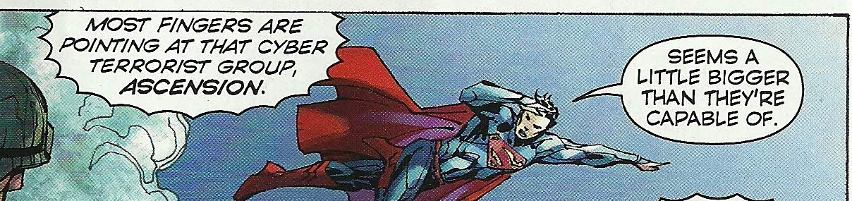
QUICK, TO THE JUMP FOR ---------


Second!


ascension2


EASY there Mr. "heir to the throne."  Lord and master of DC Comics for the forseeable future...we get it.  Sheesh.

LOW OK, mostly for the handling of the supporting cast. Although, personally, I’ve had it up to my neck with their choice for puppet master villain / hate monger. Since when did this guy enter the pantheon of “worthy adversaries?”


SUPERBOY #21

Jordan / Silva

DC COMICS $2.99

Justin Jordan is in and I’m curious to see him moving forward. Here he’s using the secret organization that spawned Superboy to deliver a little one-off. Hopefully, that puts the character on the path to tying up that nagging entity. Hell, it’s only been 21 issues, right?

Maybe Lobdell was writing for the Omnibus?

Anyhow, Jordan’s pretty good right out of the gate with the quippy quippy but I wish they had worked harder to play up the lost and unfocused Stranger in a Strange Land aspect of Superboy as he was constituted in the Nu52. Now he seems poised to be yet another teen loudmouth – JOY!

I was and sketchily remain a big proponent of RB Silva’s work. However, either his pencils are becoming erratically loose or the Rob Lean inks are going over the top in a lot of unnecessary ways. If you look back on the work this pair did for the Jimmy Olsen special with Nick Spencer you find a much cleaner, balanced, and altogether more pleasing look. Now it’s going for a basement version of a Joe Mad and Chris Bachalo aesthetic and I am not enamored. More Maguire faces, please. Less squished figures and overwrought inks. My overall read is of a thoroughly EH comic but it’s had pleasures throughout.


WORLD’S FINEST #13

Levitz / Rocha

DC COMICS $2.99

Robson Rocha’s opening splash is classically exploitative in its contortions of Power Girl but his depictions of Huntress are really quite nice. Come to think of it, I think Power Girl’s costume just changed back to old DC between issues with no explanation? I'll have to look it up… Oh, yeah, editorial mandate to be sure. Occurred in the last 1/3rd of #12 with little reason. Anywho, the juxtaposition of the two leads– one with powers beyond belief and the other merely human have been played throughout the series to good effect by “old reliable” Paul Levitz. That aspect continues here as Karen and Helena are haunted by what looks like an amped up version of a member of the Apokolips Dog Cavalry. Levitz, and I mean this as a compliment, is workmanlike in his development and execution. We get a chase, a fight, a little info dump, and a partial resolution. All appreciated. Still, I was fairly disappointed we didn’t get at least half of the Maguire / Perez art squad.  OK


BATMAN #21

YEAR ZERO

Snyder / Capullo

DC COMICS $3.99

Great. We’ve run through his “definitive” Joker story so now we get his definitive “Origin” story. Father, I shall become a Bat…MAN ON A BAT DIRTBIKE WITH A CROSSBOW AND SLEEVELESS BATSUIT COWL COMBO?!?!


BATMANDI!


Alright, sign me up. Batman running around in a post trauma flooded out Gotham fighting weird street gangs? Batman as KAMANDI?!?! Jesus, just take all my mo…AHHH, CRAP. Of course that only lasted for 3 pages…

Wait, 5 months prior to six years ago? Now we’re back before Batman as Kamandi, which was technically before the Batman we see in Justice League #1?

Excuse me, but what the shit?  A TIMELINE SO STREAMLINED AND EFFICIENT IT MAKES NO SENSE.  We are on the bleeding edge, people.

Anyway, Capullo’s stuff looks great and Bruce Wayne is written as having some real brass balls here as he goes up against the human size and shaped lipstick that is called Red Hood. Seriously, the dude looks more like a walking cherry push-pop than anything else. I dunno. It fits with the “Batman fights weirdos” motif but the look is really pushing it. Still, the introduction of a few key faces, some people I’m totally unfamiliar with and an inciting incident that bares no resemblance to the origin myth I know is definitely going to keep me around. All I ask is that we get to eventually spend some quality time with Batmandi and I am ON BOARD….(BWWWWWAAAHHHM)

GOOD!


So, all in all, a deeply troubling haul from DC Entertainment this week. Here’s hoping Man of Steel is a smart enough movie to swipe liberally from Mark Waid’s Superman work without giving him any kind of credit!


Wait, What? Ep. 117: Sometimes Dead is Better

PhotobucketOne of Annie Wu's great covers from the interior of Hawkeye #8.

Yep, it looks like this posting on Monday thing might be our new podcasting schedule for the conceivable future.  I hope it is not a problem for everyone (including Hibbs, who just posted the shipping list a few hours ago, do go check it out and comment.

After the jump: our charming and trying-hard-to-be-respectable old chum--the show notes.

0:00-5:11:  Here's our opening, a bit more truncated than usual, just so we can jump in with the Bizarro talk and humor for children. 5:11-11:41:  This is definitely a full spoiler episode for the stuff discussed (although as Graeme points out, a lot of the stuff under discussion have discussed and spoiled by the mainstream press).  And although that sounds like the perfect lead-in to our discuss about Batman, Inc. #8, we actually end up talking a bit about Channel 52, DC's spoilery back-up feature currently in all its books, Dan Didio's writing which leads into Graeme's discussion of... 11:41-18:46:  the latest issue of Legion of Super-Heroes, by Paul Levitz and Keith Giffen.  Graeme makes it sound pretty amazing, let's put it that way. 18:46-22:26: Graeme has also read Action Comics #17 (which Jeff read last week) and Graeme is far kinder about the work than Jeff was. 22:26-32:24: And so by comparison and contrast, there should be a discussion of Batman, Inc. #8  starting here…but instead we give a shout-out to Excalibur Comics in Portland, Oregon and grouse a bit about the Constantine preview currently popping up in DC books. 32:23-49:13: And then *finally* we get to Batman, Inc. #8.  A lot to talk about here, with Graeme bringing the hard questions and Jeff bringing the jabber. 49:13-1:05:55:  Also, in another round of DC Catch-Up, Jeff read Batman and Robin #17, that strange book that bridges the Morrison and Snyder sides of the Batverse, and what its future might be post-Batman, Inc. #8. 1:05:55-1:08:40:  Getting away from the Big Two books, Graeme and Jeff are both pretty enamored of Jennifer Blood, issues #22 and #23. We are very careful not to spoil any of the very big things going on in this book, but they are pretty darn good. 1:08:40-1:18:18:  Saga #10!  Although we start off by saying we will not spoil the end of Saga #10--Spoiler!!--we totally go on to spoil the end of Saga #10. 1:18:18-1:22:21: Jeff really liked issue #34 of Prophet, since he feels that Simon Roy really bring the "Space Conan" vibe to the issues he works on. 1:22:21-1:33:26:  Graeme and Jeff are apparently really out of the swing of answering questions, but we do have a few things to talk about that have been brought up by commenters in our threads recently about craft and intention and clarity. 1:33:26-1:42:37: It's been a while since we've digressed to cover other areas of pop culture, but Graeme has a recommendation for Jeff: The Following.  What does the show have to do with DC Showcase: World's Finest, The Strangers and Bad Machinery, both from Oni Press ?The answer may surprise you! (Probably not, but, hey, you never know…) 1:42:37-1:45:21: Jeff has a recommendation in his very-late-to-the-party kind of way.  If you like your comics in digital format, David Boswell has put up (nearly) all of Reid Fleming, World's Toughest Milkman on his website for "pay what you like" downloads. Even Heart Break Comics, the amazing original graphic novel from back in the day (1984?) is available, and they're all fantastic. 1:45:21-end: Speed round reviews! From Jeff:  Witch Doctor Mal Practice #4, Black Beetle #2, Flash #17, and Avengers Assemble Annual #1 by Christos Gage and Tomm Coker.  Graeme has things to say about Brandon Seifert's other work, the excerpt from The Fictional Man, Al Ewing's latest novel, Angel & Faith #19, Young Avengers #2, and Hawkeye #8 by Matt Fraction and David Aja.  Do we also mention Hook Jaw?  Of course we do!  Also, we thank those who have supported this podcast by sending Jeff digital copies and other materials -- a topic about which Jeff was quoted in this article by Todd Allen over at Next Web -- and if you listen at the close at the ending, you can hear how Jeff COMPLETELY misunderstood what was happening at the beginning. That's, like, some serious circularity, man.

Okay, so since this is getting posted at the same time I upload to iTunes, there's a chance it's not out in the wild yet, but you can find it below, ripe for the plucking (I'm not the only who finds that phrase a little on the obscene side, am I?):

Wait, What? Ep. 117: Sometimes Dead is Better

As always, we hope you enjoy and thank you for listening!

All this and Earth, too? Hibbs starts on 5/2

Everybody loves comics!

ACTION COMICS #9: This is a lot more like what I was hoping for from Grant Morrison on a regular ongoing Superman comic -- focusing on President Superman from Earth-23. last seen in FINAL CRISIS -- but I was a bit surprised to not find the "real" Superman anywhere in the story. Still, Silver Age-y without feeling dated, and lots of fun things happen. Gene Ha's art was as awesome as always. I thought this was VERY GOOD. AVENGERS VS X-MEN #3 (OF 12) AVX: Brubaker's got the writing spot this week, so maybe that's why I felt this issue had a bunch more plot? I can't even imagine how this is going to read in trade, with it's crazy tonal shifts every issue? I thought this one was strongly OK.


DIAL H #1: China Mieville's comic debut, and it's pretty decent. There are a few mechanical problems with the set up (most namely: how do you dial four digits 0n a *rotary dial* phone by accident when trying to call for help in the middle of witnessing a horrible beating?), and I have to admit that I'm not sure that I at all like the notion that the H-dial is in a static location, but putting that aside, I very much liked this issue. (On the other hand, I always liked the Robbie Reed version as well) (Sockamagee!)

I liked the schlubbiness of the protagonist, I very much liked the dialed up heroes (Captain Lachrymose needs an ongoing series, stat!), and I just liked the general weird vibe on display here -- this comic could be perfectly at home at pre-Vertigo Vertigo, and whatcha know, it's Karen Berger editing her first superhero comic in 20-something years.

The art by Mateus Santolouco sort of veers back and forth between some Ted McKeever-looking wonderfulness to "Ugh, you need more fundamentals", but it certainly works with the book just fine. Overall: VERY GOOD


EARTH 2 #1: Having read this, I really really can't even begin to understand all of the faffing about in the pre-print interviews of "well, we really can't describe this to you", because, unless there's a dramatic change from what's on display in this first issue (which would then, arguably be a not-so-good FIRST issue), this seems easy to shorthand: it's the formation of a NEW e2-based Justice Society (though maybe they'll never be called that, who knows), where the set-up is in contemporary times, rather than ww2.

I'm a pretty big ("real") JSA fan, and I didn't really like any of the new costumes we've seen so far, so I was suspicious of this at first, but yeah, I very much liked the setup and world building, and slow roll-out of characters.

James Robinson's script was solid -- I felt a real emotional tingle in that scene between Bruce & Helena -- and Nicola Scott's art is as strong as always. I don't know if I will like the new JSA, really (there's really only 7-8 pages of those characters, the rest of the oversized space is dedicated to setting up the world), but as a "Yes, I would like to see more, please" first issue, I thought this was VERY GOOD.


EPIC KILL #1:  If you want to see teenage hotties do acrobatics like River Tam in Firefly, with lots of slaughter, then this is surely the comic for you. Largely reading like a pitch for a movie, it at least has fairly pretty art by Raffaele Ienco that kind of reminds me of John Ridgeway, I think -- detailed, but with straight lines not noodly curvy ones, yet just ever so slightly stiff because of that. Anyway, since the base idea feels so "Seen that a dozen times", the joy of this kind of work is all in the *execution* of the idea, and there's just enough "hey, cool" scenes to have me say that this is GOOD.


GI COMBAT #1: Half the book is about soldiers fighting dinosaurs, so there's that, and as a plus the art is by Ariel Olivetti, and it really fits here; the other half is yet another new take on "Unknown Soldier", who is getting close to becoming DC's equivalent in the if-we-keep-relaunching-him-someone-will-like-it-eventually-right? sweepstakes to Moon Knight. I think they need to try again, as I was really entirely uninterested in this version, sorry. I think this may be a concept that just can't work in the 21st century, maybe because of the "unknown" part, and that doesn't work in our database-driven world (esp with regards to soldiers, I'd have to say). Anyway, like the first half, disliked the second, which means I can't say better then EH.


MIND THE GAP #1 :Another book that reads a little more like a pitch then a comic, but I thought this pitch was fairly terrific. The set-up is for a whodunnit kind of mystery, with the victim's spirit interacting on the, dunno, astral plane, maybe is what to call it, with what looks like a little touch of Deadman-meets-Quantum Leap, maybe?  Jim McCann's script is very strong, and the characters vivid, while the art by Rodin Esquejo and Sonia Oback is realistic, without being creepy and off-putting, like some in that style become. As a bonus, this first issue is oversized @ 48 pages, and just a mere $2.99, making it a helluva deal. No doubt this was a VERY GOOD comic!


STAR TREK ONGOING #8: Given that the premise of the first six issues of this series was adapting/converting classic Trek episodes with the movie characters, you might have missed that they followed that with a two-parter (starting in issue #7), that followed up on the film, with the Romulans and the last drop of "Red Matter" -- I know I sure did until I grabbed this issue to read, and went, "Wait... that's not TOS!" (from the "next issue" pic, it looks like they're going back to that and "The Return of the Archons"). I don't know that I exactly care about the tattooed Romulan faction, or Red Matter, but it was nice to see something wholly new set in this universe (and, in theory, "official"). I thought it was highly OK, and if you miss the TOS characters, recast or not, this was a fun little follow-up.


SUPREME #64: Wow. this should be taught as a masterclass in how to utter destroy a previous set-up in 22 pages, and replace it with the exact opposite. I really loved the clever way that Moore set up his "all versions are true" love letter to Superman, and it's own set up gave all of the ability to complete rewrite the rules as new creators came onboard, but instead Erik Larsen rips it all to shreds and chucks it out the window for the ugliest possible of all iterations of Supreme. That takes mad skills, yo. The craziest part to me is actually the letter's page to the issue (which I suspect won't be in a digital version, sorry) where Larsen defends his actions by comparing this to following Todd on Spider-Man, or whoever followed Miller & Mazuchelli after "Born Again" in Daredevil. the difference, of course, being that there's a 15-or-so year gap here between issues, and while the argument is at least understandable when related to regular ongoing production of corporately owned icons (the trains, in fact, have to keep running), it's utterly bizarre in this case, especially after they went out of their way to try and show "respect" to Alan Moore by illustrating his final "lost" script.

Obviously, the difference between, say, WATCHMEN and this situation is that the creator of the property is the owner and can do whatever they want on work-for-hire material, but there's a dissonance here that my brain is ringing from.

Erik is a talented creator, and this work has a lot of energy, but I really liked the Moore version of Supreme (and pretty much hated the grim'n'gritty take that preceded it), so I thought this comic was pretty AWFUL


WORLDS FINEST #1: I have to say that if I were DC marketing, I wouldn't have scheduled the two Earth-2 related comics in the same week, but I just sell the things, what do I know? But, I also have to say that I really really liked this one, as well. Paul Levitz turns in the first script in months that I genuinely liked from start to finish, and the twin artist (George Perez in the modern sequences, Kevin Maguire on the flashbacks) really worked much better than I thought it would. Yeah, I really thought this was strong, VERY GOOD stuff.

The one problem? That logo. Jesus, that's a horrible horrible disaster -- it looks cluttered and terrible using the "across the room" test (if you can't pick a logo/design element/whatever from across the room, it fails), and it's not at all clear what the name of the comic IS, with "Huntress" being over "World's Finest". Yow.


X-O MANOWAR (ONGOING) #1: If you read the original in the 90s, you've pretty much read this first issue, as it really alters very little of the original setup, just with a little more depth, maybe. It reads well, it's pretty enough, but I didn't feel like "OMG! I need to read the next one right now!" Maybe I'll check back in a few issues to see if they're doing new stories and not just retelling things I already know. Or, maybe I won't. OK.


Right, that's me -- what did YOU think?


-B

"Our Mission Is To Destroy Crime...ALL Crime!" COMICS! Sometimes Justice Has A Big Dead Face!

Yes, it's Sunday Afternoon Kirby Deification Theatre!More after these messages from our sponsors!

Photobucket

Nah, not really. I know you're all expecting me to link The Avenger, Jack Kirby and Justice and do some frothing rant about how Marvel Comics should just give The King his due so we can all just get on with our lives. But I didn't. I just wrote about an odd little '70s comic The King did on his way out of the door at DC Comics. I don't even go on about The King that much. Okay? I like to keep you guessing!

JUSTICE INC #1 - 4 Art by Al "Mysterious" McWilliams and Jack "KING!!!" Kirby Inks and letters by Mike "Royalty" Royer Words by Denny "No Heel!" O'Neil (Assisted by Paul "I Am Legion!" Levitz) Characters created by Walter Gibson and Lester Dent Issues 1,2 based on the "novels" by Paul Ernst ("Kenneth Robeson" was a pen name covering the work of the above three men.) (DC Comics, 1975, $0.25ea)

Photobucket

The Avenger first appeared in his self-titled magazine in 1939 and by 1942 he was gone. So, it's probably fair to say that "Lester Dent"'s attempt to replicate the success and appeal of Doc Savage failed. It's also probably fair to say that The Avenger's failure was due to the public just not wanting another pulp hero rather than the character being bad or anything. There must be something to him because he keeps popping up in The River of Time like a badly weighted corpse. After all, The Avenger was part of DC Comics' 2009 FIRST WAVE pulp sales disaster and had an (uncollected) 2 part prestige series in 1989 by Helfer/Baker. And in 1974 he butchly brooded on the pages of this series. So, yeah, who is The Avenger and how did his face gets so dead? Glad you asked.

Photobucket

Since this series lasts only four issues there isn't much room to expand on the basics of the character much,  but luckily Editor Allan Asherman provides a comprehensive run down on the character in the back of #1. So, I can just steal all that and look right clever and if Jess Nevins wants to question any of it he can just go get all up in Allan Asherman's face instead. Anyway, Dick Benson is a family man, ah, but he is a family man of the '30s! Hence it is quite believable that he was previously an adventurer and treasure hunter because, apparently, career choices in the '30s were a lot more fun. (What Allan Asherman omits but Wikipedia (hey, I'm not proud!) does not is the fact that Dick Benson also lead "native armies in Java". Which I guess makes him a mercenary. Yeah, they've dropped that by the '70s.) It doesn't really matter what unlikely employment Benson's had all that matters is that he's really wealthy and astonishingly well trained at violence. Because if an average Joe gets has his family killed by sinister criminals he tends to just have a breakdown, never find who did it and end his life living with a woman who really likes cats and is too deaf to hear him weeping in the night. That's not really very pulp though whereas a man who is master of Karate, Kung-Fu and Savate (which is not apparently a male fragrance), possesses a photographic memory, has knowledge of the sciences, and has spent an entire YEAR (Asherman's emphasis) learning to use a gun and a knife is very Pulp. He's also probably someone with very poor hand-eye coordination (a YEAR!!! (my emphasis)). Fortunately his family die and he gets to put all these mad skillz to good use attempting to destroy ALL crime!

Photobucket

Unfortunately the shock of Benson's family's death results in total facial paralysis and his face, hair and eyes all turning as white as Jesus' conscience. Really quite white, that is. The best bit is that although Benson's facial muscles are paralysed the face itself is infinitely malleable. With a few deft cheek chuches and finger digs he can replicate the features of anyone! Sure, medical professionals may be tutting and shaking their heads at this but I'm sure the rest of us find this scenario only too plausible. Oh, and he's right handy at makeup which he keeps in a "small" make-up kit, which comprises make-up, every colour of contact lens, shoes with lifts of different heights, padded shirts and wigs in every style and colour. That's an interesting use of the word "small" there I'm sure you'll agree. Come on now, if you are expecting the adventures of a man with a malleable face who has trained as a one man army in a fight to destroy all crime to be sensible, well, you've probably misread the signals even worse than tha time that chick just upped and glassed you in the face. It's absurd is what it is. And I like absurd things and these comics are pretty absurd.

Photobucket

As you've probably noticed Al McWilliams draws the first issue not Jack Kirby. I don't know anything about Al McWilliams and for all I know he could be a pseudonym for Al Williamson or something. There were a lot of artists working for more than one company under different names (e.g. cheeky Gil Kane) around this time so it's possible. More likely Al McWilliams just never took to being exploited like an unloved drayhorse as is comics' wont and is a real human being who I've just insulted by positing his imaginary nature. He draws in a heavily realistic and illustrative style which is pretty good. There's not a lot of sense of motion but that's par for the illustrative approach, however, the realism does help the absurdity on display go down smoothly. That's one way to go but it's not the way Jack Kirby chooses.

(In the comments below J. Kevin Carrier points out that "Al McWilliams drew a bunch of comics from the ’40s to the ’80s, mostly for Dell, Gold Key, and Whitman. He also drew the newspaper strip “Twin Earths”." so there you go. Apologies to Al McWilliams and thanks to J. Kevin Carrier!)

He chooses to pump up the preposterousness to such a level that absurdity looks tame indeed. Actually that's not a choice he's made, as by 1974 that was Kirby's style. And it's a great fit for something as lovably daft as this. The book is set in the '30s and Kirby's '30s look like Kirby's '70s or Kirby's '80s rather than the real world '30s. The buildings look like a gifted child's been at the building blocks again, everything is ornately chunky even the people. By 1974 as far as his art was concerned every town was Kirbytown! It's not his best work but it is his work and so it has pleasures and rewards on every page. I guess it wouldn't have been his best work because Kirby's work here is probably among the last pages he worked on at DC Comics before Marvel got to kick him around one more time.

By the end of his time at DC Comics Kirby was just being given up work to make up his agreed page rate as all his own books were cancelled. It must have been quite a shock for him working off someone else's scripts. Sure, he'd worked with Joe Simon but that seems to have been a properly collaborative relationship with both of them mucking in on different aspects as and when. Prior to Kirby's '7os DC work he would have been used to the Marvel Method. Allegedly this could be seen as involving Jack Kirby coming up with ideas and drawings which some other guy would reword the dialogue for with snake oil slickery before claiming complete credit. Some people might say that anyway. So, Kirby was probably befuddled by the fact that Denny O'Neil had provided him with a full script with a structure and dialogue and everything with only the expectation that Kirby draw it.  So he does because he was The King and that's what The King did.

Photobucket

There's a repetitive aspect to O'Neill's scripts that's worth addressing. In every issue several things will always occur. There will always be a scene where the two black characters (Josh and Rosabel) act in a Minstrelly way. The first time you see this your heart just sinks and you immediately imagine that bit of text they have to put in certain reprints now about how "Bits of this comic are a tad racist but look, it was a long time ago, and people didn't hide it as well as they do now. So don't be writing us angry letters about Billy Batson using burnt cork on his face as a disguise, please." It's okay though because immediately afterwards the two characters will have been revealed to have been acting dumb and are in fact "extremely intelligent college graduates." The book is set in the '30s after all so I think O'Neill does as good a job as can be expected of acknowledging and undercutting the racism of the time in a book produced in the '70s and aimed primarily at children.

Photobucket

There will always be a scene where The Avenger shoots someone only to have to explain that he never takes life and the shot has just "grazed" their scalp. This is interesting because although Benson is intimate enough with his weapons to have named them Ike (the knife) and Mike (the gun) all his training has been towards the end of being so proficient in their use that he can use them and not take life. Today a character would train in order to be able to take the most life as possible in any situation. So, yes, Benson may be creepy enough to give his weapons names but he's still better than that sad twat The Punisher. Also, Benson doesn't fight alone he has a bunch of chums who accompany him in the relentless quest to kill ALL Crime! The weird thing is all of them are spectacularly intelligent but talk in a way which belies this intelligence. Except for Smitty who talks daft in the books but doesn't in the comics. That's Algernon Heathcote Smith not regular commentator J_Smitty, because as intelligent as the former is at no point does the comic book Smitty mention donuts. Or Kickstarter.

Photobucket

Now all this repetition, together with the customary every issue regular recap of Benson's origin and skills, isn't the result of O'Neill's lack of writerly skills. No, it's a product of the time.  The emphasis in the '70s was on single issue stories as there was no expectation that readers would be able to find the next issue and so in two separate letter columns Asherman has to defend his book's choices along these lines:

"We wouldn't have minded devoting two issues to the origin either. But we also like to give our reader's their money's worth, and personally, would YOU like to buy a first issue and find "to be continued" at the end of the story?" (from issue3)

Interesting, n'est pas?

Some of the other repetition is a little harder to explain. With the exception of the first issue the three other issues end with the villain falling to his death. Seriously. Look, I faffed about in Photoshop and everything to prove it:

Photobucket

I don't know what that's about! Although it should be noted that it is partially explained in that issue 2 and issue 4 have exactly the same plot with only details and names changed. I guess this is because they knew they had one more issue but that was it so, hey, here's issue 2 again, who wants to go out and hold doors open for ladies!?! It's still a lot of death plunges, I feel.

So, JUSTICE INC then? Not the world's greatest comic coming across as it does as being cancelled before finding its flow and thus making its flaws all the more obvious. But in its favour it does have '70s Jack Kirby art which, for me, is the best kind of art. And maybe even more than that JUSTICE INC has plots like the one in #4 which involve the villain releasing seagulls loaded with explosives from his zeppelin and guiding the fatal flock by radio at his own airplanes in order to collect on the insurance. I mean, what could go wrong? Any comic drawn by Jack Kirby with a plot that absurd could never be less than GOOD! Me, I'm neither fierce nor noble but, like The Avenger, I am gone!

Jack kIrby A.K.A. King Kirby

Hope you had a nice weekend and read some COMICS!!!

"When do I EVER have an alibi?..." Comics! Sometimes they are really good!

Oh, God! He’s back again! Hopefully he won’t be chittering on about WILL EISNER’S THE SPIRIT (DC Comics, 2010 – 2011)! Um, don’t really know how to break this to you…

Photobucket

WILL EISNER’s THE SPIRT (2010 – 2011)

It’s cancelled now, of course. Living in LCS discount boxes across the globe waiting for eager hands and enquiring minds to alight upon the lovely Ladronn covers and pluck them out for a good hard reading. Doing so would certainly be something I’d recommend. For 17 straight issues Mark Shultz, David Hine and Matthew Sturges delivered the scripting goods. Solid, enjoyable writing all the way only occasionally undercut by decompression, but even when the pages seemed a little unnecessary they were made necessary by the delightful stylings of Moritat, for the most part, but also subs such as Victor Ibanez. Moritat was a revelation in this series; to me a new discovery whose art was a sheer pleasure on every page it graced. If I weren't already signed up for ALL-STAR WESTERN his presence would have ensured it. But it’s cancelled now of course, yet there’s still time for one last look before the final issues slip off the shelf to make way for another tie-in, yet another re-boot, yet another thing that matters less but will sell more. If there’s a lesson to be learned from the demise of WILL EISNER’S THE SPIRIT it’s probably that in today’s wacky world of funnybooks VERY GOOD! will only get you so far but hype will get you further. This series was always the former but had little of the latter and so now it’s cancelled of course. Time for that one last look back then…


WILL EISNER’S THE SPIRIT#16 By John Paul Leon (a), David Hine (w), Daniel Vozzo (c) and Rob Leigh (l) Cover by Ladronn (DC Comics, $2.99)

Consisting as this does of a story told via splash pages this corker is pretty much definitive proof that splash pages can be more than lazy page filling; that the derision and heart-sink I feel when presented with one more big image is more a learned response to their implementation over the past years by wastrels and hacks. It’s an exercise in artistic constraint, the kind Alan Moore (ssshhh! Now, Internet. Shhhh!) regularly delights in tasking himself with. Here the brief is clearly to tell the tale in splashes but each splash has to carry the story forward, include all the relevant visual information, convey mood and, just for yucks, also to include THE SPIRIT logo worked into it unobtrusively. Tell the story basically. In lesser hands it would be a stunt, in even lesser hands a pitiful waste but in hands as nimble and facile as these it becomes a joy. A delightful reminder that those rich in imagination and craft can achieve more when restricted than those who are not so blessed can achieve when given complete freedom.

Photobucket

There are 19 more pages as good as this! I shit thee not!

Clearly the star of the show here is John Paul Leon who carries the major weight of the enterprise. John Paul Leon is known to me from the WINTER MEN series he illustrated Brett Lewis’ words for. The fact that I consider WINTER MEN to be the nearest thing to AMERICAN FLAGG! since AMERICAN FLAGG! probably gives you some idea of the regard with which I already hold his work. A regard that this issue does nothing to diminish. It’s one of those artistic performances you really have to see for yourself. I’m not really one to tell people to buy things sight unseen due to all that nasty subjectivity floating about, but, hey, here I am saying buy this one sight unseen. Your eyes will owe you a pint for it because John Paul Leon’s work here elevates a solid script to EXCELLENT!


WILL EISNER’S THE SPIRIT#17 By Brian Bolland, Jose Luis Garcia Lopez and Brian Bolland (a), Howard Victor Chaykin, Paul Levitz and Will Pfeiffer (w), Rob Leigh and Galen Showman (l) Cover by Ladronn (DC Comics, $2.99)

This final issue of the series contains three short and sharp B/W strips. Such strips formed the back-up of the regular comic until DC cut pages and kept prices down (as opposed to Marvel who cut pages and kept prices up). I guess these were in the can when the axe came down but they make a fine fare thee well for the series.

First up is a strip drawn by Brian Bolland. If I have to tell you about Brian Bolland I can only surmise you have arrived here due your abiding love of bad prose styling rather than your love of comics. For to know comics is to know Brian Bolland and to love one is to love the other. It’s Brian Bolland! and although there’s a stiffness evident that was absent from his hey day he’s still Brian freaking Bolland and that makes him well worth the eye time. Here he’s illuminating a strip scripted by one Howard Victor Chaykin. You’d know that even if you didn't read the credits because it’s got all his little, um, interests in abundance (ladies, infidelity, murder, female, ladies, body builders, snappy patter, you know the deal with this guy and it’s a sweet deal indeed). Also, either he scripted this tighter than a gnat’s chuff including breakdowns or Bolland and Rob Leigh went out of their way to make it look exactly like a Howard Victor Chaykin production right down to the signature layering of sound FX. It’s Brian Bolland and Howard Victor Chaykin and so it could never be less than EXCELLENT!

Photobucket

If this panel was any more "Howard Victor Chaykin" it would have had a bah mitzvah!

Next up Jose Luis Garcia Lopez is freed from his merchandising illustration duties to bring vitality and elegance to a tale by Paul Levitz in which The Spirit versus Illegal Lottery Lad and Newspaper Kiosk Kid. Not really, but it does revolve around illegal lottery tickets and an old man in a kiosk who gets dealt with surprisingly harshly at story’s end. There’s a washed out quality to the art that is entirely at home with the snowy setting and, really, as usual Jose Luis Garcia Lopez is worth the ticket price on his own. DC should really collect TWILIGHT by Jose Luis Garcia Lopez and Howard Victor Chaykin before I die, just saying. Mostly because of the art, as the story lacks a certain clarity, this was VERY GOOD!

Photobucket

"FIGHT!"

Finally Will Pfeiffer and P Craig Russell take us on an entertaining whistle-stop tour of art history which runs parallel to The Spirit chasing a hood with many irreplaceable works of art meeting a slapstick end. It’s fizzy, informative and fun stuff that reminds me of how good Will Pfeiffer is and then makes me wonder why he doesn't write more. Being centred on Art it’s pretty much P Craig Russell’s show all the way and this being P Craig Russell it’s a barnstormer, and I can only genuflect at the wonder of his execution. Mind you, I do love me some P Craig Russell. I love him for his graceful and delicate art but I also love him because when he’s allowed to do what he wants he doesn't just illustrate a new and exciting (i.e. stale and uninteresting) take on teens with superpowers intended for other media, no, he adapts Oscar Wilde fairy tales or operas like The Ring Of The Nibelung. Then he does stuff like talk about how his pacing is intended to mimic the movements of the music and it’s right about then that I realise that although I can never appreciate his work to the level it deserves I can at least love it. So I do and this makes the final story in this issue VERY GOOD!

Photobucket

Let there be P Craig Russell...

So there you go - WILL EISNER’S THE SPIRIT published by DC Comics from 2010 to 2011 is cancelled now but it was VERY GOOD! And time won’t change that. Take a look in the dollar bins and prove me wrong, why doncha!

Pah, enough! I must go tend to the roses in the garden of my Life! Have a nice weekend and remember every weekend is better with COMICS!

And what rough beast, its hour come round at last, slouches towards Bethlehem to be born?

[ONE EDIT: 9/9/09 9:54 PM, scroll to the next brackets]

As you may have now heard, Paul Levitz is now out at DC, and DC Comics will now become "DC Entertainment", headed by Diane Nelson.

This is, I think, much bigger news than the Disney/Marvel thing from last week. Paul certainly has his shares of detractors, but I've always thought of him as the Smartest Man in Comics, and absolutely one of the key Architects and Protectors of the DM.

Rich Johnston (of all people) has probably the best "eulogy" for Paul over on Bleeding Cool.

[HERE'S THE EDIT: Kurt Busiek nails it even better than Rich]

I think Paul is a Class Act, and there's nothing more that I fear than Warners completely ruining the DM. I'm absolutely shattered by this news -- I was hoping we'd have AT LEAST another decade with Paul at the helm, and now everything -- everything -- is up in the air.

Chances are that, by 2012, nothing in comics will even remotely resemble what it does today.

You can read Paul's farewell statement over here. I appreciate the fact that Paul specifically mentions retailers. He also uses the words "comics" as a noun five times.

You can read an introduction from Diane Nelson over here. This is probably the most relevant paragraph:

DC Entertainment’s mission is to deeply integrate the DC brand and characters into all of Warner Bros.’ creative production and distribution businesses, while maintaining the integrity of the properties and DC’s longstanding commitment to and respect for writers, creators and artists. The founding of DC Entertainment is about Warner Bros. taking DC to the next level and giving DC an even greater degree of focus and prioritization in all the businesses in which we operate—films, television, home entertainment, digital, consumer products and videogames.

She doesn't use the noun "comics" even one time.

That terrifies me.

I'll probably have more later, but right about now I have to start checking in my comics shipment...

-B

All-WHAT?! -- Hibbs continues 5/16

ALL-STAR BATMAN AND ROBIN THE BOY WONDER #5: Paul Levitz apparently thinks that DC's publication of THE BOYS could do some theoretical harm to their core superhero business, or taint the icons, or something. This makes me wonder what Paul made of THIS.

Since it is the ACTUAL icons.

The strangest thing is that, had Frank Miller been drawing this, I'd probably have found it amusing and satirical and maybe even a little funny. But with Jim Lee? Lee is THE mainstream superhero comic book artist, so it adds a layer of weight and Importance to it all that just absolutely demands it be taken Seriously, and, thus, renders any satire as stone-faced earnestness.

But, really, REALLY, Levitz cancelled THE BOYS and continues to publish this? Really?

AWFUL.

What did you think?

-B

The Bendis Batman / Daredevil thing

Only because BMB asked that retailers pester Levitz over this thing, here's one retailer's 2 cents. Putting aside the whole "DC sucks! It's just like the old days with Stan! Except I talk about penises!" trip that Quesada and Jemas were on (and, see, actions have consequences -- does no one remember the adage of being nice on your way up because you get to meet all of those people again on your way back down?), I don't think there's a lot of value in DC getting in bed with Marvel as long as Marvel's current publishing policies are as they are.

Remember AVENGERS/ JLA? Marvel printed #1 and 3. Limited to initial orders only. Sold out upon release. Took no responsibility whatsoever.

DC printed #2 & 4. Had copies available for reorder. Still do, in fact. When #4 ran late, DC applied their returnable policy for mini-series and took BOTH #2 and #4 returnable.

I mean, game set and match.

Plus, let's not forget that they've done it before. Try 1997 and 2000?

-B