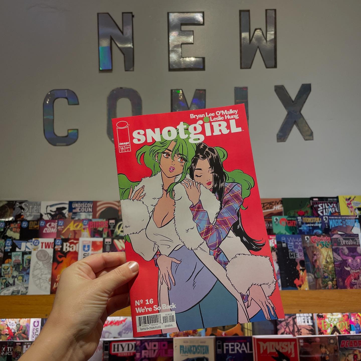
Bustin' on the ones -- Hibbs duz 6/12/2013

ON New Comics Day? What? Well, don't get used to it, but I felt bad about skipping last week, that I thought I'd get way ahead on this one.  Below the jump, and all.

A1 #1 (of 6): I'm certain I have mentioned this before, but anthologies are a wicked hard sell for American audiences -- despite being essentially the "default" option for other comics markets internationally (UK and Japan in particular) -- and I suspect someone much cleverer than I could figure out something about the Essential National Character of each culture based upon their comic markets. But that isn't me.

I will note that I think we don't like anthologies in the US because I believe we judge the entire package by the WEAKEST contribution, and that we want comics to Get To The Point a little more than others. a1 is a British production -- and, in fact, is the second go 'round at least for the name, as there was a pretty nice set of thick squarebound black & white comics also from packager Dave Elliot.

THAT set was a solid mix of "big names" with people I'd never heard of (back then), and, if you can find those original six, you might be surprised how much formative work there was on display there.

In this batch, however, I don't think we're going to look back at in two decades later with a "Wow!", because, if anything, this is kind of merely a comics-formatted 2000 AD, without the "boy's action!" angle. Plus? 2 of the three serials are written by Elliot.

The problem with those two is that (and this is often a problem with both anthologies AND, I would argue, UK creators specifically) that their premises are not explicit in the first chapter. "The Weirding Willows" seems like some sort of semi-LOEG literary mash-up, but there's no real reason to be interested in the protagonist, Alice,  other than "cute blonde" -- she walks through a bunch of supporting characters, but engages with virtually none of them and there's no narrative thrust on display. You can't spend your page count "world building" in 8 page installments until AFTER you've earned your audience's interest.

Elliot's  second serial, "Odyssey", doesn't even bother trying to provide a protagonist, just showing us a bunch of scientists and dire results in its WW2 milieu. Ugh, not THAT hoary chestnut again. Maybe maybe maybe I could deal with it if there was a single sympathetic character on display, but, literally, every character in this opening is loathsome.

In the hammock is "carpediem" by W.H. Rauf and Rhoald Marcellius which is much more palatable, introducing 7+ new characters AND giving them a complete adventure at the same time, while really having some very nice cartoony art attached to it, but too much of the heavy lifting is done by punning and British humor. Still, it's the one serial in the book I'd actually be willing to read more of.

So, overall, that's a pretty textbook EH.


SIX-GUN GORILLA #1 (of 6): See, you have a comic book called "Six-gun Gorilla" that stars a pistol-wielding gorilla, I am of the mind that you start and finish every damn page with the ape, and you don't wait until the last page or three to have the critter show up. It's that UK  world-building thing again (the world in question is, hm, a reality show of an eternal war, and it's rich enough) -- any 'murican should be able to tell ya you start with the explosion, and only ramp it up from there. In media res, byee-otch!

The shame of it is, I really did like this adequately, but who wants to wait for the second issue until the title character is a real presence? that makes this just OK.


SUPERMAN UNCHAINED #1: I wanted to like this, but I think that the reason I'm merely ambivalent is the Jim Lee art. He's simply not a Superman artist. That's not to say he can't draw Superman -- he does just fine -- but his line-style just really doesn't work on an ongoing Superman comic.  Oh, and the coloring? Too too too dark for the character (that cover, especially, doesn't scream "buy me!")

This also also features a fold out poster (though that's not cover-blurbed, go figure), which raises the price to a massive $4.99, but it's so awkward and stops the story cold (on page 5, to boot!) and it's not something that I see anyone hanging on their wall (Wow, Superman is fighting some wires!), so I really don't get the point (other than, y'know, market share games)

I liked Scott Snyder's story just fine (and that's the majority of the basis of my final grade), but, I just feel like the art is working against the story in every place. I sort of hope, kind of, that Jim stays on for just the first arc, and then they hand it off to someone with a REALLY clean style.

Anyway, I liked the writing enough to give a very low GOOD.


(Joe Hill's) THUMBPRINT #1 (of  3): Liked this.  Based on a novella by Hill (which I've never read), and it does a good job presenting a sympathetic protagonist, who could be an antagonist as well. The art by Vic Malhotra has a nice Aja / Samnee thing going on and was much of the drawing point for me (because at just three issues, this seems like it will read better in collection).  I really don't have much more to say, but I was trying to hit all of the #1s this week, so.... GOOD.


THE TRUE LIVES OF THE FABULOUS KILLJOYS #1 (of 6): Gerard Way's new comic (co-written with Shaun Simon) is pretty pants-shittingly terrific. This is a rich sci-fi world -- and one that I'm not entirely sure that I followed with each and every jump. But it didn't really matter, because I look forward to finding out the details.  It has backstory text pages and everything. I liked the characters, I liked the setup, and I especially liked some of the poetry of the writing ("One day... our bodies will only belong to each other, and the streets will be for shopping, not working" says one sex android to the other).

There is a crazy density to the world, which is so supremely helped by the fabulous artwork of Beck Cloonan. This is awesome comic which probably couldn't have been done in any other media, and my only regret about it is that it is only 6 issues. EXCELLENT.


A USERS GUIDE TO NEGLECTFUL PARENTING GN: I think Guy Delisle is a splendid cartoonist -- he's got a strong line, and his timing is perfect and impeccable. The stories in this book are hysterical and universal and absolutely heart-felt and True. And yet, for all of that, I'm ultimately going to pan this book. Why?

Format.

This is presented as a paperback sized package with two panels per page. 192 pages, with a $12.95 cover price (which is much much better than the original solicited $16.95 cover price -- it has a sticker over the original price, yikes, so I don't know whether it was an exchange rate thing, or that someone got it in their hand, and realized they couldn't possibly charge that much). And I, no shit, TORE through this on a single bus ride home. Under 13 minutes from cover to cover, even stopping and going back a few times to admire his pacing on the jokes. Ow.  That makes the $5 SUPERMAN UNCHAINED look like a friggin' bargain.  It is simply 2-3 times what this should cost for the actual density of the content.

Again: that content is GREAT, and would rate a VERY GOOD, at least, on its own (I only wish that the [few] "Shit" and "Fuck"s had been dropped, otherwise this would be a GREAT all-ages title.. my 9 year old woulda loved reading these, and laughing at old dad commonalities), but the package is so criminally egregious that I have to drag it all the way down to EH. *sad panda*


Right, that's me for today at least.... what did YOU think?


-B


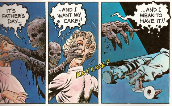
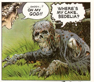
"Where's My CAKE?!" COMICS! Sometimes They Are A Bit Like Films (CREEPSHOW)!

There came a day pretty much like any other day, except sales of Godawful Tony Parsons books went up. The Day of The Father! Photobucket

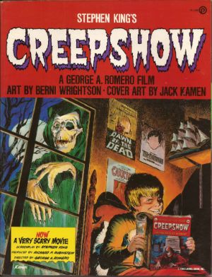
I hope you got yours a cake, kiddies! We Dads can hold a grudge for a long, long time! Heh. Heh. Heh. CREEPSHOW Art by Bernie Wrightson with Michele Wrightson Based on the motion Picture presentation CREEPSHOW directed by George Romero and written by Stephen King Plume/New American Library, $6.95 (1982)

Photobucket

A big old "COVER BY JACK KAMEN" - now that's treating creator's right!

Were I to open the nicotine stained and age crisped pages of my 1985 copy of Danse Macabre by Stephen King to page 36 I would find this:

"As a kid, I cut my teeth on William B. Gaines’s horror comics – Weird Science, Tales From The Crypt, Tales From The Vault – plus all the Gaines imitators…These horror comics of the fifties still sum up for me the epitome of horror…"

If I had time to continue reading I would find that King then goes on to describe, detail and analyse these fetid throwbacks up to page 39 of his illuminating non-fiction survey of horror. He may even go on about them later on in the book, but I wouldn't have time to check that. Hypothetically speaking, of course. Fact is, Stephen King loves him some old-timey EC horror schlockers. Hardly a bone jolter then to find that CREEPSHOW is a celluloid homage par excellence to such tales. Particularly as George A. Romero is behind the camera and, although I’m not as familiar with the man behind the ever enlarging glasses I’m pretty sure his genre work points to a familiarity with the same foul floppies.

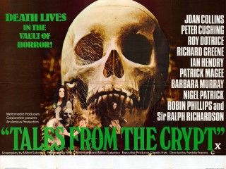
CREEPSHOW, then, is an EC comic made film. This hardly makes it notable as in 1972 there was Tales From The Crypt and, in 1973, The Vault of Horror. These were Amicus productions, although they are often mistaken for Hammer films as, to be honest, for a viewer there isn't much between the two studios. Amicus were a bit tattier, perhaps. Amicus produced a few such anthology films although the trend for horror anthologies was popularised in 1945 by Dead of Night.

Photobucket

Tales From The Crypt poster Image taken from britposters.com.

These films are often referred to as portmanteau films. “Portmanteau” is French and thus makes everyone feel that bit classier about watching a film where, say, Roy Castle and Kenny Lynch face off against a Voodoo demon in a chilly British back lot passing for the West Indies, or a film where a scientist removes his pipe and gravely intones, “Why, a plant like that could take over the world!” Basically such films consist of a framing sequence, although that bit can be optional, with some connection to the handful of short, sharp shocks which then follow. They were pretty camp stuff, I’ll be bound. Sadly, at this remove it’s hard to tell if the campness is intentional. The sight of Tom Baker screaming in beige flares might once have been chilling for reasons far removed from his fashion choices or the damage he’s inflicting upon the concept of “acting”. The final stake through the heart of this enjoyably daft stuff came in 1980 with The Monster Club, a film that fails so badly as horror that the scariest part is a musical performance by B.A. Robertson. By 1980 then all that remained was the camp and that wasn't enough.

Photobucket

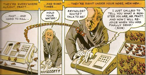
Art by Berni(e) Wrightson and words by Stephen King

In 1982 Romero and King inflicted CREEPSHOW upon the world. CREEPSHOW, while being a bit camp, is so technically adept and innovative as a film that the fact it came only 2 years after The Monster Club is pretty startling. I’d love to talk about all that but, since I haven’t seen it for about 20 years I can’t. That’s right, the clock has just struck amateur hour! Still, as unprofessional as I am I’m willing to bet a toffee wrapper and some lint that technically it’s still impressive. Impressive as a homage to the comics themselves and the films inspired by those comics, but this is a comics blog so how does the adaptation fare?

It does a pretty great job, thanks for asking. In terms of form it’s a step back for Berni Wrightson. Wrightson (who at this point isn't putting an “e” on the end of his name so I've had to do two tags, thanks Berni(e)!) had of course been a keen and active participant in the Warren magazines Creepy and Eerie. Those brought the EC formula bang up to date for the stinking Seventies and the emaciated (early) Eighties. Which mostly meant being (slightly) more horrible and having less narrative text, because the EC stuff was already pretty awesome, thanks very much. The worst elements of the originals were their overwritten nature, where a text box would describe what the artist was illustrating. Since the artist was probably someone awesome like Jack Davis or Graham Ingels, the largely redundant words would be putting a serious crimp in how much they could fit in one of the cramped panels. This was less than ideal for fans of fantastic art. CREEPSHOW the comic dials back a bit on this narration but the amount of speech still overwhelms the images at times. So, it’s a kind of compromise, I guess, and it does work for the most part. It certainly reads like an EC Comic; slightly better in fact due to the narrative nips and tucks.

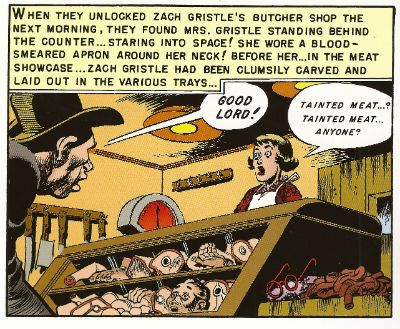
Photobucket From "'Taint The Meat...It's The Humanity!" in Tales From The Crypt #32 (EC Comics, 1952). Art by Jack Davis and written by Al Feldstein. My All Time Favourite Bad Pun Title!

Where it doesn't quite catch the EC essence is in the horror. It just isn't horrible enough. I haven’t read a lot of EC Comics but what I have read has quite often been really quite foul. That’s okay, it’s a horror comic so that kind of comes with the territory. The five stories by King presented here have horrific elements but the campness is turned up just that bit too loud and dulls the impact of the atrocities on display. Strangely, it comes across as a nostalgic view of the material. One that surprises by flinching away from the tasteless stuff that defined it in the minds of its readers, such as Stephen King, in the first place.

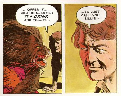
Photobucket Art by Berni(e) Wrightson and words by Stephen King

Oddly the adaptation drops the movie’s framing device, I guess page limits acted as a kind of budgetary constraint here. It does mean Joe Hill doesn't get to see himself in a comic by Berni(e) Wrightson, but he is on the Jack Kamen cover. And how loudly does the fact that Jack Kamen’s credit is so large speak to the love of the creators for the source material? Loudly indeed. Speaking of the thespian Kings, possibly the best thing about the comic is you don’t actually have to experience Stephen King’s performance as Jordy Verrill, which is a bit like having to watch Kenneth from 30Rock do a 20 minute experimental play. Sometimes I wonder why CREEPSHOW is never on TV, and part of me can’t help but wonder if Stephen King’s family haven’t got something to do with that. The likeness of Jordy suggests Berni(e) Wrightson had never seen Stephen King as do many of the other depictions of folk such as Ed Harris, Ted Danson and E.G. Marshall. He does a cracking Hal Holbrook though. Maybe Berni(e) Wrightson just really dug drawing Hal Holbrook? Each to their own. Although the adaptation benefits from the lack of Stephen King, er, acting it does suffer from the lack of, say, E.G. Marshall’s horribly convincing performance as a massive sh*t bag. But then adaptations always suffer from the lack of the human element that brings so much life to the material on the big screen. For me, that’s where the artist comes in. His, or her, performance is going to make or break an adaptation. And when it comes to Berni(e) Wrightson, for me, the guy’s a maker not a breaker. Nice work, Berni(e) Wrightson!

Photobucket Art by Berni(e) Wrightson and words by Stephen King

So, while it isn't the first EC type comic to stain the cinema screen CREEPSHOW is the first(?) to actually attempt to create the experience of reading a comic through the medium of film. And the comic CREEPSHOW is an attempt to replicate the experience of watching the film based on those comics but mostly the comics themselves. It’s all a bit confusing really, but it remains GOOD!

So, yeah, I spent Father’s Day with some COMICS!!!

How about you?