"I Guess You Could Call It An EYEFUL SORE!" COMICS! Sometimes That Joke Isn't Punny Anymore!
/Bit of a hybrid this time out. It’s a little bit European and a little bit American. Something for everyone! Also, Batman! Everyone loves Batman! Unfortunately it’s kind of terrible. But, wait! I’m getting ahead of myself…
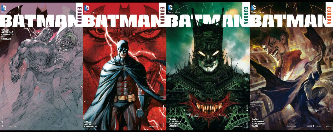
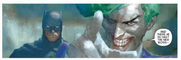 BATMAN: EUROPA by Parel, Camuncoli, Casali, Azzarello and Brosseau
Anyway, this…
BATMAN:EUROPA #1-4 Art by Jim Lee, Giuseppe Camuncoli, Diego Latorre and Gerald Parel Layouts by Giuseppe Camuncoli Written by Brian Azzarello and Matteo Cassali Coloured by Alex Sinclair Lettered by Pat Brosseau BATMAN created by Bill Finger with Bob Kane DC COMICS,$3.99 each (2015-2016)
Tellingly the most interesting thing about BATMAN: EUROPA is its appearance some ten years and change late. Announced in 2004, the series finally slouched out in 2015. What? Yes, Jim Lee is involved. However did you guess, Holmes! I guess Jim Lee struggled to find the time to draw an actual comic in between his high level corporate gig of wearing baseball caps and smiling his sunshiney smile. Maybe it’s unfair to blame Jim Lee though, maybe it was Brian Azzarello who was busy earning more money than I’ll ever see, vigorously, and ill-fatedly, palping the withered dugs of Frank Miller and Alan Moore in an attempt to express one last squirt of milky, milky cash; all for a company so bereft of ideas they mistake having Batman fight Rorschach for creativity. Or maybe it was one of the other folk involved that we’re not interested in because they sound a bit foreign and haven’t made awesome comics like, uh, that one that’s only any good because Eduardo Risso drew it, or whatever comic it is that makes people like Jim Lee’s scratchy tedium. (If you really need to like an artist who works at the pace of tectonic shift then I still think Barry “Windsor” Smith’s your best bet.) I don’t really know Matteo Casali but I hear Matteo Casali has written some Dylan Dog comics I’ve never read, so maybe he’s a byword for tardiness; maybe our continental chums are all like, “Dylan Dog would be a good comic if only it ever came out. Damn Matteo Casali’s eyes! That Mateo Casali makes Jim Lee look like a Japanese Rocket Train. Mateo Casali! Pah!” Ah, but do you want it now or do you want it right, someone who thinks I don’t know a diversionary tactic when I hear one is saying. Look, the Sistine Chapel ceiling took Michelangelo four years. Four years. Therefore it took DC Comics six years longer than it took Michelangelo to paint the Sistine chapel ceiling to produce a comic about Batman in Europe. I don’t know about you, but I’m thinking that a Batman in Europe comic that takes 10 years had better be some brand new high in Batman comics, if not a fresh peak for the very medium of comics itself. It isn’t.
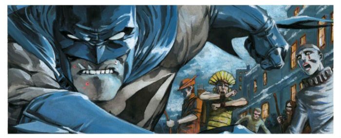 BATMAN: EUROPA by Camuncoli, Casali, Azzarello and Brosseau
Unsurprisingly BATMAN: EUROPA is mostly set in Europe. And so it’s called EUROPA, which sounds a bit like Europe. But I don’t know why it’s specifically called “EUROPA”, since that’s the website for the European Union (which we aren’t to speak of lest we be hung, drawn and quartered for Treason against Brexit Britain. TAKING BACK CONTROL!!!!) Or maybe Brian Azzarello thinks people in Europe all put ‘a’ on the end of words; like Italians in an old Chris Claremont comic (“I-a welcome-a you-a to-a Europe-a, Bat-a man-a! Bella! Bella!”) Anyway, whatever, as the kids are wont to spout. Or maybe it’s one of Brian Azzarello’s “amazing” puns (e.g. it’s Brian Azzarello on Batman, he probably got paid a shitload so EUROPA it’s good. Geddit! EUROPA it’s good! Diamonds, baby! Diamonds.) I should probably move on now, since I don’t get to be ten years and then some late; you know, like professionals do. BATMAN: EUROPA is four issues, each set in a different European city (Chisinau, Podgorica, Heidelberg and Chichester; no not really, it’s Berlin, Prague, Paris and Rome), each has a different European artist and, uh, that’s it. Well, except for the first issue which starts in Gotham, which is in America, which is not part of Europe, (also, it's not real) and so has Jim Lee tepidly involved before the series flings itself across the Atlantic to Berlin where Camuncoli picks up his pen. The premise, or the (inch) high-concept if you must, is: The Batman and The Joker are both infected by a deadly virus and have to team up and travel round Europe for a cure. And so EUROPA starts off with Batman and The Joker rolling about on the floor all bloody and kind of weightlessly sketched in that way Jim Lee will continue to do for the rest of his stint on the book. Hey, Jim Lee fans, does Jim Lee have some kind of clinical aversion to suggesting weight in his art? I’m just asking; he’s clearly talented, but everything looks too samey, and this together with the failure to allot weight to any of his visual elements just leaves his work looking like half-hearted sketches. I don’t mind Jim Lee’s art, but I’m not all that excited by it, basically. I see a picture of Jim Lee smiling in his latest baseball cap and I don’t begrudge him, you know. Equally though, I don’t get all tingly round the prepuce when I see his name. Despite Lee’s signature dreariness Azzarello/Casali try to create a mood of finality about this opener as though this time Batman will have to do the ultimate and…smash cut to splash page flashback! Ooh! What could it be? Four very disappointingly written issues will have to pass before you find out. And it’s not a bad punchline, but really four issues of set up require a punchline with a lot more, uh, punch.
 BATMAN: EUROPA by Lee, Camuncoli, Casali, Azzarello, Sinclair and Brosseau
You heard me right, pilgrim, four issues! Four issues this bumptious thing is! Four whole issues! Back when you could hate women openly in the street, this whole Batman and The Joker in Europe device would be the kind of throwaway gimmick Bob Haney would do in 22 poorly coloured pages of The Brave And The Bold, probably with some Jim Aparo goodness to boot. You know the kind of goofy borderline racist awesome that would result, but let’s go through it anyway because I’m fighting off sleep just thinking about this Mogadon® of a comic. In a better world, in a Haney world, in Paris they would face stripy jumpered, beret sporting thugs armed with onion bolas ; in Rome they would be homicidally wooed by stiletto armed lotharios; in Berlin they would attend an Einstürzende Neubauten concert (Blixa would be felled by a rogue blow and The Joker would have to chip in on “Keine Schönheit (ohne Gefahr)” to thunderous applause) and foil the cloning of Hitler’s dog, Blondi; in London they would discover it had all been a plot by Oliver Cromwell’s great, great, great, great, grandson, Barry; and it would all end with Buckingham Palace being attacked by bowler hat helicopters, the narrow averting of the assassination of King Henry XXIV and the escape of Barry Cromwell into a sudden pea-souper, only for him to be killed in a bitterly ironic last panel by a passing Jack the Ripper. The antidote would turn out to be a nice cup of tea and a biscuit, and all the while the Joker would go “Hoo! Hoo!” a lot. It would in short be very silly, not a little casually racist, and a ton of fun. Because Bob Haney comics were very silly and a lot of fun. Bob Haney not only survived the battle of Okinawa (01 April 1945), he also wrote the best Batman: Brave And The Bold comics ever; talk about The Greatest Generation! But Bob Haney was Then and this is Now, and North American genre comics are nothing if not needlessly po-faced, drab and kind of, well, insipidly joyless these days. Say, I bet Bob Haney wished he’d been 10 years late to Okinawa, but he didn’t get that option. Not everyone gets to be 10 years late. Hey, don’t get me wrong, I’m not saying today’s comics writers would benefit from passing through the fiery hell of Okinawa. Mind you, I’m not exactly ruling it out either.
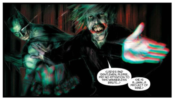 BATMAN: EUROPA by Latorre, Camuncoli, Casali, Azzarello and Brosseau
We’re all busy people so let’s not beat about the bush here; the writing is just bloody poor. The plot is a mere wisp of a thing and the actual events clinging weakly to it are so deeply unthrilling that they barely register. At one point there’s a giant robot for not much of a reason, and all it makes you think is, I wish Bob Haney was writing this. I love me some Bob Haney but I shouldn’t be missing him so hard in 2017. I mean, I won’t lie, I can’t even remember what happened in this comic it’s so relentlessly leaden. I remember a human plot shortcut in the form of a lady hacker. She hasn’t got any character as such but I remember her because at one point she is wounded and Batman leaves the Joker to tend to her. Guess how that works out. I guess they never bill him as “Batman – The World’s Greatest Judge of Character” with good reason. Ooh, there’s a mystery villain behind it all! Yeah, that reveal had all the dramatic weight of a meringue in space. I thought it was KGBeast, but I just checked (professionalism!) and it wasn’t. That’s how exciting it was. I’ve forgotten who it was again. As for motivation, well, I don’t know. Sure, killing Batman is kind of on any decent Bat-villains to-do list, but The Joker? You’d hand feed Cujo before you got that looney tune involved. And why such a needlessly protracted and highly unlikely method? I think the idea is the virus gives them a reason to follow a trail of, cough, clues so that by the end that are all tuckered out and the Guest Villain can best them. It’s a Bob Haney plan in its unlikely roundaboutness but it’s played like it’s Shakespeare. Bob Haney’s Macbeth, now there’s a thought to conjure with. Probably about a jillion times more entertaining than Azzarello/Casali’s Batman. But it’s not just Batman, it’s Batman and The Joker! “Hoo!” and indeed “Hoo!” Yes! Batman and The Joker together! Like Bing and Bob in on The Road To Europa! What a gift to a writer. Think of the cracklin’ dialogue and sinister mind games you could fill the pages with. Having to trust your life to a man who can’t even trust himself! It’s the very stuff isn’t it? The premise practically comes with a bow tied round it. Time to get your Shane Black on. More like bloody Shane Ritchie. Predictably enough nothing memorable occurs and it’s all largely page wasting, occasionally enlivened by a coughed up furball of facts about whichever city the undynamic duo are in. Basically the interaction is about as vibrant and electric as that of a long-married couple on a lengthy coach trip. Odd, isn’t it what with all these master dialogists in comics that there’s very little masterful dialogue around. Some people have an ear for dialogue, but most people in comics seem to have an arse for it; and more than one of those people are called Brian. But I digress. Frequently and with great vigour.
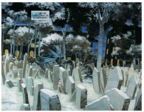 BATMAN: EUROPA by Camuncoli, Casali, Azzarello and Brosseau
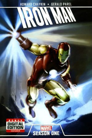
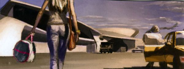
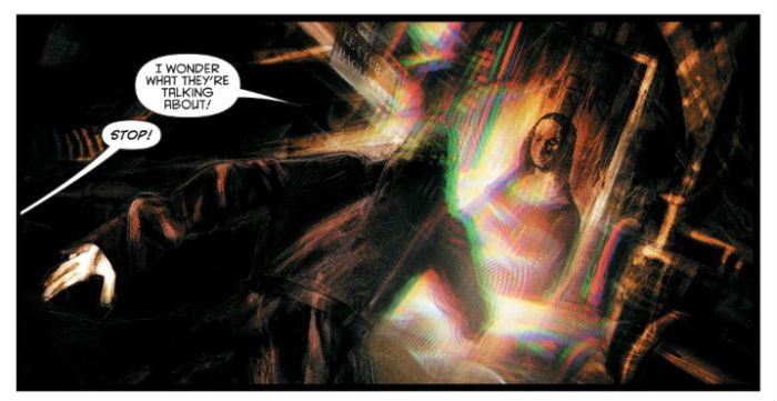
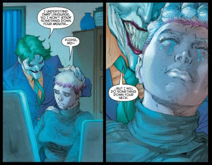
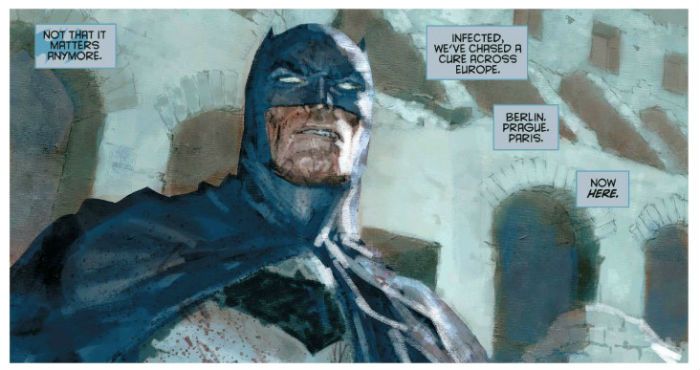
The art’s okay, sometimes it’s even really, really good; these guys are all Eurotalents after all; and I don’t want to upset anyone in North American genre comics, but the bar for art seems a bit higher abroad. True, I don’t want to upset anyone, but since it’s true I don’t actually mind upsetting anyone. Giuseppe Camuncoli is a known known since he drew much of Peter Milligan’s underrated run on Hellblazer. As ever his art here has a pinched and repressed air which I enjoy, and everyone looks hungry on a really deeply unpleasant level that goes way beyond the appetite for food. Creepy, in sum. His colours are a bit heavy and rob his images of energy but as individual images they are certainly pretty. But comics is all about the sequential image and he dips a bit there with a lack of flow. Diego Latorre is, sadly, not the Argentinian footballer known as the “New Maradonna”, but is still impressive in a murky way. Maybe too murky. He makes up for the murk with an experimental brio that makes it look like he's running a sizeable charge of electricity through his panels. Alas, I was more impressed than seduced by the effect. If you've ever had a migraine (no not a headache, a migraine!) then you'll probably agree that Latorre has successfully represented that visually here. Arresting stuff but maybe a bit too much so. Gerald Parel is less than fresh to me as he also illustrated the original Iron Man graphic novel I looked at HERE. He’s gone for a really lush and soft edged look. It’s a kind of accumulation of colours blossoming across the page without the hindrance of holding lines. I liked this smeary expressionism just fine, but I can’t shake the suspicion that this is what sight is like when cataracts start to kick in. He gets some real beauty going though, I'll give him that. And then there’s stolid old Jim Lee, cap at a jaunty angle and smiles for miles. His art’s boring though. Yet what does it matter how good any of these artists are when the writing’s as weak as a politician’s excuses. Your eyes feast on an image only to be brought up short by the Joker alluding to pissing on a woman (my, how edgey!) or a pun as poor as it is predictable (“Vaud-Villain.” Yeah, really). Here's the big secret about puns: they should be used sparingly, otherwise it's like reading a lushly illustrated Christmas cracker joke.
 BATMAN: EUROPA by Latorre, Camuncoli, Casali, Azzarello and Brosseau
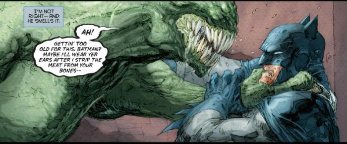
BATMAN: EUROPA is not a good comic. The first three post-splash pages (or whatever; I’m not checking) consist entirely of Batman smacking Killer Croc about. This is excellent stuff, but only if the script directions asked for as unengaging a depiction of violence as possible, and the artist was asked also to ensure that the location was never identified beyond some rudimentary lines suggesting bricks, maybe a wall if needs must, a trash can if absolutely necessary. I think they are fighting in an alley in this scene, but if so, it’s an alley with remarkably elastic dimensions. Azzarello/Casali seem to think alleys are odd in a city based on a grid, and they draw special attention to this in the reliably problematic narration. However, alleys are only odd in a grid based city if the city in question is New York; a city notable for its scarcity of alleys due to the Commissioner’s Plan of 1811 omitting rear service alleys. Gotham is often taken as a stand in for New York sooooooooooo, okay, but I’m not sure many people have any clue about the distinctive absence of alleys in New York City, and this is Gotham so it could have loads of alleys, you know, what with it not being real and people making up its geography on the fly; so I don’t know why it needs special mention, particularly as by way of contrast no mention whatsoever is made of why Batman is smacking Croc about. What I’m getting at is, the storytelling priorities here are all skew-iff, basically. Sure, there’s mention, as Croc is loaded into an ambulance, of “victims” but of what? Usually Azzarello has Croc eating people because – EDGY! And sometimes crocodiles eat people or something. Christ alone knows what Croc’s been up to this time because Azzarello/Casali don’t deign to tell us, despite having had three pages to do so. Instead they keep telling us the same thing: Batman is off his game. It’s a good job they tell us, mind you, because there’s no particular visual indication of this fight being any tougher than any other Killer Croc and Batman fight. It’s not good comics, in essence. Unusually for comics where the art often picks up the writer’s/writers' slack all parties are at fault here; it’s a failure on two fronts. I don't know exactly what's happening and I have no idea why it is happening. It's like being at work! Presented with a visual spectacle as tedious as this a writer might attempt to punch things up with captions; maybe give it some context, some stakes, at a bare minimum some reason for the scene to be occurring. I guess that’s beneath Azzarello/Casali as what they supply instead is a load of sub-Miller tough-guy guff, which takes a whole lot of space to say very little indeed. It’s difficult not to imagine that the Azzarello/Casali team isn’t itself undermined by Azzarello’s compulsive need to avoid crafting a clear sentence, so much so here that it occasionally makes you think it’s a particularly poor translation from another language (any other language). That’s the first few pages, I’m not going on through the rest of the comic but, be warned, I could do because it’s not very good.
 BATMAN: EUROPA by Lee, Camuncoli, Casali, Azzarello, Sinclair and Brosseau
BATMAN: EUROPA, then. Bit like that time you went inter-railing round Europe with your mate, but you both got the trots and fell out just past Rouen after someone (naming no names, Terry Blesdoe) was sick on your copy of Camus’ The Outsider (US: The Stranger), and you had to suffer each other’s sulky presence for the remainder of the trip because you’d booked everything in advance. And your train was ten years late. Yeah, a bit like that, but BATMAN: EUROPA is, quite possibly, if anything even less thrilling. I’ve read some of them there European comics and, while there is a variety, mostly I think I’m safe in generalising wildly and saying that European comics can tend towards the grandiose, with large pictures and outsized ideas which kind of sweep past in a lustrous rush, one you have to plumb for meaning at a later date. It’s this kind of Euro comic BATMAN: EUROPA seems to seek to emulate. But Batman isn’t The Metabaron. And Brian Azzarello/Casali aren’t Jodorowsky. And Moebius is dead, baby. Moebius is dead. Four issues of big pictures and tiny ideas is what you get. Um, but some of the pictures are nice. I’m uttering a very Continental – “EH!”
 BATMAN: EUROPA by Parel, Camuncoli, Casali, Azzarello and Brosseau
NEXT TIME: We talk about the elephant in the…road? Ah, it must be the how you say – COMICS!!!
