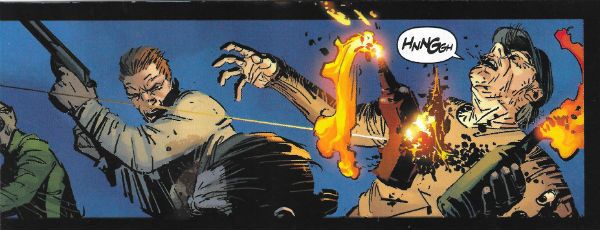
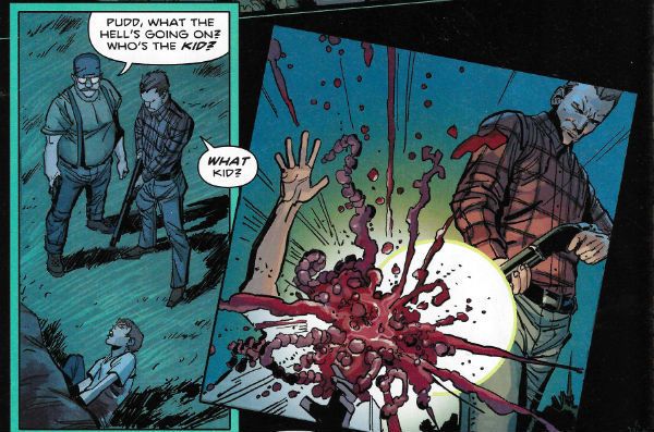
“Oh, Betty!” COMICS! Sometimes It’s Doctor Who And The Pub Made of Haunted Wood!

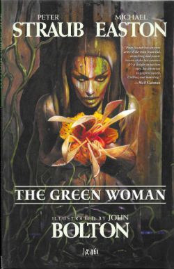
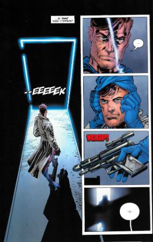
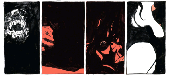
Just for a change I thought I’d look at an Original Graphic Novel rather than a British anthology comic featuring a poo eating robot that talks more sense than most public figures. Naturally, I loaded the dice by picking one by one of my favourite writers working with an artist whose work I have much fondness for. And Michael Easton. Guess how well that worked out for everyone. photo GwomFishB_zpsjlr1eo9x.jpg THE GREEN WOMAN (Bolton, Straub & Easton, Klein) Anyway, this… THE GREEN WOMAN Art by John Bolton Written by Peter Straub & Michael Easton Lettered by Todd Klein Starring Peter Capaldi Vertigo/DC Comics, £14.99 (2010)
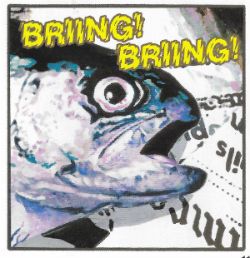
 photo GwomCovB_zps2xknngtb.jpg

On the banks of the Milwaukee River squats a bar and in that bar there broods a man who is both more than a man and less than a man. He is old now and senses the fast enchroaching end to the long road paved with his dead. But no man murders without trace and in New York a self-hating cop begins to follow the trail which will end in either his redemption or in his destruction, but it will certainly end in a bar on the banks of the Milwaukee River where a man broods. A man once called Fielding Bandolier.
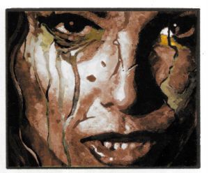
 photo GwomFaceB_zpswdold4yw.jpg THE GREEN WOMAN (Bolton, Straub & Easton, Klein)

I know who Peter Straub and John Bolton are, but who is the mysterious Michael Easton? If only there was some easily accessible source of inf...ah. A quick glance at his Wikipedia page shows me that Michael Easton is a master of the smouldering glance and favours large cuffed shirts. He is also an actor (ALLY MCBEAL, MUTANT X, ONE LIFE TO LIVE) in things I’ve never seen,  a poet whose poetry I’ve never read, an author of OGNs (the SOUL STEALER SERIES) which I’ve never heard of, in fact all I know for certain is he’s just basically six different shades of dreamy, ladies. And, I guess, gentlemen too; it’s all just friction, you prudes! Now, being a nasty piece of work I would like to blame the failure of THE GREEN WOMAN on him alone. However, that’s probably unfair. Because in the interests of fairness I should probably point out that Peter Straub’s output has somewhat diminished since 2004’s IN THE NIGHT ROOM. Diminished in frequency and scale certainly but, THE GREEN WOMAN excepted, not in quality. This book first appeared in its hardcover iteration in 2010, a year which also saw Straub produce THE JUNIPER TREE AND OTHER STORIES and A DARK MATTER. A healthily impressive output at first glance, no doubt. However, as all readers of supernatural fiction know, appearances can be deceptive; THE JUNIPER TREE was a collection of previously published stories and A DARK MATTER, his first original novel since IN THE NIGHT ROOM, was poorly received (I liked it, but there you go). It basically took Straub six years to produce a single novel, which is par for some writers but not par for Straub. What I’m trying to get at is THE GREEN WOMAN feels like a new short initially intended to freshen up the THE JUNIPER TREE, but one that didn’t make it to fruition and so the basic outline was repurposed into an OGN with help from the dreamy enigma Michael Easton and John Bolton. Alas, this is of course pure conjecture and as a consequence utterly worthless, but it killed some time for us all. And gave me an introductory paragraph. In my opinion, which is basically The Truth of The World by any other name, Peter Straub is a magnificent writer, one whose output I hold in the highest of esteem. (I heartses Peter Straub, basically.) Some of his books may not be as good as others, but they are all better than most other people’s books. This is because he is a masterful prose artist who can make distressingly horrific effects explode seemingly from nowhere following the most sublime of slow burns. His books work because Peter Straub is an unnervingly fastidious author and also because he is in complete control of his prose. This obviously isn’t the case with THE GREEN WOMAN where other hands muck in and, well, things go a bit to pot.
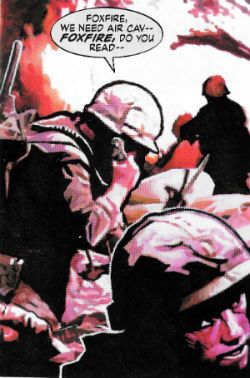
 photo GwomNamB_zpsgc3kd5hn.jpg THE GREEN WOMAN (Bolton, Straub & Easton, Klein)

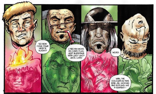
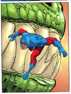
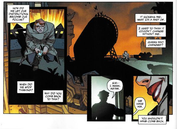
THE GREEN WOMEN is intended to act as a capstone to all the fiction Straub has previously penned regarding one Fee Bandolier. And there has been a lot of fiction from Peter Straub regarding Fee Bandolier. I’ll resist the temptation to list them as sometimes part of the joy of Straub’s work is realising how something you are reading ties in to other works, and such a list while making me feel all superior would edge a wee bit too close to SPOILER territory in some cases; trust me, Fee’s all over Straub’s post-KOKO work like a psychotic yet weirdly endearing rash. Don’t worry though THE GREEN WOMAN recaps everything you need to know about Fee and his…tendencies. Unfortunately it does so in the bluntest possible way, lacking almost wholly Straub’s prose finesse which usually effortlessly ameliorates the clichés which underpin this material. Basically dependent on others to aid his vision this just reads like a not terribly well executed serial-killer-with-‘Nam-flashbacks-hunted-by-rogue-cop-who-is-more-like-his-prey-than-he-wishes-to-acknowledge. It’s just disheartening to see Straub stoop to a cop who is the tiresome Troubled White Guy with a Gun so familiar to us all. But then I recall that he has done that in his novels and it’s worked a treat. See, it’s not the concepts in THE GREEN WOMAN which are at fault, it’s the execution and maybe the limited page count. The core tale of Straub’s (previously brilliantly realised) tragic monster reaching the end of his rope, while being hunted by a man who’s character is swiftly unravelling due to the moral faultlines within him, would have been plenty all on its todd but, no; there’s a secondary plot revolving around a malevolent ship’s figurehead which in the long gone days caused its crew to suicide en masse, and now wants to be reunited with the timbers of the boat it was stuck on, which are currently holding up a pub in Ireland. Yes, that’s right we’re talking here about spooky wood pining (get on that one, Brian Azzarello! Geddit: “pining” wood! That’s GOLD!) Obviously most scary doodahs can be reduced to the laughable via fantastic word skillage as what I has. However was a similar excellence in prose in evidence it could make the concept of haunted wood turn your bowels to water. In a Peter Straub novel this would be the case (see IF YOU COULD SEE ME NOW) but this is not a novel it is a graphic novel, so the prose is sparse and far too much rests on the art. Which is terrible. Really bad.
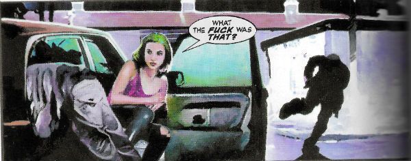
 photo GwomthatB_zpsv1xhy4bh.jpg THE GREEN WOMAN (Bolton, Straub & Easton, Klein)

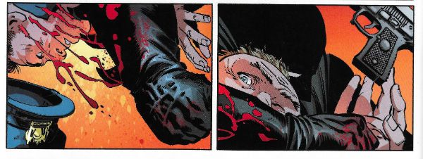
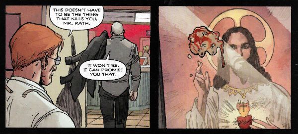
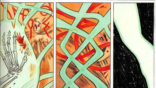
It gives me no pleasure to point out the artistic failings of THE GREEN WOMAN. I have enjoyed John Bolton’s flowing Frazetta-esque art in the past (HOUSE OF HAMMER, WARRIOR) but not here, not in THE GREEN WOMAN. Not unsurprisingly, and entirely to his credit, John Bolton has developed since then as an artist. However, the area he has chosen to take his art into centres around photo manipulation. Unfortunately for my eyes it turns out that I’m a bit picky, and I only like John Bolton’s art when he is actually, you know, drawing, which he isn’t here. He’s doing something with photographs which regular readers (hi, mom!) will recall I welcome like warts on my nethers. Even so, I am usually magnanimous enough to at least suggest the slightest possibility that that might be a matter of taste. Not here though; this is patently poor no matter what your preference.  For a start the whole thing looks so blurry I had to keep looking away to focus on other things in the room to reassure me that cataracts weren’t kicking in at a rate of knots. Then there’s the fact that someone has clearly set the resolution wrong on some of the pages, so you’re just left looking at it and wondering how many eyes this passed in front of, and how so many eyes could not care. A lot (all?) of the images are collaged together but sometimes you can clearly see the edges where the elements haven’t quite fitted together, and again those eyes, those uncaring eyes are brought to mind. There are some richly fruity images there for Bolton to play with (the women hung out like fish) but it’s all muffled and lacking in impact. THE GREEN WOMAN is just not a good reflection of John Bolton’s talent, because as sloppy as this stuff looks he’s a far from untalented artist. It’s a real shame because we’ve all had bad days at the office but few of us have those bad days printed up and bound for posterity. Mind you I don’t charge anyone money to look at my bad days at the office, either.
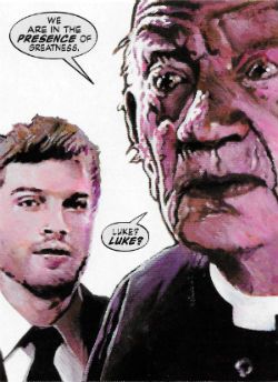
 photo GwomGreatB_zpsikrskes5.jpg THE GREEN WOMAN (Bolton, Straub & Easton, Klein)

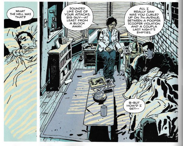
Even were it not ramshackle stuff (and, boy, is it ramshackle stuff) Bolton comes a cropper for me in his choice of model for Fee, our unhinged protagonist. See, he’s based every appearance of Fee here on the popular thespian Peter Capaldi. I mean, sure, Peter Capaldi gives good gurn so he’s a deft choice in that respect; you’re not ever in much doubt about Fee’s emotions at any given point. When the book was originally released (reminder: in 2010, in hardback) Capaldi was a recognised face in the UK thanks (largely but not solely) to his splenetic  portrayal of the sweary king of spin Malcolm Tucker in THE THICK OF IT (a political satire which now appears quaintly understated thanks to the idiocies of reality). So I’m guessing America was probably largely still oblivious to his spittle flecked charms when the book premiered, but in 2016 with Capaldi playing  the 197th Doctor in DOCTOR WHO pretty much any reader is all but guaranteed to be thrown out of the book every time he appears, which is often. (And FYI: he’s playing “The Doctor” not “Doctor Who”; woe fucking betide anyone who makes that error anywhere near some winner who has tied their sense of self-worth to a children’s TV show).
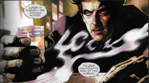
 photo GWomFeeB_zps7njhtzqb.jpg THE GREEN WOMAN (Bolton, Straub & Easton, Klein)

So often does Capaldi’s emotionally contorted face glare out at you from these pages that THE GREEN WOMAN should in all fairness appear on Peter Capaldi’s Wikipedia page, somewhere between IN THE LOOP and BISTRO. It won’t do though, because it’s not like he owns his own face is it? (This is fine by me as I currently use Capaldi’s sinewy visage on dating websites to lure young women into extra marital filth because I have no respect for my partner, but that’s okay it’s the 21st Century. It sure seemed like a good idea, but every time I try to explain away the fact that I don’t look like Peter Capaldi by saying I’m still currently playing Doctor Who but a different incarnation, they start shouting about how it’s “The Doctor! Not Doctor Fucking Who! What’s wrong with you! I don’t mind being lured into creepy sexual nastiness but what kind of pervert and general failure as a human being doesn’t know that! IT’S THE DOCTOR! You massive nonce!” And then they storm out like I’ve seen ladies in movies do, and I end the evening tearfully wanking into a hanky. Then the head waiter asks me to leave.)  Seriously, it’s a total immersion destroyer turning the page and seeing Peter Capaldi fiercely scrunching his face up like a sock ready for the laundry again. I keep expecting him to ask someone if they’d like a jelly baby. (I know that was Tom Baker; I am fucking with you. It won’t be the last time.)
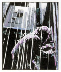
 photo GwomrainB_zpsiytzcq2p.jpg THE GREEN WOMAN (Bolton, Straub & Easton, Klein)

THE GREEN WOMAN is at once overstuffed and undercooked, and everyone involved has done better work elsewhere. Better to seek that out instead, say I, because this was AWFUL!

NEXT TIME: Uh, (SPOILER!) - COMICS!!!

Yummy Yummy Abhay!

You probably don't really need me linking to THE COMICS JOURNAL for you, but in case you haven't seen it, Abhay has an epic threefour-part journey through Comics 2015 that is a very worthwhile read -- I laughed out loud at least at four separate occasions, and I am one jaded-ass fucker. Part One: http://www.tcj.com/the-tcj-2015-year-in-review-spectacufuck-part-i/

Part Two:  http://www.tcj.com/the-tcj-2015-year-in-review-spectacufuck-part-ii/

Part Three: http://www.tcj.com/the-tcj-2015-year-in-review-spectacufuck-part-iii/

Part Four: Up tomorrow, dumb Brian.  But.... I bet you might be able to guess the URL....


Go read, and thank me later!


-B

“Let’s All Send Him Our Love.” COMICS! Sometimes I Suspect My Chakras Are Stunted.

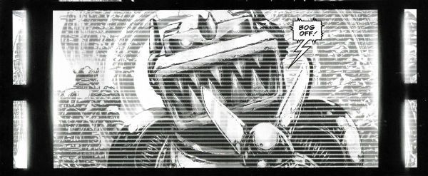
Anthologies don’t sell! Yet people keep publishing them and I keep buying them. Here are some words about three anthologies I read this week.  photo ABCtopB_zpshtgnon6i.jpg ABC WARRIORS (Langley, Mills & Parkhouse)

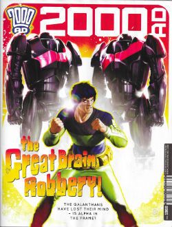
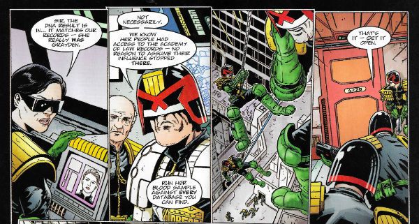
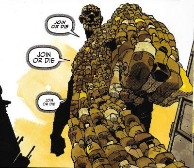
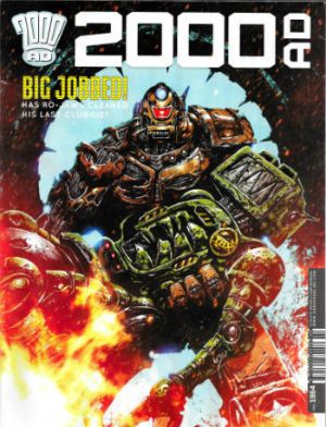
Anyway, this... 2000AD Prog 1966 Art by Mark Sexton, Richard Elson, Clint Langley, John Burns, Carlos Ezquerra Written by Michael Carroll, Dan Abnett, Pat Mills, Kek-W, John Wagner Coloured by Len O’Grady Lettered by Annie Parkhouse, Ellie De Ville, Simon Bowland Cover by Neil Roberts JUDGE DREDD created by Carlos Ezquerra & John Wagner KINGDOM created by Richard Elson & Dan Abnett ABC WARRIORS created by Kevin O’Neill, Brendan McCarthy, Mick McMahon & Pat Mills THE ORDER created by John Burns & Kek-W STRONTIUM DOG created by Carlos Ezquerra Rebellion, £2.55, weekly (2016) All contents © 2016 Rebellion A/S, unless specifically stated otherwise.

 photo Cov1966B_zpszprnldcy.jpg

Hey, here’s a thing I just noticed about 2000AD: in the little box of publishing information which tells you who owns what and what they’ll do to you if you nick it (rub distressed foxes in your face), some wag has only gone and put something humorous in it. I don’t have a fetish for legal bumph but concealing larks in that part of a comic is not entirely unknown, so occasionally I check, and this time that nanosecond glance into the small print paid off. I don’t know if it’s a regular thing, but this time out, camouflaged by legalese, someone has used the space to update people on his/her opinion of that TV series with the bikers in. The one with Ron Perlman in. The one Jason Aaron fans probably call “searing” and “incisive” when they aren’t eating raw bacon and crying about their dad not hugging them enough. Whoever penned the micro-crit wasn’t too impressed with the surly biker show but we were already into some pretty entertaining stuff and the comic hadn’t even started. See, it’s always worth having a poke about, you never know what you might find. Unless of course you work with highly confidential information, in which case you’re probably as well just minding your own business. No one wants to end up in a field choked on a porn mag with a suspiciously curt suicide note pinned to their head now, do they? As usual Tharg says some stuff but I didn’t read it. So if he said owt about me mum, let me know and I’ll go round and give ‘im a thick ear. At the bottom of the page we are promised the return of Bill Savage – COME ON, TWINKLETOES! GET SOME! So, yes, looking forward to that. GET IN THERE! Stoked, one might say.

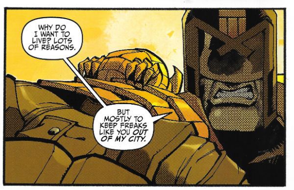
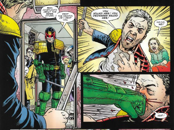
 photo DreddB_zps0omcuaan.jpg JUDGE DREDD (Sexton, Carroll, O'Grady & Parkhouse)

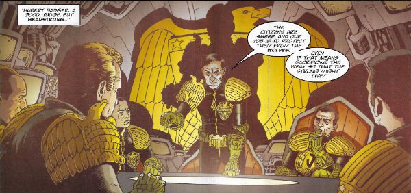
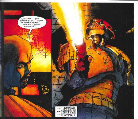
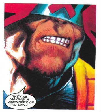
Oh, this one’s getting shakier as it goes on. Okay, we can go with a secret city-within-a-city of faux Judges, but stressing how hard-line they are (Hershey says they make normal Judges look like liberals – Whoof!) and then having them risk everything to rescue someone’s sister rings more than a little false. Additionally names are important in genre fiction and unfortunately naming the big bad “Badger” just makes me think of Brian May and I don’t really ever want to think about Brian May. Unless he’s being attacked by badgers. On the upside, however, Carroll does a really good job selling the idea that Dredd’s outclassed by his opponents on the cunning front, only to give him a sweet “You’re so sly, but so am I!” move to end the episode on. Sexton’s art remains detailed without becoming cluttered and is a definite asset to Carroll’s slightly listing script.  GOOD!

 photo KingdB_zpsfb3pppim.jpg KINGDOM (Abnett, Elson & De Ville)

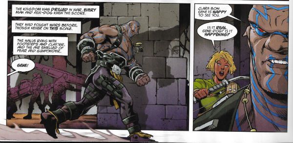
There’s not a lot to say about this because it isn’t really a story, Gene (our genetically modified hero) goes and tells everyone the bugs are coming, everyone listens, goes away and prepares and then the bugs come. That’s yer lot. There isn’t even a dude with anchors on his jacket telling Gene that it’s the Fourth of July so it’s probably best for everyone if the beaches stay open. No, they just go “okay”, and knuckle down for the big slobberknocker promised by the closing two page spread of the sea of insects about to break upon the walls of the compound. You can tell that’s a big moment because pages are precious in each and every Prog, so to splurge on a double page spread means you best sit up and listen. It’s not like your American comics with their splash page fetish and its ever diminishing returns (except for writers who get paid by the page). Oh, KINGDOM’s all right, but like I say it doesn’t feel like a story just a sequence of events. Which is fine, Abnett and Elson efficiently purvey low-attention, high-octane entertainment, but I don’t think I’ll ever feel the need to read a collected edition. For six or so pages it’s pleasant enough company. A bit like a short bus ride sat next to someone who neither stinks of ammonia nor yammers into a mobile like a deaf cretin. OKAY!

 photo ABCWarrB_zpsdspsdtnh.jpg ABC WARRIORS (Langley, Mills & Parkhouse)

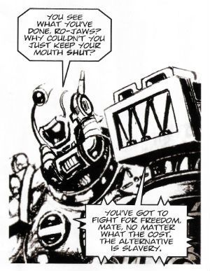
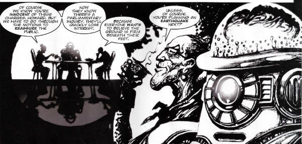
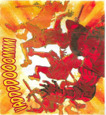
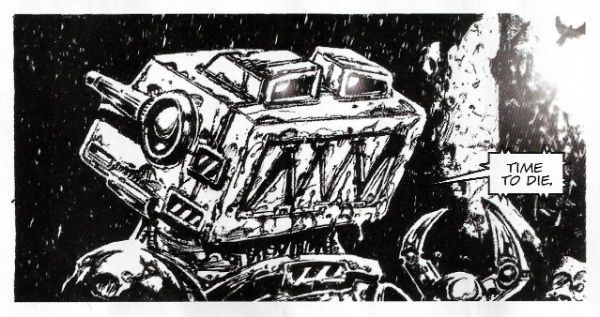
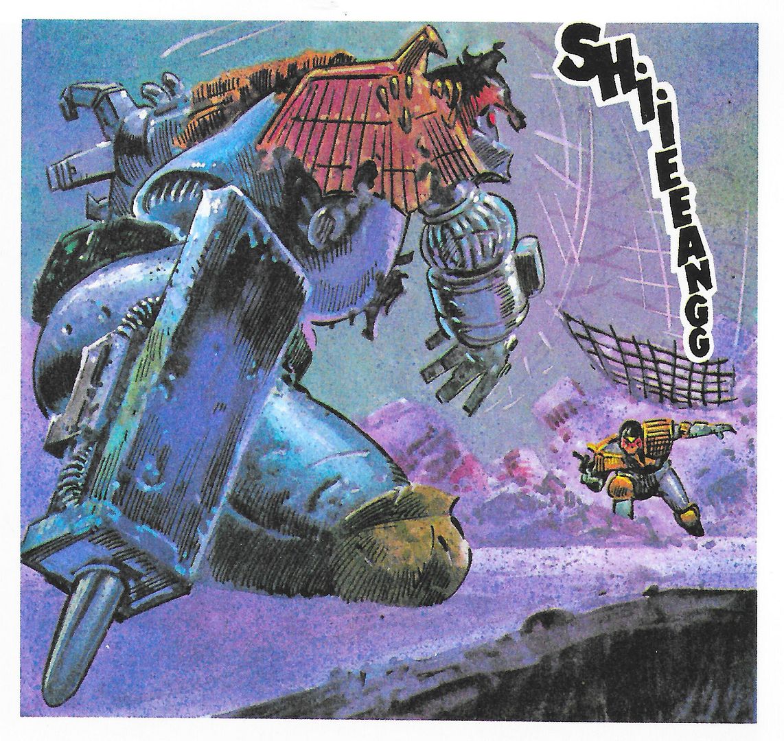
Pat Mills and Clint Langley once again, via the medium of violent robots, point at real world events and make Little Rascals Faces. Remember all those enquiries we had over here, particularly that phone hacking one which saw all those morally scrofulous people sent down and disgraced despite their connections to Rupert “Doomlord” Murdoch and David “The Ham Botherer” Cameron because The System works? No, neither does Pat Mills, but he remembers all those enquiries we had over here, particularly that phone hacking one which saw all those morally scrofulous people look a bit sheepish and embarrassed for a bit before basically taking up where they left off once everyone’s attention wandered back to The f****** Great British Bake-Off (“Terry’s sponge fingers tickle everyone’s fancy!”). Because: power protects power. Admittedly as messages go it’s all a bit rainy-day but Mills & Langley do part the clouds a bit to throw in a robot nurse with steel breasts (because men would, wouldn’t they?) and a psychotic robot yelling about “Big Jobs!” Langleys’ art might, alas, look like someone forgot to set up the printer properly but the fact ABC WARRIORS still bothers to pretend anyone cares about anything goes a long way towards healing that particular visual wound. Also, “Big Jobs!” will always make me laugh; simple pleasures for simple folk. And I am nothing if not simple. VERY GOOD! 

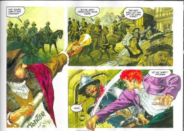
 photo OrderB_zpsmslut0le.jpg THE ORDER (Burns, Kek-W & De Ville)

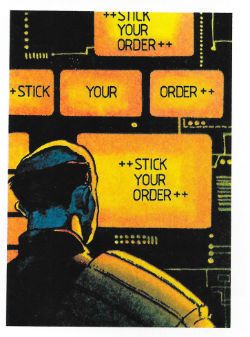
Finally, The Order plays to its strengths which, John Burns’ lovely art aside, is the odd bloke tracking our dreary heroes.  The strip would be a lot better if this guy was the protagonist; he’s a bit like the autistic savant type so beloved of current televisual melodramas but less tiresomely winsome. The lesson here is that steam driven motorbikes and people anachronistically babbling in Code are okay, but character wins the day. OKAY!

 photo StrontDB_zpsns4q6pvi.jpg STRONTIUM DOG (Wagner, Ezquerra & Bowland)

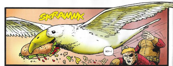
It’s easy to take Strontium Dog for granted given the apparent ease with which Ezquerra and Wagner pump it out. But then you see a panel where an alien seagull is snatching some snap from a dude with his face in his knee and the amiable weirdness of what is going on becomes glaringly apparent. I also like the fact that while Johnny is a presented as a Good Guy (which he mostly is) he’s also well dodgy and has no qualms taking advantage of the fact that the Galanthans can’t understand the concept of deceit. He’s not hurting anyone is he? Also, The Brain of Hoomonos looks like the end of term scrapings from the underside of a thousand ten year olds’ desks palm-rolled into a ball. Light comedy, endearing characters and nimbly imaginative shenanigans all add up to something that’s VERY GOOD!

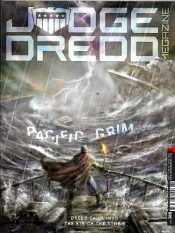
JUDGE DREDD MEGAZINE #368 Art by Nick Percival, Paul Grist, Steve Yeowell, Ben Willsher Written by Michael Carroll, Paul Grist, Arthur Wyatt Coloured by Nick Percival, Phil Elliott, Chris Blythe Lettered by Annie Parkhouse, Paul Grist, Ellie De Ville, Simon Bowland Text features by Karl Stock, Matthew Badham Rebellion, £5.80, mothly (2016) All contents © 2016 Rebellion A/S, unless otherwise stated. Demon Nic © 2016 Paul Grist JUDGE DREDD created by Carlos Ezquerra & John Wagner DEMON NIC created by Paul Grist GALEN DEMARCO created by Carlos Ezquerra & John Wagner

 photo JDMegCovB_zpsiqrrfaww.jpg

JUDGE DREDD MEGAZINE began in 1990 and is thus 2000AD’s much younger relative.  It comes out monthly rather than weekly, and has always seemed a bit extraneous to be honest; an impression not softened by the knowledge that it has often struggled to survive. At one dire point half the comic was taken up by PREACHER reprints, which was okay if you hadn’t already read PREACHER (or didn’t think PREACHER was an undisciplined mess). In 2016 those mend and make do days are long gone and it’s all original strips; well, except for quite a sizeable chunk of text stuff. I didn’t read the text stuff because I barely had time to read the comic, but it takes the form of interviews with the artists Mark Sexton and Darren Douglas, and the writer Si Spurrier. Although this is basically cheap content I am tentatively approving of it since I am old school, and I well recall having to actually make the effort to hunt down interviews with comic creators, and also the infrequency of such interviews. So if you have an interest in the work of Sexton (currently drawing Judge Dredd  - see above) or Douglas then there you go. Si Spurrier is more about shilling his new series from Image about werewolf lesbian soldiers or something. I’m sure it’s fine; he’s a decent writer from what I’ve seen. I do remain confused as to why he’s given space in the megazine to basically advertise another company’s product, but I’ll put that down to the British largesse of generosity (yes that famous largesse of ours) rather than the result of some weird quid pro quo. Mind you, if anyone is after some purely prose werewolf entertainment I’ll grant myself this opportunity to shill Toby Barlow’s SHARP TEETH (VERY GOOD!) and RED MOON (GOOD!) by Benjamin Percy. Two can play at that game, son.

 photo GyreB_zpsuhhbm8to.jpg JUDGE DREDD (Percival, Carroll & Parkhouse)

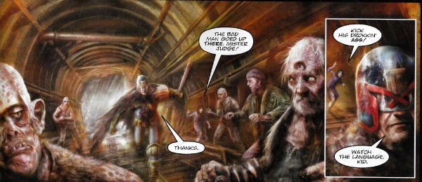
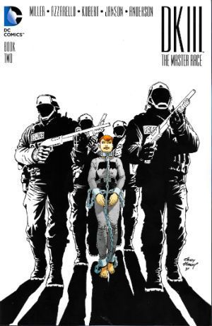
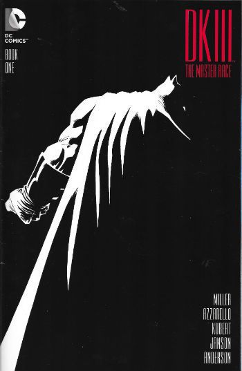
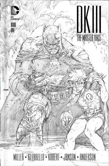
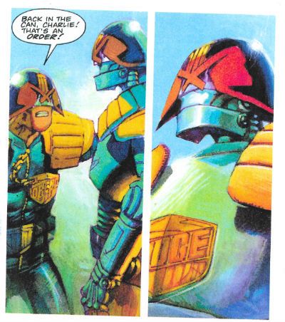
Aw, nertz. This is just EH! And me and Michael Carroll were doing so well, we were going to meet each other’s parents and maybe start looking for a small house together! But he’s put the kibosh on all that with this duffer. In this first disappointing instalment of a new Dredd thrill, Judge Dredd and Judge Joyce go to a floating shanty town populated by the crew from Bill Nighy’s ship in that movie based on a theme park ride.  The thing is though, right, because of science no technology can work in this place, The Gyre.  Ah, where to begin. Right, yeah, it’s okay making a point of mentioning that Judge Dredd’s bionic eyes will still work because they are “shielded” since a) I’m impressed anyone remembers he had his eyes poked out during City of The Damned and b) the guy has to see unless we’re in for a kind of ultra-violent fascistic riff on Norman Wisdom. So, ahuh, okay, the tech don’t work except for Dredd’s eyes  (which are “shielded”) but how come, how come right, even though their guns don’t work, and they knew going in that only Dredd’s “shielded” eyes would work, how come they didn’t just take some of those projectile weapons humanity has had such a boner for for, ooh, only a few thousand years? How come that?   There’s no microchips in a Desert Eagle, Judge Dredd! Or a bow and arrow, for that matter. And why, pray tell, isn’t Judge Joyce in proper uniform? He’s an Irish Judge so he should be in green and white with the Guinness harp on his helmet, and be perpetually concerned that they’re all after his luck charms, Bejaysus! (Hey, don’t look at me; Garth Ennis’ frequently regrettable sense of humour’s the culprit there.) Or whatever. But no, he’s depicted as just another Judge here, which seems odd. (I suppose he could have got a transfer I forgot about during my 8 years in the wilderness) Mind you Nick Percival’s art is also pretty odd from soup to nuts. He’s gone for that all painted approach which is usually used by weaker artists to plaster over any artistic deficiencies, a function it never achieved too convincingly. And so it is with Nick Percival. But, I can’t fault his colours; everything’s got an appropriately fish-gutty look, and it all certainly looks like it would stink like death would be a mercy if you were actually there. But everything under the colours is awkward with stilted poses, and such a lack of flow that the water based scenario just becomes cruelly ironic. Like the host of a shit party Percival saves the worst until last, with a full page splash of something apparently so daunting our Judges can only goggle. Unfortunately the page turn reveals Percival has drawn what appears to be a bunch of empty barges kind of milling about lethargically, which no matter how highly strung you are isn’t even interesting, never mind threatening.  It’s like he forgot to draw something very important (like a horde of angry fish men, or a rain of enraged monkfish; I don’t know what he forgot,  after all it’s pretty hard to guess what someone hasn’t drawn). Nothing about this strip is interesting except the fact that Carroll decides to lift the “mind your language” bit from DARK KNIGHT RETURNS, and by interesting I mean baffling. I mean, why? (Because that’s what being baffled sounds like.) It’s not a homage - Dredd isn’t mortally wounded and he isn’t chasing his “Joker” through a Tunnel of Love, he’s just running after some thug and gets a bit short on wind on board a crappy ship. I don’t know why the callback’s there really. This first episode is so poorly thought out, slackly paced and badly visualised it’s more DARK KNIGHT III: THE MASTER RACE than DARK KNIGHT RETURNS. I’m not a fan is what I’m getting at here. Step it up, guys.

 photo NicB_zpsd7rfb3yh.jpg DEMON NIC (Grist & Elliott)

DEMON NIC (someone explain that title to Brian Azzarello, his little face is all creased up!) is a creator owned series by Paul Grist, and this episode is the final episode in the current run. Now, I don’t really know how I find myself in the weird position of just chancing upon work by Paul Grist right as it ends because , seriously, I would certainly appreciate it if someone out there could keep me informed of Paul Grist’s doings from now on. Clearly, The Internet isn’t cutting it. It is forever telling me what people I have no interest in are doing (things I have no interest in reading, weirdly enough).  I’m not bothered if he’s doing DOCTOR WHO because Doctor Who is, er, well, look, I’m not fussed, okay. I’m allowed to not be bothered about DOCTOR WHO you know! Everything else Paul Grist gets up to? Would you mind awfully letting me know? Thanks, you are a dear. So, yeah, nothing worse than coming in on a series’ vinegar stroke but this seems to be a spooky actioner a la Hellboy but considerably more dense, amusing and generally playful in that droll way I like. Oh, and the art is spectacular. Usually I get a bit twitchy when the page is black rather than white (Avatar do that a lot) and I’ll be shaking like a shitting dog if the panel borders also go AWOL because you need to be pretty sweet at that whole art deal to be getting away with that. Here Grist just plops his chunkily robust cast onto pure black pages and guides the eye around via the miracle of being very bloody good at what he does. Just brilliant stuff. EXCELLENT!

 photo MarcoB_zpsacvdiq3i.jpg DEMARCO, P.I. (Yeowell, Carroll & De Ville)

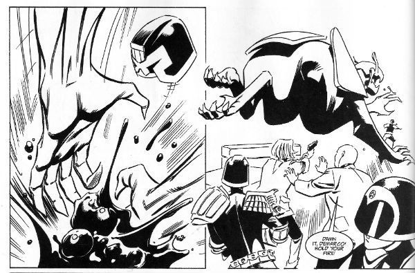
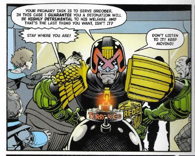
Ah, I’m beginning to see the problem; Michael Carroll is overstretched. Personally I avoid the work of any writer who regularly produces three or more US comics a month. I mean at that frequency we’re just talking mental effluvium at best; it’s not writing at that point it’s just words. Now, I don’t think Michael Carroll’s at that point yet, but then nor do I wish him to reach that point. This strip centres on Galen DeMarco a character introduced in the main Dredd strip who graduated to her own series. As a character I can’t say she she’s been terribly consistently written but then again last time I saw her she had a talking ape as a companion.  Said ape is notable by his absence so he probably died and we had a sad ape death scene which I missed, which is a shame as I am a sucker for sad ape death scenes. But enough about me! Here DeMarco is helping a bunch of Judges with some weird beast-robot things which might be connected to that TRIFECTA storyline? It’s not terribly clear. Anyway something breaks out and the size of the panels taken together with the  fact that the best last words two successive Judges can come up with at the point of death is a bare bones “No!” suggest Michael Carroll wasn’t going for the Nobel with this one. A harsher judge than I would declare it a bit of a page waster, but then I guess they wouldn’t find sufficient pleasure in Steve Yeowell’s lanky B&W stylings to raise it to OKAY!

 photo MDreddB_zpsm8pzuexo.jpg DREDD (Willsher, Wyatt, Blythe & Bowland)

This is a Judge Dredd strip set in the cinematic universe of Judge Dredd. I don’t understand why that is because the cinematic universe of Judge Dredd is precisely one movie which wasn’t popular enough for a sequel. It was also a normalised version of Judge Dredd. It was okay and all; I enjoyed it. Thankfully it fed that Stallone fiasco into the woodchipper but it didn’t dethrone the original strip in my mind. It was a good movie, probably suffered from being released in such close proximity to the (similar but superior) THE RAID but, yeah, I enjoyed it. This strip seemed okay too, like if you wanted to read Judge Dredd but didn’t want to actually read proper Judge Dredd because, gee, it’s all a bit far-fetched. So in this one all the kit is more functional and the swears are normal and, me, I don’t find that as much fun. There’s a suspicion in my head that it might be repackaged at some point by IDW as it seems oriented to the American market in terms of pacing and storytelling. OKAY!

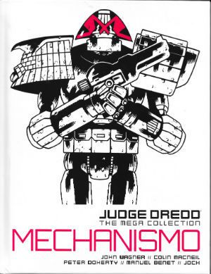
WUXTRY! Shrink-wrapped with this issue is a free magazine type Graphic Novel. This time out it’s Synnamon: Mecha Rising. I didn’t have time to read it but I do remember reading it back in the day, and for a strip about a leather jump suit lady burglar in the future it was OKAY! Undemanding entertainment slickly delivered. I think the important thing here is that you get a free magazine of reprints, and given 2000AD’s storied history chances are good that this will pay off more often than not.

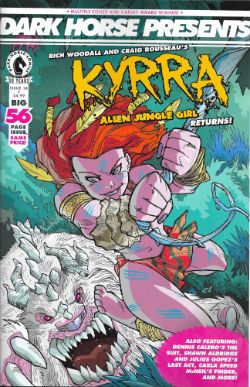
DARK HORSE PRESENTS #18 Art by Craig Rousseau, Dennis Calero, Julius Gopez, Carla Speed McNeil, Marc Olivent, David Chelsea, Tim Hamilton Written by Rich Woodall, Dennis Calero, Shawn Aldridge, Carla Speed McNeil, Barbara Randall Kesel, David Chelsea, Paul Levitz Coloured by Lawrence Bassa, Jeremy Colwell, Jenn Manley Lee, David Chelsea Lettered by Rich Woodall, John J. Hill, Carla Speed McNeil, Adam O. Pruett, David Chelsea Spot Illustrations by Geoff Darrow Cover by Craig Rousseau & Lawrence Basso Kyyra: Alien Jungle Girl TM © 2016 Craig Rousseau and Rich Woodall The Suit TM©2016 Dennis Calero Last Act TM © 2016 Shawn Alridge Finder TM © 2016 Lightspeed Press Sundown Crossroads TM© 2016 Barbara Kesel Sandy and Mandy TM © 2016 David Chelsea Brooklyn Blood TM © Paul Levitz and Tim Hamilton Shaolin Cowboy and related characters TM © Geoff Darrow Dark Horse Comics, Inc., $4.99 (2016)

 photo DHPCovB_zpsuqhkkvoh.jpg

 photo DHPKyrraB_zps2omfxjtf.jpg KYRRA: ALIEN JUNGLE GIRL (Rousseau, Woodall & Basso)

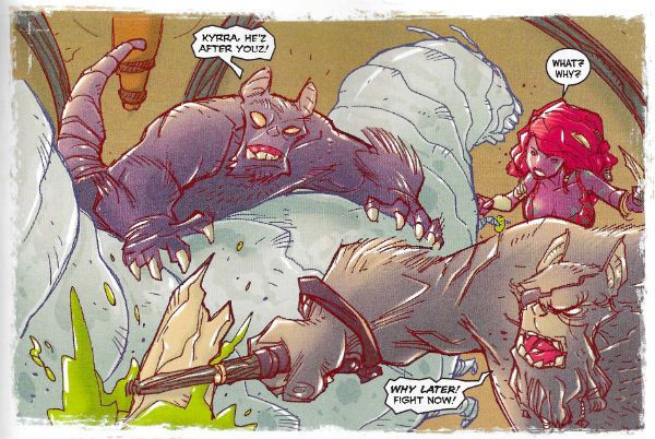
This is an absolutely gorgeous strip, done in a robustly fun style saturated in E-number colours, seemingly aimed at Young Adults which repositions Tarzan as a young girl and the setting as an alien planet. I’ve already read Tarzan and I’m neither Young nor an Adult so it left me pretty cold. The art by Rousseau is thoroughly charming though. It’s OKAY! but like a lot of comics today it’s pretty thin stuff once past the delightful art. Still, it’s nice that there’s a strip about a Cave Girl that’s not drawn by Frank Cho just so that men can fap over it and show those SJWs what’s what. Progress of a sort there. Baby steps, people. Baby steps.

 photo DHPSuitB_zpsew0rbf8p.jpg THE SUIT: CONTRACT NEGOTIATION (Calero & Hill)

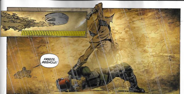
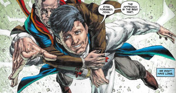
This is CRAP! This is the second run of this consistently poor series in DHP. I don’t know who asked for it back but when I find out they’ll get the sharp end of my tongue.  Every time this thing appears I just have no idea what I’m looking at on most of its pages, and when I do know what I’m looking at it’s some kind of unholy show involving photos of the two old blokes from TRADING PLACES and Don Draper. Not entirely sure if they are making love or fighting or what. Oh wait, there’s a ‘Nam flashback. Thank Christ for that. C'mon, Was everybody in America over in The ‘Nam or what? Did it not get crowded? I’m not saying ‘Nam flashbacks are overused but, yes, yes I am saying exactly that. Even my son talks about being in “The Shit” and getting back to “The World” and he’s 10 and has never been further than St Ives. And far be it from me to say that Calero is into photo referencing too heavily, but if it was cocaine we’d be calling for an intervention. Oh, mercy, mercy me (the ecology), this is just visual noise; a cacophony of blurry clip art. The passage of every poorly executed page makes Alex Maleev look more and more like Frank Robbins. I don’t want to be a big shitter here, but this should never have seen print. I just. I don’t. What. It’s. No. Just no.

 photo DHPFlyB_zpsm3mnp5zb.jpg LAST ACT (Gopez, Aldridge & Colwell)

It would be easy to take the Mick out of this overly earnest and somewhat overwrought attempt to graft some meaning onto the superhero trope, but since it was pretty refreshing to find anyone doing anything remotely interesting with the superhero trope I’ll let it off with an OKAY! Although it did not escape my irony detectors that this was basically a strip in which a superhero makes a man called John feel better by misrepresenting reality to him. Which is basically my childhood reading habits: redux.

 photo DHPFinderB_zpsbvbf9wch.jpg FINDER: CHASE THE LADY (Speed McNeil & Lee)

Carla Speed McNeil is EXCELLENT! Everything Carla Speed McNeil does is EXCELLENT! Her horse radish soup is EXCELLENT! I know because I go through her bins at night, but respectfully and not in a creepy way. And guess what? Her bins are EXCELLENT! The fact that she enjoyed that movie with Keanu Reeves on a bus so much that she legally adopted its title into her name is EXCELLENT! It’s possible Carla Speed McNeil has done some things which weren’t EXCELLENT! but I’m not privy to them so they don’t exist. FINDER is EXCELLENT! Even though in chunks this small and separated by whole months, my aged brain is struggling to stitch them all together into a coherent narrative, I have every faith such a thing will come to pass, and so the very strength of faith I have in Carla Speed McNeil’s being EXCELLENT! is EXCELLENT! in and of itself. Even Carla Speed McNeil’s colours, a softly vibrant balm for the eyes, are EXCELLENT! And that’s from someone so thuggishly impervious to colour he still doesn’t understand why Sam Neill is so upset on that bus in IN THE MOUTH OF MADNESS. And, no, Sam and Carla Speed are not related because Sam has an extra “l” in his surname, but had they been related I think we can all agree that that would have been EXCELLENT! Anyway, this was OKAY! Just joking, it was EXCELLENT! Oh my, what an EXCELLENT! joke.

 photo DHParseB_zpsy3vb9iik.jpg SUNDOWN CROSSROADS (Olivent, Kesel & Pruett)

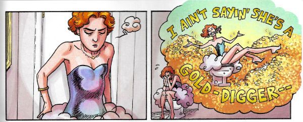
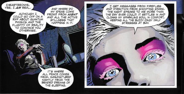
The best thing about this strip is that, well, I don’t know about you but sometimes I wake up in the night drenched in sweat worrying about whether we’re going to make it, you know, as a species. After reading SUNSET CROSSROADS I’ll probably sleep a little easier as it introduces the entirely new thought into the equation that maybe it’d be better for all concerned if we don’t. Ugh. This is some heroically twee balderdash right here.  I can make up the cover blurbs for the collection of this thing now: “With SUNSET CROSSROADS Barbara Kesel has vajazzled the soul of a generation!” - Kelly Sue DeConnick! “Something about dreams. Something about stories. SUNSET CROSSROADS is something something something.” - Neil Gaiman! The strip itself privileges us with a peek into the life of some kind of self-satisfied meringue brain wafting about her apartment, talking smug bunkum via a live podcast to people whose minds can only be little miracles of inanity. Now, my viscerally negative reaction could be due to envy as this conceited poltroon obviously makes a lot of money talking star-spangled claptrap and peddling her tat online since her apartment is bigger than my house. She doesn’t leave it either, that apartment; for the duration of the strip we are trapped inside with her and her incessant prattle; it’s like some terrible punishment. She only pauses when she spies outside what looks hilariously like Sean Philips on the street below. Sean’s minding his own business (probably getting some fresh air to clear his head before returning to the latest listless yet craft-fat script from Ed Brubaker) but our ethereal dream queen drags poor Sean into her nauseatingly precious monologue and he returns the favour by dragging her into her PC. Spooky stuff! I can tell the strip failed because my first thought as she disappeared into her monitor was “good”, not “ooh, I wonder what happens next.” I can probably live the rest of my life quite contentedly without knowing what happened to that frivolous void of a creature. Ugh. The best thing about the strip is the art, but even then in one panel the self-obsessed buffoon’s head is about four sizes too large for the body it bobbles above; which I can only hope is the artist having a cheeky laugh at the expense of the swell headed heroine. Basically, and I’m not sure if I made this clear, I’m probably not the audience for this one as I couldn’t give less of a shit about Steve Jobs and Subway makes me angry because if I wanted to make my own ****ing sandwich I’d have made my own ****ing sandwich! Basically, I am a bit of a throwback; you’d have to have your head further up the arse of the 21st Century than I’ll ever manage in order to appreciate this. That does, however, mean it is possible someone might not think SUNDOWN CROSSROADS is AWFUL!

 photo DHPChelseaB_zpsthwiiimc.jpg SANDY AND MANDY (Chelsea)

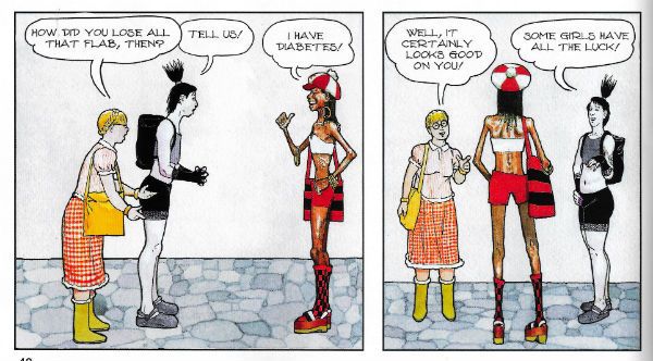
If David Chelsea wants to put his elegantly precise Winsor McCay-isms to use in immaculately illustrating a sedately paced cascade of jokes which veer giddily from the hilarious to eye-rolling howlers then who shall say him nay? Not I, sir. Not I. VERY GOOD!

 photo DHPLevitzB_zpskg5oww0h.jpg BROOKLYN BLOOD (Hamilton, Levitz & Pruett)

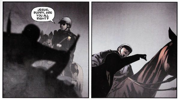
Brawklynn! BRAWK-LYNNN! People are super-proud of living in Brooklyn aren’t they? Well, people who live in BREWK-LARYNN! Seem to be. Doesn’t Jimmy “Spats” Palmiotti cahm frawm BRAHK-LAHYNNNA? I don’t know, but he should. I do know that BROKE-LIE-IN! is supposed to be one of those places that has mystique (not the naked blue lady) but all I can think of is the smell of fried onions, small boys in old men's caps selling papers on street corners and pigeon coops on rooftops. Is that BRAWK-LYNNN!? (I don’t care really. I’m just humouring them.) So, yes, BREWK-LYNNE is special, and so are you if you live there, but moving on…a lot of people criticise the American police and, you know, sometimes they have a point but, personally, I think the brunt of the blame should be borne by their Human Resources Department. I realise it’s not the sexiest of Police Departments but, still, there’s no excuse for such laxity. Who keeps signing off as fit for duty all these blackout drunks, PTSD sufferers, psychics, aliens and blind tap dancers who festoon their fictional ranks?  Yes, here we are again in the aisle marked “Damaged White Men With Guns” (next to the corn, above the beets), what’s not to love! This is the second (maybe; I don’t care enough to look) episode of this exciting new series which is exactly like every other cop series about a traumatised cop, but with “‘Nam” scratched out and “Iraqistaniraq” written above it. Despite there having been two murders most of the page time has been spent watching the mentally disordered white guy roll around in the street being distressed by phantom firefights. Which is okay, because murder’s pretty shabby but the real crime is how war fucks up white guys. Mind you, I am quite impressed with how clean American streets are; if you roll around in the ones near me you’d end up covered in dog poop and cig butts. Possibly the odd unlucky hedgehog. But then I don’t live in BRAWK-LYNNN! This strip is some bizarre stuff; the damaged white guy basically can’t walk down the street without hallucinating he’s in Call of Duty (but 4Realz!!) and his partner just dusts him off and puts him to bed. Go to sleep, tiny nutcase. The main draw here is the art by Tim Hamilton which has that generosity of ink I like and there’s also something fun happening with the colours; they get all luridly rhubarb purple and custardy yellow when there’s a catastrophic flashback, but I also like the subtlety in the bed scene where he dials it right back.  Maybe this strip is some kind of post-modern piss take of clichéd cop crap and every episode they’ll discover a body and the white cop will roll about and his not-white (obviously) partner will be all sensible, and it’ll just keep going like that with the bodies turning up in ever more ludicrous places and his mania taking on more and more extreme forms. By episode six they’ll be attending a murder in a clown school and he’ll be throwing poop at the local Shriners. In reality it’s probably just going to be more EH! but in BREWK-LYNN!

What am I giving up for Lent? I don’t know but it won’t be – COMICS!!!

“He Thought He Could Forget The Past. He was Wrong.” COMICS! Sometimes I Find A whole New Way To Bore You!

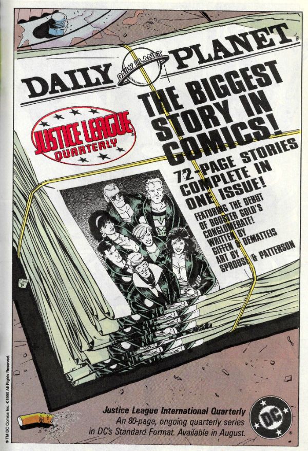
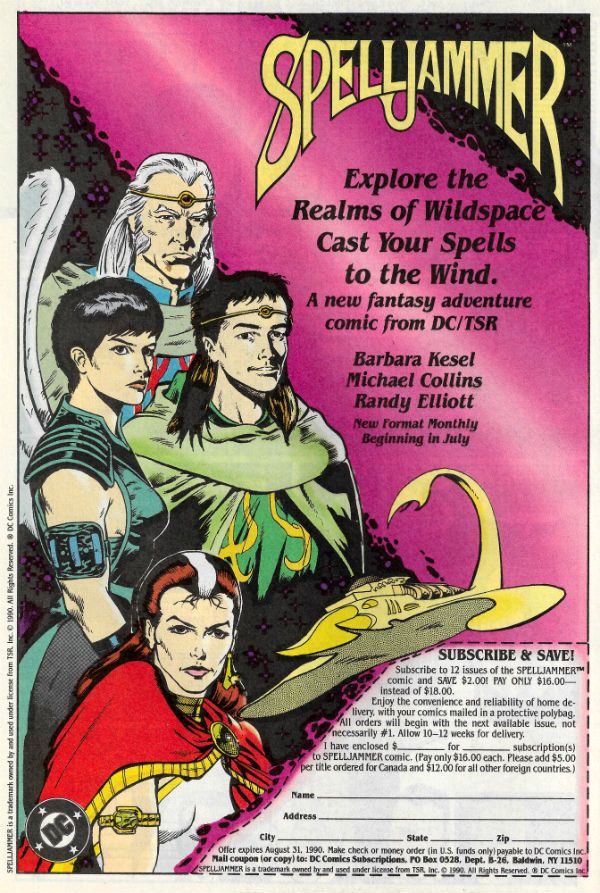
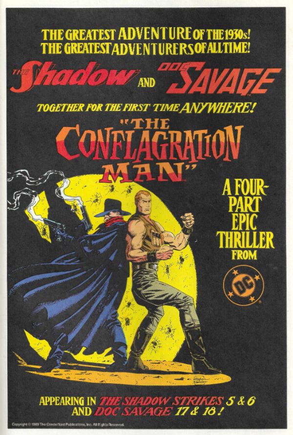
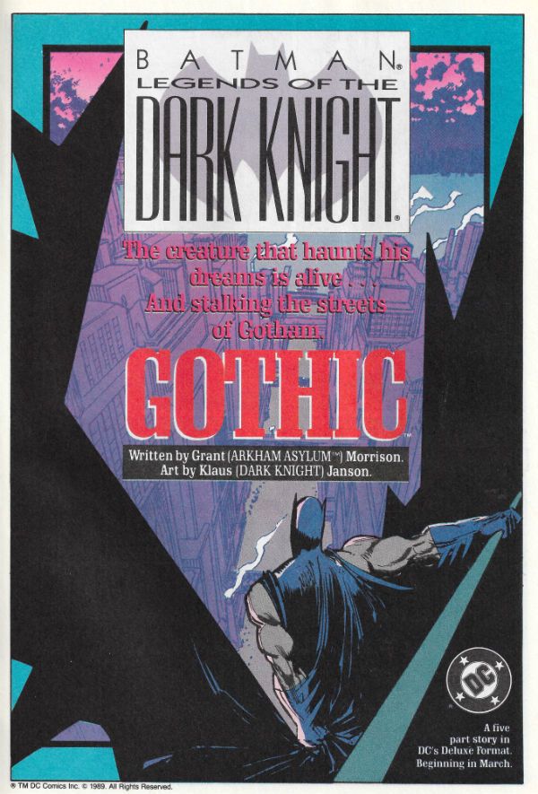
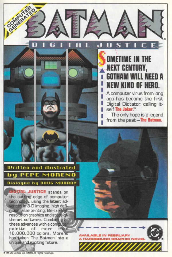
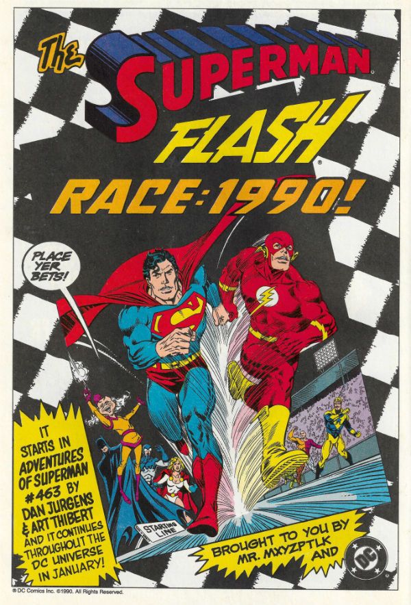
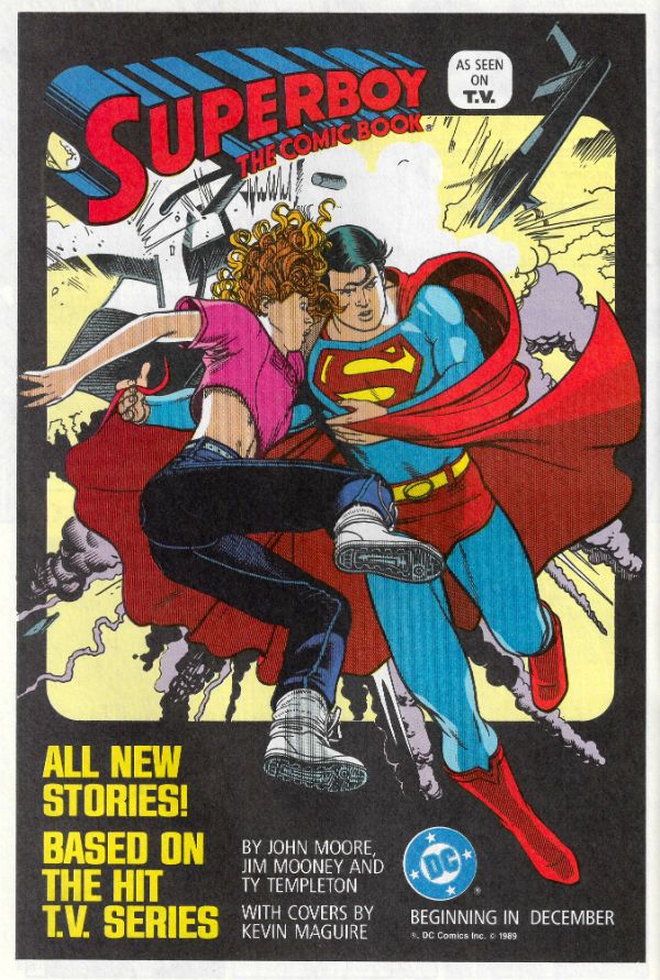
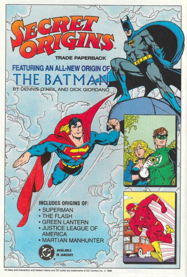
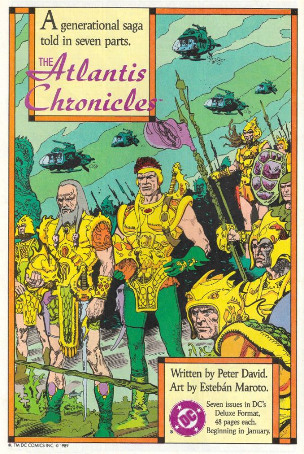
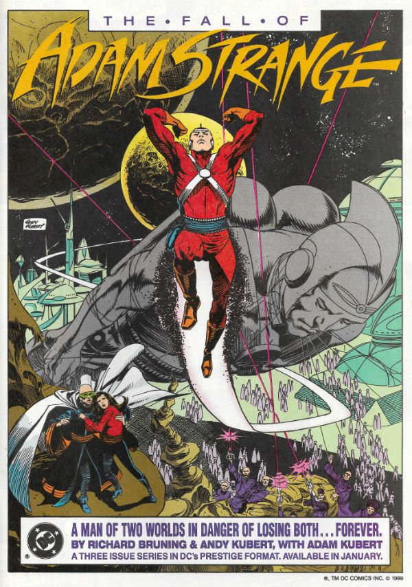
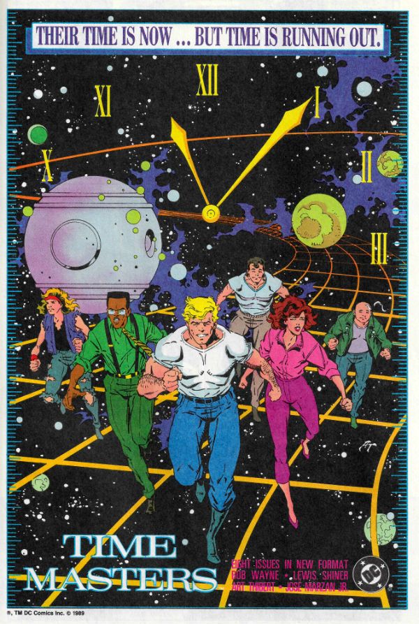
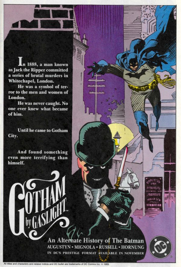
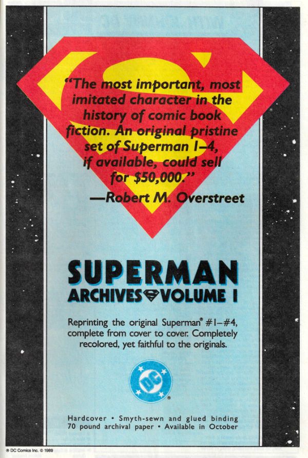
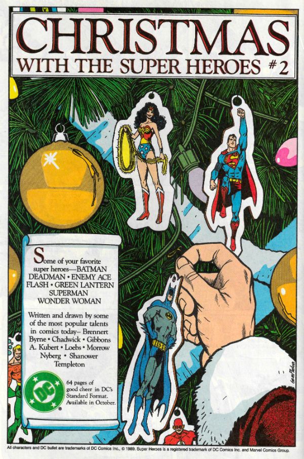
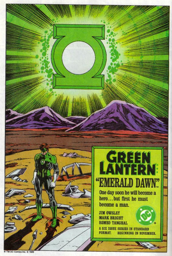
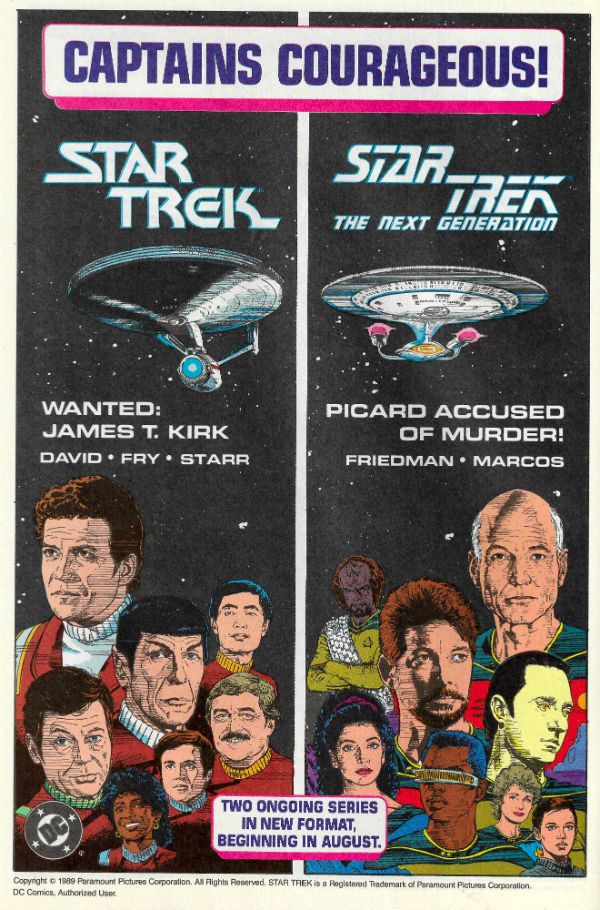
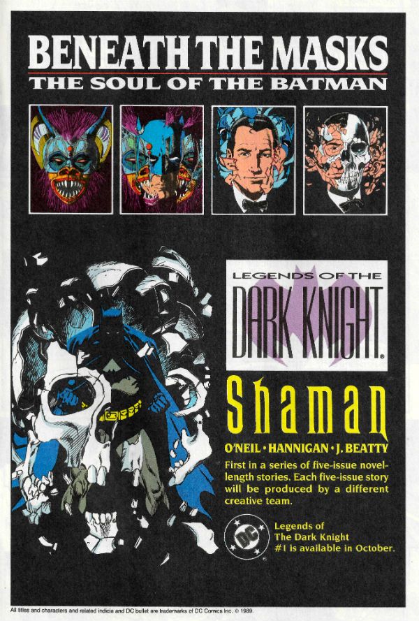
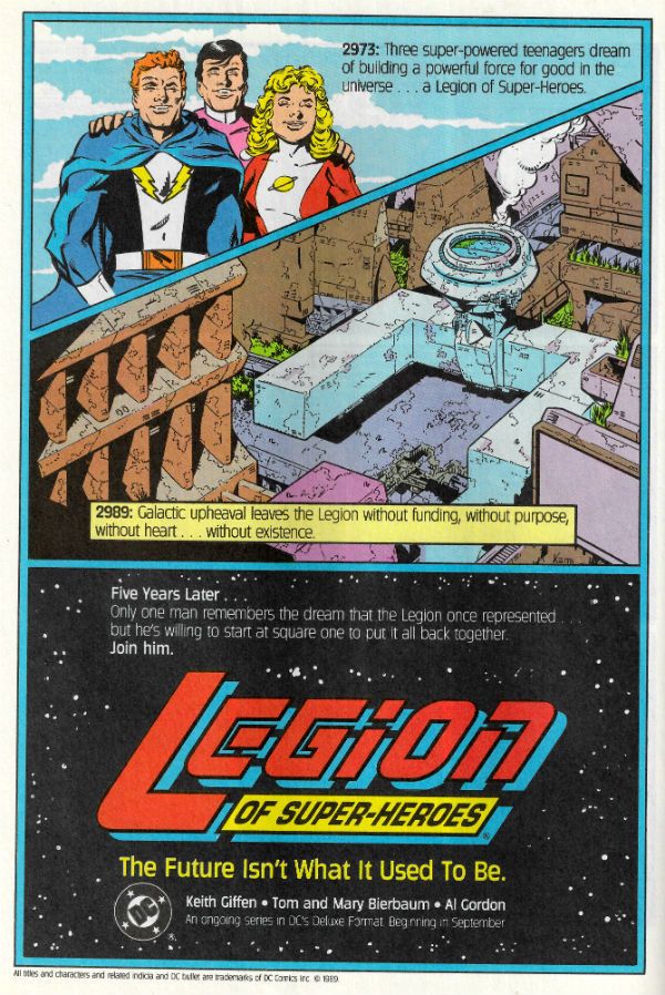
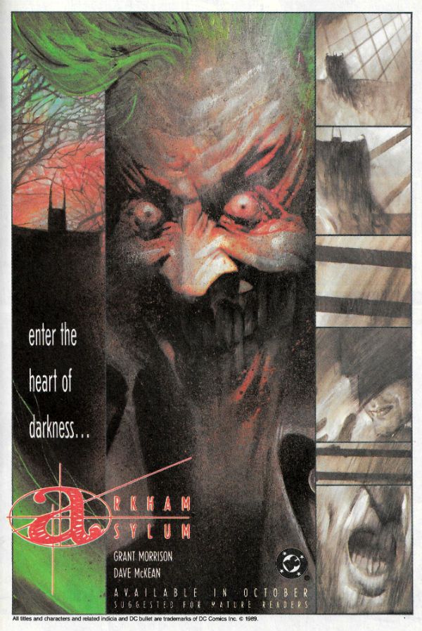
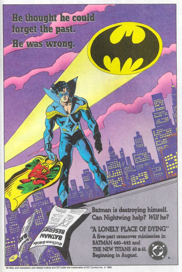
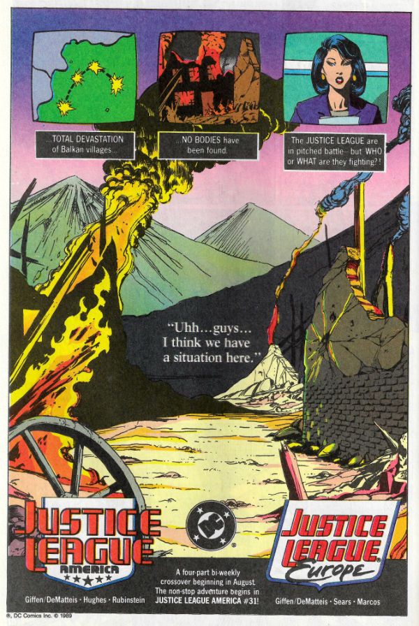
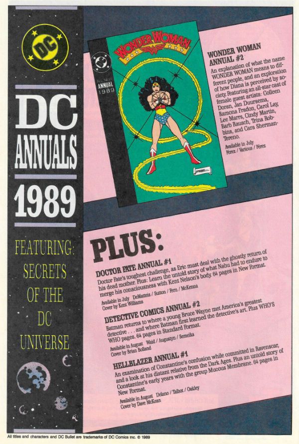
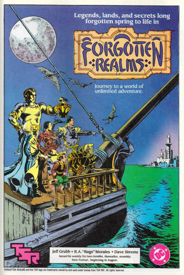
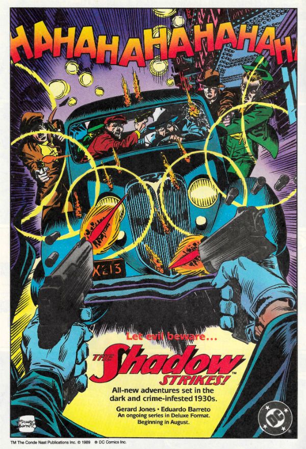
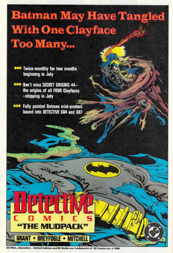
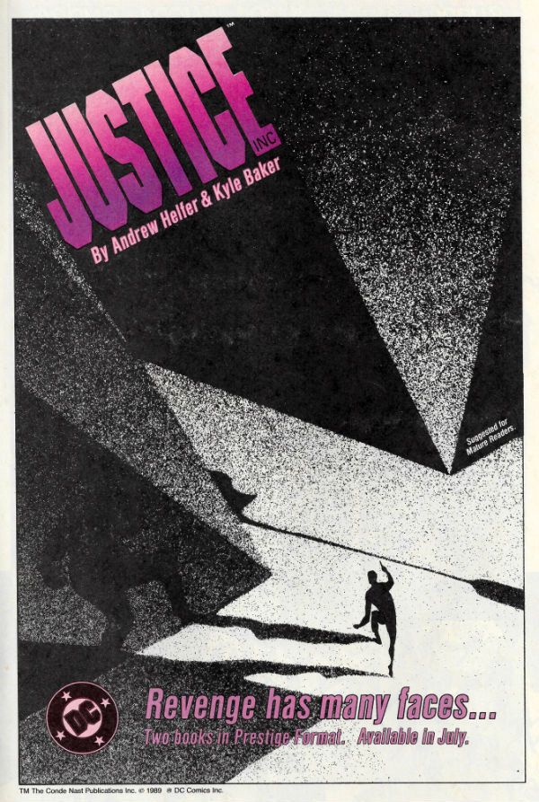
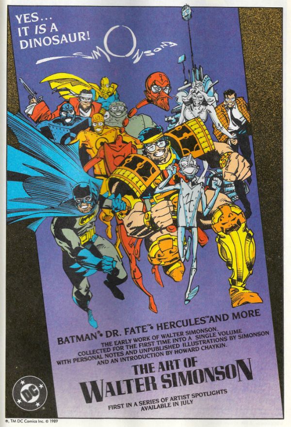
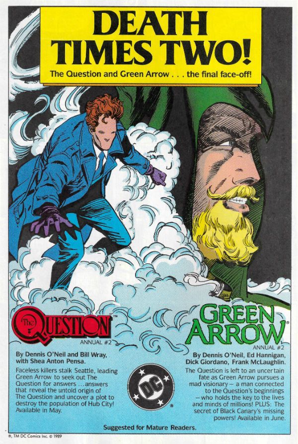
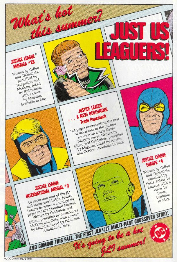
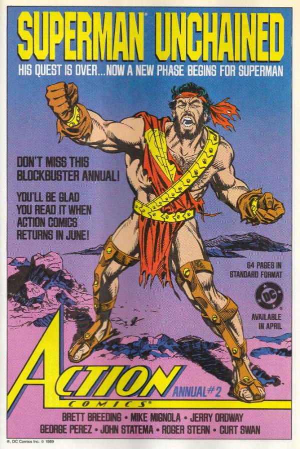
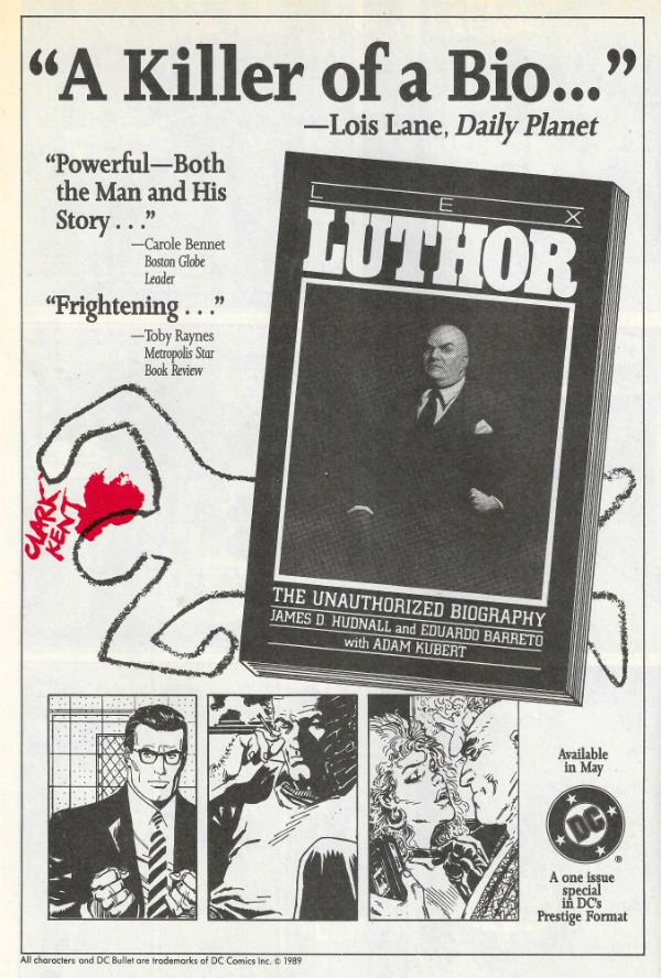
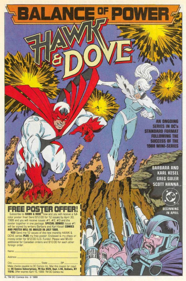
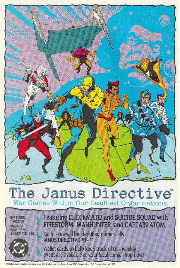
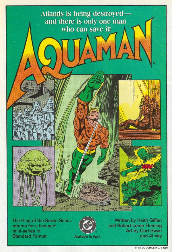
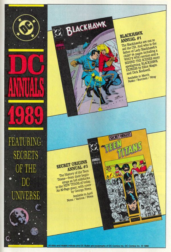
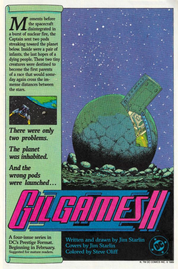
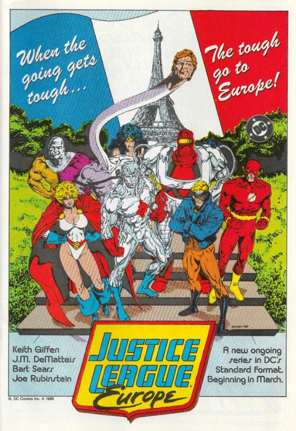
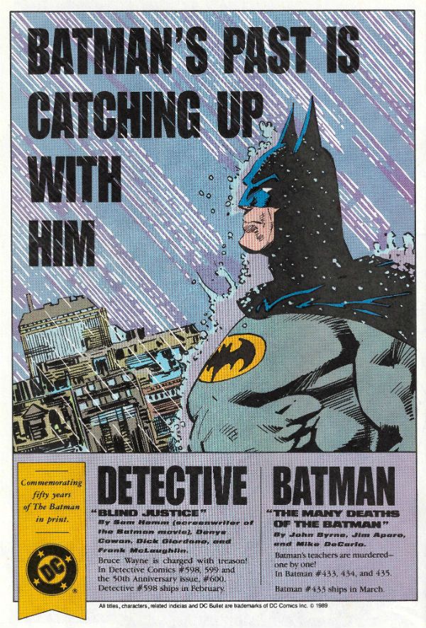
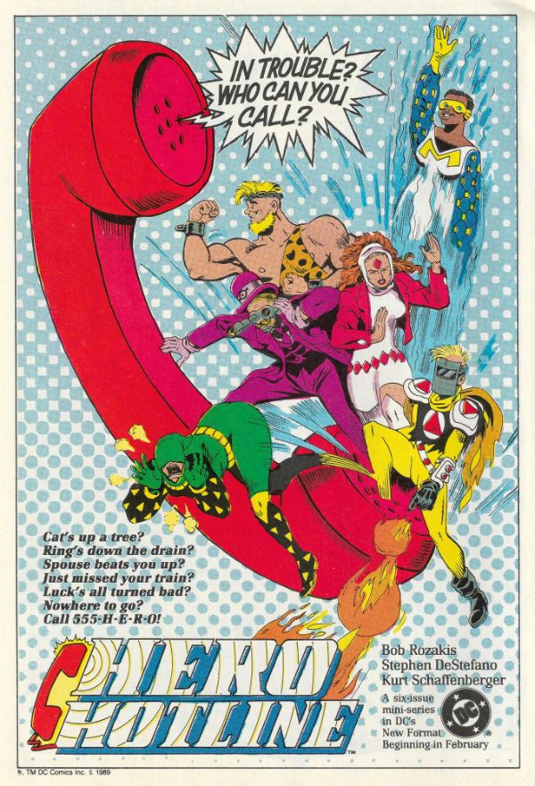
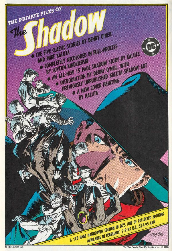
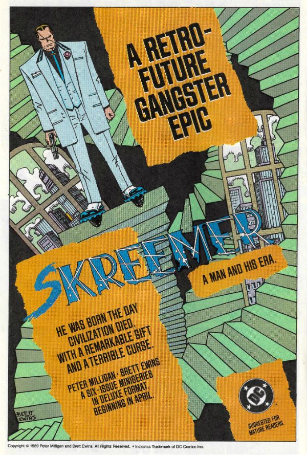
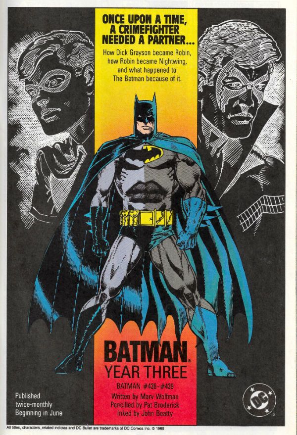
Of late I've been a regular Chatty Cathy and no mistake, so as a change of pace I've scanned in some House Ads which ran in DC Comics from (and it's totally arbitrary this) March 1989 to August 1990. I always enjoy looking at these things when I dig out my back issues; they remind me of stuff I have tucked away (and even sometimes forgotten), or nudge me about stuff I mean to pick up at some point before...I come to my senses and start acting my age. Sometimes they just make me shake my head and wonder how that turned out for everyone. Heck, it's just fun looking at them, basically, and I hope you share my fascination...  photo DCHADSstart_zps8zsk4fy9.jpg

Anyway, this...

While this is an image heavy post, and so you do get off lightly, you don't get off Scott-free as I have some words as well. Looking at the ad for SKREEMER I am reminded of one of several reasons why I will always be happy to give Peter Milligan a hug i.e. the ferocious passion with which, early in his career, he sought to make James Joyce an influence on comics. Now with most (mainstream North American) comic writers rarely straying to any level higher than that of Glen A. Larson or The Disney Channel his example is missed more than ever. Also, SKREEMER is not only violence and intelligence beautifully and cheekily intertwined via Milligan's script and Dillon/Ewins' art, but it is also still in print today. So go and buy a copy before I do a more in depth write-up on it, is what I'm getting at there.

JUSTICE INC. by Helfer & Baker isn't in print and (AFAIK) has never been reprinted. This is bad. However, you can pick up both prestige format issues for pennies. Which is good. Particularly if you want a comic which wades into the same troubled waters of America's History as Ellroy's UNDERWORLD USA trilogy and Don Winslow's POWER OF THE DOG. Not only that, but it does so by avoiding Ellroy's grating (if historically accurate) racism and Winslow's risky dalliance with cliché. JUSTICE INC. is also funnier. Not only that but Helfer's scripts show that if your dialogue is going to make the art play second fiddle, then it better be pretty immaculate dialogue. Which his is. Of course, it doesn't hurt to have a stylistic chameleon like Kyle Baker on board either, and he makes every artistic inch begrudgingly allotted him work like a pastel shaded dream.

Additionally, from this aged vantage, I well recall Alan Grant and Norm Breyfogle's Batman run(s). As well I should, as it's the only comic I allowed myself while, ahem, studying due to the fact that Guinness doesn't buy itself. (Sometimes I weakened and bought SHADE THE CHANGING MAN as well. Shhhh.) Those were some rock solid Batman comics and I'm pretty sure I can't be alone in being keen on a comprehensive collection of them appearing one day.

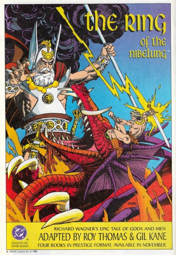
I note also that there's an advert for THE ART OF WALTER SIMONSON down there, and that volume is packed full of Simonson's early DC work, and is a humongous joy for any Simonson fan (which should really be any fan of Comics). It's also cheap to pick up today; so you just ran out of reasons for not owning it, chum. The magnificent Gil Kane's there as well; still alive back then, and fulfilling his personal dream of adapting (with Roy Thomas) Richard (not John) Wagner's The Ring Cycle. That's easy to find too in 2016, and if you like Gil Kane (as well you should) then that's you sorted. I never read Pepe Moreno's BATMAN: DIGITAL JUSTICE, which was probably for the best as I believe it's now considered to be to DC Comics as E.T. THE VIDEO GAME was to Atari.

There's lots of other stuff there, and feel free to share your recollections and misgivings regarding them. But before I go, it has always struck me as a bit of a dick move on the part of The Flash to challenge Superman to a race. Do you not think? And on that note, stick your face right into The Past and enjoy...COMICS!!!

 photo DCHADS56B_zpscuq10xie.jpg

 photo DCHADS57B_zpsxifflipr.jpg

 photo DCHADS58B_zpsqhnduhw0.jpg

 photo DCHADS53B_zpsucx4i4uh.jpg

 photo DCHADS54B_zpsdwkcwhcn.jpg

 photo DCHADS55B_zpstfum4gmd.jpg

 photo DCHADS52B_zpssuthctyk.jpg

 photo DCHADS51B_zpsniabsfi0.jpg

 photo DCHADS48B_zpsdlxexhcd.jpg

 photo DCHADS49B_zpsqyx1s1yj.jpg

 photo DCHADS50B_zpsojsoodtz.jpg

 photo DCHADS47B_zpspuxi2kmp.jpg

 photo DCHADS46B_zpsyh2f9g9r.jpg

 photo DCHADS45B_zpsiv7ybaaf.jpg

 photo DCHADS43B_zpsmku7pdqa.jpg

 photo DCHADS39B_zpswrtk6bcy.jpg

 photo DCHADS42B_zpsuoulf31b.jpg

 photo DCHADS41B_zpslggvylcy.jpg

 photo DCHADS40B_zpsbg6nb9p7.jpg

 photo DCHADS35B_zpstid85d54.jpg

 photo DCHADS38B_zpsdmb9ktl0.jpg

 photo DCHADS37B_zps3ltlegzt.jpg

 photo DCHADS36B_zpsfothudmc.jpg

 photo DCHADS34B_zpswy4g4c4m.jpg

 photo DCHADS32B_zpskxhoatxp.jpg

 photo DCHADS33B_zpszry8u52h.jpg

 photo DCHADS31B_zpsksfiubwb.jpg

 photo DCHADS30B_zps42j2aslw.jpg

 photo DCHADS29B_zpstisn4eka.jpg

 photo DCHADS28B_zpslskzcfyx.jpg

 photo DCHADS24B_zpsyevxfbkf.jpg

 photo DCHADS25B_zpsi4sx7ngh.jpg

 photo DCHADS27B_zpstzbaxiaw.jpg

 photo DCHADS26B_zpsxee0v3dm.jpg

 photo DCHADS22B_zpsy9qzryrp.jpg

 photo DCHADS23B_zpsulcuxsmf.jpg

 photo DCHADS21B_zpscfw77q60.jpg

 photo DCHADS19B_zps0h2vzcmp.jpg

 photo DCHADS17B_zpsfp4flza4.jpg

 photo DCHADS20B_zpsc4qwqkjx.jpg

 photo DCHADS18B_zpsesenyt9p.jpg

 photo DCHADS16B_zpsuf5jkk4j.jpg

 photo DCHADS15B_zpsaajf31z8.jpg

 photo DCHADS14B_zpselv3chc6.jpg

 photo DCHADS13B_zpsuswve8o4.jpg

 photo DCHADS11B_zpskgnrtven.jpg

 photo DCHADS09B_zpsq26fehhp.jpg

 photo DCHADS12B_zpsnnv7ctfa.jpg

 photo DCHADS08B_zps9ainuijo.jpg

 photo DCHADS10B_zpsqpb9ouep.jpg

 photo DCHADS07B_zpsdpv9wew0.jpg

 photo DCHADS02B_zpso7qjh6xg.jpg

 photo DCHADS03B_zpsknpmz1qg.jpg

 photo DCHADS06B_zpsnzgyusws.jpg

 photo DCHADS04B_zpsdm6xu2yo.jpg

 photo DCHADS01B_zpsbwl944e6.jpg

 photo DCHADS05B_zpsq535azms.jpg

NEXT TIME: Take a wild guess, that's right - COMICS!!!
“We’re JUDGES – We Can Do Any Damn Thing We WANT.” COMICS! Sometimes It’s A Clear Cut Case of Rather You Than Me, Dear.

I only had time to write about one comic this time. Sorry. But do please feel free to all club together and make me independently wealthy. I’ll probably manage, oooh, three comics then. Gee, thanks for thinking about it, anyway. This time I continue to big up The Home Side by looking at the very latest issue of 2000AD. It might only be one comic, but it’s a fresh ‘un! Hmm, still breathing so it is!  photo DreddGoGoGoB_zpsurenbrwa.jpg JUDGE DREDD by Sexton, Carroll, O’Grady & Parkhouse

Anyway, this. 2000AD Prog 1965 Art by Mark Sexton, Richard Elson, Clint Langley, John Burns, Carlos Ezquerra Written by Michael Carroll, Dan Abnett, Pat Mills, Kek-W, John Wagner Coloured by Len O’Grady Lettered by Annie Parkhouse, Ellie De Ville, Simon Bowland Cover by Cliff Robinson(a) & Dylan Teague(c) JUDGE DREDD created by Carlos Ezquerra & John Wagner KINGDOM created by Richard Elson & Dan Abnett ABC WARRIORS created by Kevin O’Neill, Brendan McCarthy, Mick McMahon & Pat Mills THE ORDER created by John Burns & Kek-W STRONTIUM DOG created by Carlos Ezquerra Rebellion, £2.55, weekly (2016)

 photo Cov1965B_zpsfwhvz7ky.jpg

You know, it has belatedly occurred to me that I have, characteristically, set off on this whole 2000AD thing more than a little half-cocked. So here are the answers to a few questions I should have probably addressed at the very start of this pointless exercise:

1) It’s all a bit creaky isn’t it? Why don’t they update it? You know, give some characters cancer, or a womb, or both even? Make one into a womb that fires cancers, even? Maybe give them those ridiculous beards Ver Kids are sporting these days? Why? Oh, why? Oh, why, oh why, oh why?

I admit I too was a little surprised and not a little dismayed on my return to the Galaxy’s Greatest Comic, after a hiatus of some 8 years, only to find that just one series was unfamiliar to me (THE ORDER). Truth to tell, it did occur to me to start wailing, gnashing my teeth and rending my garments over the lack of original concepts on show. However, I just couldn’t be bothered. (I suffer from idleitis, a recognised medical condition named by my Mum.) This, for once, was to my advantage. Because in the meantime it occurred to me that at present Marvel©™®’s biggest selling comics (to Retailers) are based on the popular children’s entertainment STAR WARS. Which, despite it currently thrilling the easily thrilled with a fresh instalment in cinemas right now, started off in 1977 as did 2000AD. More than likely 2000AD’s inception was hastened, if not occasioned, by the blockbuster success of the popular children’s entertainment STAR WARS. Both of them were pretty derivative as well. STAR WARS, the popular children’s entertainment, being basically Kurosawa’s HIDDEN FORTRESS (1958) with the dogfight from 633 SQUADRON (1964) bolted on the back. But in space! And with some New Age bum chunder about The Force! (Peter Cushing’s performance is ****ing immaculate, however.) While 2000AD in its rather more vulgar turn smashed and grabbed with abandon from hither and yon to great success, mainly by adding lashings of violence with a topping of topicality. In 2016 the only Force the popular children’s entertainment STAR WARS cares about is that of the market, so while 2000AD might still be trotting out Judge Dredd, ABC Warriors and Strontium Dog it wins, because they are good comics and have progressed within themselves. Basically, until 2000AD gives up the creative ghost completely and just becomes a billion dollar advert for toys and ancillary revenue streams across multiple platforms (UGH!) we’ll let it off. As for DC©™®, their biggest sales (to Retailers) are currently based on Batman, who was created in circa 1938, so they can’t point any fingers either. Sticking a hipster beard on Shaggy isn’t a paradigm shifter, you know, DC©™®. And, yeah, what is it with those beards. The beards on The Kids these days. I mean, seriously, kids. It’s like I woke up one day and I was in Philip K Dick’s THE MAN IN THE HIGH CASTLE; every third youth looks like a U-Boat commander on shore leave. What’s that all about? Sort yourselves out.

 photo youngpeopleB_zpsq06msiwj.jpg Picture thieved from Getty Images ("It's Not an Image, Unless it's a Getty!")

2) John, you complacent oaf, you failed to tell us why it is called 200AD in the Year of Our Lord 2016AD. So do that! NOW!

Okay, sure, it might seem odd that the comic is still called 2000AD since it is now 2016AD; so what was once, in 1977, unthinkably futuristic is now quaintly dated. I can assure you though that as the millennium loomed much discussion was had regarding the comic’s name in the letter pages, and several alternatives were indeed considered (2001AD, 2050AD, 3000AD, “Geoffrey”, probably even 2525AD (you know, if man is still alive, if woman can survive)) . In the end they stuck with what everyone knew. “If it ain’t broke, don’t fix it.”, we say over here, which is why Britain is a world leader in innovation. Me, I would have gone with 3000AD myself, plenty of future-proofing (ugh!), see, but there you go. No one listens to me. Which is why we don’t live in a Socialist Utopia, and 2000AD is still called 2000AD in 2016AD. In their defence part of the fun of watching something like ESCAPE FROM NEW YORK is admittedly that bit where it comes up with “1997 – NOW!” at the beginning. Also, whenever I visit my parents to remind them why they wish they had remained childless, I always pass this hairdressers called HAIR2000. That’s 16 years out of date as well, and nevertheless there are still women in there getting their rinses blued. (I have always wanted to ring people up for a night out and say “Let’s all meet up at HAIR2000.” But I don’t have any friends; largely because of jokes like that. And the fact I’m a big prick.) I guess the lesson here is: quality of content trumps a name, or 2000AD is such a strong brand that…ugh, sorry I passed out there. Anyway, amusing as I find HAIR2000, it’s not my favourite shop name; I once spotted a dress shop called SOPHIE’S CHOICE. Nice.

3) Is 2000AD really edited by a green alien from Betelgeuse called Tharg The Mighty?

Yes.

 photo thargB_zpsjiesn7aq.jpg Picture ganked from Down The Tubes

I hope that answers your questions anyway because if it didn’t, tough titty.

Meanwhile…back at the comics.

 photo DreddTortB_zpsnaur5zmk.jpg JUDGE DREDD by Sexton, Carroll, O’Grady & Parkhouse

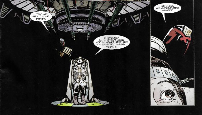
The pace of JUDGE DREDD (Sexton/Carroll/O’Grady/Parkhouse) continues to resemble my feet after I accompanied my son (“Gil”) and his Cub pack on a walk around Carsington Reservoir – blistering. Following The Set-Up (Ep. 1) and The Big Fight (Ep. 2) episode 3 of Ghosts is the investigative bit; the procedural part if you will. Because, no, contrary to popular misconception Judge Dredd doesn’t typically just ride up and shoot the perp du jour in the face and give with a quip; there’s more to it than that (unless it’s that regrettably dunderheaded Dredd run where Mark Millar and Grant Morrison were in charge). Here we get the bit where Dredd acts like a **** for the Greater Good. Since the Western mind set seems to currently be a trifle crypto-fascist, I should probably point out that we aren’t really supposed to be cheering Dredd on as he psychologically tortures an innocent woman to draw out the wrong ‘uns. Sure, it looks like it’s worked but at what cost; every action has an equal and opposite reaction, as Ray Palmer reminds us in that Godawful DKIII:TMR comic. And I think that’s true morally too. I do. I haven’t got any proof mind, but that’s rarely prevented anyone from voicing their opinion. Anyway, Nietzsche’s just popped in to remind us that “He who fights too long against dragons becomes a dragon himself”. Thanks, Fred. Nice ‘tache! Stay away from piano stools, now! Anyway, in this issue Joe gets a bit scalier and Mark Sexton continues to impress with his balance of detail and clarity; although I think he could make his Dredd a bit more iconic, you know, if I had to whine about something. VERY GOOD!

 photo KingdomB_zpsrugyqa06.jpg KINGDOM by Elson, Abnett & De Ville

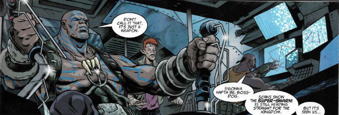
Now, I’m not saying the events so far in KINGDOM (Elson/Abnett/De Ville) test my patience exactly, but it is a bit like if after The Big Badness your nan wanted a biscuit with her Sour Grass Tea and you went out into The Big Dusty and after a hundred yards came upon a fully operational Fox’s biscuit factory. Massively convenient might be the term. Because it turns out that Gene and his pack have found exactly what they need to outrun the swarm and get back to warn the folks at home. Not only that but only Gene can operate it. Yes, I’d say massively convenient might do it. Which is fine because KINGDOM is just breezy action based larks, so it can get away with massively convenient. Not least because Elson’s art has a detail and a crispness which is never less than impressive. OKAY!

 photo ABCTerrorB_zpsh0qavf8c.jpg ABC WARRIORS by Langley, Mills & Parkhouse

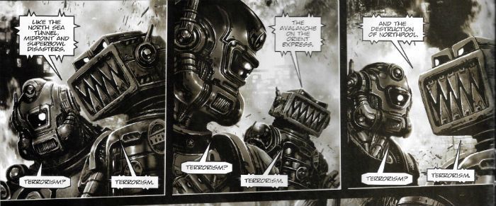
In the letters page there’s a bit of a kerfuffle over Pat Mills, as no less than two of the three letters therein find exception with the fact that Mills’ stories always basically end up being the same, no matter what colourful character fronts them. i.e. an uncouth Rip The System! riff with some clumsy exposition, endearingly silly wordplay and the odd off-colour joke chucked in. As a criticism it’s perfectly valid, and I can certainly see their point. However, it misses the larger point that the burden isn’t on Pat Mills to change the stories he tells, but for society to sort itself out so that Pat Mills no longer has to tell these stories. Come on, Society, pull your finger out and let’s see what Pat Mills has to say when we’ve all stopped ****ing each other over. Until such time I for one am more than happy for Pat Mills’ comics to remain perpetually chanting the lyrics to Soft Cells’ Best Way to Kill. Oh yeah, babies of the beard, raise your voices high, “…like a badge on a blazer at school – TEAR IT OFF!! RIP IT UP!! Stick your two fingers up at the world!” If you want comics about ****ing nothing you’re spoilt for choice, so in the meantime, personally speaking, I’m perfectly happy for Pat Mills and the Warriors to continue to age disgracefully. This week ABC WARRIORS (Langley/Mills/Parkhouse) continues to explore the (REALLY unlikely) idea that The System might exploit the fear of terrorism in order to pursue its own agenda of repression and profit. (Which is just CRAZY TALK!) As fantastical a notion as that is (I mean, AS IF!) it makes for very good fiction. On art Clint Langley manages to make a bunch of robots and wreckage extraordinarily atmospheric and expressive, despite the fact that that must be very difficult to do. And I greatly enjoyed his off-kilter choice to sparsely spot colour the odd bit here and there with a queasy green and a rosy red. VERY GOOD!

 photo OrderBurnsB_zpsncczziy6.jpg THE ORDER by Burns, Kek-W & De Ville

Although THE ORDER (Burns/Kek-W/De Ville) is set in the 1580s the odd burst of computer speak blaring out of the mystified face of our fiery headed lead (“10 print john rules ok [RETURN] 20 goto 10 [RETURN]”, he doesn’t say) suggests a futuristic aspect to the strip yet to be clearly revealed. Because I have a mind so finely honed that it would shame a VIC20, I think I have already sussed the twist. The clue is in its dung studded, infrastructure light setting in which squats a scrofulous population of downtrodden paupers, through which privileged fops can cut a swathe, thanks to the heavily armed police acting as their personal militia. Clearly, we are in fact in the future and the year 1580AD is actually 1580 After Dave, because when Tories dream it is this they dream of. And every day that dream comes closer. Or maybe my mind was tip-toeing through its own tulips because the whole thing was a bit generic for me, and the only solid pleasure was seeing what the estimable John Burns did with colour; just a really arresting series of loose washes which sometimes don’t even stay within the lines, and are often quite minimal in their range of shade within a single panel. Yet, always, always he takes pains to mark out the protagonist’s barnet with a blob of red. John Burns is great. Burns, baby, Burns! OKAY!

 photo StrontMoreB_zpsb2cbytbd.jpg STRONTIUM DOG by Ezquerra, Wagner & Bowland

Okay, I was initially underwhelmed by the ease with which Johnny Alpha and his mutant chums pulled off their heist in STRONTIUM DOG (Ezquerra/Wagner/Bowland). But on reflection since it did depend on the ability to stretch one’s arm like reed Richards’ can only dream it was probably a lot more difficult than it looked. Plus, this is the lulling section of every heist movie. The bit where things get a bit tense but the objective is achieved. PHEW! we all exclaim in relief as Danny Ocean hides inside the guard’s anus with the crown jewels, and is walked safely out of the building to a sloppy but enriching exit. Things start getting interesting after this bit, where in all likelihood we'll get the Strontium Dog equivalent of Andy Garcia jumping out of the guard’s sock and threatening to flush the loo unless the newly excreted Danny Ocean gives him his career back. Or something. I forget; OCEAN'S ELEVEN was okay but I prefer that 2001 David Mamet heist movie. The one with Gene Hackman, Delroy Lindo and Danny DeVito doing a heist. It's a good heist movie. I wish I could remember what it was called, that heist movie. Anyway, STRONTIUM DOG this week is all smooth reading from both script and art, as the old pros Wagner & Ezquerra go back for one more job. Most likely though all the goodwill I felt was down to Kid Knee reappearing, and his being just as endearingly fractious as ever. GOOD!

NEXT TIME: I’ll hopefully look at more than one comic because that’ll mean I can use the plural which is – COMICS!!!

“Droids Don't Knock.” COMICS! Sometimes The Darkest Judge of All Is Judge Critic!

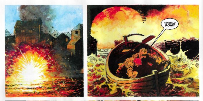
Not wishing to set a precedent here but in response to a reader comment I look at a volume of IDW’s JUDGE DREDD. There’s little, if any, toilet humour in this one. I've got all that out of my system (tee hee!) But if you like icy disdain then bring your skates because we’re doing figure eights! Or maybe I liked it. Ha, Ha, just kidding.  photo AWODshowB_zpsbhdibqy7.jpg JUDGE DREDD by Daniel, Swierczynski & Lee

Anyway, this… JUDGE DREDD, VOLUME 5: THE AMERICAN WAY OF DEATH Art by Nelson Daniel, Steve Scott Written by Duane Swierczynski Coloured by John-Paul Bove Lettered by Shawn Lee Originally published as JUDGE DREDD #17-20 IDW, $17.99 (2014) JUDGE DREDD created by Carlos Ezquerra & John Wagner

 photo AWODcovB_zpsg2uidkm5.jpg

For a few years now IDW have had the licence to produce original Dredd comics in America, and these exist distinct from the (more familiar to me) UK Dredd canon, which is currently handled by Rebellion. Theoretically IDW are in a pretty advantageous position; they get to start from scratch without any of the early mis-steps of the original strip (Maria! Non-Judge policemen! Mick McMahon thinking Dredd was black!) and can cherry pick plots and characters from an impressively fecund near-40 years of ideas and concepts pre-tested in the fieriest crucible of the imagination  possible – British children’s minds. Alas, it gives me no pleasure whatsoever to report that on the evidence of this volume IDW have bungled it quite badly. I wanted to like this book; I want to like every book I read. Whatever kind of creature it is which knowingly seeks out things it dislikes, that is not the kind of creature I am. (Unless it’s DKIII: TMR because, seriously, **** that garbage.) JUDGE DREDD VOLUME 5: THE AMERICAN WAY OF DEATH is not a disaster, but like many a Tory given all its in-built advantages it’s a disappointment.

 photo AWODarghB_zps272rertf.jpg JUDGE DREDD by Daniel, Swierczynski & Lee

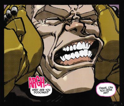
Thanks mainly to Nelson Daniel's lively cartooning (and frequent use of a function on his PC which replicates that dotty stuff I like so much) as I read the book I was enjoying it, but the further I read that enjoyment was progressively undermined by some pretty basic gaffes. Not least among these was the utter disregard with which the volume treated potential new readers. Like, uh, me. It’s pretty staggering; as though IDW expect everyone to have read Vol.s 1 thru 4 thirty seconds before they cracked the covers on this one. Would it have broken the bank to use a page to provide a cast list and a “What Has Gone Before…” paragraph? (No, it wouldn’t.)  I’ve read Dredd for longer than is admissible in mixed company so, yeah, I know who Judge Janus and Judge Omar are, and why they can talk to each other using unanchored thought balloons (helpfully colour coded pink for a girl and blue for a boy like this is fucking Bunty or something) but does Chet in Omaha, who has never read a Dredd before? (No, Chet doesn’t. Look at his big simple face; he hasn’t a clue.) Of course, it’s not so much the basic set-up of Judge Dredd as a series I’m talking about; just looking at the book effectively communicates the fact that it takes place in The Future, Judge Dredd is a Cop and Things Are Less Than Rosy. Dredd’s a pretty direct concept. With the exception of Mark Millar & Grant Morrison most sentient creatures can pretty much pick up “Judge Dredd” so easily it’s almost as though it’s by osmosis. No, it’s more the set-up of the story herein itself which is the problem.

 photo AWODchokeB_zpsjtnkpemx.jpg JUDGE DREDD by Daniel, Swierczynski & Lee

Essentially this doesn’t read like a complete story but like a section in a larger story. Which is fine, very sexy, very modern, very Television and all that but Christ, people, context counts. And context here is sorely lacking. Although the book is ostensibly about Dredd vs. The Dark Judges, some fuzzily defined business about two people who have swapped bodies (in a previous volume, I guess) keeps barging its way to the fore like a drunk on a bus. This is a problem, as I picked it up for The Dark Judges, and if you want me to be more interested in some other story that’s already half over you’ll have to put your back into it. Unfortunately, Duane Swierczynski doesn’t. He is, I hasten to add, professional enough to convey the essentials of the situation (a man and a woman have swapped bodies, one of them was a Judge, and the Judge swapped bodies so that the other party would go to Titan (the space prison for Judges) instead). Sure, Swierczynski manages to smoothly integrate all that into the text and I can think of plenty of Red Hawt Comics Writers who would have skinned their knees at even at that low hurdle. But, c’mon, being better than the worst isn’t good enough. Beyond the basics there’s no deeper insight into the situation proffered e.g. the relationship between the two people, how the swap occurred or even what crime the Judge committed. Let me put it in terms a writer would understand – when you go to a meeting with some people “in” Television what’s the first thing everyone does? Introduce themselves! The smile on your face tells me I’ve been understood.

 photo AWODeathB_zpswwdjv72e.jpg JUDGE DREDD by Daniel, Swierczynski & Lee

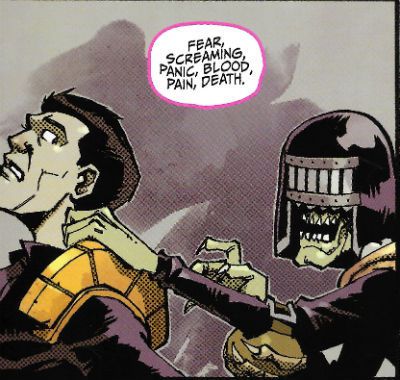
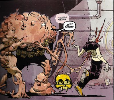
It’s unfortunate that Swierczynski  seems to have elected to tell this other story with the The Dark Judges acting as merely a spicy backdrop, because this means he doesn’t really develop that bit either. The book starts and The Dark Judges are running amuck in Mega-City One because, uh, because…of something that happened in the previous volume? (Chet’s really flailing now, IDW. I don’t think you’ve won him over. He’s looking wistfully at the TV.)  For some inexplicable reason Swierczynski has decided to add a bunch of new Dark Judges as well. I know we’re always moaning that people don’t create stuff anymore but, you know a) there’s a time and a place and b) it still has to be good. These new Dark Judges are totally unnecessary and utterly underwhelming in comparison to their antecedents. I mean Nelson Daniel draws the balls off them, there’s nothing wrong with his designs at all; they are fresh, funny and not a little icky as befits a concept which straddles the sinister and the silly as deftly as that of The Dark Judges.

 photo AWODbigB_zpsgsojk82o.jpg JUDGE DREDD by Daniel, Swierczynski & Lee

It’s a tough gig adding new Dark Judges, a bit of a poison chalice really. Especially since even the immediate additions post Death’s first appearance (Fear, Fire and Mortis) do, in retrospect, have the whiff of Brian Bolland’s having done some sweet character designs which were just thrown in to spice stuff up. Personally, Judge Death’s enough but there’s so many of the buggers now that even he’s barely in the book. Remember when you went to see BLADE: TRINITY and there were all these other people in it and Ryan Reynold’s abs vying for screen space? But you had gone hoping to see Blade not all these other people, and certainly not Ryan Reynold’s abs? It’s like that. A bit. There are so many Dark Judges, and the book is so slim that most of them only really get a scene to establish their shtick, and if they get more than that then it’s because the plot requires them to do something to propel it along. The action’s disappointing too, with Judge Dredd (points awarded for him being written as suitably curt and street-smart rather than a thick thug) strolling about dispatching his enemies with incendiaries. It's hardly Sun Tzu is it now? Mind you it’s hardly a permanent solution but then again the permanent solution is somewhat problematic. It’s problematic in the sense that it seems pulled from Duane Swierczynski’s backside. It hasn’t been of course. Obviously, this solution is a call back to events in an earlier volume but since there is no indication of this in the text it all seems bit random and dismayingly abrupt. (Chet’s started digging for gold up his nose and I don’t think he’ll be back, IDW).

 photo AWODliveB_zpsqhdowxbt.jpg JUDGE DREDD by Daniel, Swierczynski & Lee

So even Nelson Daniel’s fizzy Charlie-Adlard-but-with-a-pulse performance can’t save what is basically a Freaky Friday re-run with cameos from The Dark Judges. In the hellish future world that is The Savage Critics Judge John is The Law, and Judge John’s verdict is that JUDGE DREDD VOLUME 5:  THE AMERICAN WAY OF DEATH is EH!

BONUS: HOW WELL DO YOU KNOW THE NEW DARK JUDGES? TAKE OUR FUN QUIZ AND FIND OUT!

 photo AWODfistB_zpsrrgerbzf.jpg JUDGE DREDD by Daniel, Swierczynski & Lee

Judge Blank is: A) A mysterious teleporting entity which acts in opposition to the other Dark Judges.

B) A plot device used to get people from one far-flung location to another.

Answer: A)

Judge Fistula is: A) A blobby looking chap who links people together by impaling them with lengthy fleshy barbs.

B) A Scouser who issues sexual threats at passers-by (“I’m gunna fist you, la’!”)

Answer: A) (Now, I’ve not been graced with a fistula (“an abnormal or surgically made passage between a hollow or tubular organ and the body surface, or between two hollow or tubular organs”) but I do know what one is (see preceding note) and this “Judge Fistula” thing seems a bit tenuous. You may disagree. From the pages of sketches and notes in the back of the book it seems Duane Swierczynski was going for a Human Centipede effect. Since the whole Human Centipede effect depends on someone having their mouth sewn to a stranger’s arse and here we just have some people stood dazedly about connected by flesh sticks I think he missed that effect. I think “Judge Tumour” might have been better but again, that’s just me.)

Judge Skinner has: A) Had his lyrics discussed in an Oxford Professor of Poetry lecture by Sir Geoffrey Hill.

B) No skin and can remove the skin of his victims by magic.

Answer: B)

Judge Sleep is: A) A lady Judge who causes irritating gummy secretions in people’s eyes, which harden and can be really tricky to get out even if you use your little finger and get right on in there. Hot water and cotton wool are the cure.

B) A lady judge who puts people to sleep forever.

Answer: B) (Which sounds more like Judge Coma to me but there you go, I’m not a writer like Duane Swierczynski so what do I know.)

Judge Burroughs : A) Shoots wives in the head "accidentally" and fantasises about naked sailors hanging themselves in sufficient quantities that the resultant terminal ejaculate makes it look like it is snowing.

B) Burrows like a mole. (Brring! Brring! Brian Azzarello called, he wants his wordplay back.)

Answer: B) (He also looks like a mole, albeit a skinned one which, look, okay, moles do burrow, I’ll give you that,  but I’m kind of hazy on their connection to death. I’m struggling to think of any culture which has the mole as a totem of death. I’m flawed; I’ve watched a lot of bad movies where “nature fights back”, but I can’t think of even one where moles start acting up. Rabbits and worms, yes, slugs even, but moles? I’m drawing a blank here, to be honest. Maybe Duane Swierczynski’s got an allotment and moles got into his lettuce last summer and he still bears a grudge. Judge Burroughs is stupid is what I’m getting at there.)

Judge Sludge is: A) Made of Sludge and able to spray victims with a dense emission.

B) Evidence that inspiration can fail us all.

Answer: A)

Judge Metastasis is: A) an ever increasing giant composed of people subsumed into its bulk, all of whom are ruled by one mind; a searing commentary on the mindlessness of the mob.

B) the result of someone reading Clive Barker’s In The Hills, The Cities at a formative age.

Answer: A)

Judge Stigmata is: A) Able to sidle up to people and charismatically induce them to wound themselves.

B) An attention seeking hairdresser who gives priests who look like Gabriel Byrne boners.

Answer: A) (Unfortunately, and I take no pleasure in pointing this out, this is not actually stigmatism as the wounds do not appear spontaneously and nor do they conform to those said to have been endured by Jesus Christ. Those, you know, being the defining elements of stigmatism. What we have here in this book is hypnotically induced self-harming. I know it seems picky but there you go. Again, no writer I.)

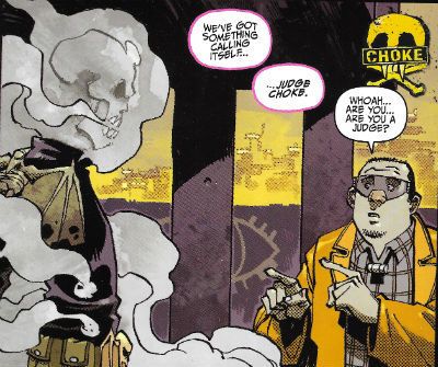
Judge Choke is: A)  A somewhat hazily realised comment on the self-destructive  nature of smoking. (Okay, maybe he just straight up chokes people on smoke. Design-wise anyway, Judge Choke definitely looks like Ghost Rider after a light summer shower.)

B) An insecure actor who corners people at parties and, in an increasingly hysterical manner as the evening wears on, and the drink gets sunk, points out that although appearances in drearily unexceptional production-line Marvel©® movie fodder have made him rich he just really, really needs you to know that there’s just so much more to him than that; what with him having once directed a movie adaptation of Chuck Palahniuk’s Choke. Struggling to stay conscious victims stab themselves in the leg with those cocktail sticks you put the tiny sausages on, eventually expiring from blood loss.

Answer A)

Judge Judy is: A) a TV program my Mum watches during the day because she is retired and that’s her choice; she’s worked hard and she’s earned that right.

B) a cheap joke on my behalf to see us out.

Answer: A) and B)

NEXT TIME: I don’t know. Do you think I actually have a plan? Probably this week’s 2000AD and a couple of other – COMICS!!!

“Like Turds in Rain...” COMICS! Sometimes I Act My Shoe-Size Not My Age.

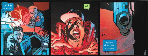
Abhay's below this, so don't dilly dally, and certainly don't shilly shally, go there! Do it NOW! Me, I'm still trying to get regular, so here's another go at that. There's a lot of toilet humour in this one. It's the only industry we have left.  photo DKSweatB_zpsdi8lj2ly.jpg DKIII by Risso, Azzarello, Mulvihill & Robins

Anyway, this... SIR: The critics? No, I have nothing but compassion for them. How can I hate the crippled, the mentally deficient, and the dead? The Dresser by Ronald Harwood

2000AD Prog 1964 Art by Mark Sexton, Richard Elson, John Burns, Clint Langley, Carlos Ezquerra Written by Michael Carroll, Dan Abnett, Kek-W, Pat Mills, John Wagner Colours by Len O'Grady,the artists Lettered by Annie Parkhouse, Ellie De Ville, Simon Bowland JUDGE DREDD created by Carlos Ezquerra & John Wagner KINGDOM created by Richard Elson & Dan Abnett THE ORDER created by John Burns & Kek-W ABC WARRIORS created by Kevin O'Neill, Brendan McCarthy, Mick Mcmahon & Pat Mills STRONTIUM DOG created by Carlos Ezquerra & John Wagner Rebellion, £2.55 weekly (2016)

 photo Cov1964B_zpsdm1rptxk.jpg

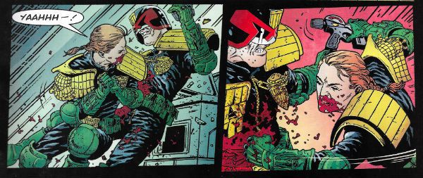
Borag Thungg! Another week, another issue of the Galaxy's Greatest Comic! This week in Judge Dredd (Sexton/Carroll/O'Grady/Parkhouse) the decision is taken to devote the bulk of the seven page installment to a quite bloody and brutal action sequence which leaves Dredd on the edge of death. Also, some plot developments. It's a salutary reminder that when a Judge goes wrong that's way more dangerous than just your average perp. As seven pages go it's lean, mean, gory and crunchily executed stuff. Two parts in and “Ghosts” is shaping up VERY GOOD!

 photo DreddB_zpsrgtzqjtj.jpg DREDD by Sexton, Carroll, O'Grady & Parkhouse

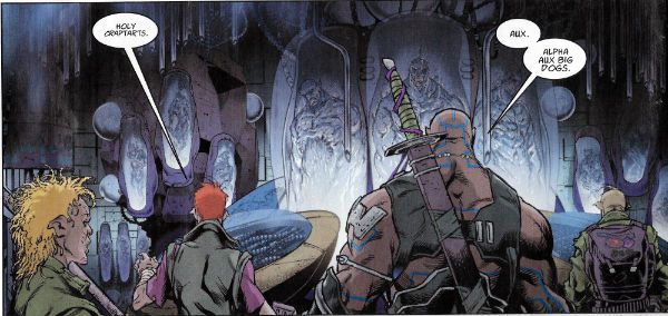
KINGDOM (Elson/Abnett/DeVille) takes time out from hurtling about hither and yon for a quick plot stop. Some fruity swears and mysterious discoveries later the strip is tanked back up with motivation enough to hurtle off, in the final panel of the fifth page, into what promises to be a more typically action orientated episode. Elson art possesses a crisp precision and Abnett's script remains fundamentally derivative but still just original enough to provide undemanding fun. OKAY!

 photo KingDB_zpsxcsvs1k2.jpg KINGDOM by Elson, Abnett & DeVille

Alas, the major question raised by THE ORDER (Burns/Kek-W/DeVille) so far is what exactly was achieved by the steampunk motorbike that could not have been achieved by a horse. So, obviously this one's not exactly pulling me in. It's not terrible though. And that's despite groan inducing clichés such as the masked rescuer being revealed to be a stunningly beautiful lady (and unless Boots The Chemist was operating in 1560 then her make up skills are a tad anachronistic). As if in balance there's a nifty bit of dialogue on the fifth and final page (the “...empircal evidence..” bit). That alone is enough to leave me optimistic that the ideas underpinning the series will eventually be revealed to have been worth the more predictable stretches. OKAY!

 photo OrderB_zpszk5qseeq.jpg THE ORDER by Burns, Kek-W & De Ville

Last week, while struggling to make sense in a short space of time, I , somewhat tenuously I thought, mentioned Blade Runner in connection with the mek-nificent ones. This week Serendipity, obviously in a playful mood, shocks my socks of by having Pat Mills rejig the Roy Batty death speech everyone loves from that selfsame movie, but puts it in the foul mouth of an ailing Ro-Jaws and, thus, appropriately enough, fixes up the references within it to those of a somewhat more scatological stripe. Reader, I larfed. One of the many things I respond to in Pat Mills' writing is his unselfconscious embrace of puerility. It's particularly prevalent in ABC Warriors and is always welcome. In a strip where the authorities (who have been searching for Hammerstein) have just cottoned on to the fact that that robot that looks just like Hammerstein but with a different head is in fact Hammerstein but with a different head, having a giant robot referencing David Lynch films and also yelling about “Big Jobs!” is probably more of a help than a hindrance. (Note for Children of The Now: “Big jobs” was used to refer to babies going “Number Two” back in the day, back in the UK.) Clint Langley's art looks like it's all taking place inside an active bowel and so is perfectly appropriate. VERY GOOD!

 photo ABCB_zpse7eqoz5u.jpg ABC WARRIORS by Langley, Mills & Parkhouse

You know the bit in every heist movie where the heist gets underway and it's a matter of watching the protagonists evade detection before things go wrong? This week's STRONTIUM DOG (Ezquerra/Wagner/Bowland) is that bit of the heist movie. The fun here is that instead of using specialist equipment provided by a character actor in a minor but showy role, they use their mutant abilities (stretchy arms, super strong fingers, x-ray vision, a Keegan perm, a bumpy heid, etc) and there is still time for a good joke about where one would hide the scared brain of a bizarre cult's founder. Ezquerra's art remains so flawlessy devoted to storytelling it never even hints at the effort and experience underpinning every panel. VERY GOOD!

 photo StrontB_zpsezhjye6s.jpg STRONTIUM DOG by Ezquerra, Wagner & Bowland


DKIII THE MASTER RACE BOOK TWO Based on THE DARK KNIGHT RETURNS by Frank Miller, Lynn Varley & Klaus Janson (although once again DC only identify Frank Miller as the author. Tsk. Tsk.) Art by Andy Kubert, Klaus Janson, Eduardo Risso Story by Frank Miller & Brian Azzarello Lettered by Clem Robins Colours by Brad Anderson, Trish Mulvihill Cover by Andy Kubert & Brad Anderson Variant Covers by Frank Miller & Alex Sinclair, Klaus Janson & Brad Anderson, Jim Lee, Scott Williams & Alex Sinclair, Cliff Chiang, Eduardo Risso & Trish Mulvihill Retailer variant cover by Sean Gordon Murphy & Matt Hollingsworth, Greg Capullo & FCO Plascenia Convention Variant Cover by Jill Thompson DC Comics, $5.99 Standard/$12.99 Deluxe (2016) Batman cteated by Bill Finger & Bob Kane

 photo DKCovB_zpsh0abexop.jpg

If nothing else this series has proved to be a thought provoking one. The thought it has provoked in my tiny mind is exactly how bad does the writing in a comic have to get before everyone stops just waving it through? Because the writing in this comic is astoundingly poor. I've not read any other reviews because I don't accidentally want to steal anyone else's thoughts, but unless those reviews point out first and foremost how utterly craptabulous the writing is I'd hesitate to trust anything they have to say. Because, ugh. I mean, ew. Someone wrote this with a big brown crayon, allright. It's no wonder they're so keen to drag Frank Miller's name into it. It's basically the same as blaming the old dog in the corner when you fart in company. “Man, this comic is carved out of stupid!”,“Dang, must be Frank Miller's fault!”Classy behaviour, guys. You know (of course you don't, what a stupid way to start a sentence) I was in the cinema recently, and during the performance someone broke wind next to me. Now let me tell you that was one blue ribbon winner of a fart and no mistake. It was like someone had just put a Sunday dinner under my nose. You ever smell a fart that smelt like you could chew it? This was that fart. It was a heroic achievement, to which I doff my cap; respect is due to someone who can create something like that. However, before we get carried away let's remember it was still just a fart. DKIII:TMR is the comic book equivalent of that fart. It's stink is mighty. Impressively so. But it's still just a big stink.

 photo DKCageB_zpswzqaaoou.jpg DKIII by Kubert, Janson, Azzarello, Anderson & Robins

Oh, that's a bit much, John! Really? Have you read this? Tell me, what is not cretinous about Batman's plan to make the world think he is dead? Let me just recap it for you: After an absence of three years during which the world has probably started to stop thinking about him, Batman rides his Bat-cycle into the middle of Gotham. He then proceeds to engage in a pitched battle with the Gotham PD. At some point the media notice and Batman's return is plastered across every TV screen in the world. Batman suddenly has an asthma attack and collapses. At this point it is revealed that Batman is in fact a young girl dressed as Batman, and she collapsed due to grief and exhaustion rather than a respiratory condition marked by attacks of spasm in the bronchi of the lungs. She is taken into custody and says nothing for twenty seven days, in which time the media speculate about Batman's whereabouts to its heart's content. On the twenty seventh day the girl tells a thoroughly unconvincing story about how Batman died (in bed; maudlin, bed-bound and old). Usually the police would require a body, they are funny like that. But they just take this girl's word, as you would. With Batman now ineradicably on everyone's mind it's a masterstroke of idiocy to have the young girl sprung by the sudden appearance of a massive Bat-Tank, which trashes the part of the GPD which isn't already in traction before disappearing in a thoroughly ill-defined way. Obviously, having now convinced the world of his death Batman is now free to act. Given his fantastic plan to make the world forget him, his first act will probably be to soil himself and dance the Macarena. Christ. Batman the tactical genius there.

 photo DKEmptyB_zpsbtkfml10.jpg DKIII by Kubert, Janson, Azzarello, Anderson & Robins

That ridiculous horseshit takes up most of the first and second issues but there's still room in this one for Ray Palmer to say something science-y (but not too demandingly science-y) and act like a Batman level moron. Because at no point - AT NO POINT - does it occur to Ray Palmer that introducing to the planet Earth a city full of people who can fly, fire fire out of their eyes and probably fart mustard gas to boot, might be less than stellar thinking. Jean left you because you were an idiot, Ray. There might be pages of this comic which don't insult the reader's intelligence but I couldn't recall any. What about the art? People don't talk about the art! Why should I say anything about the art when the writing is this bad. The writing here is ruinously bad. But okay, Kubert as ever manages that trick of being both fussy and lazy, while in the mini-comic Eduardo Risso's deep contrast talents are wasted on something so superfluous it's barely there. But really, what matters the art when a character describes herself as Batman's “prick”? “I was his PRICK.”, she says. Nice dire-logue, Brian Azzarello! “I was his PRICK.”, she says. She says was an old man's prick. What does that even mean, Brian Azzarello? That she got him up at odd times during the night for a piss? Boom, and indeed, BOOM!

 photo DKWondB_zpsxx9lrwg8.jpg DKIII by Risso, Azzarello, Mulvihill & Robins

See, the real problem is that this utter drivel is soaking up attention better used on other comics. There are too many comics today, and the good ones risk getting lost in the crush. Instead of writing about Brian Azzarello and Andy Kubert's futile attempt to polish the stale turds of greater talents I should have been writing about, say, MONSTRESS, STRAY BULLETS, ISLAND, EGOs, RAGNAROK and SPONGEBOB COMICS. All of which are probably struggling to survive while this bloated, brainless and thoroughly unnecessary thing flails about attracting everyone's attention. I mean, I don't need to write about this comic do I? Everyone else will already have alerted you to how fundamentally poor it is. (Won't they?) Look, my complaint isn't even that DKIII:TMR isn't a Frank Miller comic; it's that DKIII:TMR is CRAP!

 photo DKBooMB_zpsppgqvys4.jpg DKIII by Kubert, Janson, Azzarello, Anderson & Robins


NEXT TIME: On September 28th 2015 at 10:44 am “Peter” asked if I would be looking at the US attempts to “do” Judge Dredd. In 2016, he will have his answer! (SPOILER: It's “yes” and it's next up, thanks to my library.) I may be tardy but I will eventually get around to your - COMICS!!!
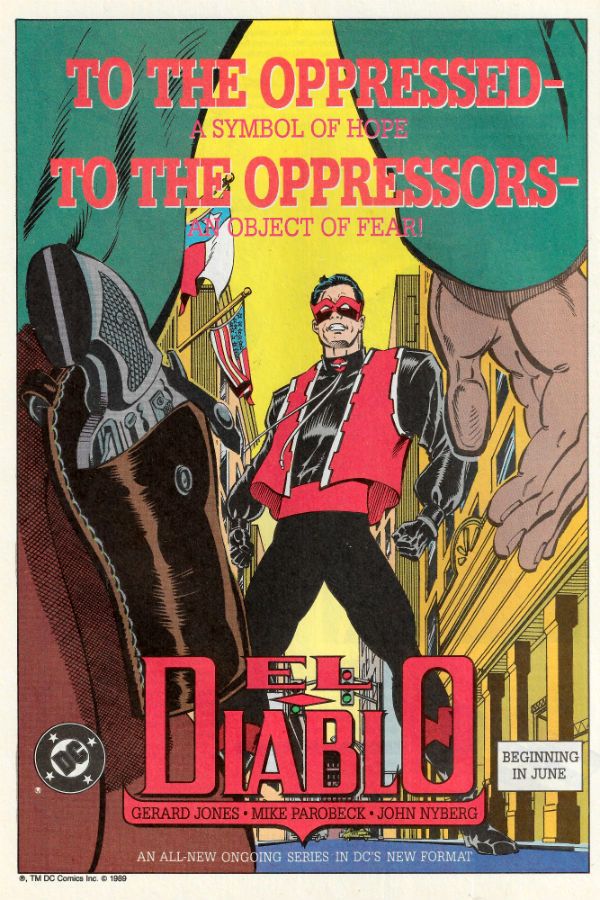
Abhay vs. His To-Read Pile

I haven't bought comics in some months (October? November?), but I have an out-of-control to-read pile, filled with impulse buys that I have not made much progress on for a very long time.  I had a whole night last night, and worked pretty hard today, so I'm staying home tonight, doing laundry, making pasta, having a quiet evening, and thought I'd try to make a dent in the pile.  Thought I should take breaks and ramble around.  So, you know, just hanging out, reading some comics that came out a while ago, spelling errors, paragraphs that go nowhere, "reviews" that add up to nothing, hemming, hawing, a lack of wit, tedium... FRIDAY NIGHT!  WOOOO!

563139998a358 You know: people talk a lot about all the girl-friendly comics right now, but I never see people talk much about the one that I like, which is the Dennis Hopeless-Javier Rodriguez Spiderwoman series...?  It feels weird to admit that I like that one or any of them-- but that's the one I like.

I just bought one last year because some of you folks requested that I write about the other bigger, more popular superheroine comics of the moment, back when I was doing those Q&A's (which I want to get back to, but).  I thought I'd do a whole month that was just those books, all analytic-like-- that was one of my Big Ideas, before the shit hit the fan with me, schedule-wise.  Anyways:  this series was the only one that made any kind of positive impression.

It’s just such a lame character-- pretty much the lamest. The smart move is they recognize that the character sucks and turn into the skid. It surrounds her with an even lamer supporting cast -- her sidekick is the Porcupine...?   (The Porcupine is a supervillain who dresses like a porcupine). Ben Urich is in there, too-- that character's always been pretty underrated, considering he had some of the best scenes in Born Again; that scene with the nurse, at least. But Urich hardly qualifies as a fan favorite, either.

I just like how they’ve made that d-list quality the appeal of the book, how that forces them to be warm towards these loser characters instead of trying to convince me some character that's always sucked is actually really great.  I always really loved that move in superhero comics -- not trying to pretend some shitty thing is great (the "oh yeah Aquaman could drown this city awwww shit Aquaman" move that fans tend to prefer), but just acknowledging that some shitty thing is shitty and that it doesn't fucking matter because the creators love it anyways (one of my favorite comics as a kid was the issue of Secret Origins about the Legion of Substitute Heroes).

The stories are just corny mystery shit (there was an issue about a road-trip that was about as good as it ever got). You know, it's all very unambitious-- it’s not a very deep read, at all-- but it’s landing the tone I think they’re aiming to land at, at least.  It's not trying to be Some Other Thing, like the stuff that gets buzz tends to do-- I like that it's just trying to be a Marvel comic.  The adventures feel like the kinds of adventures Kurt Busiek talks about in Astro City, instead of being, like, the thing-trying-to-be-the-other-thing and just reminding you how much you'd rather be reading the other thing...?

Anyways, blah blah blah: most importantly, Javier Rodriguez just fucking draws better than other folks.   I think that guy’s fucking solid, since forever now. That's the big appeal for me, at least.  His layouts are usually really fun without being intrusive or show-off-y. Plus, he colors himself on this one and every so often, he does some stuff with color that's pretty sweet, at least for a monthly book like this. I really like watching him work.

It’s the only Marvel book I fuck with, at all, but I don't really know too much what else is out there.  And I'm months behind because like I said, I haven't been to a store in ages...

I don’t get why she’s pregnant all of the sudden, though-- is it because of Secret Wars? Did the Beyonder make all the superheros stop using condoms during the Secret Wars? “Beyonder says Raw Dog It” was my favorite Frankie Goes to Hollywood song.  Was it a secret war on birth control, like the ones the Republicans are waging against our sisters??  Got deep on you there.  You thought you were reading a sad pasta-fueled middle-age man type into the night about Spiderwoman, and then no, this turned into a Comics Alliance article. GOTCHA!  Welcome to my social justice war!

"Keeping all you motherfuckers on your toes!" -- Betty Friedan.

4816005-warb_4_4-5

Read the James Harvey / Harvey James (?) issue of We are the Robins, uhhh #4.  I've followed James Harvey James's work, since that Mario Brothers comic he did in 2008, so I was checking this out just to see him work.

I'm obviously not the audience for this one.  That said, boy, there was an impressive amount of whiplash to this comic, just in the disparity between how interesting I found some of the choices the art made and how lame and rote the writing was.  That whiplash happens all the time with comics-- ALL THE TIME!-- but this comic really packed a punch in that department...

I'm kinda weird in that I really get antsy when comic artists drop gutters-- I like a nice gutter between my panels.  But besides that, there's a visual-noise to the art (see, e.g., this panel), purposeful imperfections, detail-overload moves, a bunch of  choices that I thought were pretty interesting.  And then the writing could’ve been equally served by stick-figure theater.  It's just by-the-numbers DC junk.  It had nothing to it that the art's choices was actually advancing.  Not even close to being on the same page...

But probably the kids this was aimed at wouldn't mind so much...?  If multicultural Robin gang comic is some kid's jam, this issue probably was just a cool-looking issue of a thing they liked to begin with.  Nothing to get angry about, a pretty normal thing to happen with these kinds of comics, but... Just a pretty glaring example-- they're on such different pages...

The-Fade-Out-005-005

Caught up to issue #5 of the Fade Out.  I'd read the first one or two, and then got behind-- it usually takes a while to muster up any energy to read a Brubaker-Phillips comic-- they're not really high-energy cups of coffee.

I think this series just wrapped up the other day?  So far, it's their usual thing-- well executed, but I'm not sure what any of this is adding up to.

I don't know-- it must suck to be doing any kinda historical thing in the wake of Mad Men because I felt like that show, whatever it got wrong, whatever choices they made that I might not have liked, the thing it nailed was I never felt lost what it was about.  With this, I just don't know what it's about yet.

Plus, that time period, people have really worn a groove into that time period-- I've never been that interested in the Hollywood blacklist, as historical topics go... It's not even really my era movie-wise, or fetishizing-LA-wise or anything, except for loving LA Confidential or those terrific articles that formed the basis for that terrible movie Gangster Squad.  All the stuff that the comic fetishizes doesn't really get me off-- we go to different churches.  I was more the audience for the LA stuff in Fatale.  I'd rather hear the B-side stories of De Palma and Spielberg and Margot Kidder on some beach in Malibu; any random paragraph out of Easy Riders Raging Bulls tops it for me any day...

But they know how to keep a thing interesting without ever doing anything splashy or fun or exciting, that team.  Like, pleasure-wise, their comics are  the anti-Akira-- it's just panel after panel; all in that same monotone; there's never any kind of "hey we're making a comic" glee to it all.  But the consistency of aesthetic and tone and style, comic to comic, book to book-- I can't help but admire what they've carved out for themselves, overall...?  Like, judging any one thing particularly just seems sort of besides the point, misses the fun of the entire enterprise, what I think keeps me coming back, of just watching these guys assemble their life's work one brick at a time.  I kind of like that overall "this will be a whole thing, you know, when they're dead" of it all more than I like the bricks...?

If they ever did try to do anything exciting to look at, Brubaker-Phillips' Nth Man the Ultimate Ninja, it'd be the worst thing to ever happen because ... it just wouldn't fit that chunk of bookshelf they're building.  (I didn't see that magazine-sized issue of Criminal though so no idea what they did there...)

COVER_web

Goddamn, this is so good.  It's Frontier #6, the Emily Carroll issue...?  Frontier, I think, it's like an anthology where cartoonists each take an issue and do their thing for an issue...?  I don't see it in the shop I usually go to, so this came out a while ago, 2014, I think, but I only got it mid-to-late last year sometime.

Anyways, it's a Emily Carroll horror comic-- there aren't many times that's gone wrong for me.  I really like how she tells her story in this one, mixing past-tense "documentary" stretches and present-tense fiction scenes.  She just adjusts her visual style so slightly to cue up new scenes-- I never felt lost.  The last page is a little too Goosebumps, but I like the mythology she built for this one.  It's not her in fairy-tale mode-- it's closer to her doing a found footage thing, really.

Carroll really excels at creating a little room for you in your mind to fill up on your own, at letting the reader fill in the space between panels with the terrible bits.  I wonder why it took me a while to get to this-- I like her work very, very much.

I don't know-- I've been listening to the Comic Books are Burning In Hell crowd's 2015 Wrap-Up on my commute-- I guess one of my goals for this year should probably be to get back into shape re: expanding my horizons.  I got pretty flabby with my reading last year, didn't really seek out interesting work very consistently beyond whatever passed through my store, the c-grade stuff.  I didn't have to listen very long to notice that I needed to up my reading game, to the extent I want to actually do that, which I don't know, I could just watch movies instead... Have you ever seen movies?  "Movies are pretty great, though" -- my review of comic books. 20150716_183858

Finally sat down with Island #1.  I have a handful of these Island's lying around, figuring it'd be a kind of thing I would be into.  But never sat and pulled the trigger on one since they're all pretty thick and my attention span's only just starting to come back to me, after the year I had last year...

I got that weird thing where I get a little outside my head when I'm looking a thing like this. Just apart from the immediate experience of it, I go to a "well what about the business part of comics" place that isn't really cool to admit to.  Especially on  a thing like this, where it's so strikingly different in goals and tool-sets from whatever else is out on an ordinary comic shop shelf there that ... my mind goes straight to wondering if there's enough here for Joe Q. Ordinary Regular Comics Reader to latch onto to orient themselves.  Or Anthologies have always been a tough road for comics-- or-- or....

But like, I think I shouldn't care about any of that stuff, or that it's uncool to care about that stuff at least, and I should just talk instead about how ...

I guess the interesting thing with this is just how all the comics are constantly present-tense experiences, more interested in visceral reactions to a panel or a page, moreso than to a sequence or building a story or inhabiting a character.  Which isn't uninteresting-- it's interesting they all went in that direction, how that was a common appeal for artists whose surface qualities are so different.

Like, one part that I really liked was there's a story (by Ludroe?) where a skateboarder does some trick.  A character watching the trick in a big empty panel yells "fucking righteous" (Ludroe separates the character from the word balloon, puts space between the two so it's like those words have risen up into the air).  And then there's just this nice moment where the comic follows that up by having the bottom third of the page just be "FUCKING RIGHTEOUS" written in block letters on an all-black background.  That felt like more of a mission statement of Island #1's aesthetic than anything else-- a sort of dedication to in-the-moment enthusiasm, trumping any other virtue.

It felt like the anthology was trying to speak to one particular experience of what the fun of comics might be... uhm, the kind of experience that's the hardest to articulate where ... where it's just the juxtapositions, the timing of images, transitions between panels. Like, the Emma Rios story and Brandon Graham story are both a lot of fun, but from a "looking at page layouts" perspective, or choices of what to put in panels perspective (though that shade of red Rios chooses is a pretty aggressive choice!).

But if the juice for you for comics are stories and writing, scenes and character arcs and themes... well, I don't know what you'd make of this guy.  I barely understood what happened for most of these stories-- not that I particularly cared because ... there's more reliable things to read for stories than comic anthologies, you know...?  But that's where my "worrying about the business of comics" hat goes right back on and...

(Though I might be exaggerating how confusing the stories were, just in that the last big comics-reading experience I had was reading Ranma 1/2 where it's ... the pleasure of that comic for me was how completely direct and immediate and LOUD the storytelling in that comic is-- that way you can grab a page out of context and show it to someone, and ... And the emotions of it are just immediately clear.  It's just all cymbal crashes, the pages of that thing, so maybe the difference between that and the Island comics is just more jarring for me, as a result.  The transition to Graham, say, is pretty pronounced because his strategies are so very much the opposite-- he tends to like to have the emotional content of his stories accrete very slowly and over much longer spans of time, so the reader doesn't really notice until by the end of a comic, an emotional weight has built up around a thing.  Similarly, I suspect Rios works better in quantity because her work is about shifting readers into a different flow-- bringing readers into her aesthetic universe... Which is completely the opposite of what's going on in Ranma 1/2, which is just a completely and totally unsubtle comedy where you don't have to do any work... So... long paragraph; short version-- "maybe I suck at reading comics").

I kinda want to go back and find how other people received this issue.  I can't help but imagine some folks might've gotten thrown.  But maybe not-- maybe people are open to having this kinda experience... That'd be nice, too...   I did like the ... what do you want to call it, aesthetic coherence.  I like that editorially it seems to evidence an overall aesthetic argument being made, instead of trying to be some kinda free-floating something-for-everybody thing.

Anyways, I've rambled around enough and probably need to give that Emily Carroll comic some space-- nothing's topping that tonight, probably... Plus, my burps have gotten weird.  FYI.  I need to go figure out what's going on there.  The last couple were pretty alarming.

“I've Had Mair Exciting Enemas.” COMICS! Sometimes It's The Comics of Tomorrow – TODAY!

Hey, I finally realised after eight years of looking at Brian (The Guv'nor) Hibbs' Shipping Lists that due to a temporal anomaly which baffles the greatest scientific minds of our times, I am able to tell the The Americas about certain comics well in advance of when they are able to read them! Or it might be because they are British comics and it takes a bit of time for them to get distributed. That's a bit mundane though isn't it? Temporal anomaly it is! So, below the line I give you The Future - NOW!  photo DreddTopB_zps6gmo1mps.jpg JUDGE DREDD by Marshall, Carroll, Caldwell & Parkhouse

Anyway, this... For those joining us late:

2000AD is a UK anthology comic published weekly which contains usually 5 strips, each of which is given between 5 and 7 pages to strut its sci-fi themed stuff. When 2000AD (or “Tooth” as no one calls it) was first published in 1977 (Year of The Jubilee, Year of Elvis' Death, Year Zero for Punk: quite the year) this sci-fi aspect was its basic remit, but as the years have passed it has cheerfully incorporated any and all genres. Mostly though it's okay to refer to it as a weekly sci-fi anthology comic published in the UK. I was there in 1977 when it launched but I stopped reading it about 8 years ago.

Now, this wasn't because it was rubbish (I'd have stopped in the '90s if that was a problem) but because I and mine moved across the UK. Due to the speed this had to occur it was reminiscent of a movie where an ailing plane has to gain altitude to clear a mountain range and everyone throws everything out including the seats. That is to say, I had to let a large portion of my comic collection go to charity. Don't..I'll be okay...in a ...minute. Sniff! Since this included my entire run of 2000AD it seemed a good place to stop.

But then I was in the newsagent the other week and I thought why am I in the newsagent I should be in work o God have I been drinking again, no, I thought, hey it's a New Year and I can start it off by telling all those funny foreign folk about a British institution. Fair warning though, I have missed nearly a decade of issues so I might be bit rusty. Still, God loves a trier (and the odd burnt sheep) so, hey ho, let's go!

2000AD Progs #1962 & #1963 Art by Paul Marshall, Mark Sexton, Richard Elson, Clint Langley, John Burns and Carlos Ezquerra Written by Michael Carroll, Dan Abnett, Pat Mills, Kek-W and John Wagner Coloured by Gary Caldwell, Len O'Grady or the artists. Lettered by Annie Parkhouse, Ellie DeVille and Simon Bowland Rebellion, £2.25 each, every Wednesday, (2016)  photo coversB_zpslrkw16k1.jpg

JUDGE DREDD # 1962 - Street Cred Art by Paul Marshall Script by Michael Carroll Colours by Gary Caldwell Letters by Annie Parkhouse #1963 – Ghosts: 1 Art by Mark Sexton Script by Michael Carroll Colours by Len O'Grady Letters by Annie Parkhouse Judge Dredd created by John Wagner & Carlos Ezquerra

 photo DREDDcitB_zpspwn2ddjp.jpg JUDGE DREDD by Sexton, Carroll, O'Grady & Parkhouse

Judge Dredd remains The Daddy of the comic, I see. The Dan Dare to 2000Ad's Eagle if you will. I was slightly discombobulated by the name Michael Carroll as I have never heard of him. Yet here he is helming the flagship character. Every now and again whoever owns 2000AD realises John Wagner is in fact just mortal and won't be around forever, so they try and groom (not in that sense) a replacement. Dredd's a tough gig and even big names can fail; those of us who suffered through it still bear the mental scars of Grant Morrison and Mark Millar's petulant turd of a run. Anyway, it looks like yer man Carroll's up for anointment this time round so let's see how that goes.

First up, he's got a done-in-one called Street Cred in which a man walks into a bar and tells everyone he's shot Judge Dredd. I'm sure I've read this same story somewhere else, about another hard-ass character who provokes fear in his enemies. Batman or Jericho, whatever. It doesn't matter as there are after all only seven stories, as anyone who has read a Book on Writing by someone no one has ever heard of can tell you. (These being: a man buys a motorbike and has to sell it because he's too old for all that leather and looks a fool, a woman buys Orla Kiely wallpaper and her child spoils it with crayons, Batman kills the Joker, a small animal finds shelter in the snow, a ultra capable female assassin is sad inside because ladies have feelings, and a man walks into a bar and tells the clientele he has shot their hated enemy.) What matters is how well Carroll tells it and he tells it well. Short and to the point, with even a touch of that distinctive dated Dredd punnery (“Roseanne's Bar” indeed.). Next up Carroll goes a bit more long-play with Ghosts which in six pages contains characterisation, pathos and action while also managing to lay out the long term plot with an efficiency that never once sacrifices atmosphere. I was impressed. In both cases Carroll is aided by artists who are talented enough to combine clarity with a distinctive style, with Marshall edging towards the Gibbons end of the spectrum and Sexton clearly dipping a toe into the pool of Darrow. VERY GOOD!

KINGDOM Beast of Eden: Two, & Three Art by Richard Elson Script by Dan Abnett Letters by Ellie De Ville

Kingdom created by Dan Abnett & Richard Elson

 photo KINGdomB_zpsj8oooqax.jpg KINGDOM by Elson, Abnett & De Ville

KINGDOM had been around a while when I threw in the towel, but the fact is I can barely remember anything about it. I'm having trouble remembering the two parts I just read, so it's consistent if nothing else. Back in the day 2000AD used to, uh, appropriate freely from the pop culture of the time and KINGDOM continues that grand tradition by being, seemingly, Mad Max versus the aliens from Starship Troopers. What helps it stand out is the fact that the characters are all humanoid dogs who communicate using a gruffly truncated vernacular. It's very much an action strip and it does that well enough. Elson gets some energy into all the jalopy jolting, and the scale of the swarm doesn't defeat his gifts. It's not bad, just a little slight as action strips are wont to be. And for something that rips off Mad Max there's nothing as memorable as “Why, he's just a raggedy man!”, and if you're entering the Thunderdome with Mad Max you need to be able to supercede the memory of Tina Turner dressed in ring pulls and cake tins. At the very least. But, in its favour at no point is the strip quite so bland and forgettable as Tom Hardy. He likes dogs though, that Tom Hardy, maybe he'd like KINGDOM more than me. OKAY!

A.B.C. WARRIORS Return To Ro-Busters Parts Two & Three Art by Clint Langley Script by Pat Mills Letters by Annie Parkhouse ABC Warriors created by Pat Mills, Kevin O'Neill, Brendan McCarthy & Mick McMahon

 photo ABCbogB_zps3fvwhoxo.jpg ABC WARRIORS by Langley, Mills & Parkhouse

In Ridley Scott's beautiful mess Blade Runner it was posited that eventually robots would become more “human than human”. This led to spiritually troubled creatures with severe issues with their creator. Pat Mills eschews this comforting high mindedness and gives us a more realistic version of “more human than human” i.e. just as dumb, evil, weak, credulous, gifted and unexpectedly magnificent as we are. But able to eat sewage or have a big hammer for a hand. Ro-Busters are a robot rescue squad. That's it. Magnificently simple premise, and one which was elevated primarily by the pungent characterisation of the droids. Ultimately though Ro-Jaws and Hammerstein were the linchpins of the series, with Ro-Jaws being a waist-high chippy oik and Hammerstein his long suffering clenched sphincter good-soldier type pal. (Oh, Ro-Jaws and Hammerstein. You got that, right? Eat Pat Mills' dust, Brian Azzarello.) ABC WARRIORS and RO-BUSTERS remain essentially the same as they ever were because Pat Mills remains essentially the same as he ever was. Herein is the usual ebullient mooning in the face of authority, the effervescently stolid exposition, the giggling wordplay, the blunt appropriation of current affairs and the ever present, ever hopeful, entreaty for the reader to “Begin Thinking. Stop Believing.” And Clint Langley? He honourably upholds the fine tradition of artists who have been called upon to depict the mechanised milieu of ABC WARRIORS in a suitably shabby and rust scored style. ABC WARRIORS same as it ever was, so ABC WARRIORS is VERY GOOD!

THE ORDER In The Court of The Wyrmqueen Parts Two and Three Art by John Burns Script by Kek-W Letters by Ellie De Ville The Order created by Kek-W & John Burns

 photo OrderBurnsB_zpss4nbdu3n.jpg THE ORDER by Burns, Kek-W & De Ville

Going back to knicking from Pop culture we have The Order which reads like it was written by someone whose son plays a lot of Assassin's Creed. The unconvincingly monikered Kek-W gets points for period expletives (“swiving”; always a good one) and his romp pumps merrily along in fine fashion with the gross period detail contrasting nicely with the (purposefully) anachronistic slips. Unfortunately at the sight of a steam punk motorbike my eyes rolled so hard they rattled, so I might not be the audience for this one. Still, I'll keep reading it because the magnificent John Burns is on art duties. Burns is a genius level talent of the Old School, whose flowing linework is abetted by his painterly use of colour. Throughout this strip the main character's hair is depicted as a red blob; a move elegant in its simplicity, as it pinpoints him visually no matter how deep the murk he inhabits. A lot of the strip has a distinctly cloacal hue so old red top sticks out is what I'm saying. GOOD!

STRONTIUM DOG Repo Men Parts Two and Three Art by Carlos Ezquerra Script by John Wagner Letters by Simon Bowland Strontium Dog created by John Wagner & Carlos Ezquerra

 photo SdogCarlosB_zpstxwj1cuz.jpg STRONTIUM DOG by Ezquerra, Wagner & Bowland

STRONTIUM DOG is the last survivor of 2000AD's short lived companion STARLORD. Second only to Dredd in popularity it's Johnny Alpha who sees us out. Alpha died but came back. I can't recall the details but Garth Ennis/Alan Grant killed him off and John Wagner brought him back. Because everyone missed him, so why not. That's popular. Currently Johnny and his mutated muchachos are engaged in an ambitious, and somewhat convoluted, heist involving a race of beings who have become machines while inner ructions threaten to tear his gang apart. The fun of Strontium Dog is in the characters and their interaction within Wagner's lighthearted but still menacing universe. These days I see Wagner drops in exposition in a form reminiscent of the Hitchiker's Guide, but the affable action still unfolds with all the genially satisfying skill of a Dick Clement and Ian LaFrenais sitcom. But, you know, in space. And one guy's head is in his knee. Whether Wagner is Clement or LaFrenais then that makes Ezquerra the other one, because Johnny Alpha wouldn't be the same without Carlos Ezquerra's lumpy magic. VERY GOOD!

A couple of comics that are well worth reading then. Not a bad way to start off 2016. Because after all 2016 (like every year) is the year of – COMICS!!!
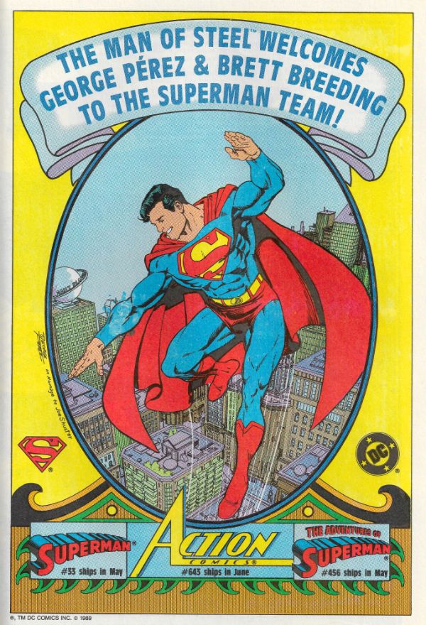
“Today Is The First Day Of A Life Of Sacrifice.” MOVIES! Sometimes It Takes Me a Bit To Warm Up.

It’s 2016! I don’t know about you but I know that the one thing I really need right now is another year to get through! Nothing quite gets me smilin’ like the feeling I’m starting from scratch all over again. Sisyphus ain’t no mythyphus, Camus! Ugh. What is it with time? It just never stops. Ugh. Time. Double ugh. So, before I pull the covers back over my head, here’s some stuff on movies which you’ve all already seen and made your minds up about. I tried to make it even more useless than that even, but it just wasn’t possible. HAPPY NEW YEAR!  photo WHIP_B_zpsszbypdsq.png The movie WHIPLASH (2014) in one panel.

Anyway, this…

Last year I didn’t go to the movies, they came to me! Which sounds super glamorous and exciting, as though Joss Whedon and JJ Abrams popped round in an ironic flurry to personally preview for me the latest derivative piece of billion dollar budgeted, pulseless shit brimming with lens flare and fan pandering. Alas, the reality is that due to bone idleness and a refusal to accept the fact that the outside world exists I don’t get out to the picture house, and so I relied this year largely on blu-rays and streaming services. Yeah, we know, John, and we know you mostly watch unpleasant foreign films, largely involving women being stabbed in the face, because you are a weird old misogynist forever locked into old horror movies as a coping mechanism for your utter failure to take control of your life, and, also, John, in a vain attempt to stem slightly the bitterly venomous resentment this inculcates in you for people better than you, and we do so hope your mother is proud, John! Ah, uh, well, okay, can’t deny you might have a slight point there, but in my defence I am vast and sometimes I watch other stuff. This year, okay, sure, I was on a bit of a horror kick, but despite my best efforts some proper muck snuck in too. I won’t go into everything I watched (please stem your disappointment) but here are the highlights of John’s Movie Year (2015):


All pictures ripped from the bleeding heart of Wikipedia because I am in a rush. As ever, all “And she said”s are supplied by La Belle Dame sans Merci and used without permission.


THE BABADOOK (2014) Directed by Jennifer Kent Written by Jennifer kent Starring Essie Davis, Noah Wiseman, Hayley McElhinney, Daniel Henshall, Barbara West, Ben Winspear Music by Jed Jurzel  photo BADA_B_zpslm87q7kw.jpg And she said, “I had my eyes covered! What happened!”

I liked this low key, small scale, Oz set nerve jangler quite a bit. I was particularly partial since it was obviously about something, which is always nice. What it’s about is the horror of being a parent, specifically the horror of being a single parent. Being a single parent is, undoubtedly, more horrible than being one of a pair of parents, but I’d wager they have much horror in common and it’s the intensity that differs. In the interests of balance I should say that being a parent has its upside, but this is a horror movie so that’s not the side it sets its sights on. I mean, yes, THE BABADOOK is about a nasty kind of Struwwelpetery thing which gets out of a kid’s book, and menaces a mom and son duo in a horrific and violent manner, one which escalates towards a seemingly inevitable and tragic ending. But it’s also about the fear of being unable to protect your kid, and even moreso the definitive parental terror that sometimes the person you need to protect your kid from most is yourself. Think of REPULSION (1965) but centred around a stressed and sleep deprived single mother rather than a woman too sexy for sanity. Folk without kids will have a fun and spooky time with plenty of jump scares mixed in with a real sense of threat, but parents get most fun for their pennies as they’ll feel like they’ve been kicked around the room a bit. Noah Wiseman makes for a realistic kid; one at times irritating, at times infuriating, but still a kid for all that. While Essie Davis seizes the screen with her authentic portrayal of a mother clearly aware of the impossibility of what is happening and eaten away by her failure to affect the final shape it seems fated to take. But they are just stand out performances, and by rights everyone involved should be proud they made a movie about a  thing in a top hat which jumps out of a kid’s book which not only shit me right up but was GOOD!


GATE OF HELL (地獄門, Jigokumon) (1953) Directed by Teinosuke Kinugasa Written by Teinosuke Kinusaga Starring Kazuo Hasegawa, Machiko Kyō, Isao Yamagata, Yatarō Kurokawa, Kōtarō Bandō, Jun Tazaki, Koreya Senda, Masao Shimizu Music by Yasushi Akutagawa  photo GOH_B_zpszufkuct2.jpg

And she said, “It’s like Powell and Pressburger made a samurai film!”

Oooh, hark at her with her high-toned comparisons! She wasn’t wrong mind. And that’s the highest praise there is Chez Kane – P&P being shorthand for Peak Cinema hereabouts. This was an elegant, stately paced and sumptuously costumed period samurai tragedy. Cinematically this was just operating on another level really; as good as everything else here was, this was better. Sometimes that’s just how it is, no offence to all the other movies here. No one’s ever going to confuse it with 13 ASSASSINS because it’s not that kind of movie, but if it’s the kind of movie that could be confused with Powell & Pressburger then it’s my kind of movie. Like IN THE MOOD FOR LOVE this one was pure cinema. Just lovely, lovely stuff; a movie as colourful and sedate  on the surface as it was as dark and turbulent  in its heart; all the codes and protocols, all the honour and values of the samurai could not build a society robust enough to resist the evil born of human weakness. Oh, being flash I watched this on blu-ray via the Masters of Cinema series and you should know that the big thing about blu-rays is how variable the image quality can be. I guess people are still getting the hang of the tech or something, but I’ve seen some real stinkers. I’m not going to get sucked into technical specs, but I can assure you the picture quality on this one is magnificent; everything has a slightly faded opulence as befits the subject and the only degradation here is in the souls of the characters.  Sure, GATE OF HELL is old, and it wasn’t exactly a barrel of laughs and it certainly wasn’t a high–octane thrill ride but it was vivid, captivating, painfully poignant and basically EXCELLENT!


A GIRL WALKS HOME ALONE AT NIGHT (2014) Directed by Ana Lily Amirpour Written by Ana Lily Amirpour Starring Seila Vand, Arash Marandi, Marshall Manesh, Dominic Rains  photo AGWHAN_B_zpszjaz2iup.jpg

And she said, “I like that top she’s got on.”

This is a B&W romantic/coming of age/vampire movie set in (a hopefully imaginary version of) Iran, I think. I’m letting you know upfront it’s B&W because some people are funny about that. Like they are about subtitles. Oh, yeah, it also has subtitles. So, to recap -  it’s B&W and it’s also got subtitles, so it’s maybe not your thing. That’s okay, I’m not judging. Michael Bay’s still working, so you’ll be okay. HA! I was judging you all along! Stealth judging! Christ, lighten up; watch what you want. I do, so I watched this and I just really grooved on this one as an experience. It was just my cup of cinematic tea, seeing as how it was very much like a young David Lynch adapting an unwritten Barry Gifford novel. Yes, it was like that, but that’s not all it was. Lynch and Gifford are some weighty blankets of influence to chuck over a nascent film maker, but Amirpour’s up to it and wrestles free to produce something unique. I’ve not seen a movie so in love with silence for a long time. No, smartlips, silent movies don’t count. It’s not like G W Pabst had a choice is it?   Now, I’m not saying it was quiet but I’ve heard more dialogue between Yorkshiremen fishing.  So, okay, I am saying it is quiet and the whole embracing silence for large parts of the movie thing worked spectacularly well. It takes some special cinematic magic to make a boy oh-so-slowly crossing a room to a girl feel more thrilling than a Bond pre-credits sequence. My cuticles were screaming for mercy. Just great, great stuff; stepping back and letting scenes take as long as they took really helped with the immersion. If I was still in my twenties I’d be a living miracle, but I’d also have this poster up next to WILD AT HEART (1990) because it’s very much a movie about being Young. Or the particularly romantic view of being Young the Young have. In short the movie was as bleakly romantic and thrillingly unhurried as, er, a girl walking home alone at night. (Also, the bit with the skateboard. Yes!) VERY GOOD!

  YOU’RE NEXT (2011) Directed by Adam Wingard Written by Simon Barrett Starring Sharni Vinson, Nicholas Tucci, Wendy Glenn, A. J. Bowen, Joe Swanberg, Margaret Laney/Sarah Myers, Aimee Seimetz, Ti West, Rob Moran, Barbara Crampton Music by Jasper Justice Lee, Kyle McKinnon, Mads Heldtberg, Adam Wingard

 photo YOUR_B_zps9v0bqyxf.jpg

And she said, “Well, it was better than I thought it was going to be when it started.”

This was a fun one. It’s one of those home invasion movies which by their very nature have to involve an upscale middle class family, since, and I’m sure I’m not alone in this, you can get from the front of my house to the back in three steps; any high stakes games of cat and mouse would be severely truncated and somewhat sparse on the suspense fronta s a result. Rich family – big house, makes sense set up wise. Unlike FUNNY GAMES (1997) which wants you to know the director is cleverer than you and wants you to hate yourself for watching people die, YOU’RE NEXT understands that watching people die is just part of modern day relaxing, like candles in the bathroom and Candy Crush. YOU’RE NEXT is supposed to be a pulpy bit of fun and it succeeds in that, but it was also a bit better than that might lead you to expect. It doesn’t mess about and gets stuck in pretty quick, rarely letting up from then on in, but it still draws the characters vividly and as obnoxiously as you might expect of a wealthy family gathering in a horror movie, but when the bad stuff kicks in somehow you start feeling a bit bad for them. I mean, the brother at the start is set up as a major douche and no mistake, but he rallies and you feel a bit sad for him as his evening gets progressively worse. Look, my surprise at the fact a horror movie actually evoked empathy for its victims speaks, I feel, more about the poor quality of modern horror movie making than any lack of humanity on my part. Well, that’s my story and I’m sticking to it. Fast, funny and pulpy YOU’RE NEXT was like an updated John Carpenter siege movie starring a Joe R Lansdale heroine. Even without the perfectly healthy nostalgic pleasure conjured by the comfortingly reassuring sight of Barbara (RE-ANIMATOR, FROM BEYOND, BODY DOUBLE, CASTLE FREAK) Crampton shrieking under extreme duress it would still have been GOOD!


IT FOLLOWS (2014) Directed by David Robert Mitchell Written by David Robert Mitchell Starring Maika Monroe, Keir Gilchrist, Daniel Zovatto, Jake Weary, Olivia Luccardi, Lili Sepe Music by Disasterpeace  photo IF_B_zps5h5itecp.jpg

And she said, “That’s that guy from FRED: THE SHOW!”

Like the thin musk from a faded car deodorizer in a suspiciously shiny ‘58 Plymouth Fury John Carpenter was (again) a phantom but persistent presence during IT FOLLOWS (2014), through the widescreen framing of shots, implacable pacing and the cunning use of music in particular. But no one likes that kind of untrimmed nosehair talk so let’s stick to the fact that IT FOLLOWS was basically a movie about teens who had to fuck to live. Oh, that got your attention didn’t it now, trampyhands. Well, leave the moisturising creme in the bathroom, because this movie is about as sexy as spilt Lilt on a Pound Shop floor. Purposefully so; it’s a horror movie not a skin flick. Unlike the (decent) slasher flick CHERRY FALLS (1999) doin’ it here wasn’t a guarantee of safety but just a stay of execution. Whatever the IT was attracted to was passed via, uh, intimate contact, to the partner who then had to, uh, romance someone else with their groin before IT got them. If IT caught up and got the last person to, er, shingle someone’s roof then it would work its way back down the daisy chain. In a killin’ way. Also, when IT appeared IT would resemble someone you knew such as your Granddad or Mom which made IT’s appearances super creepy. Particularly if IT was grinding IT’s groin against yours as it throttled you like you’d just spent the rent. EeeeW!  IT FOLLOWS was stylish stuff which successfully mutated the mundanity of its working class USA setting into an almost surreal theatre of horror, and while the metaphor at first seemed clear (promiscuity!) it was certainly a tad more complex than that (Her Dad? You get that?). Oh my, metaphors yet! Ugh, trim those nose hairs, John! Ignore all that dusty chunter because IT FOLLOWS was an intelligently creepy time, cleverly directed, well-acted by all involved and it set off some real ripples of unease behind my eyes where rumour has it my mind hides. IT FOLLOWS was GOOD!

  WHIPLASH (2014) Directed by Damien Chazelle Written by Damien Chazelle Starring Miles Teller, J. K. Simmons, Paul Reiser, Jim Neiman, Melissa Benoist, Austin Stowell, Nate Lang, Chris Mulkey, Damon Gupton, Suanne Spoke Music by Justin Hurwitz  photo WHIP_B_zpsbg5vou7t.jpg

And she said, “D’ya wanna feel the Spirit of Jazz up inside ya!”

This is that movie everyone, even your parents, liked in which J Jonah Jameson shouts at a kid so he will play the jazz drums better. Full disclosure - I’m hardly the most musical of men (check out my record CD collection for proof. Haw haw haw!), and cinematically the last jazz outing I saw was that episode in DR. TERROR’S HOUSE OF HORRORS (1965) where Roy Castle and Kenny Lynch upset The Spirit of Jazz by nicking his rhythms. (Bad Voodoo ensues.) In essence, then, I’m not exactly Dr. Jazz, you know. But I got the gist of this; about pushing yourself and drive and gifts and talent and, and, and, basically, and all that stuff I’ve never really felt the need for. I’m largely inert ambition wise; I just hope to get through life without killing anyone or starting a war, and maybe having raised a decent kid. It doesn’t sound like much but it sure fills the hours. The world will have to look elsewhere for excellence in jazz drumming, I fear. So, I’m probably not the ideal audience for something like WHIPLASH with its driven jazz drummer and question(s) about how much is jazz drumming worth giving up? Sure, it was extraordinarily well executed visually; at no point was I as bored as I am when people are actually jazz drumming in my vicinity in reality. And it felt like the thing had the structure of a thriller (I didn’t check though; maybe it didn’t, but it felt like it did, and that’s more important) which helped with the whole keeping-the-musically-illiterate-ambition-averse-viewer (i.e. me) interested thing. And the performances were great all the way through. Even the little parts were well done (Paul Reiser!) and the big parts were screen excellence par excellence. I hear old JJJ shouted at the kid so well that he got an Oscar(?), but, you know, Miles Teller as the kid was good too; he had the harder part I felt since he was a dick, but sometimes with great jazz drumming must come great dickishness. I think the idea was to suggest some of that “Oooh, it’s a bit of a Grey Area!” people are so fond of these days. I wasn't convinced by the ending either, but what can you say, a well made movie is a well made movie. Alas, I’m unfashionably hard line on this one; playing the jazz drums well is super special and all that, but I don’t think jazz drumming at any level is worth some kid stringing themselves up from light fittings (Don’t worry, that’s not what happens to him. I don’t do spoiling. Hopefully.) Call me old fashioned but don’t call me trad, Dad. Unhip I may be but I’m no churl, so WHIPLASH was Jazzzzzzzzzzzzzzzzz! (Oh, okay, it was GOOD!)

Next Time: COMICS!!!

(maybe.)

“Wonderfully PEDESTRIAN.” COMICS! Sometimes I’m Less Than Impressed.

There was a new Batman comic out. It was an Event because Frank Miller was reportedly involved. I bought it. Frank Miller may well have been involved in actuality but, honestly, I could only detect homeopathic quantities of Frank Miller. Overall, I thought it was a pretty poor Event and only a mediocre Btaman comic. Yeah, that’s it; I thought I’d spare you having to read what follows. You can if you like, but it goes on a bit. Ooh, what a palaver!  photo DKIIIkB_zpsl0ghmsh4.jpg DKIII by Miller, Janson, Azzarello, Anderson & Robins

Anyway this… DK III: THE MASTER RACE BOOK ONE Based on The Dark Knight Returns by Frank Miller, Klaus Janson & Lynn Varley (Although in the comic DKR’s just credited to Frank Miller alone, which is a bit rich, and not something I want to encourage. Cut that shit out, DC Comics.) Pencils by Andy Kubert Inks by Klaus Janson Story by Frank Miller& Brian Azzarello Colours by Brad Anderson Letters by Clem Robins Cover by Andy Kubert & Klaus Janson Variant covers by Jim Lee, Scott Williams & Alex Sinclair, Frank Miller & Alex Sinclair, Dave Gibbons & Brad Anderson, Jill Thompson Retailer Variant Covers by Dave Johnson, Sean Gordon Murphy, Lee Bermejo, Klaus Janson, Rafael Albuquerque, Jae Lee & June Chung, Eduardo Risso, Jock, Walter Simonson & Laura Martin, Ivan Reis & Marcelo Maiolo, Aaron Lopresti, Tyler Kirkham & Tomeu Morey, Brian Bolland, Paul Pope & Jose Villarubia, Gabriele Dell’Otto, John Cassady & Laura Martin, Tony Daniel & Tomeu Morey, Matt Wagner & Brennan Wagner, Michael Allred & Laura Allred, Brian Stelfreeze, Amanda Connor & Paul Mounts, Terry Dodson & Rachel Dodson, Jason Fabok & Brad Anderson, Darwyn Cooke, Josh Middleton, Gary Frank & Brad Anderson, Howard Porter & Hi-Fi, Kevin Eastman & Varga Tamas, Bill Sienkiewicz, Dave Dorman, Greg Capullo & FCO Plascenia, Stanley “Artgerm” Lau, Marc Silvestri & Alex Sinclair, Kelley Jones, Dale Keown & Jason Keith, Neal Adams & Alex Sinclair, Simon Bisley, Tony Harris, David Finch, Scott Hanna & Brad Anderson, Scott Williams & Alex Sinclair, John Romita Jnr, Danny Miki & Dean White, Adam Hughes, Francis Manapul, J. Scott Campbell & Nei Ruffino, Tim Sale, Bruce Timm and Babs Tarr with John Vernon as “The Mayor” Batman created by Bill Finger and Bob Kane DC COMICS, $5.99/£4.99 (Standard Ed.), $12.99/£9.99 (Deluxe Ed.) (2015)

 photo DKIIIcB_zpsu3yiacqo.jpg

PART THE FIRST: Oblique? C’est Chic!

 photo DKIIIpB_zpstyynd74y.jpg DKIII by Kubert, Janson, Azzarello, Anderson, Robins & Miller

On November 11th, 2015 it was reported in a number of British papers that David Cameron, the Prime Minister, had written to Oxfordshire council leader Ian Hudspeth criticising the council’s proposed cuts resulting from the austerity policies imposed by the very same Government of which David Cameron is Prime Minister. Dave was, we are told, “disappointed”. Dave’s disappointment was mostly because he is also the MP for Witney which is covered by the council. Austerity and cutbacks are okay as long as they don’t affect Dave’s constituency. So far, so Tory. Thankfully though like the great Statesman he is Dave pushed past his disappointment to offer Ian Hudspeth unsolicited assurances and advice on how to best allocate his reduced resources. Showing he is not without humour Dave tried out the old one about how in fact the Council had more money not less. Probably in “real terms” which is always a sign someone is having a laugh. Regrettably and no doubt to his eternal chagrin Ian Hudspeth had to point out the unfeasibility of Dave’s helpful suggestions and indeed also corrected a couple of erroneous underlying assumptions particularly the one about Dave’s government having given him more money; they hadn’t, they had taken some away. But my favourite of these hesitant corrections, and one which will prove pertinent to the Batman comic under discussion today, was Dave's wizard idea that council property be sold off as a solution to the funding deficit. Alas, Mr. Hudspeth had no alternative to remind Dave this wouldn’t work as they are one-off receipts, so you can’t keep selling the same buildings every year. And the moral of this story is as applicable to Prime ministers as it is to Entertainment Corporations: You can only sell the family silverware once.

PART THE SECOND: Imitation Is The Sincerest Form of Pandering!

 photo DKIIIlB_zpsdmcd9zpy.jpg DKIII by Kubert, Janson, Azzarello, Anderson, Robins & Miller

Do you remember those splash pages with a one panel inset Frank Miller did in DKSA? Andy Kubert does. Herein Wonder Woman fights a minotaur for no clear reason except this is how Frank Miller introduced his characters in DKSA – with a big splashy action set piece which had little to do with anything which followed. A lot of the book is like this – Frank Miller did something in DKR or DKSA so DKIII:TMR does it too but takes up more space, has less spark, and has no idea why it’s doing it other than Frank did it first. There’s the Gotham skyline which was used by Miller to give the city a sense of being a huge gaudy (Gaudi? Oh, I can do wordplay too!) cathedral of heat hazed sin. Here the Gotham skyline is used to show us, uh, it’s Gotham. In DKR and DKSA Miller used insets of TV screens to comment on the culture of the time, the events portrayed and also the comic itself, while also employing them to propel the narrative forward and fill in exposition in a graceful and entertaining fashion. Here the same inset TV panels are used because Frank Miller used them, and here bear as much relation to satire as does a knock-knock joke. Like most of the visual language of the book it’s been purloined from the source with no thought as to its original purpose or intent. You could imagine Brian Azzarello and Andy Kubert noticing Frank Miller looks natty in a hat and buying themselves a couple only to go out wearing them on their arses. (The only people laughing would, of course, be Haters who had prejudged those hats, or fools who didn’t understand what Kubert and Azzarello were doing. Clearly.)

 photo DKIIIgB_zps4dki76vw.jpg DKIII by Kubert, Janson, Azzarello, Anderson, Robins & Miller

Then there’s the youth-speak, which in DKR was apparently contributed by Lynn Varley (and her rightly legendary colouring on DKR and DKSA is in no danger of being de-throned by the trendy lens-flare and banal gloss job of Brad Anderson) but here is by Brian Azzarello and…look, I’m inclined to leniency on this one, he has a pop. It’s not as good; it’s clumsy, ineffective and calls attention to itself more than it serves any real purpose. But, still, he has a pop. That scene also show a young POC being menaced by the cops which is so timely and relevant it’s a shame to point out the scene doesn’t go anywhere and is thus shameless attention seeking rather than any useful contribution to the debate about state sanctioned violence and institutionalised racism. I do have a sneaking suspicion that our harassed POC might turn out to be the new Robin (it won’t make the book any better but it might get some coverage; that’s what matters right? “White Man Writes Black Character in Comic Book! All Racist Violence Ends!”) Mind you, it’s reassuring to know that “The Man” is still the problem. If only we could find “The Man” and beard him in his lair! All our problems would be solved! Then we could all go down the “Disco” in our stack heels and “chat someone up”!

 photo DKIIIdB_zpsbzs1wqdt.jpg DKIII by Kubert, Janson, Azzarello, Anderson, Robins & Miller

A similar sense of worldly awareness is indicated in the bit where Wonder Woman breast feeds her baby. In keeping with the rest of the book this takes a lot more panels than a normal human being might expect, or a writer with any self-respect would risk. Largely, I think here it takes so long to get the kid on the tit so that we all have plenty of time to get upset. Except no one has got upset. Nice try, Brian Azzarello but you failed for the same reason Matt Fraction failed with that outrage baiting issue of SATELLITE SAM which was just blow job central. Try getting out of the house a bit, guys. It’s 2015 not 1986, superstar-comic-book-writers-whose-reputations-and-influence-far-exceed-your-actual-accomplishments, and your notions of what gets people upset are a bit behind the times. Also, calling your book THE MASTER RACE isn’t “provocative” (calling it BATMAN THE DARK KNIGHT: **** ALL YOUR MOTHERS is provocative. Not wise, but provocative.) and nor is seeing Wonder Woman breast feeding. Taking a dump on Superman’s chest? Sure, that’d probably get some tongues wagging even in this fallen age, but breast feeding kids not so much. I’ve sat next to complete strangers breast feeding their kids in cafes on public streets and I managed to neither touch myself lewdly nor call the peelers. Of course we won’t be seeing Wonder Woman laying some tarmac on Superman’s chest any time soon, not in this comic anyway because Superman is having a Supersulk in his Fortress of Solitude. At first I thought he was frozen and I couldn’t understand why his naughty daughter didn’t just unfreeze him with her eye beams. At first, I admit, I was ungenerous in my response and I thought it was just shitty writing. Then I figured he was just Supersulking and the ice had frozen over him. That’s still shitty writing because it’s basically saying in order for this plot to get going we need Superman out of the way so we’ll have him sulk. Batman will turn up and shout at him and Superman will get so angry he’ll break out of his ice and…look, I’m not getting paid for this so let’s leave it to the professionals. Believe you me those dudes are getting paid for it. Otherwise it’s just fan fiction. Which this isn’t. A lot of people get confused about the difference between fan fiction and professional fiction when there’s no need to. Professional fiction is precisely the same as fan fiction it just costs $5.99, or $12.99 for the Deluxe Edition.

INTERLUDE#1: I have seen The Future of Comics And It Is Expensive!

 photo DKIIIaB_zpsauxojhxf.jpg DKIII Cover by Jim Lee

Because, yes, this comic comes in a Deluxe Edition. For $12.99 you get precisely the same comic but at a bigger size and encased in hard covers. I kind of admire the satanic genius of this. This series alone is 8 issues and a couple of “Specials”; that’s around and about $120 dollars from each punter who signed up. Imagine if your entire line of comics were in that format. Sure, there’d be an audience drop off but at those prices you could probably absorb losses of around 70% of the comic buying public. This? This is the comics retailing equivalent of David Warner at the end of TIME BANDITS! This is Concentrated Evil! This is like the comics retailing equivalent of a first strike nuclear attack. (“We’ll lose Washington, but the Eastern seaboard should still be salvageable. Forecasts are bleak for Texas, and Mexico will fall into the sea. Predictions have Lootcrate picking up the slack when the Corn Belt goes. Mr President, those losses are acceptable to our shareholders. Let the prices soar. Hallelujah! Hallelujah!”) Holy terror, wait until Marvel get wind of this. Imagine $12.99 for a single issue of a slim wisp of a Brian Bendis comic! And Marvel being Marvel they’ll probably double ship the shitters too. One day all comics will be this way. Are you ready for the world which is coming? Better start saving, kids! As for comics retailers, duck and cover mes amis, duck and bloody cover. Remember WAR GAMES: The only way to win is not to play!

PART THE THIRD: The World’s Finest Splash Page!

 photo DKIIIfB_zpspczi1xaq.jpg DKIII by Kubert, Janson, Azzarello, Anderson, Robins & Miller

My main beef with this comic is it is so badly written. We don’t say we love each other enough and, more pertinently, we don’t say comics are badly written enough. Comics have never been so replete with visual wonders. The standard of art these days is off the scale and we critics find that hard to talk about, but not as hard as we do to point out the failings which are rapidly rotting the craft of writing away from within. Oh, hang on I should in all fairness point out that visually this book is hardly better than average. Andy Kubert’s art is slick but thoroughly unconvincing in terms of spatial dimensions; the size of the minotaur is hard to pin down; at one point there’s a police car parked lengthways in an alleyway which is too narrow for it; a few times Kubert channels Miller and David Mazzucchelli but somehow makes it dull; but you know, it’s slick enough stuff. A bit too slick really. You can just about tell Klaus Janson’s at work here, but you have to really squint. There’s none of that lively line flurry and sparky scribbliness which usually peps his stuff up. He’s saved all that for The Atom mini-comic. Because, yes, for some inexplicable reason halfway through the comic you come to a bit of cardboard affixed to which is a mini-comic about The Atom. I can’t believe Frank Miller wrote this mini-comic. Sure, he probably said “And then the dame, she goes and gets The Atom to make them big. Damn big. Maybe some whores are involved. Not the ones with bruised vaginal walls and PTSD. Fun ones. Fun whores. Big damn fun whores.” But the execution has Azzarello’s tin ear and indecent love of decompression smeared all over it like Deep Heat on an old man’s back. Actually, that’s’ unfair. Decompression is a legitimate narrative technique, this is just pissing about. Brian Azzarello doesn’t use decompression, that legitimises what he does; it plays right into his money filled hands. It’s pissing about. At one point a door opens and we get this:

 photo DKIIIiB_zpswzurrfh2.jpg DKIII by Kubert, Janson, Azzarello, Anderson, Robins & Miller

That’s a full page splash that is. It’s then followed on the page turn by this:

 photo DKIIIjB_zps1crpzfx1.jpg DKIII by Kubert, Janson, Azzarello, Anderson, Robins & Miller

This comic takes ONE AND A HALF splash pages to depict a door opening. Decompression, my pile ridden arse. Sort yourself out Azzarello, you’re a disgrace, man.

Frank Miller definitely drew some of this mini-comic, but mostly, I’d say, it’s Klaus Janson. Which is okay; Janson never gets enough credit for all the weight he carried at the tail end of Miller’s DAREDEVIL run. I like Klaus Janson and it’s nice to see him here, tidying up Frank in his dotage. Dabbing the egg from his chin, artistically speaking. The best bit of the minicomic, the whole comic even, is the cover which is drawn by Frank Miller and features a Superman who’s all creased up like a pug dog’s scrotum. I liked it, but then I like Frank Miller’s art. I’m not shuck, I know he has got old and I think something has undoubtedly taken its toll; both you and I know his line isn’t as sure as it was and there’s just something off about it. It’s a frailer Frank, but it’s still Frank. I guess crumpled-up-and-badly-flattened-out Superman won’t be to everyone’s taste, what with the outline of “Lil Kal-El” (his Superwinklestick!) clearly visible to boot, but, you know, it’s what Frank’s doing now, so I like it because I like to know what Frank’s up to. Shit, I’m just glad he’s still drawing breath never mind drawing Superman. It’s a wrap-around drawing so the back of it is stuck to the cardboard thus providing a physical manifestation for the respect with which the big Two treat the art of even the giants of the industry.

 photo DKIIInB_zps0wzmfgbx.jpg DKIII by Miller, Janson, Azzarello, Anderson & Robins

PART THE FOURTH: The Ernest Hemingway Memorial Award for Clarity and Economy of Prose 2015

 photo DKIIImB_zpsxjcgtpx9.jpg DKIII by Kubert, Janson, Azzarello, Anderson, Robins & Miller

So, yeah, I was starting to go on about the writing and then I went on about the art. I’m not going to spend much time on this bit because it’s depressing how badly written this comic is. And, yes, people can pretend Frank Miller wrote it but he didn’t, Brian Azzarello did. You can tell because all the flaws are Brian Azzarello’s characteristic flaws. You can also tell Frank Miller didn’t write this comic because Wonder Woman rescues a bunch of stereotypical natives straight out of a 1920s Tarzan serial and no one flinches. Look, if anyone thought for one hot second that Frank Miller had written a scene in which a bunch of POCs in loin cloths with stuff stuck through their noses ran about in big eyed fear, you best believe there’d have been a right ruckus. Oh, I’m sure these natives are well researched and based on currently existent tribes but that’s not really my point. My point is that this comic is badly written and not by Frank Miller, so let’s gets back to that point.

On page 9 we have this:

“They’re afraid. And they will be, until they are what they ARE most afraid of…Dead.”

Now, I don’t know, there might be a way to make that more convoluted and unpleasant to parse but I’m happy to die unaware of it.

On page 15 we’ve got Wonder Woman describing her stroll as “Wonderfully PEDESTRIAN”.

Do you need me to walk (heh!) you through that one? She is saying her walk was both dull and something she did with her feet. It’s funny, see, because she had a fight with a minotaur which is very far from pedestrian and it was, indeed, actually something she did with her feet! O! My aching ribs.

 photo DKIIIhB_zpsfv5gfk2s.jpg DKIII by Kubert, Janson, Azzarello, Anderson, Robins & Miller

On the first page of The Atom mini-comic we have:

“When Jean divorced me, a fundamental scientific tenet I’d clung to—since being a mind-blown grade schooler hearing it for the FIRST TIME—was DEBUNKED. Everything—from Stephen Hawking’s BRAIN to a molten flash of goo bubbling at the Earth’s core—shared an undeniable COMMONALITY—That being, every damn atom in the UNIVERSE, was made from the SAME basic matter. Well, Having my HEART BROKEN meant NOTHING mattered.”

Sorry, Ray, I nodded off there. Jean left you? You don’t say, Ray! Why? Why would she do that? Why, you are such an interesting fellow what with your oh-so-convincing and not at all crude and excessive shoehorning in of shallow science-isms (fundamental, tenet, debunked, Stephen Hawking, molten, core, commonality, matter, universe, jism) and your pulse quickening randomly EMPHASISED speech patterns. Stephen Hawking’s BRAIN, you say! Golly, Ray, and yet you say JEAN left you? I bet the winter nights just flew BY for you two. An undeniable COMMONALITY, yet! C’mon, Ray, NO tears. It’s Jean’s loss, Ray. Honest. Here let’s make a VOLCANO with some Diet Coke and some MENTOS! SCIENCE, Ray! SCIENCE! Cry into the science, Ray! Science Won’t LEAVE you, Ray! Cry into the SCIENCE!

Seriously the whole things like this. Any chance which arises for characterisation is rudely shouldered out of the way so that Azzarello can parade another of his fundamentally empty linguistic pirouettes, which impress no one more than himself. Dreadful, dreadful, self-indulgent stuff. Personally I pick as the utter nadir of this approach what came on p.10 when Wonder Woman’s brain emitted this tripe:

“How many times have we saved them? A hundred? A HUNDRED hundred? Though the math may elude…the SENTIMENT does not.”

Rushing past the weird innumeracy of “a HUNDRED hundred” we get “…the math may elude…” Seriously? I was under the impression Wonder Woman was a kick-ass feminist Amazon breaking faces in the name of Peace and Love not some Elizabethan dandy-man.

There’s barely enough plot in this comic for half a comic, and then to dollop on top all this obnoxious showboating results in a not terribly well-written comic. That's a pretty basic mistake to make.

INTERLUDE #2: Exclusive Extract from Frank Miller’s John Ford’s “’TIS PITY SHE’S A WHORE”!

Scene: The interior of YE OLDE COMIC EXPERIENCE. Scrolls and leather bound volumes festoon the sturdy shelving. A bear of a man (BRIAN A HIBBS) hunkers behind the counter tapping at an abacus, his florid and hirsute face cauliflowered in concentration. A small brass bell tinkles as the stout door opens inward and tumbling into the shop, resplendent in doublet and hose, cassock aswirl, is the slighter but no less furry figure of JEFF OF LESTER.

JEFF OF LESTER: “Privvy, Sirrah, hast thine crusty experience and tender mentals allowed thee to ably scry the quantities required for the 1:200 Jim Lee “Static and Over Rendered Variant”? Pray tell, lest FOC pass ne’er to return! Pray tarry not and fly thine answer on wings fleeter than Hermes!!”

BRIAN A HIBBS: “Hey nonny ho, a ho nonny hey! Nay, sweet Jeff. And ‘tis to fear I shall ne’er do such. FOR MAY THE DEVIL TAKE ME FOR A PAPIST, THE MATH DOTH ELUDE!

PART THE FIFTH: Concluding Remarks

 photo DKIIIeB_zpsntuor3ph.jpg DKIII by Kubert, Janson, Azzarello, Anderson, Robins & Miller

Basically I think I disliked this comic because whatever the faults of DKR and DKSA (of which there are none, clearly, but let’s pretend) they were both at core genuine expressions of a remarkable artistic vision. The DK books were Frank Miller and Lynn Varley’s books. I bought them because I wanted to know what Frank Miller & Lynn Varley were up to now. I didn’t buy them just for fucking Batman. There’s plenty of fucking Batman comics as it is, but there aren’t a lot of Frank Miller and Lynn Varley Batman comics. DKIII:TMR thinks all I want is more fucking Batman comics. DKIII:TMR thinks all I want is a largely inept but still not entirely unentertaining Batman comic set in the Millerverse. DKIII:TMR thinks all I want is an unthreatening remix; a toothless rehash of familiar elements which speaks to an ultimately condescending view of the comic book audience and embodies a complacency the source texts actively kicked against. If DC had sold this book as an Azzarello and Kubert book set in the Millerverse I’d have been a lot more indulgent, I think. All its flaws are their usual flaws after all. But DKIII:TMR’s biggest flaw is to pretend it is Frank Miller when it is patently not.

And yet…

And yet…

…there is an easily sated part of me that doesn’t mind this comic for all its flaws (which are not small – characterisation, ostentatiously awful wordplay, sluggish pacing and a fatally mistaken sense of self-satisfaction shining up from every adequate page) because I don’t expect a great deal from a Batman comic, but there’s also a part of me that despairs that something so flawed (and they are not small flaws– characterisation, ostentatiously awful wordplay, sluggish pacing and a fatally mistaken sense of self-satisfaction shining up from every adequate page) can be treated as an Event. That what is basically a fan fiction pandering remix can be met with such acclaim. Cue STAR WARS: THE FORCE AWAKENS joke. DKIII:TMR as a comic is EH! As an Event it is CRAP!

And that’s it for 2015!

Thanks for all the magic, and I’ll see you in 2016 at some point when, in all likelihood, I’ll be writing about – COMICS!!!
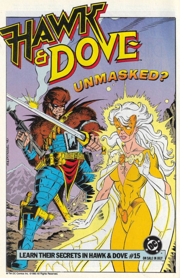
“I Think of Dollar Signs. The Rest is Easy.” COMICS! Sometimes I Think Some Folk Need To Remember You Can Only Sell The Family Silverware Once!

Yeah, so I'm not getting it together at all over here. Sorry. Let's just leave it as I'll be back in the New Year then we all know where we are. But wait! No one leaves empty handed! So until we next meet let me gift you with the pathetic results of what happens when an old man messes with Paint. Yes! Please be seated and feast your eyes upon a tribute to DKIII: The Childishly Trollingly Fascistic Title, with particular emphasis upon the rocket ship pacing and Shakespearean word play of Brian Azzarello and, naturally, the visually scintillating fireworks of Andy Kubert.

 photo DKIIIk_zps6s6fx7tt.png DARK KNIGHT III: THE MASTER RACE by Andy Kubert, Klaus Janson, Frank Miller(?) & Brian Azzarello

I sincerely thank each and everyone one of you for your patience, attention and forbearance during 2015 and I hope to see you all in 2016. Have a great Holiday Season!

Anyway this...  photo DKIIIa_zps7lywud40.jpg

 photo DKIIIb_zpscnunfmzd.png

 photo DKIIIc_zpsxbplvmyo.png

 photo DKIIId_zps06iuxgg0.png

 photo DKIIIe_zpszstciyxm.png

 photo DKIIIf_zps5vhrnjgf.png

 photo DKIIIg_zpsdzz06fug.png

 photo DKIIIh_zpsgjjpijks.png

 photo DKIIIi_zpshguudc5x.png

 photo DKIIIj_zpsyoima96w.png

All artwork by Andy Kubert & Klaus Janson.

Merry Christmas! See you in 2016 for – COMICS!!!
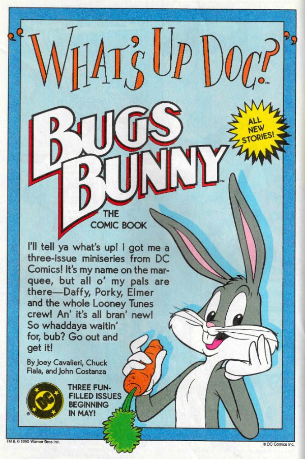
“The One You See Coming.” COMICS! Sometimes Moon Knight’s Gonna Drive You Home Tonight!”

I am given to understand that self-proclaimed Futurist and alleged butter sculptor Warren Ellis is currently writing the comic book adventures of Britain’s favourite misogynistic throwback tool of the ruling elite. Not only that, but word has reached me that said knuckle faced sop to the Pre-Suez nostalgists like Your Grand-Dad is also currently tumbling out of explosions and beds while adjusting his cuffs at a Multiplex near you.  Talking about James Bond there, not Warren Ellis. Although, having said that, having said that…no, definitely James Bond. So, what could be more appropriate then, than to write about a completely different set of comics Warren Ellis wrote and Declan Shalvey illustrated. Probably a lot of things would be more appropriate, John. Yes, but this is what you got. Life lessons, we got 'em!  photo MK03B_zpszb8ygxkk.jpg MOON KNIGHT by Shalvey, Ellis, Bellaire & Eliopoulos

Anyway, this… MOON KNIGHT VOL.1: FROM THE DEAD Artist – Declan Shalvey Writer – Warren Ellis Colour Artist – Jordie Bellaire Letterer – VC's Chris Eliopoulos Contains material previously published in magazine form as MOON KNIGHT #1-6 MARVEL WORLDWIDE INC, $17.99 (US), $19.99 (CAN) (2014) Moon Knight created by Don Perlin & Doug Moench © 2014 Marvel Characters, Inc.

 photo MK01B_zpsj0sonnqh.jpg

NB: This book was obtained from Derbyshire County Council's excellent Library Service. Do NOT let them take your libraries away.

In which we join Declan Shalvey and Warren Ellis in Marvel's continuing battle to make anyone care about Moon Knight (MK) post Bill Sienkiewicz. Changes have been made. Changes not only to the creative personnel but also to the set up itself. MK doesn’t have his old supporting cast anymore, but he does have a special Moon Mobile which is dead flash; like one of those big long cars, you know, like those limousines teenagers and hen parties hire to drive around Grimsby town centre in for reasons which quickly escape them. It drives itself, because of course it does. That’s Warren Ellis, The Futurist there (“In the Future cars will be faster, literally, and maybe have, uh, bigger wheels! MAYBE FLIGHT IS INVOLVED!!! Hic!”)  MK also has a drone thing, because drones are bad except in the hands of insane vigilantes who are unaccountable to anyone. Then they are cool. More spooky Futurism there probably (“Everyone (burp!) will have their own drone, like. To go down the shops and that, yeah? I drink whisky and swear. AND YOU CAN’T HANDLE IT!!!”) Also, I misspoke back there because it turns out Sir Moon’s not nuts no more. So the whole “lunar” and  “lunatic” wordplay thing has gone for a Burton. Shame, I liked that but then I am a bit traditional. Hey, keep up, old man, tradition’s for tossers and it’s the 21st Century (according to my Cats in Funny Hats calendar) so in the first issue both MK and we are told (in a phrase clearly intended to be quote fodder, and who am I to disappoint (shut up, mother! SHUT UP!)),  “You’re not insane. Your brain has been colonised by an ancient consciousness from beyond space-time. Smile.”  Naturally, this being Warren Ellis the flop sweat scented  linguistic razzle-dazzle errs away from the meaningful and more towards the polytechnic-lecturer-down-the-pub-with-the-new-intake-and-his-eye-on-the-wee-lassie-with-the-nose–ring-and-the badly-obscured-cold-sore. Like many an Ellis-ian concept splash it’s not like it ever gets mentioned again, but I think we all felt all the cooler for reading it. I know, being a simple soul, you might think having a character “colonised by an ancient consciousness from beyond space-time” might be something you’d want to expand upon a bit, but no. As it happens, astonishingly enough, it doesn’t matter because MK still acts like someone who needs a hug and a good chat. Just in a different way.

 photo MK02B_zpsqk1l4u1d.jpg MOON KNIGHT by Shalvey, Ellis, Bellaire & Eliopoulos

Visually MK is redesigned as a man in a suit with a bag over his head. (Well, sometimes he isn’t, but it’s this image that works best and that you  come away from the book with, so in the interests of brevity: a man with a suit with a bag over his head.) Sounds silly but it isn’t. It’s a good design; men in suits generally look really quite grand, I find. Lot of graphic potential in a suit, you know. It’s just plain classy for a start. The bag’s okay visually too, and is a proper bit of Futurism because, and there is no way Warren “Future Sailor” Ellis could possibly have known this when he wrote the book, shops now charge you for a carrier. I am forever being caught out by this, but MK can just stick his chicken dippers in his hastily doffed headgear. No fool he. I imagine (many things, but let’s stick to this one) Declan Shalvey is the one who makes the redesign work quite as well as it does. (“He’s in a suit now, Declan, not that capey thing. Oh, stop whining, JUST BLOODY DRAW IT!!!”) It’s a sharply cut suit and the visual potential of a nicely draped ensemble’s ability to communicate flow and to just generally cut a flash dash on the page is fully realised by  the man Shalvey.  Someone has also decided not to colour MK in which makes him really pop off the page. Pages beautifully toned by Bellaire's subtly muted shades. Unlike Warren Ellis the Irish human being Declan Shalvey is a new one on me, but he’s very much worth watching as an artist (as opposed to watching as a “suspect”, but never rule anything out, eh). I was first struck by his apparent talent when I noted the jaunty angle at which he had cocked MK’s shoe sole on the initial splash. By the end of the book there was nothing apparent about it, Declan Shalvey was pretty firmly established in my fractured mind as a Talent with a  capital “T”. Which is lucky, because sometimes it’s Shalvey’s Talent that makes the book work as well as it does. Which is why everyone refers to it as Declan Shalvey’s MOON KNIGHT, right? Oh.

 photo MK04B_zpsqq3prtfe.jpg MOON KNIGHT by Shalvey, Ellis, Bellaire & Eliopoulos

It’s easy to knock Warren Ellis (so I did) but in his defence FROM THE DEAD collects six issues, the majority of which are very strong done-in ones (they vary, but are mostly good times). It’s possible Ellis even put his drink down and typed with both hands on some of them. Inevitably though there’s  a couple of underdone slips into the worst of Warren Ellis’ patented Post-It Note plotting. He gets a lot of stick for this, but in all fairness sometimes this works (and equally sometimes it doesn’t). I guess it depends how detailed his Post-It Note gets before he collapses from the exertion of coming up with a crunchy hi-concept soundbite hook. Because all these issues have a crunchy high-concept soundbite hook, but they don’t all have a story. I would hesitate to suggest that Warren Ellis occasionally has his writerly priorities wrong since, you know, he’s the feted millionaire author with a built-in audience and I’m the erratic  crank who has his hair cut at home and whose own love partner won’t read his stuff, but it did cross my mind every now and again. Particularly during “Box” which seemed to be based on “Moon Knight punches Ghost Punks!” and then forgot to be about anything else, although there was some half-hearted stuff about gentrification and a sad music box. All of which possibly interesting stuff was shuffled to the side-lines, because who doesn’t love pages of Moon Knight punching ghost punks! Haw, Haw. Oh, that tickles me. Ghost punks. Punching. Well worth all those pages. (There’s some sarcasm going on there but as I don’t use emoticons I’m just going to have to risk you missing it). It’s okay, sometimes comics creators are clearly having a lot more fun than their audience (Matt Fraction) which is fine in moderation (everyone else). Oh, Shalvey tries his best and it is gorgeous stuff, but storywise at base “Box” is pretty thin  gruel. However, in all fairness,  “Scarlet” works really well and that one’s just “Moon Knight beats up five floors of thugs to rescue a little girl.” Which as a story is equally austere in its development and complexity (“Declan, child, I have seen this film called THE RAID. DELIVER THAT UNTO ME, YOU CUR!!!”) But, ah, ah, but, crucially, this one is rich as Croesus in the visual opportunities it offers up to Declan “I can” Shalvey. The brutal choreography and general illusion of movement created by Shalvey’s art here is superlative stuff and truly cinematic in the very best sense. I winced more than once at the imaginary violence on show.

 photo MK05B_zpss8b6dv0f.jpg MOON KNIGHT by Shalvey, Ellis, Bellaire & Eliopoulos

Since Shalvey saves “Scarlet” there’s only really “Box” which is a damp squib. “Sleep” gamely attempts to present a creepy mystery; one which Ellis has given a decent beginning and a solid ending, but during the (lengthy) mid-section relies so hard on Shalvey’s phantasmagorical fungi fuelled  hallucinations it’s only they that prevent its title becoming a self-fulfilling prophecy. “Slasher” is impressive for not only introducing the new MK set up with economical élan but also for cramming in a serial killer who MK hunts and bests using his intelligence. It even finds room for a little dig at the weaponisation of humanity to keep things current (“THEY’LL TURN US ALL INTO GUNS, I TELL YOU!!! Oh look, HOLLYOAKS is on”). It’s a tidy comic book script and Shalvey’s art keeps it interesting even during the largely static (and just on the right side of self-consciously flip) conversation  bits, but it really hits its stride when things get a bit weird under the streets where the S.H.I.E.L.D. creeps sleep.

 photo MK06B_zps3t3dlsgu.jpg MOON KNIGHT by Shalvey, Ellis, Bellaire & Eliopoulos

“Sniper” raises the game in term of storytelling. Yeah, Ellis really exerts himself on the one about the sniper. Or maybe it’s the case that Shalvey nearly busts a gut on this one. Perhaps it’s even a joint strainer. Whatever the case may be, it’s really just an exercise in storytelling rather than a story as such. But it’s such a good exercise in storytelling you can forgive the bit where the man walks in at the end to explain the point of the story to Moon Knight. And since that point is that bankers are dangerous assholes and we should never forget this since we are all still trying to claw our way out of a recession their unregulated greed caused with very little impact on themselves, I’m inclined to leniency. “Sniper” is a thing of beauty in its execution. As Shalvey's countryman Frank Carson once said, “It's the way I tell 'em!” and in “Sniper” the way Shalvey & Ellis et al tell it is pure COMICS!!! The volume closes with a smart call back to the first issue, “Spectre” (Now THAT's impressive futurism.), where a bit part player goes entertainingly if somewhat unconvincingly nuts and tries to replace Moon Knight. I say unconvincingly nuts but if anyone was exposed to the previous volume of Moon Knight (apparently fuelled by “years of research” into MK’s condition. Oh, give over.) then in comparison Warren Ellis’ treatment of mental illness here resembles that of B.F. Skinner.
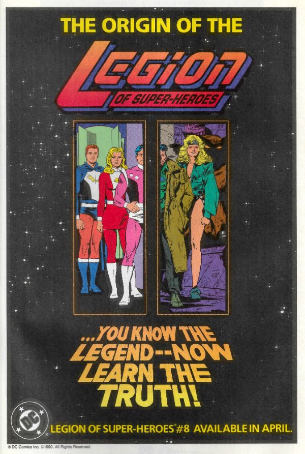
 photo MK08B_zpsheqf7nnk.jpg MOON KNIGHT by Shalvey, Ellis, Bellaire & Eliopoulos

Given the paucity of plot elsewhere there’s a surprising surfeit of it in “Spectre”, maybe too much. Might have been better to have it running as a sub plot through the other issues…but clearly it’s more important that each issue be “stand alone” and self-contained”  in line with whatever high-falutin’ modus operandi Warren Ellis has informed the world he is operating under via interviews I haven’t read (“NOW HEAR THIS!!! NOW HEAR THIS!!!). Remember all that horsefeathers about “comics as 7-inch pop singles” (“One day there will be 12-INCH POP SINGLES!!! Mark my words!”)? I know I am forever picking up copies of FELL and exclaiming, wow, this is like the comic as a 7-inch pop single! Rather than, Oh, yeah, another series he just left floating like the sad corpse of a duck that didn’t make it through the winter! Obviously that whole 7-inch single thing is a bit dated now, so this time out these particular comics are probably  “fibre optic nano-belches of picto-jism”. You know how he gets, that Warren Ellis. With his catchy tag lines and such. Oh, you can mock, you cur, but that’s what they pay him for. With MOON KNIGHT VOL1: BACK FROM THE DEAD Warren Ellis trots out his long running Warren Ellis schtick and gives us exactly what we expect, exactly what he gets paid for, warts and all. However, Declan Shalvey, the wee shaver, is a total and thoroughly pleasurable artistic revelation, so it’s on him that the book ends up with VERY GOOD!

Seriously, that “Sniper” Chapter is - COMICS!!!
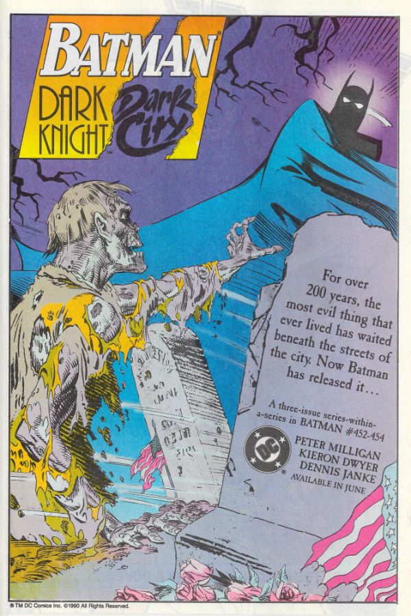
“I Ain't Never...Made Nothin' My Whole Life.” COMICS! Sometimes I React Quite Badly To The Tiresomely Derivative Violent Fantasies Of The Middle-Aged White Male. Tough Titty.

So, hey, you know all the Goodwill I've built up with y'all. Let's douse all that in kerosene and flick a lit match at it. Because, damn, this comic sure rubbed me the wrong way. Sometimes I'm like a mad dog. A sexy mad dog. You've been warned. WOOF! WOOF!  photo Bang04B_zps9lrzh3ax.jpg MEN OF WRATH by Garney, Aaron, Milla & Fletcher

Anyway, this... MEN OF WRATH Art by Ron “Through The Jungle” Garney Written by Jason “Star Wars” Aaron Coloured by Matt “Killer” Milla Lettered by Jared K. (“-Bar”) Fletcher Marvel, $3.50 each MEN OF WRATH created by Ron Garney & Jason Aaron

 photo MWrathCovs01_zpsnp6wonam.jpg

And all the others Running 'round so hot and bothered Anything to give their lives some meaning In the evening Running around with guns and Said they would act in self-defence With violence

Violence - The Pet Shop Boys

I’m a Killing Machine! I’m a Killing Machine! I’m a Killing Machine! I’m a Killing Machine! I’m a Killing Machine! I’m a Killing Machine! I’m a Killing Machine!

In The Neck – Revolting Cocks

Hey, Buddy! Yeah, you! How bad is your ass? No matter how bad your ass is I bet it’s not as bad as the bad asses in this comic and that’s allowing for a high level of badness when it comes to your ass. Man, the asses in this book are all bad. Because they are all (mostly) men's asses. And all men are violent. All the time. I’m being violent right now. And manly. Hell, I piss oxtail soup and fart raw lumber. Imagine an ambulatory hickory-smoked cock constantly emitting milky explosions of violence and that’s me, Padre. Straight up! I didn’t grow this beard, I was born with it! Chafed my Ma so bad on the way out that during the delivery (in a clapboard shack with a roof o’ tin) she tore an intern’s throat out like The Swayze in Charles Dickens’ immortal classic ROAD HOUSE. Shitfire and molasses! Get out of my sight! Get out of my way! Rubber Duck to Teddy Bear, we got ourselves a convoy! A Convoy of Violence! Yeah, my chapped lips to your cauliflower ears, I thought this comic was just great, if a little dainty for a giant violent hickory-smoked bearded cock like my bad ass self. No word of a lie, this comic displays all the nuance and insight into male violence you would expect of a comic called MEN OF WRATH which is about some men called Rath who are angry. And that’s some smart stuff right there, Cochise, because, see, wrath is a synonym for angry and, get this, wrath rhymes with Rath (largely in fact due to it being the same word except the “w” has gone), but not only that, but, and I don’t want to tell tales out of school or anything, but men are renowned for being violent, and violence is often a physical embodiment of anger, or, brace yourself - wrath. MEN OF WRATH! Geddit! Yeah, that stain on the wall is your mind, baby. Because like a sailor on shore leave, it just got blown. And that’s just the title. Comics aren’t just for kids anymore! They are for big kids! Big kids who enjoy the literary equivalent of staring into the gummily cycloptic eye of their own boner.

 photo Bang08B_zpswetixent.jpg

MEN OF WRATH by Garney, Aaron, Milla & Fletcher

MEN OF WRATH has many things to tell us about the human condition and some of these things are about men growing old. And revenge. And  religion. And animals. The religion bit is easy – religion is rubbish. A white collar won't stop a bullet. And nor will God. Controversial stuff there; knocking Christianity being as tough as mocking Perry Como in this the year of Our Lord 2015. There's a lot of sheep and horses in it so I guess the idea is to suggest people are just like animals, they just pretend otherwise because, uh, that sounds like a really badass thing to say. In fact, people can indeed act like animals when under extreme duress, or following lengthy periods of systematic abuse or when there are soup makers with 33% off RRP on Black Friday. Mostly though people act like people. I'm not sure about the animal thing, MEN OF WRATH might not be that complex, but I'm committed to this train of thought so we'll carry on - I suspect people are not actually just like animals because I’ve yet to hear of a chicken tiling a bathroom or a capybara performing chanson. Although, true, quite a few barnyard animals do seem to be elected to political office. Actually it's probably not saying anything about animals. What about men and age? I bet it's replete with wisdom on that score. Oh yeah, as men get older, MEN OF WRATH tell us, they might get cancer but that's okay because they'll just spit blood, or maybe run out of puff during a gunfight, or occasionally clutch their side and grimace like they are trying to keep a fugitive poo in. Cancer, MEN OF WRATH assures us, much like renal failure or pulmonary embolisms, can be pushed back by sheer force of will, a crinkling of the forehead and a manly hiss of “Not now, old man. Not yet.” Old men, cancerous or no, MEN OF WRATH reveals, can be shot and burned with little immediate impact, although MEN OF WRATH is fast to point out that they will suddenly fall over and black out at a moment of high emotional impact in the narrative. This is because, and I'm reaching here, maybe, old thoughts don’t travel as fast as young thoughts so it takes time for the news of their injuries to reach their aged brain. Like dinosaurs. Sometimes old men can be referred to as dinosaurs because dinosaurs died off; the fact that humanity will have to stick around for several millennia more before they equal the dinosaurs’ tenure never gets mentioned. Or maybe it’s because old men are scaly and have a tendency to stumble around roaring with no pants on. I don't know. Mostly, though, MEN OF WRATH is telling us about sons and fathers. What it tells us about sons and fathers is fuck all. It starts off telling us that a cycle of violence began when Papyrus Wrath stabbed a dude over sheep, but then it realises that it isn't the 1970s and everyone with more sense than a doughnut now knows all that “bred in the bone” shit is just a weak ass refusal to take responsibility for one's own actions. This means it kind of stumbles about all confused and bellyflops into a truly poor end reveal which is both pandering and maybe a wee bit sexist. Because ladies? Not violent. Ever. Hey, Jason Aaron - meet my mum. Yeah, you better run, boy. Stop when you hit the sea. Anyway, MEN OF WRATH has many things to tell us about many things, I'm not sure what they are but I am sure all of the things it has to tell us are dumb. This is because everything MEN OF WRATH tells us is based on a bunch of movies and books that have already told us all these things better. On reflection I suspect MEN OF WRATH doesn't tell anyone anything, because MEN OF WRATH is five issues of macho posing and as a consequence any message within has all the strength of a sick man's piss. MEN OF WRATH is a book apparently written by someone who doesn’t get that the truest thing movies like TAXI DRIVER and ROLLING THUNDER tell us is that Paul Schrader was a very unhappy young man.

 photo Bang07B_zpsaohxfaes.jpg

MEN OF WRATH by Garney, Aaron, Milla & Fletcher

Oh yeah, MEN OF WRATH has a lot of violence in it and this violence is extraordinarily effective in solving everyone's problems. True dat. Now, sure, some people will tell you violence solves nothing. Probably some guy who goes to work in an office and wears glasses and loves his wife like he’s some puling castrato or something. Personally speaking,  I’ve yet to find a problem violence can’t solve. See as a for instance, a couple of years back we were calculating our return for the Tax Credits and it turned out some sums had gone awry and we’d been claiming more than we should. We’d been claiming it for a full year, so we had to make the choice of whether to ‘fess up and pay the not inconsiderable sum back, or just sail right on ahead living with the possibility that at any moment  the black helicopters would descend and there’d be knock at the door. Please understand, it wasn’t that we didn’t want to pay it back. After all I’m big on paying taxes because I have this dumb idea I’m a part of a wider society to which we should all contribute so that we can raise each other up (also, hospitals, prisons, schools and roads - quite useful!) No, the issue was whether we’d get into trouble; it was an honest mistake, but you know maybe They wouldn’t see it like that. I don’t know about anywhere else but in the UK the last person you go toe to toe with is the Tax Man. You’ve got more chance of getting away with fiddling with kids than with fiddling your taxes. So, we talked about it for a few days and it all got a bit stressful and in the end I just went out and murdered someone. That solved the whole Tax Credits problem right quick, don’t tell me it didn’t. You can visit me on Wednesdays. Bring cigarettes.

 photo Bang02B_zpsttxvolul.jpg

MEN OF WRATH by Garney, Aaron, Milla & Fletcher

Look, it's not that Jason “Star Wars” Aaron can't write and can't write well but, seriously, this is some tired path he's treading. It's certainly very fucken' far from Cormac McCarthy. Because, hey, didn't you hear, Jason “Star Wars” Aaron is Comics’ Cormac McCarthy. You know, like Brian Michael Bendis is Comics’ David Mamet, Ed Brubaker is Comics’ Raymond Chandler and Matt Fraction is Comics’ Rip Taylor. Throw all that stuff on your rhubarb to make it grow. Jason “Star Wars” Aaron can write, but MEN OF WRATH is refried junk. Oh, hey, since my pills are overdue and I'm going all Scorched Earth have you heard the one where comics writers equate themselves with Charles Dickens? Have you not heard that one? It’s great. Honestly, I’ve seen at least one do it in a public comments section, and given comics writers are herd creatures you can bet the concept’s got some traction with a few of ‘em. Modest folk that they are. Anyway, it seems to run like this: Charles Dickens produced popular fictional entertainments in a serialised format which were later collected between two covers for posterity. So do they. Thus, comic book writers are like Charles Dickens. QED.  If any comic book writers think that, I want them to know that I have two step ladders in my garage and they are more than welcome to borrow one to try and get over themselves. Because, yes, clearly it was the format in which Dickens’ work was published that makes it great rather than, you know, the genius of Charles Dickens. See, you start out complimenting a writer and before you know it we’re in a place in which Frank Tieri is comparable to Charles Dickens. A hot place with imps and cackling. Look, the last thing I want to do is rub poo in anyone’s eyes here, but if the writing was the most important thing about comics there wouldn’t be any pictures in ‘em. Writing is the most important thing in prose - fancy your chances in that arena, comic book writers? Yeah, thought not. Go back to hiding behind Frank Quitely’s skirt. No offense, like. Look, short version: If Charles Dickens was alive today I doubt very fucking much if he’d be writing comics about C-3PO’s arm or Han Solo’s sassy wife. Check and mate. Cormac McCarthy, my arse. More like Charlie fucking McCarthy. Gottle a geer!  Gottle a geer!

 photo Bang06B_zps28uu4pvx.jpg

Also, I made the mistake of starting to read the back matter until I hit the usual ride-a-cock-horse about how the story has a profoundly personal aspect, which comes across about as sincere as Wayne Newton telling us Peace Frog holds a very special place in his heart before clicking his fingers and getting stuck in on the Trocadero Main Stage, during a poorly attended Thursday matinee. Apparently one of Jason “Star Wars” Aaron’s kin done gone killed some fella back yonder  times over some sheep or some such, hence the inspiration for this timeless paper classic; one which will be ranked by posterity somewhere under that FRIDAY THE  13th comic Jason “Star Wars” Aaron did.  I think I’m supposed to be impressed by the honesty of Jason “Star Wars” Aaron’s facing of the familial sins of the past full on and the colossal internal strength he draws on to use it as a spur to create art (i.e. money). And had the ancestral Aaron touched kids I probably would be suitably impressed. But Festus Aaron killed someone, which is still a manly and butch crime; the kind of crime you can walk tall behind, and so we just got another comic about how violence is, oh, so very, very bad but still manages to force itself  to roll around in it like a dog in fox shit.

 photo Bang03B_zpsoovgex1d.jpg

What? Maybe I'm just not the audience for this? Maybe it's a bit too raw for my fluffy pink liberal palate? Seriously, you have no idea who you are dealing with here. Circque du Soleil would gasp at the contortions my Electric-Pink Liberal Conscience can make just so I can enjoy my Hot Strong Man Boner Action. DIRTY HARRY? The balls, man, Just the balls. I can recite that thing; don’t test me, it’ll end badly for you. And yet, as my regular readers will attest I’m all, hey, why don’t we all look after each other, and, like forgive although we can never forget, and bad things are real bad, yeah, and you use roads, you were born in hospital, so  pay your taxes and all that, ugh, nasty, nasty, wispy beard, cork sandaled, recycling, folk listenin’, home-made preserves shit. Listen to this, and you best believe you better be bracing yourself like nobody’s business because here it comes: I’m the guy who thinks Harry Callaghan throws his badge away at the end of DIRTY HARRY because he has failed The System! That’s right! The System hasn’t failed Dirty Harry, Dirty Harry has failed The System. He no longer believes he is fit to carry the badge. (Well, he isn’t is he? I mean, there’s crossing a line and then there’s being silly about it. He endangers about twelve little kids at the end; not cool, Harry.) Why then, John, is he back in MAGNUM FORCE and also, John, not only is he in MAGNUM FORCE but he is such a plainly unapologetic fascistic bastard they have to set up a bunch of bike cops including David “Black Bean Soup” Soul and that guy from Vega$ as a kind of Central American Death Squad, whose only Real Crime the movie seems to be saying is offing a luckless cop. Why, John? Because John Milius is why. Also, it’s a fucking cartoon. The first movie is a proper film; Don Siegel made proper movies - word to that. And the rest of the Harrys? Fuck those. That Cagney & Lacey one is so badly directed it’s a good job the human charmball Bradford Dillman’s in it, and THE DEAD POOL has a remote control car chasing Harry Callaghan about like it’s some kind of R-Rated Hot Wheels movie or something. A remote controlled car! That movie is for goofballs and Liam Neeson/Jim Carrey completists. The only half way decent one (other than MAGNUM FORCE; I like fascist cartoons! TWIST!) is that one that keeps forgetting it’s a Dirty Harry movie and thinks it’s Sondra Locke in DEATHWISH. (N.B. DEATHWISH is a piece of crap.) And SUDDEN IMPACT’s only good because it would take a sleepy chimp indeed to come away from that one feeling revenge was any fucking good at all. A chimp, or John Milius. I mean, I’ve checked my pants and I’m a man; I have a weakness for dumb aviator shaded, cigar chompin’ shit like the stuff John Milius sprays like musk, but the important thing to remember is that stuff’s a fucking cartoon.  Yeah, I know he’s dead. It should be sprayed not sprays. Fuck tenses. Grammar ain’t manly, pal. Except Powers Boothe’s Gramma. Ma Boothe cures her own pork, you hear me! Skiddlyupyah! But, y’know, you can step the Hell back if you’re even thinking of telling me RED DAWN says anything about the human condition. My point? Like John Vernon said in Josey Wales, “Don’t piss down my neck and tell me it’s raining, Senator.”  Capiche, cochise?

 photo Bang01B_zps4o9ygvrx.jpg

MEN OF WRATH by Garney, Aaron, Milla & Fletcher

Someone out there is going to go, yeah, yeah, you big limey mincer, but have you read SOUTHERN BASTARDS - that’s great! And because I was raised right  I am going to ignore the fact that this site is fully searchable and you can find out fairly easily that I have read SOUTHERN BASTARDS and, no, in the world in which I am cursed to live, it is not great. SOUTHERN BASTARDS took five issues of “stellar character work” to tell us nothing about said character or the mise en scène (yeah, some ooh-la-la parlez vous francais there. Bite me, tough guy!) that couldn’t have been covered in one issue. He’s old, he’s sad, his dad was bad and Americans react to seeing dogs shitting like someone was murdering a baby. (Of course he’s been in ‘Nam. Of course he had. Did you know ‘Nam backwards is Man? There goes your mind again!) Anyway, five issues of repetitive dithering. Five issues of it. Five fucking issues of packing boxes, hitting people with sticks and being sad. Fucking interminable stuff.  And all so that the end of issue 5 would come as some big surprise. Which it did, because who had “Jason Aaron is just wasting everyone’s time” in the raffle? You, sir or madam, are a winner! Tickets to that raffle cost $14.95 approx. You’re welcome. And ugh. That last page. Where the non-Caucasian non-male character is revealed on the page turn like she’s Darkseid or something; a move shocking only in its humungous smuggery. Who the hell in their right mind went – it’s a coloured lady! A POC! OMG! Why the blue fuck wouldn’t it be? Even better - she’s in the Army! Talk about mixed messages. Either all the suspense just dropped out of the arse of this book because, really, who will win between a drug dealing sports teacher and his shit-thick hicks, and a government trained killing machine with revenge on her mind? Dur. Lemme think. In Michael Bay’s documentary CON-AIR Cameron Poe (Nic Cage with seaweed on his head) is dealt with more harshly than other mortals by The System because his awesome military training makes him unlike other men – he is become like unto a Living Weapon, he has become War. It’s not much of a contest is it? Lady Cameron Poe versus Craig T. Nelson's COACH? Or maybe it means Jason “Star Wars” Aaron thinks the US Military is so shit its soldiers would have trouble dealing with a drug dealing sports teacher and his shit-thick hicks. I very much doubt that was his intention, Americans being pretty well disposed on the whole toward their boys in uniform. There are even a couple of movies about it and everything. You could say I didn’t give it long enough; how long is long enough? Perhaps I should have waited to find out that the drug dealing sports teacher had a Bad Dad and got his knee shot off so he could never play football. Or whatever, I didn’t give it that long, did I? Sure, I can see someone turning to crime because they can’t play their favourite sport in a professional capacity. My heart bleeds. I never got to be Howard Victor Chaykin’s pool boy but you don’t see me peddling drugs and exhibiting singularly poor recruitment choices. Maybe the lady character will allow Jason “Star Wars” Aaron to bring to bear some “stellar character work”.  Perhaps when she’s strapping some C-5 under a pickup with a Confederate flag on its plates she’ll pause wistfully as a baby in a pushchair is wheeled past. Because: nuance. Jason Latour’s art was spectacular, mind you. It had a lovely autumnal pallet all russet and  dusty and what a goddamn waste. Which reminds me, Ron Garney illustrates MEN OF WRATH and his art, inconsistent as it is, is wasted on this cowflop. They say you should talk about the art so there you go. That much I did right. MEN OF WRATH is CRAP!

You can't choose your family but you can choose – COMICS!!!
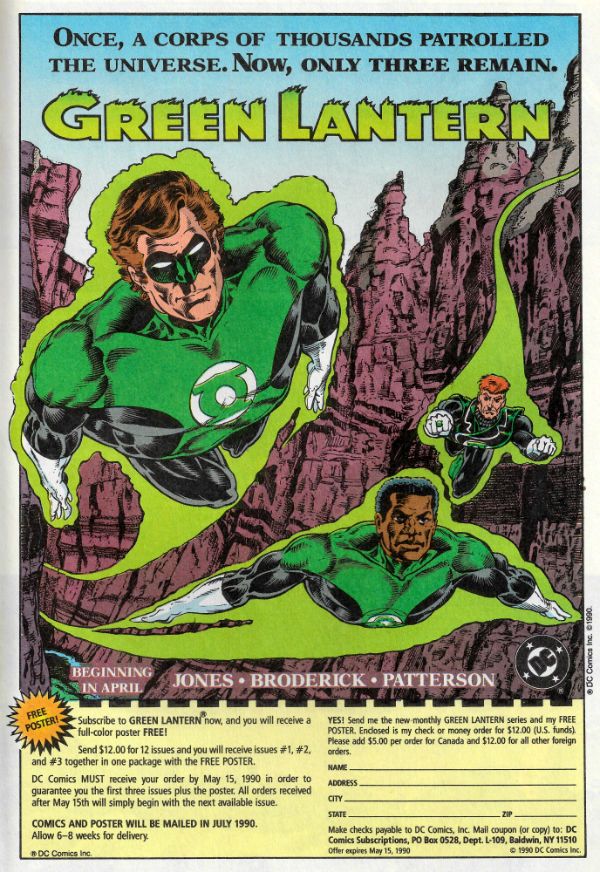
“THE TRAVELLING PALACE OF IEMUHM ANNOUNCES ITS ARRIVAL IN BRIGHT RUNES” COMICS! Sometimes Houses Are Surprisingly Mobile!

In which I write about a single series that is in fact like a whole imprint in itself. Now, I'm not usually one for comics about, you know, the Frangipanis struggle against the Ipanemians on the planet Sega, but I have a weakness for good storytelling, which all of these had. Um, spoilers!  photo Ehouse02AB_zps9osrzymt.jpg 8HOUSE: ARCLIGHT by Churchland, Graham & Maher

Anyway, this... 8HOUSE #1 -2: ARCLIGHT Art and Colours by Marian Churchland Art by Brandon Graham om p.27 in #1 Art by Brandon Graham on p.28-29 in #2 Story by Brandon Graham Letters by Ariana Maher Image comics, $2.99 each (2015) © 2015 Brandon Graham & Marion Churchland

 photo EHouse01AA_zpsbte97bp3.jpg

Man, this thing just drips aristocratic hauteur does it not? It can barely bring itself to allow a prole like you to sully it with your low-born gaze. First there’s that weird title to get past; the one that sounds like a Bullingdon Clubber saying outhouse e.g. “Haw, haw, by 2020 we’ll have turned this country into an 8House. Hard times for the little people, what?” I mean, as title’s go it’s not exactly informative is it? 8House? Hate House? Yeah, I’m not fond of it myself, more of a Northern Soul man. Luckily, I have been gifted with powers beyond those of mortal ken so I know it refers to the 8 Houses (or Families) which rule the planet of Greg Araki where Ghoonga Djinn will save everyone by using the magic white spice to make his pupils contract to pinpricks and talk crap very fast. Or is that our Chancellor, Norman Osborne? Hard to tell in days as strange as these. No, all digressionary bullshit aside I’ve read two issues of this comic now and it’s basically magical space fops in love. Oh, and more importantly it's pretty great to boot.

 photo EHouse01AB_zpsi2nzvsql.jpg 8HOUSE: ARCLIGHT by Churchland, Graham & Maher

I know it’s pretty great because even though its pacing is stately and the storytelling somewhat opaque (two things which when done badly I hate), this stately opacity is tethered to meticulously honed storytelling. Each image from line weight, framing, size through to colour is carefully measured to maximise its impact and import.  Brandon Graham's captions are sparse, being used mainly for an atmospheric mix of the evocative and the expositionary and so the book is mostly imagery drive. And the imagery Marian Churchland brings to it is really quite striking. Everything looks hand drawn with a lovely human wobble to the line, and the colouring is the soothingly smooth combination of hard and soft only coloured pencils seem able to achieve (although it was probably all done on those computers I hear about). Gesture and expression are pivotal in conveying information here and the book's lucky to have someone so gifted in conveying such tricksy stuff on board. Having said that, I'm still a bit unsure if I gleaned all the meaning from these two issues. As far as I can tell there’s a bundle of twigs in a cloak hosting the soul of a genderblended noble and s/he/it is and her pal are tracking whatever has nicked her/his/its body. The whole being made of kindling thing is putting a serious crimp in stick face’s attendance at soirees where all the gentleladymen wear gossamer nighties and trade bitchery of the barbed variety. So when news reaches Twiggy that his/her/its body is doing the rounds off they set, and after some blood fueled sigil based scuffling a confrontation, the outcomes and import of which are still a tad unclear to this most unreliable of readers, seems unavoidable. Now, I could have some stuff wrong there, after all I read it a bit back and this book isn't exactly eager to give up its secrets, but puzzling them out is part of the fun. And it's gorgeously illustrated and meticulously executed fun, which makes 8HOUSE: ARCLIGHT VERY GOOD!

 photo Ehouse01AC_zpsuhuc2kms.jpg 8HOUSE: ARCLIGHT by Churchland, Graham & Maher

8HOUSE #3: KIEM Story & Art by Xurxo G. Penalta Story by Brandon Graham Image Comics, $2.99 (2015) © 2015 Brandon Graham & Xurxo G. Penalta

 photo Ehouse03A_zpsjj3qwle4.jpg

In which that unavoidable confrontation promised by #2 is...avoided. I guess whoever’s in charge of this 8HOUSE gaff (Brandon Graham)  thinks you’re getting a little too comfy, a little too complacent what with you being all involved in the story of Sir Arclight, aristo-discos, blood-magick combat, hidden agendas and the cloaky twig-thing - HOOPLA! – 8HOUSE is now, without any whiff of warning, about a completely different bit of the 8HOUSE world and a whole new set-up!  I guess this is to stop your brain getting all swaddled in fat and lethargic, so we’re now dealing with a young woman who appears to be part of a military unit, one which is sequestered from the outside world. This bunch of bantering naïfs only leave their bunker to mind-leap into the far-distant deceased bodies of their mono-zygotic twins, whereupon they battle alien creatures on an upsettingly huge construction I failed to retain the exact nature of. Which is nice but don’t put your feet up, Cochise, because now Kiem (yes, it’s named after the lead character; a rare sop for the traditionalists there) has to enter the real world on a Special Mission and finds all is not as she thought (or as we have been led to believe in the preceding blah-de-blah pages (if they aren't going to number them then I'm not going to count them, people)).

 photo EHouse03AB_zpsz9d1oczm.jpg 8HOUSE: KIEM by Penalta & Graham

In line with its contrasting tech-heavy ambience KIEM takes a different approach to storytelling to ARCLIGHT with the captions being both more plentiful and more larded with straight exposition. But then they are the inner monologue of the main character (a soldier) who is less high faluting than those in ARCLIGHT (dandyish aristos). Which is fair enough as soldiers tend to be more direct in communication than ruffle necked aristocrats. That's not to say the storytelling burden borne by the art is any lighter. You can't fault Penata's art, it is a pretty staggering achievement; it’s as though someone saw Jean Giraud and decided it was good....but not detailed enough, or wanted to explore how deep a focus a paneled image could pull off. The art on these pages is so visually dense it made me worry about the sanity of the mind behind it. I mean, I didn't worry that much because I had tons of fun looking at it and I'm not actually all that caring a person. You drive yourself nuts, Xurxo G. Penalta, just keep those comics coming! Also, there's a cool bit where Penalta upends the images so proving he knows when simplicity is the best tool in the box too. Pretty much a totally different approach and experience from ARCLIGHT it turns out that KIEM is also VERY GOOD!

8HOUSE #4: YORRIS Art by Fil Barlow Written by Fil Barlow & Helen Maier Image Comics, $2.99 (2015) © 2015 Brandon Graham, Fil Barlow & Helen Maier

 photo EHouse04A_zpsescbooub.jpg

Obviously, predictability being toxic to this series, with the next issue we needs must leave Kiem staring slack jawed at a truck sized crystal with her war wounded space-panda beggar friend because issue 4 of 8HOUSE (The House That Likes To Move About) is about Yarris or YARRIS (although that reads like CAPSRAGE, and I prefer to save that for when someone writing Spider-Man has done something I don't like; you know, the important things in life). Again, in what can only be deemed a calculated slap to the face of the unrepresented male, Yarris is a young woman but, aha, she is a different young woman to Kiem (clue: different names); she seems a bit more of a hot house flower who spends most of the issue sat very still indeed while indulging in an internal monologue of such expositionary density you could put icing on it and pass it off as a christmas cake. If exposition were edible. To be fair though, while show not tell is an important rule it's hard to carry off when what you are showing is a big alien dog phantom spitting ectoplasm formed of screaming faces. Since this is the primary form of oppression used by one sect (The Bound) to undermine another (The Un-Tied) some explanation is forgivable. Also, I think a little of it is lack of confidence on the part of Barlow & Maier. They’ve done some comics but they aren't a seasoned old lag like Brandon Graham, whose influence here only seems to extend to an invitation to the talented pair to play in his sandbox. Ultimately though it's probably just another form of storytelling. It's not wrong, it's just different, as I used to tell my teachers to admittedly very little effect. Alas, poor YARRIS is the weakest entry so far but it's still pretty strong. It's all relative. This is 8HOUSE after all. There's a flamboyance to the designs in YARRIS which is somehow both restrained and demented, and the storytelling finally settles down to promise thrills aplenty. And how could one not warm to a comic which ends with a character worrying that The Suprymes have been dispatched after them. On past evidence however we'll probably be denied the sight of Florence Ballard, Mary Wilson, Diana Ross, and Betty McGlown as sassy steampunk bounty-hunters because this is 8HOUSE so it'll be about something else entirely, but a young woman will probably be involved. Just like many a fight on Saturday night. Unlike physical violence fueled by alcohol, stupidity and hormones 8HOUSE: YARRIS was GOOD!

 photo EHouse04AB_zpskpp3oxkl.jpg 8HOUSE: YORRIS by Barlow & Maier


Pro Tip: When visiting the 8House I always take some – COMICS!!!
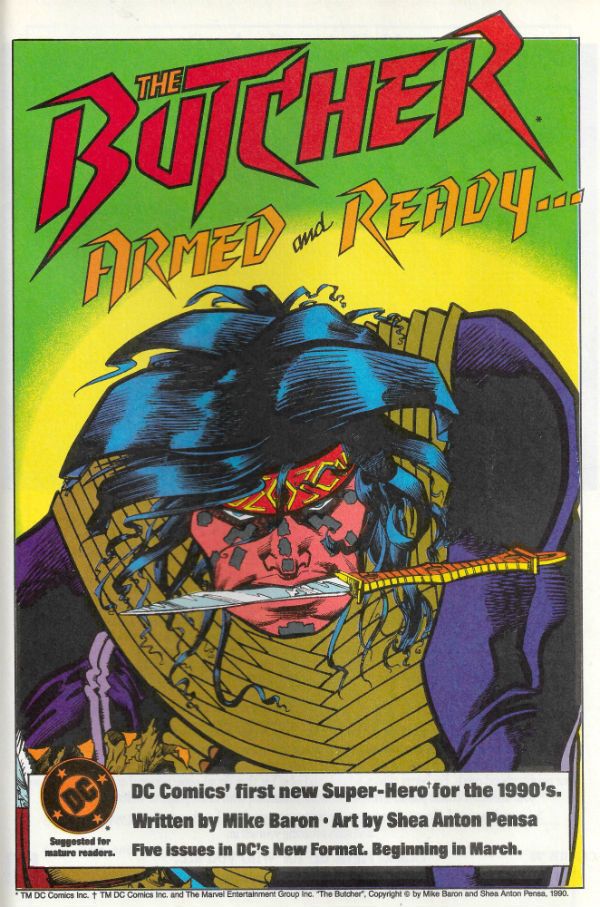
“Somebody Who Should Be Dead Is Alive, Or Somebody Who Should Be Alive Is Already Dead!” MOVIES! Sometimes I Am Reminded That No Matter Whatever Our Country Of Origin May Be We Are All Human And So United By A Fear of Being Stabbed In The Face By A Gloved Nutter.

Yes! It’s that thing where I watch some movies you aren’t interested in and then tell you what I think about them, while prefacing my words with a comment My Lady of Infinite Patience made about them. Look, I just haven’t had chance to read anything lately. Sorry but, uh, them's the breaks.  photo VICEeyesB_zpsnncmatz3.jpg Anita Strindberg in Your Vice Is A Locked Room And Only I Have The Key (1972)

Anyway, this… PHENOMENA (1985) Directed by Dario Argento Written by Dario Argento & Franco Ferrini Starring Jennifer Connelly, Daria Nicolodi, Fiore Argento, Frederica Mastroianni, Fiorenza Tessari, Dalila Di Lazzaro, Patrick Bauchau and Donald Pleasence as Professor John McGregor. Special Guest Chimp “Tanga” as Inga Music by Simon Boswell and Goblin

 photo PHENcovB_zpstyplrtag.jpg

….and she said, “I think I’m going to be sick…”

That wasn’t a comment on the movie; we were barely forty minutes in when She of The Streaming Content was taken badly. This left me with a dilemma: I could either watch a ridiculous movie in which a baby-faced Jennifer Connelly hunts a serial killer in a Swiss girls school aided only by her ability to communicate with insects together with wheelchair bound pathologist Donald Pleasence and his trained chimp, Inga, or…or…or I could  provide succour and comfort to my ailing heart partner. Obviously, I watched the movie. Now, before you trip over yourself in your rush to judgement may I just remind you that this was a ridiculous movie in which a baby-faced Jennifer Connelly hunts a serial killer in a Swiss girls school aided only by her ability to communicate with insects together with wheelchair bound pathologist Donald Pleasence and his trained chimp, Inga. Sometimes Life’s all about priorities, kids.

 photo PHENapeB_zpscjaitjgn.jpg

Even though we (well, I. Sorry, dollcakes) watched it via a streaming service and so it wasn’t HD, and thus it was like watching it through a piece of soiled muslin, Argento’s much lauded stylishness was still more than apparent. Having avoided his work thus far in my life I am really warming to Dario Argento; there is just something supremely endearing about the seriousness and sheer graft with which he approaches the most preposterous baloney. As preposterous baloney goes PHENOMENA is amazingly so right until the end. At which point the preposterousness and the baloniness reach such a hysterical pitch that they pummel you into submission.  Truly, the ending to PHENOMENA is just a thing of wonder and a joy forever, because this ending goes on for a good half hour and just keeps piling insane nonsense atop insane nonsense, in a kind of splendidly insane nonsense Jenga of an ending. And somewhere in there Donald Pleasance is “doing” a Scots accent to boot. HELP MABOAB! Look, if you are okay with a barely pubescent Jennifer Connelly attempting to locate the killer’s house by taking a fly on a bus ride then you, sir or madam, are in for an intoxicating treat. PHENOMENA was PHENOMENAL! (HAHAHAHAHAHAHA! Shame is for lesser men!)

TENEBRAE (1982) Directed by Dario Argento Written by Dario Argento Starring Anthony Franciosa, Giulana Gemma, Christian Borromeo, Mirella D’Angelo, Veronica Lario, Ania Pieroni, Eva Robins, Carola Stagnaro, John Steiner, Lara Wendel, Daria Nicoldi, Giuliano Gemma and John Saxon as “Bullmer” Music by Massimo, Fabio Pignatelli and Claudio Simonetti

 photo TENposterB_zpsiw9jdv0t.jpg

…and she said, “Do they not have bras in Italy then?”

Oh, we both liked this one. Belay that, we both loved it! Sure, enjoyment was expected but amore was a pleasant surprise. That Dario Argento, the tricksy scamp,  outflanked me by making a wicked-smart movie; one not just with a plot that made sense but one with real cinematic smarts too. The stuff cineastes adore is here with “doubling” abounding, a meta-textual message to his critics embedded in the meat of the movie (one that needs to be reconsidered once the movie ends) and playful jumps between diegetic and non-diegetic sound. Or, cough, so I hear. For us layfolk who are here for the entertainment that’s all well and good, but it’s probably nicer that with TENEBRAE Argento’s got several people who can act in the cast, rather than the usual just one or two (or none).  Also, style? This thing is lacquered in style. It’s so ‘80s I was tempted to try and snort it through a rolled up tenner. TENEBRAE may mean shadows (or darkness) in English but the movie is shot in such a way as to eradicate as much shadow as possible. This is Hell in the glare of a neon flare. Murder in a world lit like a Supermarket. (Some of my trademark overstuffed writing there in case you were missing it.) Even a chase through a park at night denies the quarry the safety of shadows. A park at night, even! That’s visually tricky stuff to pull off that is. But Argento et al pull it off, alright. There’s just something fantastically right about TENEBRAE; as though it’s the movie Argento was working towards and everything after it could only ever be a decline. (Calm down, Argentophiles: That’s relatively speaking; his “decline” still includes PHENOMENA see above). Argento is just ON with this one. He even has one of the most flamboyantly pointless camera moves in history and it’s just a delightful indulgence soundtracked by the best blare of Death Disco soundtrack yet.

 photo TENhandB_zpsl2nliuer.jpg

Anthony Franciosa winningly essays  a charmingly jovial author whose new schlocky horror novel (‘Tenebrae’, natch) is found at the scene of a brutal murder which leads to the police taking an interest in him, and his taking an interest in the crimes. After all, imagine if “Peter Neal” (for 'tis he), could catch a killer - imagine the book sales!  Unfortunately he fails to consider what might happen should the murderer have other ideas –imagine the bodycount! Don’t worry you won’t have to. You’ll see it. There’s some mighty fine murders in this one. Although Franciosa’s persistently upbeat performance owns the movie he gets good support from the ever sturdy John Saxon (who has fun playing with his hat and wiggling his eyebrows),  the cops (Carola Stagnaro and Giulano Gemma) are sympathetically puzzled and Daria Nicoldi gets the best of the female civilian roles (most of the other female roles involving screaming and bleeding) and, really, the only weak spot in the main players is what seems to be a young Martin Amis in a bad jumper. But, you know, for an Argento movie the cast is like MAGNOLIA solid. Not only that but  the plot makes sense. I know! I wasn’t expecting that at all. Usually you’d have more chance identifying the killer by opening a book of Baby Names at random, but this time if you’ve got your wits about you the smug luxury of being right is within your reach.  TENEBRAE’s not perfect, there are still some of Argento’s bad habits like some truly ridiculous plot contortions to get a character to accidently enter the killer’s den and some stilted lesbian arguing but when it ends you won't remember any of that. When TENEBRAE ends you'll just remember that sometimes the darkness is within. TENEBRAE is TENEBRAE!

YOUR VICE IS A LOCKED ROOM AND ONLY I HAVE THE KEY (1972) Directed by Sergio Martino Screenplay by Adriano Bolzini, Ernesto Gastaldi and Sauro Scavolini Story by Luciano Martino and Sauro Scavolini Based on the story The Black Cat by Edgar Allan Poe Starring Edwige Fenech, Anita Strindberg, Luigi Pistilli, Ivan Rassimov, Franco Nebbia, Riccardo Salvino, Angela La Vorgna and Enrica Bonaccorti as “Hooker” Music by Bruno Nicolai

 photo VICEcoverB_zpsbtzdywiy.jpg

…and she said, “Phew! For a minute there I thought we weren’t going to see her breasts.”

Seriously, who could resist a movie with a title like that? Not I, honeythighs. YOUR VICE IS A LOCKED ROOM AND ONLY I HAVE THE KEY ! It’s like something a bell-bottomed Howard Victor Chaykin would use to chat up “foxy chicks” in the ‘70s at a roller disco: “YOUR VICE IS A LOCKED ROOM AND ONLY I HAVE THE KEY!” (Subtext: THE KEY BEING MY PENIS!) Fan-tastic. Obviously the movie doesn’t live up to that promise of staggering ridiculosity, but it certainly has an admirable crack at it. YOUR VICE IS A LOCKED ROOM AND ONLY I HAVE THE KEY is a 1970s Italian movie adaptation of Edgar Allan Poe’s The Black Cat, but in a really sleazy giallo stylee. So, there’s  pair of gloved hands, some heavy breathing POV, blaringly cool murder tunes, scads of stabbing and a pint pot of plot twists. That’s the giallo bit taken care of. The 1970s bit is covered by the unpleasantly leering air, the use of unfortunate racial terminology, a supercrazysexygroovy party scene, excessive motocross footage, asphyxia mocking levels of smoking,  and wardrobe choices which turn everyone into a sartorial criminal.

 photo VICEposterB_zpsxrnqesmj.jpg (Words fail me.)

Well, everyone except Luigi Pistilli who has that distinctly craggy machismo which enables him to carry off looking like a disco shepherd. Anyway, he sulkily plays a debauched writer who can’t write, and so like any writer fills his time by drinking, smoking, throwing supercrazysexygroovy parties, drinking, abusing his wife (Anita Strindberg doing a nice line in “Crazy Lady Eyes”©®), smoking, drinking, feeding his black cat (“Satan”, natch), smoking, drinking and knocking off (in a sexy sense) his ex-student. Then someone knocks off (in a dead sense) his ex-student and things escalate into a crazy slasher flick for a bit before calming down into a movie normal human beings might endure at a push, but then his sexually, uh, accommodating niece (a very, uh, vigorous Edwige Fenech) turns up and  things hurtle off into the a realm of mental delirium so unapologetic Poe would probably approve. (Although he’d probably have had conniptions over the surfeit of tits.) YOUR VICE IS A LOCKED ROOM AND ONLY I HAVE THE KEY  was DELIRIOUS!

So, um, next time – COMICS!!!
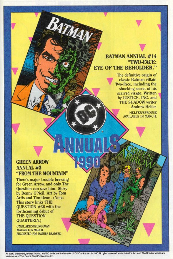
“Selena Has Already Decided Not To Buy The Lawn Furniture.” COMICS! Sometimes I Look at Saga - The Saga Of The Swamp Thing!
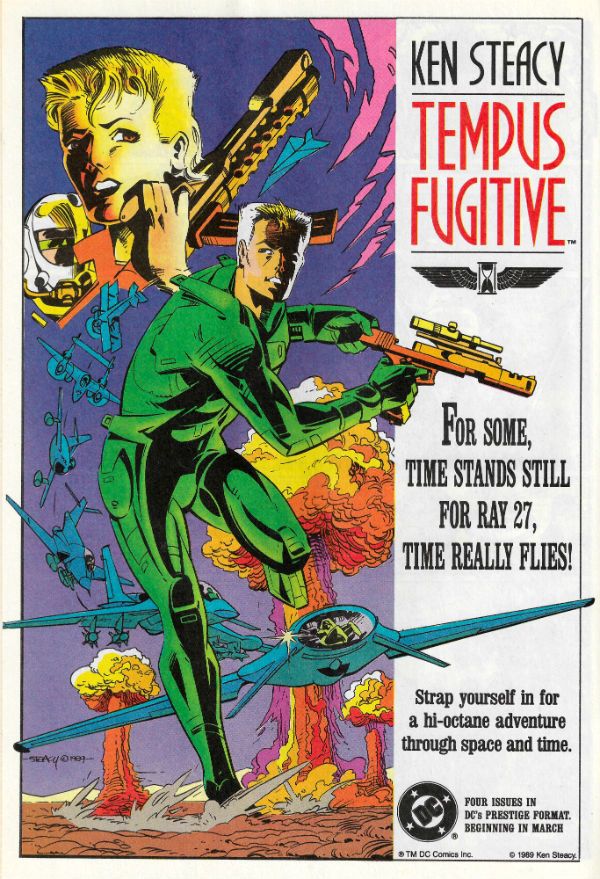
It's Halloween! Gather round, gather round! O, you lucky children! Feast your tiny dead fly sized eyes on a ghoulish gallery fit to chill even the hardiest of souls! Halloween! Sil-VER SHAMROCK! Oh alright, I just scanned in my incomplete Saga of the Swamp Thing comics run. No tricks here, m'dears; only treats! It's mostly covers but also some pin-ups and even Swamp Thing's death certificate. Morbidly apropos eh, what? I hope you enjoy looking at them while I creep up behind you. HOO-HA! Gonna wear your face like knickers!  photo S0tST27bB_zpsiwfempwk.jpg SWAMP THING by Stephen Bissette, John Totleben, Alan Moore, Tatjana Wood & John Constanza

SWAMP THING Created by Berni Wrightson & Len Wein

I started reading Saga of the Swamp Thing (SotST) with # 2 because I was 12 and a morbid little thing. Oh yes, Horror was my jam. I spread it liberally on my toast of terror. I was there, so let me tell you that the 1980s were a pretty awesome time all around for horror in movies, prose and comics. Probably even jam; horror was everywhere. Probably because the 1980s was a pretty awesome time for horror in real life: Thatcher, AIDS, Clause28, The Cold War, Reaganomics, The Miners Strike, Phil Collins; sometimes you just wanted to pull the covers over your head. But then you ran the risk of missing some fab Horror jam. Like SotSW. I stopped reading SotSW with #6. Not because it was rubbish, but because it stopped appearing at my local market cum newstand. Those early issues by Tom Yeates and Martin Pasko aren't the ones people remember but they were pretty decent. Issue 3 with the vampires was nice (nice enough for Moore to call back later in #38 & #39) and #4 had a children's entertainer who entertained himself with children in a bad way. It was far from rote and just about worthy of note. I restarted reading SotSW with #35 when it suddenly reappeared back on my stands. That fella from Warrior and 2000AD whose stuff I liked only turned out to be writing it, didn't he! (It would turn out he'd been writing it for a while.) My surprise and delight at the chillingly efficient tales this Moore fellow was producing was rather upended when Swamp Thing promptly died at the end of #36. Well, fuck a duck, I thought (I was a potty mouthed child).

 photo S0tST25bB_zpsfk00uihl.jpg

But then he brought him back. Later on he'd kill Swampy again, but I'd got the knack by then and just hung on til he was back. With #64 Moore moved on and even brought back Tom Yeates for a fitting finale. But Moore didn't push off before he'd written a pile of the most entertaining comics it's ever been my pleasure to read. (And re-read. And re-re-read. Etc.) So much so that I went back and filled as many gaps as I could, before TPBs were a thing at which point I, as they say, completed the set. It took time and it took money but it was worth it. From the early issues which recast old horror tropes in fresh robes of relevance, through the inevitable team up with Batman (one which actually had weight and consequences for once) through the tail end whistle stop tour of the DCU, Alan Moore brought the words. And plenty of them. But that's okay because they were good words. I have a weakness for writers who love language; I'm odd like that. And as ever with any long comics run you could tell he stayed too long, but rather than phone it in he simply concentrated on keeping himself entertained, and in so doing kept me entertained.

But there are more than words in a comic; otherwise it would be prose. There are pictures. And the pictures in SotST are the equal of Moore's words, mostly. From the titanic trio of Bissette, Totleben & Veitch whose jagged, fractured pages seemed to stab the horrors displayed right into your mind, to the stalwarts called in at short notice: Alfredo Alcala, Stan Woch, Ron Randall et al. And of course, Shawn McManus. Shawn McManus who gave Moore's script for POG (#32) a heartwrecking cartoony beauty. Everyone on the book seemed to be having a blast and so I had a blast. John Totleben certainly had fun, fun which culminated in, with #60, his flamboyantly futuristic issue-long recasting of Kirby Collage technique. John Totleben's eyes are tired, so they say, but he can hear well enough, so let's all say that, you, John Totleben rocked, and you rocked never harder than on #60 of The Saga of the Swamp Thing (unless it was that issue of Miracleman (yeah, that one). SotST is often spoken of as being Alan Moore's but that's just convenient shorthand. SotST and its many, many successes belong to everyone on its pages. Most notably those already spoken of, and particularly Steve Bissette's dark swathes of ink. SotSW is a remarkable run of comics; remarkable in its consistency, intelligence and heart. Yes, heart. Because for a horror book it was surprisingly keen to remind us of what it meant to be human; how that can be the worst thing in the world, but also how it can be the best thing in the world. That's not bad for a comic book about a plant that dreamt it was a man.Sage of the Swamp Thing was EXCELLENT!

You've all been very patient so here's the gallery:

 photo S0tST01aB_zps7h5hwgue.jpg

 photo S0tST02B_zpszdyqnst2.jpg

 photo S0tST03B_zpslf6q2xbc.jpg

 photo S0tST04B_zpscy2qs815.jpg

 photo S0tST05B_zpskrjm0ere.jpg

 photo S0tST06B_zpswdwuunik.jpg

 photo S0tST07B_zpsqte67v9r.jpg

 photo S0tST08B_zpshvofaavx.jpg

 photo S0tST09B_zpsjxa1lezp.jpg

 photo S0tST10B_zpse1uoltfq.jpg

 photo S0tST11B_zpswqlv7wtw.jpg

 photo S0tST12B_zpssfjcaq0d.jpg

 photo S0tST13B_zps8bo3fv9p.jpg

 photo S0tST14B_zpsvivzjzif.jpg

 photo S0tST15B_zps1xedww1b.jpg

 photo S0tST18B_zpsnuiygvpv.jpg

 photo S0tST19B_zpsuwutnp5z.jpg

 photo S0tST25aB_zps3tysl1sc.jpg

 photo S0tST27aB_zps0loq4qxu.jpg

 photo S0tST28B_zpsmiw1obak.jpg

 photo S0tST29aB_zpsskphvrjv.jpg

 photo S0tST30B_zpsx0la6u2u.jpg

 photo S0tST31B_zpsgot7zuvm.jpg

 photo S0tST32B_zpsm9qy66hq.jpg

 photo S0tST33aB_zpsx7wua3vy.jpg

 photo S0tST34B_zpsownvcs1j.jpg

 photo S0tST35B_zpsznnknjca.jpg

 photo S0tST36B_zpso2qu0eif.jpg

 photo S0tST37B_zpsxeynkefc.jpg

 photo S0tST38B_zpsopoygf1k.jpg

 photo S0tST39B_zpslth7i3mr.jpg

 photo S0tST40B_zpsd26tl5tm.jpg

 photo S0tST41B_zpsdrvixr4q.jpg

 photo S0tST42B_zpsljwtrkr1.jpg

 photo S0tST43B_zpsoxrfstyp.jpg

 photo S0tST44B_zps3gfhl8ay.jpg

 photo S0tST45B_zpshvdm3nft.jpg

 photo S0tST46B_zpsd8obz8fi.jpg

 photo S0tST47B_zpsifwgyksx.jpg

 photo S0tST48B_zpseqezckgg.jpg

 photo S0tST49B_zpsbneswwwa.jpg

 photo S0tST50B_zpsyvf3mam3.jpg

 photo S0tST51B_zpsyn0w08ri.jpg

 photo S0tST52B_zpsmwnmvi12.jpg

 photo S0tST53B_zps9frna7qi.jpg

 photo S0tST54B_zps0xhxnwkt.jpg

 photo S0tST55B_zpslesguhzq.jpg

 photo S0tST56aB_zpsohaunsiz.jpg

 photo S0tST57B_zpsiaqpadgq.jpg

 photo S0tST58B_zpsmgd1rlzp.jpg

 photo S0tST59B_zpsjwh2z4gt.jpg

 photo S0tST60B_zpsdmfcyt1r.jpg

 photo S0tST61aB_zpslhdmkxta.jpg

 photo S0tST62B_zpsdnn3rhx3.jpg

 photo S0tST63B_zpshyv41wqh.jpg

 photo S0tST64B_zpsw5xfgw3o.jpg

 photo S0tSTan01B_zpslomwyqhd.jpg

 photo S0tSTan02B_zpsrwbdlrgt.jpg

 photo S0tSTan03B_zpsuxr6xmxd.jpg

 photo S0tSTan04B_zpsti69jov9.jpg

 photo S0tST61bB_zpsrydsqhs8.jpg

 photo S0tST61cB_zpsg9bys5c0.jpg

 photo S0tST33cB_zpsgb1fcy2r.jpg

 photo S0tST33dB_zpsd62wuaoc.jpg

 photo S0tST33bB_zpsvt2qopaw.jpg

 photo S0tST29bB_zps6xqtt53s.jpg

 photo S0tST01bB_zpsllbs3gih.jpg

 photo S0tST56bB_zps77ya6esz.jpg

Sometimes...I am almost...frightened...by my own – COMICS!!!
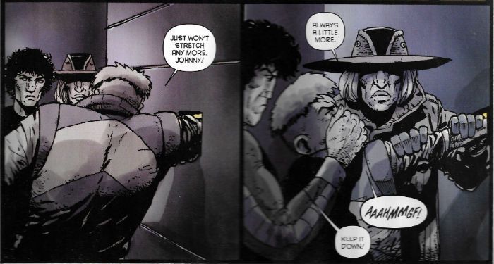
"It's All About The Angles." COMICS! Sometimes I Hope Someone Isn't Expecting The Dog Poo Fairy To Clear This Mess Up!

As a break from Dredd here's a look at a sci-fi horror outing remarkable for the artistry of its visual execution. I've not noticed anyone go on about this one, but I think it's worth going on about. So I did.  photo DogWBitB_zpsjnjelwdd.png DOGS OF MARS by Maybury, Zito, Trov, Wieser, Bautista

Anyway, this...

DOGS OF MARS Art by Paul Maybury Story by Johnny Zito,Tony Trov and Christian Wieser Lettered by Gabe Bautista Book Design by Pauk Maybury & Jordan Gibson Collects DOGS OF MARS#1-4, plus a couple of sketch pages, with pin ups by Steve Funnell, Viktor Kalvachev, Alexis Ziritt, Christine Larsen, Giannis Milonogiannis, Michel Fiffe, Rob Giullory, Jordan Gibson and Victoria Grace Elliot Image Comics, £7.99 (Digital) (2012)

 photo DogMCovB_zps2khrpnxo.png

I bought this on Comixology a while back and read it the other day due to circumstances having interposed a considerable distance between myself and my faithful paper pals. (This time of year I travel around unlocking the doors to lunatic asylums. I'm in Haddonfield on Saturday, watch out for me!) I'm glad I got round to reading it finally, because while it is a work few would grace with the term original it is effectively, efficiently and, I have to say, impressively done. I should probably set your trembling minds at rest right from the off that this has nothing to do with John Carpenter's Ghosts of Mars; a film so execrable that all I can remember is the sight of Ice Cube stumbling about in camo “fat pants” (i.e. vanity pants designed to hide excess poundage) and the reliably stolid Charles Cyphers gamely failing to save this regrettable repetitive muddle of cinematic junk. (John Carpenter remains a cinematic God though.) No, this is completely different, by which I mean a bit similar. But then again DOGS OF MARS is a bit similar to a lot of things. That's not a problem. Borrow away; it's what you do with it that counts - that shall be the whole of the Law. And I have to say I was pretty impressed with DOGS OF MARS; particularly considering the only member of the creative team I'd heard of was Paul Maybury. The man no one calls “Magic Maybury” was the reason I found the book. I searched on his name, since Comixology won't find anything if you put in “derivative but fundamentally entertaining and surprisingly well executed genre entertainment”. Strangely “Paul Maybury” returns a lot more hits, I find.

 photo DogMFightB_zpsxs8htg32.png DOGS OF MARS by Maybury, Zito, Trov, Wieser, Bautista

Endearing itself to me right from the start DOGS OF MARS doesn’t piss about. It opens in media res; I think that's the term. Anyway stuff's kicked off already, we're dropped straight in and you have to run to catch up. Clearly things on Mars Base Bowie (ugh) are less than ideal; order is breaking down, an execution is in the offing, a murder has occurred and there's talk of something “out there”. Before you can get your bearings the space fan gets a good coat of space faeces and we whipcrack back to the start to see what went wrong. Turns out that what we've got here is a bunch of scientists and soldiers planning to terraform Mars by dropping a nuke into its guts and then then, uh, algebra, plants and, er, things because, science. Clearly it's a case of Chekhov's Nuke so the “science” doesn't matter. Also, it's an action-horror story set on Mars so worrying about the science might not be the best use of your time here. The plot's good in its urgent hokiness, the whole thing's delivered with a straight face and the thundering pace means it can barrel right over any disbelief that might stray into the road. It's also pretty icky stuff and manages to define its cast quickly and with elegant simplicity. Other than Maybury's visuals this might be where DOGS OF MARS impresses most. No matter how brief their appearance all the characters are discrete and their demises are affecting. I liked the burly sad guy who became an astronaut to impress his wife but, “She left me for the manager of a Mr. Cluck's Chicken in Utah.” He's barely in the book but he's funny, sad and when he goes...it's bad.

 photo DogMOpenB_zpss9c763kc.png DOGS OF MARS by Maybury, Zito, Trov, Wieser, Bautista

All the secondary characters, no matter their genre mandated impermanence, are similarly sketched by the creators with an efficiency lacking from (sshhhhhh!) many established writers. But the best bit of the book is the relationship which defines the two key protagonists: Zoe and Turk. They being two female characters who occupy the top spots in the Mars Base hierarchy and whose love/hate dynamic is so sharply defined you'll keep checking your fingers for punctures. Yeah, yeah, at first you might roll your eyes as it looks like Zoe's husband is the source of the sisterly friction, but it's soon apparent that that's just a symptom of a deeper and more realistic fracture. It's far less the usual rice cakes pressed into the shape of women that comics usually deal in. No sad lady assassins or sad lady robot assassins or ladies who are basically differentiated from the same male characters by their sadness. Nope, none of that sad crap. The interaction between Zoe and Turk is far more akin to the women in The Descent; which, yes, is a movie about weekend spelunkers menaced by cannibal throwbacks but, you know, fair's fair, is still pretty good on character. Honest. Horror always hurts more when you care about the characters, and because someone had bothered to write some characters DOGS OF MARS made me wince more than once.

 photo DogMDreamB_zpsfkfnqdoa.png DOGS OF MARS by Maybury, Zito, Trov, Wieser, Bautista

Mind you there's a difference between writing and “story” which is what Zito, Trov and Wieser are actually credited with. It's entirely possible they gave Maybury their “story” and the distillation of it into a viciously entertaining comic is down to Maybury's alchemical finesse. Or his “storytelling”, as it is known. Because be in no doubt Maybury rocks these pages like honeymooners in a caravan. In the back there are sketches of the characters which are clearly defined and reader friendly in the extreme. But in the book itself Maybury discards this catchy clarity and goes for an approach so loose it gives David Cameron's grasp on truth a run for its money. It also, honesty demands I concede, at times gives lucidity a run for its money. But...that's okay. It really is. There are a number of approaches to horror – show it, don't show it, and show something but let it unsettle via its lack of clarity. (Hey, you want Kim Newman you go pay Kim Newman, Cochise.) It's this latter approach that gets most play from Maybury. Given there's an awful lot of body horror and panicked rushing about it also turns out to be the most aesthetically appropriate approach. From character designs, hardware and general atmospherics there's an obviously experimental edge to all of Maybury's work here, but never moreso than in the frequent and intentional dips into visual bedlam. None of which detracts from the pleasure of the reading experience. In fact this lurching in and out of coherency works in tandem with the unusual colouring choice of having just white and red. On occasion this is powerfully inverted and so guts spray out like cold white worms into a warmly carmine world. There's also some lovely dream imagery and a daring fragmentation of images into pixellated chaos. All of which ultimately raises what is at root a merely satisfying act of genre homage up several levels, into a propulsive and frenetically entertainingly unique beast. Woof , woof! DOGS OF MARS is VERY GOOD!

Mars wants – COMICS!!!
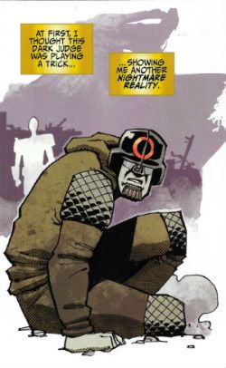
“SHUT THEM DOWN! SHUT THEM ALL DOWN!” COMICS! Sometimes He’s Such A Stick In The Mud He’s More Like Judge Ludd!

In which I provide you with another cheerless slog through a volume of JUDGE DREDD THE MEGA COLLECTION. No charge!  photo JDMC24_01B_zpsdzmlztqc.jpg JUDGE DREDD by Doherty, Wagner and Parkhouse

Anyway, this… THE JUDGE DREDD MEGA COLLECTION REVIEW INDEX

MECHANISMO JUDGE DREDD MEGA COLLECTION VOLUME 24 Contents: Introduction by Matt Smith, Mechanismo, Mechanismo Returns, Body Count, S.A.M. and Safe Hands, cover gallery, Colin MacNeil interviewed by Michael Molcher Art by Colin MacNeil, Peter Doherty, Manuel Benet, Val Semeiks & Cliff Robinson, and Jock Written by John Wagner and Gordon Rennie Coloured by Chris Blythe Lettered by Annie Parkhouse and Tom Frame Originally published in Judge Dredd Megazine 2.12. – 2.17, 2.22 – 2.26, 2.37 -2.43, 2000AD progs 1374 and 1273 Hatchette/Rebellion, £6.99 UK (2014) (It’s £6.99 because it was the second issue which is always, in partworks, more expensive than the first issue, but less expensive than the third issue which is when the real price (£9.99) sets in.) Judge Dredd created by Carlos Ezquerra, John Wagner and Pat Mills

 photo JDMC24CovB_zpsbk8cffzz.jpg Cover by Colin MacNeil

I say, I say, I say, when is a comic book movie not a comic book movie? When it is Paul Verhoeven’s Robocop(1987): the best comic book movie ever(1). Yes, smarty pants, despite its not being a comic book movie. Yet, despite its having no direct single original comic book source it opts instead to indulge a cheekily blatant preference to plunder freely from many sources. Mainly though, it plunders from the best; its black humour, satirical edge, ultraviolence and taciturn (but sympathetic) central character all owing more than a little to Judge Dredd(2). In 1993 in the pages of Judge Dredd Megazine(3), no doubt having tired of waiting for acknowledgement or remuneration, John Wagner repaid the favour with Mechanismo; which is basically Judge Dredd vs. Robocop(s)(4). Due to the persistently apocalyptic nature of life in Mega City One Judges are getting a bit short in supply(5). Flying in the face of pretty much every piece of speculative fiction ever in which automata take on human tasks, Justice Department decide to bolster the Judges with automata. Better yet these are fiercely armed, heavily armoured automata with personalities based on Judge Joseph Dredd his own bad self. Dredd thinks this idea is less than ideal but he’s not Chief Judge. McGruder(6) is, so it’s her call. The Mechanismos get a test run and give Dredd a run for his money.

 photo JDMC24_02B_zpshqpbcs3s.jpg JUDGE DREDD by MacNeil, Wagner and Parkhouse

Surprising absolutely no one Dredd’s right, and things go wrong about 5 minutes after the droids’ boots hit the slab. People die, chaos puts on its dancing shoes and Dredd soon has to hunt a rogue droid imprinted with his own personality. Um, SPOILER! It’s okay, Mechanismo isn’t really about suspense; Mechanismo is a fleet footed blast of future-thrill action which reads better collected than it did when serialised. Initially these tales seemed a little lightweight for the amount of time it took for them to appear, but here they all are in one chunk and their upside becomes more apparent; what initially starts as a sassy riposte to a cinematic rip off (or homage) develops into something a little deeper(7). Playing Dredd off against his robotic doppelganger(s) is a neat trick since their distorted mirroring of Dredd’s appearance, speech and behaviour is amusing, and their embodiment of his personality unfettered by any humanity is revealing in itself. The Mechanismos aren’t Judge Dredd because they can’t ever be Judge Dredd as they aren’t human, and as little humanity as Dredd may have it’s what ultimately prevents him from becoming a monster. Or at least prevents him from becoming an inhuman monster. As monster’s go Judge Dredd’s a very human one, which is cold comfort but still some comfort. After all, where there’s humanity there’s hope(8).

 photo JDMC24_03B_zpszttryf2l.jpg JUDGE DREDD by Doherty, Wagner and Parkhouse

Trouble kicks off because the units overheat and start disobeying orders. Or more precisely, they follow orders too inflexibly and are soon executing people for witnessing crimes and not reporting them. Having laws is all well and dandy but justice is about a bit more than that, says the book full of exploding heads and robots that look like killer Metal Mickeys. Tellingly by the end of the trilogy Dredd himself has been forced to do the wrong thing, but for the right reasons. Wagner’s writing takes a misstep here at the last by uncharacteristically labouring what Dredd has done and what it means. However, it is a big step in Dredd’s development(9) so it’s easy to see why Wagner’s usual lightness of touch becomes a little heavier than usual. Pretty much the whole point of robots in stories is that they’ll go wrong(10), or teach us a very special lesson about the magic of human nature(11). Here Wagner gives us both; although because he is John Wagner his very special lesson is a bit less sparkly than most. What starts out as a fast and funny, sunnily lit action romp pivots via a transitionary dank sewer set middle section into a final darkly subdued echo of the initial premise. The cheerful Robocop-esque overkill of the first chapter invites laughter as citizens are slaughtered for ridiculous reasons, but by the final chapter the same jokes have ceased to be played for laughs as the more mordant and downbeat world of Dredd takes precedence over its derivative cinematic would-be usurper.

 photo JDMC24_04_zpsuvueixjv.jpg JUDGE DREDD by Benet, Wagner and Frame

As ever these strips appeared over a lengthy period of time and the creative teams are (Wagner aside) discrete. Sensibly, visual choppiness over the course of the trilogy is kept to a minimum by assigning each chapter to a particular artist. MacNeil chooses to paint the opener, Mechanismo, in a bleached out style awash with bright sunshine, like it’s perpetually high noon (of course - because there’s a showdown!) Everything has a lovely warm quality - even the smears of colour that were once people’s heads. (12) Signalling the shift in tone Peter Doherty’s Mechanismo Returns is a far darker affair, due to its night time and underground settings. Doherty has an oddly hesitant line, and the resultant tentativeness is an odd fit for the blunt world of Dredd. Also, his people look like they’ve been dead for six months; it’s an odd look all round. I like it, but it’s odd. Not unpleasant, just different(13). In comparison to MacNeil & Doherty Benet’s art on Body Count seems simultaneously both "European" and old fashioned; like a throwback to a 1970s Heavy Metal, or a coloured-in cousin of Casanovas’ work on Dredd (remember Max Normal?) I mean, Benet’s art is fine, it does the job but it can’t help but look a little stuffy and archaic after Doherty and MacNeil’s comparatively brisk and frisky stuff.

 photo JDMC24_05B_zpsxutw9zi5.jpg JUDGE DREDD by Semeiks & Robinson, Wagner, Blythe and Frame

The book is filled out by a pair of tales falling within the unspoken remit of “robots gone wrong”. In S.A.M. Wagner writes a caustic take on bureaucratic pettifoggery which ostensibly involves Judge Dredd having to outwit a talking bomb, but is given satirical bite via its roots in the plight faced by an increasing number of folk in the real world. The ostensibly bizarre pairing of North American stalwart Semeiks’ pencils with the Bolland-lite inks of Robinson makes for a pleasing goofy result. Robbie Morrison’s Safe Hands is an example of the punchline approach to a Dredd strip and is weak in a probably-had-it-on-file-for-emergencies way. It’s still worth a look because it’s drawn by Jock. And that’s pretty much it. Plenty of Thrill-Power in this volume so Judge Kane’s verdict is a solid GOOD!

They can replace us all with robots but they’ll never replace – COMICS!!!
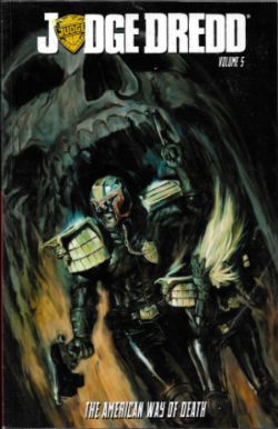
(1) Yeah, yeah, thinking about it now, Dobermann (1997), Sin City (2005) and Ghost World (2001) are close contenders, and, yeah, sure, you probably have your own favourite but I can’t read your mind, pal, so Robocop wins today (and mostly because I can’t be bothered to do a new opening).

(2) Oh, I’m sure there’s a quote somewhere about how no one involved in the movie had ever heard of Judge Dredd. But still and all, still and all…

(3) The actual issue numbers are up there. That’s one sexy time that is, copying that stuff out. I only do this so I can copy issue numbers out, don’t tell everyone! It’s my Secret Garden!
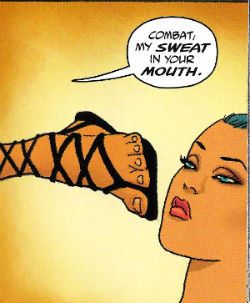
(4) It’s so obvious I kind of regret taking up all that space building up to such a non-revelation. The first chapter is upfront about it and has a bit of fun directly referring to the Mechanismo as both “the future of law enforcement” and “Robo Judge”. In the second chapter Wagner pokes fun at his own movie allusions with a character declaring “Number 5’s alive!” - the tag line to Short Circuit (1986); a quite different movie from Robocop. No, I haven’t seen Short Circuit; I was 16, why the blue blazes would I be watching a Steve Guttenberg comedy about a tiny robot. I was watching tawdry horror nonsense, probably involving Barbara Crampton screaming. And they let me breed.

(5) This takes place just after NECROPOLIS which had the Dark Judges take over Mega City One with predictably hilarious consequences.

(6) McGruder is a particularly confusing character when encountered in isolated stories. She’s of a distinctly mannish aspect and is functionally nuts, quite often referring to herself in the plural, and prone to paranoid fancies. Originally a Judge who took the Long Walk she returned to the City during NECROPOLIS and was hugely influential in overthrowing the Dark Judges. She means well but her eroding sanity is starting to take its toll. This a sensible footnote. You might want to frame it.

(7) But not that deep. It kind of introduces themes , characters and events which lead into the mega-epic WILDERLANDS which occurs beyond the covers of this book.

(8) You have to believe stuff like that if you have kids, otherwise you go nuts.

(9) Judge Dredd’s that rare character in comics whose character does indeed develop. He also ages and one day he will die. I doubt if he’d want flowers so send the money to a kid’s charity. It’s what he’d want.

(10) See Robocop. Although Robocop goes wrong by regaining his humanity which is right, this is still against his programming so it is also wrong. Look, just go with it.

(11) See Short Circuit. Probably, anyway. Because, no, I don’t know what lesson everyone is supposed to take away from Short Circuit. Like I say I was busy watching From Beyond or something erudite like that. We covered that earlier. Don’t you read these? I have other things to do, you know. I’m not sat around imbibing peeled grapes from servile hands while deigning occasionally to set some words down about Judge Dredd. This country’s turning to shit over here under the Tories, this is not a good time to be conscious and…sorry, 再见了!

(12) In the interview at the back of the book MacNeil explicitly acknowledges this luminous approach, but I’d just like to stress I’d already written about that bit before I’d read his interview. So I’m not stealing his words, I’m saying I was right. That was a pleasant surprise because I’m simply awful on colours.

(13) I’m pretty sure this is the same Peter Doherty who facilitates the excellent colouring on so many of Geoff Darrow’s grotesquely flamboyant creations. I could be wrong, I often am; it’s what keeps me modest.

(14) There is no fourteenth footnote. Go home.

 photo JDMC24_06B_zpsxbgns8vq.jpg JUDGE DREDD by MacNeil, Wagner and Parkhouse

"Justice Has A Price. The Price Is Freedom." COMICS! Sometimes I Hesitate To Correct An Officer Of The Law But I Think You'll Find That In This Case The Price is £9.99 Fortnightly. OW!

Borag Thungg, Earthlets! Clearly I have nothing useful to do with my time because I have bodged up a master list of the JUDGE DREDD MEGA COLLECTION. As each volume is released I will update the list and the accompanying image gallery. Should I “review” a volume I will link to that volume in the list. So, interested in the JUDGE DREDD MEGA COLLECTION as “reviewed” by yours truly, then this is the list for that. Pretty clear stuff. No questions? Anyone? Good. If anyone wants me to look at a particular volume, just drop me a comment. The volumes aren't released in order so it's not like I have a sensible plan of attack. If anyone wants me to stick them where the sun don't shine I suggest you keep that sentiment to yourself, cheers. Right, that laundry won't wash itself. Pip! Pip!

 photo JDMCMickMB_zpsizu2lmf4.jpg JUDGE DREDD by Mick McMahon & Pat Mills

Anyway, this... JUDGE DREDD THE MEGA COLLECTION Published by Hatchette/Rebellion UK, 2014 onwards.

Judge Dredd Created by Carlos Ezquerra, John Wagner & Pat Mills

Volumes:

01 – JUDGE DREDD: AMERICA  photo JDMC01CovB_zpszwn41pta.jpg Cover by Colin MacNeil

02 – JUDGE DREDD: DEMOCRACY NOW  photo JDMC02CovB_zpsq911wtwo.jpg Cover by John Higgins

03 – JUDGE DREDD: TOTAL WAR  photo JDMC03CovB_zpsivydbs9u.jpg Cover by Simon Coleby

04 - JUDGE DREDD: THE DEAD MAN  photo JDMC04CovB_zpsmn7ydfuh.jpg Cover by John Ridgway

05 - JUDGE DREDD: NECROPOLIS  photo JDMC05CovB_zpsnuqsvxj5.jpg Cover by Carlos Ezquerra

06 - JUDGE DREDD: JUDGE DEATH LIVES  photo JDTMC06CovB_zpsaq3ditzq.jpg Cover By Brian Bolland 07 - JUDGE DREDD: YOUNG DEATH  photo JDTMC07CovB_zpsob9kouak.jpg Cover by Frazer Irving

08 – JUDGE ANDERSON: THE POSSESSED  photo JDMC08CovB_zpsuvcgvenl.jpg Cover by Brett Ewins

09 - JUDGE ANDERSON: ENGRAM  photo JDTMC09CovB_zpsdkyt2b50.jpg Cover by David Roach

10 – JUDGE ANDERSON: SHAMBALLA  photo JDMC10CovB_zps4dorgz0v.jpg Cover by Arthur Ranson

11 - JUDGE ANDERSON: CHILDHOOD'S END  photo JDTMC11CovB_zpslu5tzgiw.jpg Cover by Kev Walker

12 - JUDGE ANDERSON: HALF-LIFE  photo JDTMC12CovB_zps5utk9y9a.jpg Cover by Arthur Ranson

13 -

14 – DEVLIN WAUGH: SWIMMING IN BLOOD  photo JDMC14CovB_zpsvyswy0fh.jpg Cover by Cliff Robinson

15 - DEVLIN WAUGH: CHASING HEROD  photo JDMC15CovB_zpsnimjxsr9.jpg Cover by Colin Wilson

16 - DEVLIN WAUGH: FETISH  photo JDTMC16CovB_zpscuk0v1s1.jpg Cover by Cliff Robinson 17 -

18 -

19 - LOW LIFE:PARANOIA  photo JDMC19CovB_zpsgg7guzae.jpg Cover by Henry Flint

20 - LOW LIFE: HOSTILE TAKEOVER  photo JDTMC20CovB_zpsyngdx9uy.jpg Cover by D'Israeli

21 - THE SIMPING DETECTIVE  photo JDMC21CovB_zpsitffoknj.jpg Cover by Cliff Robinson

22 -

23 - JUDGE DREDD: BANZAI BATALLION  photo JDTMC23CovB_zpsvjxnlmkj.jpg Cover by Jock

24 - JUDGE DREDD: MECHANISMO  photo JDMC24CovB_zpsbk8cffzz.jpg Cover by Colin MacNeil

25 - JUDGE DREDD: MANDROID  photo JDMC25CovB_zpstmax9ipf.jpg Cover by Kev Walker

26 - 27 -

28 - JUDGE DREDD: THE LIFE AND CRIMES OF P. J. MAYBE  photo JDTMC28CovB_zpst5nqiyjj.jpg Cover by Cliff Robinson

29 -

30 - TARGET: JUDGE DREDD  photo JDMC30CovB_zpsehozji3q.jpg Cover by Jim Baikie

31 – JUDGE DREDD: OZ  photo JDMC31CovB_zpscwshqbub.jpg Cover by Steve Dillon

32 – JUDGE DREDD: THE CURSED EARTH  photo JDMC32CovB_zpsdpn4ydg9.jpg Cover by Mick McMahon

33 - JUDGE DREDD: THE DAY THE LAW DIED  photo JDTMC33CovB_zps0gz5vjru.jpg Cover by Mick McMahon

34 - 35 -

36 – JUDGE DREDD: THE APOCALYPSE WAR  photo JDMC36CovB_zpsfenowryi.jpg Cover by Carlos Ezquerra

37 - JUDGE DREDD: JUDGEMENT DAY  photo JDMC37CovB_zpsd05ohipp.jpg Cover by Carlos Ezquerra

38 - JUDGE DREDD: INFERNO  photo JDTMC38CovB_zpslw7fxonu.jpg Cover by Carlos Ezquerra

39 - JUDGE DREDD: WILDERLANDS  photo JDTMC39CovB_zpsiyoxkwq0.jpg Cover by Trevor Hairsine

40 - JUDGE DREDD: THE PIT  photo JDTMC40CovB_zpspzoxpfzh.jpg Cover by Cliff Robinson

41 -

42 – JUDGE DREDD: DOOMSDAY FOR DREDD  photo JDMC42CovB_zpsrrjlb1lh.jpg Cover by Dylan Teague

43 - JUDGE DREDD: DOOMSDAY FOR MEGA-CITY ONE  photo JDTMC43CovB_zps87xsz7tg.jpg Cover by Colin Wilson

44 -

45 - JUDGE DREDD: ORIGINS  photo JDMC45CovB_zpsl9cheet9.jpg Cover by Brian Bolland

46 -

47 - JUDGE DREDD: TOUR OF DUTY: BACKLASH  photo JDTMC47CovB_zpsxajbvcgy.jpg Cover by Carlos Ezquerra

48 -

49 - JUDGE DREDD: DAY OF CHAOS: THE FOURTH FACTION  photo JDMC49CovB_zpsptwjvupp.jpg Cover by Henry Flint

50 – JUDGE DREDD: DAY OF CHAOS: ENDGAME  photo JDMC50CovB_zpscvwjhrmc.jpg Cover by Henry Flint

51 - TRIFECTA  photo JDMC51CovB_zpshowsktmz.jpg Cover by Carl Critchlow

52 - 53 - 54 -

55 – JUDGE DREDD: THE HEAVY MOB  photo JDMC55CovB_zpsktwwziwe.jpg Cover by Dylan Teague

56 -JUDGE DREDD: BEYOND MEGA-CITY ONE  photo JDMC56CovB_zpspufoidxp.jpg Cover by Brendan McCarthy

57 - CALHAB JUSTICE  photo JDTMC57CovB_zpsufxttikn.jpg Cover by John Ridgway

58 - 59 -

60 – HONDO-CITY JUSTICE  photo JDMC60CovB_zps1nwcymd4.jpg Cover by Cliff Robinson

61 - SHIMURA  photo JDMC61CovB_zpsw3yr3wo4.jpg Cover by Colin MacNeil 62 - 63 - 64 - 65 - 66 - 67 - CURSED EARTH KOBURN  photo JDMC67CovB_zps8x2mgubm.jpg

68 - CURSED EARTH CARNAGE  photo JDTMC68CovB_zps8b1ebsky.jpg Cover by Anthony Williams

69 - 70 - 71 -

72 - JUDGE DREDD: THE ART OF TAXIDERMY  photo JDTMC72CovB_zpskjb2hko5.jpg Cover by Steve Dillon

73 - JUDGE DREDD: HEAVY METAL DREDD  photo JDTMC73CovB_zpsg60x71tu.jpg Cover by John Hicklenton

74

75 – JUDGE DREDD: ALIEN NATIONS  photo JDMC75CovB_zpsoejo0w3t.jpg Cover by Cliff Robinson

76 - JUDGE DREDD: KLEGG HAI  photo JDMC76CovB_zpsfloyfmee.jpg Cover by Chris Weston

77 - JUDGE DREDD: HORROR STORIES  photo JDTMC77CovB_zpspgu4ny8w.jpg Cover by Brett Ewins

78 -

79 - JUDGE DREDD: INTO THE UNDERCITY  photo JDTMC79CovB_zpsypnh5ic8.jpg Cover by Tiernen Trevallion

80 - JUDGE DREDD: DARK SIDE OF THE MOON  photo JDTMC80CovB_zpsxgtpkvlb.jpg Cover by Brian Bolland

Judge Dredd! He is the – COMICS!!!