"It's All About The Angles." COMICS! Sometimes I Hope Someone Isn't Expecting The Dog Poo Fairy To Clear This Mess Up!

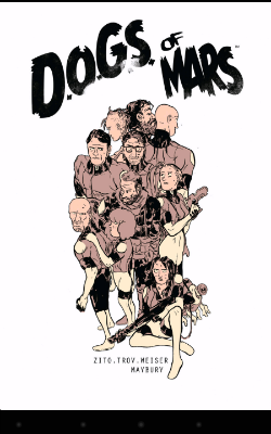
As a break from Dredd here's a look at a sci-fi horror outing remarkable for the artistry of its visual execution. I've not noticed anyone go on about this one, but I think it's worth going on about. So I did.  photo DogWBitB_zpsjnjelwdd.png DOGS OF MARS by Maybury, Zito, Trov, Wieser, Bautista
Anyway, this...

DOGS OF MARS Art by Paul Maybury Story by Johnny Zito,Tony Trov and Christian Wieser Lettered by Gabe Bautista Book Design by Pauk Maybury & Jordan Gibson Collects DOGS OF MARS#1-4, plus a couple of sketch pages, with pin ups by Steve Funnell, Viktor Kalvachev, Alexis Ziritt, Christine Larsen, Giannis Milonogiannis, Michel Fiffe, Rob Giullory, Jordan Gibson and Victoria Grace Elliot Image Comics, £7.99 (Digital) (2012)

 photo DogMCovB_zps2khrpnxo.png

I bought this on Comixology a while back and read it the other day due to circumstances having interposed a considerable distance between myself and my faithful paper pals. (This time of year I travel around unlocking the doors to lunatic asylums. I'm in Haddonfield on Saturday, watch out for me!) I'm glad I got round to reading it finally, because while it is a work few would grace with the term original it is effectively, efficiently and, I have to say, impressively done. I should probably set your trembling minds at rest right from the off that this has nothing to do with John Carpenter's Ghosts of Mars; a film so execrable that all I can remember is the sight of Ice Cube stumbling about in camo “fat pants” (i.e. vanity pants designed to hide excess poundage) and the reliably stolid Charles Cyphers gamely failing to save this regrettable repetitive muddle of cinematic junk. (John Carpenter remains a cinematic God though.) No, this is completely different, by which I mean a bit similar. But then again DOGS OF MARS is a bit similar to a lot of things. That's not a problem. Borrow away; it's what you do with it that counts - that shall be the whole of the Law. And I have to say I was pretty impressed with DOGS OF MARS; particularly considering the only member of the creative team I'd heard of was Paul Maybury. The man no one calls “Magic Maybury” was the reason I found the book. I searched on his name, since Comixology won't find anything if you put in “derivative but fundamentally entertaining and surprisingly well executed genre entertainment”. Strangely “Paul Maybury” returns a lot more hits, I find.
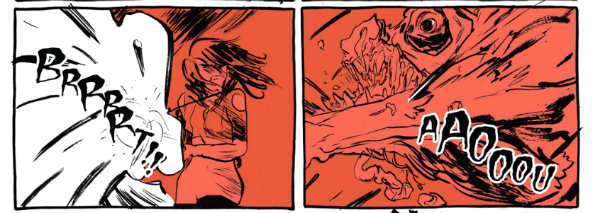
 photo DogMFightB_zpsxs8htg32.png DOGS OF MARS by Maybury, Zito, Trov, Wieser, Bautista

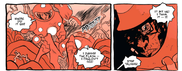
Endearing itself to me right from the start DOGS OF MARS doesn’t piss about. It opens in media res; I think that's the term. Anyway stuff's kicked off already, we're dropped straight in and you have to run to catch up. Clearly things on Mars Base Bowie (ugh) are less than ideal; order is breaking down, an execution is in the offing, a murder has occurred and there's talk of something “out there”. Before you can get your bearings the space fan gets a good coat of space faeces and we whipcrack back to the start to see what went wrong. Turns out that what we've got here is a bunch of scientists and soldiers planning to terraform Mars by dropping a nuke into its guts and then then, uh, algebra, plants and, er, things because, science. Clearly it's a case of Chekhov's Nuke so the “science” doesn't matter. Also, it's an action-horror story set on Mars so worrying about the science might not be the best use of your time here. The plot's good in its urgent hokiness, the whole thing's delivered with a straight face and the thundering pace means it can barrel right over any disbelief that might stray into the road. It's also pretty icky stuff and manages to define its cast quickly and with elegant simplicity. Other than Maybury's visuals this might be where DOGS OF MARS impresses most. No matter how brief their appearance all the characters are discrete and their demises are affecting. I liked the burly sad guy who became an astronaut to impress his wife but, “She left me for the manager of a Mr. Cluck's Chicken in Utah.” He's barely in the book but he's funny, sad and when he goes...it's bad.
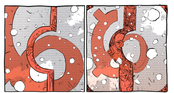
 photo DogMOpenB_zpss9c763kc.png DOGS OF MARS by Maybury, Zito, Trov, Wieser, Bautista

All the secondary characters, no matter their genre mandated impermanence, are similarly sketched by the creators with an efficiency lacking from (sshhhhhh!) many established writers. But the best bit of the book is the relationship which defines the two key protagonists: Zoe and Turk. They being two female characters who occupy the top spots in the Mars Base hierarchy and whose love/hate dynamic is so sharply defined you'll keep checking your fingers for punctures. Yeah, yeah, at first you might roll your eyes as it looks like Zoe's husband is the source of the sisterly friction, but it's soon apparent that that's just a symptom of a deeper and more realistic fracture. It's far less the usual rice cakes pressed into the shape of women that comics usually deal in. No sad lady assassins or sad lady robot assassins or ladies who are basically differentiated from the same male characters by their sadness. Nope, none of that sad crap. The interaction between Zoe and Turk is far more akin to the women in The Descent; which, yes, is a movie about weekend spelunkers menaced by cannibal throwbacks but, you know, fair's fair, is still pretty good on character. Honest. Horror always hurts more when you care about the characters, and because someone had bothered to write some characters DOGS OF MARS made me wince more than once.
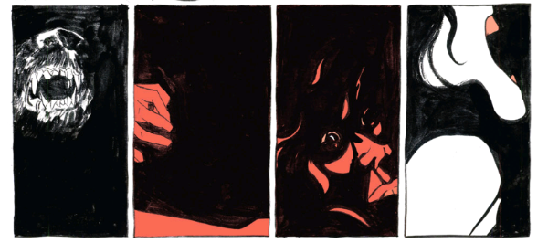
 photo DogMDreamB_zpsfkfnqdoa.png DOGS OF MARS by Maybury, Zito, Trov, Wieser, Bautista

Mind you there's a difference between writing and “story” which is what Zito, Trov and Wieser are actually credited with. It's entirely possible they gave Maybury their “story” and the distillation of it into a viciously entertaining comic is down to Maybury's alchemical finesse. Or his “storytelling”, as it is known. Because be in no doubt Maybury rocks these pages like honeymooners in a caravan. In the back there are sketches of the characters which are clearly defined and reader friendly in the extreme. But in the book itself Maybury discards this catchy clarity and goes for an approach so loose it gives David Cameron's grasp on truth a run for its money. It also, honesty demands I concede, at times gives lucidity a run for its money. But...that's okay. It really is. There are a number of approaches to horror – show it, don't show it, and show something but let it unsettle via its lack of clarity. (Hey, you want Kim Newman you go pay Kim Newman, Cochise.) It's this latter approach that gets most play from Maybury. Given there's an awful lot of body horror and panicked rushing about it also turns out to be the most aesthetically appropriate approach. From character designs, hardware and general atmospherics there's an obviously experimental edge to all of Maybury's work here, but never moreso than in the frequent and intentional dips into visual bedlam. None of which detracts from the pleasure of the reading experience. In fact this lurching in and out of coherency works in tandem with the unusual colouring choice of having just white and red. On occasion this is powerfully inverted and so guts spray out like cold white worms into a warmly carmine world. There's also some lovely dream imagery and a daring fragmentation of images into pixellated chaos. All of which ultimately raises what is at root a merely satisfying act of genre homage up several levels, into a propulsive and frenetically entertainingly unique beast. Woof , woof! DOGS OF MARS is VERY GOOD!

Mars wants – COMICS!!!

“Thy Opinion Hath Been NOTED, Wrinkled One.” COMICS! Sometimes I Wonder If It's Gil -BERT or Gil-BEAR! And Then I Just Settle for GODHEAD!

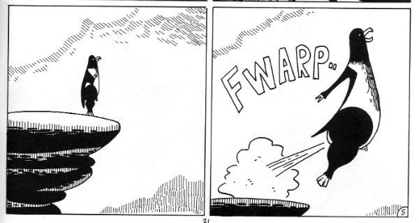
In which a vain attempt is made to engage with The Present and some words are written about comics produced during these times known as Modern. In a display of staggering arrogance at no point is any excuse proffered for the extended absence of the author, although he would like it to be known that upon occasion it is necessary for him to work for a living. Would that it were otherwise.  photo BlubFlyB_zpsvt1i7sjw.jpg BLUBBER by Gilbert Hernandez

Anyway, this... Yeah, I know, what the world needs more of is middle-aged white males talking about what they like. Condemned as I am by the circumstances of my birth to a prison of unearned privilege, all I can offer by way of recompense are these words; as ungrammatical and dismayingly keen on cant as they may be. However, in the interests of diversity please note that while there is little I can do about being a middle-aged white male without multiple hospital stays and a bunch of therapy, I did at least show willing and wrote the following while wearing my wife’s knickers.

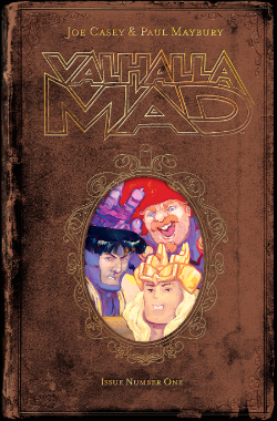
VALHALLA MAD#1 Art by Paul Maybury Written by Joe Casey Coloured by Paul Maybury Lettered by Russ Wooton Graphic Design by Sonia Harris Flats by Ricky Valenzuela Valhalla Mad created by Maybury & Casey Image Comics, $3.50 (2015)

 photo ValCoverB_zps8hzmenzm.png

I bought VALHALLA MAD for the art of Paul Maybury which I previously encountered in SOVEREIGN, a comic which now appears to be defunct despite its dense pleasures. Chris Roberson wrote that one but this one's written by Joe Casey, who here has done one of those comics which are inexplicably basically about some Big Two characters but, you know, in the literary equivalent of those disguise kits you get from joke shops with the big pink plastic nose, the Groucho 'tache and the lens-less specs fit only to fool only vegetation and estate agents. So VALHALLA MAD is clearly not a comic about Thor and The Warriors Three because there are only three of them in total not four, and they all have different names: The Glorious Knox, Greghorn The Battlebjorn and Jhago The Irritator. (Extra bonus comedy points for Jhago The Irritator).

 photo ValPanelB_zpsrylerx00.png VALHALLA MAD by Maybury, Casey, Wooton, Harris & Valenzuela

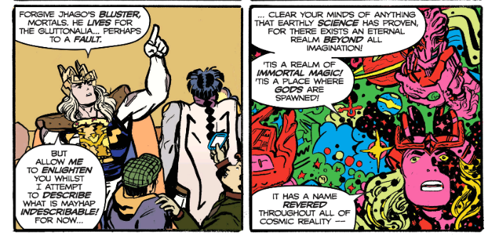
It's a light comedy which is amusing enough (they rescue a plane but unbeknownst to they, their arrival caused it to crash in the first place!) Much sport is made of the voluminous verbiage of the Stan Lee Style and a generally pleasant time is had by all, not least our three protagonists who have graced Earth with their presence for a glorified pub crawl. Or there may be more to it than that as the final page appears to promise. It's a lot of talking is what it is, and with the exception of the odd typo (e.g. "feint" for "faint") it's propulsive and amusing enough stuff but visually it doesn't give Maybury much to work with. Good job he packed his Awesome this time out and he goes to town on it nevertheless. His boldly chunky style of cartooning brings the otherworldly and the mundane together while never losing the humour of the juxtaposition. Throughout the molten flow of his line is broad enough to encompass two realities and it's ultimately his art which makes VALHALLA MAD #1 GOOD!

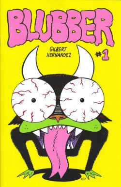
BLUBBER #1 By Gilbert Hernandez Fantagraphics, $3.99 (2015)

 photo BlubCovB_zpsucmnqxte.jpg

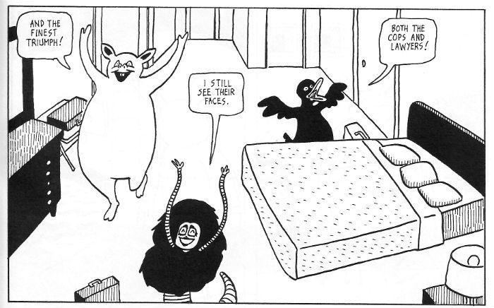
If VALHALLA MAD is the stag do then BLUBBER is the morning after where you wake up in a strange and distant field covered in sick while a stray dog humps the back of your head. Yes, it’s the one man kick to the nuts of rational thought that is Gilbert “Berty” Hernandez. Here he’s unleashed one of those baffling one-off comics that just exist because, well, because he wants it to. Is this the first in a new ongoing series of madcap anthropomorphic laff mags based around mutilation and sexual degradation? Or will the next time we see this be some sixty years hence in some pricey Fantagraphics boxed set big enough to hide a chopped up dog in? Trick question! The next time we see this will be in a court of law when Gilbert Hernandez is called to account for crimes so bizarre and outlandish we’ll have to redefine the concept of human society just to register the correct level of disgust. I particularly like the way this looks like a kids’ comic but it isn’t (unless you want to go to jail or your kids are The Children of The Damned). I was going to moan about how he got the name of his character wrong in the first strip but, y’know, the fact he didn’t murder anyone while making this bizarre farrago of puce faced lunacy probably outweighs that. Hard is the heart that weighs a typo heavier than a human life.

 photo BlubEarnedB_zps3pasgvez.jpg BLUBBER by Gilbert Hernandez

It’s a pint pot of horror poured in a teacup of visual discipline. Because as ostentatiously obtuse and unremittingly repellent as things get “Los Boss” Hernandez sticks to his grid like a fly to a fast moving windshield. It’s this friction between the boiling horror and the discipline of craft that sets that itch you just can't shift to work in your startled mind. Sandwiched inbetween the Charles Manson's Discovery Channel stuff is a bleakly funny exercise in unsettling obfuscation the equal of Lynch or (maybe a Beckett). I could feel profundity pressing against the tender membranes of my eyes as I read. Mind you, at other points I could also feel my mind pulsing and straining, like the overworked and exhausted sphincter of a pensioner at stool, as it tried at punishing cost to impose some meaning, some sense onto this EXCELLENT! comic.

Like the lady nearly sang, I can't live if living is without - COMICS!!!
“Extremely Unlikely, And Definitely Improbably, But Not IMPOSSIBLE” COMICS! Sometimes It's A Whole New World. We Just Need Some Magic Carpets And We're Set To Go!

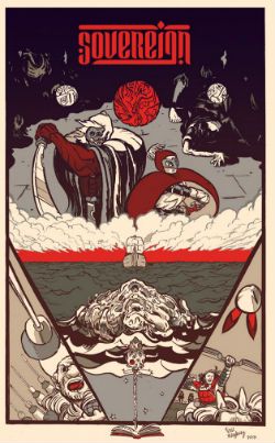
Hello. I read a comic, did a little dance. Felt it needed more work as a critical medium and fell back on words. Sometimes the Old Ways are best.  photo SovHeaderB_zps82794e99.jpg Anyway, this... SOVEREIGN #1 Art by Paul Maybury Written by Chris Roberson Coloured by Paul Maybury with Jordan Gibson Lettered by John . Hill Image, Paper $2.99 Digital £1.99 (2014) Sovereign created by Maybury & Roberson

 photo SovCovB_zps543670be.jpg

At the risk of unsettling my regular readers I thought I’d cut right to the nub of the matter this time out; Sovereign is Fantasy. It’s the kind of Fantasy with swords and monsters and cloaks and a classy upper case F. Sovereign is not that tawdry lower case f type of fantasy involving you, a Nixon mask, Kinder eggs and Miss Ga-Ga (Yes, Miss Ga-Ga; because that filly’s no Lady, I’ll be bound). More simply Sovereign is Fantasy a la Game of Thrones. I picked that because everyone knows Game of Thrones and this is very much like that, and that’s no bad thing. If you like Game of Thrones you’ll probably like Sovereign is what I’m getting at there. That’s all I need to say really so there you go. What? No, I don’t watch (or read) Game of Thrones; I did watch the first episode and it was okay (the highlight, naturally, being 1970s Martin Amis as Tyrion Lannister) but I didn’t feel any burning need to carve out a small niche in my life for it. But I think I will for this book because it caught my fancy with its off kilter visuals and intelligent approach.

 photo SovPOV_zpsde0e724d.jpg

Also, quite a lot happens. So much happens in fact that Roberson has to carve his book into three chunks. Each chunk introduces a set of cast members intended to represent the mind-set of their particular societies. Since two of the chunks involve groups in transit the contrasts being offered are very much cultural rather than geographical. While we are treated to several of Maybury’s lovely locales none of them really come into too clear a focus (plus one bunch of folk are on a boat and the sea is pretty much the sea even in Scrabble Name Land) so it’s obvious the book is more bothered about the characters. The first trio of whom we meet being three members of the Luminari, which is a sect of spiritual ghost fighters who also flense corpses like master butchers under conditions of extreme duress. They are off see the Tamurid, the current rulers of Khend. It’s in this section that your eye has to acclimatise to Maybury’s off kilter approach to POVs and his art’s general air of swollen decay. I was thinking a lot about tainted sausages during this section. The spur to our spiritual pals’ pilgrimage is some rum business which we will soon see is getting the plot rolling in at least two other areas of Countdown Conundrum Land. No sooner have you noticed that our trio are in fact a cheekily recast Batman (Paladin), Robin (Raven) and Alfred Pennyworth (The Practician) than they are up their nuts in guts and it’s a cliffhanger cut to the next section.

 photo SovTeaB_zpscf2d1ece.jpg

Wherein we meet the Tamurid. The Tamurid are a kind of Steppes warrior bunch and among their number they count the book's Conan analogue. Because his Dad is Khan (no, not Ricardo Montalban) Janramir gets to generally fart about like any rich kid but with the milieu specific emphasis on killing things, laughing around campfires with other lusty men and voicing the eternal Barbarian’s Lament about perfumed men who fight only with words. In this part Maybury has a good time drawing horses so big and thick they are scarier than the big and thick men who ride them. Back at the writing Roberson does some time lapse stuff where the chat flows as if in real time but the images jump from night to day and incident to incident; I like this because people generally do just talk about shit that’s bothering them like maybe going over it one more goddamn time will make it go away. Luckily Roberson realises there’s no need to actually subject the reader to all that repetition. Better to suggest it and to do so cleverly. Take note, jabber jockeys. Alas, all wasteful things must come to an end and Janramir is told his Dad’s dead. Downer. The inference is that he’s going to have to go back and wade through the kind of internecine rivalry and callous backstabbing familiar to anyone with siblings who’s Mum has died and not said who can have her jewellery.

 photo SovRen_zps43fb2cff.jpg

The third and final part of the comic introduces us to a boat borne band whose fictional culture is clearly that of renaissance(?) Britain but, you know, a bit different; more credulity in magic and that stuff. There’s Pol Ravenstone; a bloke whose head is always in a book and prefers others to do the physical stuff, so he’s the only normal person in the comic (cough!); Lady Joselyn Evrendon, a lady it’s heavily hinted at is a bit cold and let’s hope her character arc isn’t as obvious as “sworn virgin” would lead us to infer; and then there’s Argus Mag Donnac, a violent and ill-bred man in tartan i.e. a Scot. The big set piece cracks off in this bit so I won’t spoil it; it’s good. 'S exciting if slightly hampered by a lack of clarity on the part of the restlessly inventive Maybury. I couldn’t really get a fix on the size of the ship or exactly what was happening but it was a quite hectic series of remarkably uncommon events so that may have been intentional.

 photo SovHand_zpsf36e9797.jpg

For the page count of a single comic in 2014 a lot of ground gets covered; I don’t know how much ground because Sovereign omits to give us a map. Which is odd because if Sovereign were a book it would have a map in the front, but it’s not it’s a comic so it has prose in the back. The first time through I didn’t read that bit because I shouldn’t need to. And I didn’t need to. The words at the back worked the way they should, as an appendix which enhanced and deepened what went before. But what had gone before stood solidly enough by itself. I also liked Roberson’s use of quotes from sources in his fake world to preface (and on occasion end) his chapters. This gave everything a bit of extra import and because he’s made them up they could fulfil their narrative purpose more precisely and, more importantly, we didn’t have to suffer that same fucking Nietzsche quote about the abyss everyone trots out. Hey, comic book writers? Read a book every now and again; they don’t fucking bite. Chris Roberson obviously reads books and it seems to be working out okay for his writing, I'd say.

I’m old and move slow so there are a number of issues (Sigh. Yes, I could have checked but my nails are drying, dear. This is strictly amateur hour, you know.) of this series now available but I just read the first. I’ll be picking up the others and I hope Maybury’s art continues to provide a quirky compliment to Roberson’s nifty scripting. However, he might just want to keep an eye on the levels of quirk involved. Looking at issue two’s cover it appears the cast is to be joined by the cuckolded homophobe Ray Purchase from Toast of London. While this would make it the best comic ever, as that probably isn’t going to happen Sovereign will have to settle for just being GOOD!

And remember that there may not be elves, Sam, but there are always - COMICS!!!

Last Issues, First / Last Issues, Second Issues (that could be first issues) and so on...

Get after it, Pope.  

Grand Champion of the Kumite Brian Hibbs is going all Howard Beale above and below this post.  Go check 'em out and get smart.  Or, read me going on about comic books.  Win / win, right?

Disclaimer: This is not to say that Hibbs will follow down the awful rabbit hole Beale goes in Network.  He's just mad as hell and he's out the window telling you about it.  You're human beings, damn it!  Your lives have value!

Capsules of the last weeks after the jump!


Dial H # 15

Mieville / Ponticelli

At $4.99 and stuffed with 38 pages of story Dial H #15 doesn’t disappoint in the “crazy be crazy” department.  My interest in the series had waned after the initial arc but I kept on with it and now at the abbreviated end I’m glad that I did.  Ponticelli’s rough madness grew on me throughout and Mieville introduced some elements I’d never thought of let alone seen in a Dial H comic.  These radical takes on existing property seem to get shorter and shorter runs at relevancy and I’m left wondering what a juggernaut like DC is doing trying to have main line (52) contributions from books like these on a sales level.  One hopes that Vertigo provides a lifeline with realistic expectations.  Oh, also, does anyone give a rip about those Channel 52 things?  Seems an indulgent house ad with no discernible value when “costs keep going up!” (by the by – 7 pages of ads in this one – mostly house and house adjacent)

Though…this is pretty funny.

Holding the line at...stupid!


Prophet #38

Graham / Milonogiannis / Roy

$3.99


First, I got the Jim Rugg cover and it’s pretty great.  I highly recommend seeking out SuperMag #1 by the man himself.  Stylistically and in all different types of delivery Rugg is really and truly a virtuoso talent.  Stunningly flexible. Check it out.  Amazing. (Additional superlatives needed)

Anywho, Prophet is lean and mean as a comic book.  The gang throws us 29 pages of story content with nary an ad.  Even the inside front and back covers are dedicated to story.  It’s a generous gesture and almost certainly costs someone money.  I can’t stress enough how immediately – by breaking the opening page monotony – Prophet slams you into the narrative.  By changing the pace you change the experience.  Not cookie cutter comics.

Also worth mentioning is the continuing and “as the wind blows” back-up selection.  This month, Kate Craig brings us a precious story about the emotional and psychological benefits of not always trying to annihilate anything that has the temerity to exist outside our immediate scope of meticulous plans and schemes.  Being decent, essentially, is its own reward.  The whole thing is enjoyably paced with a nice, emotive style.  Kate also draws amazing and weird hands / paws.  Cool.

Be Decent


Catalyst Comix #2

Casey / McDaid / Maybury / Farinas

$2.99 

Art = NICE.  Each brings an identifiable tone – sense of place – and individual style.  I gushed over each of these in my original review and talked through the motifs they’re employing but I have to say – AGAIN – that the super…SUPER…SUPER star of this thing so far is Brad Simpson.  The color palette for each of these chapters is individual – unique and simply gorgeous.  Colorists just don’t get enough love and this guy is on another level.  A true secret weapon who deserves all the credit in the world for giving this book something to simultaneously help hold it together and break it up.  Get paid, Brad Simpson.  Get paid!

On the other hand your enjoyment of the story is going to be largely dependent on how much you enjoy winking asides.  If, like myself, you generally respond with atrocious and socially unacceptable amounts of sighing and eye-rolling you may want to read this one in the isolation chamber.

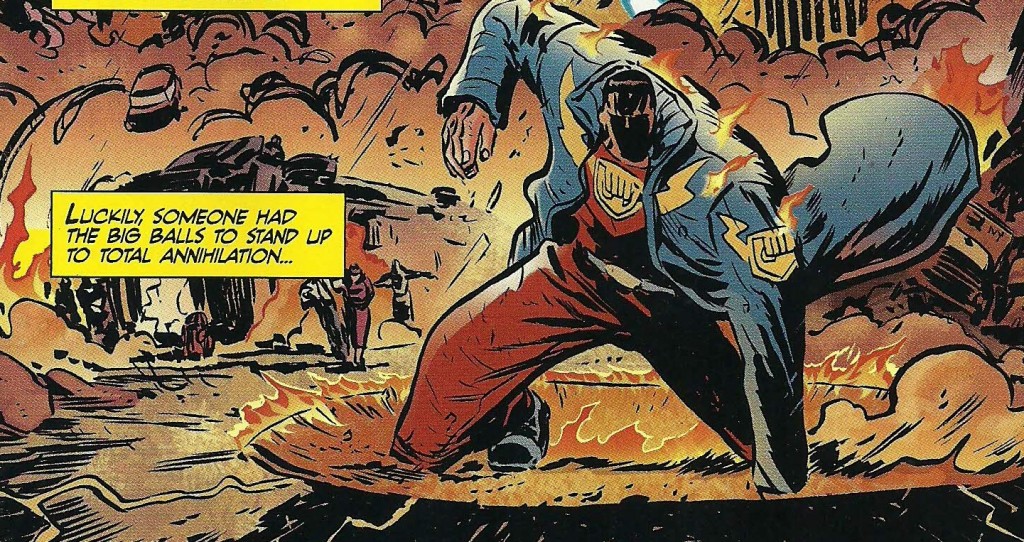
At points Casey goes full frontal assault, totally aping Dr. Strangelove, using Vandelay Industries as the company responsible for rebuilding the trashed city (when everyone knows they deal exclusively in latex), and having the group therapy session centerpiece of Change Agents not only fall prey to every, single, boring satirical stereotype trope of such an encounter but also take place in the gymnasium of the Jean M Giraud Fighting Arzachs.

That is to say...it's kind of what you expect from a Joe Casey comic and that's not what I was sold as a "bold re-invention of the super-hero comic experience."

Anywho, all 3 segments here could actually be part of an extended #1 comic.  We’re re-introduced, the supporting cast fleshes out a bit, a new wrinkle is revealed.  I think it’s not a bad strategy early on to give people late to the party a bit of breathing room so, from me at least, the feel of the pace is not too bad.

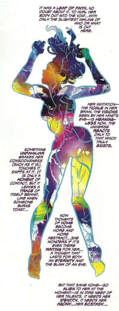
Still, does this line make any f’ing sense?  I must have read this three times and I was afraid it was going to give me a Lewis Black aneurysm.  Maybe Casey is trying to say the guy talking is just coming right out of his ass with this stuff but…I kinda doubt it.

That comparison is...not apt.

Brain…hemorrhaging….

http://www.youtube.com/watch?v=sJ0s0KUUpxo

"If it weren't for my horse..."


Save me…Paul!


The Invincible Haggard West #101

Paul Pope

$2.99

32 pages – No ads

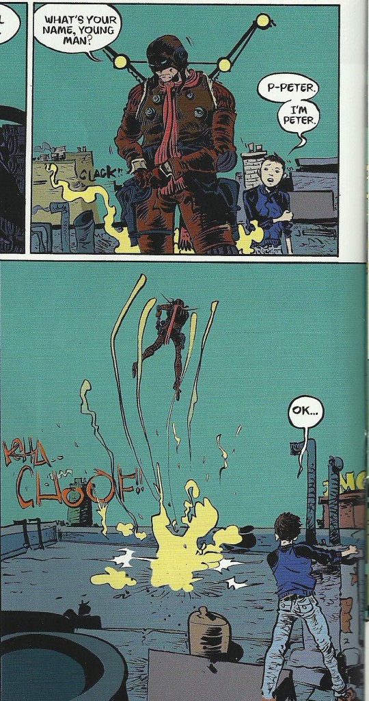
All this goes without saying and to prattle about it would really belabor the point but it’s really and truly quite striking as an artistic statement.  From the hand-drawn sound effects to the visual choices made for each character this thing is a note perfect juggernaut.

Quickly

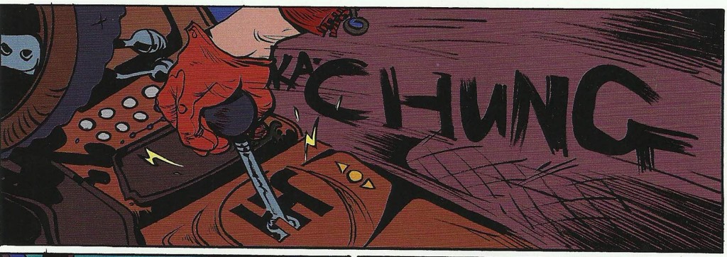
Each sound effect is perfectly and I mean fucking perfectly suited and delivered.

Contrast a well placed “Klop, Klop, Klop” or “TCHOOF!!” with some digitally inserted garbage in Batman / Superman and that tells you there is a difference between art and product.

The design work is so elegant and beautiful it engenders hyperbole.  In action or at rest Haggard’s “flight frame” is a thing of wonder.  His guns are neon tube death machines with impossible innards.  Hell, the man himself is so pulpy when his scarf gets shot you feel him take things to the next level.  (I pulled two vertical panels out of sequence just to show you the elements)

Put it all together and VOILA!


The supporting characters are well rendered in a minimum of space.  Haggard’s daughter, Aurora, is on for all of three pages and she’s already got a backbone to envy and a multifaceted personality.

In control


This is A work and EXCELLENT.  Battling Boy can’t come soon enough.

Happy reading, everyone!

Them's Fightin' Words, Joe Casey.

In the absence of the dulcet tones of Mssrs. Jeff and Graeme... It should go without saying that all that follows is my opinion.

So, quietly and without much advance hullabaloo Dark Horse Comics made its entry…or rather its re-entry…into the world of Superheroics with Catalyst Comix #1


titlebumper


There’s a lot to recommend this book.  There’s a lot to recommend this series, really.   But, as with all things...a caveat.


First, if you’re a fan of offbeat capes and unique delivery systems this book may be for you.  The story starts by spinning out the various circumstances of the principal characters at the time of a major crisis.  It’s a cool set-up.

Second, if you’re in the mood for that trademark Casey dialogue (Snappy, knowing, and biting all the right brassy reference points) this book may be to your taste.

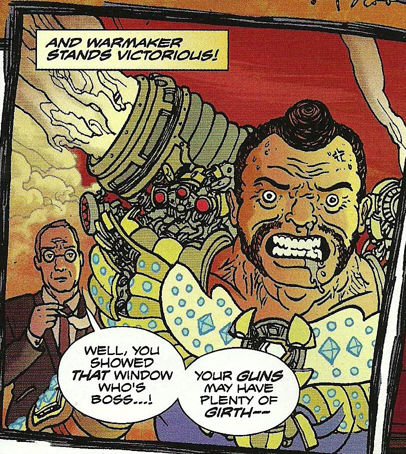
Third, all the art here makes some really bold style choices.  The list of influences is long enough to go up one arm and down the other.  Scioli / Kirby is all over Frank Wells.  Er, FRANK WELLS!  I see a fair amount Ross Campbell waiting in the wings of Amazing Grace.  The Change Agents benefit from an odd marriage of Sylvan Migdal’s Curvy and Geoff Darrow of all things.  Also, it should be noted there may be many - MANY - more influences here.  I am a stupid neophyte, not Frank Santoro.

frankwells

amazing grace


warmaker

A quick aside:  As all contributors are given credits as ART it’s hard to tell whether Brad Simpson colors the whole thing.  He is the sole credited colorist and could be the standout player for bringing such a diverse sensibility and individuality to all three chapters.  But, since it’s a little unclear, I hesitate to take credit for the color choices away from the individual artists.  It’s a really nice component of the book.  Especially worthy of note is the Change Agents chapter.  The colors there really set that section apart.

But then…there’s this.  And, from this point, for me, what was a nice exercise in genre bending becomes something else.


CatalystMission


Whoa.  As the title says, Them’s Fightin’ Words.

So, by this, you’re led to believe that Casey’s taking some bold stance.  Some US VS. THEM classic bully wrestling storyline.  DAMN THE MAN and all that shit.

Except he’s using existing IP.

http://en.wikipedia.org/wiki/Comics%27_Greatest_World


And, really, the US VS THEM manifesto should be retired.  If I could give this venture one bit of advice it would be to ditch the shrill “NO!  WE’RE DIFFERENT!  WE’RE RUSHING THE GATES!” mentality.  It’s passé in 2013.  We’ve played that game out.  Walking Dead, The Image re-emergence, SAGA, Vaughn and Martin’s Private Eye…

That game’s over.

There is no US VS THEM.

There’s only US.  Start pitching this series as what “WE” do at Dark Horse.  This is how “WE” chart the course.  As long as you’re hung up on showing “The Mainstream” they’re outdated you’re playing by their rules.

But, therein lies the problem.  You’re using THEIR methods.

This comic is riding generic names like Titan and Amazing Grace because it’s easier to do that than create your own thing.  DH Publisher Mike Richardson said yes to this because Dark Horse OWNS THE COPYRIGHTS.  He was one of the original creators!  So, you know, go ahead and show me how not mainstream you are by doing the ONE THING mainstream comics are reviled for more than any other ONE THING amongst the comics going Secret Society.   Don’t blame me when I ask if Barbara Kesel, Randy Stradley, Jerry Prosser, and Chris Warner are getting their royalty checks off of this “bold new line in the sand.”  When people ask Brandon Graham what he’s doing working on Prophet when he doesn’t own it he smiles because he’s in on the joke.  He’s taking money for work and not trying to pass it off as anything more than that.  It’s a check and he’s never pretended anything different.  NEVER.

Dark Horse and Joe Casey in particular are pretending to kick down the door of Superhero books but decades on from the ownership disasters of Miracleman and Zenith no lessons have been learned.  Kirby, who Casey so openly apes in the Frank Wells chapter, might SPIN knowing that this is being put forward as CHANGE and DIFFERENT.

A talented car crash of artists is pouring their work into a corporate funnel and this is the new version of “line drawing?”  This is the bold new stance?

It’s a good comic with lots to recommend it but please…don’t tell me it’s one thing – pretend to me it’s new ground – when it’s plainly more of the same.  Let it be what it actually is, the Dark Horse Corporate Super Hero Line.

Don’t tell me you’re re-inventing the wheel when it's the same old grist stone that's made a fine powder out of creators for the length, breadth, and depth of the industry.